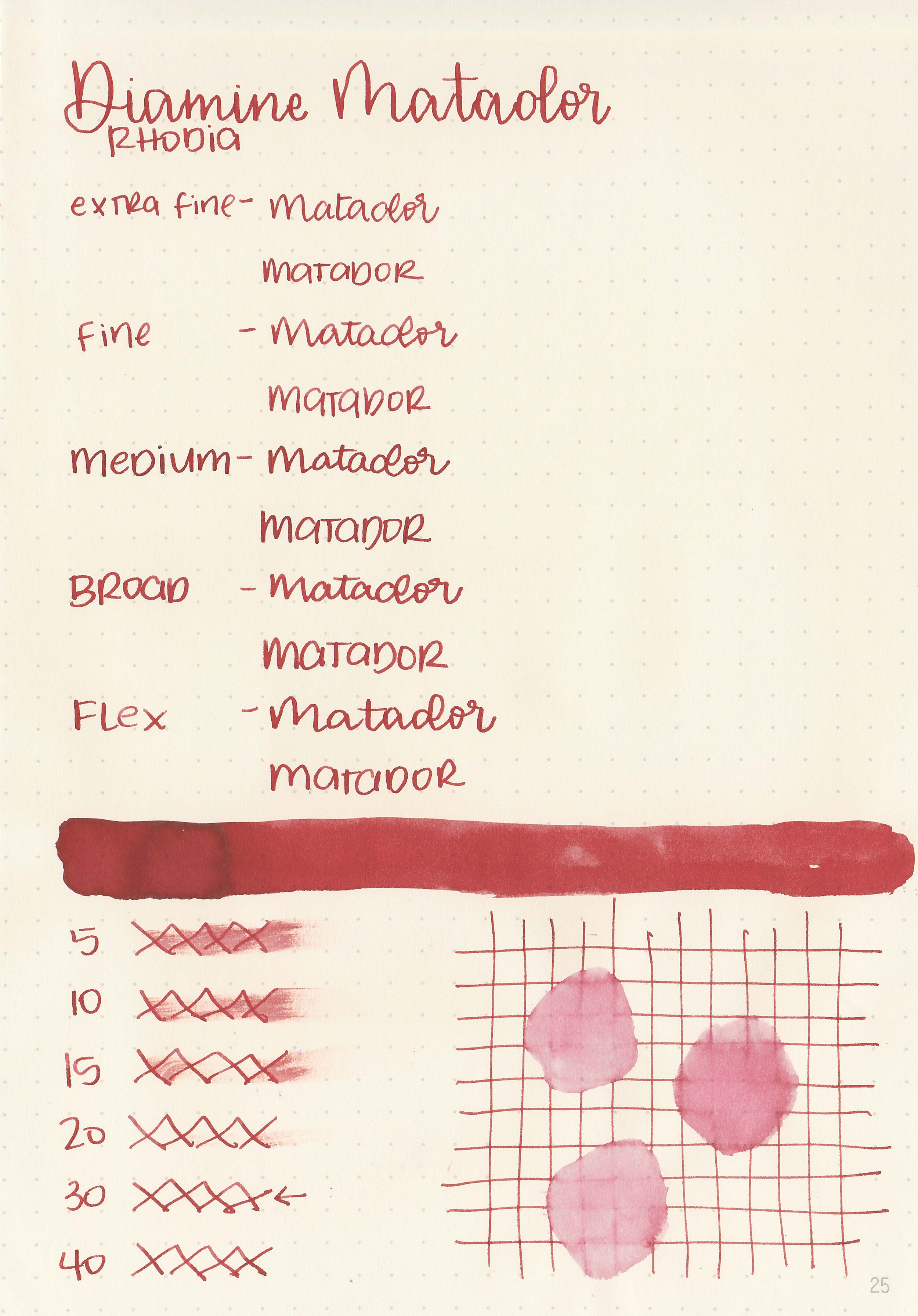
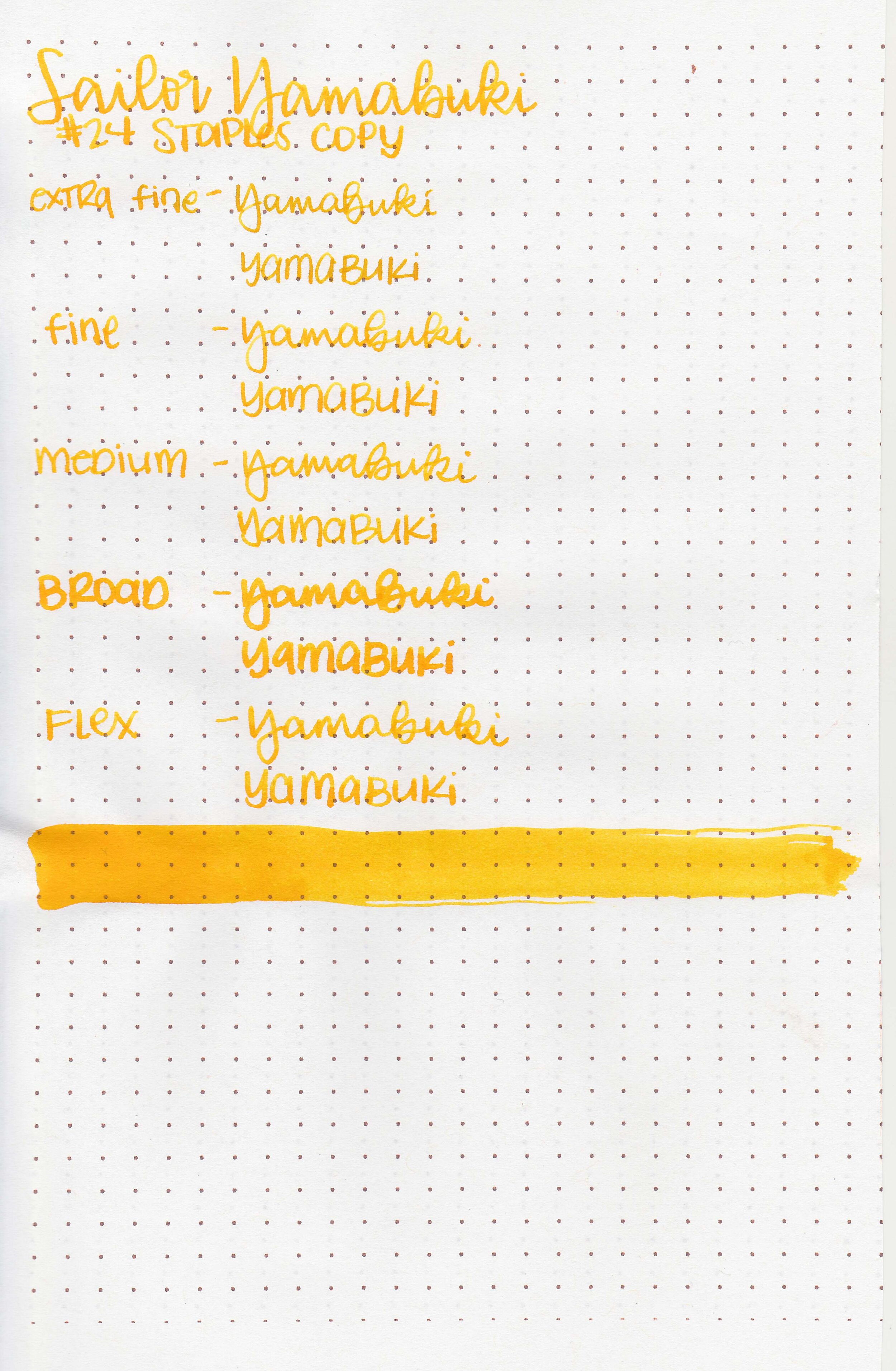
Ink Review #1164: Diamine Merlot
/
Let’s take a look at Diamine Merlot today. I purchased my bottle of ink from Cult Pens a few years ago.

The color:
Merlot is a dark, dusky, unsaturated purple.
Swabs:

In large swabs on Tomoe River paper the ink has a little bit of shading, and a tiny bit of green and brown sheen.

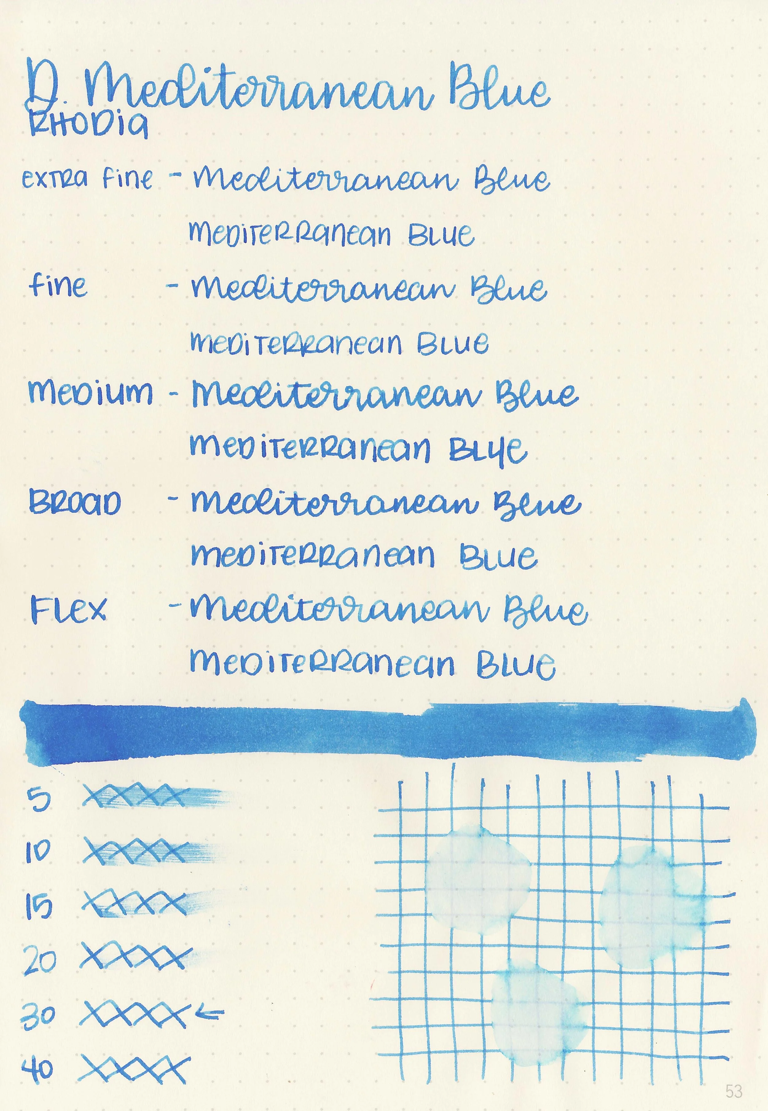
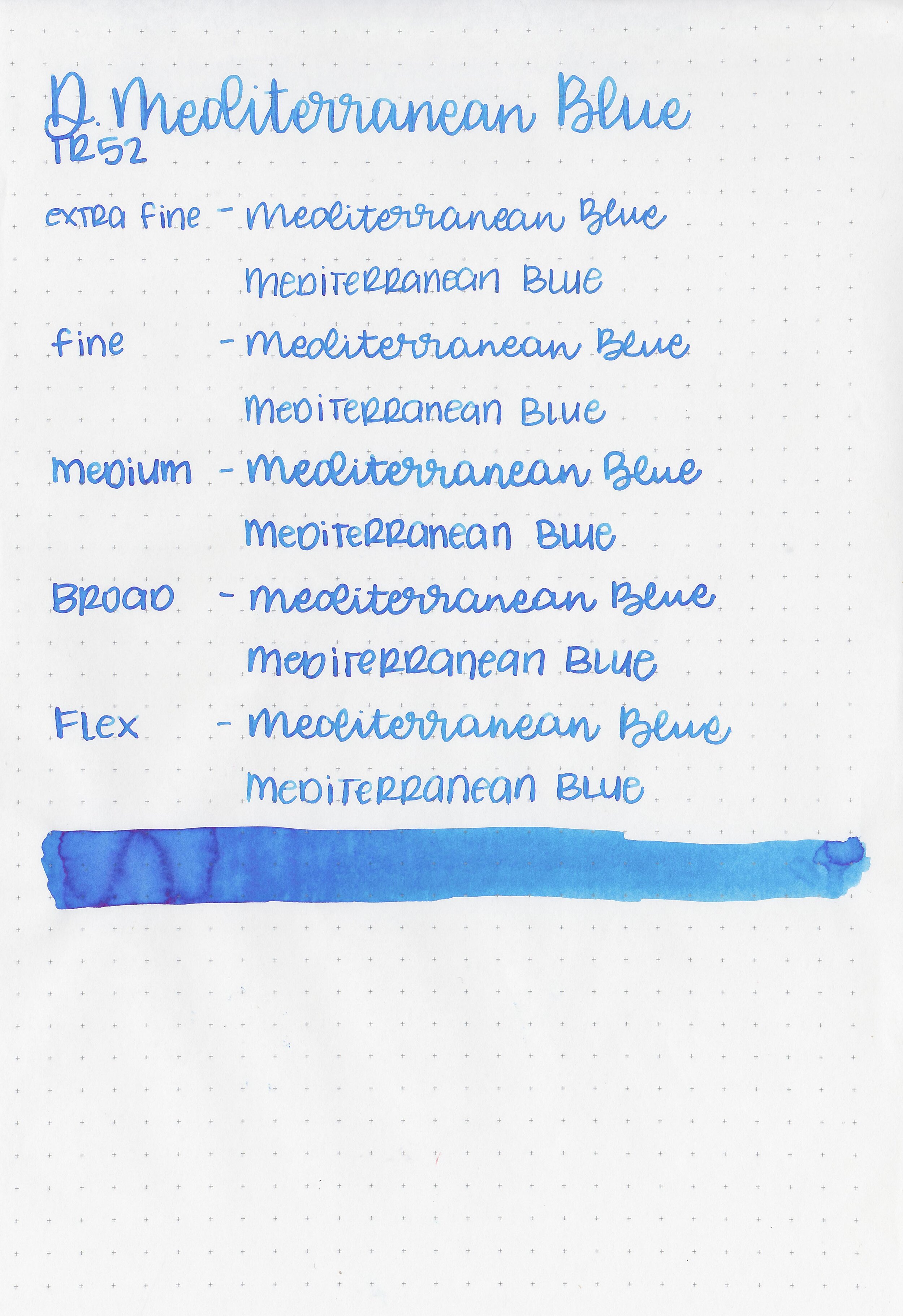
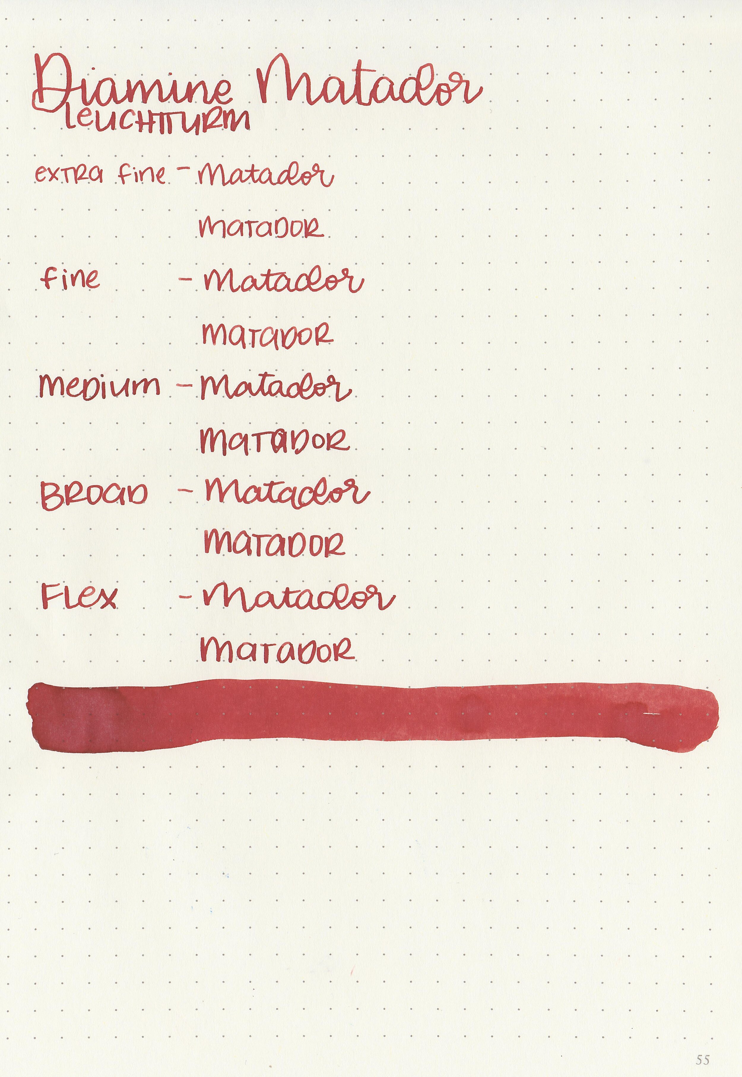
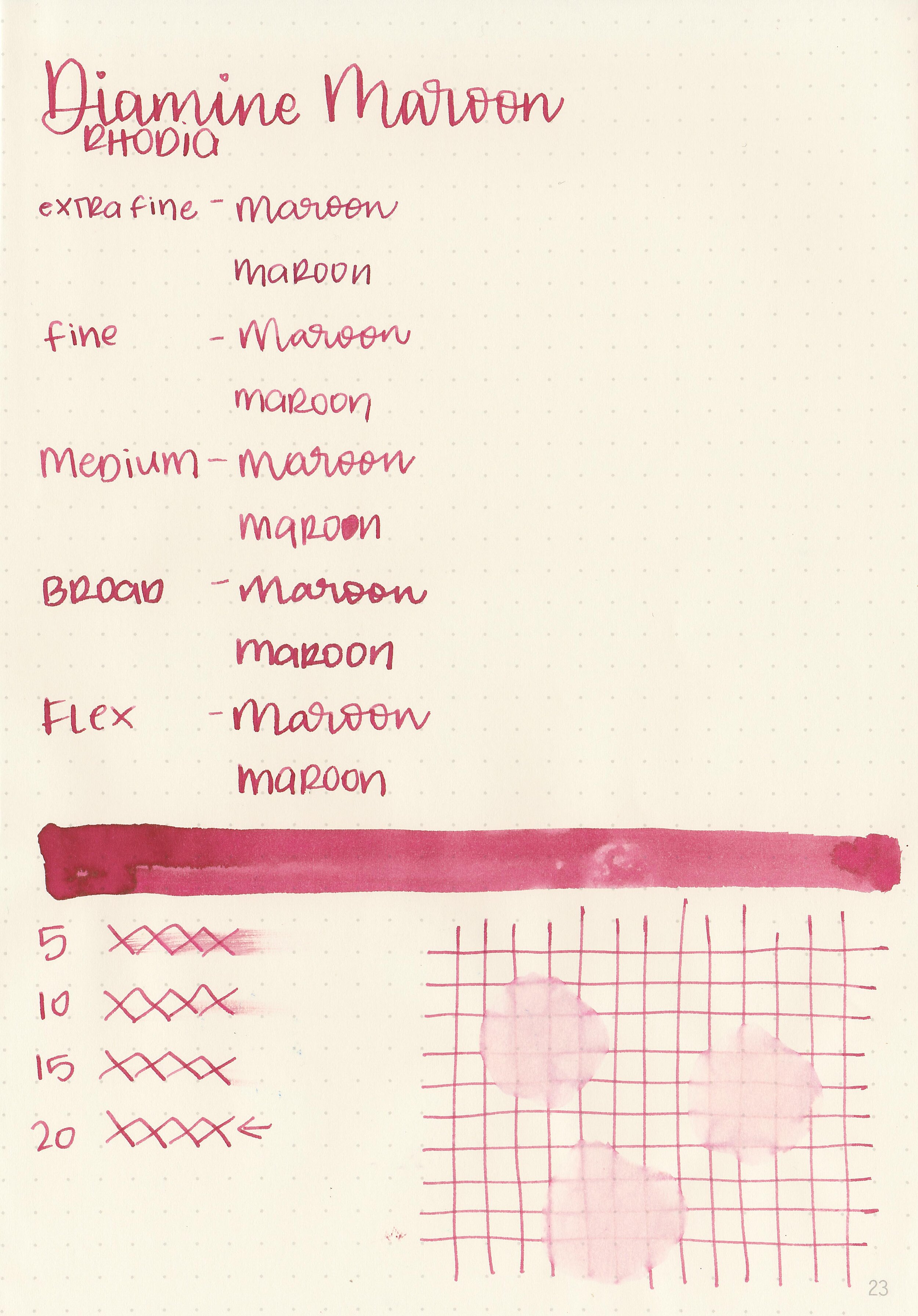
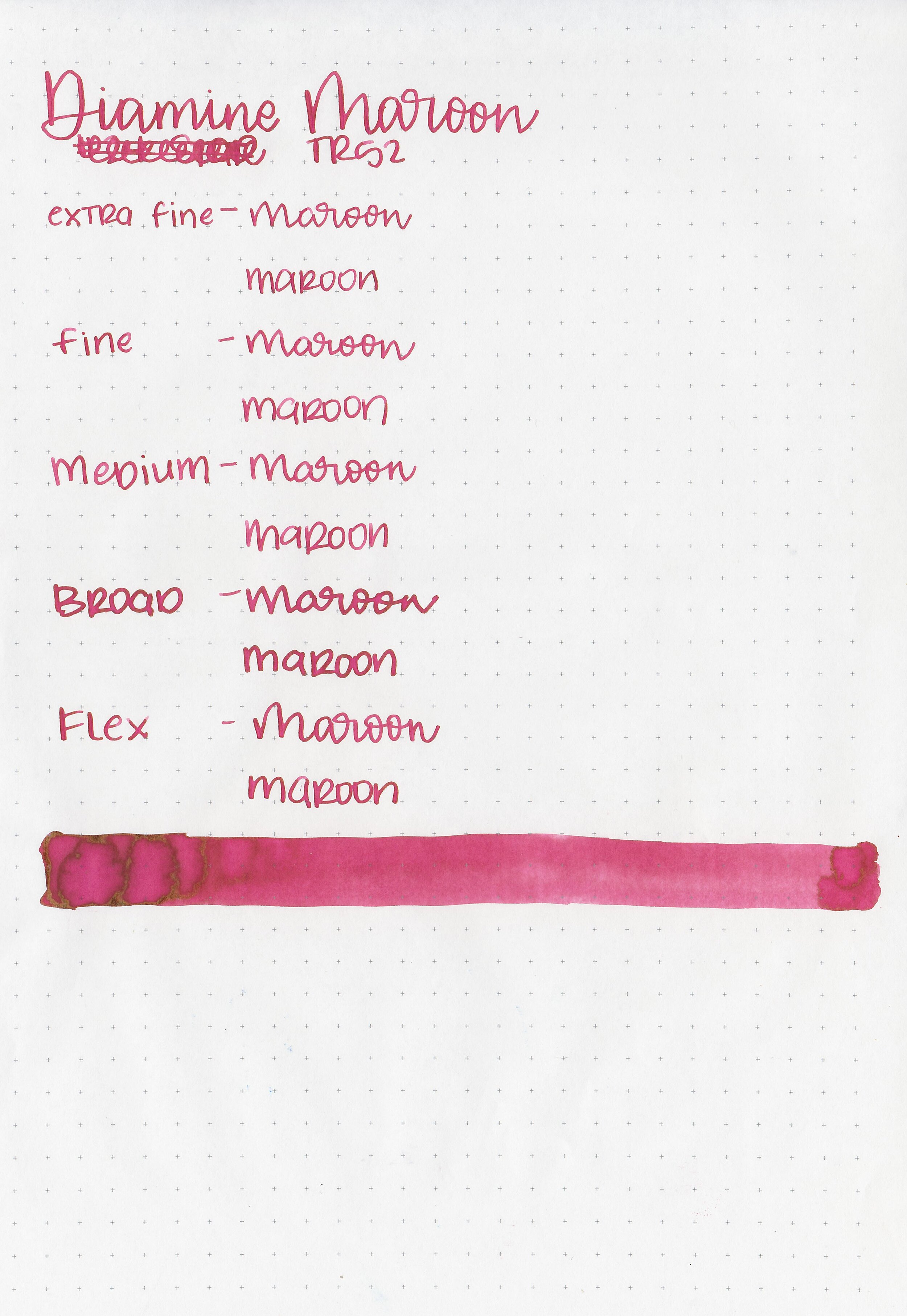
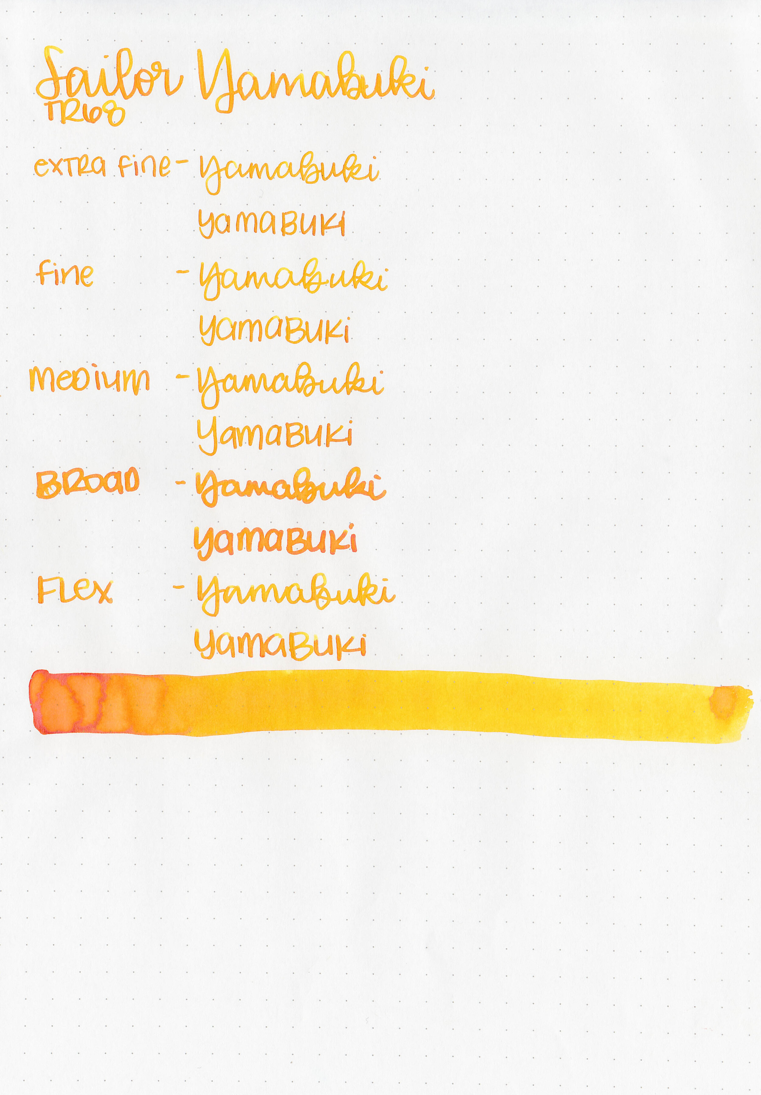
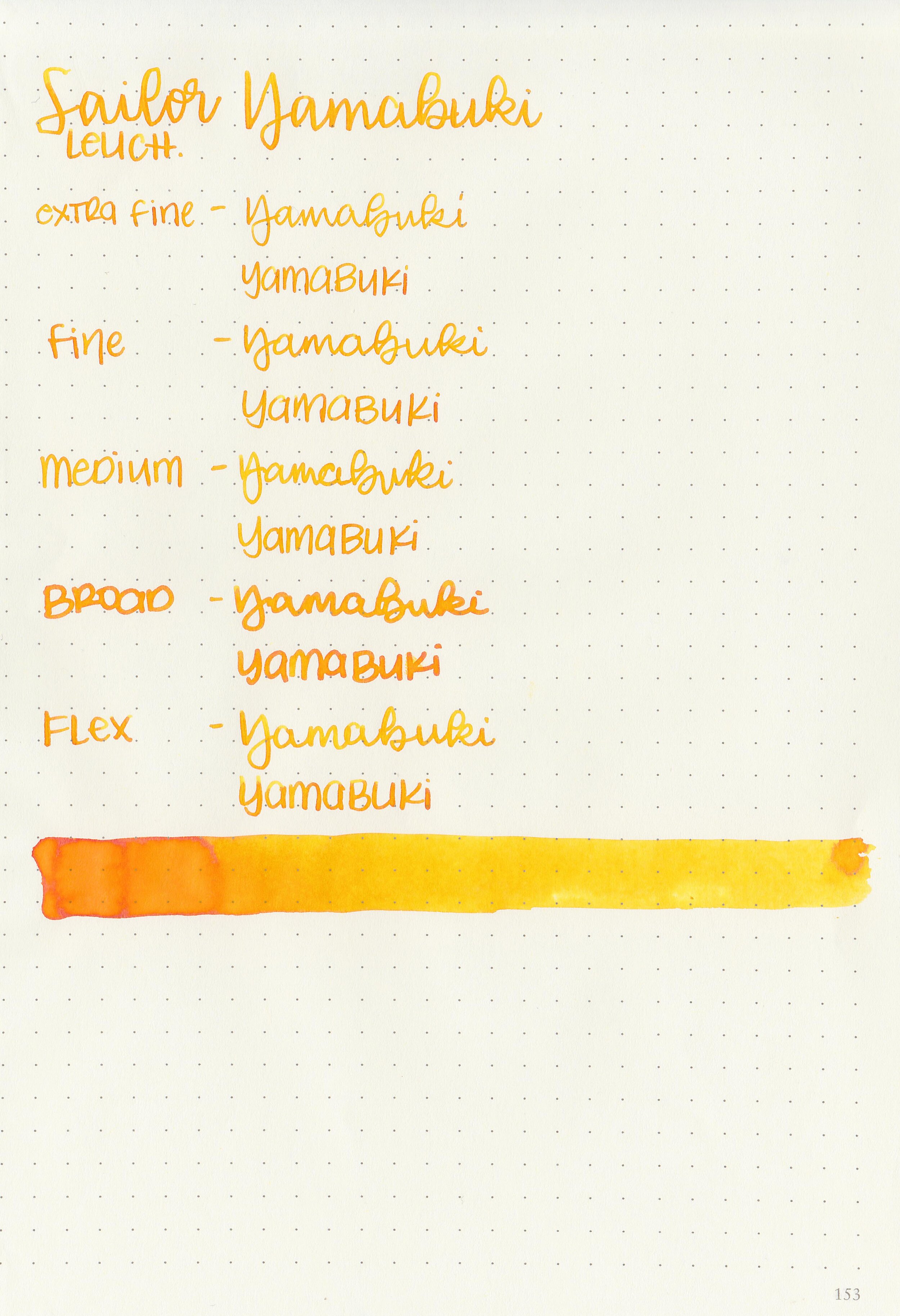
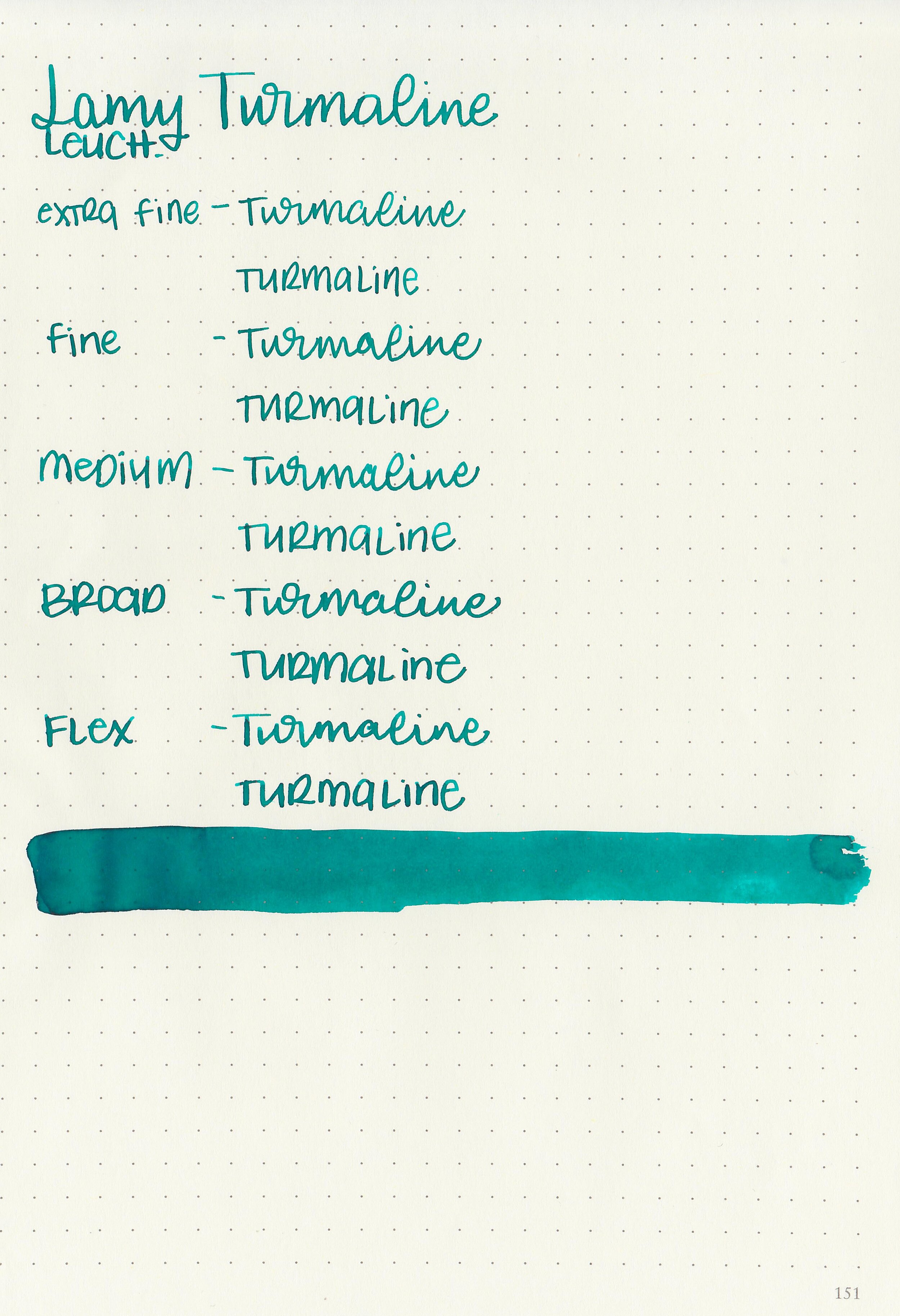
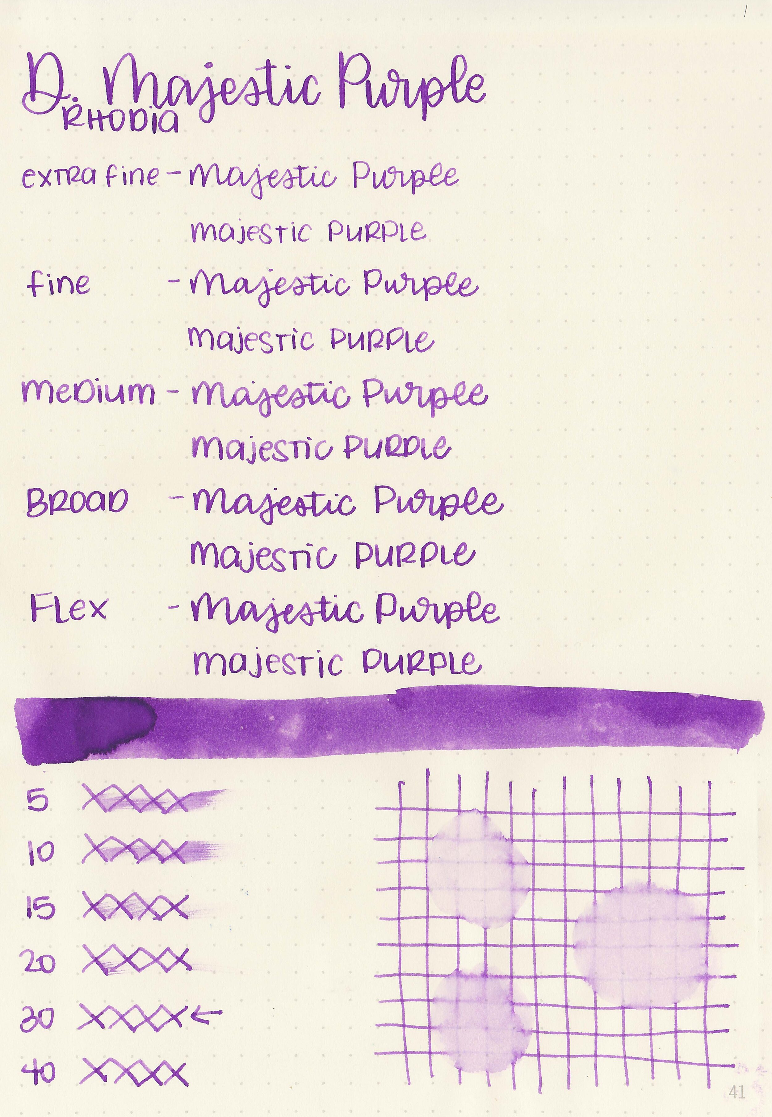
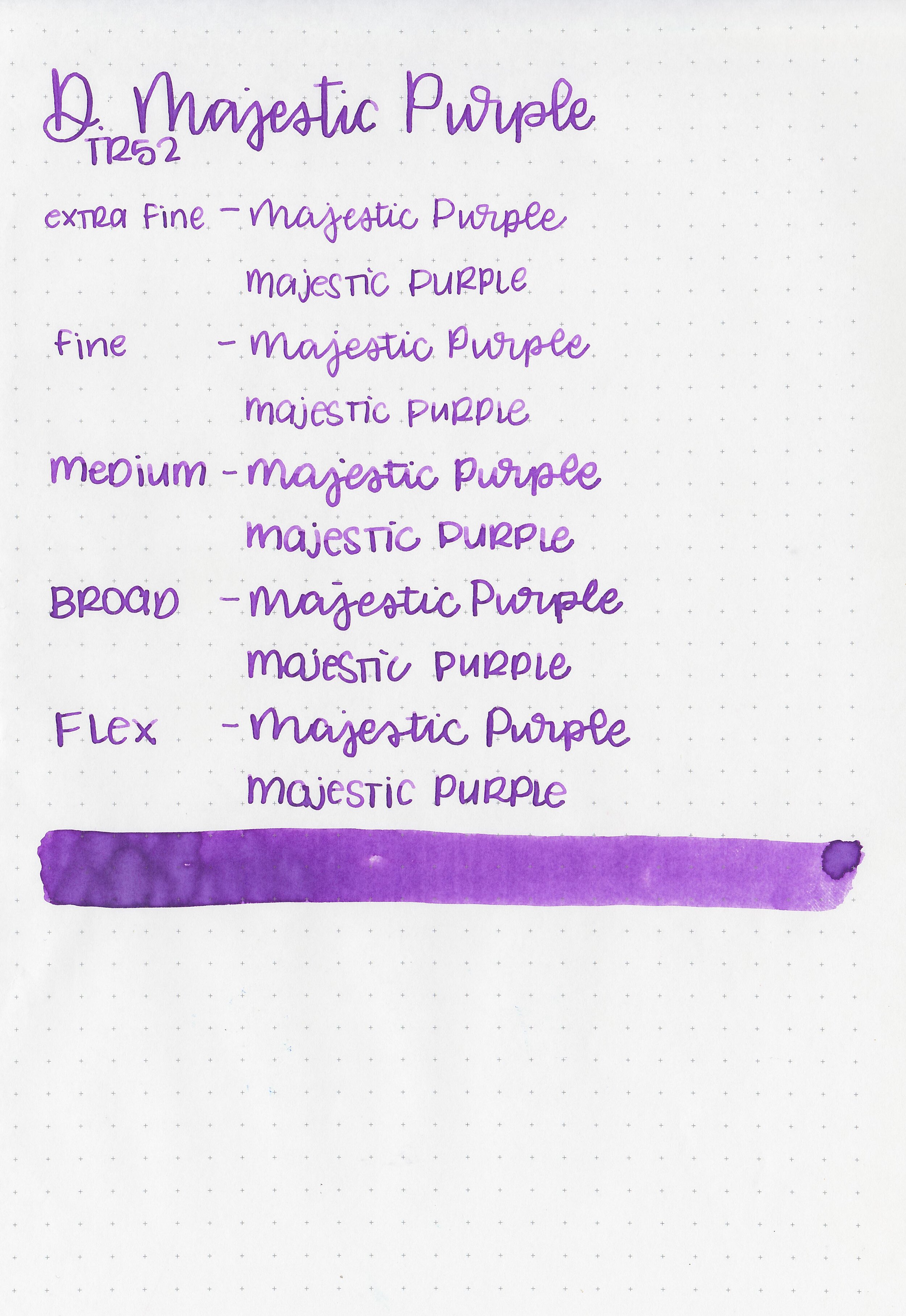
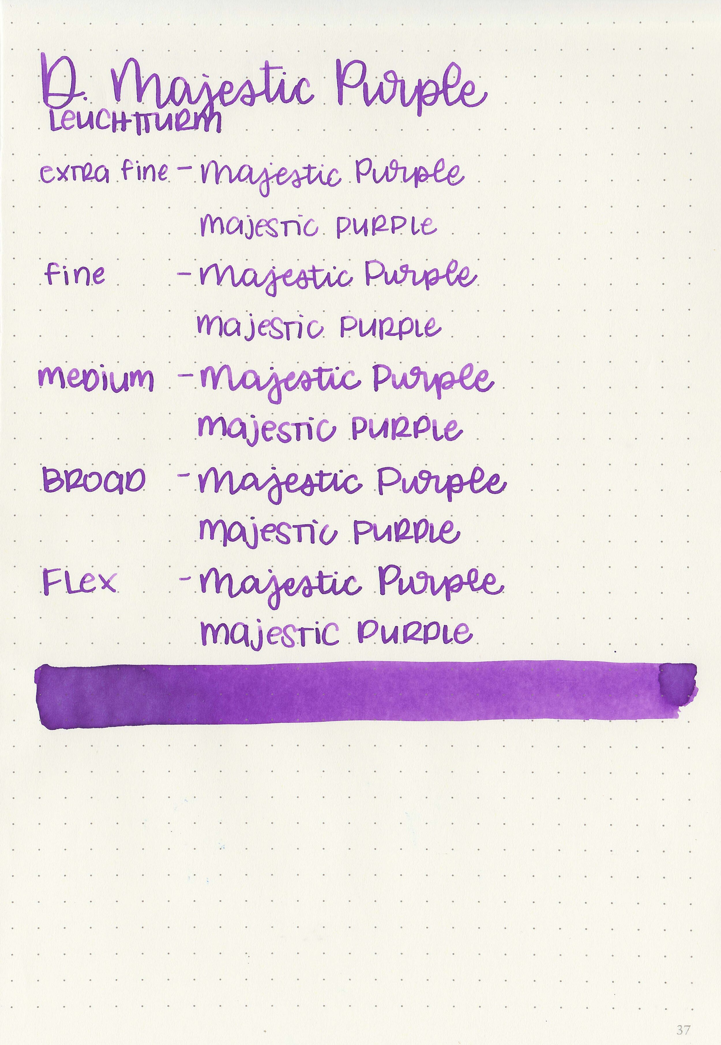
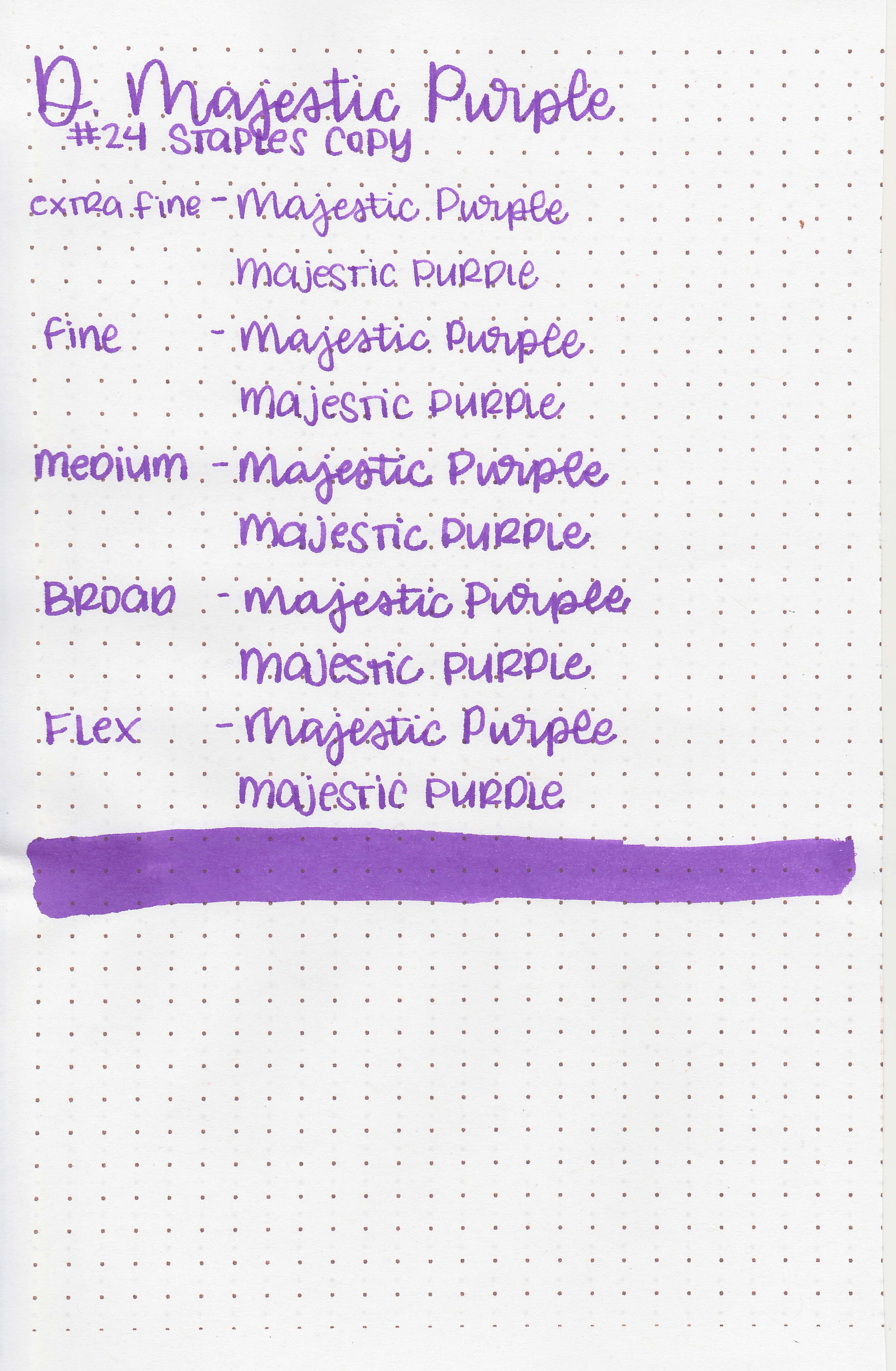
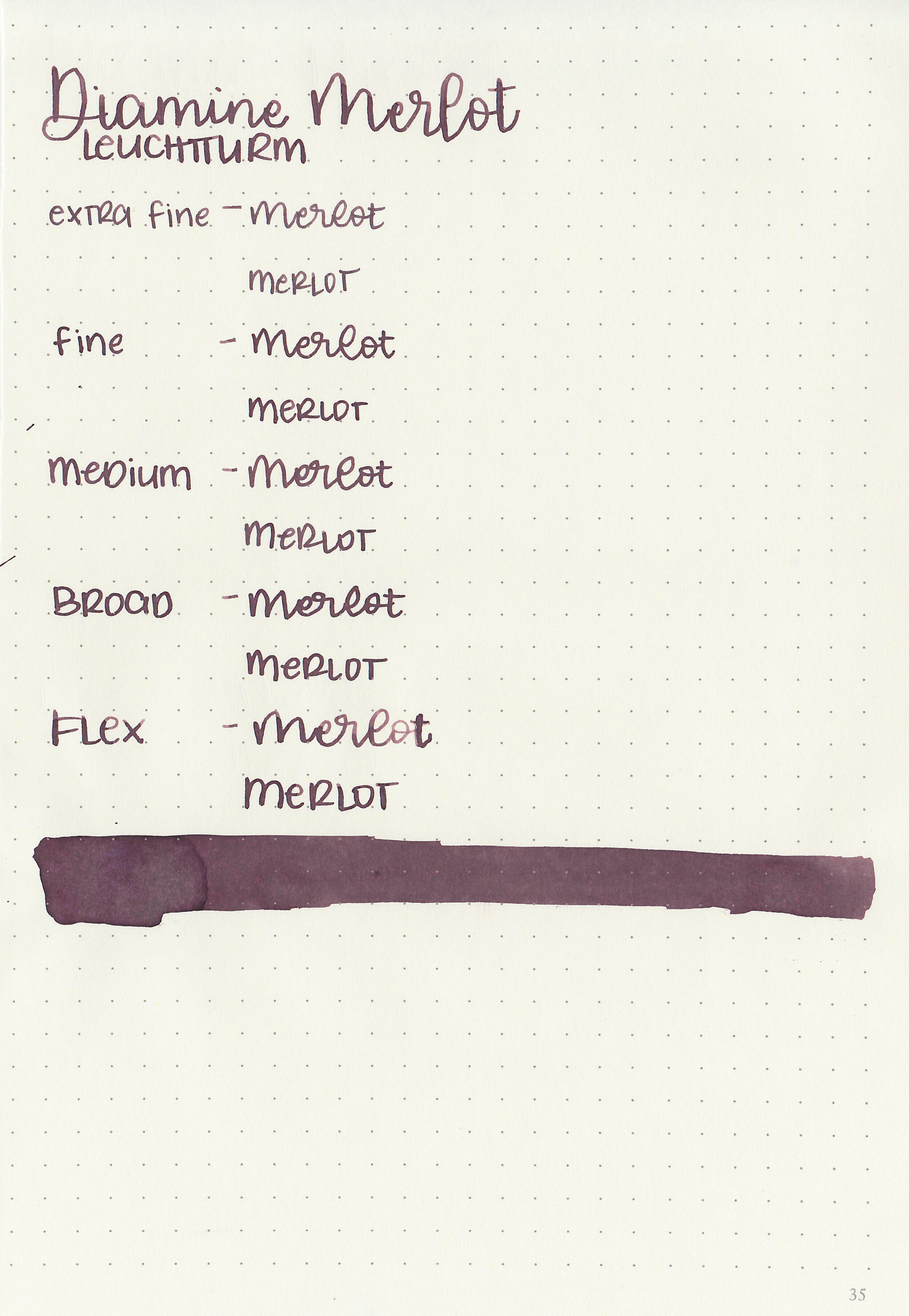
Writing samples:
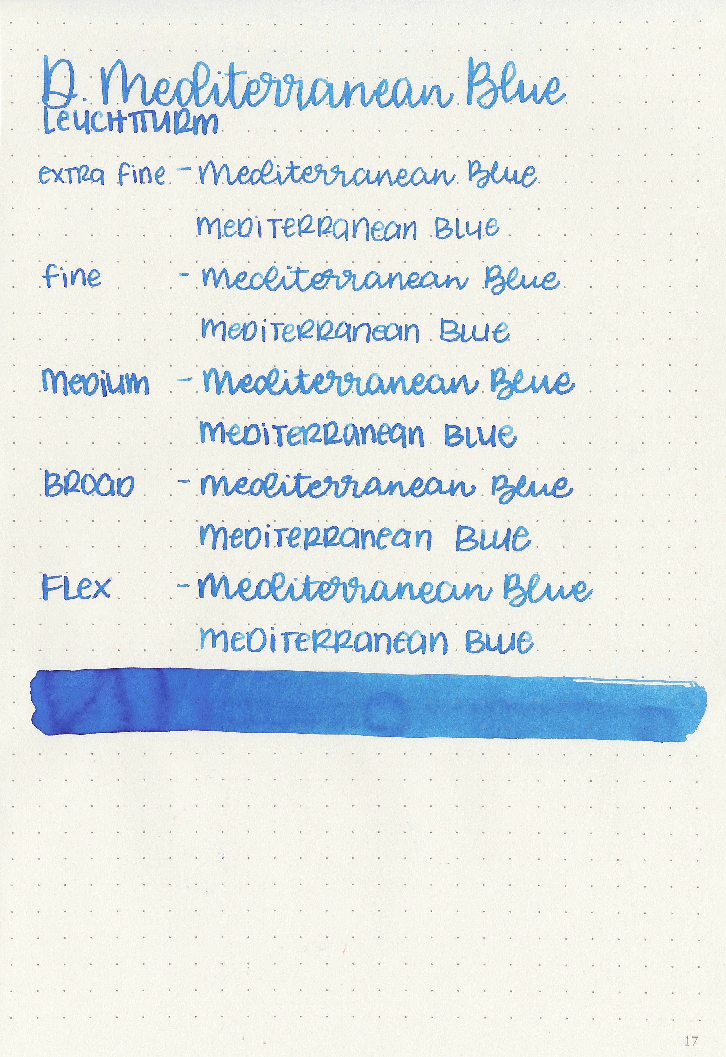
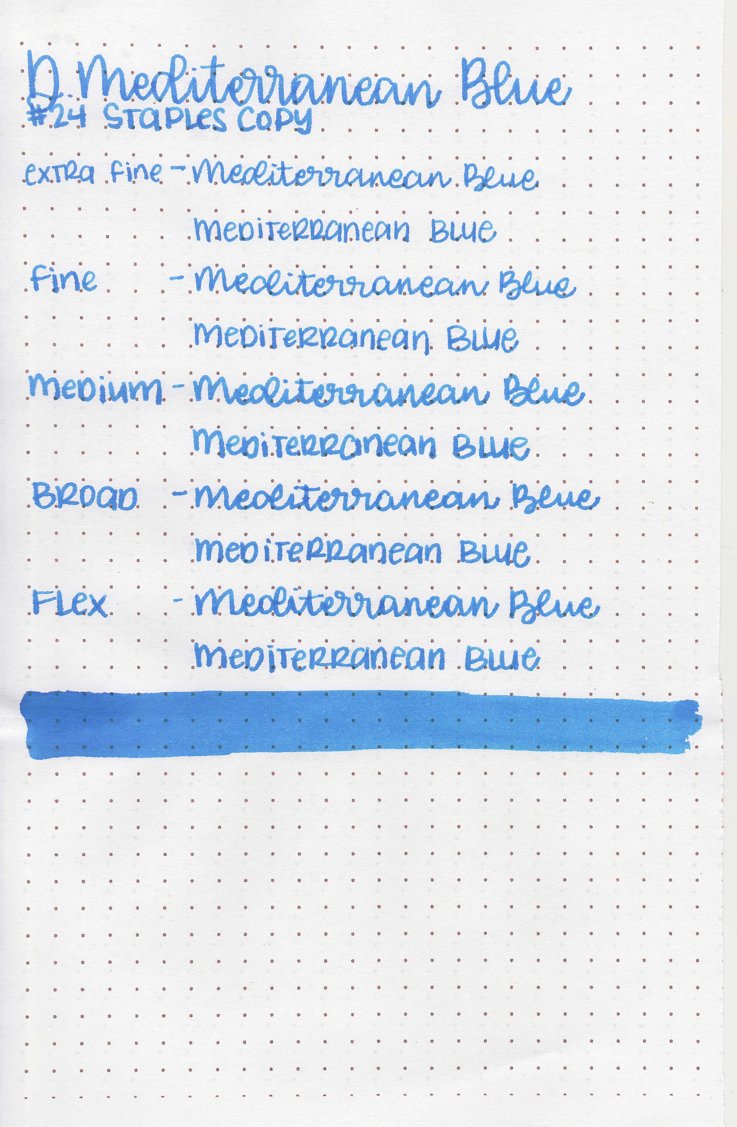
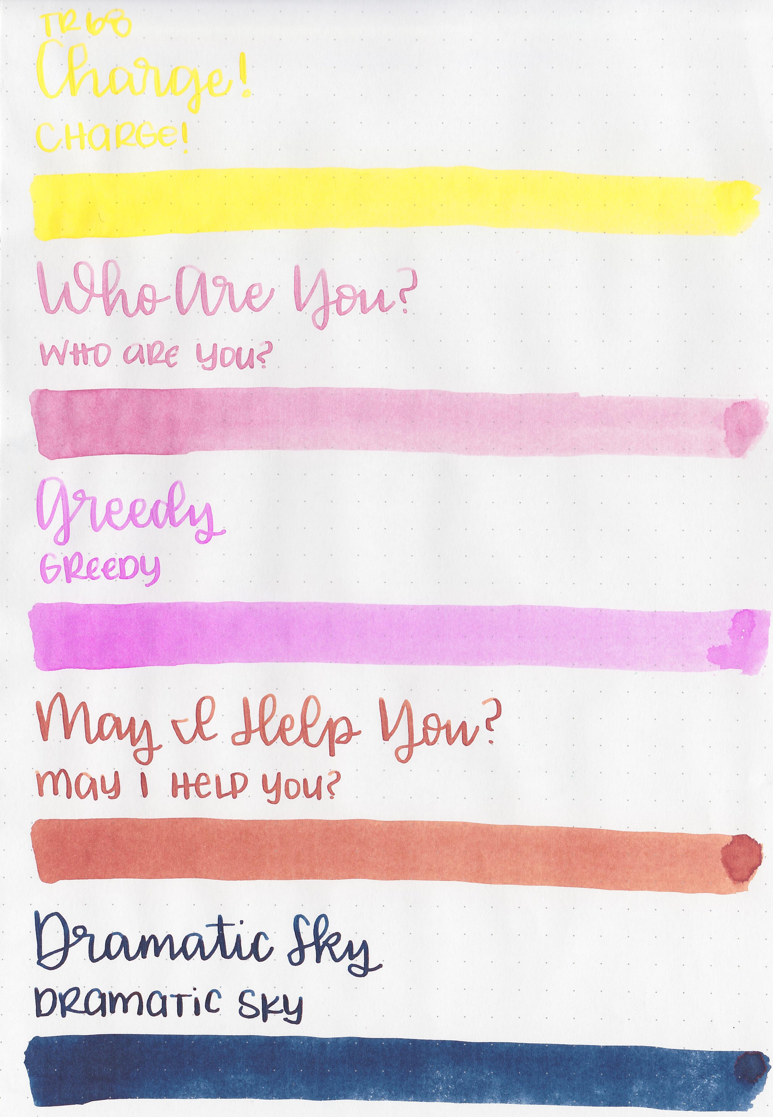
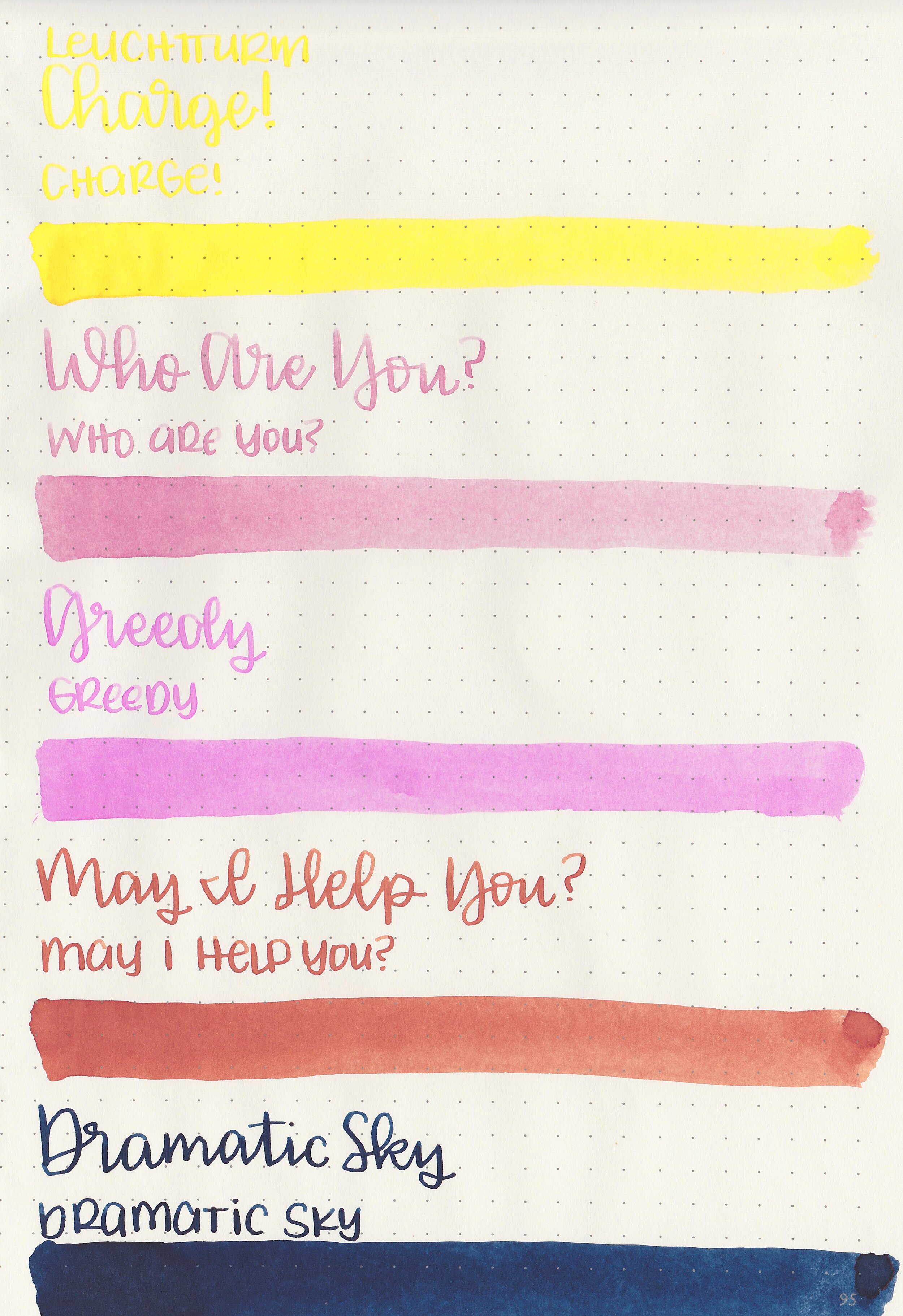
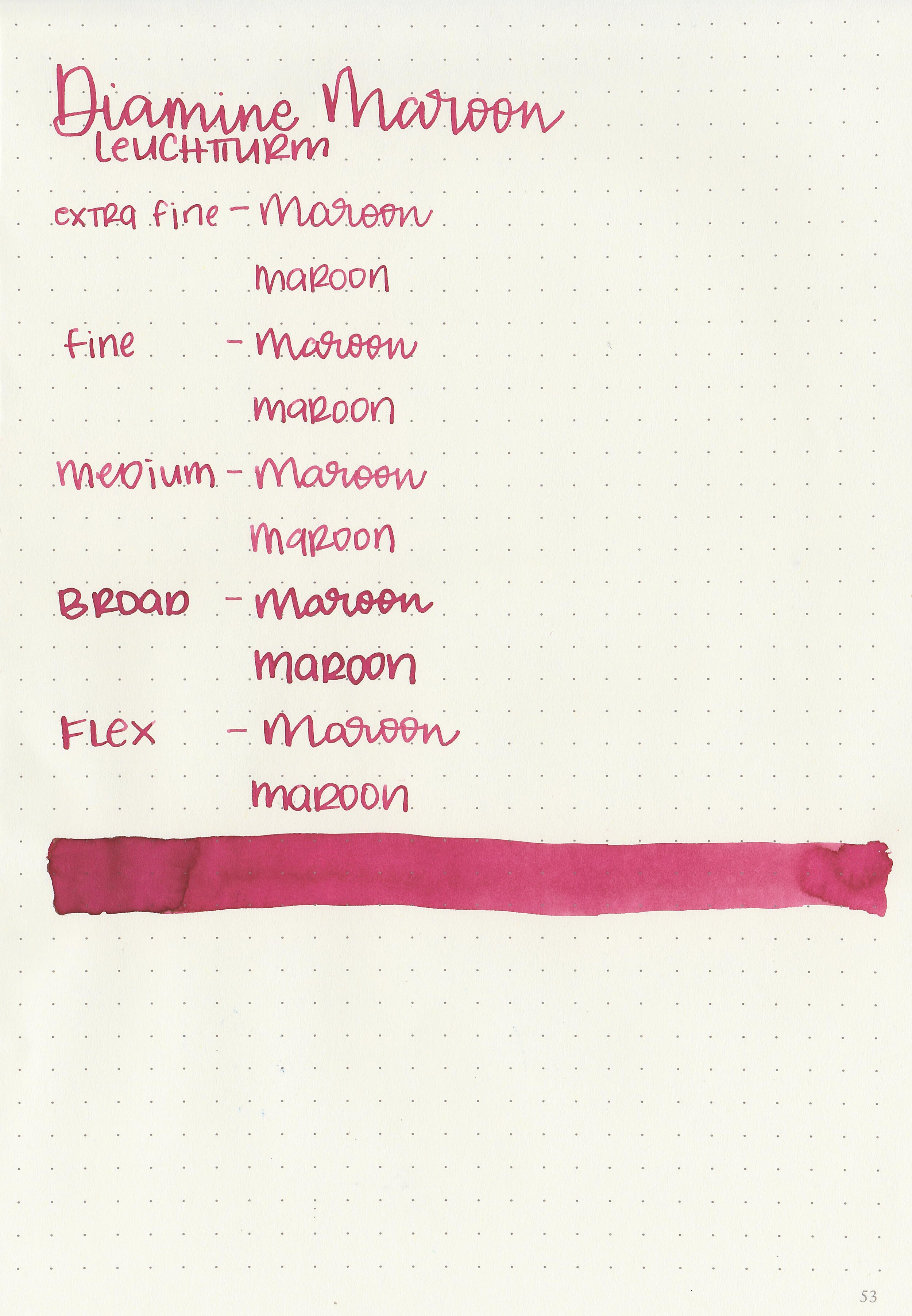
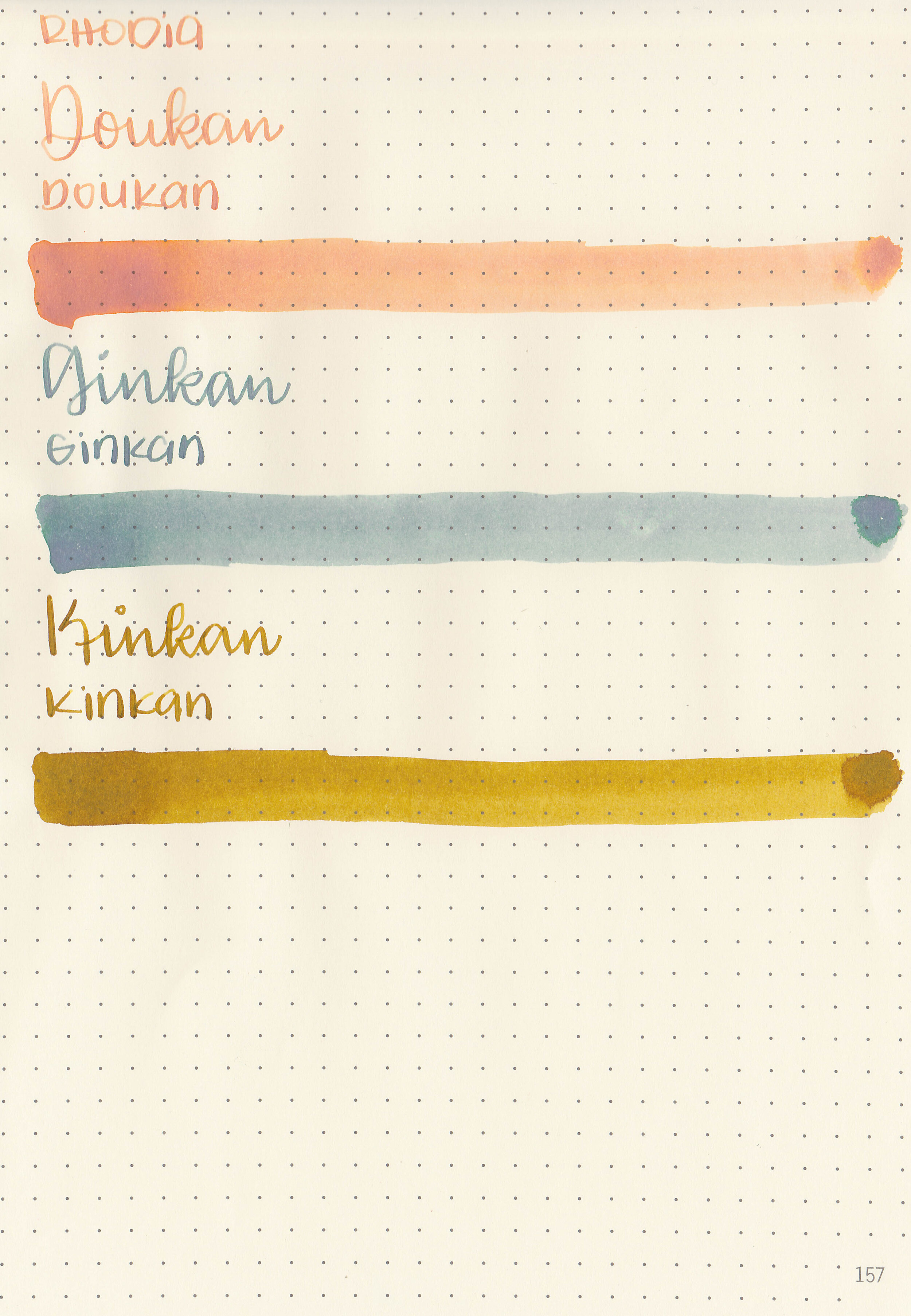
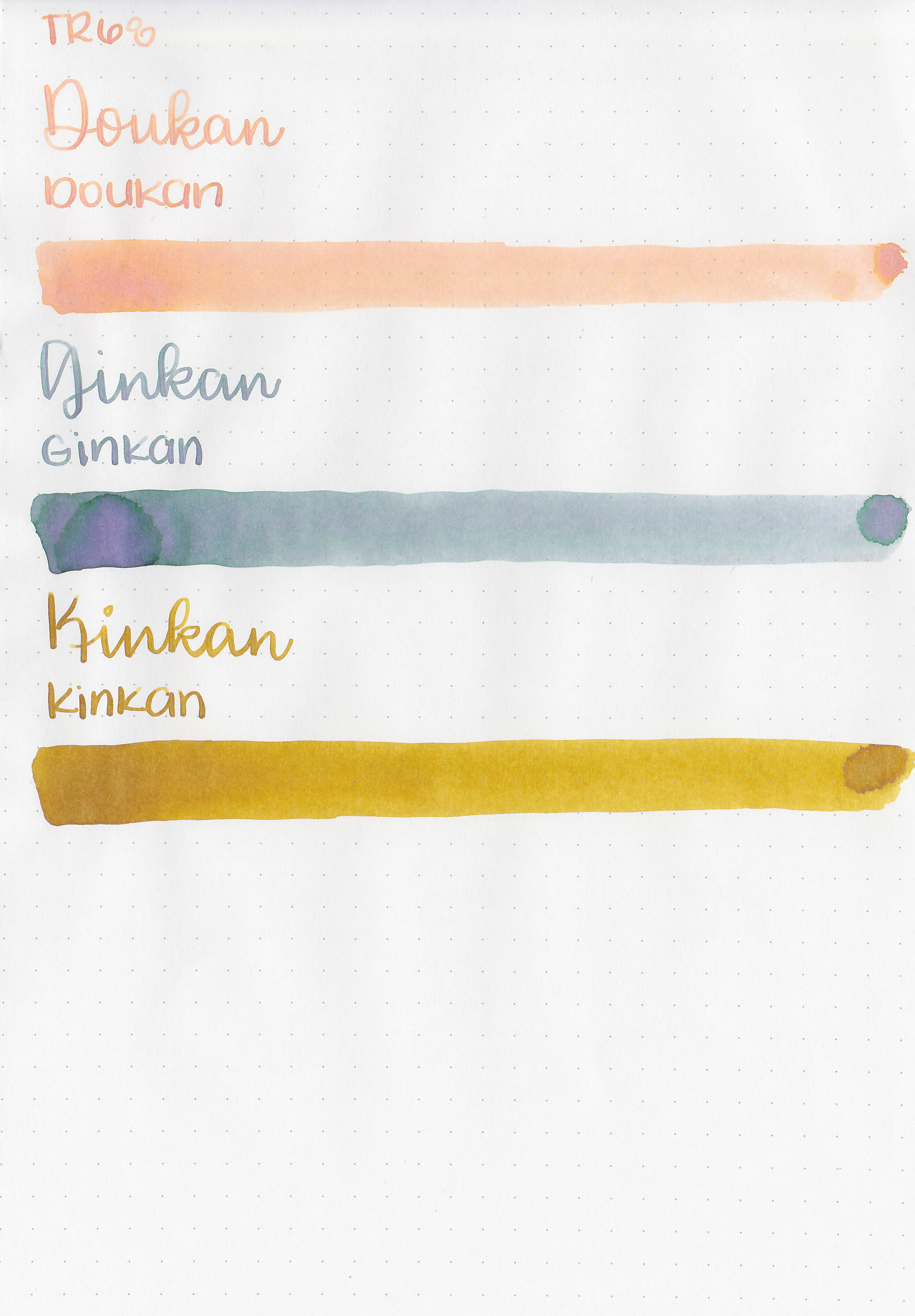
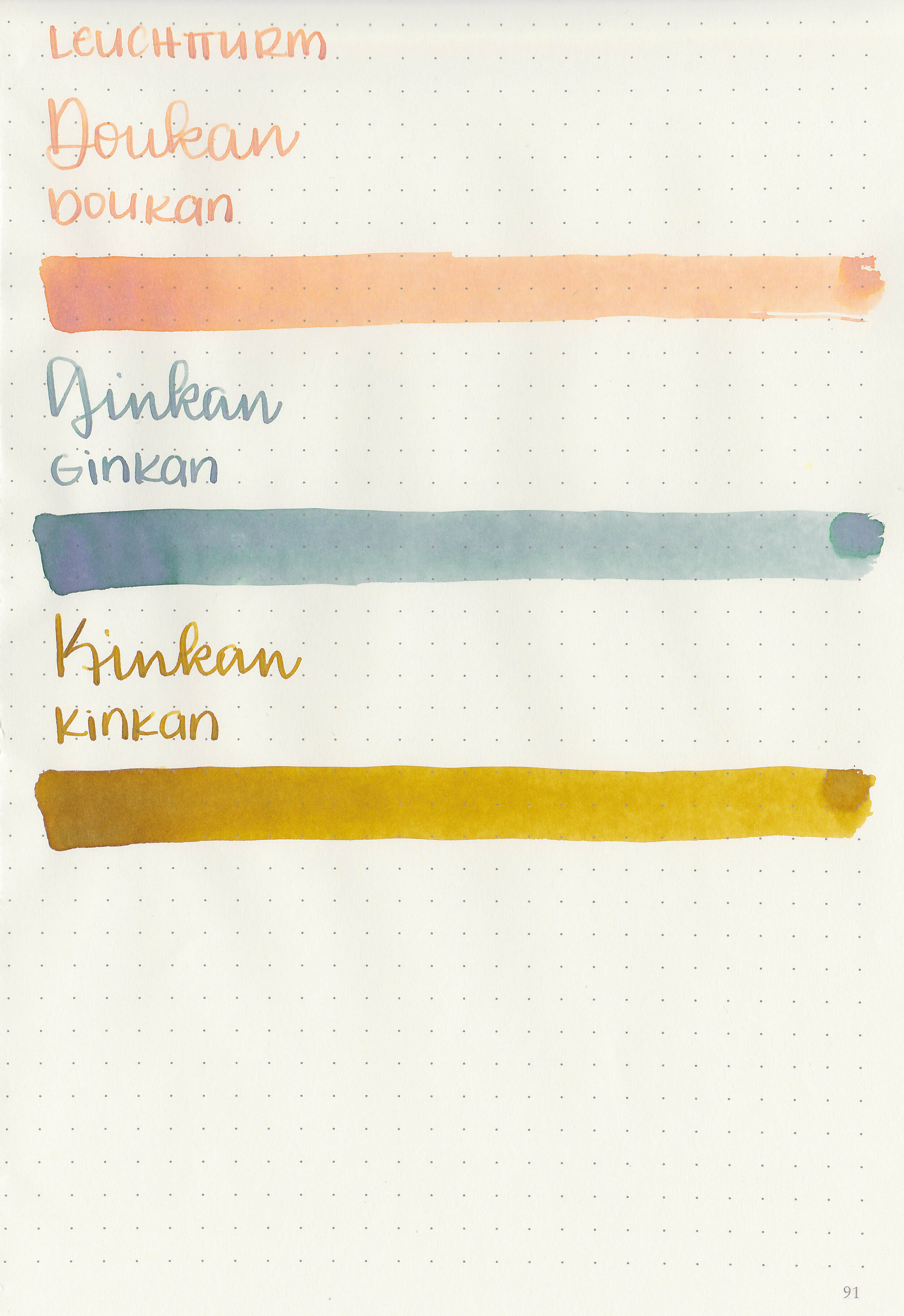
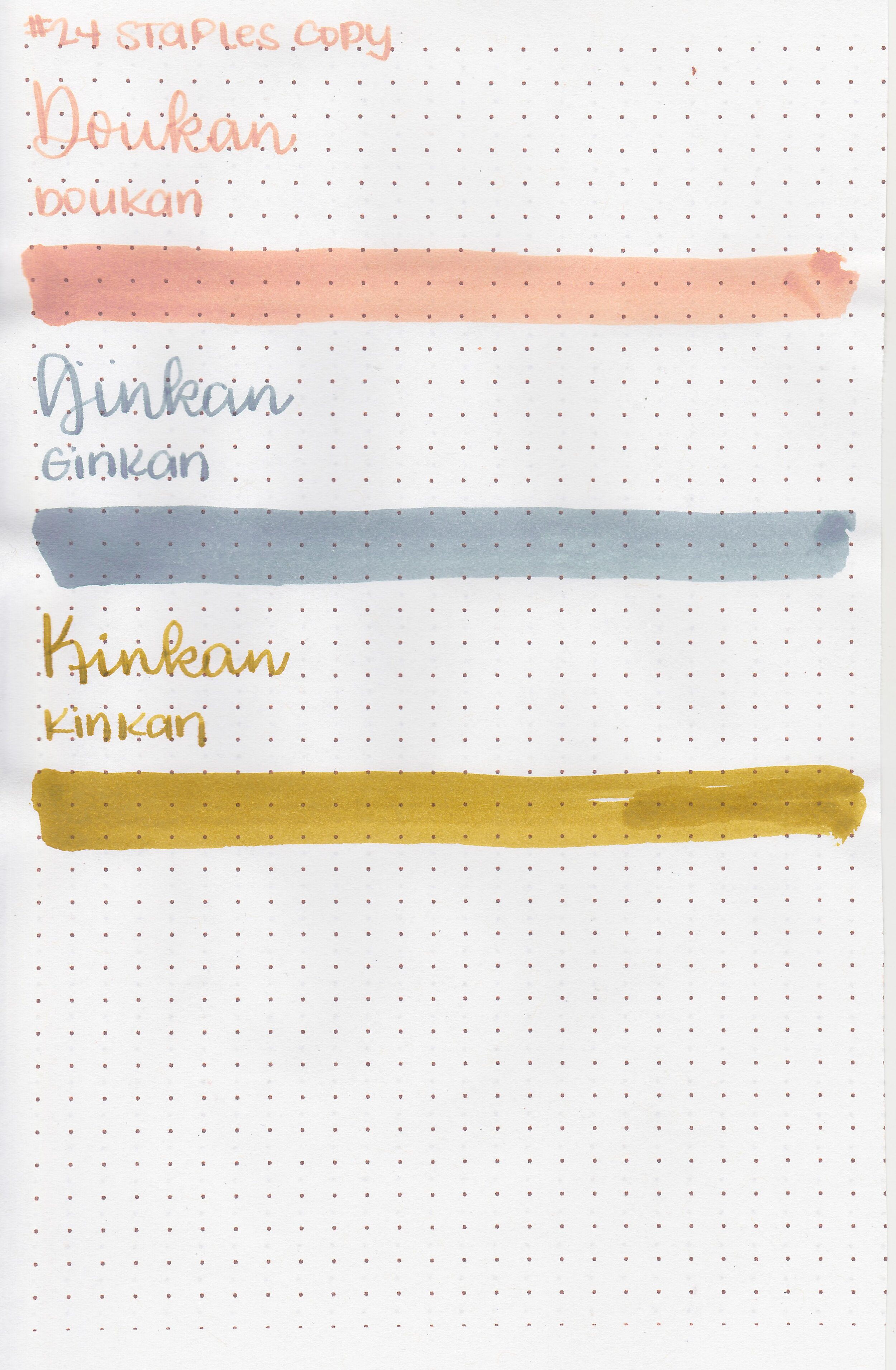
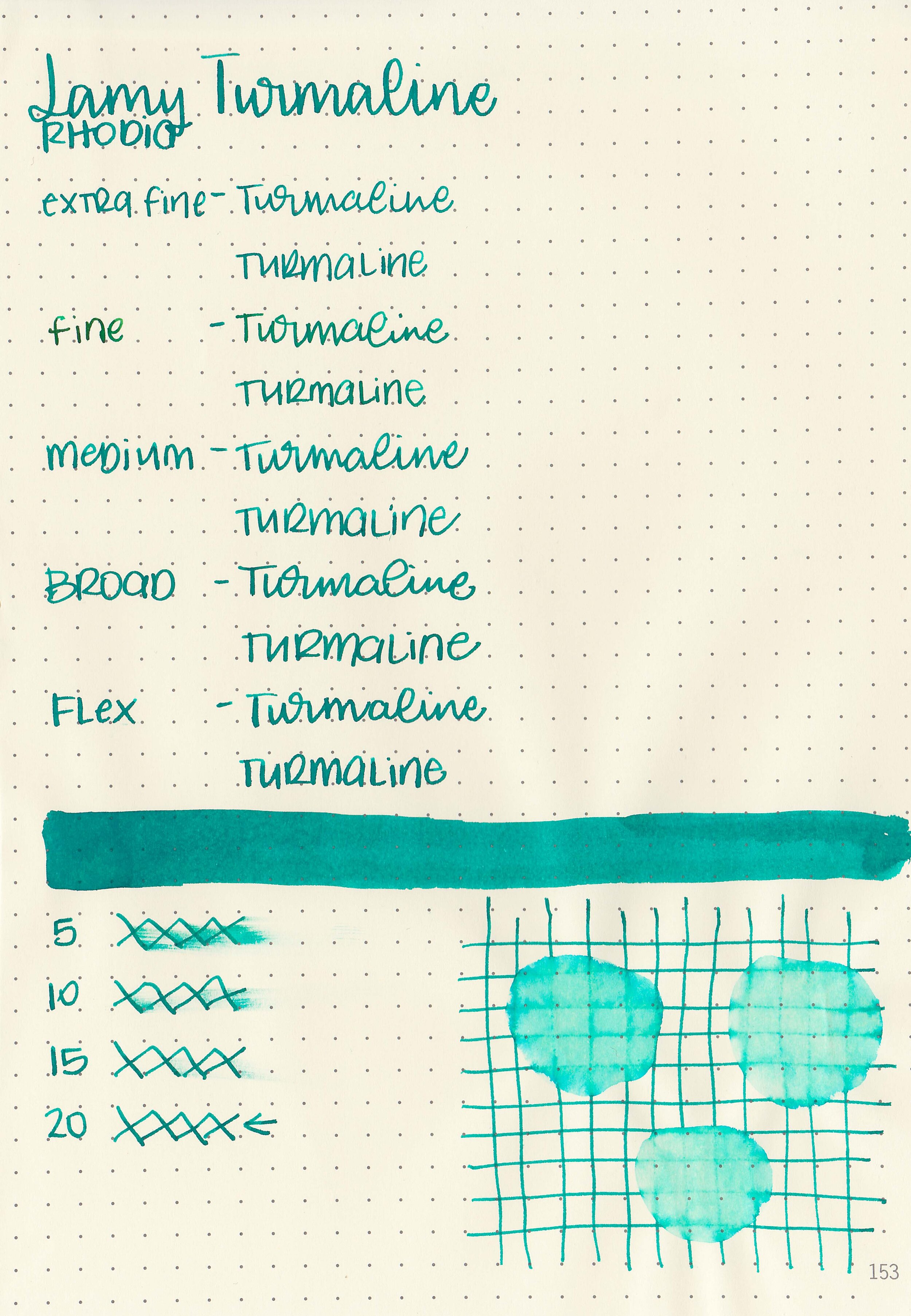
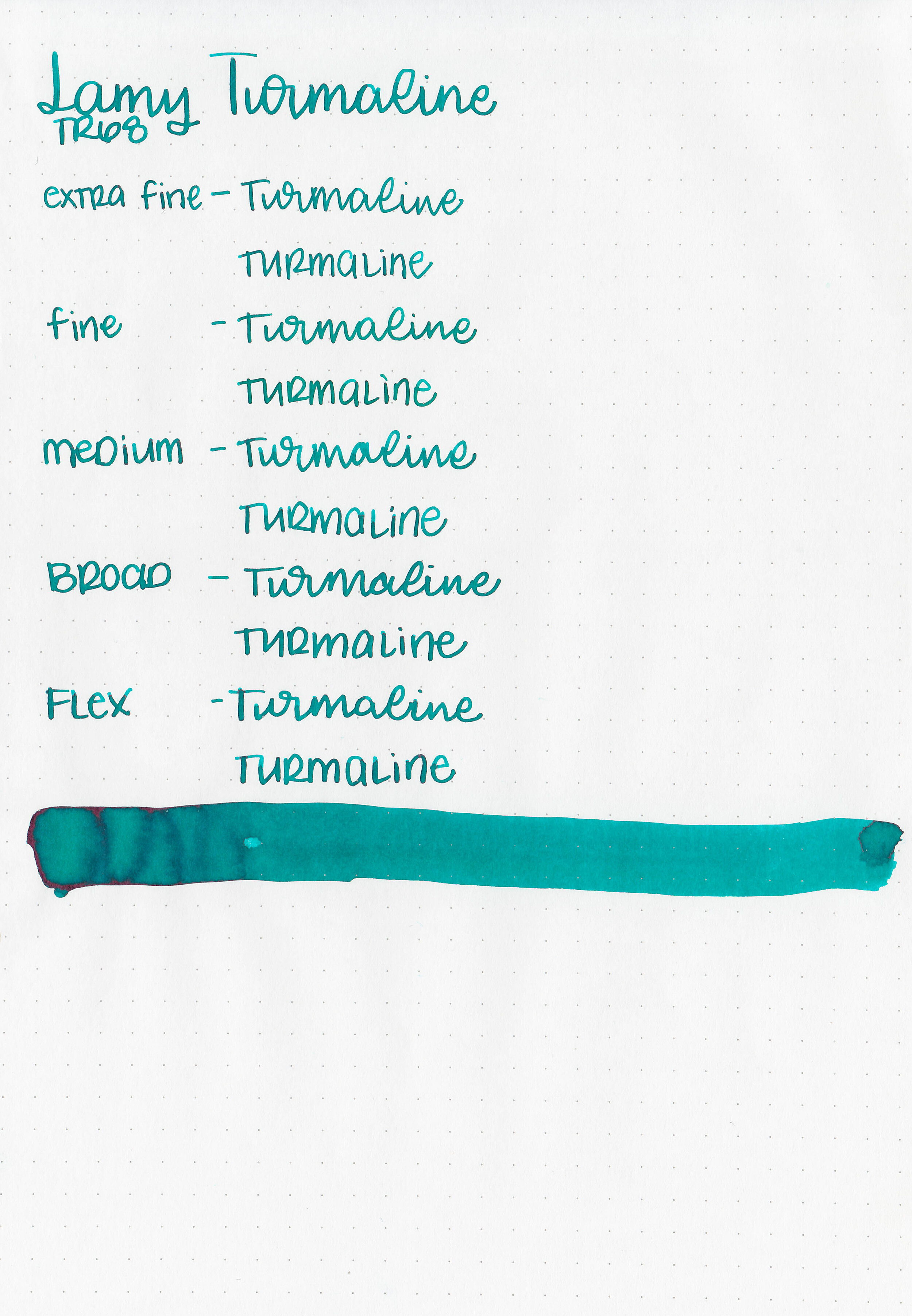
Let's take a look at how the ink behaves on fountain pen friendly papers: Rhodia, Tomoe River, and Leuchtturm.
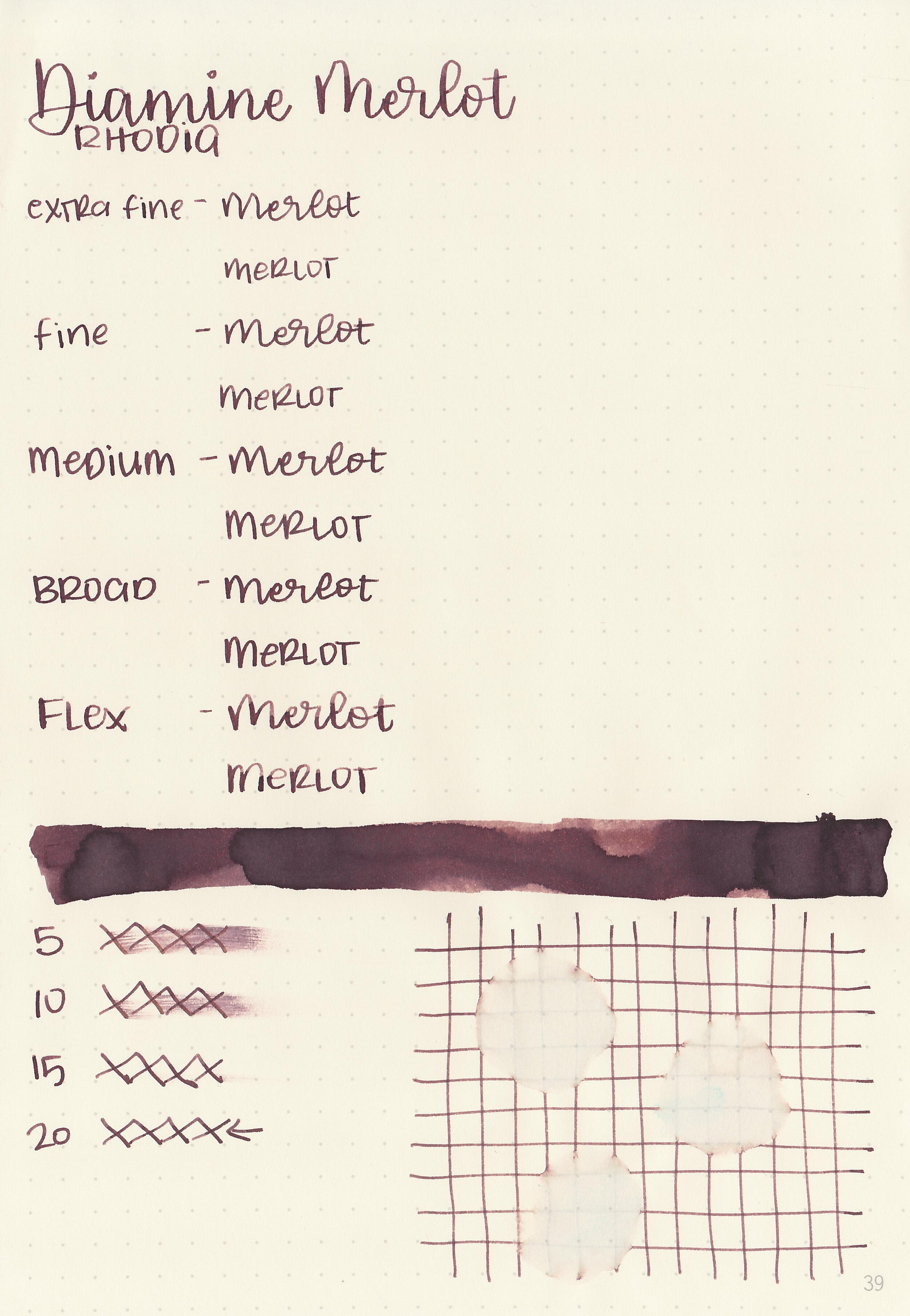
Dry time: 20 seconds
Water resistance: Low
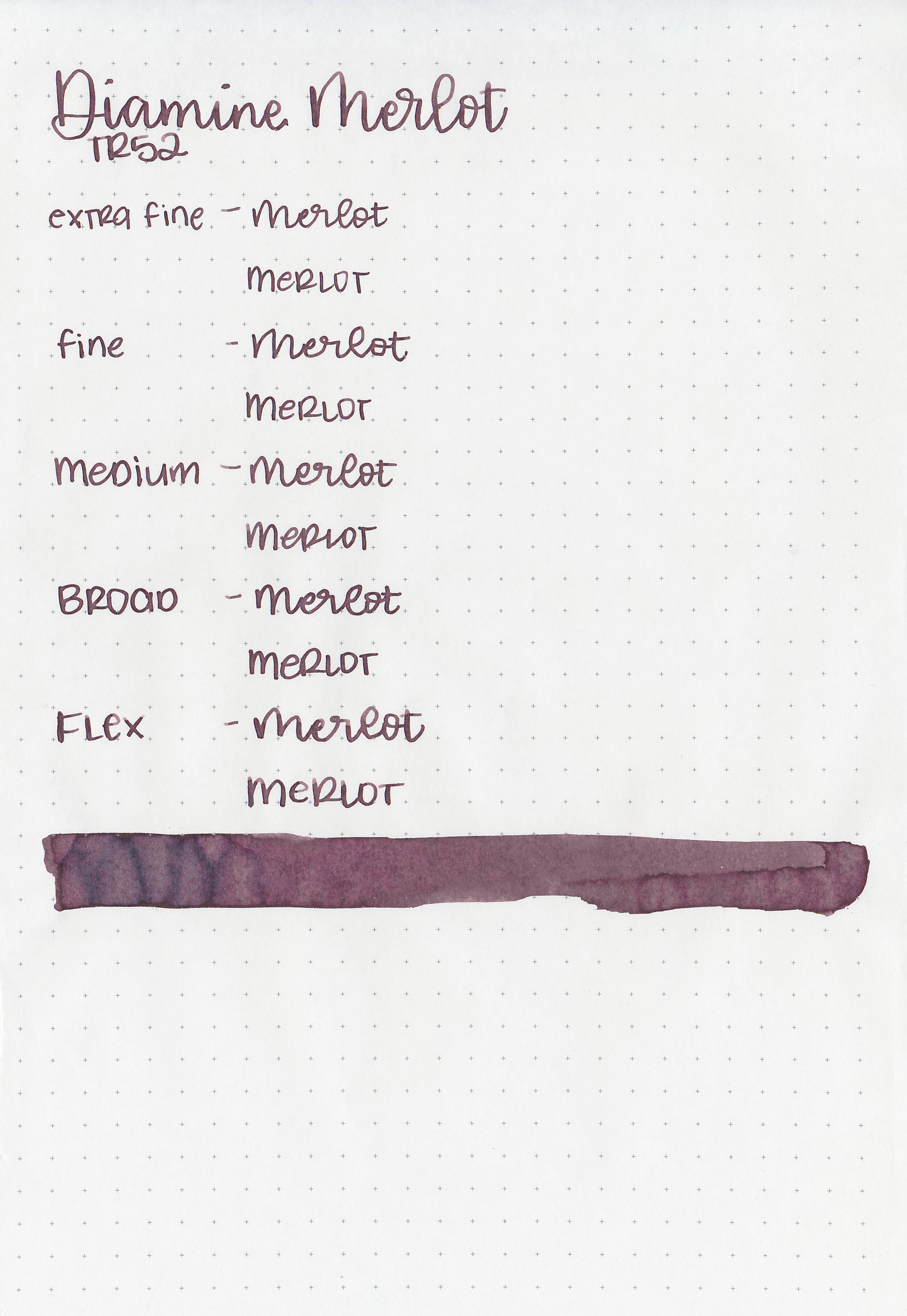
Feathering: None
Show through: Medium
Bleeding: None
Other properties: low shading, tiny sheen, and no shimmer. The sheen is only visible in large swabs on Tomoe River Paper.
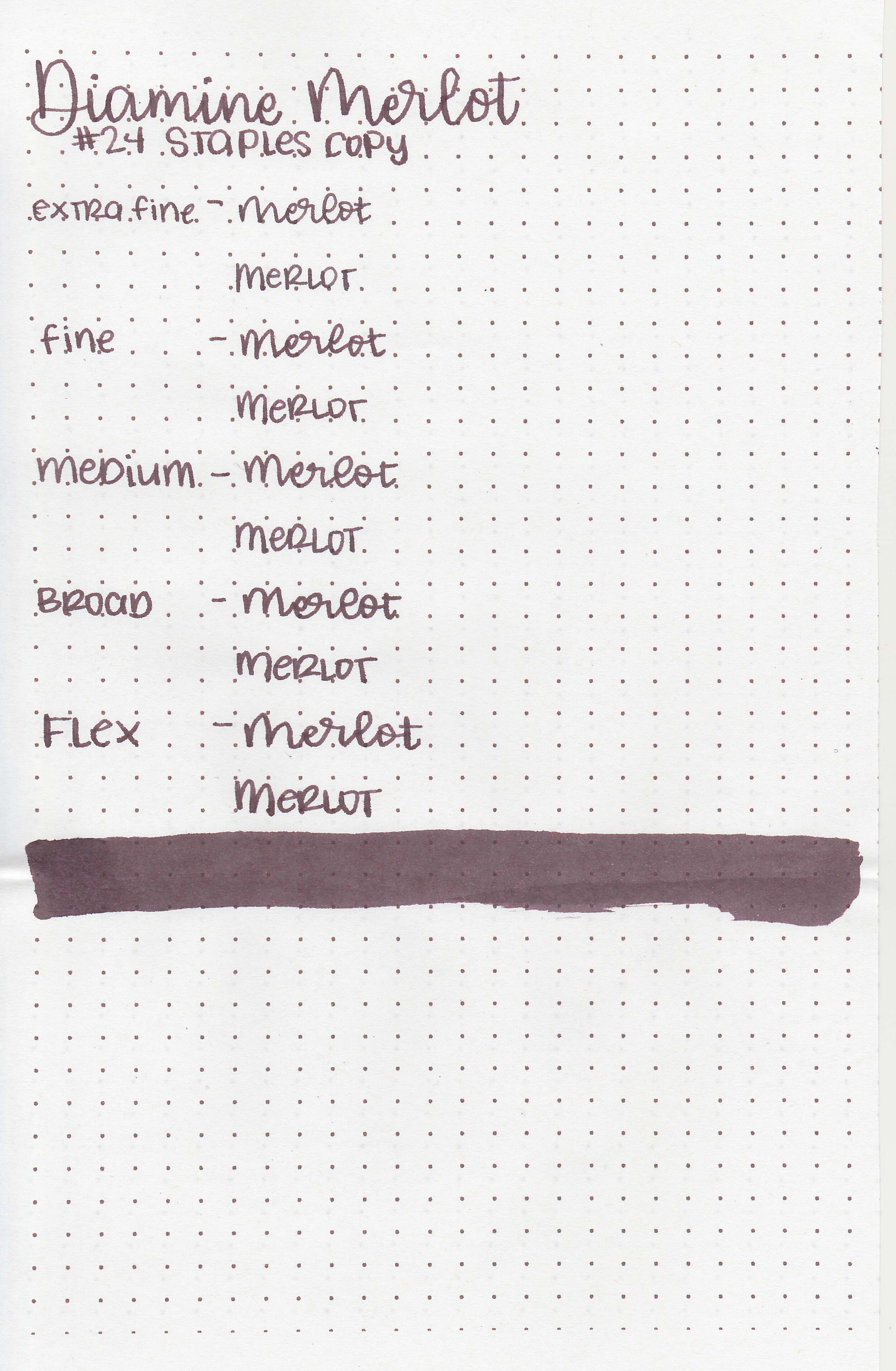
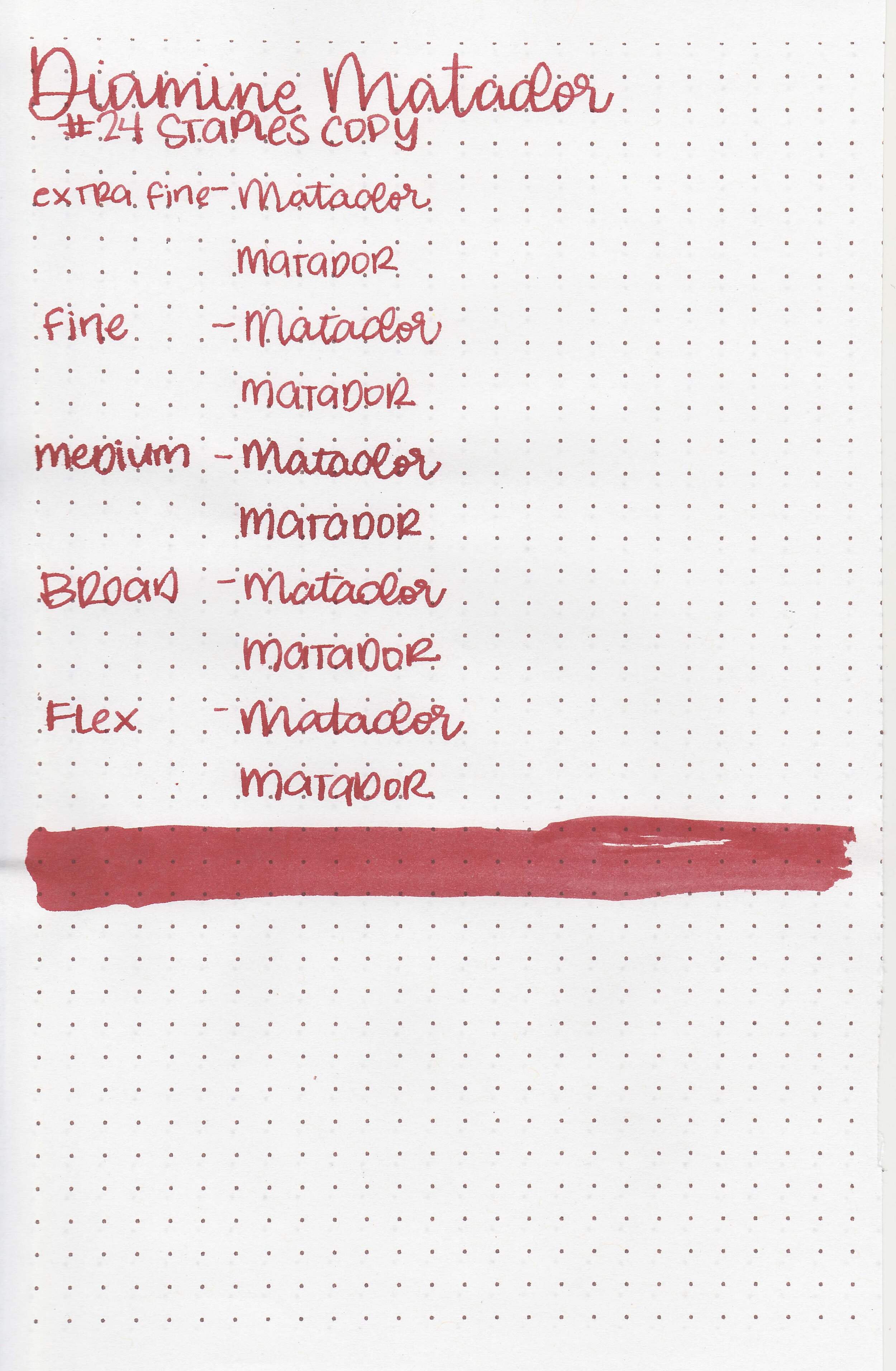
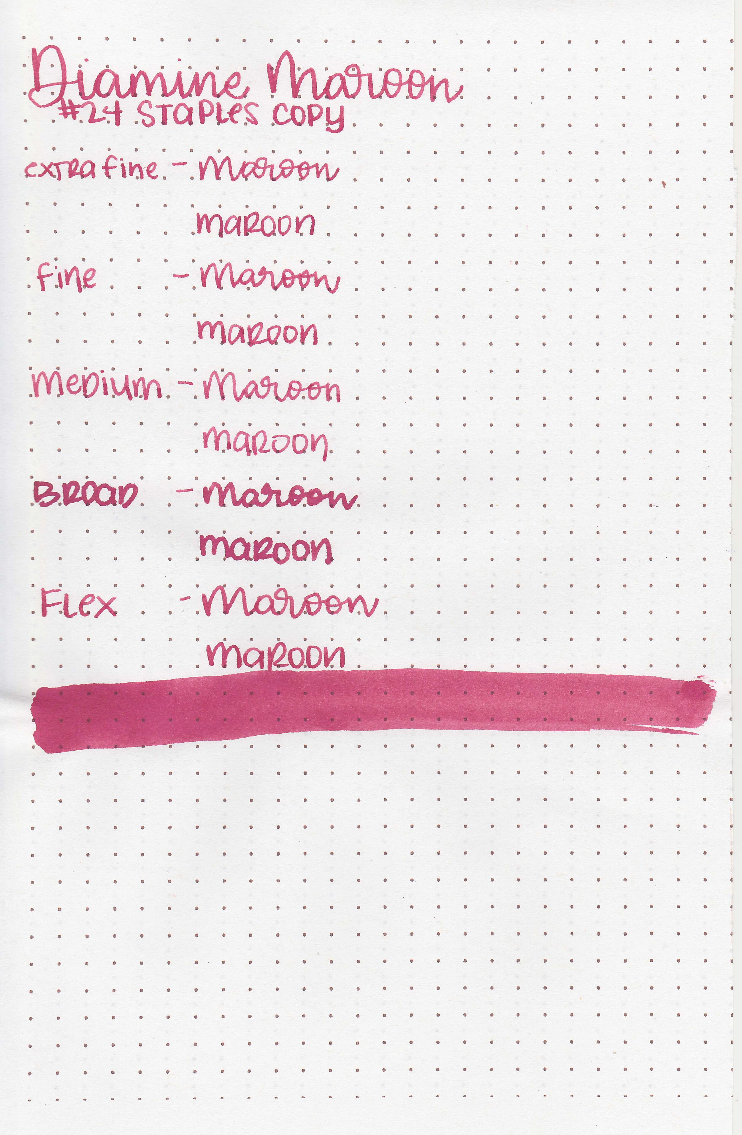
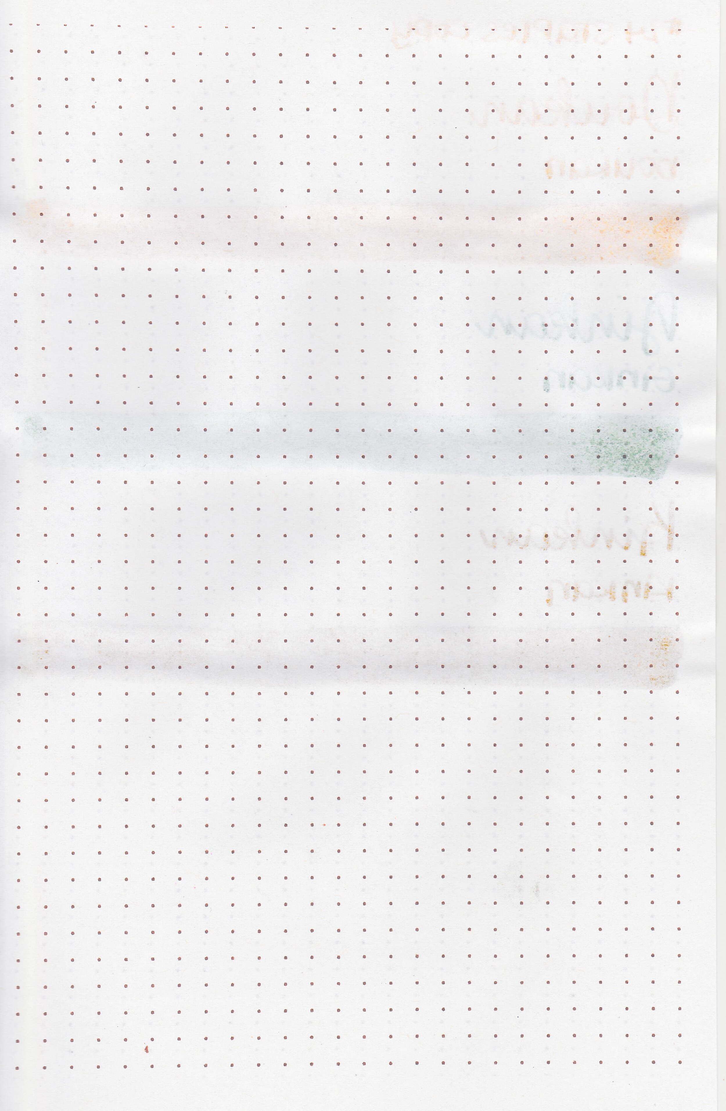
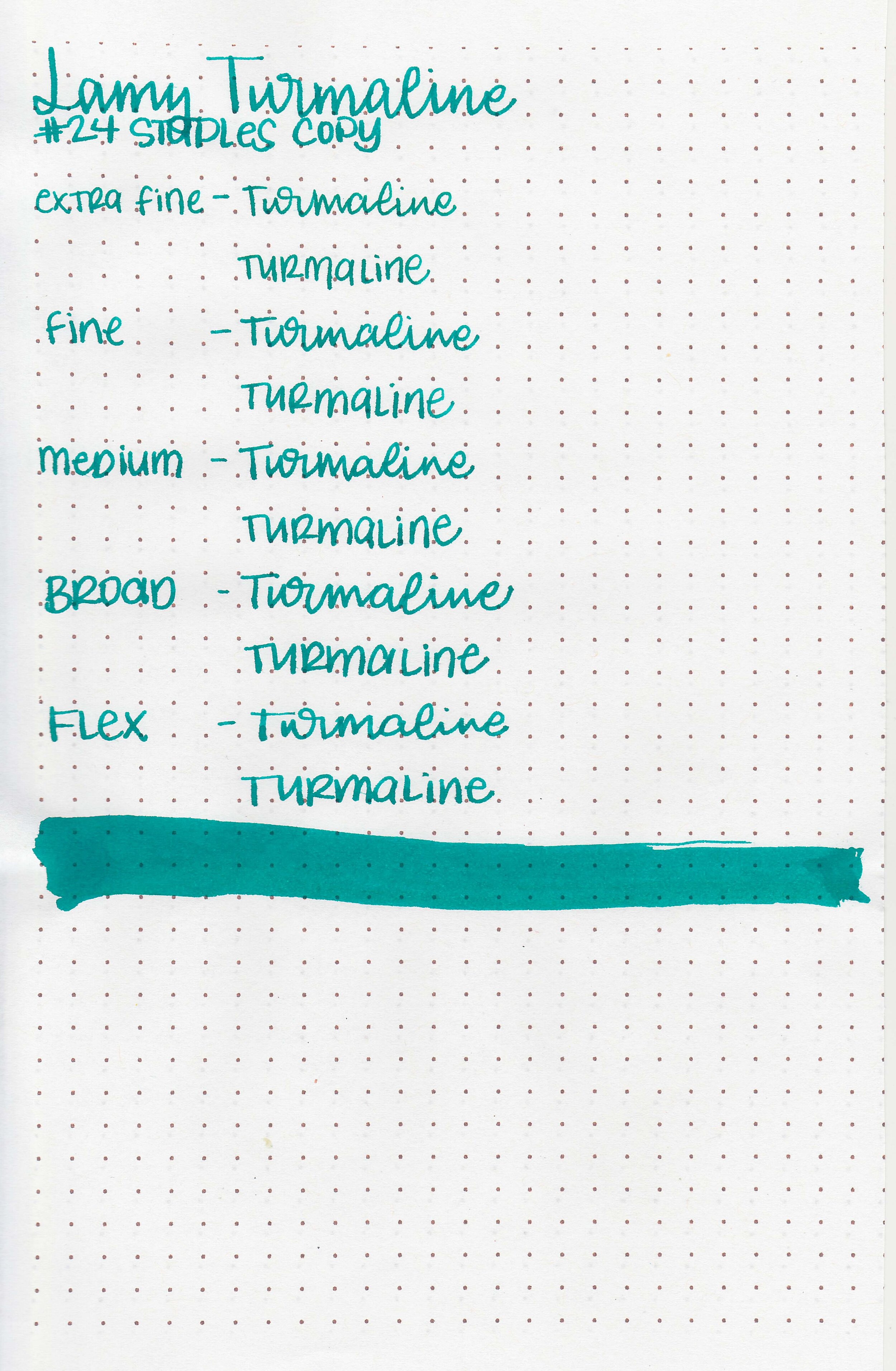
On Staples 24 lb copy paper there was some feathering in most nib sizes and a few dots of bleeding.
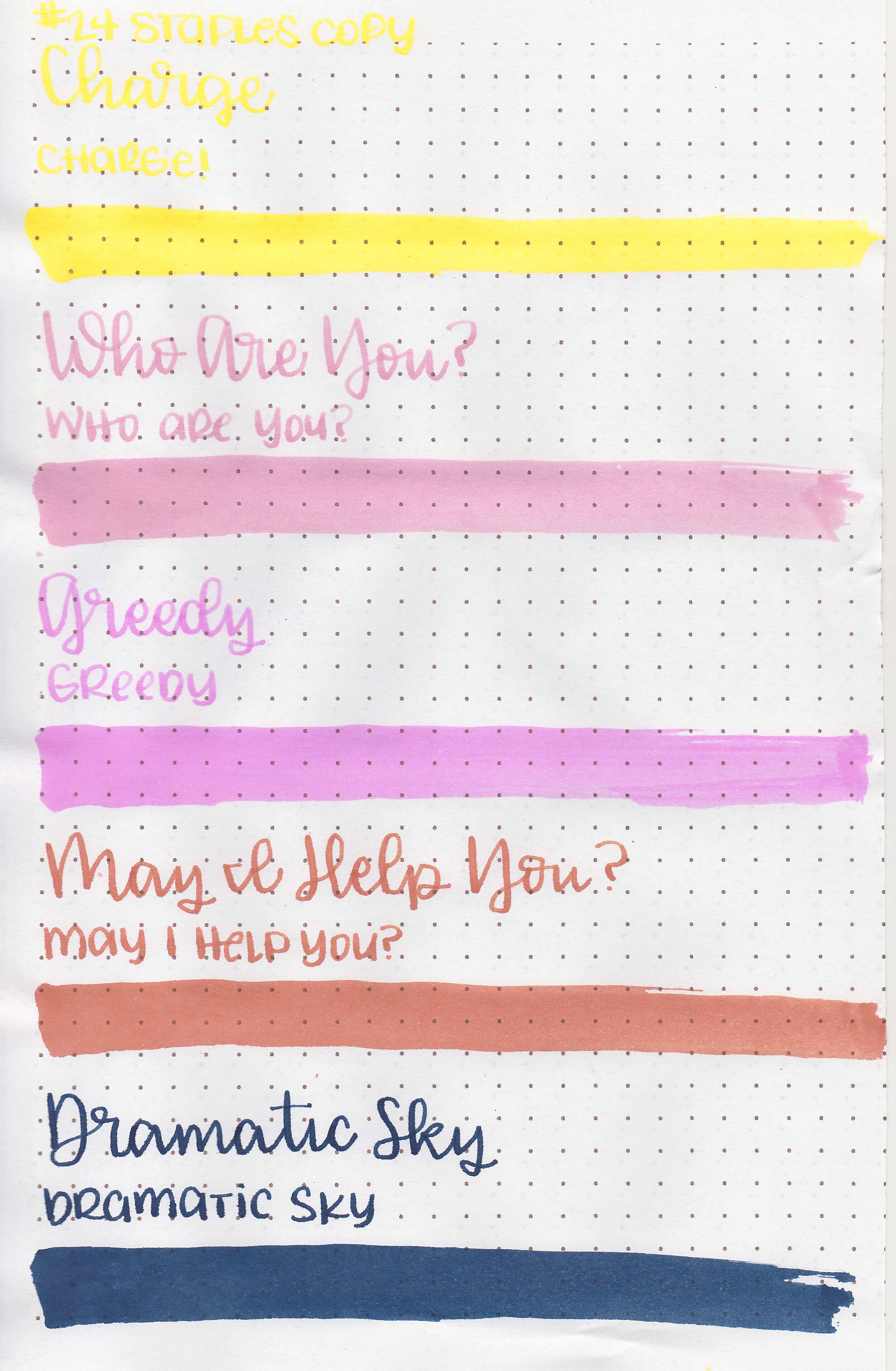
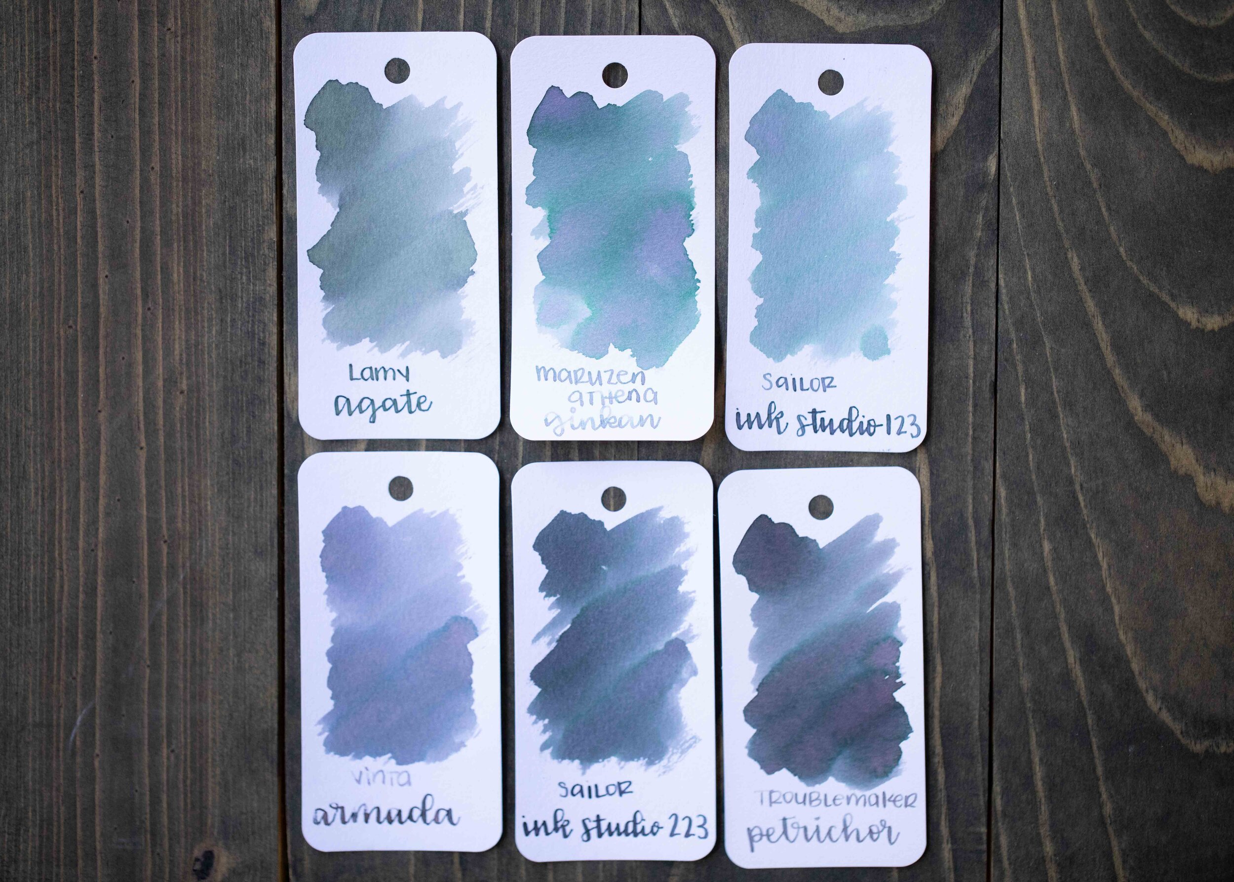
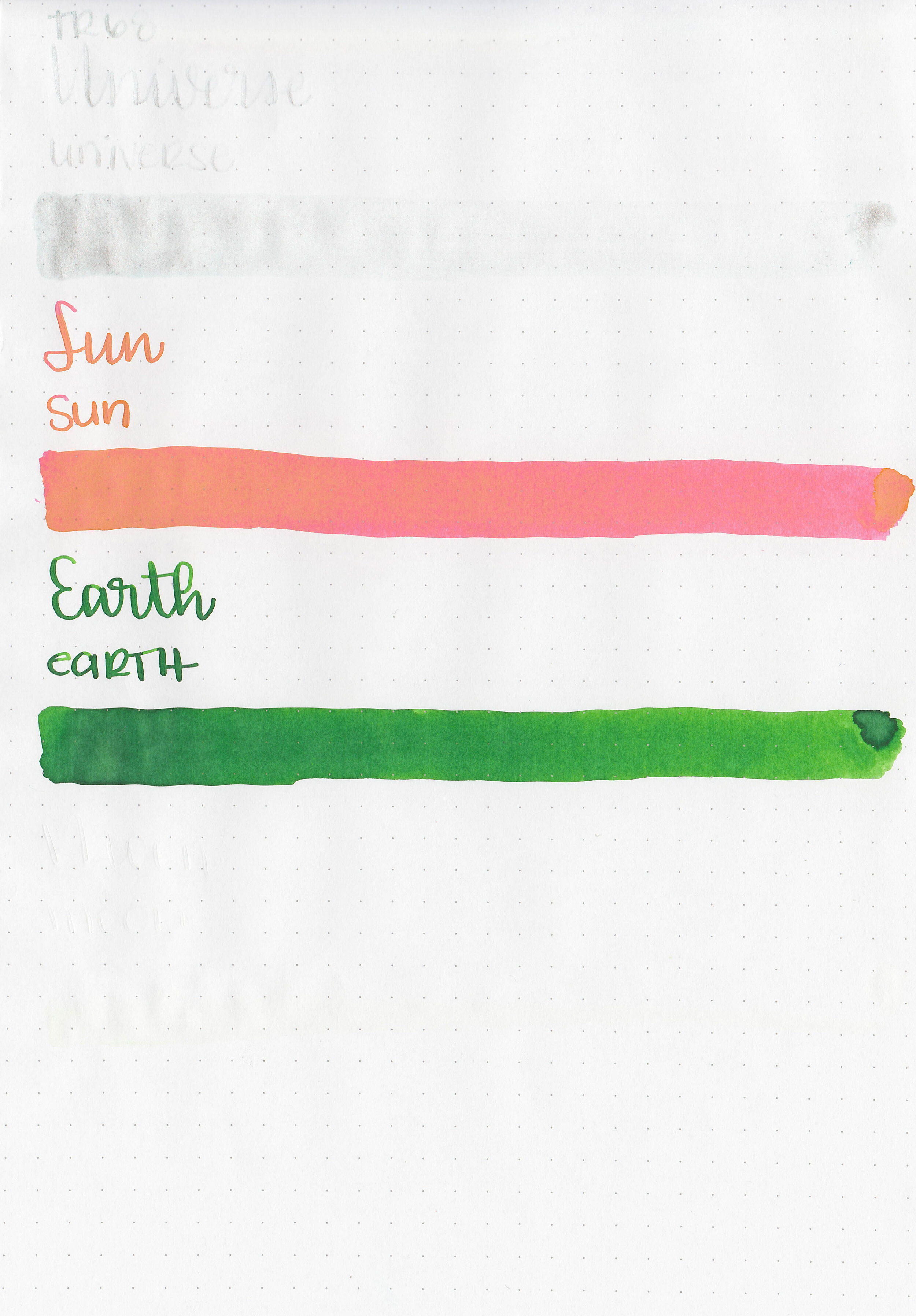
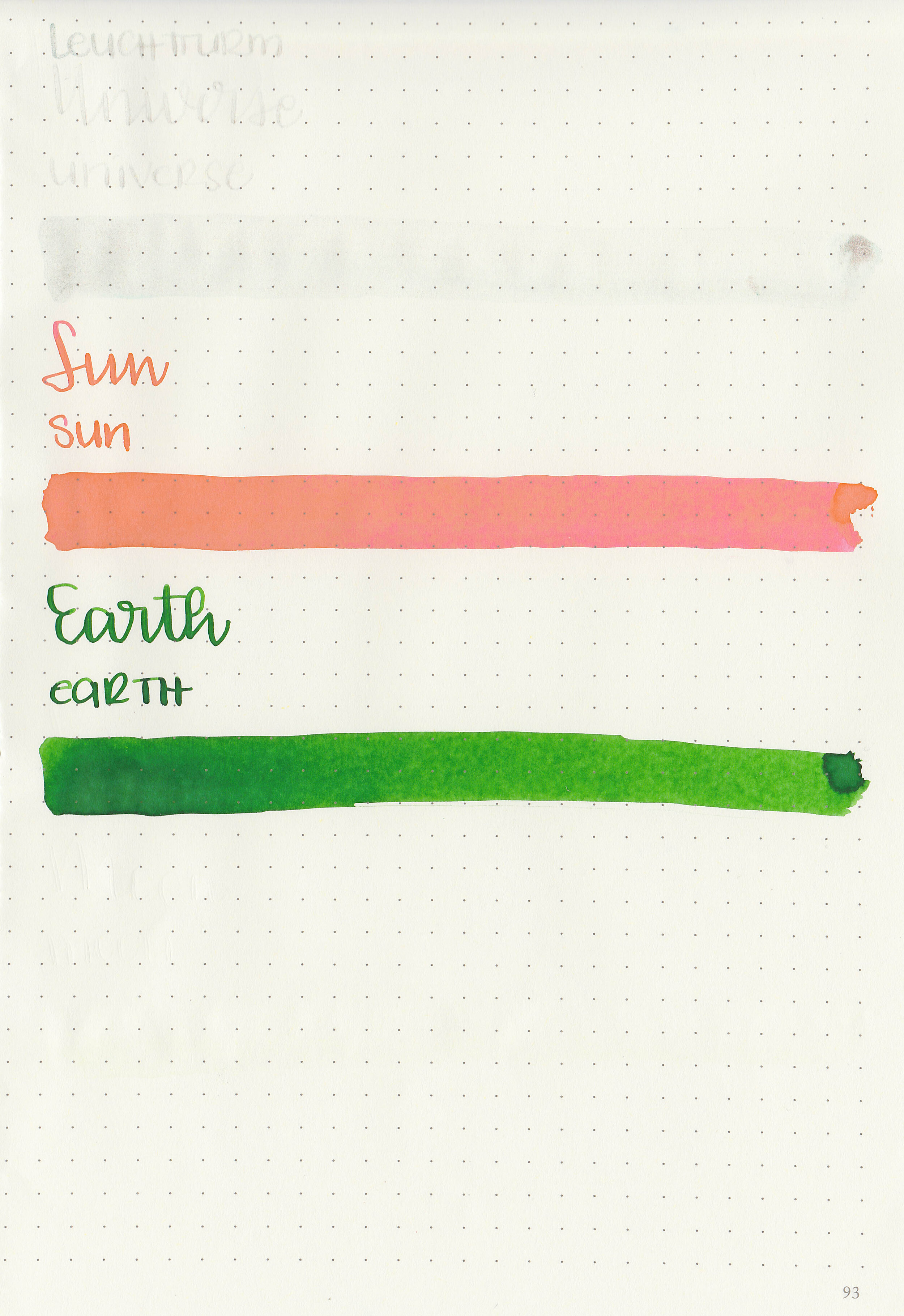
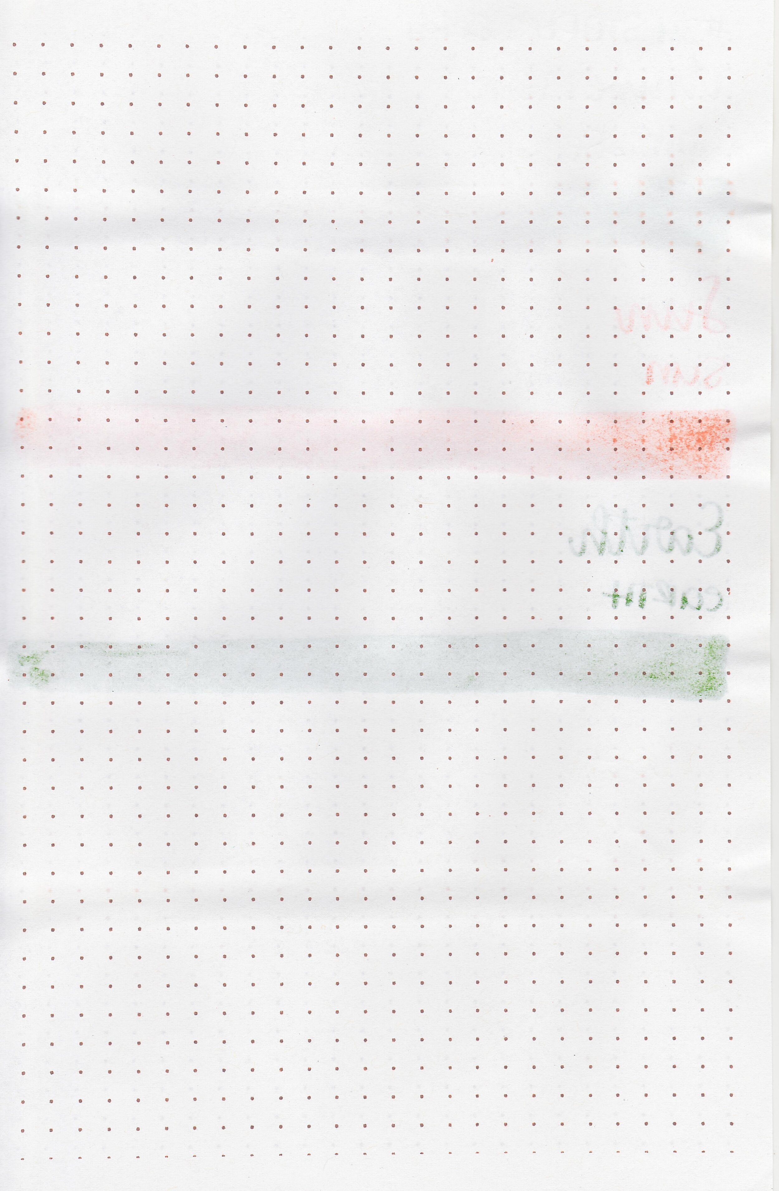
Comparison Swabs:

Merlot is more purple than any of these other inks and much less saturated. Click here to see the Diamine inks together, and click here to see the purple inks together.
Longer writing:

I used a Pelikan M205 Star Ruby with a fine nib on a Taroko Enigma notebook. The ink had an average flow.
Overall, it’s good but not great. It’s pretty well behaved, but I don’t love the color and it doesn’t have much shading. I’m just not in love with it.
Disclaimer: I purchased this ink myself, and all photos and opinions are my own. This page does not contain affiliate links and this post is not sponsored in any way.