Ink Review #1264: Robert Oster Vine Leaf
/
Robert Oster Vine Leaf is another recent release from Robert Oster. You can find this ink at most retailers including Vanness Pens.

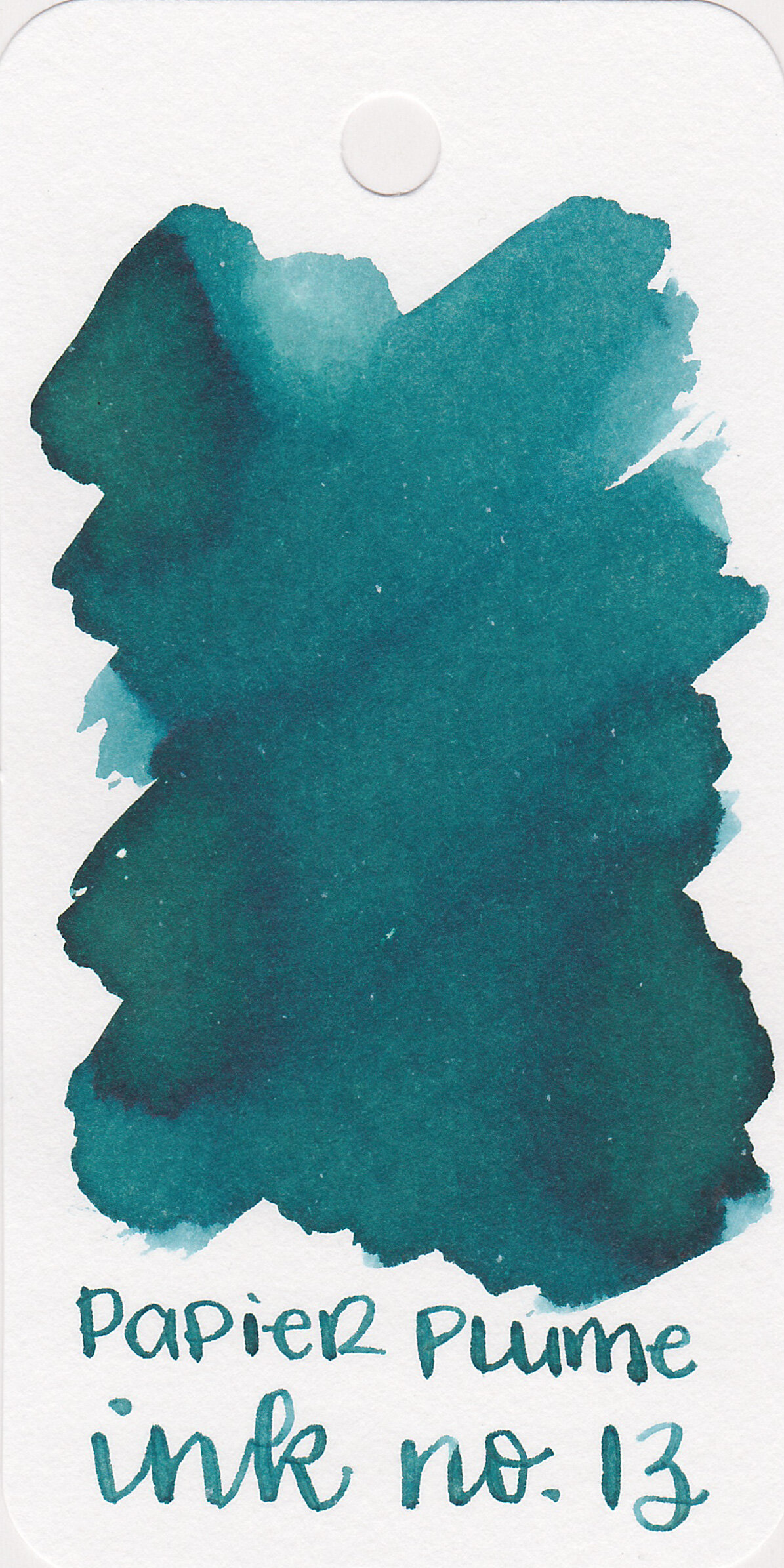
The color:
Vine Leaf is a light spring green.
Swabs:
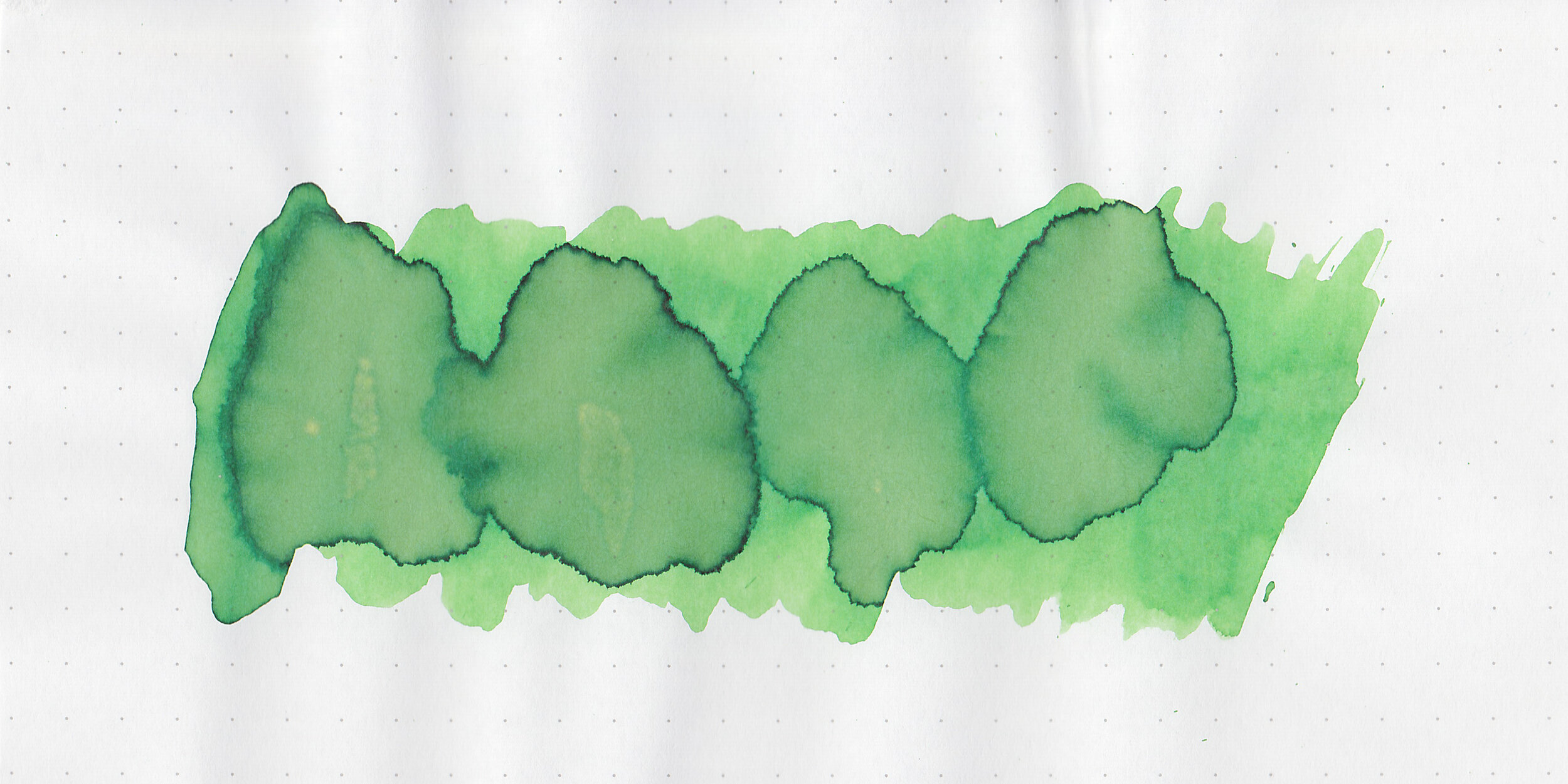
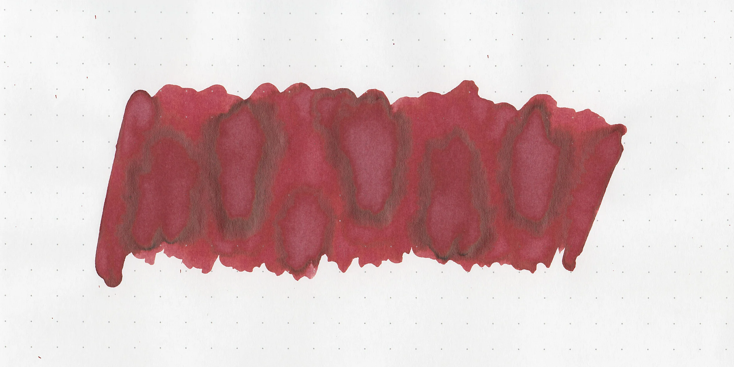
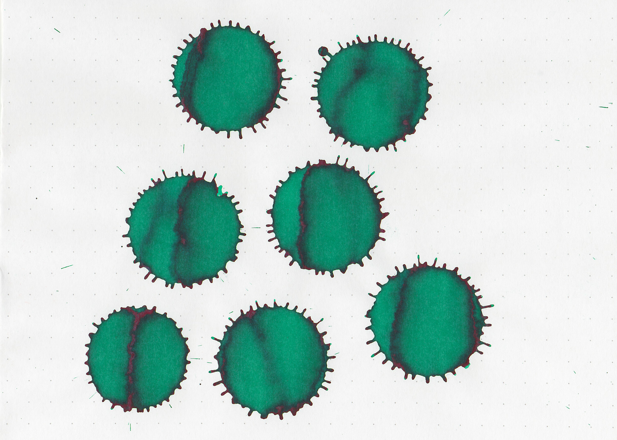
In large swabs on Tomoe River paper the ink looks a little bit darker.

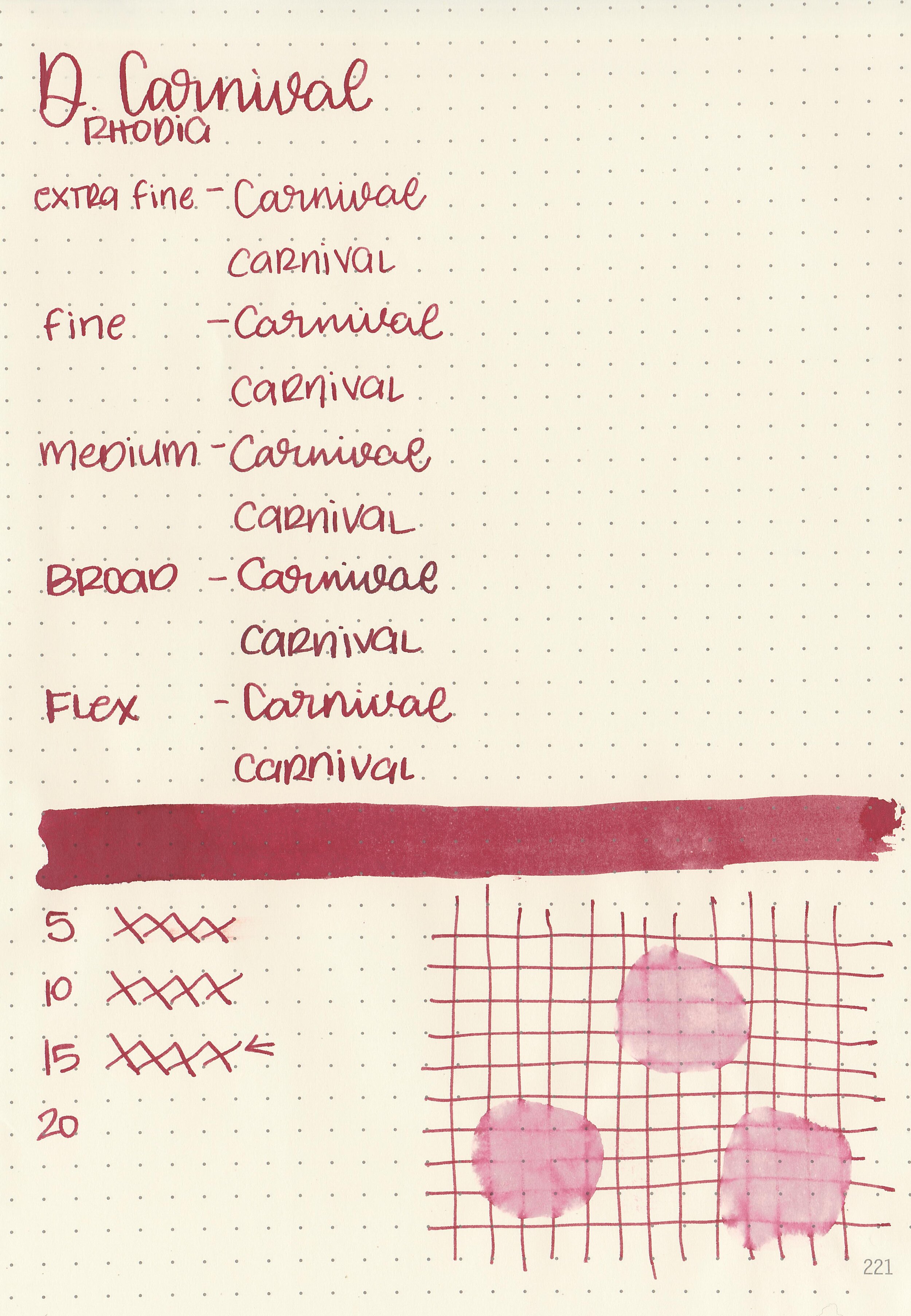
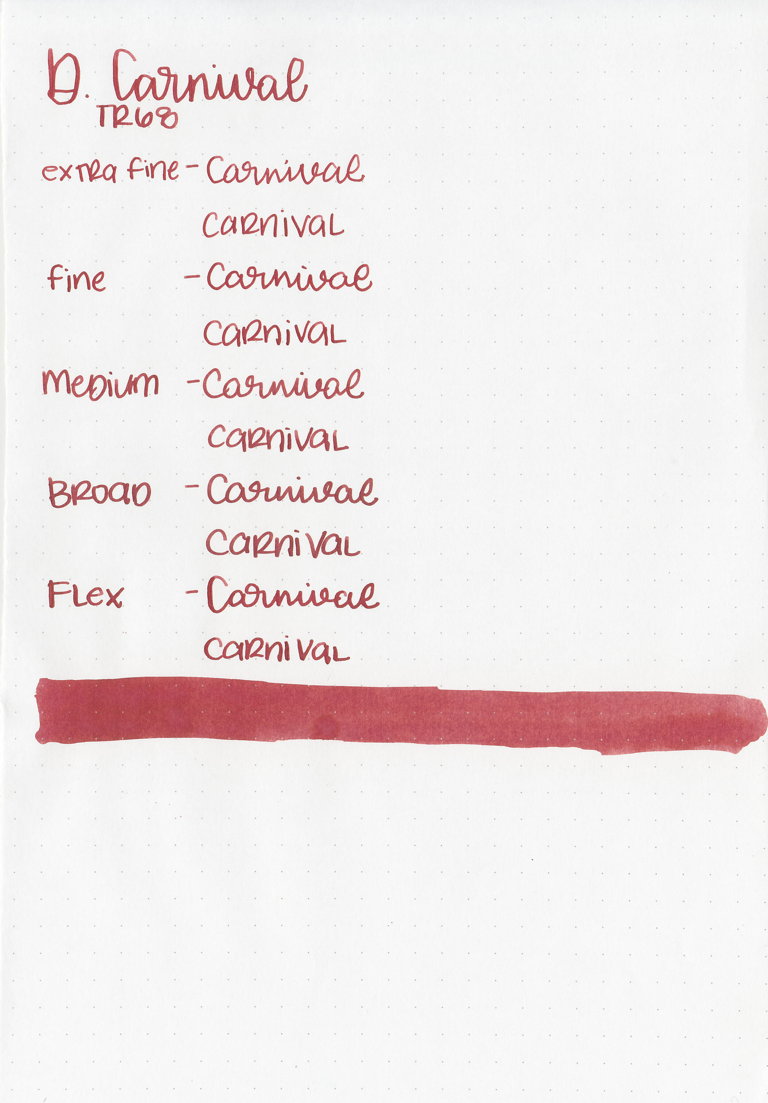
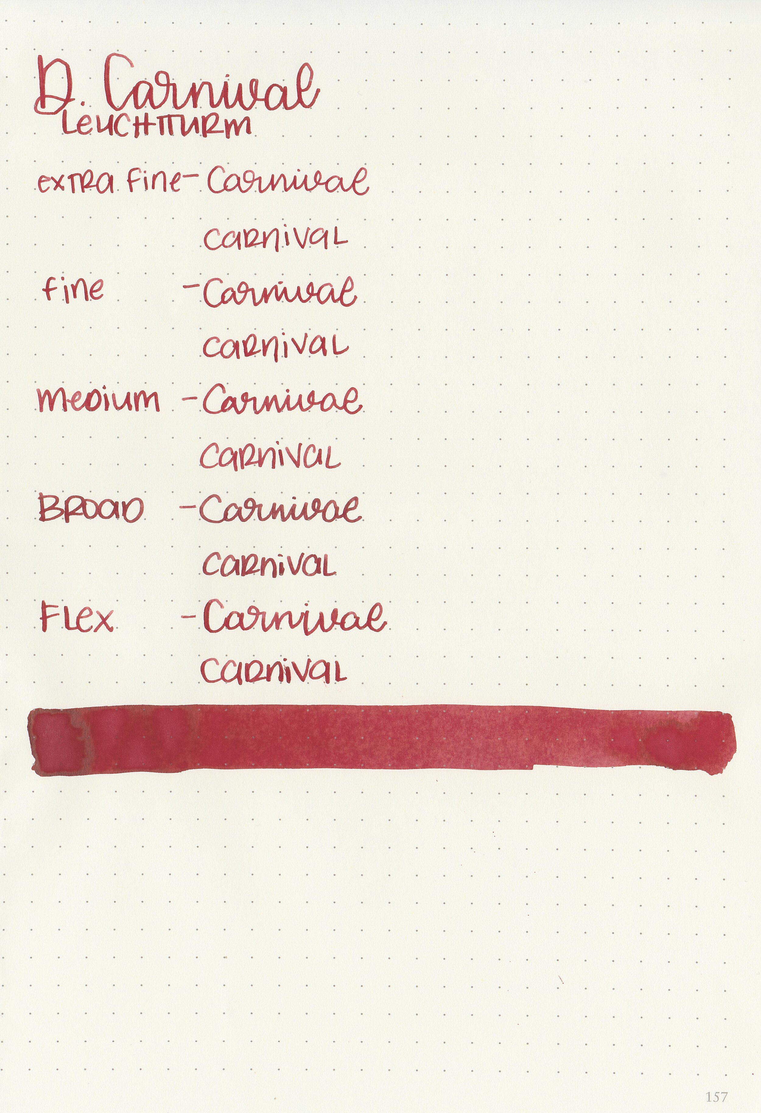
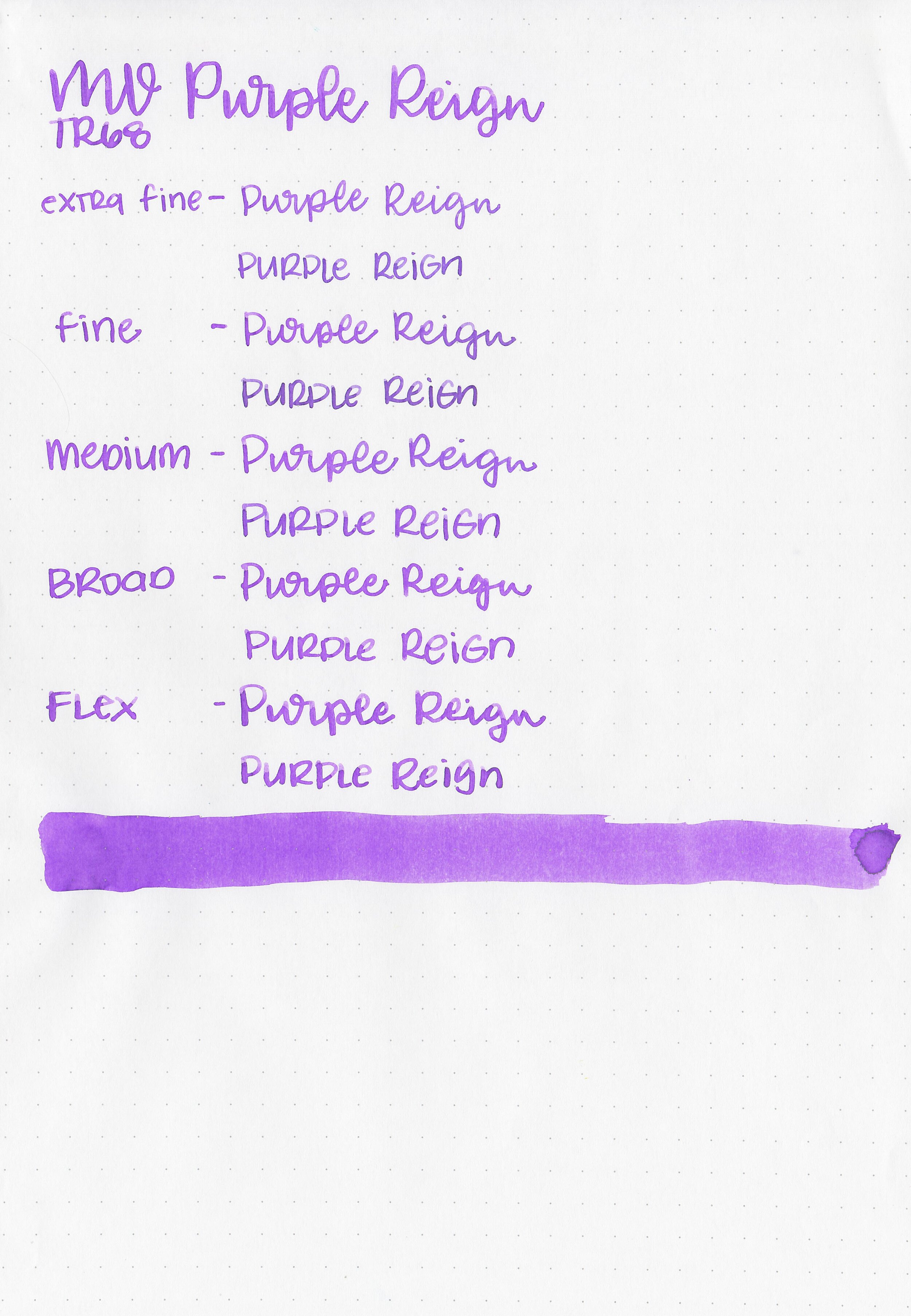
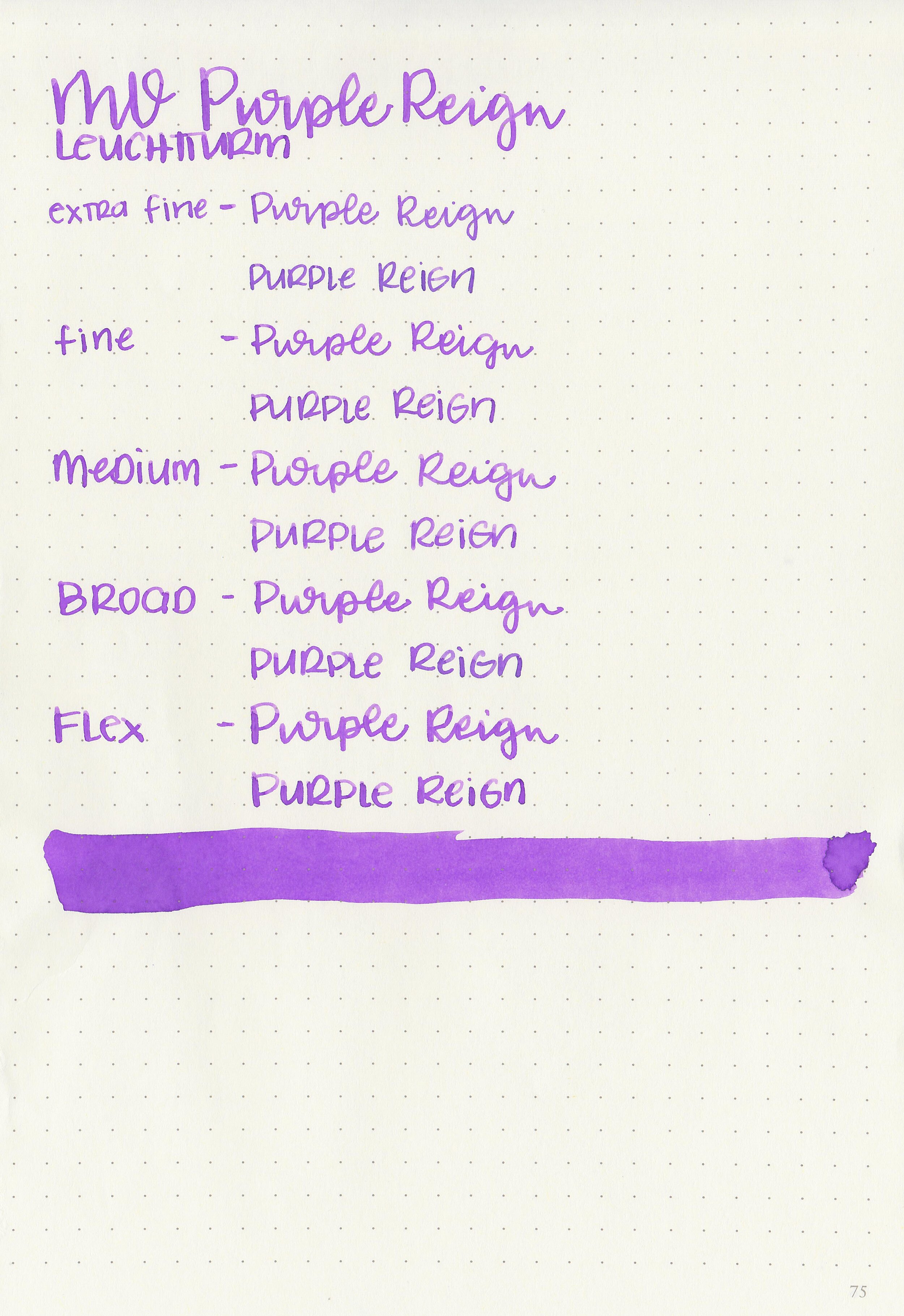
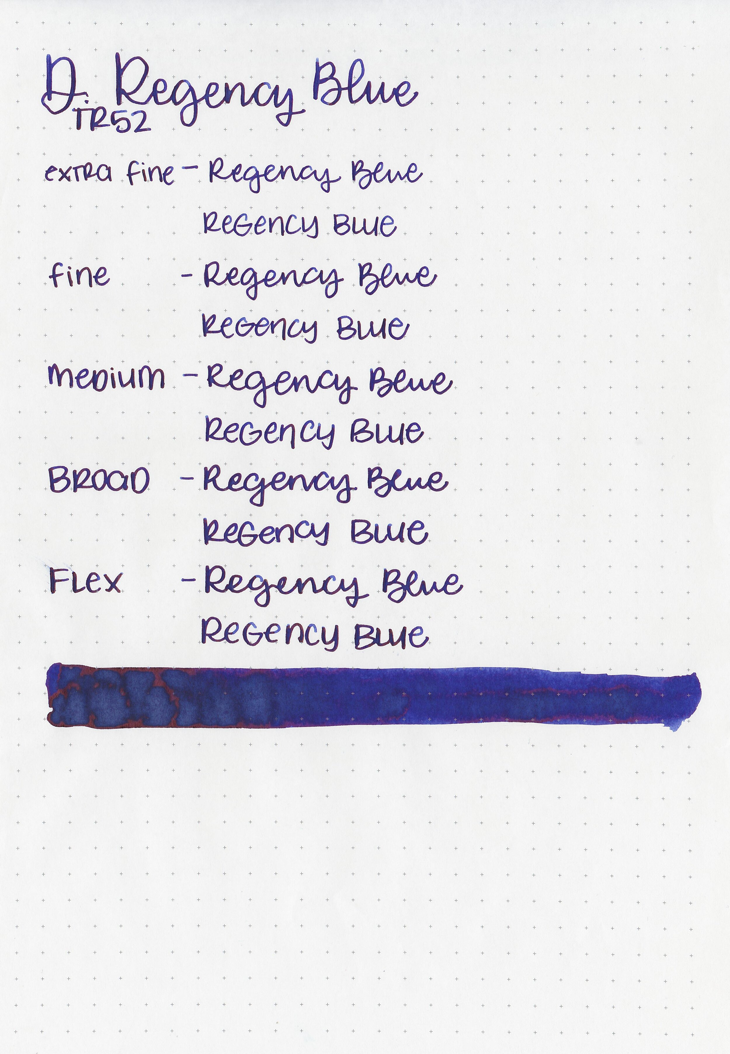
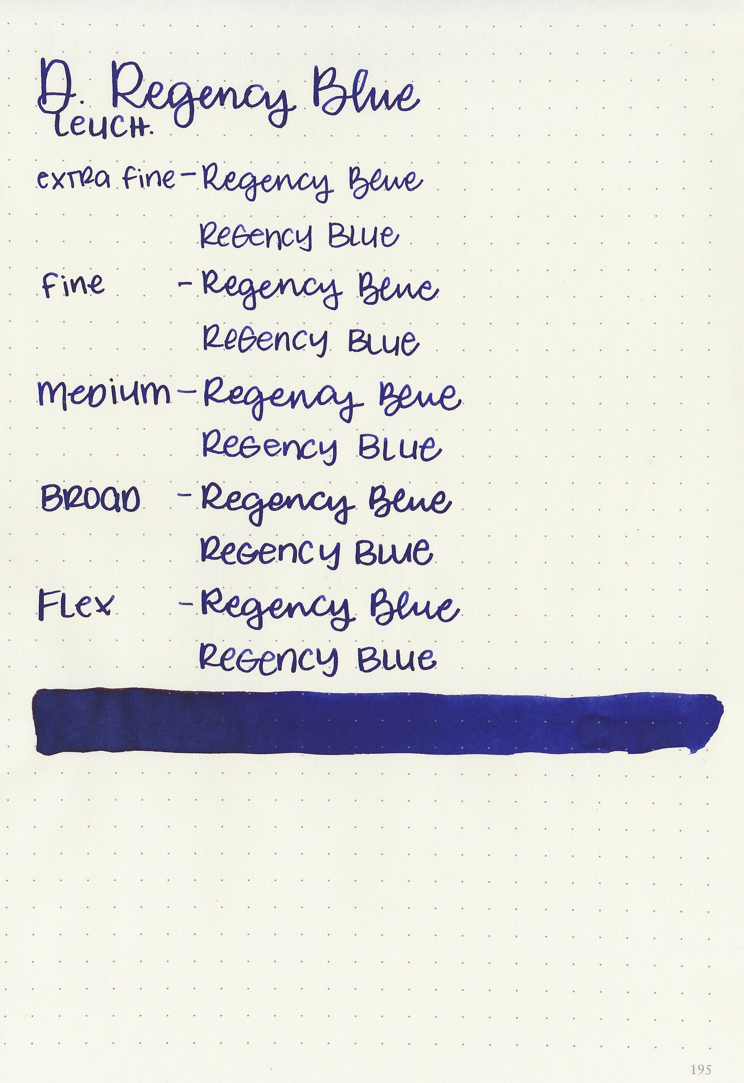
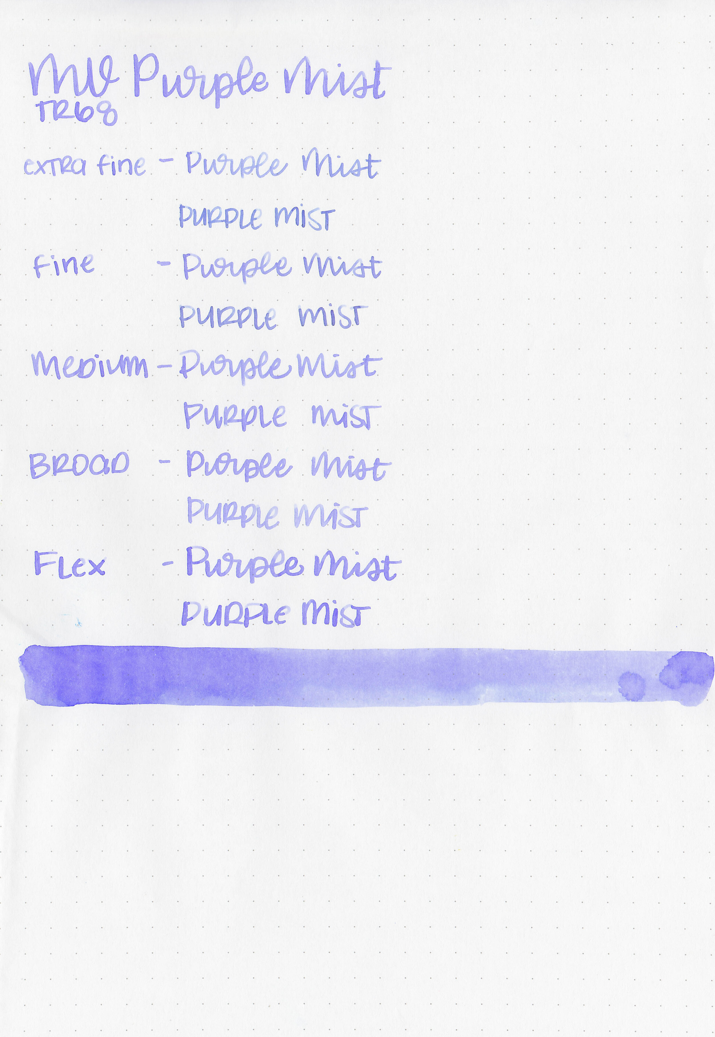
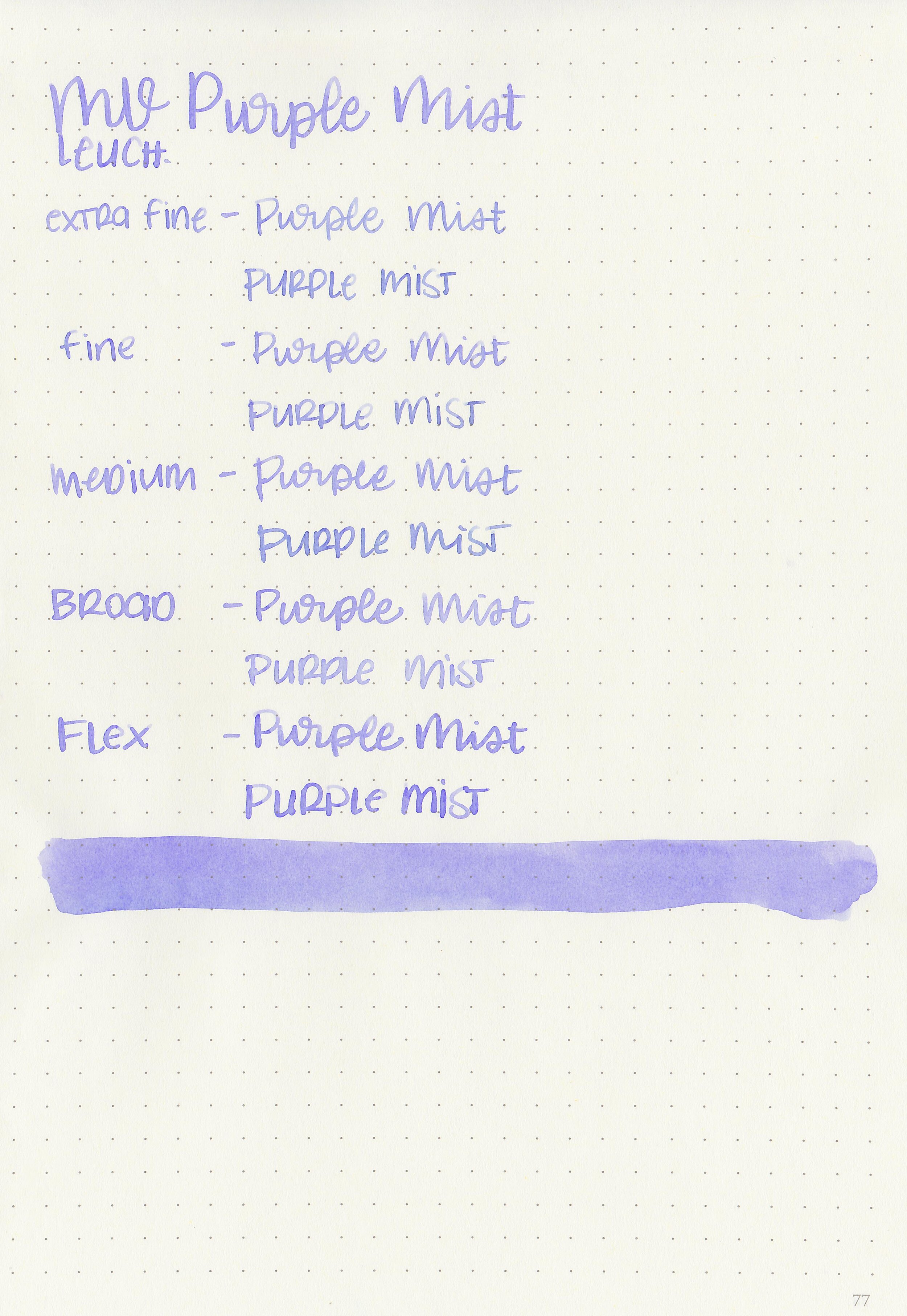
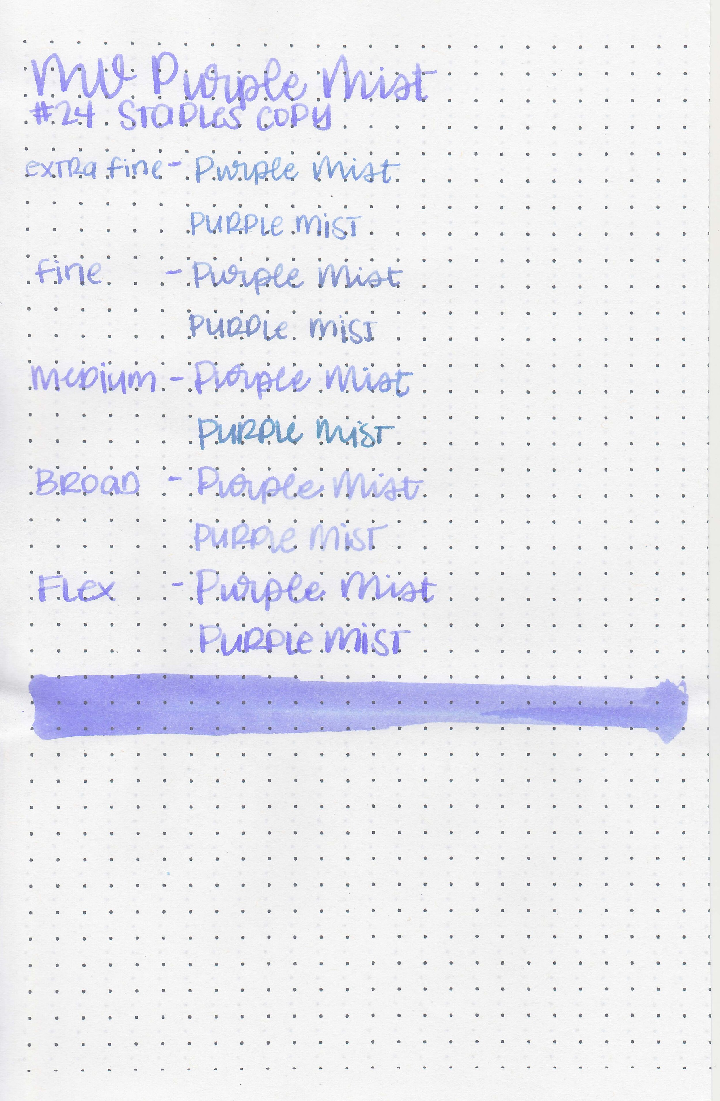
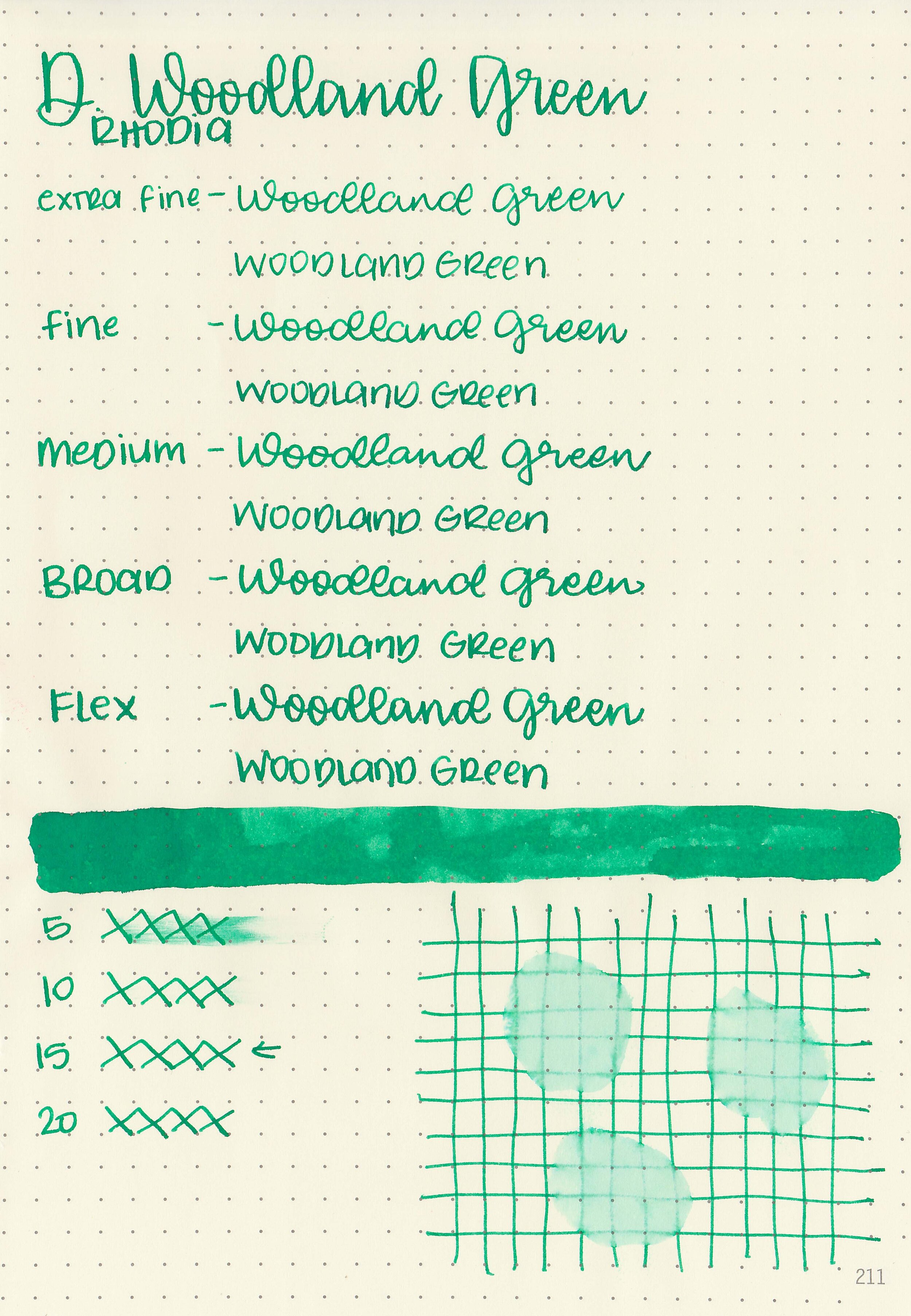
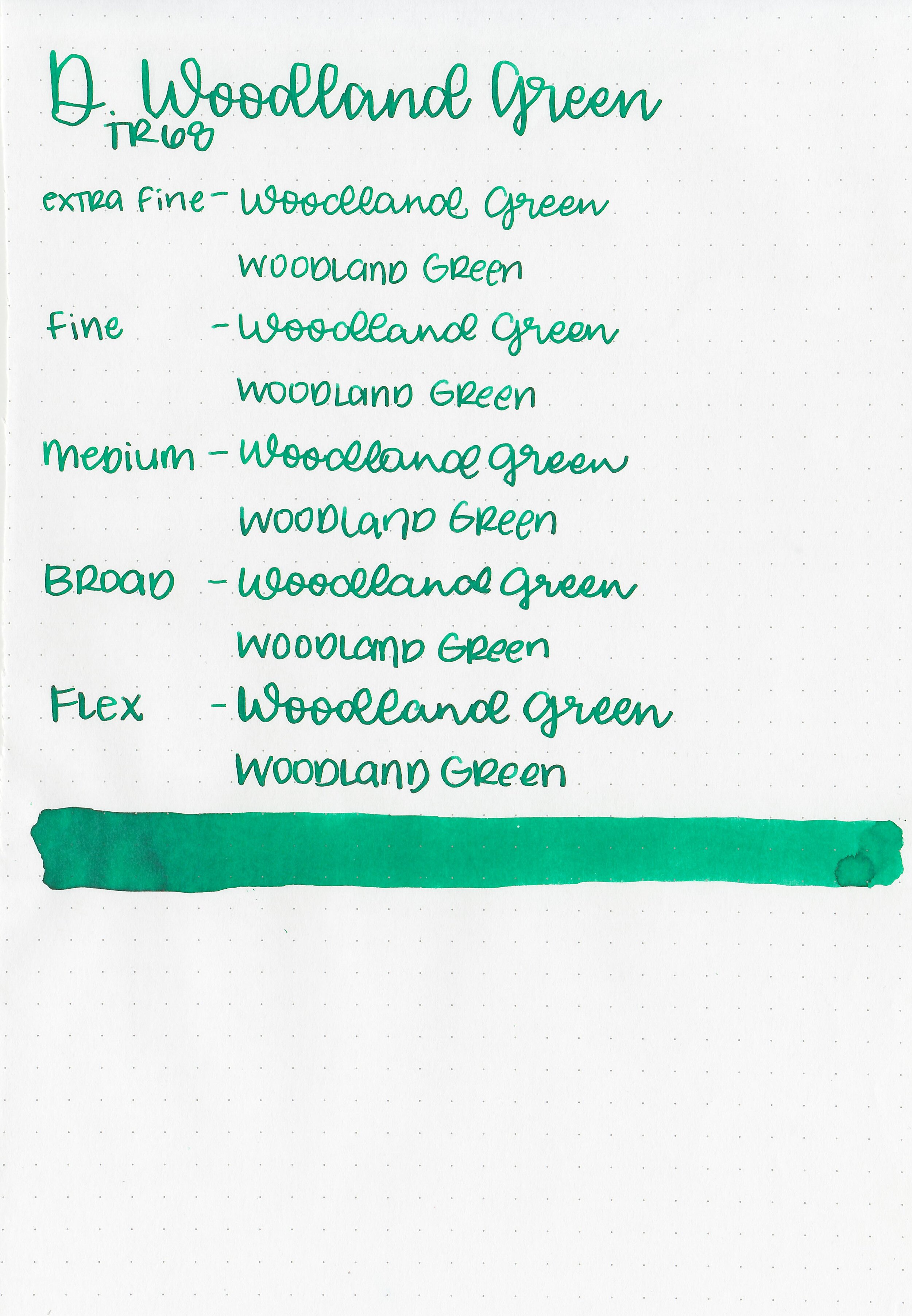
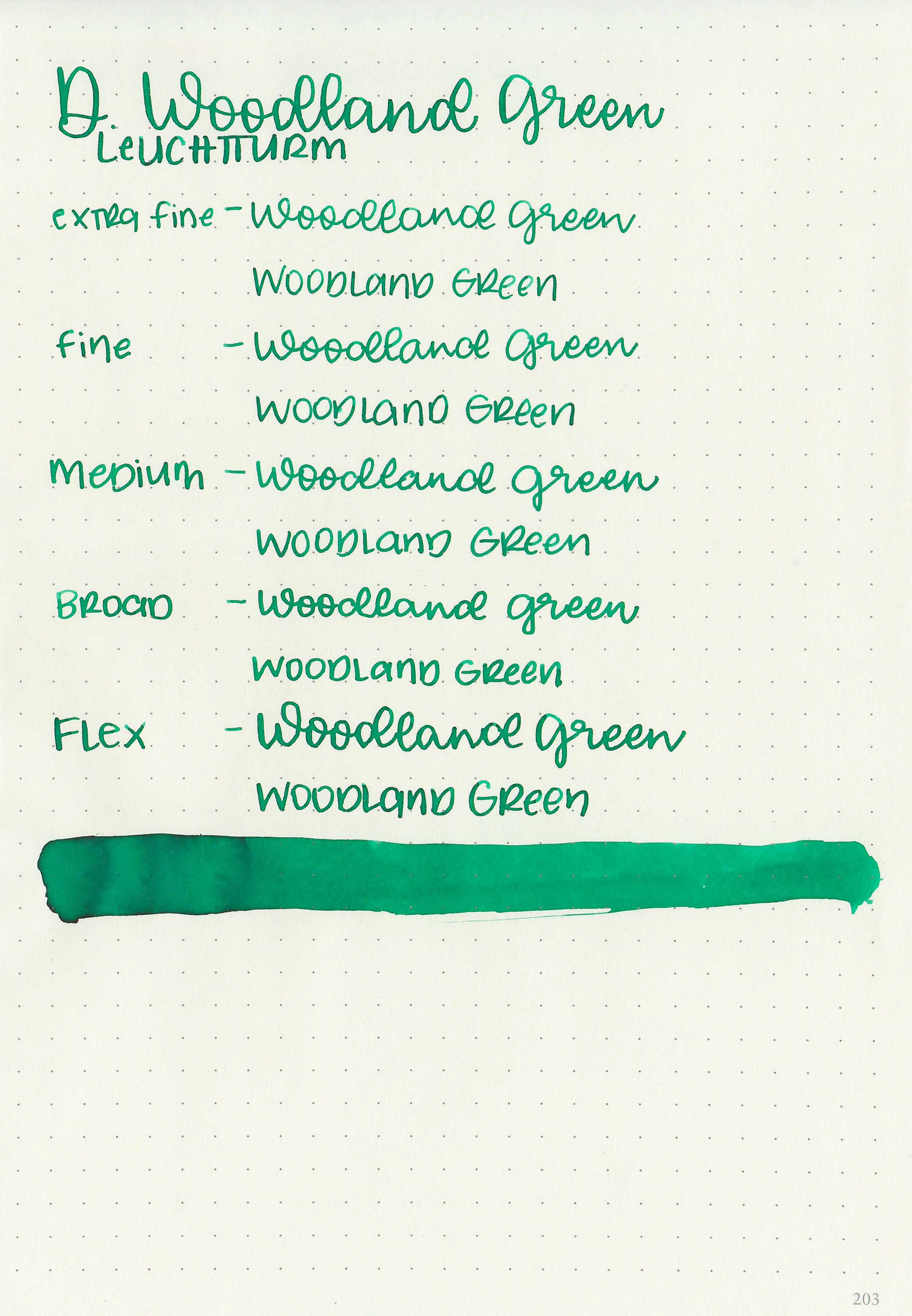
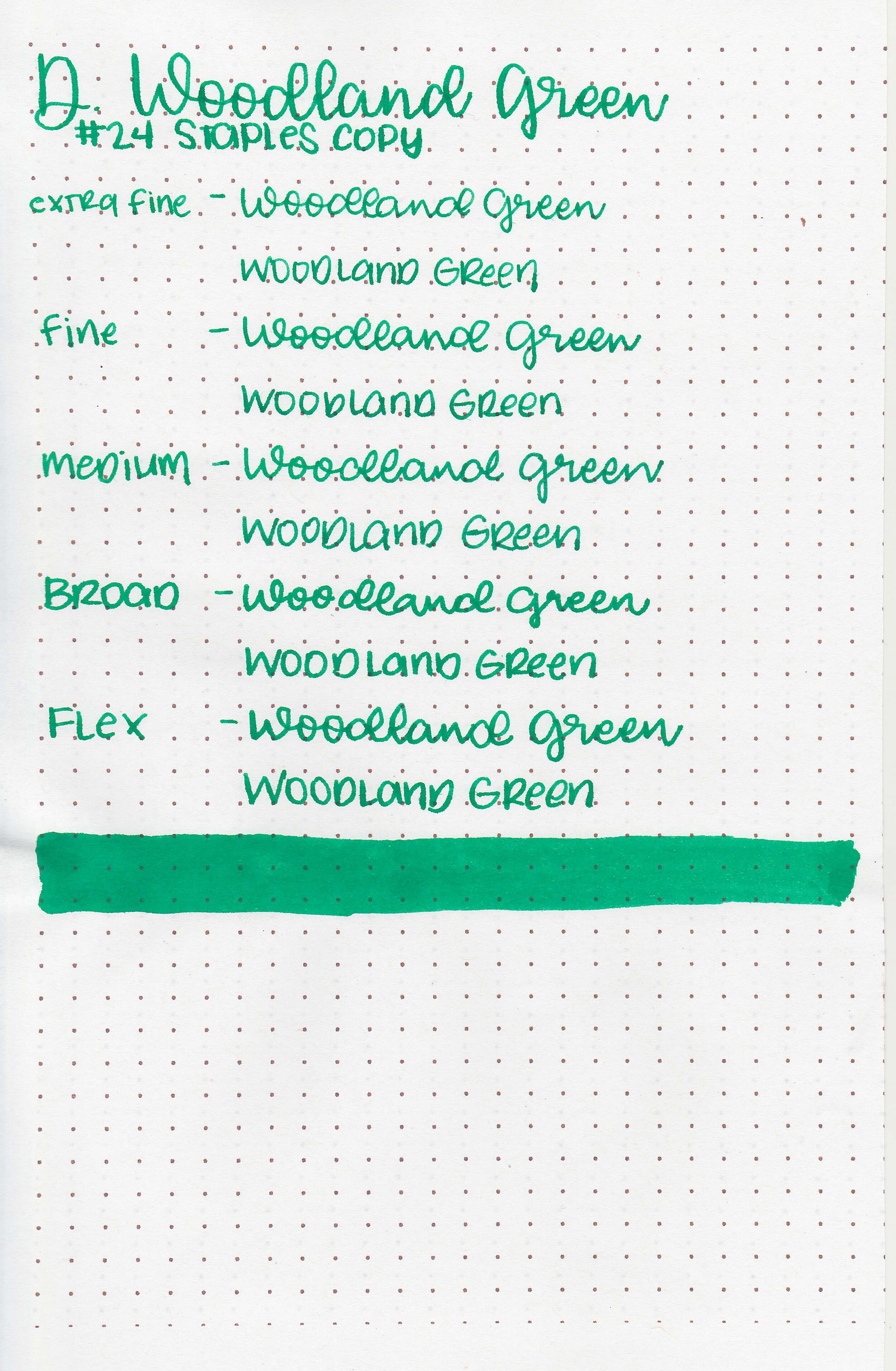
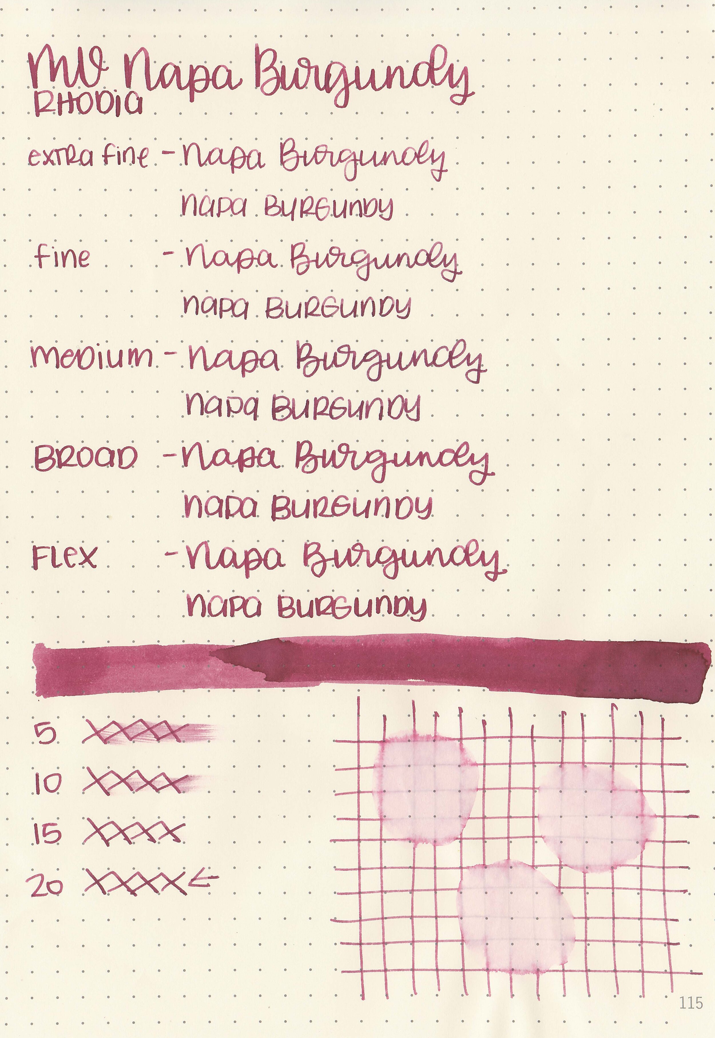
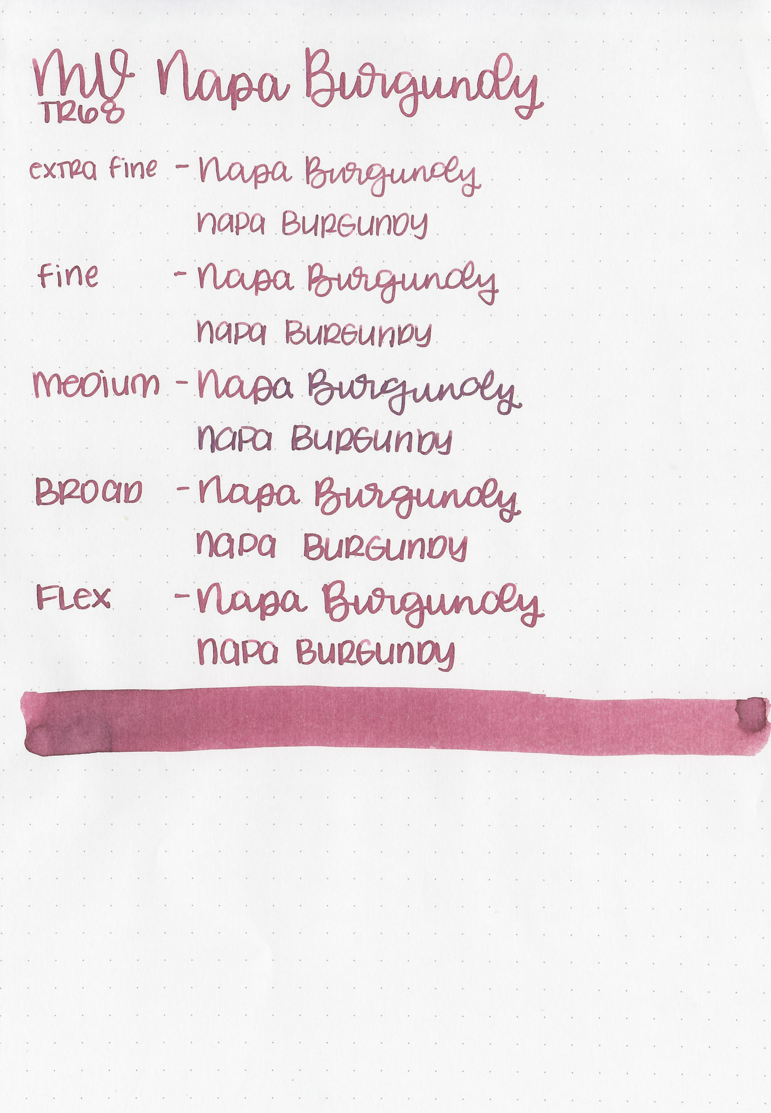
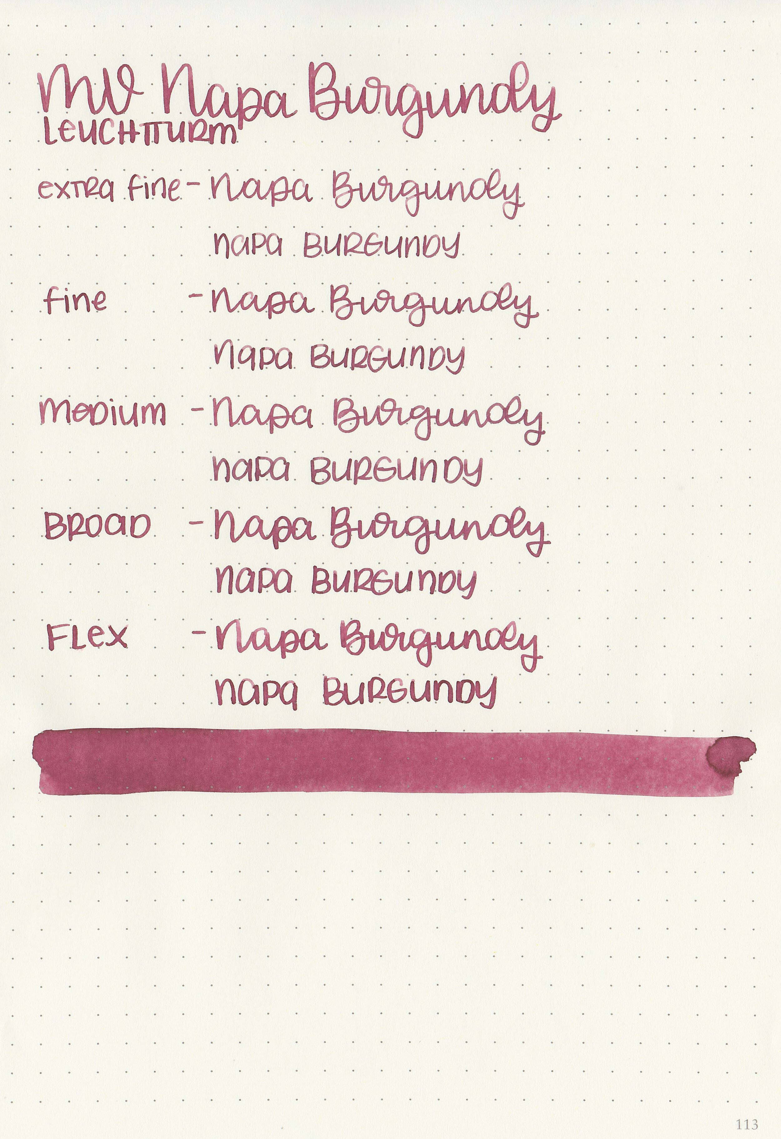
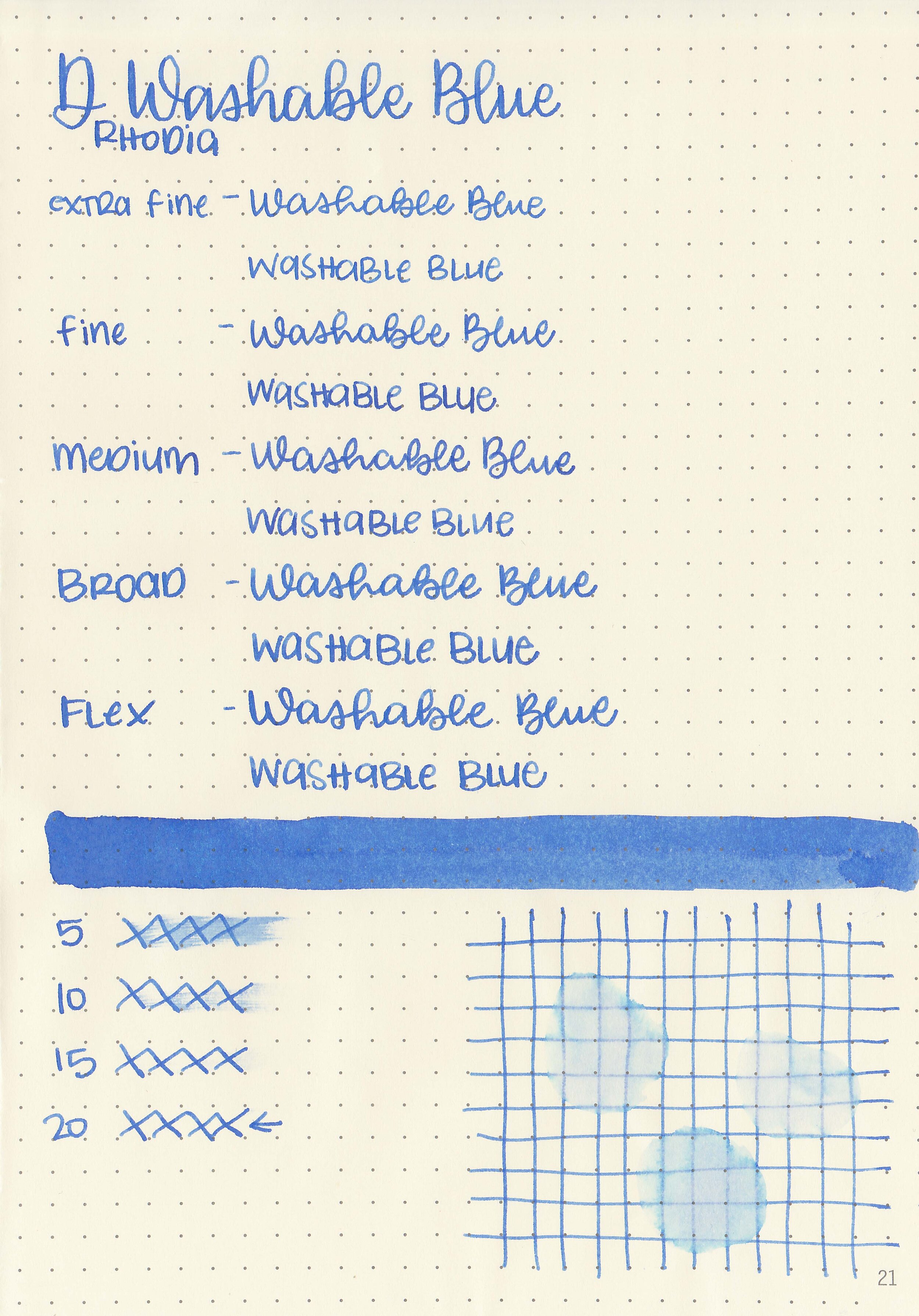
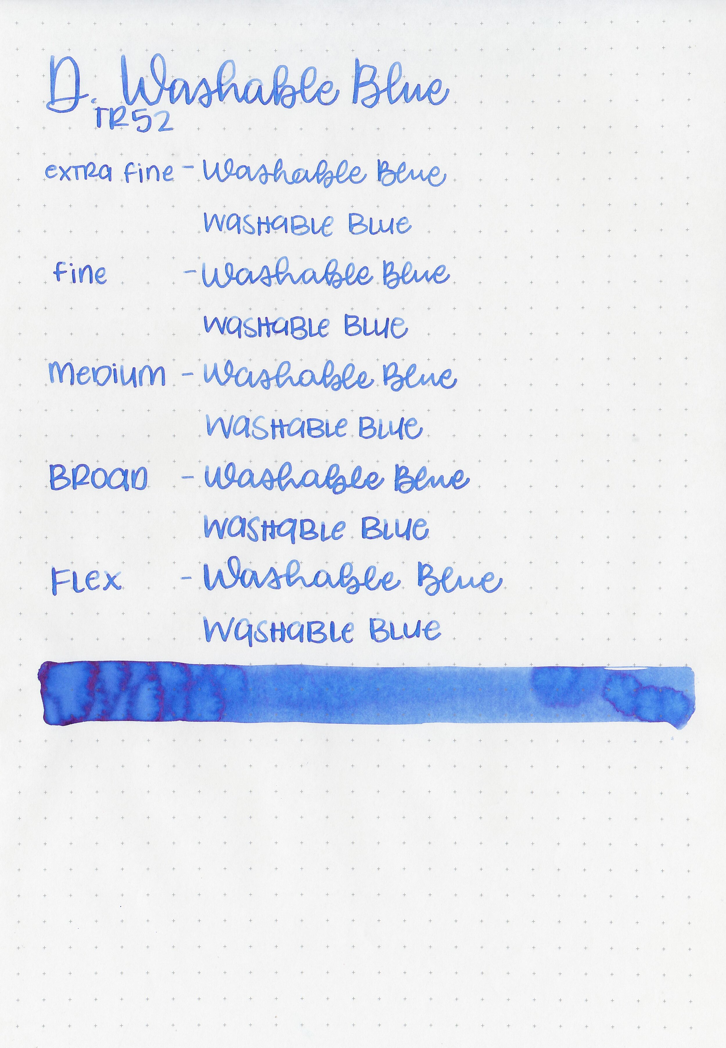
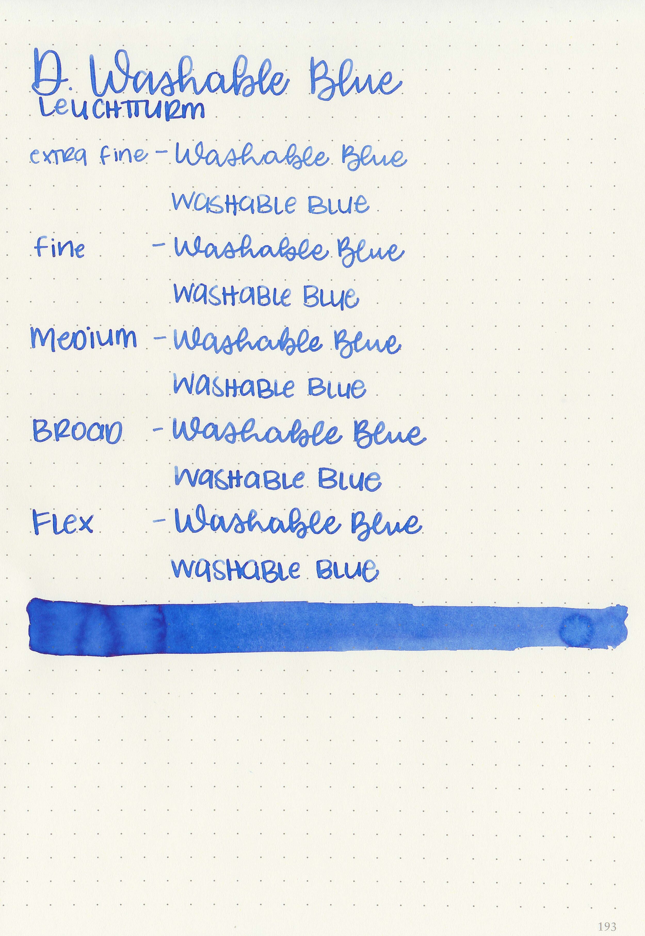
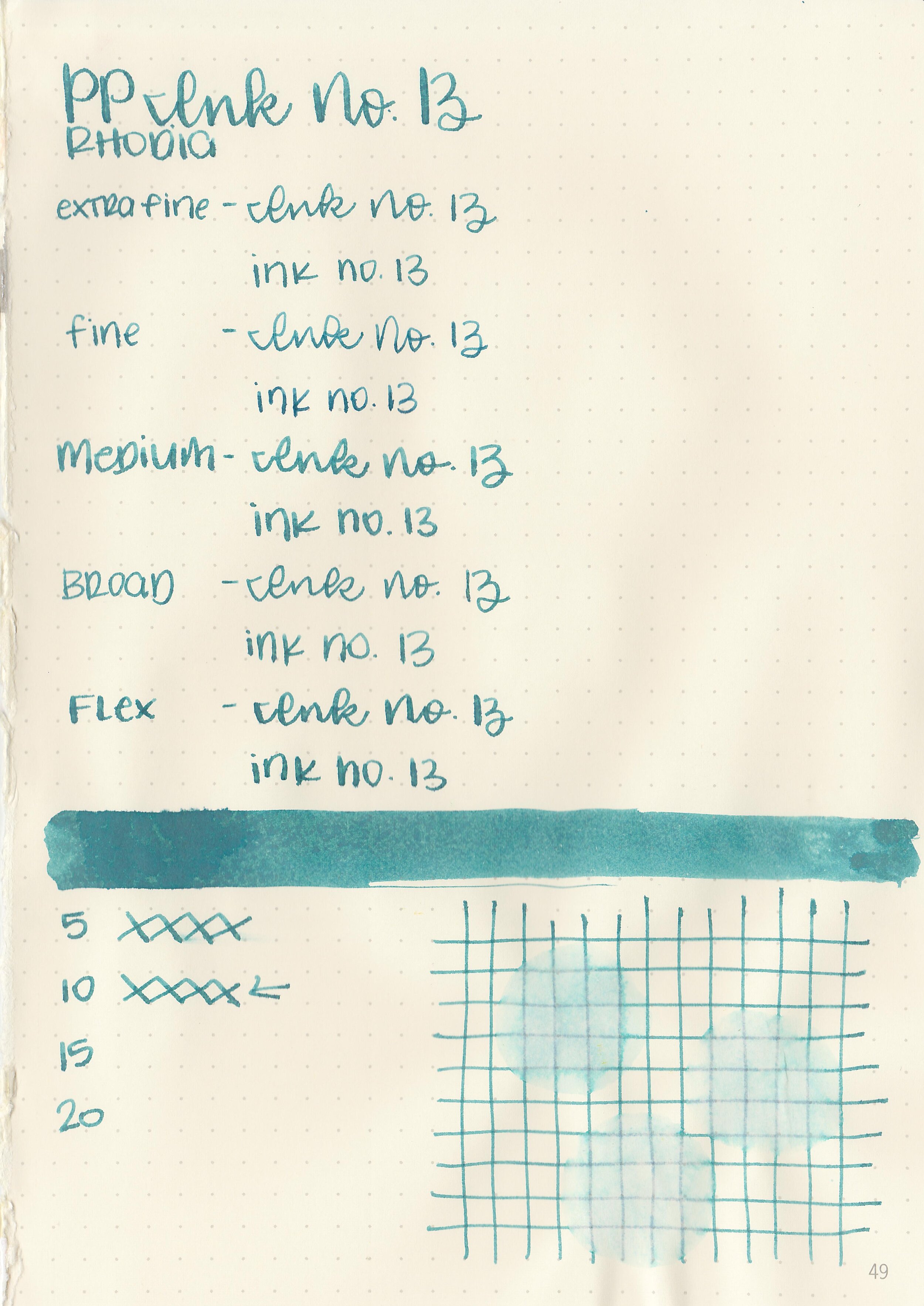
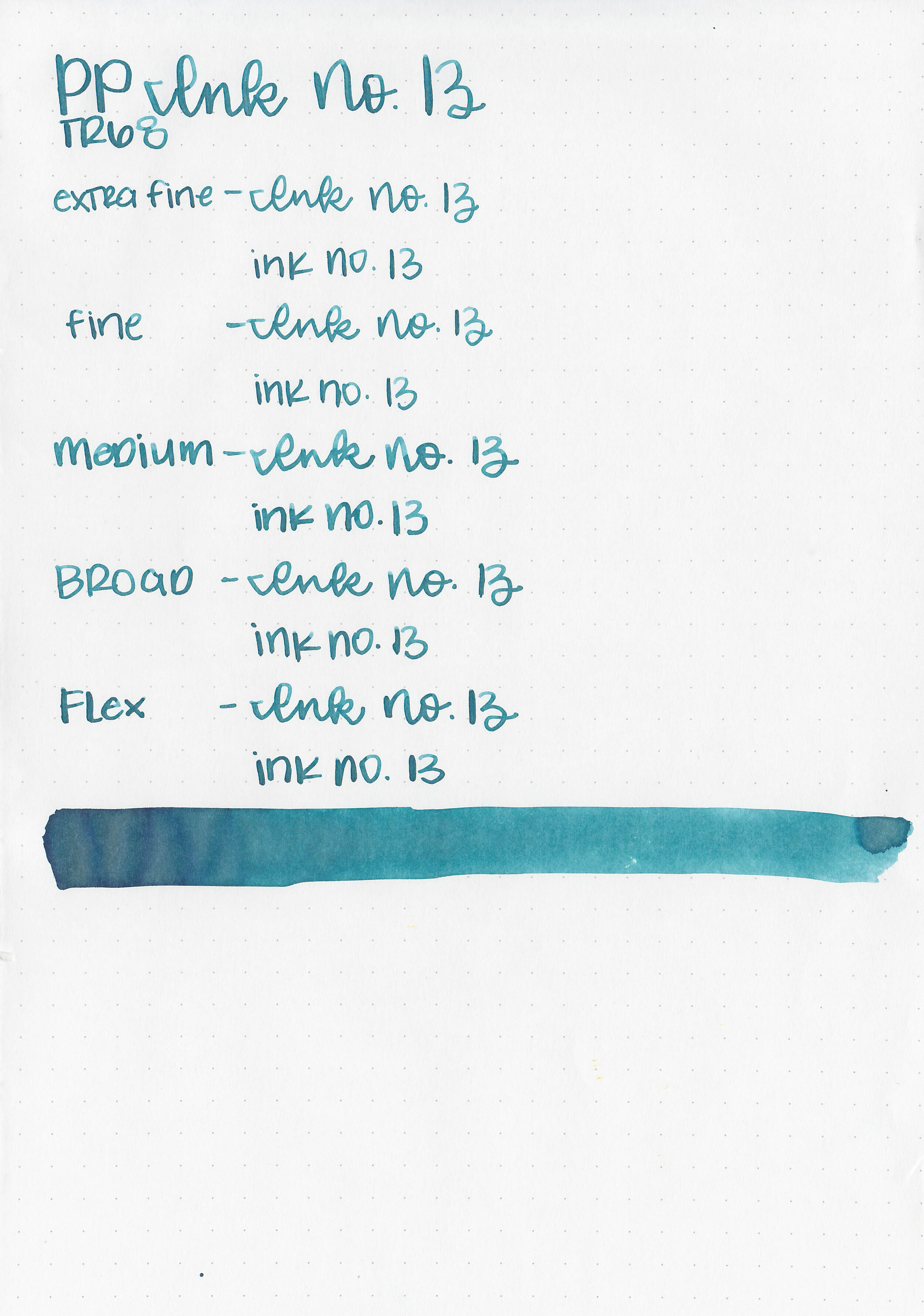
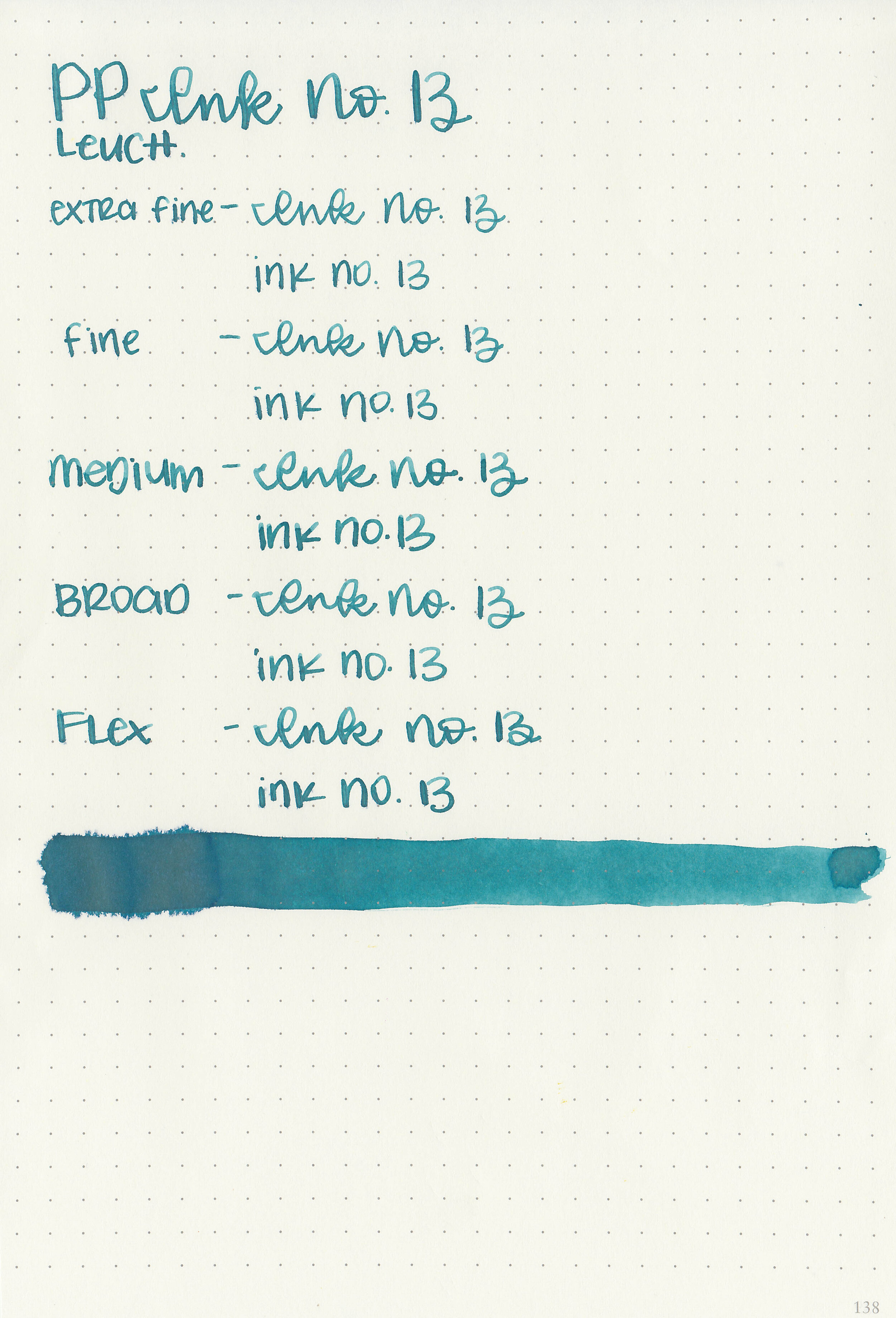
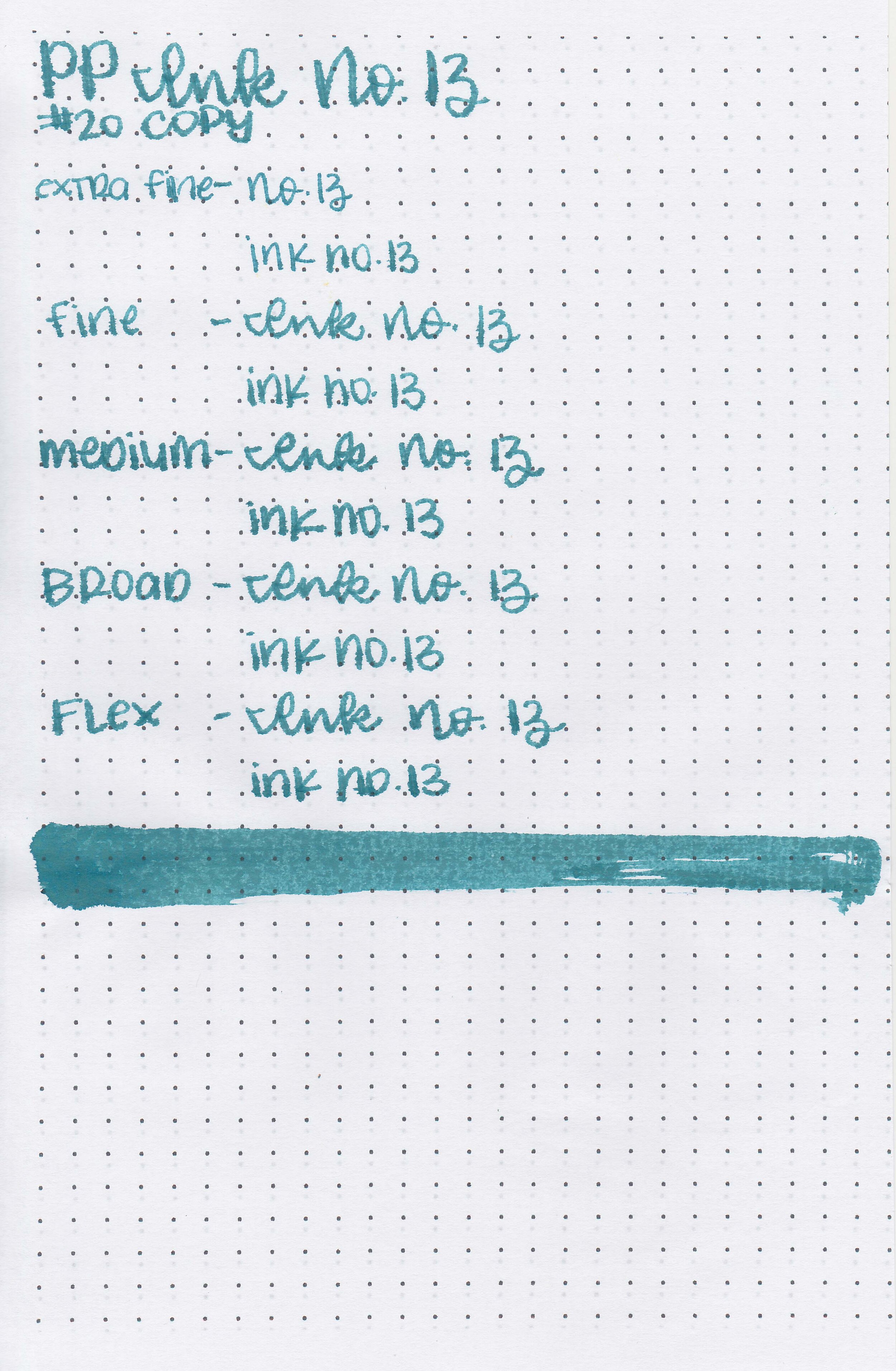
Writing samples:
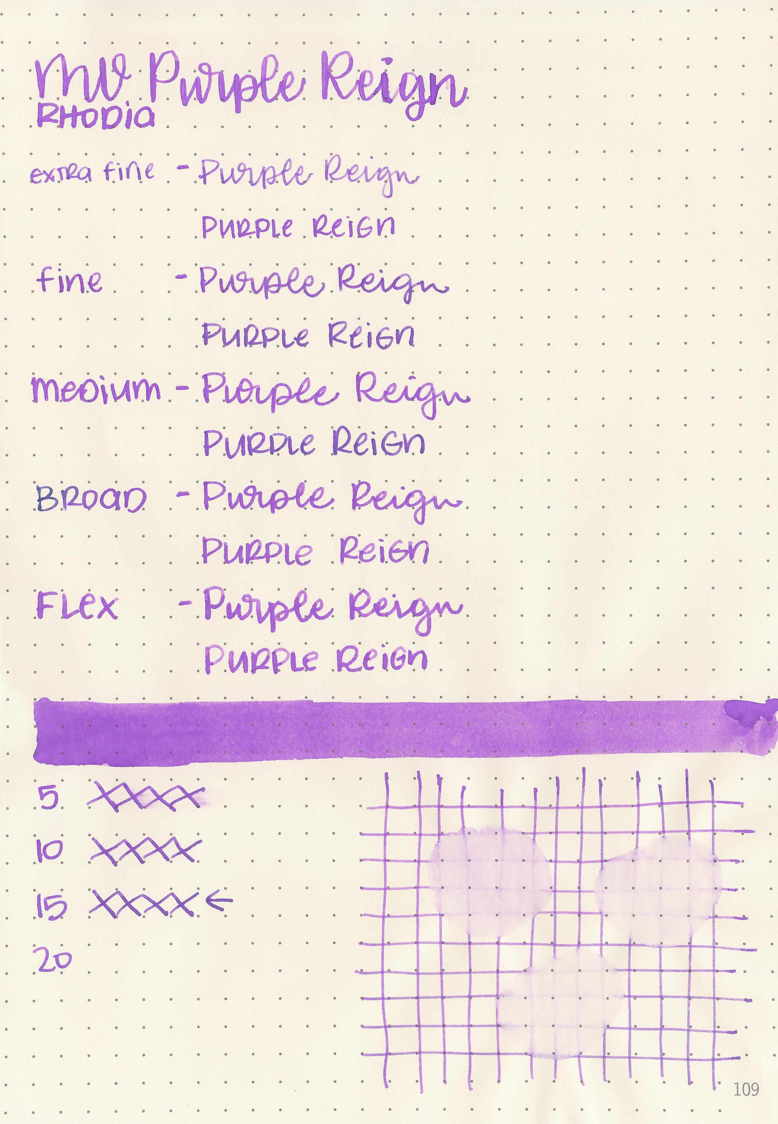
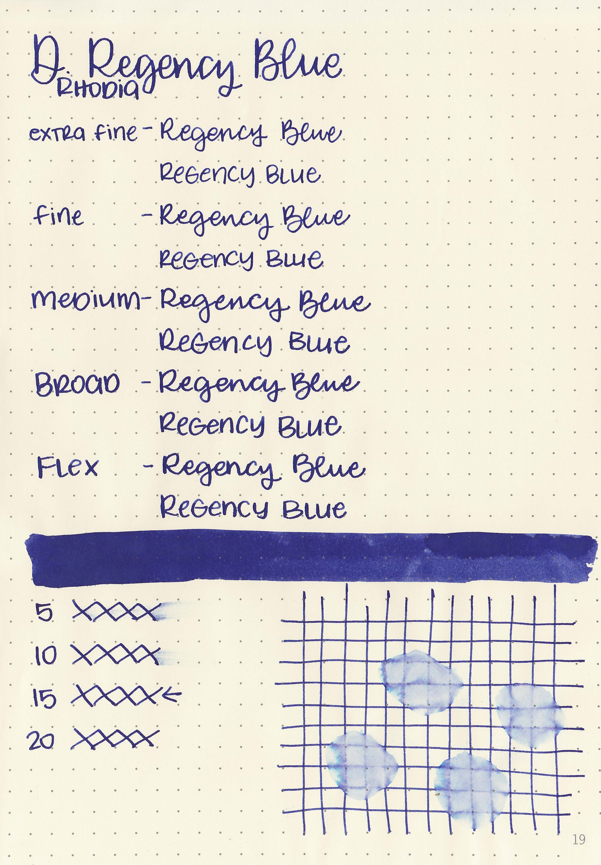
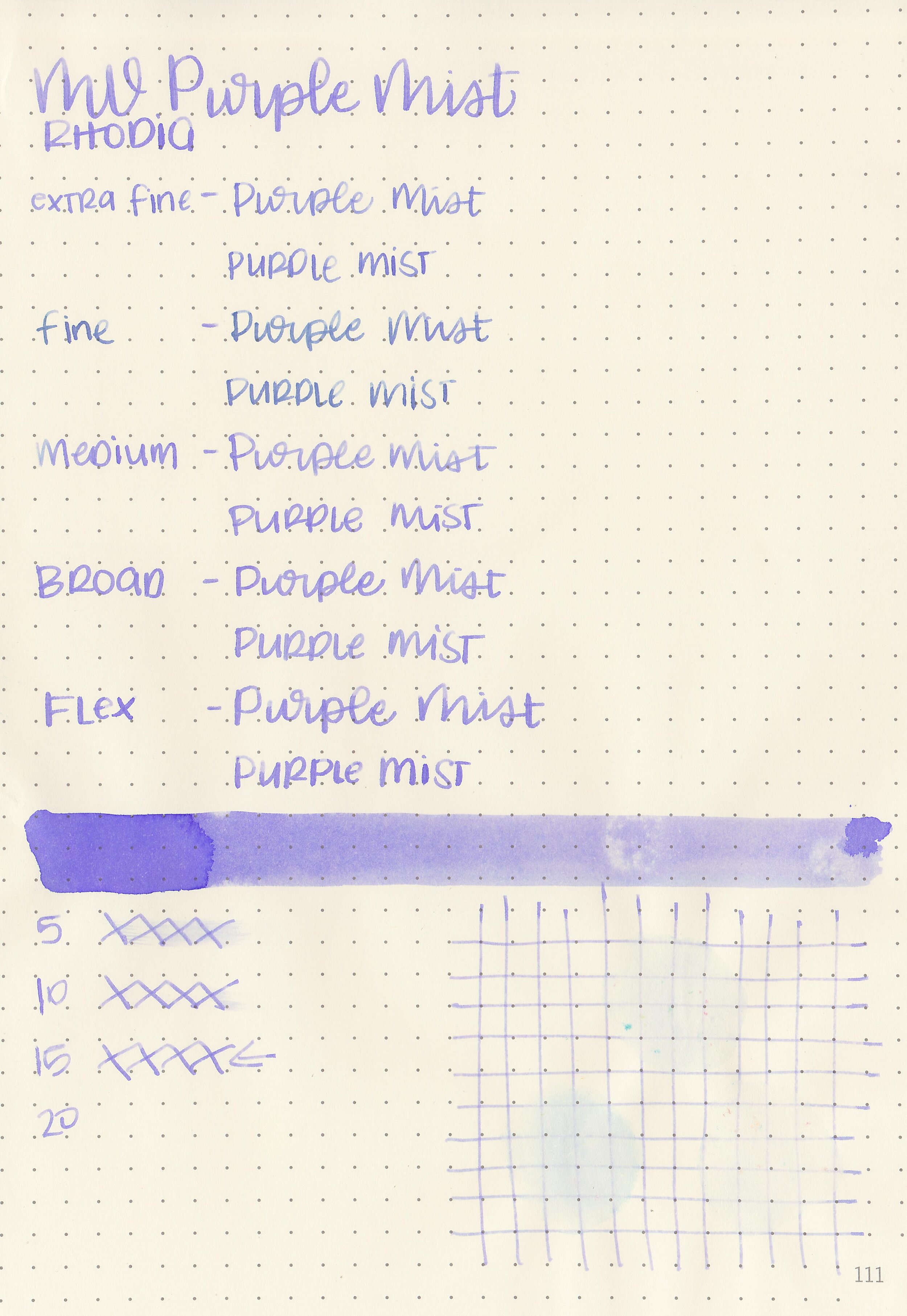
Let's take a look at how the ink behaves on fountain pen friendly papers: Rhodia, Tomoe River, and Leuchtturm.

Dry time: 20 seconds
Water resistance: Low
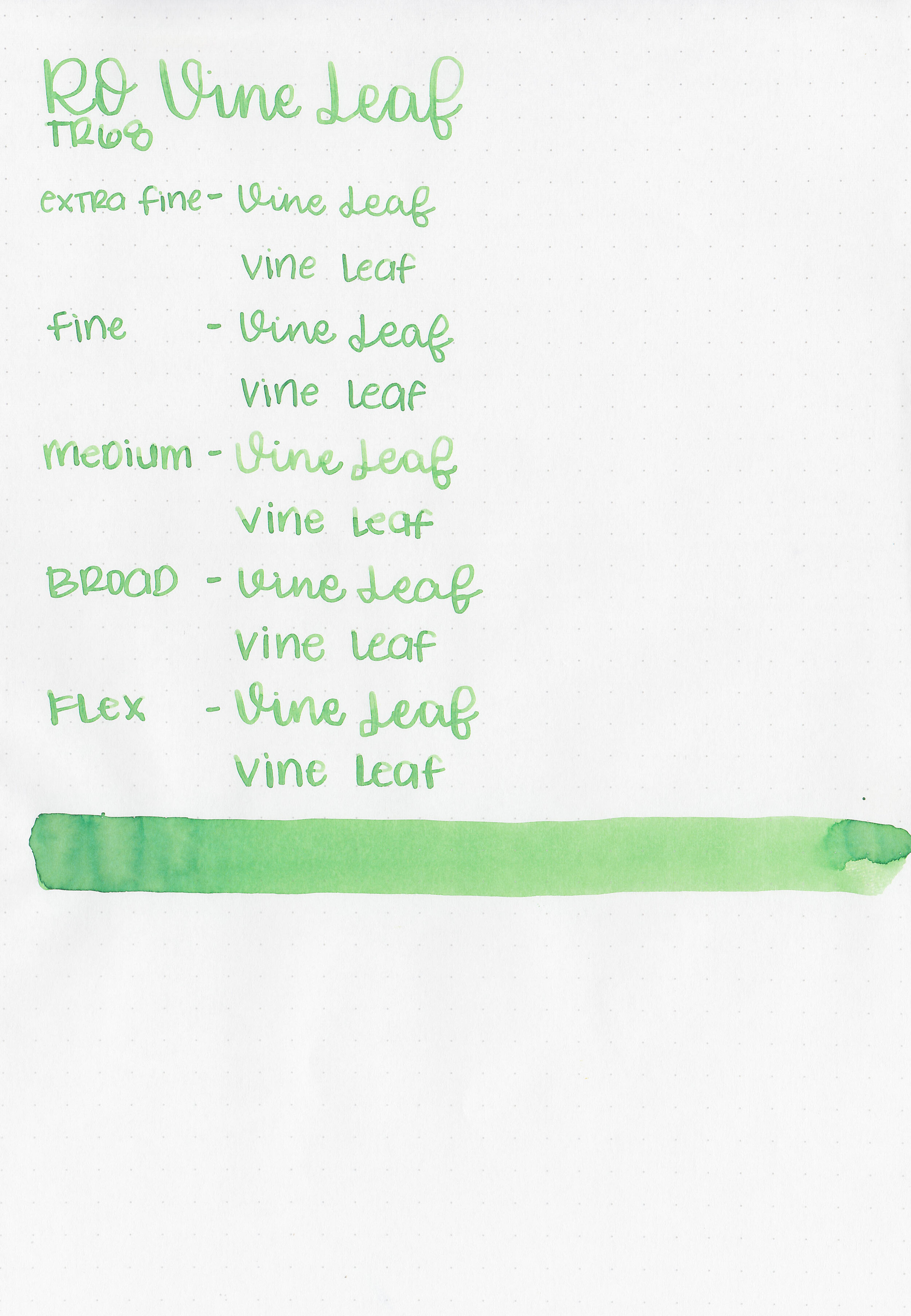
Feathering: None
Show through: Medium
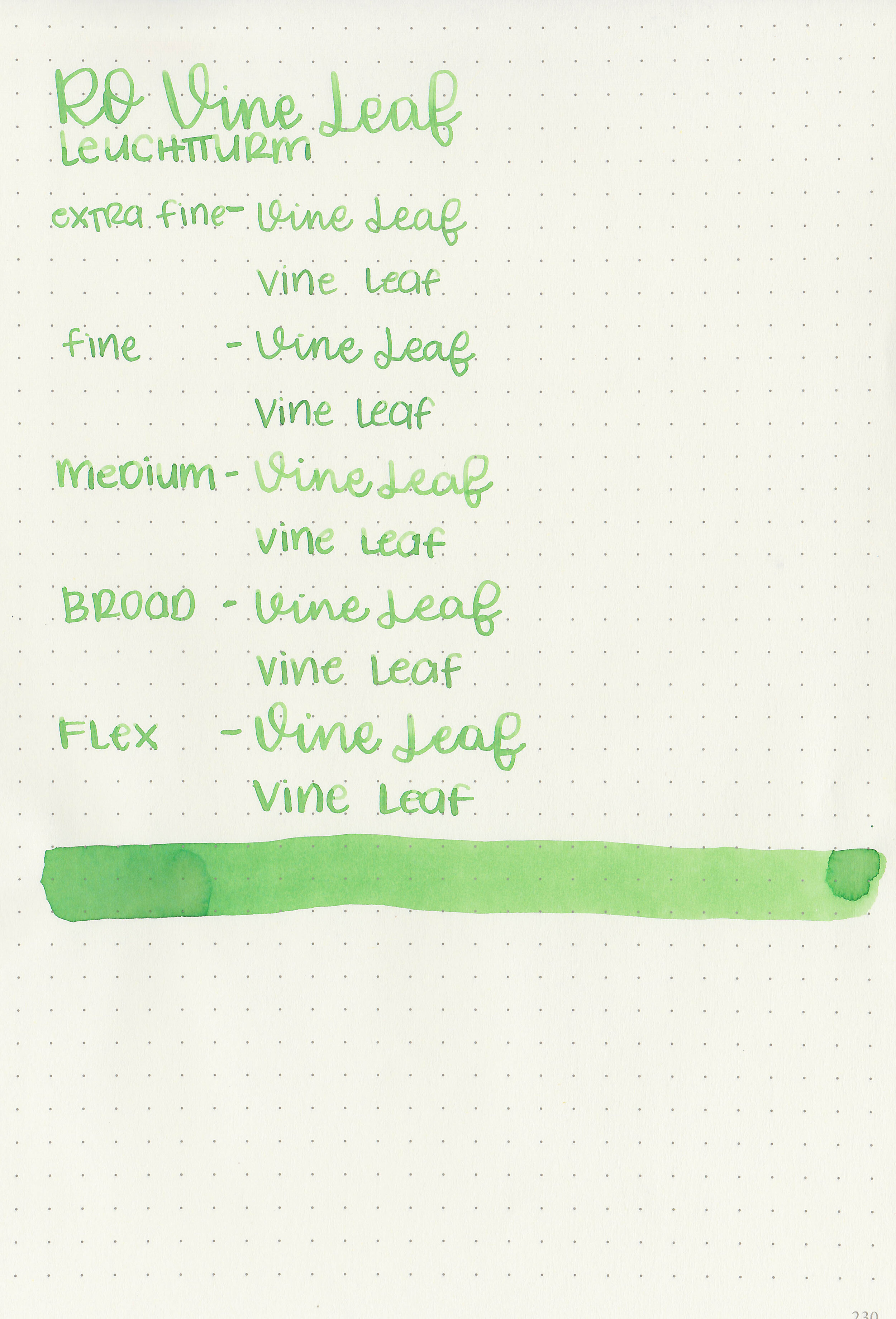
Bleeding: None
Other properties: medium shading, no sheen, and no shimmer.
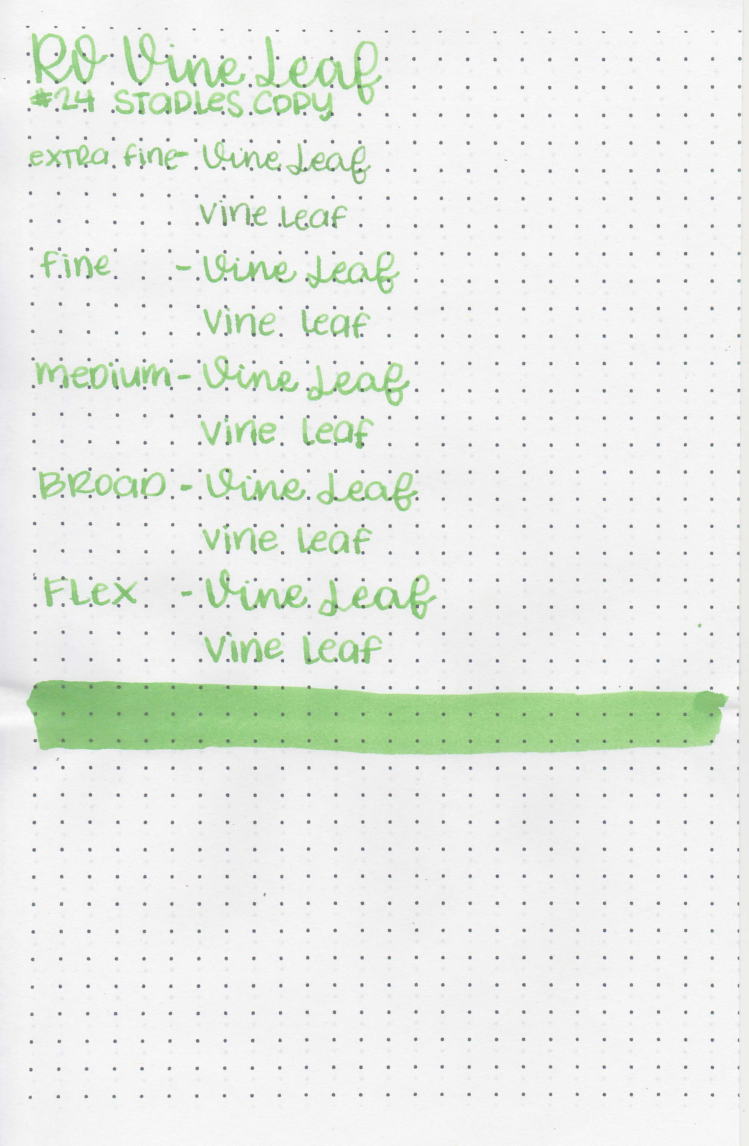
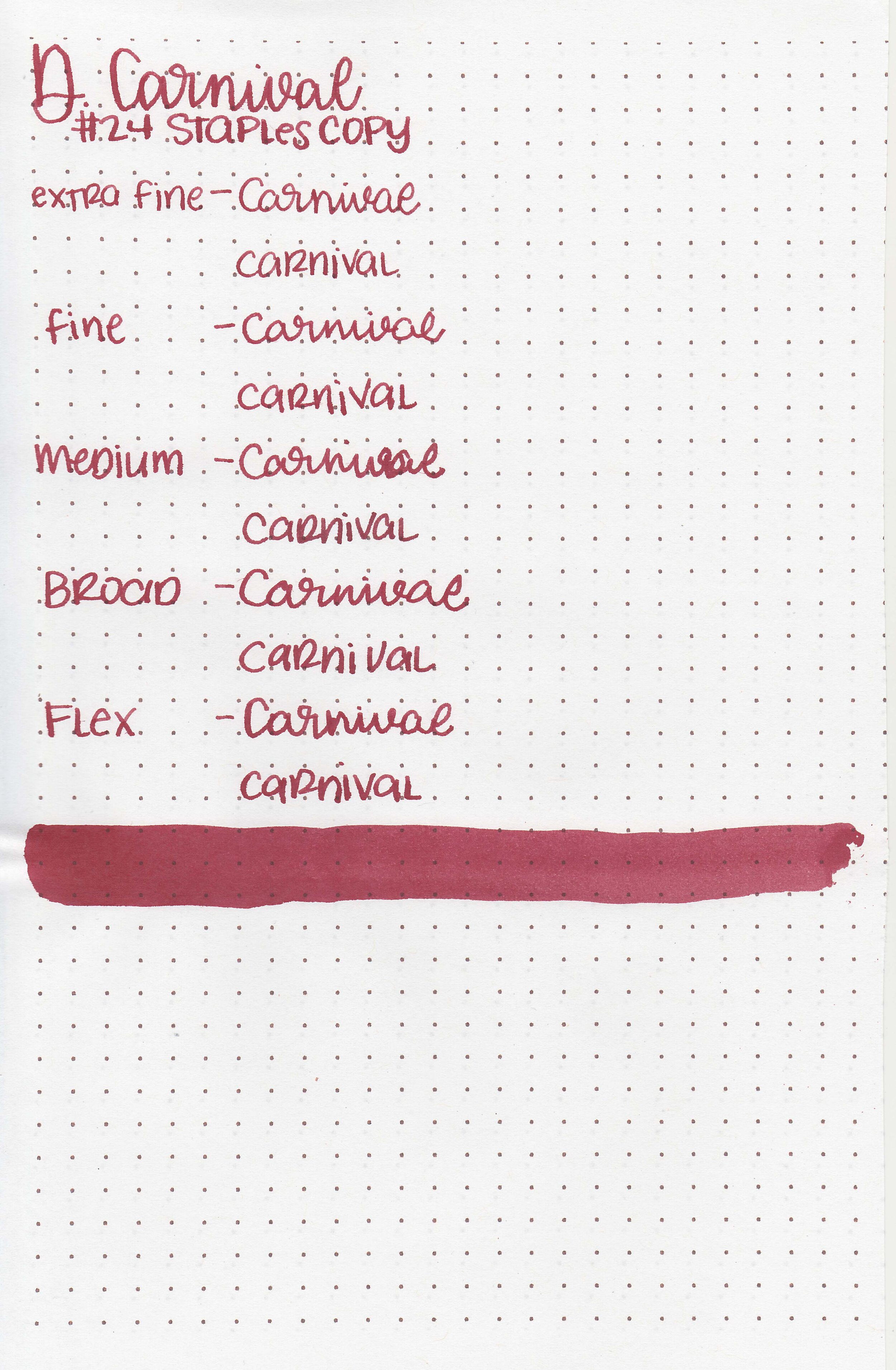
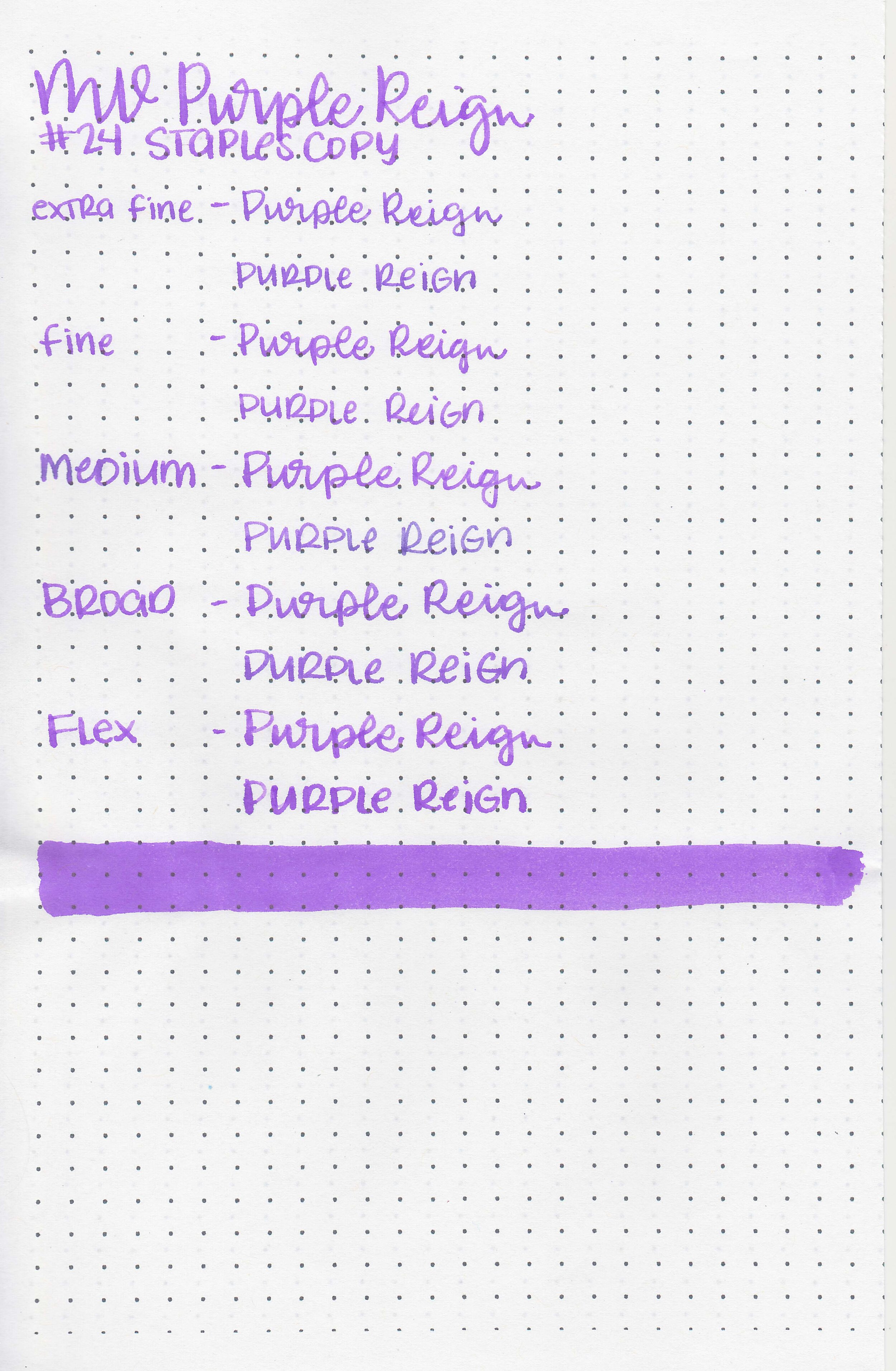
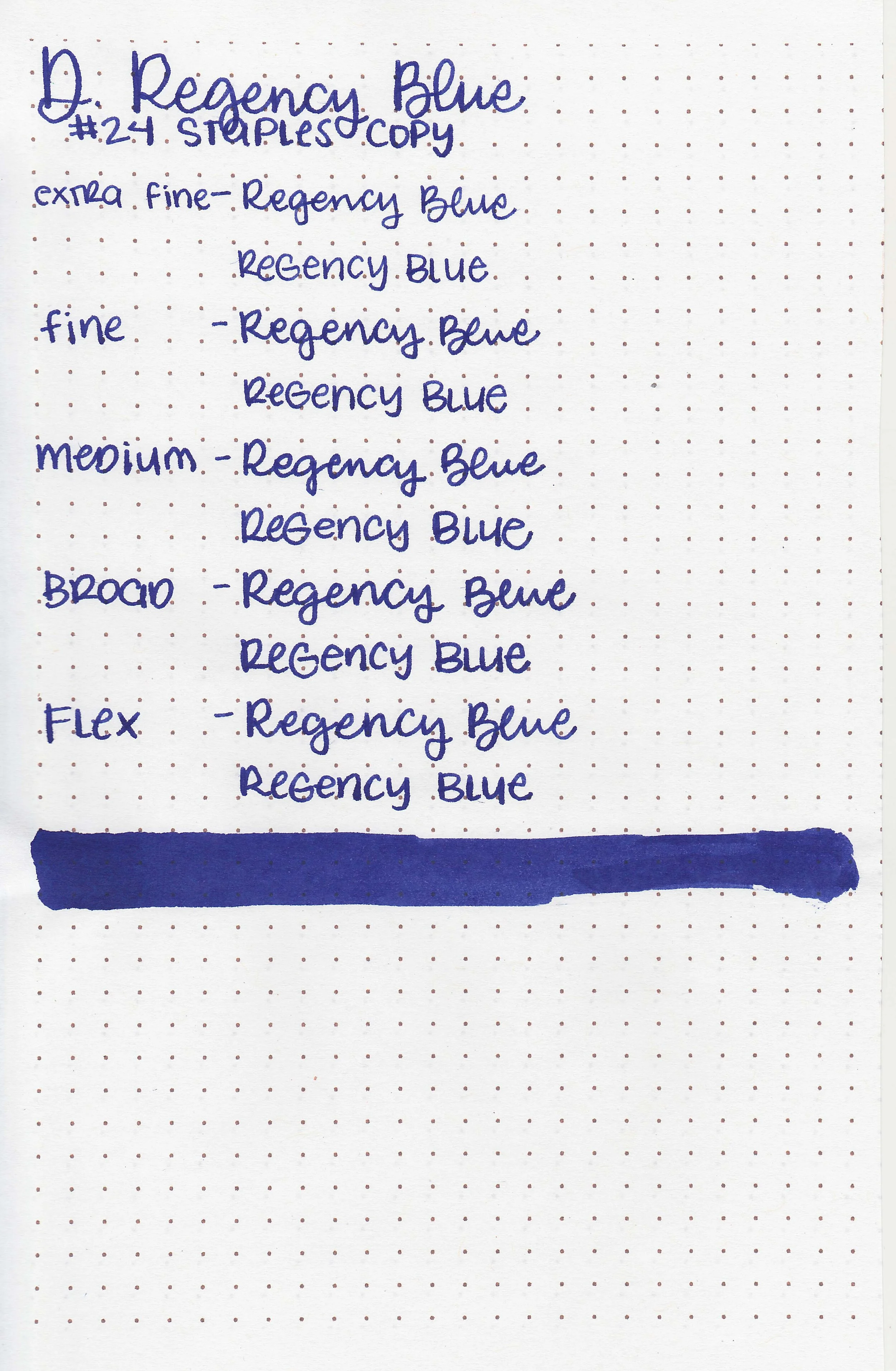
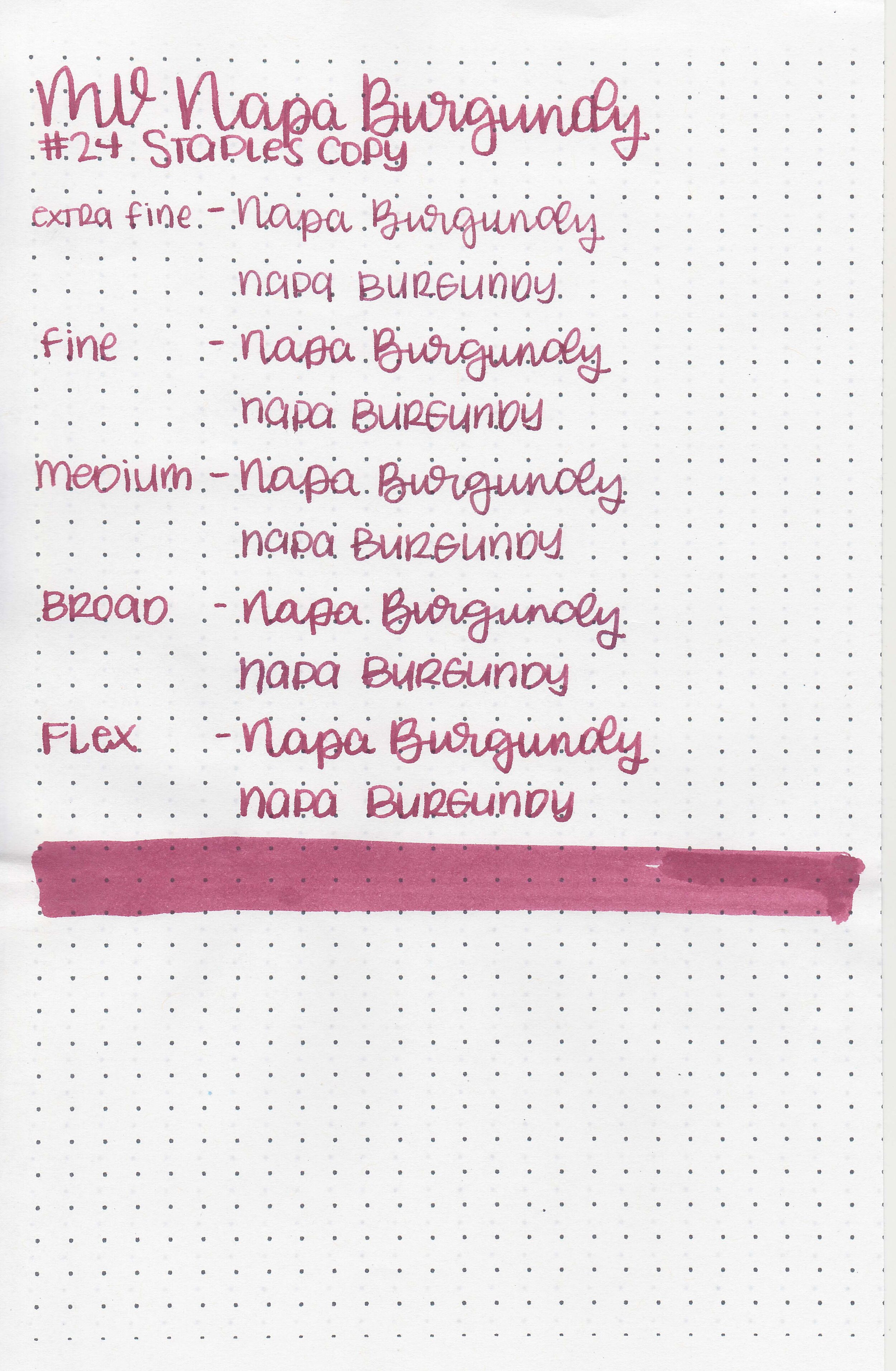
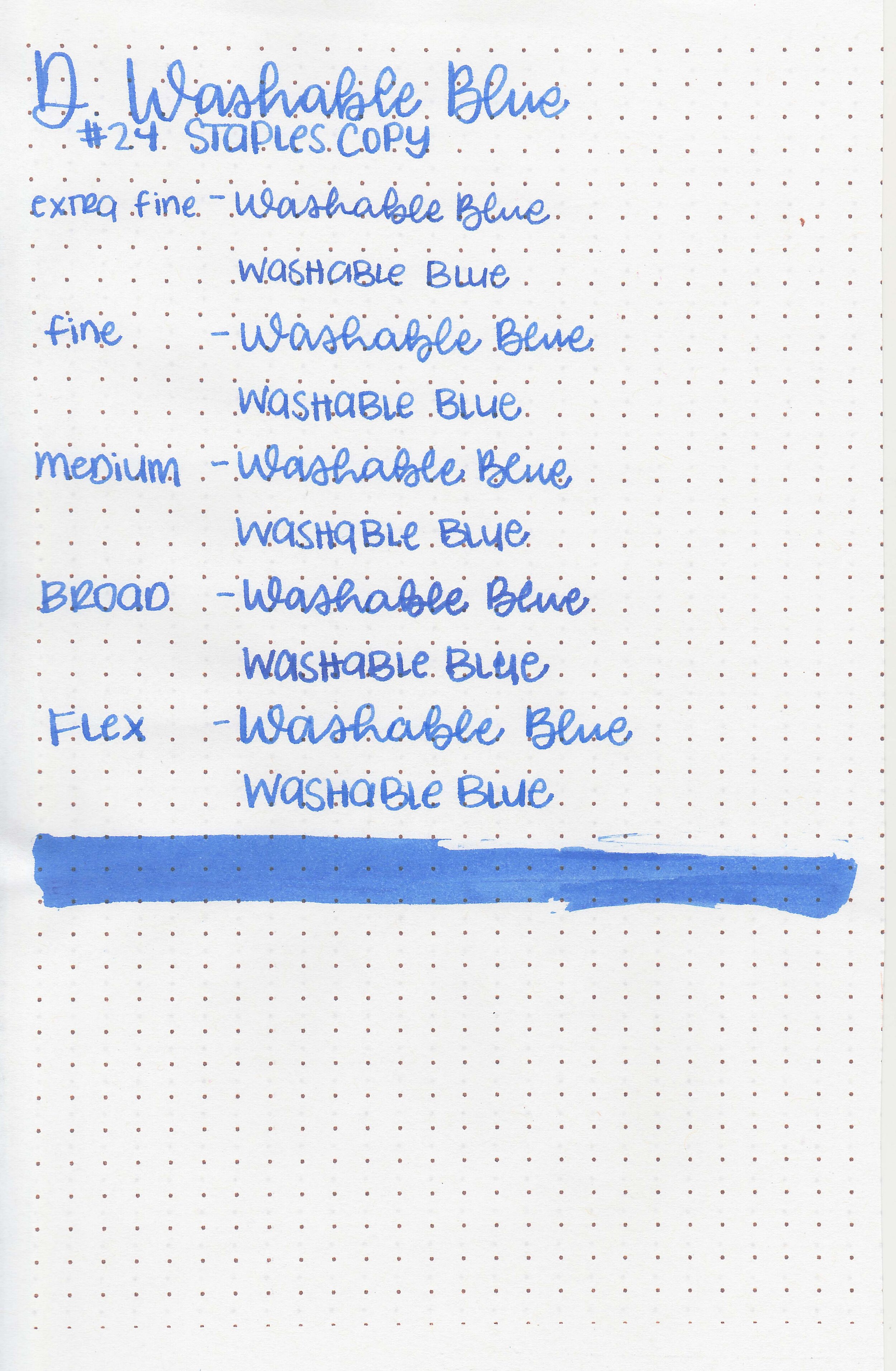
On Staples 24 lb copy paper there was some feathering in all nib sizes and just a few dots of bleeding.
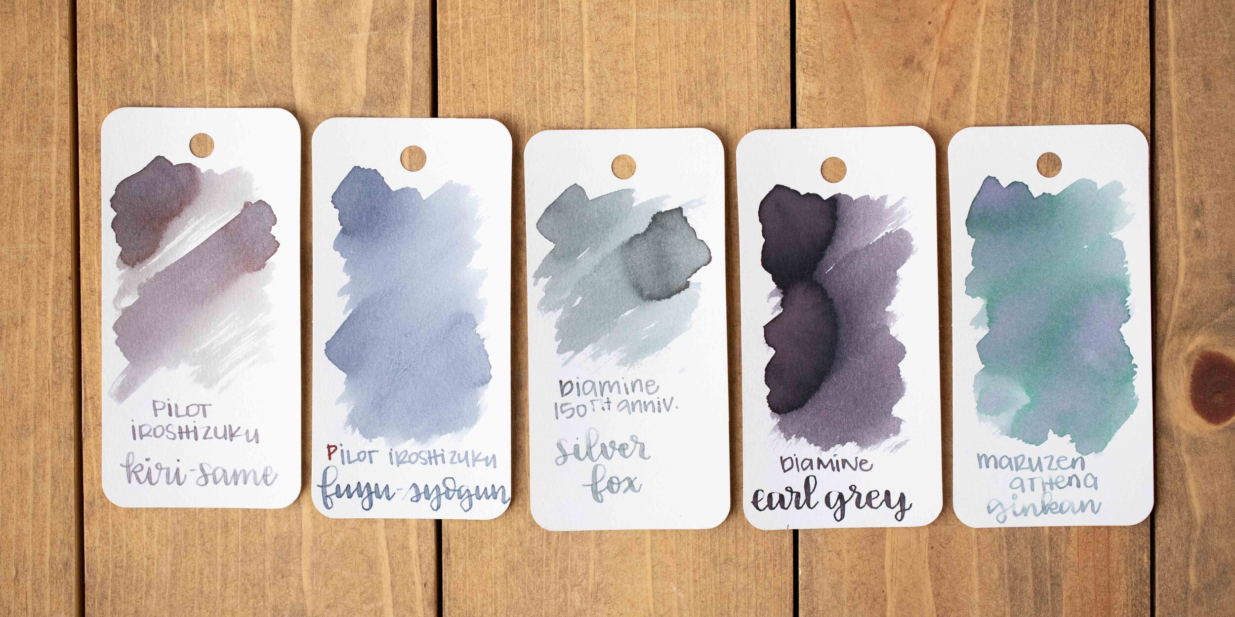
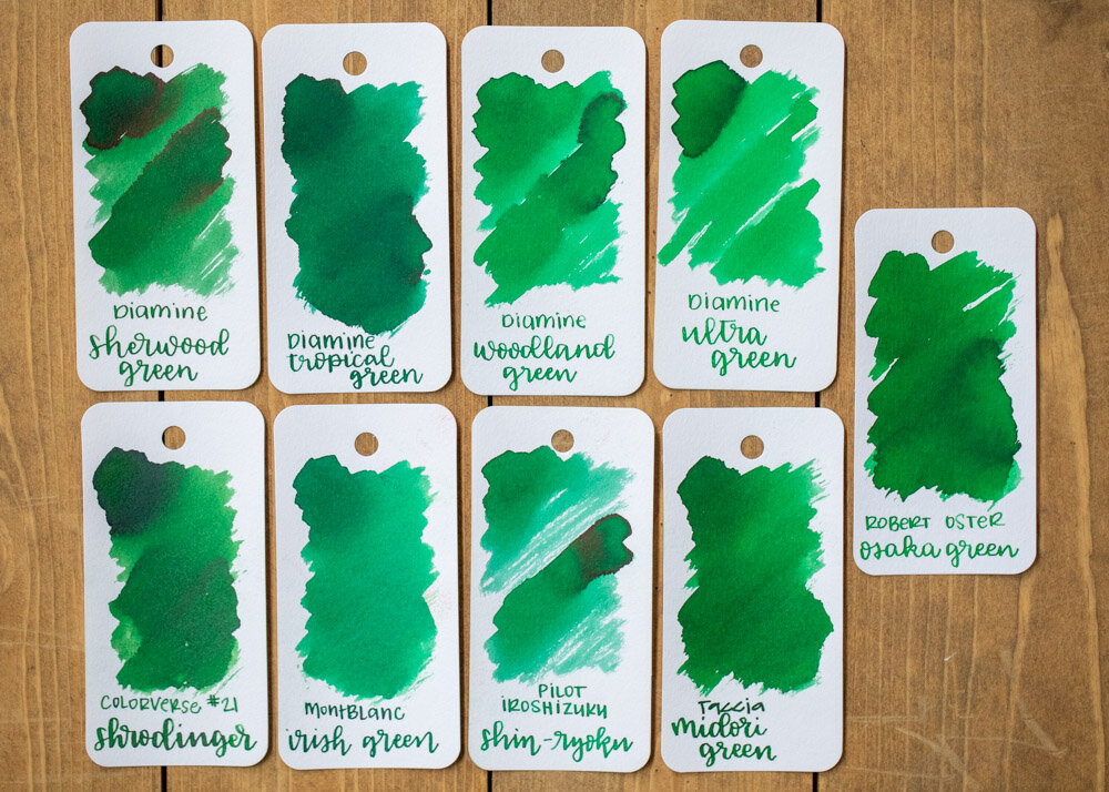
Comparison Swabs:
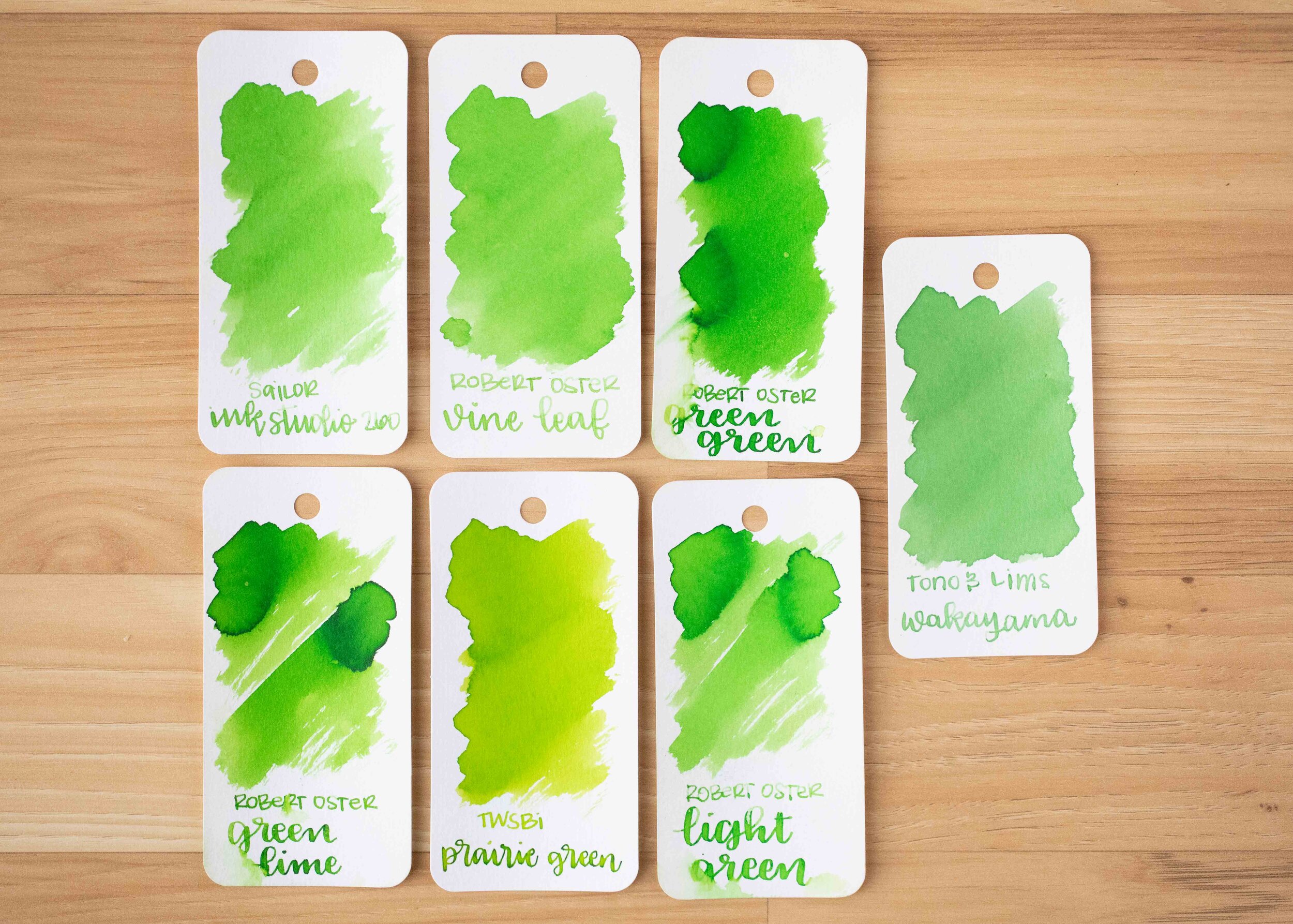
Vine Leaf is closest to Sailor Ink Studio 260. Click here to see the Robert Oster inks together, and click here to see the green inks together.
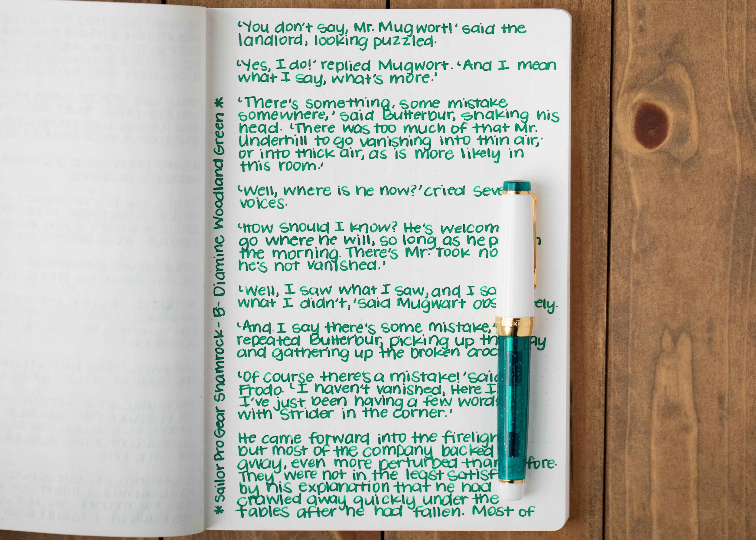
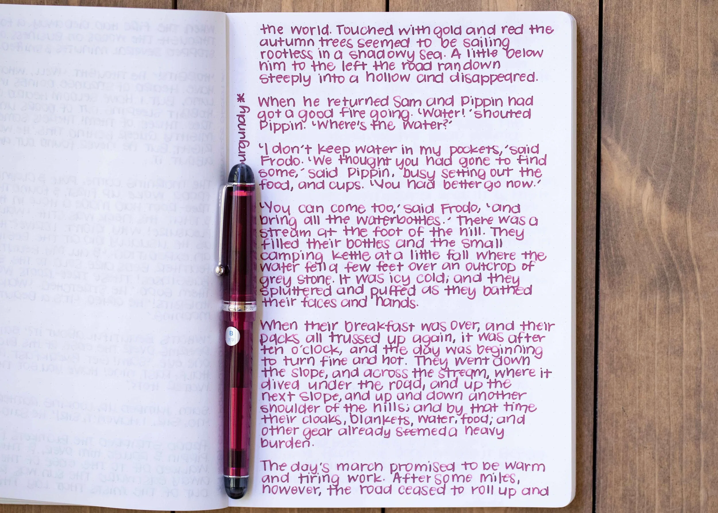
Longer writing:

I used a Lamy Safari Turquoise with a medium nib on a Taroko Enigma notebook. The ink had an average flow.
Overall, it’s a lovely light green but it can be rather pale, especially in smaller nibs and therefore hard to read. I think I would reach for this ink the most in the spring and early summer.
Disclaimer: All photos and opinions are my own. This page does not contain affiliate links and this post is not sponsored in any way.