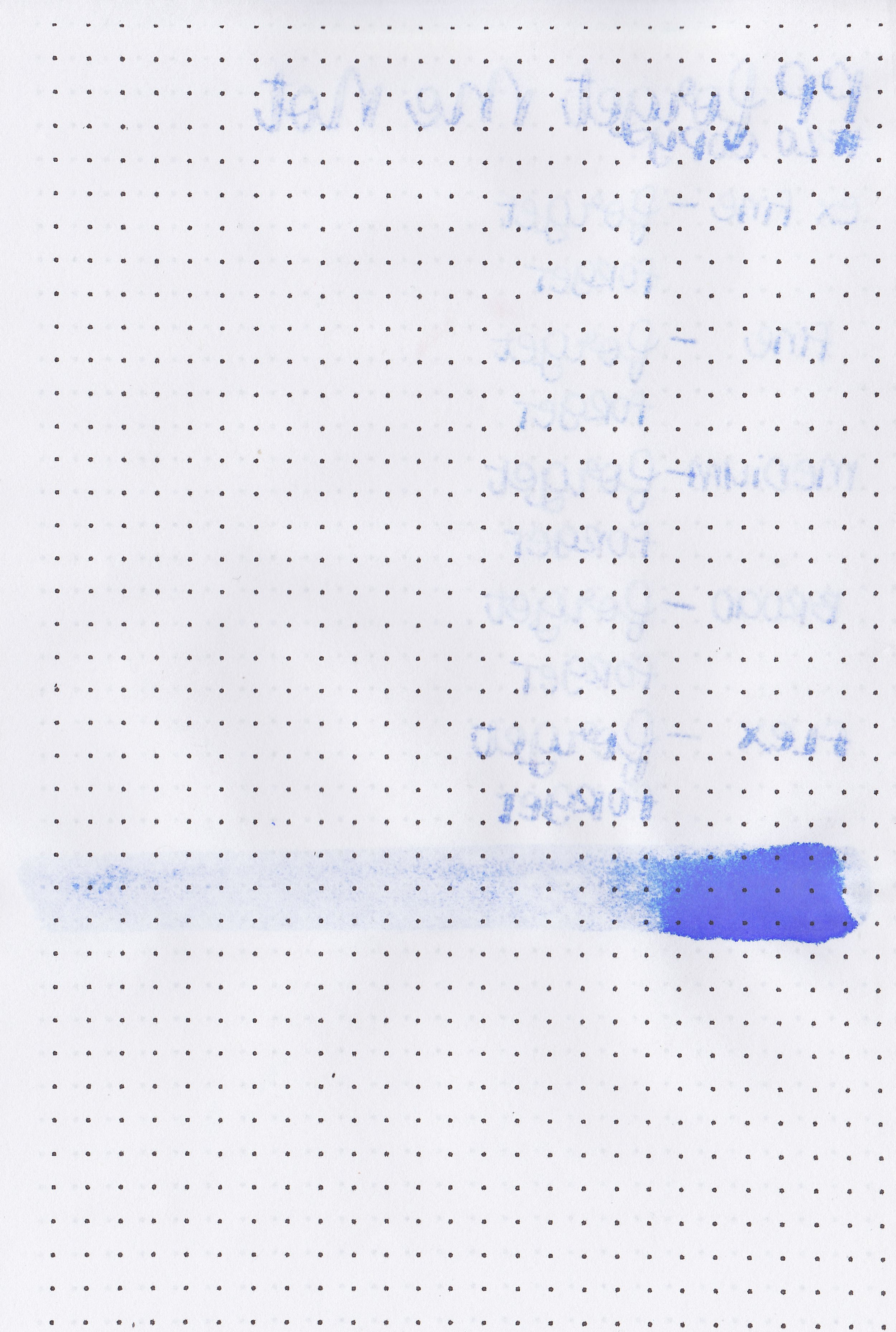
Ink Review #2542: Wearingeul Wendy Darling
/
Wearingeul Wendy Darling is from the Wearingeul Peter and Wendy collection. You can find this ink for sale at most retailers including Vanness Pens.

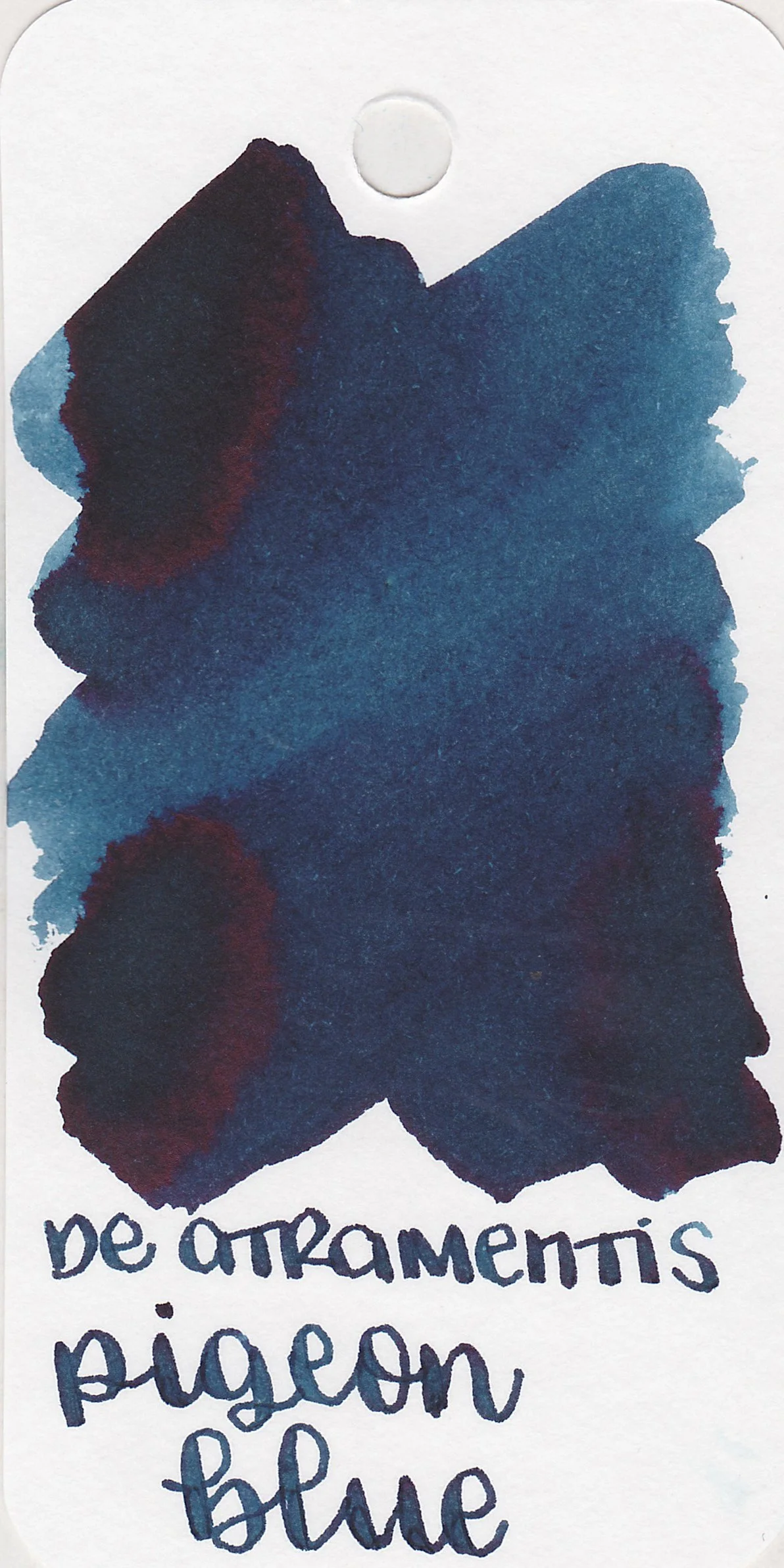
The color:
Wendy Darling is a pale baby blue that shades to pink.
*For my swab cards I use a Col-o-ring by Skylab Letterpress, a medium Pilot Ishime and a Mabie Todd Swan.
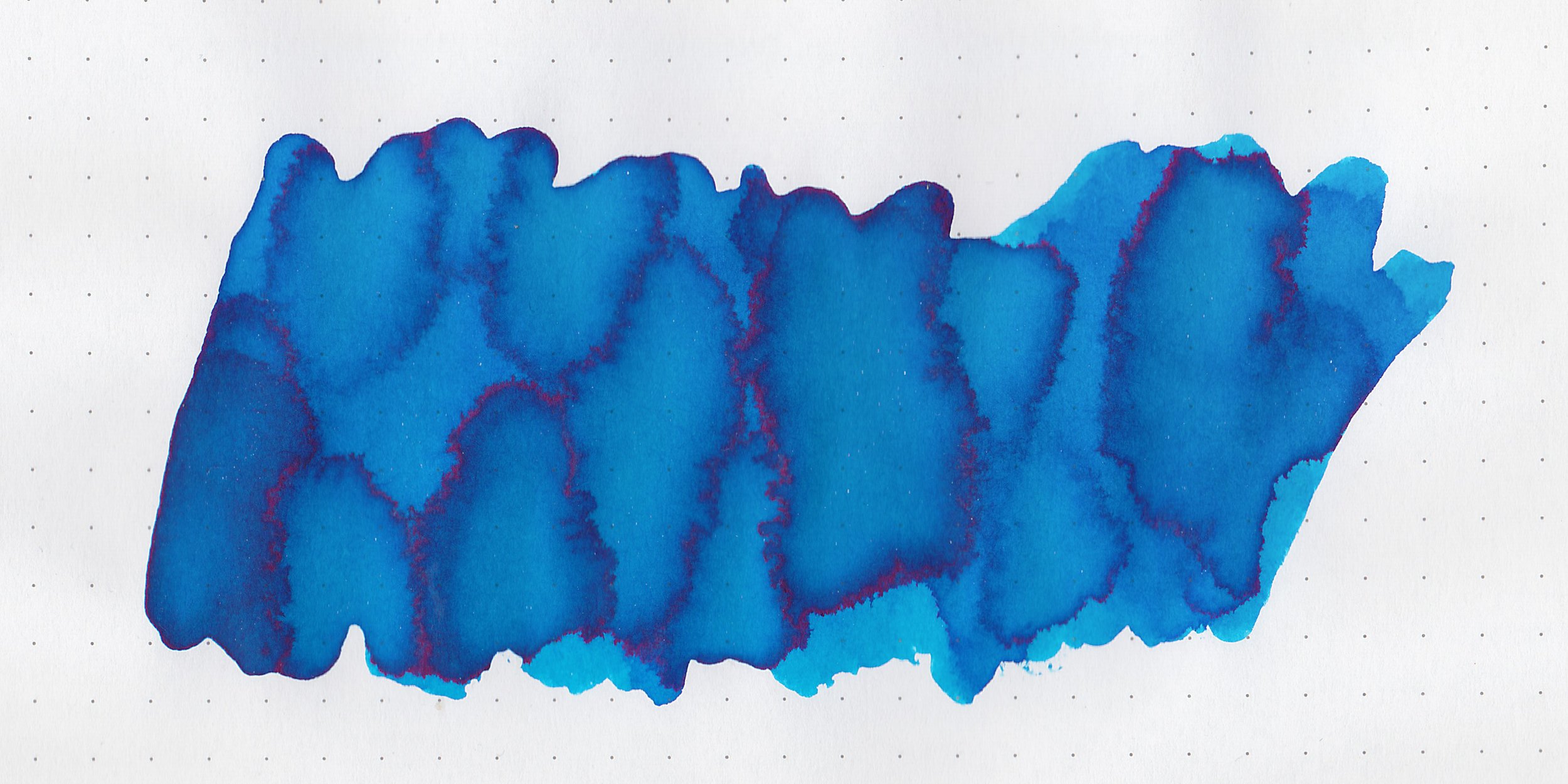
Swabs:
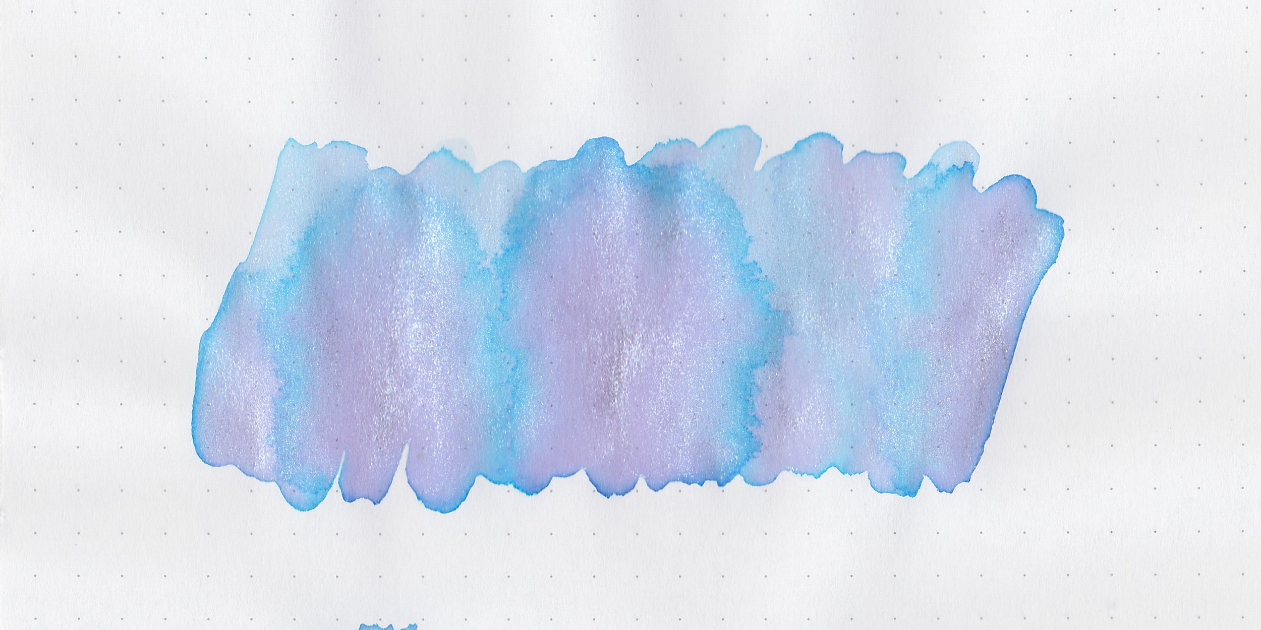
In large swabs on Tomoe River paper the ink has silver and turquoise shimmer (according to Wearingeul). I just see silver shimmer.

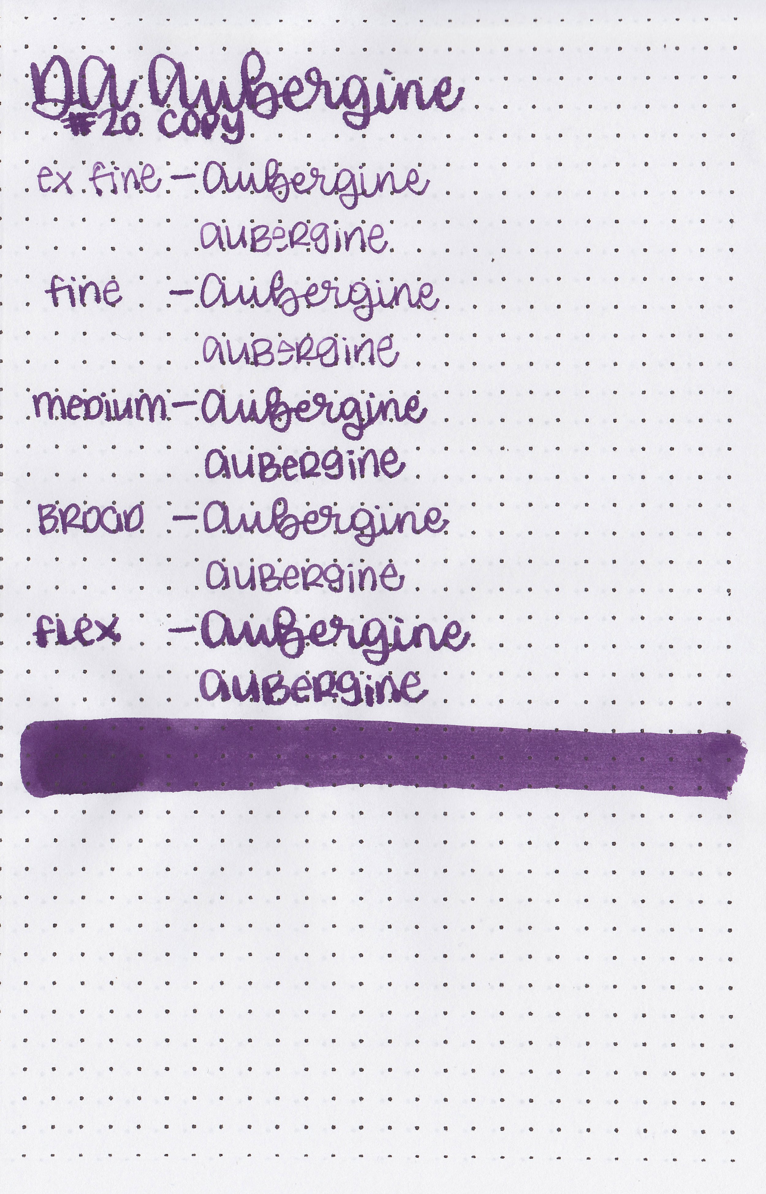
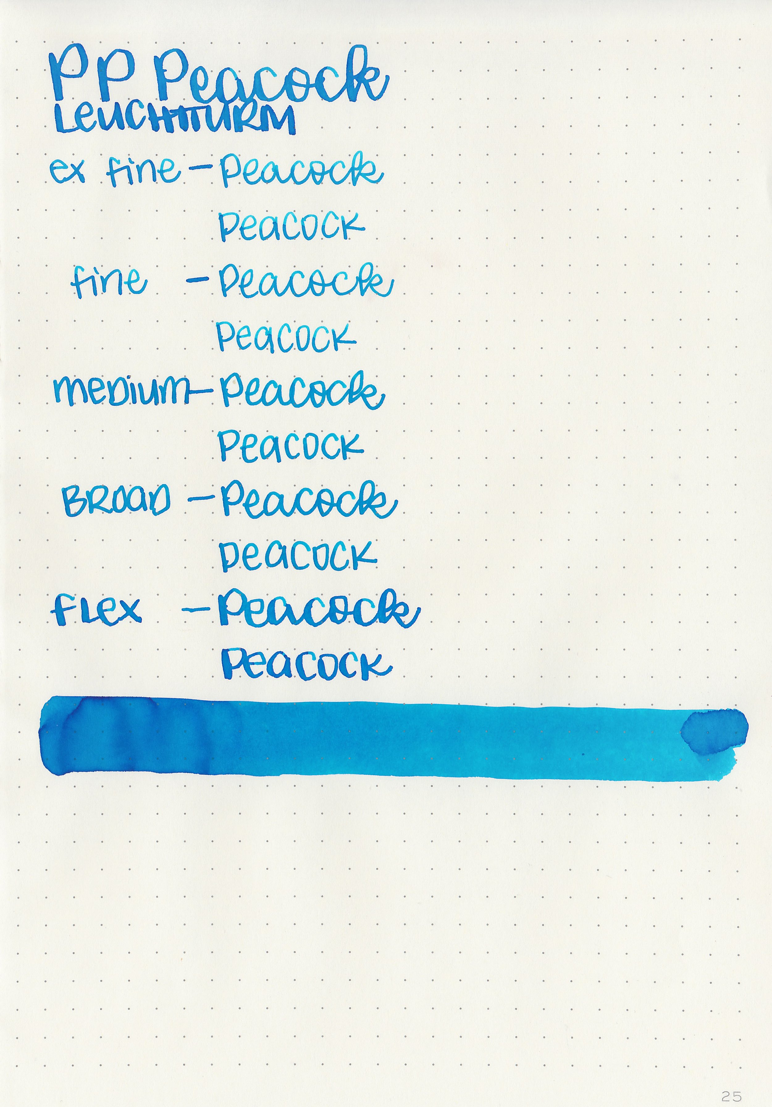
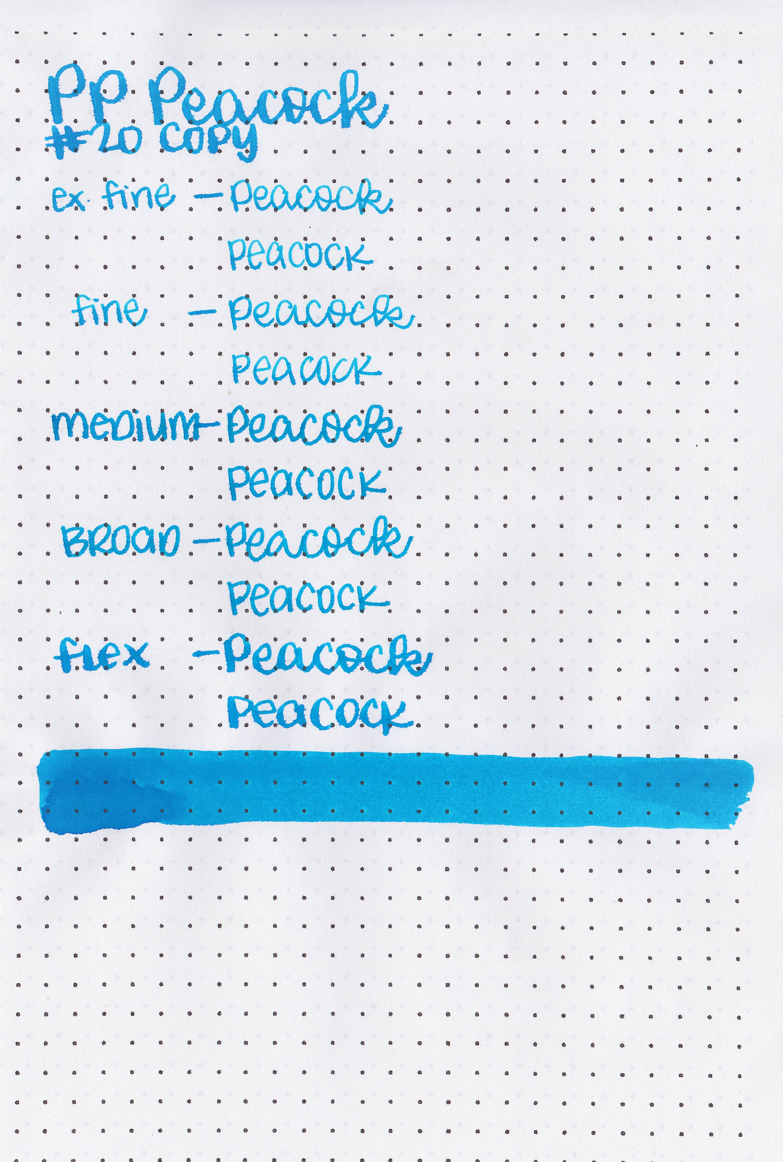
Writing samples:
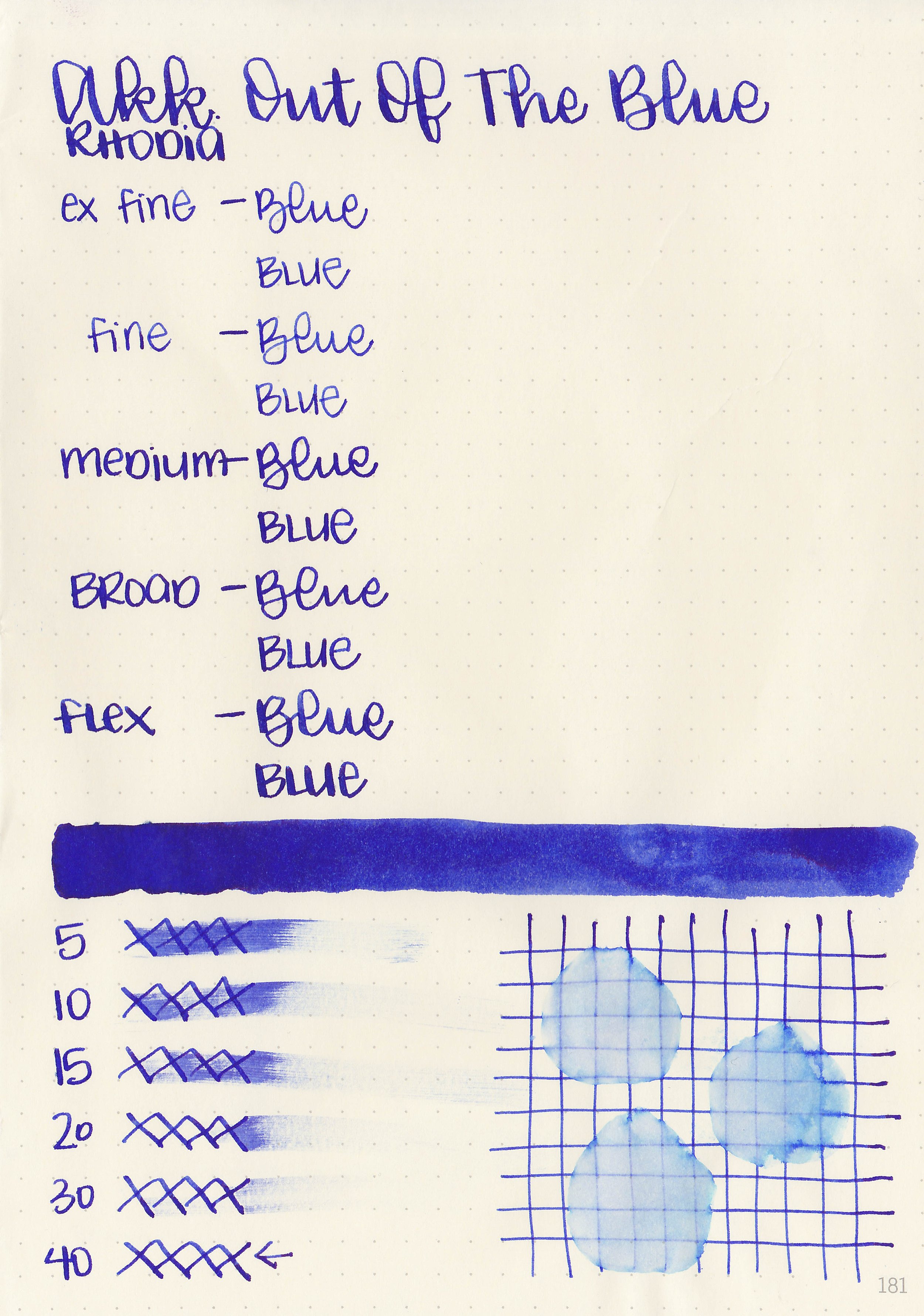
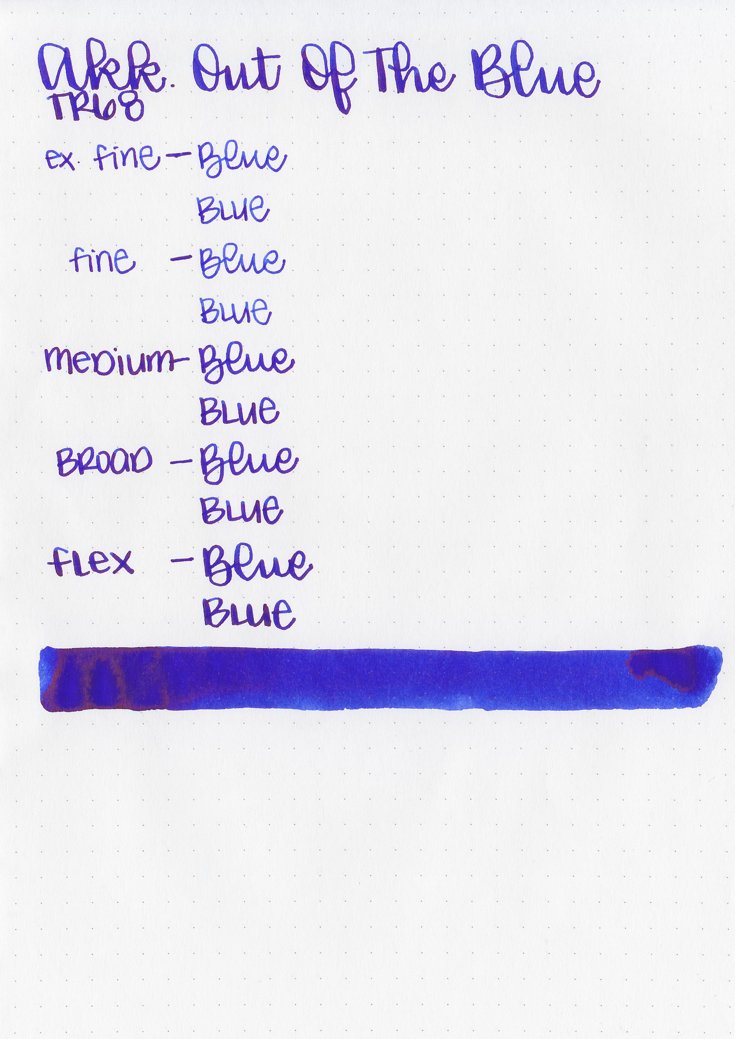
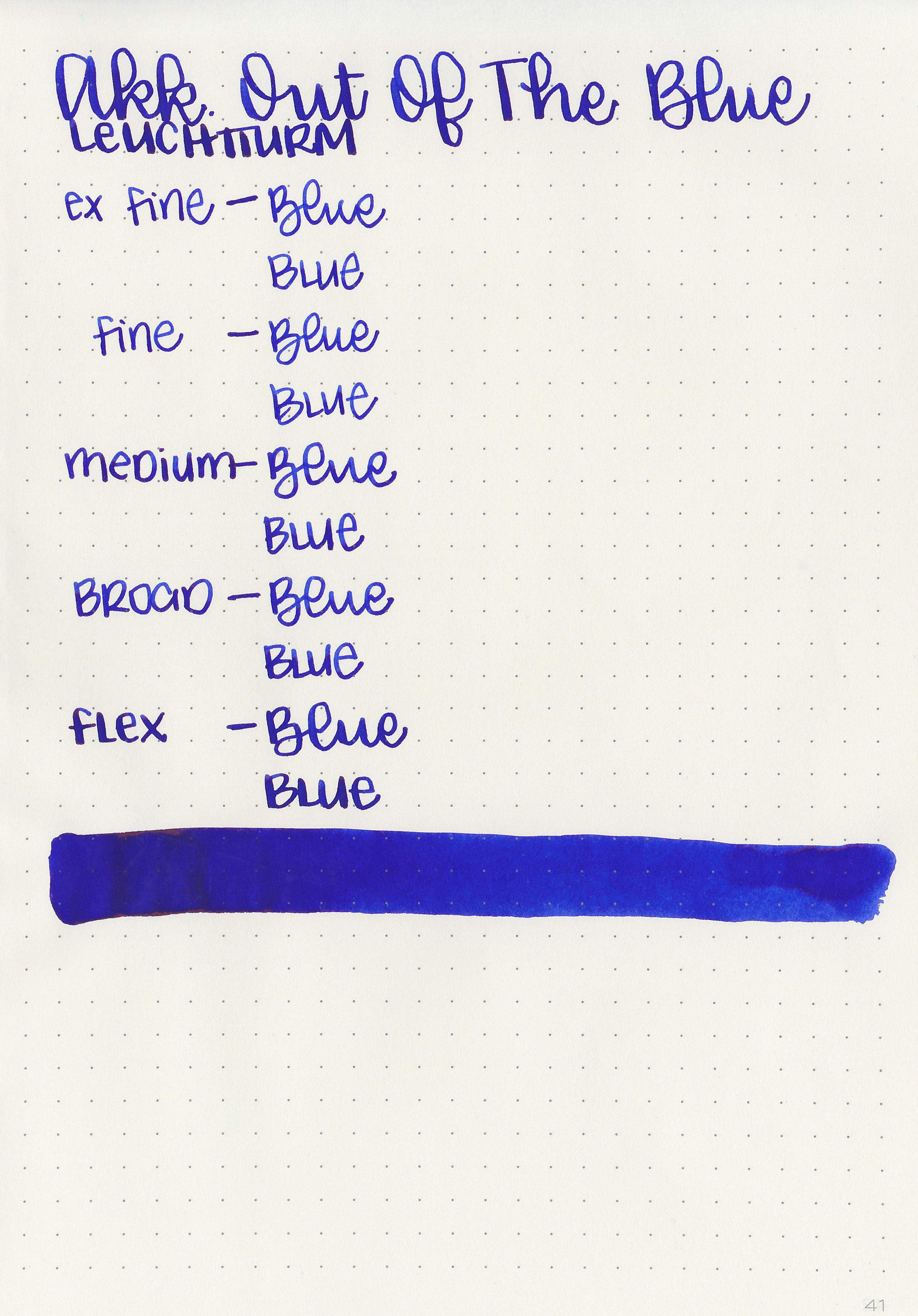
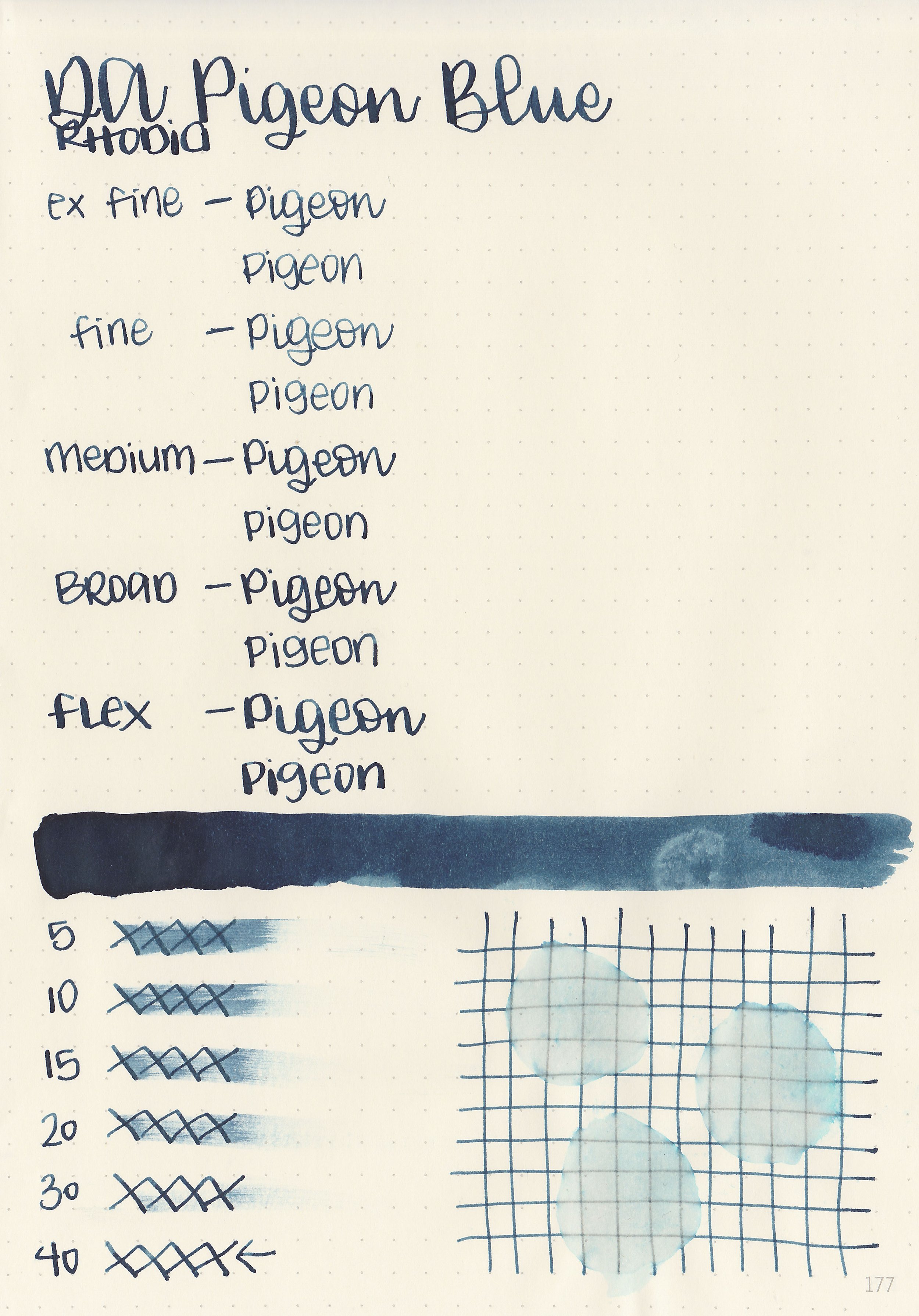
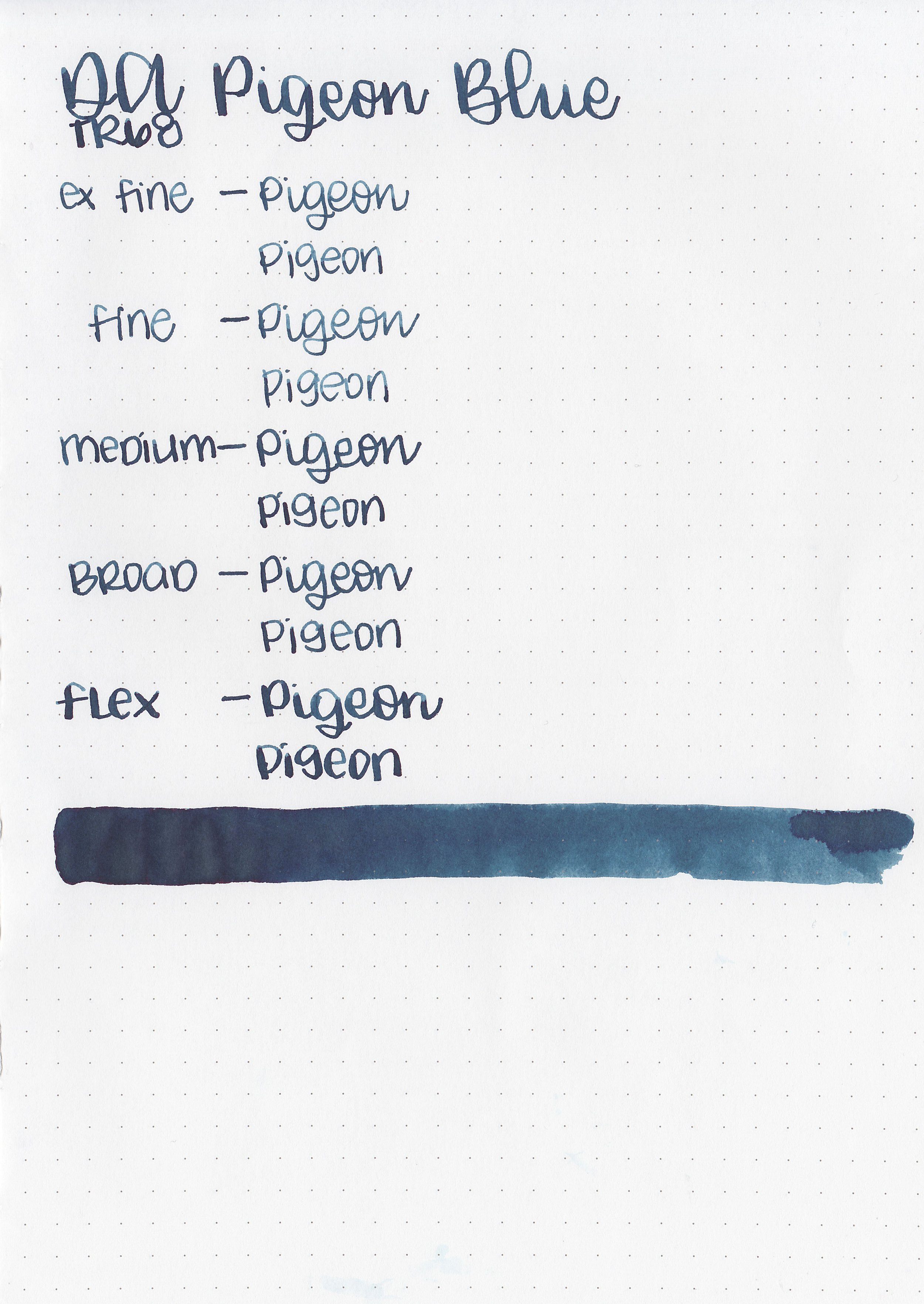
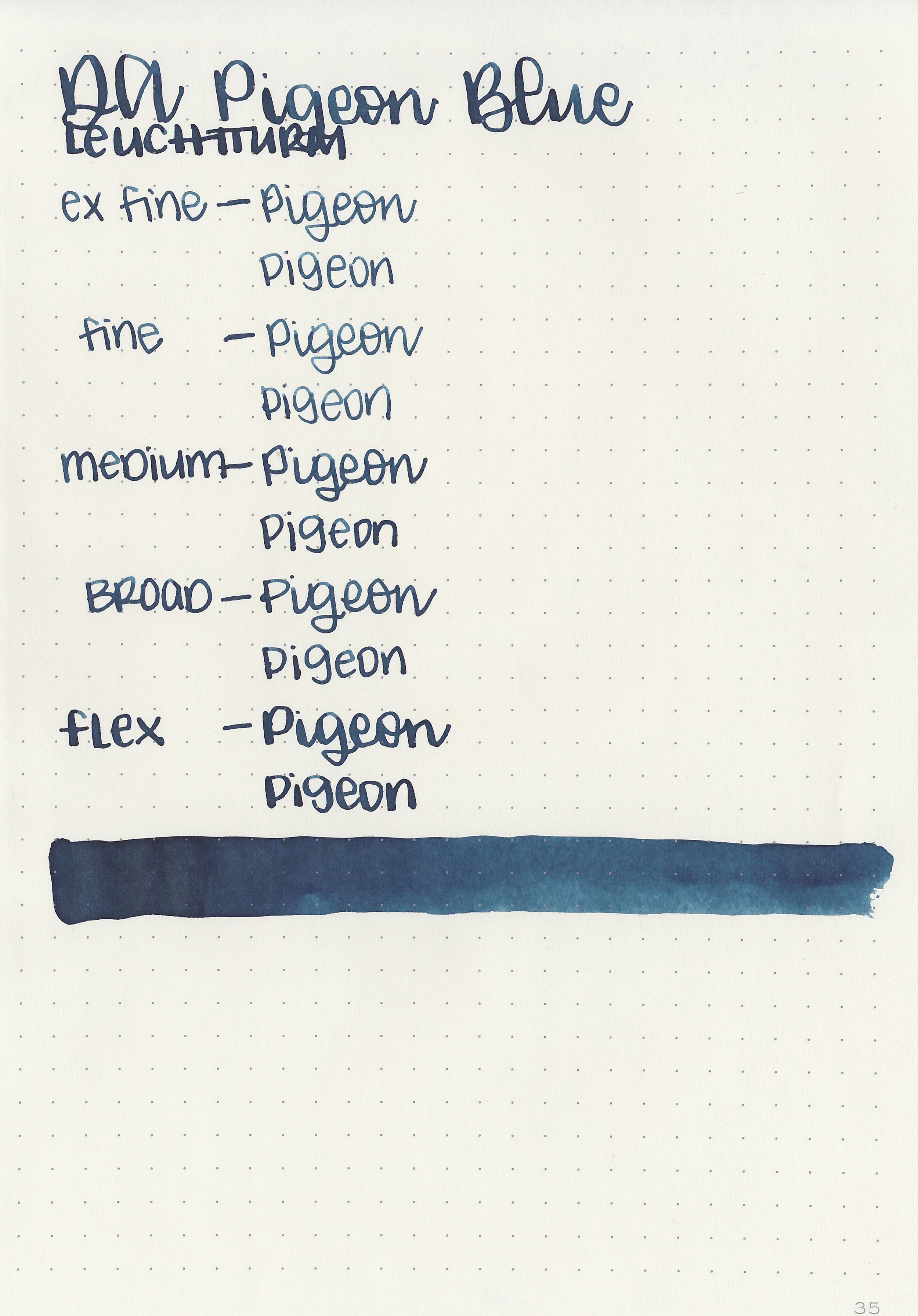
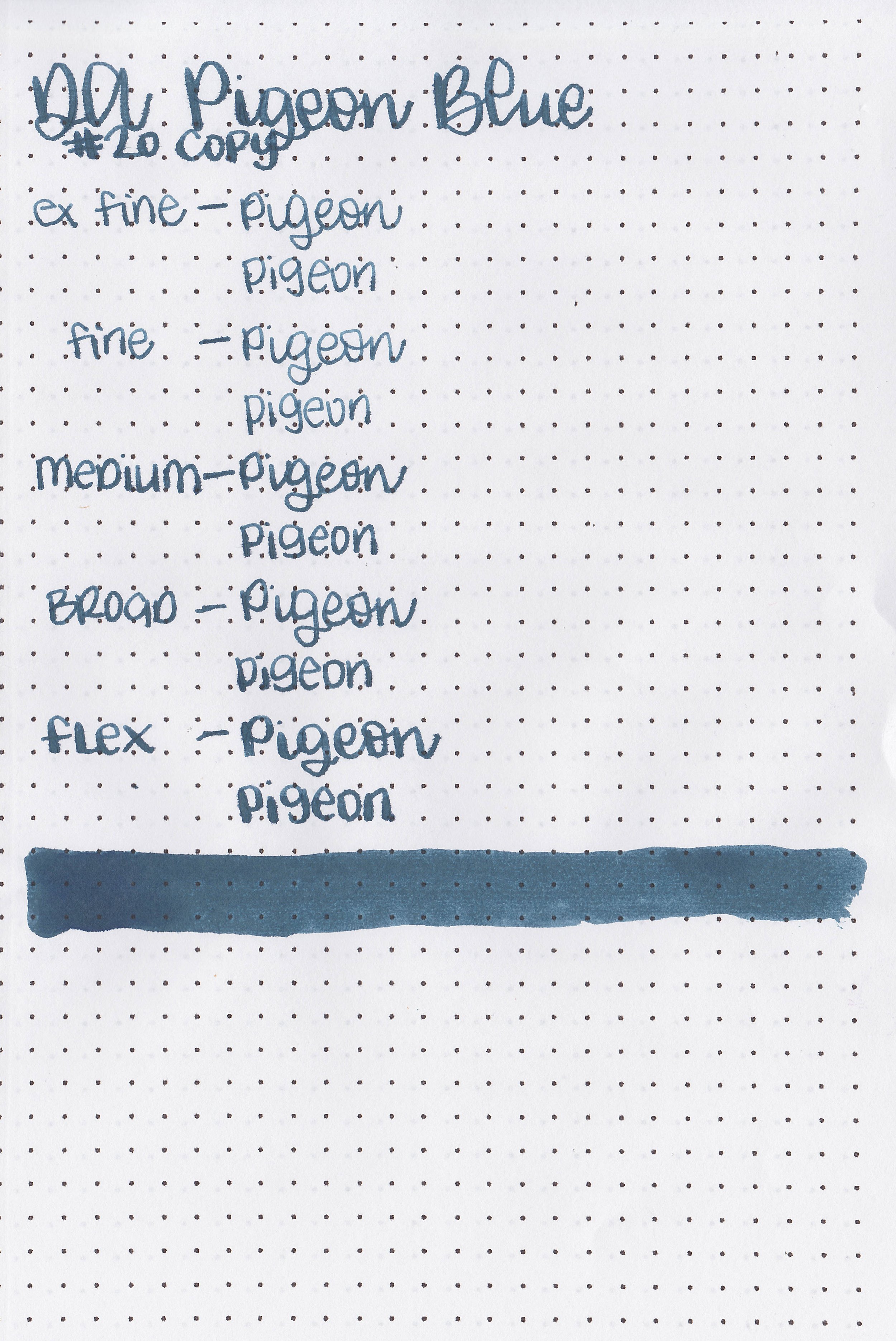
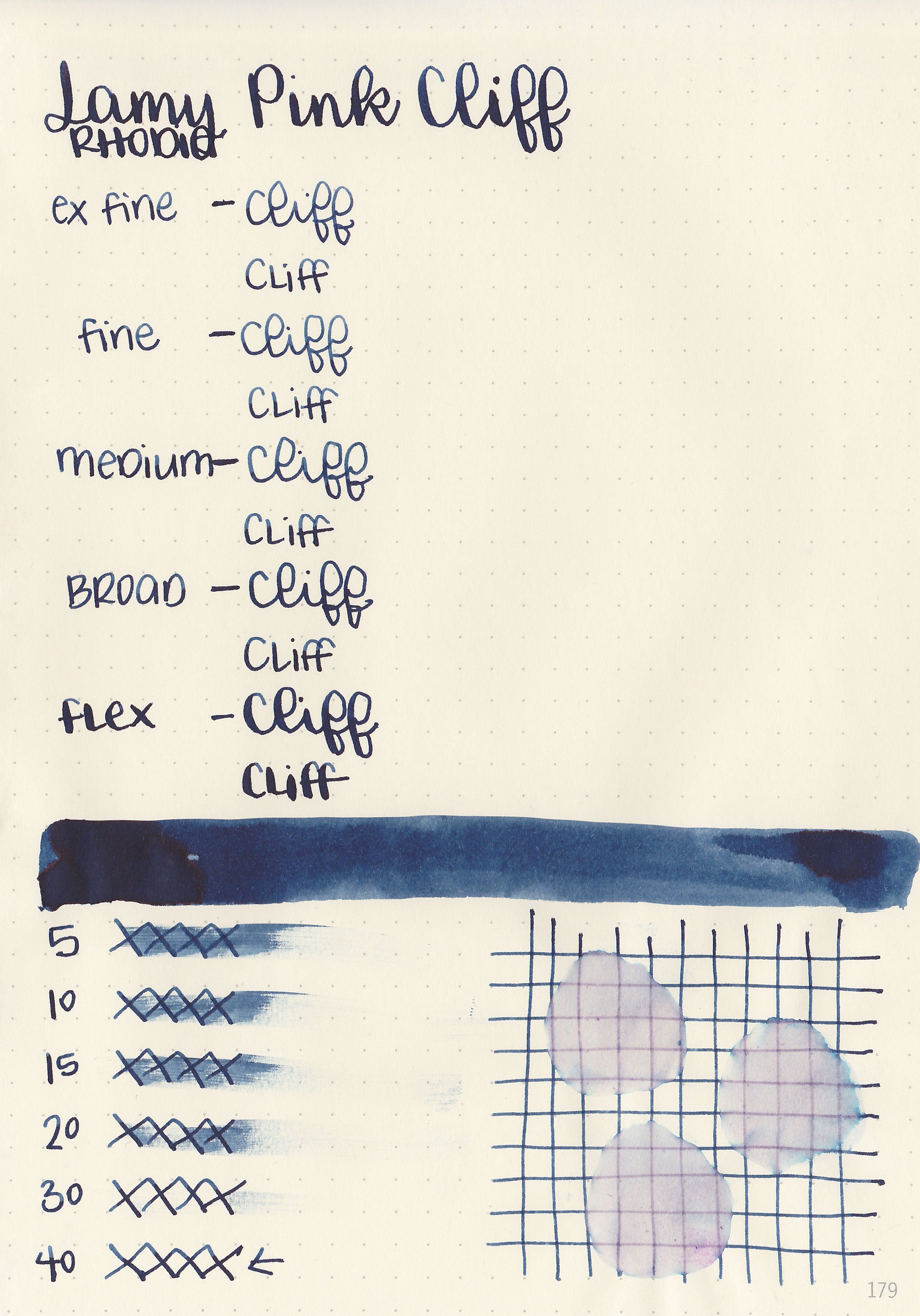
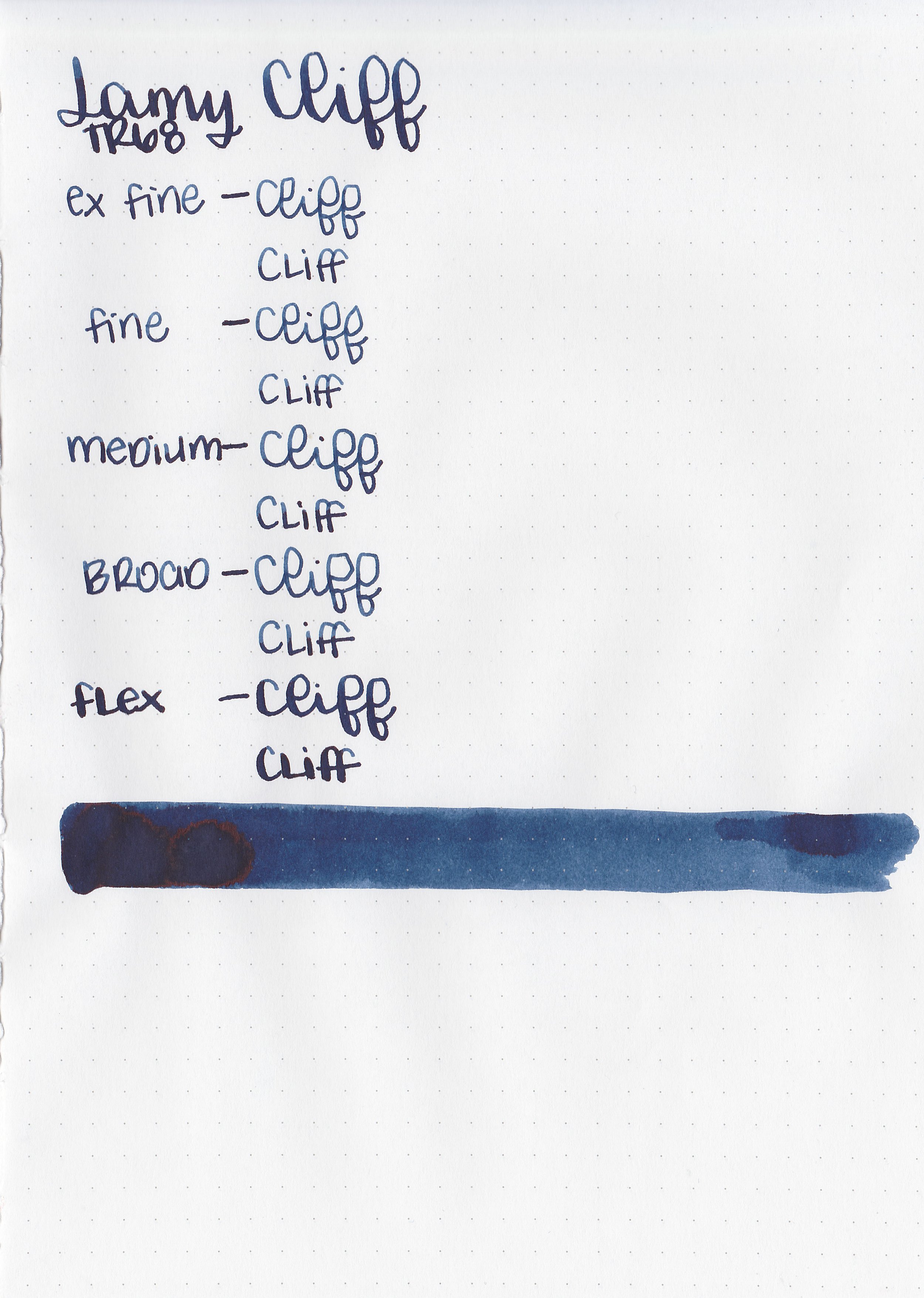
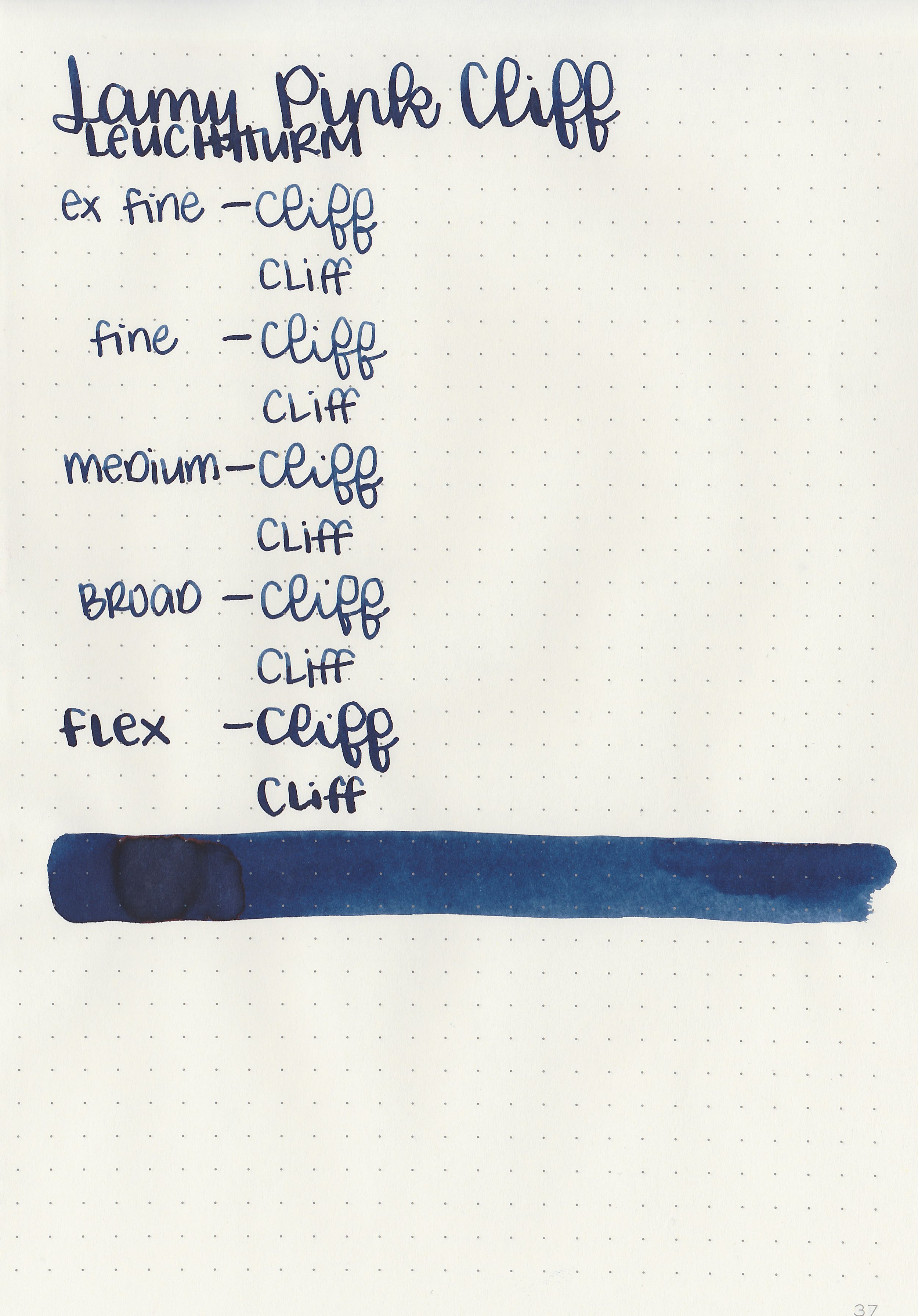
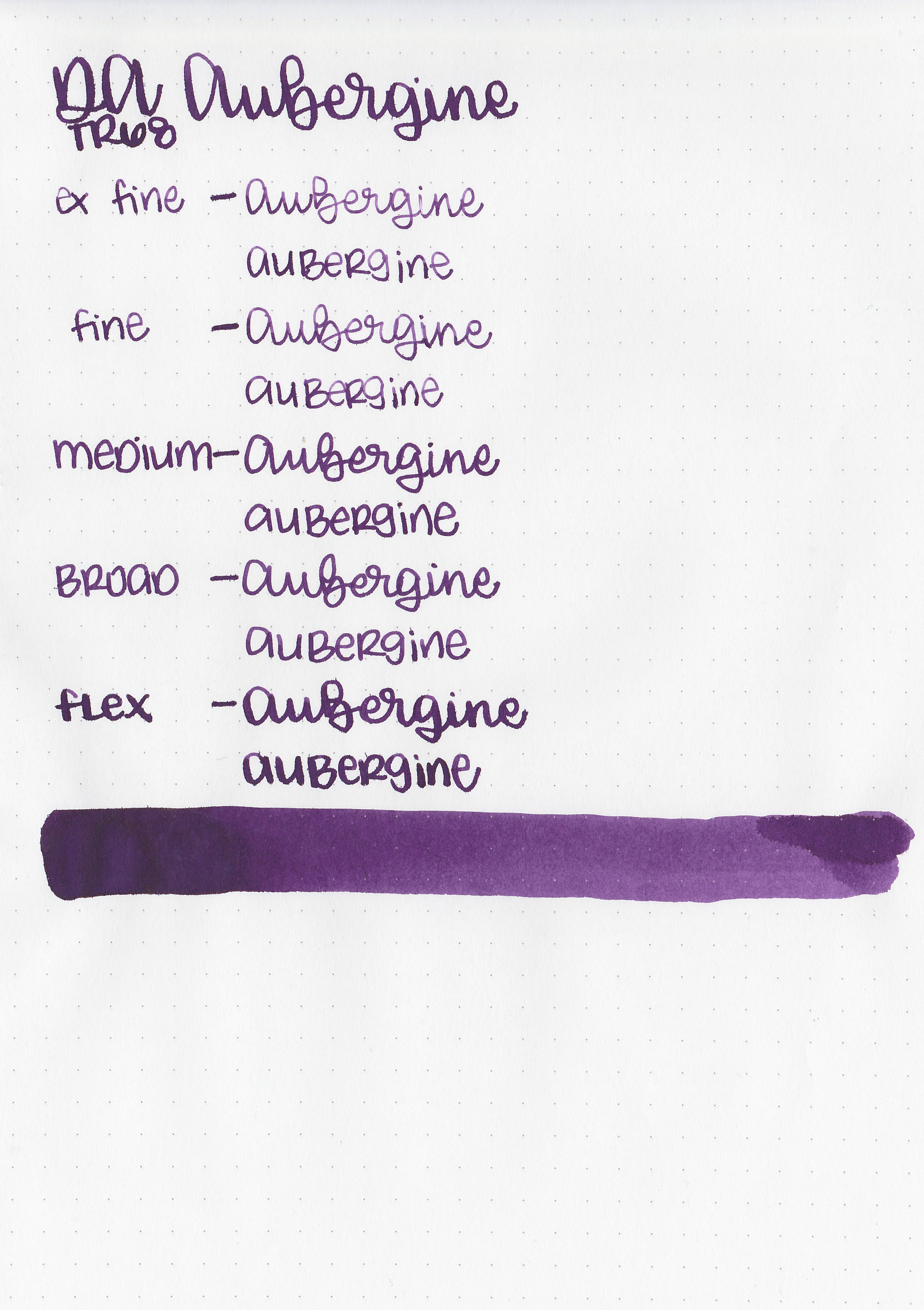
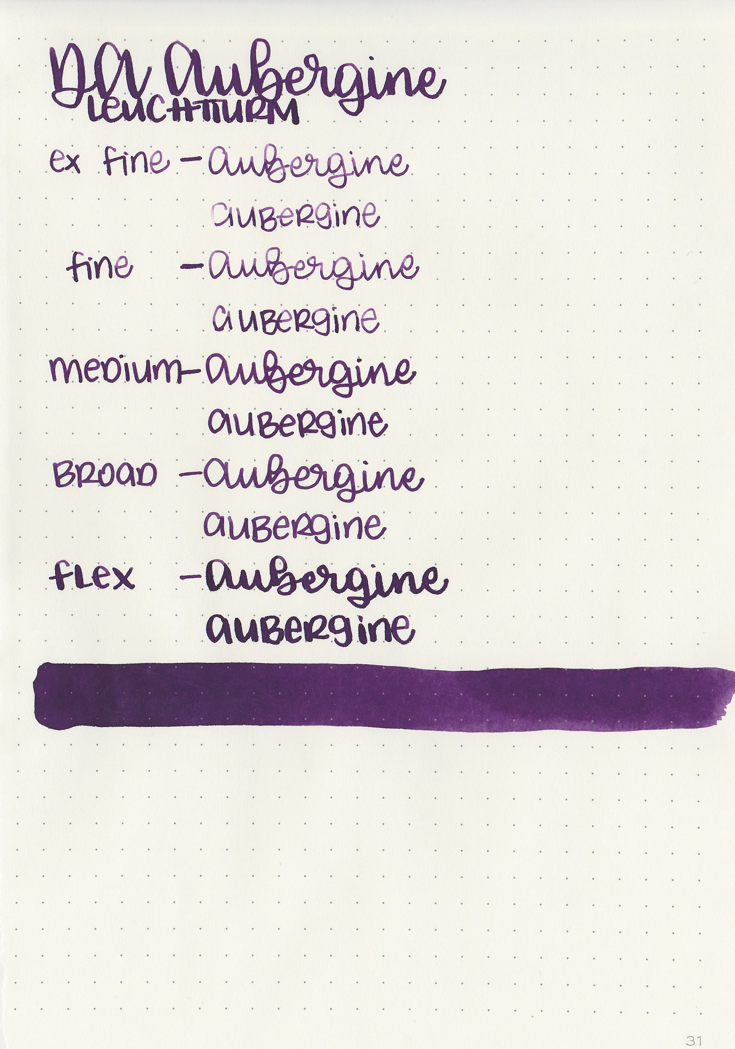
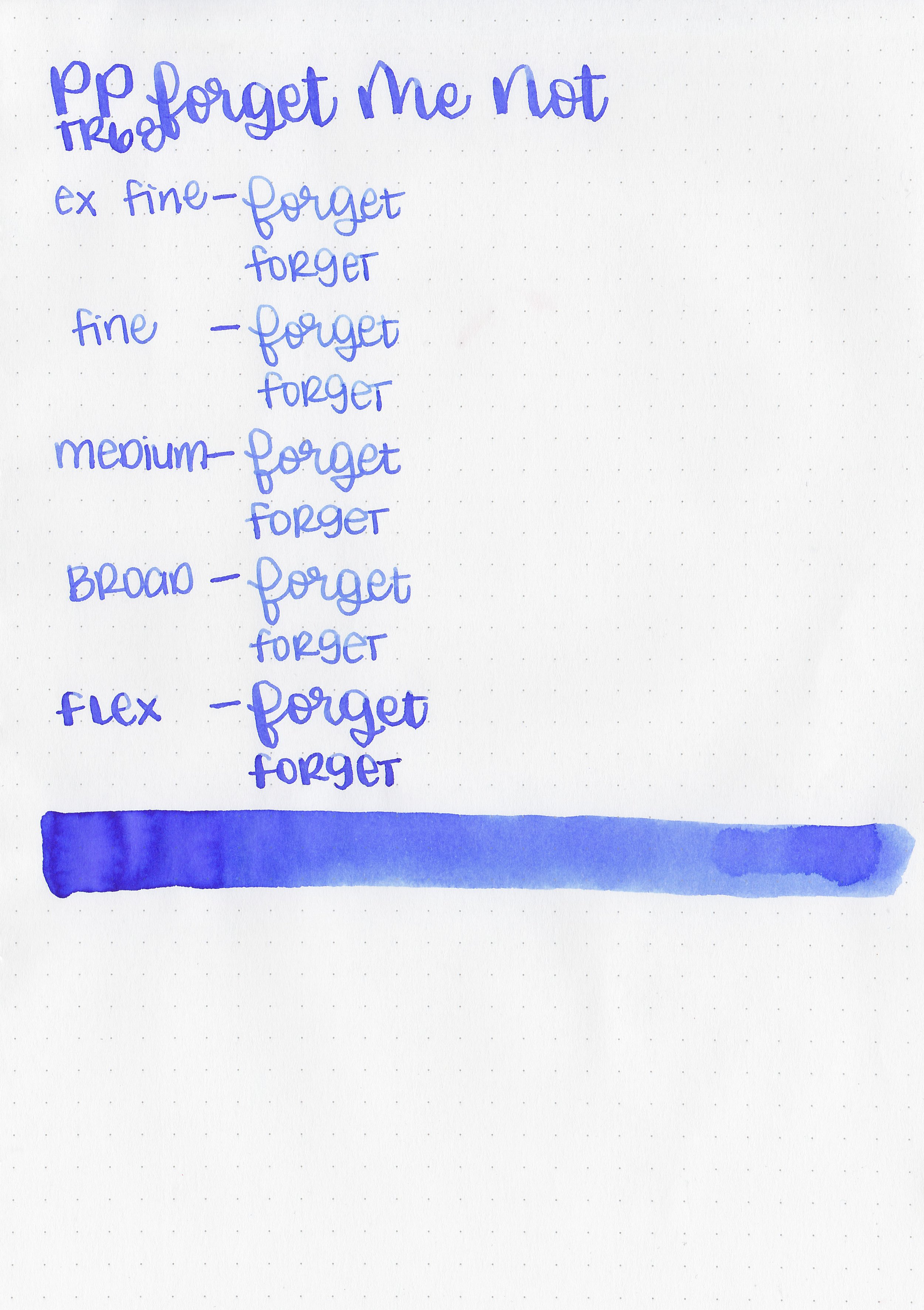
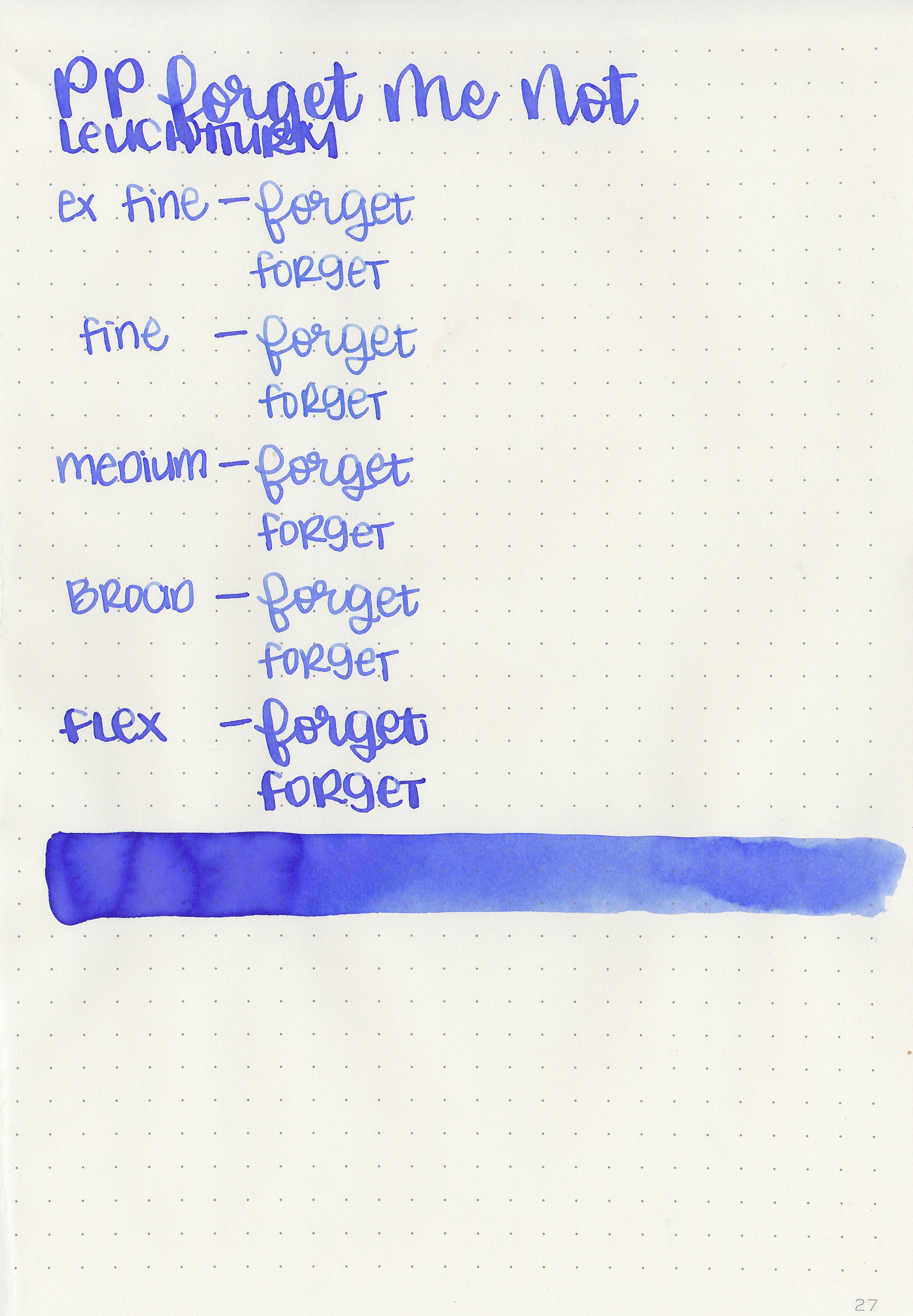
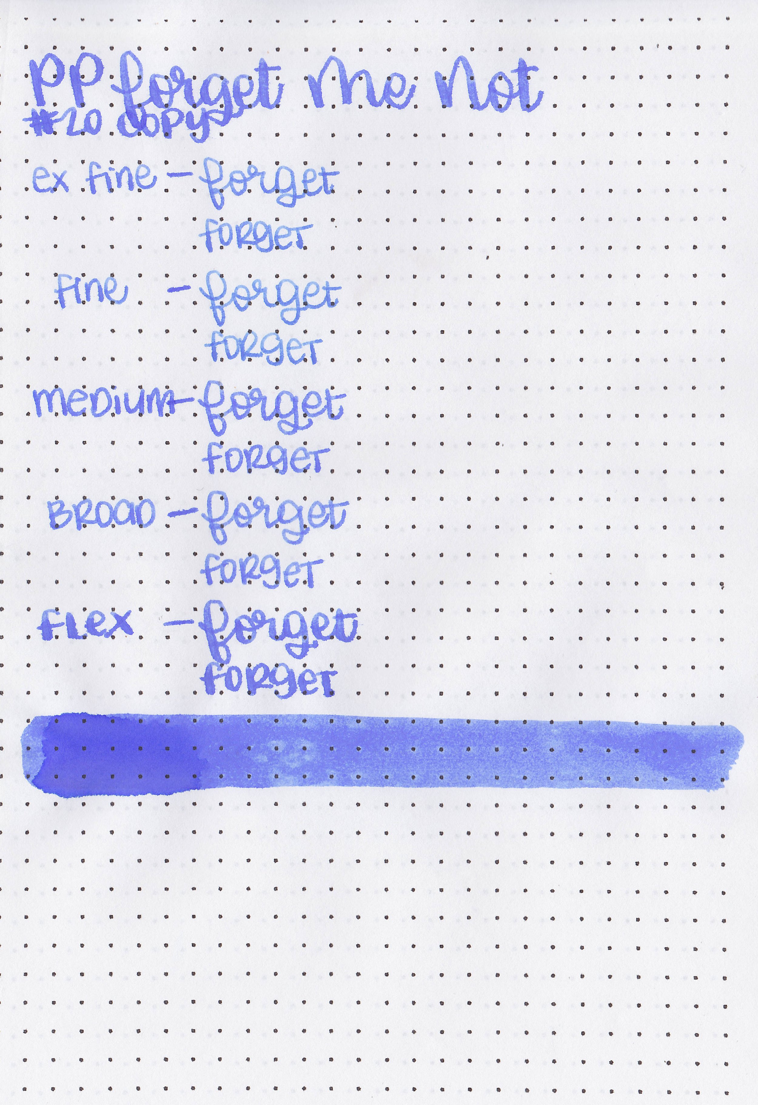
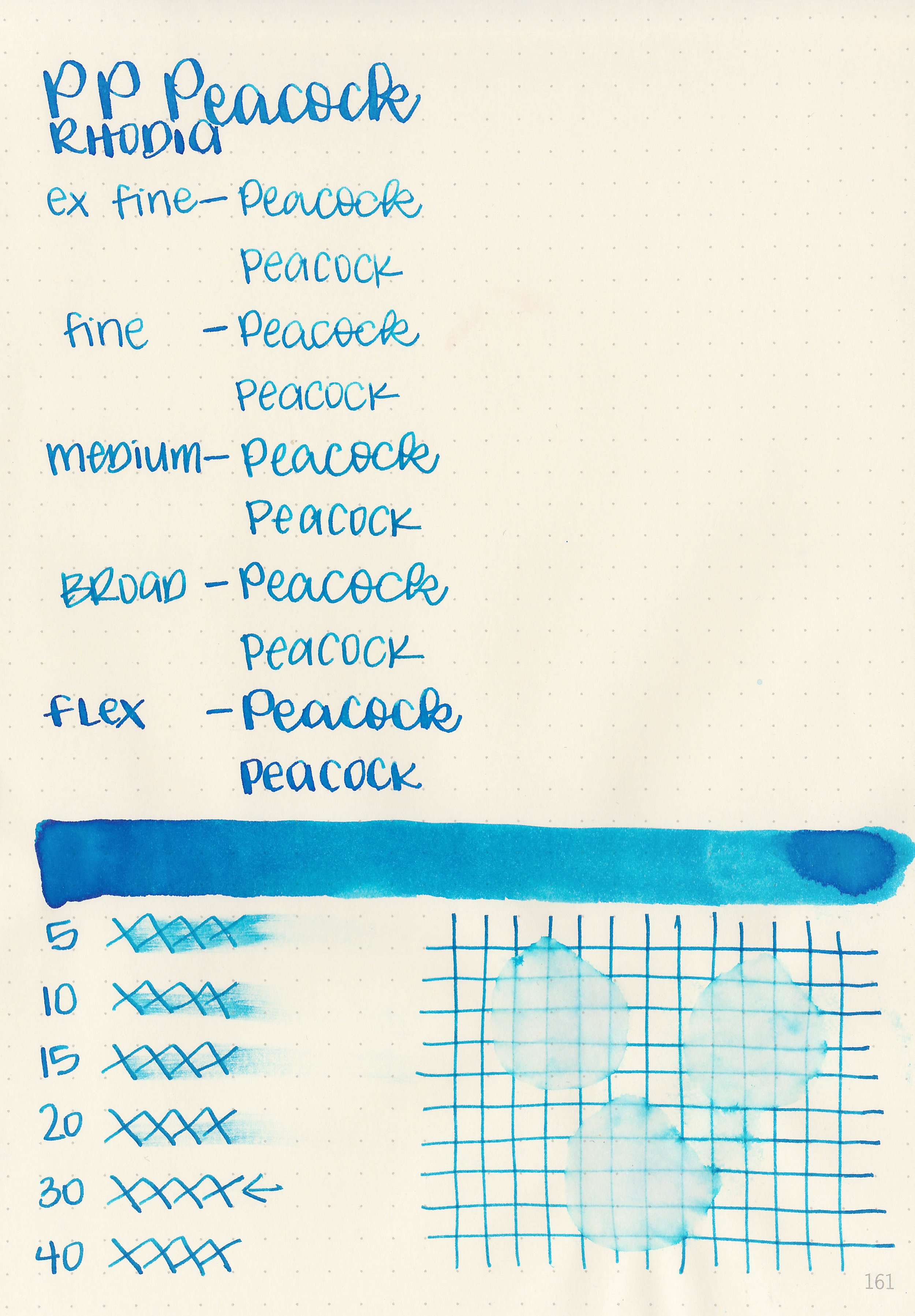
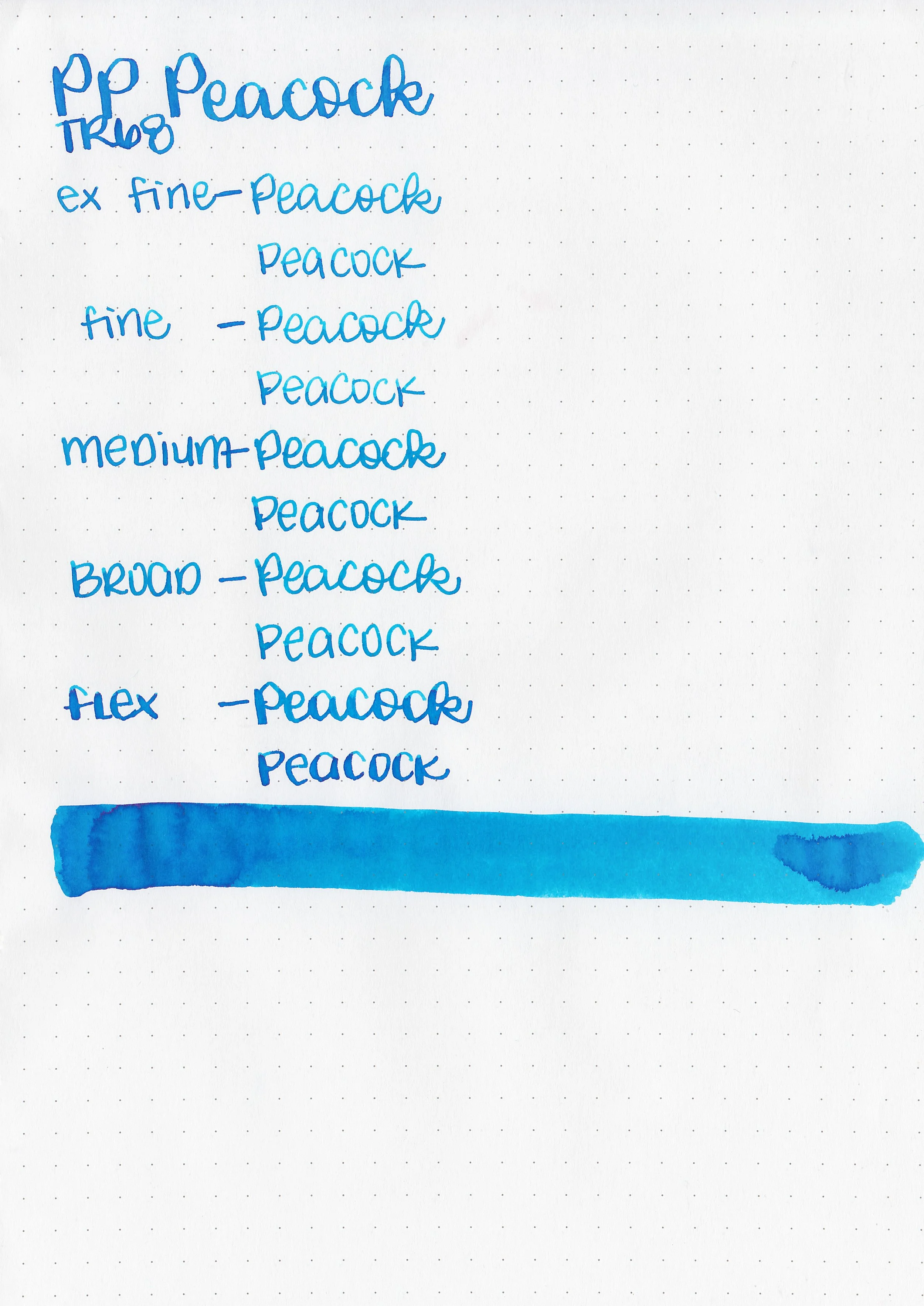
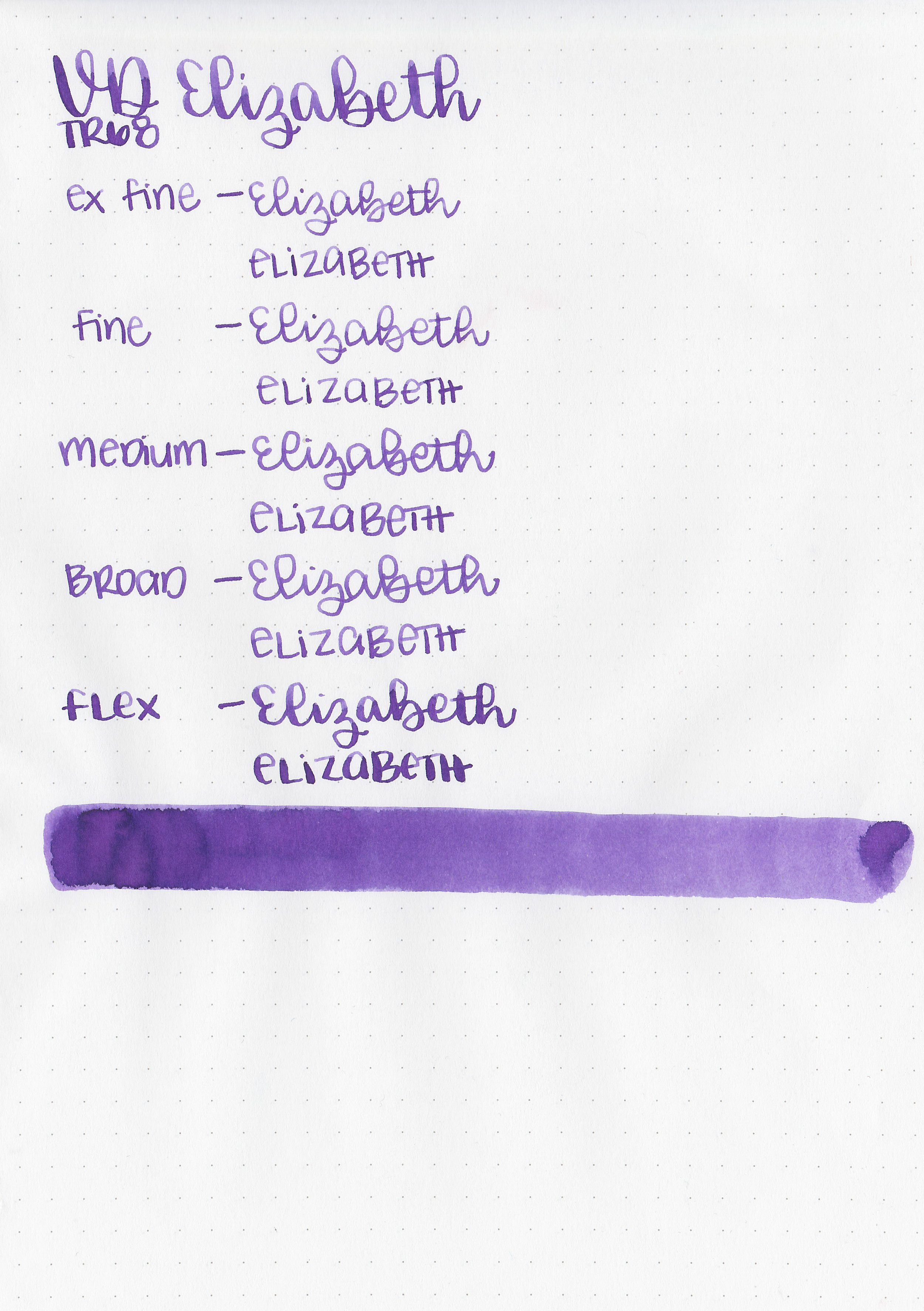
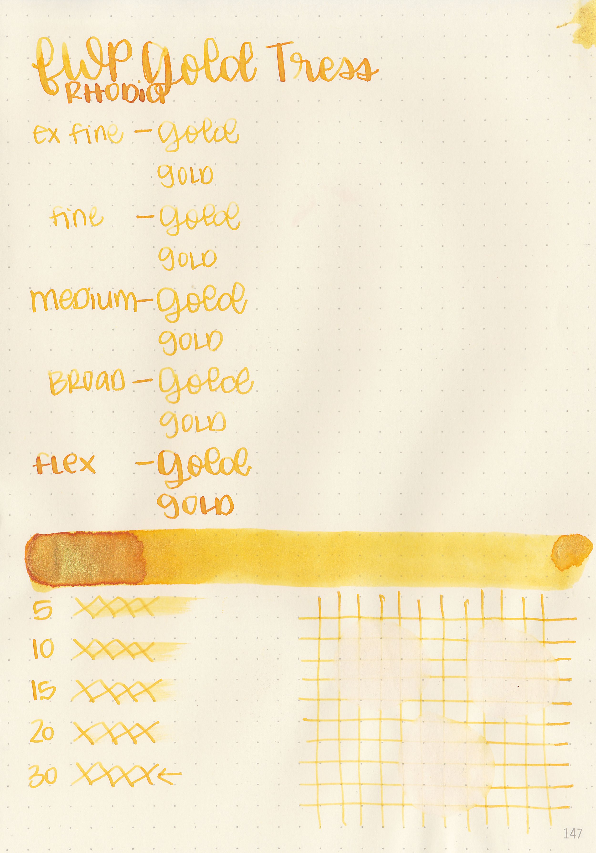
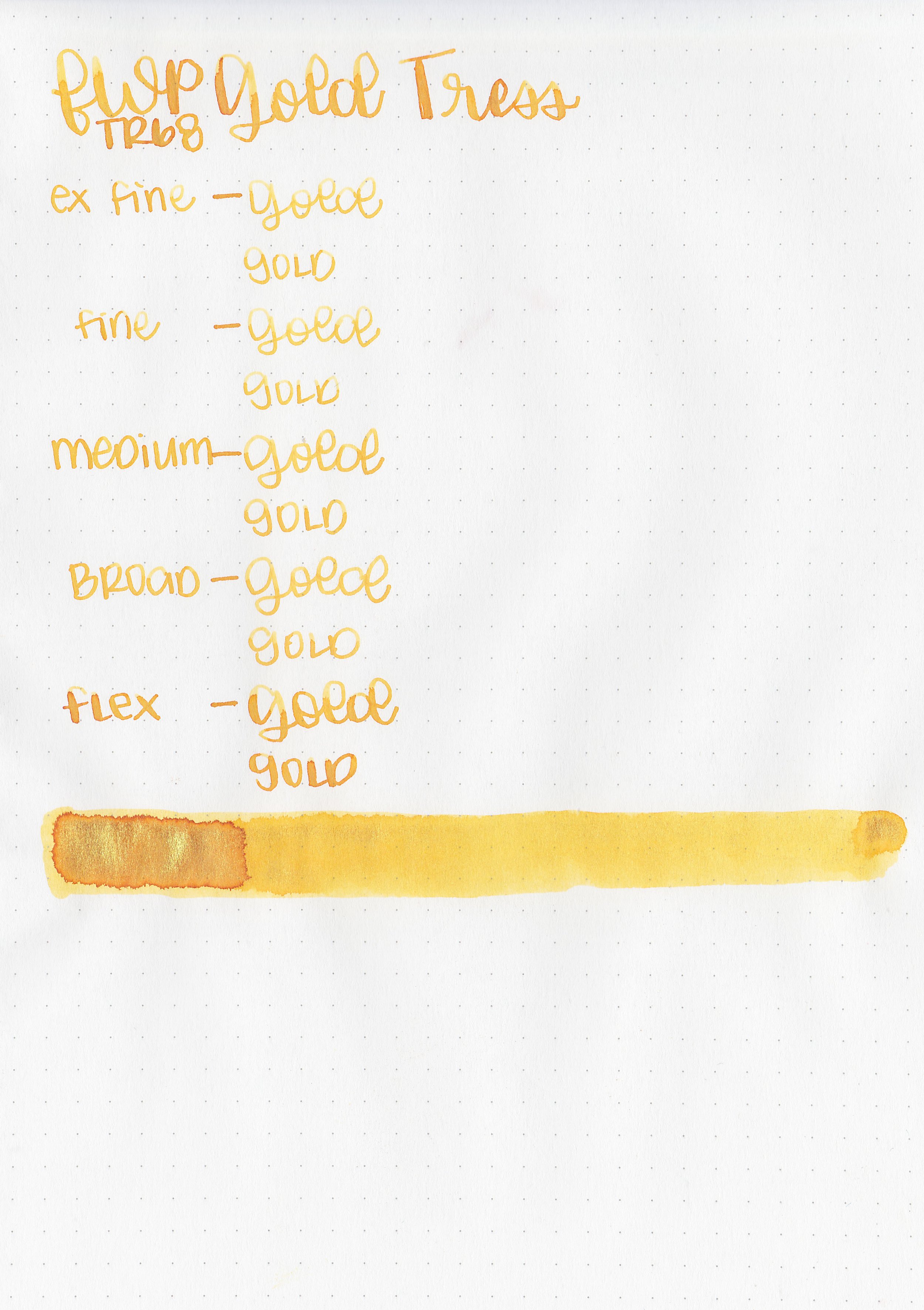
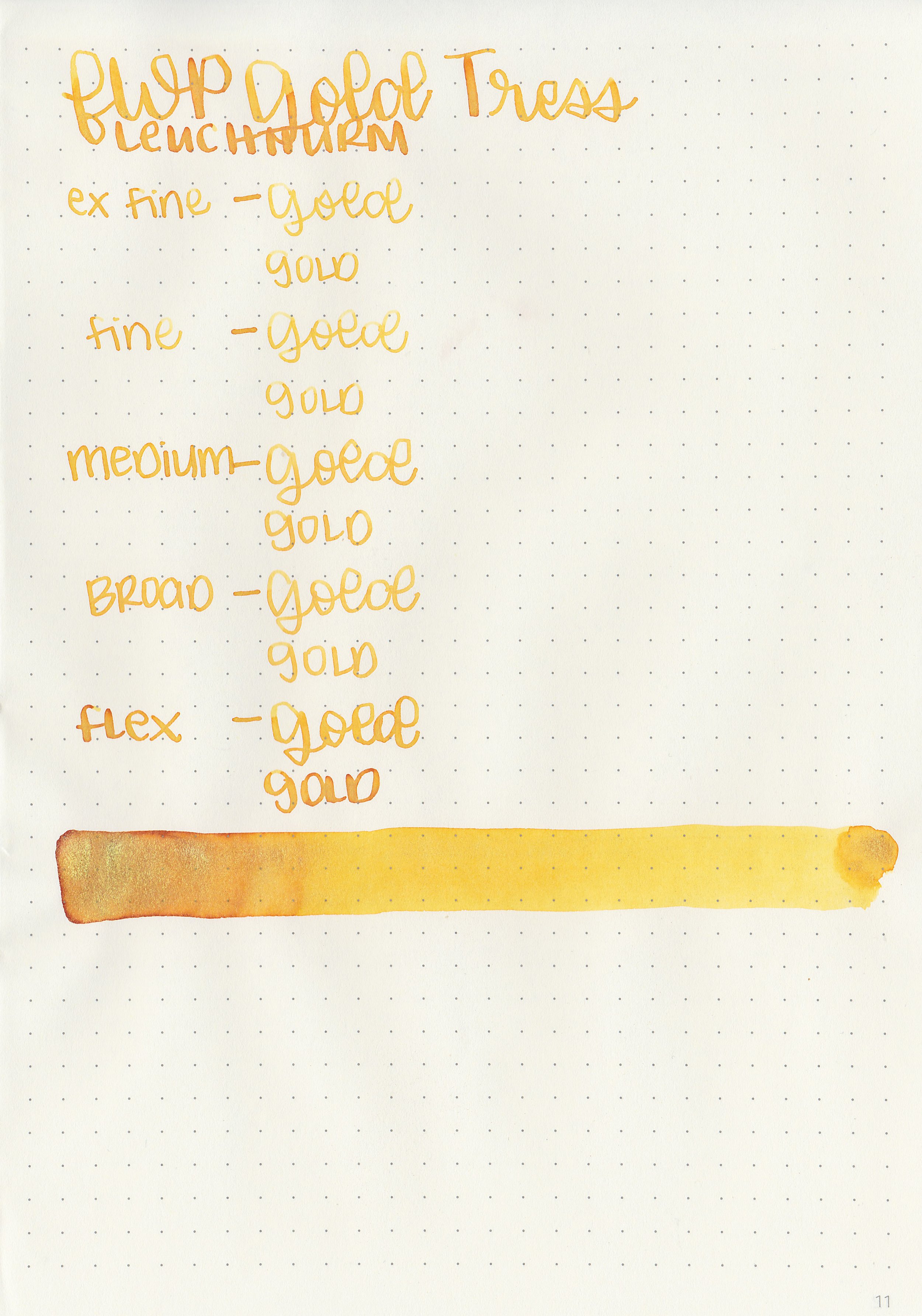
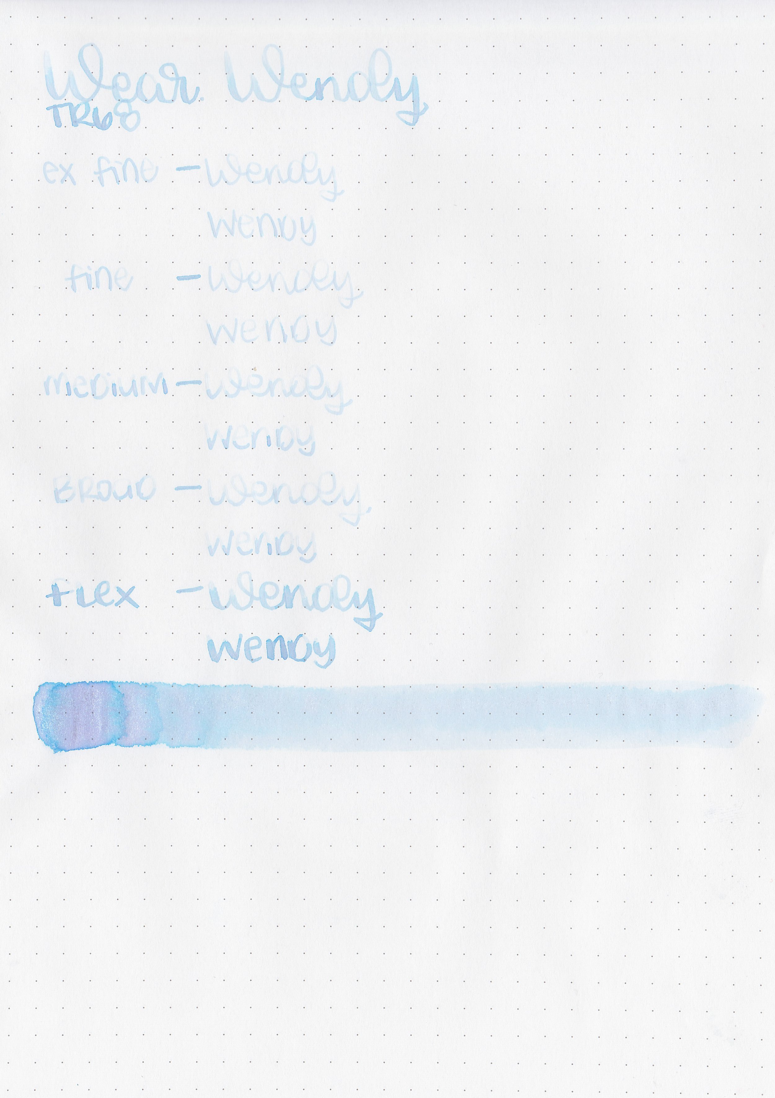
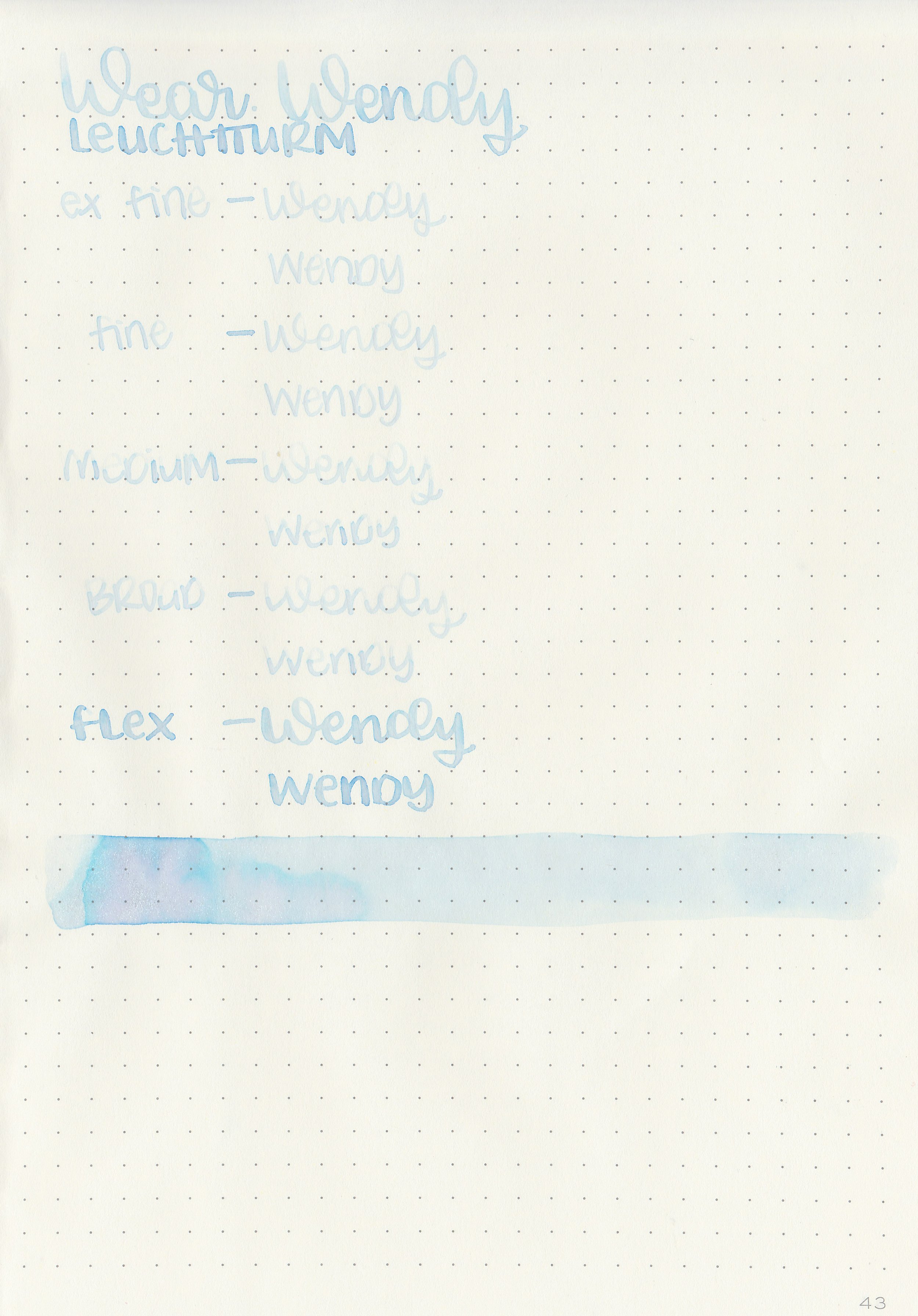
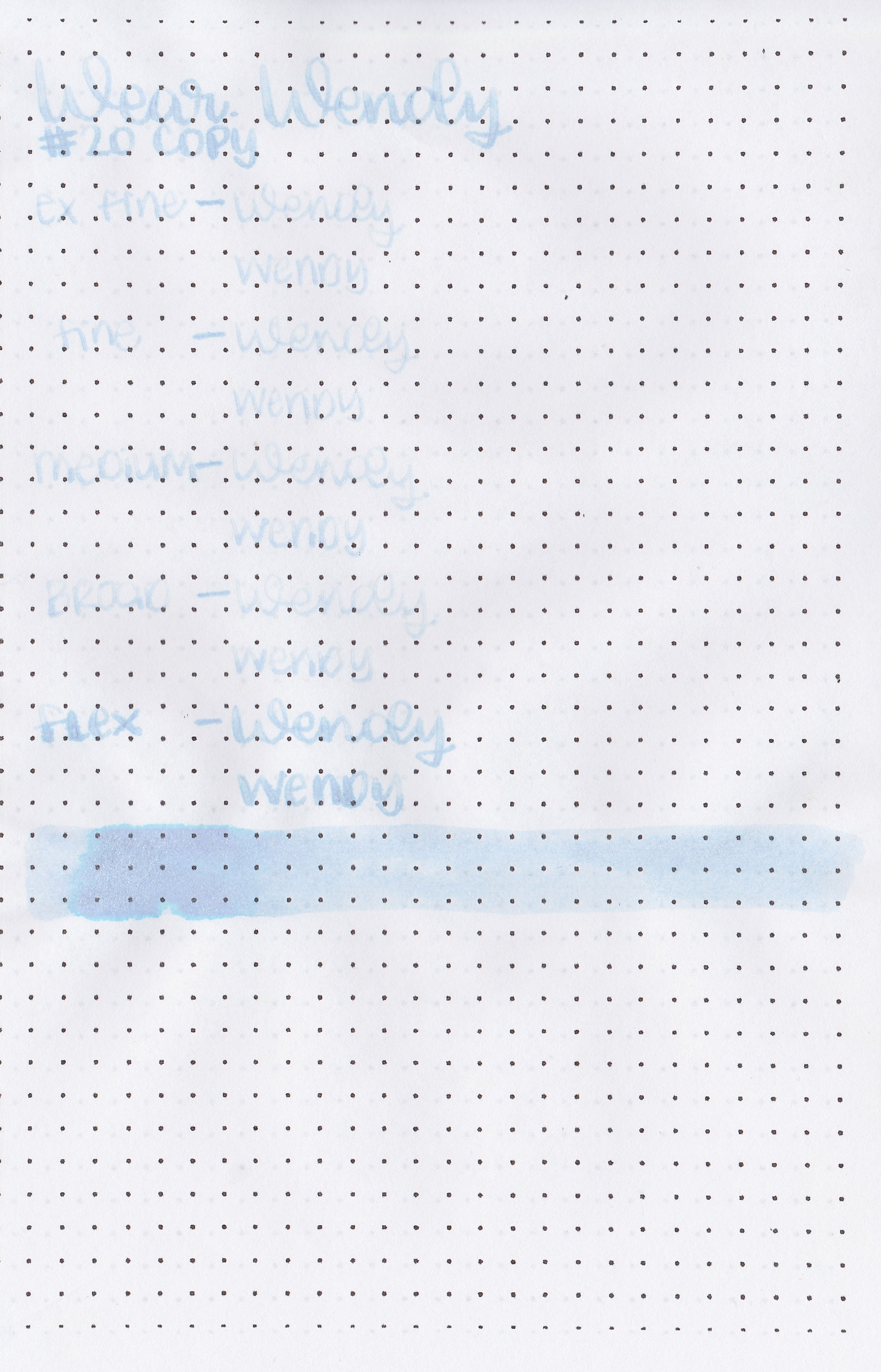
Let's take a look at how the ink behaves on fountain pen friendly papers: Rhodia, Tomoe River, and Leuchtturm.
*For my writing samples I use:
Vintage Mabie Todd Swan (flex nib)
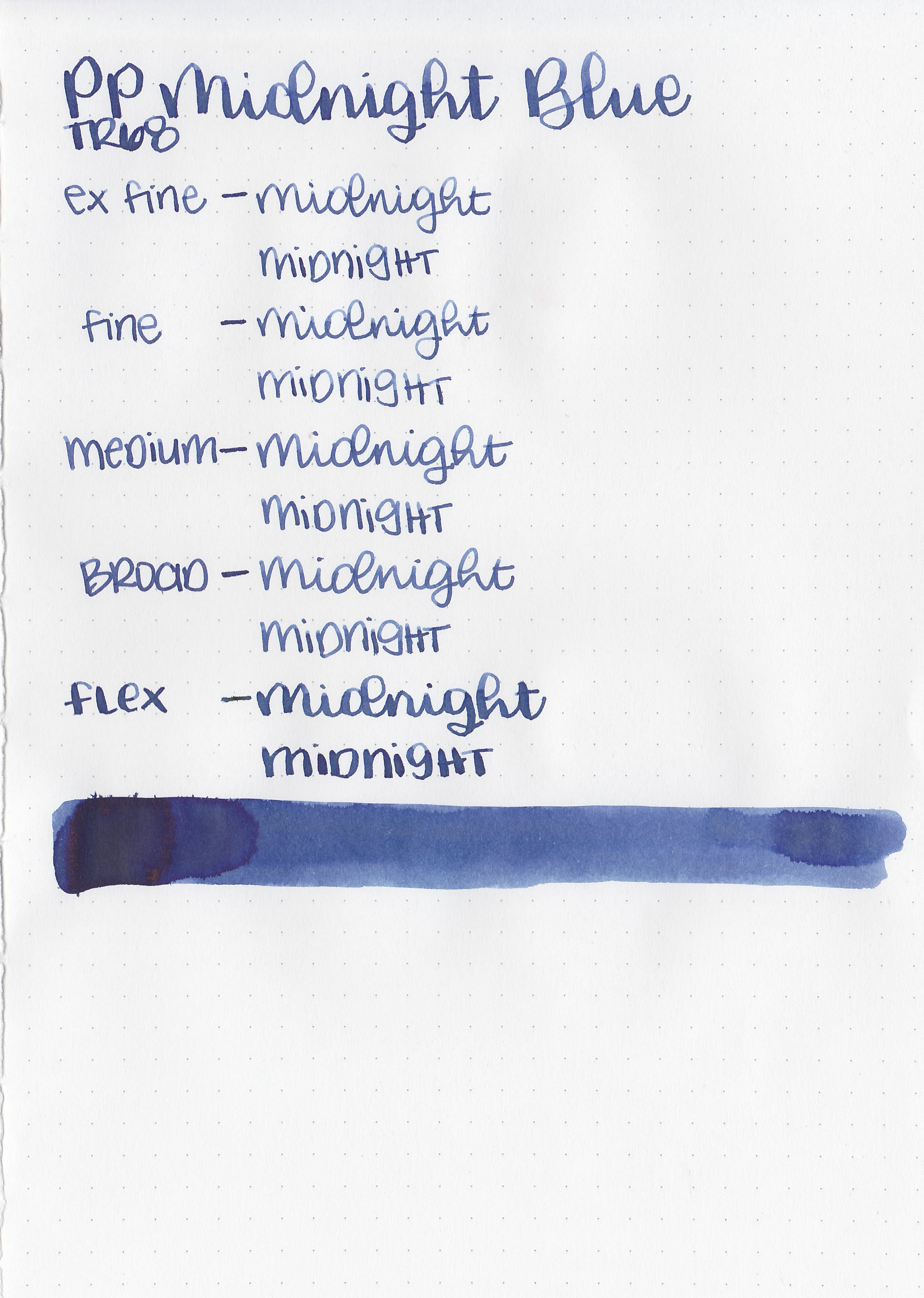
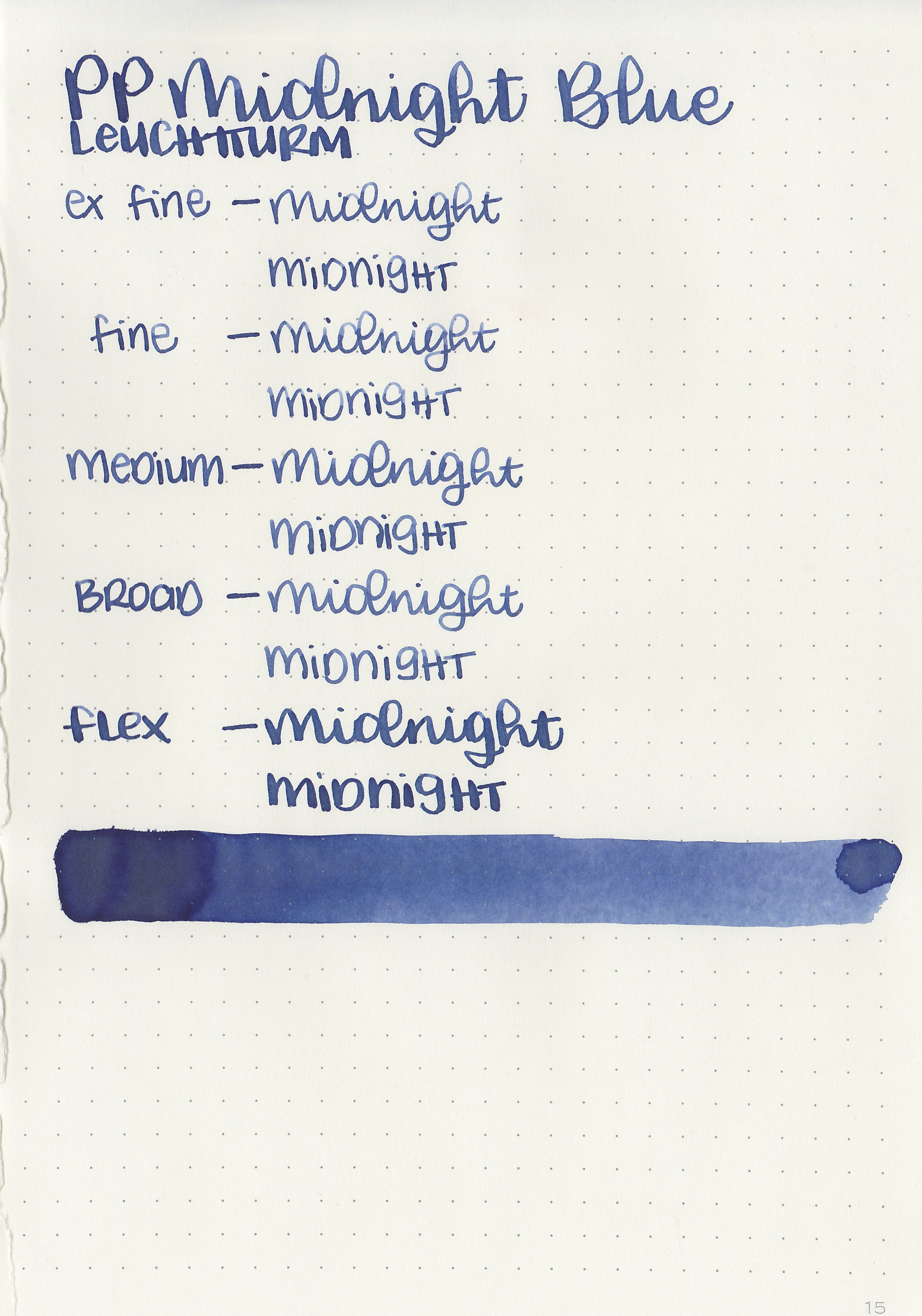
Taroko Enigma notebooks (68gsm TR)
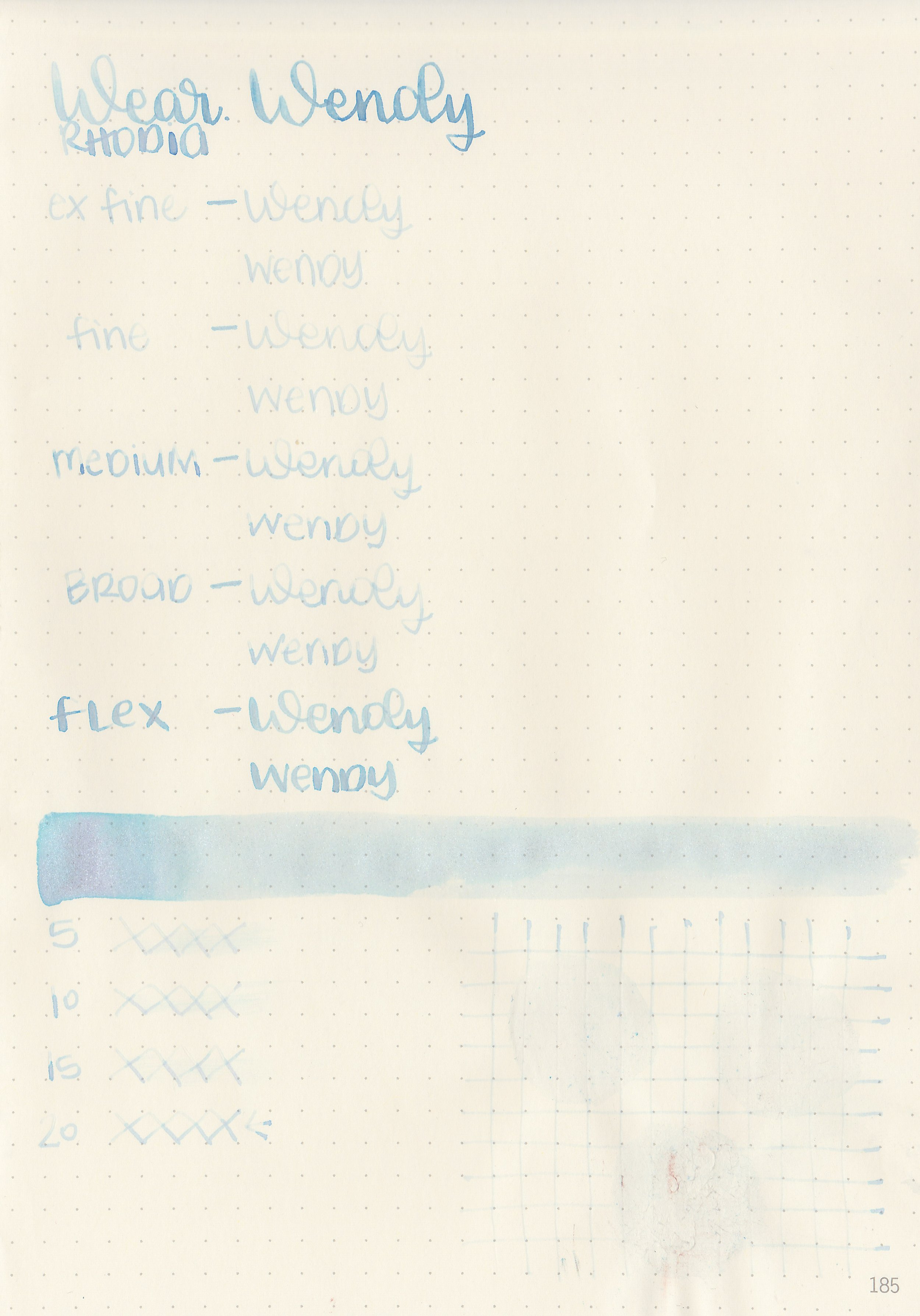
Dry time: 20 seconds
Water resistance: Low
Feathering: None
Show through: Medium
Bleeding: None
Other properties: low shading, no sheen, and silver and turquoise shimmer.
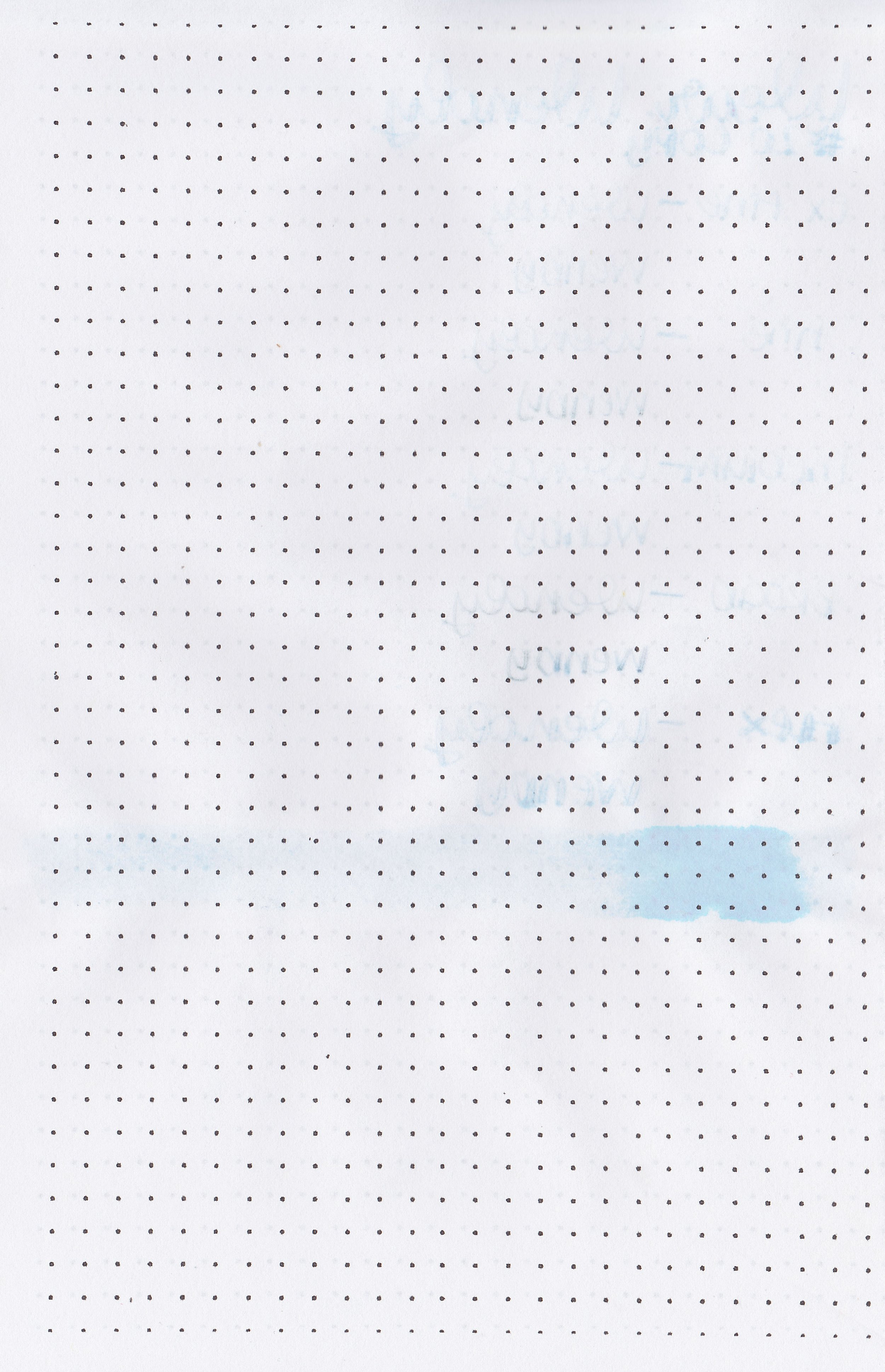
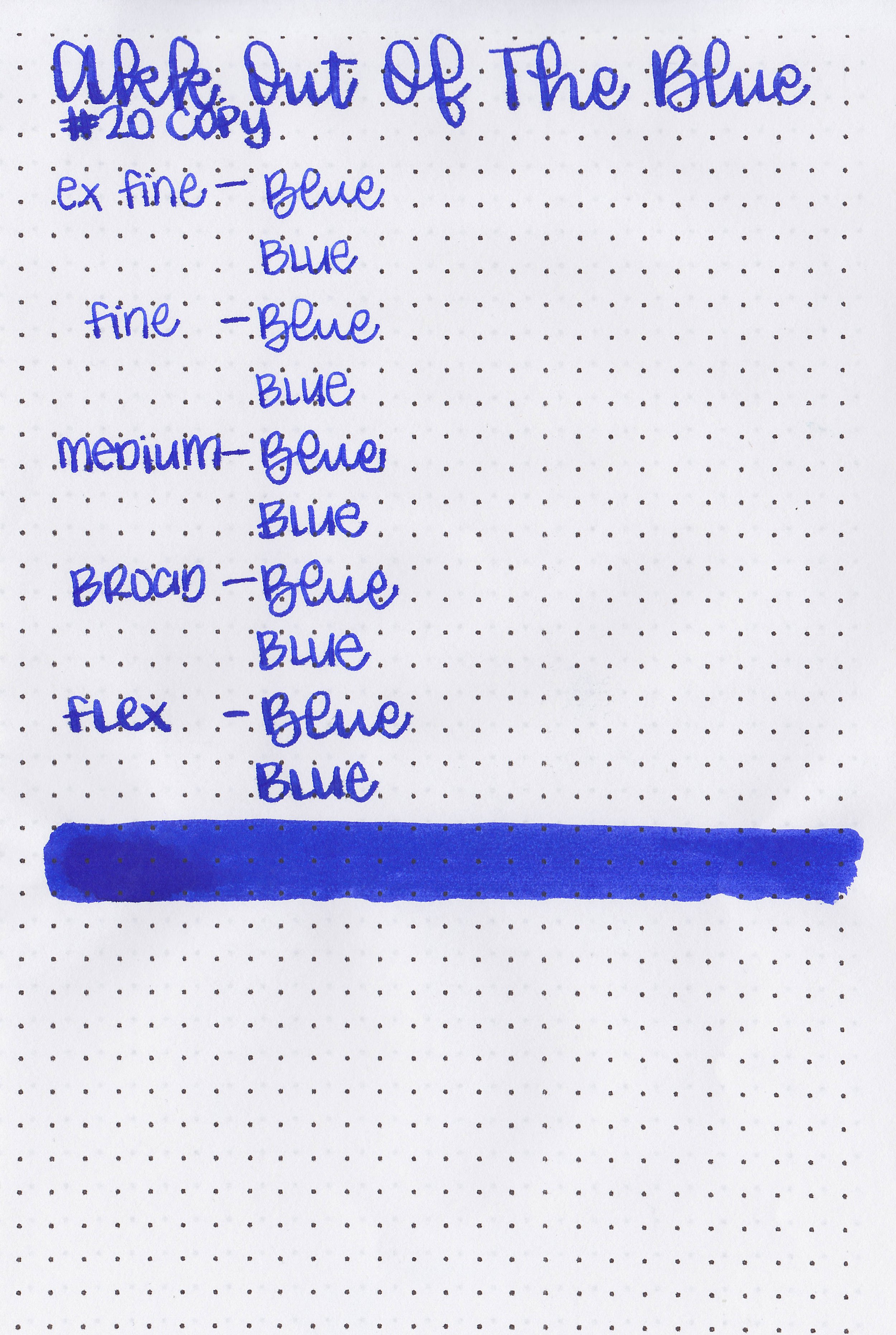
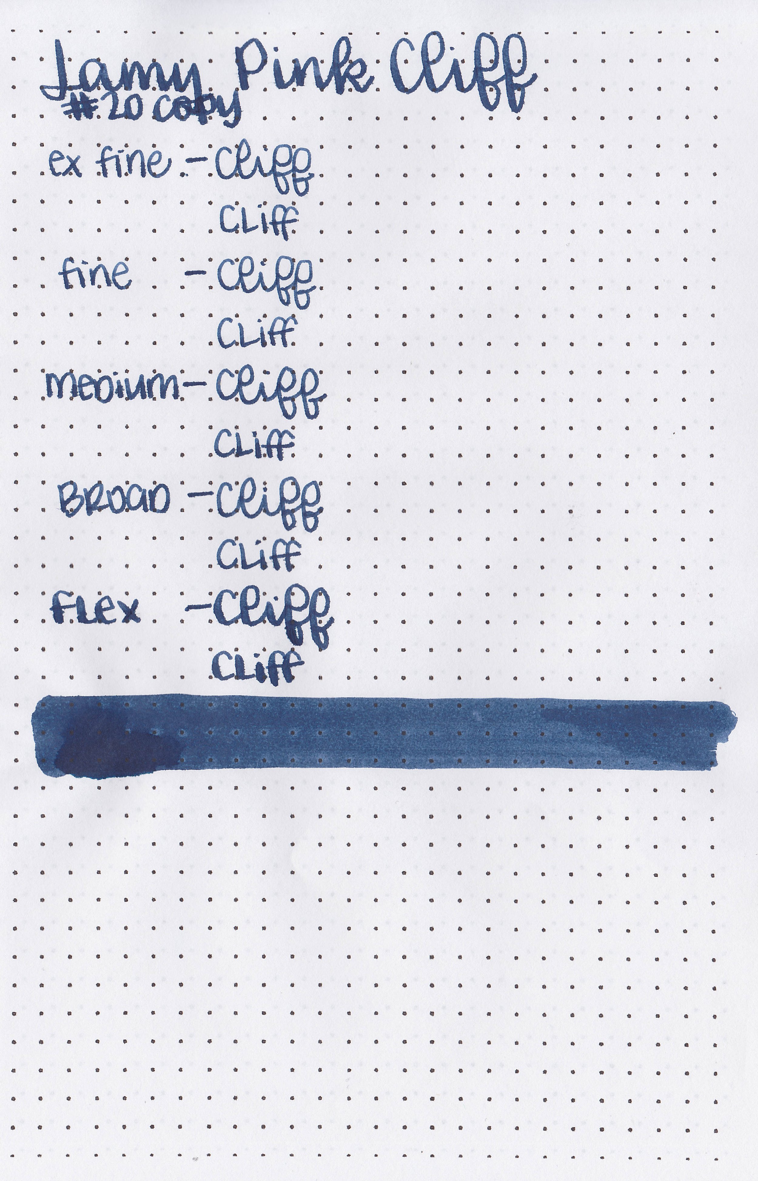
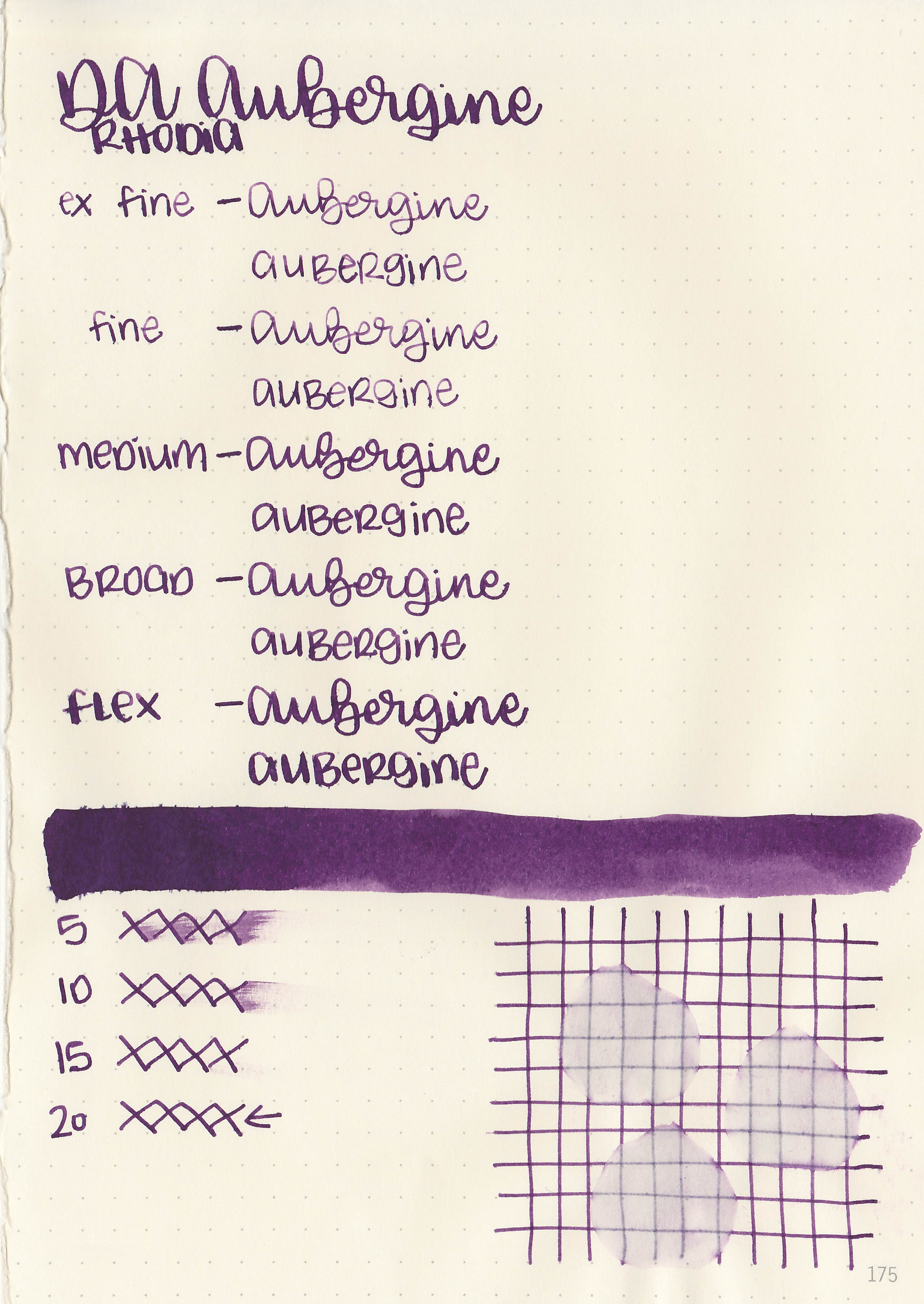
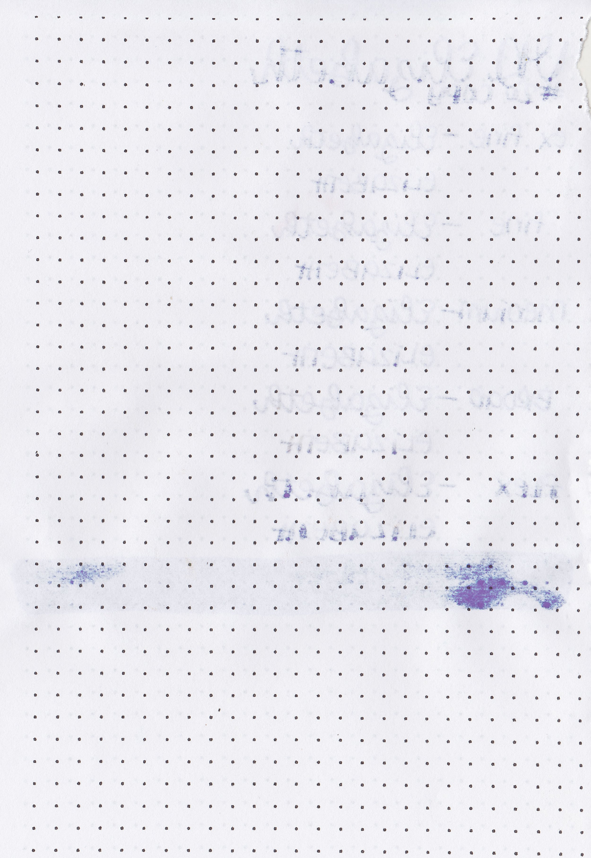
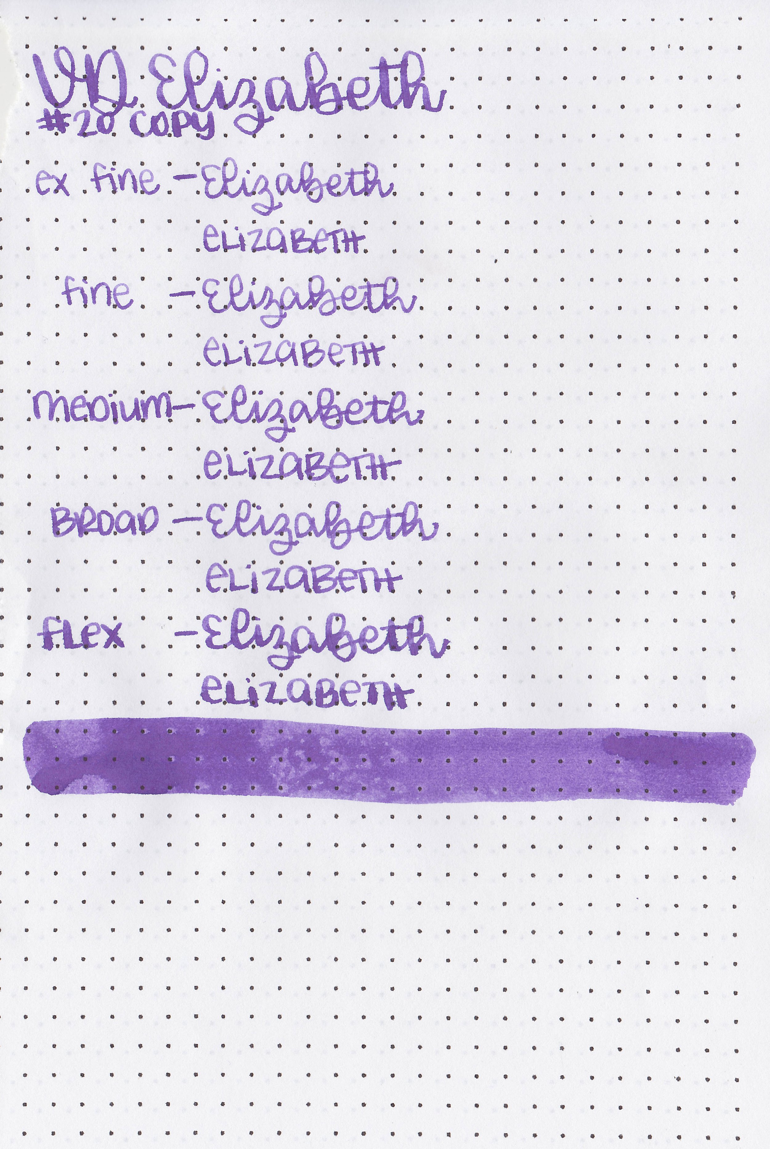
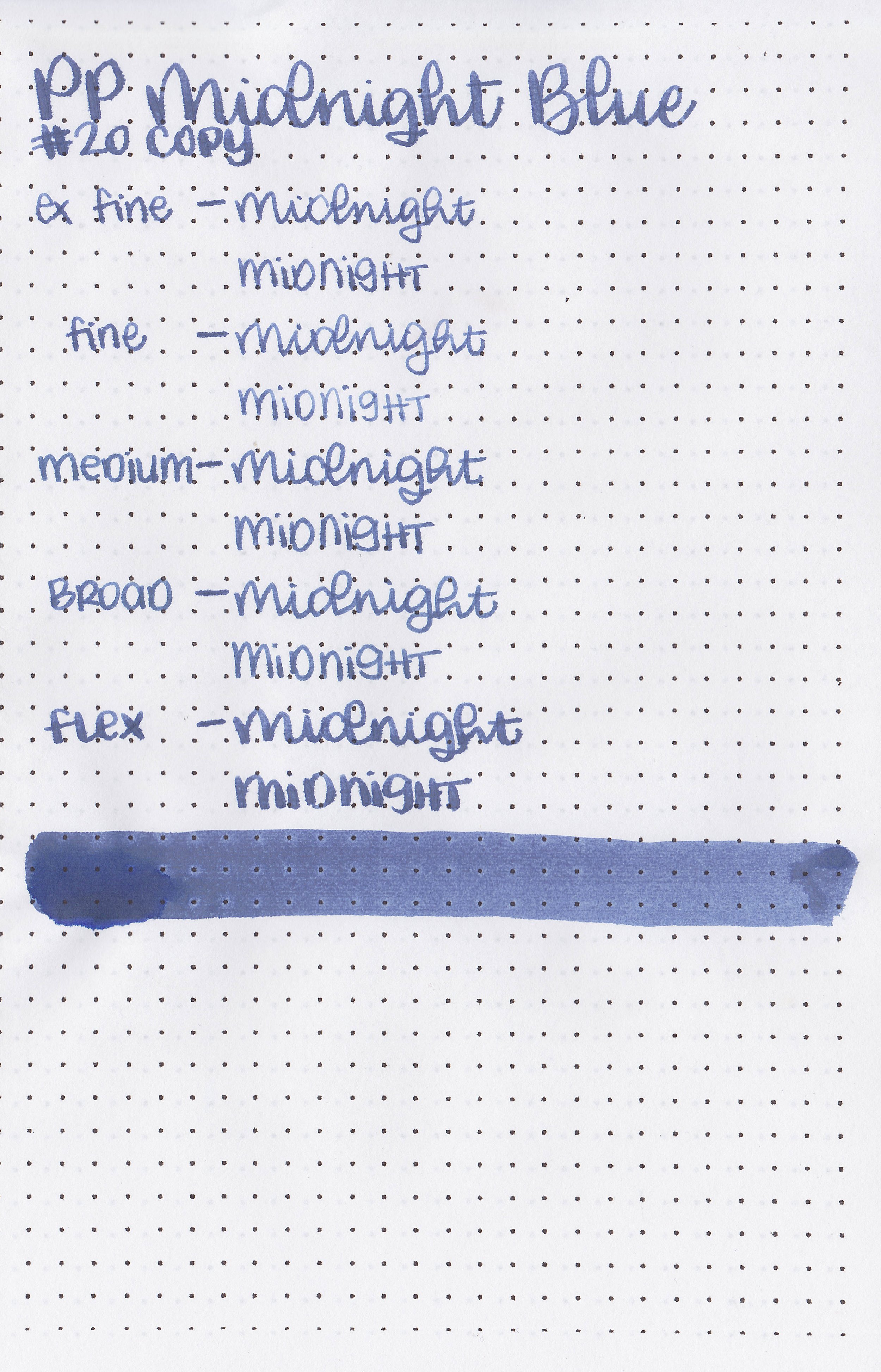
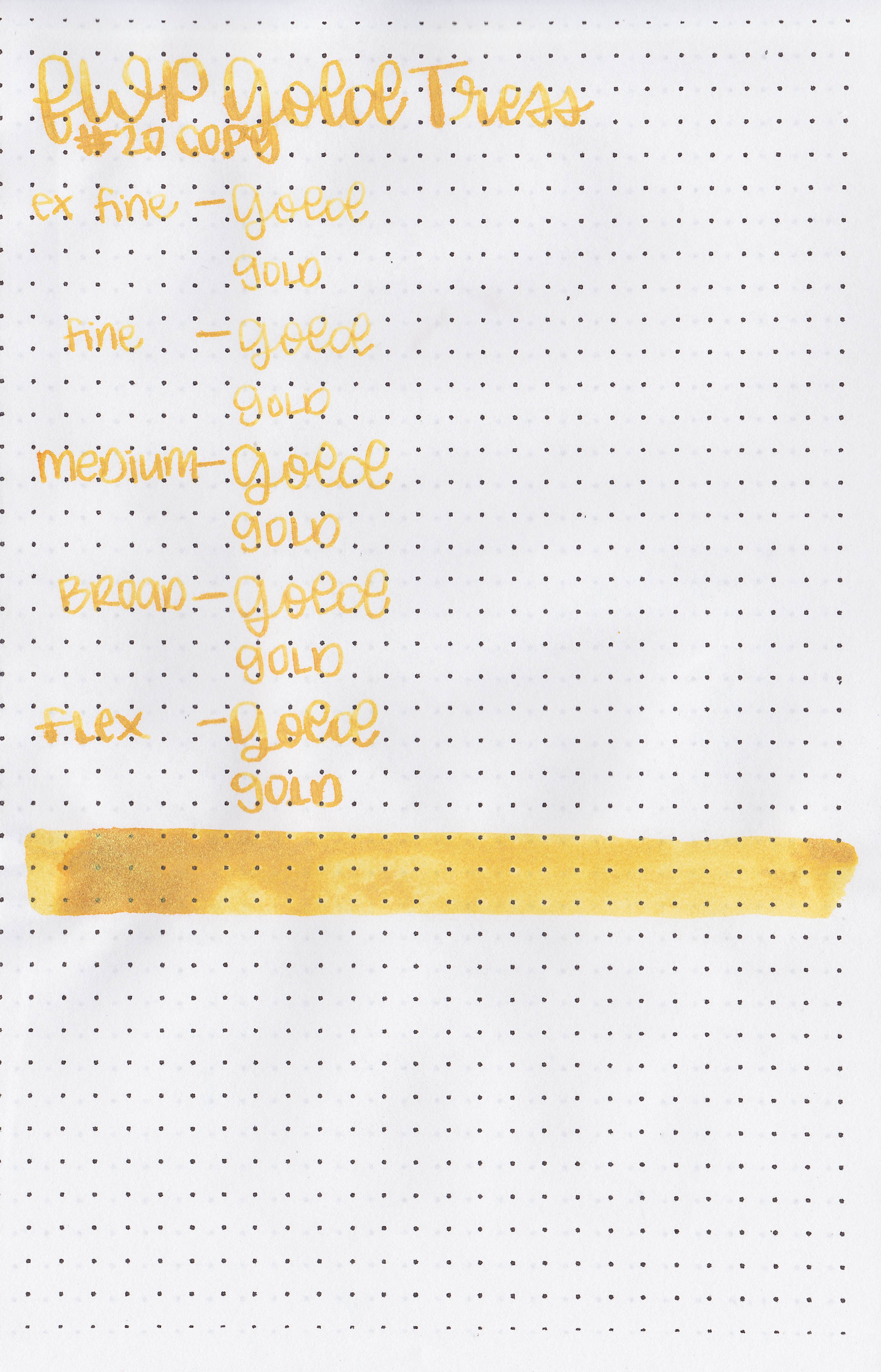
On 20 lb copy paper the ink had some feathering in all nib sizes and some bleeding in the flex nib sizes.
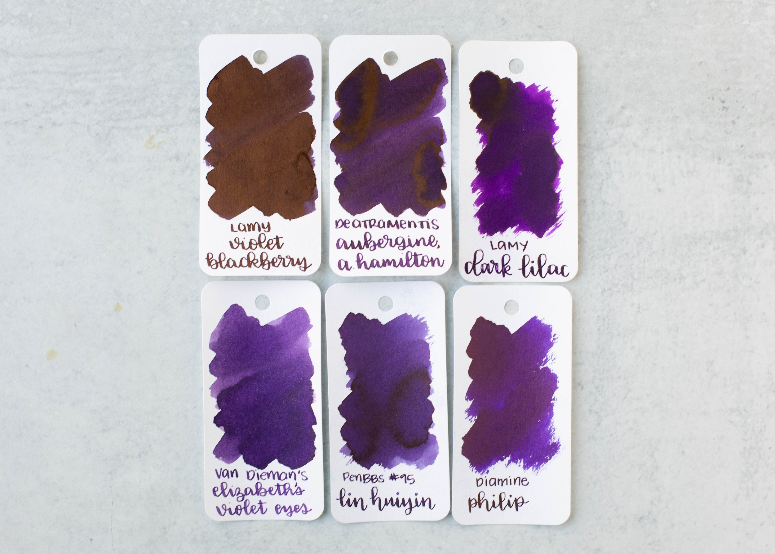
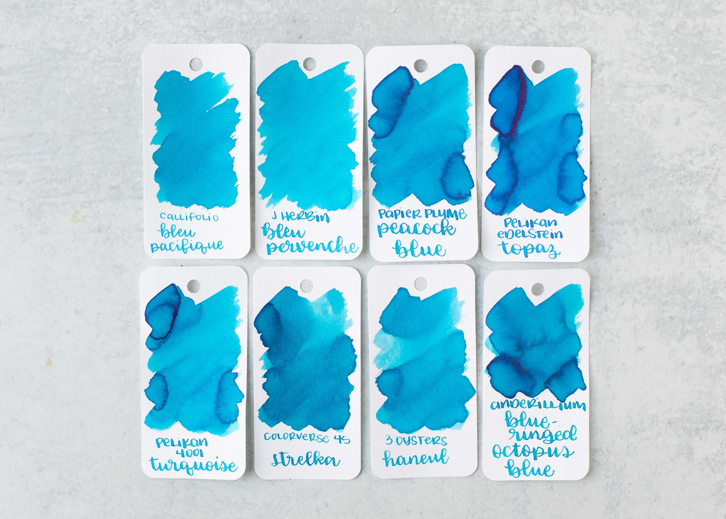
Comparison Swabs:
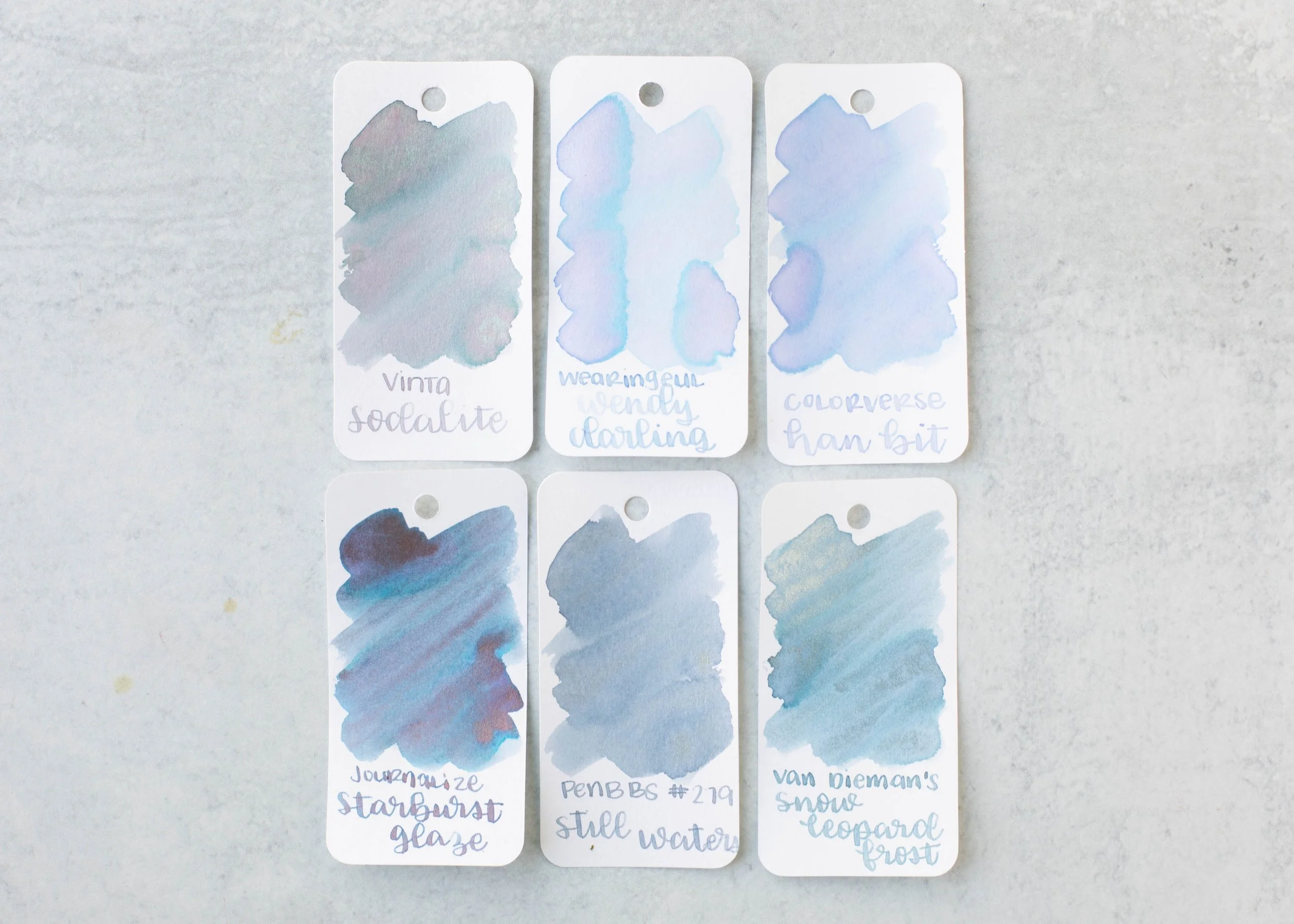
Wendy Darling is closest to Colorverse Han Bit. Click here to see the blue inks together.
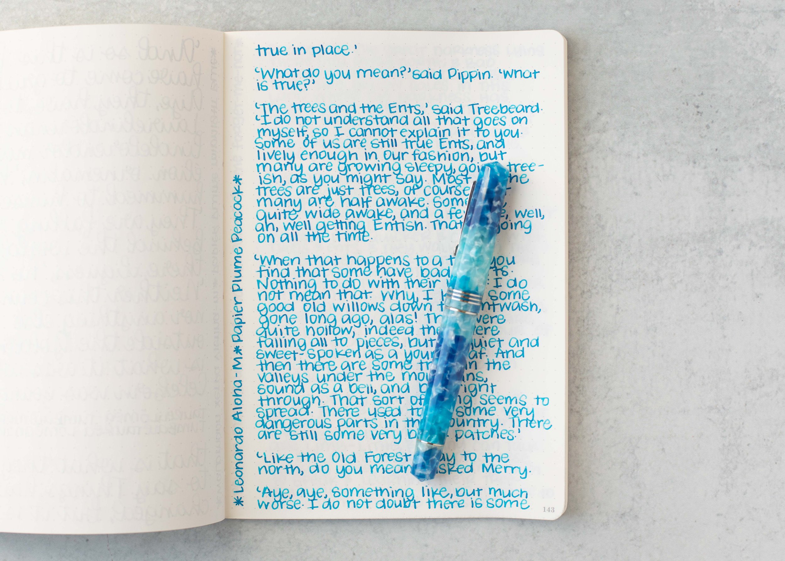
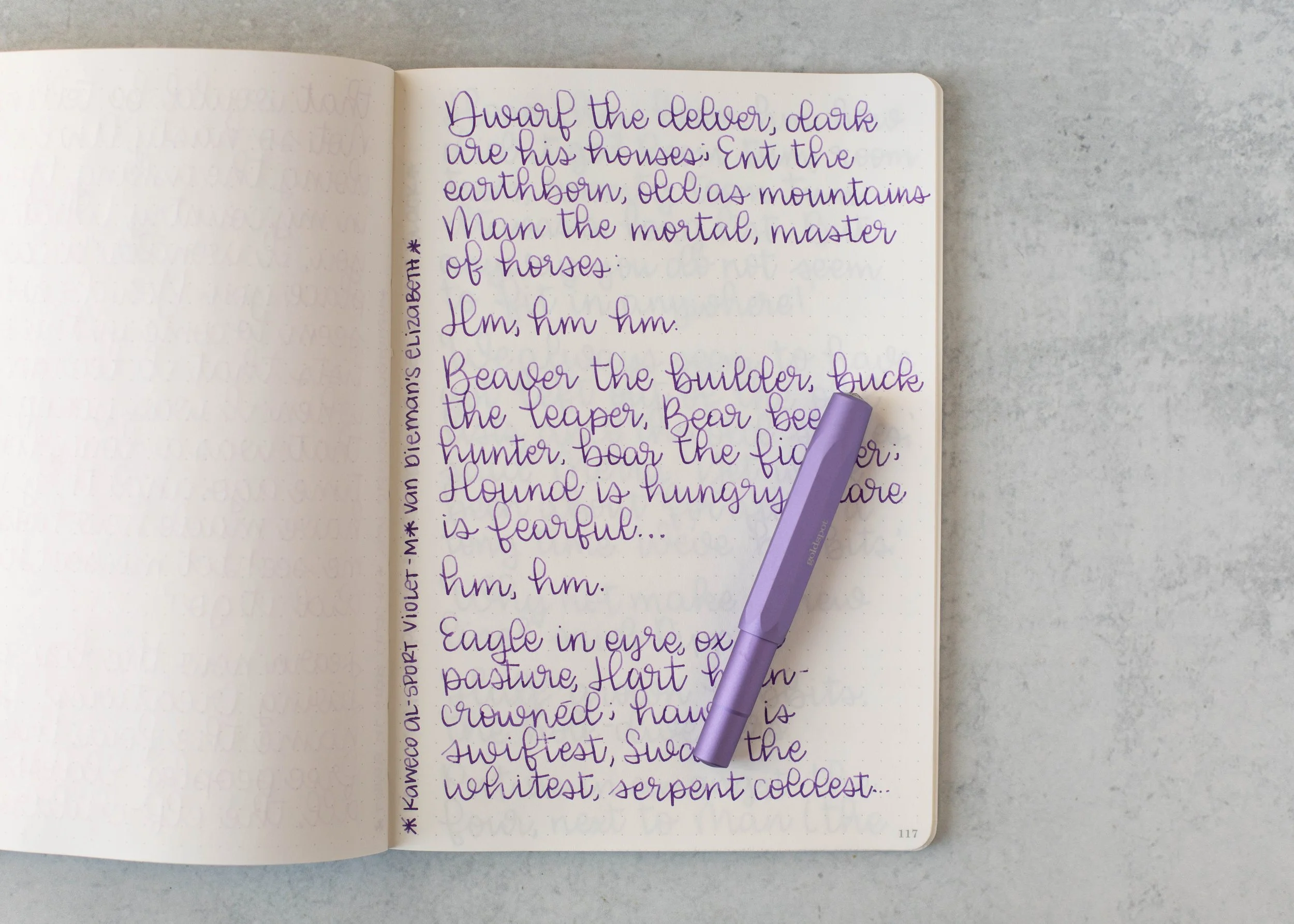
Longer Writing:

I used a Pilot Vanishing Point Black Ice with a medium nib on a Taroko Enigma notebook. The ink has a dry flow.
Overall, I don’t like this ink. It’s way too pale in writing to even see it let alone read it. The longer writing just looks like a blank page. It’s also way too dry for me. I understand that it would be good for art, but that’s not how I use fountain pen ink. I would give this one a pass.
Thanks to all my Patrons! I couldn’t do these reviews without you! You can find my Patreon page here.
Disclaimer: All photos and opinions are my own. This page does not contain affiliate links and this post is not sponsored.