Ink Review #851: Kobe Fragrance of Sumi
/
Today’s ink is Kobe Fragrance of Sumi. It’s an interesting ink-it’s scented with the traditional sumi India ink stick. I purchased my sample of ink from Vanness Pens.
Read MoreToday’s ink is Kobe Fragrance of Sumi. It’s an interesting ink-it’s scented with the traditional sumi India ink stick. I purchased my sample of ink from Vanness Pens.
Read More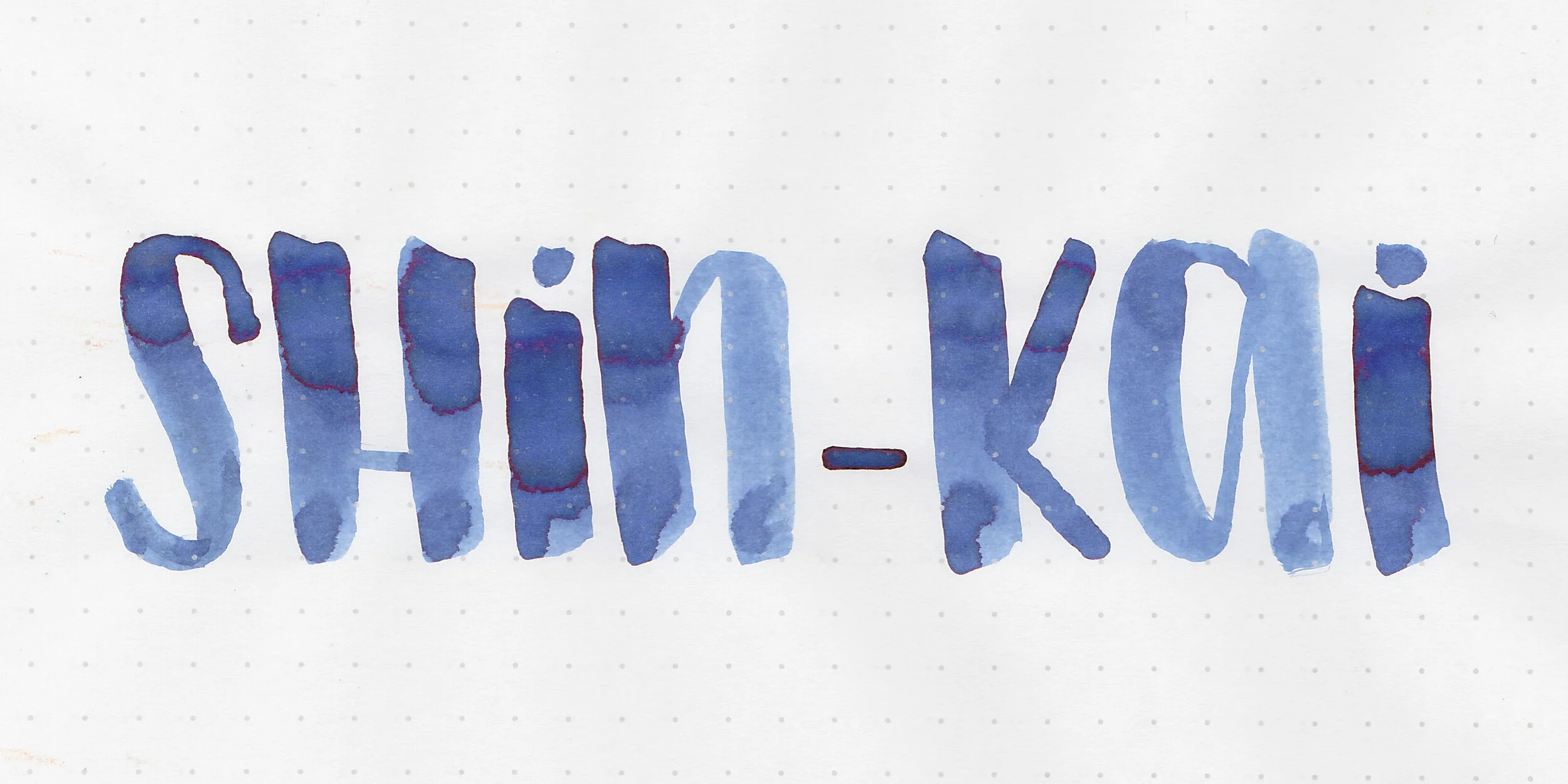
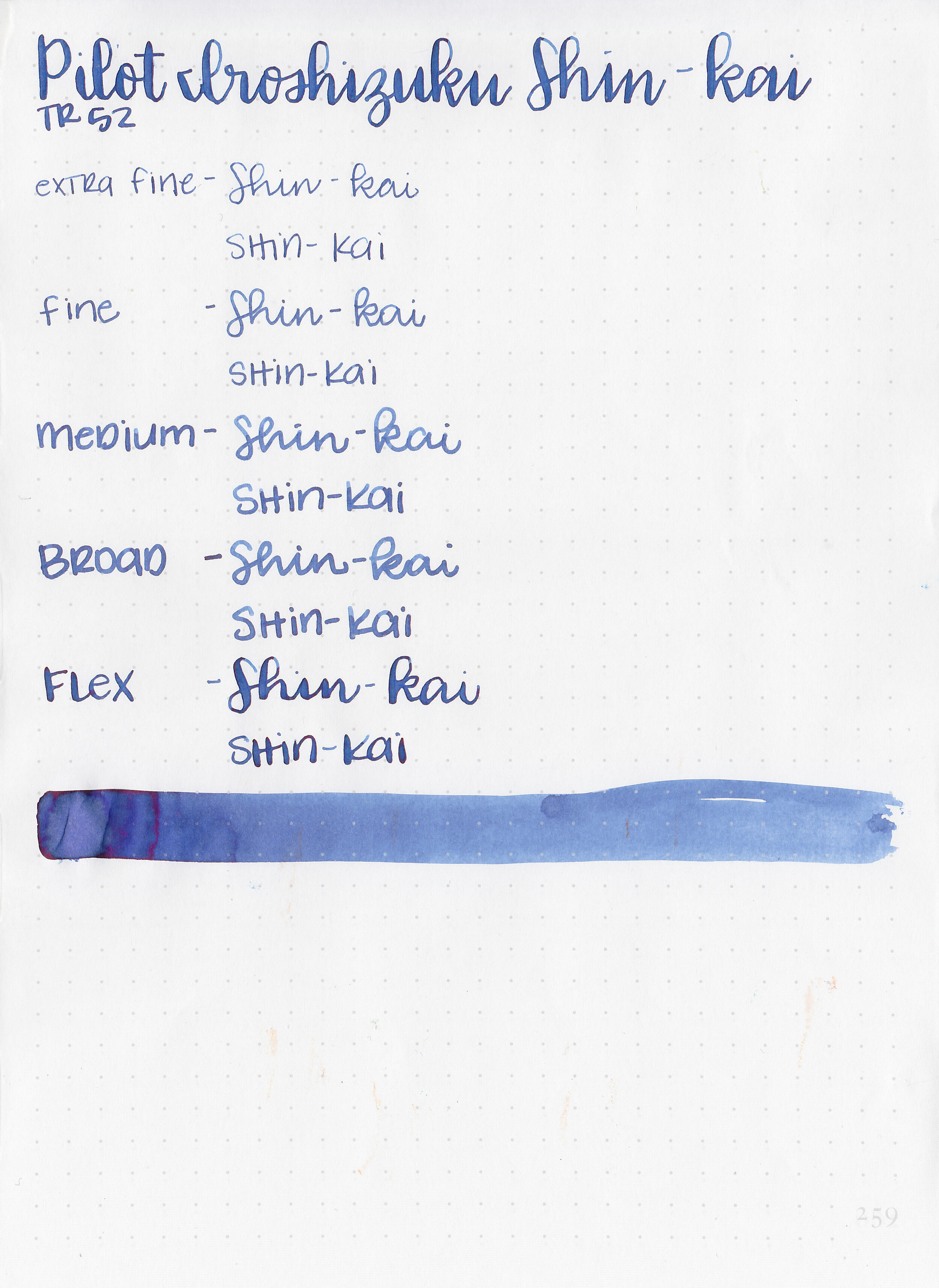
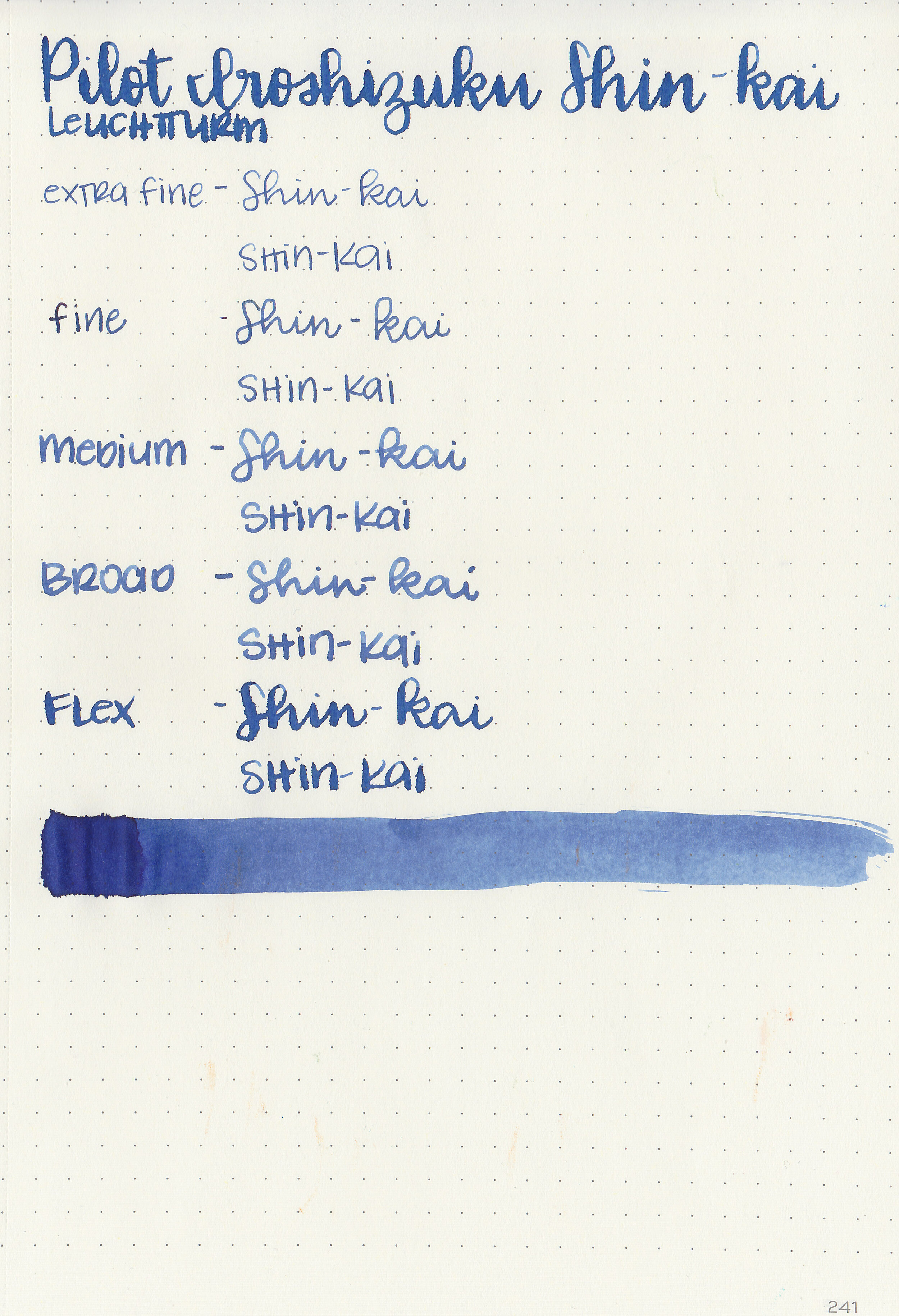
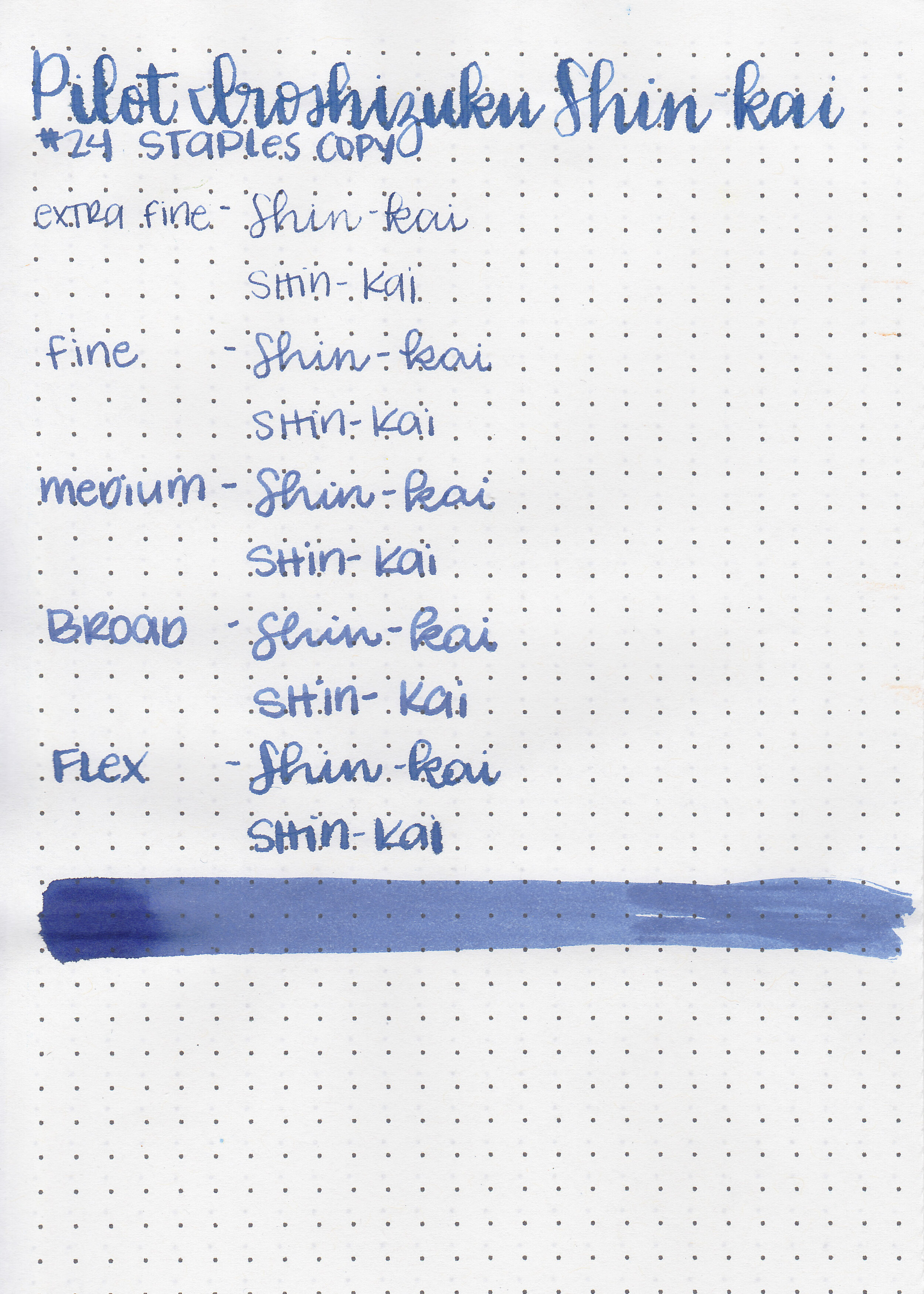
Most of the time I just review whatever inks are next on my list, but sometimes I like to do a theme for the week. This week’s theme is blue-black inks. Pilot Iroshizuku Shin-kai, aka “Deep Sea” is an ink I use often, and I was surprised when I realized I’ve never actually reviewed it. A pen friend was very kind and gave me my bottle, but you can find this ink for sale at Pen Chalet.

The color:
Shin-kai is a medium blue-black.

In large swabs on Tomoe River paper the ink looks more blue with some red sheen.

Let's take a look at how the ink behaves on fountain pen friendly papers: Rhodia, Tomoe River, and Leuchtturm.

Dry time: 15 seconds
Water resistance: Medium-some of the ink washed away but you might still be able to read what was written.

Feathering: Low-there was a little bit of feathering in the flex nib on Leuchtturm paper.
Show through: Medium
Bleeding: Low-there was some bleeding in the flex nib.
Other properties: medium shading, low sheen, and no shimmer. The sheen is only visible in large nibs on Tomoe River paper.

On Staples 24 lb copy paper the ink feathered in all nib sizes and had a little bit of bleeding.

Shin-kai is similar to Lamy Blue-Black, but I do prefer Shin-kai. Click here to see the Pilot inks together, and click here to see the blue-black inks together.

I used a Lamy AL-star Pacific Blue with a fine nib on Tomoe River paper. The ink had a lovely wet flow.
Overall, I love this ink, and use it often. I love the color, shading, wet flow, and quick dry time. Since I only have the small 15 ml bottle, I’ll buy a full-size bottle when it’s gone.
Disclaimer: This ink was given to me by a pen friend. All photos and opinions are my own. This page does contain affiliate links, but this post is not sponsored in any way.

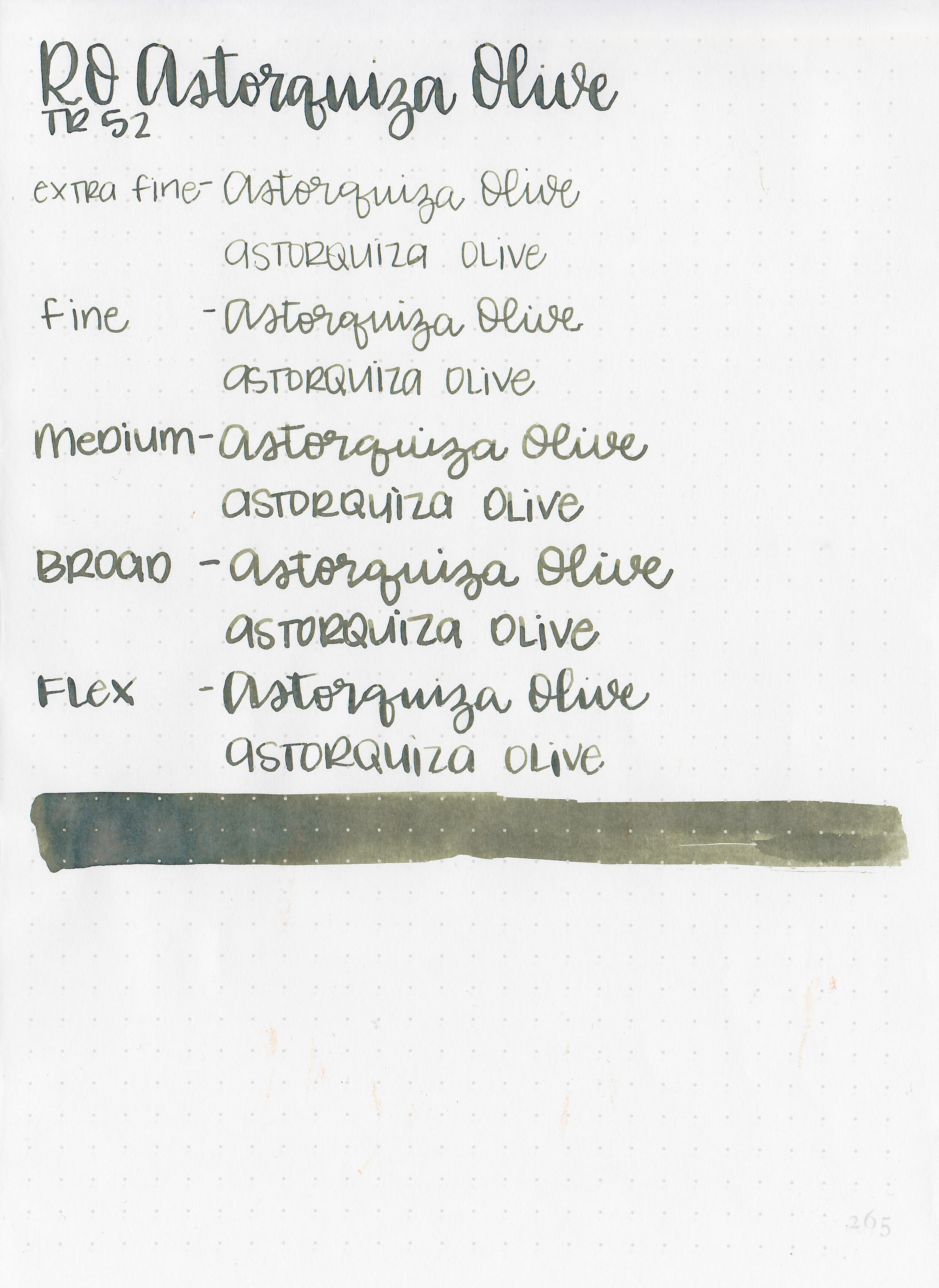
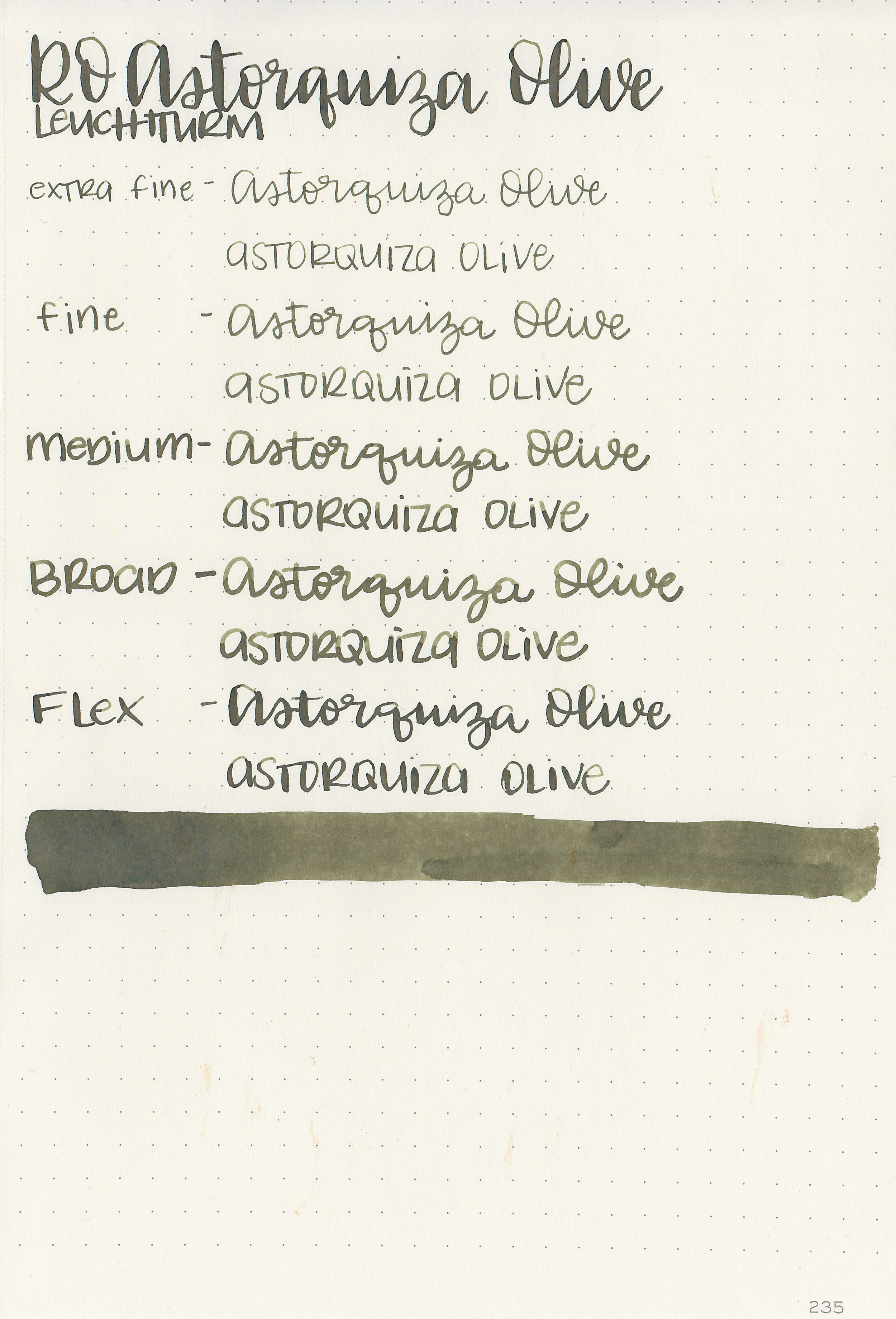
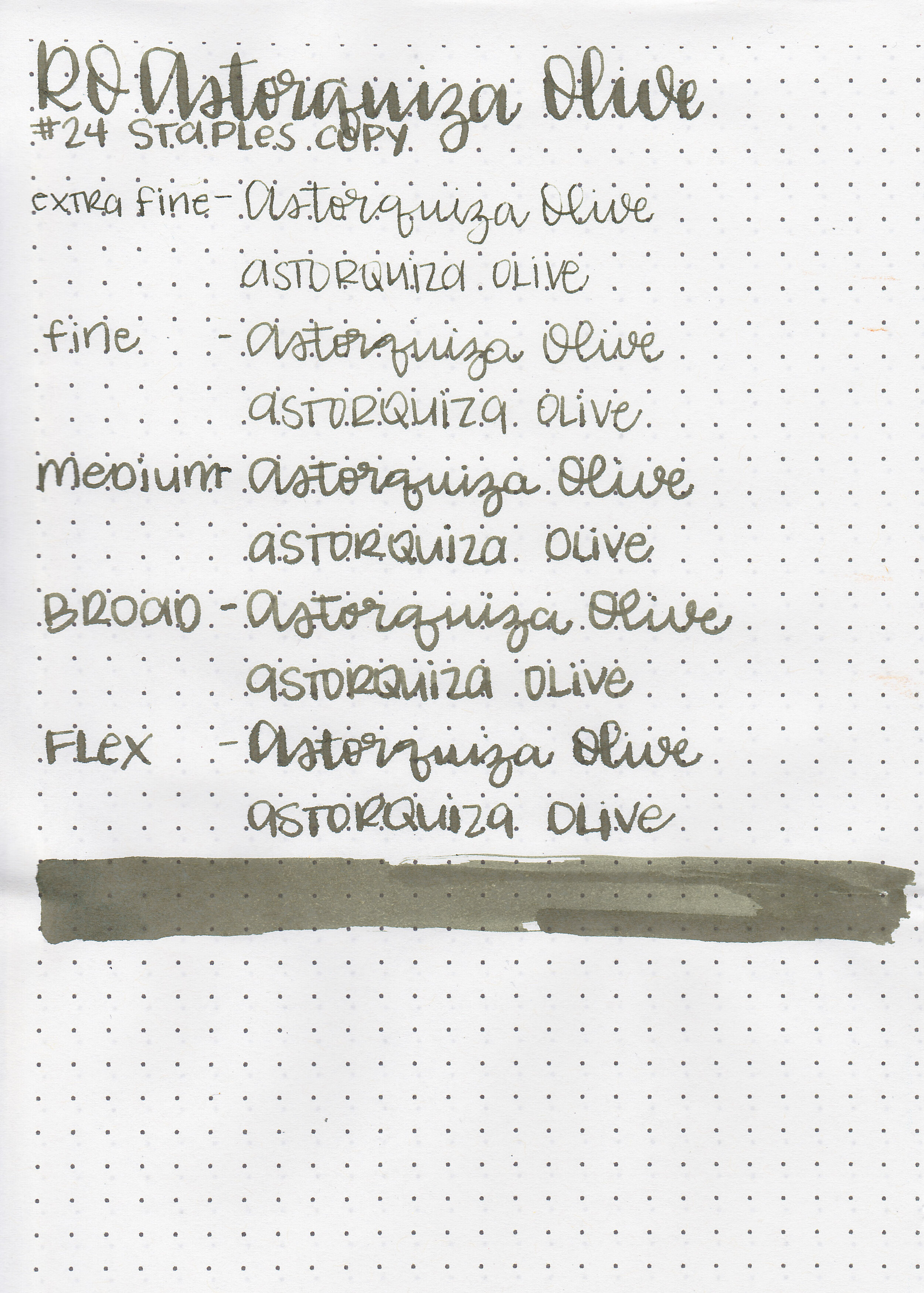
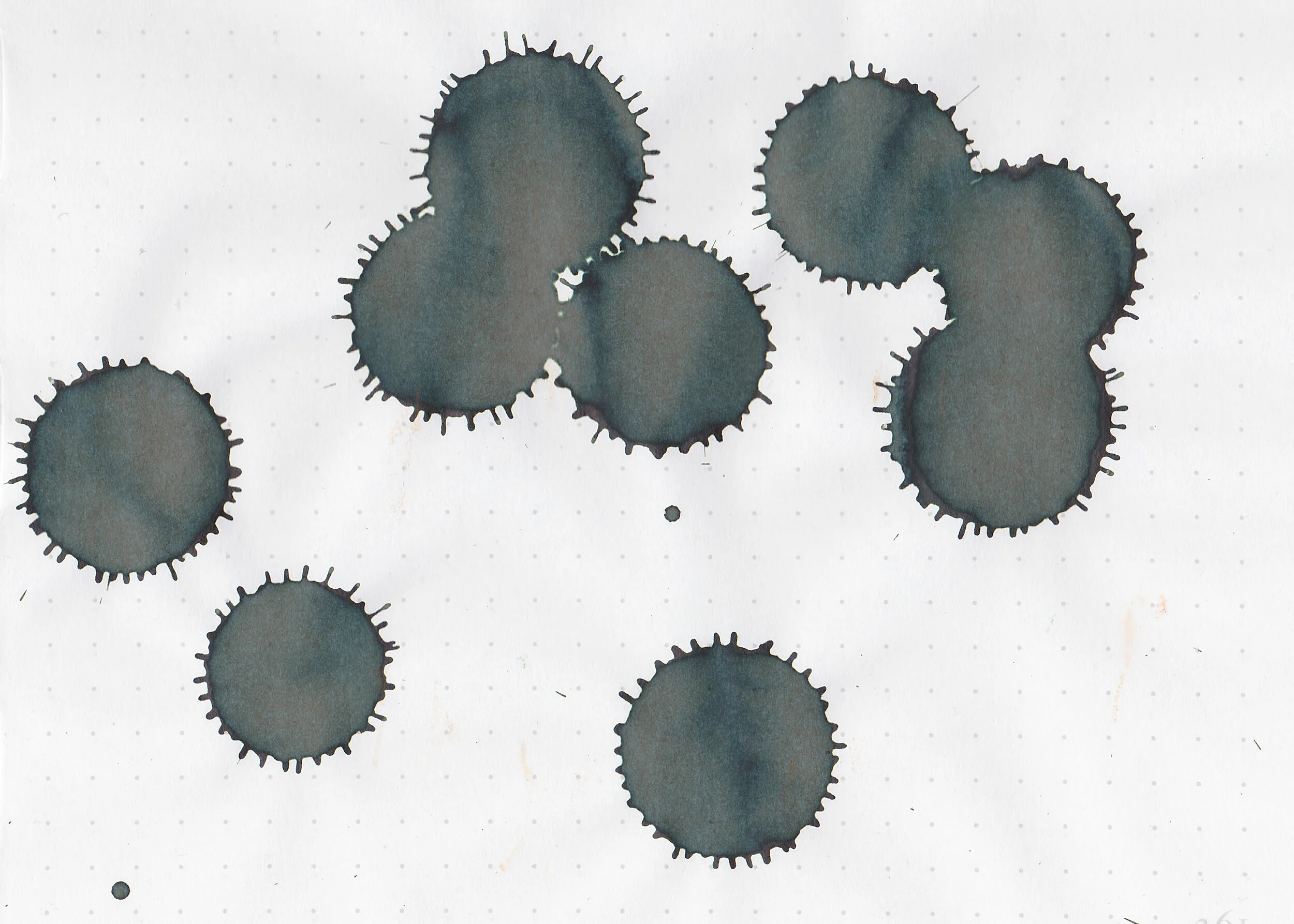
Robert Oster Astorquiza Olive is a Bauer Inks exclusive. They had a table at the SF Pen Show, and when I saw some art that had been done with this ink I knew I had to give it a try.

The color:
Astorquiza Olive is dark, and somewhere between brown and green. I think it leans just a bit more toward green, but it can go either way depending on the lighting.
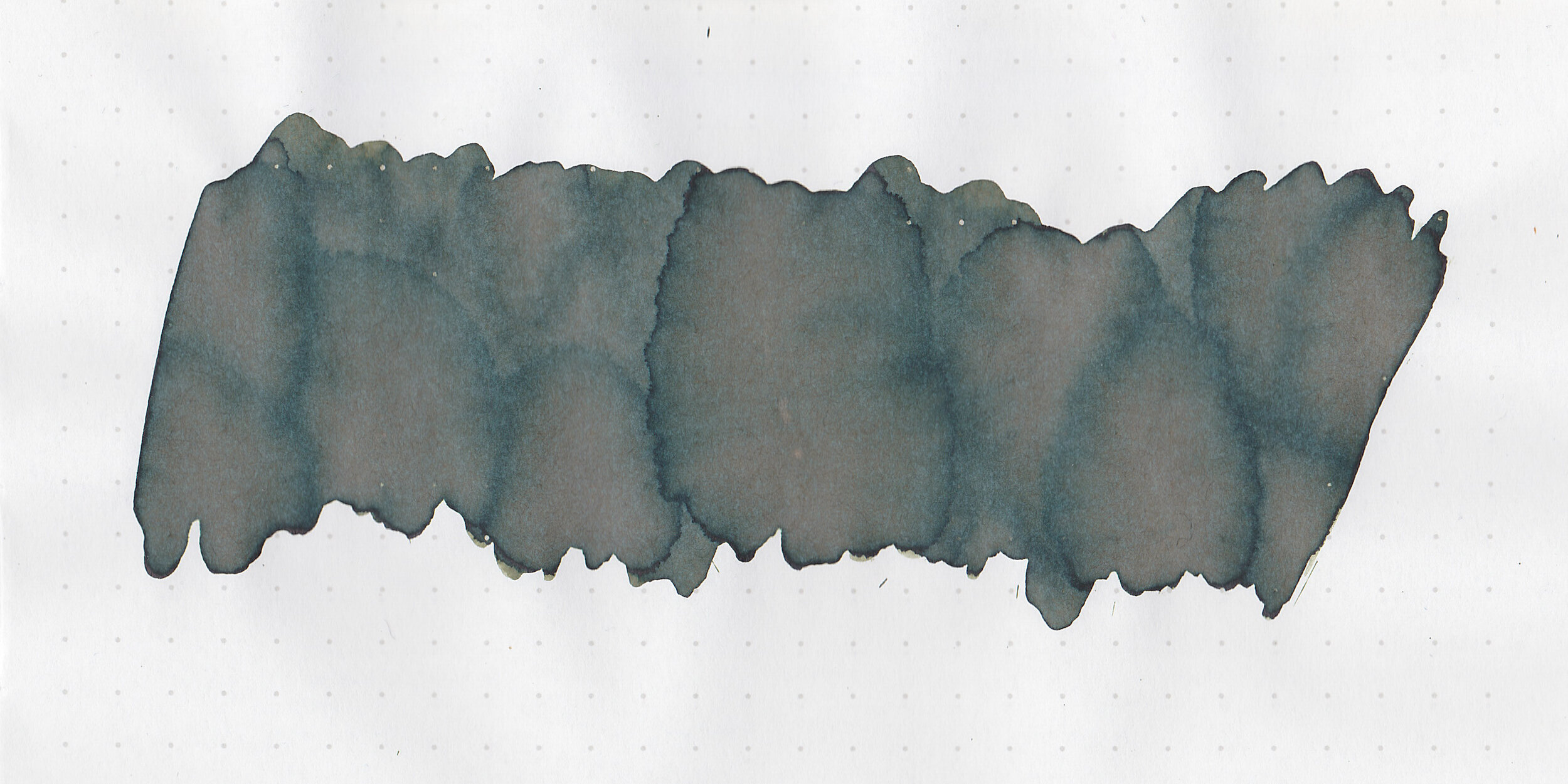
In large swabs on Tomoe River paper the ink more green and matte than on the Col-o-ring paper.
Let's take a look at how the ink behaves on fountain pen friendly papers: Rhodia, Tomoe River, and Leuchtturm.
Dry time: 10 seconds
Water resistance: Low

Feathering: Low-there was a little bit of feathering in the flex nib on Leuchtturm paper.
Show through: Medium

Bleeding: Low-there was some bleeding in the flex nib.
Other properties: medium shading, no sheen, and no shimmer.
On Staples 24 lb copy paper the ink feathered in all nib sizes and had a little bit of bleeding.

Astorquiza Olive has a lot more brown in it than other olive inks. to Click here to see the Robert Oster inks together, and click here to see the green inks together.

I used a Kaweco Al-sport Rose Gold with a broad nib on Tomoe River paper. The ink had a dry flow. You can see in the last paragraph where I primed the feed a bit since it was so dry.
Overall, I don’t love this ink as much as I thought I would. The color is interesting and it dries quickly, but the flow is a bit dry for me.
Disclaimer: I purchased this ink myself, and all photos and opinions are my own. This page does not contain affiliate links, and this post is not sponsored in any way.

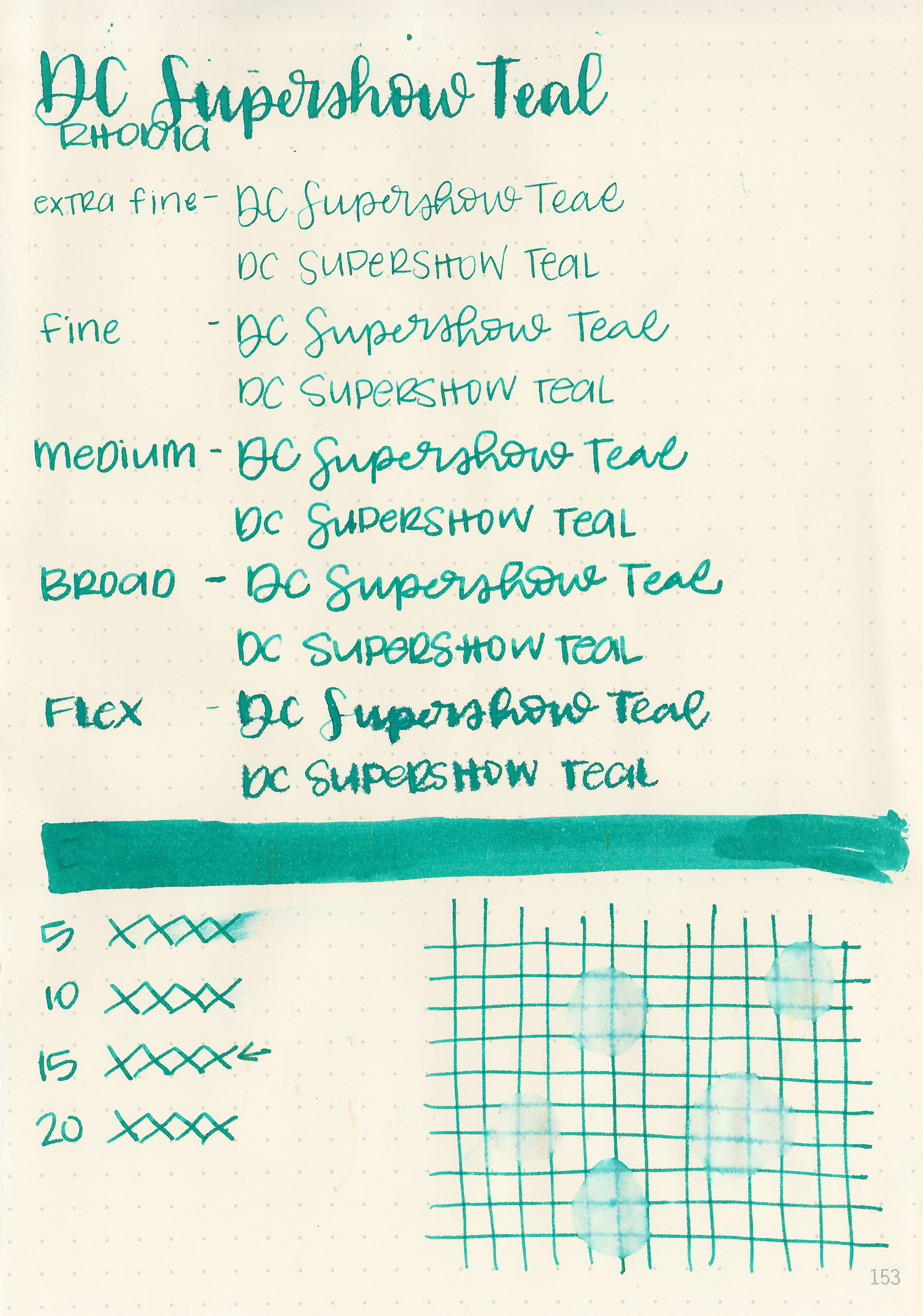
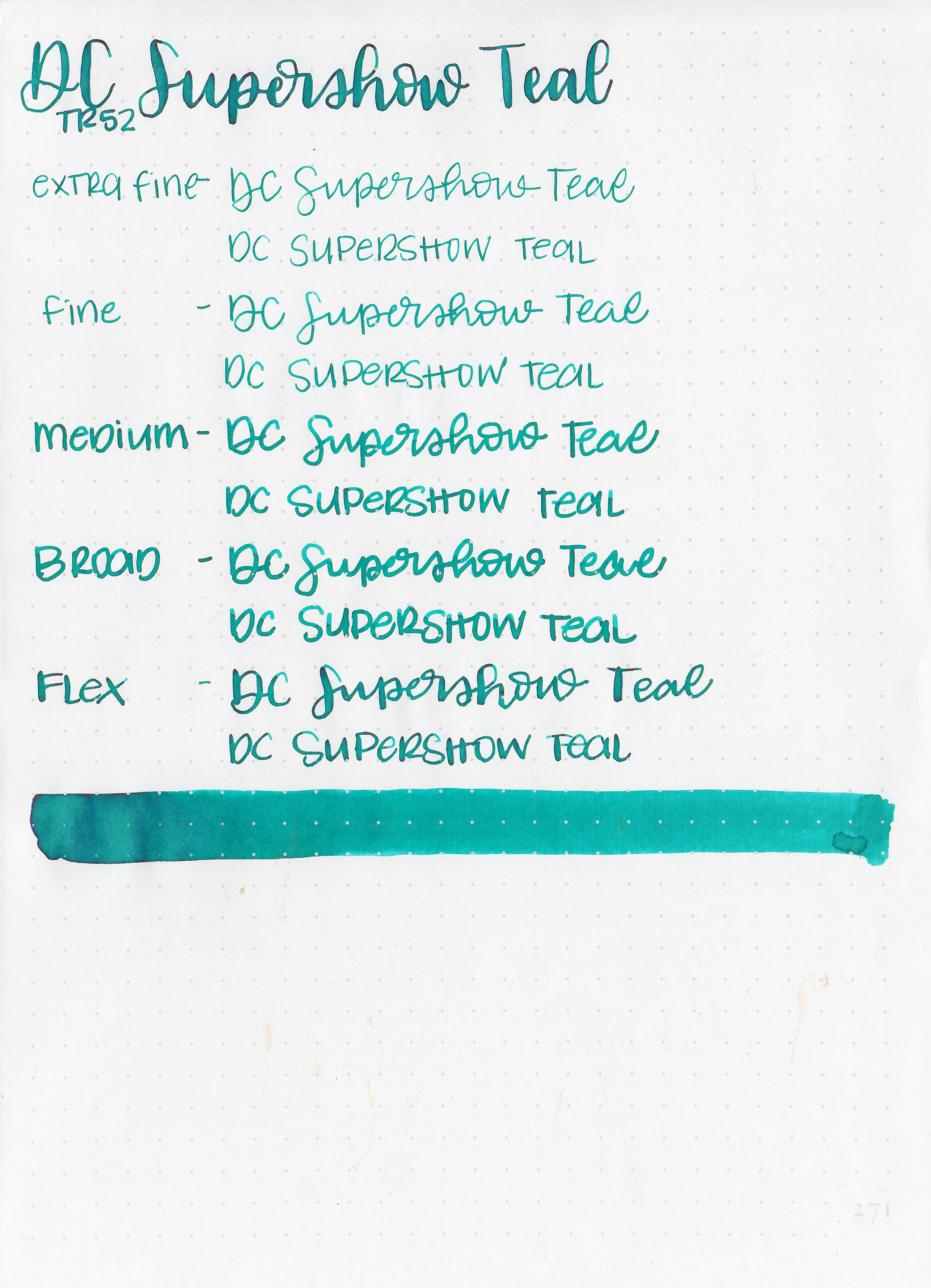
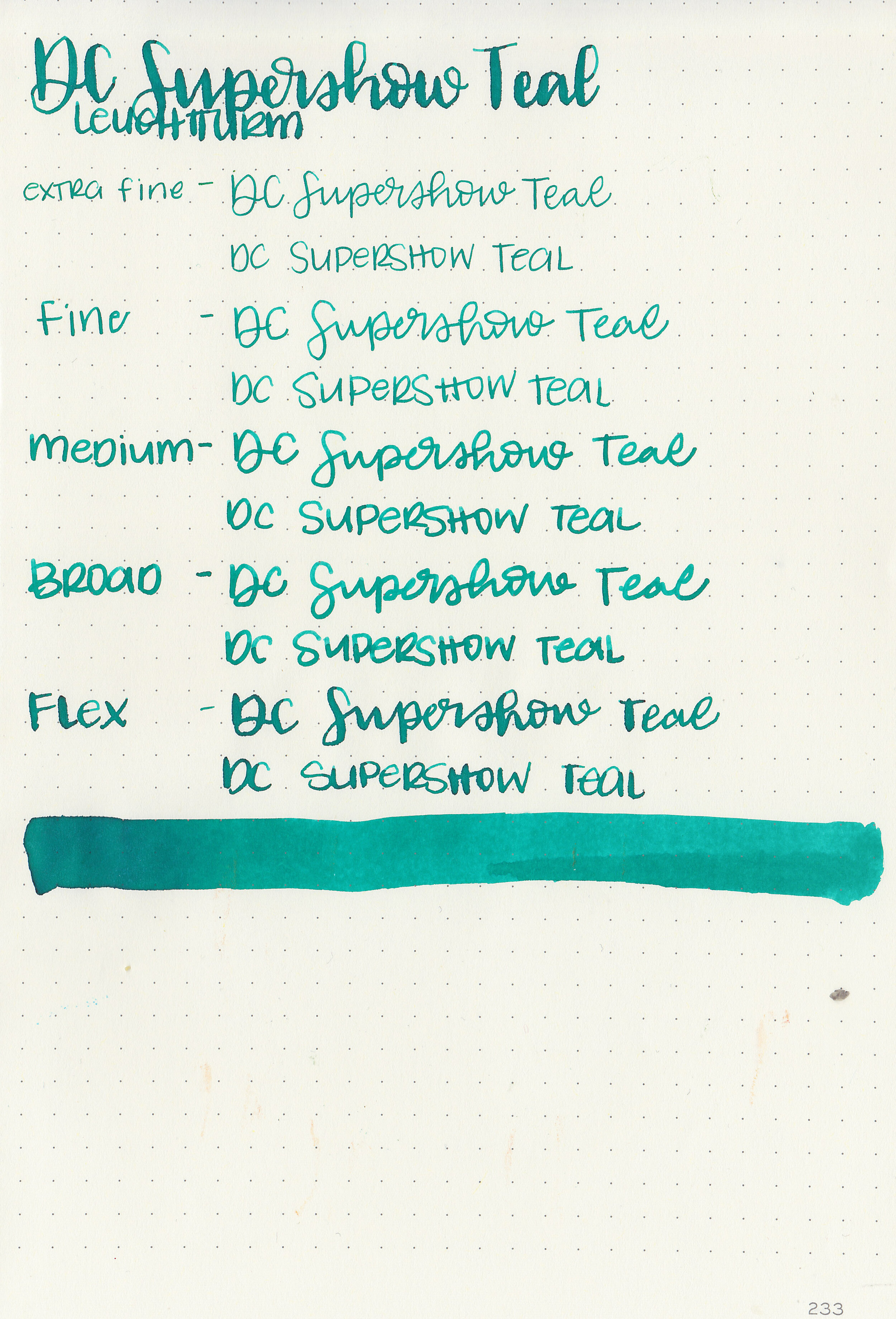
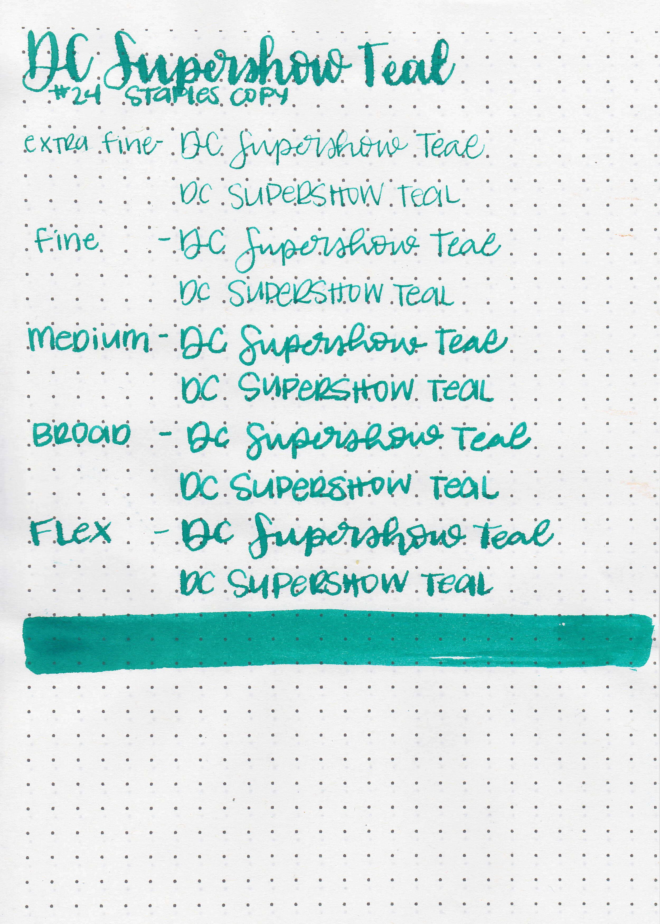
The YAFA table at the 2019 SF Pen Show got most of my money. They are the US distributor for Monteverde and they had a great show price on their inks this year. One ink I picked is Monteverde 2019 DC Supershow Teal. It debuted at the 2019 DC Pen Show in August, and is now part of the standard line. You can find this ink for sale at Goulet Pens.
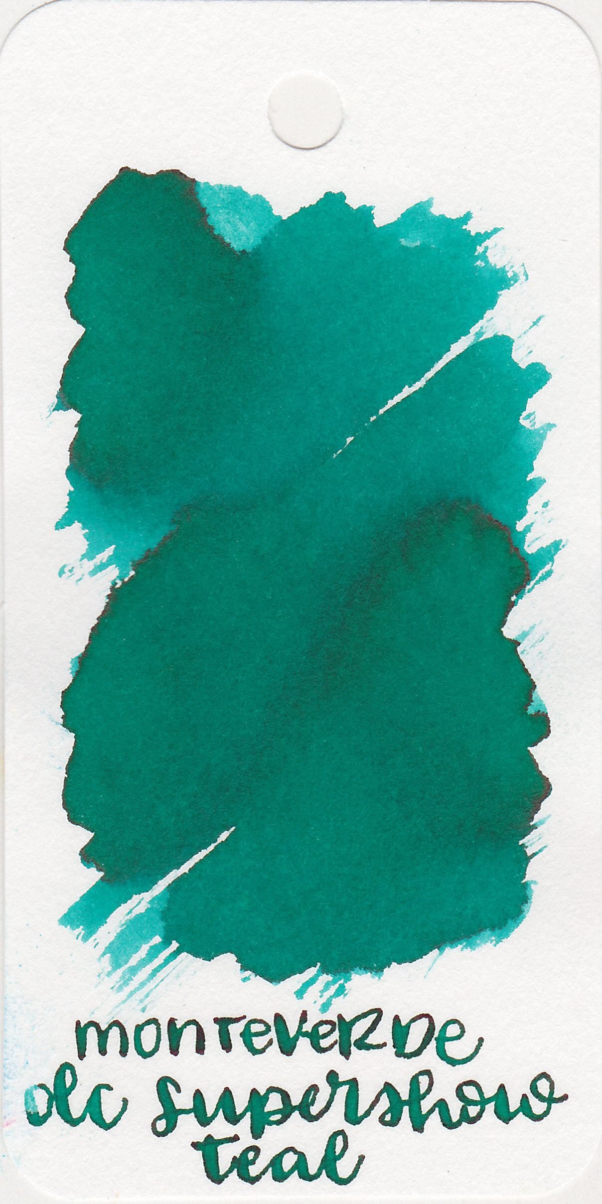
The color:
DC Supershow Teal is a beautiful medium teal with shading.

In large swabs on Tomoe River paper the ink appears a bit less green with the tiniest hint of pink sheen around the edges. It’s almost nonexistent sheen.
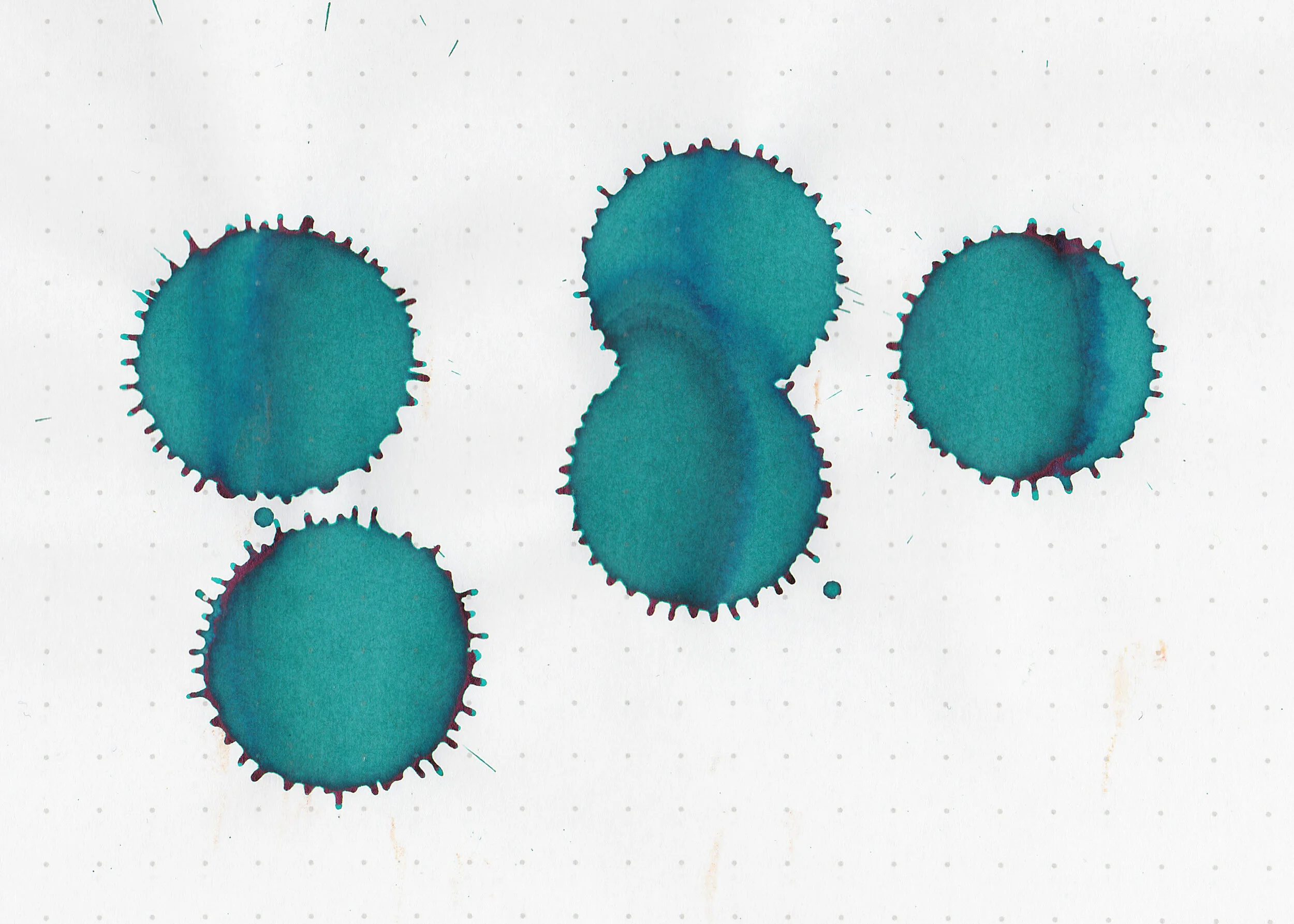
Let's take a look at how the ink behaves on fountain pen friendly papers: Rhodia, Tomoe River, and Leuchtturm.
Dry time: 15 seconds
Water resistance: Low
Feathering: Low-there was a little bit of feathering in the flex nib on Leuchtturm paper.
Show through: Medium
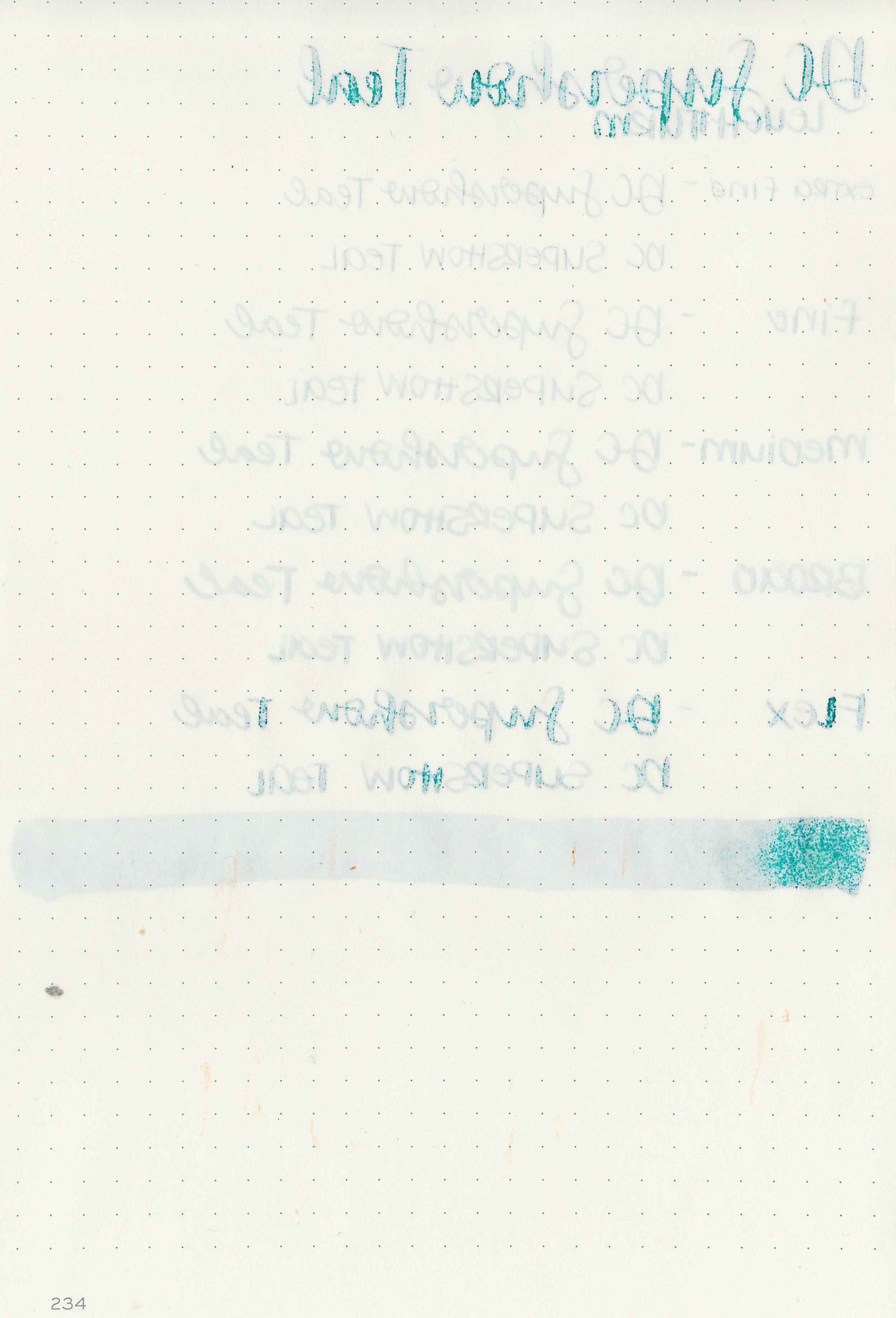
Bleeding: Low-there was some bleeding in the flex nib.
Other properties: medium shading, no sheen, and no shimmer.

On Staples 24 lb copy paper the ink feathered in all nib sizes and had a little bit of bleeding.
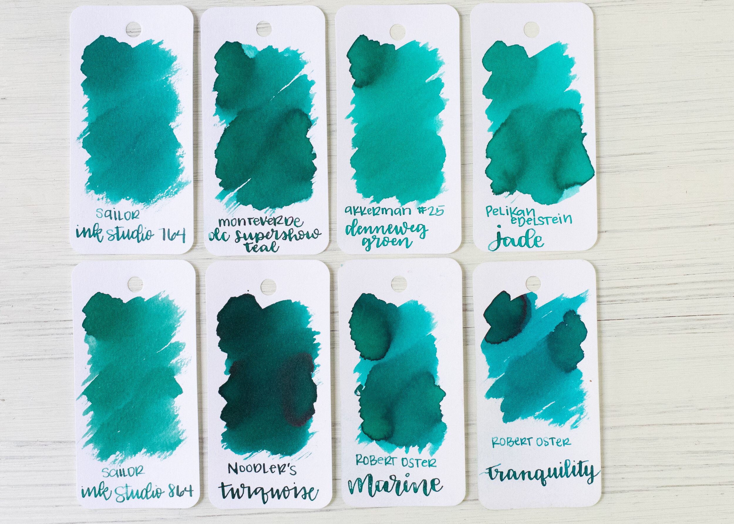
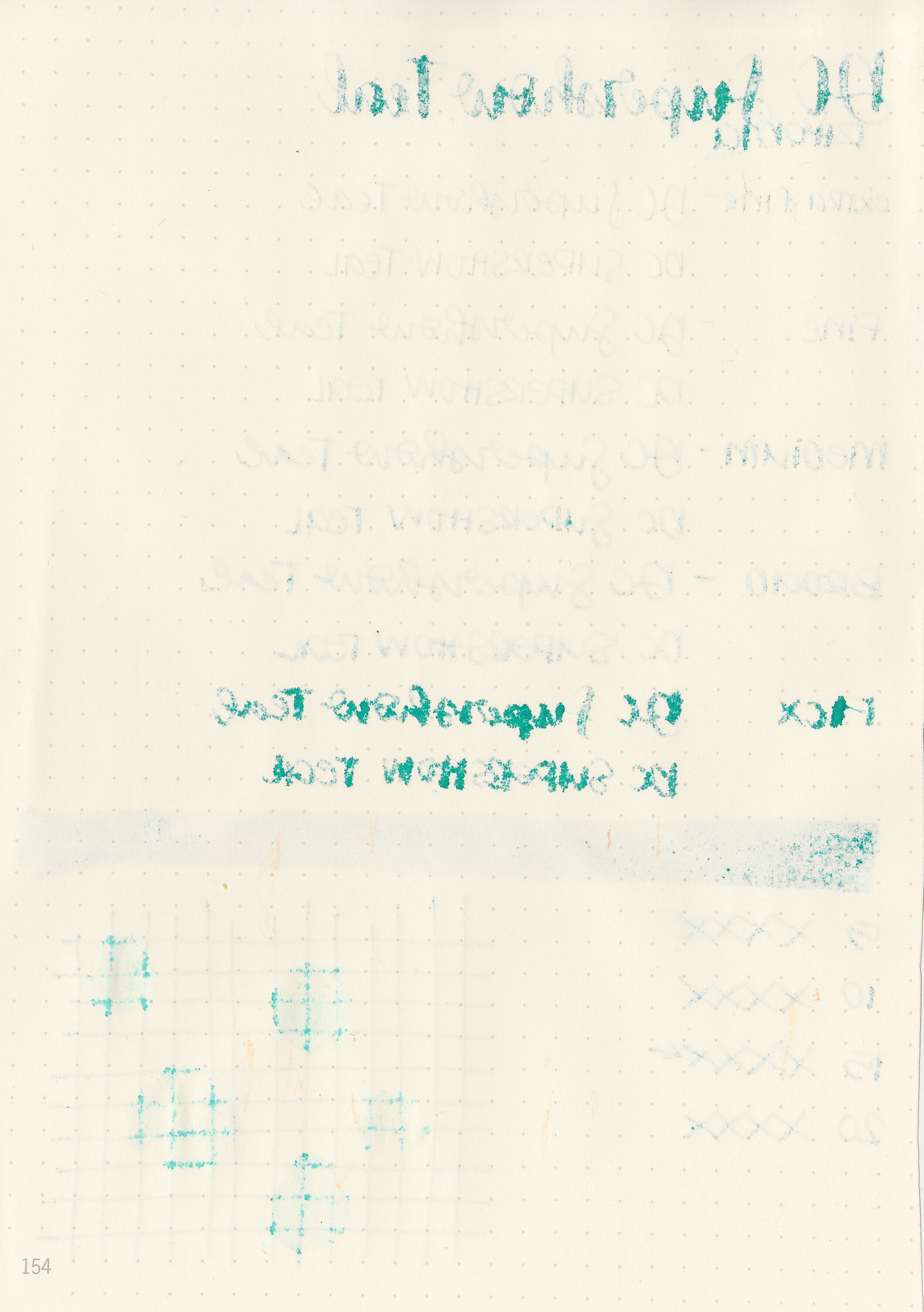
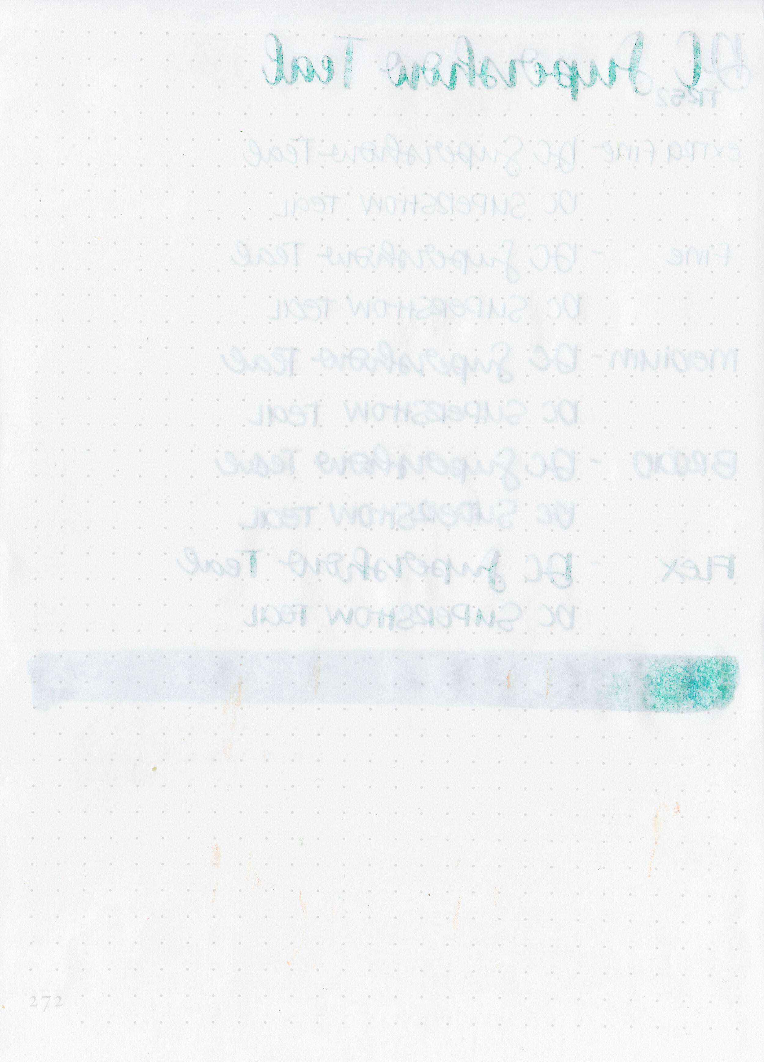
DC Supershow Teal is closest to Robert Oster Marine, but Supershow Teal has a much wetter flow than Marine does and Marine has more sheen. Click here to see the Monteverde Inks together, and click here to see the teal inks together.

I used a Pelikan M600 Turquoise with a broad nib on Tomoe River paper. The ink had an wet flow.
Overall, this ink was an insta-buy for me when I saw it. I love the flow of Monteverde Inks, they perform well and I love teal, so it’s a win for me! At a show price of $5 per bottle, I couldn’t pass it up and I don’t regret it!
Disclaimer: I purchased this ink myself, and all photos and opinions are my own. This page does not contain affiliate links, and this post is not sponsored in any way.

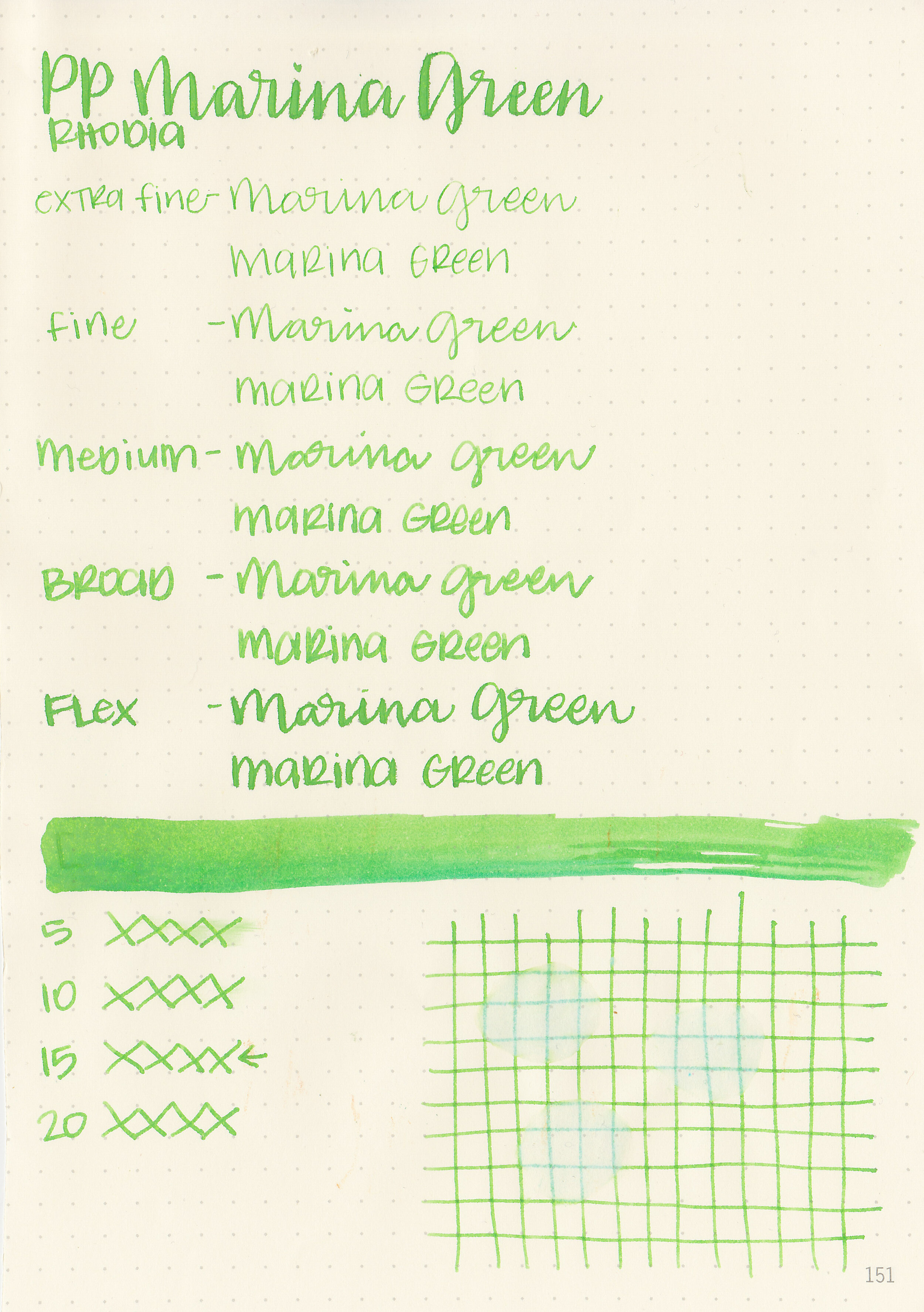
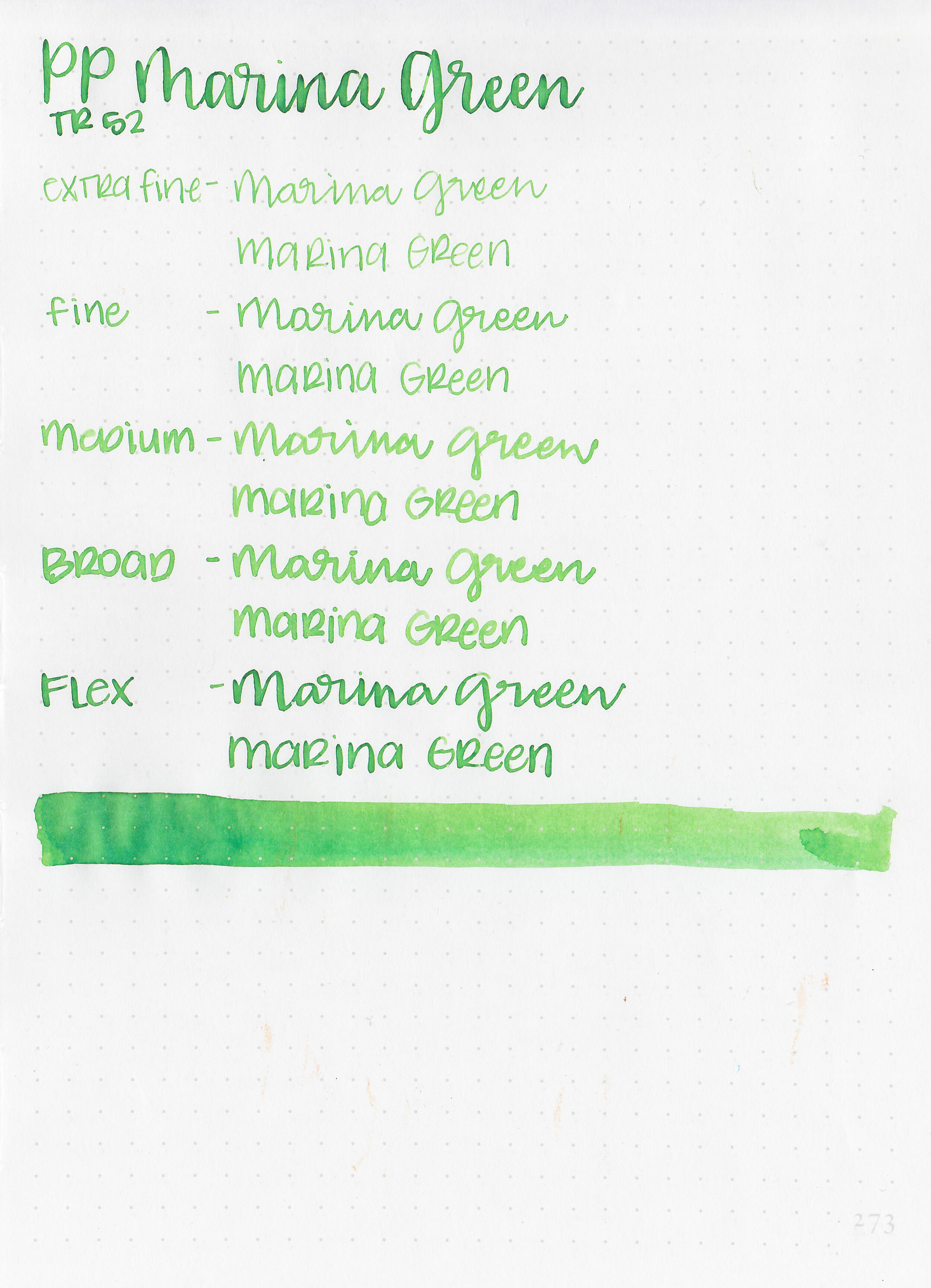
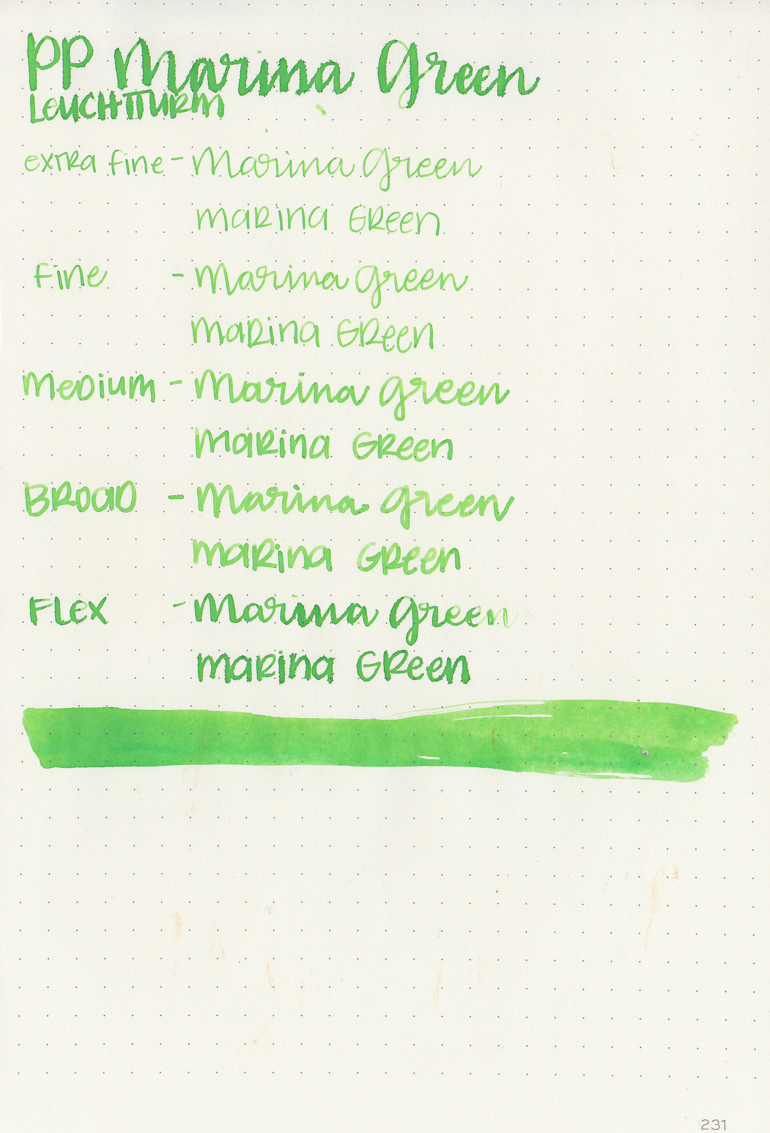
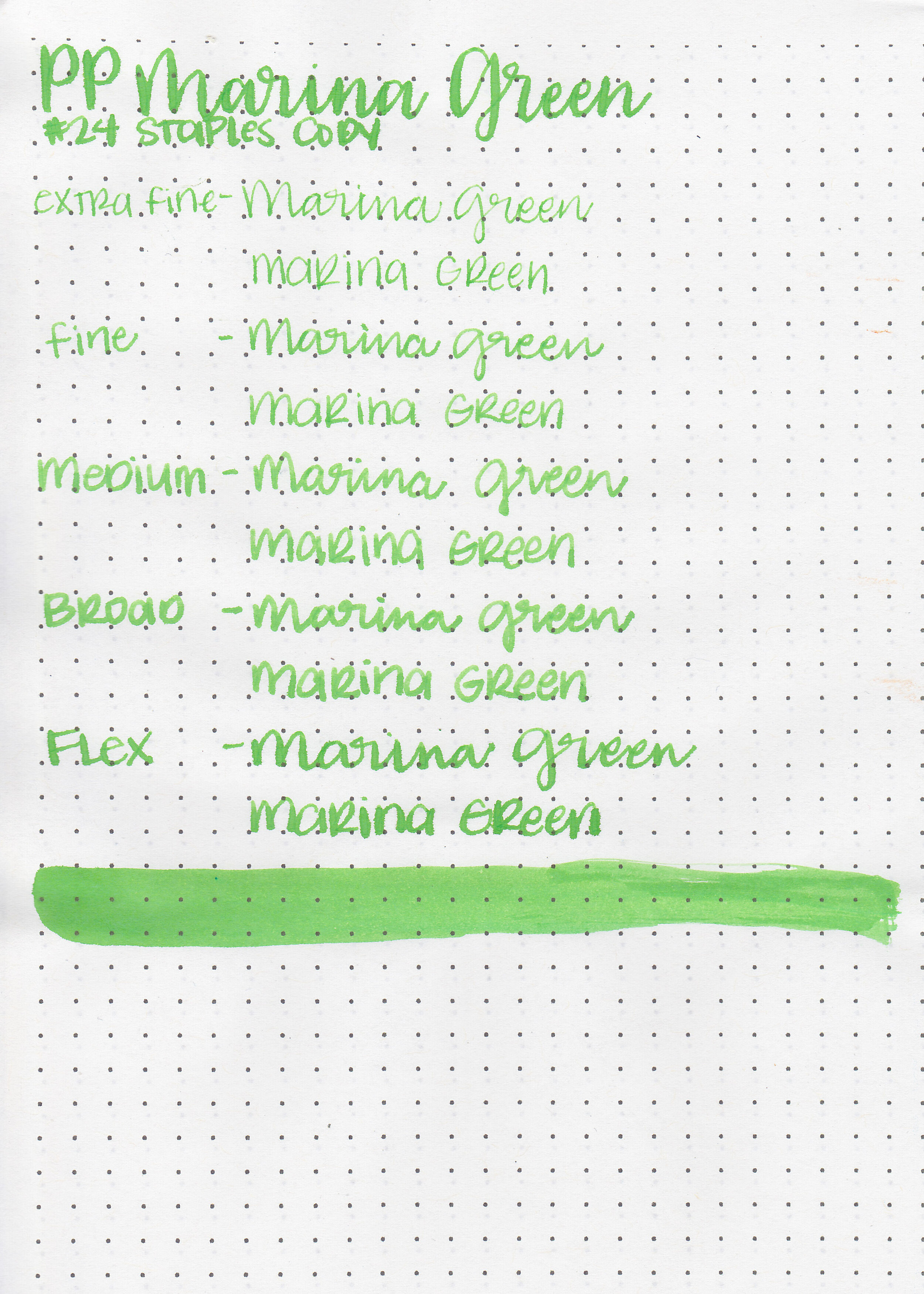
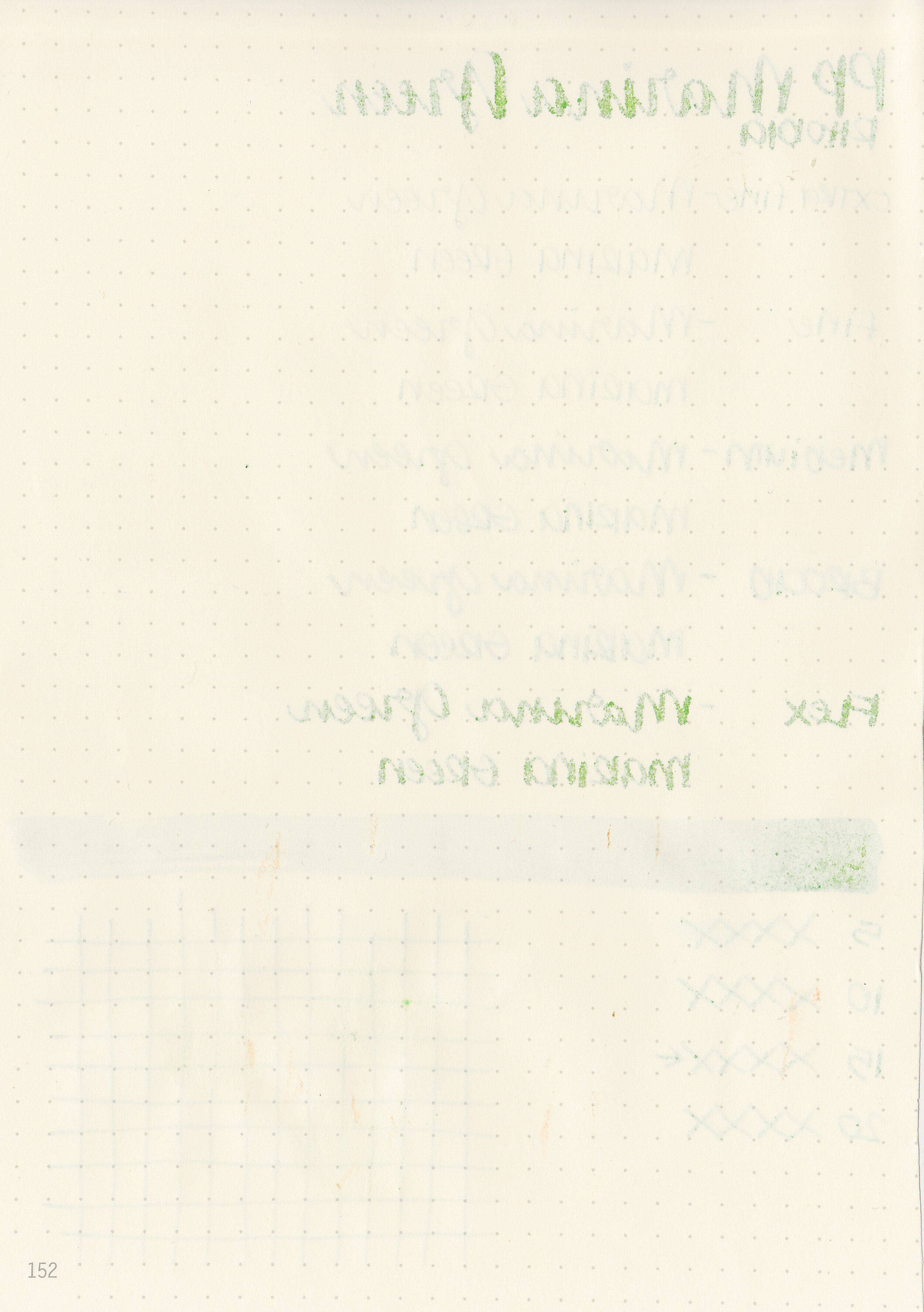
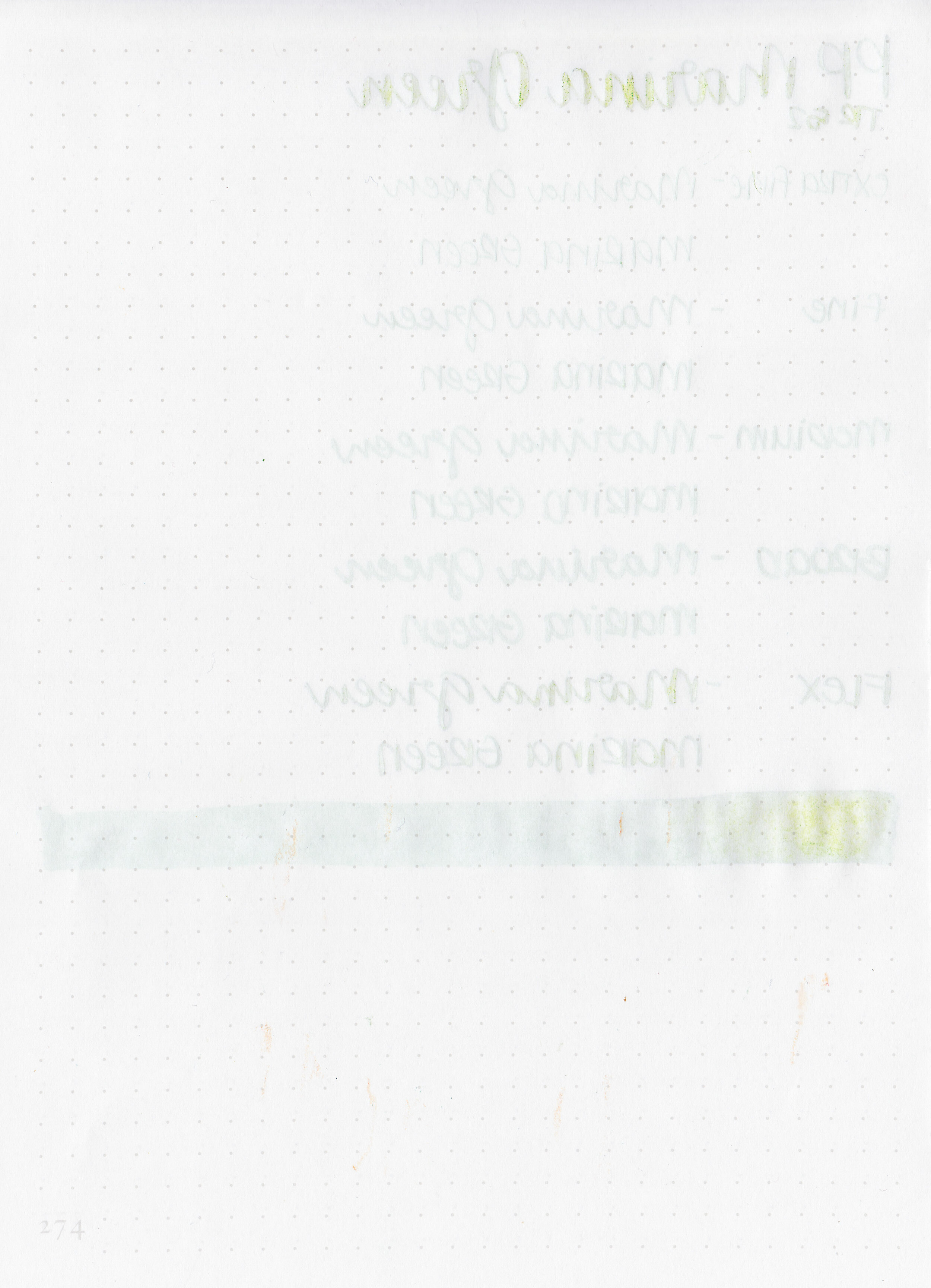
Papier Plume Marina Green was released at the 2019 San Francisco Pen Show. I picked up a bottle at the Papier Plume table but they still have some in stock on their website and Vanness Pens has some in stock as well. I like the Papier Plume bottles but I dislike the wax seals on top. The idea is great but sometimes the wax drips down too far and then it’s hard to get the bottle open. This bottle I had to cut a bunch of wax off before I could get the bottle open.

The color:
Marina Green is a bright medium green with some shading. I would almost call it a lime green on this Col-o-ring paper.

In large swabs on Tomoe River paper the ink looks darker and more matte.

Let's take a look at how the ink behaves on fountain pen friendly papers: Rhodia, Tomoe River, and Leuchtturm.
Dry time: 15 seconds
Water resistance: Medium-some of the ink washed away but you still might be able to read what was written.
Feathering: Low-there was a little bit of feathering in the flex nib on Leuchtturm paper.
Show through: Medium
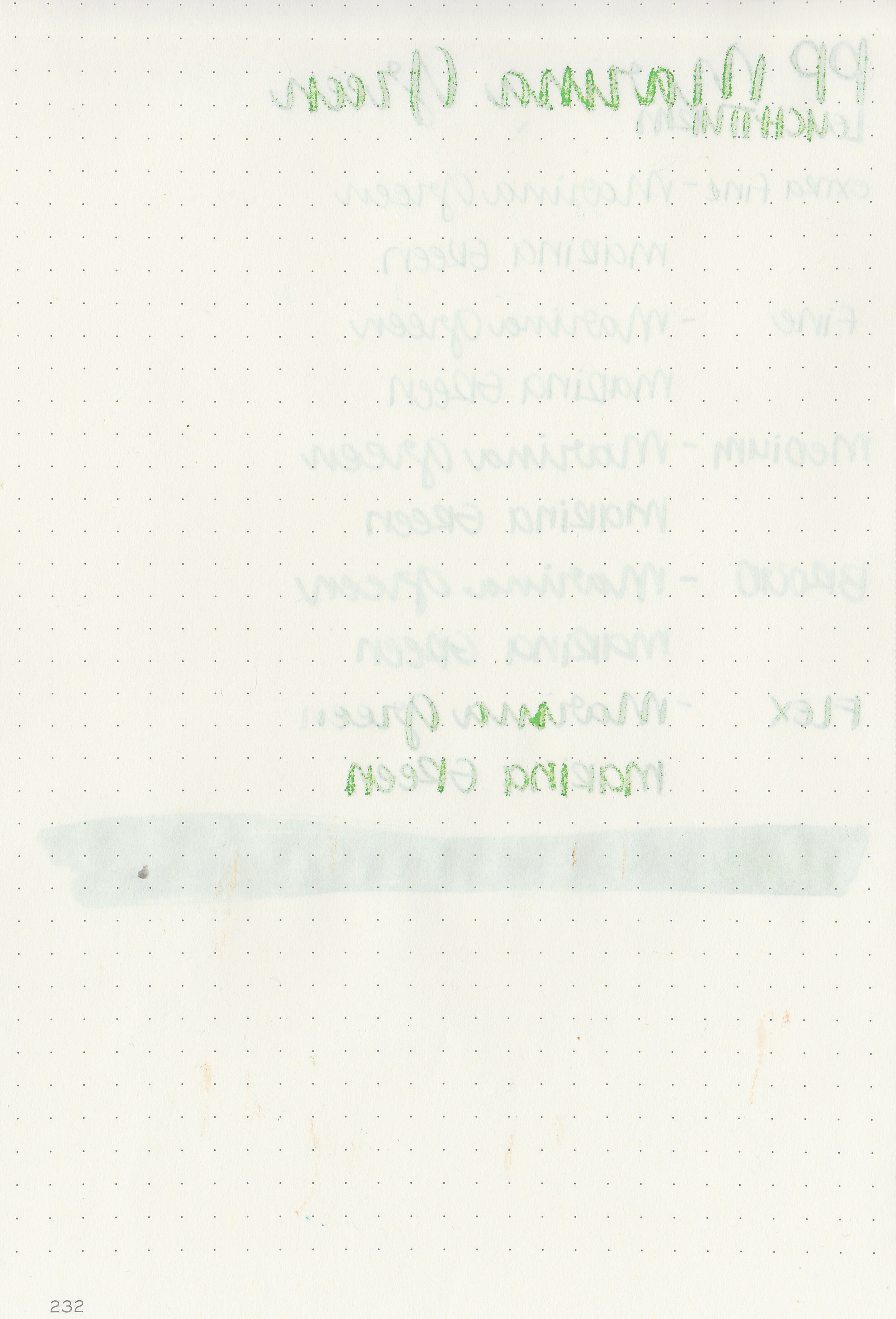
Bleeding: Low-there was some bleeding in the flex nib.
Other properties: low shading, no sheen, and no shimmer.
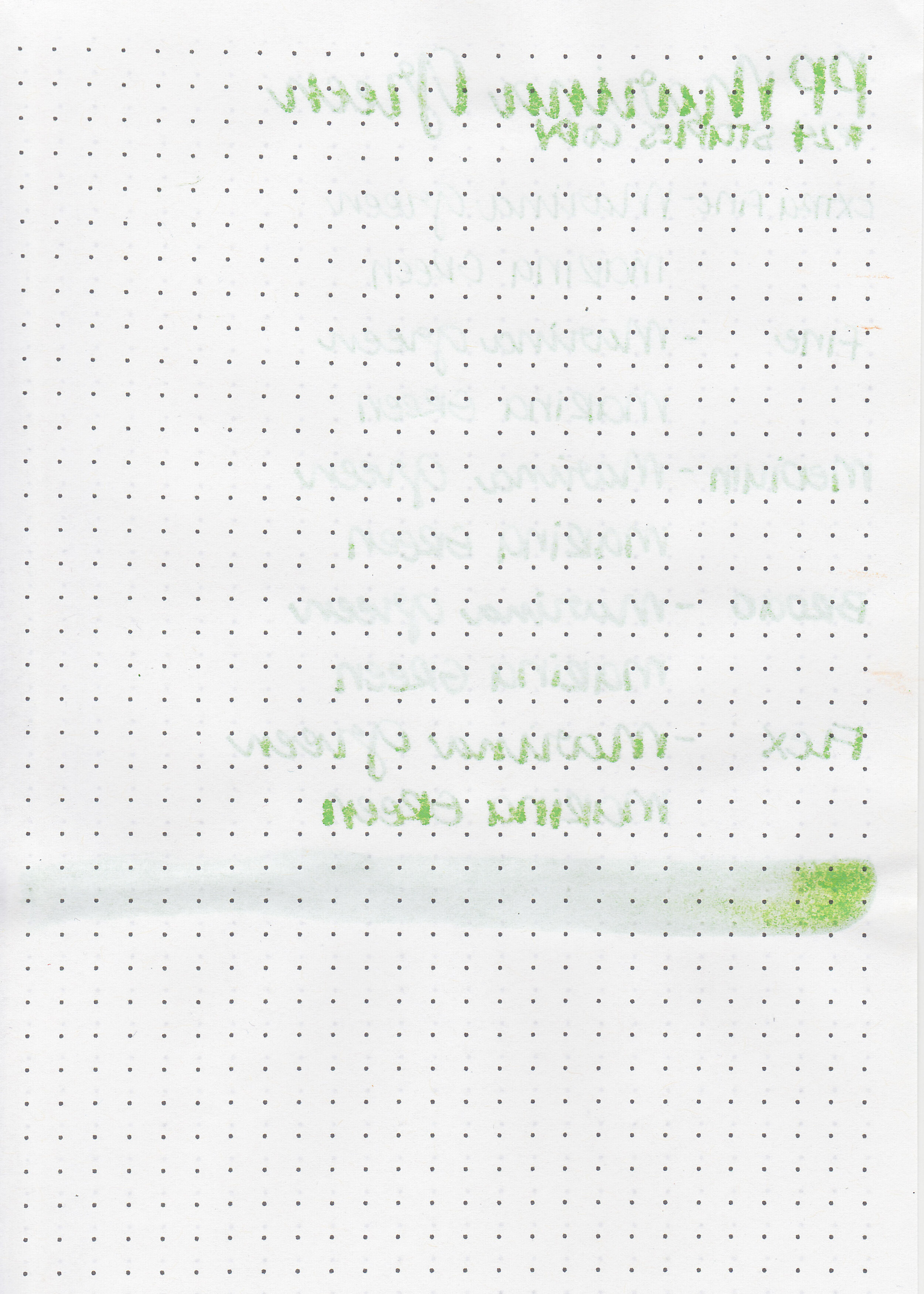
On Staples 24 lb copy paper the ink feathered in all nib sizes and had a little bit of bleeding.

I think the closest ink I have is Robert Oster Green Green. Click here to see the Papier Plume inks together, and click here to see the green inks together.

I used a TWSBI Eco Transparent Green with a medium nib on Tomoe River paper. The ink had an average flow.
Overall, it’s a bright fun green. It would be a great ink to use in the late spring and summer.
Disclaimer: I purchased this ink myself, and all photos and opinions are my own. This page does not contain affiliate links, and this post is not sponsored in any way.

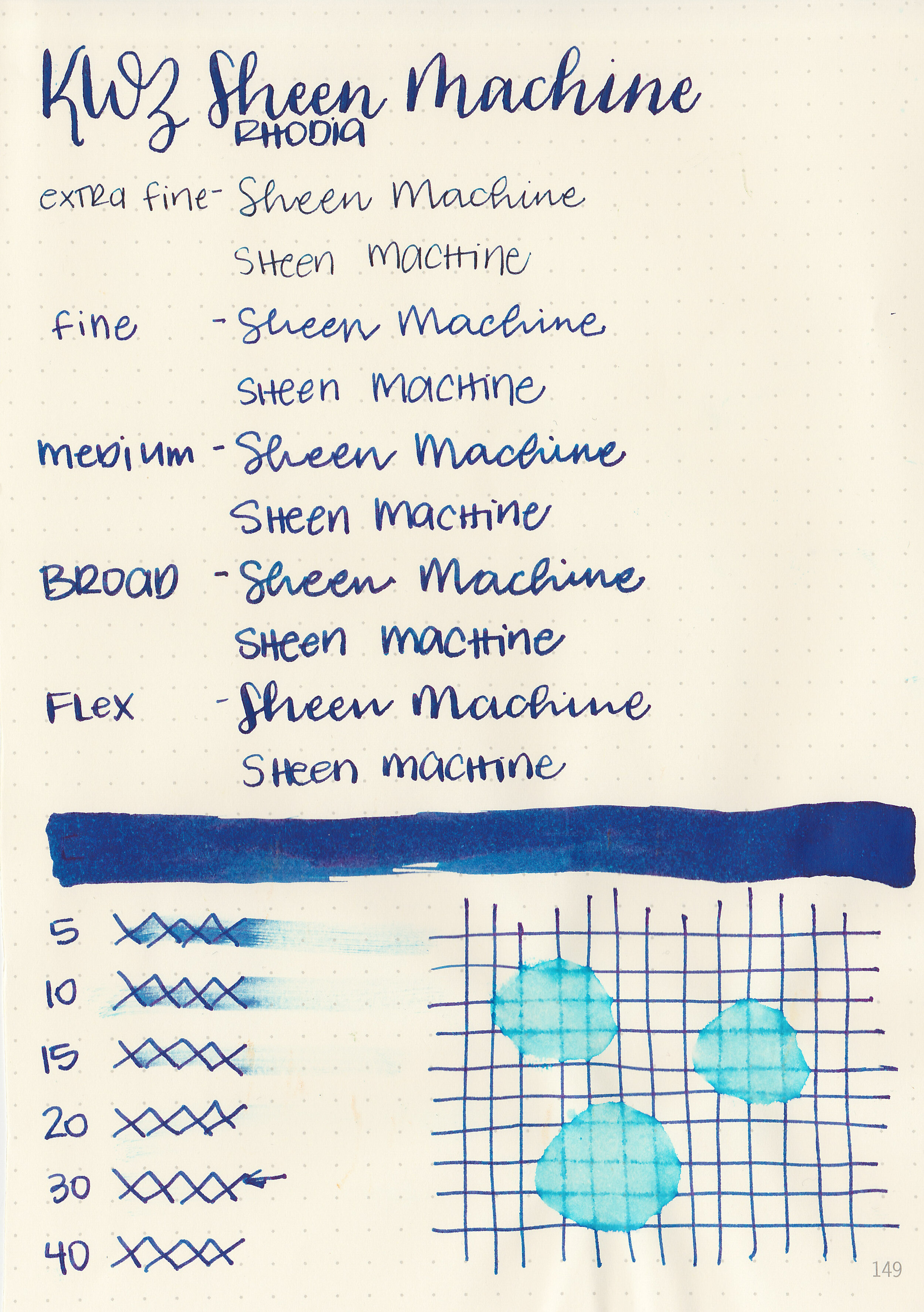
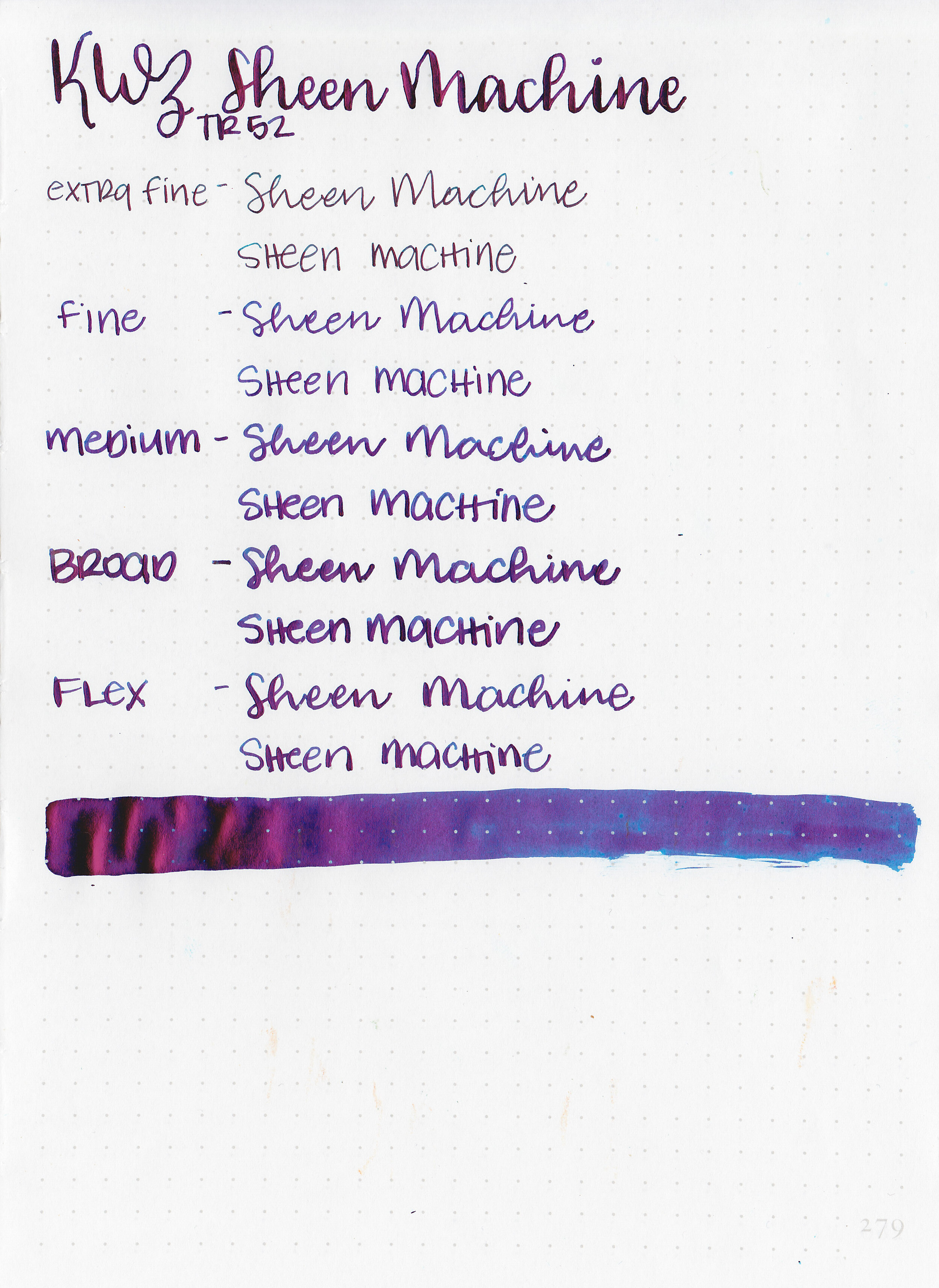
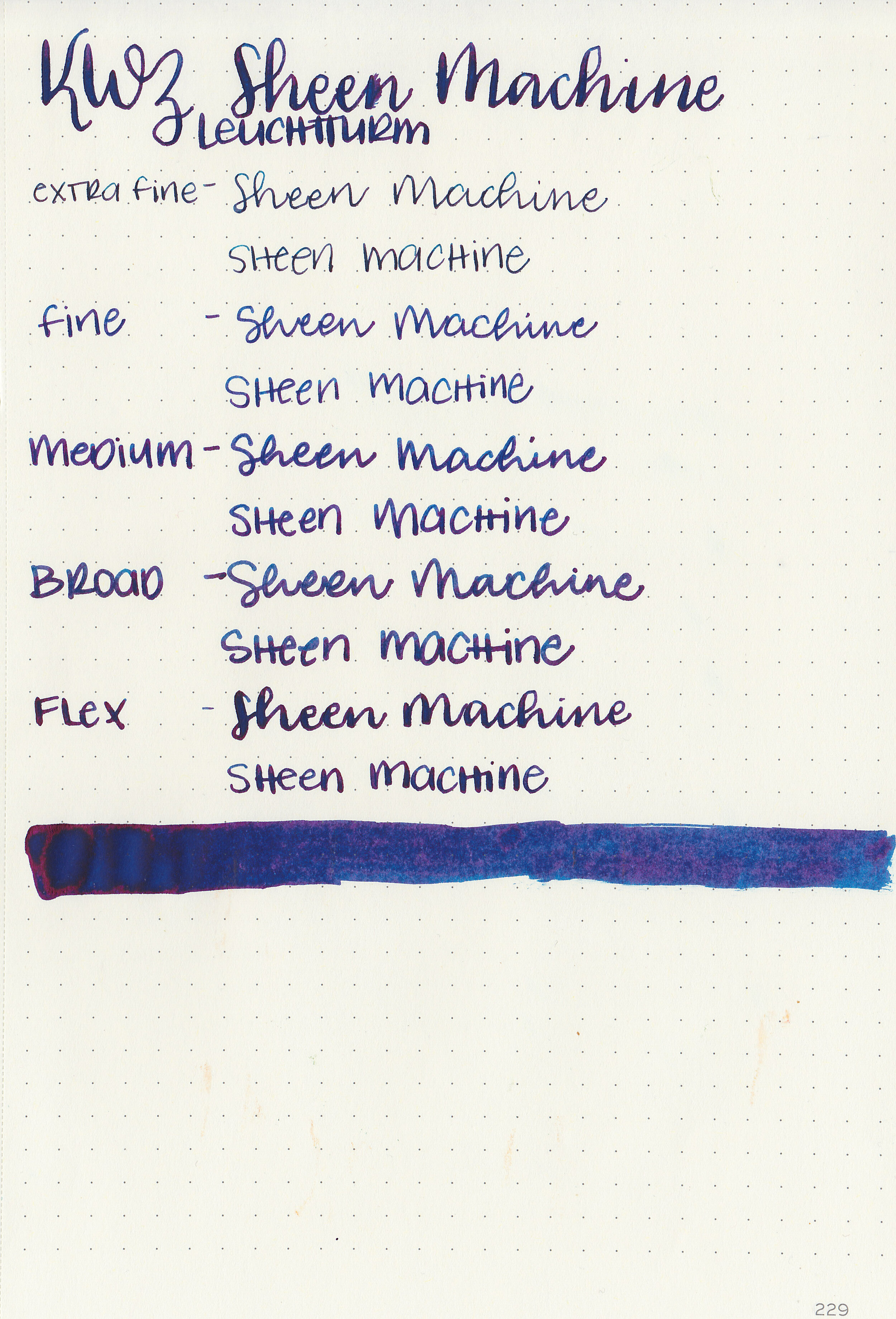
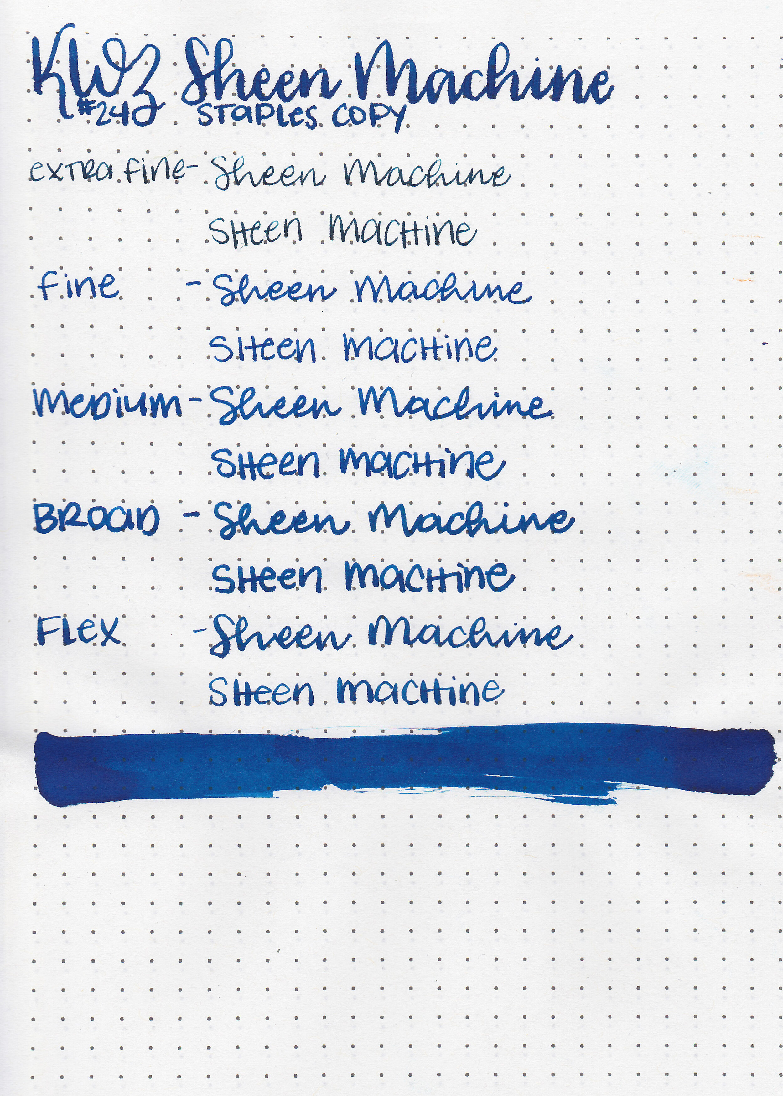
For the rest of this week we are going to tackle some inks I picked up at the San Francisco Pen Show last month, starting with KWZ Sheen Machine. I picked up a bottle at the Vanness Pen table. Super sheening inks still seem to be all the rage, so this is KWZ’s newest ink.

The color:
Sheen Machine is a dark blue with a ton of pink sheen.

In large swabs on Tomoe River paper the ink is mostly sheen with a little bit of blue mixed in.

Let's take a look at how the ink behaves on fountain pen friendly papers: Rhodia, Tomoe River, and Leuchtturm.
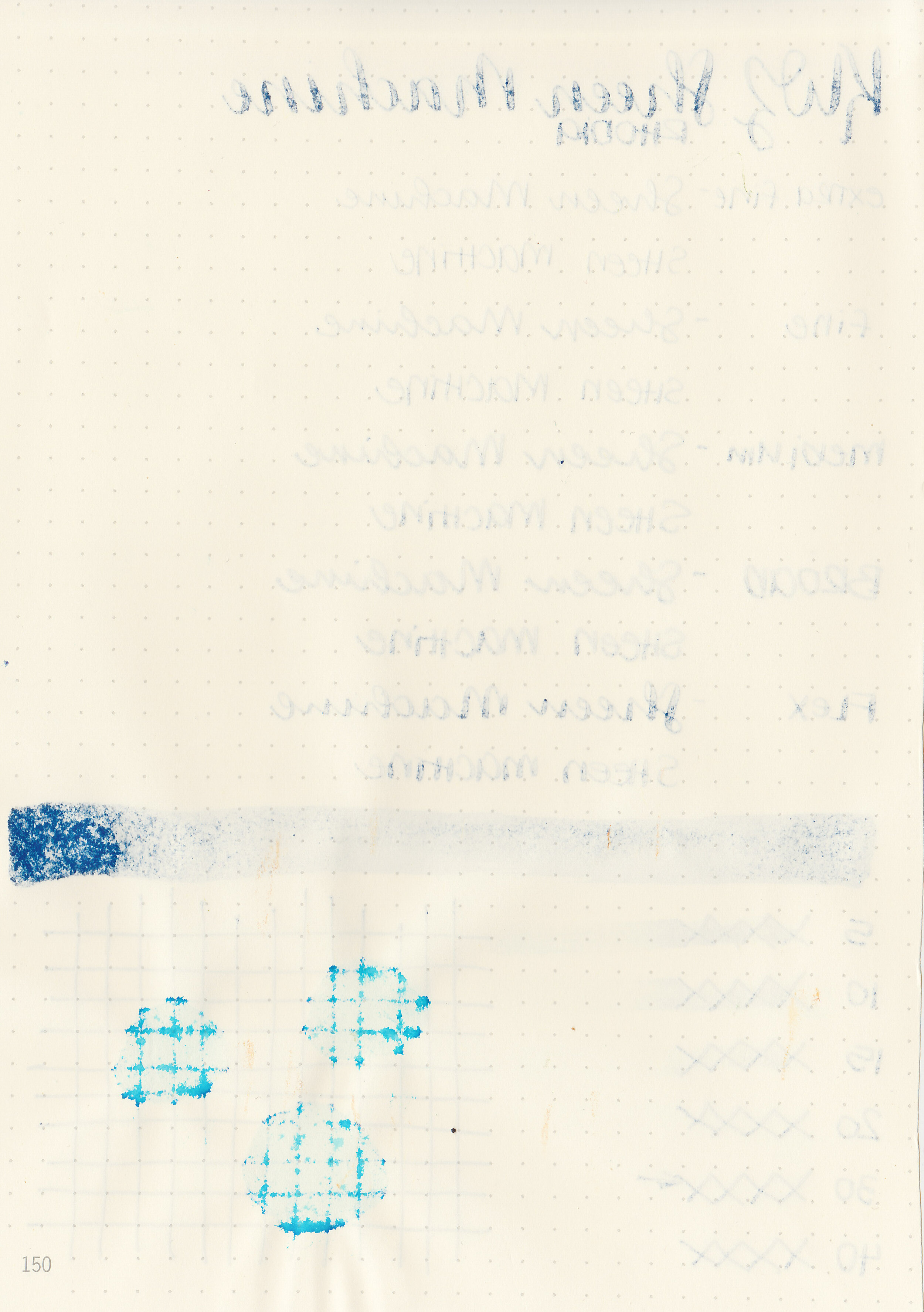
Dry time: 30 seconds
Water resistance: Low
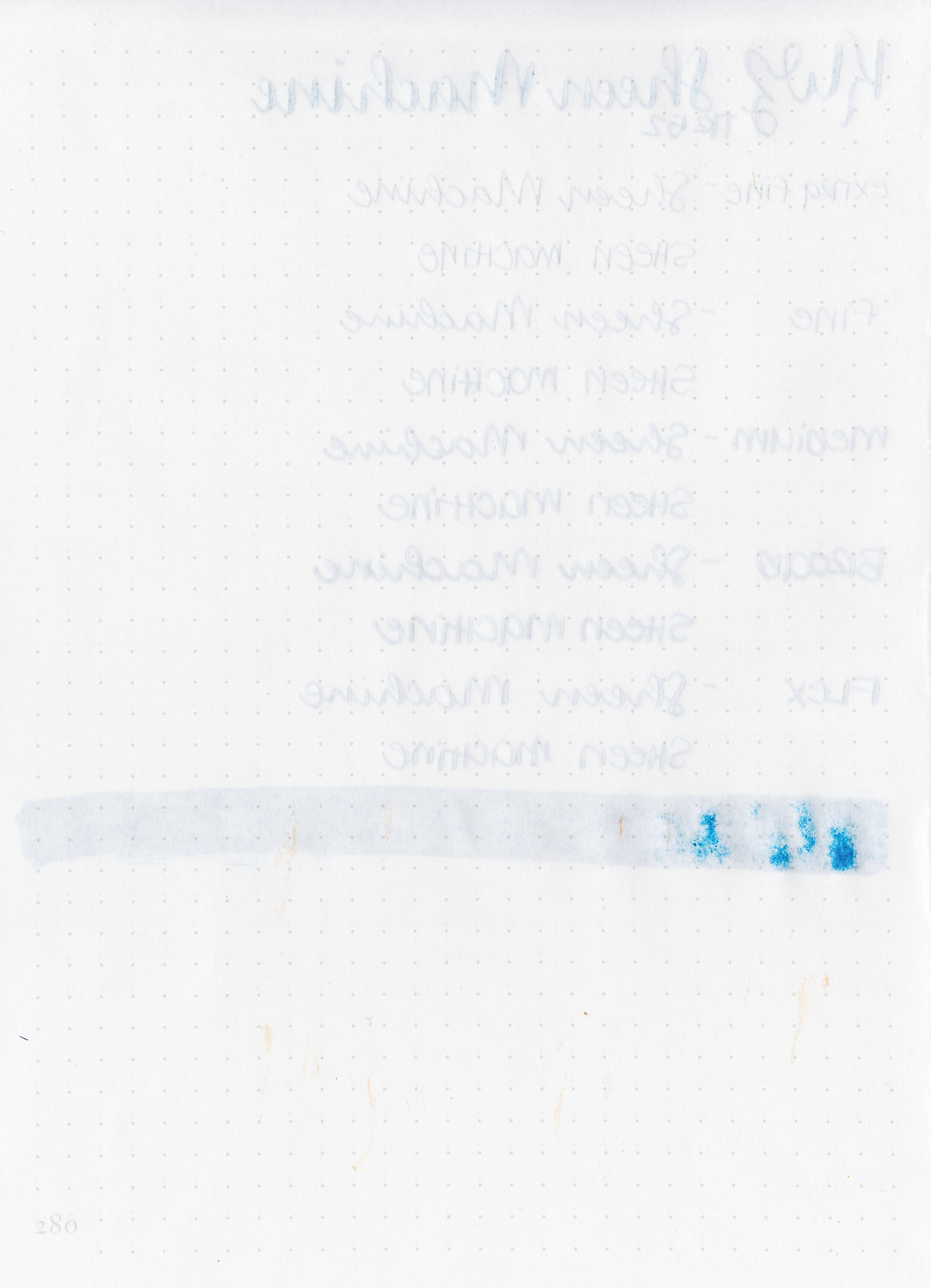
Feathering: None
Show through: High
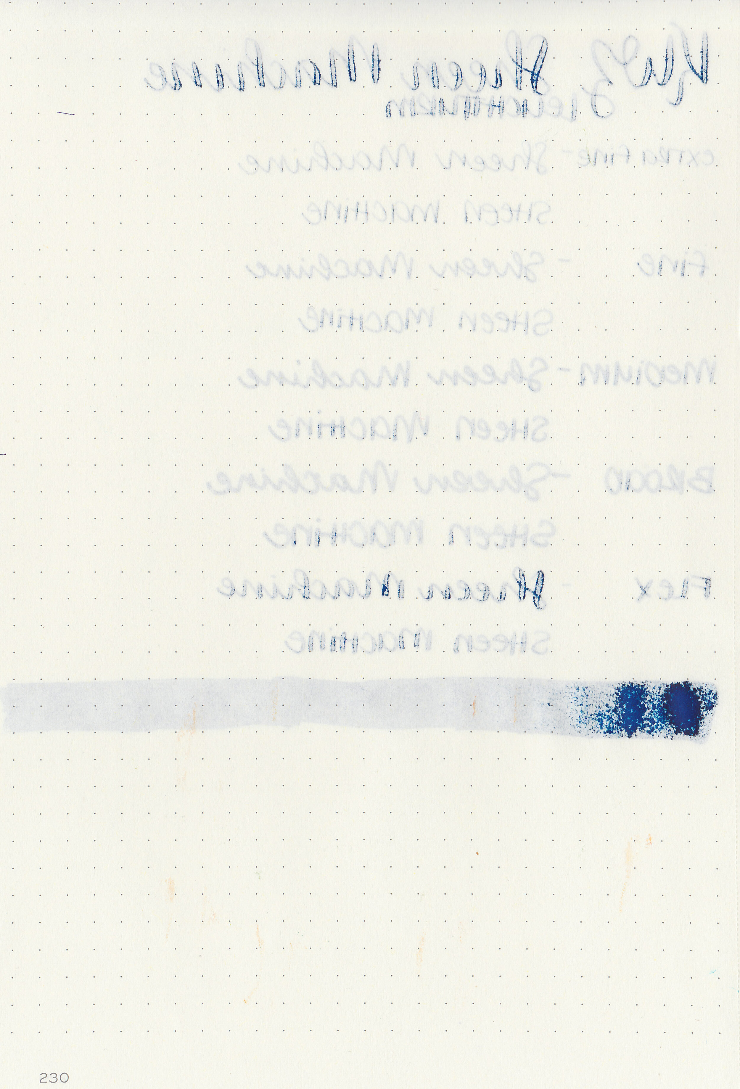
Bleeding: Medium
Other properties: low shading, monster sheen, and no shimmer. There is a little bit of shading, there could be a lot more but if so it’s hidden under all that sheen. The sheen is visible in all nib sizes on Tomoe River paper and Leuchtturm, as well as the larger nib sizes on Rhodia.
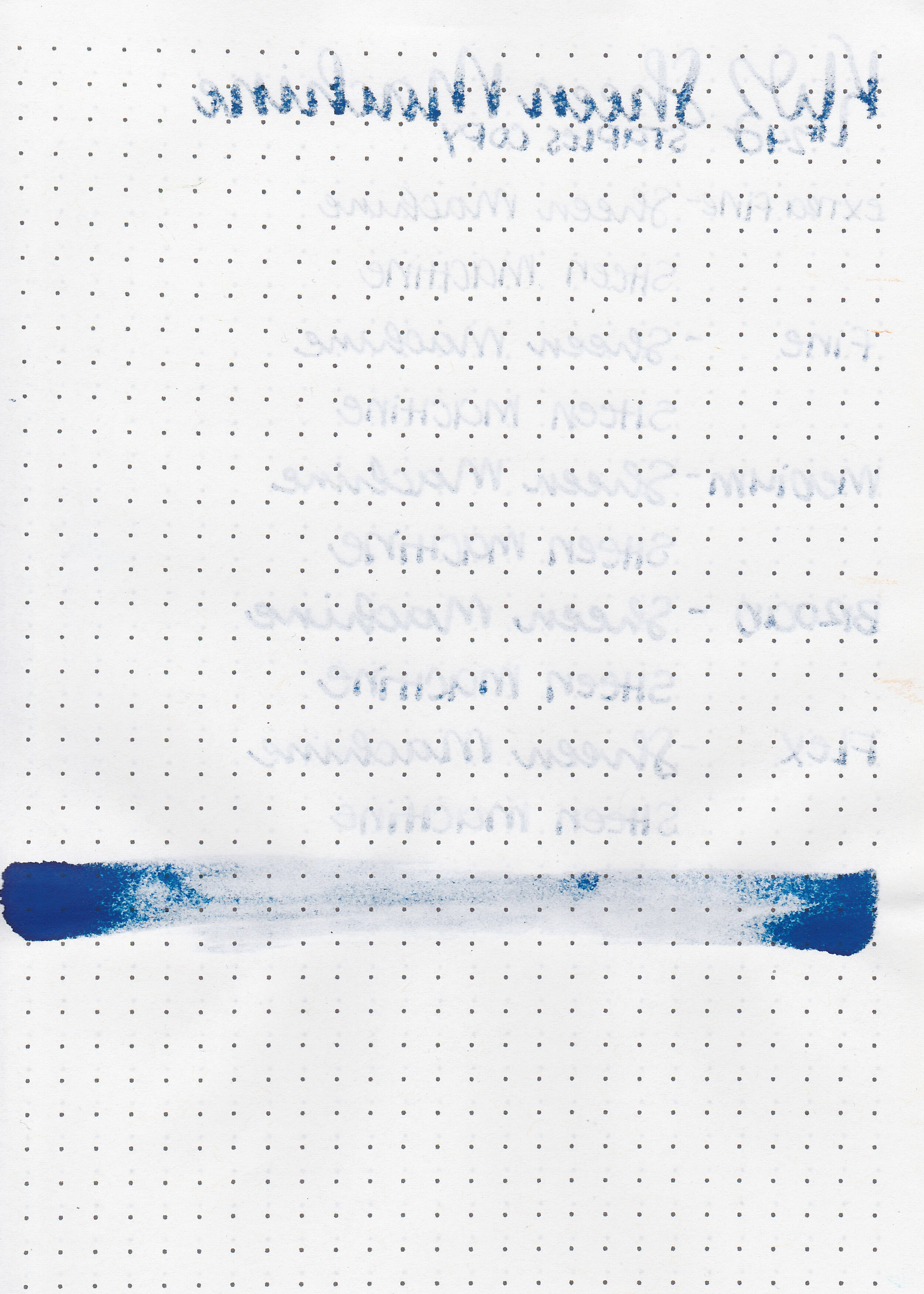
On Staples 24 lb copy paper the ink feathered in all nib sizes and had a little bit of bleeding.

Sheen Machine is similar to Organics Studio Nitrogen, Krishna Moonview and Diamine Maureen. Click here to see the KWZ inks together, and click here to see the blue inks together.

I used a Pilot Metropolitan Retro Pop Purple with a fine nib on Tomoe River paper. The ink had an average flow, a bit sticky though. Even in this small fine nib the writing is mostly sheen, it’s hard to even see the blue under it.
Overall, it is very similar to Organics Studio Nitrogen, except that the flow is a little bit better. You can smear it easily if you aren’t careful, even after it’s been dry for a few days. Monster sheening inks aren’t my favorite since they can smear after drying, but they are fun to play with.
Disclaimer: I purchased this ink myself, and all photos and opinions are my own. This page does not contain affiliate links, and this post is not sponsored in any way.

We’ve made it to the last Vinta Ink sample I have, Vinta Azure Maharlika 7107 from Vinta’s Series 1. According to Vinta’s website, “Maharlika means "nobility" in Tagalog. These men and women were the leaders of the Filipino communities before the Spaniards arrived in the 16th century to colonize the Philippines. The beautiful azure color of this ink with pink accents evokes the image of the dusk in the Philippines as the sun sets over its 7107 islands.” Thanks to Vanness Pens for sending a sample over for review.

The color:
Maharlika is a medium-dark blue with lots of pink sheen.
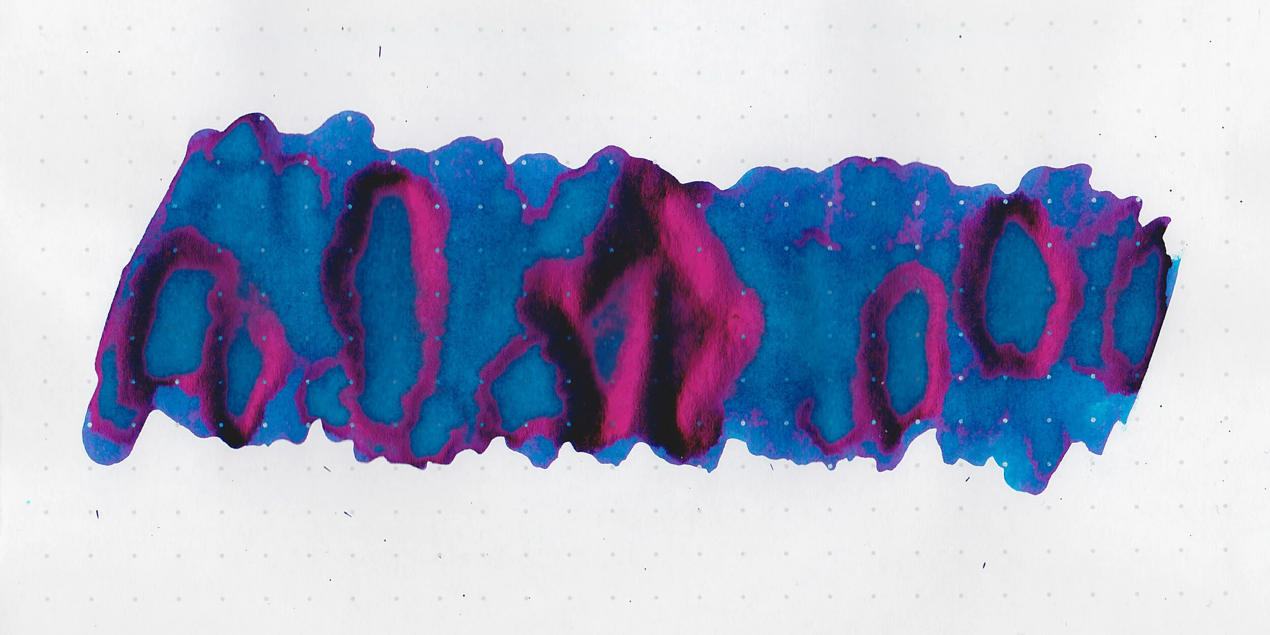
In large swabs on Tomoe River paper the ink shows off some pink sheen, but there wasn’t quite as much sheen as I expected.

Let's take a look at how the ink behaves on fountain pen friendly papers: Rhodia, Tomoe River, and Leuchtturm.

Dry time: 15 seconds
Water resistance: Low

Feathering: None
Show through: Medium

Bleeding: Low-there was some bleeding in the flex nib.
Other properties: low shading, high sheen, and no shimmer. There was sheen in every nib size on Leuchtturm and Tomoe River paper, but I couldn’t get it to sheen on Rhodia, so it falls a bit short of the “monster sheener” mark.

On Staples 24 lb copy paper the ink feathered in all nib sizes and had a little bit of bleeding.

Maharlika seems to fit in-between two inks, a bit darker than Blackstone Barrier Reef Blue, but not quite as dark as Organics Studio Nitrogen. Click here to see the Vinta inks together, and click here to see the blue inks together.

I used a TWSBI Eco Transparent Blue with a medium nib on Tomoe River paper. The ink had an average flow.
Overall, it has a high pink sheen, not as much as the monster sheening inks, but does suffer some of the same issues they do (although not as badly), a few hard starts, slightly sticky flow, and can be smeared days after drying. I wrote the writing sample shown above over a week ago but I can still easily smear it if I run my hand across the page. I enjoy playing with high sheening inks, but I don’t reach for them often due to the smearing. I’ve used my entire sample of the ink, but I don’t need a full bottle of it.
Disclaimer: A sample of this ink was provided by Vanness Pens for the purpose of this review. All photos and opinions are my own. This page does not contain affiliate links, and this post is not sponsored in any way.

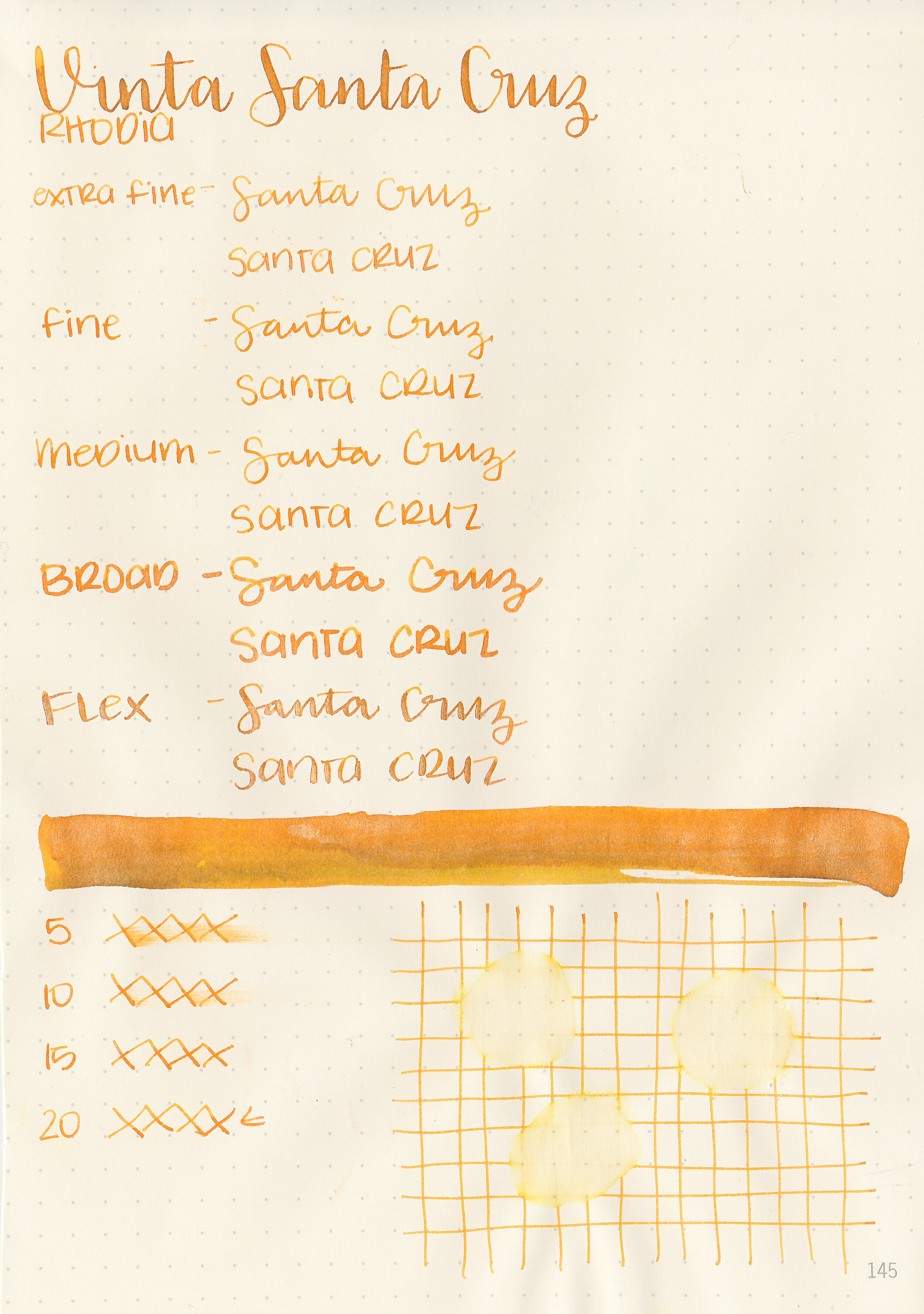
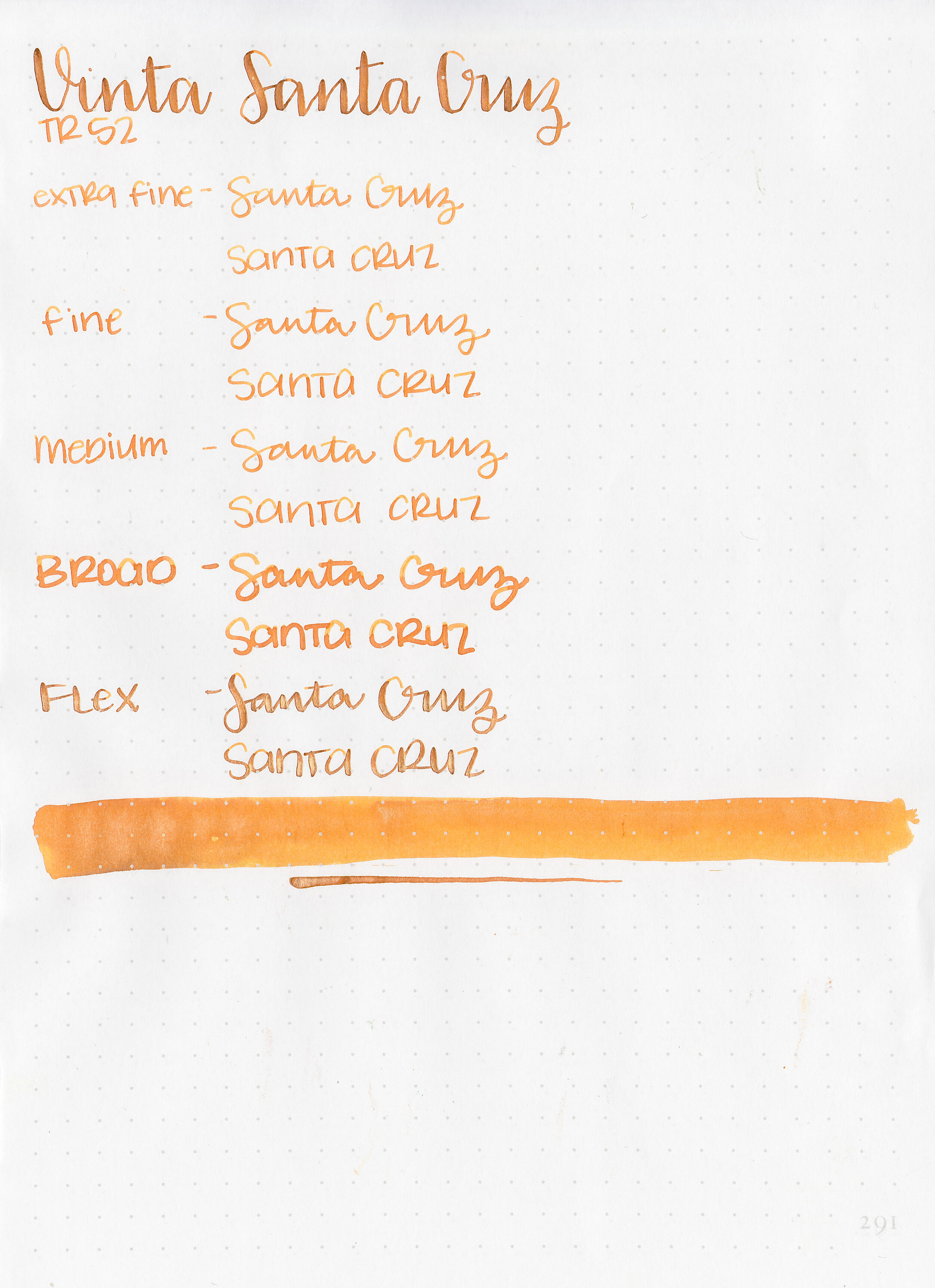
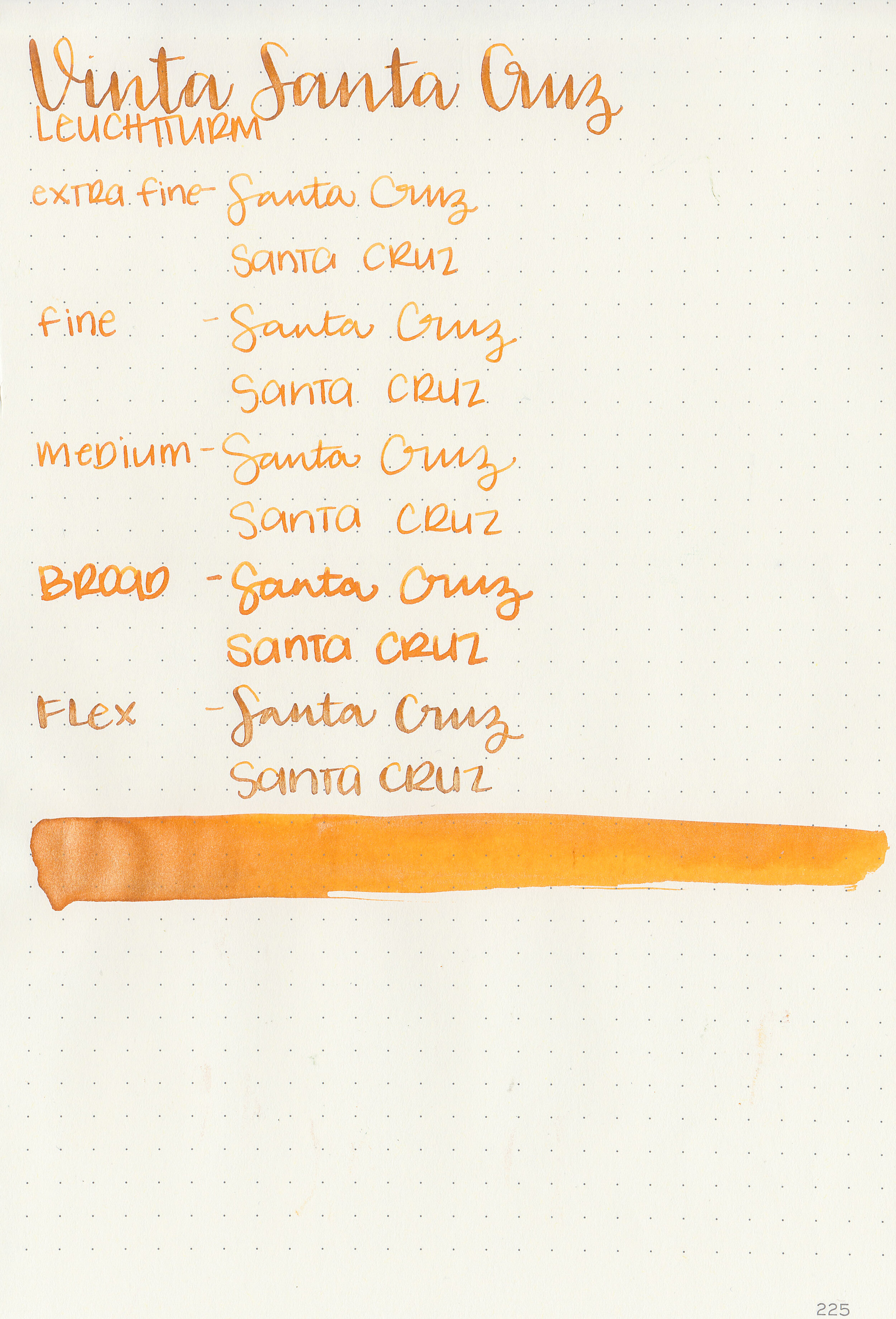
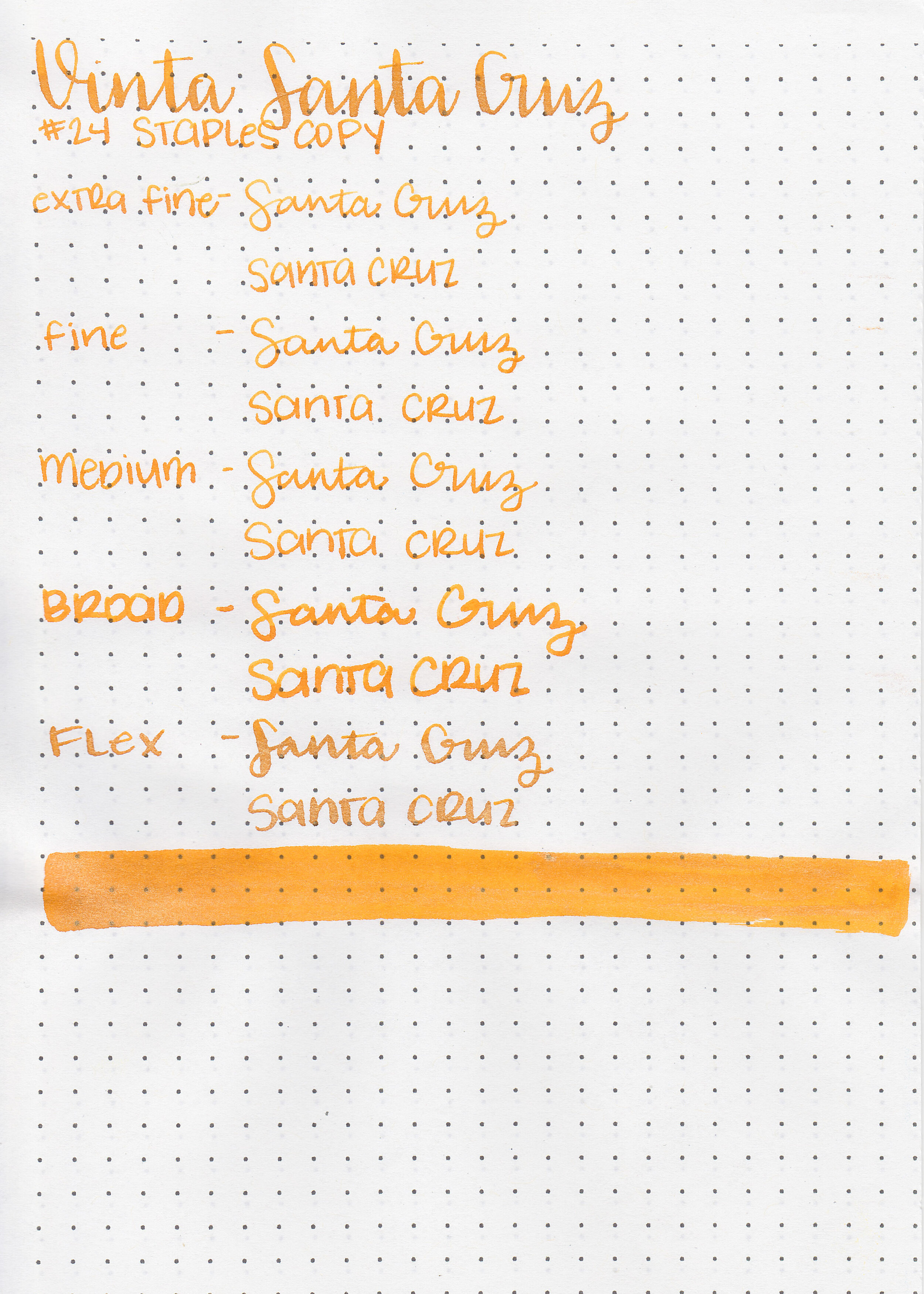
We’ve almost made it through the Vinta samples I have-today’s is Vinta Pink Sands Santa Cruz 1983. According to Vinta’s website, “Pink sands can be found in the Great Santa Cruz beach as well as in the province of Northern Samar. The pink comes from pulverized red corals which blends with the white sand. This gorgeous shimmering ink takes the contrast a little further by using a base of yellow and pink gold shimmer to produce an image of a sun drenched beach at dusk.” Thanks to Vanness Pens for sending a sample over for review.

The color:
Santa Cruz is a bright medium orange with gold shimmer.

In large swabs on Tomoe River paper there is lots of gold shimmer.

Let's take a look at how the ink behaves on fountain pen friendly papers: Rhodia, Tomoe River, and Leuchtturm.
Dry time: 20 seconds
Water resistance: Low
Feathering: None
Show through: Medium
Bleeding: None
Other properties: medium shading, no sheen, and gold shimmer.
On Staples 24 lb copy paper the ink feathered in all nib sizes and had a little bit of bleeding.

Santa Cruz is similar to Diamine Citrus Ice except that Citrus Ice has silver shimmer not gold. Sailor Apricot is a close non-shimmer orange. Click here to see the Vinta inks together, and click here to see the orange inks together.

I used a Kaweco Sport Orange with a double broad nib on Tomoe River paper. The ink had a slightly dry flow.
Overall, It’s pretty well behaved, a fun color and no problems with clogging. Diamine Citrus Ice is a good alternative if you prefer silver shimmer instead of gold.
Disclaimer: A sample of this ink was provided by Vanness Pens for the purpose of this review. All photos and opinions are my own. This page does not contain affiliate links, and this post is not sponsored in any way.
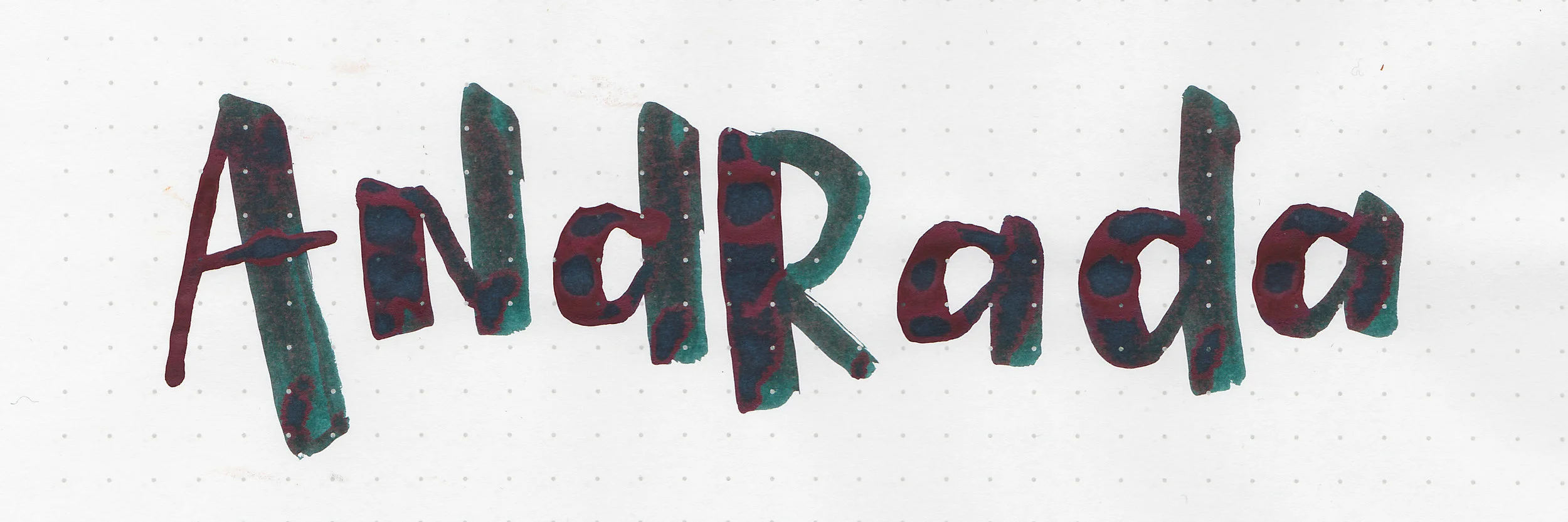
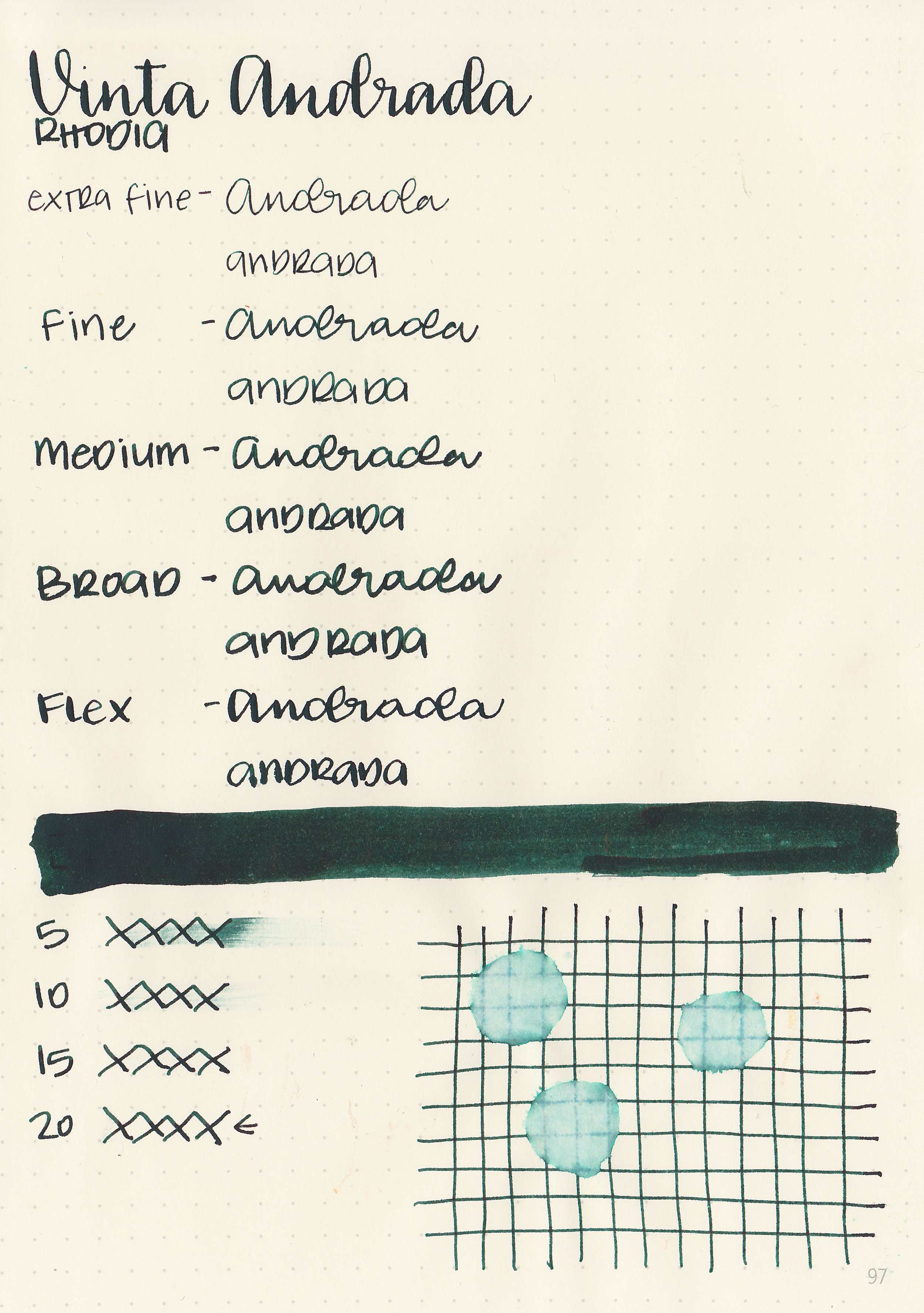
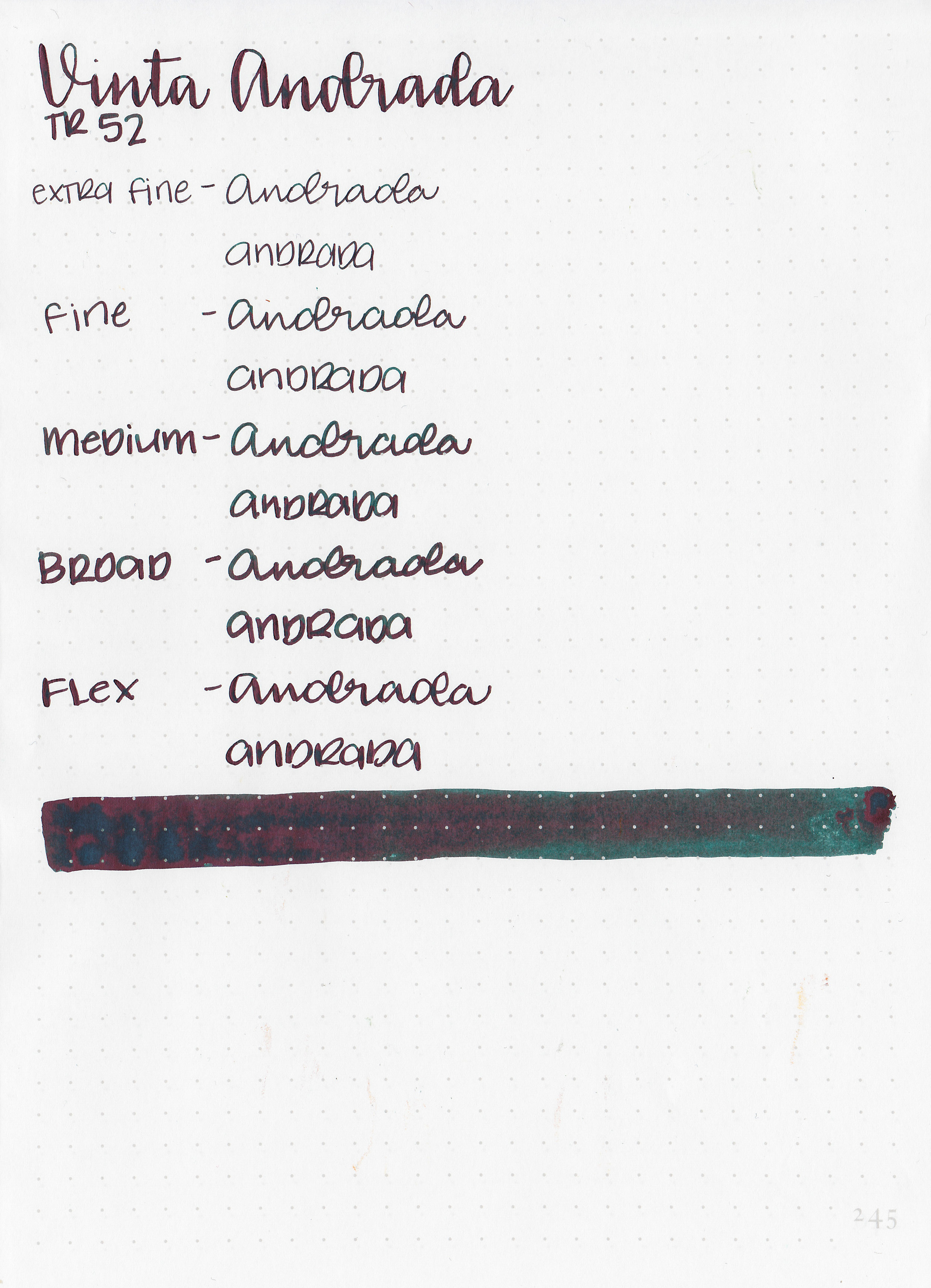
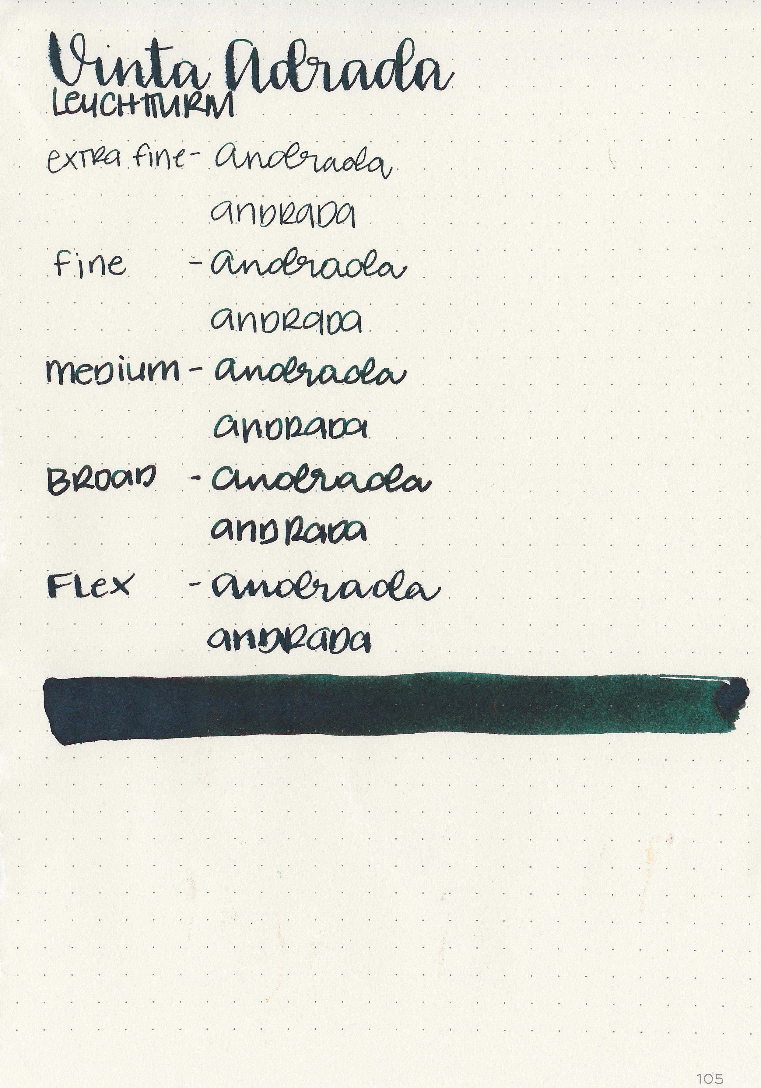
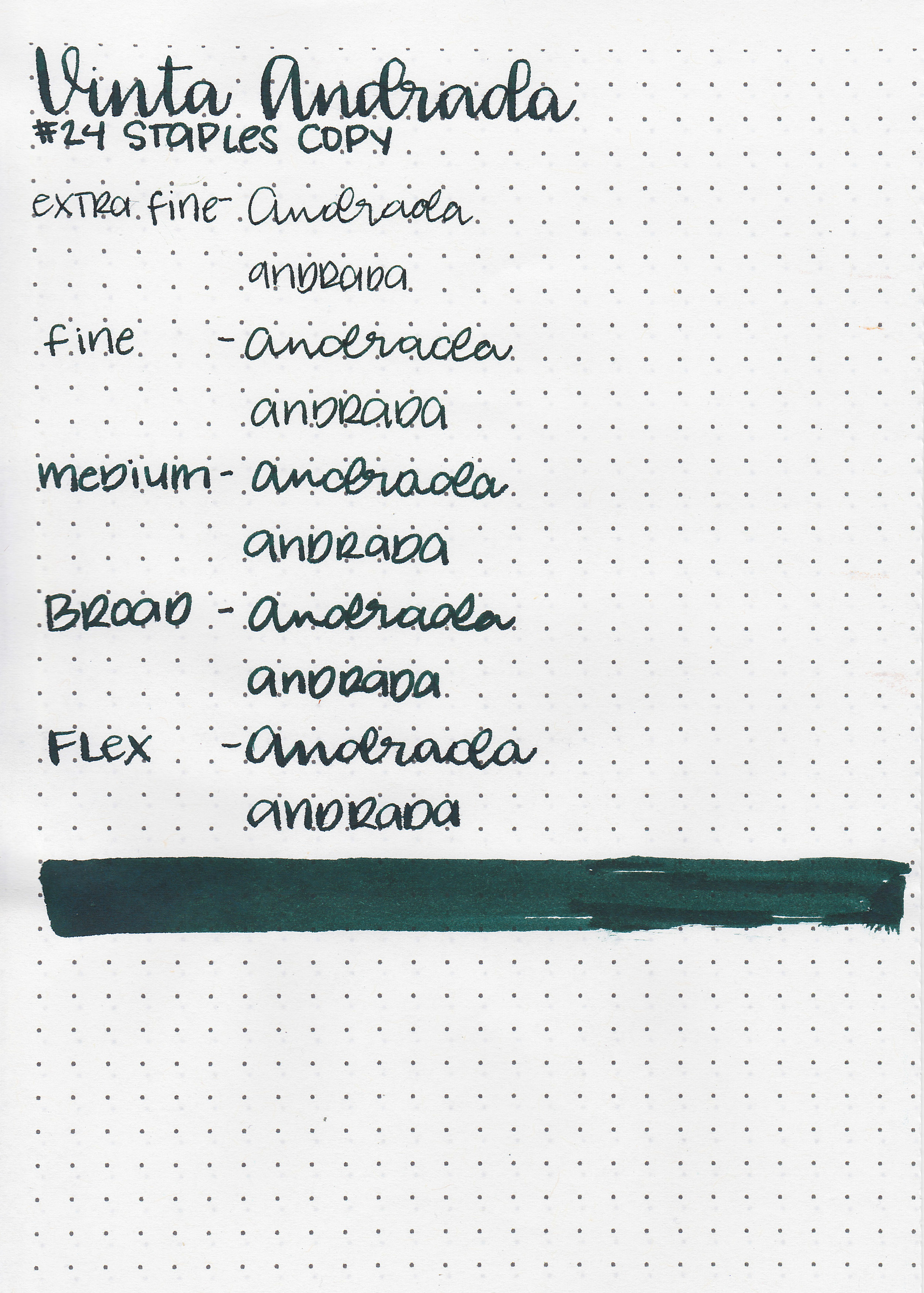
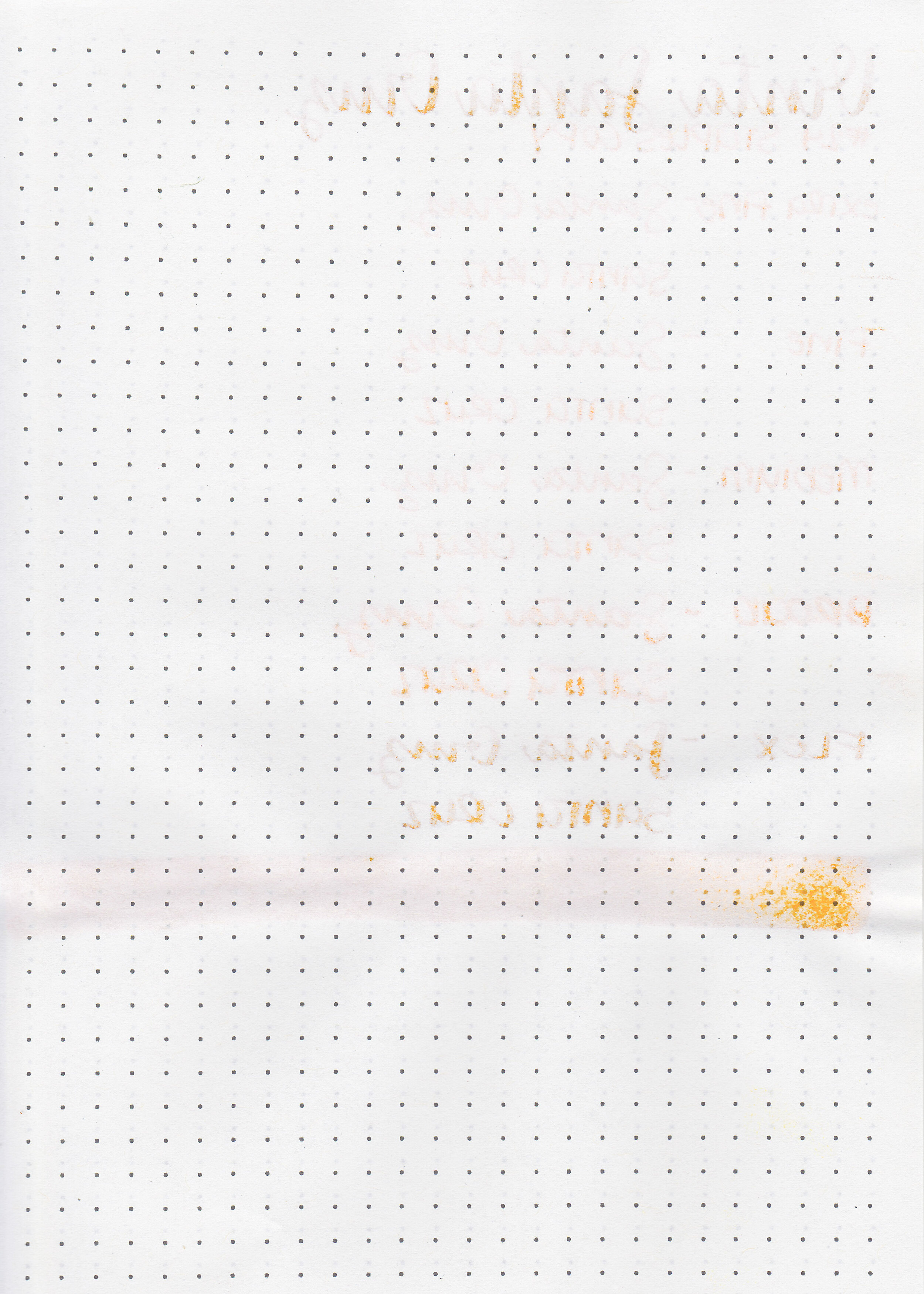
Let’s take a look at Vinta Teal Andrada 1898 from Vinta’s Series 1. According to Vinta’s website, “In 1898, the Philippine Navy was founded. The first headquarters is in Andrada, Manila named after the commanding officer of the navy, Jose Andrada. This beautiful sheening teal color with specks of red highlights the diverse colors of the Philippine waters.” Thanks to Vanness Pens for sending a sample over for review.

The color:
I don’t know why this ink is called Teal Andrada because it’s a dark forest green with dark red sheen, not teal.

In large swabs on Tomoe River paper the ink almost looks navy blue with red sheen.

Let's take a look at how the ink behaves on fountain pen friendly papers: Rhodia, Tomoe River, and Leuchtturm.
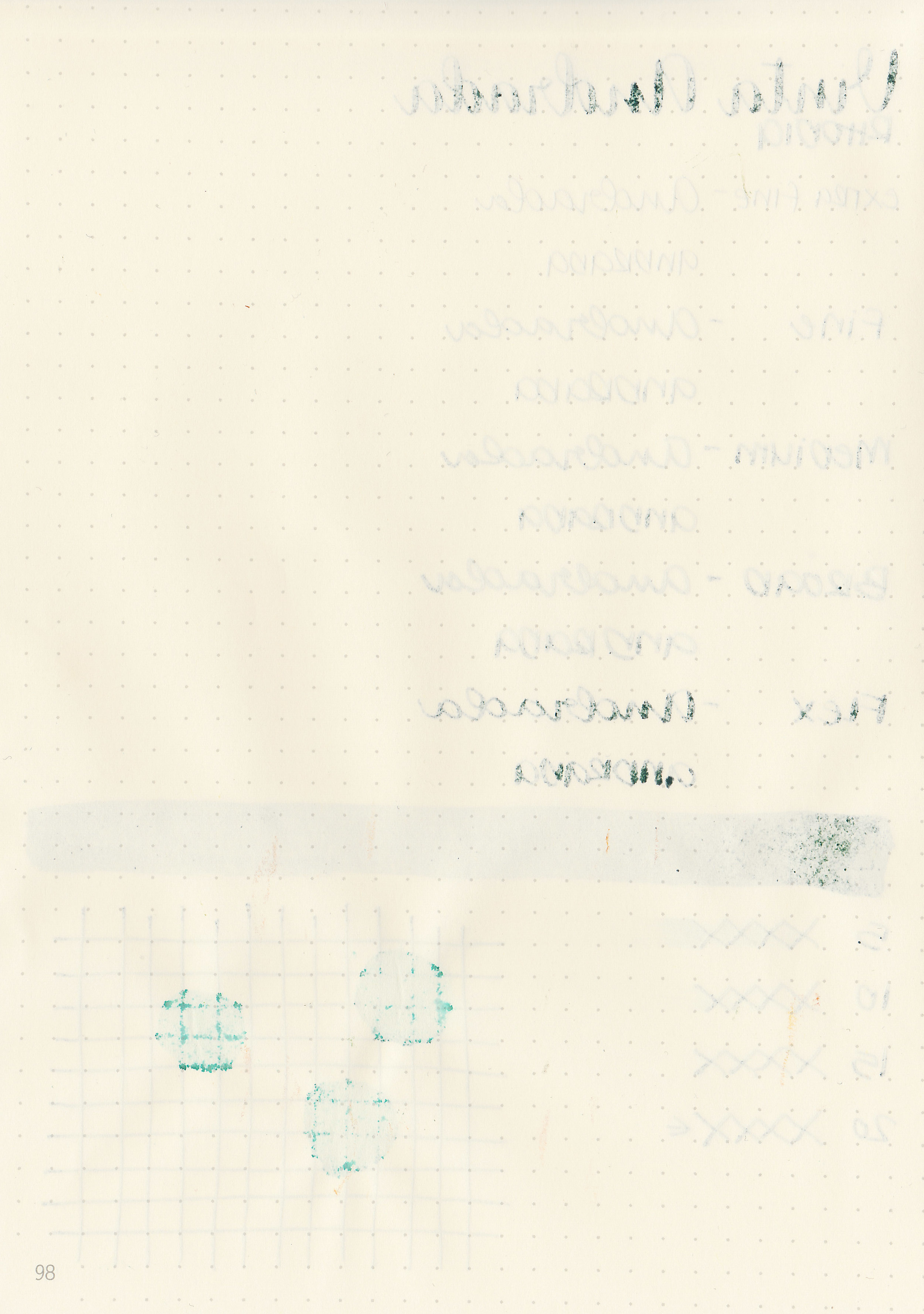
Dry time: 20 seconds
Water resistance: Low
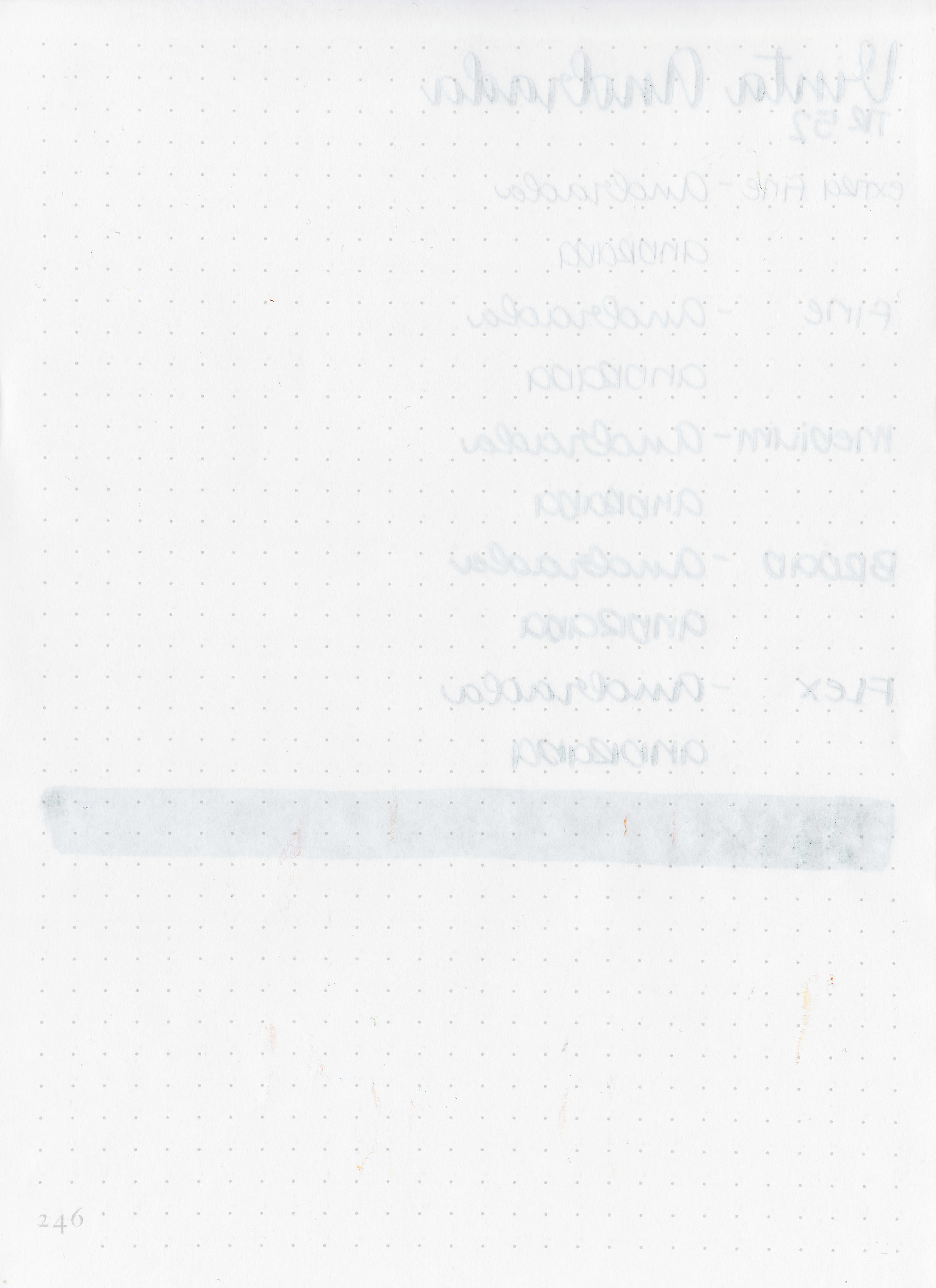
Feathering: Low-there was some feathering in the flex nib on Leuchtturm.
Show through: Medium

Bleeding: Medium-there was quite a bit of bleeding on Leuchtturm.
Other properties: low shading, medium sheen, and no shimmer.
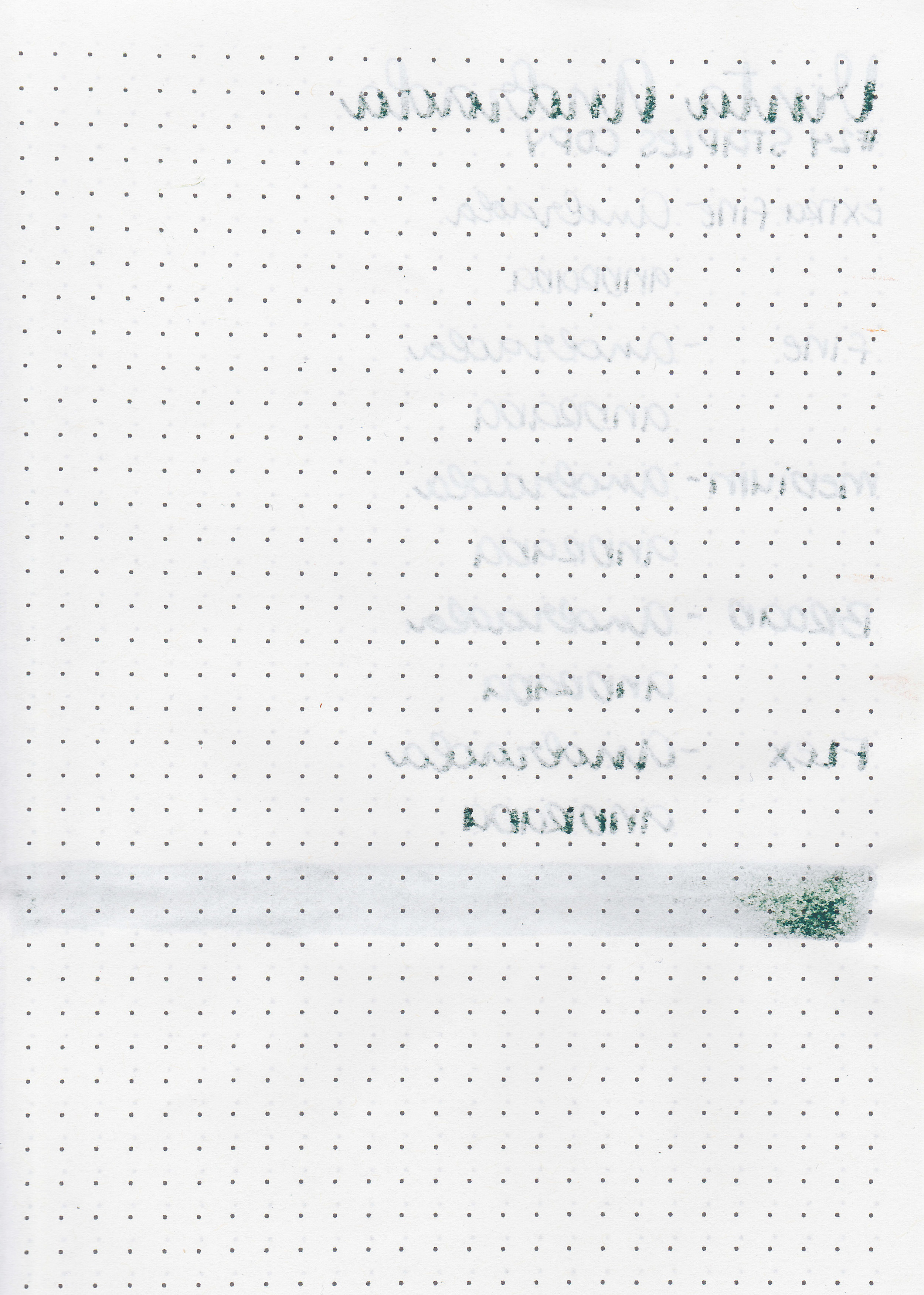
On Staples 24 lb copy paper the ink feathered in all nib sizes and had a little bit of bleeding.
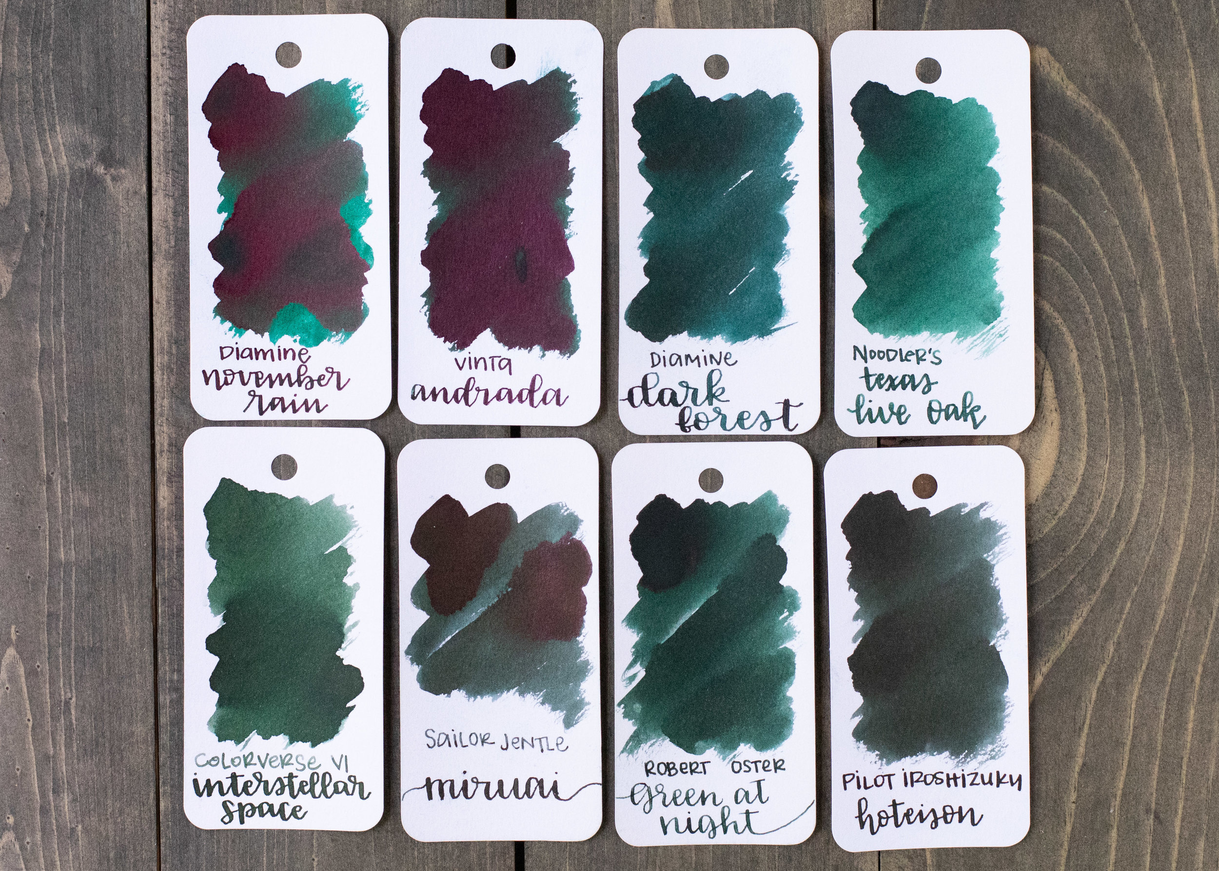
Andrada is darker than Diamine November Rain. The sheen is the same color, but Andrada has less sheen than November Rain. Click here to see the Vinta inks together, and click here to see the green inks together.

I used a Conklin Durograph Forest Green with a broad nib on Tomoe River paper. The ink had an average flow.
Overall, this ink is well behaved except on Leuchtturm paper. I didn’t have any issues with the sheen smearing after it dried (except on the Col-o-ring). The sheen is visible in all nib sizes on Tomoe River paper, but not on any other papers.
Disclaimer: A sample of this ink was provided by Vanness Pens for the purpose of this review. All photos and opinions are my own. This page does not contain affiliate links, and this post is not sponsored in any way.

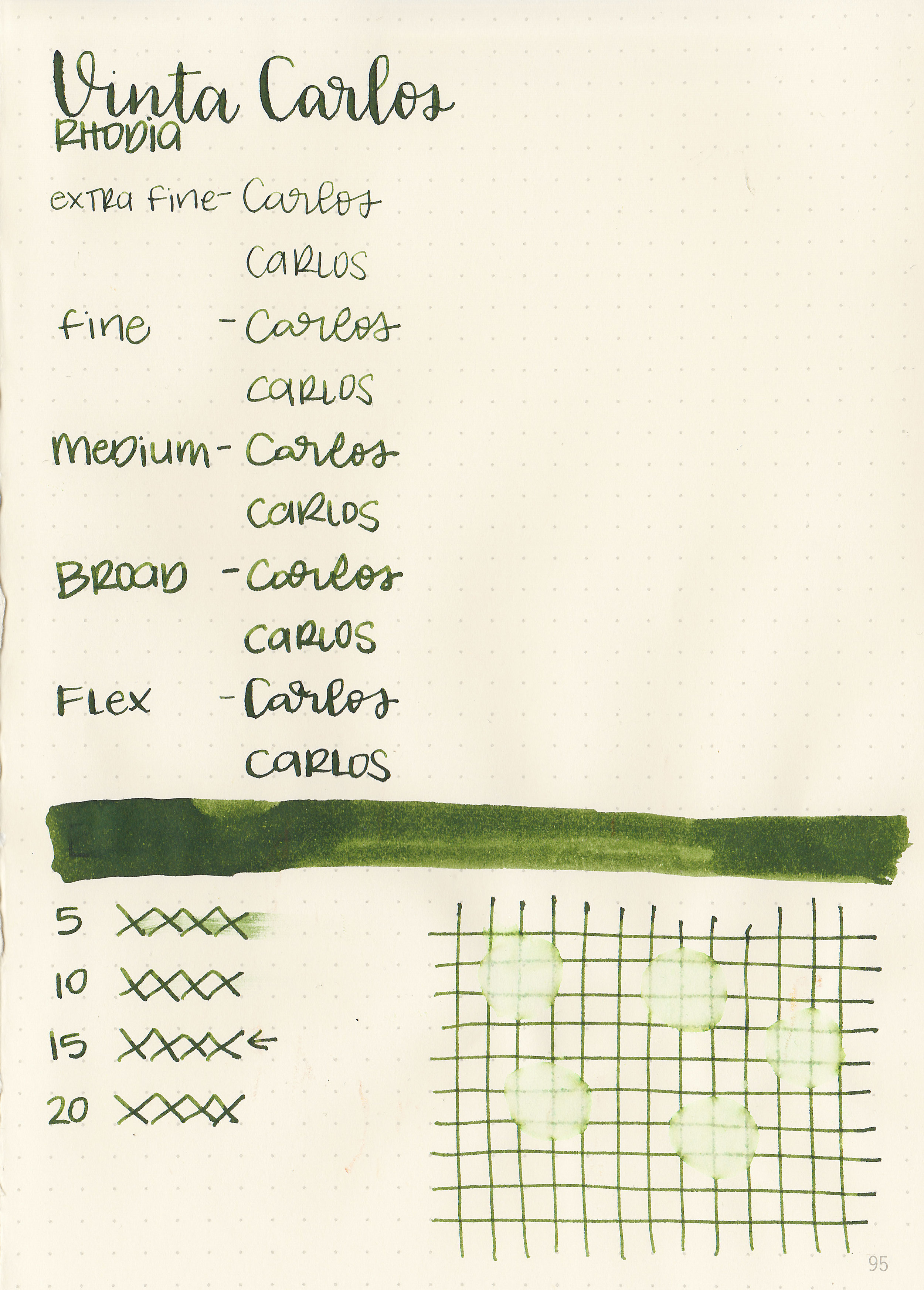
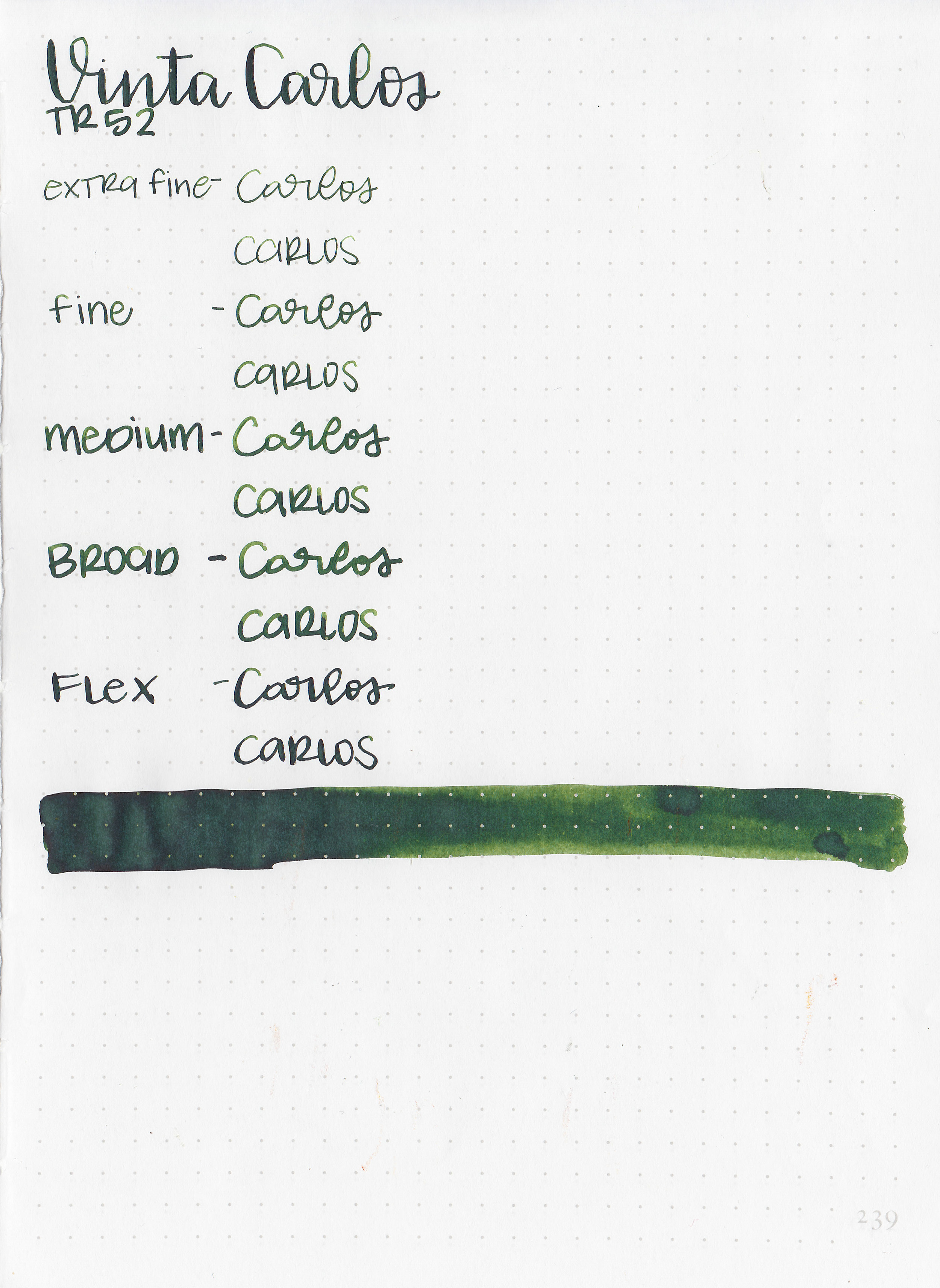
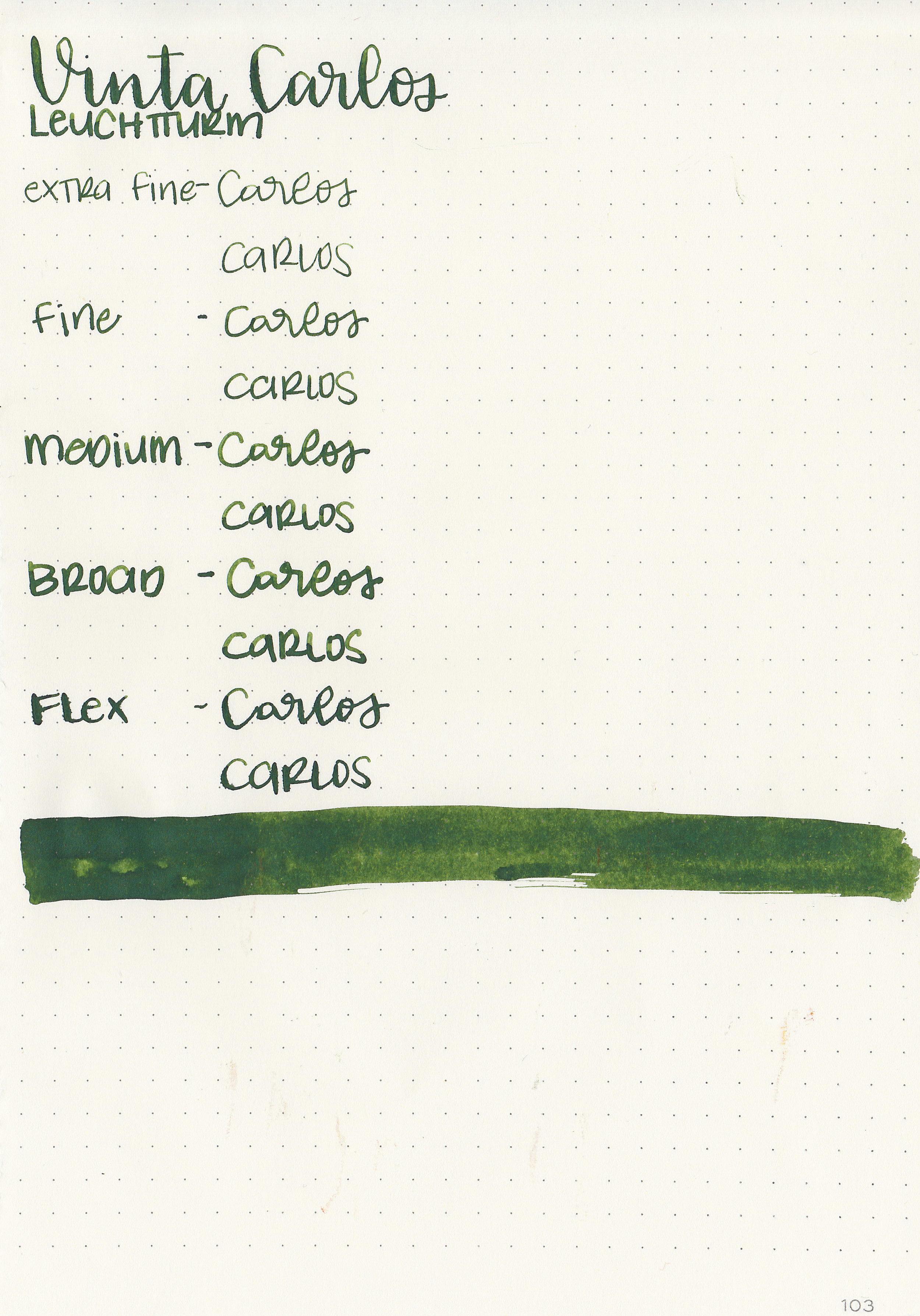
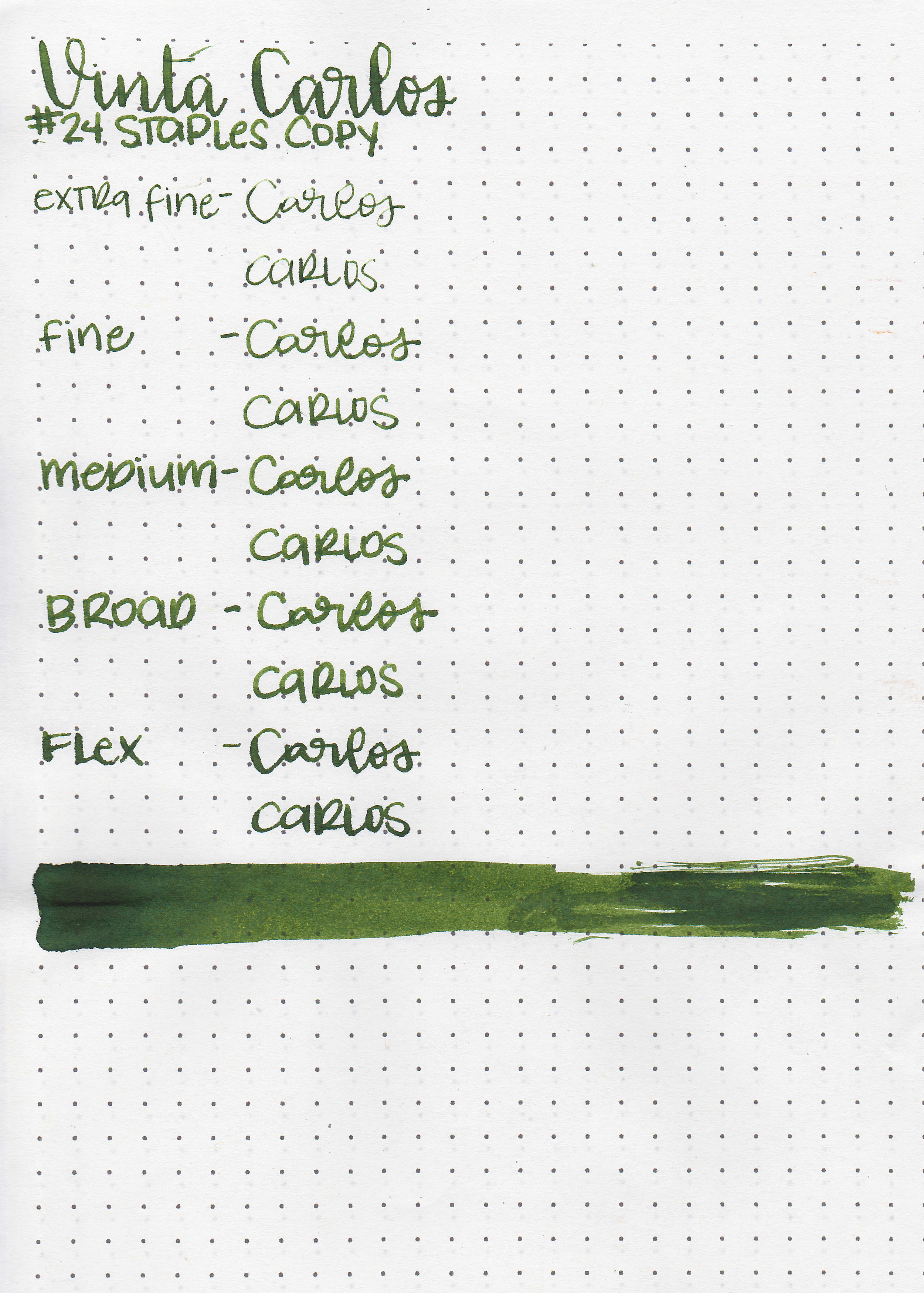
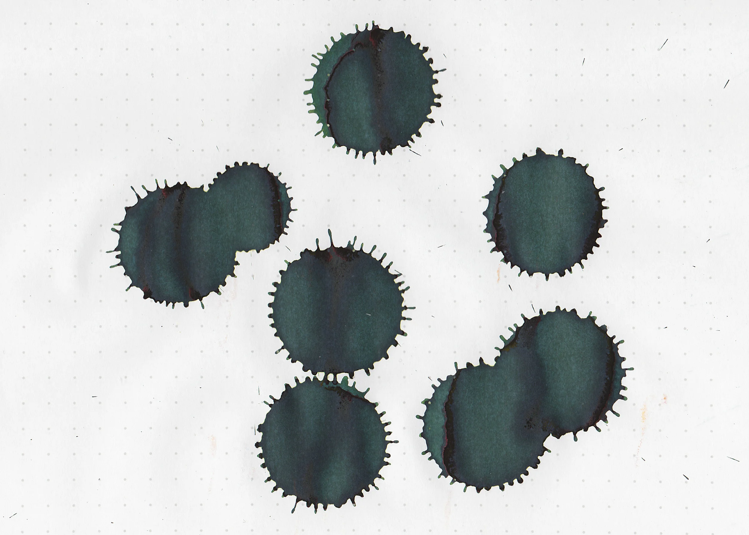
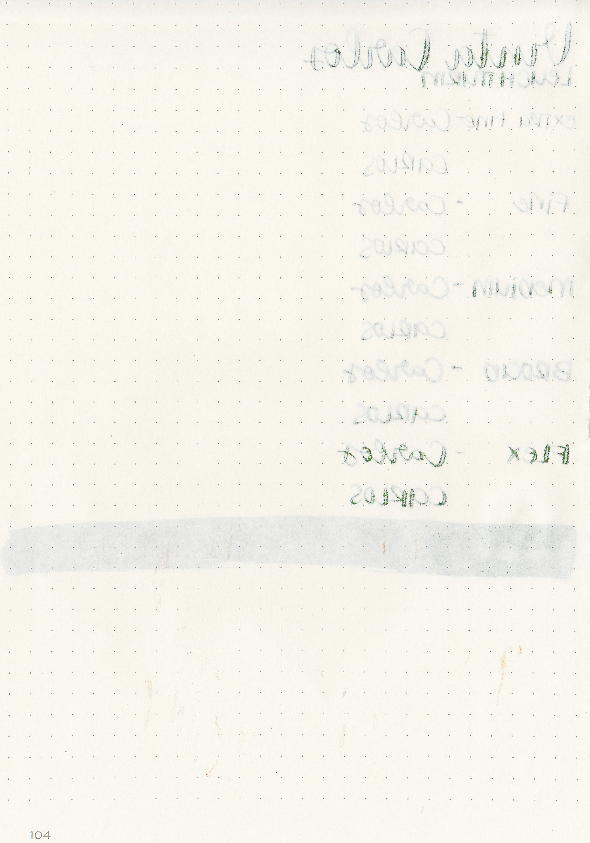
We are continuing on with Vinta’s Series 1 inks this week, so today’s ink is Emerald Carlos 1960. According to Vinta’s website, “This ink is named after former Filipino president Carlos P. Garcia who refused to cooperate with the Japanese forces during WWII. Garcia is also from Bohol known for their majestic and lush chocolate hills.” Thanks to Vanness Pens for sending a sample over for review.

The color:
Carlos is a medium-dark green with a slight yellow/olive tone.

In large swabs on Tomoe River paper the ink shows off some interesting shading. The ink turns almost black where it pooled, but doesn’t sheen.
Let's take a look at how the ink behaves on fountain pen friendly papers: Rhodia, Tomoe River, and Leuchtturm.
Dry time: 15 seconds
Water resistance: Low
Feathering: Low-there was some feathering in the flex nib on Leuchtturm and Rhodia.
Show through: Medium
Bleeding: Low-there was some bleeding in the flex nib on Leuchtturm and Rhodia.
Other properties: medium shading, no sheen, and no shimmer.
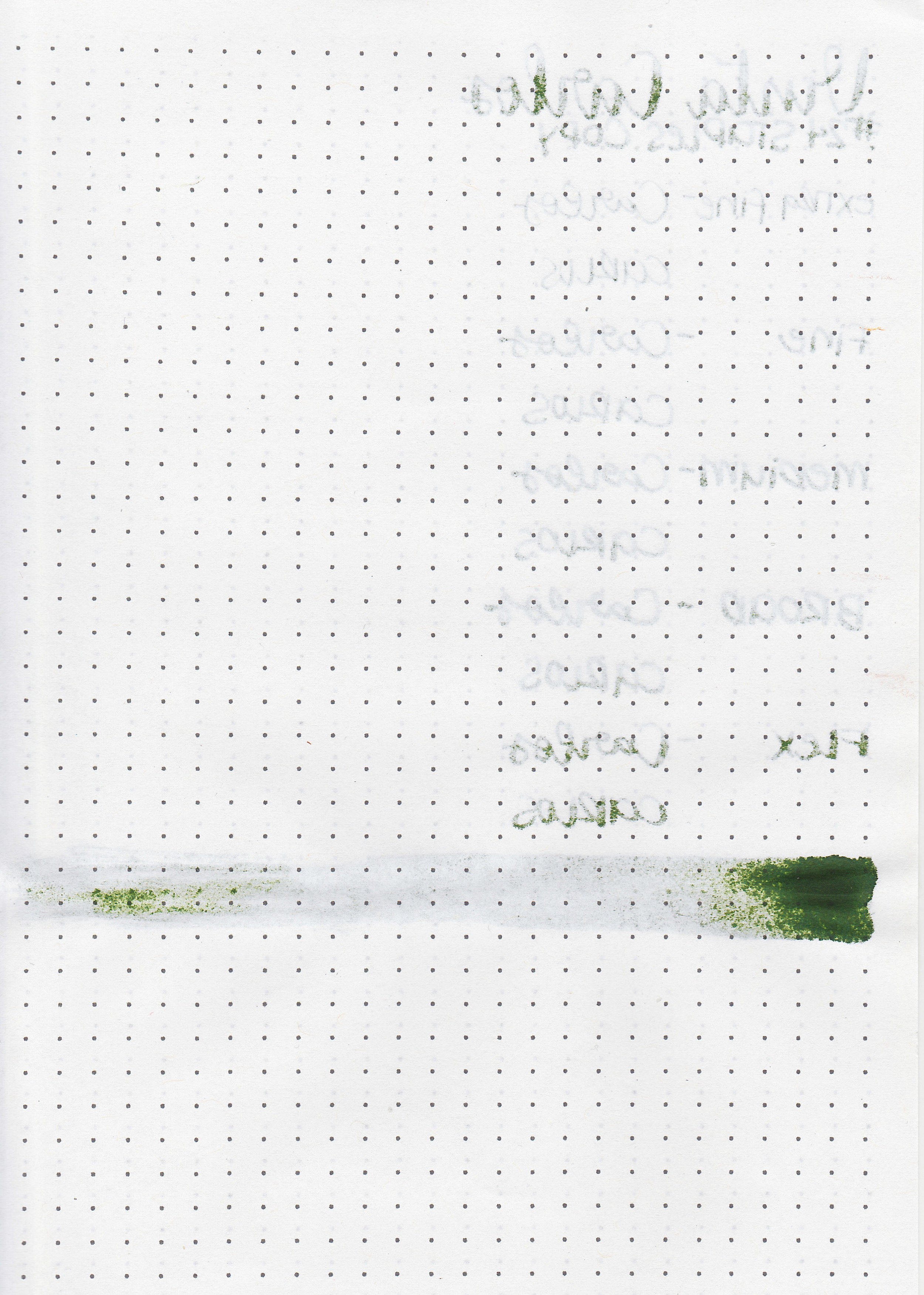
On Staples 24 lb copy paper the ink feathered in all nib sizes and had a little bit of bleeding.

Carlos is similar to Monteverde Olivine, but it has a little less yellow in it. Click here to see the Vinta inks together, and click here to see the green inks together.

I used a Lamy Al-star Purple with a broad nib on Tomoe River paper. The ink had an average flow.
Overall, I enjoyed this ink. It had an average flow, some decent shading, and is a nice color for fall and winter.
Disclaimer: A sample of this ink was provided by Vanness Pens for the purpose of this review. All photos and opinions are my own. This page does not contain affiliate links, and this post is not sponsored in any way.
Hi, I’m Kelli, and I’m the brain behind Mountain of Ink. I’m a homeschooling mama of three littles, full-time student, aspiring photographer, amateur chef, and lover of all things stationery. I think any day that doesn’t involve learning and playing with ink is a day wasted. On my site you will find fountain pen, ink, and paper reviews, along with stationery bits and bobs along the way. You can find me @mountainofink on Instagram, Facebook, Twitter, and Pinterest.
Powered by Squarespace.