Ink Review #2900: Colorverse 010 a Cygni
/
Today’s ink is Colorverse a Cygni Glistening from the Project collection. You can find this ink for sale at most retailers including Vanness Pens.
The color:
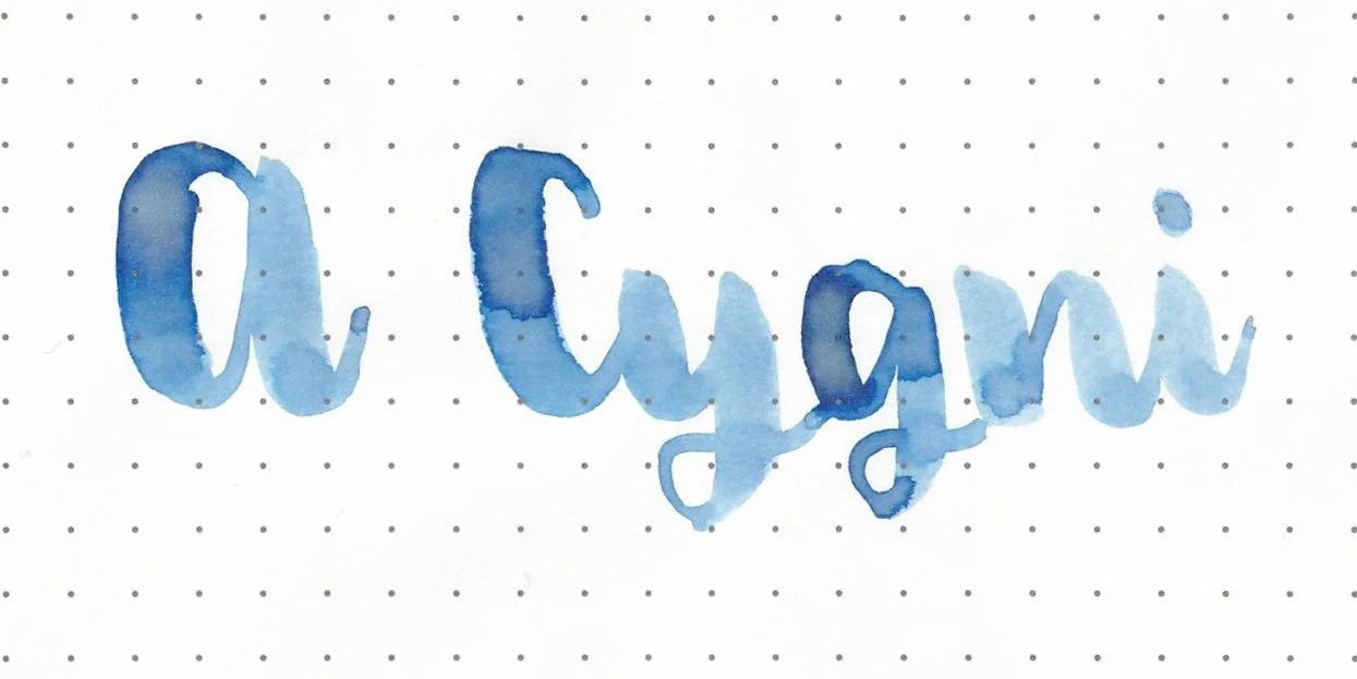
a Cygni is a pale baby sky blue with blue shimmer.
*For my swab cards I use a Col-o-ring by Skylab Letterpress, a medium Pilot Ishime and a Mabie Todd Swan.
Swabs:
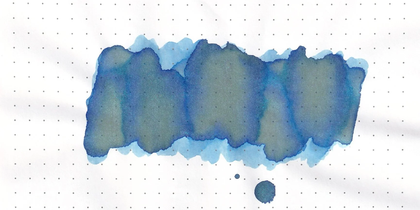
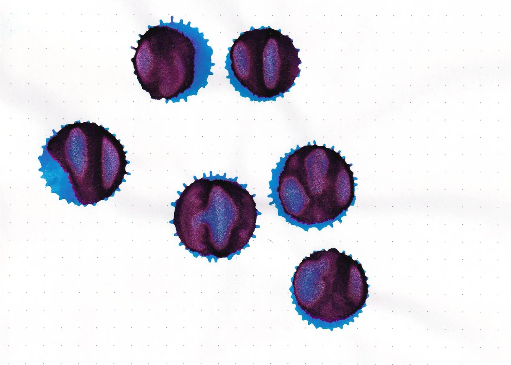
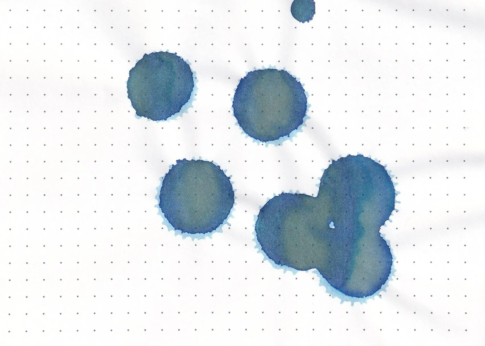
In large swabs on Tomoe River paper the ink shades almost to a green.
Writing samples:
Let's take a look at how the ink behaves on fountain pen friendly papers: Rhodia, Tomoe River, and Leuchtturm, and on cheap copy paper.
*For my writing samples I use:
Vintage Mabie Todd Swan (flex nib)
Taroko Enigma notebooks (68gsm TR)
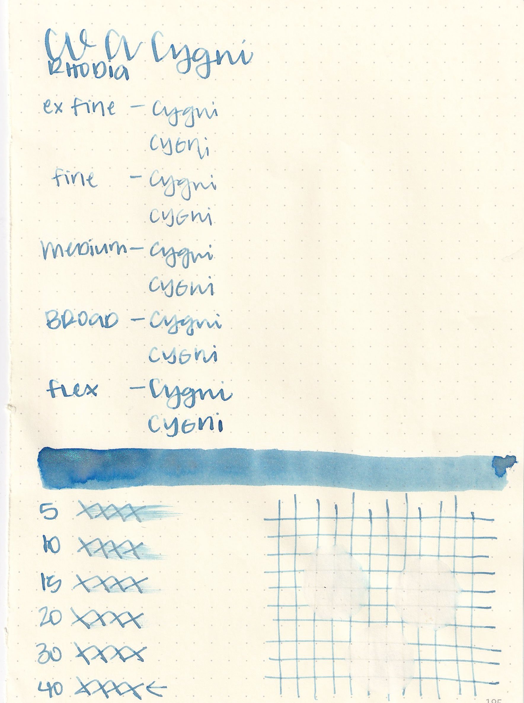
Dry time: 40 seconds
Water resistance: Low

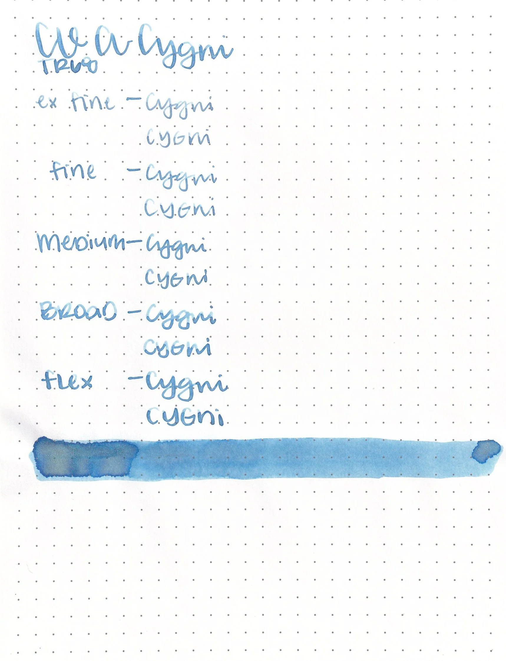
Feathering: None
Show through: Medium
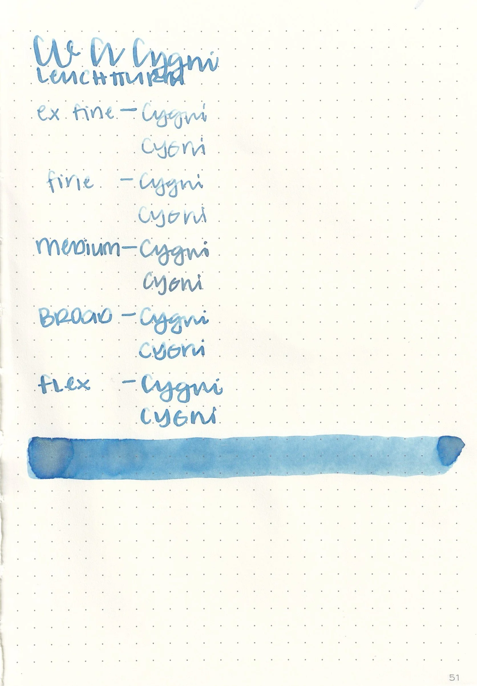
Bleeding: None
Other properties: low shading, no sheen, and blue shimmer.
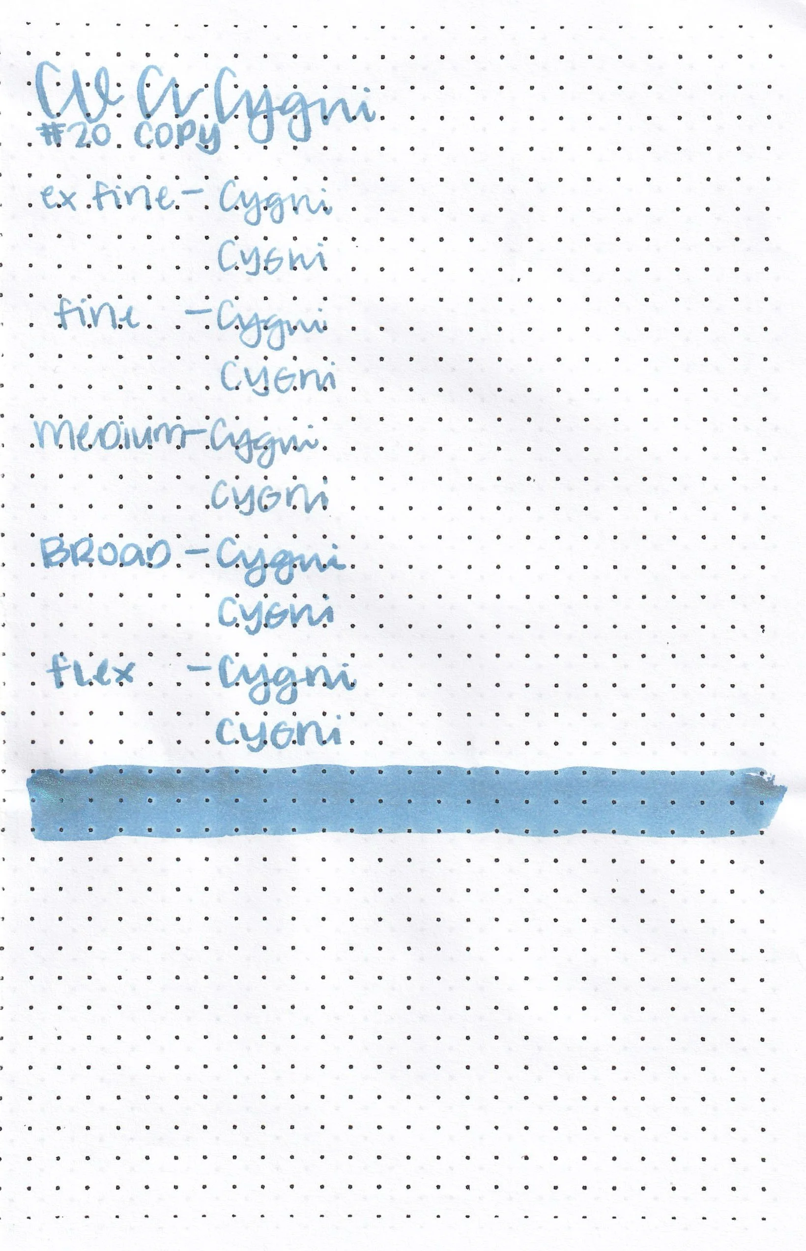
On 20 lb copy paper the ink had feathering in all nib sizes and some bleeding.
Comparison Swabs:
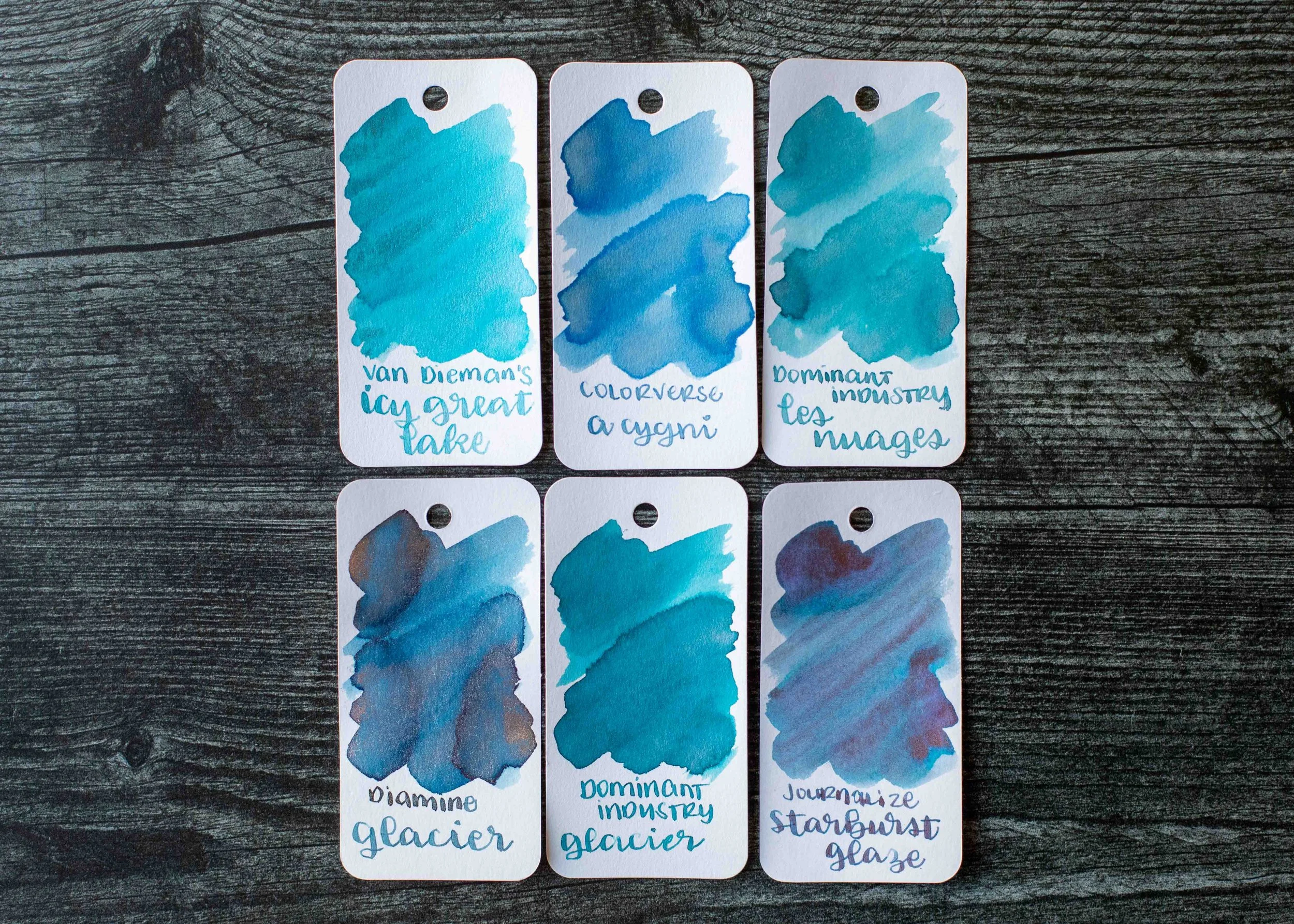
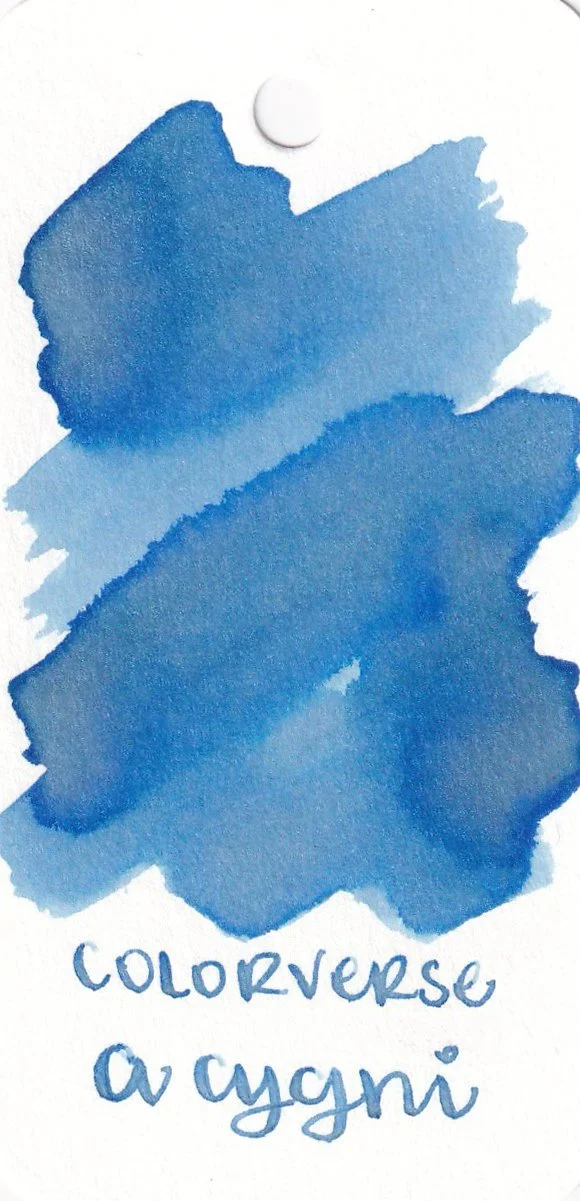
a Cygni is lighter than Diamine Glacier. Click here to see the blue inks together.
Longer Writing:
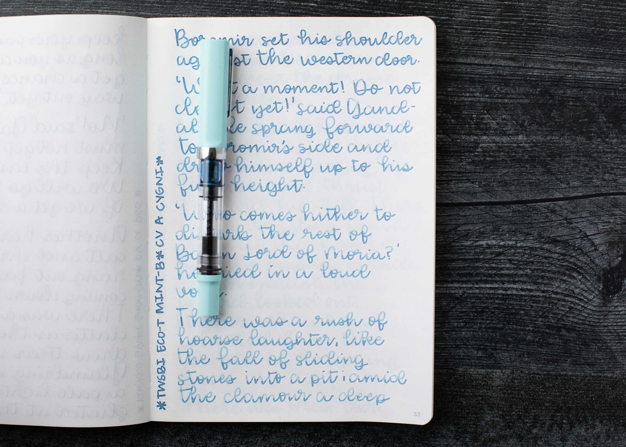
I used a TWSBI Eco-T Mint with a broad nib on a Taroko Enigma notebook. The ink has a dry flow.
Overall, this is a lovely pale blue ink, but it can be hard to read in smaller nib sizes. It’s also drier than I prefer, so it’s not an ink I’m in love with. It’s okay, but not great.
Thanks to all my Patrons! I couldn’t do these reviews without you! You can find my Patreon page here.
Disclaimer: All photos and opinions are my own. This page does not contain affiliate links and this post is not sponsored.