Ink Review #957: Diamine Hope Pink
/
We are going to tackle another reader request today, Diamine Hope Pink. This ink is available in 80ml and 30ml bottles. I purchased my bottle of ink from Cult Pens.

The color:
Hope Pink is a bright summery pink. I don’t know if this one is supposed to match the Breast Cancer Awareness pink (and thus the name of Hope Pink), but it seems there are 2 main pinks used, and this one matches the darker pink.
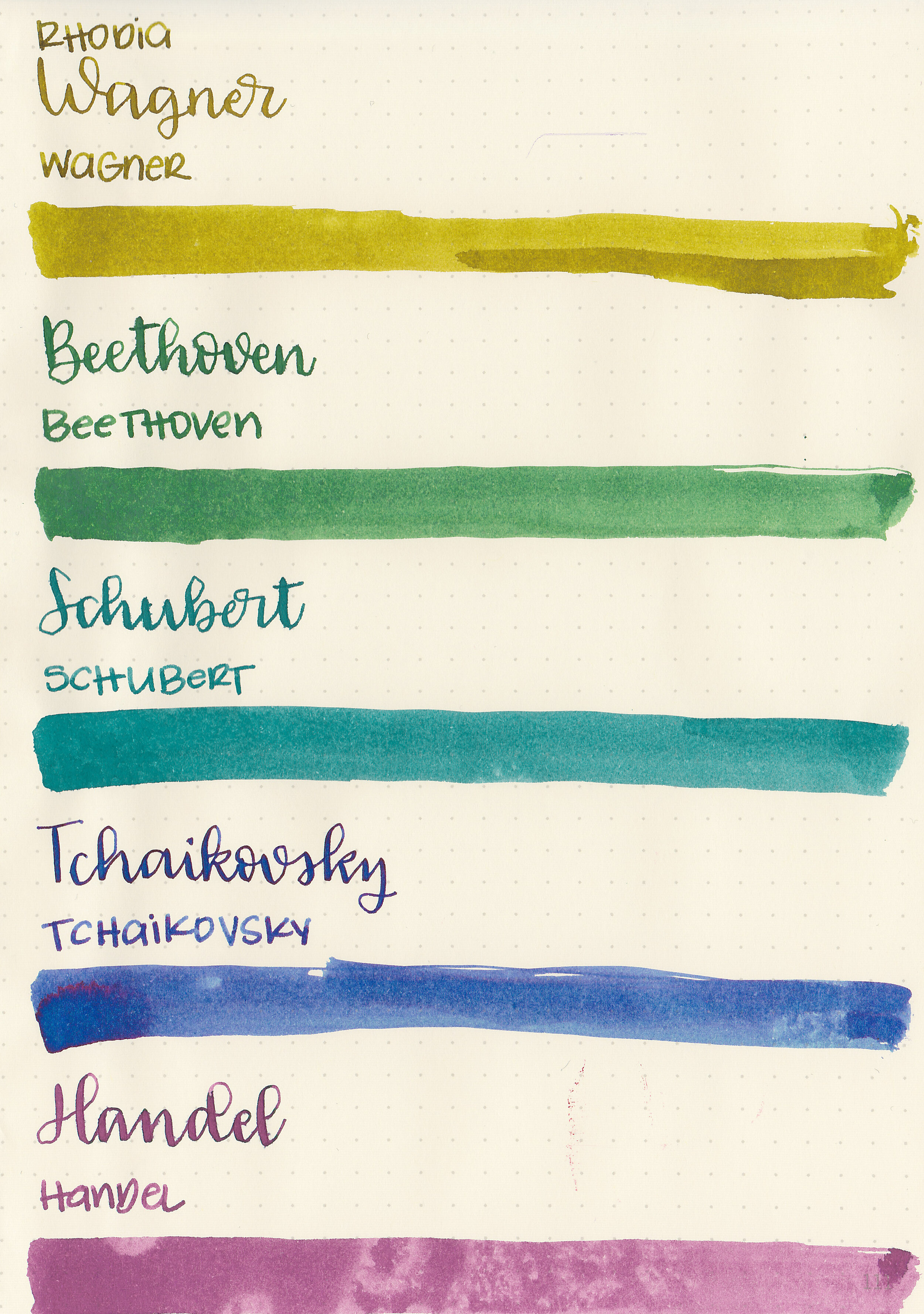
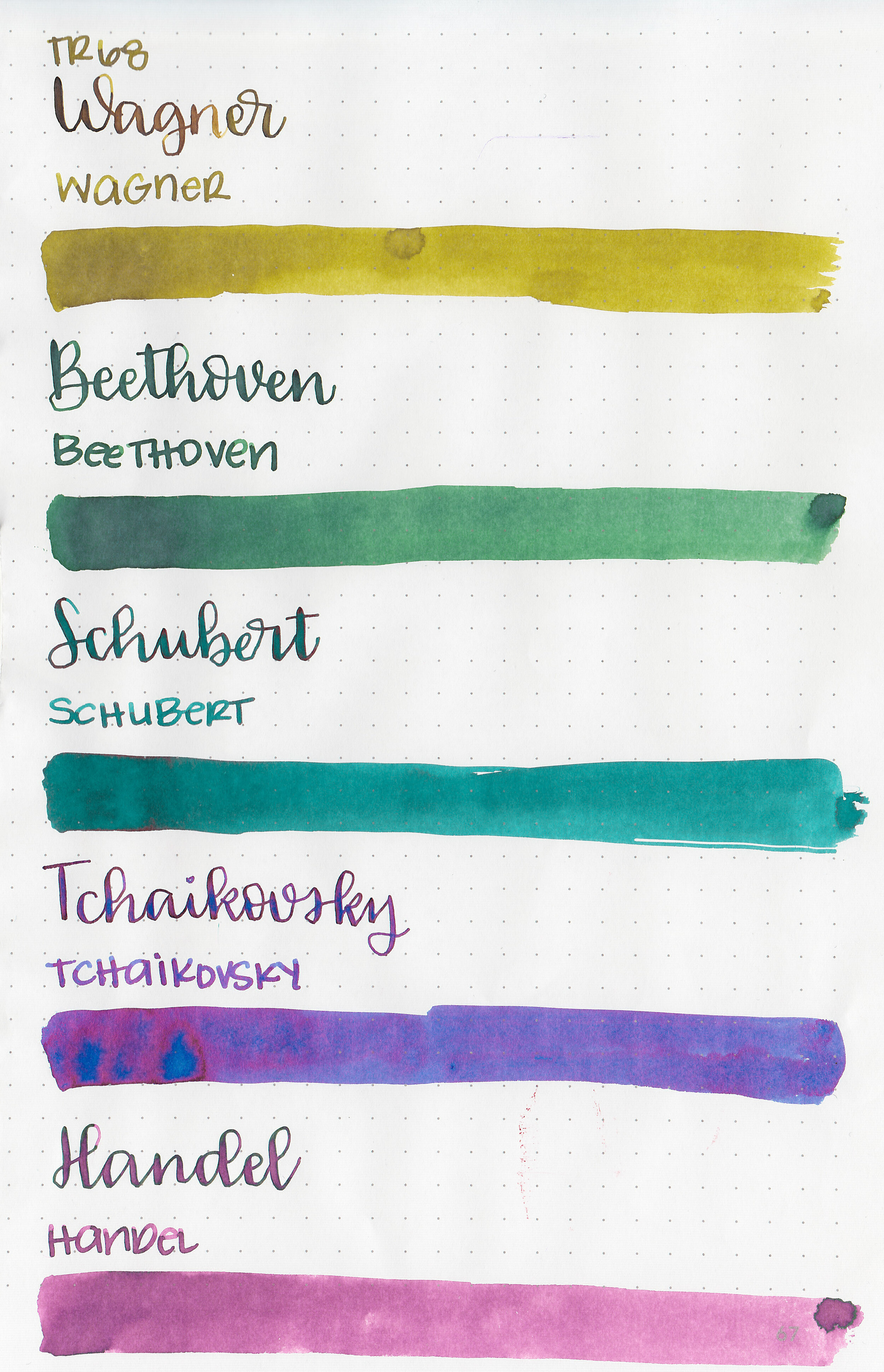
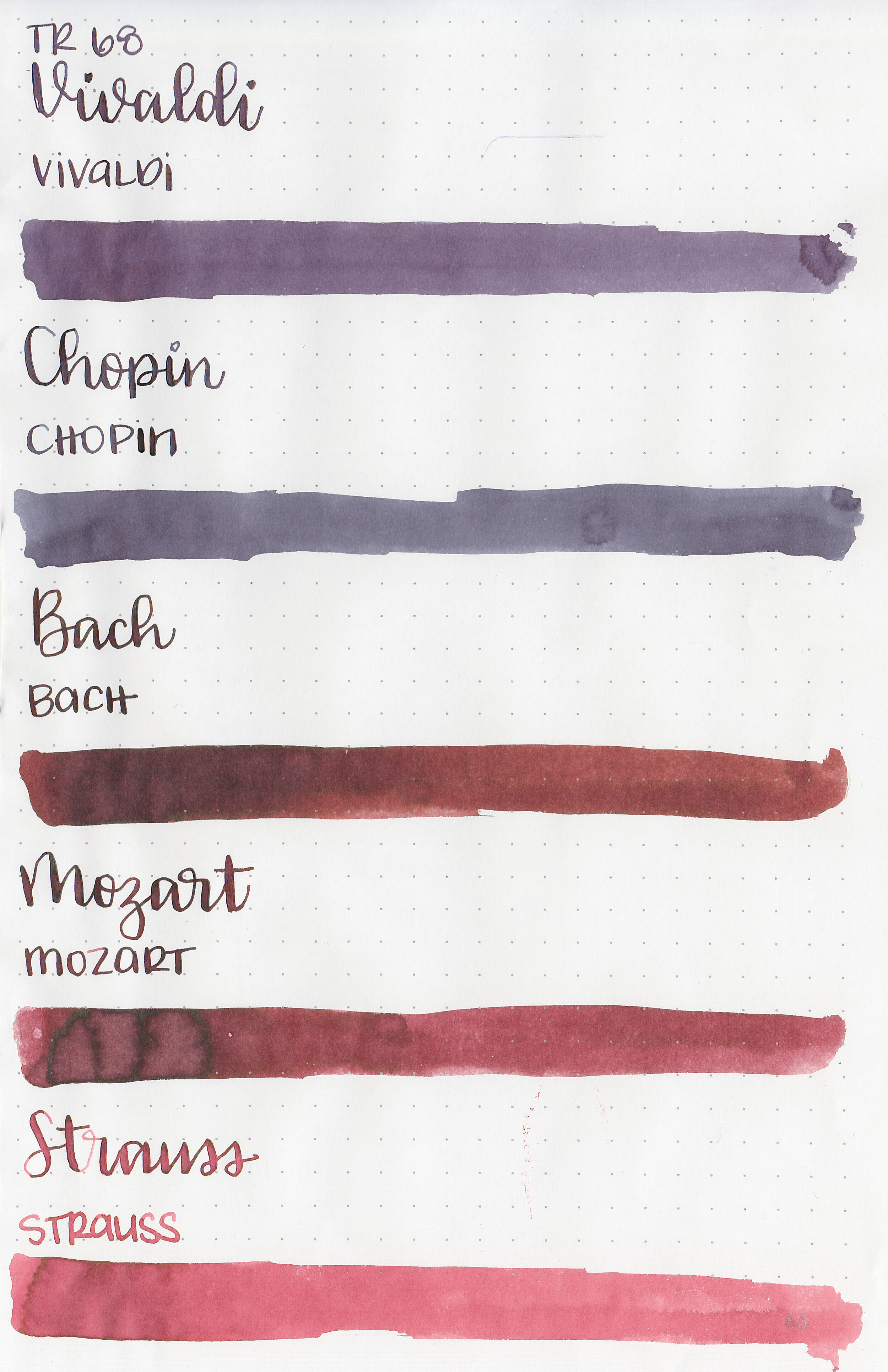
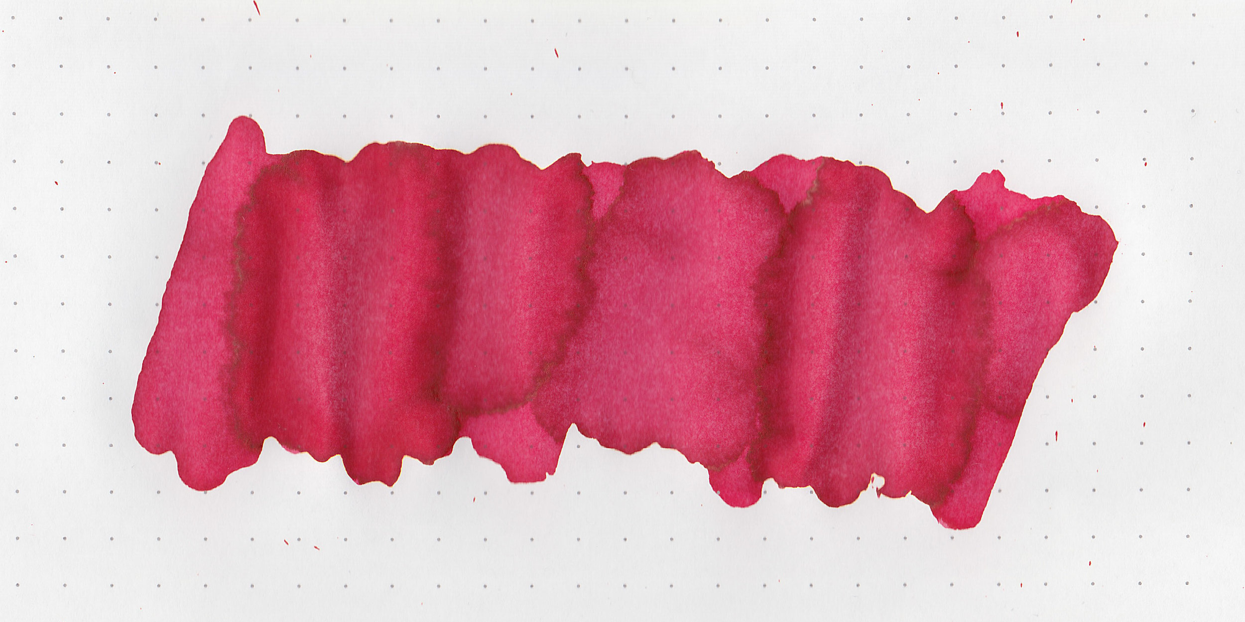
Swabs:

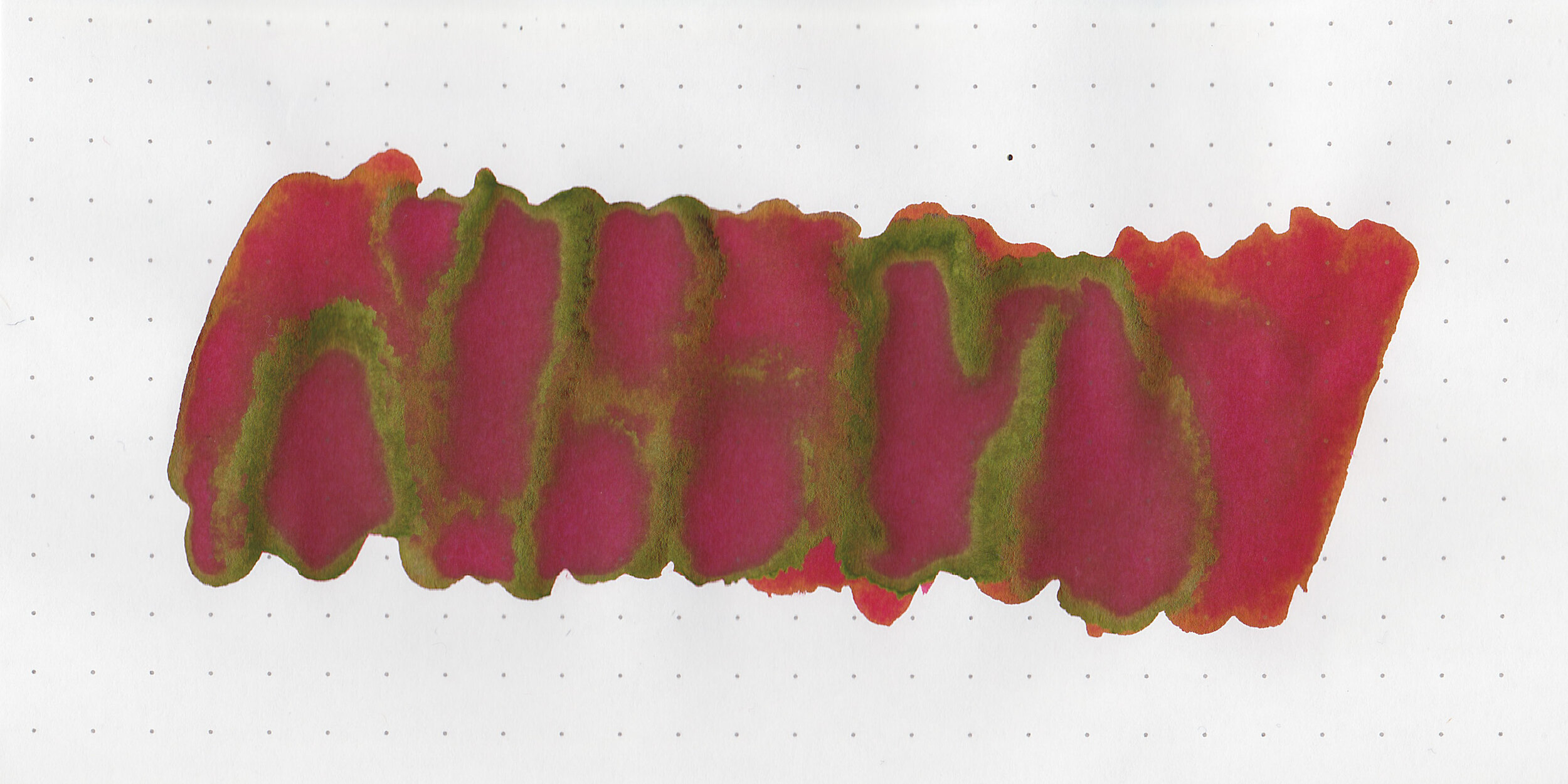
In large swabs on Tomoe River paper there is just the barest hint of gold sheen.

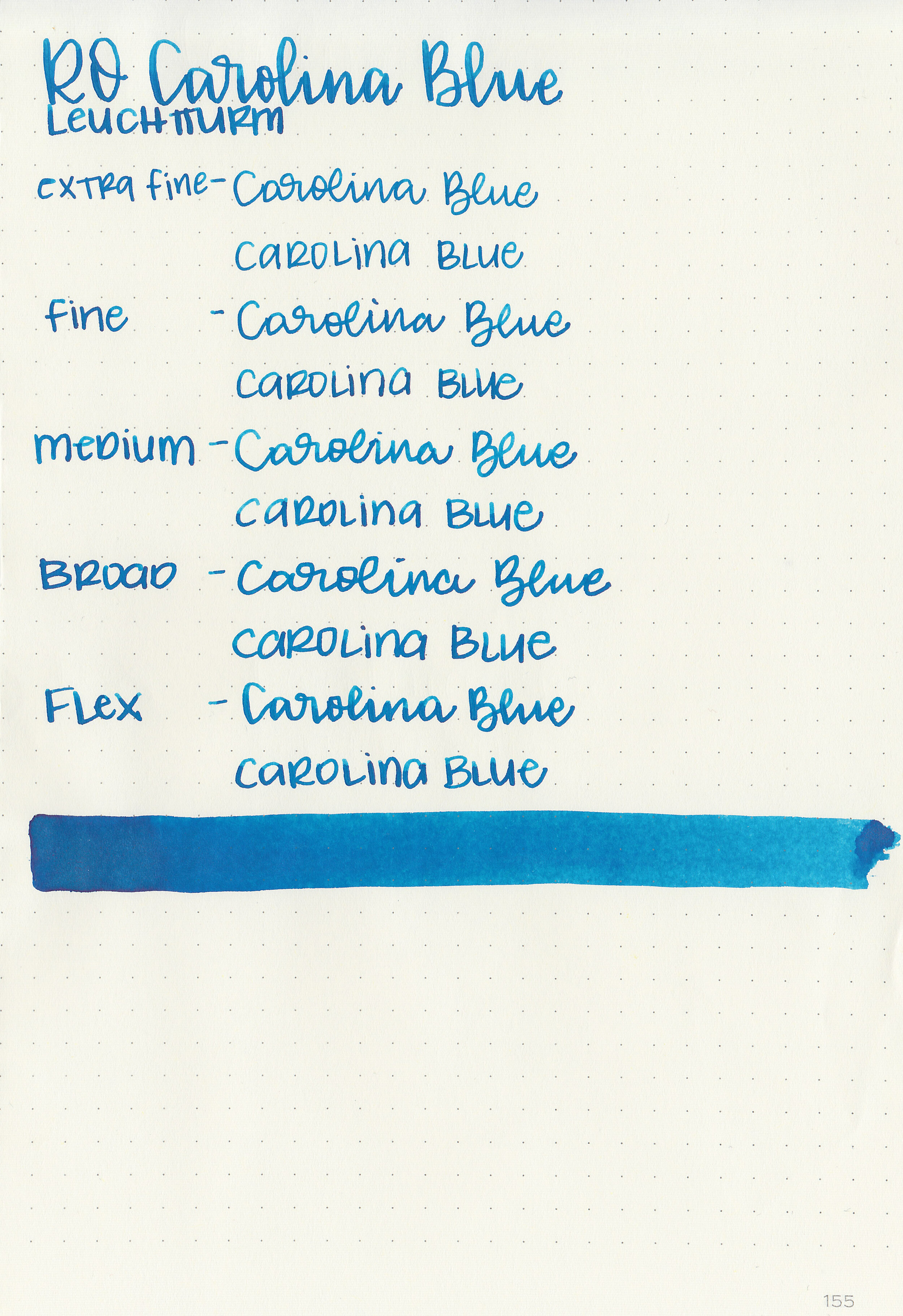
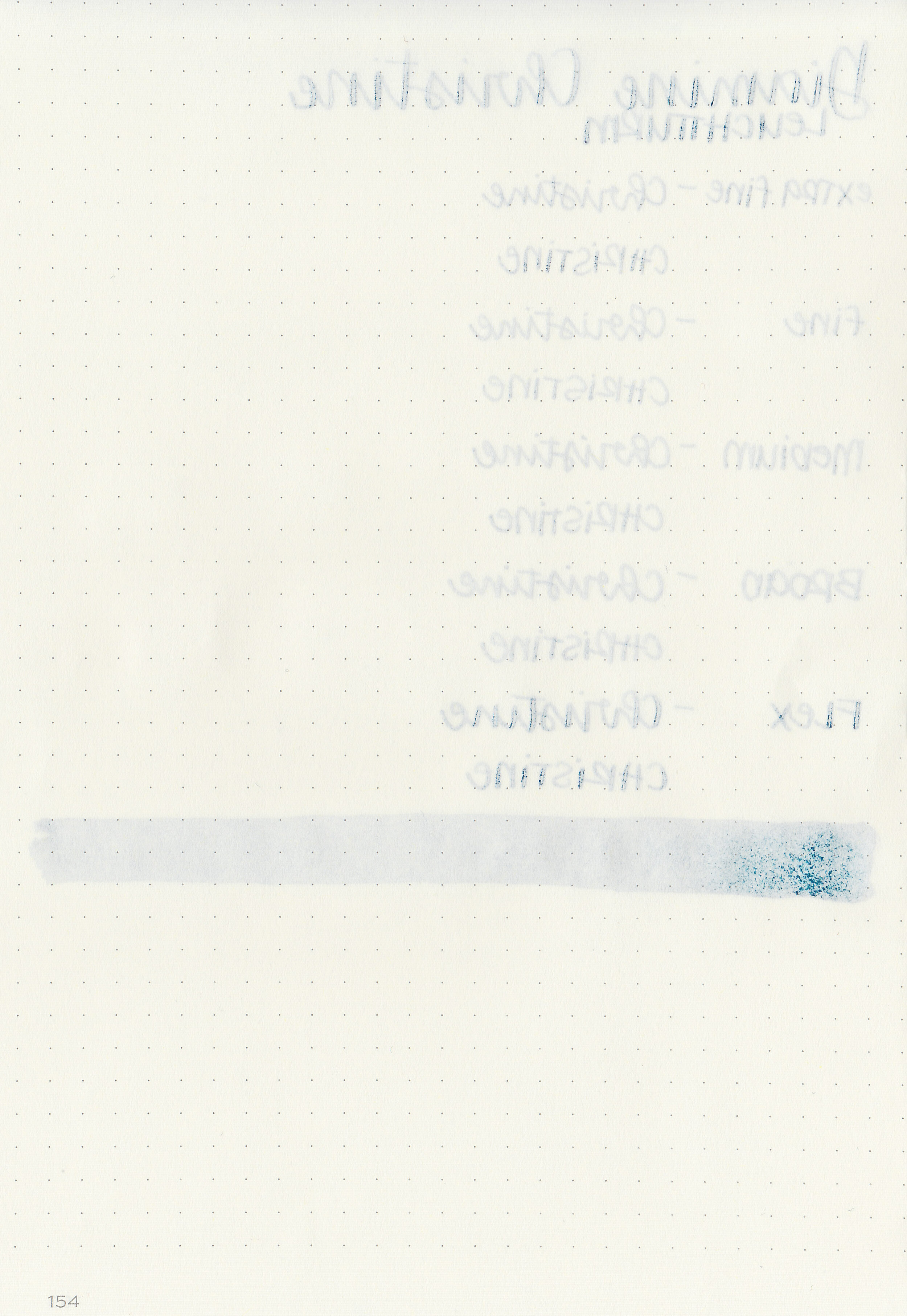
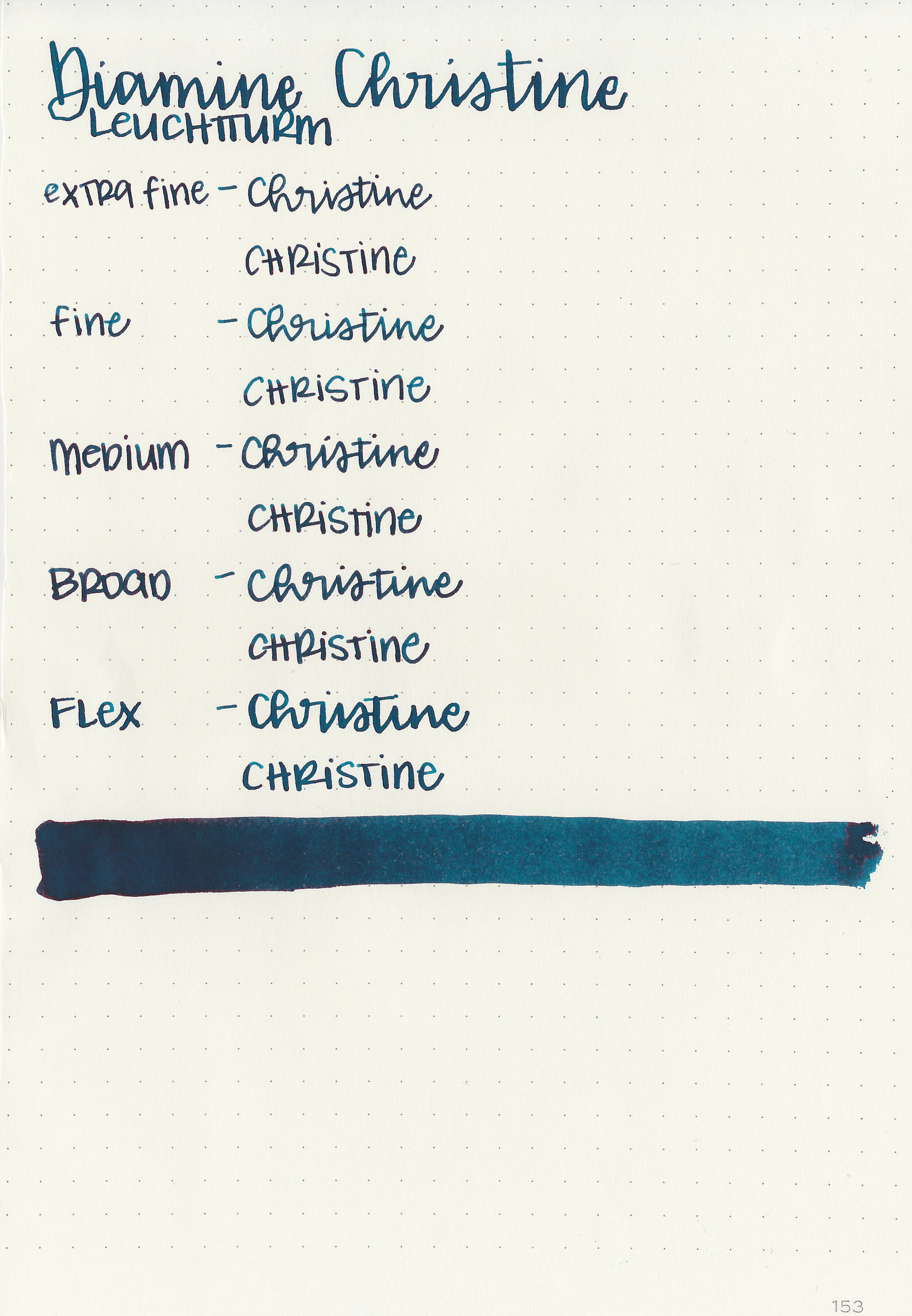
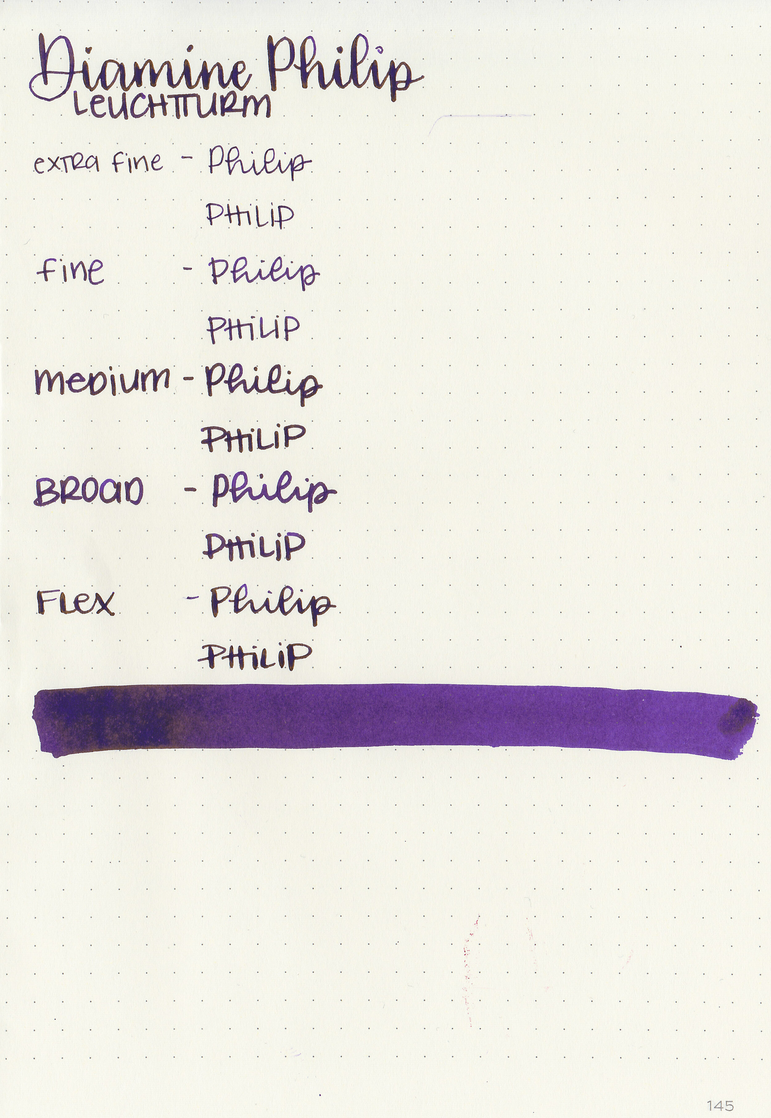
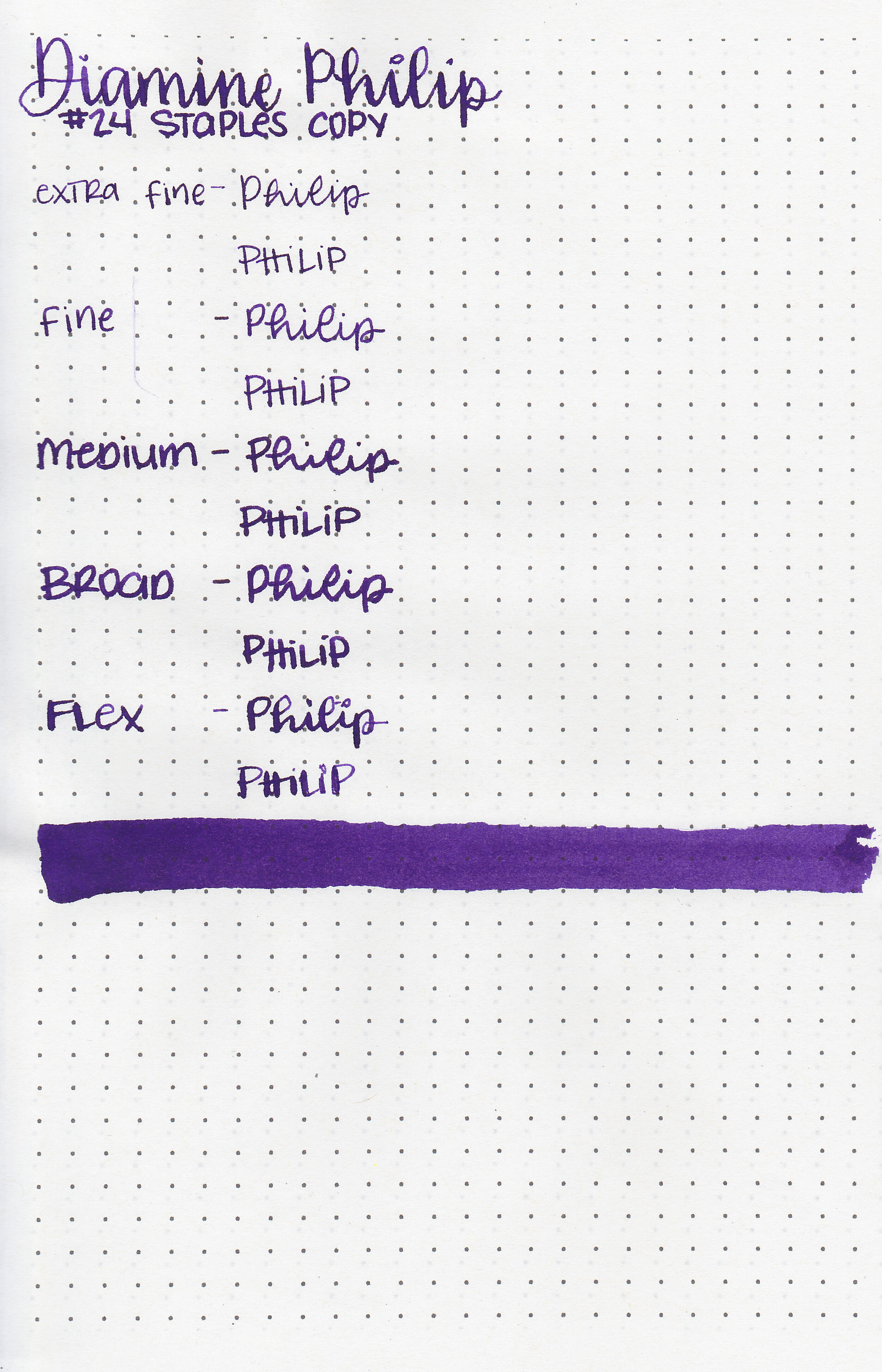
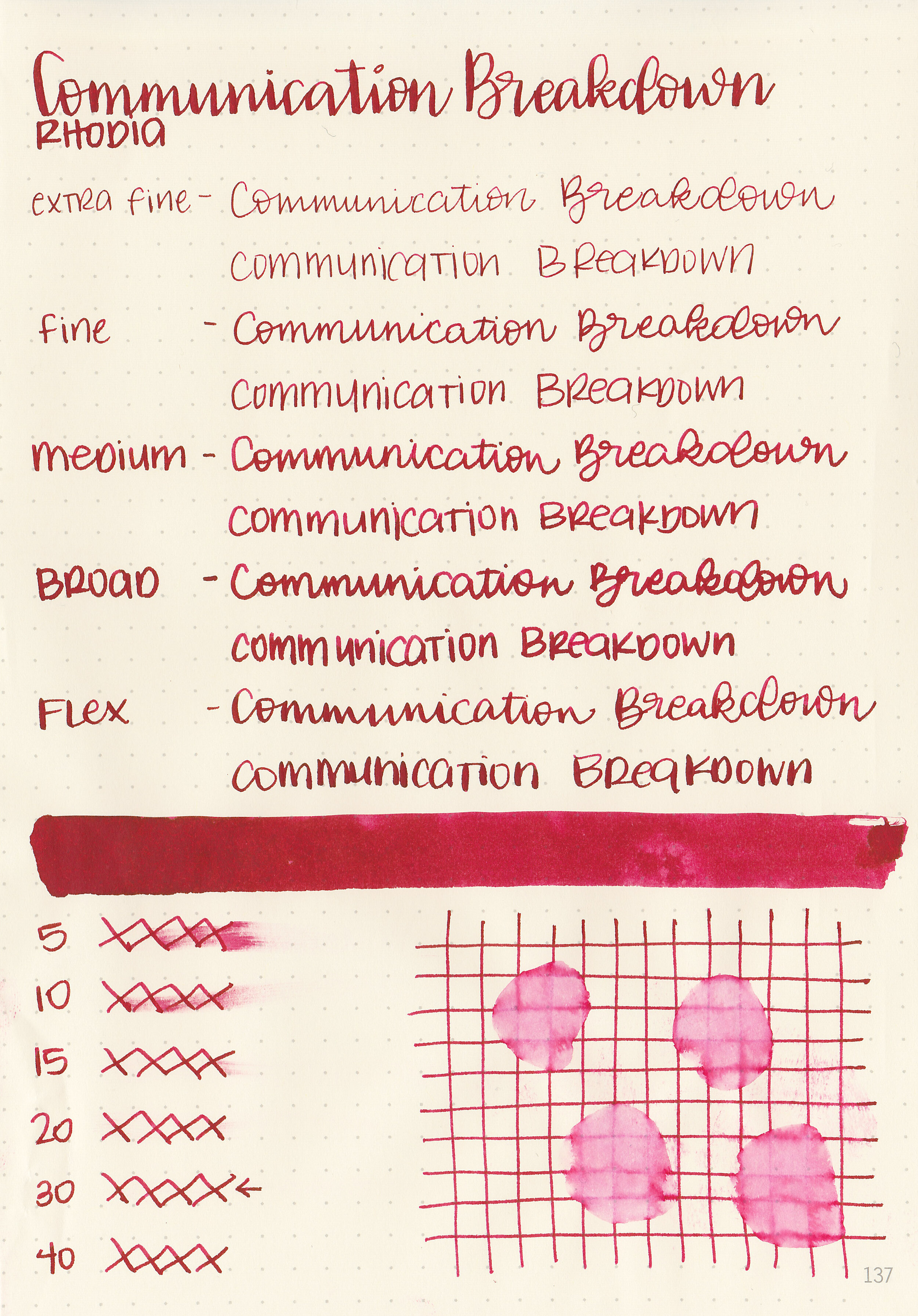
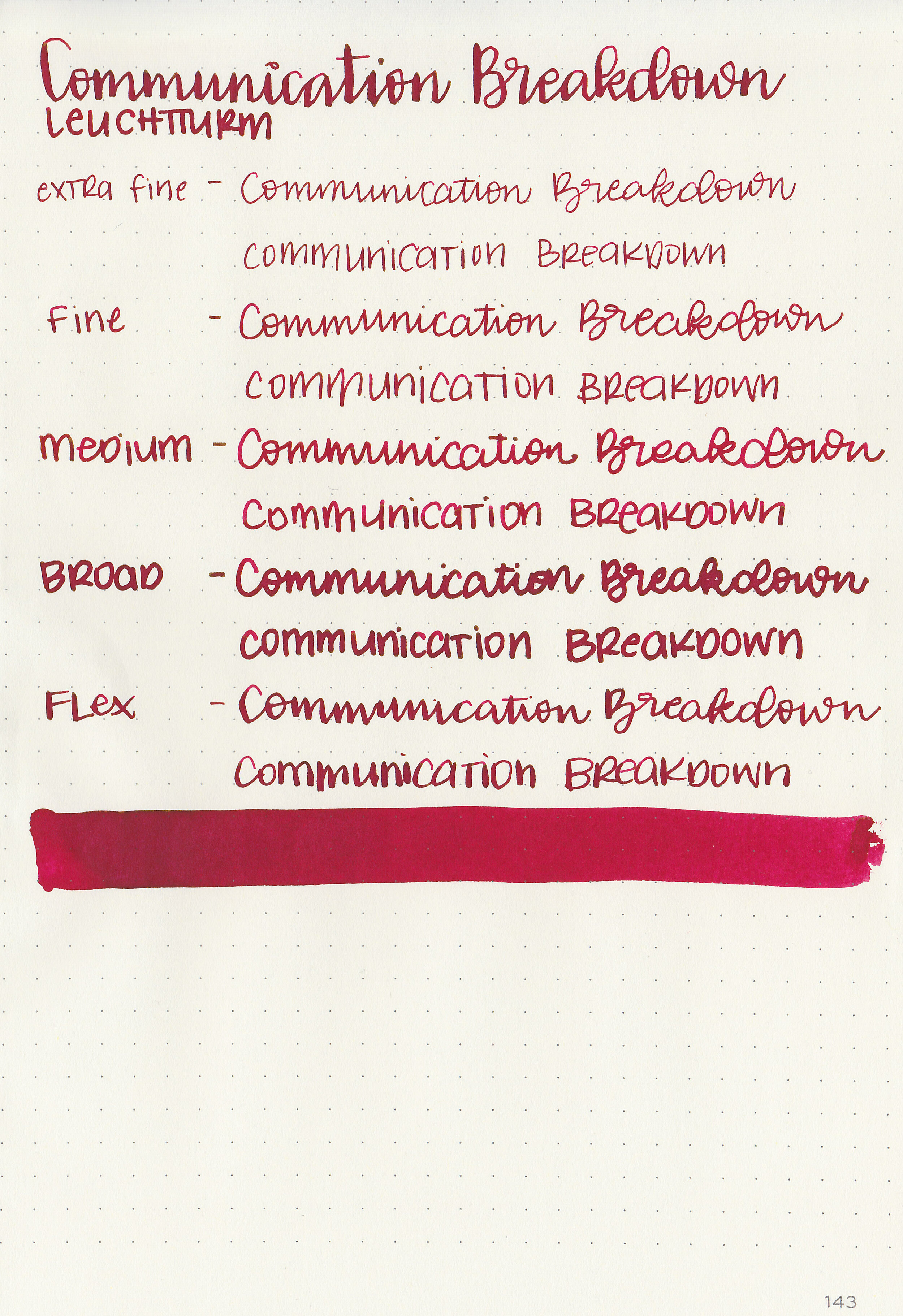
Writing samples:
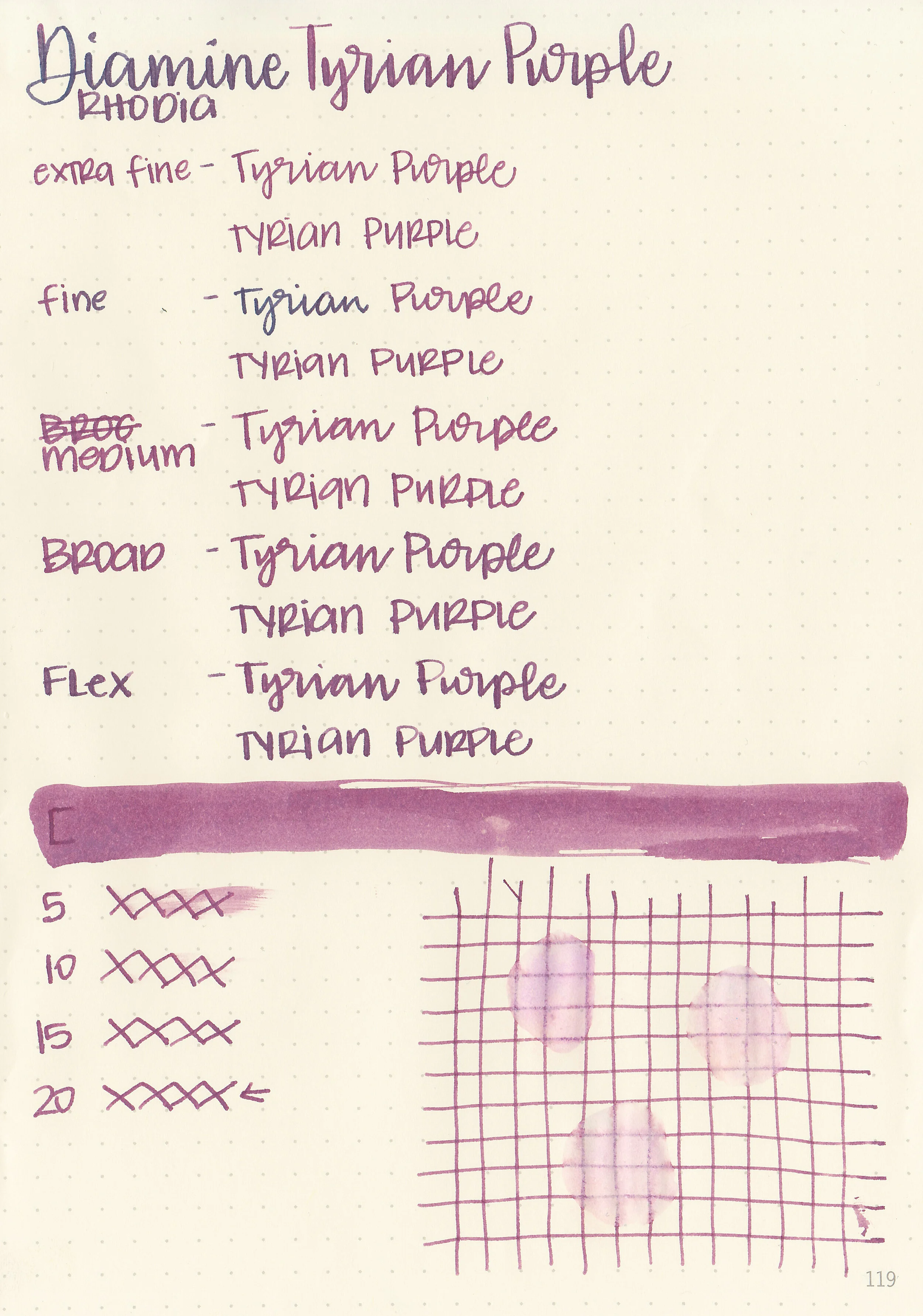
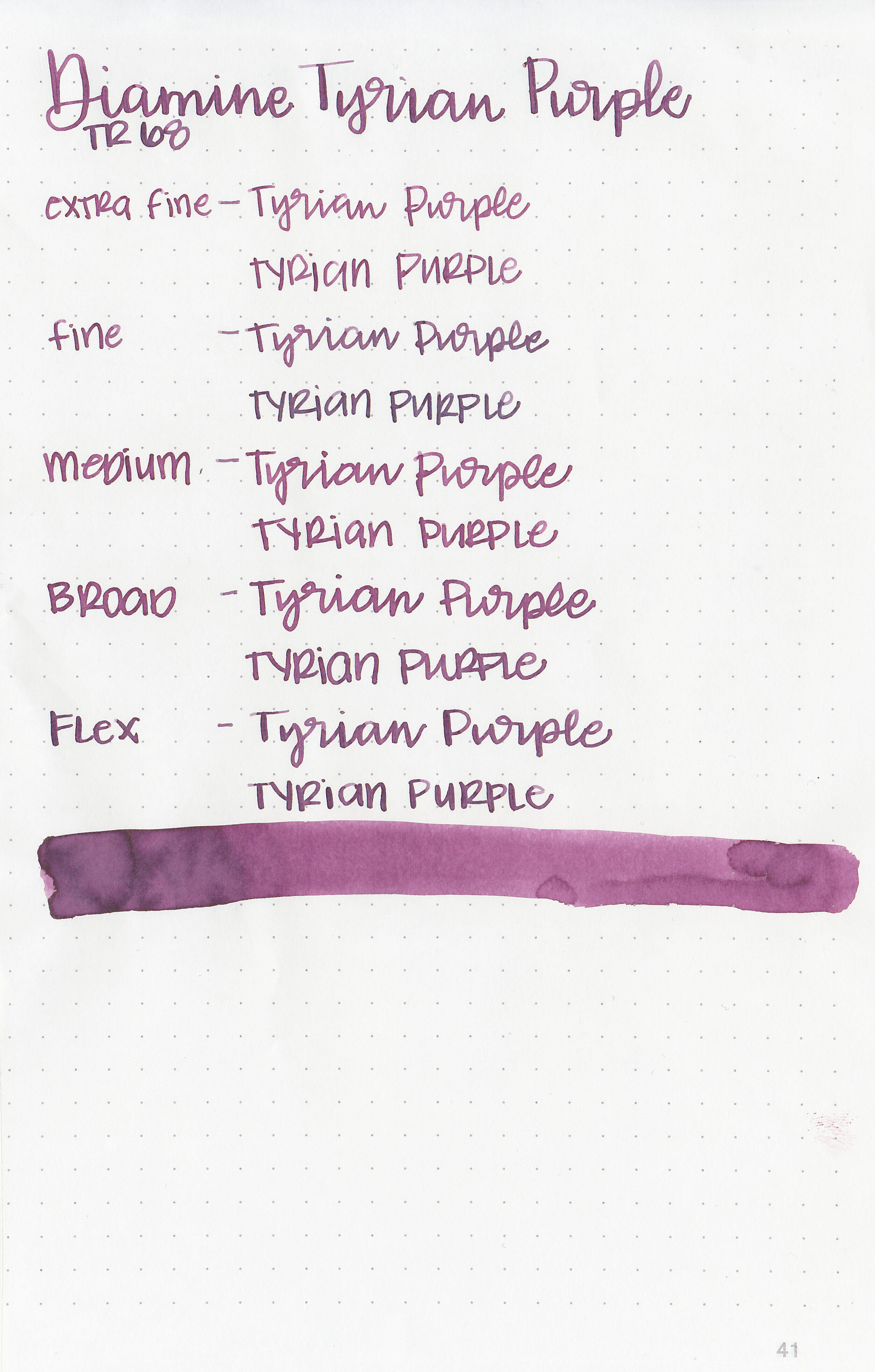
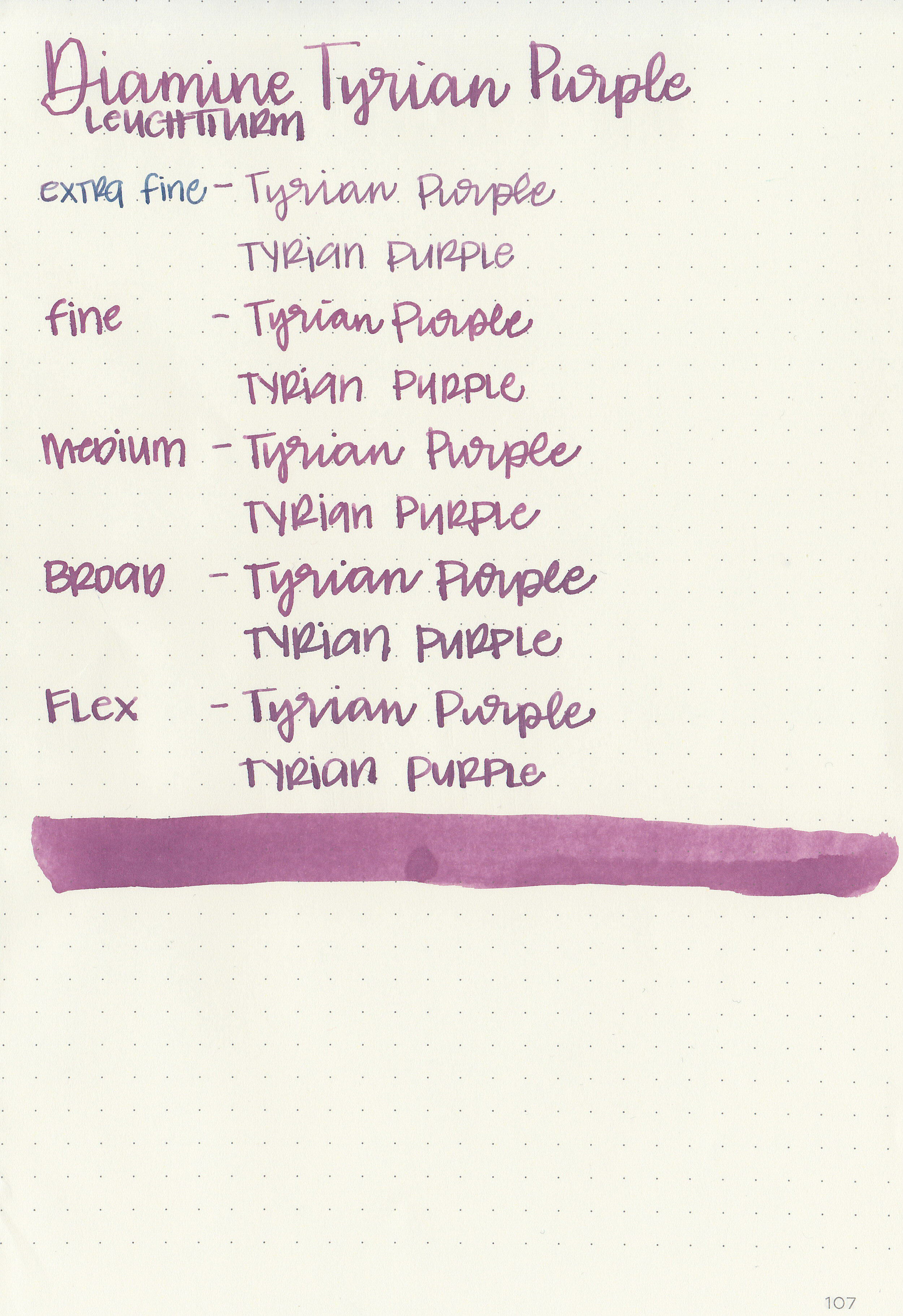
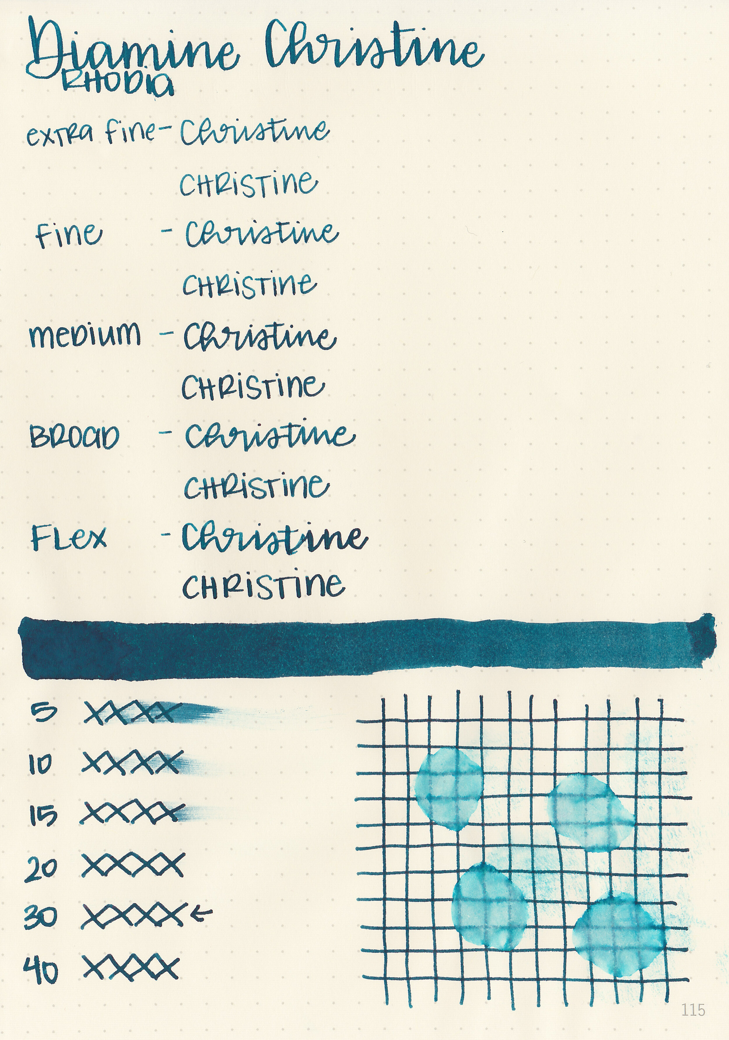
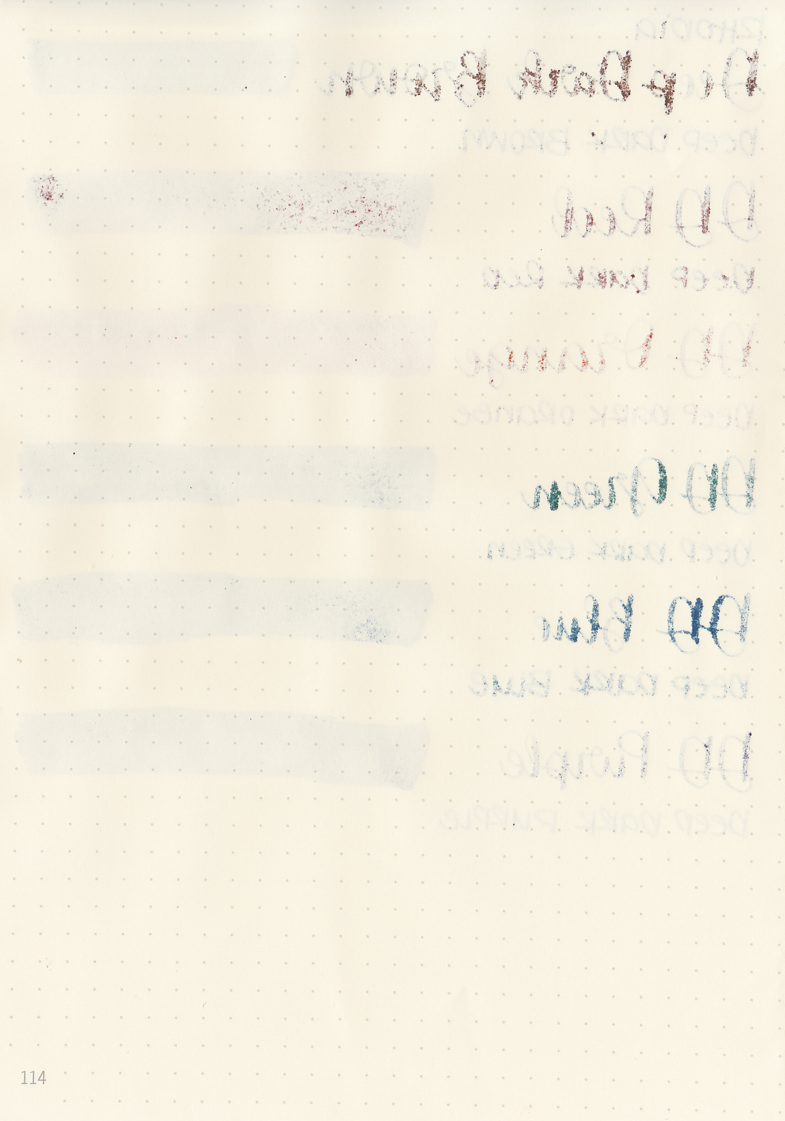
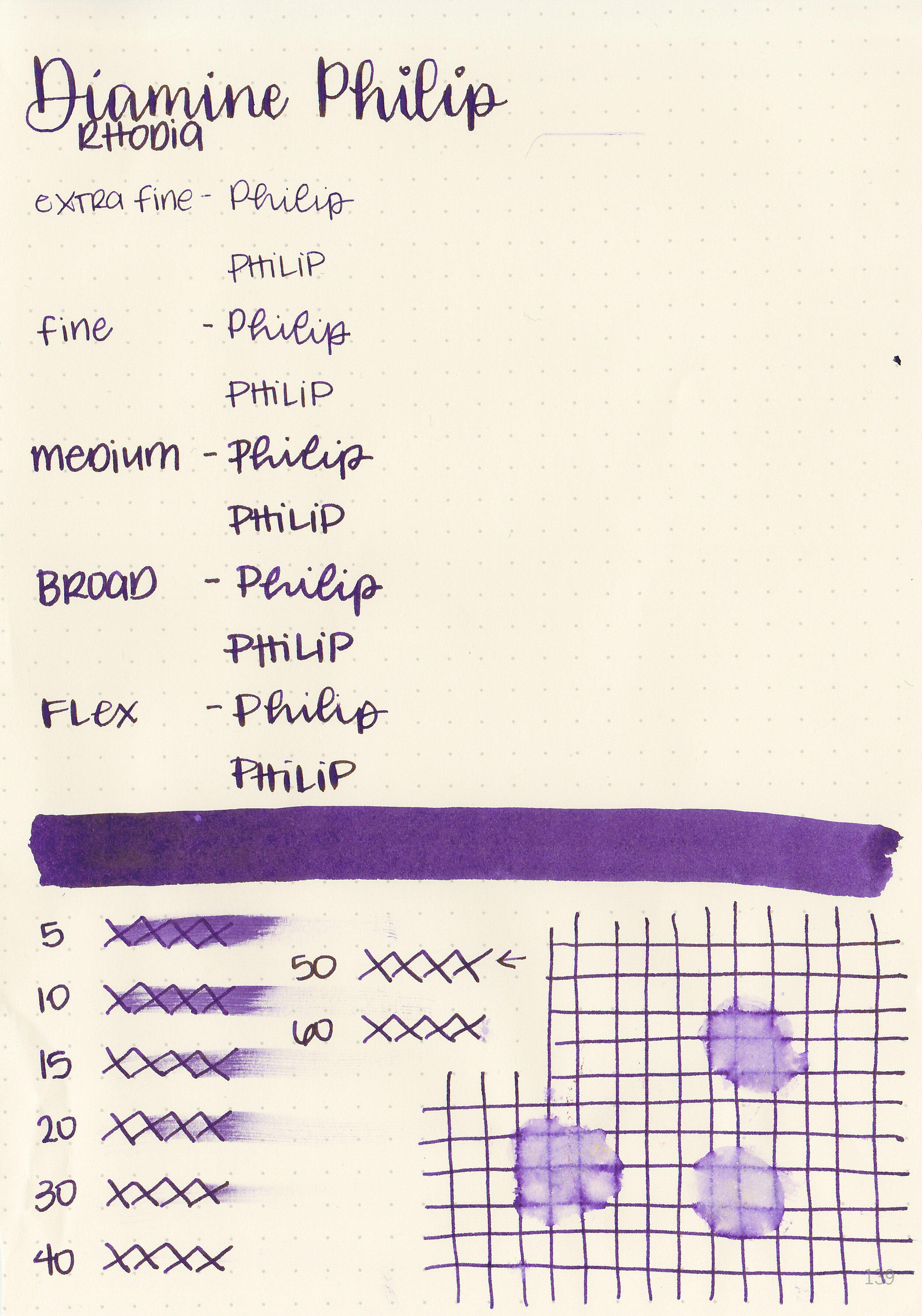
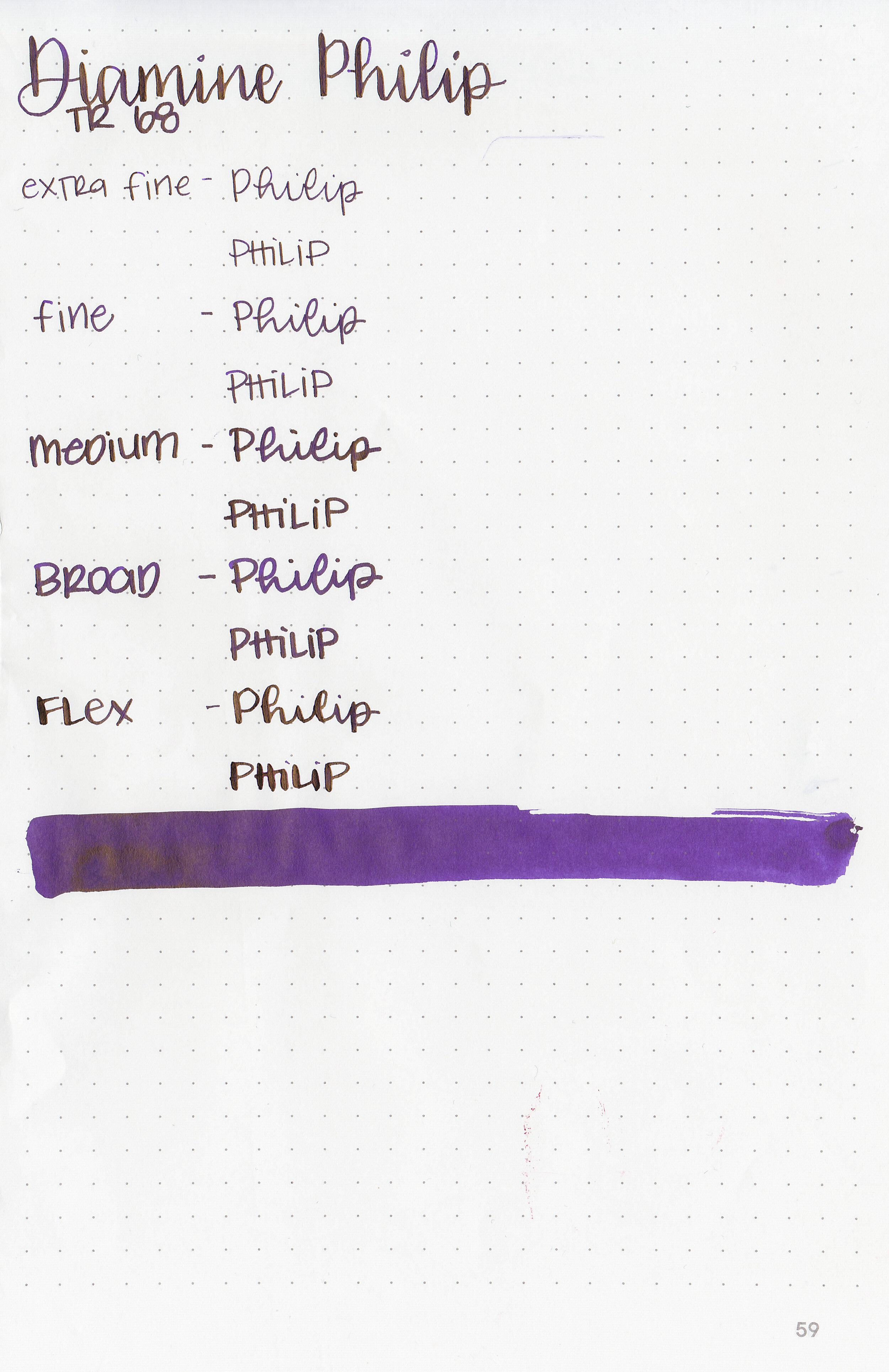
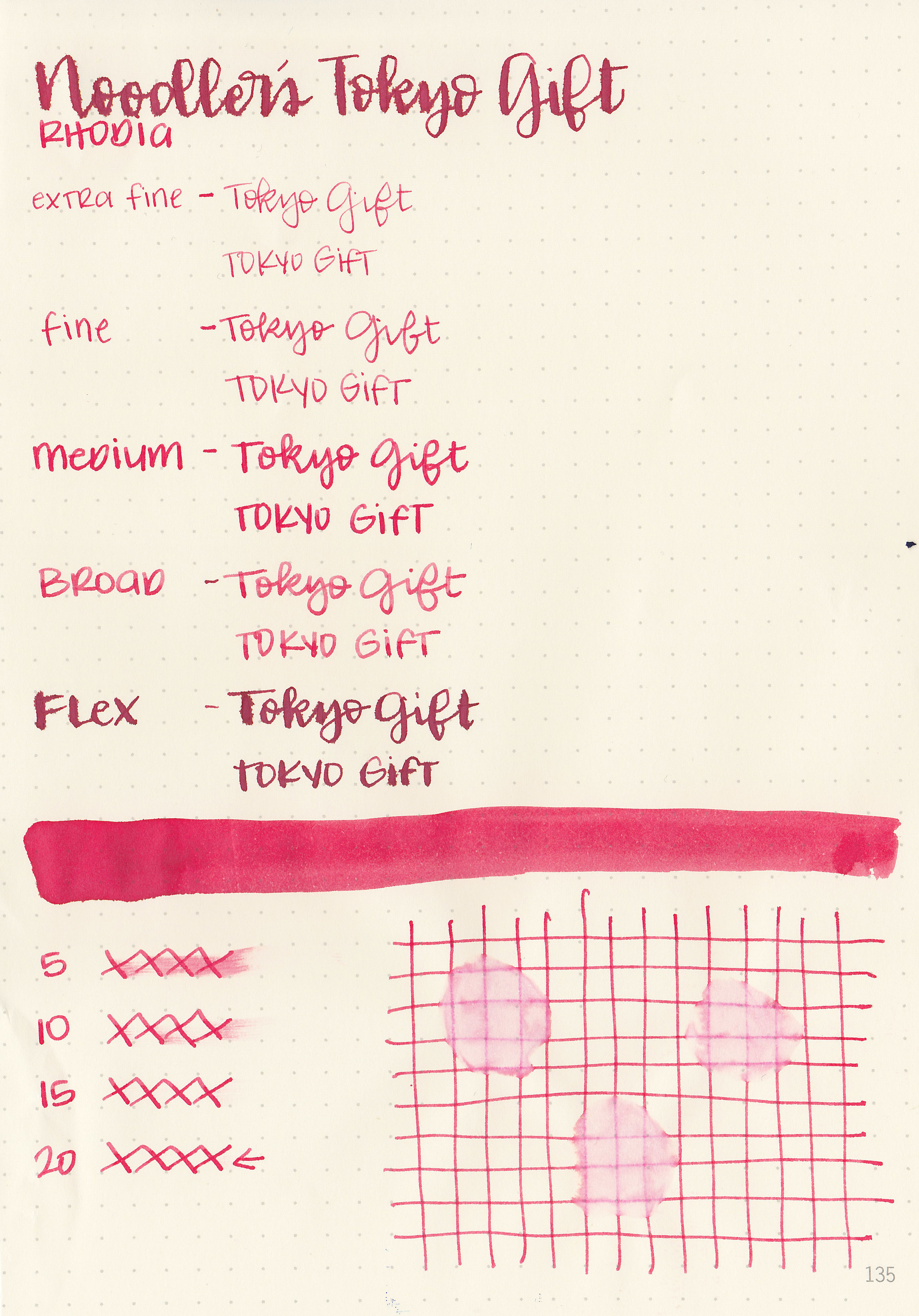
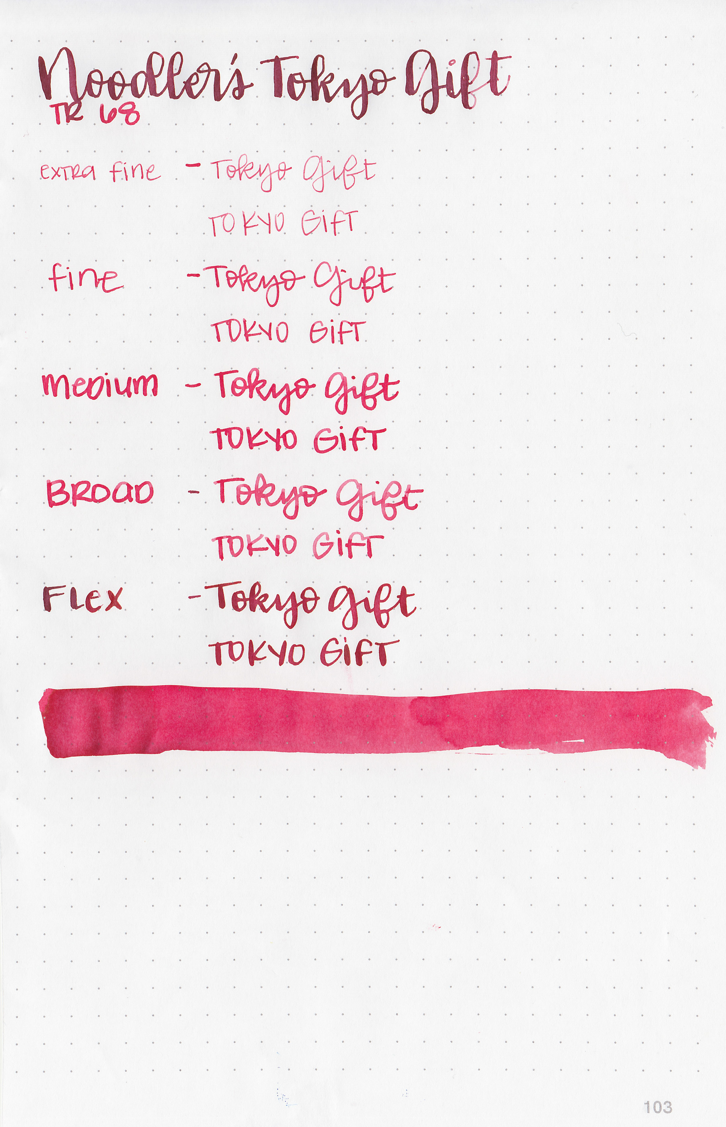
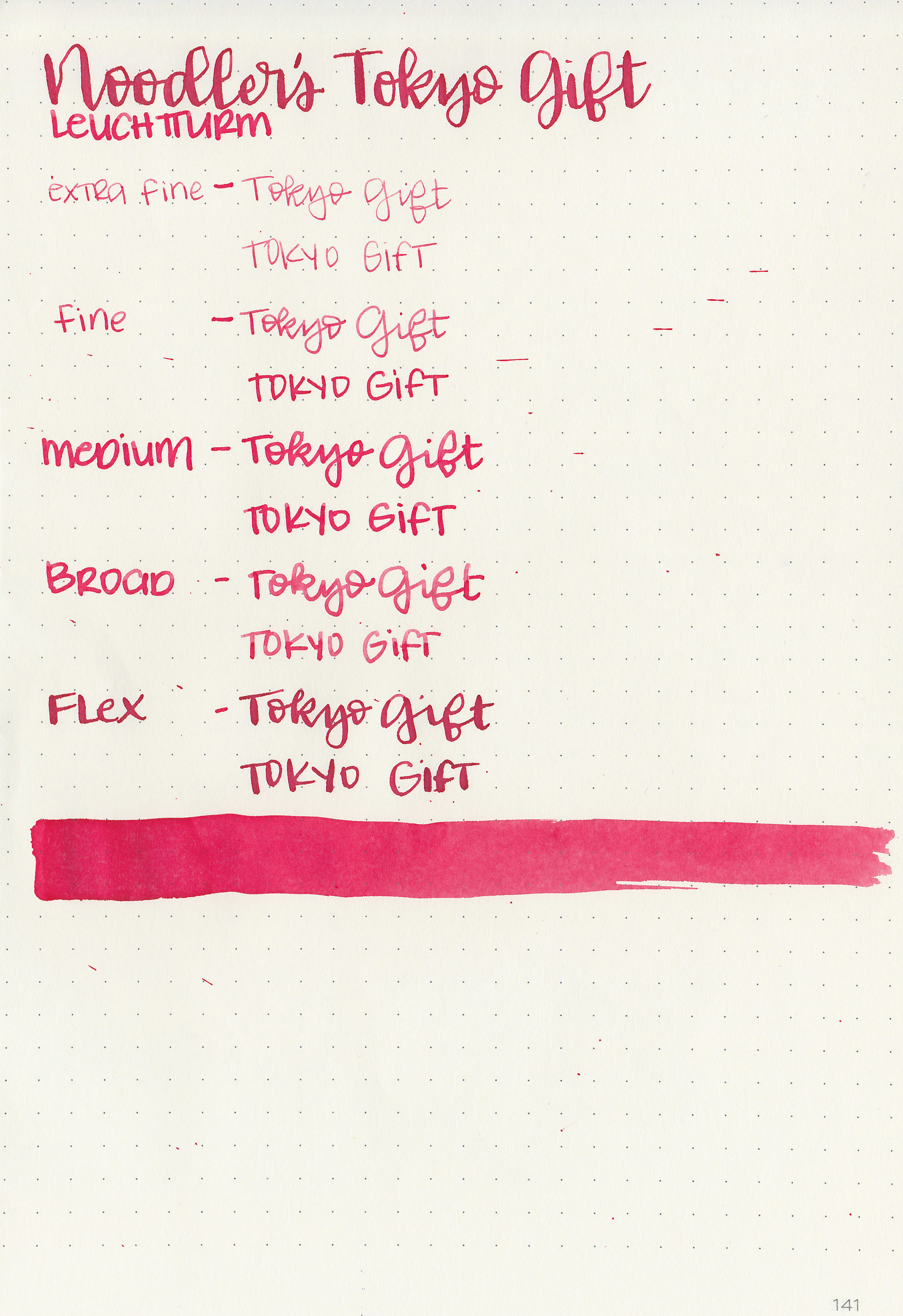
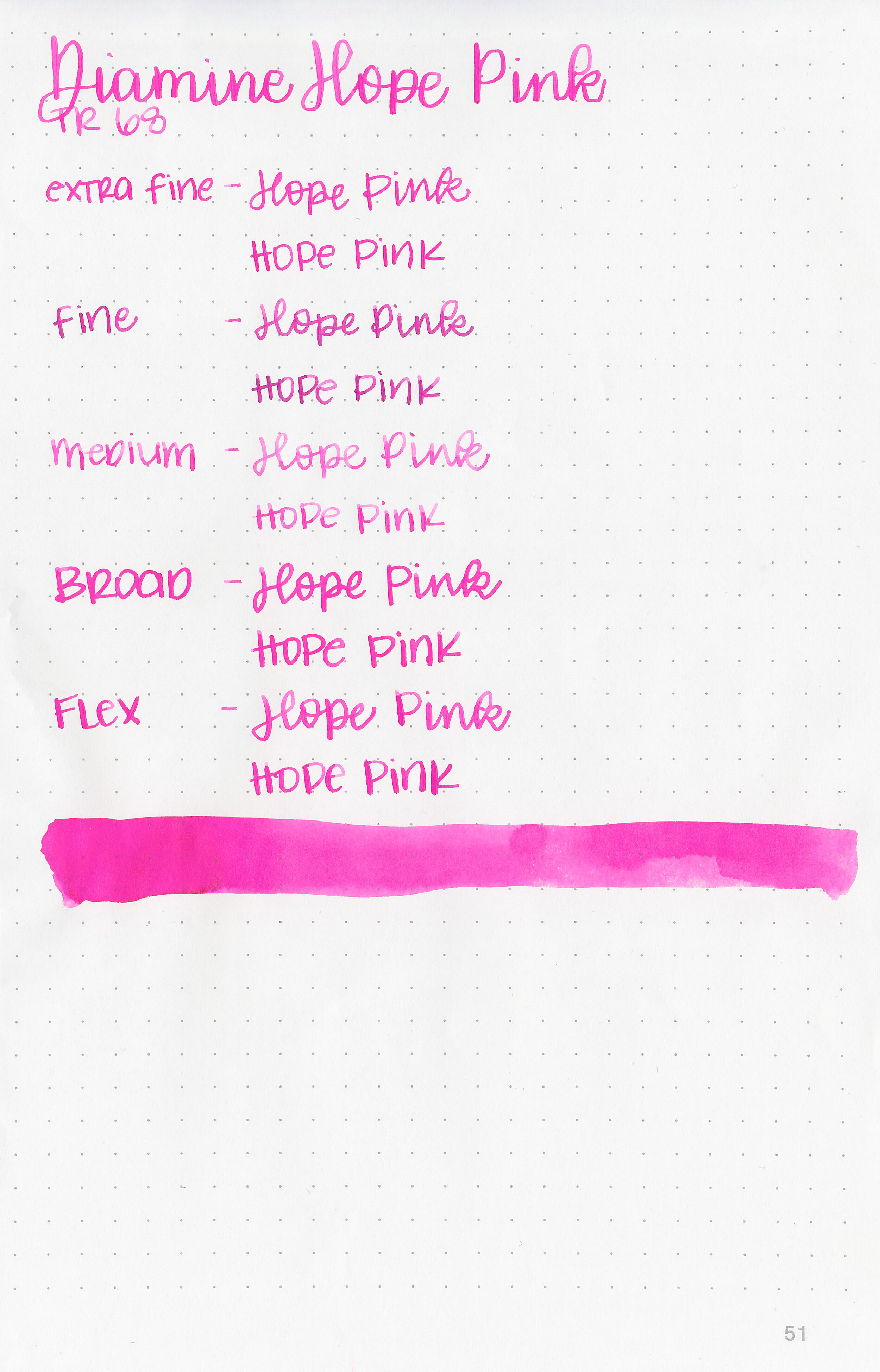
Let's take a look at how the ink behaves on fountain pen friendly papers: Rhodia, Tomoe River, and Leuchtturm.
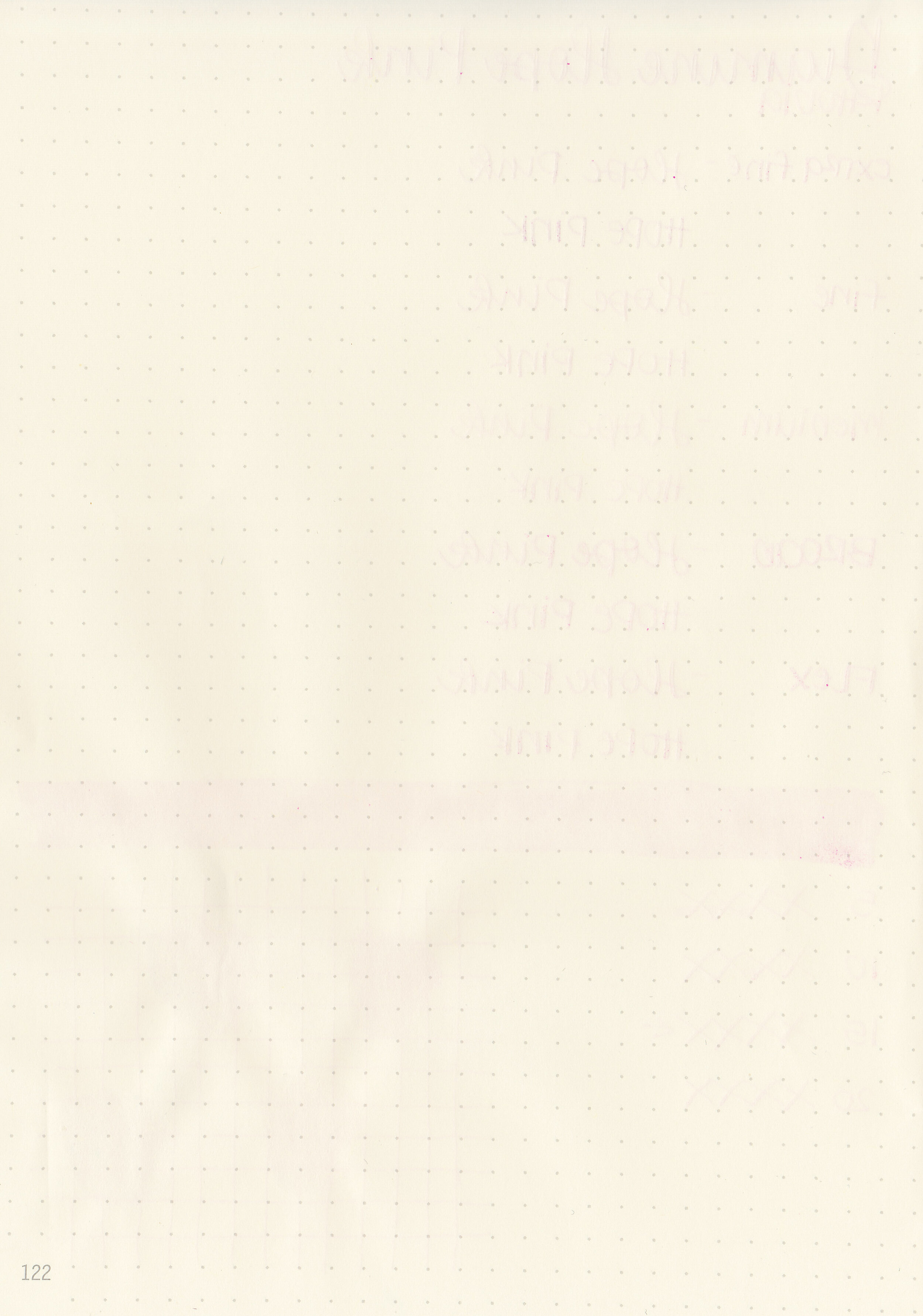
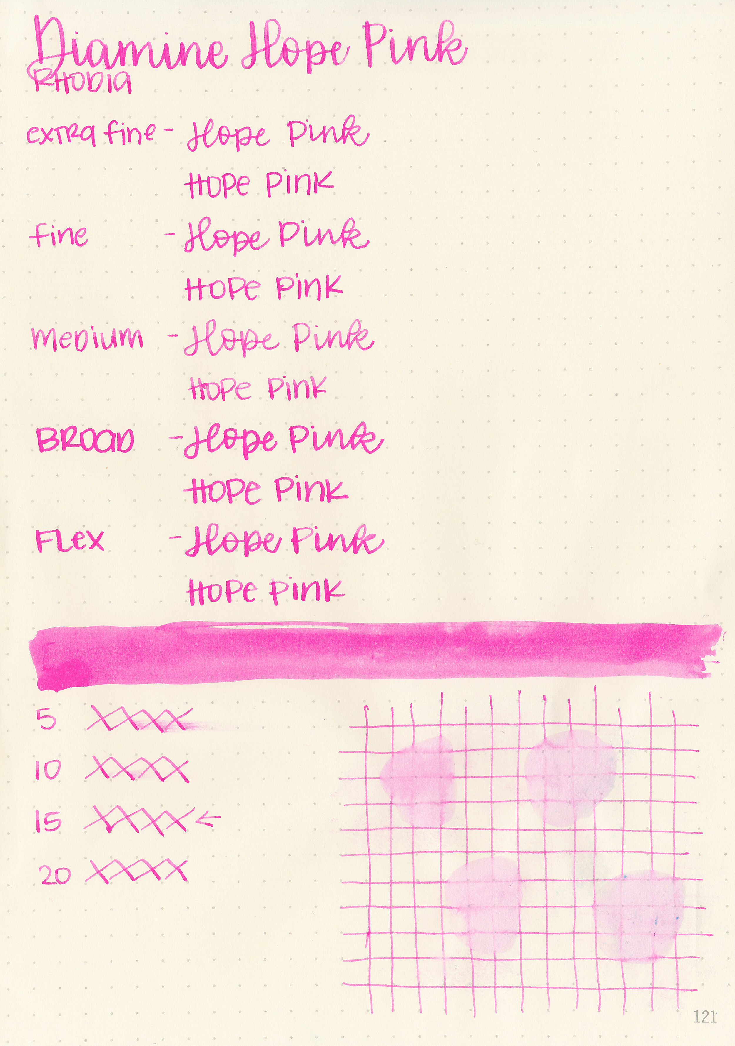
Dry time: 15 seconds
Water resistance: Low

Feathering: None
Show through: Medium
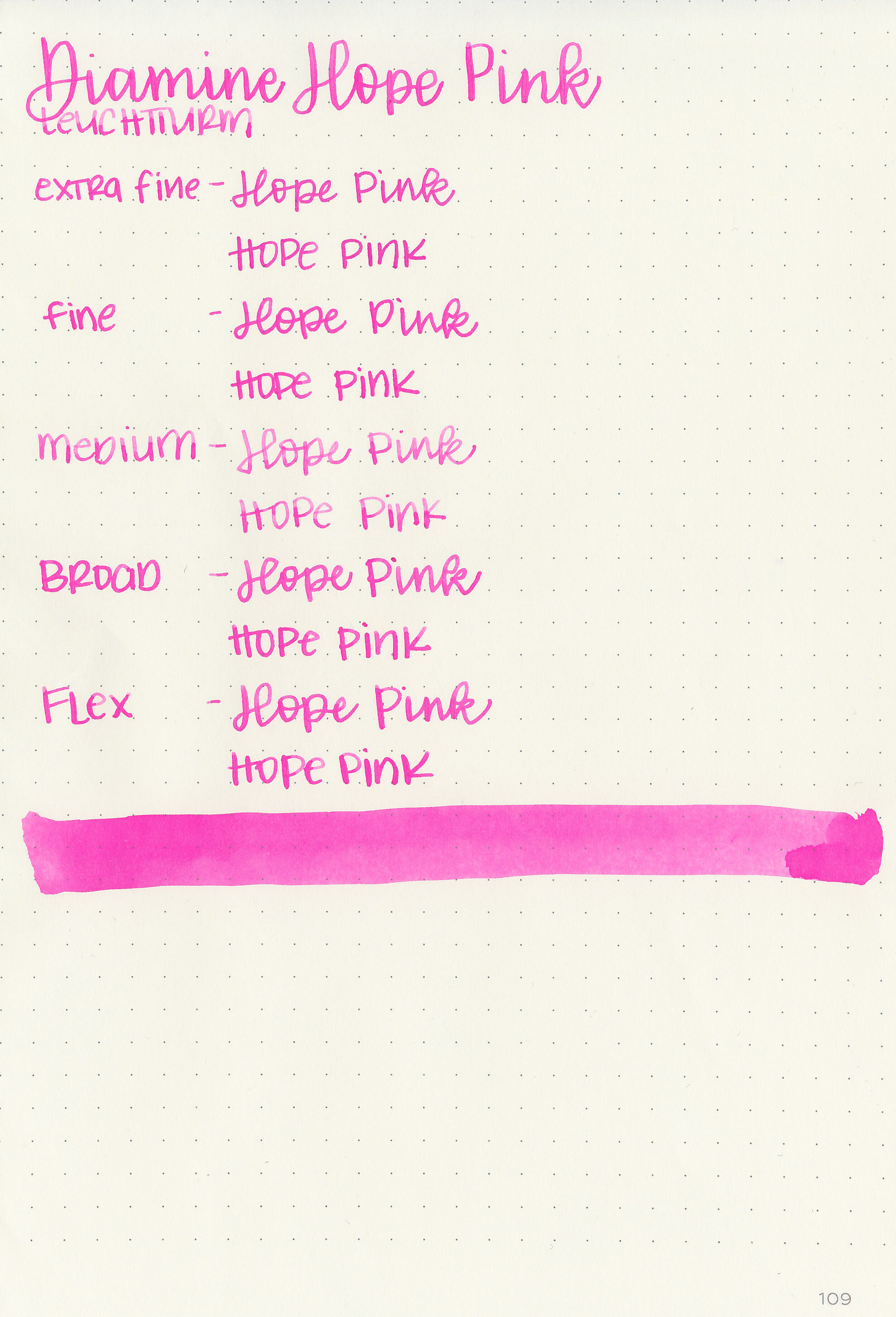
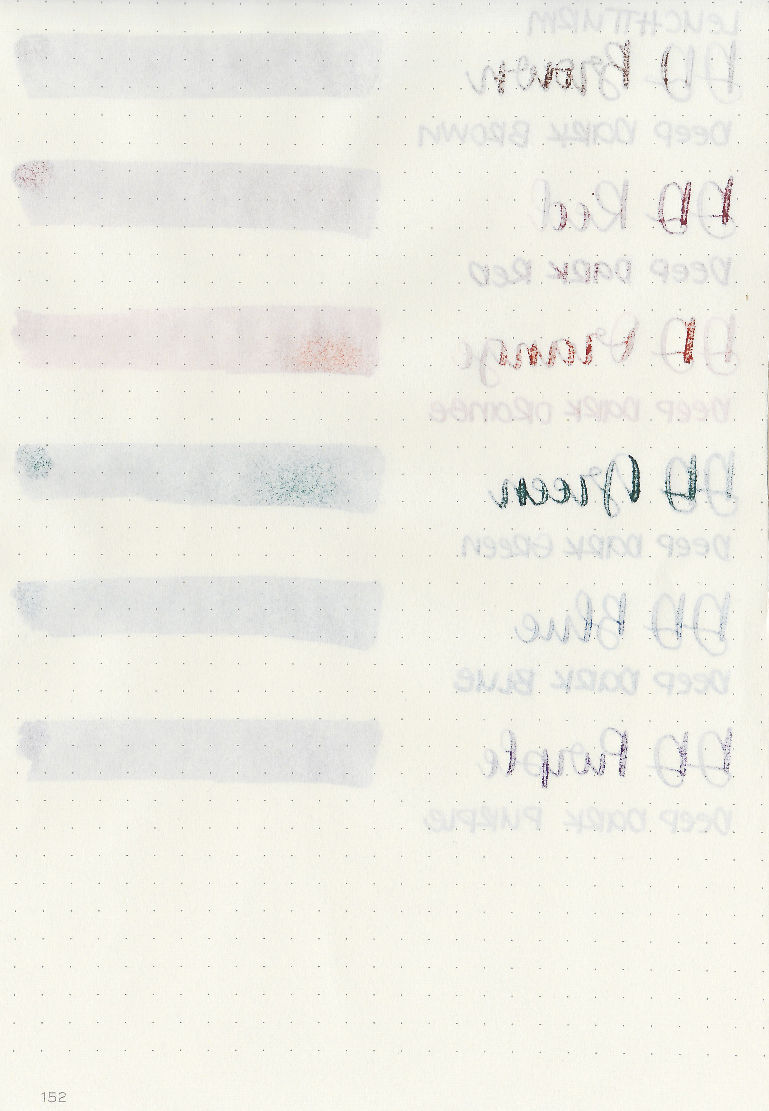
Bleeding: Low-there’s a little bit of bleeding on Leuchtturm.
Other properties: low shading, tiny sheen, and no shimmer. The sheen is only visible in huge swabs on Tomoe River paper, but not in writing.
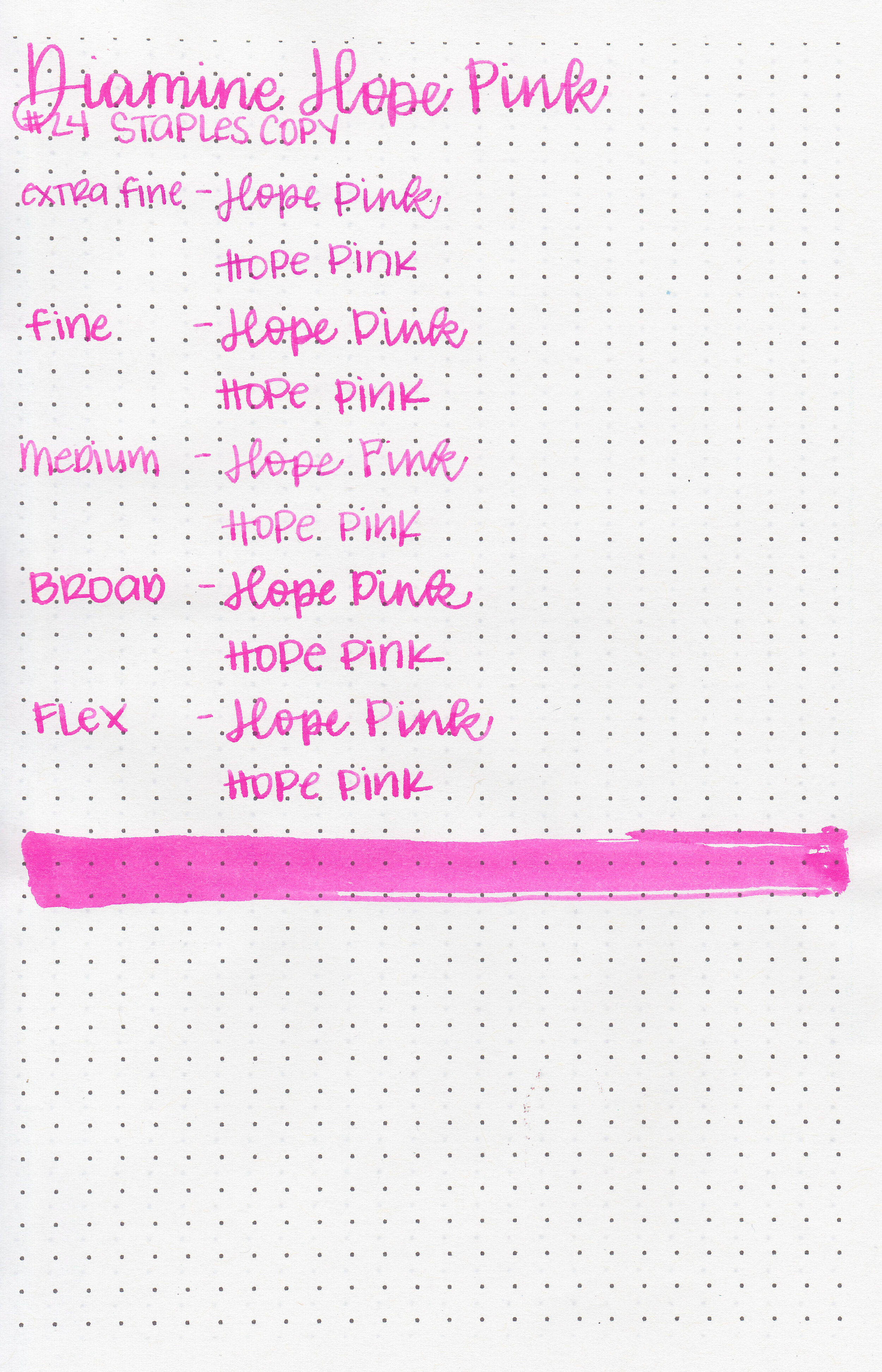
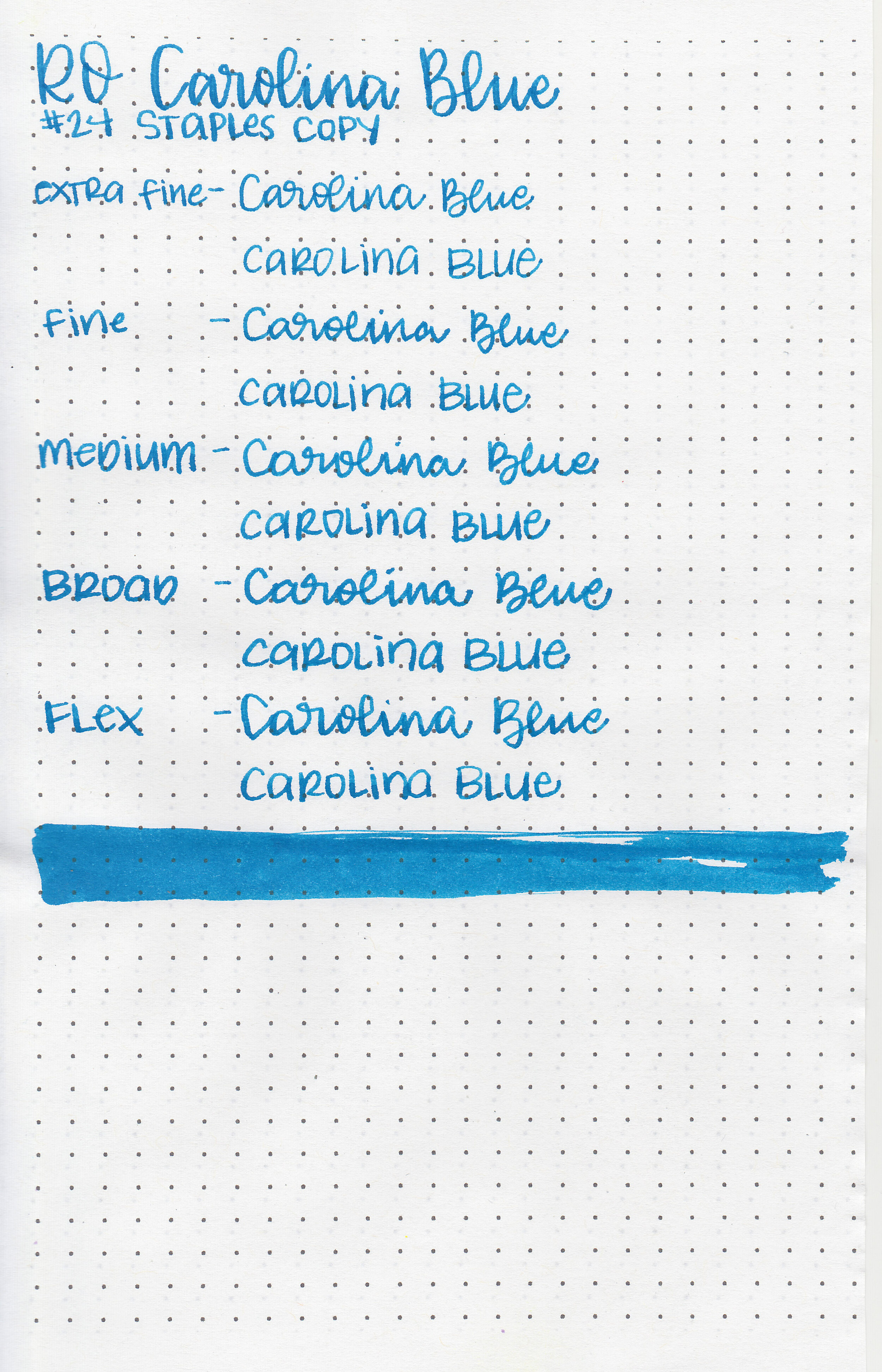
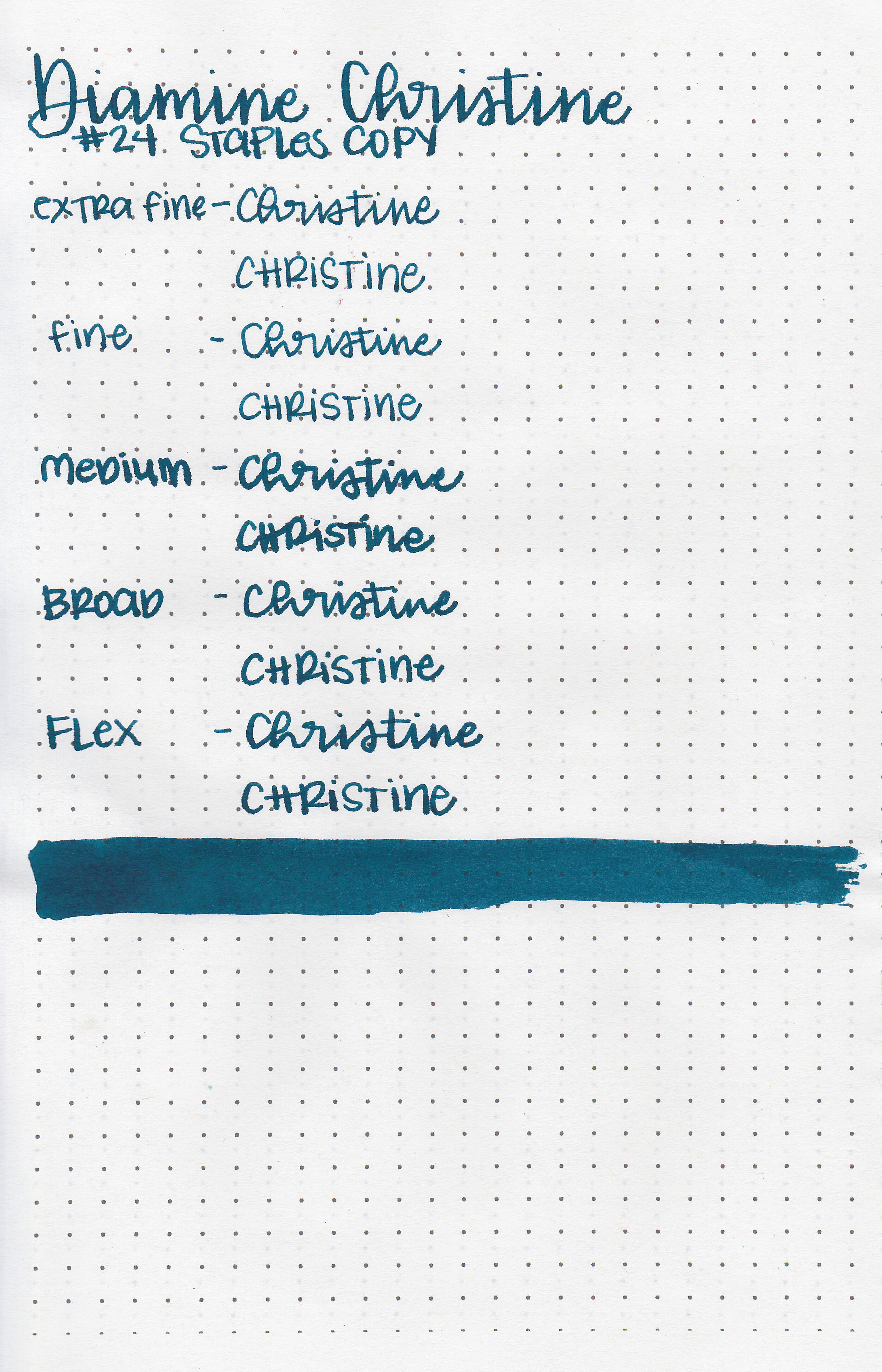
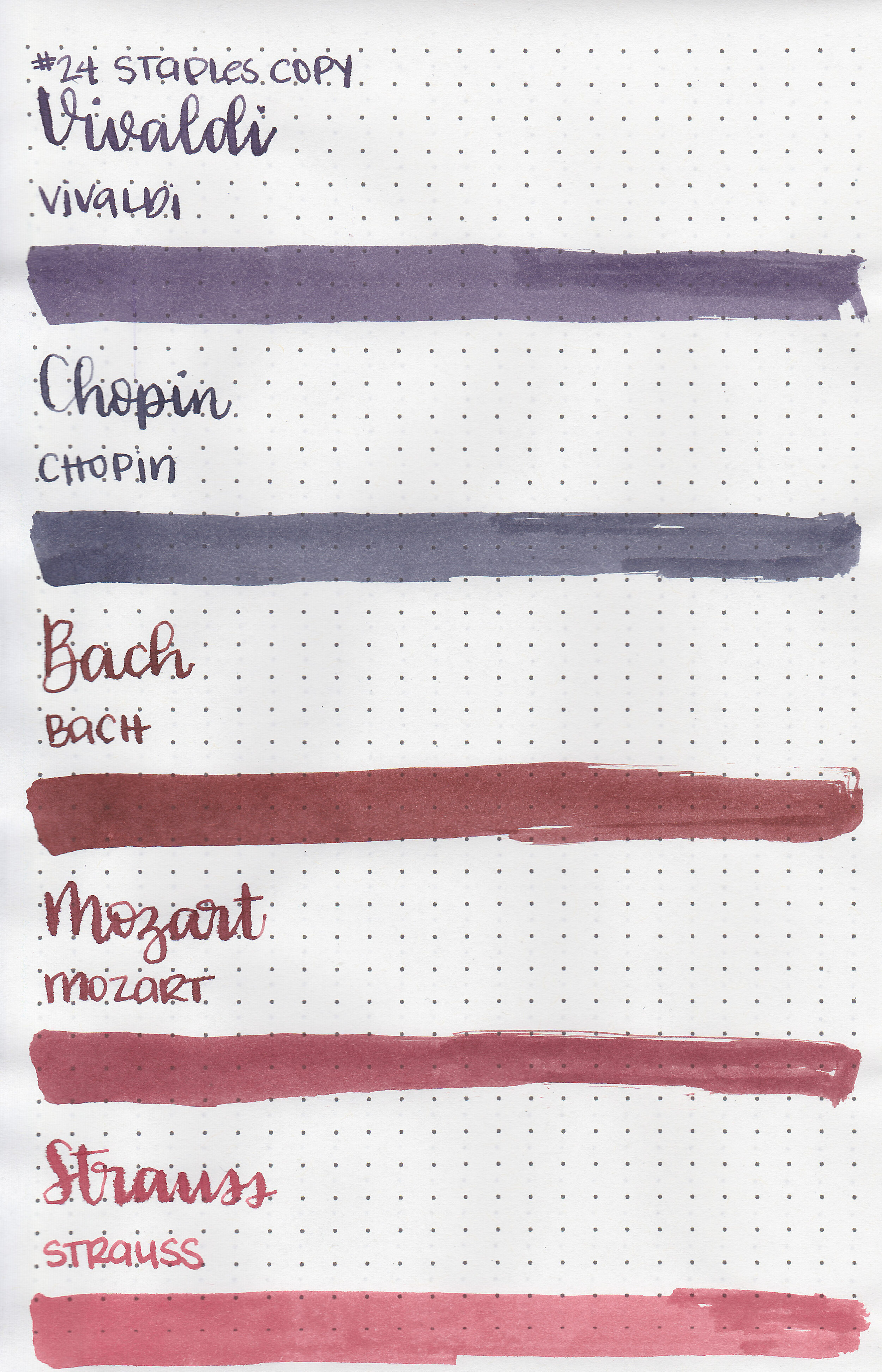
On Staples 24 lb copy paper there was some feathering but no bleeding.
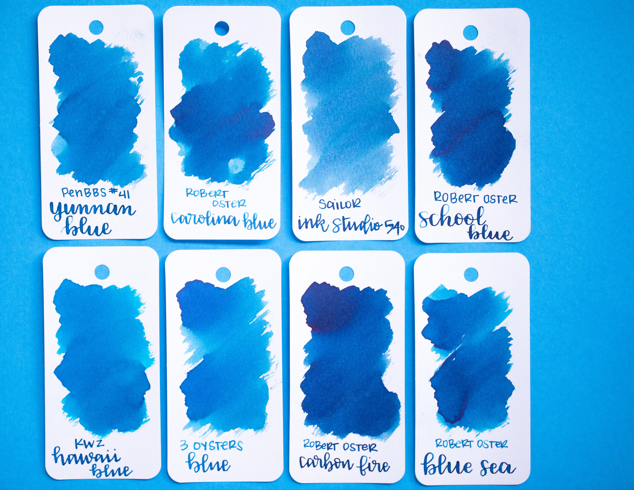
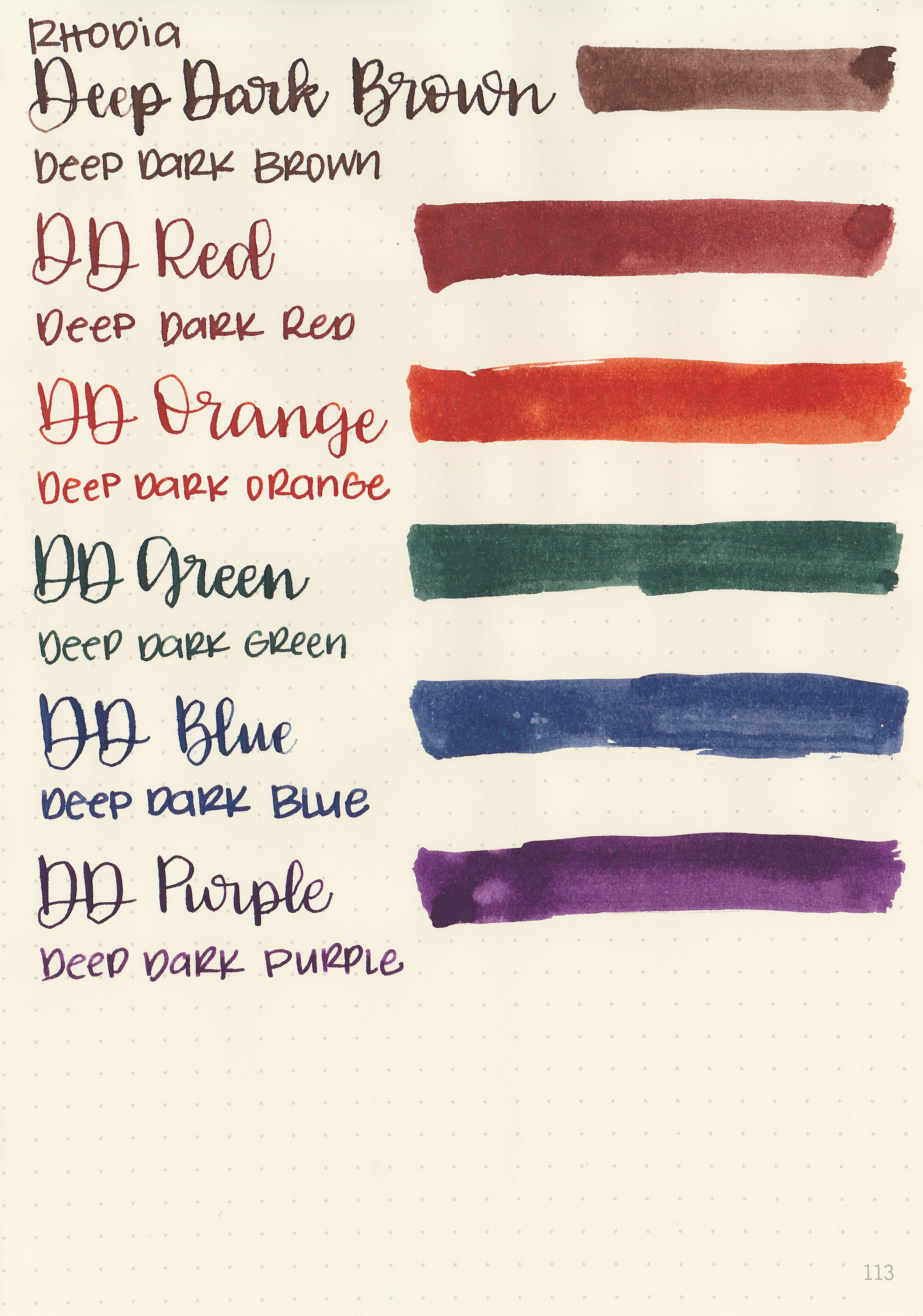
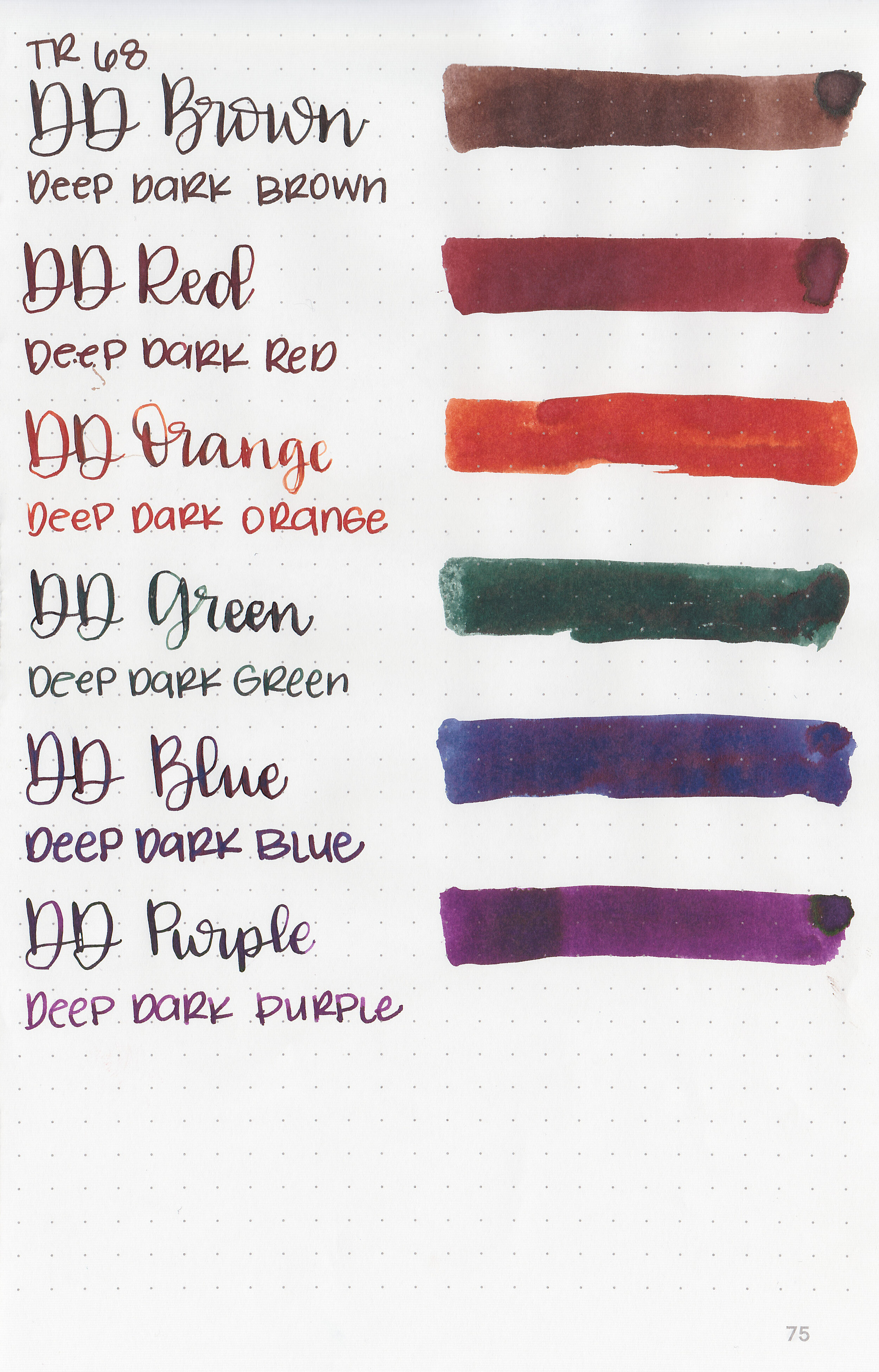
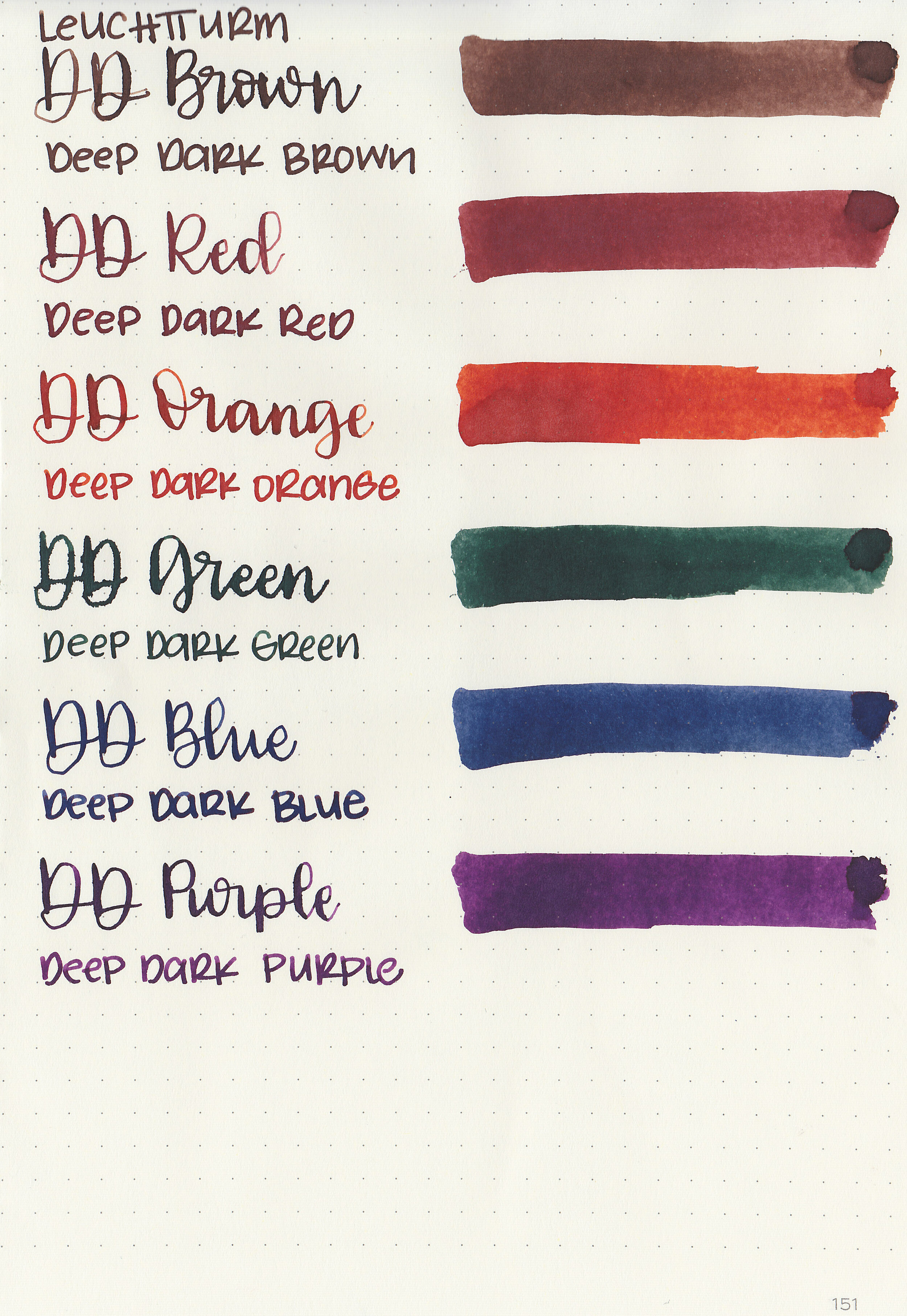
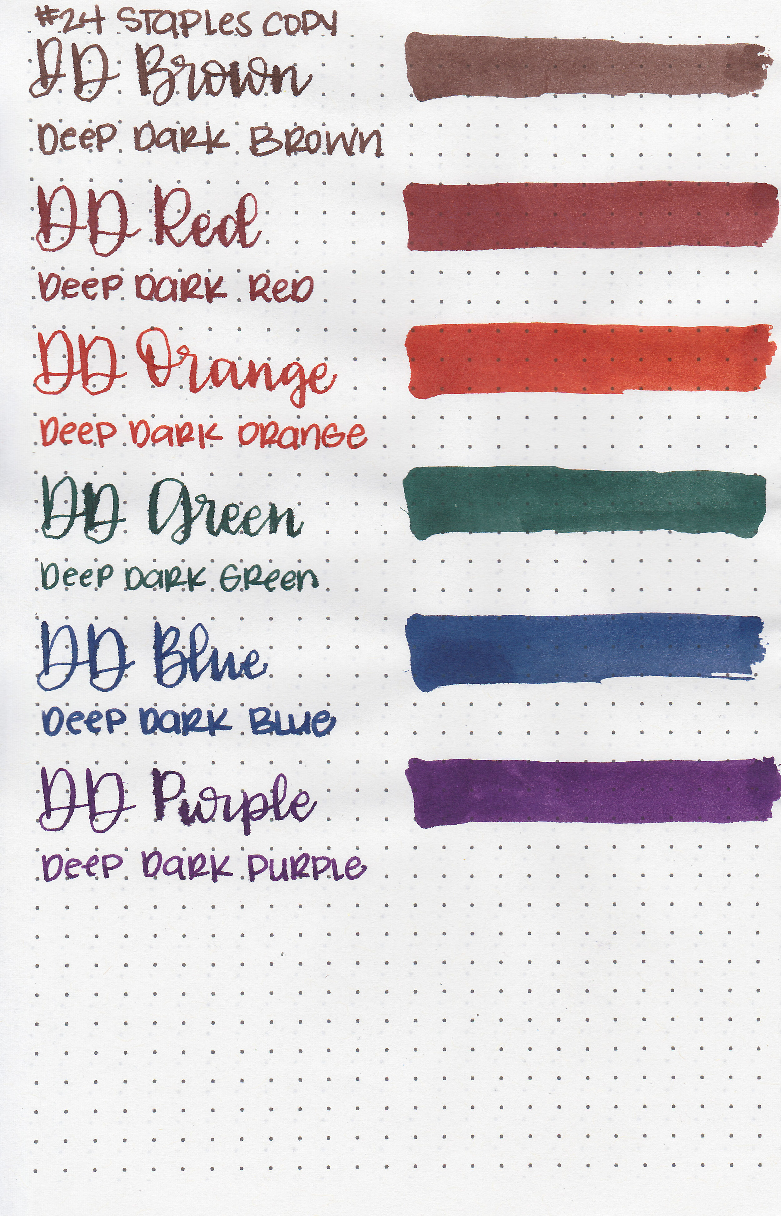
Comparison Swabs:

Hope Pink is just slightly cooler in tone than Diamine Cerise, and a little bit lighter than Sailor Ink Studio 431. Click here to see the Diamine inks together, and click here to see the pink inks together.
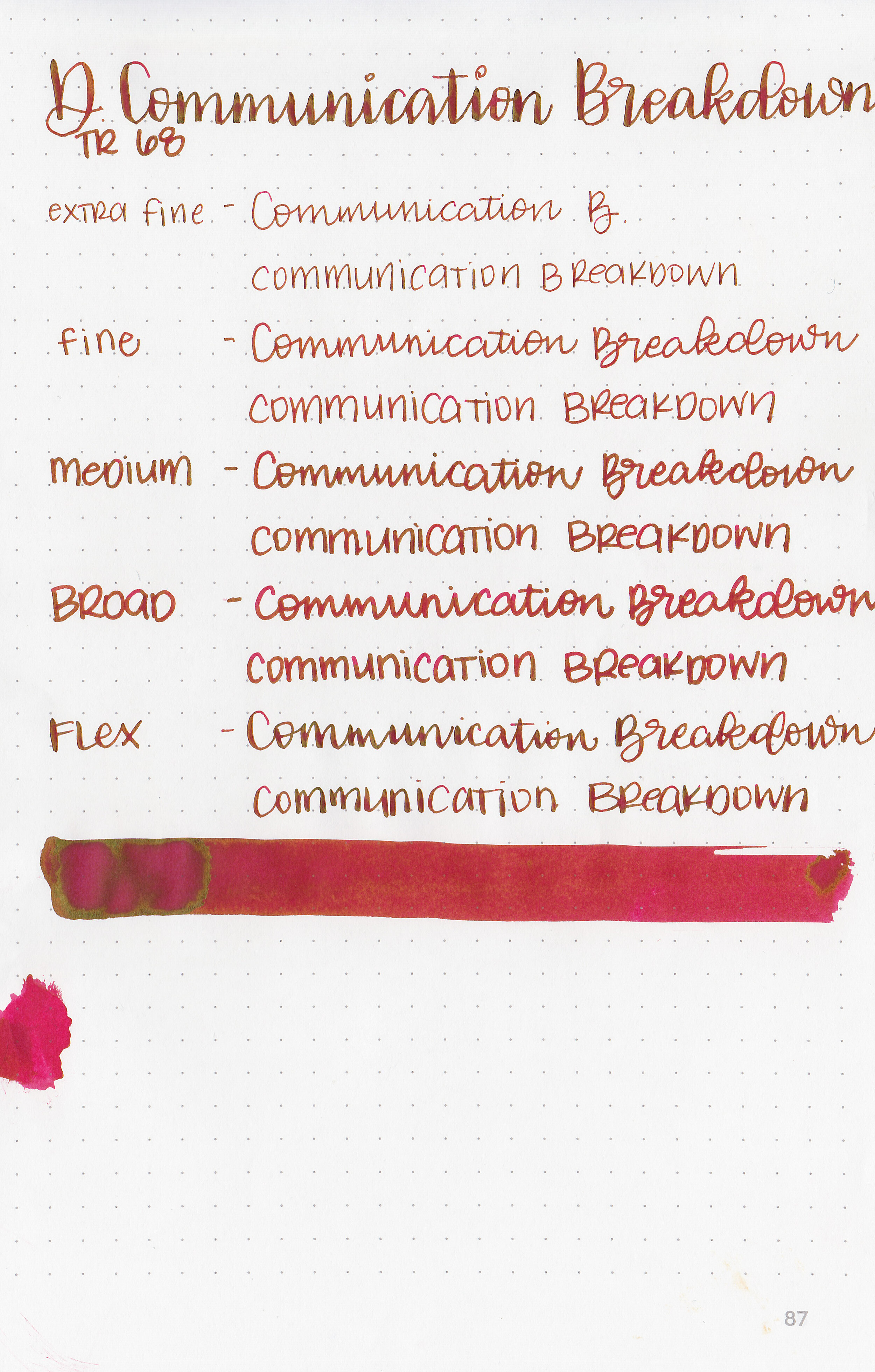
Longer writing:

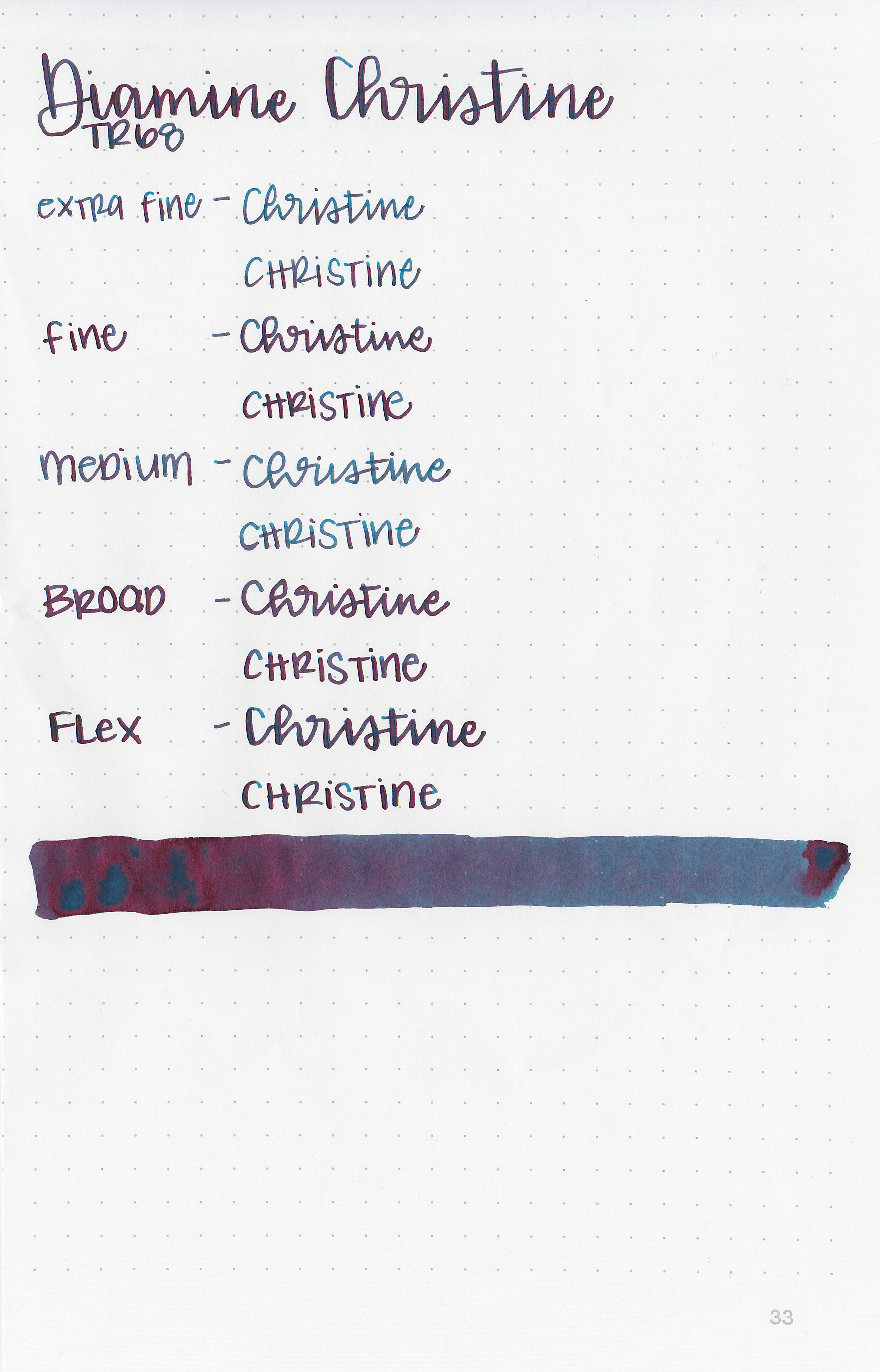
I used a Franklin-Christoph 45L in Italian Ice with a medium nib on a Lochby A5 blank Refill-Tomoe River 68gsm. The ink had a slightly dry flow.
Overall, it’s a good standard pink, especially for the price, but I prefer Diamine Cerise over Hope Pink. Both are similar but Hope Pink is just a little bit cooler toned.
Disclaimer: I purchased this product myself, and all photos and opinions are my own. This page does not contain affiliate links, and this post is not sponsored in any way.