Ink Review #985: Diamine Monboddo's Hat

d-monboddos-hat-4.jpg

This year the Fountain Pens UK Facebook group teamed up with Diamine to create two new purples: Monboddo’s Hat and Scribble Purple. Today we are taking a look at Monboddo’s Hat. Thanks to Vanness Pens for sending a sample over for review.

d-monboddos-hat-3.jpg

The color:

Monboddo’s Hat is a medium purple with a slight red undertone.

Swabs:

d-monboddos-hat-5.jpg

In large swabs on Tomoe River paper the ink shows just a little bit of gold sheen.

d-monboddos-hat-6.jpg

Writing samples:

Let's take a look at how the ink behaves on fountain pen friendly papers: Rhodia, Tomoe River, and Leuchtturm.

Dry time: 15 seconds

Water resistance: Low

Feathering: None

Show through: Medium

Bleeding: None

Other properties: low shading, low sheen, and no shimmer.

On Staples 24 lb copy paper there was some feathering in all nib sizes but just a tiny bit of bleeding.

Comparison Swabs:

d-monboddos-hat-1.jpg

Monboddo’s Hat isn’t as red as Lamy Dark Lilac but has more red in it than Sailor Ink Studio 750. Click here to see the Diamine inks together, and click here to see the purple inks together.

Longer writing:

d-monboddos-hat-2.jpg

I used a Platinum 3776 Nice Lavande with a broad nib on a A5 Yoseka notebook. The ink had an average flow.

Overall, It’s a fun purple. It has less sheen than I expected, but still interesting and dries quickly too.

Disclaimer: A sample of this ink was provided by Vanness Pens for the purpose of this review. All photos and opinions are my own. This page does not contain affiliate links, and this post is not sponsored in any way.

Ferris Wheel Press Charger Set

fwp-charger-set-4.jpg

We are wrapping up this week’s Ferris Wheel Press theme with the Charger Set that includes 5ml sample vials of Candy Marsala, Tanzanite Sky and Bluegrass Velvet. Thanks to Vanness Pens for providing samples for review. You can purchase these inks in the charger set, or as individual bottles: Candy Marsala, Tanzanite Sky and Bluegrass Velvet.

Swabs:

fwp-charger-set-s-1.jpg

Left to right: Candy Marsala, Tanzanite Sky and Bluegrass Velvet.

Writing samples:

Let's take a look at how the ink behaves on fountain pen friendly papers: Rhodia, Tomoe River, and Leuchtturm.

Water resistance: Low

Feathering: Low-there was some feathering on Rhodia.

Show through: Medium

Bleeding: Low-there was some bleeding on Rhodia and Leuchtturm.

Other properties: medium shadingsome sheen, and no shimmer. Only Tanzanite Sky showed any sheen-and then only on Tomoe River paper in large nib sizes.

On Staples 24 lb copy paper there was lots of feathering in every nib size as well as a little bleeding.

Comparison Swabs:

fwp-charger-set-s-2.jpg

Swabs:

Candy Marsala is a little less saturated than Monteverde Cherry Danish. Tanzanite Sky is similar to Robert Oster Dragon’s Night. Bluegrass Velvet is similar to both Lamy Amazonite and Monteverde Iced Cookie.

fwp-charger-set-s-3.jpg

I used an A5 Yoseka notebook. All of the inks had an average flow.

Overall, while generally well behaved, I find Candy Marsala a bit too unsaturated. I enjoy both Tanzanite Sky and Bluegrass Velvet, but both are very similar to inks I already have.

Disclaimer: These samples were provided by Vanness Pens for the purpose of this review. All photos and opinions are my own. This page does not contain affiliate links, and is not sponsored in any way.

Ink Review #981: Ferris Wheel Press Grape Ice Pop

fwp-grape-ice-pop-2.jpg

Today’s ink is Ferris Wheel Press Grape Ice Pop. Thanks to Vanness Pens for sending a sample over for review.

fwp-grape-ice-pop-1.jpg

The color:

Grape Ice Pop is a dark purple with a red undertone.

Swabs:

fwp-grape-ice-pop-3.jpg

In large swabs on Tomoe River paper the ink looks more straight purple, less red.

fwp-grape-ice-pop-4.jpg

Writing samples:

Let's take a look at how the ink behaves on fountain pen friendly papers: Rhodia, Tomoe River, and Leuchtturm.

Dry time: 20 seconds

Water resistance: Low

Feathering: None

Show through: Medium

Bleeding: None

Other properties: medium shading, no sheen, and no shimmer.

On Staples 24 lb copy paper there was some feathering in all nib sizes but just a tiny bit of bleeding.

Comparison Swabs:

fwp-grape-ice-pop-s-1.jpg

Grape Ice Pop is a little less vibrant than Diamine Purple Dream but more vibrant than Robert Oster Berry d’Arche. Click here to see the Ferris Wheel Press inks together, and click here to see the purple inks together.

Longer writing:

fwp-grape-ice-pop-s-2.jpg

I used a Pelikan M600 Violet with a fine nib on a A5 Yoseka notebook. The ink had an average flow.

Overall, I enjoyed this ink. It’s well behaved, a lovely color, and even has a bit of shading.

Disclaimer: A sample of this ink was provided by Vanness Pens for the purpose of this review. All photos and opinions are my own. This page does not contain affiliate links, and this post is not sponsored in any way.

Ink Review #980: Ferris Wheel Press Jelly Bean Blue

fwp-jelly-bean-blue-2.jpg

We are continuing on with Ferris Wheel Press inks, today’s is Jelly Bean Blue. Thanks to Vanness Pens for sending a sample over for review.

fwp-jelly-bean-blue-1.jpg

The color:

Jelly Bean Blue is a vibrant medium blue.

Swabs:

fwp-jelly-bean-blue-3.jpg

In large swabs on Tomoe River paper the ink looks lighter, with some red sheen.

fwp-jelly-bean-blue-4.jpg

Writing samples:

Let's take a look at how the ink behaves on fountain pen friendly papers: Rhodia, Tomoe River, and Leuchtturm.

Dry time: 15 seconds

Water resistance: Low

Feathering: Low-there was some feathering on Rhodia.

Show through: Medium

Bleeding: Low

Other properties: medium shading, low sheen, and no shimmer.

On Staples 24 lb copy paper there was some feathering in all nib sizes but just a tiny bit of bleeding.

Comparison Swabs:

fwp-jelly-bean-blue-s-2.jpg

Jelly Bean Blue is similar to Parker Penman Sapphire. Click here to see the Ferris Wheel Press inks together, and click here to see the blue inks together.

Longer writing:

fwp-jelly-bean-blue-s-1.jpg

I used a Pelikan M805 Vibrant Blue with a broad nib on an A5 Yoseka notebook. The ink had an average flow. Since we finished up The Hobbit yesterday, today I started on The Fellowship of the Ring.

Overall, this ink is generally well behaved except for some slight feathering and bleeding on Rhodia. It’s a beautiful match for the Pelikan M805 Vibrant Blue.

Disclaimer: A sample of this ink was provided by Vanness Pens for the purpose of this review. All photos and opinions are my own. This page does not contain affiliate links, and this post is not sponsored in any way.

Ink Review #979: Ferris Wheel Press Peppermint Drop

fwp-peppermint-drop-2.jpg

This week we are playing with Ferris Wheel Press inks, today’s is Peppermint Drop. Thanks to Vanness Pens for sending a sample over for review!

fwp-peppermint-drop-1.jpg

The color:

Peppermint Drop is a medium green with some red sheen.

Swabs:

fwp-peppermint-drop-3.jpg

In large swabs on Tomoe River paper the ink looks darker, with more sheen.

fwp-peppermint-drop-4.jpg

Writing samples:

Let's take a look at how the ink behaves on fountain pen friendly papers: Rhodia, Tomoe River, and Leuchtturm.

Dry time: 15 seconds

Water resistance: Low

Feathering: Low-there was some feathering on Rhodia.

Show through: Medium

Bleeding: Low

Other properties: medium shading, high sheen, and no shimmer.

On Staples 24 lb copy paper there was some feathering in all nib sizes but just a tiny bit of bleeding.

Comparison Swabs:

fwp-peppermint-drop-s-1.jpg

Peppermint Drop is very similar to Robert Oster Peppermint, and is close to Diamine November Rain, with less sheen. Click here to see the green inks together.

Longer writing:

fwp-peppermint-drop-s-2.jpg

I used a Lamy Safari Petrol with a medium nib on a Lochby A5 blank Refill-Tomoe River 68gsm. The ink had an average flow. We’ve finally reached the end of The Hobbit by JRR Tolkien. It lasted through almost 1,000 ink reviews.

Overall, this ink is a take-it or leave-it for me. It has a bit more feathering and bleeding on Rhodia than I’d like, and I have some good inks this color already like Robert Oster Peppermint.

Disclaimer: A sample of this ink was provided by Vanness Pens for the purpose of this review. All photos and opinions are my own. This page does not contain affiliate links, and this post is not sponsored in any way.

Ink Review #978: Ferris Wheel Press Buttered Popcorn

fwp-buttered-popcorn-2.jpg

I’ve been waiting for a US retailer to start carrying Ferris Wheel Press inks, especially because I get a lot of requests for them lately. Vanness Pens now carries the full line, and was very kind to send me some to try out! Let’s start with Ferris Wheel Press Buttered Popcorn.

fwp-buttered-popcorn-1.jpg

The color:

Buttered Popcorn is the color of movie theater butter. It’s a vibrant yellow-orange. The ink looks a bit lighter when wet, and darkens a bit as it dries.

Swabs:

fwp-buttered-popcorn-3.jpg

In large swabs on Tomoe River paper the ink looks more orange than yellow.

fwp-buttered-popcorn-4.jpg

Writing samples:

Let's take a look at how the ink behaves on fountain pen friendly papers: Rhodia, Tomoe River, and Leuchtturm.

Dry time: 15 seconds

Water resistance: Low

Feathering: None

Show through: Medium

Bleeding: None

Other properties: low shading, no sheen, and no shimmer.

On Staples 24 lb copy paper there was some feathering in all nib sizes but just a tiny bit of bleeding.

Comparison Swabs:

fwp-buttered-popcorn-s-1.jpg

Buttered Popcorn is similar to Robert Oster Yellow Sunset and Diamine Amber. Click here to see the yellow inks together.

Longer writing:

fwp-buttered-popcorn-s-2.jpg

I used a Pelikan M600 Vibrant Orange with a medium nib on a Lochby A5 blank Refill-Tomoe River 68gsm. The ink had an average flow.

Overall, I like this ink. It’s hard to get yellow inks just right-not orange but dark enough to read easily. This one performs well, easy to read in all nib sizes, and well behaved.

Disclaimer: A sample of this ink was provided by Vanness Pens for the purpose of this review. All photos and opinions are my own. This page does not contain affiliate links, and this post is not sponsored in any way.

3 Oysters DIY My Color Kit

3o-my-color-s-20.jpg

3 Oysters recently sent me their new DIY My Color kit to try out, so I’ve been having fun all week coming up with different ways to use it.

3o-my-color-s-12.jpg

The kit comes in a useful silver tin, packaged well. The kit includes:

  • 10-5ml bottles of ink

  • 2-5ml bottles of ink toner

  • 1 glass pen-mine is green

  • 2-5ml beakers

  • 1-5ml empty glass bottle with eyedropper top

  • Instruction book

  • 4 coloring postcards

3o-my-color-s-22.jpg

The instructions show how to mix inks, how to create lighter and darker colors, and a sample chart of possible colors. You can see this chart re-created below.

Swabs:

3o-my-color-s-11.jpg

Left to right: Black, Brown, Red, Magenta, Orange, Yellow, Green, Emerald, Cyan and Violet.

Writing samples:

Let's take a look at how the ink behaves on fountain pen friendly papers: Rhodia, Tomoe River, and Leuchtturm.

Water resistance: Low

Feathering: None

Show through: Medium

Bleeding: Low-there is just a little bit of bleeding, mainly in the swabs and the Violet color.

Other properties: low shadingtiny to no sheen, and no shimmer. Violet shows some green sheen, Black shows some grey sheen and Cyan shows some pink sheen. I was only able to see the sheen in large swabs on Tomoe River paper, but none in writing.

On Staples 24 lb copy paper there was lots of feathering in every nib size as well as bleeding, so I would not recommend these inks for cheap paper.

Comparison Swabs:

For these comparisons, I wanted to show some alternatives, as well as coming up with a set of inks you could create yourself from one brand to get a similar mixing kit. Since I have a lot of Diamine inks, and they generally mix safely, I made sure I showed a Diamine alternative for each color.

3o-my-color-s-1.jpg

Black is similar to Sailor Jentle Black, although they are not an exact match-the Sailor ink has a cooler tone, as does Diamine Jet Black.

3o-my-color-s-2.jpg

Brown is similar to SBRE Brown, Diamine Ochre is a bit less orange than 3O Brown.

3o-my-color-s-3.jpg

Red is similar to another 3 Oysters ink I have already reviewed-Chili Red, but Diamine Tulip is another alternative.

3o-my-color-s-4.jpg

Magenta is similar to Monteverde Garnet, Robert Oster Hot Pink and Diamine Claret.

3o-my-color-s-5.jpg

Orange is similar to Diamine Blaze Orange, Montblanc Lucky Orange and Sailor Jentle Apricot.

3o-my-color-s-6.jpg

Yellow is similar to Diamine Sunshine Yellow, Pilot Iroshizuku Daikokuten and Private Reserve Buttercup.

3o-my-color-s-7.jpg

Green is closest to Colorverse Supernatural, but Diamine Meadow is another close alternative.

3o-my-color-s-8.jpg

Emerald is almost an exact match for 3 Oysters Aqua Green, but is also similar to Colorverse Morning Star and Diamine Steel Blue.

3o-my-color-s-9.jpg

Cyan is almost an exact match for 3 Oysters Blue, but is also similar to Colorverse Supernova, KWZ Hawaii Blue and Diamine Asa Blue.

3o-my-color-s-10.jpg

Violet is similar to Diamine Lavender and warmer than Colorverse Hayabusa and Waterman Tender Purple, but Tender Purple does have a similar green sheen.

3o-my-color-s-16.jpg

I had a lot of fun re-creating the sample chart from the instructions. I simply mixed 50-50 ratios of each of the colors. So many possibilities from 10 basic inks. I did notice that there wasn’t a lot of difference in the mixes with orange and brown. They are pretty close on their own, so their mixes looked pretty similar.

3o-my-color-s-15.jpg

I love that you can create gradients with this kit. I did notice that it takes twice as many toner drops to create the same change one drop of black can make. For example, 4 drops of toner would create a similar difference to 2 drops of black.

3o-my-color-s-18.jpg

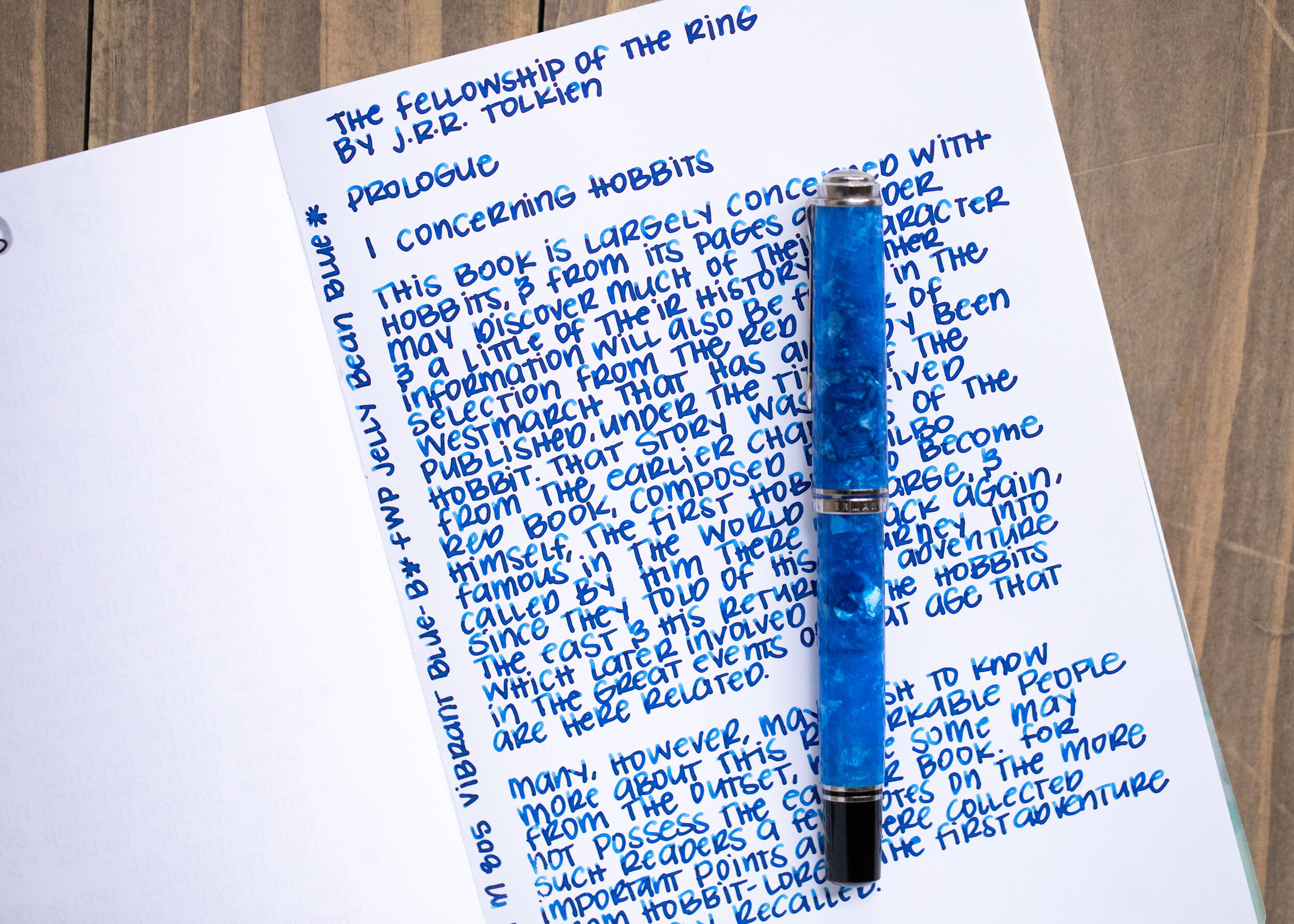
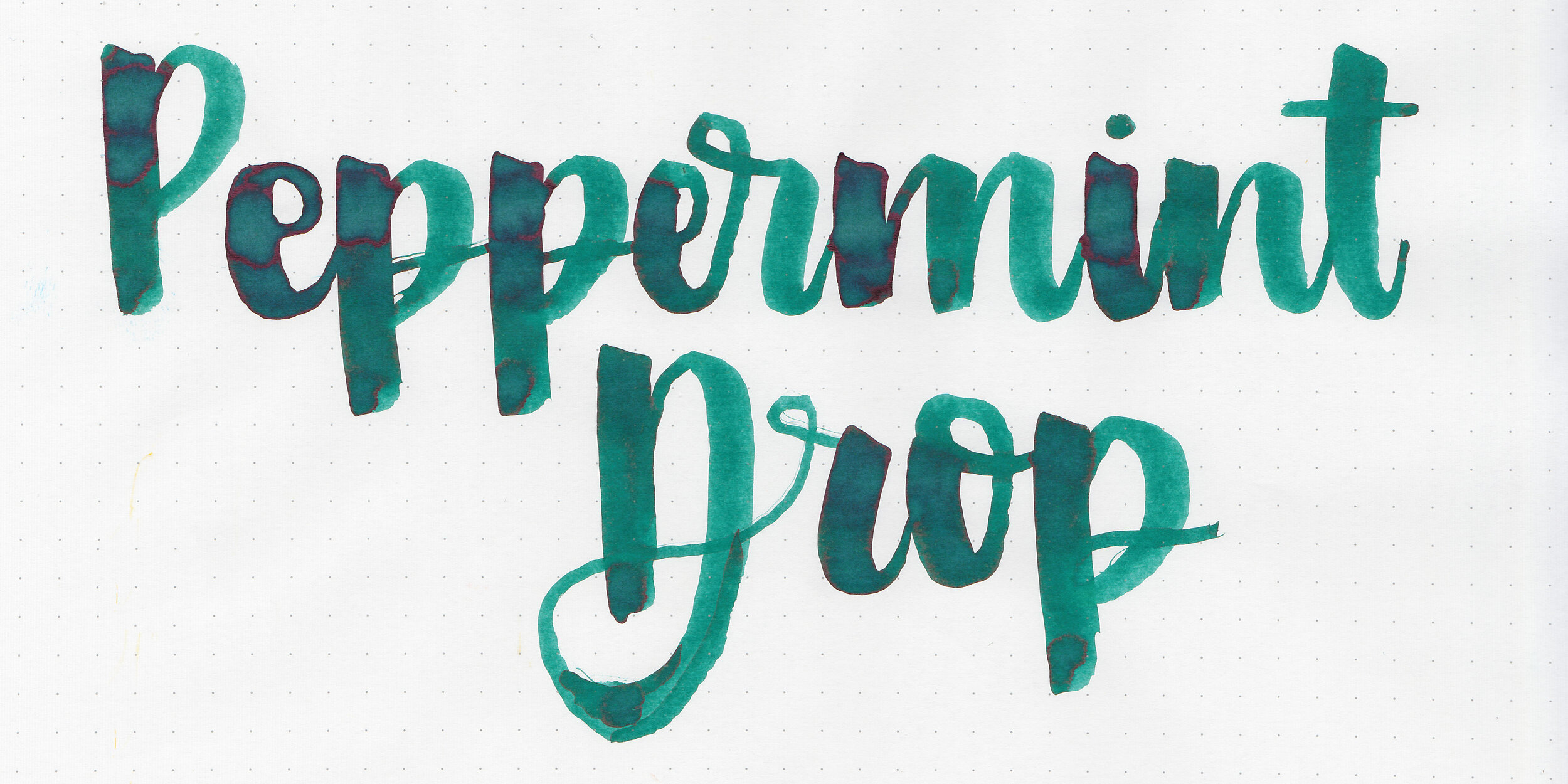
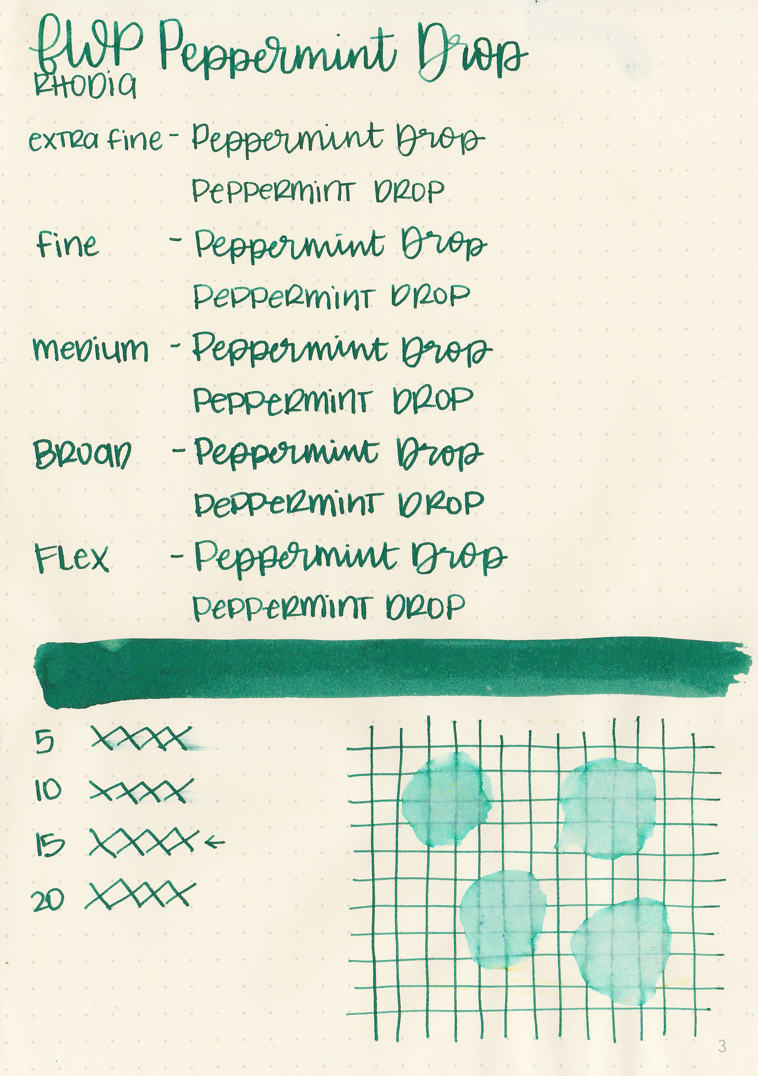
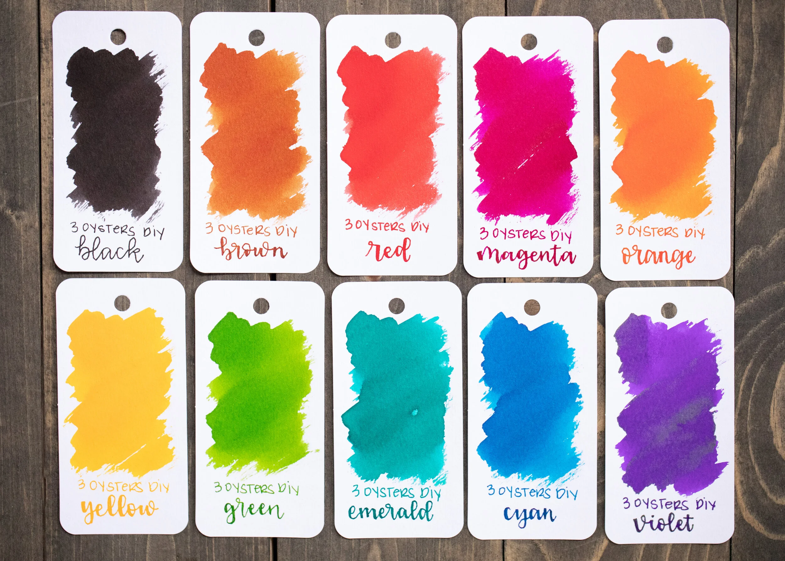
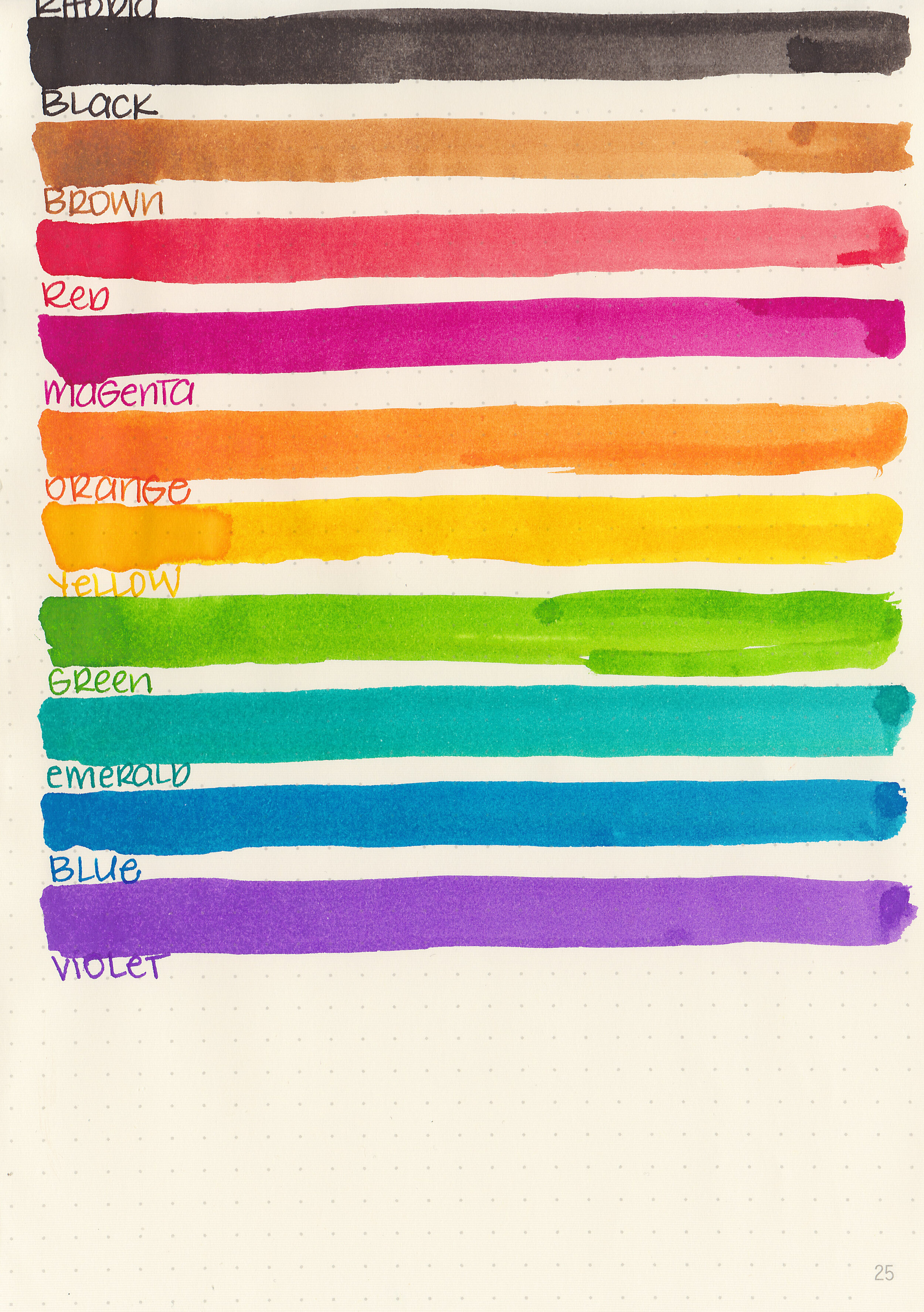
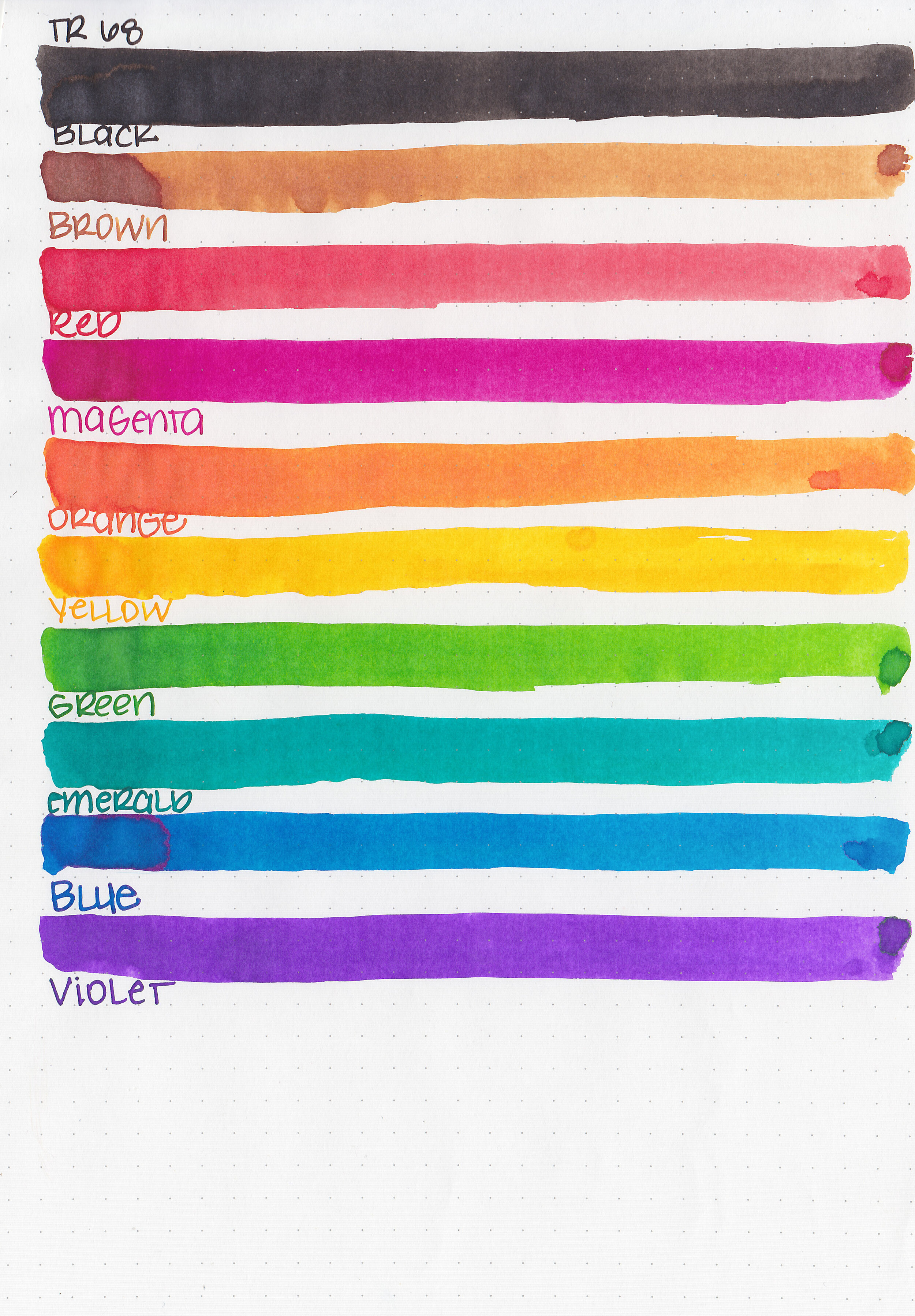
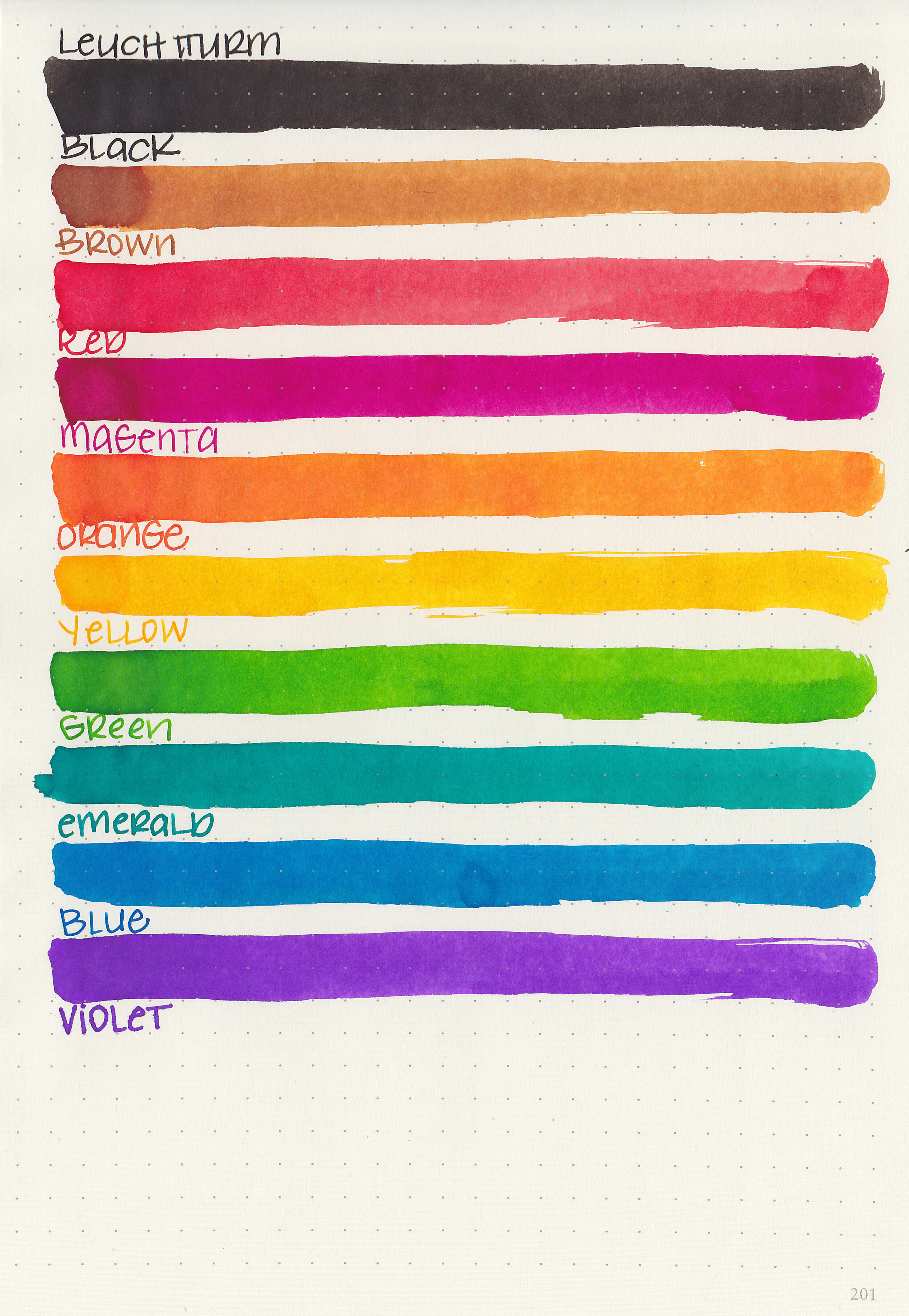
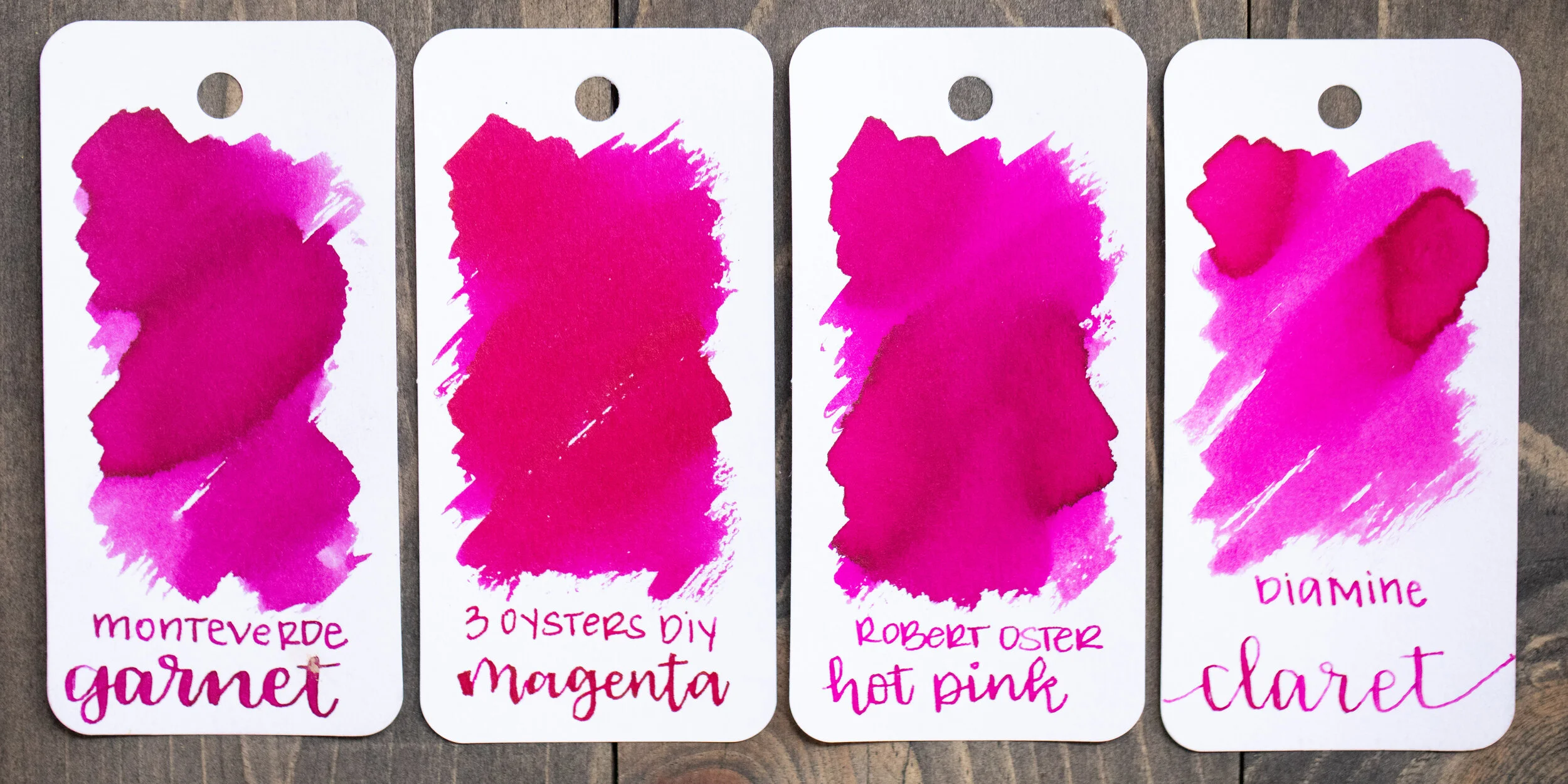
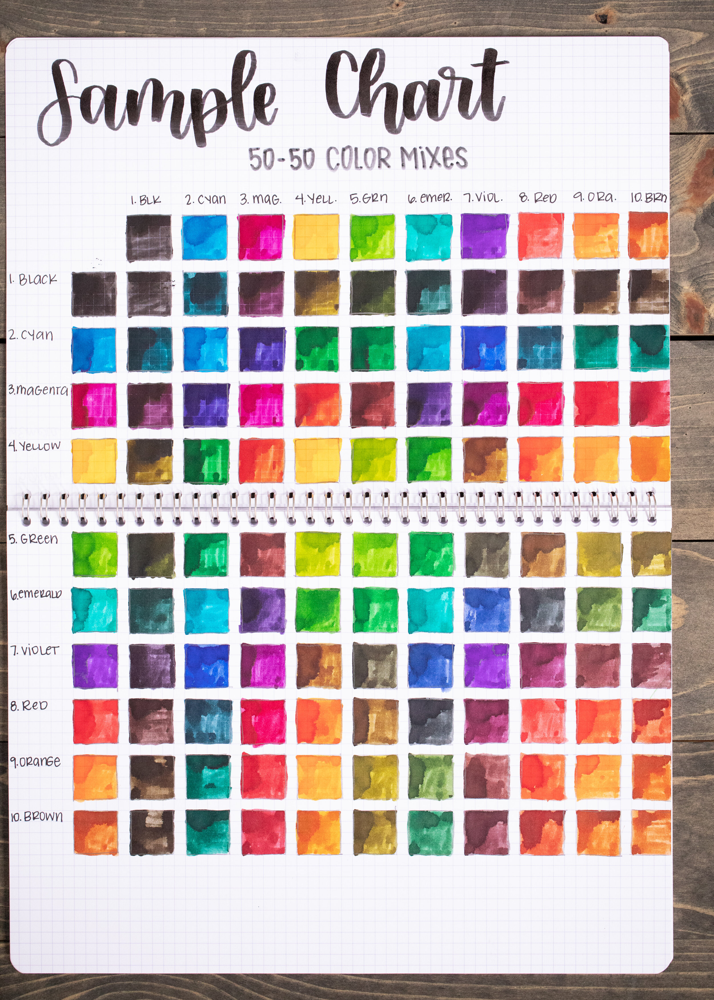
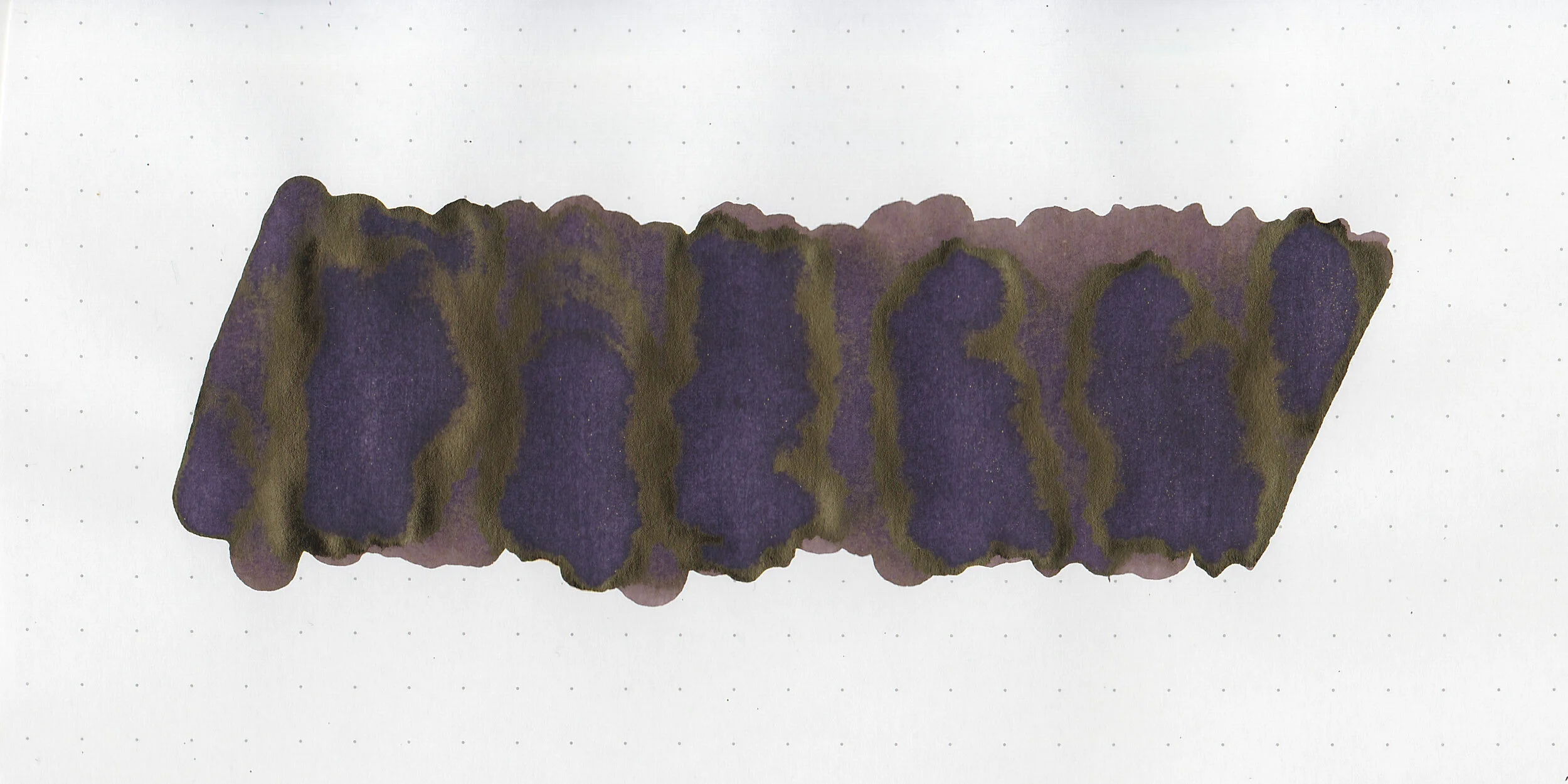
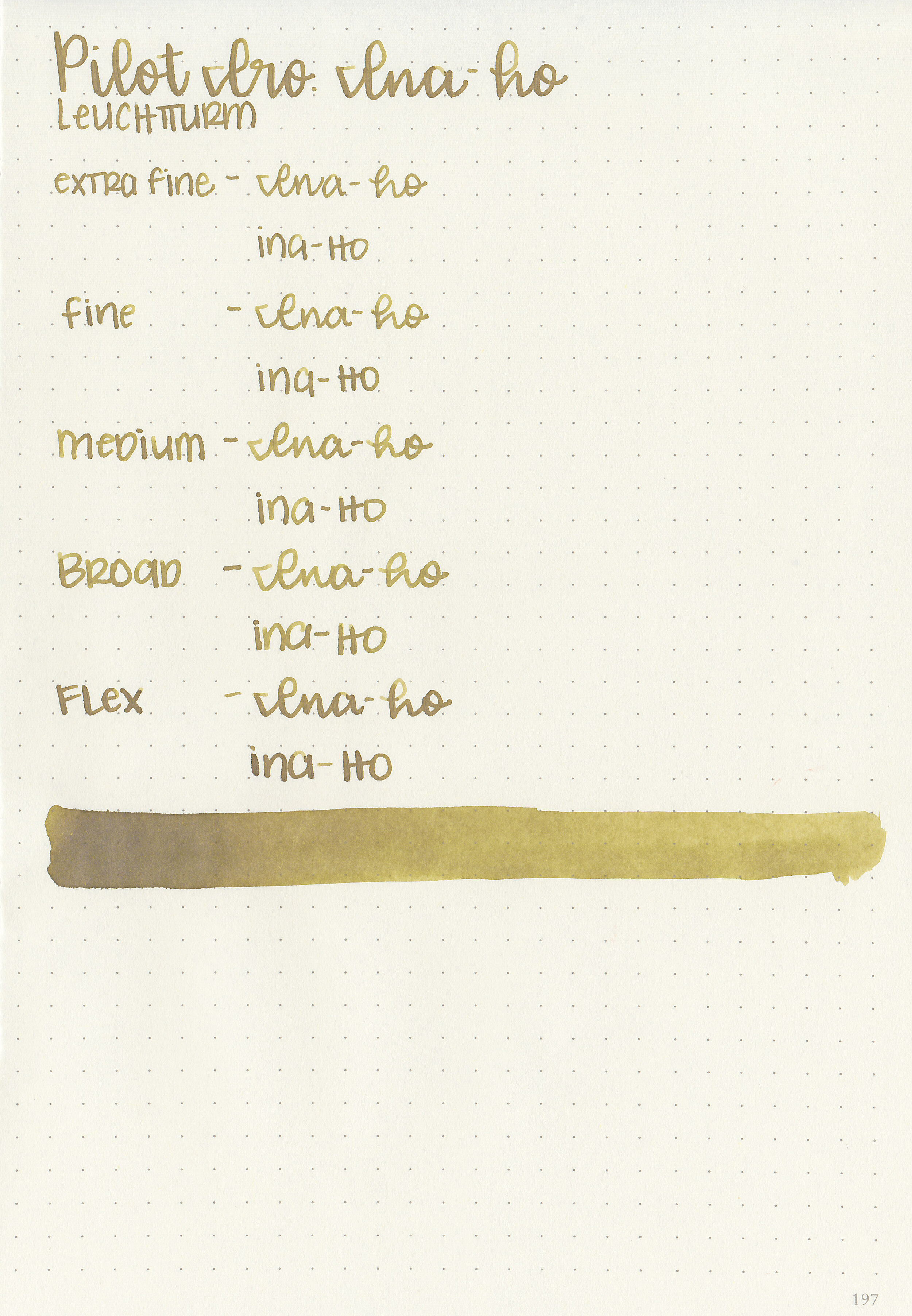
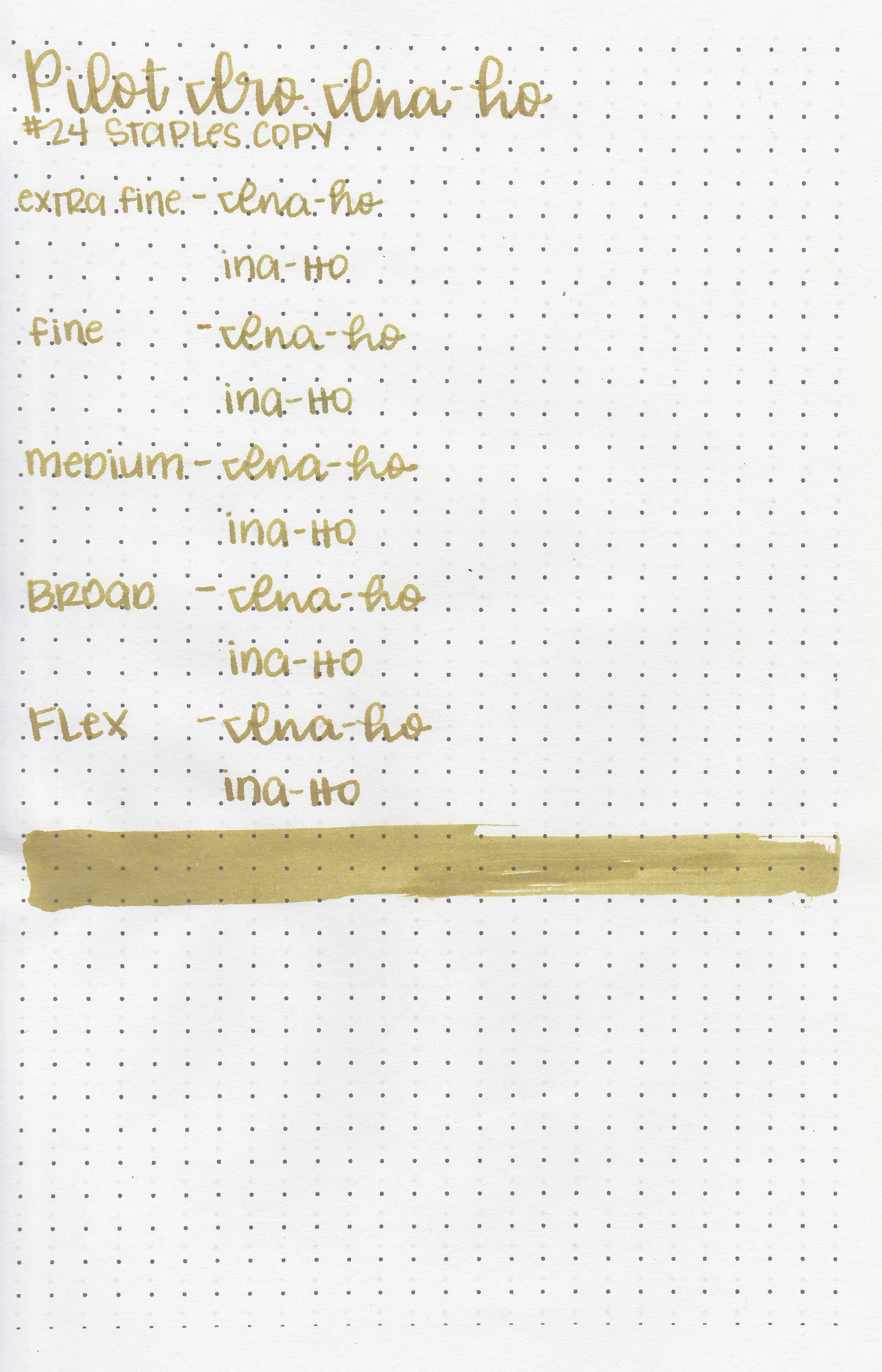
Finally, I made two of my own mixes. What I called Moody Teal is a mix of Emerald, Red and Toner-I picked the name while it was still wet, but it dried to more of a green than teal. It almost reminds me of Robert Oster Sydney Darling Harbour, but darker. Moody Blue is a mix of Red, Cyan and Black. Again, I named it while it was still wet, but it dried to more of a teal. There are so many different colors you could create.

Overall, I really enjoyed this kit, and was impressed by how well thought-out it was. There are so many possibilities. I was sad when I quickly ran out of certain colors (I ran out of Black and Emerald first), so I was excited to find that Cityluxe has the inks for sale individually. UPDATE: I just found out that Vanness Pens (USA) has them in stock and on sale!

Disclaimer: This product was provided by 3 Oysters for the purpose of this review. All photos and opinions are my own. This page does not contain affiliate links, and is not sponsored in any way.

Ink Review #967: Pilot Iroshizuku Yama-guri

pi-ina-ho-4.jpg

I’ve been using a lot of Pilot inks lately but haven’t reviewed them all yet, so today we are looking at Pilot Iroshizuku Yama-guri aka “Wild Chestnut”. I purchased my bottle of ink from Pen Chalet.

pi-yama-guri-1.jpg

The color:

Yama-guri is a medium brown with a purple undertone.

Swabs:

pi-yama-guri-3.jpg

In large swabs on Tomoe River paper the ink looks more purple than black, with some antique gold sheen.

pi-yama-guri-4.jpg

Writing samples:

Let's take a look at how the ink behaves on fountain pen friendly papers: Rhodia, Tomoe River, and Leuchtturm.

Dry time: 15 seconds

Water resistance: Low

Feathering: None

Show through: Medium

Bleeding: None

Other properties: medium shading, low sheen, and no shimmer. The sheen is only visible in the flex nib and swabs on Tomoe River paper.

On Staples 24 lb copy paper there was some feathering in all nib sizes but just a tiny bit of bleeding.

Comparison Swabs:

pi-yama-guri-s-1.jpg

Yama-guri is a bit lighter than Robert Oster Motor Oil and a bit cooler than Diamine Espresso. Click here to see the Pilot Iroshizuku inks together, and click here to see the brown inks together.

Longer writing:

pi-yama-guri-s-2.jpg

I used a Montegrappa Copper Mule with a fine nib on a Lochby A5 blank Refill-Tomoe River 68gsm. The ink had a wet flow.

Overall, I really enjoyed this ink. It has a nice wet flow and some decent shading. It’s a great go-to brown, I think I would use it most in the winter. I did recently find out that the price of these Iroshizuku inks will be going up in January 2020, so if you are considering buying one it’s a great time to do it.

Disclaimer: I purchased this ink myself, and all photos and opinions are my own. This page does contain affiliate links, but this post is not sponsored in any way.

Ink Review #966: Pilot Iroshizuku Ina-ho

pi-ina-ho-4.jpg

Pilot Iroshizuku Ina-ho aka “Grain of Rice” has been on my list to review for a long time. A reader recently sent me a sample for review so let’s try it out. You can purchase this ink at Pen Chalet.

pi-ina-ho-3.jpg

The color:

Ina-ho is a medium yellow-brown with lots of character.

Swabs:

pi-ina-ho-5.jpg

In large swabs on Tomoe River paper the ink looks much darker but still has plenty of shading.

pi-ina-ho-6.jpg

Writing samples:

Let's take a look at how the ink behaves on fountain pen friendly papers: Rhodia, Tomoe River, and Leuchtturm.

Dry time: 15 seconds

Water resistance: Low

Feathering: None

Show through: Medium

Bleeding: None

Other properties: medium shading, no sheen, and no shimmer.

On Staples 24 lb copy paper there was some feathering in all nib sizes but just a tiny bit of bleeding.

Comparison Swabs:

pi-ina-ho-1.jpg

Ina-ho is lighter and more yellow than Robert Oster Khaki and Noodler’s Banker’s Tan. Click here to see the Pilot Iroshizuku inks together, and click here to see the brown inks together.

Longer writing:

pi-ina-ho-2.jpg

I used a Pelikan M200 Gold Marbled with a medium nib on a Lochby A5 blank Refill-Tomoe River 68gsm. The ink had a wet flow.

Overall, I love this ink so much I ordered a full bottle. It has a great color, wonderful wet flow and lots of shading. Pilot does a great job on their Iroshizuku line, and this one is no exception. It’s definitely worth a try!

Disclaimer: I received a sample of this ink from a reader for the purpose of this review. All photos and opinions are my own. This page does contain affiliate links, but this post is not sponsored in any way.