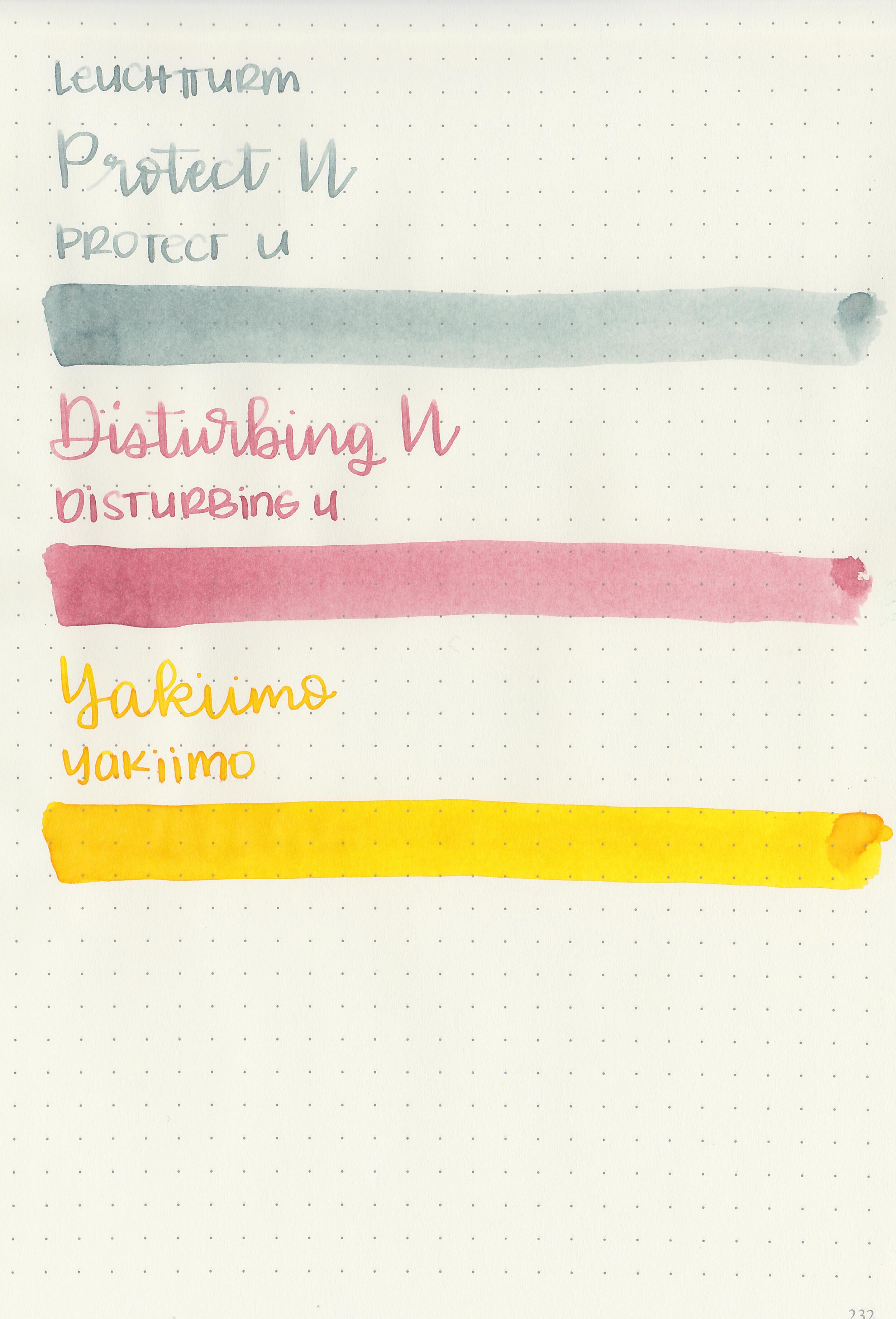
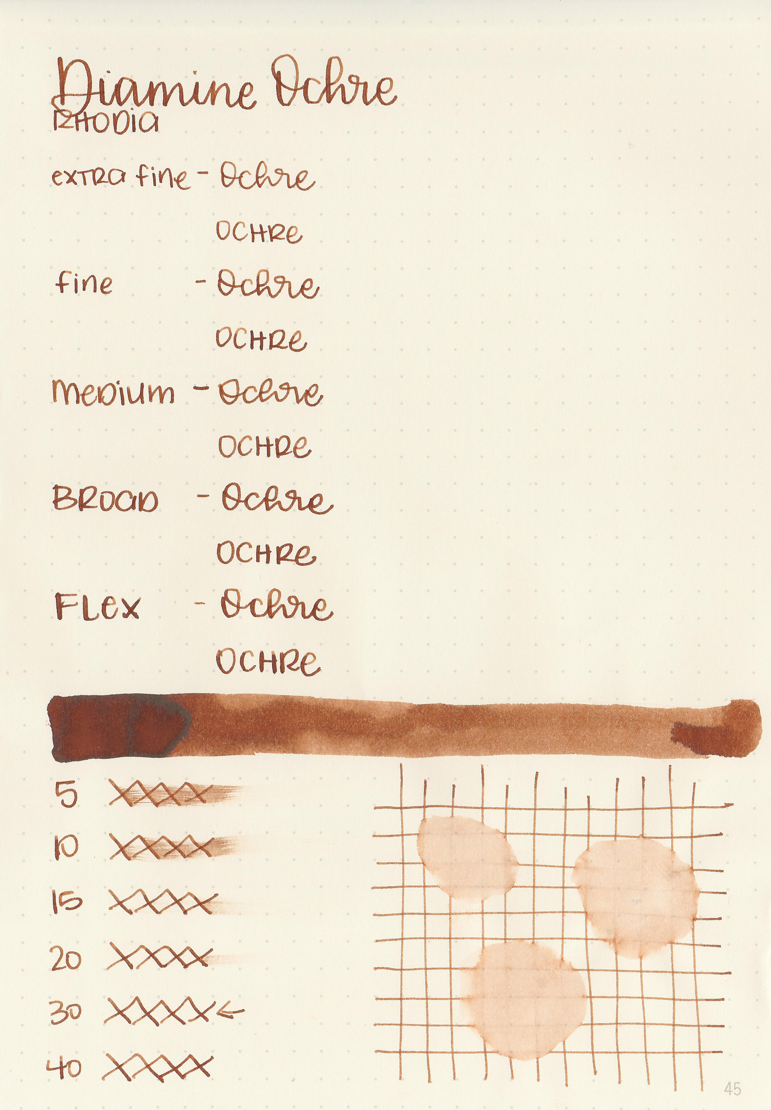
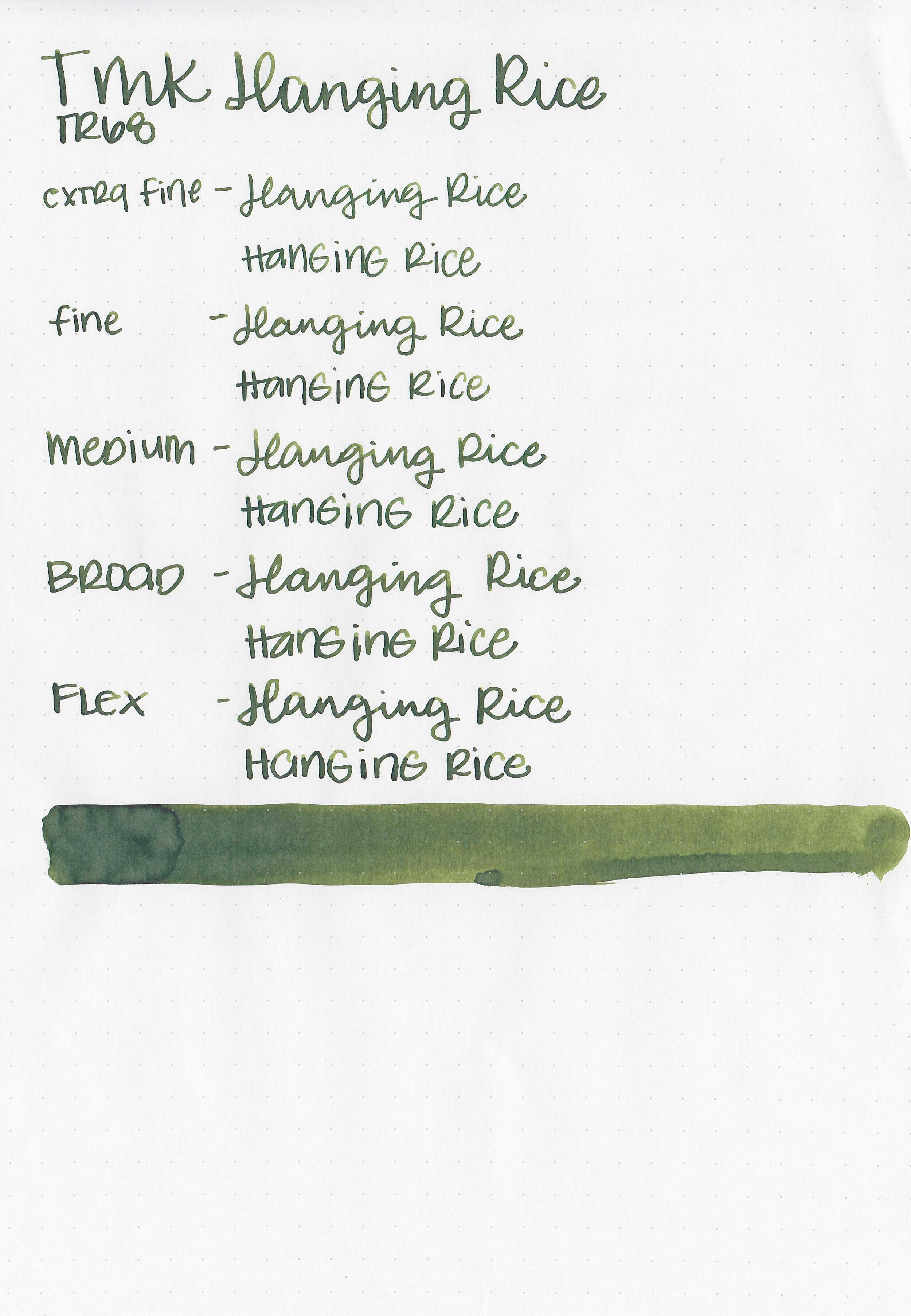
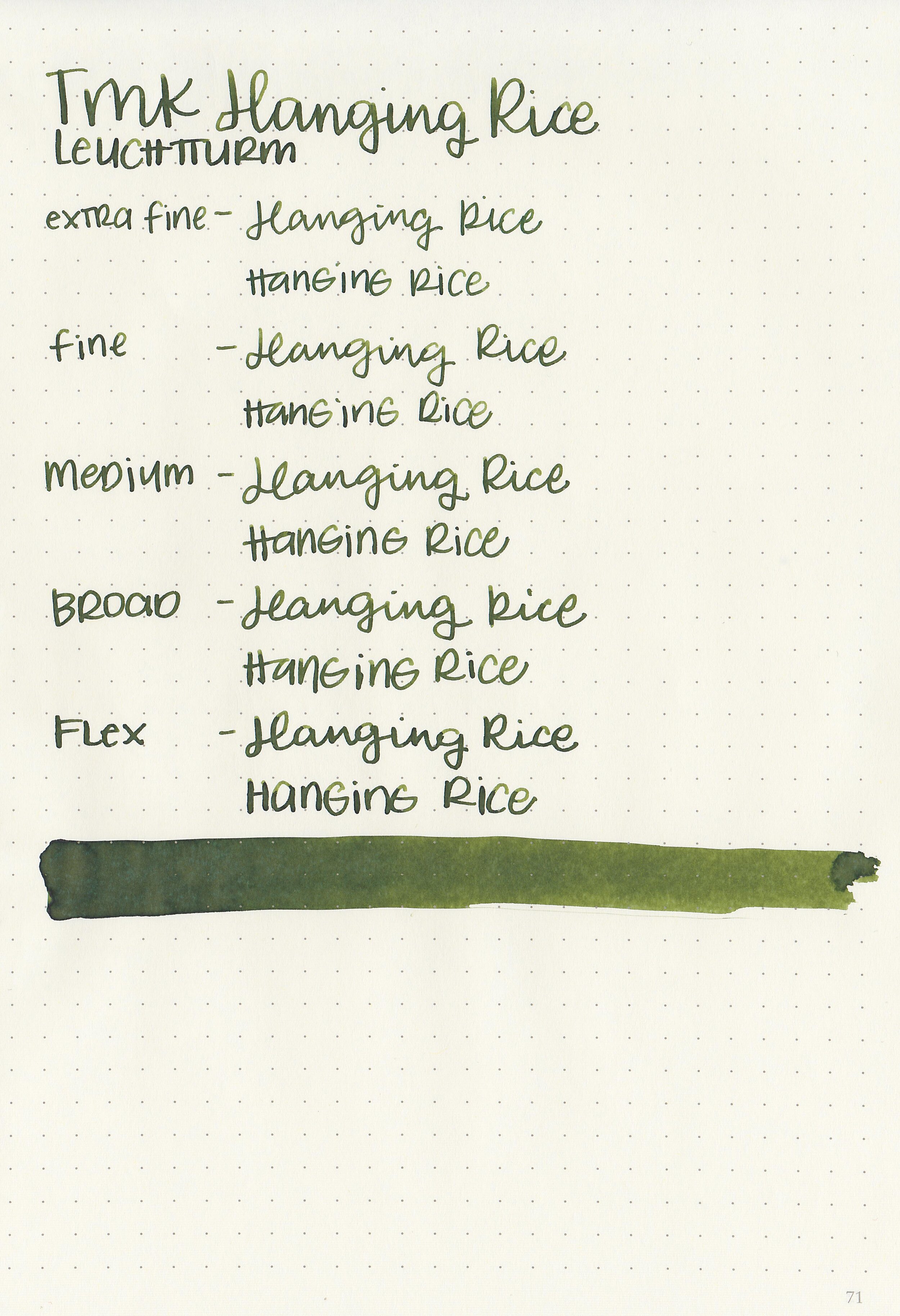
Tono & Lims Star Light Inks
/
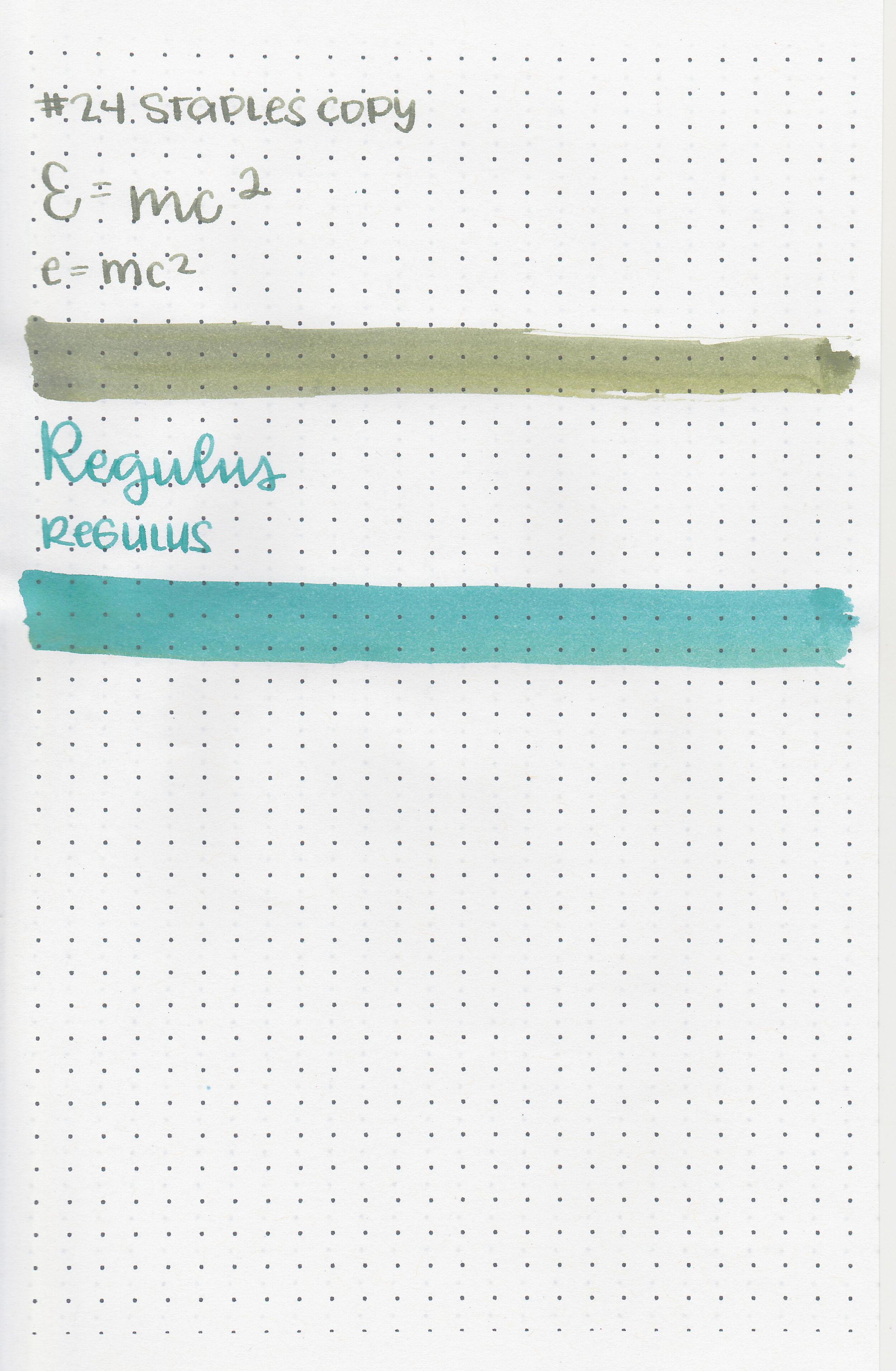
It’s time to take a look at two really interesting inks, Tono & Lims e=mc2 and Regulus from the Star Light collection. Thanks to Shigure Inks for sending samples over for review!
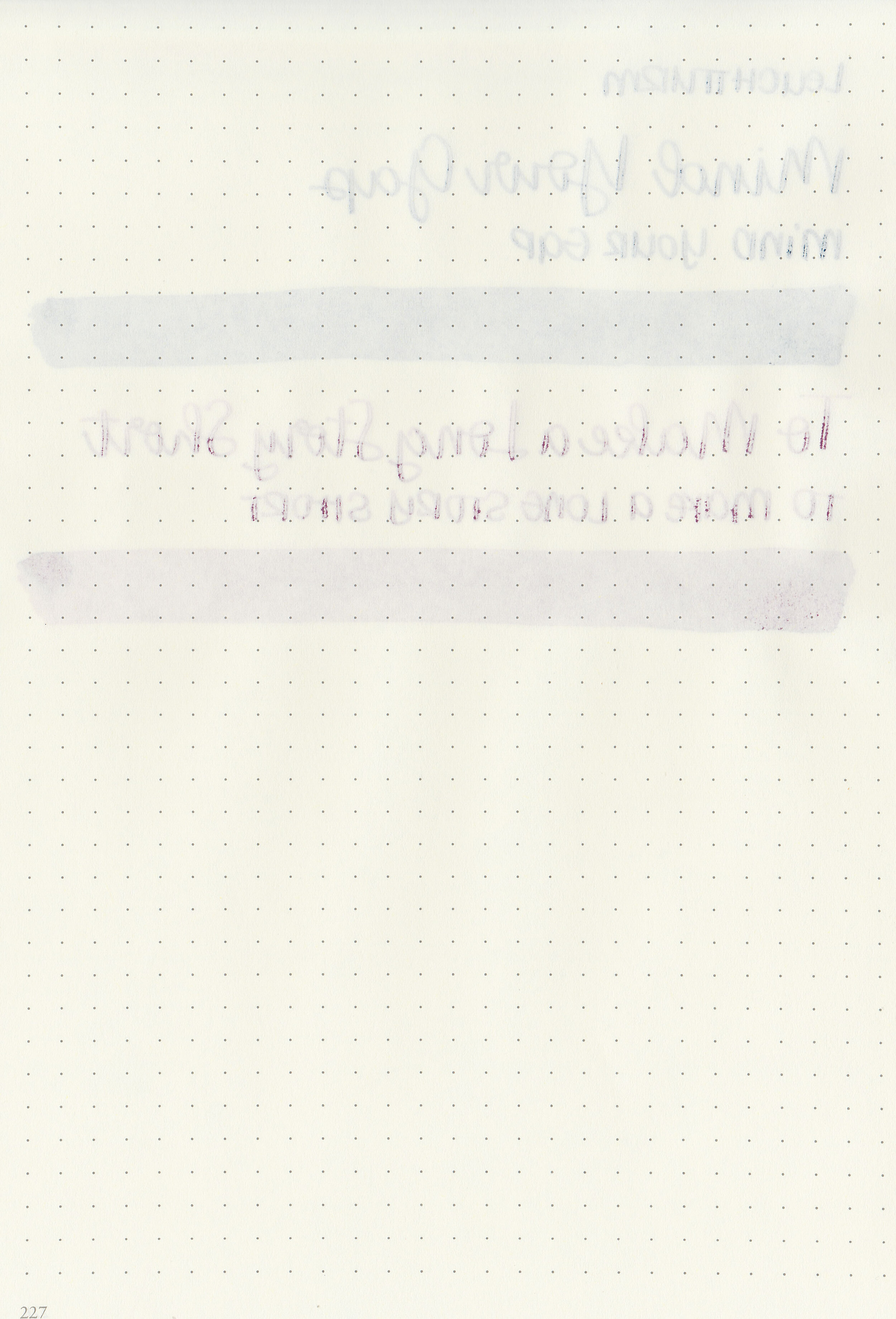
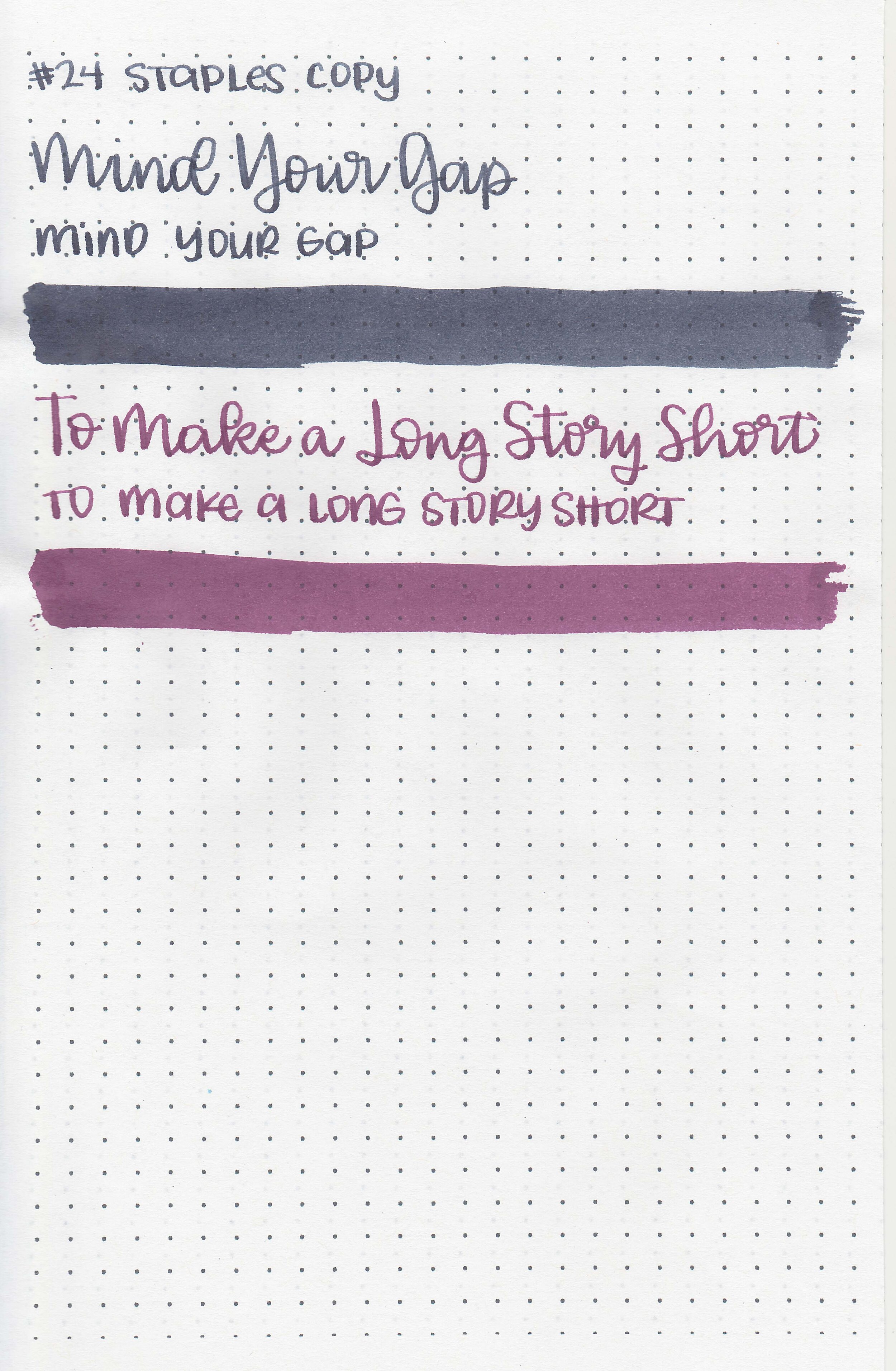
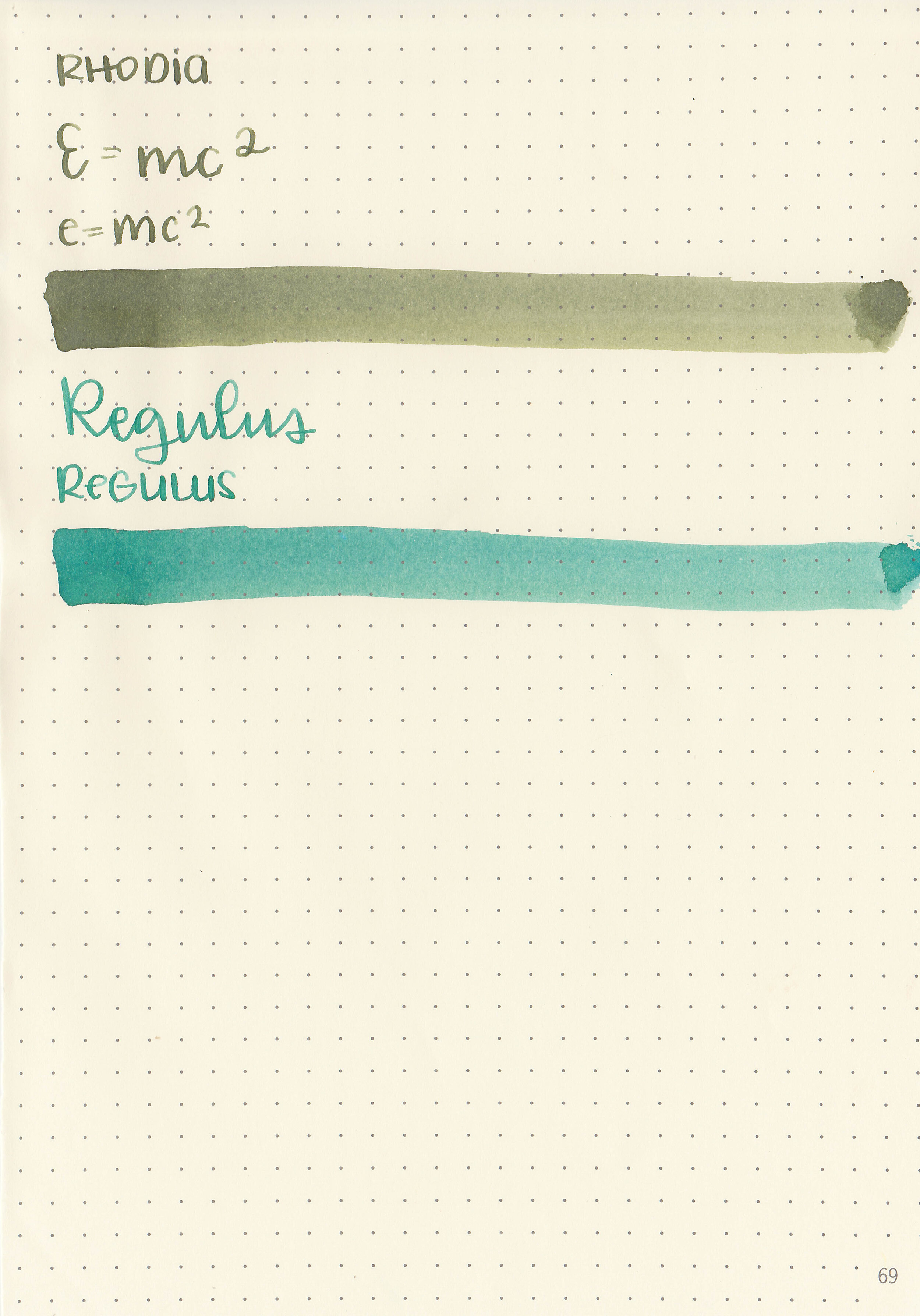
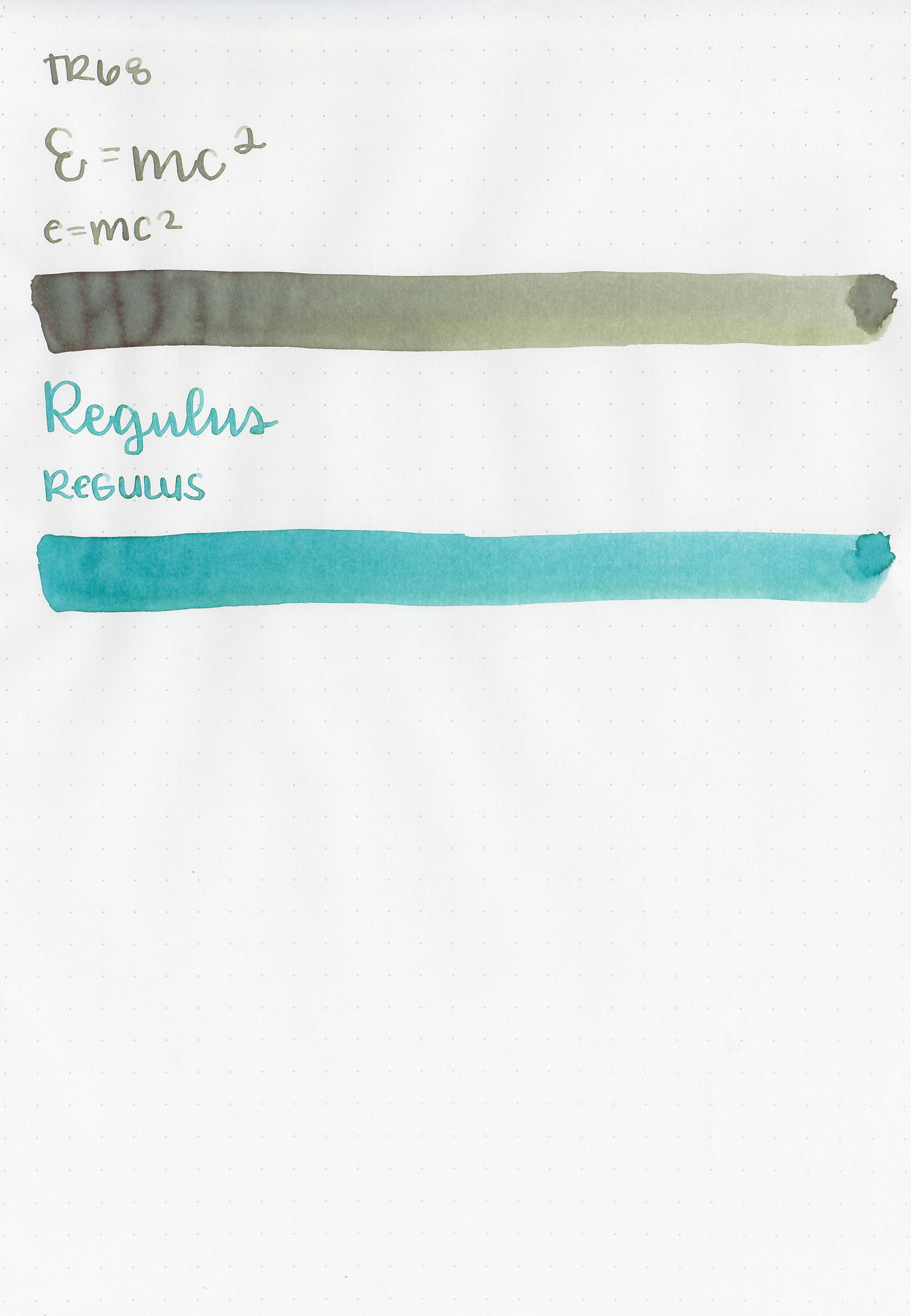
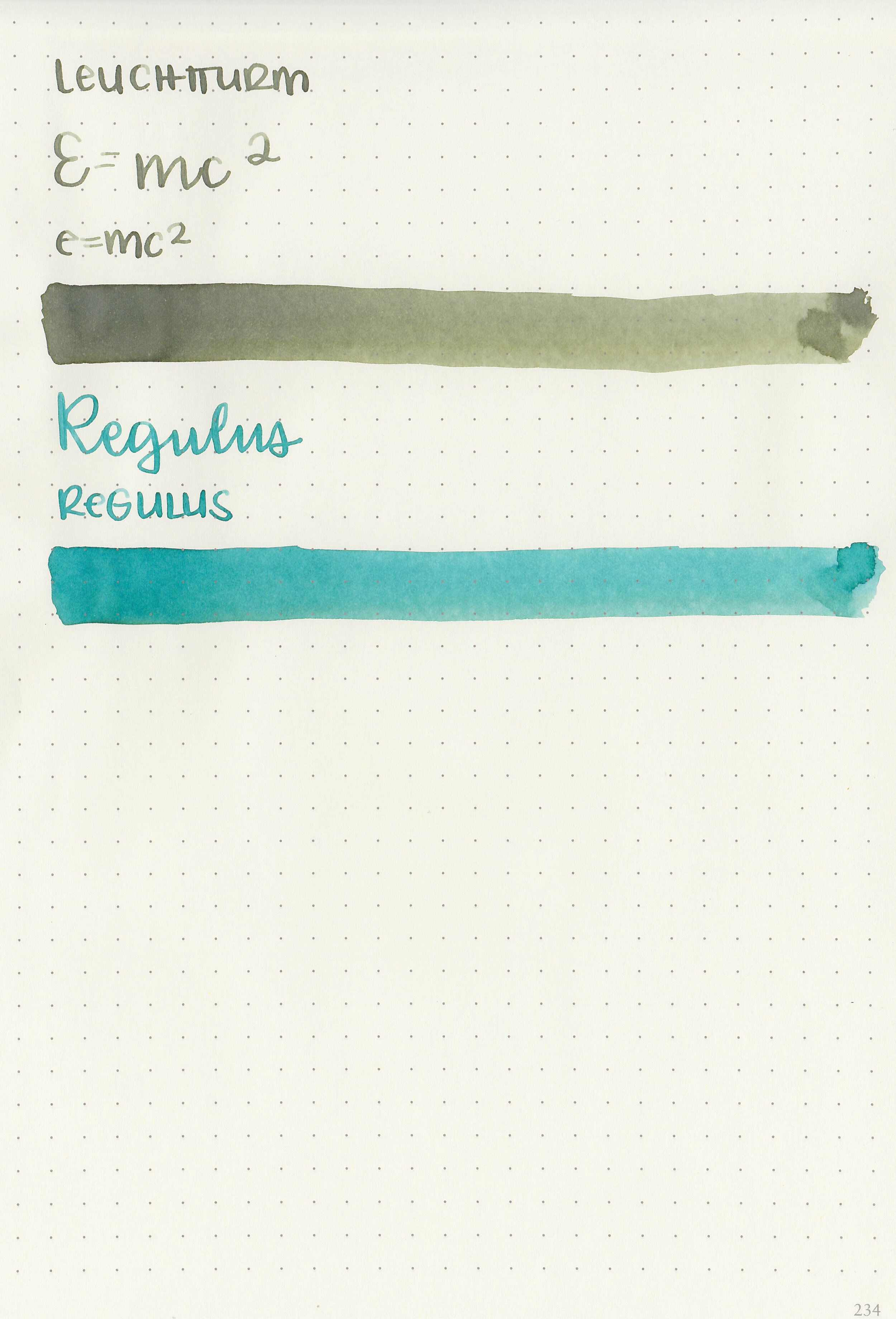
E=mc2 starts grey when wet and dries to a dusky green. Regulus starts blue (and stays blue on Col-o-ring paper) and dries to teal on most papers. Both are uv reactive.
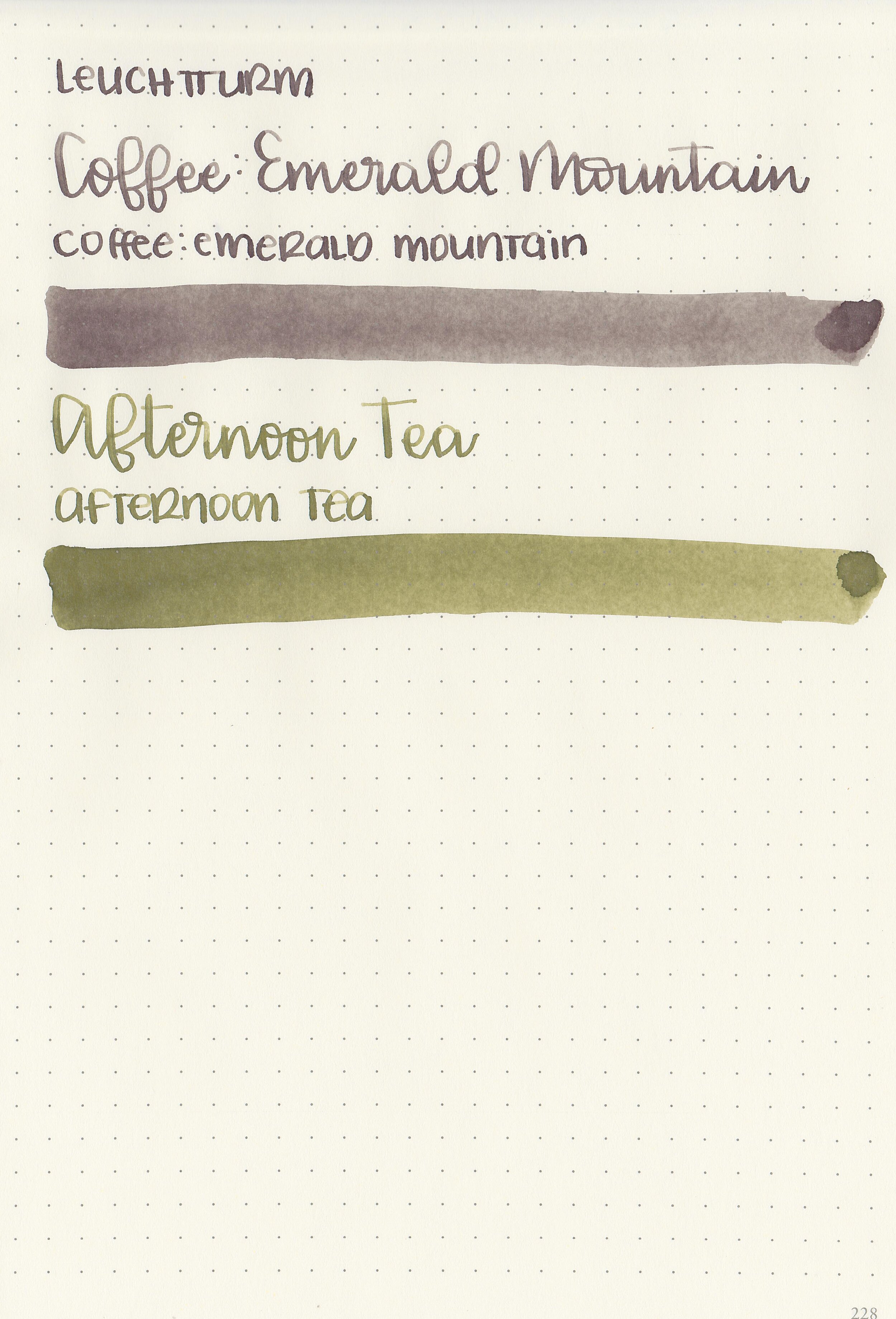
Swabs:

Left to right: e=mc2 and Regulus
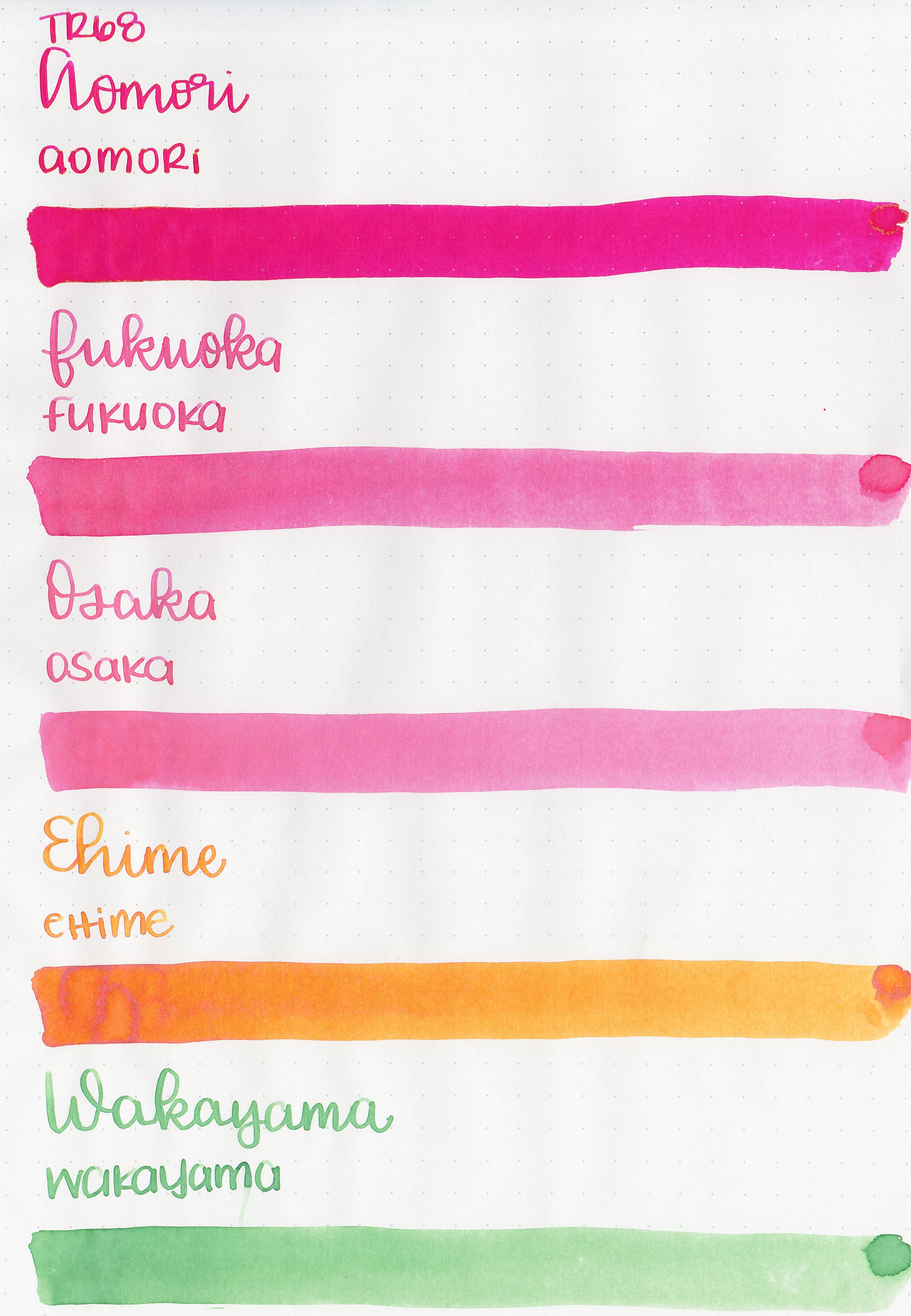
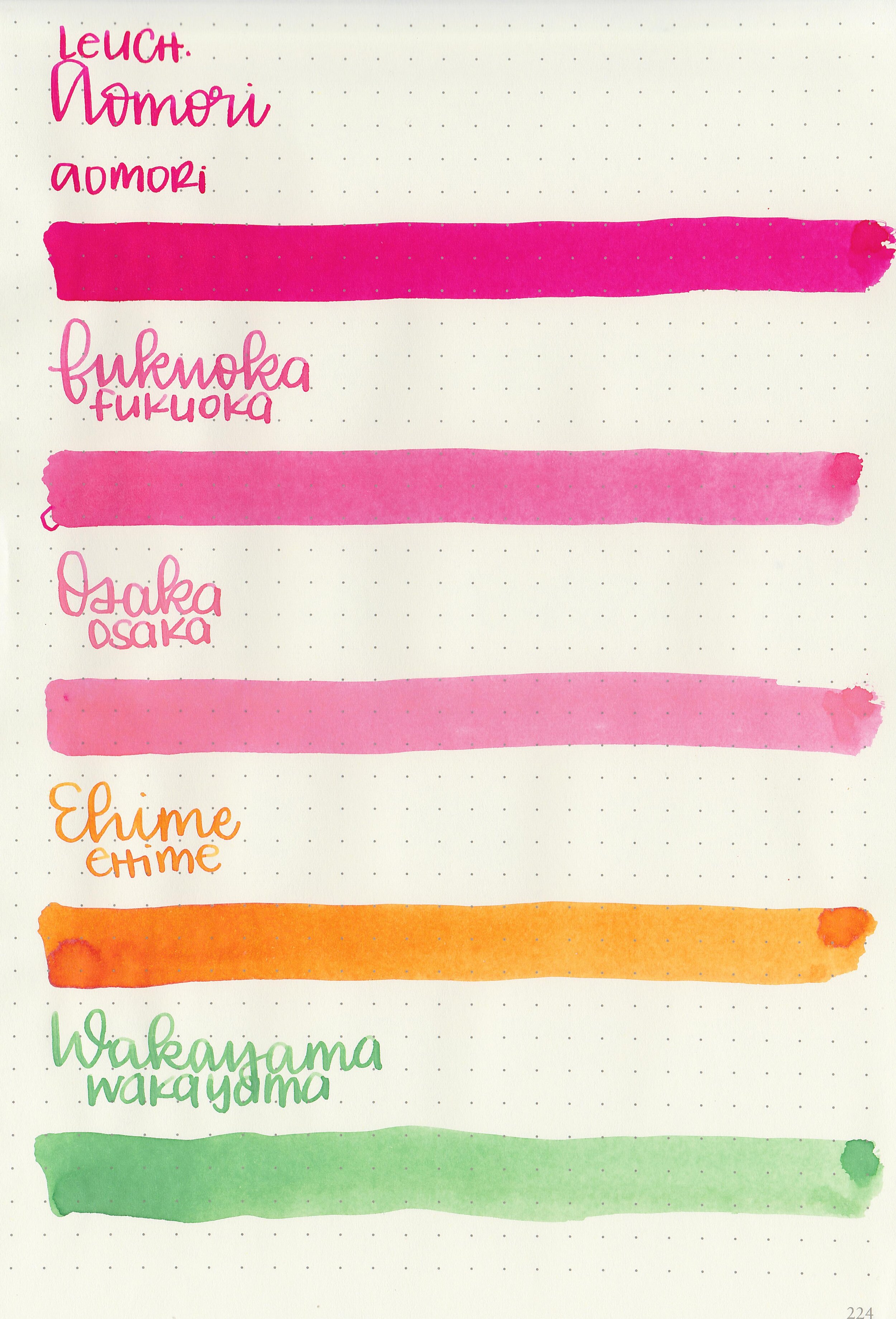
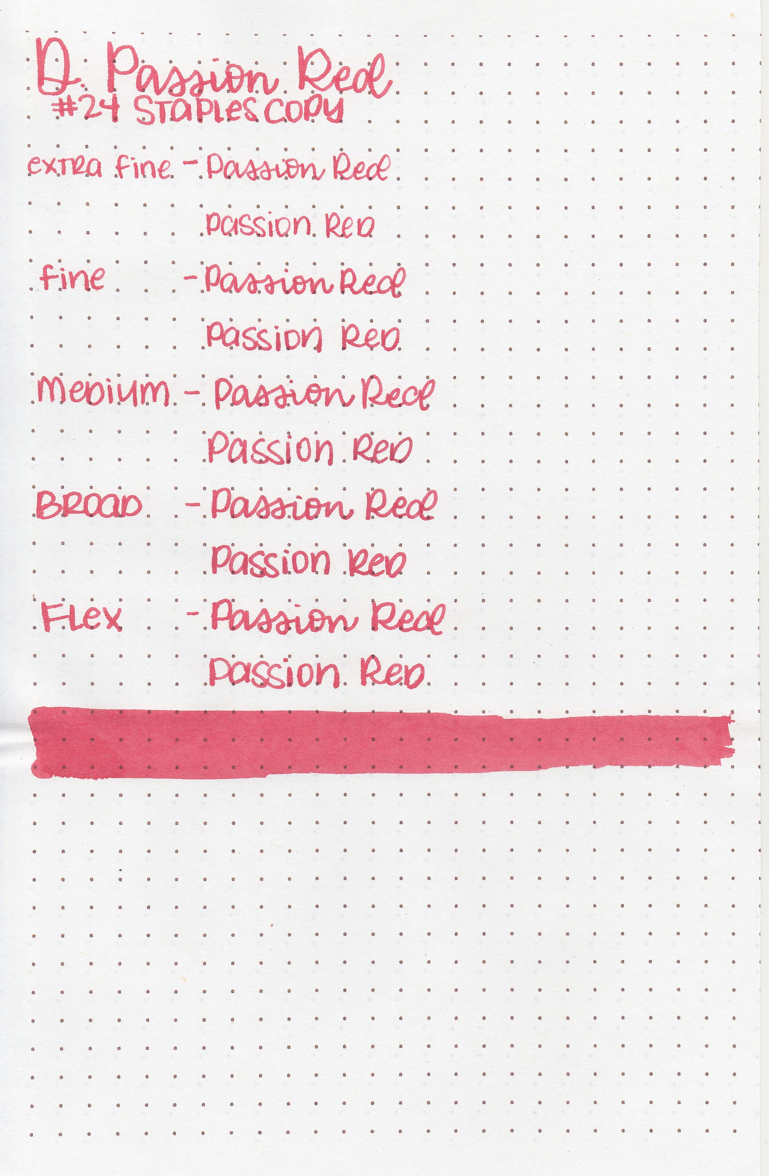
Writing samples:
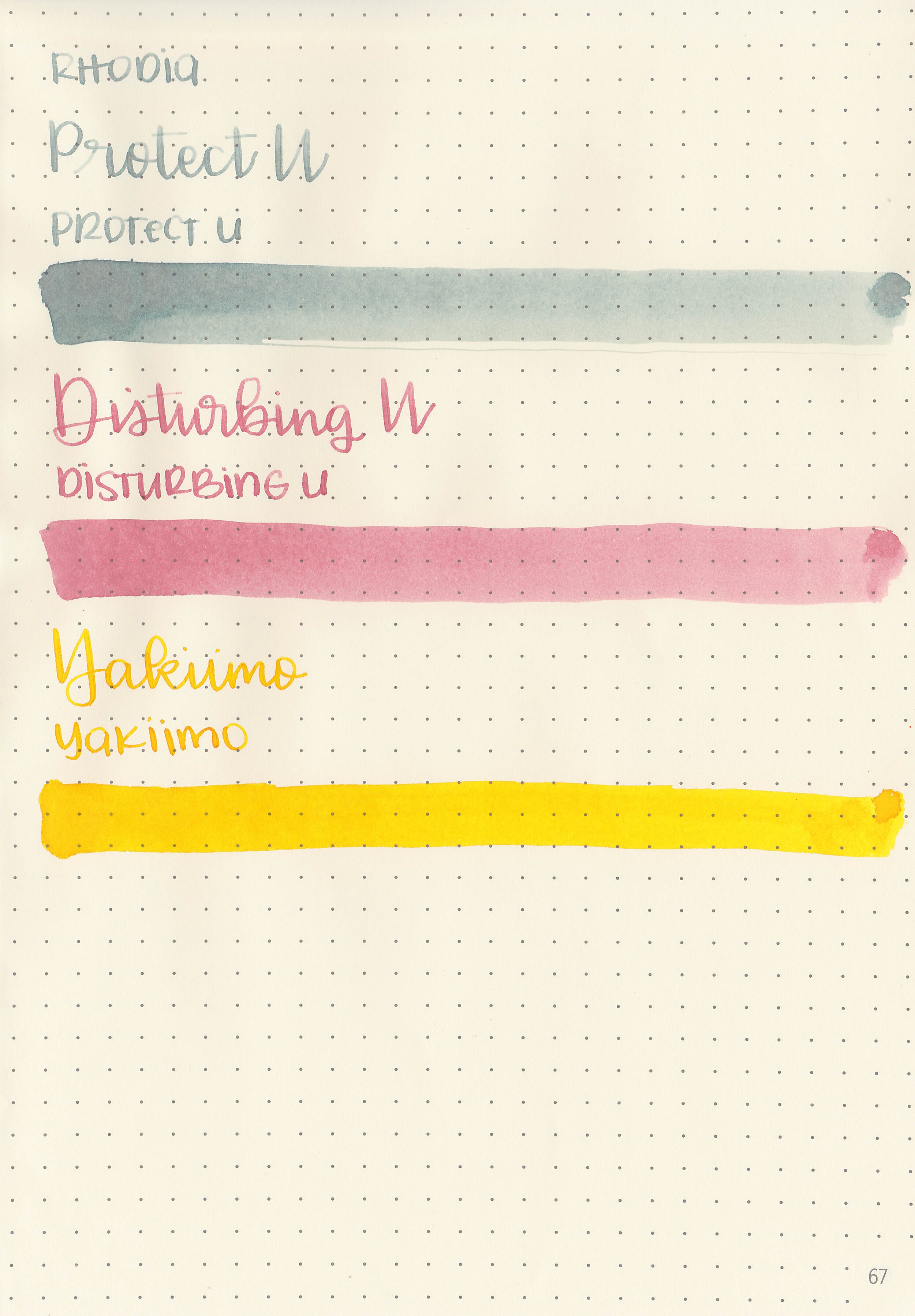
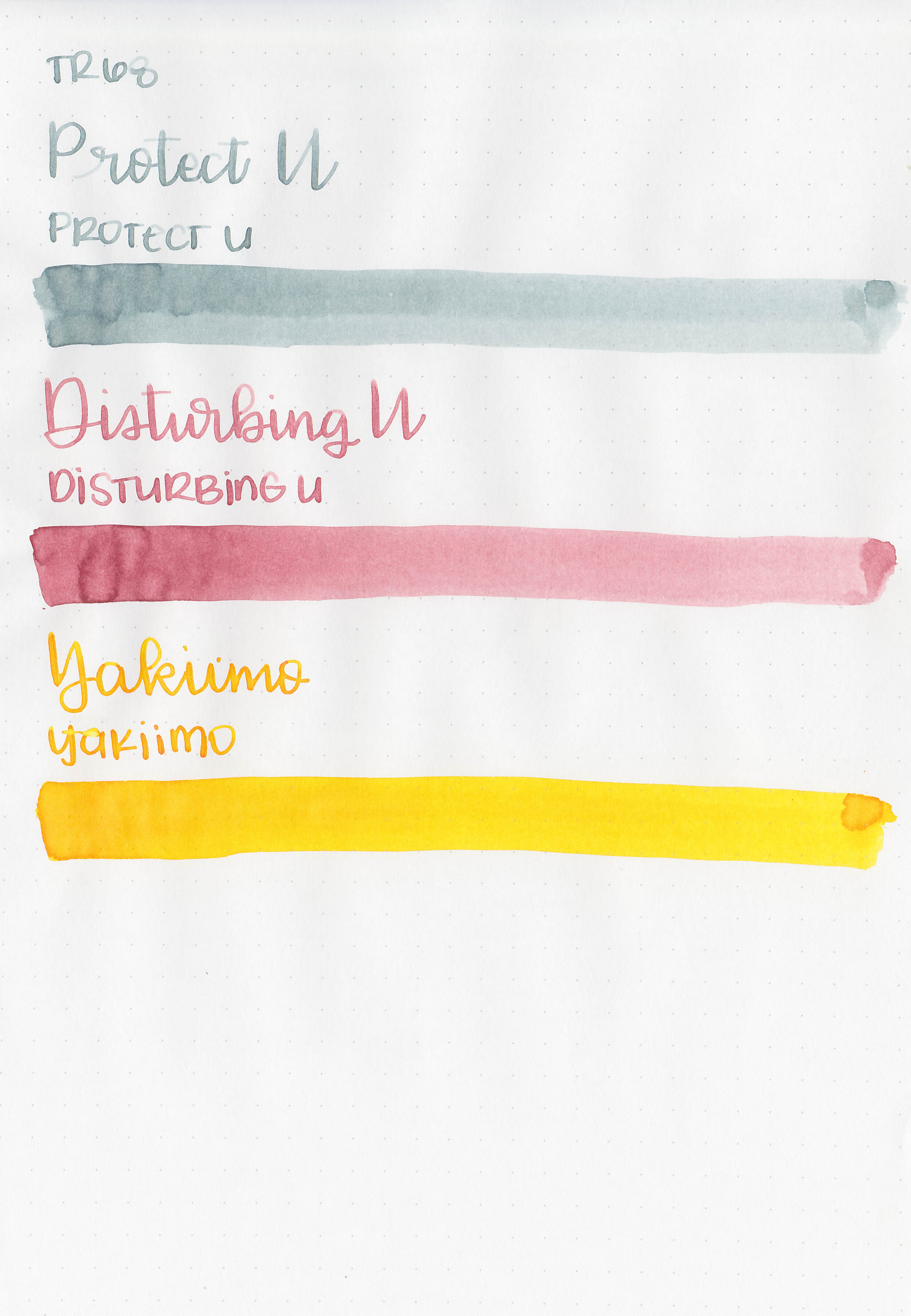
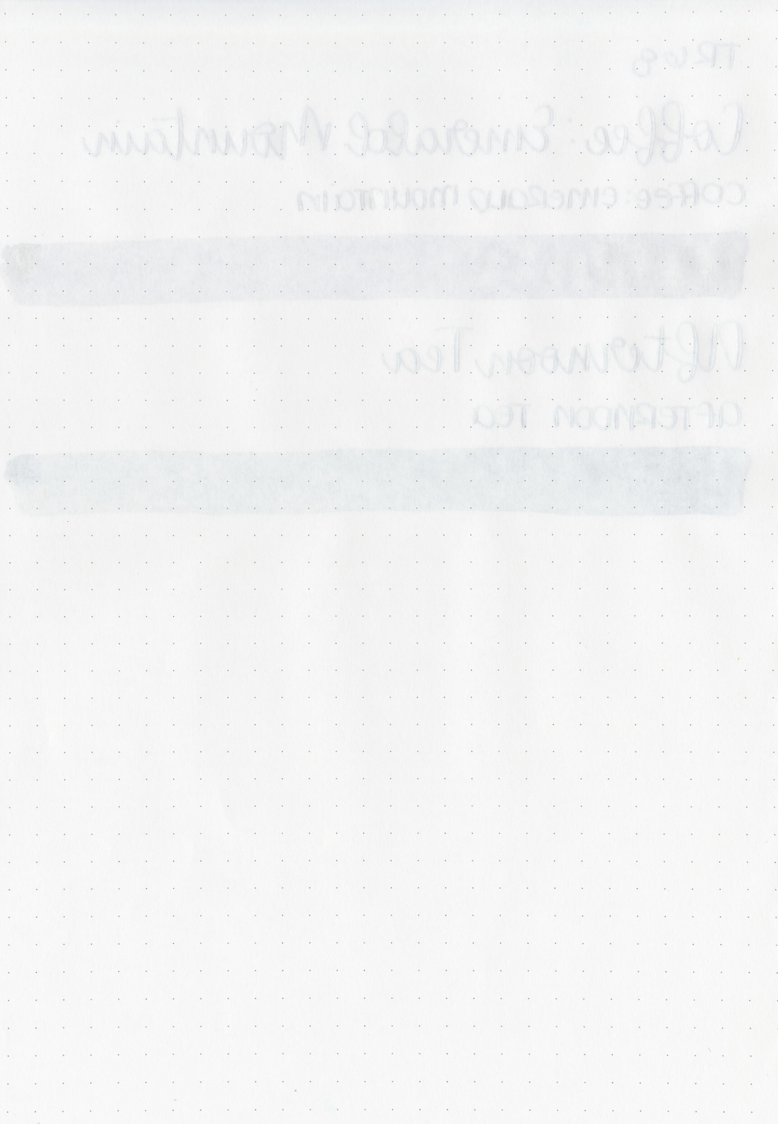
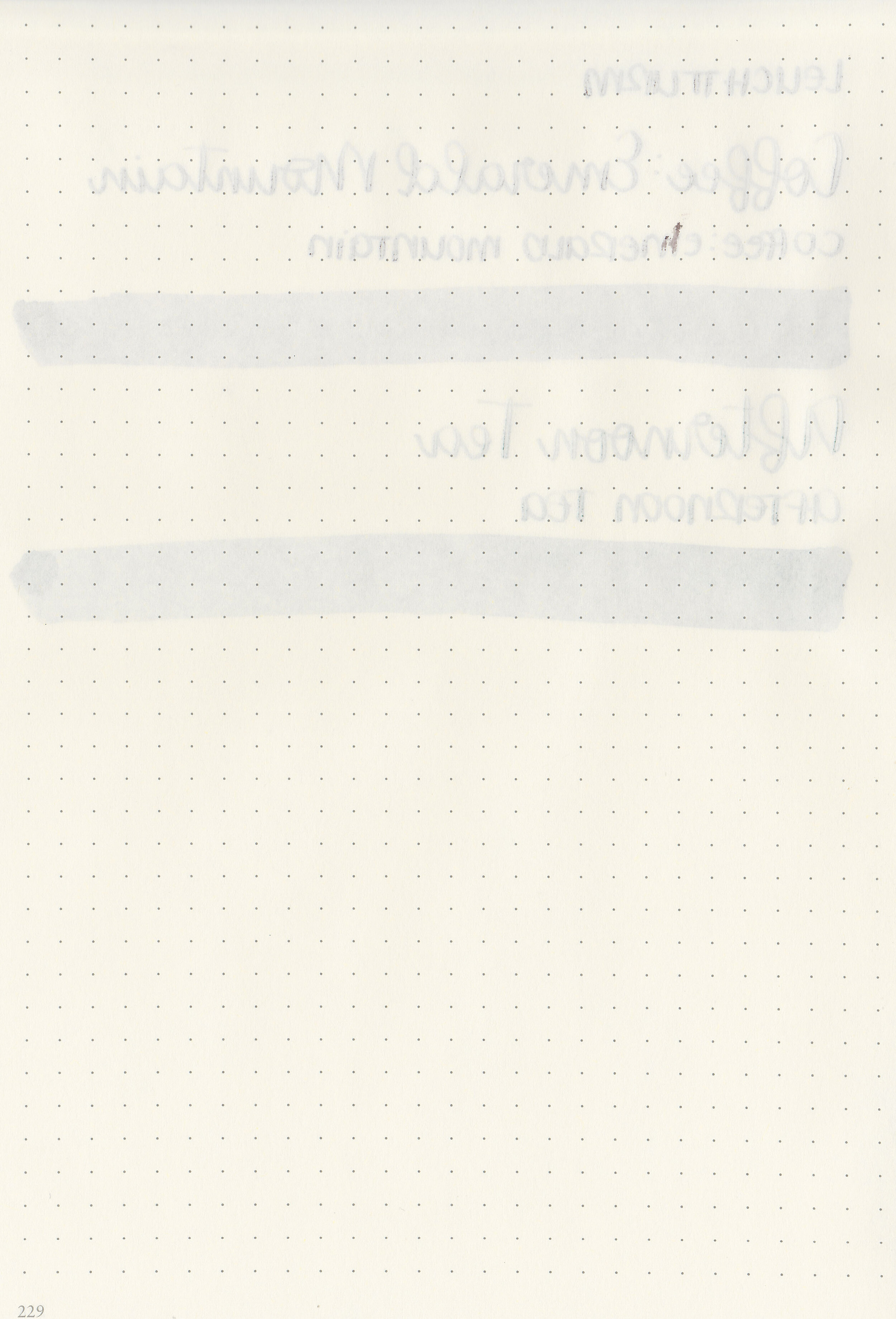
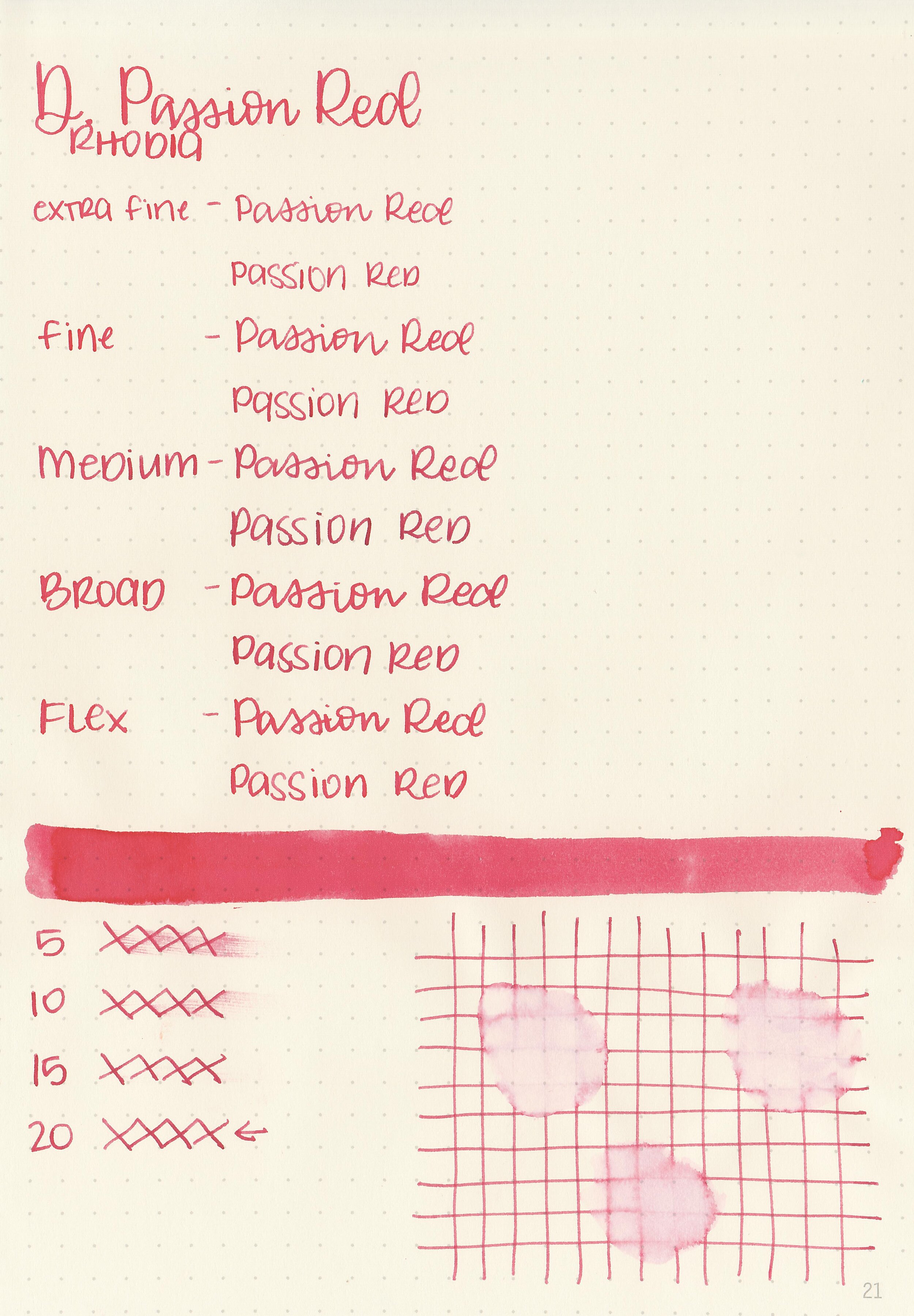
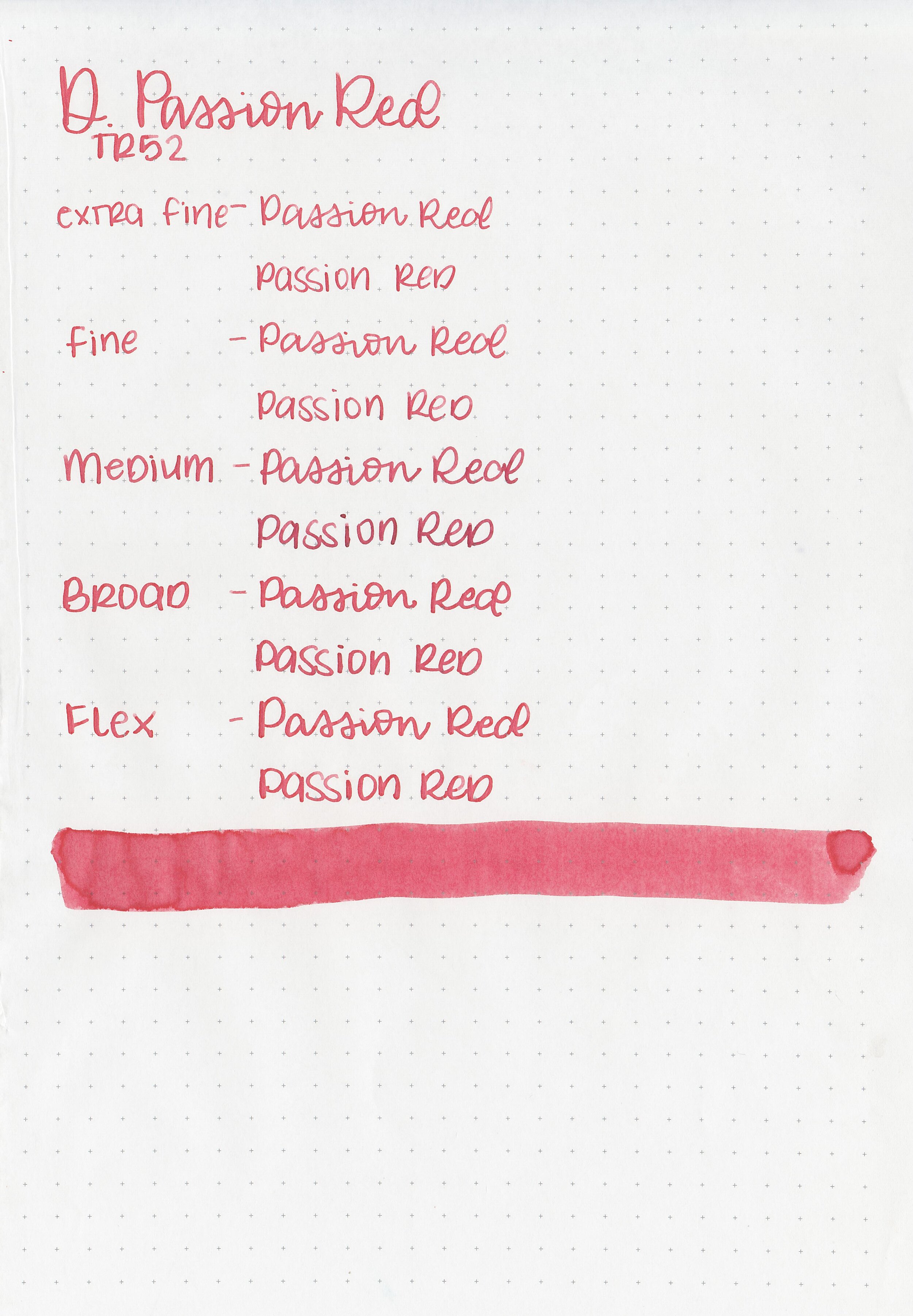
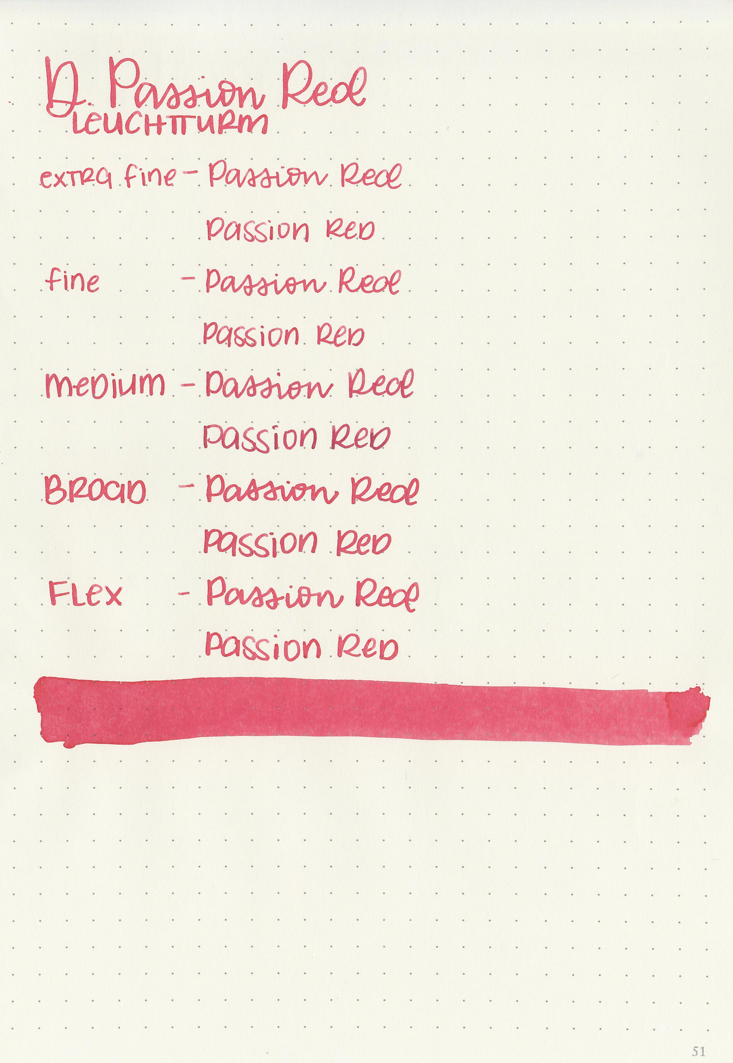
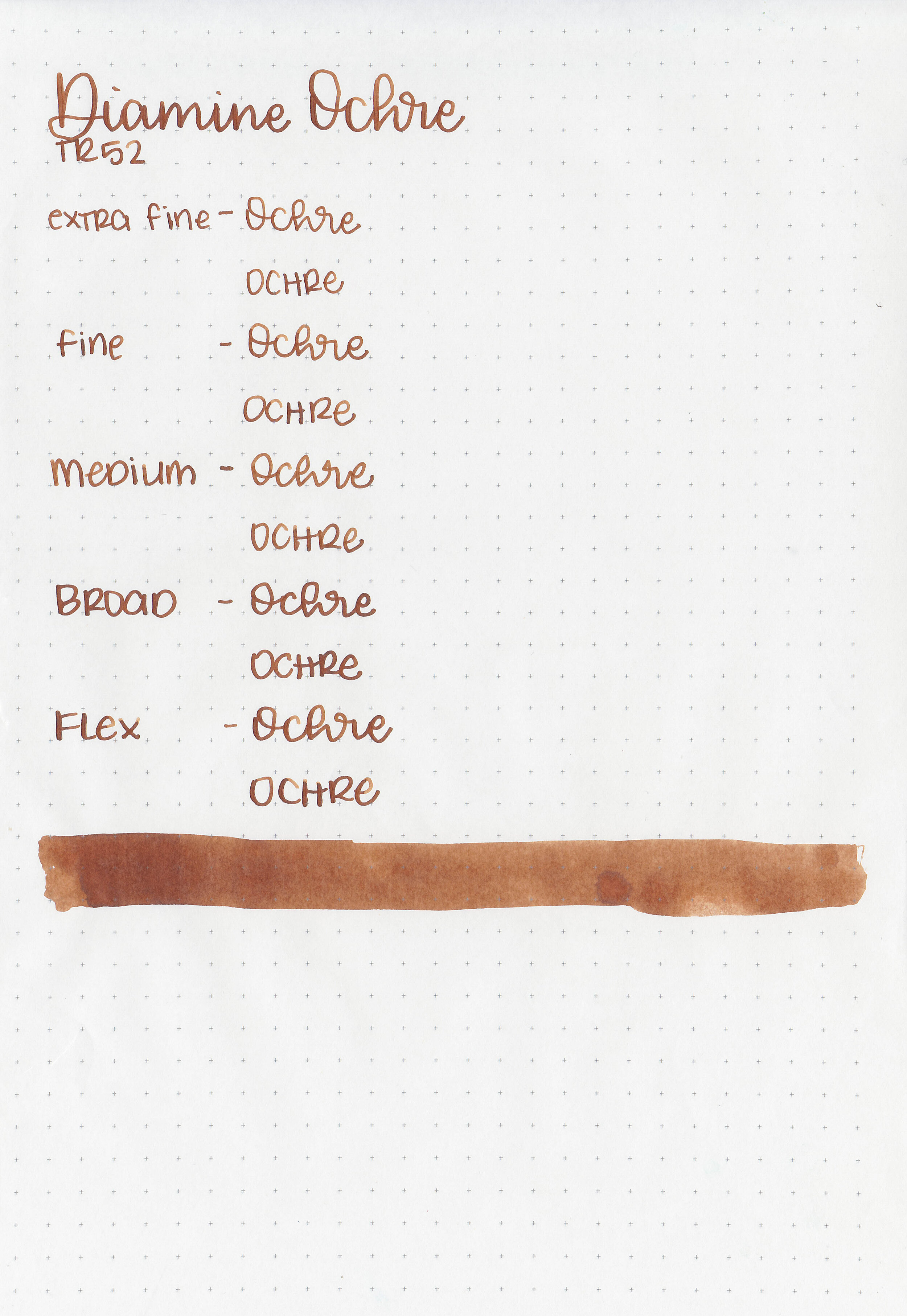
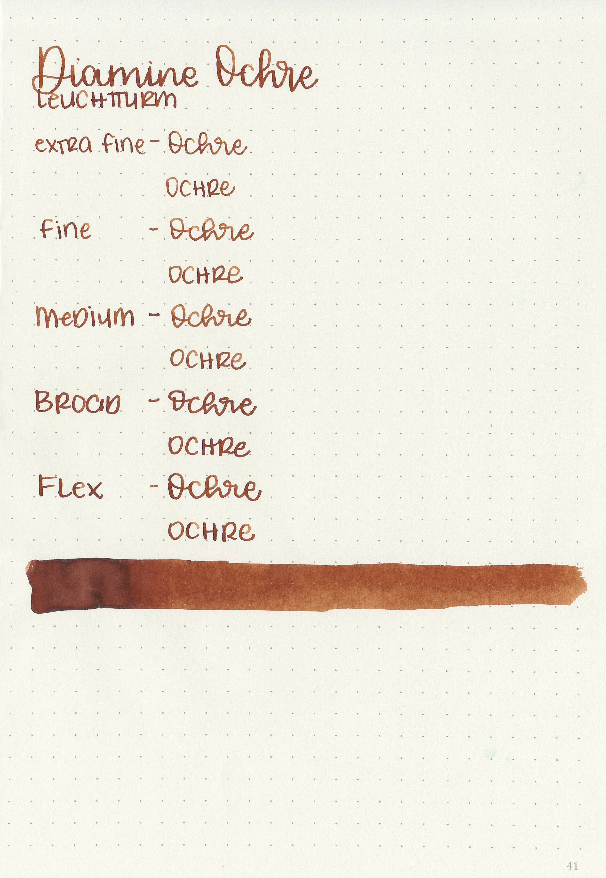
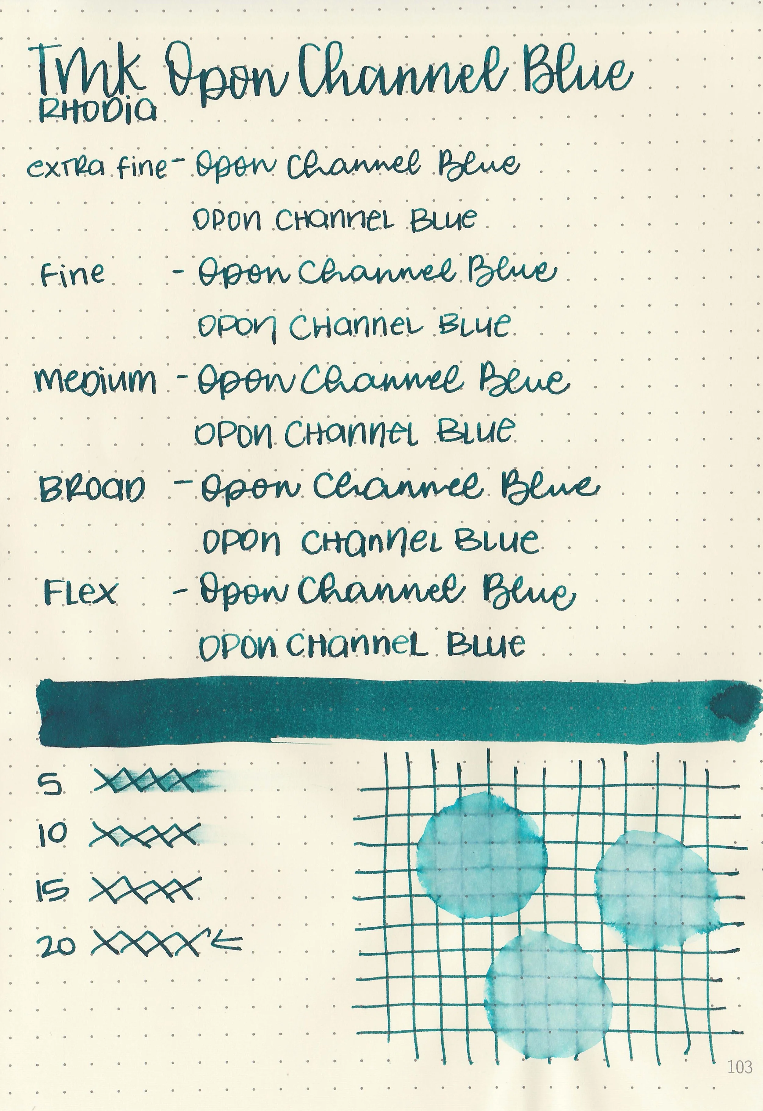
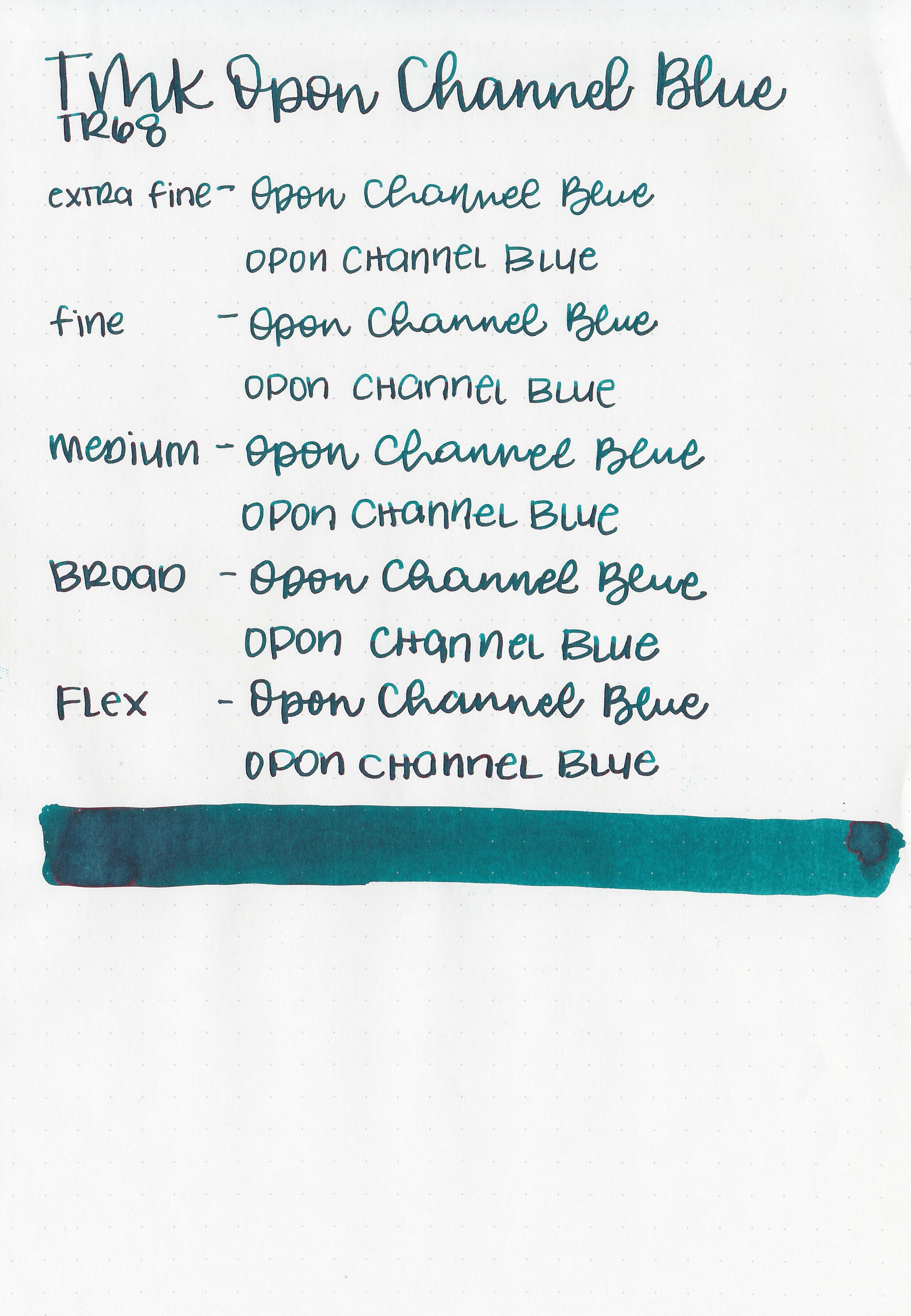
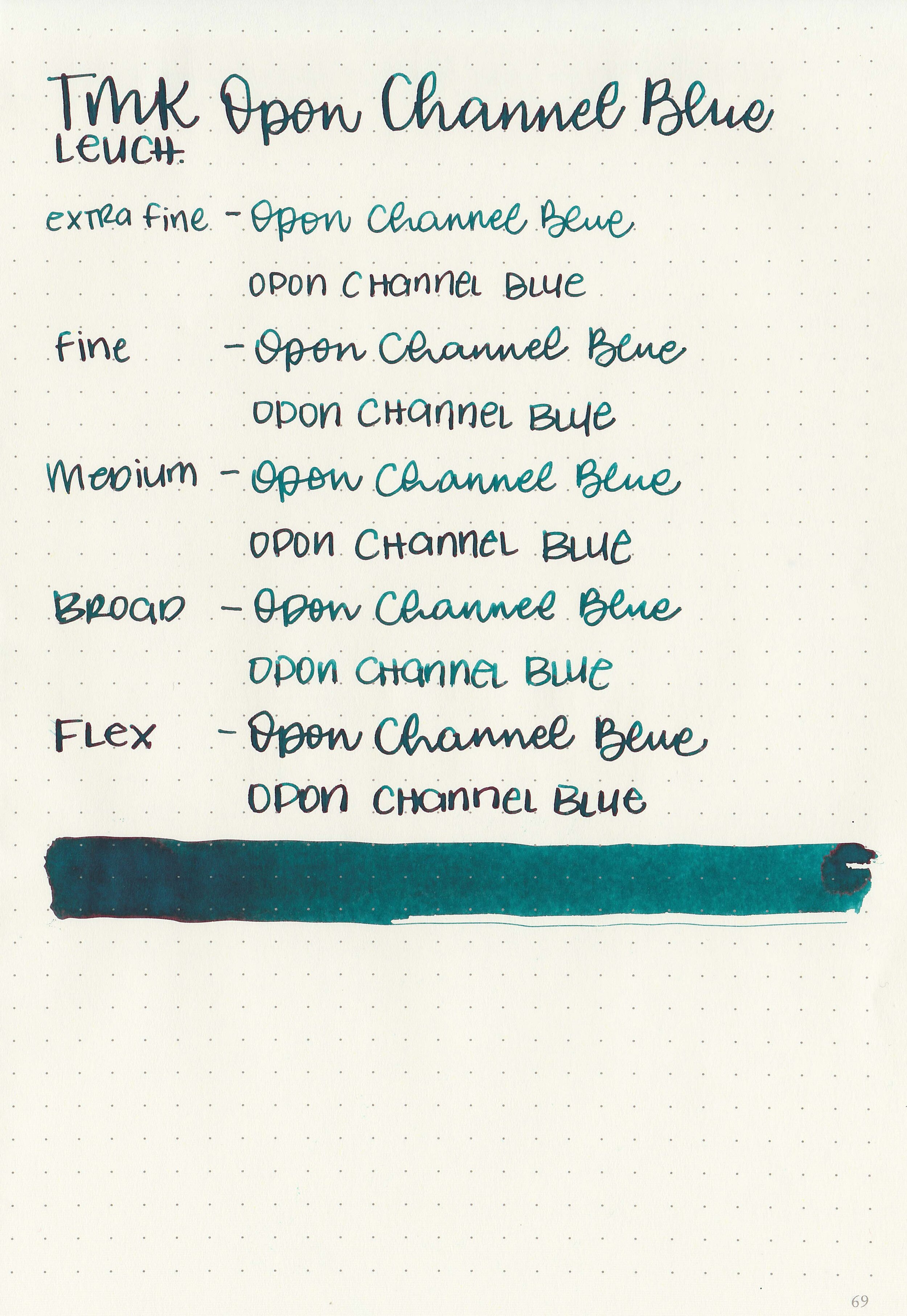
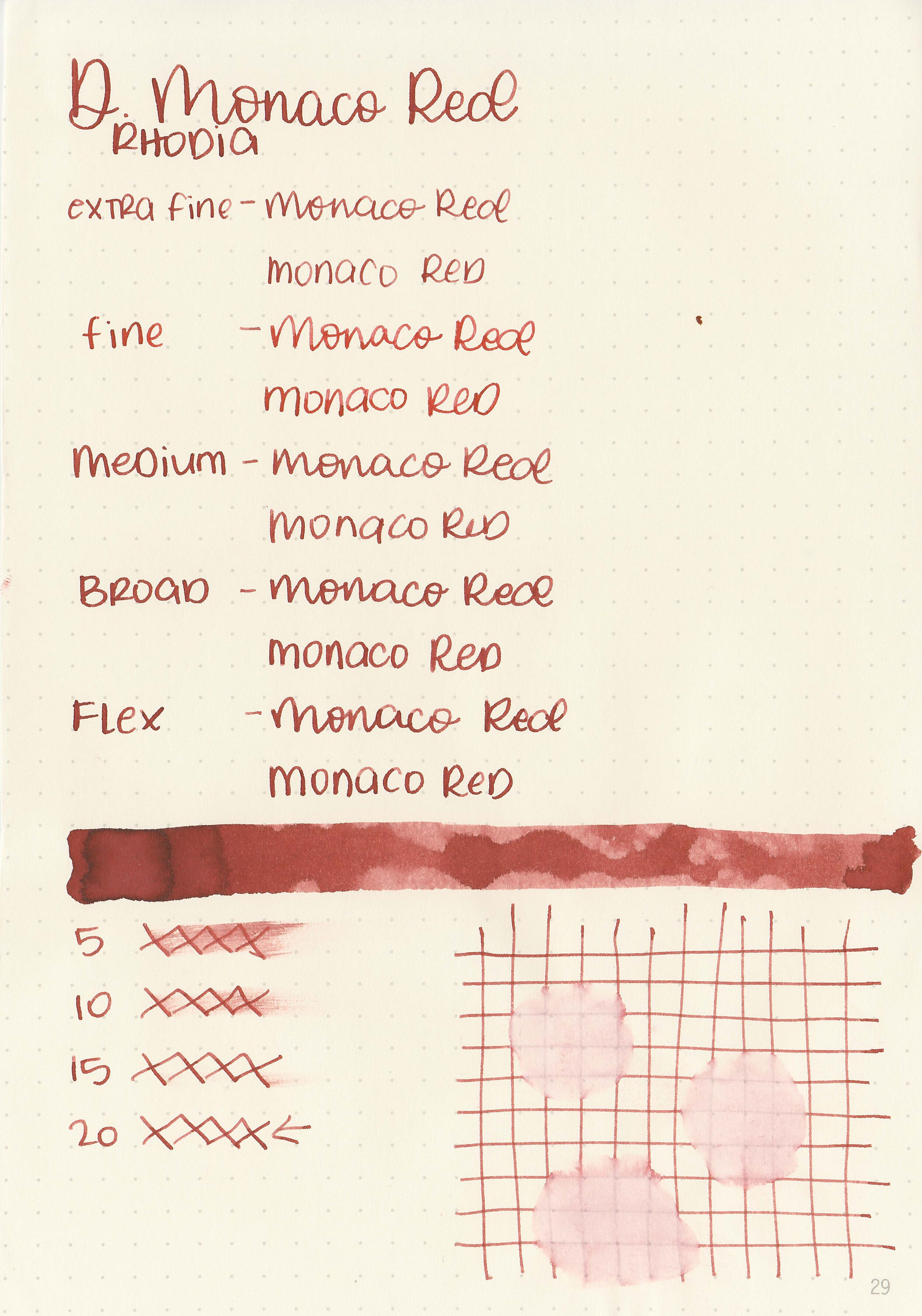
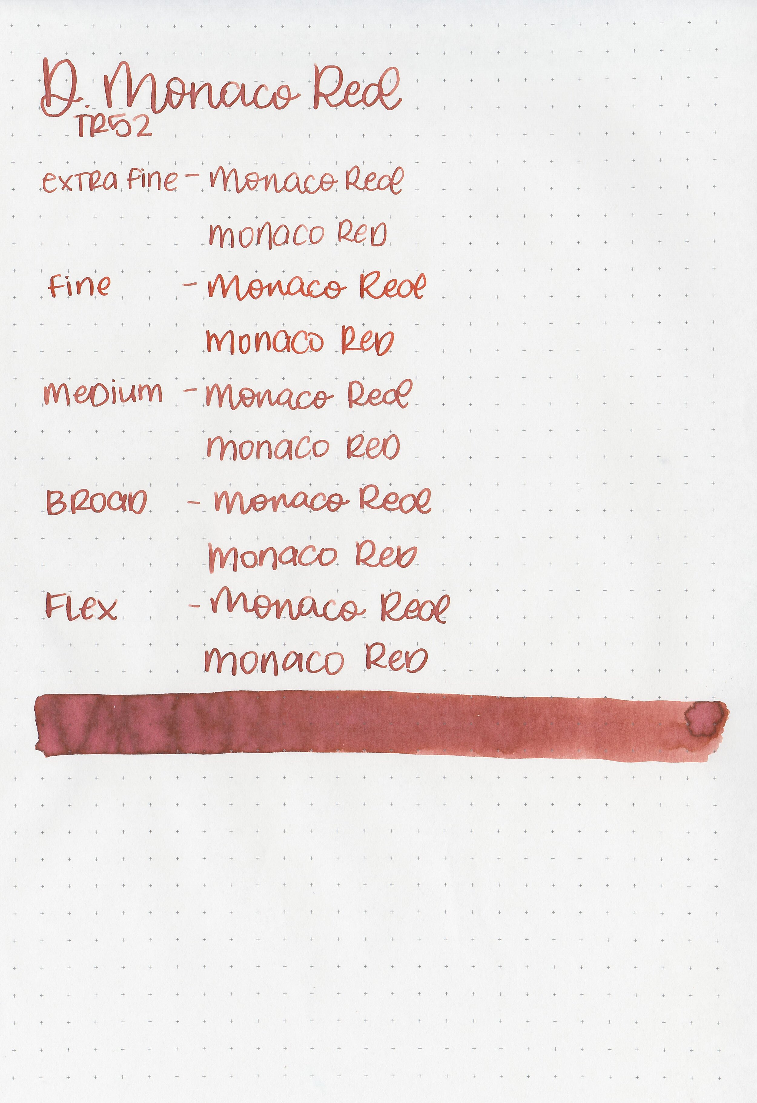
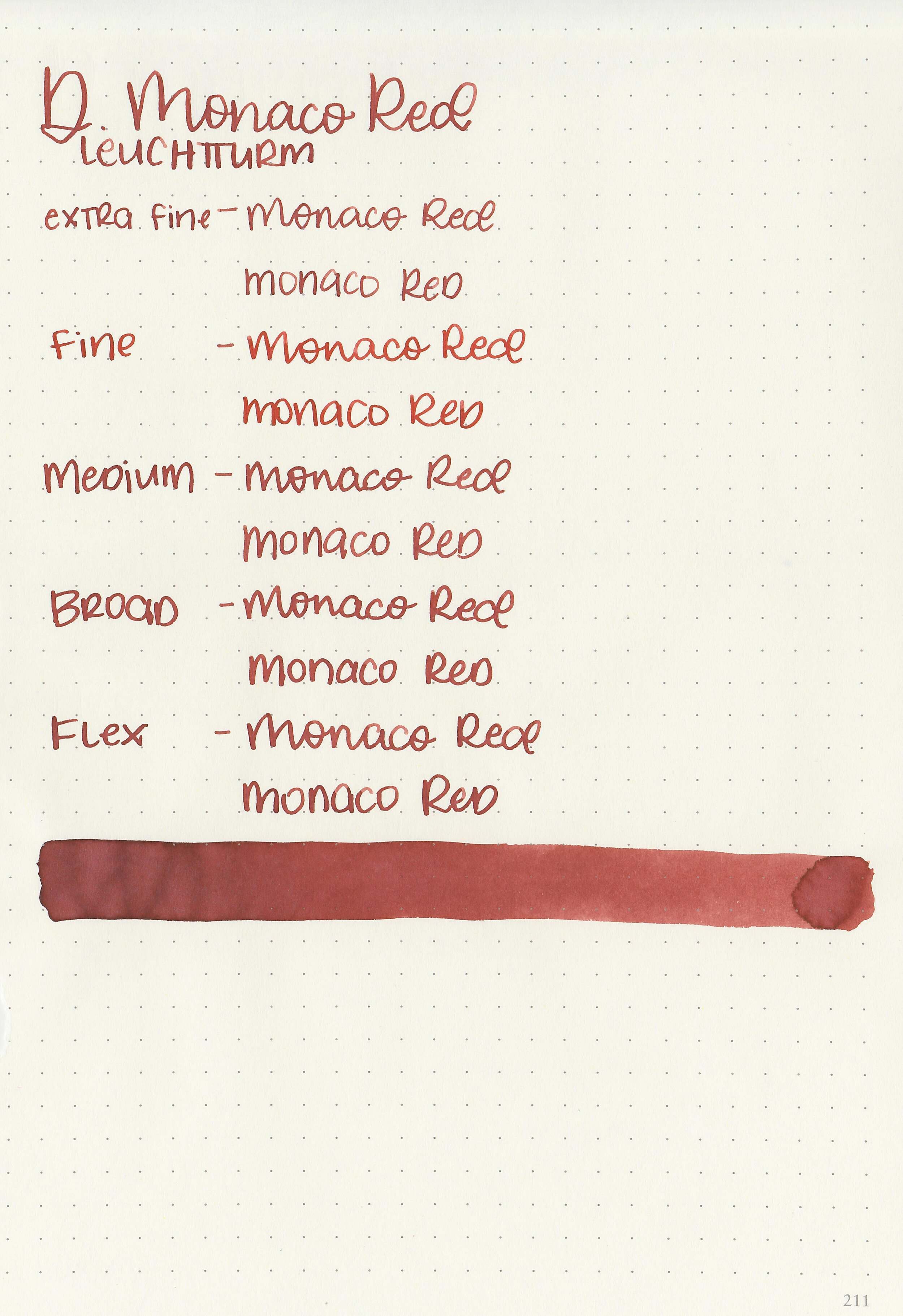
Let's take a look at how the ink behaves on fountain pen friendly papers: Rhodia, Tomoe River, and Leuchtturm.

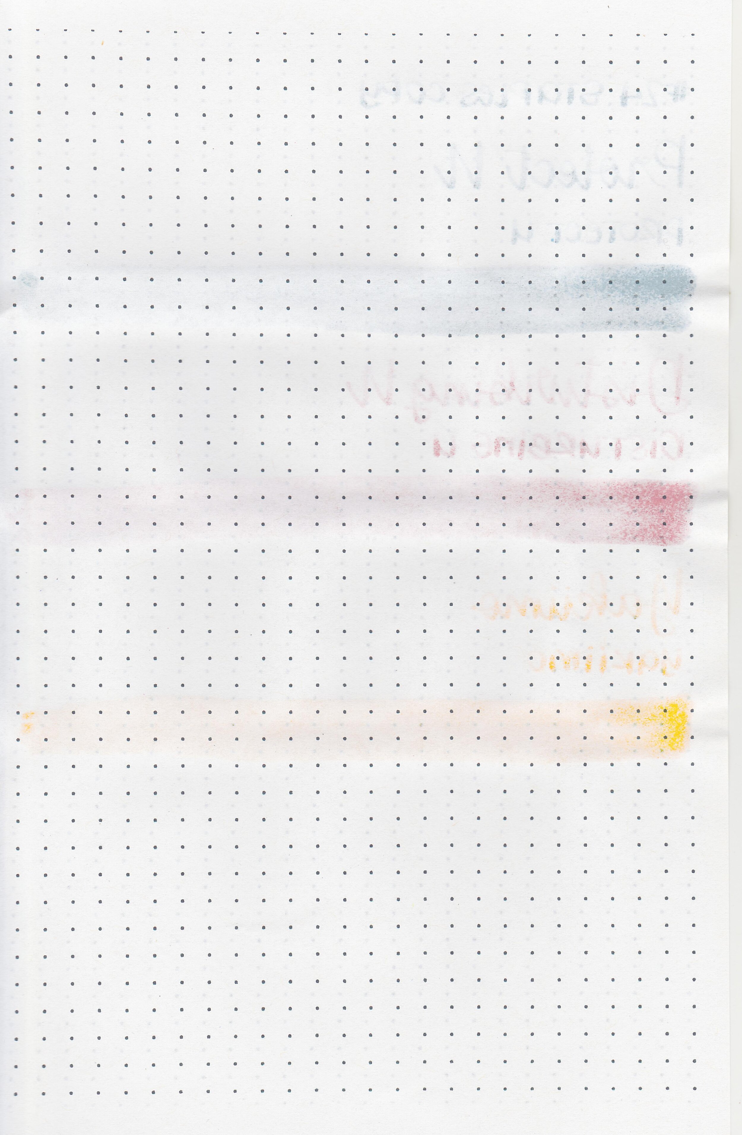
Water resistance: Low-medium
Feathering: None
Show through: Medium
Bleeding: None
Other properties: low shading, no sheen, and no shimmer.
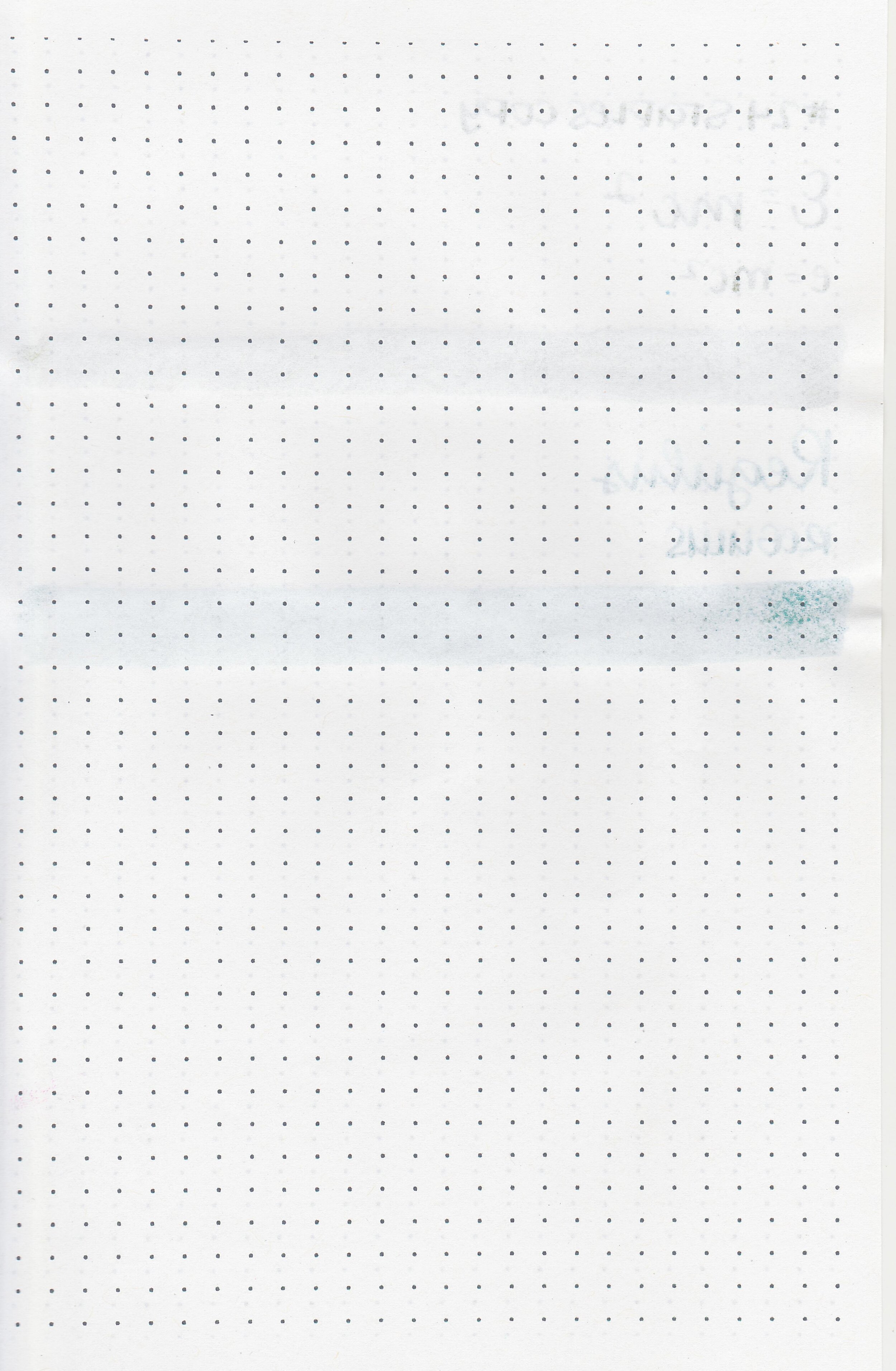
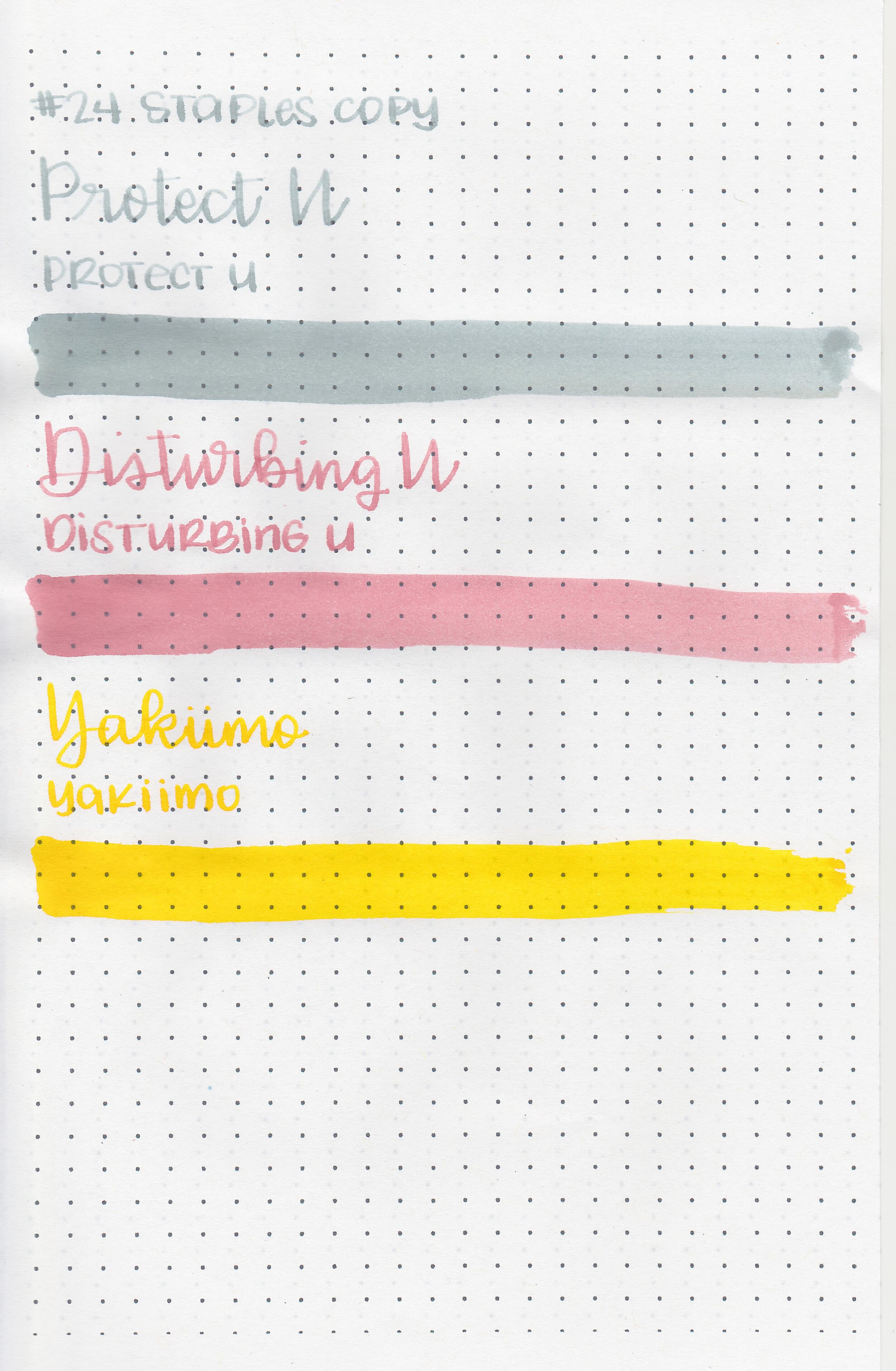
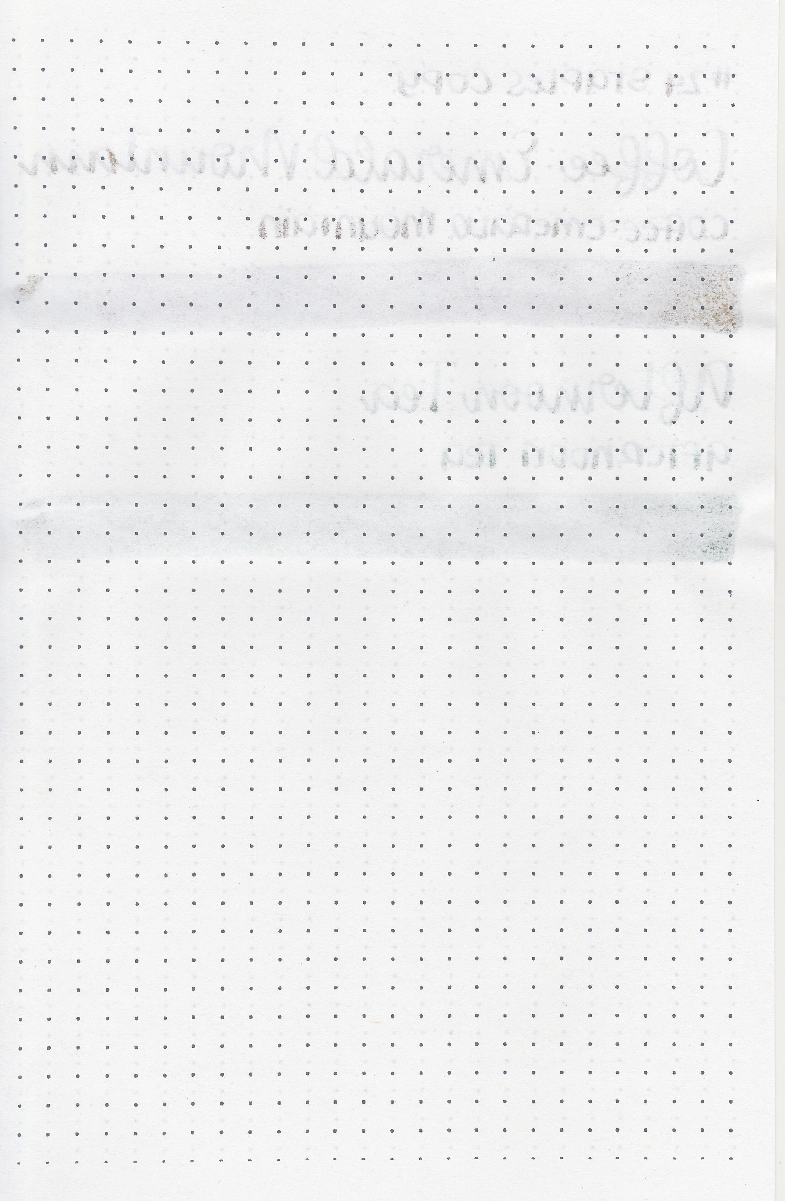
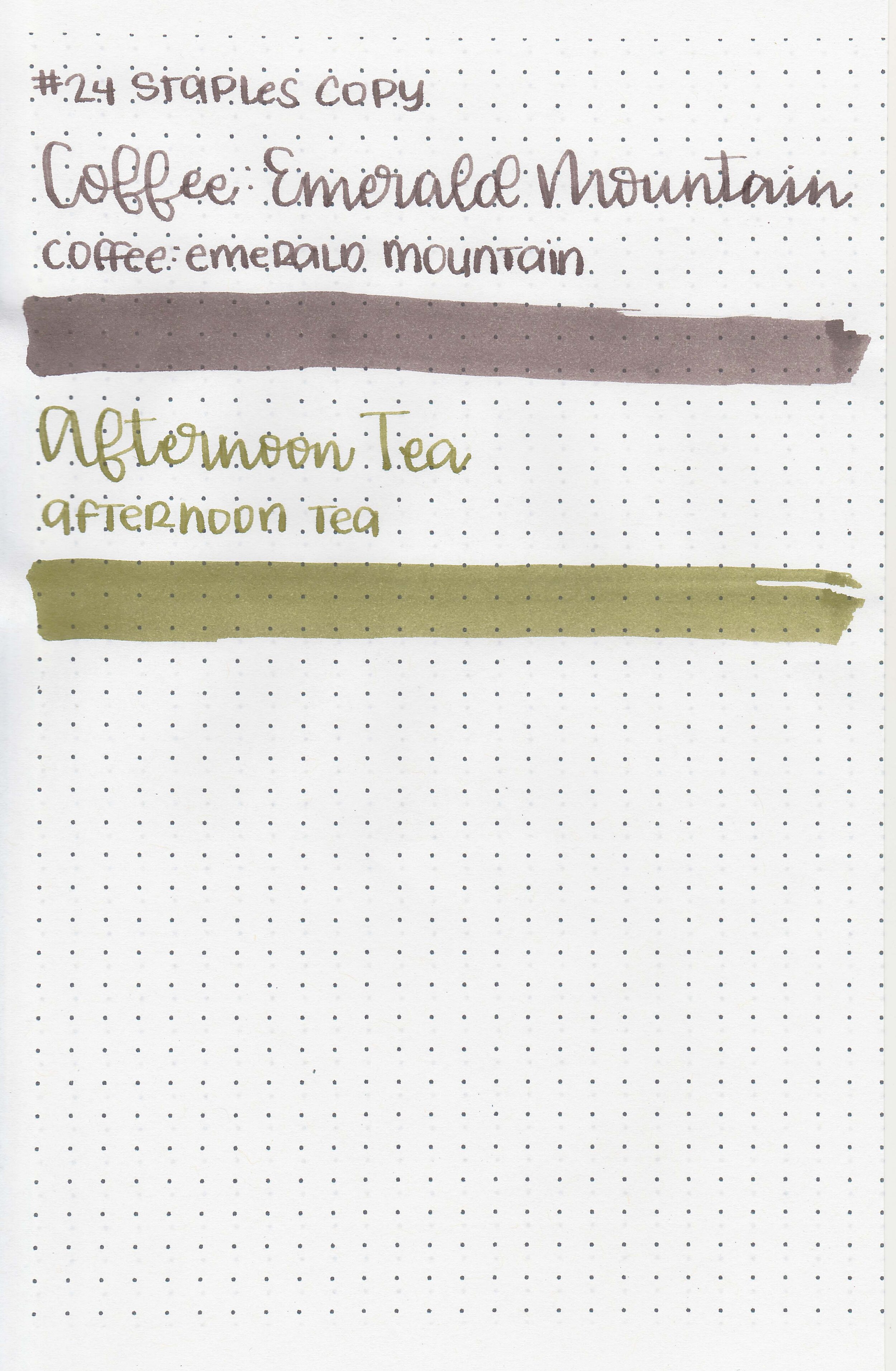
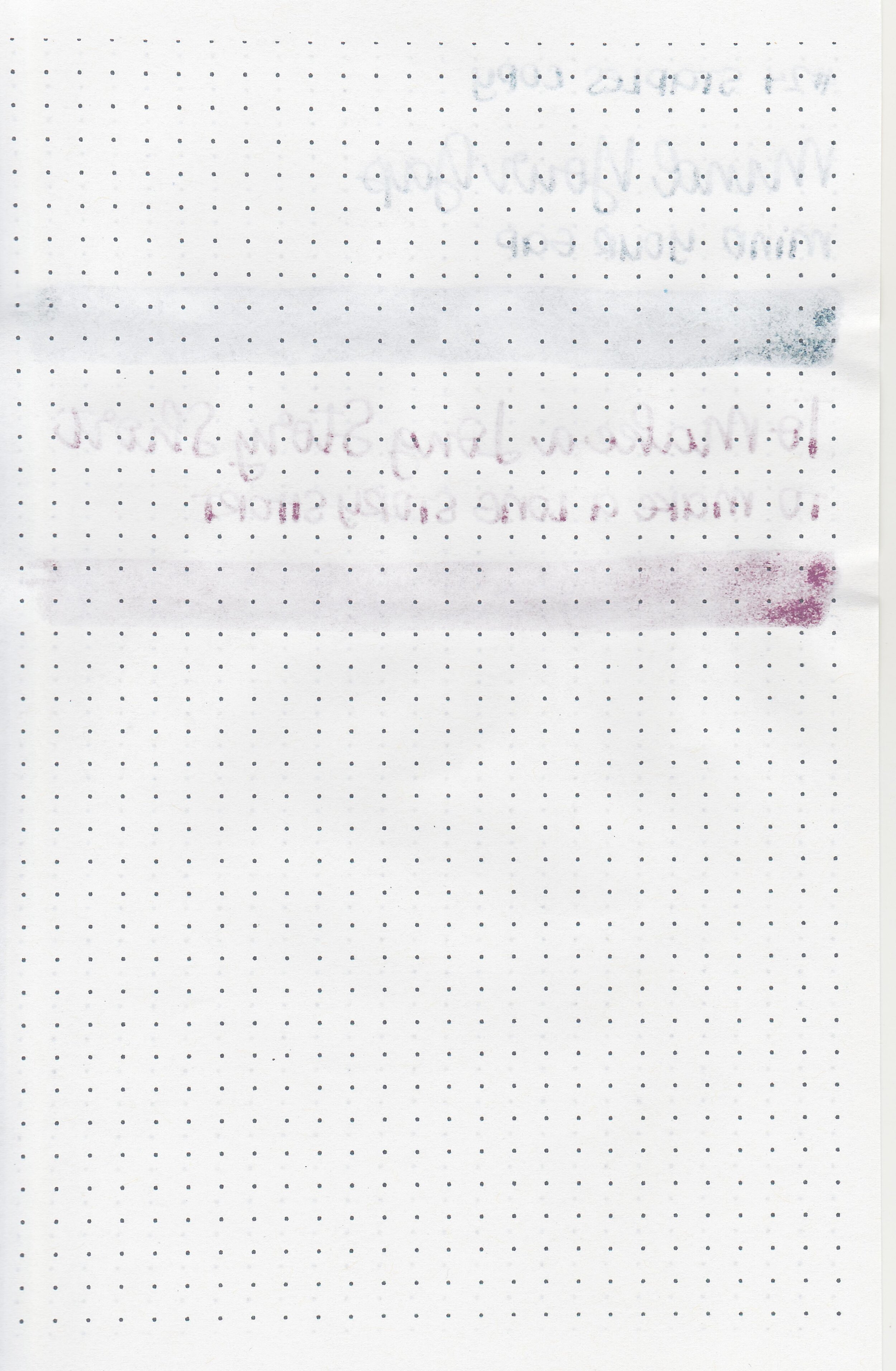
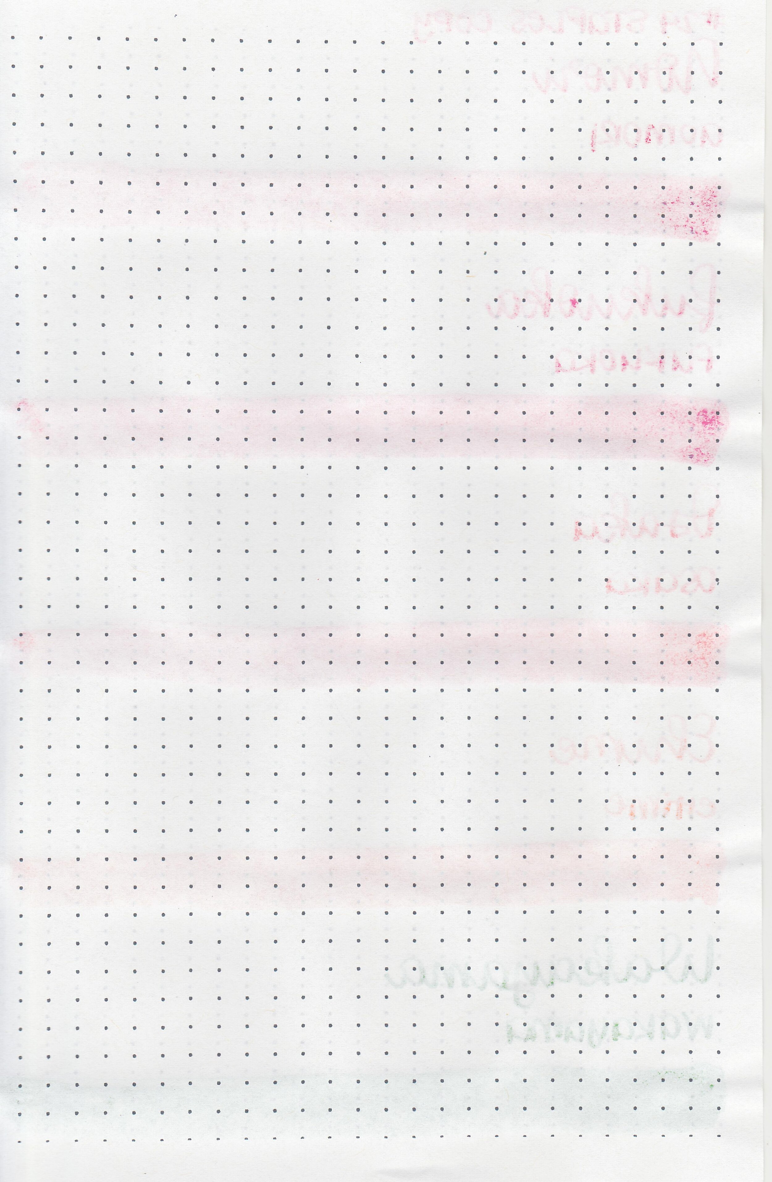
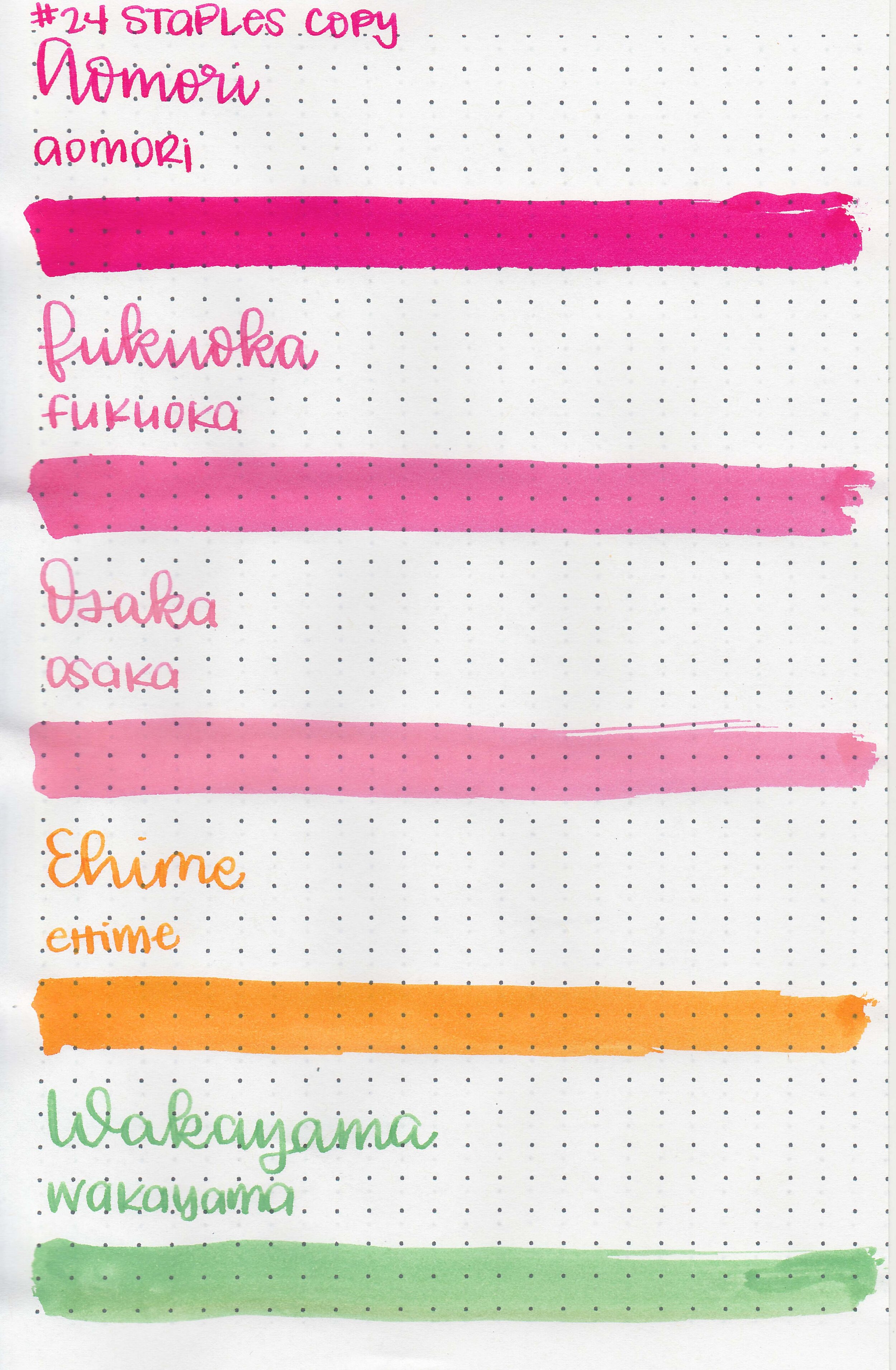
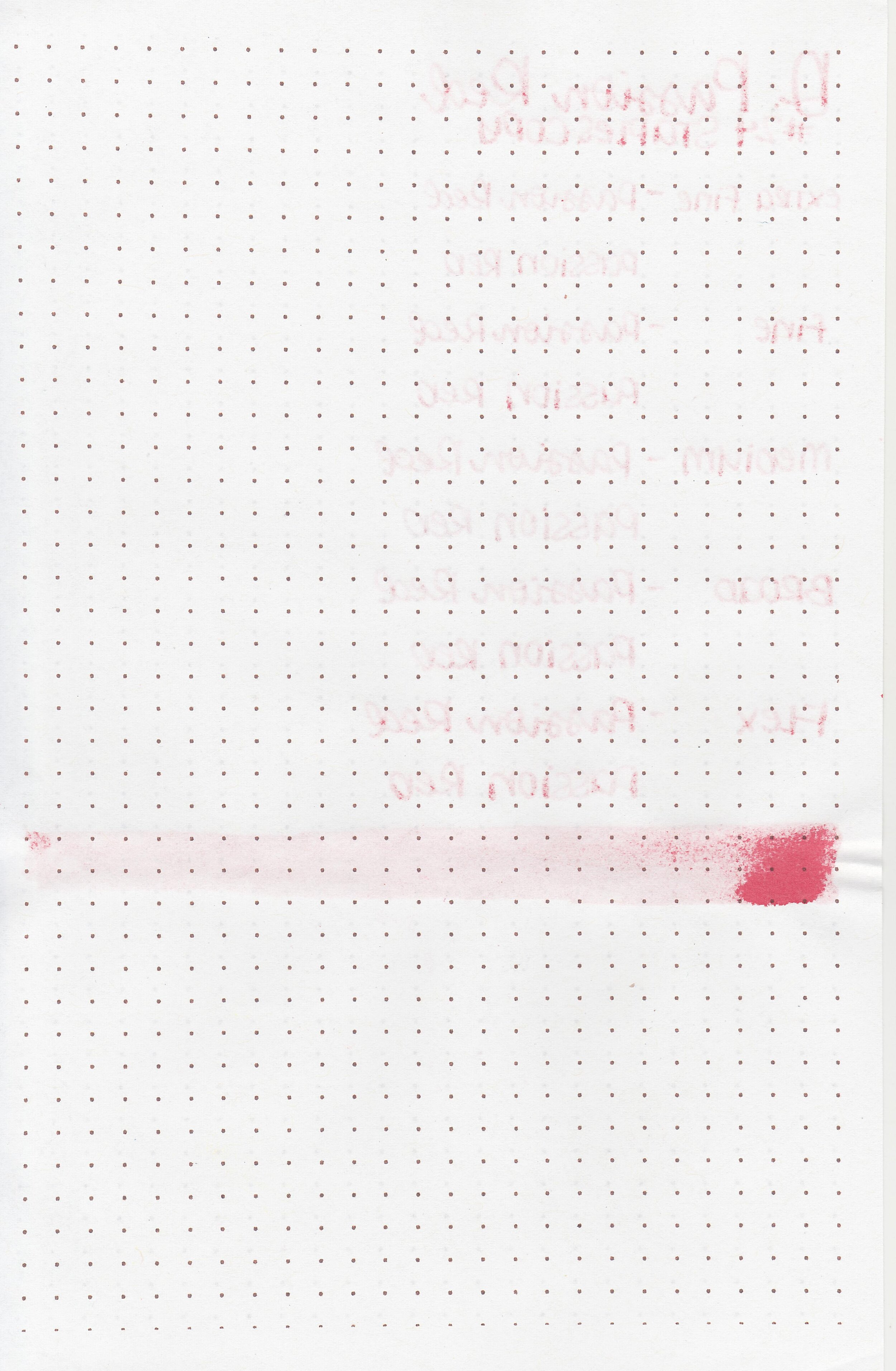
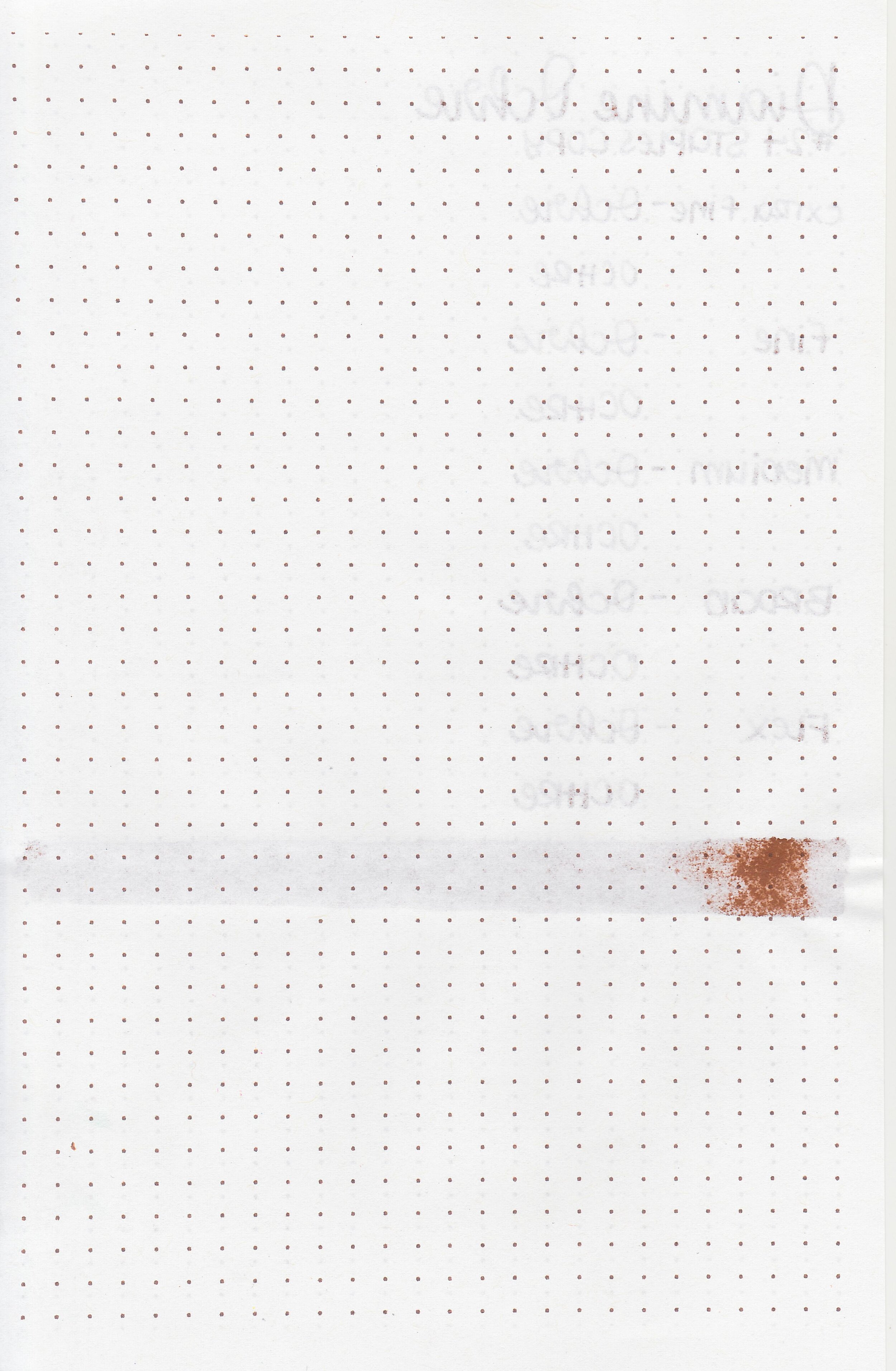
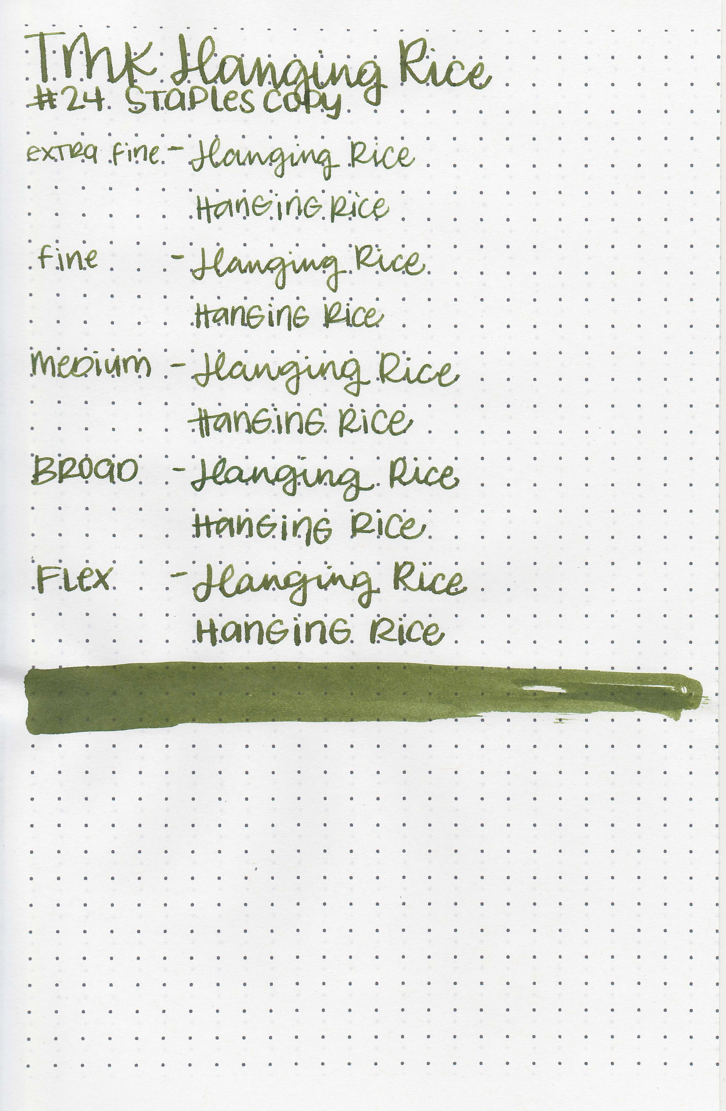
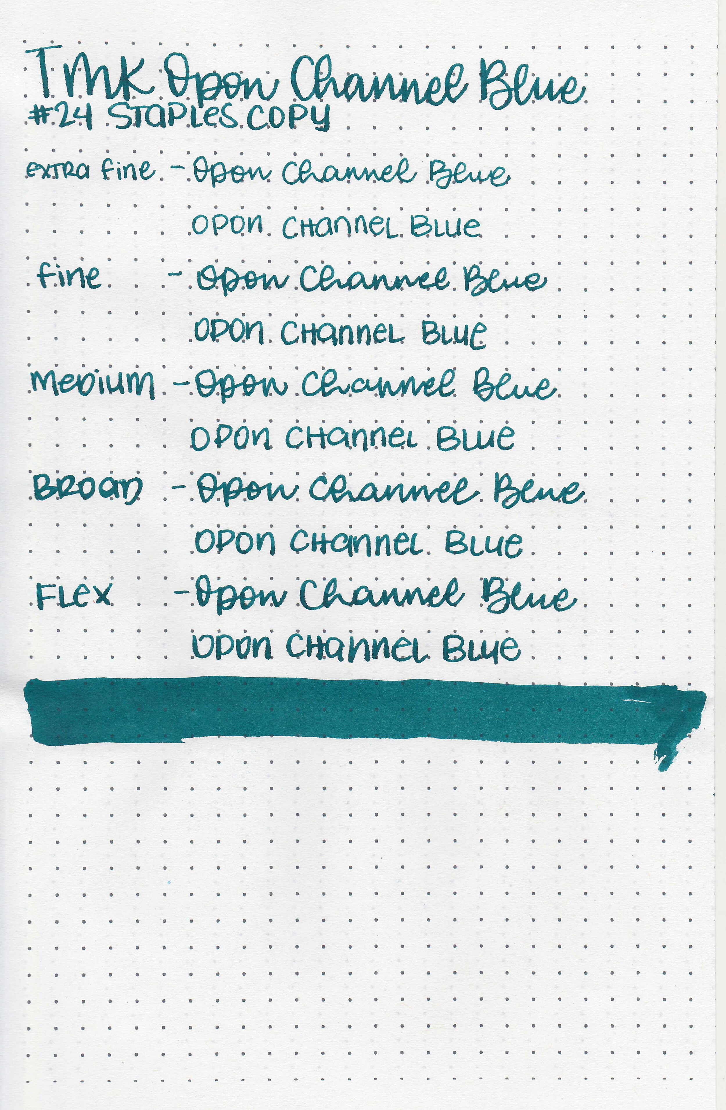
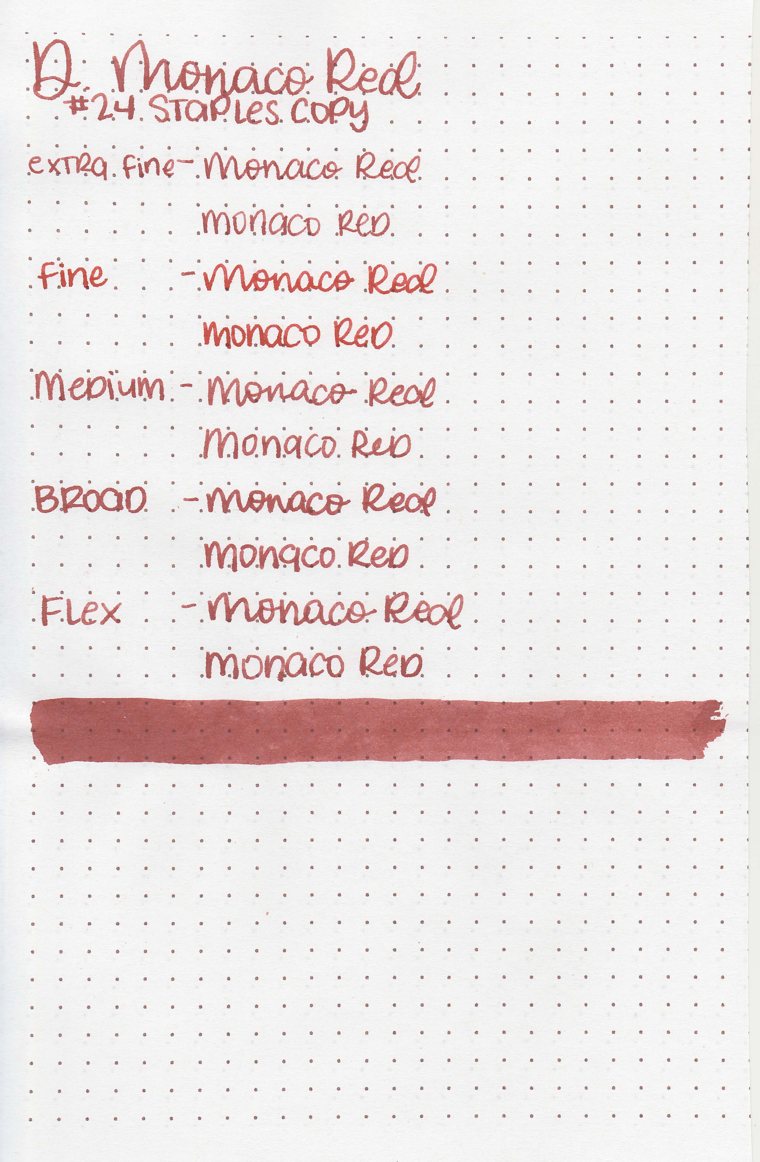
On Staples 24 lb copy paper there was lots of feathering in every nib size as well as some bleeding.
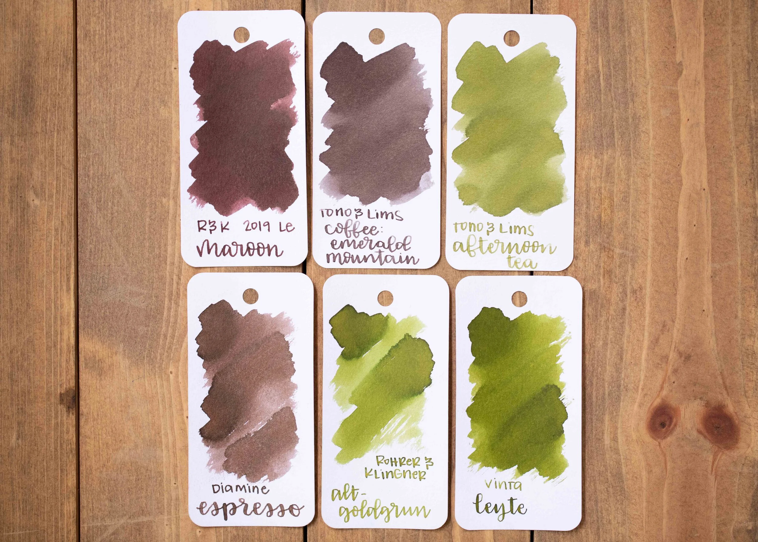
Comparison Swabs:
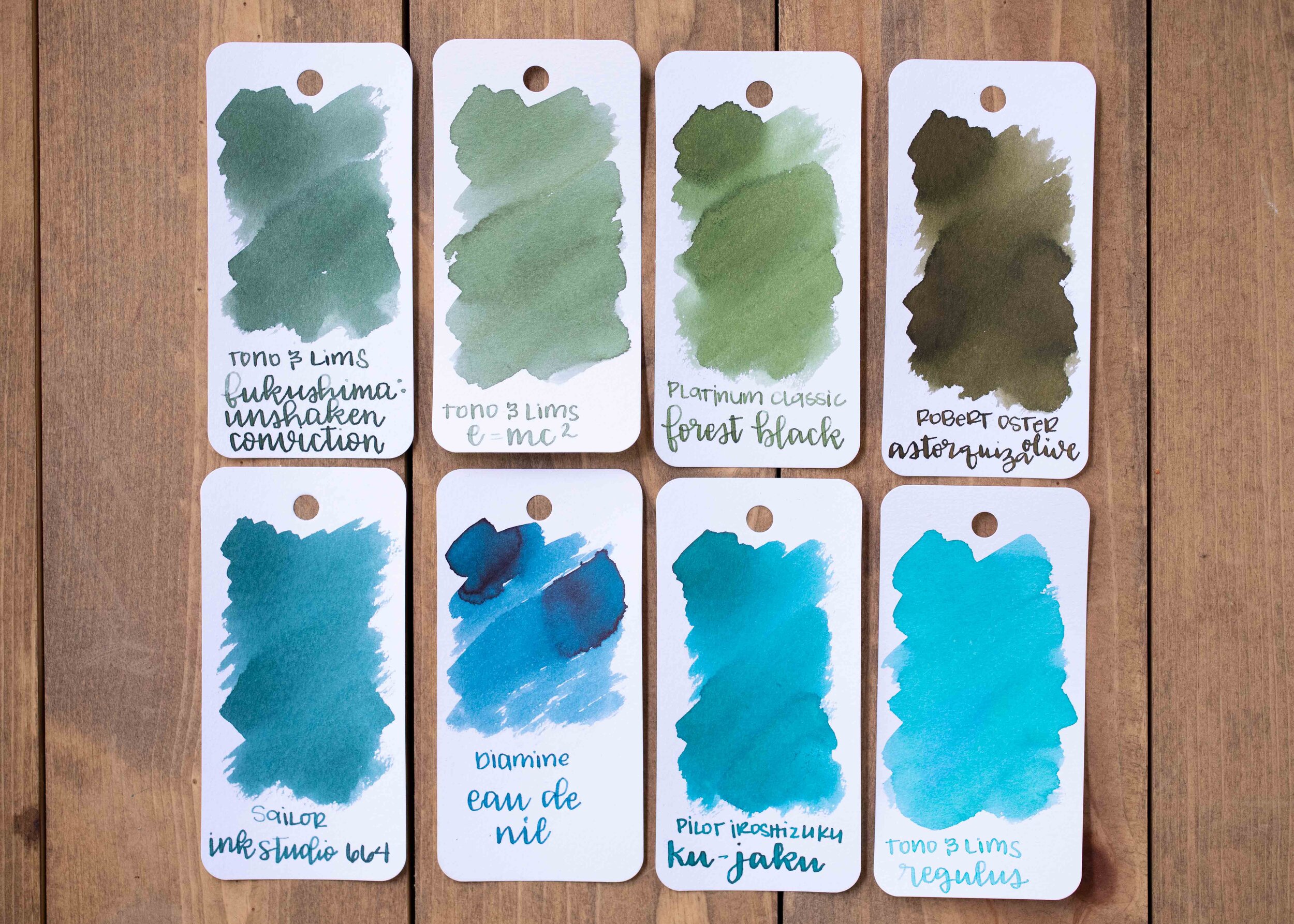
E=mc2 is less saturated than Platinum Classic Forest Black. Regulus is lighter and brighter on the Col-o-ring paper than Pilot Iroshizuku Ku-jaku.
Longer Writing:


I used a Taroko Enigma notebook. Both inks had a slightly dry flow.
Overall, both are really interesting, but out of the two I like Regulus the best (and not only because the name reminds me of Harry Potter).
Disclaimer: These inks were provided by Shigure Inks for the purpose of this review. All photos and opinions are my own. This page does not contain affiliate links, and is not sponsored in any way.