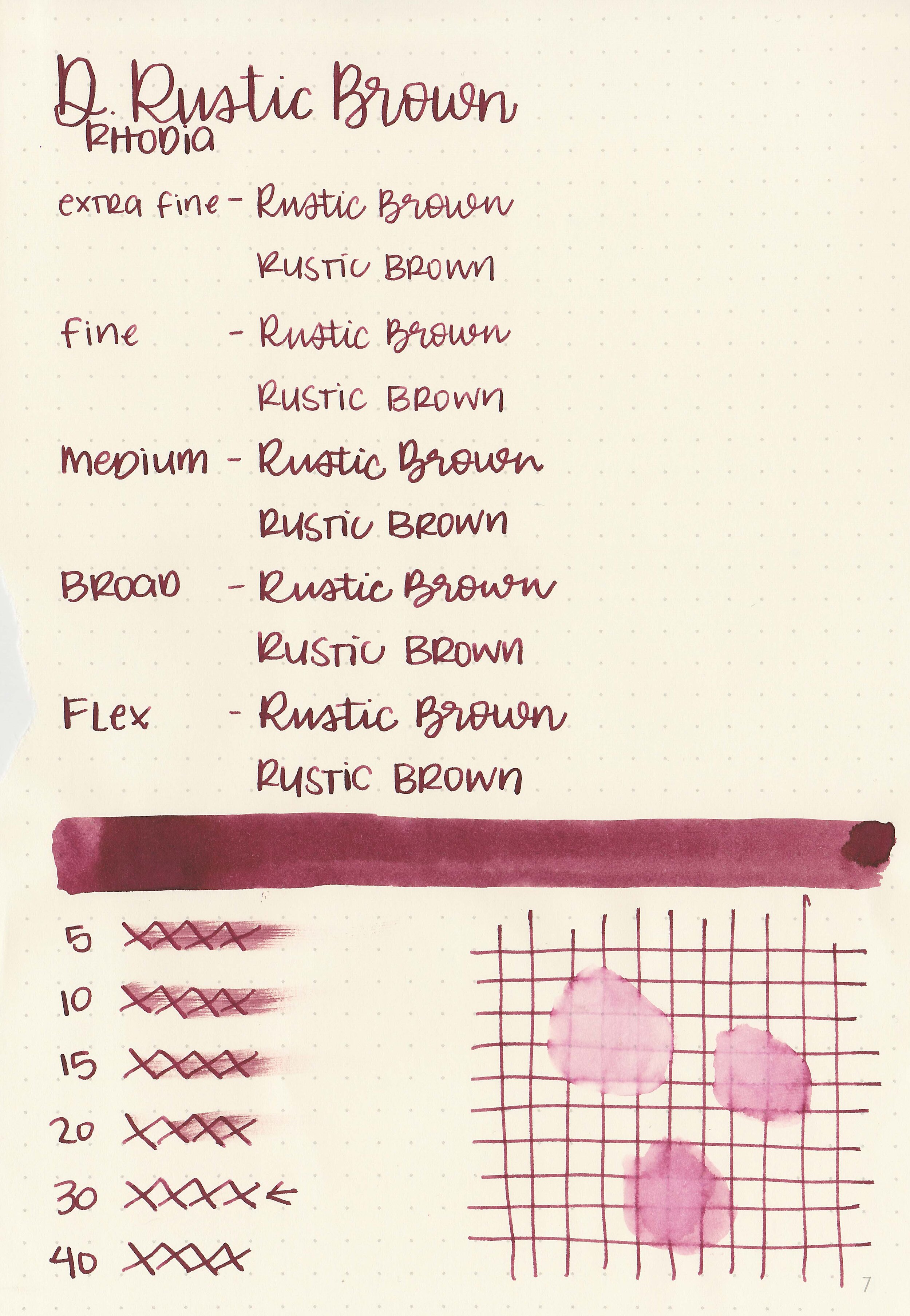
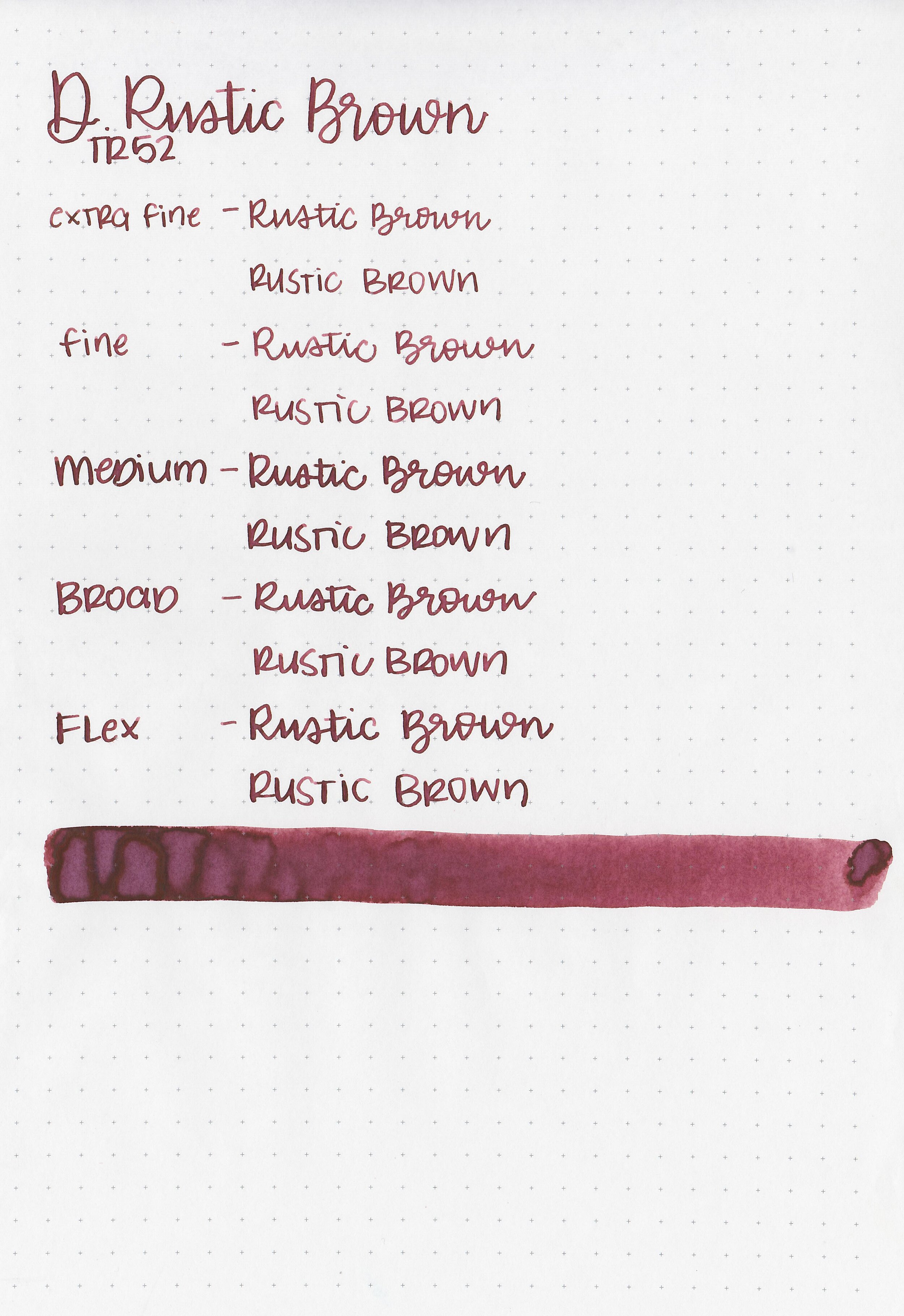
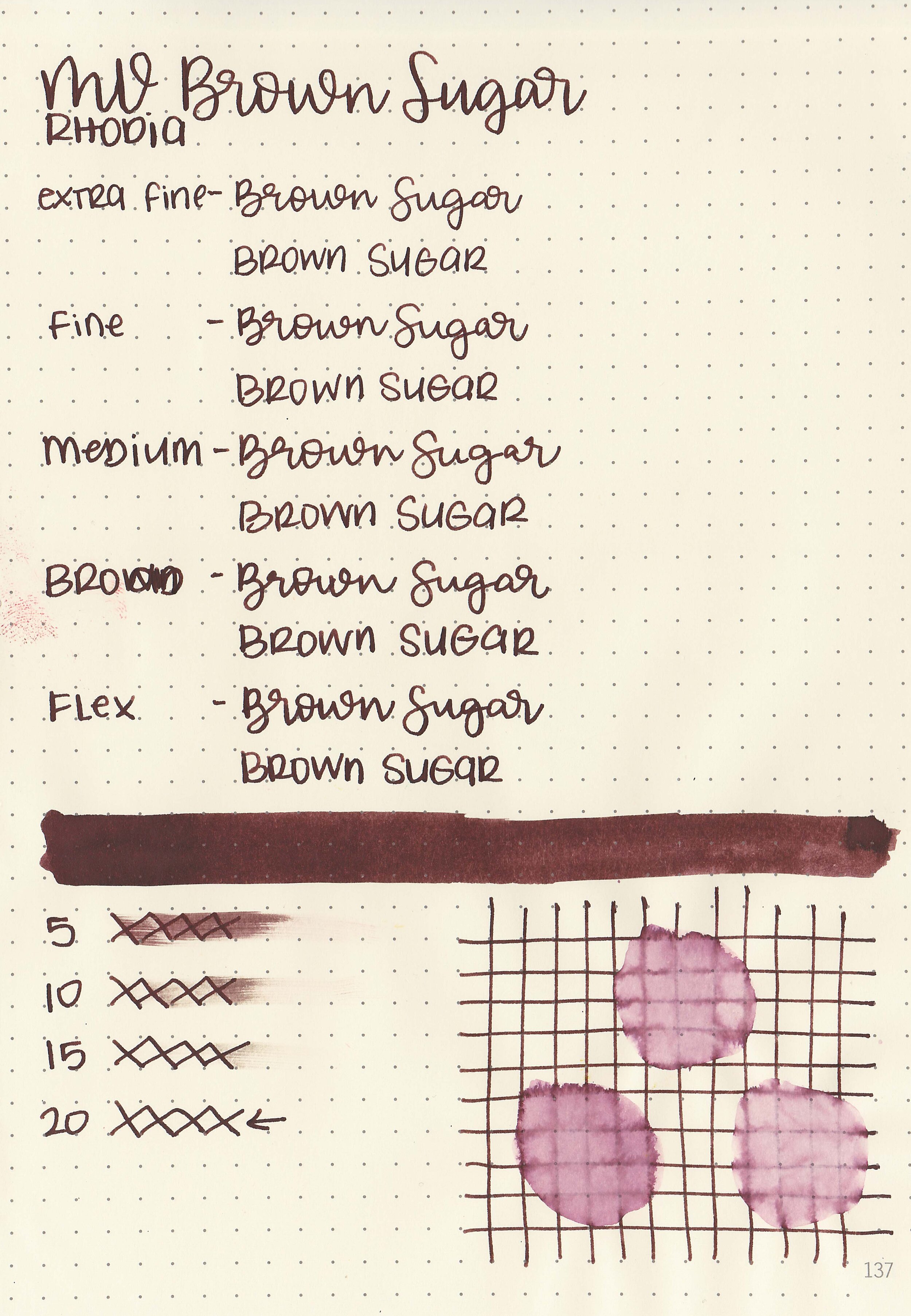
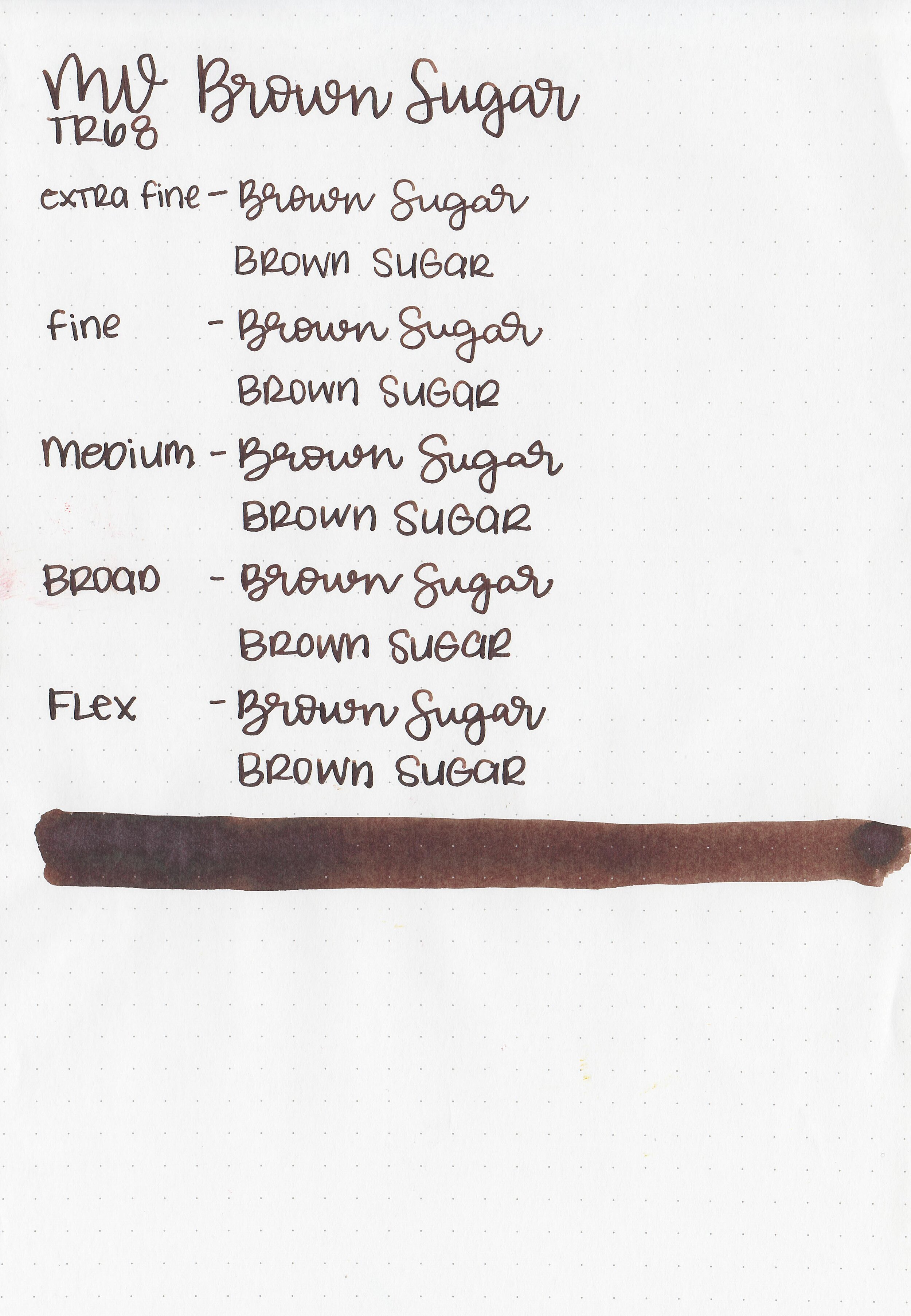
Ink Review #1219: Diamine Saddle Brown
/
I love how affordable Diamine inks are, and they come in multiple bottle sizes which is great. I purchased a bottle of Diamine Rustic Brown from Cult Pens a while ago, but never played with it much until now.
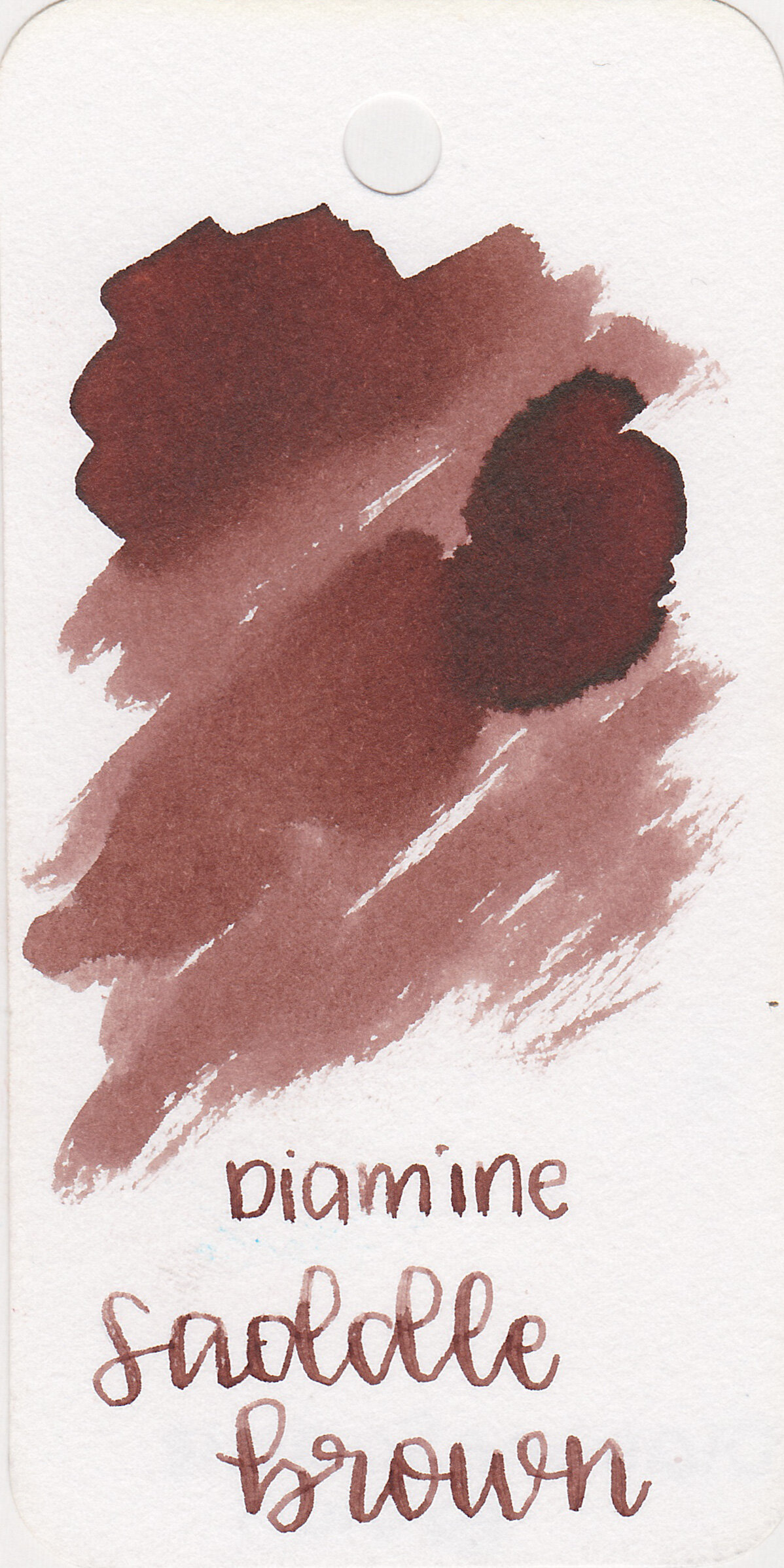
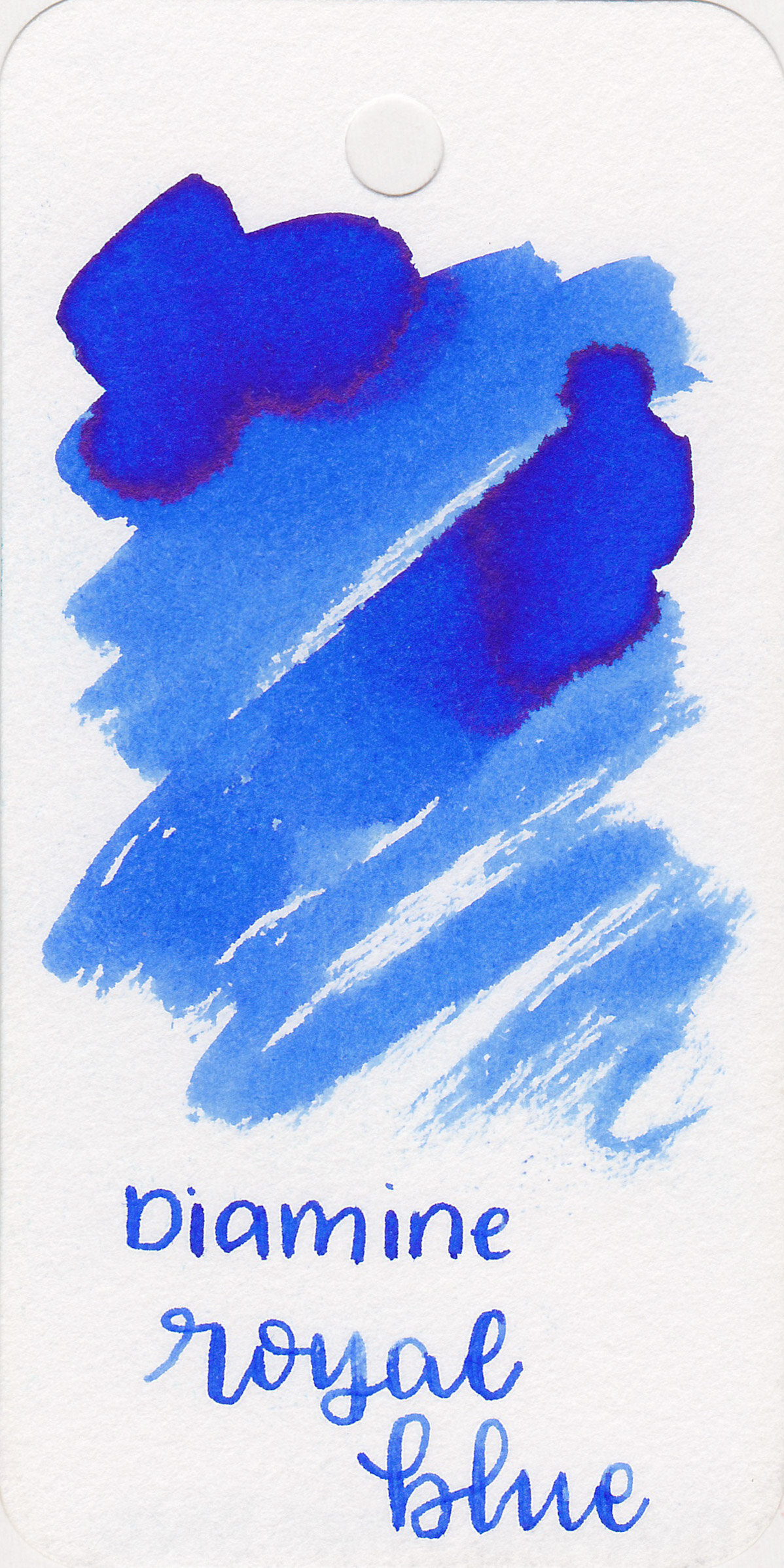
The color:
Saddle Brown is a very unsaturated red-brown.
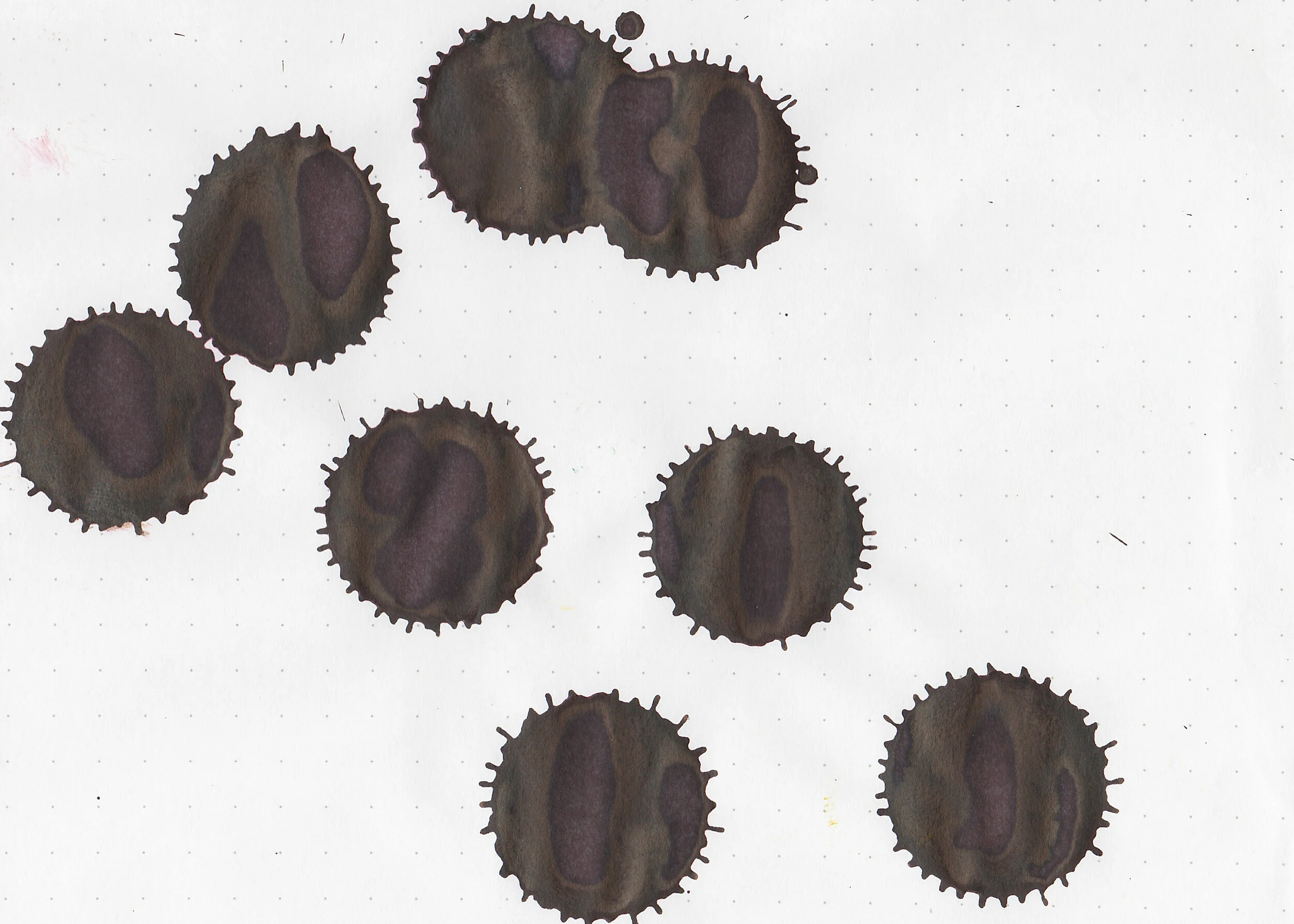
Swabs:

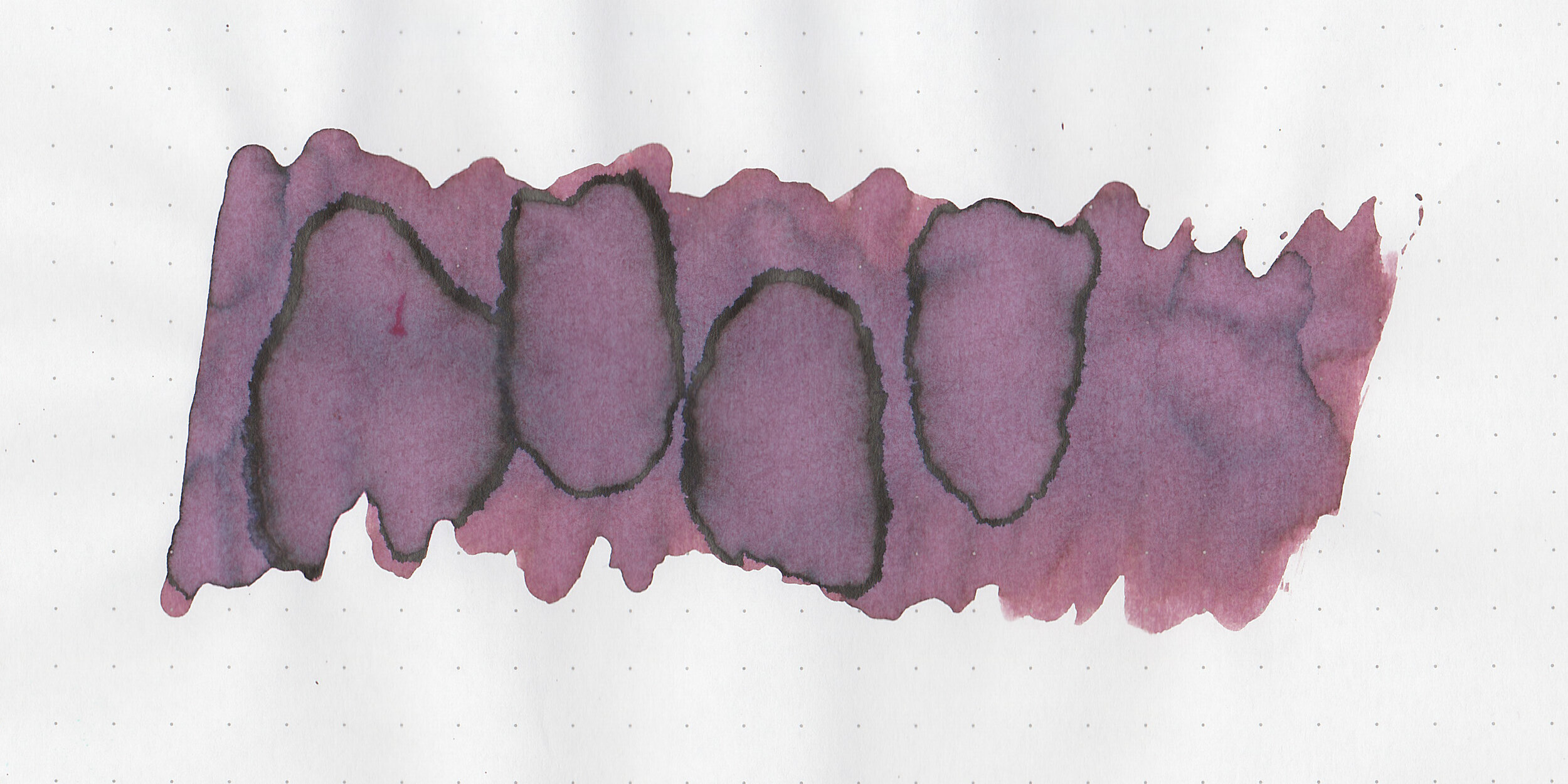
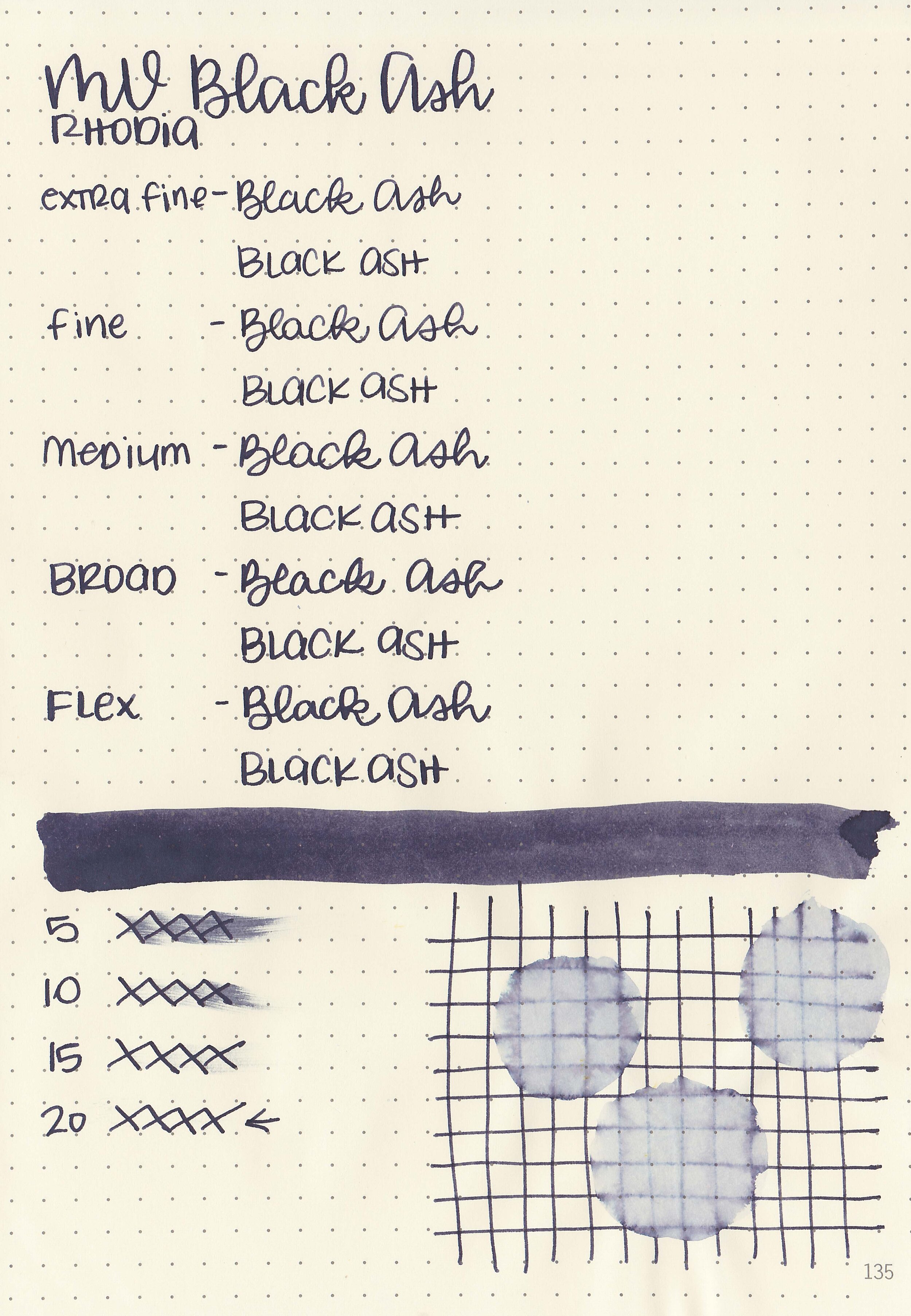
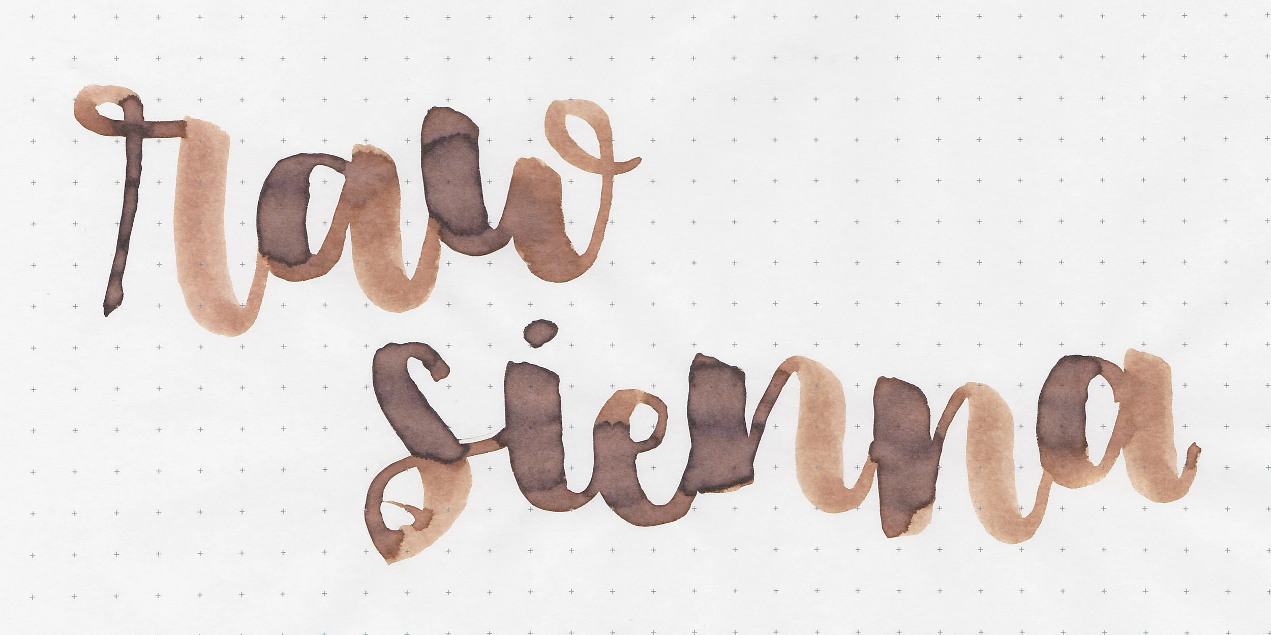
In large swabs on Tomoe River paper the ink looks more purple.

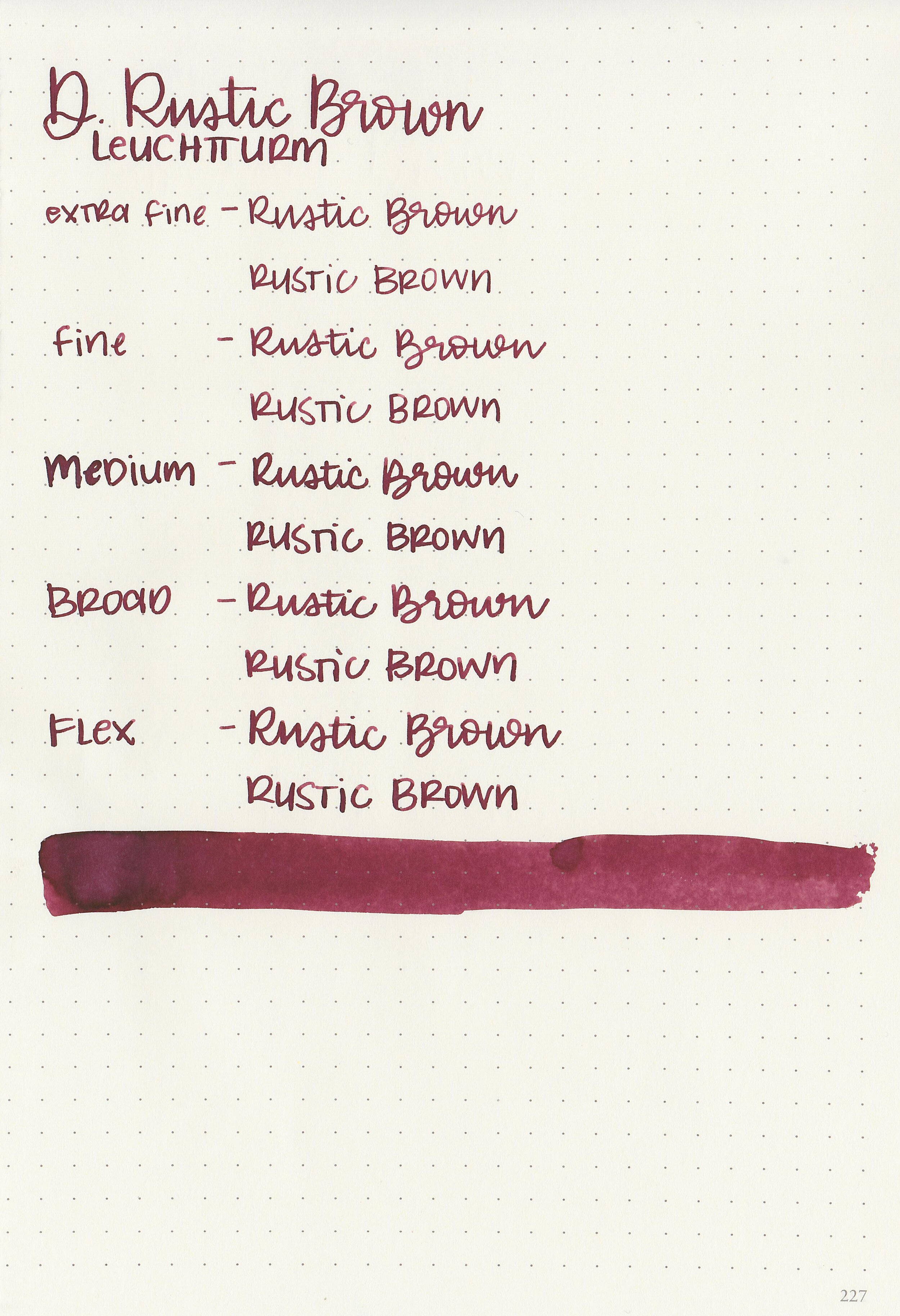
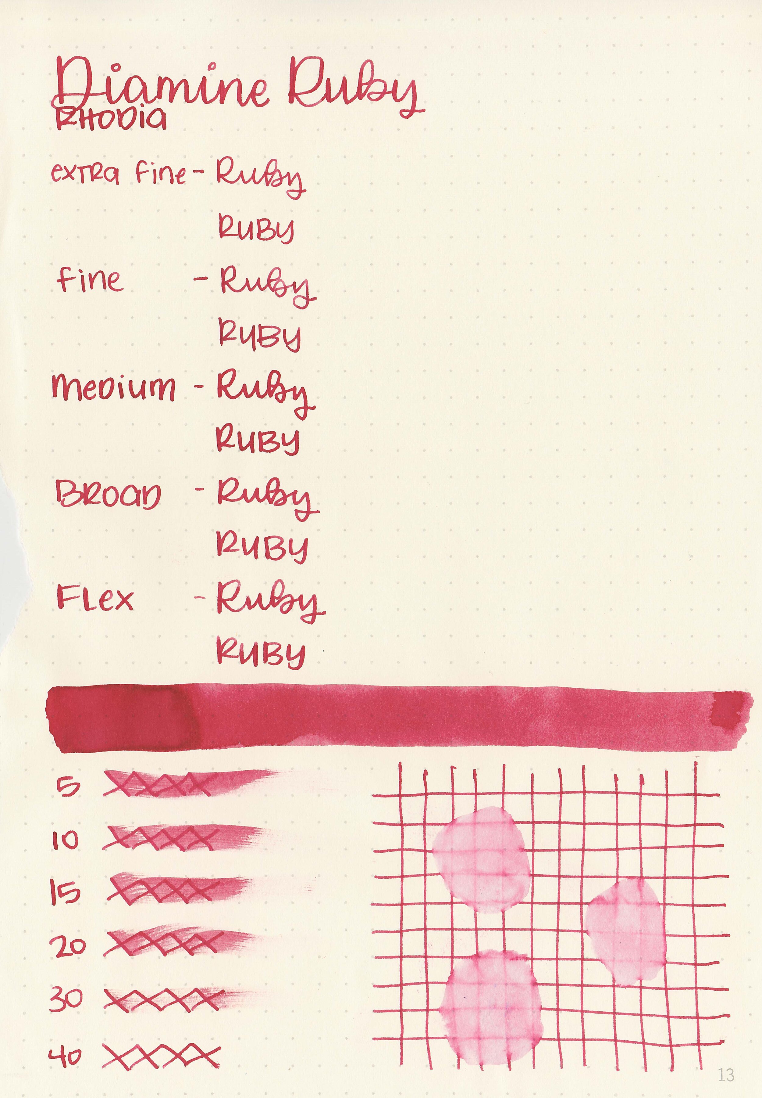
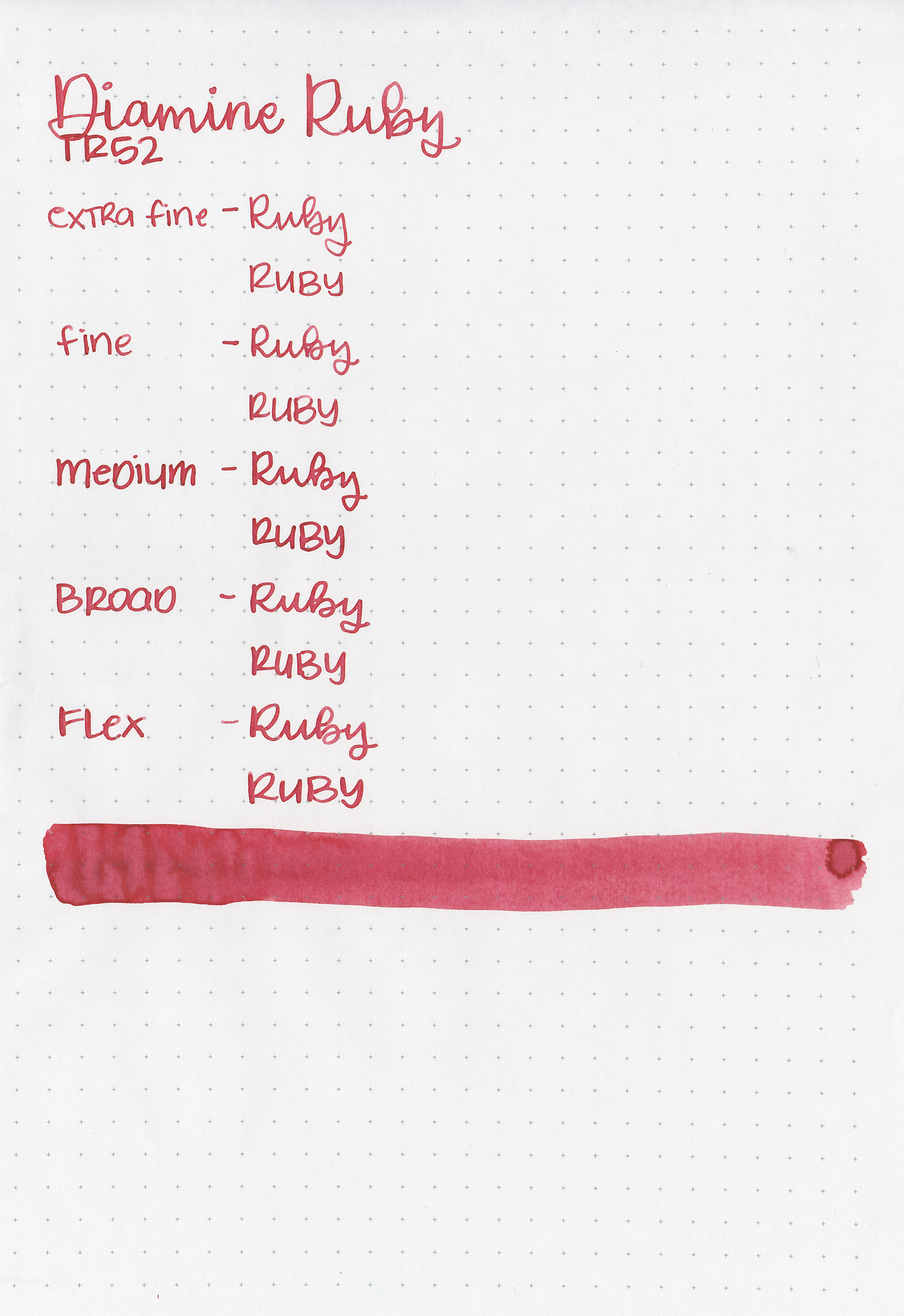
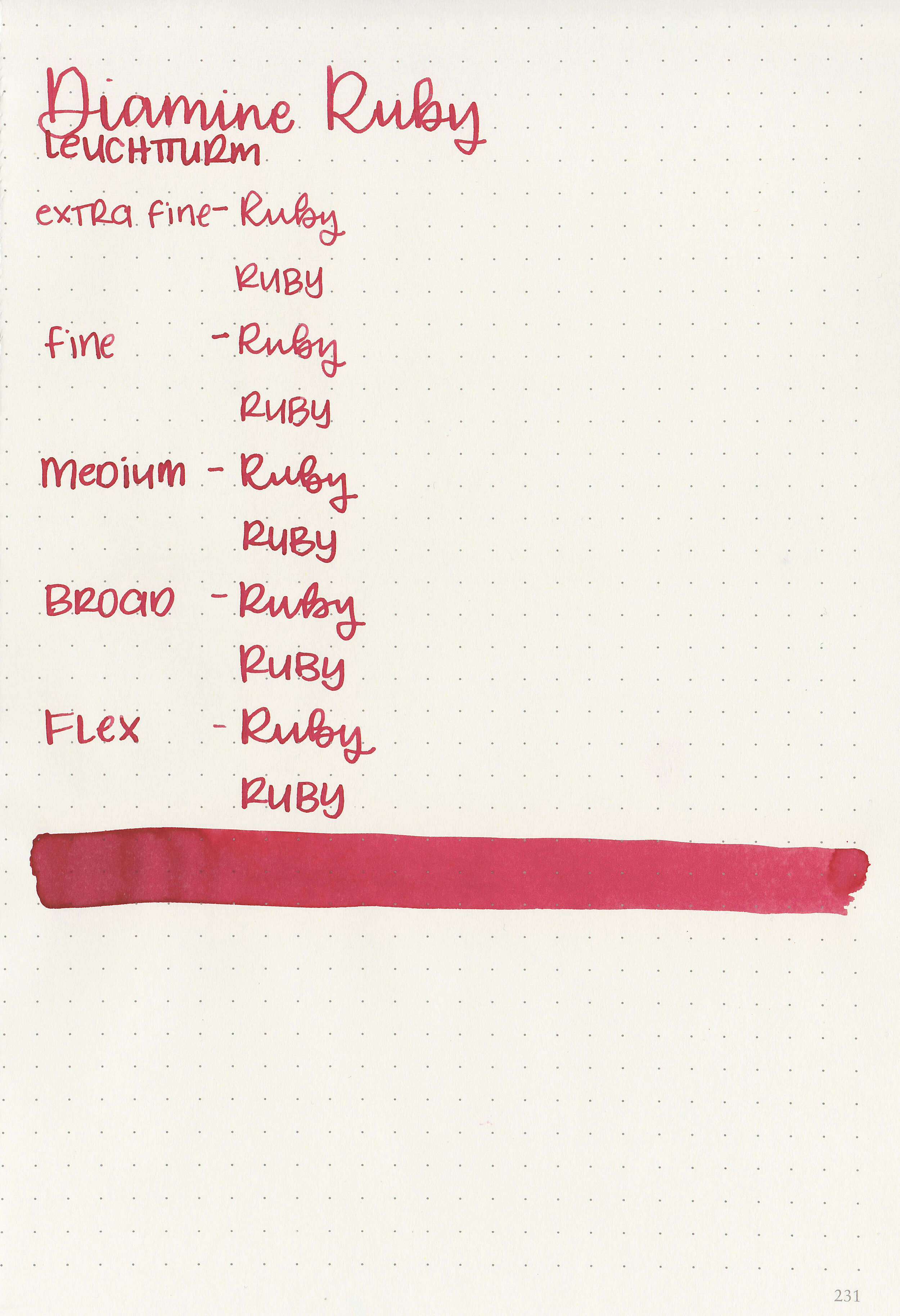
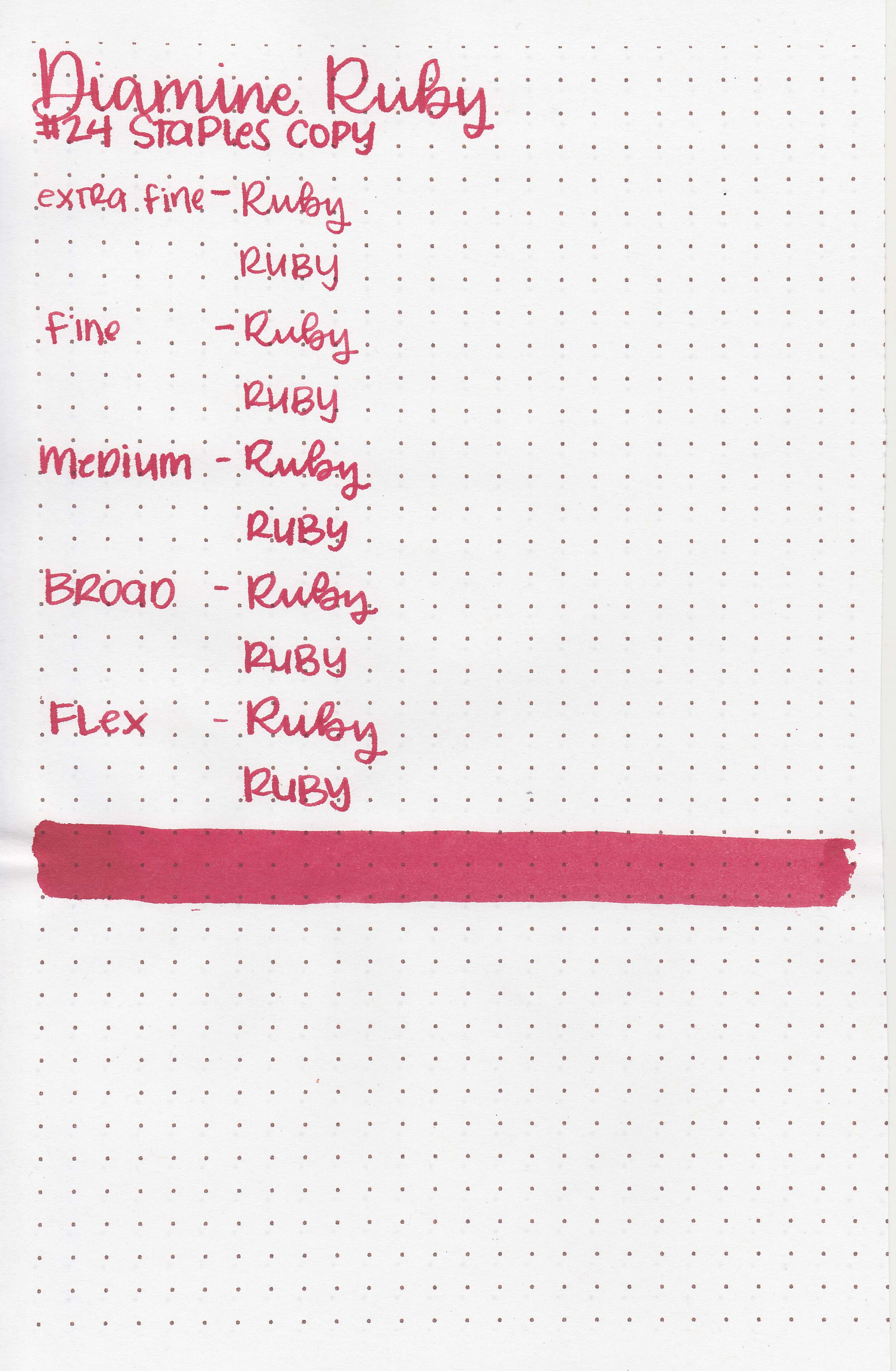
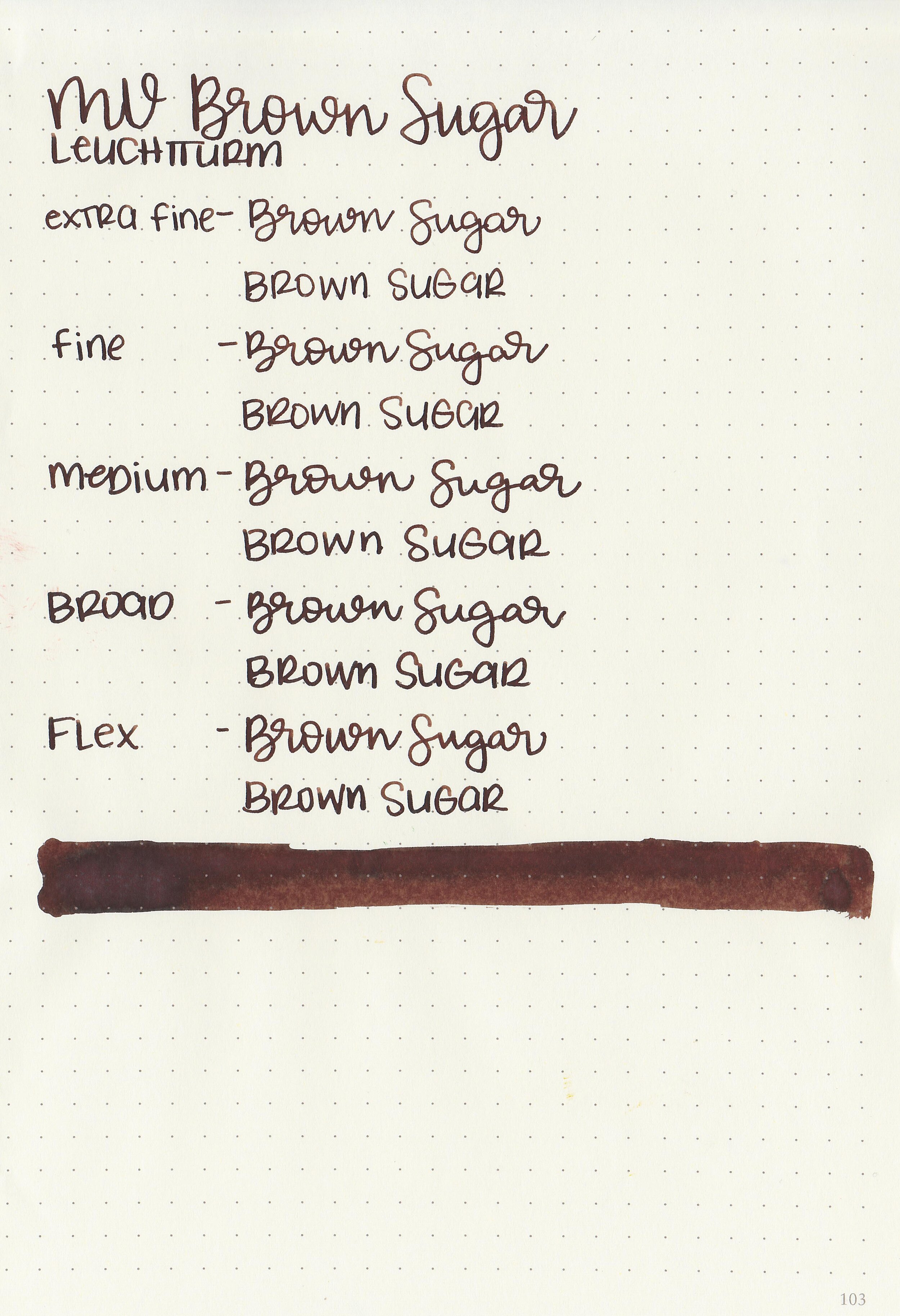
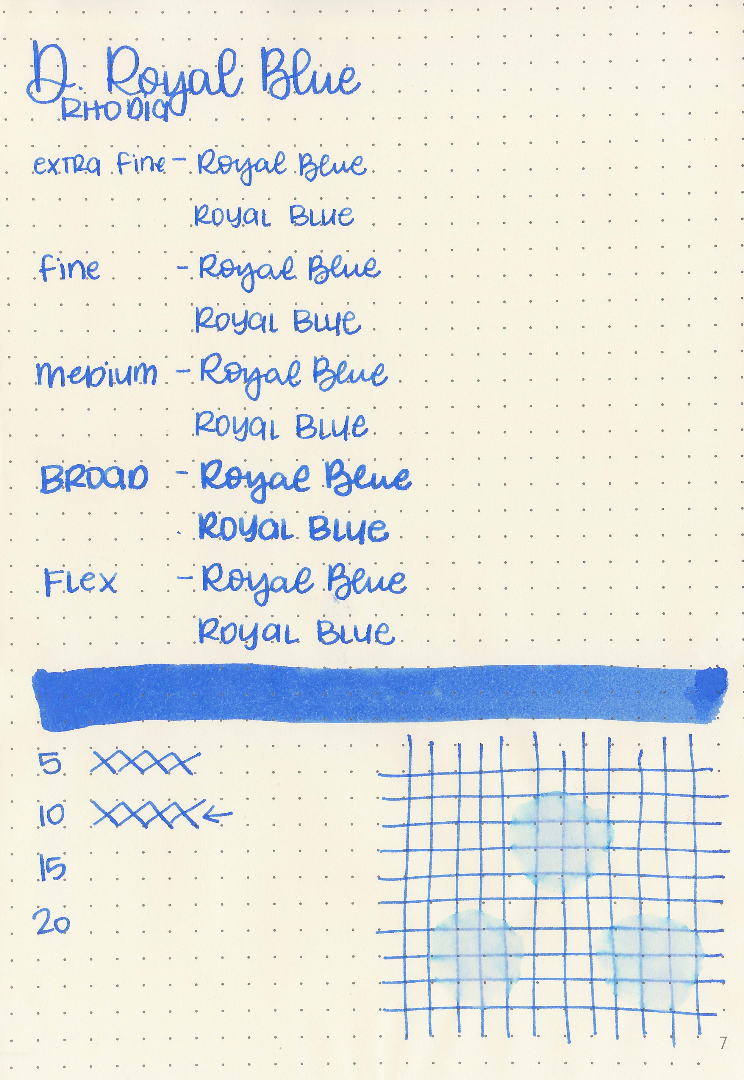
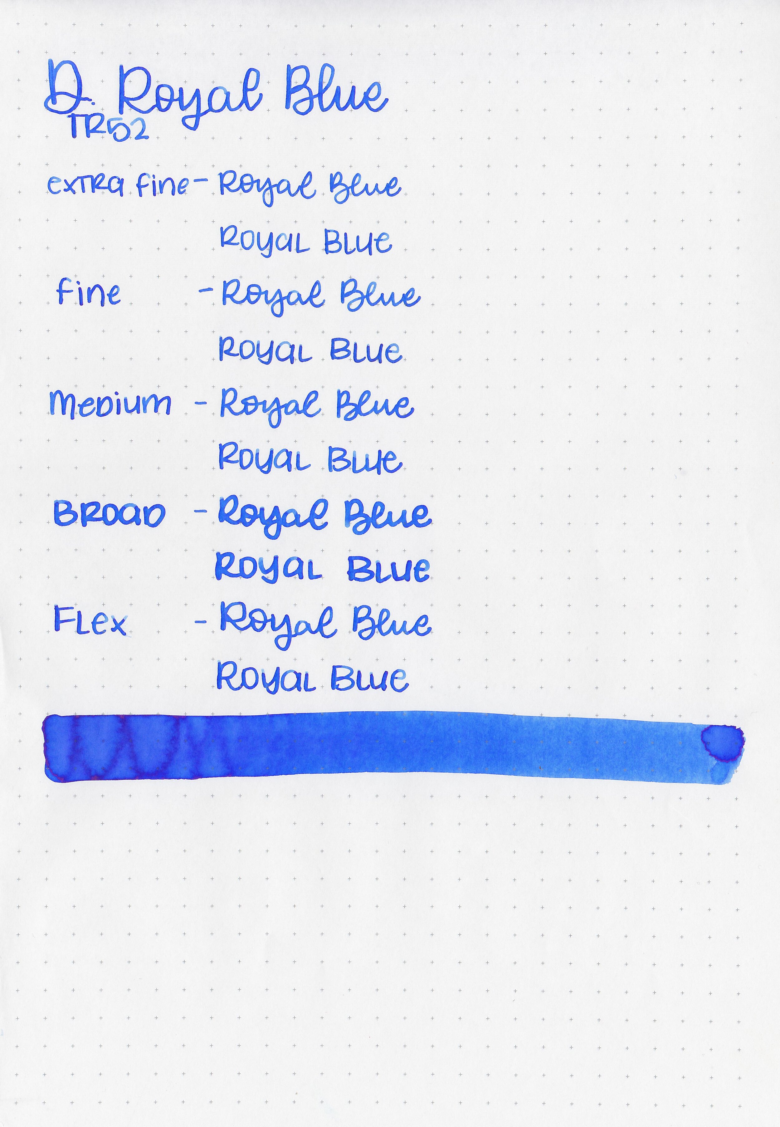
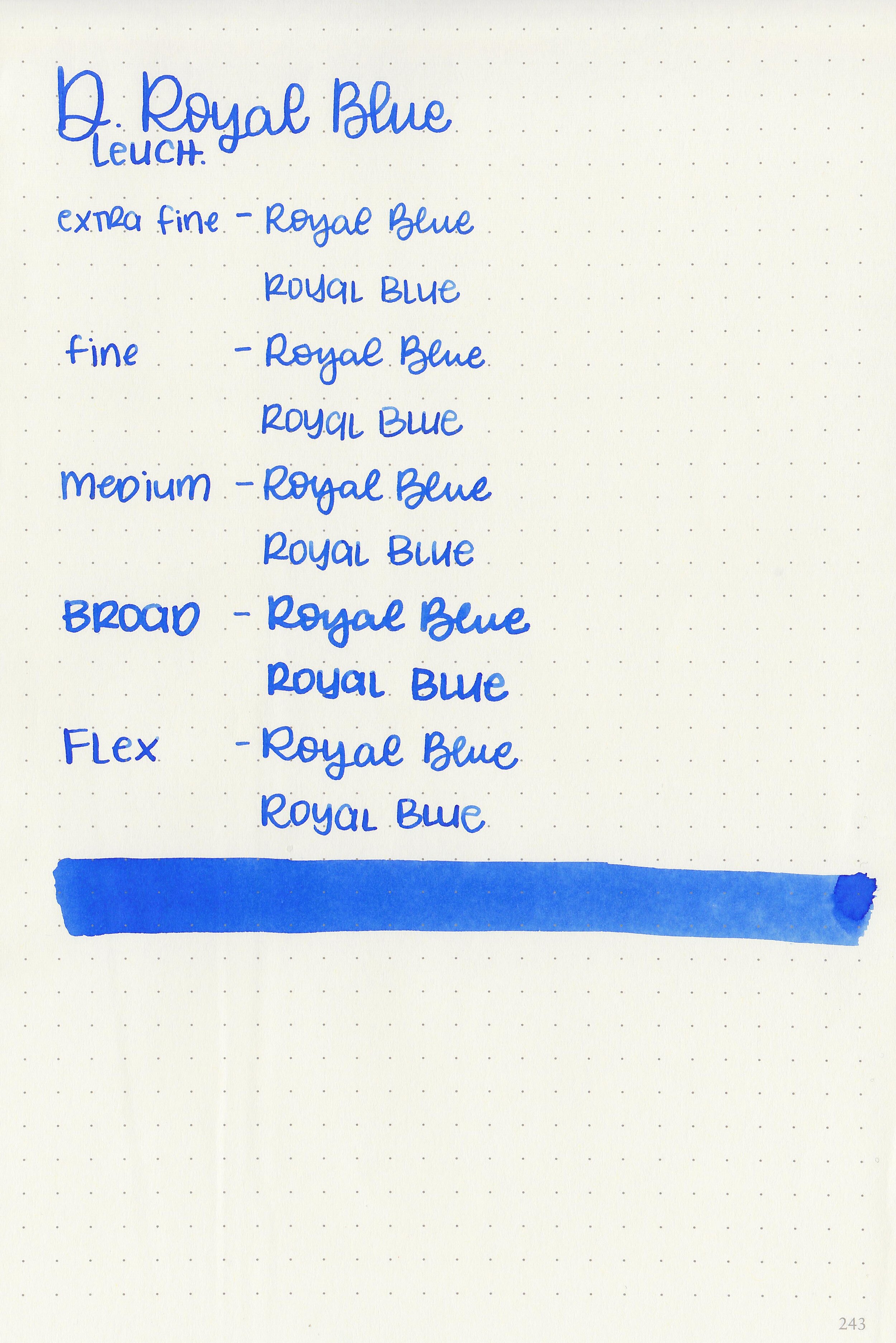
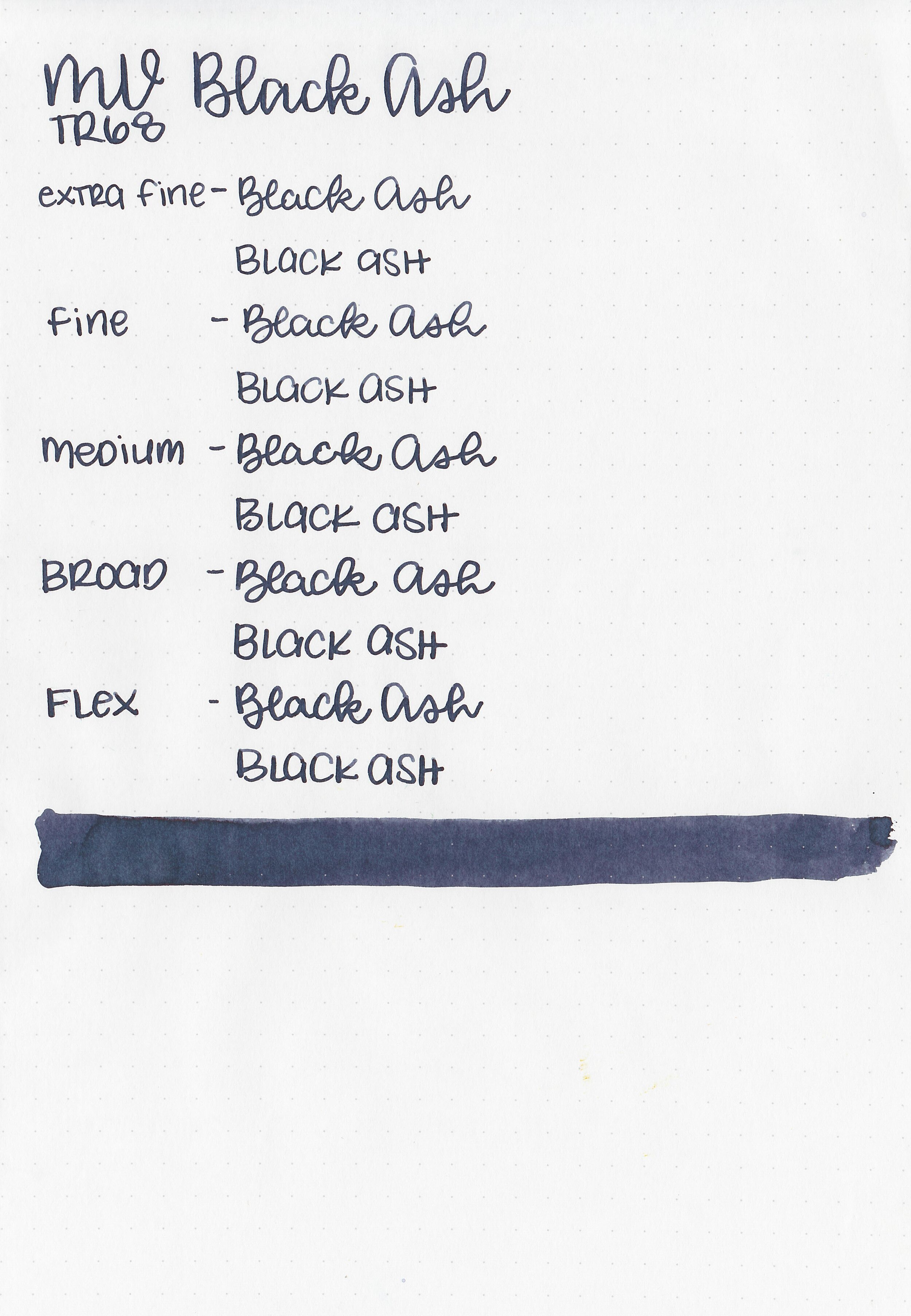
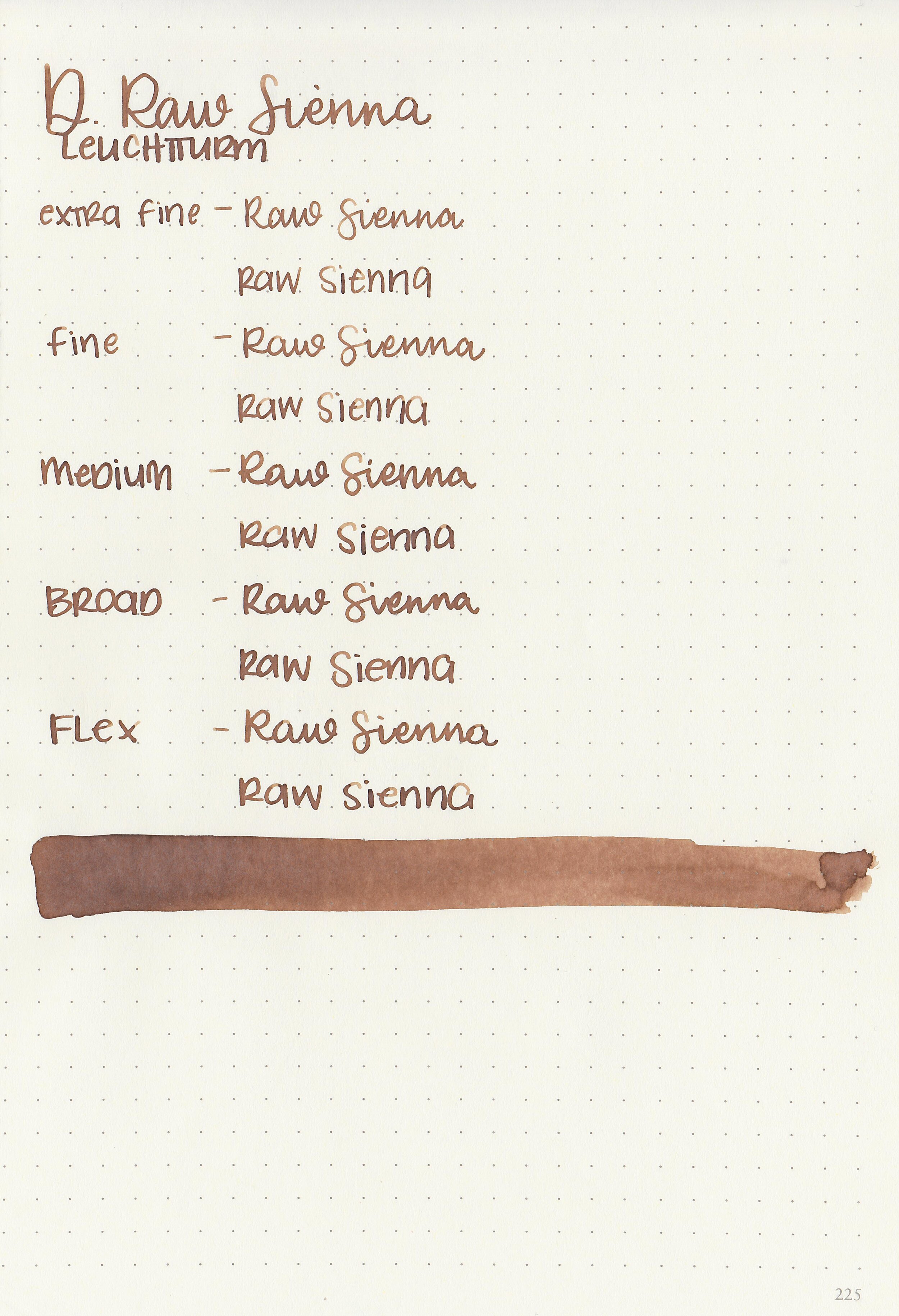
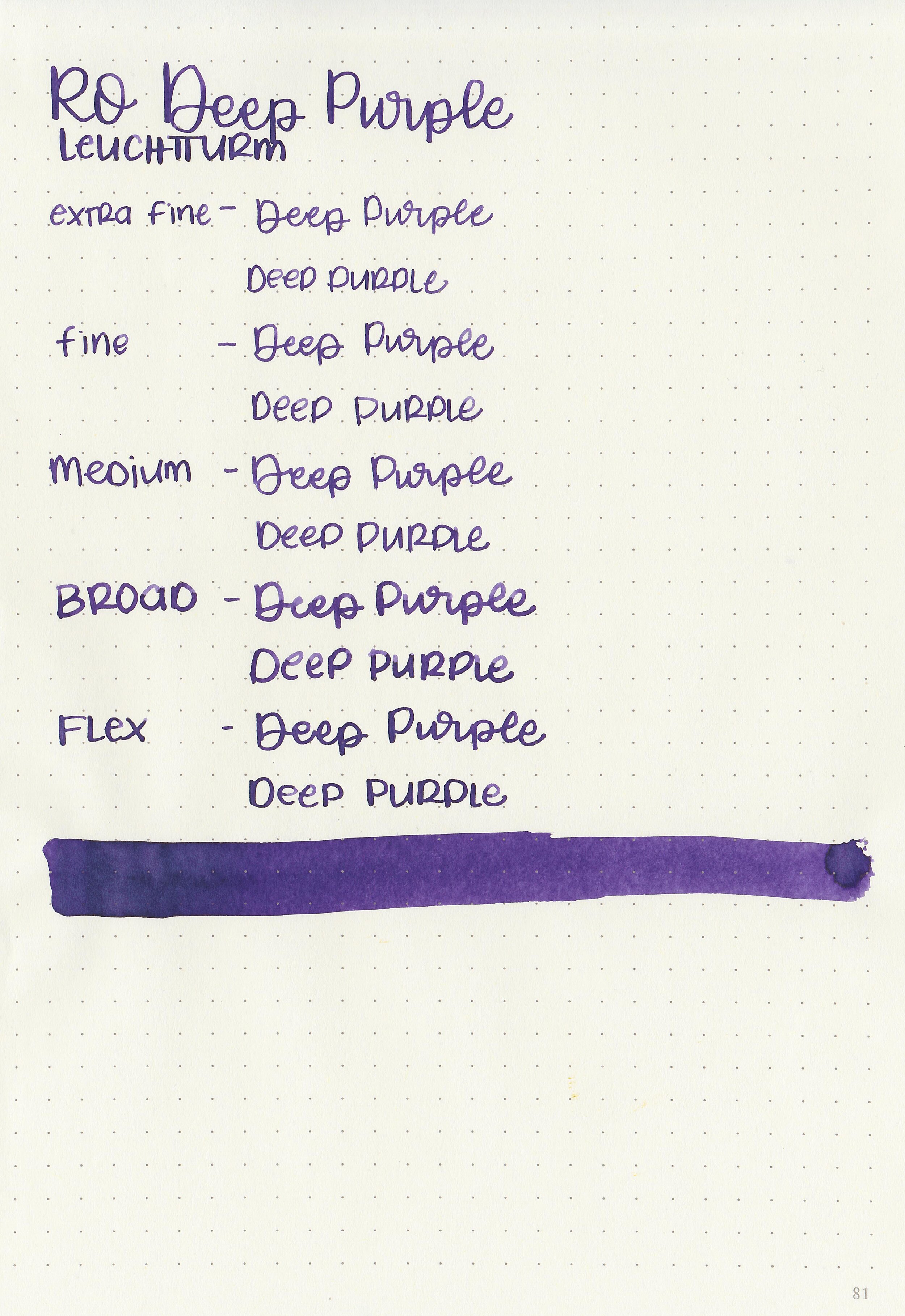
Writing samples:
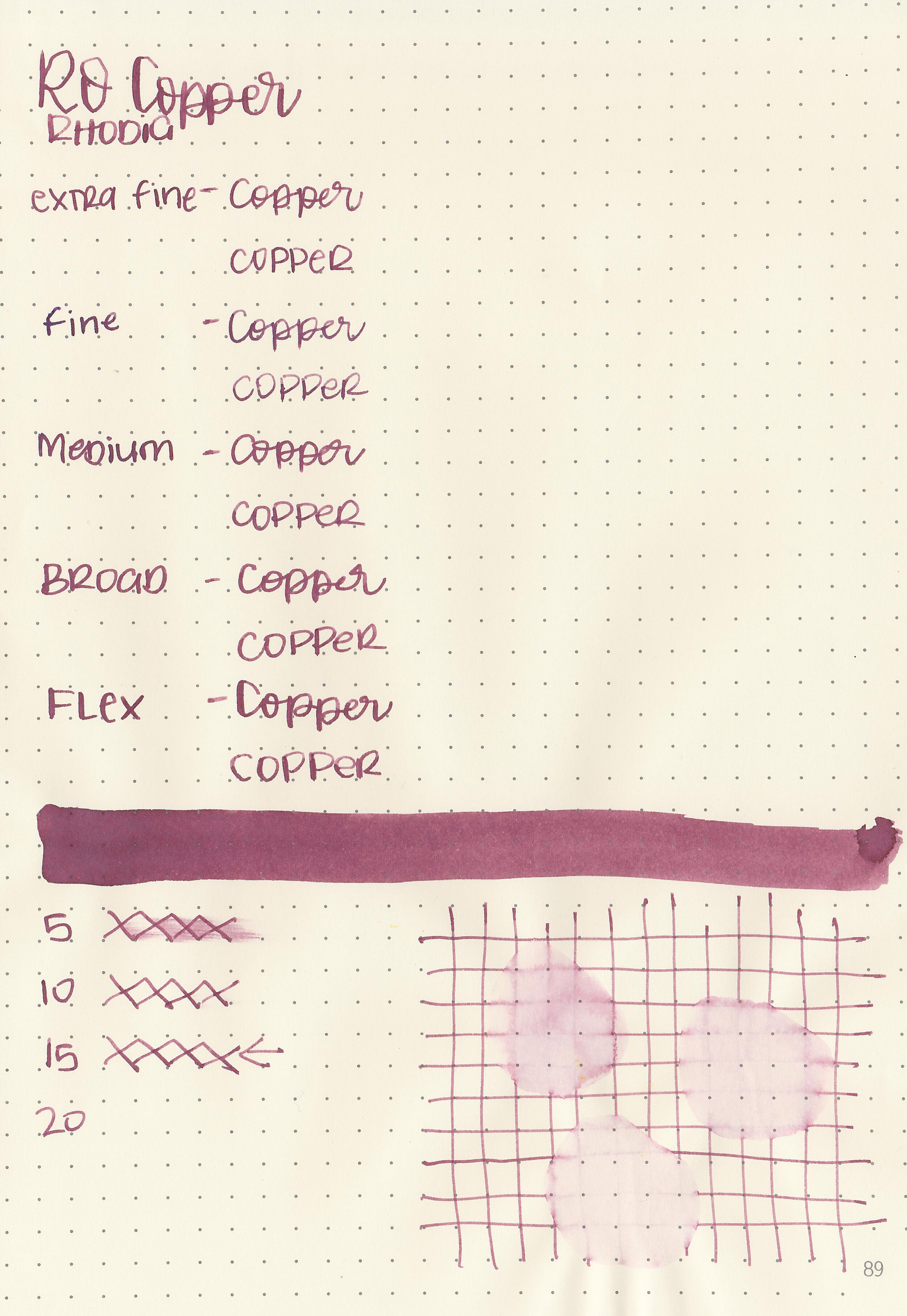
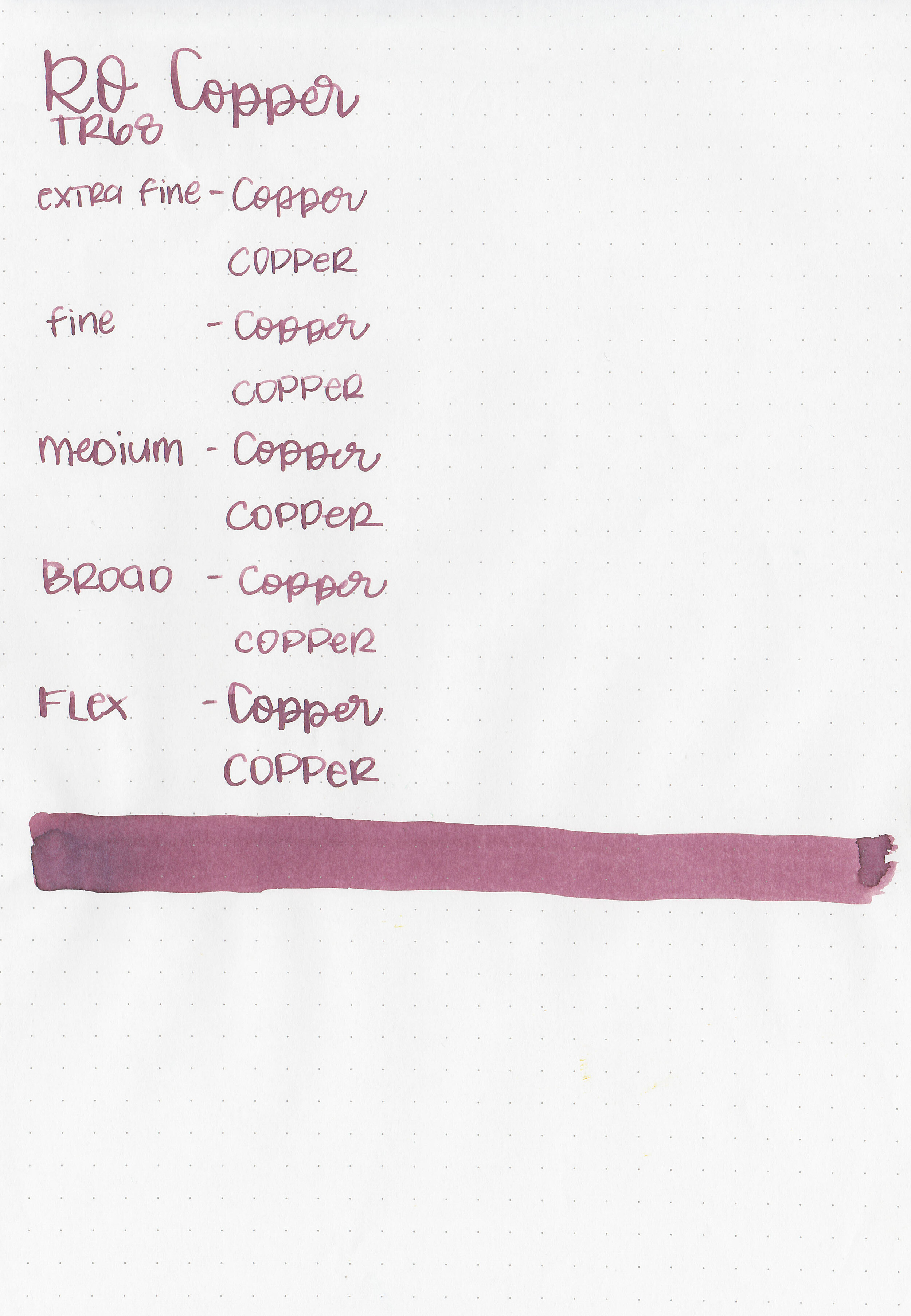
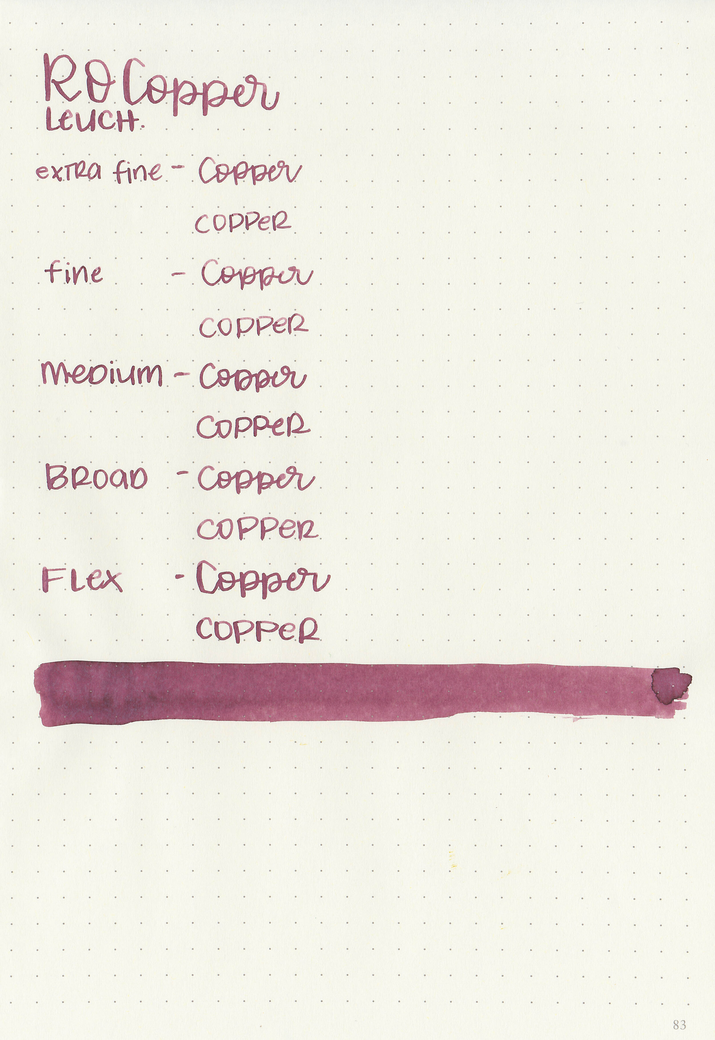
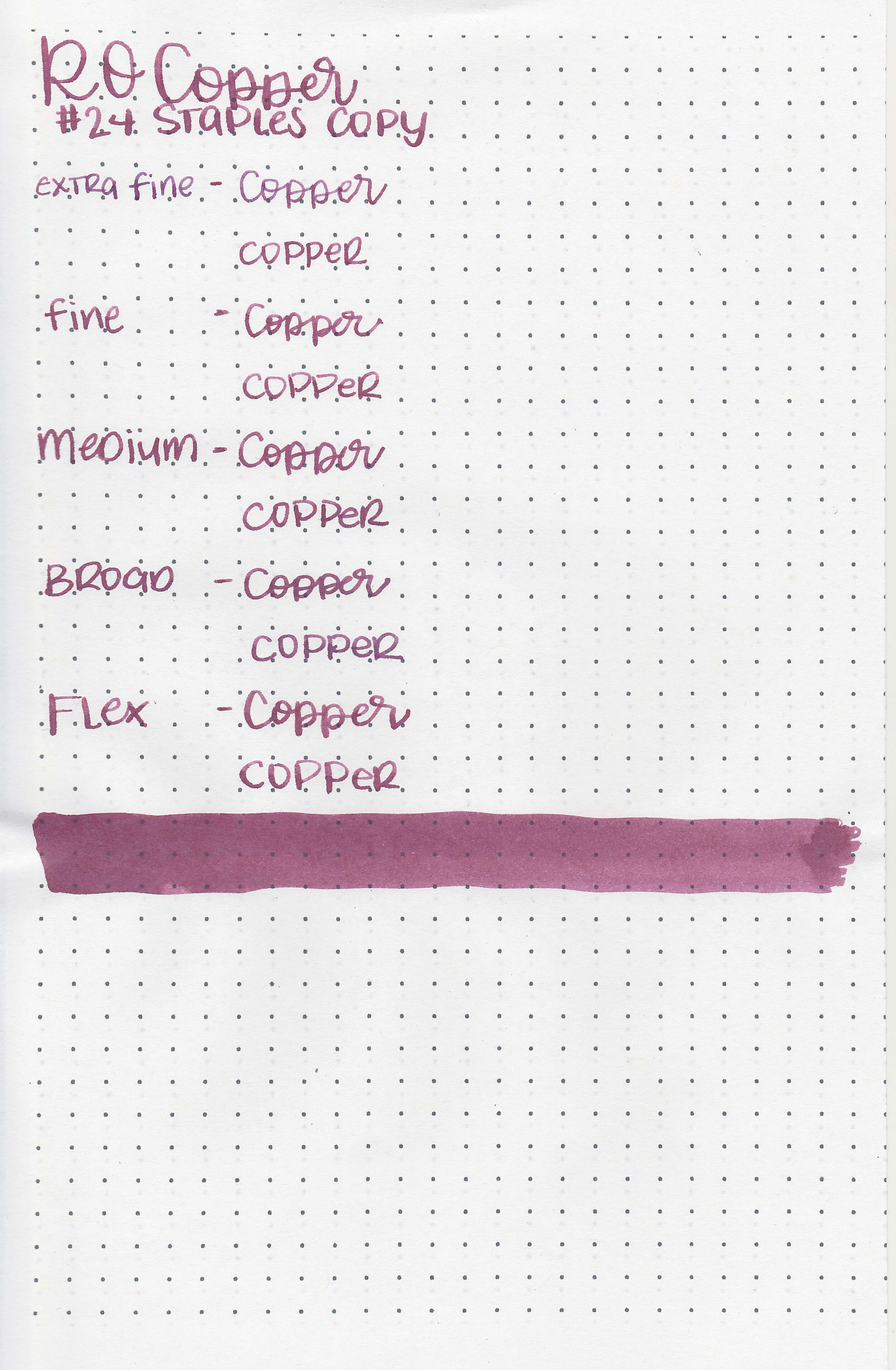
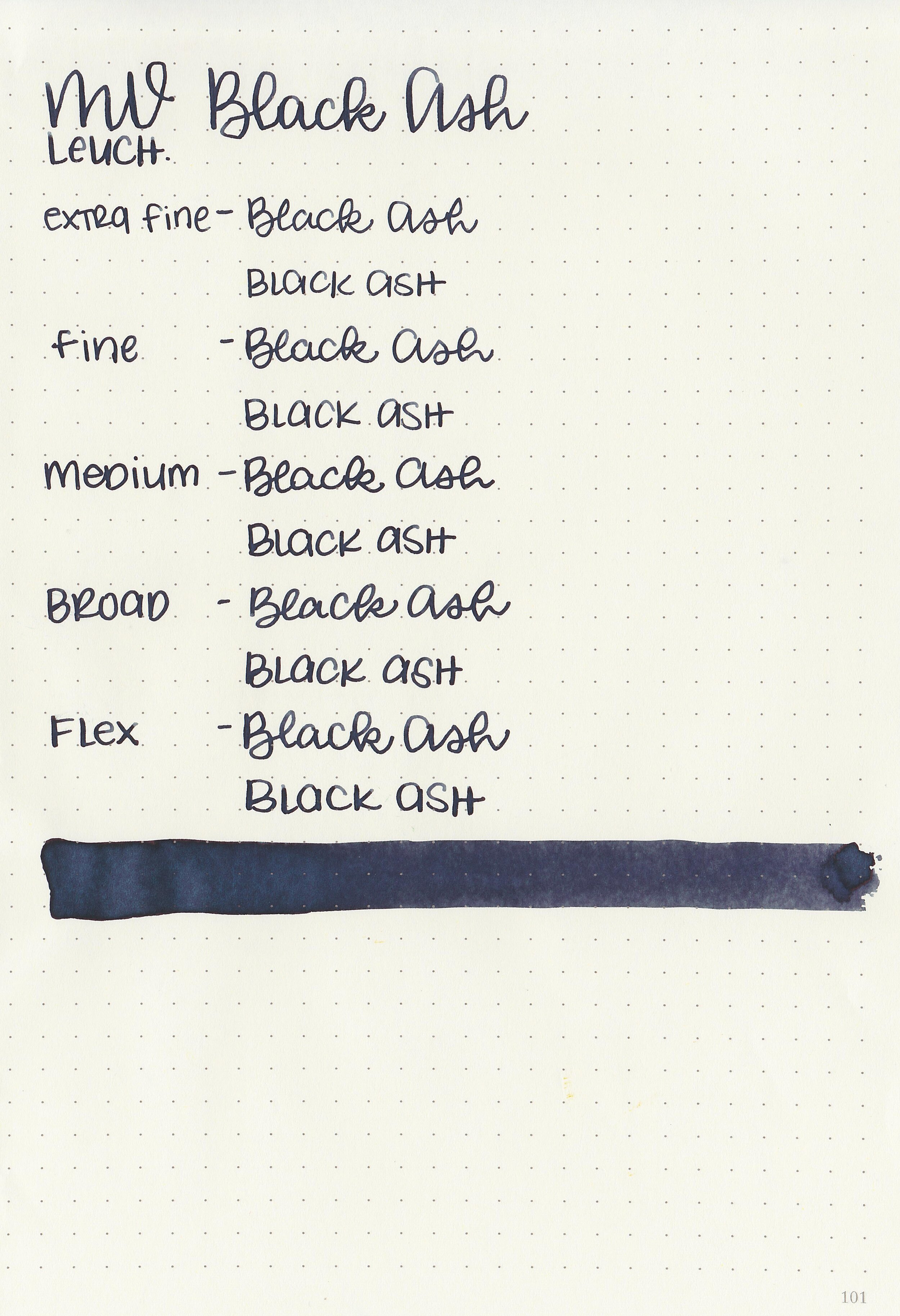
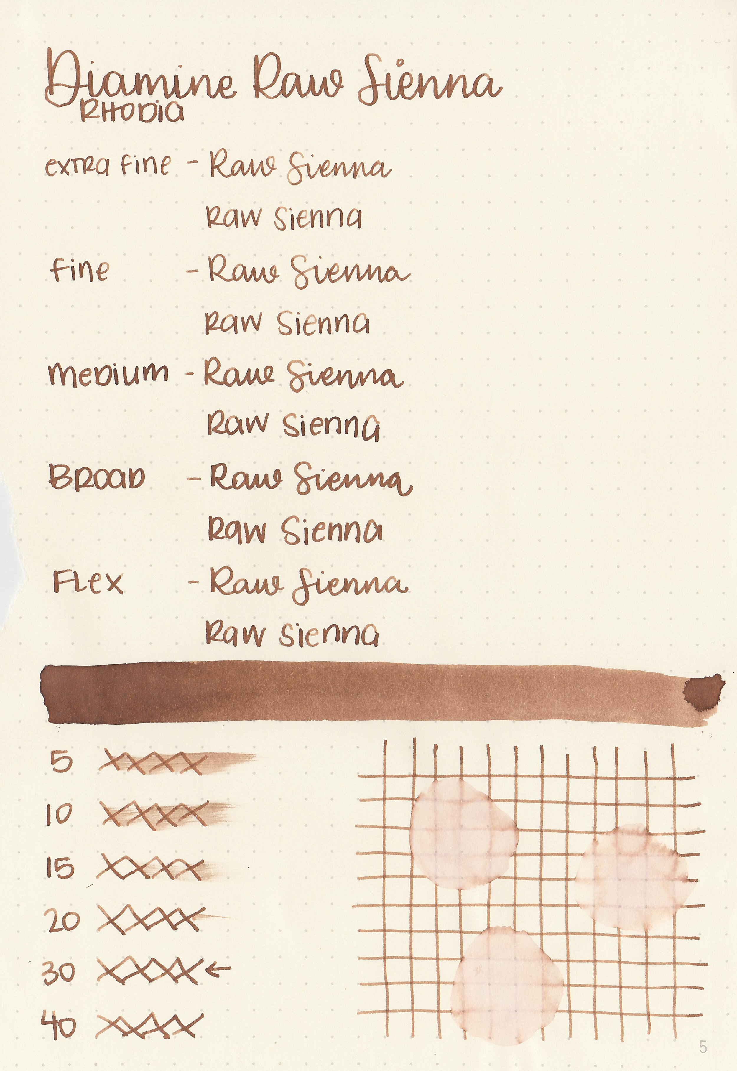
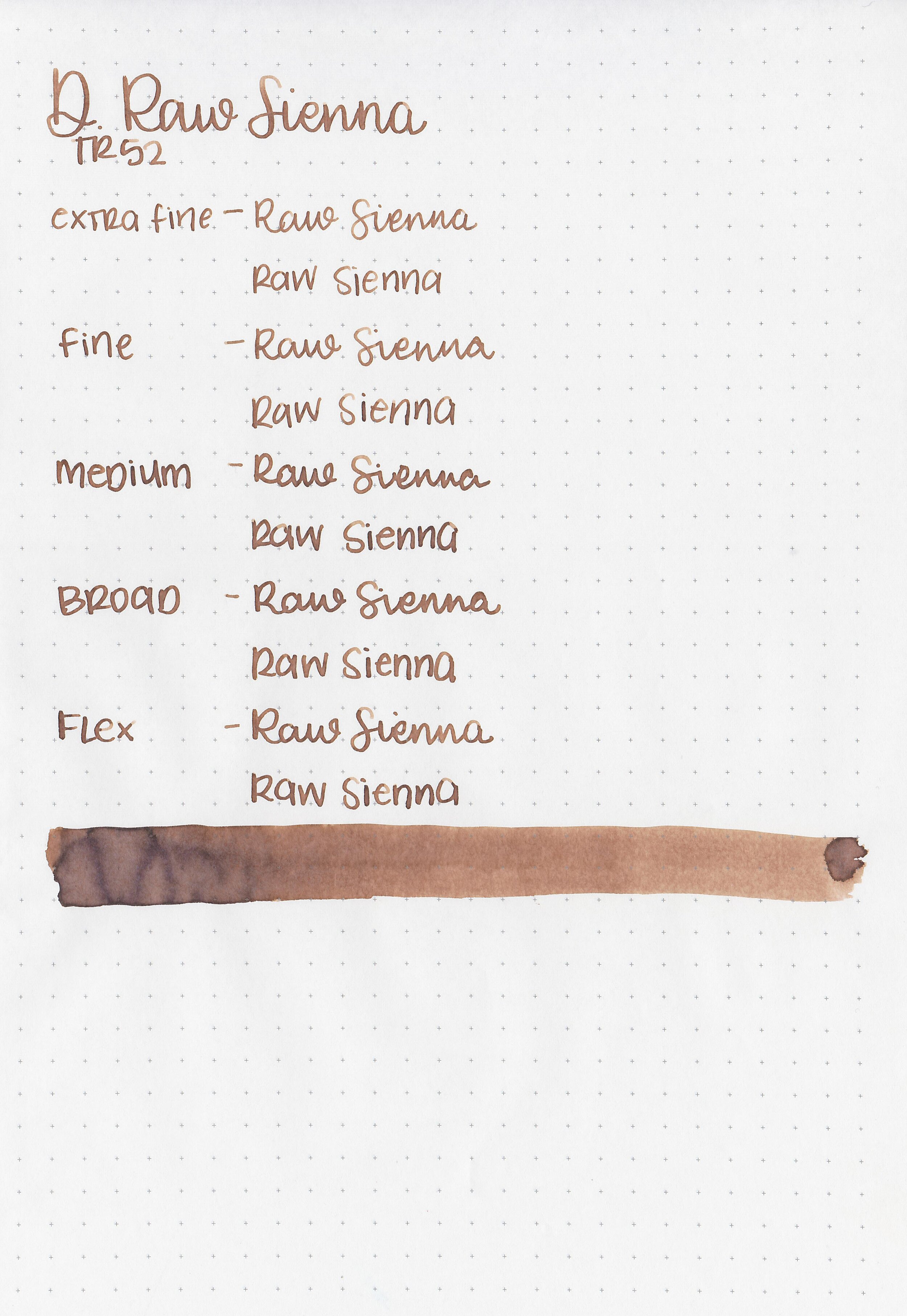
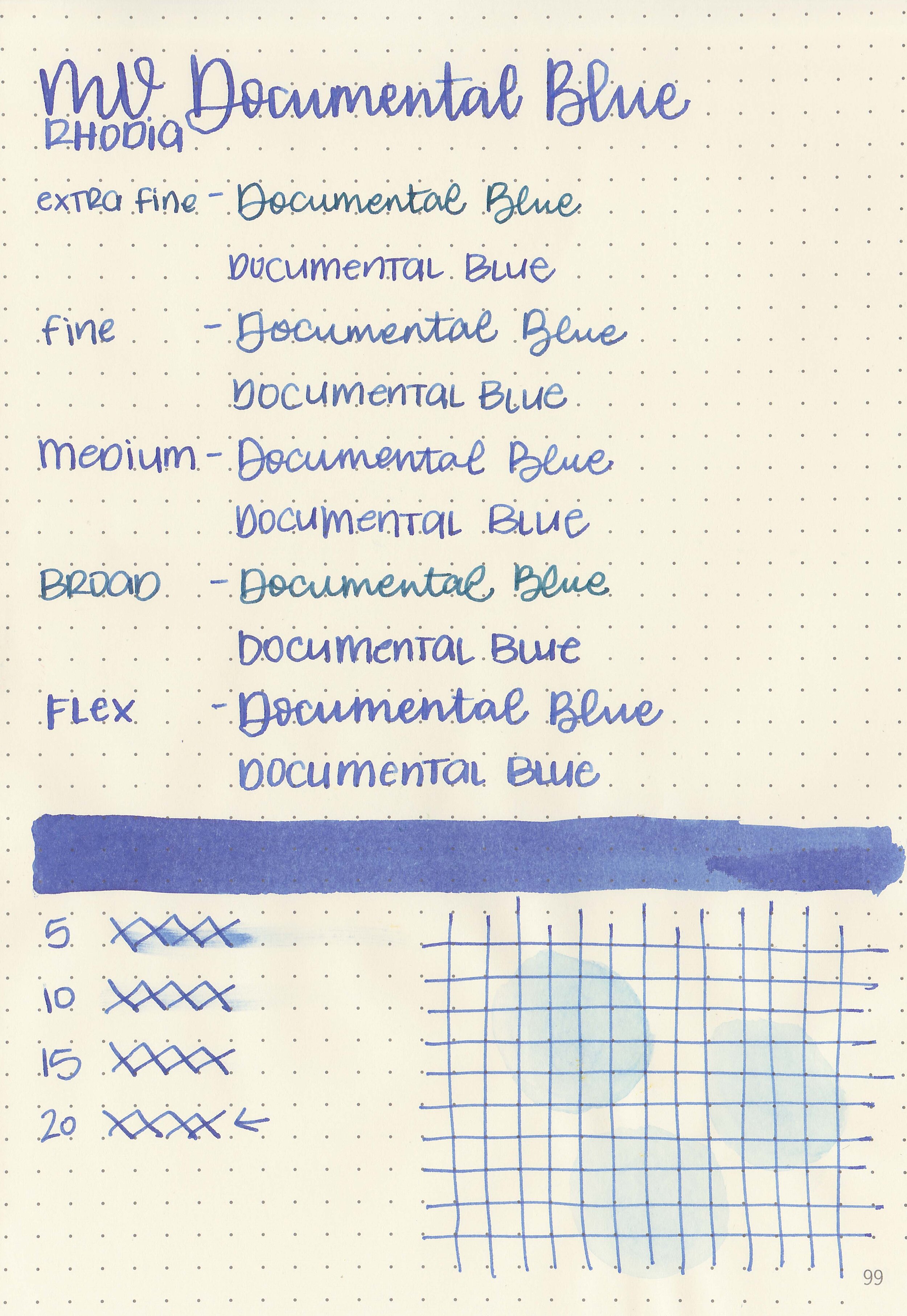
Let's take a look at how the ink behaves on fountain pen friendly papers: Rhodia, Tomoe River, and Leuchtturm.

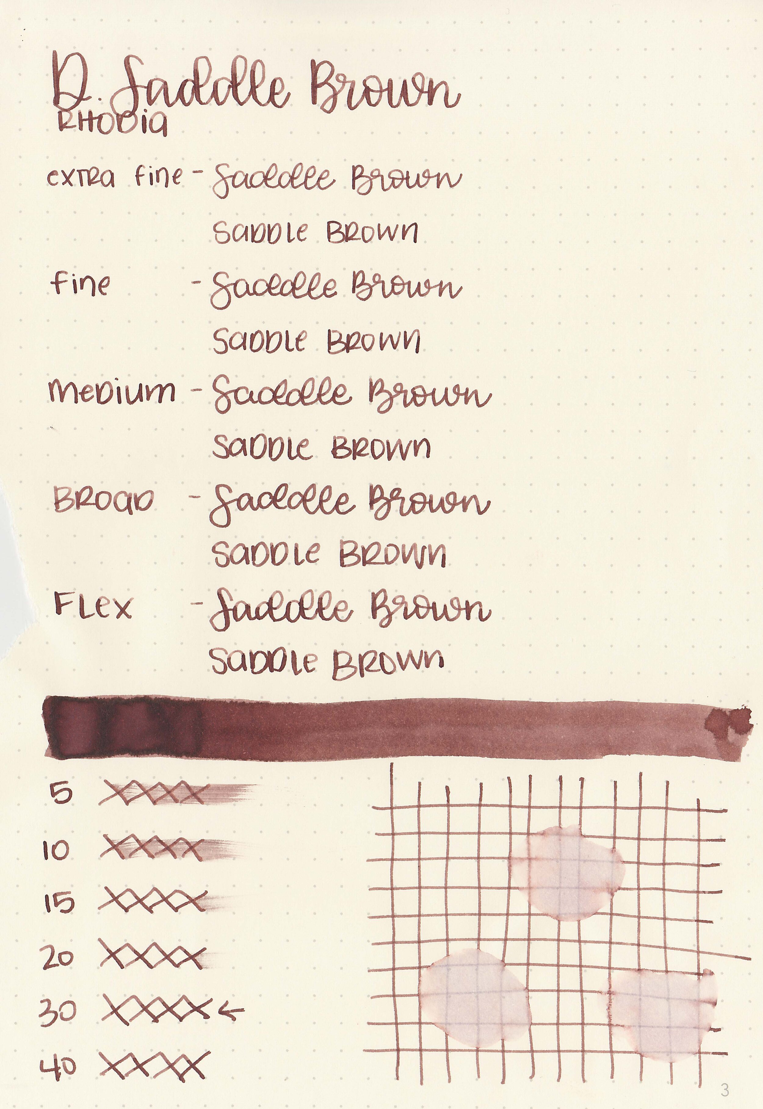
Dry time: 30 seconds
Water resistance: Low
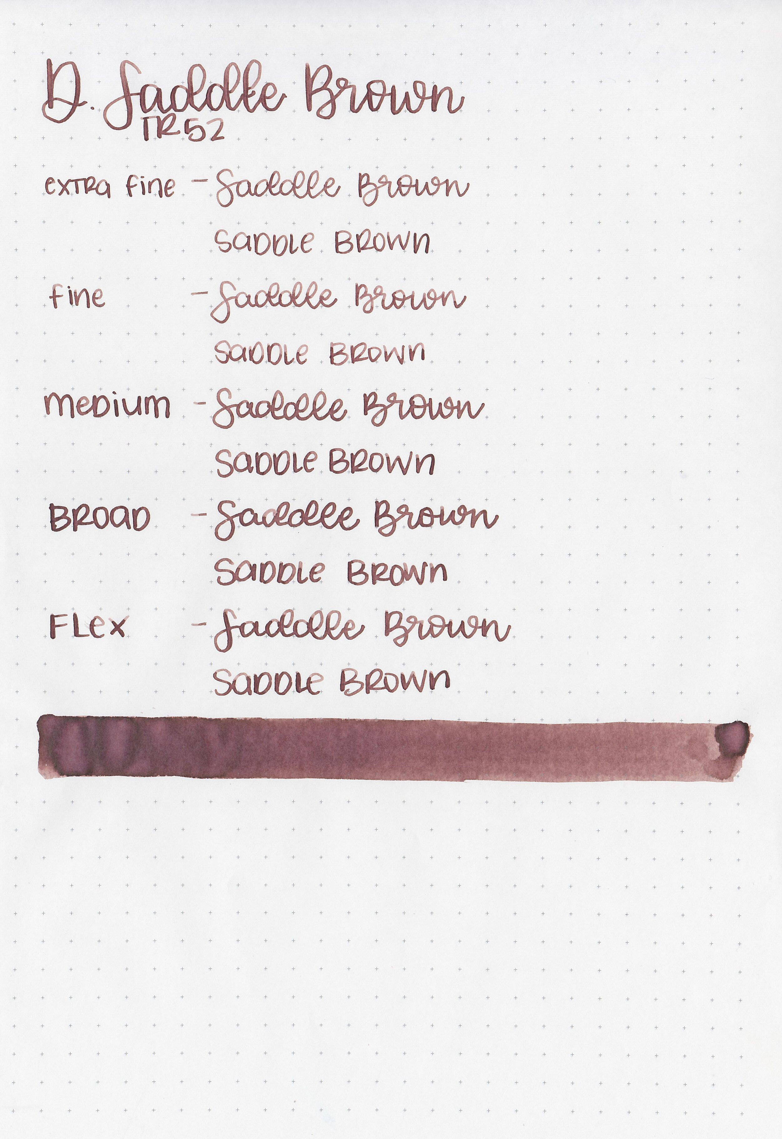
Feathering: None
Show through: Medium
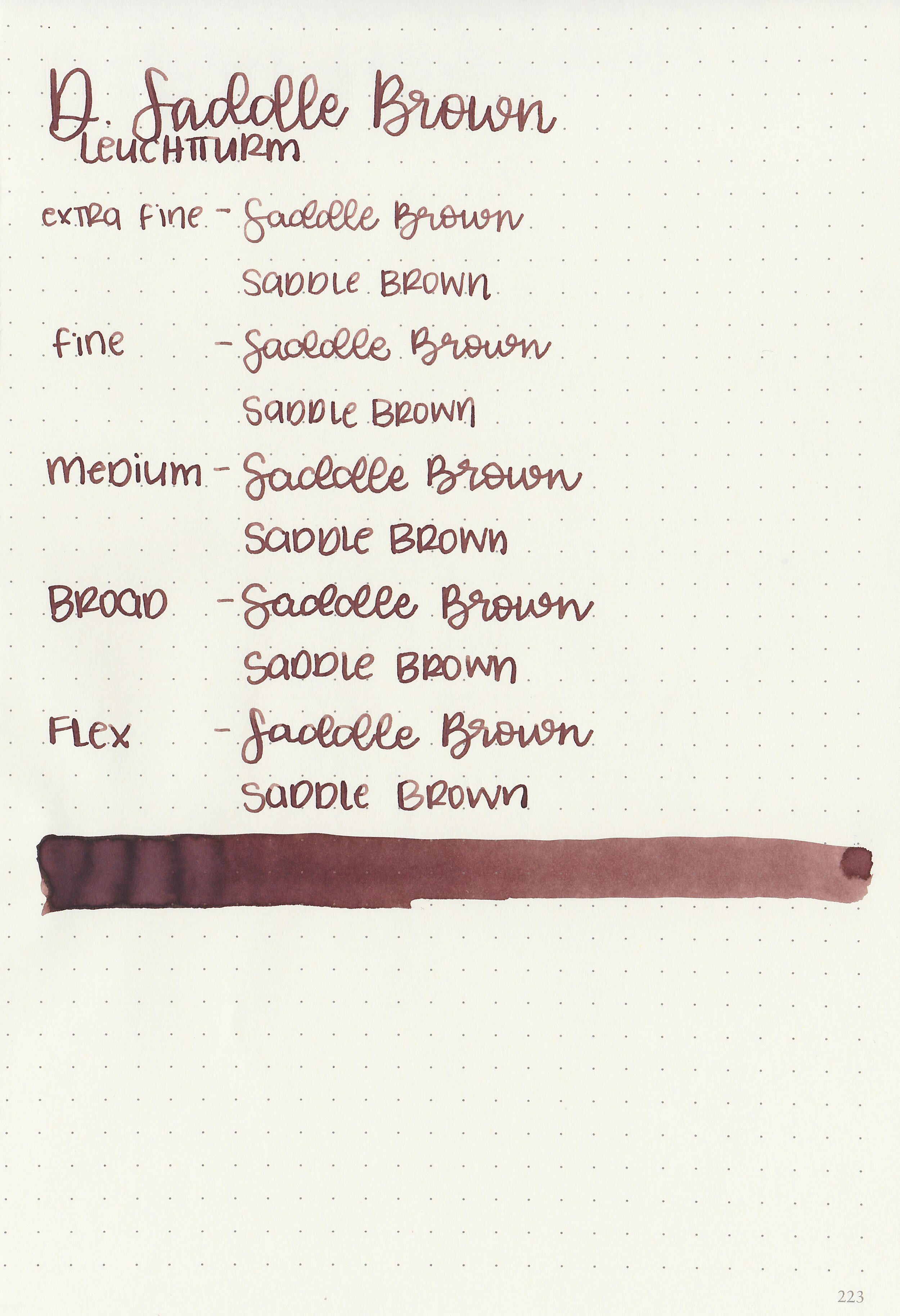
Bleeding: None
Other properties: low shading, no sheen, and no shimmer.
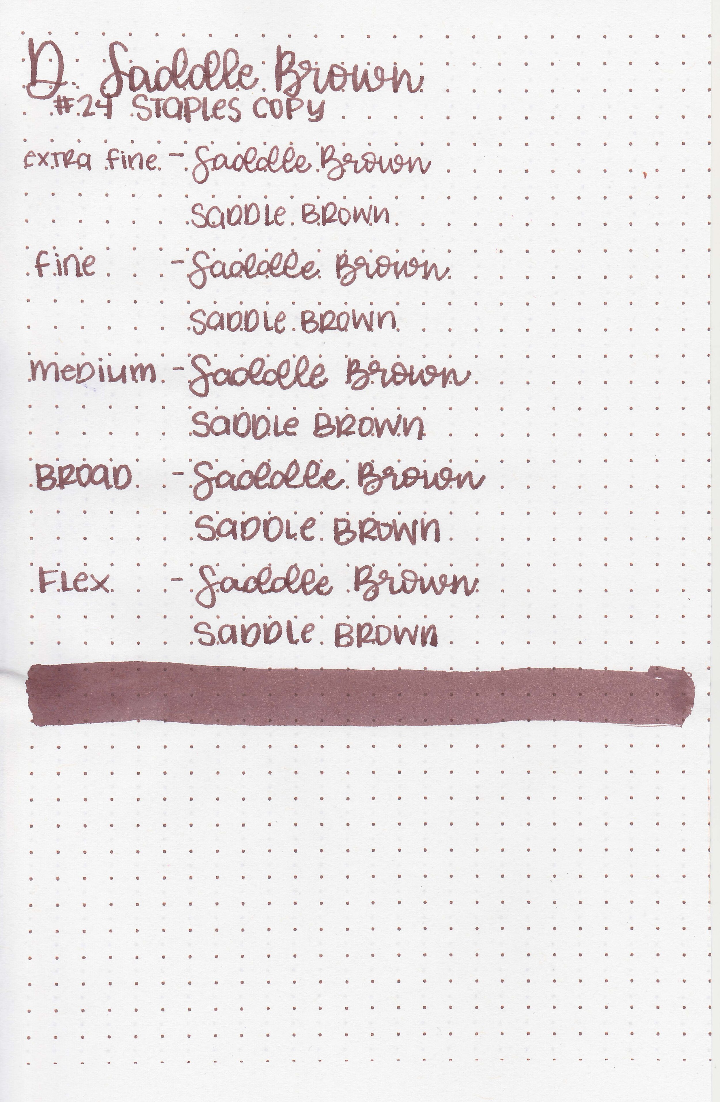
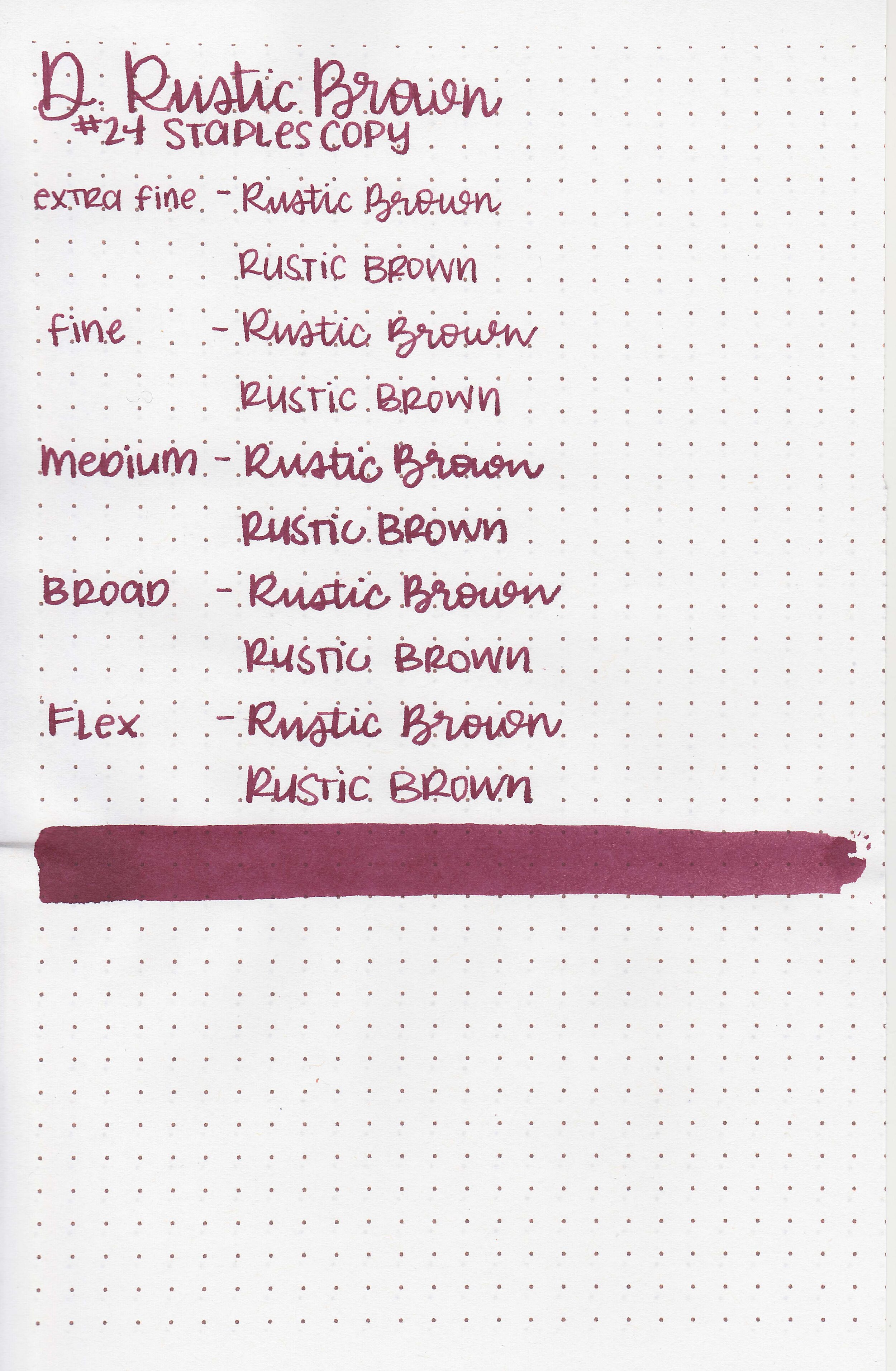
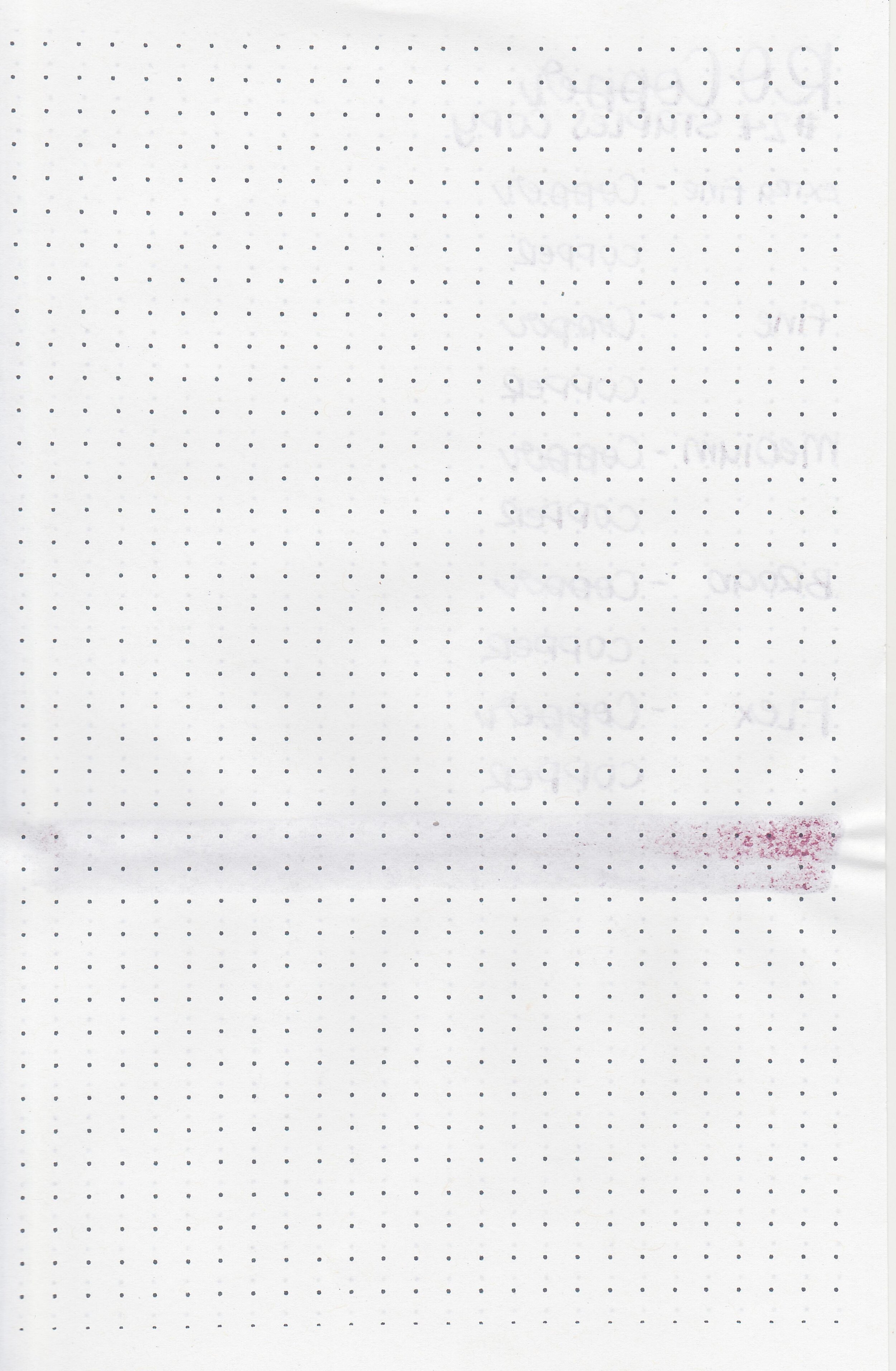
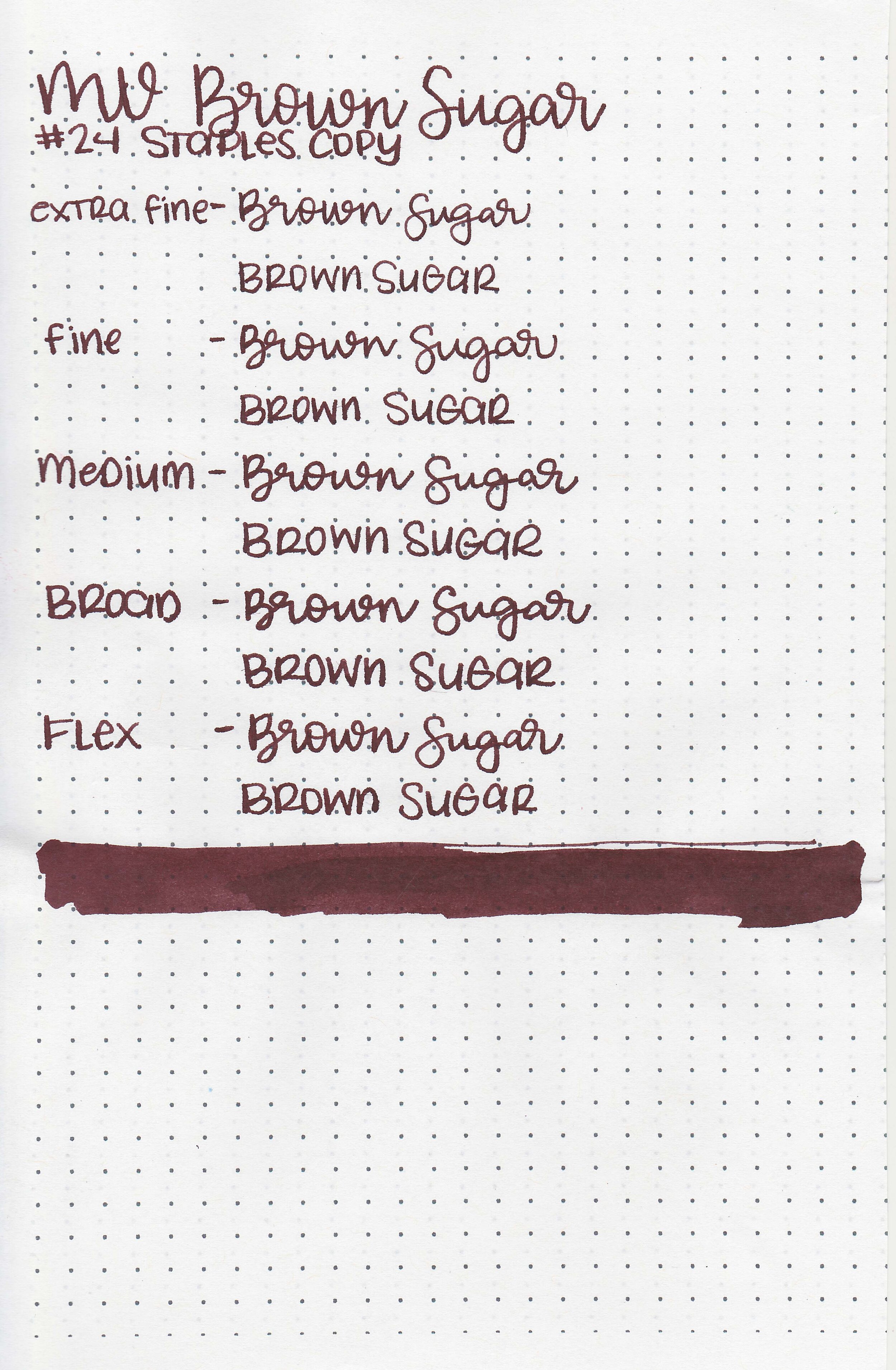
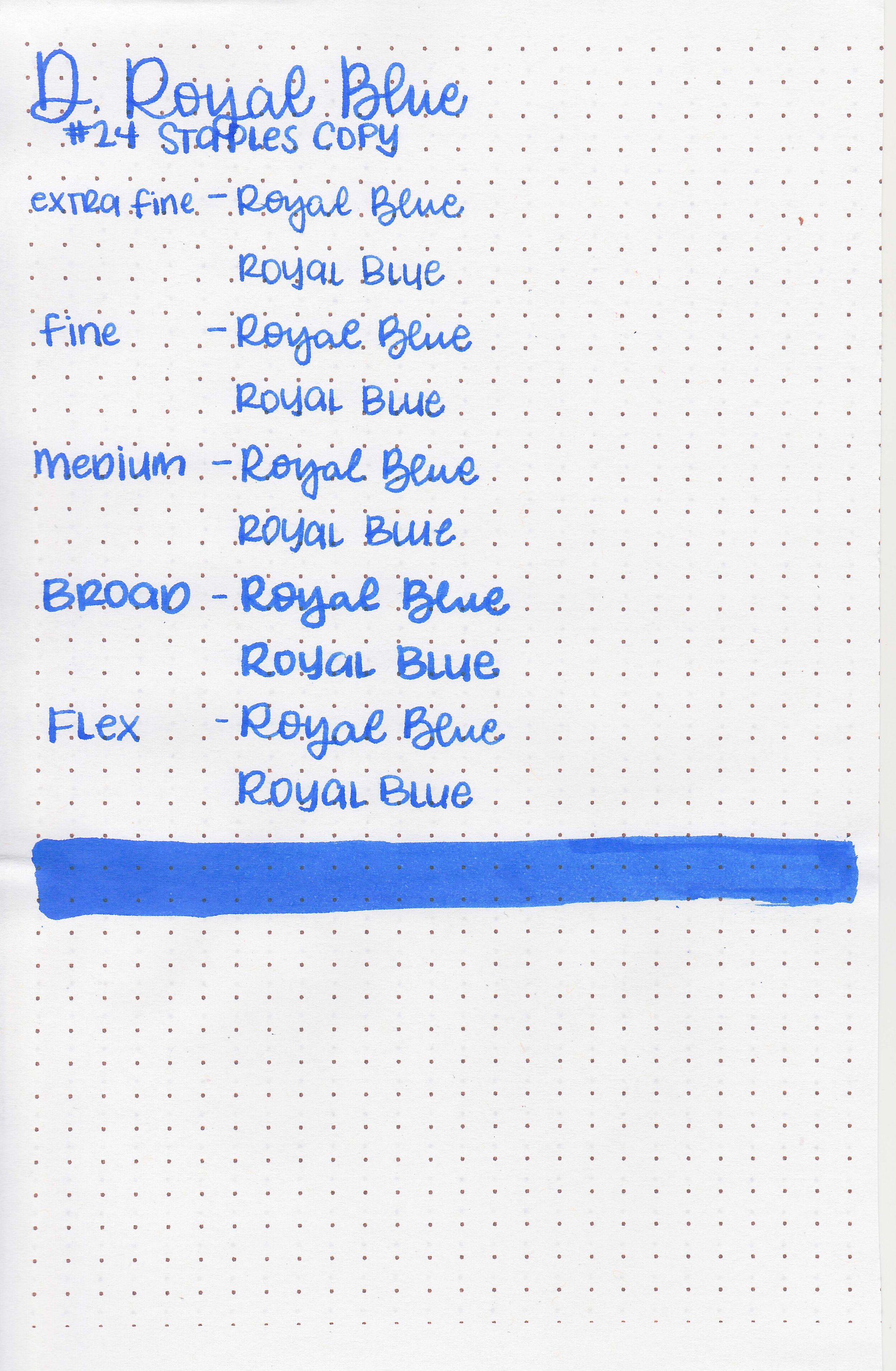
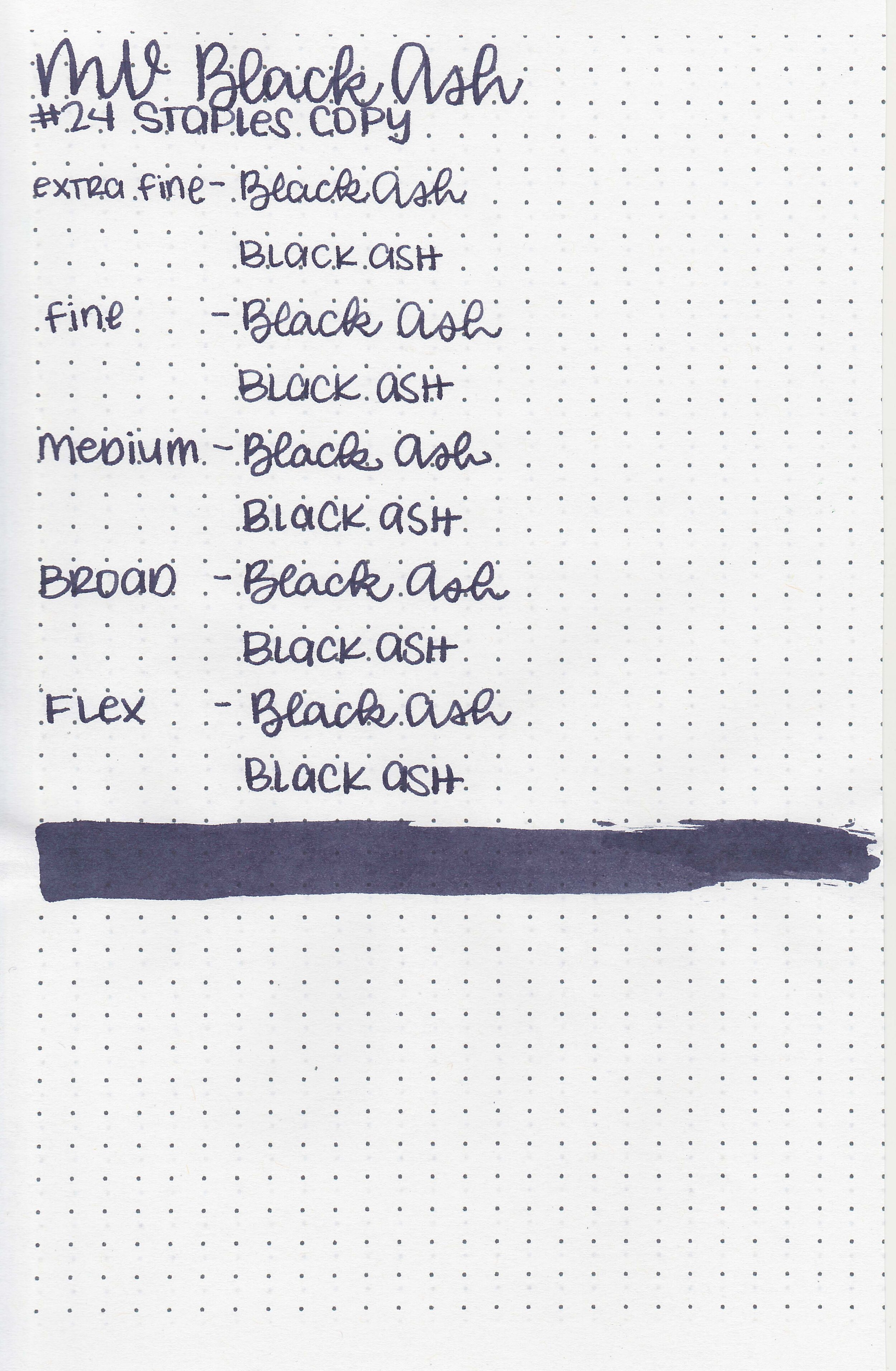
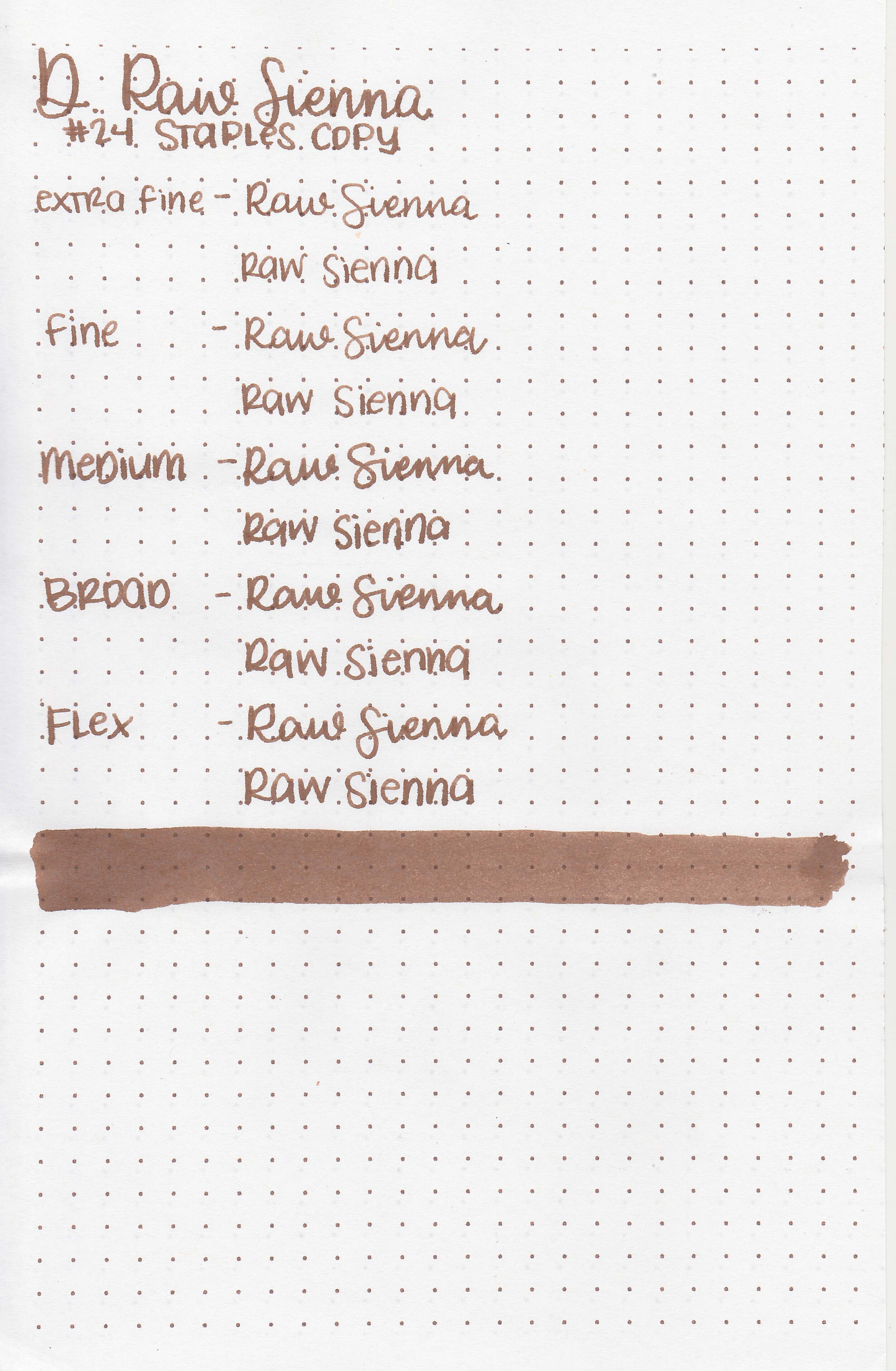
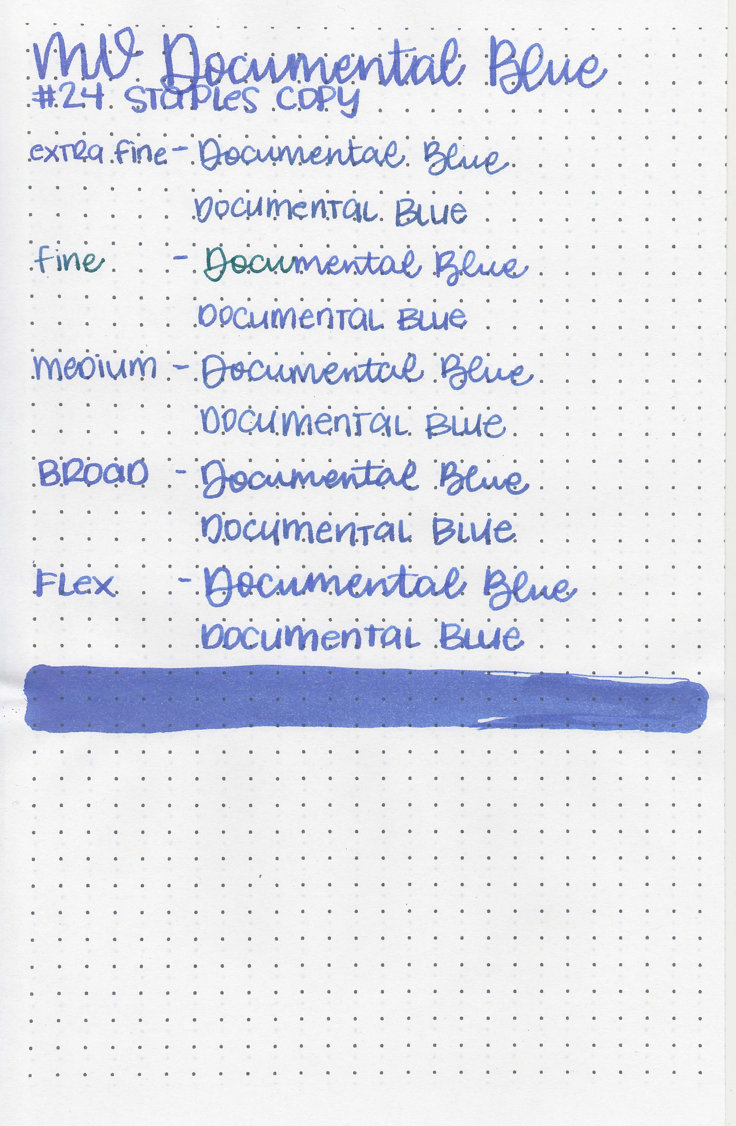
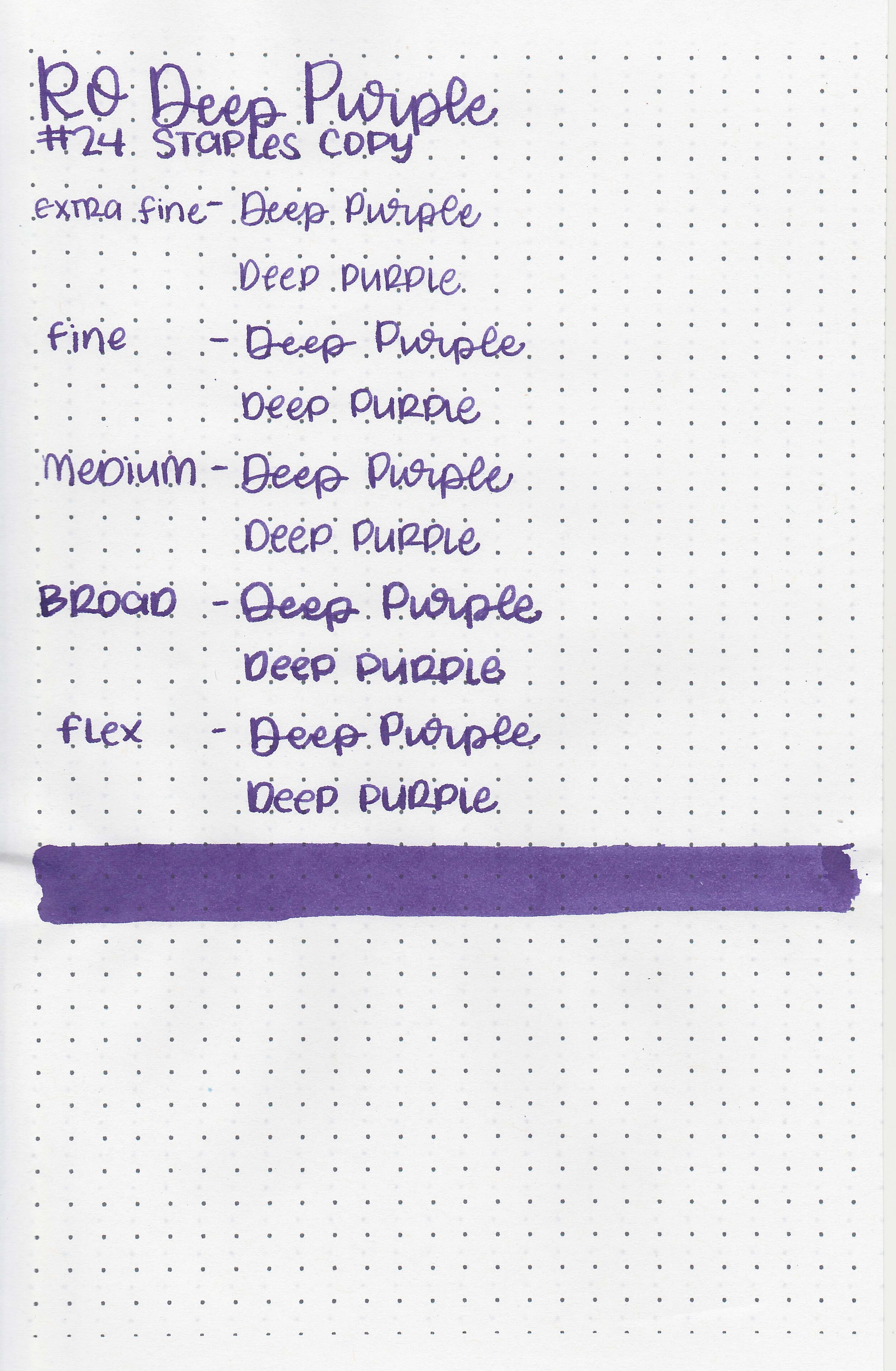
On Staples 24 lb copy paper there was some feathering in most nib sizes and some bleeding.
Comparison Swabs:

Saddle Brown is a little bit more red than Pilot Iroshizuku Tsukushi. Click here to see the Diamine inks together, and click here to see the brown inks together.
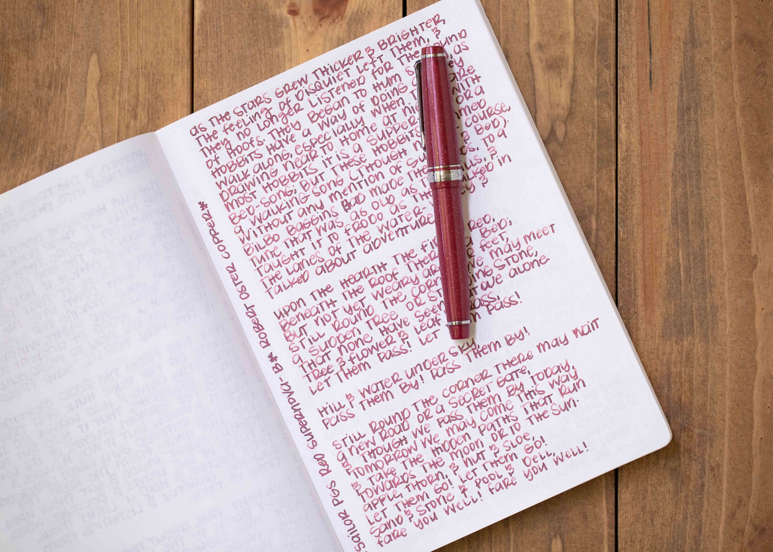
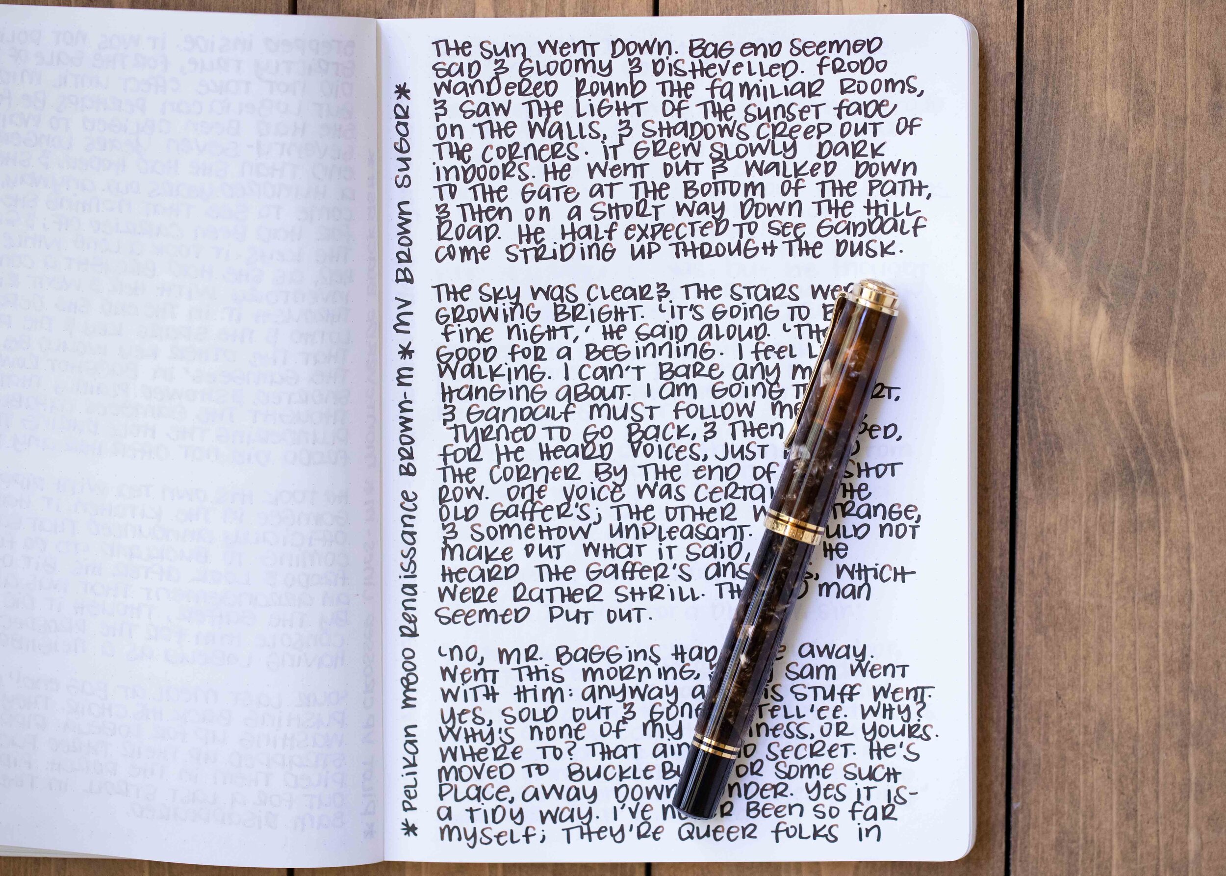
Longer writing:

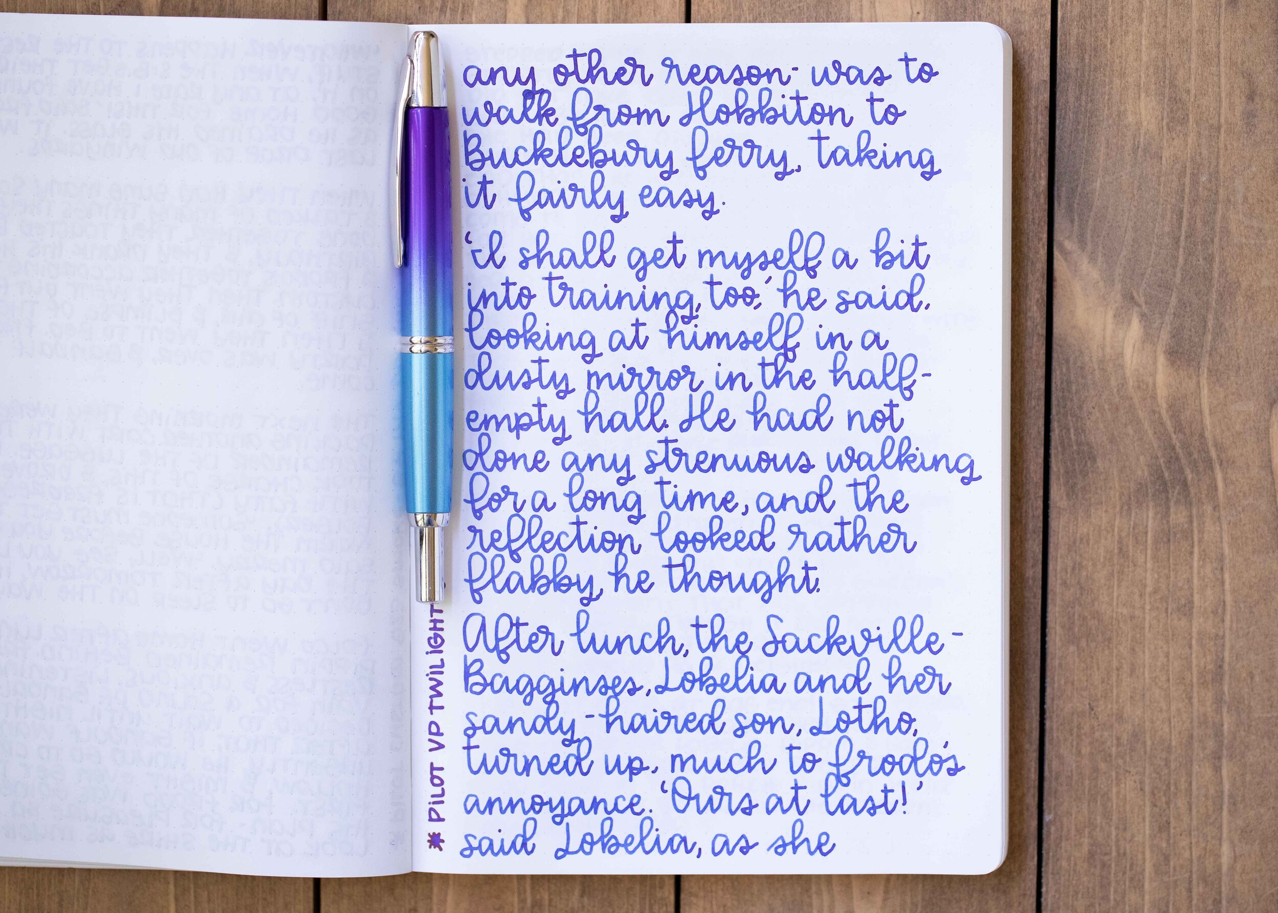
I used a Franklin-Christoph 46 in Autumn Oak with a medium nib on a Taroko Enigma notebook. The ink had an average flow.
Overall, the color isn’t my favorite and I wish it had a bit more shading. It’s nice, but not a must-have.
Disclaimer: I purchased this ink myself, and all photos and opinions are my own. This page does not contain affiliate links and this post is not sponsored in any way.