Ink Review #1244: Penlux Mo Plum
/
A few months ago I tried my first Penlux ink and I knew I needed to get some more to try, starting with Penlux Mo Plum (aff. link). I purchased my bottle of ink from Pen Chalet. Penlux inks come in square 50ml glass bottles and are made by Sailor.

The color:
Plum is a dark red violet.
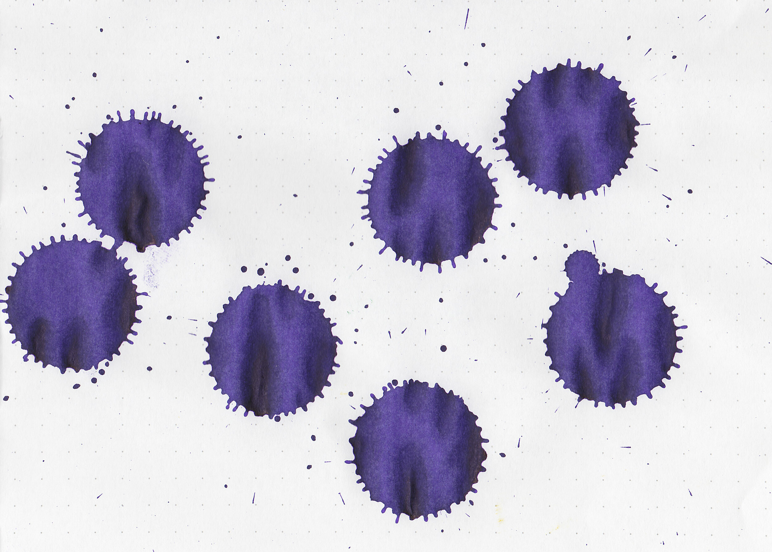
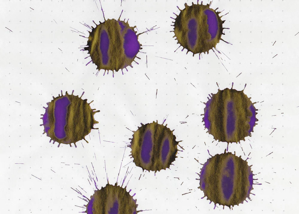
Swabs:

In large swabs on Tomoe River paper the ink looks more of a neutral purple with some green sheen.

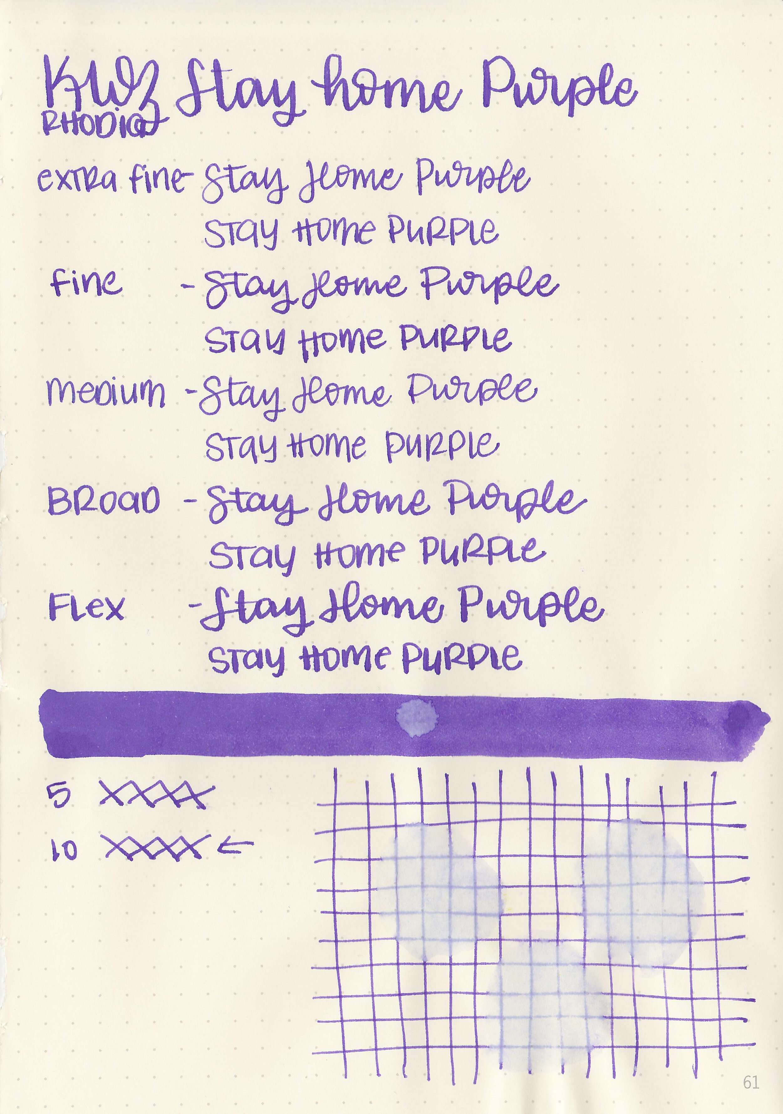
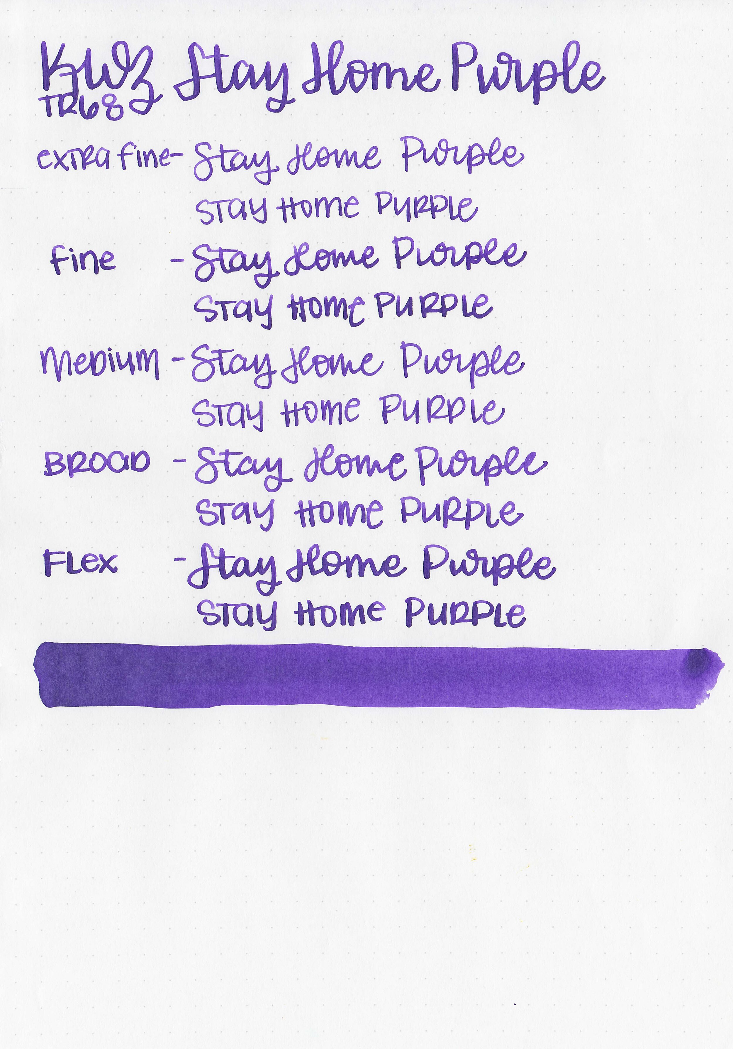
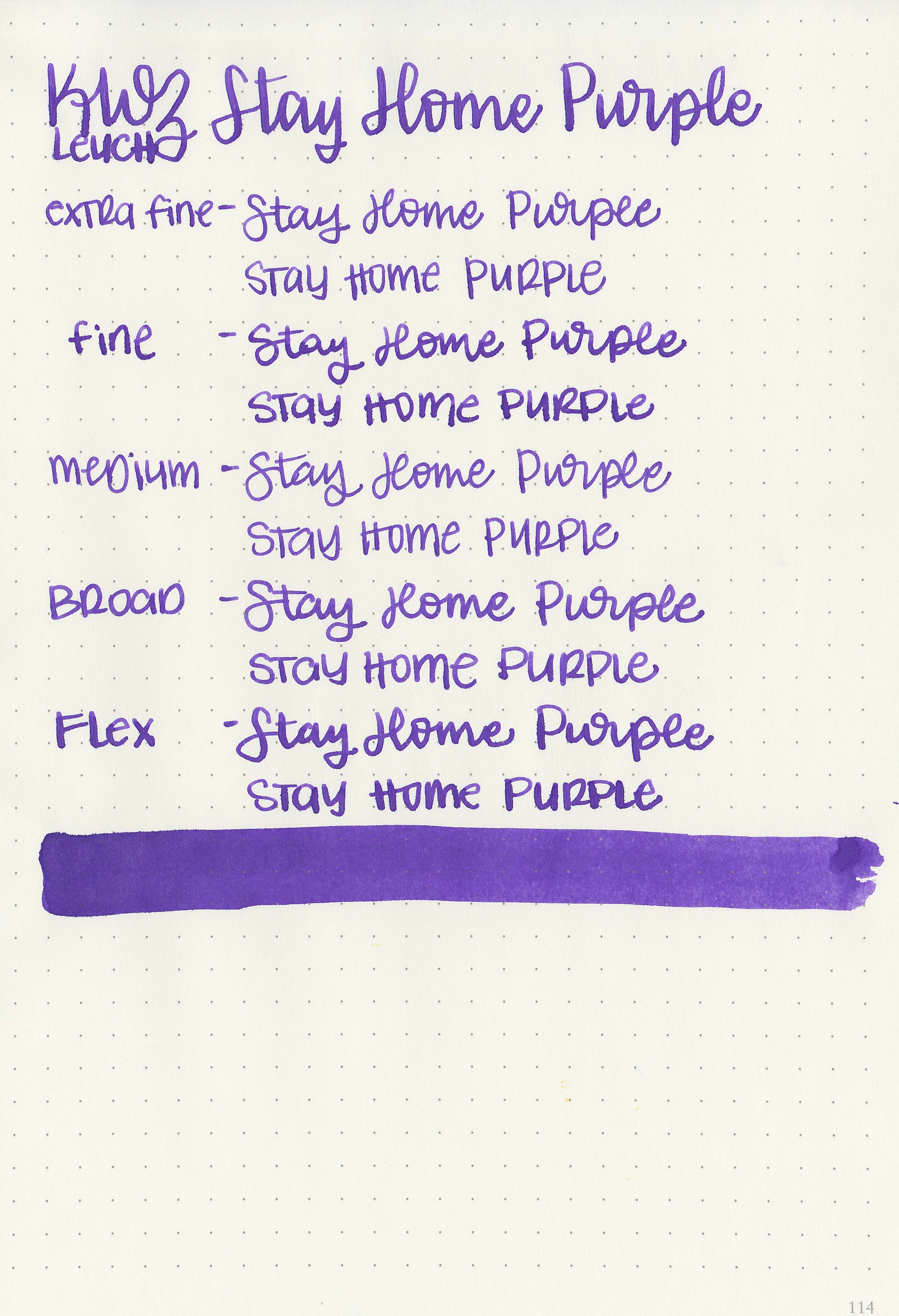
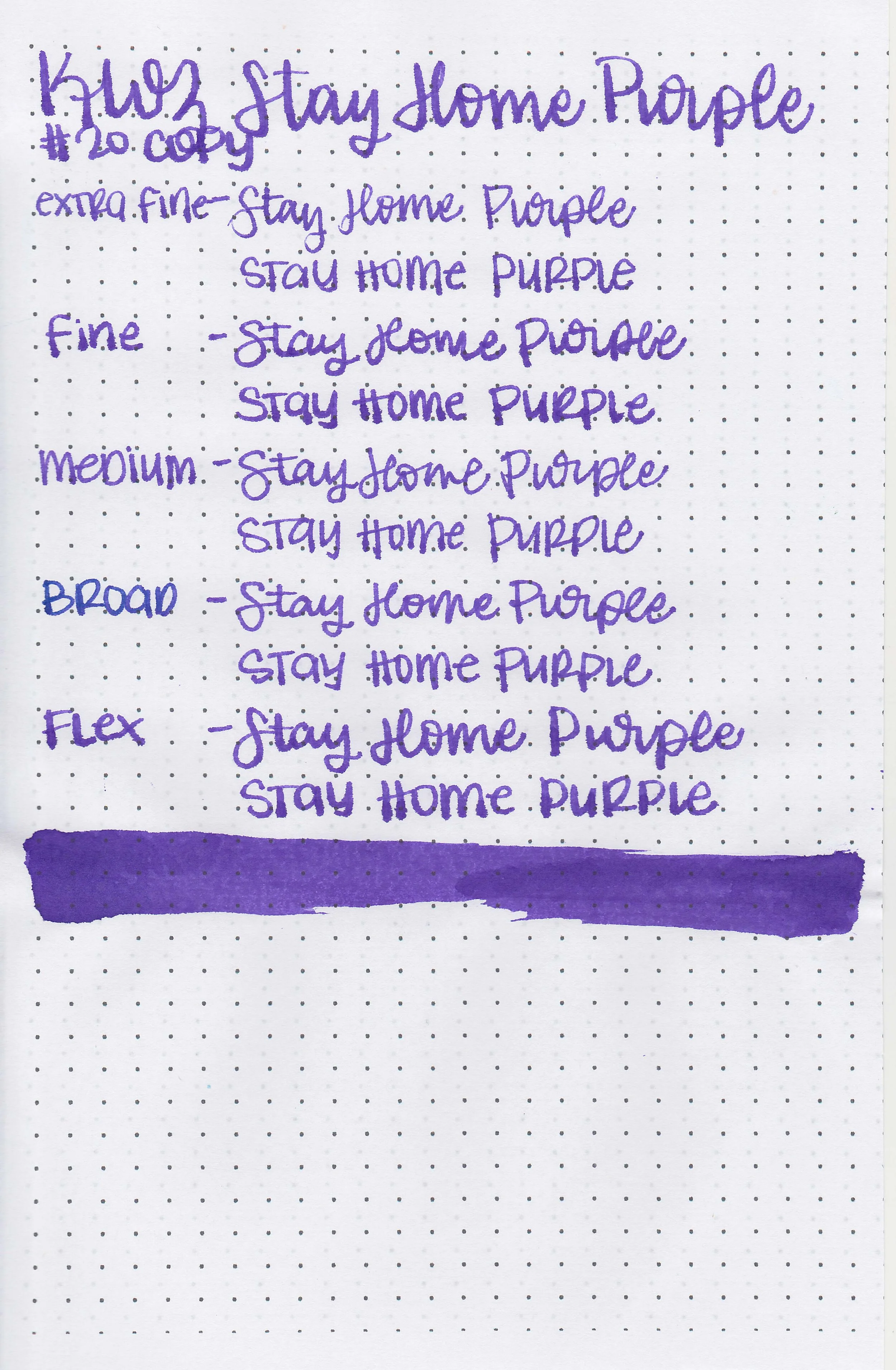
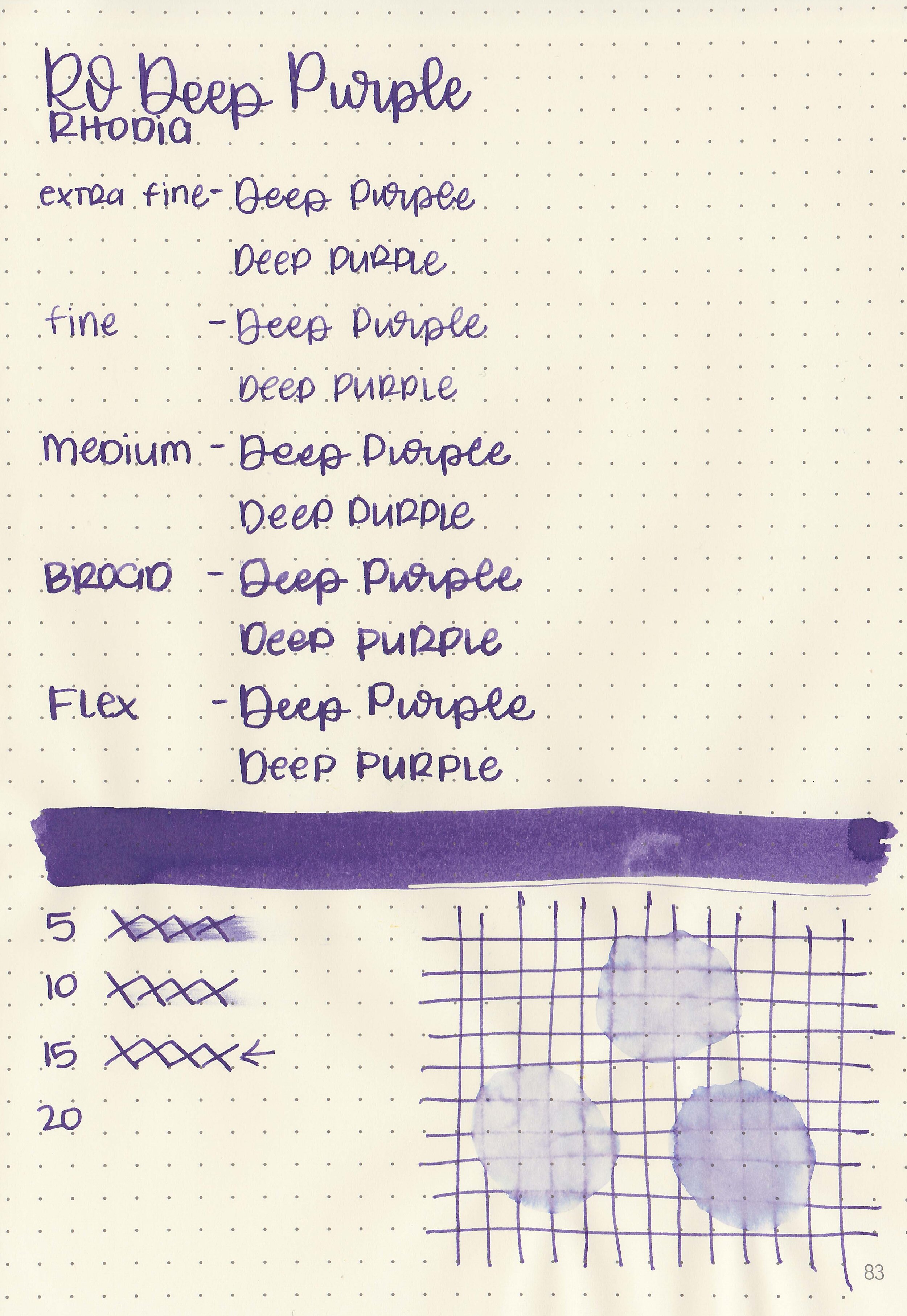
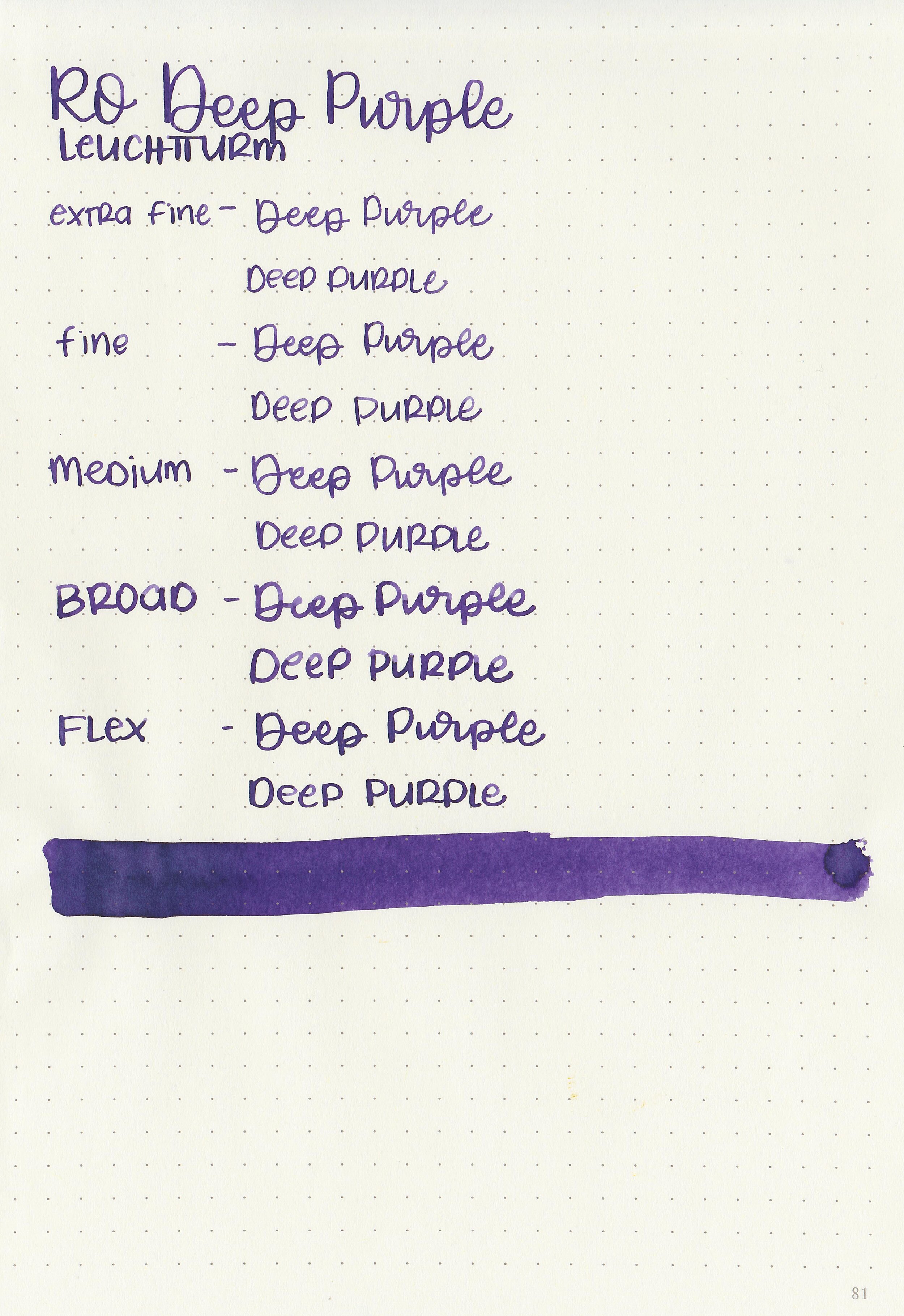
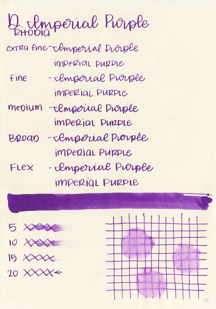
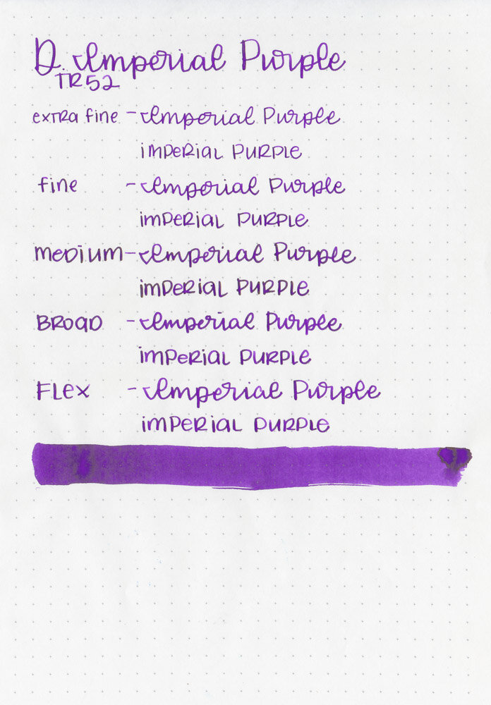
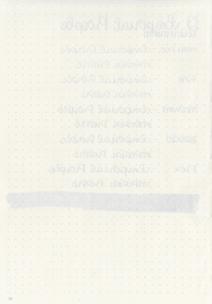
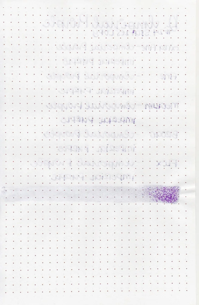
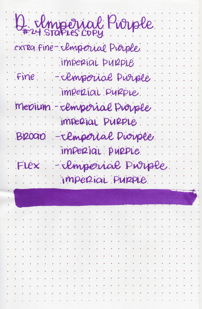
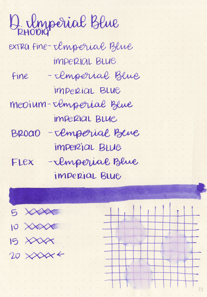
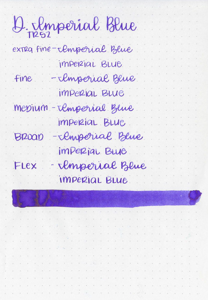
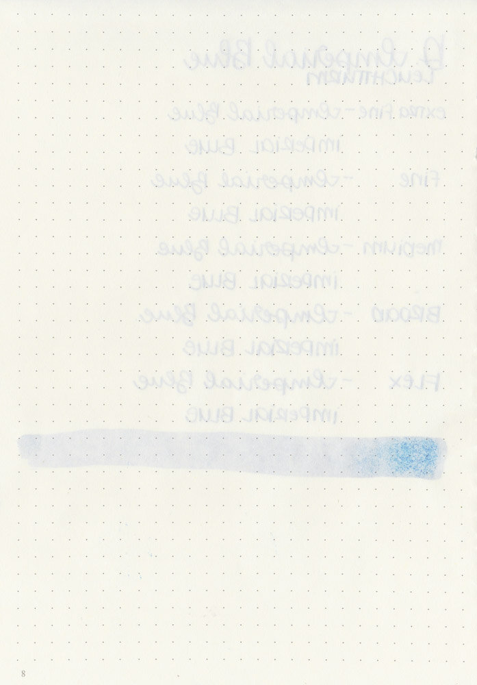
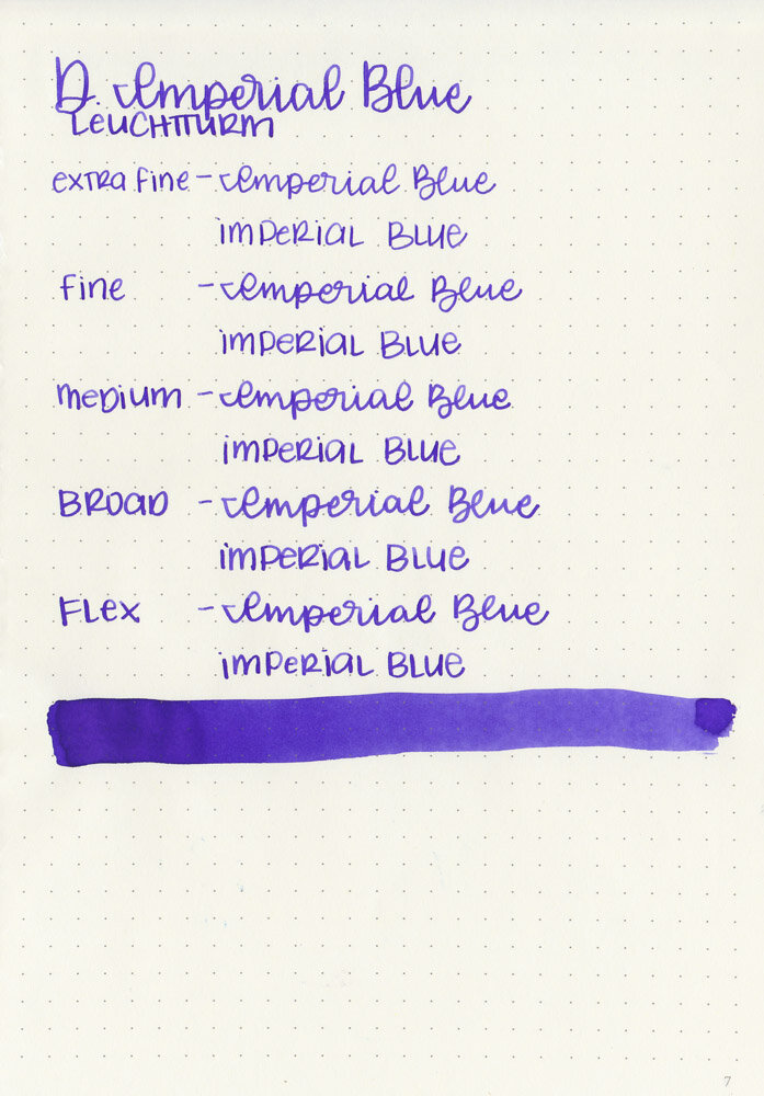
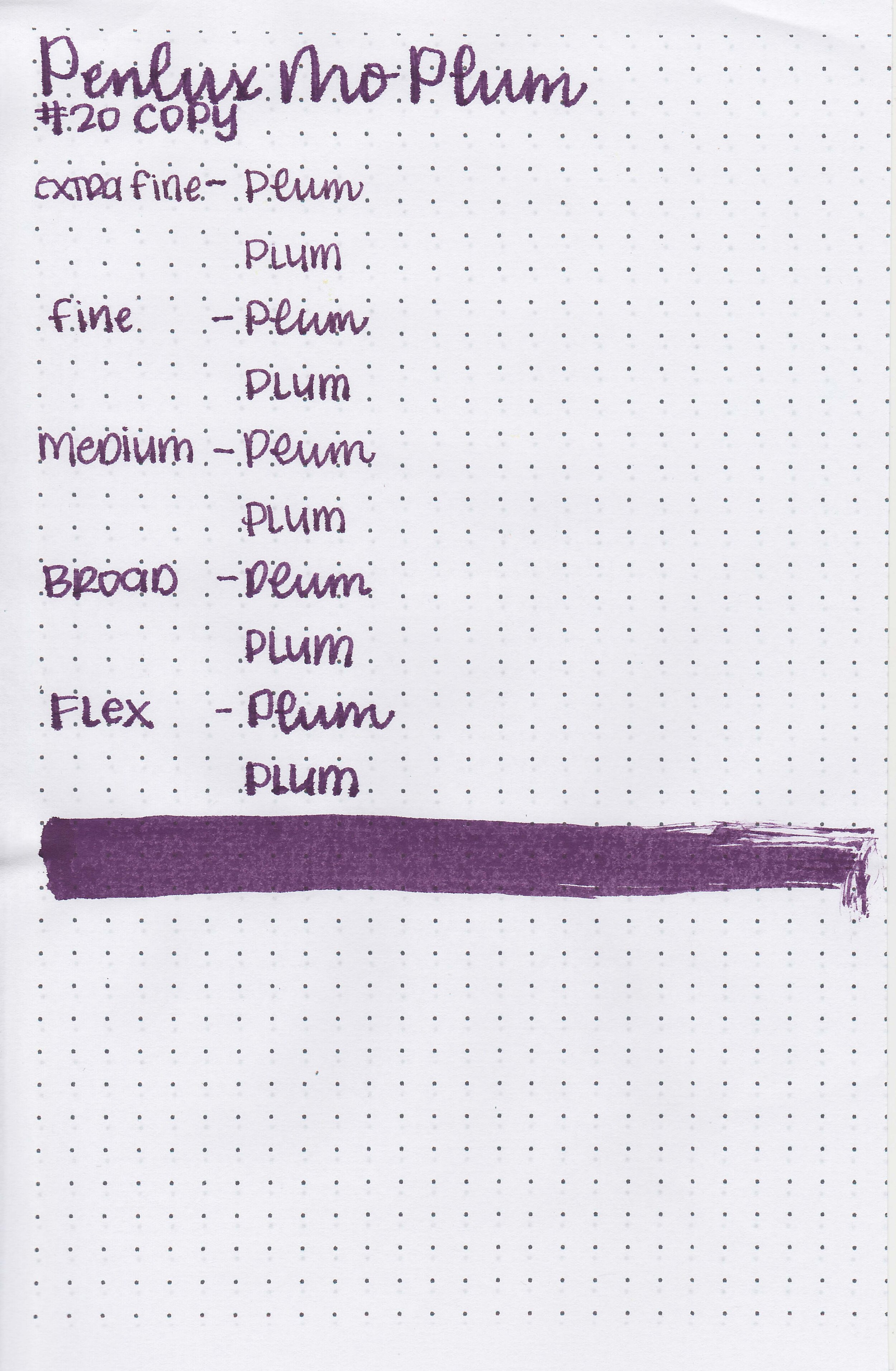
Writing samples:
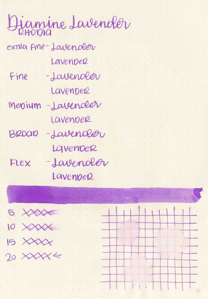
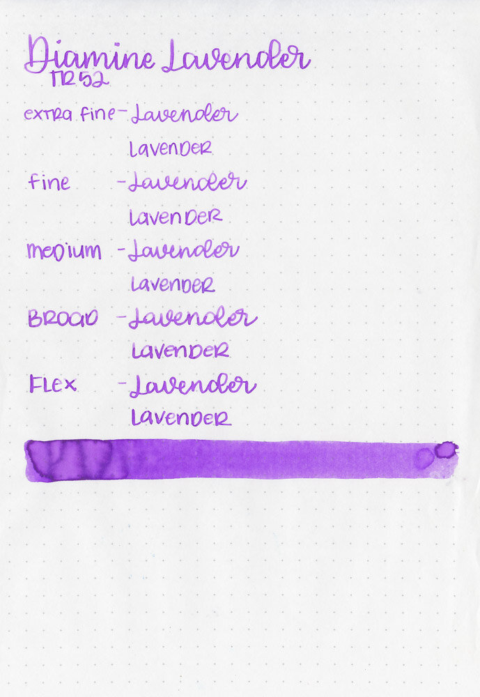
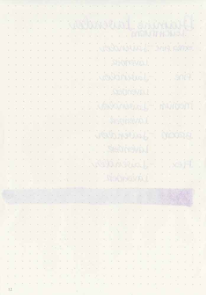
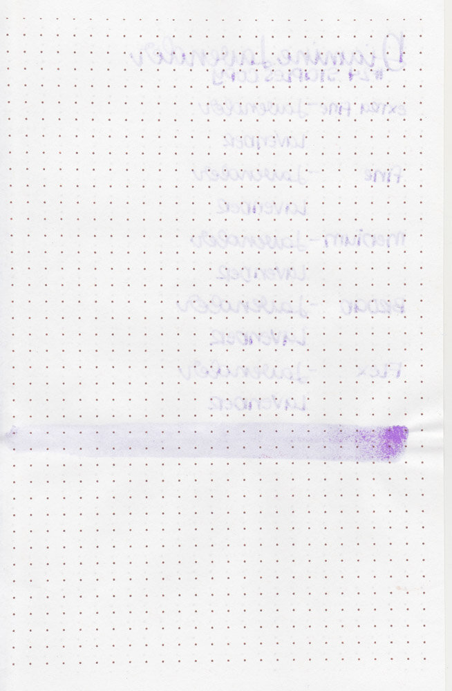
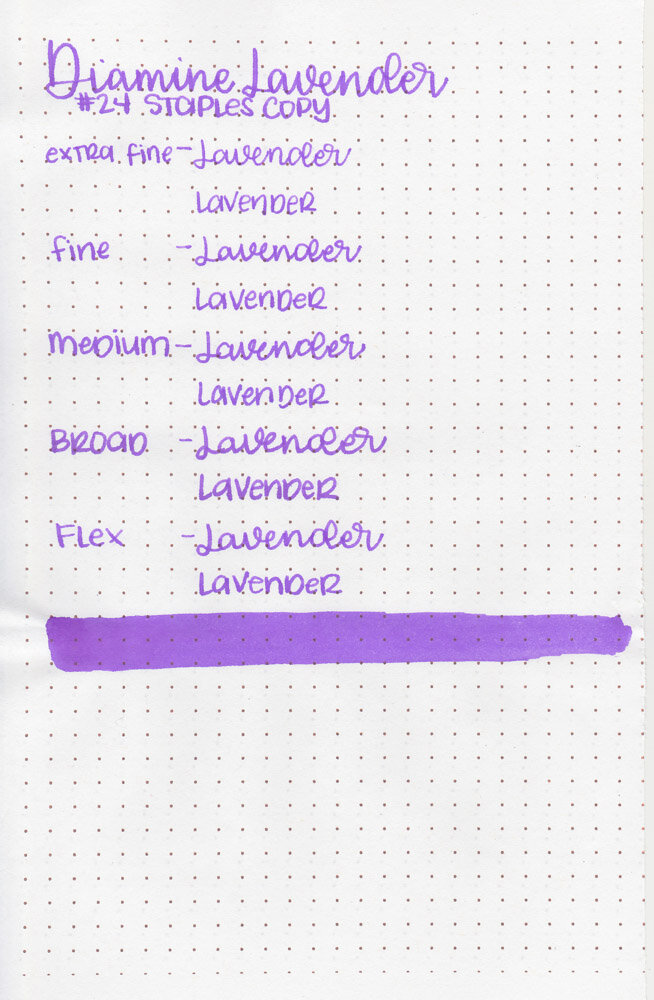
Let's take a look at how the ink behaves on fountain pen friendly papers: Rhodia, Tomoe River, and Leuchtturm.
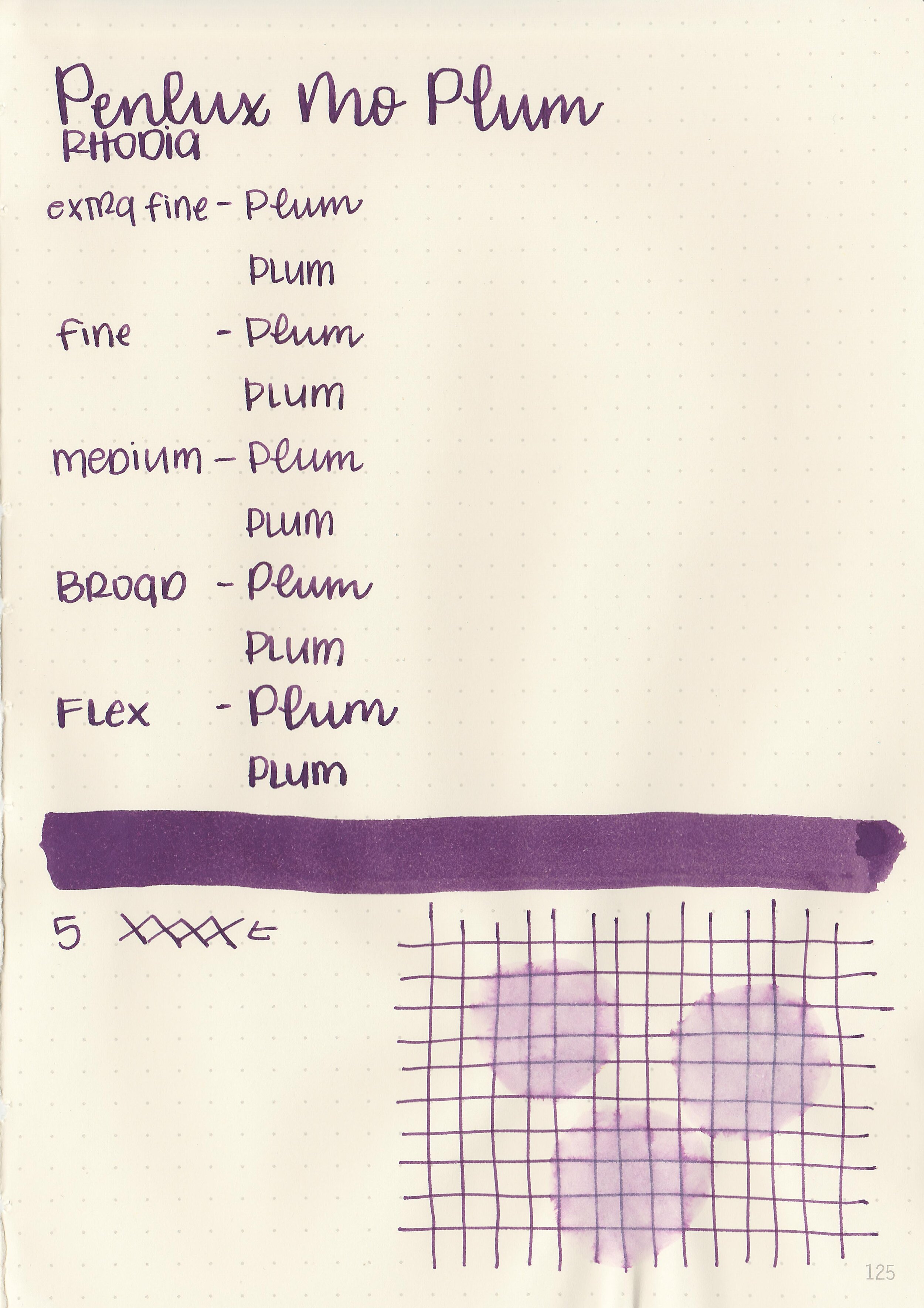
Dry time: 5 seconds
Water resistance: Medium
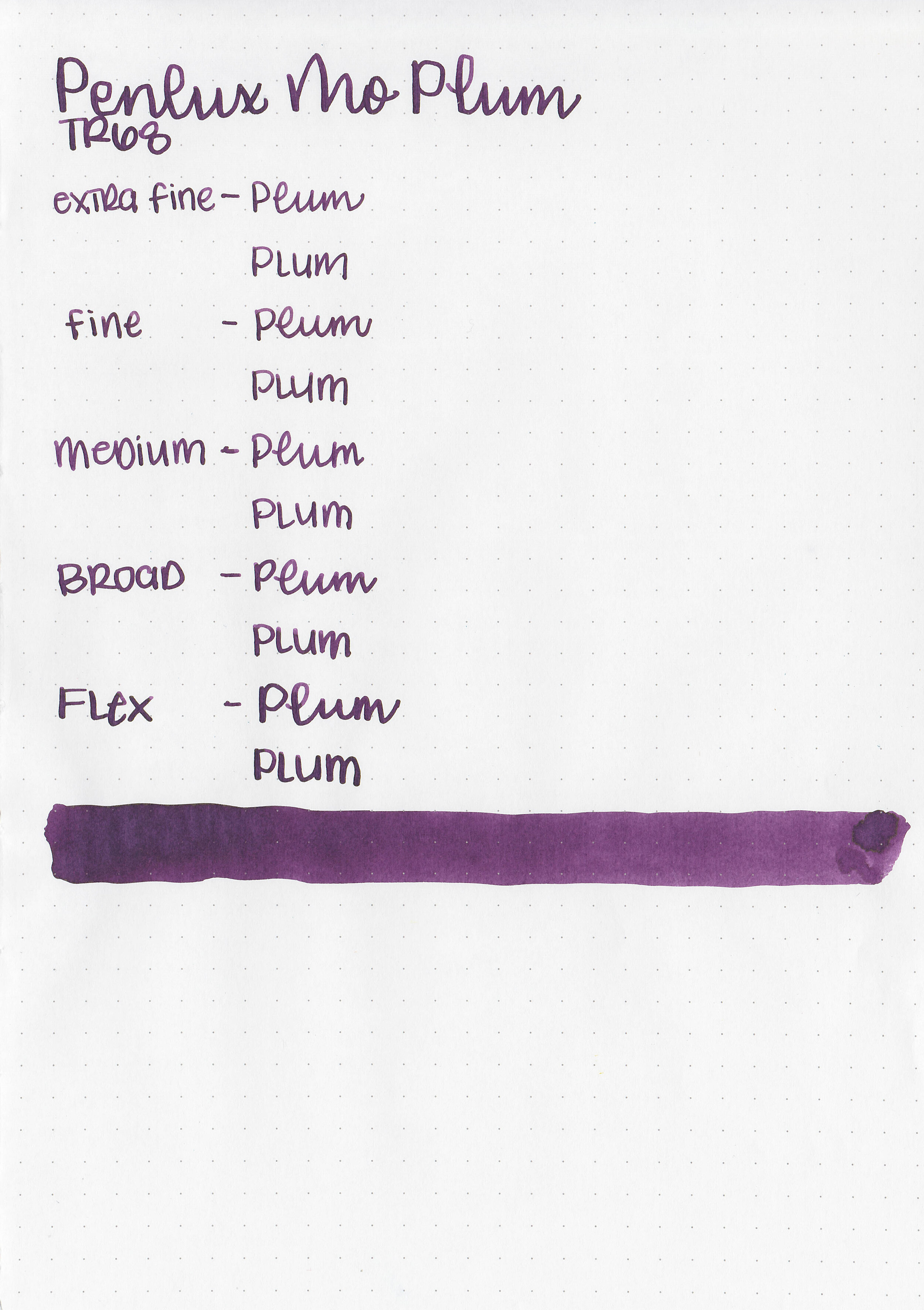
Feathering: Low
Show through: Medium
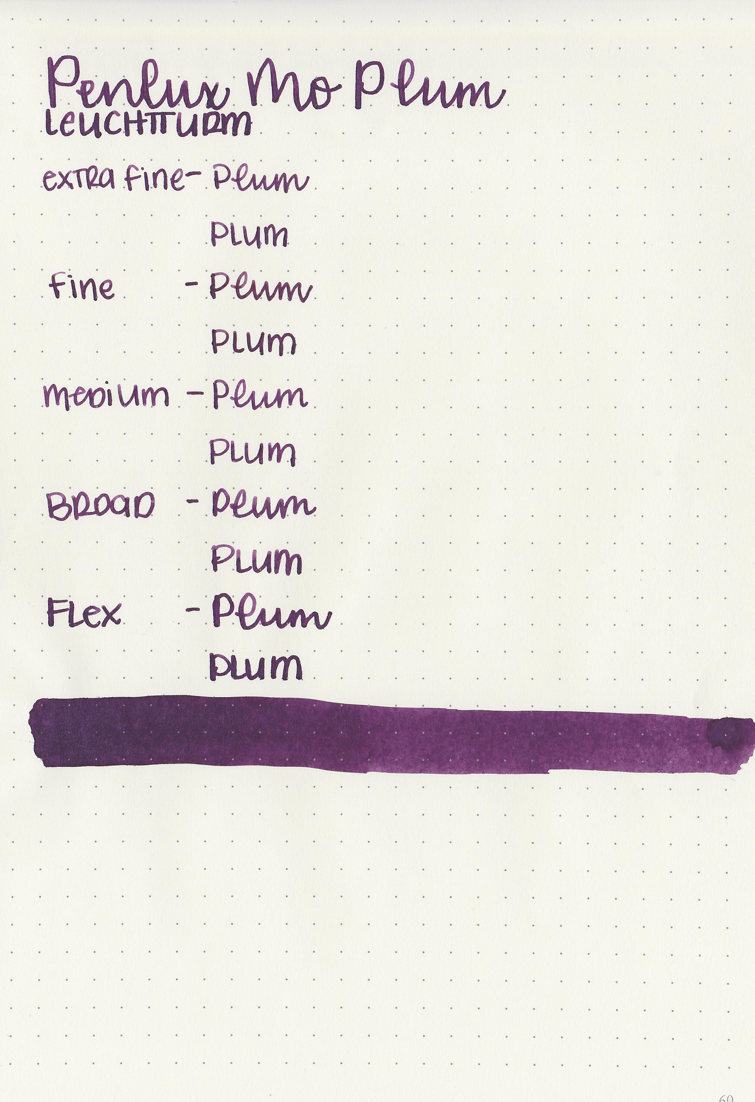
Bleeding: Low
Other properties: low shading, low green sheen, and no shimmer.
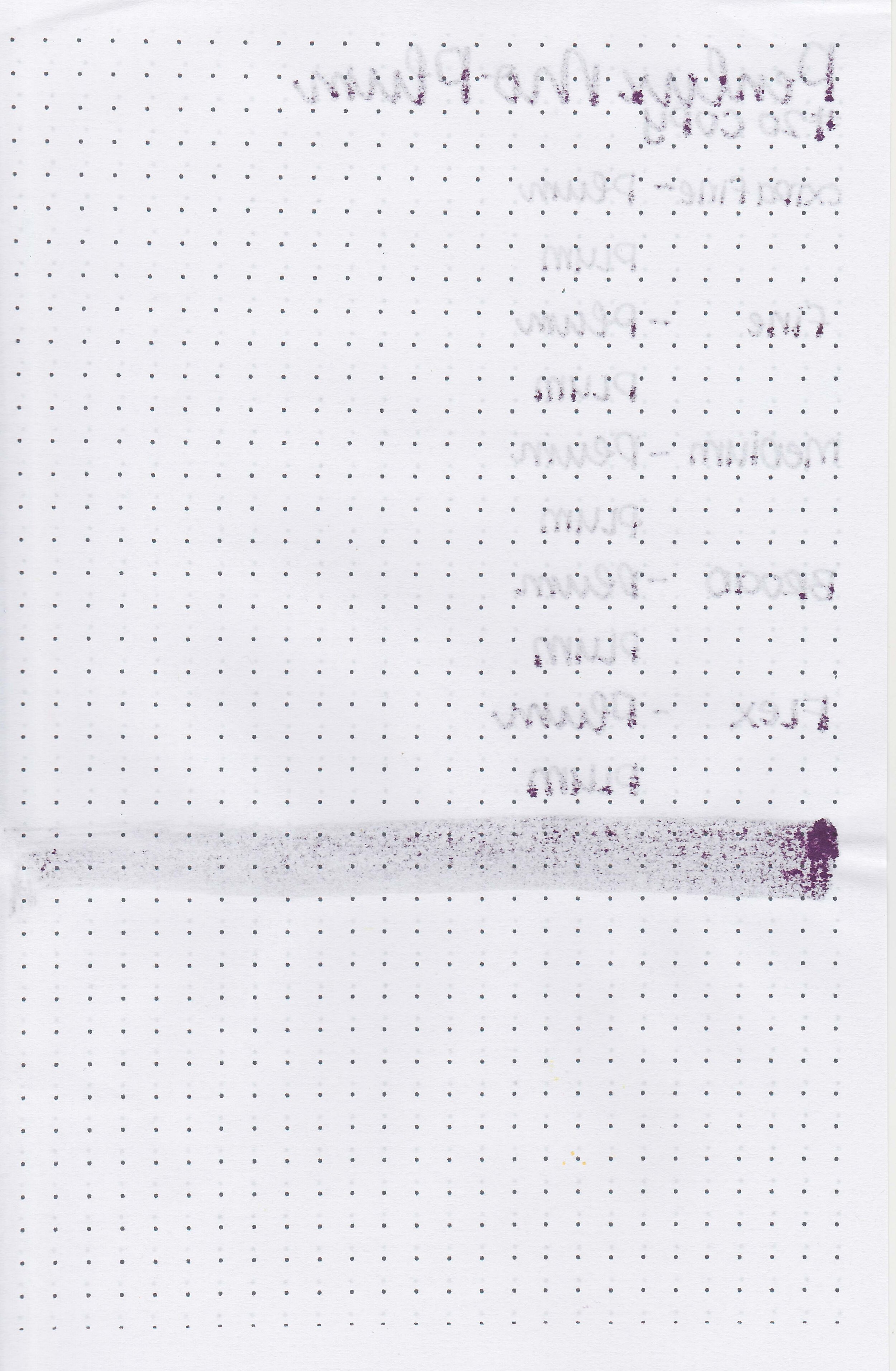
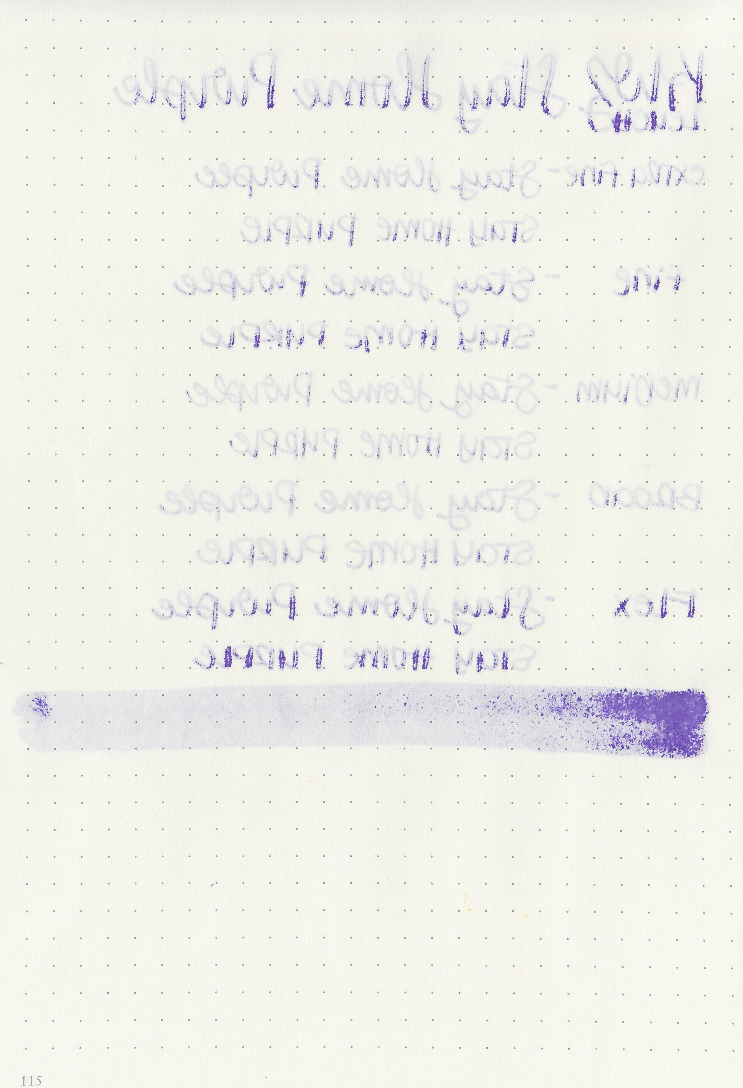
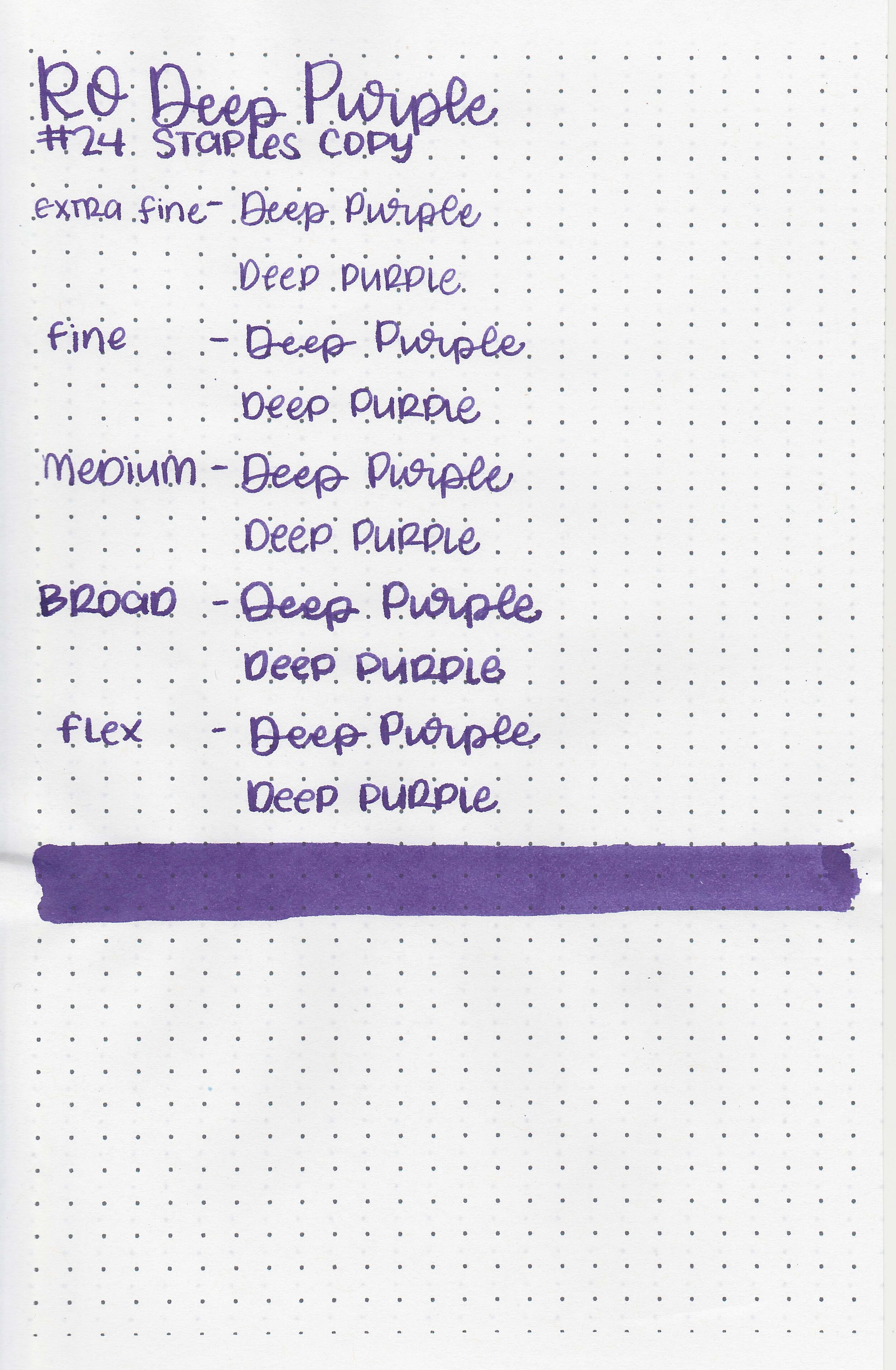
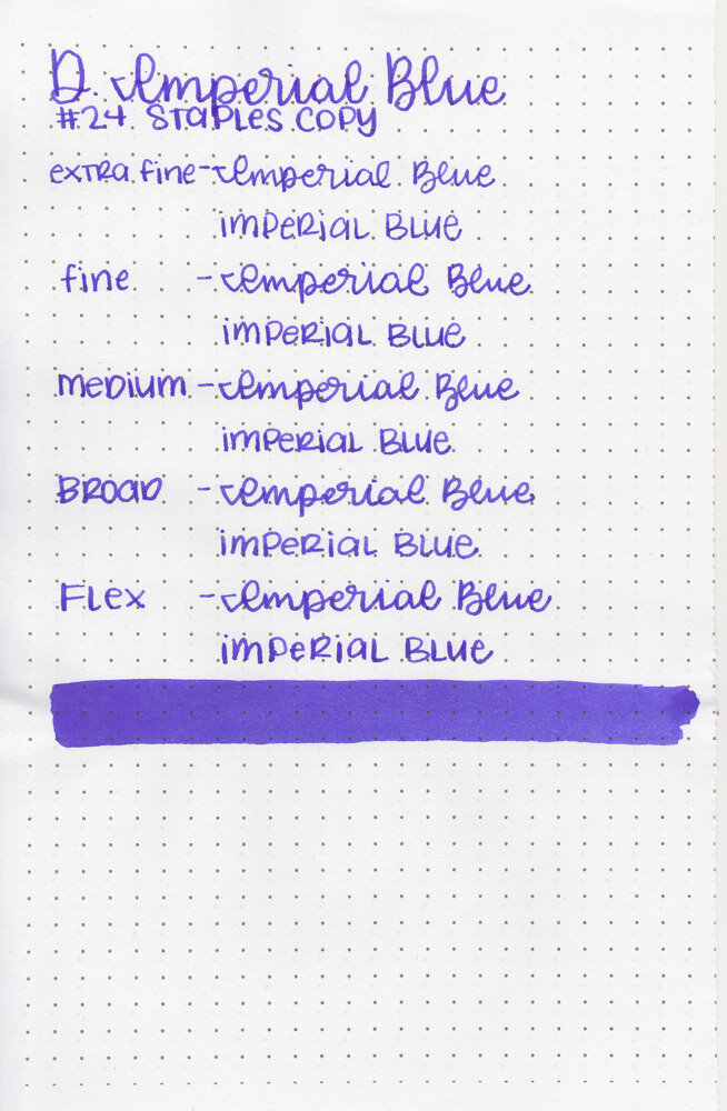
On Staples 24 lb copy paper there was some feathering and bleeding in all nib sizes.
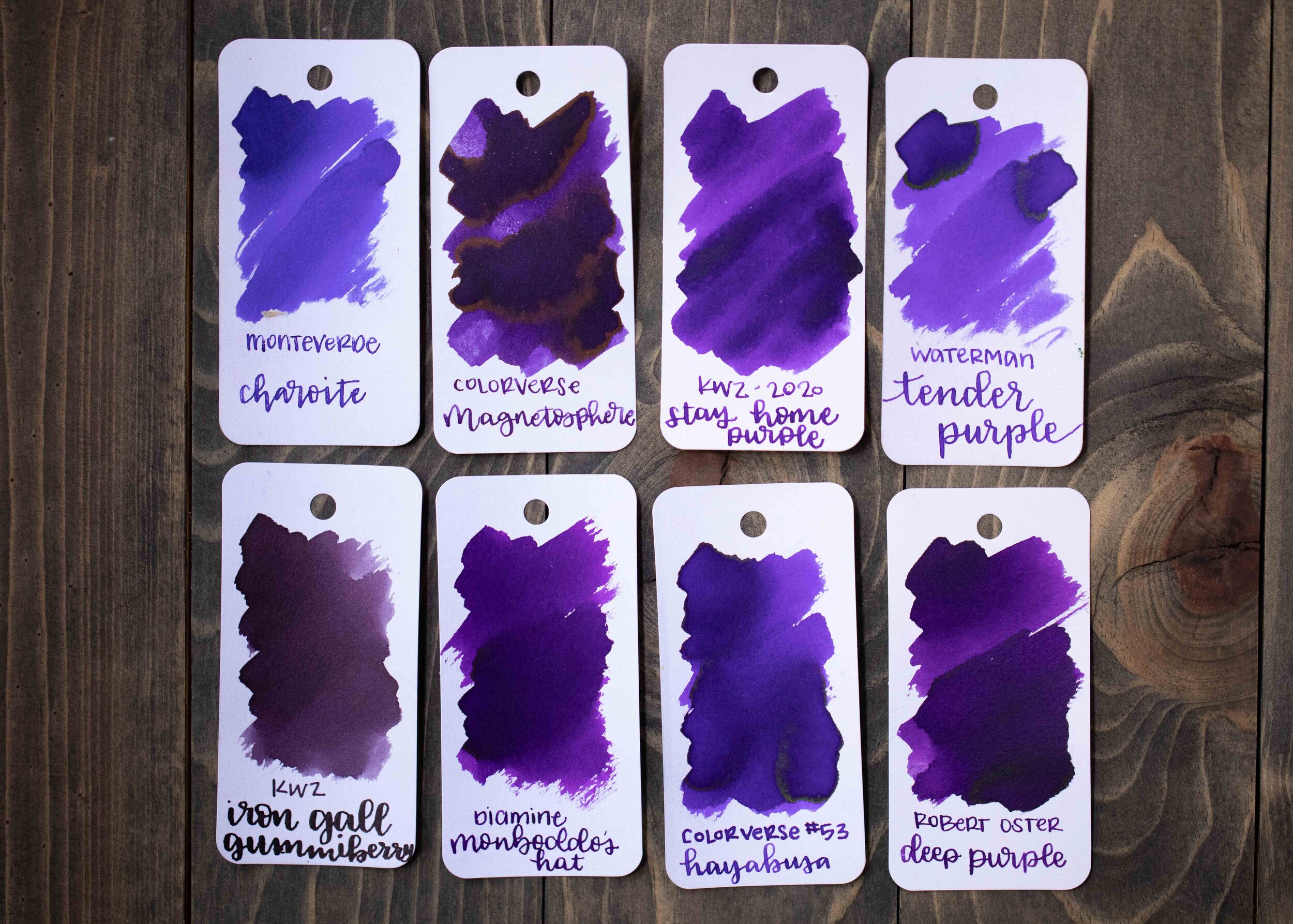
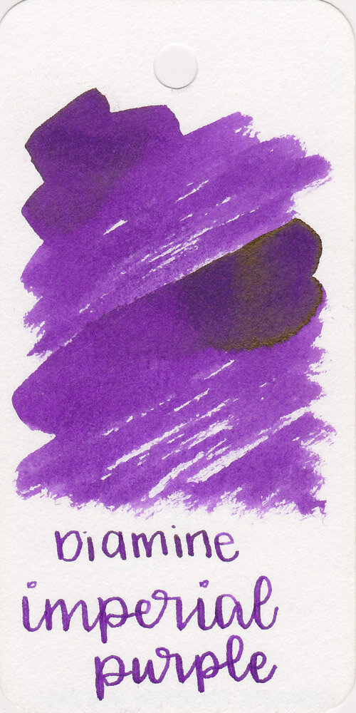
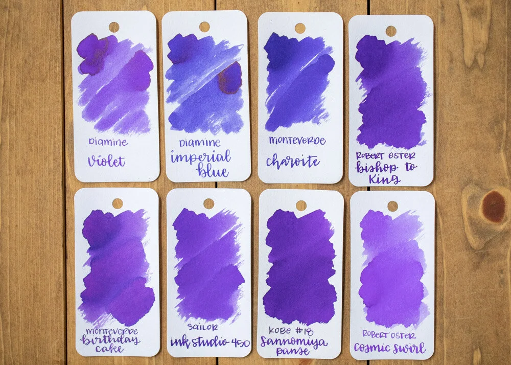
Comparison Swabs:

Plum has less red in it than Ferris Wheel Press Grape Ice Pop, but more red than Diamine Grape. Click here to see the purple inks together.
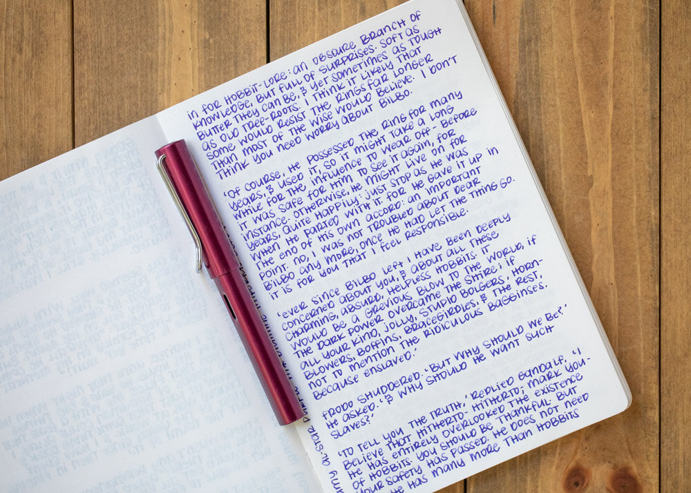
Longer writing:

I used an Pelikan M805 Stresemann with a medium nib on a Taroko Enigma notebook. The ink had a wet flow.
Overall, I plan on using this ink thought the fall and winter seasons. I love the color and the wet flow, and it even has a little bit of shading.
Disclaimer: I purchased this ink myself, and all photos and opinions are my own. This page does contain affiliate links but this post is not sponsored in any way.