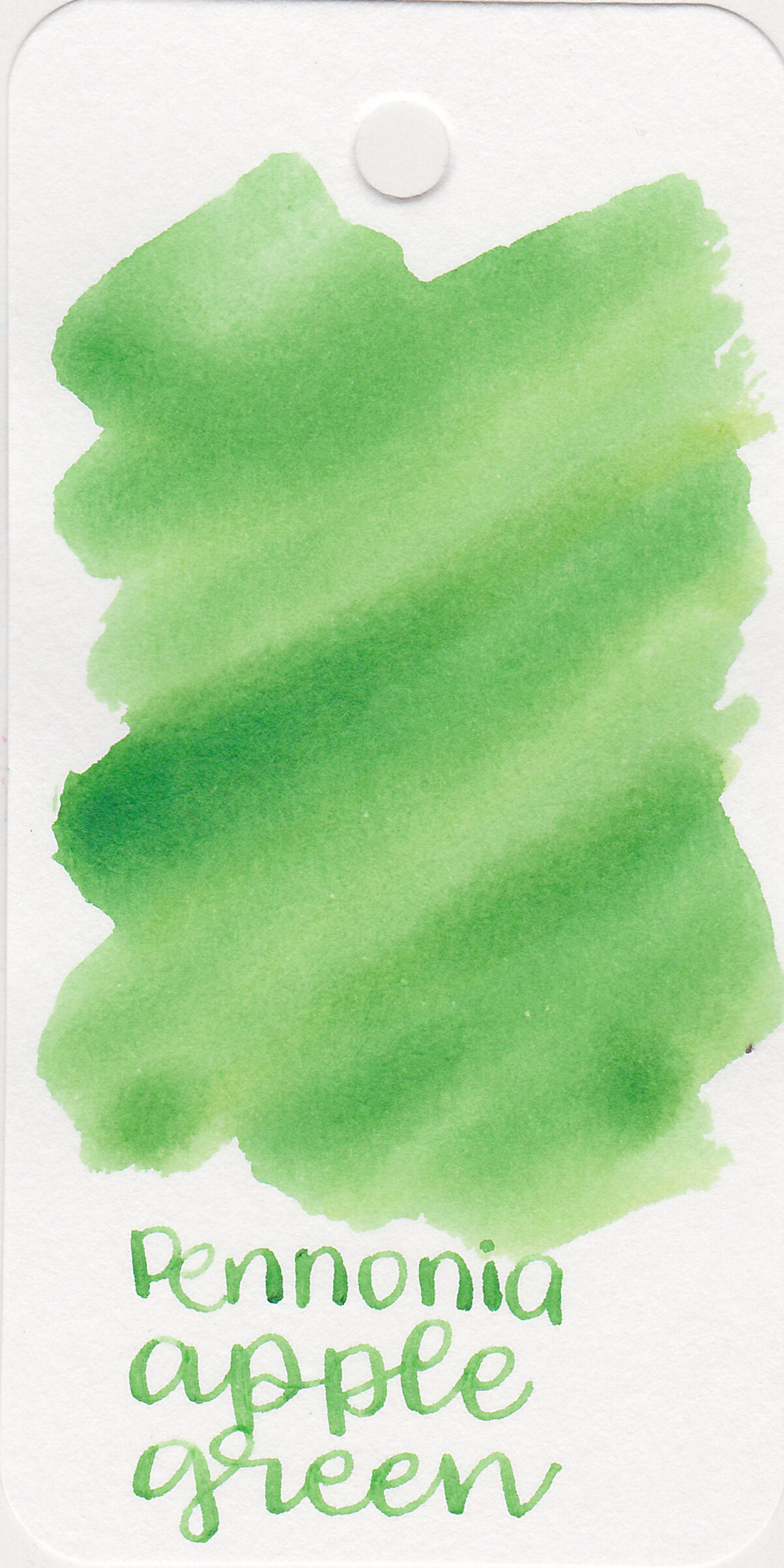
Pennonia Inks Part 6
/
We have one more set of Pennonia inks to go over: Young Wine, Chestnut Brown, Sour Cherry, Devil Red and Cotton Candy. Thanks to Shigure Inks for sending these inks over for review!
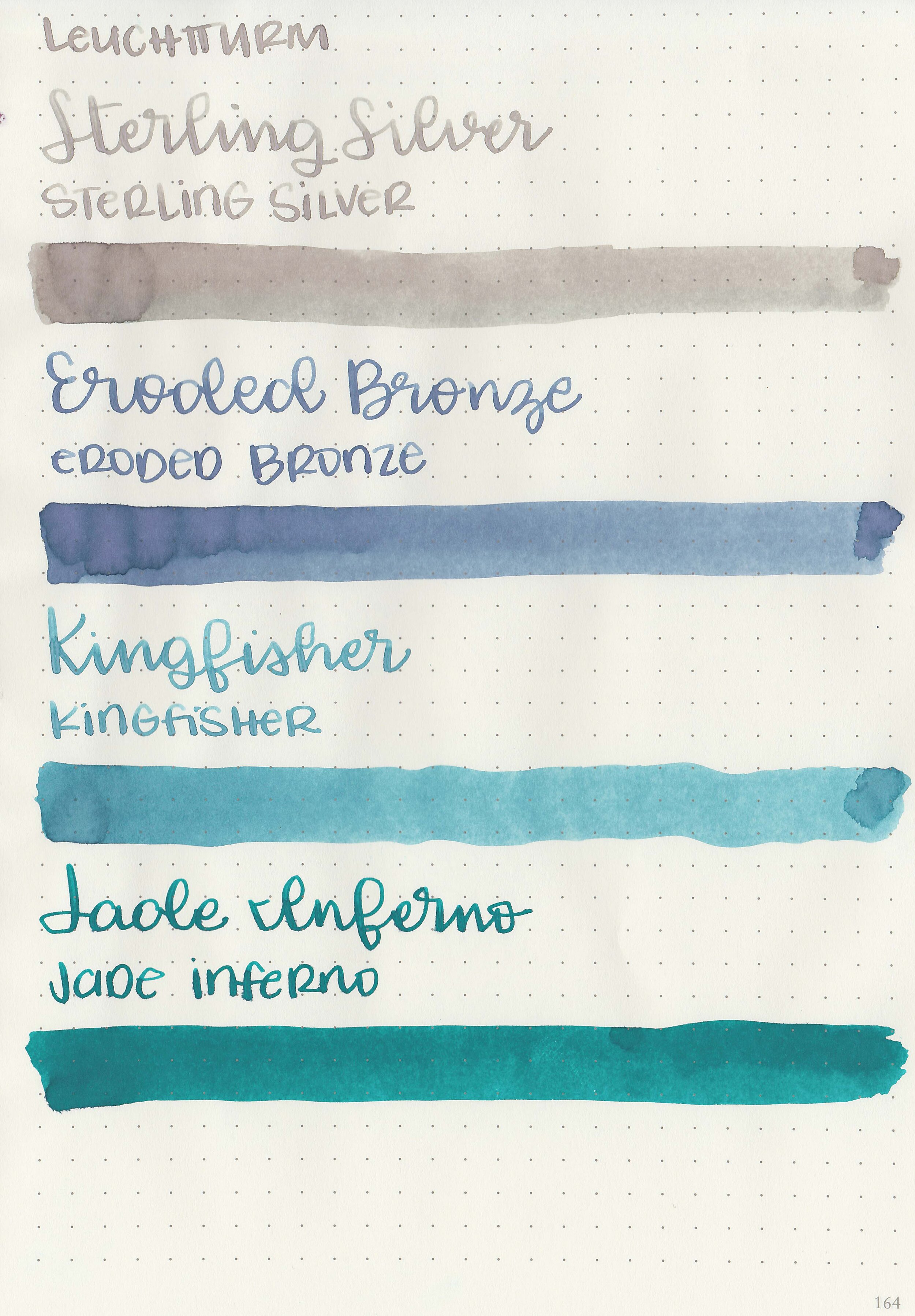
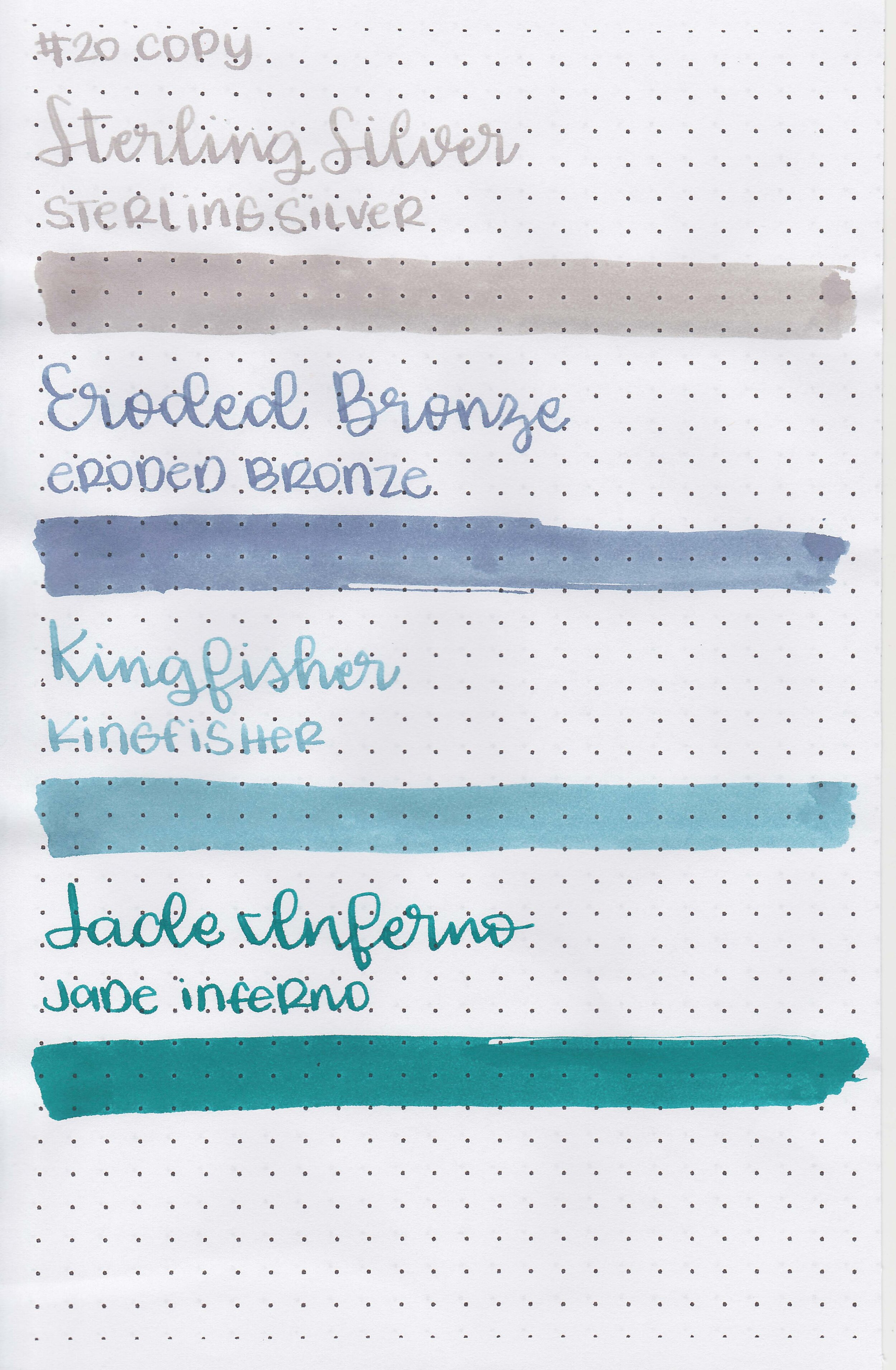
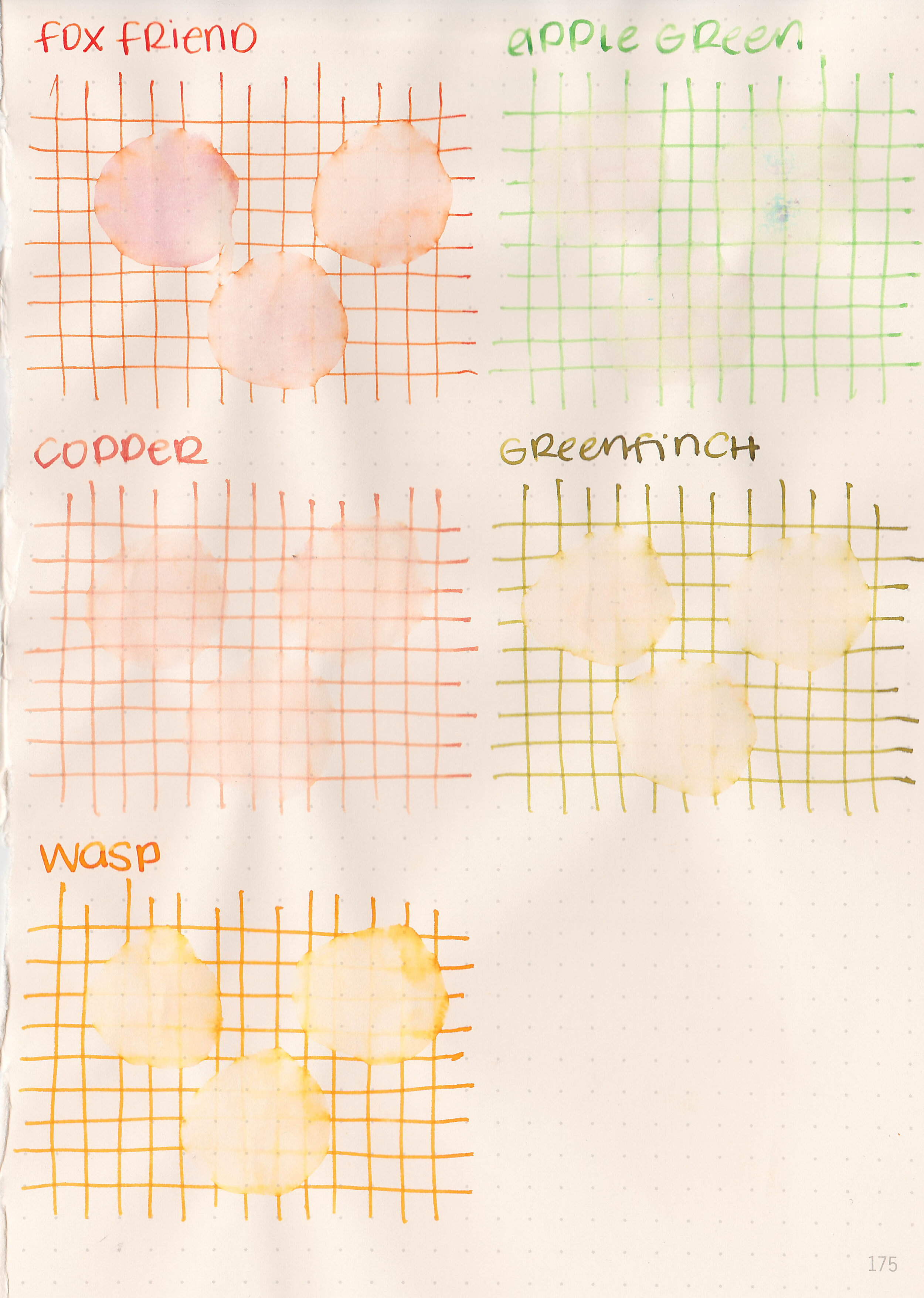
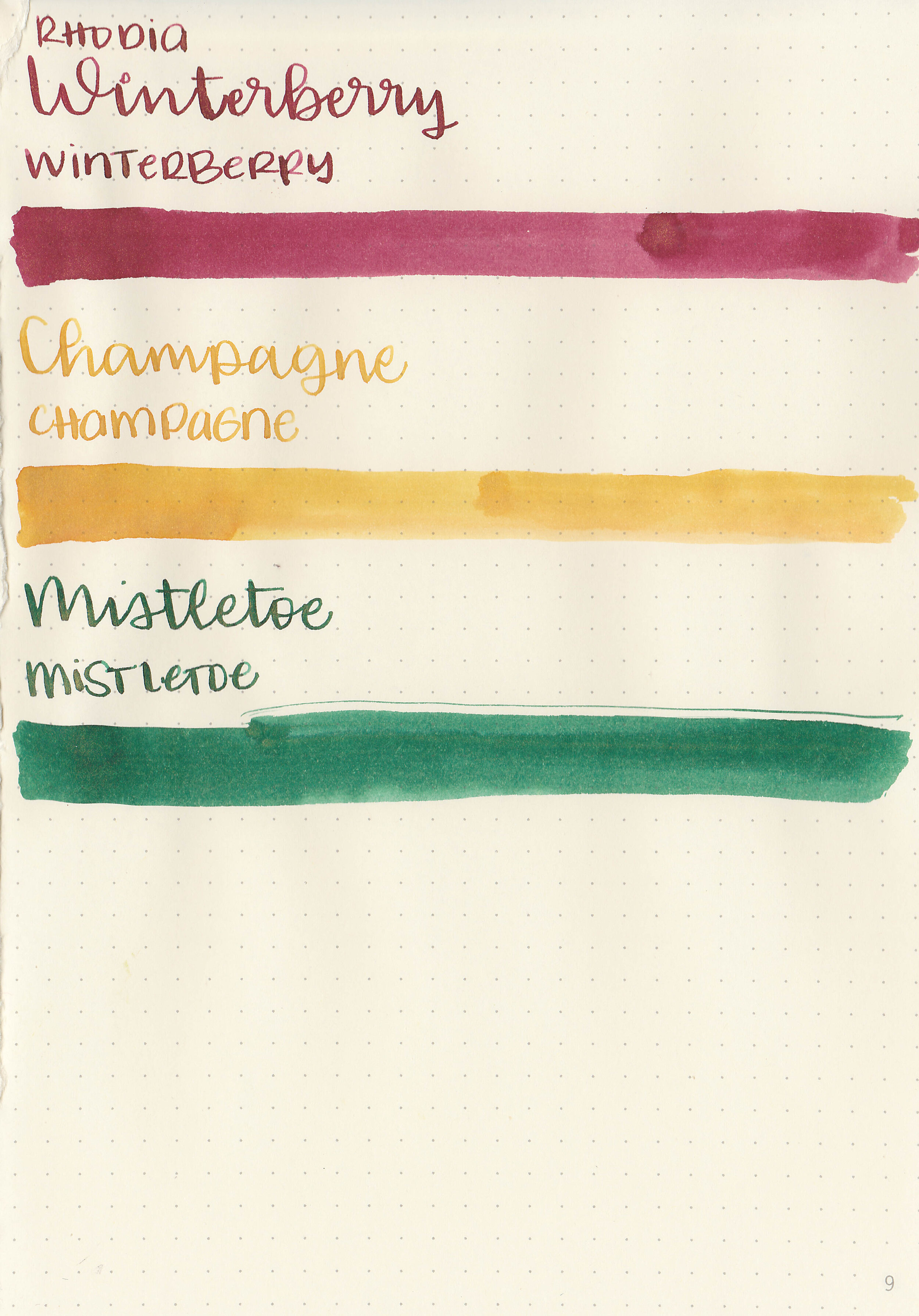
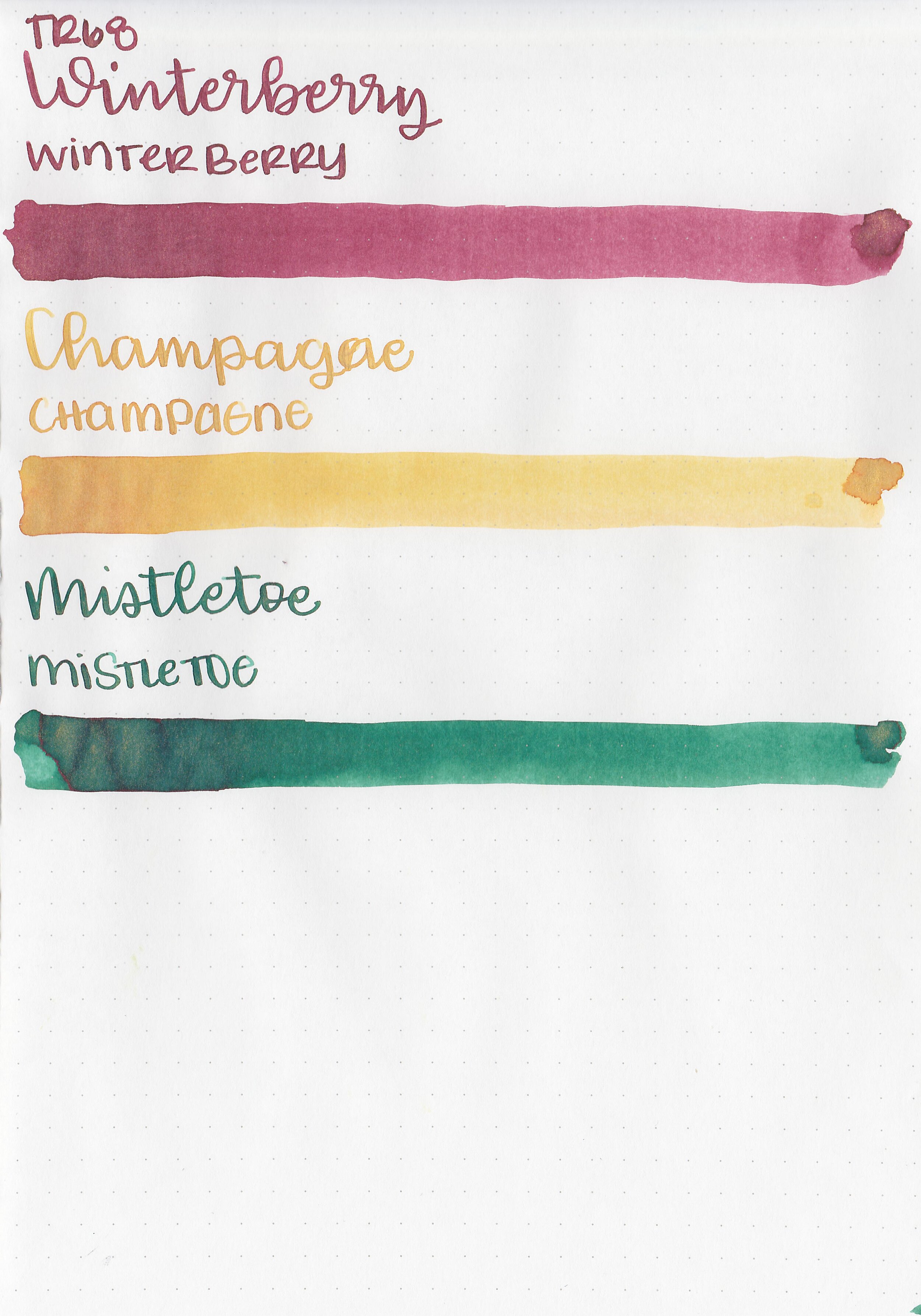
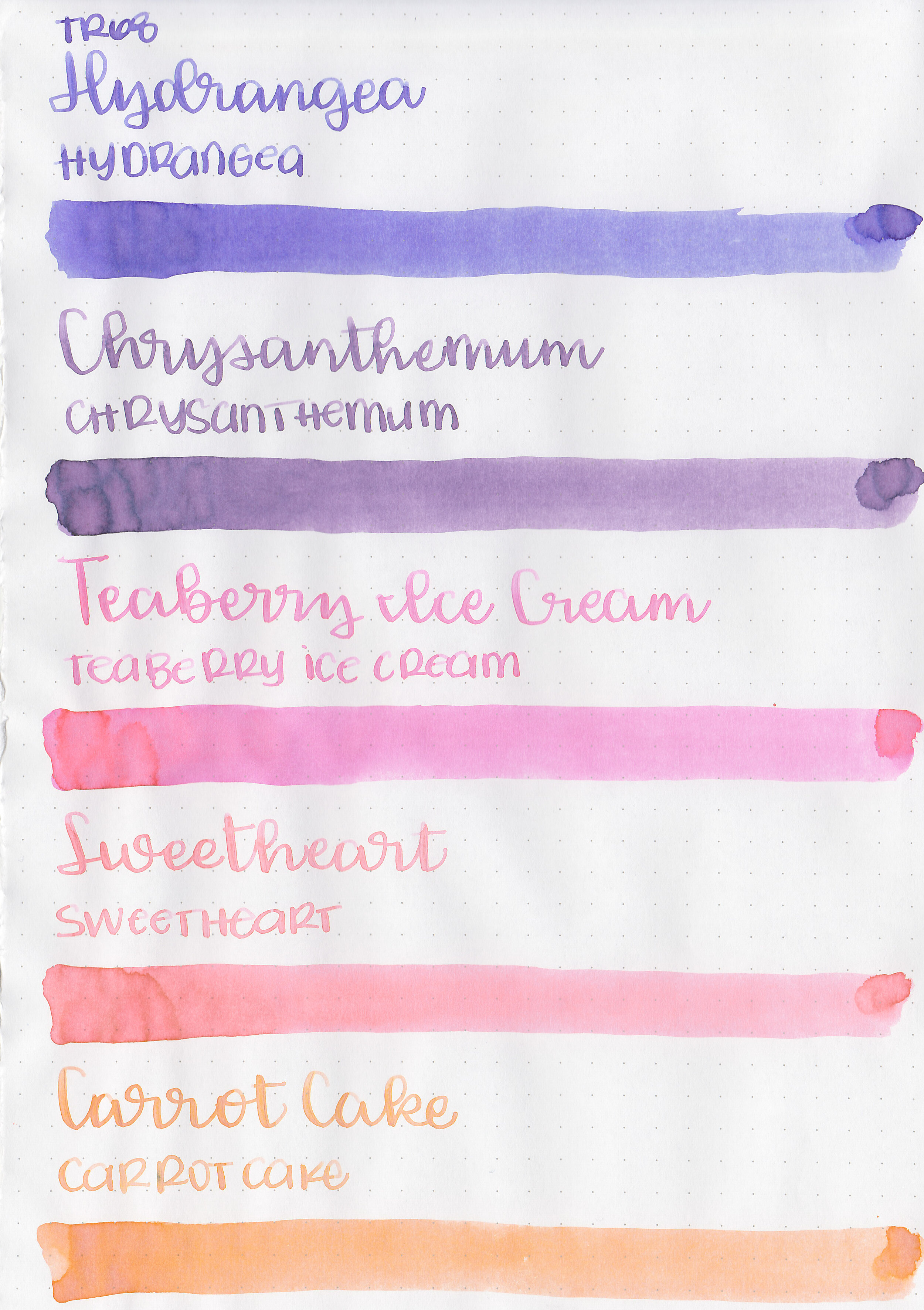
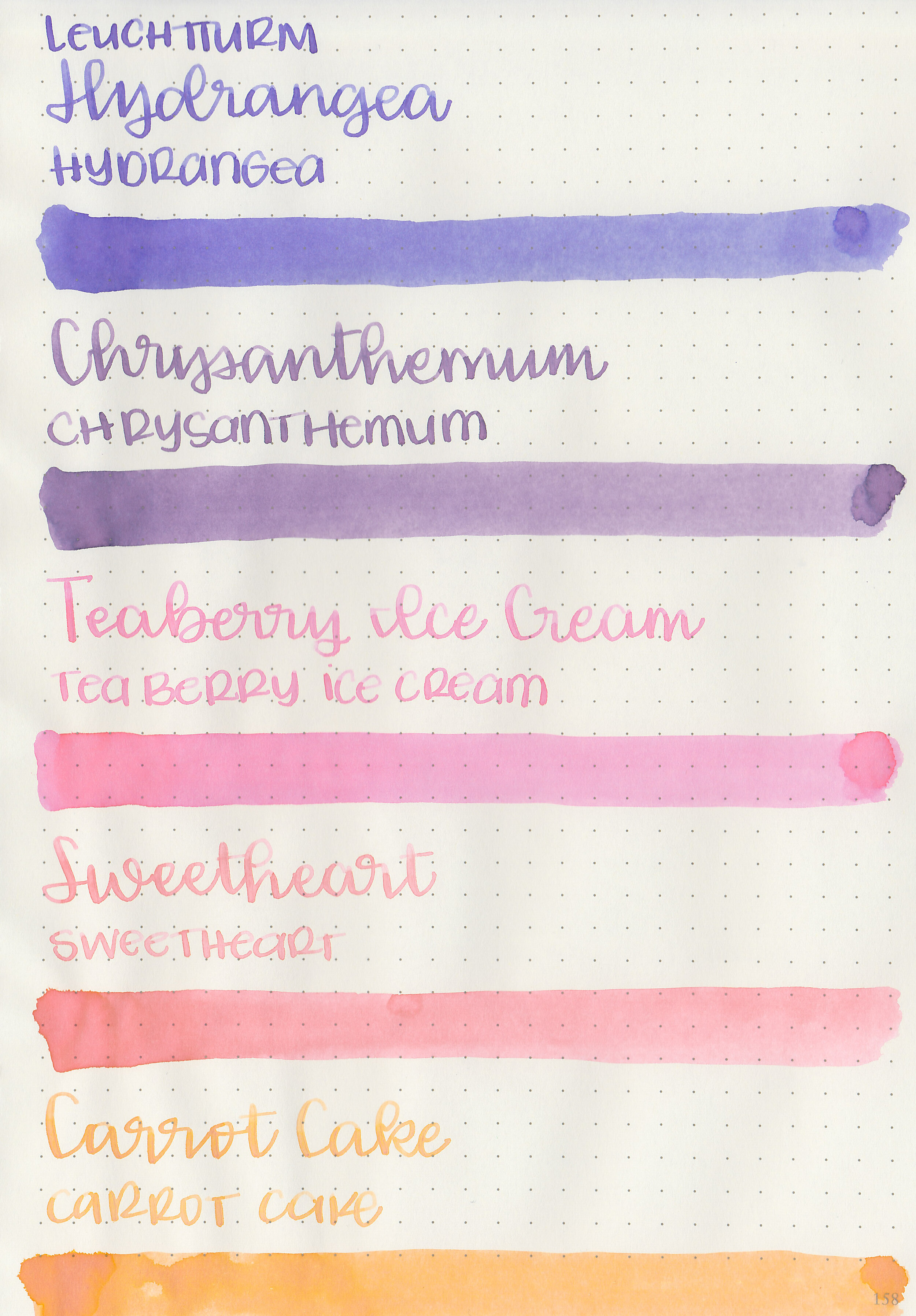
Swabs:

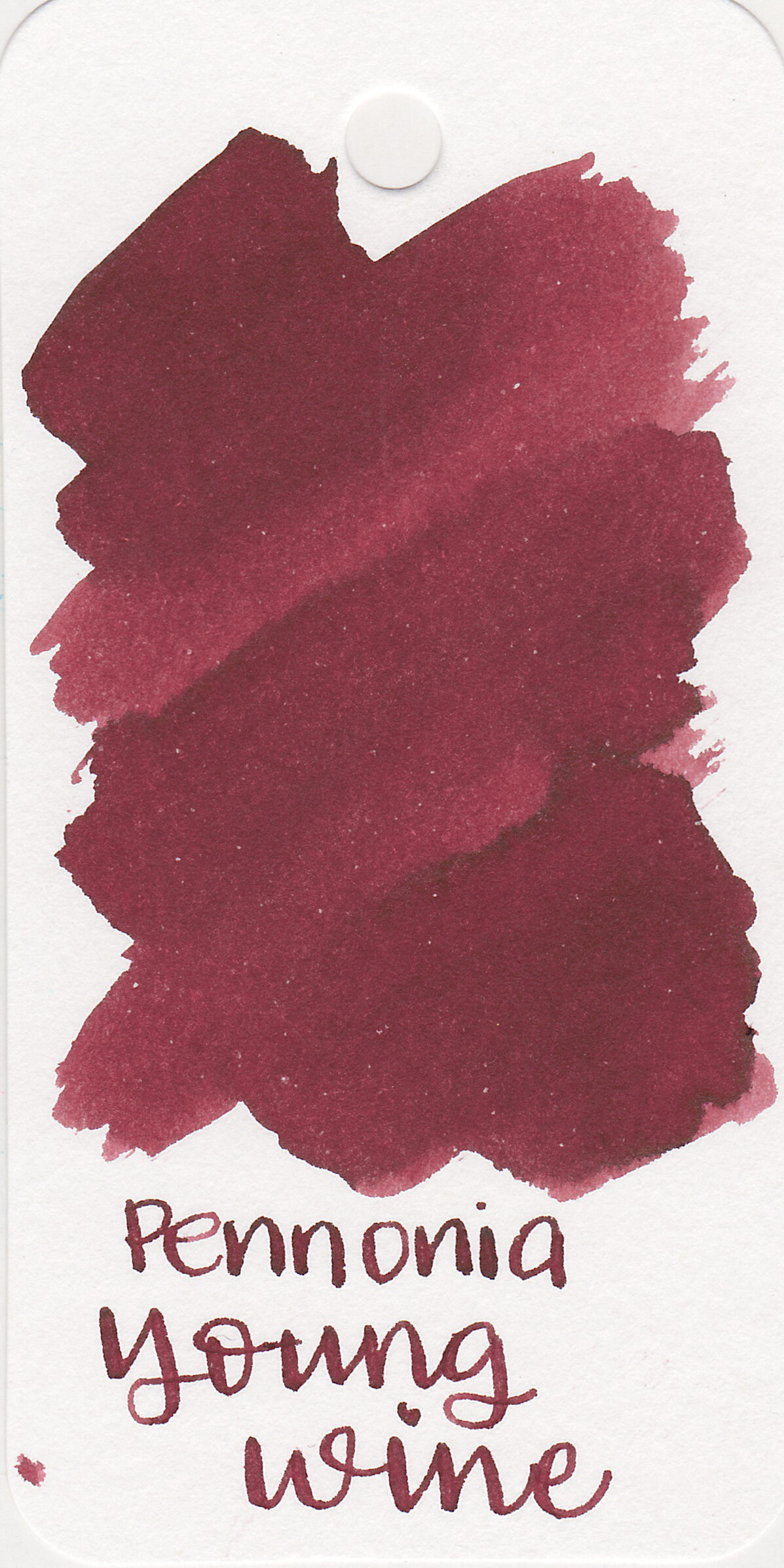
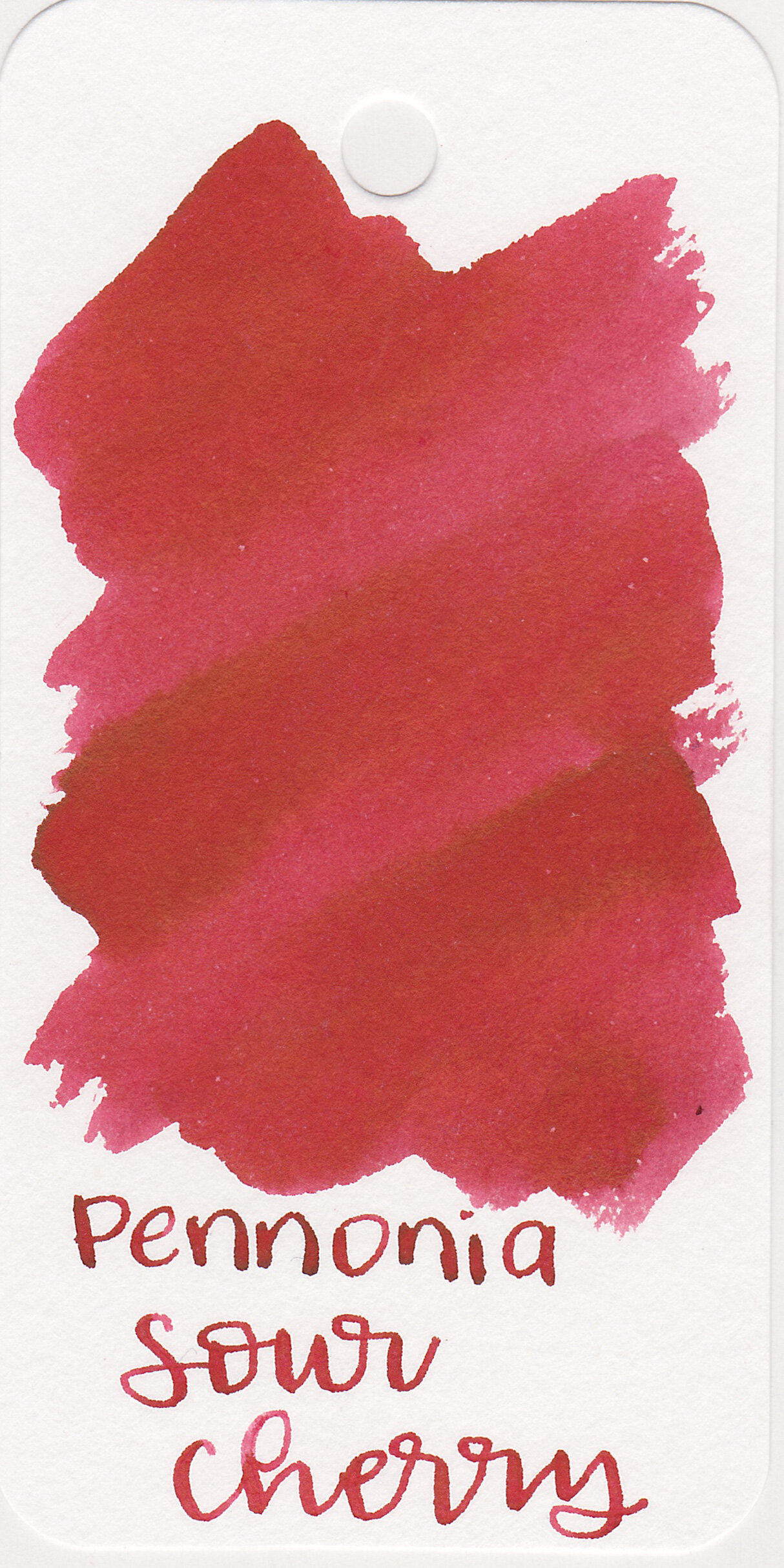
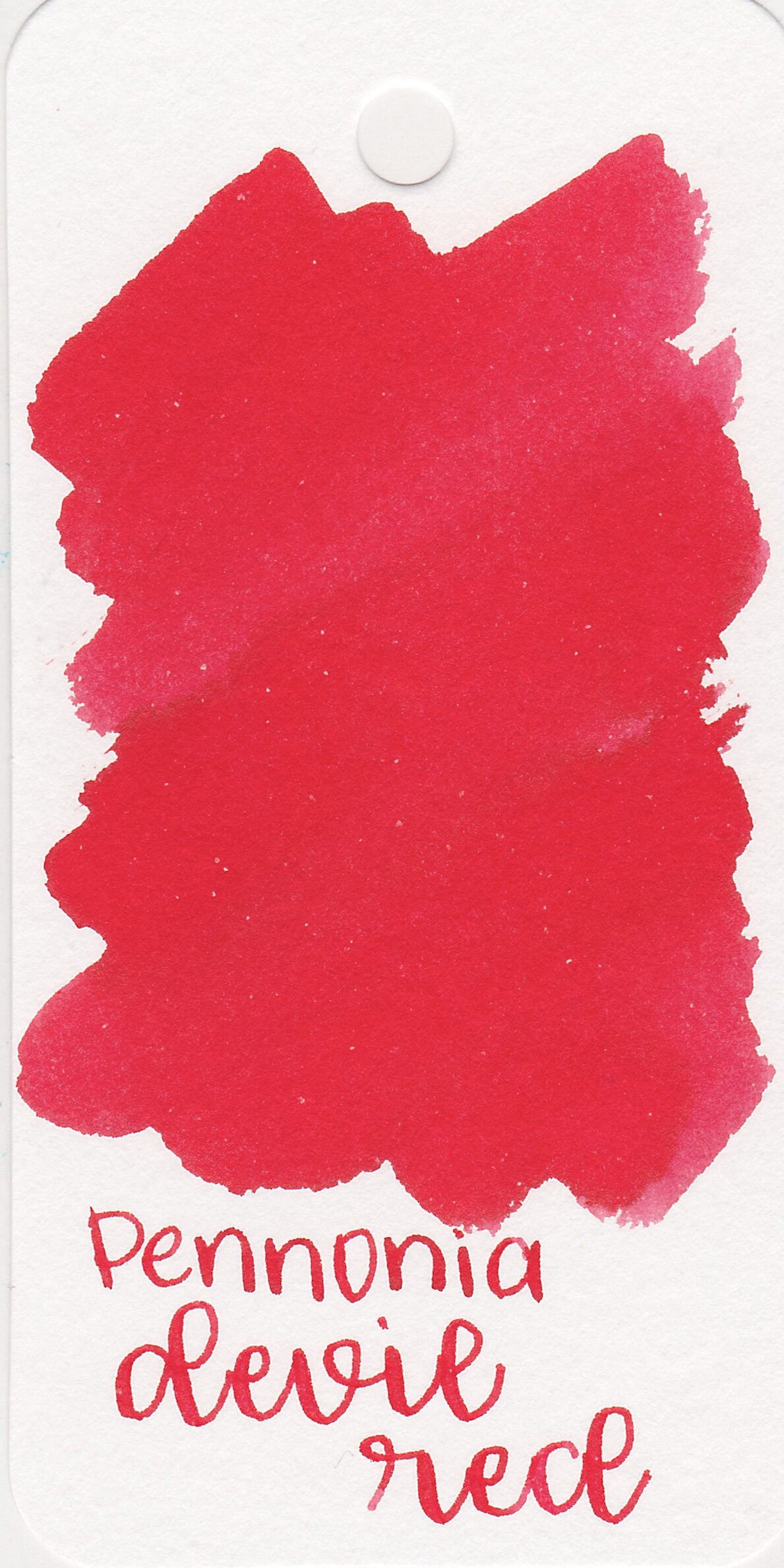

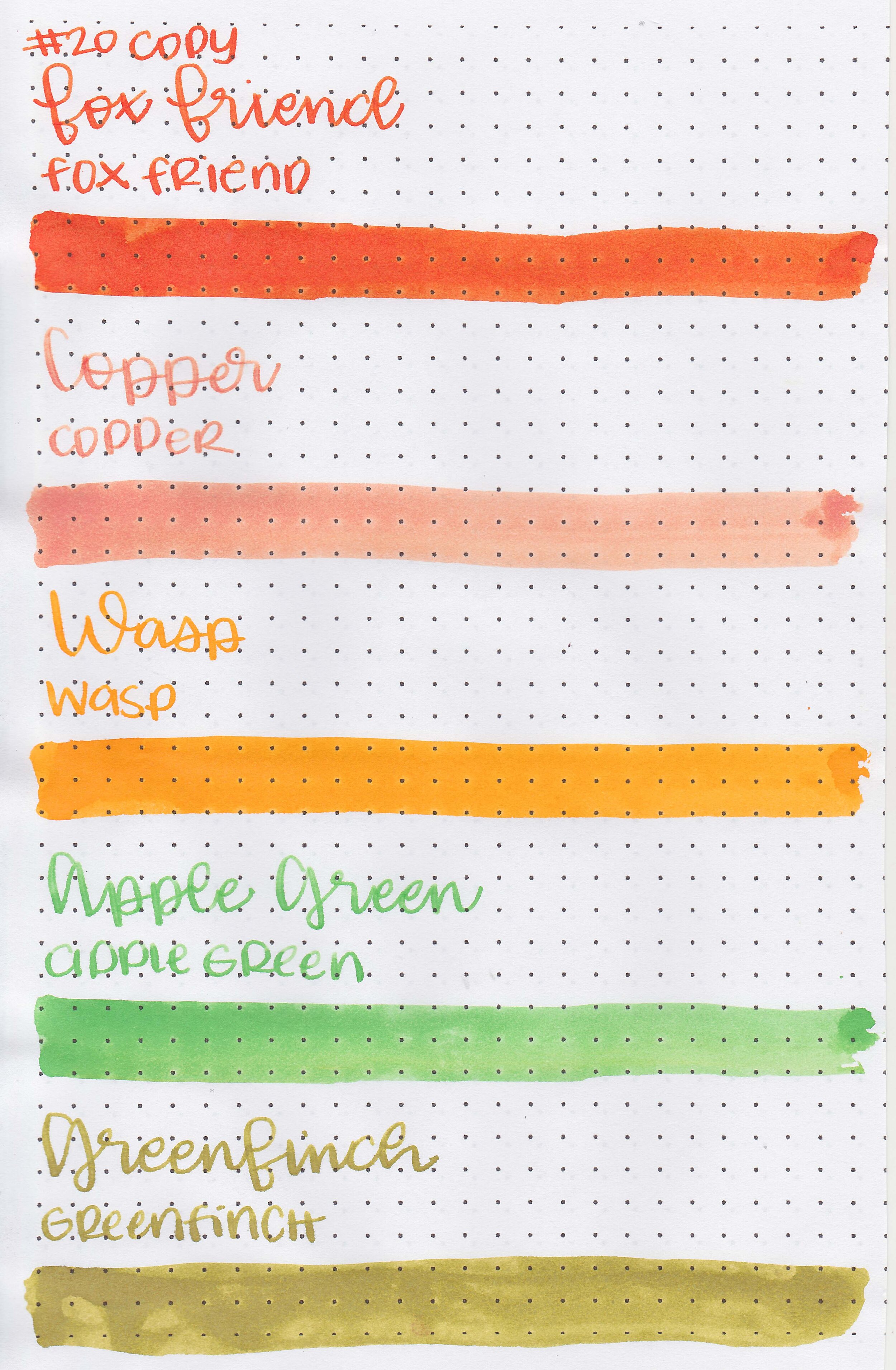
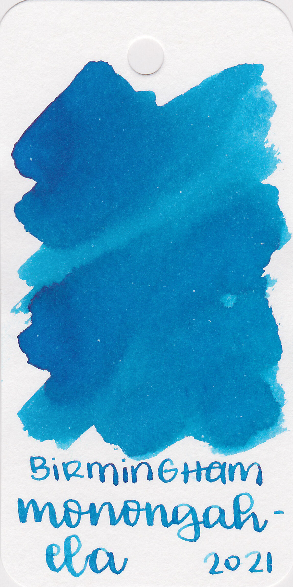
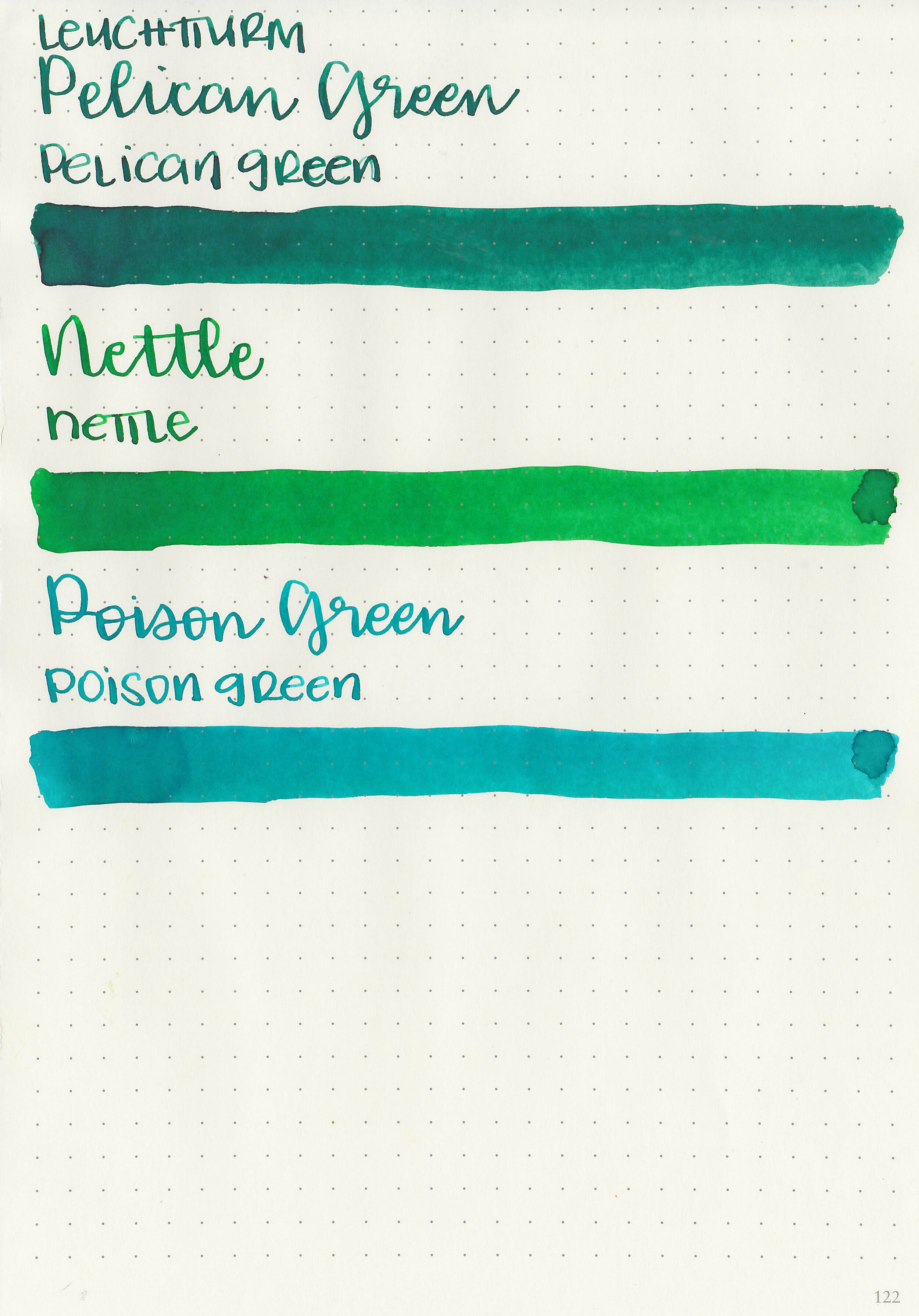
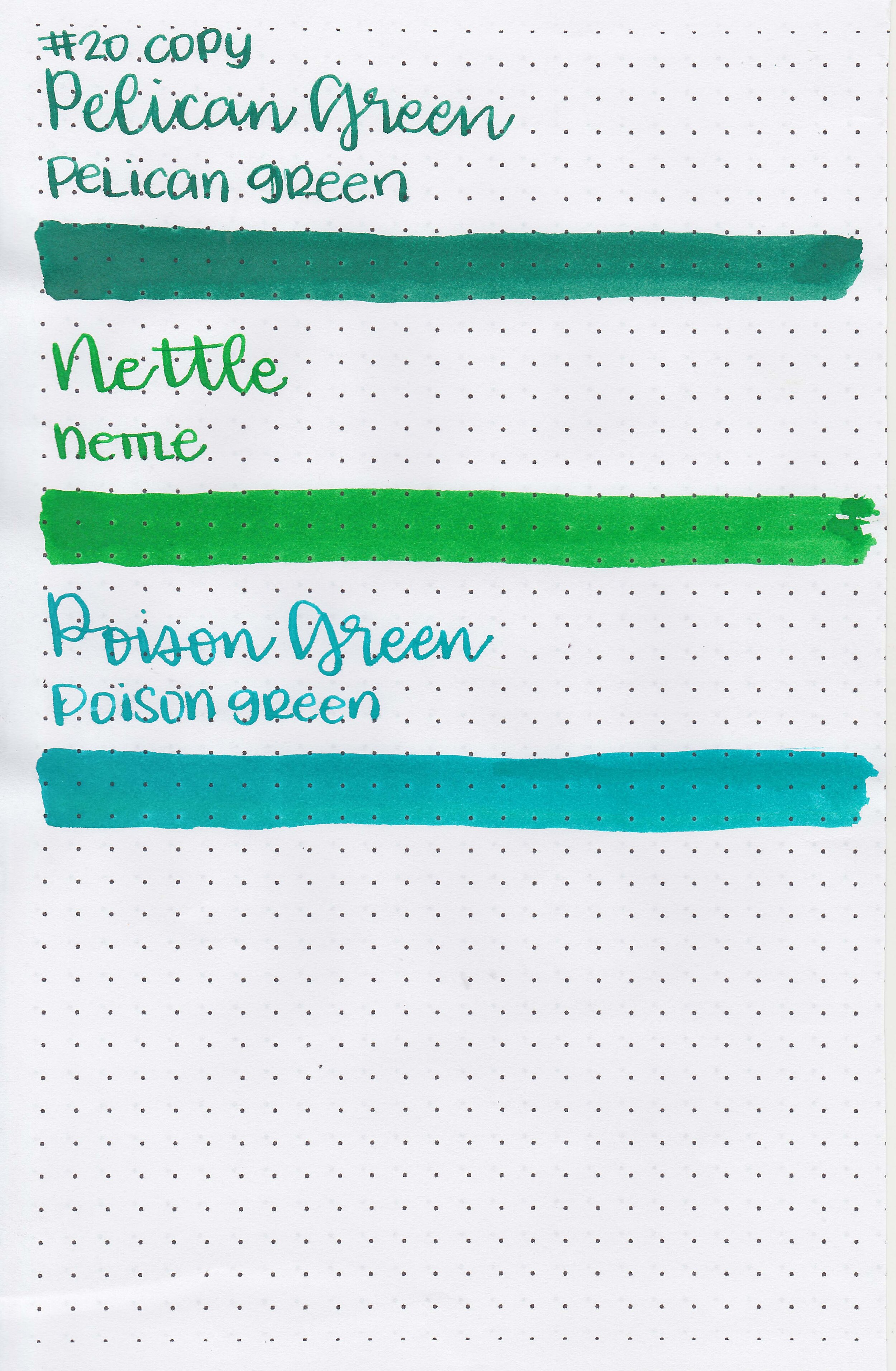
Left to right: Chestnut Brown, Young Wine, Sour Cherry, Devil Red and Cotton Candy
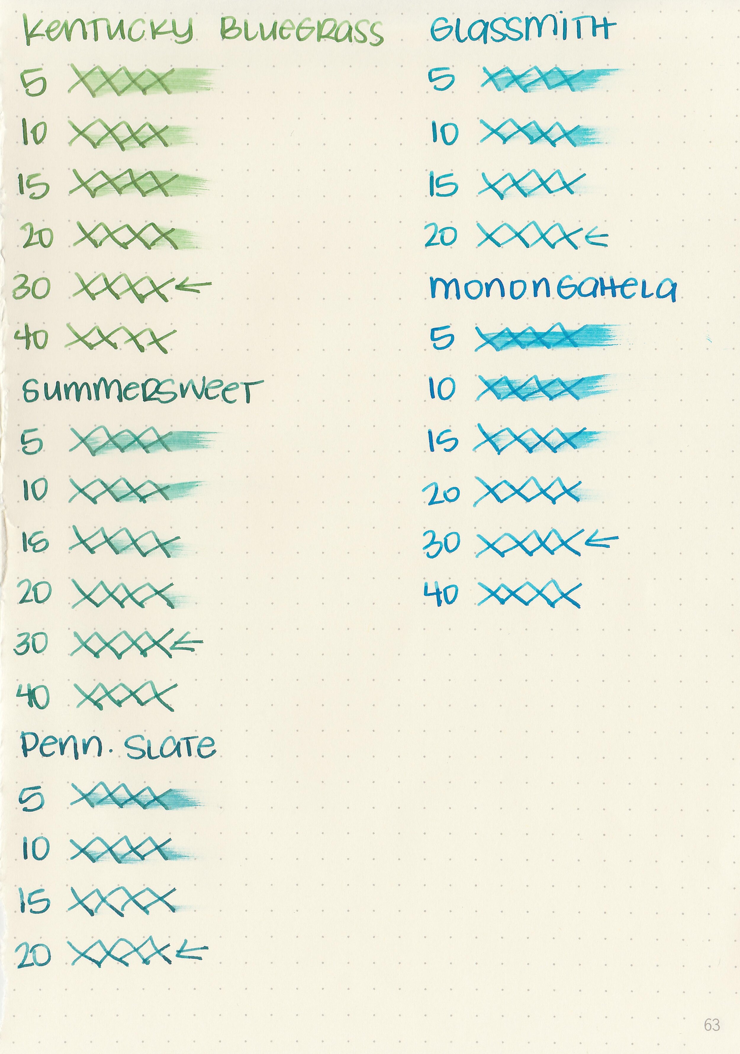
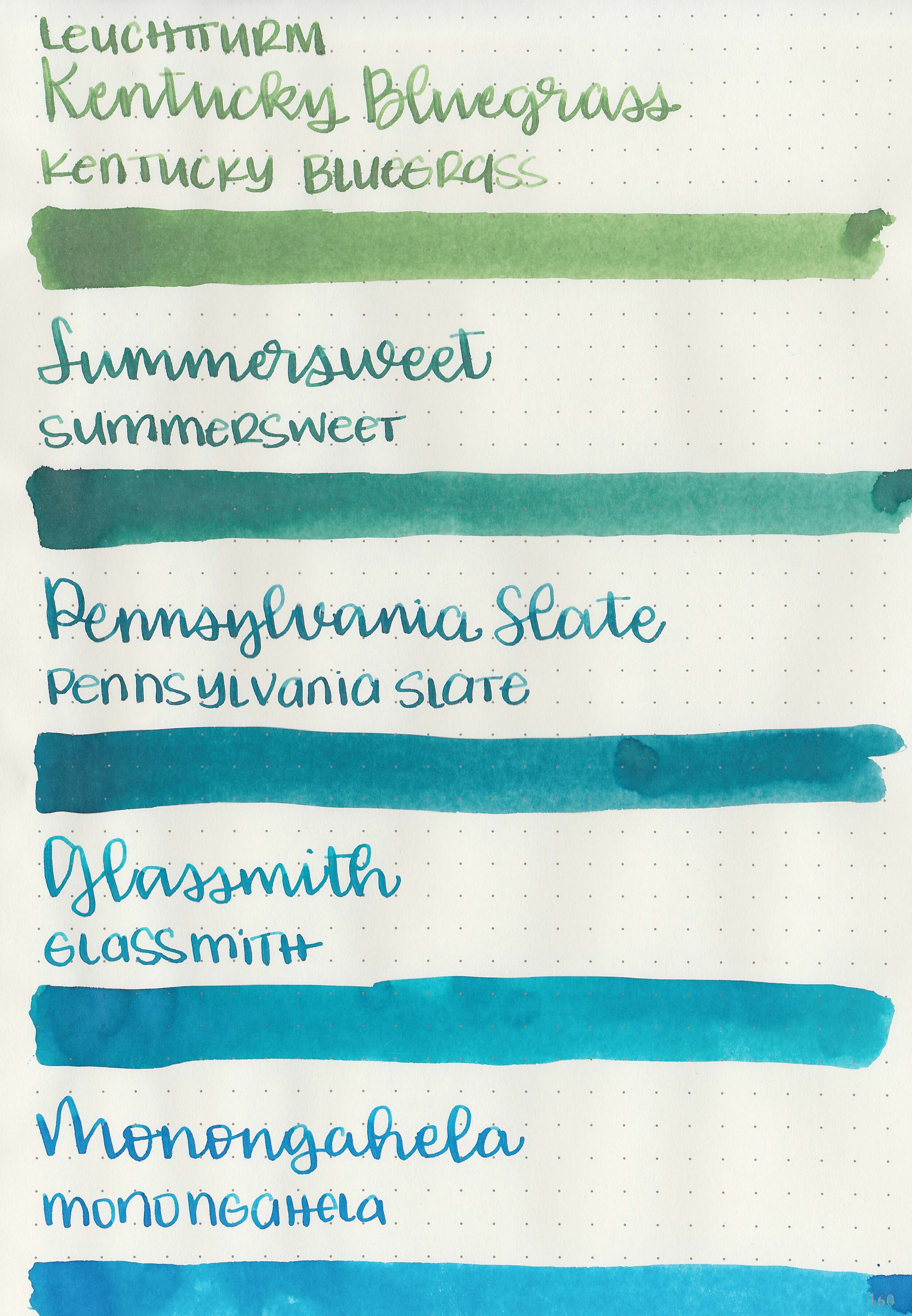
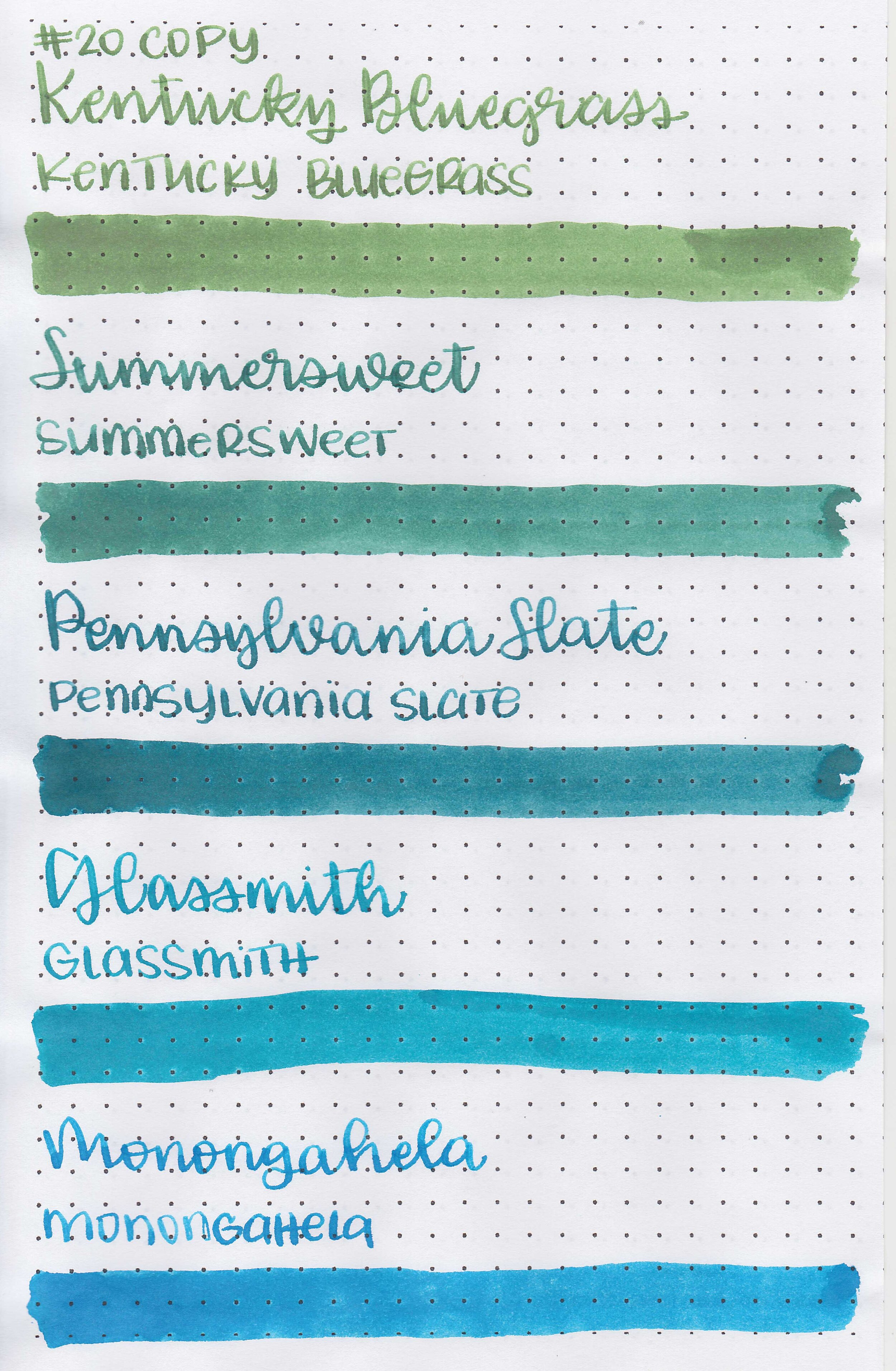
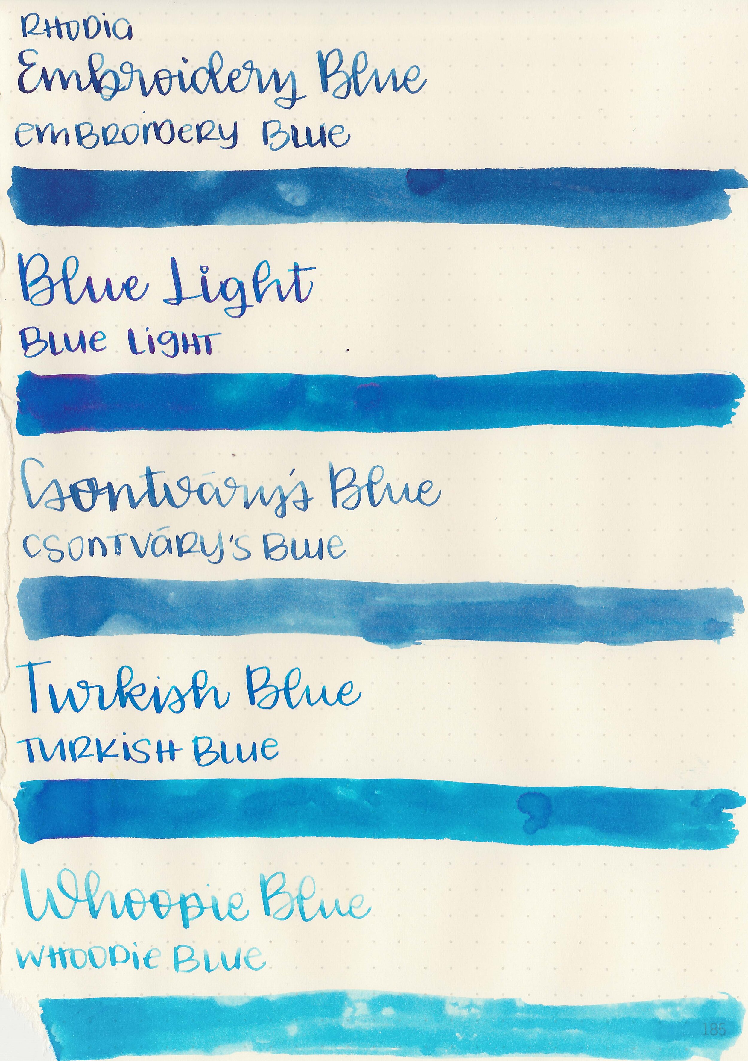
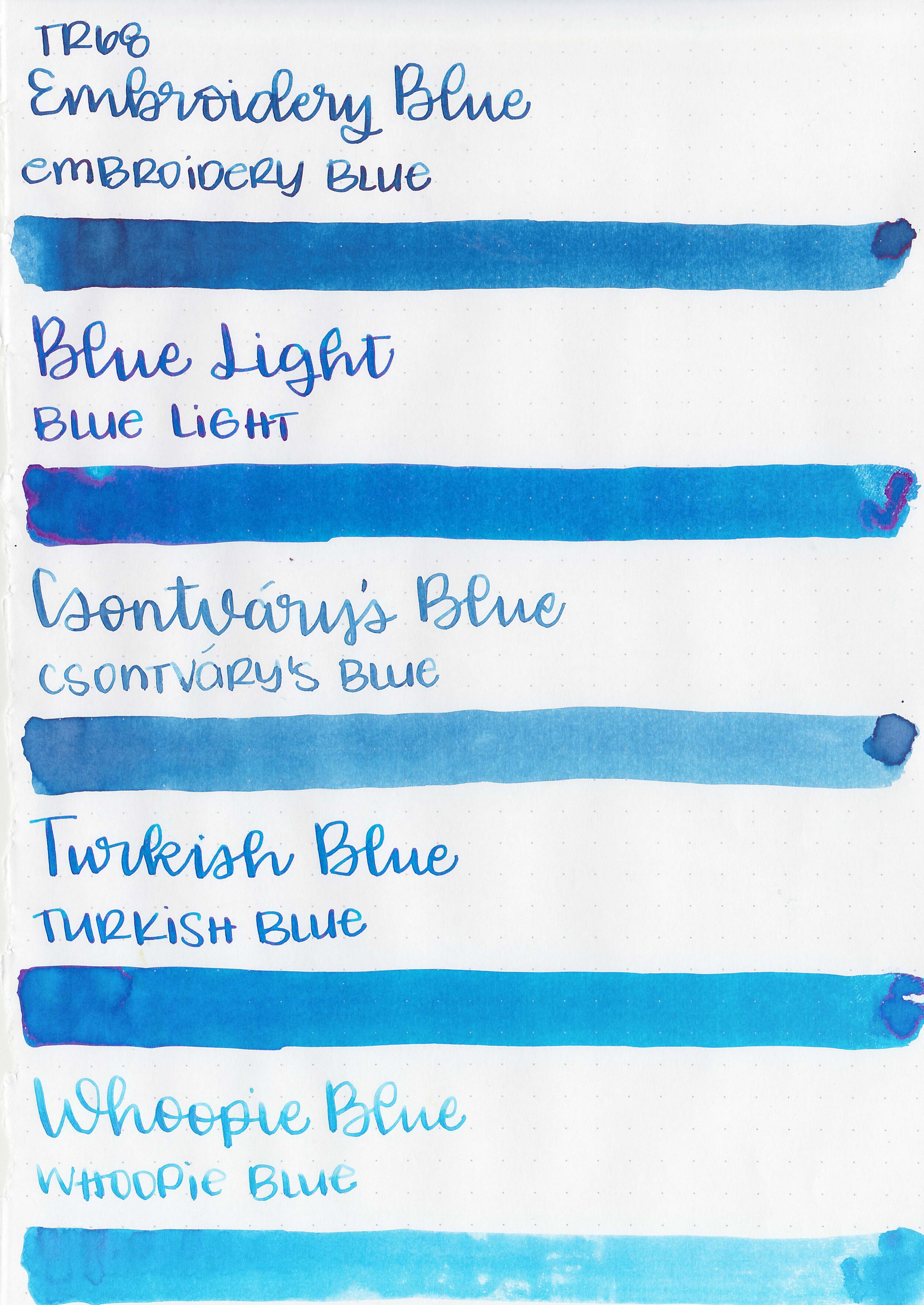
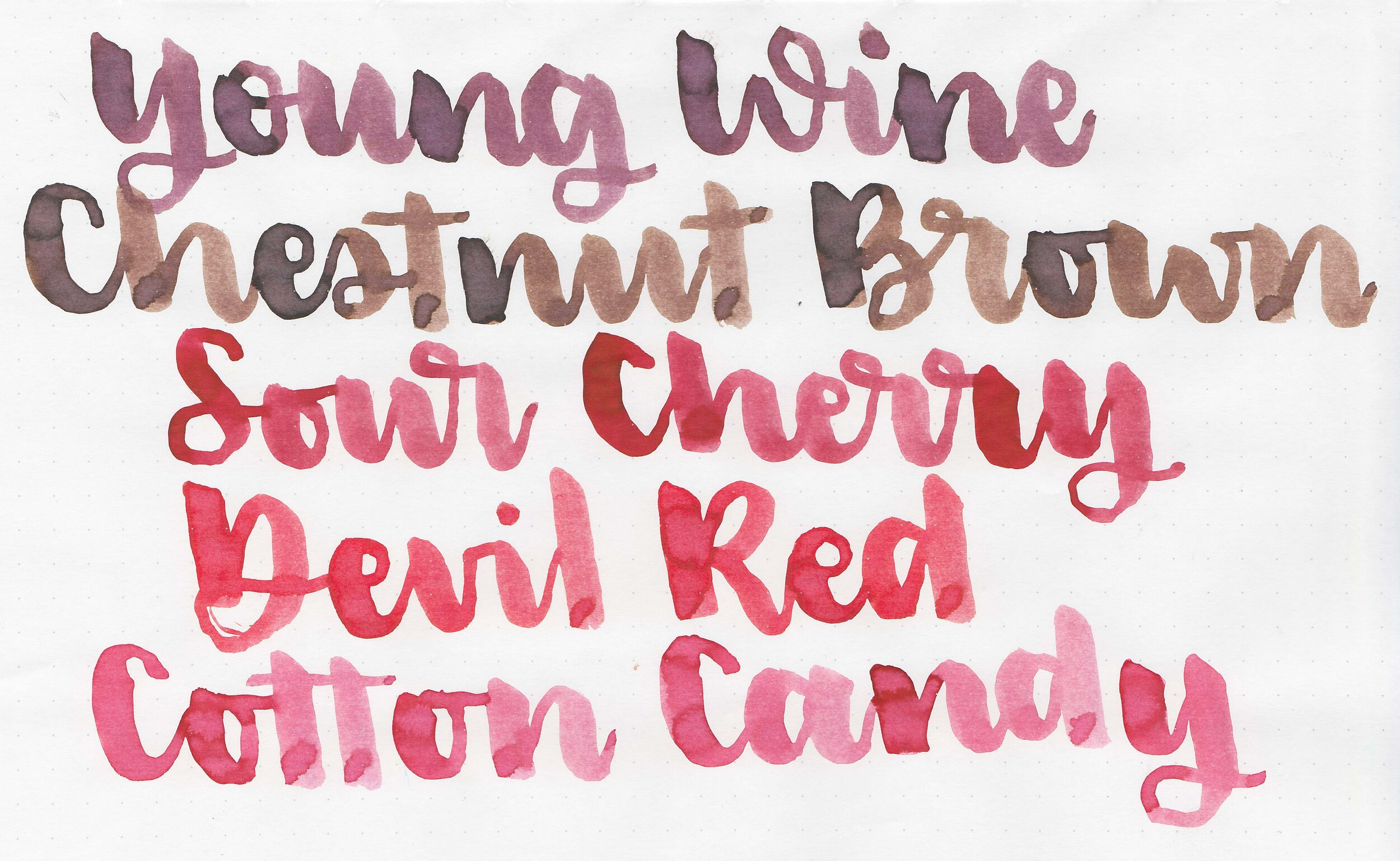
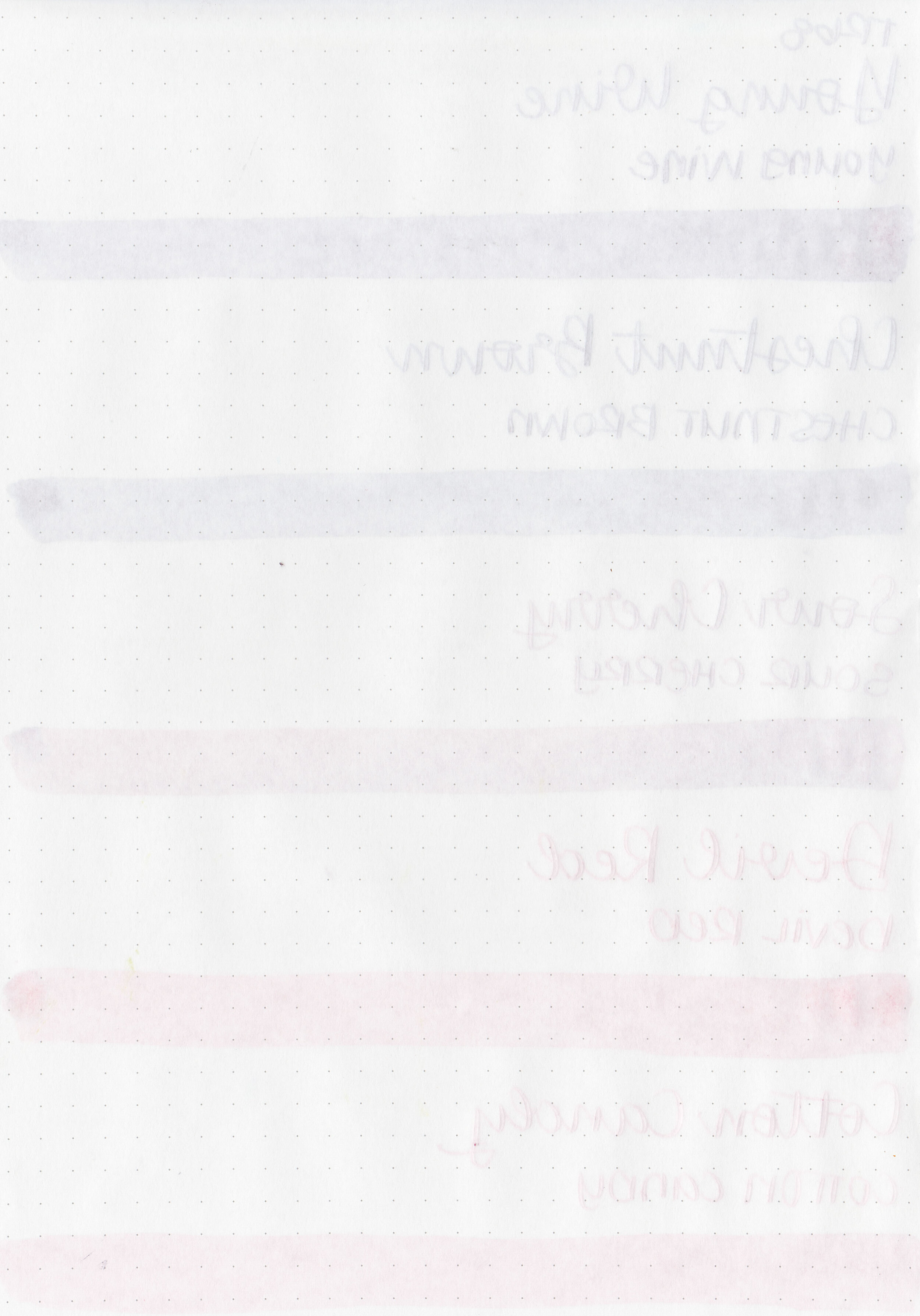
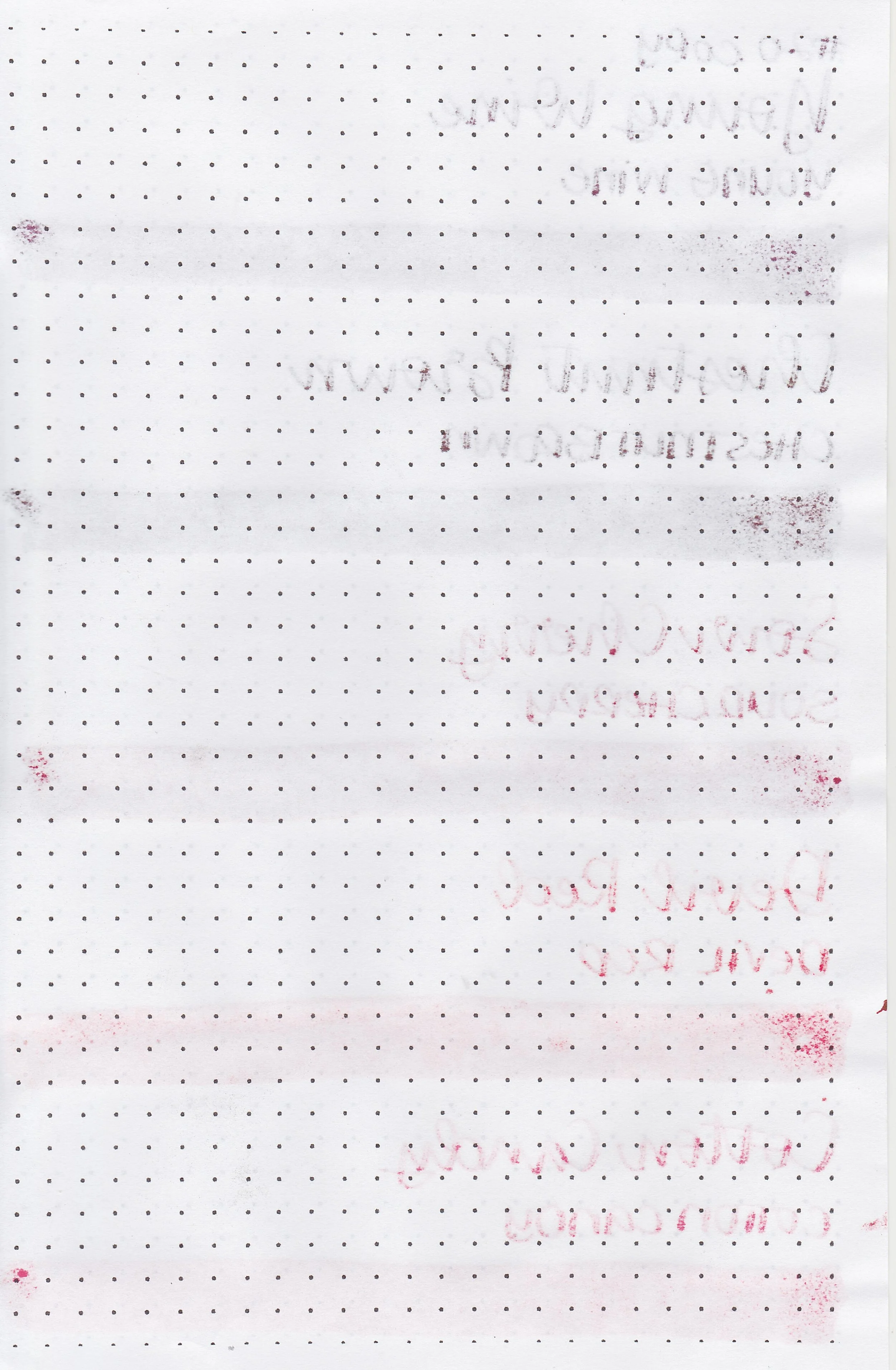
Writing samples:
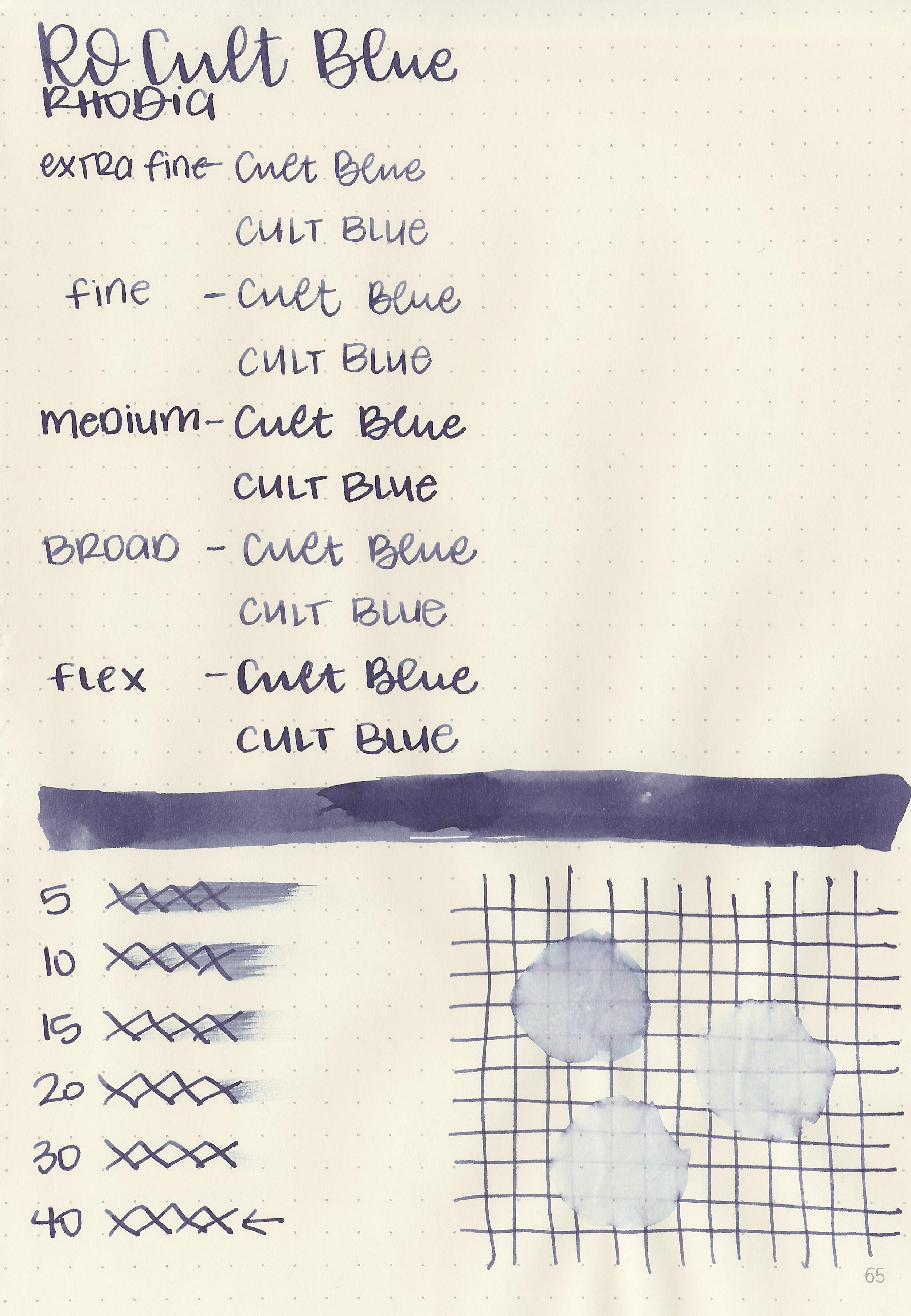
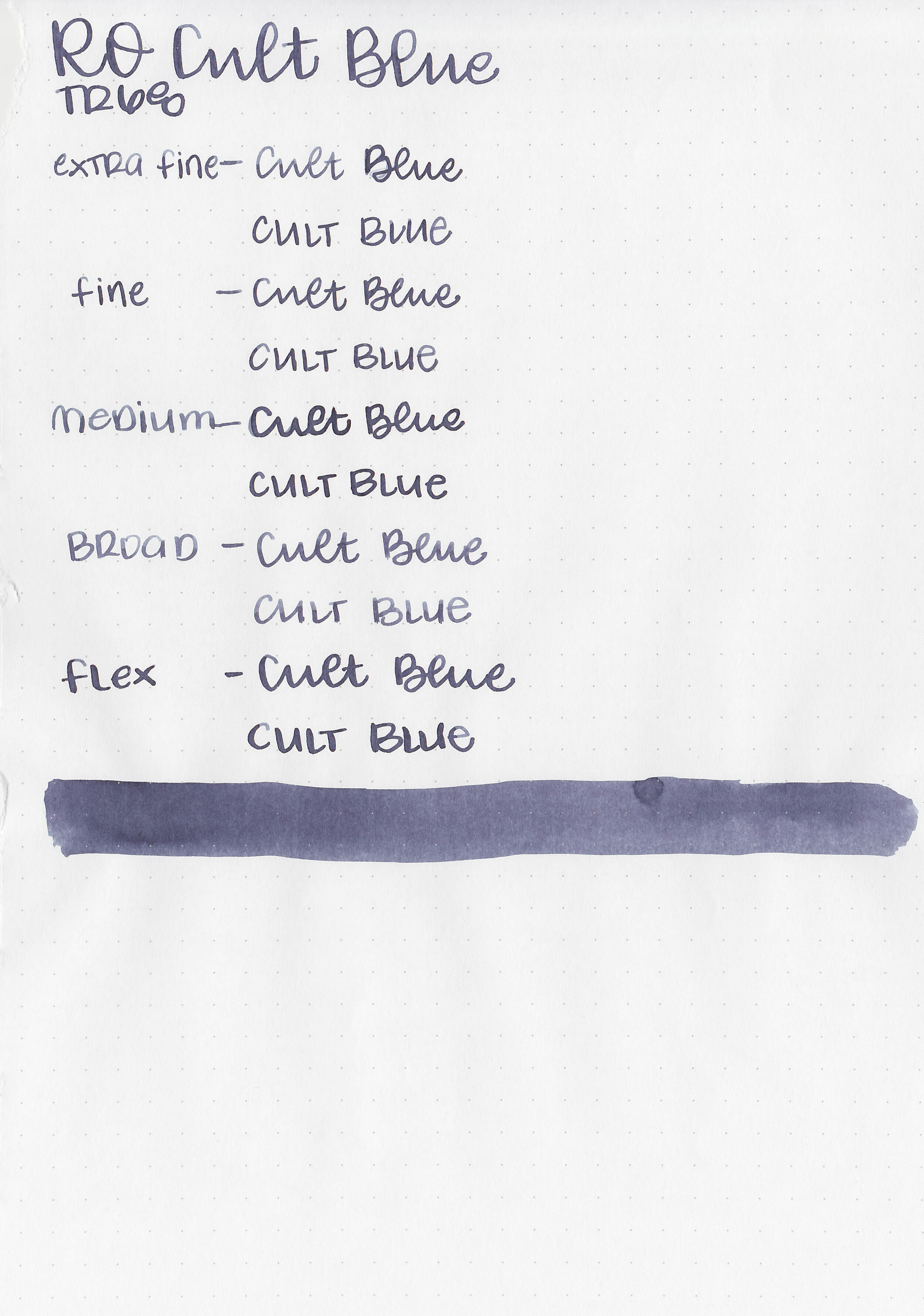
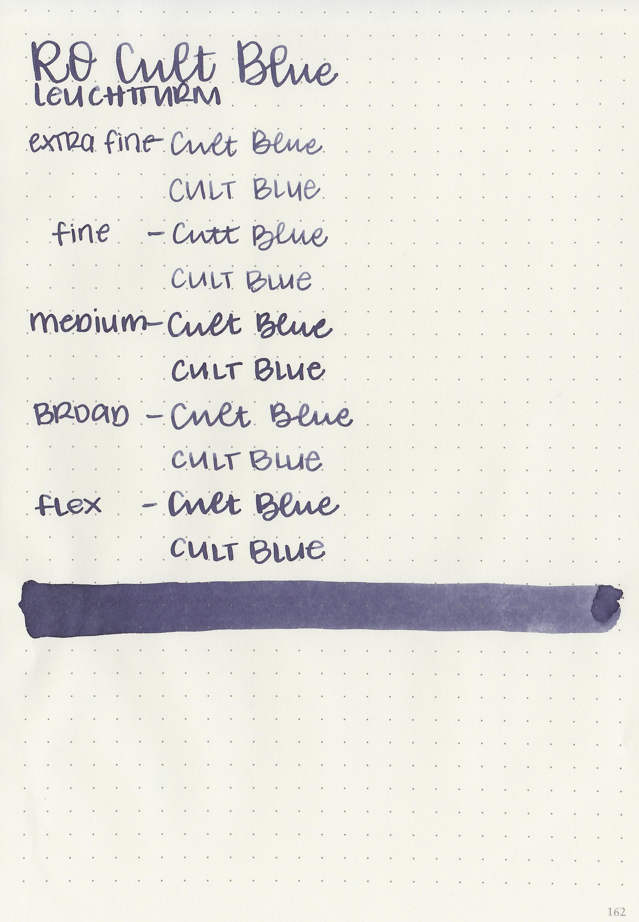
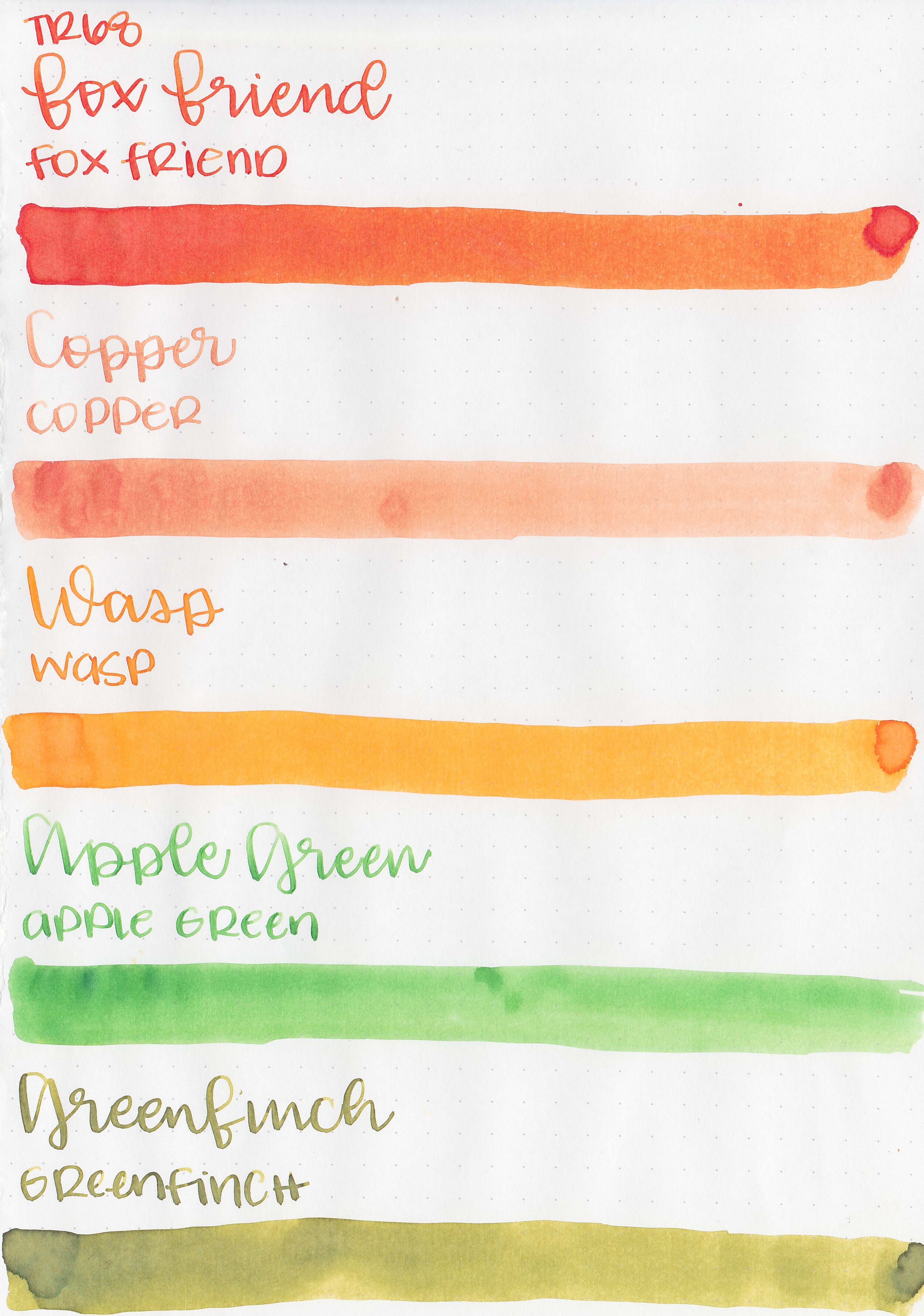
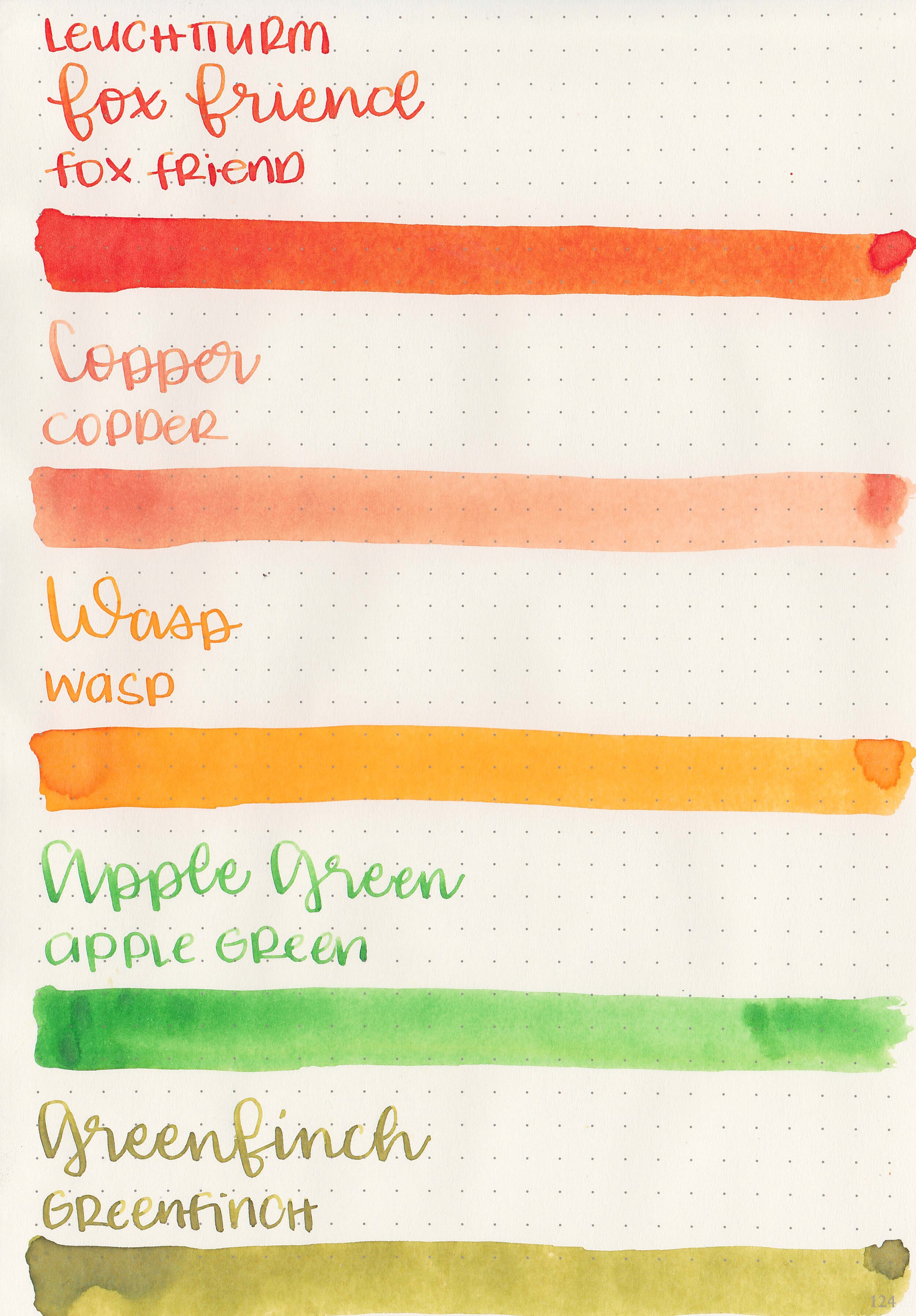
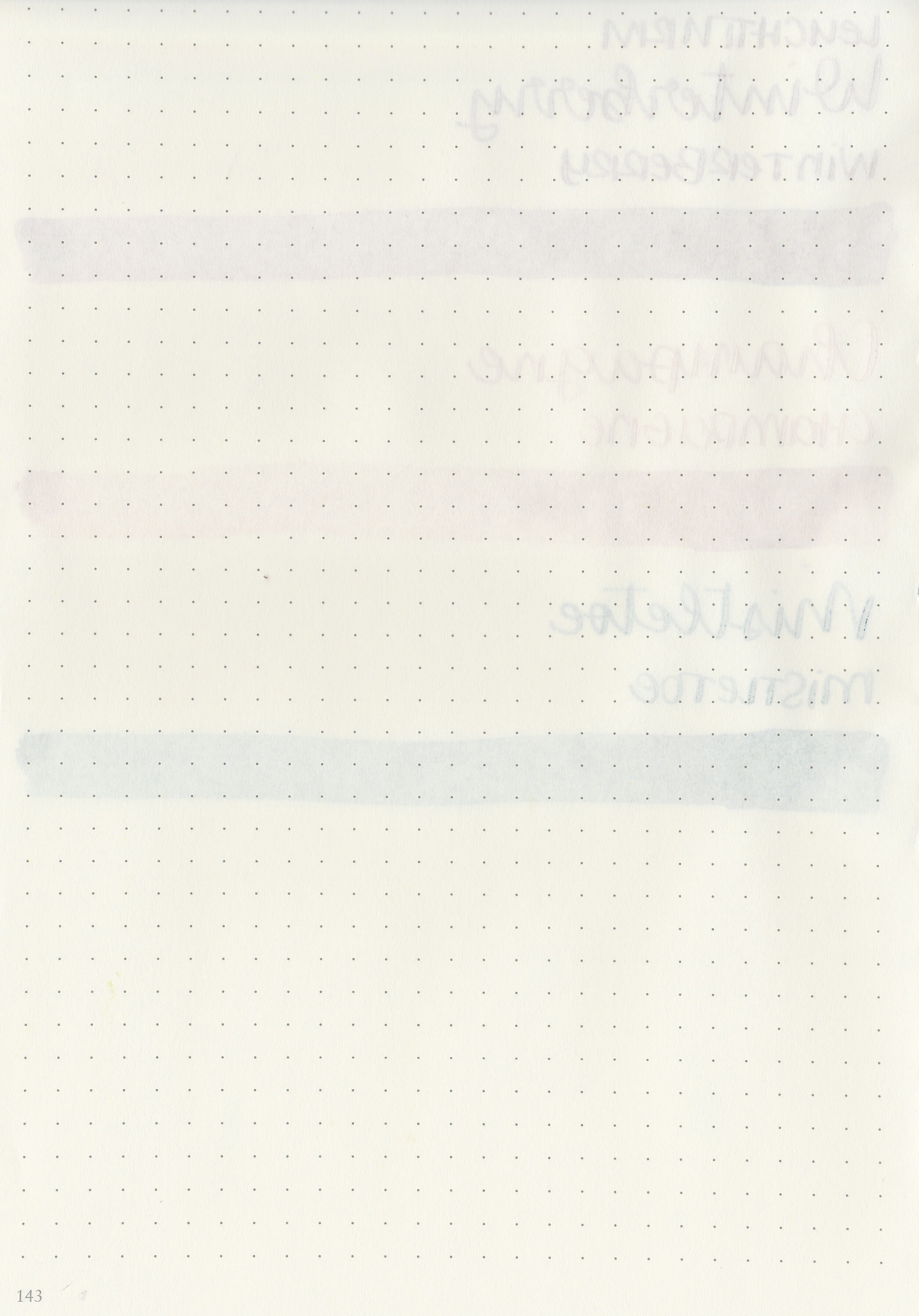
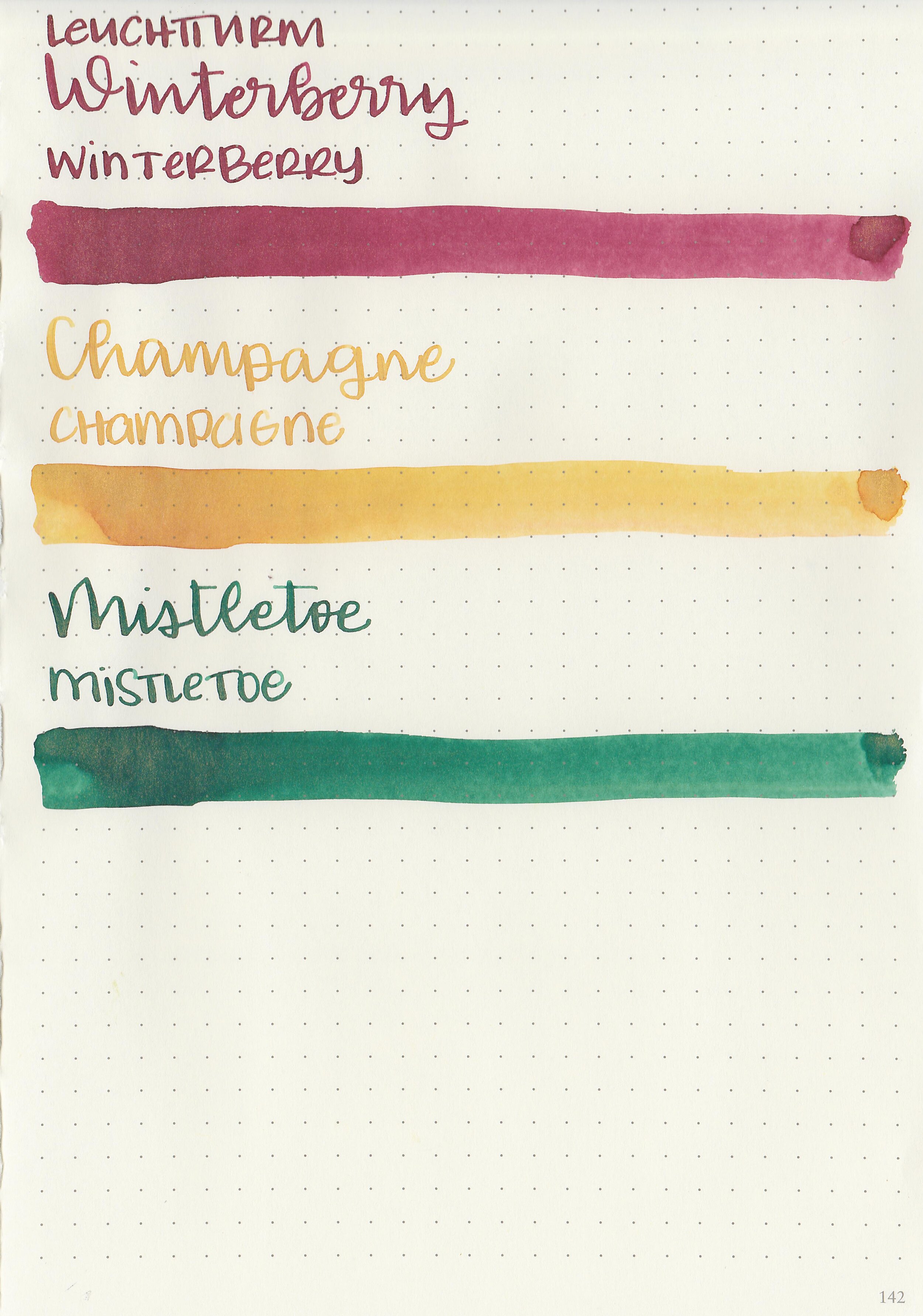
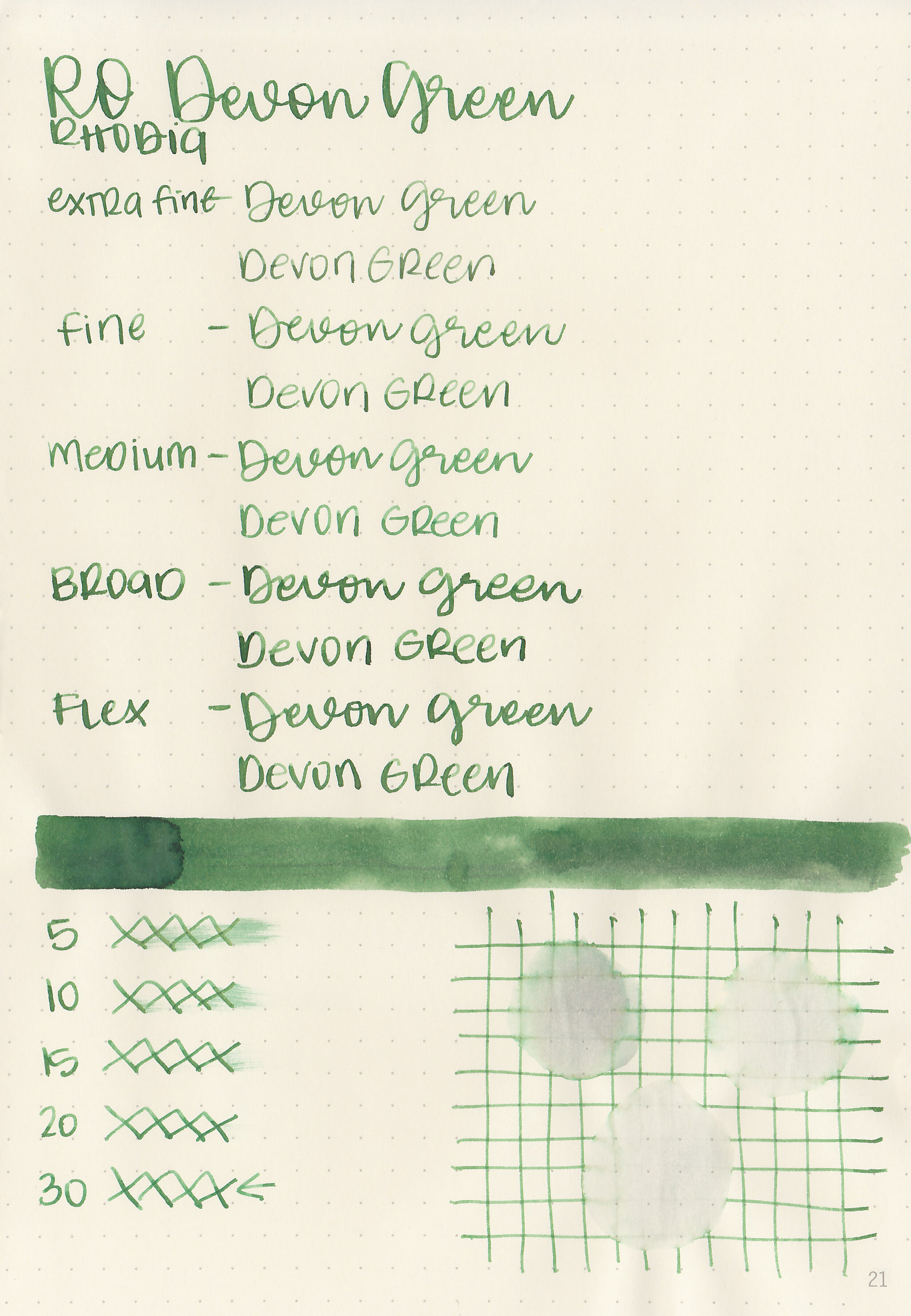
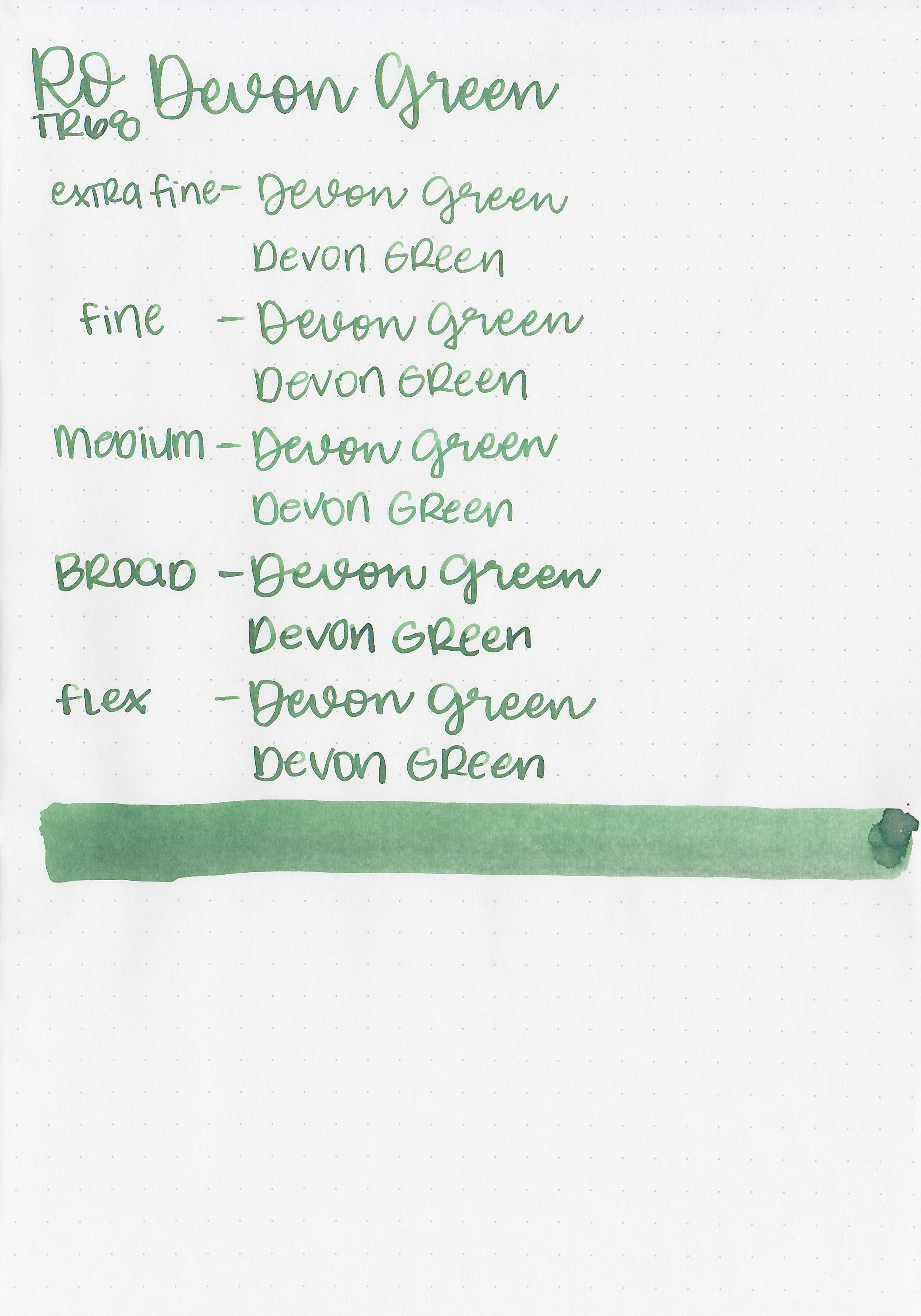
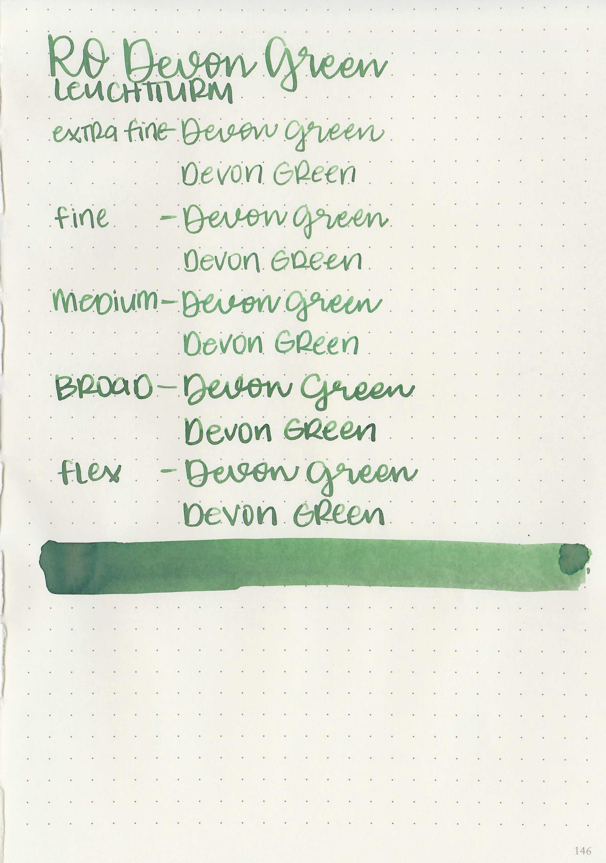
Let's take a look at how the ink behaves on fountain pen friendly papers: Rhodia, Tomoe River, and Leuchtturm.
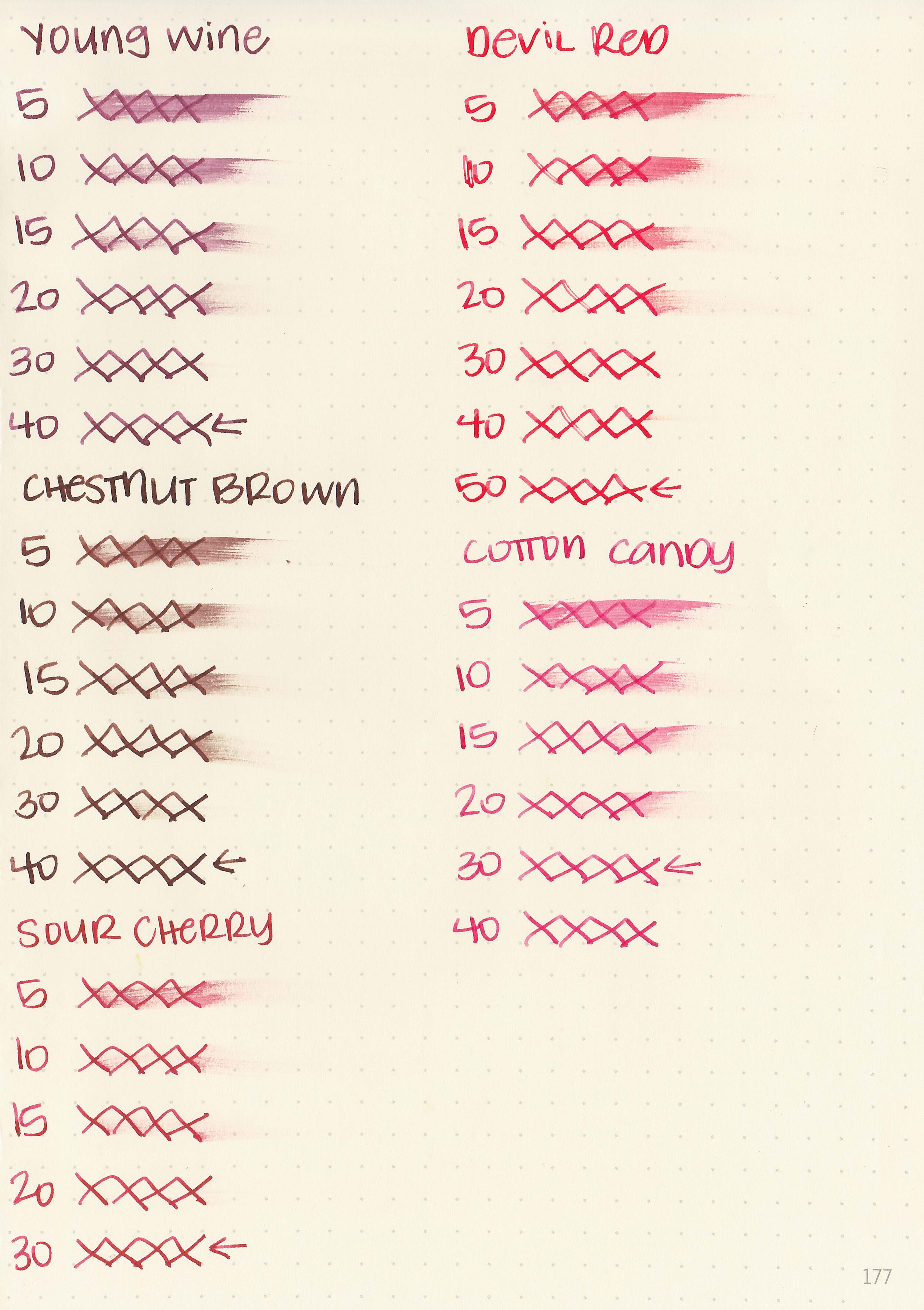
Dry Time: 30-50 seconds
Water Resistance: Low-Medium
Feathering: None
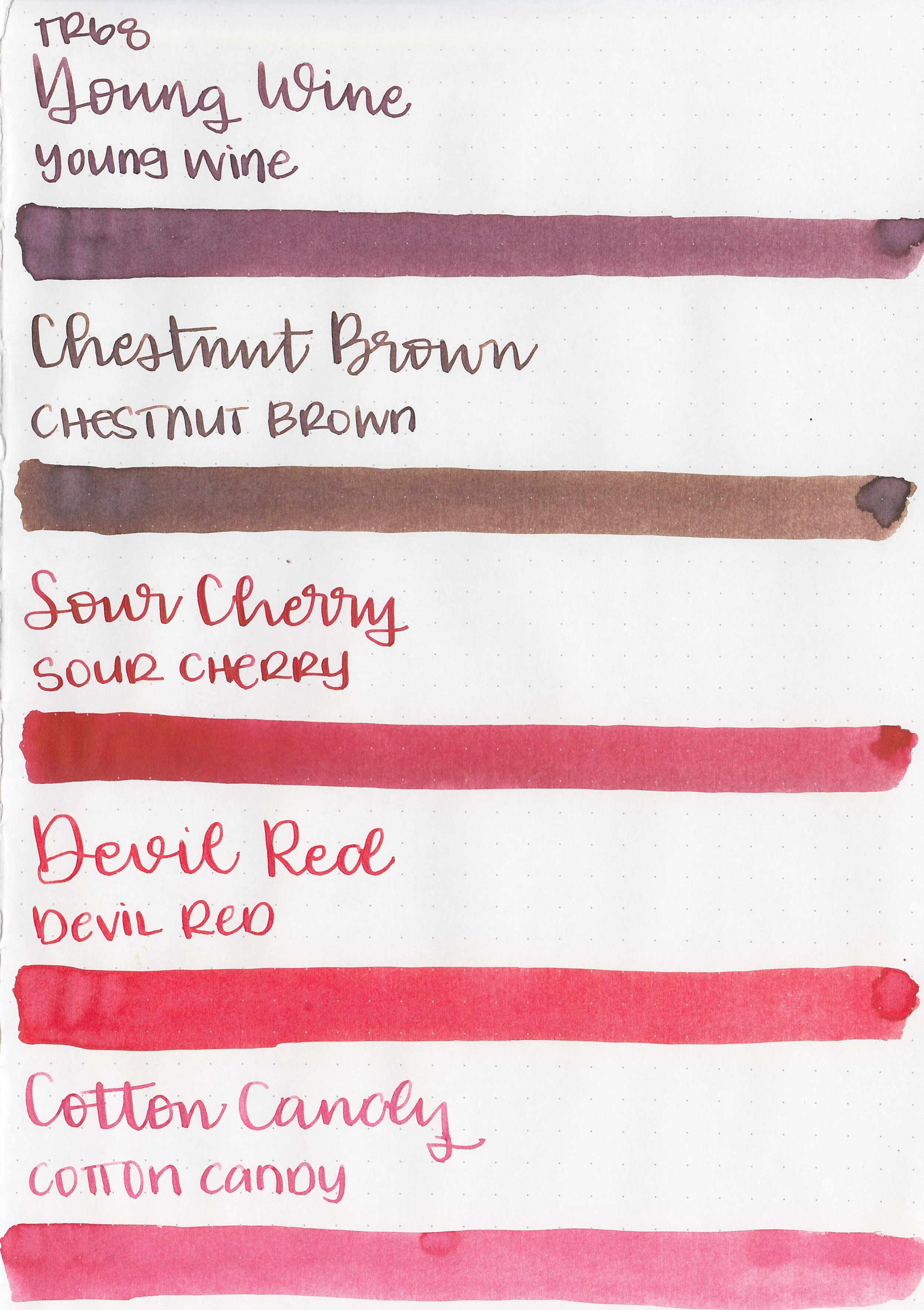
Show through: Medium
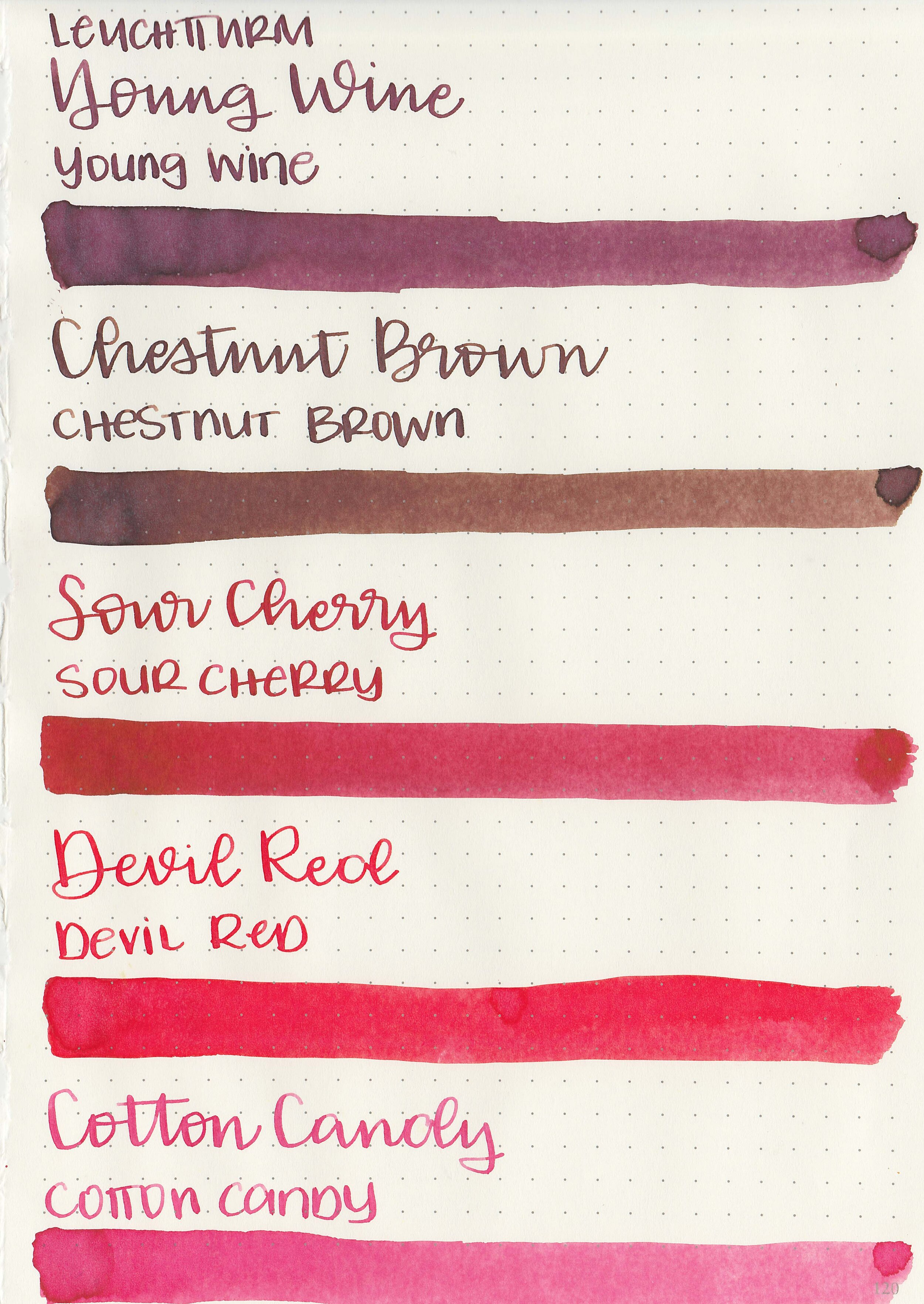
Bleeding: None
Other properties: medium shading, no sheen and no shimmer.

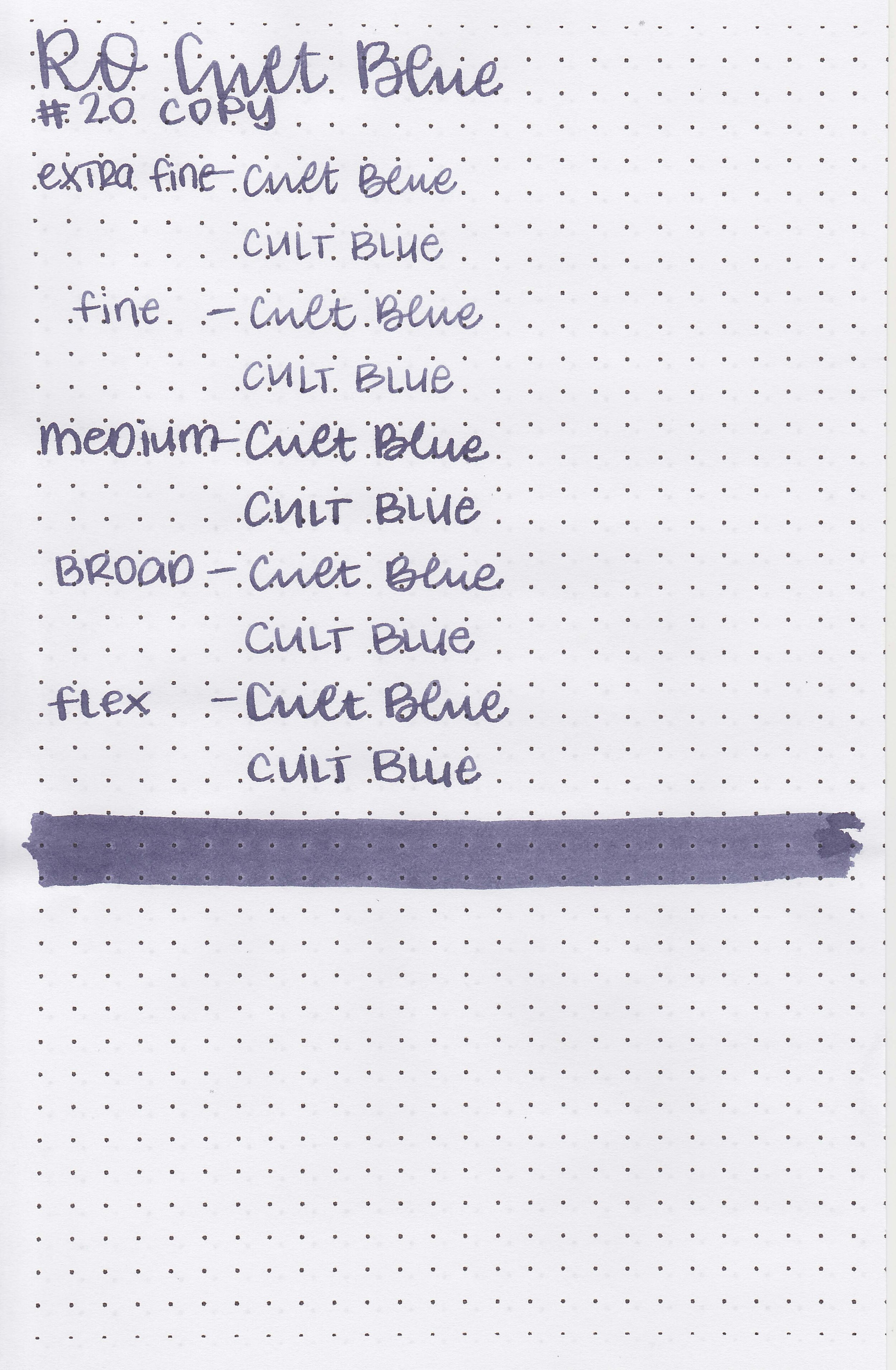
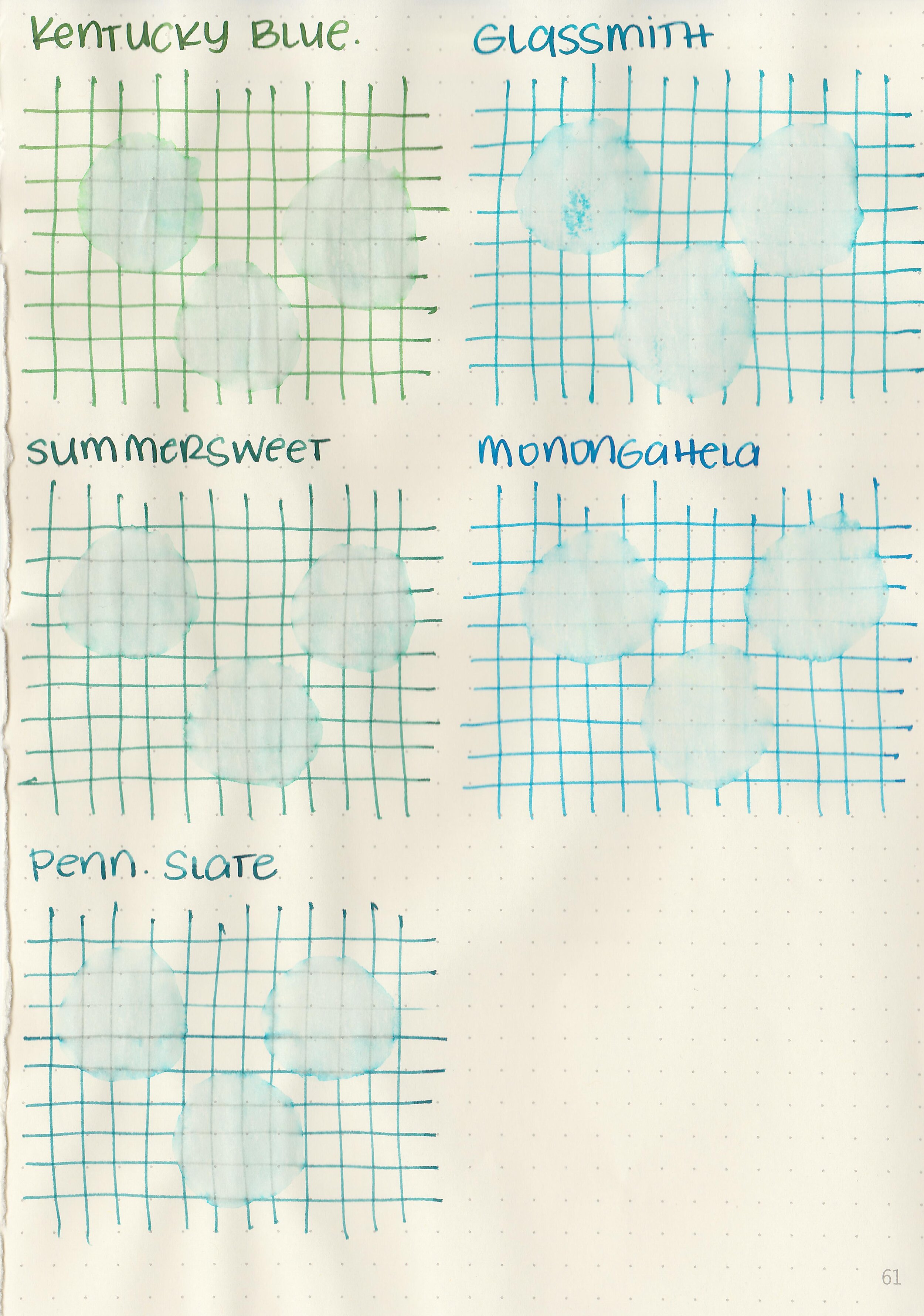
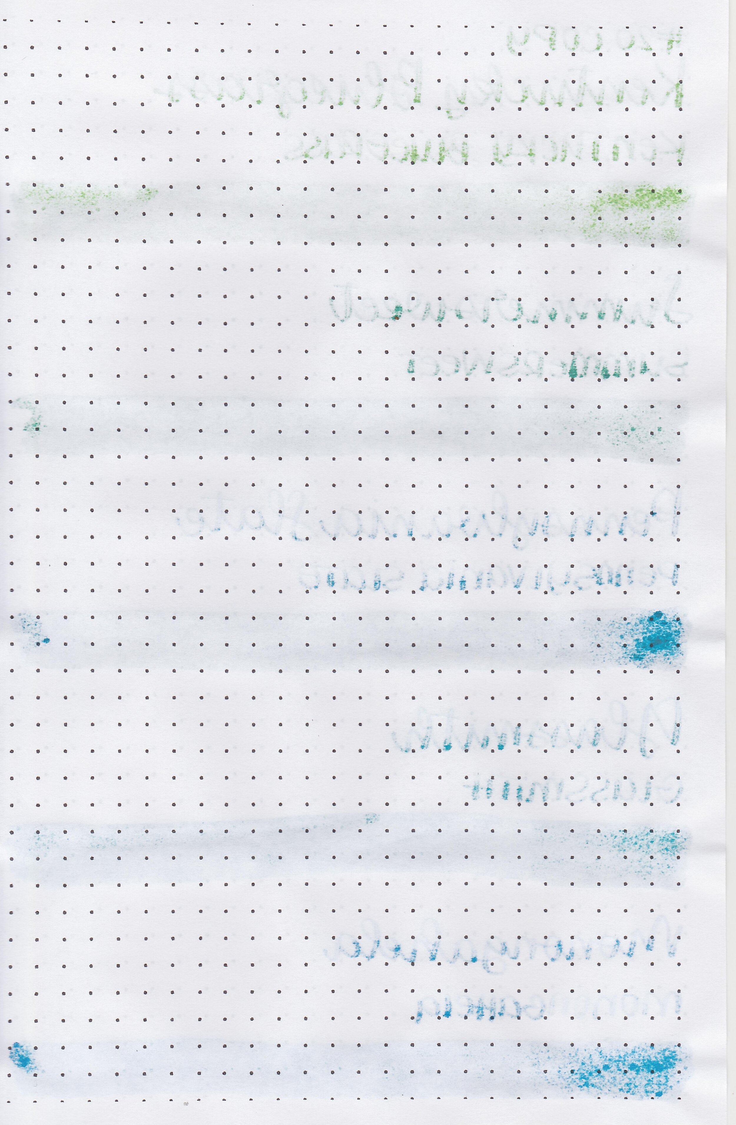
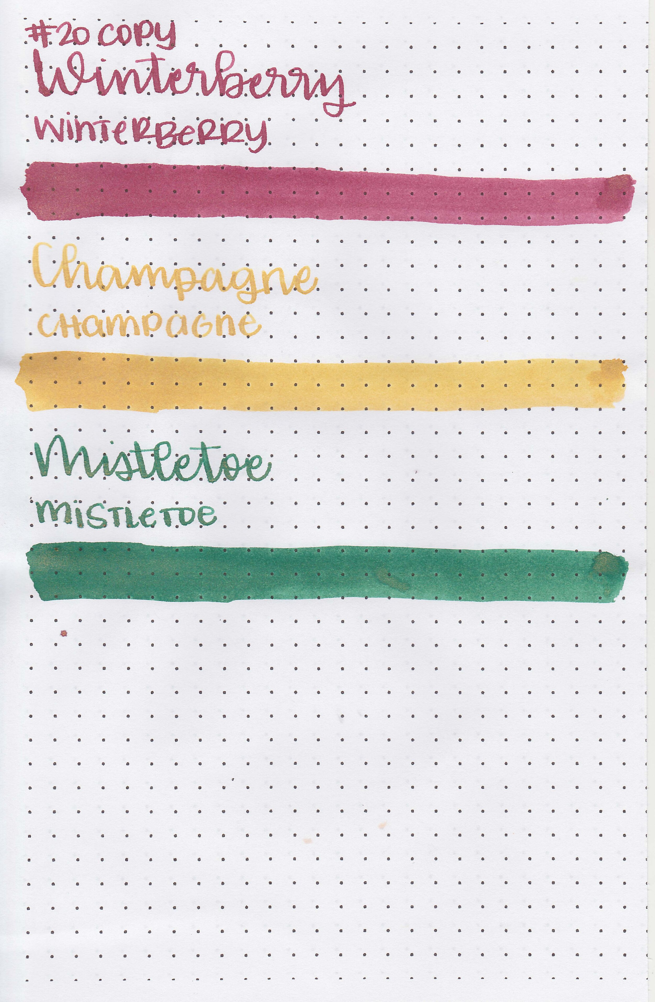
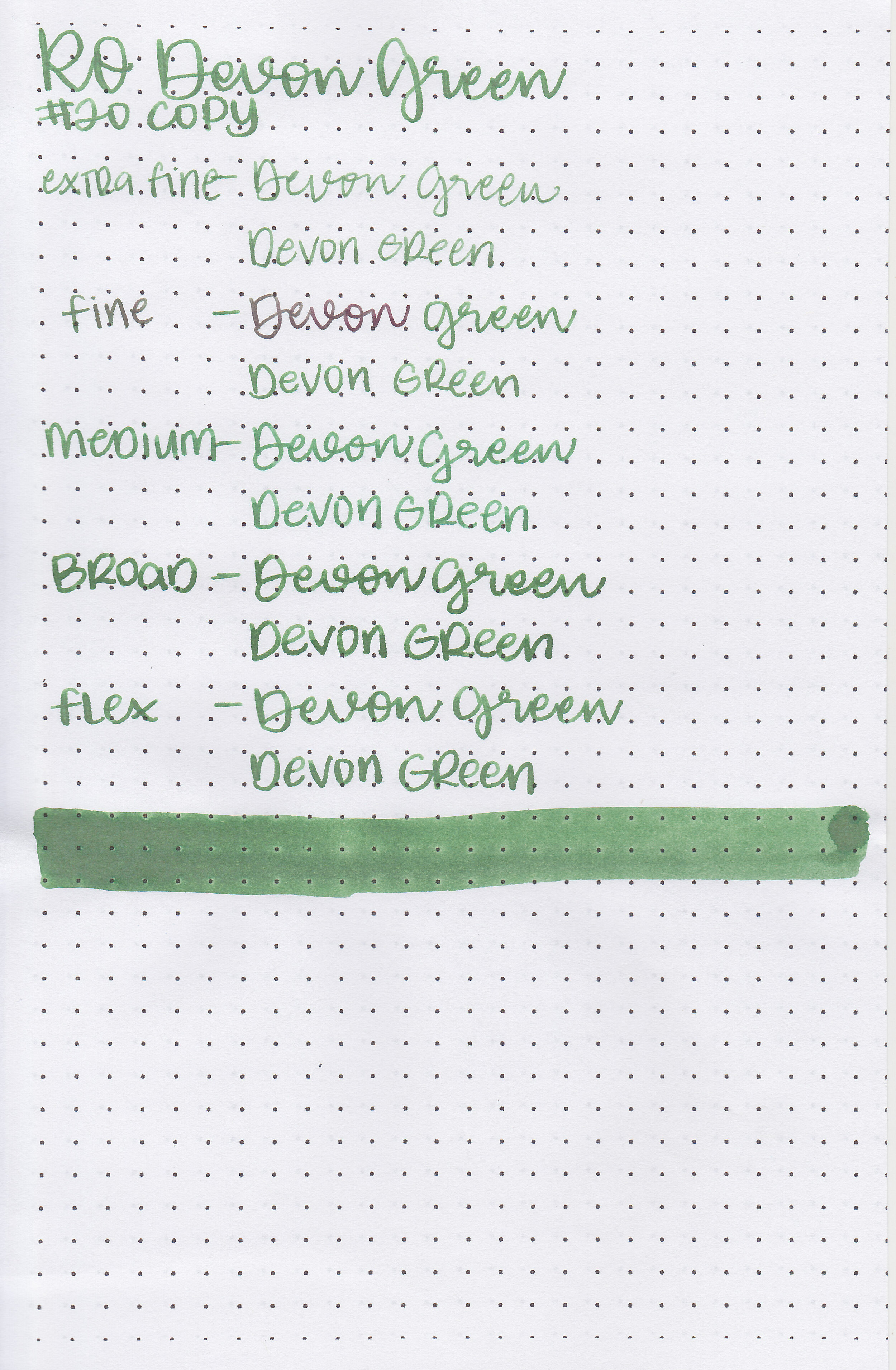
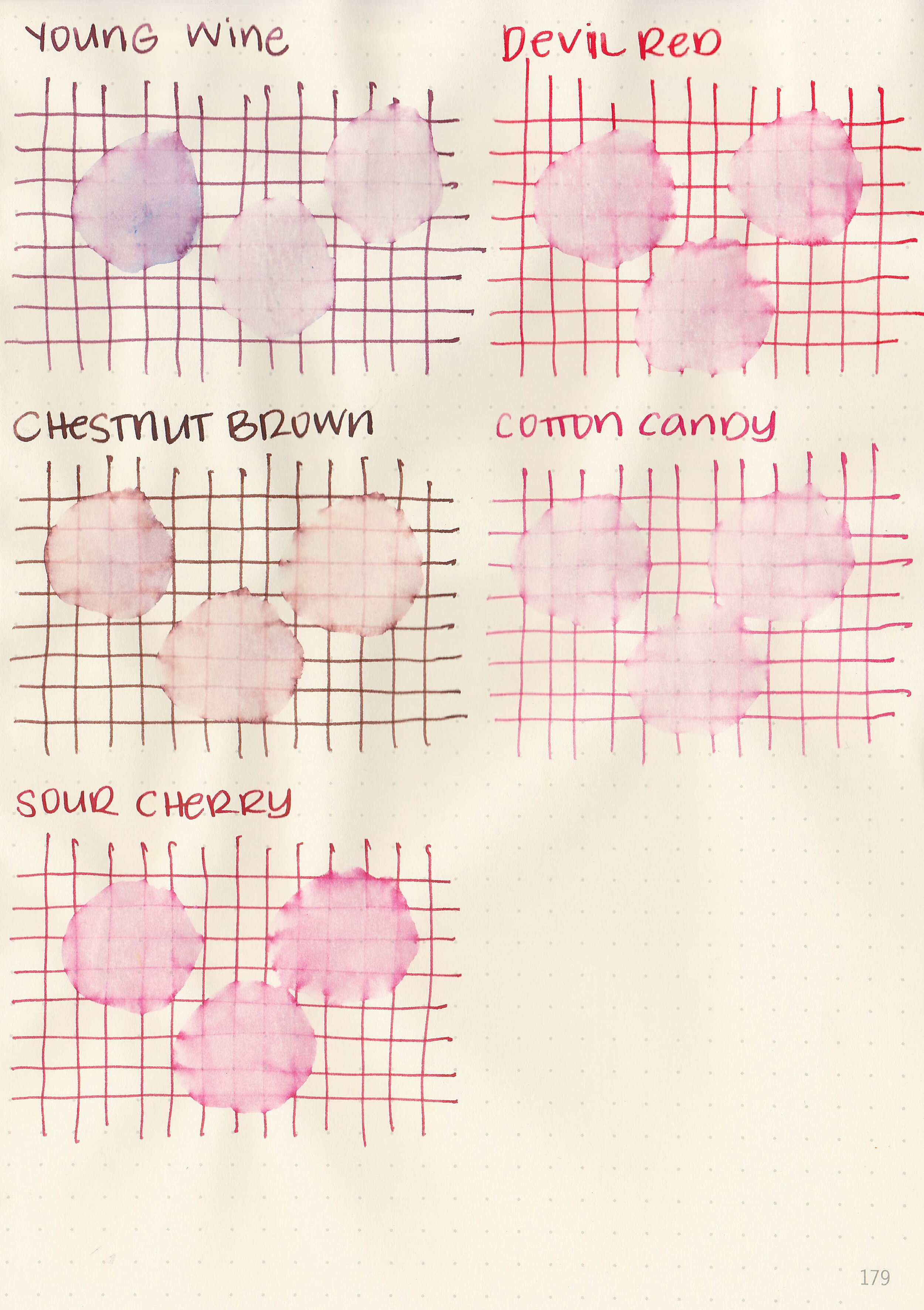
On Staples 24 lb copy paper there was a bit of feathering in every nib size as well as a little bit of bleeding.
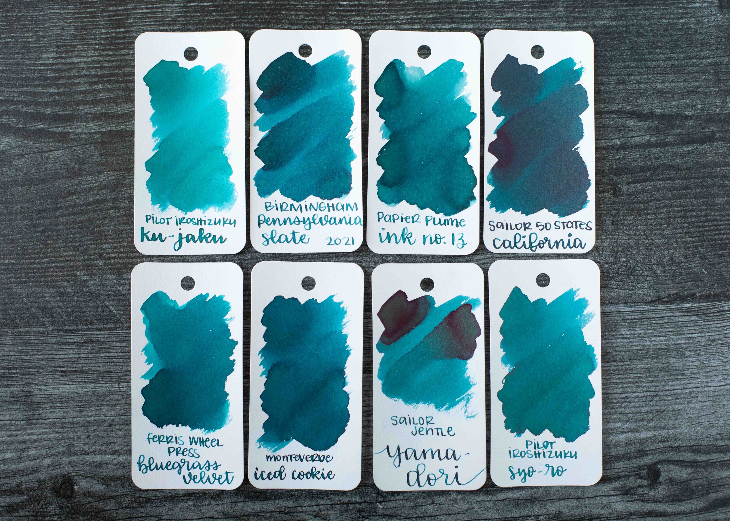
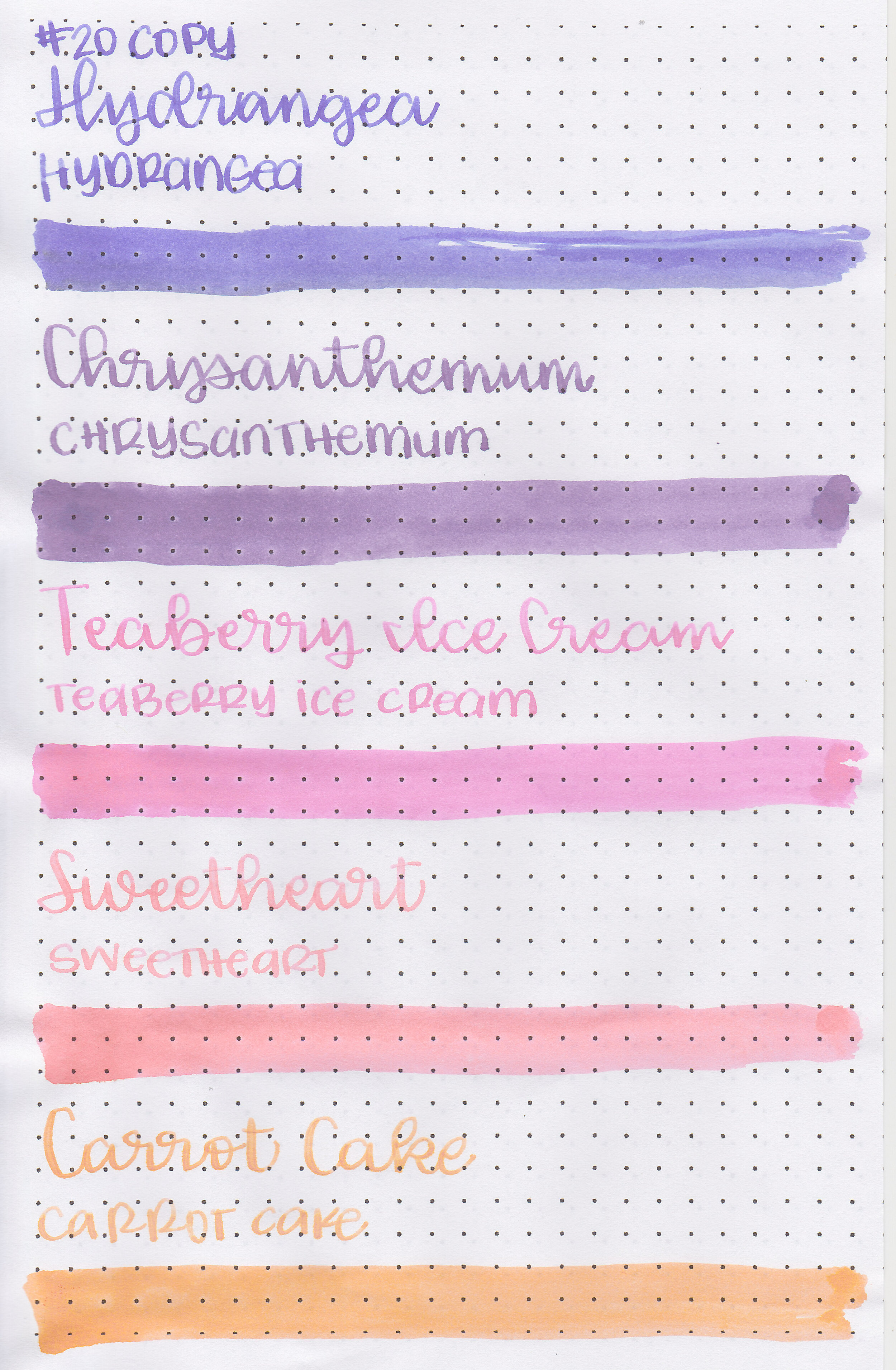
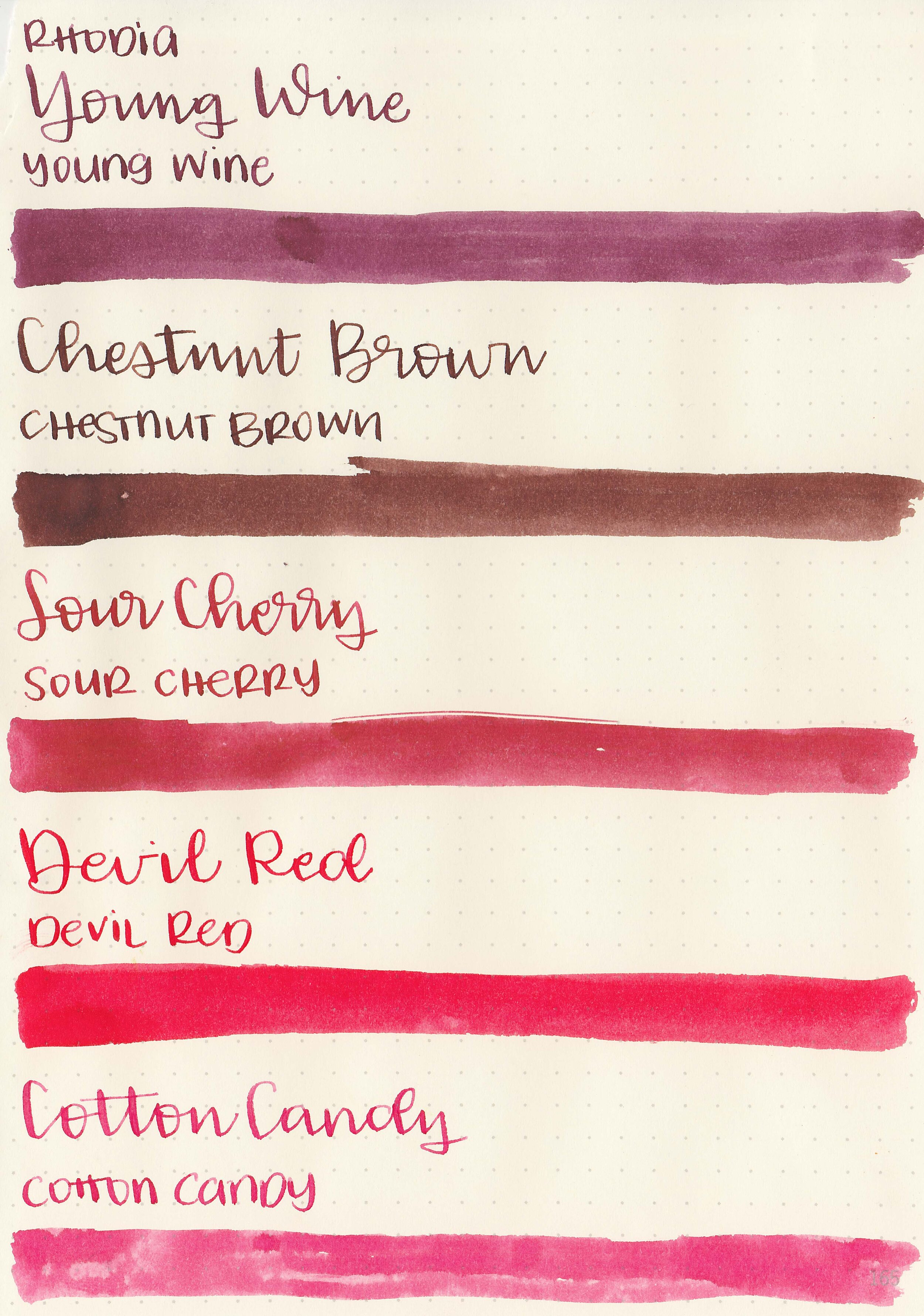
Comparison Swabs:

Chestnut Brown is lighter than Montblanc Toffee Brown.

Young Wine is similar to Montblanc Seasons Greetings.

Sour Cherry is a little lighter than Monteverde Napa Burgundy.

There are a lot of inks close to Devil Red including Monteverde Valentine Red.

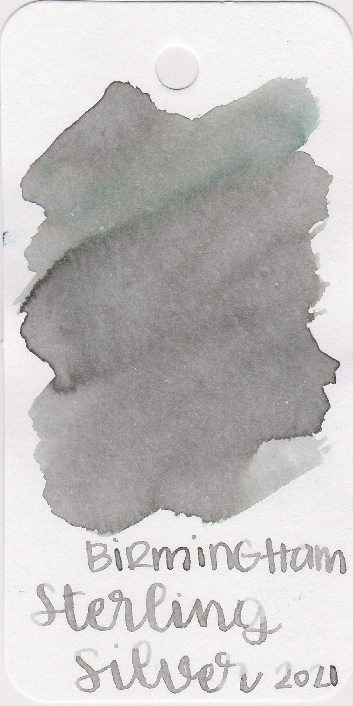
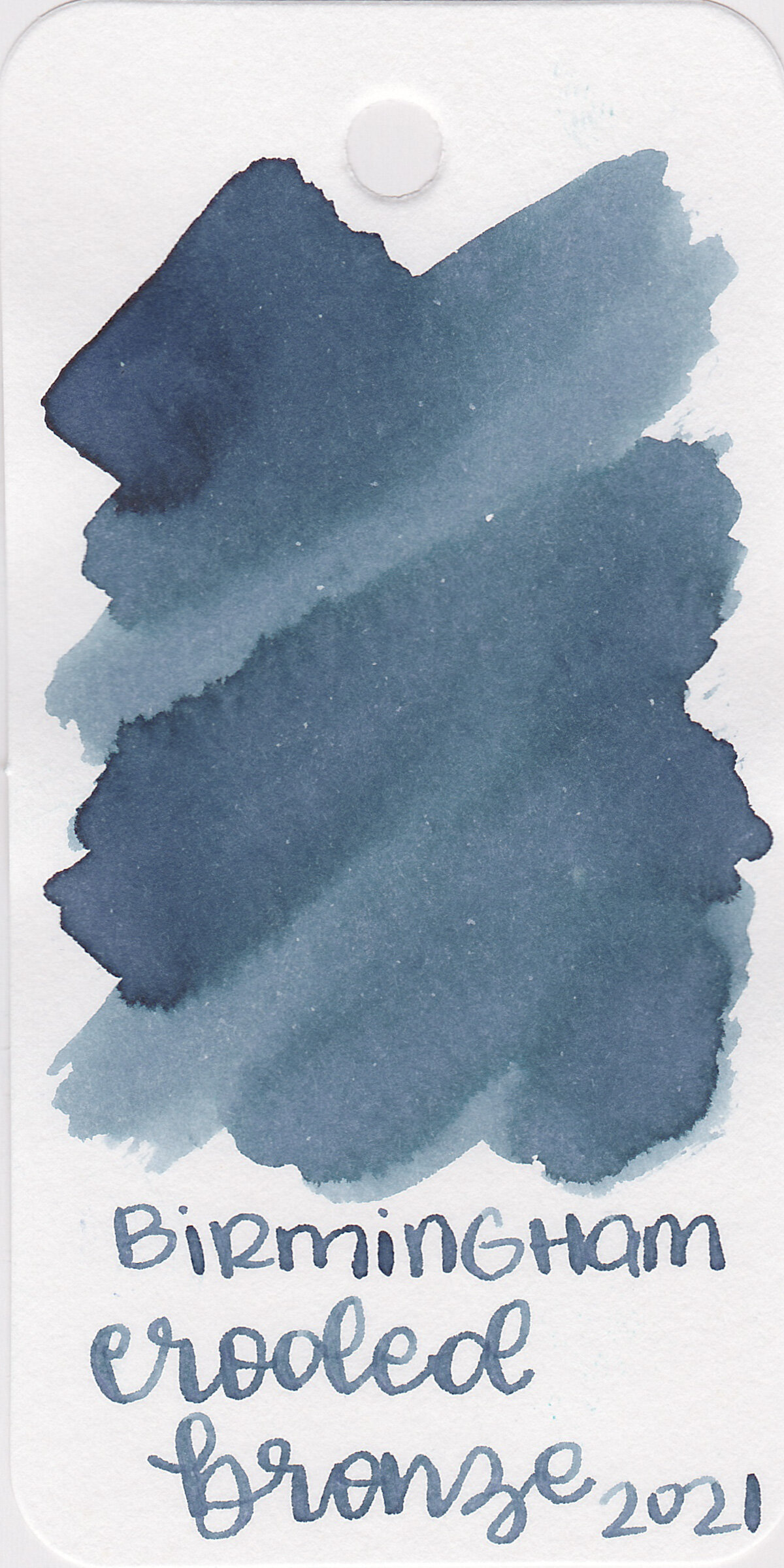
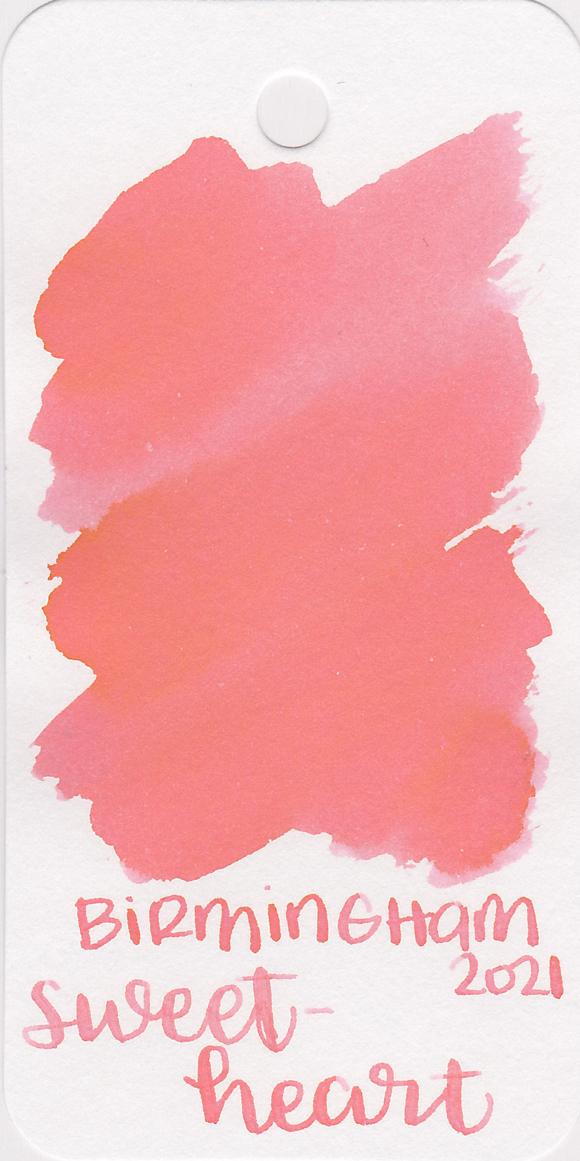
Cotton Candy is a little darker than Birmingham Cranberry Nobel.
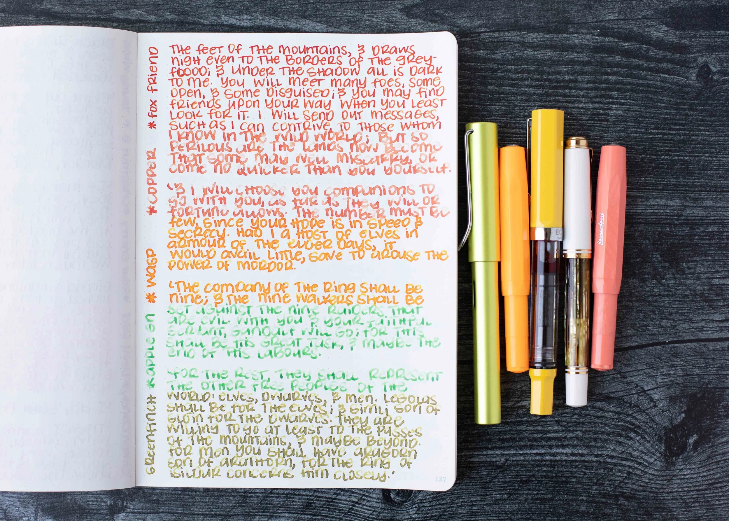
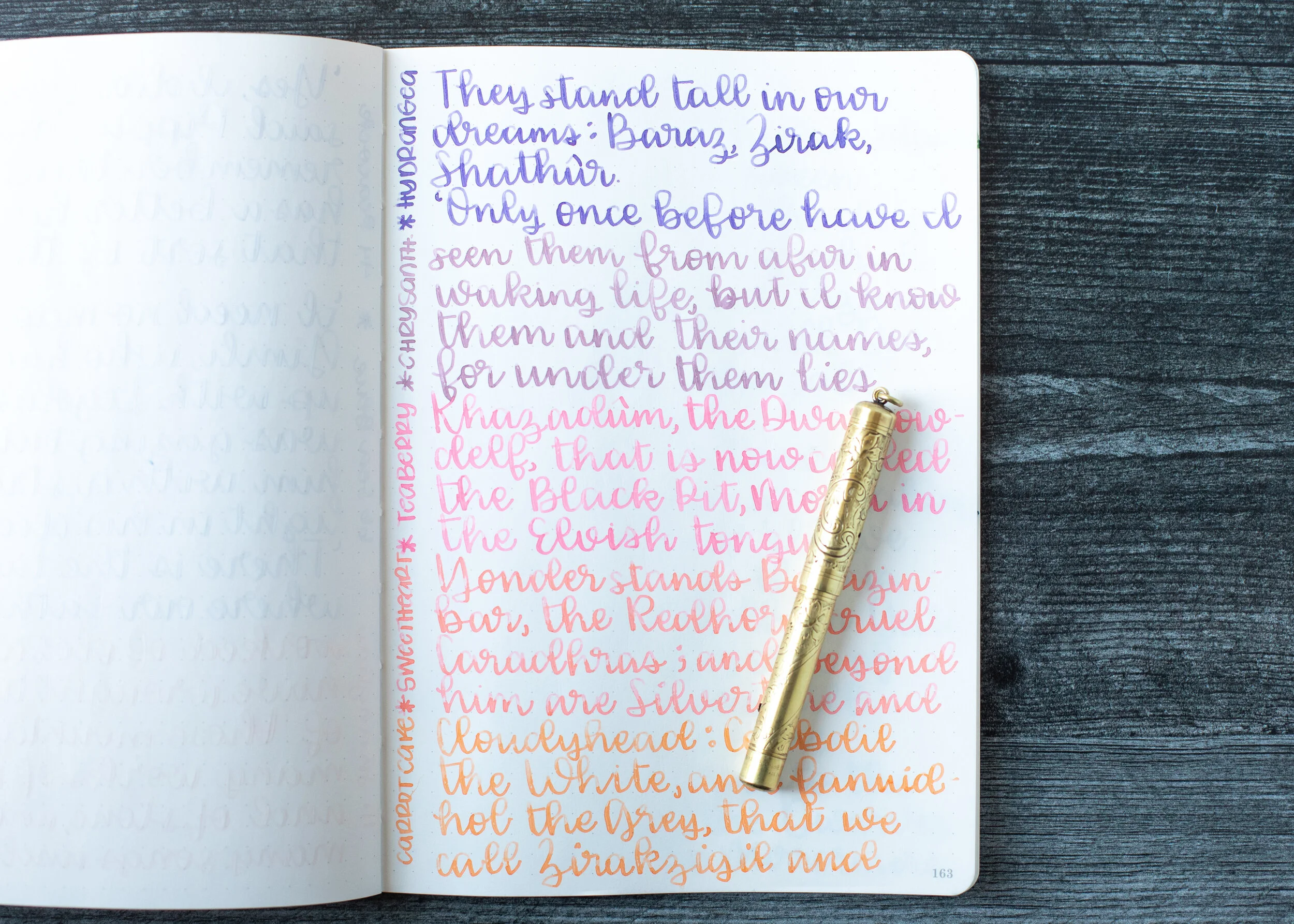
Longer Writing:


I used a Taroko Odyssey notebook, four of the inks had an average flow and Devil Red had a dry flow.
Overall, Young Wine is my favorite, I love the color and it’s well behaved. You can’t go wrong with any of these inks, but Devil Red is a little dry for me.
Disclaimer: These inks were provided by Shigure Inks for the purpose of this review. All photos and opinions are my own. This page does not contain affiliate links, and this post is not sponsored.