Pens That Got Away
/
Some pens that got away from me.
Read More
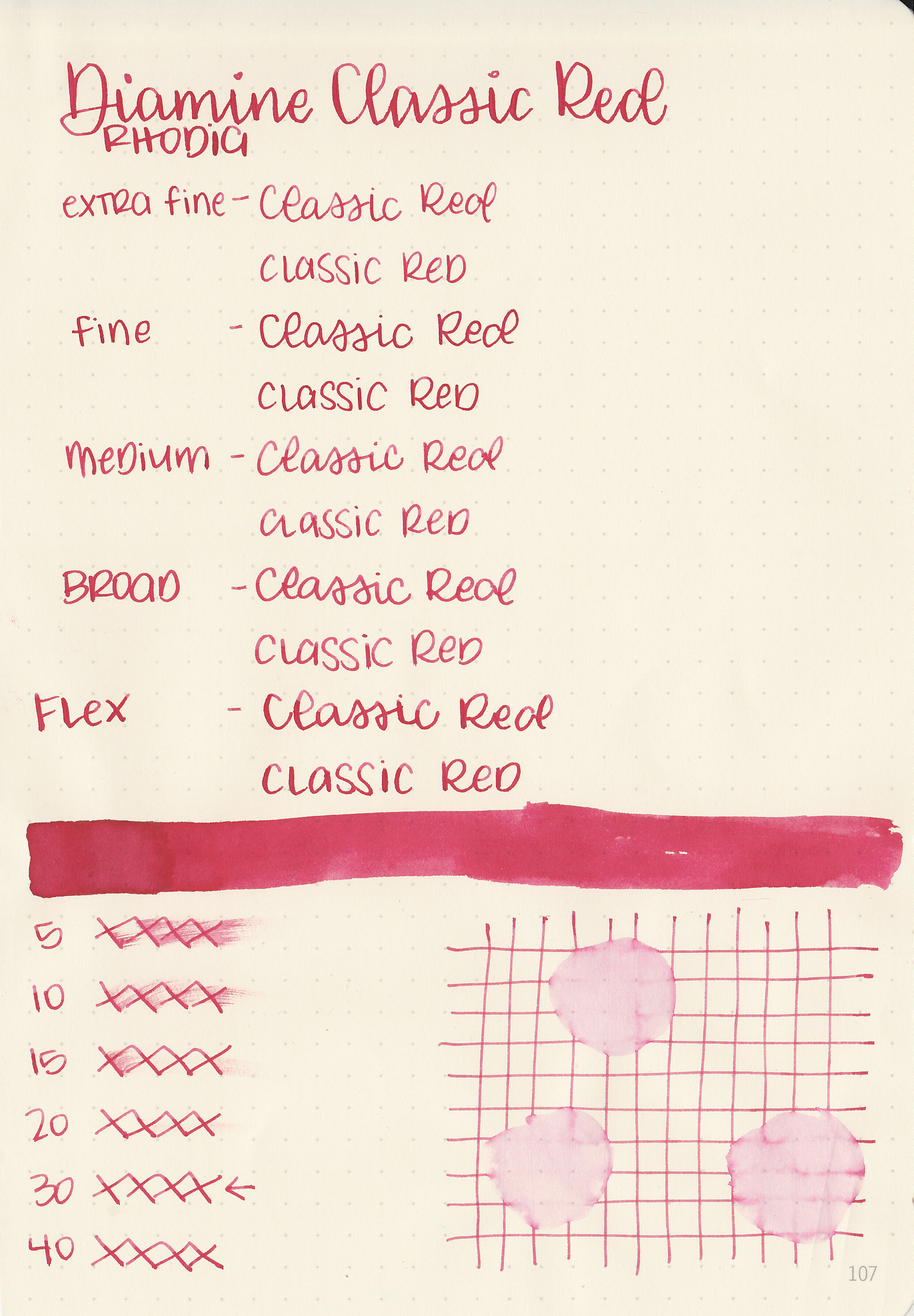
While trendy inks are fun and new, classic standard inks have their place too. Let’s take a look at Diamine Classic Red. I purchased my bottle of ink from Cult Pens.

The color:
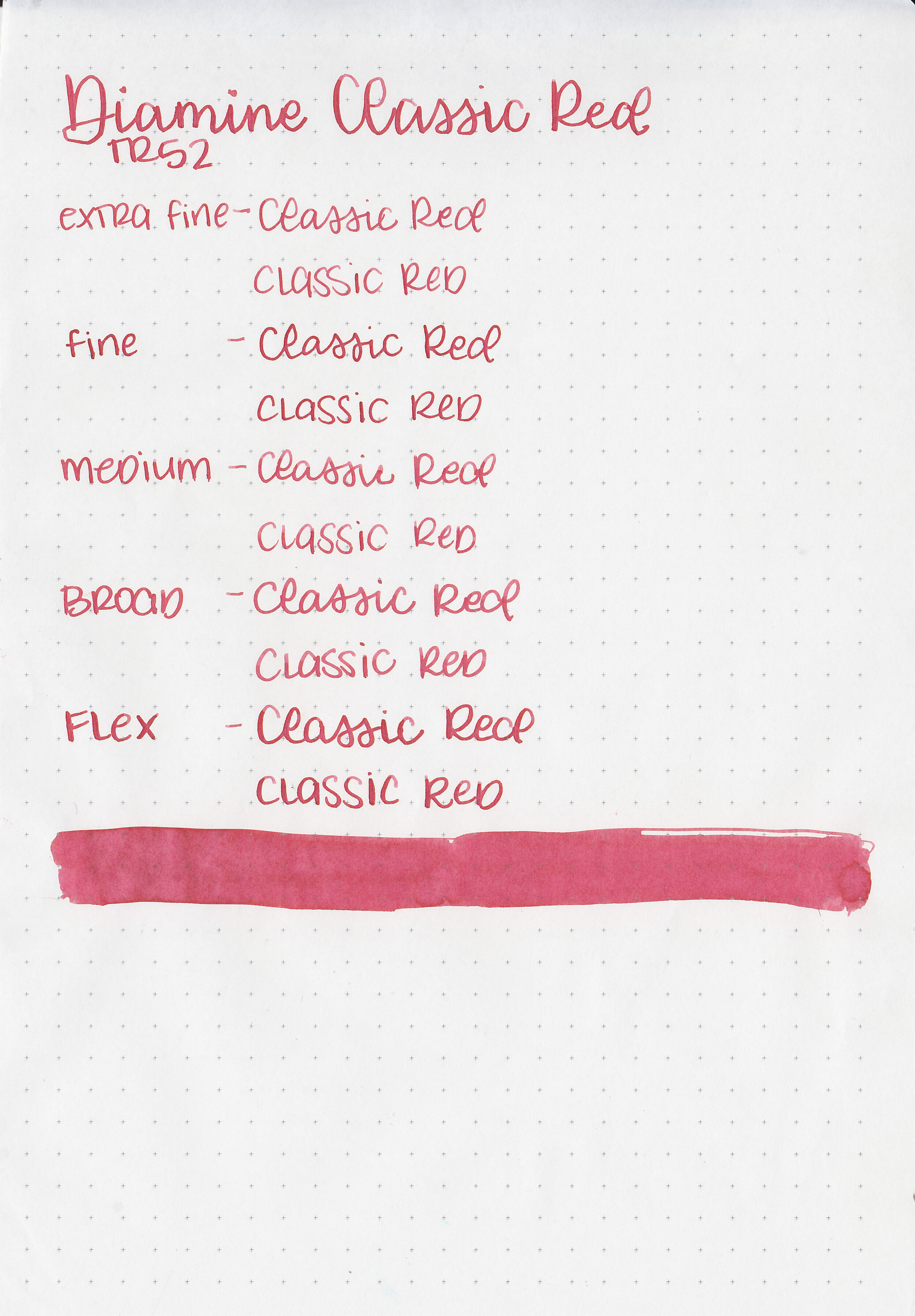
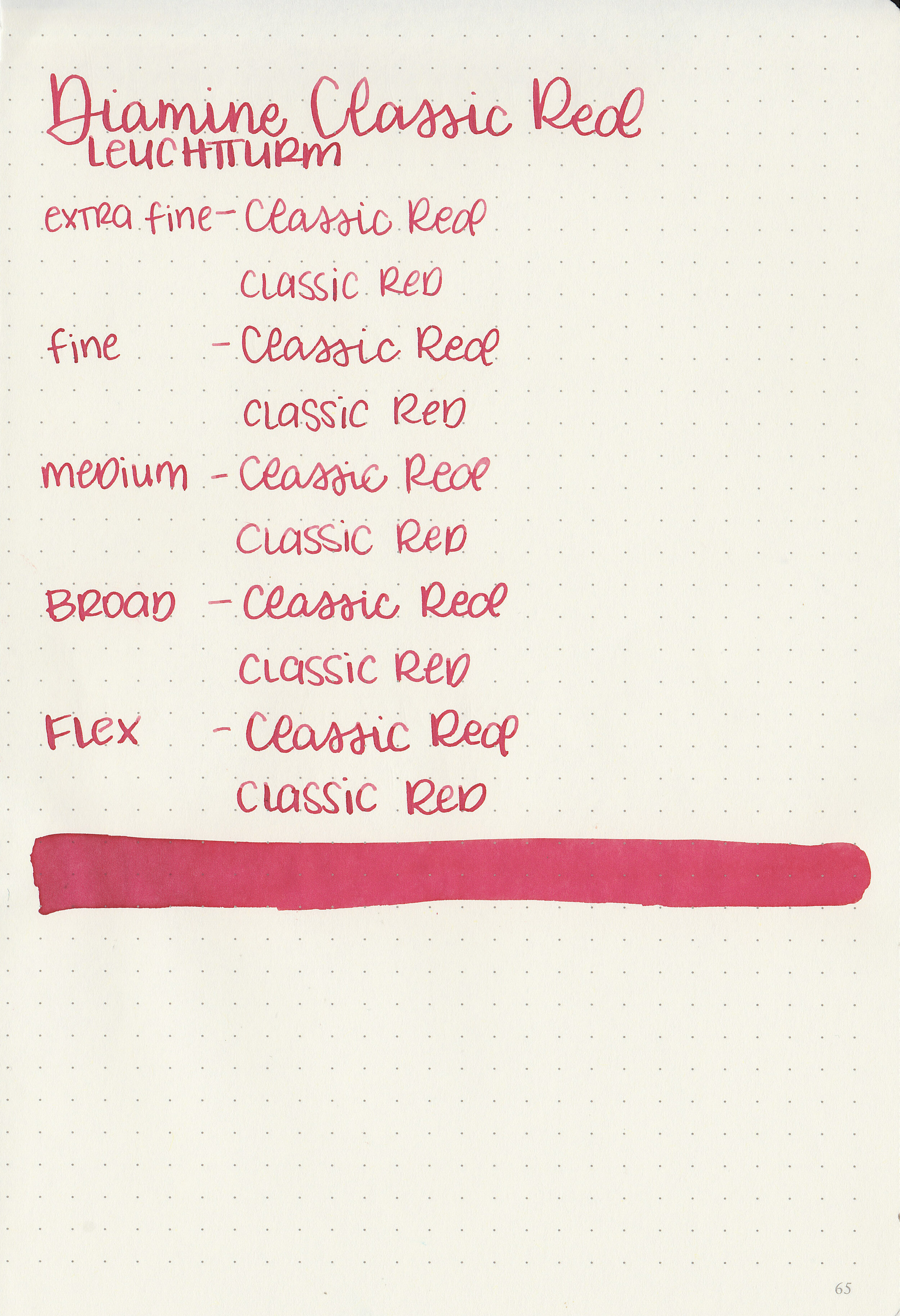
Classic Red is just that-a classic medium red.

In large swabs on Tomoe River paper the ink has a little bit of shading.

Let's take a look at how the ink behaves on fountain pen friendly papers: Rhodia, Tomoe River, and Leuchtturm.
Dry time: 30 seconds
Water resistance: Low
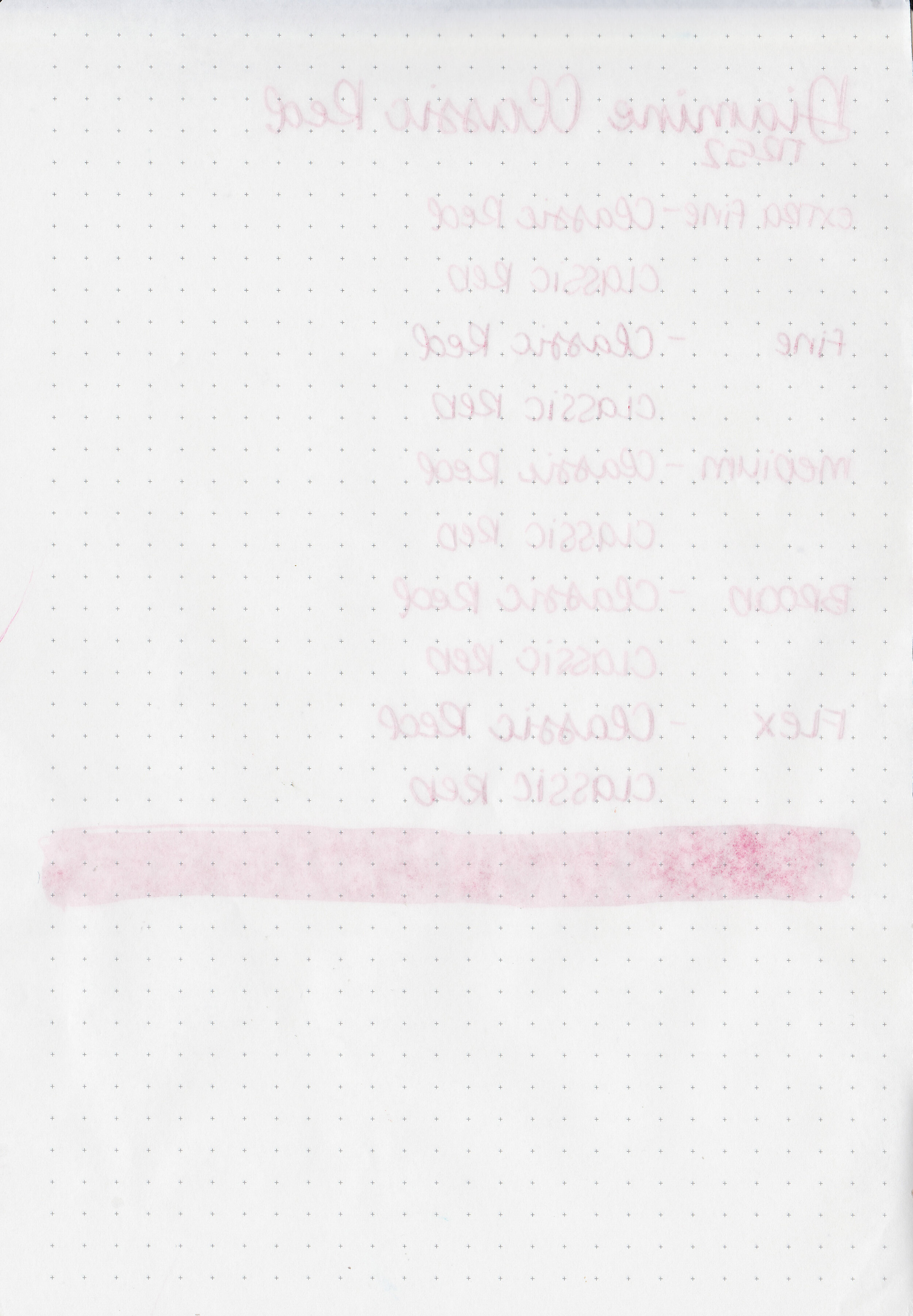
Feathering: None
Show through: Medium
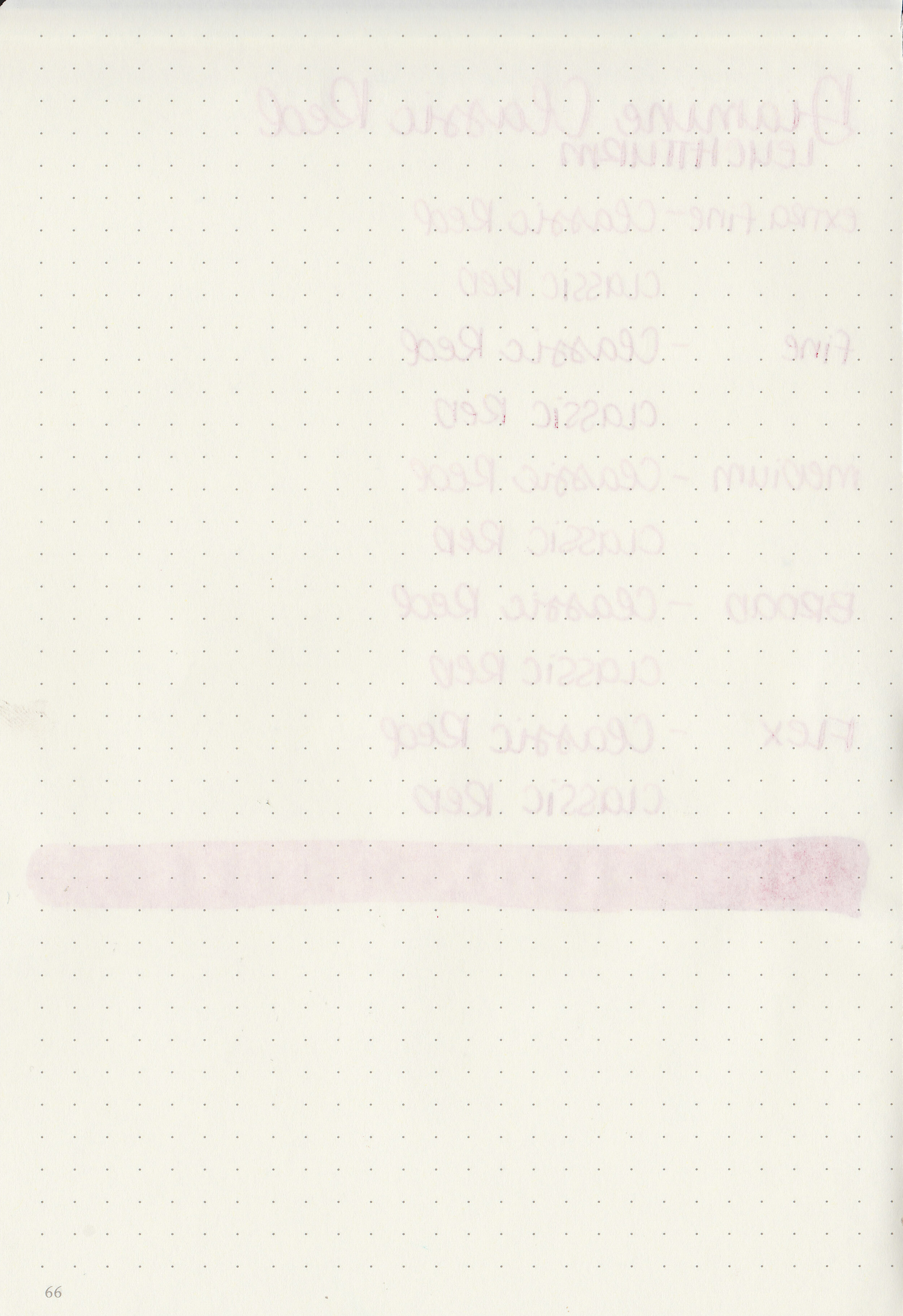
Bleeding: None
Other properties: low shading, no sheen, and no shimmer.
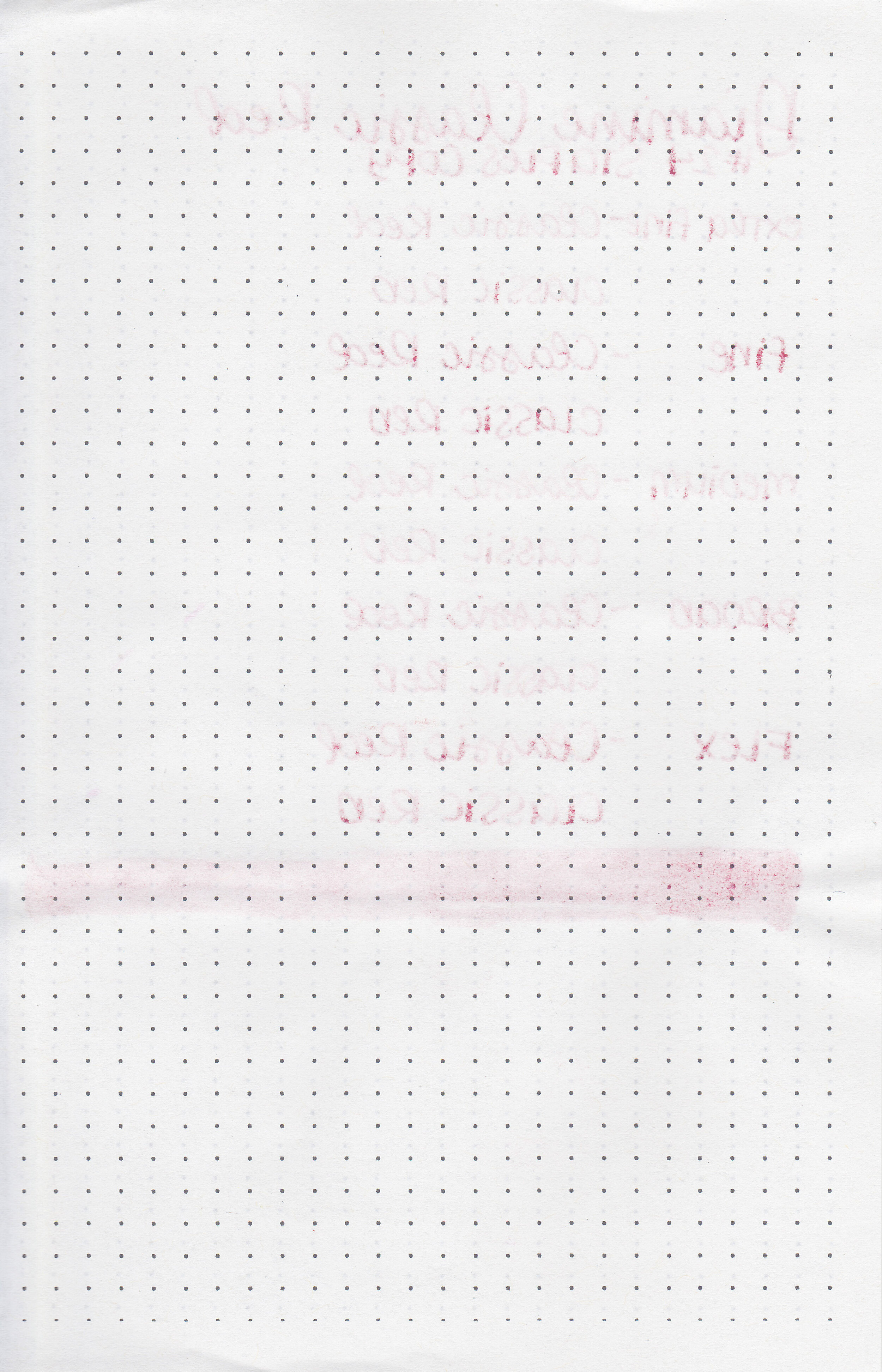
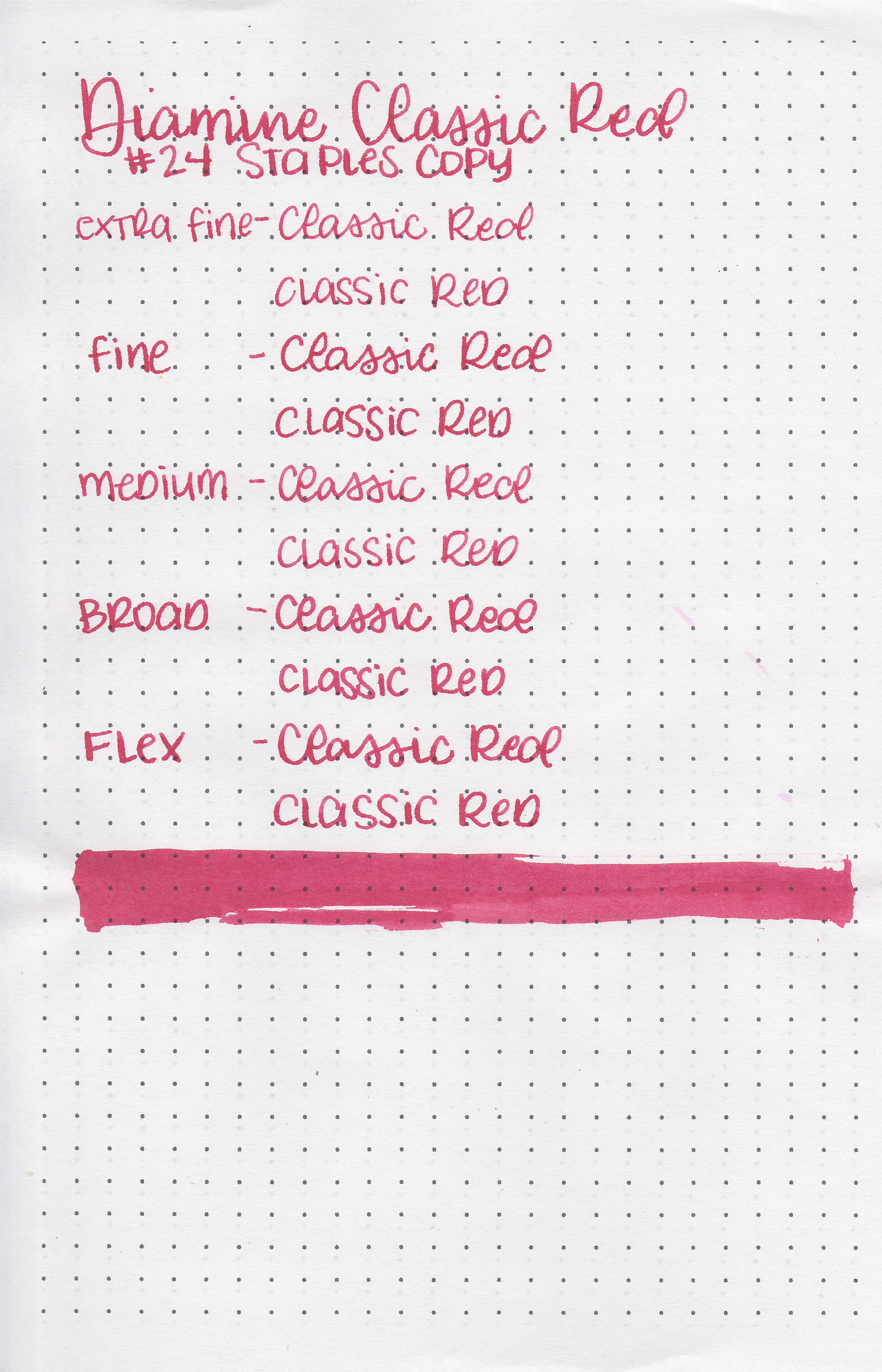
On Staples 24 lb copy paper there was some feathering in most nib sizes and a few dots of bleeding.

Classic Red is closest to Lamy Ruby. Click here to see the Diamine inks together, and click here to see the red inks together.

I used a Kaweco Al-sport Rose Gold with a fine nib on a Yoseka A5 notebook. The ink had a slightly dry flow.
Overall, it’s a well behaved classic red. It’s not exciting or amazing, but a good standard red.
Disclaimer: I purchased this ink myself, and all photos and opinions are my own. This page does not contain affiliate links and this post is not sponsored in any way.
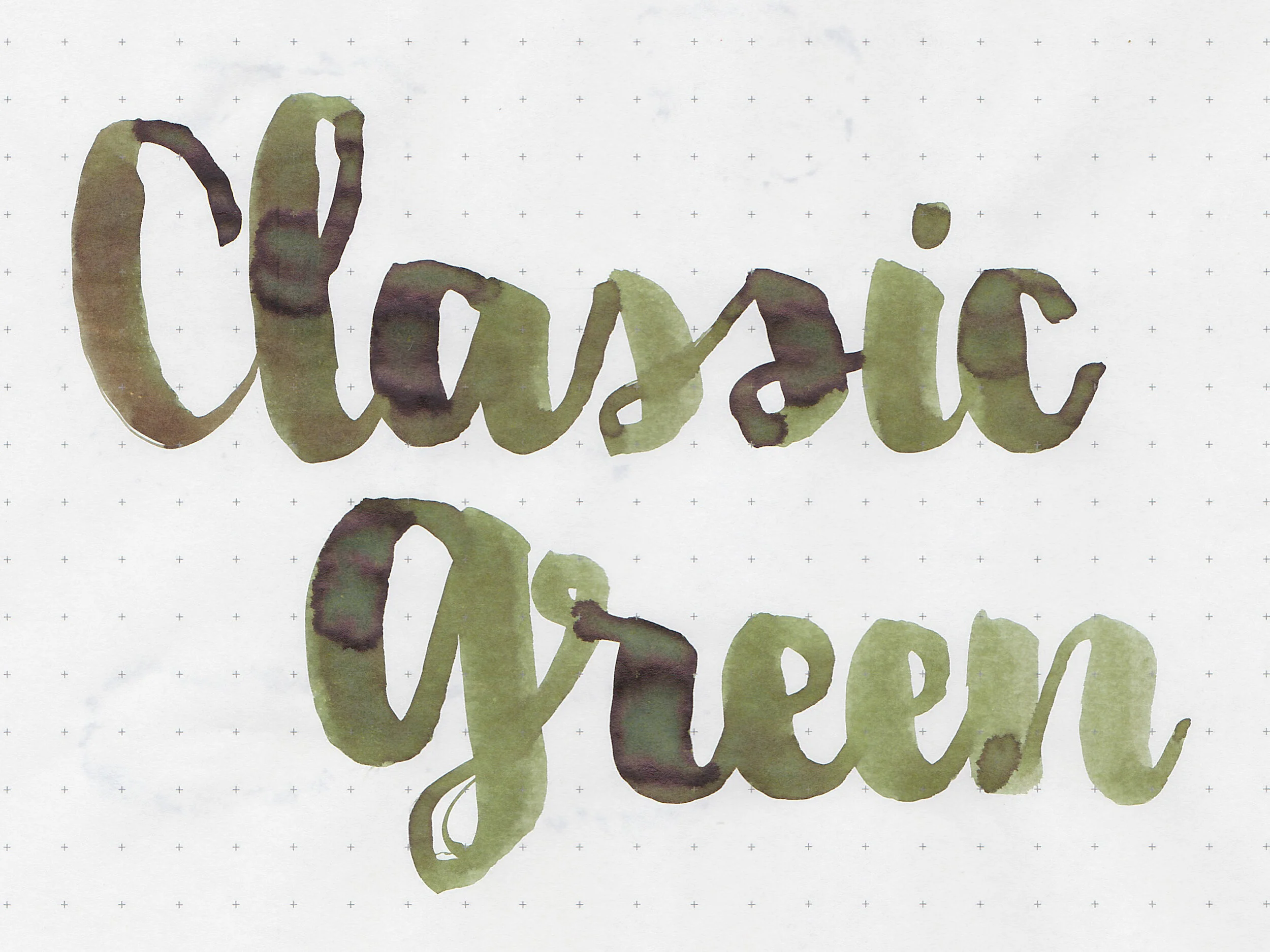
Let’s take a look at Diamine Classic Green. I purchased my bottle of ink from Cult Pens.

The color:
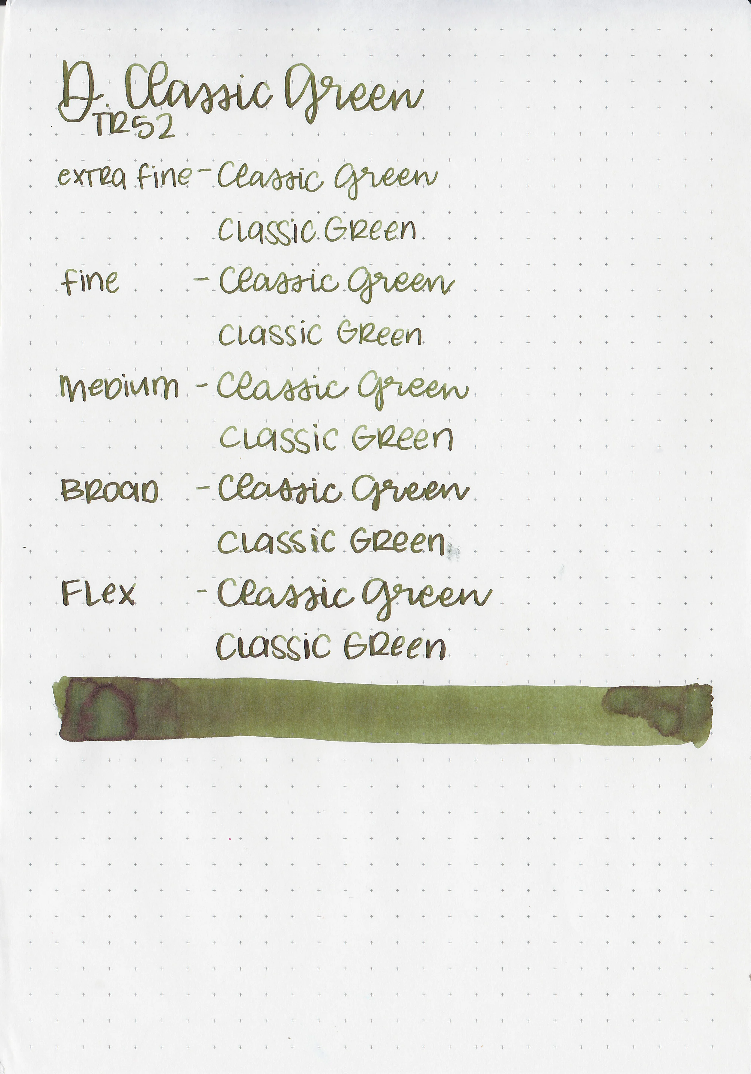
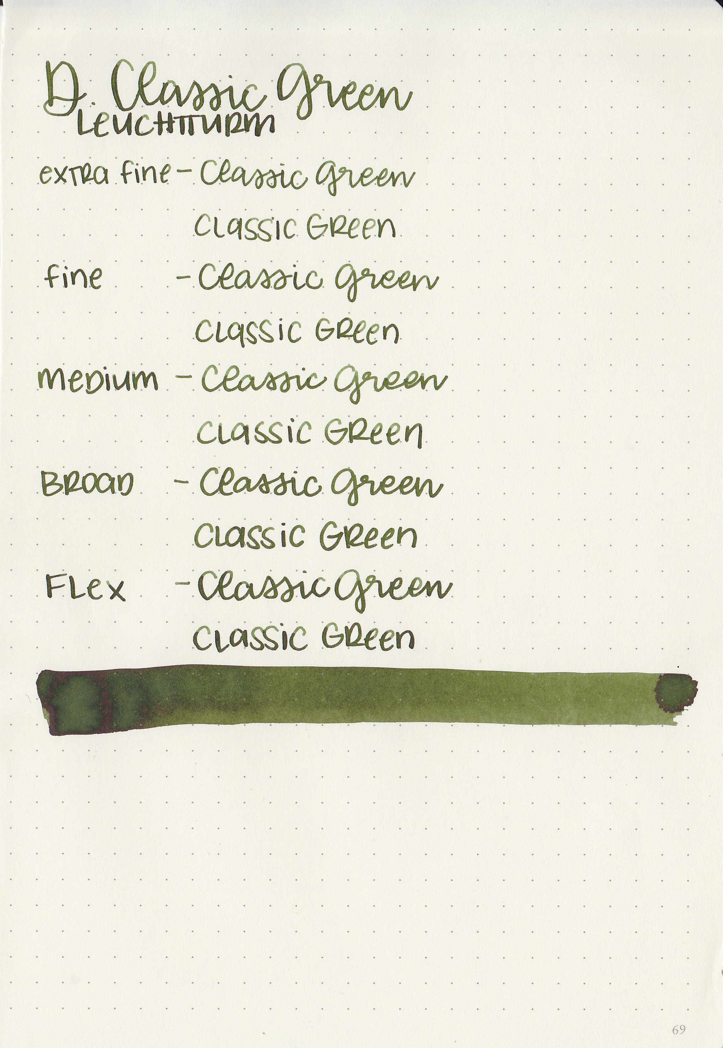
Classic Green is a dark olive green.
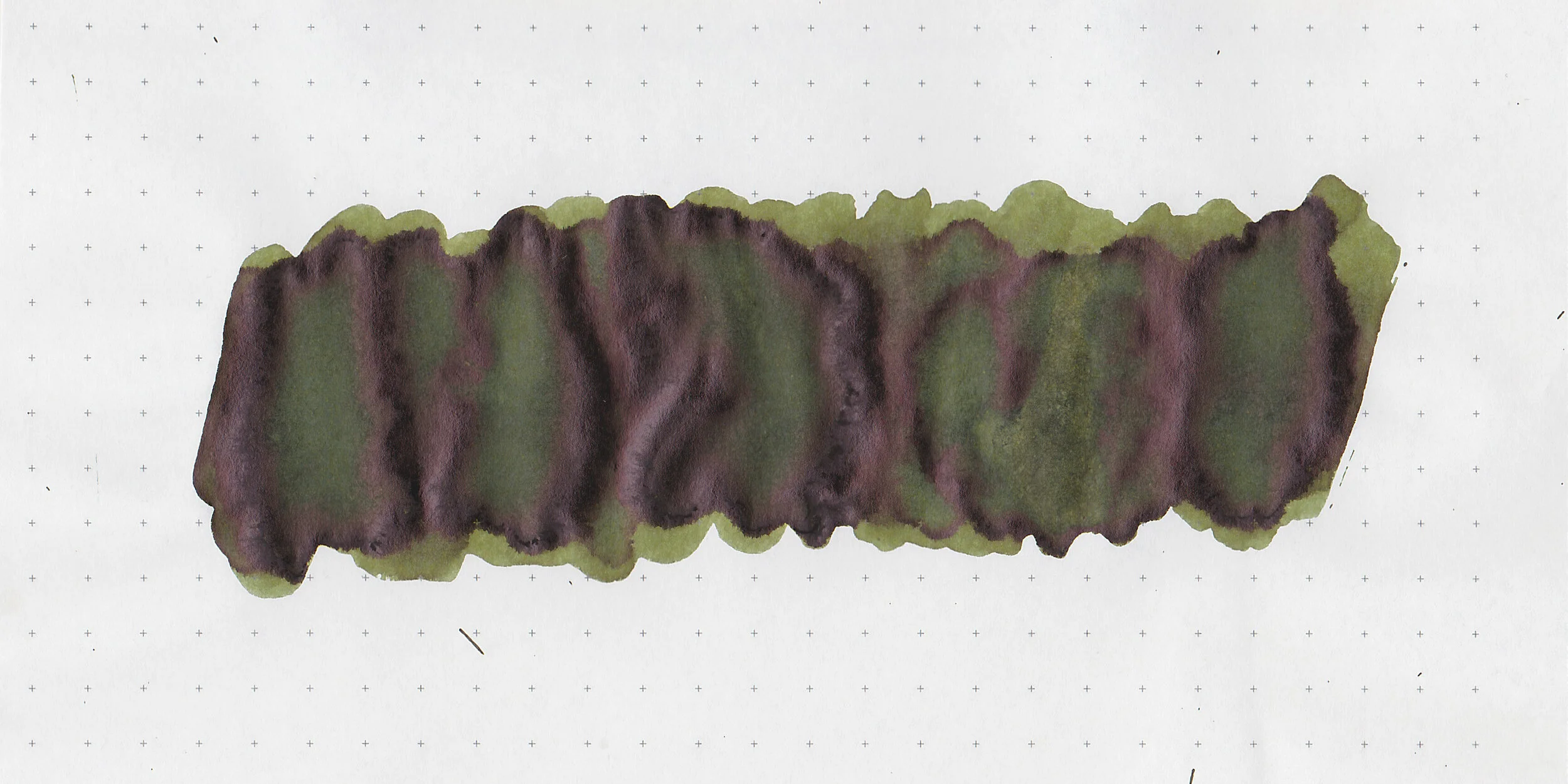
In large swabs on Tomoe River paper the ink has some shading and a little bit of black sheen.

Let's take a look at how the ink behaves on fountain pen friendly papers: Rhodia, Tomoe River, and Leuchtturm.
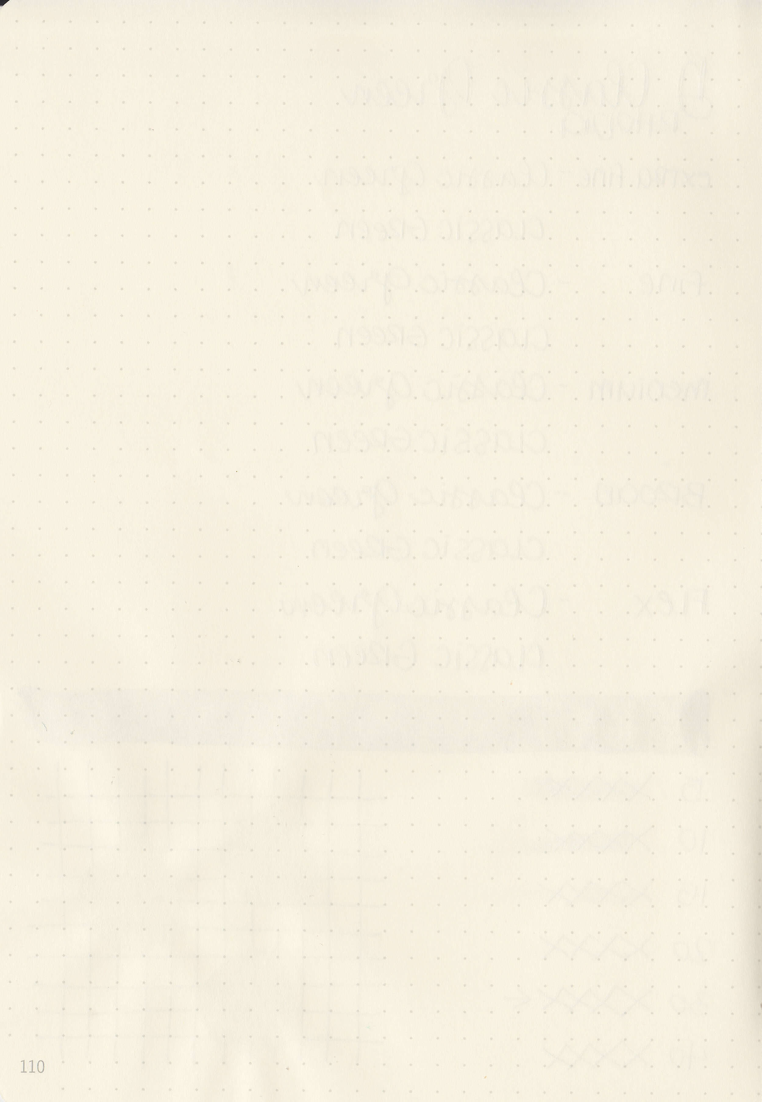
Dry time: 30 seconds
Water resistance: Low
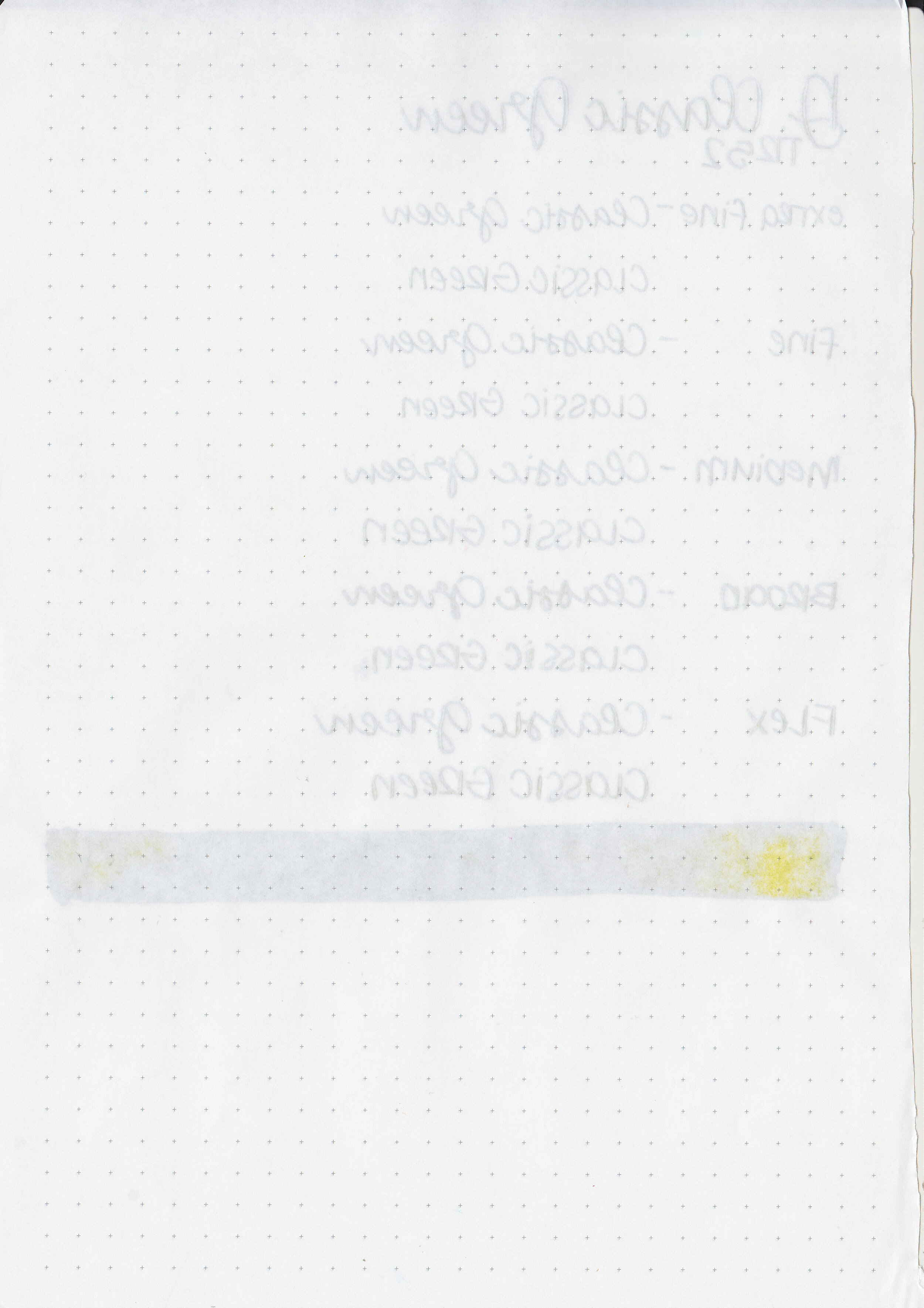
Feathering: None
Show through: Medium
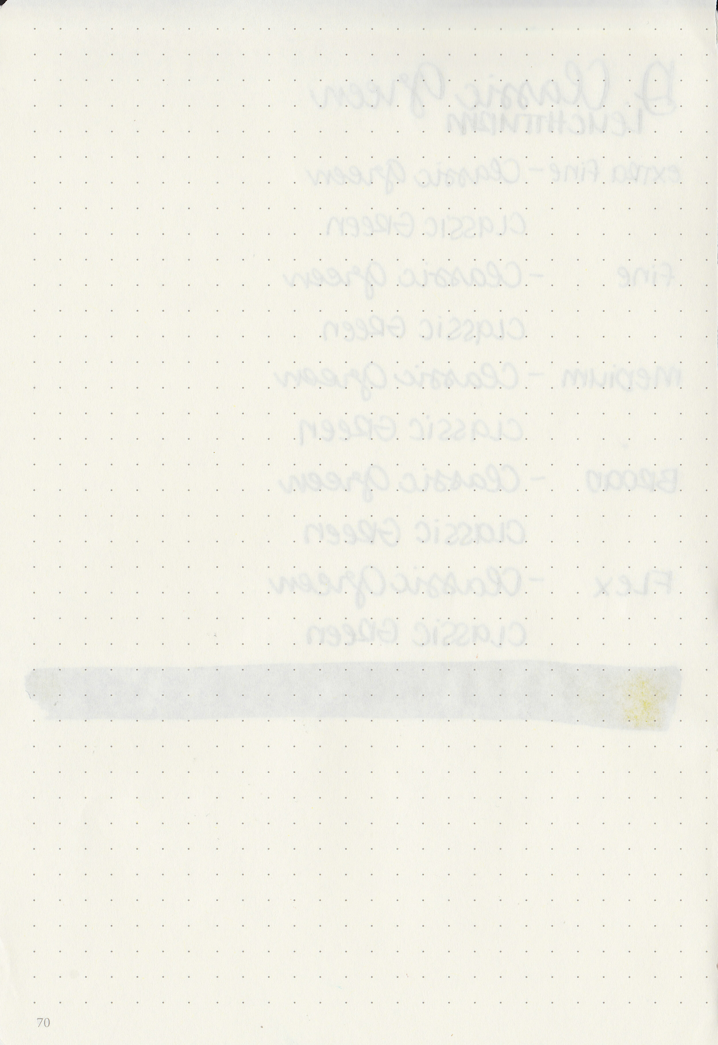
Bleeding: None
Other properties: medium shading, tiny black sheen, and no shimmer. The black sheen is only visible in large swabs on Tomoe River Paper.
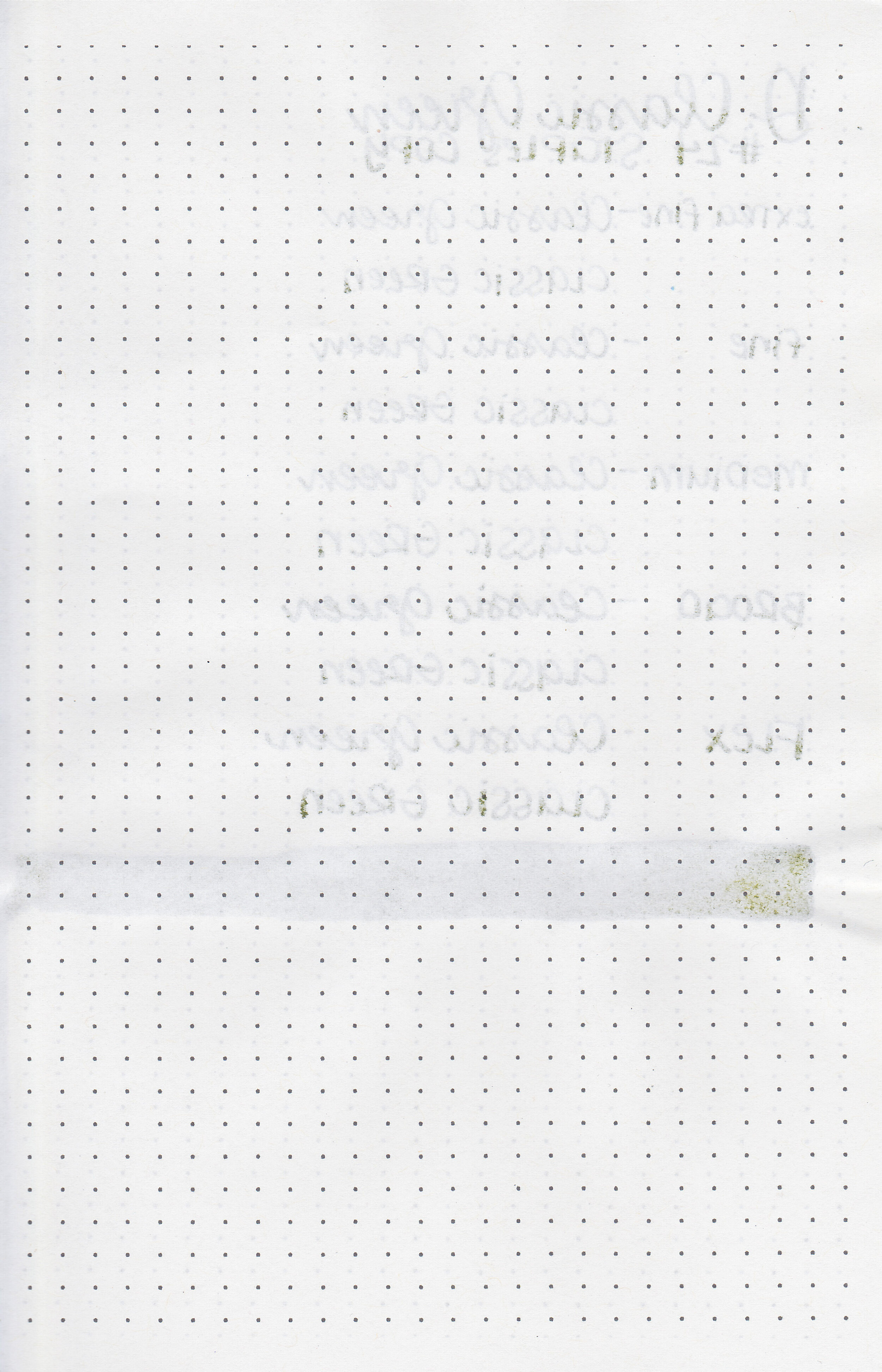
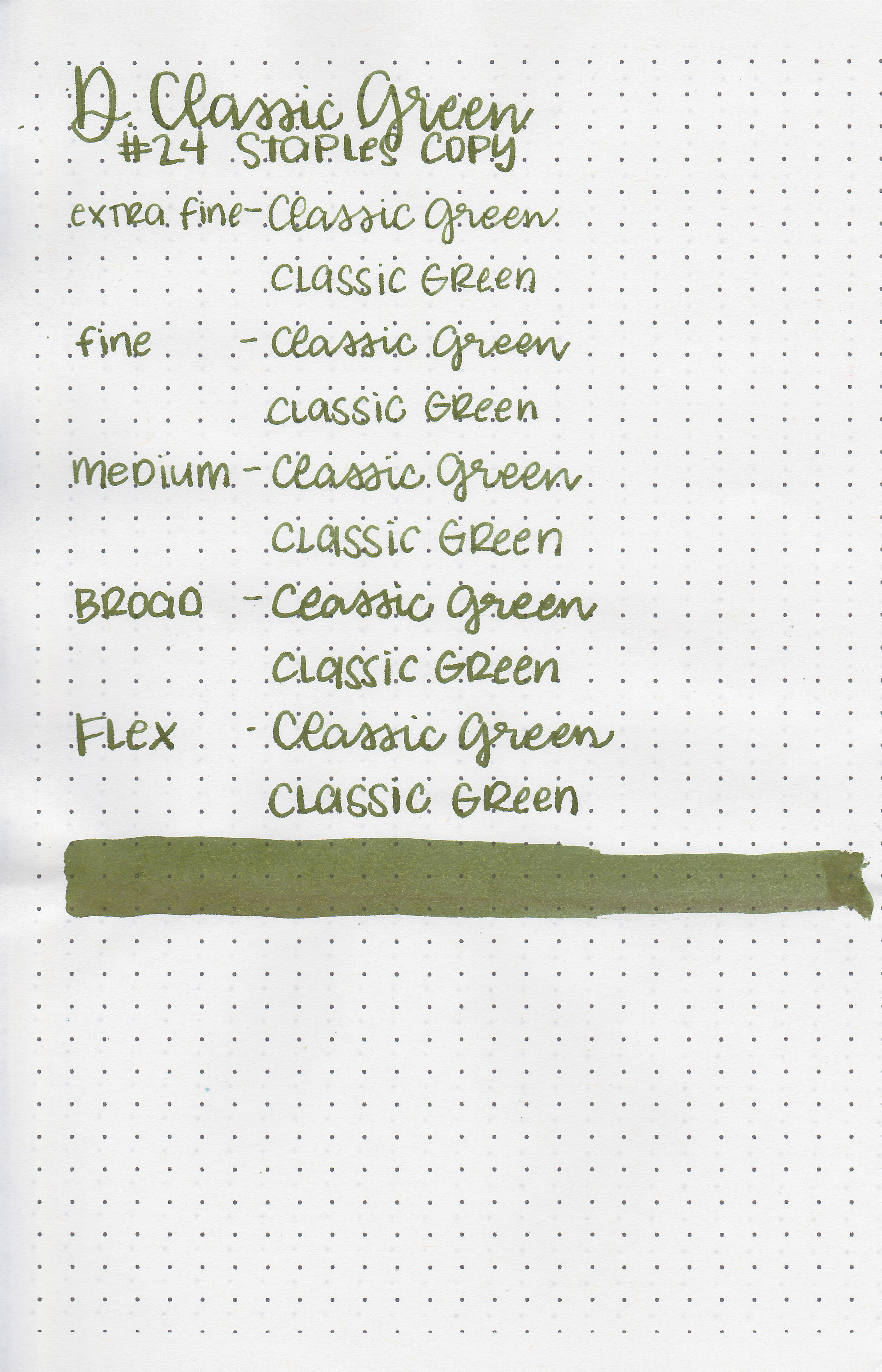
On Staples 24 lb copy paper there was some feathering in most nib sizes and a few dots of bleeding.

Classic Green is pretty close to Sailor Jentle Tokiwa Matsu and Epinard. Click here to see the Diamine inks together, and click here to see the green inks together.

I used a Franklin Christoph 46 in Green Diamondcast with a medium nib on a Yoseka A5 notebook. The ink had an average flow.
Overall, I didn’t used to be a fan of olive greens but they have really grown on me this past year. This ink is well behaved and even has some shading. You can’t go wrong with this ink, especially for the price.
Disclaimer: I purchased this ink myself, and all photos and opinions are my own. This page does not contain affiliate links and this post is not sponsored in any way.
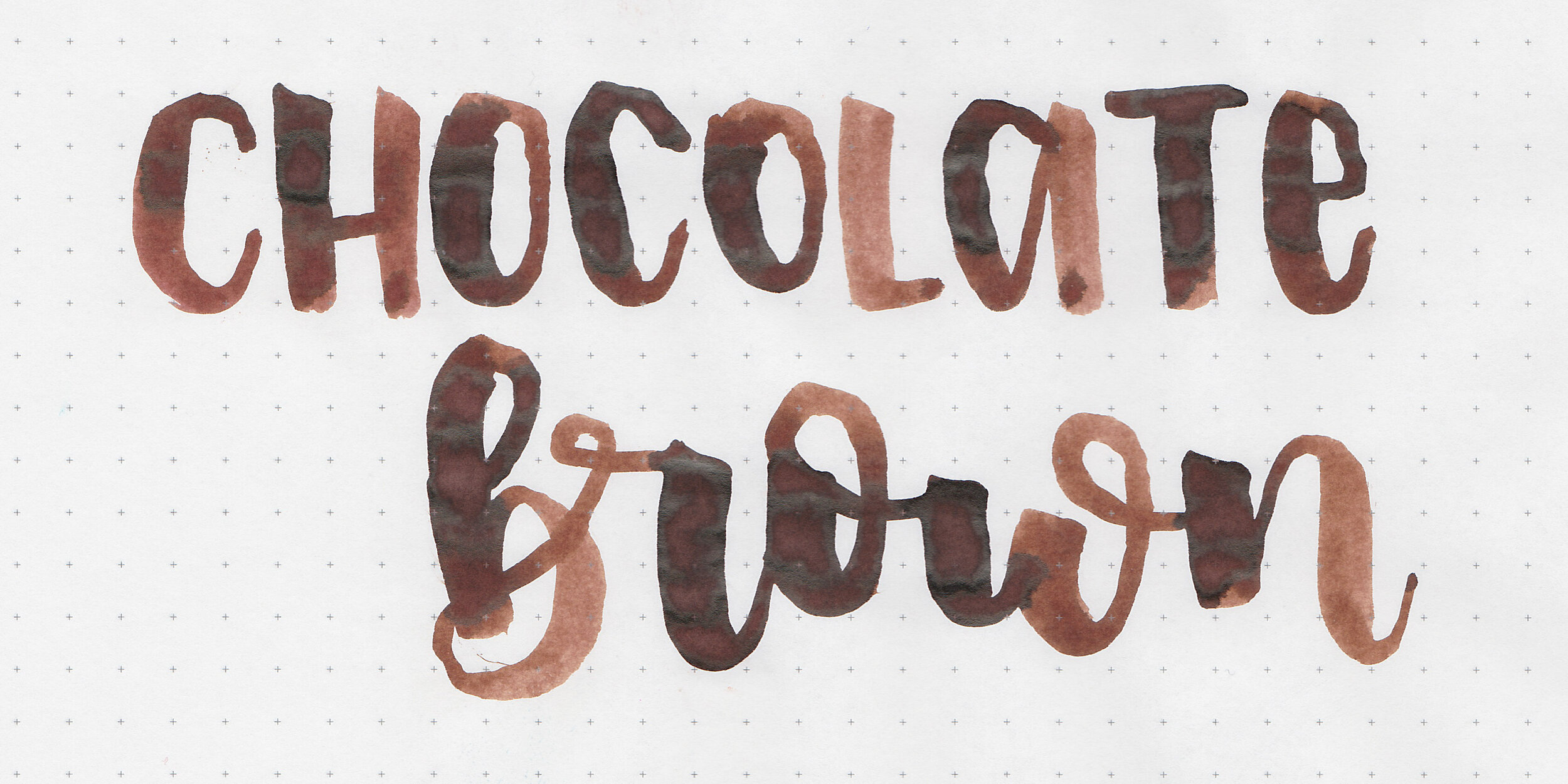
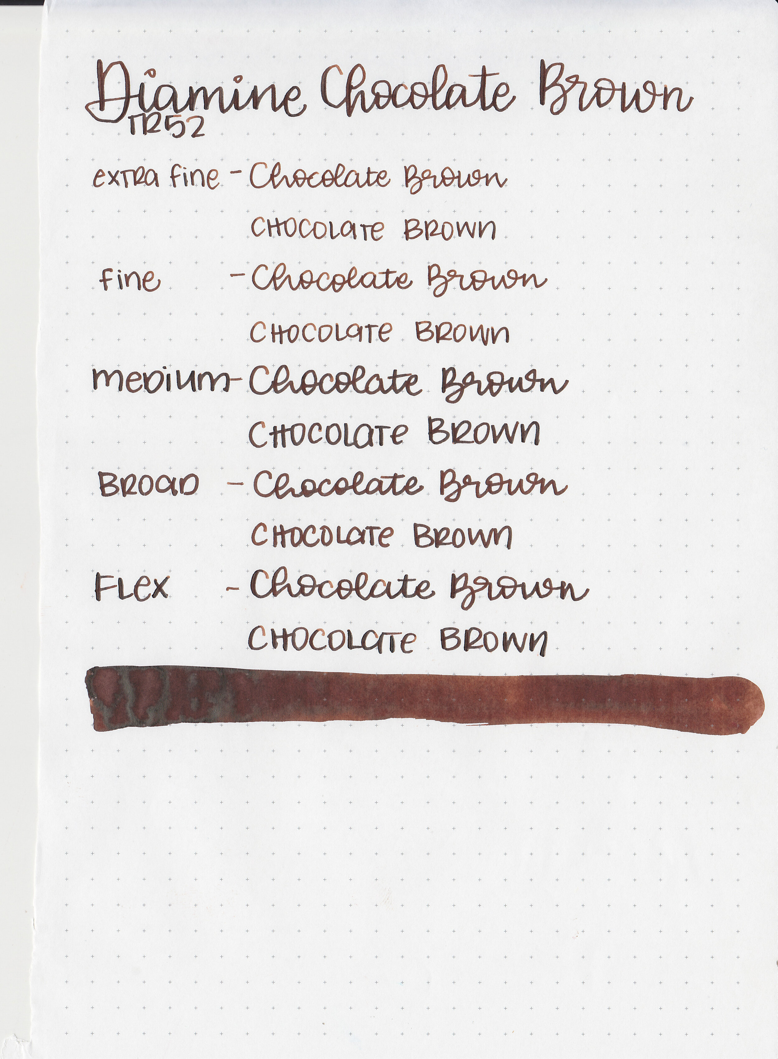
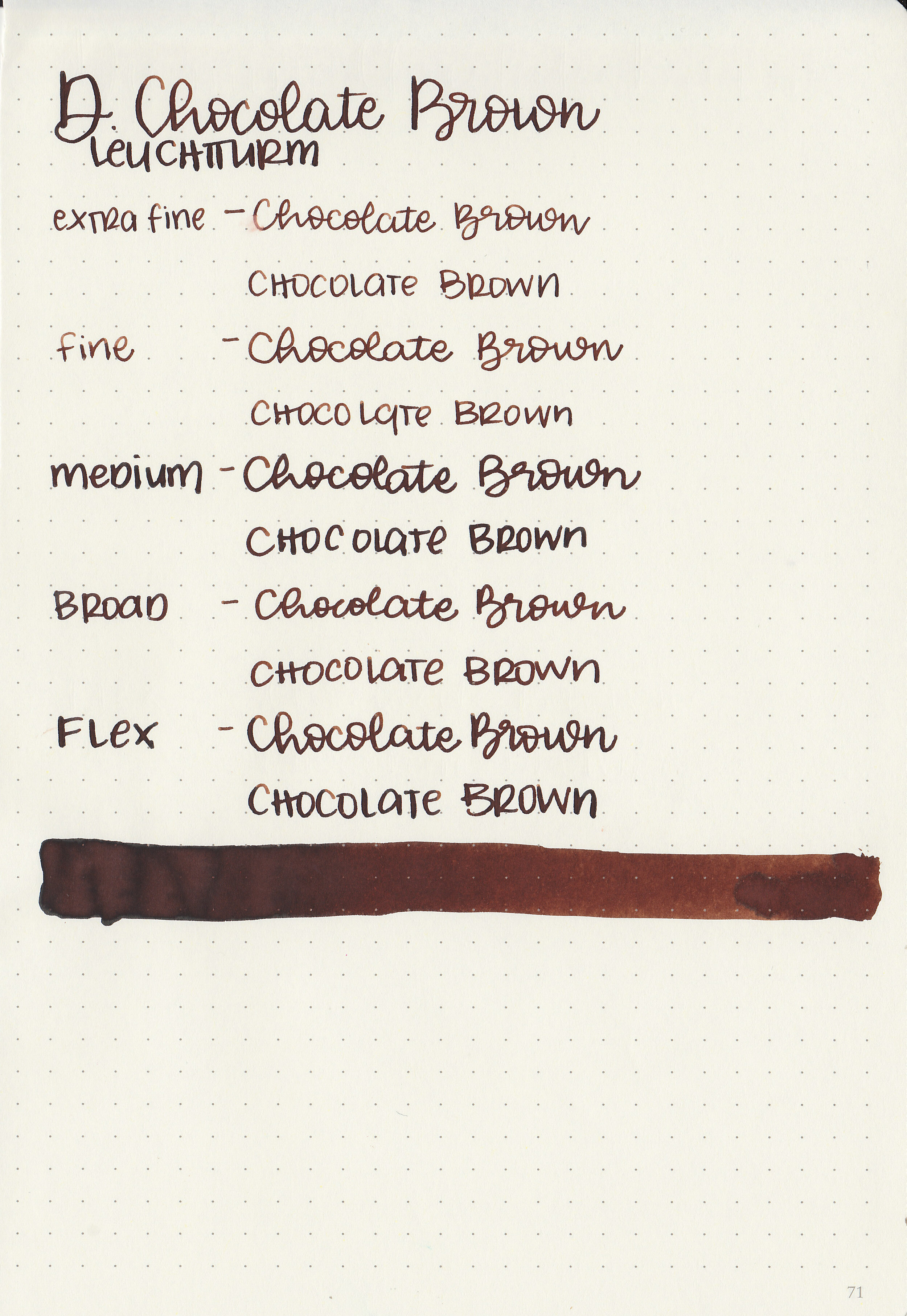
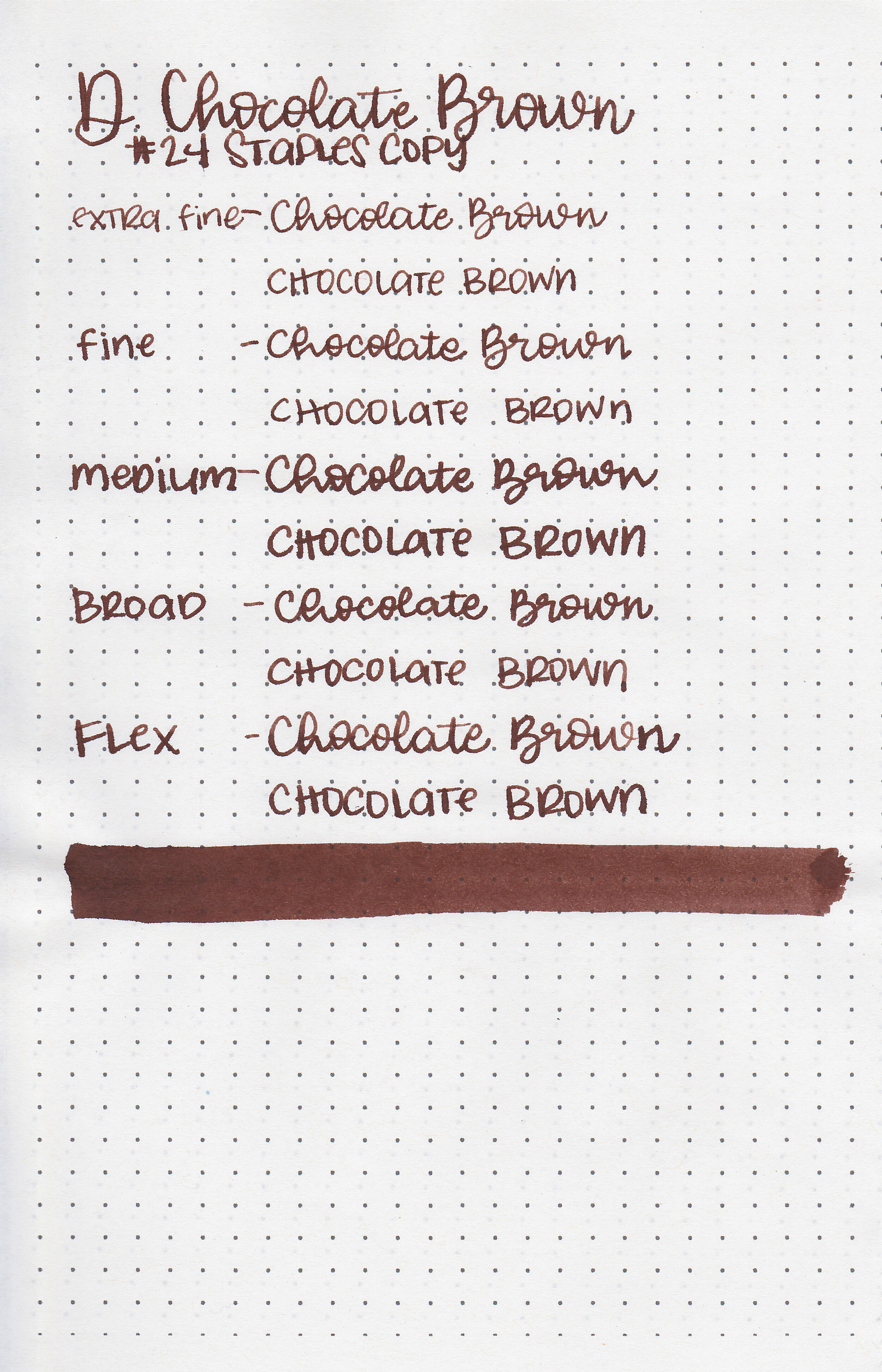
Let’s take a look at Diamine Chocolate Brown. I purchased my bottle of ink from Cult Pens a few years ago and it’s been waiting for it’s own review.

The color:
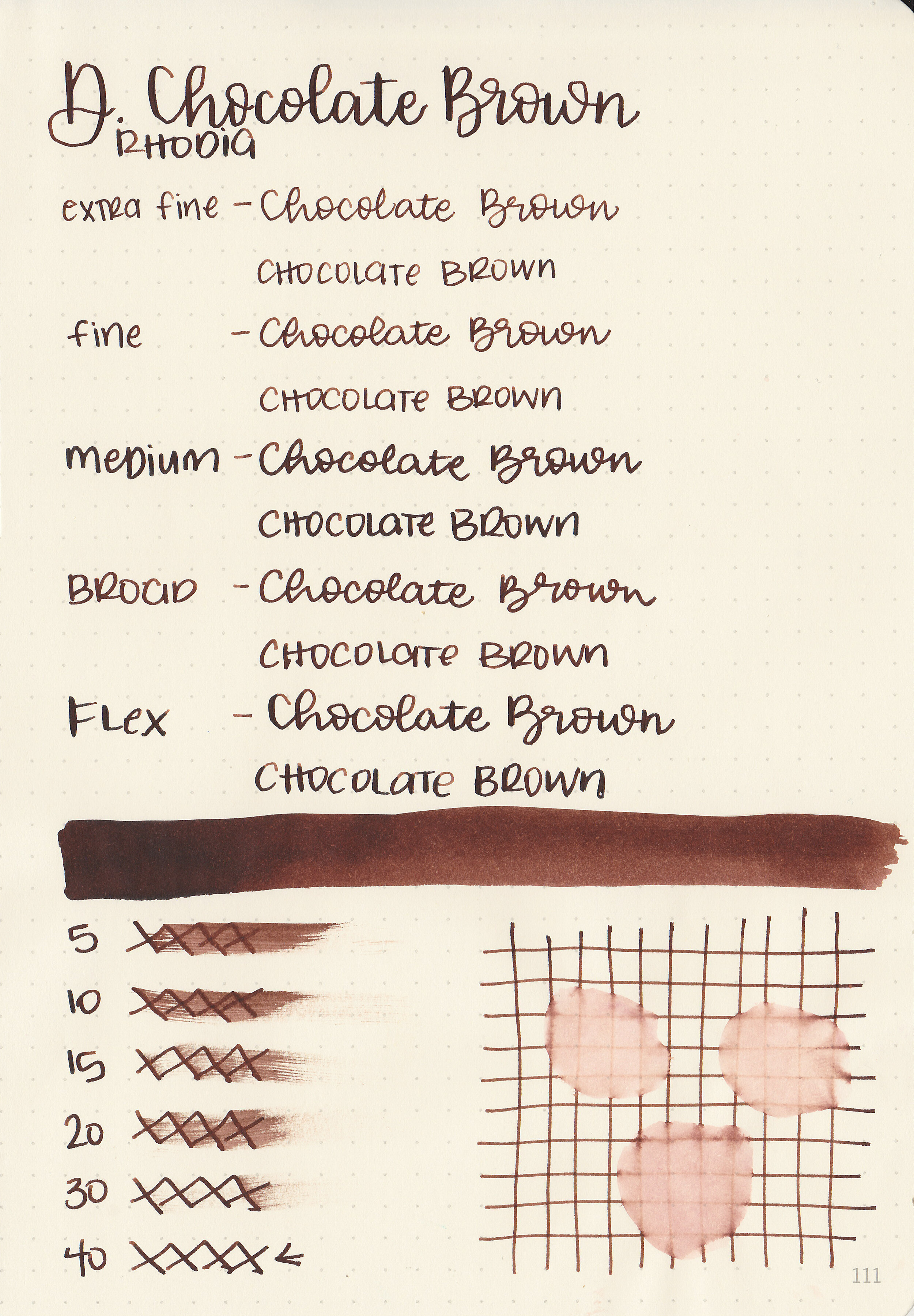
Chocolate Brown is a deep, red-tone brown.

In large swabs on Tomoe River paper the ink looks much darker and has some black sheen.

Let's take a look at how the ink behaves on fountain pen friendly papers: Rhodia, Tomoe River, and Leuchtturm.
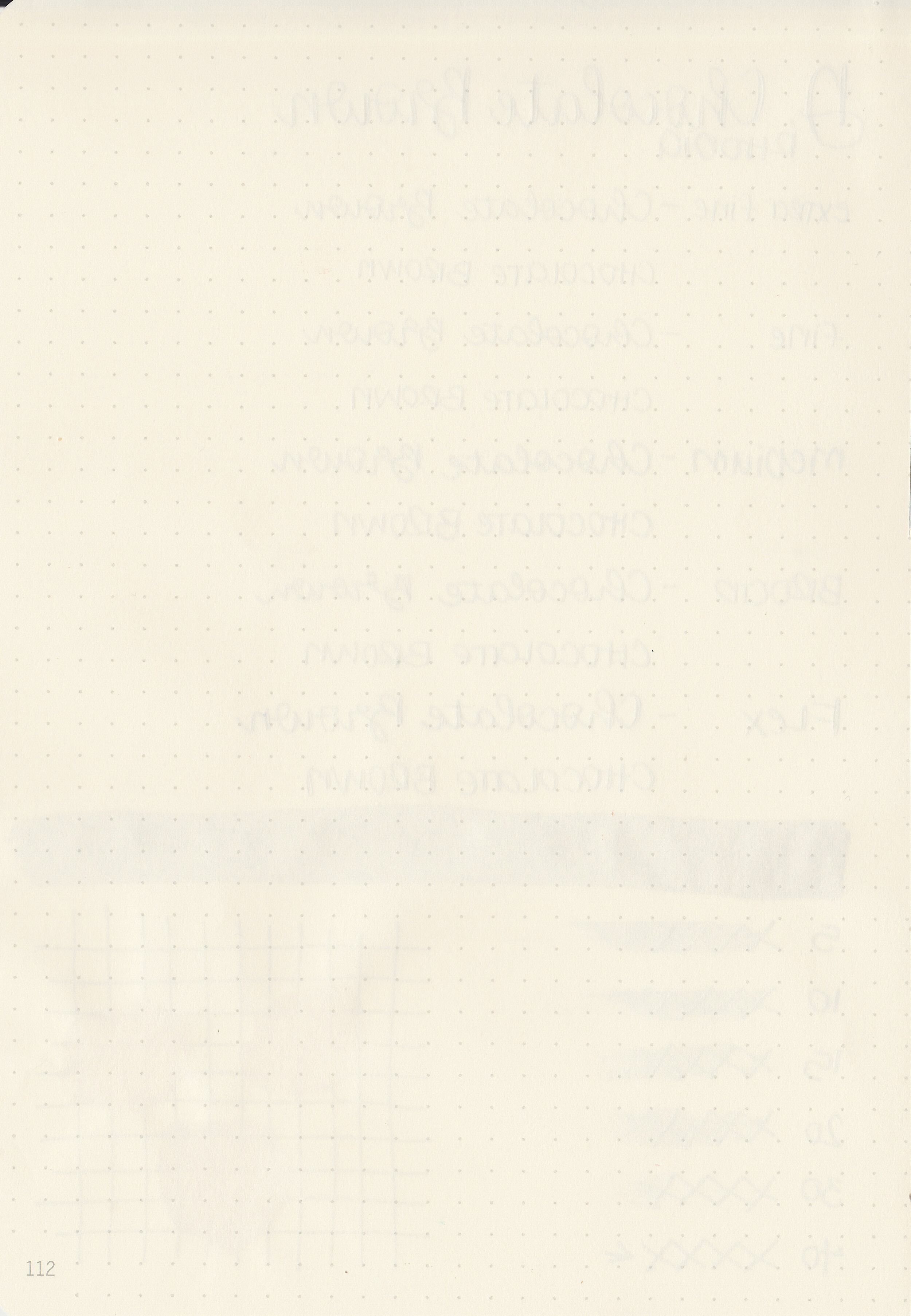
Dry time: 40 seconds
Water resistance: Low
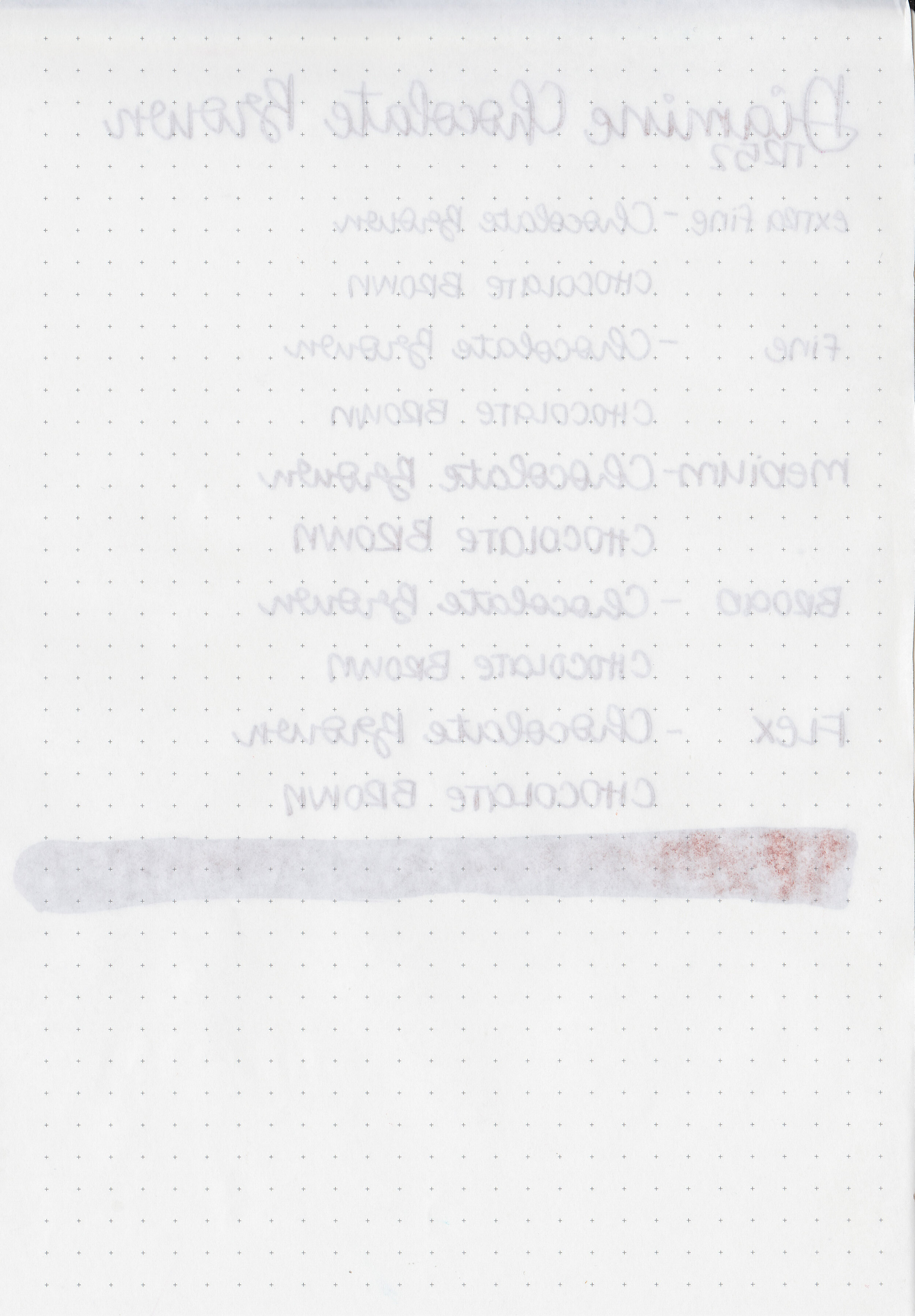
Feathering: None
Show through: Medium

Bleeding: None
Other properties: medium shading, low black sheen, and no shimmer.
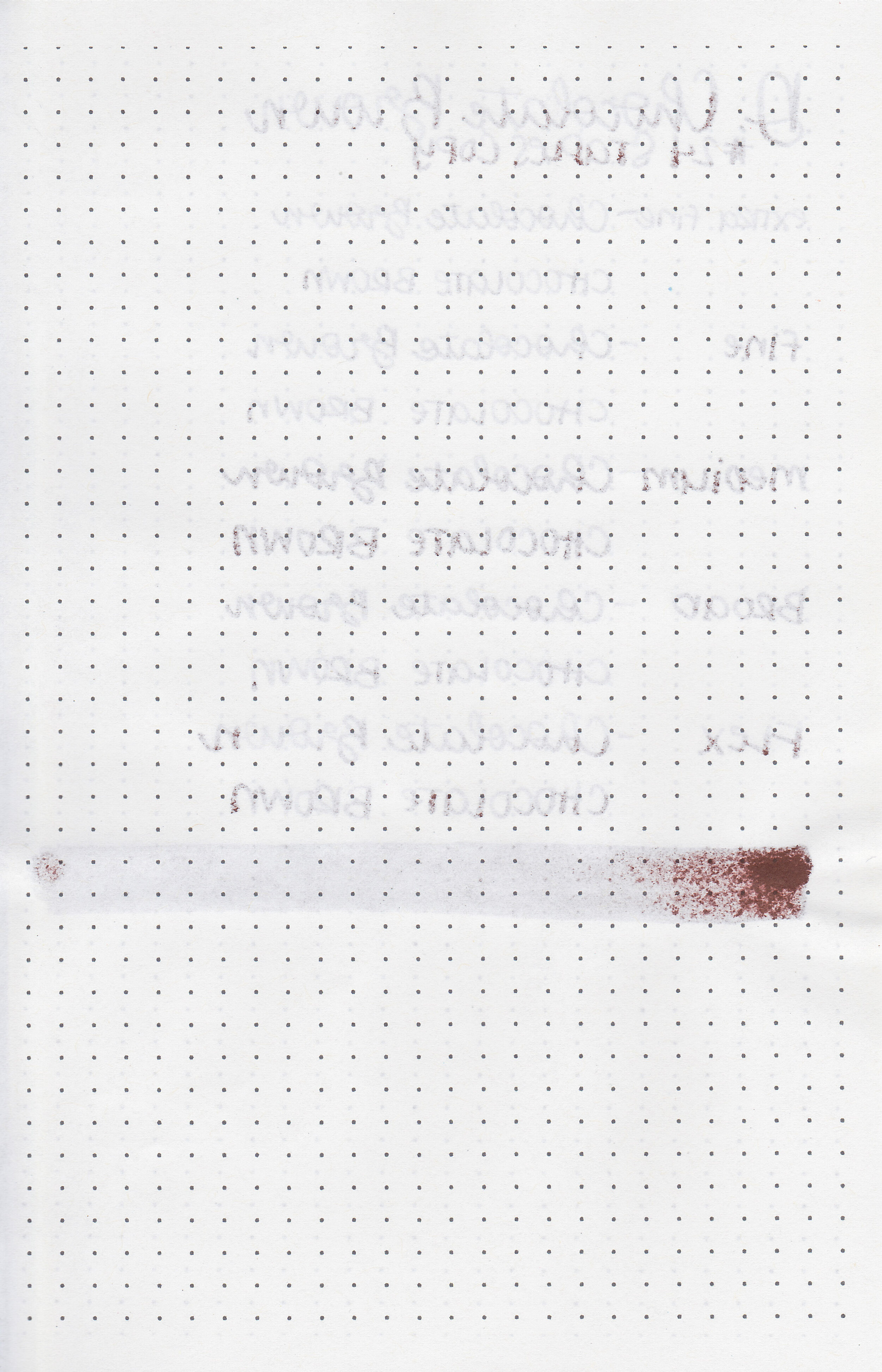
On Staples 24 lb copy paper there was some feathering in most nib sizes and some bleeding.

Chocolate Brown is warmer toned than Kobe Nada Brown, but cooler toned than Diamine Bach. Click here to see the Diamine inks together, and click here to see the brown inks together.
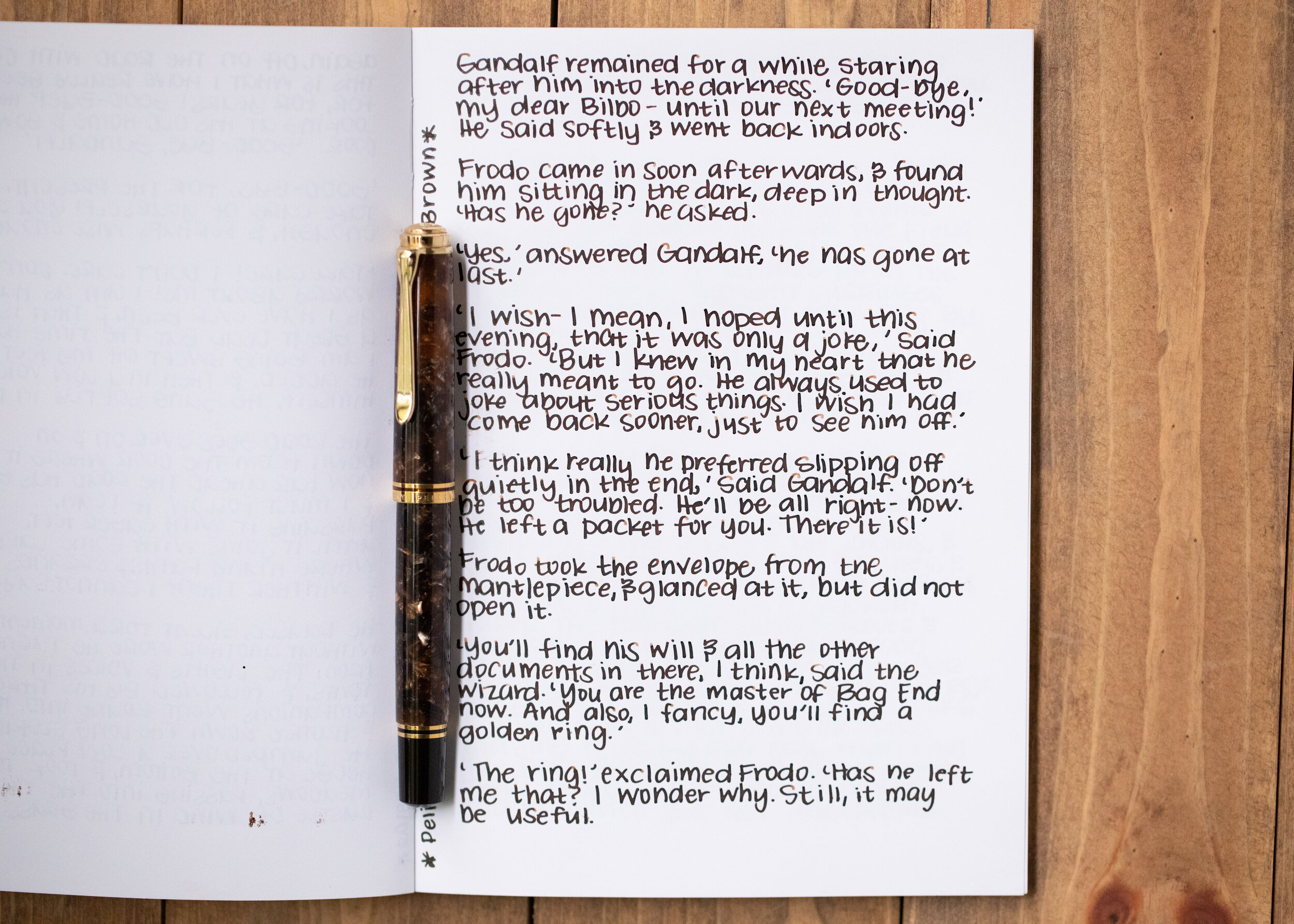
I used a Pelikan M800 Renaissance Brown with a medium nib on a Yoseka A5 notebook. The ink had an average flow.
Overall, it’s pretty well behaved except for the dry time which is a bit long. It looks darker in writing then it does in most swabs.
Disclaimer: I purchased this ink myself, and all photos and opinions are my own. This page does not contain affiliate links and this post is not sponsored in any way.
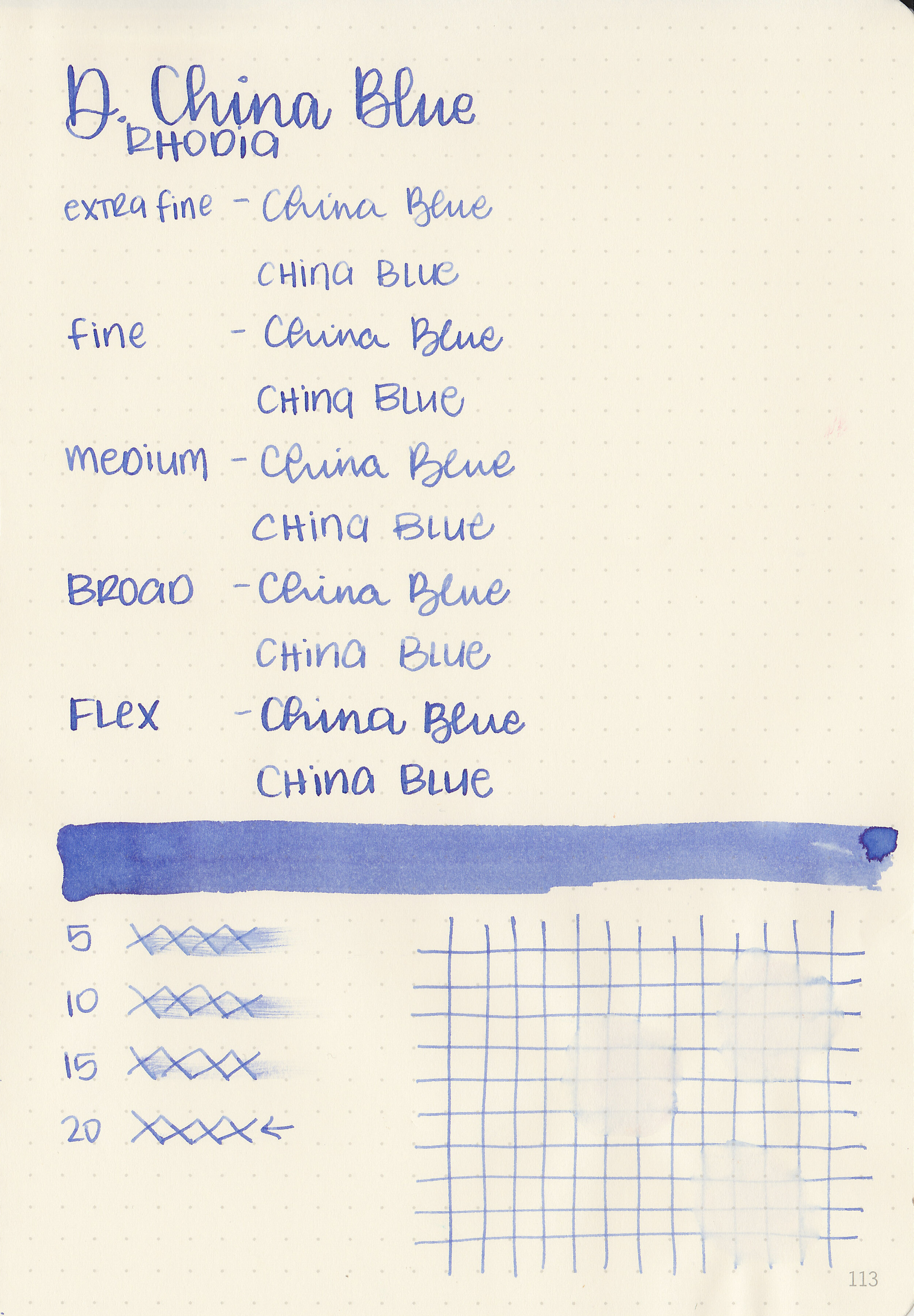
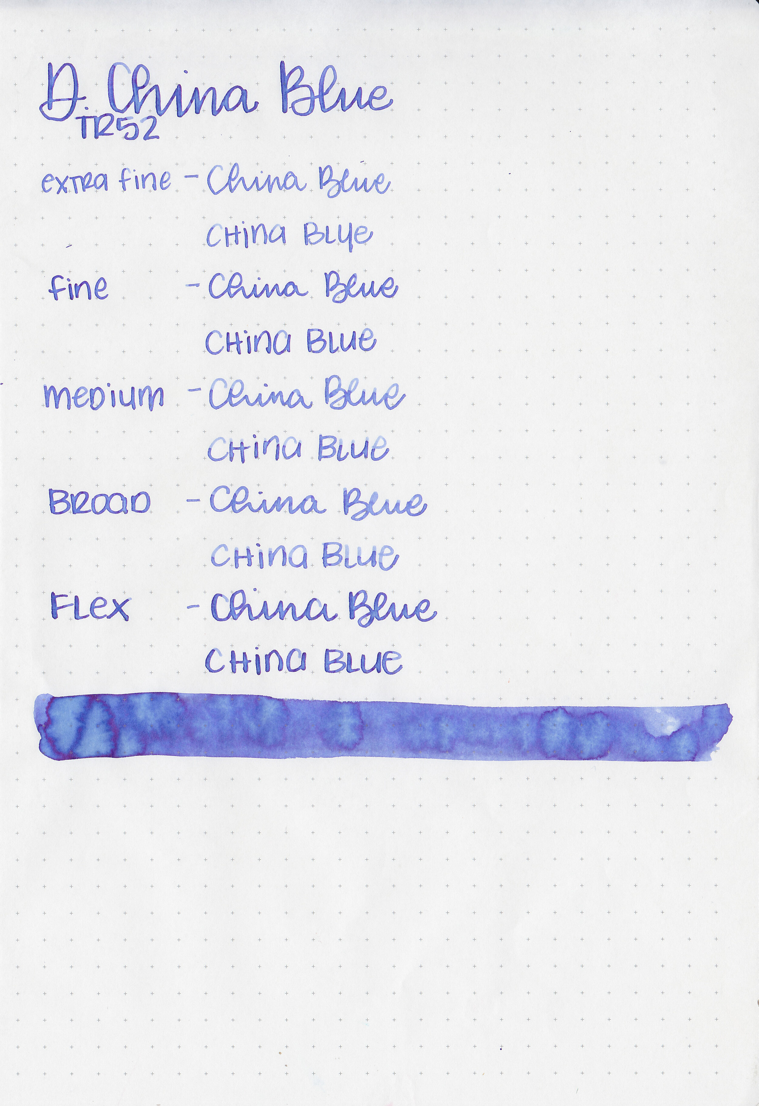
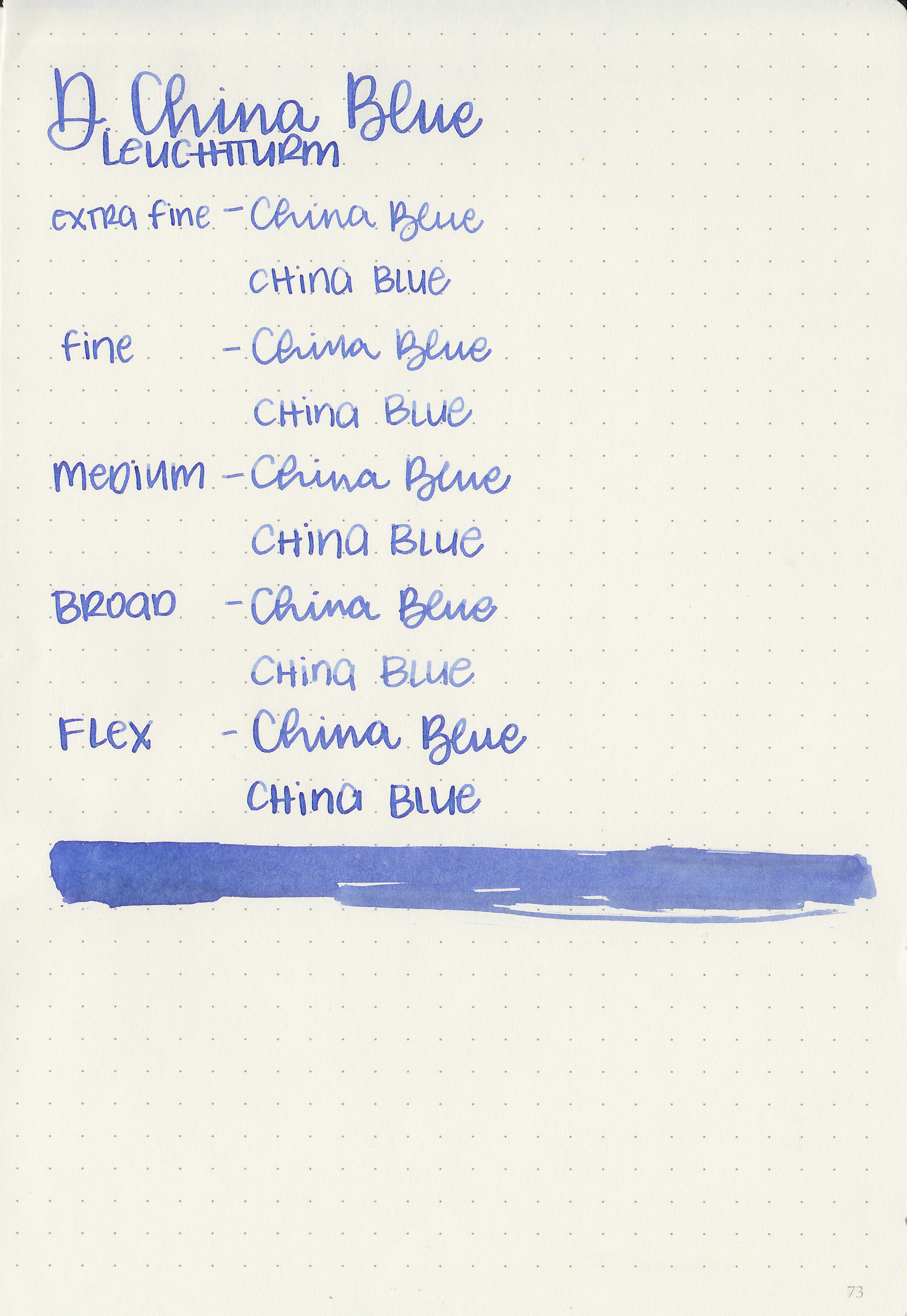
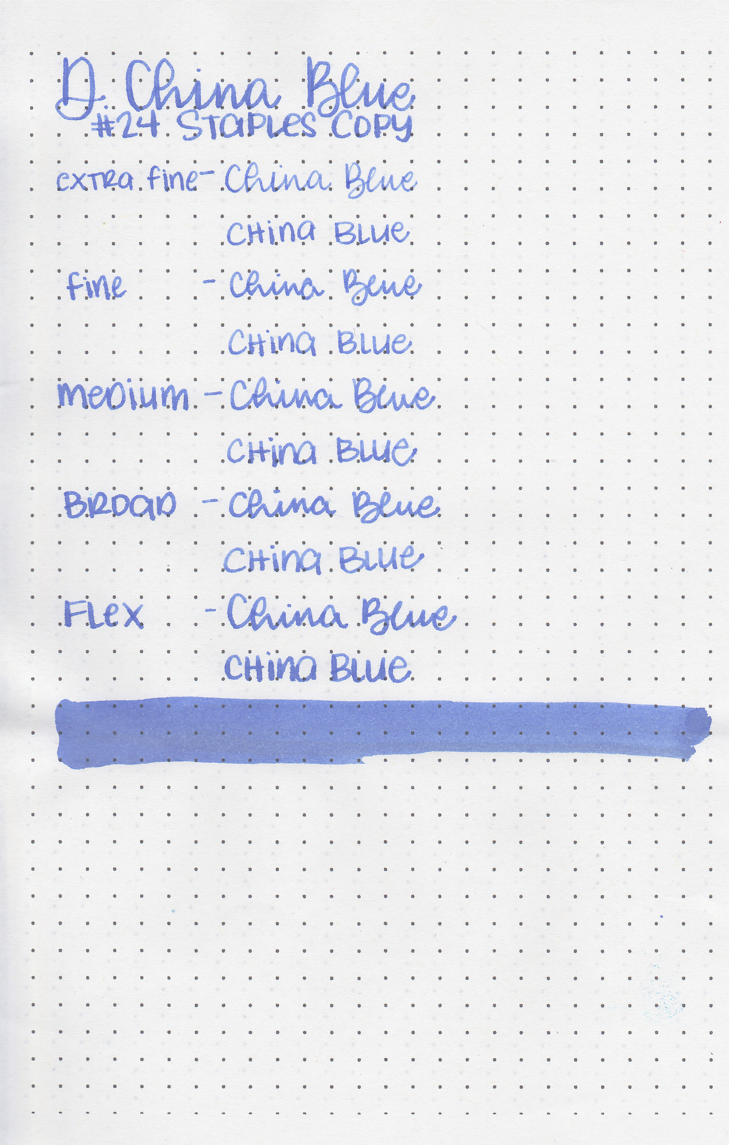
Today’s ink is another Diamine ink I’ve had for a while, Diamine China Blue. I purchased my bottle of ink from Cult Pens.

The color:
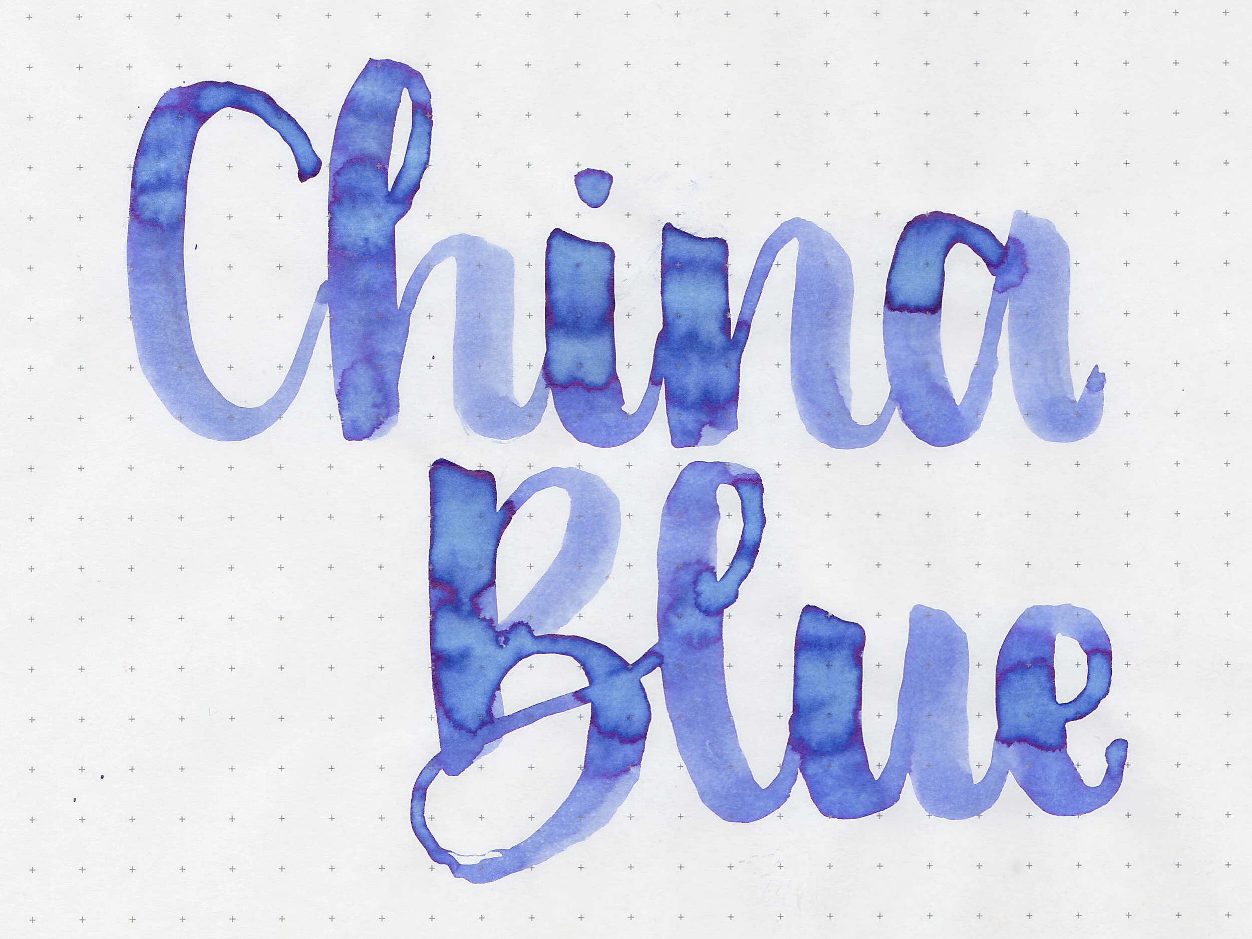
China Blue is a dusky medium blue.

In large swabs on Tomoe River paper the ink looks much lighter and has a little bit of pink sheen.

Let's take a look at how the ink behaves on fountain pen friendly papers: Rhodia, Tomoe River, and Leuchtturm.
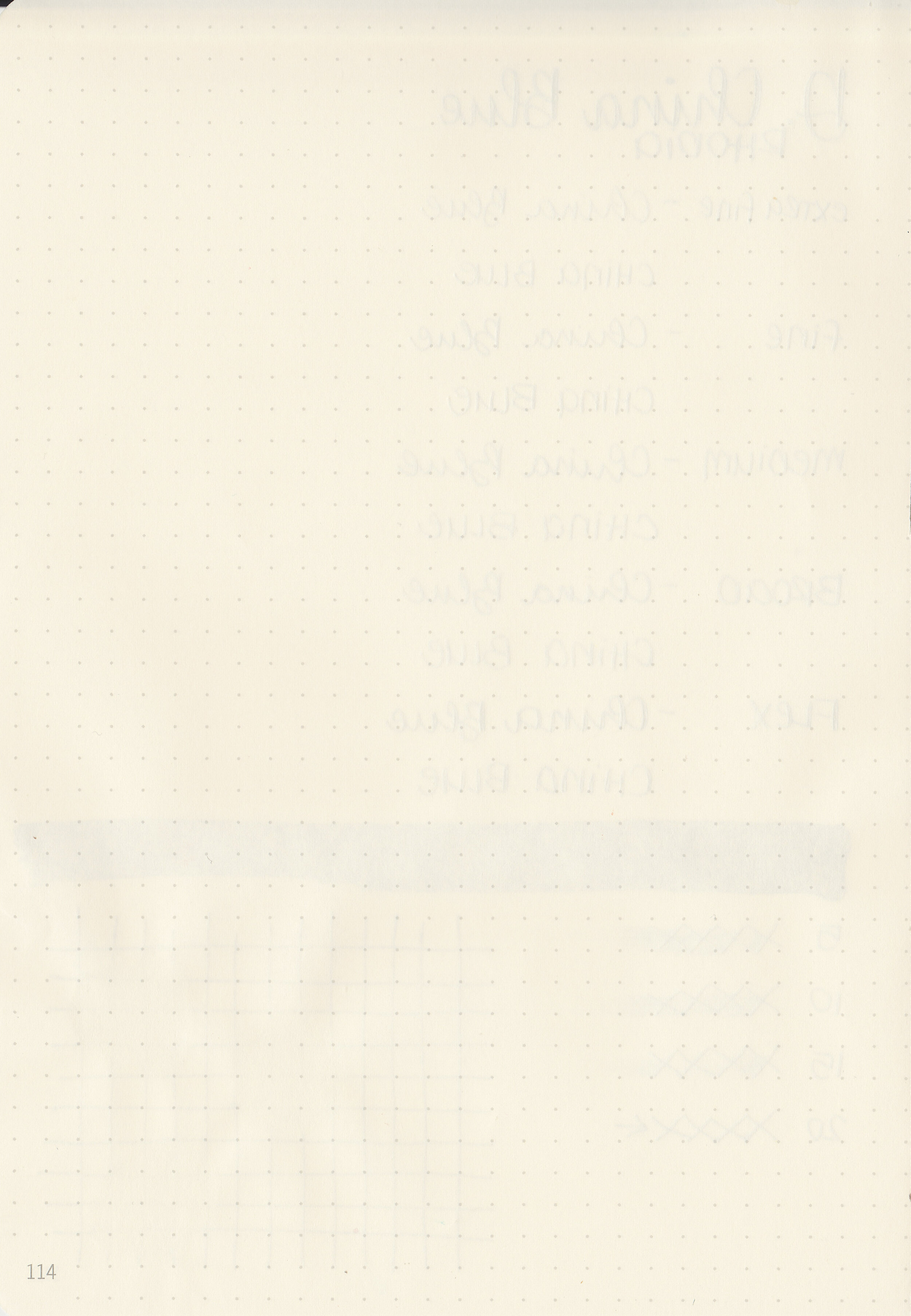
Dry time: 20 seconds
Water resistance: Low
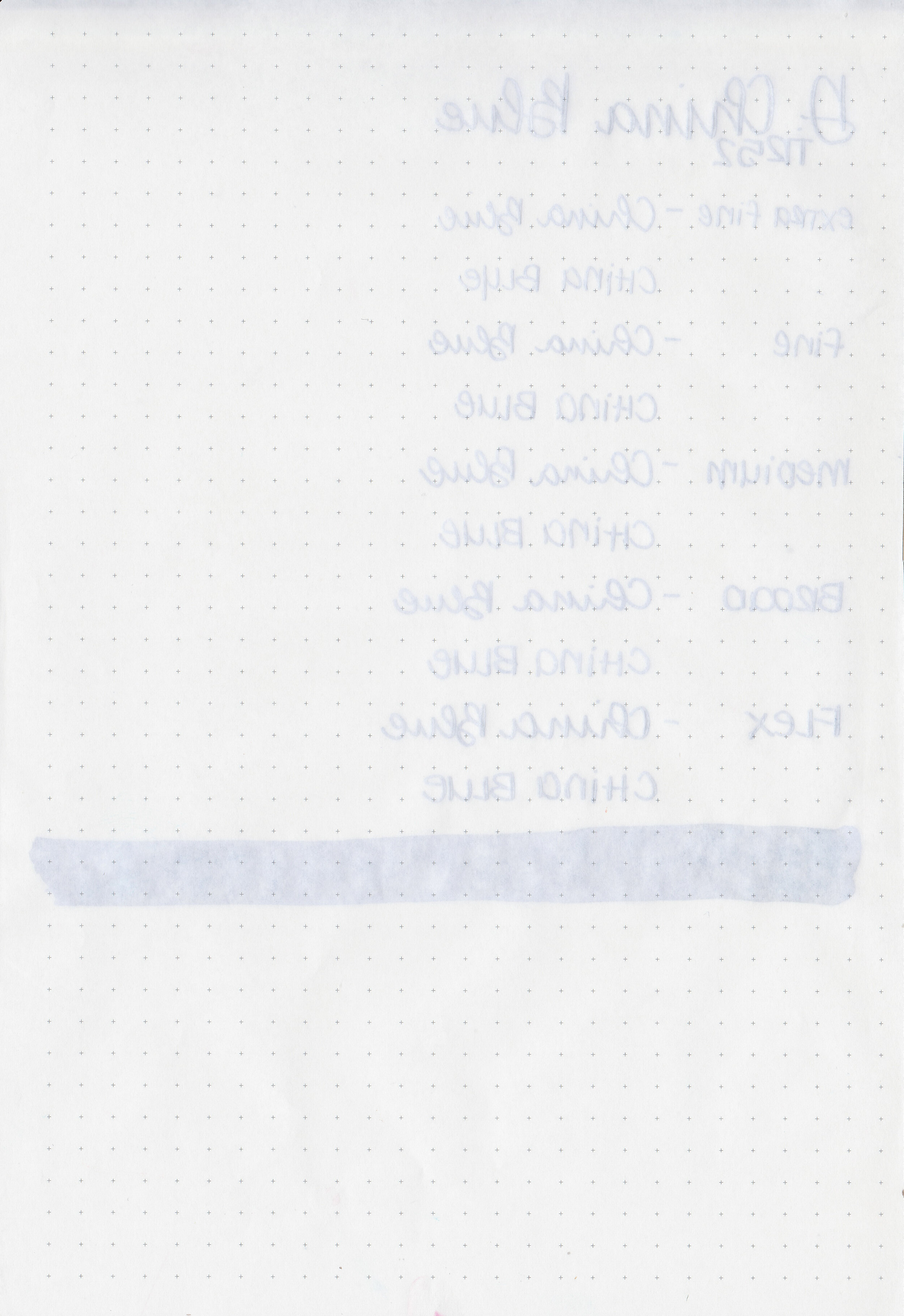
Feathering: None
Show through: Medium
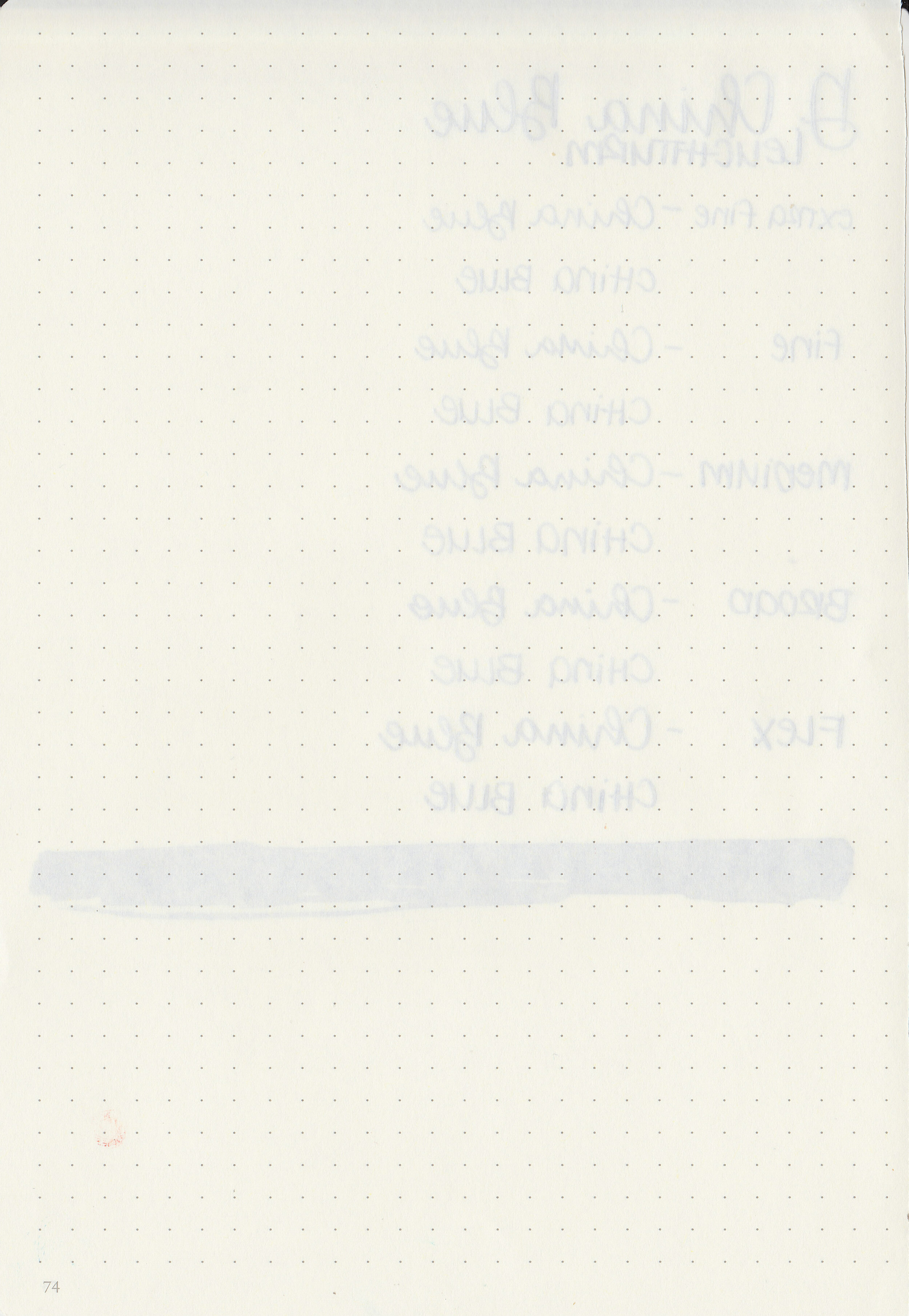
Bleeding: None
Other properties: medium shading, low pink sheen, and no shimmer.
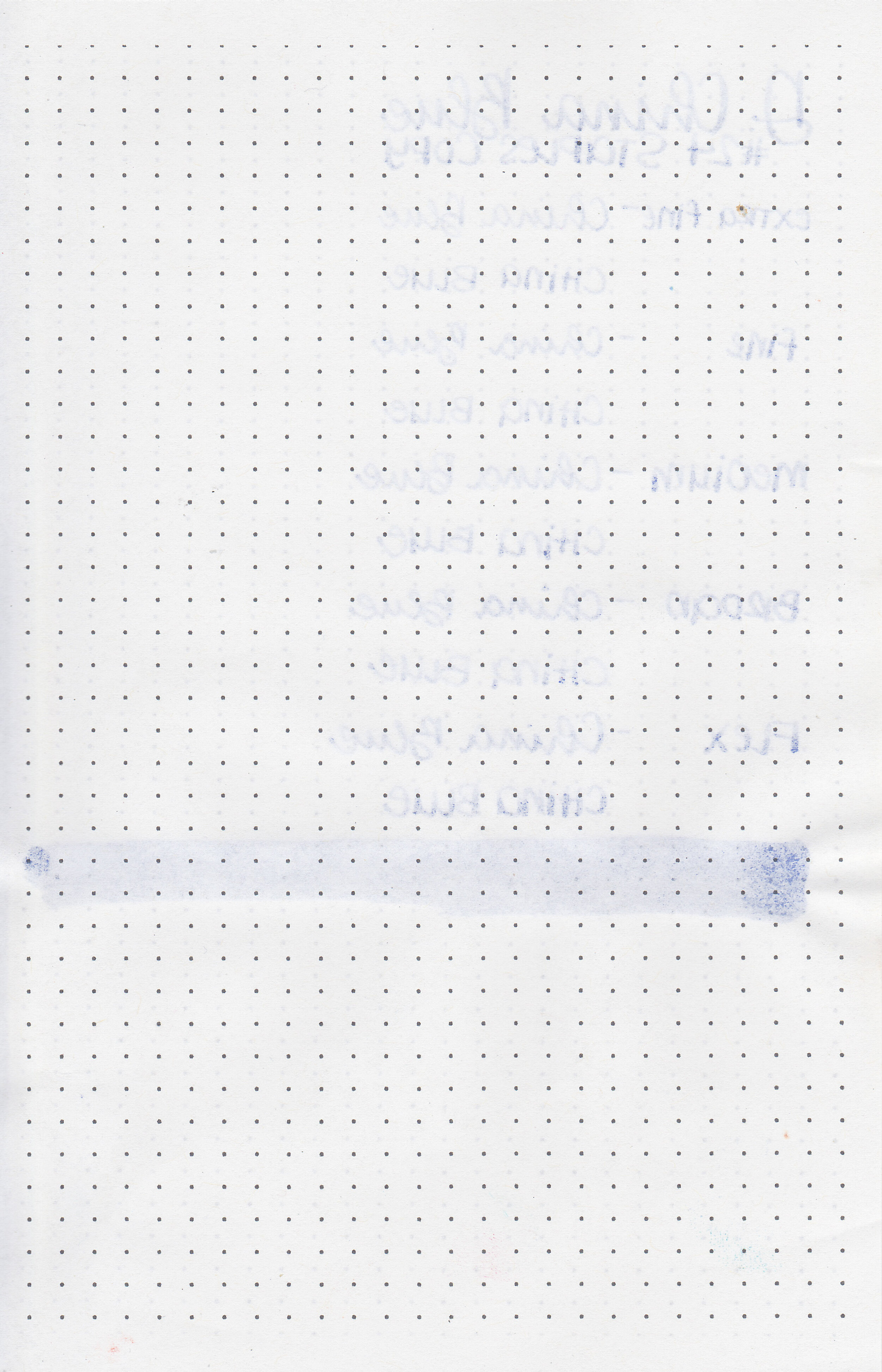
On Staples 24 lb copy paper there was some feathering in most nib sizes and just a few dots of bleeding.

China Blue is similar to Pilot Iroshizuku Asa-gao, just less saturated. Click here to see the Diamine inks together, and click here to see the blue inks together.

I used an Edison Collier Blue Steel with a broad nib on a Yoseka A5 notebook. The ink had an average flow.
Overall, I love the color of this ink. It can be a bit pale in smaller nib sizes so I would keep this ink to the larger nibs.
Disclaimer: I purchased this ink myself, and all photos and opinions are my own. This page does not contain affiliate links and this post is not sponsored in any way.

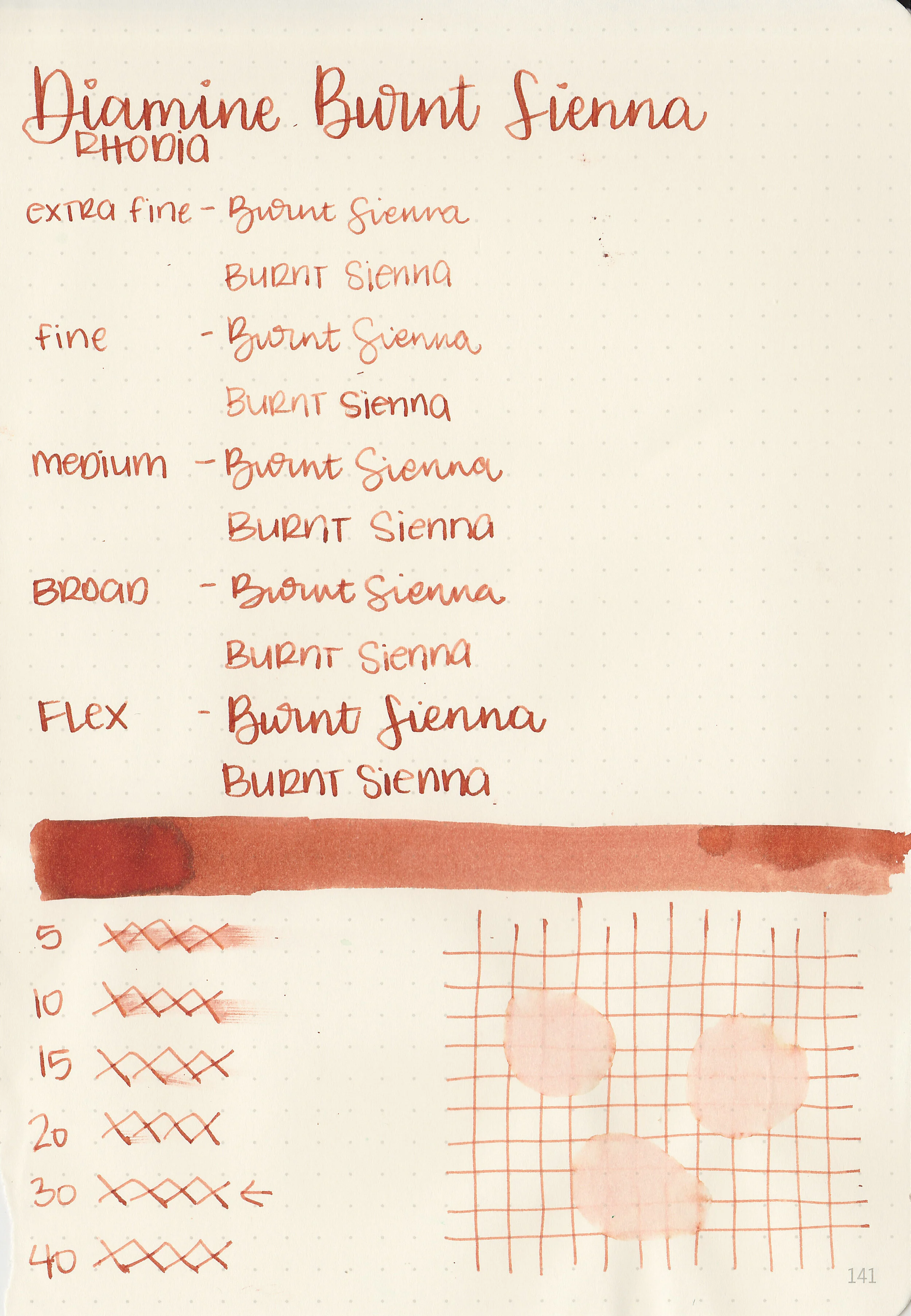
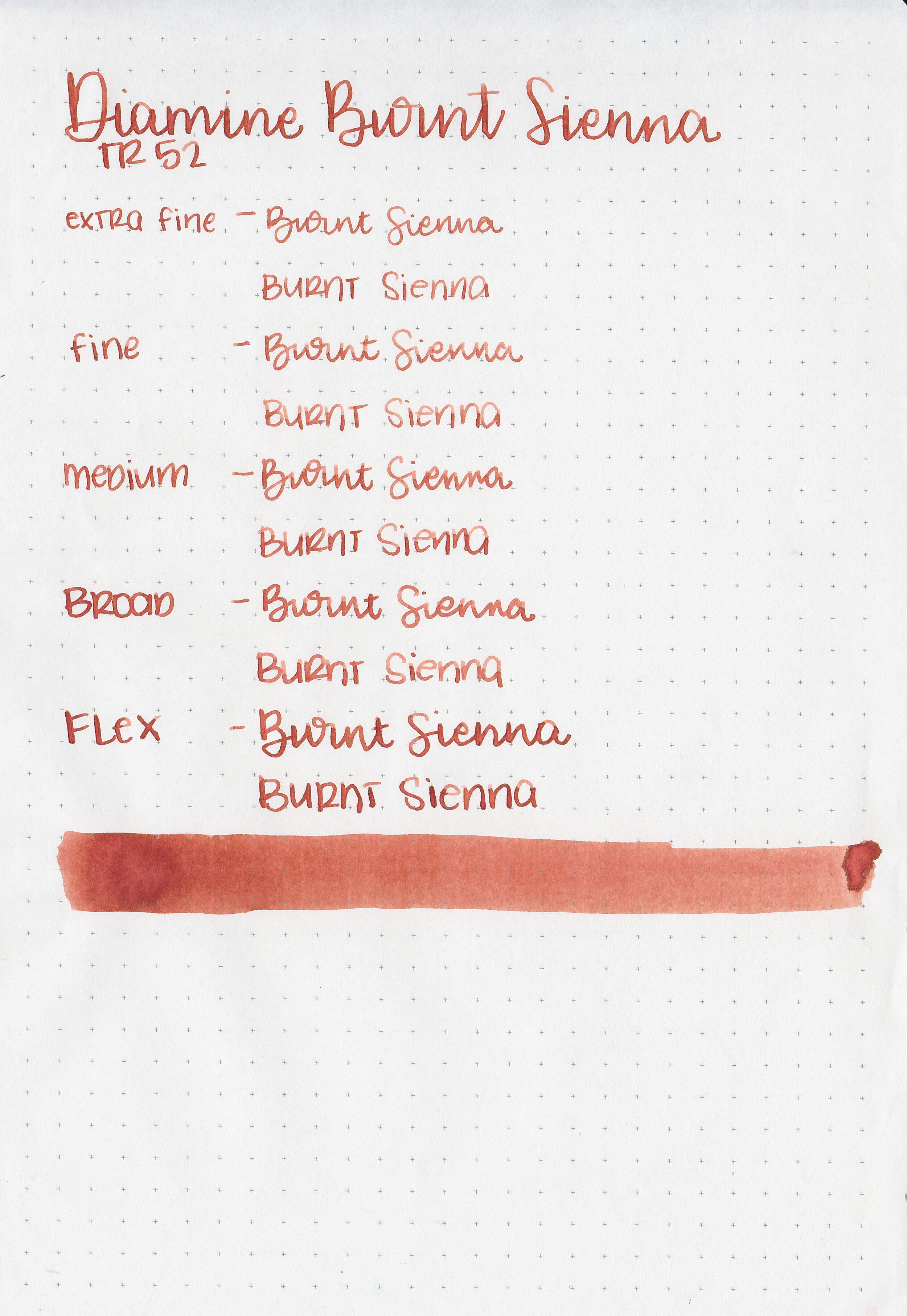
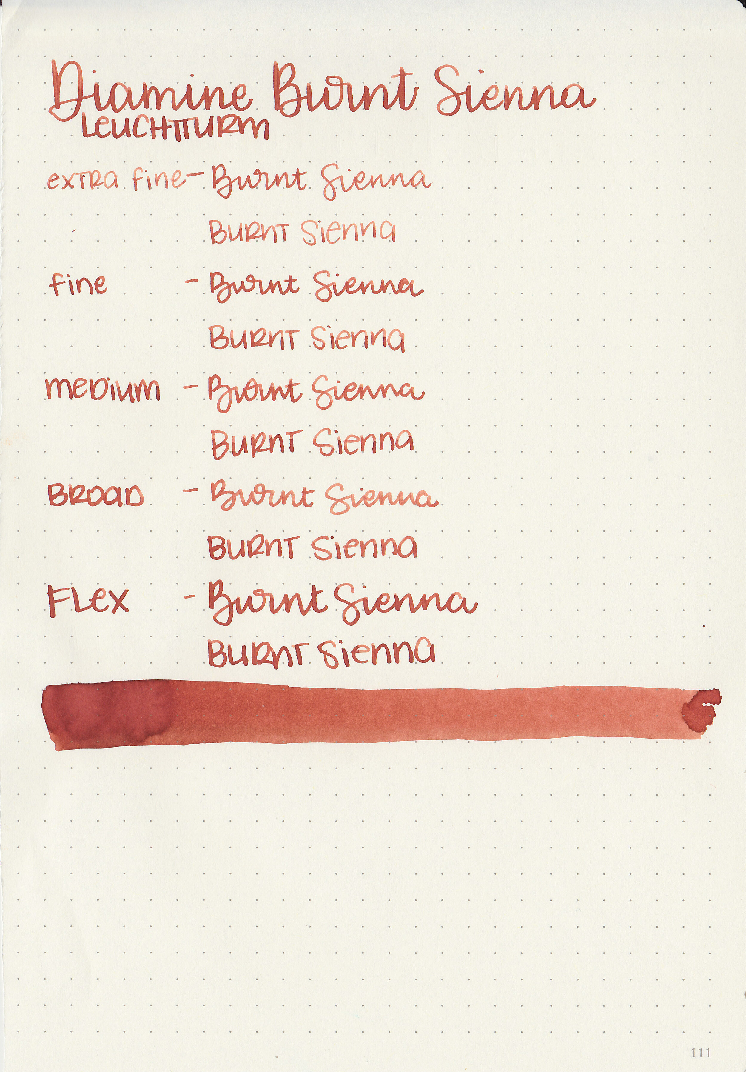
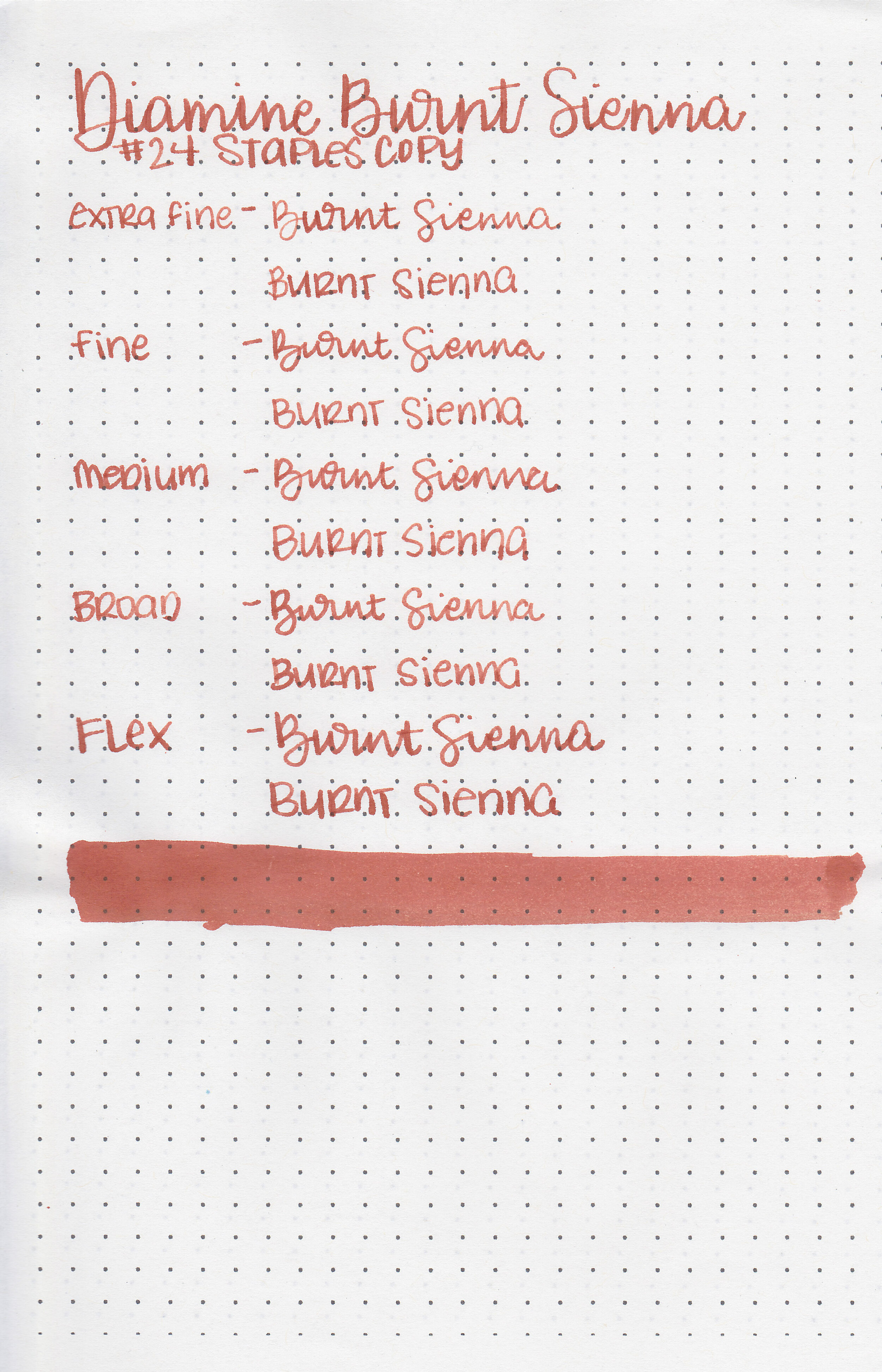
I’ve been trying to make it through some of the Diamine inks I’ve had for a long time, so today’s ink is Diamine Burnt Sienna. I purchased my bottle of ink from Cult Pens.

The color:
Burnt Sienna is an unsaturated red brown.

In large swabs on Tomoe River paper the ink has a little bit of black sheen.

Let's take a look at how the ink behaves on fountain pen friendly papers: Rhodia, Tomoe River, and Leuchtturm.

Dry time: 30 seconds
Water resistance: Low
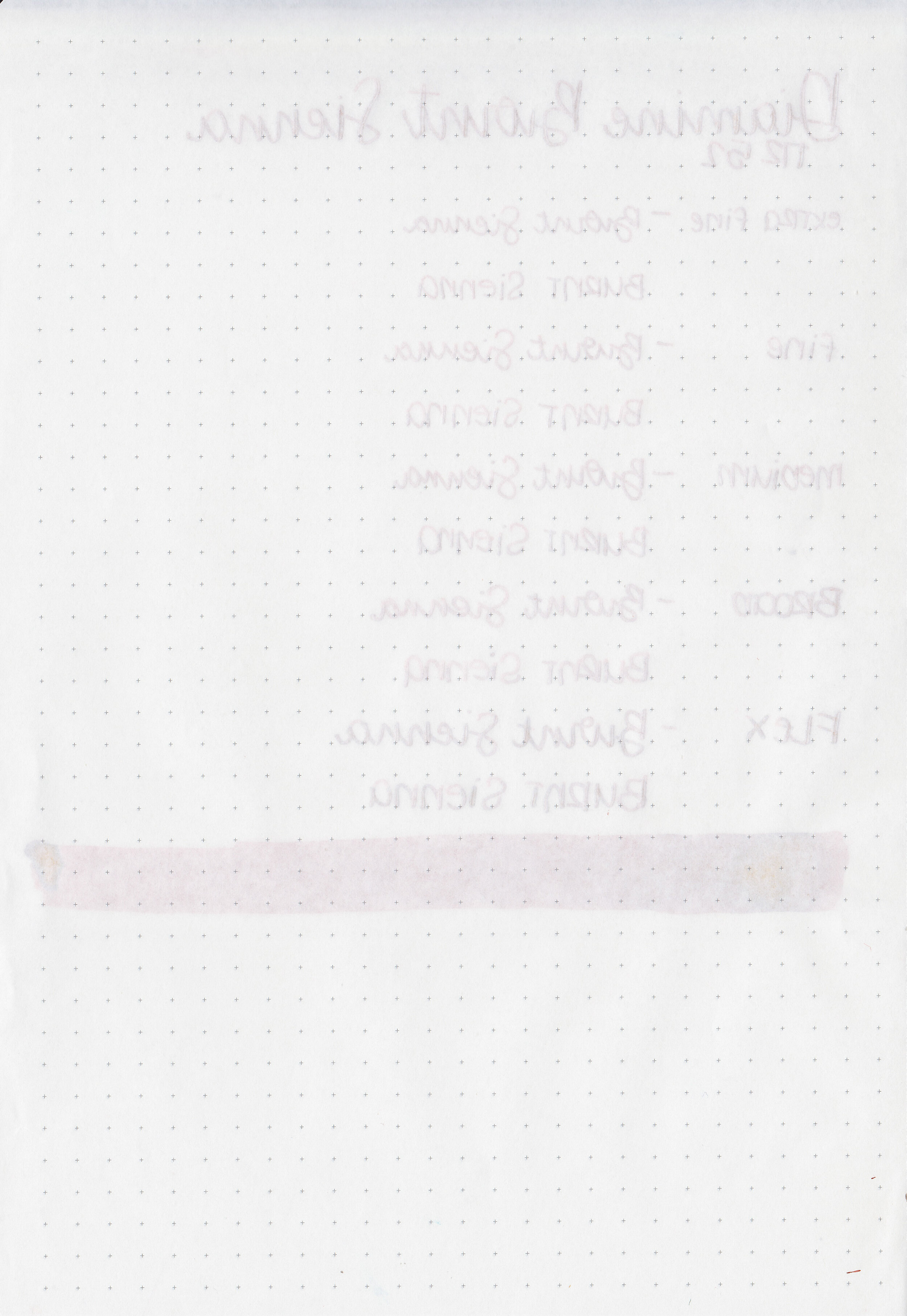
Feathering: None
Show through: Medium
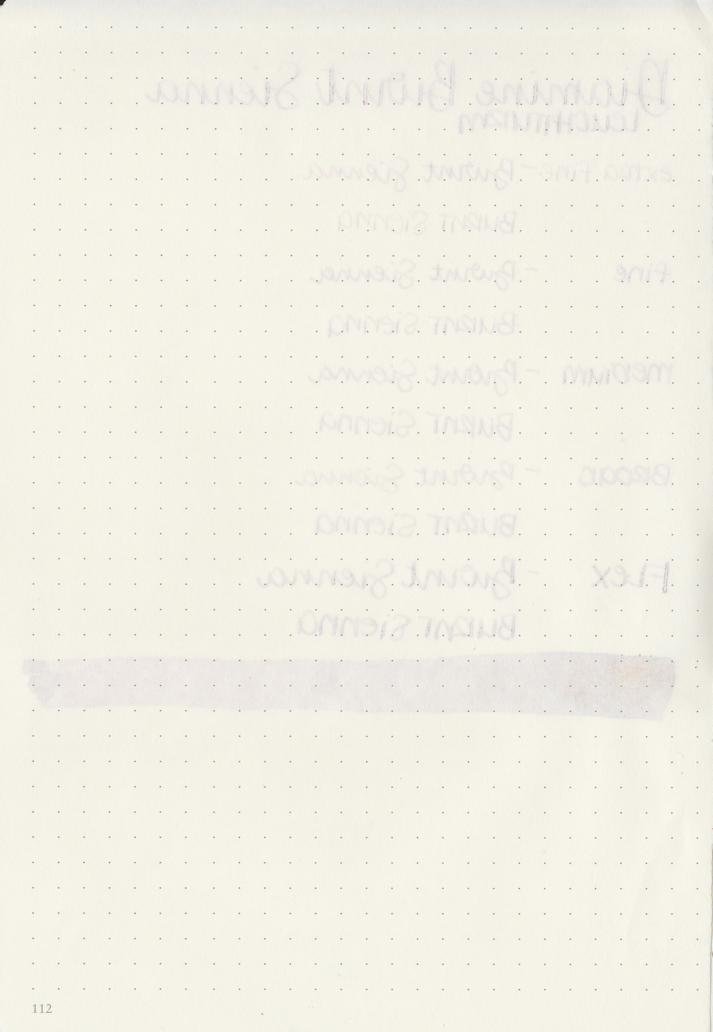
Bleeding: None
Other properties: medium shading, tiny black sheen, and no shimmer. The sheen was only visible in large swabs on Tomoe River Paper.
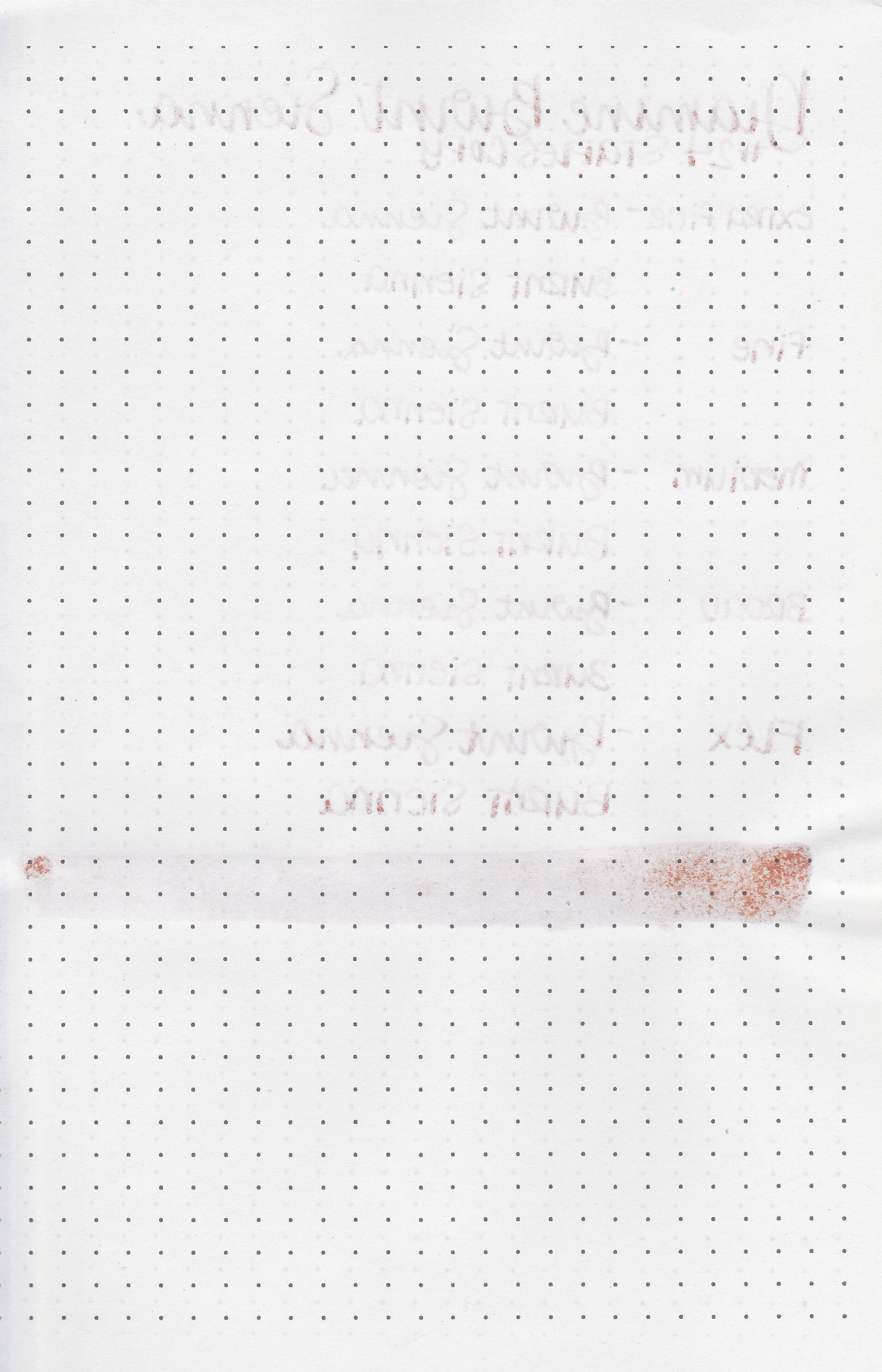
On Staples 24 lb copy paper there was some feathering in most nib sizes and just a few dots of bleeding.

Burnt Sienna is similar to Diamine Cherry Sunburst but much lighter. Click here to see the Diamine inks together, and click here to see the brown inks together.

I used a Lamy Studio Terracotta with a medium nib on a Yoseka A5 notebook. The ink had an average flow.
Overall, it’s a well behaved ink but the color doesn’t wow me. I think I would use this ink the most in the autumn season.
Disclaimer: I purchased this ink myself, and all photos and opinions are my own. This page does not contain affiliate links and this post is not sponsored in any way.

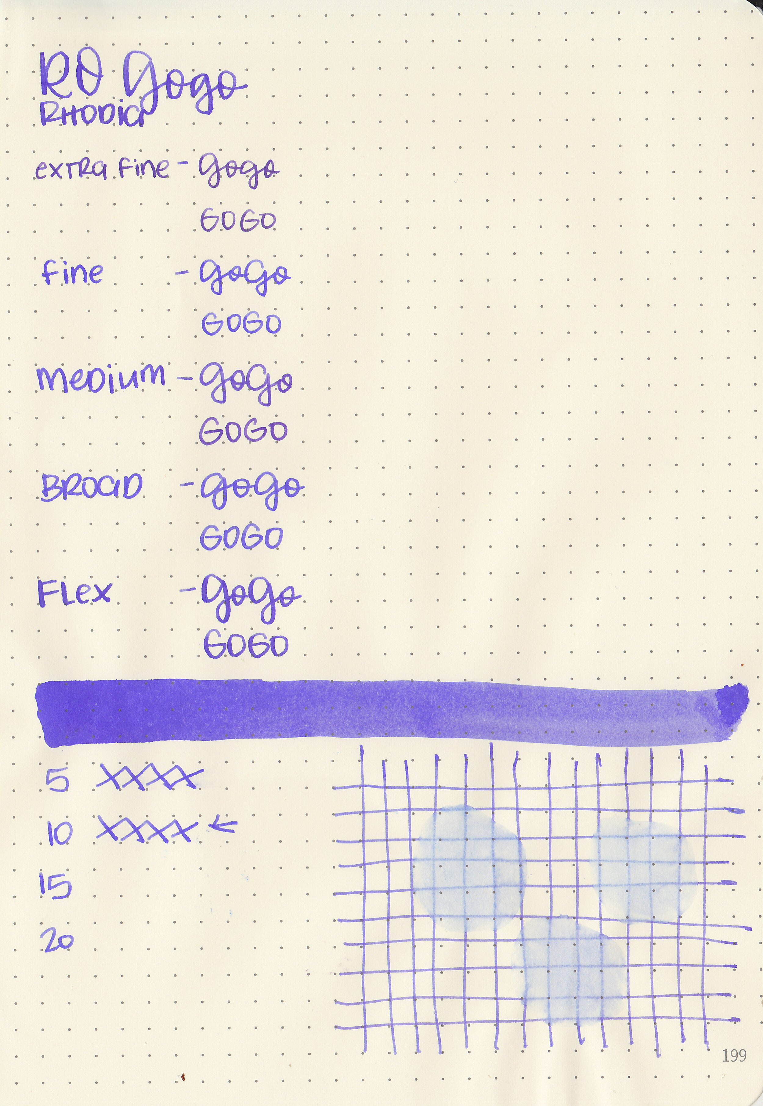
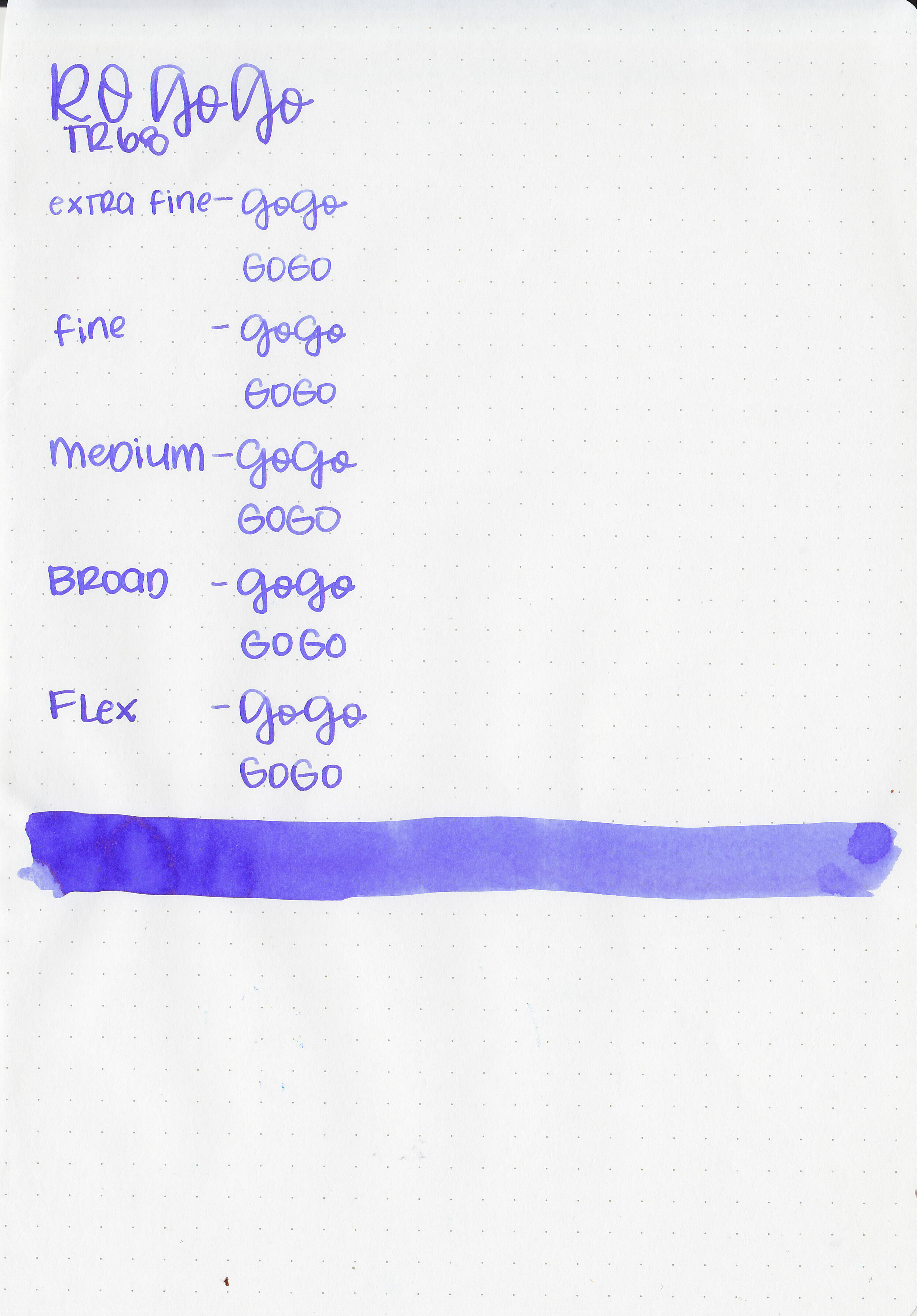
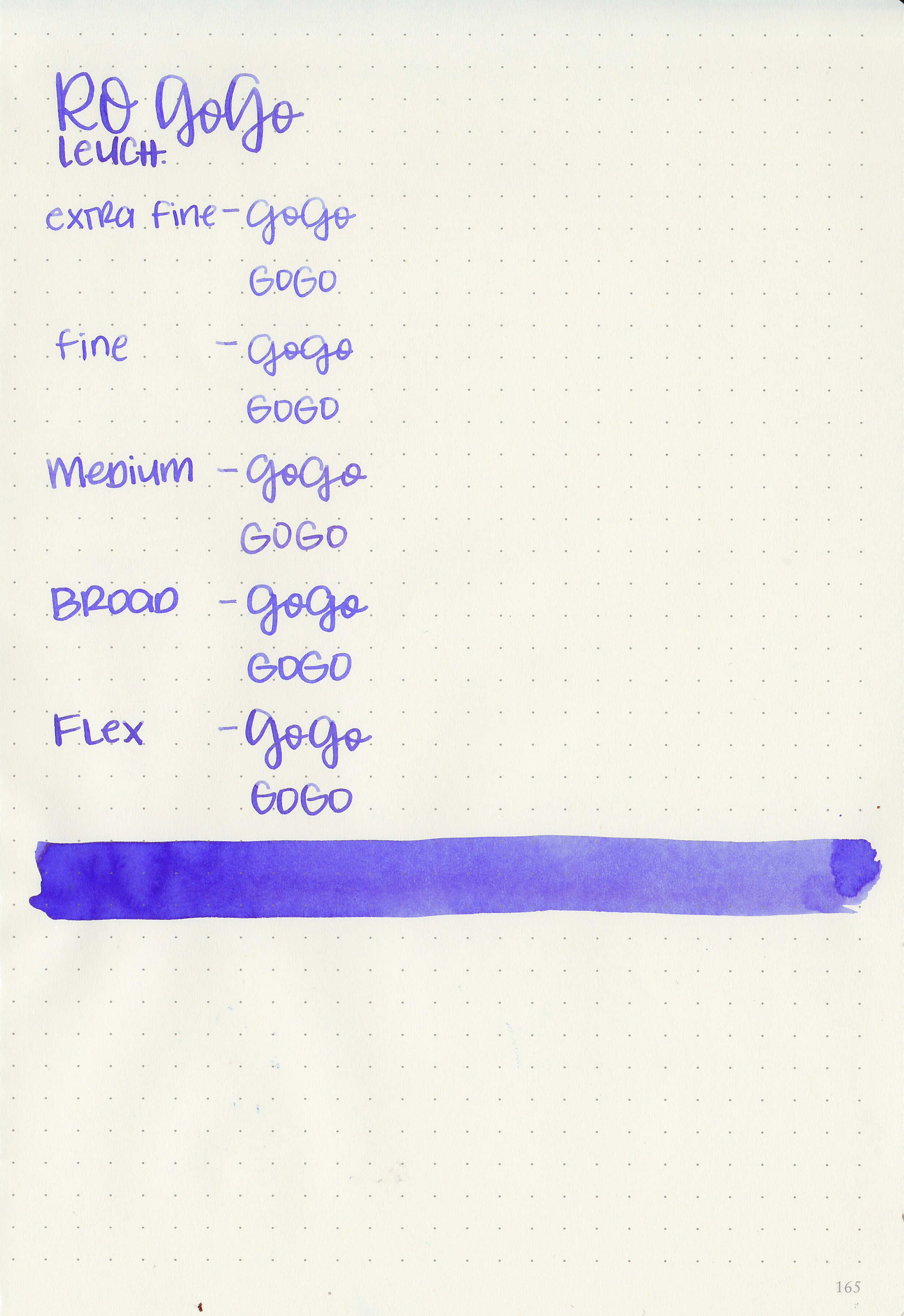
It seems I’m still stuck on purple inks lately-let’s take a look at Robert Oster Go Go. I purchased my sample of ink from Pen Chalet.

The color:
Go Go is a cool tone medium purple. It’s much warmer toned when wet and cools in tone as it dries.

In large swabs on Tomoe River paper the ink has a little bit of gold sheen.

Let's take a look at how the ink behaves on fountain pen friendly papers: Rhodia, Tomoe River, and Leuchtturm.
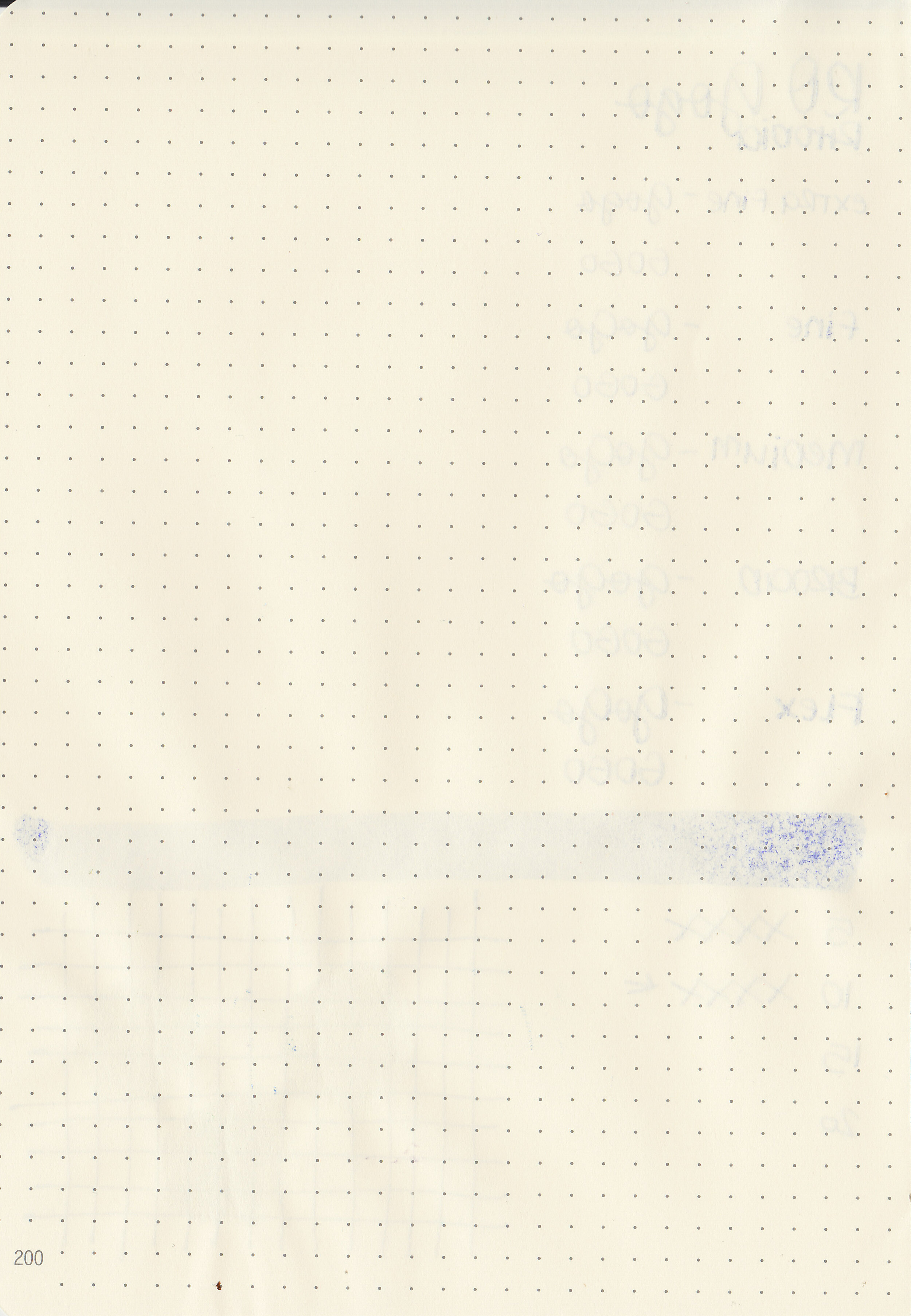
Dry time: 10 seconds
Water resistance: Medium
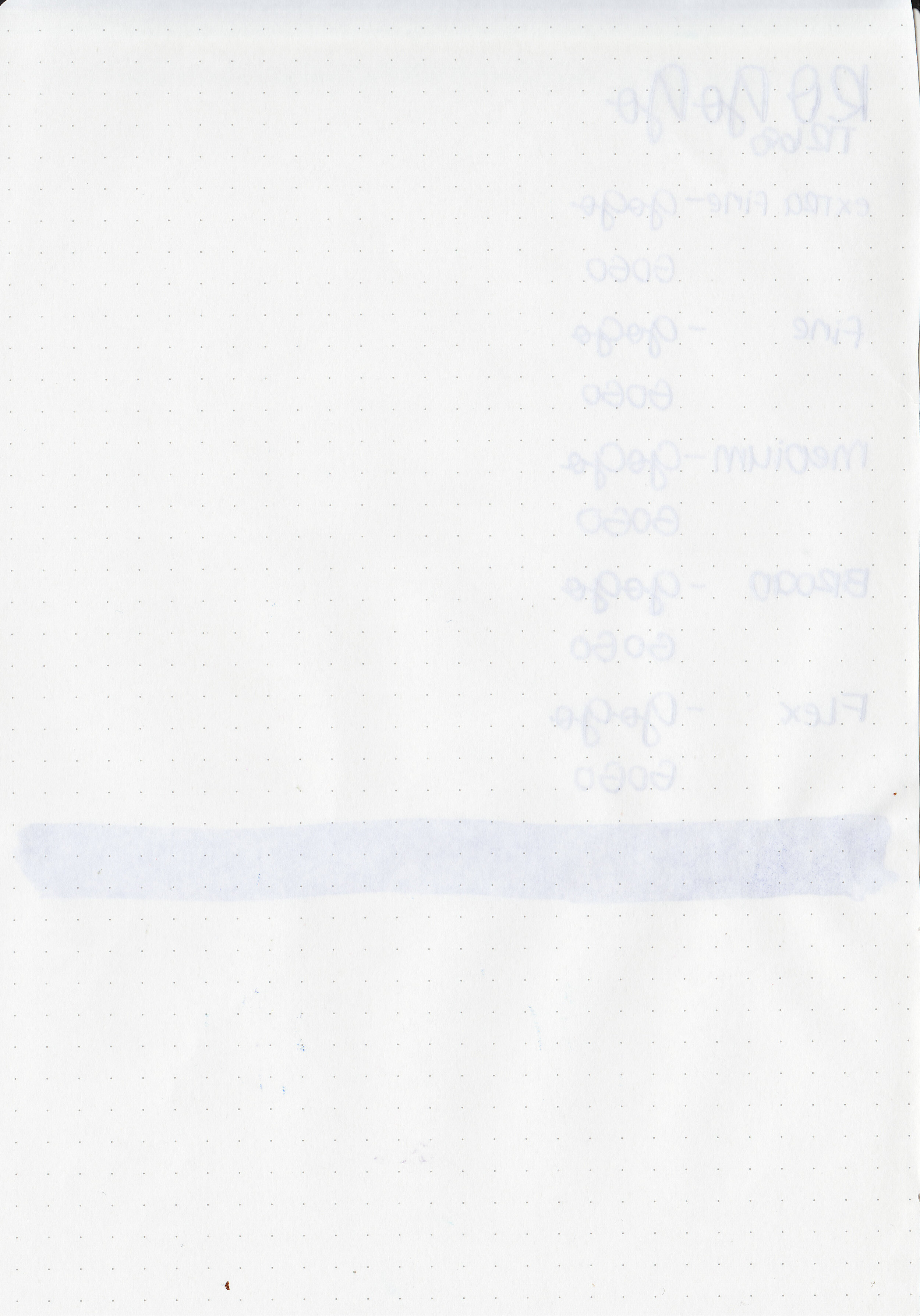
Feathering: Low-there was some feathering in the flex nib on Rhodia.
Show through: Medium
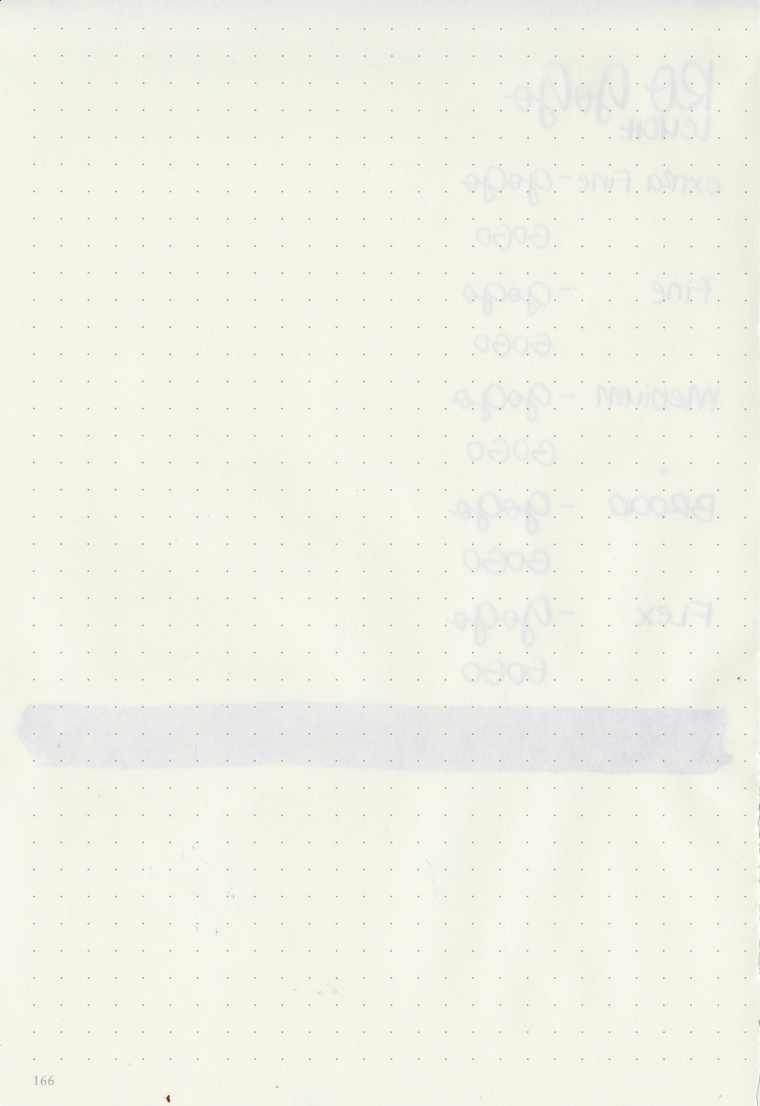
Bleeding: None
Other properties: low shading, tiny gold sheen, and no shimmer. The sheen was only visible in large swabs on Tomoe River Paper.
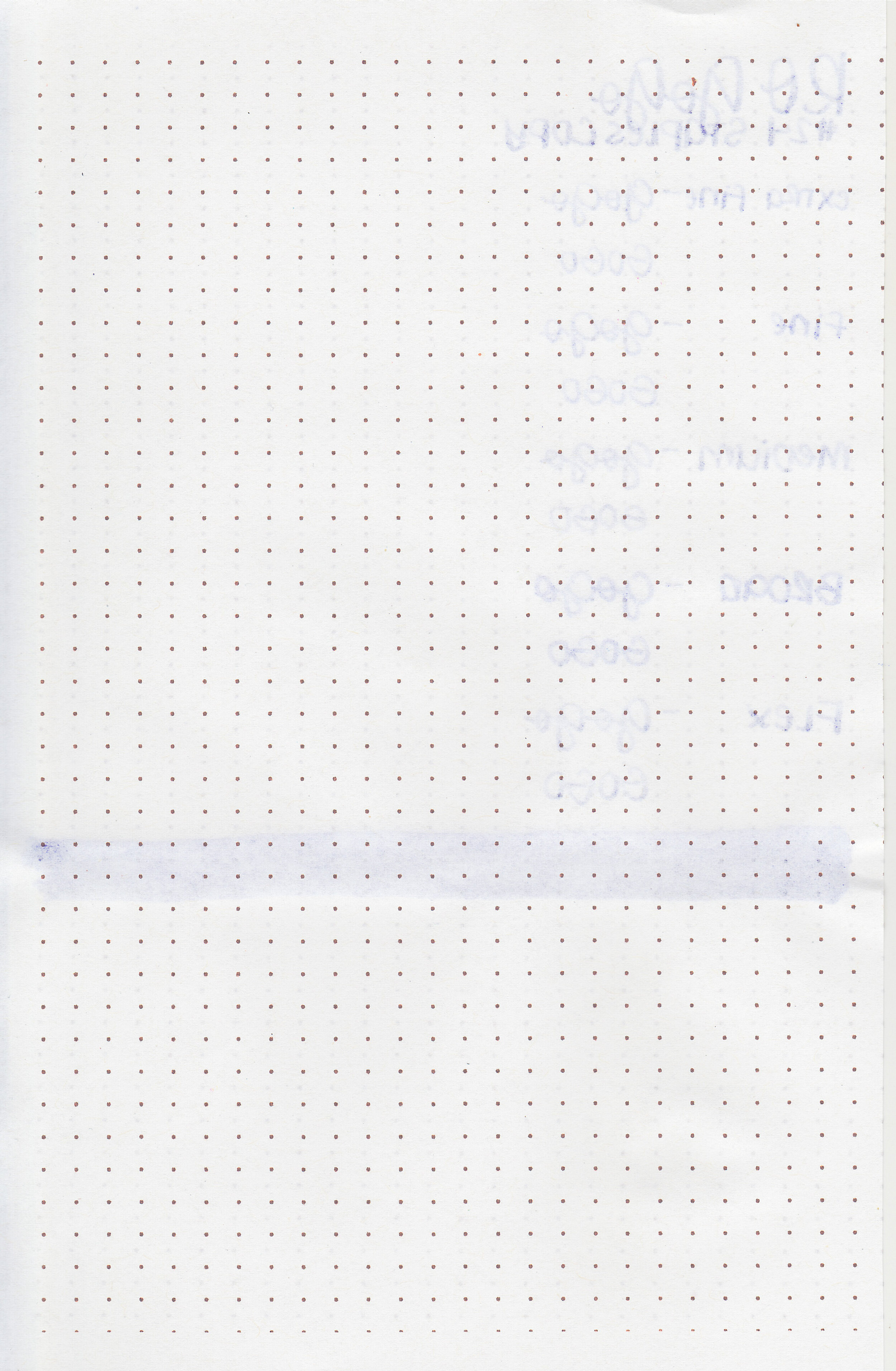
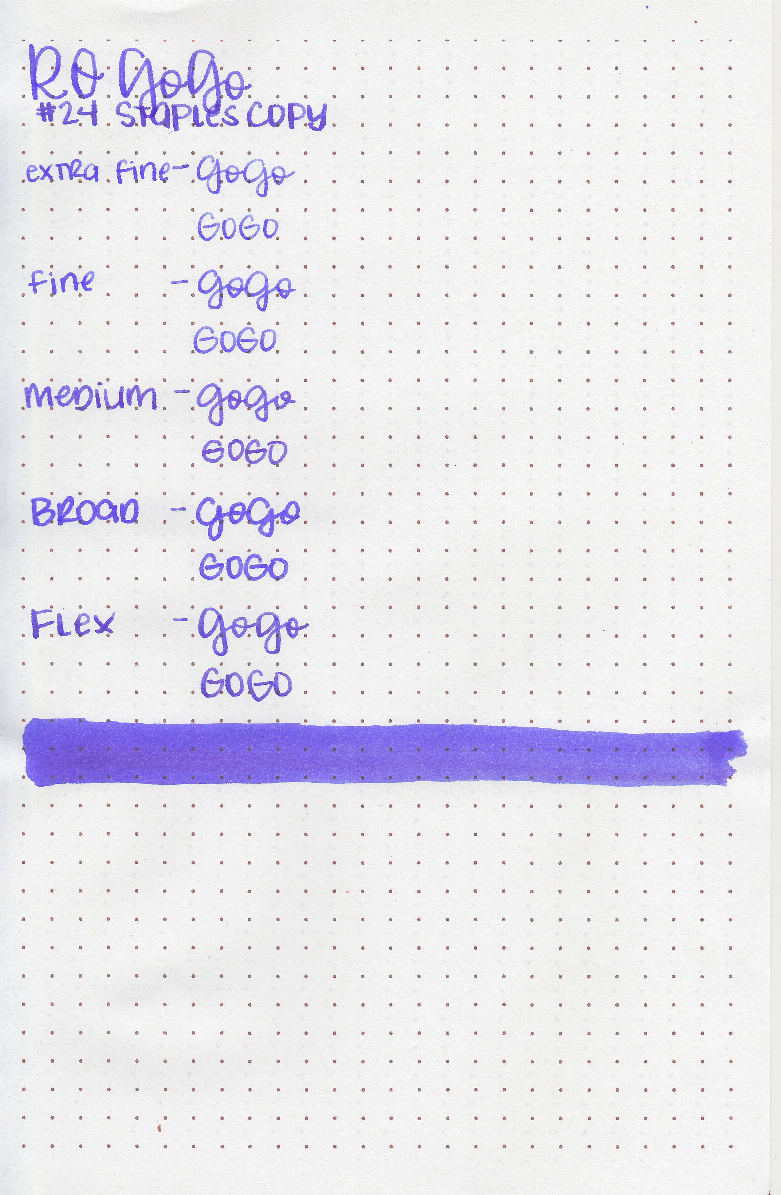
On Staples 24 lb copy paper there was some feathering in most nib sizes and just a few dots of bleeding.

Go Go is a little bit cooler in tone than Pilot Iroshizuku Jurojin. Click here to see the Robert Oster inks together, and click here to see the purple inks together.

I used a Pelikan M600 Violet with a fine nib on a Taroko Enigma A5 notebook. The ink had an average flow.
Overall, I was surprised by how much the tone of this ink cools as it dries. It dries quickly, is a beautiful color and has some shading too.
Disclaimer: I purchased this ink myself, and all photos and opinions are my own. This page does contain affiliate links but this post is not sponsored in any way.

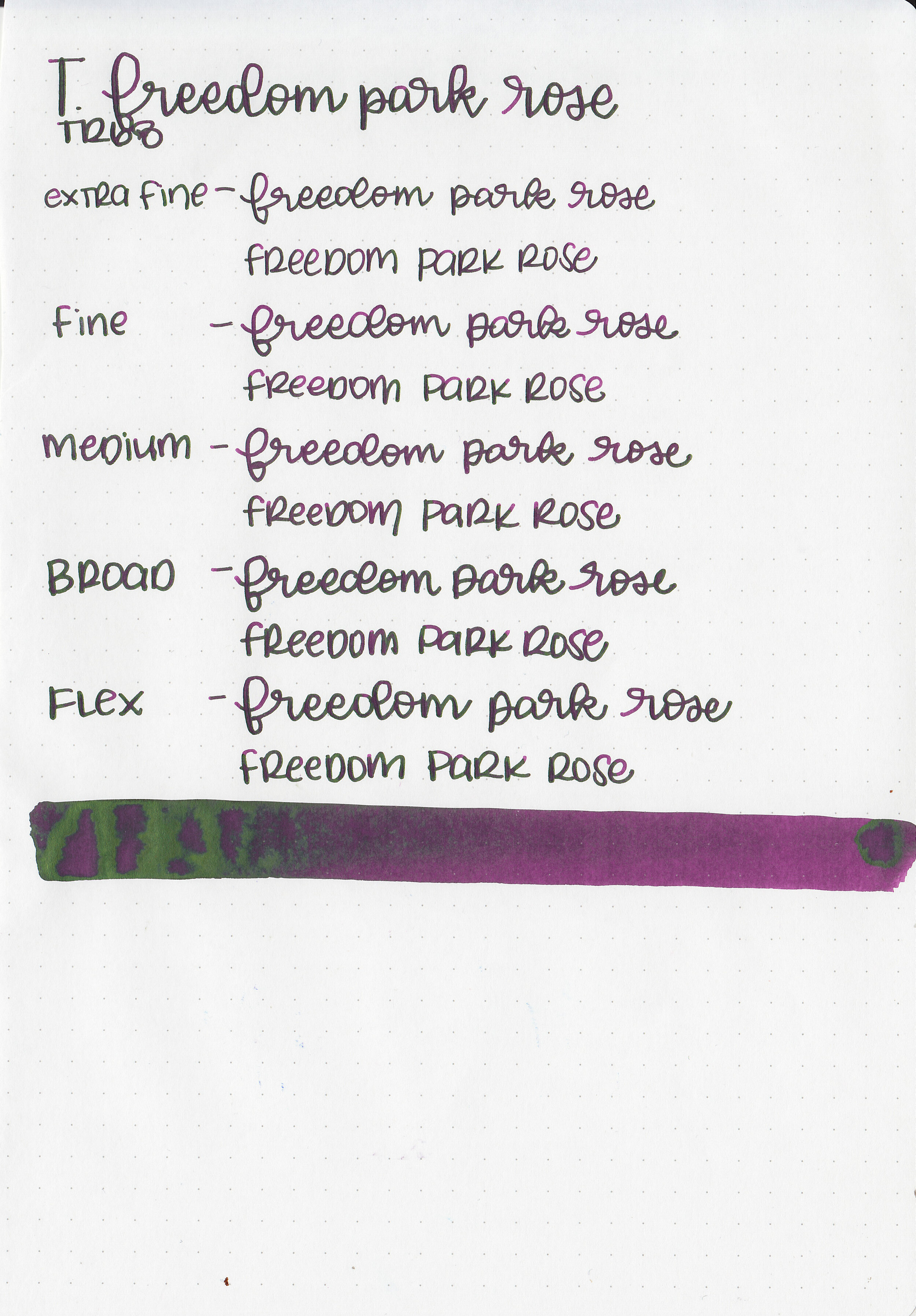
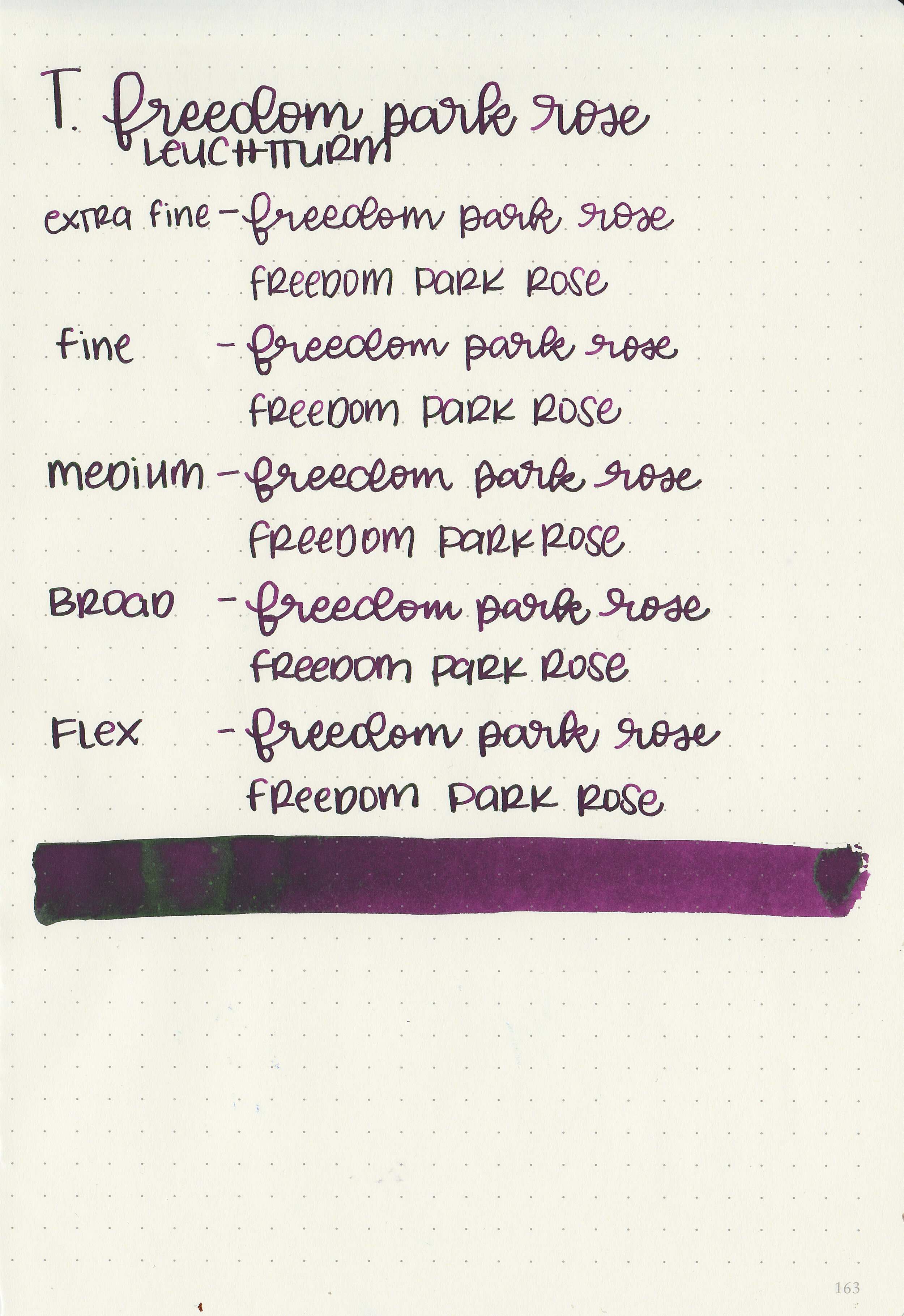
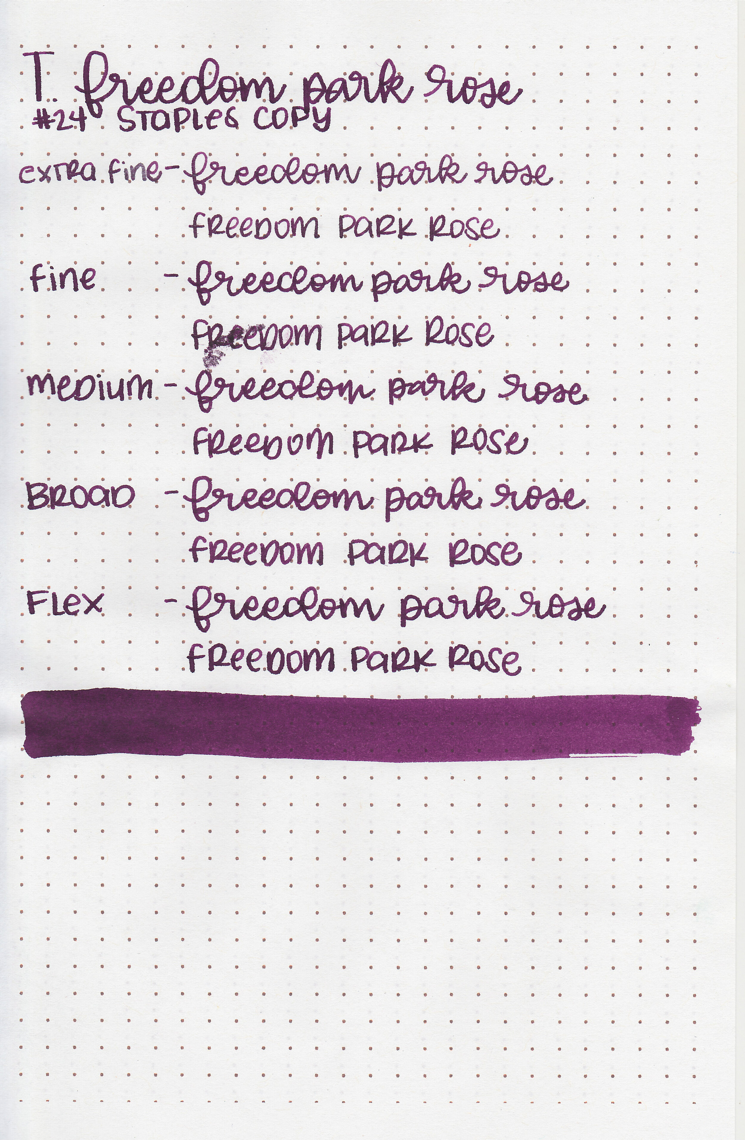
Today’s ink is Troublemaker Freedom Park Rose. Thanks to Shigure Inks for sending a sample over for review!
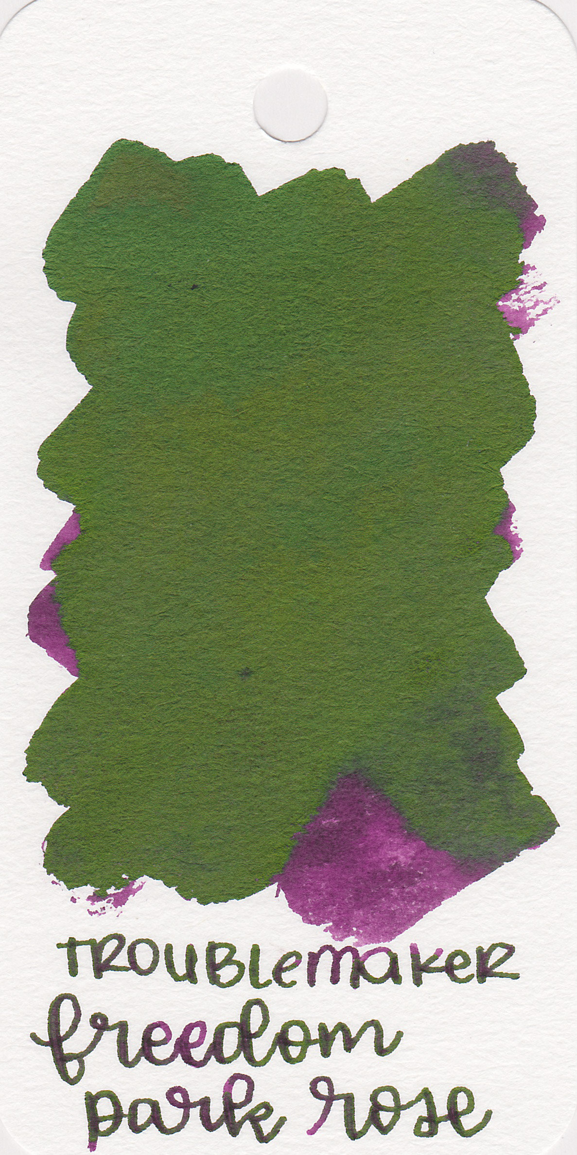
The color:
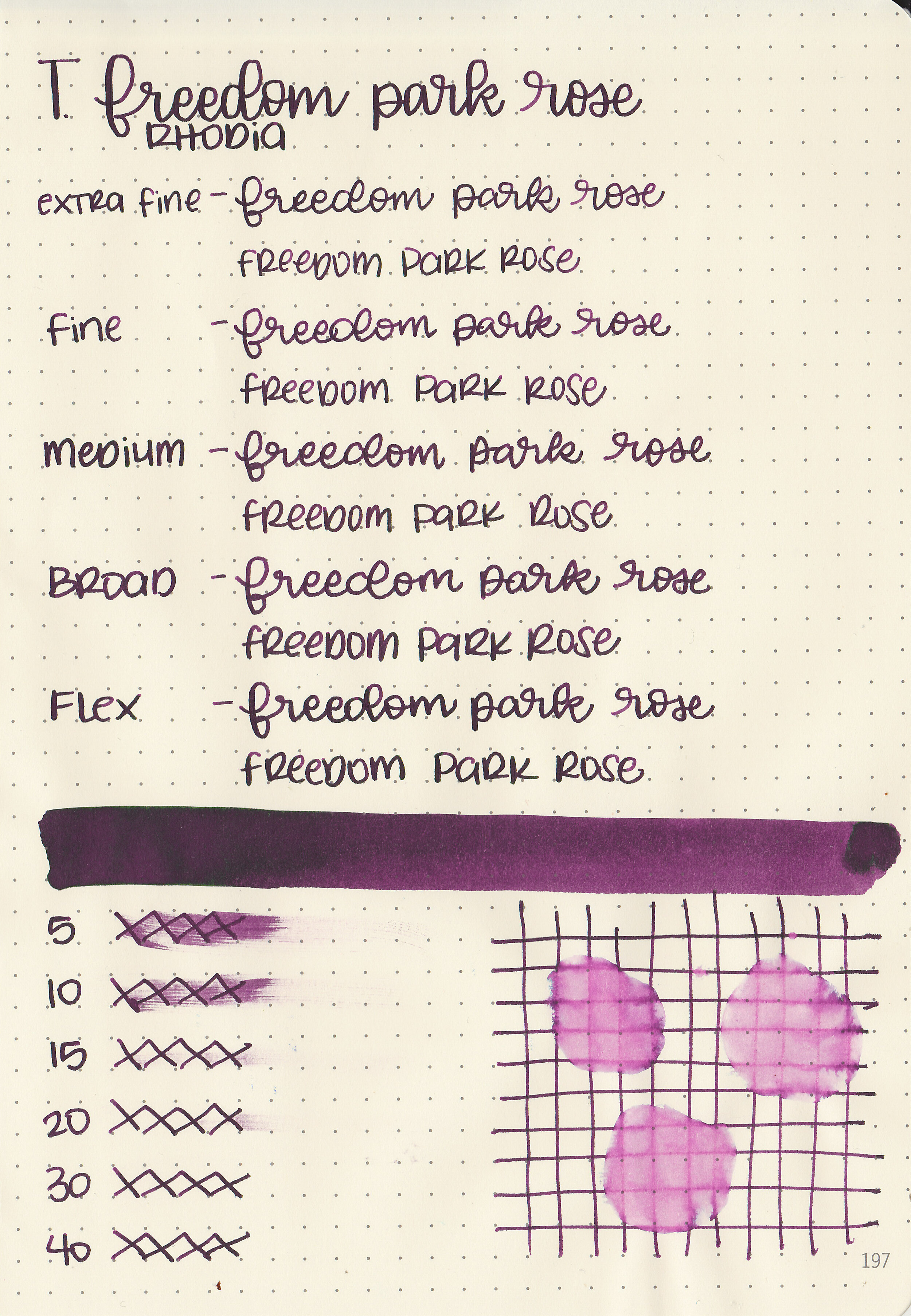
Freedom Park Rose is a dusky dark purple with lots of green sheen.

In large swabs on Tomoe River paper the ink has a lot of sheen.

Let's take a look at how the ink behaves on fountain pen friendly papers: Rhodia, Tomoe River, and Leuchtturm.
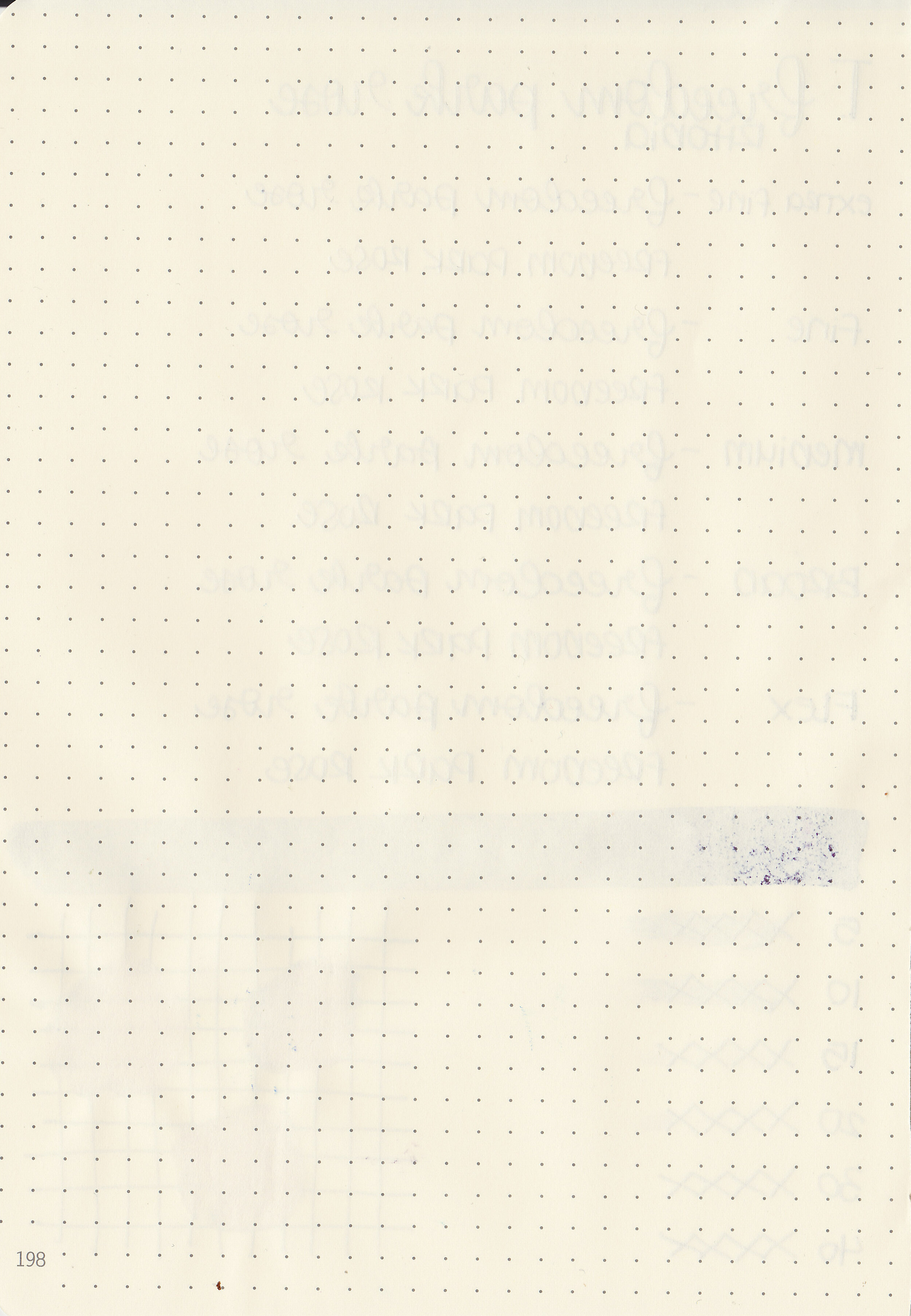
Dry time: 30 seconds
Water resistance: Low
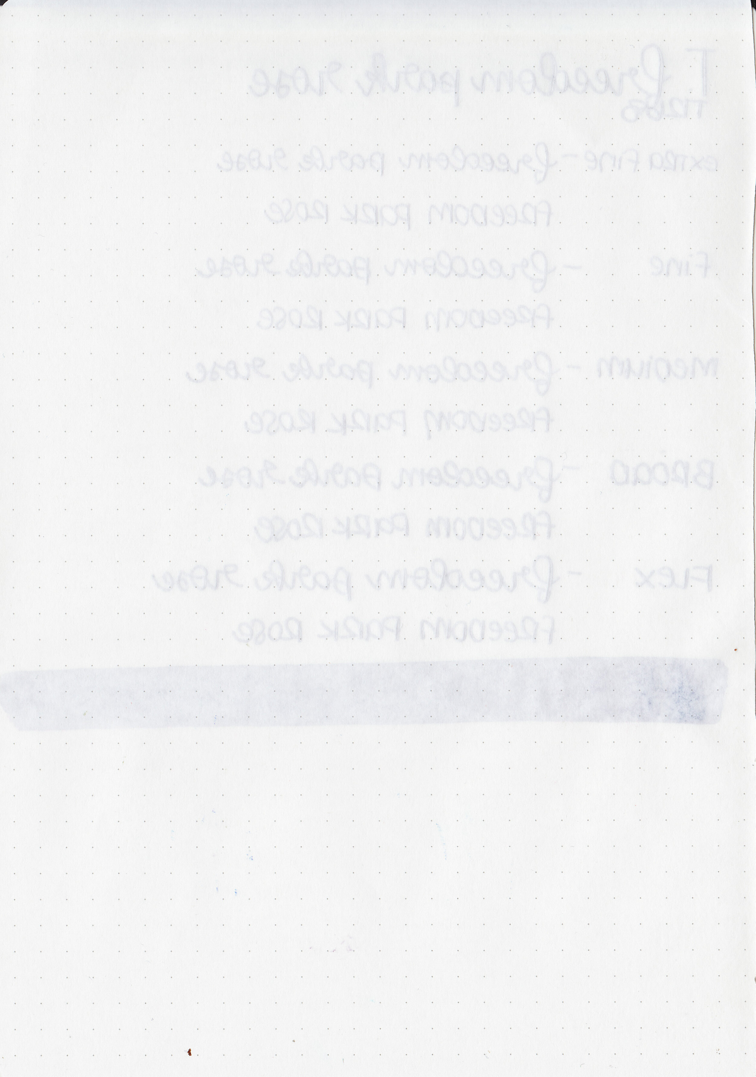
Feathering: None
Show through: Medium
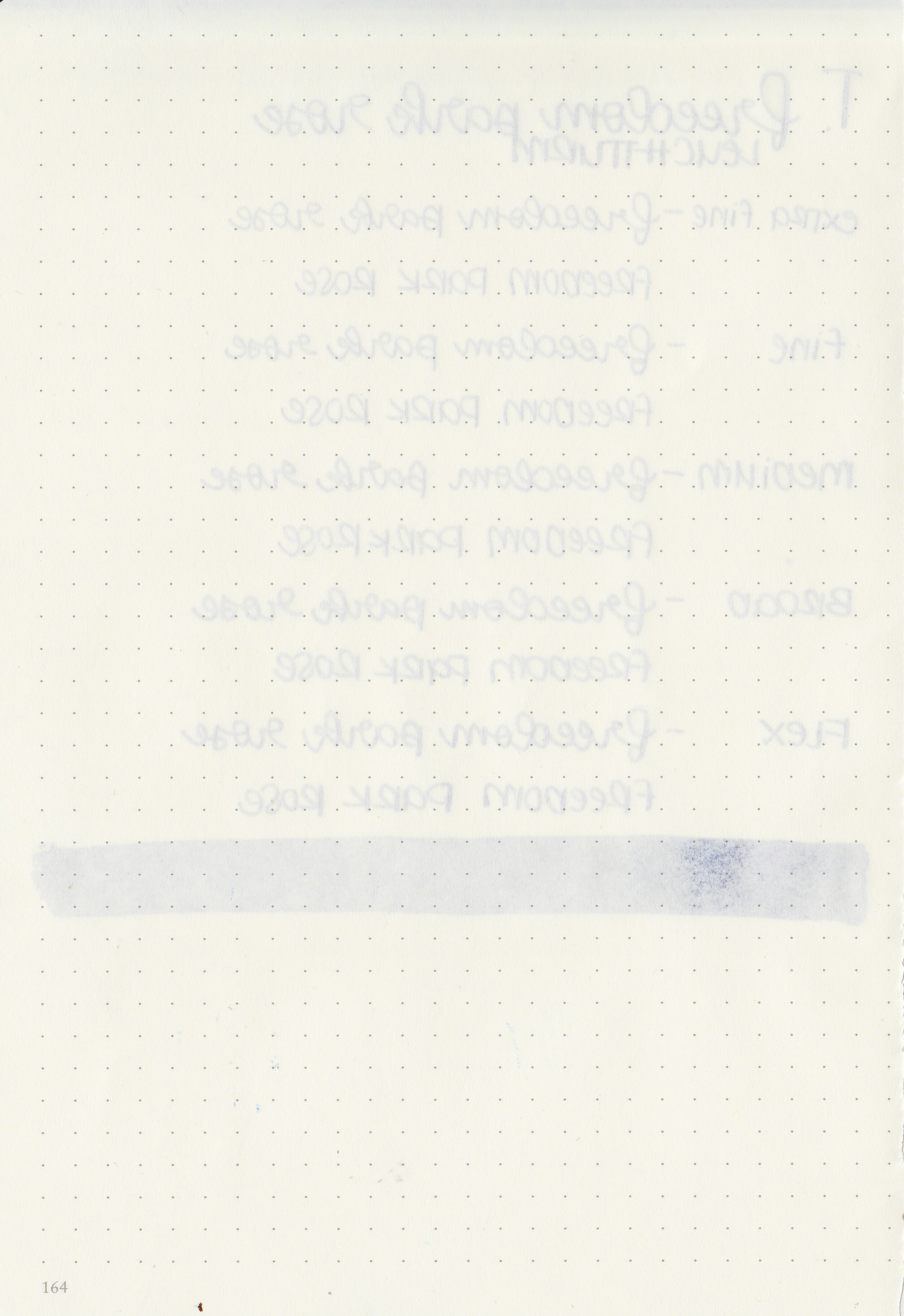
Bleeding: None
Other properties: low shading, high green sheen, and no shimmer.
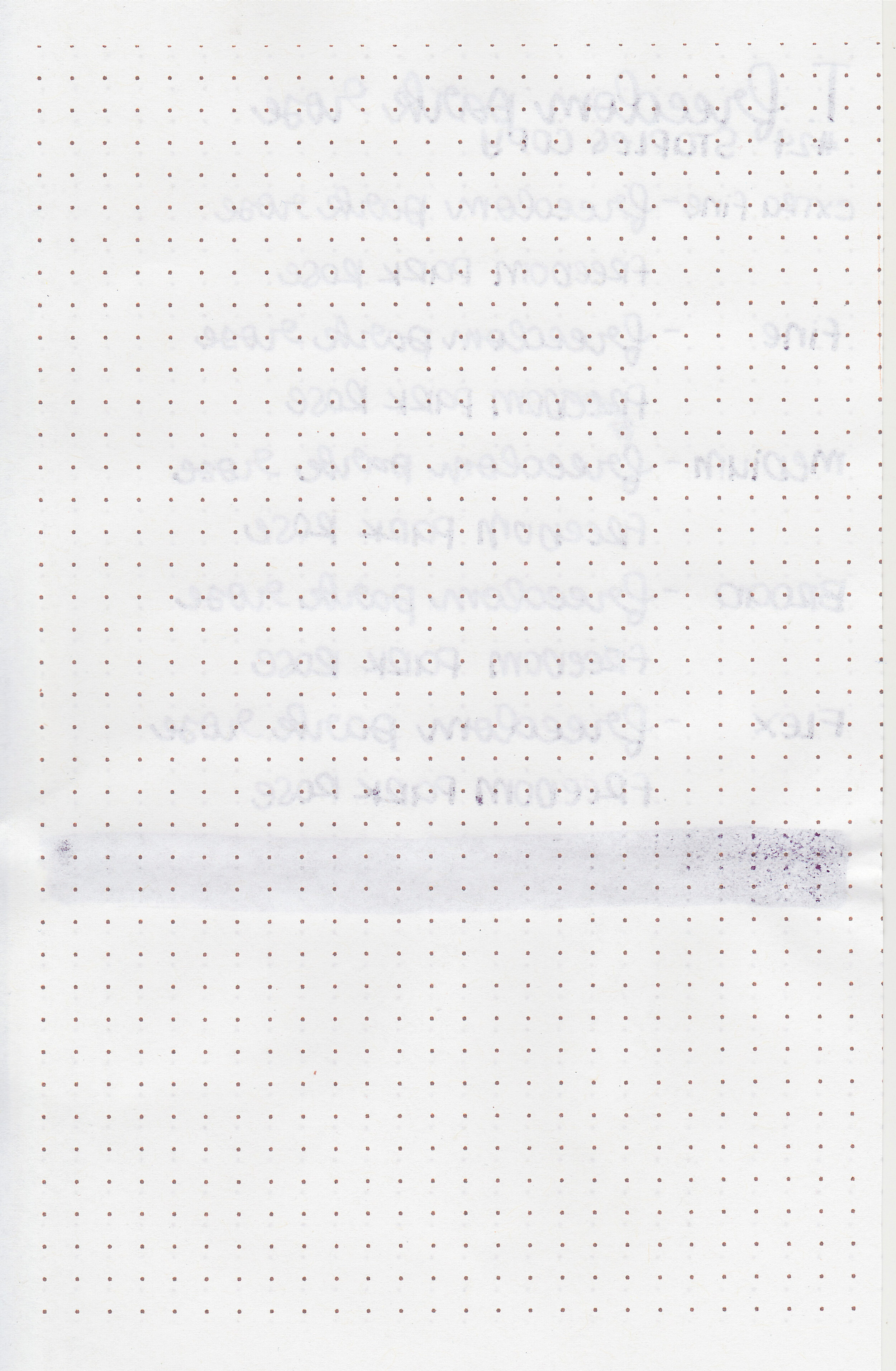
On Staples 24 lb copy paper there was some feathering in most nib sizes and just a few dots of bleeding.

Freedom Park Rose is a bit lighter than Sailor Ink Studio 653 and has more sheen. Click here to see the Troublemaker inks together, and click here to see the purple inks together.

I used a TWSBI Eco Transparent Purple with a medium nib on a Taroko Enigma A5 notebook. The ink had a wet, slightly sticky flow.
Overall, I love the dusky purple color and it’s pretty well behaved, but the flow does feel just a bit sticky. I didn’t have any smearing issues with this ink!
Disclaimer: A sample of this ink was provided by Shigure Inks for the purpose of this review. All photos and opinions are my own. This page does not contain affiliate links and this post is not sponsored in any way.

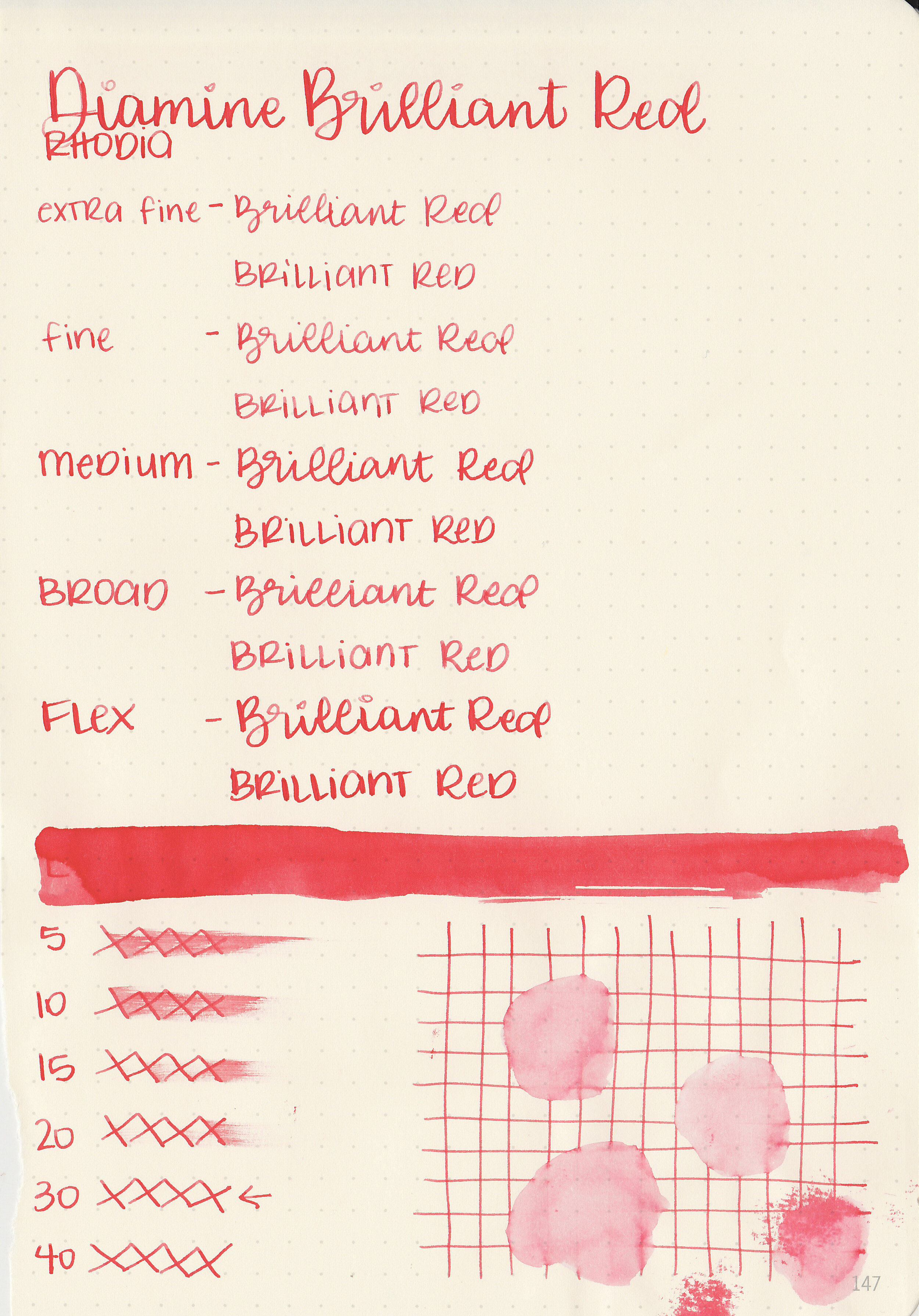
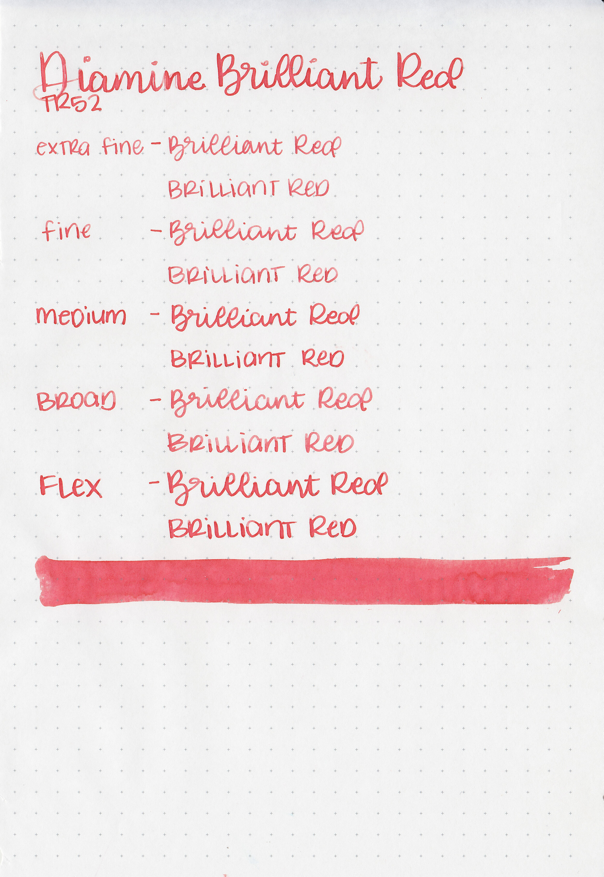
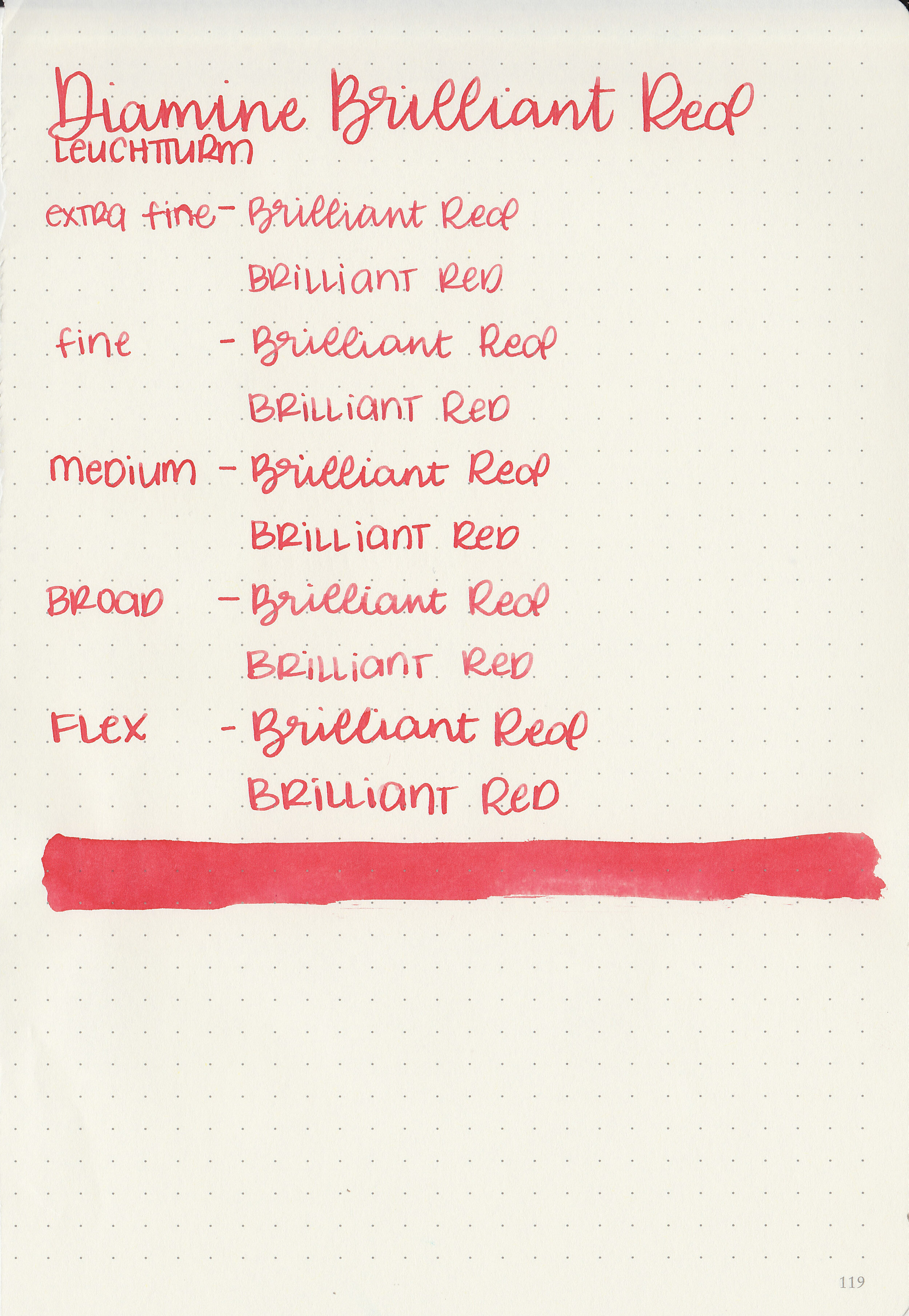
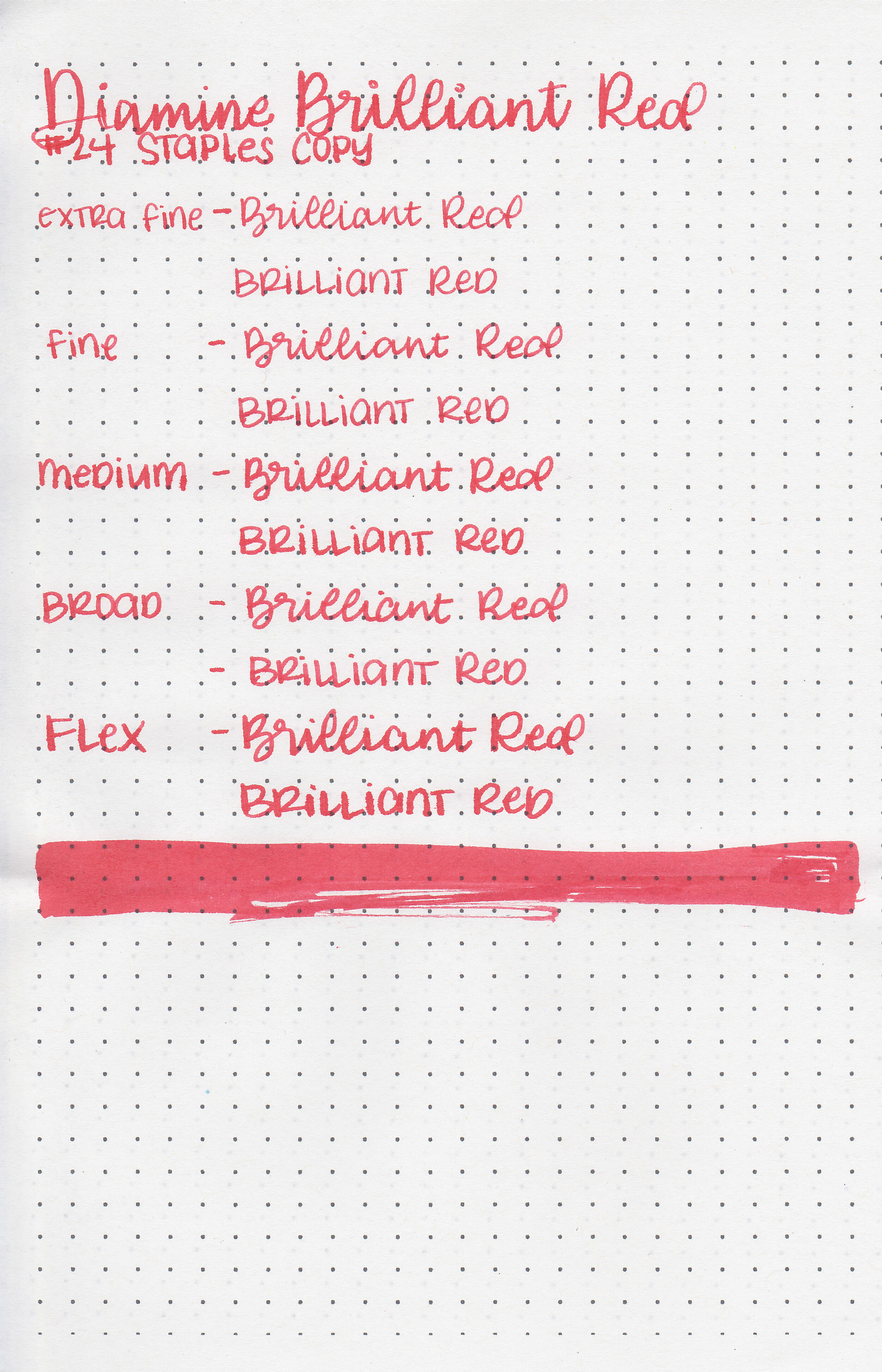
Let’s take a look at Diamine Brilliant Red today. I purchased my bottle of ink from Cult Pens.

The color:
Brilliant Red is a light but vibrant red.

In large swabs on Tomoe River paper the ink has a little bit of shading.

Let's take a look at how the ink behaves on fountain pen friendly papers: Rhodia, Tomoe River, and Leuchtturm.
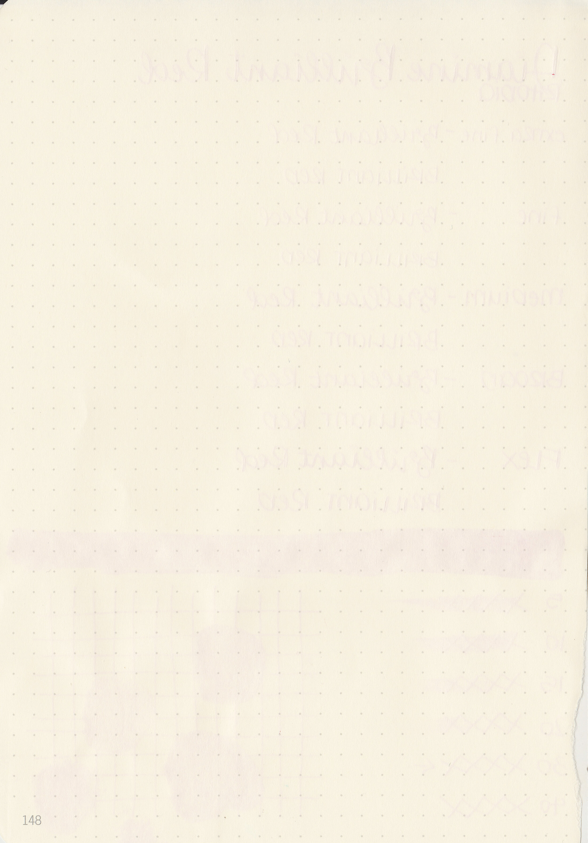
Dry time: 30 seconds
Water resistance: Low
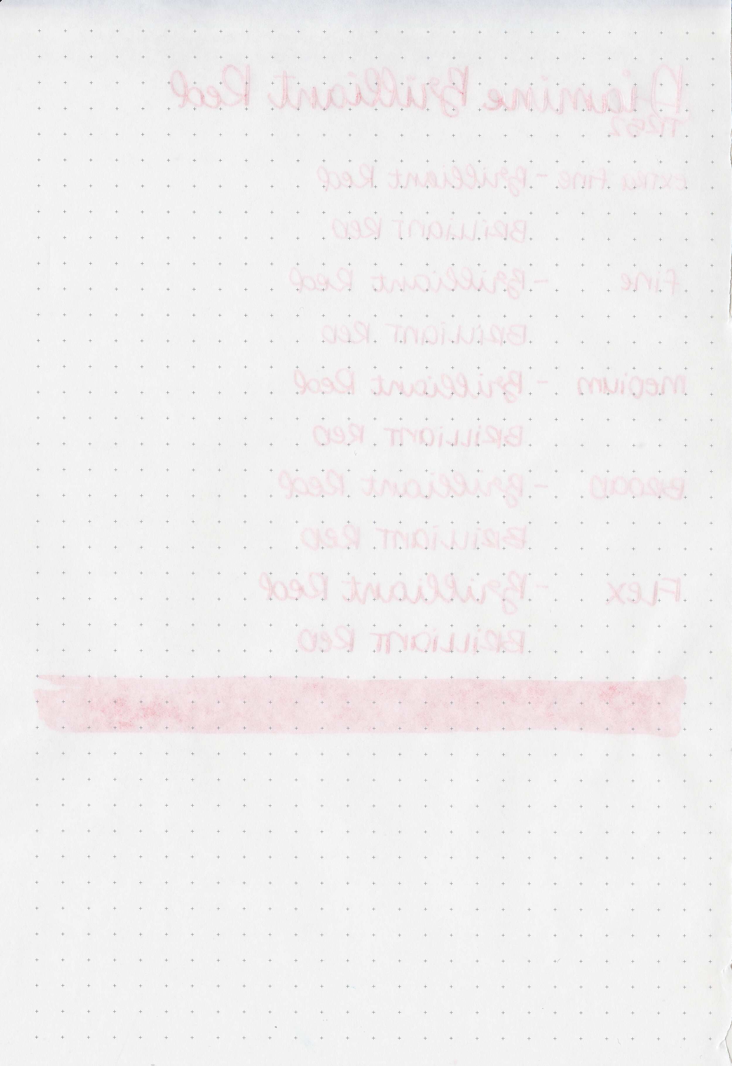
Feathering: None
Show through: Medium
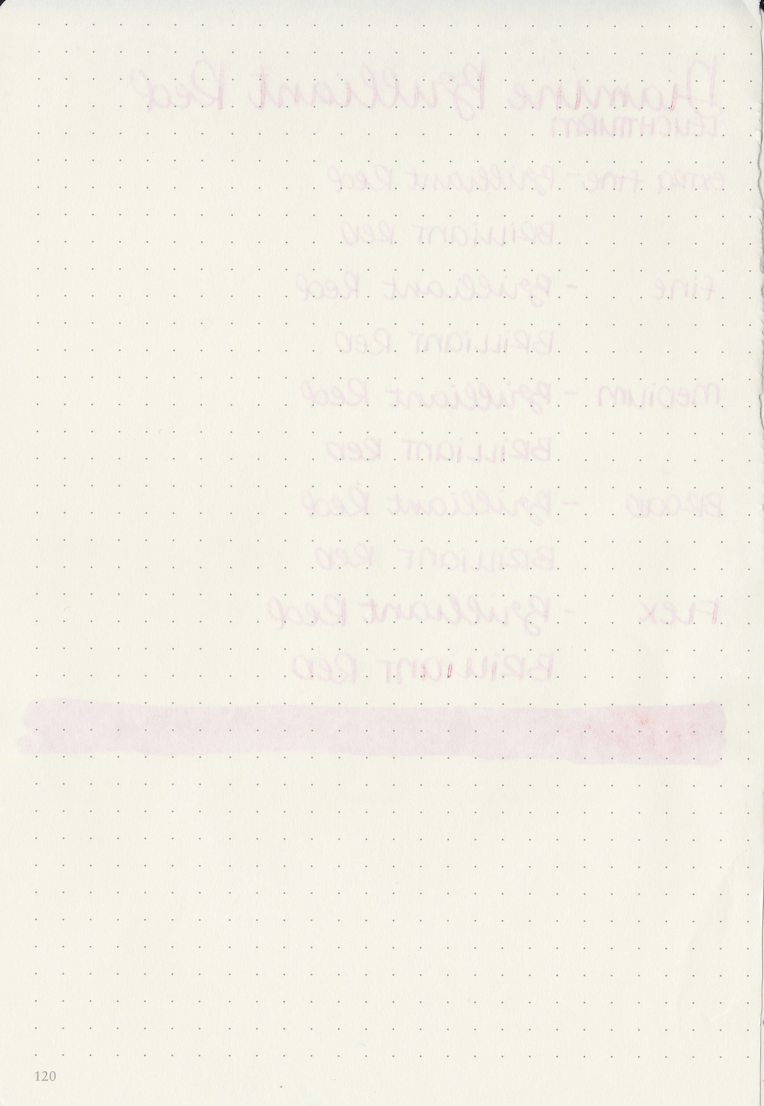
Bleeding: None
Other properties: medium shading, no sheen, and no shimmer.
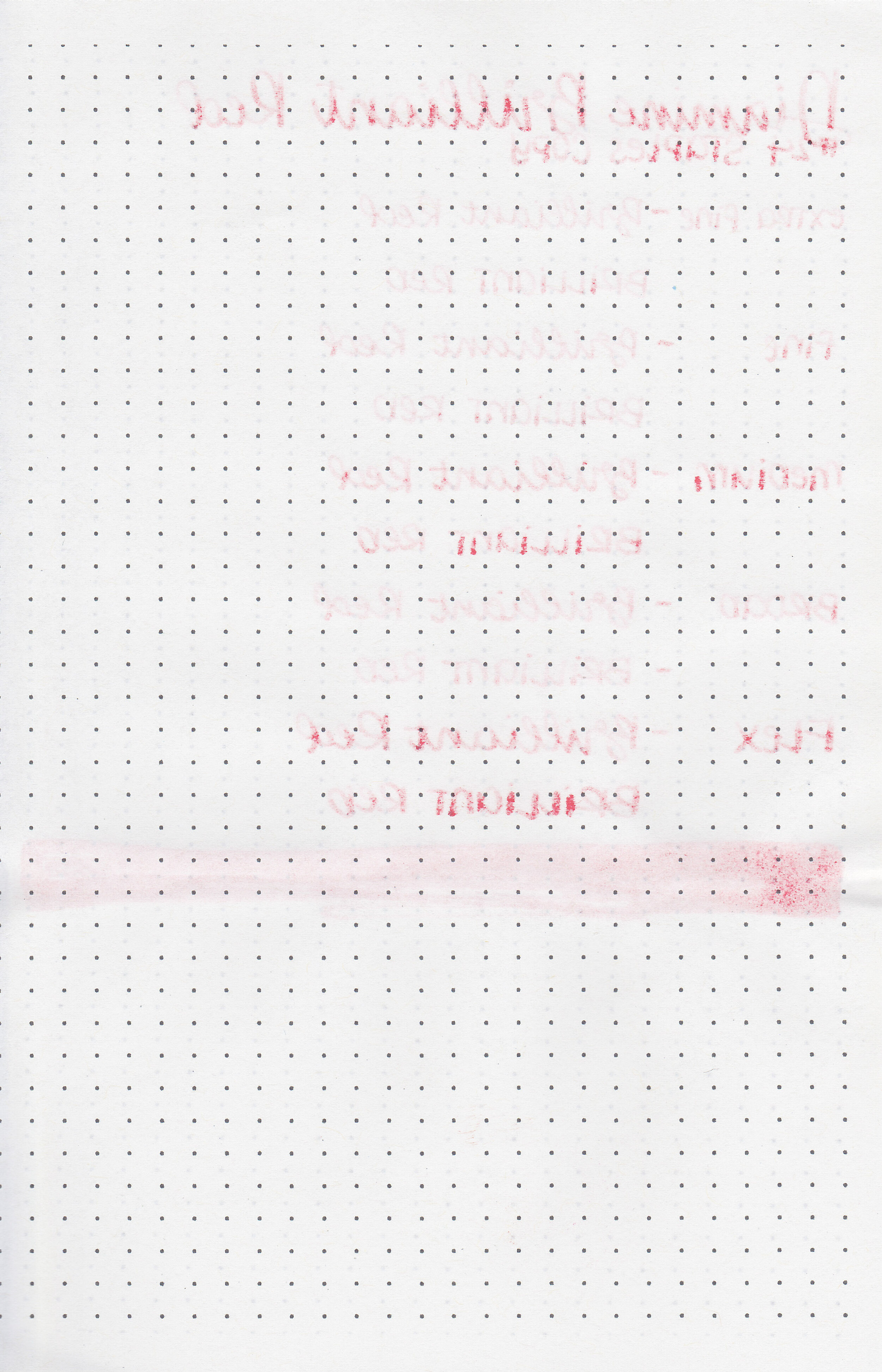
On Staples 24 lb copy paper there was some feathering in most nib sizes and some bleeding.

Brilliant Red is a bit lighter than Diamine Poppy Red. Click here to see the Diamine inks together, and click here to see the red inks together.

I used a Pelikan M205 Star Ruby with a fine nib on a Yoseka A5 notebook. The ink had an average flow.
Overall, this ink is well behaved but I’m not in love with the color. It’s just a bit too light for me.
Disclaimer: I purchased this ink myself, and all photos and opinions are my own. This page does not contain affiliate links and this post is not sponsored in any way.

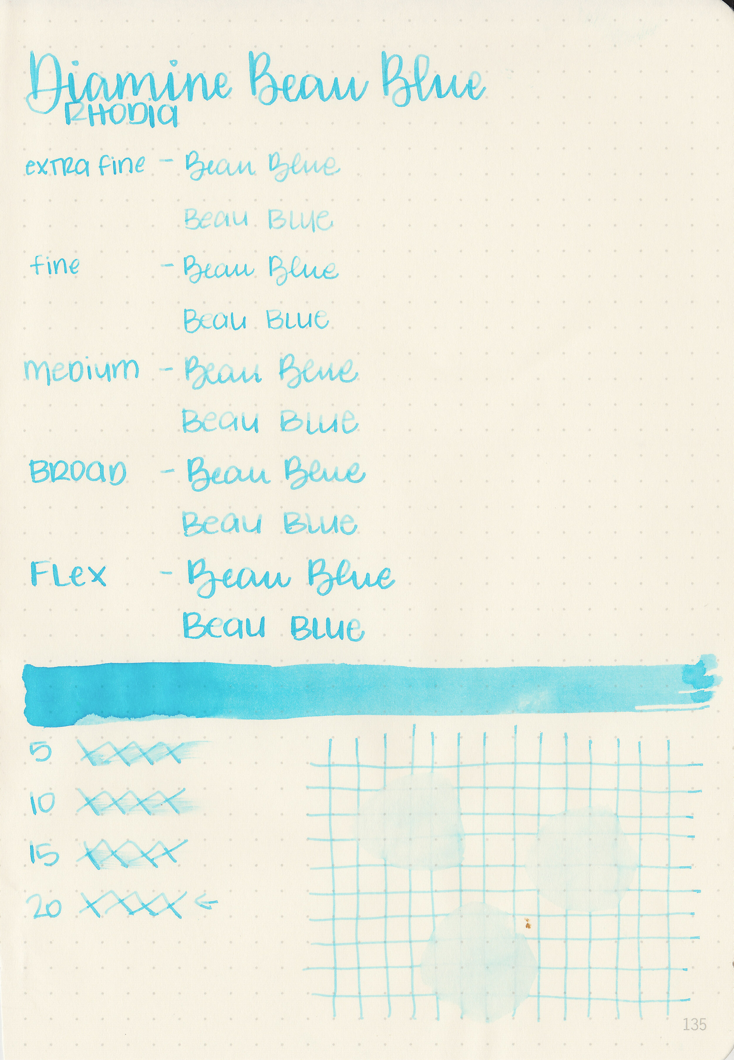
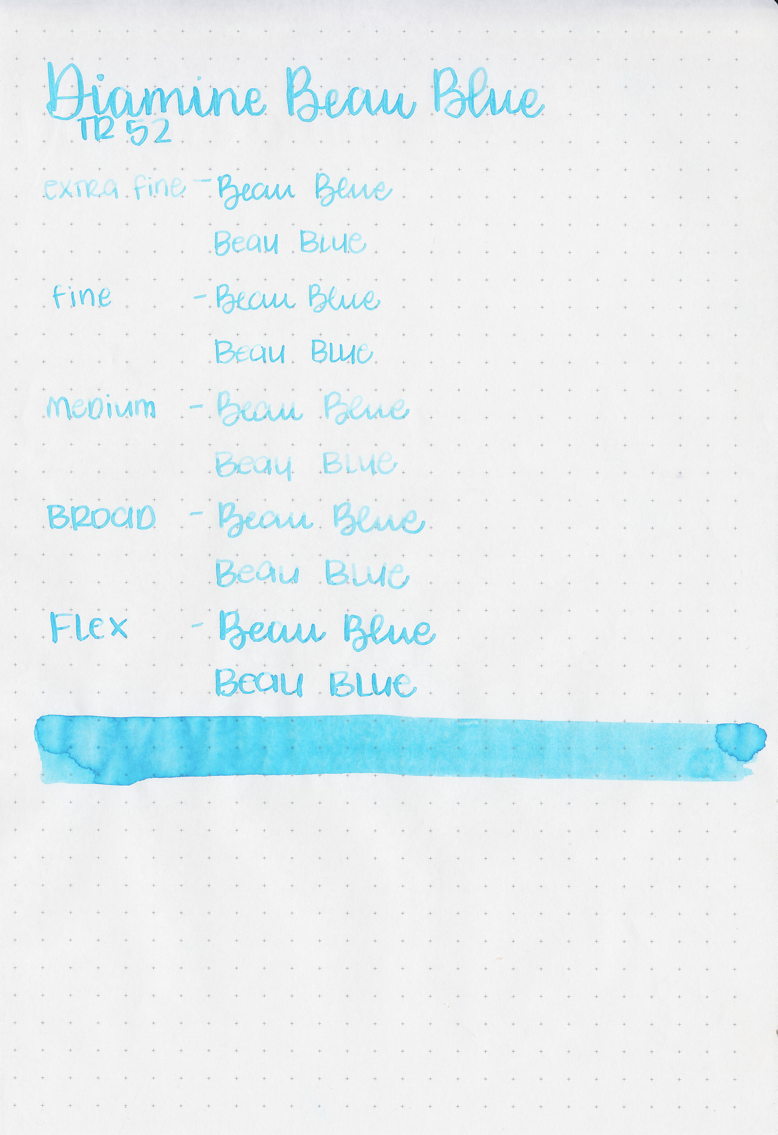
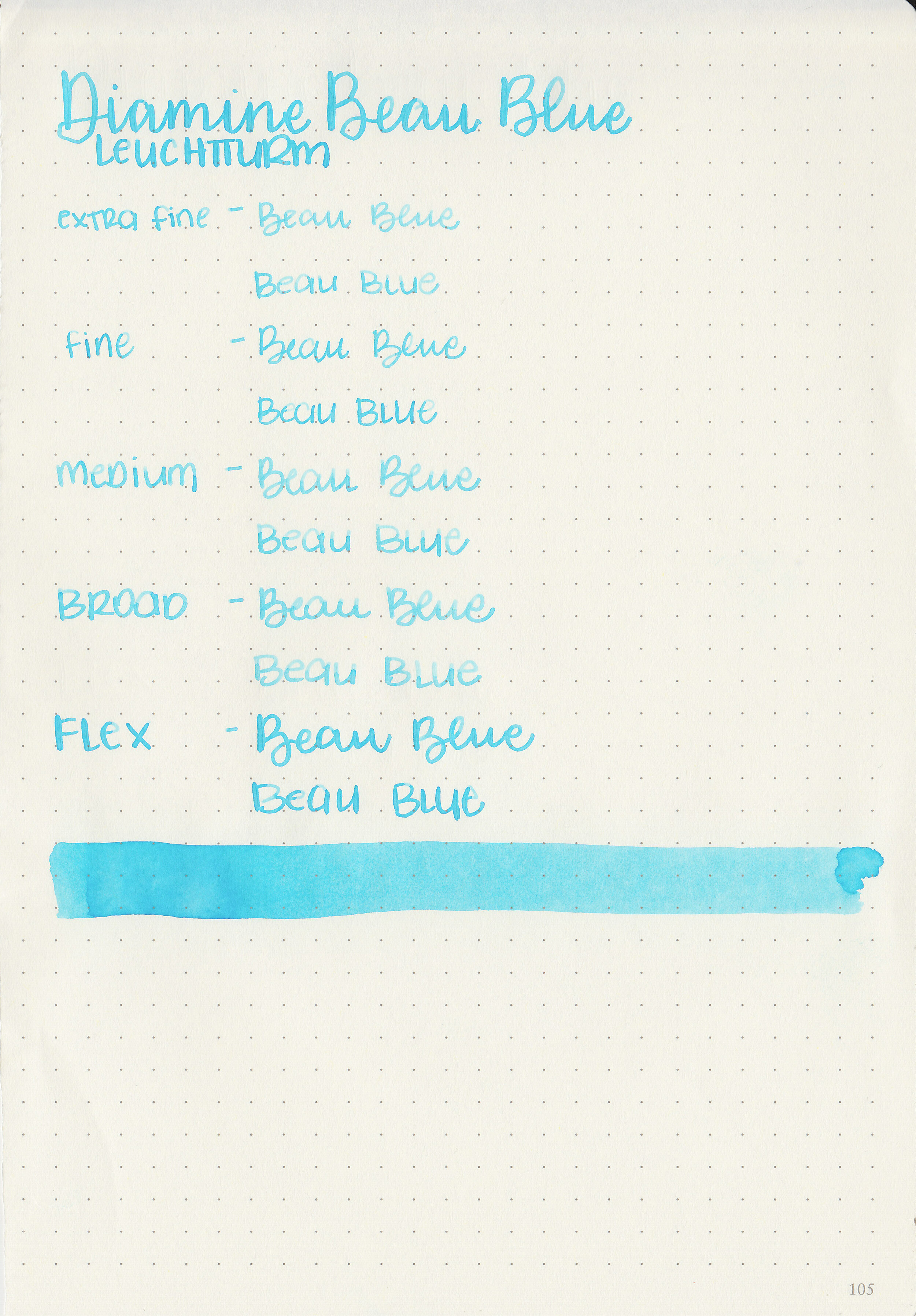
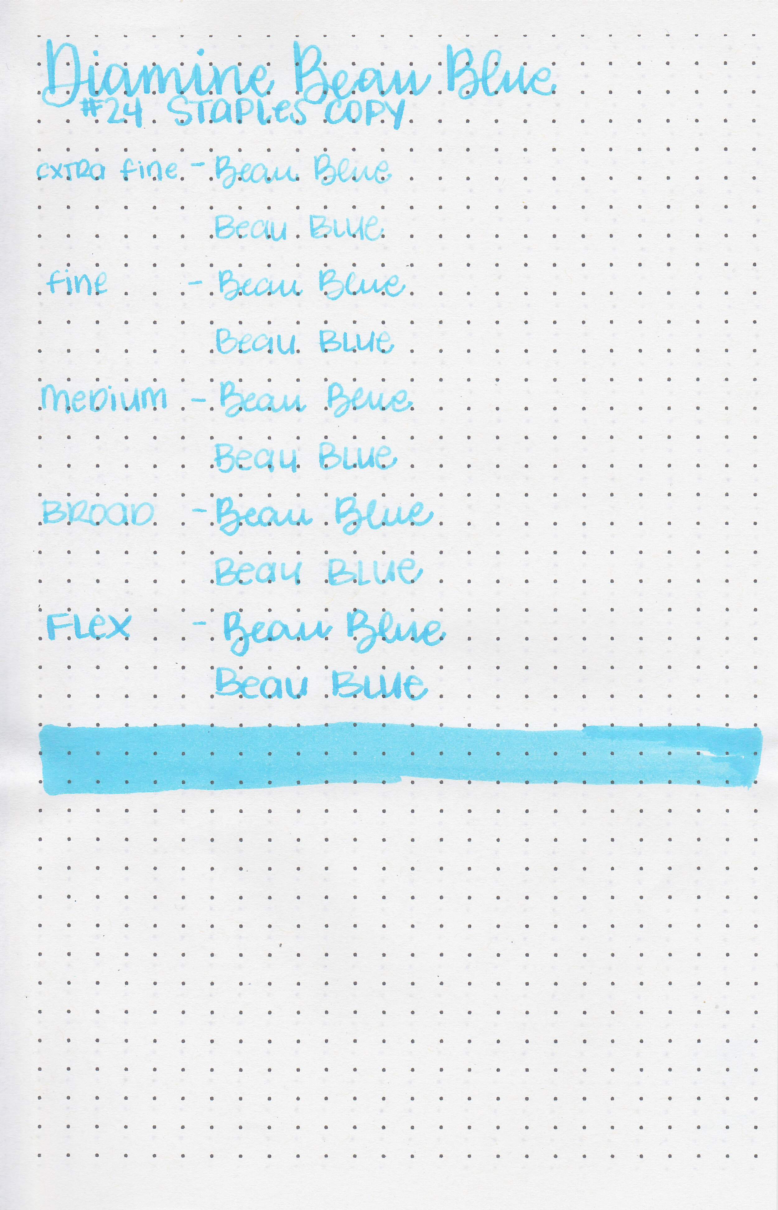
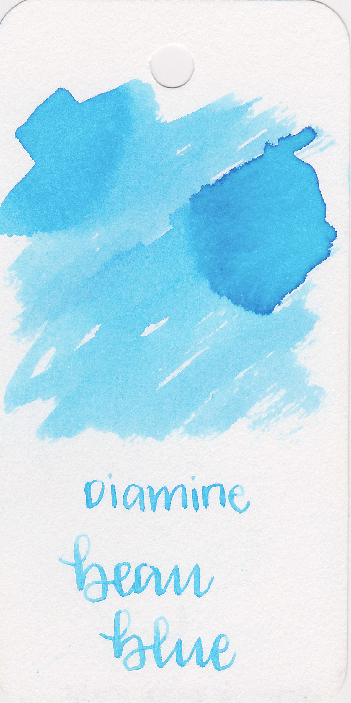
Diamine Beau Blue is a very pale blue. I bought a bottle of this ink a few years ago from Cult Pens, but I’ve never used it much so it’s time to test it out.
The color:
Beau Blue is a pale baby blue.

In large swabs on Tomoe River paper the ink has a little bit of shading.

Let's take a look at how the ink behaves on fountain pen friendly papers: Rhodia, Tomoe River, and Leuchtturm.
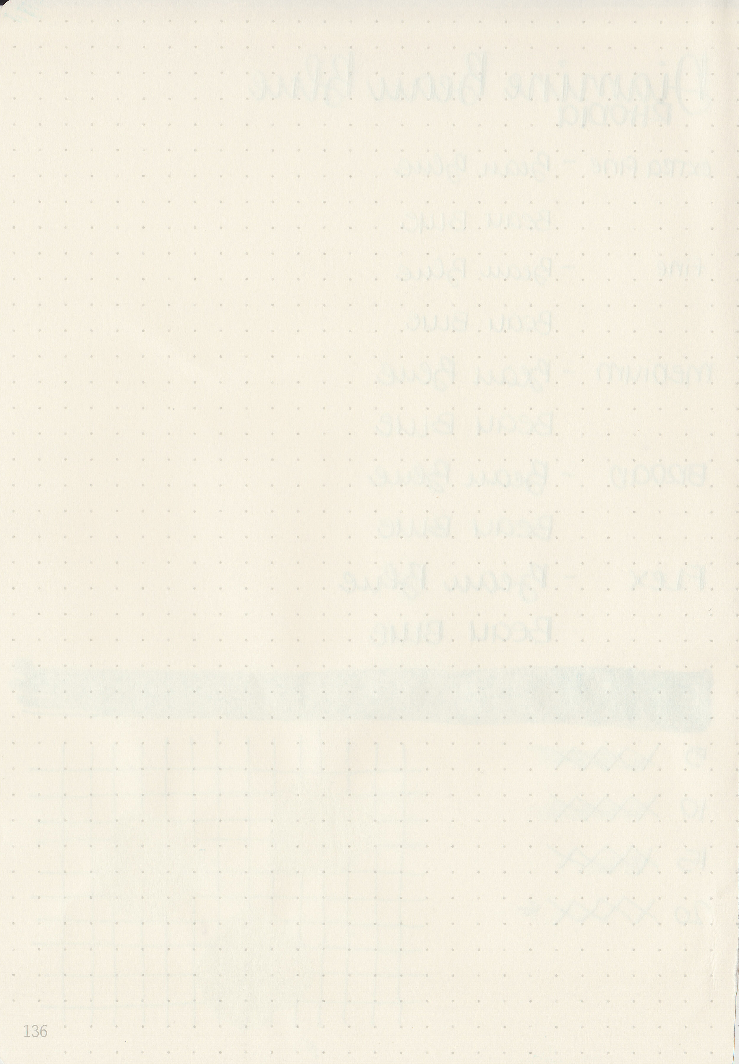
Dry time: 20 seconds
Water resistance: Low
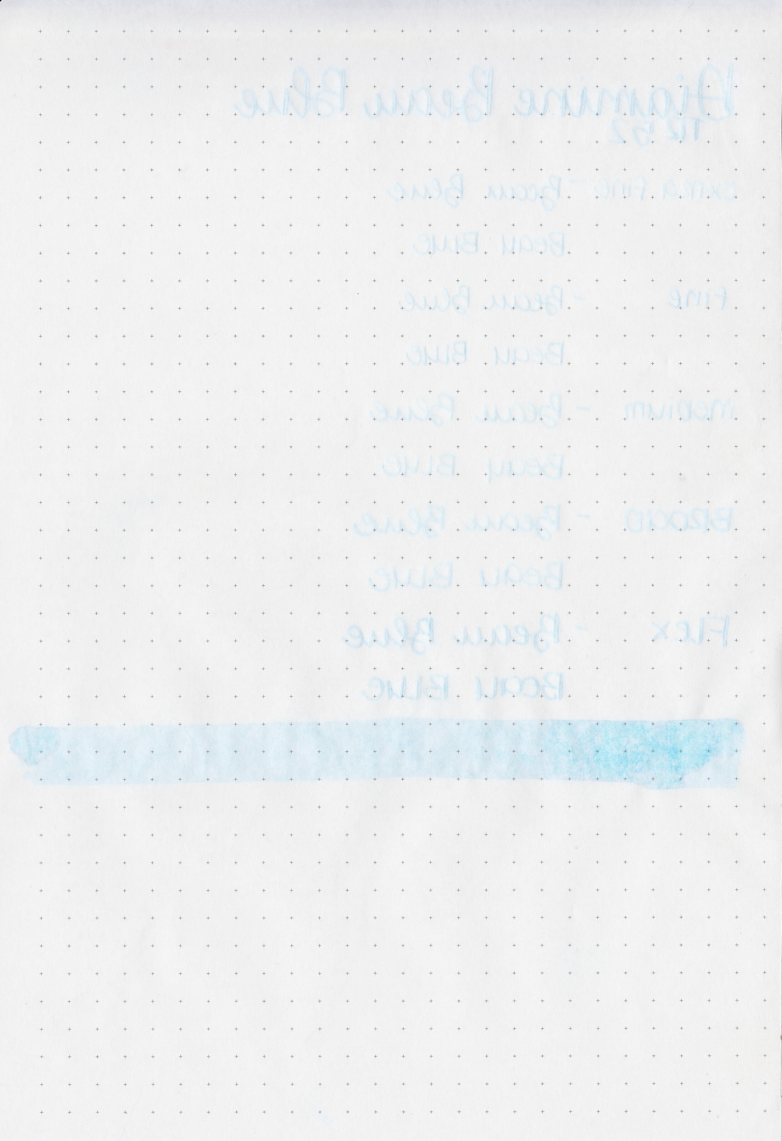
Feathering: None
Show through: Low
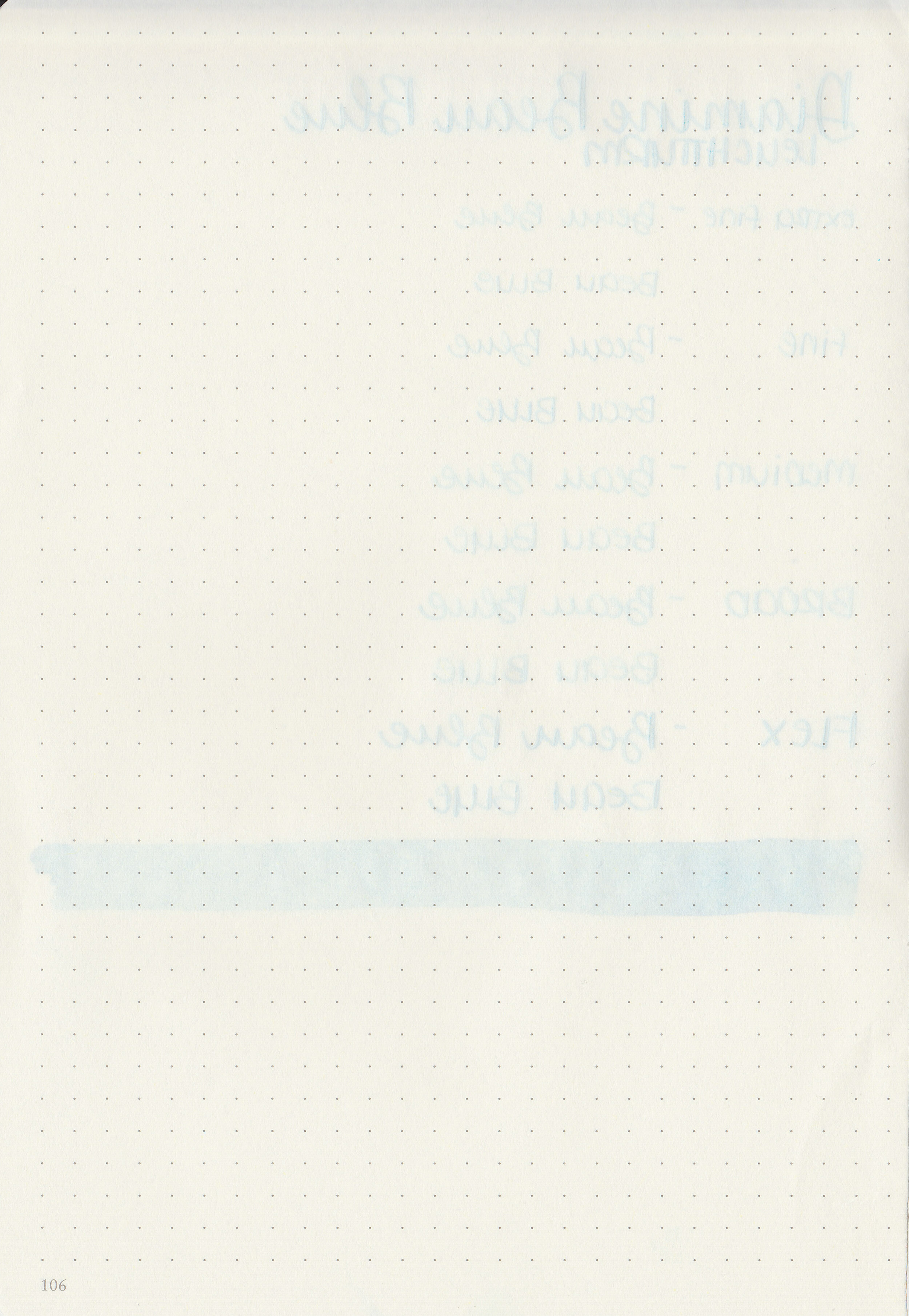
Bleeding: None
Other properties: medium shading, no sheen, and no shimmer.
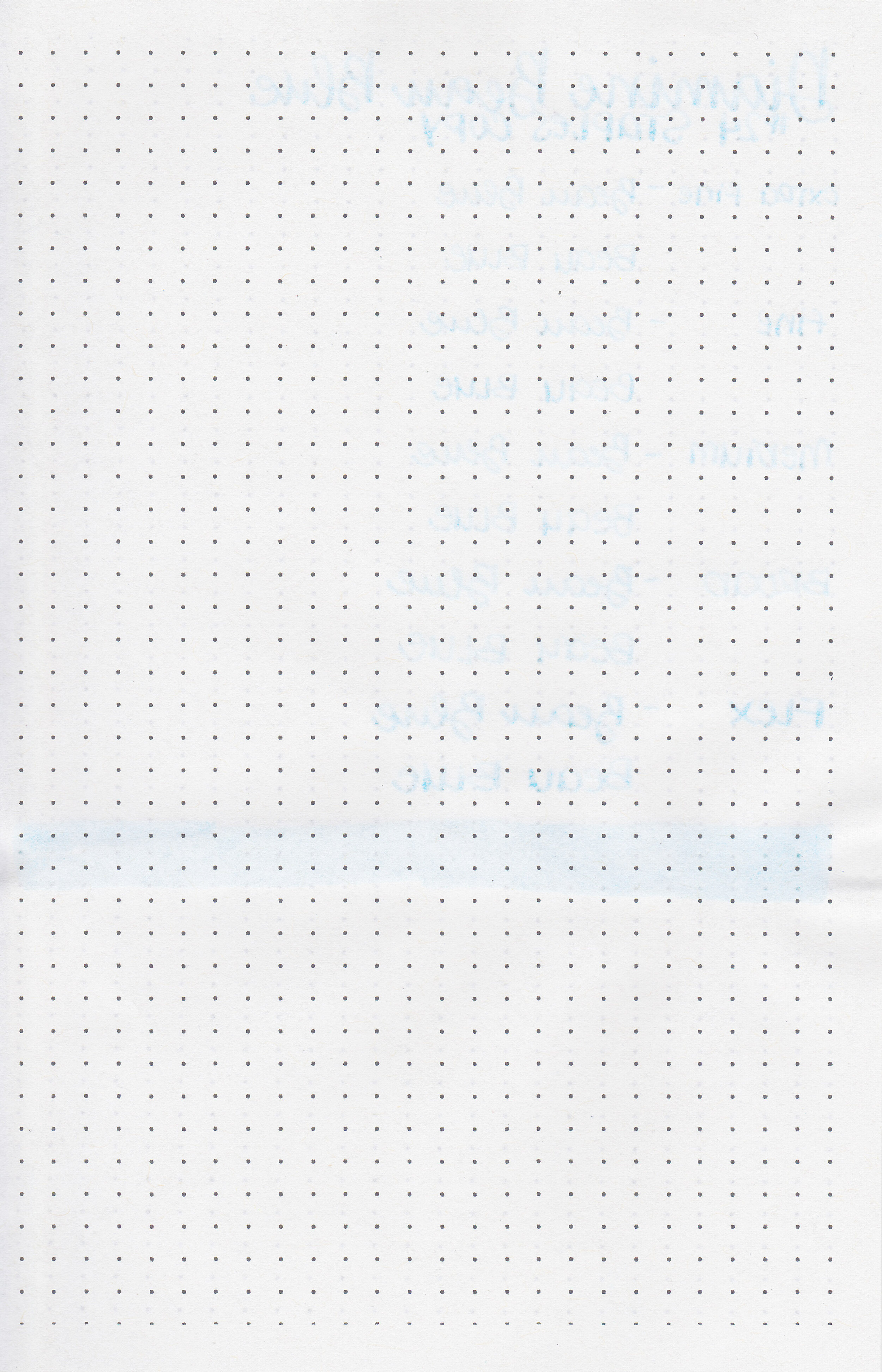
On Staples 24 lb copy paper there was some feathering in most nib sizes but no bleeding.

Beau Blue is the same tone as Tono & Lims Yamanashi, but it’s much lighter. Click here to see the Diamine inks together, and click here to see the blue inks together.

I used a Kaweco Sport Serenity Blue-fine nib on a Yoseka A5 notebook. The ink had an average flow.
Overall, while this ink behaves well it is very pale and hard to comfortably read. I think I would use this ink more for lettering and art rather than drawing.
Disclaimer: I purchased this ink myself, and all photos and opinions are my own. This page does not contain affiliate links and this post is not sponsored in any way.
Hi, I’m Kelli, and I’m the brain behind Mountain of Ink. I’m a homeschooling mama of three littles, full-time student, aspiring photographer, amateur chef, and lover of all things stationery. I think any day that doesn’t involve learning and playing with ink is a day wasted. On my site you will find fountain pen, ink, and paper reviews, along with stationery bits and bobs along the way. You can find me @mountainofink on Instagram, Facebook, Twitter, and Pinterest.
Powered by Squarespace.