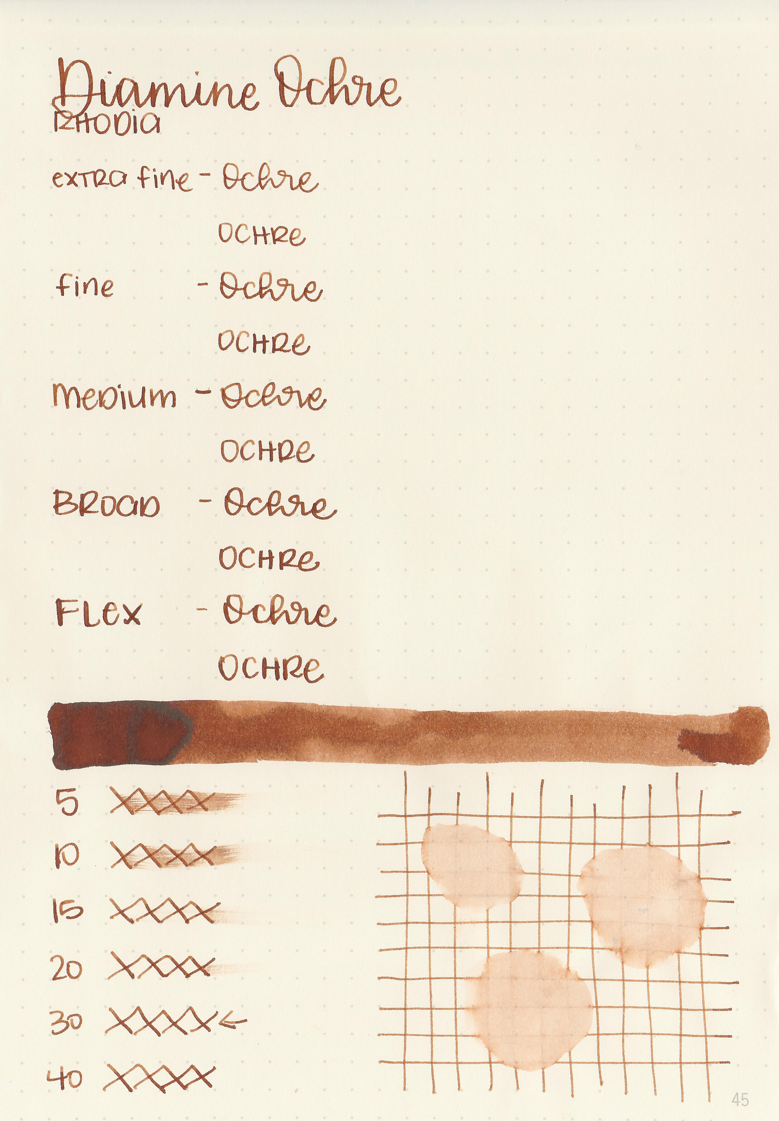
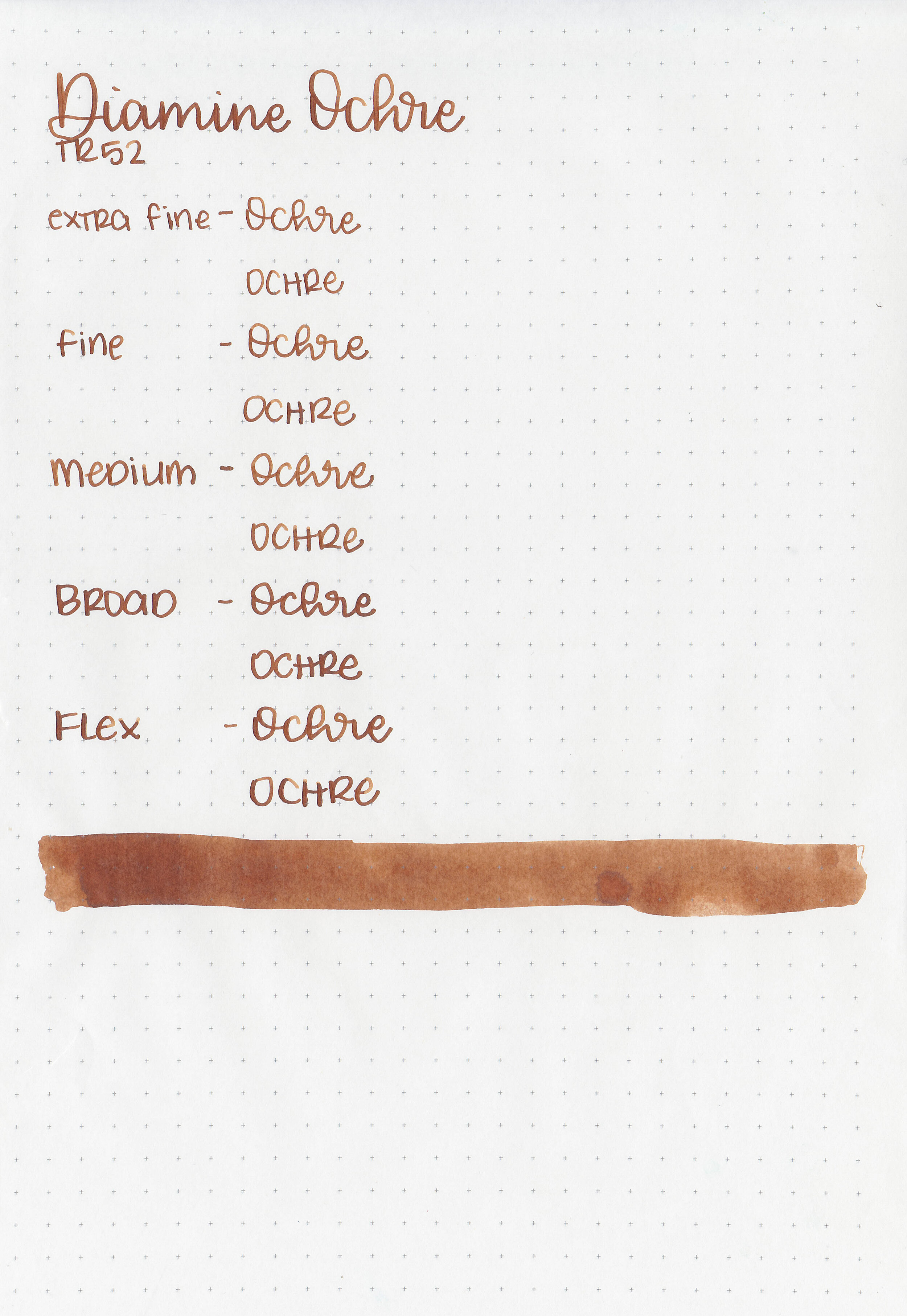
Ink Review #1189: Monteverde Coal Noir
/
Today’s ink is Monteverde Coal Noir from the Noir collection. These inks came out quite a while ago but I’ve yet to review all of them. I purchased my sample of ink from Vanness Pens quite a while ago.

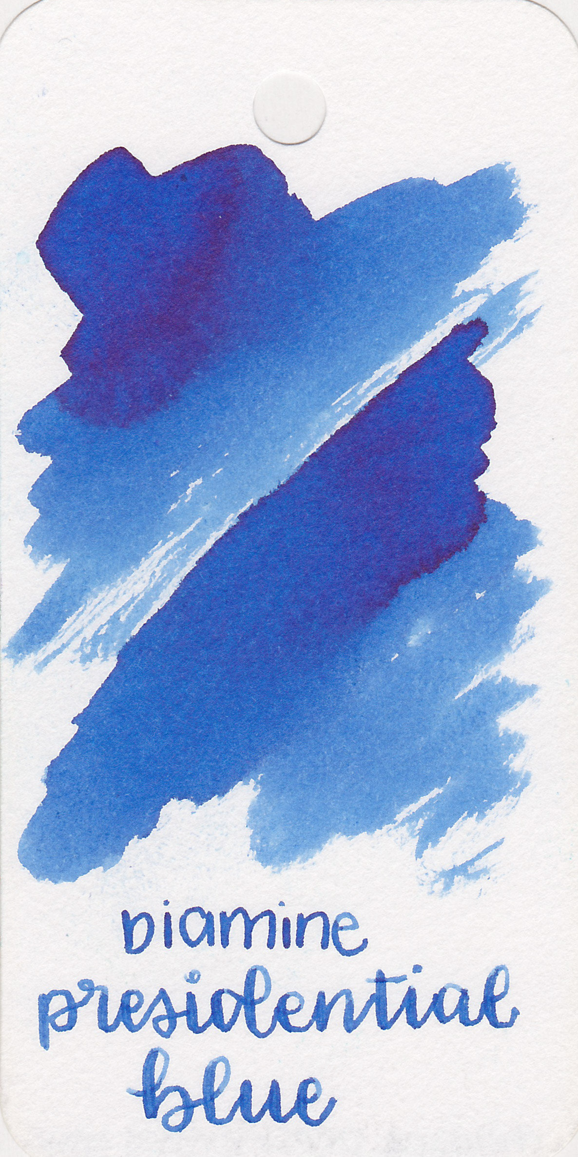
The color:
Coal Noir is a dark grey/light black.
Swabs:

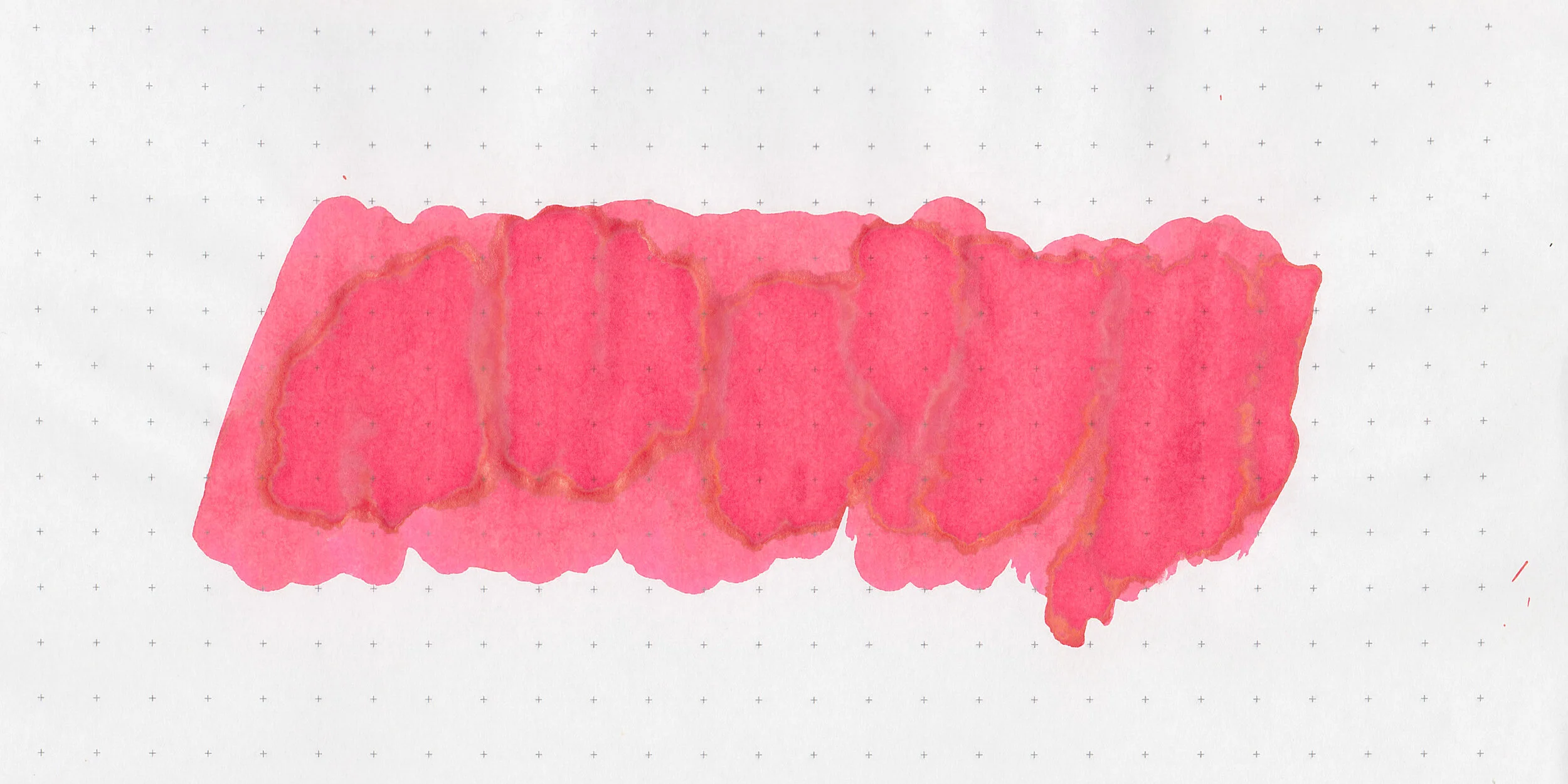
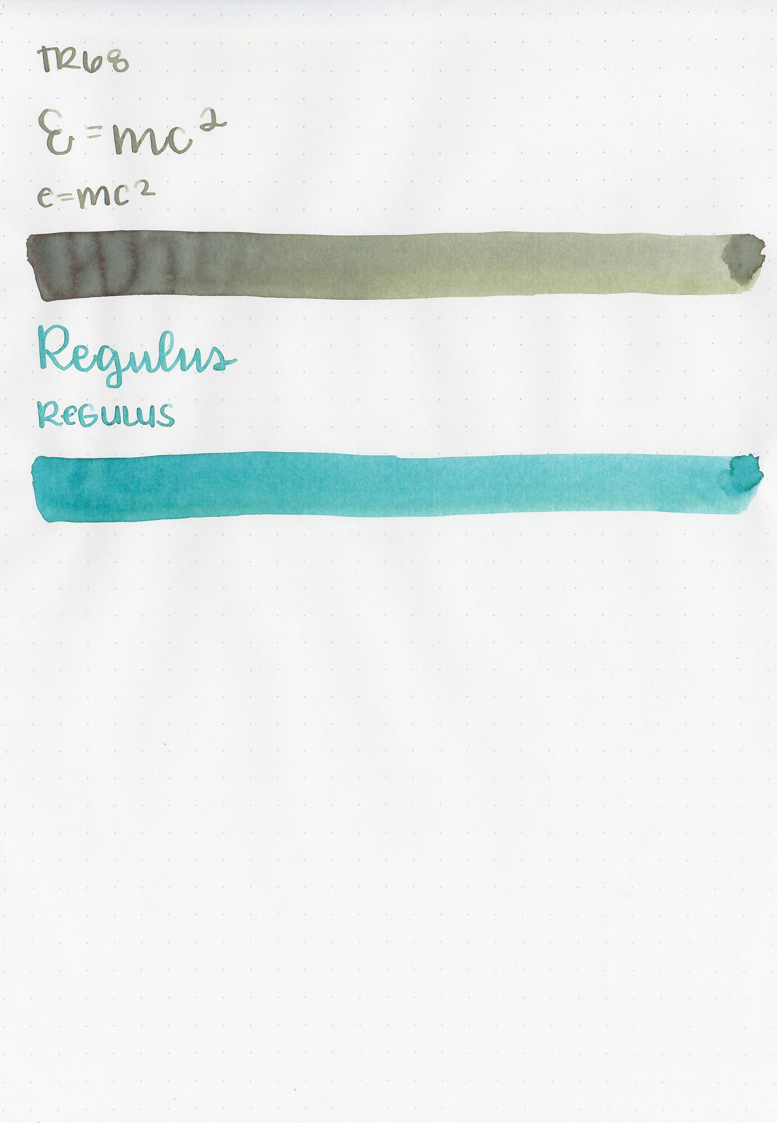
In large swabs on Tomoe River paper the ink has just a little bit of coppery sheen.

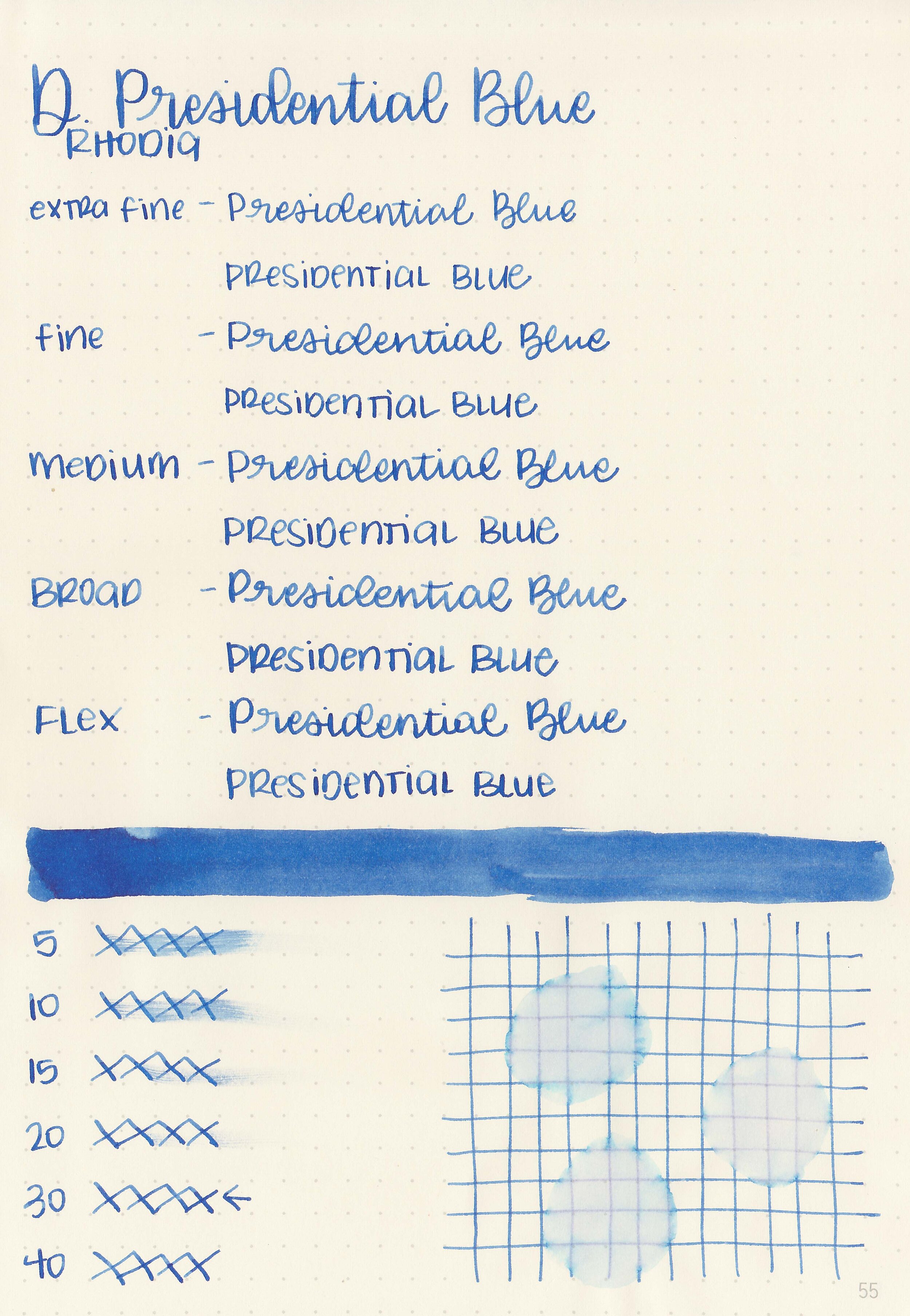
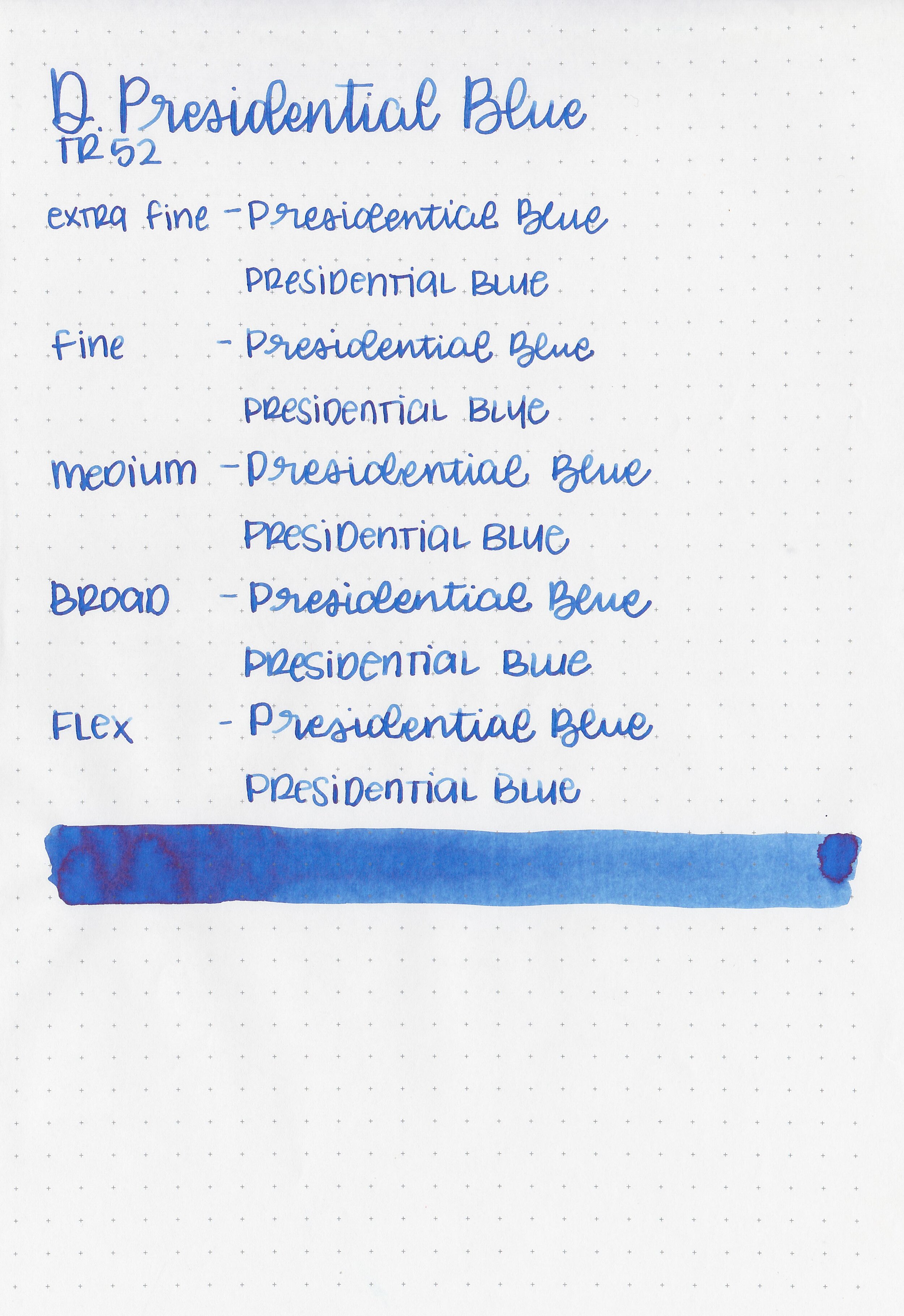
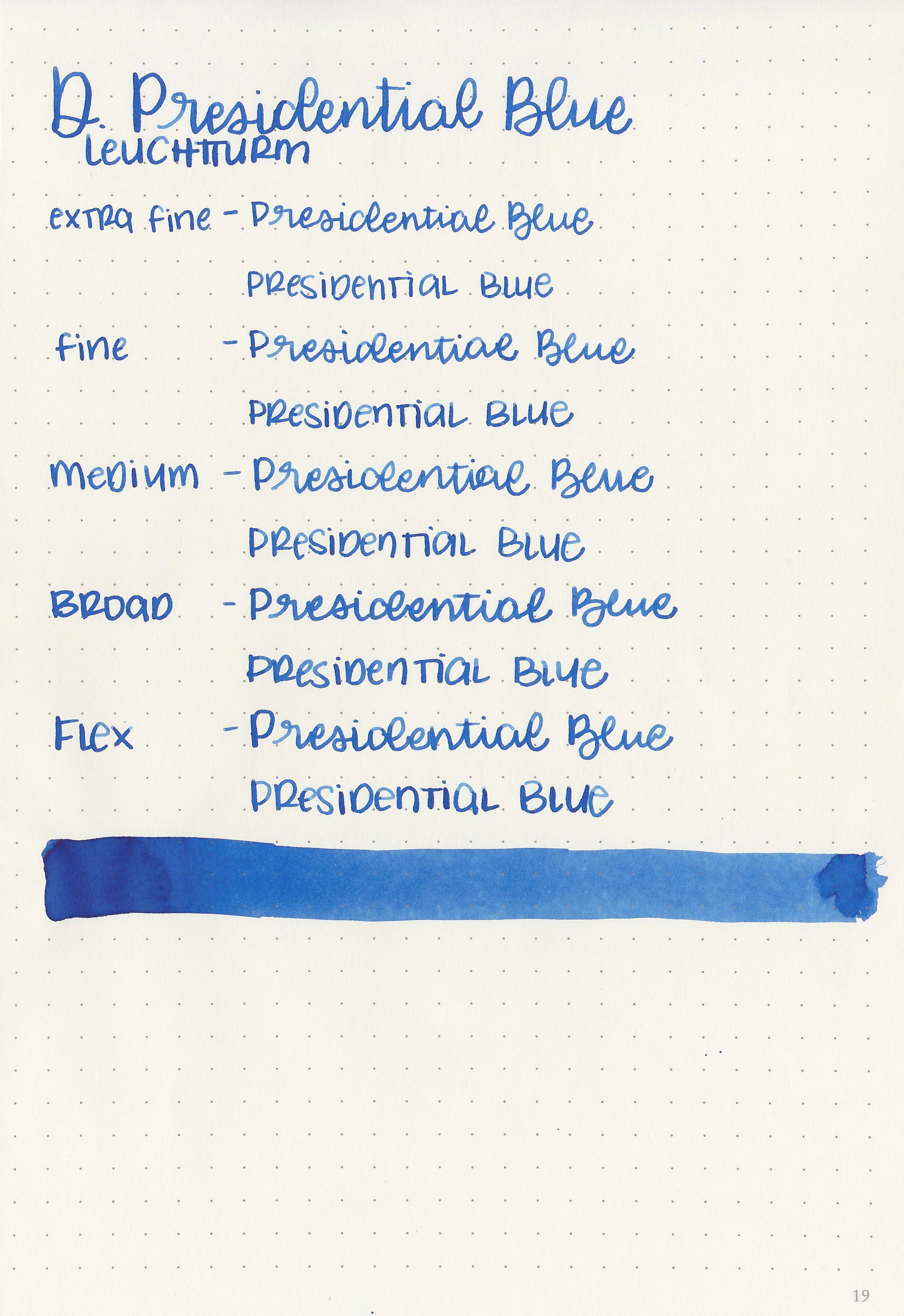
Writing samples:
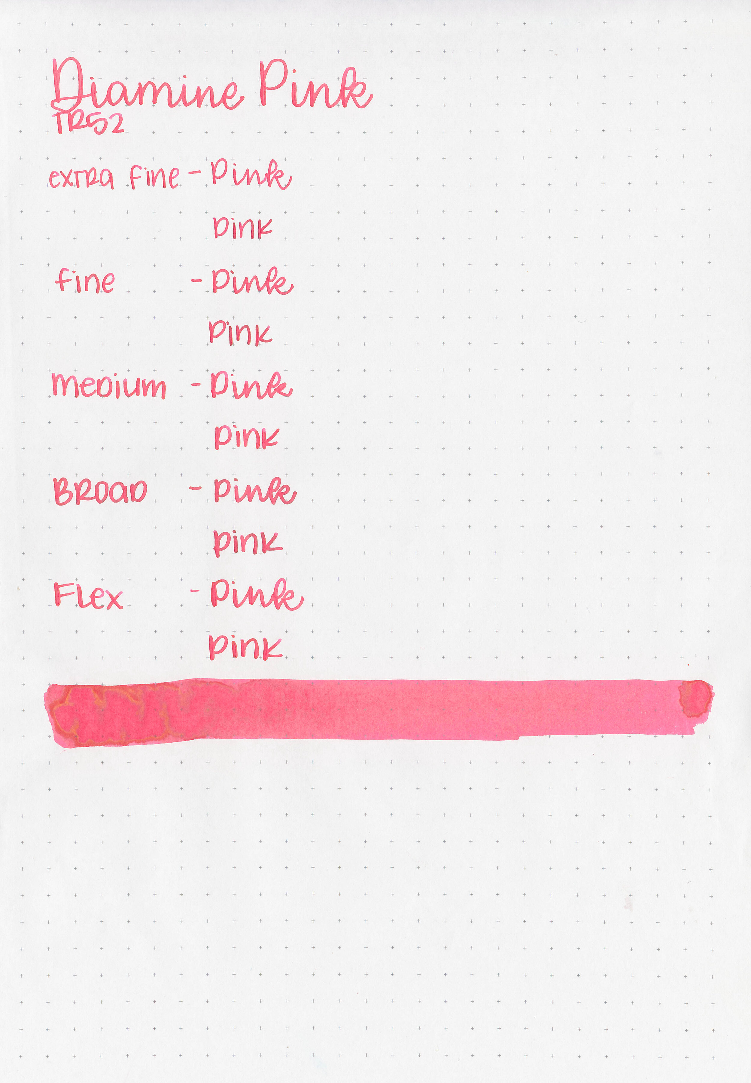
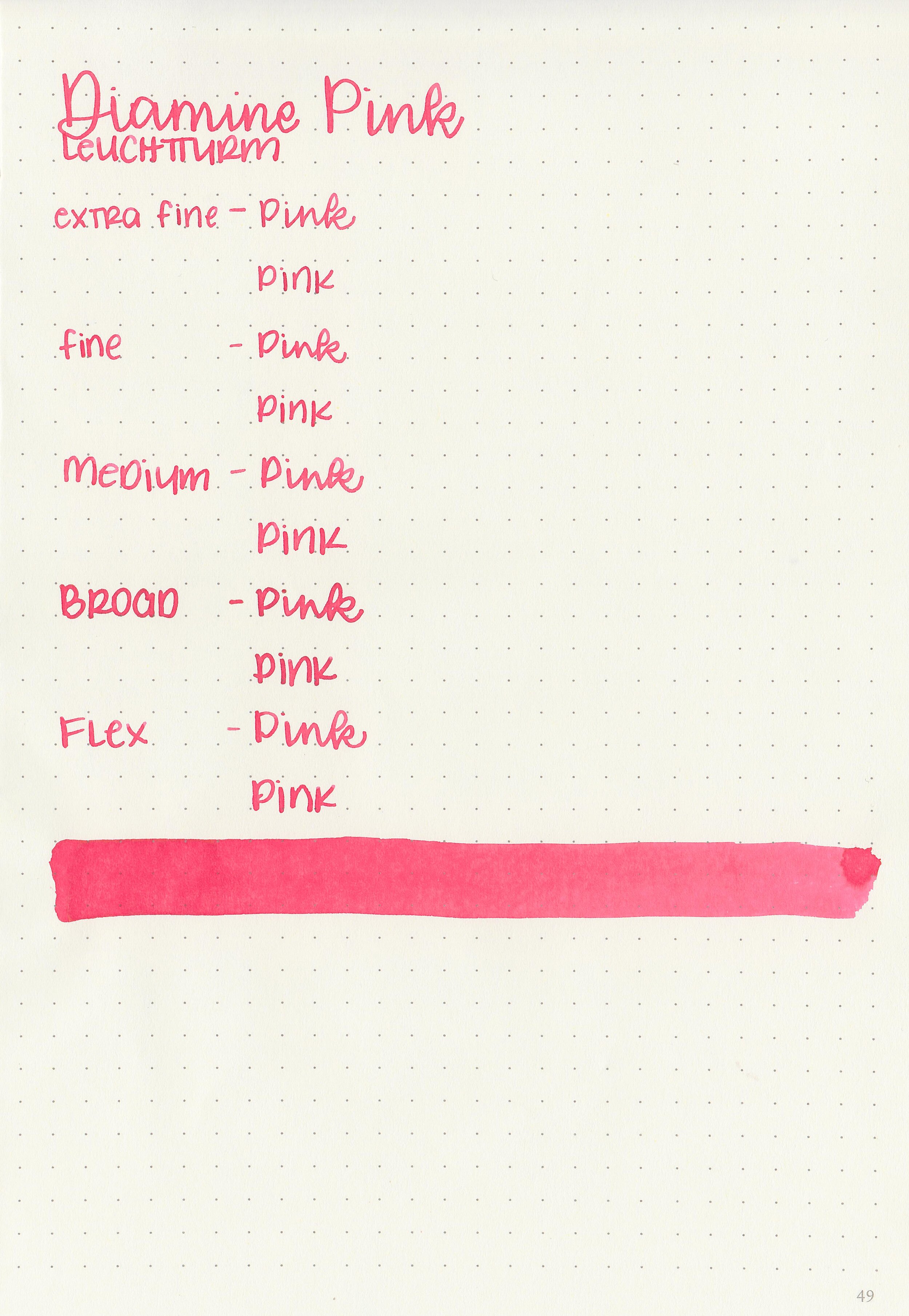
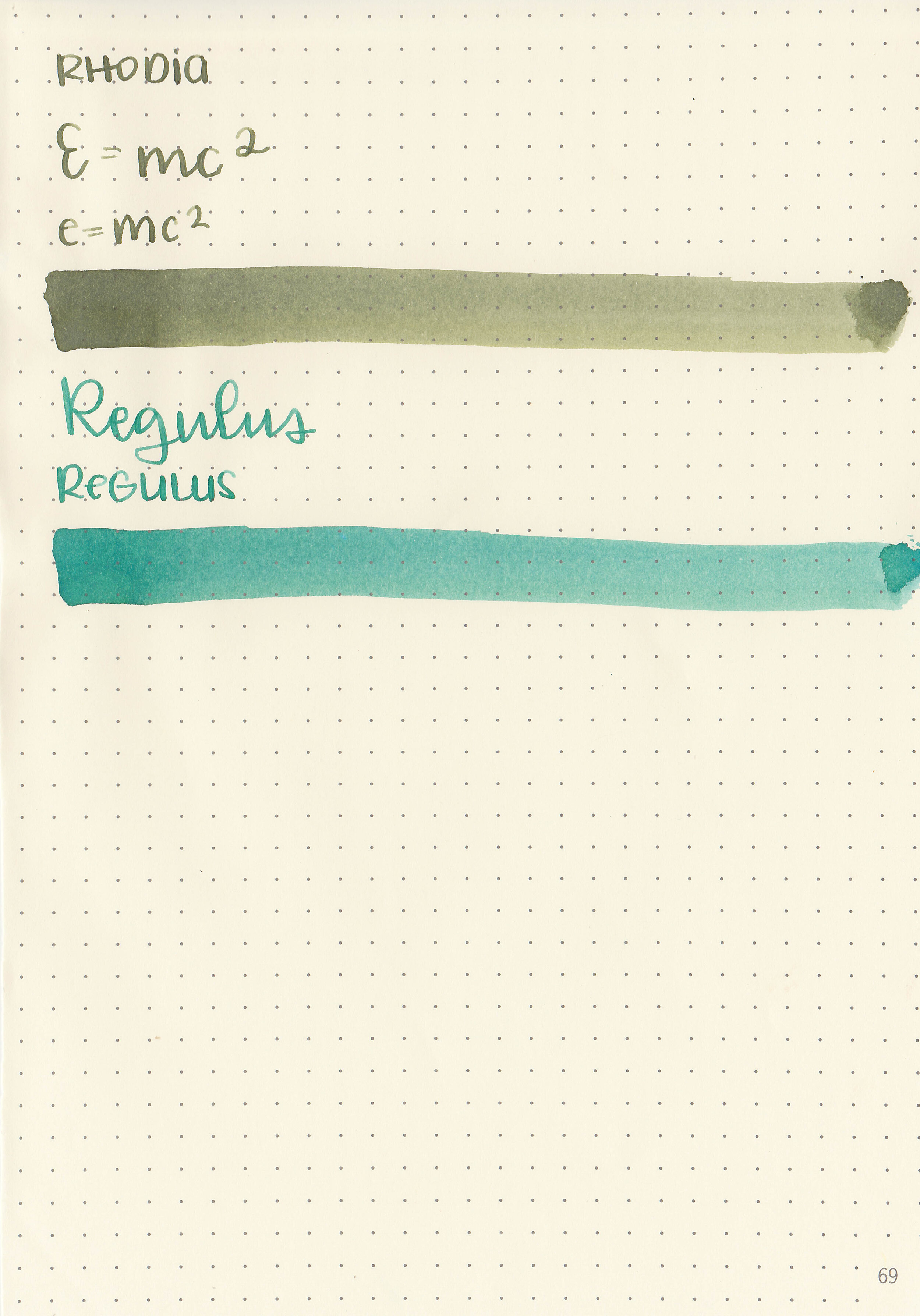
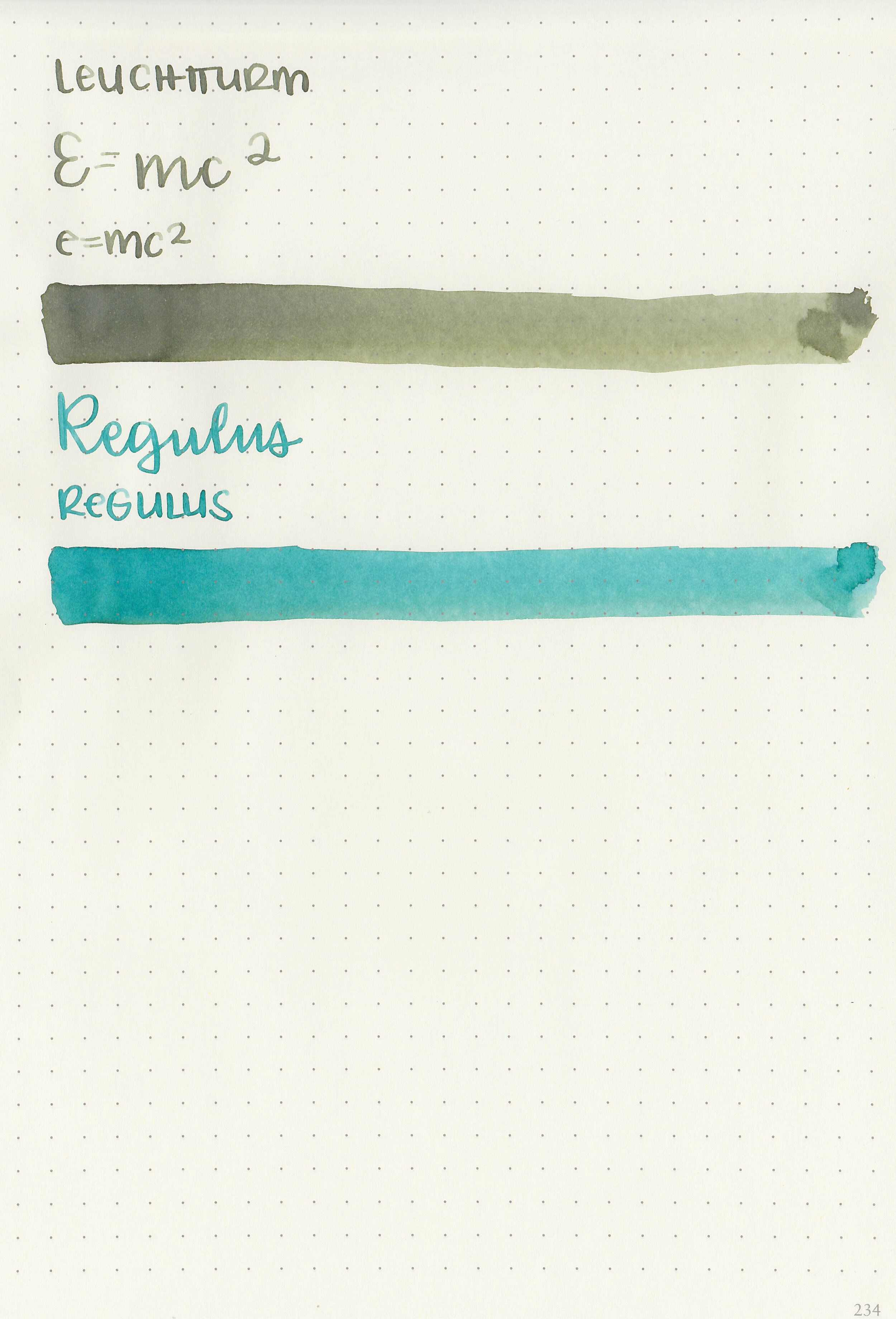
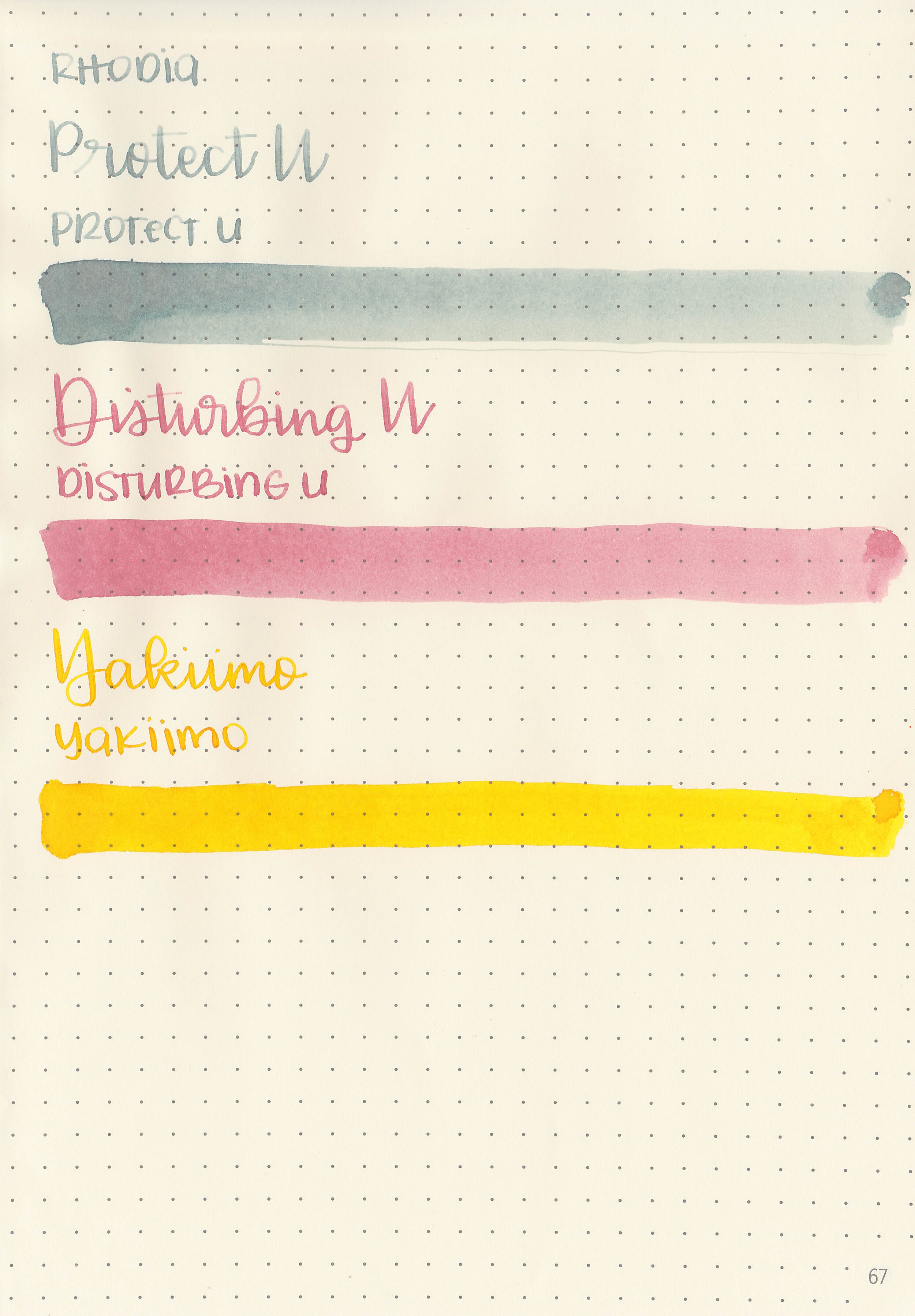
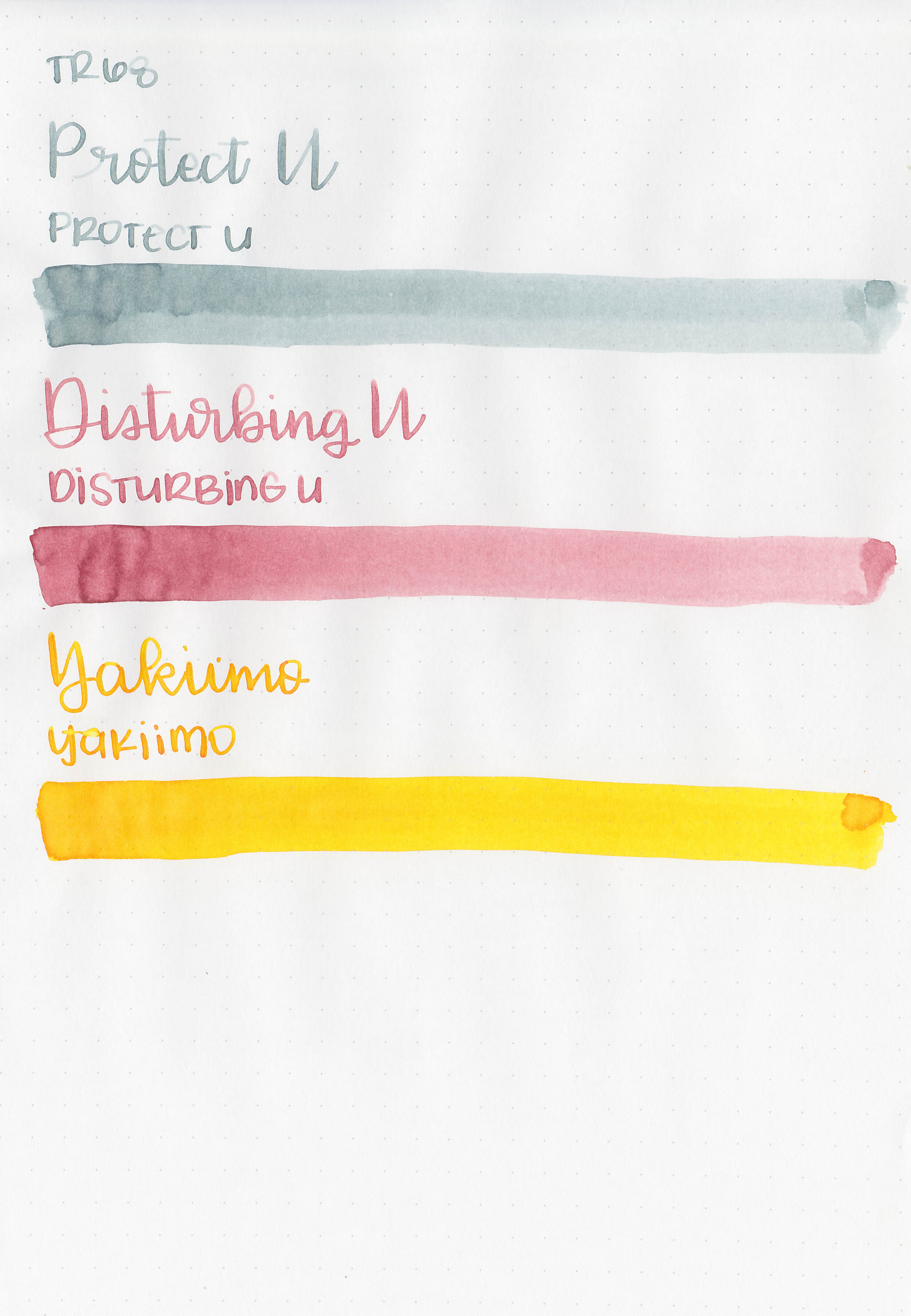
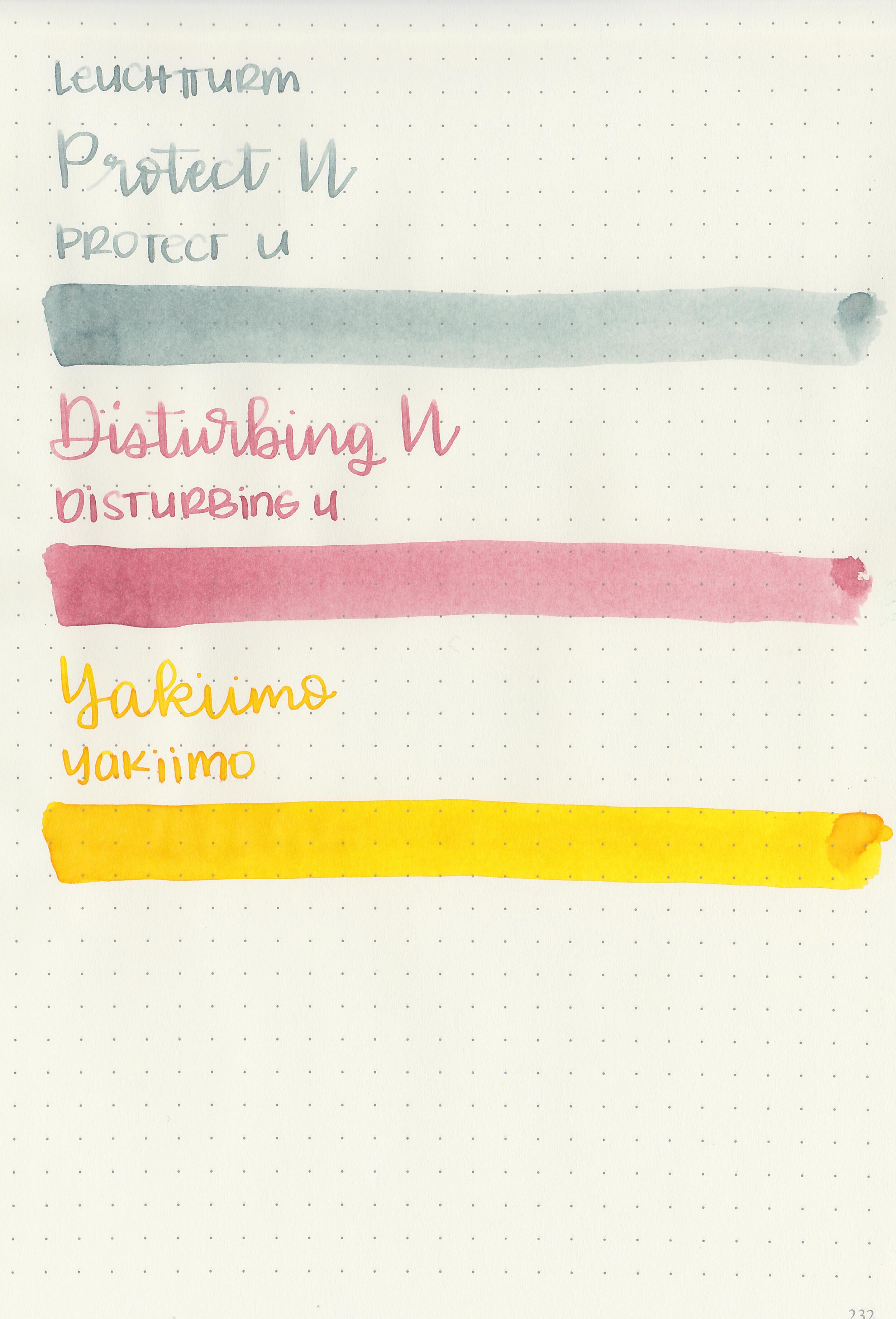
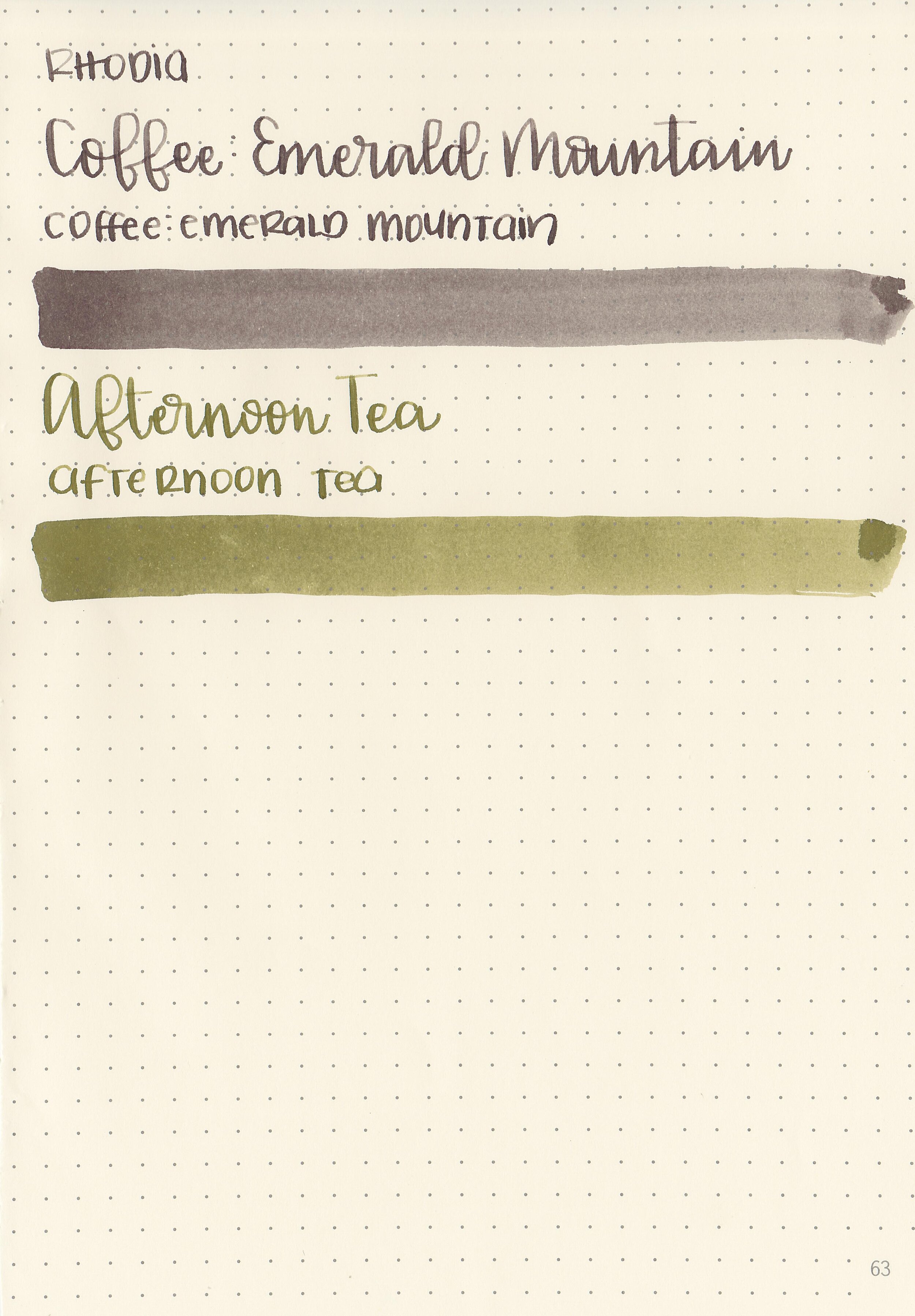
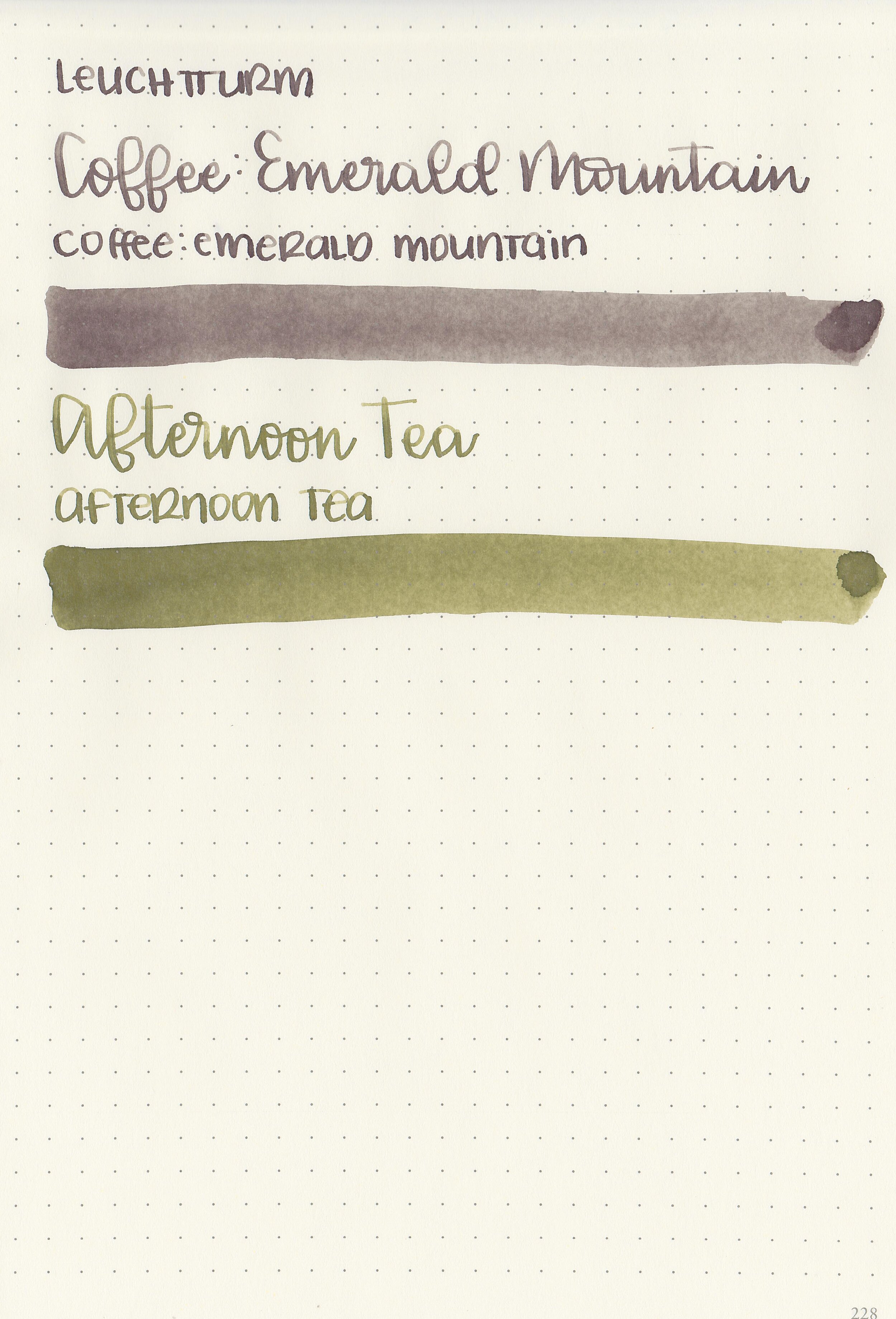
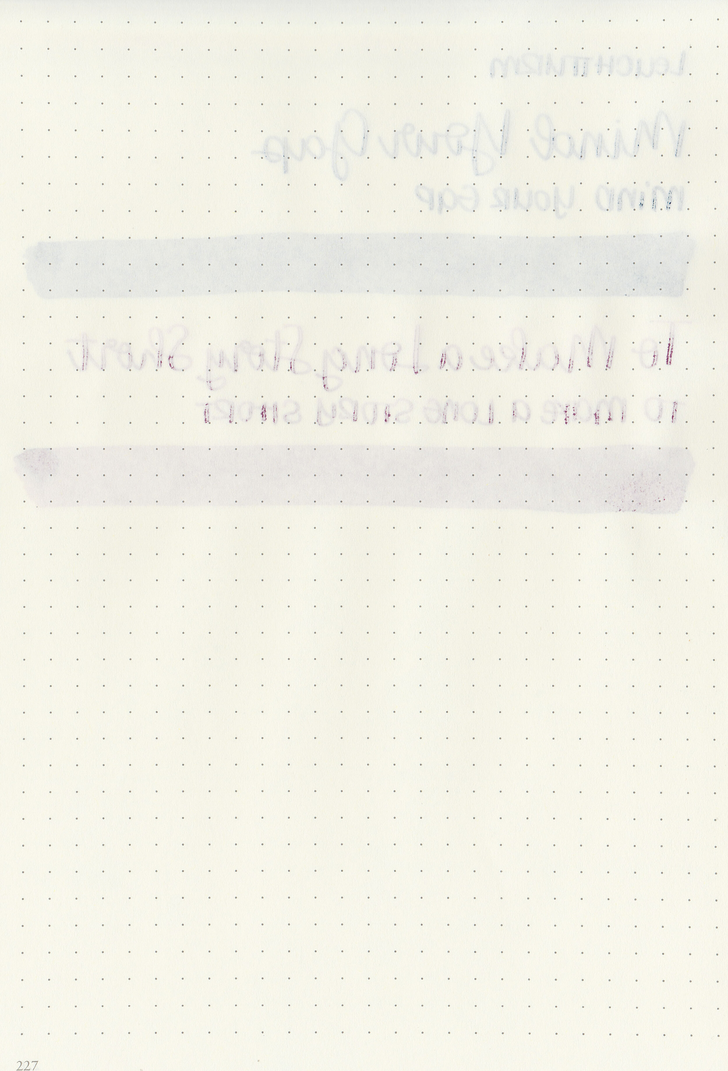
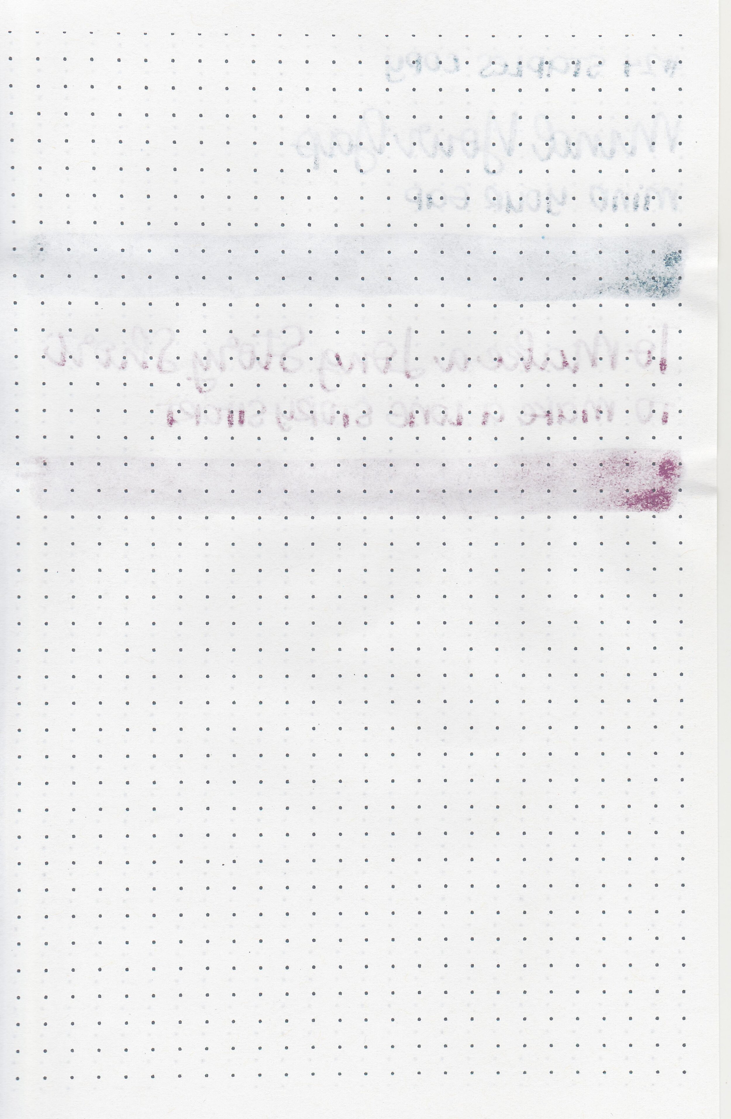
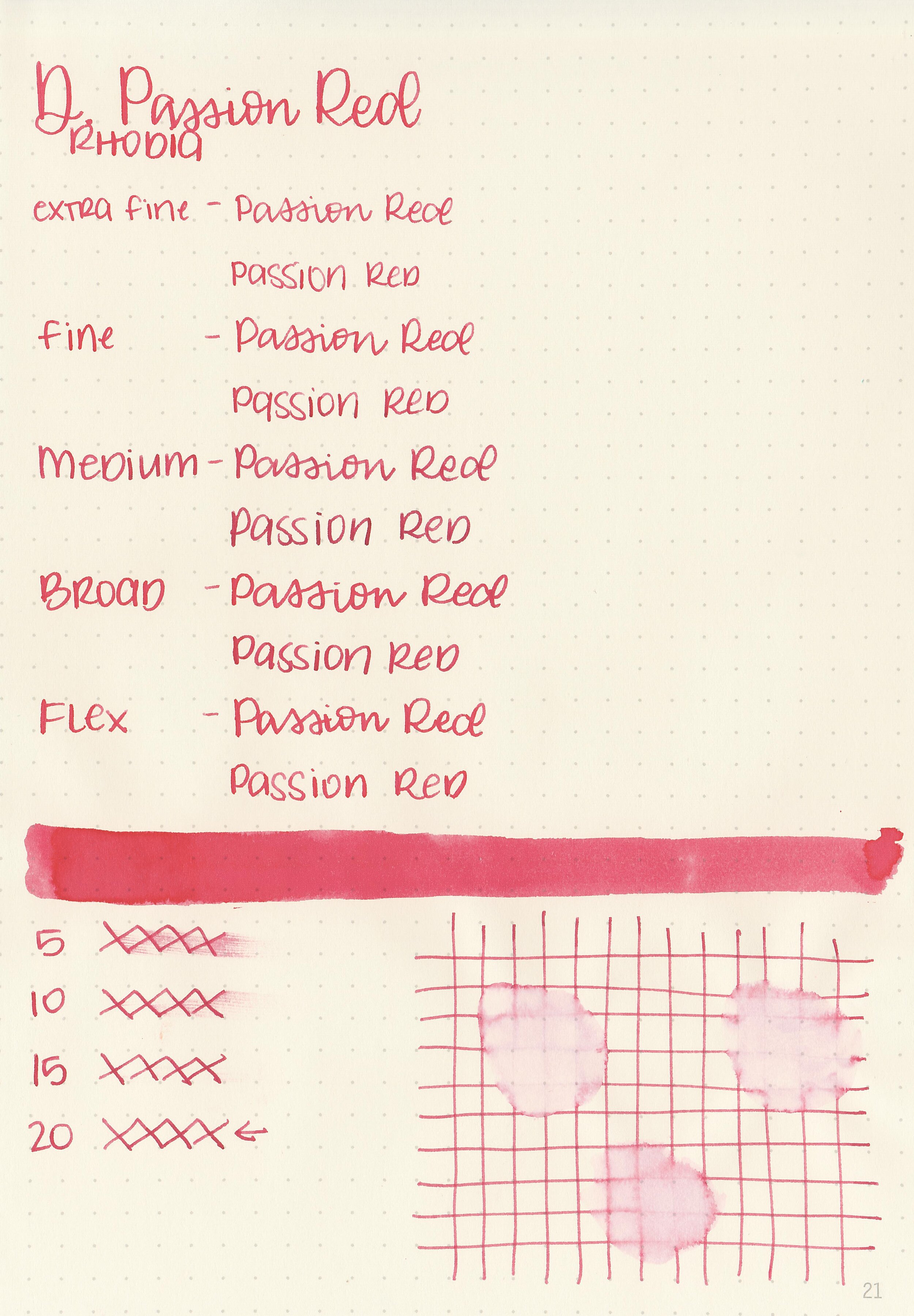
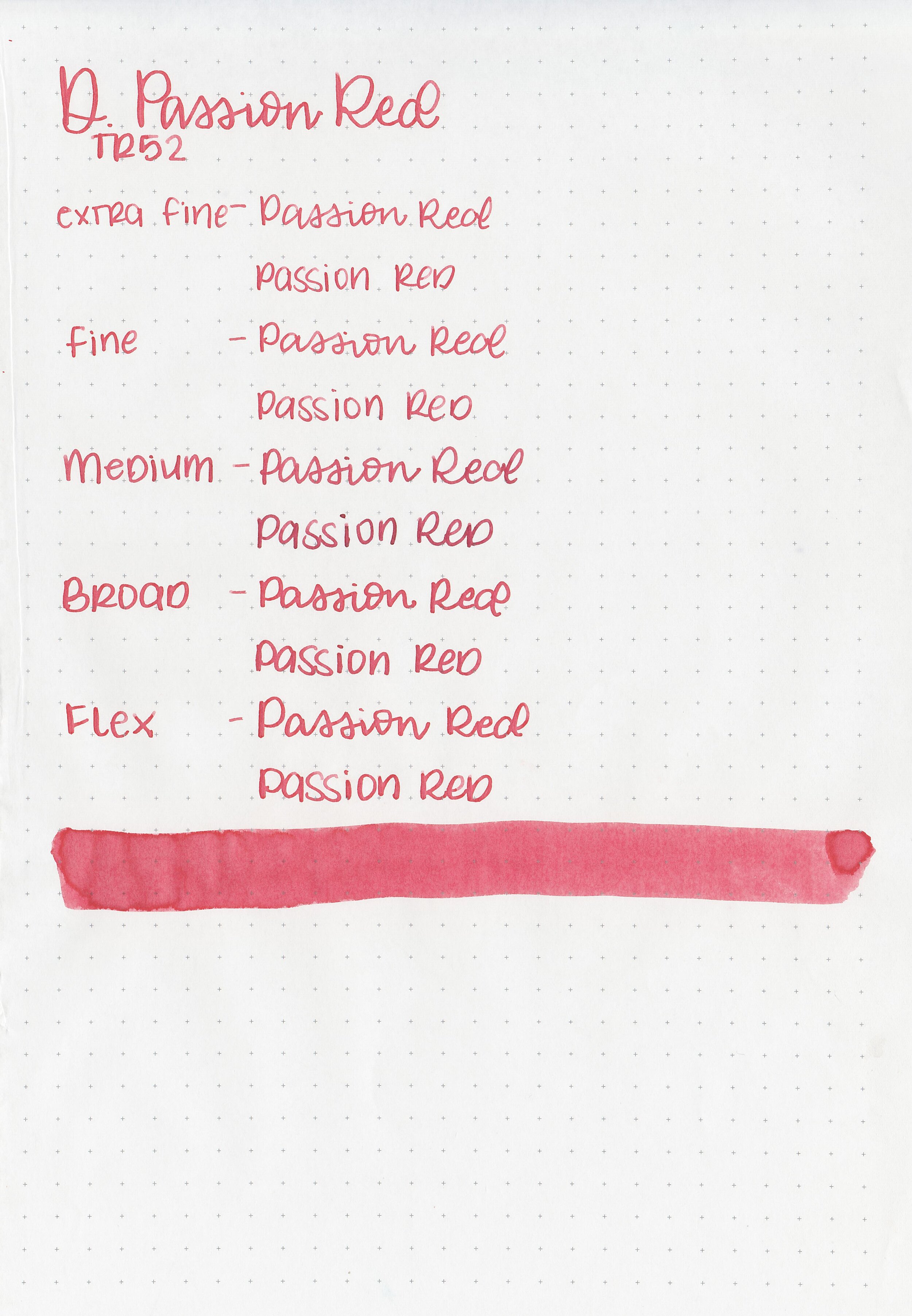
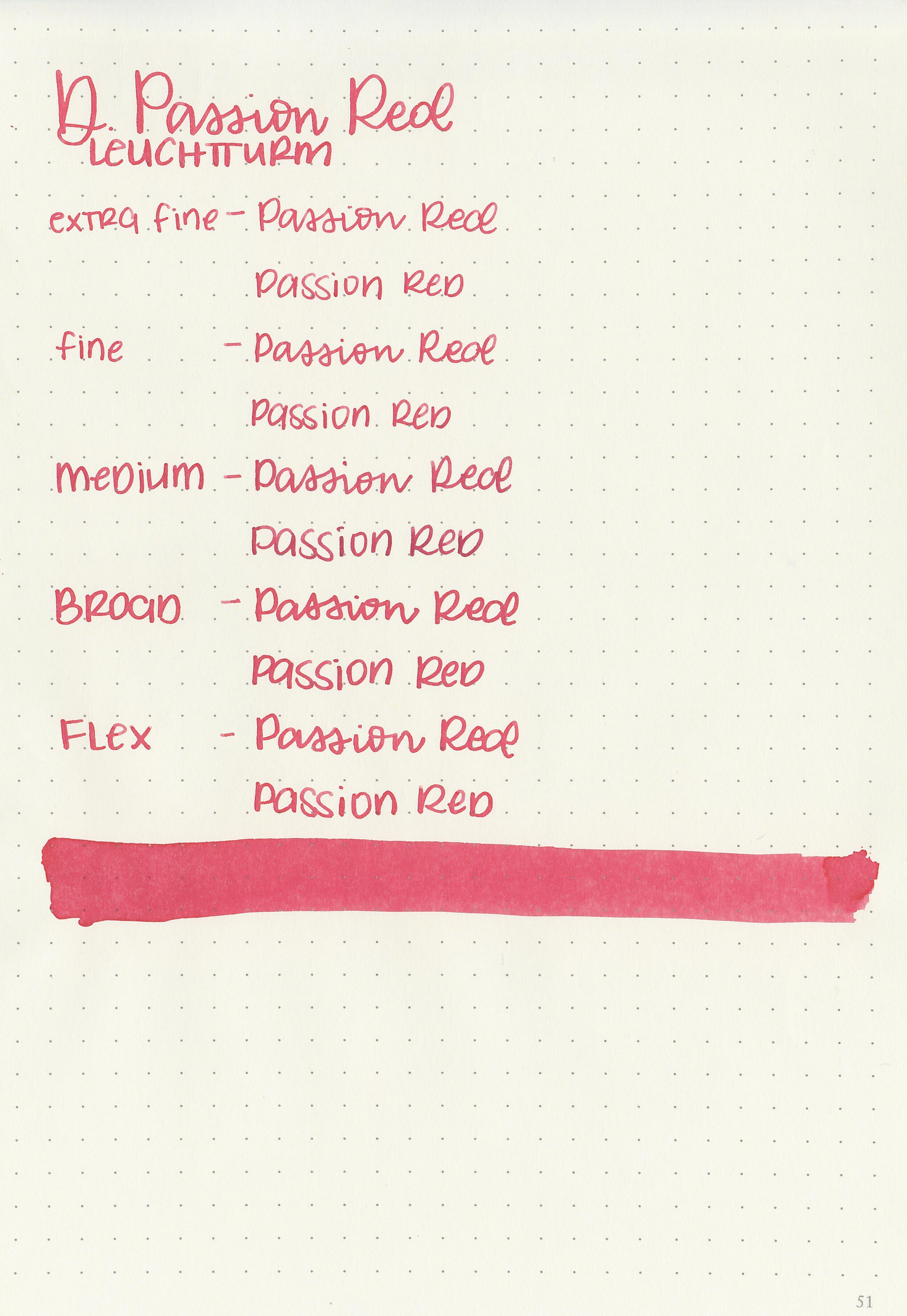
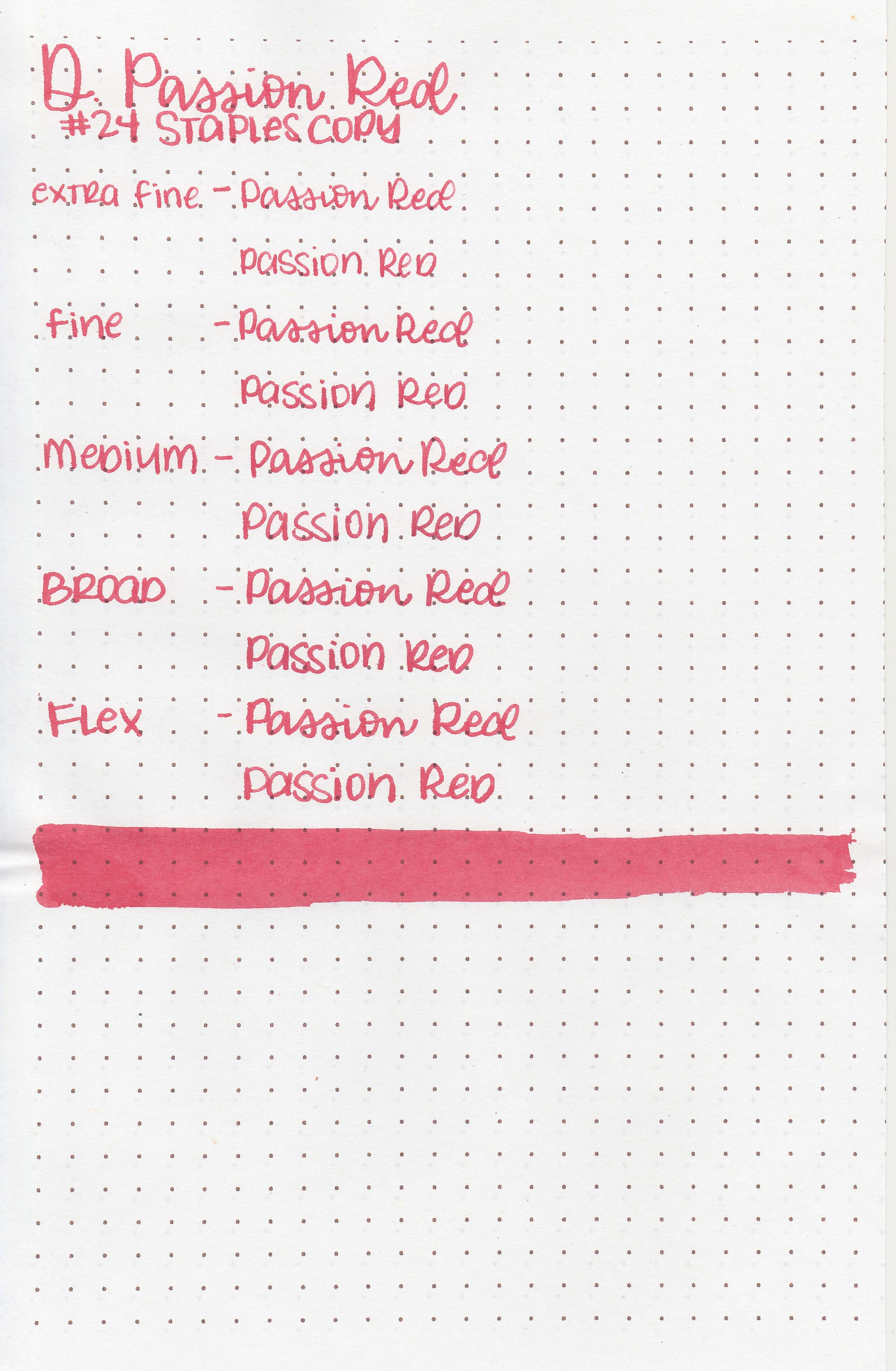
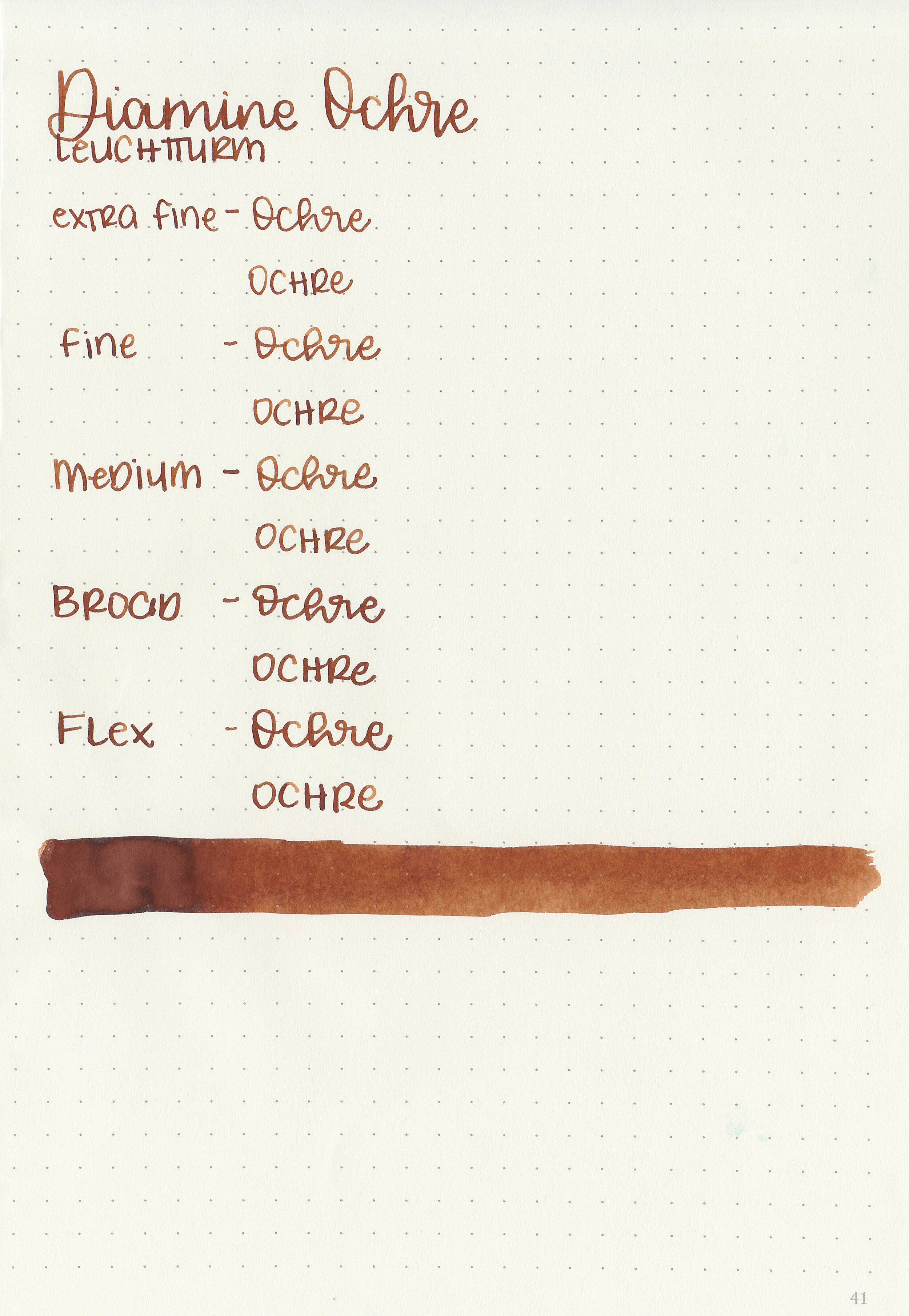
Let's take a look at how the ink behaves on fountain pen friendly papers: Rhodia, Tomoe River, and Leuchtturm.

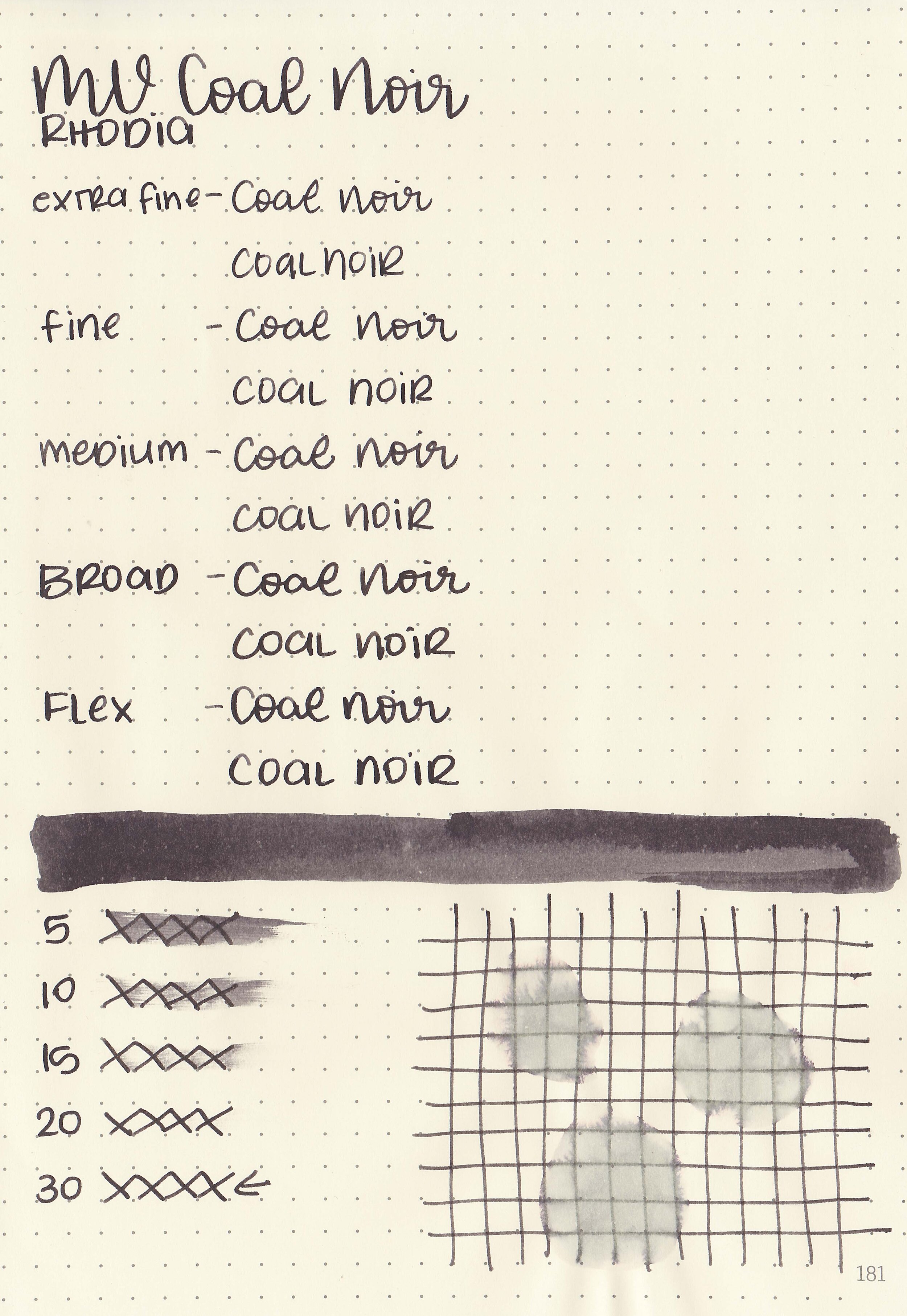
Dry time: 30 seconds
Water resistance: Medium
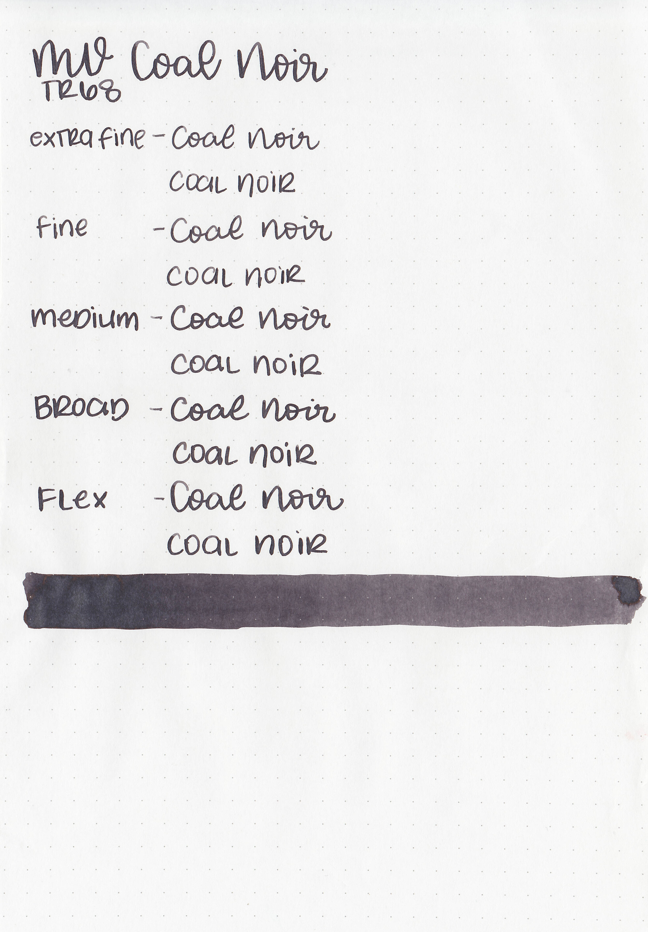
Feathering: None
Show through: Medium
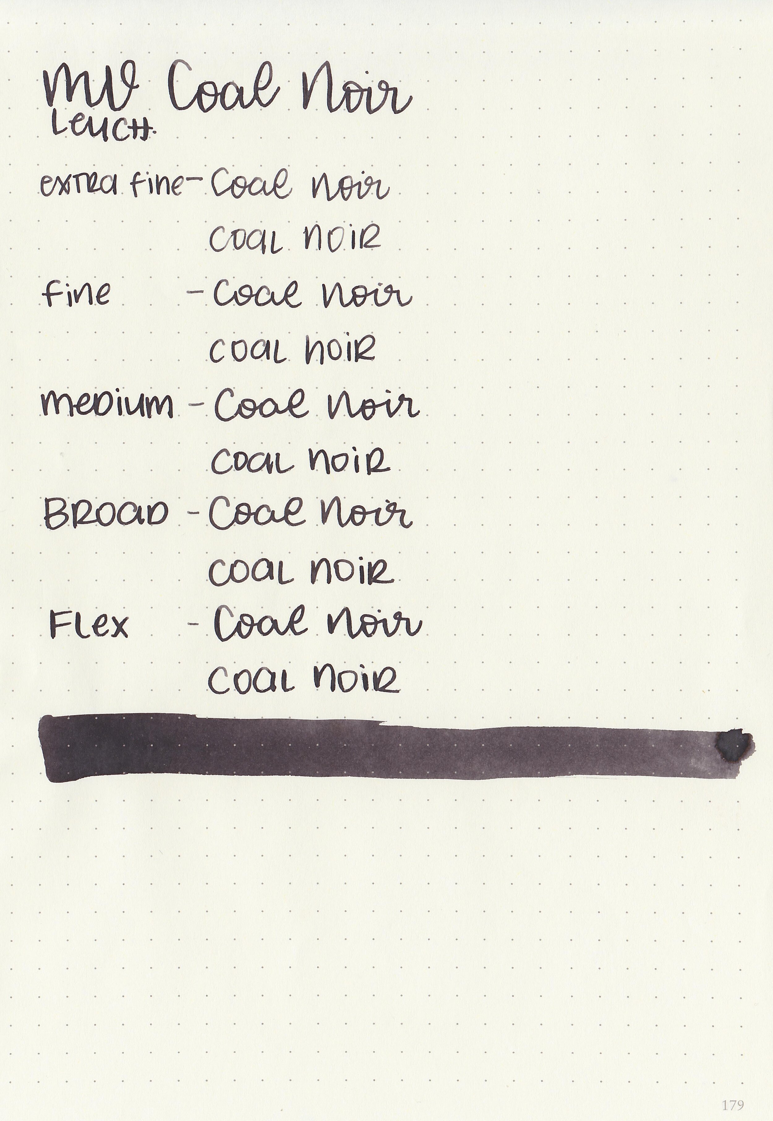
Bleeding: None
Other properties: low shading, tiny copper sheen, and no shimmer. The sheen is only visible in large swabs.
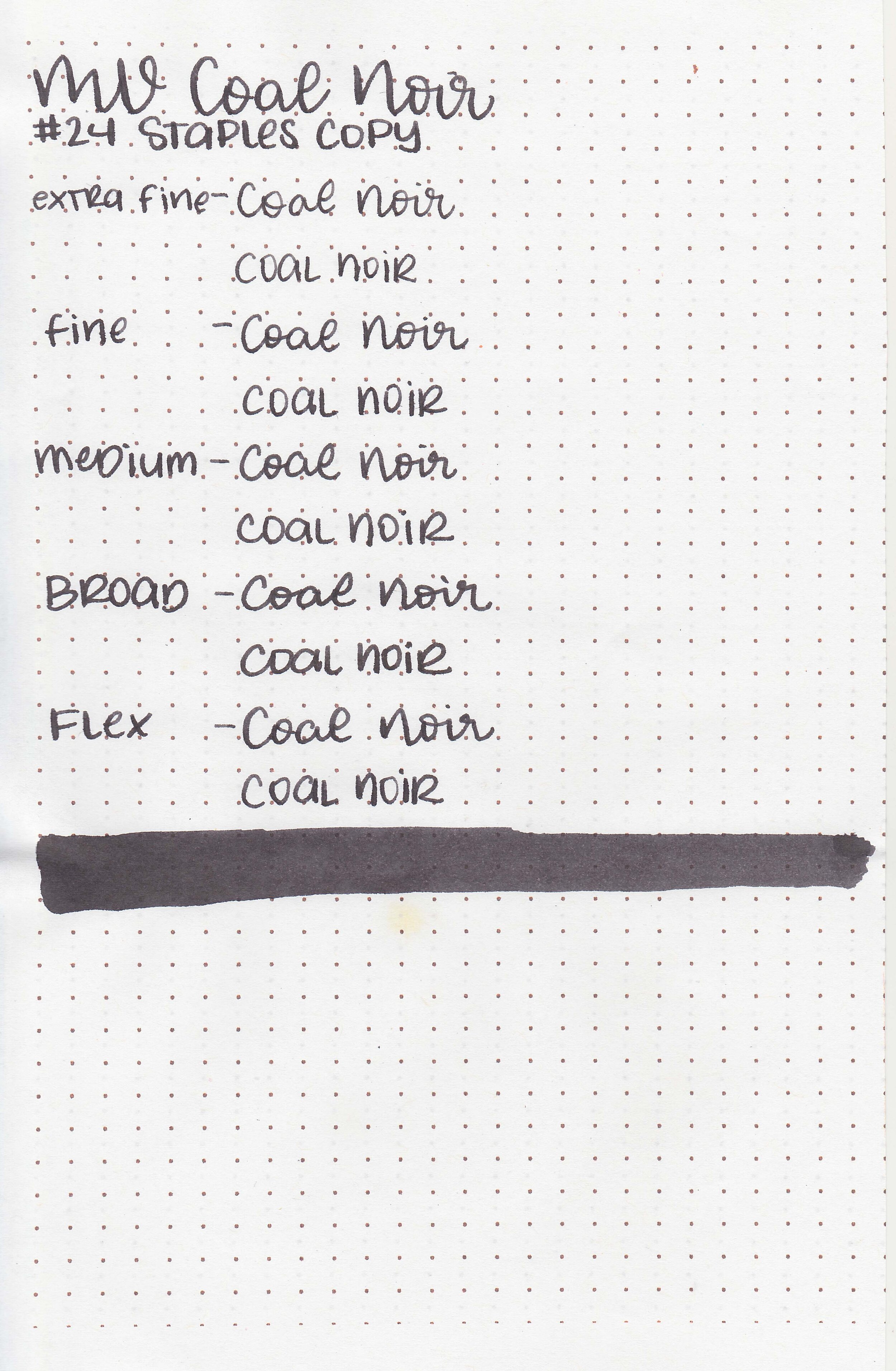
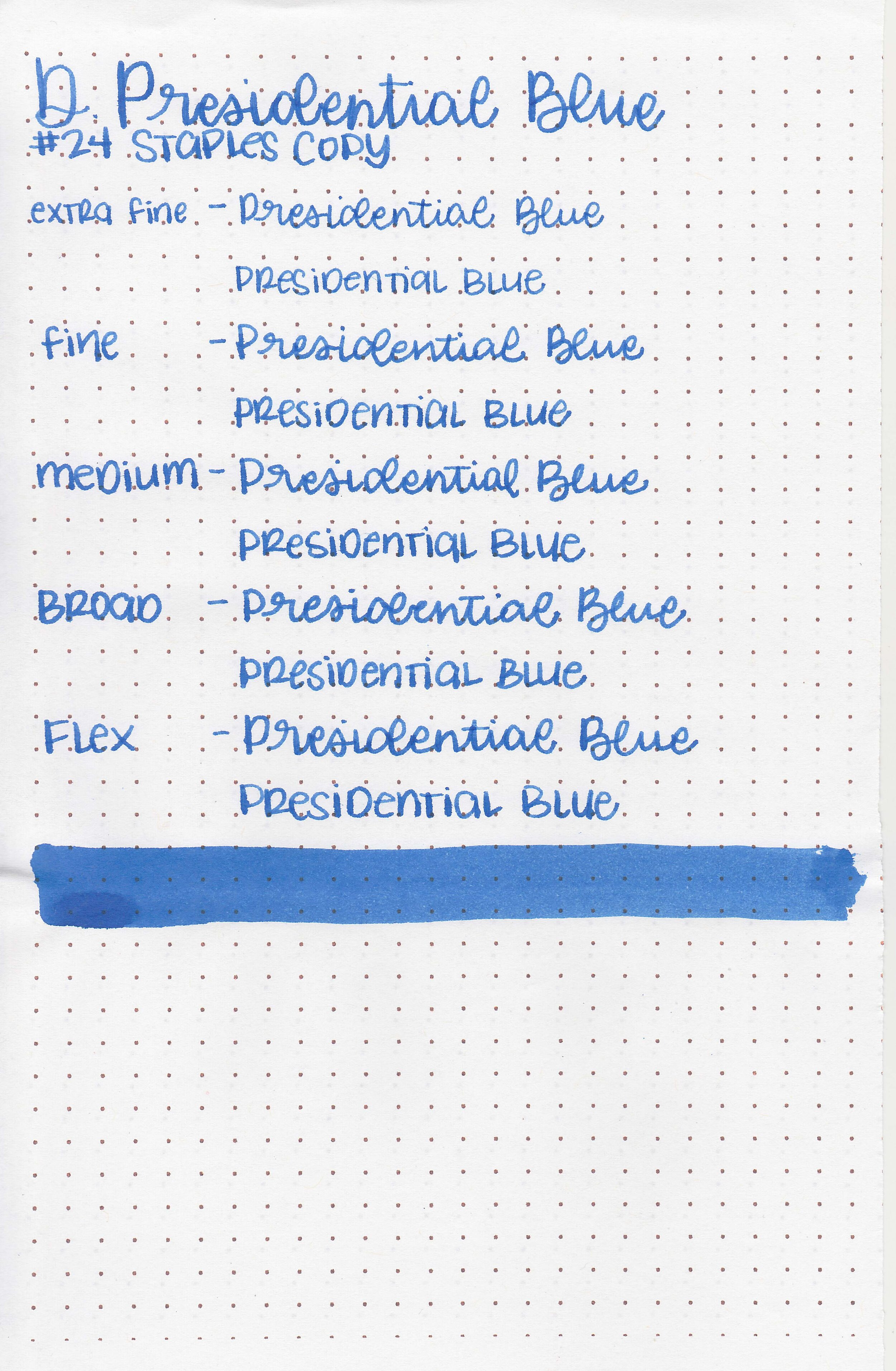
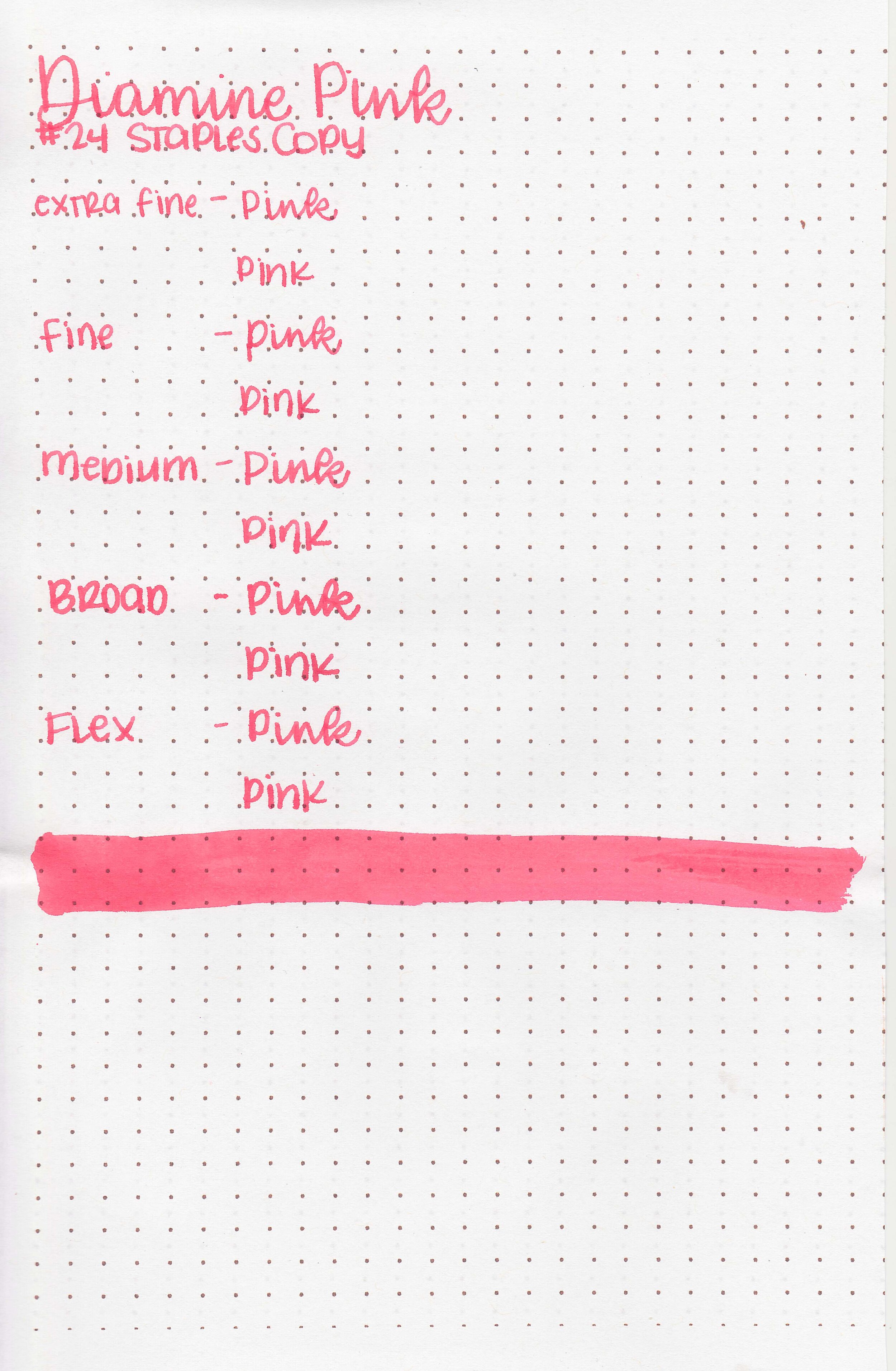
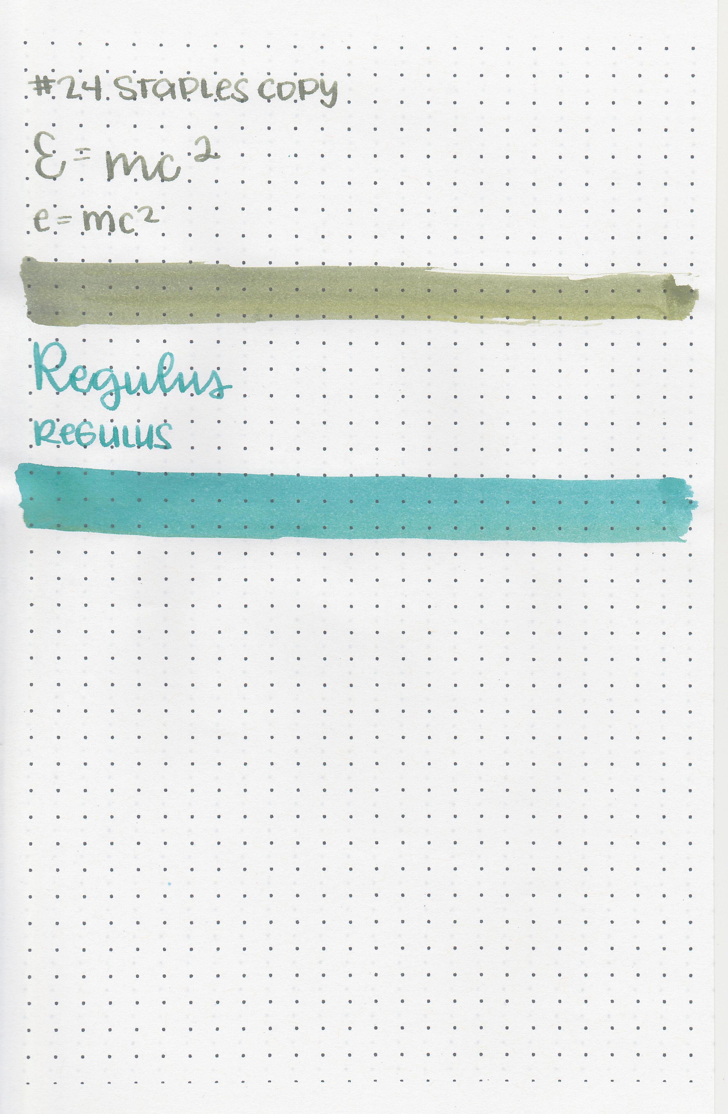
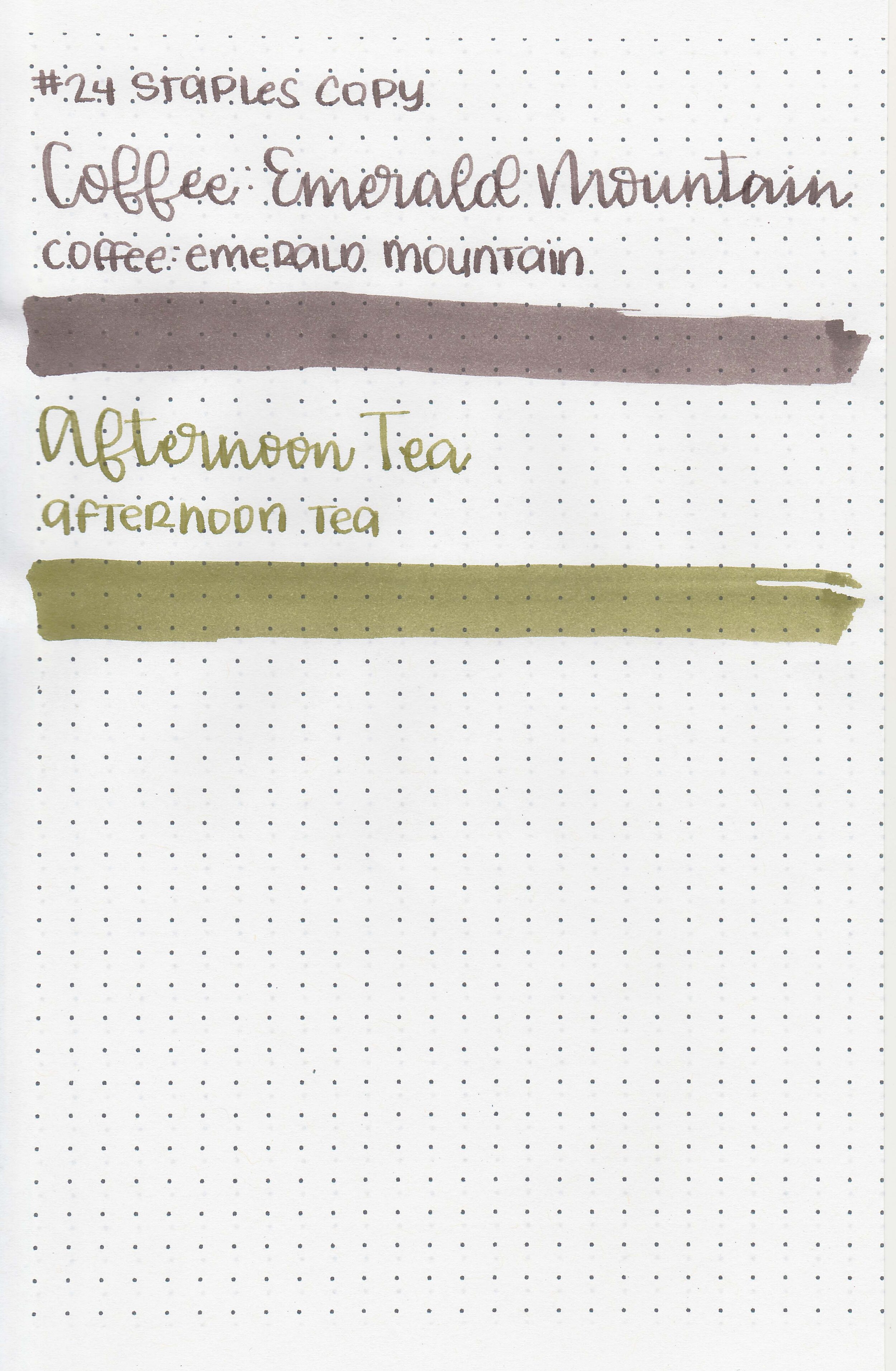
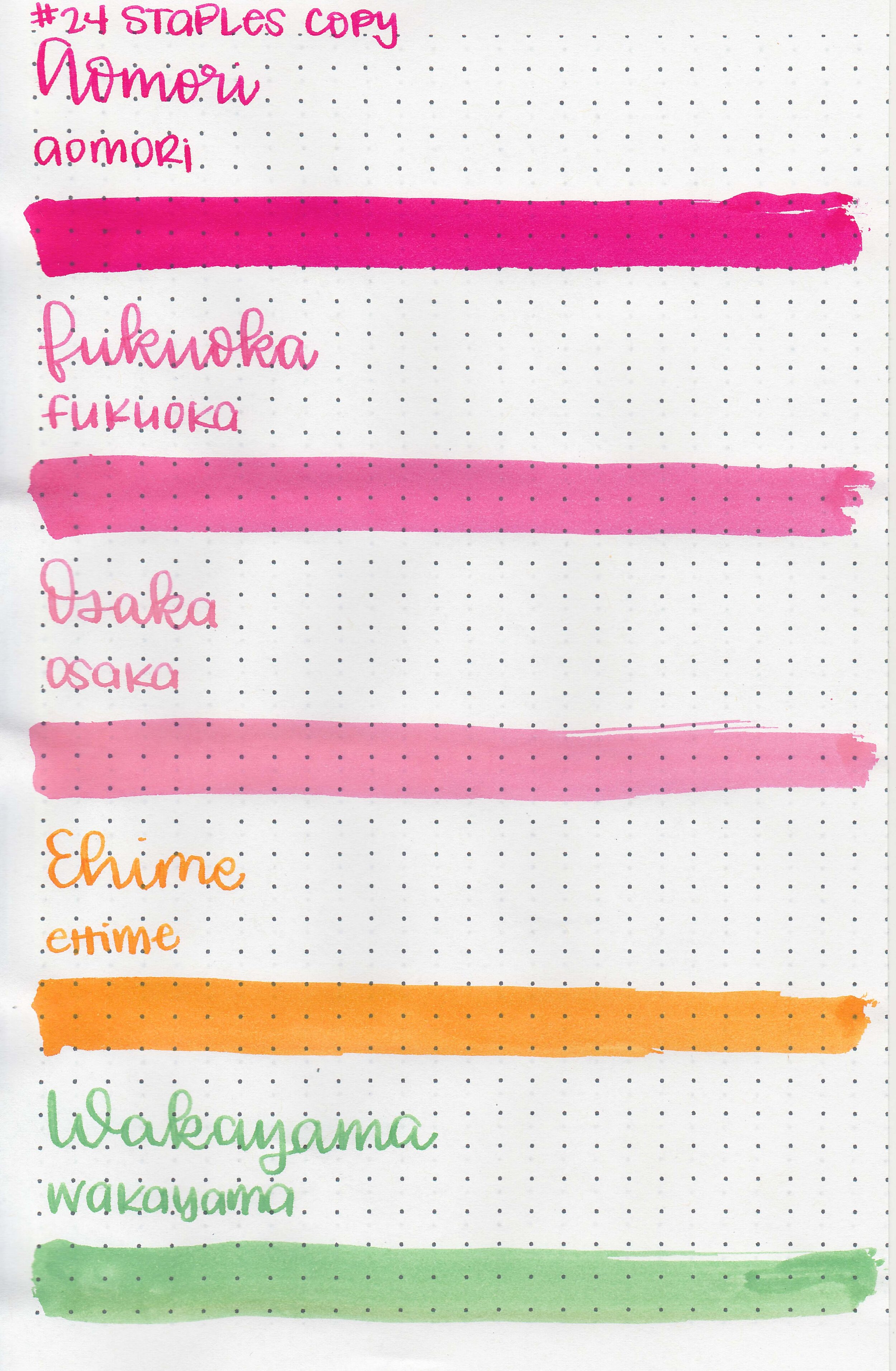
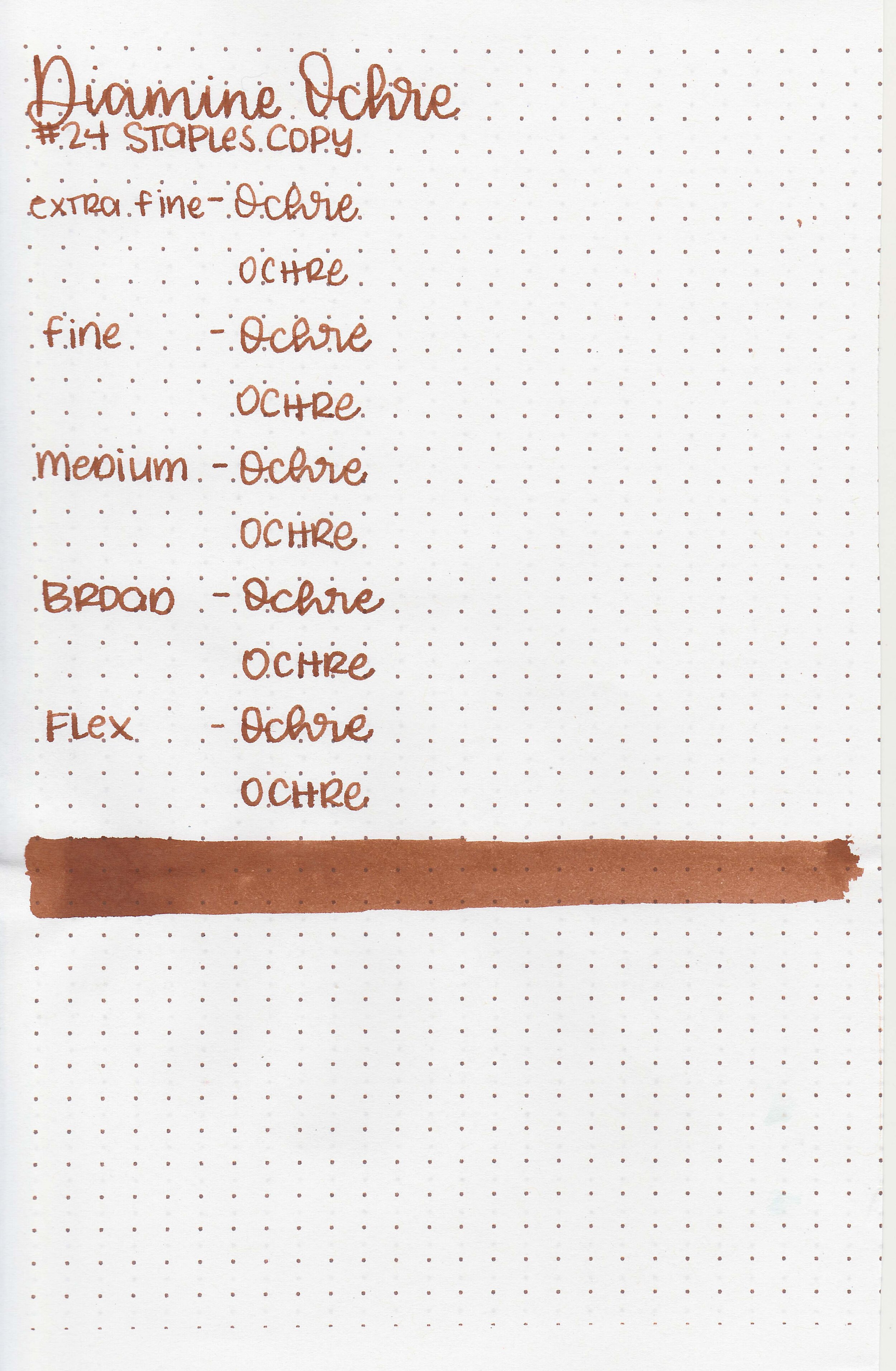
On Staples 24 lb copy paper there was some feathering in most nib sizes and a few dots of bleeding.
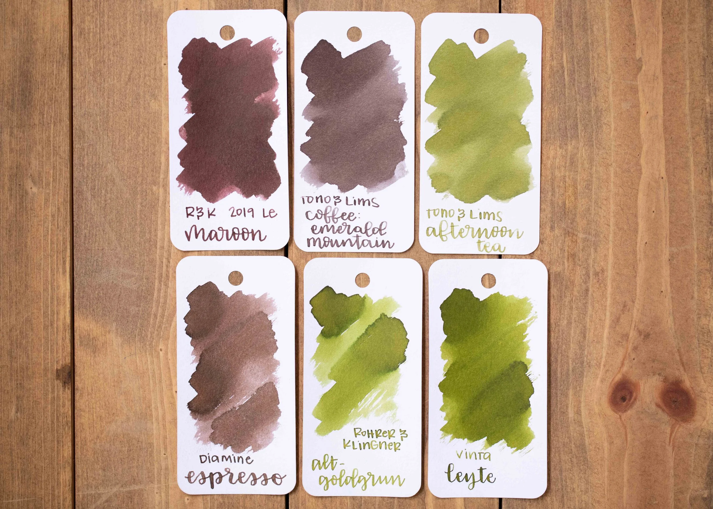
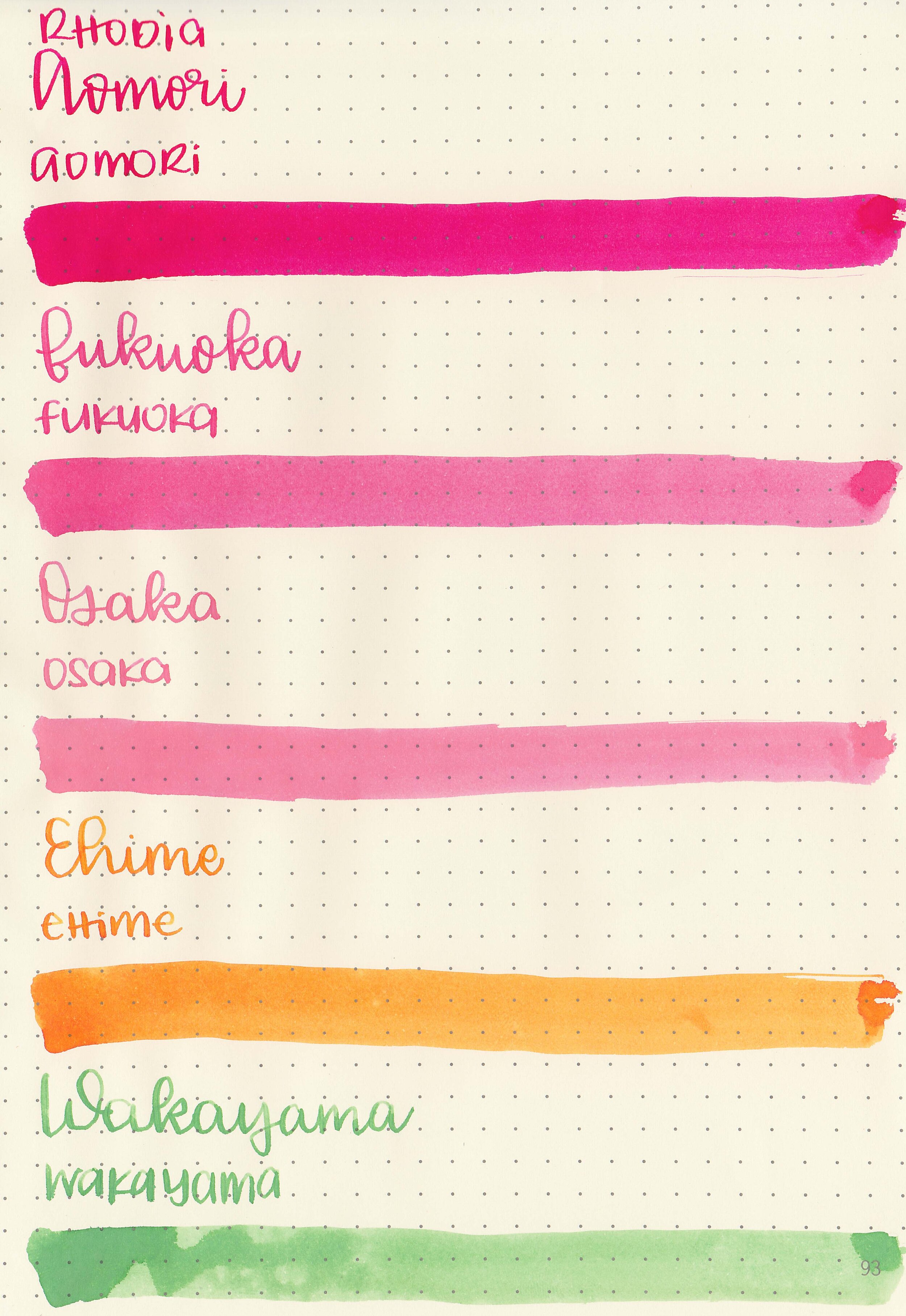
Comparison Swabs:

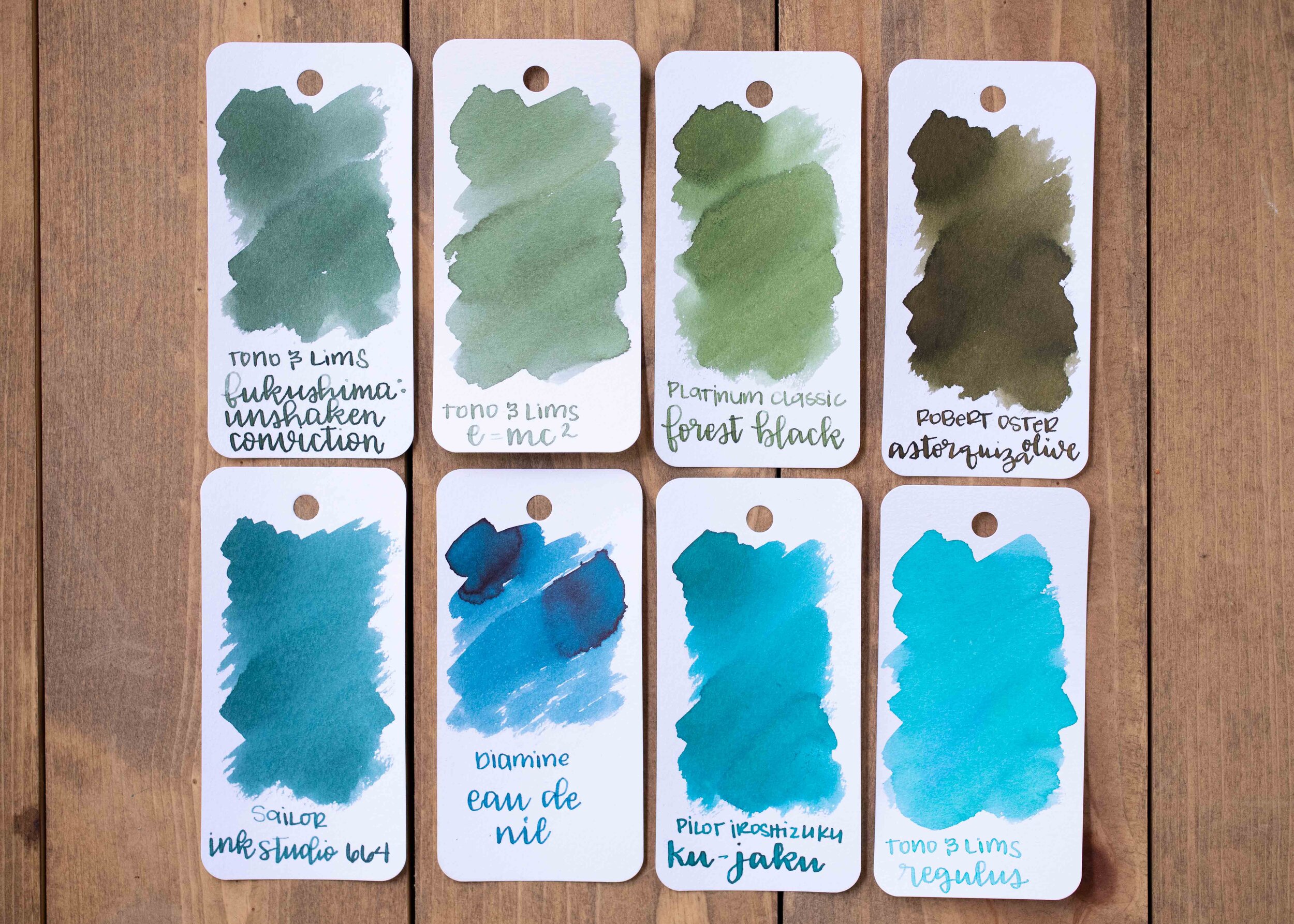
Coal Noir is similar to Monteverde Raven Noir and Waterman Intense Black. Click here to see the Monteverde inks together, and click here to see the black inks together.
Longer writing:

I used a Pilot Custom 823 Smoke with a broad nib on a Taroko Enigma notebook. The ink had a slightly wetter than average flow.
Overall, it’s a nice ink, but not my favorite black by a long shot. I just wish it was a little bit darker, with a little more shading and a little bit wetter. It’s a good ink for someone, just not a great one for me.
Disclaimer: I purchased this ink myself, and all photos and opinions are my own. This page does not contain affiliate links and this post is not sponsored in any way.