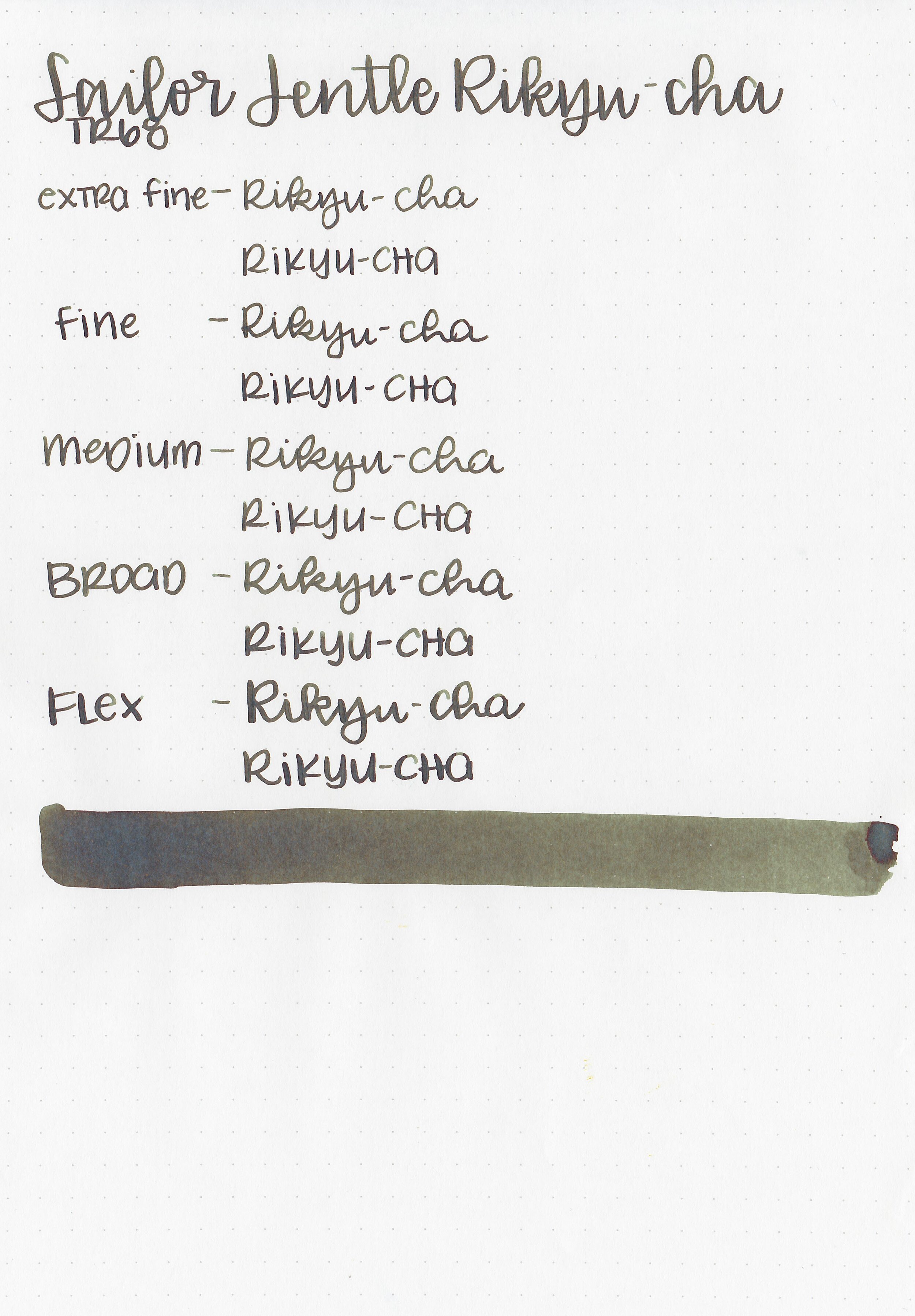
Ink Review #1225: Sailor Jentle Rikyu-cha
/
Sailor Jentle Rikyu-cha was released in the 2016 Four Seasons collection. It used to be available in the round 50ml bottles, but recently Sailor changed it to the 20ml Shikiori bottles. Thanks to the reader that sent a sample in for review! You can find this ink for sale at most fountain pen retailers including Vanness Pens.

The color:
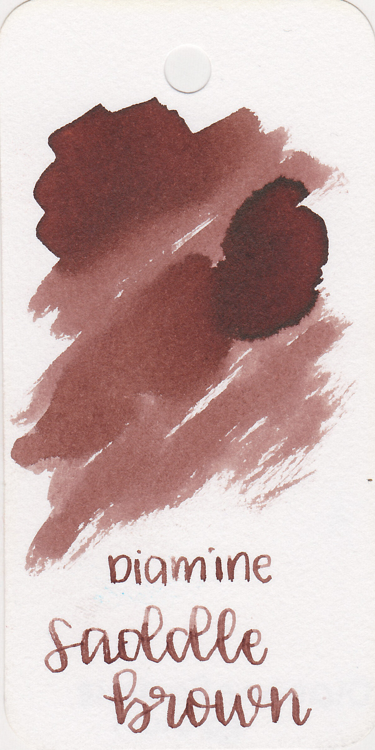
Rikyu-cha is in-between a dark olive green and a dark brown.
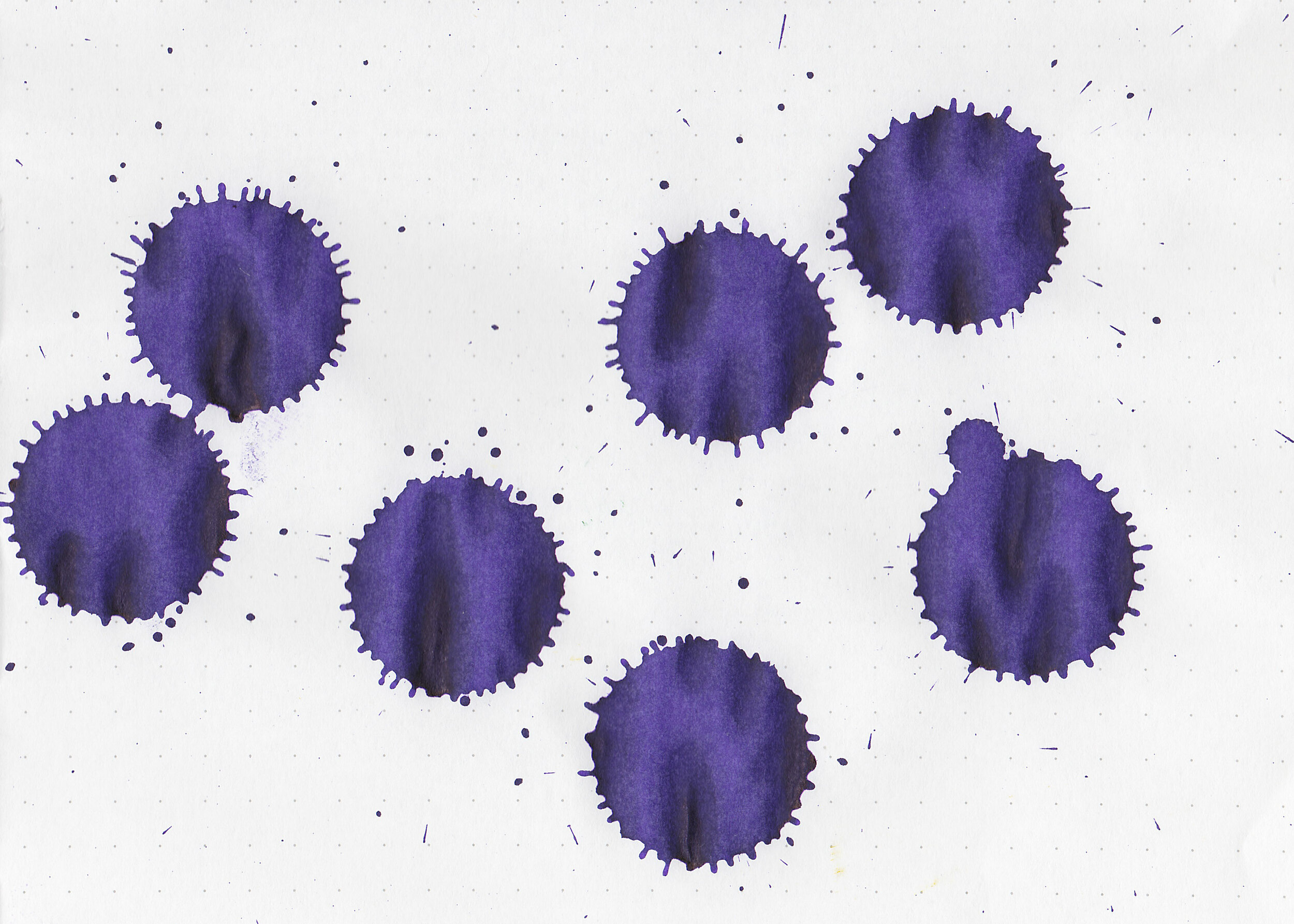
Swabs:

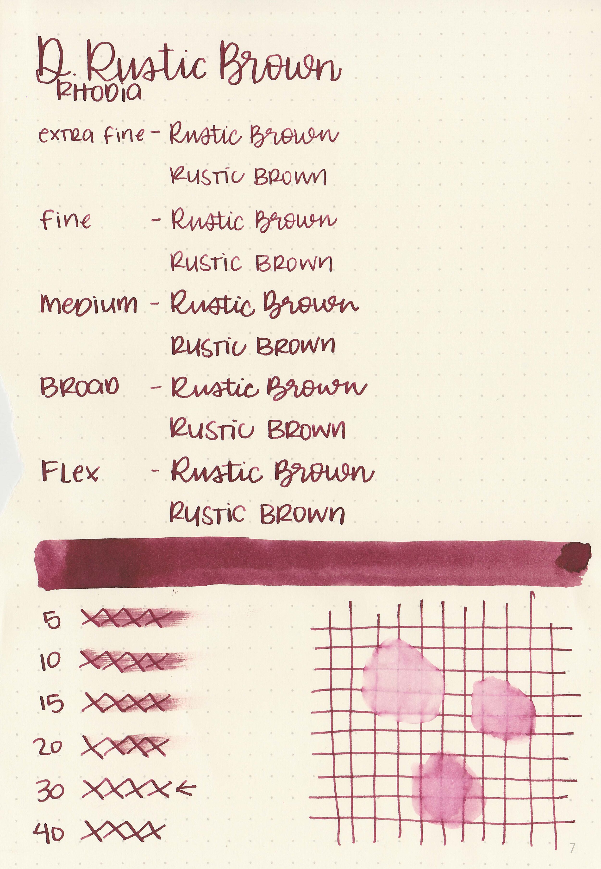
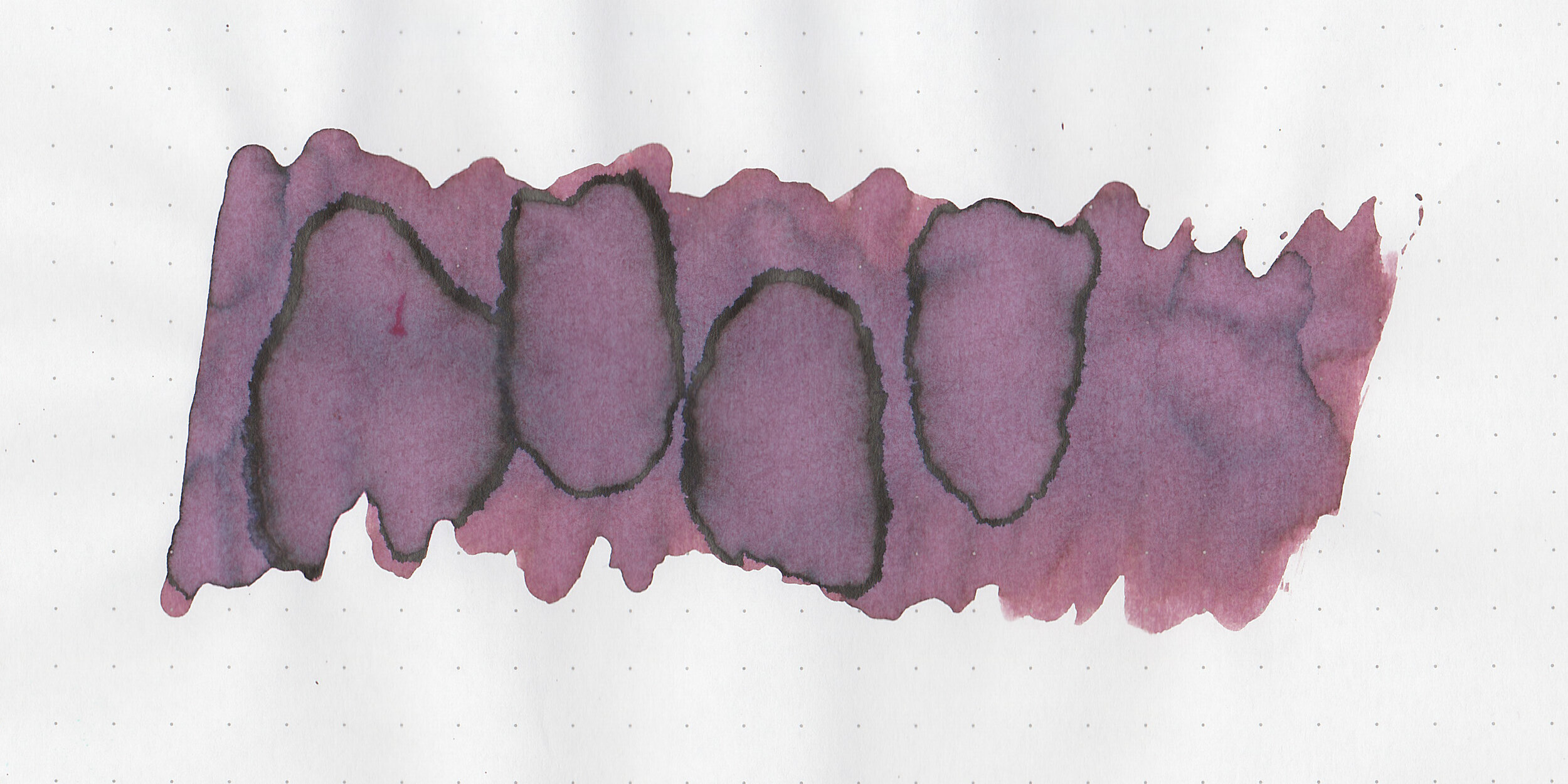
In large swabs on Tomoe River paper the ink looks more of a dark teal than green.

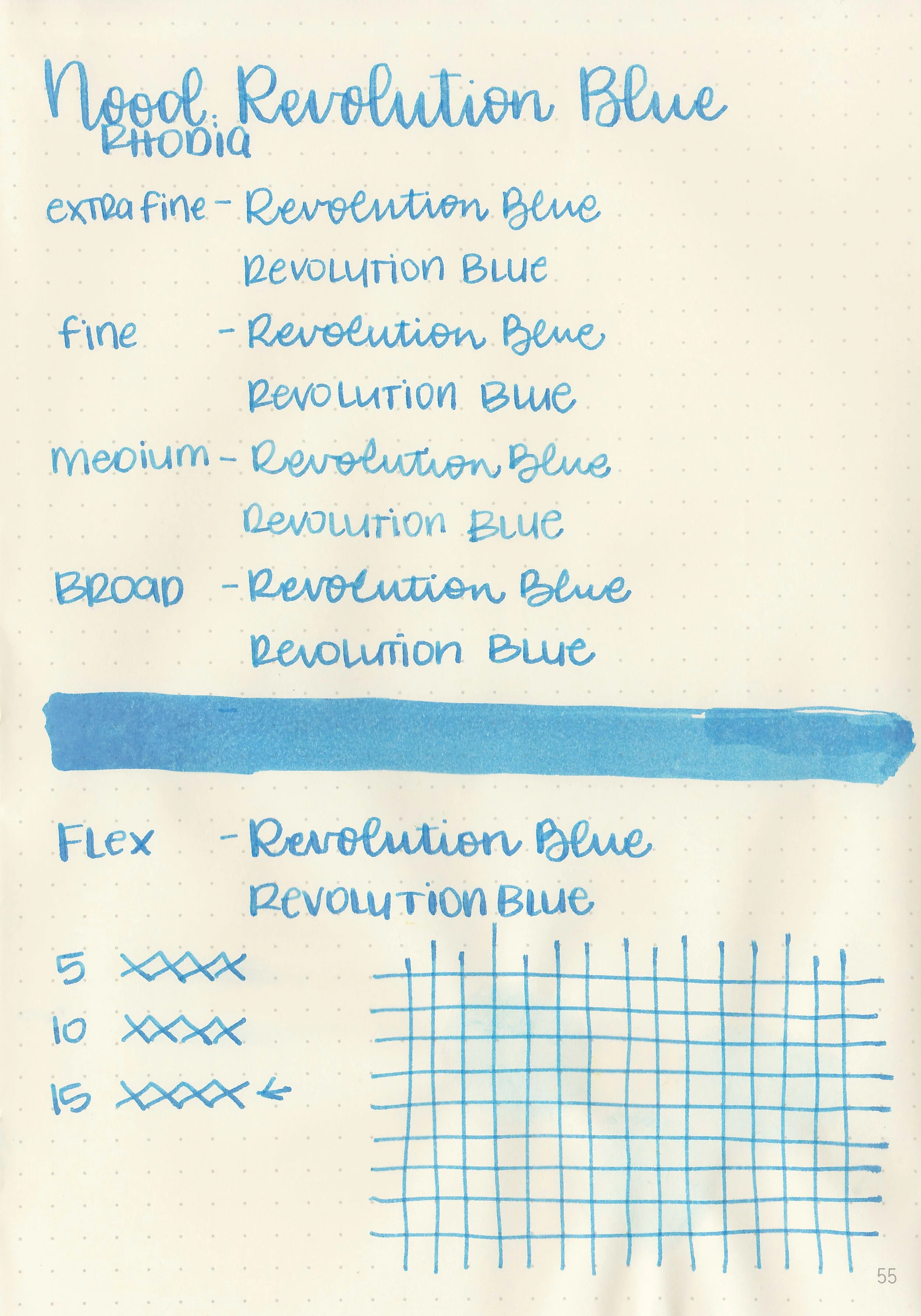
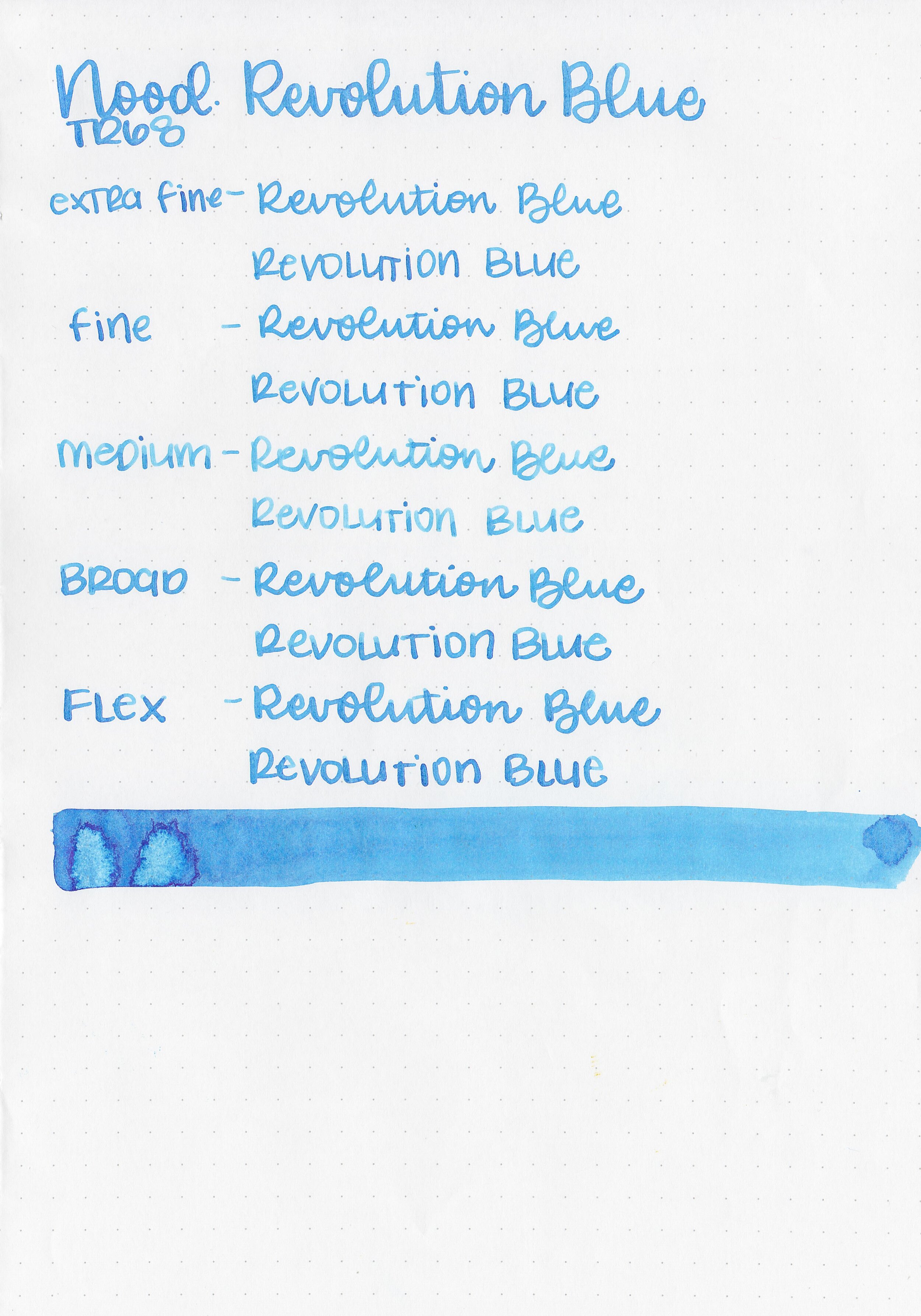
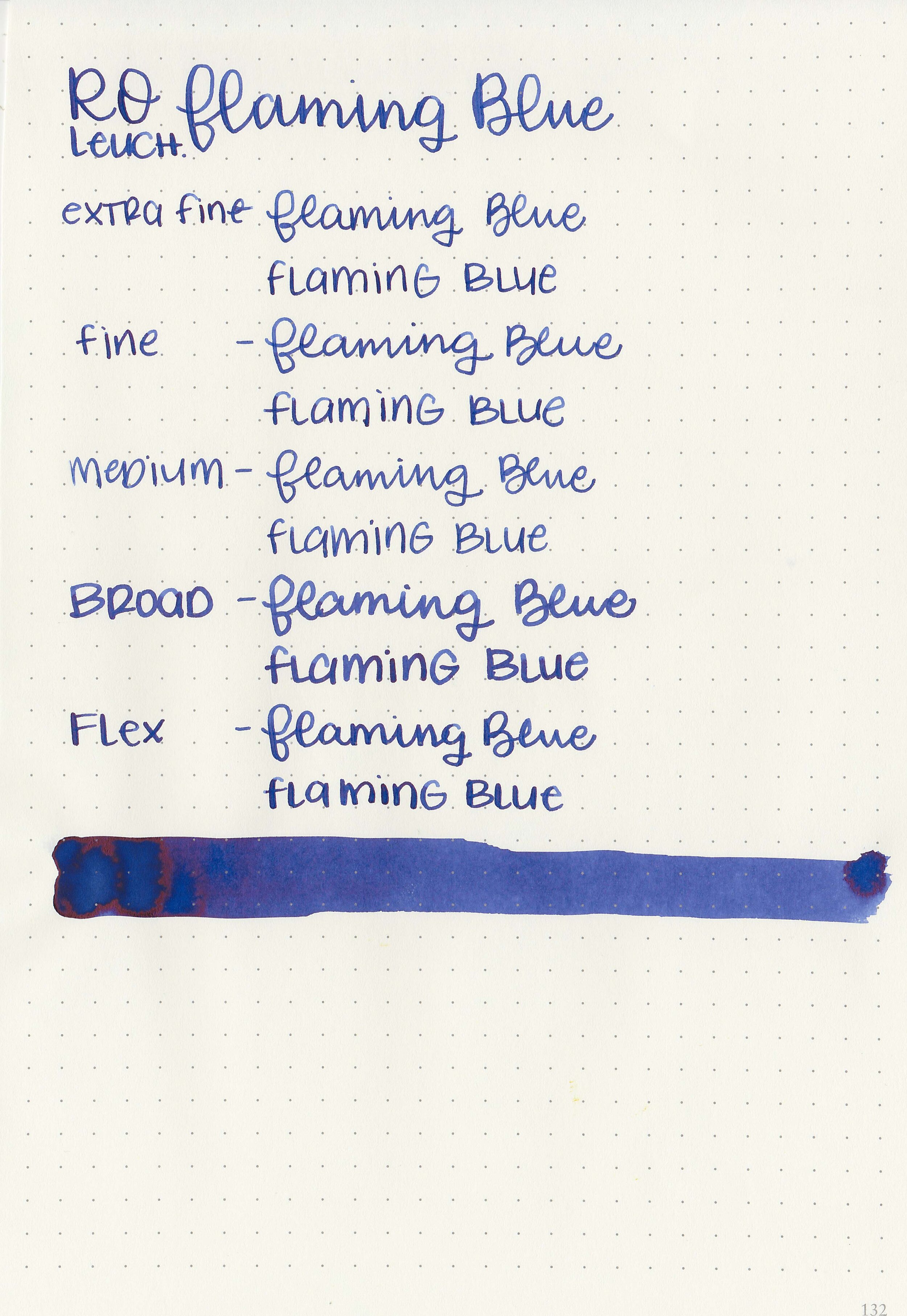
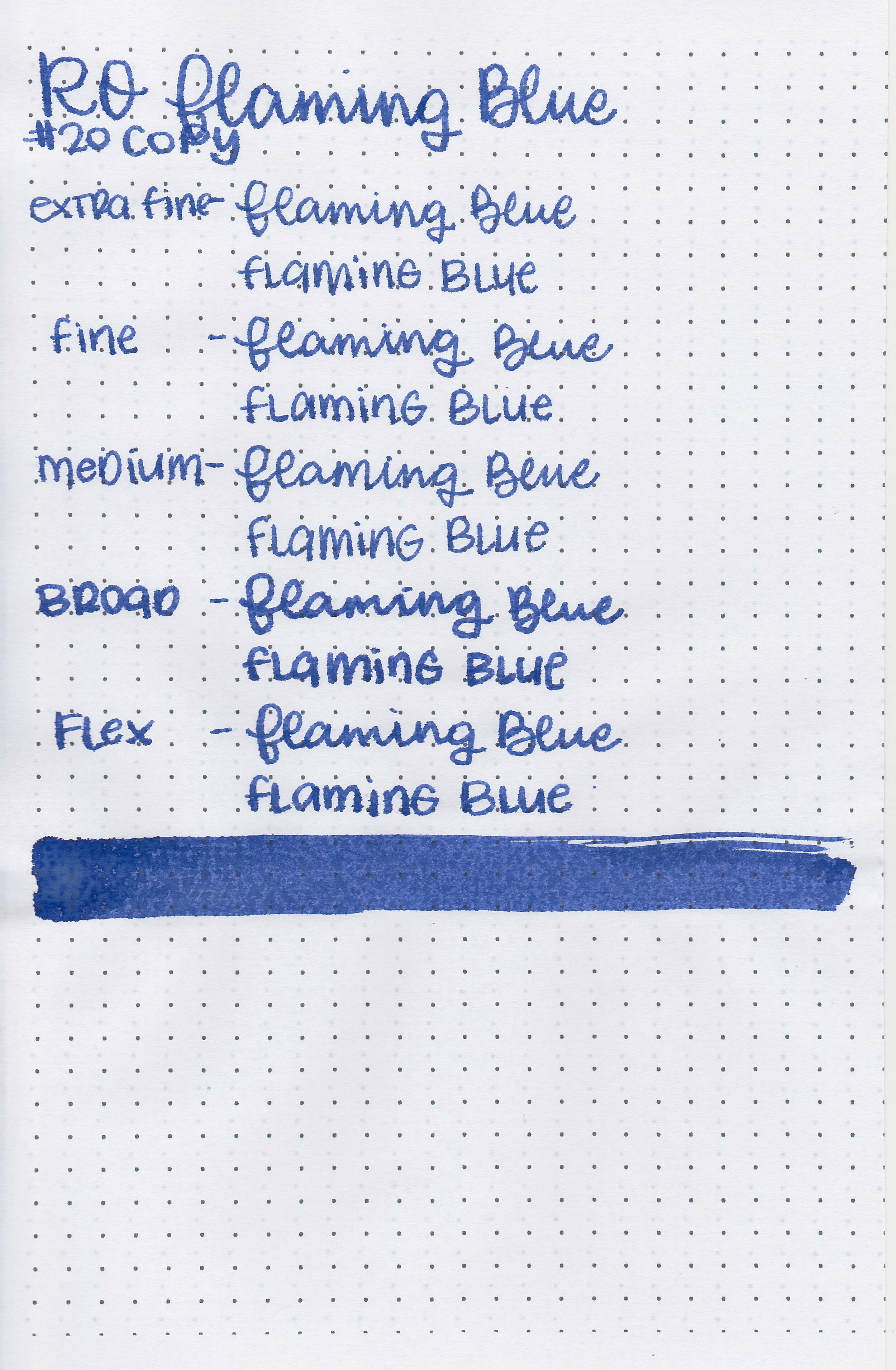
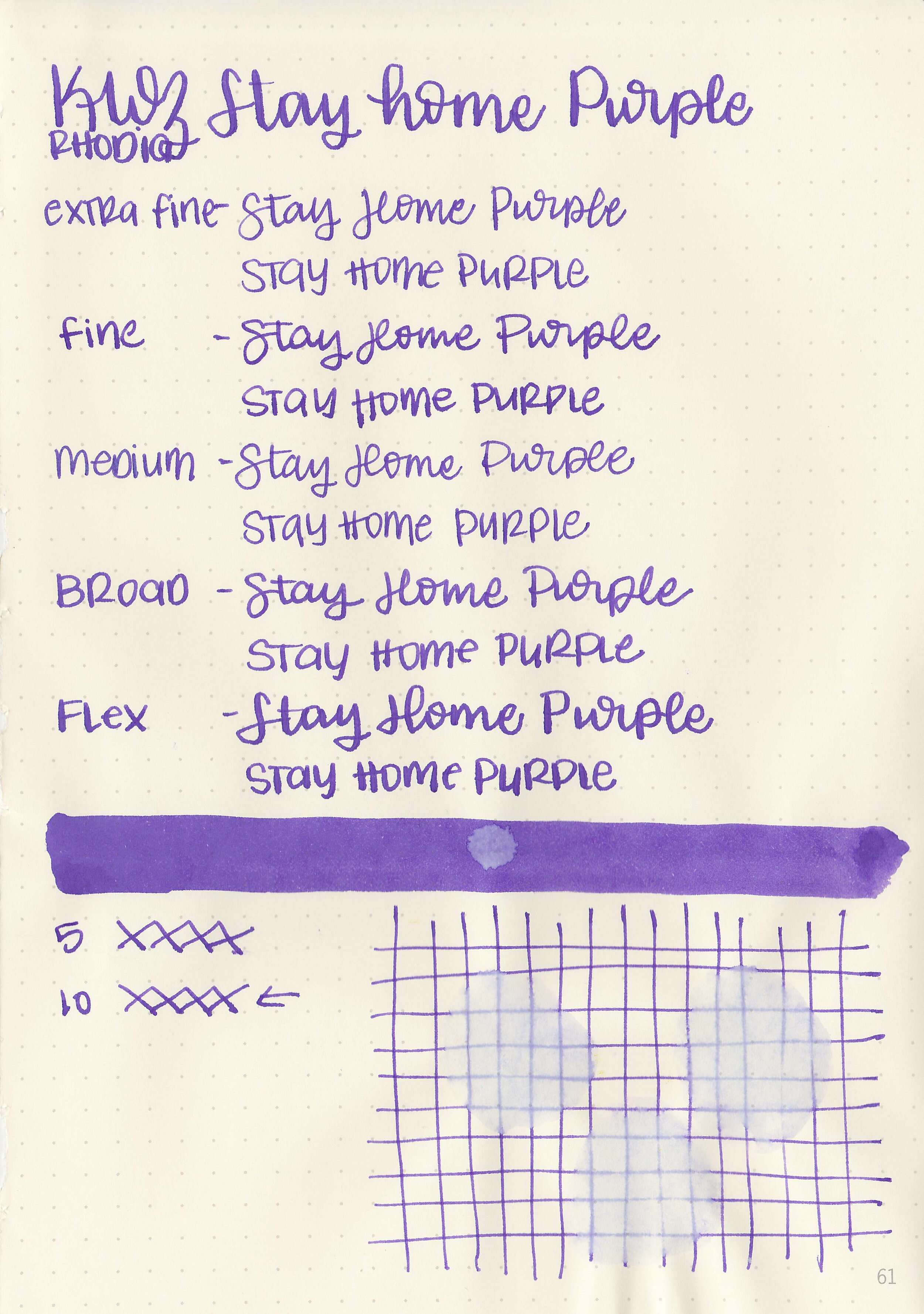
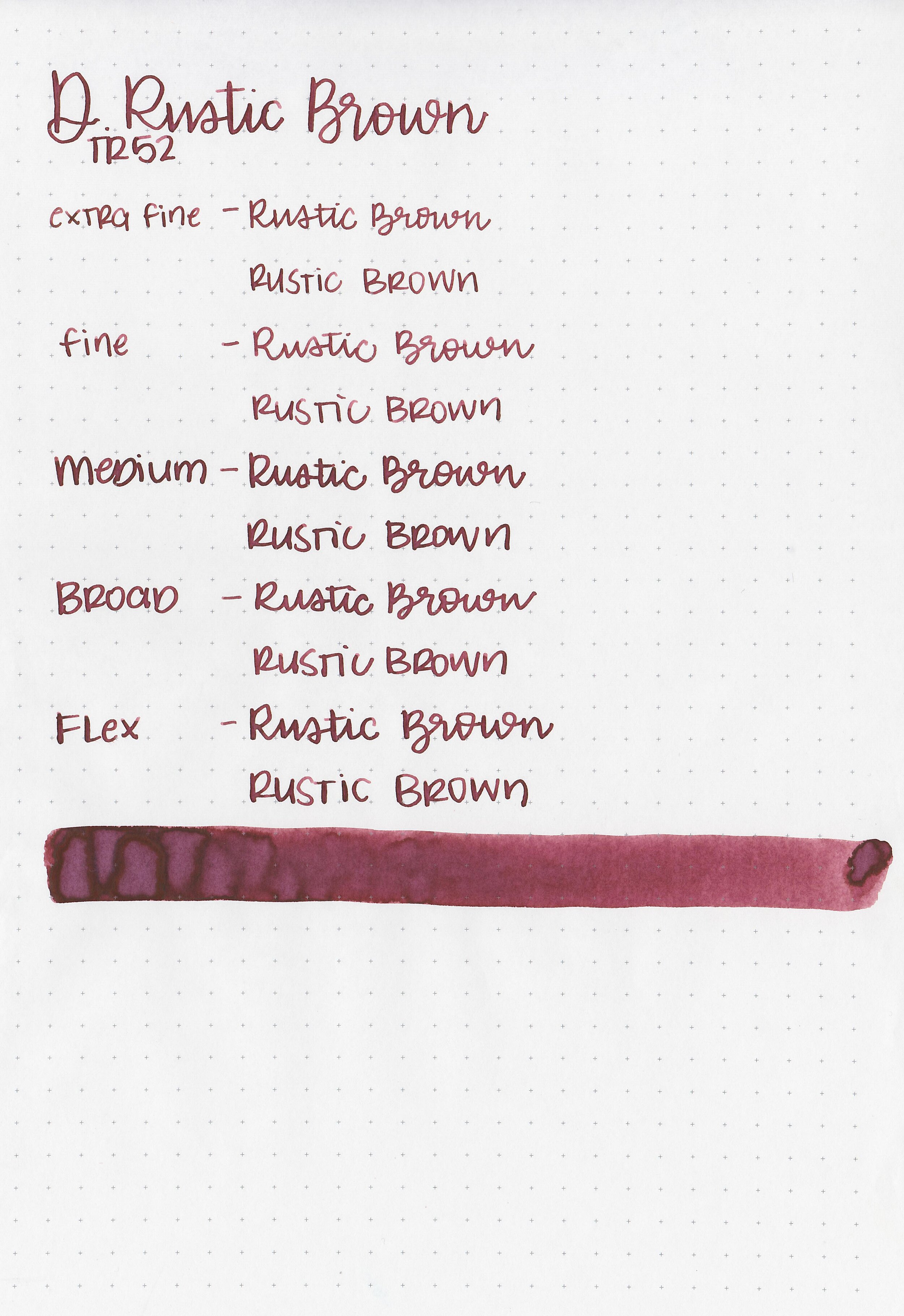
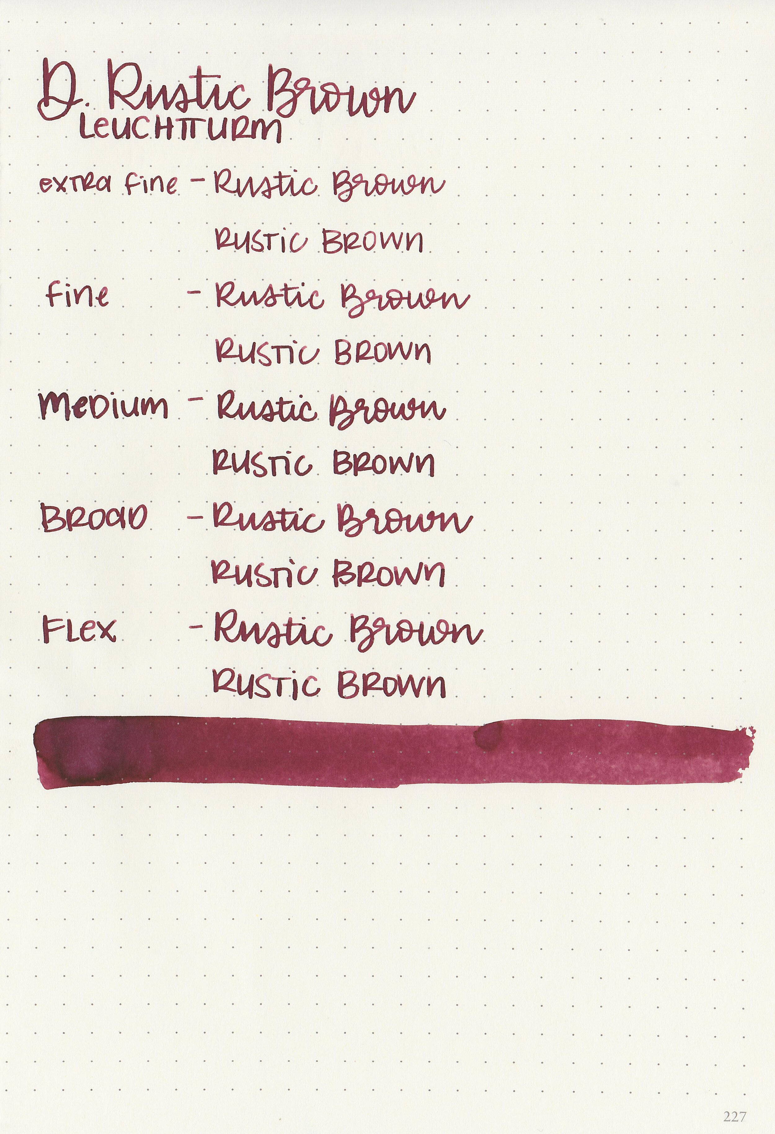
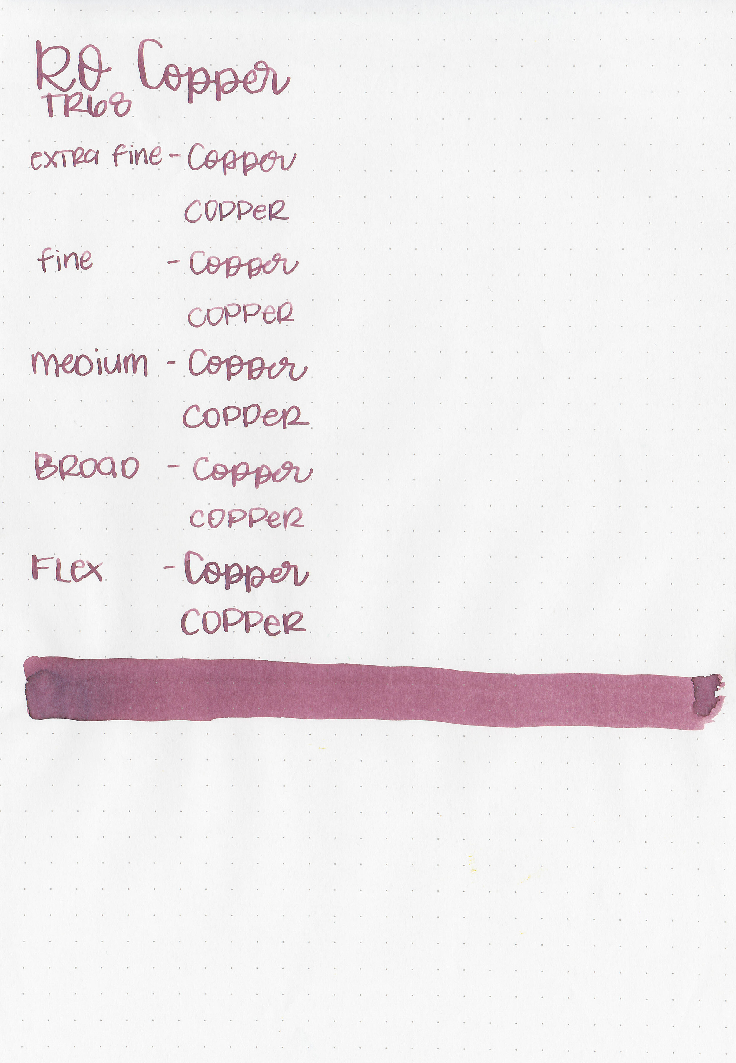
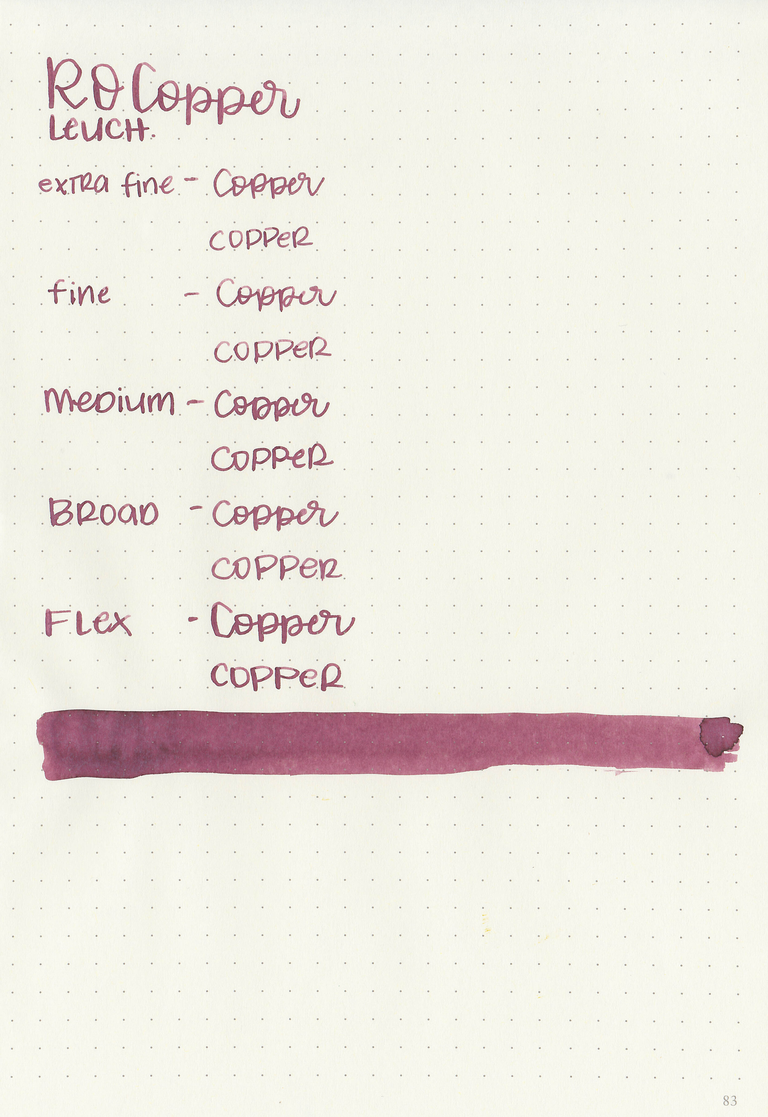
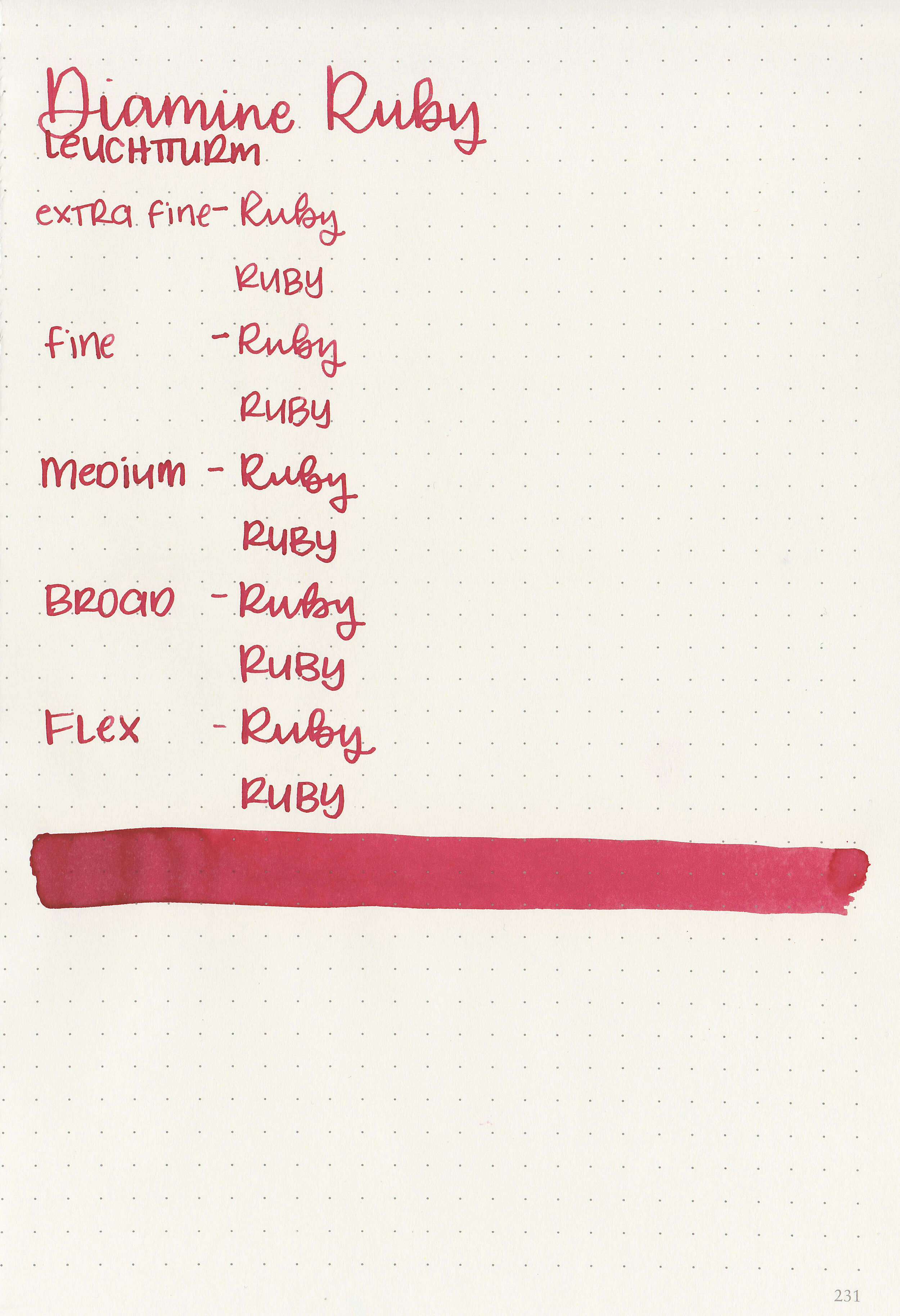
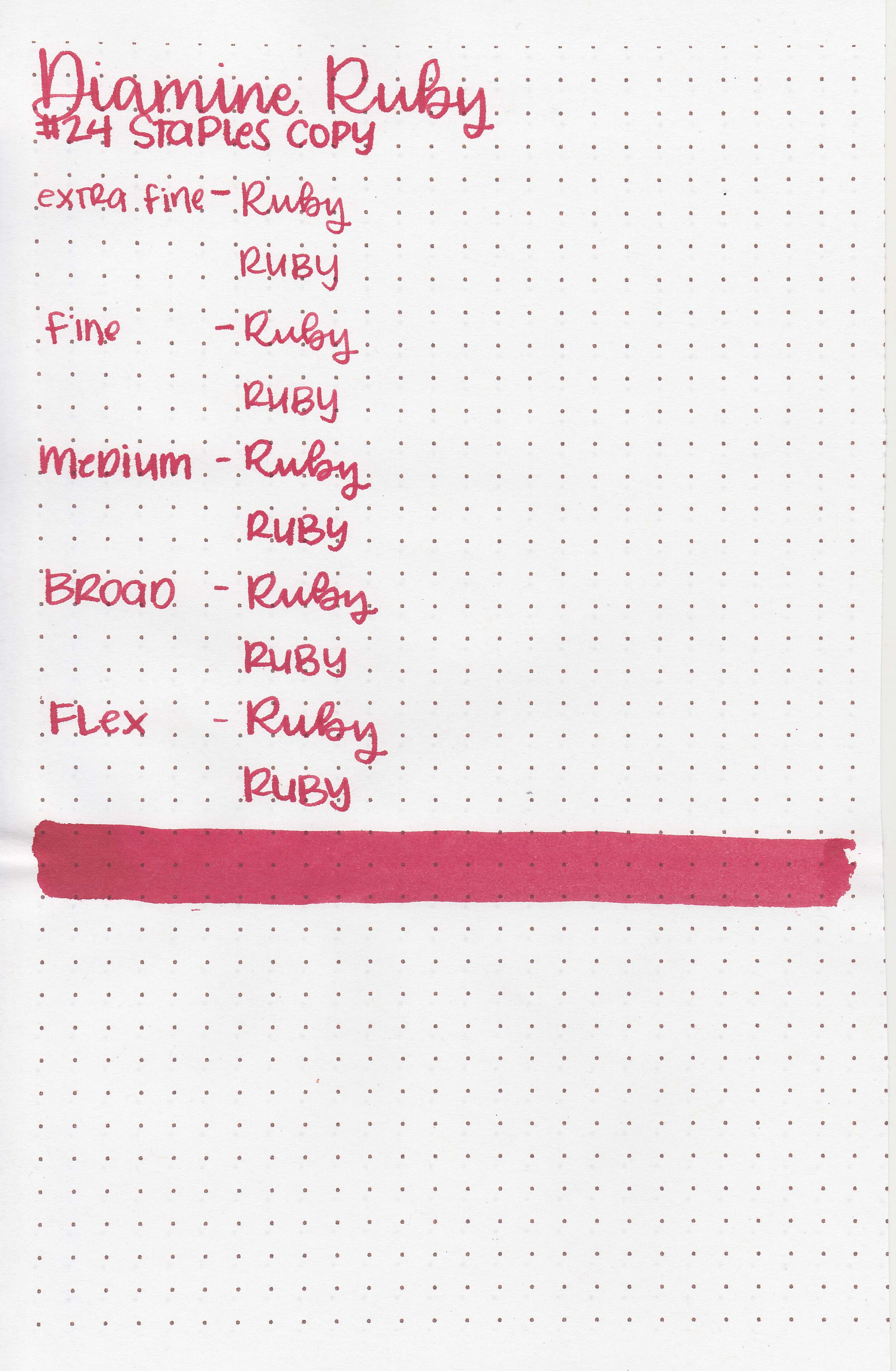
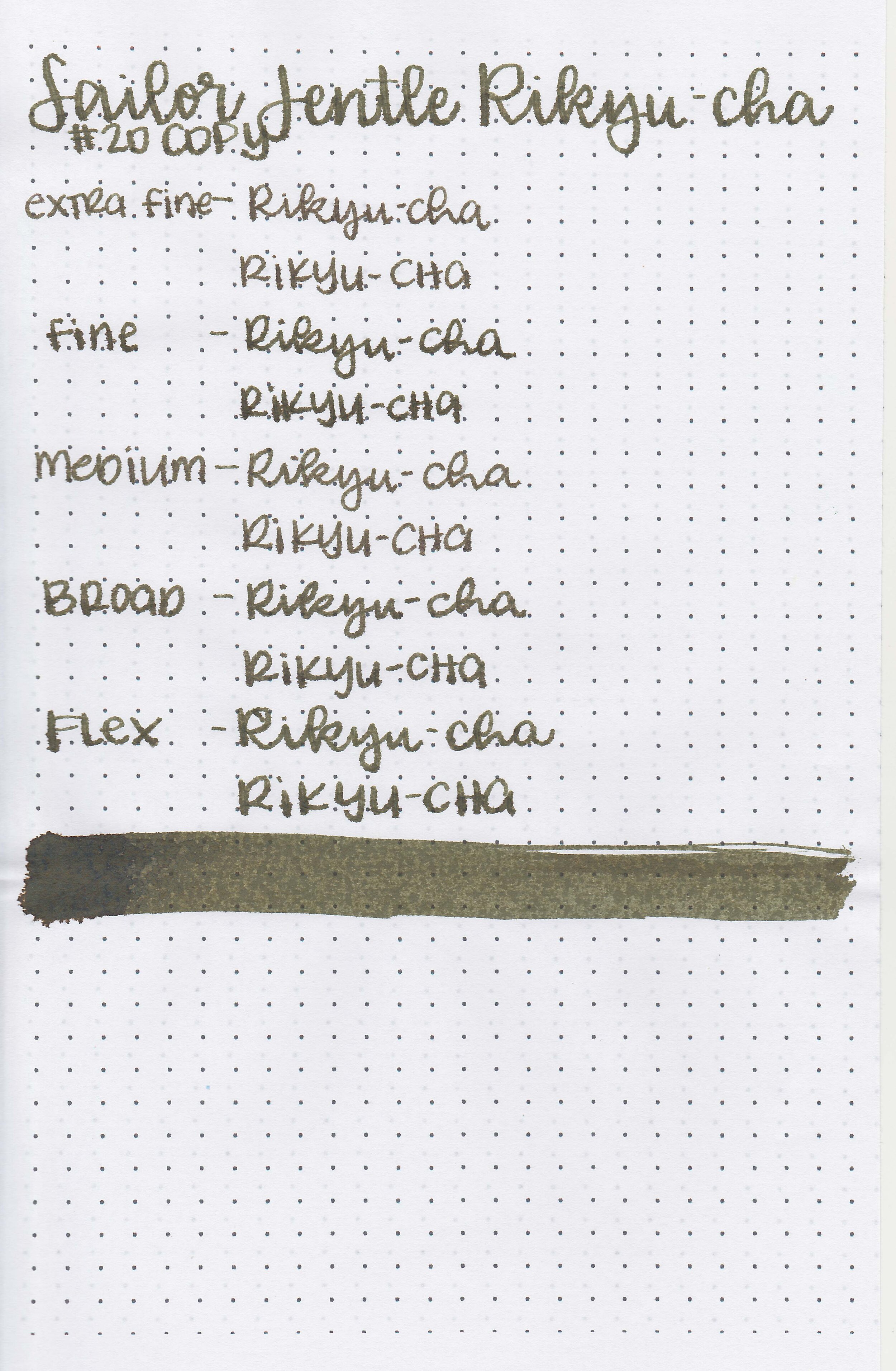
Writing samples:
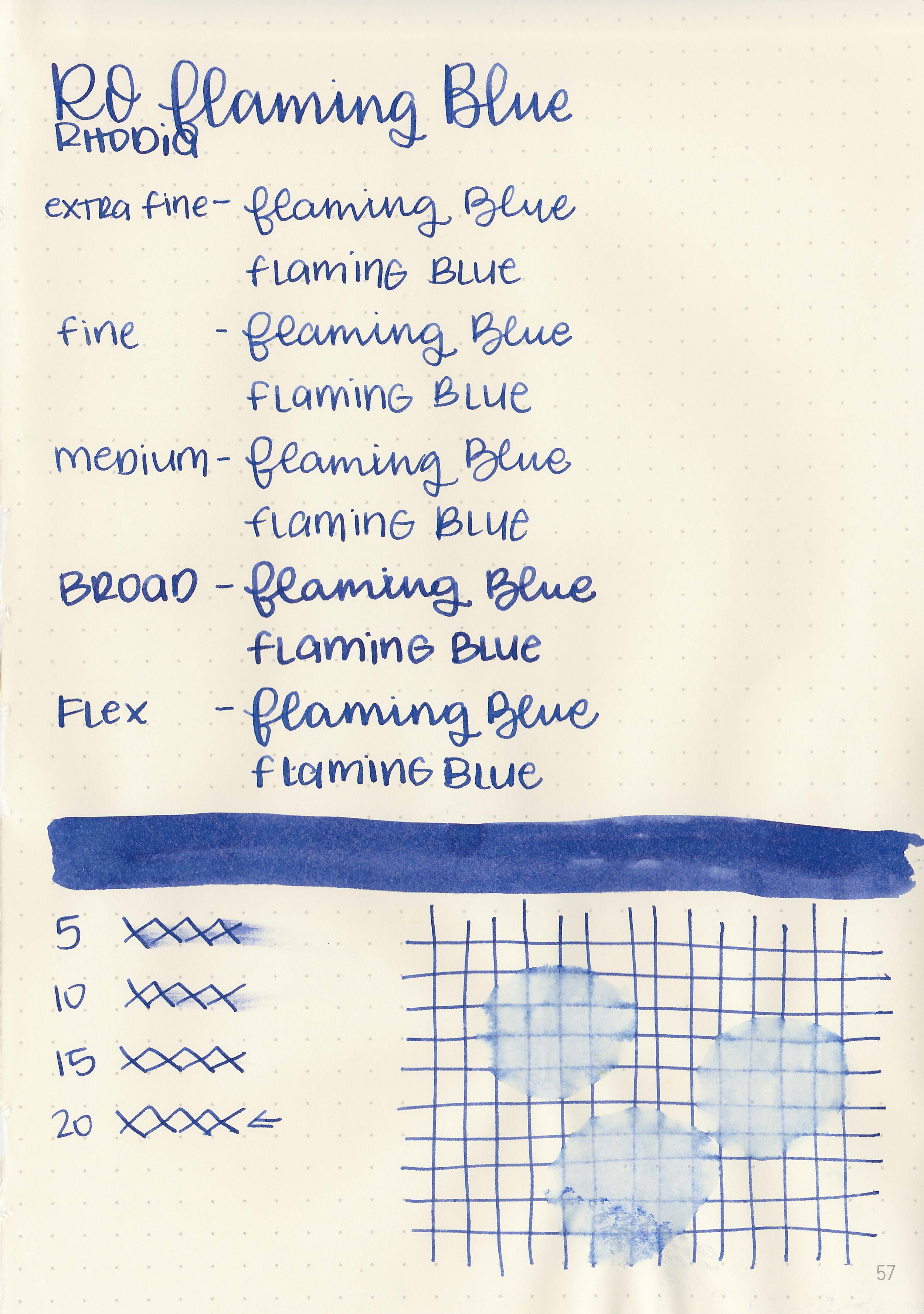
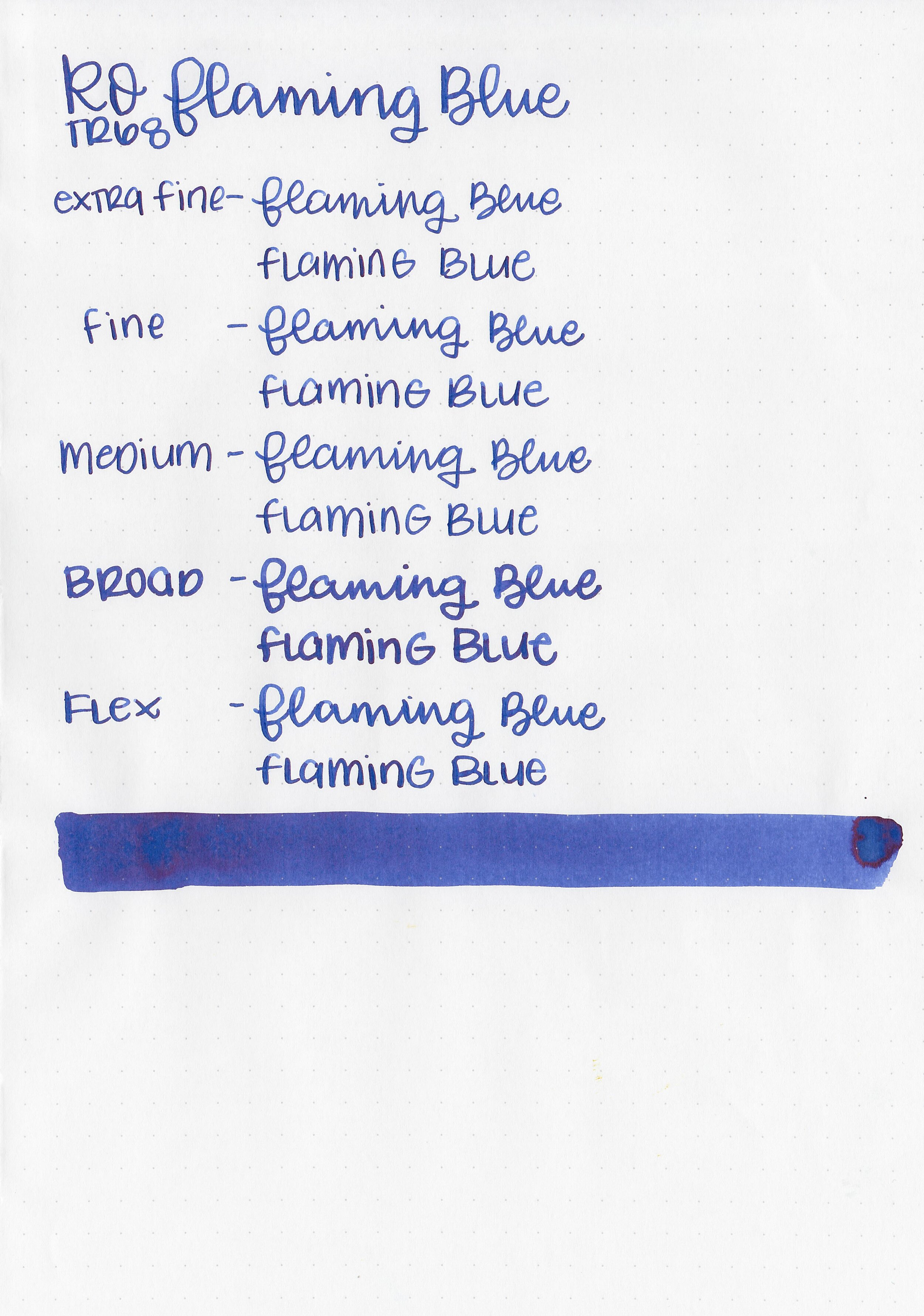
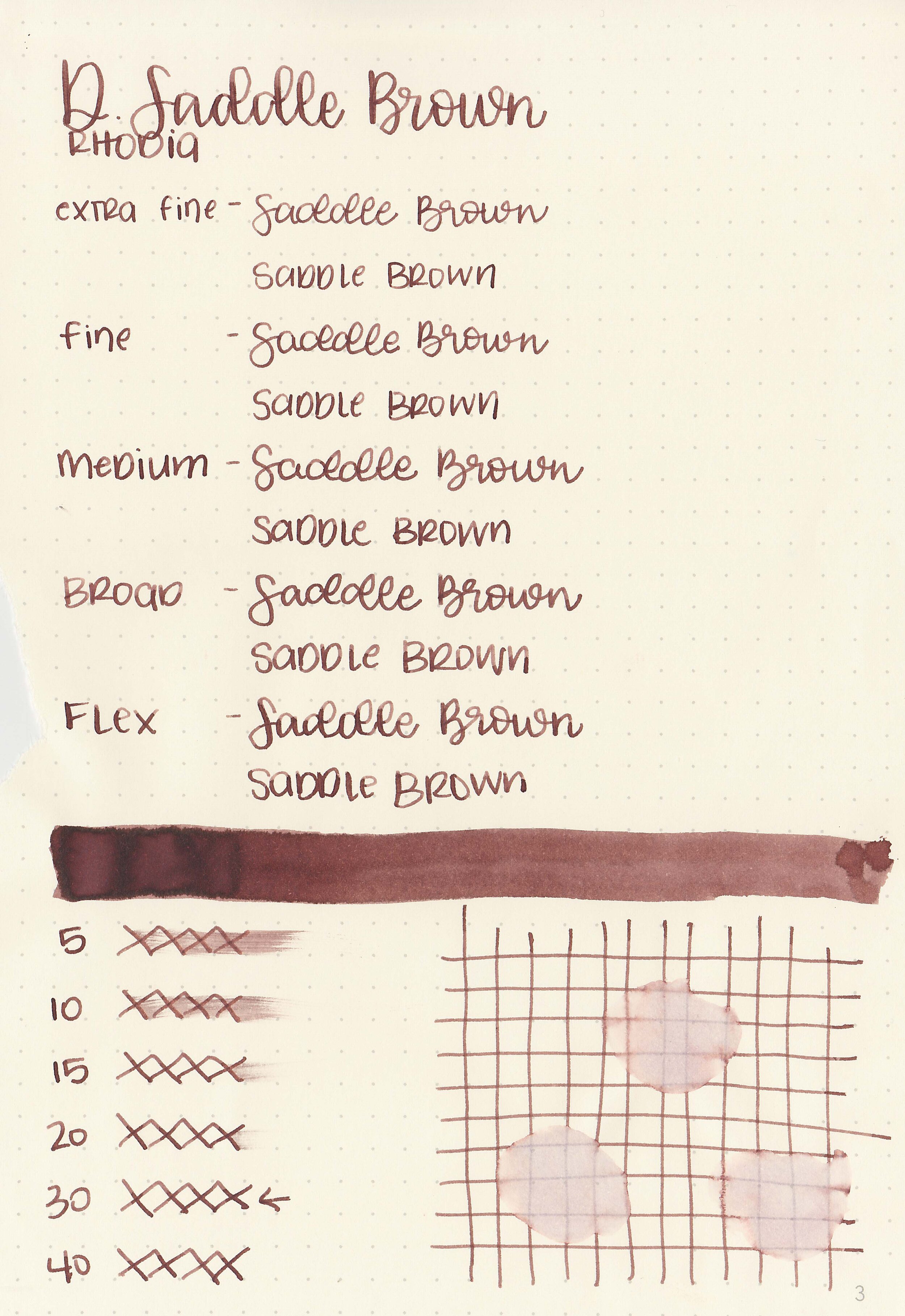
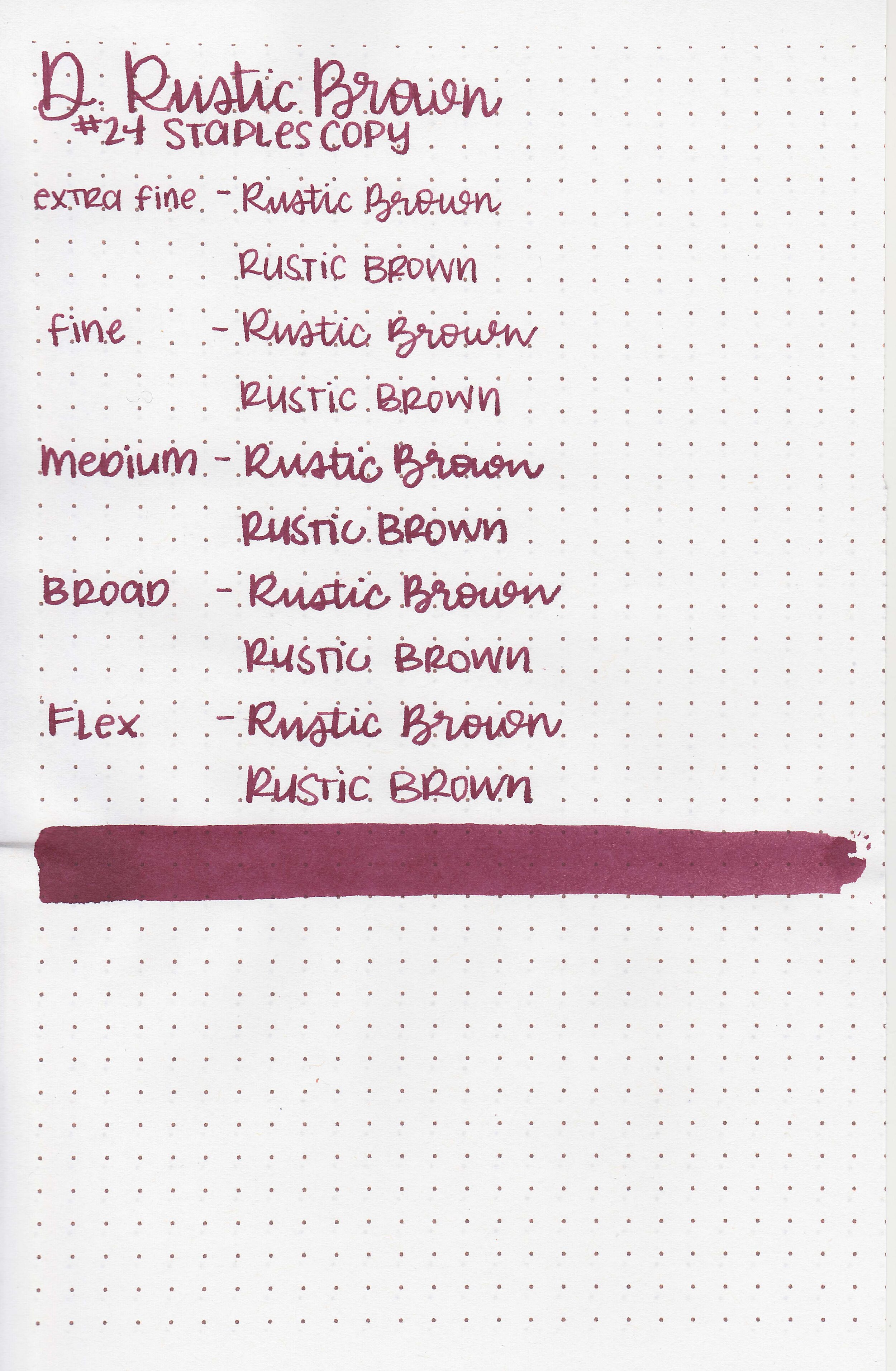
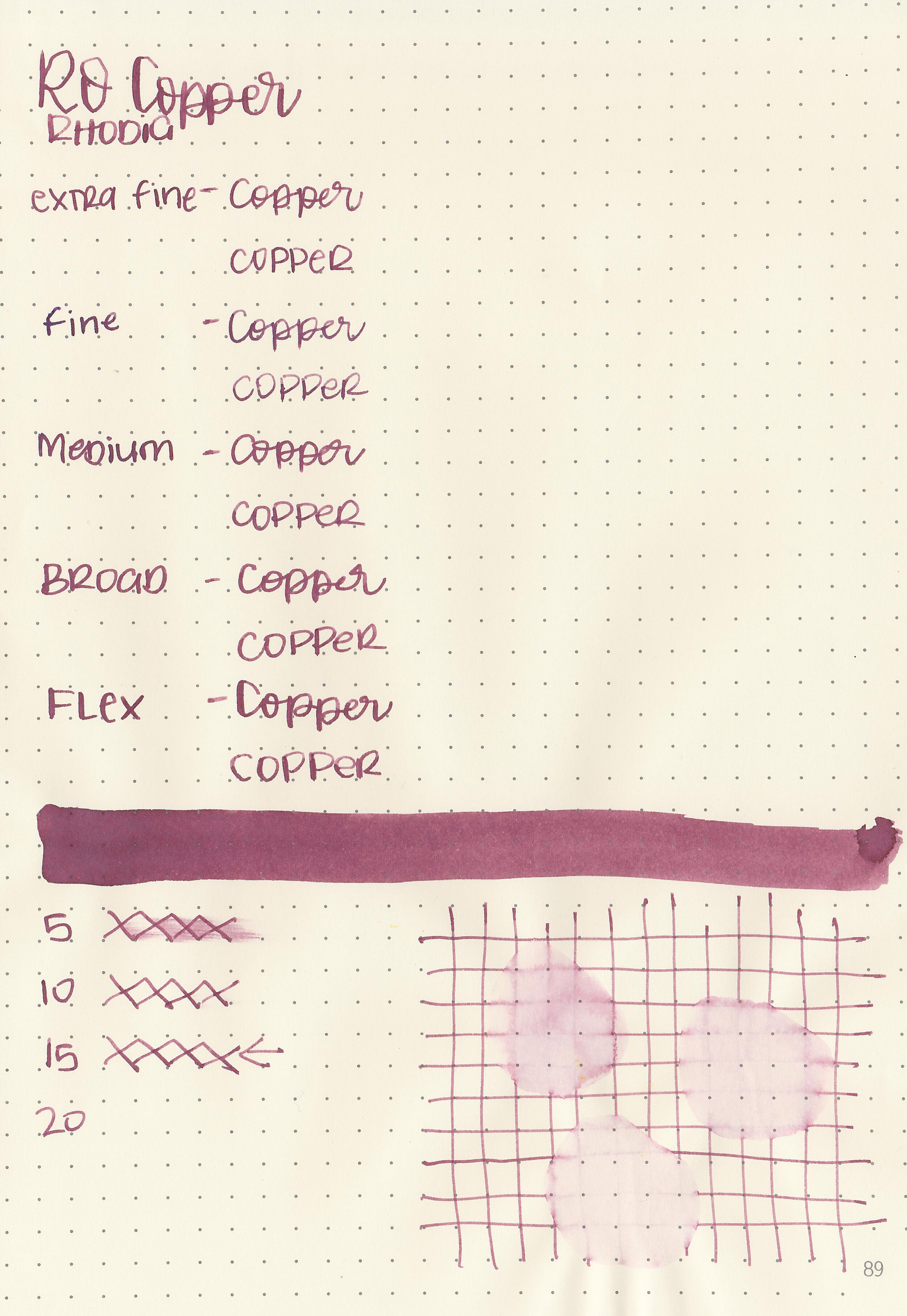
Let's take a look at how the ink behaves on fountain pen friendly papers: Rhodia, Tomoe River, and Leuchtturm.
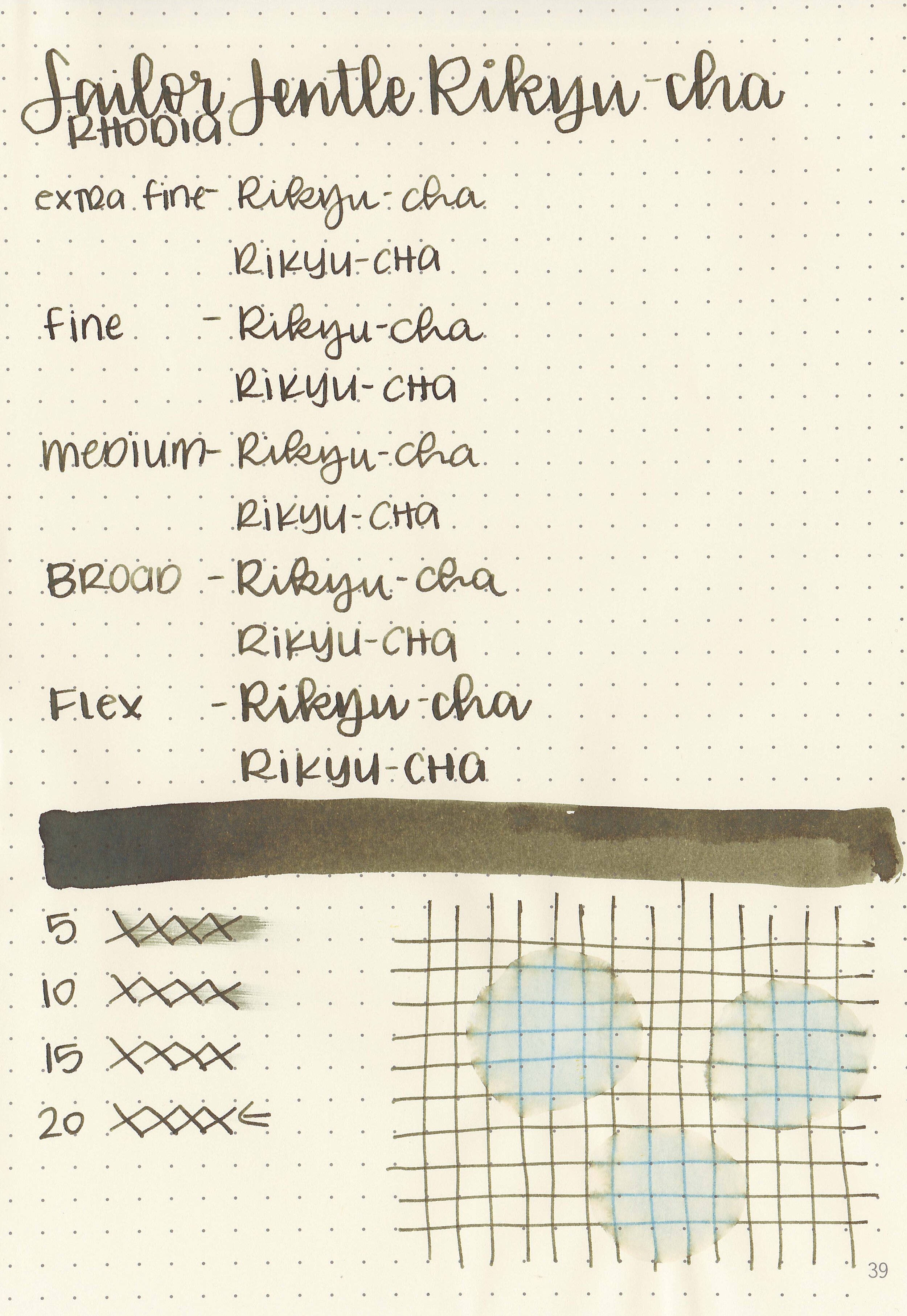
Dry time: 20 seconds
Water resistance: Medium
Feathering: Low-there was some feathering in the larger nib sizes on Rhodia and Leuchtturm.
Show through: Medium
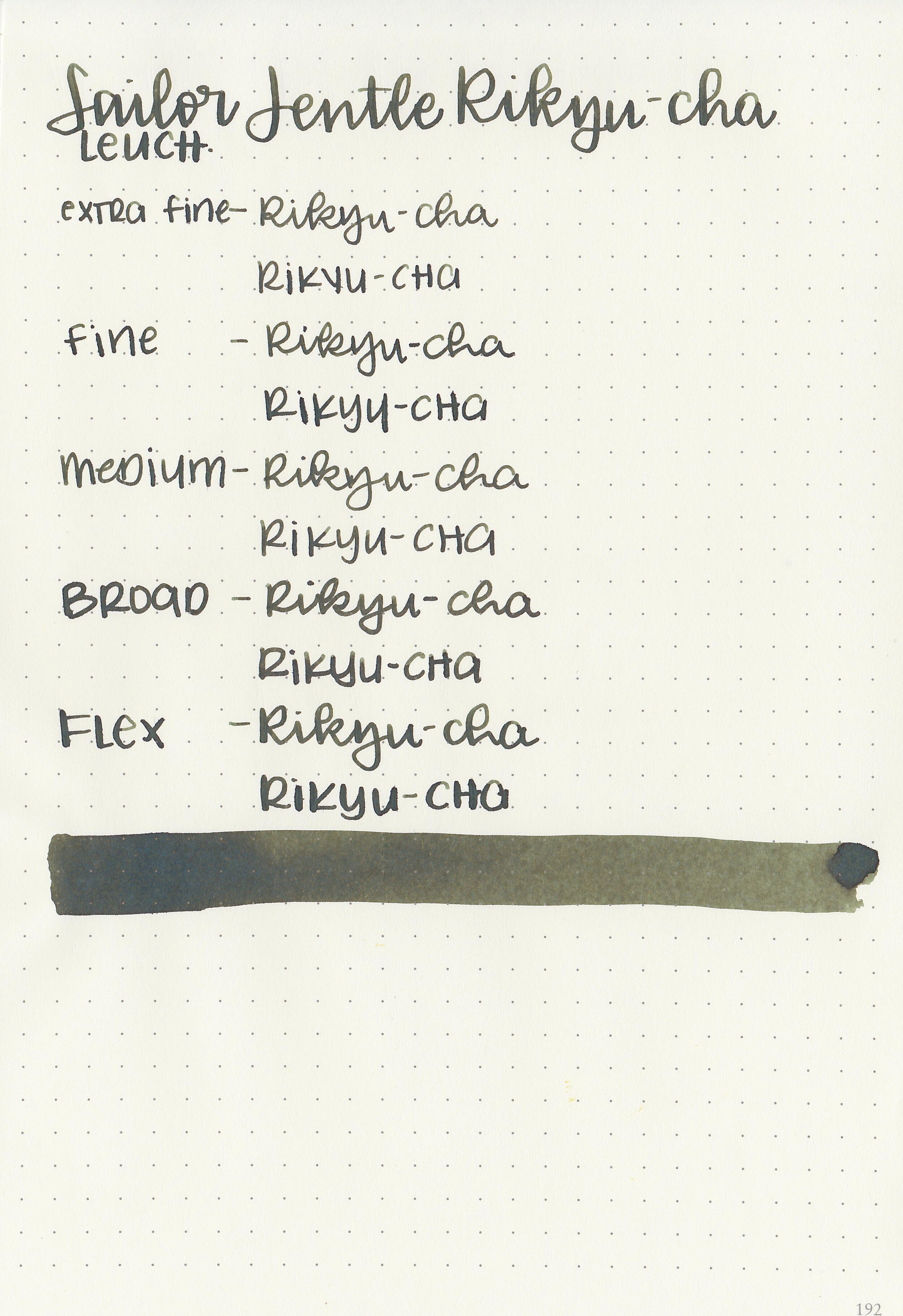
Bleeding: None
Other properties: medium shading, tiny red sheen, and no shimmer. The sheen is only visible in large swabs on Tomoe River paper.
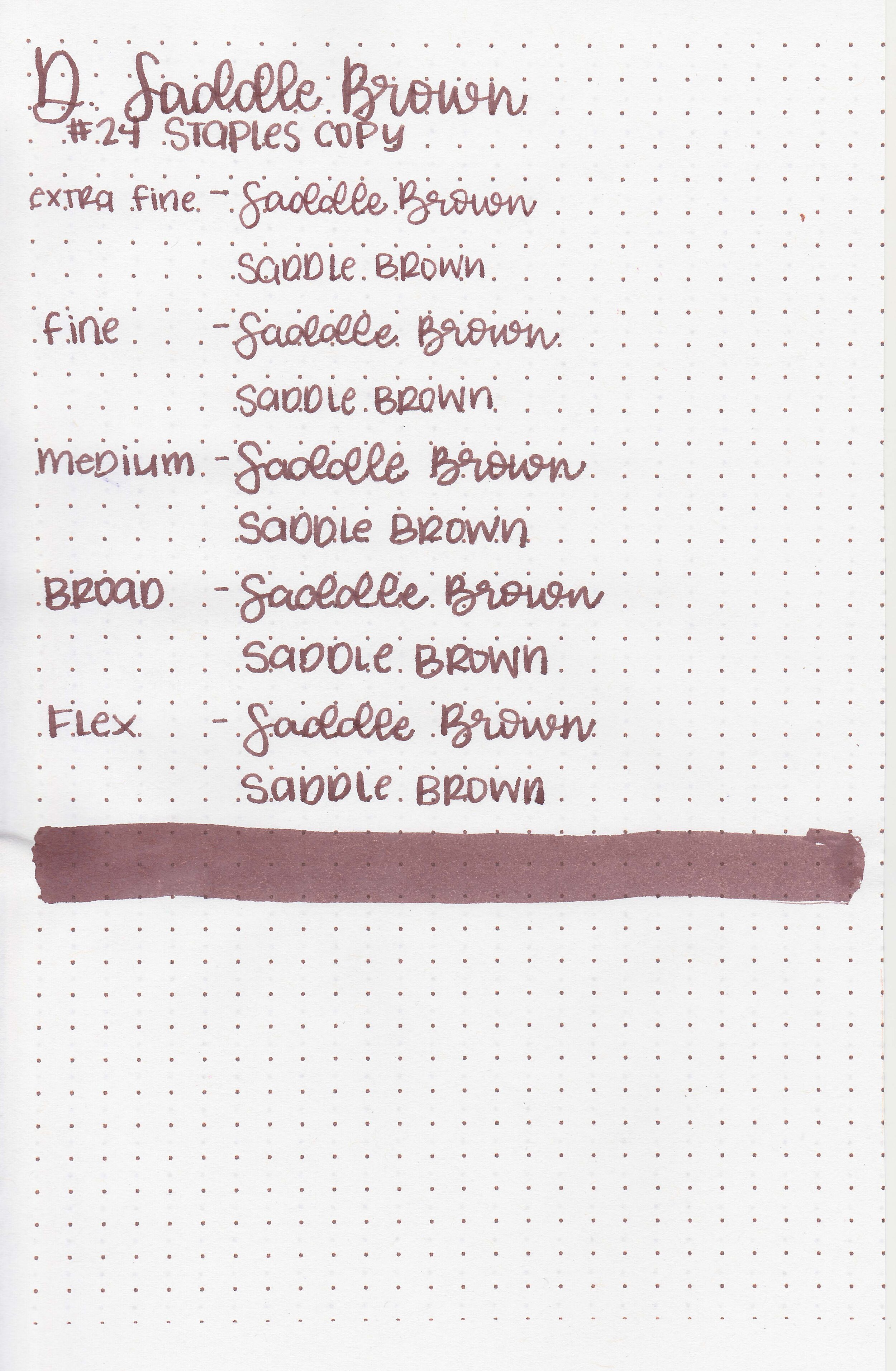
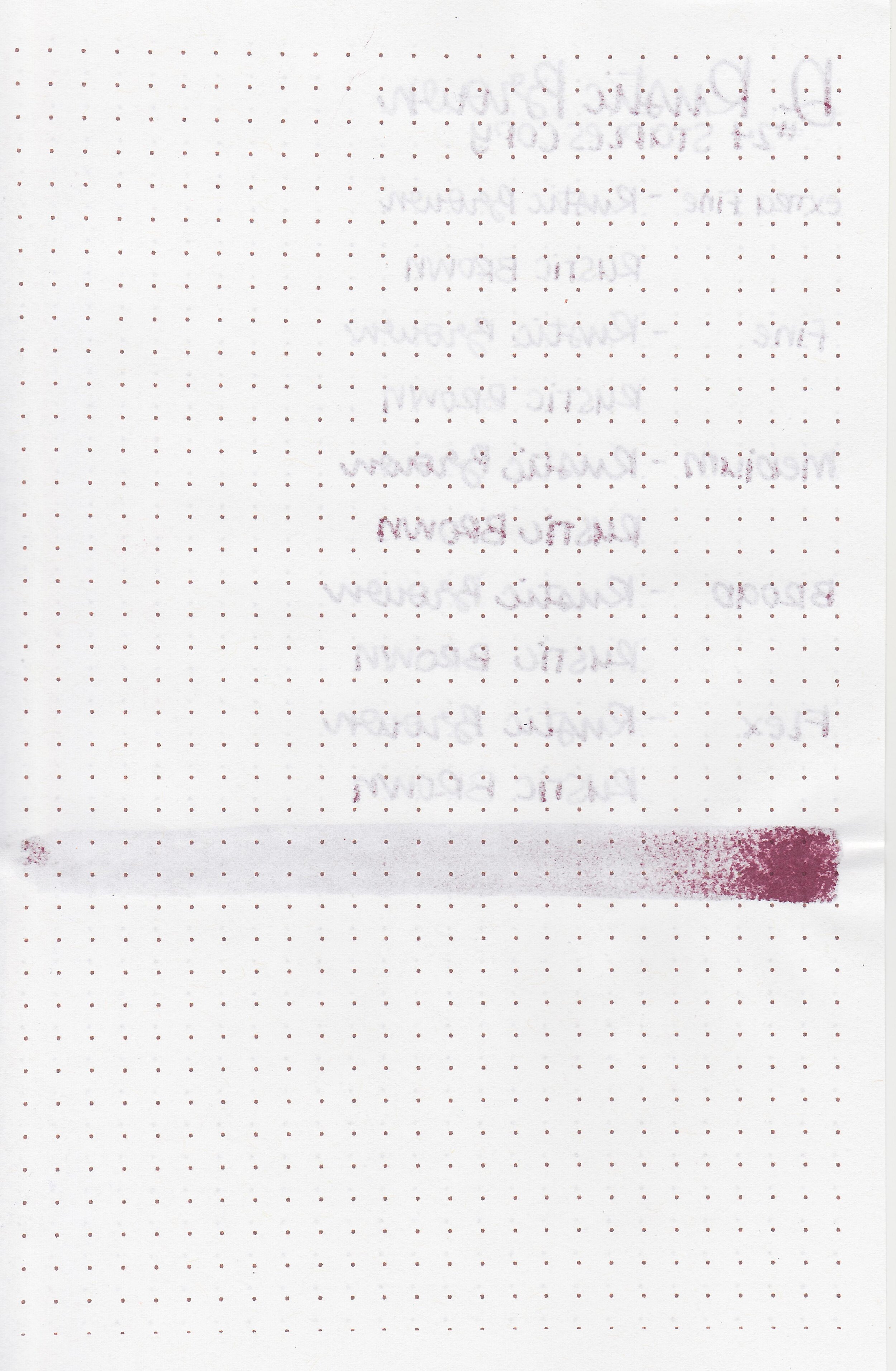
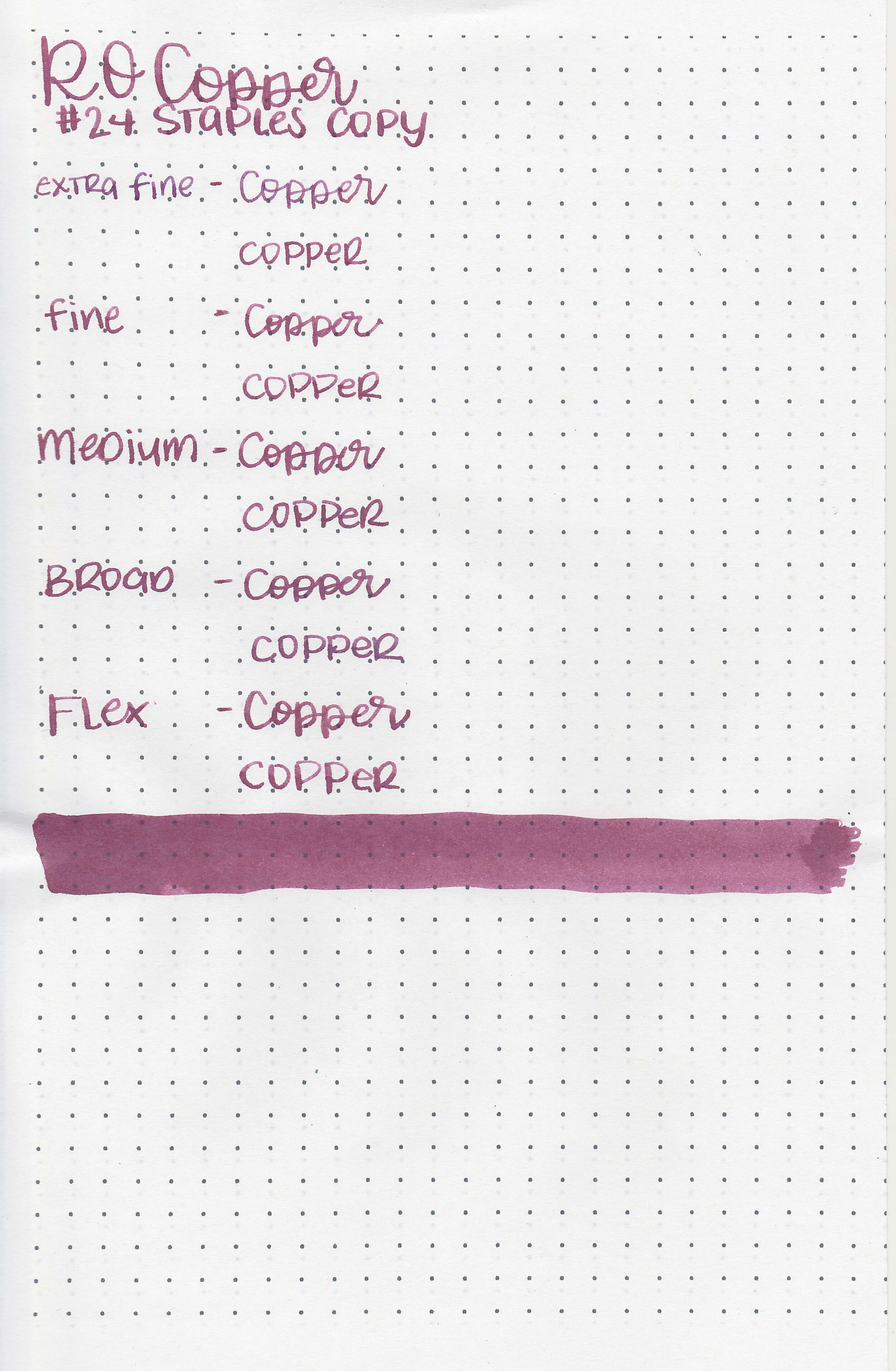
On Staples 24 lb copy paper there was some feathering and bleeding in all nib sizes.
Comparison Swabs:

Rikyu-cha is much browner than either Sailor Jentle Epinard or Tokiwa-matsu. Click here to see the Sailor inks together, and click here to see the green inks together.
Longer writing:

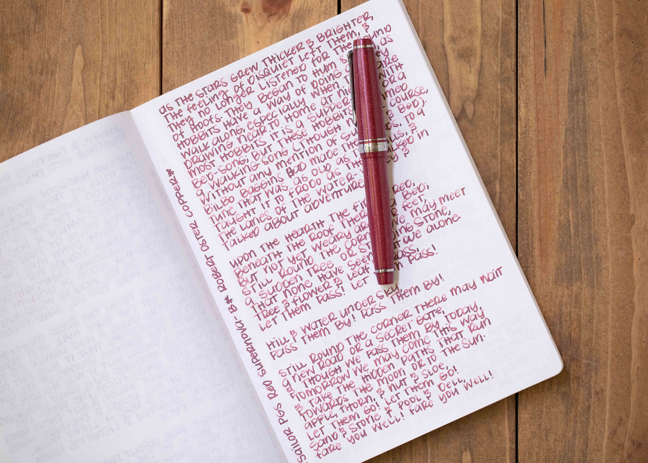
I used a Lamy 2000 Black Amber with a fine nib on a Taroko Enigma notebook. The ink had a wet flow.
Overall, I really enjoyed this ink. It makes me think of late autumn, it has a lovely wet flow and is well behaved. I need to add a full bottle to my wish list!
Disclaimer: A sample of this ink was provided by a reader for the purpose of this review. All photos and opinions are my own. This page does not contain affiliate links and this post is not sponsored in any way.