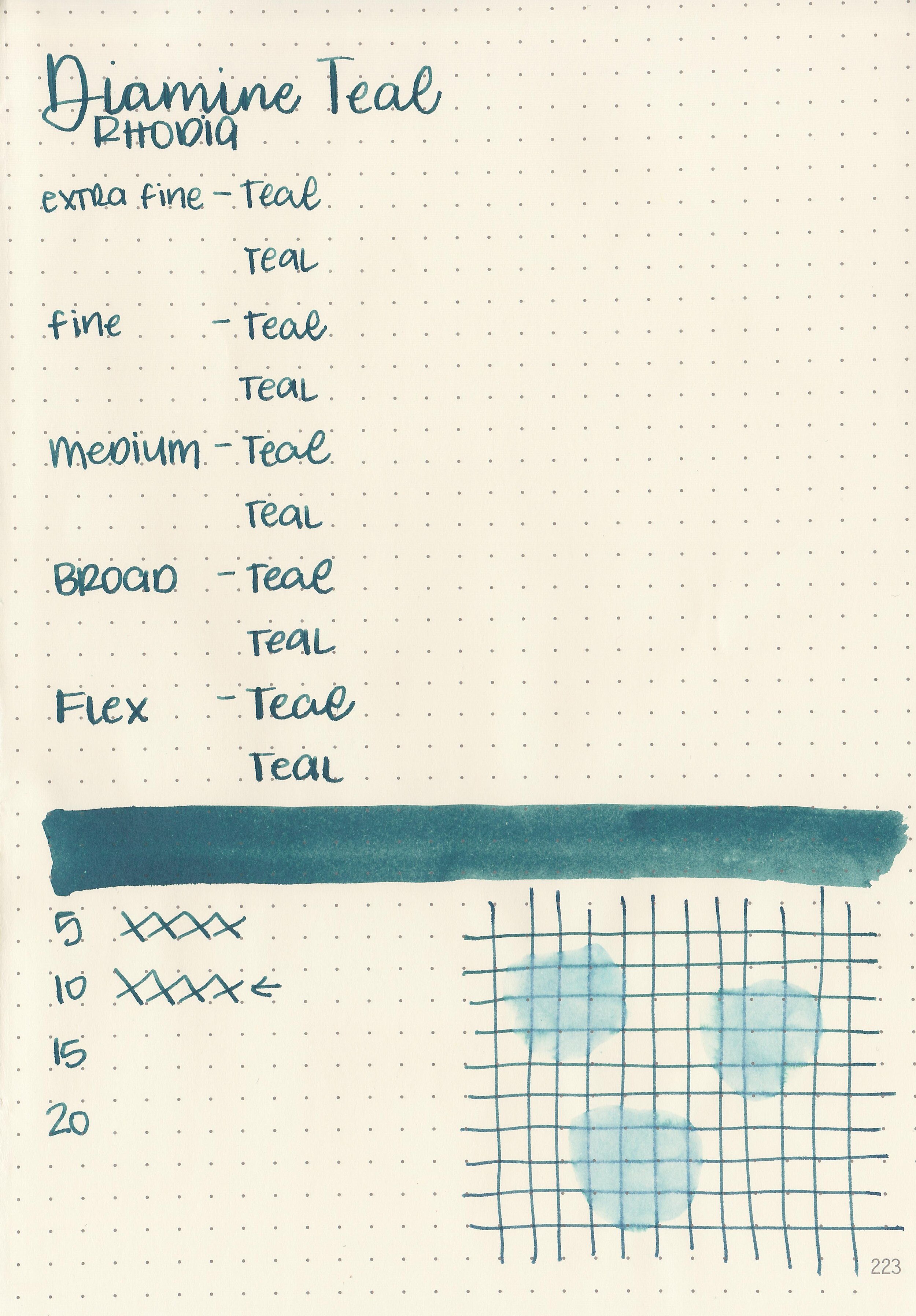
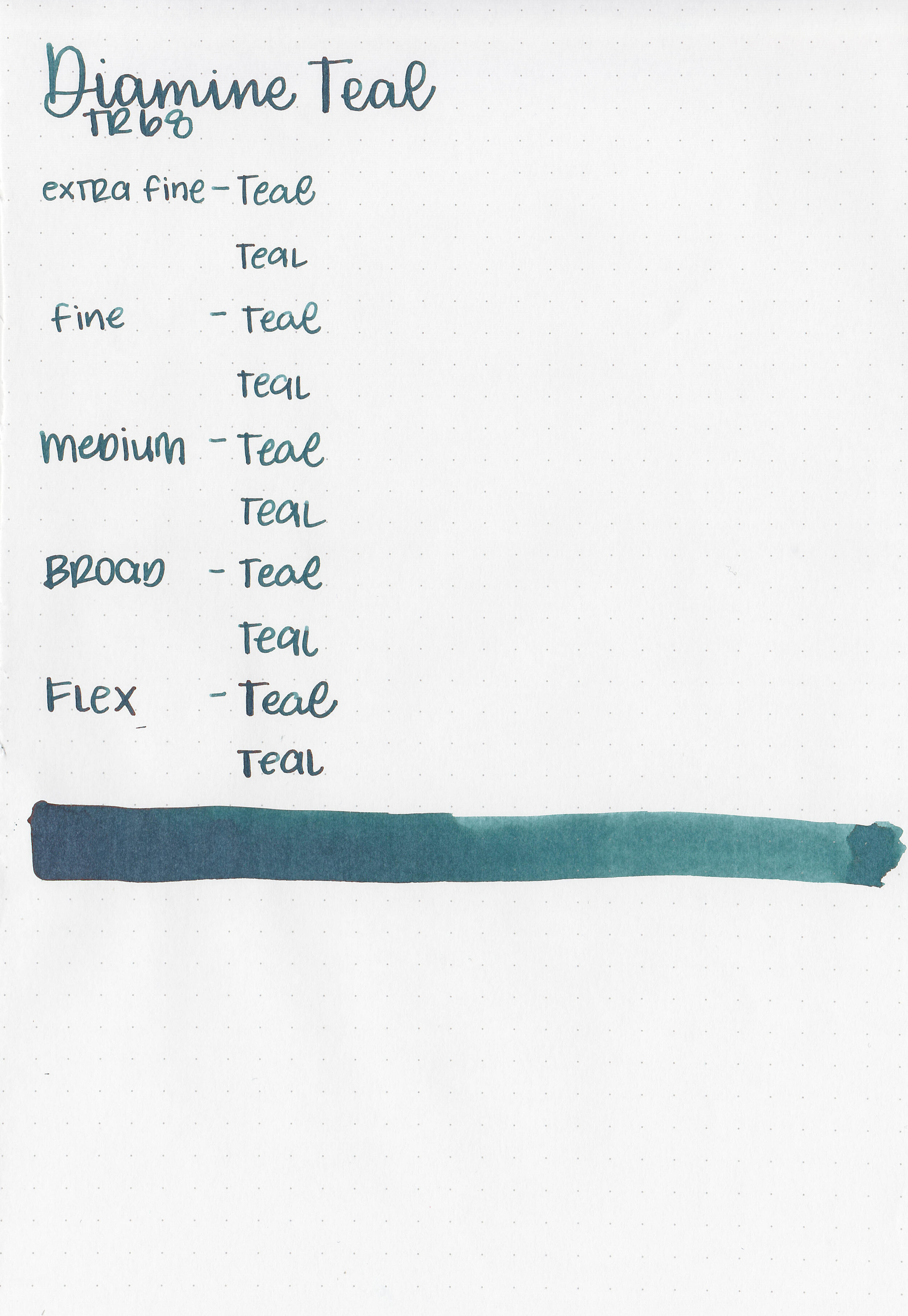
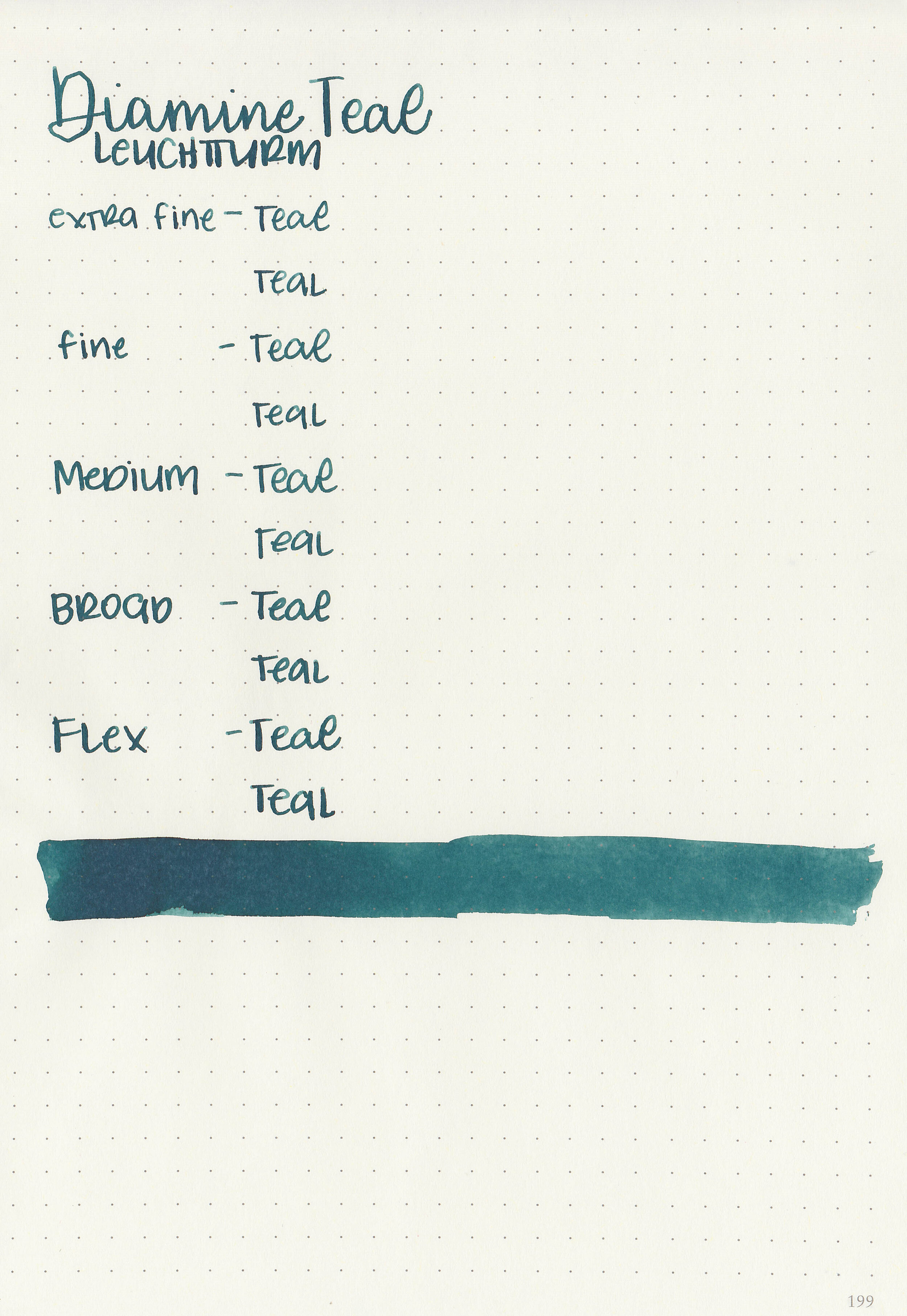
Ink Review #1237: Diamine Teal
/
Diamine Teal is a lovely dark teal. It reminds me of late fall, early winter when I still want color, but much more muted tones. I purchased my bottle of ink from Cult Pens.

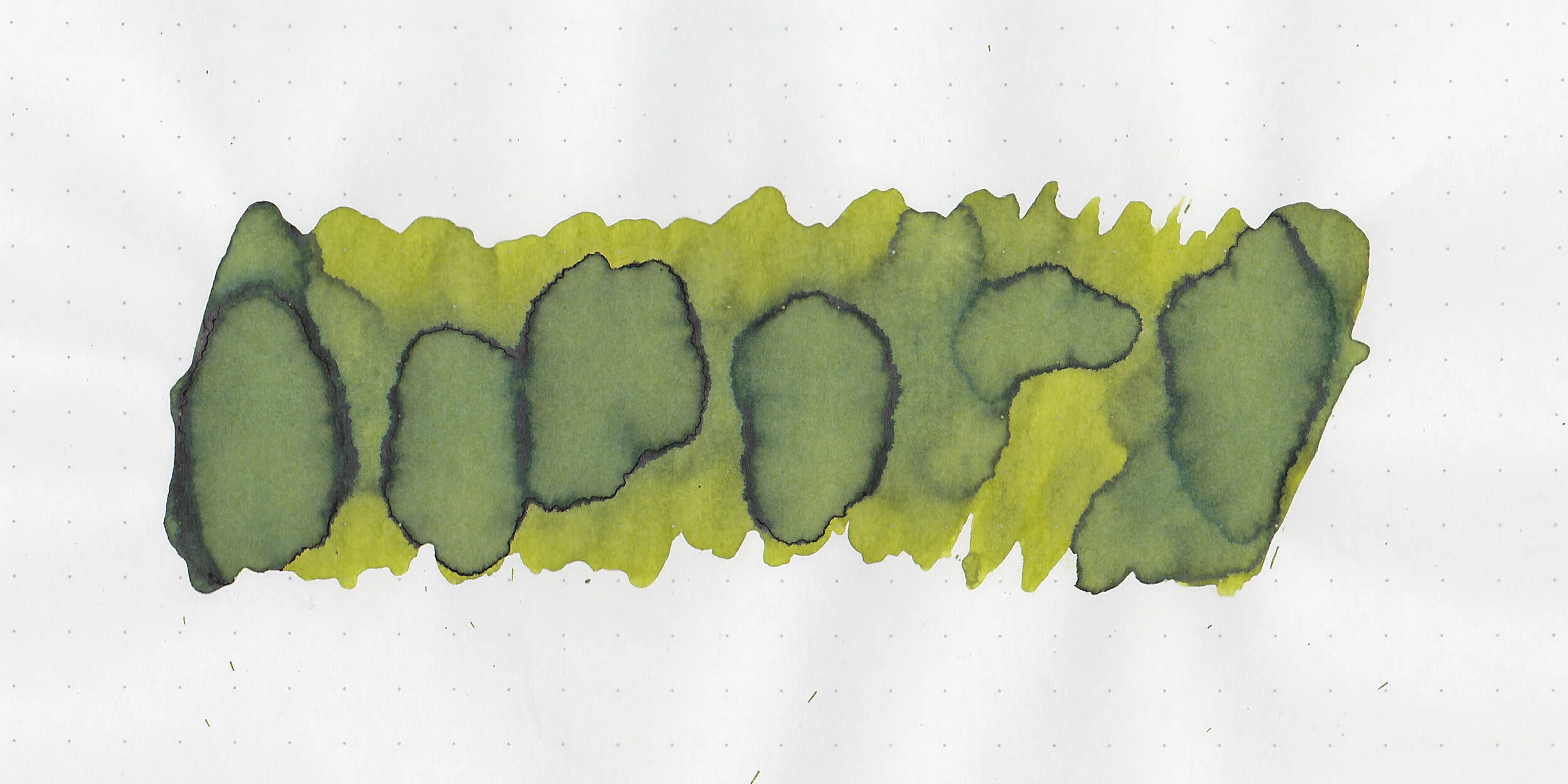
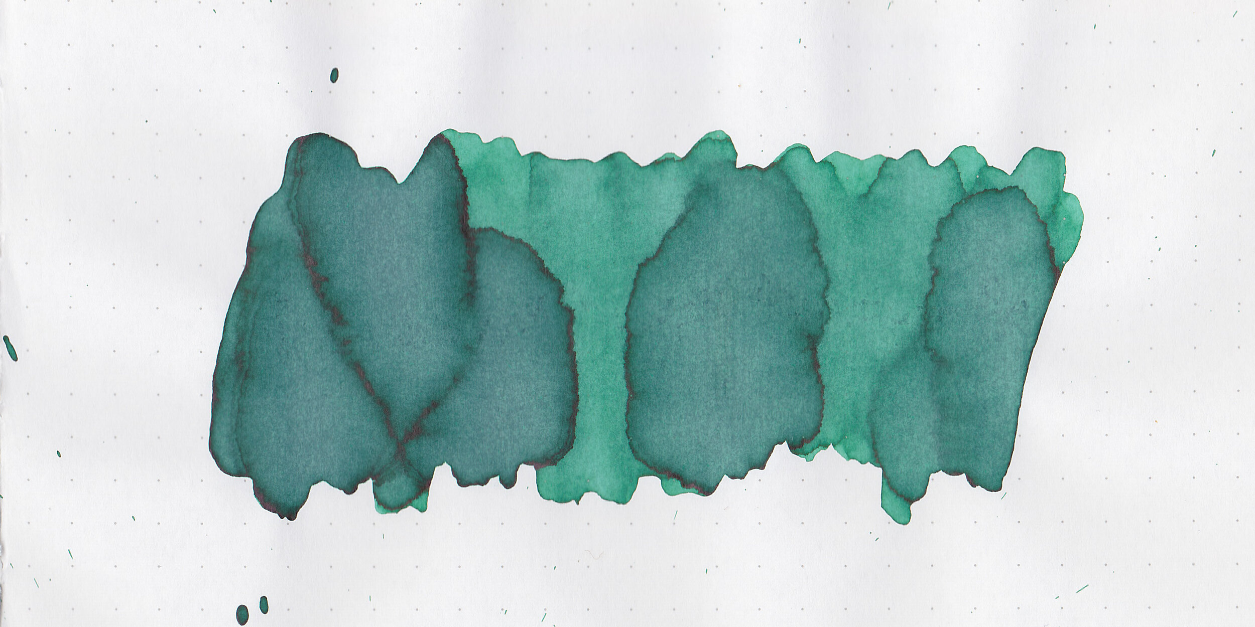
The color:
Teal is a dark moody teal.
Swabs:

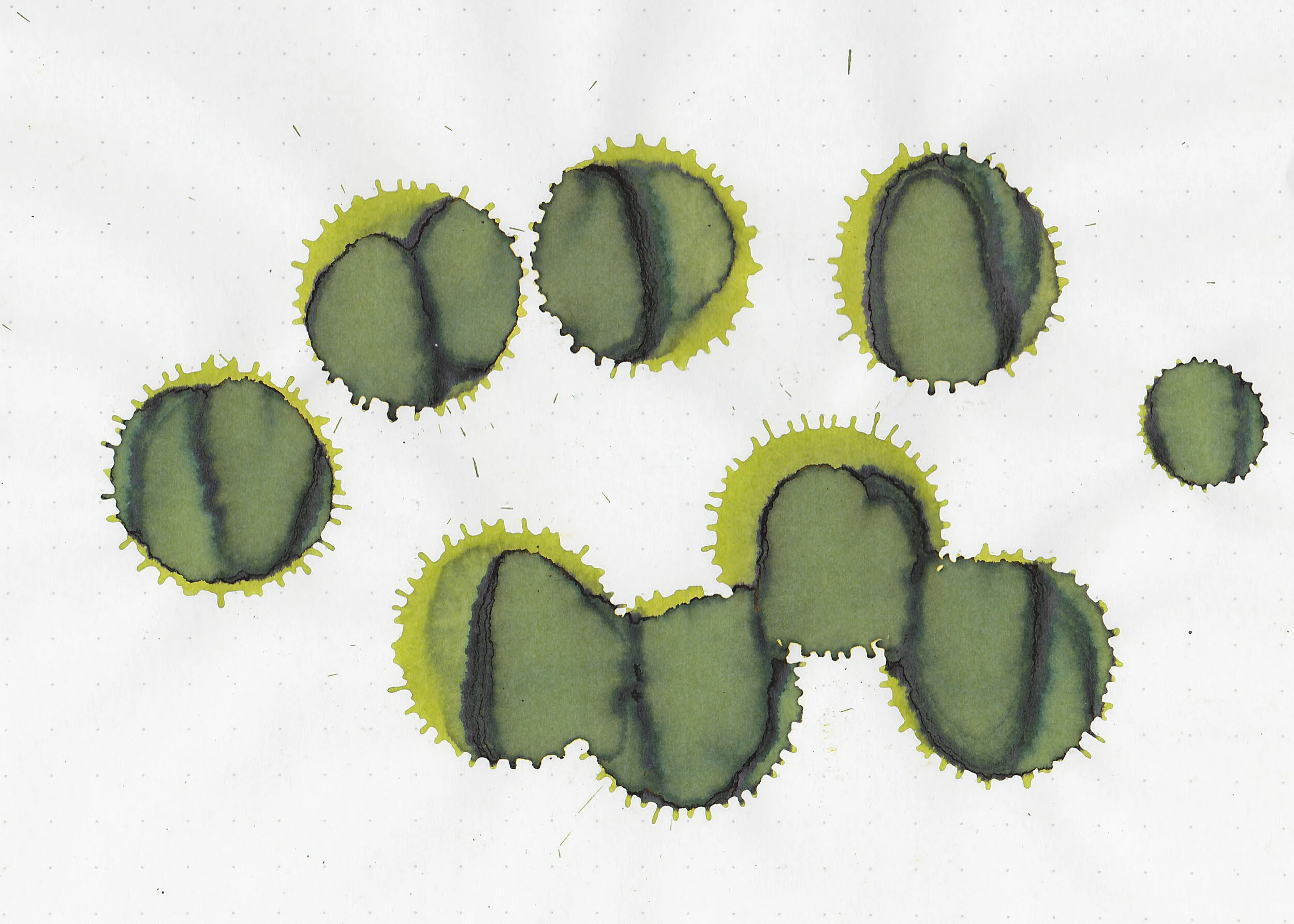
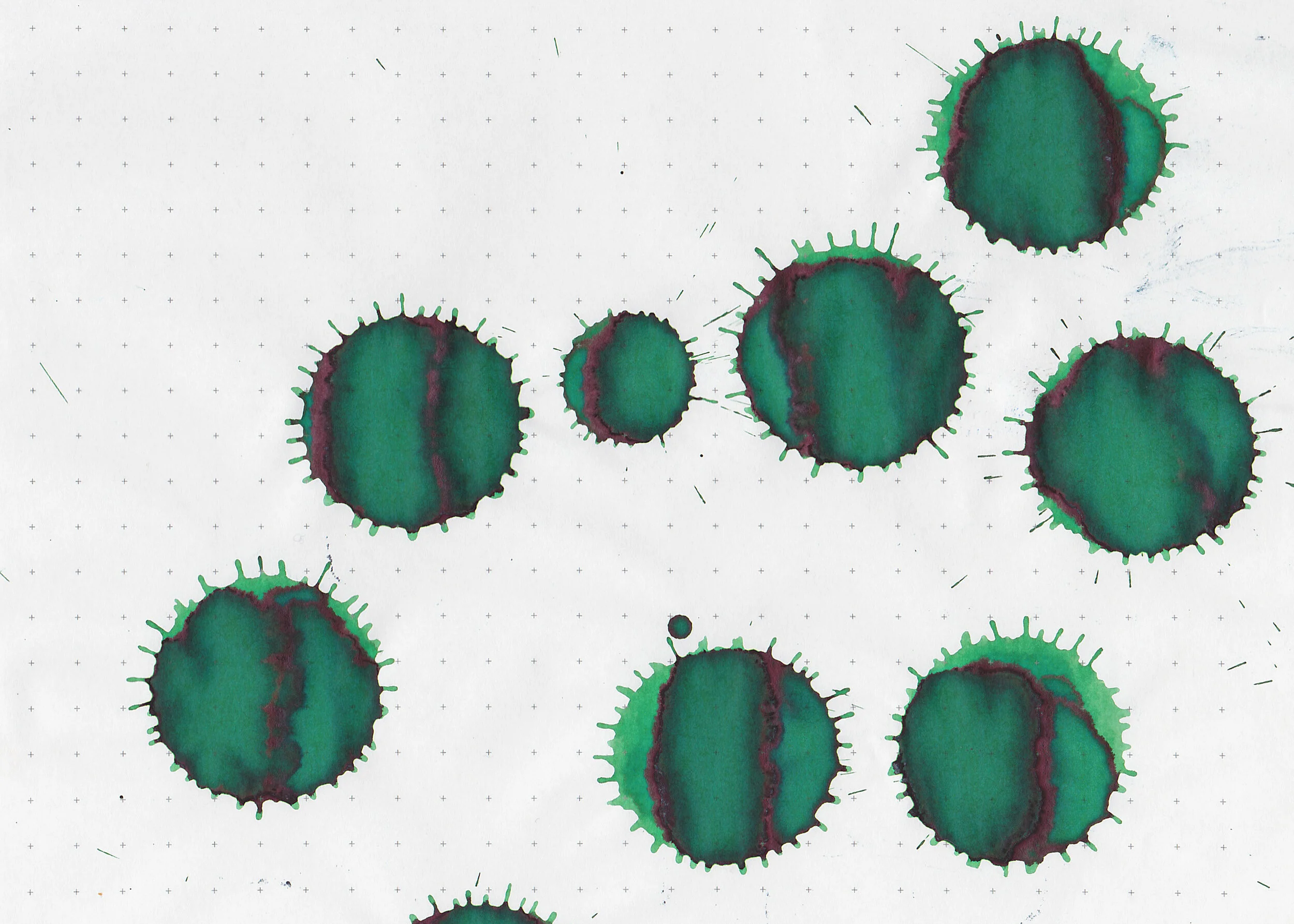
In large swabs on Tomoe River paper the ink looks much darker.

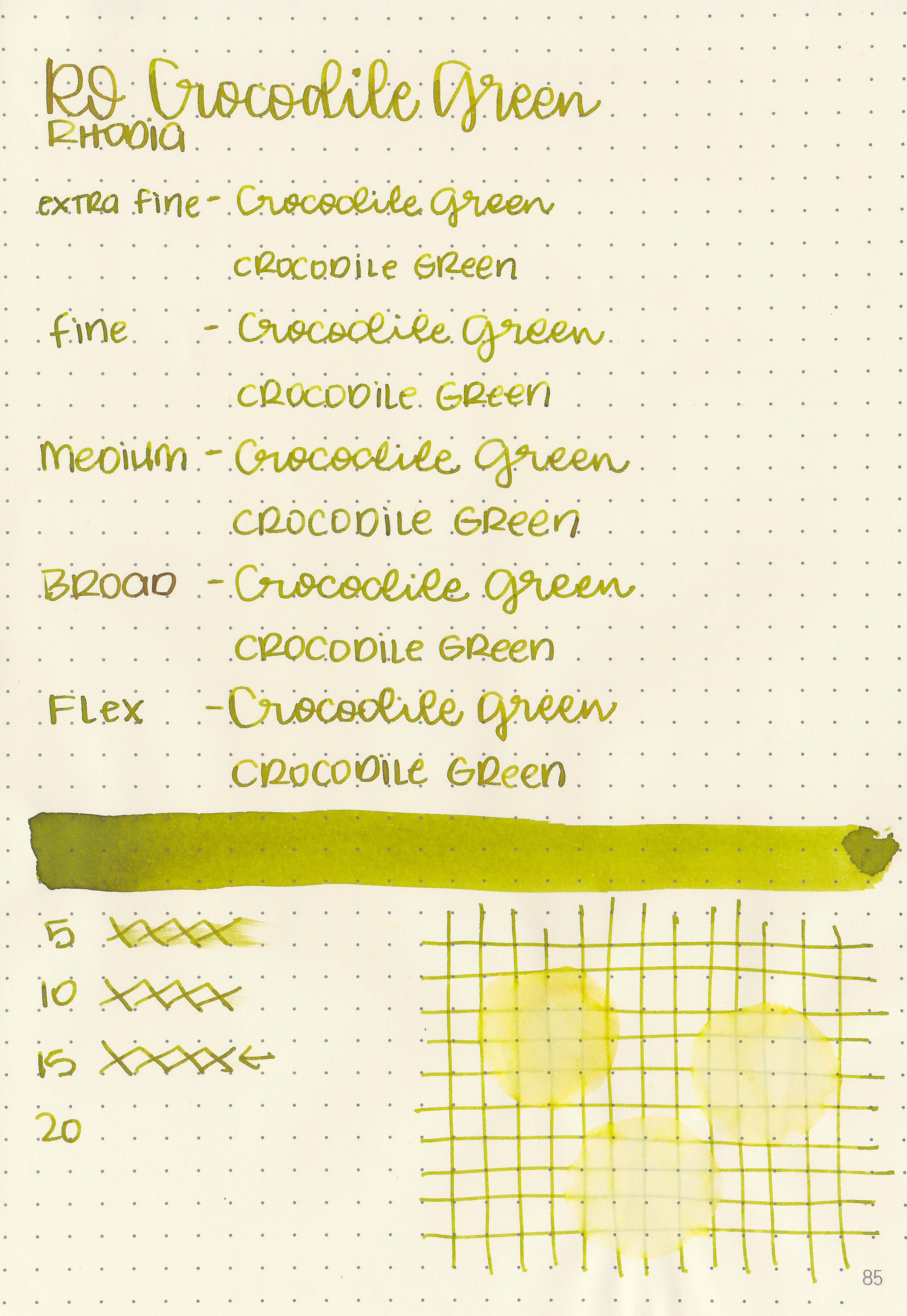
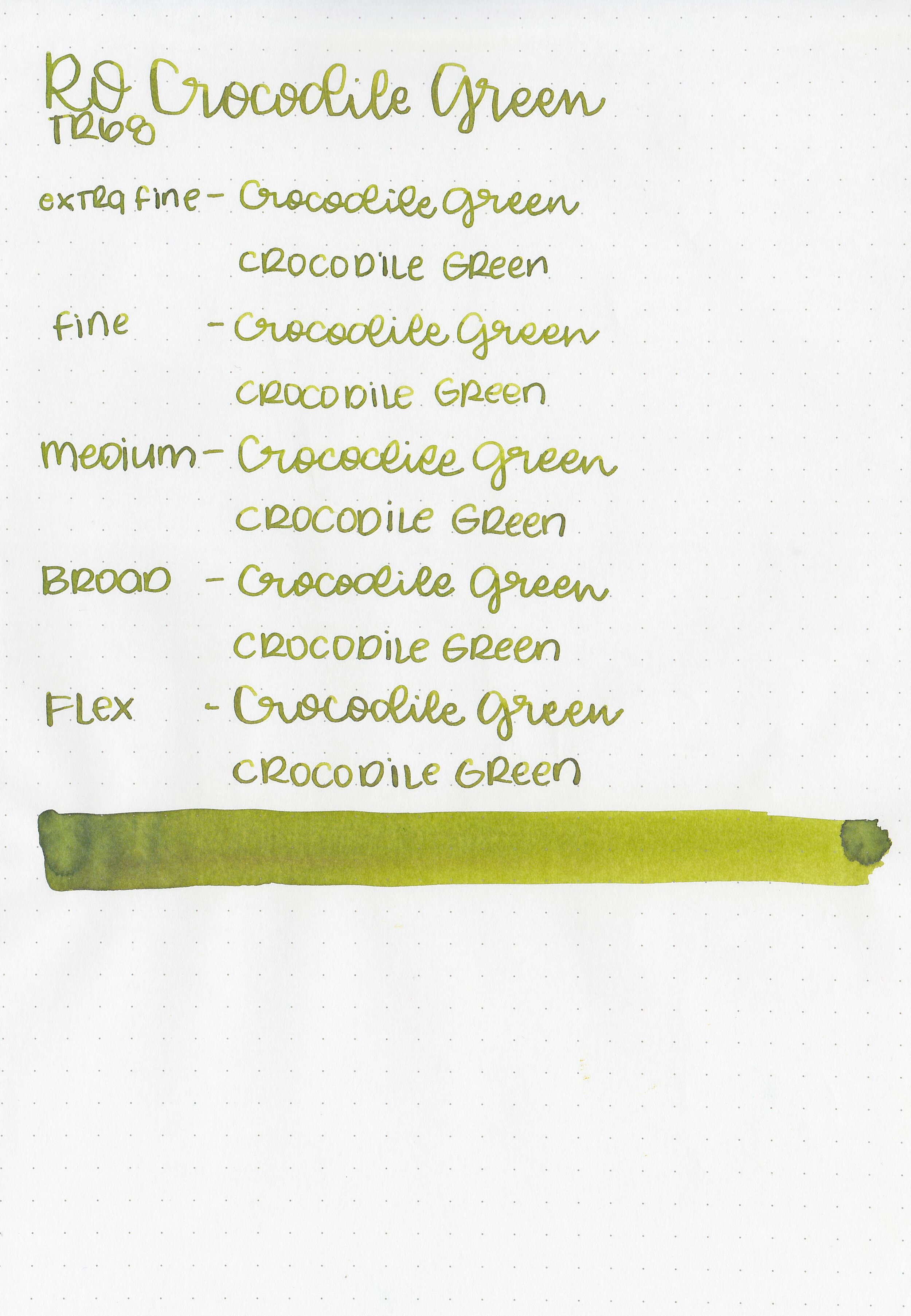
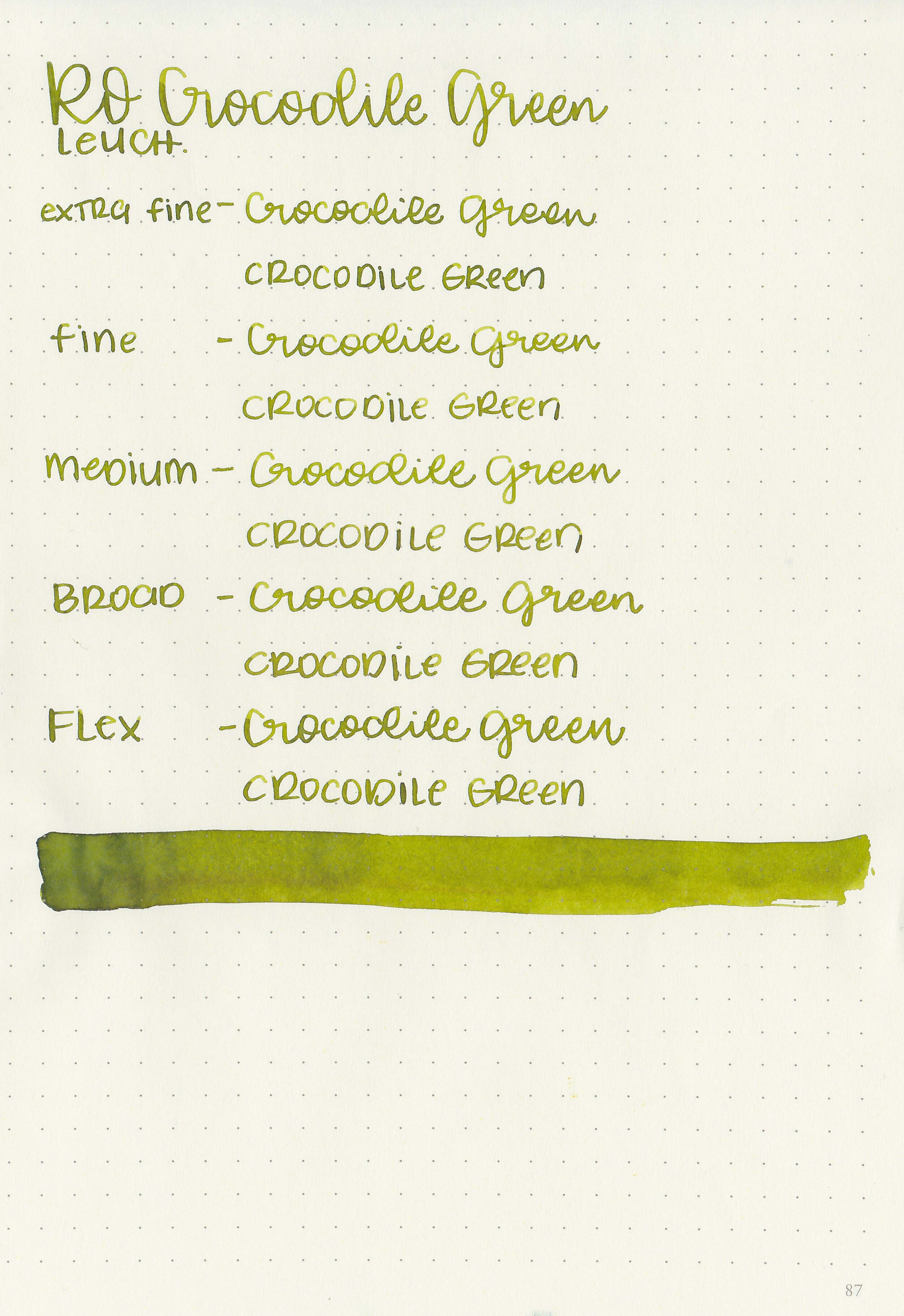
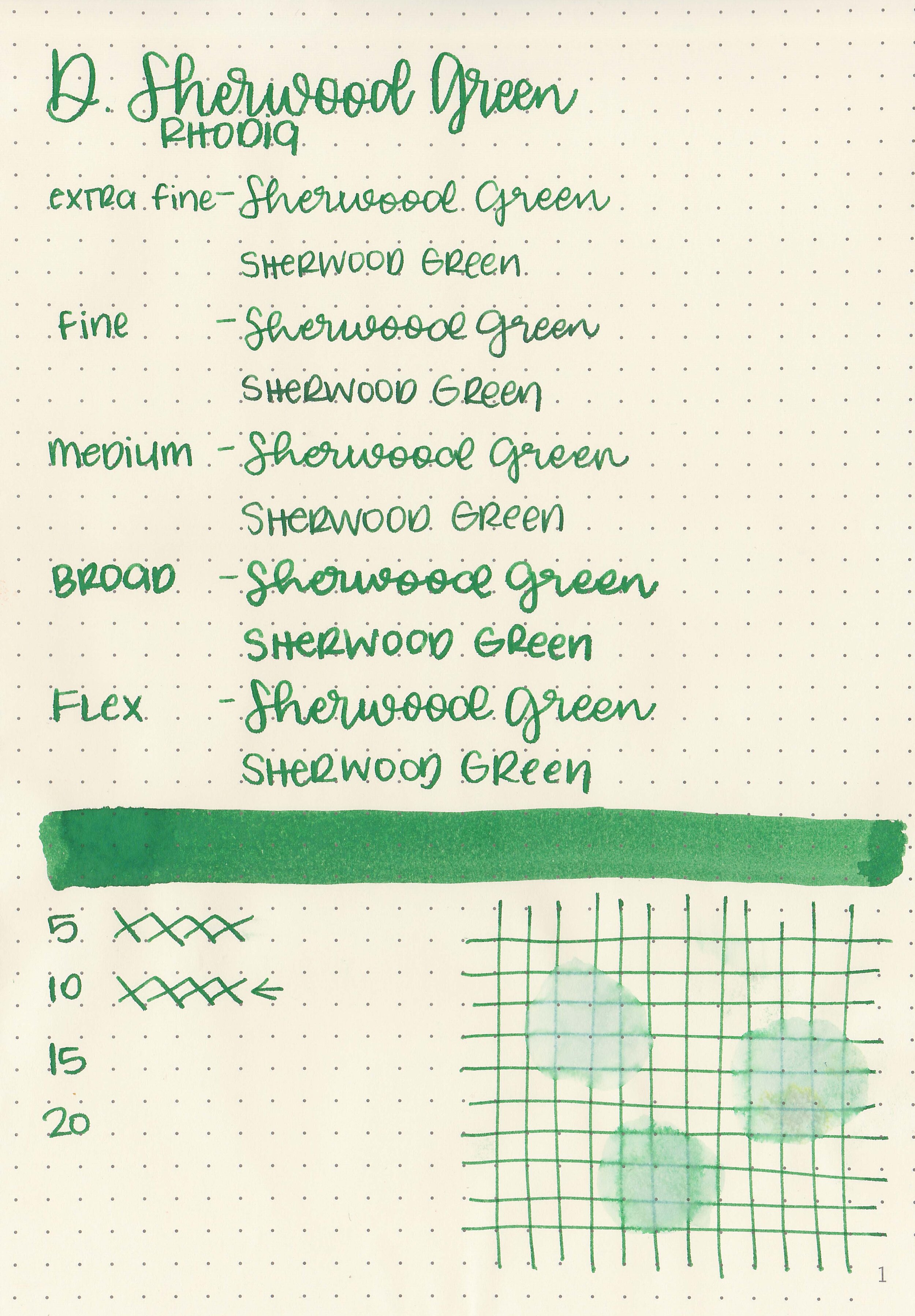
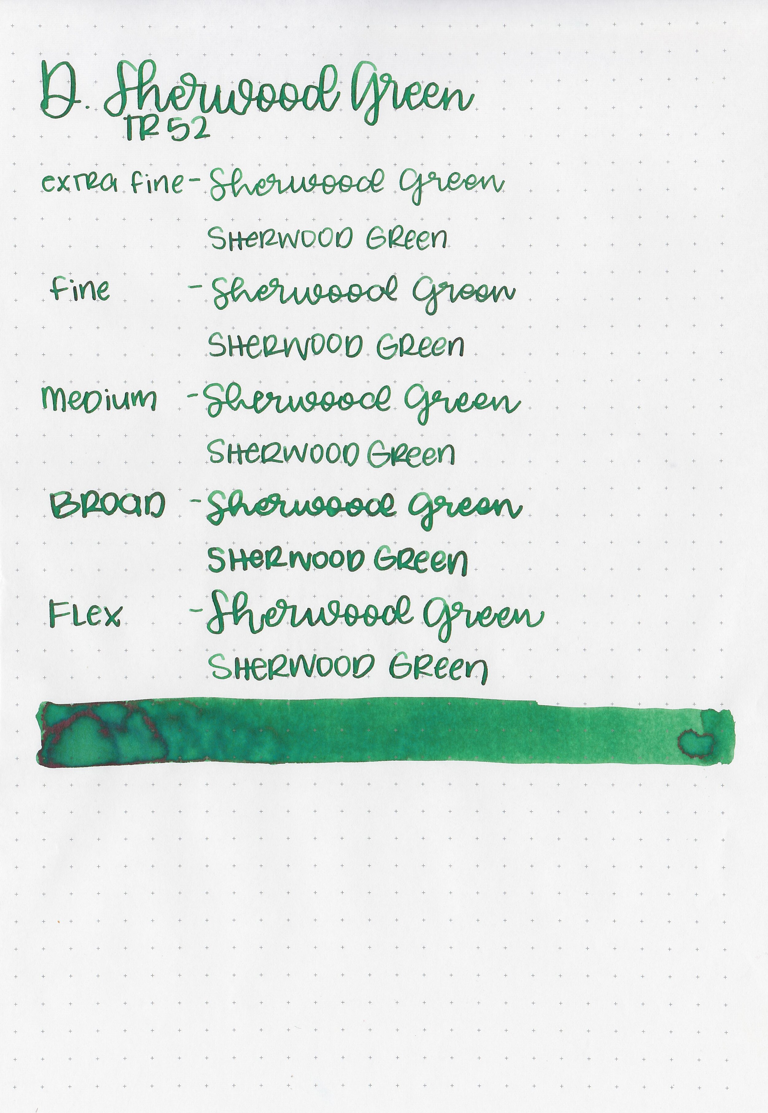
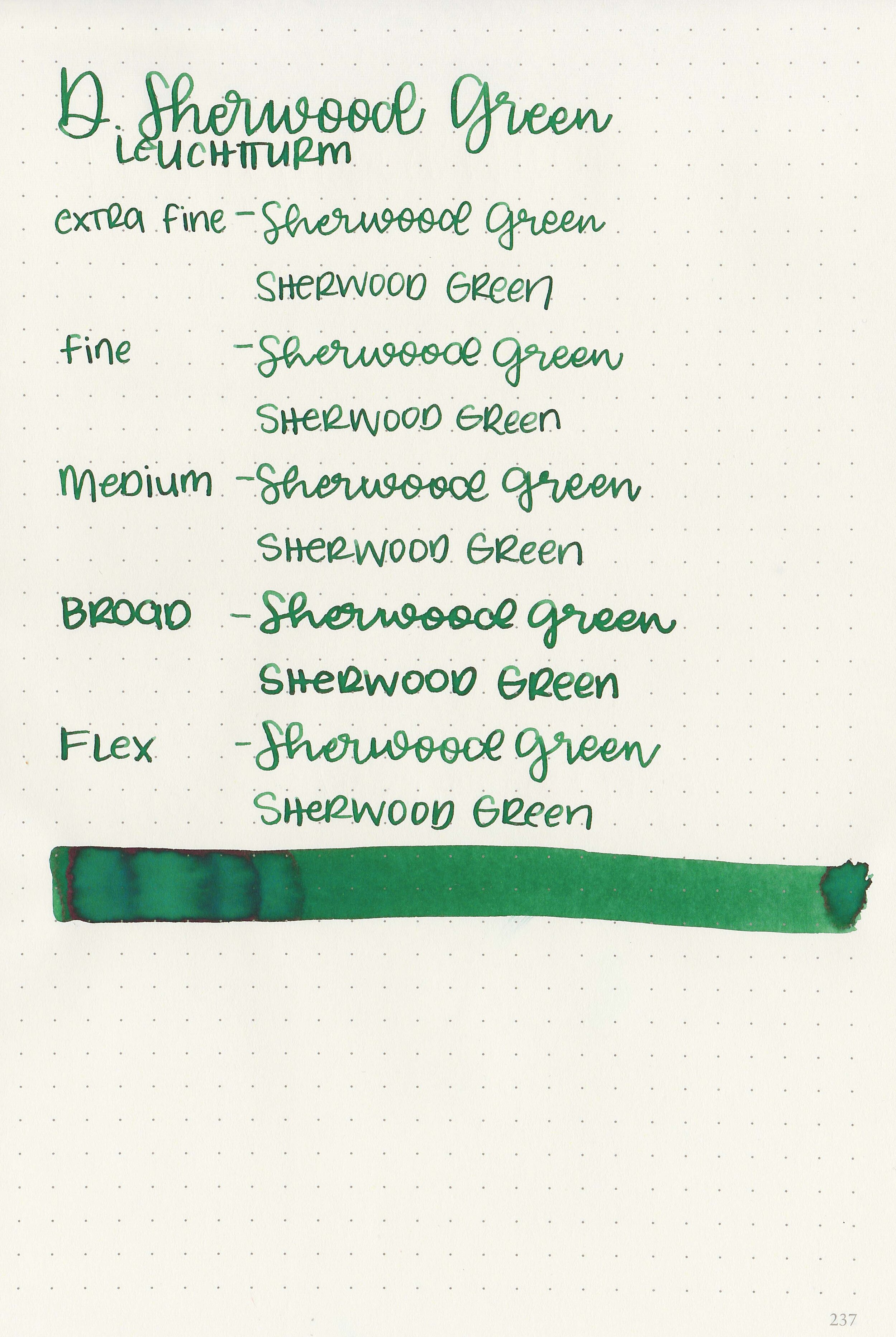
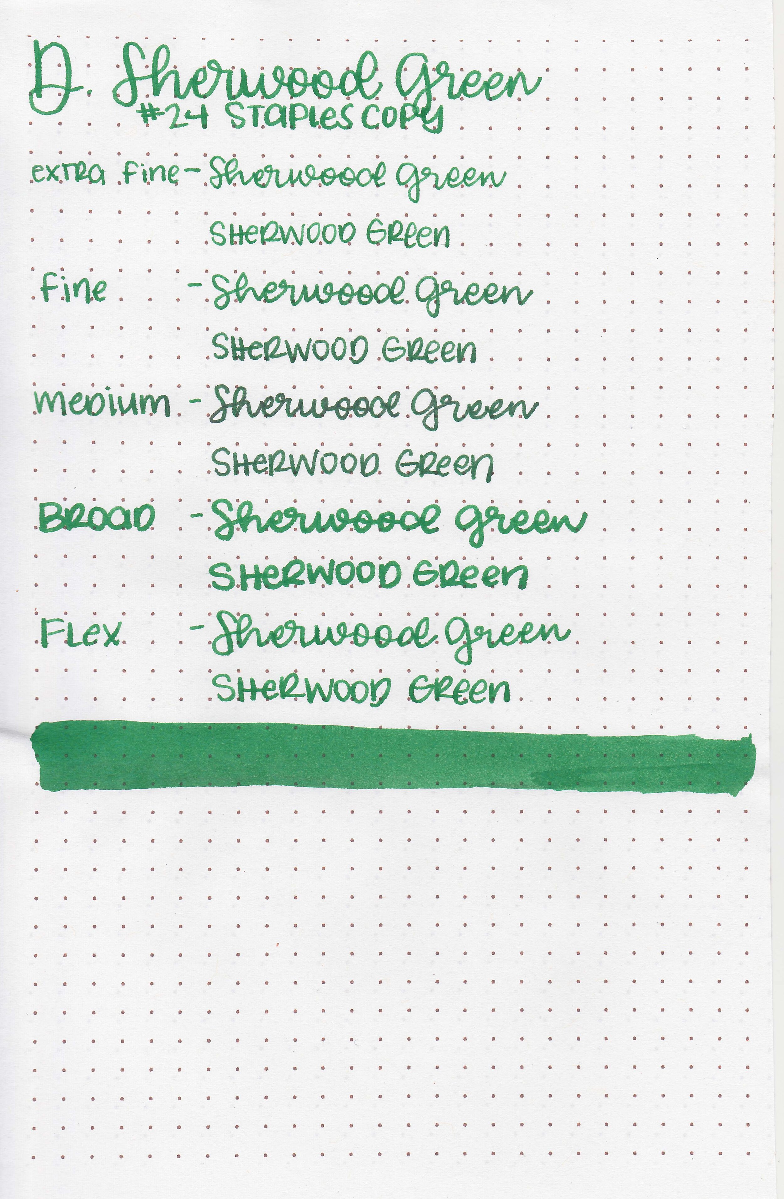
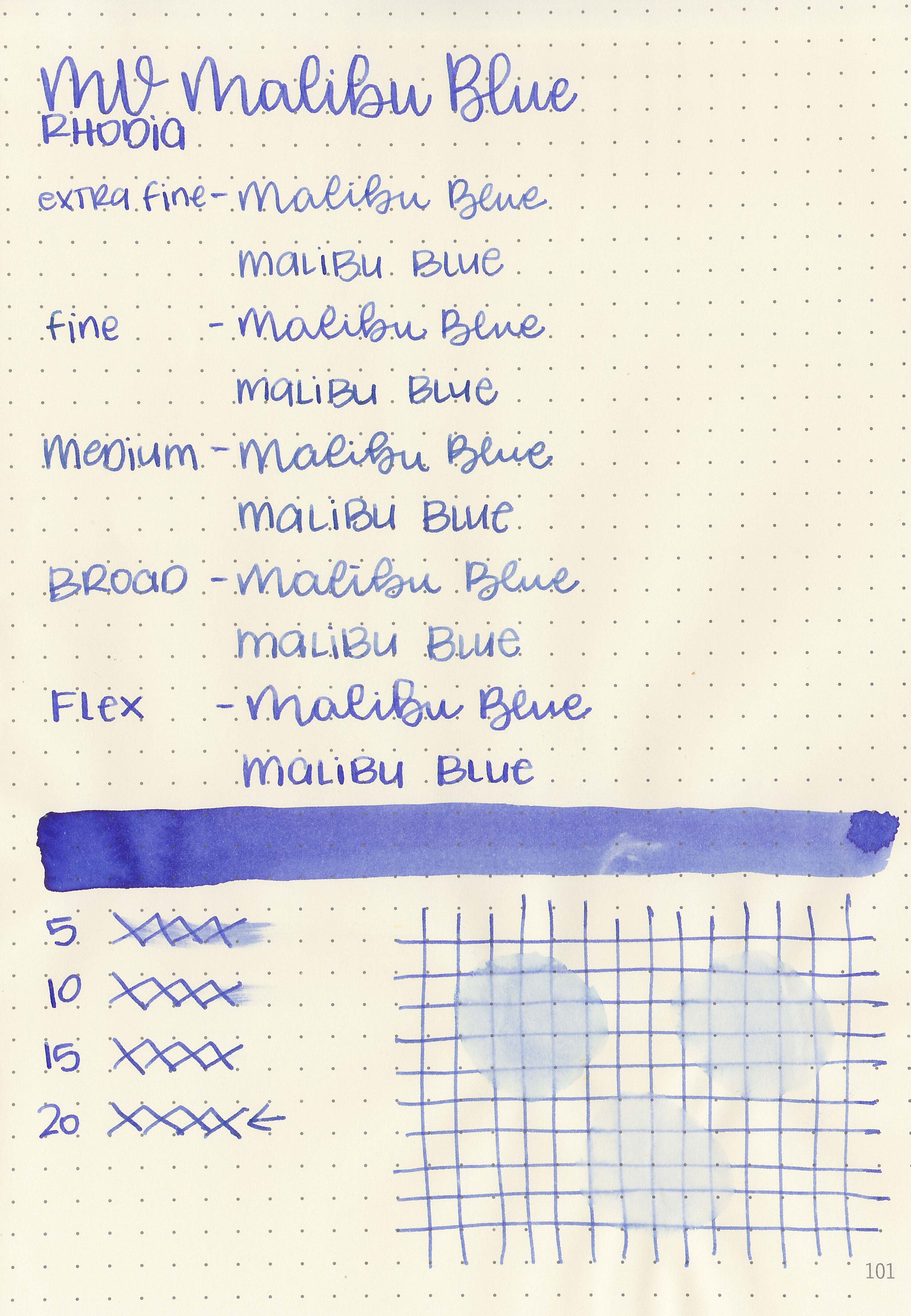
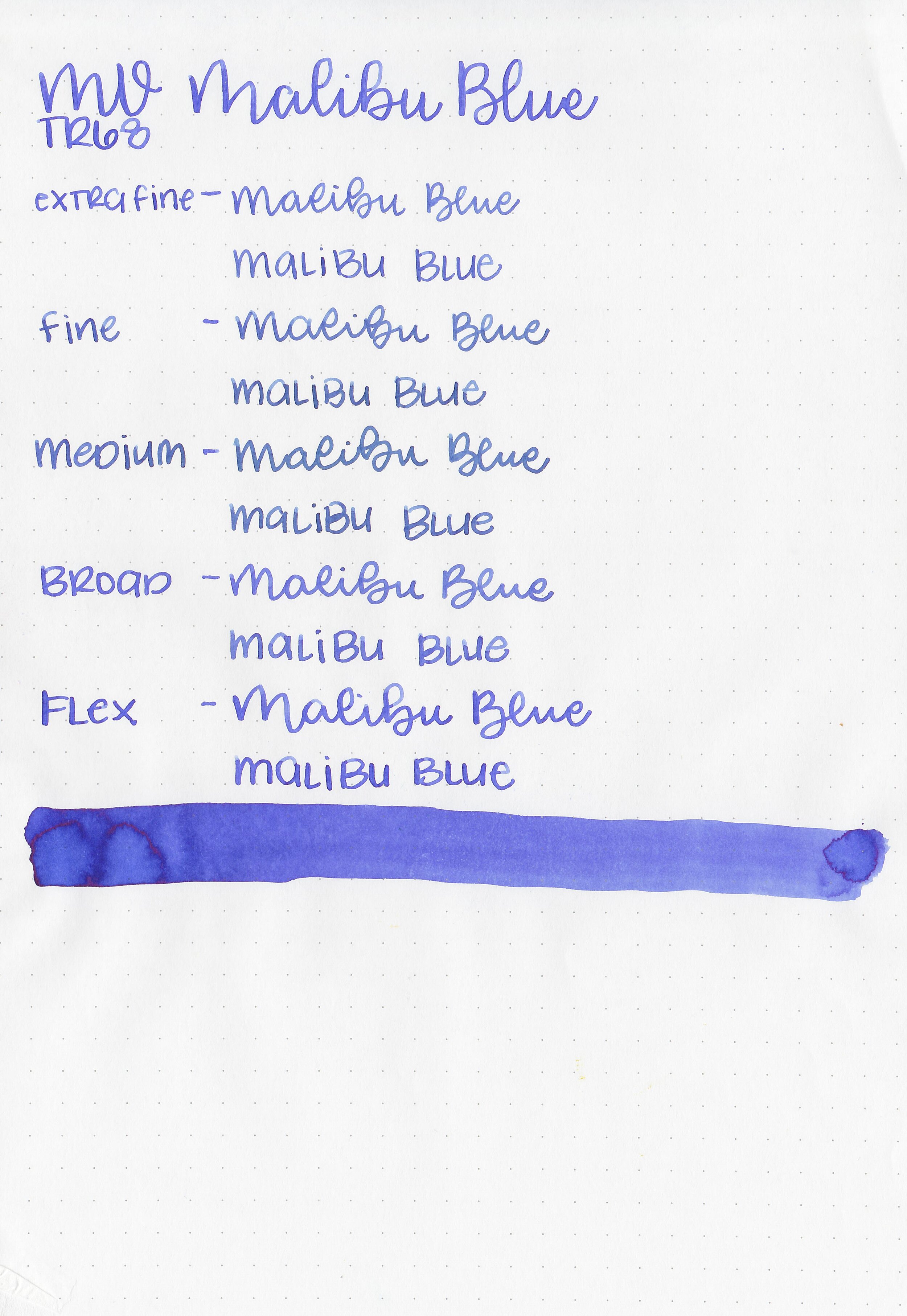
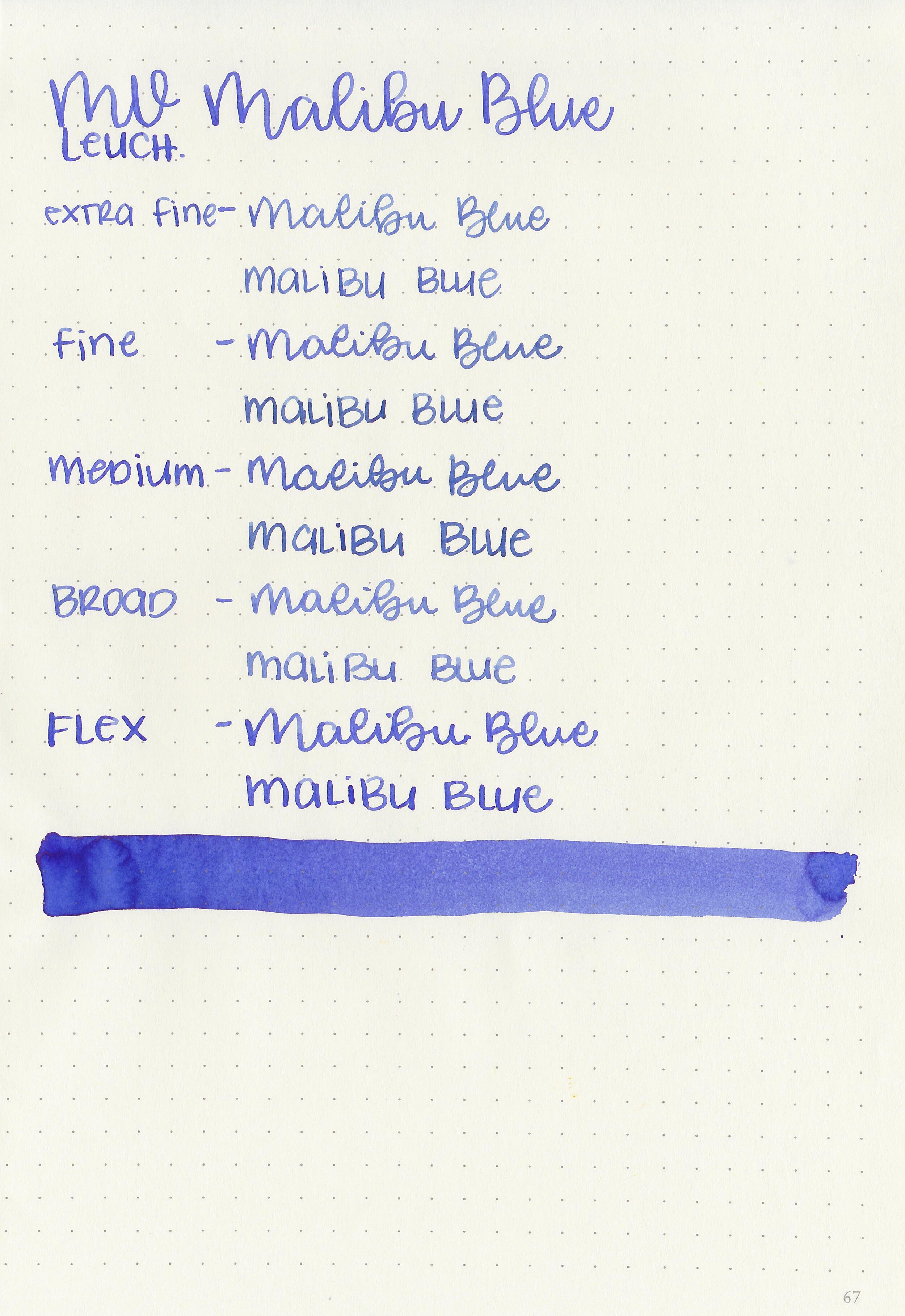
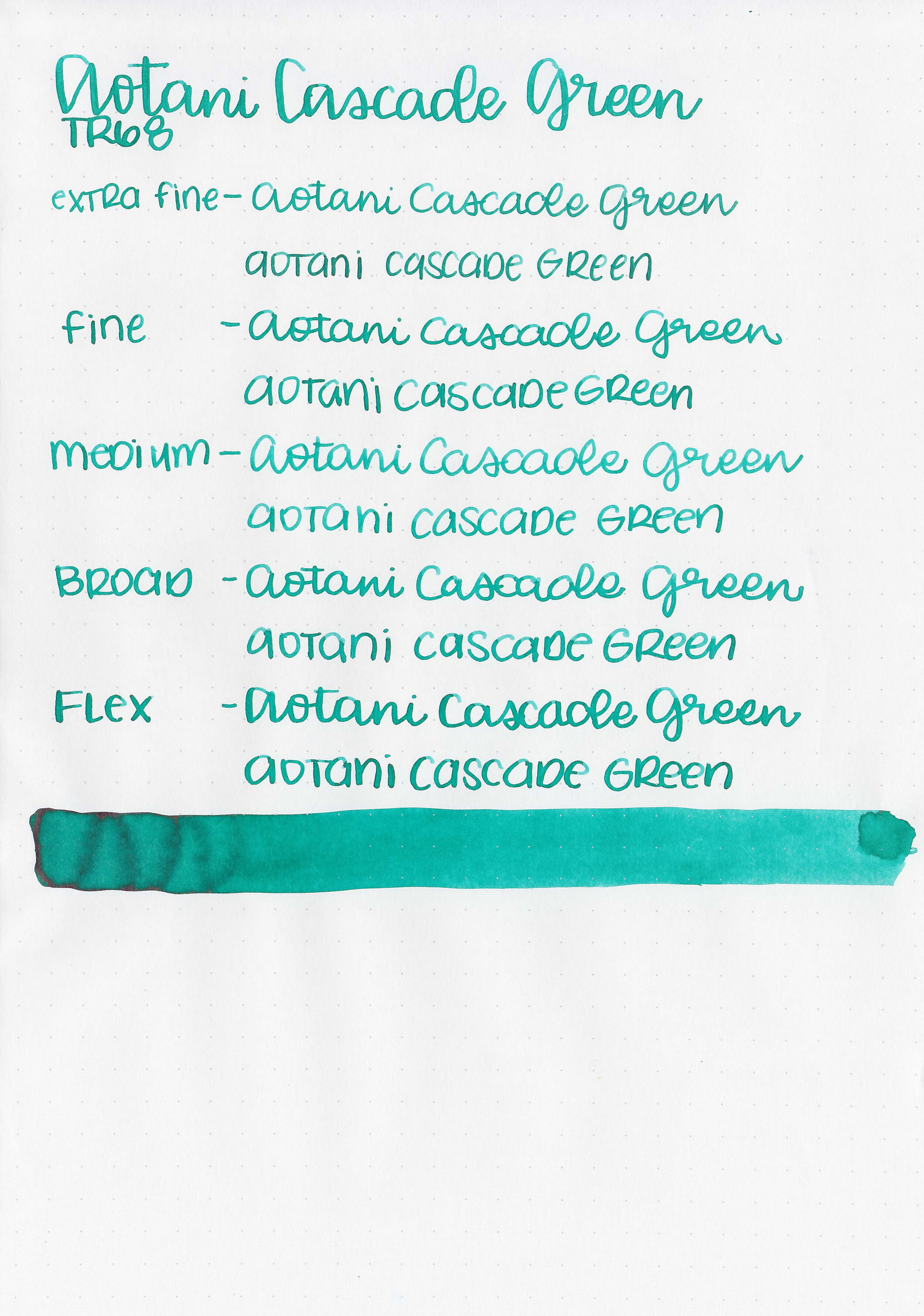
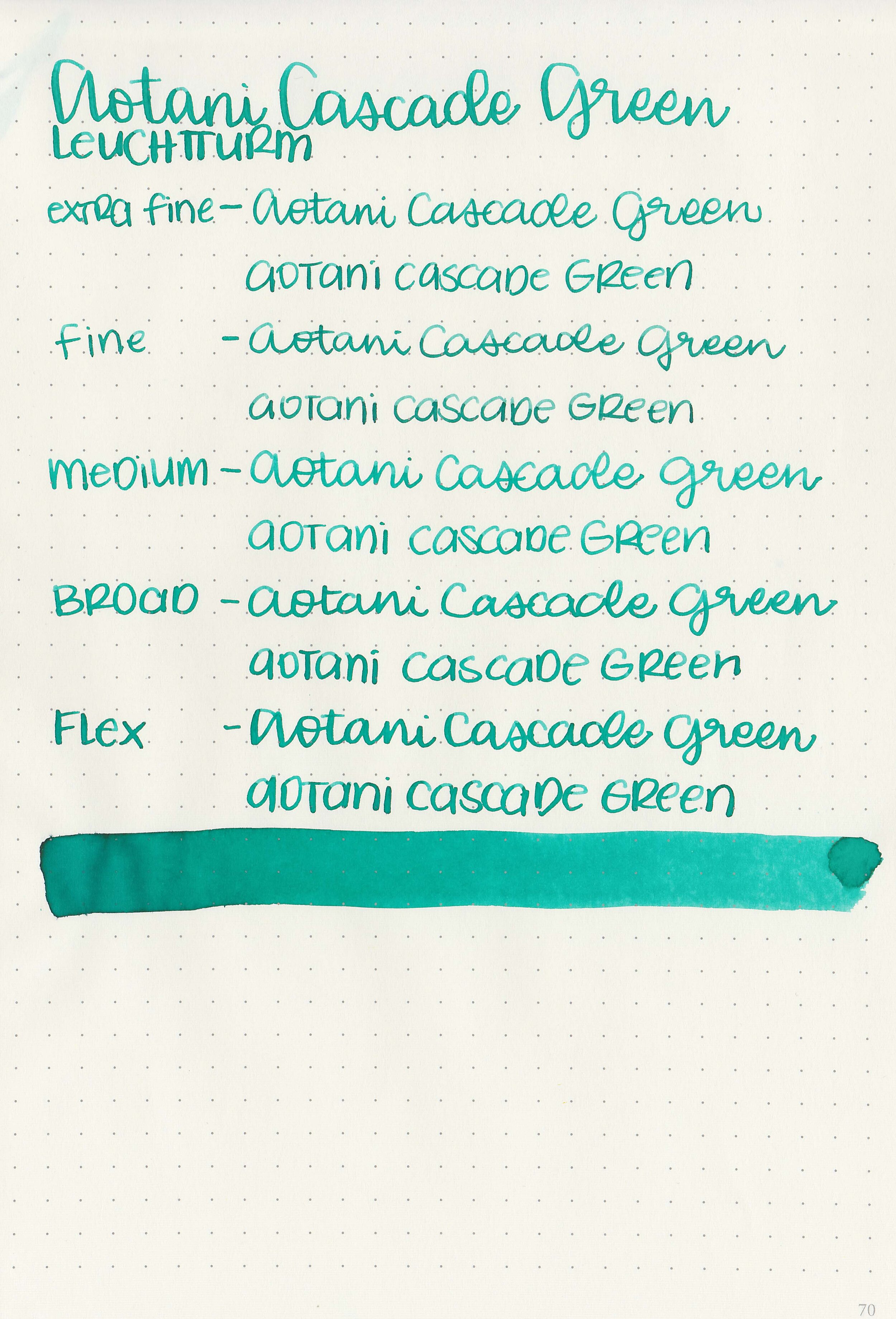
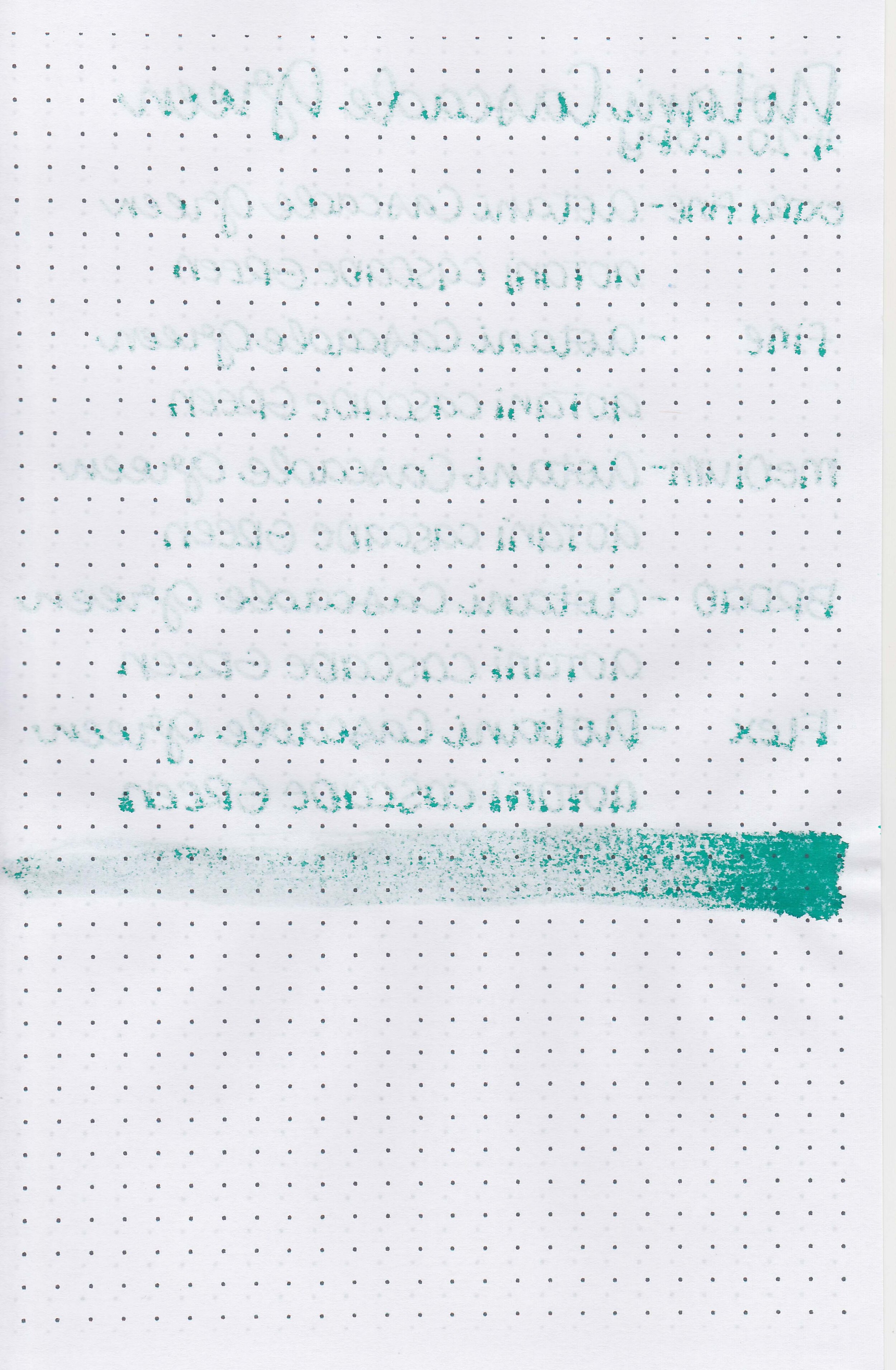
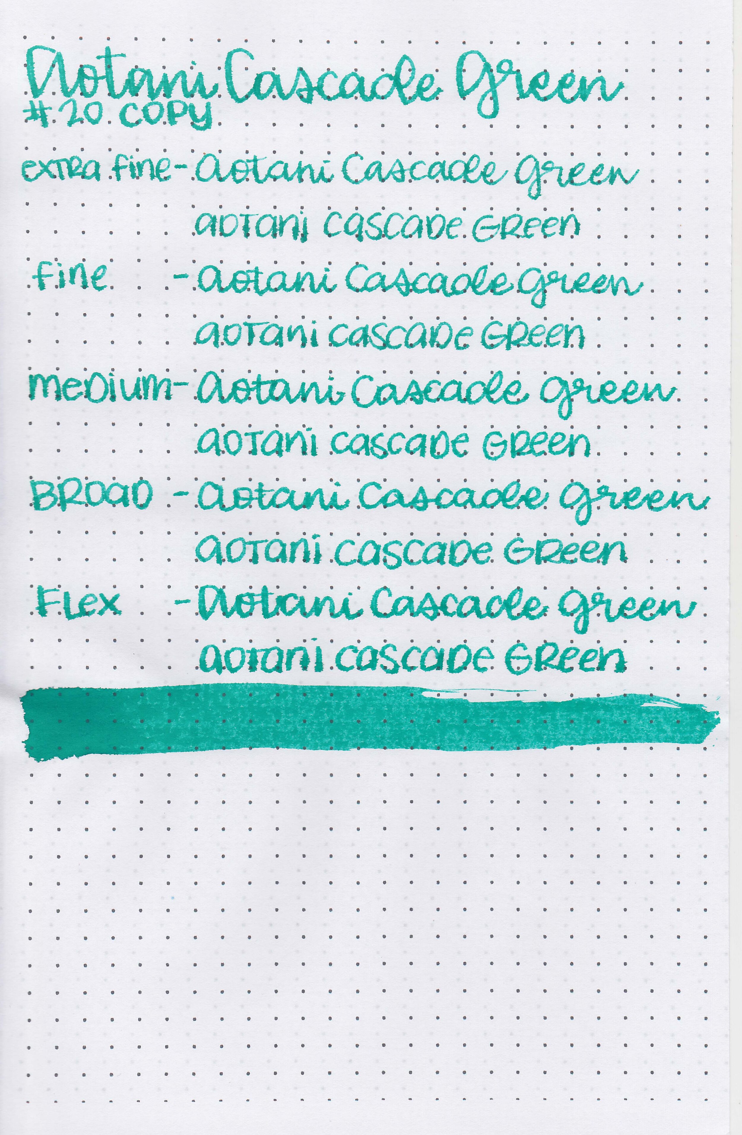
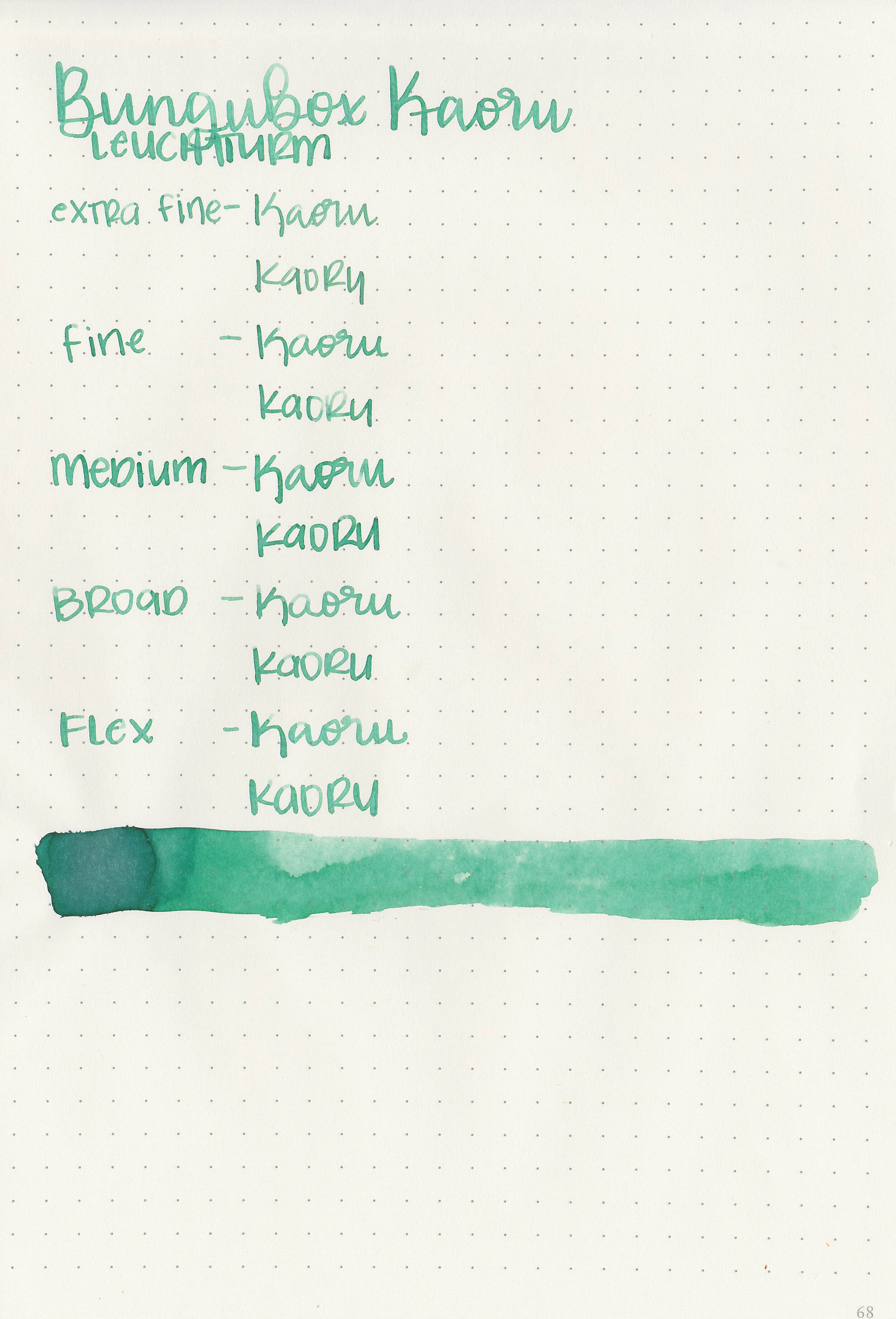
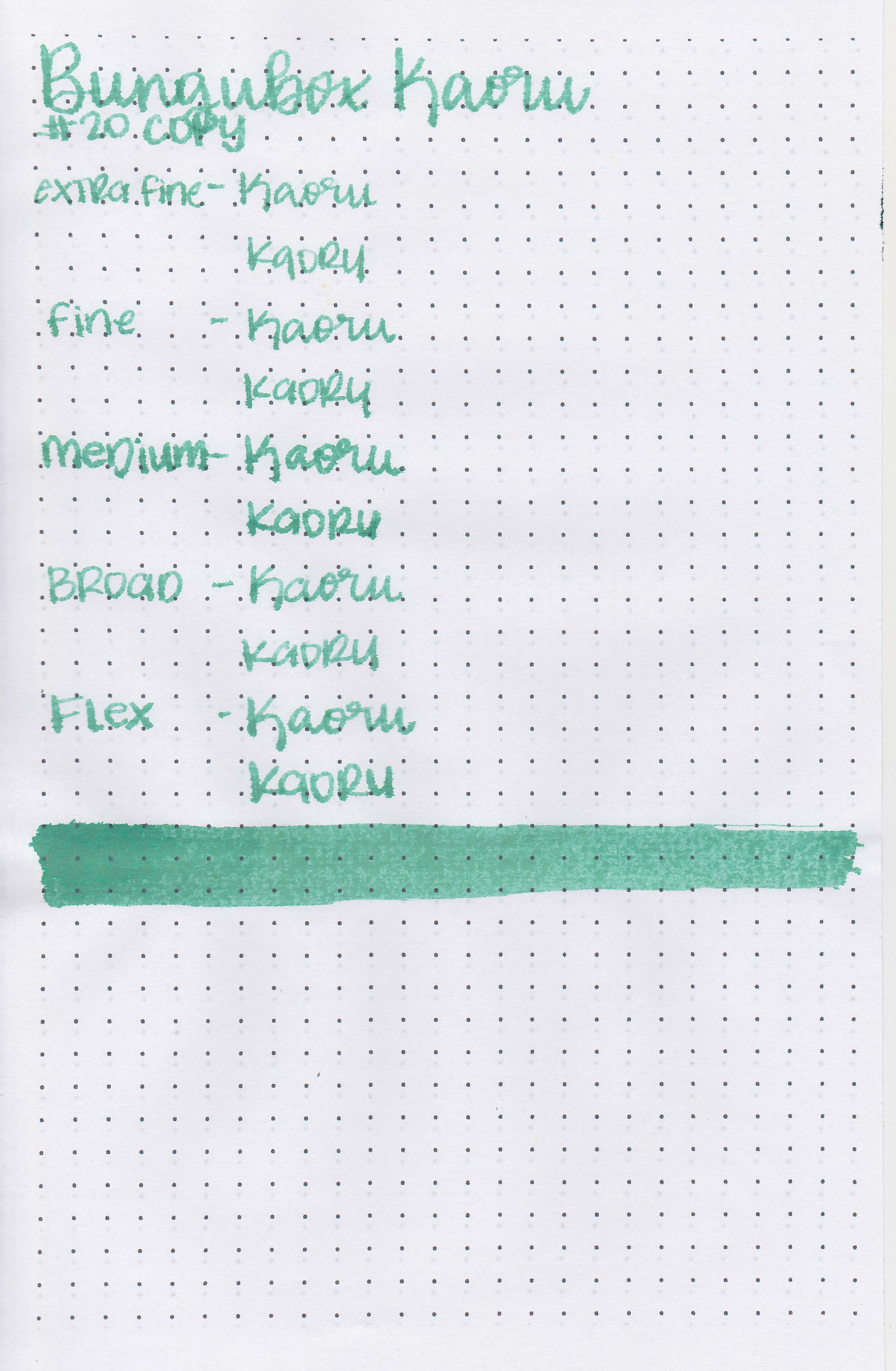
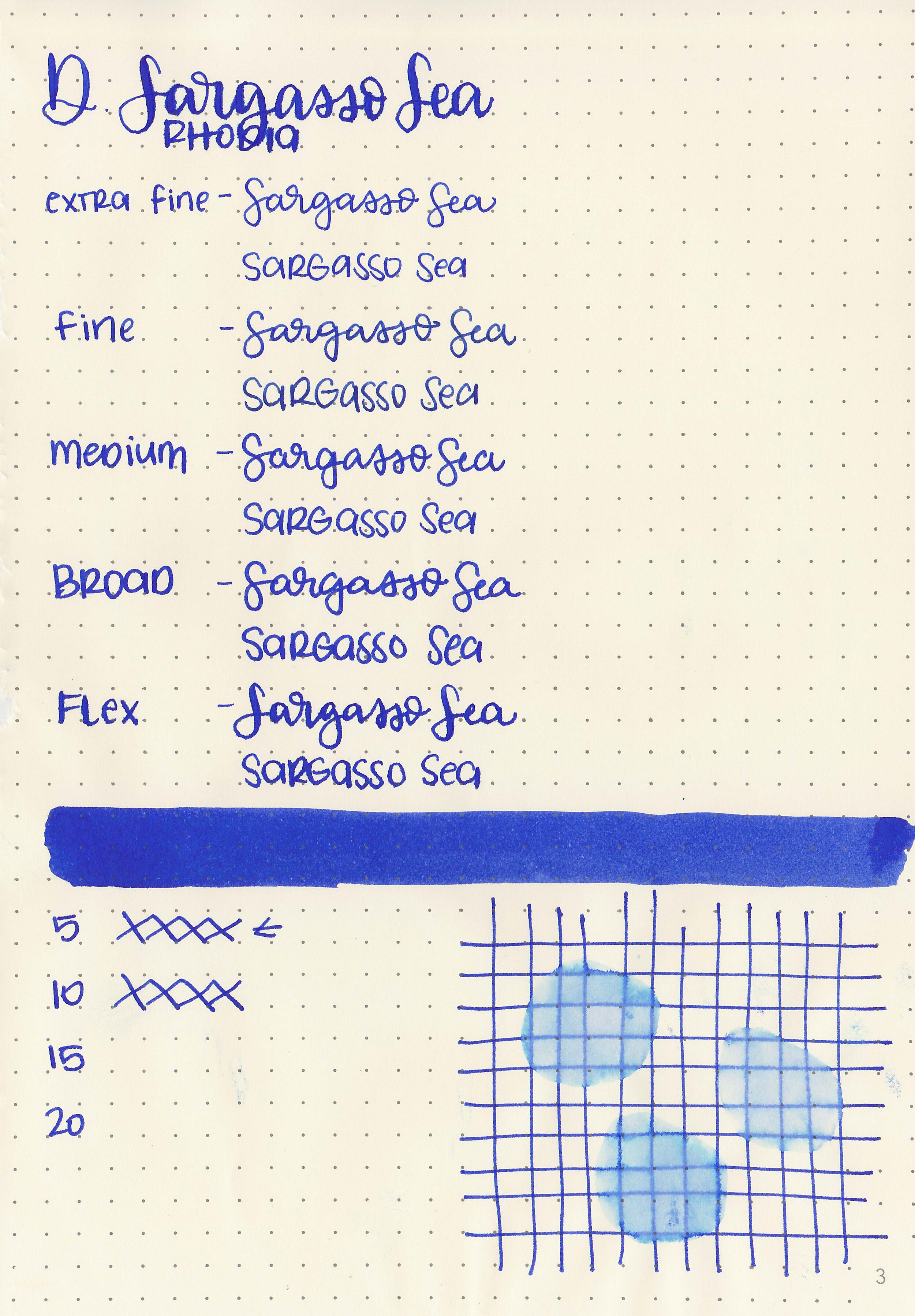
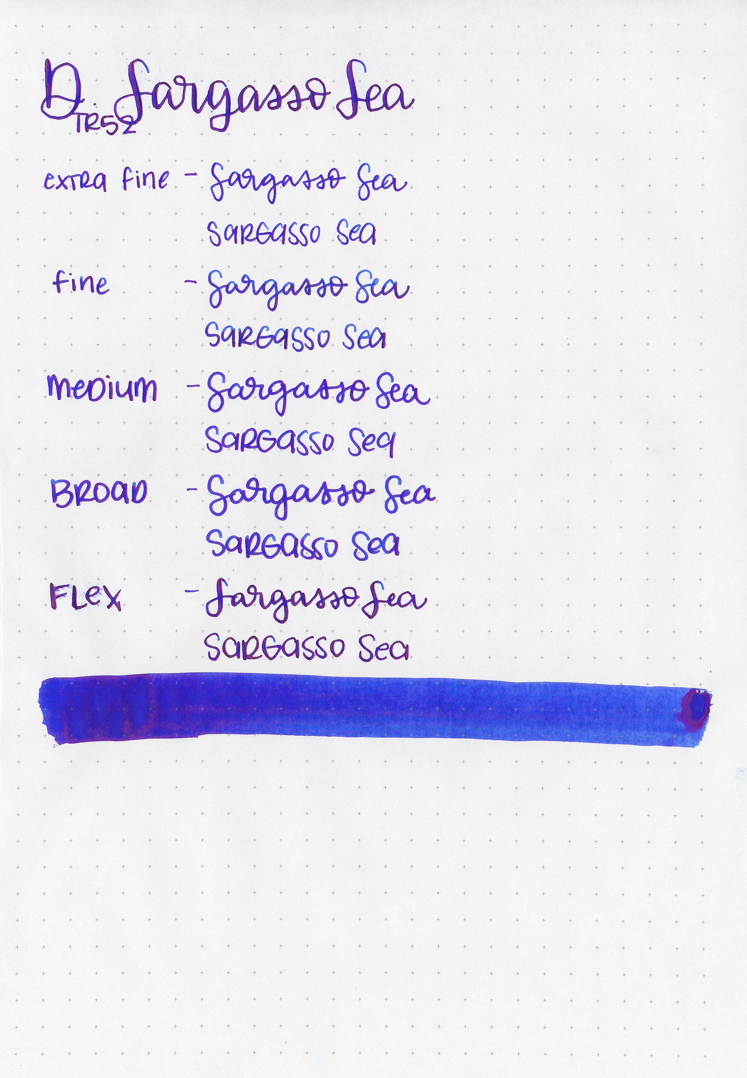
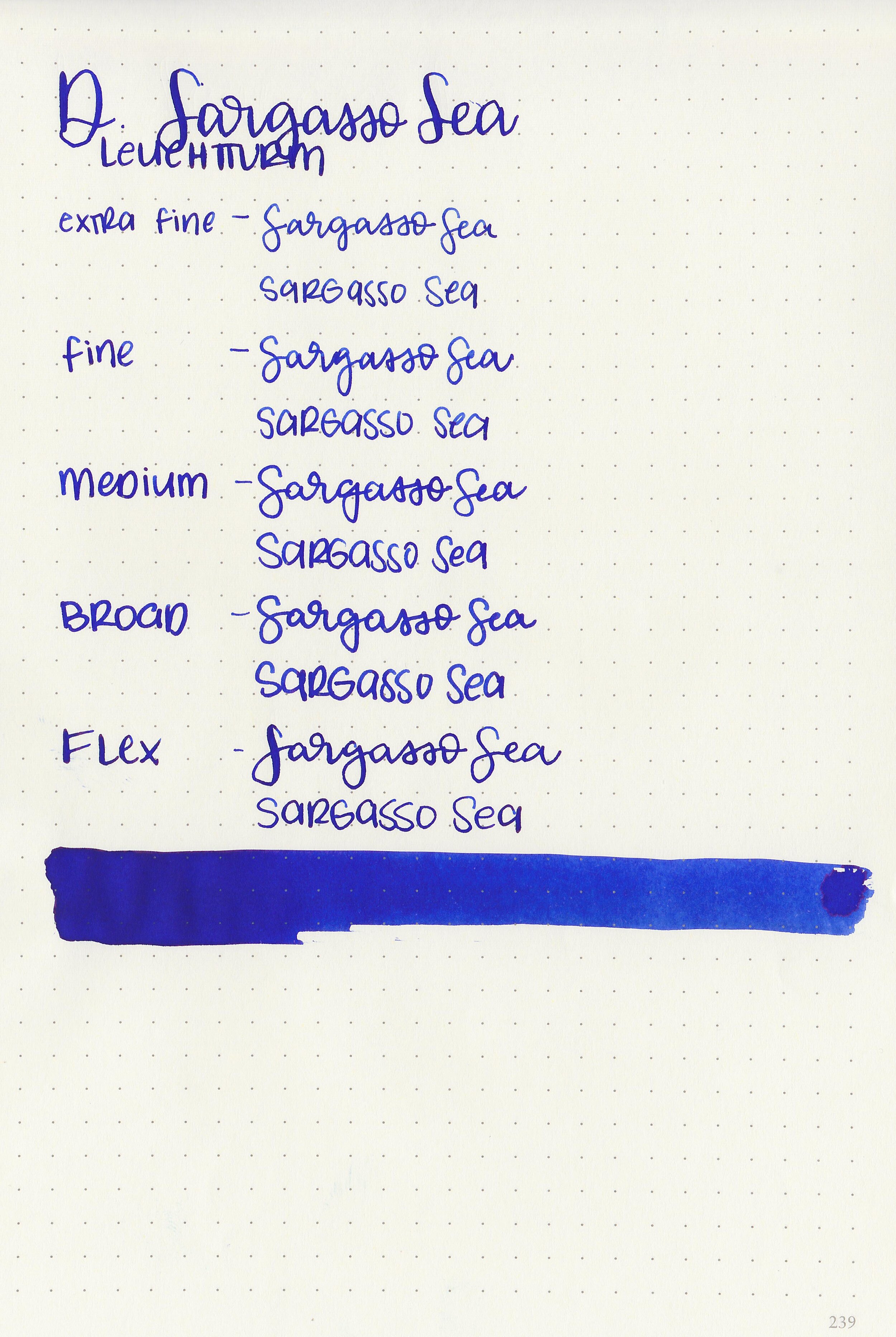
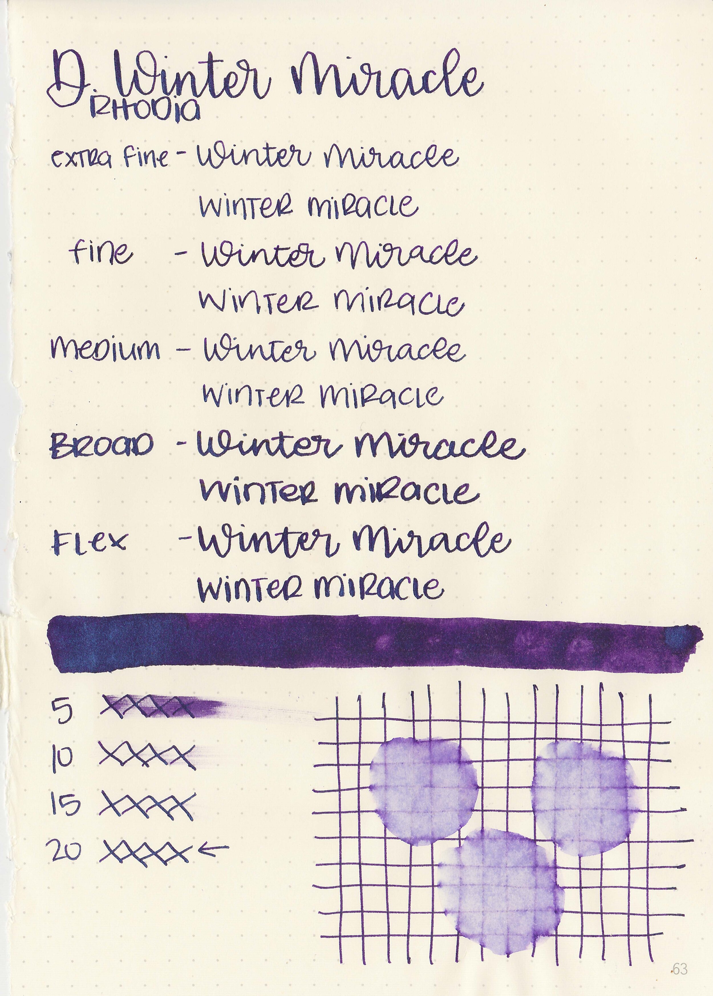
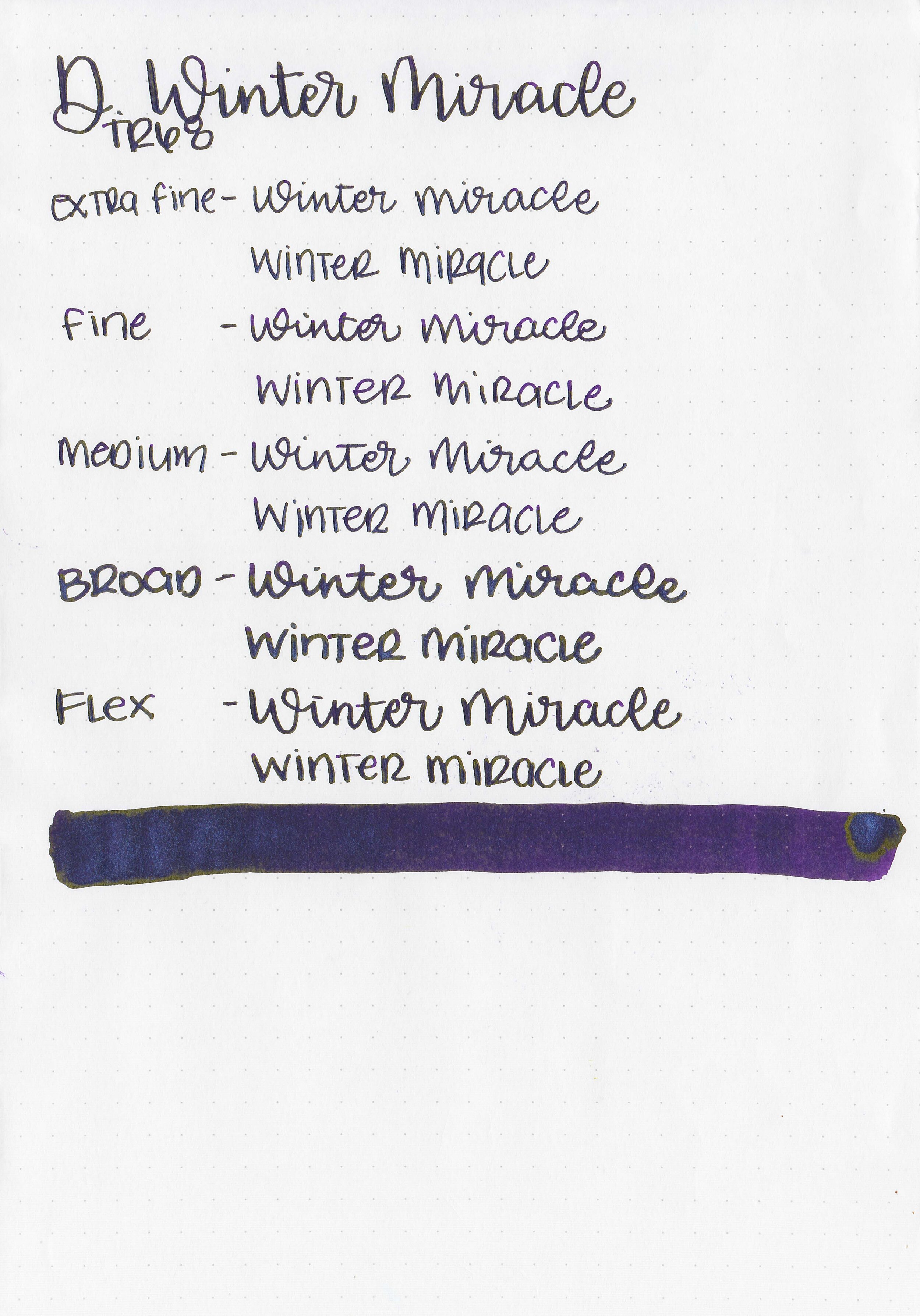
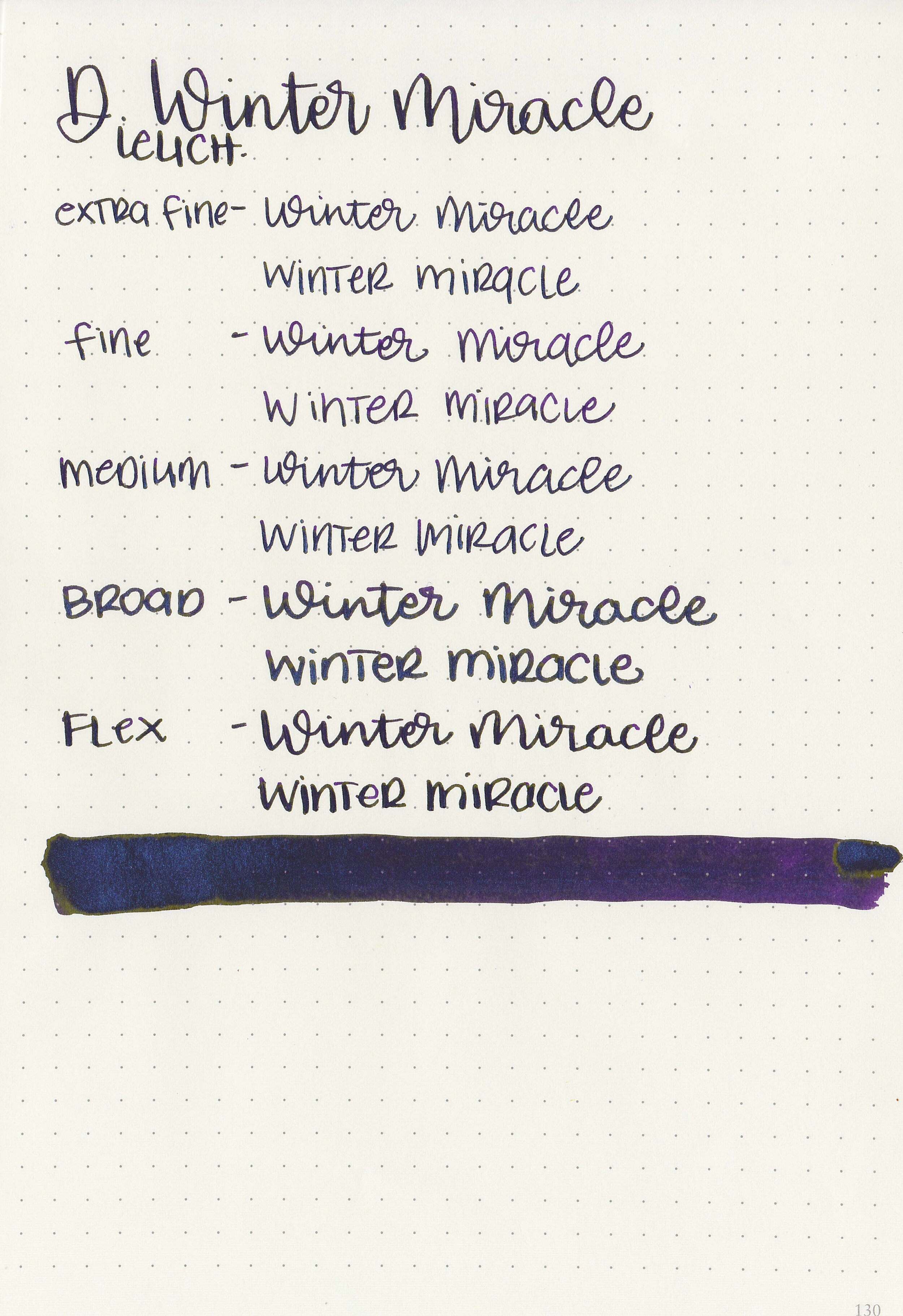
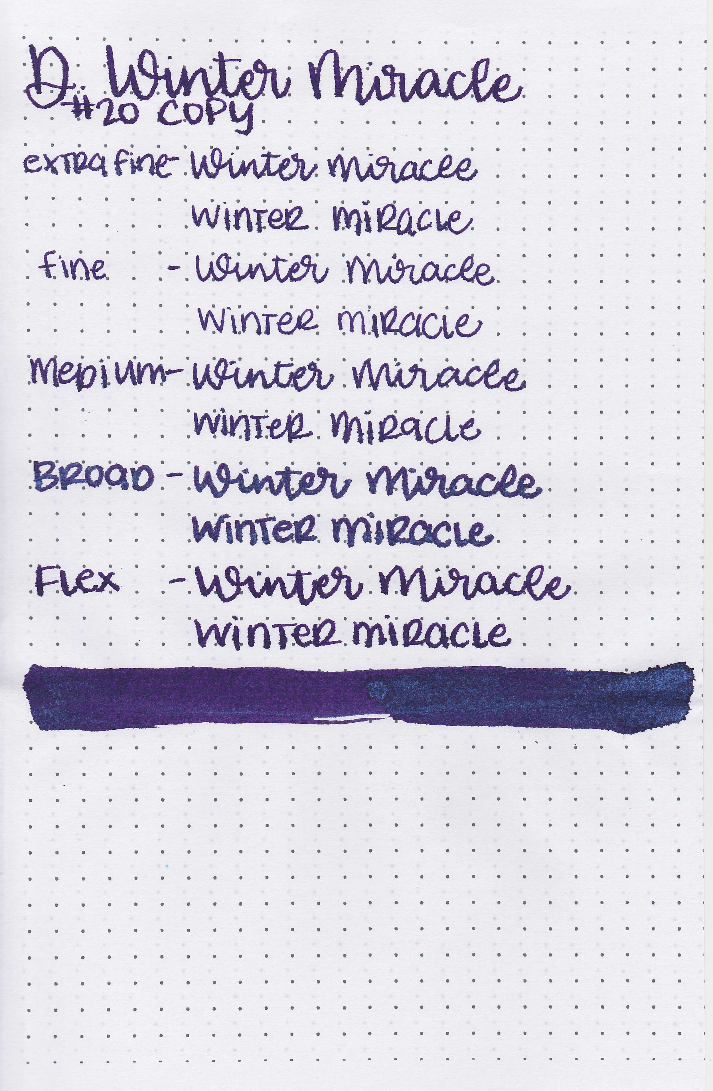
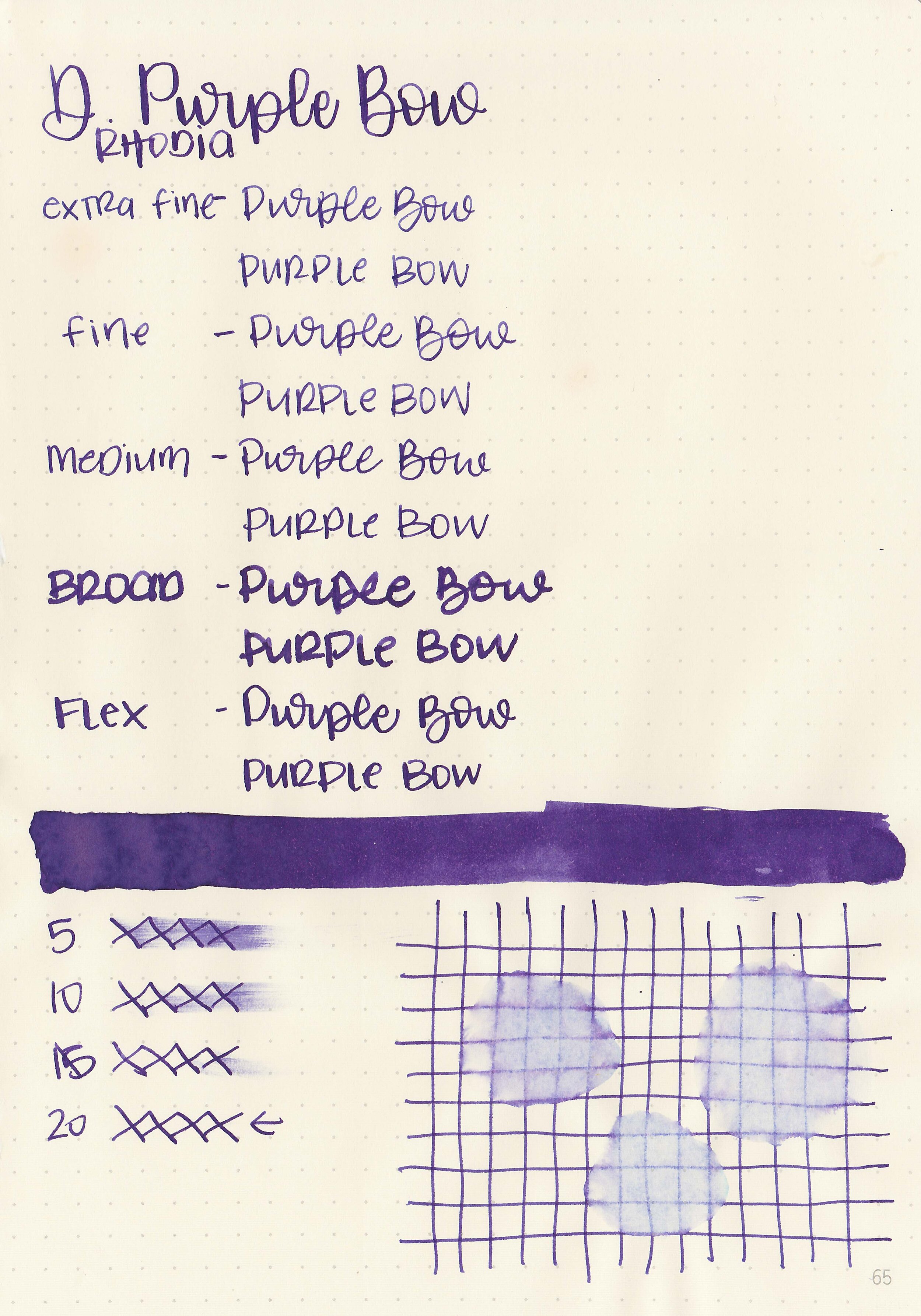
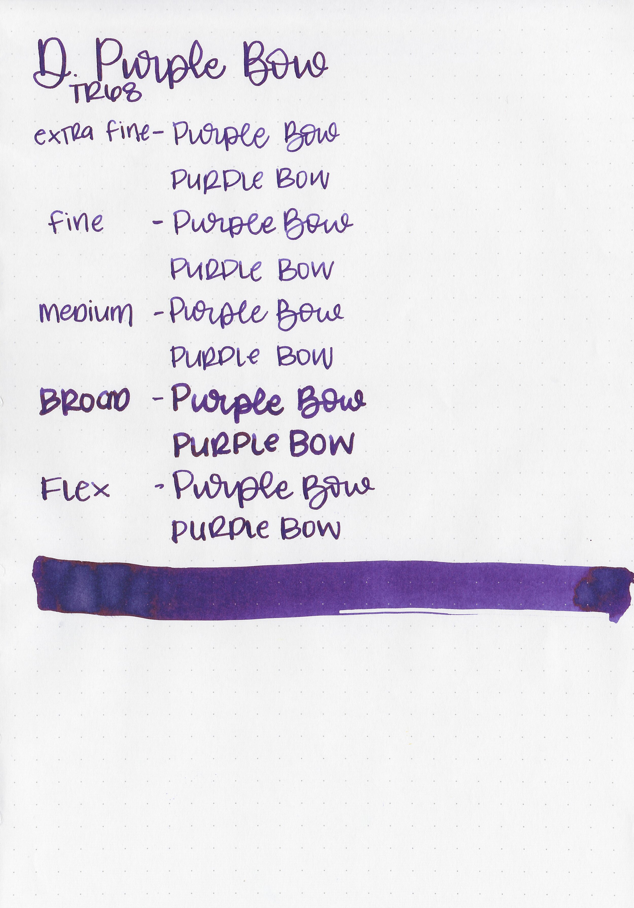
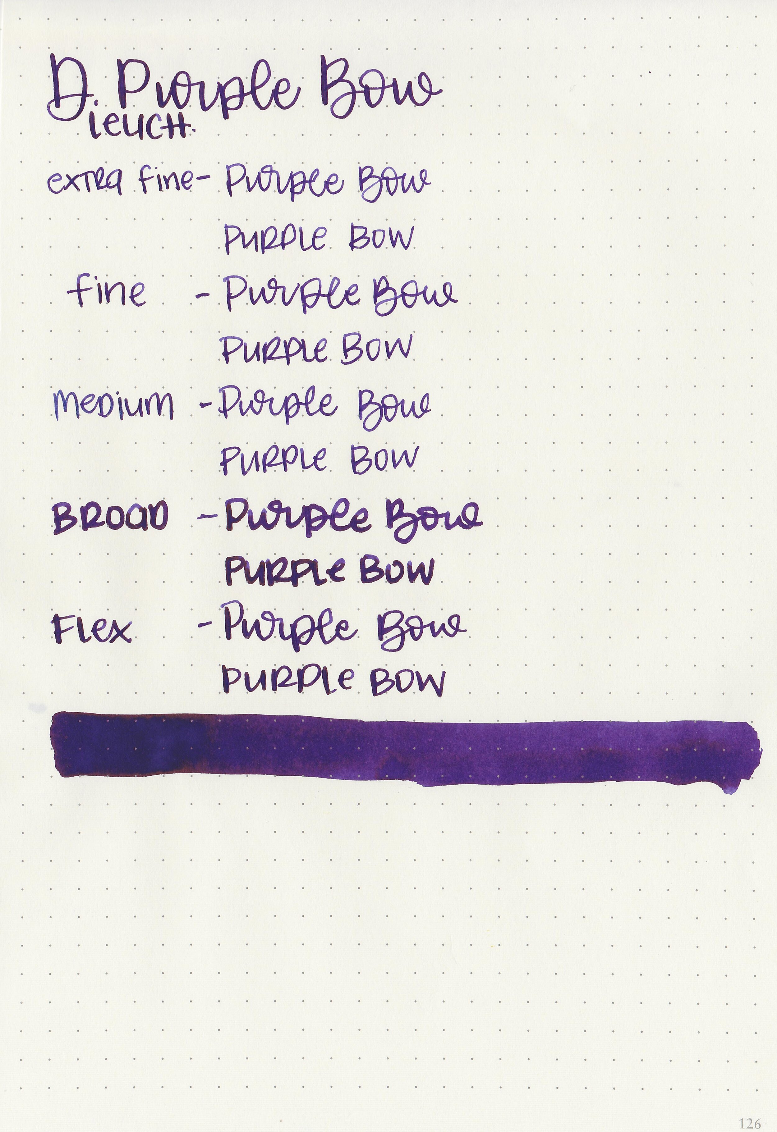
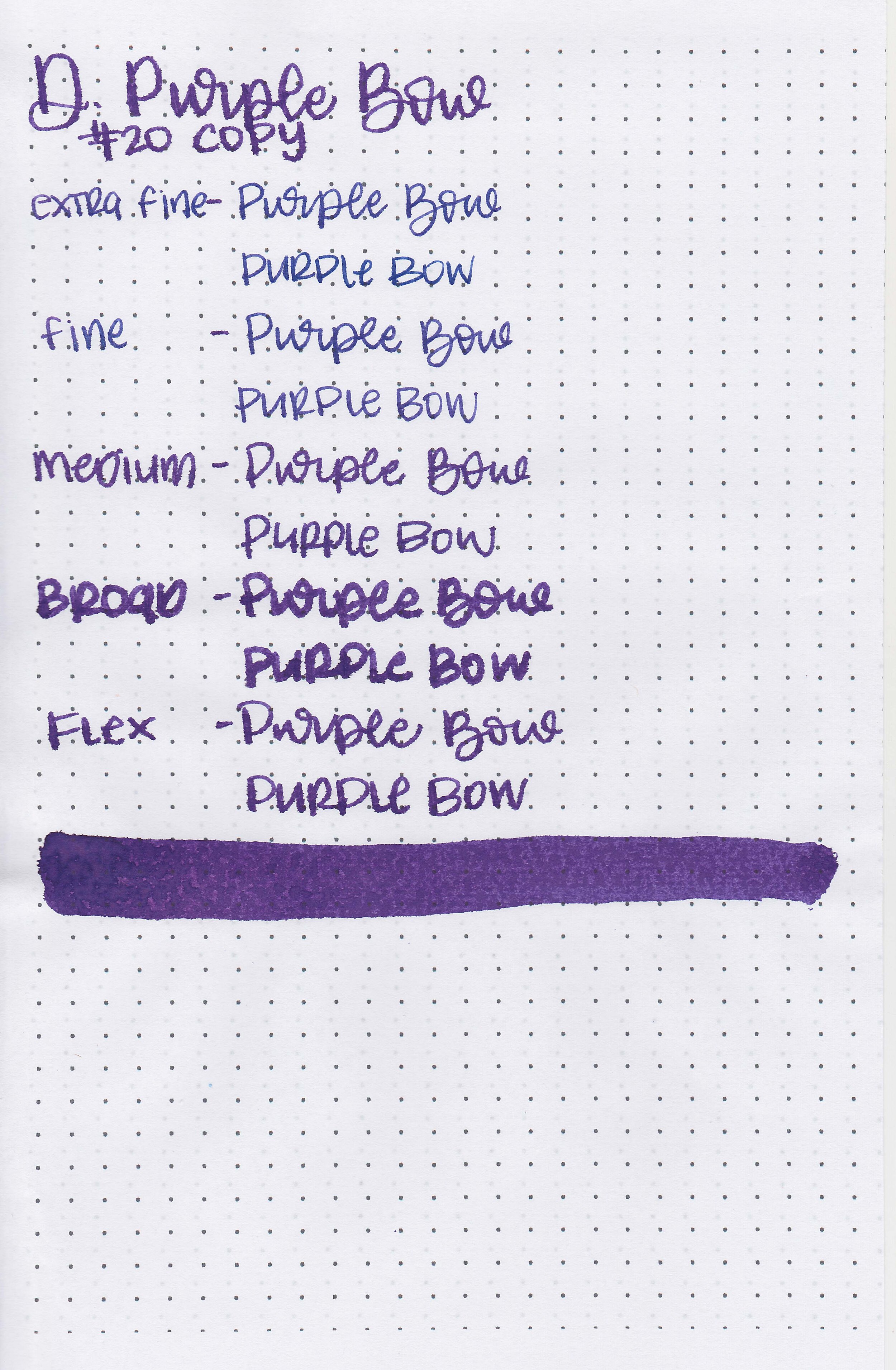
Writing samples:
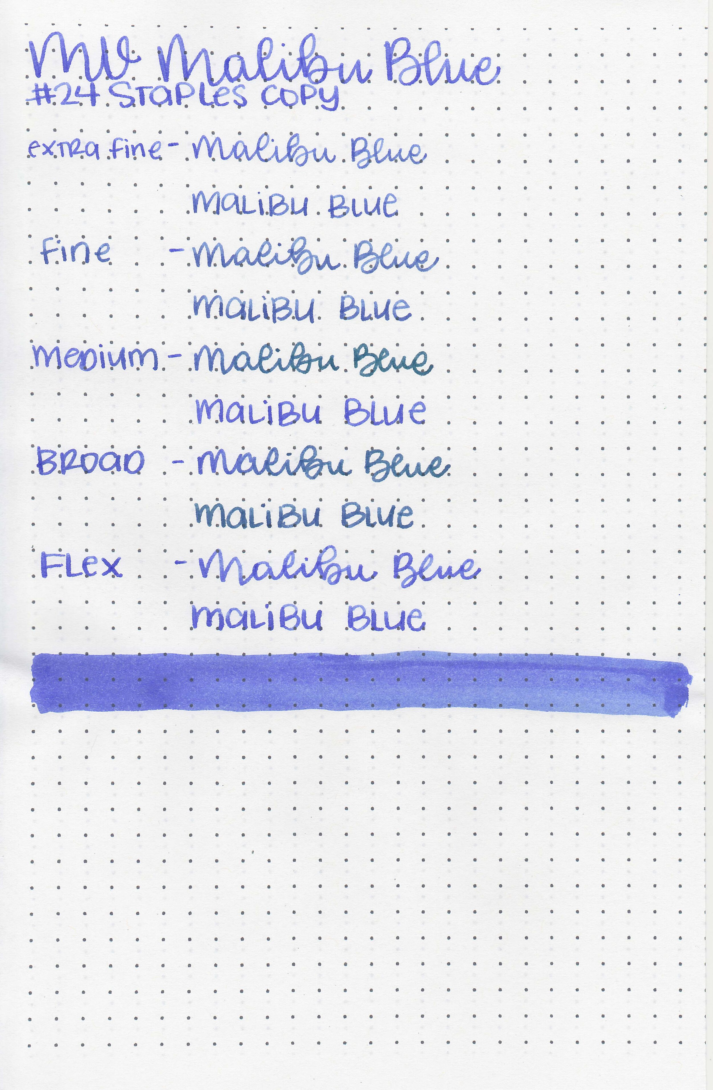
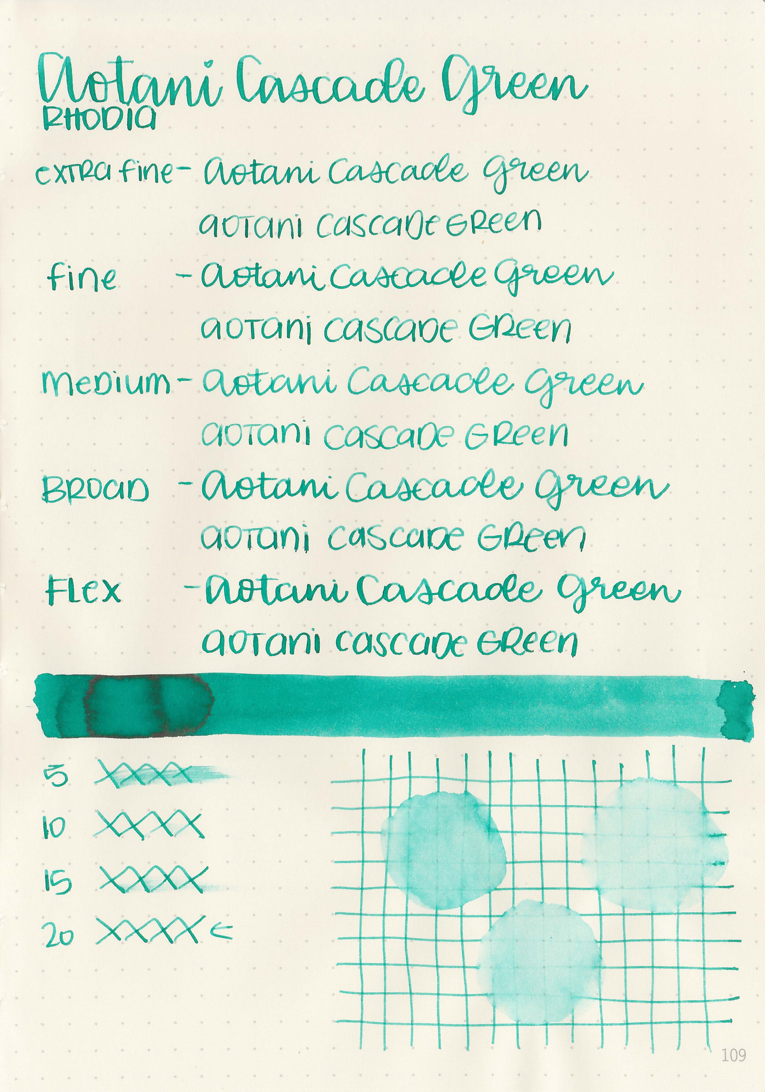
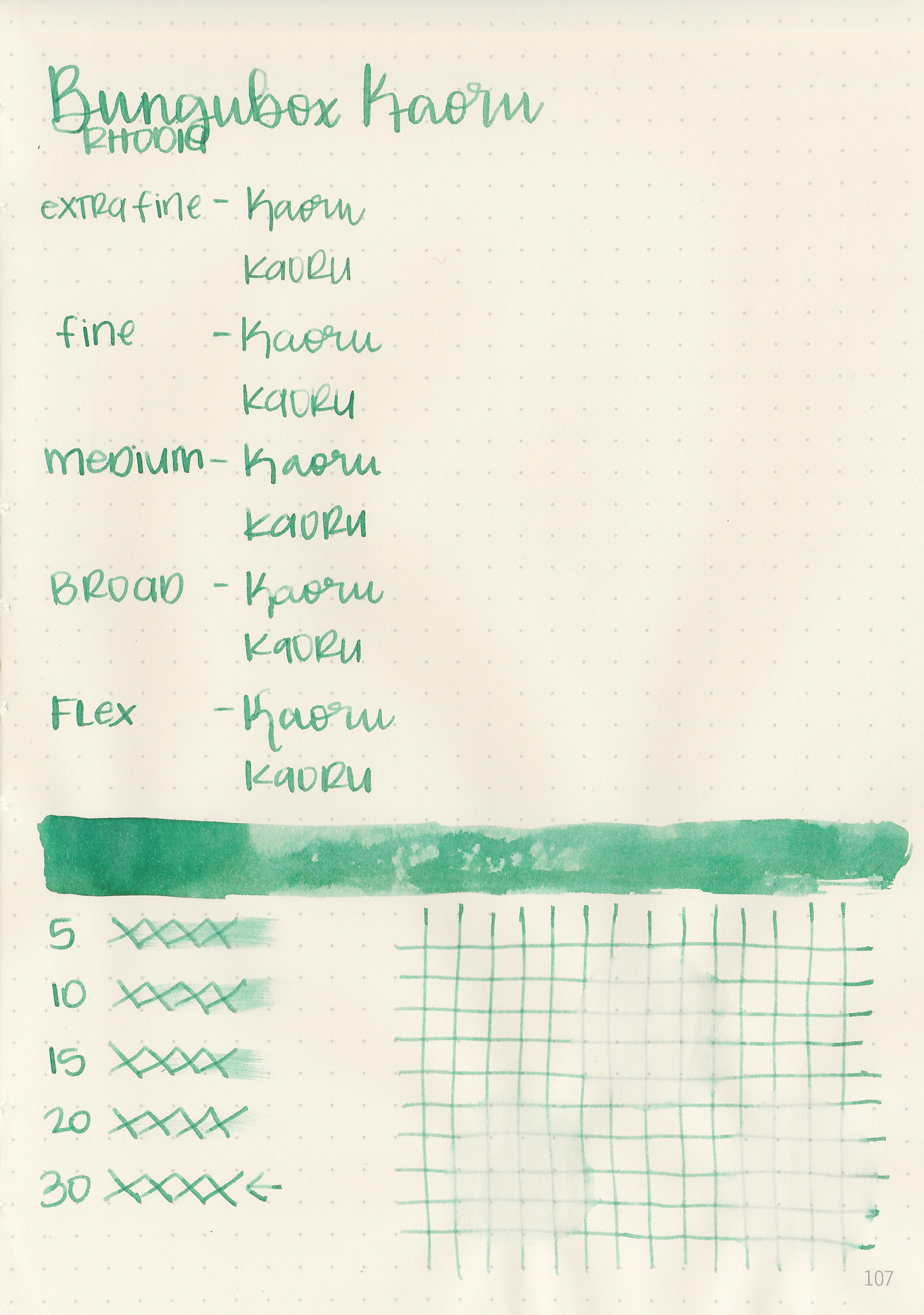
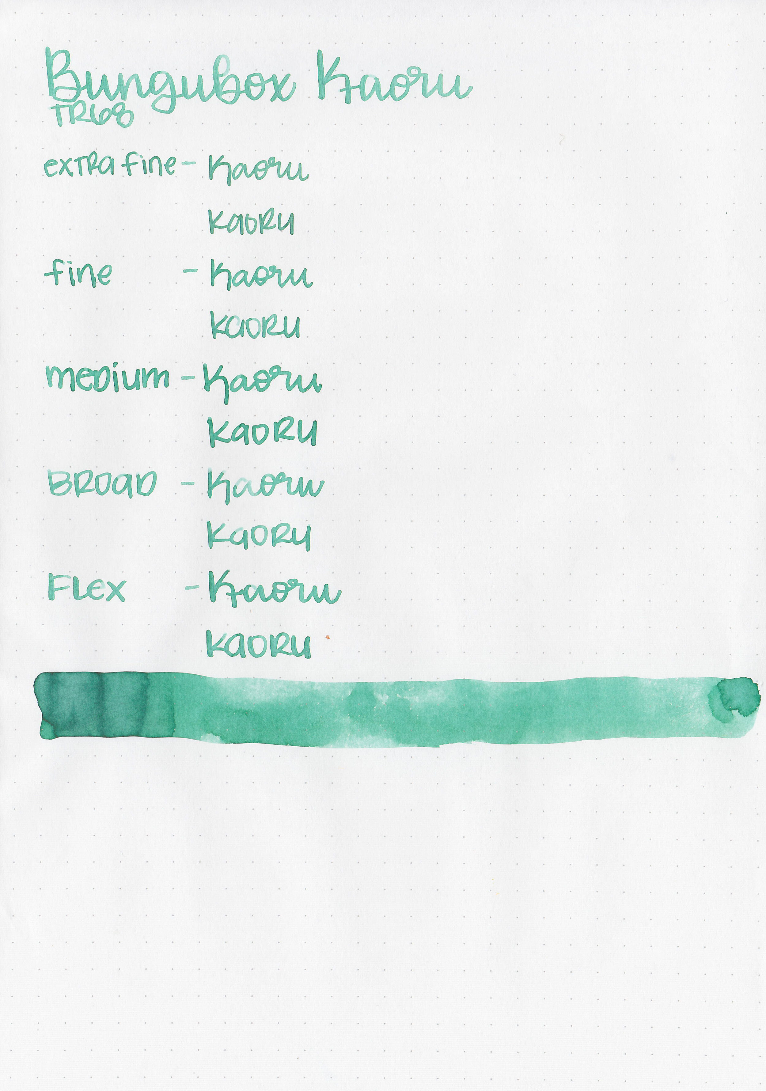
Let's take a look at how the ink behaves on fountain pen friendly papers: Rhodia, Tomoe River, and Leuchtturm.
Dry time: 10 seconds
Water resistance: Medium
Feathering: None
Show through: Medium
Bleeding: Low
Other properties: low shading, no sheen, and no shimmer.
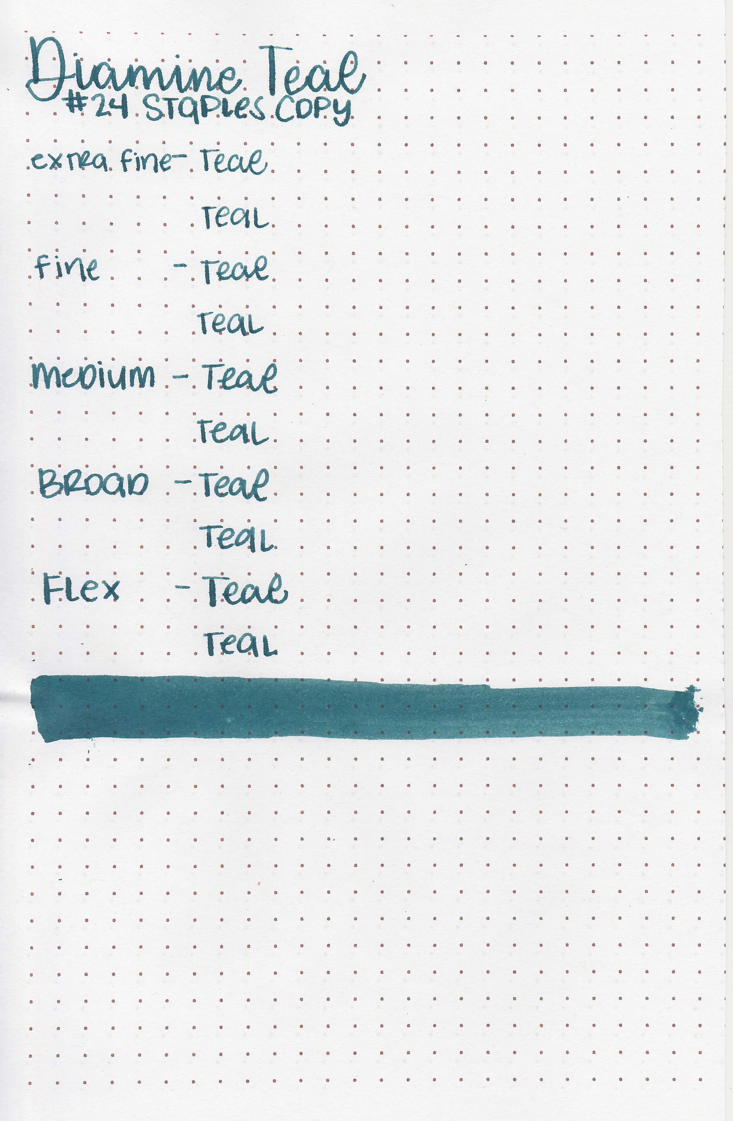
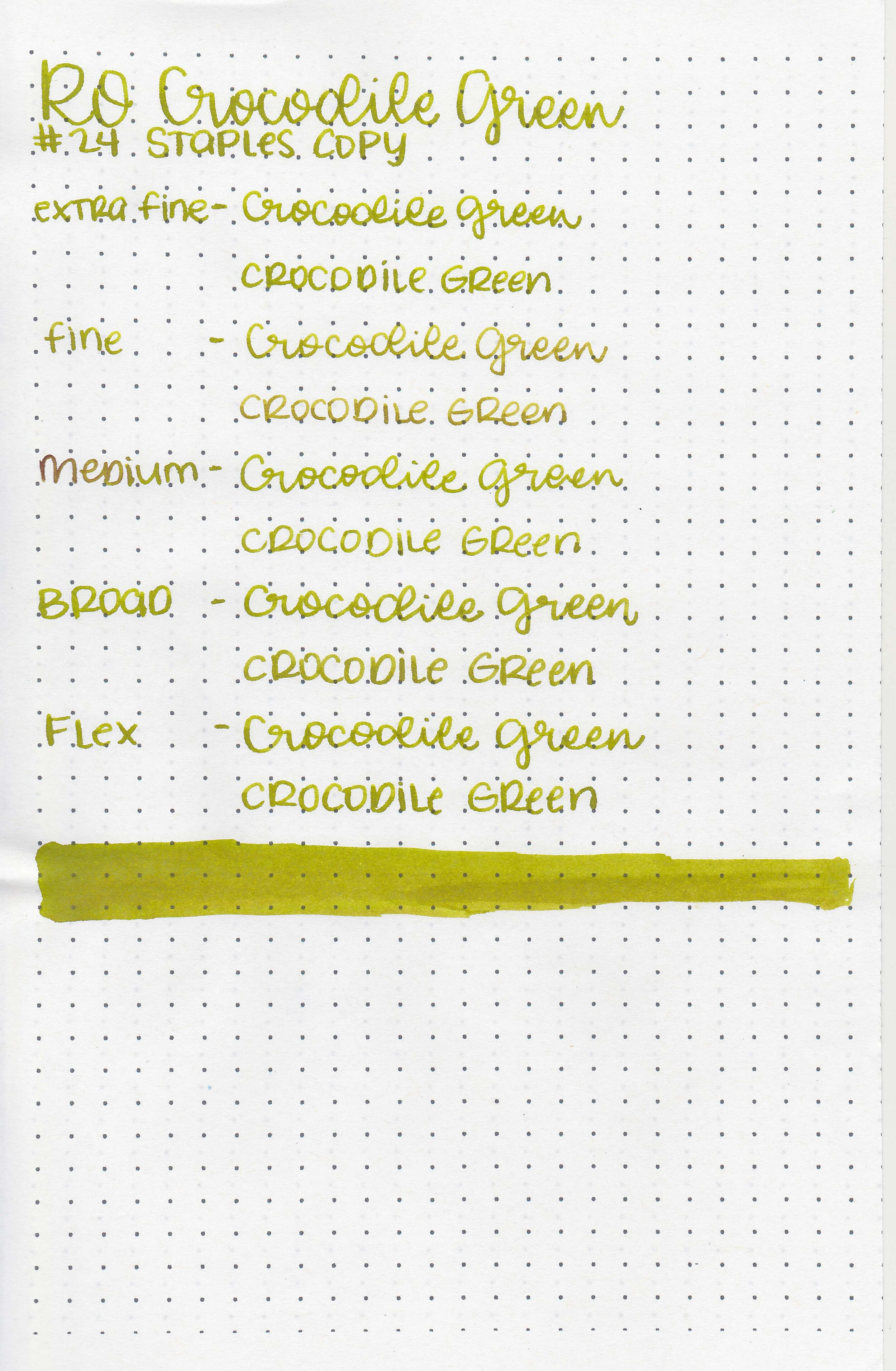
On Staples 24 lb copy paper there was some feathering in most nib sizes.
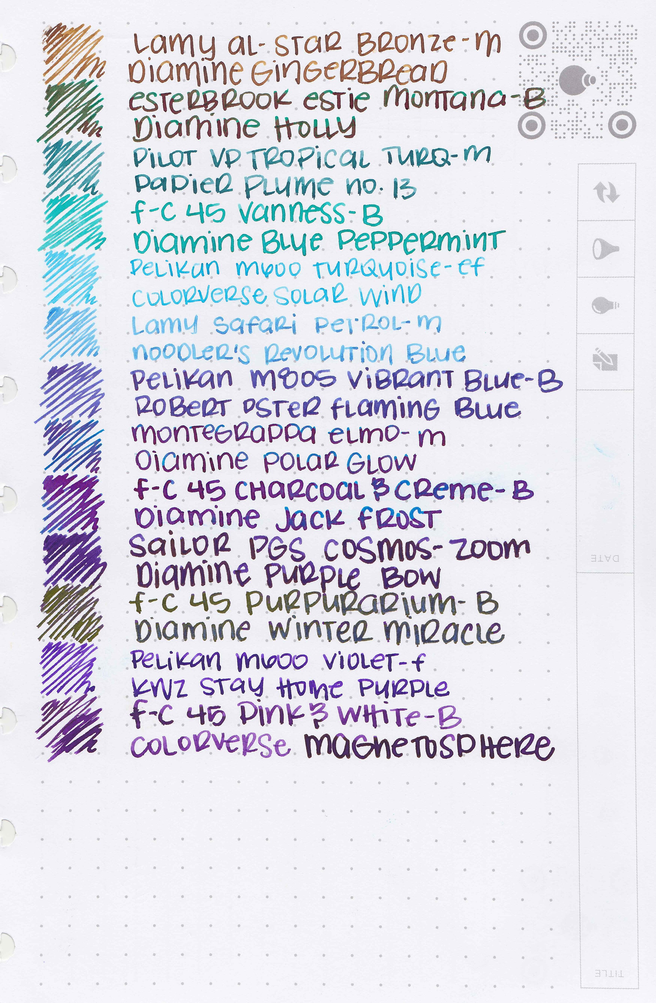
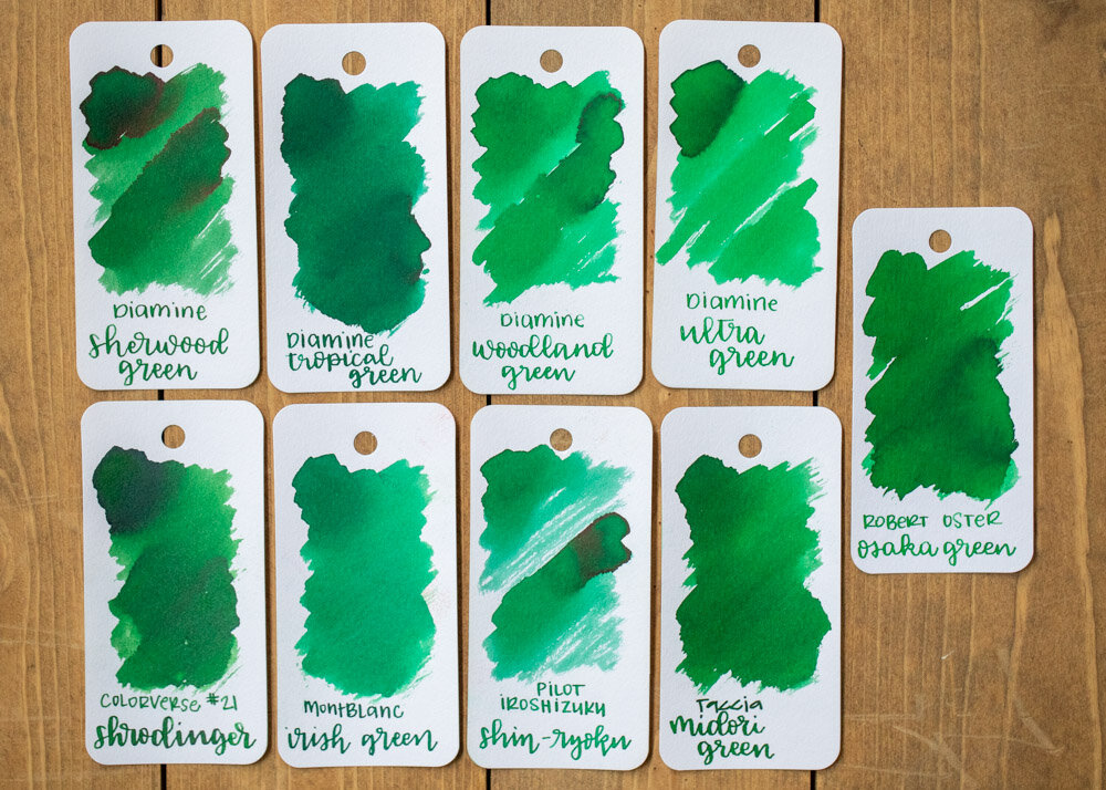
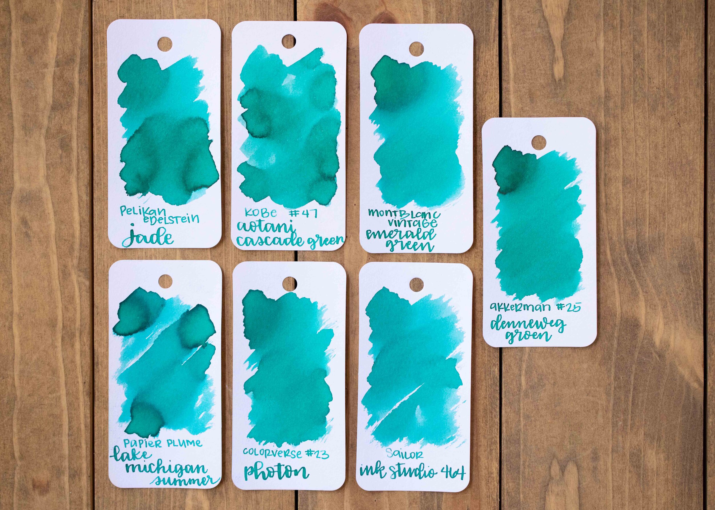
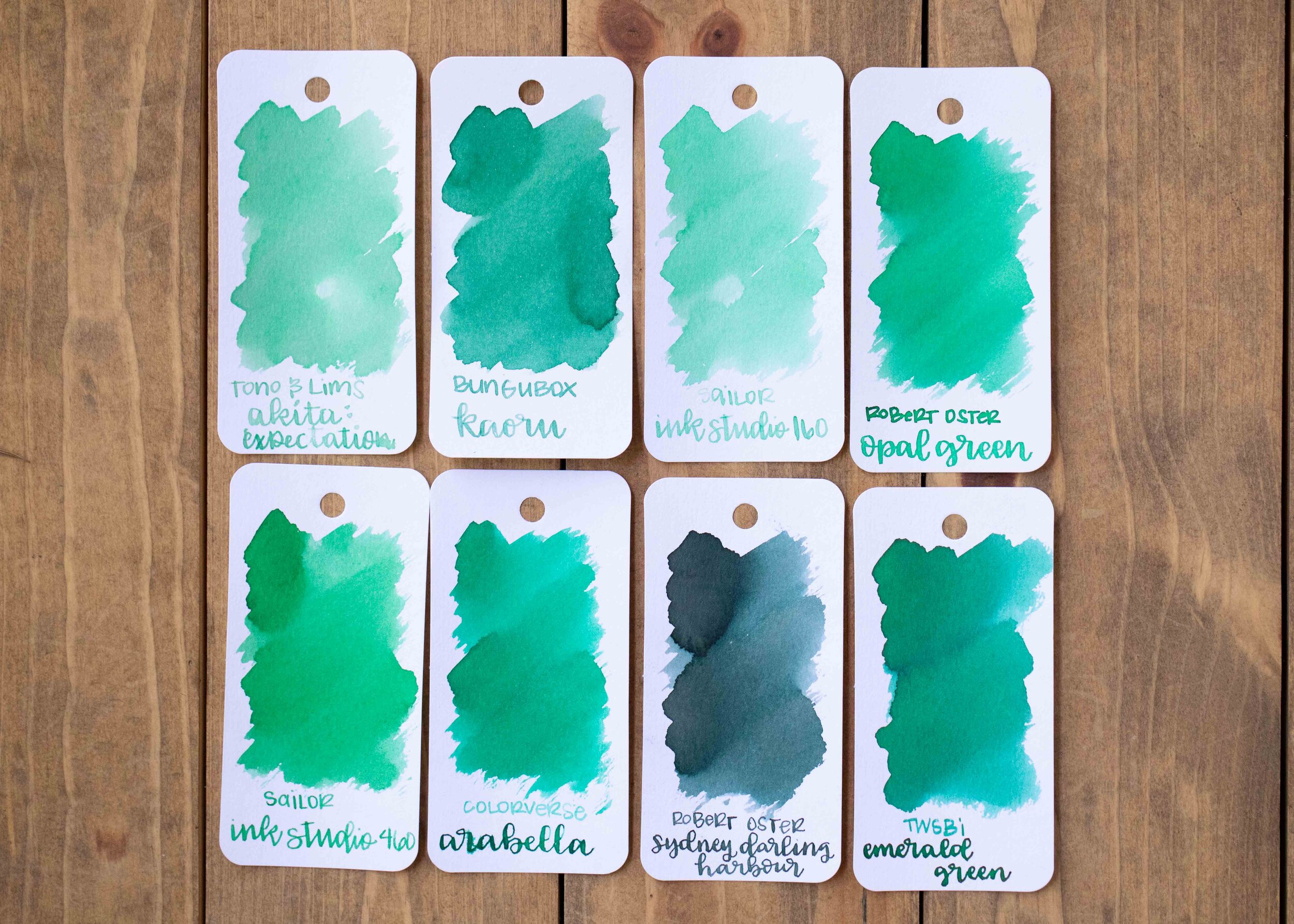
Comparison Swabs:

Teal is closest to Pilot Iroshizuku Syo-ro, but is much less saturated. Click here to see the Diamine inks together, and click here to see the teal inks together.
Longer writing:
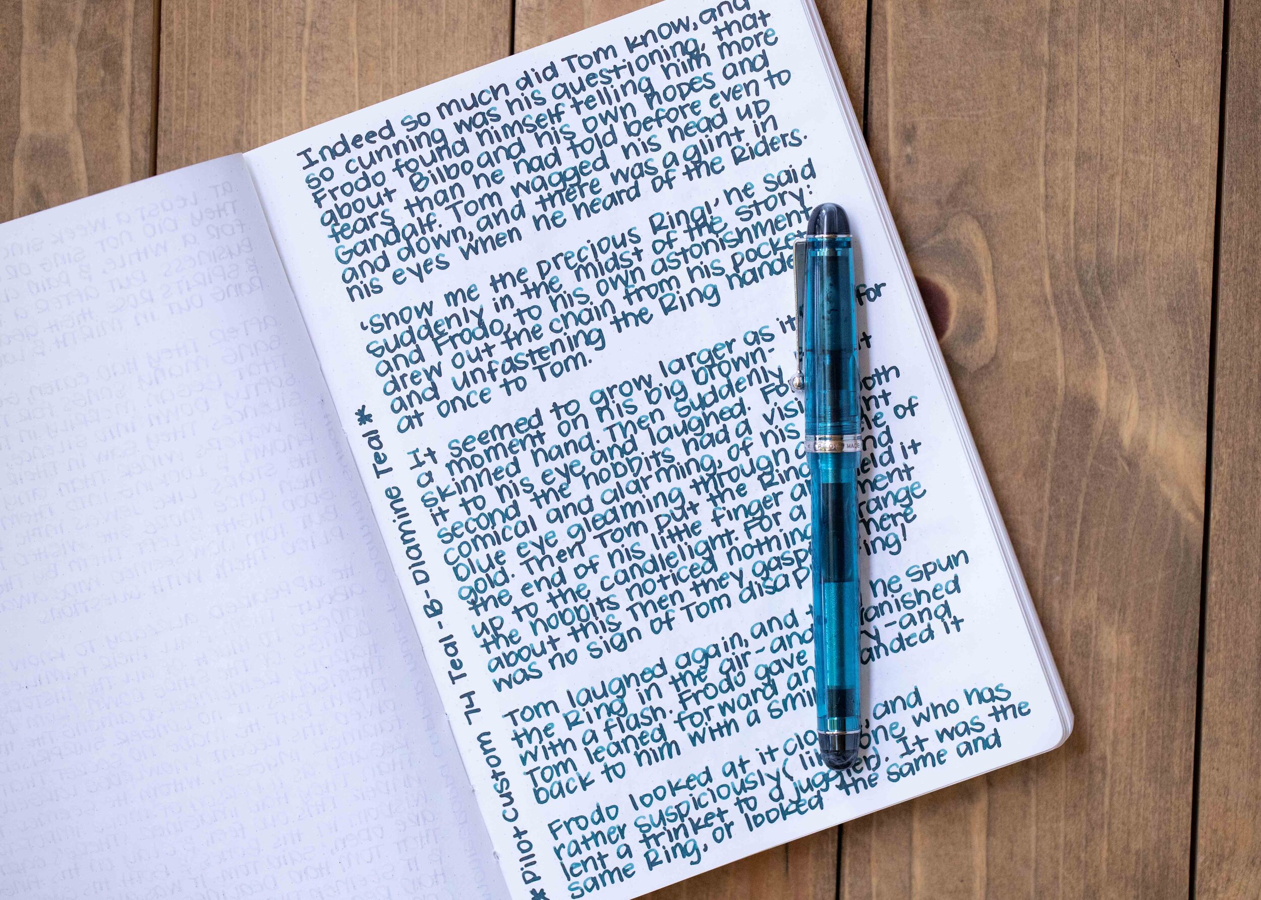
I used a Pilot Custom 74 Teal with a broad nib on a Taroko Enigma notebook. The ink had an average flow. I loved this ink/pen combo together, it wrote so smoothly but I did wish for just a little bit more shading.
Overall, I really like this ink, especially for the price. It’s definitely worth a try for the fall and winter seasons!
Disclaimer: I purchased this ink myself, and all photos and opinions are my own. This page does not contain affiliate links and this post is not sponsored in any way.