Octopus Fluids Inks Set 2
/
Let’s take a look at the next set of Octopus Fluids inks: Sepia Schwarz, Weinrot, Pinie, Karamell and Bronze. Thanks to Octopus Fluids for sending these inks over for review!
Swabs:
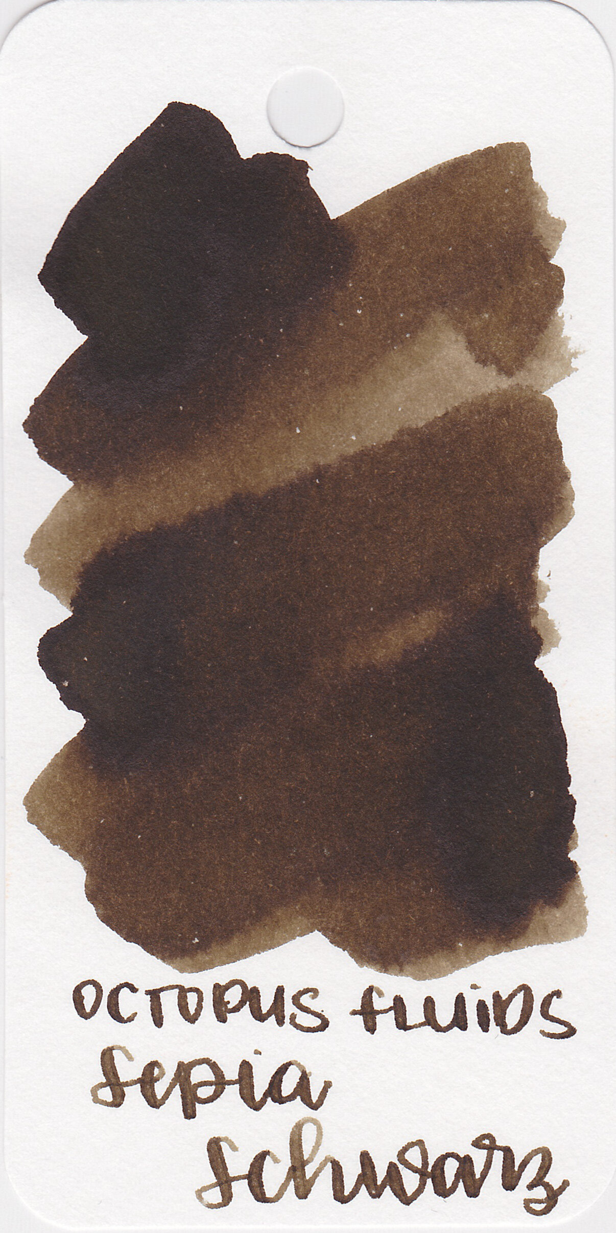
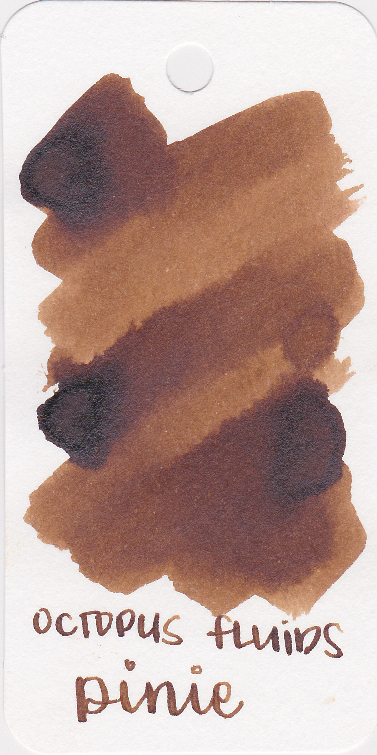

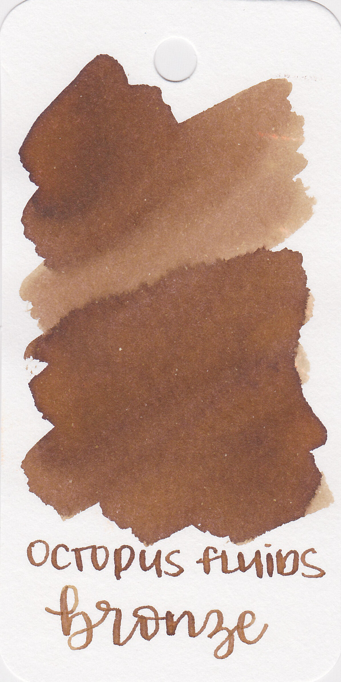

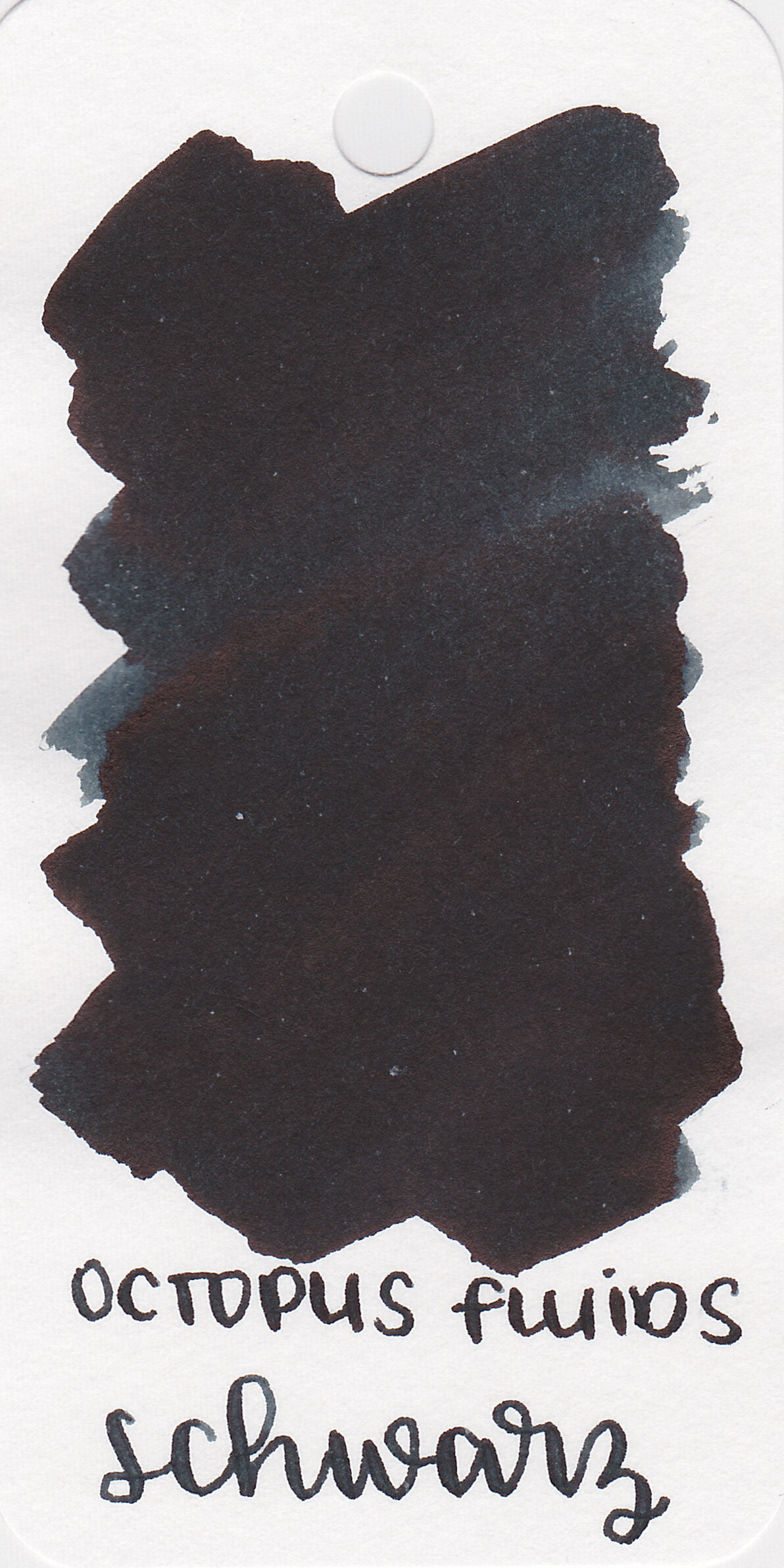
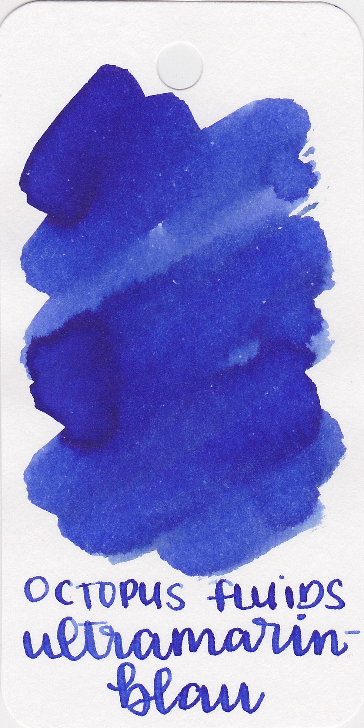
Left to right: Sepia Schwarz, Pinie, Karamell, Bronze and Weinrot.

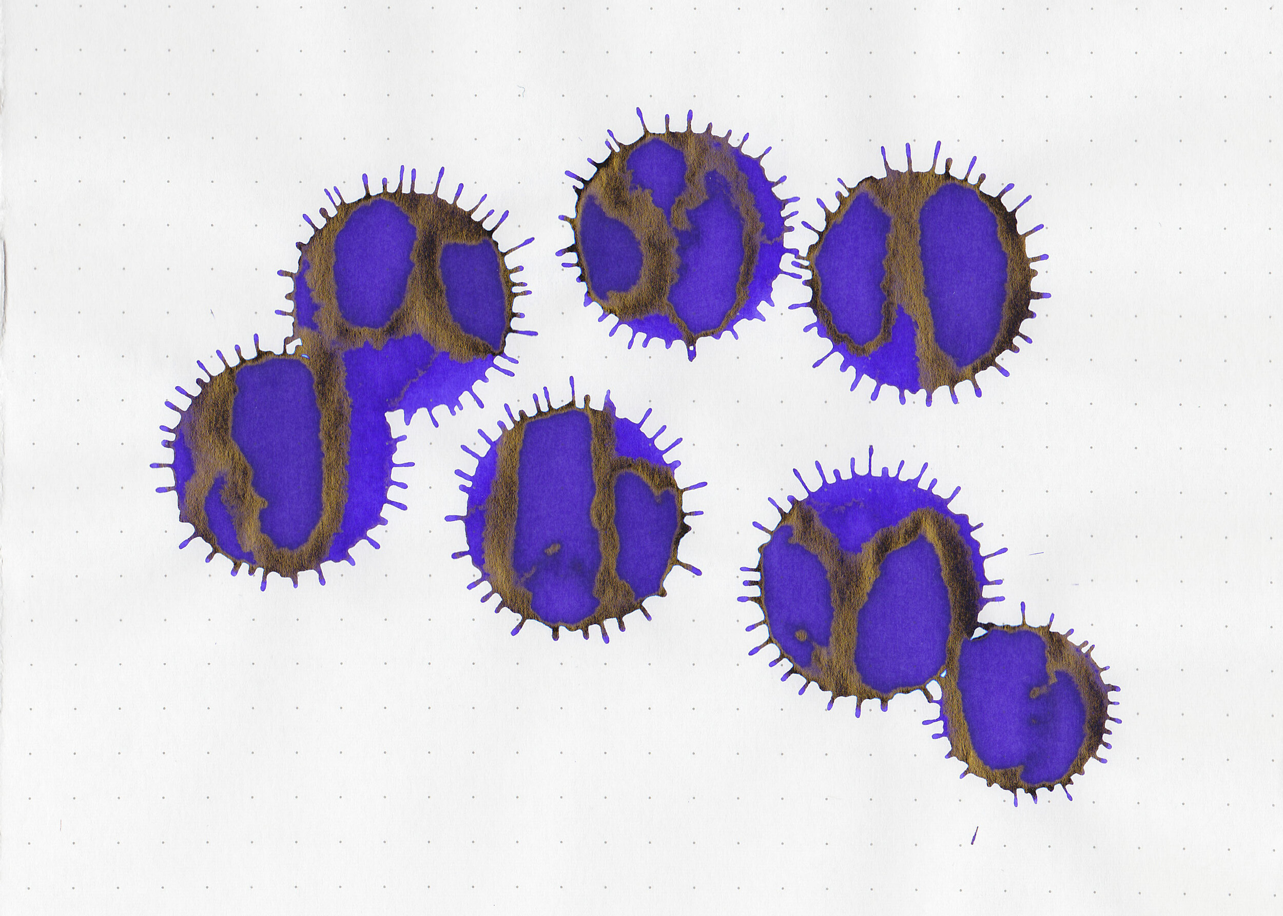
Ink drops:
Weinrot, Pinie and Karamell all show a little bit of sheen.
Dry Time:
All five inks dried in 20-30 seconds.

Water Resistance:
All have low to medium water resistance.
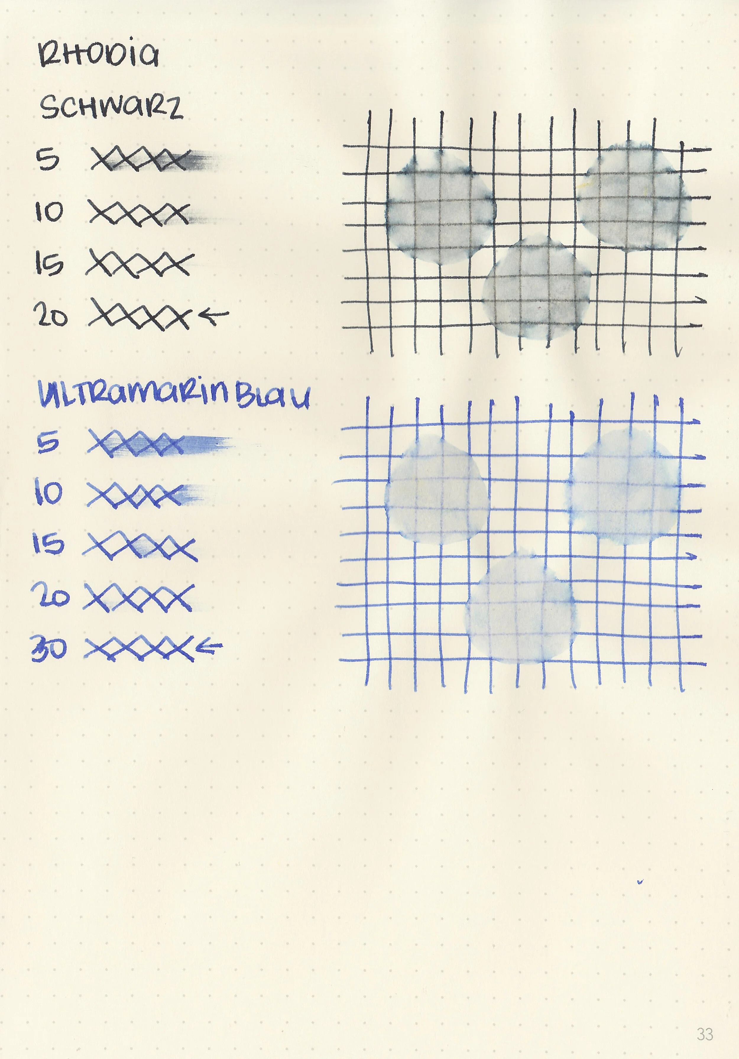
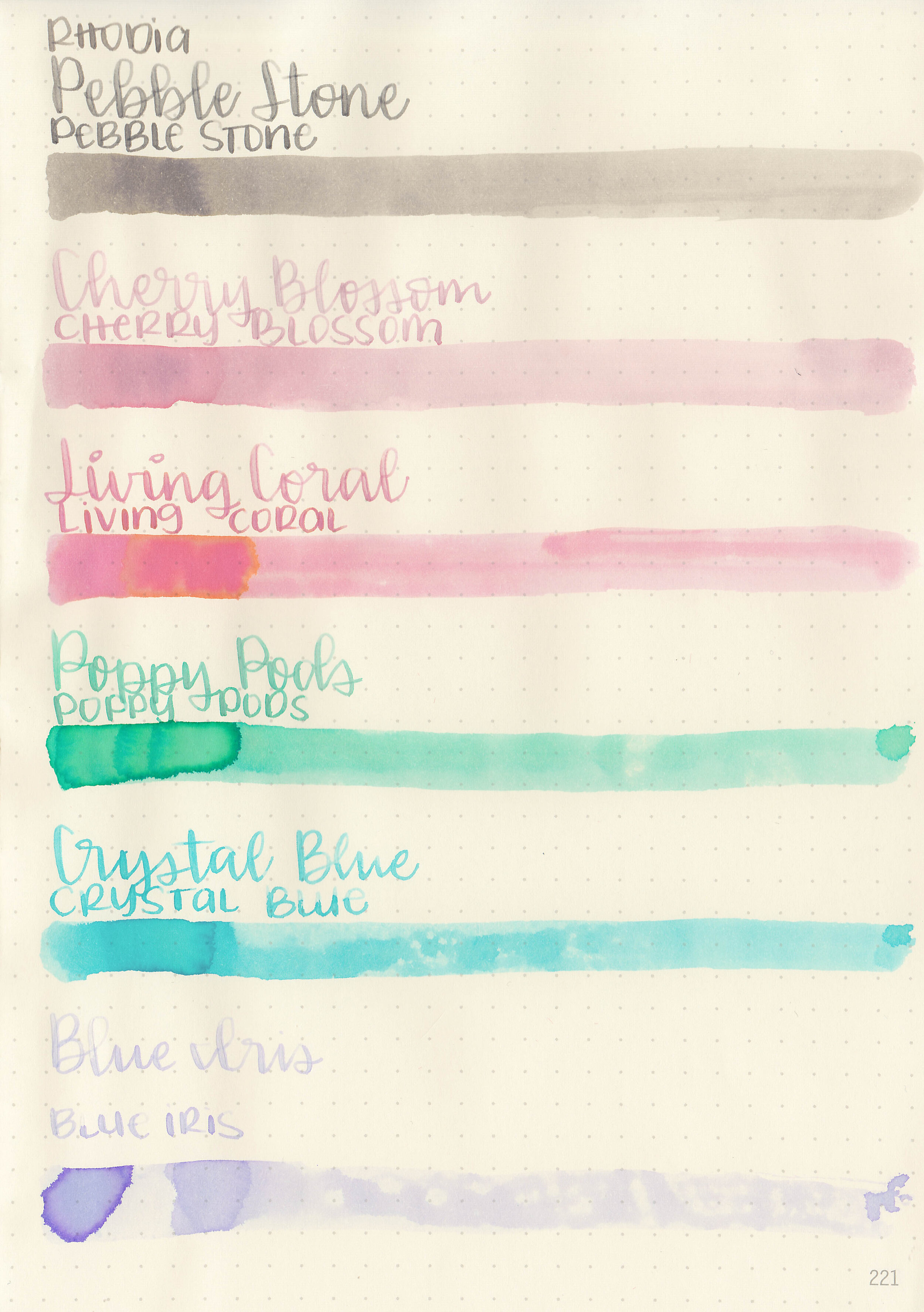
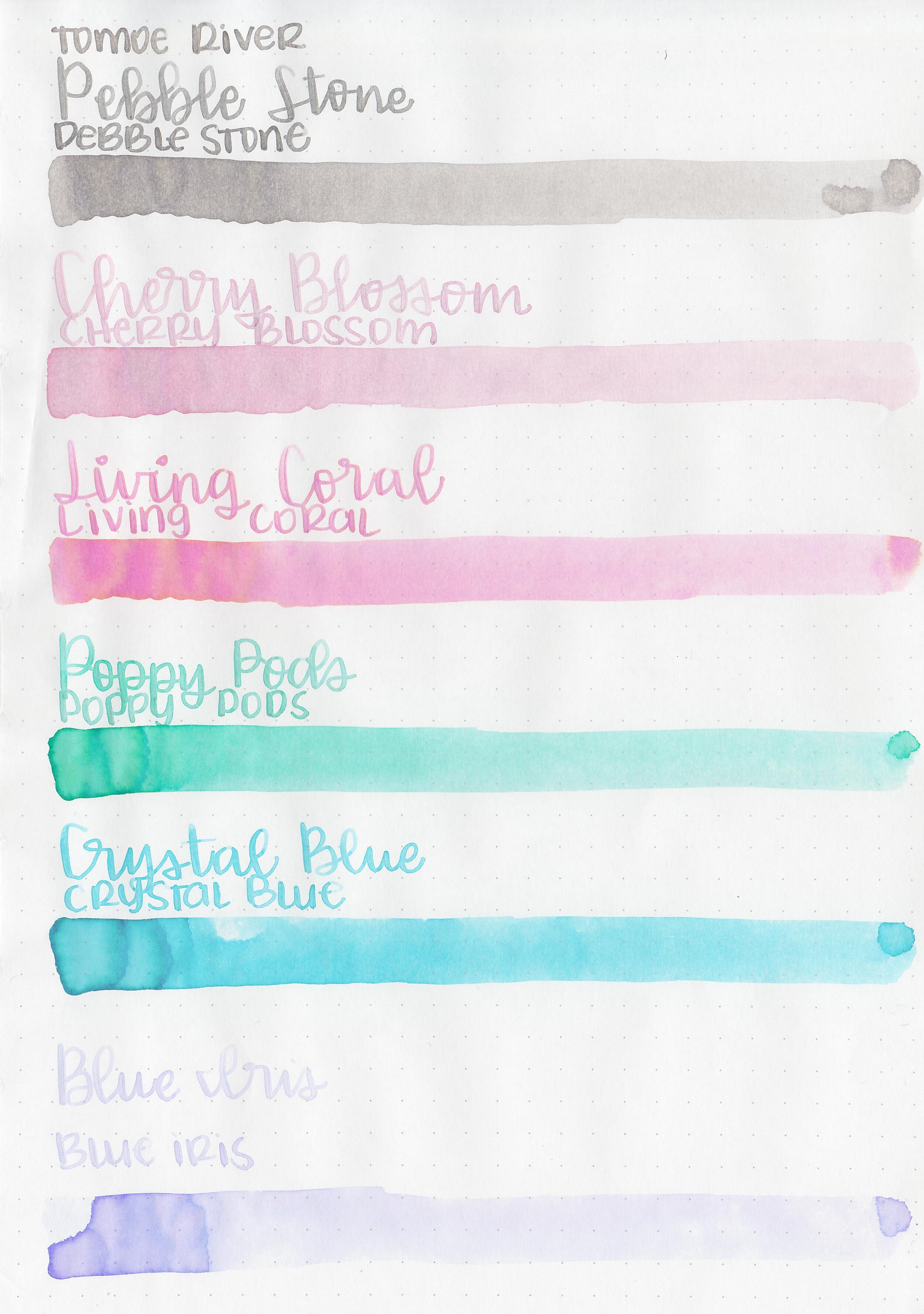
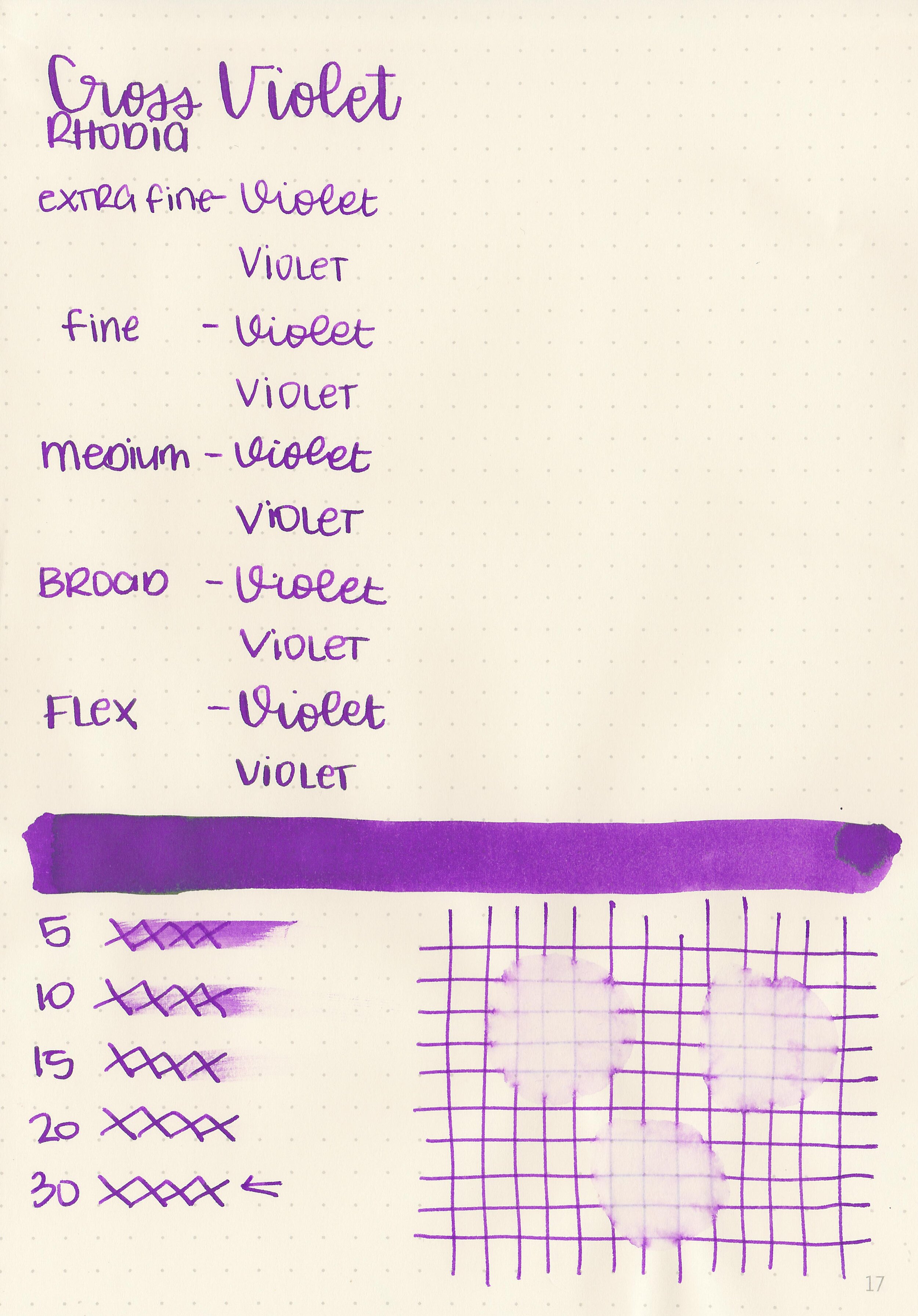
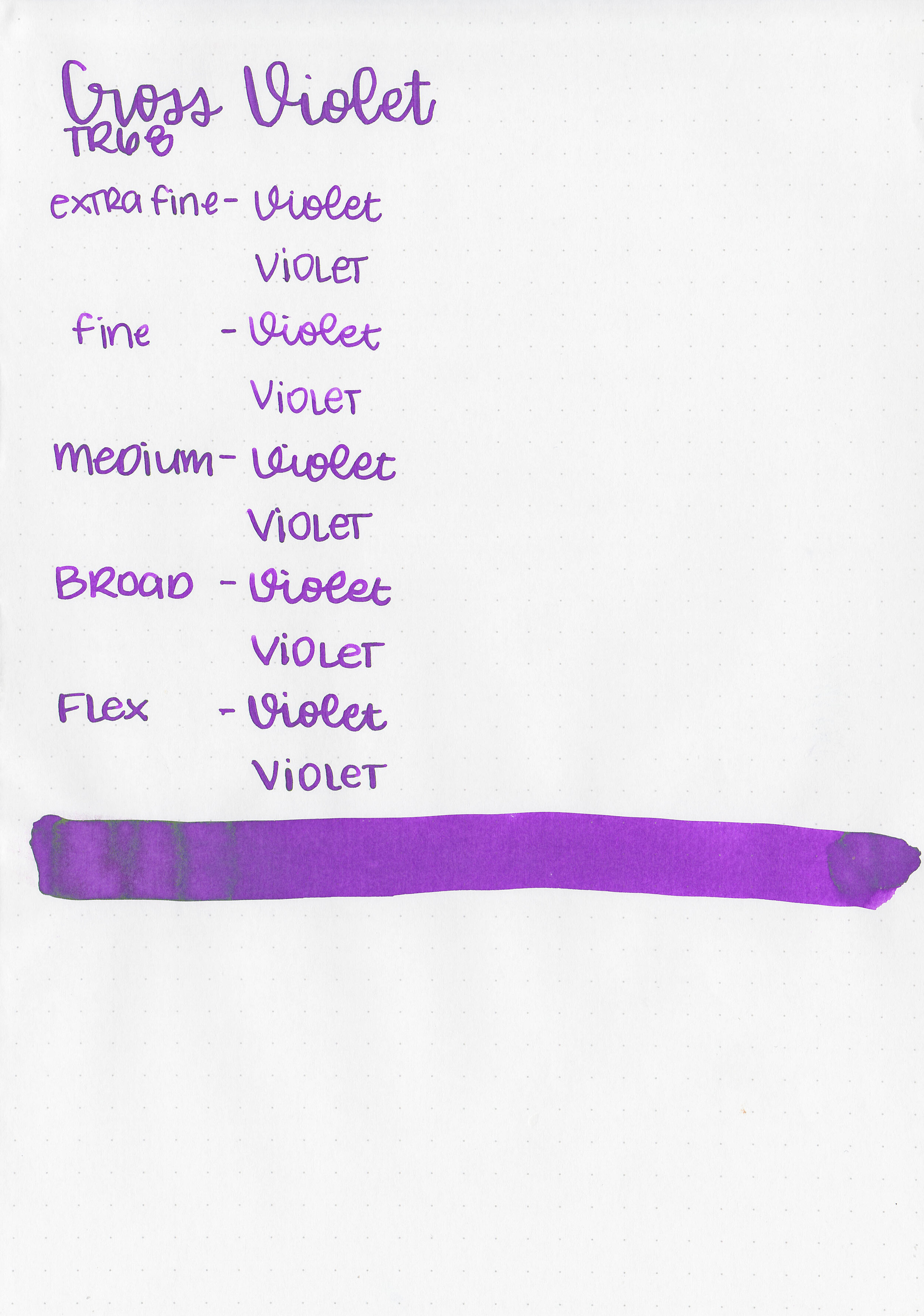
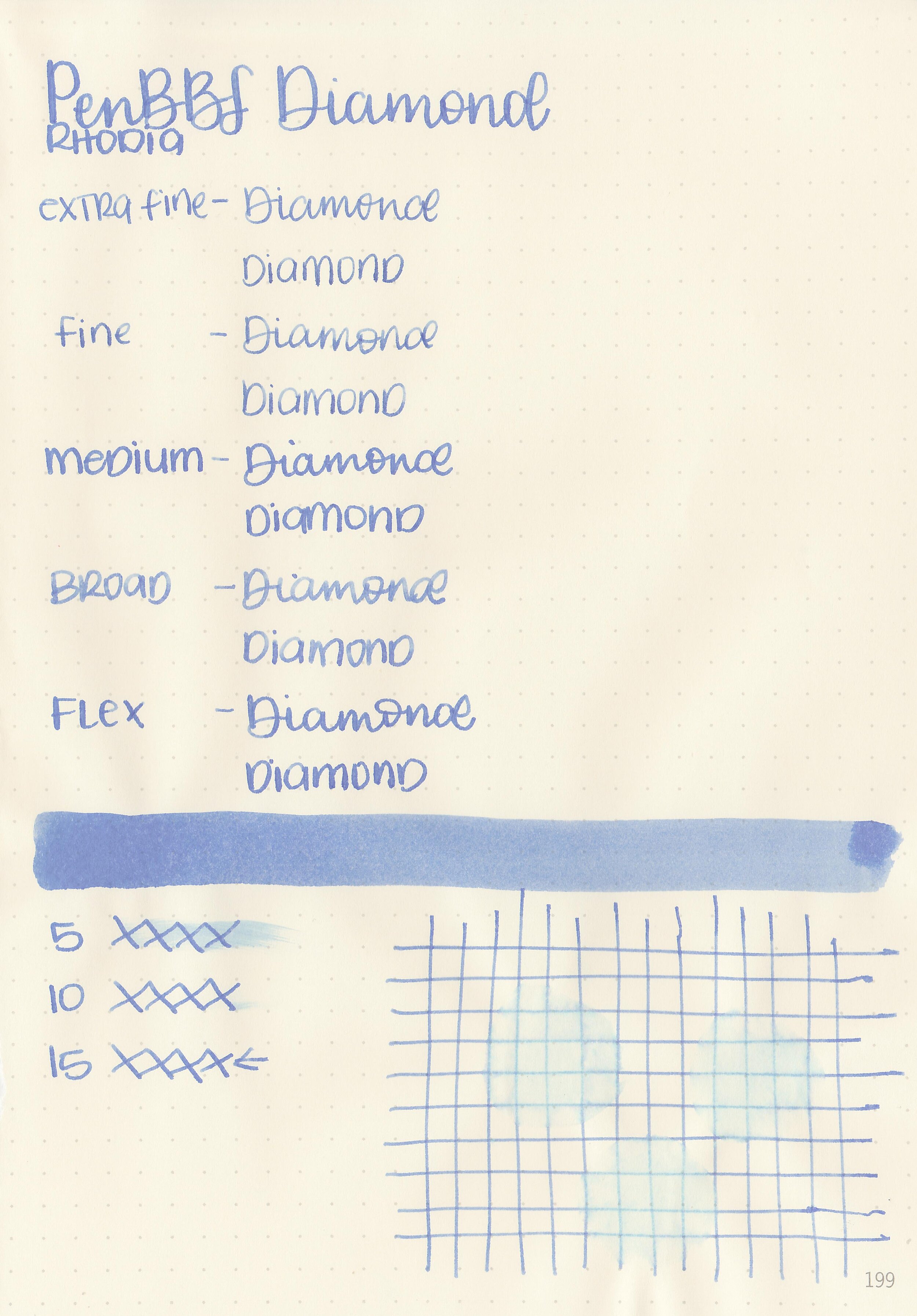
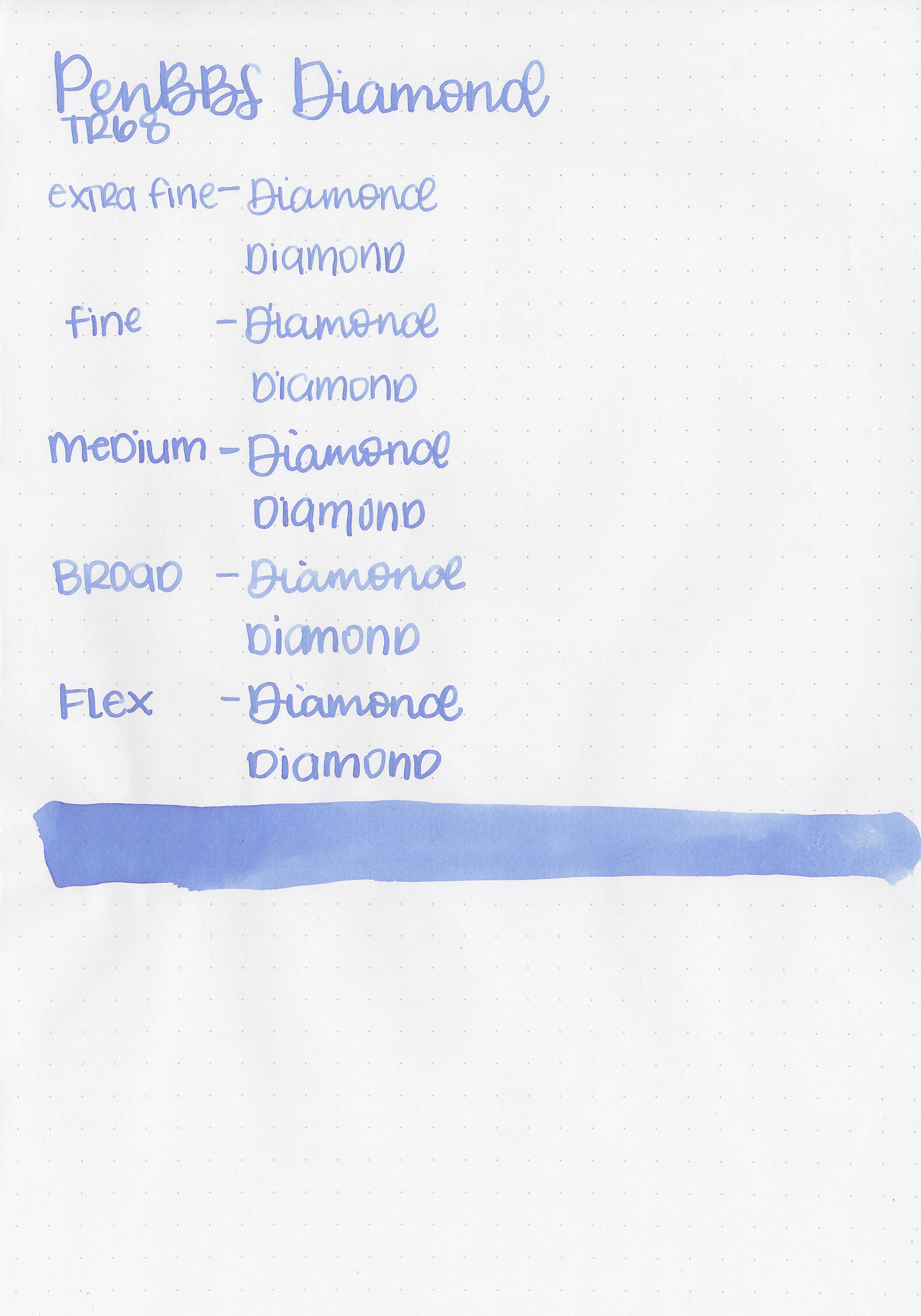
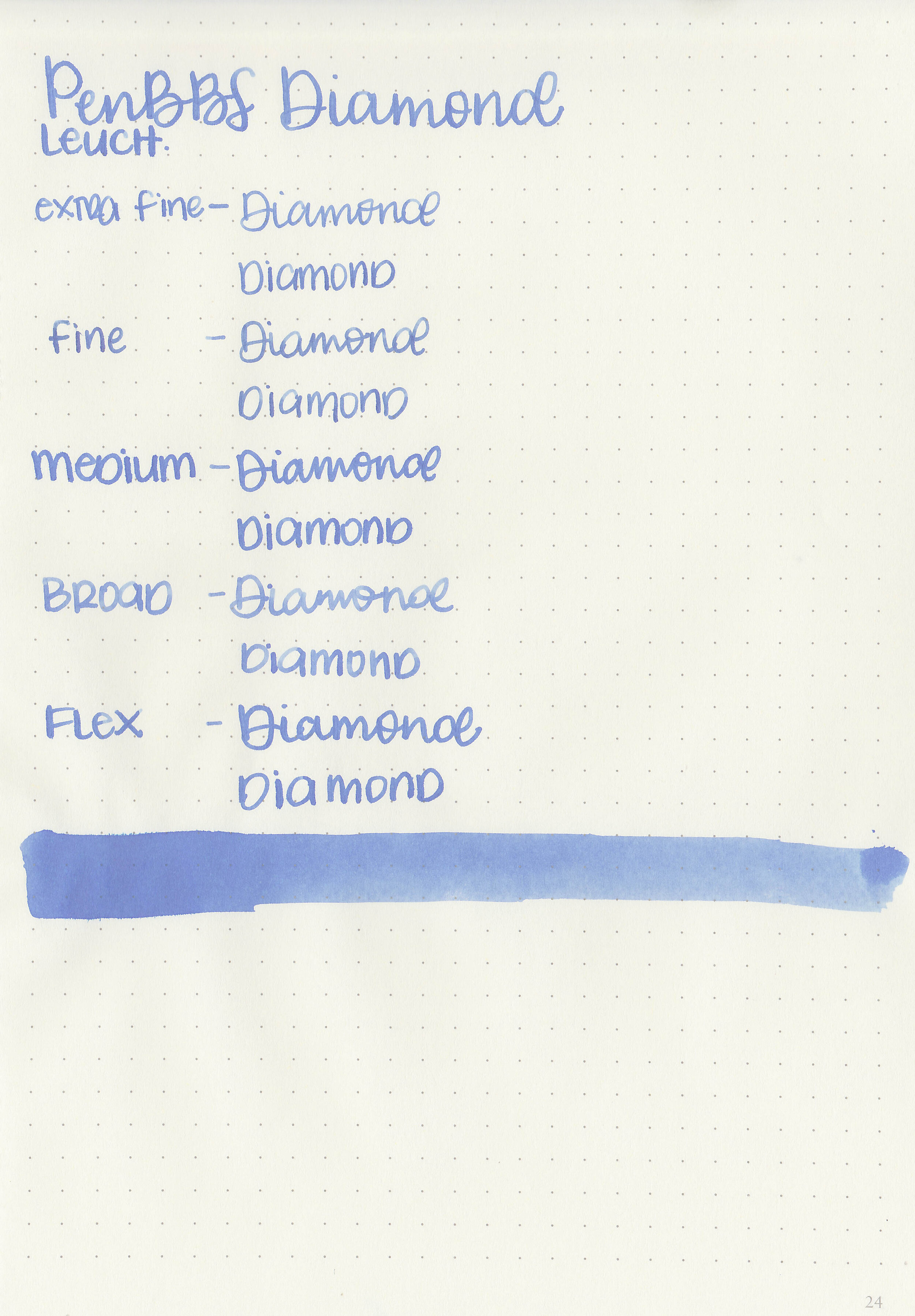
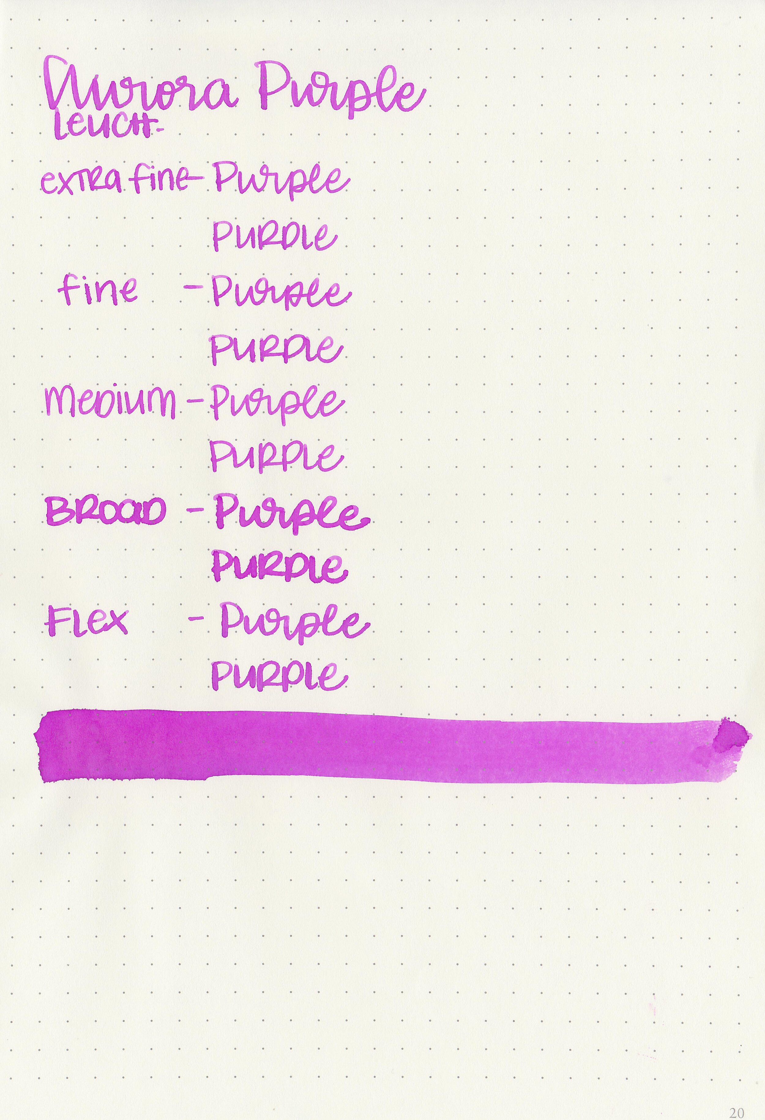
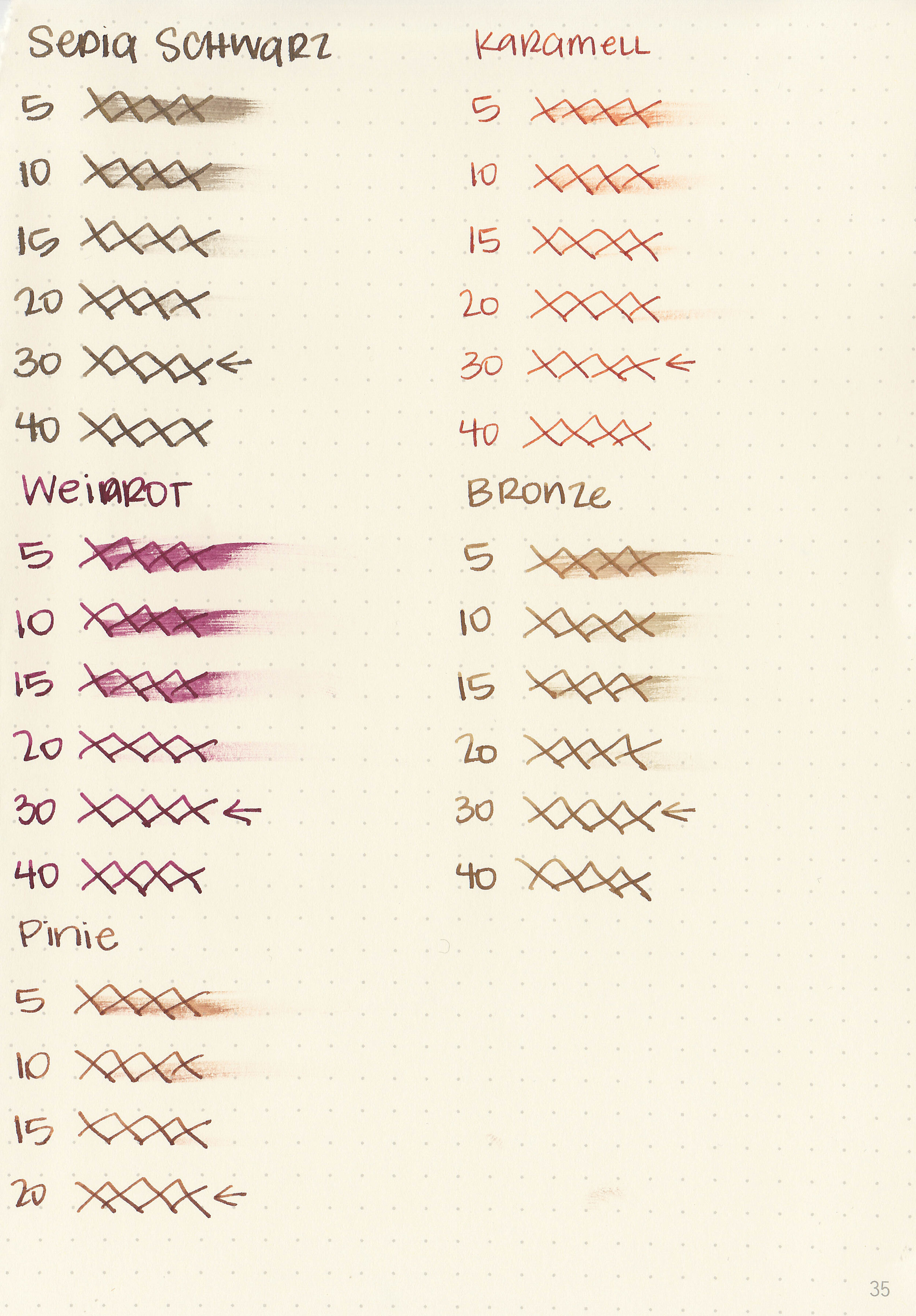
Writing samples:
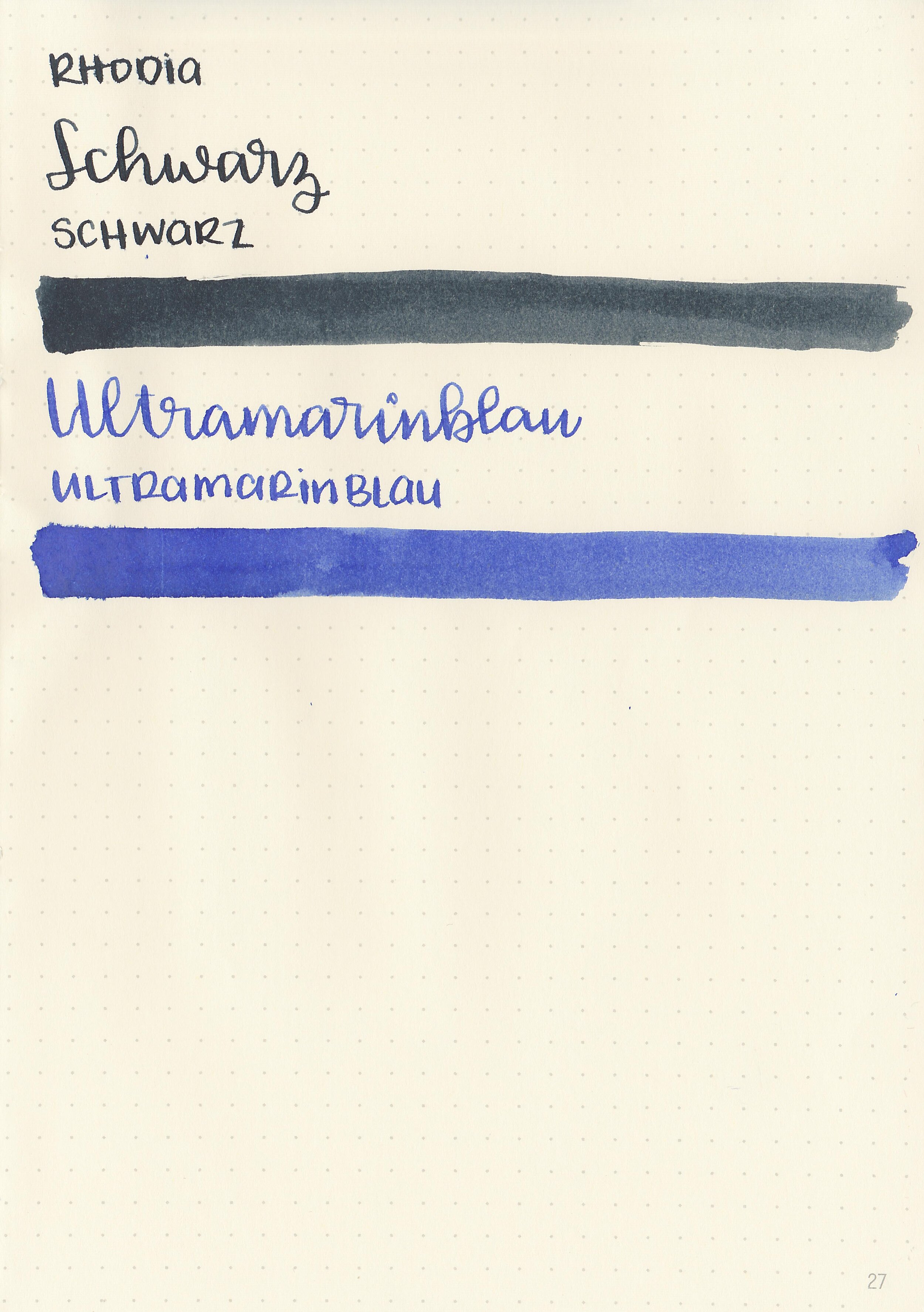
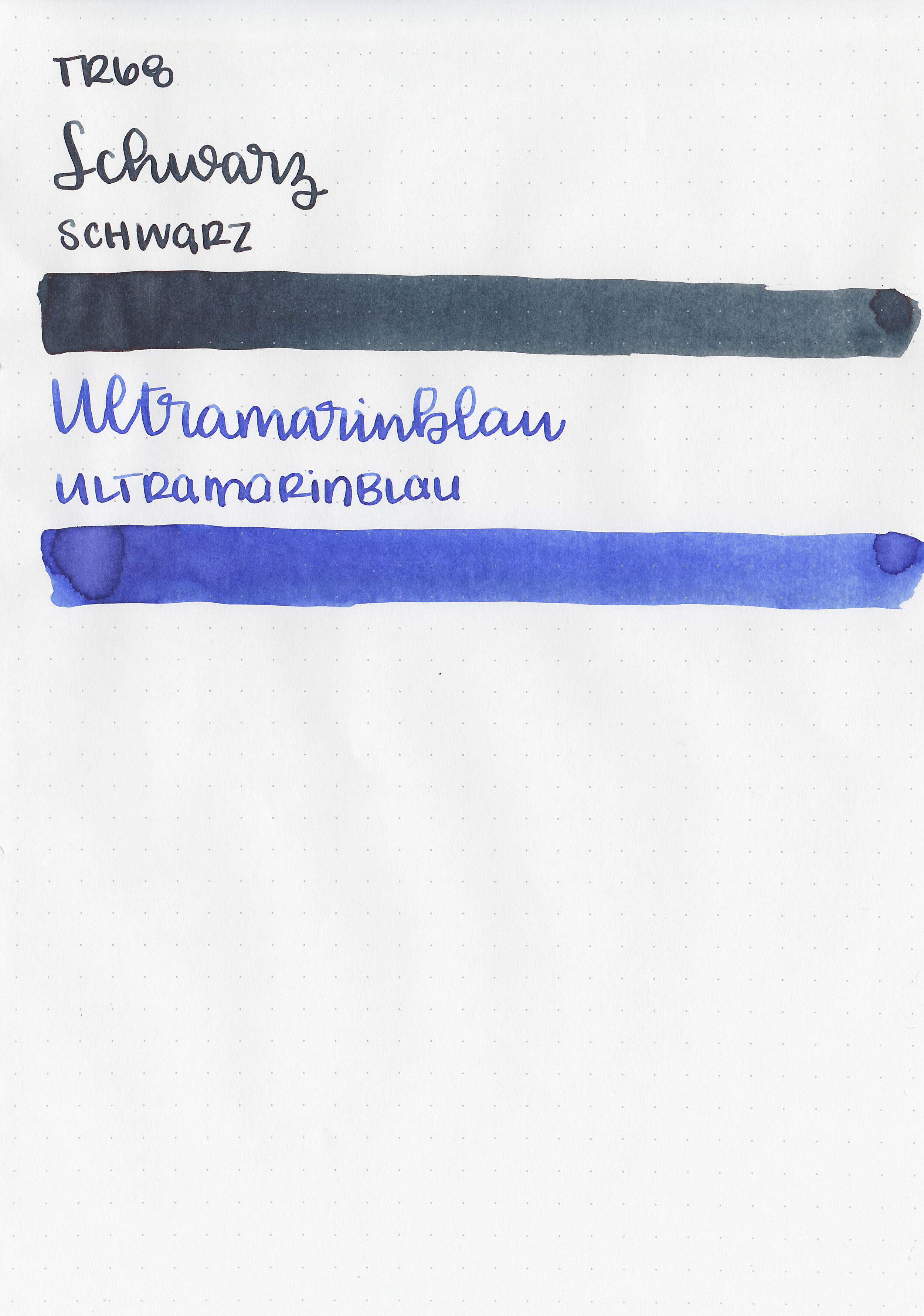
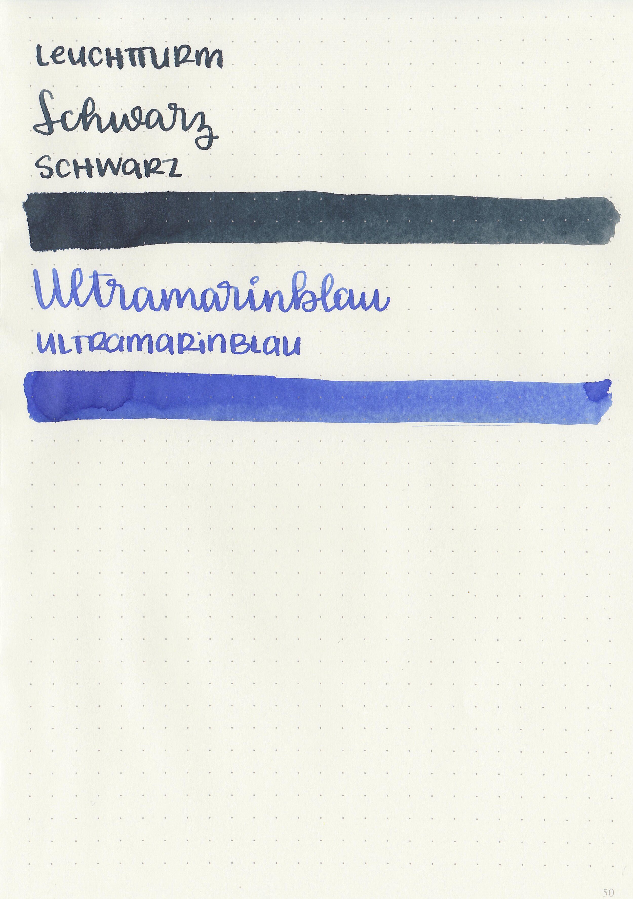
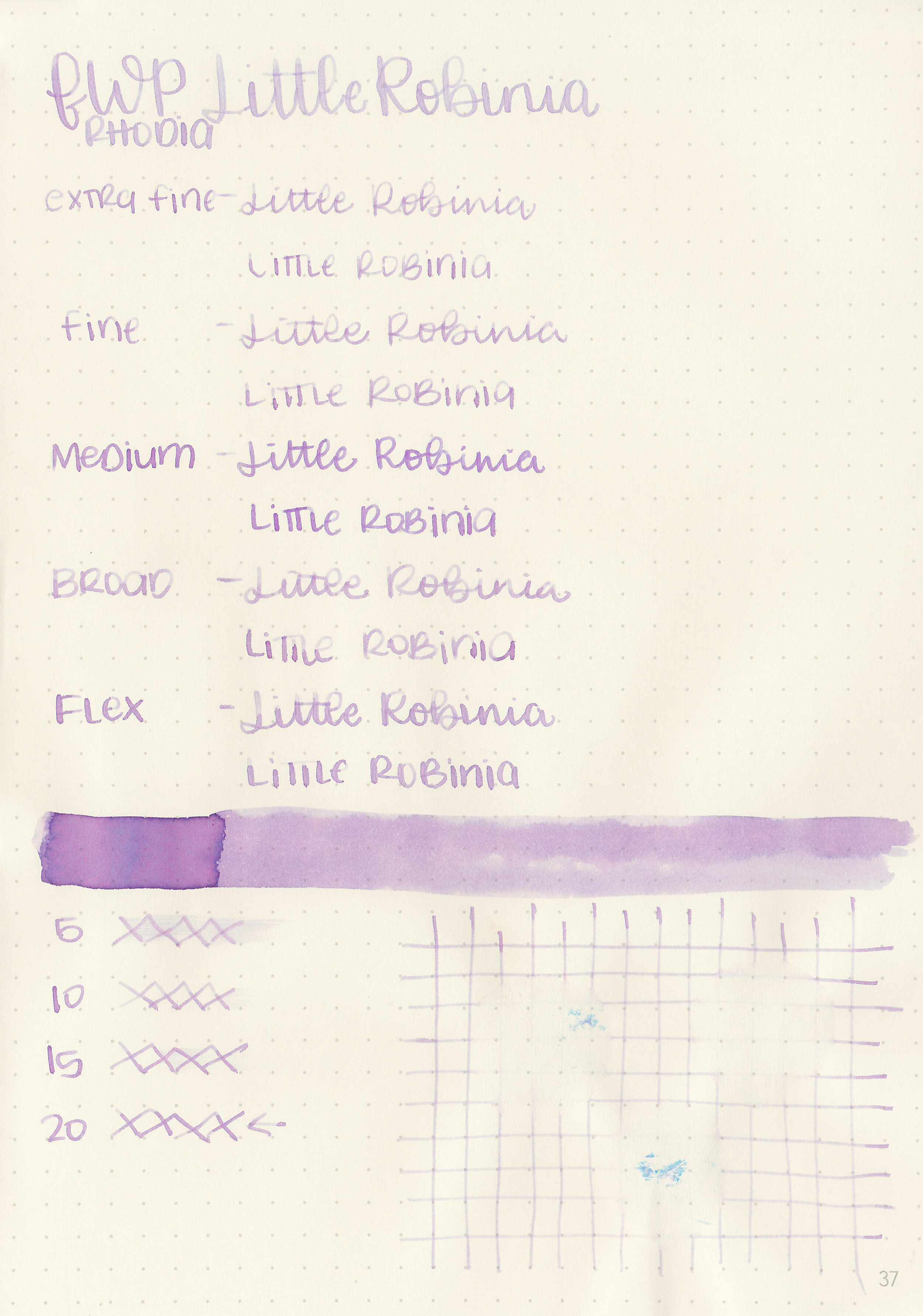
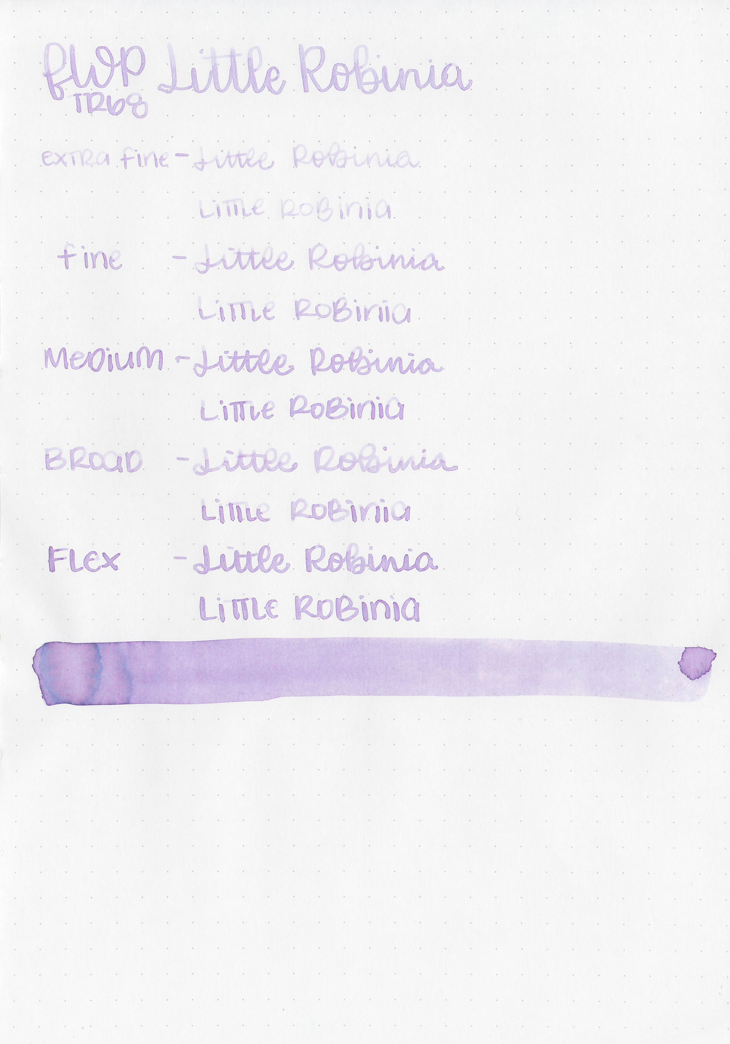
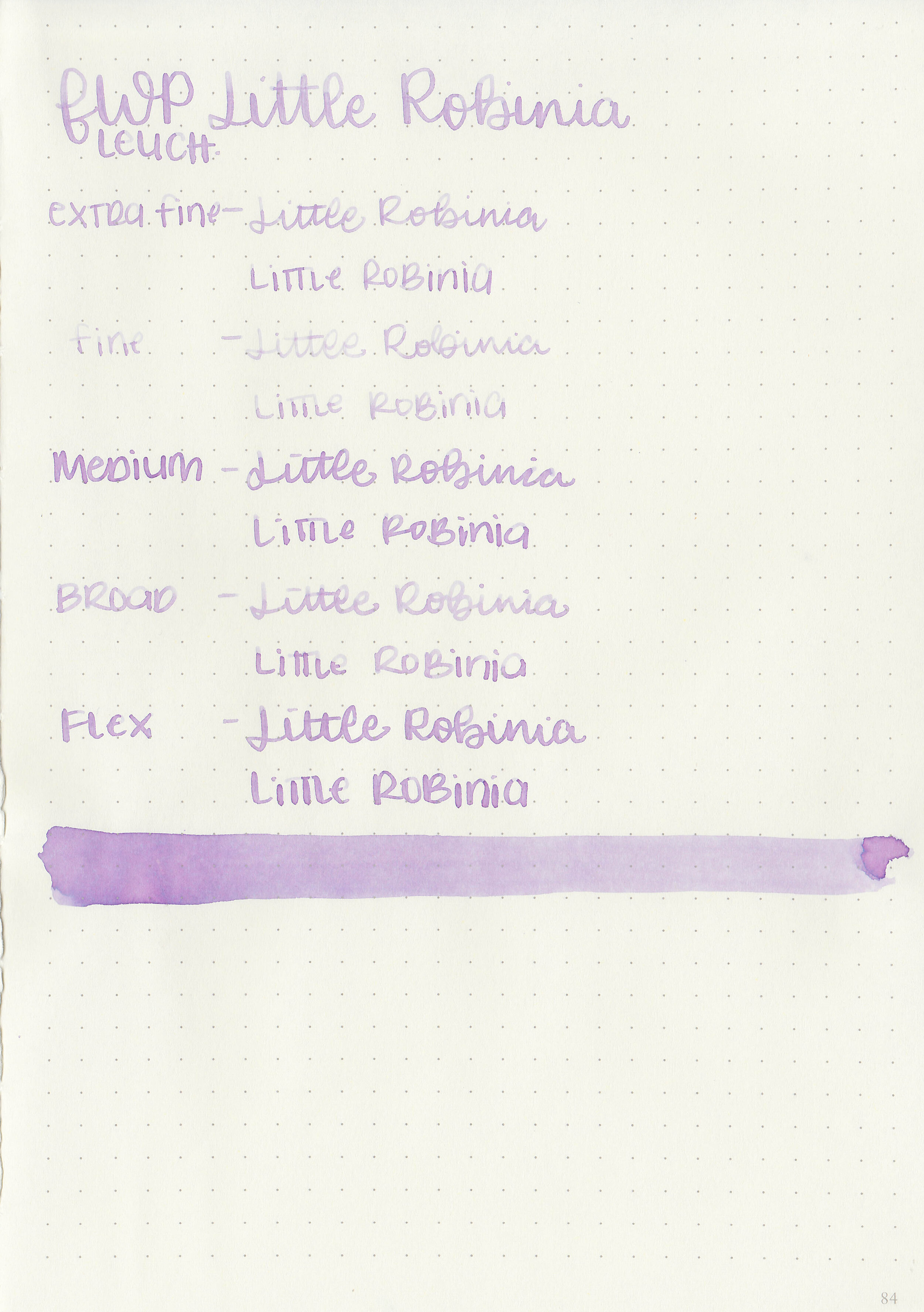
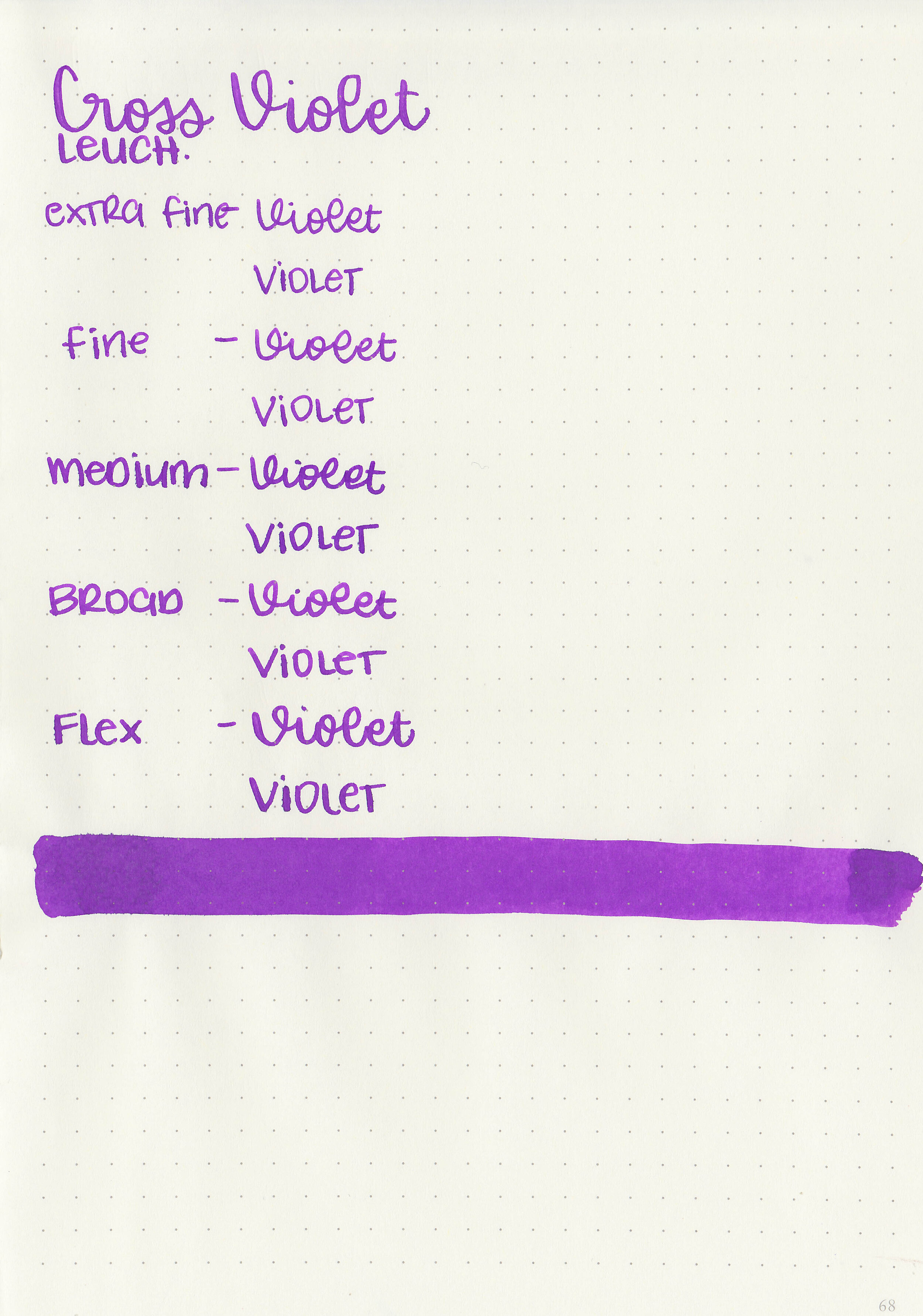
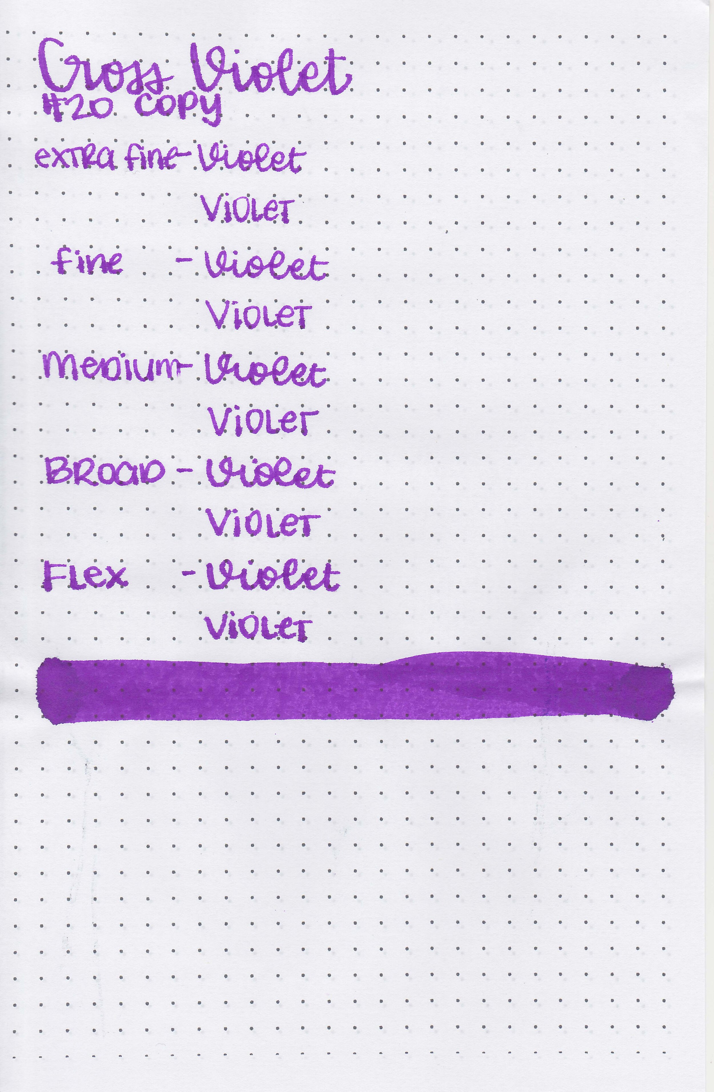
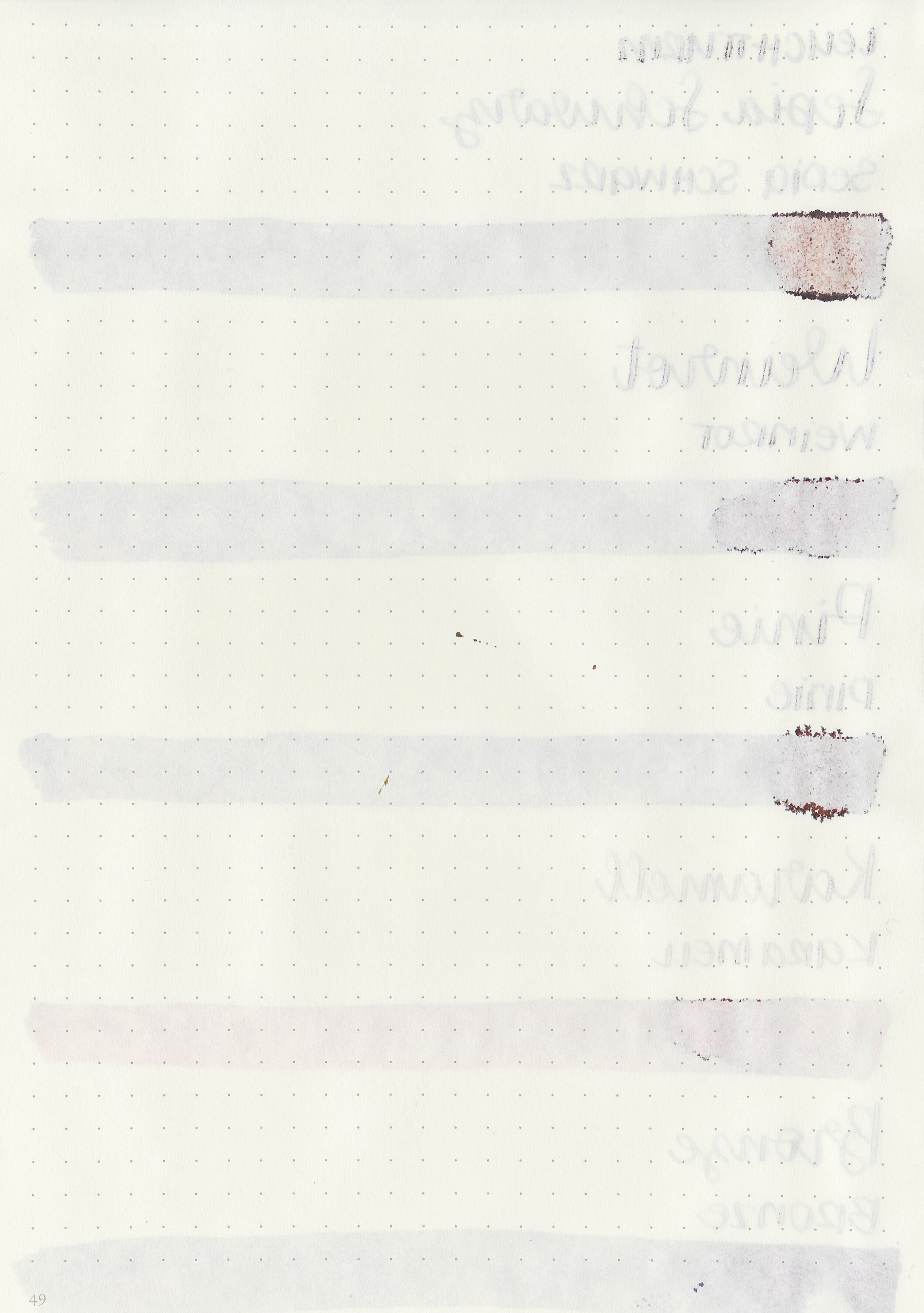
Let's take a look at how the ink behaves on fountain pen friendly papers: Rhodia, Tomoe River, and Leuchtturm.
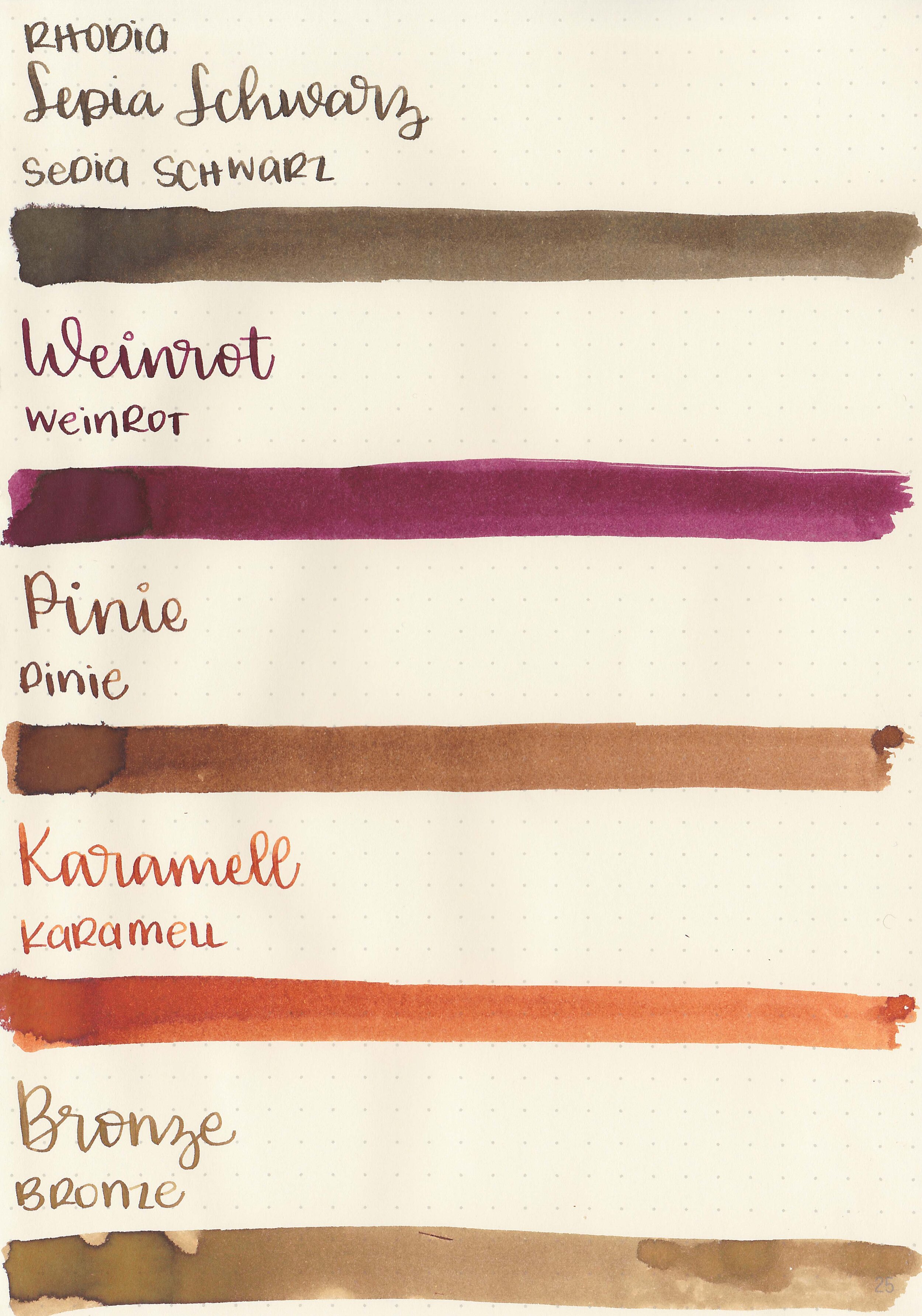
Feathering: Medium

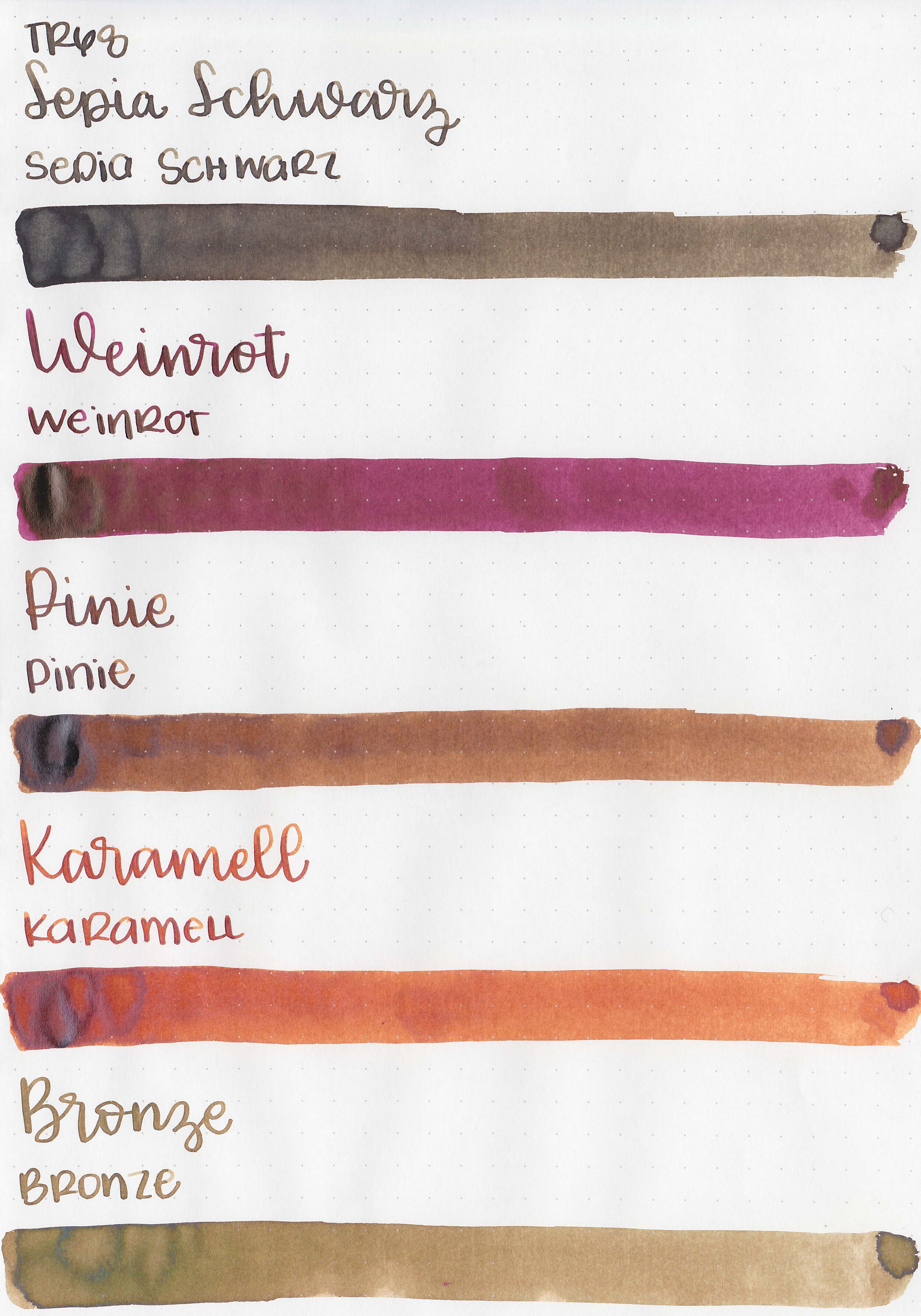
Show through: Medium

Bleeding: Low
Other properties: low shading, no sheen to medium sheen (Weinrot and Pinie) and no shimmer.


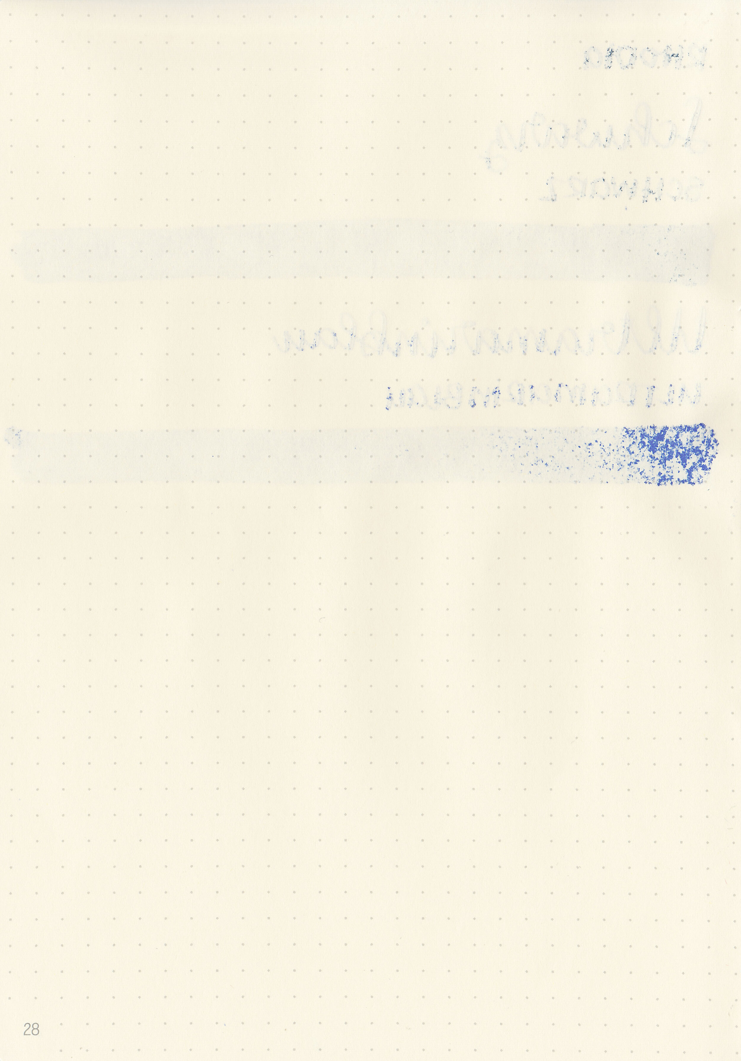
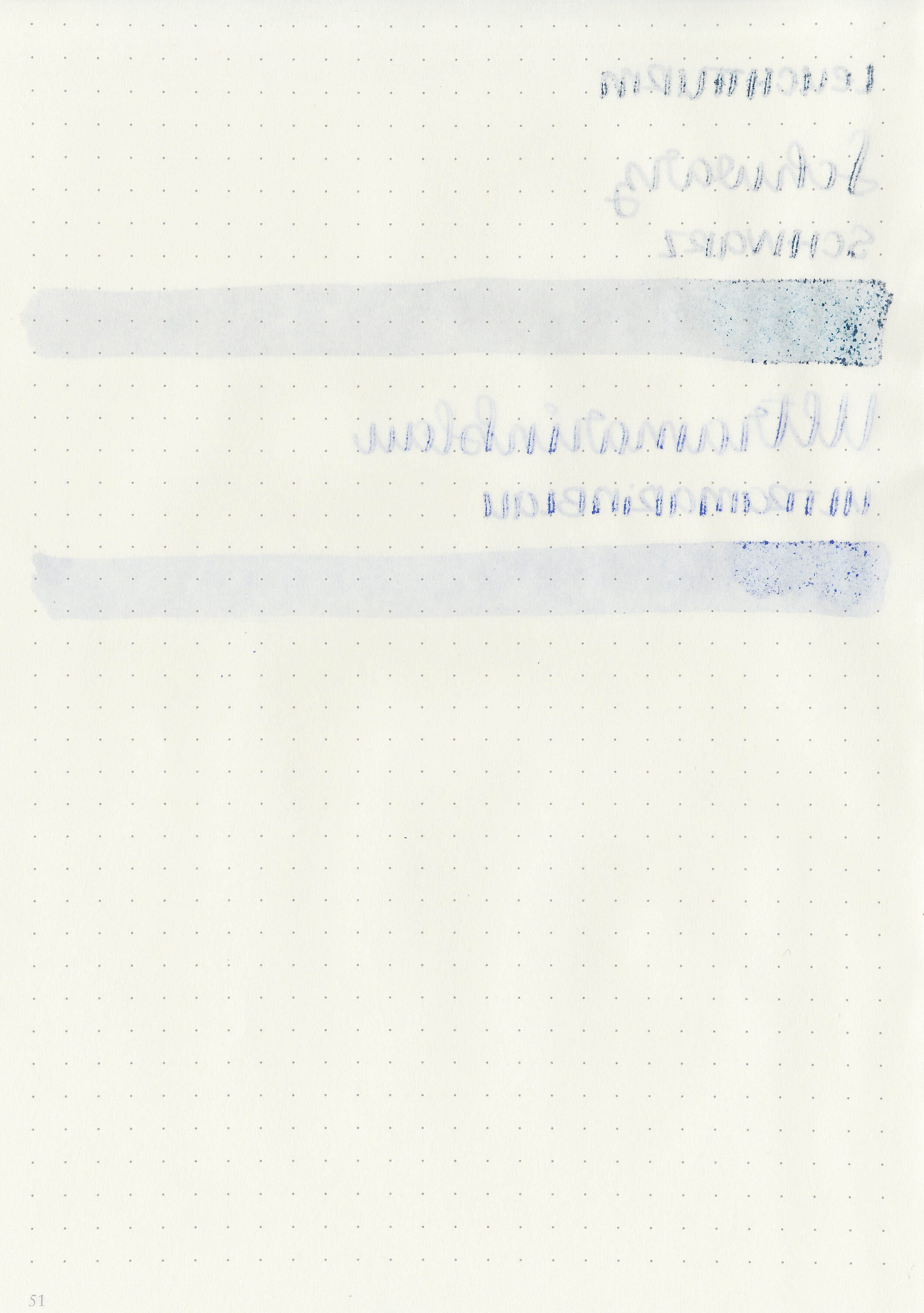
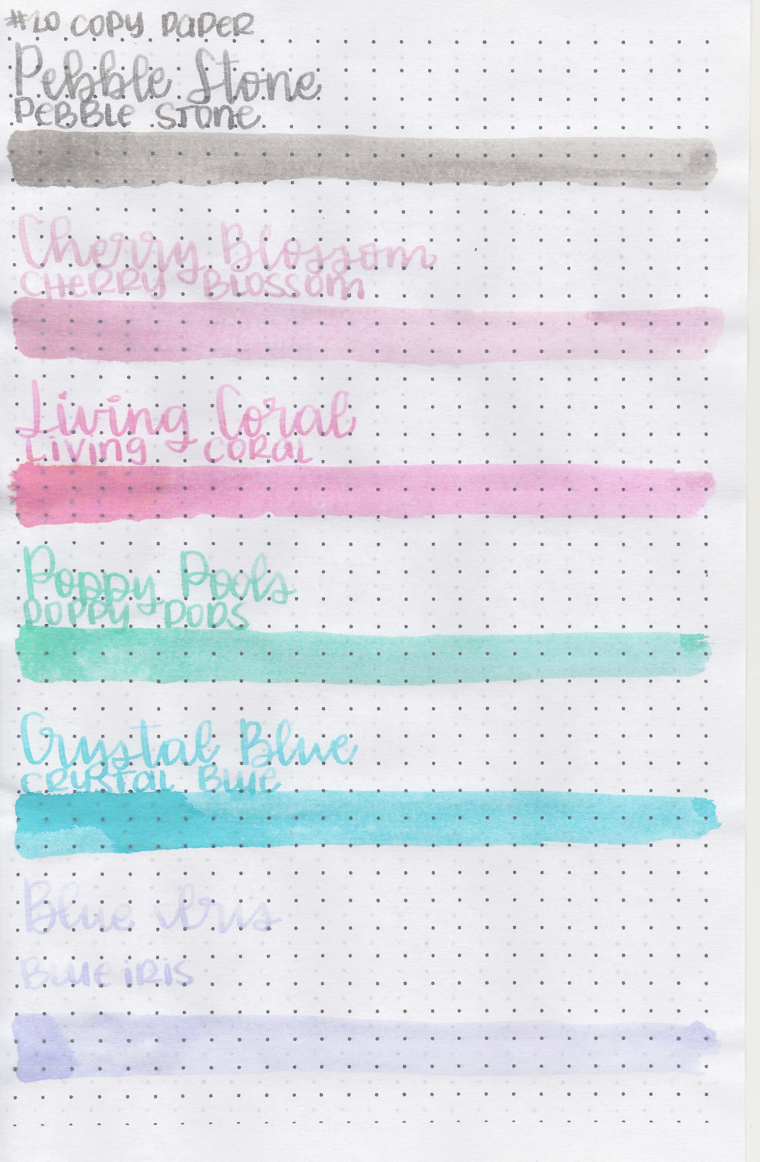
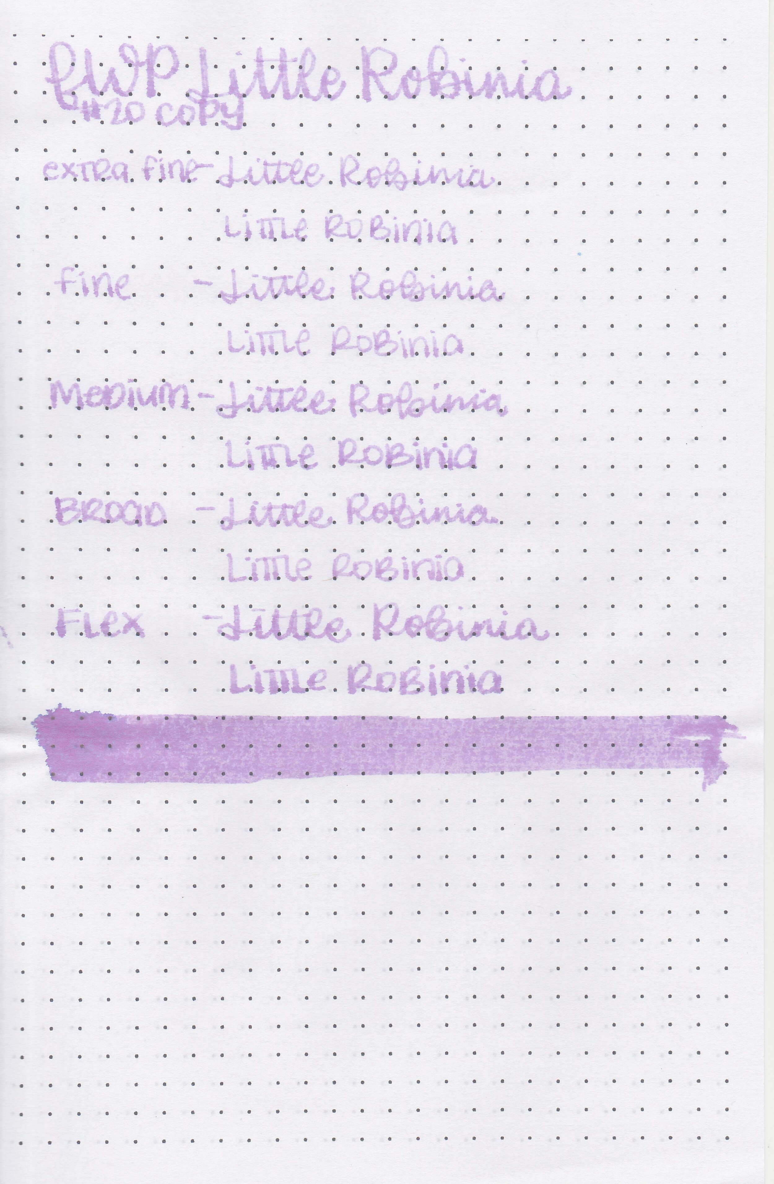
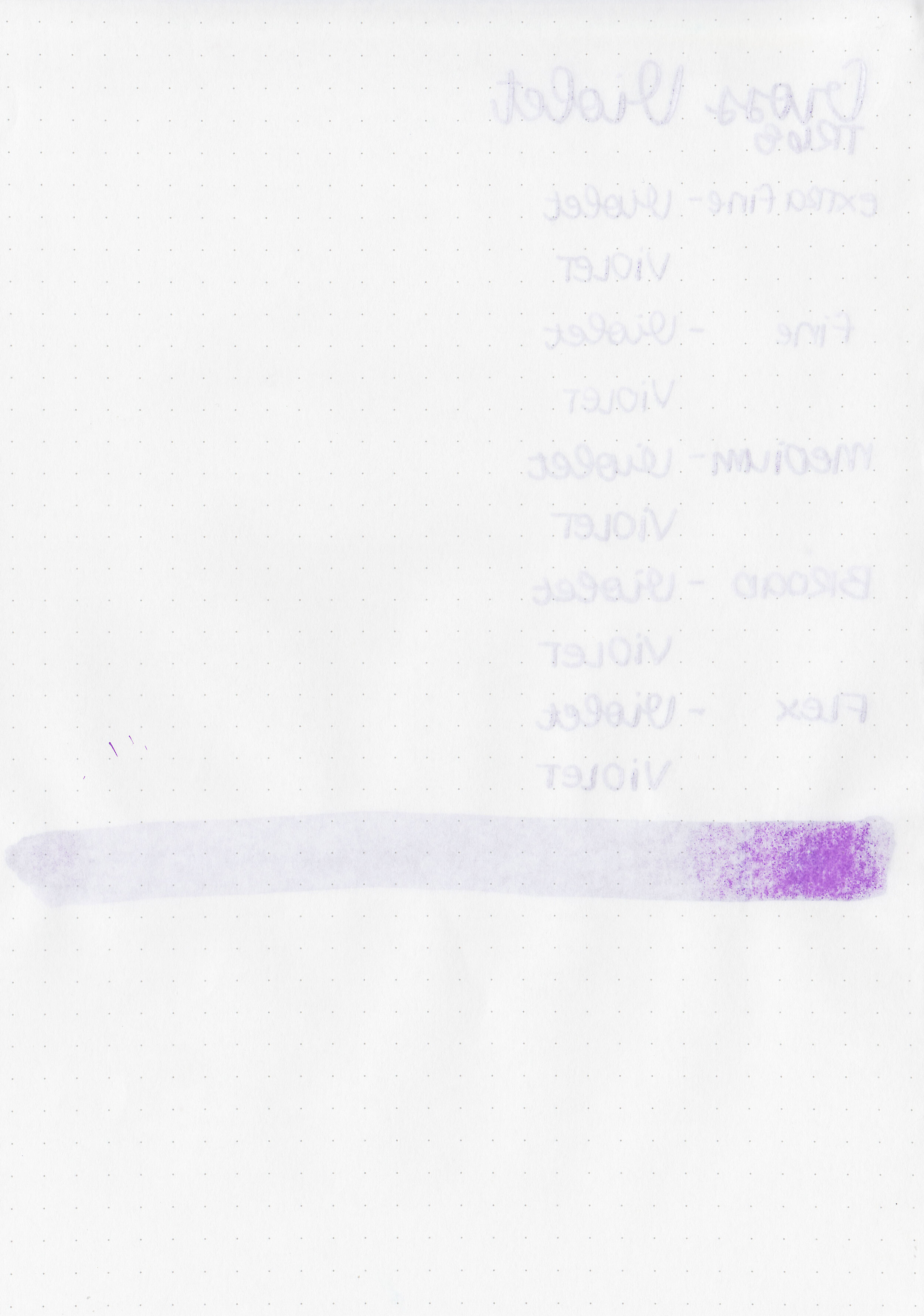
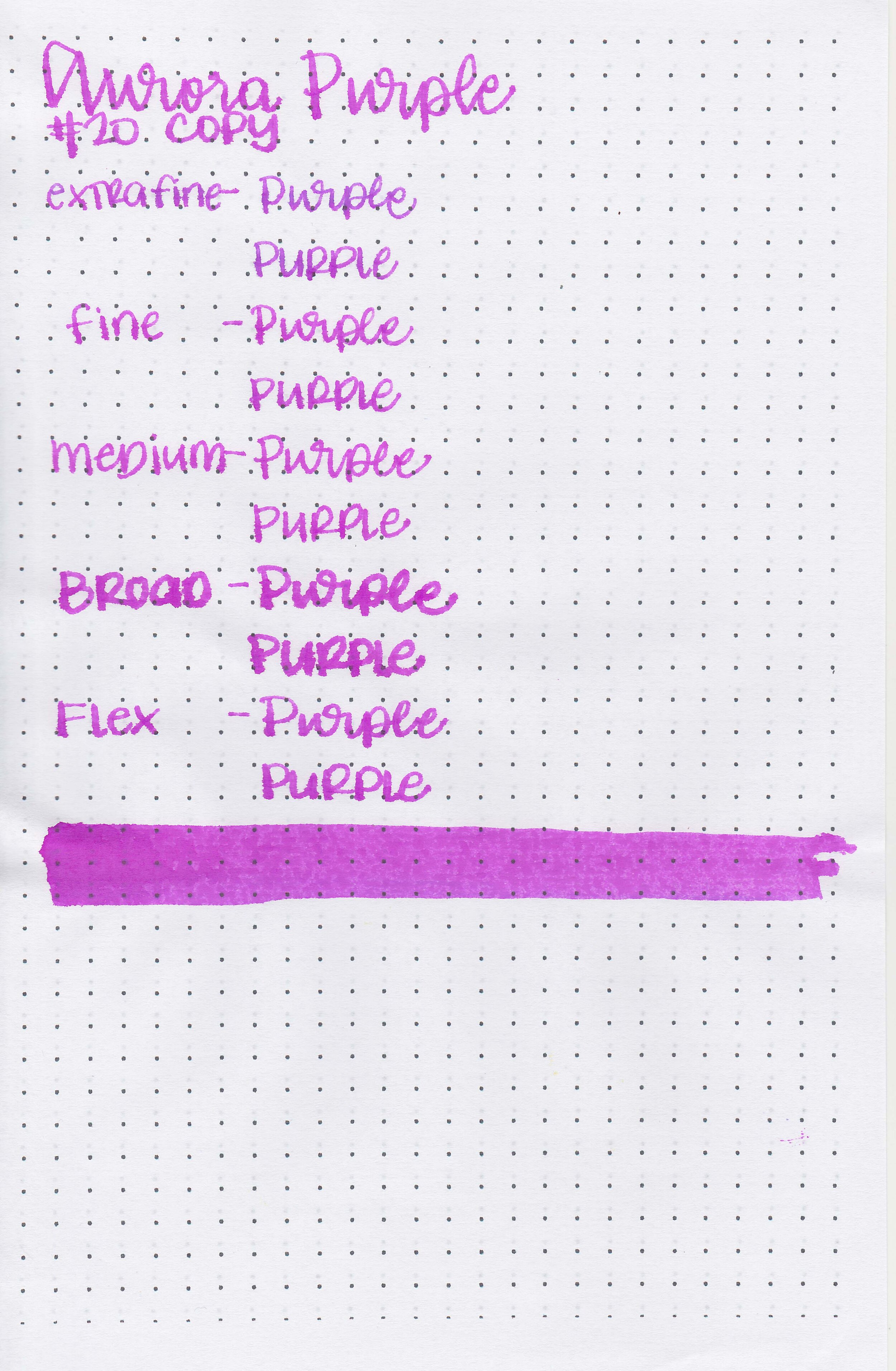
On Staples 24 lb copy paper there was lots of feathering in every nib size as well as some bleeding.
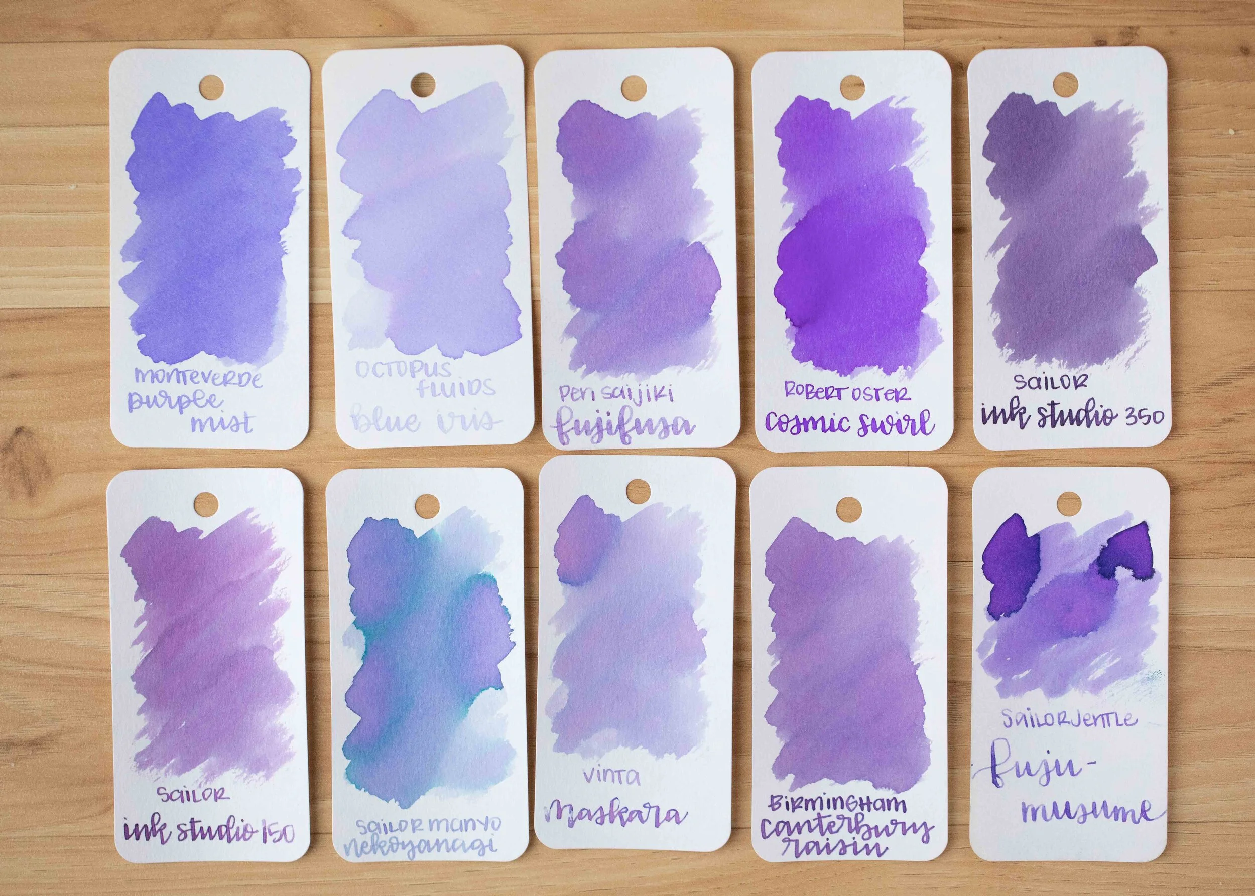
Comparison Swabs:

Sepia Schwarz is closest to Diamine Macassar. Pinie is closest to Kobe Nada Brown. Bronze is closest to Colorverse Soul.

Karamell is closest to Monteverde Pumpkin Cake.

Weinrot is closest to Montblanc Antoine de Saint-euxpery.
Longer Writing:

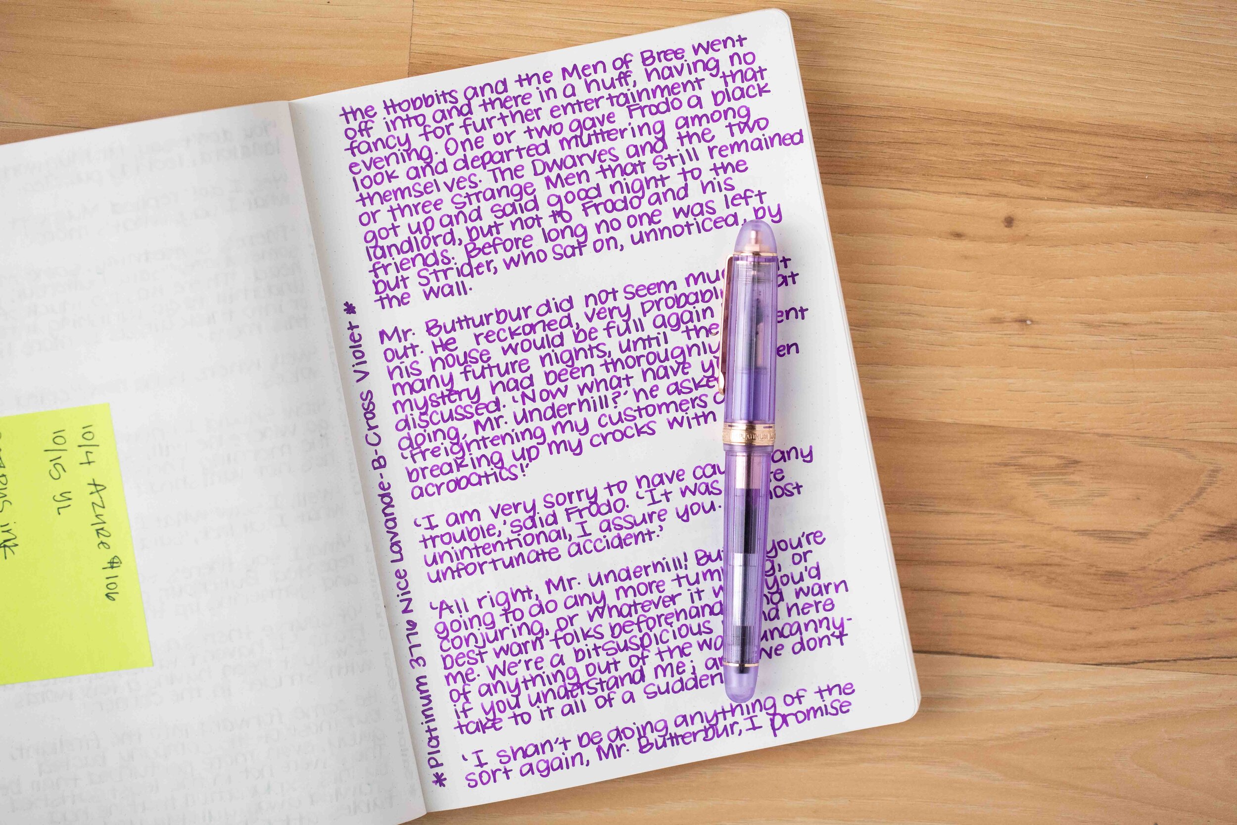
I used a Taroko Enigma notebook. All five inks had an average but watery flow.
Overall, there’s a bit more feathering than I prefer. Out of these five, Karamell is my favorite. It’s an interesting fall golden brown.
Disclaimer: These inks were provided by Octopus Fluids for the purpose of this review. All photos and opinions are my own. This page does not contain affiliate links, and is not sponsored in any way.