
Ink Review #358: Colorverse 10 Sea of Tranquility
/
It's the last day of new releases week, and today's new release is Colorverse Sea of Tranquility, from Spaceward Season 1. This ink comes in a box set of two bottles, 65ml and 15ml, both full of the same ink. Thanks to Pen Chalet for sending a sample over for review.
The color:
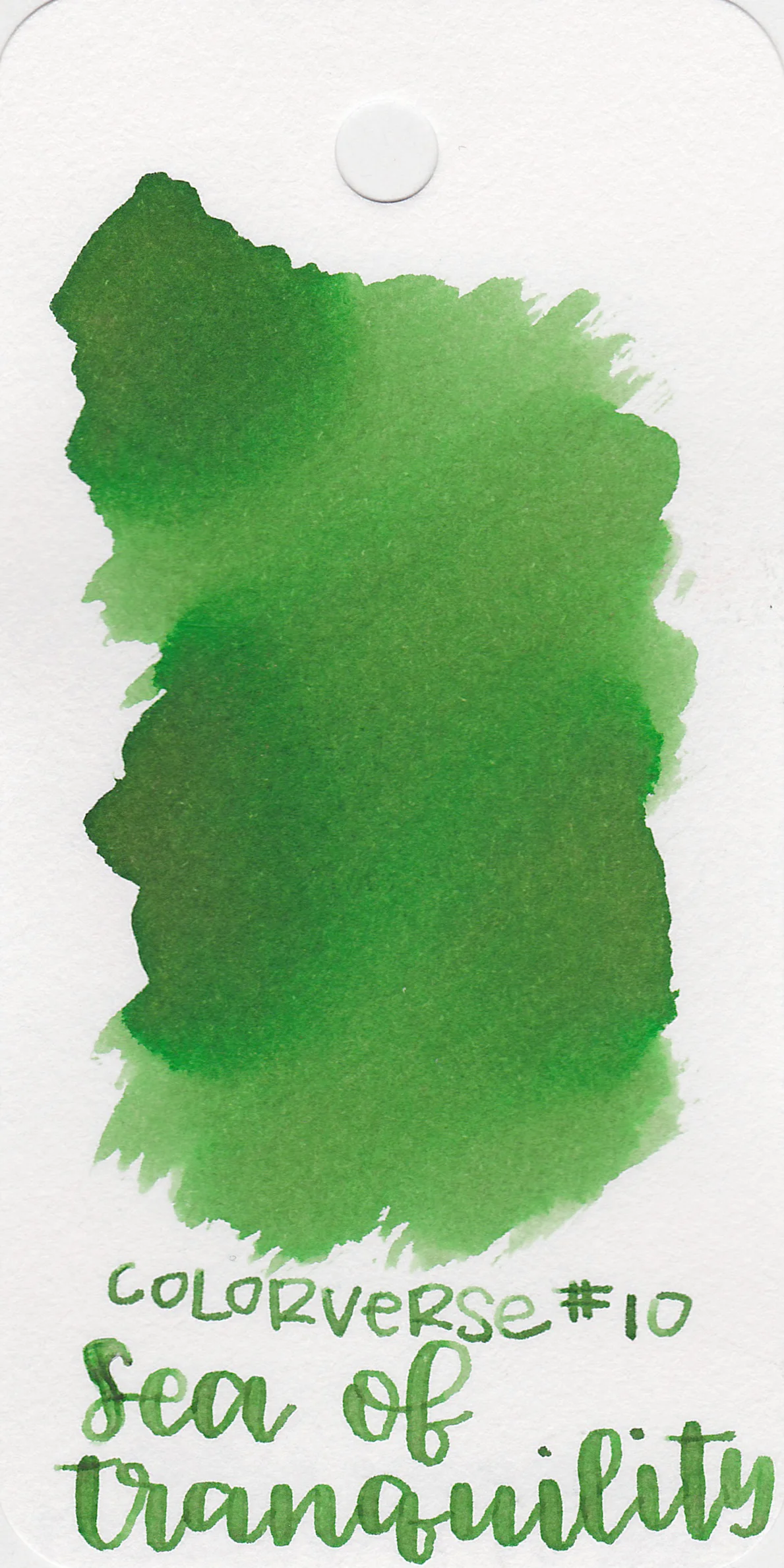
Sea of Tranquility is a medium, moderately saturated green.
Swabs:

In large swabs there is lots of shading.

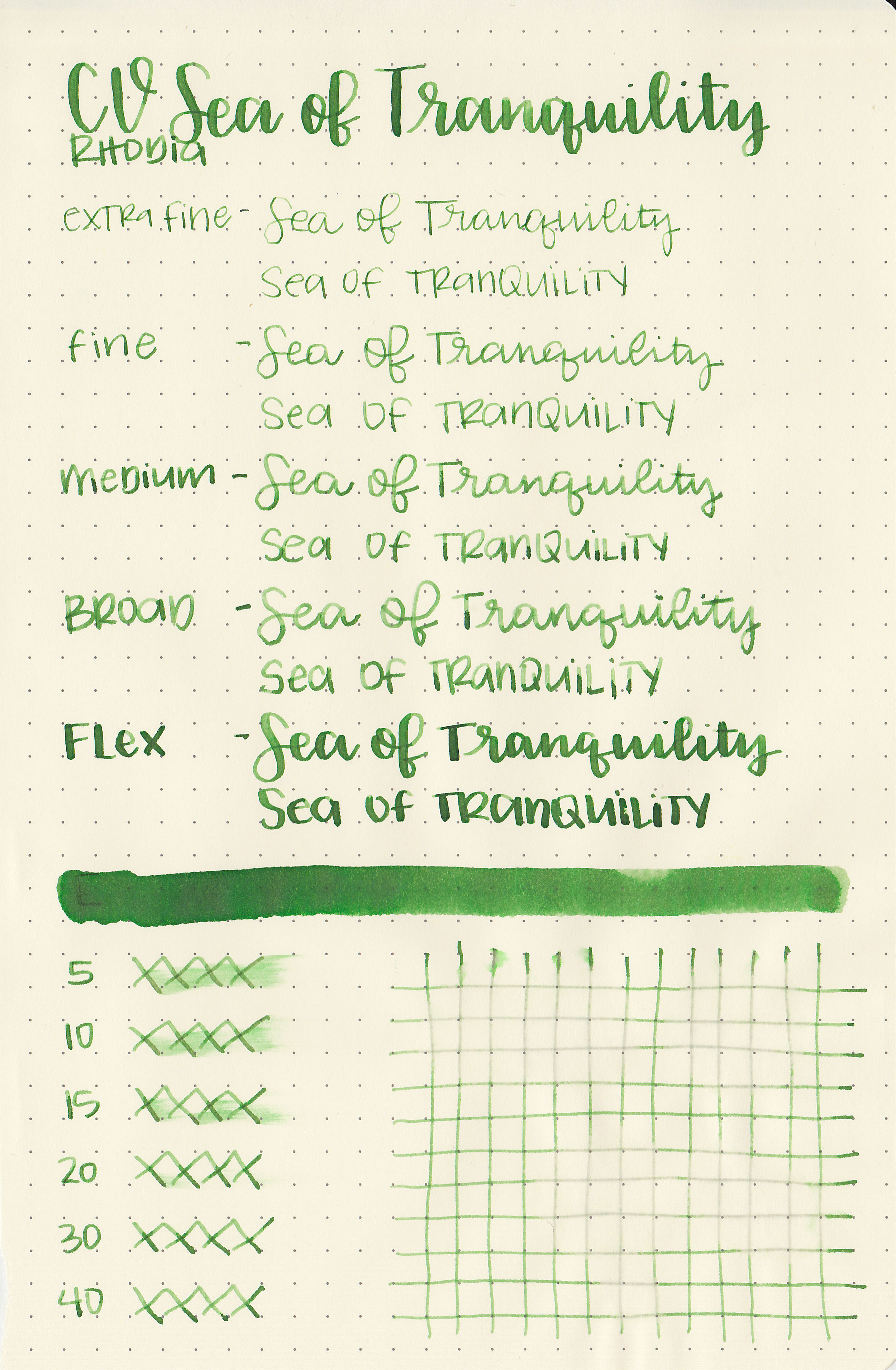
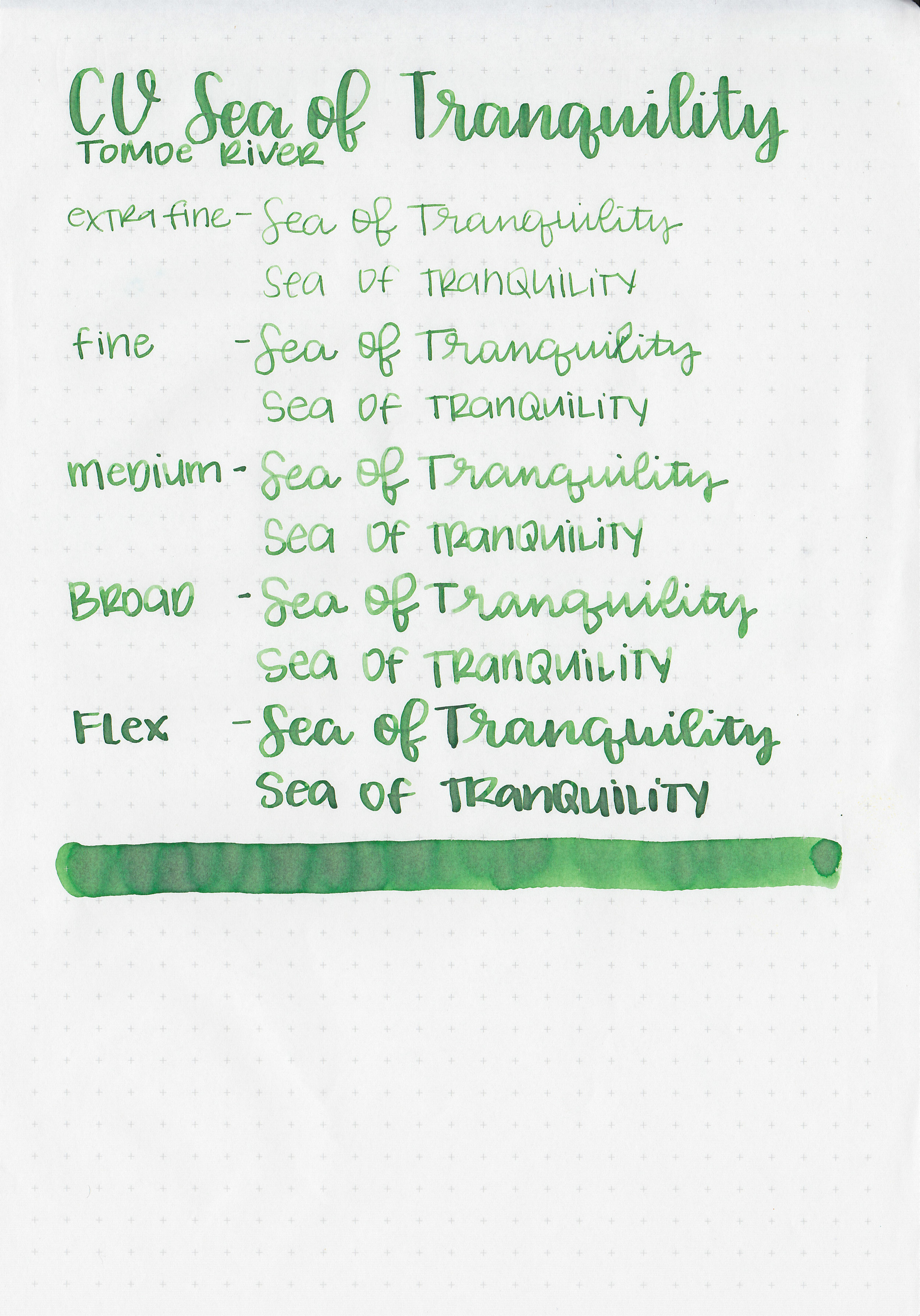
Writing samples:
Let's take a look at how the ink behaves on fountain pen friendly papers: Rhodia, Tomoe River, and Leuchtturm.

Dry time: 30 seconds
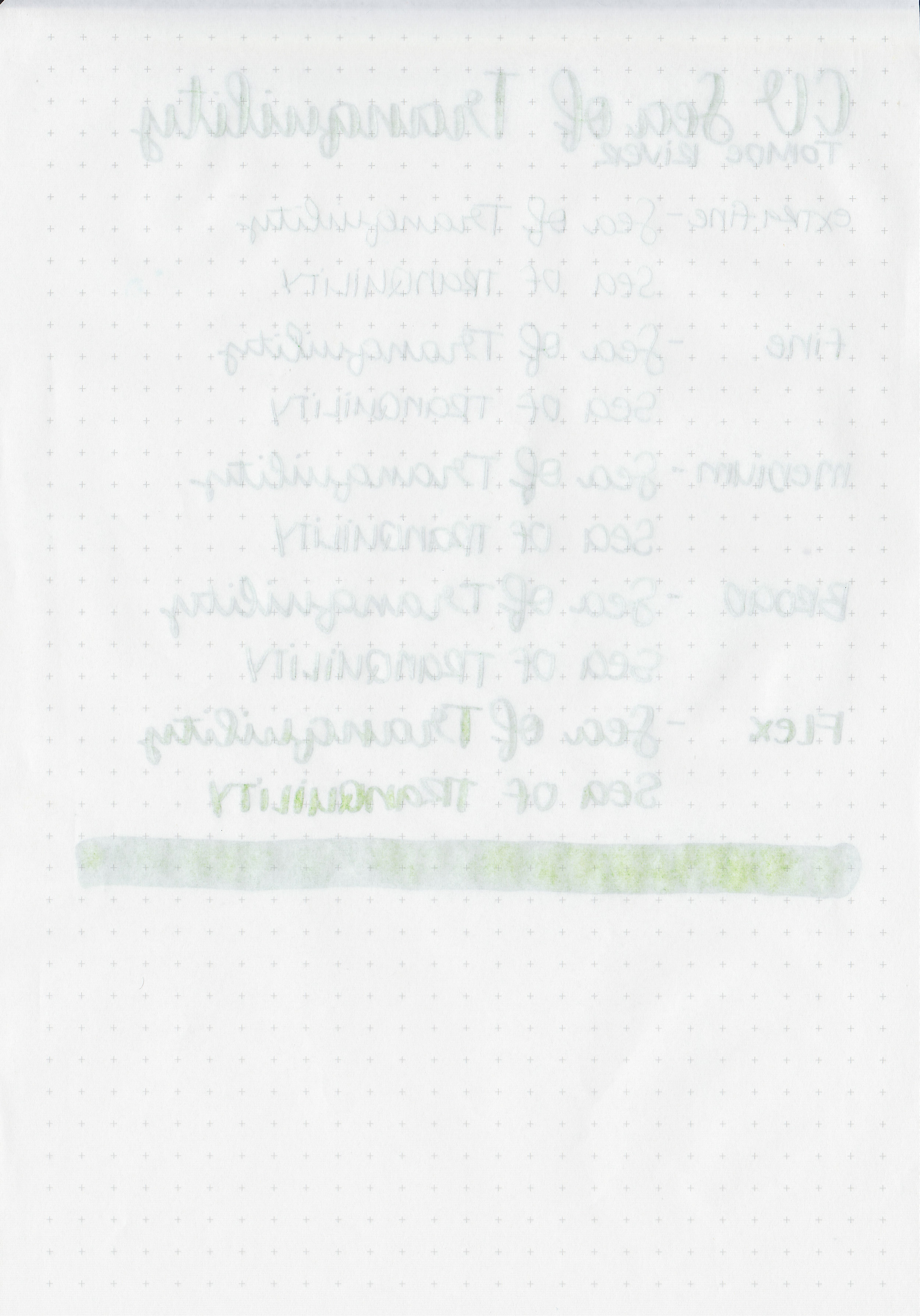
Water resistance: Low
Feathering: None
Show through: Medium
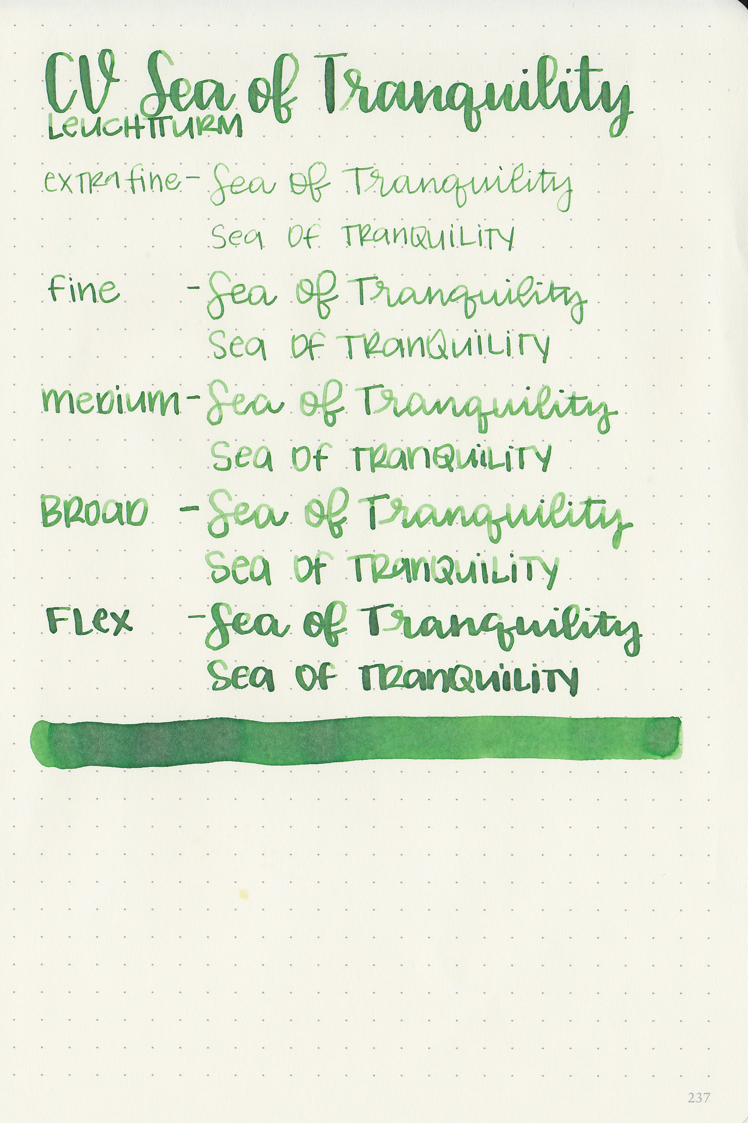
Bleeding: None
Other properties: medium shading, no sheen, and no shimmer.
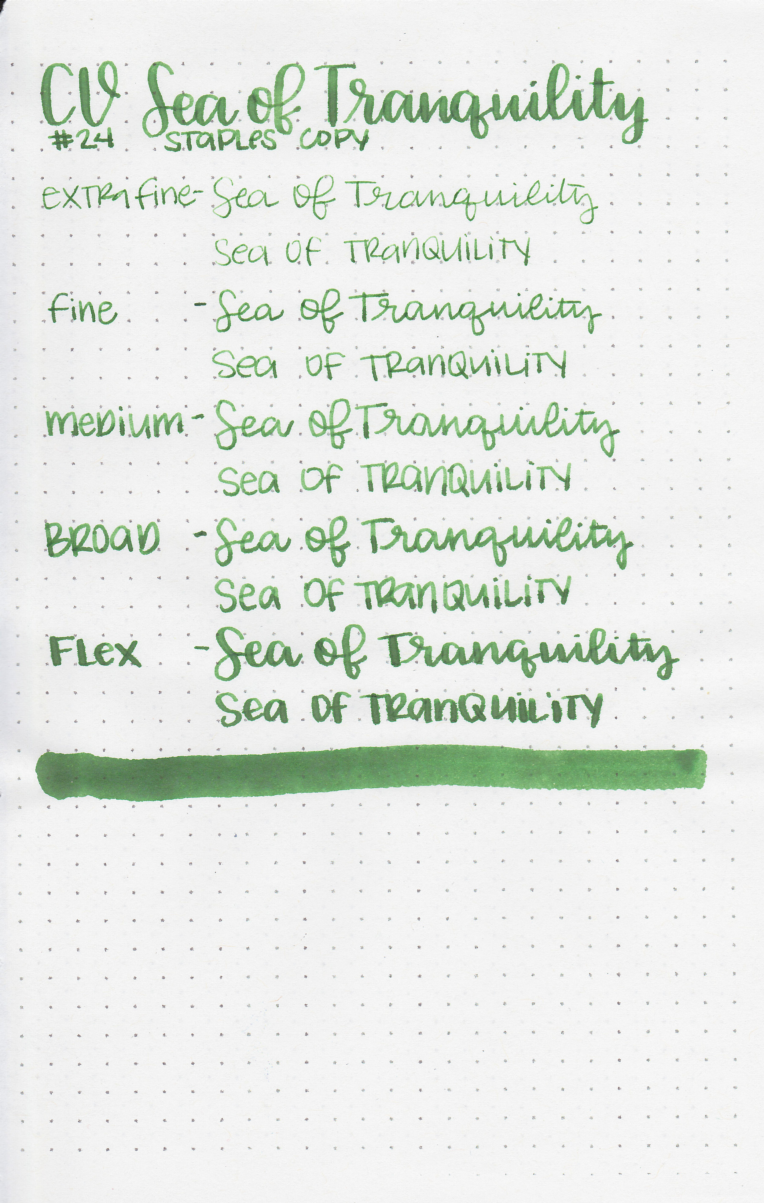
On Staples 24 lb copy paper there was feathering in most nib sizes, and some bleeding, mostly in the flex nib.
Comparison Swabs:
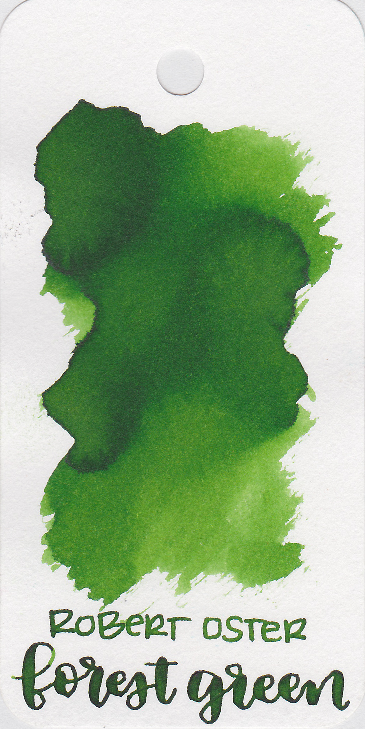

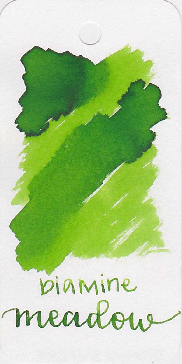
Ink swabs for comparison, left to right (top to bottom for mobile RSS): Robert Oster Forest Green, Colorverse Sea of Tranquility, and Diamine Meadow. Forest Green is darker and brighter, and Meadow is lighter, but brighter. Click here to see the Colorverse inks together.
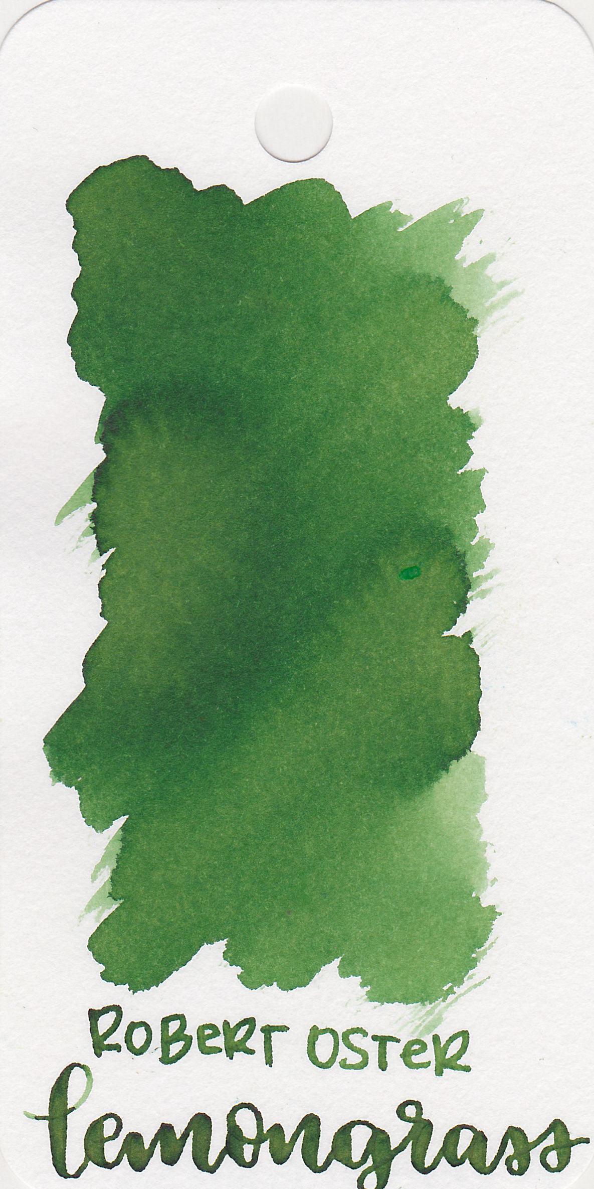
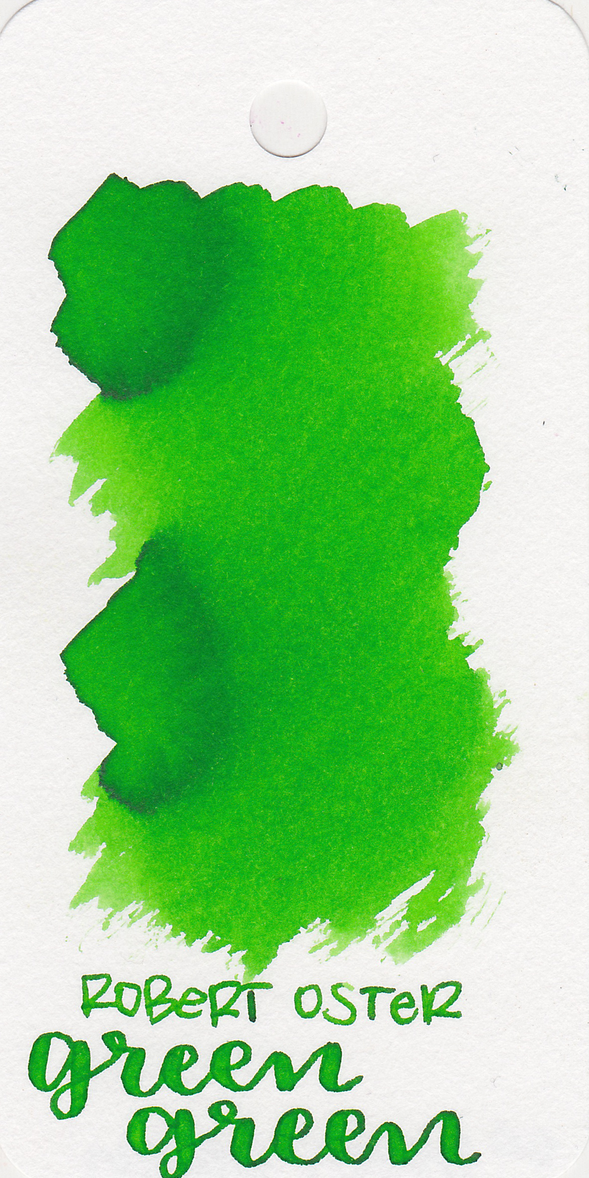
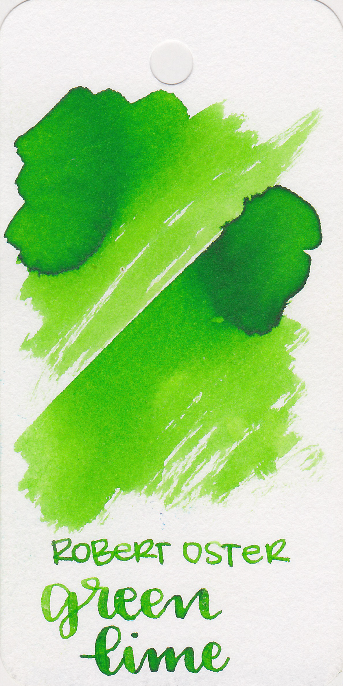
Robert Oster Lemongrass, Robert Oster Green Green, and Robert Oster Green Lime. Lemongrass is a bit darker, but pretty close. Click here to see the green inks together.

Longer writing:
I used a broad Conklin Durograph Forest Green on Franklin-Christoph Sugar Cane paper, which does have a purple tone to it. The ink had an average flow on the other papers, but felt dry on this paper.

Overall, it's well behaved and an interesting color. Robert Oster Lemongrass is the closest color match I could find, but is a bit wetter than Sea of Tranquility is.
Disclaimer: A sample of this ink was provided by Pen Chalet for the purpose of this review. All photos and opinions are my own. This page does contain affiliate links.