
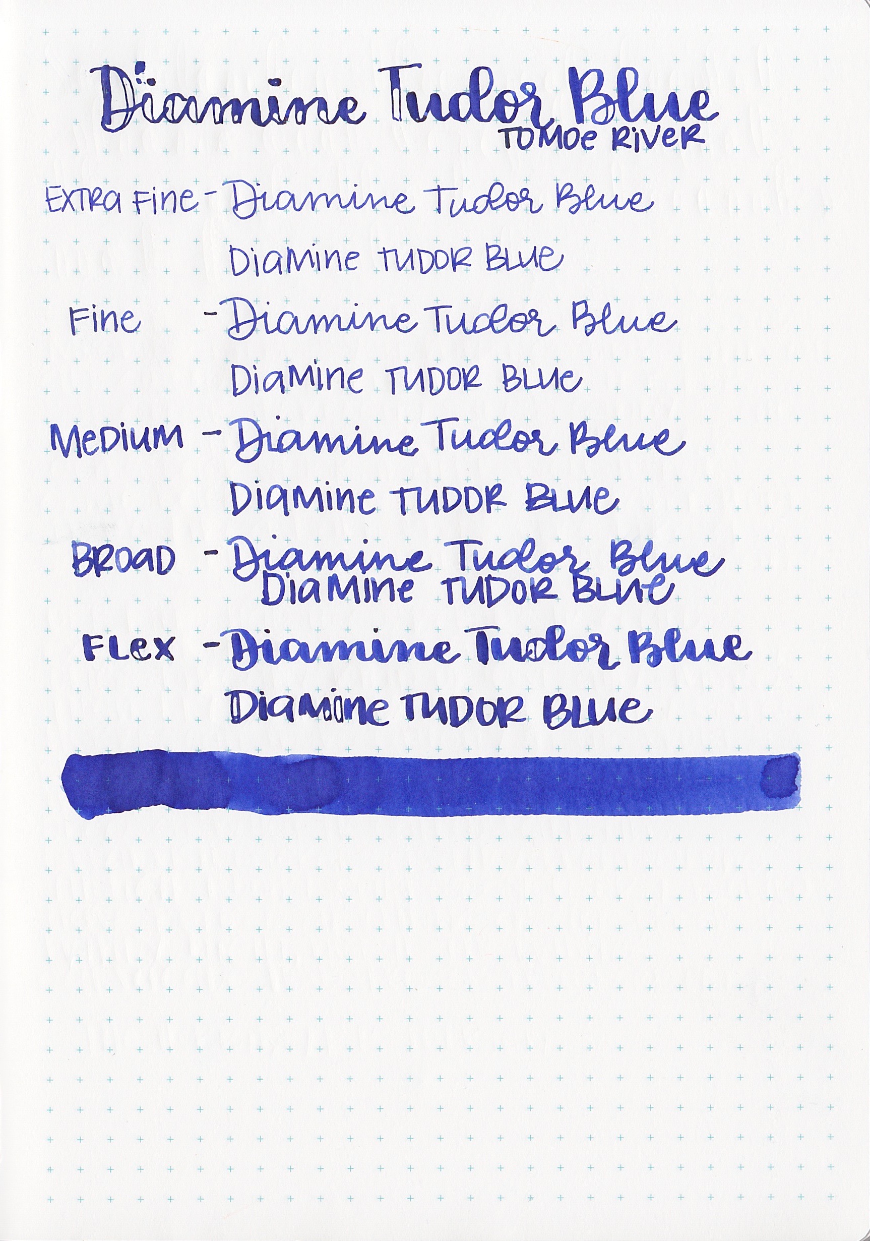
Ink Review #136: Diamine Tudor Blue
/
Diamine Tudor Blue is one of the 2017 150th anniversary inks from Diamine. The collection has some really great colors-I love how the colors just seem to fit with each other. I wish all ink collections had colors that worked so well together.

The color...
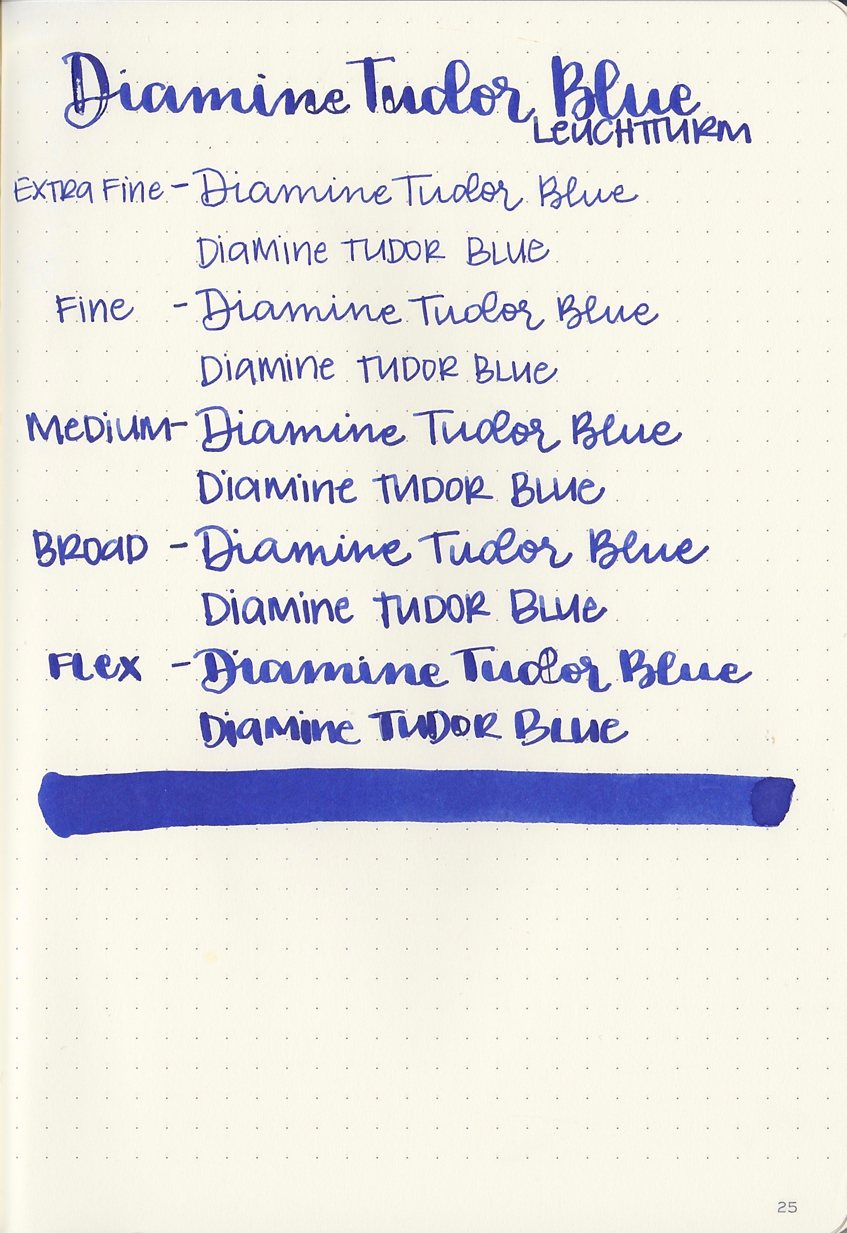
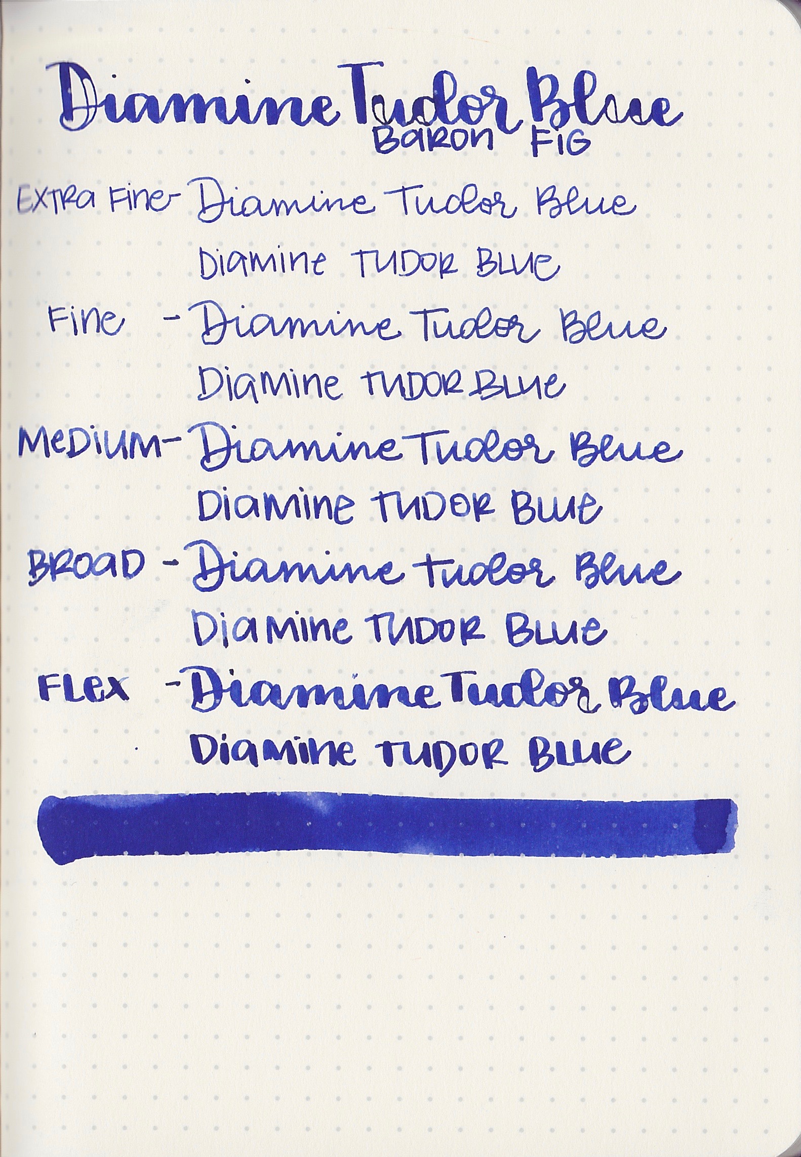
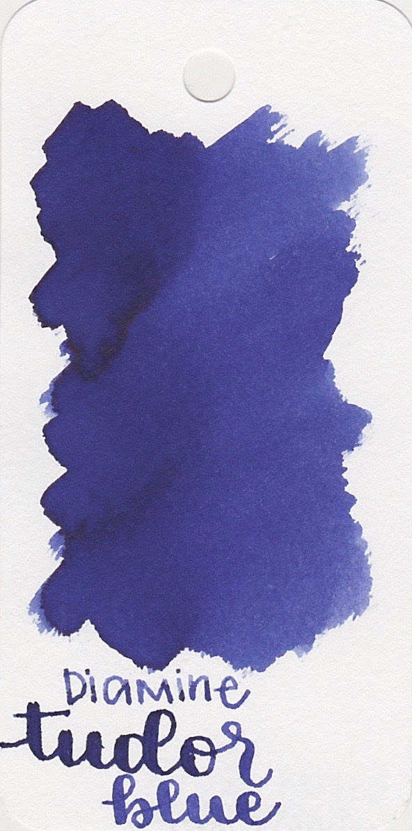
Tudor Blue is a vibrant dark blue.


There is almost a tiny tiny bit of sheen on the very edge of the ink drops. You really have to look for it to see it.
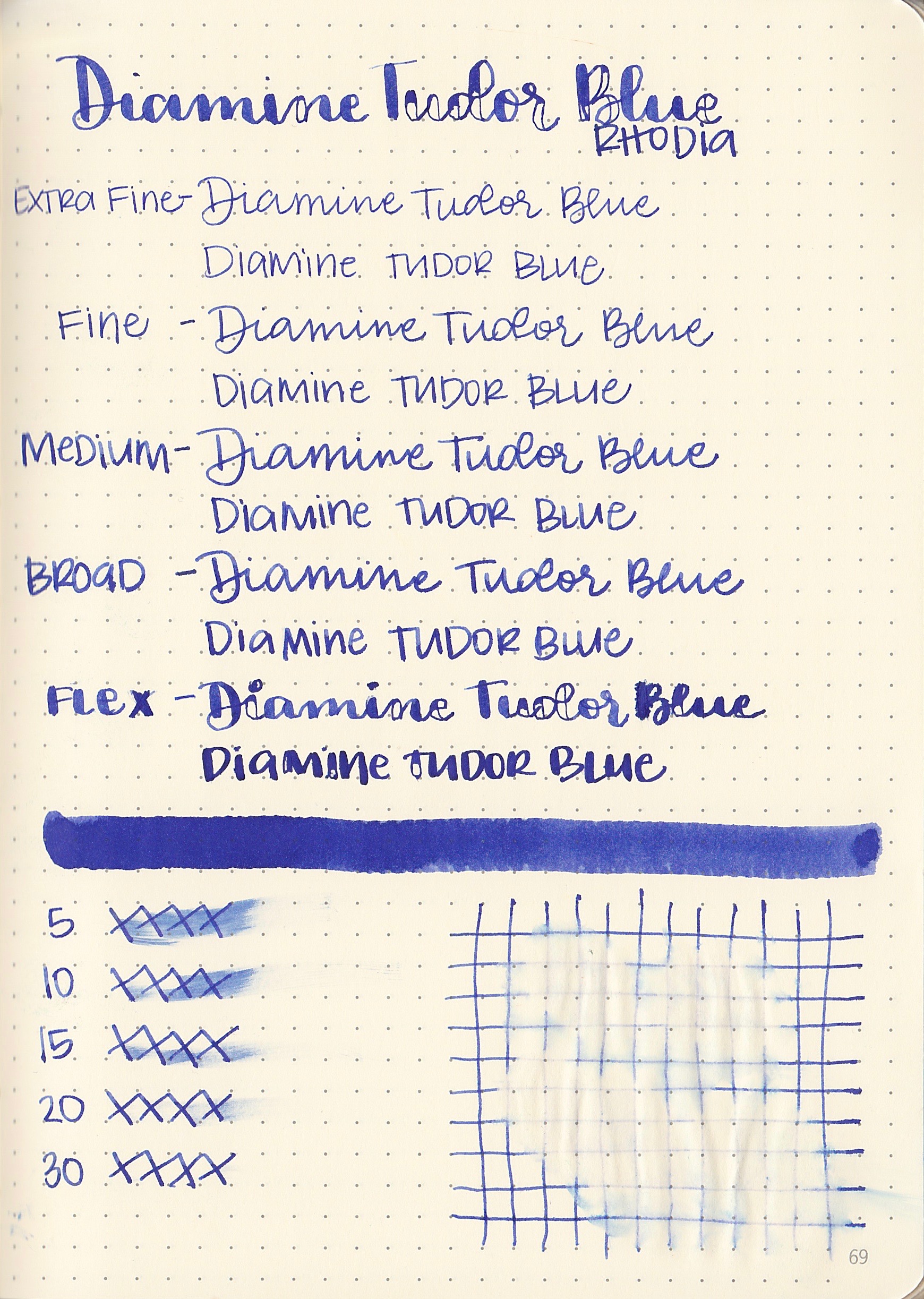
Dry time: 25 seconds
Water resistance: Low
Feathering: There was just a tiny bit of feathering on Rhodia, on spots where there was a lot of ink.
Show through: Medium
Bleeding: None
Other properties: Medium shading, no sheen

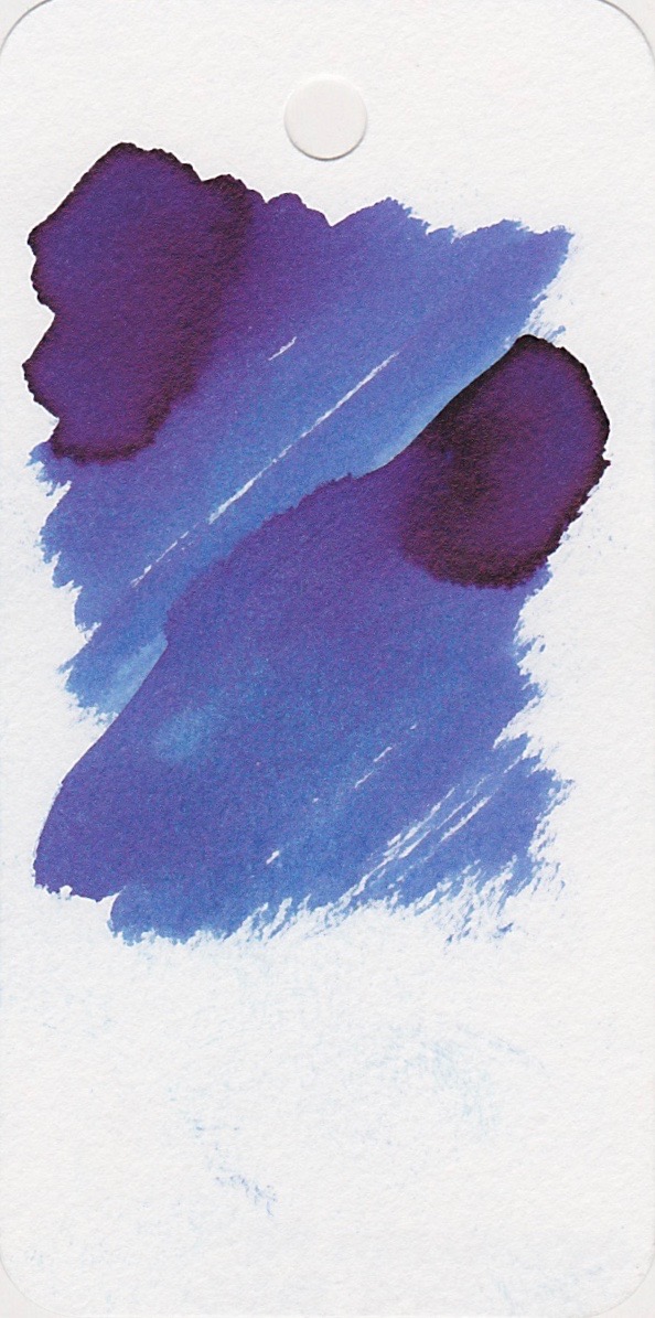
Ink swabs for comparison, left to right (top to bottom for RSS): Diamine Regency Blue (150th Anniversary collection), Diamine Tudor Blue, Akkerman #5 Shocking Blue. To see the Diamine inks together, click here. I think Regency Blue is the closest to Tudor Blue, but it has a lot more sheen than Tudor Blue does, and it is a bit darker.
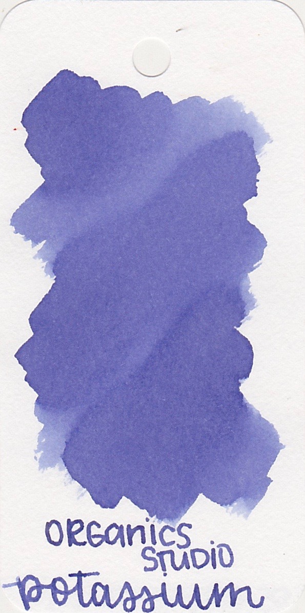
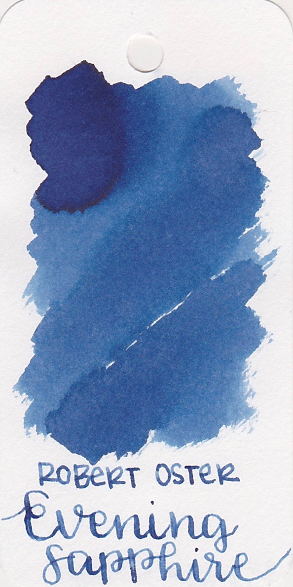
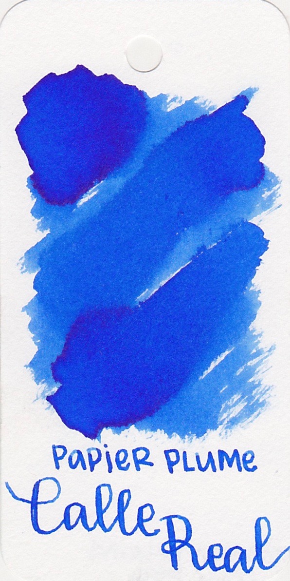
Organics Studio Potassium Lavender, Robert Oster Evening Sapphire, and Papier Plume Calle Real. Click here to see the blue inks together.

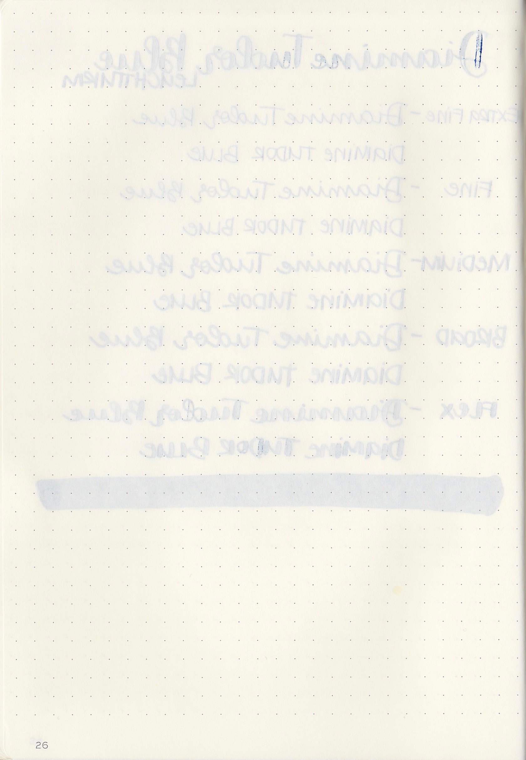
I started out writing with a Pilot 912 FA, but I've been having some problems with the pen hard starting and skipping, so I switched to a broad Vanishing Point.

Longer writing:
I really like the shading that showed up in the broad nib. It's really lovely.
Overall, I think this is a nice ink, it's well behaved and has a nice tone. It's not a super common color, which I think is part of why I like it.
Disclaimer: I purchased this ink myself, and all photos and opinions are my own. There are no affiliate links on this page.