Ink Review: Papier Plume Calle Real
/Papier Plume released five inks in 2016, each ink based on a color found in New Orleans, and called the New Orleans collection. Each bottle is about 30 ml of ink, and created in small batches in the US. I purchased my bottle of ink from Papier Plume. According to their website:
"It's history starts with the Spanish take over of New Orleans. From 1763 to about 1800 Spain had control of New Orleans. Two large fires, in 1788 and 1794, destroyed over a 1000 buildings. During the rebuilding, some of the most impressive structures in New Orleans were built: St. Louis Cathedral, The Cabildo and The Presbytere. Today our store is just a few blocks from these buildings on Royal Street, at that time called Calle Real. This blue ink is inspired by the blue in the street tiles and Spanish wall tiles throughout the French Quarter."
When I first swabbed this ink, the first thought I had was "Goulet blue!" The color reminds me of Goulet Pen's blue ink splat logo. I guess I've watched one Goulet YouTube video too many.
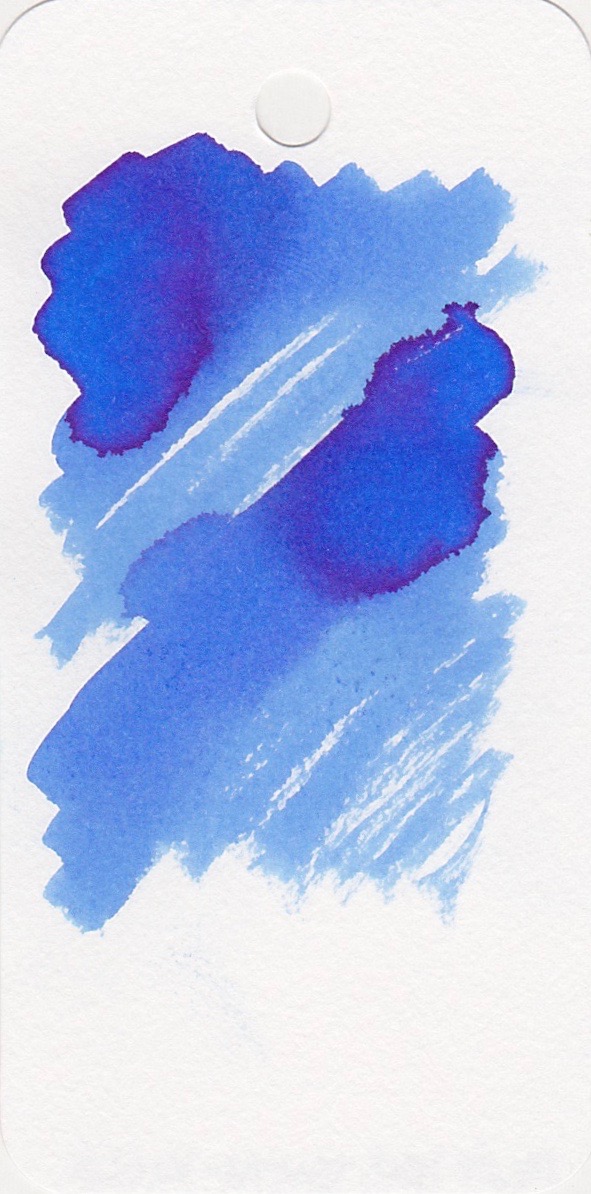
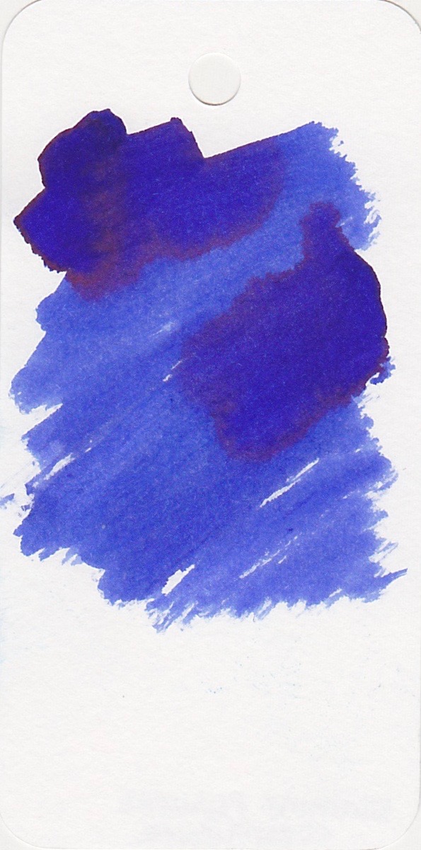
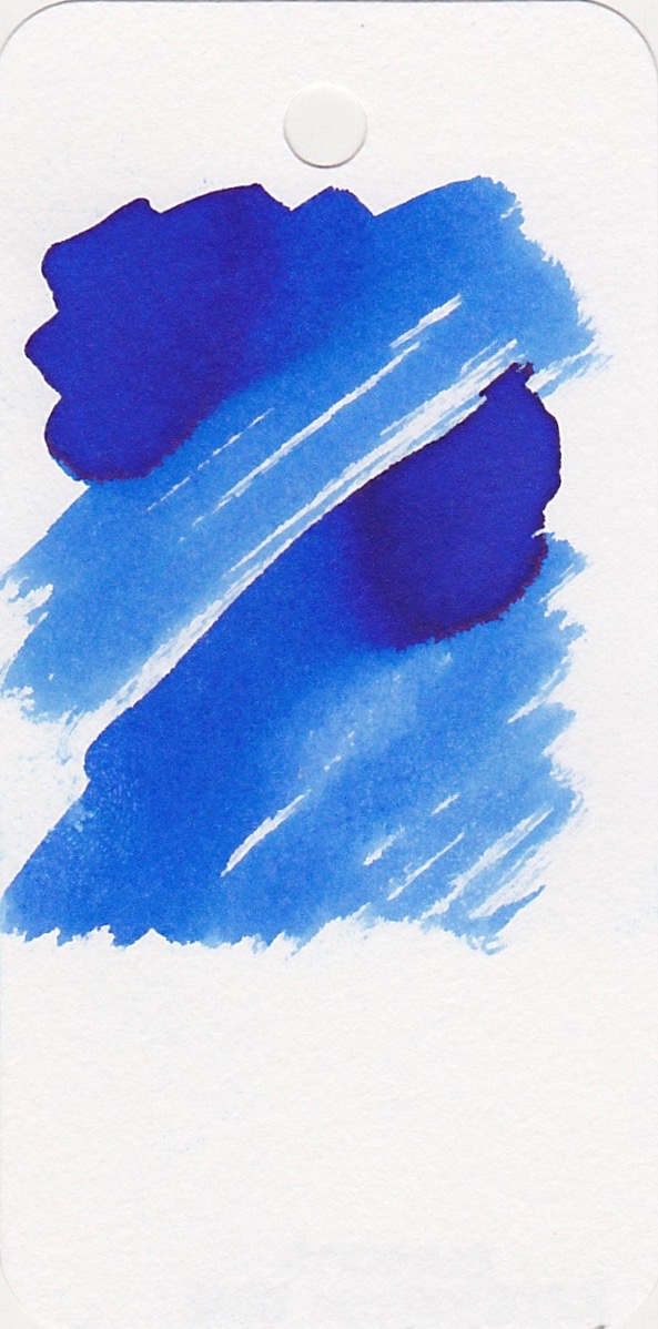
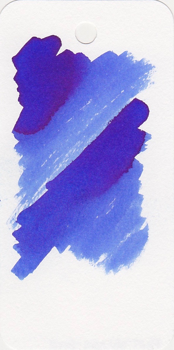
Above is a picture of the swabs of the Papier Plume New Orleans Collection.
The bottle:
The bottle is glass with a metal lid, with a wax seal attached to the lid. The bottle is 30 ml of ink.
The color...
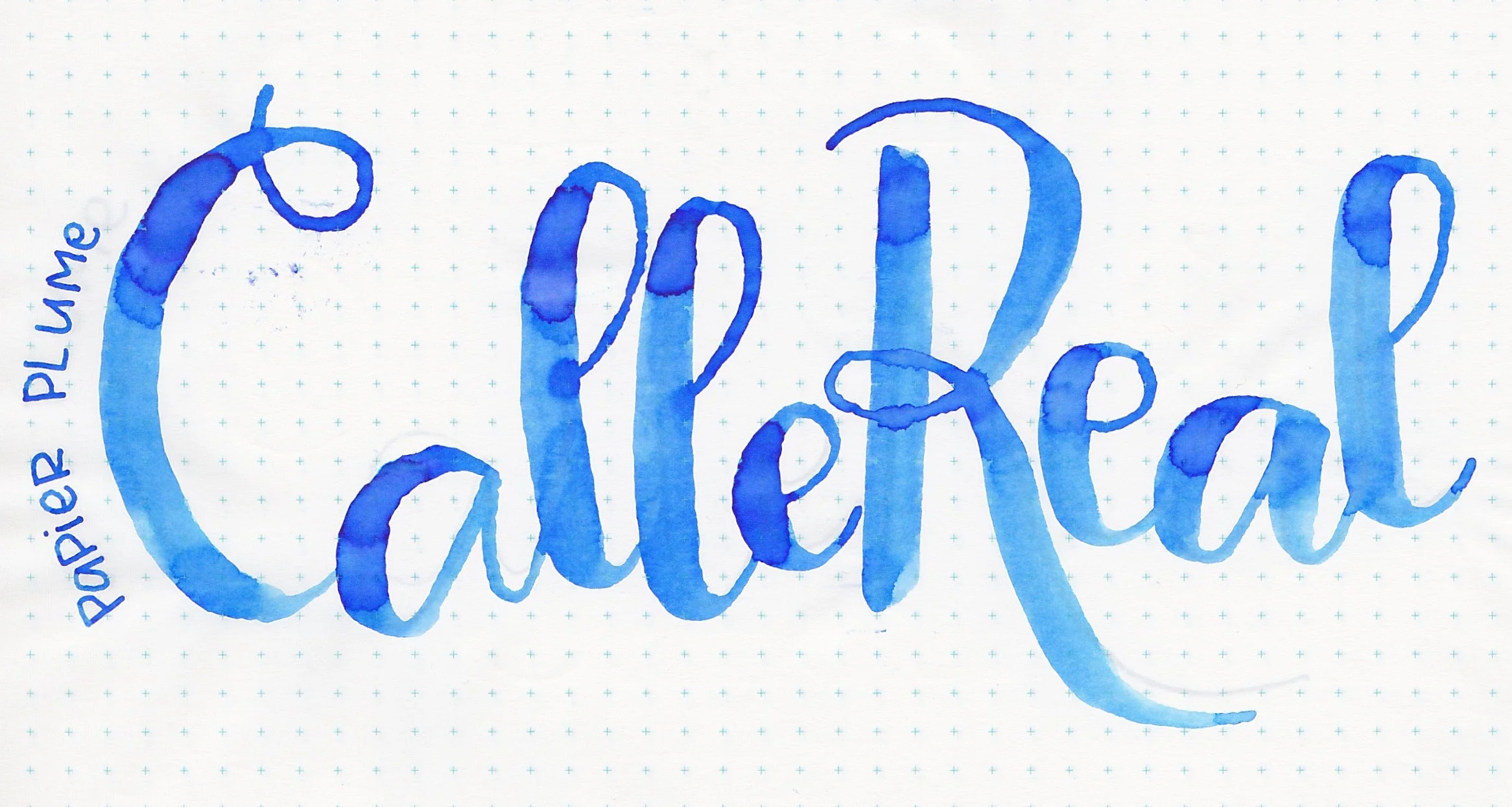
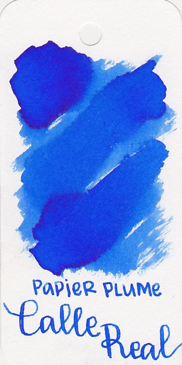
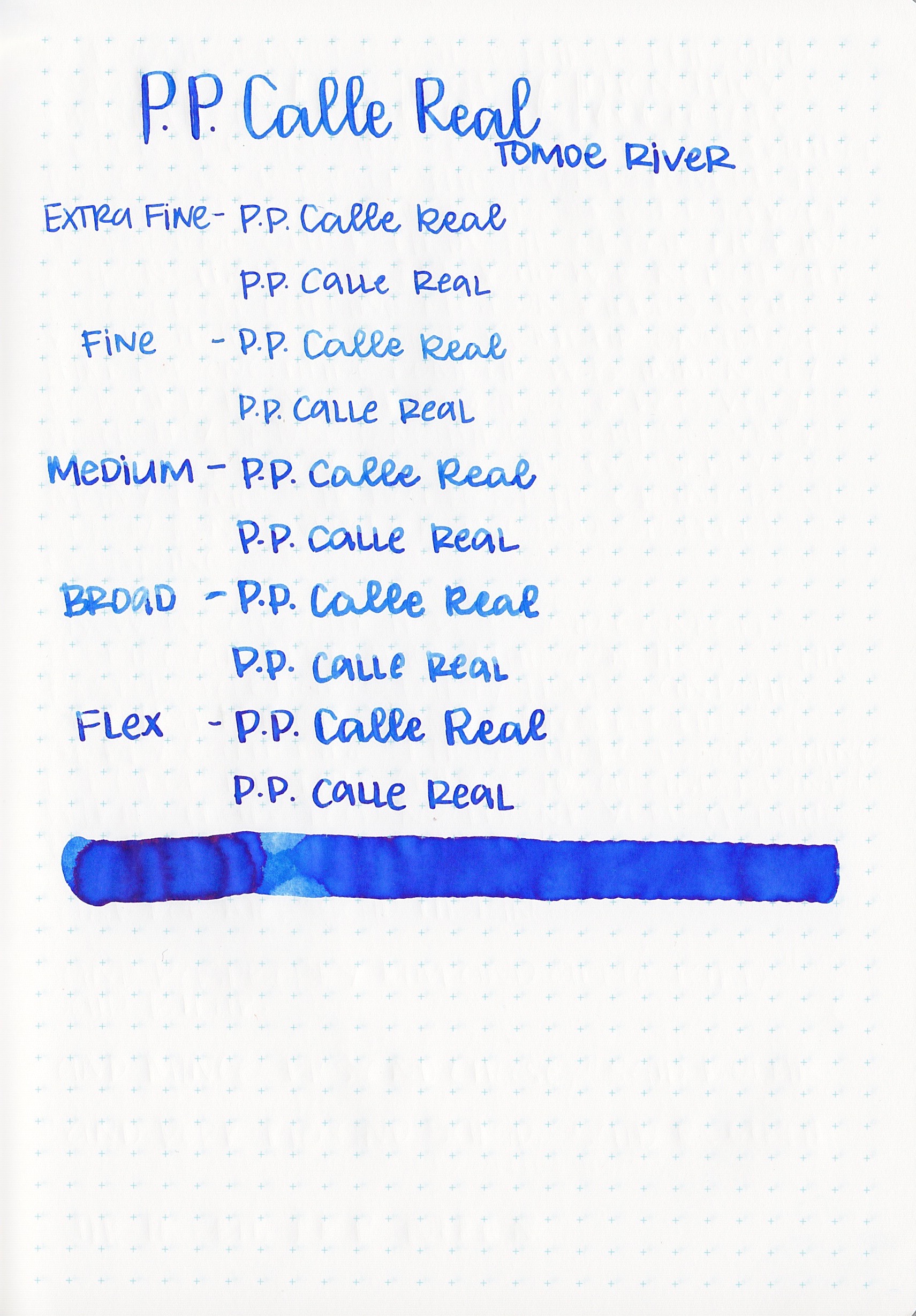
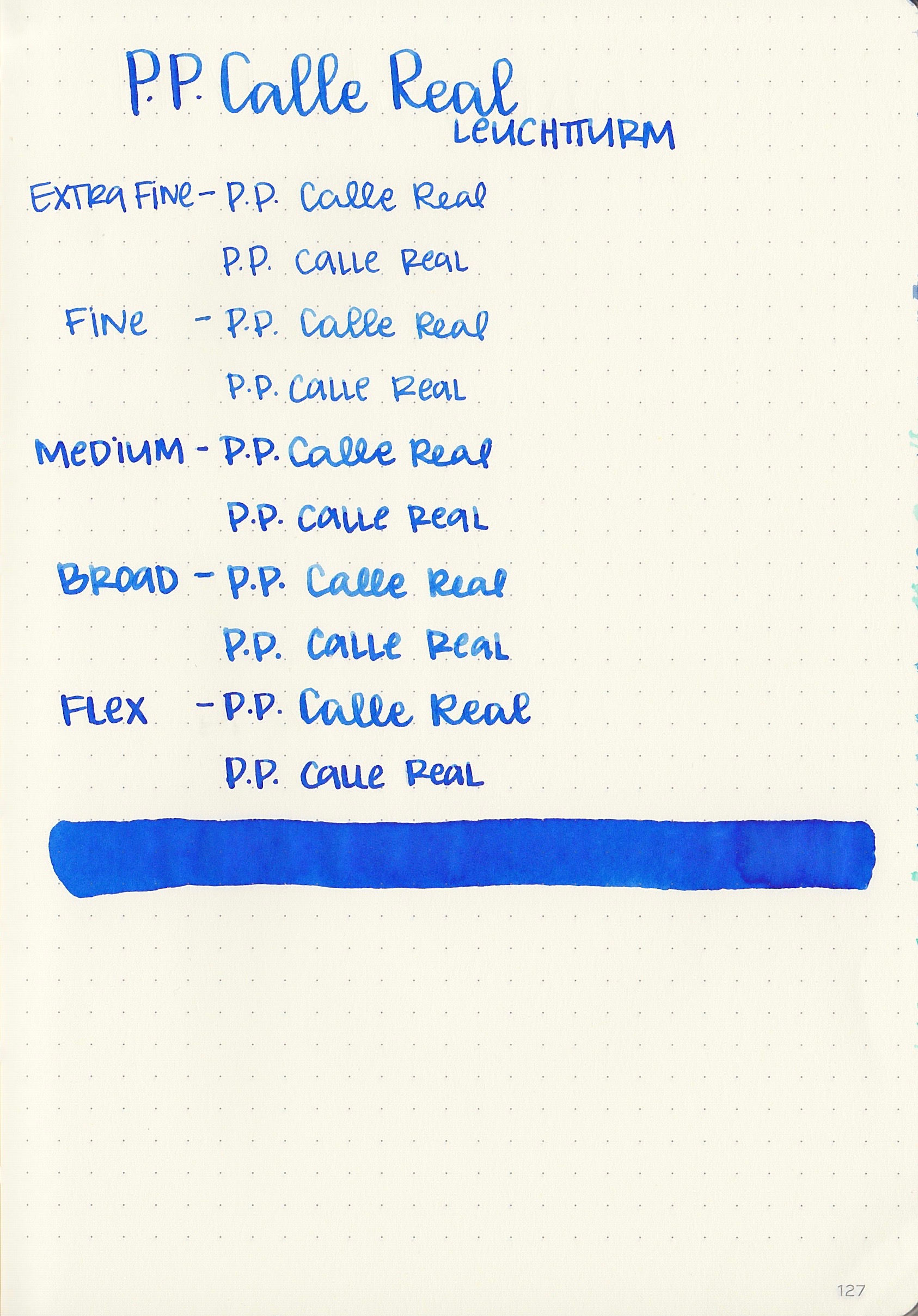
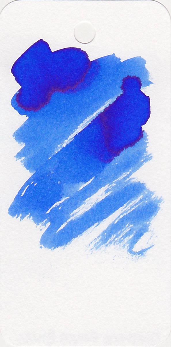
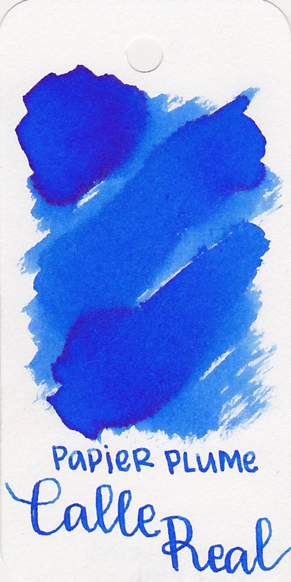
Calle Real is a royal blue with a tiny bit of sheen.
I was pleasantly surprised to see a tiny bit of sheen on the ink drops. This is the first Papier Plume ink that I've reviewed that showed any sheen.
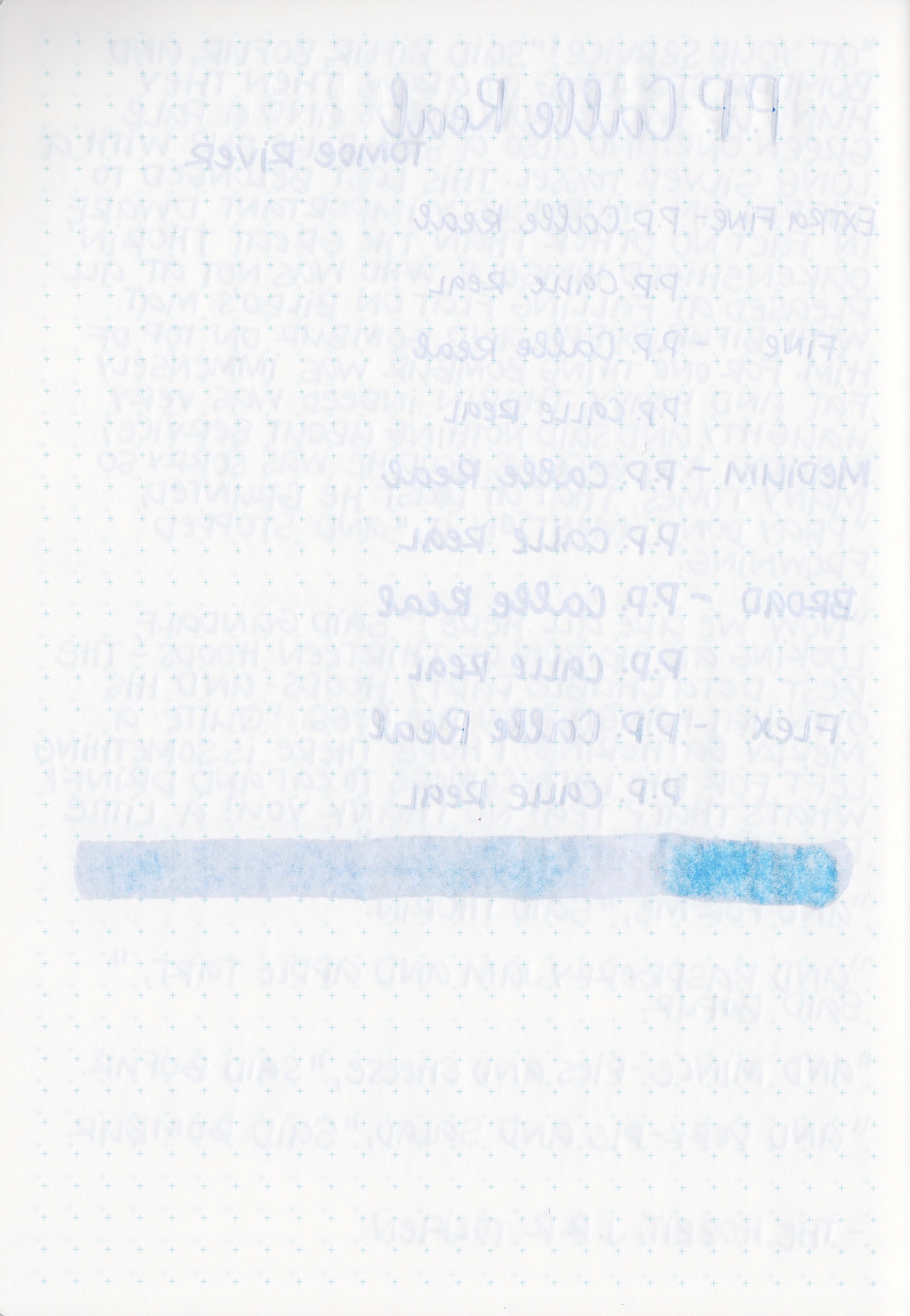
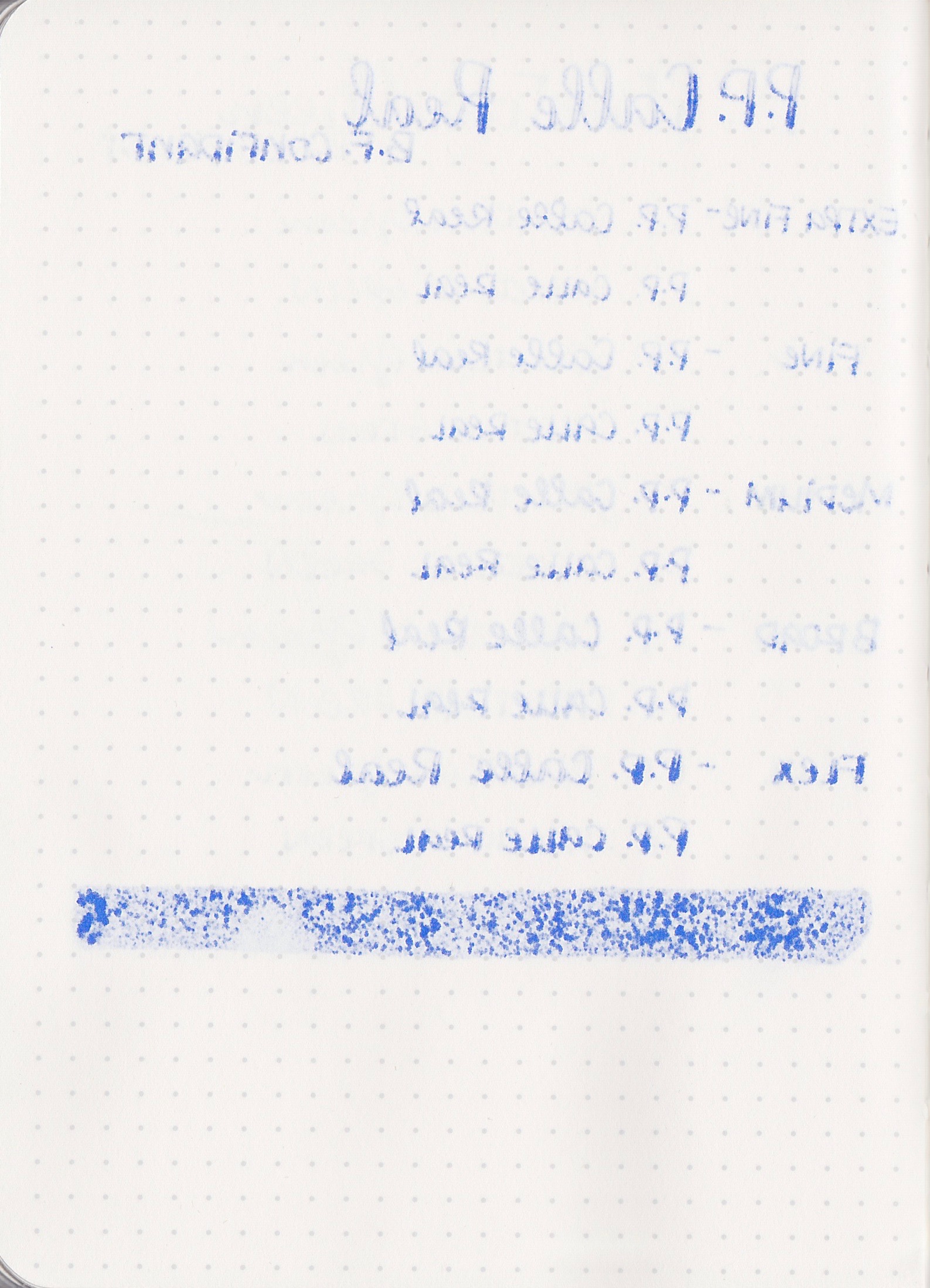
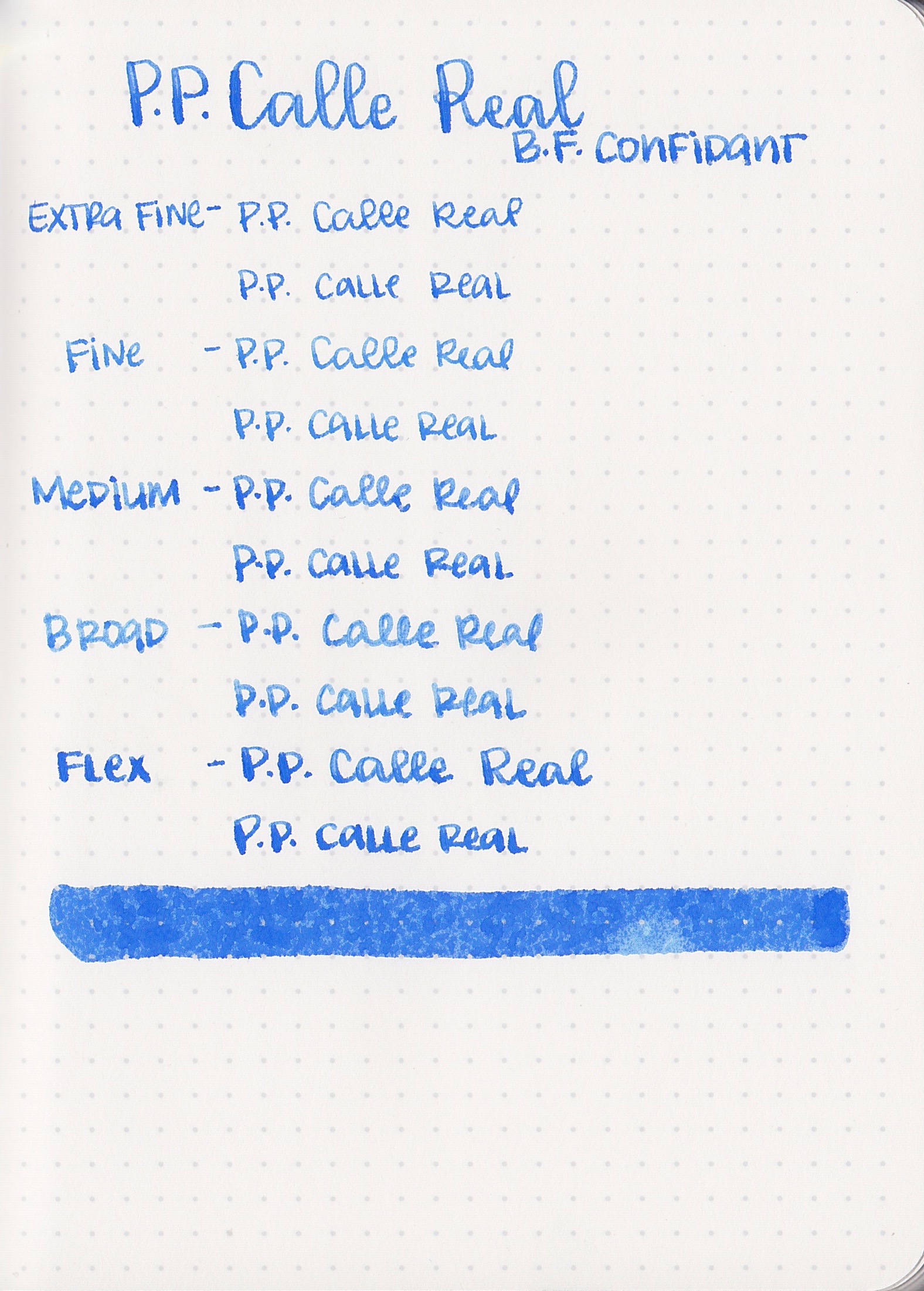
Feathering: Calle Real only feathered on Baron Fig paper.
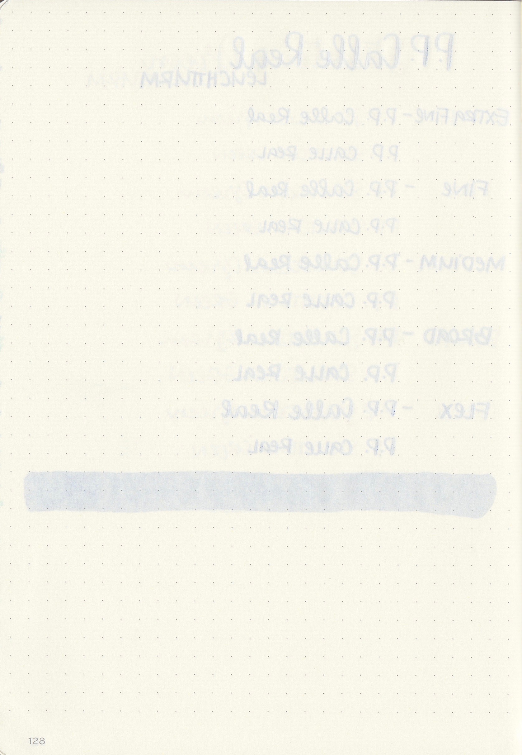
Show through: Calle Real had low to medium show through on all of the papers.
Bleeding: Calle Real bled on Baron Fig paper, and a little bit on the large Tomoe River swab, but it did great on the other papers.
Special properties: Calle Real had a tiny bit of sheen, only on the large swabs on Tomoe River. It also had low shading on Tomoe River paper.
Swabs for comparison, left to right: Diamine Royal Blue, Papier plume Calle Real, and Pilot Iroshizuku Tsuyu-Kusa. Diamine Royal Blue seems to be the closest to Calle Real. To see swabs and links to all of the Papier Plume inks I have reviewed so far, click here.
Left to right: Diamine Flowers Cornflower, Diamine Kensington Blue, and Pilot Iroshizuku Asa-gao. To see swabs and links to all of the blue inks I have reviewed so far, click here.
Longer writing:
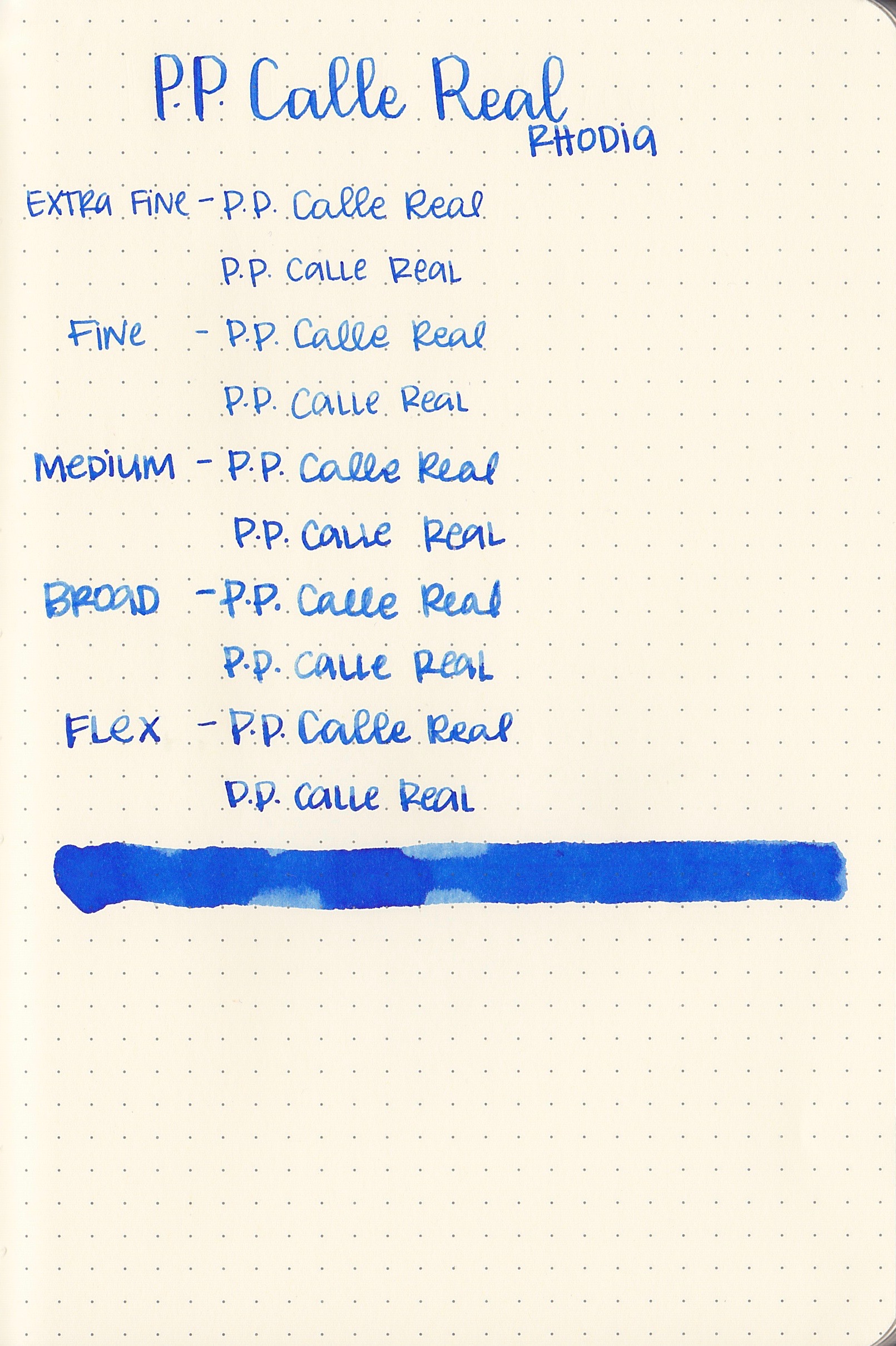
I used a medium nib on Tomoe River paper. The ink had a wet flow and slightly longer than average dry time. I do love a slightly wet ink.
On Tomoe River paper, the ink was wet and had a slightly long dry time. On Baron Fig paper it seemed to seep straight into the paper and dry immediately, but it also had lots of bleeding and feathering. On Rhodia and Leuchtturm it was slightly wet but other than that performed like an average ink.
Overall, I liked the color and saturation of this ink. I liked that it was slightly wet and very smooth. I still can't look at the ink without thinking "Goulet blue!"
Disclaimer: I purchased this ink myself, and all photos and opinions are my own. There are no affiliate links on this page.

