
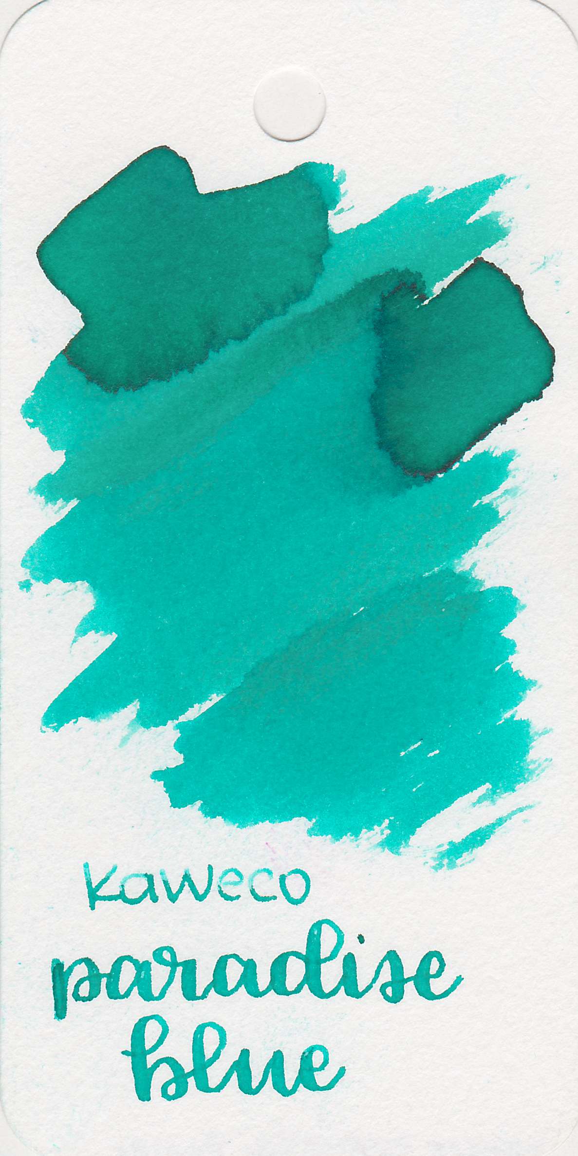
Ink Review #320: Kaweco Paradise Blue
/
Today's ink is Kaweco Paradise Blue. This ink has always been interesting to me, on some papers it looks more green and some it looks more blue. I purchased my bottle of ink from Vanness Pens.

The bottle:
Paradise Blue comes in a 30ml glass bottle for $13. I wish it actually said Paradise Blue on the bottle, not just the brand name.

The color:
Paradise Blue is a light teal. It looks much greener in the swab on the Col-o-ring than it does on other papers.
Swabs:

In large swabs the ink has the tiniest hint of pink sheen. You really have to look for it to notice it.

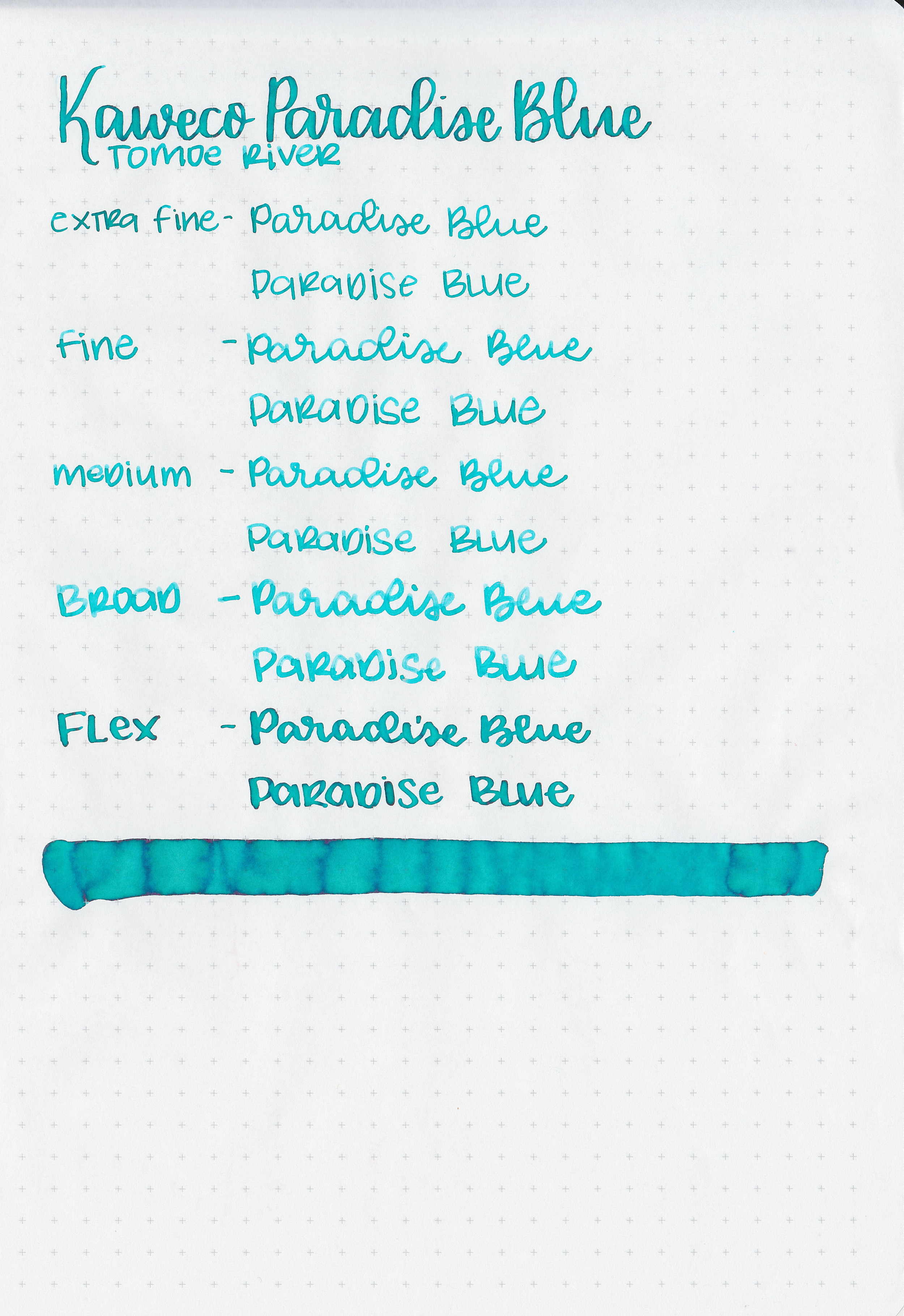
Writing samples:
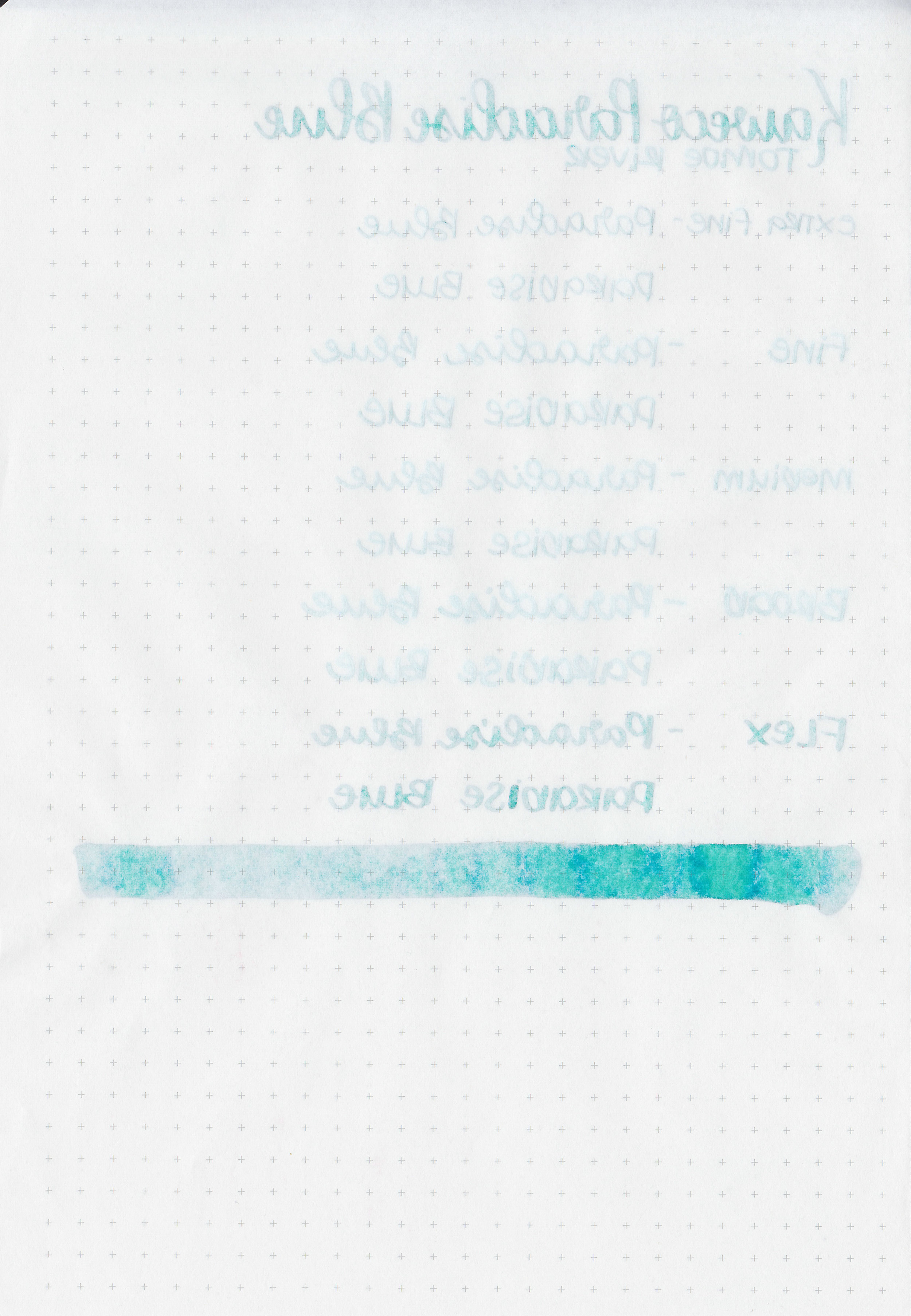
Let's take a look at how the ink behaves on fountain pen friendly papers: Rhodia, Tomoe River, and Leuchtturm.

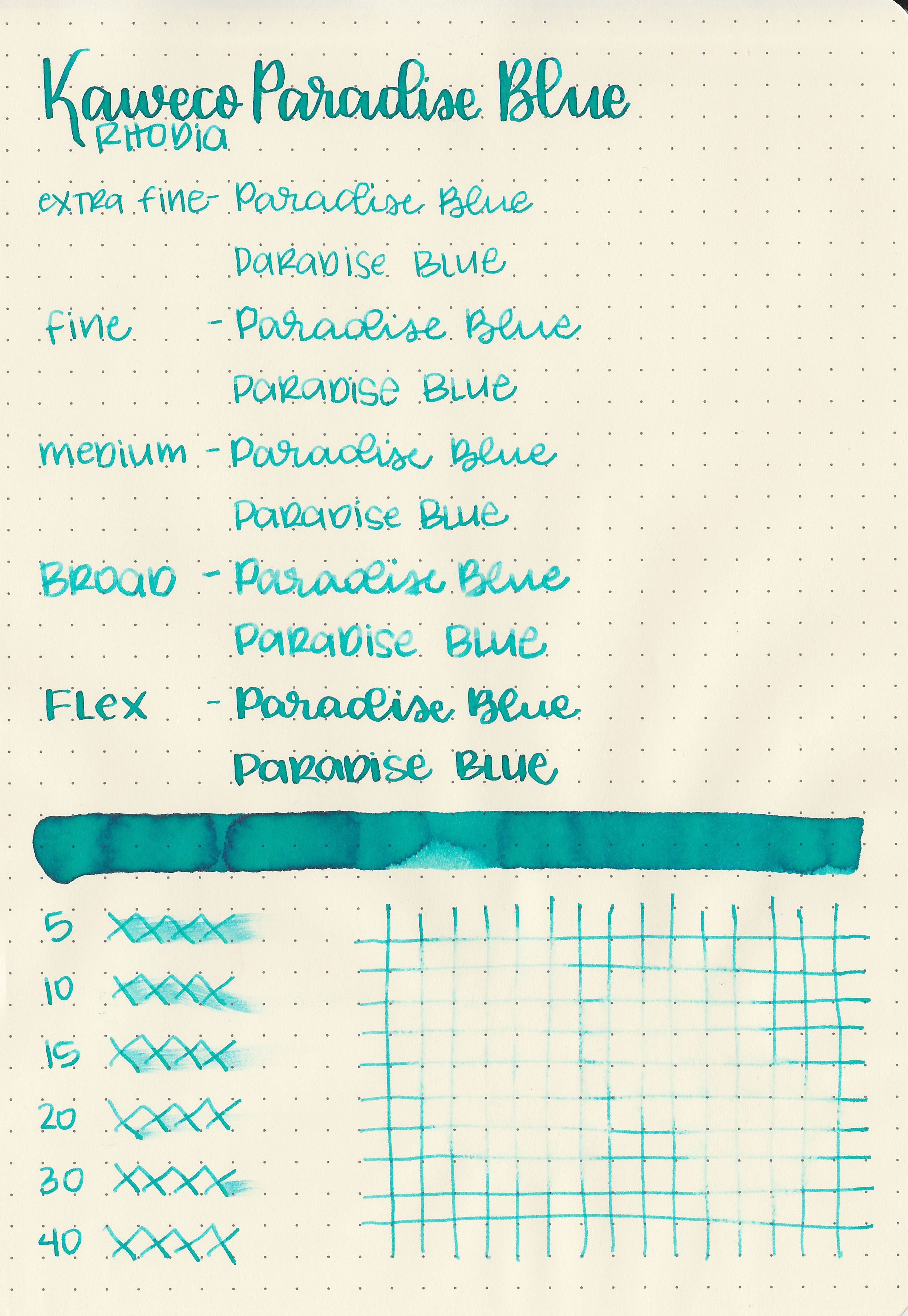
Dry time: 40 seconds
Water resistance: Low
Feathering: None
Show through: Medium
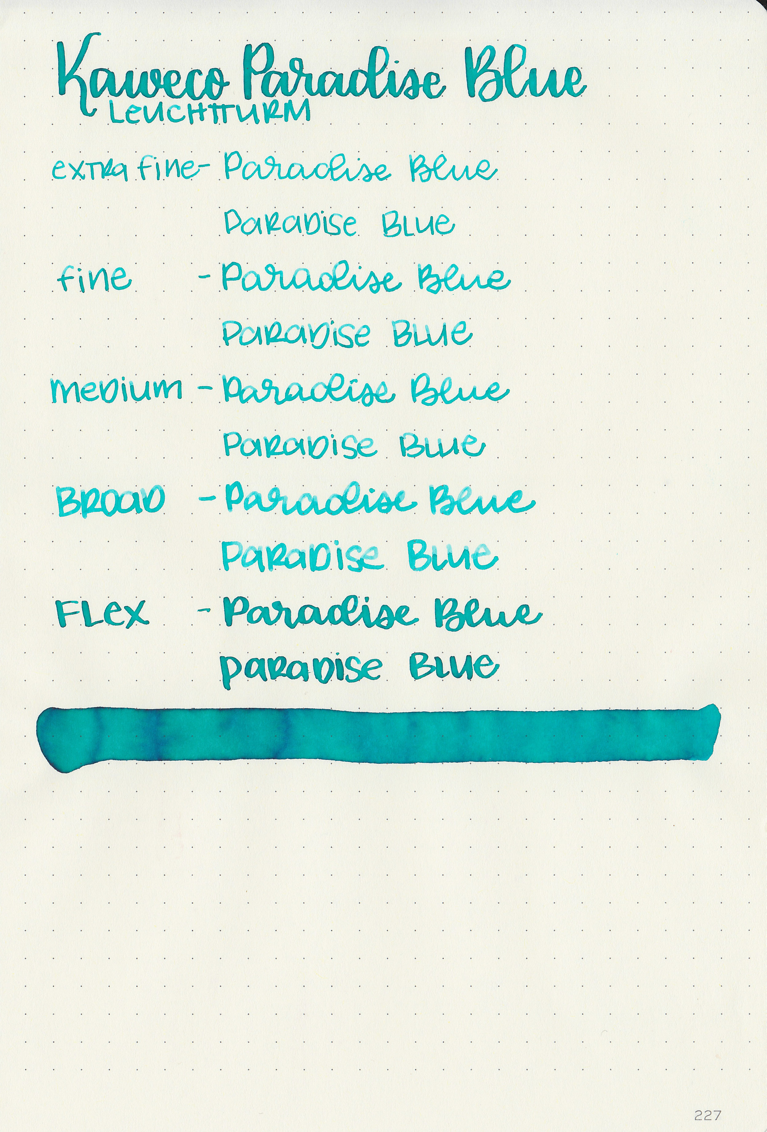
Bleeding: Low
Other properties: medium shading, no sheen, and no shimmer.
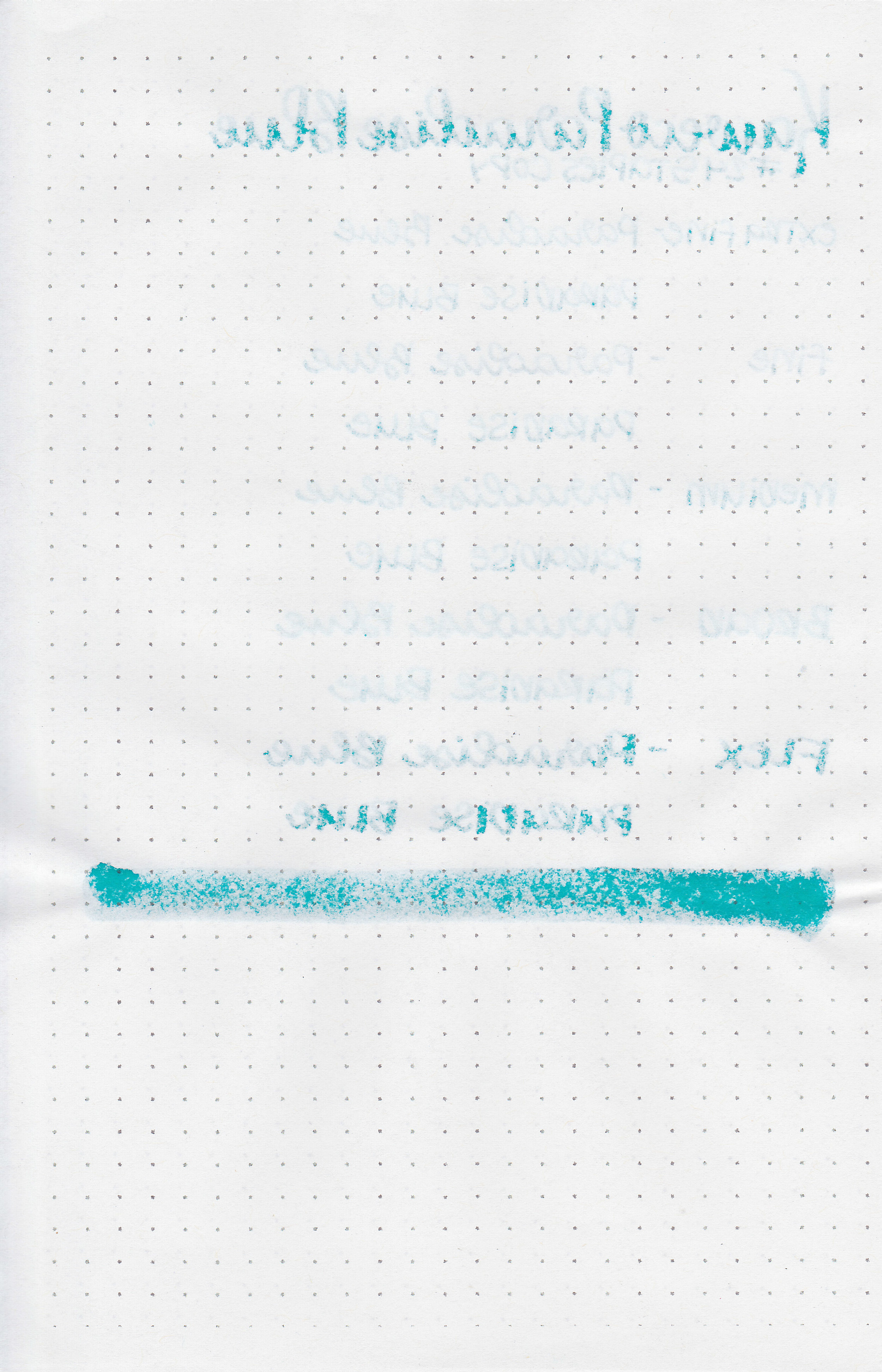
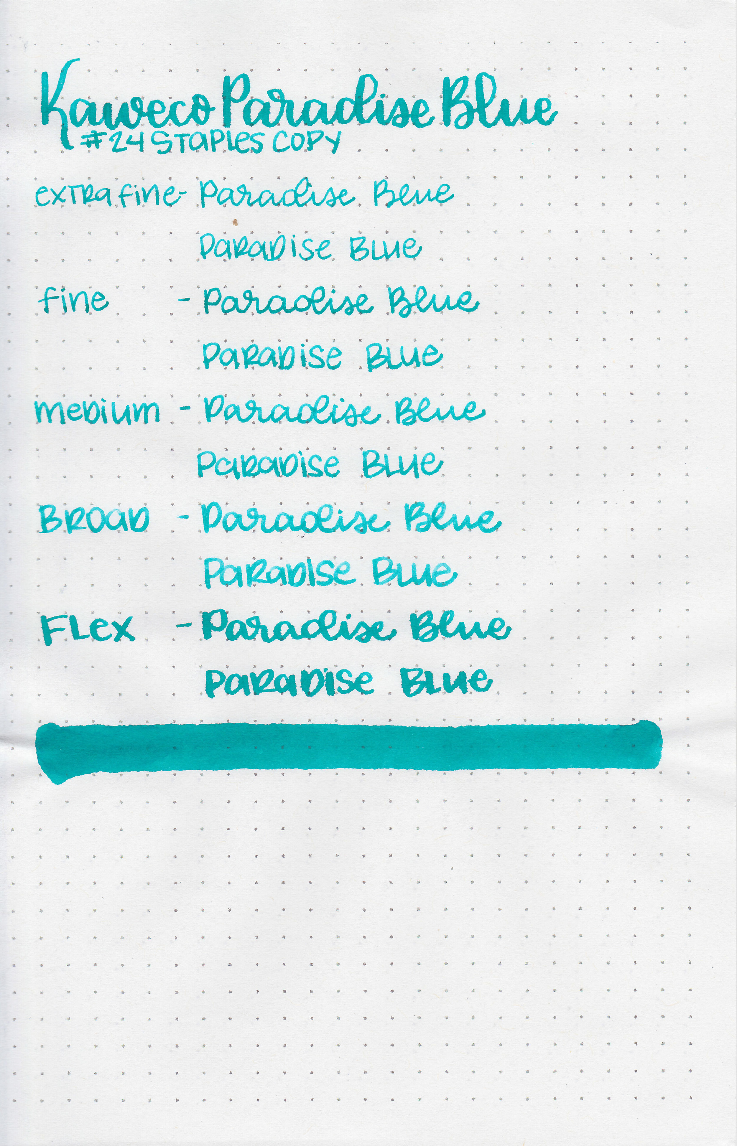
On Staples 24 lb copy paper there was some feathering and bleeding.
Comparison Swabs:
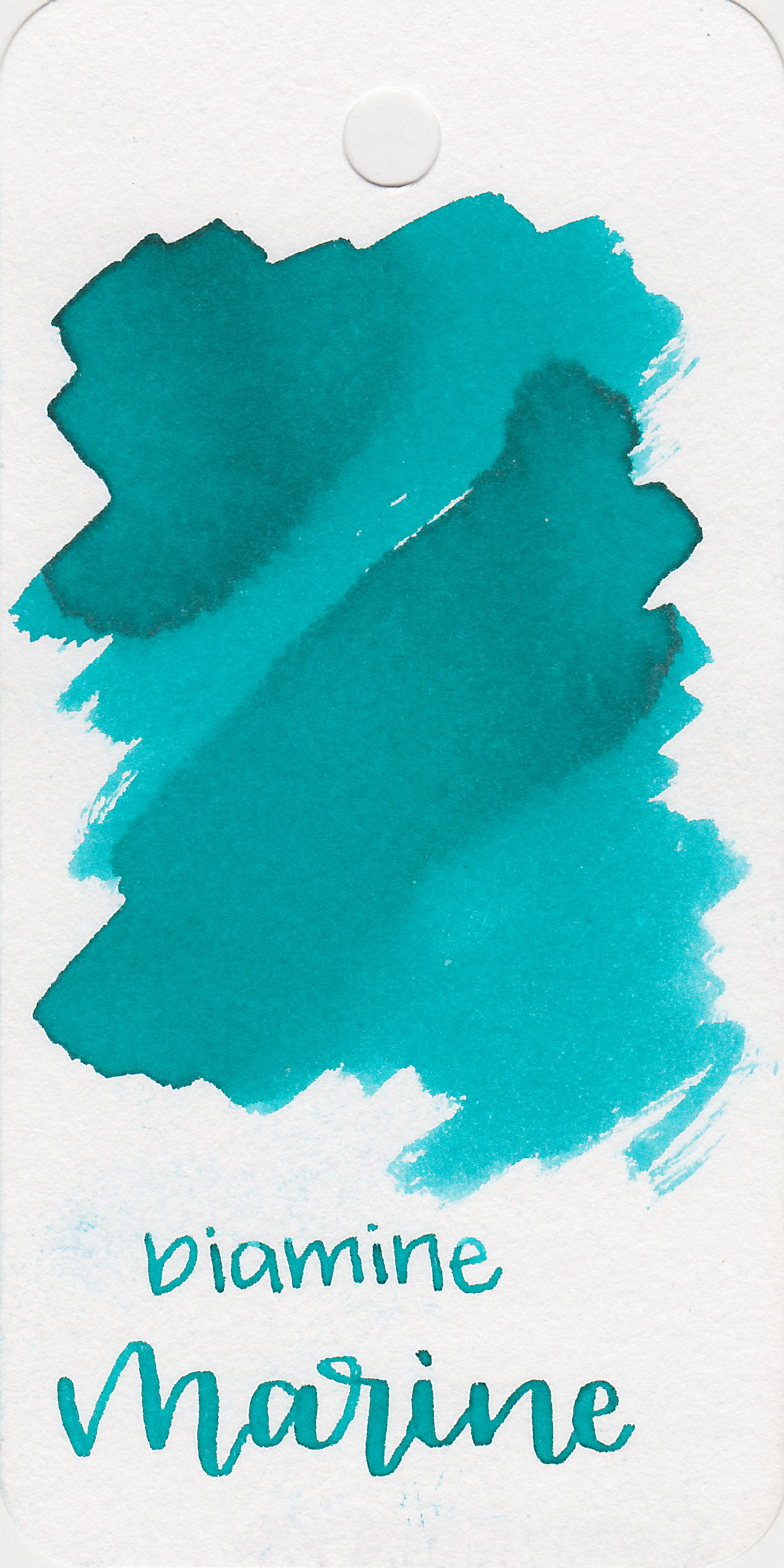
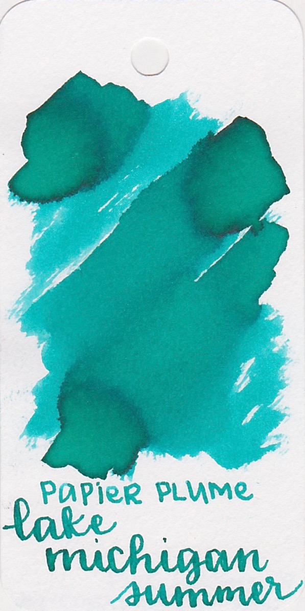
Ink swabs for comparison, left to right (top to bottom for mobile RSS): Diamine Marine, Kaweco Paradise Blue, and Papier Plume Lake Michigan Summer. Click here to see the Kaweco inks together. Paradise Blue has a bit more green in it than Marine does.
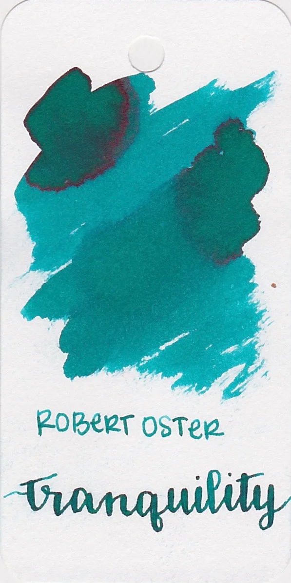

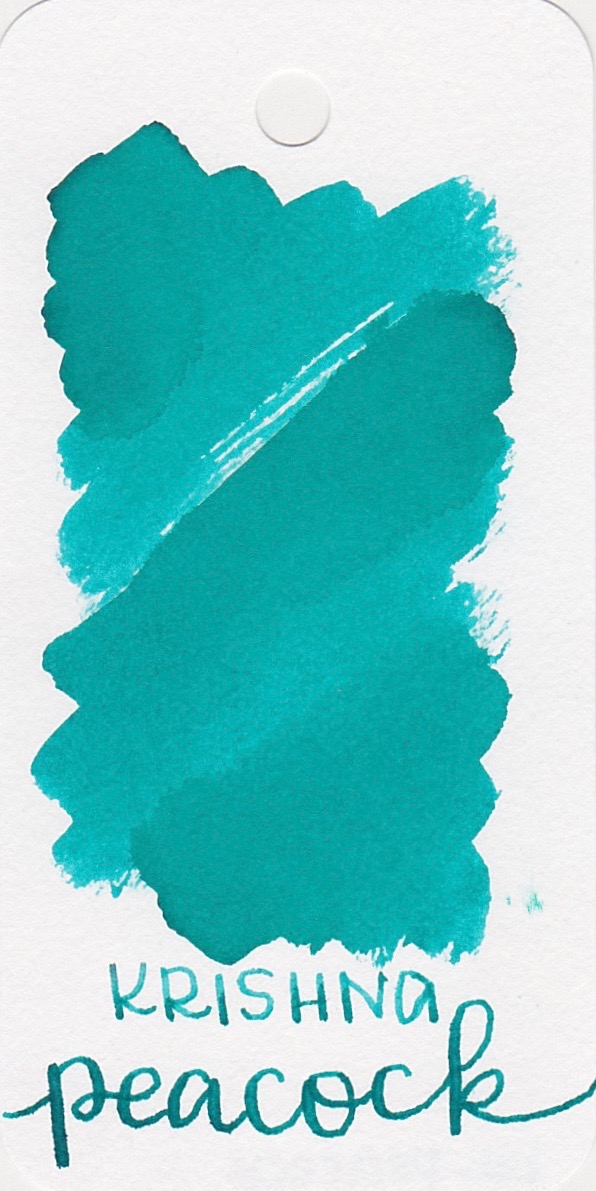
Robert Oster Tranquility, Robert Oster Turquoise, and Krishna Peacock. Click here to see the teal inks together.

Longer writing:
I used a broad TWSBI Eco Pink on Tomoe River paper. The ink had an average flow.

Overall, it's a pretty well behaved ink, but there is a little bit of bleeding and the dry time is just a bit long. Other good inks in this color are Diamine Marine and Papier Plume Lake Michigan Summer.
Disclaimer: I purchased this ink myself, and all photos and opinions are my own. There are no affiliate links on this page.