
Ink Review #342: Monteverde Capri Blue
/
Today's ink is Monteverde Capri Blue. I know I'm a day late for this, but I'm pretty sure this is the perfect blue for the fourth of July. Ink Journal was very kind and sent a sample over for review.
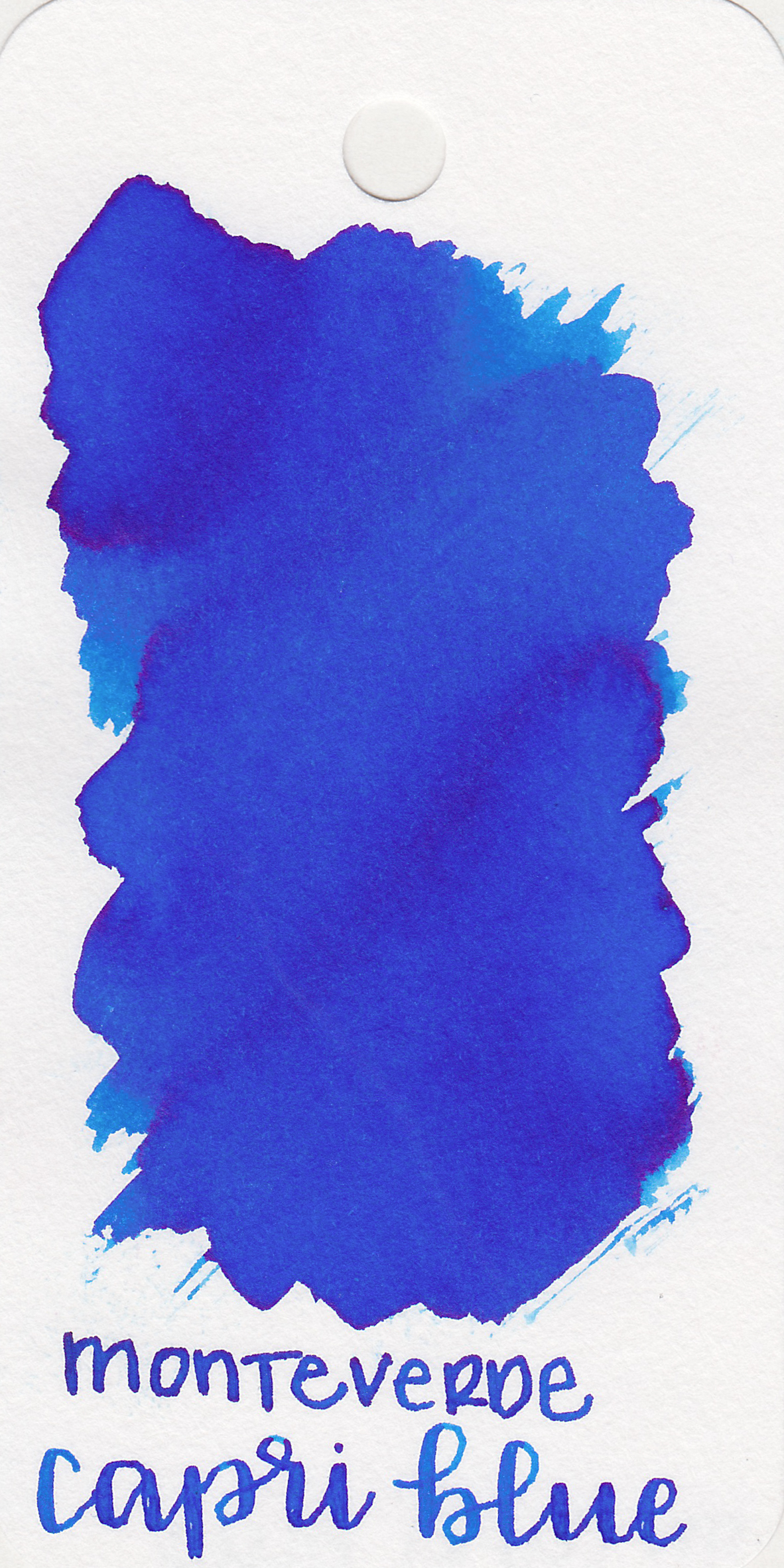
The color:
Capri Blue is a beautiful medium bright blue. It makes me think of the 4th of July.
Swabs:
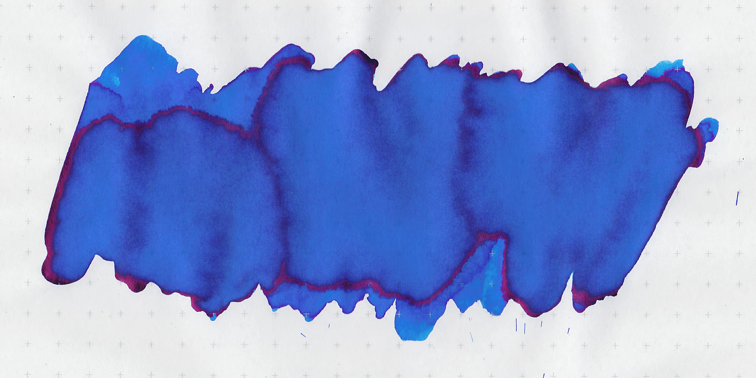
In large swabs there is a little bit of bright pink sheen.
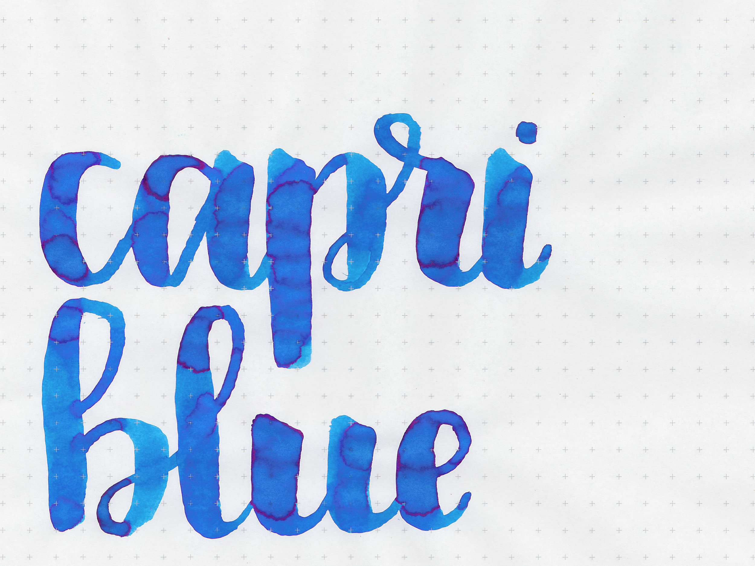
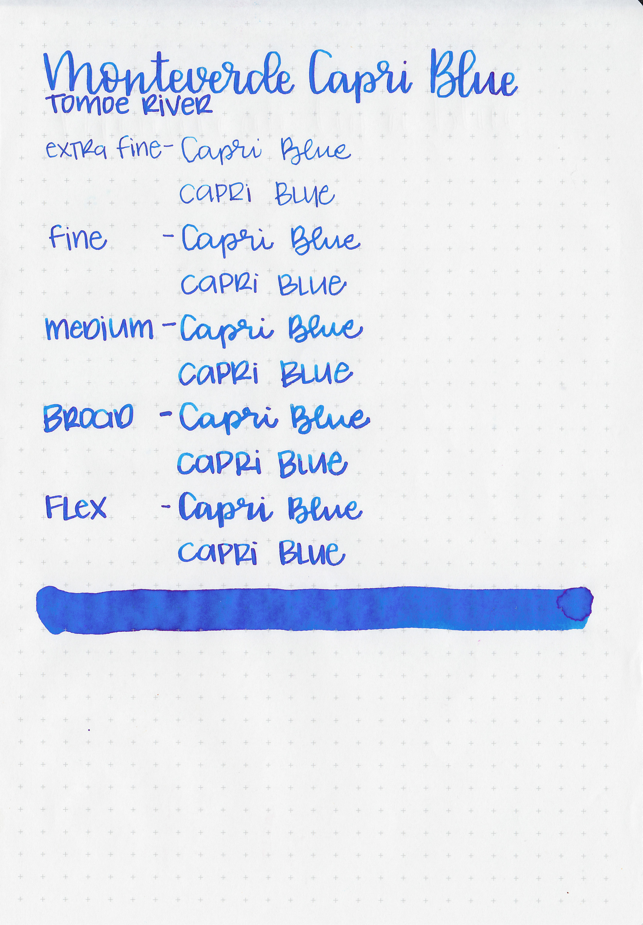
Writing samples:
Let's take a look at how the ink behaves on fountain pen friendly papers: Rhodia, Tomoe River, and Leuchtturm.
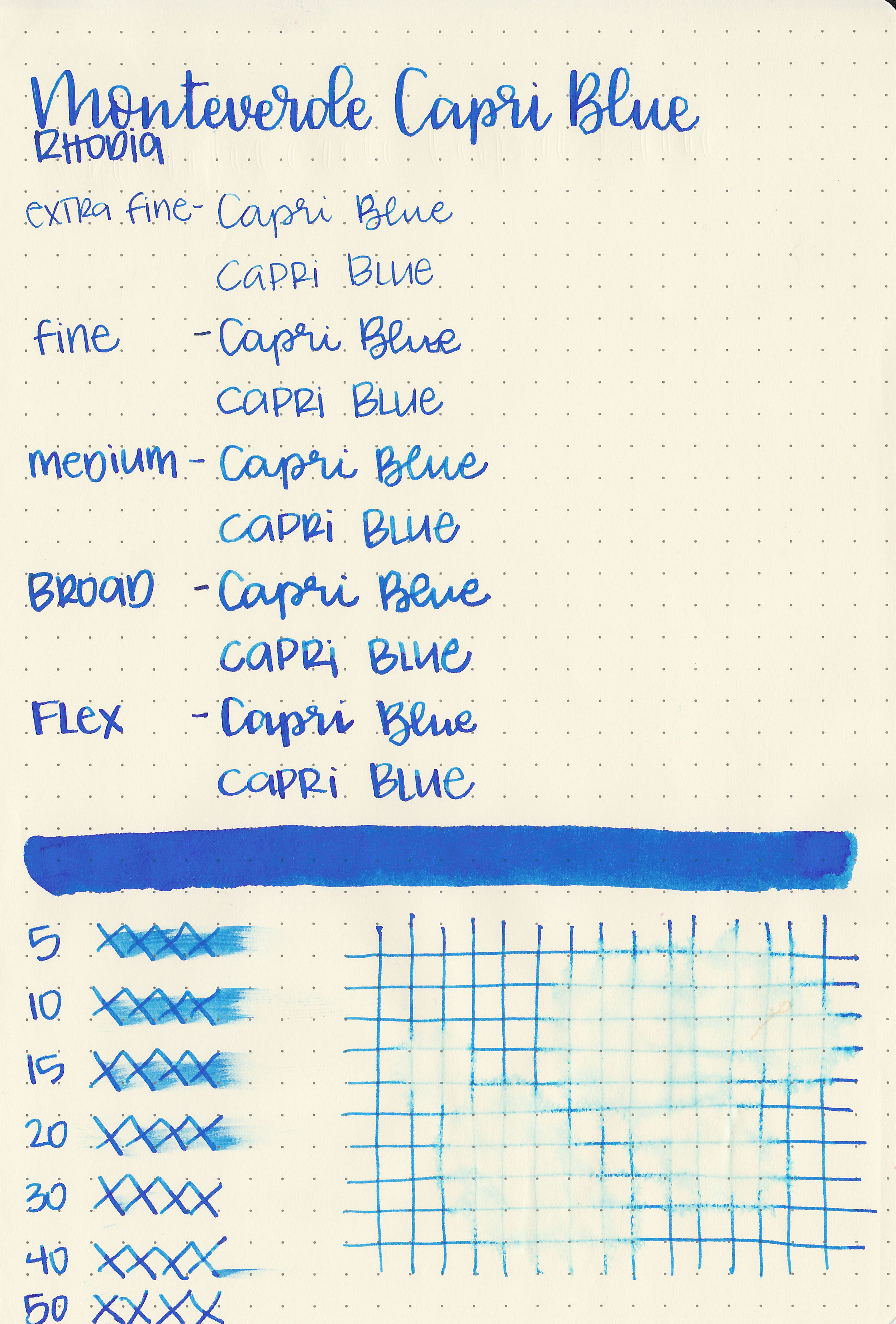
Dry time: 50 seconds
Water resistance: Low
Feathering: None
Show through: Medium
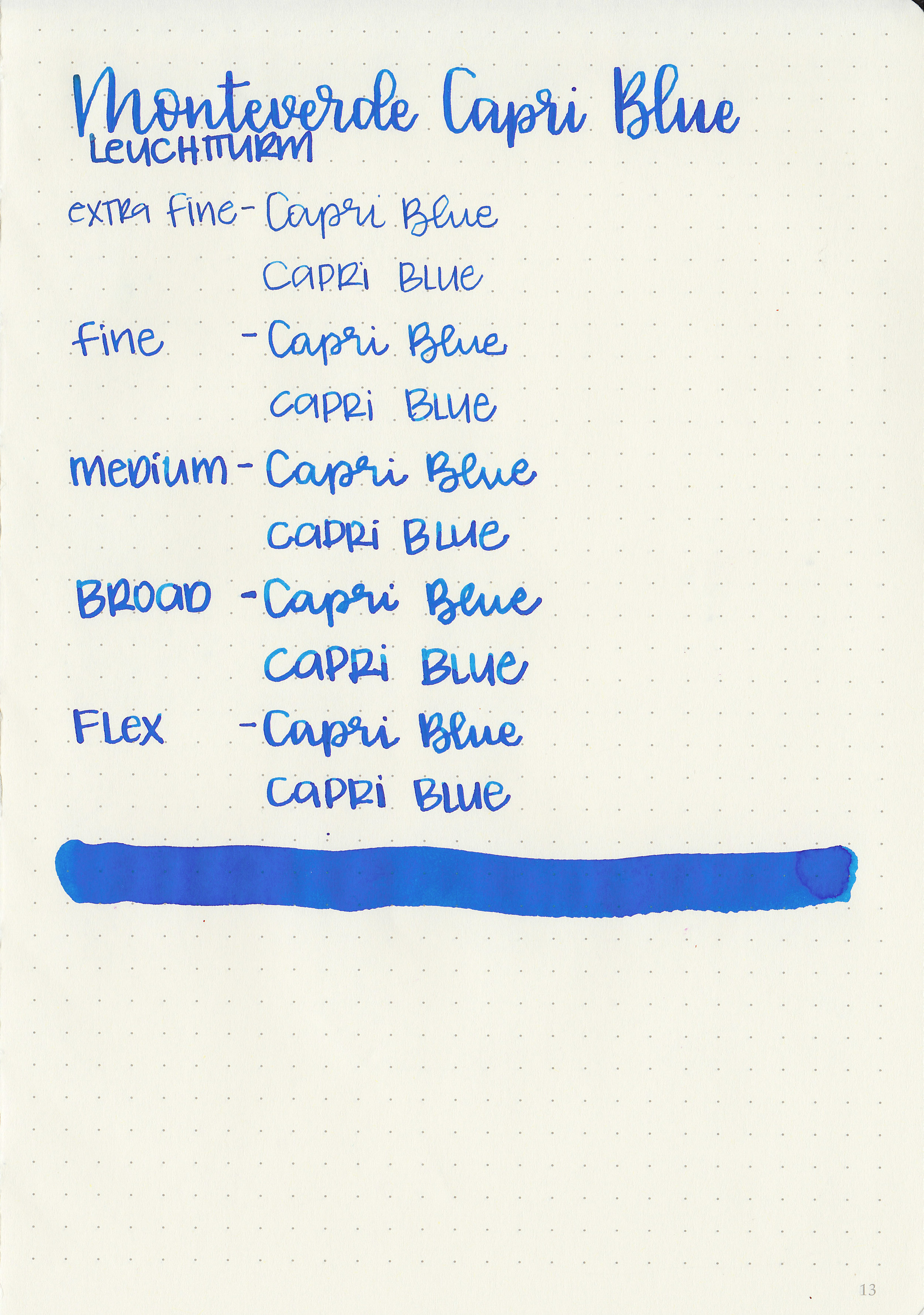
Bleeding: None
Other properties: medium shading, low sheen, and no shimmer.
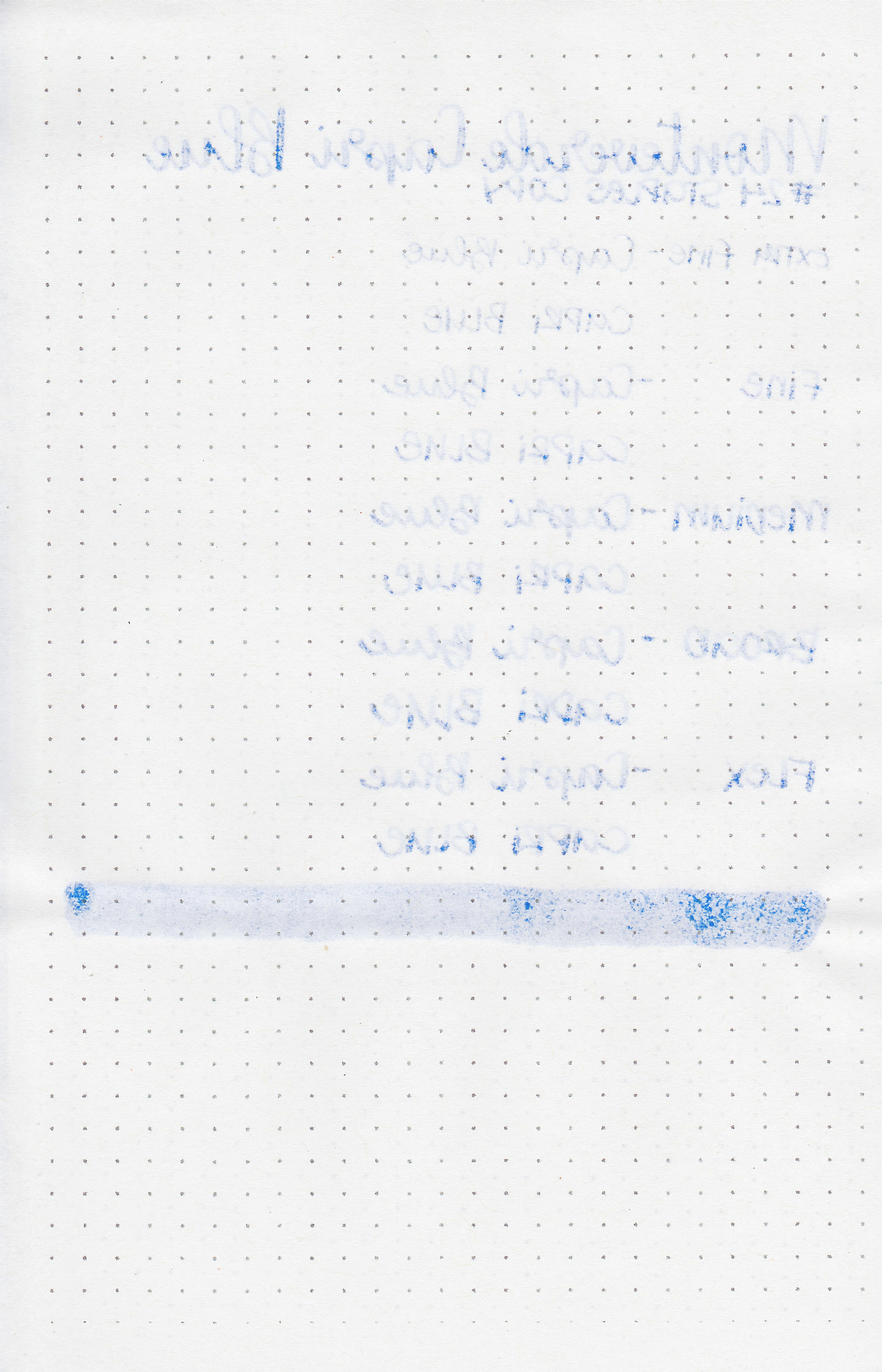
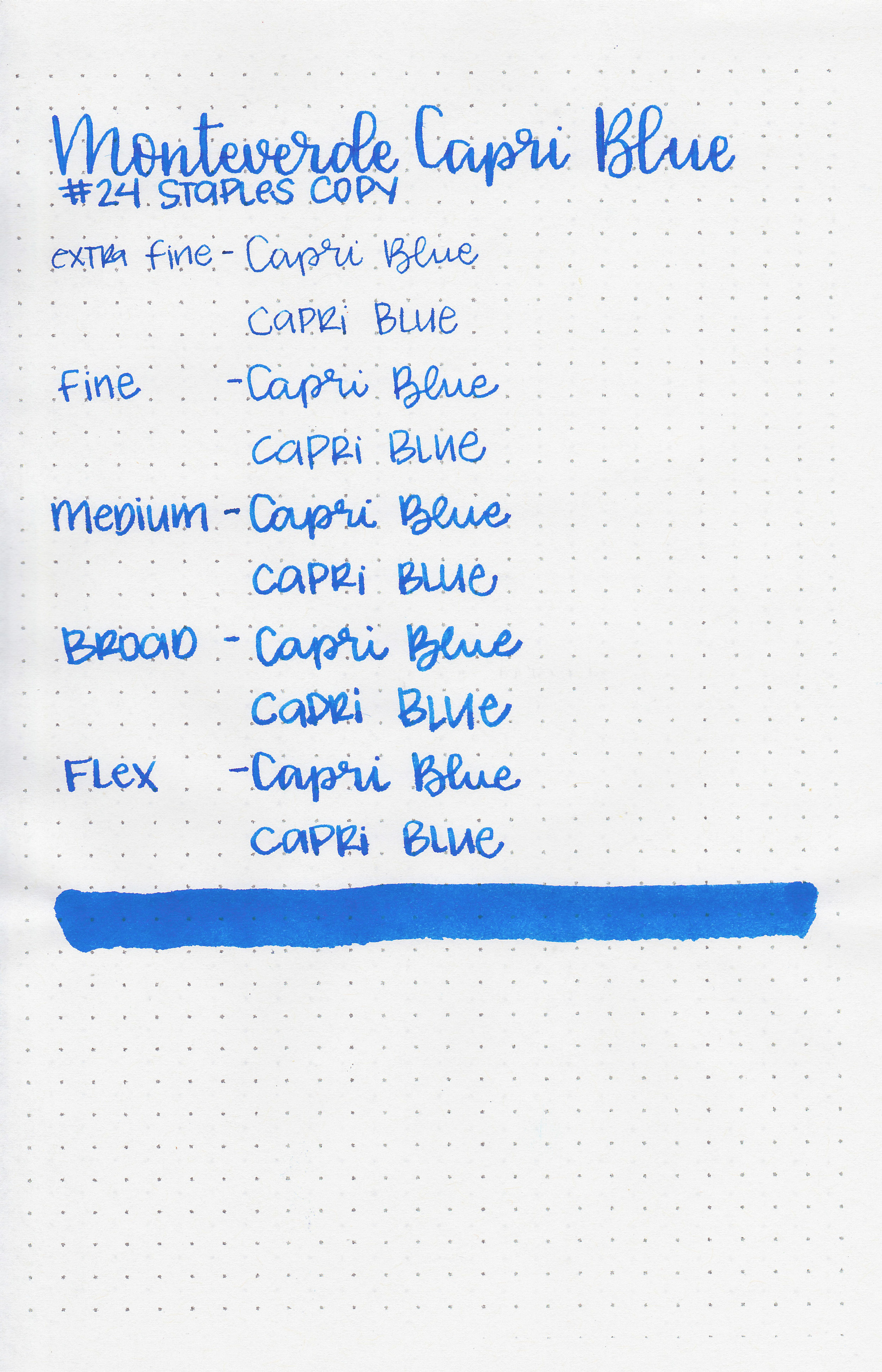
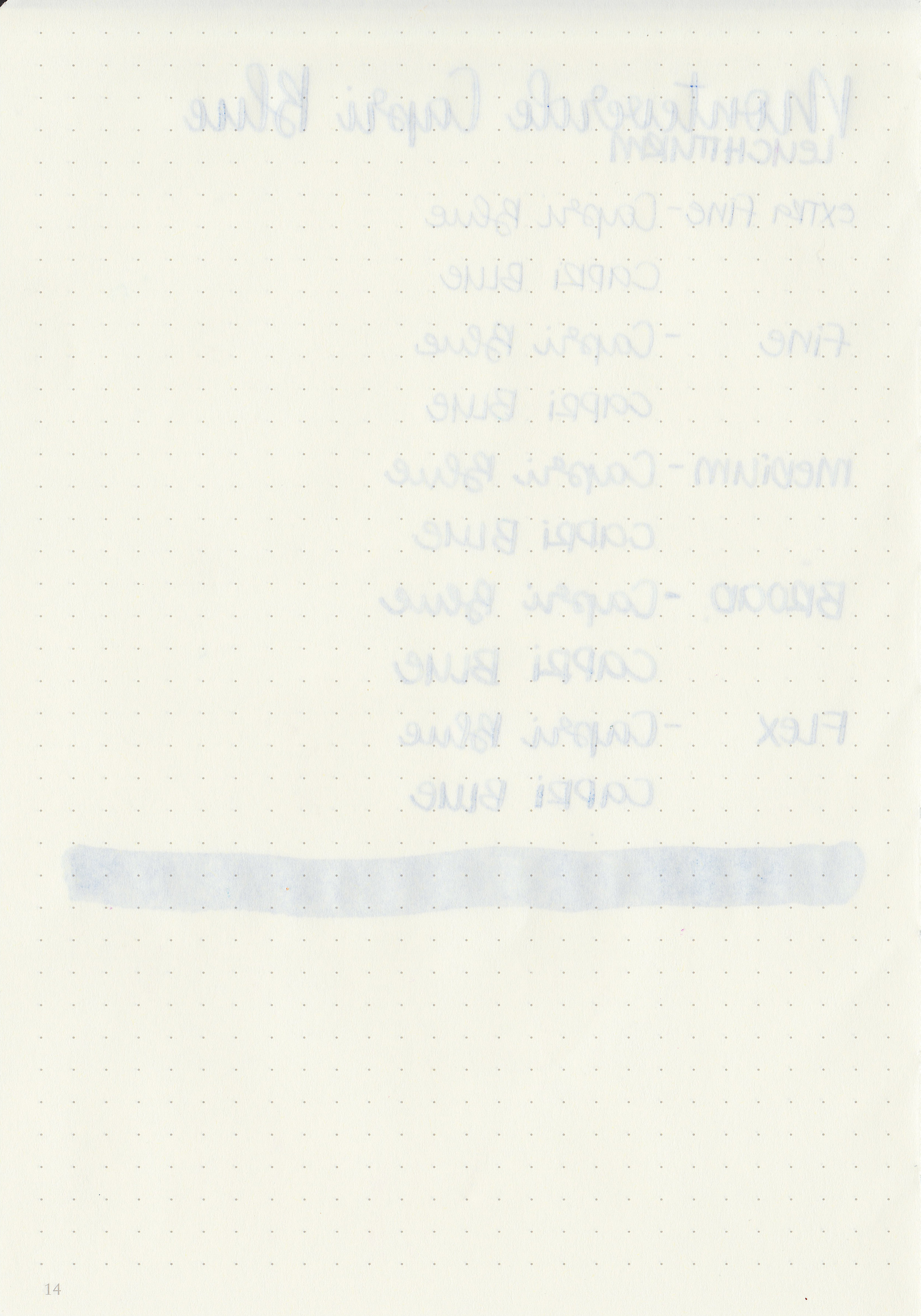
On Staples 24 lb copy paper there was some feathering in every nib size as well as a bit of bleeding, so it's not an ink I would recommend for cheap paper.
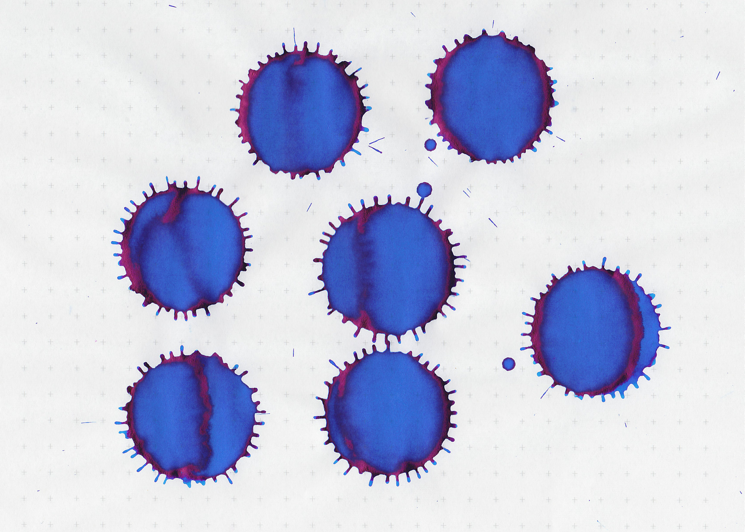
Comparison Swabs:
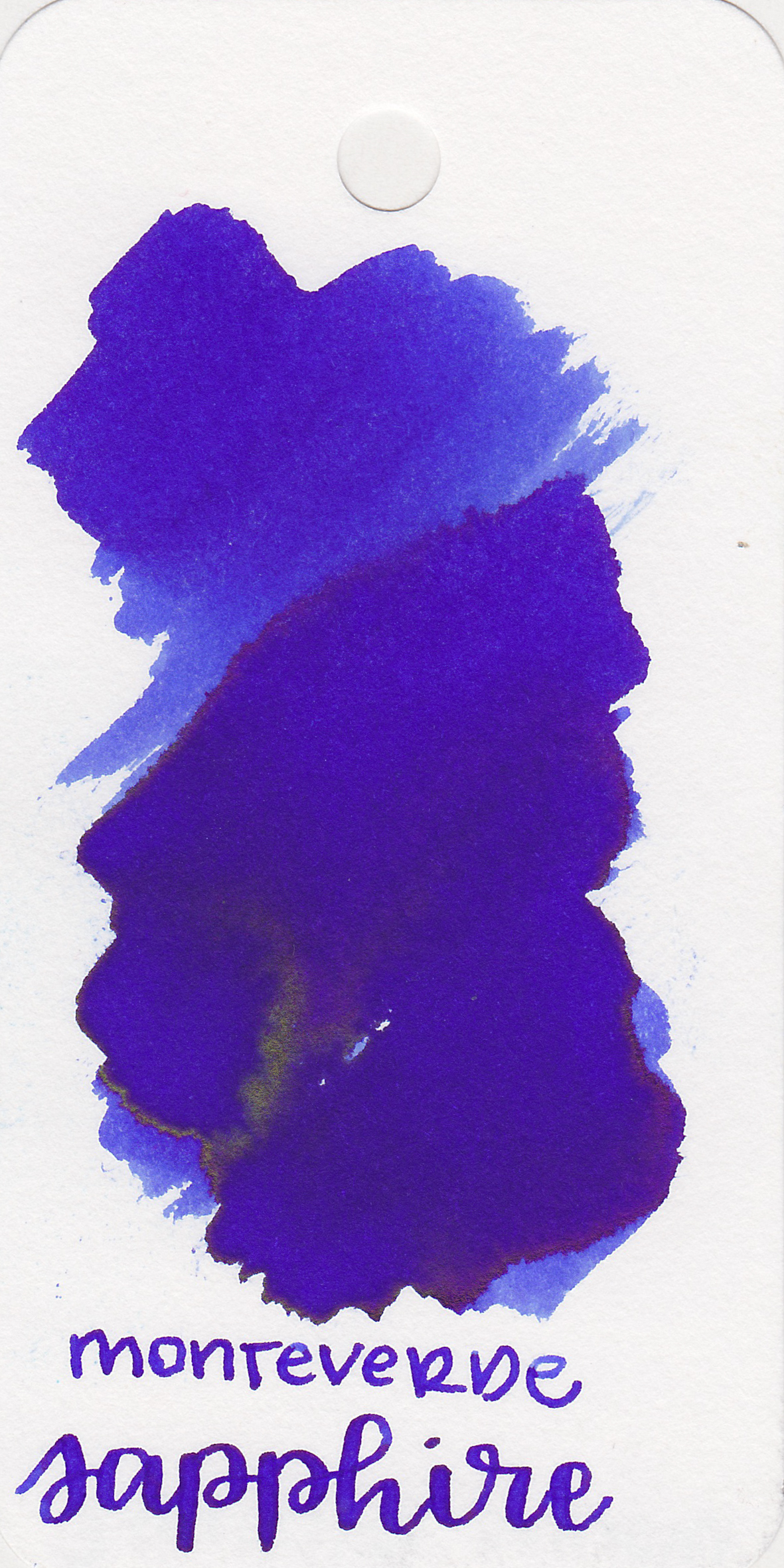

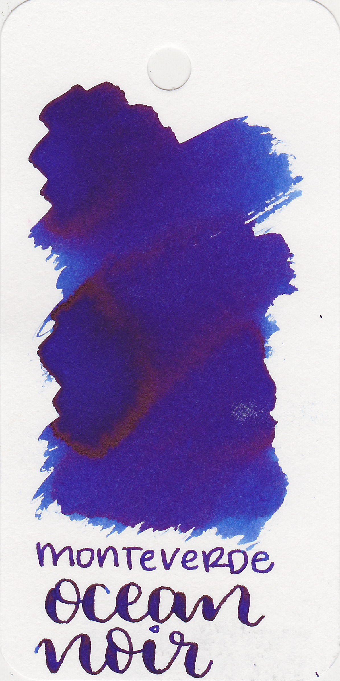
Ink swabs for comparison, left to right (top to bottom for mobile RSS): Monteverde Sapphire, Monteverde Capri Blue, and Monteverde Ocean Noir. Click here to see the Monteverde inks together.
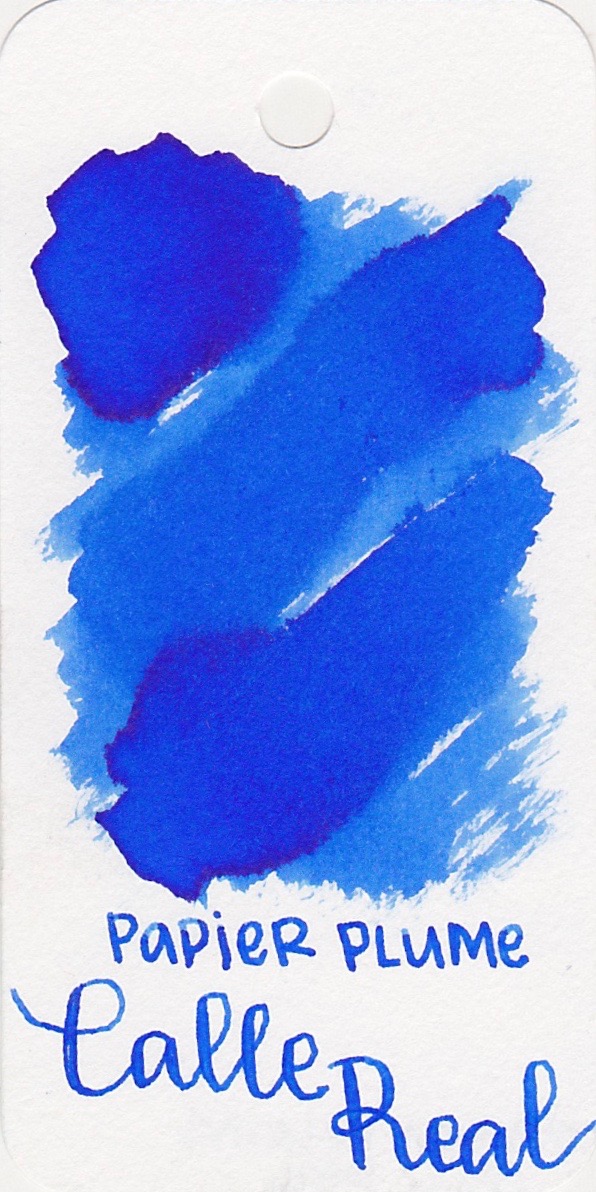
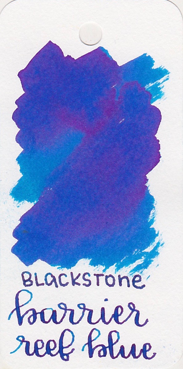
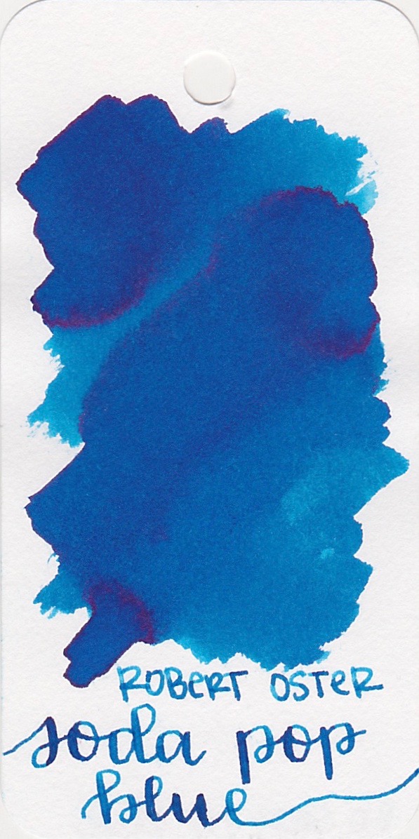
Papier Plume Calle Real, Blackstone Barrier Reef Blue, and Robert Oster Soda Pop Blue. Click here to see the blue inks together. Calle Real is a bit brighter than Capri Blue, but I think it's the closest in color.

Longer writing:
I used a broad Pelikan M805 Vibrant Blue on Tomoe River paper. The ink had a lovely wet flow. I love the flow of Monteverde inks.

Overall, I love the flow of Monteverde inks, and Capri Blue has the same great flow. I love this color for summer, and it's a perfect match for my Pelikan M805 Vibrant Blue.
Disclaimer: A sample of this ink was provided by Ink Journal for the purpose of this review. All photos and opinions are my own. This page does not contain affiliate links.