
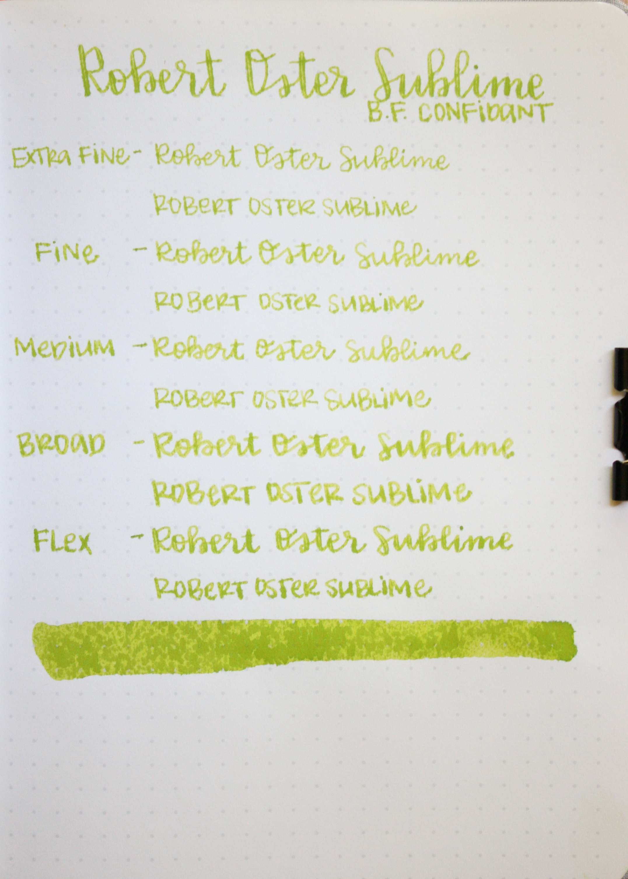
Robert Oster Sublime
/
So I've been blogging for about a month now, and I'm realizing how much my style has changed just in a month-I'm still trying to find my workflow and what I'm looking for in an ink. My photography is still a work in progress. I've been working my way through some of the Sailor inks, but they are a bit on the darker side and I was feeling the need for a brighter ink today, so enter Robert Oster Sublime. I bought my bottle at Pen Chalet.

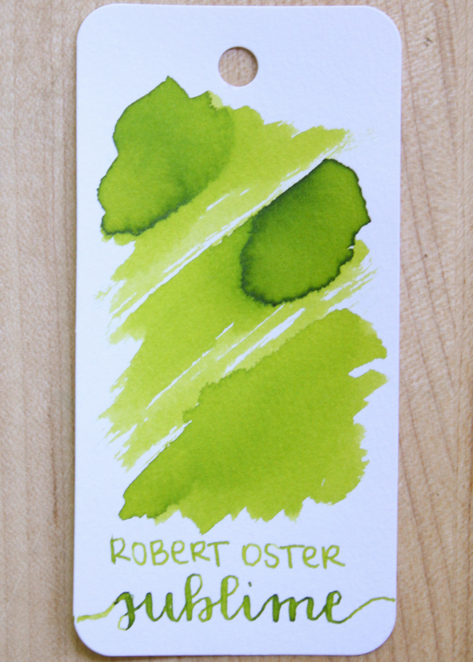
I still like the Robert Oster bottles. They are tall and skinny, which makes it great for filling fountain pens (but also makes it easy to tip it over by accident). The bottle is plastic, but I'm okay with that. I love the sticker on the top. I really struggle with bottles that don't have a label in the top. I keep all of my inks in drawers, and I hate having to look at every bottle to find the one I'm looking for. Robert Oster bottles not only have the color name on the top, but they have a tiny swatch which is super helpful. The bottle is 50ml of ink.
The color...
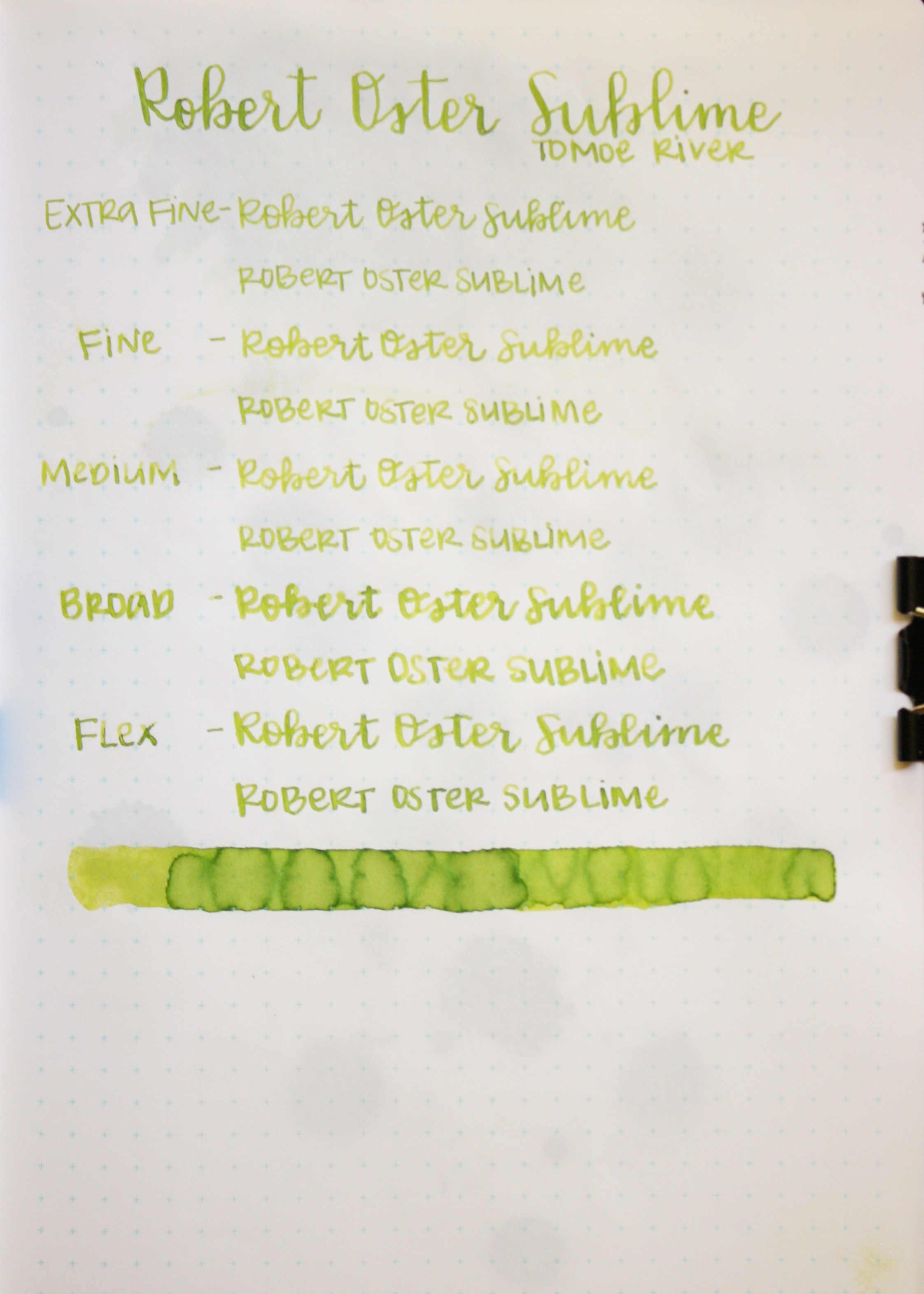
Sublime is a bright yellow-green. Seasonally, it is a perfect spring green.

Sublime does show a lot of fun shading on Tomoe River.

Ink drops: I think they are super fun to play with, but only give you an idea of how the ink looks super saturated. If you only look at ink drops, you can't get a good idea of how the ink looks in daily use, but they are fun to do. Sublime has almost a black tint to it on the edges.
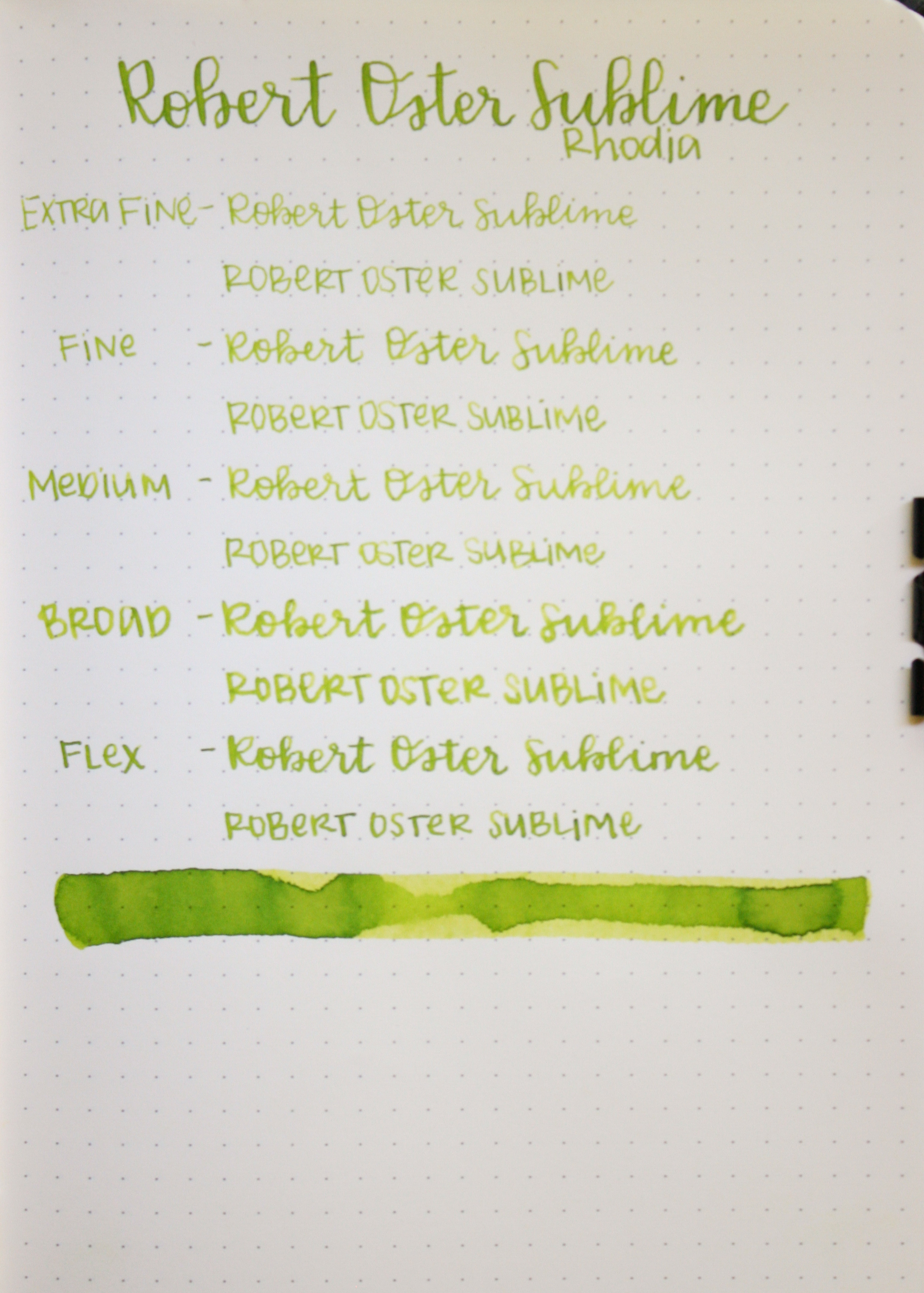
Feathering: Sublime only feathered on the Baron Fig Confidant paper, which is not that unusual for that paper, but did amazingly on all of the other papers.
Bleeding: Sublime only bled on the Tomoe River swab, and on Baron Fig paper.
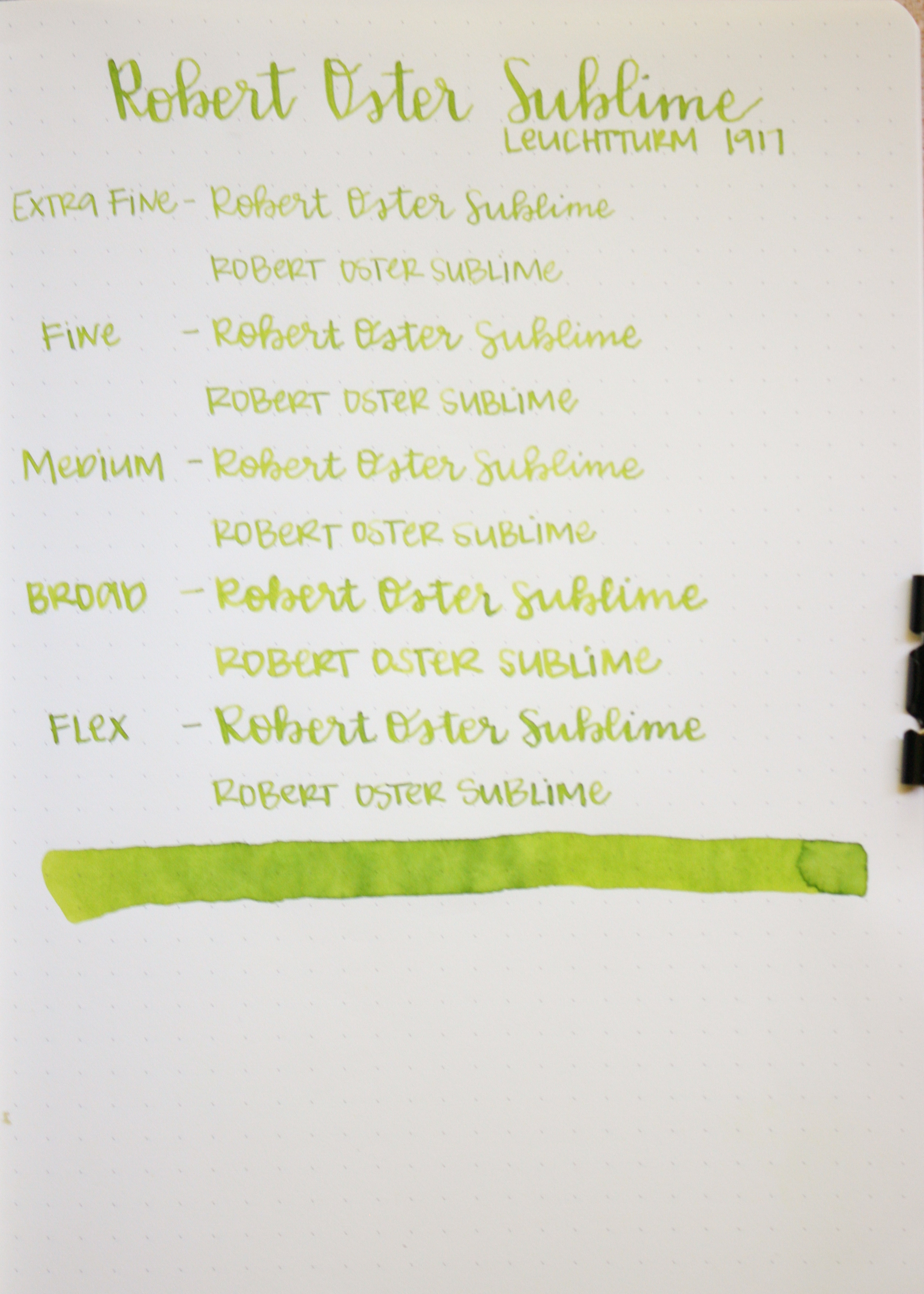
Show through: Sublime had low show through on Rhodia and Leuchtturm, medium on Tomoe River, and high on Baron Fig. This ink really is dependent upon what paper you use.
Shading: Sublime had high shading on every paper except Baron Fig, where the shading was low. There is no sheen on this ink.

Similar inks:
Top row, left to right: Diamine Jade Green, Robert Oster Sublime, and Diamine Spring Green. Bottom row: J. Herbin Vert Pre, Pilot Iroshizuku Chiku-Rin, and Robert Oster Light Green.
I think the closest ink is Diamine Spring Green, but it is a little bit darker, and a little bit bluer in tone.
Overall, I love this ink. I think it's a perfect spring green, and has great shading. It's a well behaved ink, and looks great on every paper I tried except Baron Fig paper.
Disclaimer: I purchased this ink myself, and all opinions and photos are my own.