
Sailor Ink Studio Set 18
/
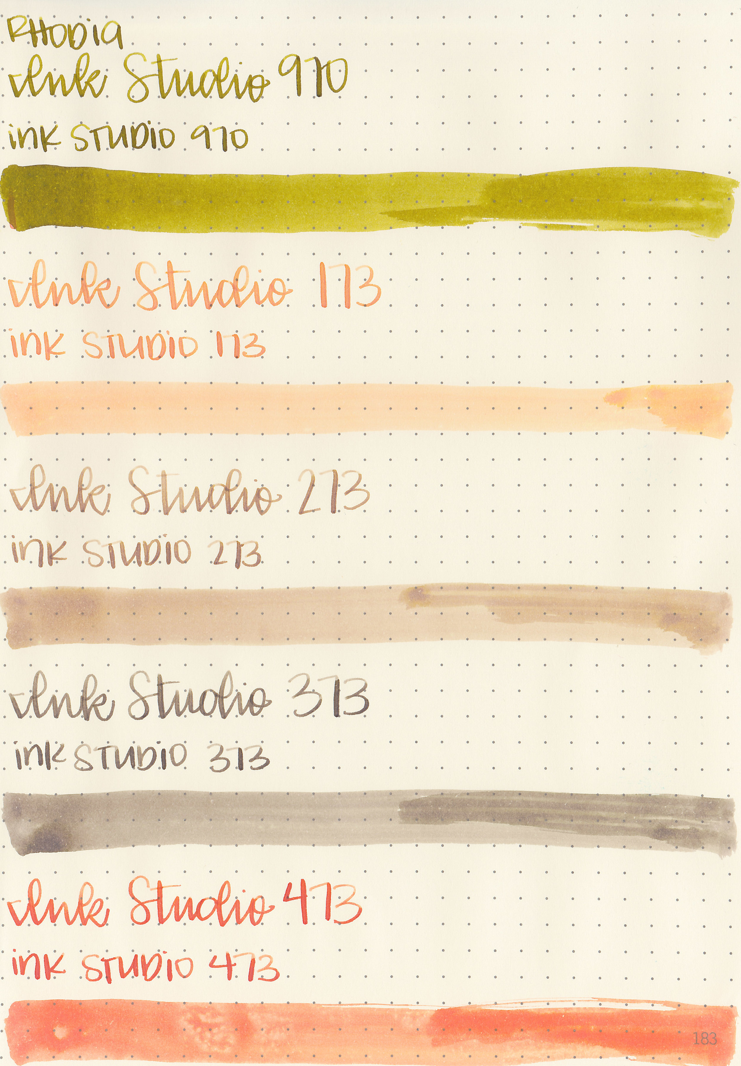
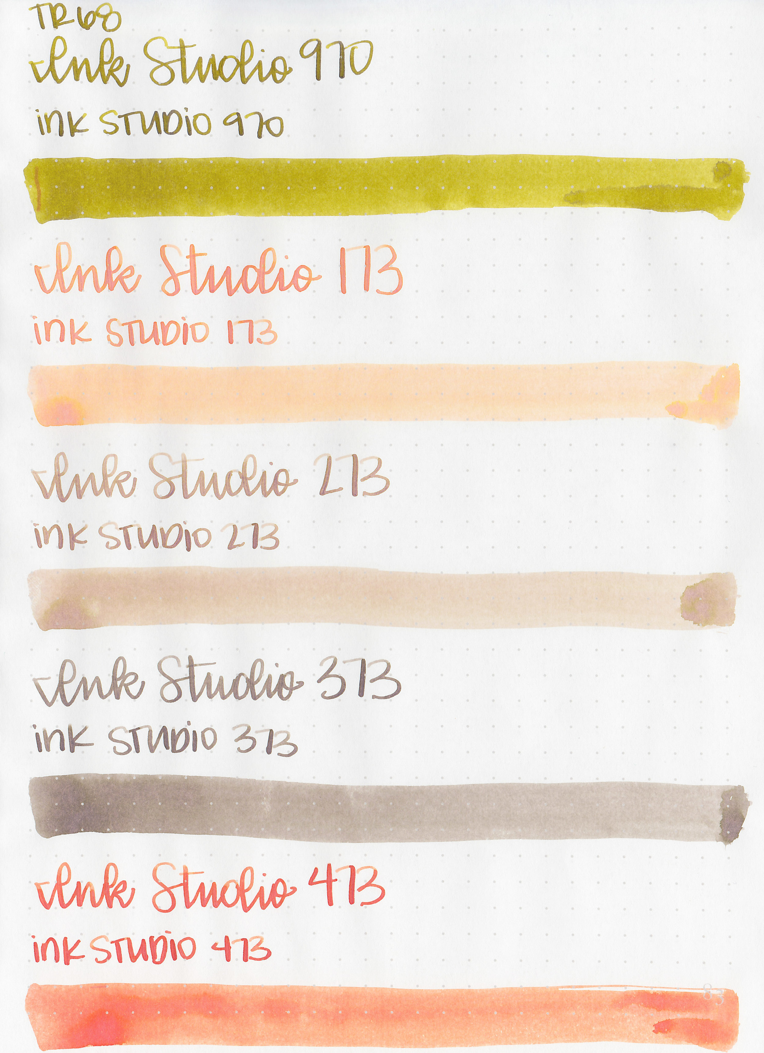
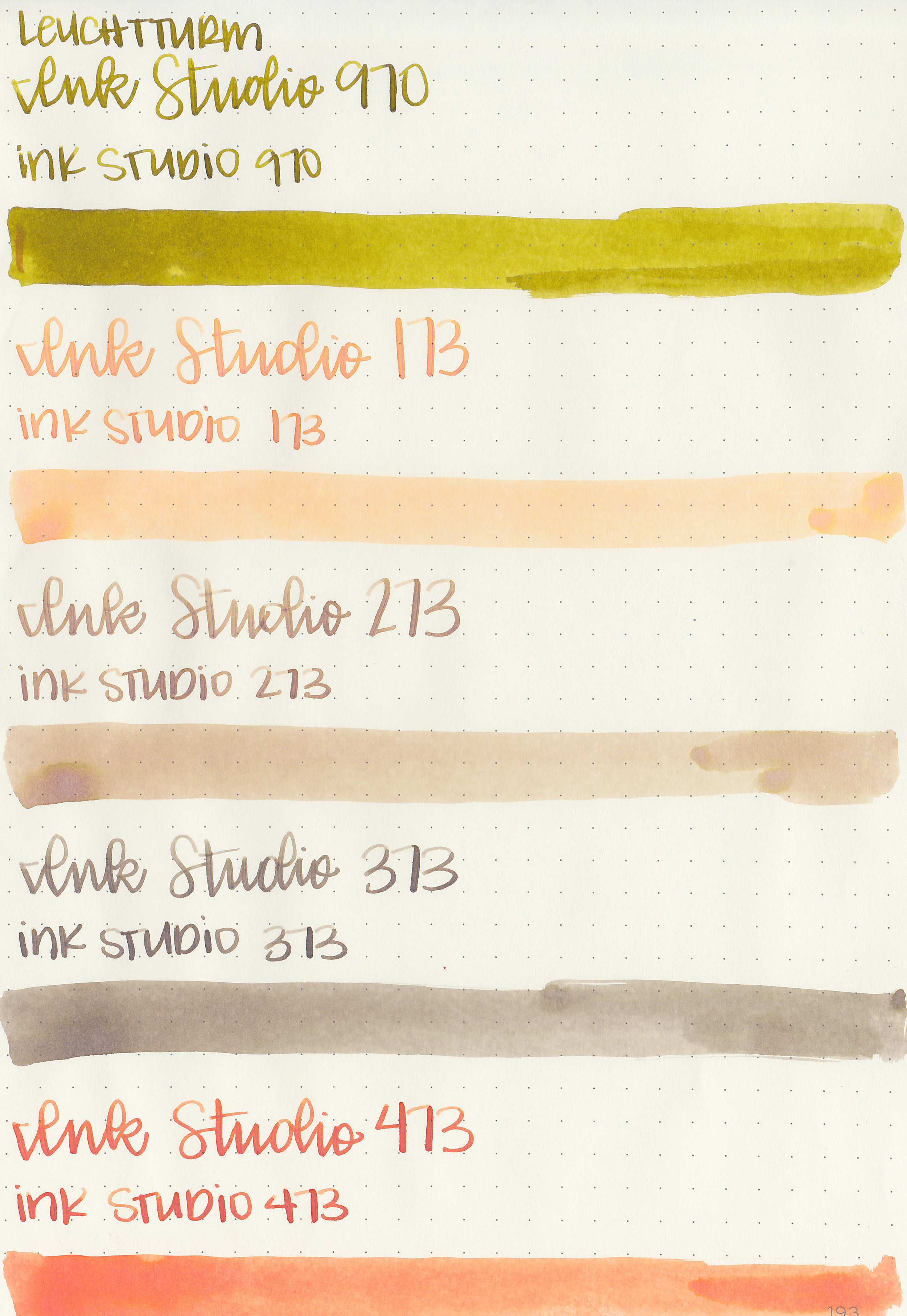
Sailor Ink Studio set #18 includes: 970, 173, 273, 373 and 473. 970 is a dark yellow, 173 and 473 are orange, and 273 and 373 are brown. Thanks to Sakura Fountain Pen Gallery for helping me get the full set of 100 Ink Studio samples.
The shading on 173 is amazing, it ranges from pale orange to yellow to peony pink. 473 is a much darker version but lacks the depth of 173.
Swabs:

Left to right: 970, 173, 273, 373 and 473.
Writing samples:
Let's take a look at how the ink behaves on fountain pen friendly papers: Rhodia, Tomoe River, and Leuchtturm.

Dry time:
The inks took 15 seconds to dry.
Water resistance: Low
Feathering: None
Show through: Medium
Bleeding: None
Other properties: All but 173 had medium shading, and 173 had high shading. 970 had medium silver sheen.
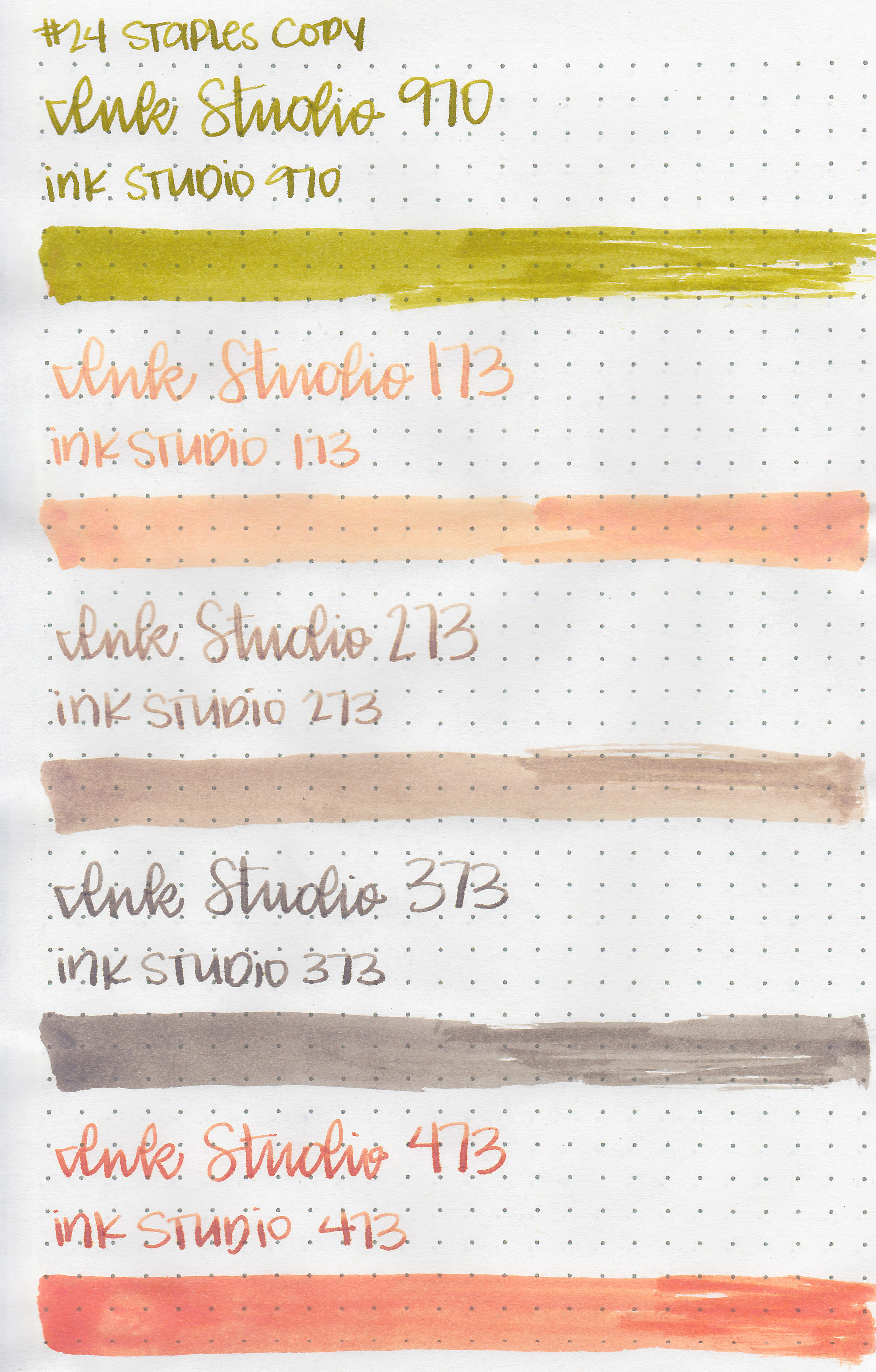
On Staples 24 lb copy paper there was lots of feathering in the larger nib sizes as well as a bit of bleeding.
Comparison Swabs:

970 is similar to Platinum Classic Citrus Black. 173 is closest to Birmingham Salmon Hors d’oeuvre. 273 isn’t really close to anything I have. 373 is similar to Montblanc Swan Illusion, but it’s not an exact match. 473 is similar to Diamine Peach Haze. Click here to see the Sailor inks together.

Life Bank paper brings out the undertones. 173 has a strong yellow undertone. 273 has a green undertone.

I used a Tomoe River paper notebook. The inks all had a wetter flow.
Overall, I love 173. It’s a perfect spring orange with lots of depth and shading. It is light, so I’ll stick to using it in larger nib sizes. 970 is pretty close to Platinum Classic Citrus Black. I like all five, but I love 173.
Disclaimer: I purchased this ink at a discount from Sakura Fountain Pen Galley for the purpose of this review. All photos and opinions are my own. This page does not contain affiliate links, and is not sponsored in any way.