
Ink Review #1978: Van Dieman's Bay of Fires
/
Van Dieman’s Bay of Fires is from the Colours of Tasmania Collection. You can find this ink for sale at Vanness Pens. (This is the original version, not the reformulation).

The color:
Bay of Fires is a bright red, almost an orange.
*For my swab cards I use a Col-o-ring by Skylab Letterpress, a medium Pilot Ishime and a Mabie Todd Swan.
Swabs:

In large swabs on Tomoe River paper the ink has just a little bit of shading.

Writing samples:
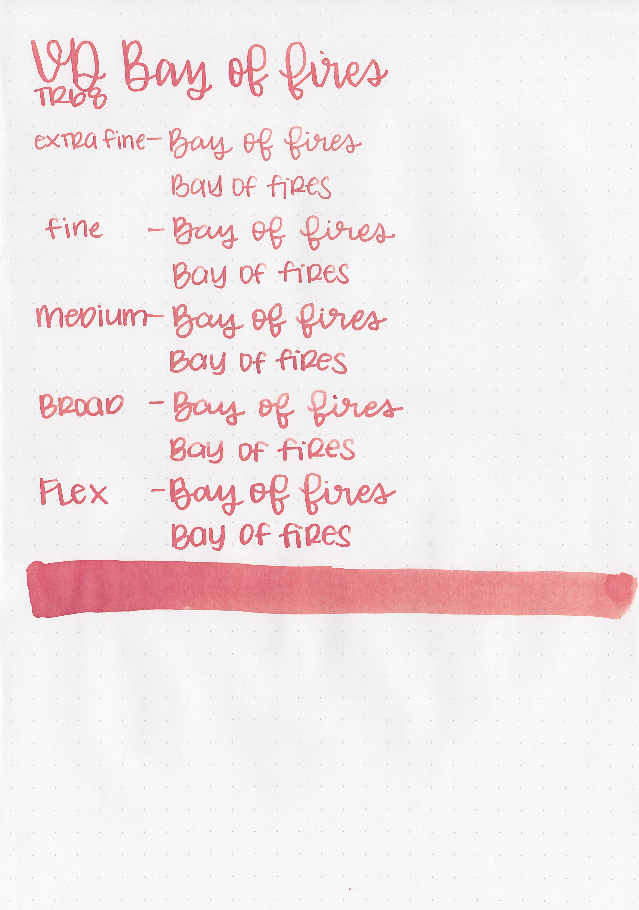
Let's take a look at how the ink behaves on fountain pen friendly papers: Rhodia, Tomoe River, and Leuchtturm.
*For my writing samples I use:
Vintage Mabie Todd Swan (flex nib)
Taroko Enigma notebooks (68gsm TR)
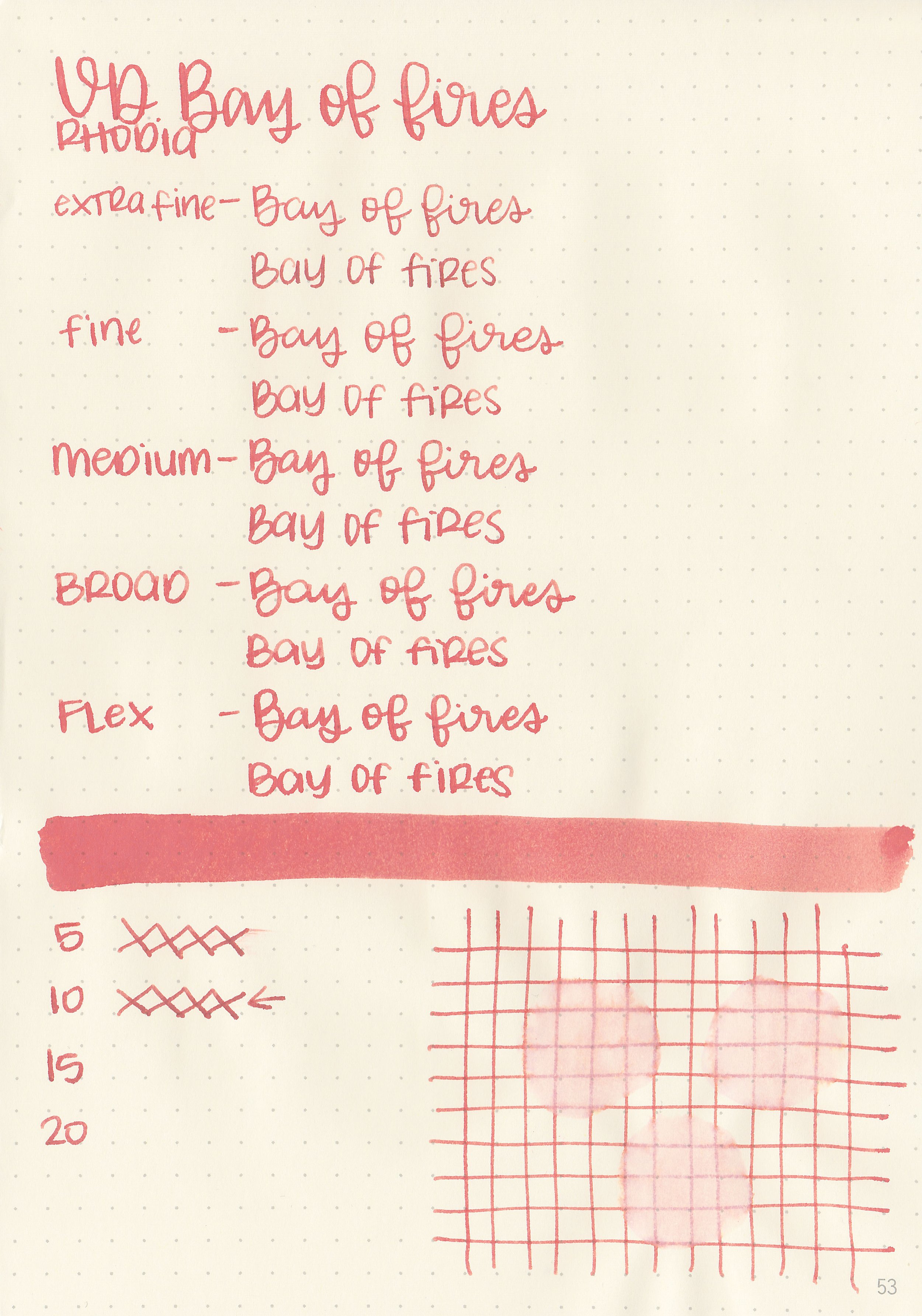
Dry time: 10 seconds
Water resistance: Medium

Feathering: Medium
Show through: Medium
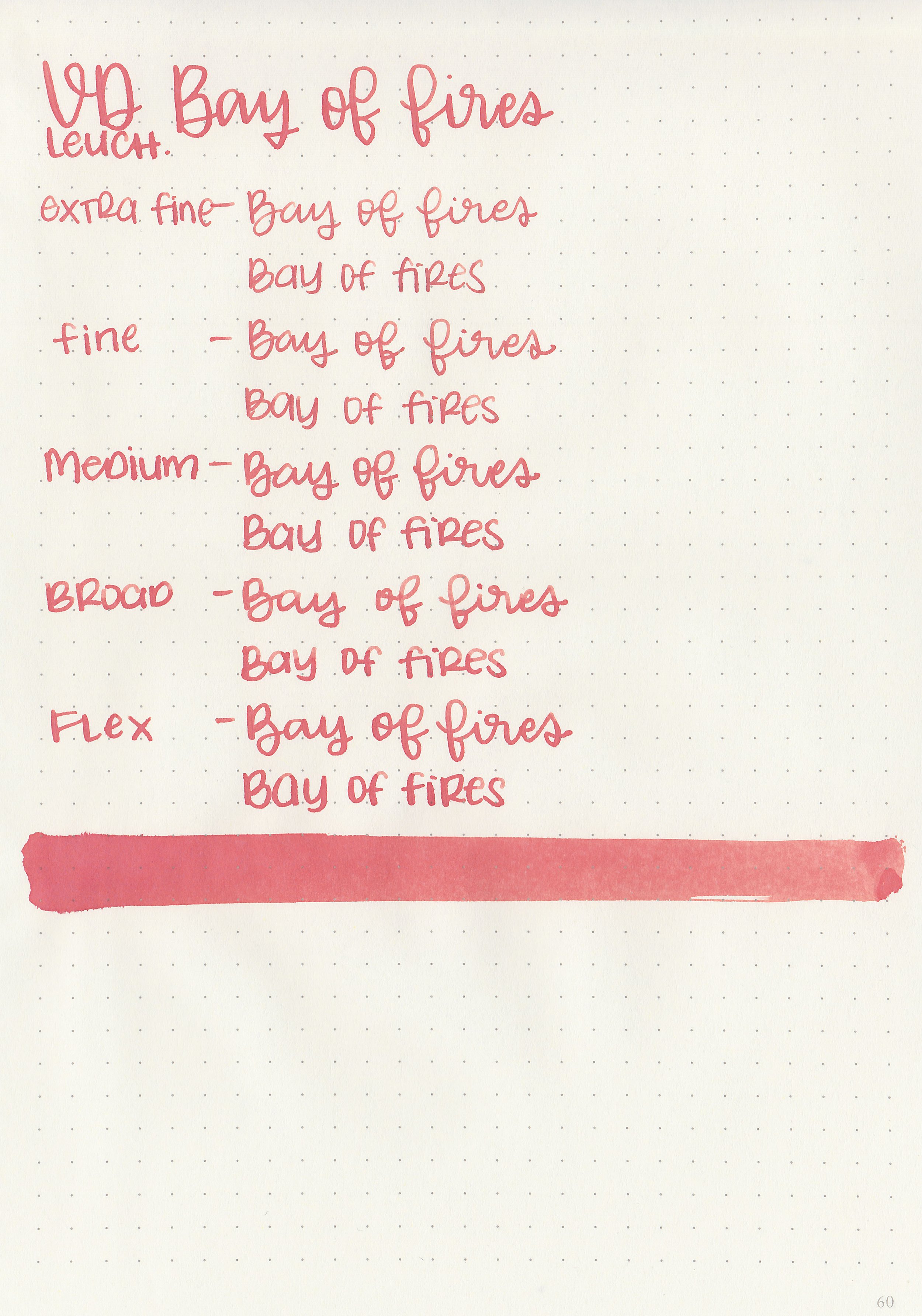
Bleeding: Low
Other properties: low shading, no sheen, and no shimmer.
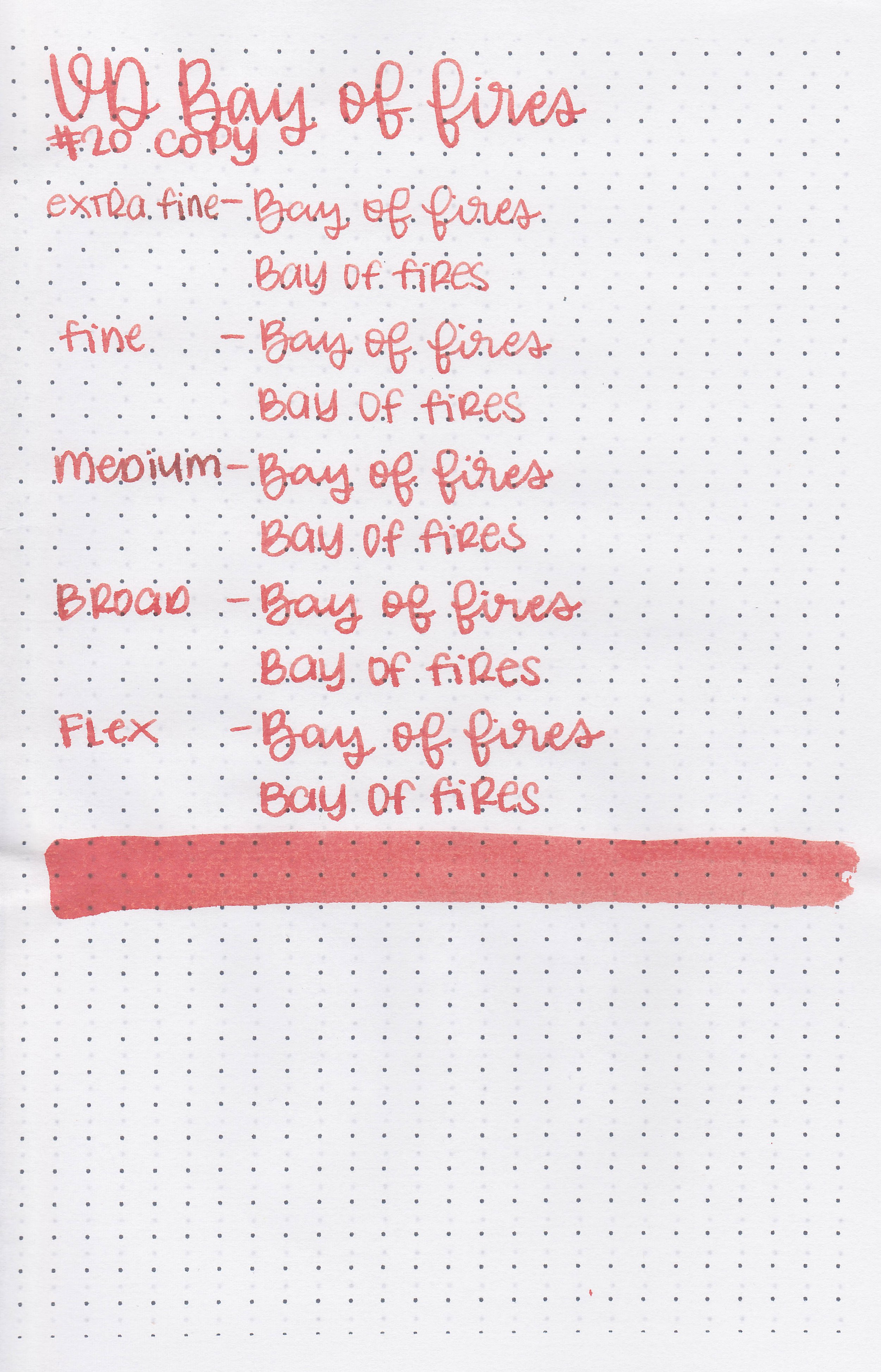
On 20 lb copy paper the ink had some feathering and a few dots of bleeding.
Comparison Swabs:

Bay of Fires is similar to Esterbrook Scarlet. Click here to see the red inks together.
Longer writing:

I used an Esterbrook Estie Maraschino with a broad nib on a Taroko Enigma notebook. The ink had a slightly dry flow.
Overall, I’m not a fan. The color is a bit too orange for me and there’s too much bleeding and feathering.
Disclaimer: All photos and opinions are my own. This page does not contain affiliate links and this post is not sponsored.