
Ink Review #831: Vinta Pastel Blue Julio 1991
/
My middle child is obsessed with unicorns. She’s six and wears unicorns every day in some form from her shirt all the way down to her shoes. If any one ink could look like a unicorn, Vinta Pastel Blue Julio 1991 does. If she could paint herself with this ink she probably would. It’s a pale blue with a strong baby pink tone and silver shimmer. According to Vinta’s website, “Julio and Julia, was a popular show about two magical twins. It went on air in 1991. It was actually created by a French writer Jean Chalopin and the original title was Les Jumeaux du Bout du Monde or ‘Twins of Destiny.’” Thanks to Vanness Pens for sending a sample over for review.

The color:
Pastel Blue Julio is a pale baby blue with a strong pink undertone/shading and silver shimmer.
Swabs:

In large swabs on Tomoe River paper the ink shows off the pink undertone and the silver shimmer.

Writing samples:
Let's take a look at how the ink behaves on fountain pen friendly papers: Rhodia, Tomoe River, and Leuchtturm.
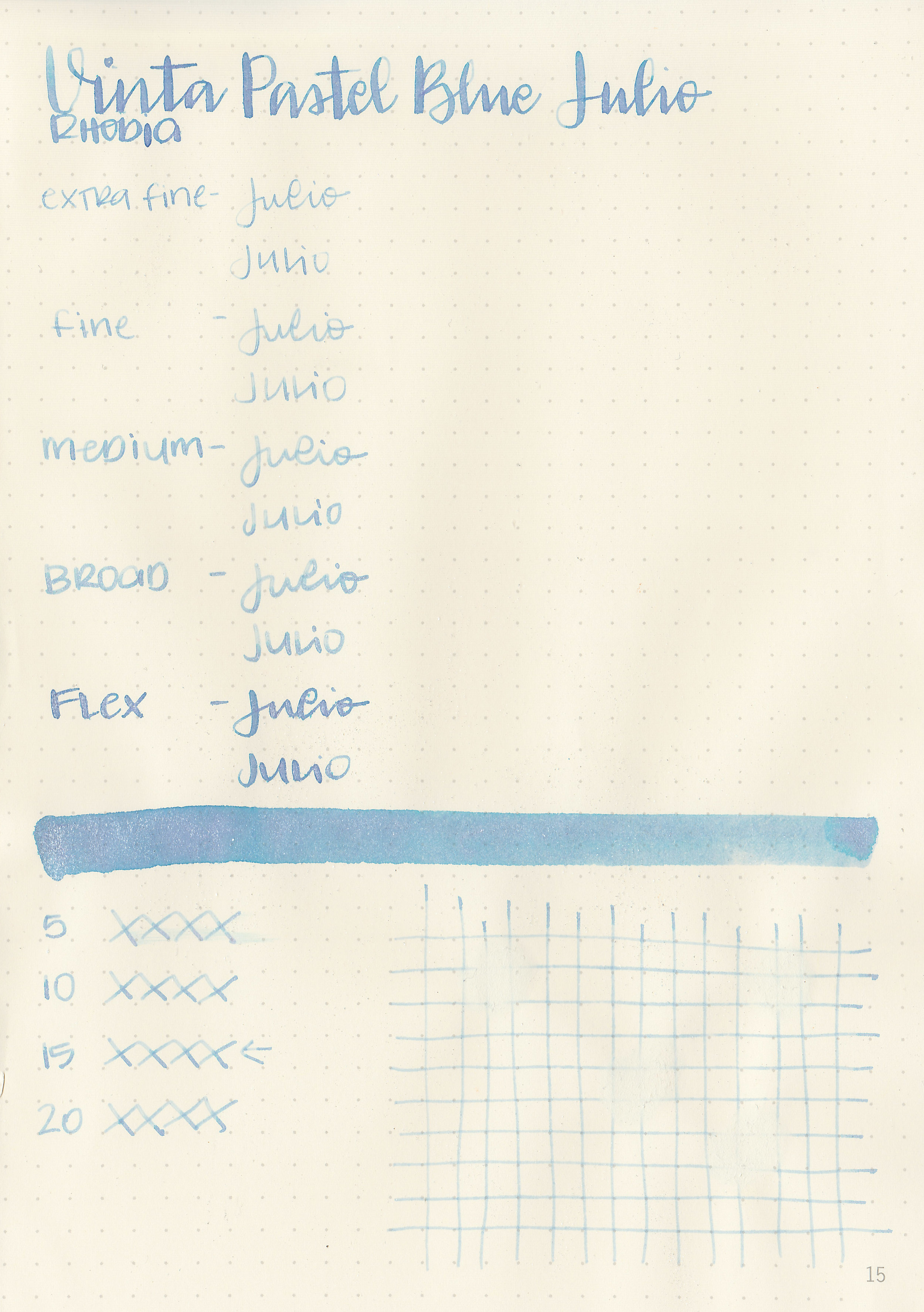
Dry time: 15 seconds
Water resistance: Low
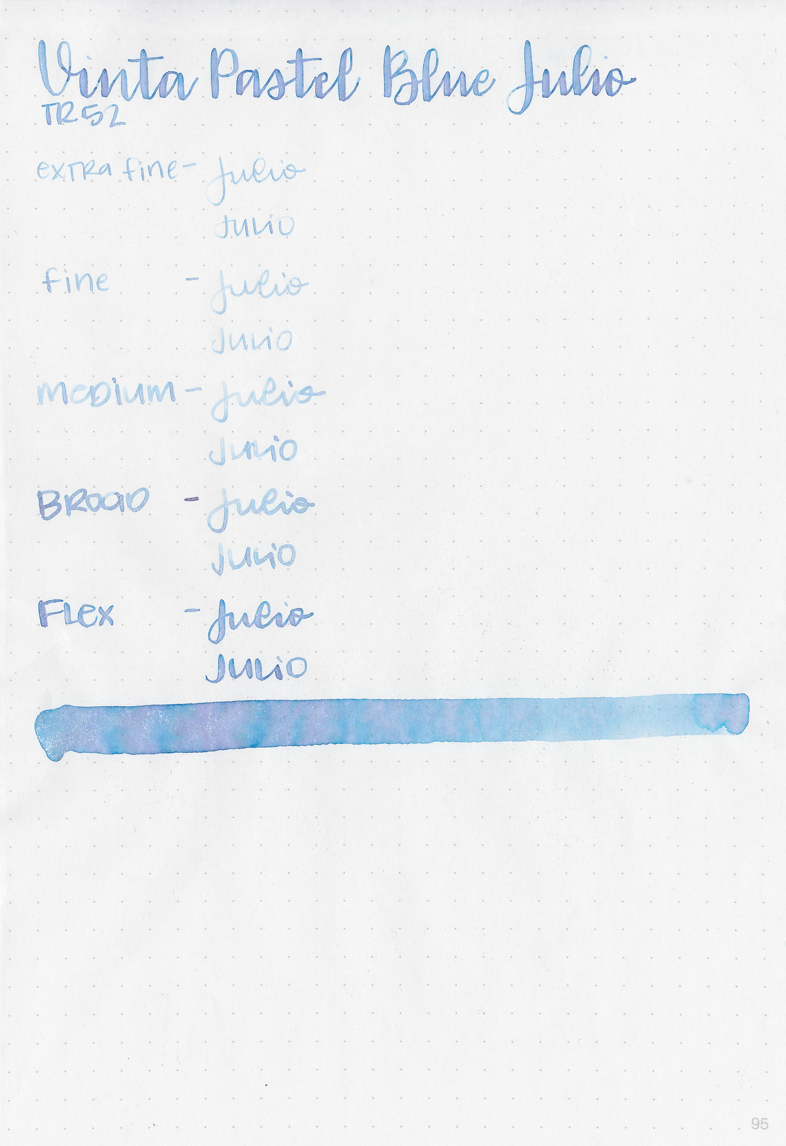
Feathering: Low-there was some feathering in the flex nib on Rhodia and Leuchtturm
Show through: Medium
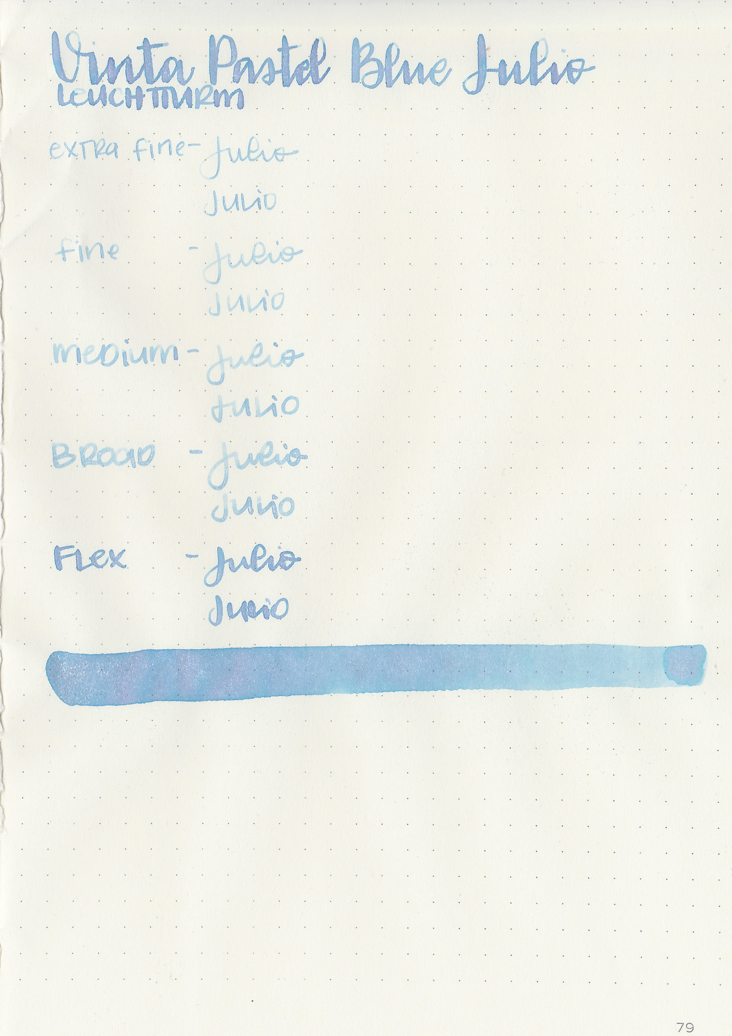
Bleeding: Low-there was some bleeding in the flex nib.
Other properties: medium shading, no sheen, and silver shimmer. There is a bit of shading in the blue but it’s so pale you have to be really looking for it to see it, and in the flex nib sometimes you can see the shift between the blue and pink tones.
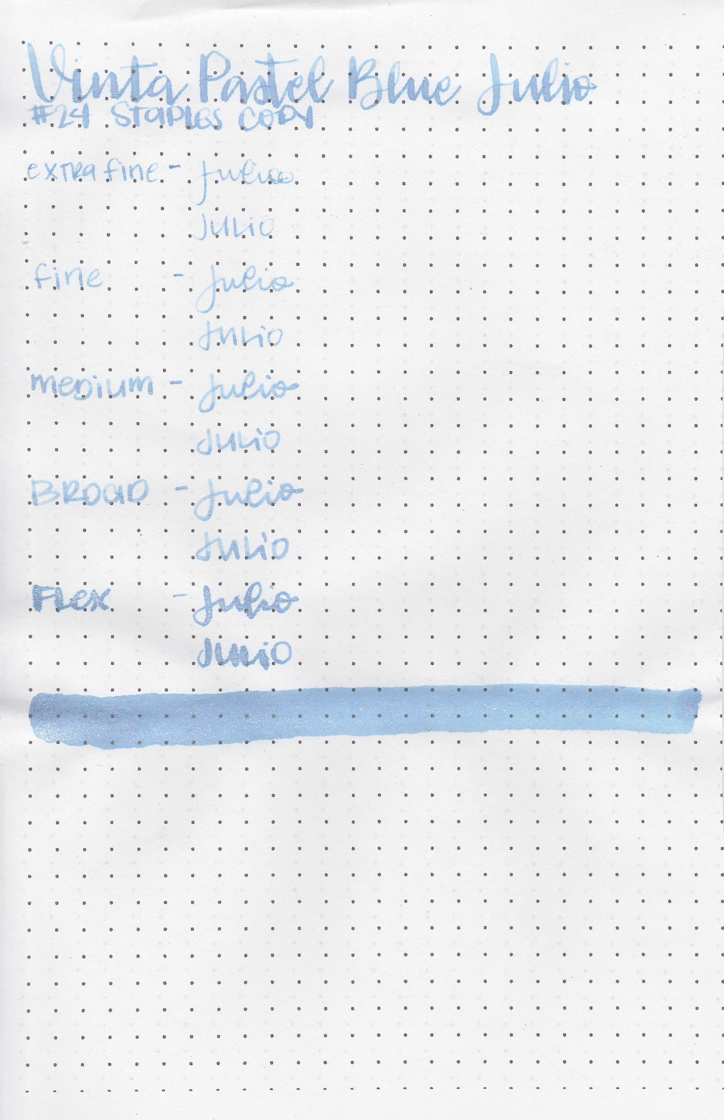
On Staples 24 lb copy paper the ink feathered in the larger nib sizes and had a little bit of bleeding in the flex nib too.
Comparison Swabs:

Julio is lighter than Montblanc Miles Davis (which I didn’t think was possible). I don’t have any blue shimmer inks this color, the closest I have (which isn’t close at all) is J Herbin Kyanite du Nepal. Click here to see the Vinta inks together, and click here to see the blue inks together.
Longer Writing:

I used a Bonecrusher Studios pen with a Regalia Writing Labs Crossflex nib on Tomoe River paper. The ink had a dry flow. The color is really interesting-you can see the pink come out in a lot of the letters as well as lots of silver shimmer, but even in the flex nib the color is very pale.

Overall, I loved playing with this ink, but I wouldn’t use it in anything smaller than a flex nib. It would be a good art ink.
Disclaimer: A sample of this ink was provided by Vanness Pens for the purpose of this review. All photos and opinions are my own. This page does not contain affiliate links, and this post is not sponsored in any way.