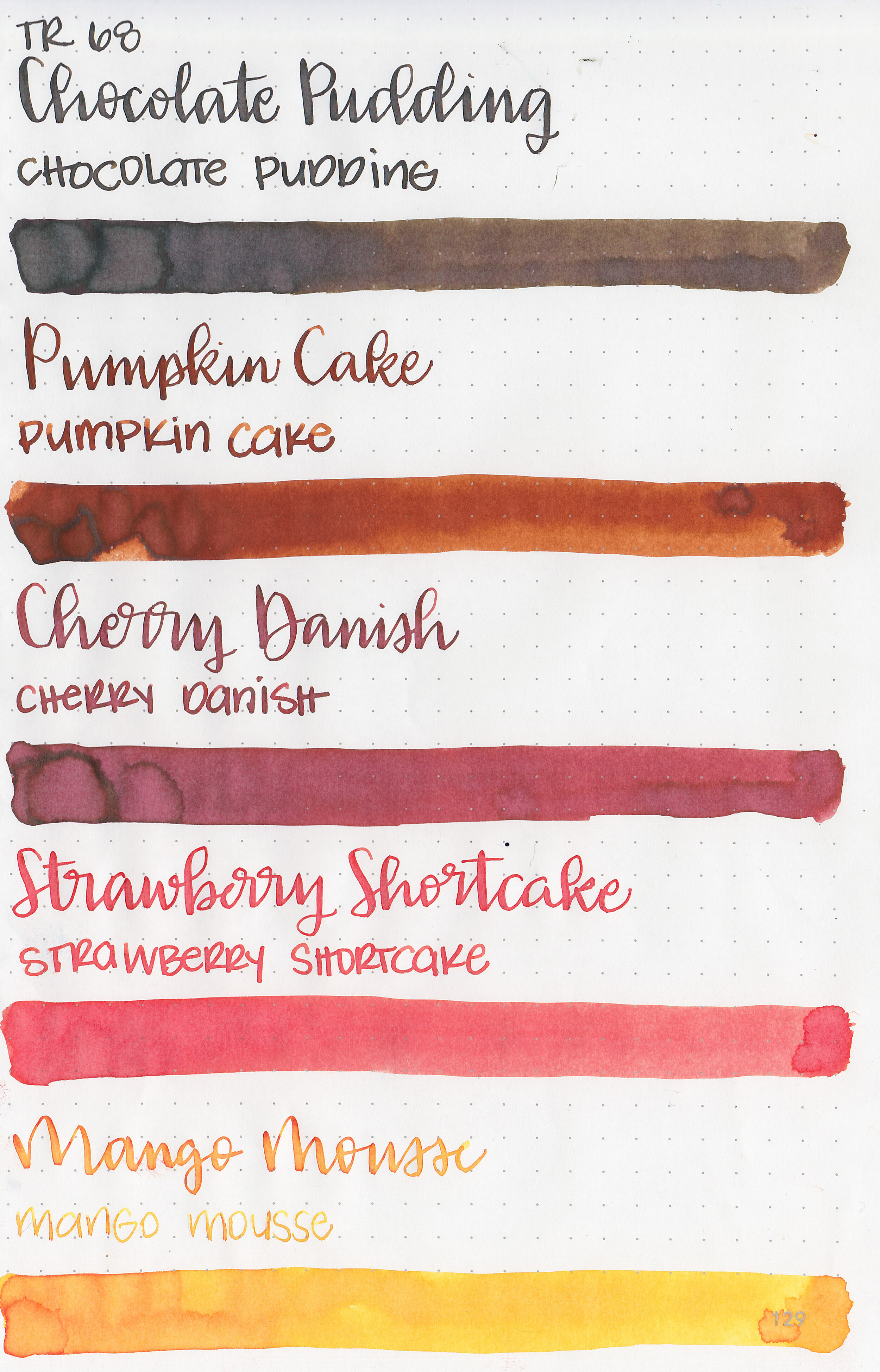
Monteverde Sweet Life Inks, Part 2
/
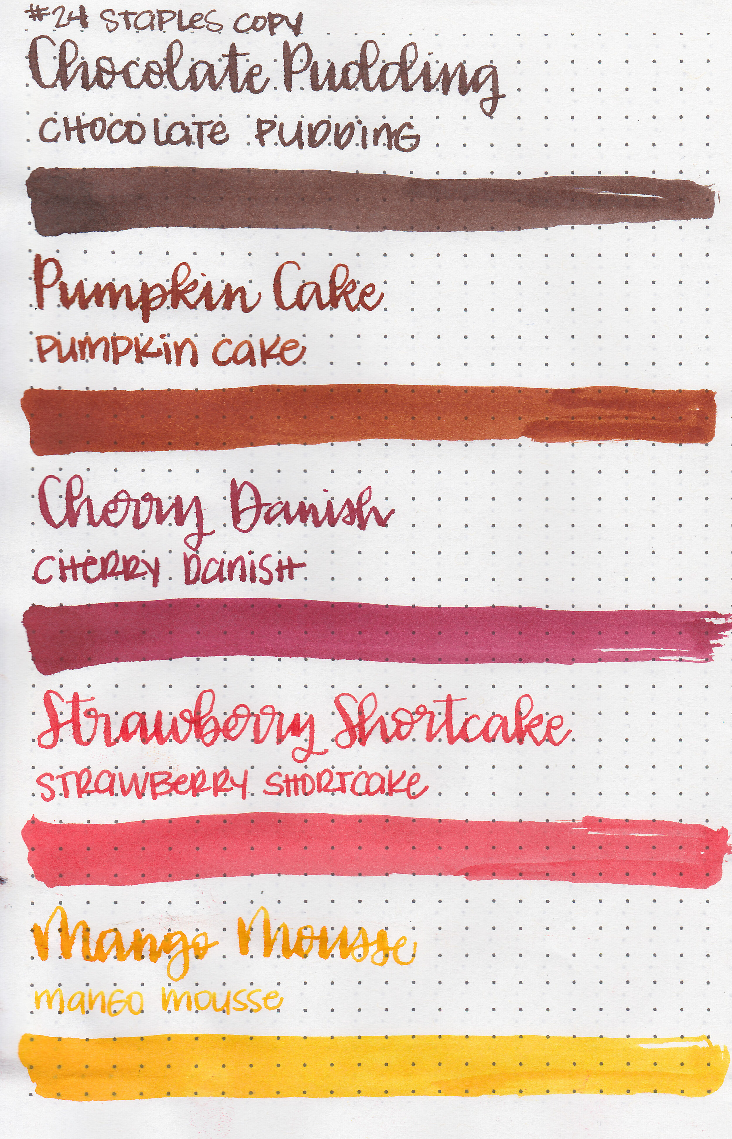
Earlier this week I reviewed the first half of Monteverde’s new Sweet Life collection. You can find the Sweet Life set for sale at most US retailers including Goulet Pens. I decided to break the collection down into two sets for this review, today we are going to cover the second half: Key Lime Pie, Iced Cookie, Blue Velvet Cake, Blueberry Muffin, and Birthday Cake.
Swabs:

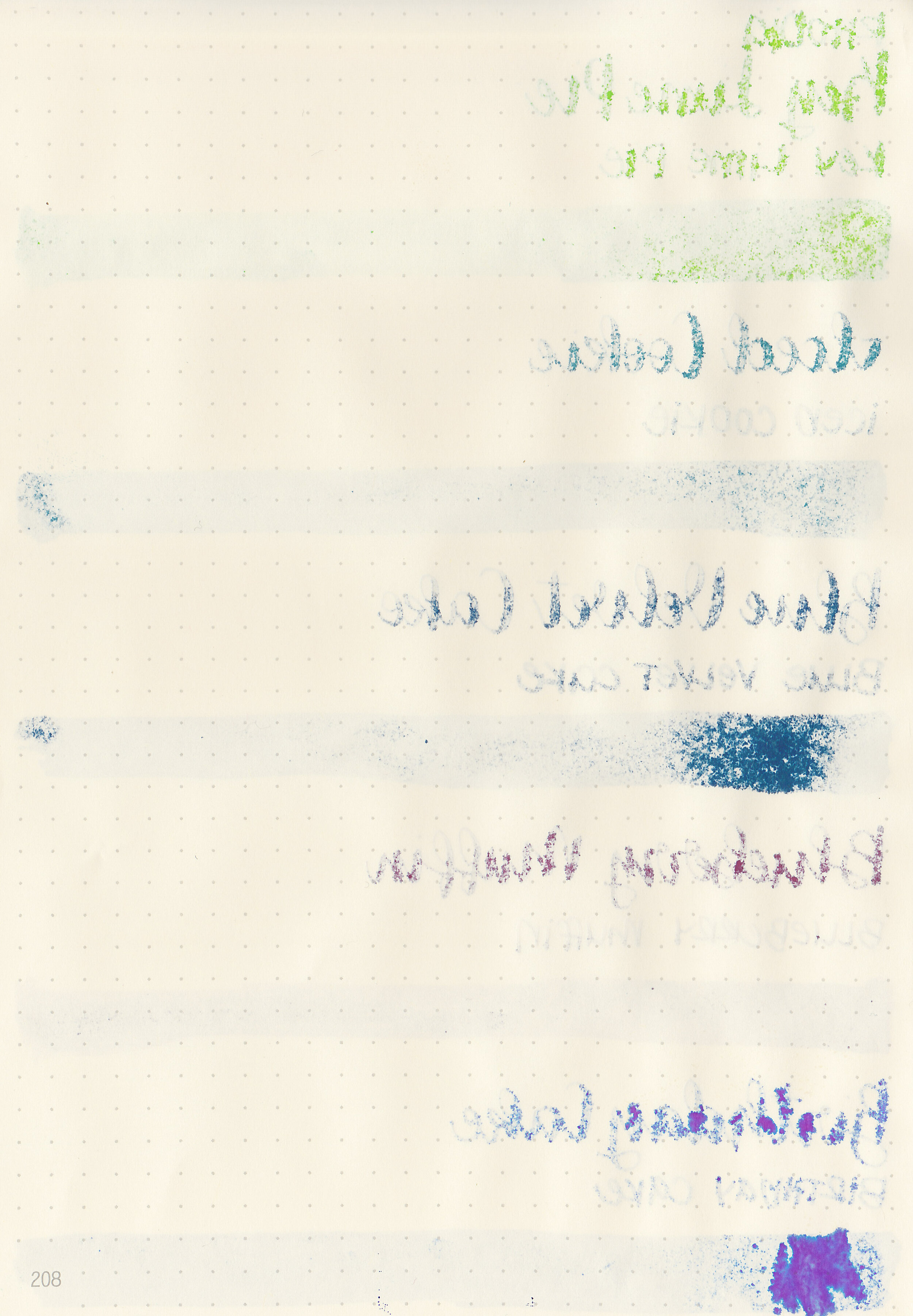
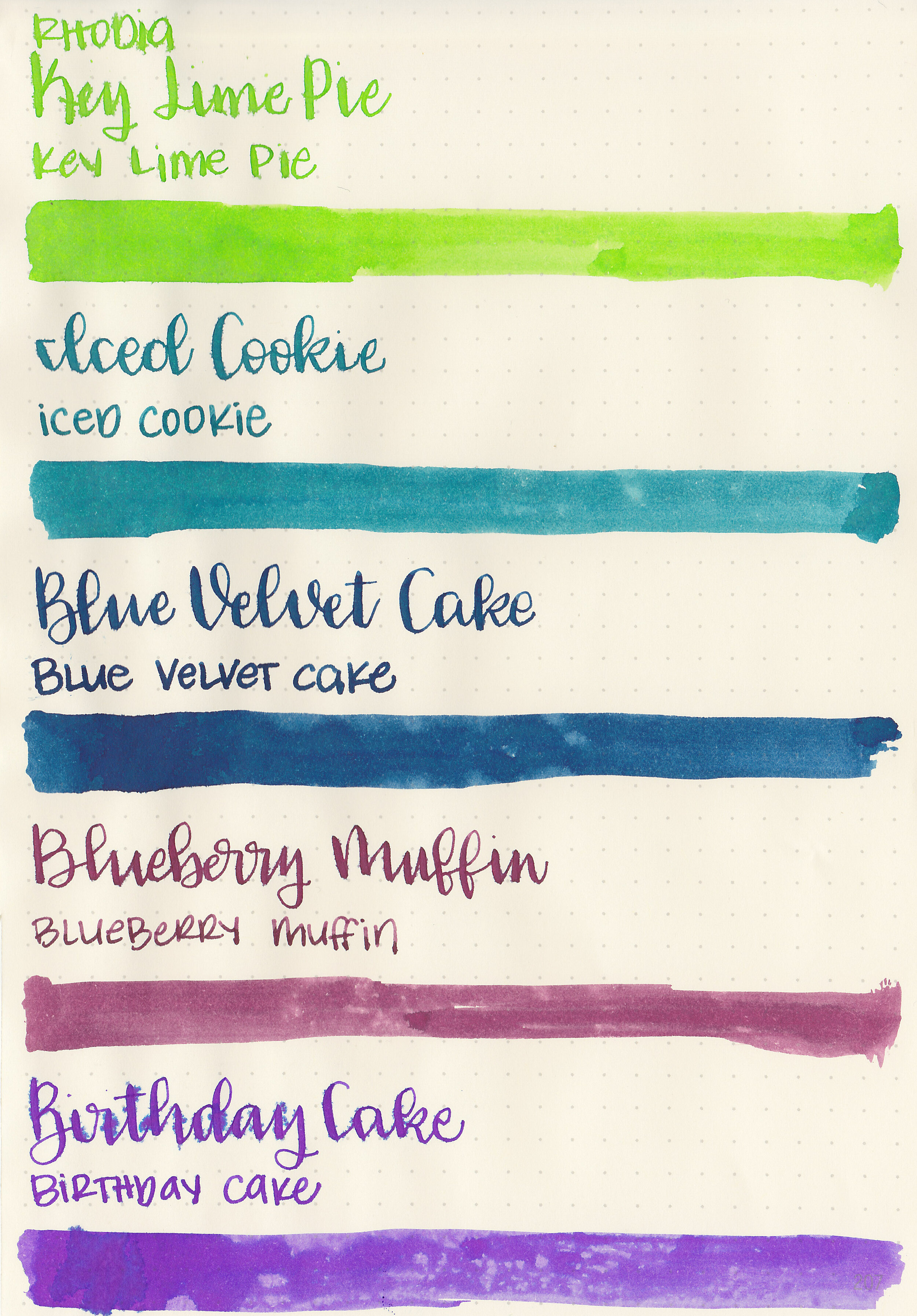
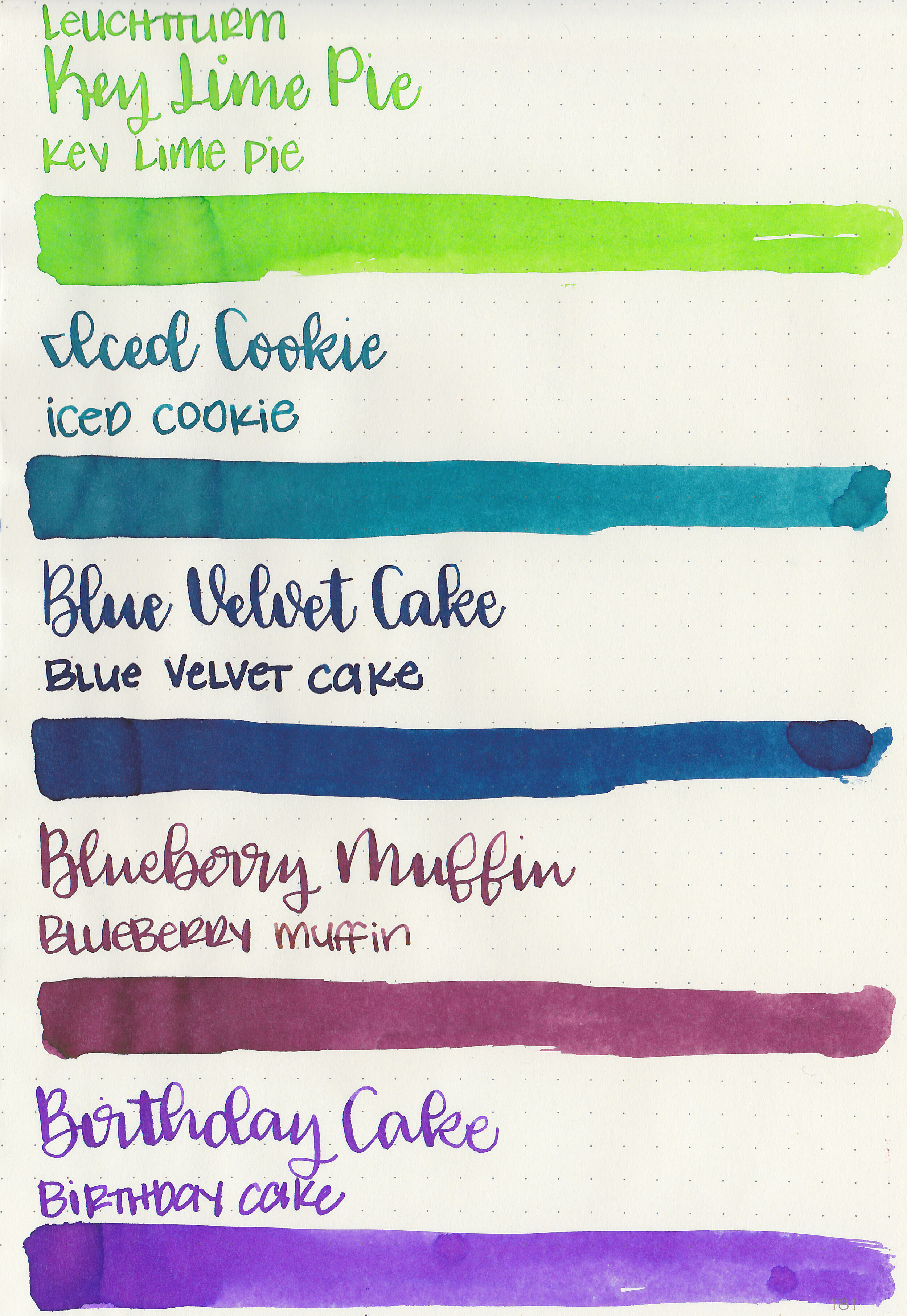
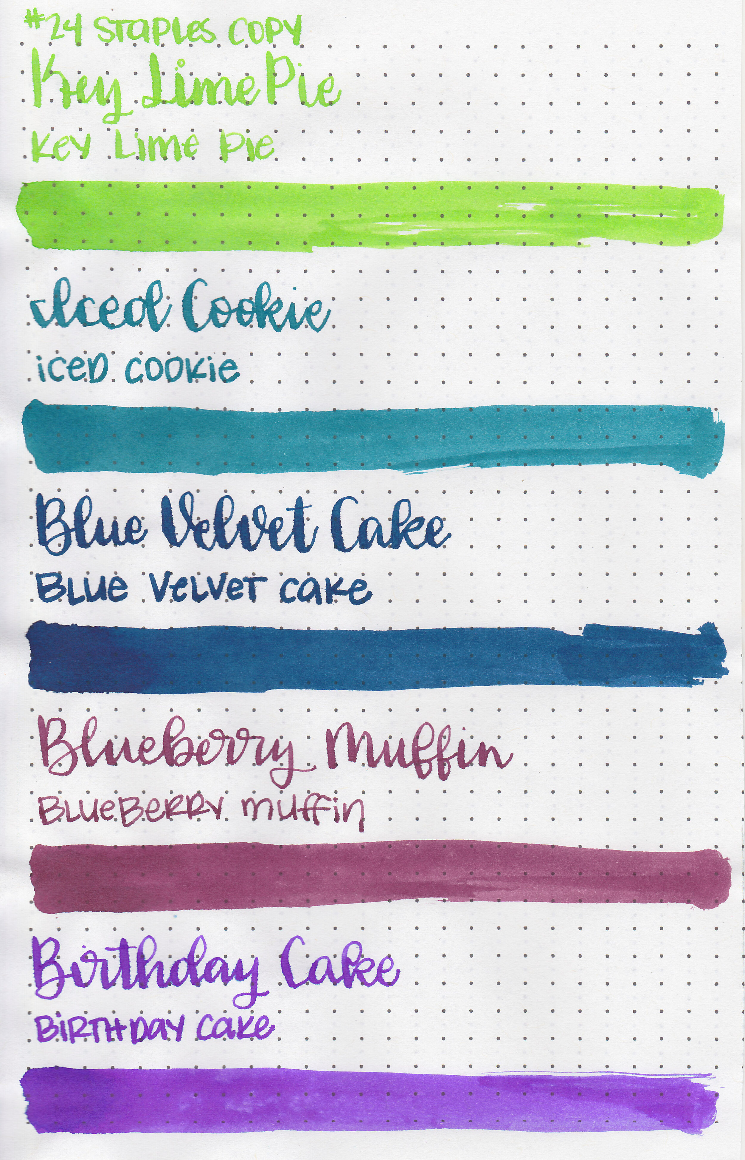
Left to right: Key Lime Pie, Iced Cookie, Blue Velvet Cake, Blueberry Muffin and Birthday Cake.
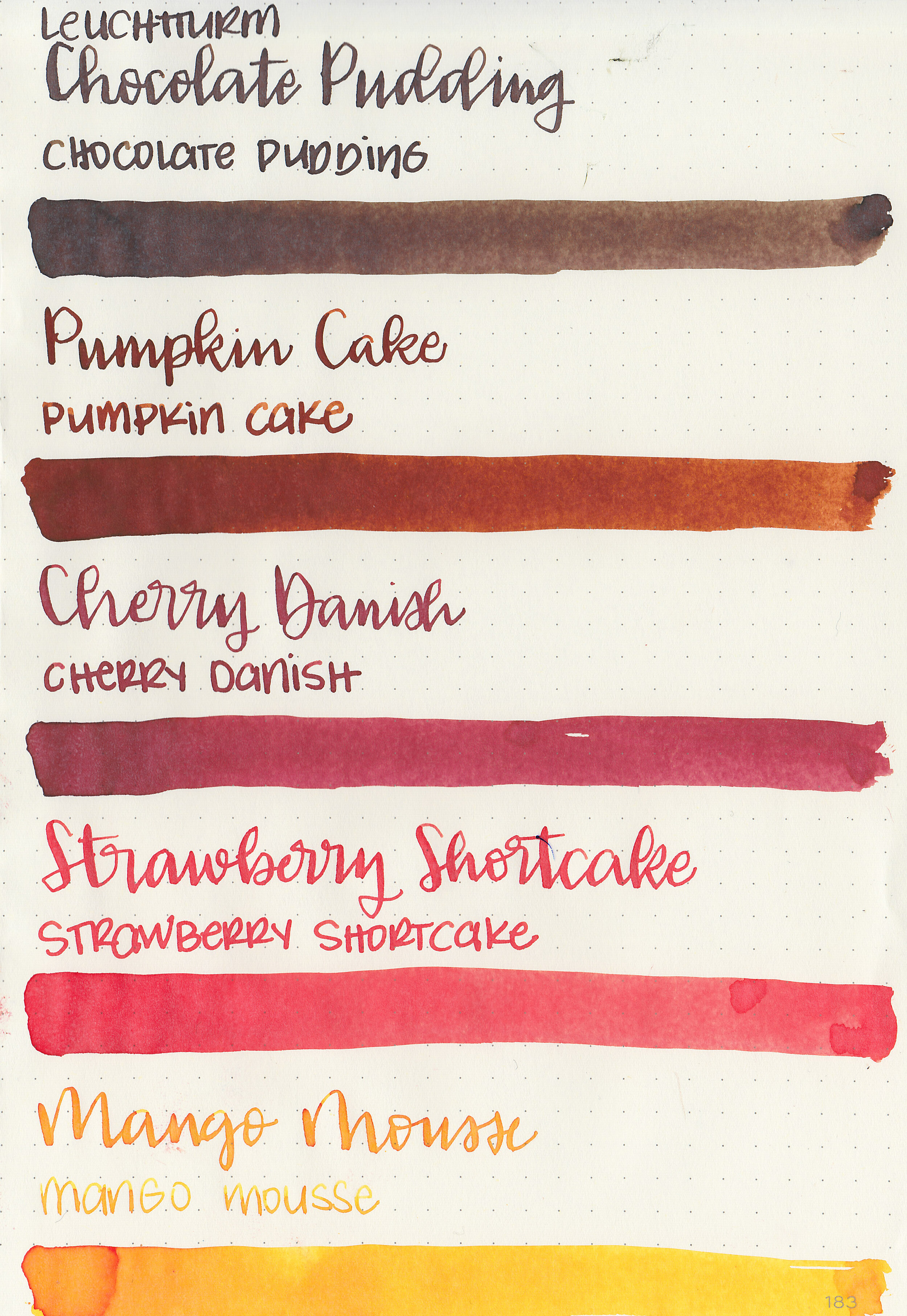
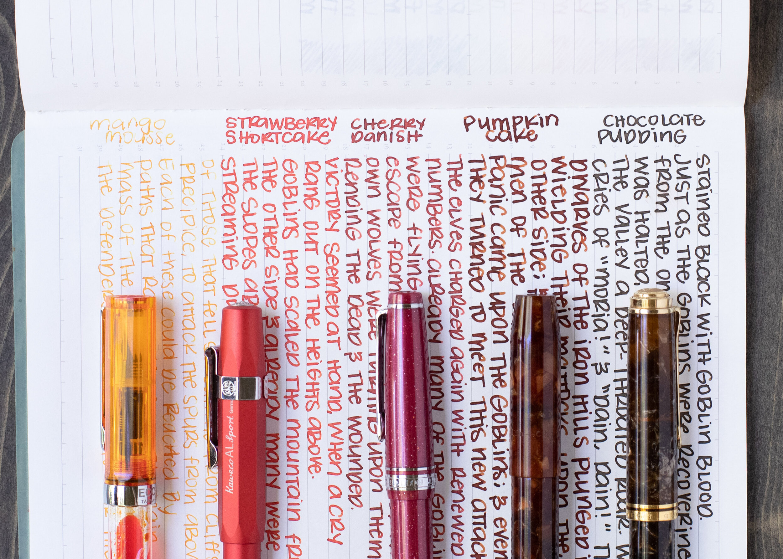
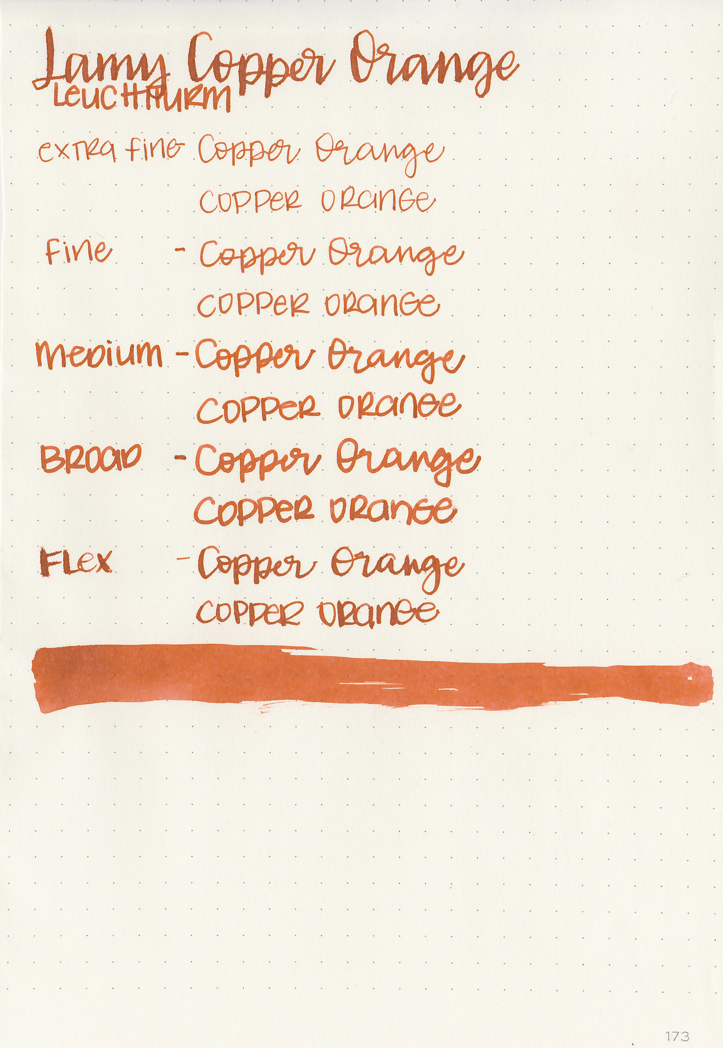
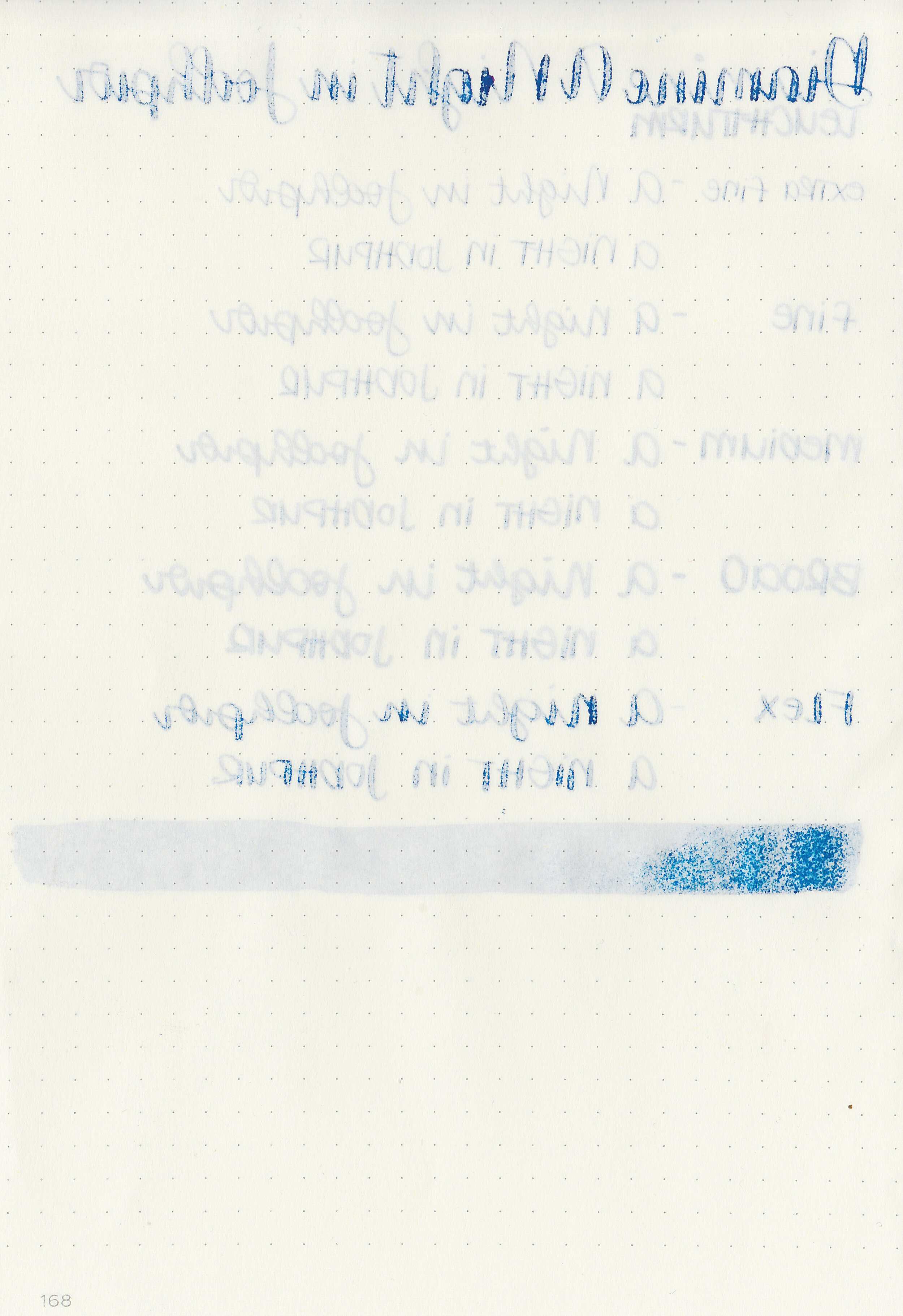
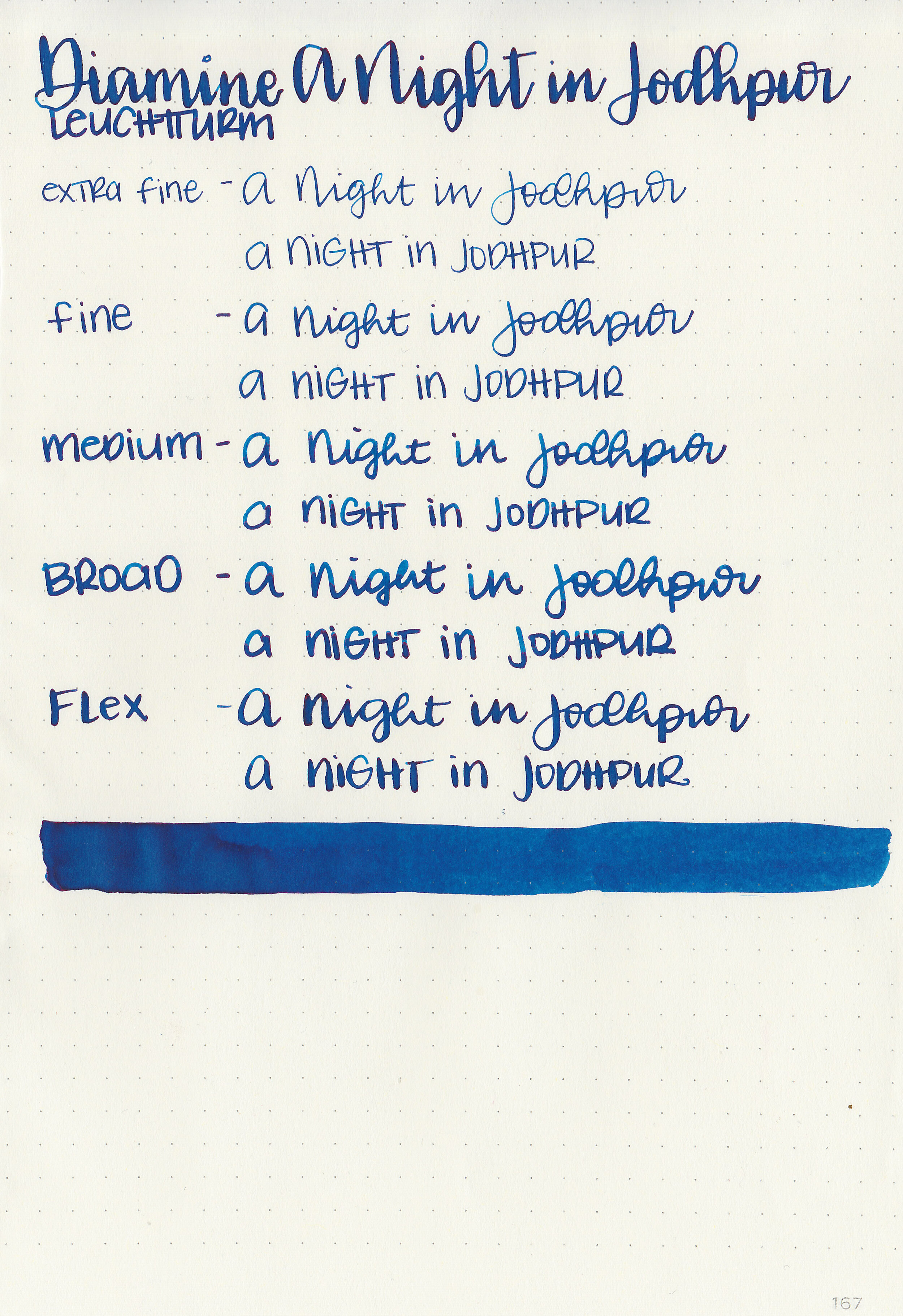
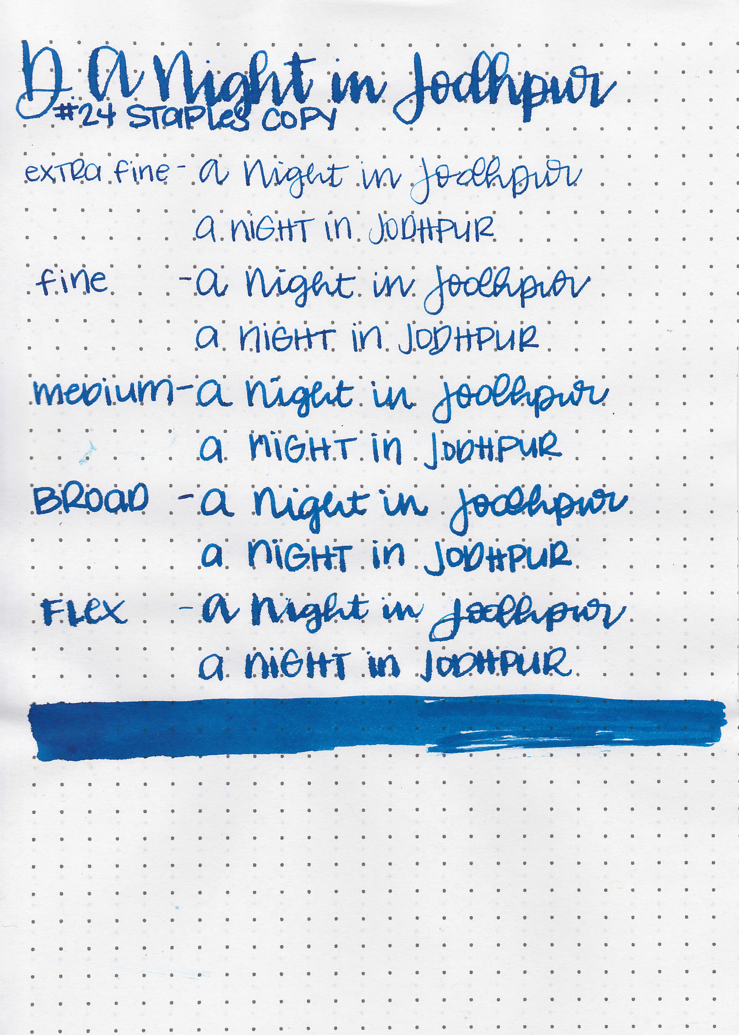
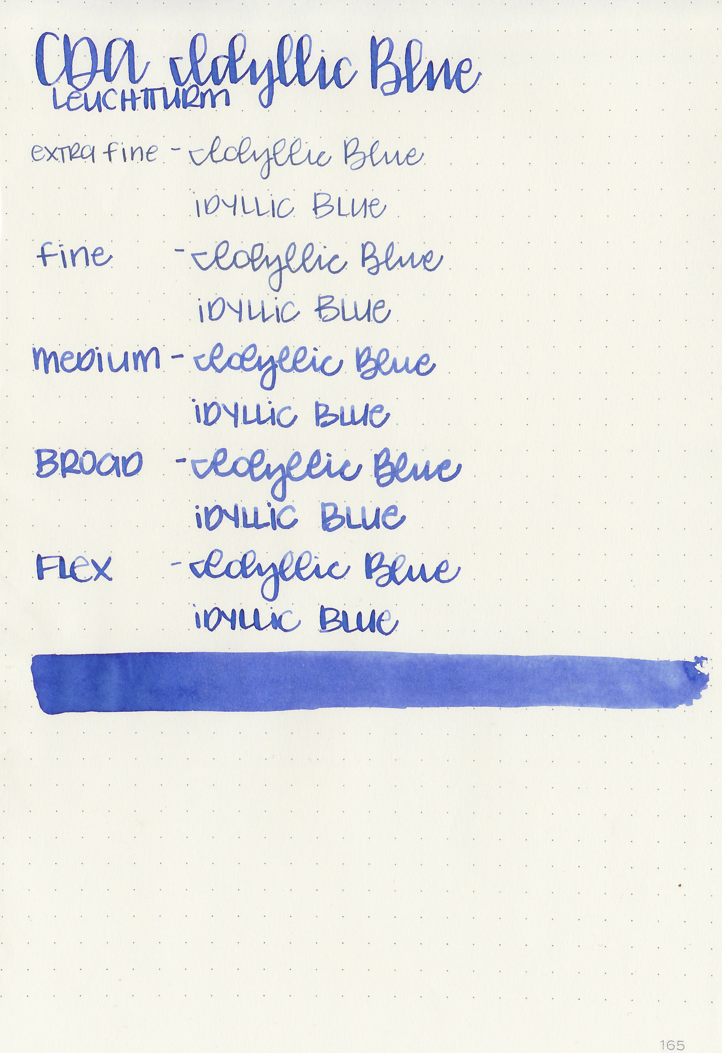
Writing samples:
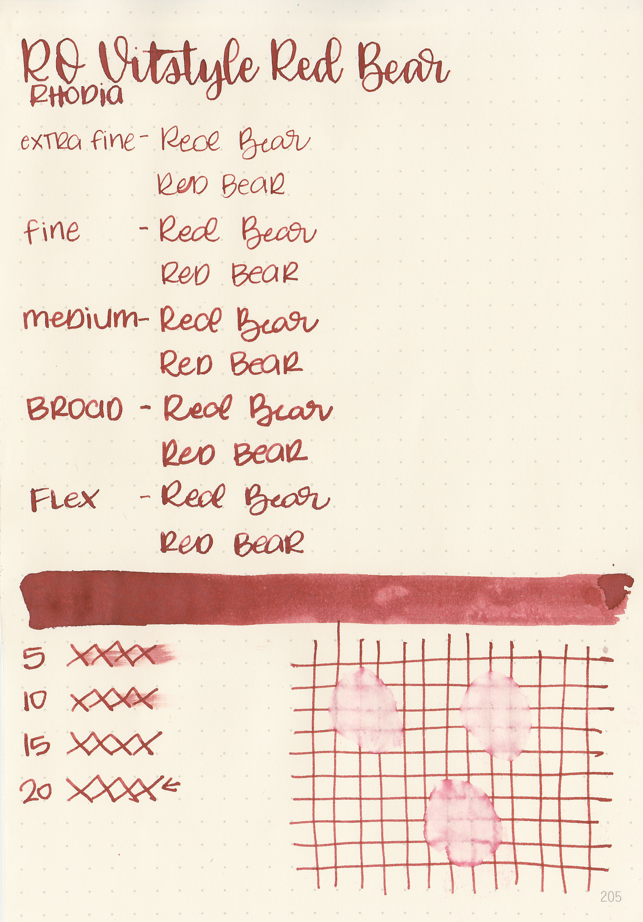
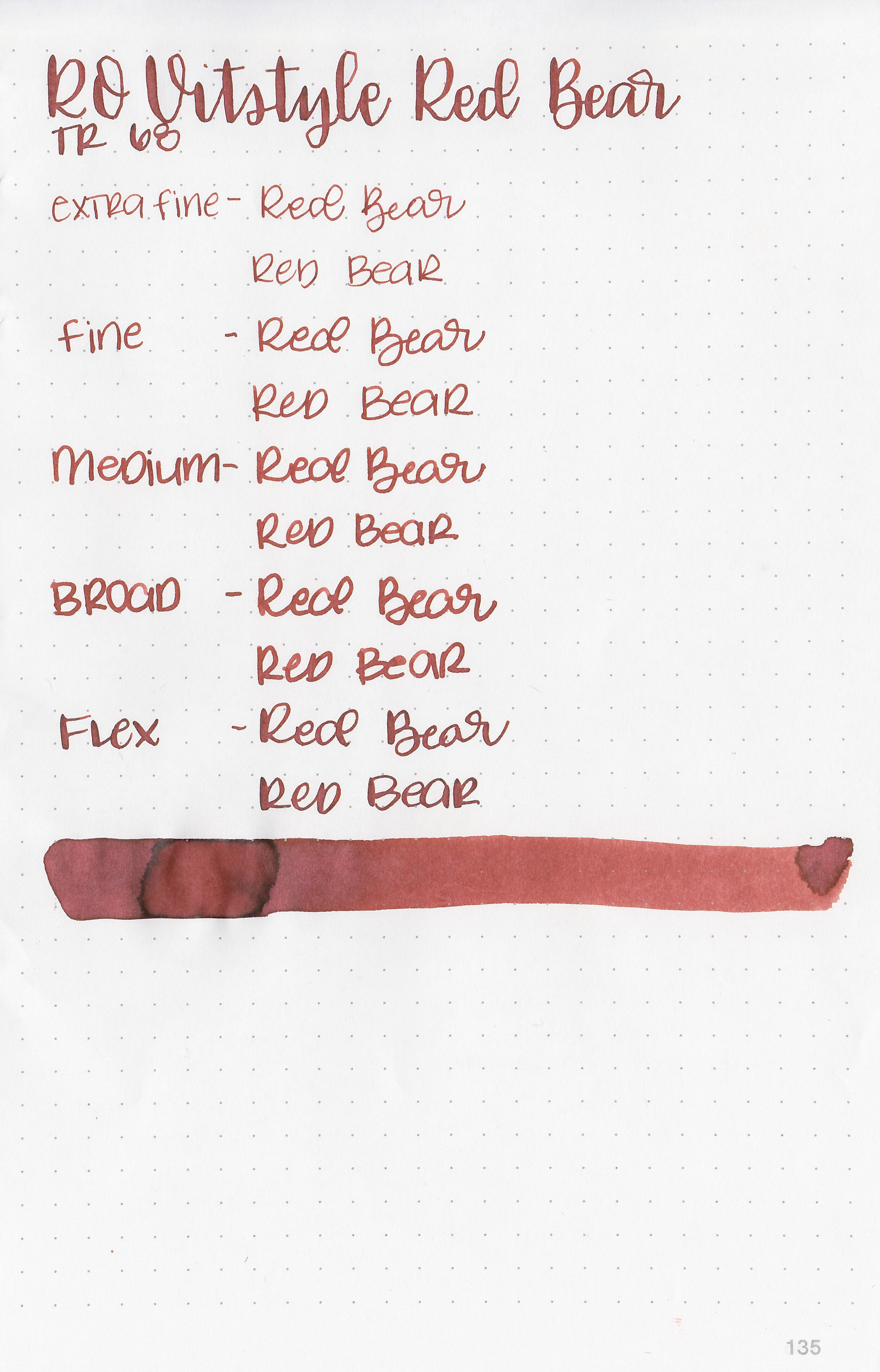
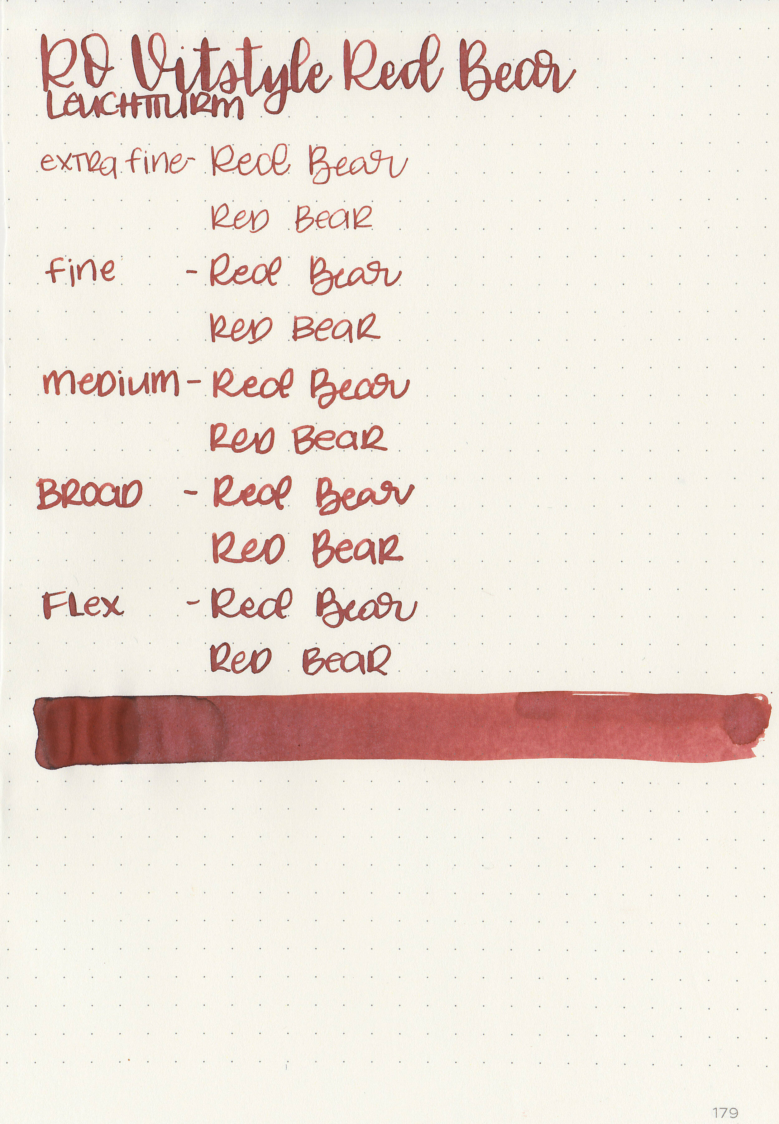
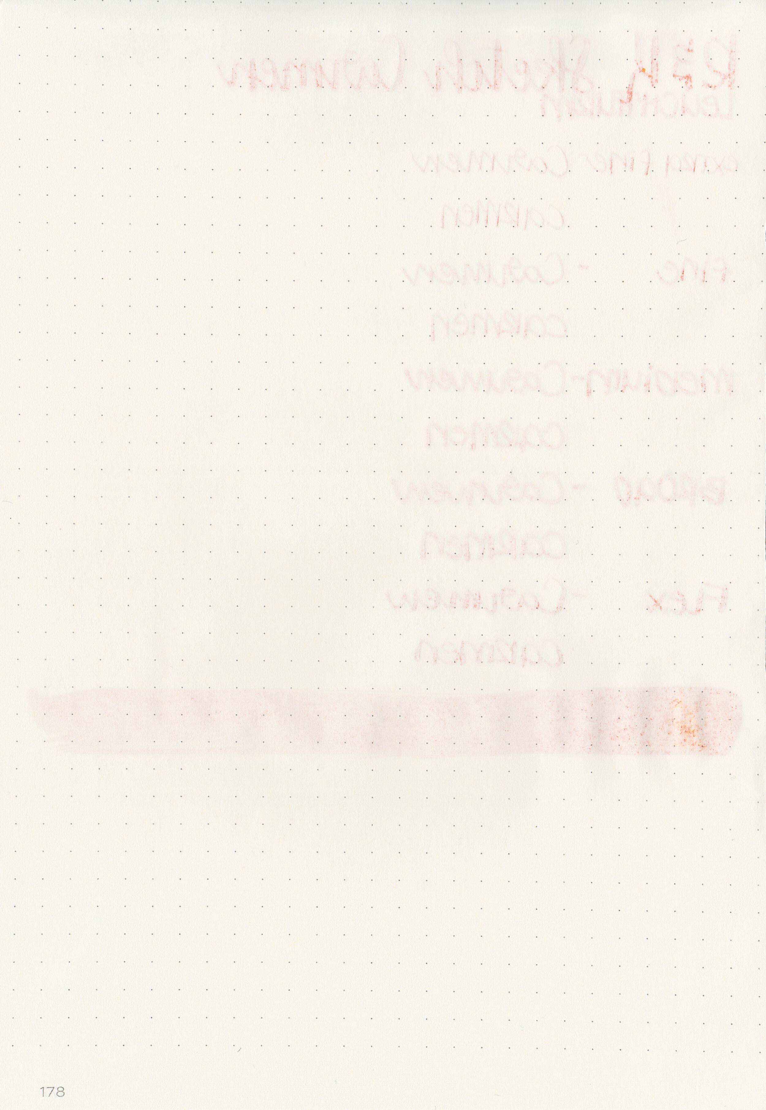
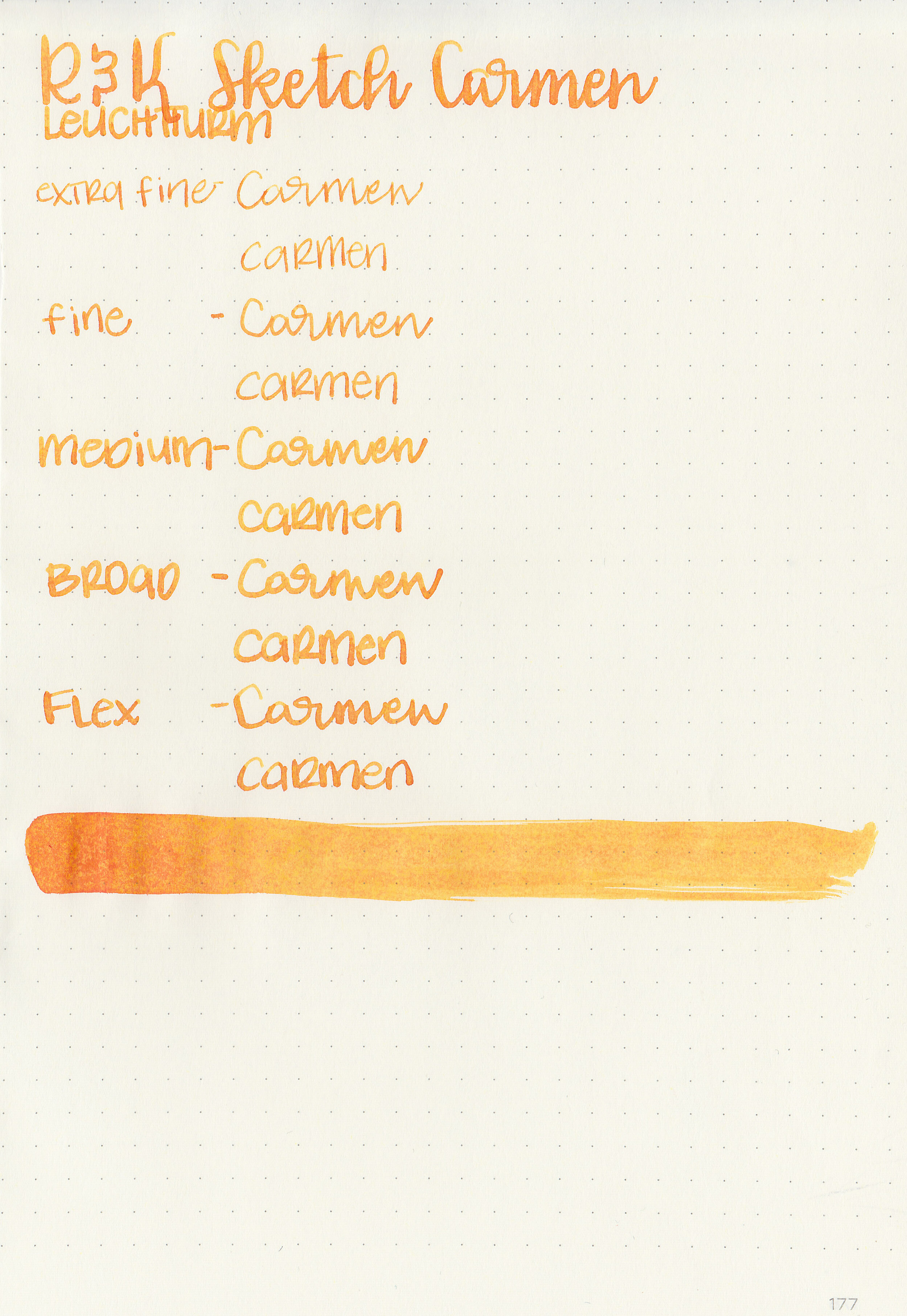
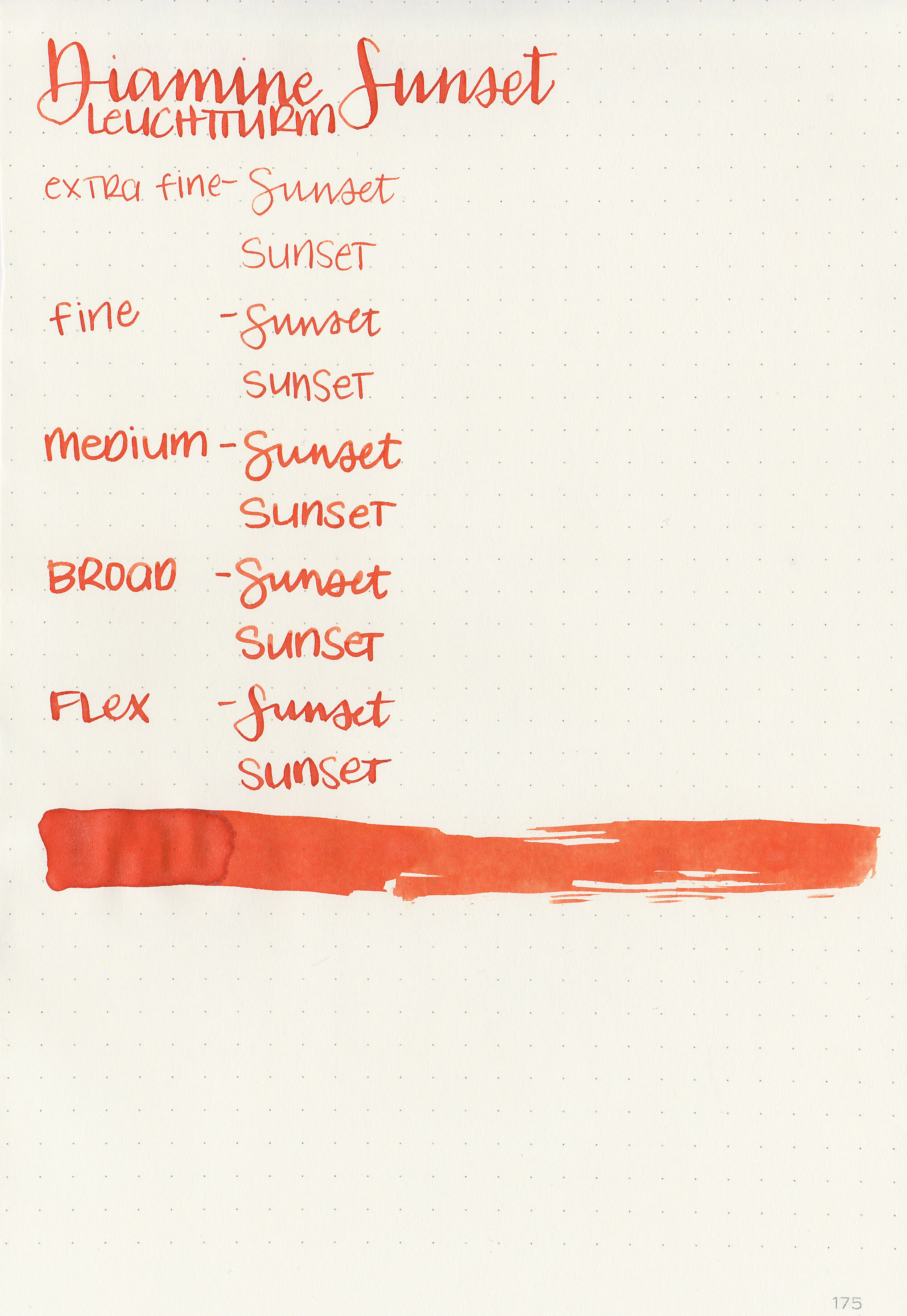
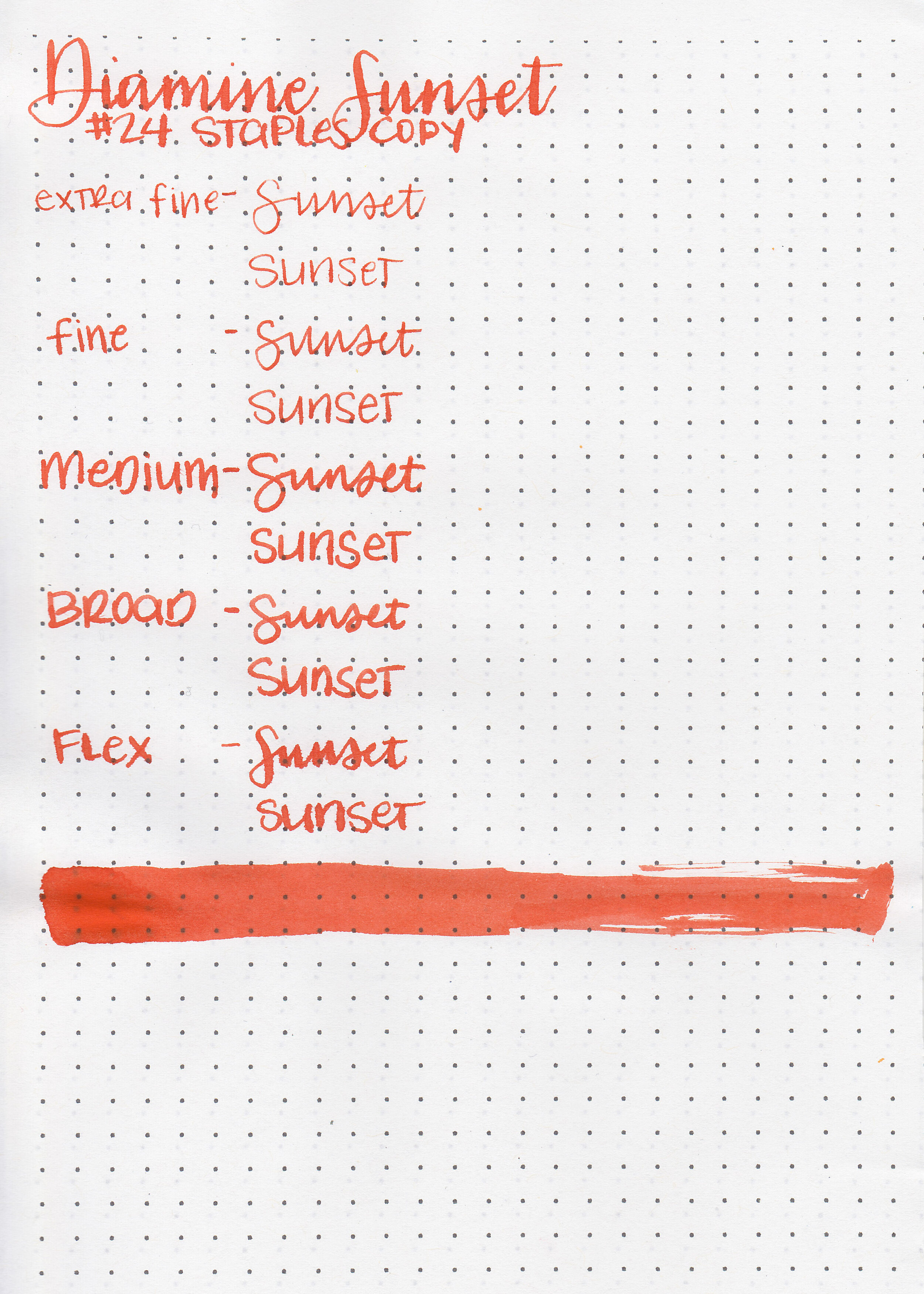
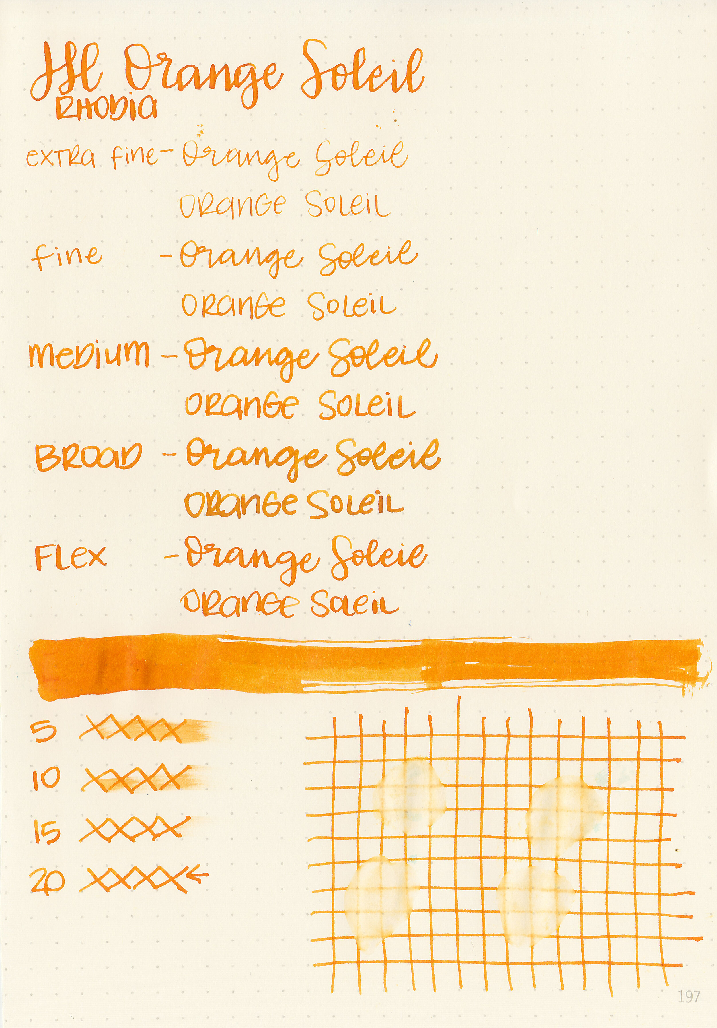
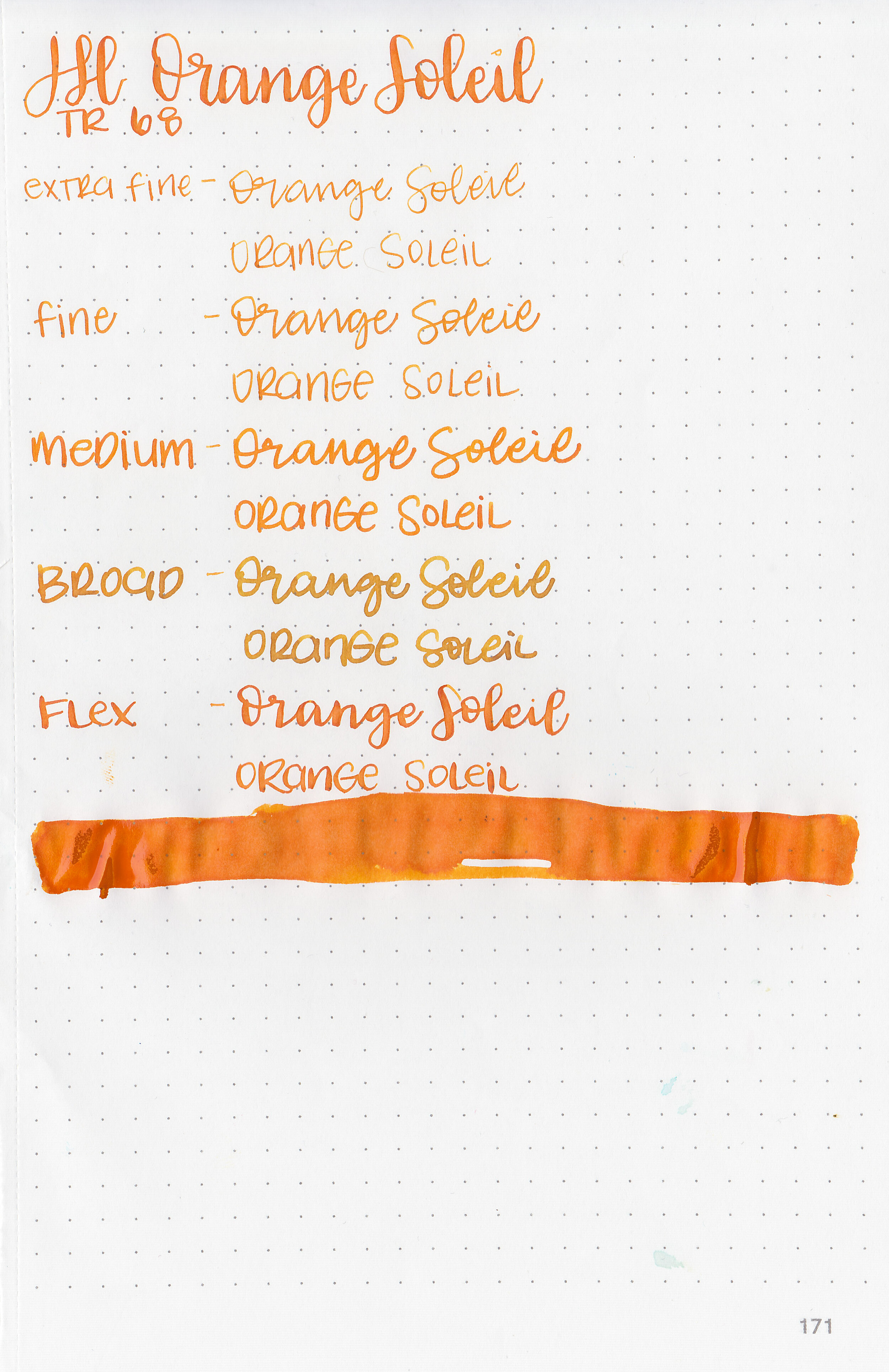
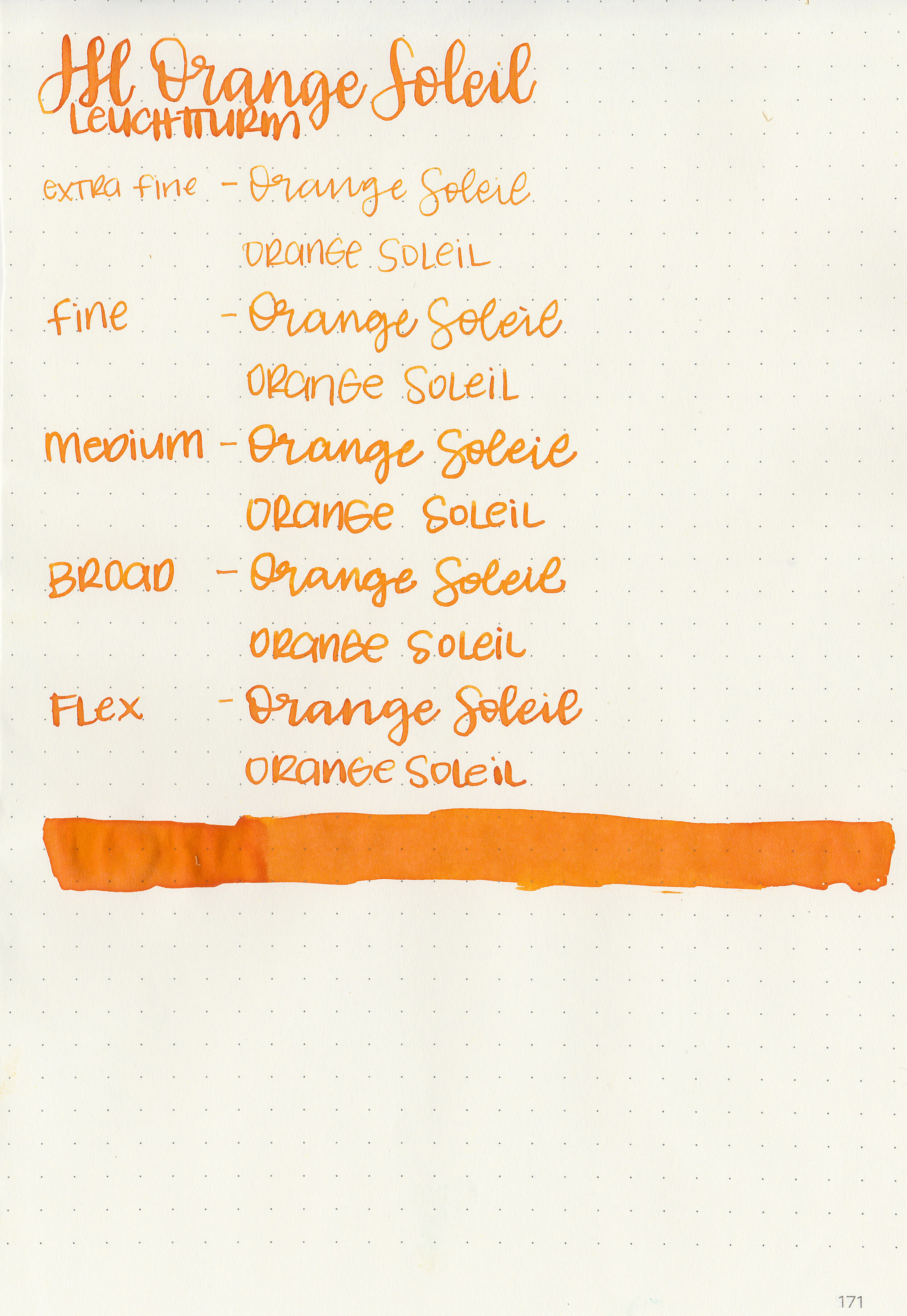
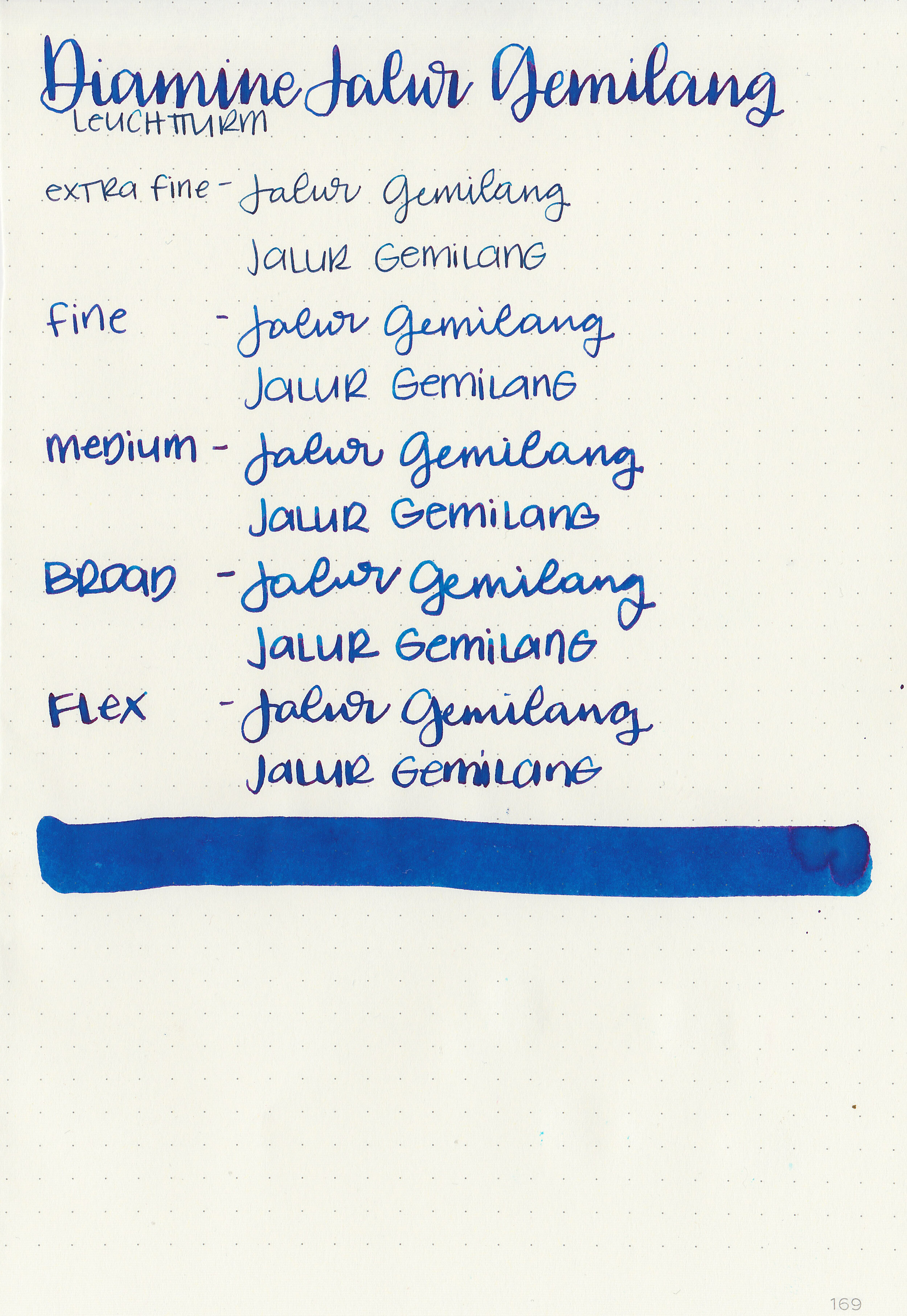
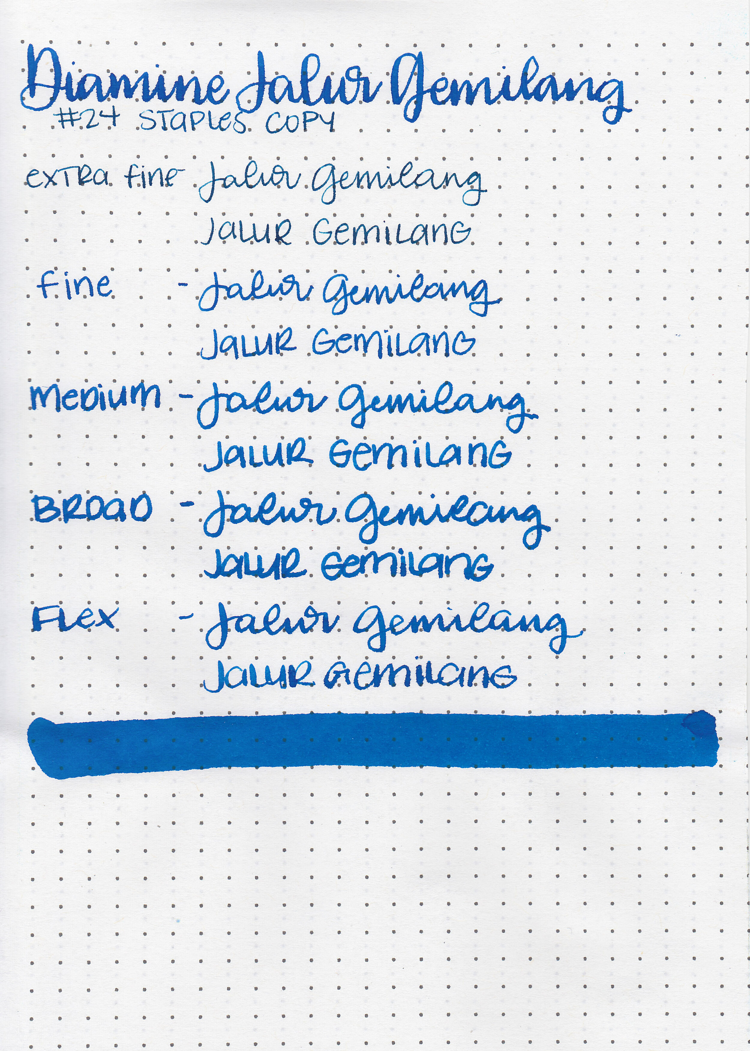
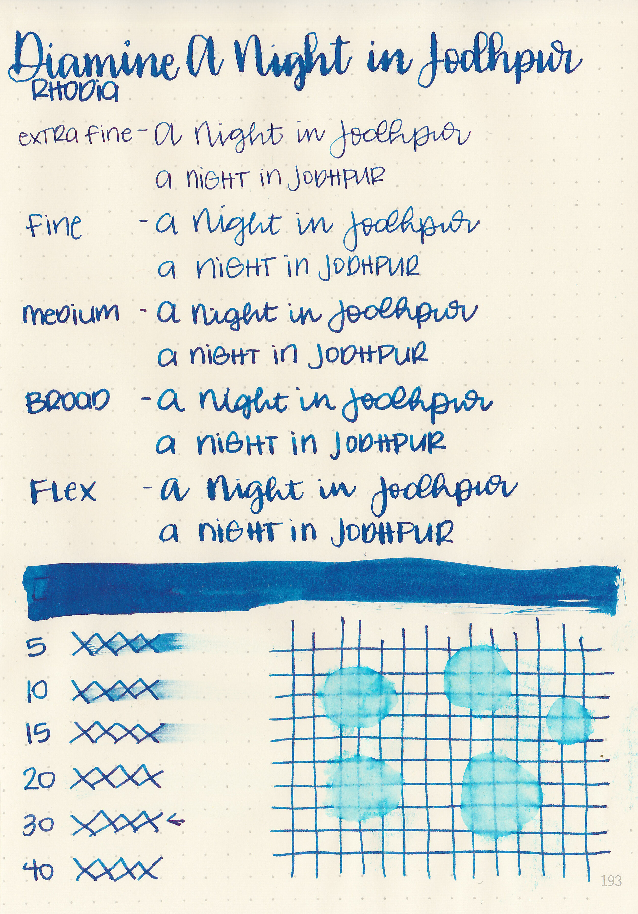
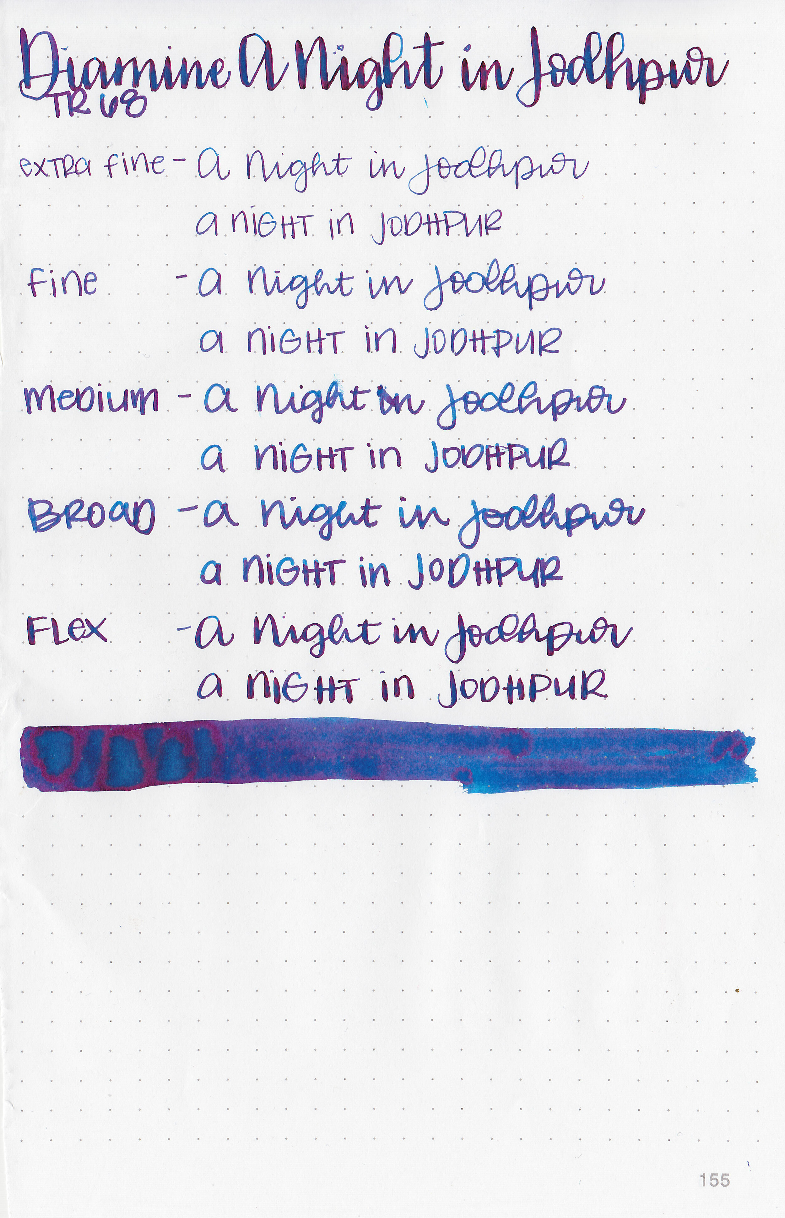
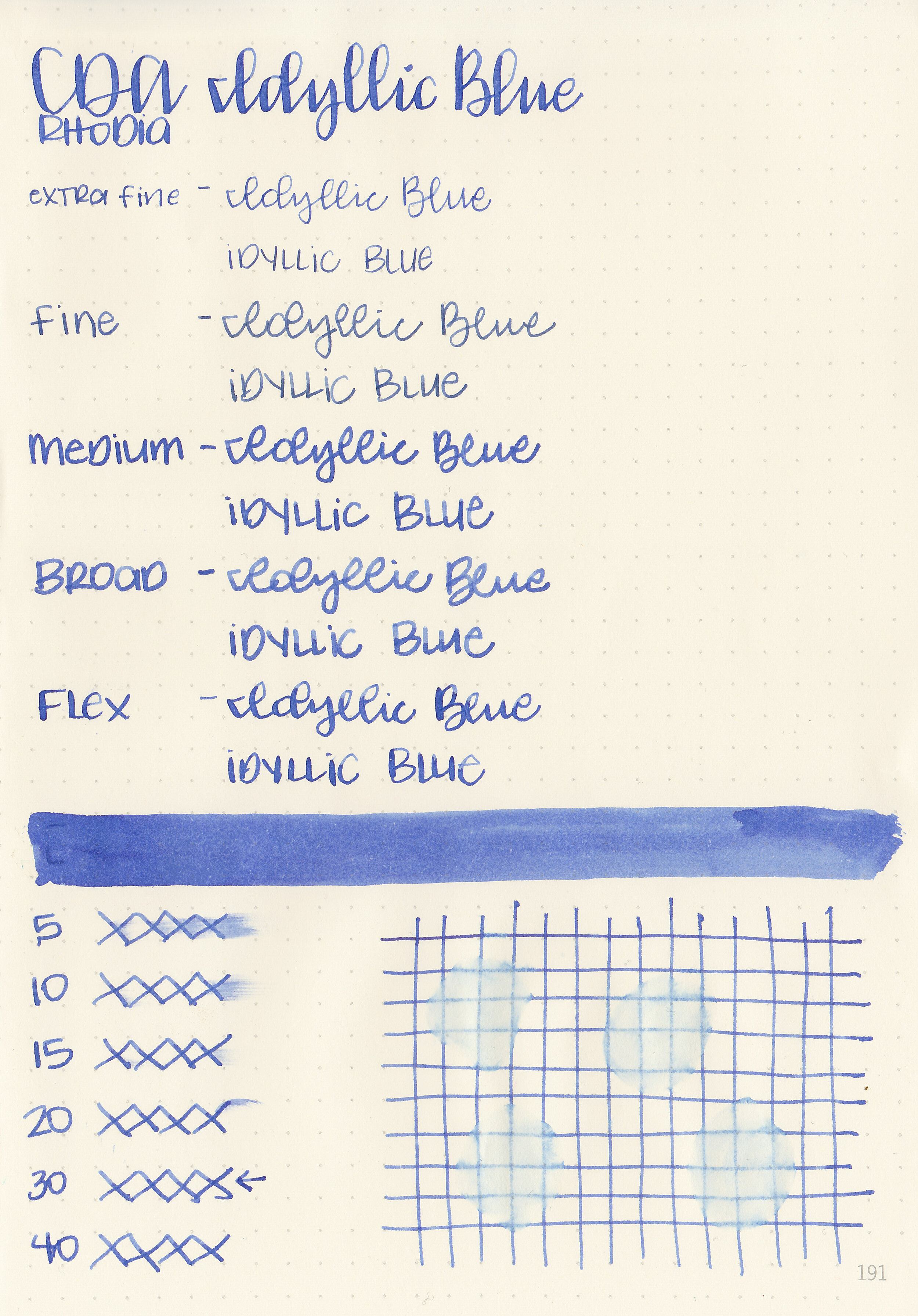
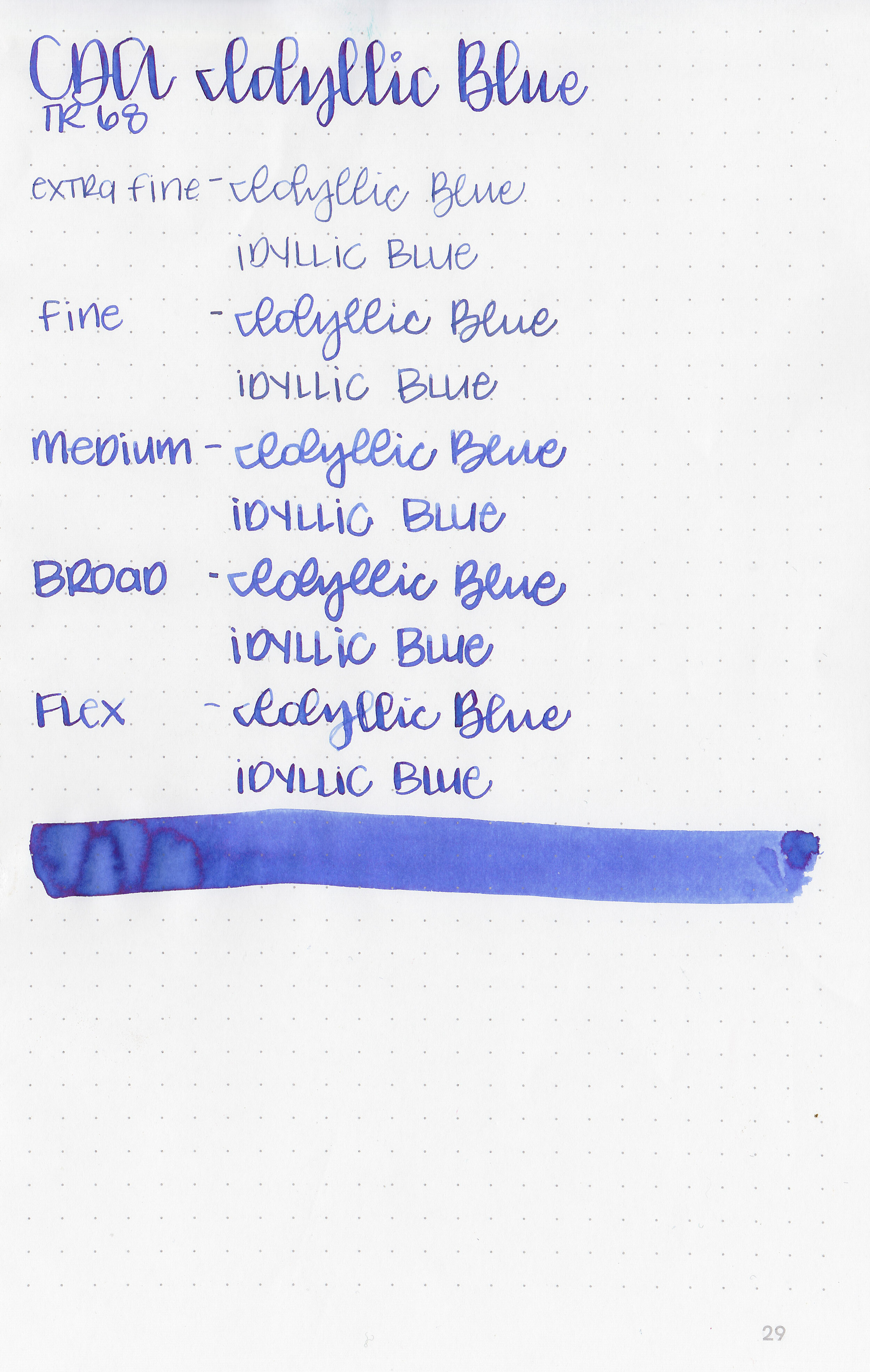
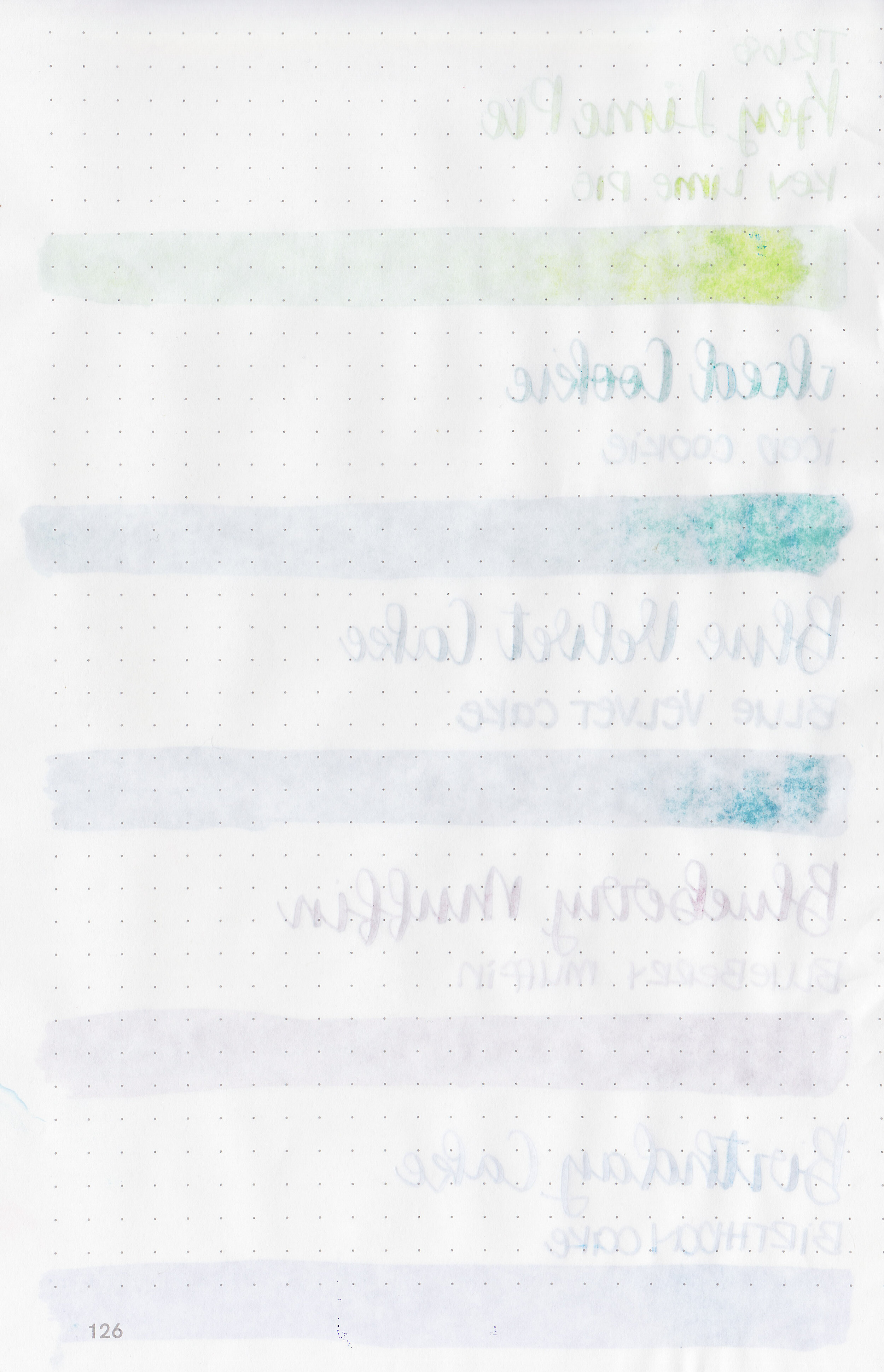
Let's take a look at how the ink behaves on fountain pen friendly papers: Rhodia, Tomoe River, and Leuchtturm.
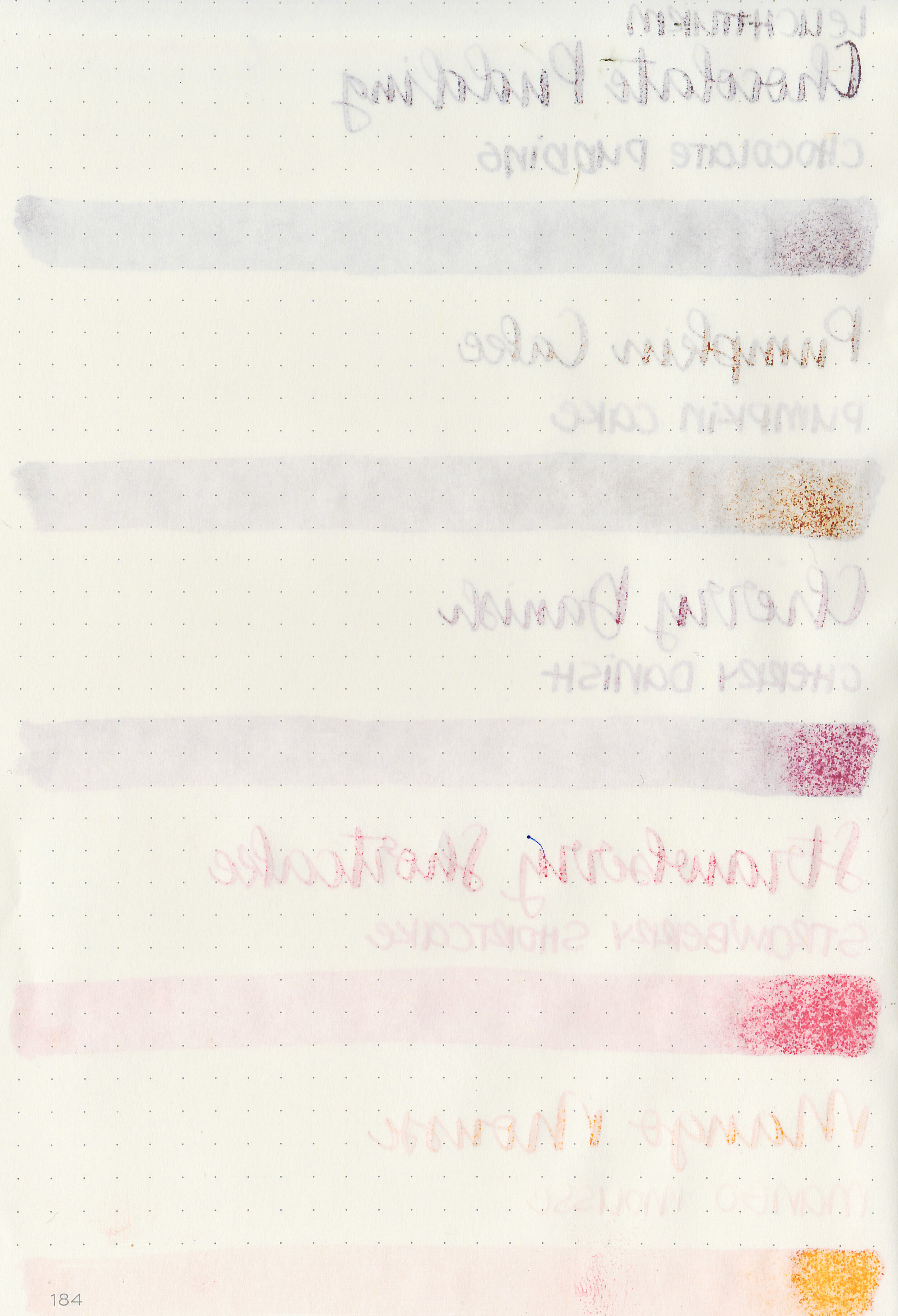
Water resistance: Low
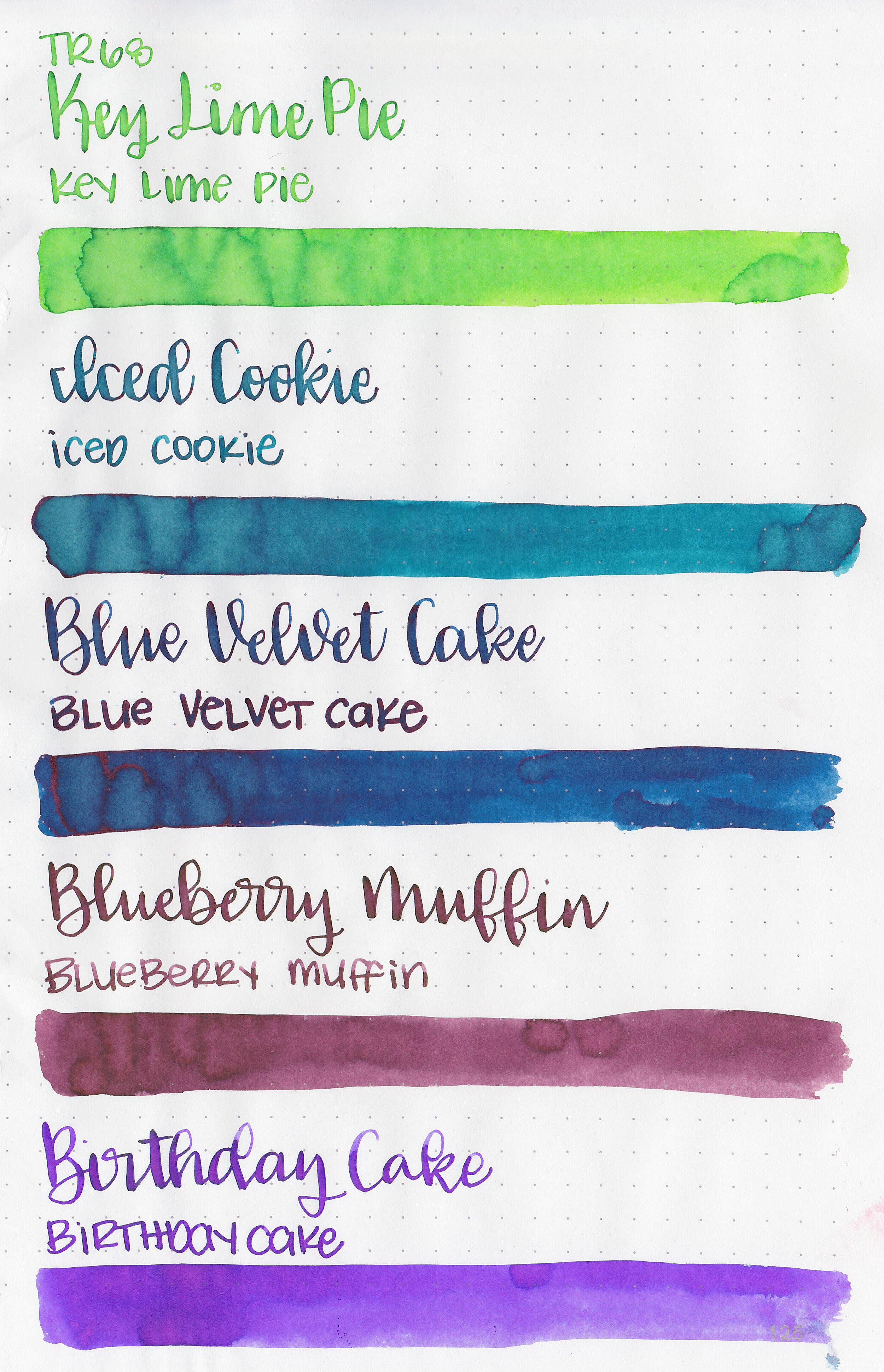
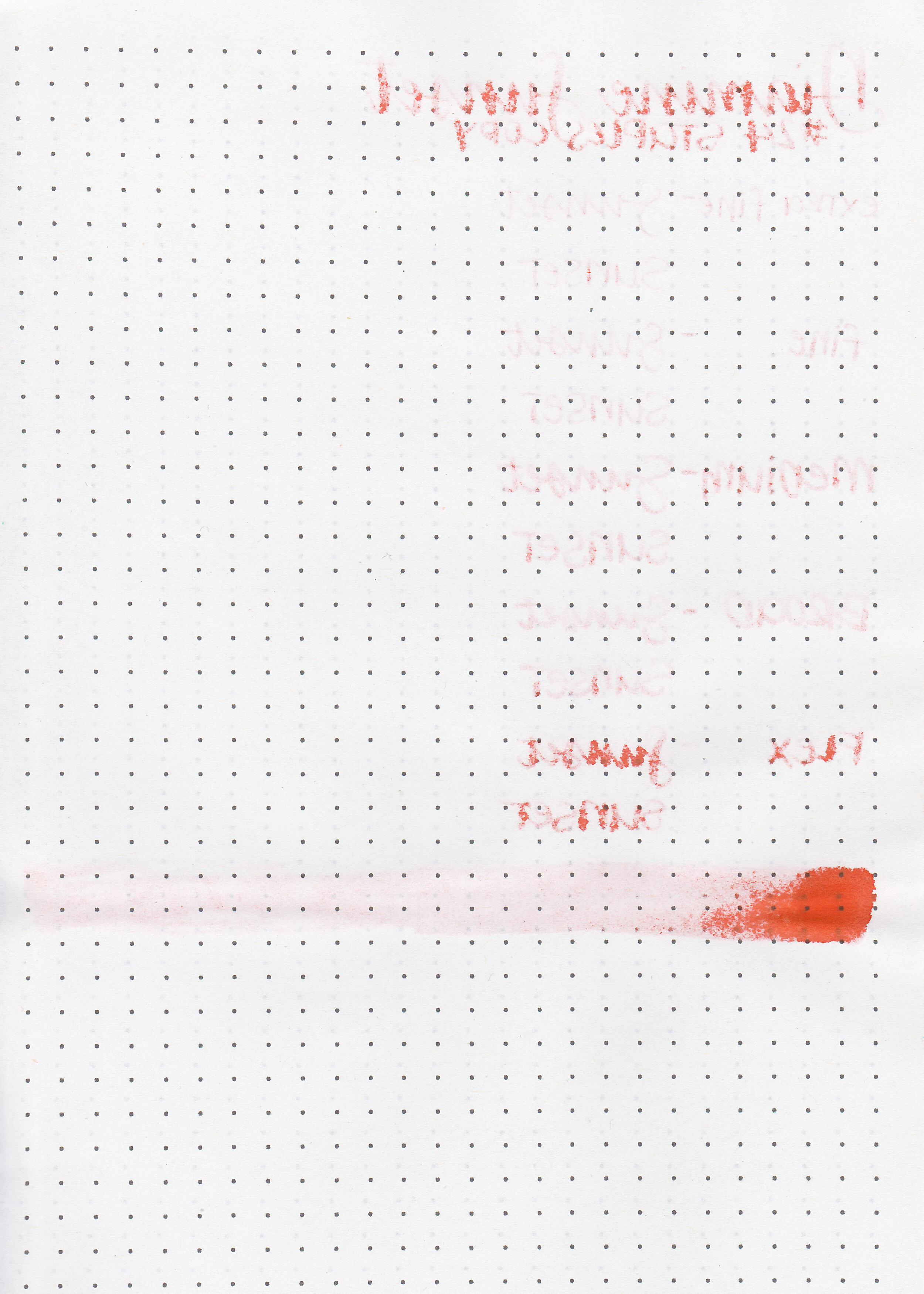
Feathering: Low-there was some feathering in the flex nib on Leuchtturm and Rhodia.
Show through: Medium
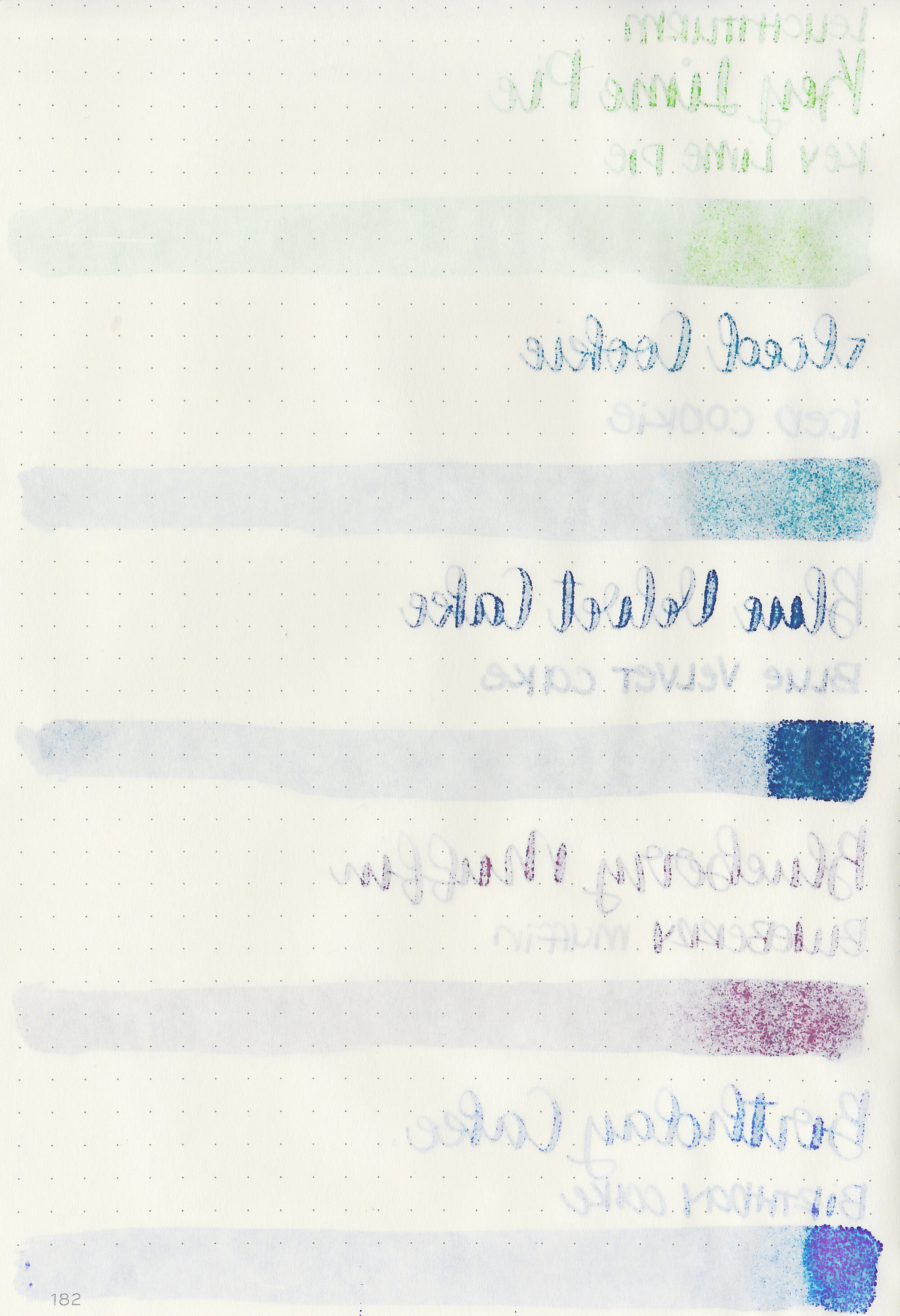
Bleeding: Low-there was some bleeding on Leuchtturm in the flex nib.
Other properties: low to medium shading, no to medium sheen, and no shimmer. Out of the set only Blue Velvet Cake shows any sheen.
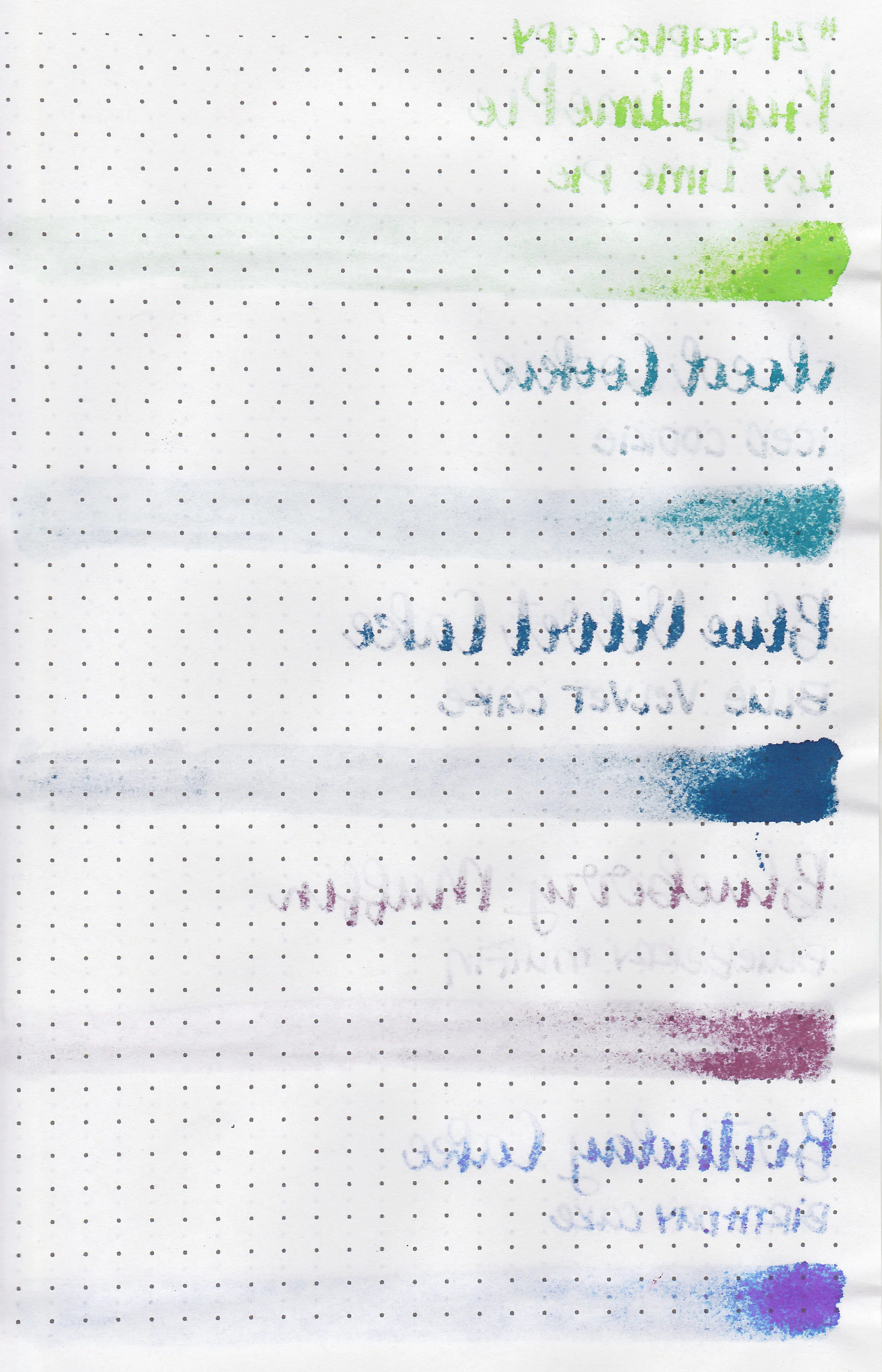
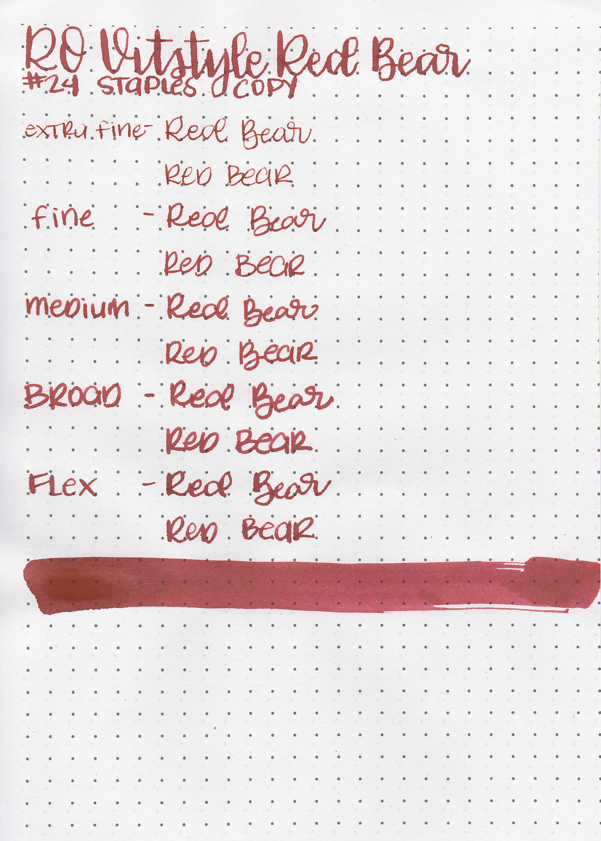
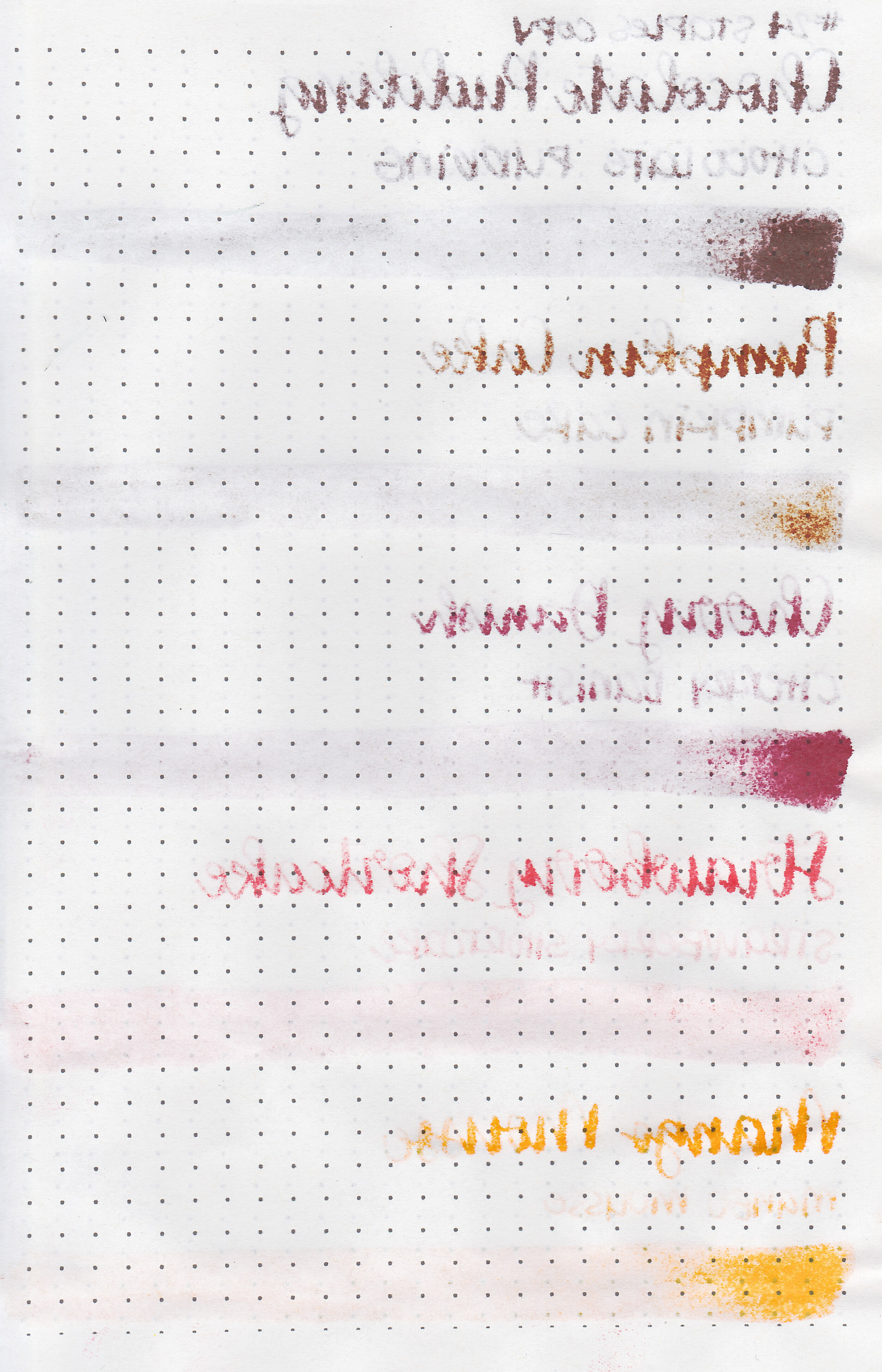
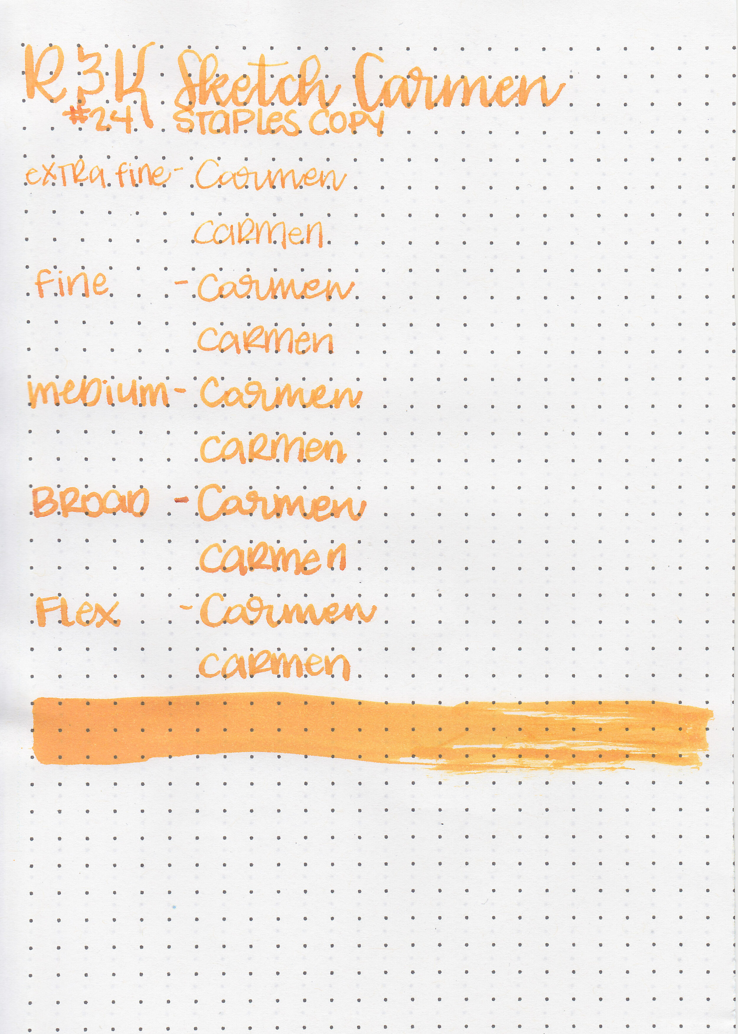
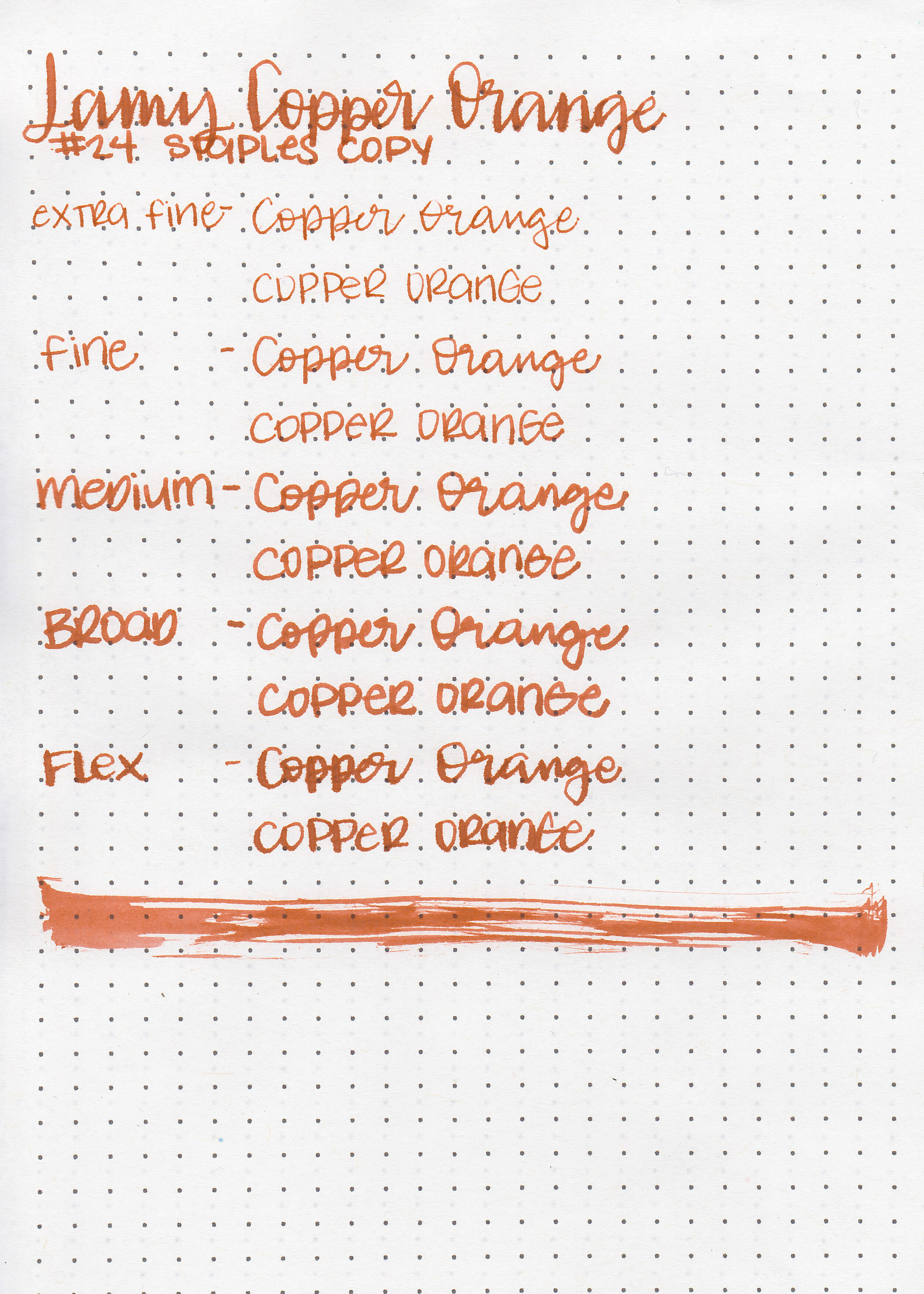
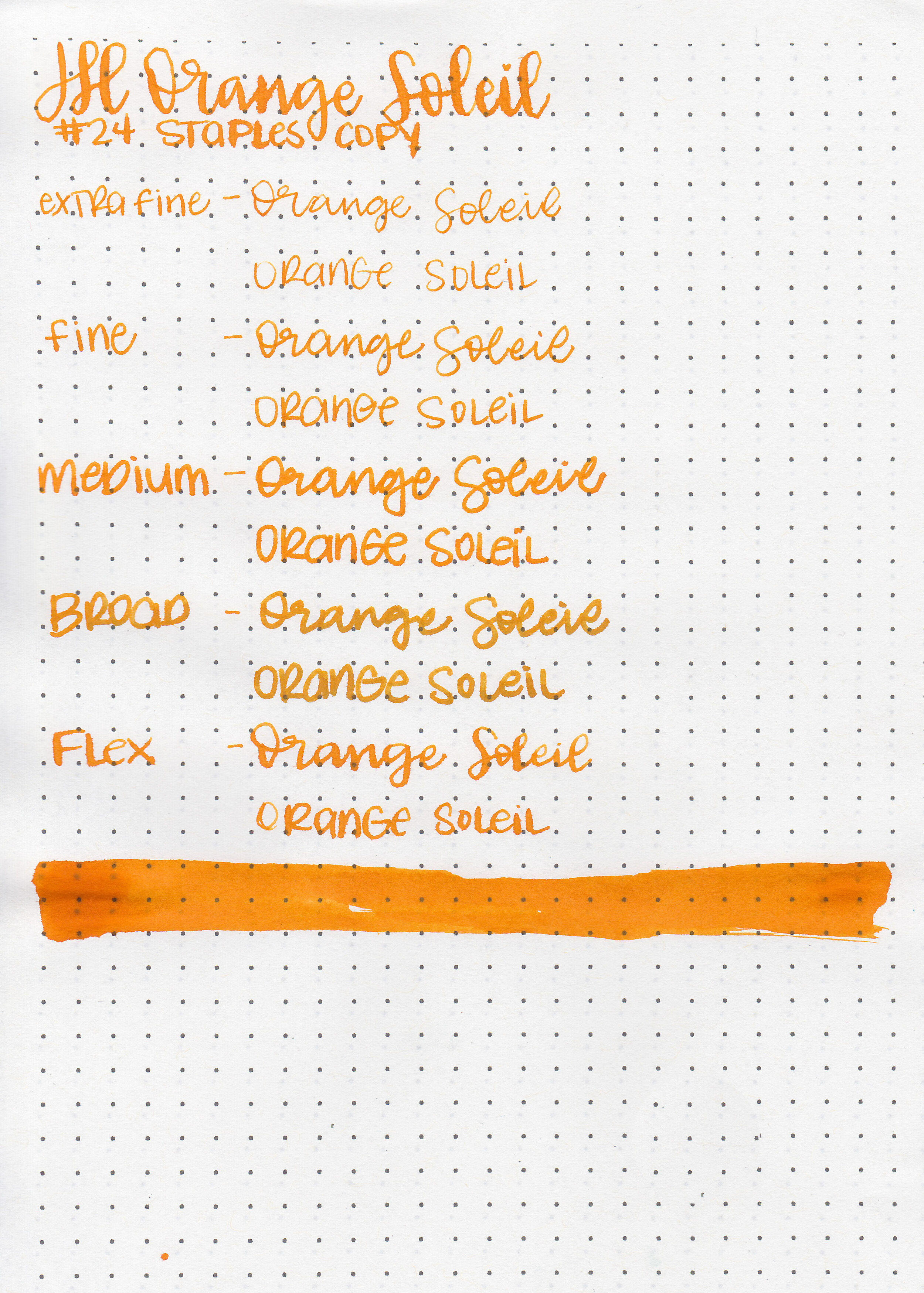
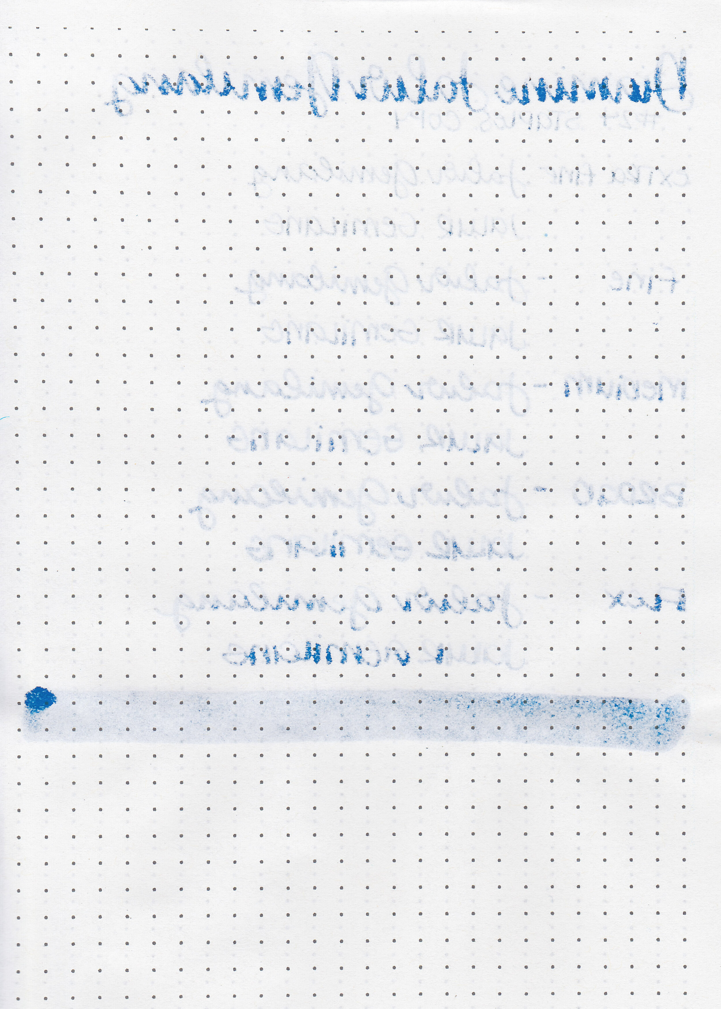
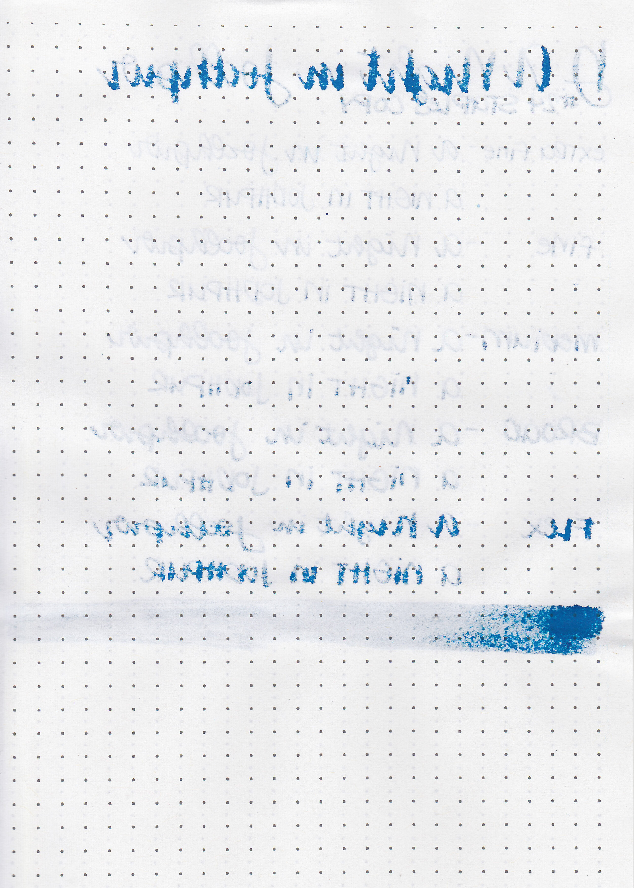
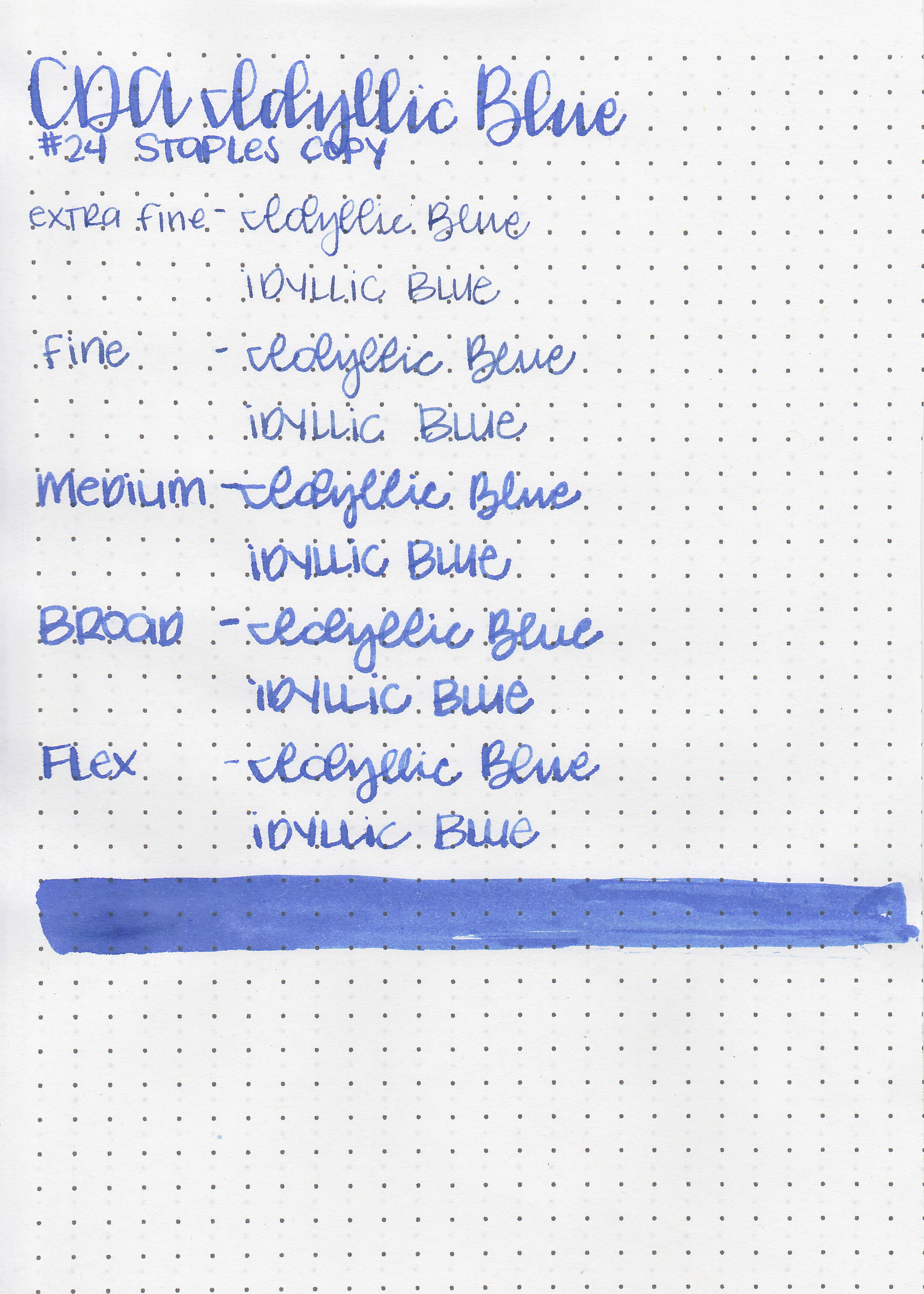
On Staples 24 lb copy paper there was lots of feathering in every nib size as well as a lot of bleeding, so I would not recommend these inks for cheap paper.
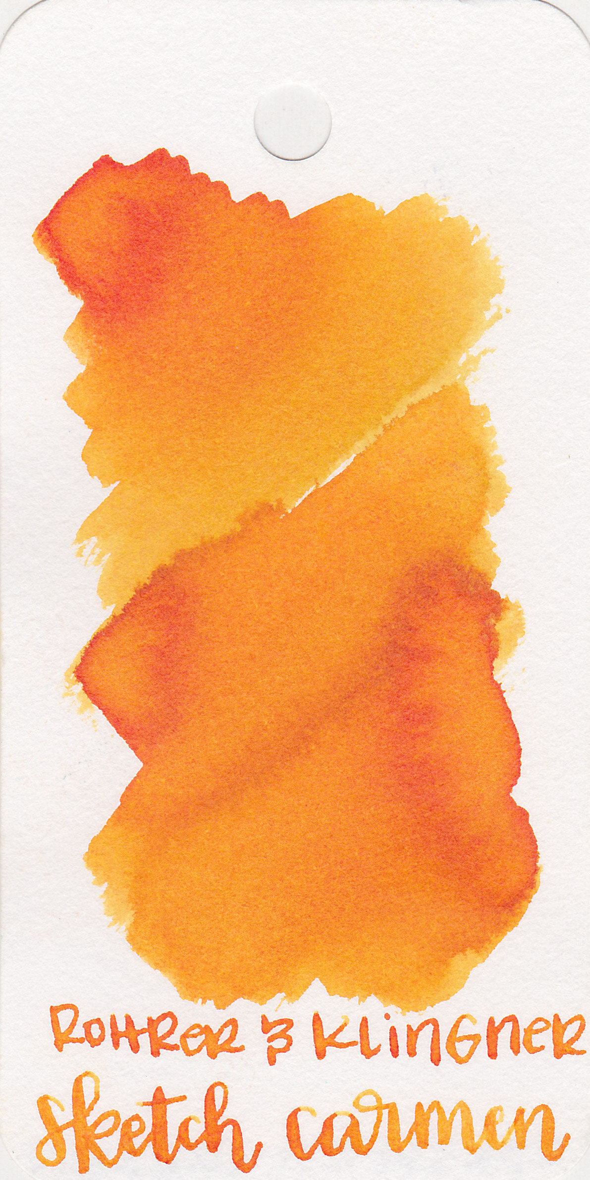
Comparison Swabs:

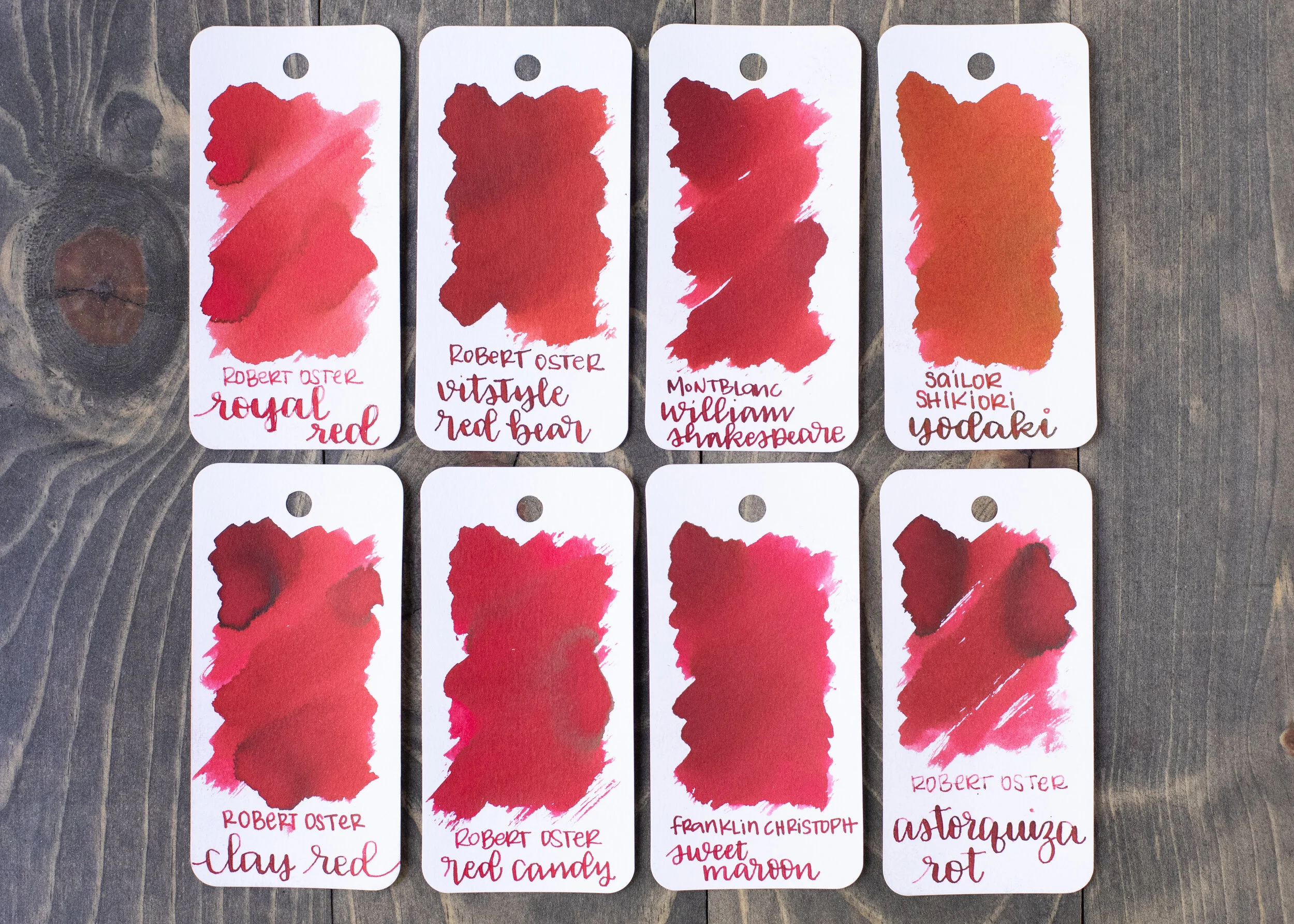
Key Lime Pie is warmer than Robert Oster Light Green, but cooler than Diamine Jade Green. Iced Cookie is similar to Lamy Amazonite. Blue Velvet Cake is similar to J Herbin Bleu Des Profondeurs. Blueberry Muffin is a little bit darker than Platinum Lavender Black. Birthday Cake is warmer than Monteverde Charoite but cooler than Monteverde Amethyst. Click here to see the Monteverde Inks together.


I used a Lochby Lined Refill A5 notebook (Tomoe River 68gsm). All of the inks had a wetter than average flow.
Overall, I love all five of these inks. They go well together, are generally well behaved, and have a nice wet flow. I love these colors together, and have been using them daily for the last week. Definitely worth a try!
Disclaimer: I purchased this ink myself. All photos and opinions are my own. This page does not contain affiliate links, and is not sponsored in any way.