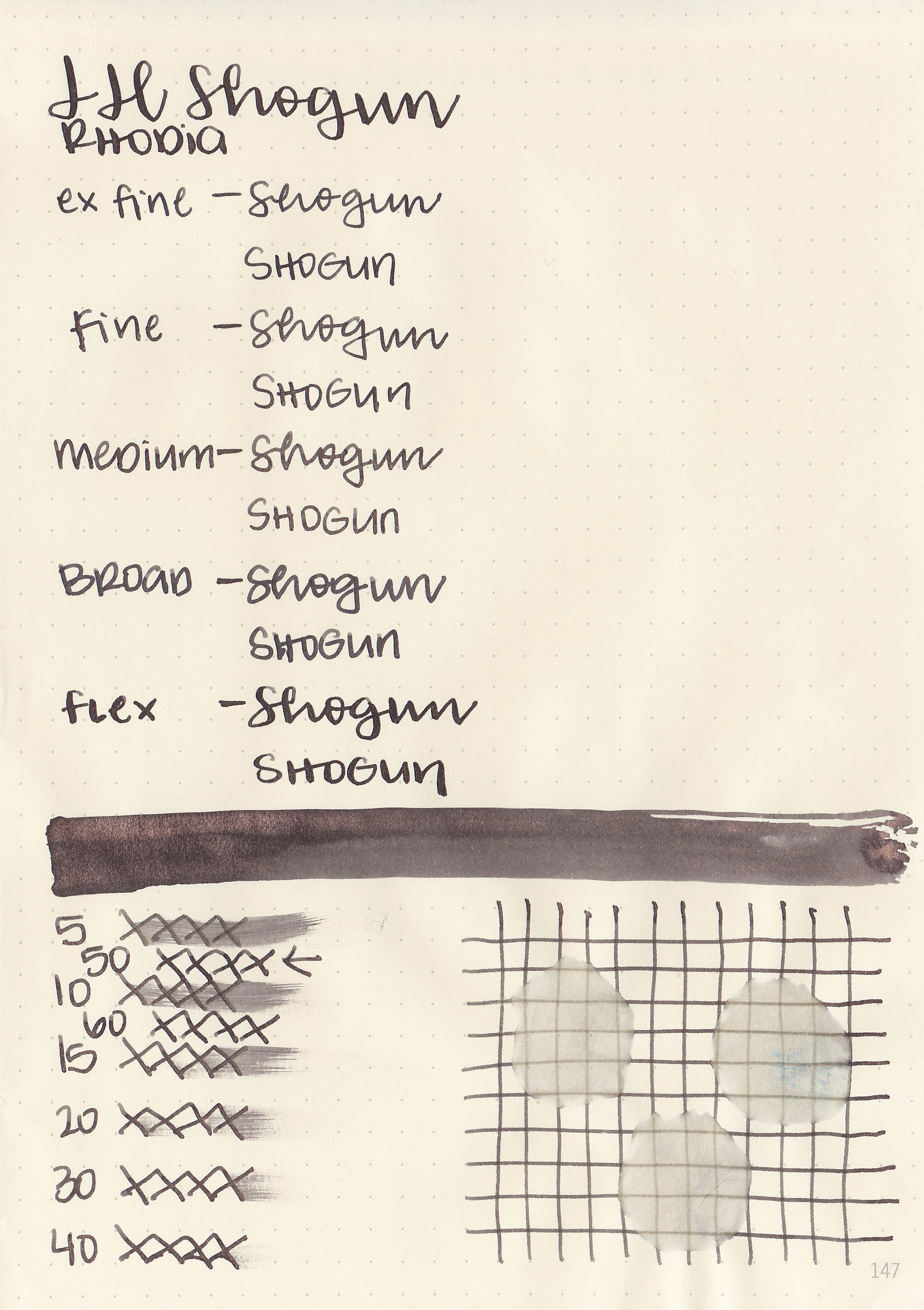
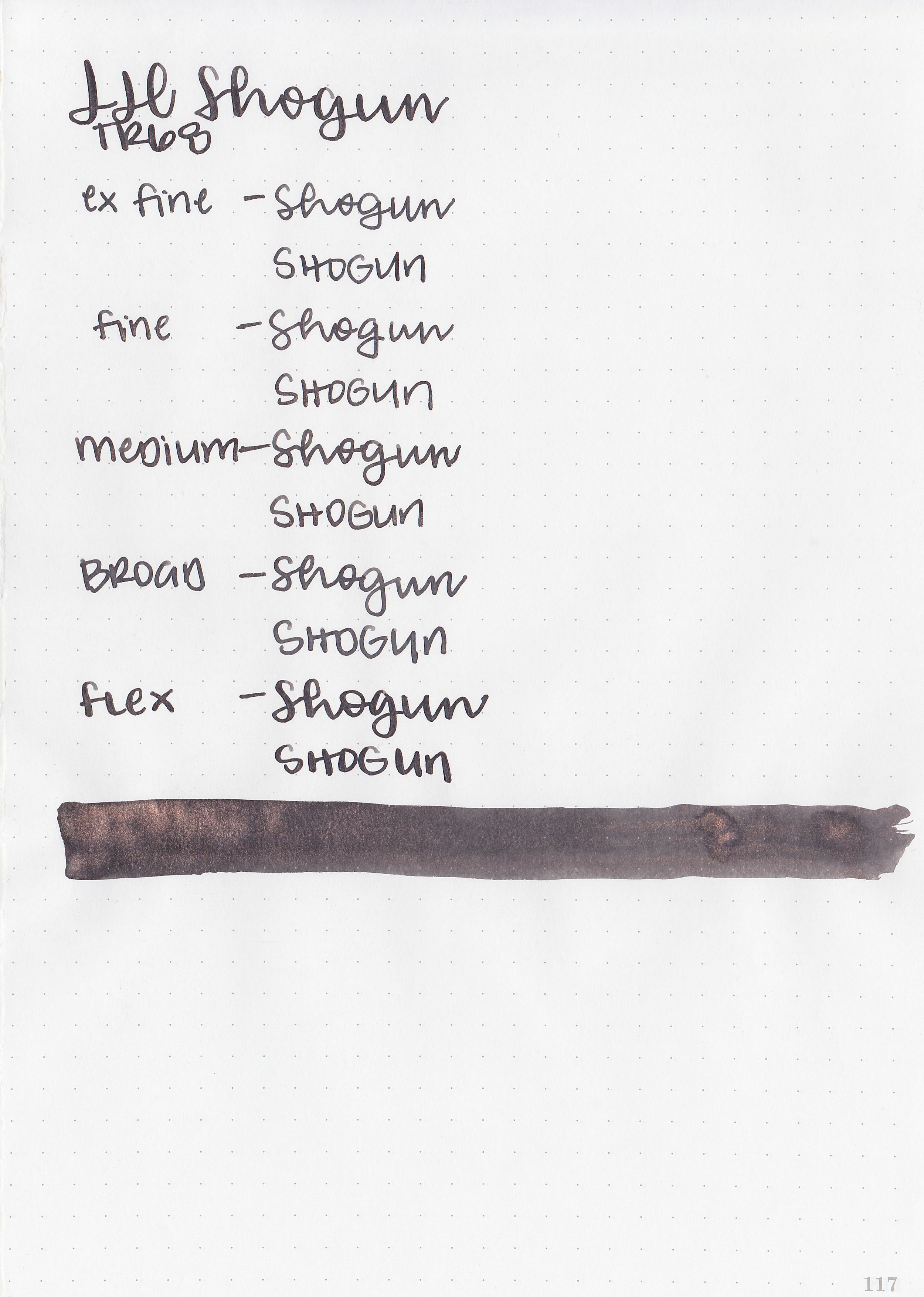
Ink Review: J Herbin Green Inks
/
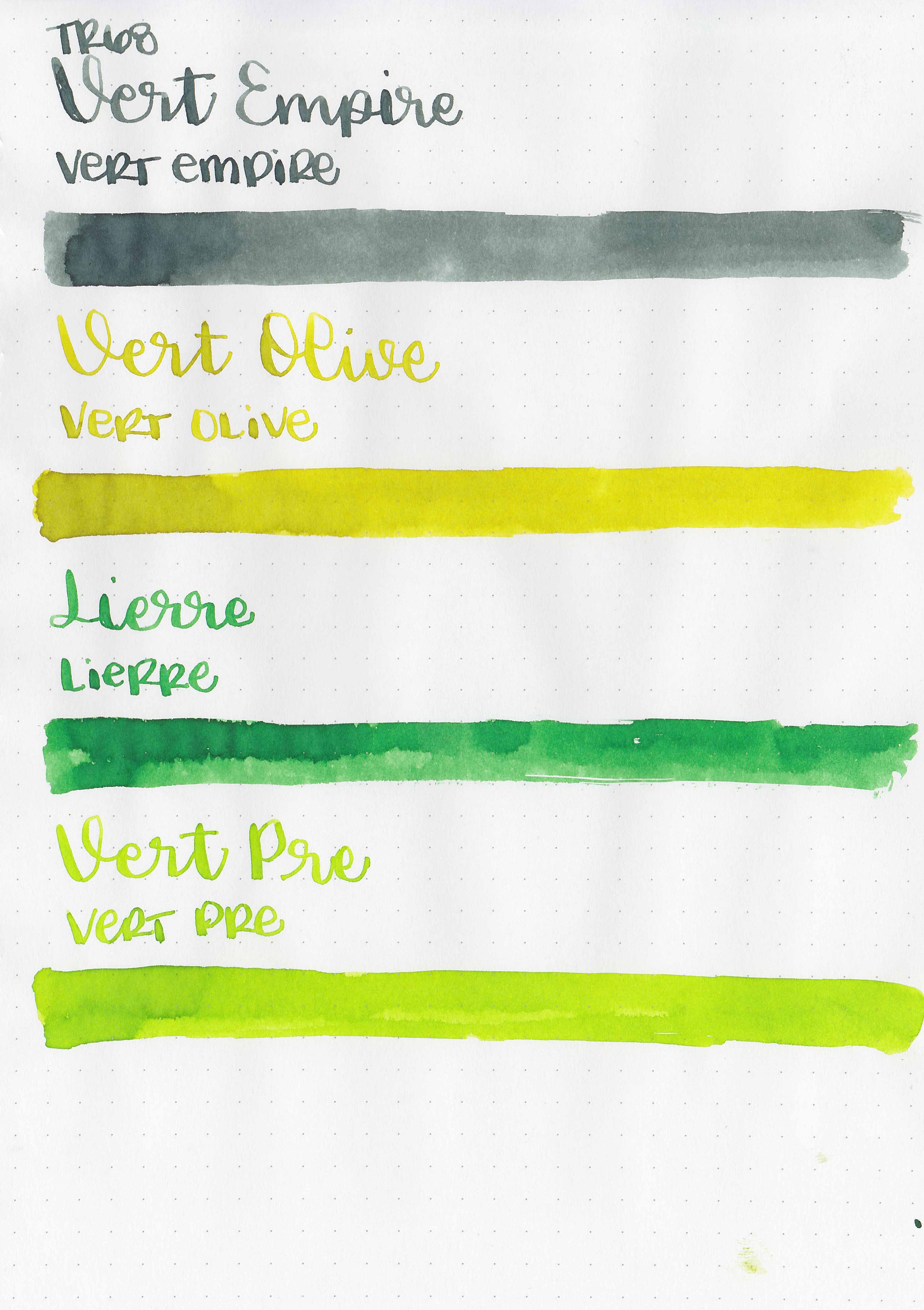
Let’s take a look at four J Herbin standard inks: Vert Empire, Vert Olive, Lierre Sauvage and Vert Pre. You can purchase these inks at most retailers including Vanness Pens. Thanks to the reader who sent these inks in for review!
Swabs:


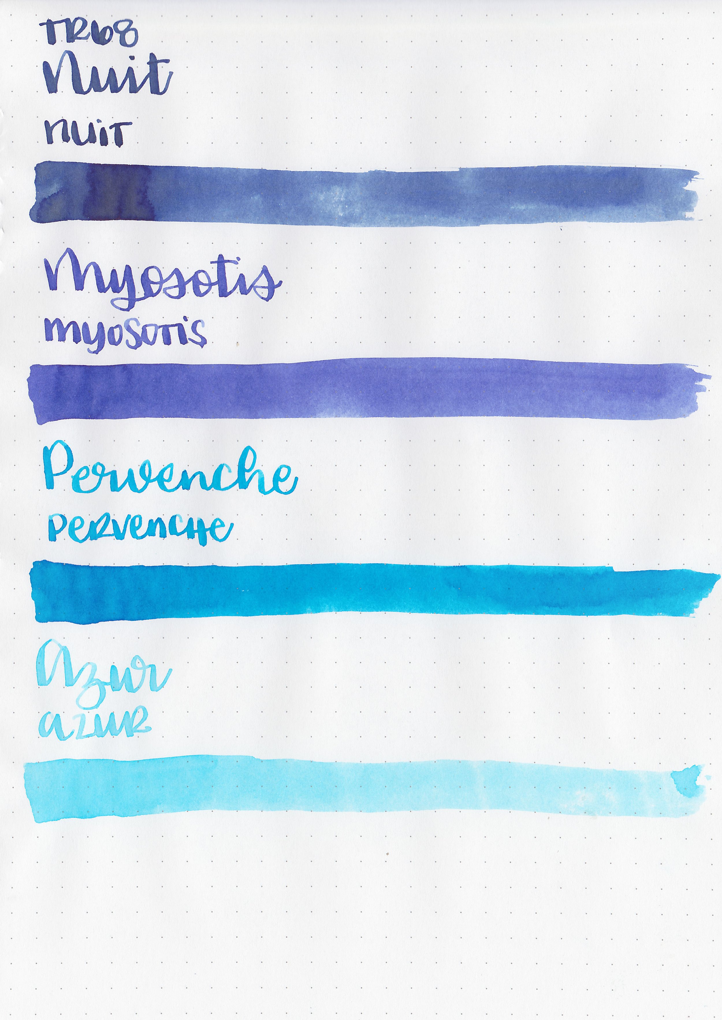
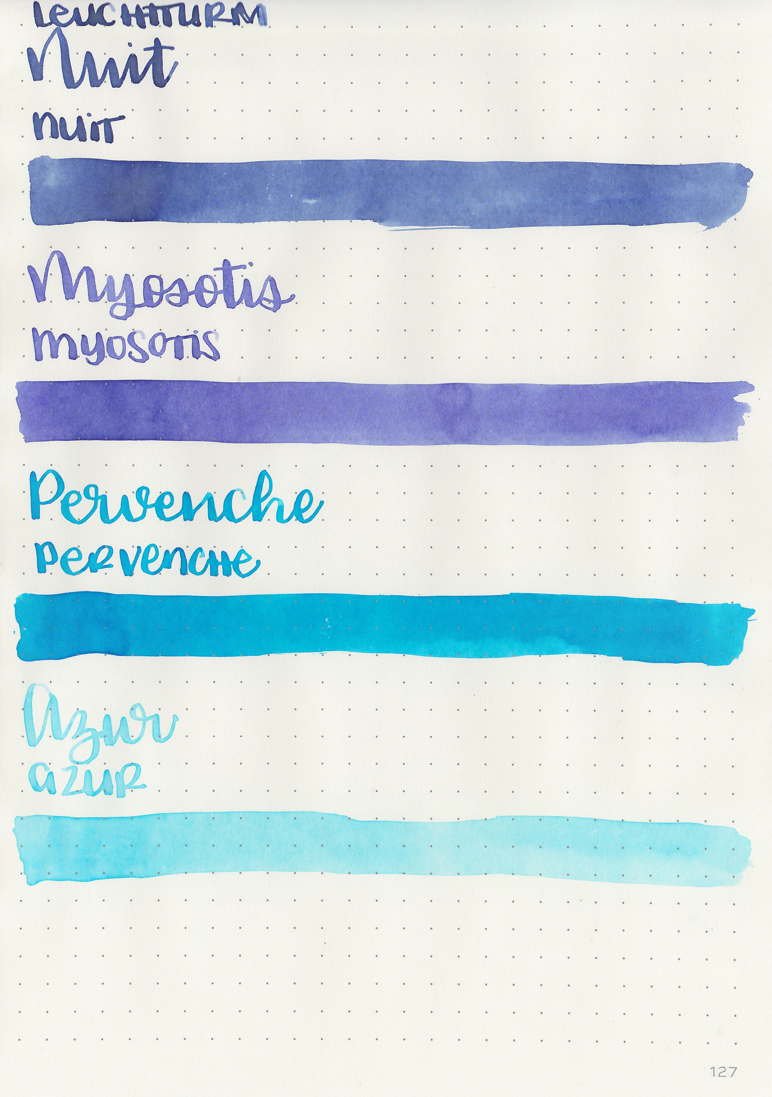
Left to right: Vert Empire, Vert Olive, Lierre Sauvage and Vert Pre.
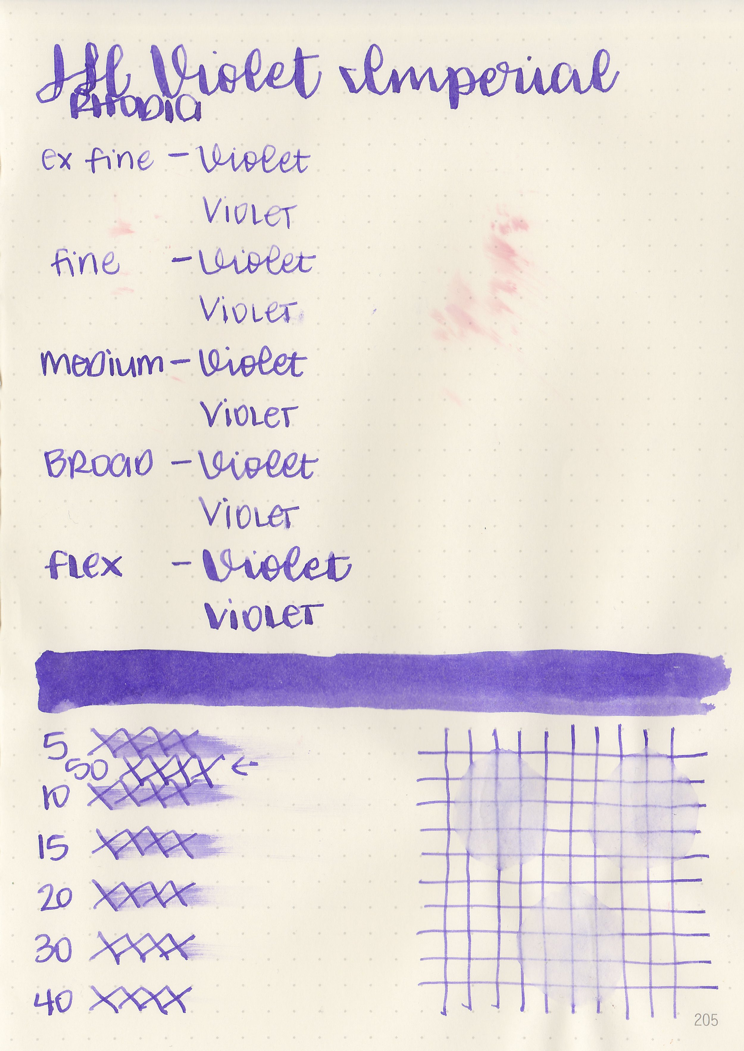
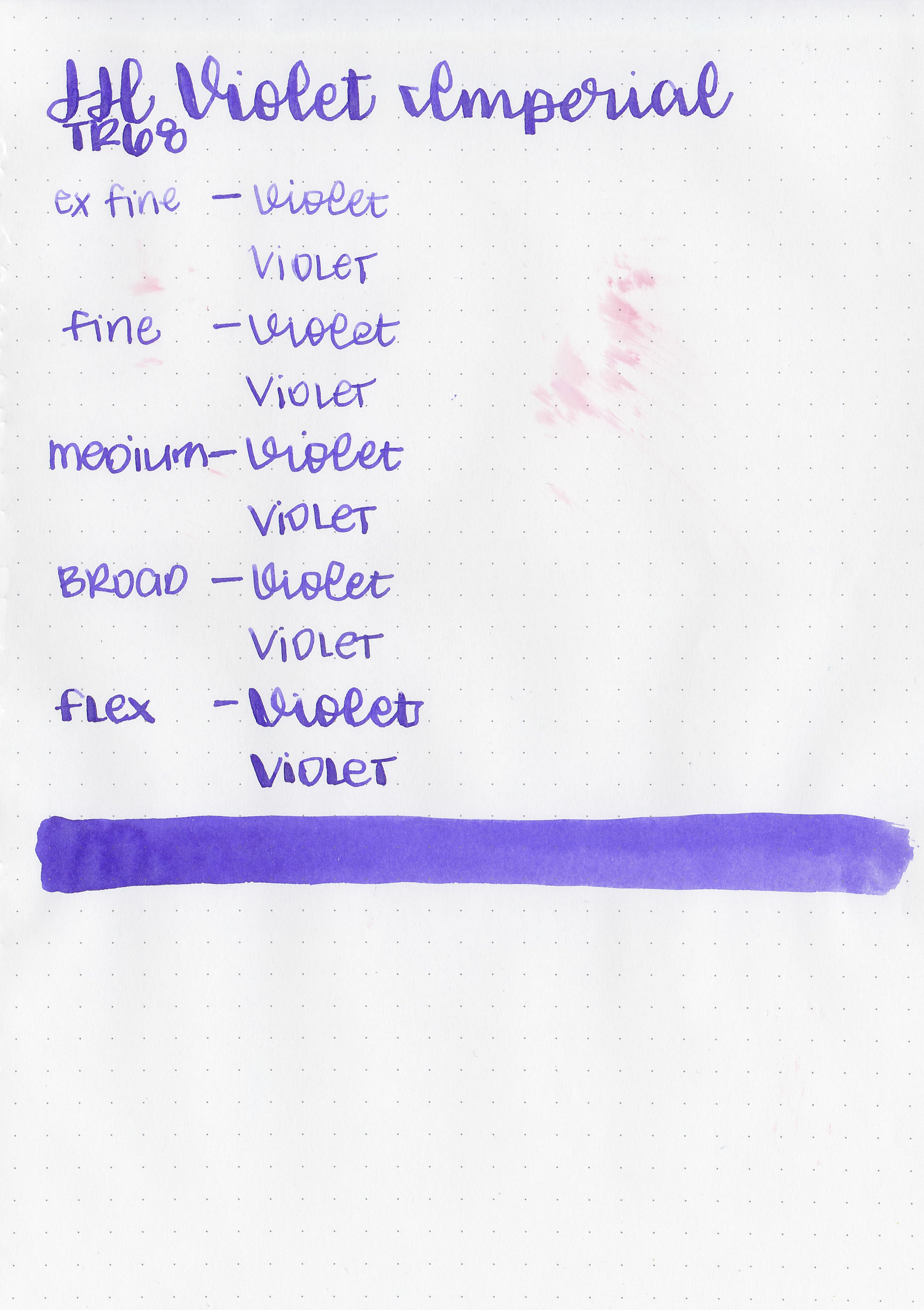
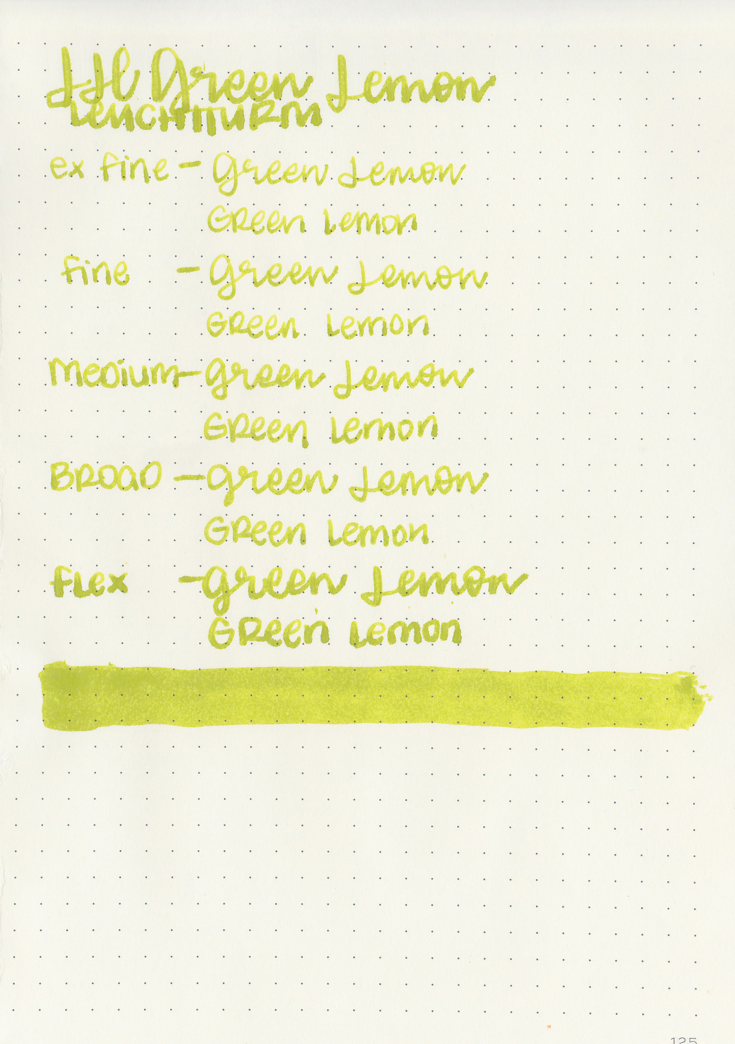
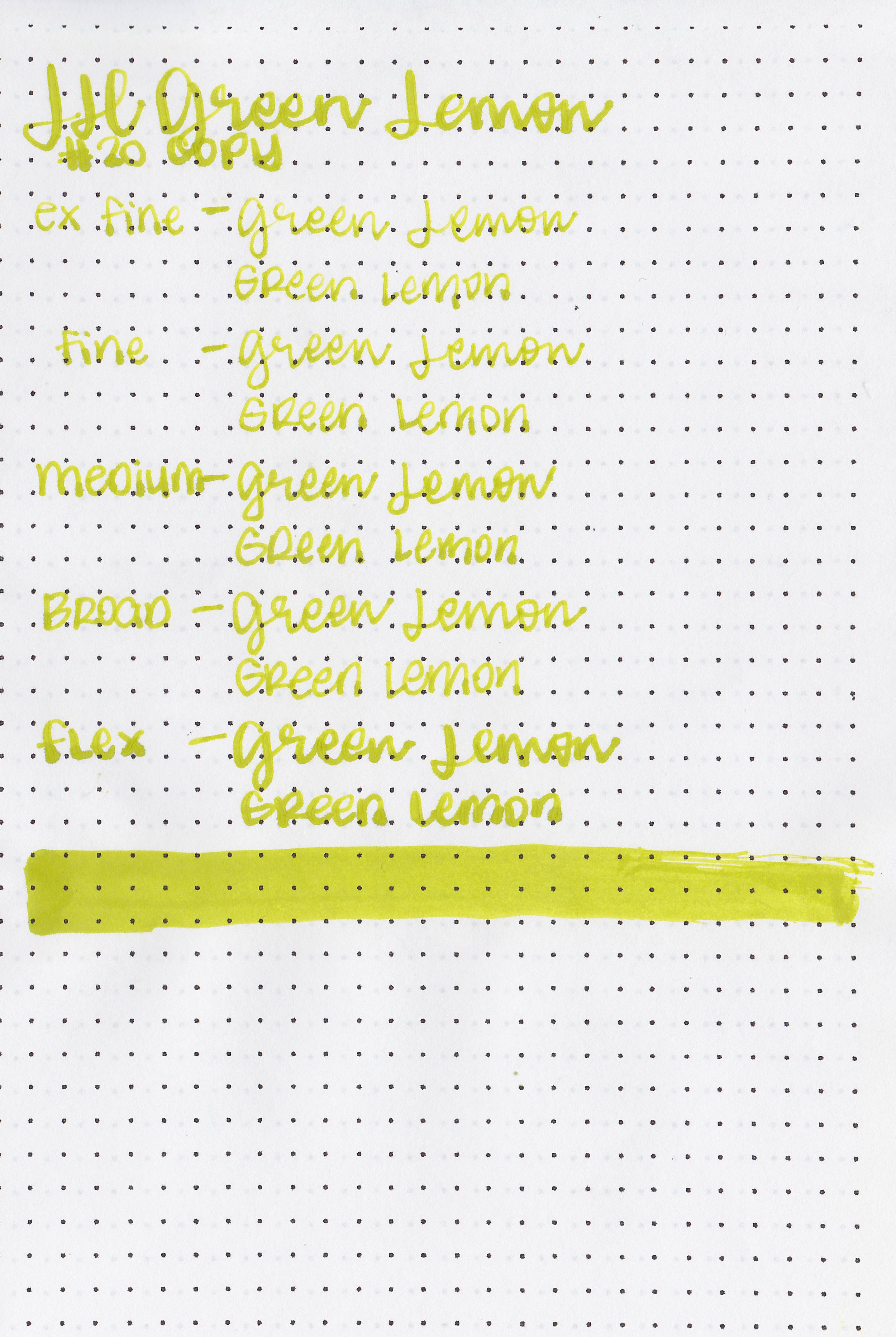
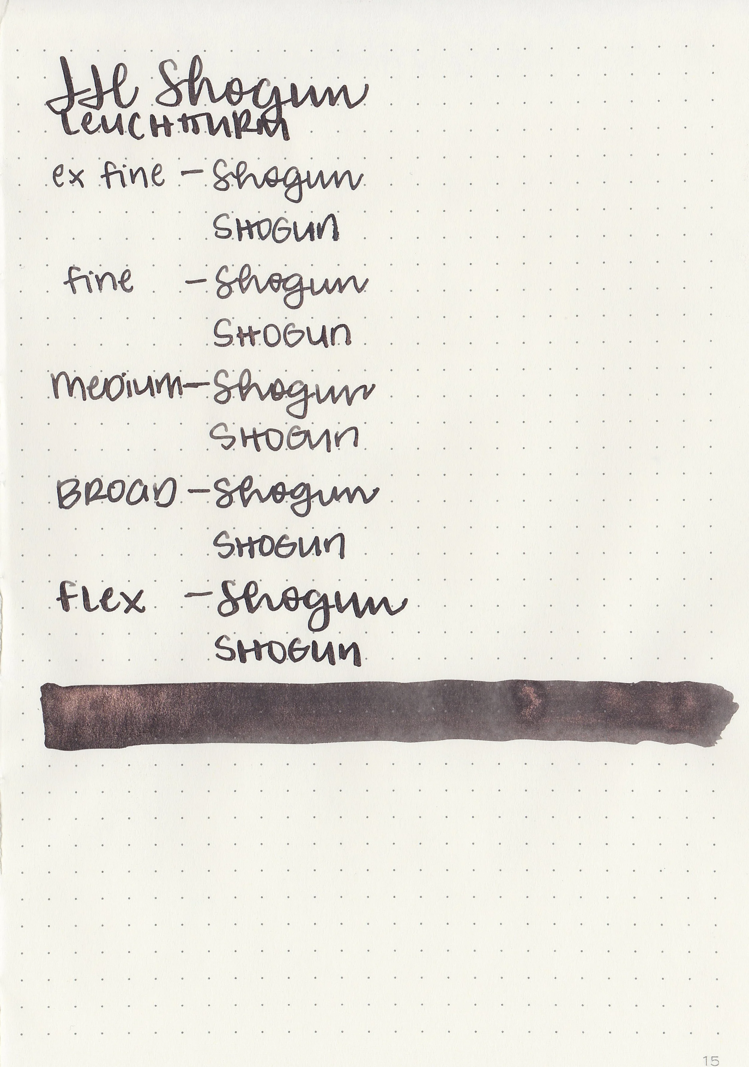
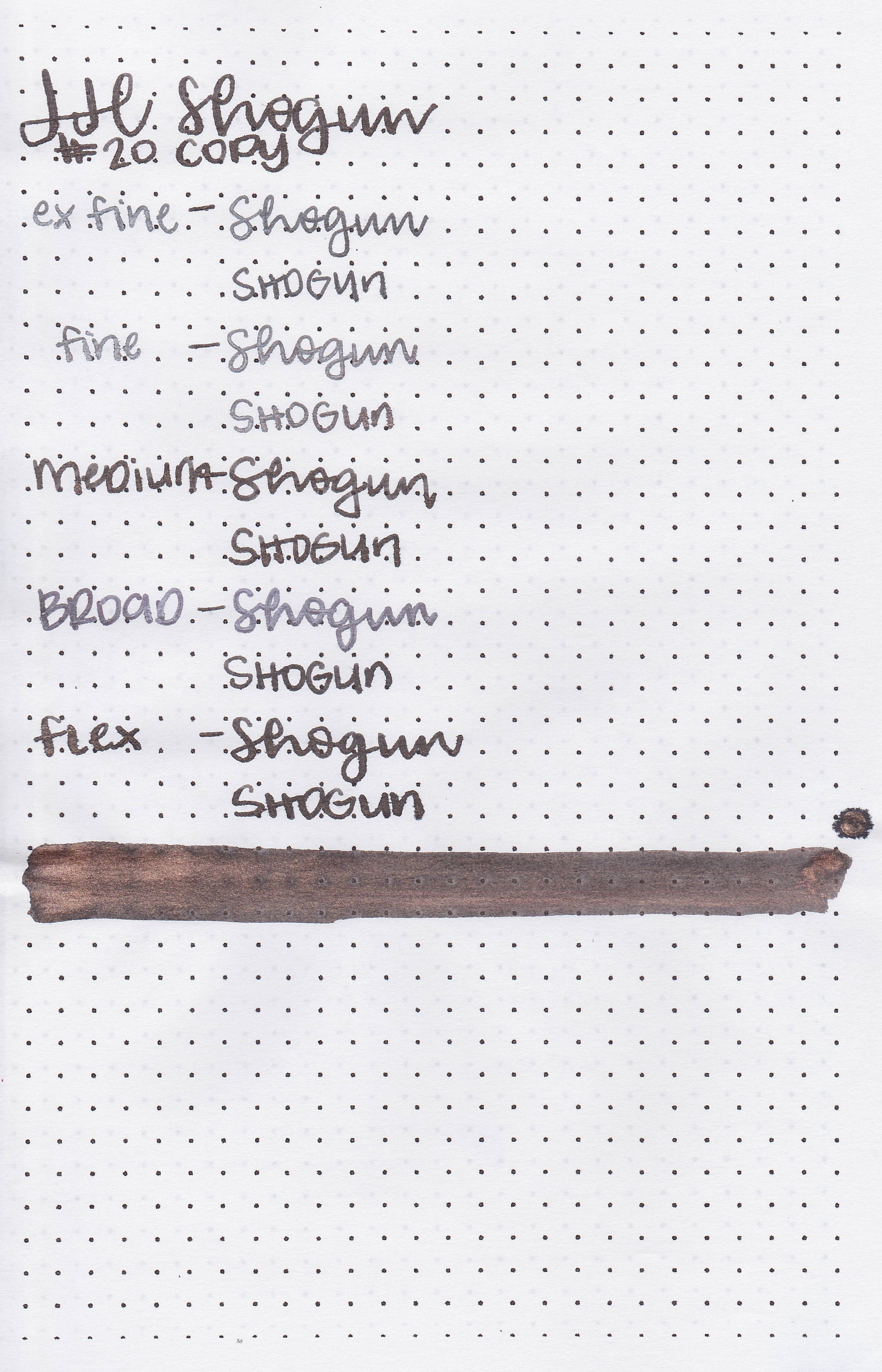
Writing samples:
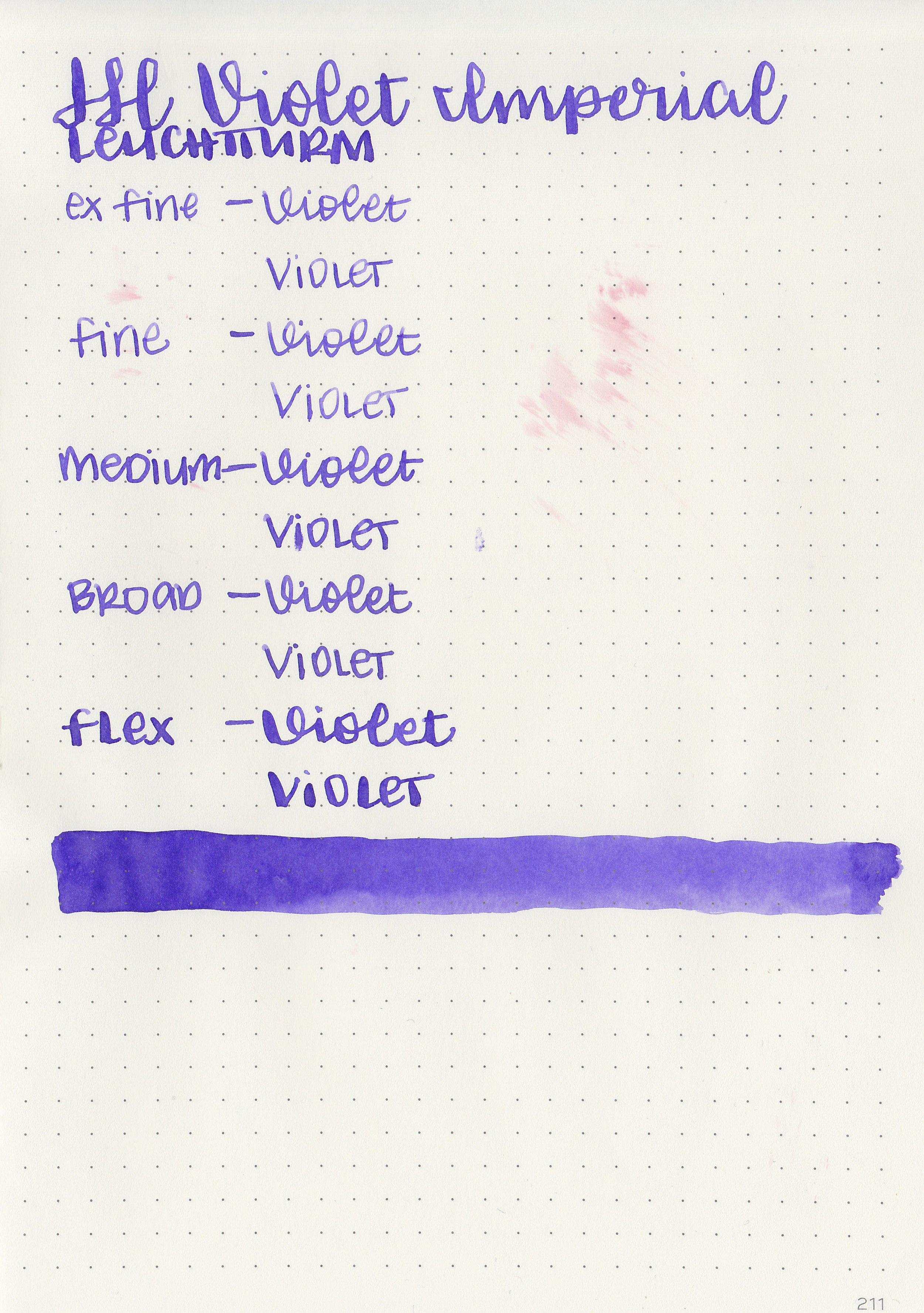
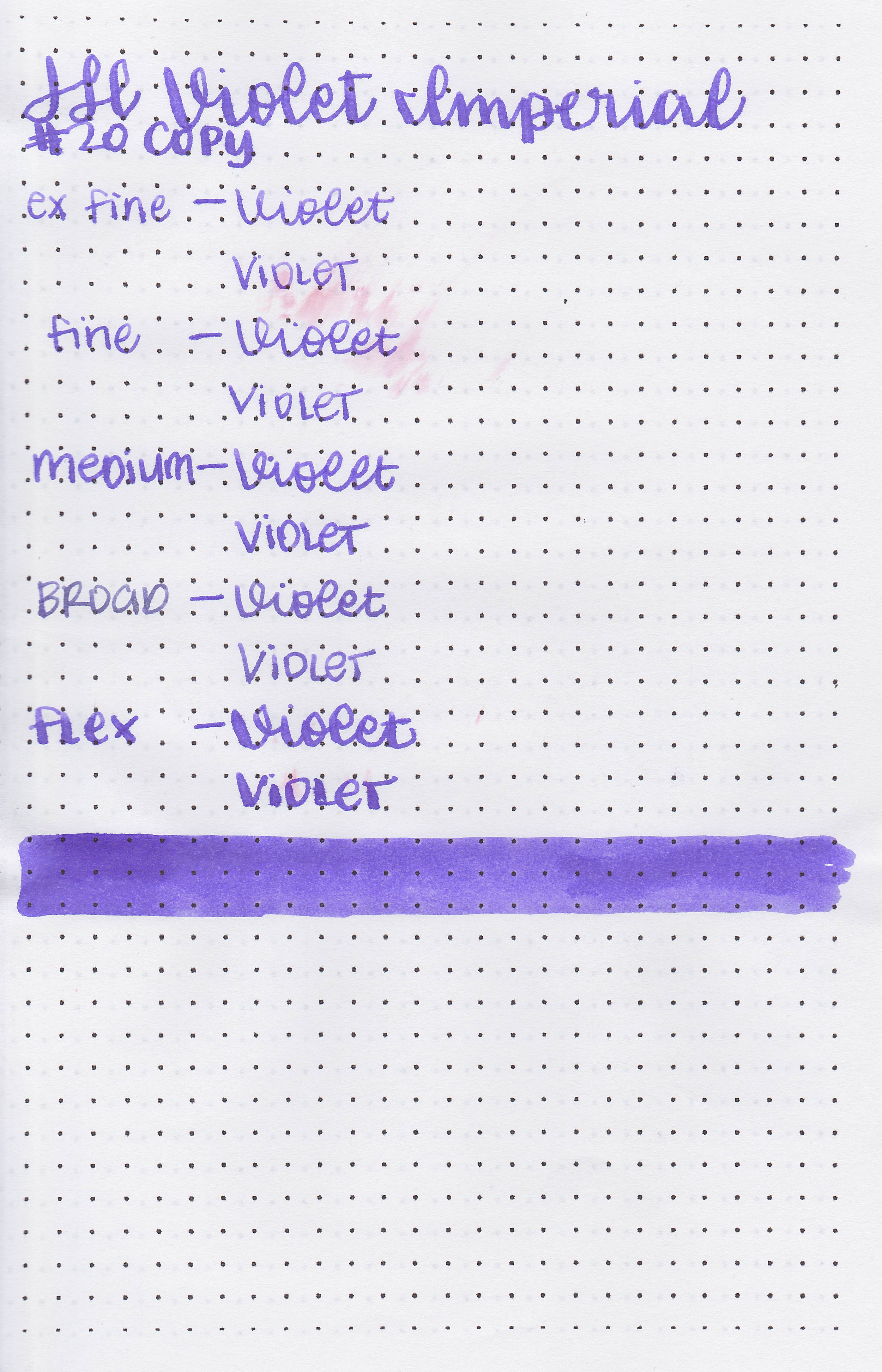
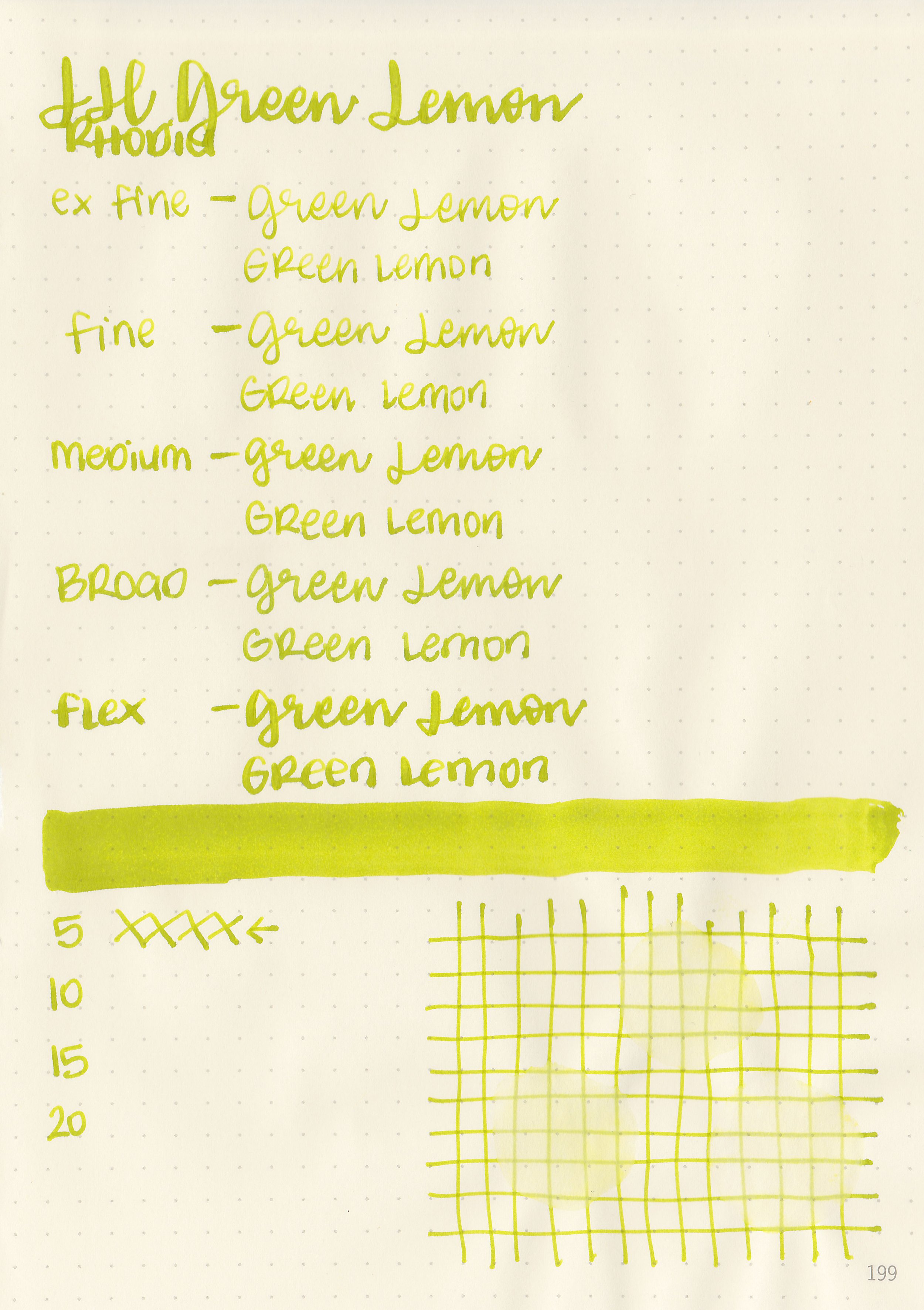
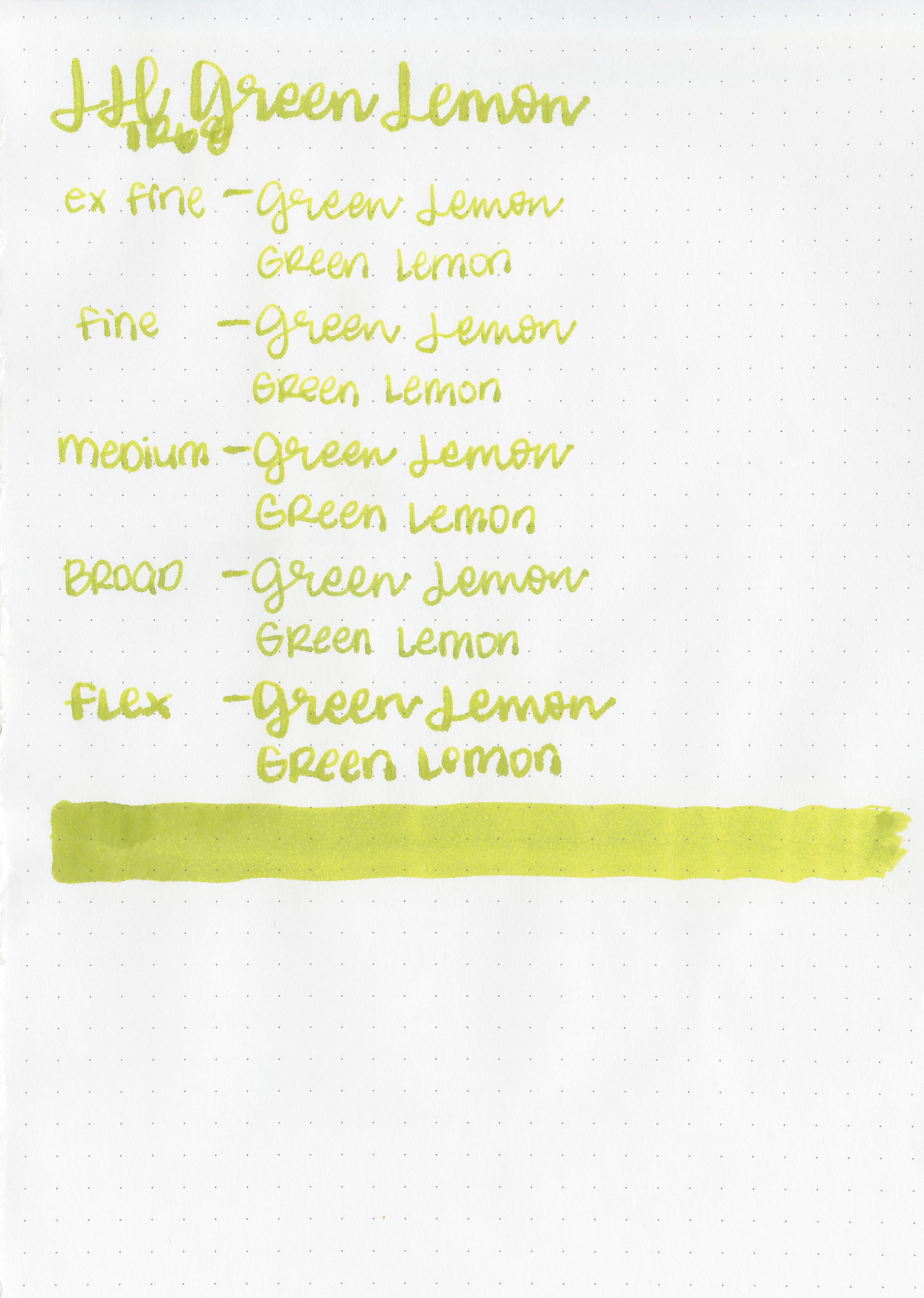
Let's take a look at how the ink behaves on fountain pen friendly papers: Rhodia, Tomoe River, and Leuchtturm.


Dry Time: 40 seconds
Water Resistance: Low


Feathering: None

Show through: Medium


Bleeding: None
Other properties: All four had low shading.


On Walmart Pen + Gear copy paper there was quite a bit of feathering and bleeding in all nib sizes. I spilled some Lierre Sauvage all over.
Comparison Swabs:
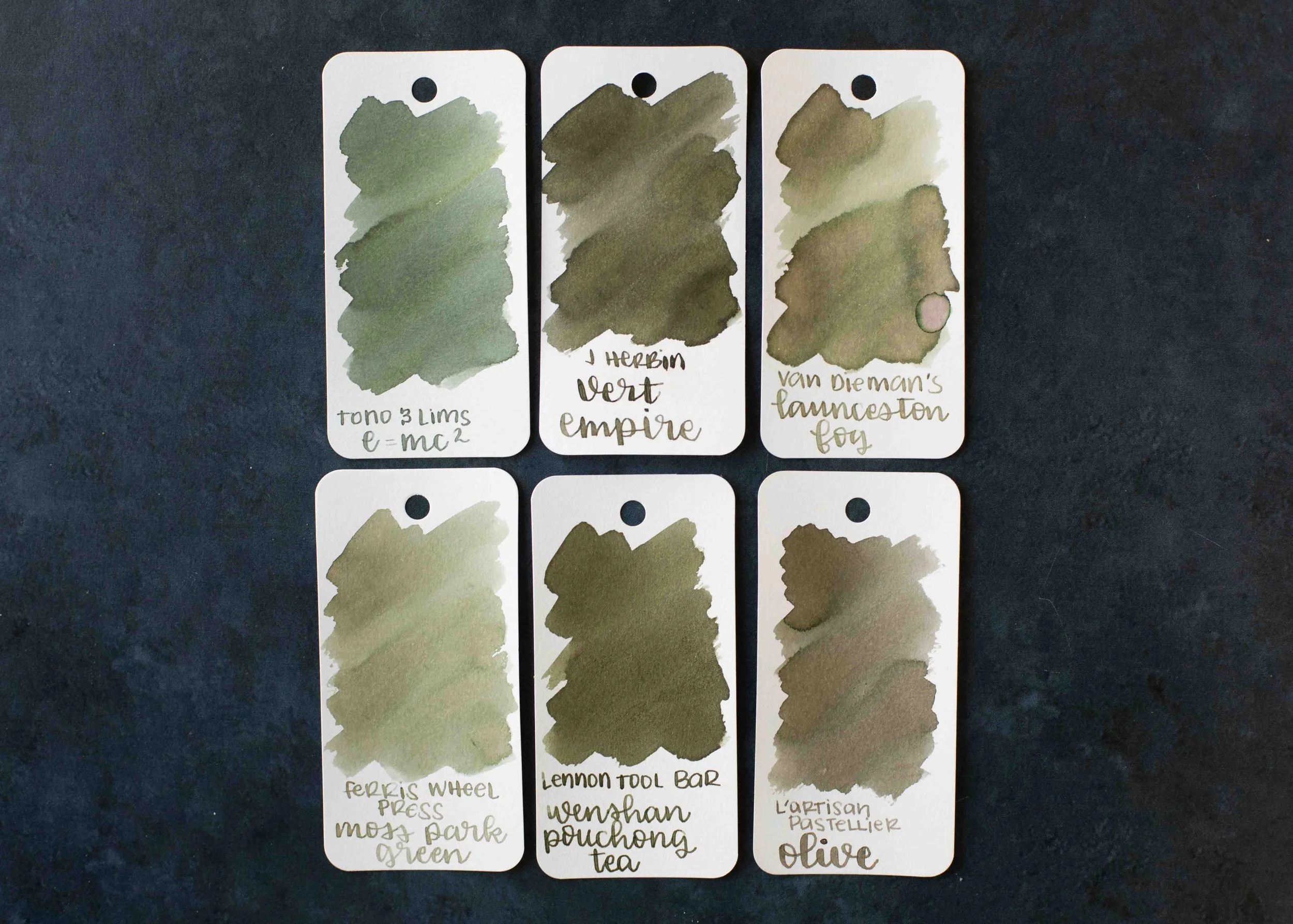
Vert Empire is more brown than Lennon Tool Bar Wenshan Pouchong Tea.

Vert Olive is more yellow than Pilot Iroshizuku Hotaru-bi.

Lierre Sauvage is darker than Robert Oster Ryde Green.

Vert Pre is more yellow than Diamine Spring Green.

I used a Taroko Enigma notebook. All four inks had average flows.
Overall, I love all four of these but Lierre Sauvage is my favorite. The color is fabulous.
Disclaimer: These inks were provided by a reader for the purpose of this review. All photos and opinions are my own. This page does not contain affiliate links, and is not sponsored in any way.