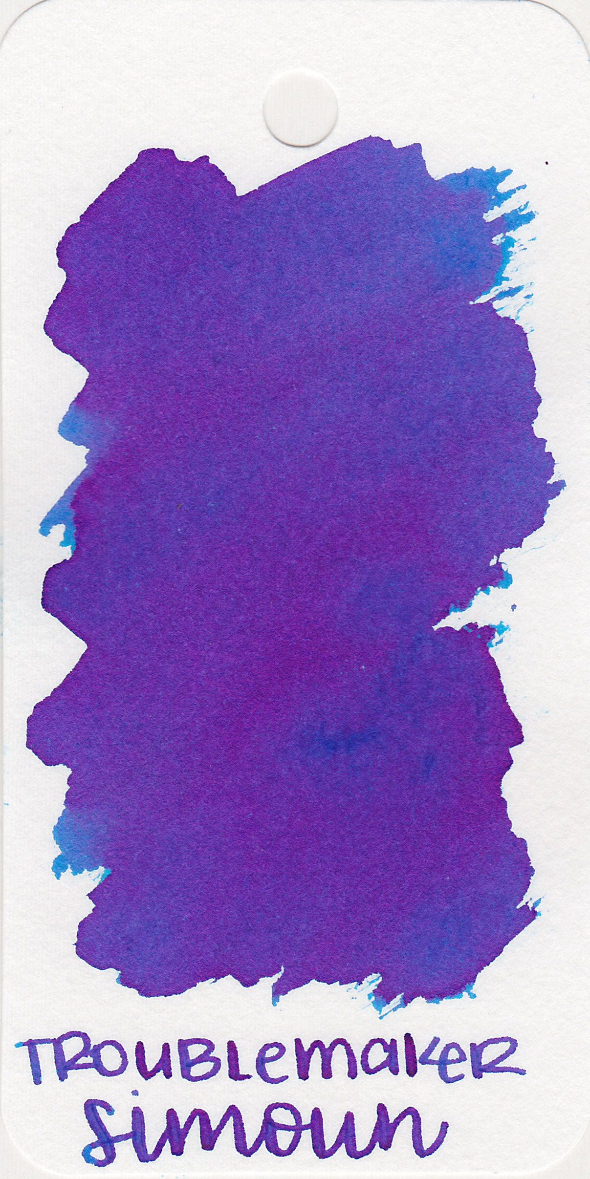
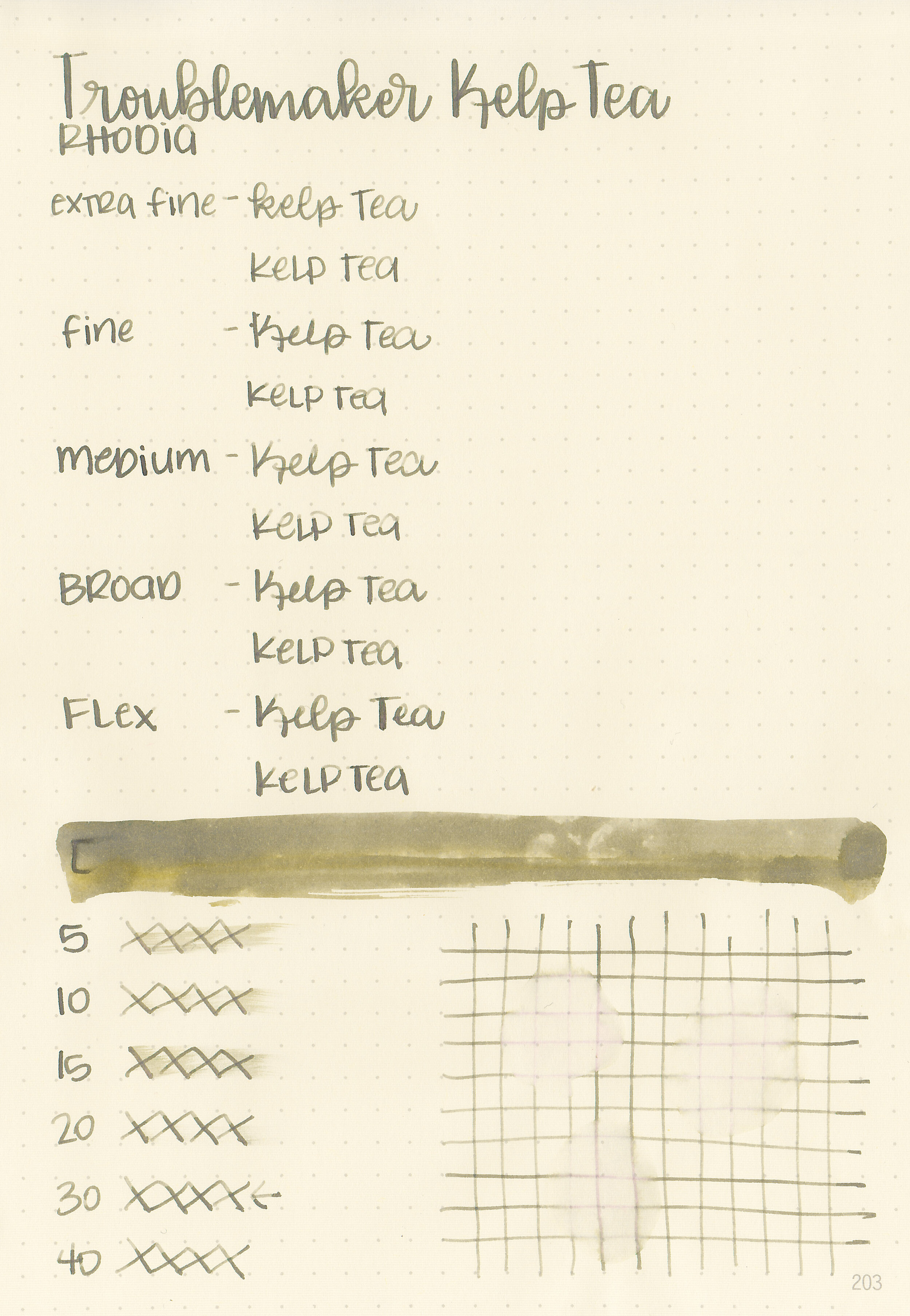
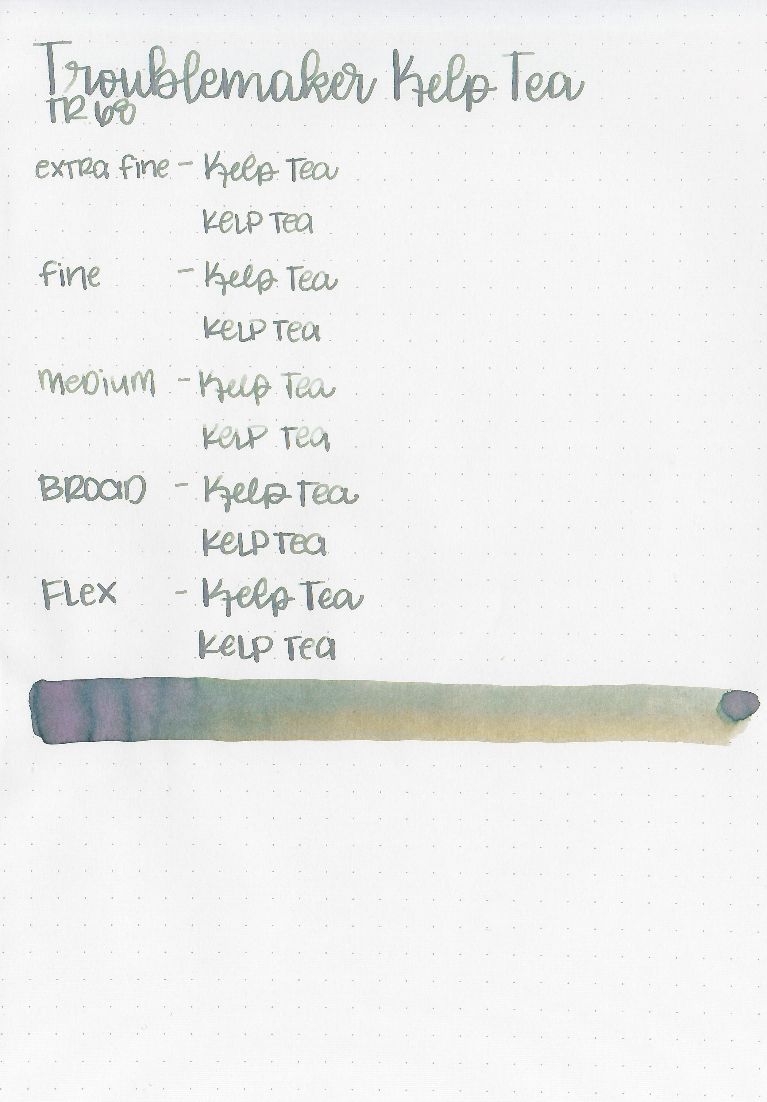
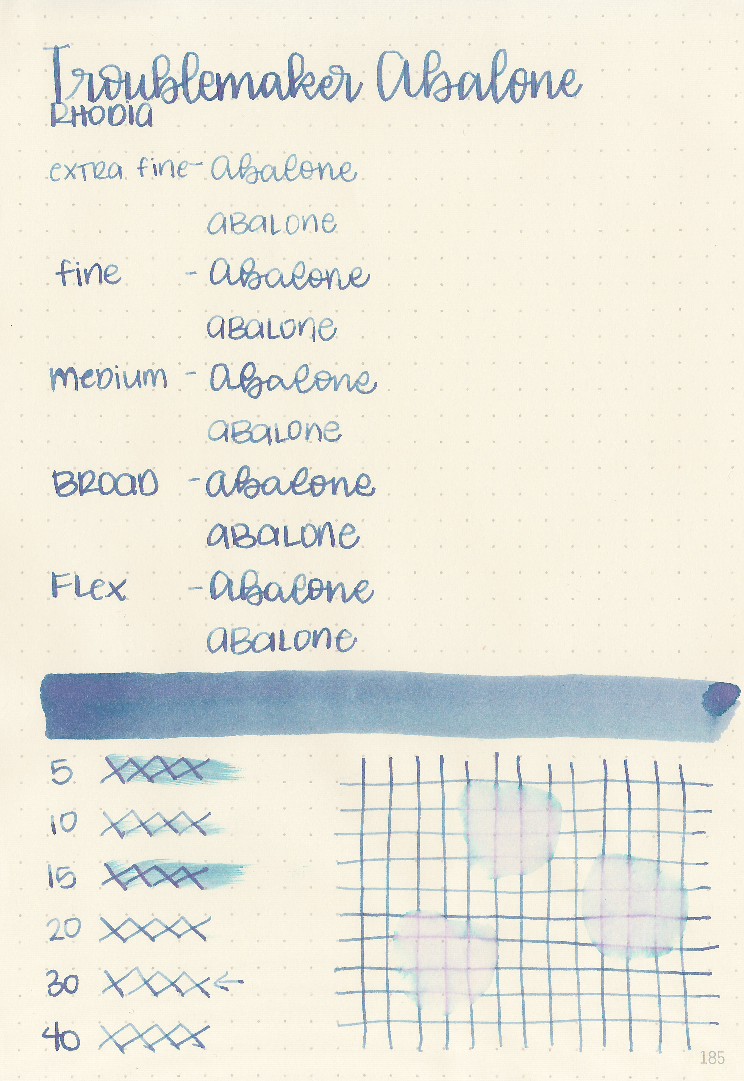
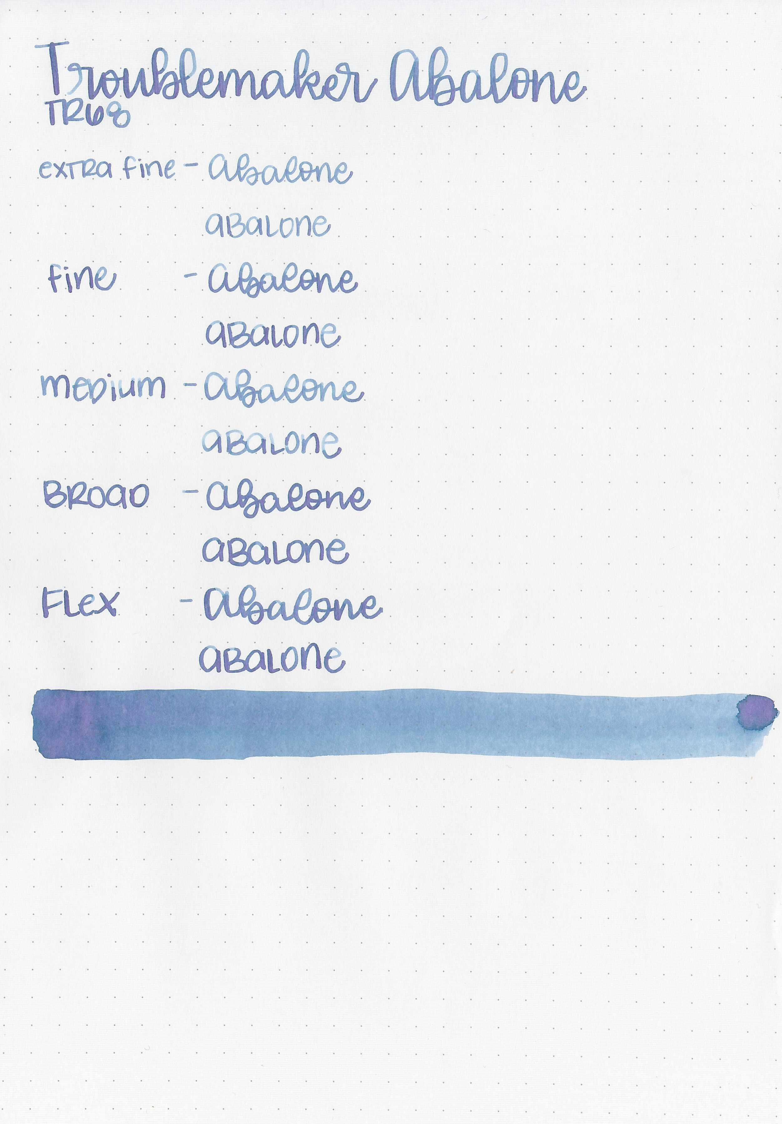
Tono & Lims Standard Inks, Part 2
/
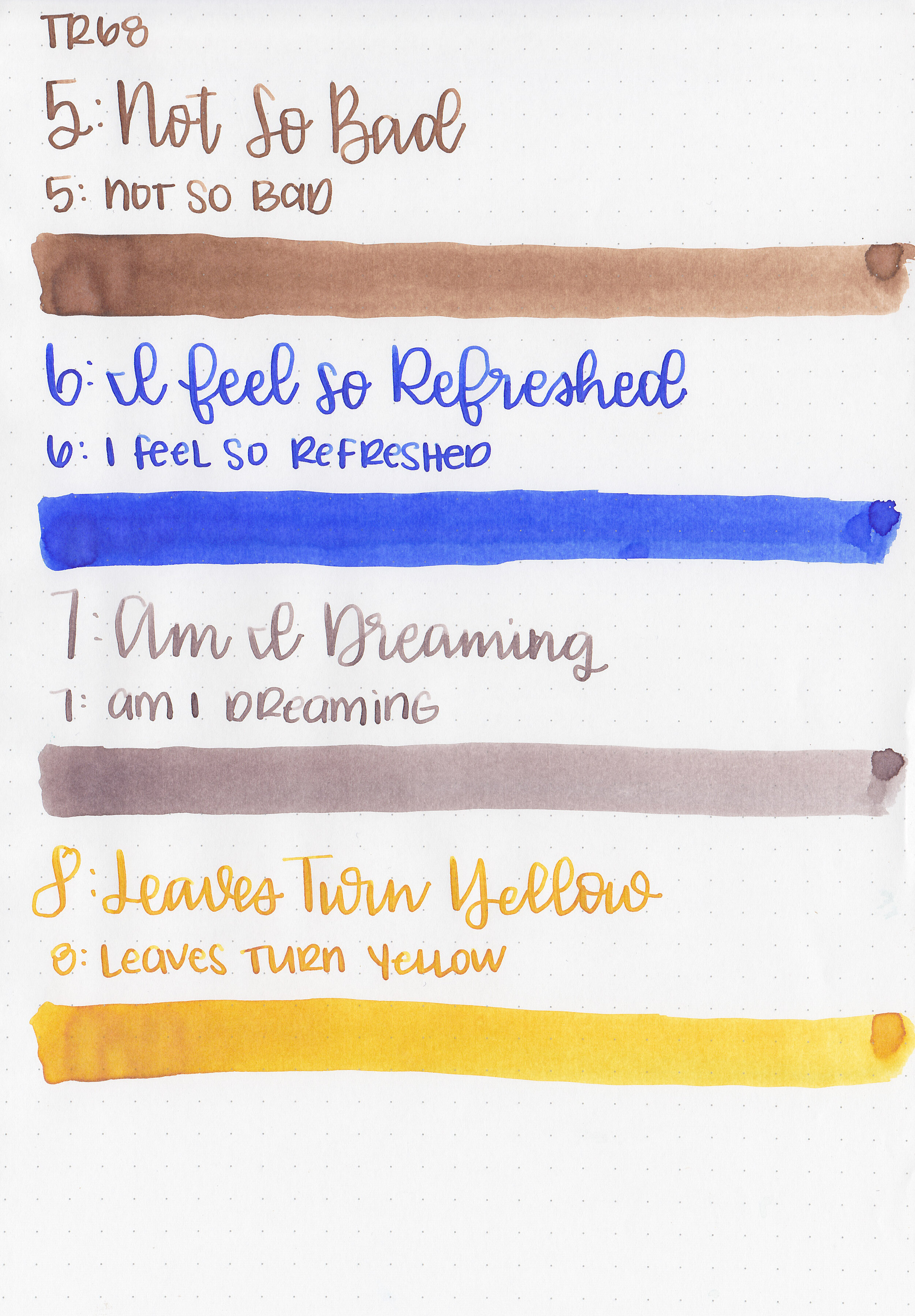
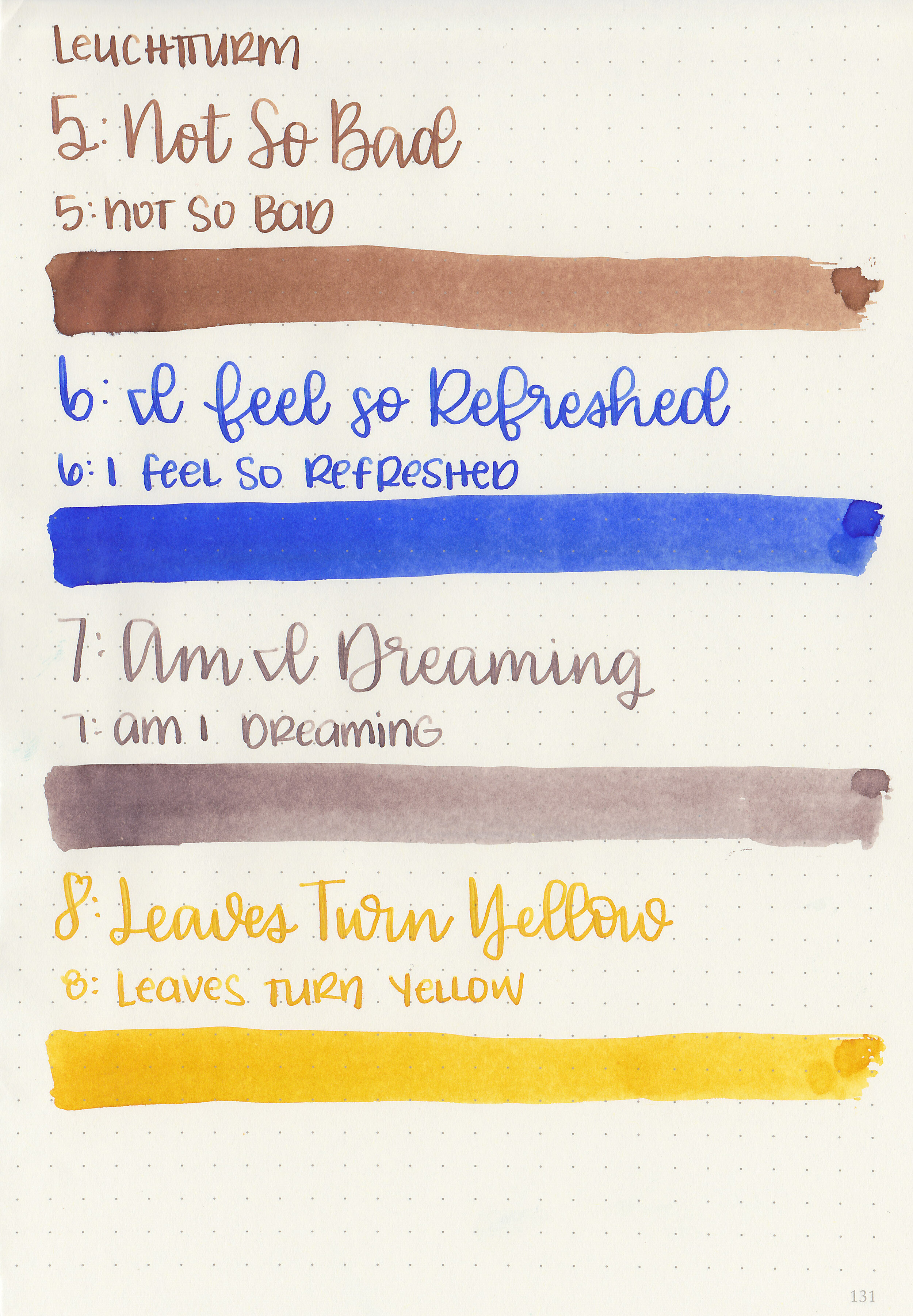
Yesterday I reviewed the first four inks from the Tono & Lims standard collection, so today we are going to continue with the next four inks from the collection: No. 5 Not So Bad, No. 6 I Feel So Refreshed, No. 7 Am I Dreaming and No. 8 Leaves Turn Yellow. These inks come in square 30ml glass bottles. Thanks to Shigure Inks for sending samples over for review!
Swabs:

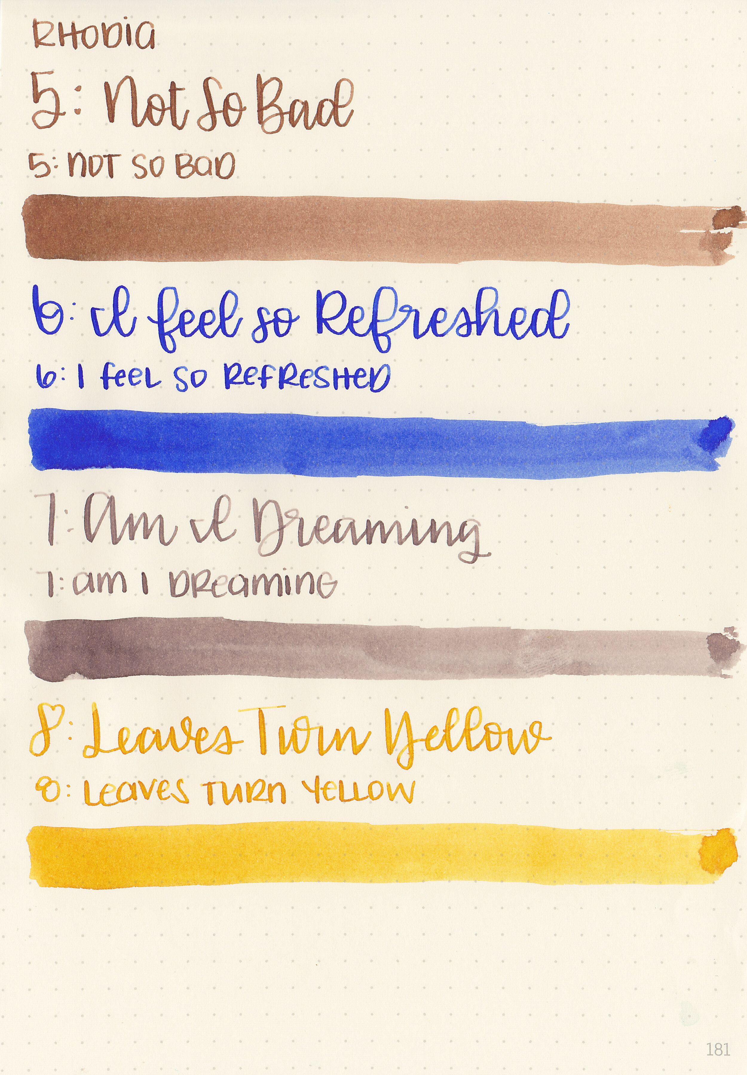
Left to right: No. 5 Not So Bad, No. 6 I Feel So Refreshed, No. 7 Am I Dreaming and No. 8 Leaves Turn Yellow
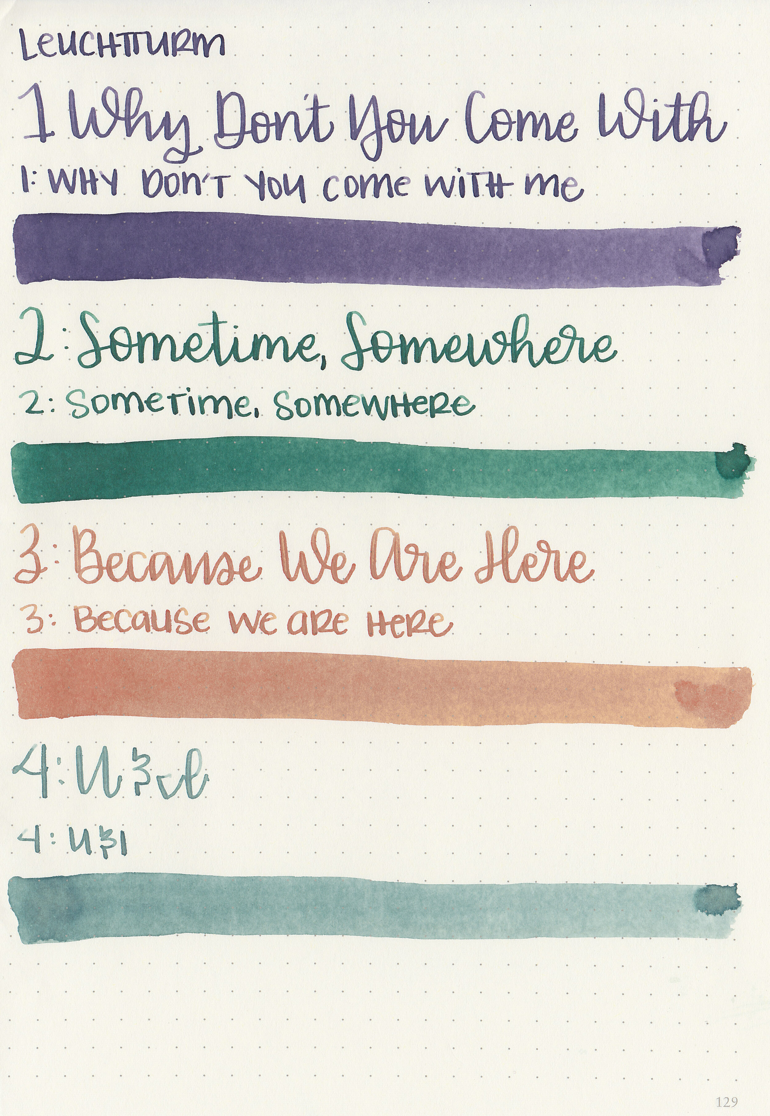
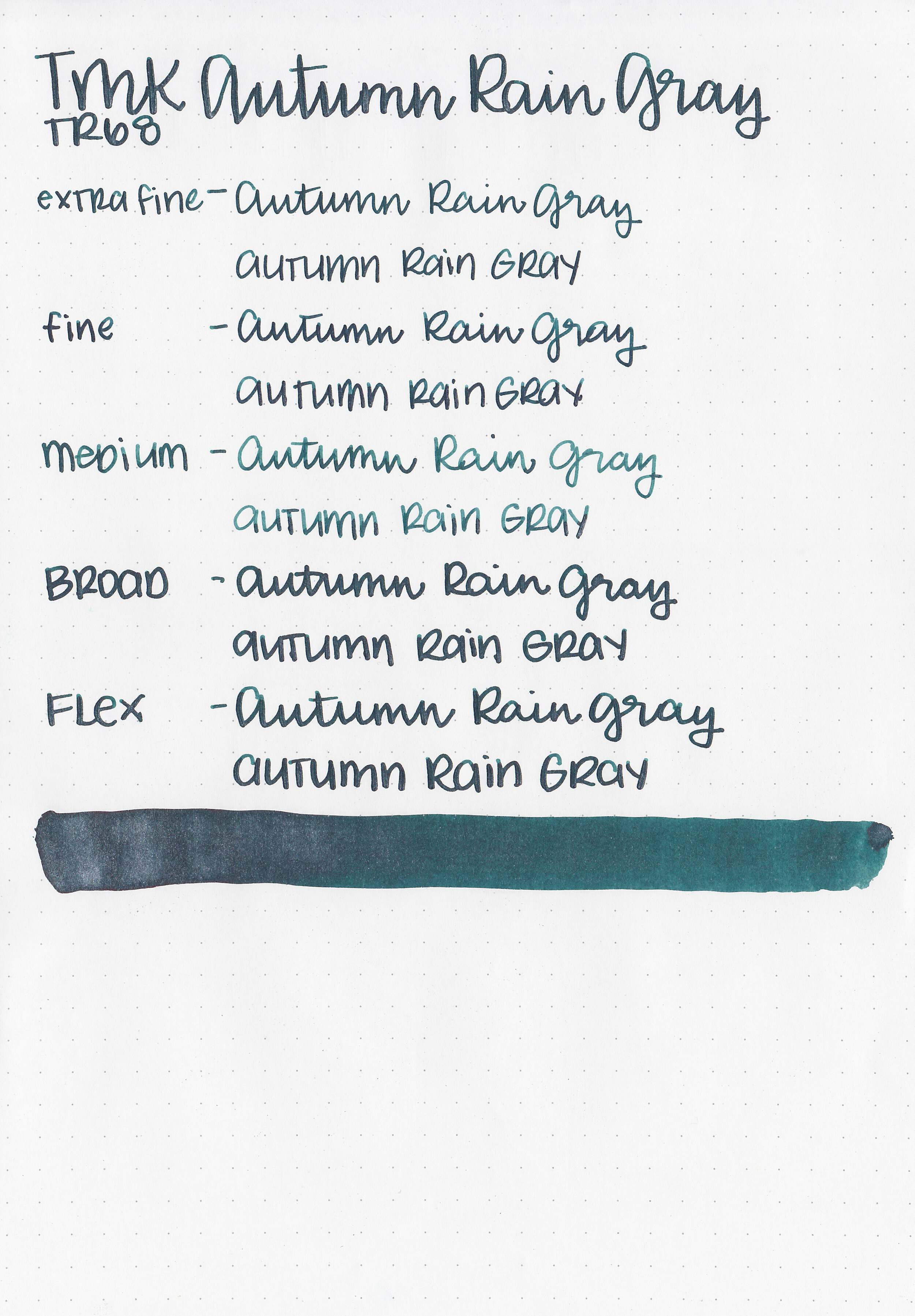
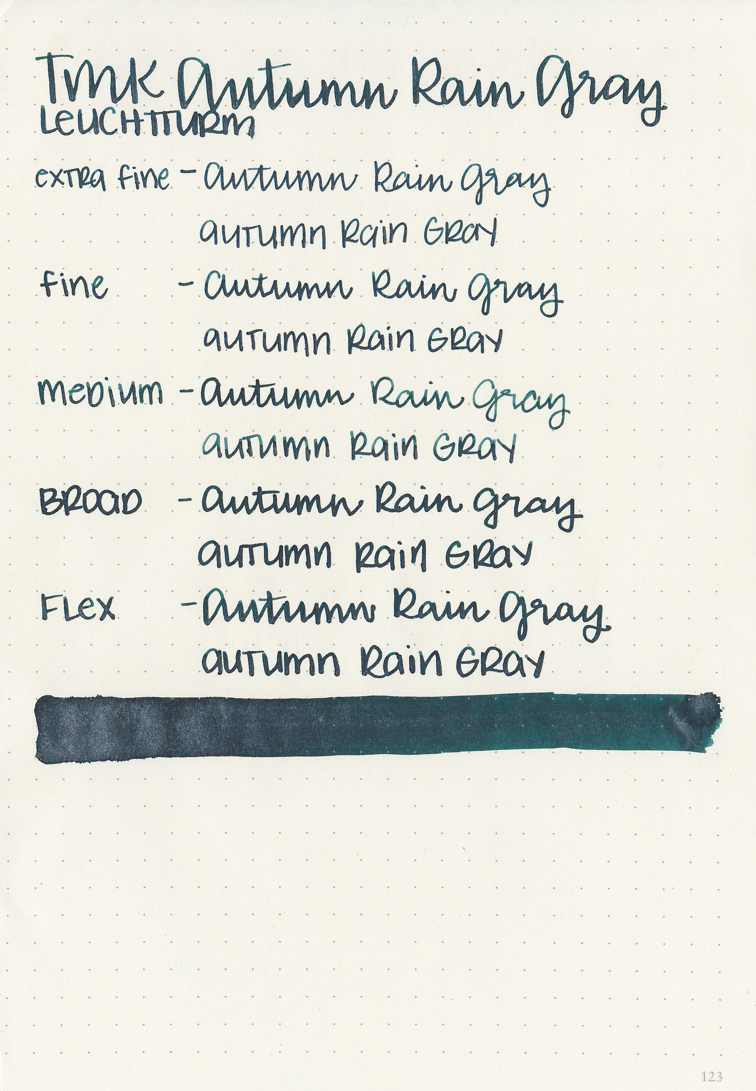
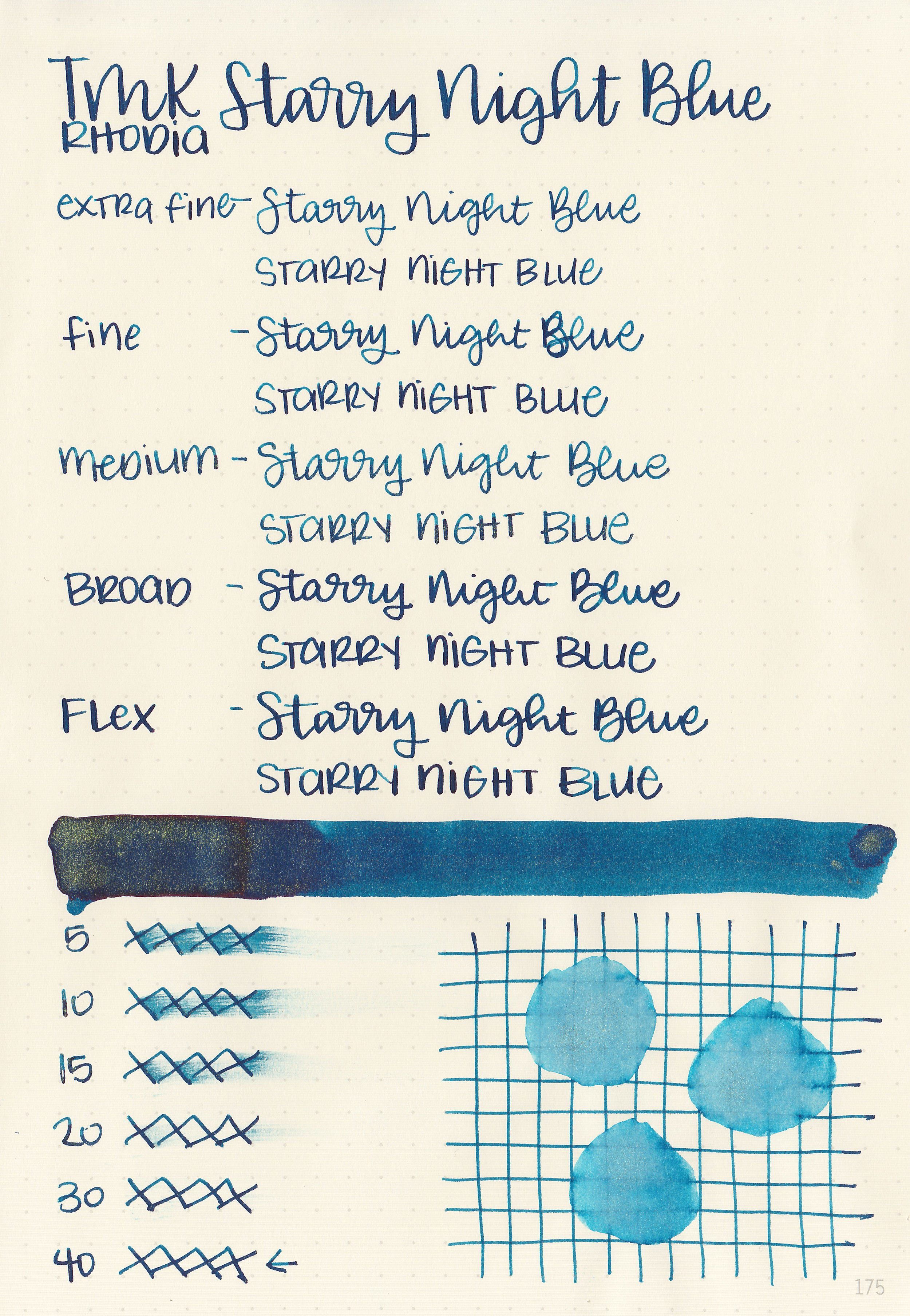
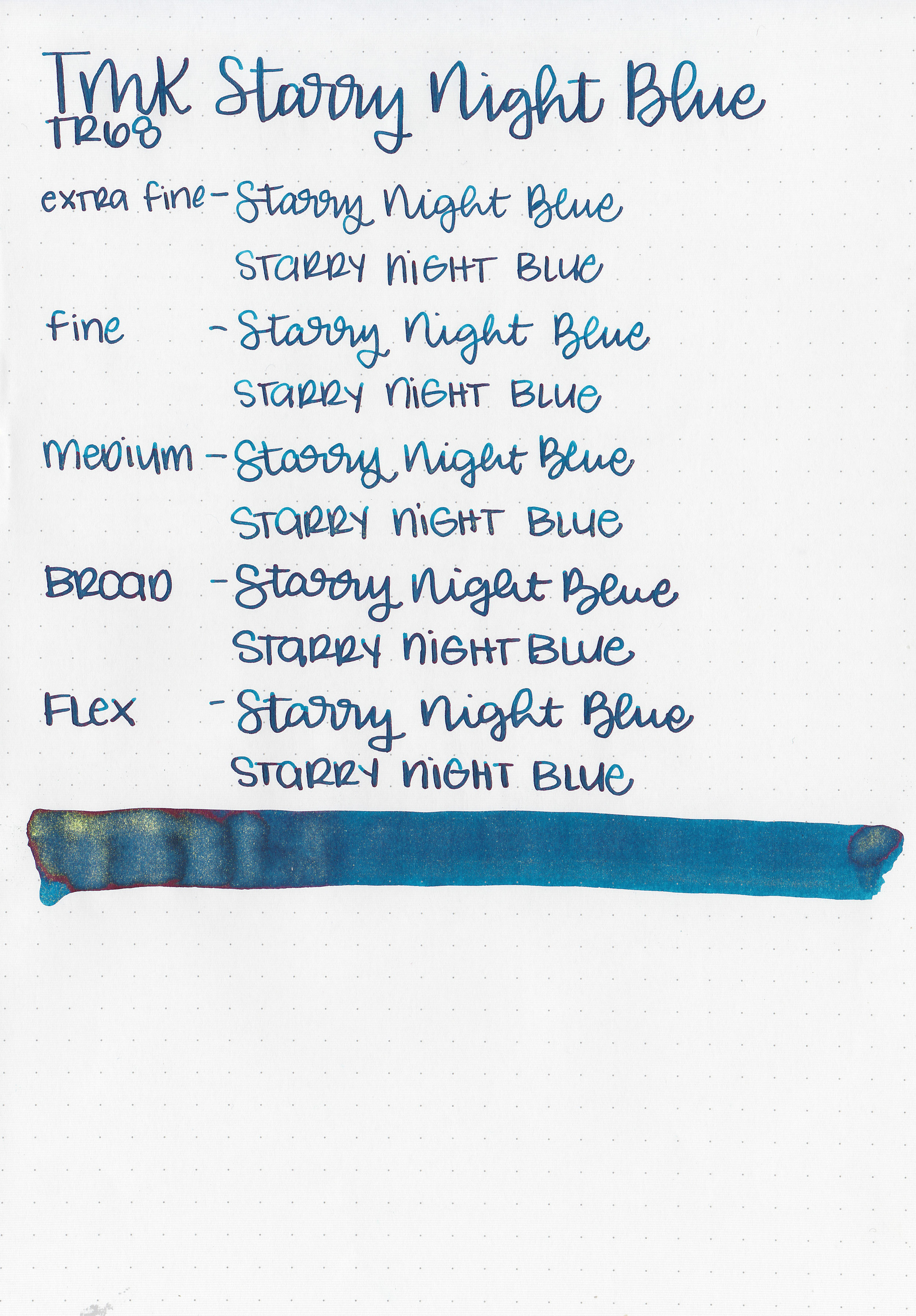
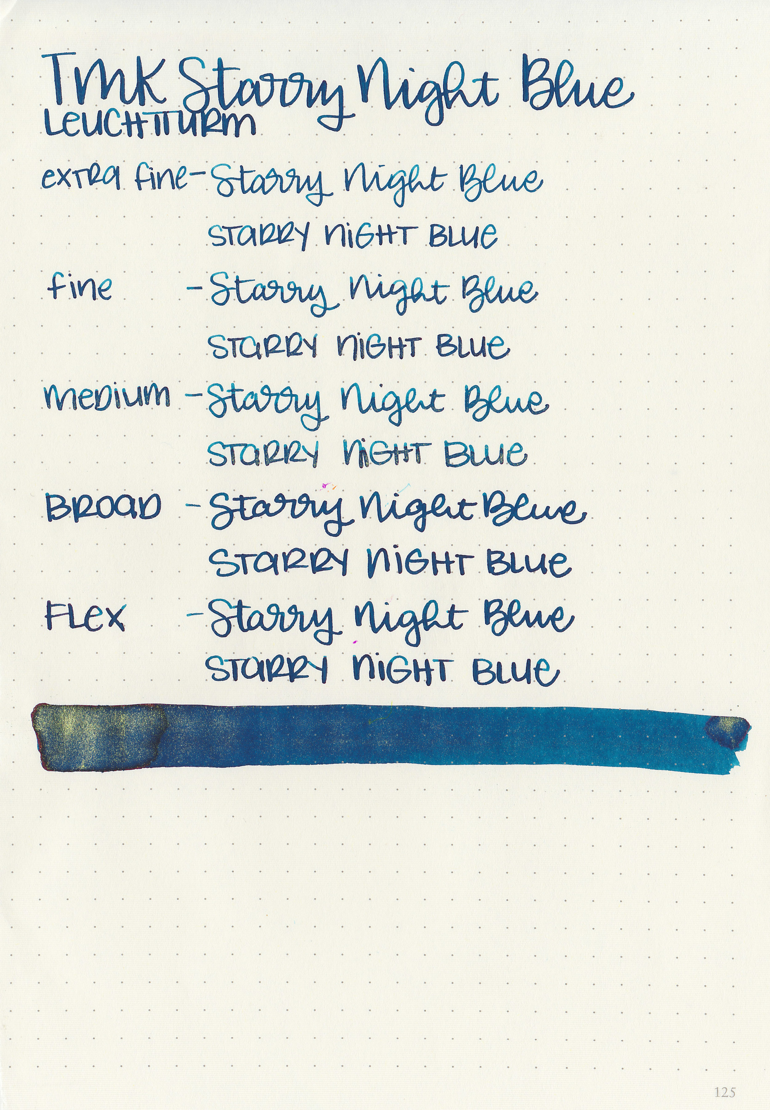
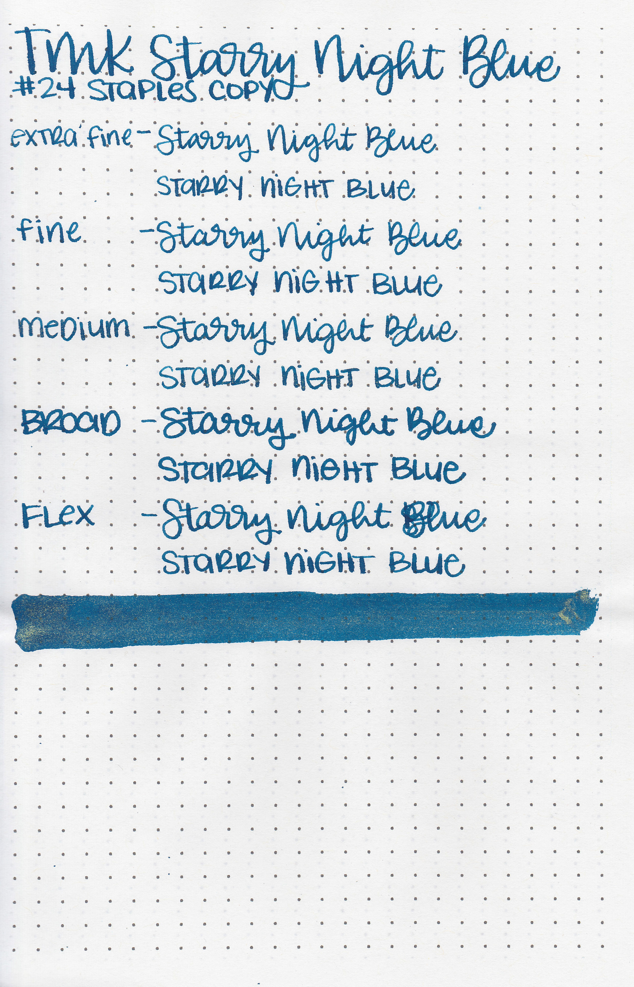
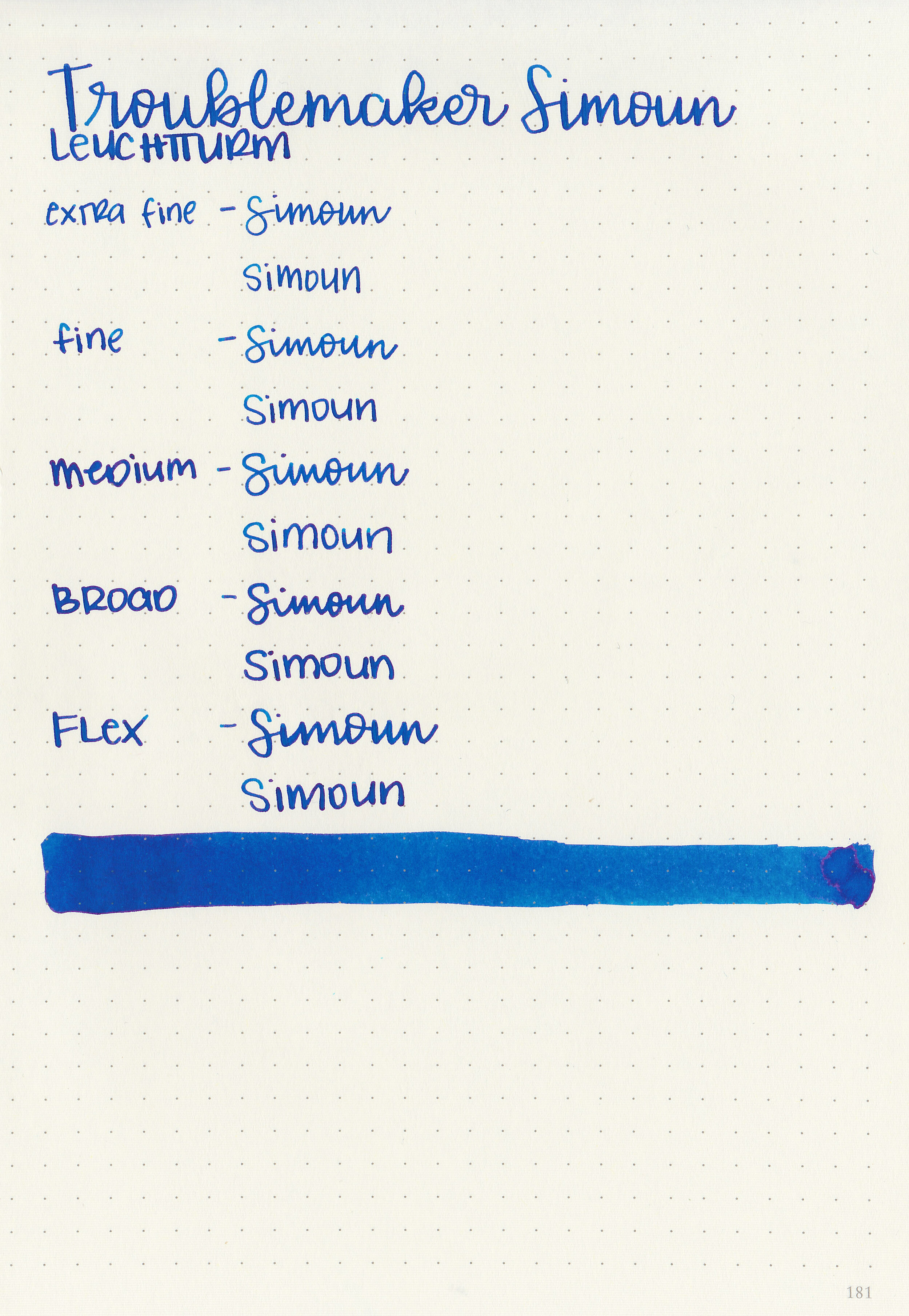
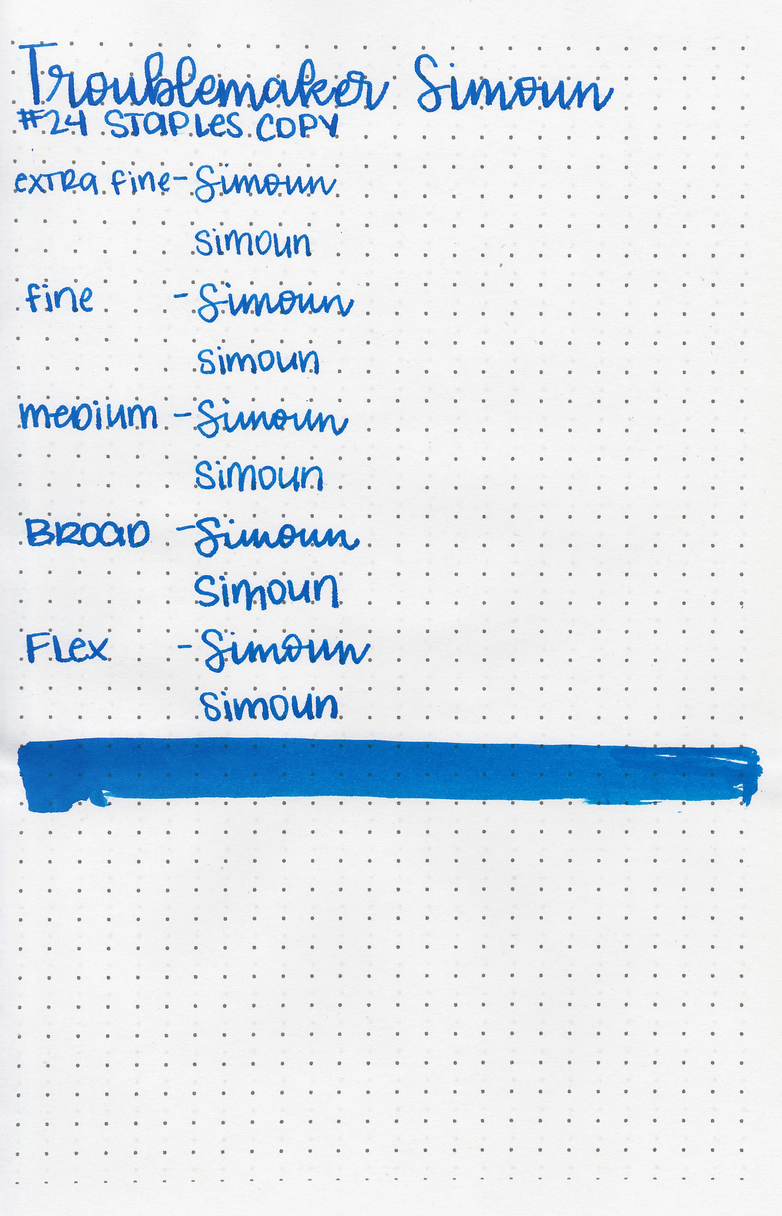
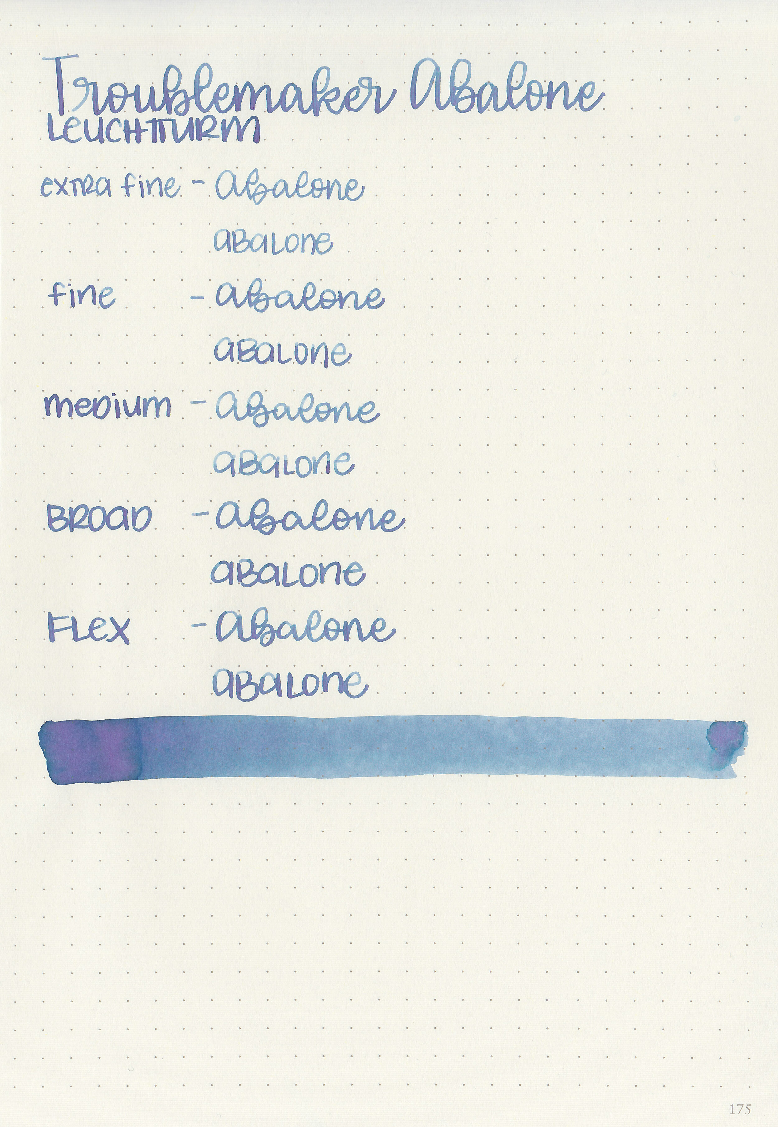
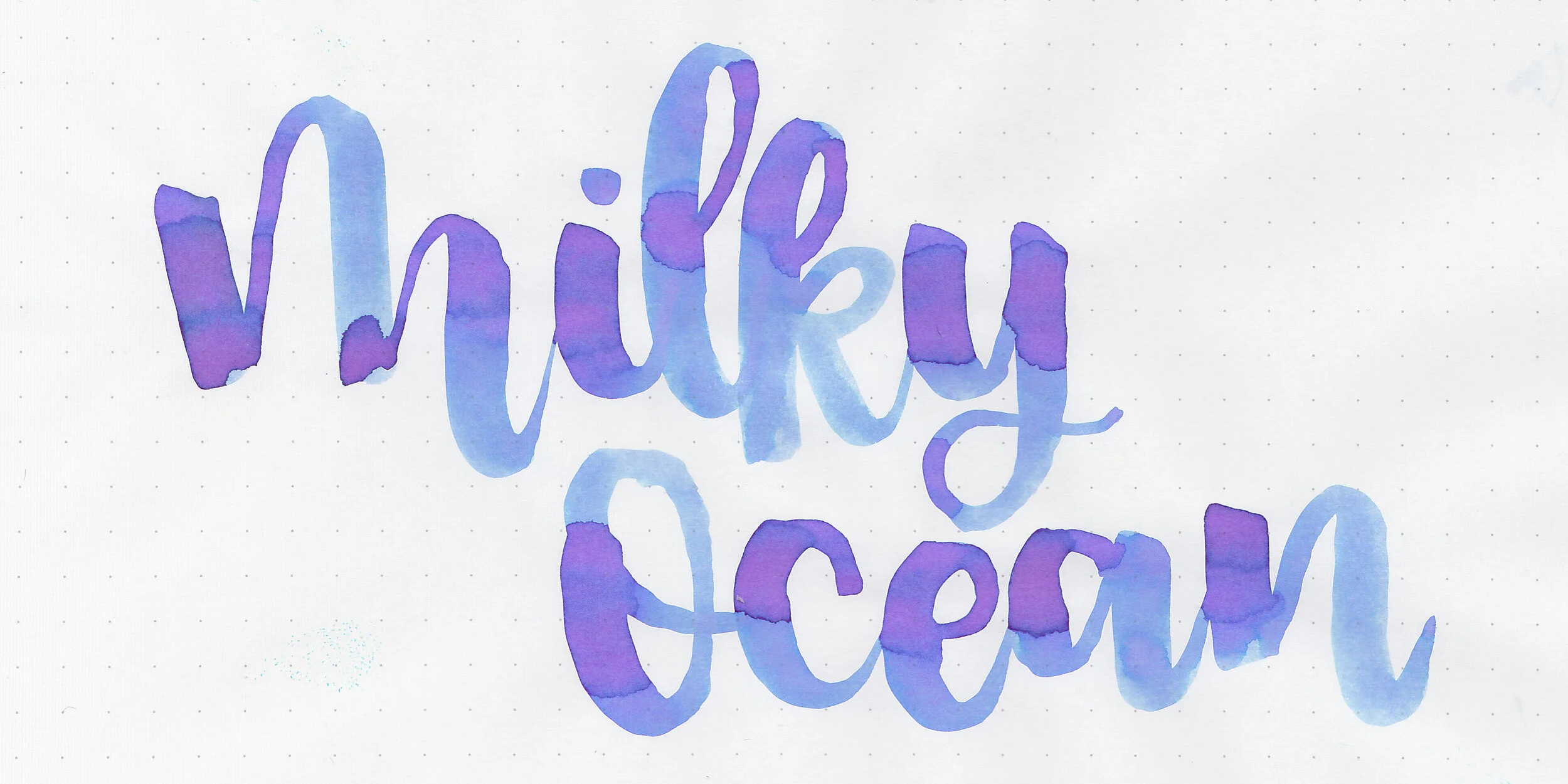
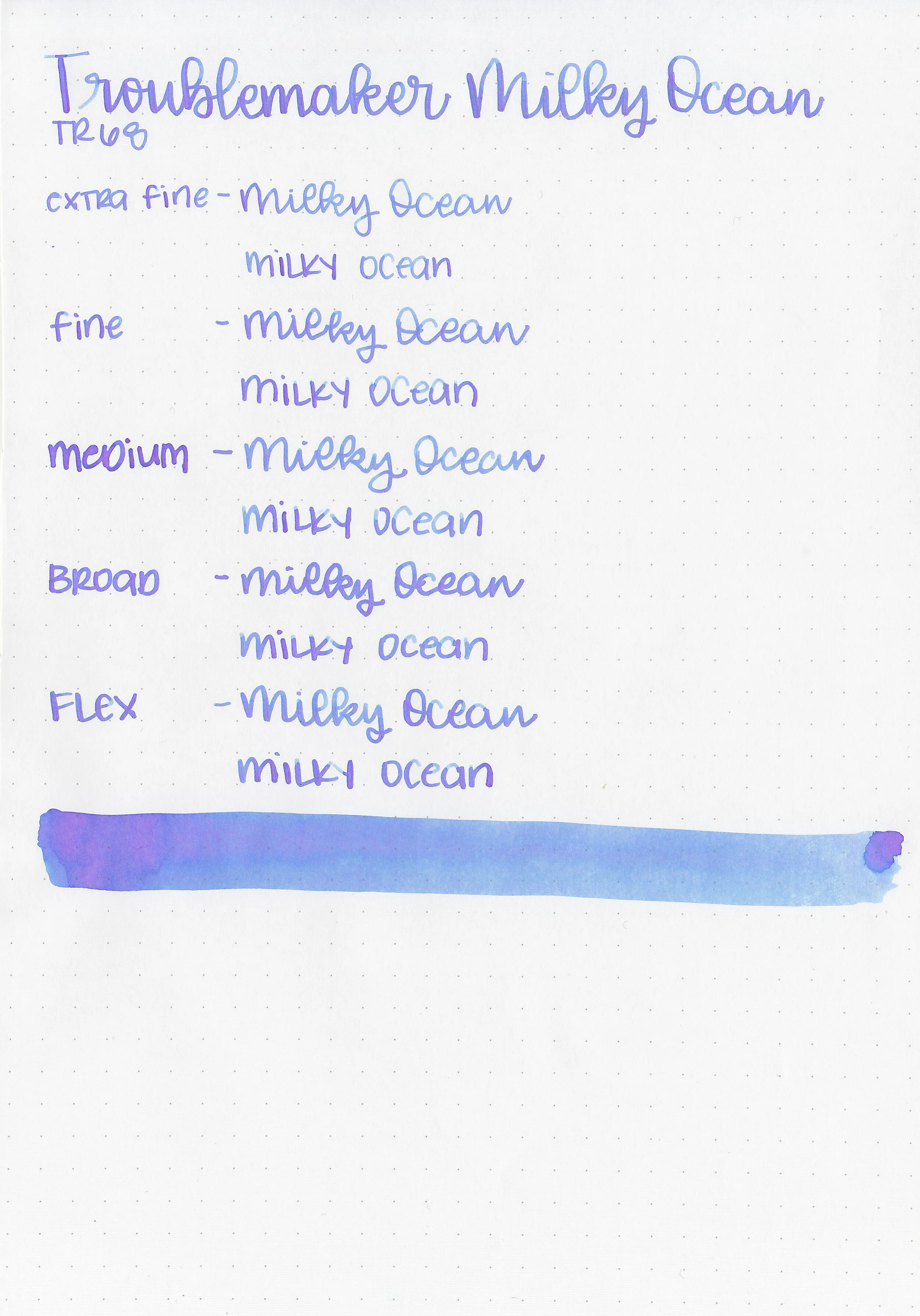
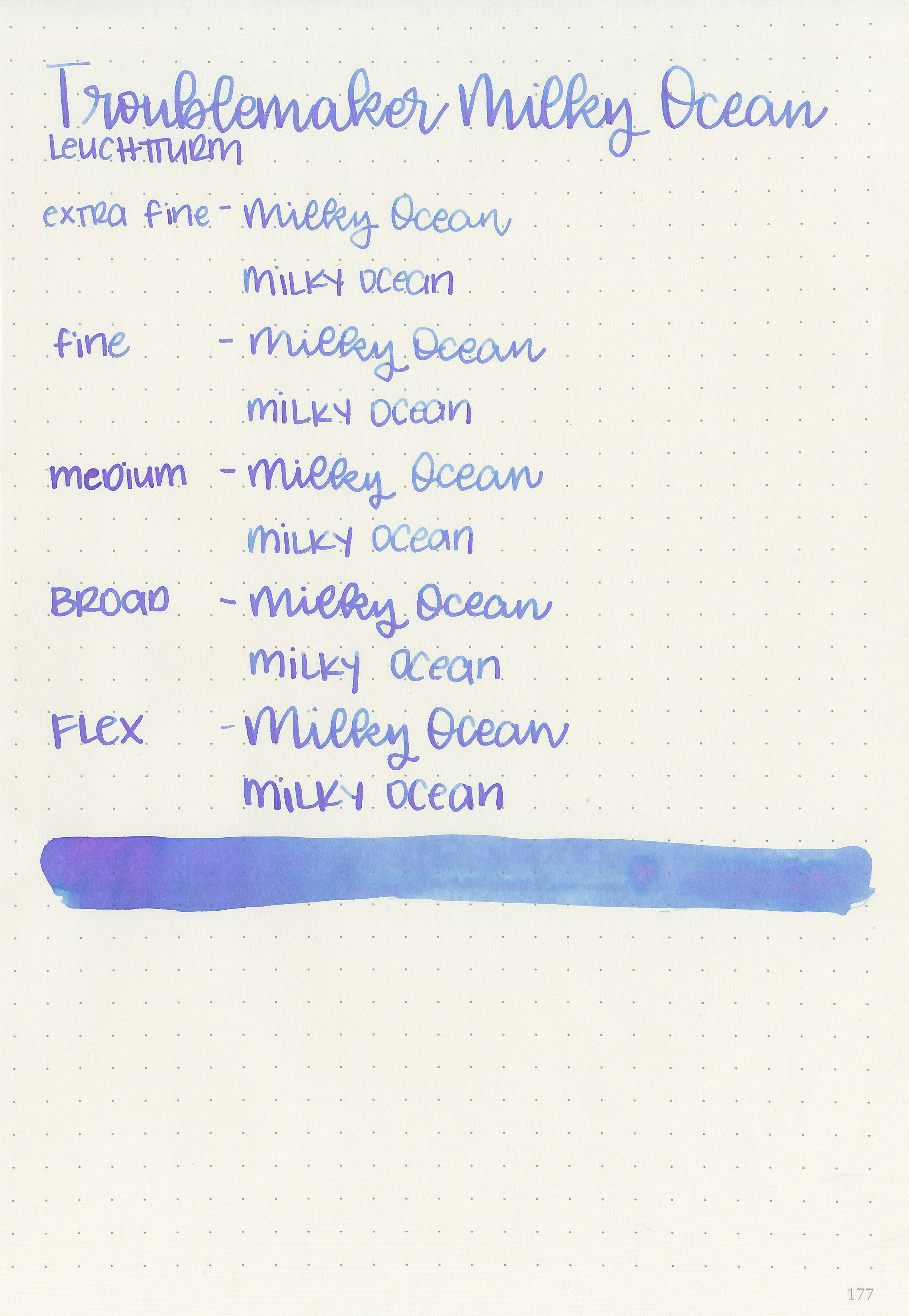
Writing samples:
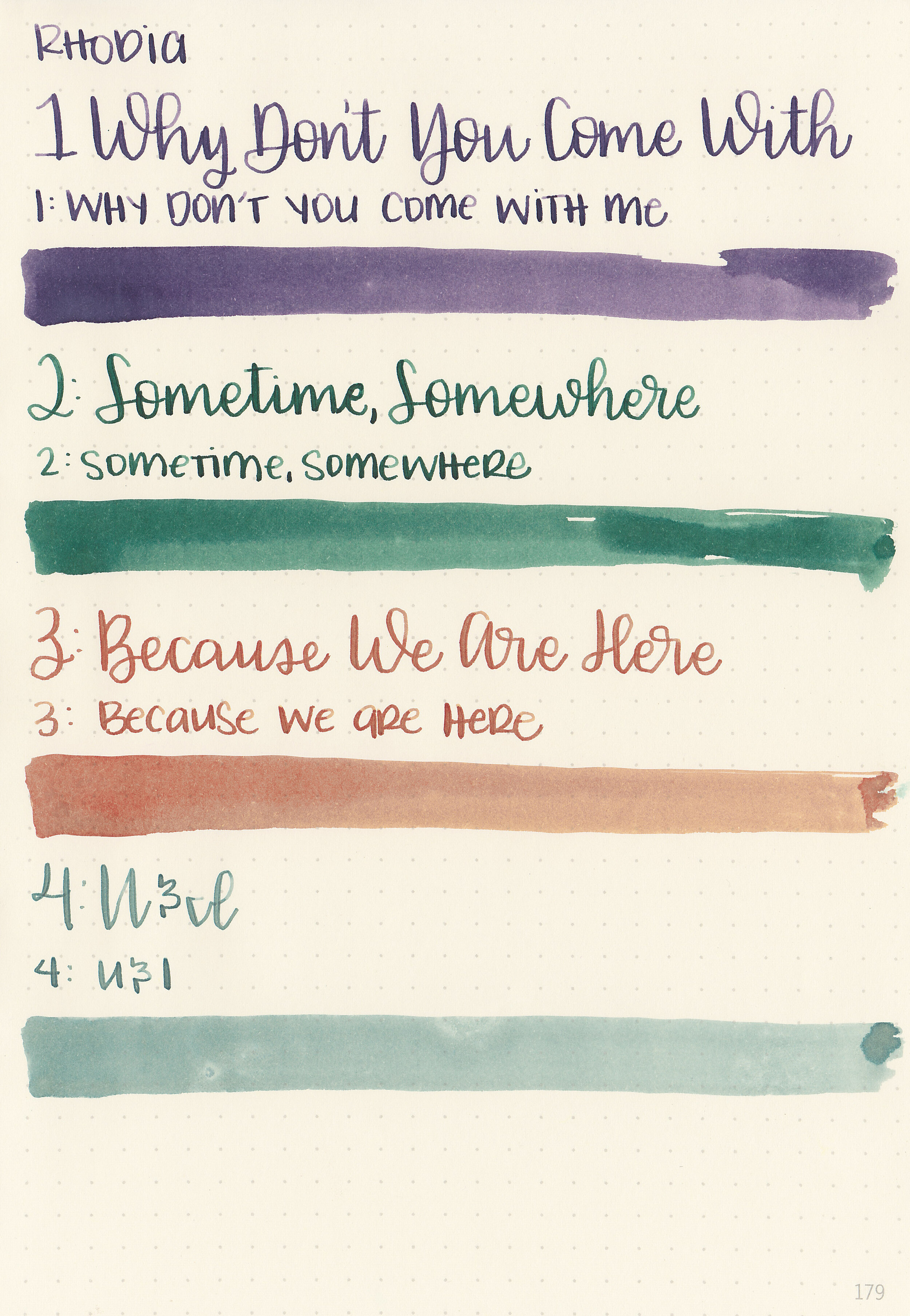
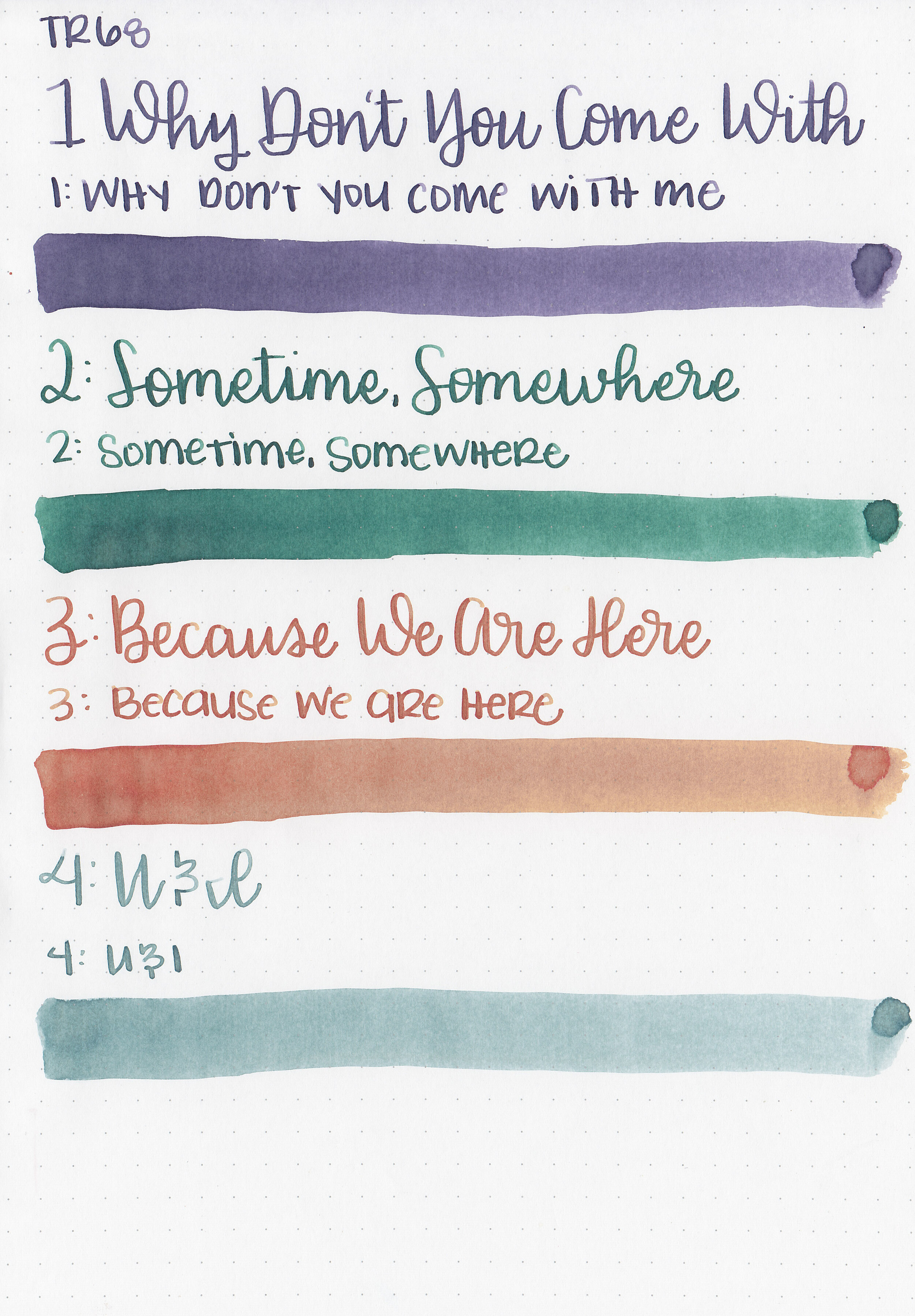
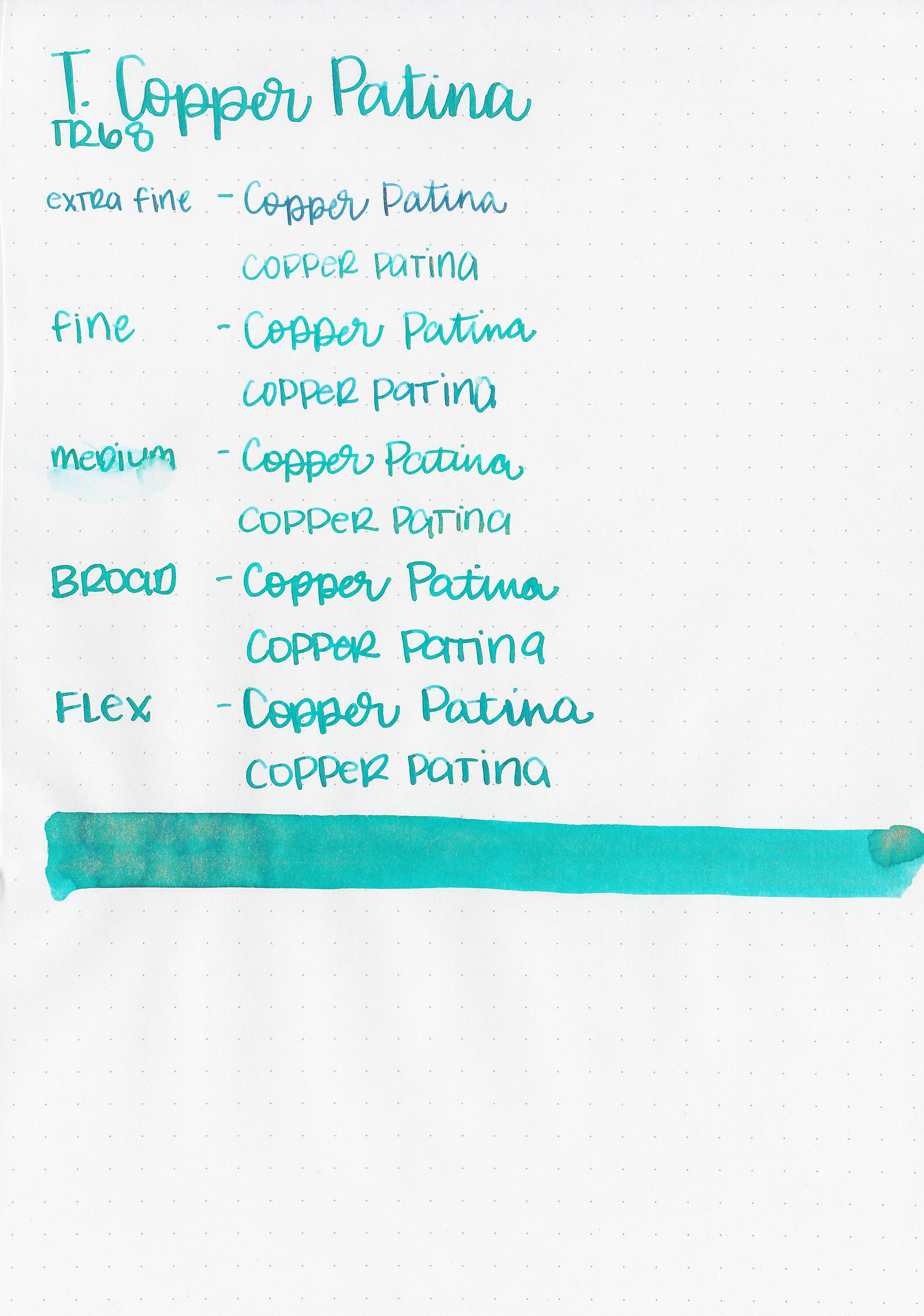
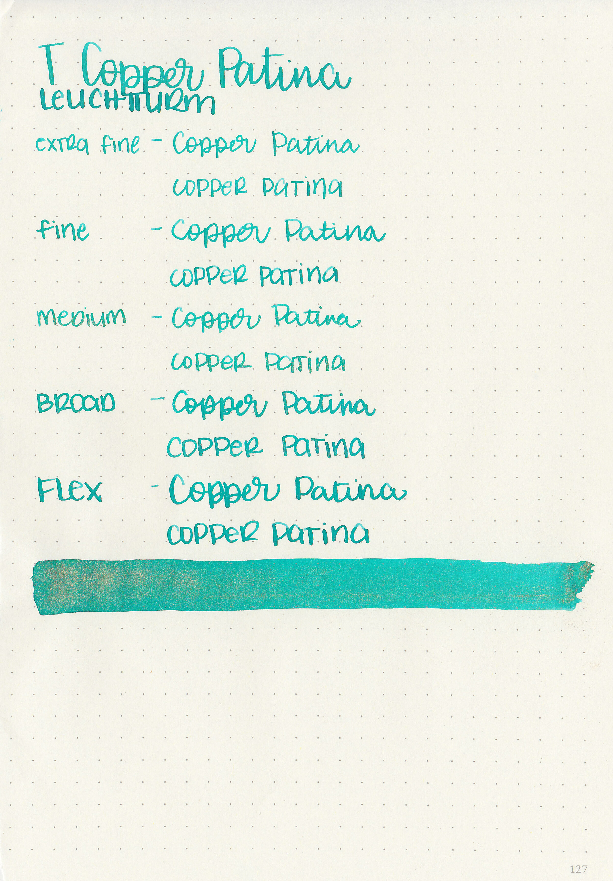
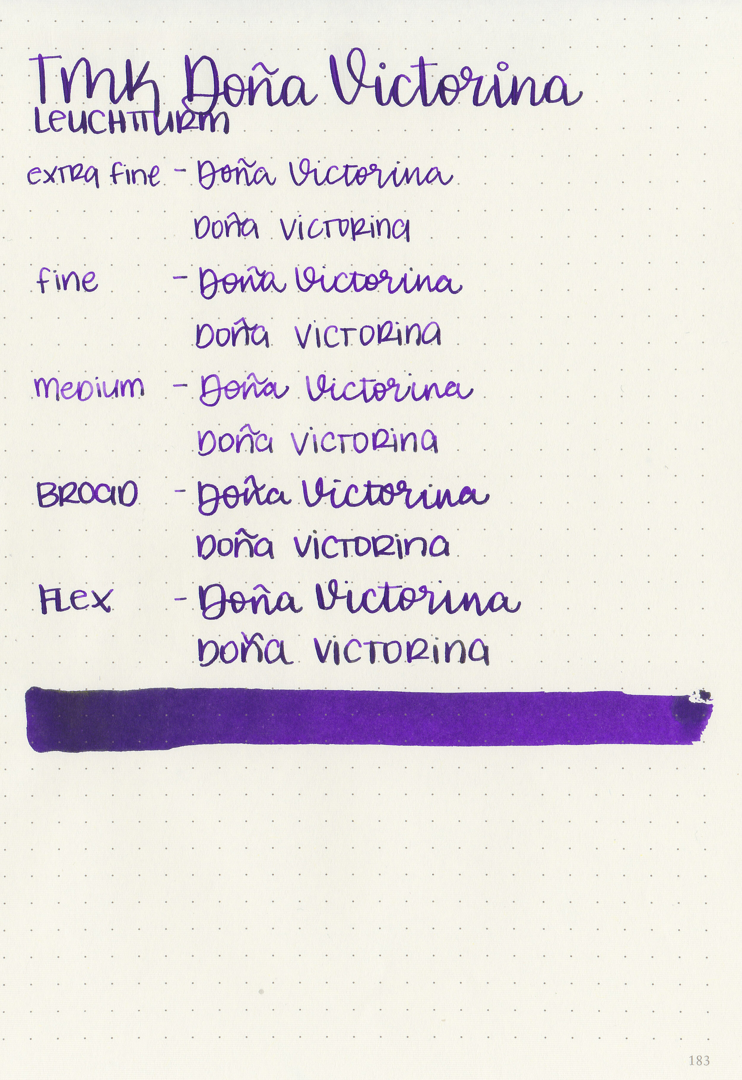
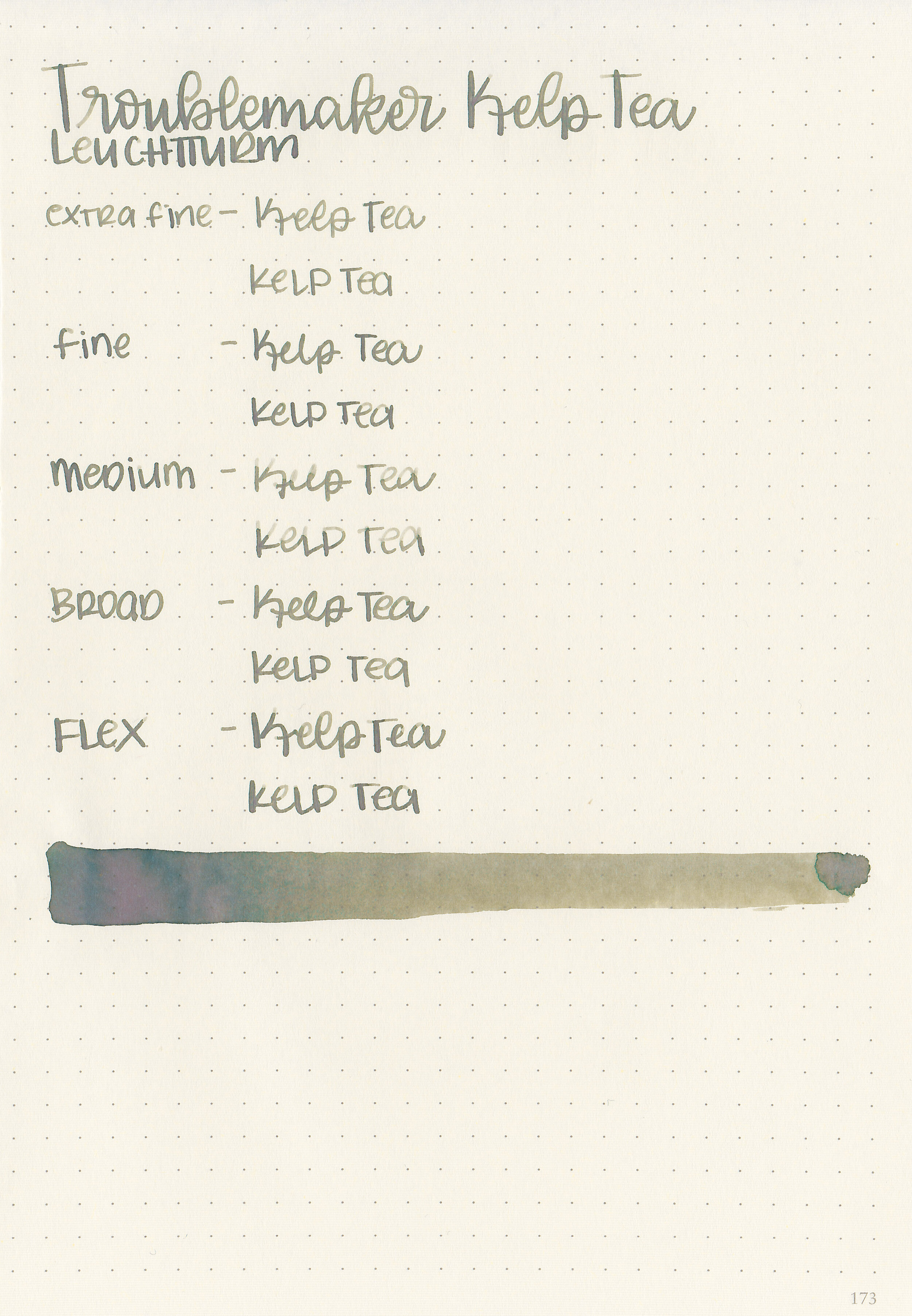
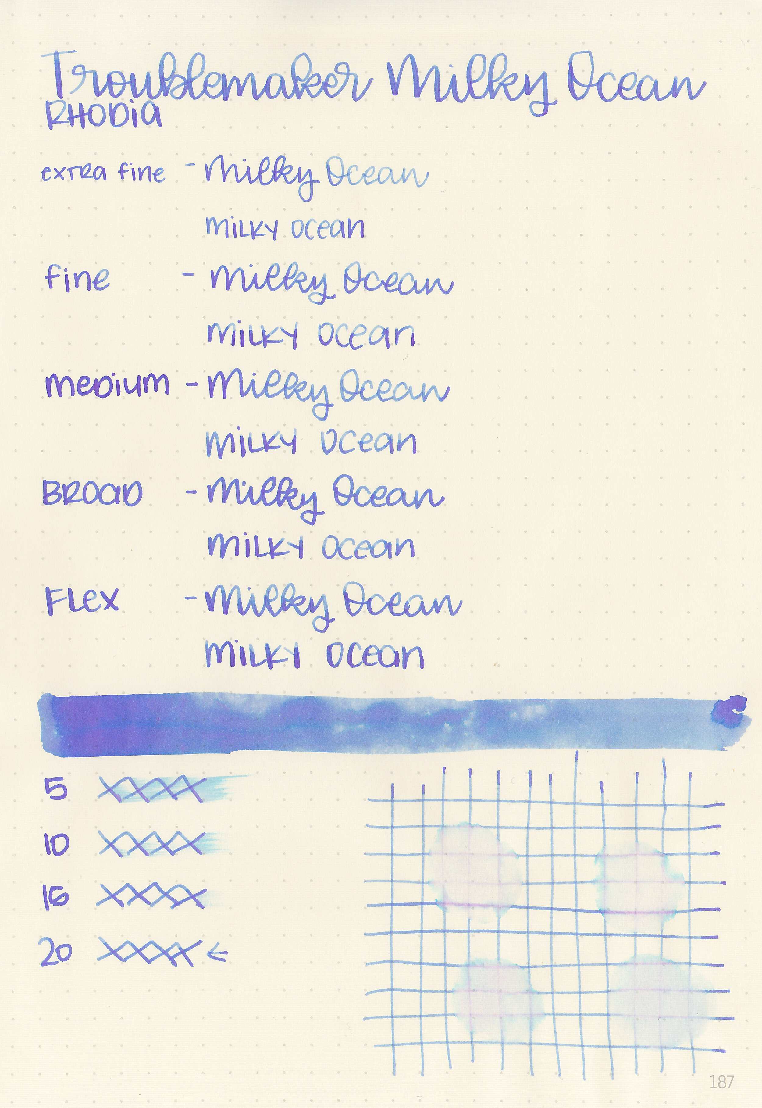
Let's take a look at how the ink behaves on fountain pen friendly papers: Rhodia, Tomoe River, and Leuchtturm.
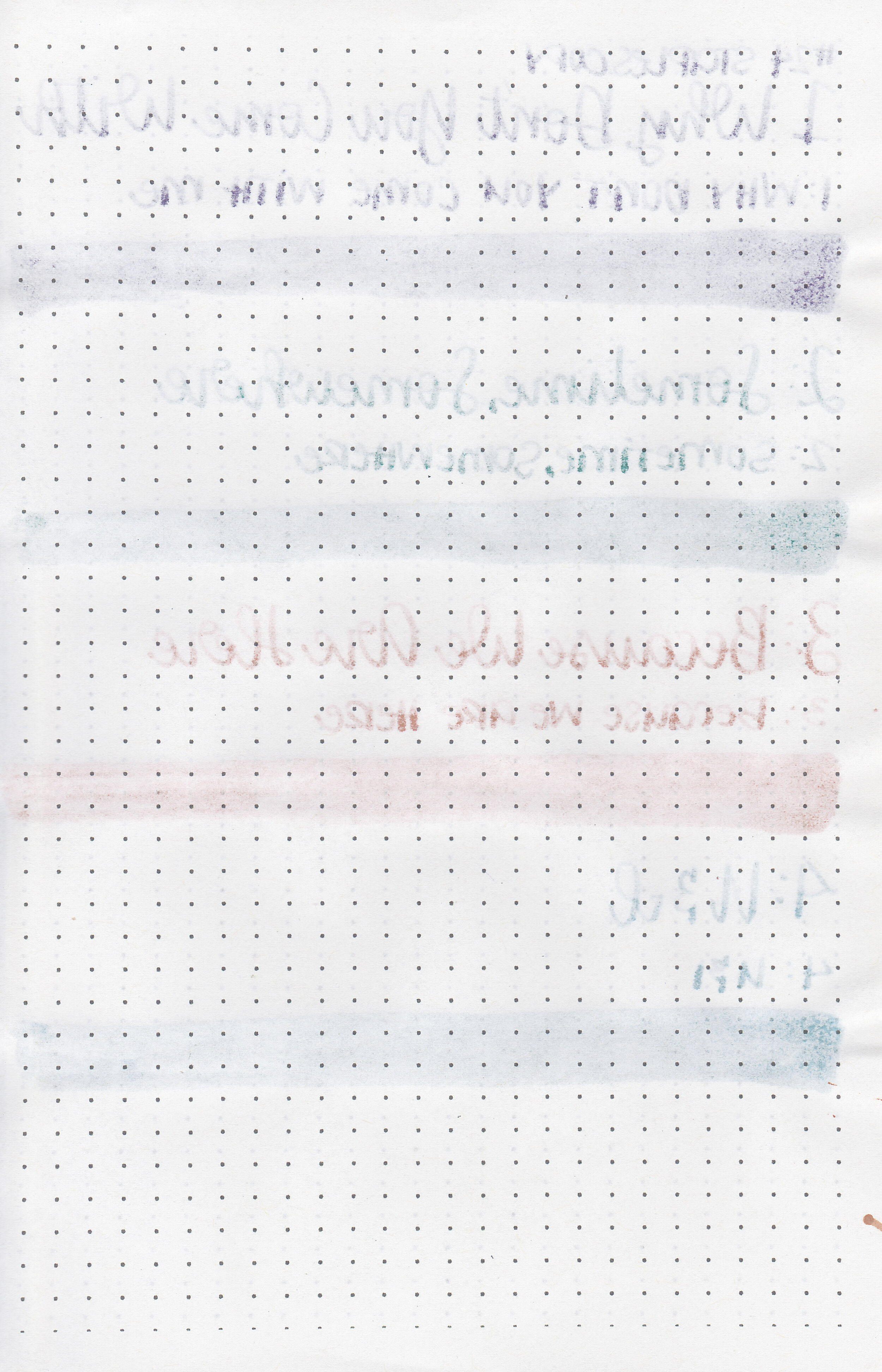
Water resistance: Low
Feathering: None
Show through: Medium
Bleeding: Low-there was some bleeding on Leuchtturm with No. 5, 6 and 8.
Other properties: low shading, no sheen, and no shimmer.
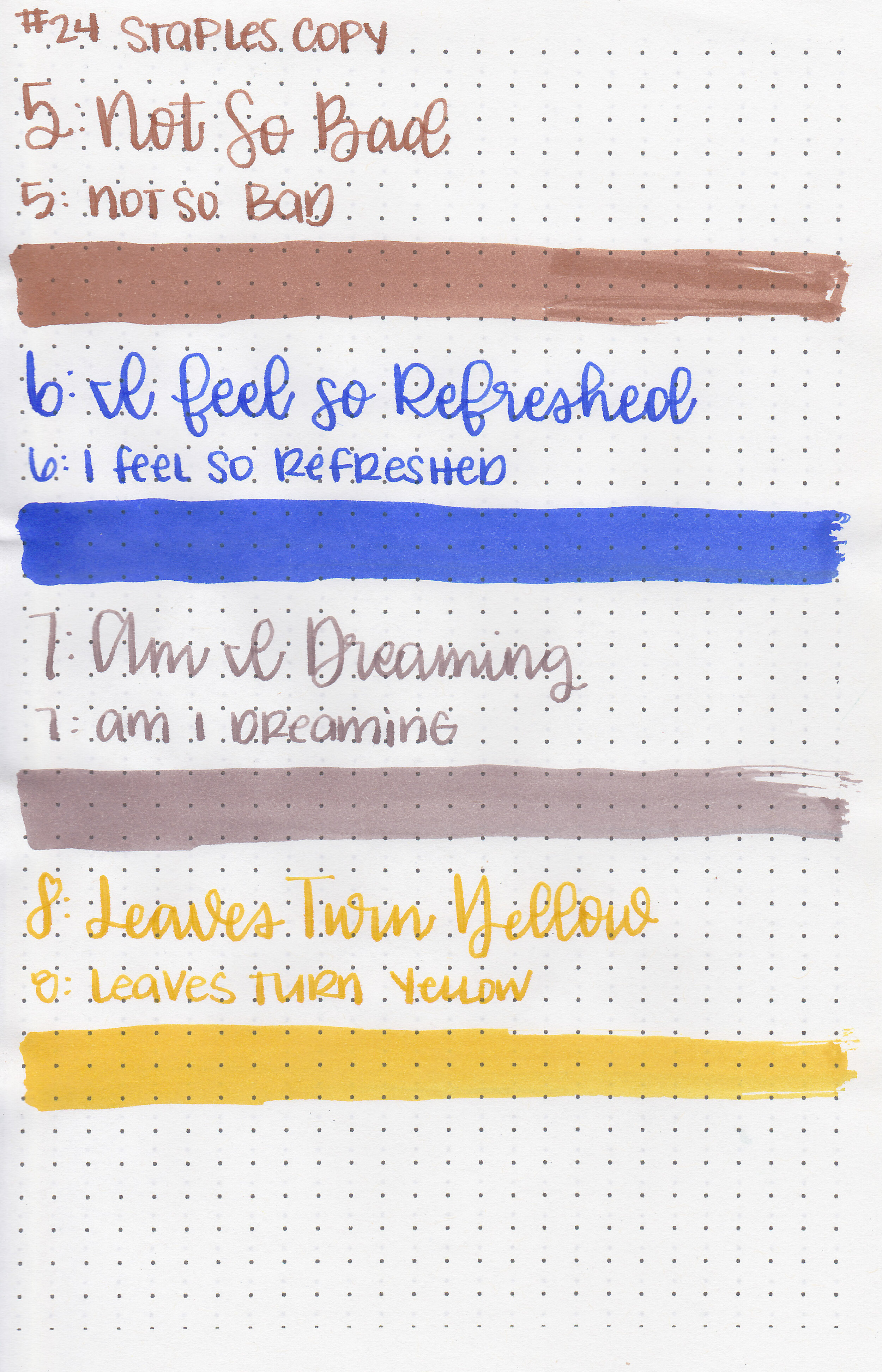
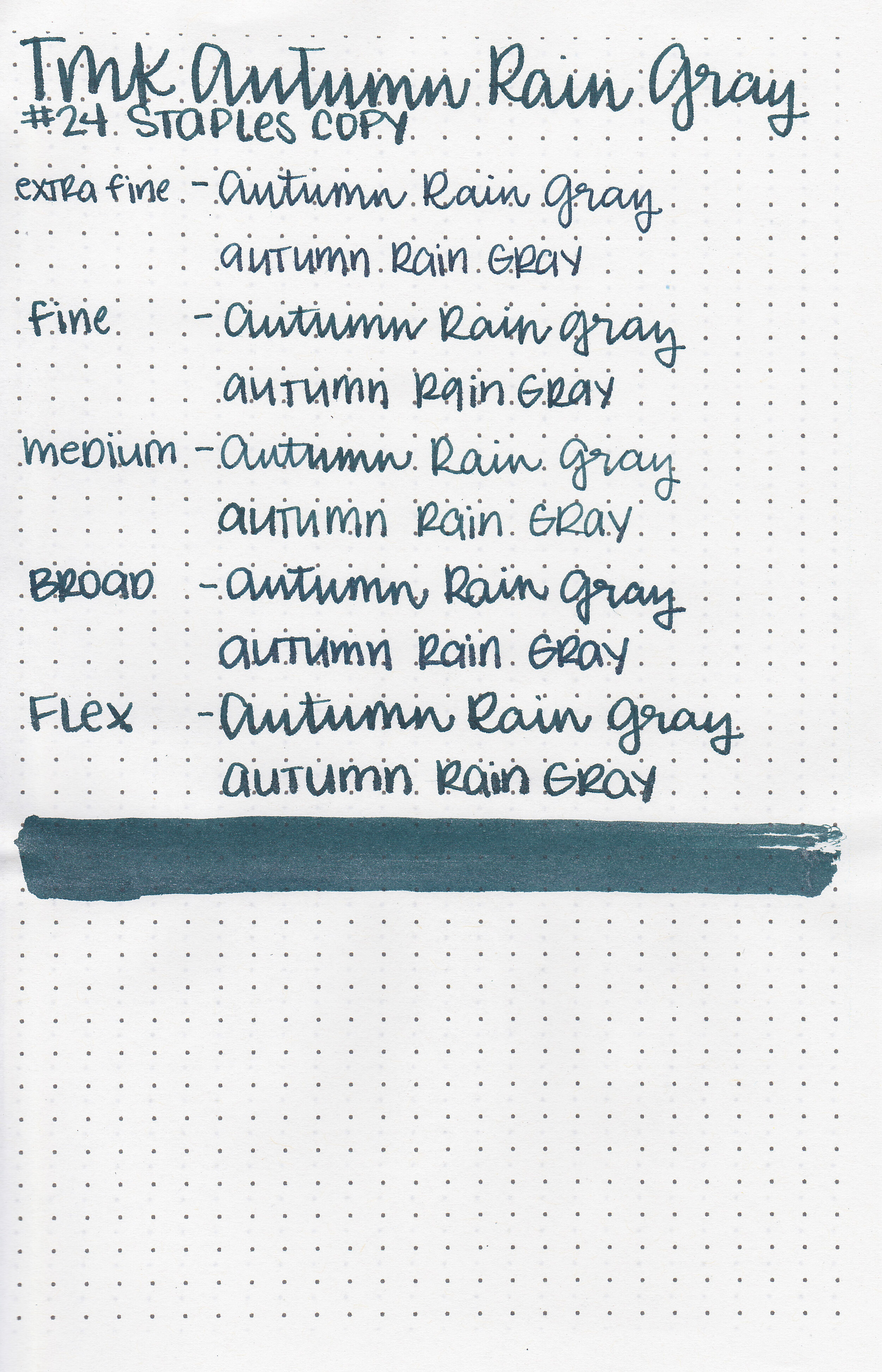
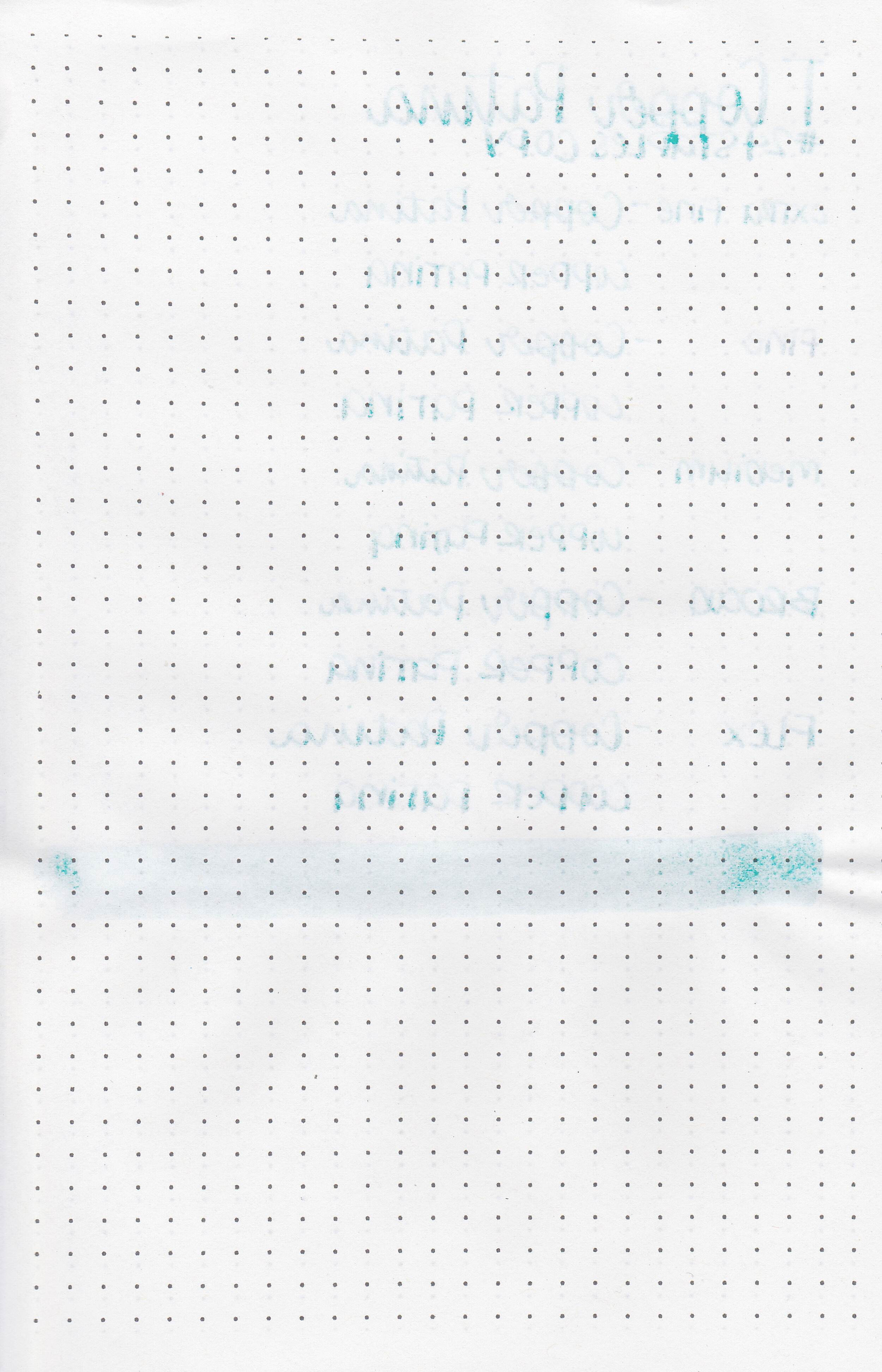
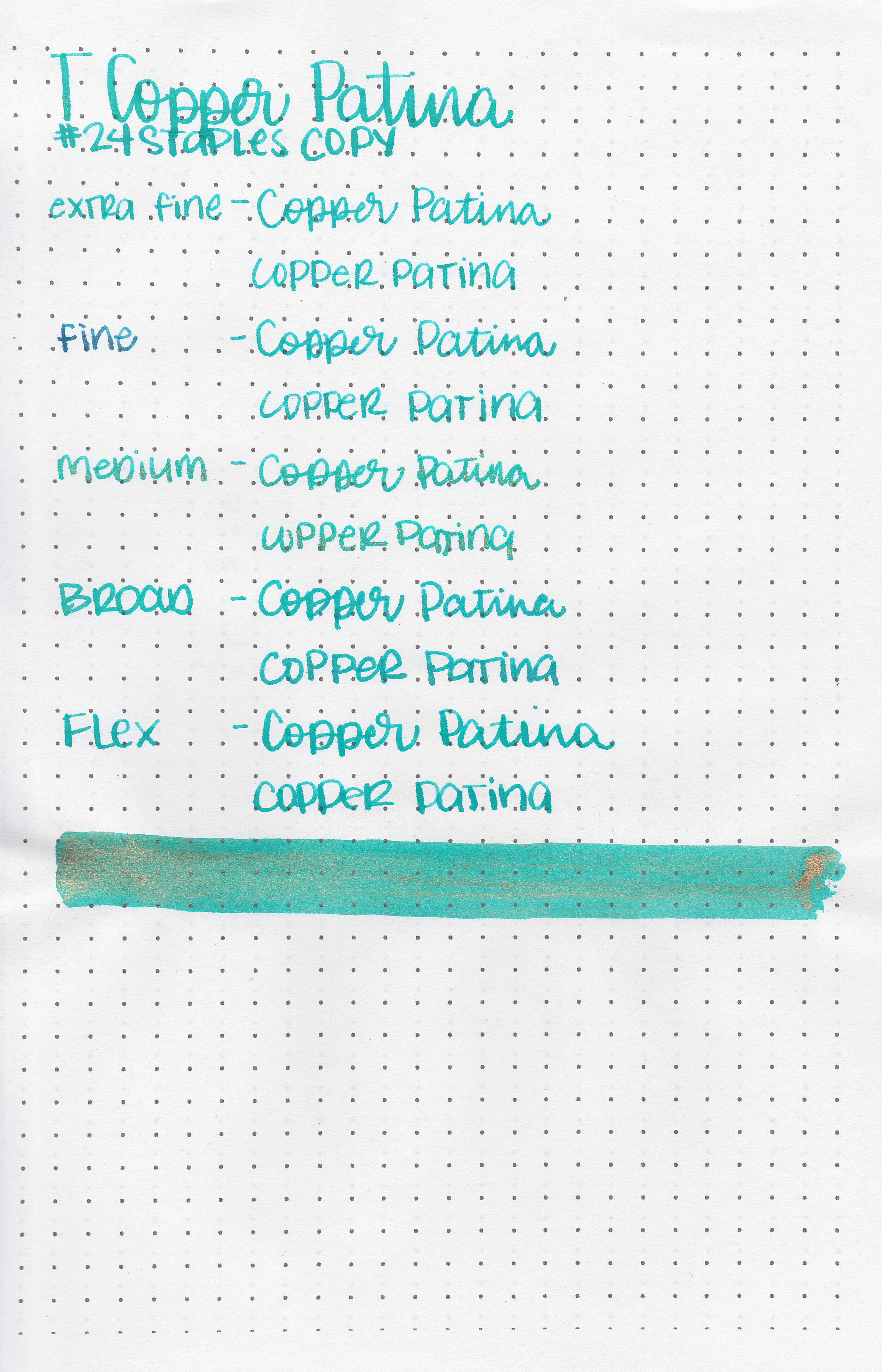
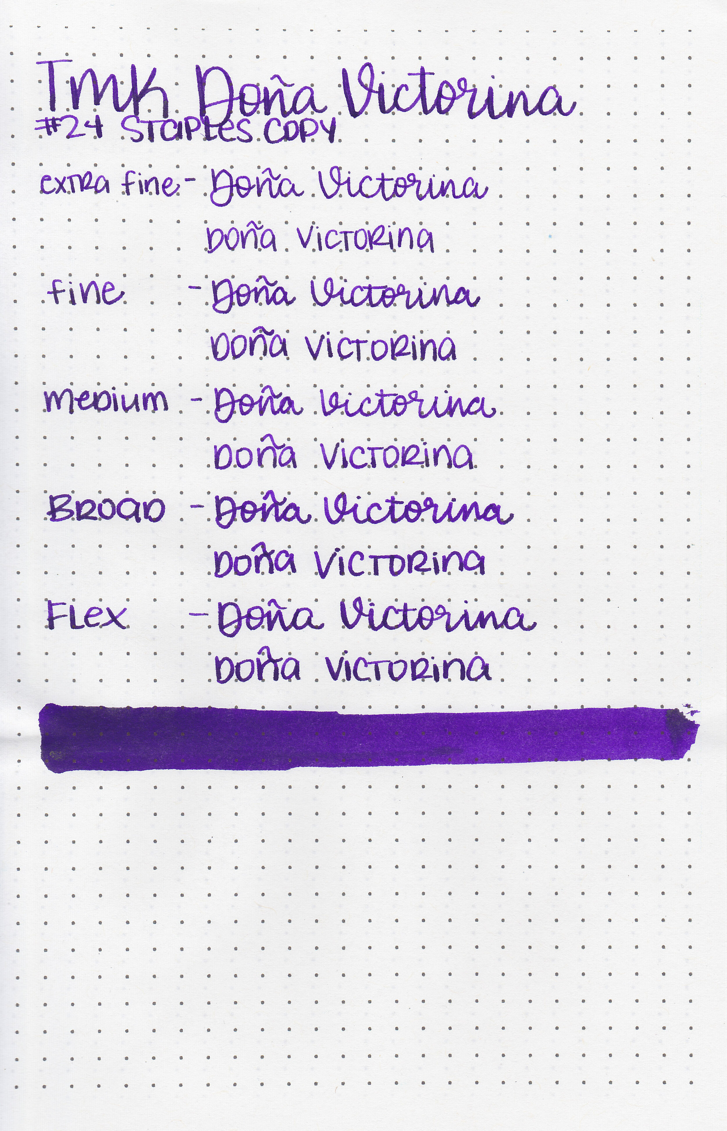
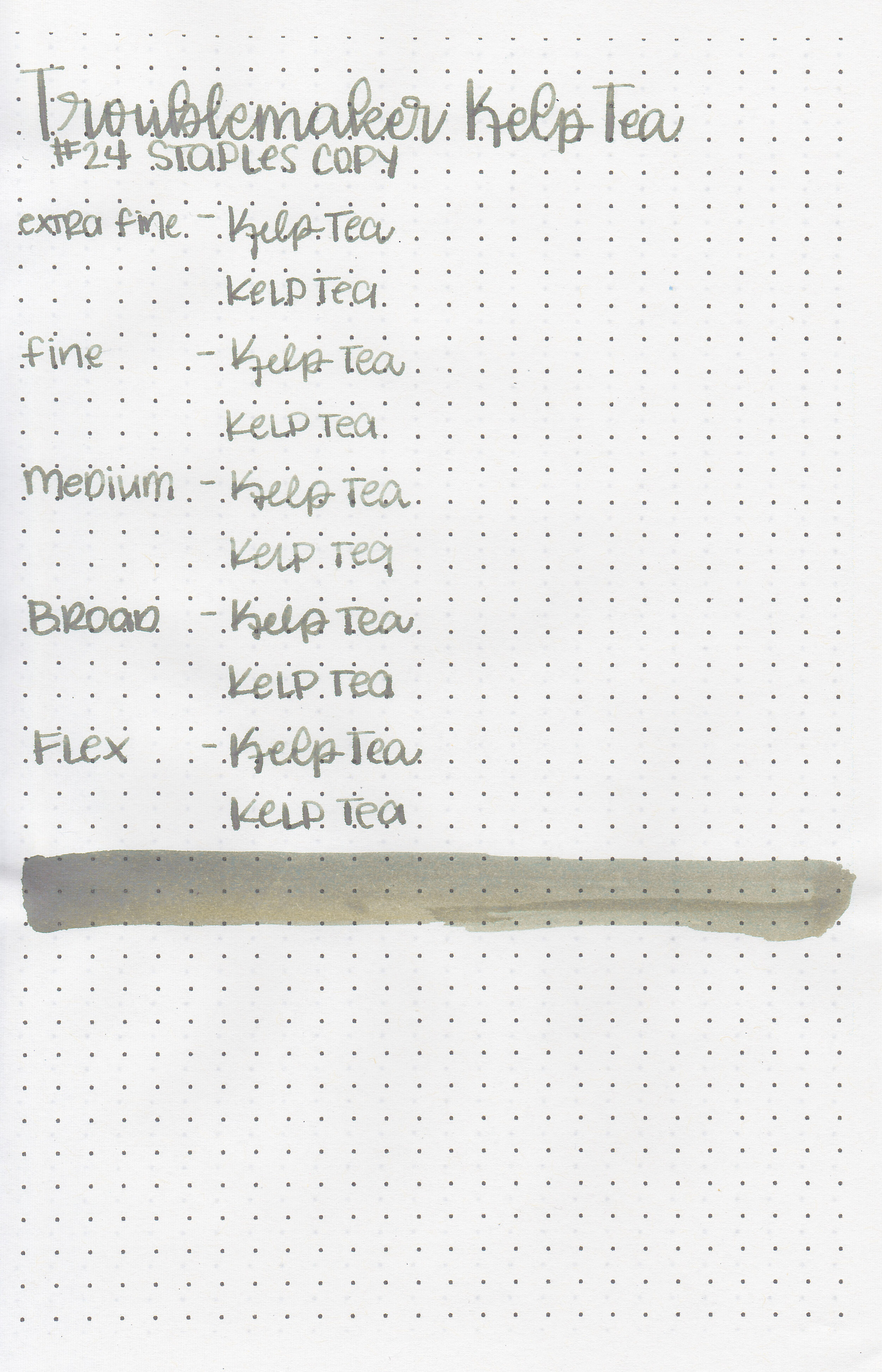
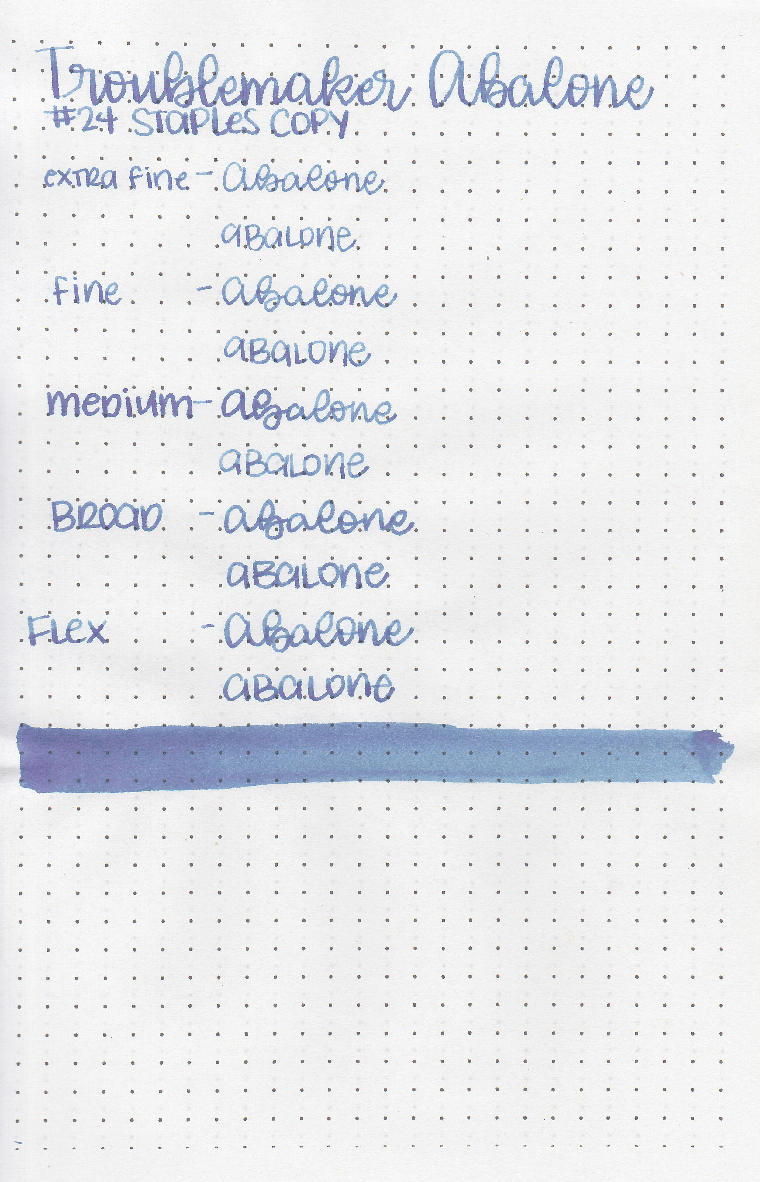
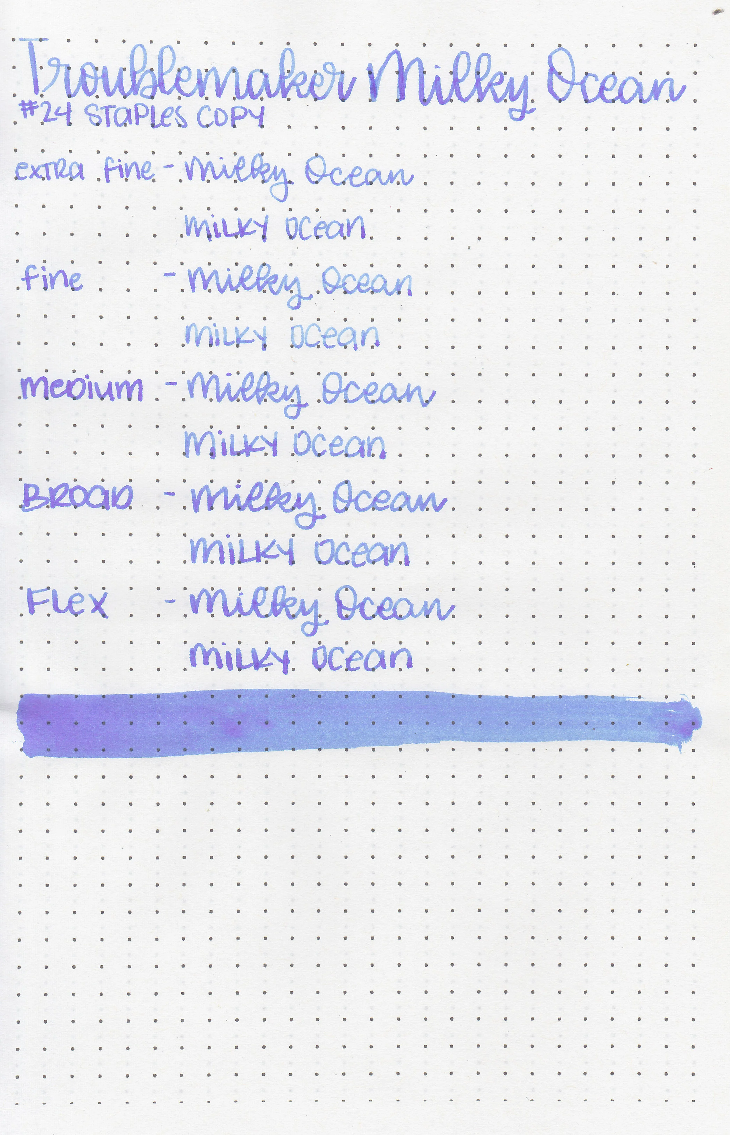
On Staples 24 lb copy paper there was lots of feathering in every nib size as well as a little bleeding.
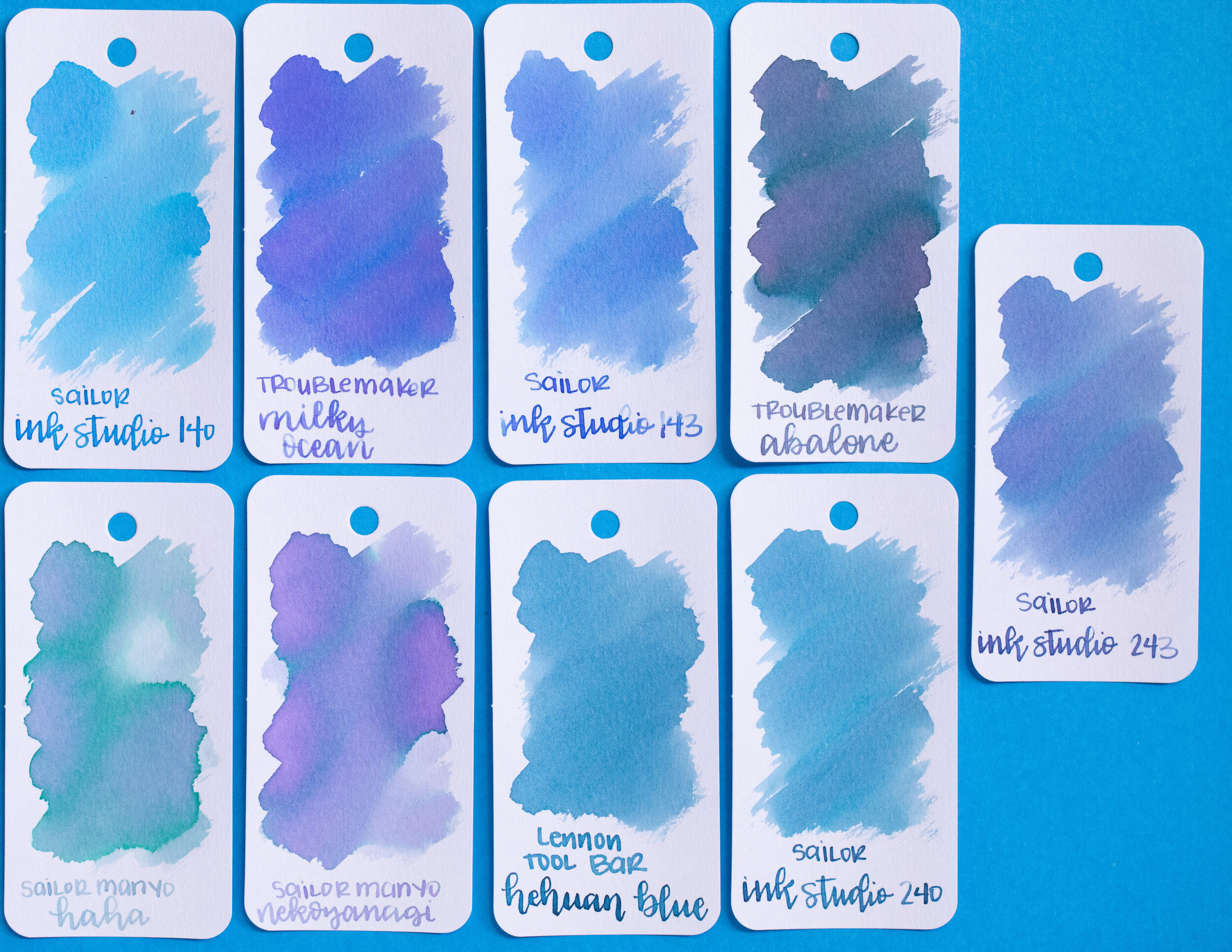
Comparison Swabs:

No. 5 Not So Bad is similar to Sailor Ink Studio 673. No. 6 I Feel So Refreshed is a bit darker/more vibrant than KWZ Azure #3. No. 7 Am I Dreaming is cooler in tone than Montblanc Swan Illusion and No. 8 Leaves Turn Yellow is a bit lighter than 3 Oysters Mustard, but darker than Jacques Herbin Ambre de Baltique.

I used an A5 Yoseka notebook. All of the inks had an average flow.
Overall,I found Am I dreaming to have the most shading and the most well behaved, but I love the color of Leaves Turn Yellow.
Disclaimer: These inks were provided by Shigure Inks for the purpose of this review. All photos and opinions are my own. This page does not contain affiliate links, and is not sponsored in any way.