Tono & Lims Inks
/
Swabs and links to Tono & Lims ink reviews.
Read More
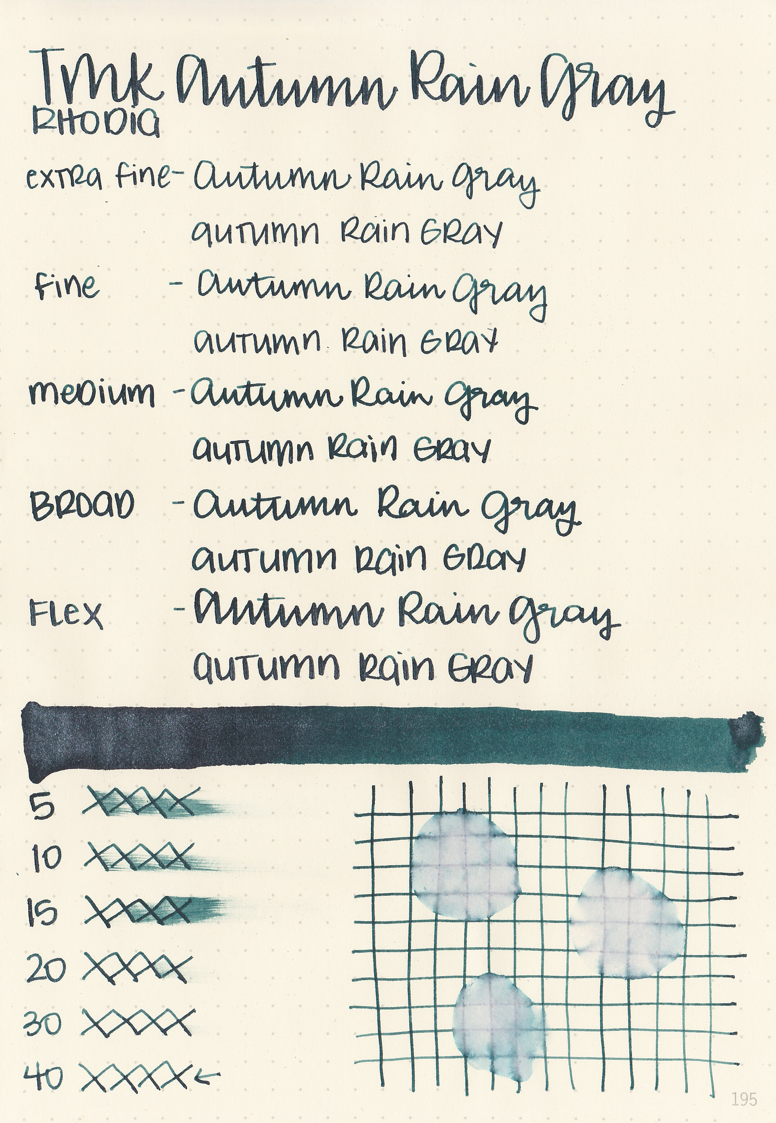
We have one more Troublemaker ink to review today before we move on to something new-Troublemaker Autumn Rain Gray. Thanks to Shigure Inks for sending a sample over for review!

The color:
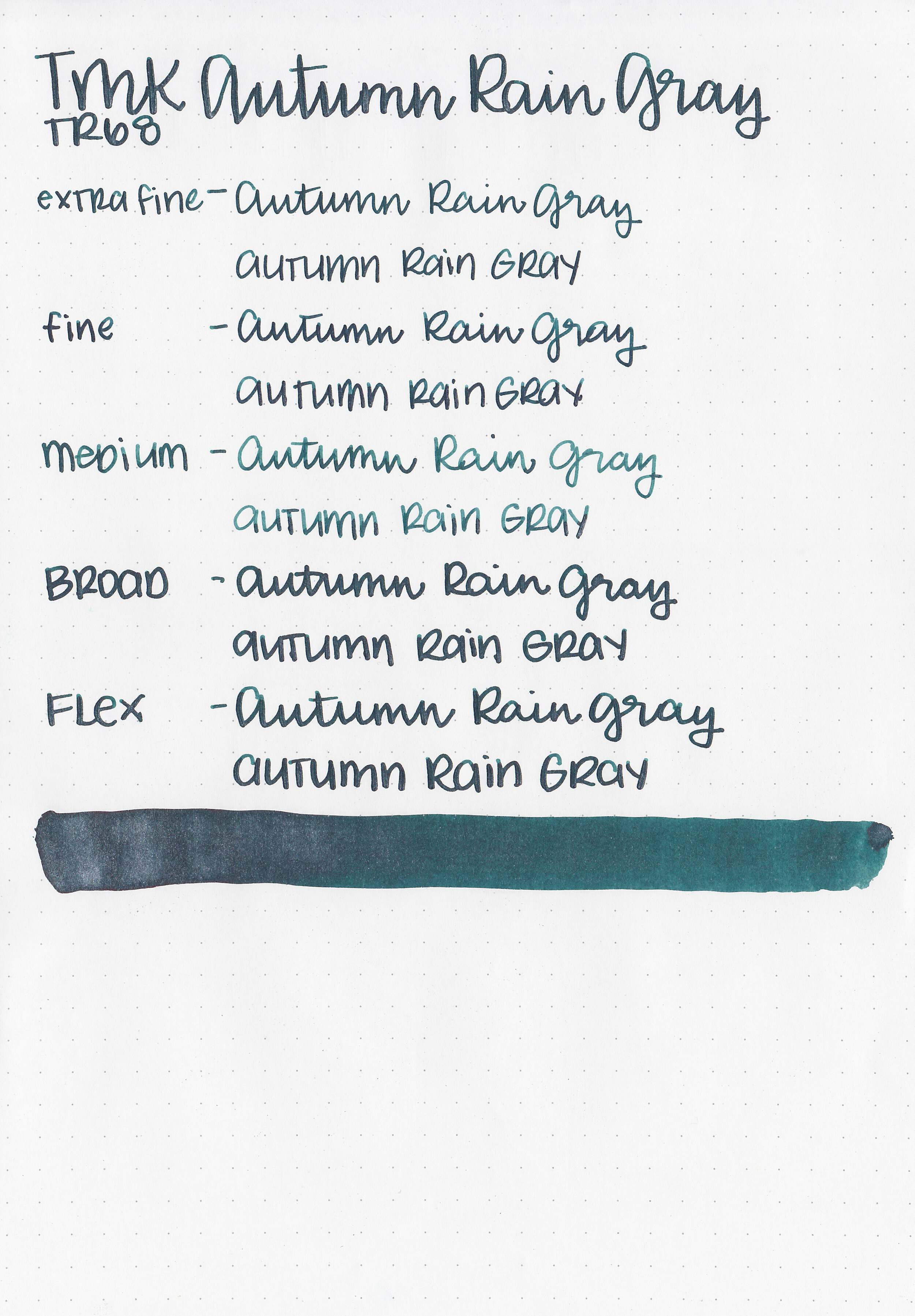
Autumn Rain Gray is a super dark green, not really a grey.

In large swabs on Tomoe River paper you can see plenty of silver shimmer.

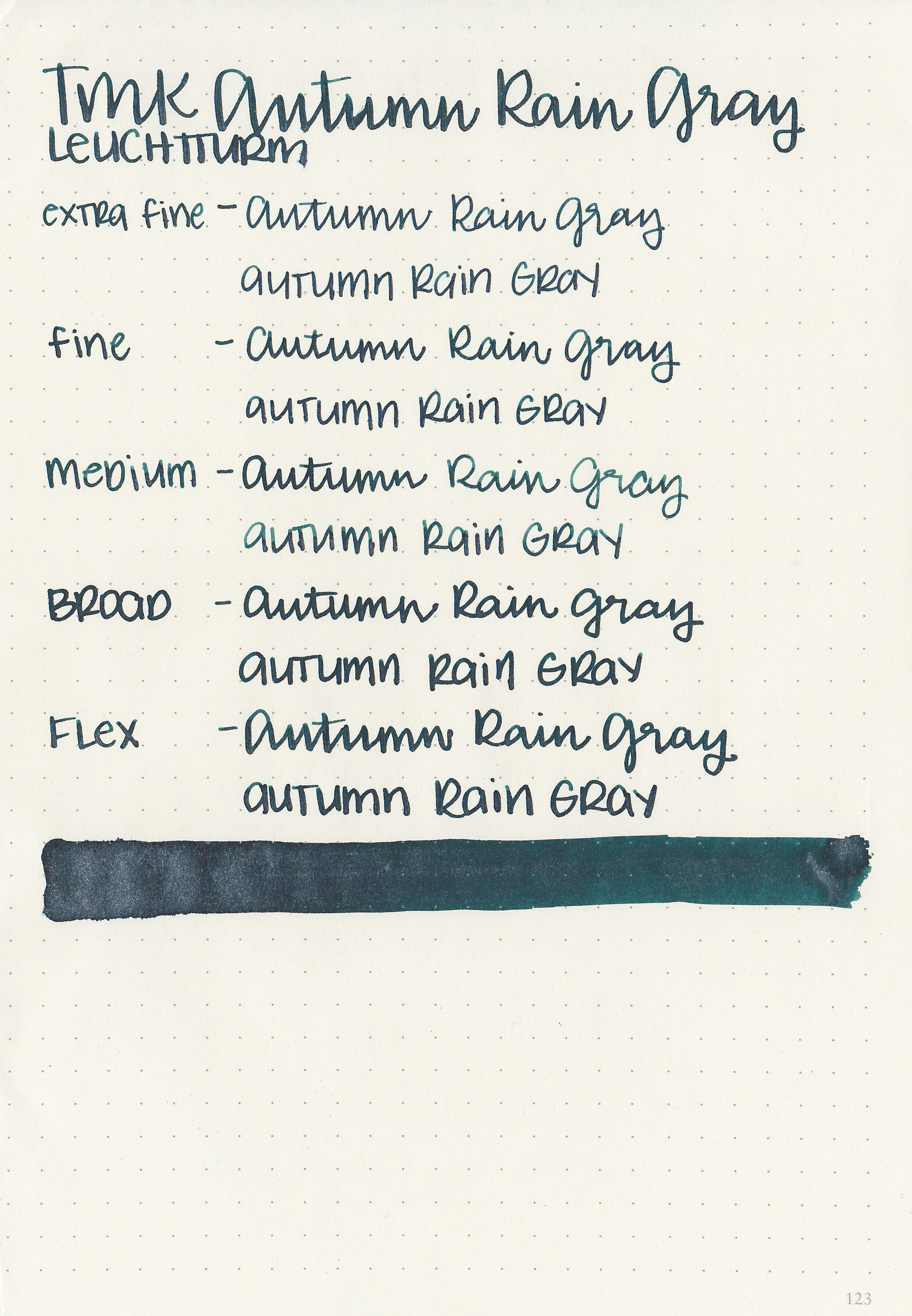
Let's take a look at how the ink behaves on fountain pen friendly papers: Rhodia, Tomoe River, and Leuchtturm.
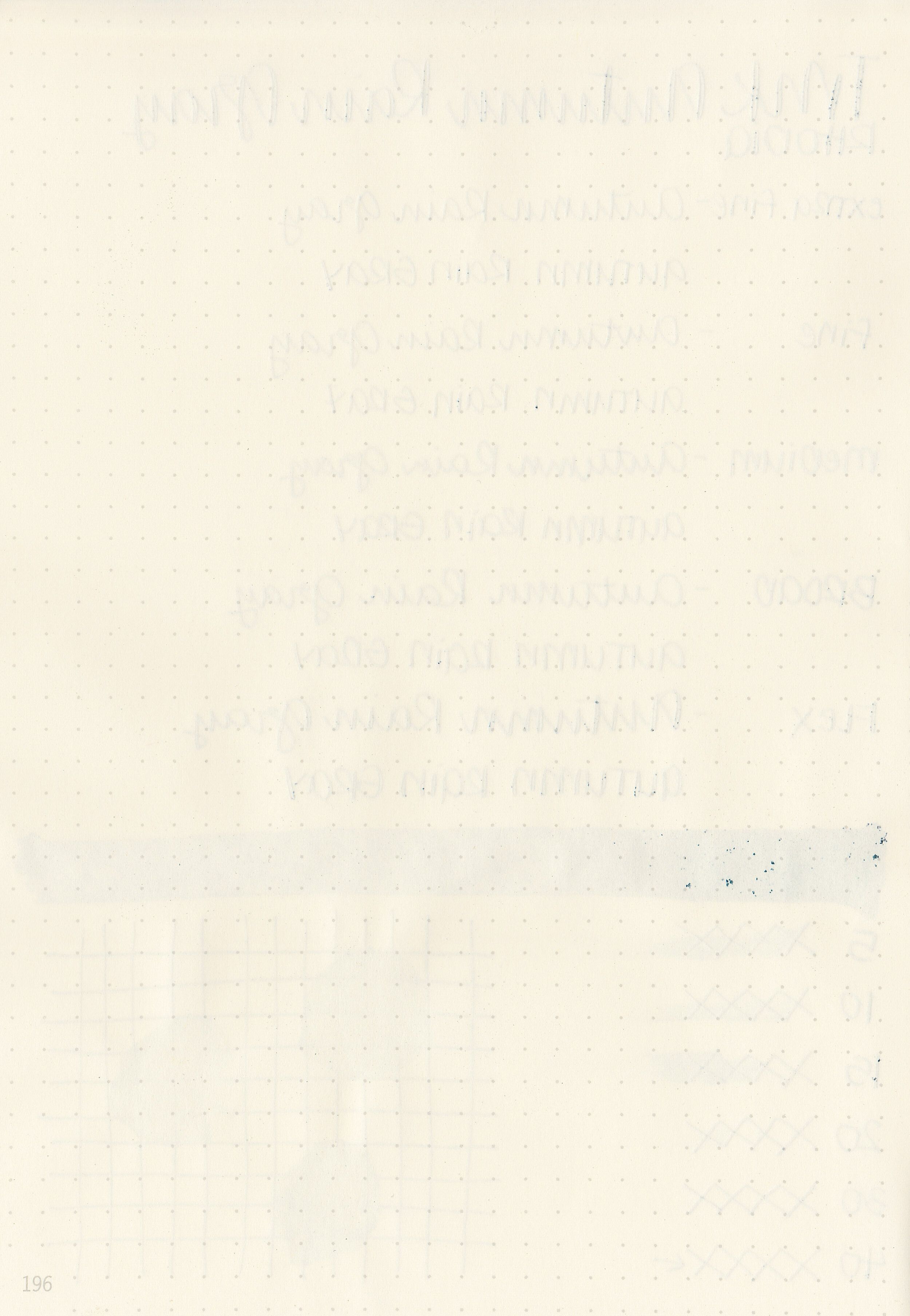
Dry time: 40 seconds
Water resistance: Low
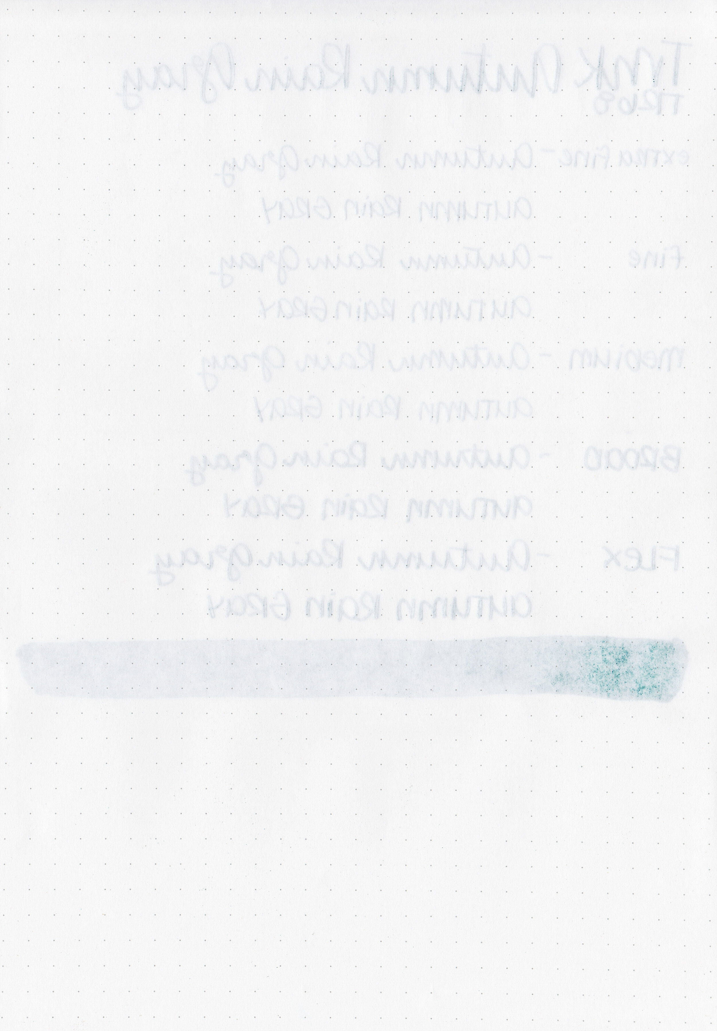
Feathering: None
Show through: Medium
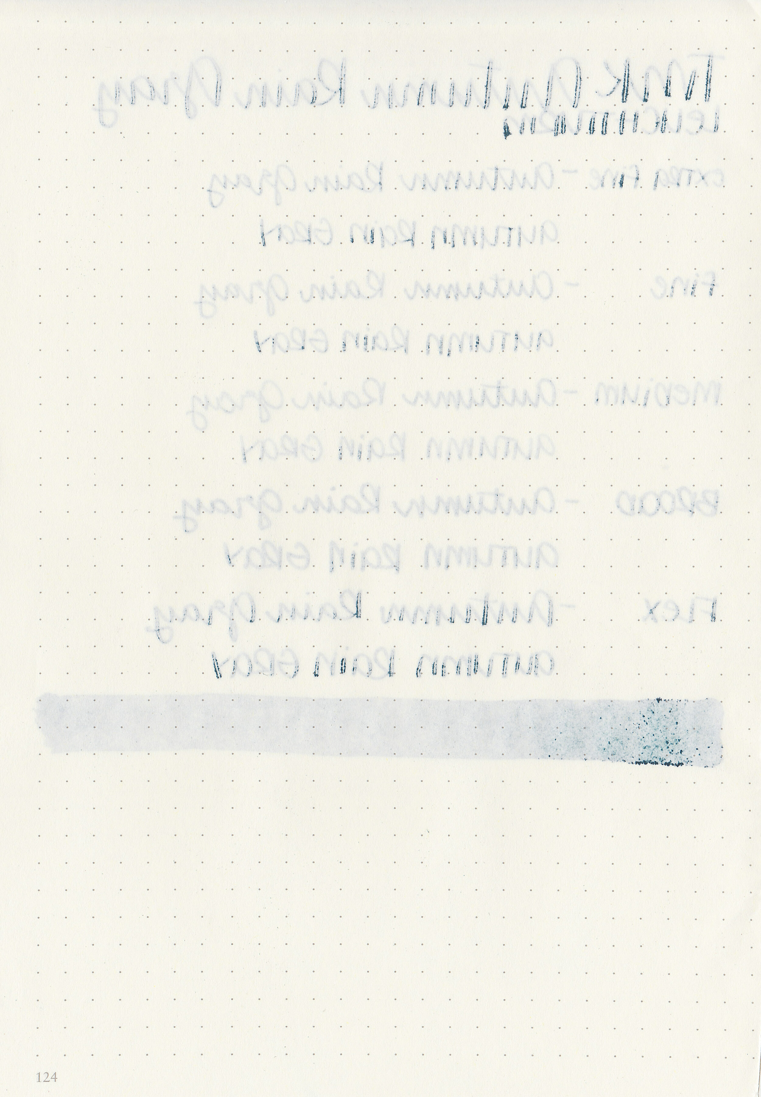
Bleeding: Low-there was bleeding on Leuchtturm
Other properties: low shading, no sheen, and silver shimmer.
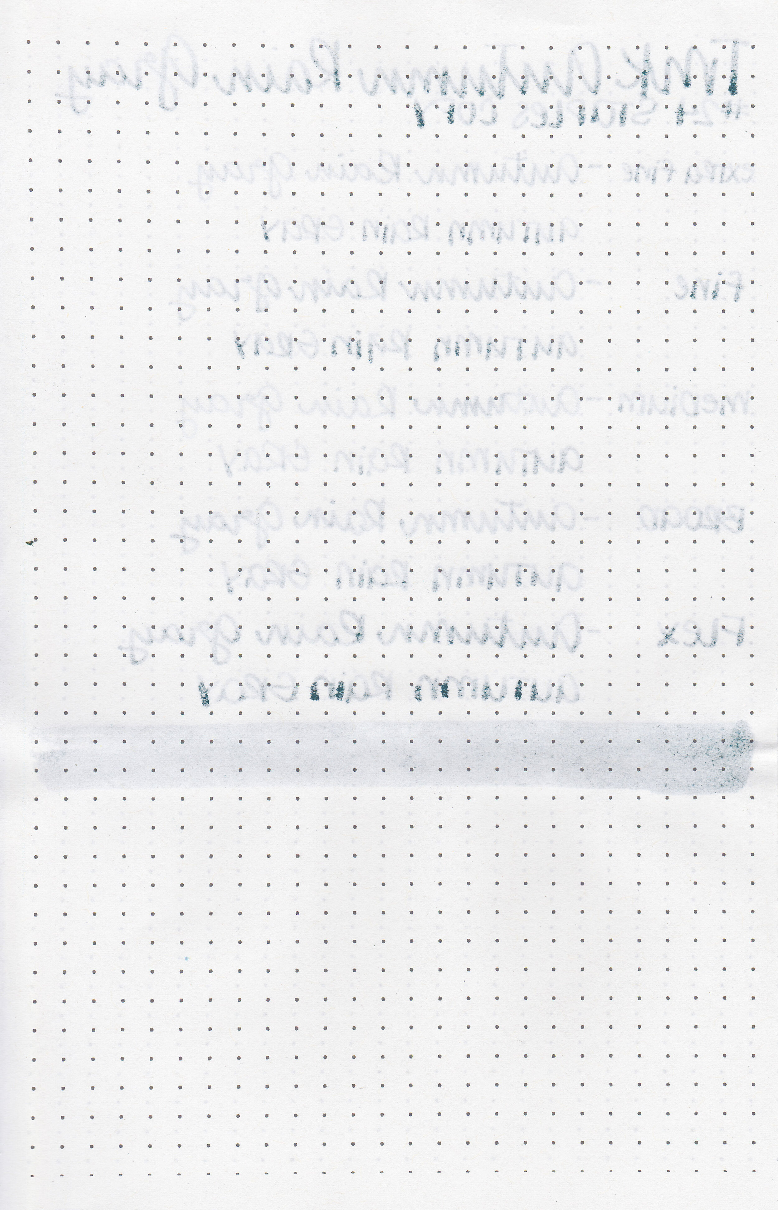
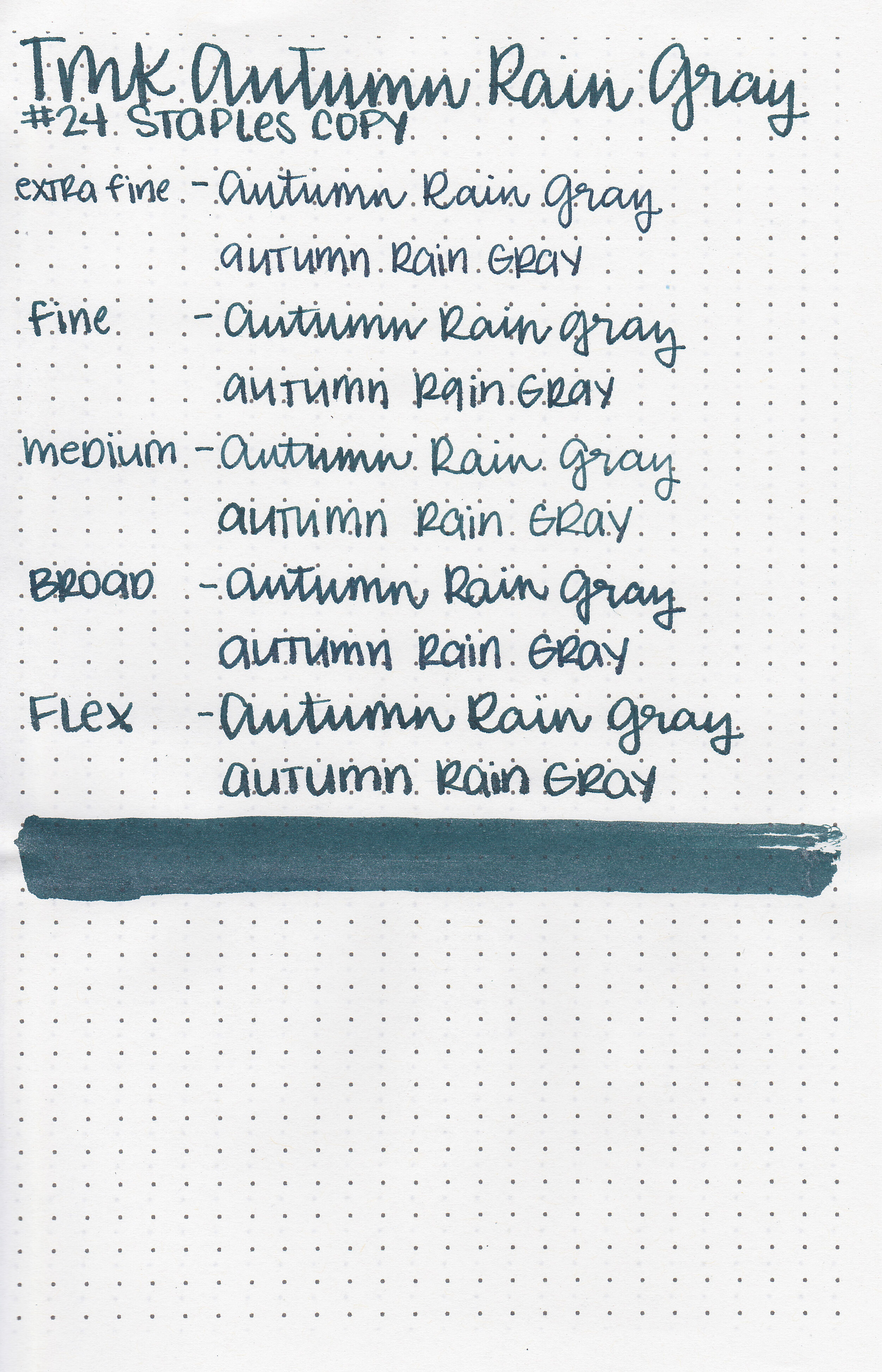
On Staples 24 lb copy paper there was some feathering and a bit of bleeding.

Autumn Rain Gray is a bit darker than Robert Oster Black ‘n’ Blue, and has silver shimmer instead of the RO’s blue. Click here to see the Troublemaker inks together and click here to see the green inks together.

I used a TWSBI Eco Blossom Red with a medium nib on a Yoseka A5 notebook. The ink had an average flow.
Overall, I was surprised that this ink is actually dark green rather than gray like the name states. I found it to be pretty well behaved on Rhodia and Tomoe River paper. I just wouldn’t use it on Leuchtturm or copy paper.
Disclaimer: This ink was provided by Shigure Inks for the purpose of this review. All photos and opinions are my own. This page does not contain affiliate links, and this post is not sponsored in any way.

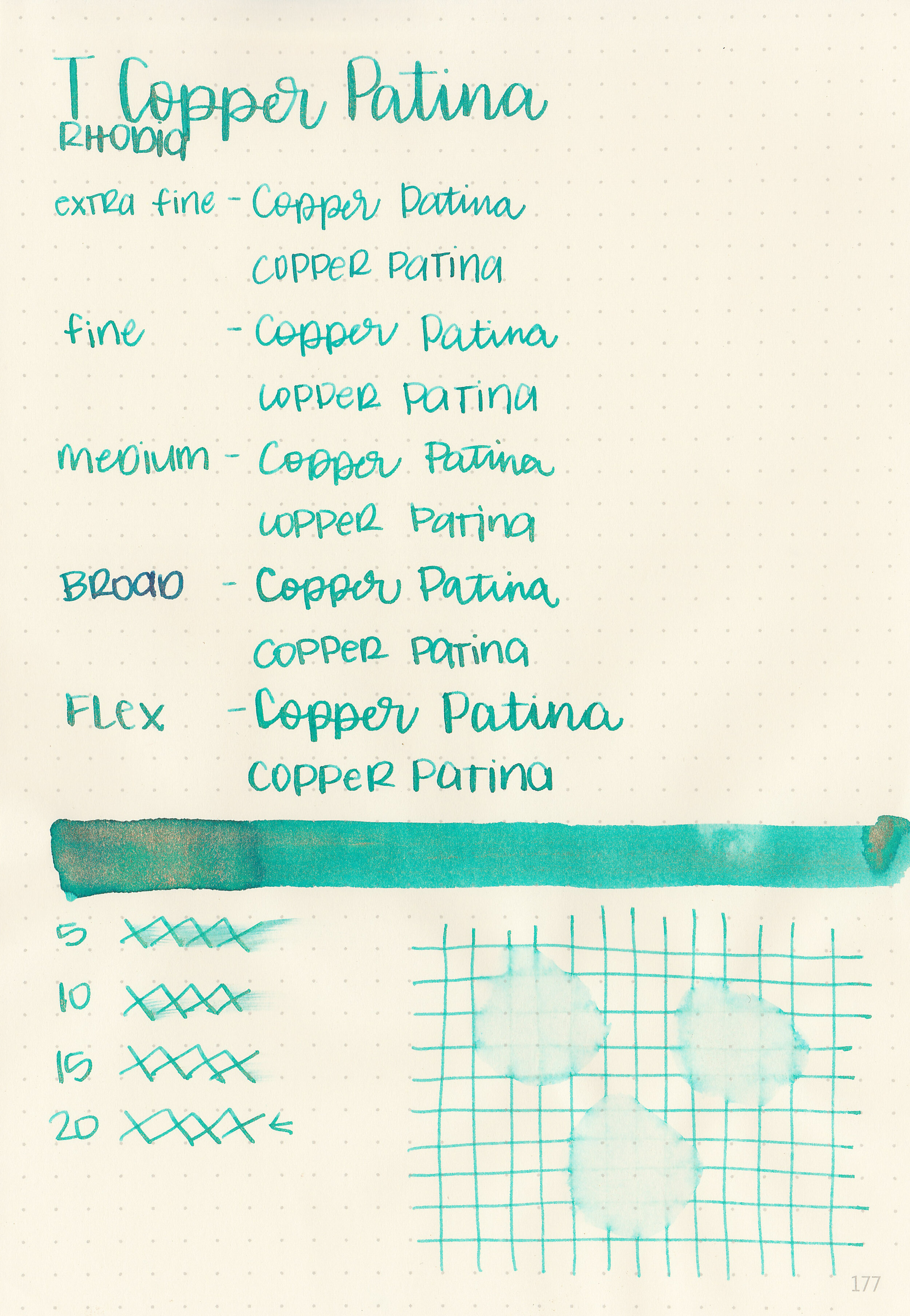
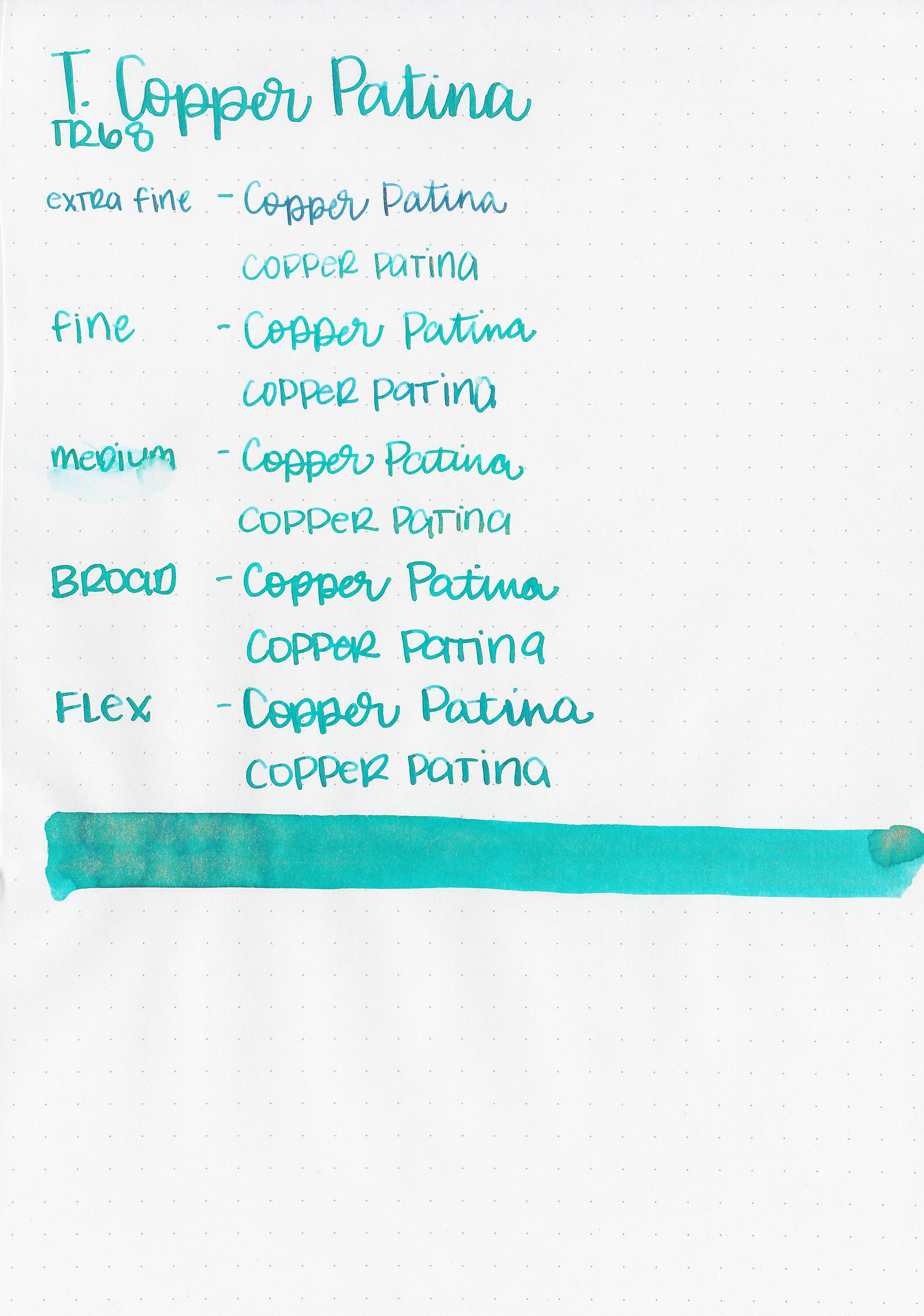
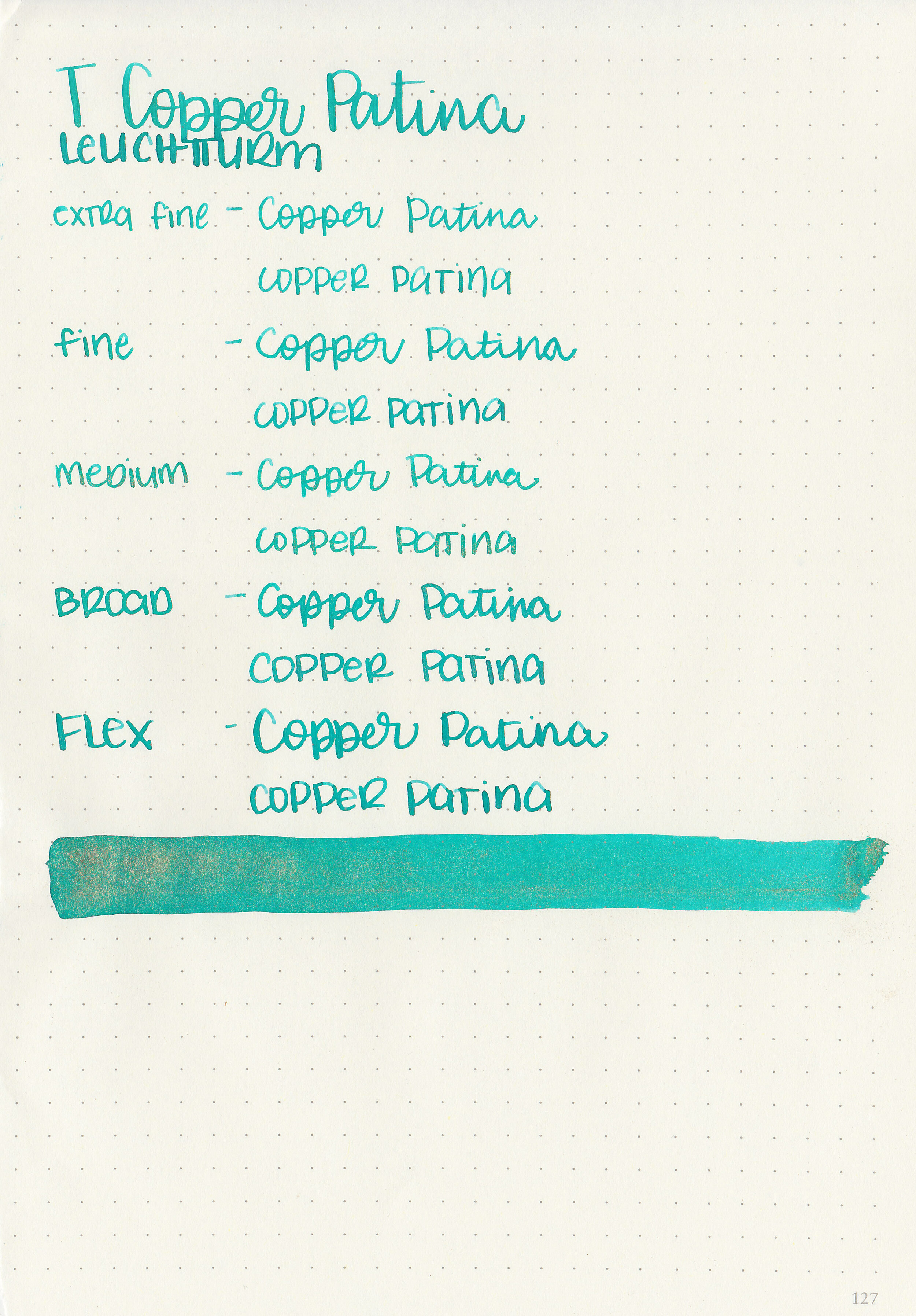
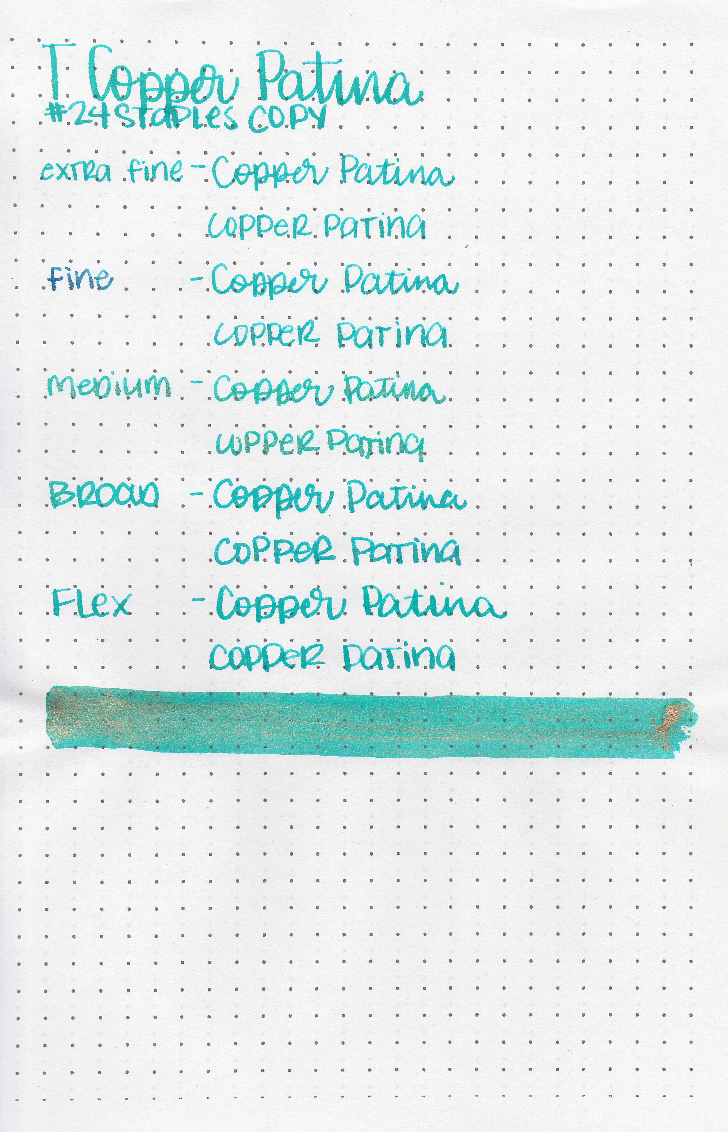
Let’s take a look at Troublemaker Copper Patina today. Thanks to Shigure Inks for sending a sample over for review!

The color:
Copper Patina is a light teal with gold shimmer.

In large swabs on Tomoe River paper you can see plenty of gold shimmer.

Let's take a look at how the ink behaves on fountain pen friendly papers: Rhodia, Tomoe River, and Leuchtturm.
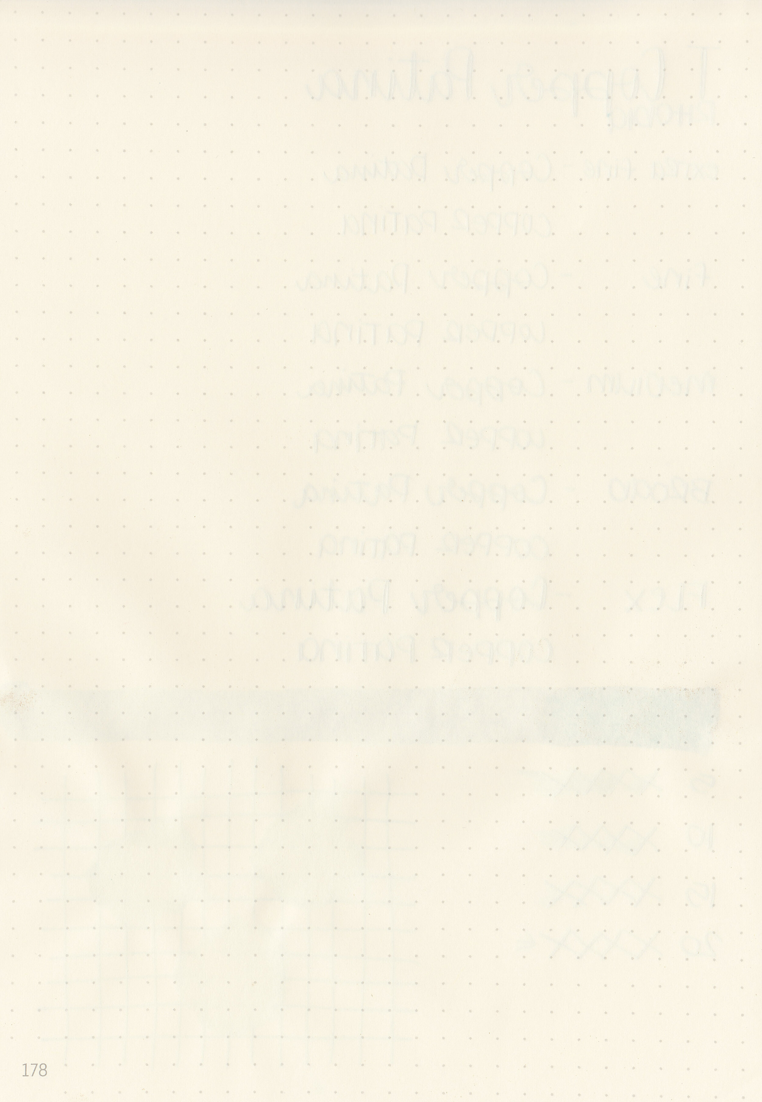
Dry time: 20 seconds
Water resistance: Low
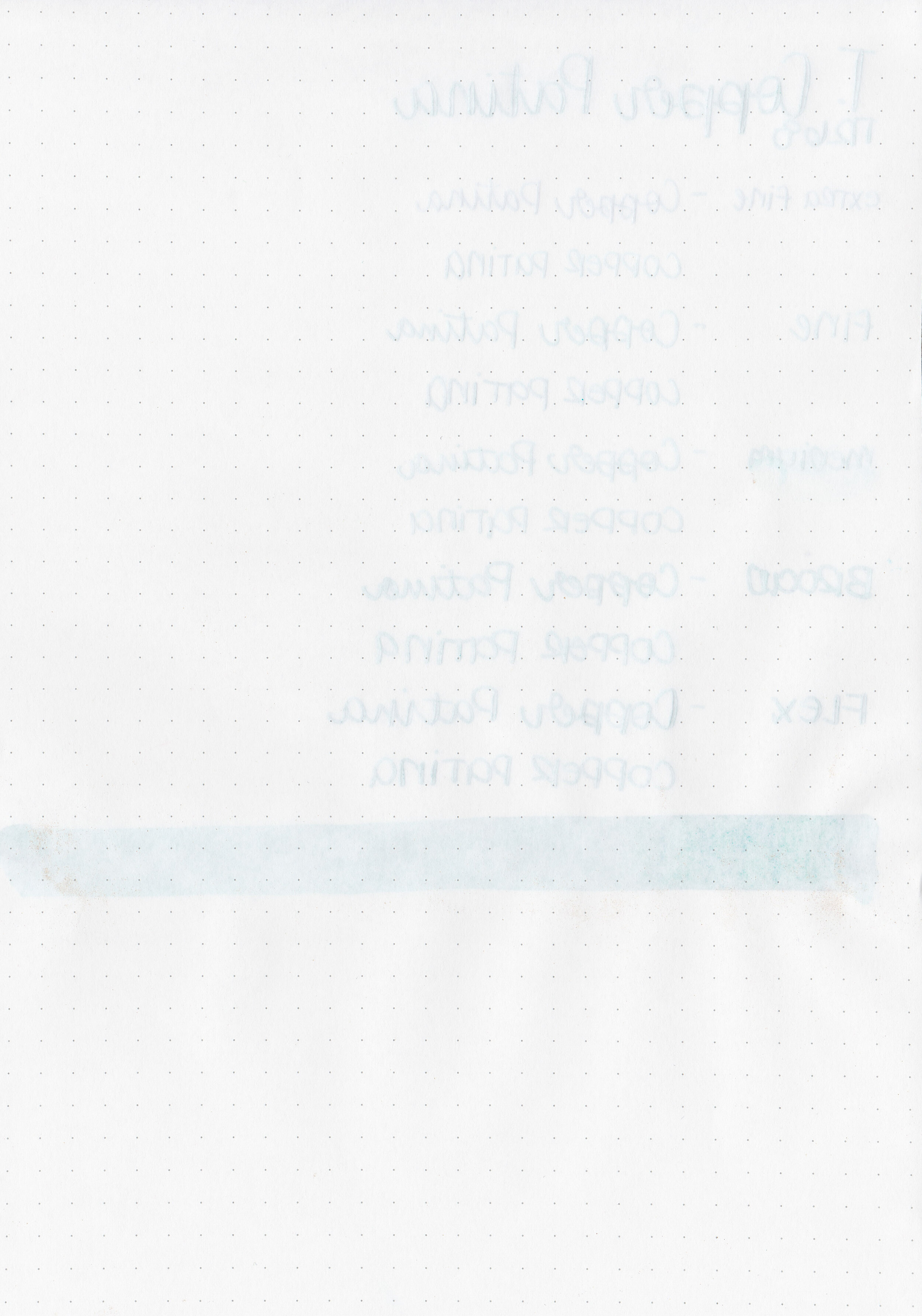
Feathering: None
Show through: Medium
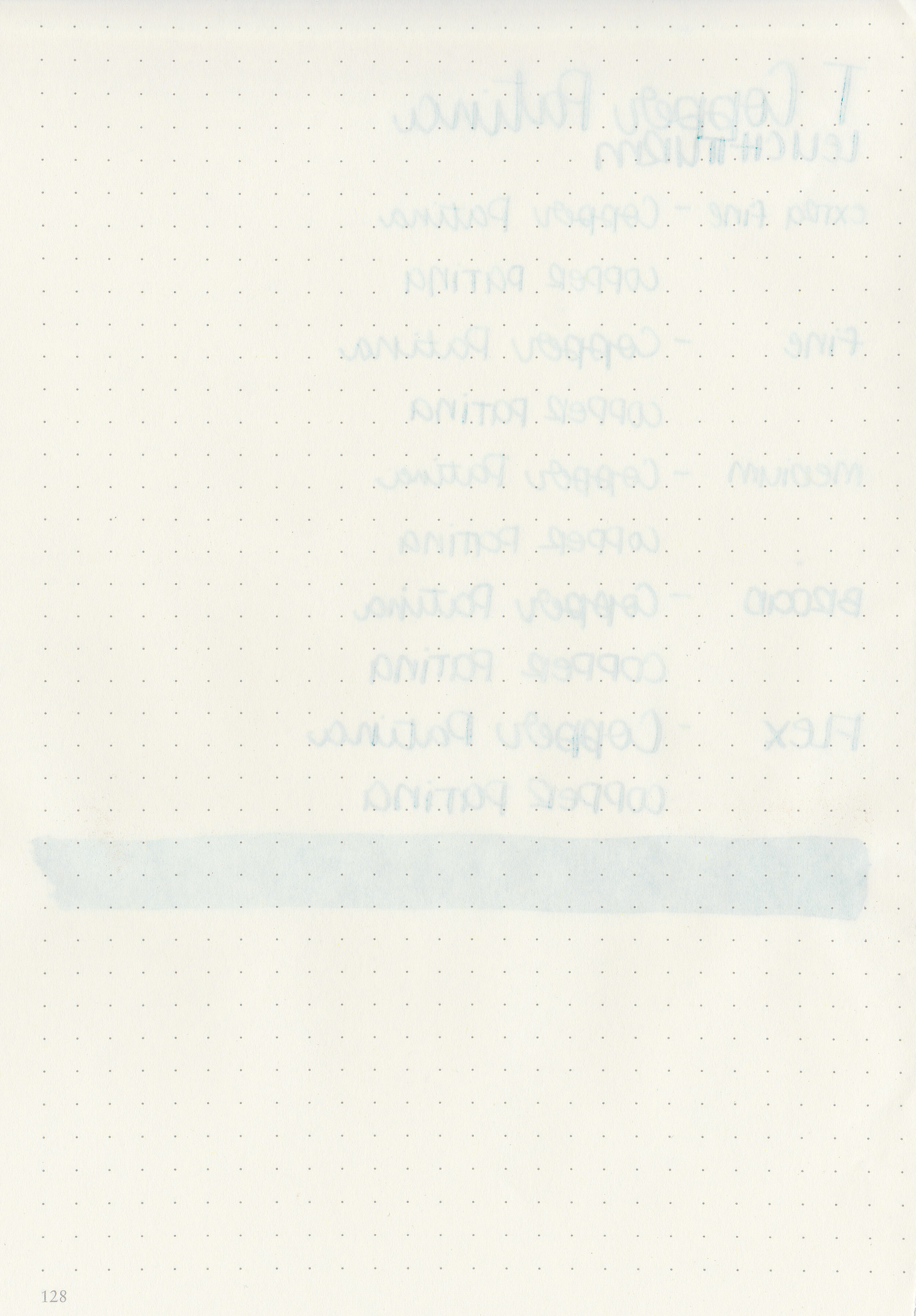
Bleeding: None
Other properties: medium shading, no sheen, and gold shimmer.
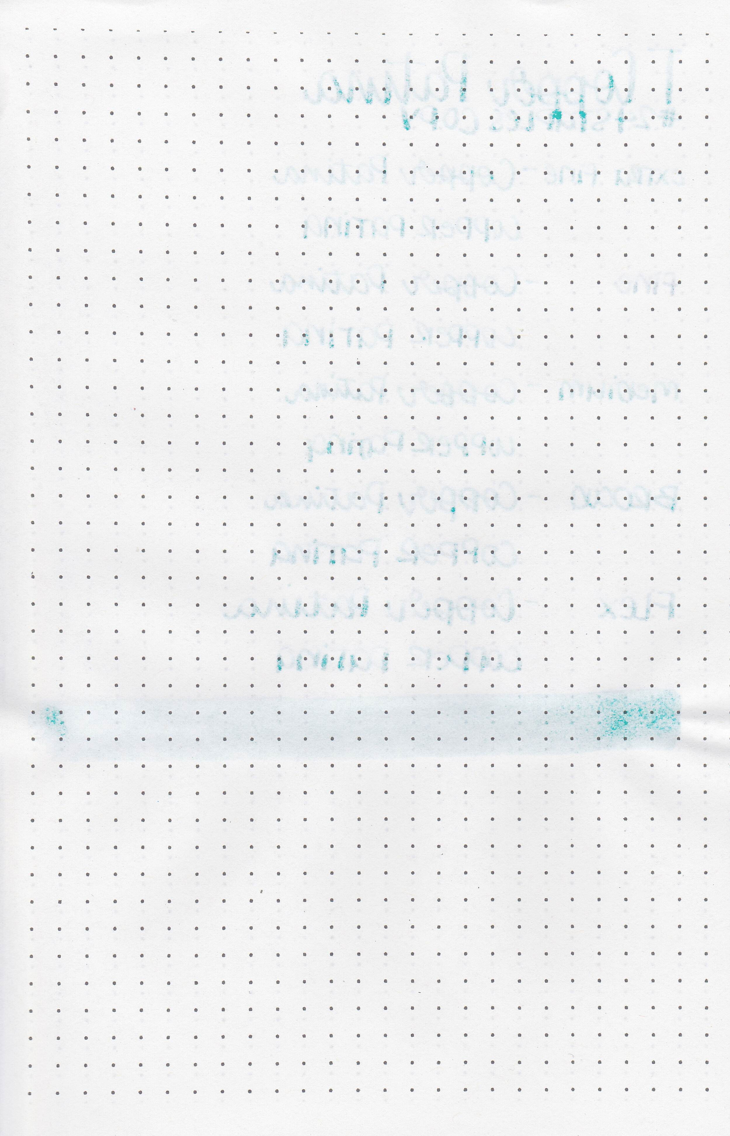
On Staples 24 lb copy paper there was some feathering and a bit of bleeding.

Copper Patina is pretty similar to Diamine Spearmint Diva, the only difference is that Spearmint Diva has silver shimmer instead of Copper Patina’s gold. Click here to see the Troublemaker inks together and click here to see the teal inks together.

I used a TWSBI Eco Transparent Orange with a medium nib on a Yoseka A5 notebook. The ink had a dry flow, I think mainly due to the shimmer slowing it down.
Overall, I love the color, but I prefer silver shimmer, so I like Diamine Spearmint Diva more than Troublemaker Copper Patina.
Disclaimer: This ink was provided by Shigure Inks for the purpose of this review. All photos and opinions are my own. This page does not contain affiliate links, and this post is not sponsored in any way.
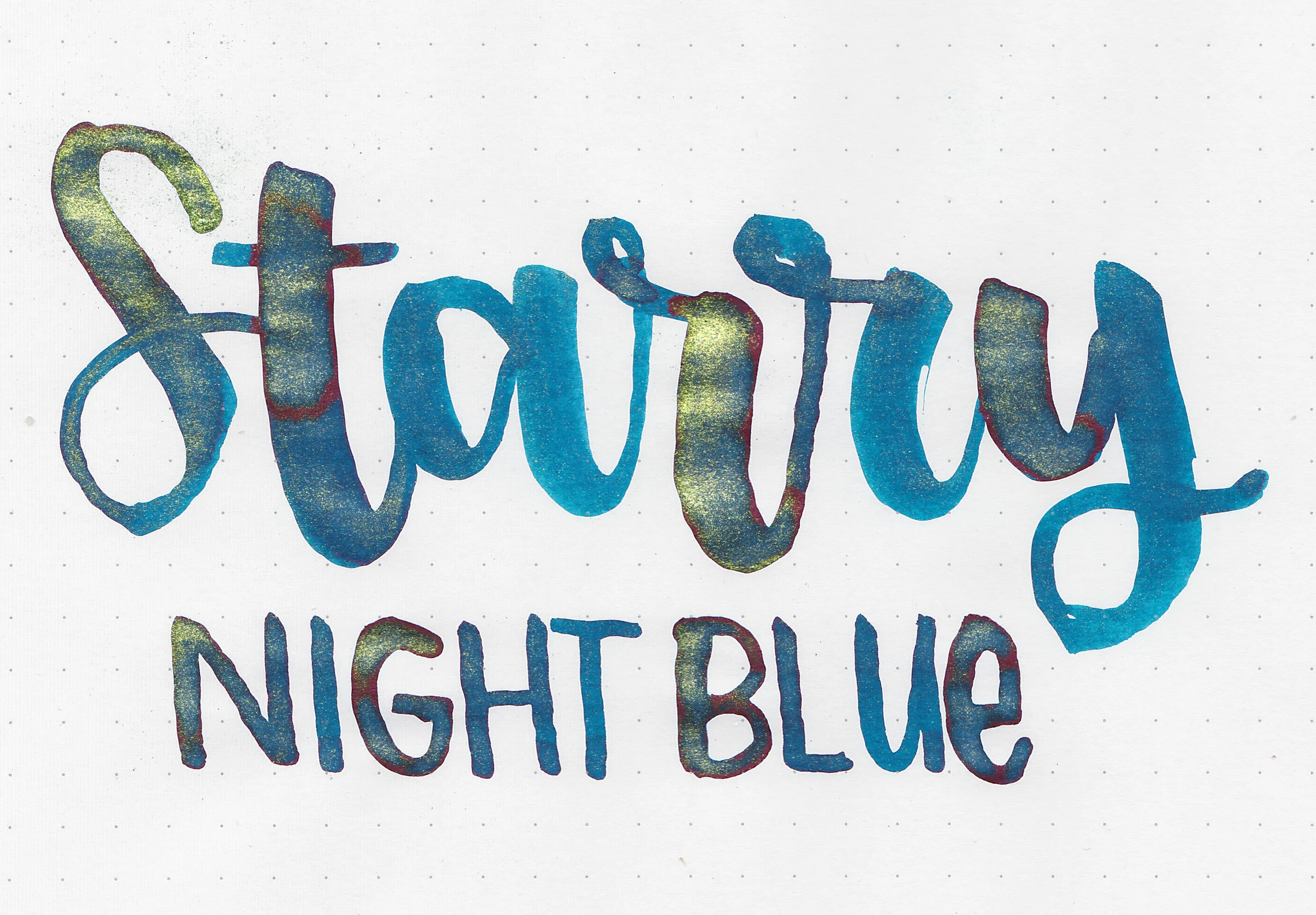
Troublemaker Starry Night Blue is from Troublemaker’s shimmer collection. Thanks to Shigure Inks for sending a sample over for review!
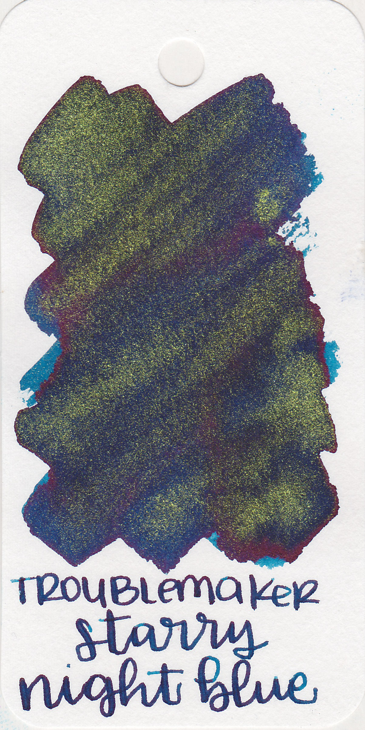
The color:
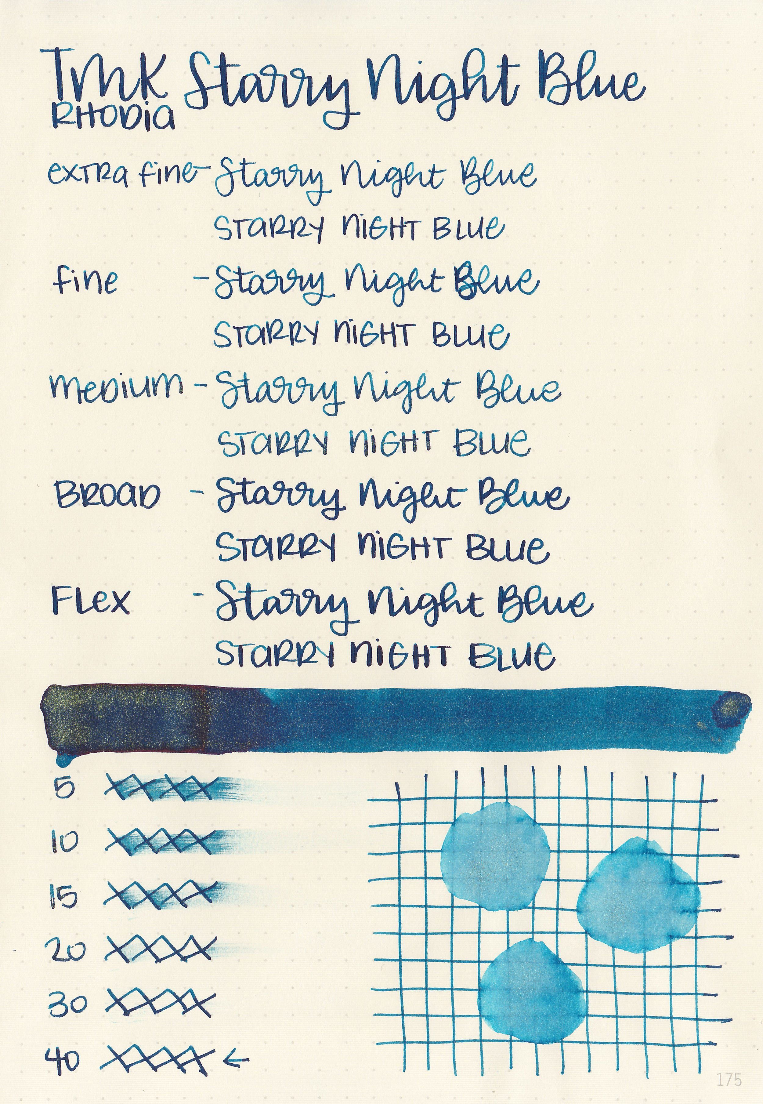
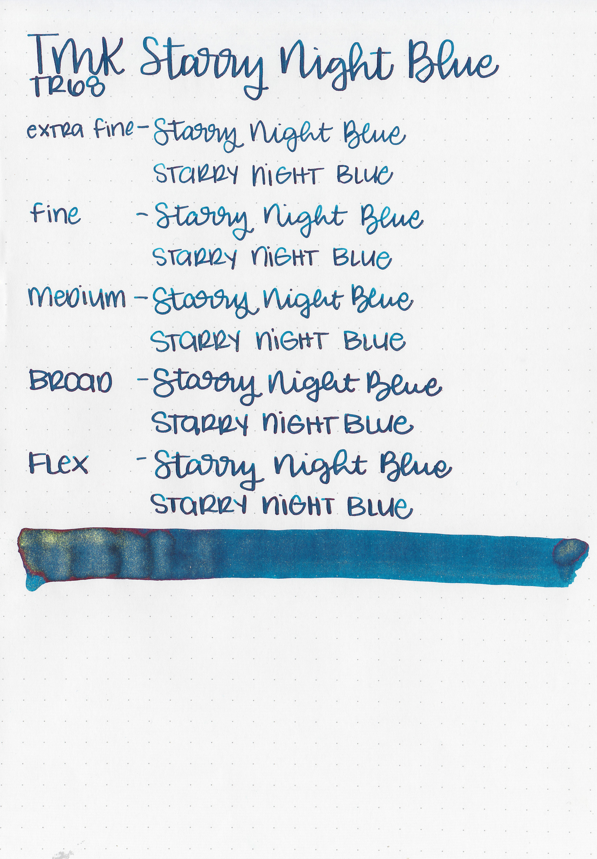
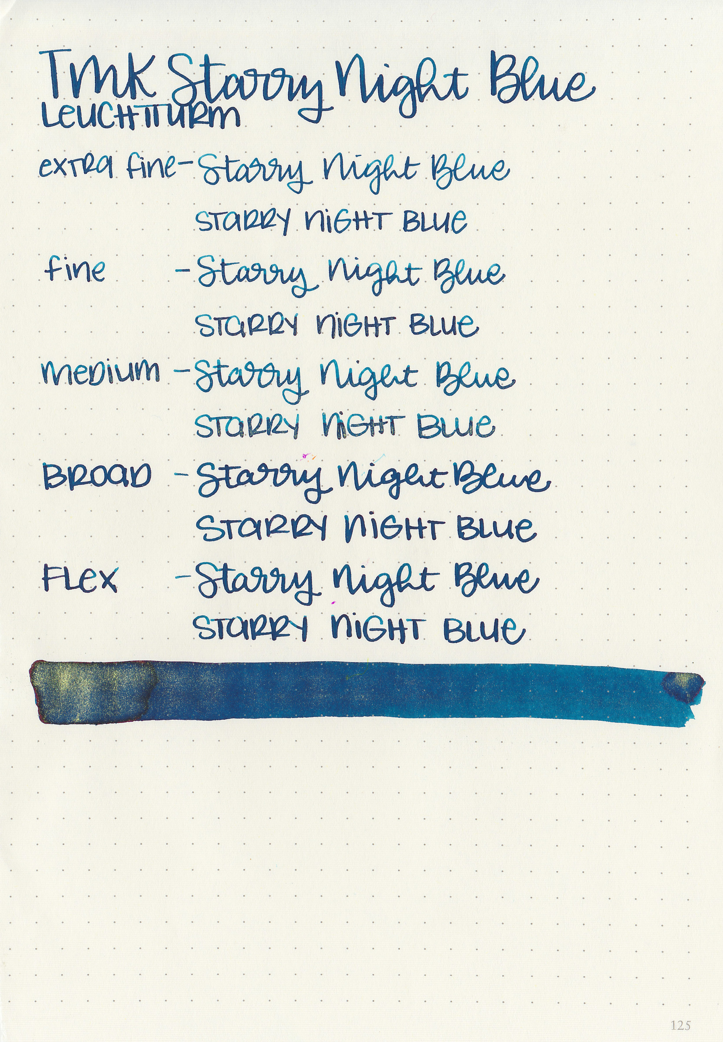
Starry Night Blue is a dark blue with a slight green undertone, red sheen and gold shimmer.

In large swabs on Tomoe River paper you can see some of the gold shimmer and red sheen.

Let's take a look at how the ink behaves on fountain pen friendly papers: Rhodia, Tomoe River, and Leuchtturm.
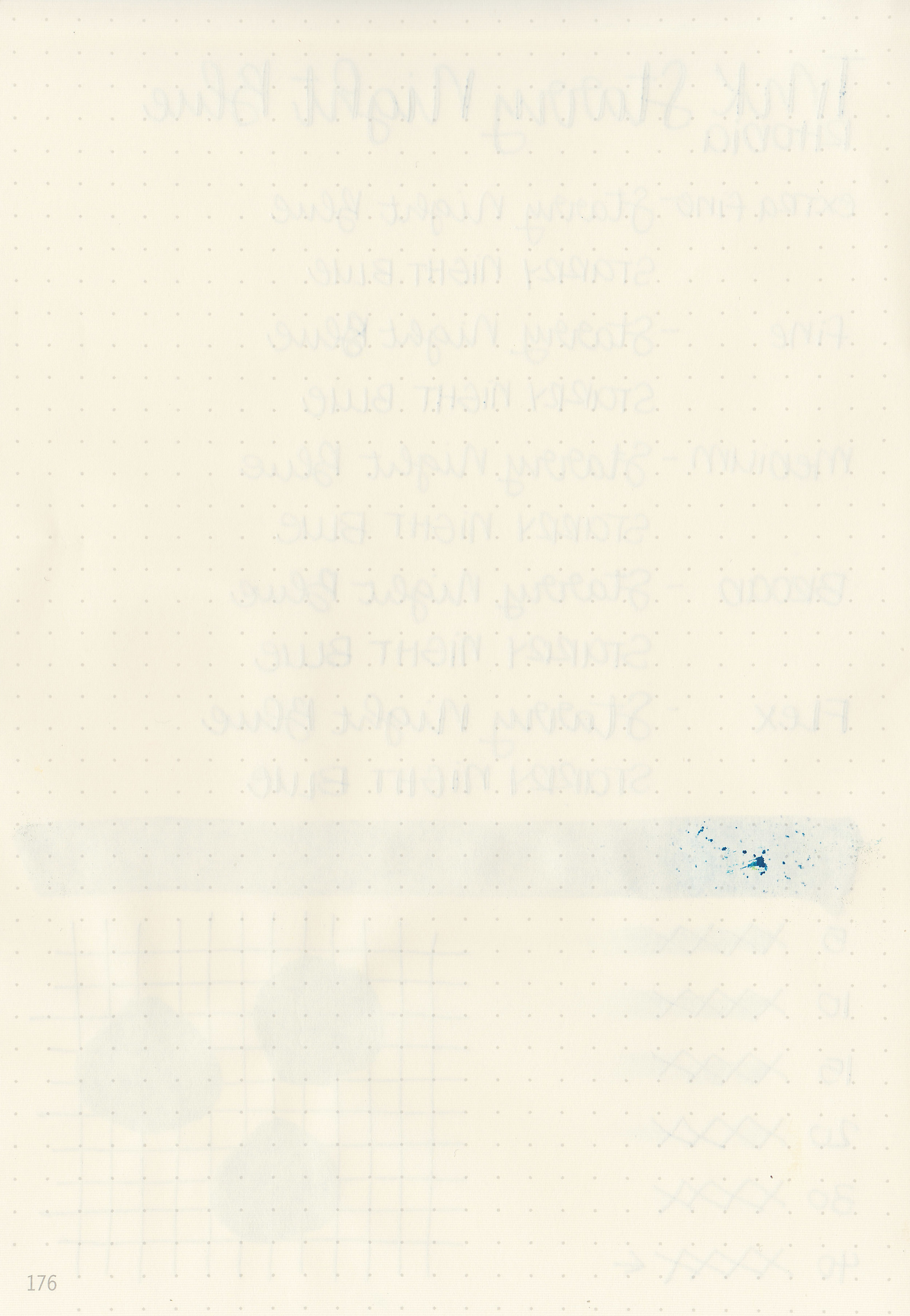
Dry time: 40 seconds
Water resistance: Low
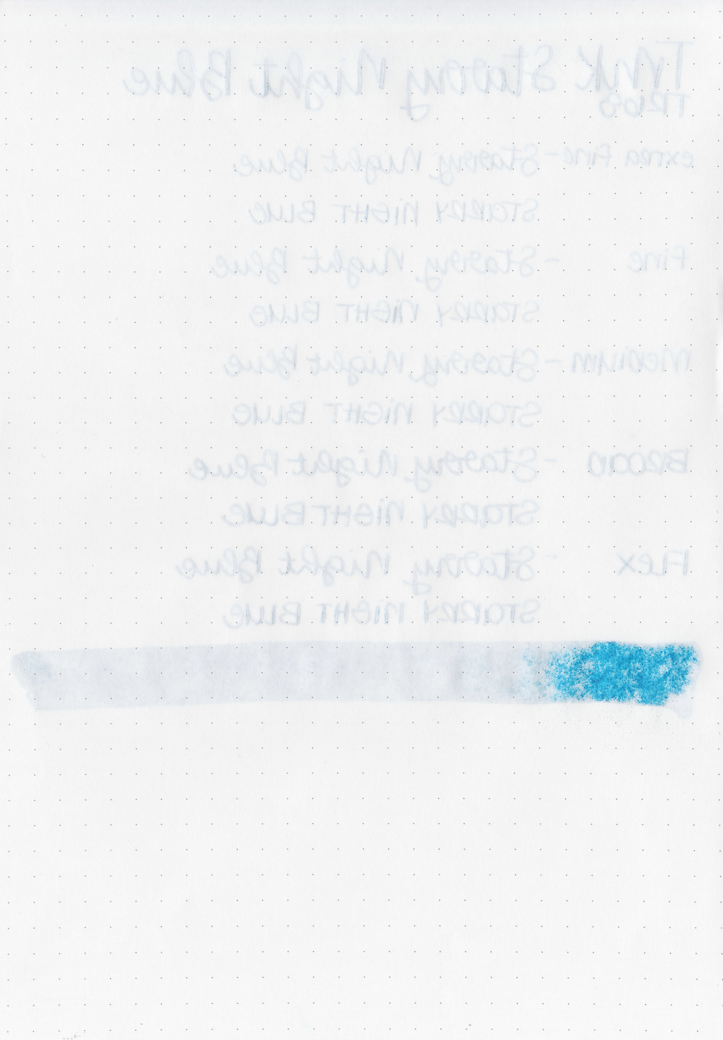
Feathering: None
Show through: Medium
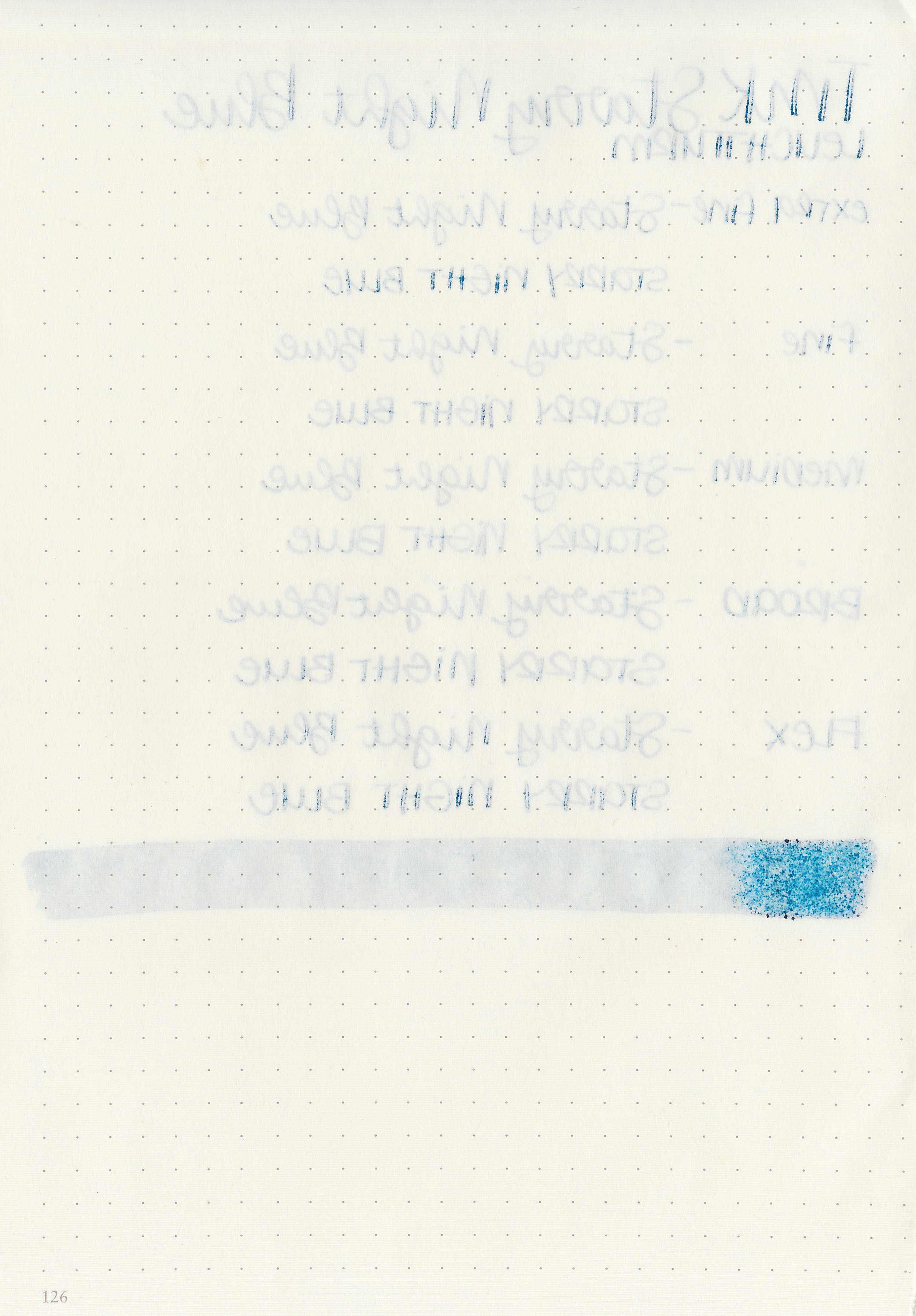
Bleeding: Medium
Other properties: medium shading, high sheen, and gold shimmer.
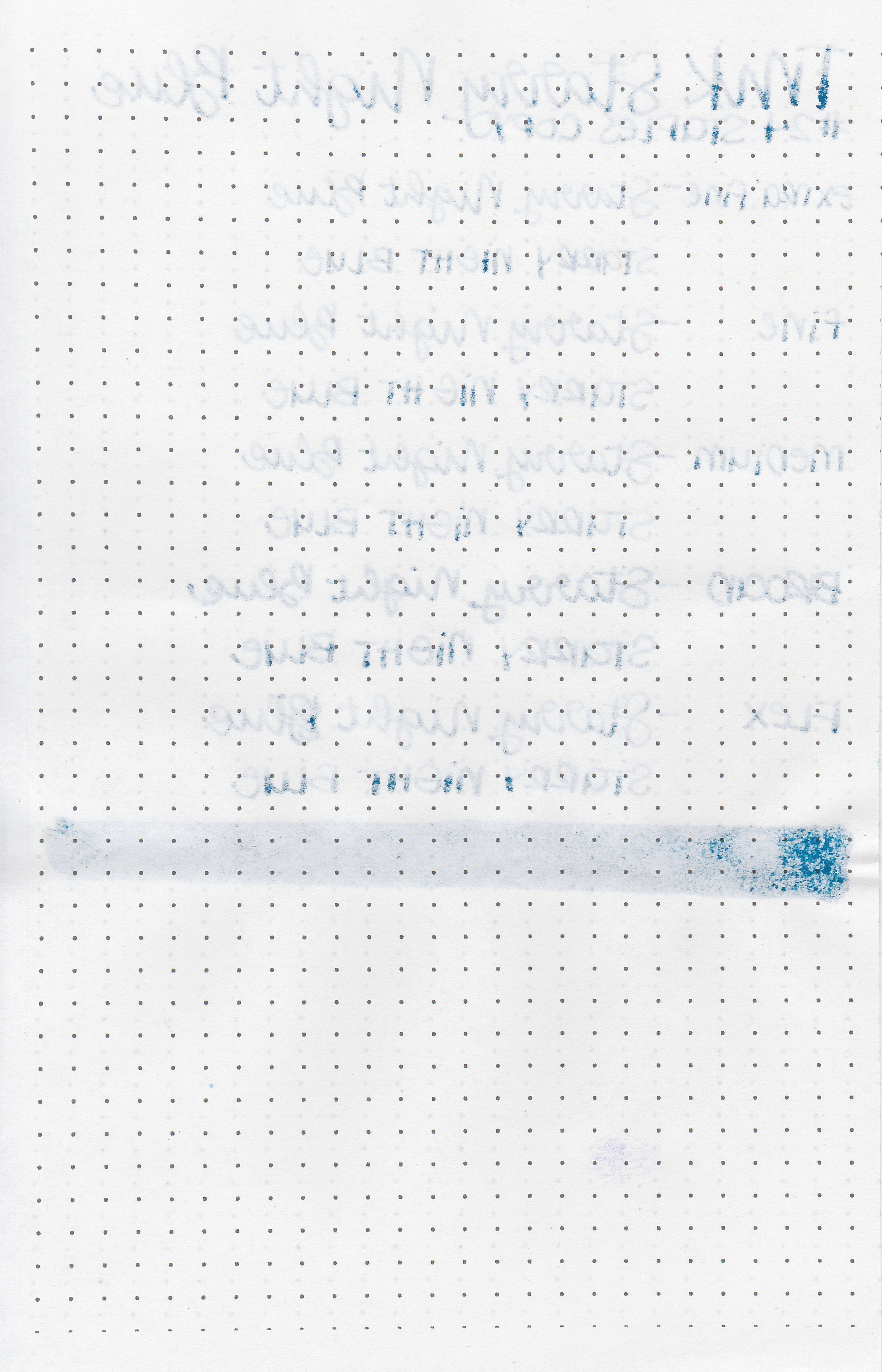
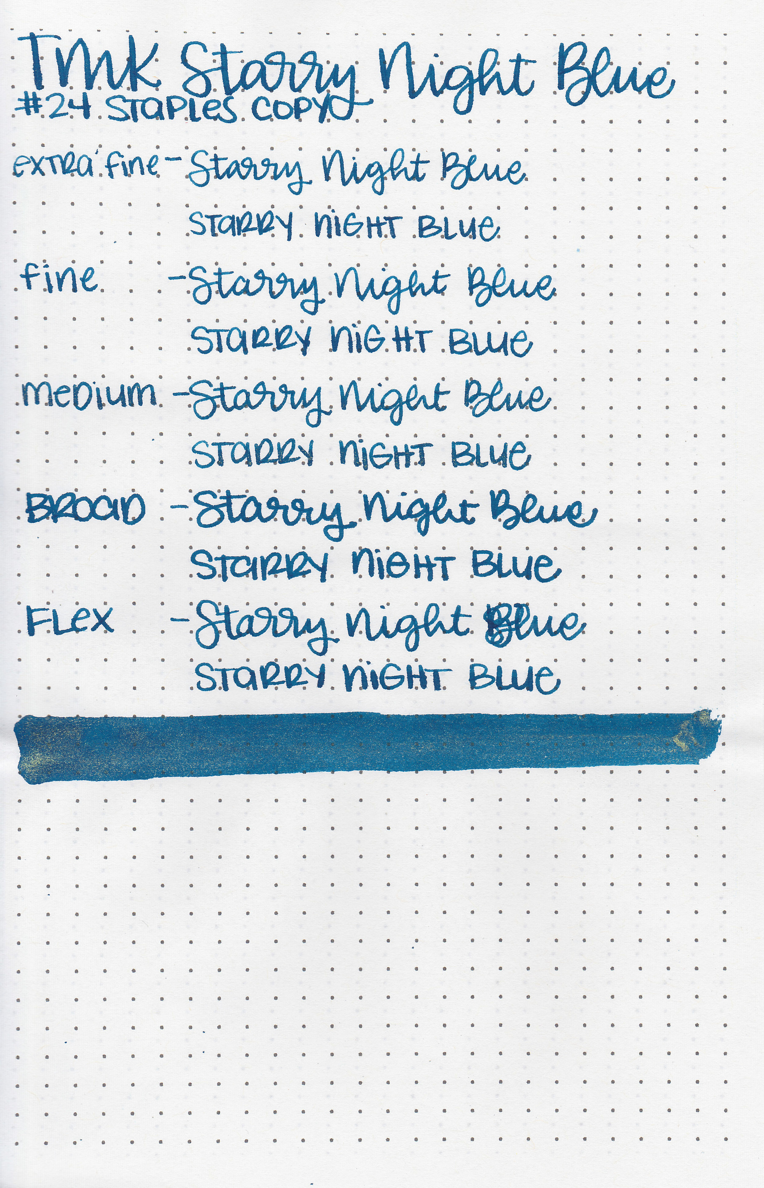
On Staples 24 lb copy paper there was some feathering and a bit of bleeding.

Starry Night Blue is similar to Vinta Cosmic Blue Kosmos but has gold shimmer instead of Kosmos’ copper. Click here to see the Troublemaker inks together and click here to see the blue inks together.

I used a TWSBI Eco Transparent Green with a medium nib on a Yoseka A5 notebook. The ink had a dry flow, I think mainly due to the shimmer slowing it down.
Overall, I don’t love how dry it is but other than that it’s performs pretty well. The color is nice, and it’s pretty affordable at 60ml/$12. Shimmer inks aren’t an everyday carry for me, but I would use them for holiday cards and letters.
Disclaimer: This ink was provided by Shigure Inks for the purpose of this review. All photos and opinions are my own. This page does not contain affiliate links, and this post is not sponsored in any way.

We finally reached 1,000 ink reviews earlier this month! I never though I’d hit that many, let alone in the first three years. I try to do a favorites post every 100 ink reviews but decided to do something a bit different this time. I took a vote on Instagram, and the #1 request was for a tour of my ink storage, so let’s go for a wander through my cabinet.

Ink Tower:
This cabinet is the Alex 9-drawer from Ikea, and is where most of my ink lives. This tower lives to the left of my desk.
I do own a lot of ink, but most of these inks have come to me in the process of reviewing inks. I occasionally take a box of ink to my local pen club to give away. The light inside isn’t the best so forgive some of the crappy lighting. Generally I take my photos outside but I can’t really move this whole tower outside.

This first drawer holds my Sailor Ink Studio samples as well as my Birmingham samples (since the glass vials don’t fit in the vial holders) and some Thornton’s Luxury Goods inks.

The next drawer holds 3 vial holders with samples divided by color: neutrals, orange/yellow and red/pink. In the front are some J Herbin, Thornton’s Luxury Goods, David Oscarson, Montblanc and Sailor Ink Studio bottles.

Drawer #3 holds another 3 vial holders: green/teals, blues and purples. Bottles are from Blackstone, Troublemaker and KWZ (If you can ever get your hands on a bottle of the KWZ Meet Me in St. Louis Butterscotch-DO IT!).

Next we’ve got Papier Plume and some random J Herbin, Montblanc, Callifolio, Noodler’s, TWSBI, De Atramentis and Colorverse.

This drawer is mainly Sailor with some Kobe and Private Reserve mixed in.
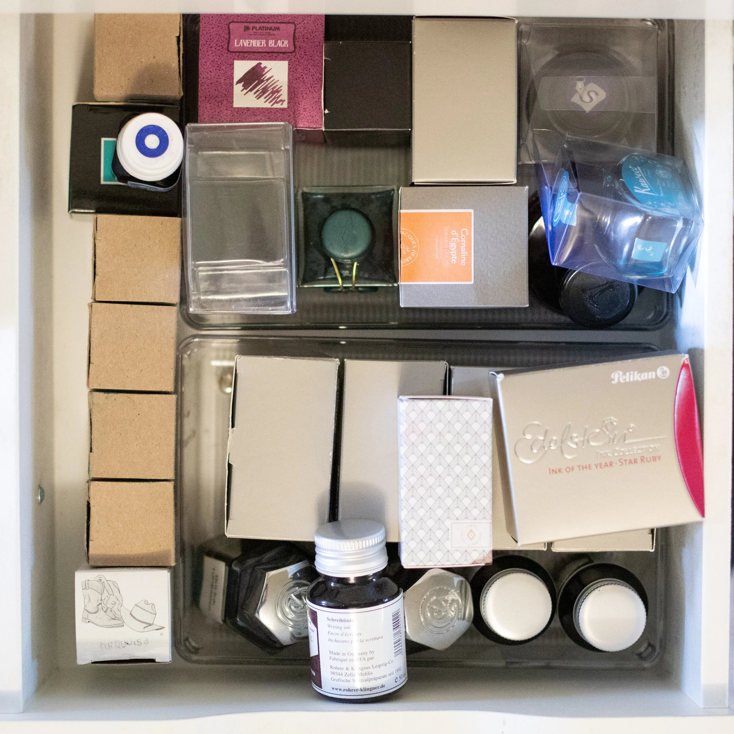
This drawer is all random: Noodler’s, Organics Studio, Rohrer and Klingner, Krishna, Vinta, Pelikan, Platinum, Cross, J Herbin, Sheaffer, Parker, Kaweco and some re-bottled Bril.

Monteverde, some overflow Robert Oster and Diamine, the Colorverse Voyager set and the Sailor Nano inks.

Robert Oster deserves his own drawer because I love his inks.

Diamine gets its own drawer, and even spills over into some other drawers. I love these 30ml bottles-I think I paid under $2 per 30ml bottle.

Here’s my Pilot Iroshizuku inks-one day I’ll own them all, some PenBBS, Lamy, Waterman, some overflow Diamine, and some Ancient Song bottles in the very back.

This is a drawer in my desk that holds inks I’m currently working on reviewing and ones I want to review soon (ones that have been sent in by retailers or readers).

Samples
After I’ve reviewed an ink if there’s any ink left in the sample then I throw it in these bins. I have one bin for neutrals, one for warm colors and one for cool colors. I try not to waste any ink, and I often search through these bins for a specific sample.
I love this Alex cabinet-it has held up really well for the past 5 years. I do put a cardboard support on the bottom of the drawers with the heaviest inks in them to prevent any sagging. You can probably tell what my favorite brands are, just based on which I own the most bottles of. My top 5 are (in no particular order): Robert Oster, Pilot Iroshizuku, Sailor, Monteverde and Diamine.
Discaimer: All photos and opinions are my own. There are no affiliate links on this page, and this post is not sponsored in any way.

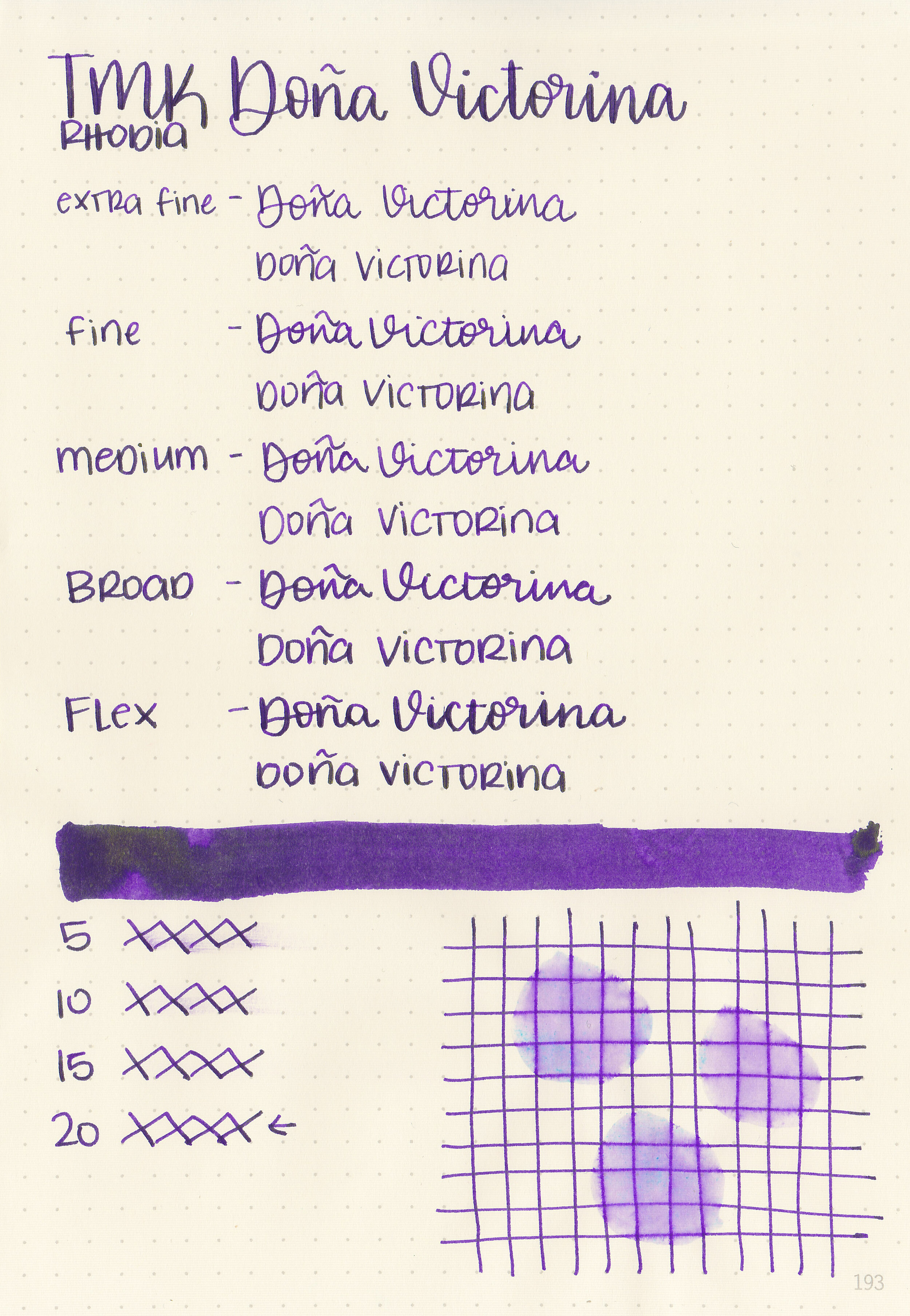
Today’s ink is Troublemaker Dona Victorina. Thanks to Shigure Inks for sending a sample over for review! The very first thing I want to say about this ink is that it stains everything! You can see a pic of my stained Eco below. I used an Inkmeiser to fill some pens with this ink, and by the time I rinsed it out a few minutes later the Inkmeiser was already stained. After three separate cleanings it’s barely noticeable but it was a lot of trouble to go to for just a few minutes of use. Troublemaker is aware that this ink stains, and the Dona Victorina product page on their website warns: “⚠️ This ink is prone to staining. Proceed with caution when using it with demonstrators.”
View this post on InstagramA post shared by Mountain of Ink (@mountainofink) on

The color:
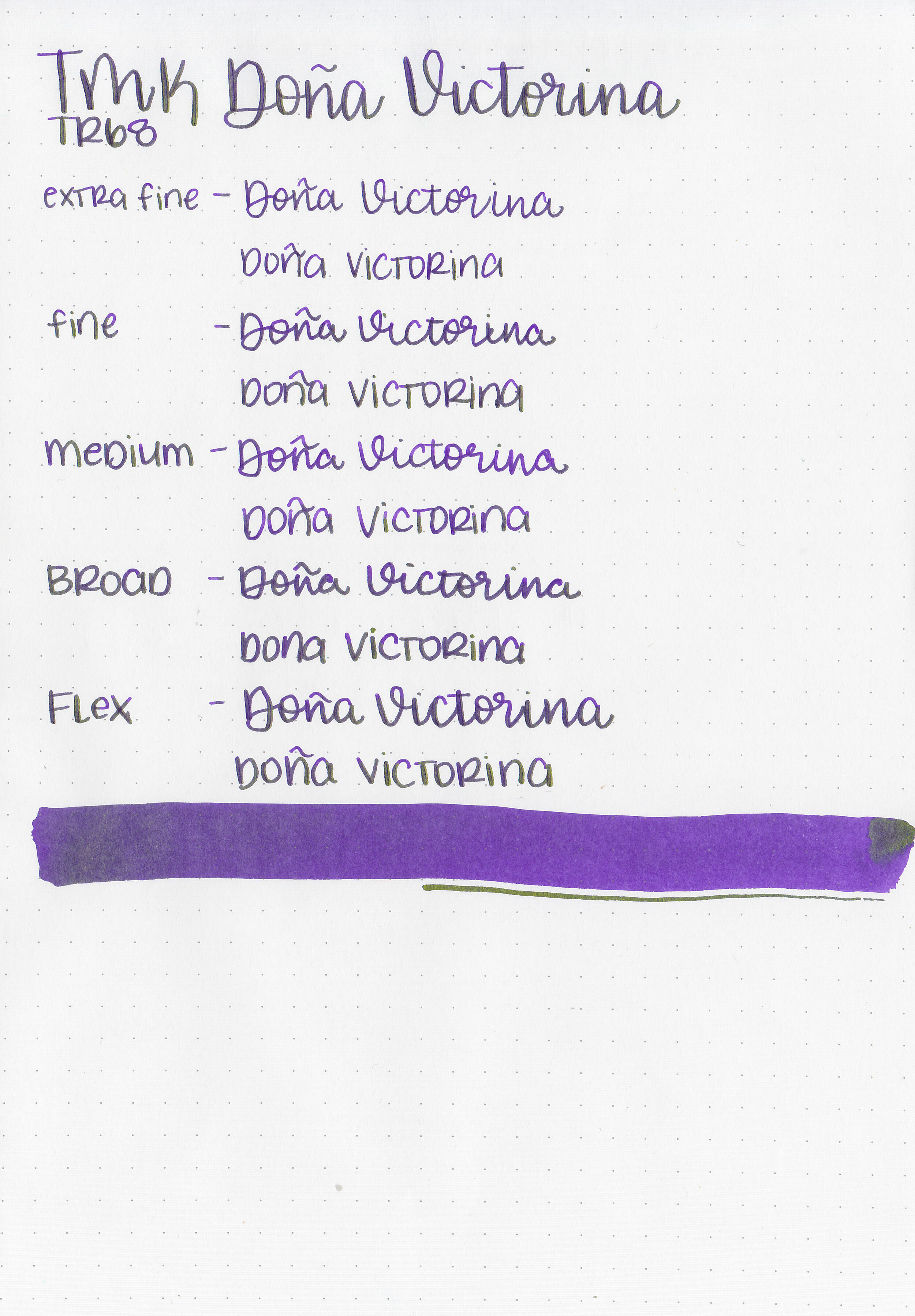
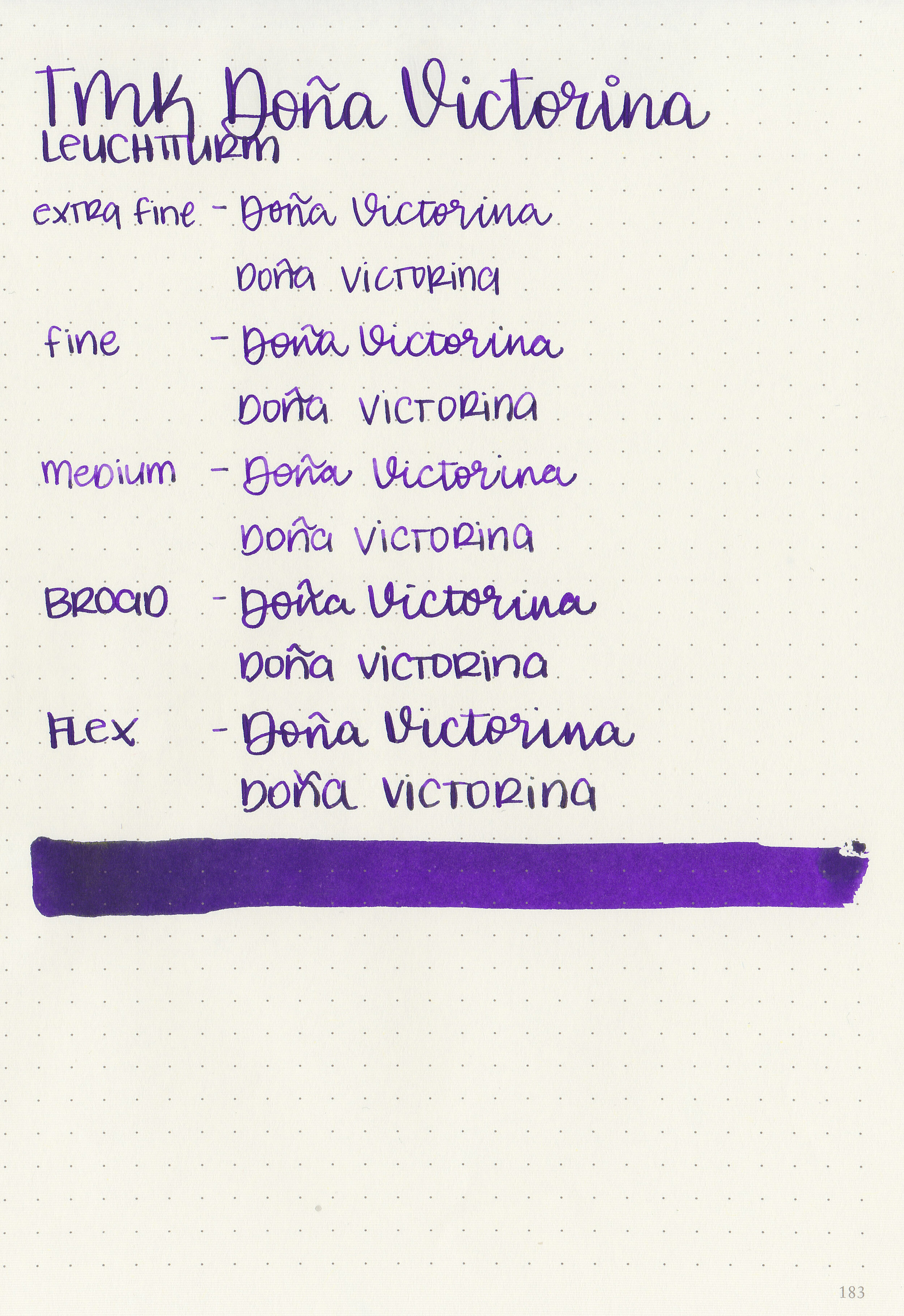
Dona Victorina is a vibrant purple with tons of bright green sheen.

In large swabs on Tomoe River paper you can see lots of the green sheen.

Let's take a look at how the ink behaves on fountain pen friendly papers: Rhodia, Tomoe River, and Leuchtturm.
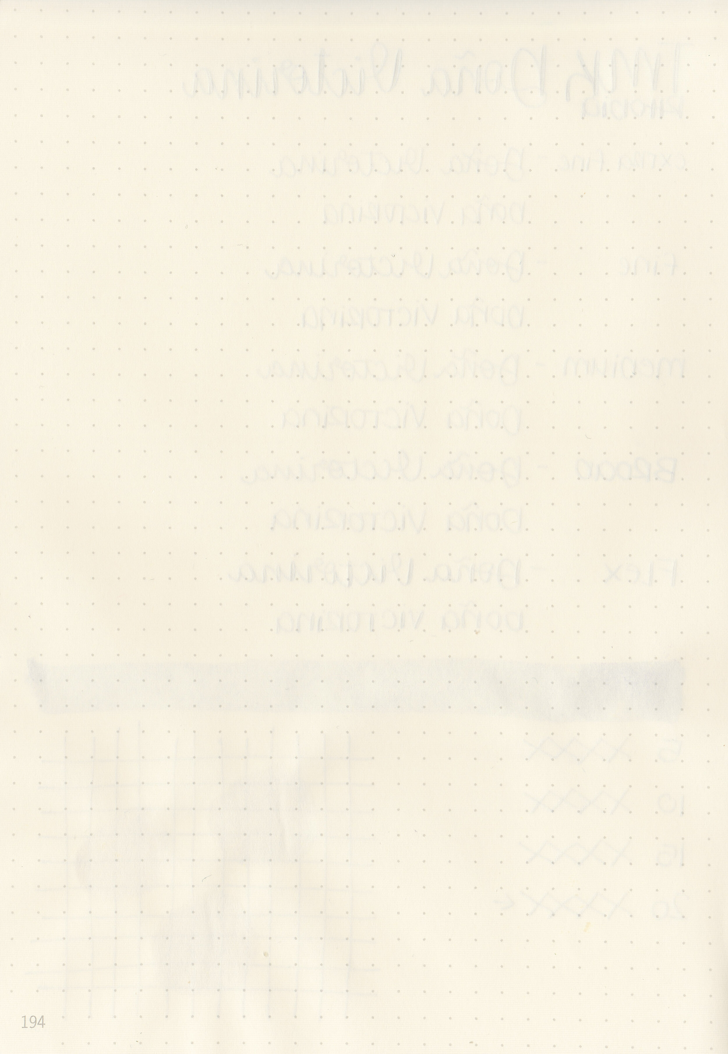
Dry time: 20 seconds
Water resistance: Medium-some of the ink washed away but you might still be able to read it.
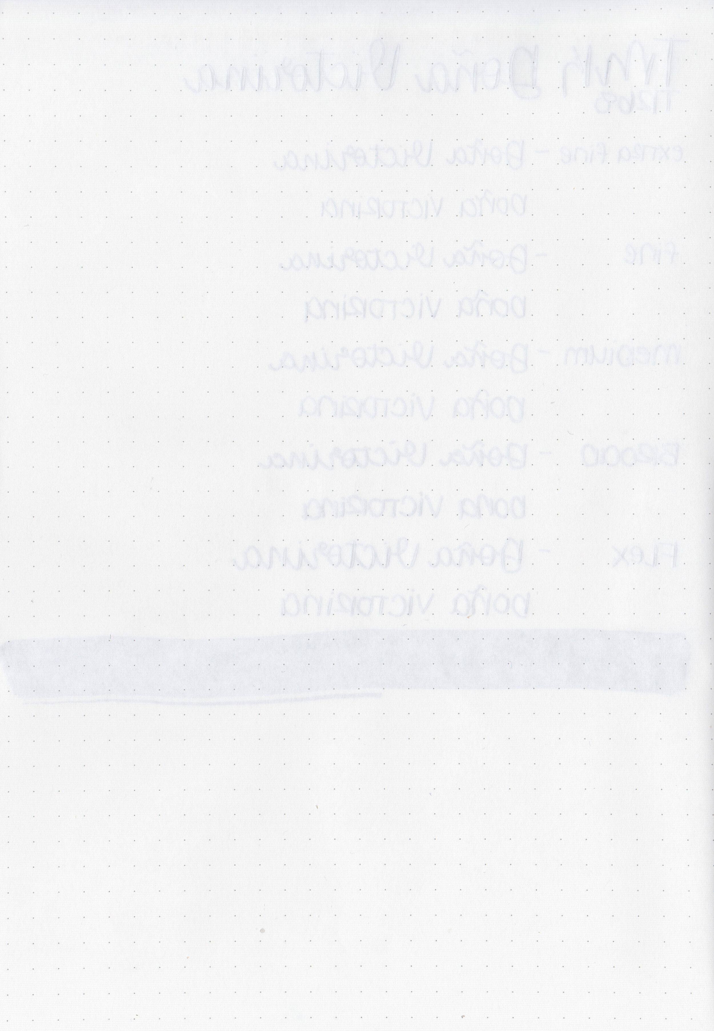
Feathering: None
Show through: High
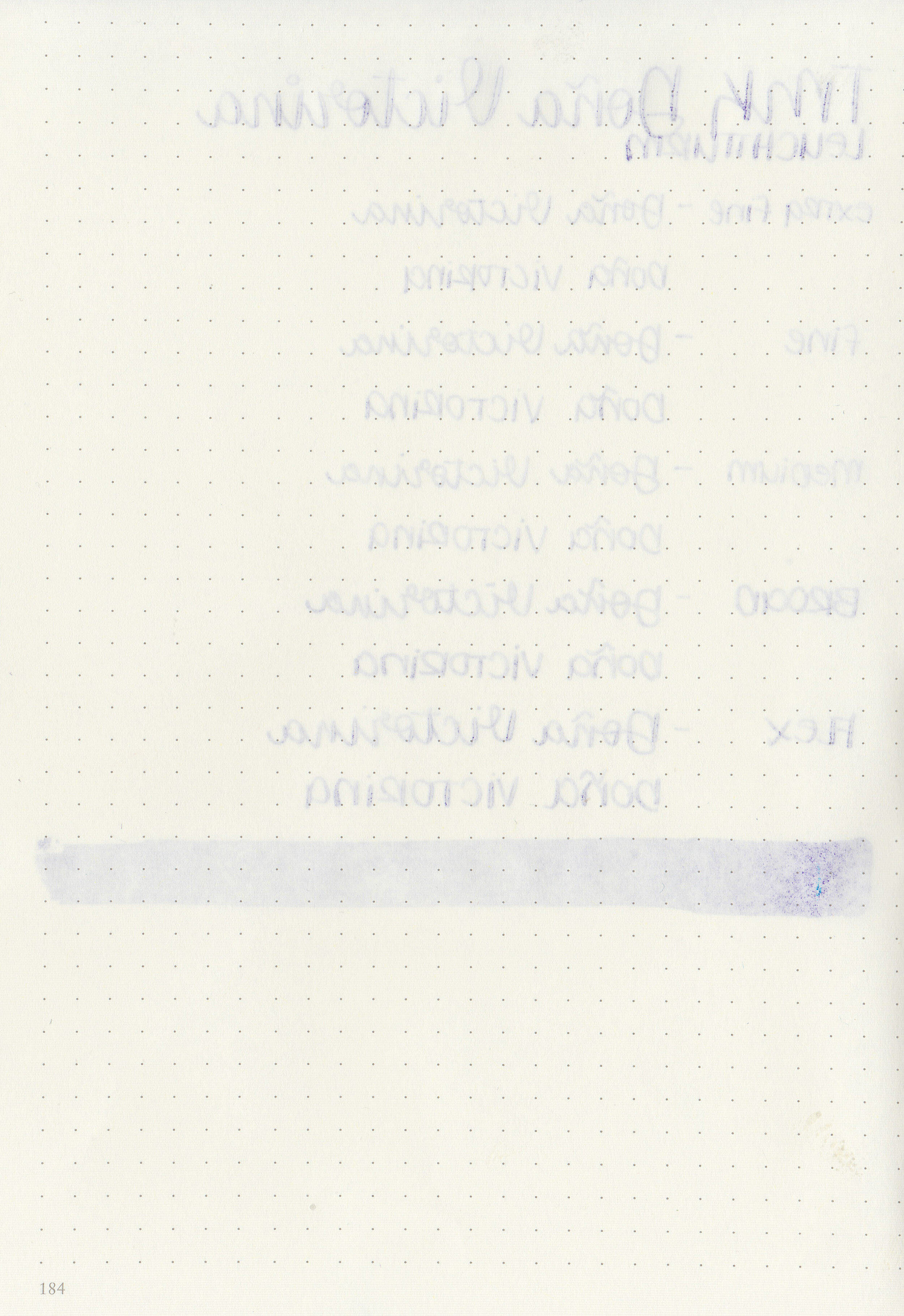
Bleeding: Medium
Other properties: no shading, high sheen, and no shimmer. This ink is almost a monster sheener but not quite. It just doesn’t show up as well on Leuchtturm and Rhodia as it does on Tomoe River paper.
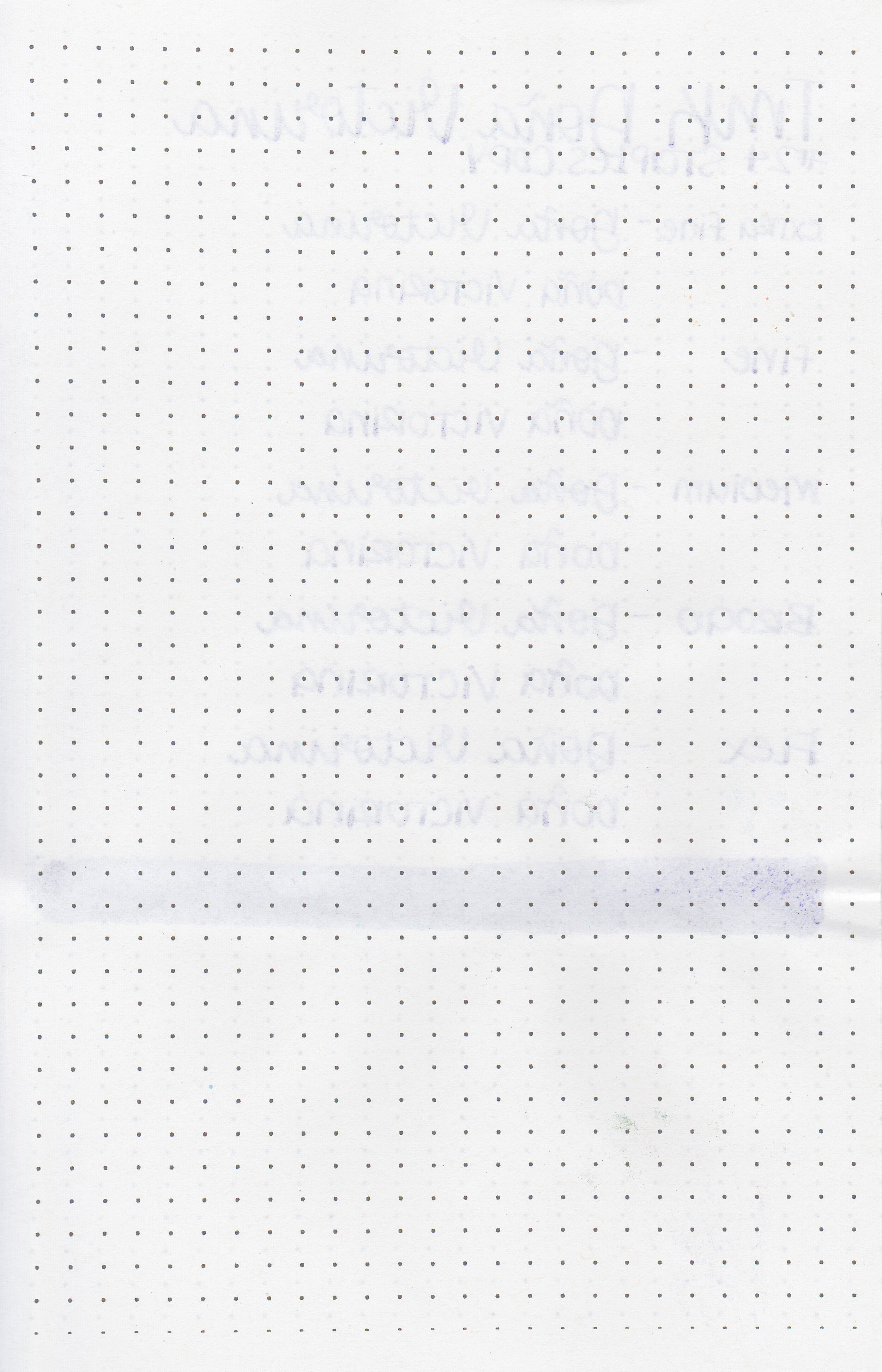
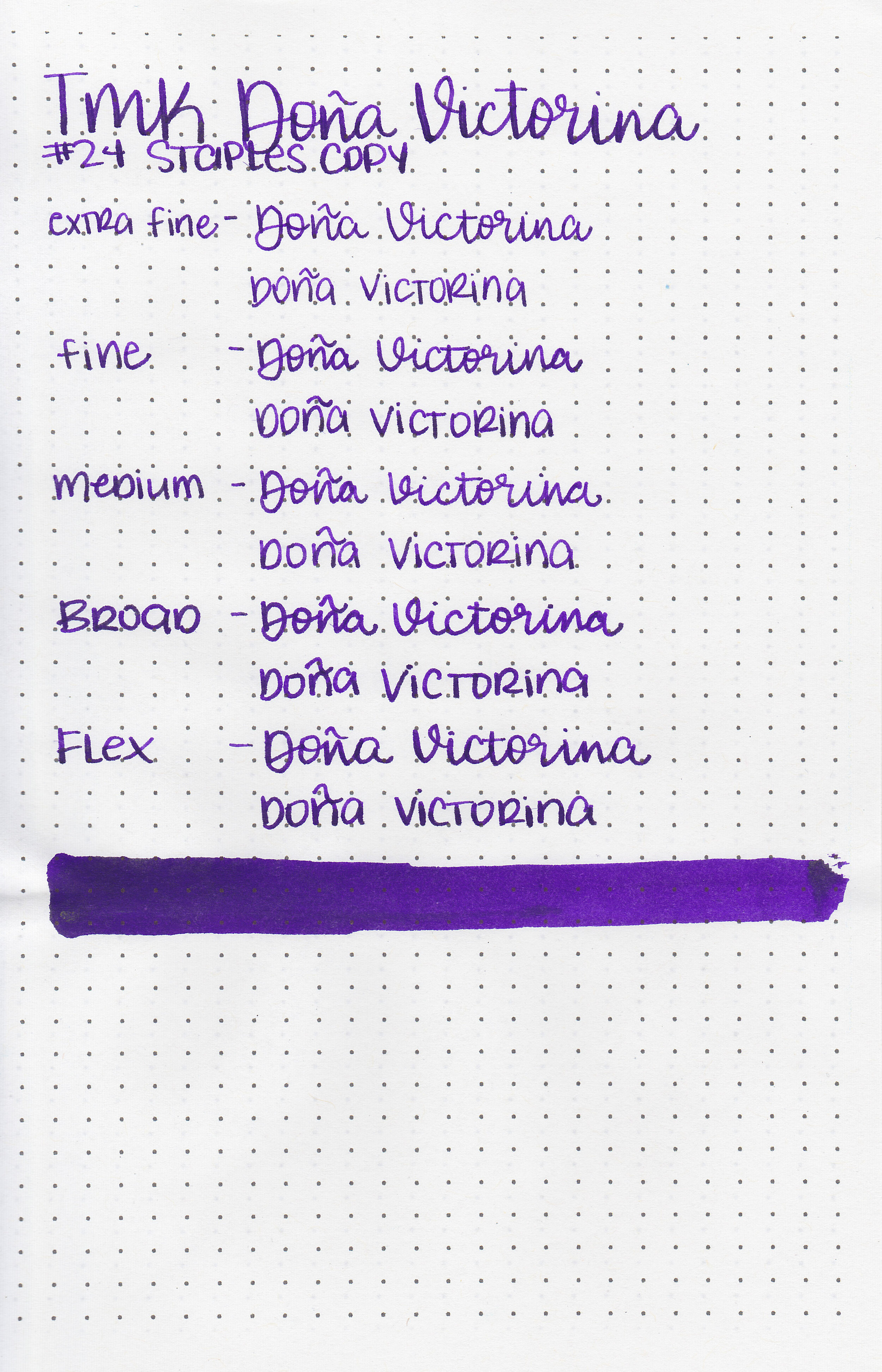
On Staples 24 lb copy paper there was some feathering and a bit of bleeding.

Dona Victorina is in-between 3 Oysters Violet and Diamine Philip. Click here to see the Troublemaker inks together and click here to see the purple inks together.

I used a TWSBI Eco Transparent Purple with a medium nib on a Yoseka A5 notebook. The ink had a sticky flow.
I made a quick Instagram video that shows the sheen better than in photos:
Overall, I hate that it stains everything and has a sticky flow. It’s beautiful on Tomoe River paper and the Yoseka notebook I used, but that amazing sheen doesn’t carry over to Rhodia and Leuchtturm. The staining is a deal breaker for me.
Disclaimer: This ink was provided by Shigure Inks for the purpose of this review. All photos and opinions are my own. This page does not contain affiliate links, and this post is not sponsored in any way.

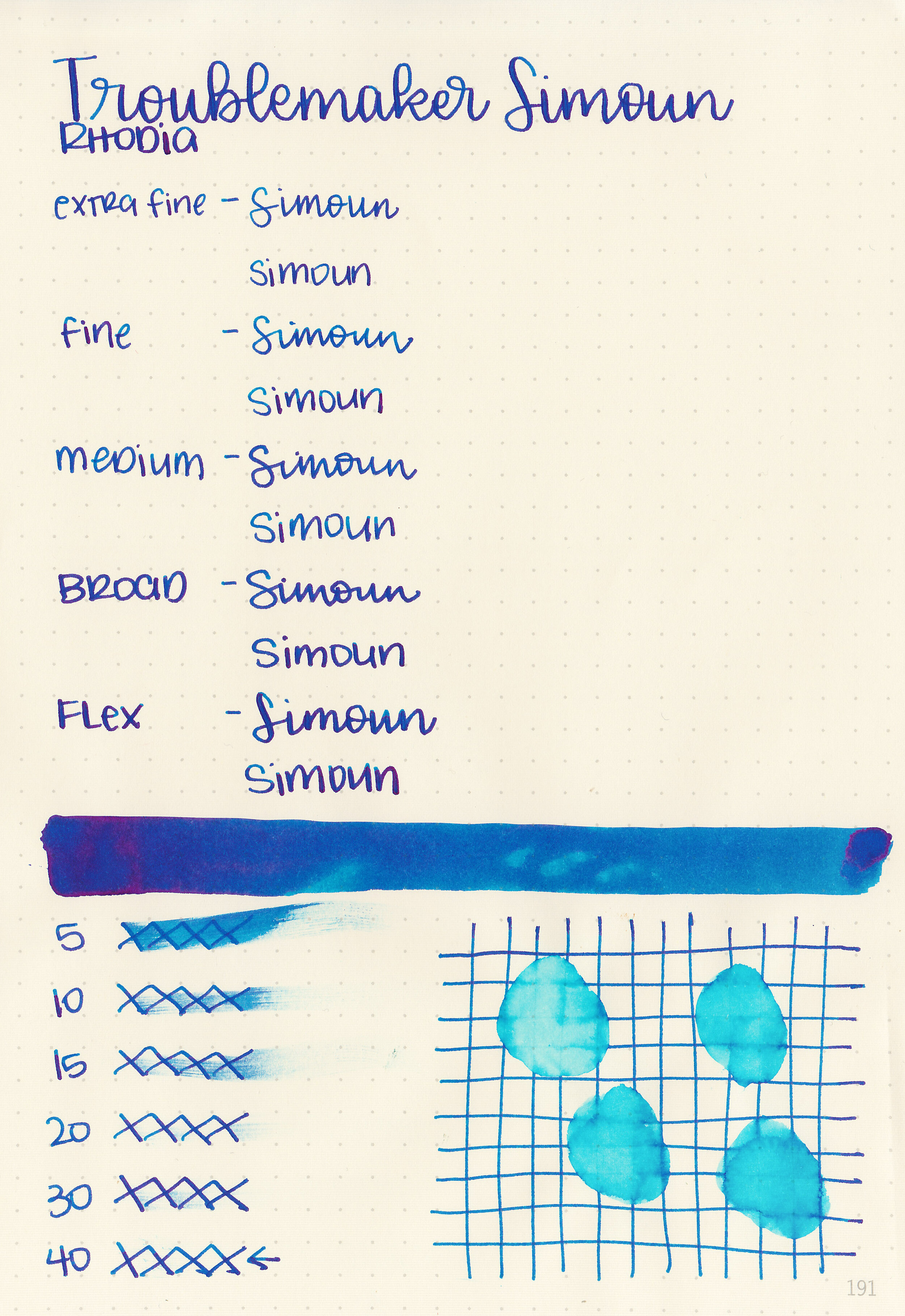
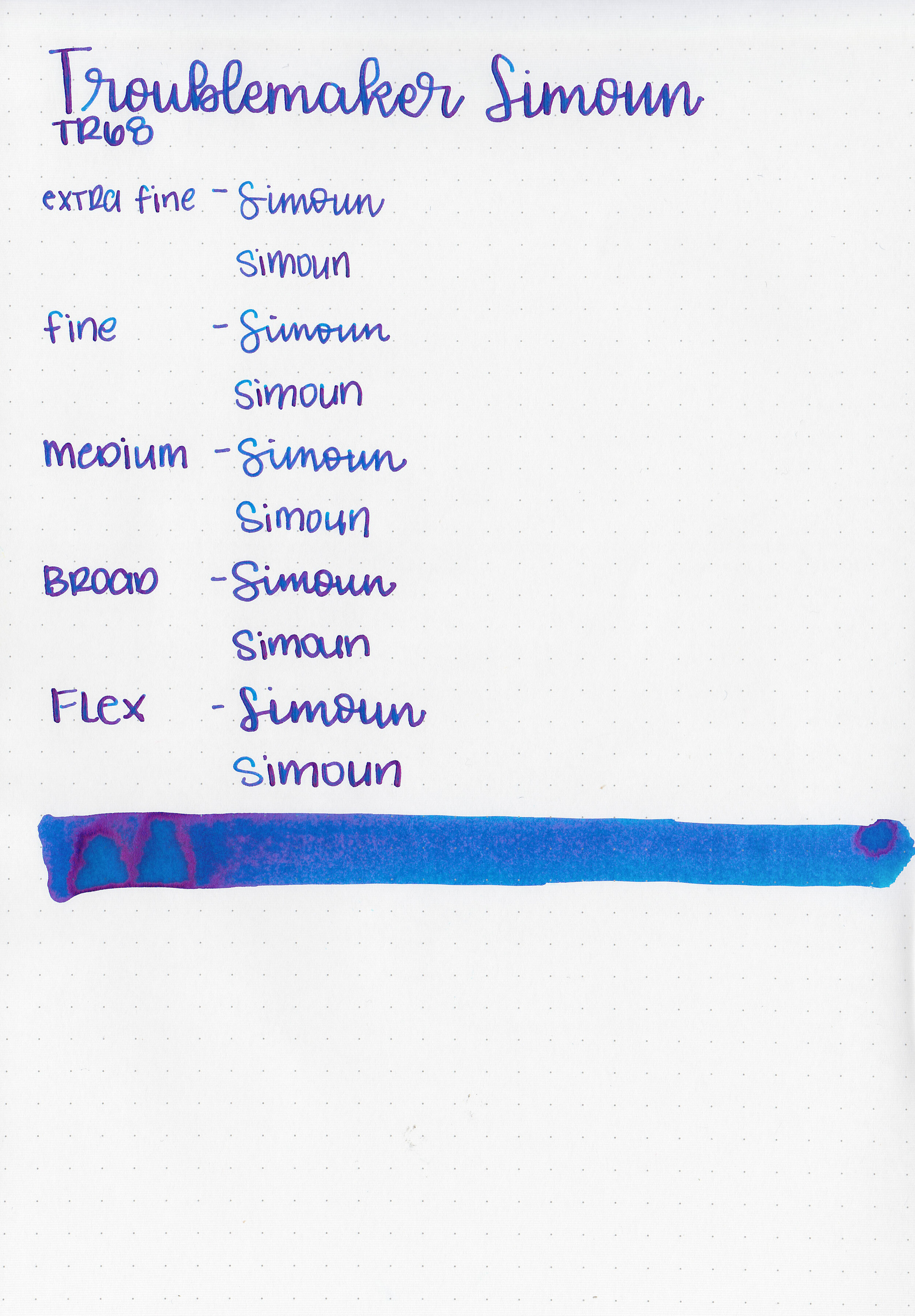
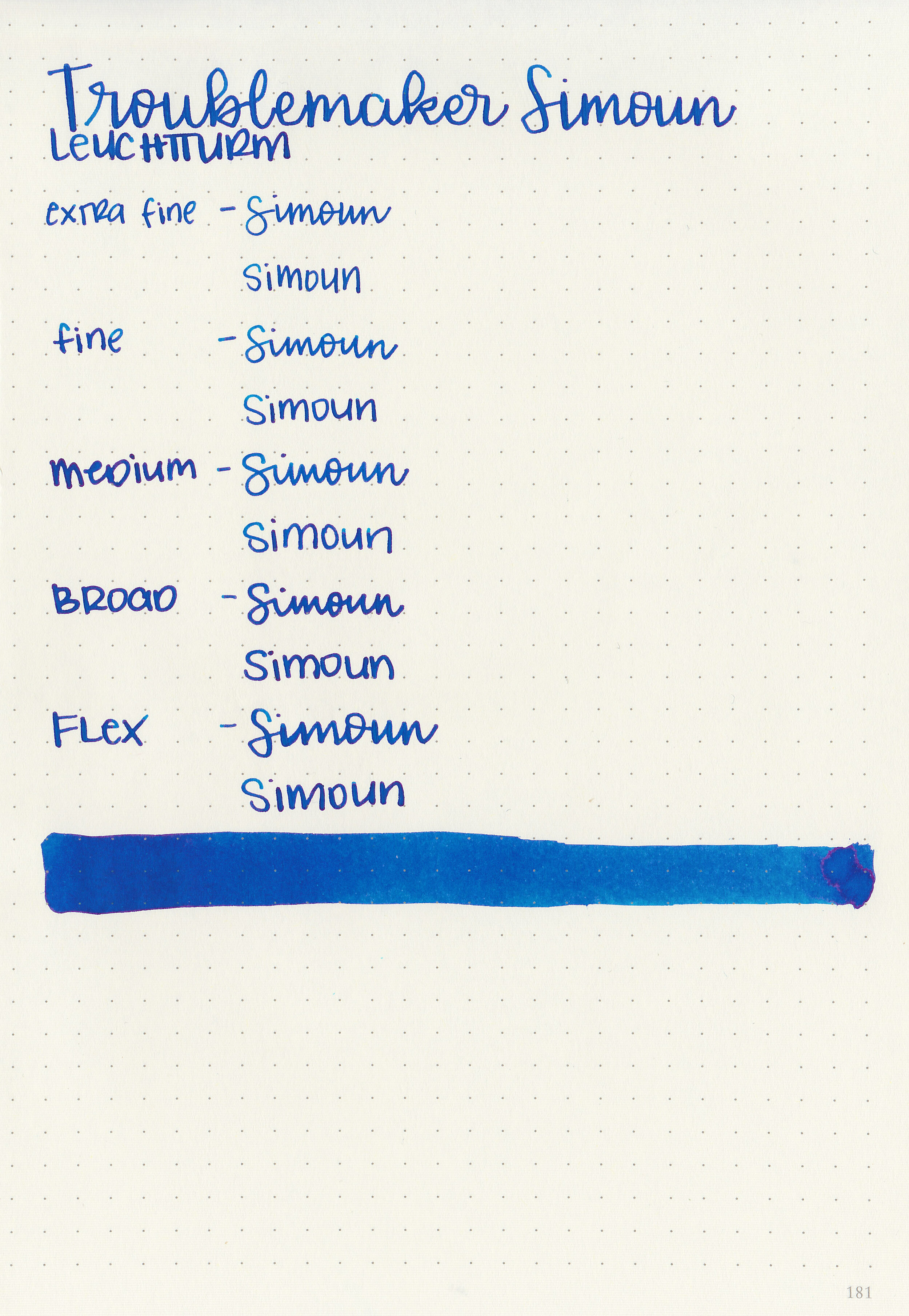
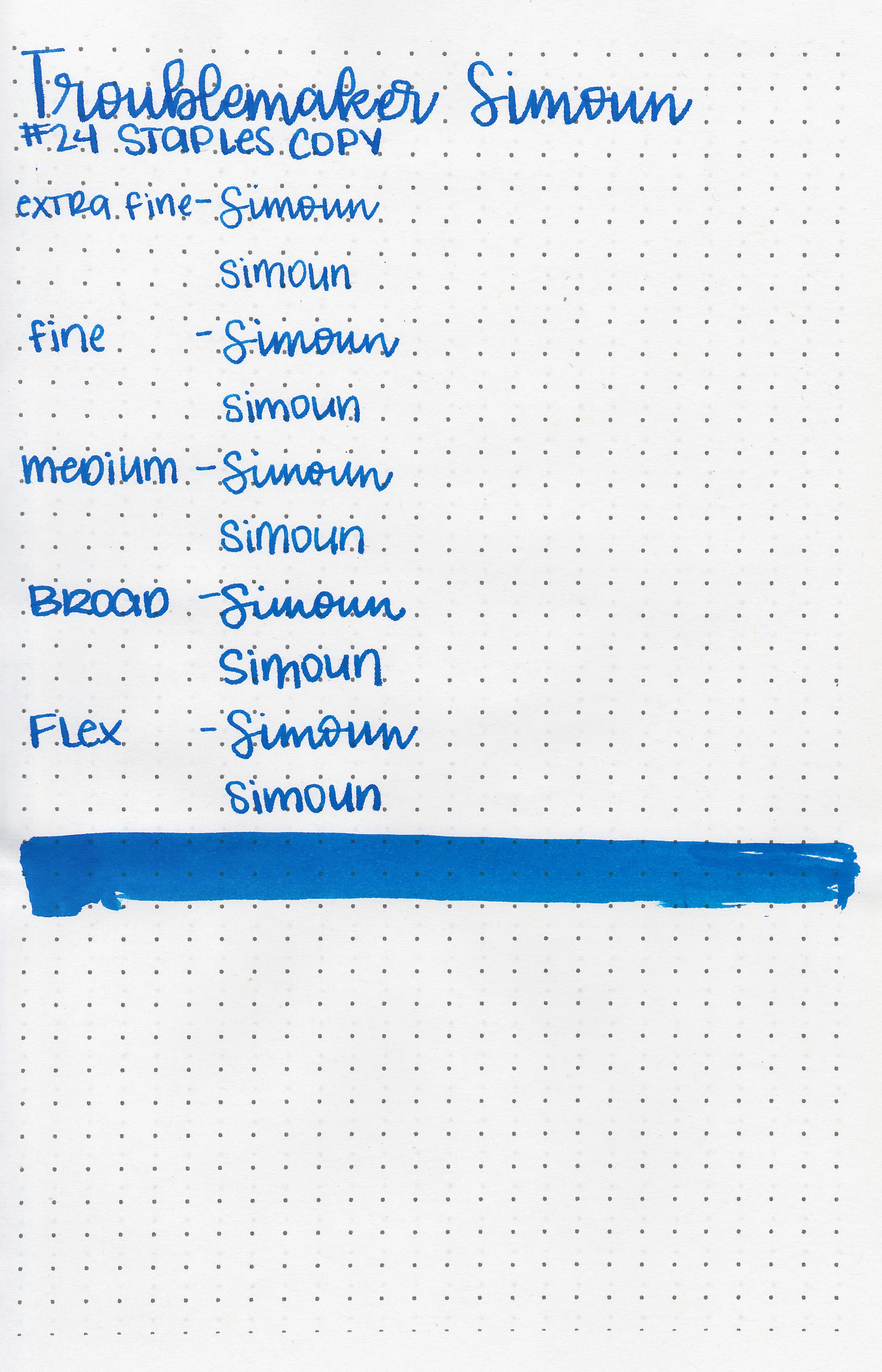
After the last few days of Troublemaker shading inks we are going to move on to some sheening inks starting with Troublemaker Simoun. Thanks to Shigure Inks for sending a sample over for review!
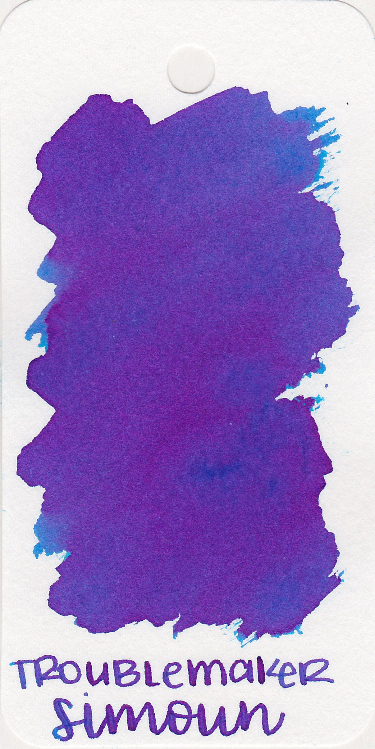
The color:
Simoun is a medium blue with lots of pink sheen.

In large swabs on Tomoe River paper the ink shows off some pretty pink sheen.

Let's take a look at how the ink behaves on fountain pen friendly papers: Rhodia, Tomoe River, and Leuchtturm.
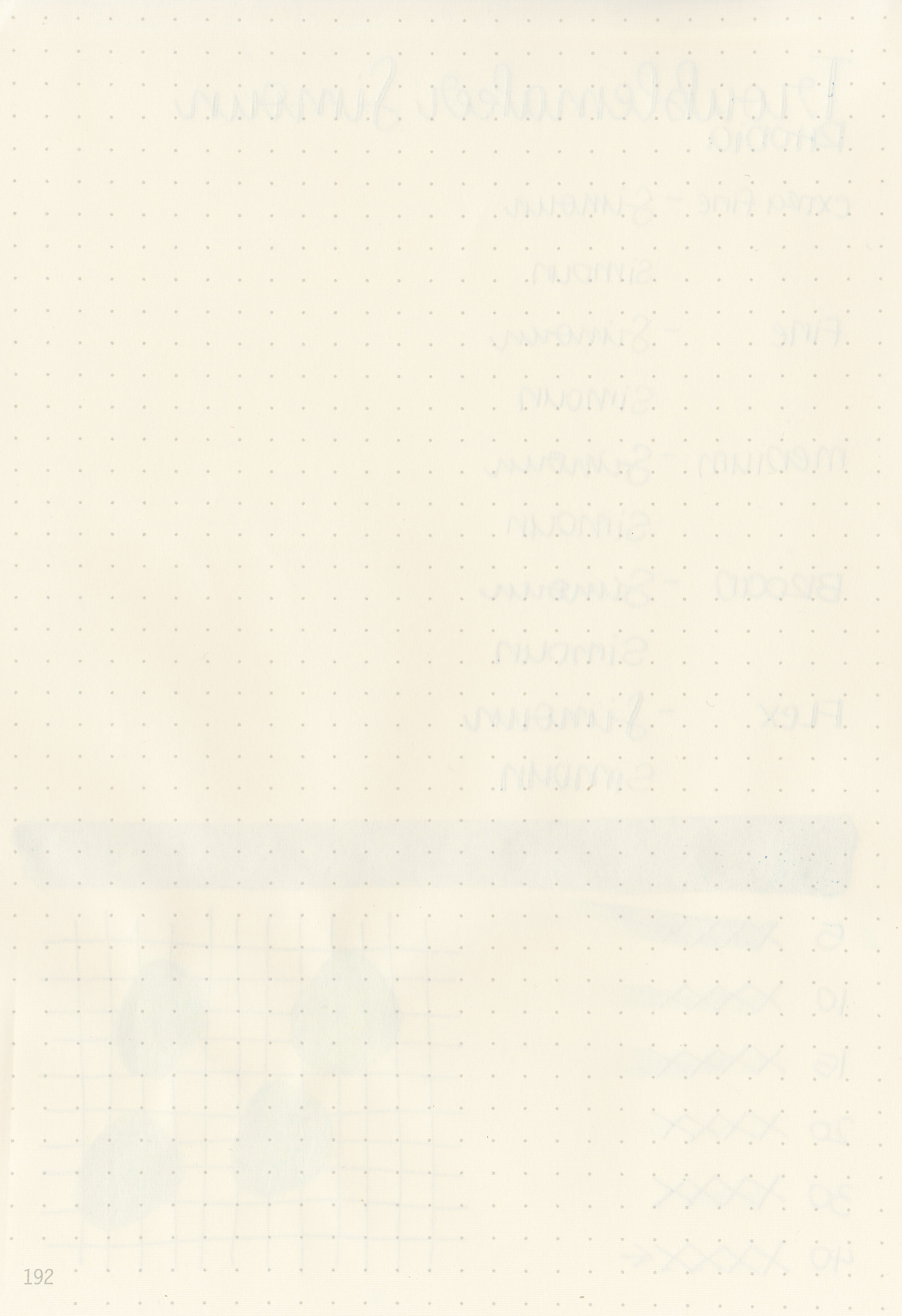
Dry time: 40 seconds
Water resistance: Low

Feathering: None
Show through: Medium
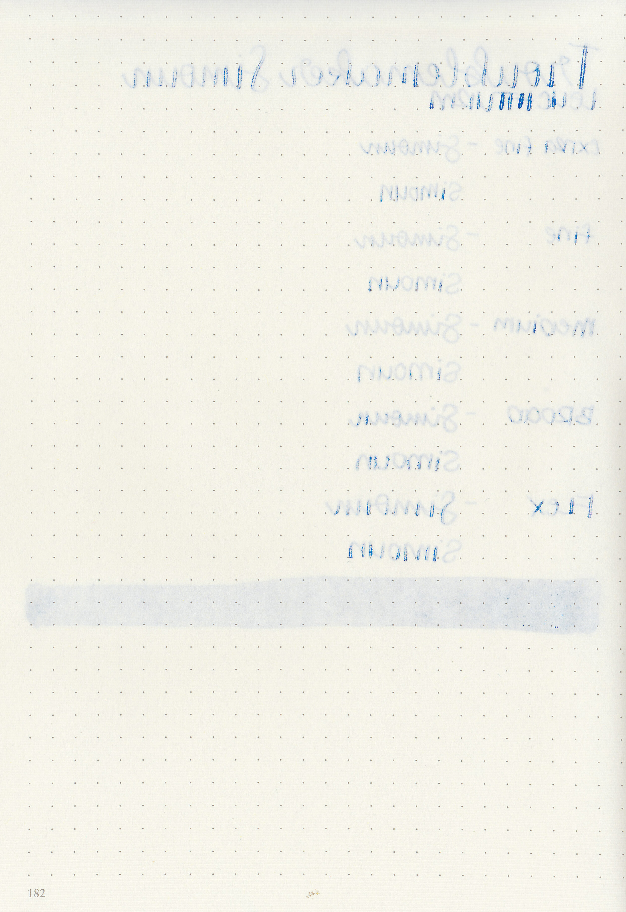
Bleeding: Medium
Other properties: medium shading, monster sheen, and no shimmer.
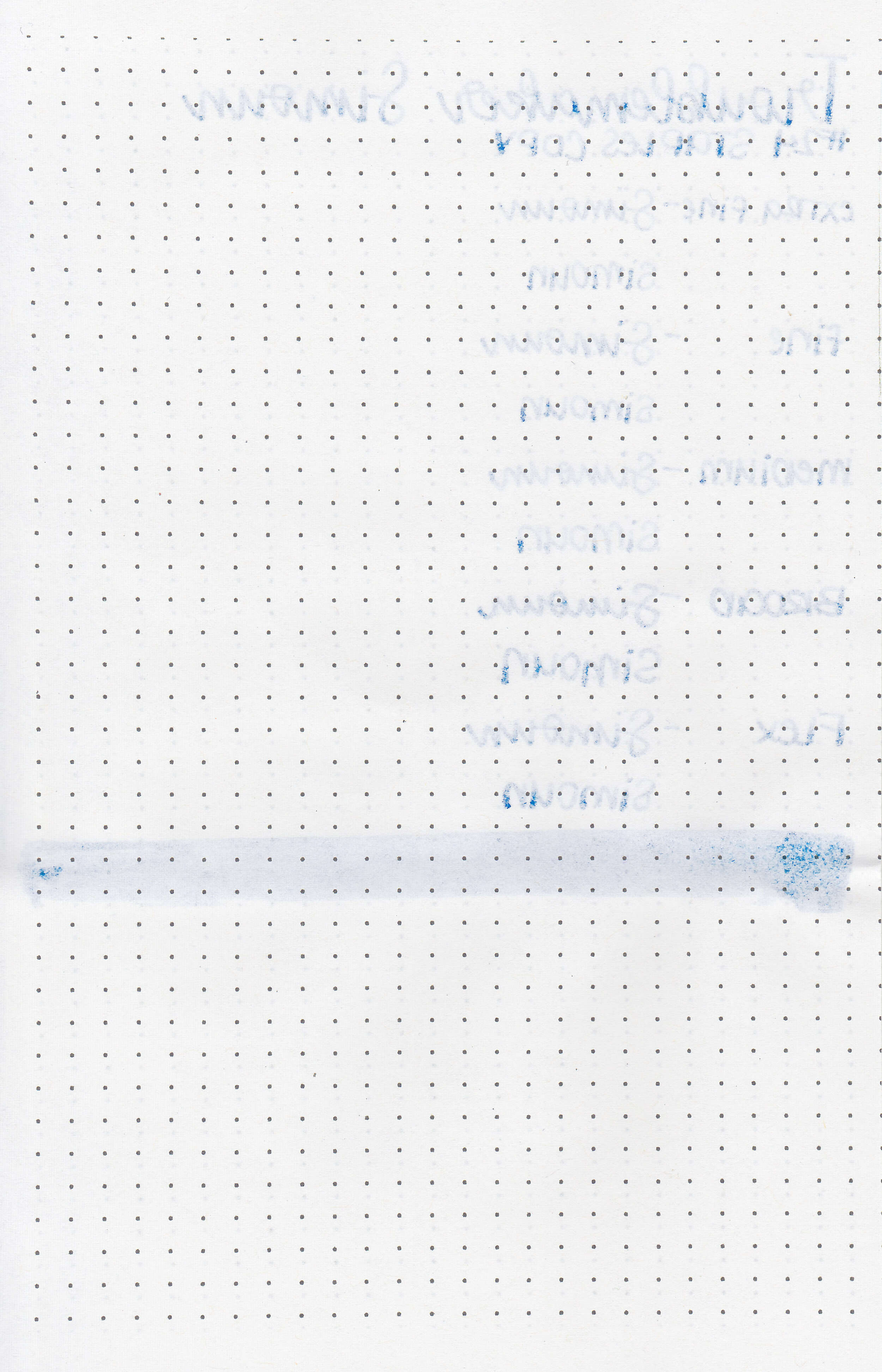
On Staples 24 lb copy paper there was some feathering and a bit of bleeding.

There are a lot of sheening blue inks this color, it’s pretty close to Vinta Maharlika. Click here to see the Troublemaker inks together and click here to see the blue inks together.

I used a TWSBI Eco Transparent Blue with a medium nib on a Yoseka A5 notebook. The ink had a sticky flow.
Overall, I don’t love the flow of this ink-it just feels a bit thick and sticky. I didn’t notice any smearing which is great, but I’m just not in love because of the flow.
Disclaimer: This ink was provided by Shigure Inks for the purpose of this review. All photos and opinions are my own. This page does not contain affiliate links, and this post is not sponsored in any way.

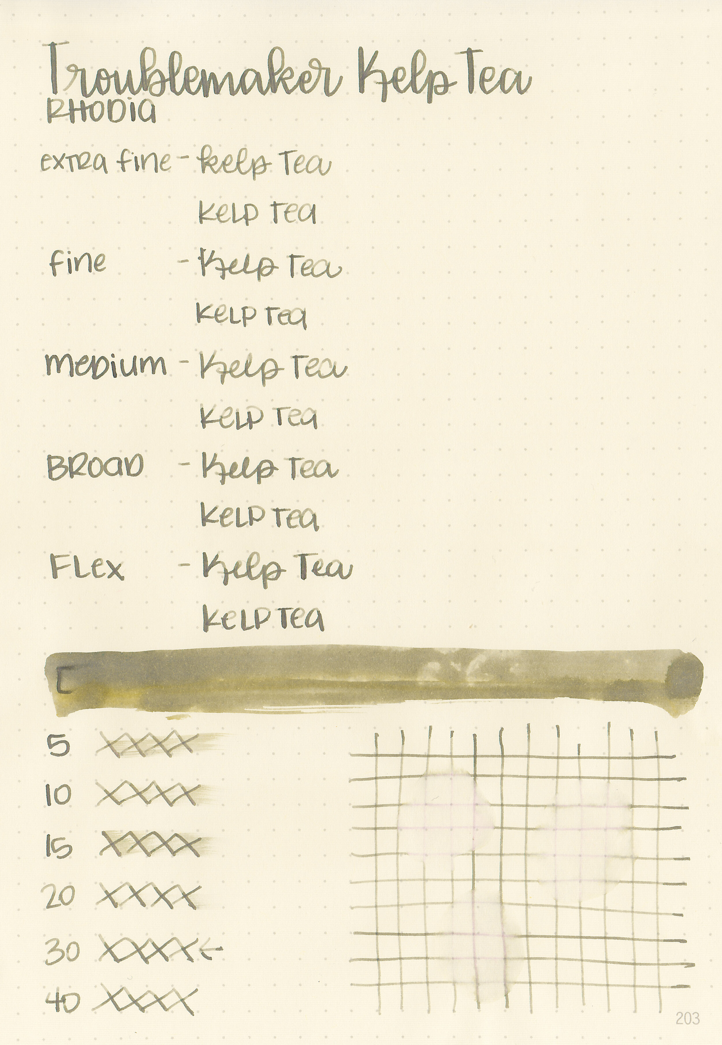
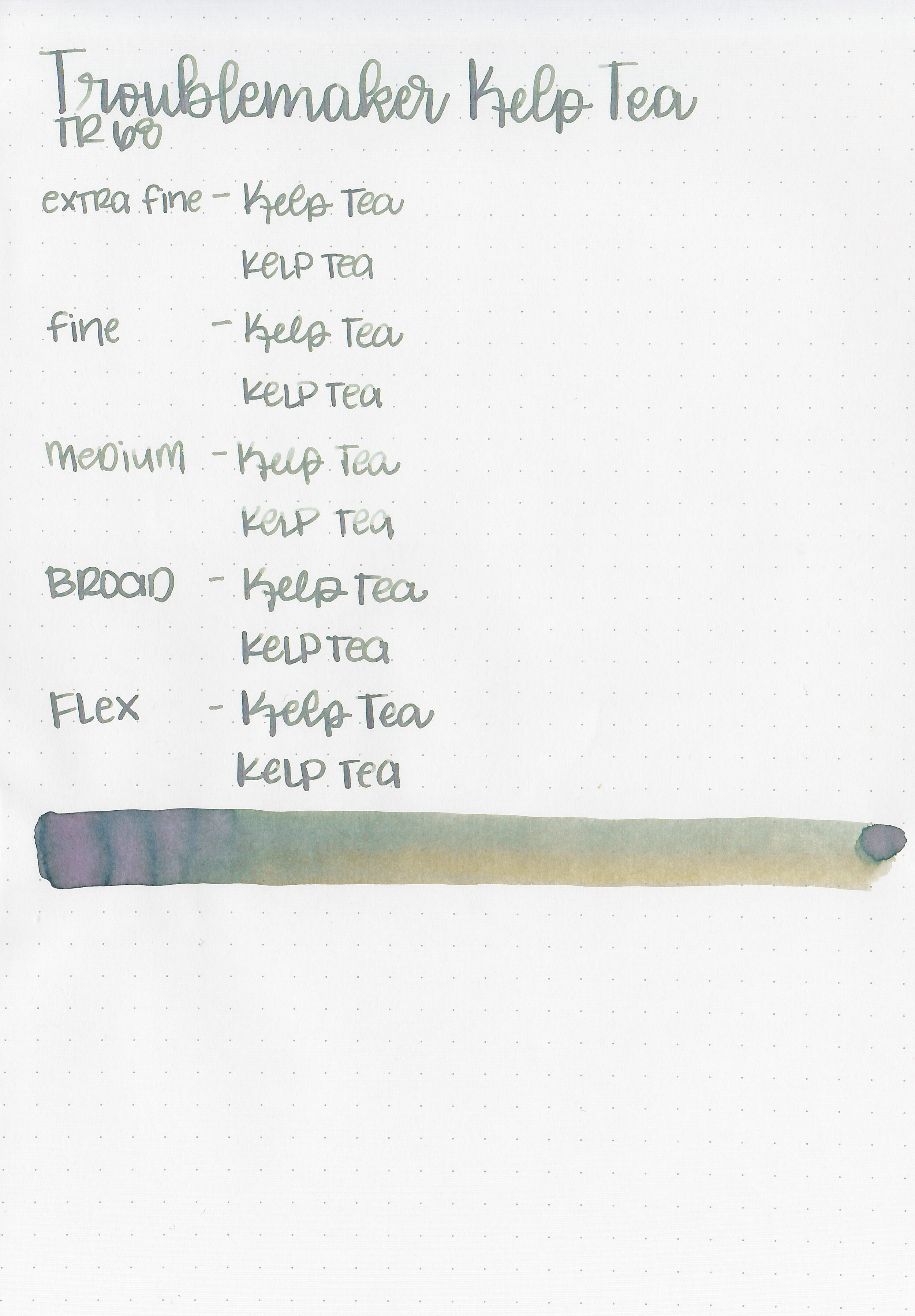
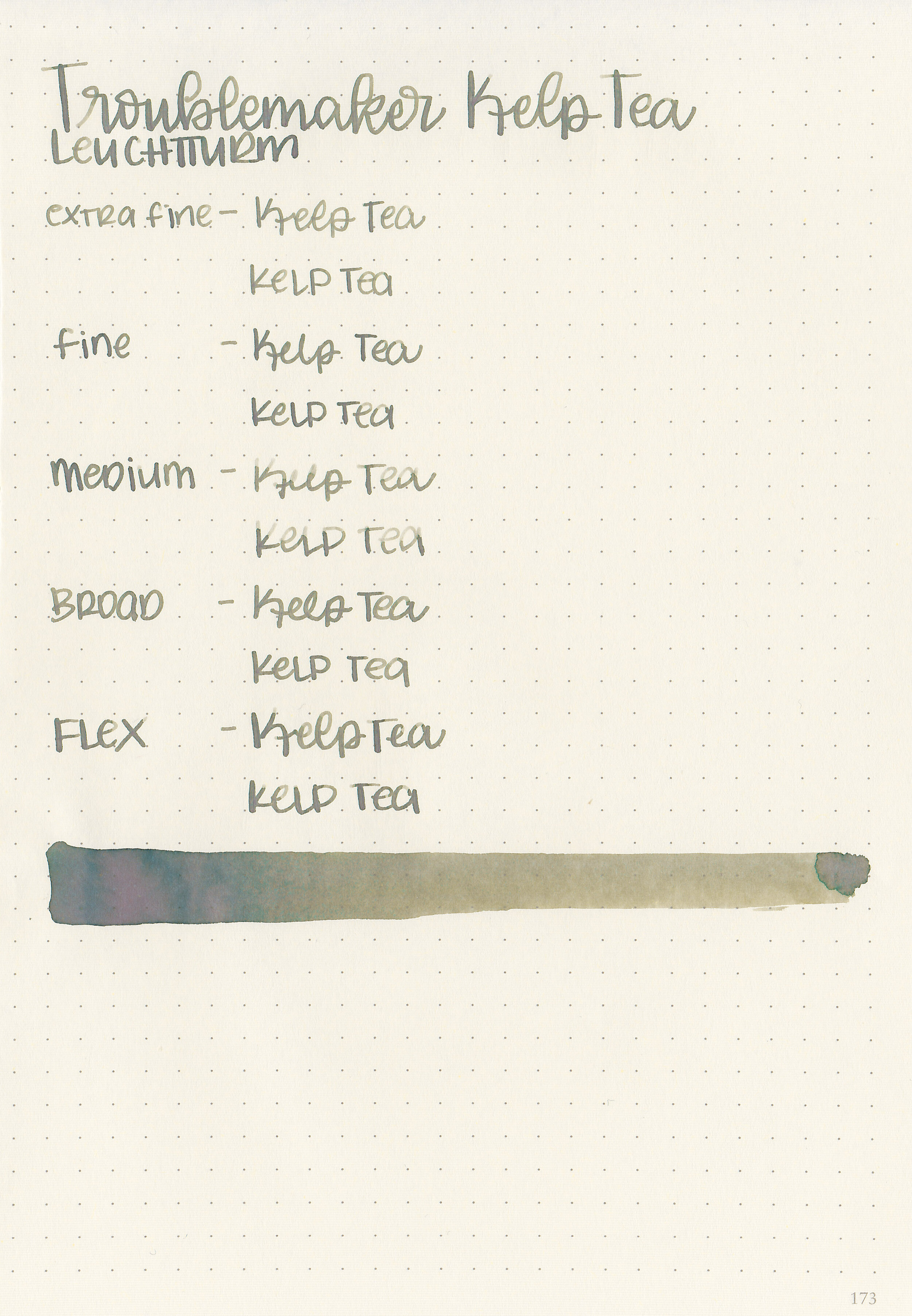
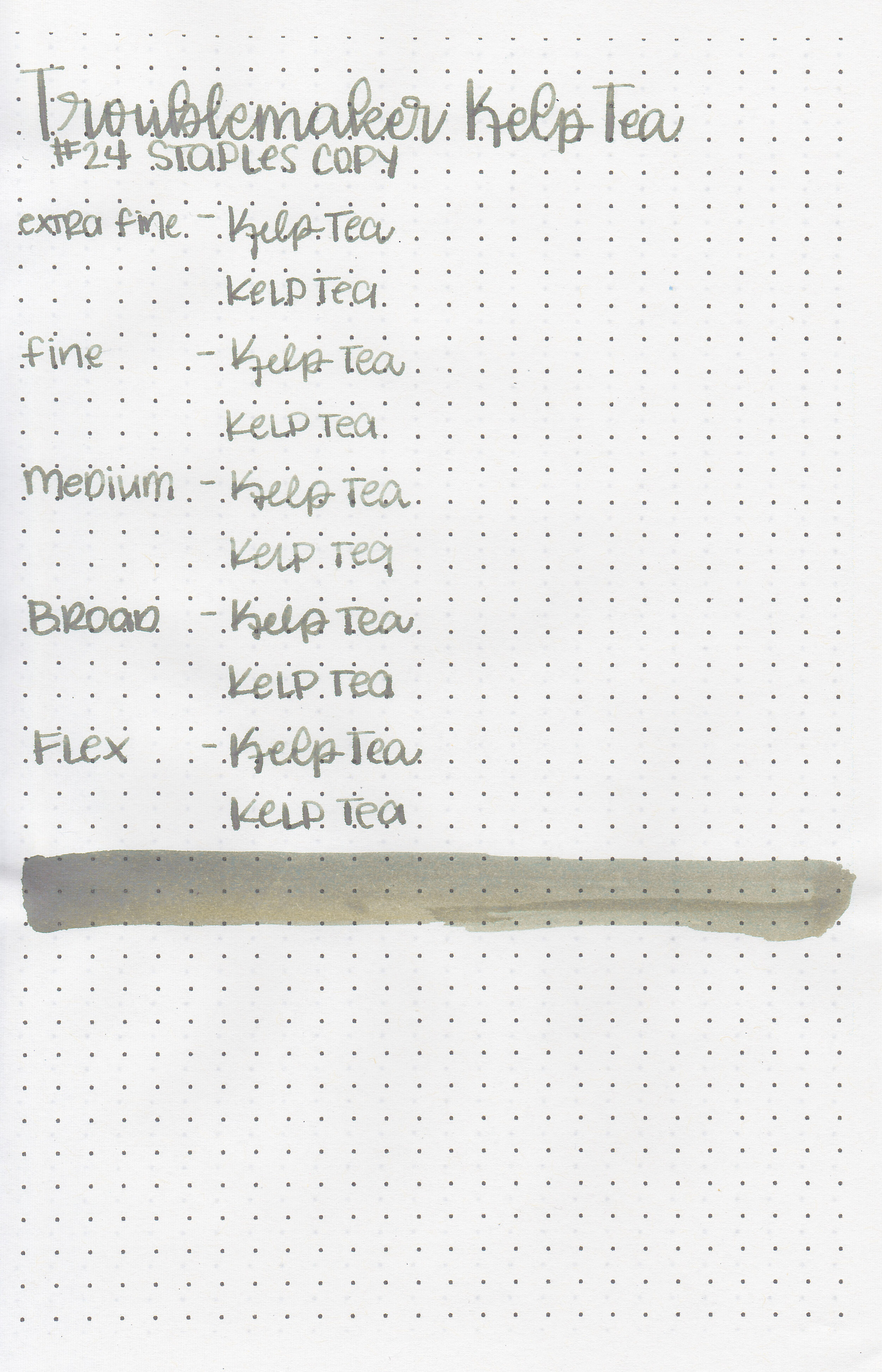
We are continuing on with Troublemaker inks today with Troublemaker Kelp Tea. Thanks to Shigure Inks for sending a sample over for review! This ink looks green when wet, and dries to an olive green/brown.

The color:
Kelp Tea ranges from pea green to khaki brown.

In large swabs on Tomoe River paper the ink almost looks pink.

Let's take a look at how the ink behaves on fountain pen friendly papers: Rhodia, Tomoe River, and Leuchtturm.
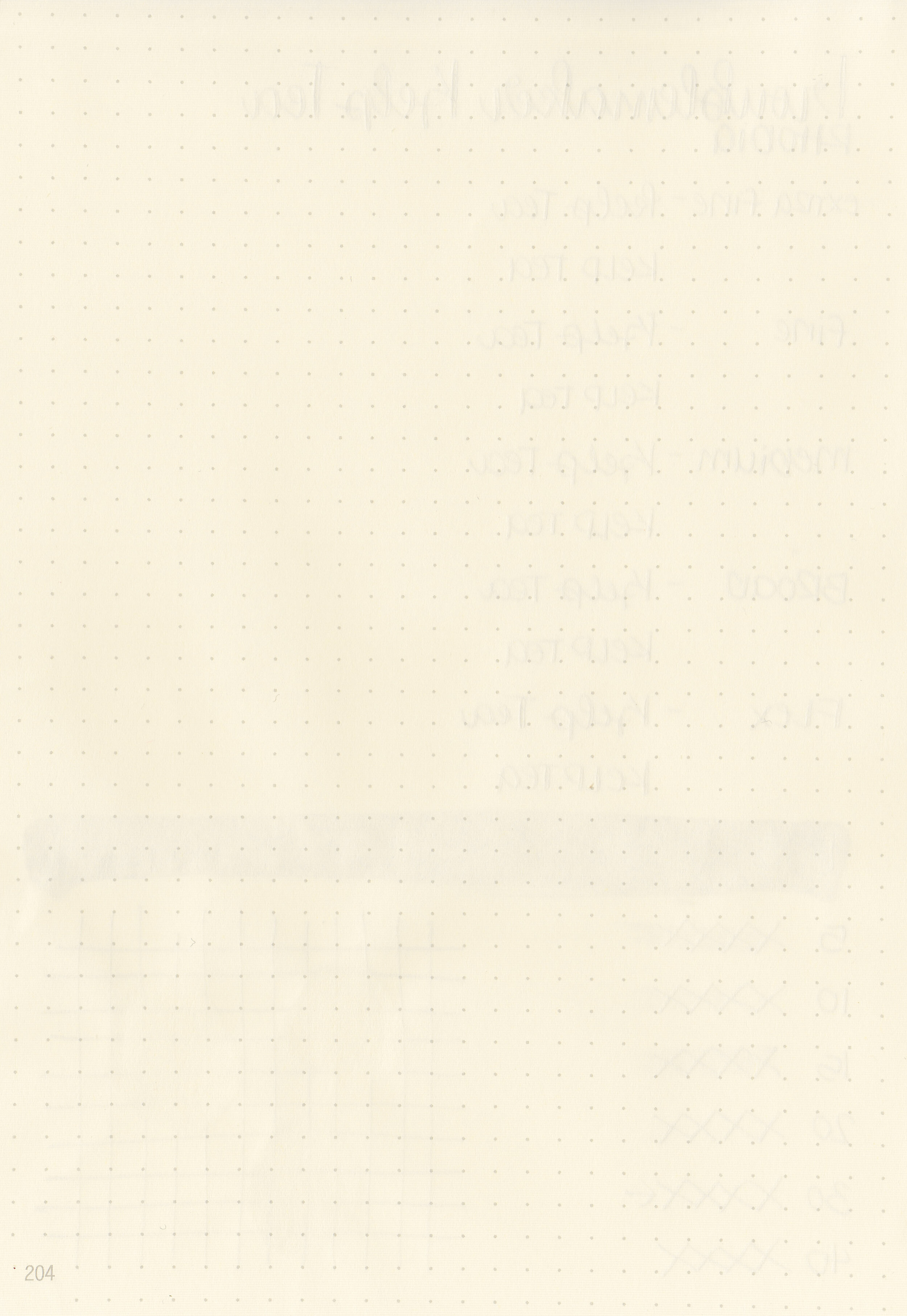
Dry time: 30 seconds
Water resistance: Low
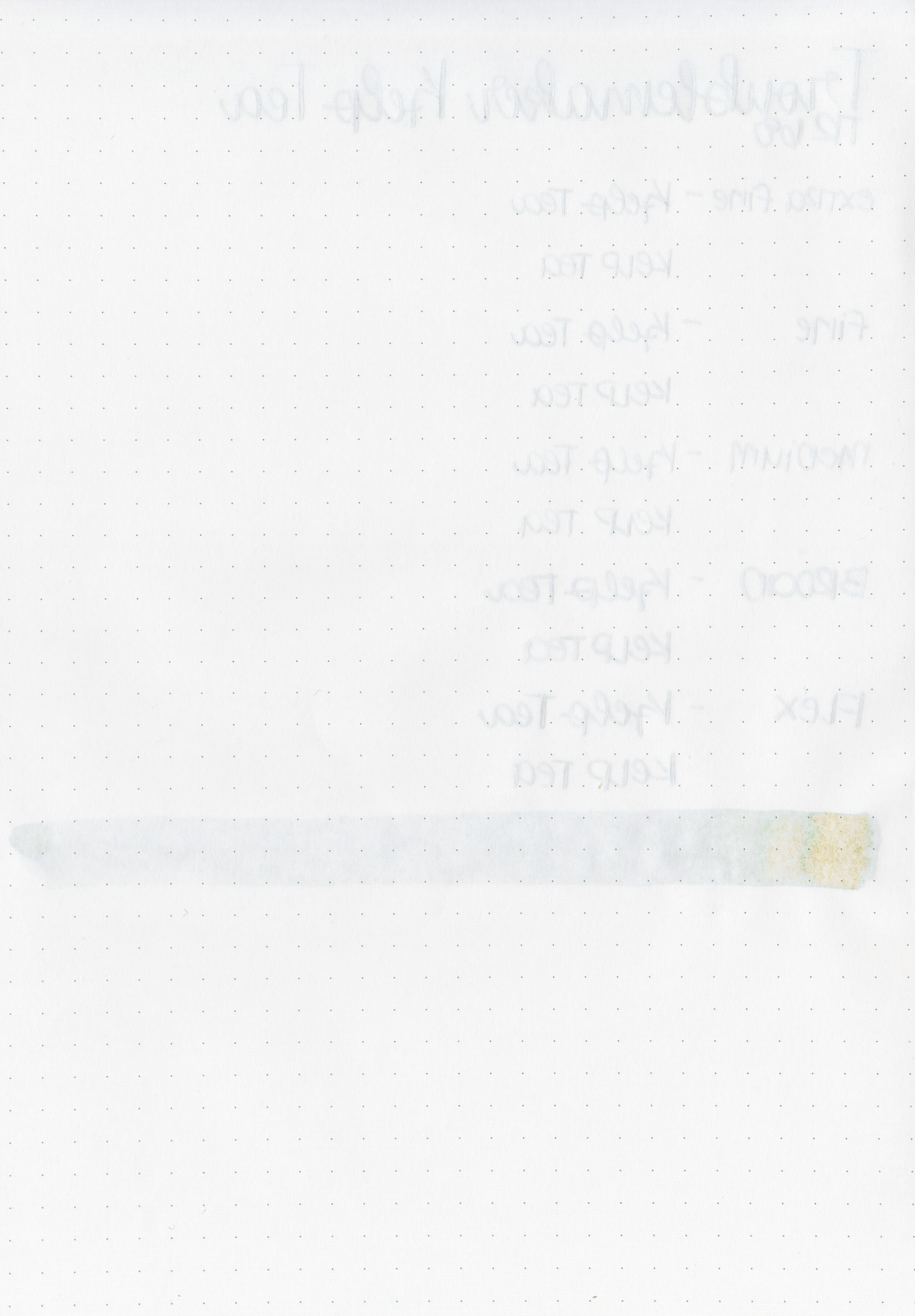
Feathering: None
Show through: Medium
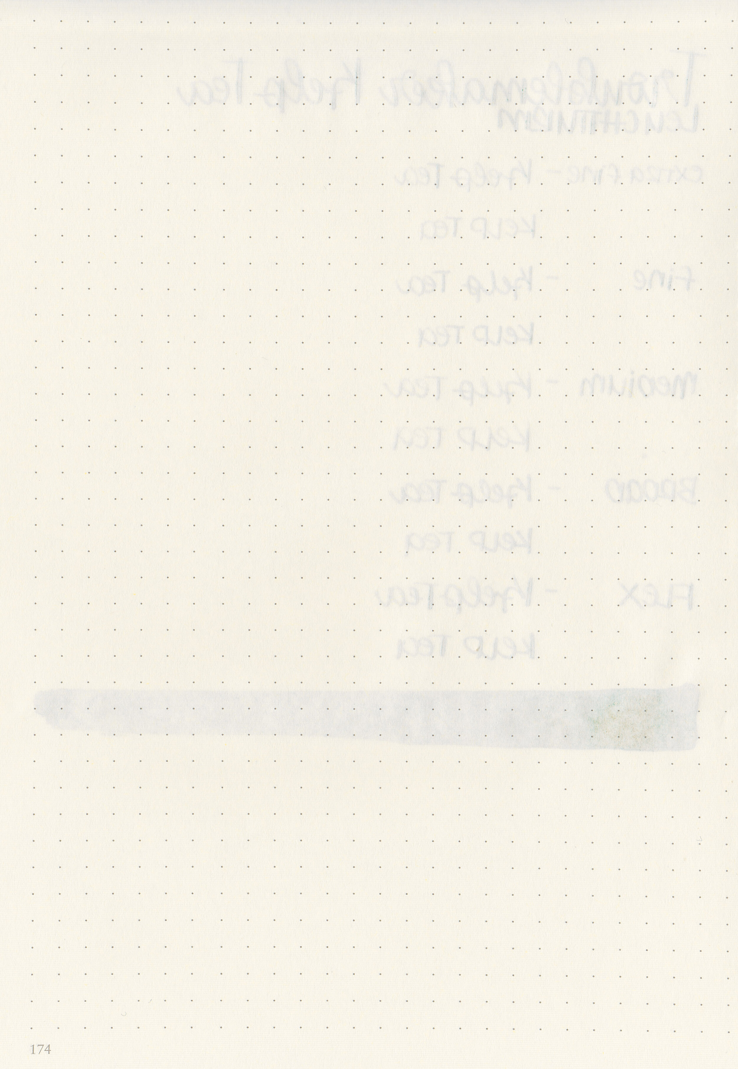
Bleeding: None
Other properties: medium shading, no sheen, and no shimmer.
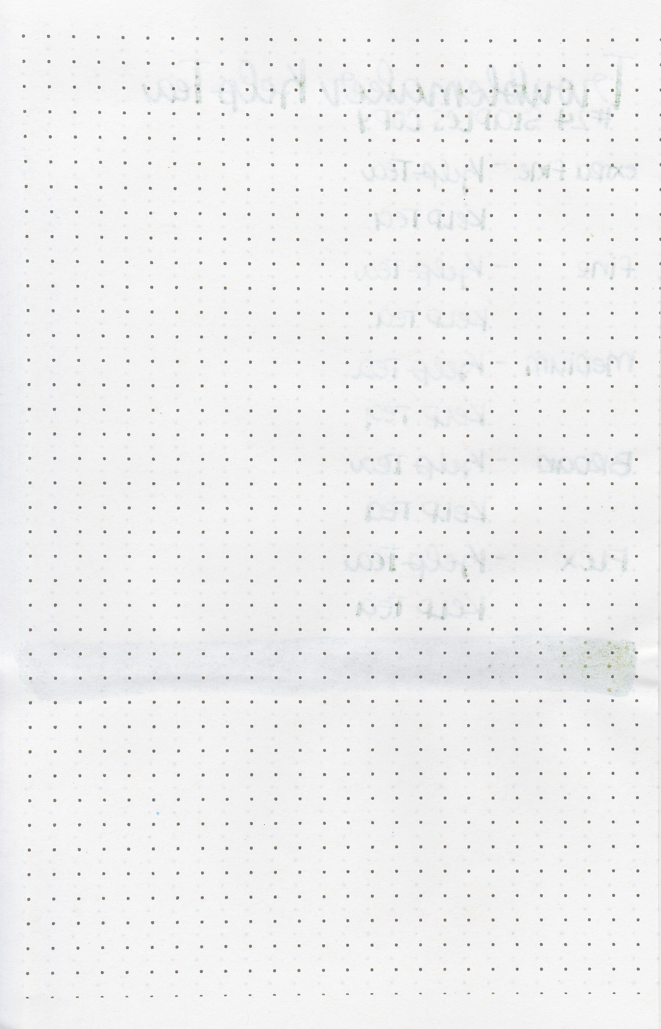
On Staples 24 lb copy paper there was some feathering in all nib sizes but no bleeding.

Kelp Tea is a bit more green than Birmingham The Golden Arm and lighter than Robert Oster Astorquiza Olive. Click here to see the Troublemaker inks together and click here to see the green inks together.

I used a Franklin-Christoph 46 Diamindcast Green with a broad nib on a Yoseka A5 notebook. The ink had an average flow.
Overall, it has some nice shading but I don’t love the color. It doesn’t have quite as much shading as the other Troublemaker shading inks I’ve tried.
Disclaimer: This ink was provided by Shigure Inks for the purpose of this review. All photos and opinions are my own. This page does not contain affiliate links, and this post is not sponsored in any way.

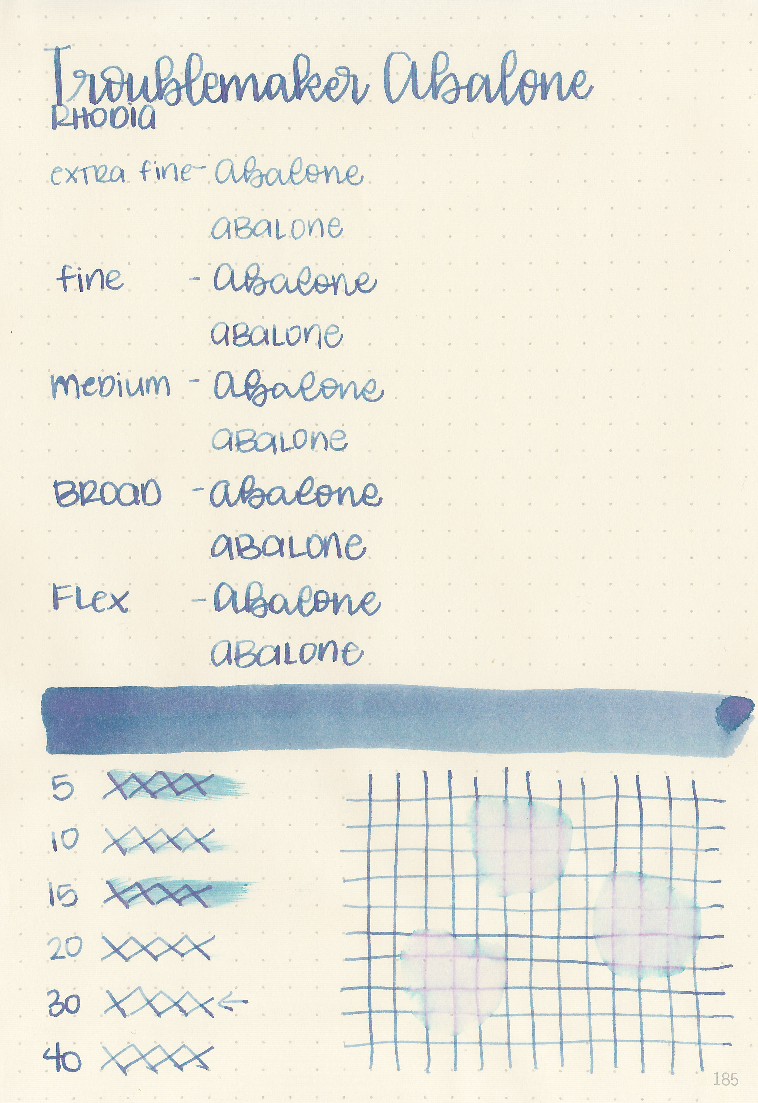
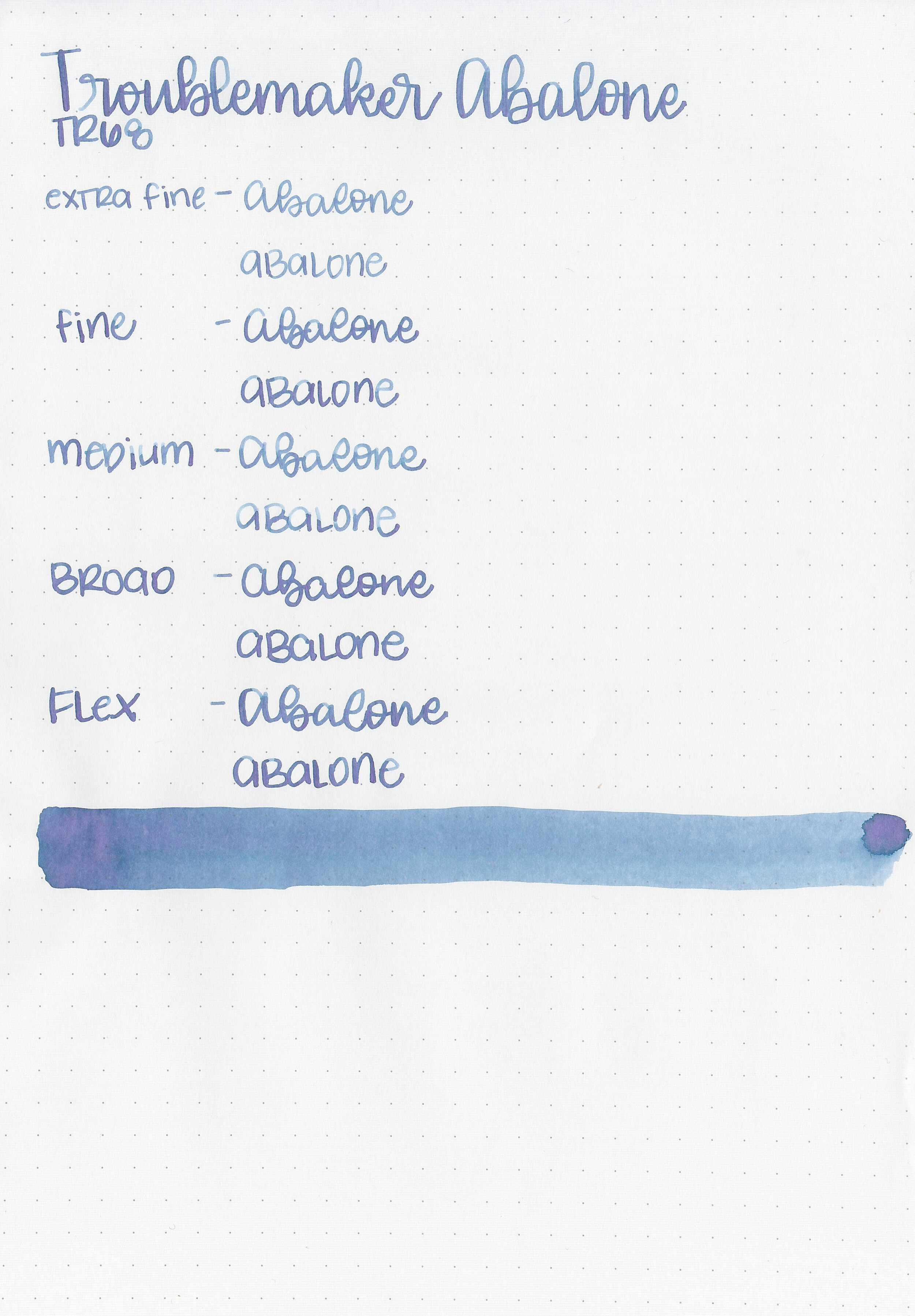
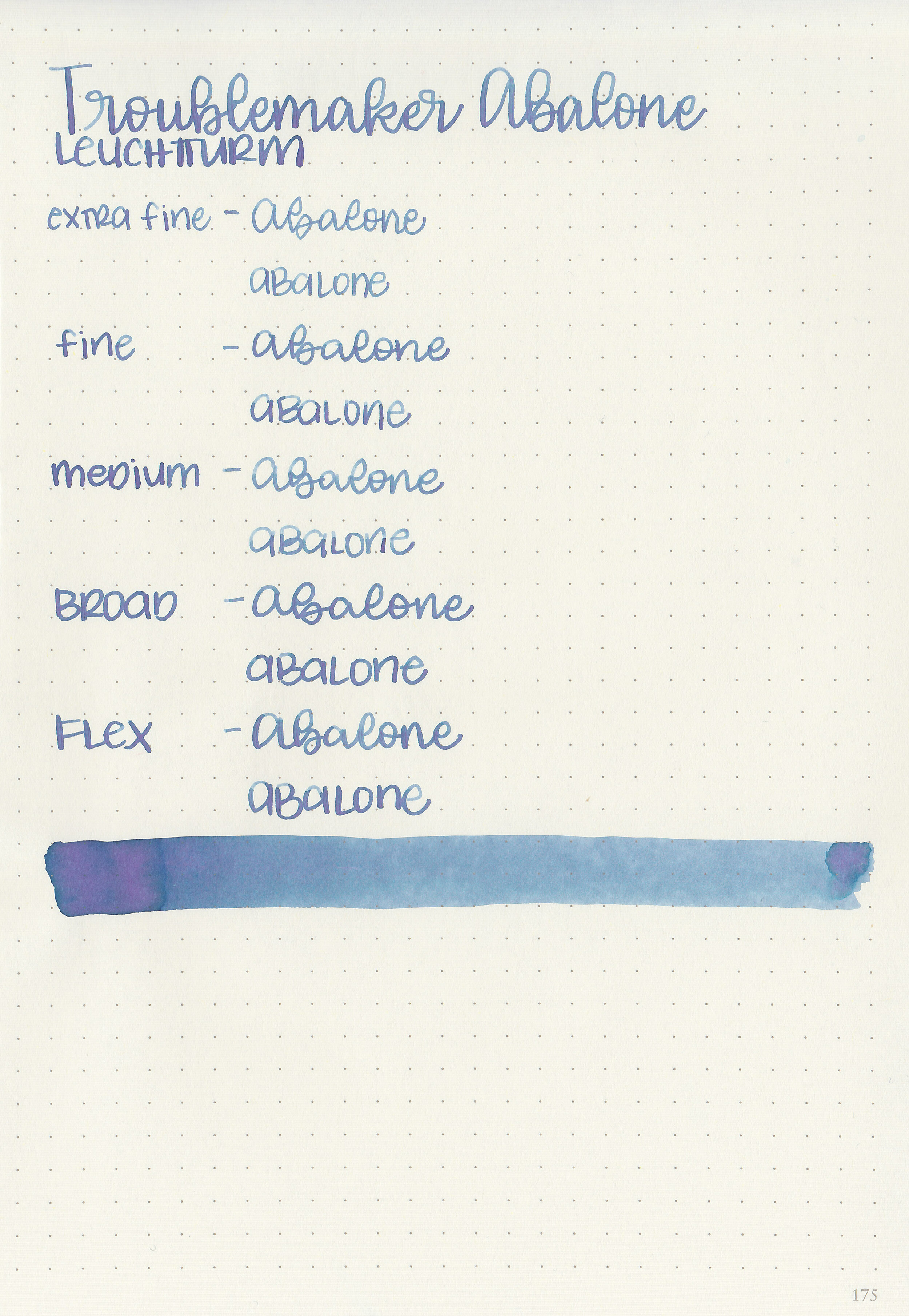
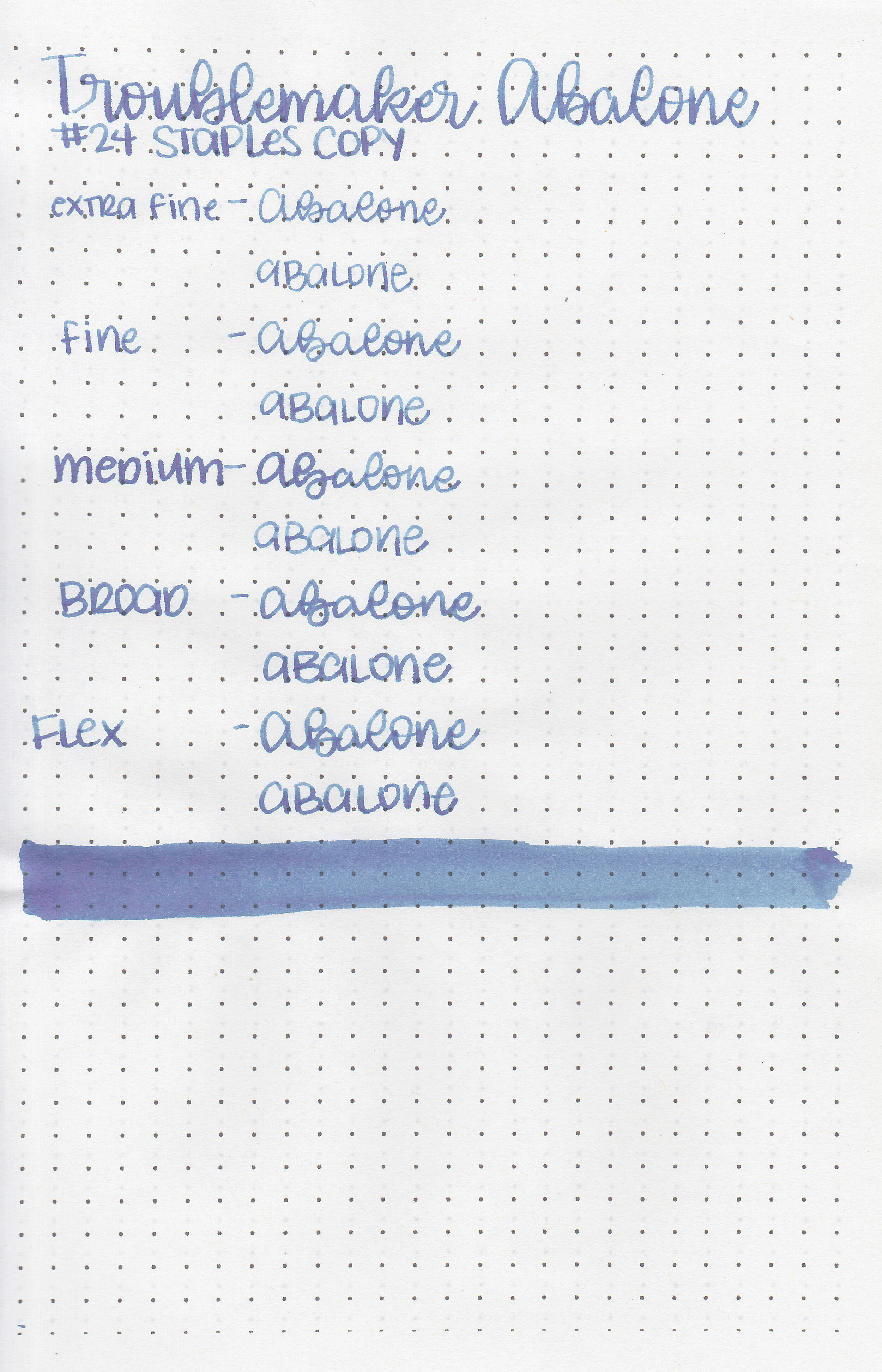
Troublemaker Abalone shades from blue to purple and is rather fascinating. Thanks to Shigure Inks for sending a sample over for review!

The color:
Abalone is a dark blue that shades to purple.

In large swabs on Tomoe River paper the ink shows off lots of purple, and even a little bit of green.

Let's take a look at how the ink behaves on fountain pen friendly papers: Rhodia, Tomoe River, and Leuchtturm.
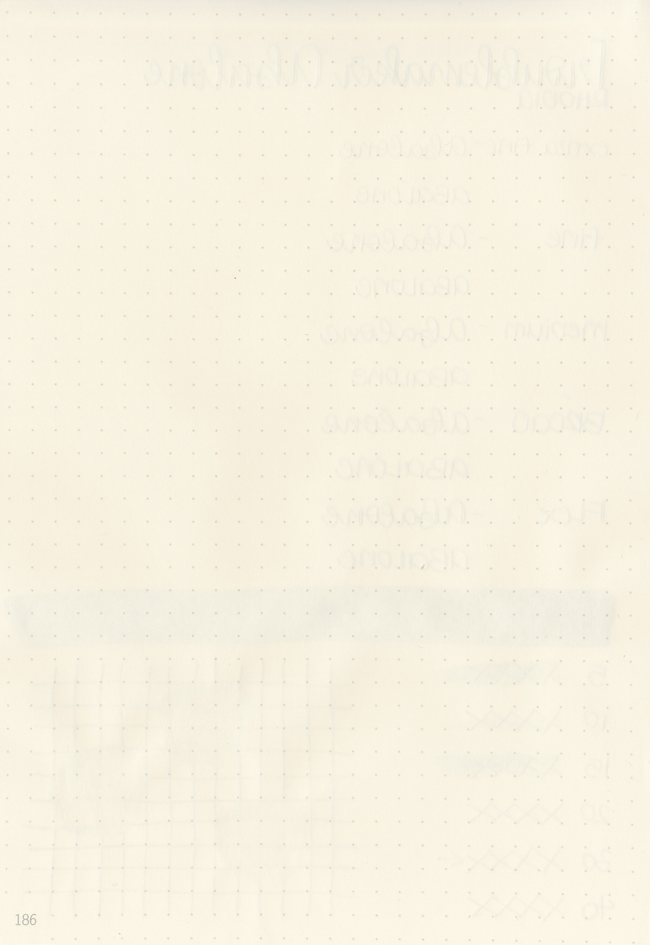
Dry time: 30 seconds
Water resistance: Low
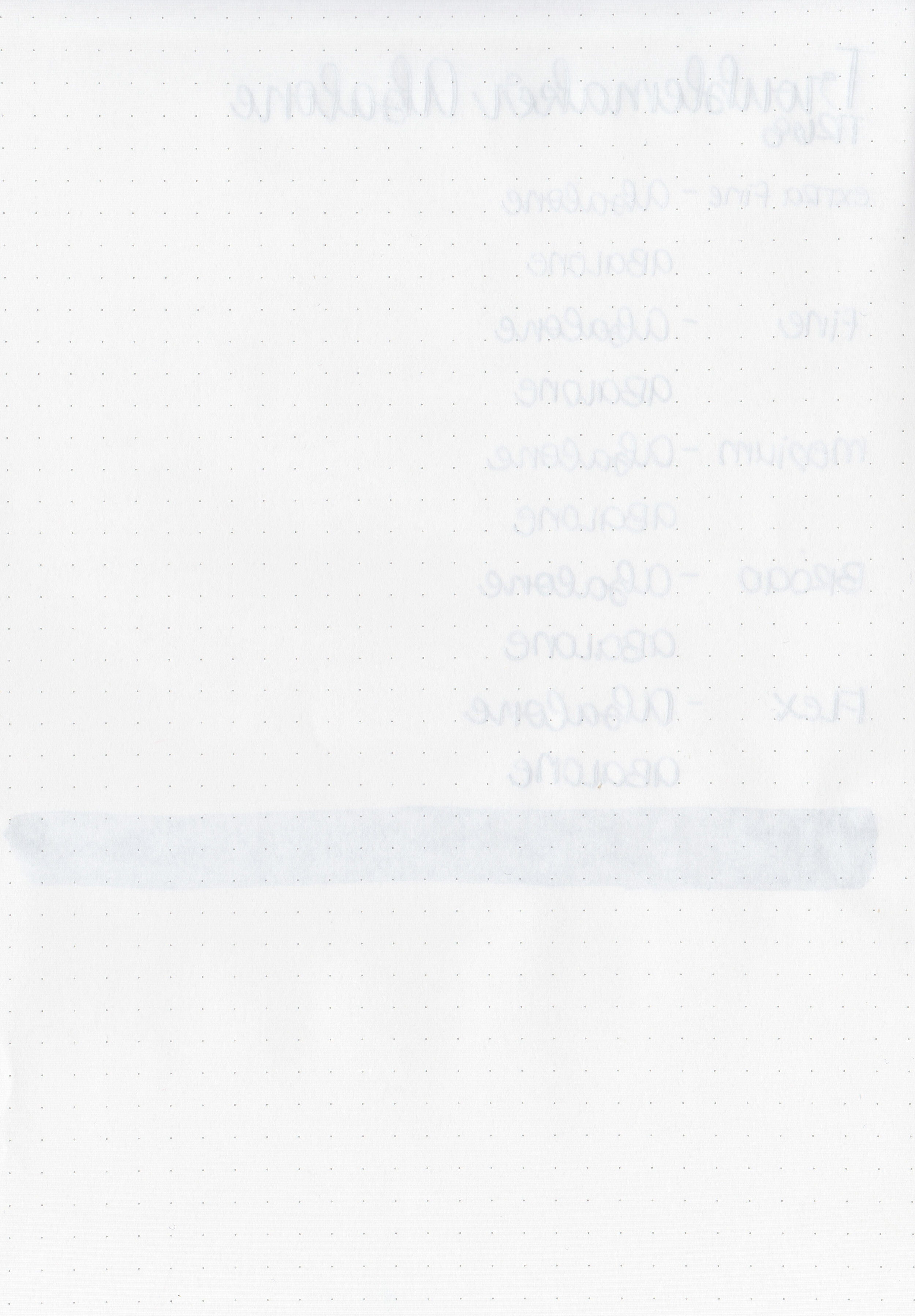
Feathering: None
Show through: Medium
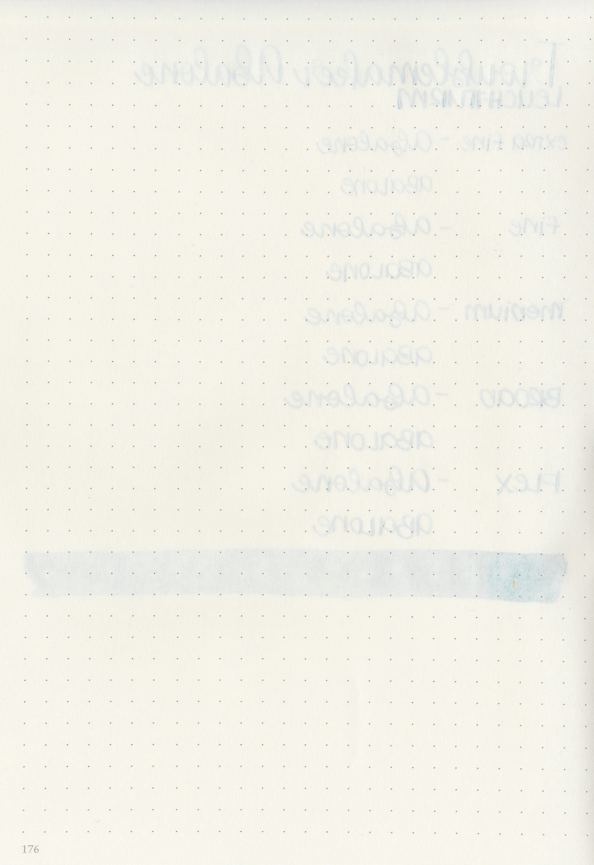
Bleeding: None
Other properties: high shading, no sheen, and no shimmer.
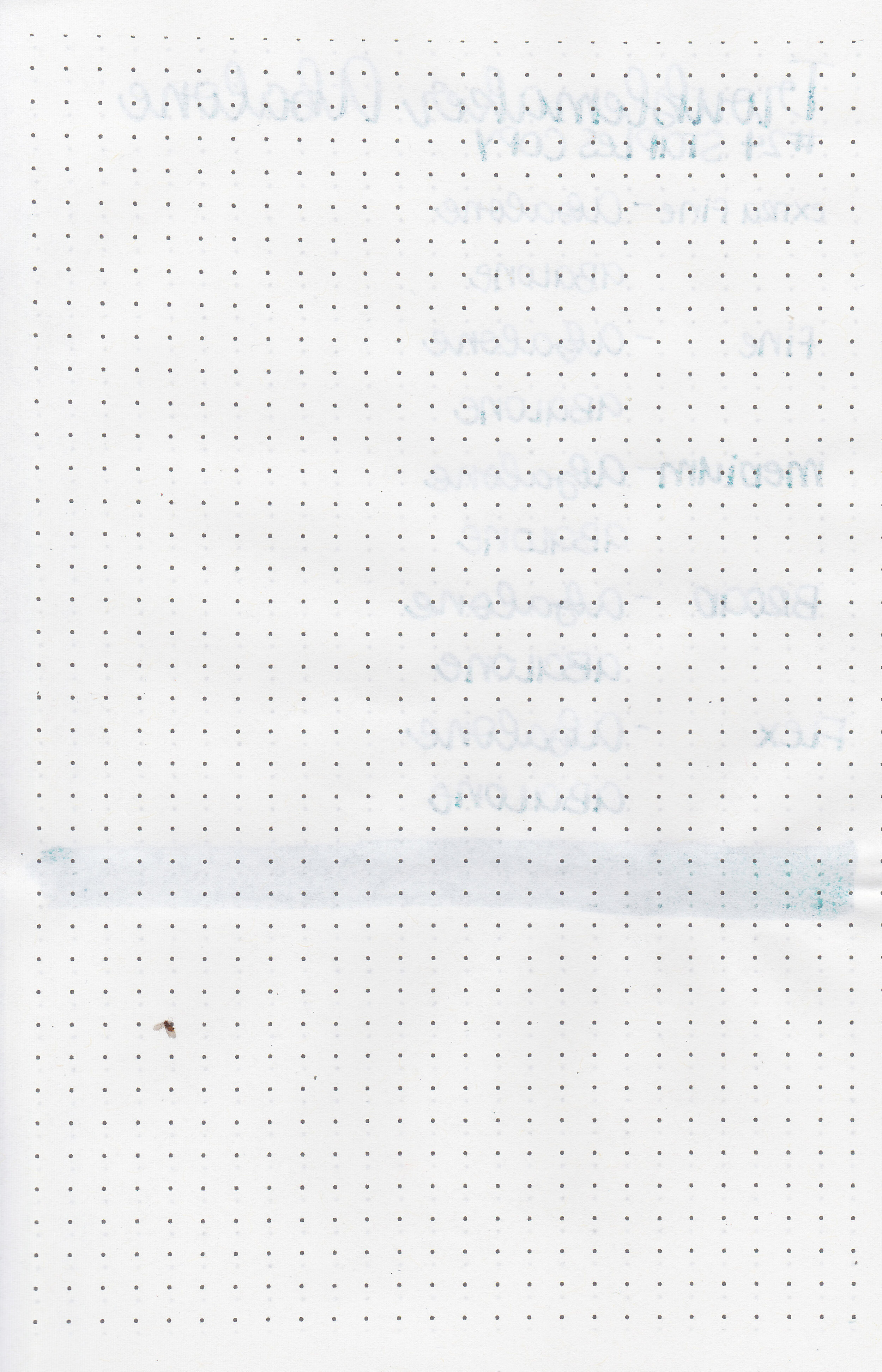
On Staples 24 lb copy paper there was some feathering in all nib sizes but no bleeding.
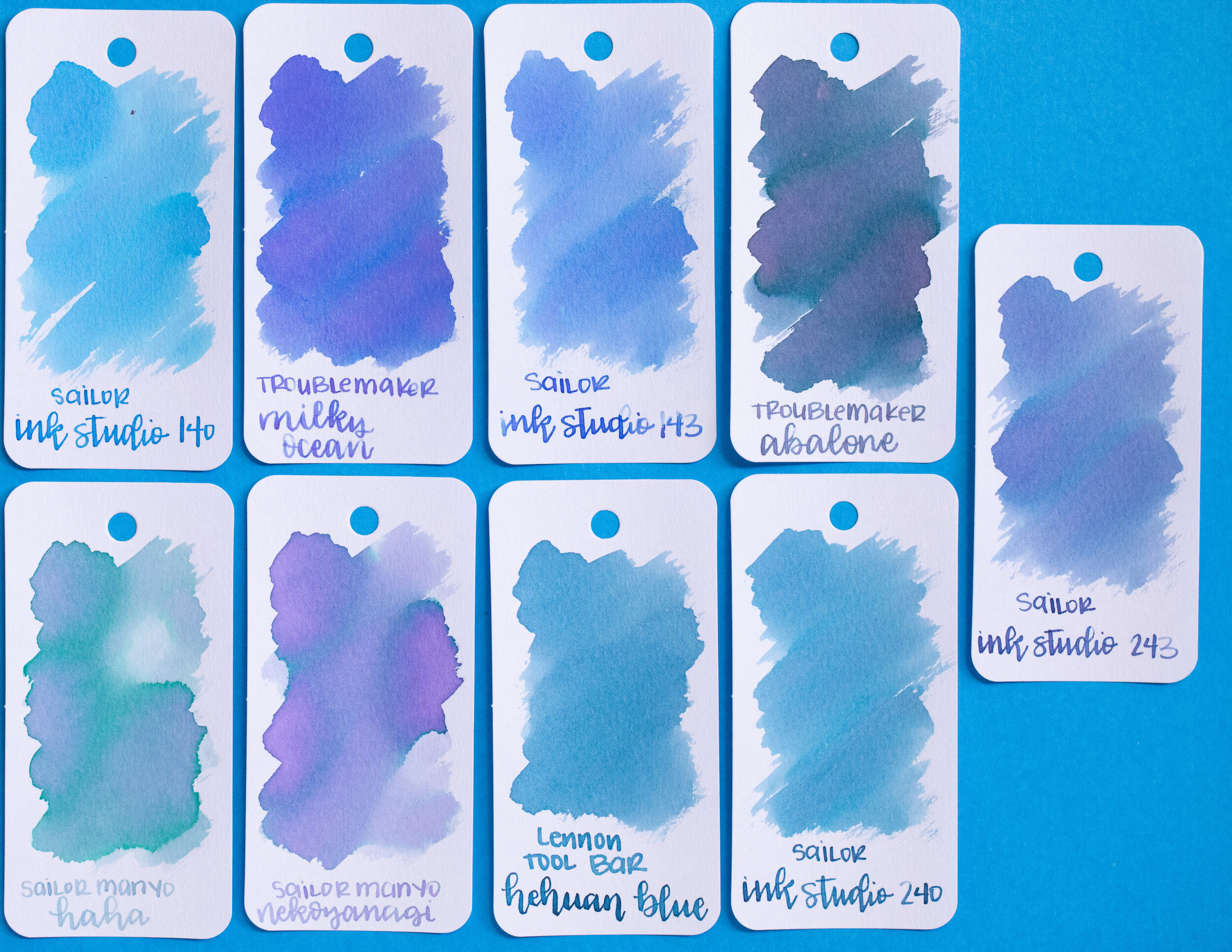
Abalone is much darker and more green than Troublemaker Milky Ocean. Click here to see the Troublemaker inks together and click here to see the blue inks together.

I used a Pelikan M605 White Transparent with a medium nib on a Yoseka A5 notebook. The ink had an average flow.
Overall, I really enjoyed this ink. It can be rather pale in smaller nibs, so I would stick to medium and larger nibs, but the shading is amazing. I need to get a full bottle when it’s back in stock!
Disclaimer: This ink was provided by Shigure Inks for the purpose of this review. All photos and opinions are my own. This page does not contain affiliate links, and this post is not sponsored in any way.
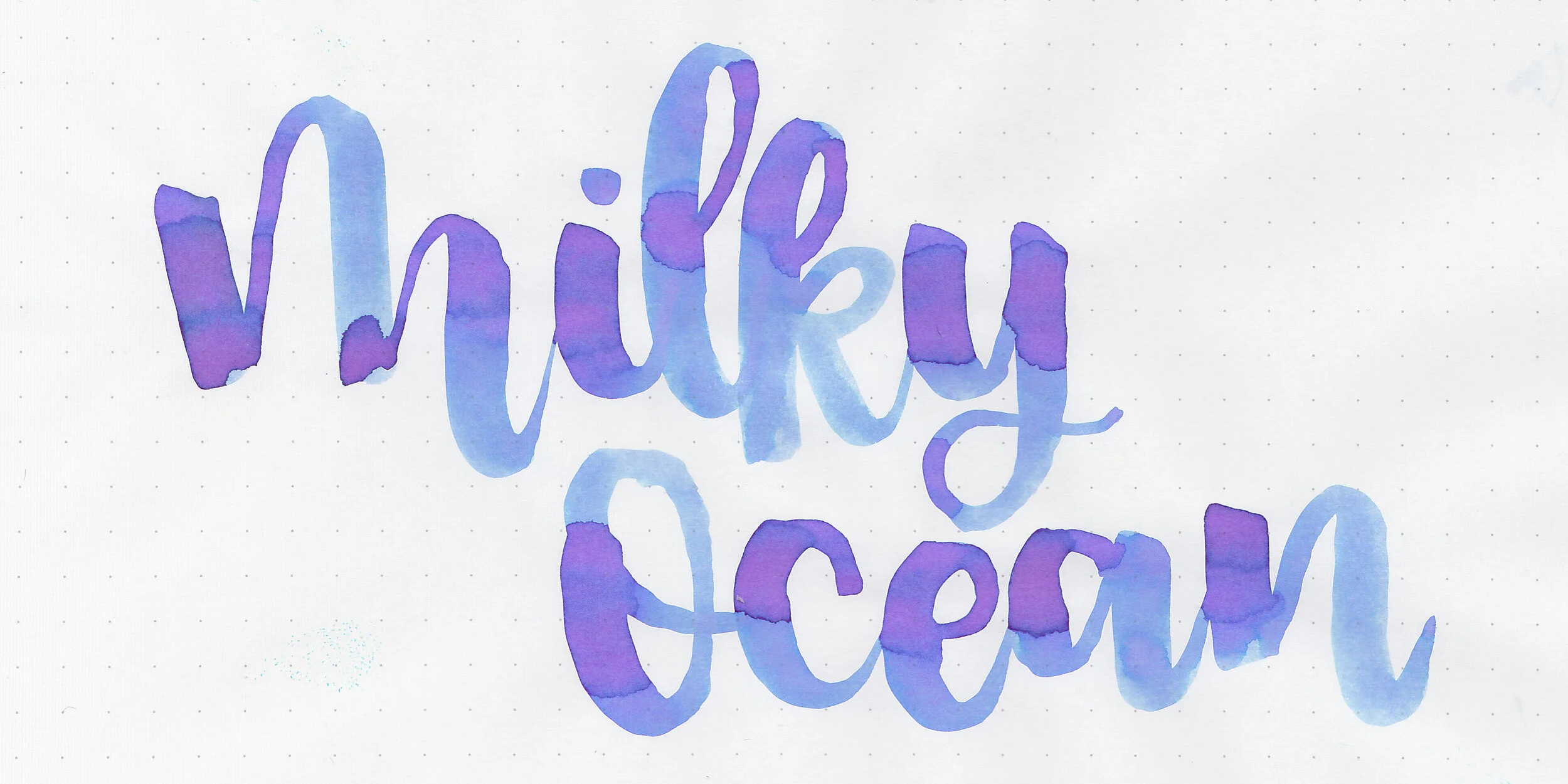
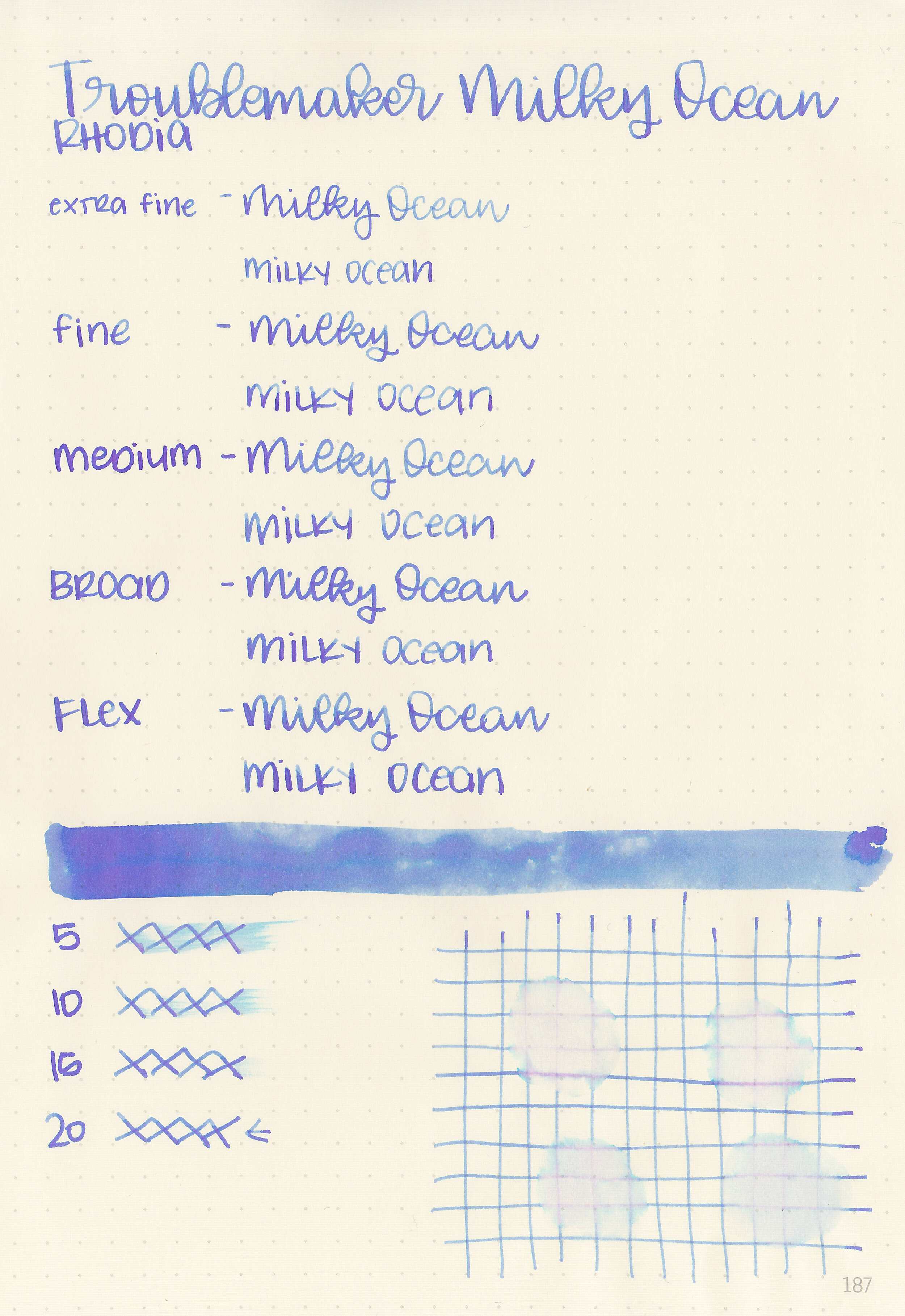
I’ve been waiting so long to try this ink, so I’m so excited to finally review Troublemaker Milky Ocean. Thanks to Shigure Inks for sending a sample over for review!

The color:
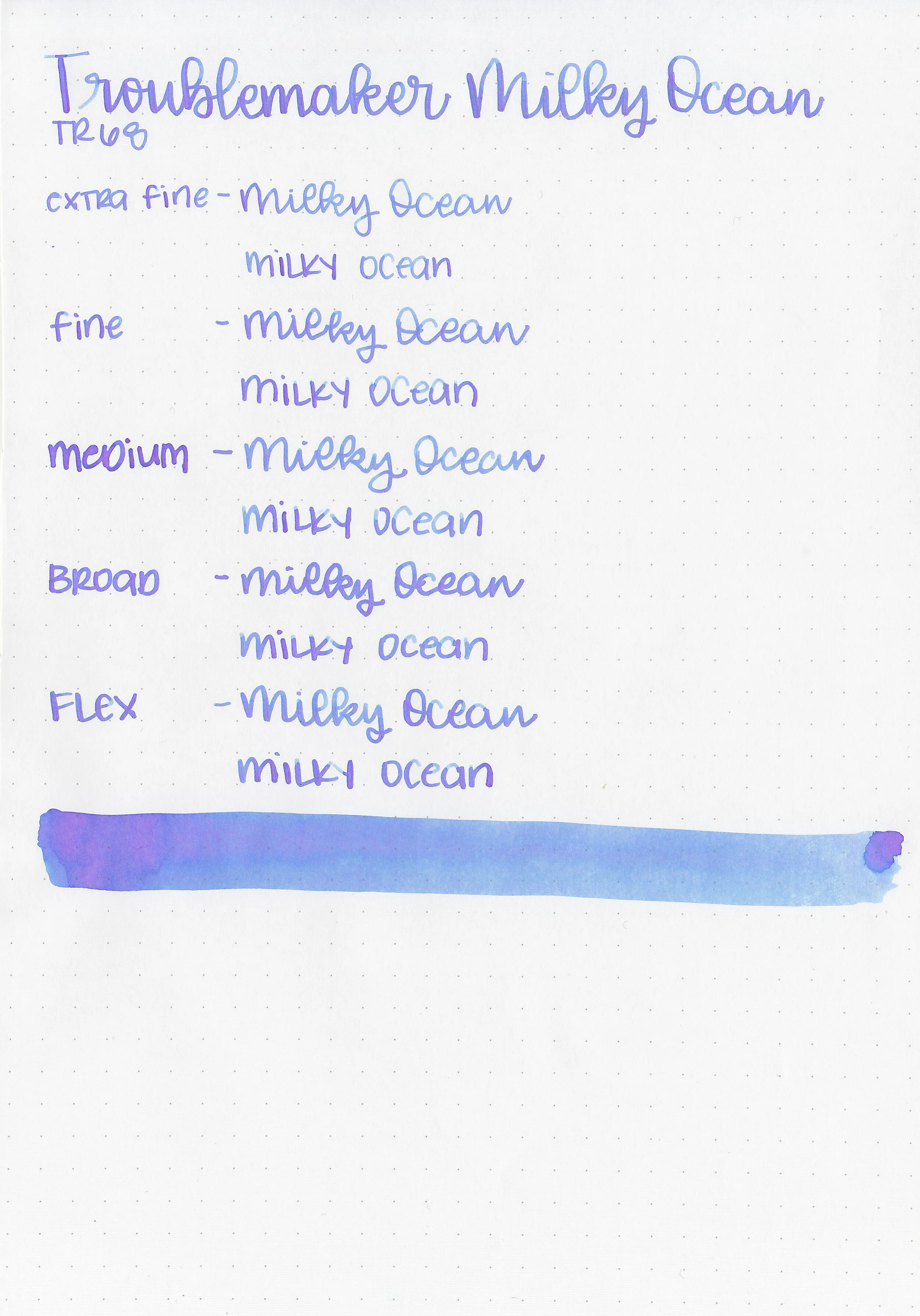
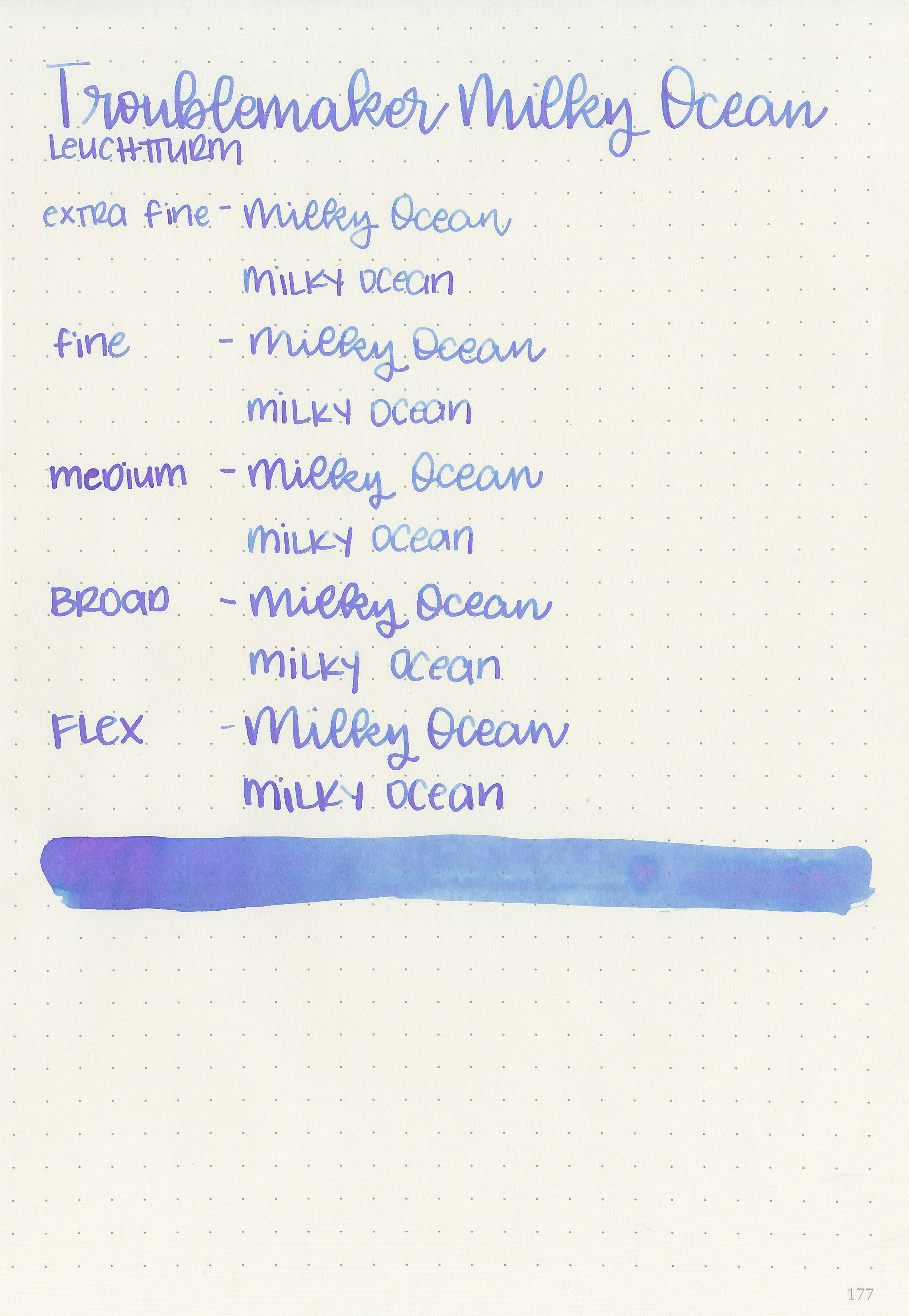
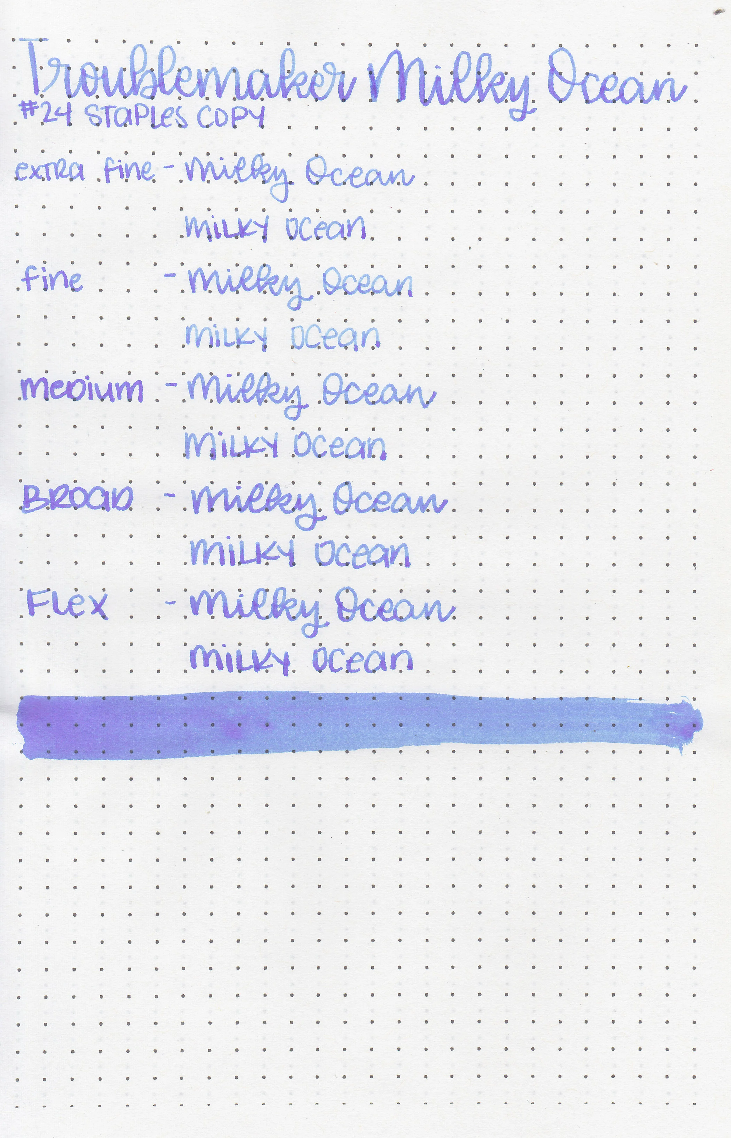
Milky Ocean is a pale blue that shades to a pale purple.

In large swabs on Tomoe River paper you can see plenty of purple shading.

Let's take a look at how the ink behaves on fountain pen friendly papers: Rhodia, Tomoe River, and Leuchtturm.

Dry time: 20 seconds
Water resistance: Low
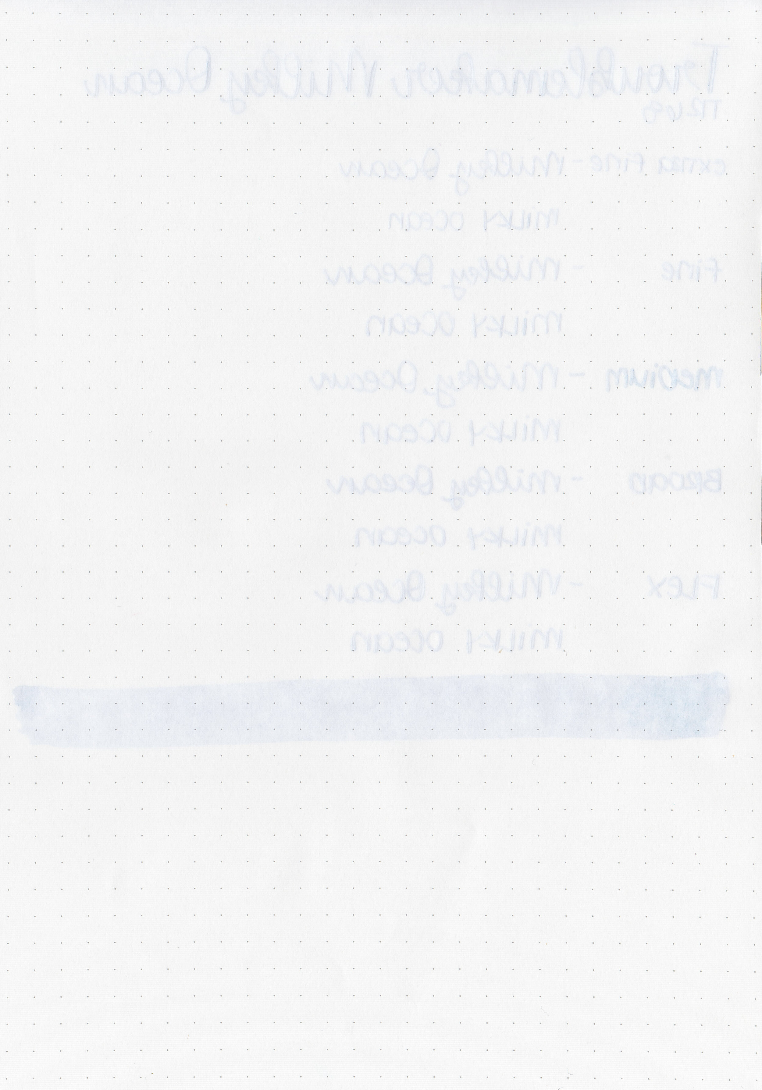
Feathering: None
Show through: Medium
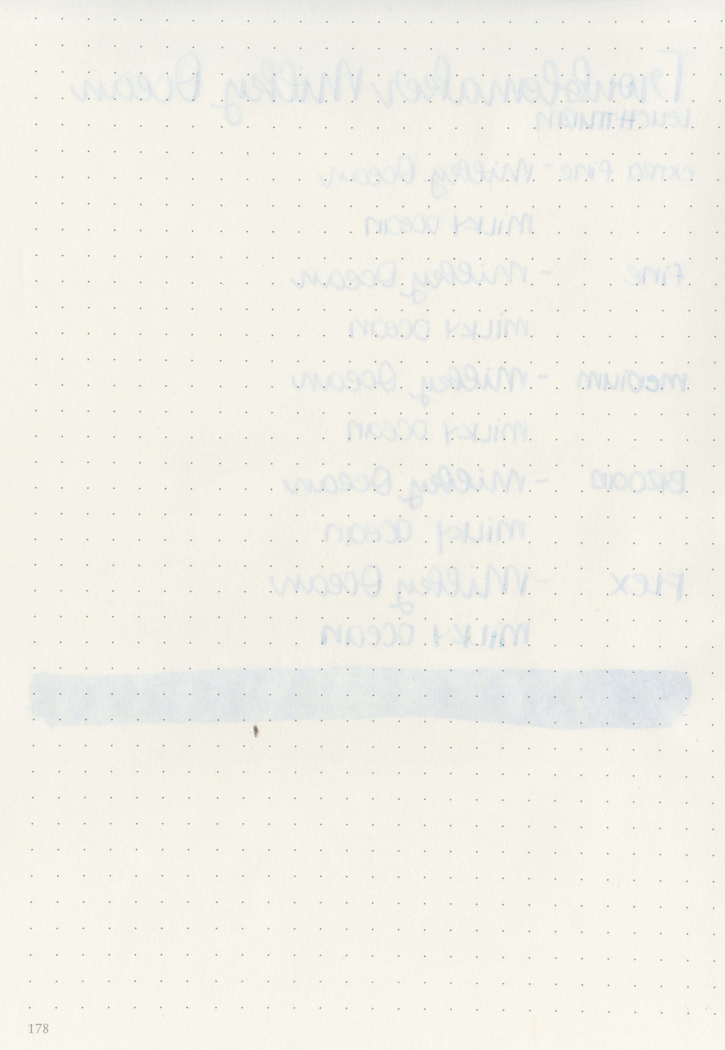
Bleeding: None
Other properties: high shading, no sheen, and no shimmer.
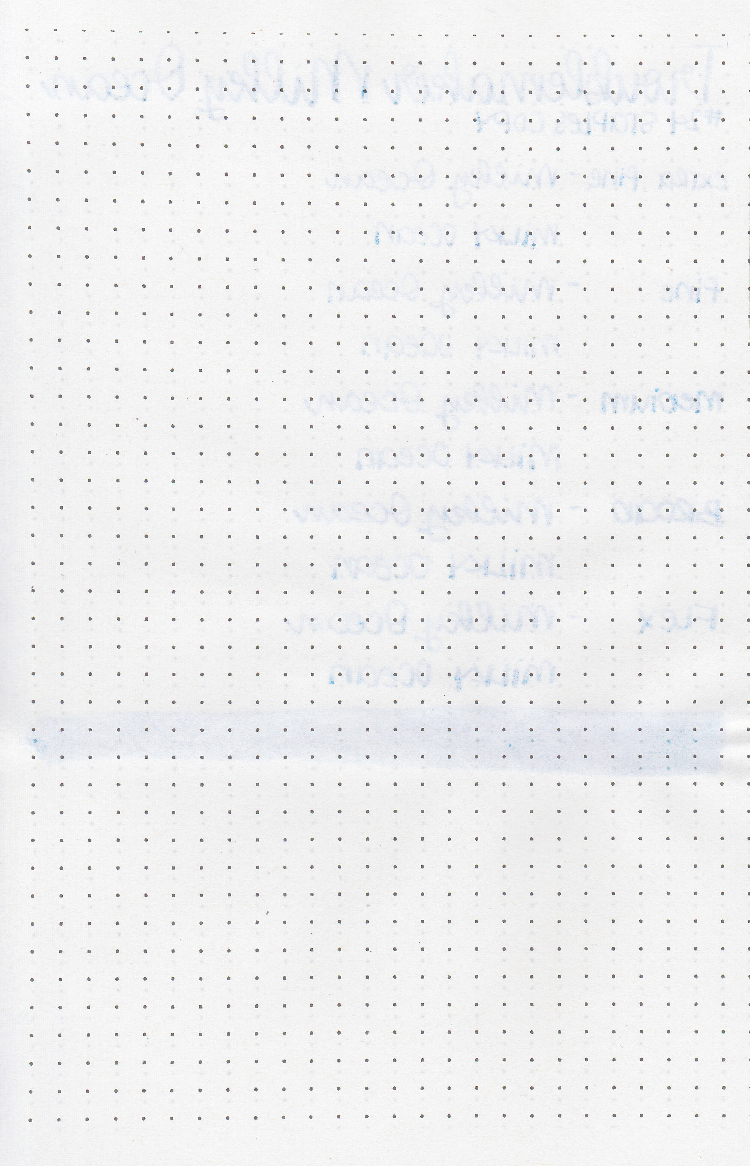
On Staples 24 lb copy paper there was some feathering in all nib sizes but just a tiny bit of bleeding.
Milky Ocean is similar to Sailor Ink Studio 243, but a bit more vibrant than that. Click here to see the Troublemaker inks together and click here to see the blue inks together.

I used a Bonecrusher Studios custom pen with a Regalia Writing Labs Crossflex nib on a Yoseka A5 notebook. The ink had an average flow.
Overall, I love the shading this ink has: blue and purple in various shades. I need to order a full bottle as soon as it’s back in stock!
Disclaimer: This ink was provided by Shigure Inks for the purpose of this review. All photos and opinions are my own. This page does not contain affiliate links, and this post is not sponsored in any way.
Hi, I’m Kelli, and I’m the brain behind Mountain of Ink. I’m a homeschooling mama of three littles, full-time student, aspiring photographer, amateur chef, and lover of all things stationery. I think any day that doesn’t involve learning and playing with ink is a day wasted. On my site you will find fountain pen, ink, and paper reviews, along with stationery bits and bobs along the way. You can find me @mountainofink on Instagram, Facebook, Twitter, and Pinterest.
Powered by Squarespace.