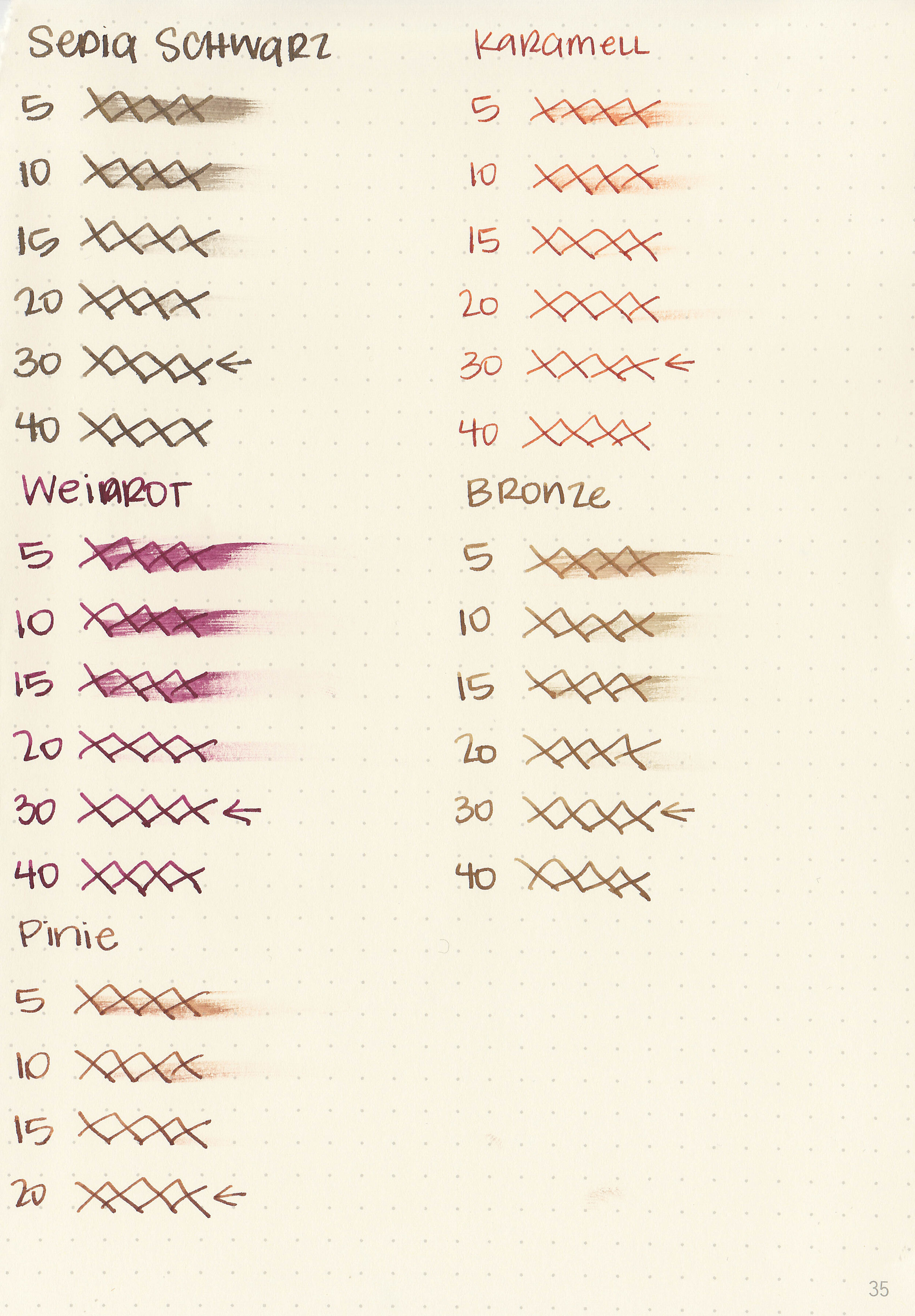
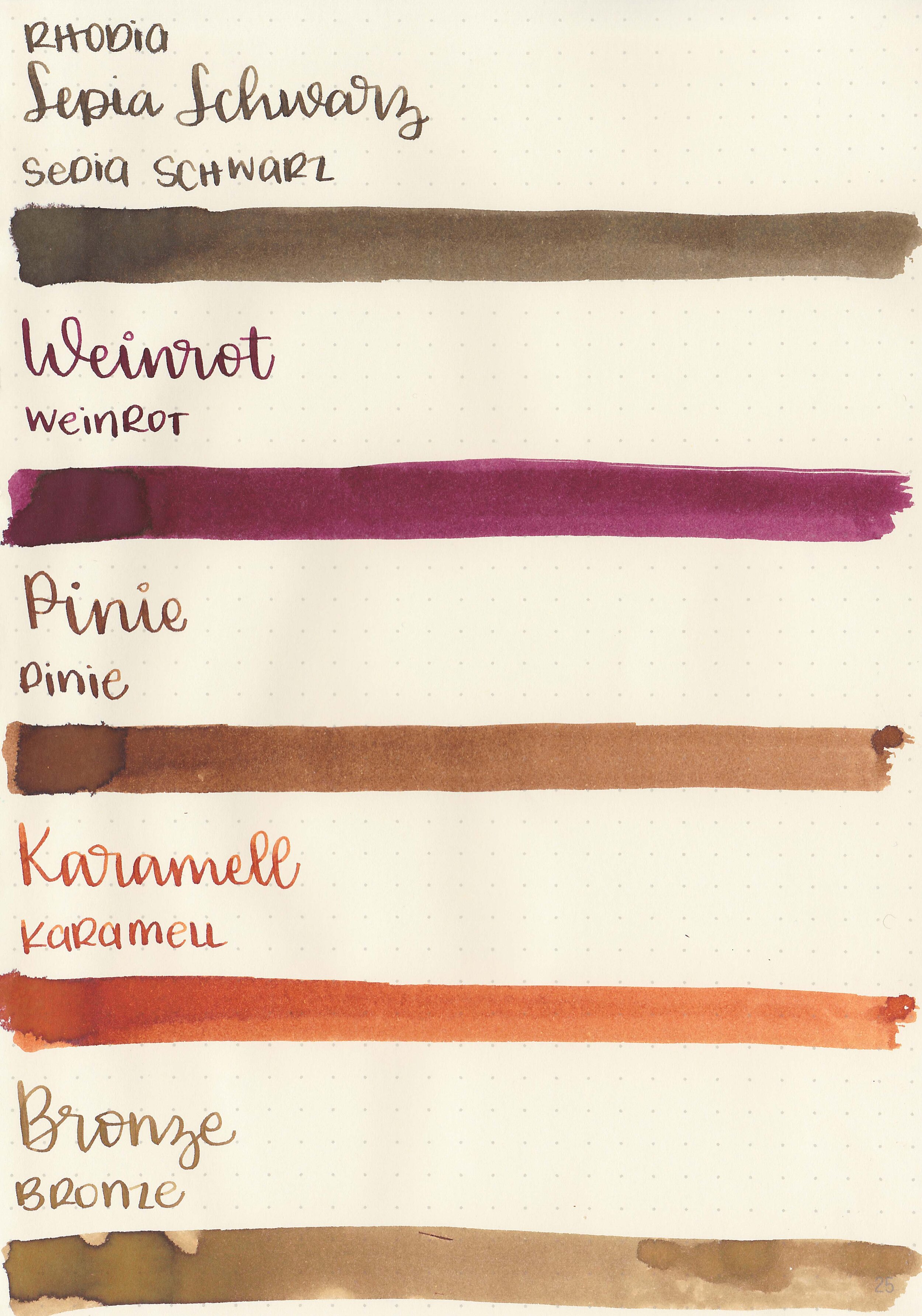
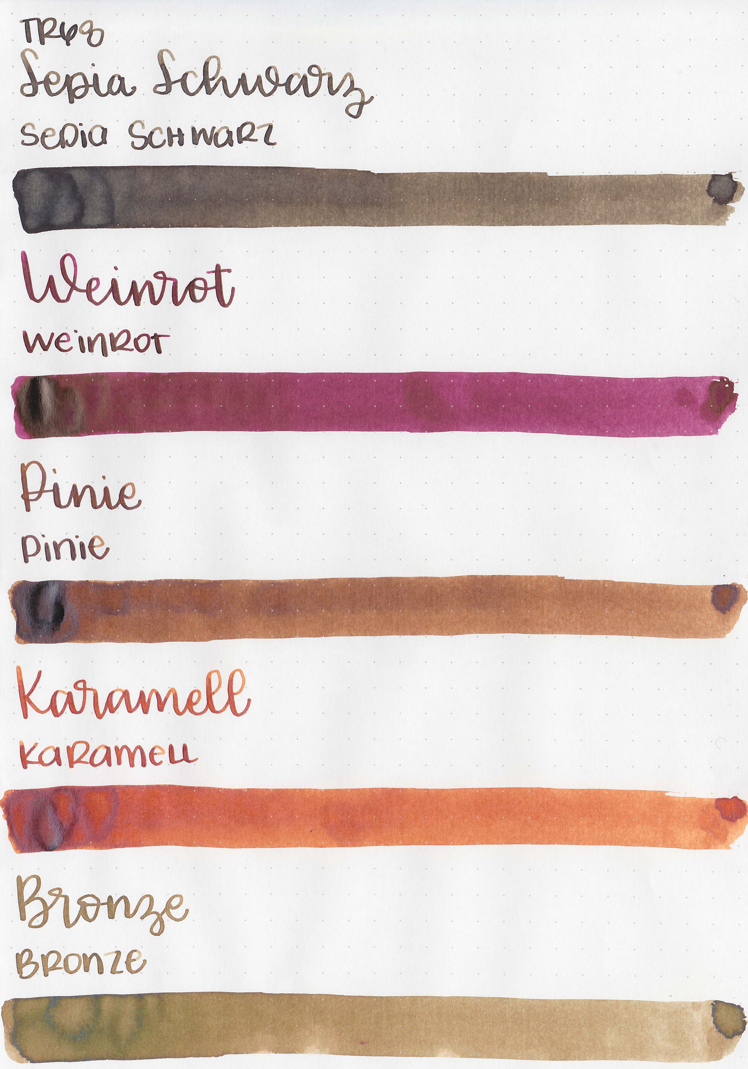
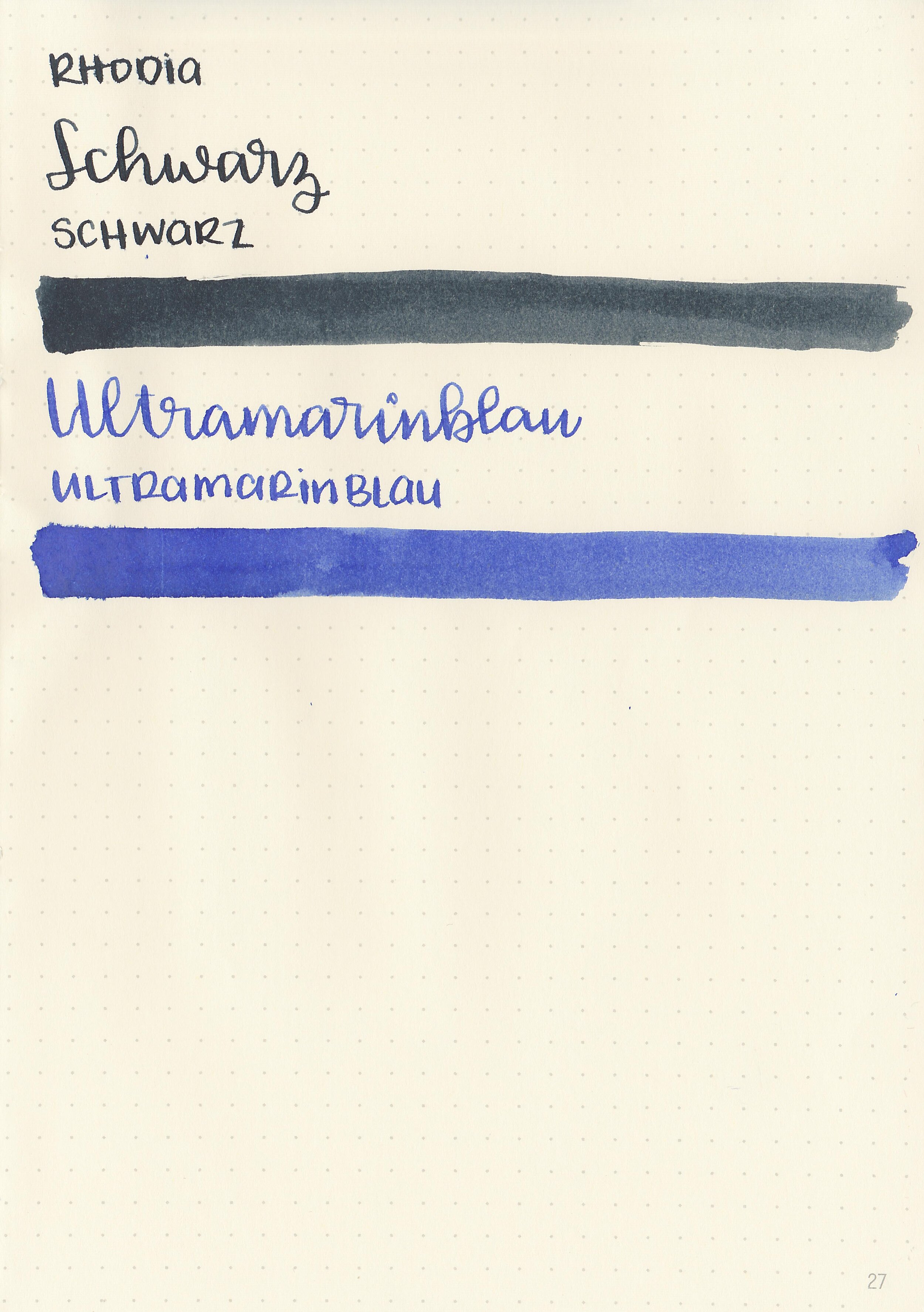
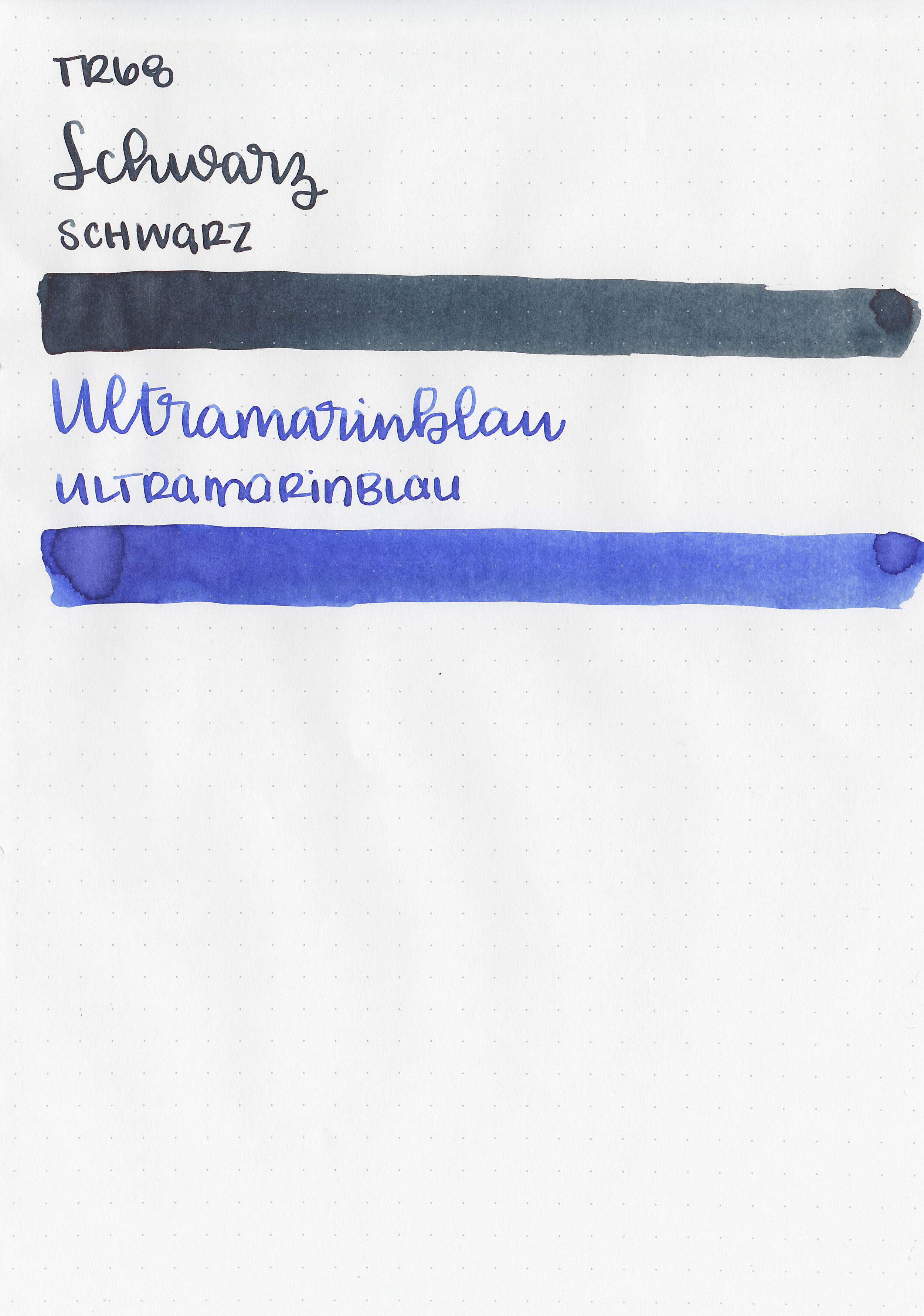
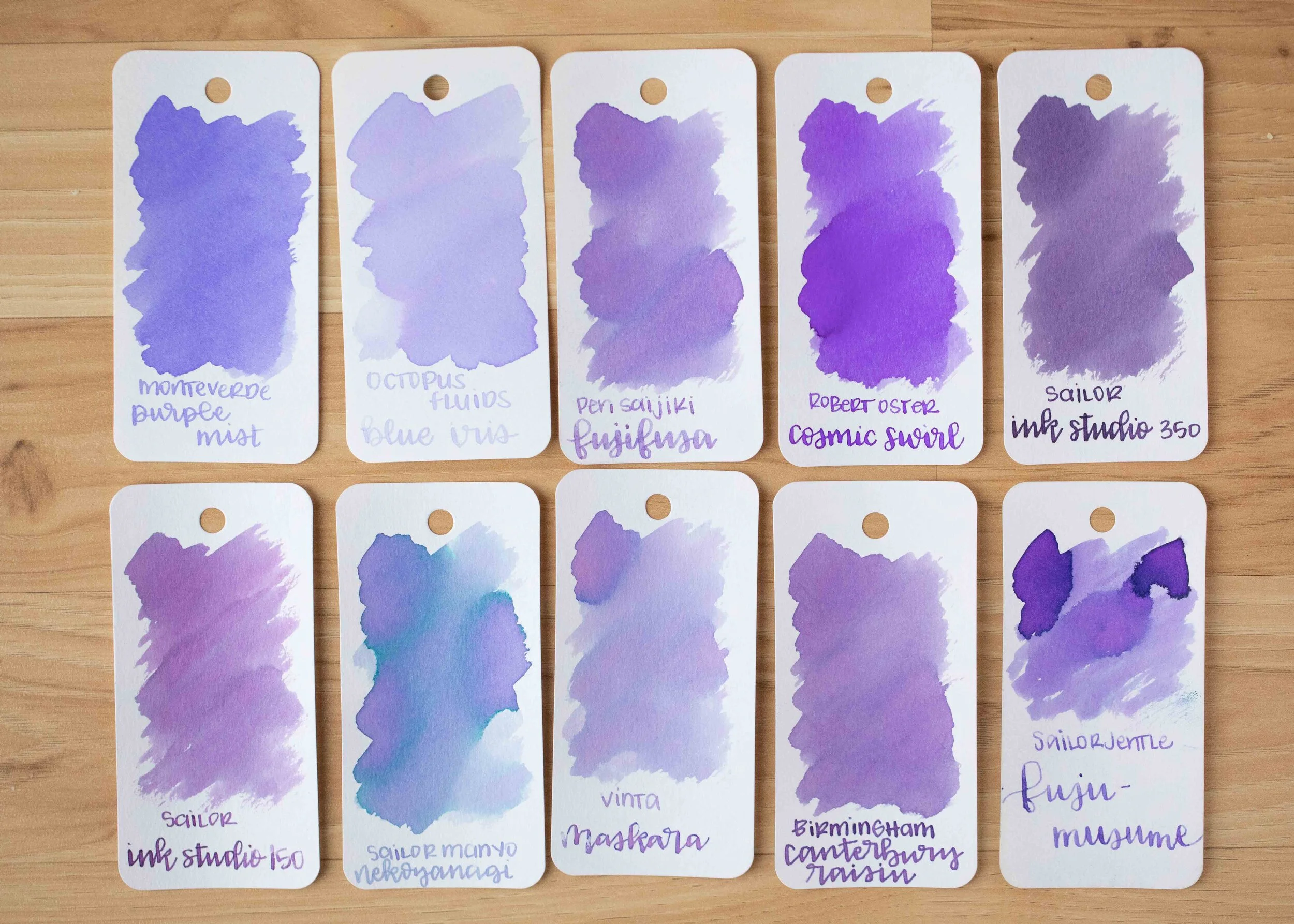
More Robert Oster Blues

ro-blues-s-1.jpg

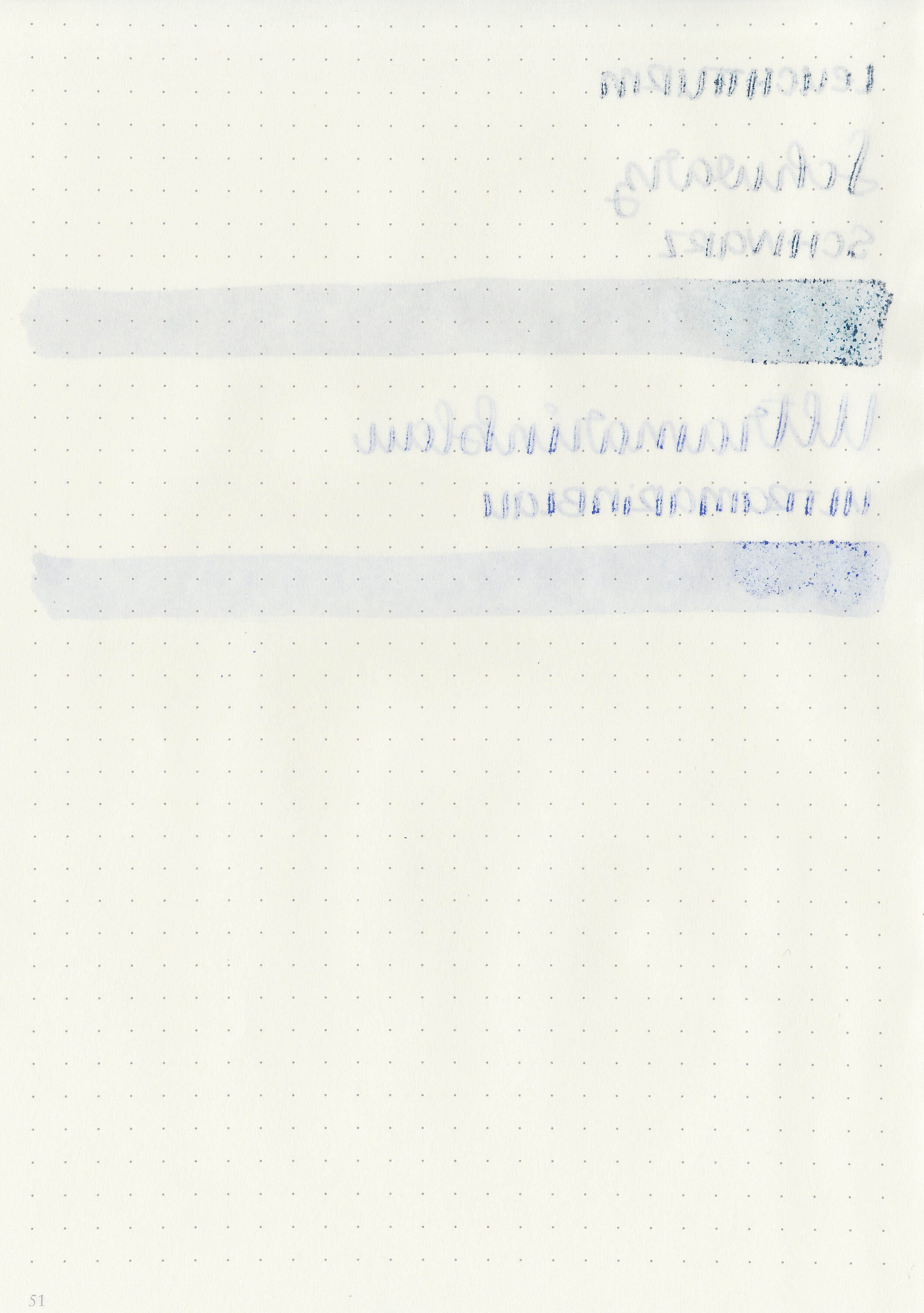
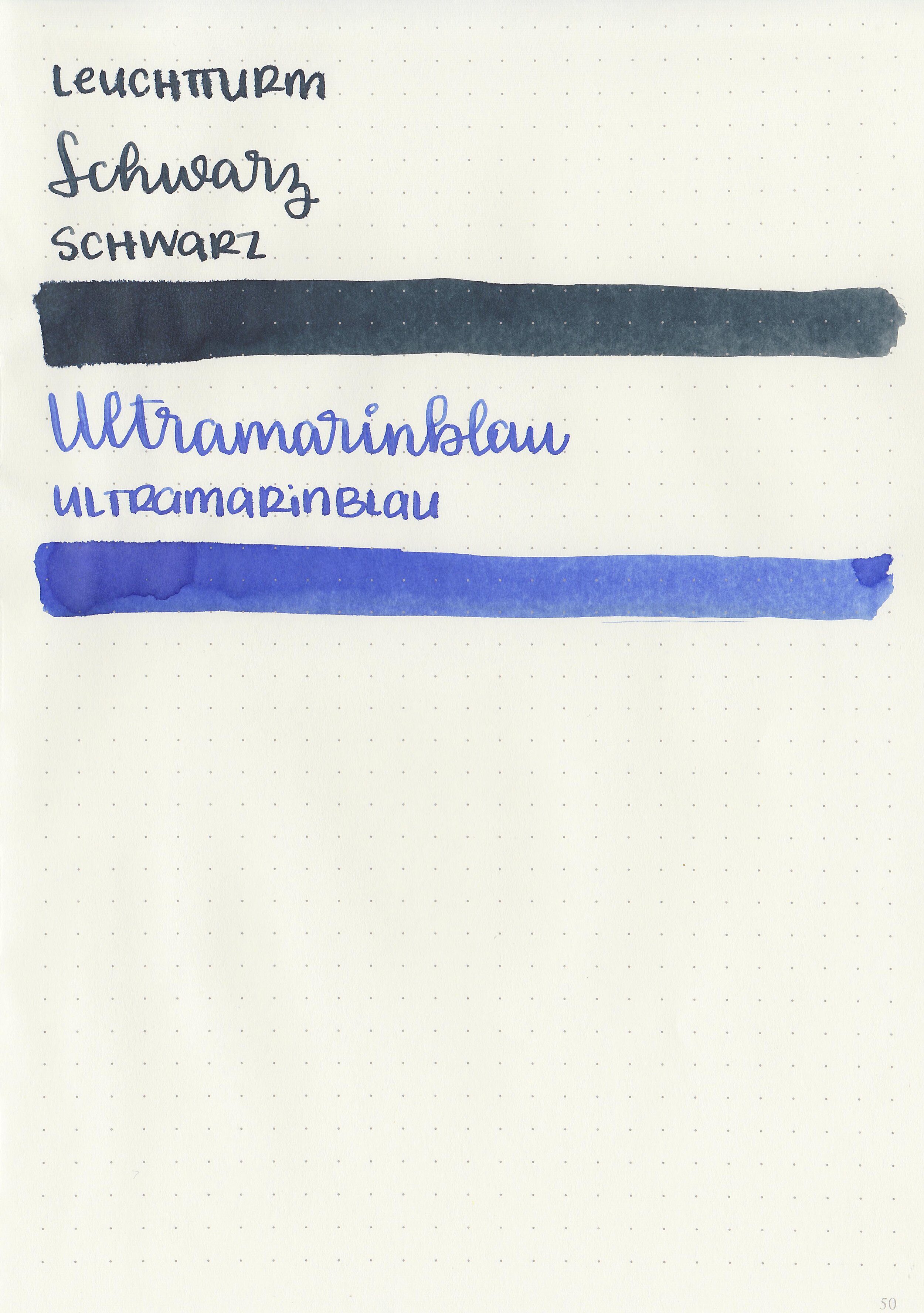
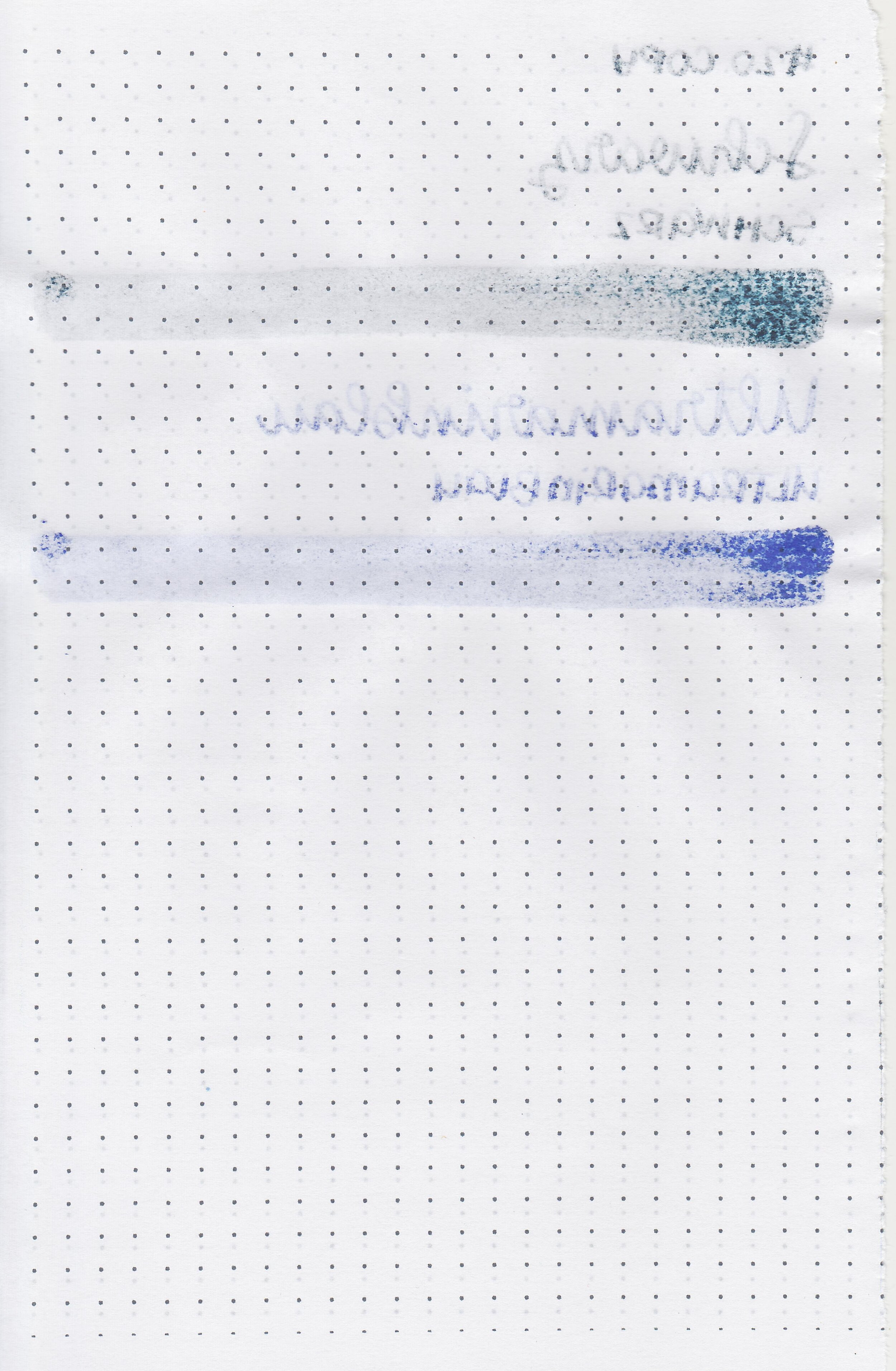
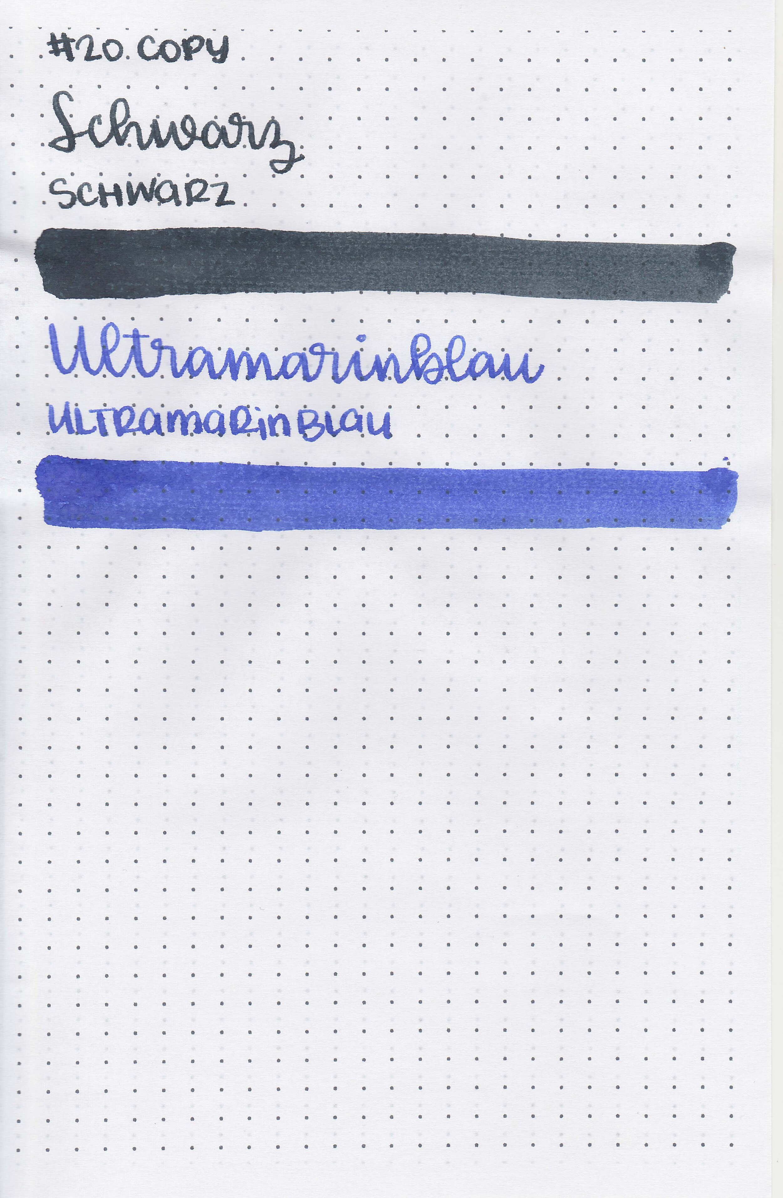
I had a request recently for a new comparison of Robert Oster blues, so I grabbed every RO blue ink currently in my desk (I don't know what that says about me that I was able to quickly come up with 25...) and started swabbing. I included Monsoon Sky, the newest ink I got and haven't even swabbed yet, but I feel like it's more green than the blue it shows on the bottle lid. Anyway, my top 5 RO blues: Blue Water Ice, Soda Pop Blue, Grey Seas, Evening Sapphire and Fire & Ice. Keep in mind that if you ask me tomorrow my answer will probably be different. What's your #1 favorite RO blue ink?

Ink Review #1379: Robert Oster Australis Rose

ro-australis-rose-2.jpg

Robert Oster Australis Rose is from the recent limited edition Australis collection. You can find this ink for sale at most retailers including Vanness Pens and Pen Chalet (aff. link).

ro-australis-rose-1.jpg

The color:

Australis Rose is a medium dusky rose pink.

Swabs:

ro-australis-rose-3.jpg

In large swabs on Tomoe River paper the ink has some shading but no sheen.

ro-australis-rose-4.jpg

Writing samples:

Let's take a look at how the ink behaves on fountain pen friendly papers: Rhodia, Tomoe River, and Leuchtturm.

Dry time: 40 seconds

Water resistance: Low

Feathering: Low

Show through: Medium

Bleeding: None

Other properties: medium shading, no sheen, and no shimmer.

On Staples 24 lb copy paper there was some feathering in all nib sizes.

Comparison Swabs:

ro-australis-rose-s-1.jpg

Australis Oak is lighter than Robert Oster Plumb Nut. Click here to see the Robert Oster inks together, and click here to see the pink inks together.

Longer writing:

ro-australis-rose-w-1.jpg

I used a Pilot Custom 74 Merlot with a medium nib on a Taroko Enigma notebook. The ink had a dry flow.

Overall, this ink fits right in-between Robert Oster Plumb Nut and Robert Oster Cherry Blossom. I think I’m partial to this ink just because it’s the color my grandma used to wear on her nails.

Disclaimer: All photos and opinions are my own. This page does contain affiliate links but this post is not sponsored in any way.

Ink Review #1378: Robert Oster Australis Oak

ro-australis-oak-2.jpg

Robert Oster Australis Oak is a recent limited edition ink. You can find this ink for sale at most retailers including Vanness Pens and Pen Chalet (aff. link).

ro-australis-oak-1.jpg

The color:

Australis Oak is a medium toffee brown.

Swabs:

ro-australis-oak-3.jpg

In large swabs on Tomoe River paper the ink has some shading but no sheen.

ro-australis-oak-4.jpg

Writing samples:

Let's take a look at how the ink behaves on fountain pen friendly papers: Rhodia, Tomoe River, and Leuchtturm.

Dry time: 20 seconds

Water resistance: Medium

Feathering: Low

Show through: Medium

Bleeding: Low

Other properties: medium shading, no sheen, and no shimmer.

On Staples 24 lb copy paper there was some feathering in all nib sizes.

Comparison Swabs:

ro-australis-oak-s-1.jpg

Australis Oak is darker than SBRE Brown. Click here to see the Robert Oster inks together, and click here to see the brown inks together.

Longer writing:

ro-australis-oak-w-1.jpg

I used a Pelikan M400 White Tortoise with a medium nib on a Taroko Enigma notebook. The ink had a dry flow.

Overall, it’s a nice addition to the Robert Oster lineup, but since it’s a limited edition ink you’ll have to grab it while it’s still available. It’s a little drier than I prefer but performed well in a wet Pelikan nib.

Disclaimer: All photos and opinions are my own. This page does contain affiliate links but this post is not sponsored in any way.

Octopus Fluids Inks Set 3

of-set3-6.jpg

Let’s take a look at the next set of Octopus Fluids inks: Rot, Brilliant Rot, Burgunder, Orange and Mango. Thanks to Octopus Fluids for sending these inks over for review!

Swabs:

Left to right: Burgunder, Rot, Brilliant Rot, Orange and Mango.

of-set3-7.jpg

Ink drops:

None of the inks show sheen.

of-set3-8.jpg

Dry Time:

All five inks dried in 10-20 seconds.

of-set3-9.jpg

Water Resistance:

All have low to medium water resistance.

Writing samples:

Let's take a look at how the ink behaves on fountain pen friendly papers: Rhodia, Tomoe River, and Leuchtturm.

Feathering: Medium

Show through: Medium

Bleeding: Low

Other properties: low shadingno sheen and no shimmer.

On Staples 24 lb copy paper there was lots of feathering in every nib size as well as some bleeding.

Comparison Swabs:

of-set3-s-1.jpg

Burgunder is closest to Diamine Classic Red. Rot is lighter than Classic Red, Brilliant Rot is closest to Monteverde Valentine Red.

of-set3-s-2.jpg

Orange is closest to Diamine Flowers Marigold.

of-set3-s-3.jpg

Mango is closest to Tono & Lims Yakiimo.

Longer Writing:

of-set3-w-1.jpg

I used a Taroko Enigma notebook and a Mabie Todd Swan. All five inks had an average flow.

Overall, out of the five Burgunder is my favorite. Mango and Orange can be hard to read in smaller nib sizes. All five inks do have some feathering on Rhodia and Leuchtturm.

Disclaimer: These inks were provided by Octopus Fluids for the purpose of this review. All photos and opinions are my own. This page does not contain affiliate links, and is not sponsored in any way.

Octopus Fluids Inks Set 2

of-set2-6.jpg

Let’s take a look at the next set of Octopus Fluids inks: Sepia Schwarz, Weinrot, Pinie, Karamell and Bronze. Thanks to Octopus Fluids for sending these inks over for review!

Swabs:

Left to right: Sepia Schwarz, Pinie, Karamell, Bronze and Weinrot.

of-set2-7.jpg

Ink drops:

Weinrot, Pinie and Karamell all show a little bit of sheen.

of-set2-9.jpg

Dry Time:

All five inks dried in 20-30 seconds.

of-set2-8.jpg

Water Resistance:

All have low to medium water resistance.

Writing samples:

Let's take a look at how the ink behaves on fountain pen friendly papers: Rhodia, Tomoe River, and Leuchtturm.

Feathering: Medium

Show through: Medium

Bleeding: Low

Other properties: low shadingno sheen to medium sheen (Weinrot and Pinie) and no shimmer.

On Staples 24 lb copy paper there was lots of feathering in every nib size as well as some bleeding.

Comparison Swabs:

of-set2-s-1.jpg

Sepia Schwarz is closest to Diamine Macassar. Pinie is closest to Kobe Nada Brown. Bronze is closest to Colorverse Soul.

of-set2-s-2.jpg

Karamell is closest to Monteverde Pumpkin Cake.

of-set2-s-3.jpg

Weinrot is closest to Montblanc Antoine de Saint-euxpery.

Longer Writing:

of-set2-w-1.jpg

I used a Taroko Enigma notebook. All five inks had an average but watery flow.

Overall, there’s a bit more feathering than I prefer. Out of these five, Karamell is my favorite. It’s an interesting fall golden brown.

Disclaimer: These inks were provided by Octopus Fluids for the purpose of this review. All photos and opinions are my own. This page does not contain affiliate links, and is not sponsored in any way.

Octopus Fluids Inks Set 1

of-set1-3.jpg

Let’s take a look at Octopus Fluids Schwarz and Ultramarinblau. Thanks to Octopus Fluids for sending these inks over for review!

Swabs:

Left to right: Schwarz and Ultramarinblau.

of-set1-4.jpg

Ink drops:

Schwarz doesn’t show as much shading as Ultramarinblau.

of-set1-5.jpg

Dry Time:

Both inks dried in 20-30 seconds.

Writing samples:

Let's take a look at how the ink behaves on fountain pen friendly papers: Rhodia, Tomoe River, and Leuchtturm.

Feathering: Medium

Show through: Medium

Bleeding: Medium

Other properties: low to medium shadingno sheen and no shimmer.

On Staples 24 lb copy paper there was lots of feathering in every nib size as well as some bleeding.

Comparison Swabs:

of-set1-s-2.jpg

Schwarz is closest to Sailor Ink Studio 024.

of-set1-s-1.jpg

Ultramarinblau is closest to Tono & Lims I Feel So Refreshed.

Longer Writing:

of-set1-w-1.jpg

I used a Taroko Enigma notebook. Both inks had an average but watery flow.

Overall, they’re not bad but not fabulous. There’s more feathering and bleeding than I prefer and since the colors are very basic there a lot of better alternatives out there.

Disclaimer: These inks were provided by Octopus Fluids for the purpose of this review. All photos and opinions are my own. This page does not contain affiliate links, and is not sponsored in any way.

Octopus Fluids Pastell Inks

of-pastell-7.jpg

Recently I’ve been trying out a new-to-me brand called Octopus Fluids. I wanted to start their ink reviews off with the Pastell series-6 very pale inks. Thanks to Octopus Fluids for sending these inks over for review!

Swabs:

Left to right: Pebble Stone, Cherry Blossom, Living Coral, Poppy Pods, Crystal Blue and Blue Iris.

of-pastell-9.jpg

Dry Time:

All six inks dried in 20-30 seconds.

Writing samples:

Let's take a look at how the ink behaves on fountain pen friendly papers: Rhodia, Tomoe River, and Leuchtturm.

Water resistance: Low

Feathering: Low

Show through: Medium

Bleeding: Low

Other properties: low to medium shadingno sheen and no shimmer.

On Staples 24 lb copy paper there was lots of feathering in every nib size as well as some bleeding.

Comparison Swabs:

of-pastell-s-3.jpg

Pebble Stone is closest to Montblanc Spider Gray.

of-pastell-s-4.jpg

Cherry Blossom is closest to Sailor Ink Studio 237. Living Coral is closest to Sailor Jentle Sakura-mori.

of-pastell-s-5.jpg

Poppy Pods is closest to Pen Saijiki Kazahana.

of-pastell-s-6.jpg

Crystal Blue is right in-between Pure Pens Porthcurno Cove and Pilot Iroshizuku Ebisu.

of-pastell-s-7.jpg

Blue Iris is cooler-toned than Vinta Maskara.

Longer Writing:

of-pastell-s-2.jpg
of-pastell-s-1.jpg

I used a Taroko Enigma notebook. All six inks had an average but watery flow.

Overall, all of these inks are a bit light for me. They would be great for art but not for everyday writing. Out of the six Pebble Stone is my favorite color but Crystal Blue is the most readable in writing.

Disclaimer: These inks were provided by Octopus Fluids for the purpose of this review. All photos and opinions are my own. This page does not contain affiliate links, and is not sponsored in any way.

Thinkers Notebook Version 2

thinker-version2-1.jpg

I reviewed the first Thinkers Notebook back in August but they recently released a second version which we are gong to look at today. Thanks to Thinkers for sending a copy over for review!

thinker-version2-3.jpg

Size:

6.5" by 8.67" with a recycled leather cover and ribbon bookmark.

The paper is 120 gsm premium Munken paper, with 256 numbered pages using a 5mm dot grid.

thinker-version2-2.jpg

The edges of the notebook feature an orange to black color fade.

thinker-version2-4.jpg

Format:

The pages have space for a title at the top and a 5mm dot grid.

thinker-version2-5.jpg

The page numbers are probably my favorite feature.

Fountain Pens:

Every ink feathered and bled at least a little, which is so disappointing after the first version. It handled all of the standard pens and highlighters I tried below.

This notebook is designed to be used with the app, but there isn’t a way to name files or group them by subject. It also crashes often. The app just isn’t for me I think.

Overall, I’m sad they changed the paper from the first version, which I preferred. I love the color on the edge of the pages but don’t love how blatant the branding is on the cover. There just isn’t enough I love about it that makes me want to use it often.

Disclaimer: This notebook was provided by Thinkers Notebook for the purpose of this review. All photos and opinions are my own. There are no affiliate links on this page and this post is not sponsored in any way.

Ink Review #1359: Ferris Wheel Press Little Robinia

fwp-little-robinia-2.jpg

Ferris Wheel Press Little Robinia is from the Spring 2020 collection. You can find this ink for sale at most retailers including Vanness Pens.

fwp-little-robinia-1.jpg

The color:

Little Robinia is a pale mauve purple.

Swabs:

fwp-little-robinia-3.jpg

In large swabs on Tomoe River paper the ink looks more blue and shows off the blue undertone in some shading.

fwp-little-robinia-12.jpg

Writing samples:

Let's take a look at how the ink behaves on fountain pen friendly papers: Rhodia, Tomoe River, and Leuchtturm.

Dry time: 20 seconds

Water resistance: Low

Feathering: Low

Show through: Medium

Bleeding: None

Other properties: high shading, no sheen, and no shimmer.

On Staples 24 lb copy paper there was some feathering in all nib sizes as well as a bit of bleeding.

Comparison Swabs:

fwp-little-robinia-s-1.jpg

Little Robinia is much paler than the other purple inks. Click here to see the Ferris Wheel Press inks together, and click here to see the purple inks together.

Longer writing:

fwp-little-robinia-w-1.jpg

I used a Platinum 3776 Nice Lavande with a broad nib on a Taroko Enigma notebook. The ink had a super dry flow.

Overall, while I find the color interesting it’s not dark enough for everyday use. It’s also super dry which makes for great shading but not a great writing experience for me. This one is a solid no for me.

Disclaimer: All photos and opinions are my own. This page does not contain affiliate links and this post is not sponsored in any way.