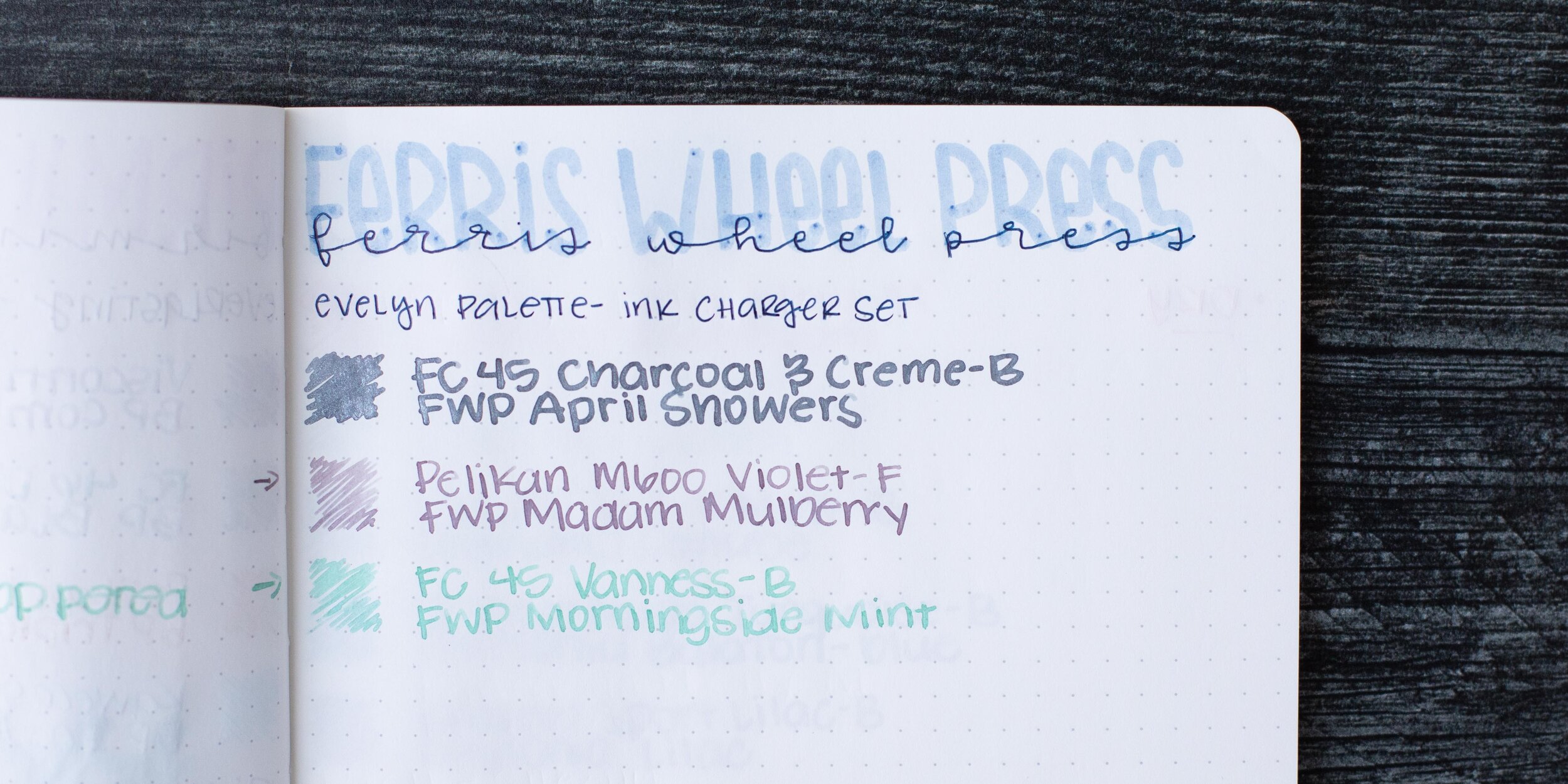
Ferris Wheel Press Claire Charger Set
/
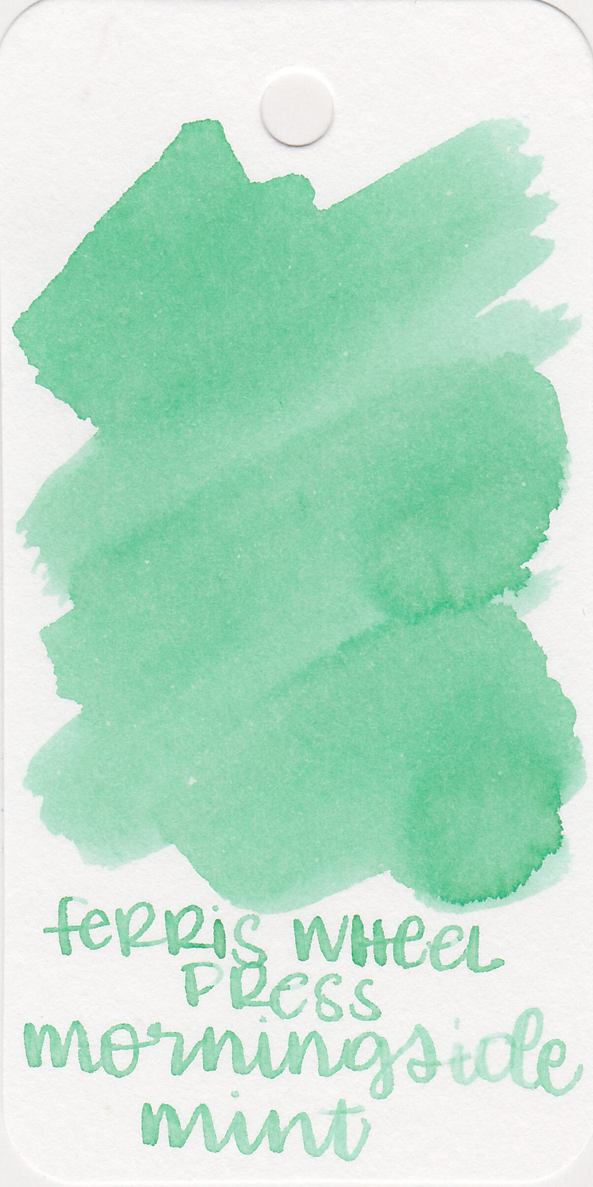
I’ve been looking forward to trying some of Ferris Wheel Press’s fall charger sets (3 x 5ml ink vials). The Claire charger set contains 3 inks from the Fall 2020 collection. Thanks to Phidon Pens for sending this set over for review!
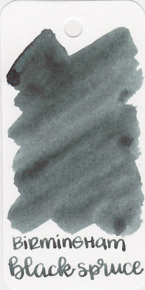
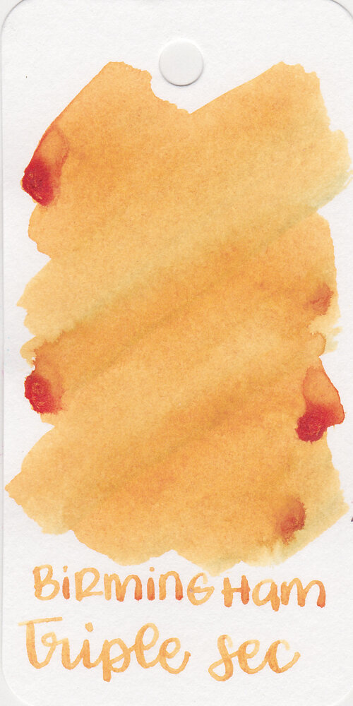
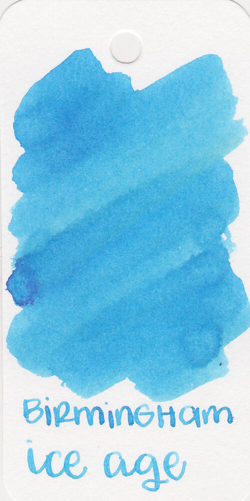
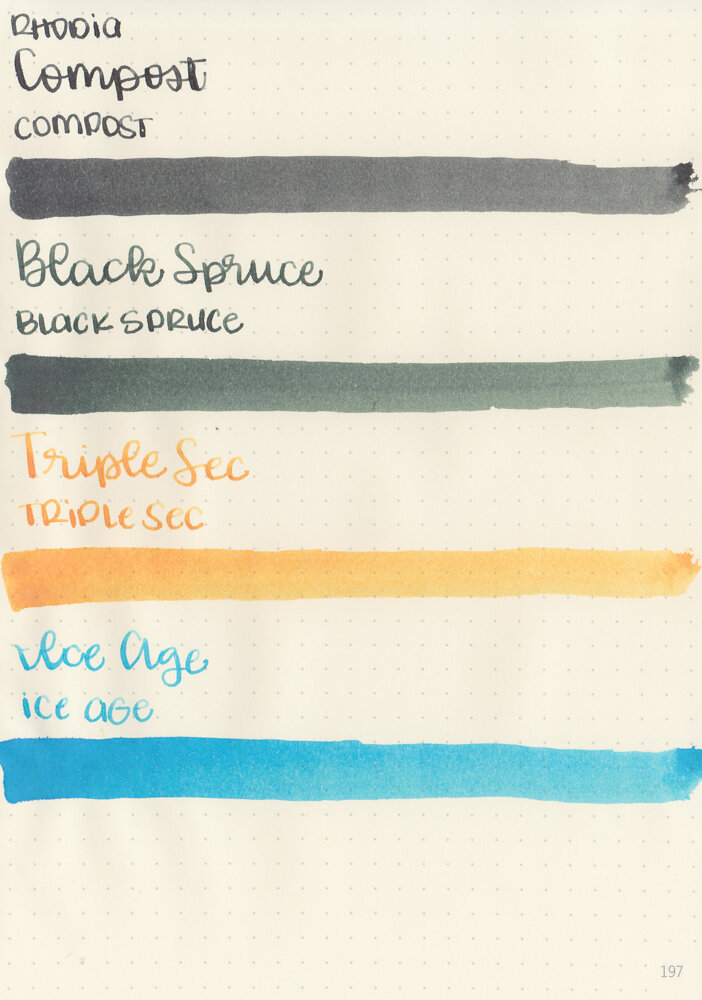
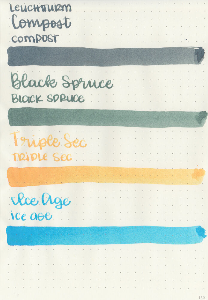
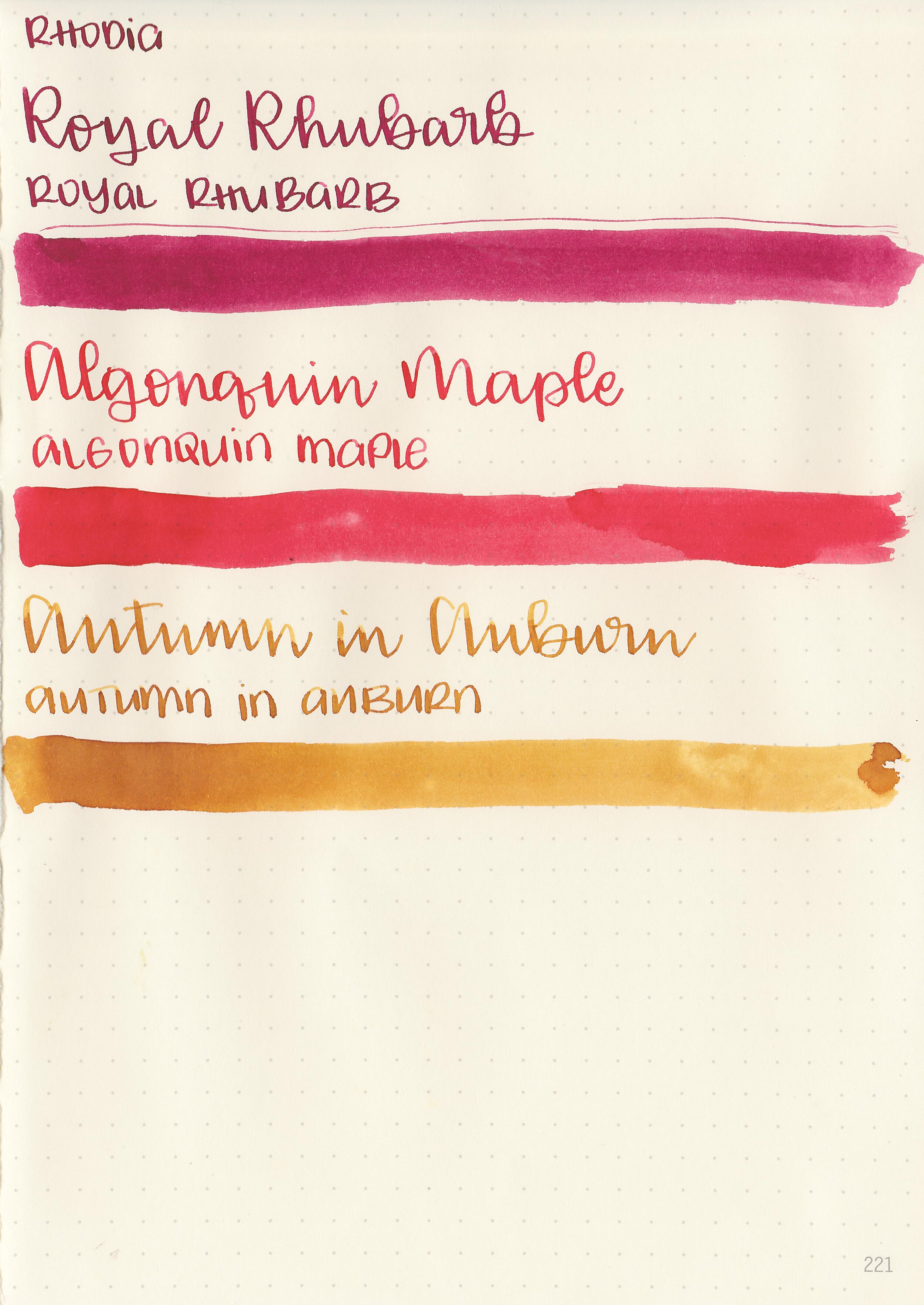
Swabs:
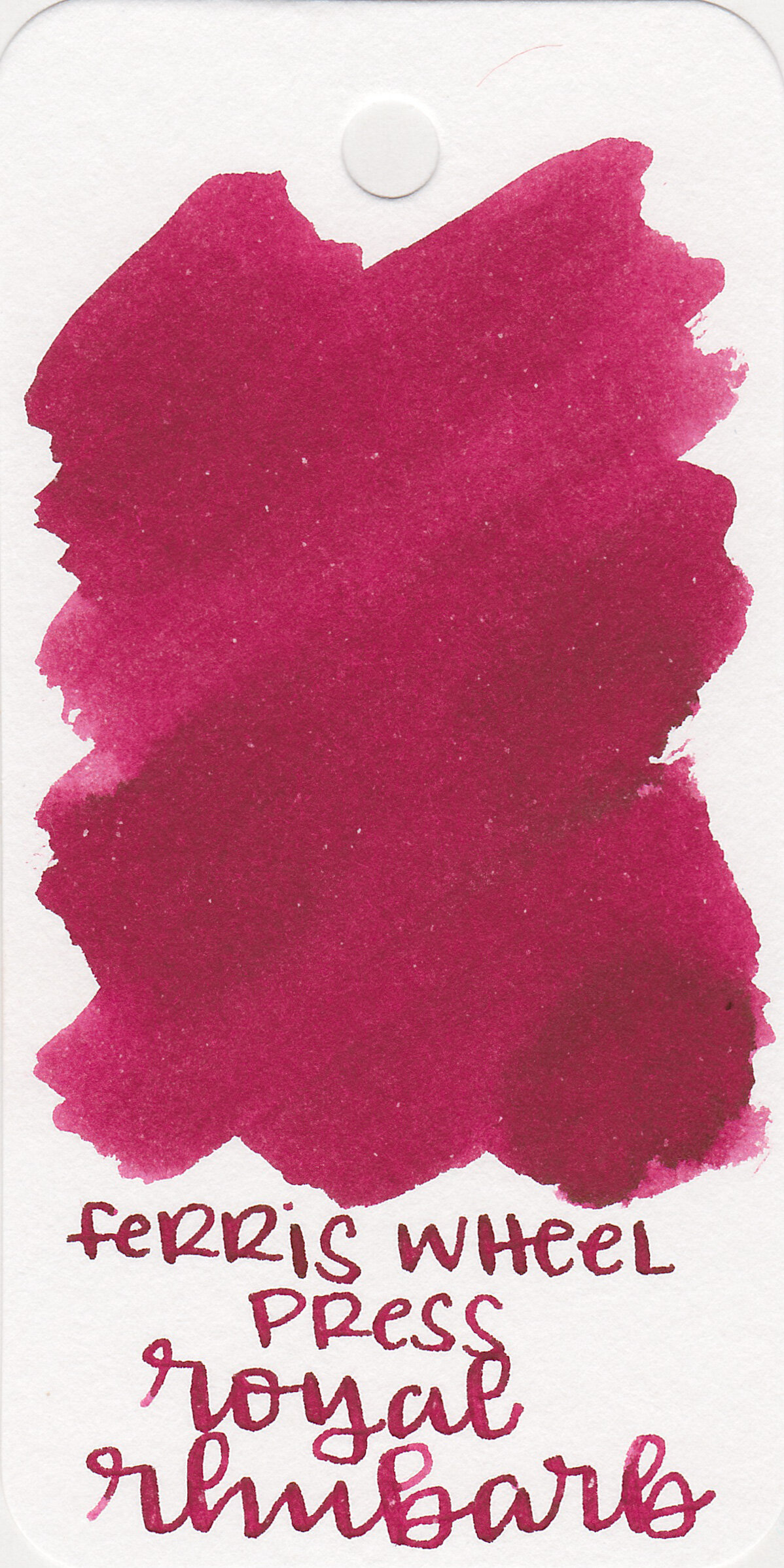
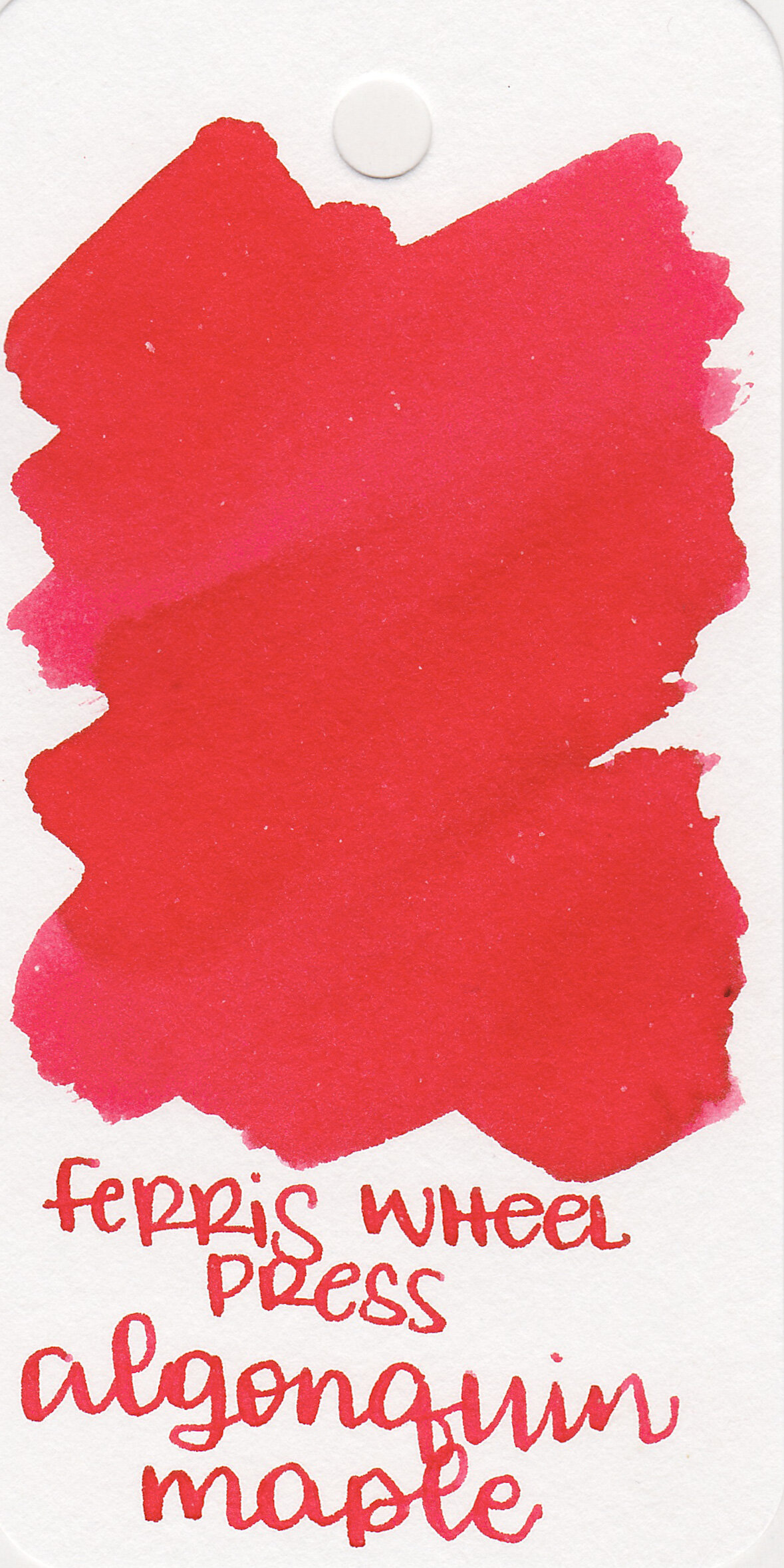
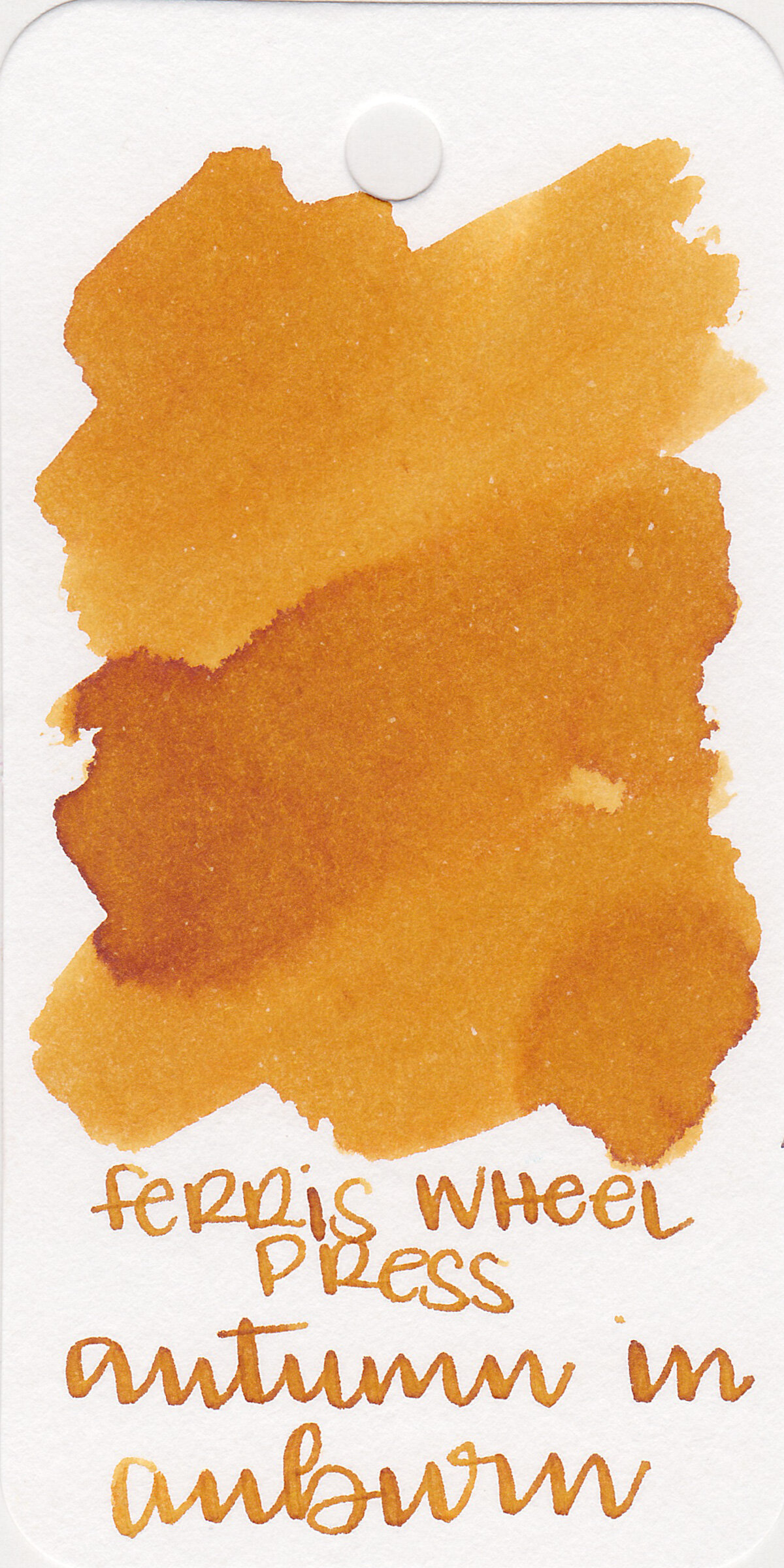
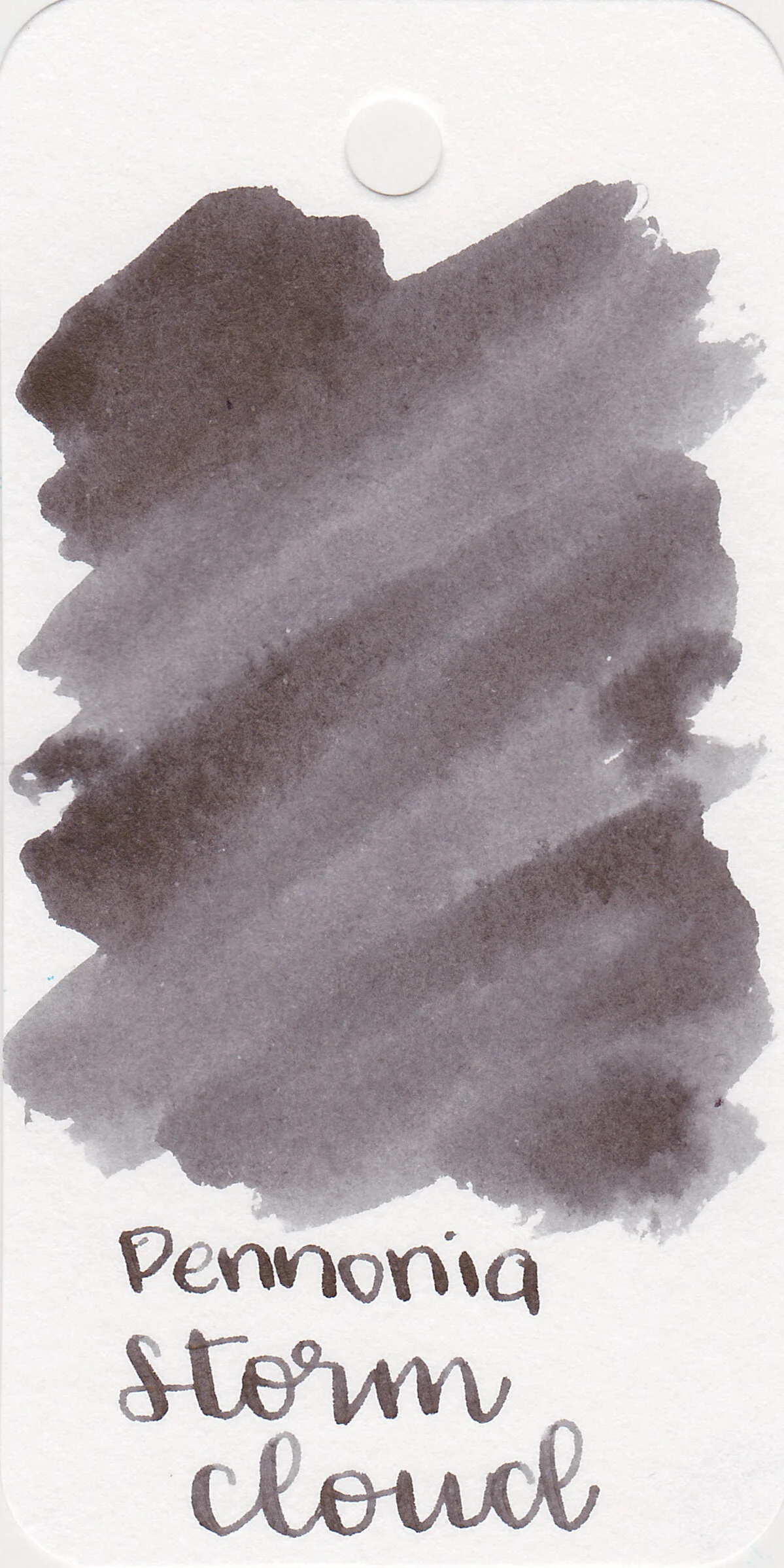
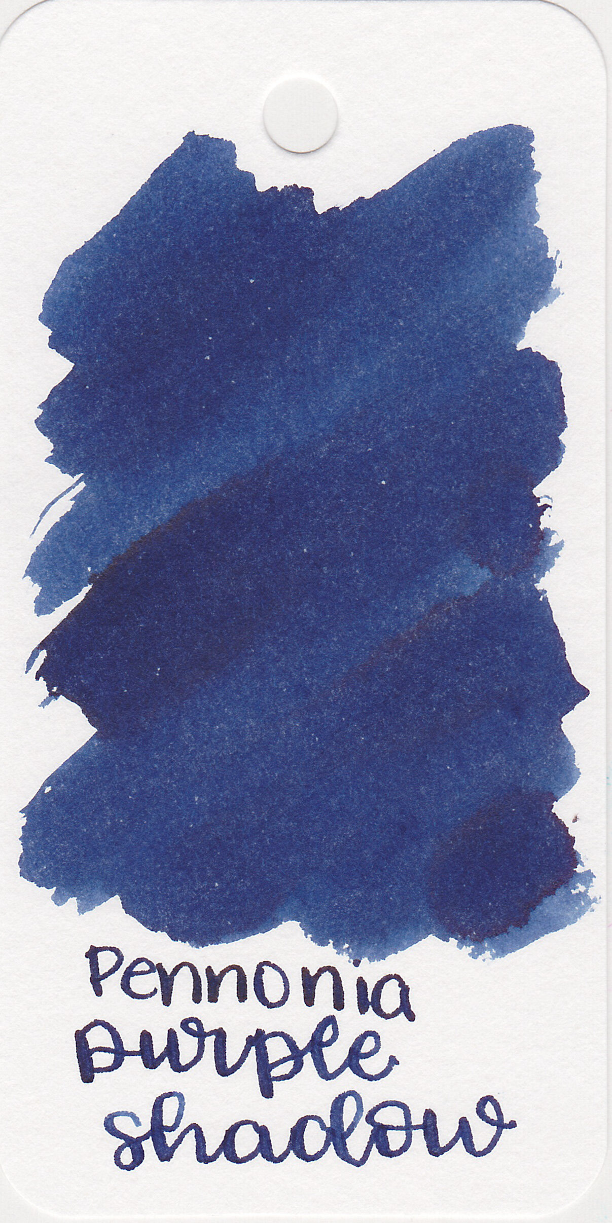
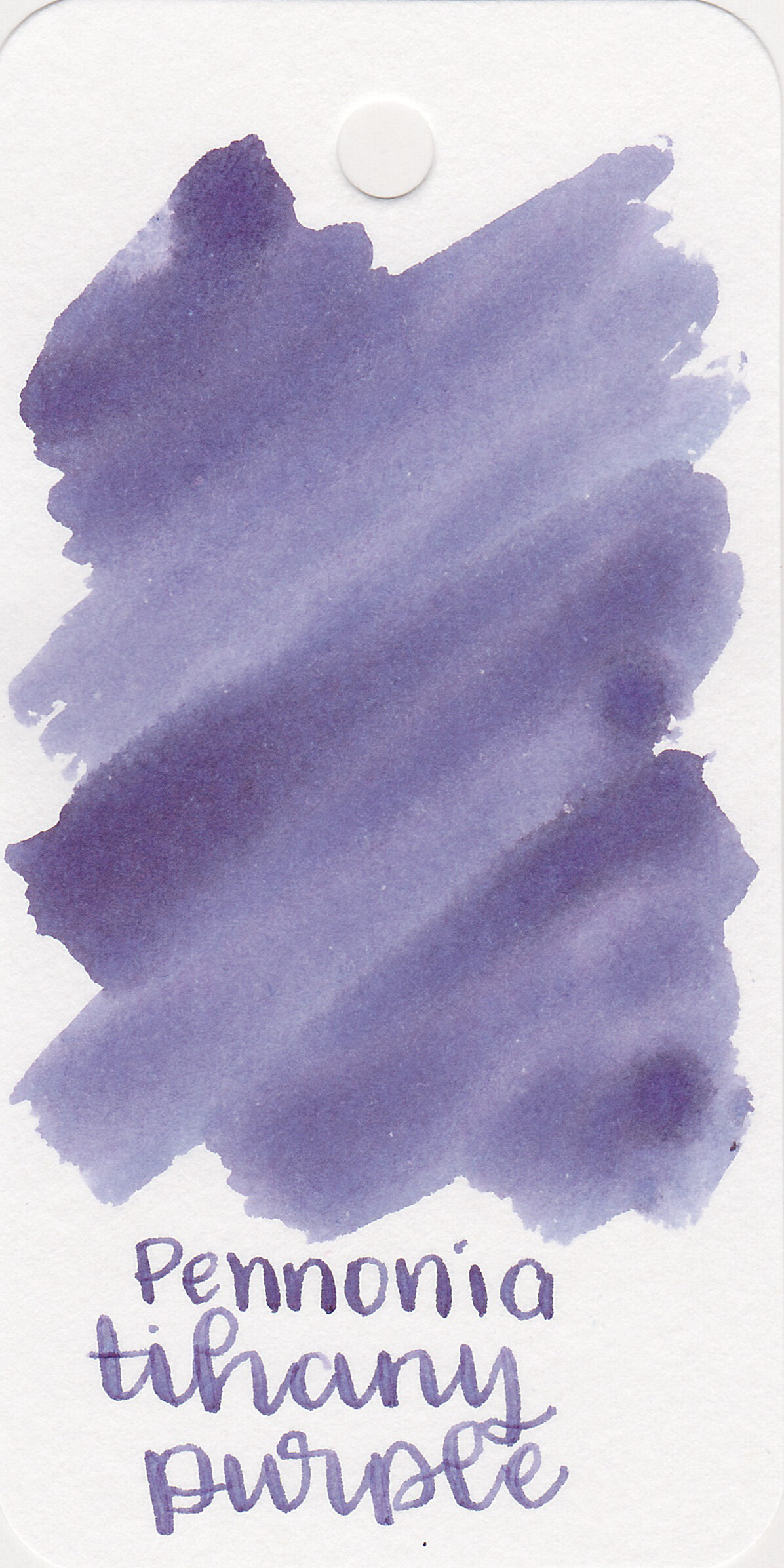
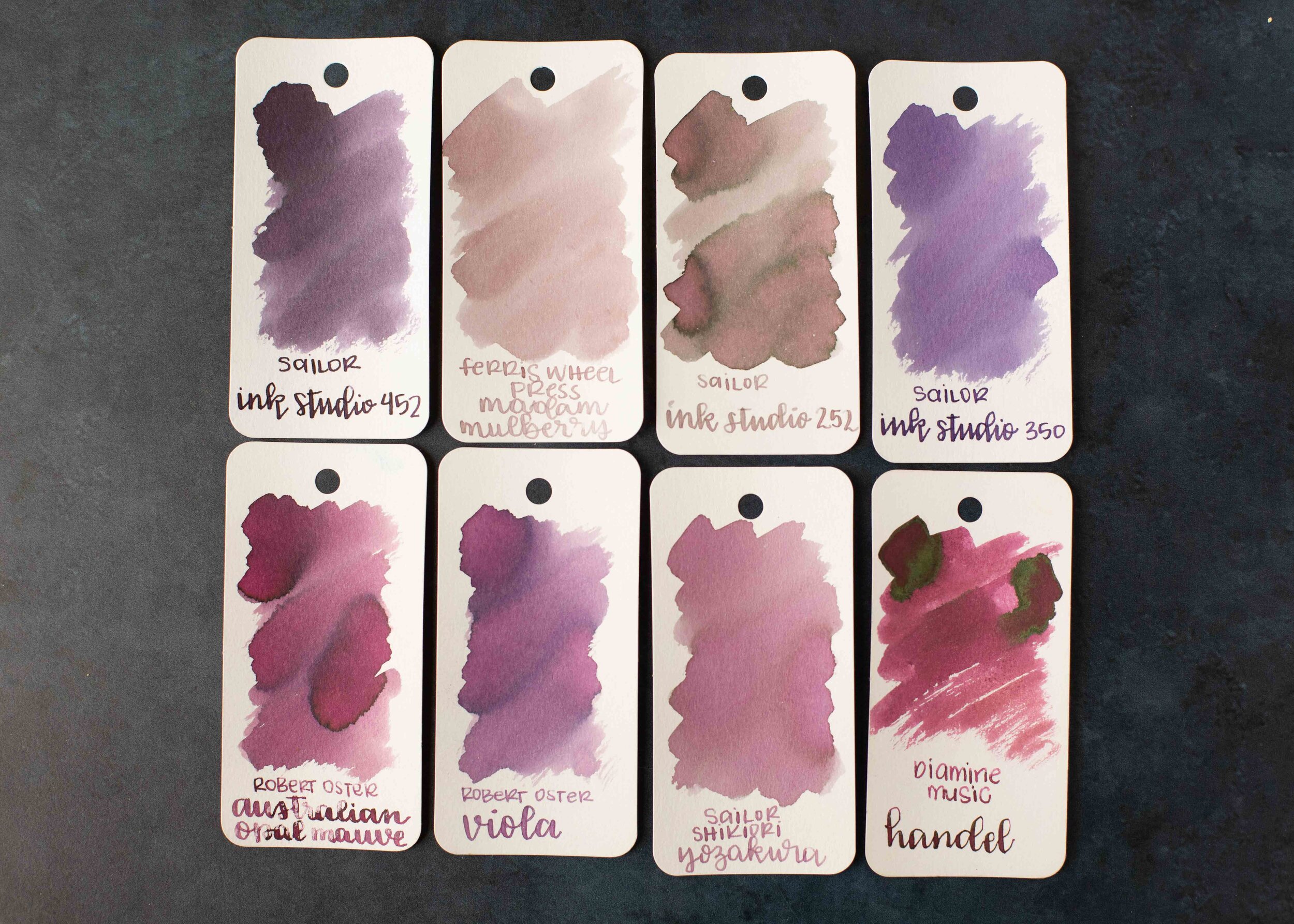
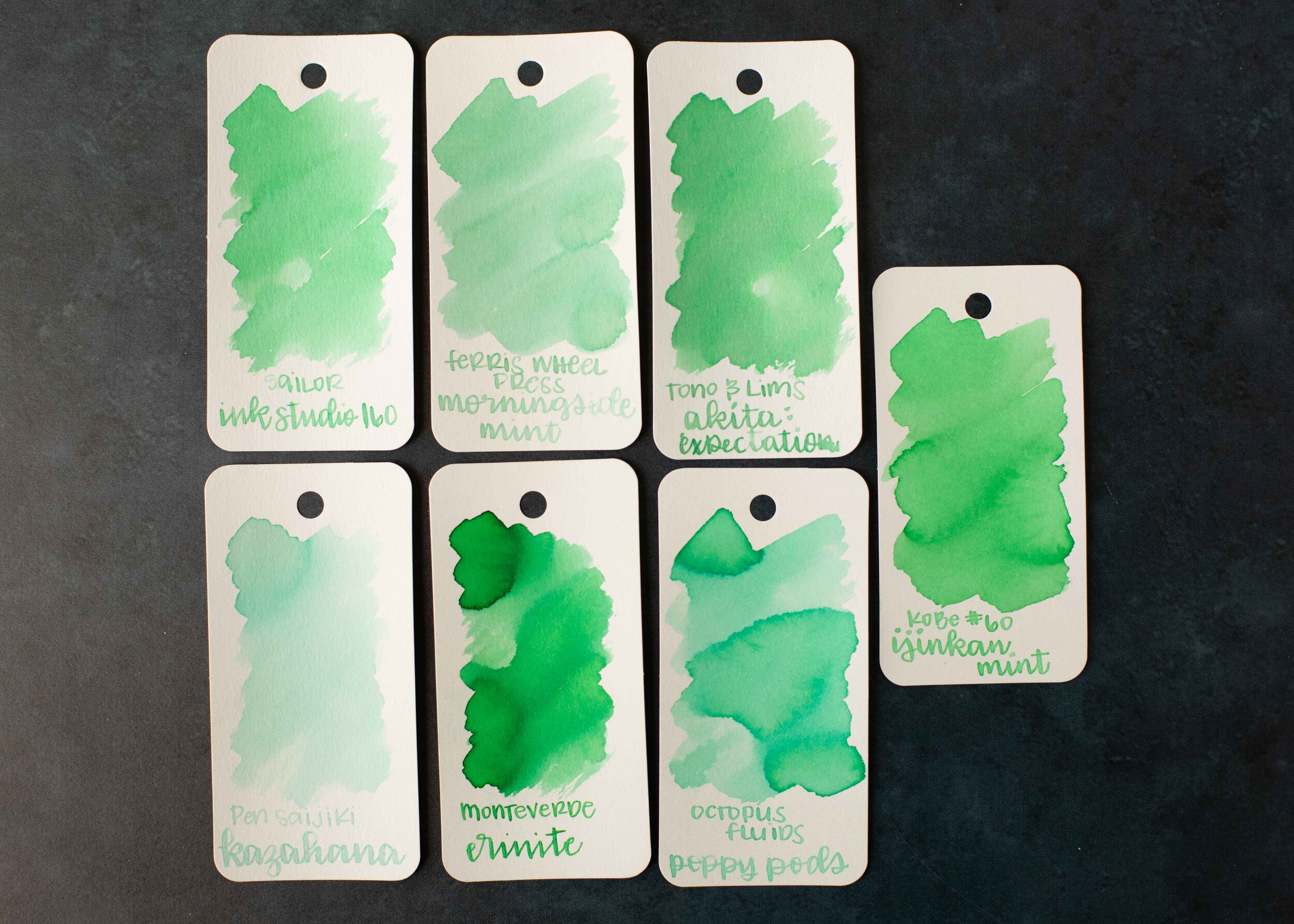
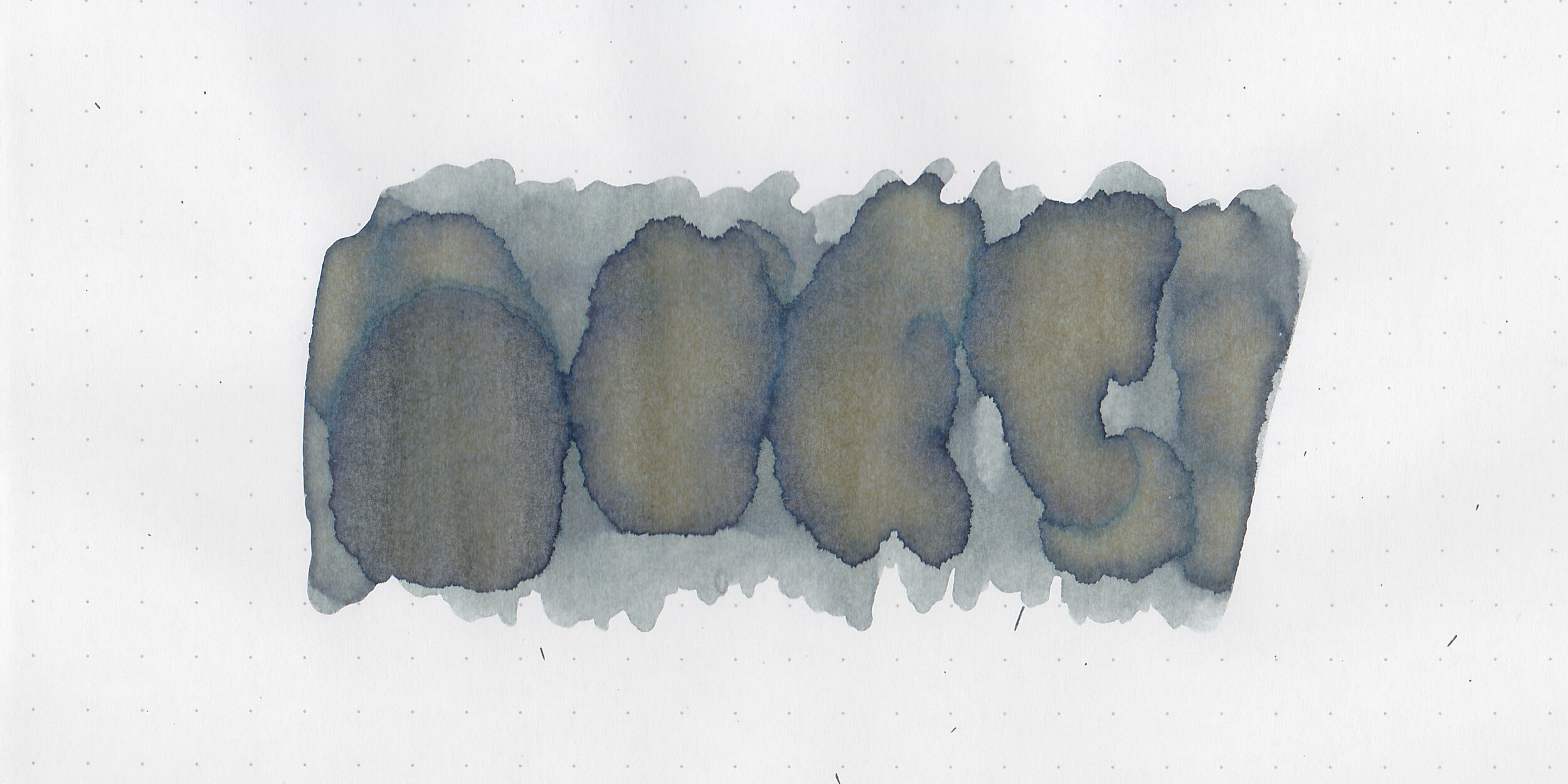
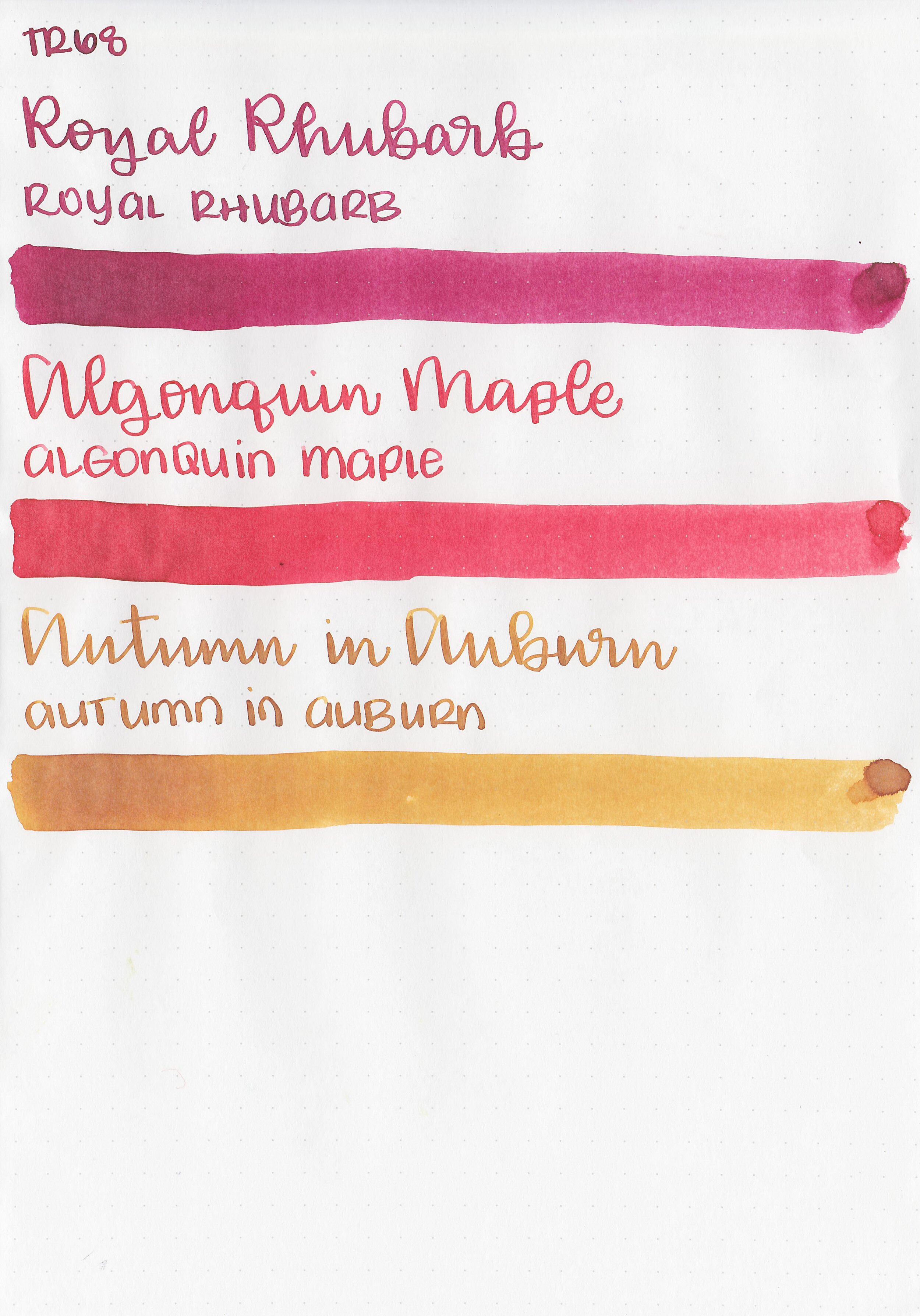
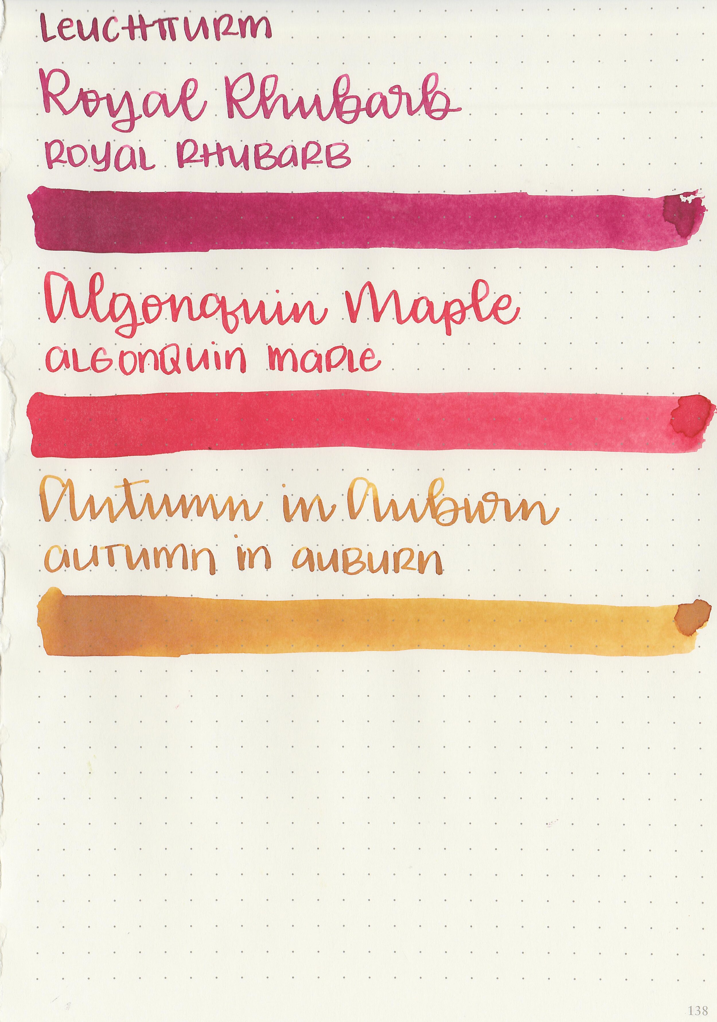
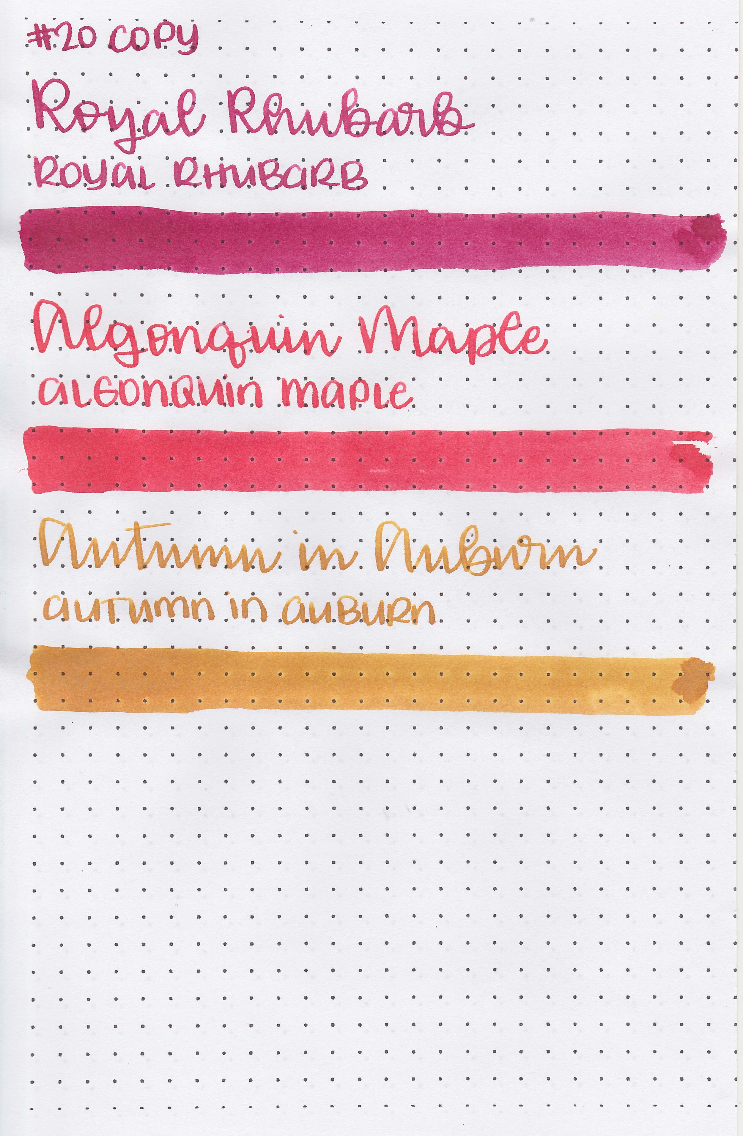
Left to right: Royal Rhubarb, Algonquin Maple and Autumn in Auburn.
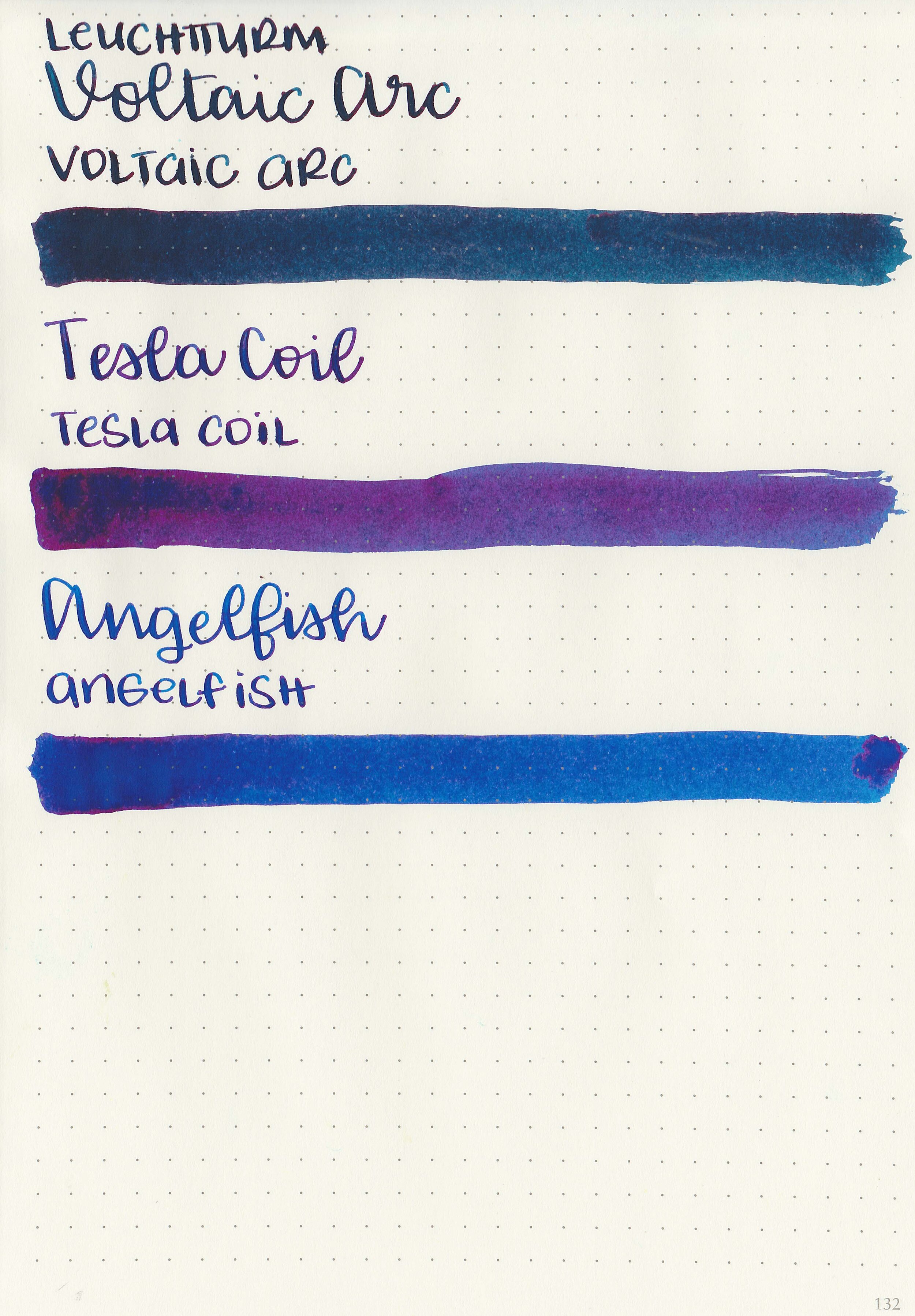
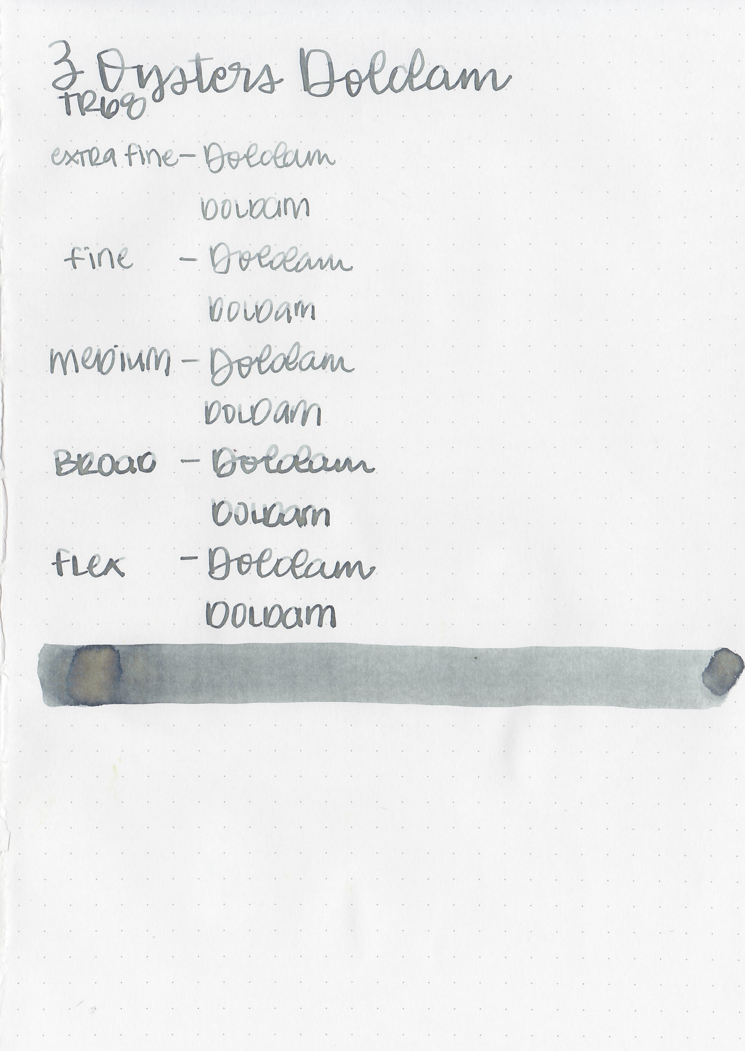
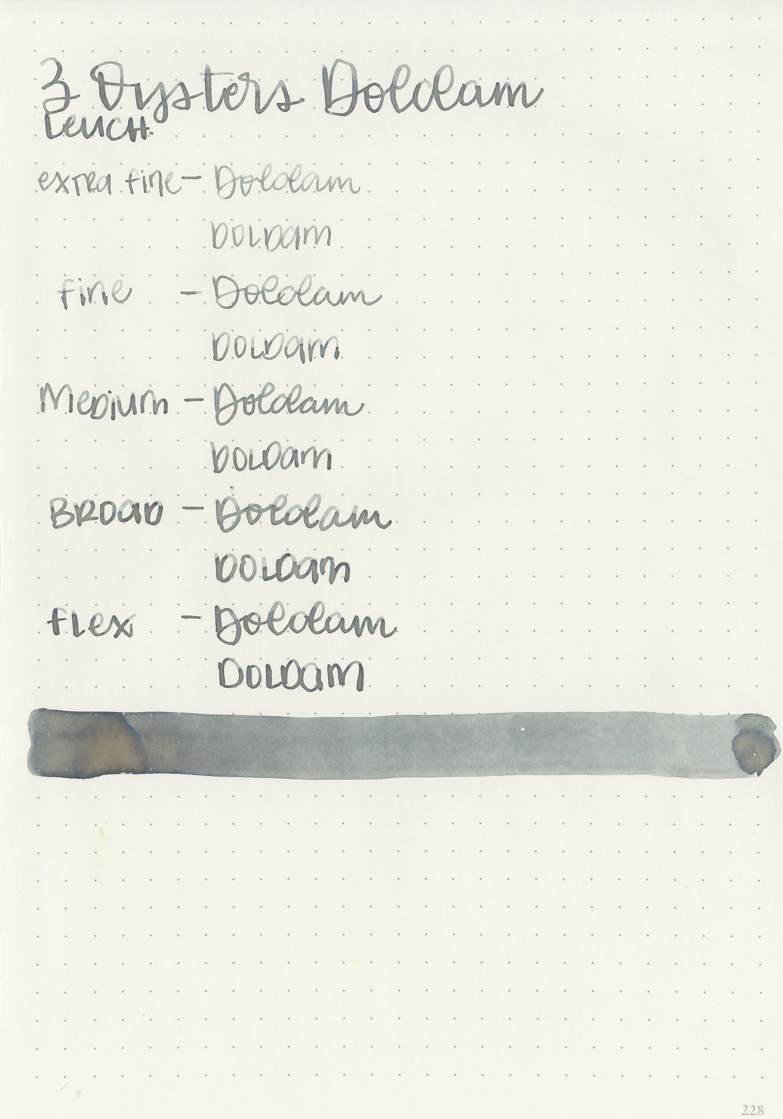
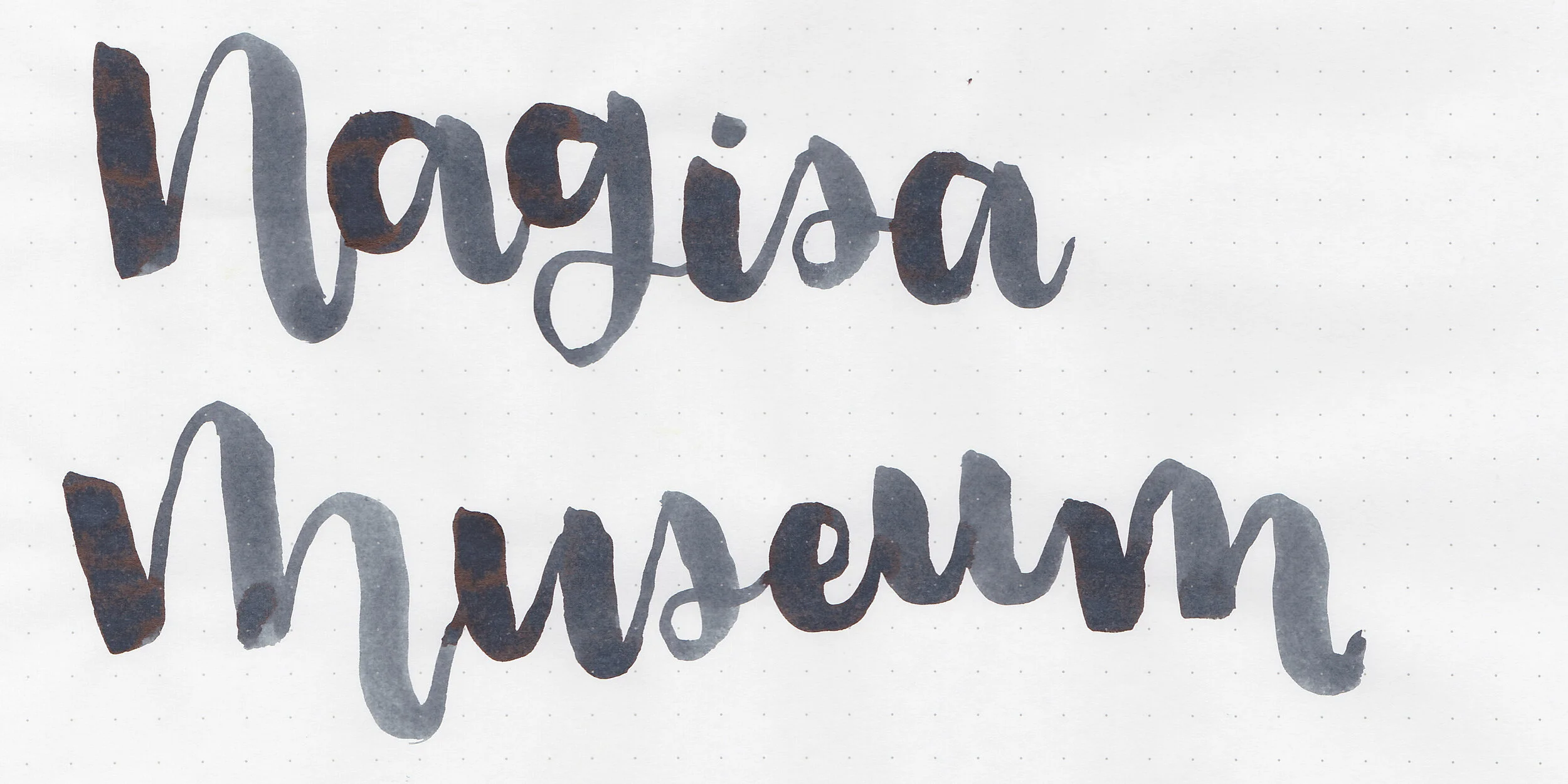
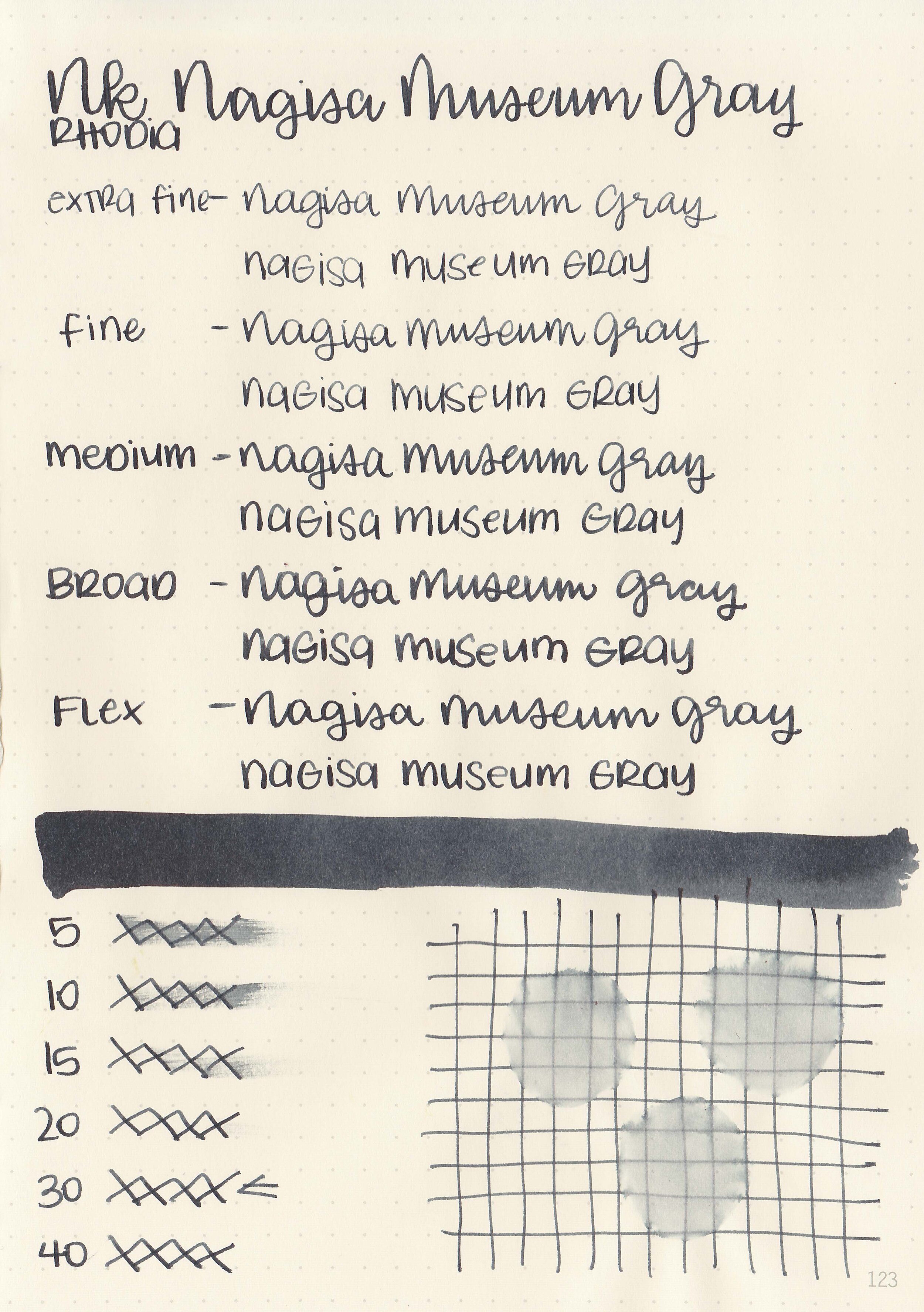
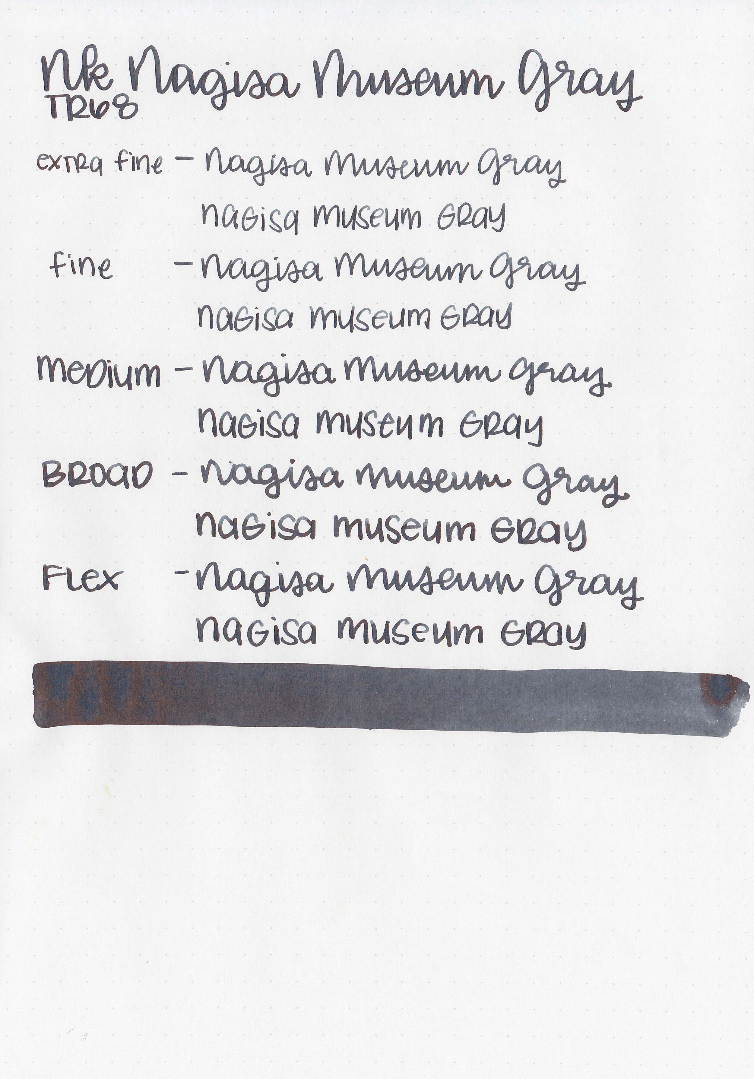
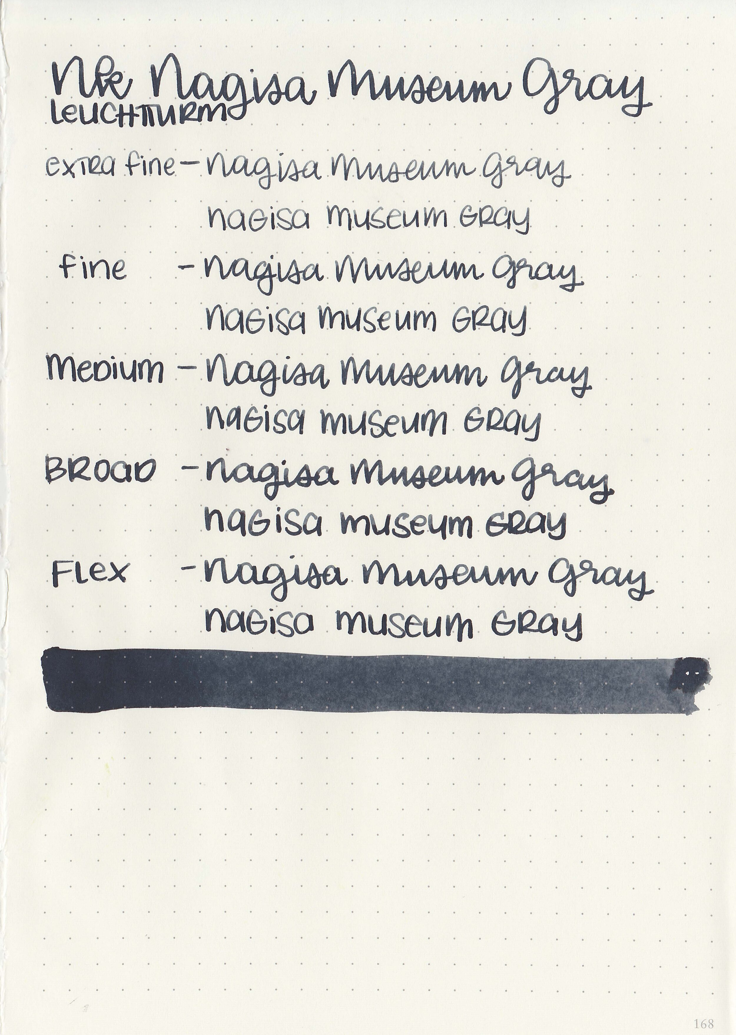
Writing samples:
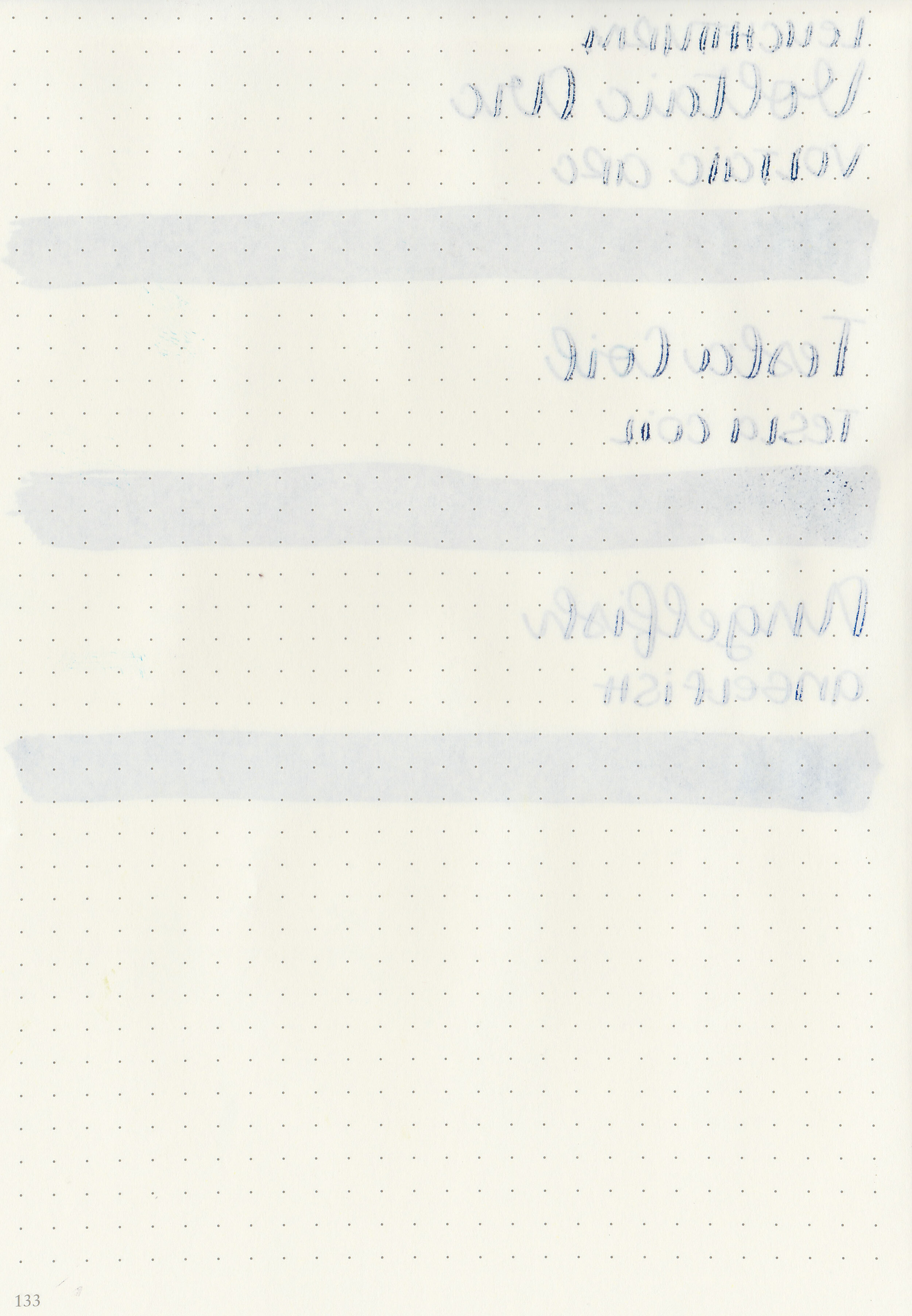
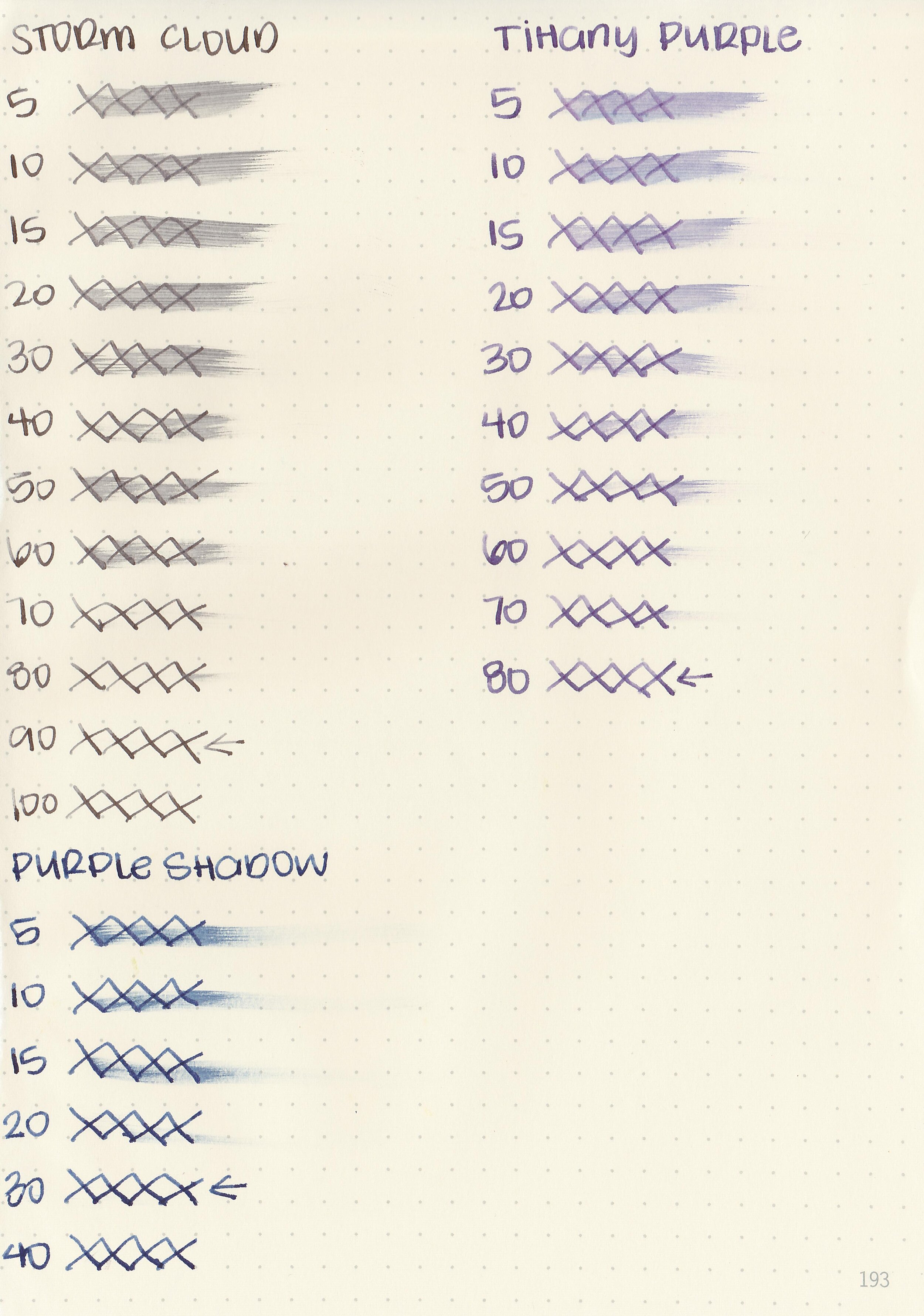
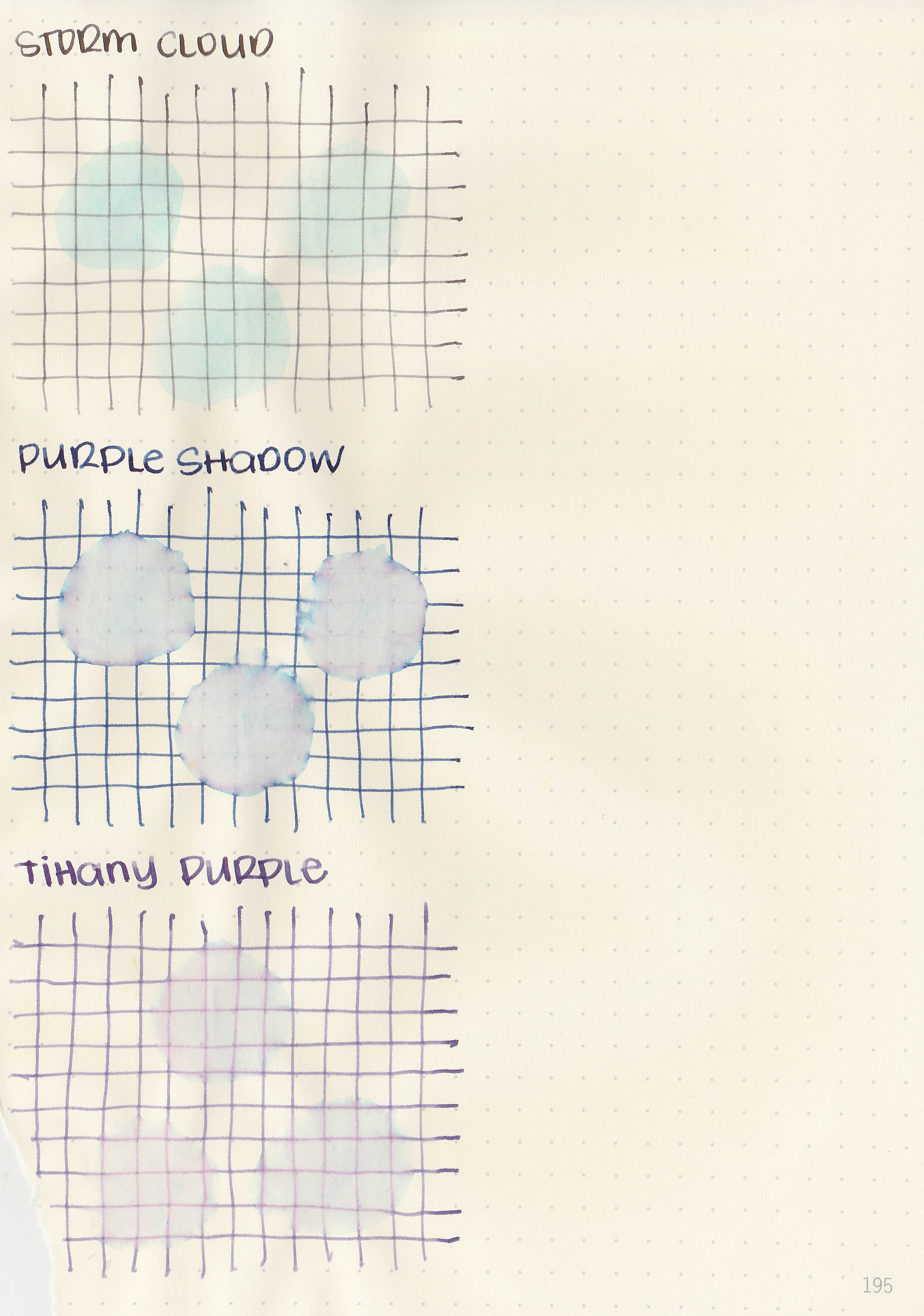
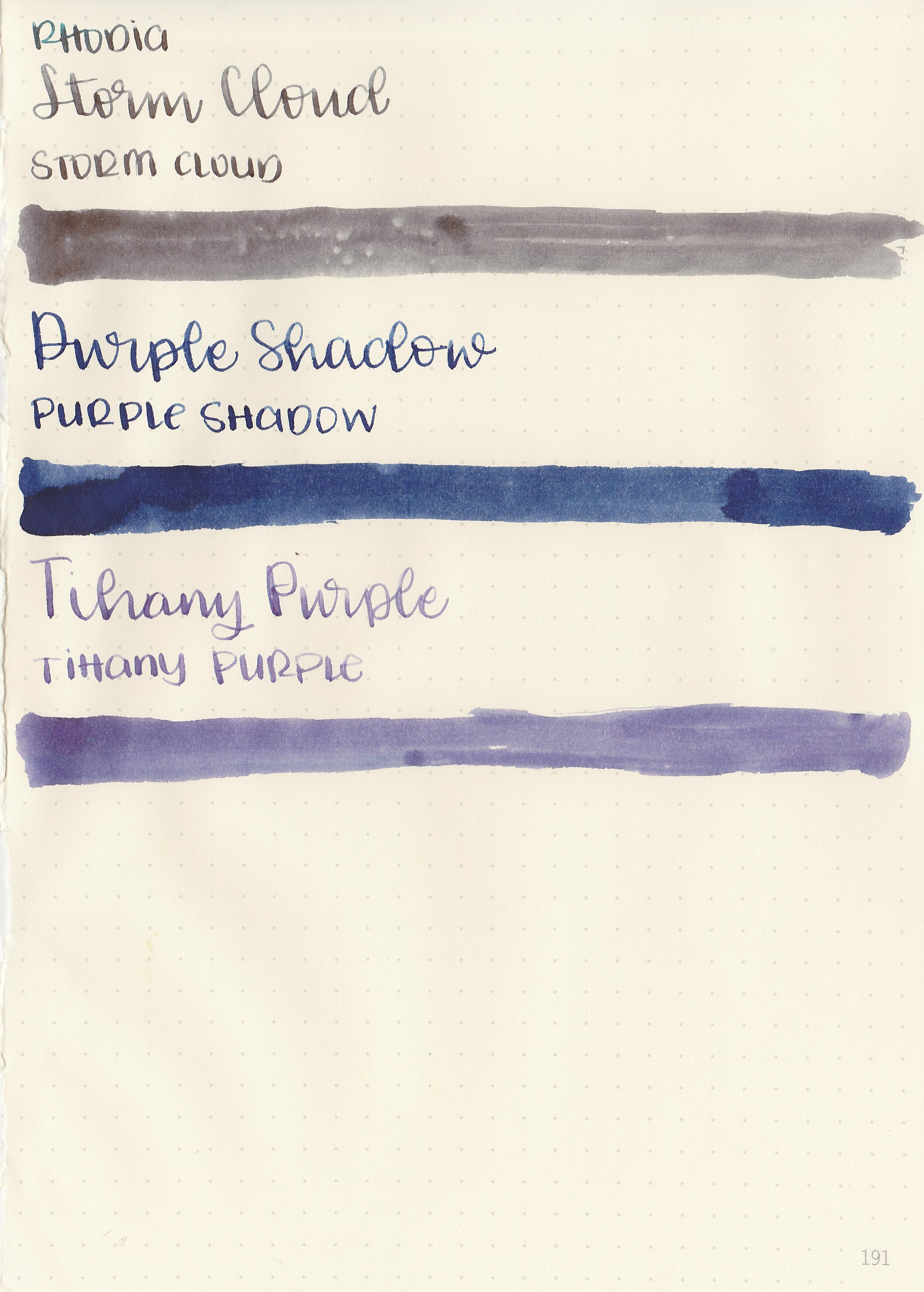
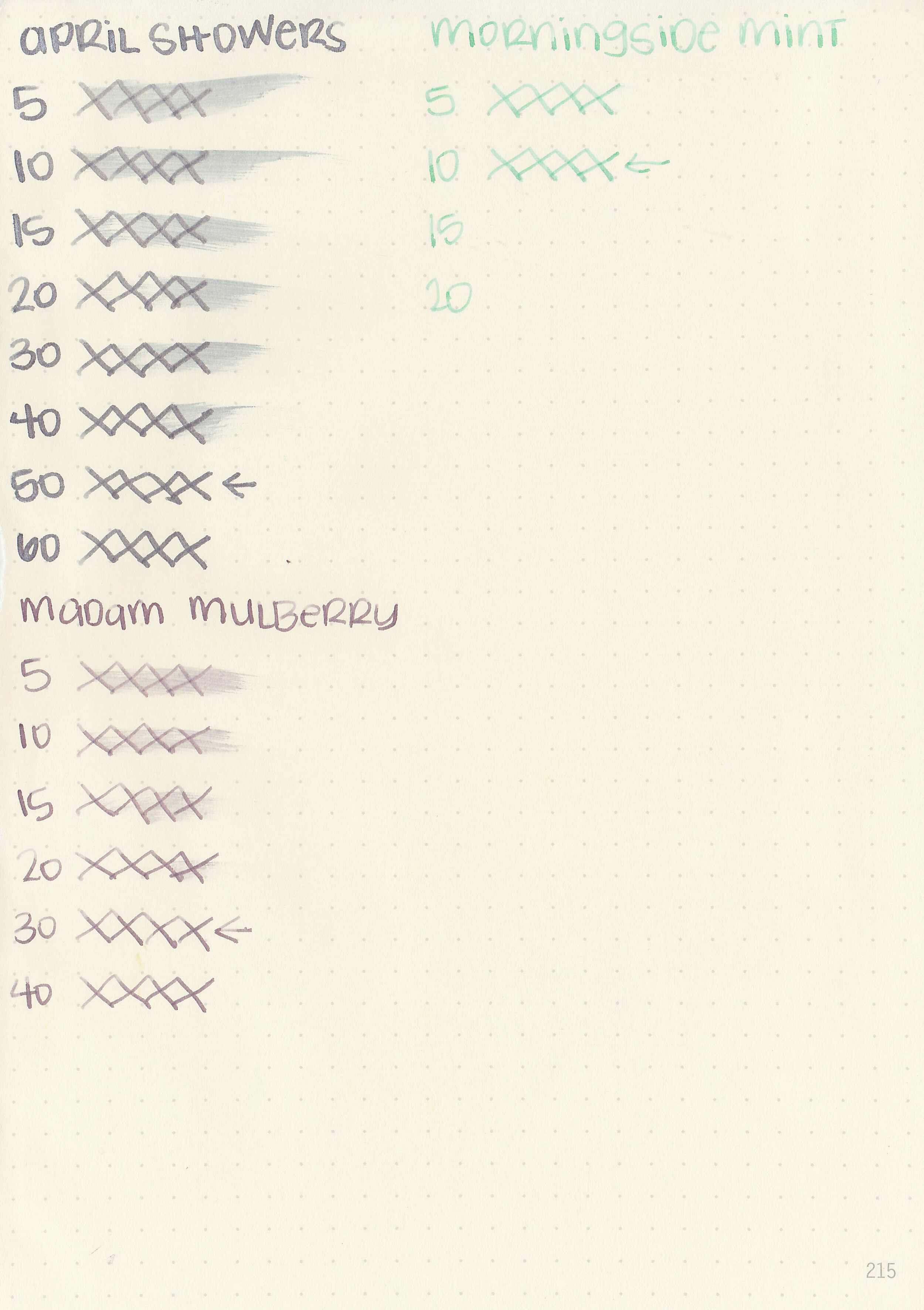
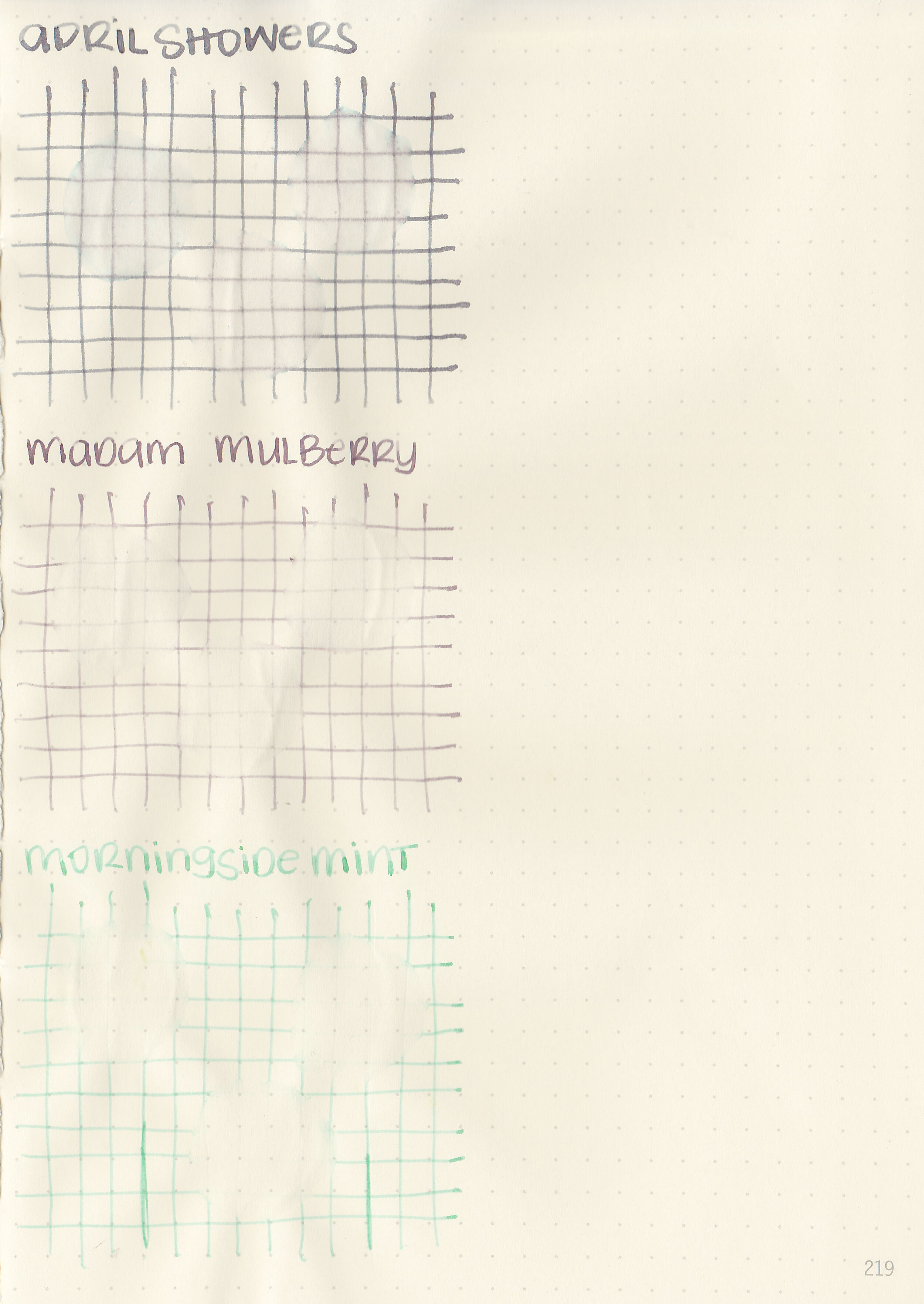
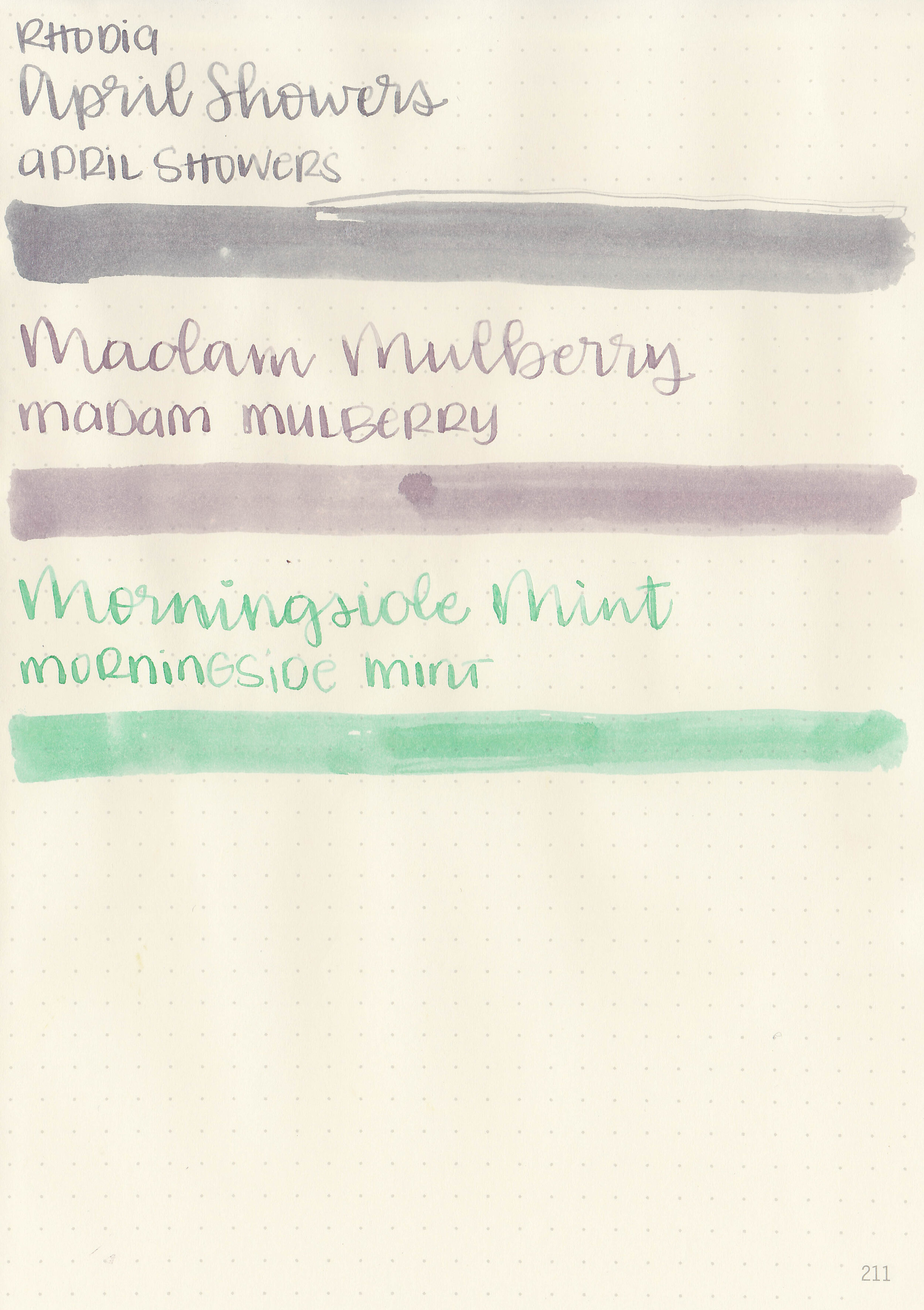
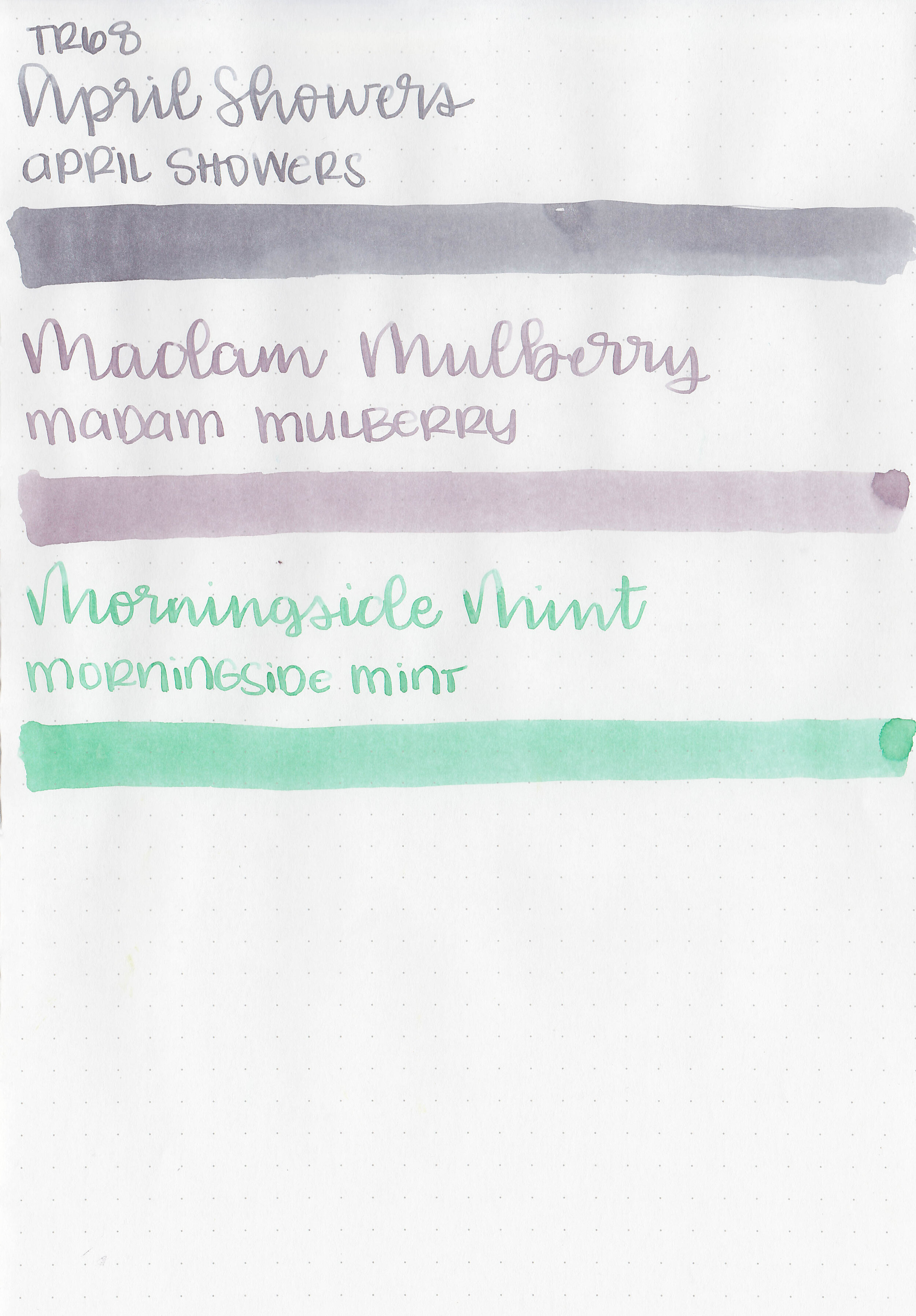
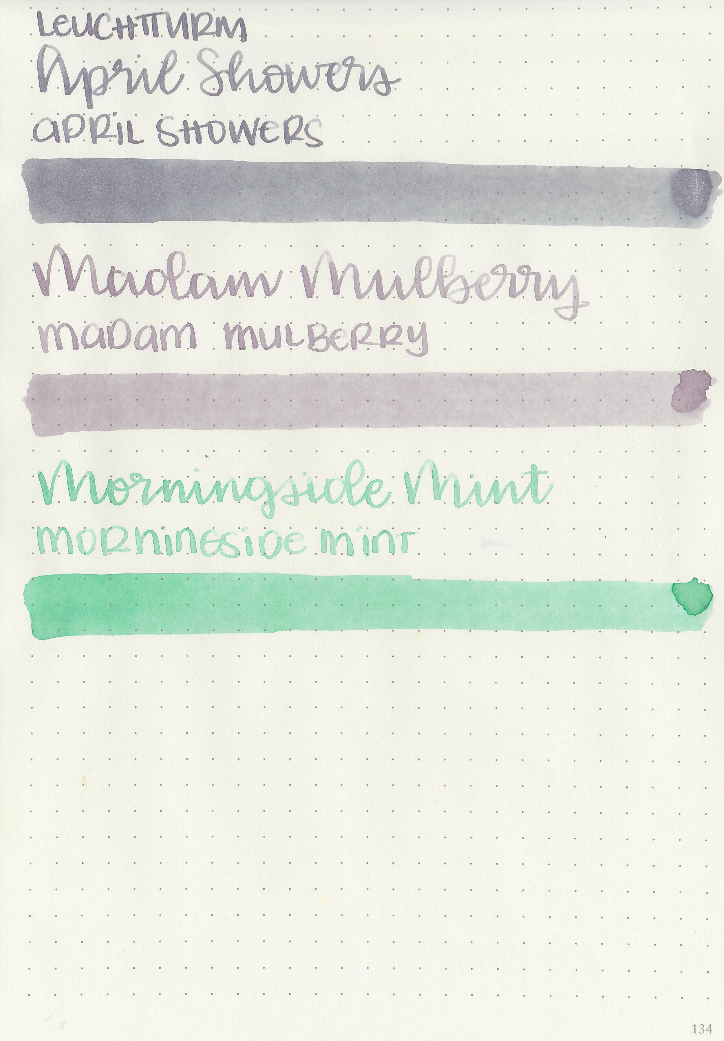
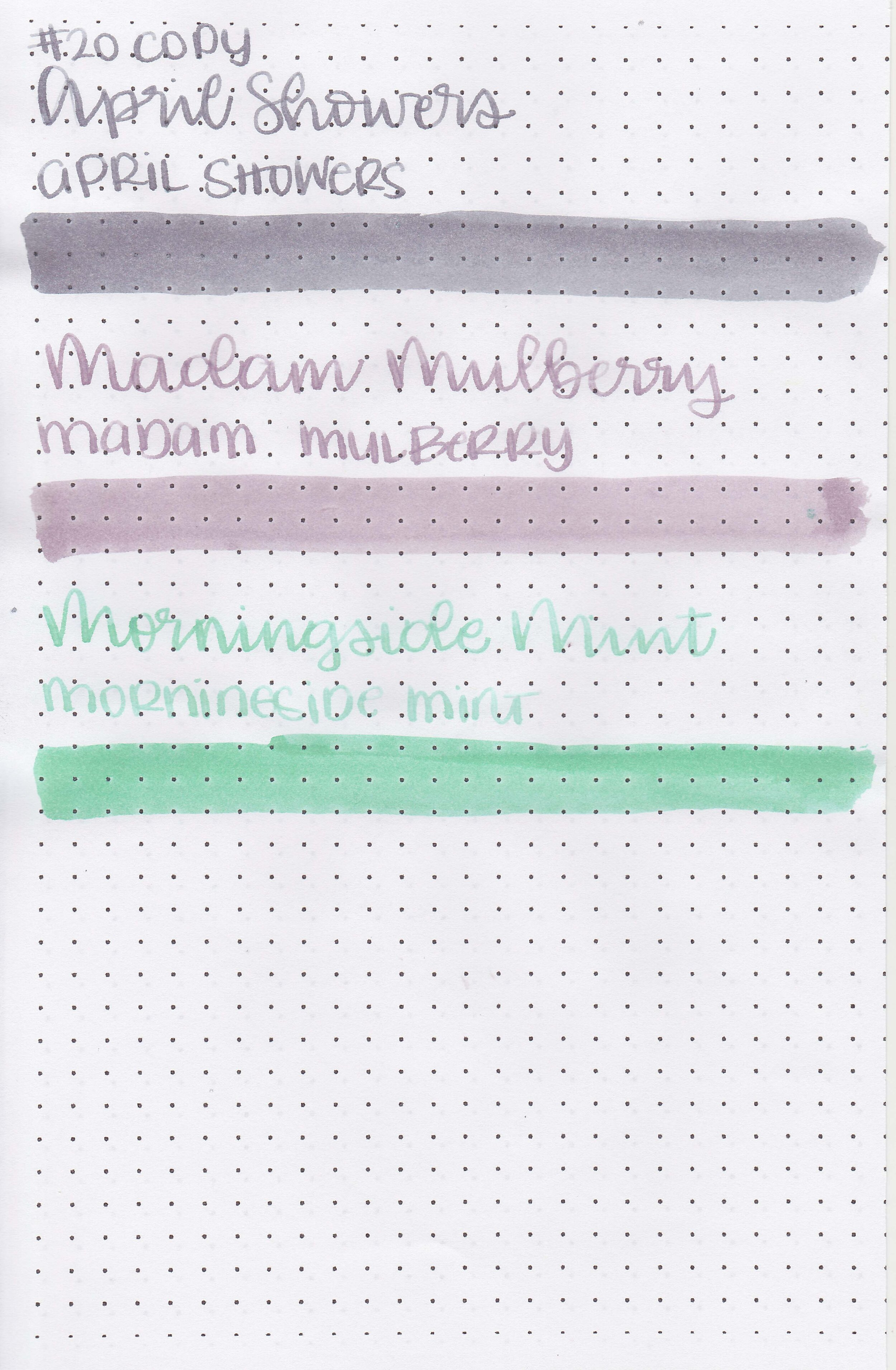
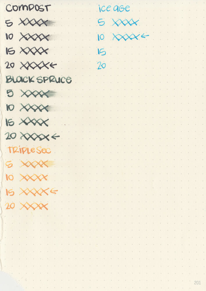
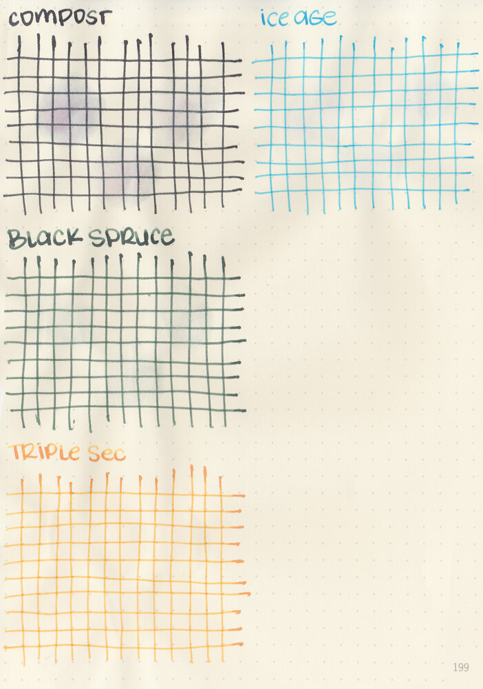
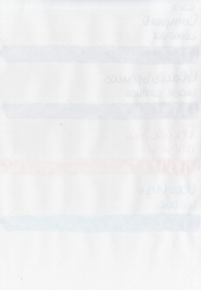
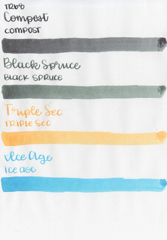
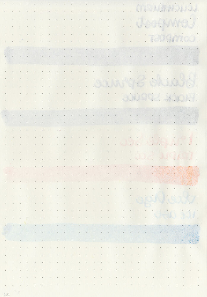
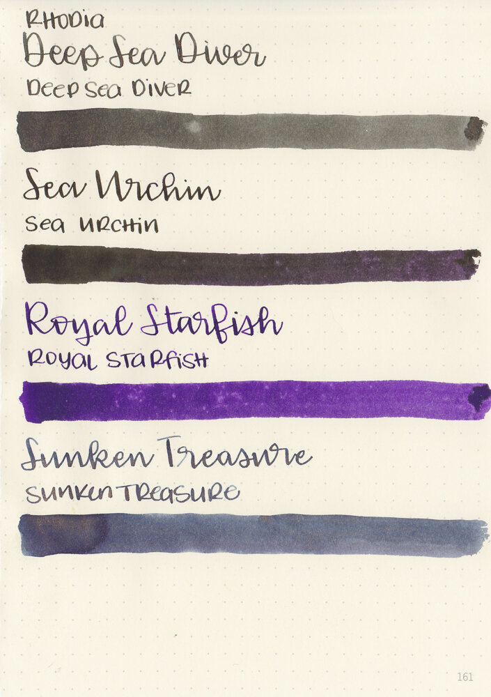
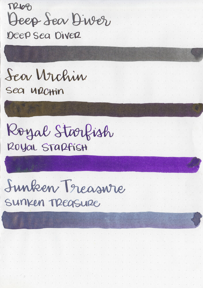
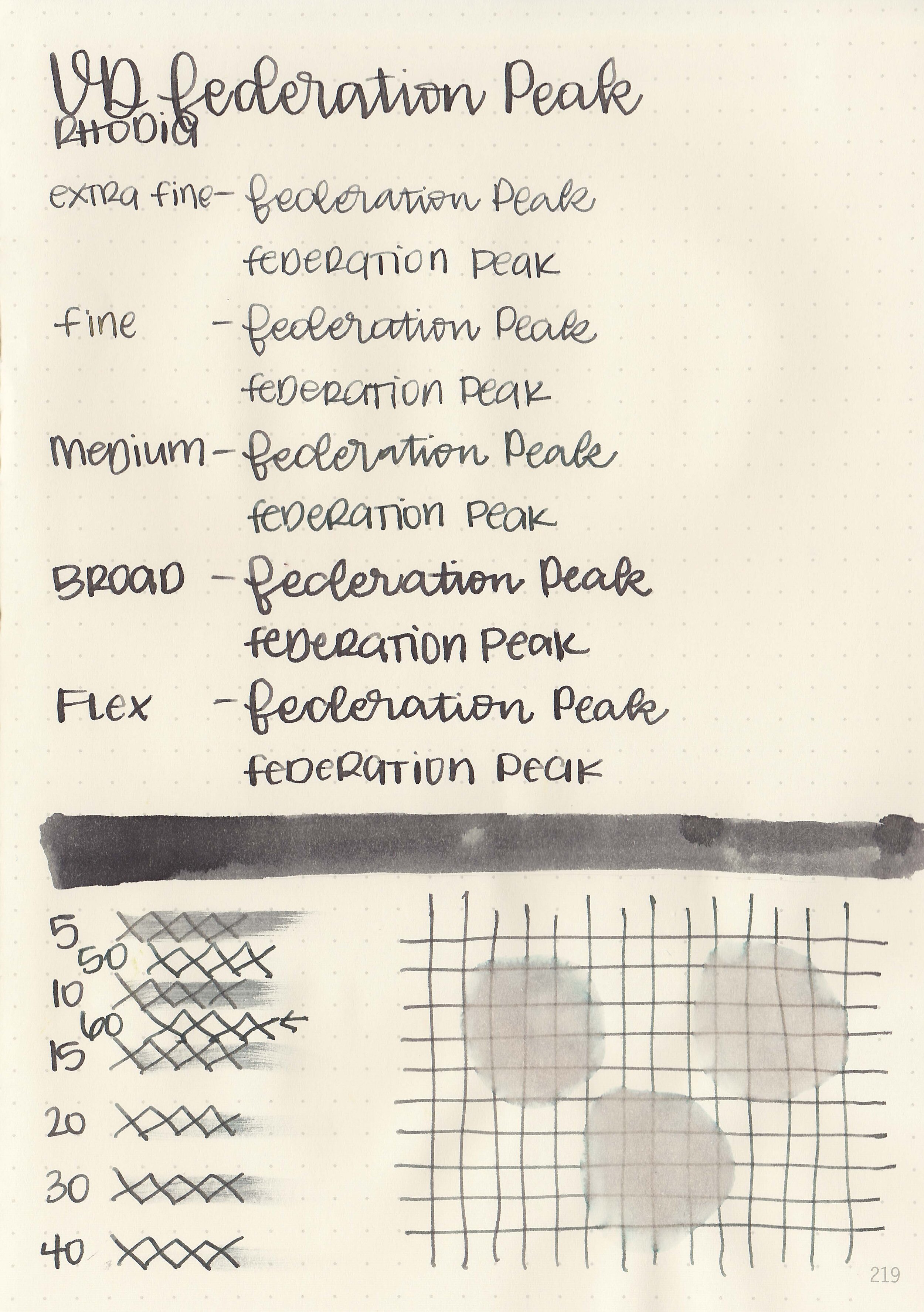
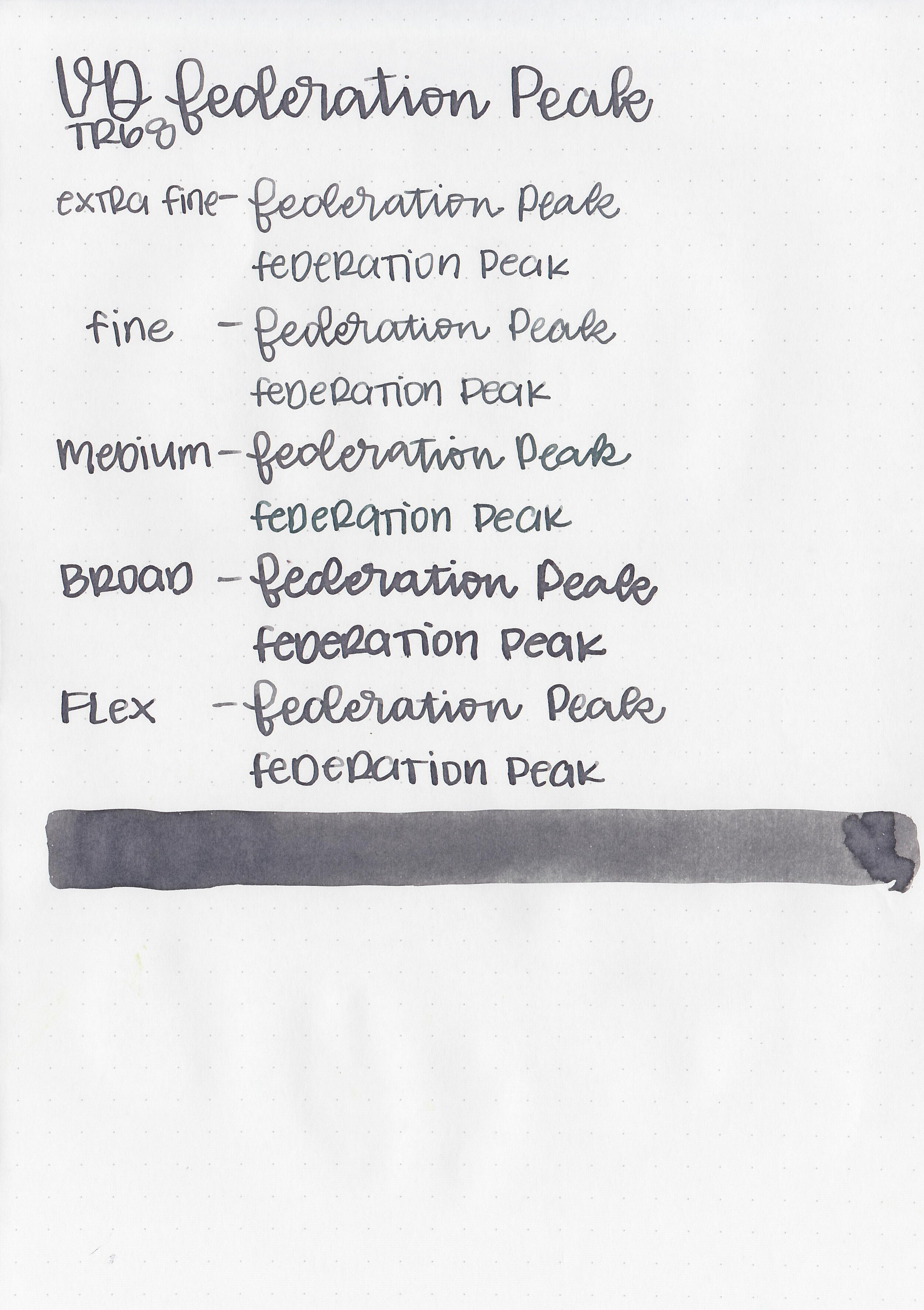
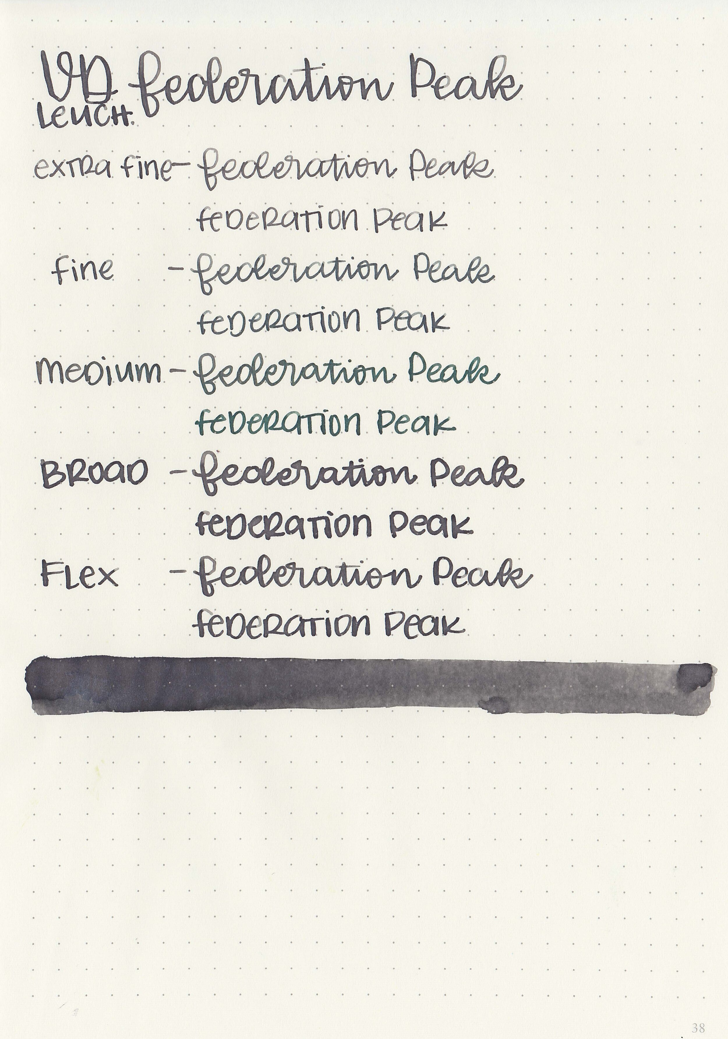
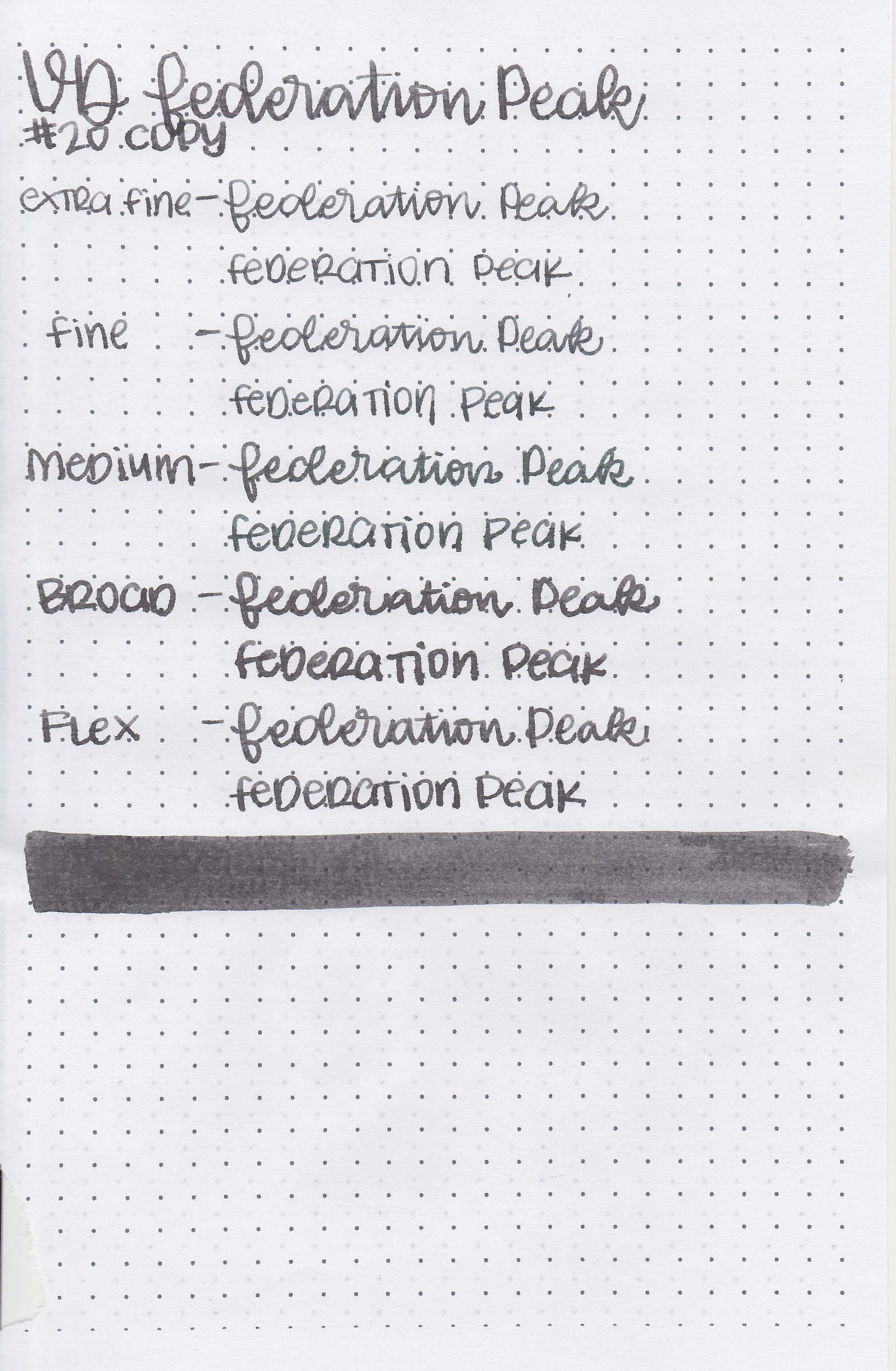
Let's take a look at how the ink behaves on fountain pen friendly papers: Rhodia, Tomoe River, and Leuchtturm.
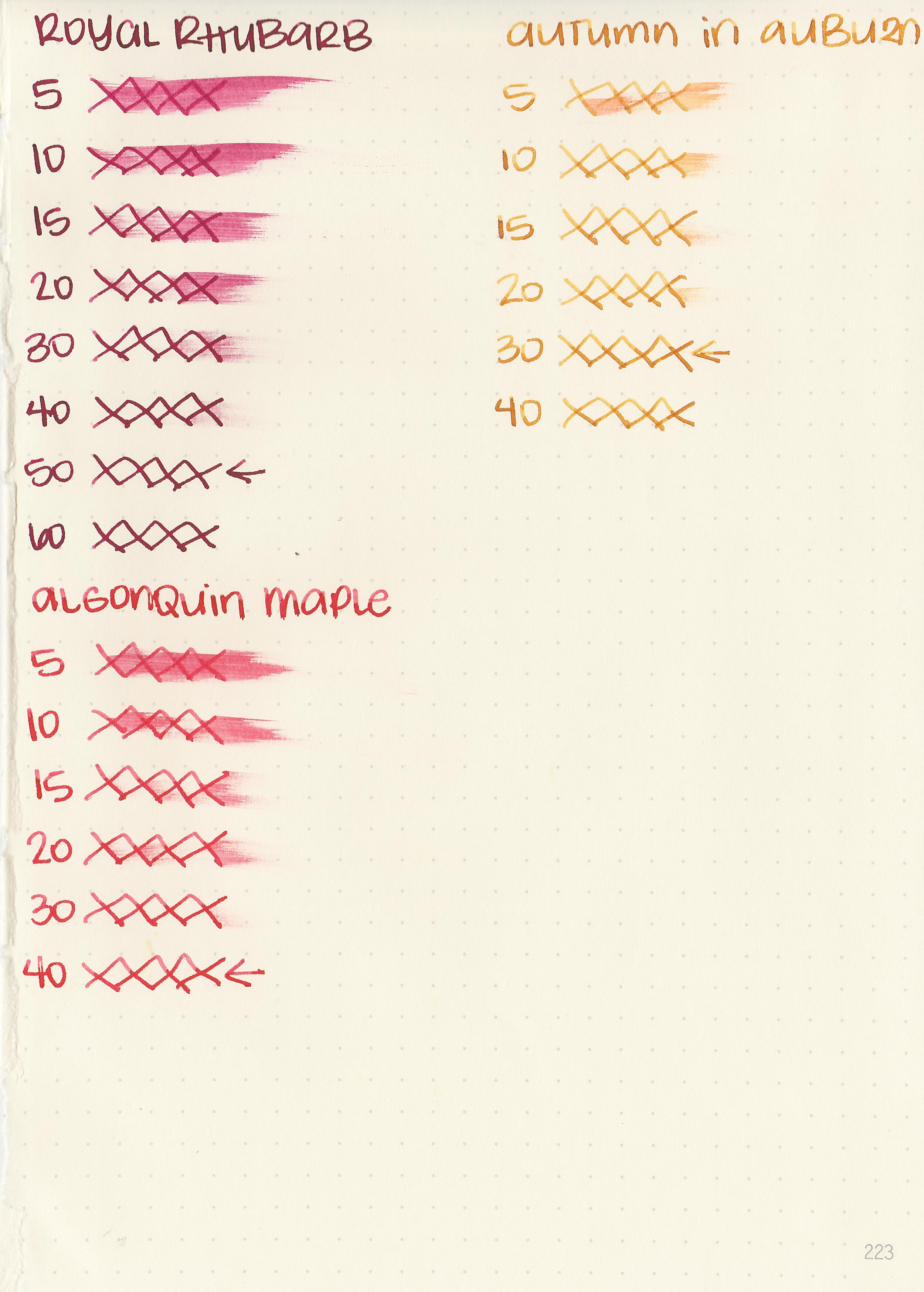
Dry Time: 30-50 seconds
Water Resistance: Low-Medium
Feathering: None
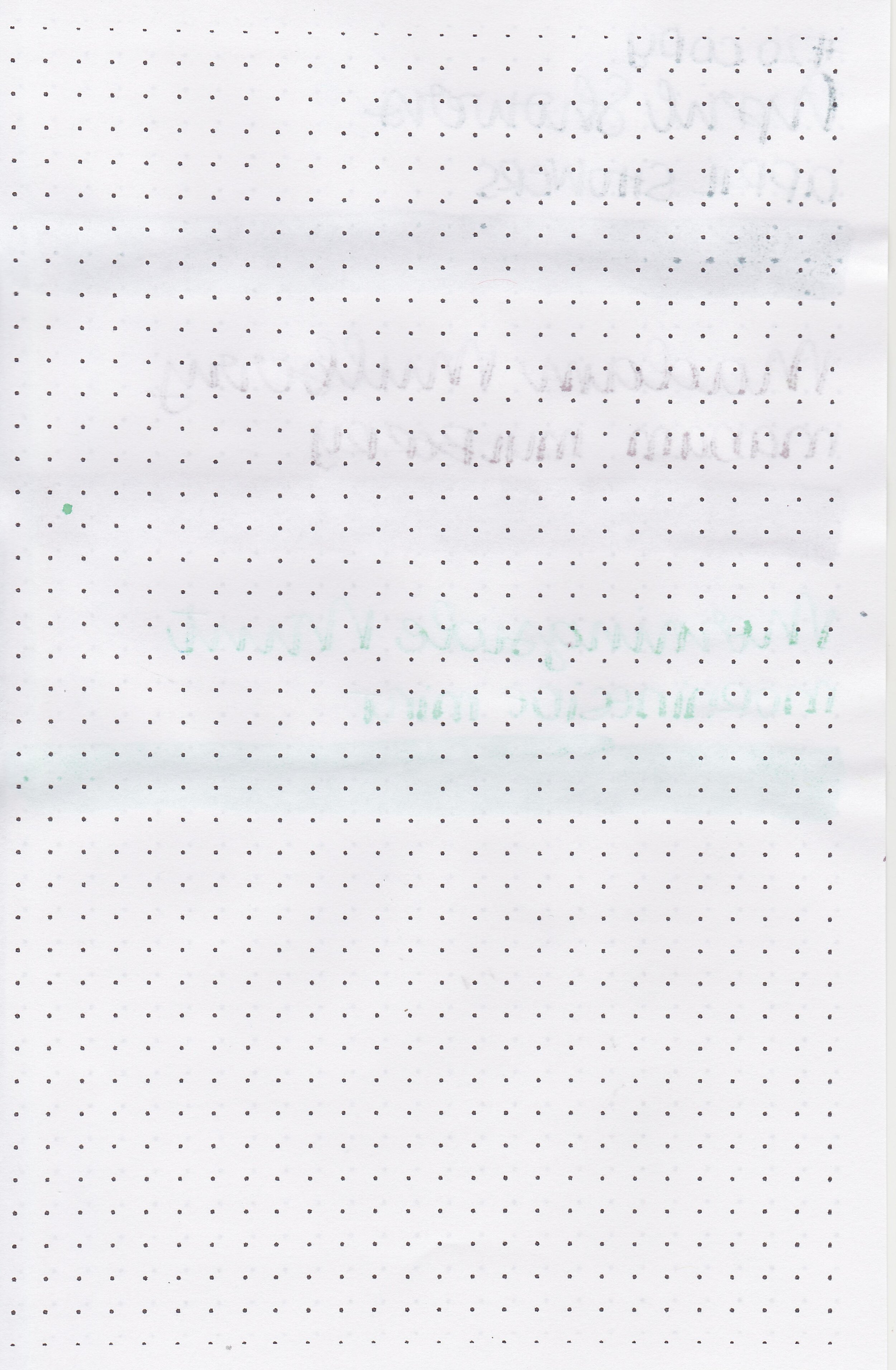
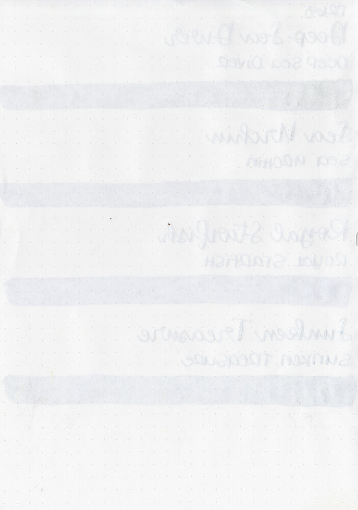
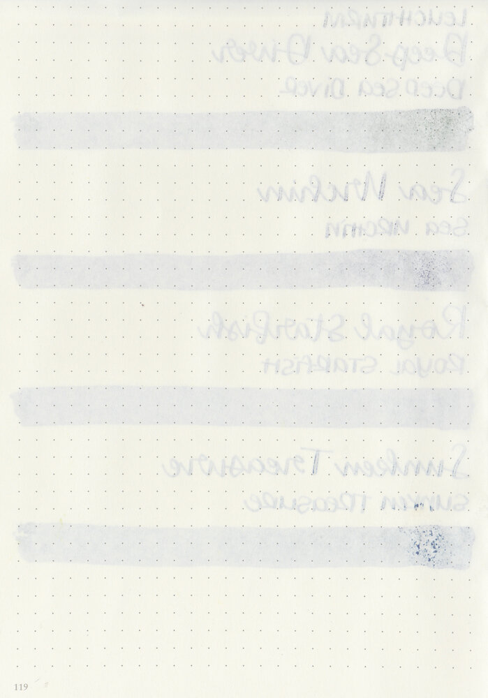
Show through: Medium
Bleeding: None
Other properties: low-high shading (high shading on Autumn in Auburn), no sheen and no shimmer.
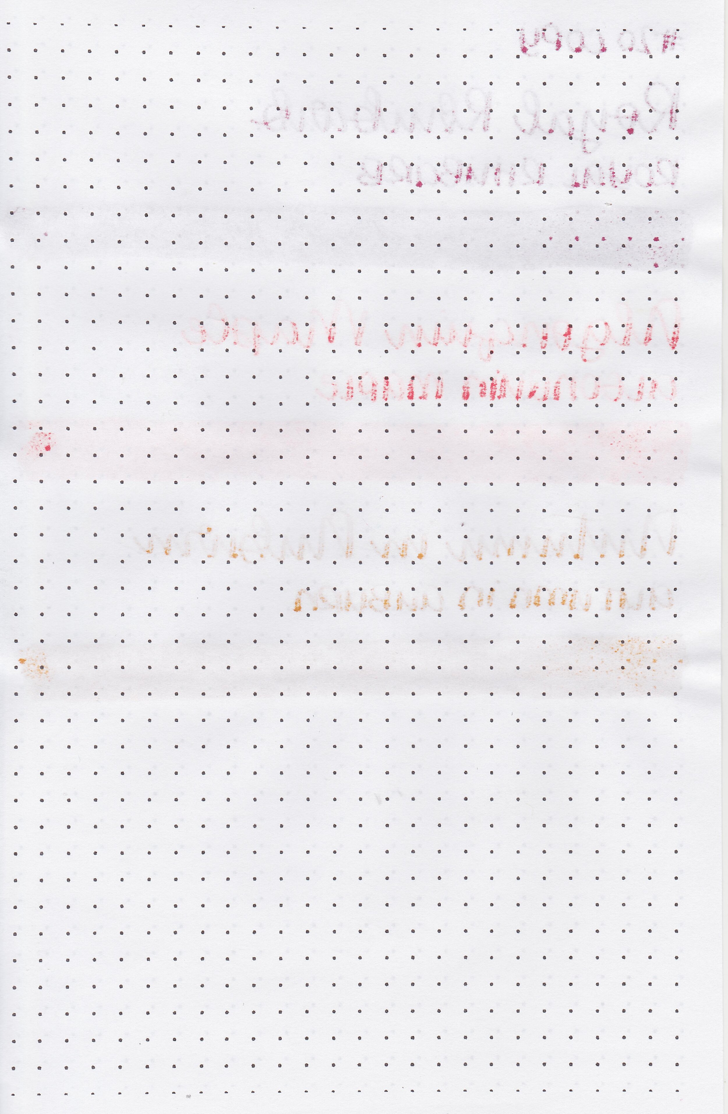
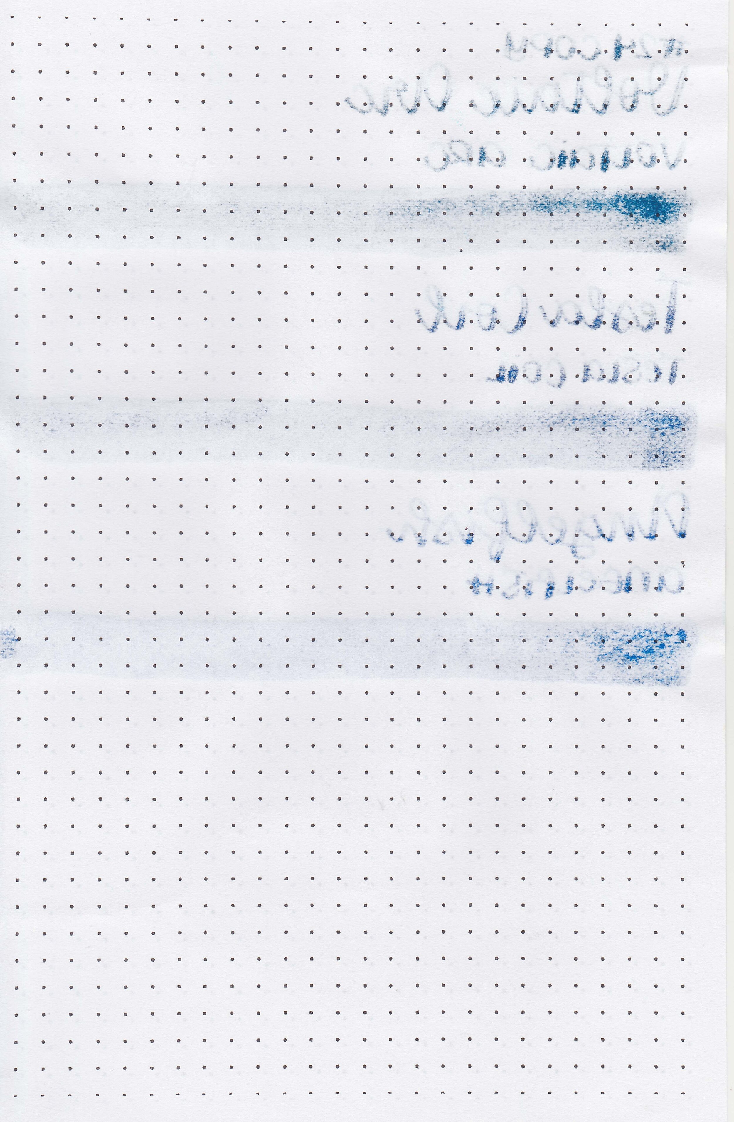
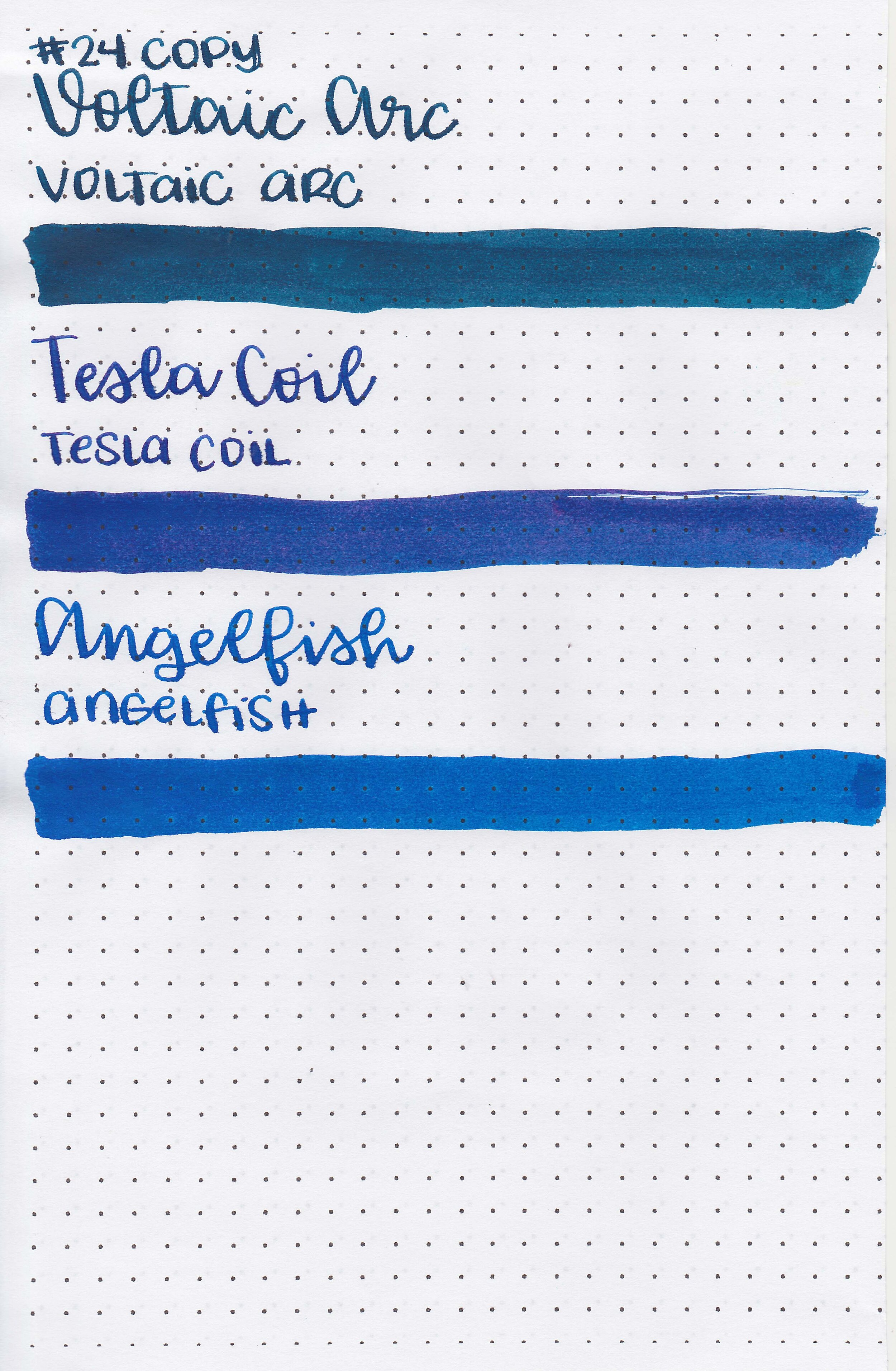
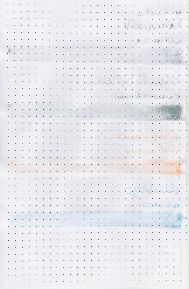
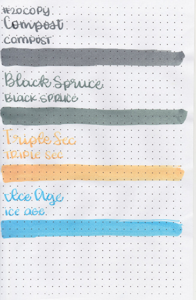
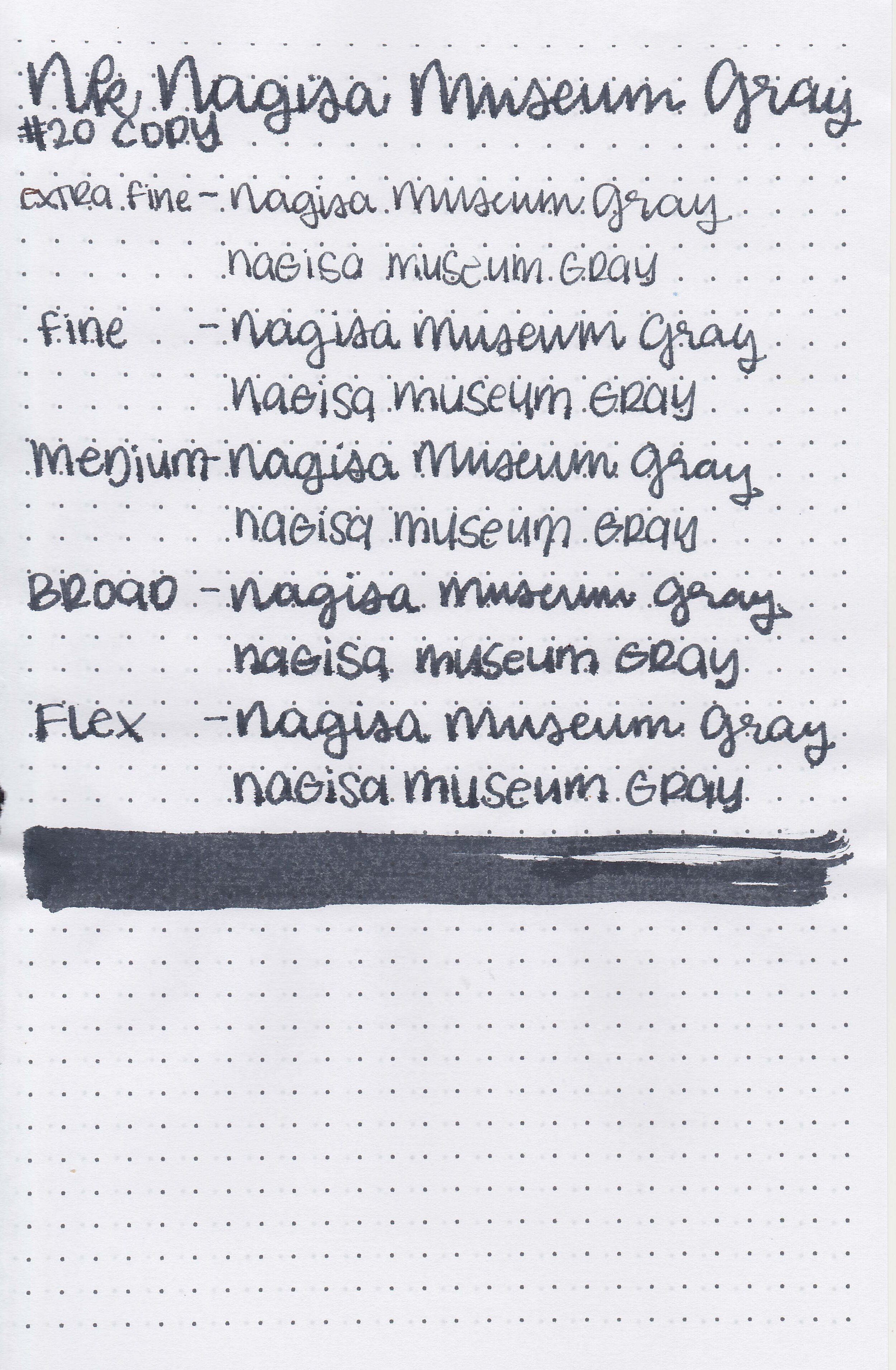
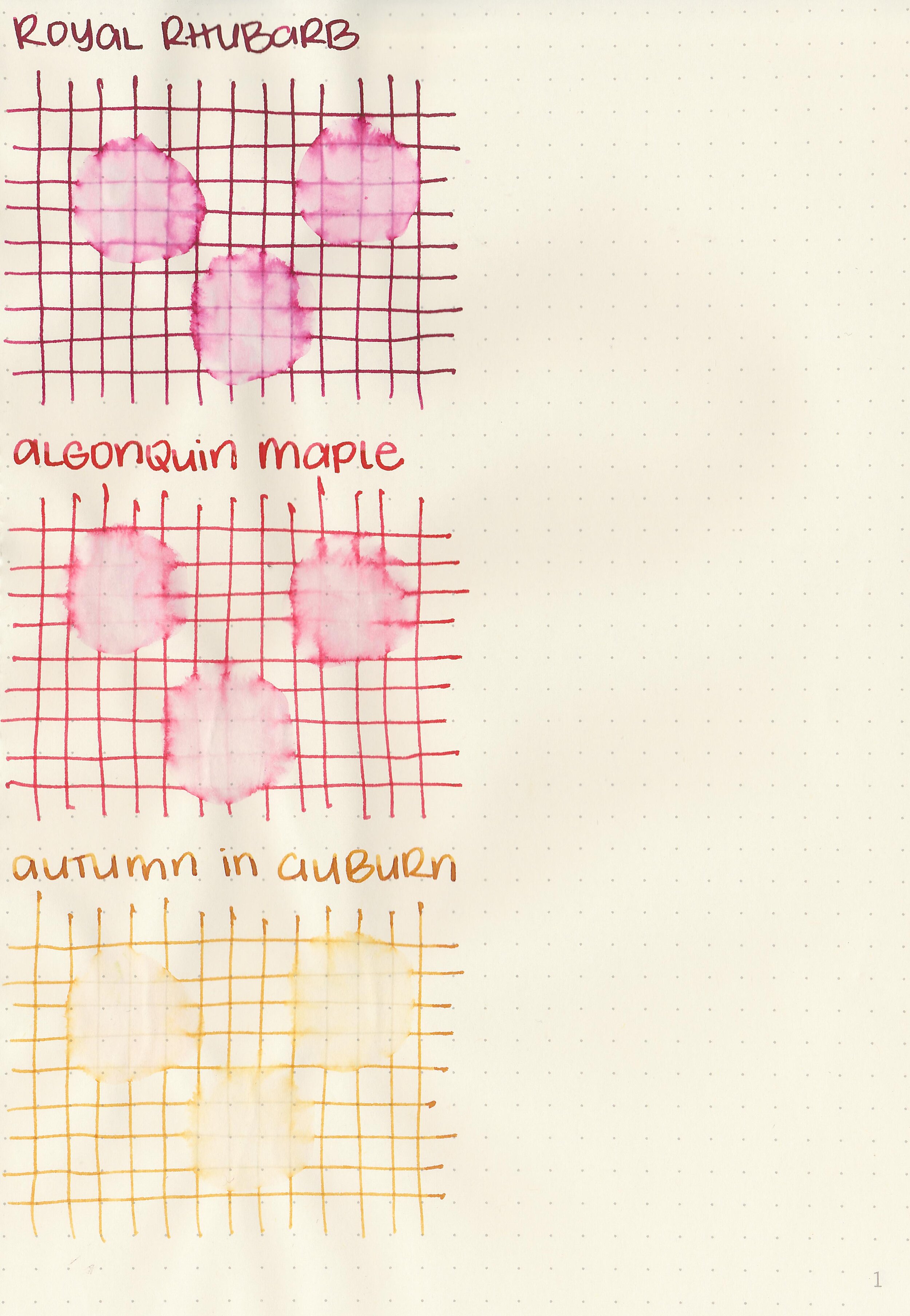
On Staples 24 lb copy paper there was lots of feathering in every nib size as well as some bleeding.
Comparison Swabs:

Royal Rhubarb is brighter than Monteverde Napa Burgundy.

There are a lot of similar inks to Algonquin Maple including Monteverde Valentine Red.

Autumn in Auburn is close to Ink Institute Zhonghe-xinlu Line.
Longer Writing:

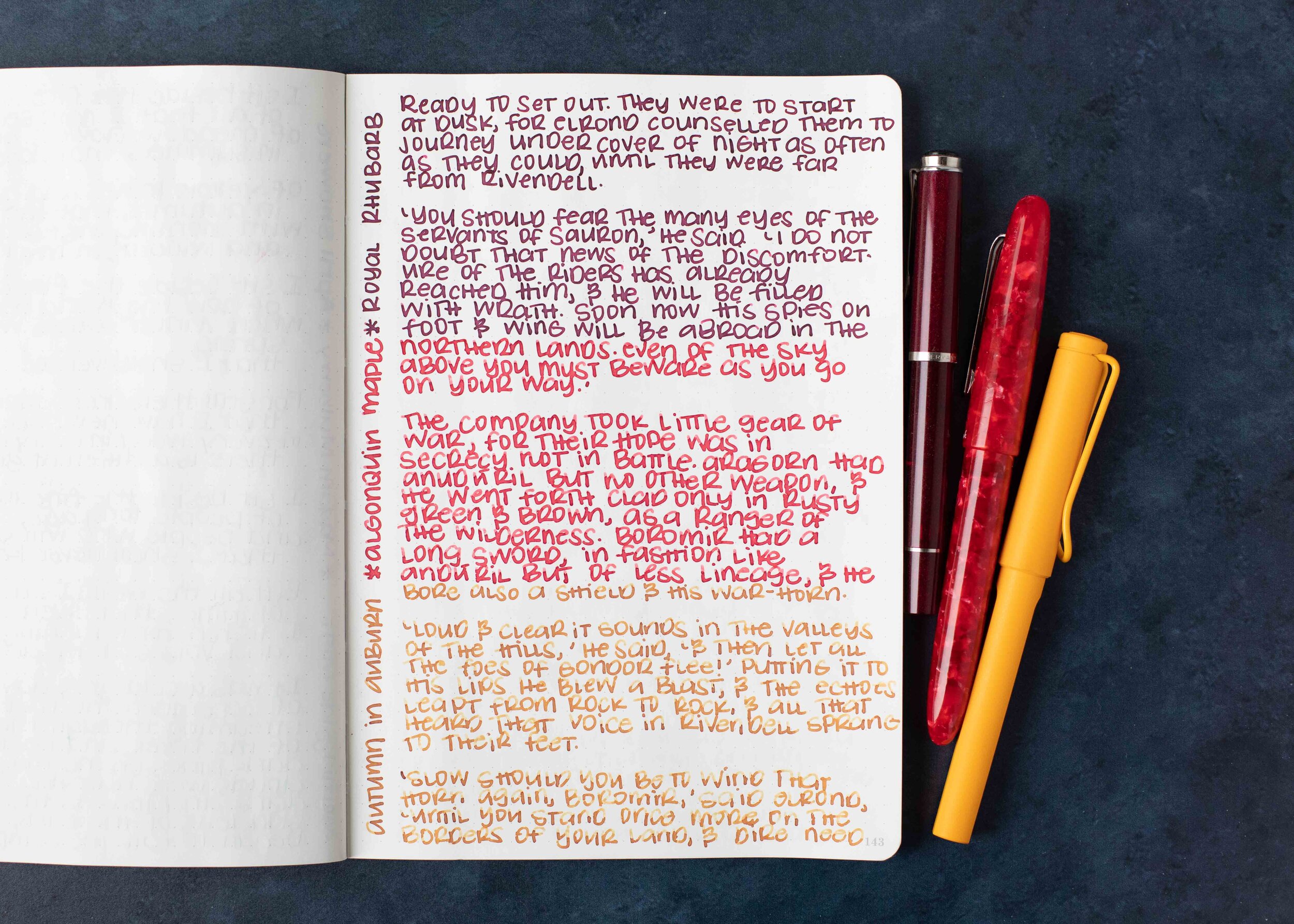
I used a Taroko Odyssey notebook, the first two inks had an average flow and Autumn in Auburn had a dry flow.
Overall, I enjoyed all three of these inks, they are some of my favorites from the Ferris Wheel Press lineup. I think Royal Rhubarb and Autumn in Auburn are my favorites out of the three.
Disclaimer: These inks were provided by Phidon Pens for the purpose of this review. All photos and opinions are my own. This page does not contain affiliate links, and this post is not sponsored.