Ink Review #2680: Diamine Tundra

It’s Day 16 of the Diamine Inkvent 2024 Calendar! You can still find the Inkvent Calendar for sale at Cult Pens, along with many others. Thanks to Diamine for sending the Inkvent Calendar over for review!

The color:

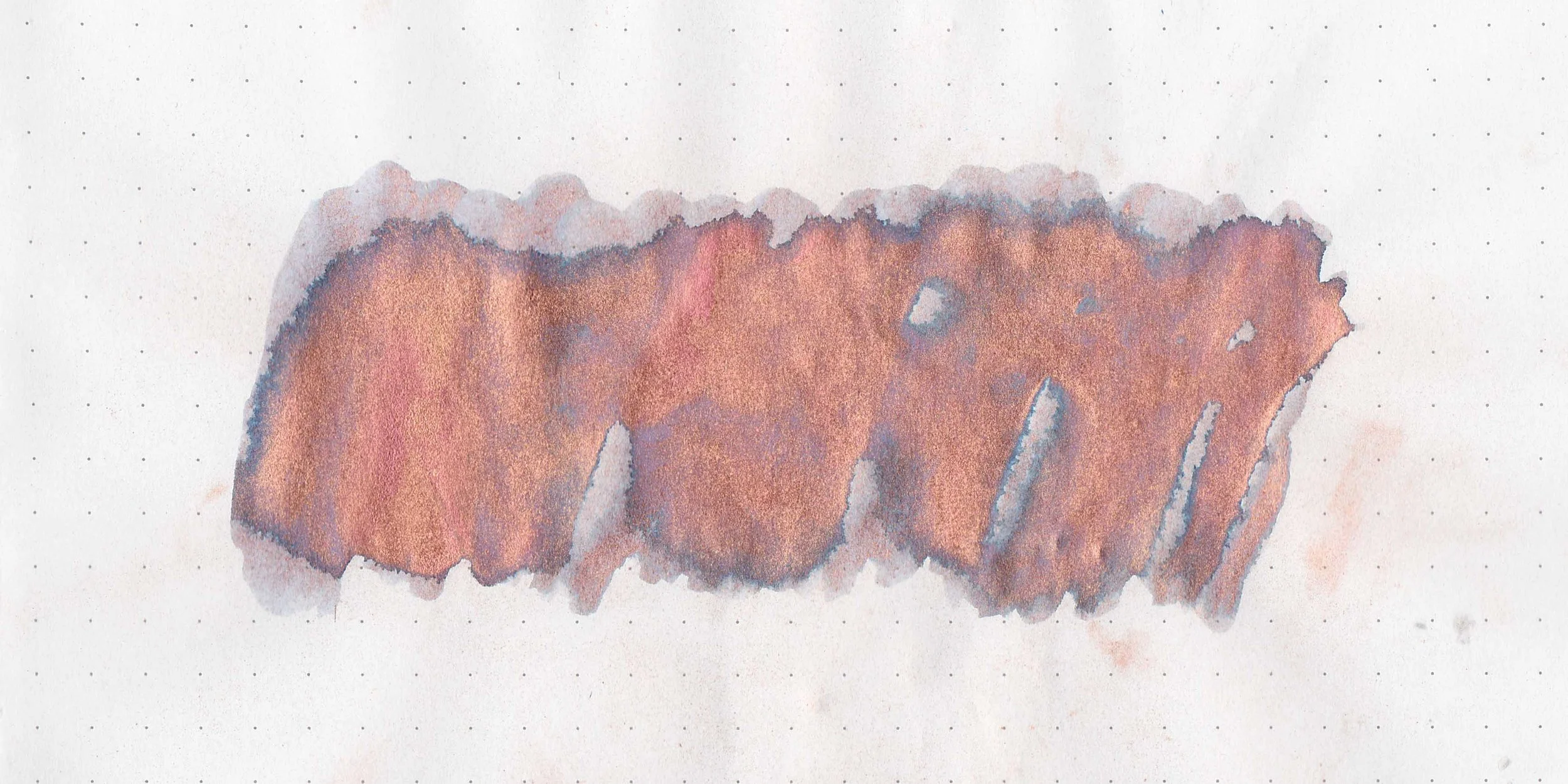
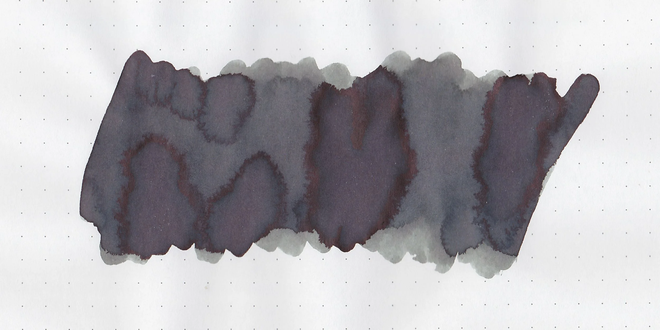
Tundra is right in-between grey and brown.

*For my swab cards I use a Col-o-ring by Skylab Letterpress, a medium Pilot Ishime and a Mabie Todd Swan.

Swabs:

In large swabs on Tomoe River paper the ink looks more grey than brown. This ink is advertised as a standard ink.

Writing samples:

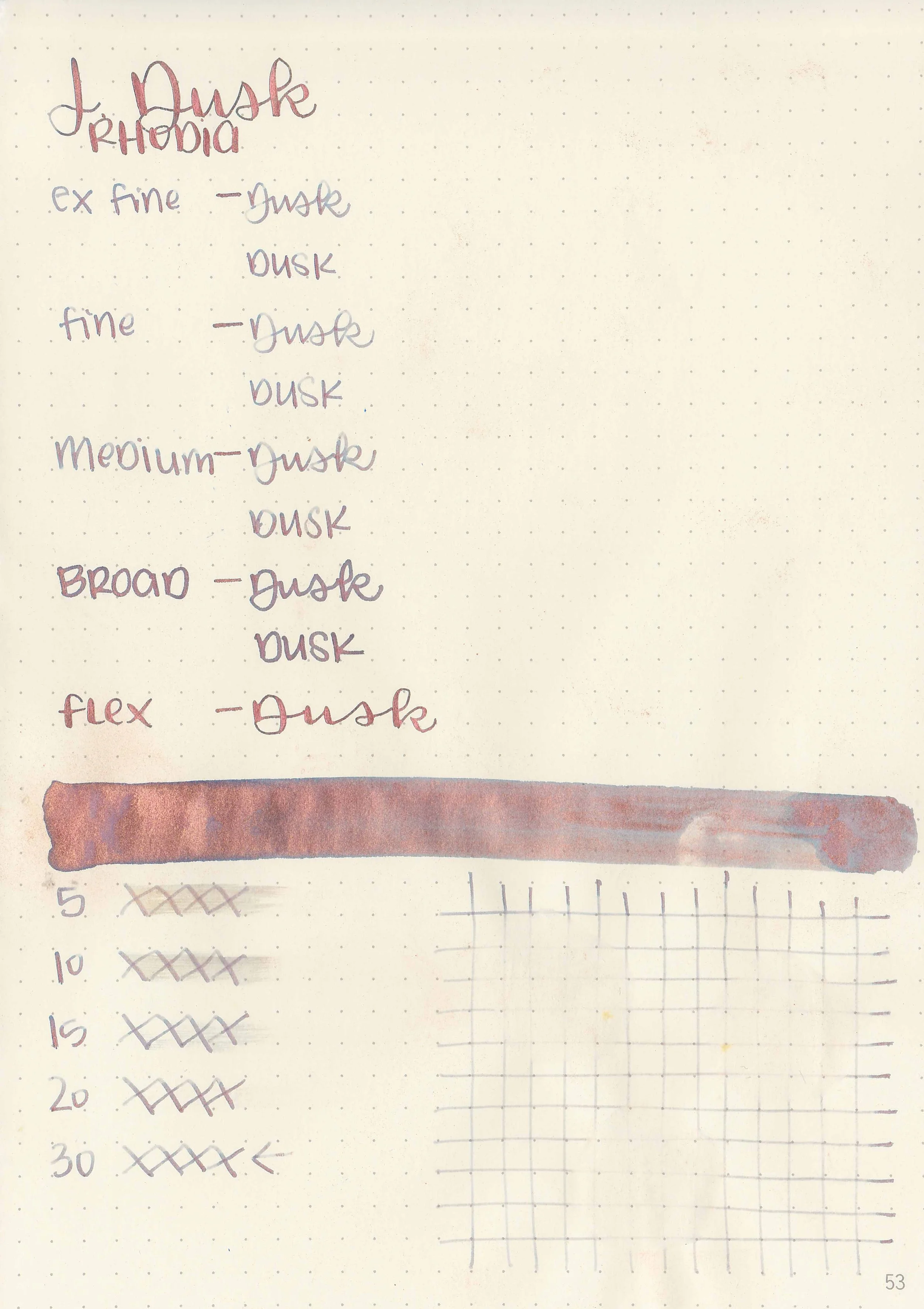
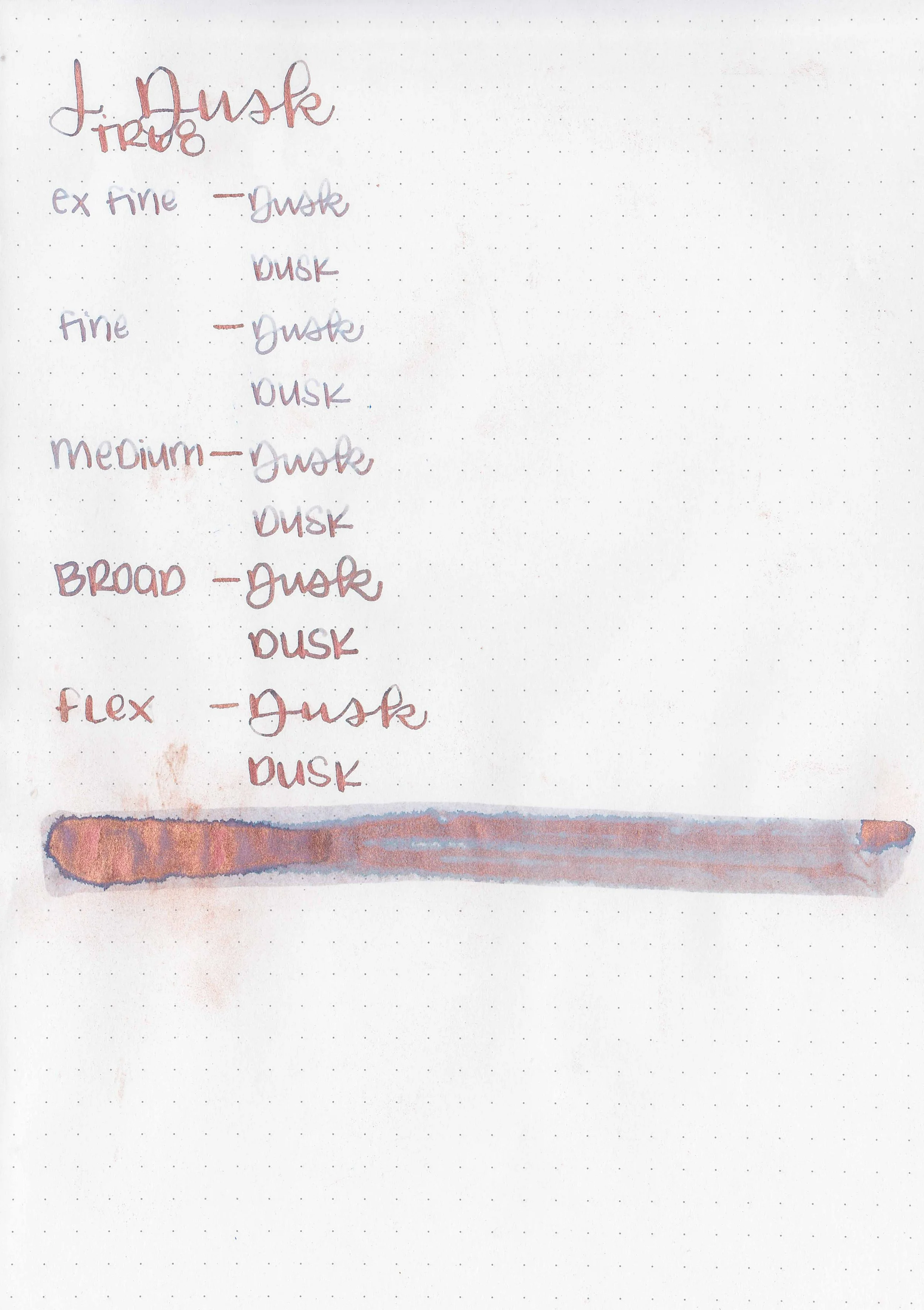
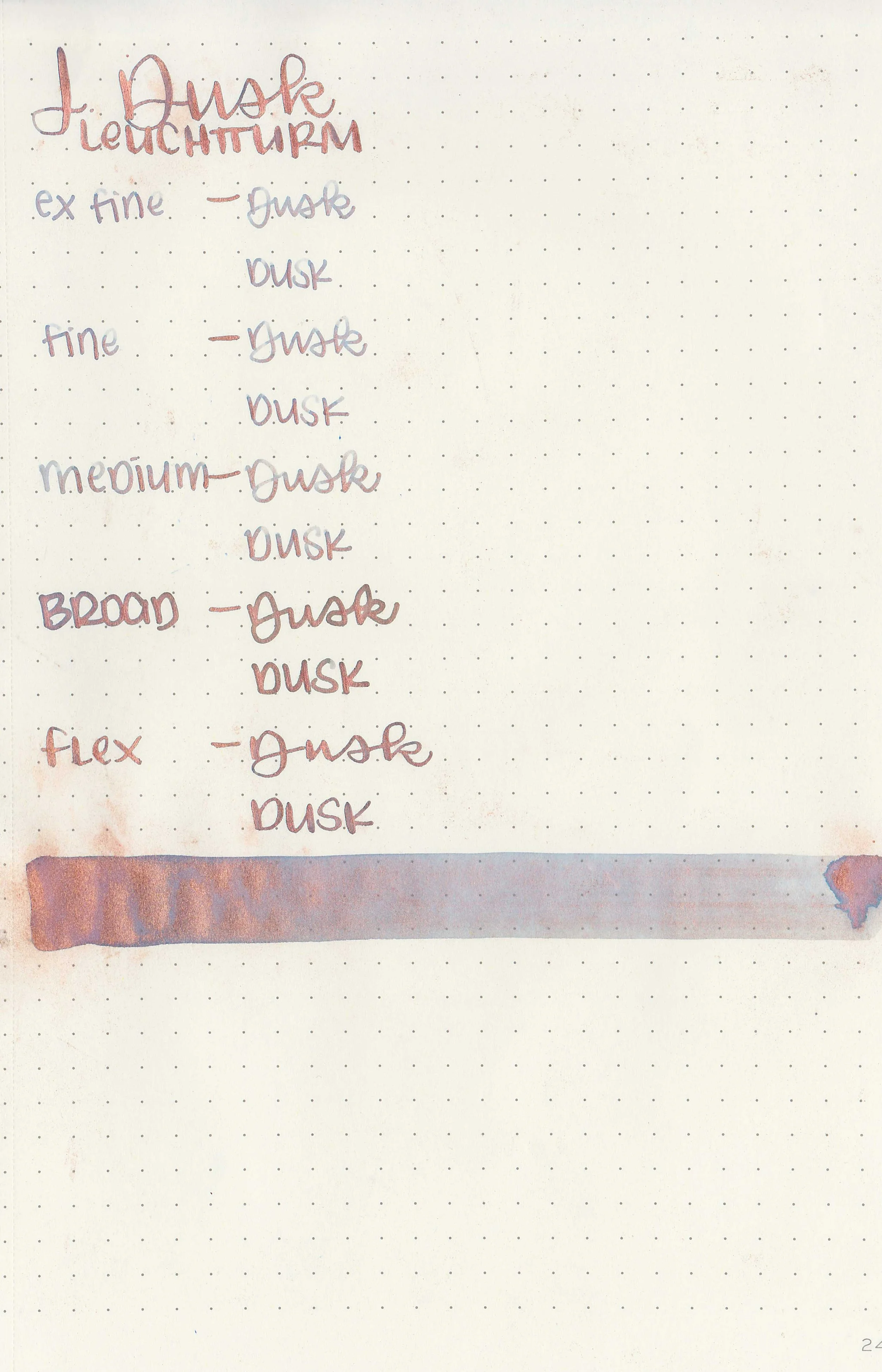
Let's take a look at how the ink behaves on fountain pen friendly papers: Rhodia, Tomoe River, and Leuchtturm.

*For my writing samples I use:

Dry time: 20 seconds

Water resistance: Low

Feathering: None

Show through: Medium

Bleeding: None

Other properties: low shading, no sheen, and no shimmer.

On 20 lb copy paper the ink had feathering in all nib sizes and some bleeding.

Comparison Swabs:

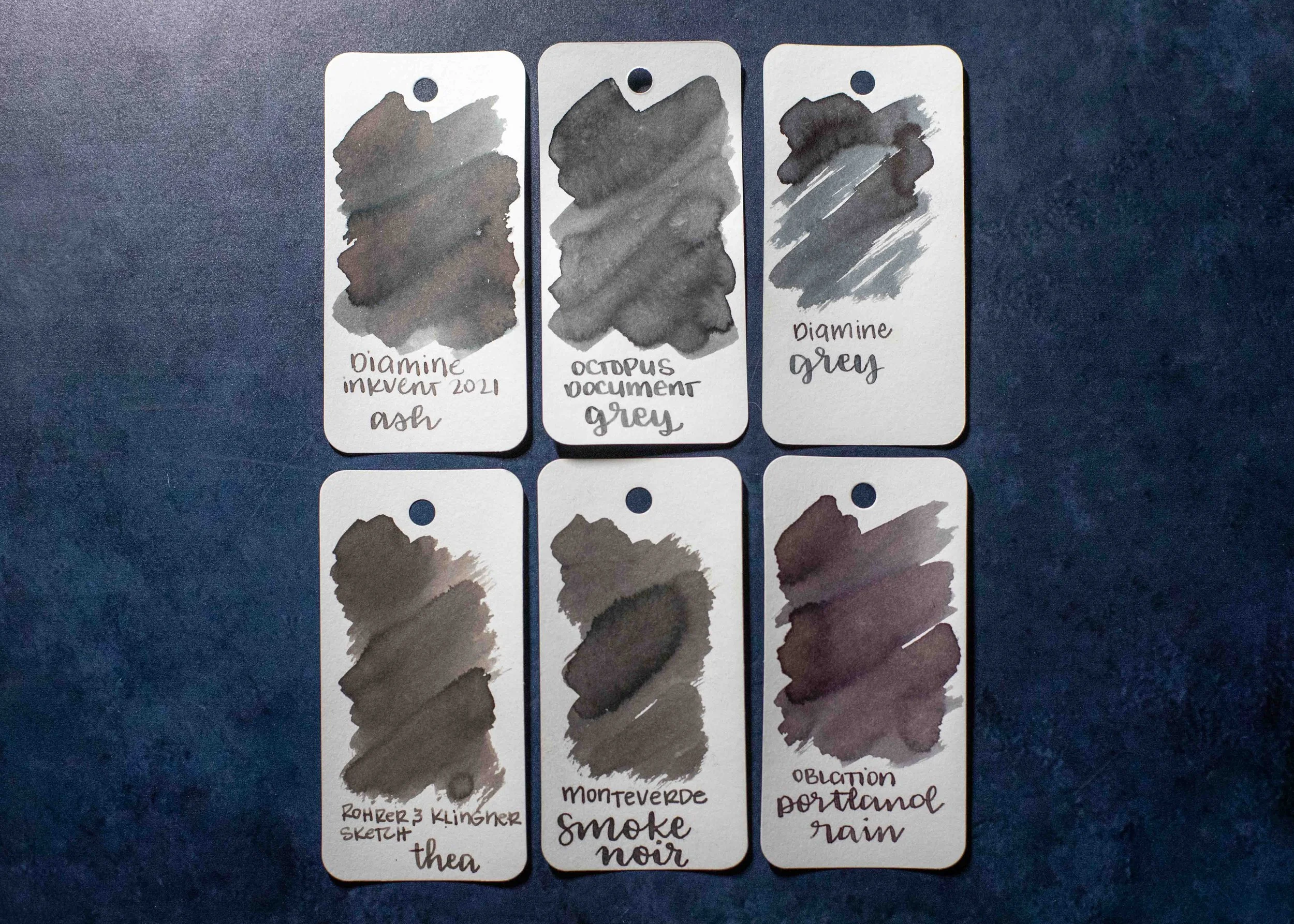
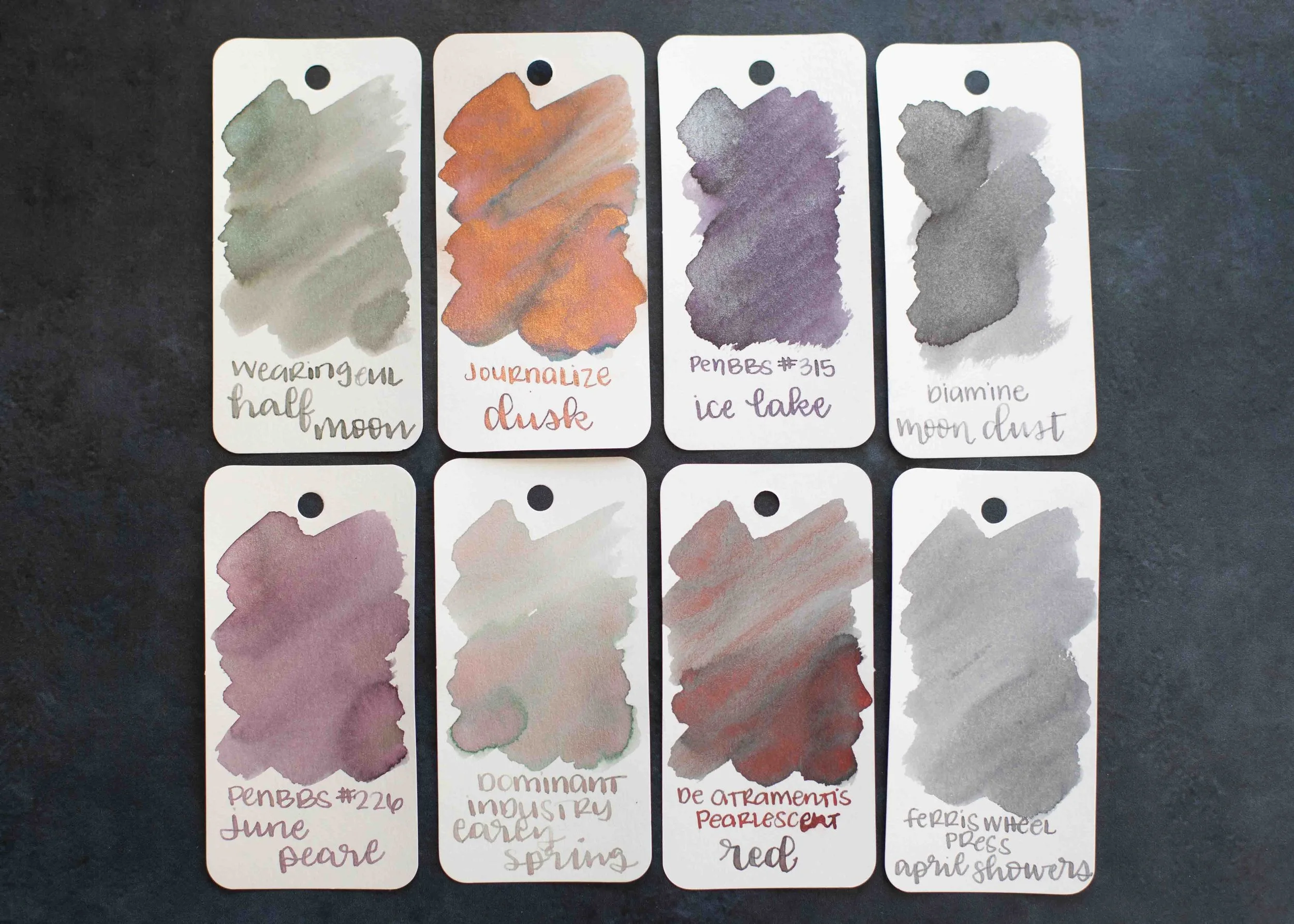
In swabs Tundra is closest to Colorverse Costar and Van Dieman’s Eclipse. Click here to see the grey inks together.

Longer Writing:

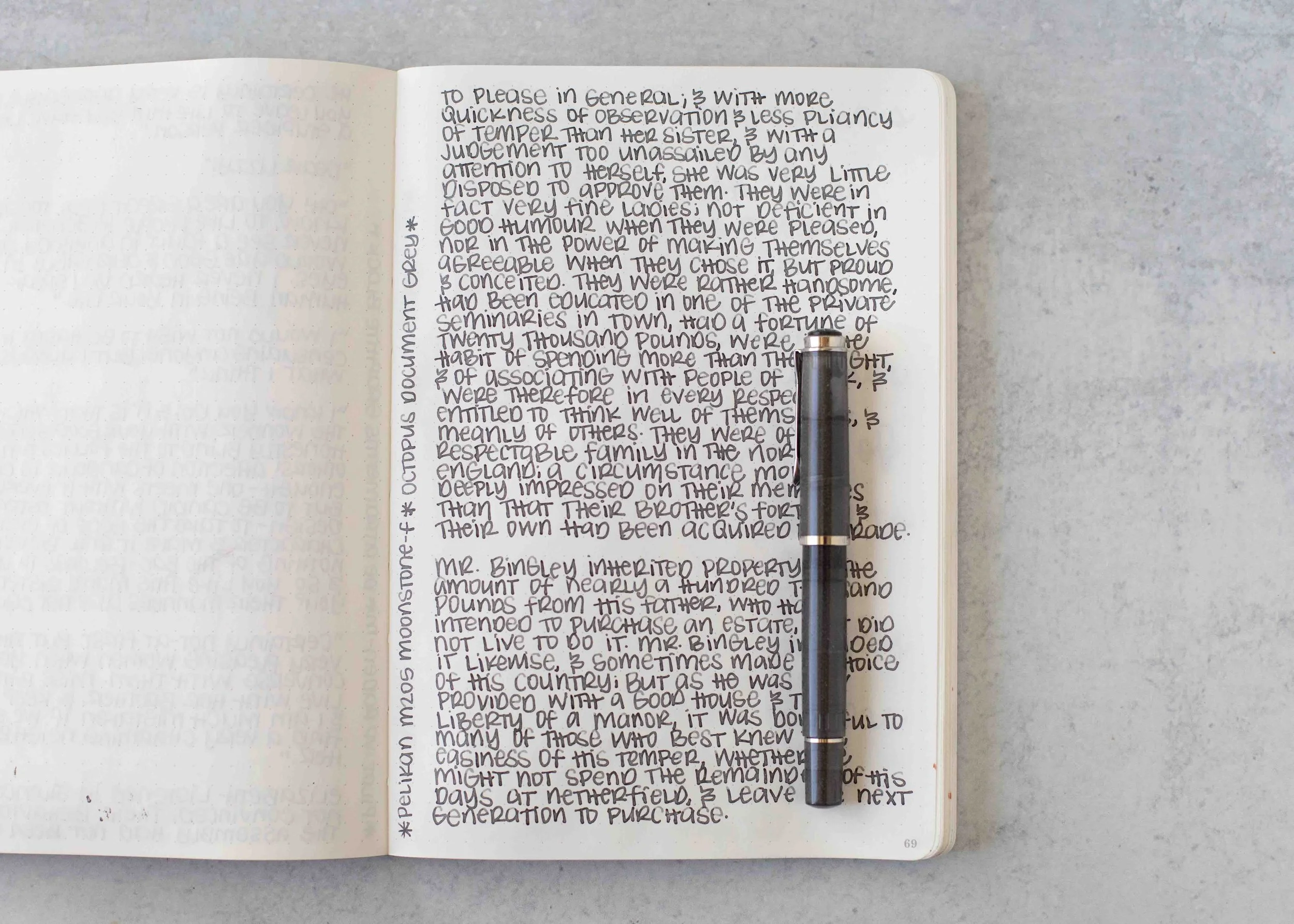
I used a Pelikan M205 Moonstone with a fine nib on a Taroko Enigma notebook. The ink has an average flow.

Overall, I like that the color can be either brown or grey depending on the paper. The ink can be rather light in the smallest nib sizes, so I prefer to use fine nibs or larger.

Thanks to all my Patrons! I couldn’t do these reviews without you! You can find my Patreon page here.

Disclaimer: This product was provided by Diamine for the purpose of this review. All photos and opinions are my own. This page does not contain affiliate links and this post is not sponsored.

Ink Review #2660: Ferris Wheel Press The Sad Charade

Today’s ink is Ferris Wheel Press The Sad Charade. You can find this ink for sale at Ferris Wheel Press and Vanness Pens.

The color:

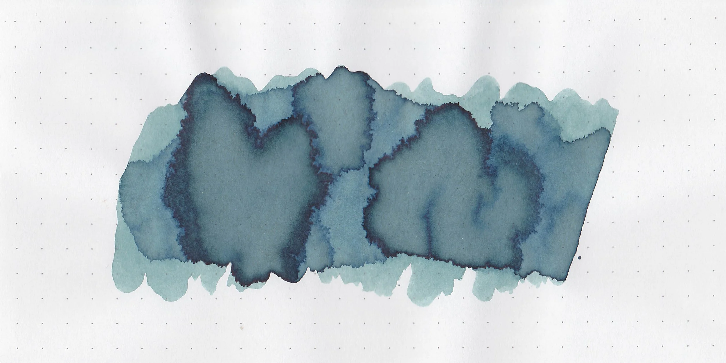
The Sad Charade is hard to quantify. It’s not quite blue, not quite grey and not quite green. It’s right in the middle of all three.

*For my swab cards I use a Col-o-ring by Skylab Letterpress, a medium Pilot Ishime and a Mabie Todd Swan.

Swabs:

In large swabs on Tomoe River paper the ink looks more blue than it does on the Col-o-ring swab.

Writing samples:

Let's take a look at how the ink behaves on fountain pen friendly papers: Rhodia, Tomoe River, and Leuchtturm.

*For my writing samples I use:

Dry time: 20 seconds

Water resistance: Low

Feathering: None

Show through: Medium

Bleeding: None

Other properties: low shading, no sheen, and no shimmer.

On 20 lb copy paper the ink had feathering in all nib sizes and some bleeding.

Comparison Swabs:

The Sad Charade isn’t close to any other inks I have. Click here to see the blue inks together.

Longer Writing:

I used a Kaweco Al-sport Petrol, with a medium nib on a Taroko Enigma notebook. The ink has a slightly dry flow.

Overall, this color is really unique-I don’t have anything else quite like it. I do wish the flow was wetter because the slightly dry flow can make the ink hard to read in smaller nib sizes.

Thanks to all my Patrons! I couldn’t do these reviews without you! You can find my Patreon page here.

Disclaimer: All photos and opinions are my own. This page does not contain affiliate links and this post is not sponsored.

Graf von Faber-Castell Inks, Part 2

Let’s take a look at five Graf von Faber-Castell inks today. You can finds these inks for sale at a lot of retailers, including Vanness Pens.

Swabs:

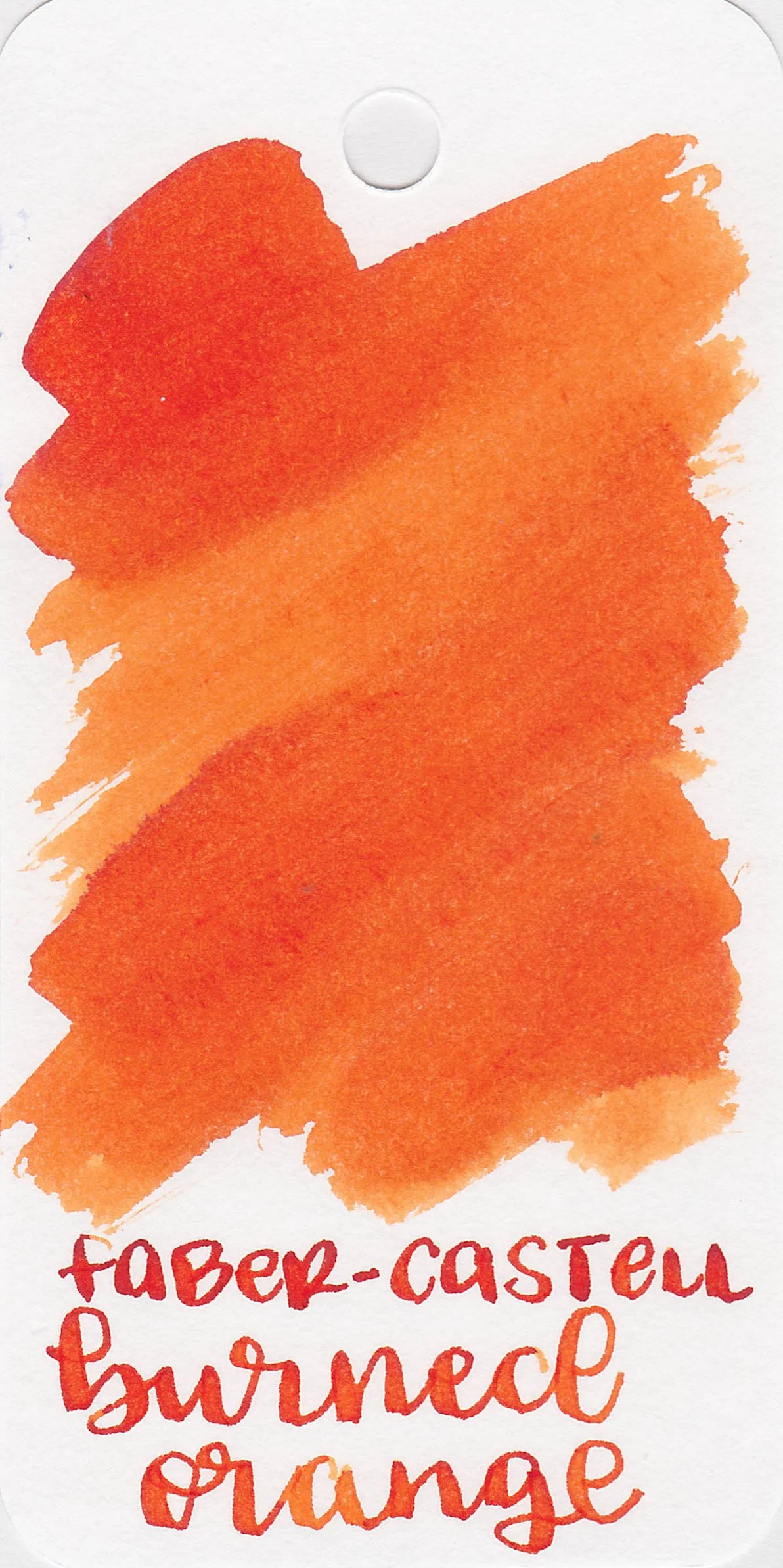
Left to right: Carbon Black, Stone Grey, Hazelnut Brown, India Red, and Burned Orange.

Writing samples:

Let's take a look at how the ink behaves on fountain pen friendly papers: Rhodia, Tomoe River, and Leuchtturm.

Dry Time: 15-40 seconds

Water Resistance: Medium

Feathering: None

Show through: Medium

Bleeding: None

Other properties: All have low shading.

On Walmart Pen + Gear copy paper there was some feathering and bleeding in the larger nib sizes.

Comparison Swabs:

Carbon Black is similar to Private Reserve Infinity Black.

Stone Grey is a little cooler-toned than Aurora Grey.

Hazelnut Brown is a little deeper than Sailor Spicy Chipotle.

India Red is closest to Organics Studio Mercury Red.

Burned Orange is a little darker in writing than Dominant Industry Earl Grey Tea.

Longer Writing:

I used a Taroko Enigma notebook. All four had dry flows.

Overall, I love the colors but the flow was a little dry for me-I just wish they were a little wetter.

Disclaimer: All photos and opinions are my own. This page does not contain affiliate links, and is not sponsored in any way.

Ink Review #2591: Papier Plume Oyster Grey

Today’s ink is Papier Plume Oyster Grey. You can find this ink at Papier Plume’s website or Vanness Pens. Thanks to the reader who sent this ink in for review!

The color:

Oyster Grey is a deep grey with a blue undertone.

*For my swab cards I use a Col-o-ring by Skylab Letterpress, a medium Pilot Ishime and a Mabie Todd Swan.

Swabs:

In large swabs on Tomoe River paper the ink looks very dark.

Writing samples:

Let's take a look at how the ink behaves on fountain pen friendly papers: Rhodia, Tomoe River, and Leuchtturm.

*For my writing samples I use:

Dry time: 30 seconds

Water resistance: Medium

Feathering: None

Show through: Medium

Bleeding: None

Other properties: low shading, no sheen, and no shimmer.

On 20 lb copy paper the ink had some feathering and bleeding in the larger nib sizes.

Comparison Swabs:

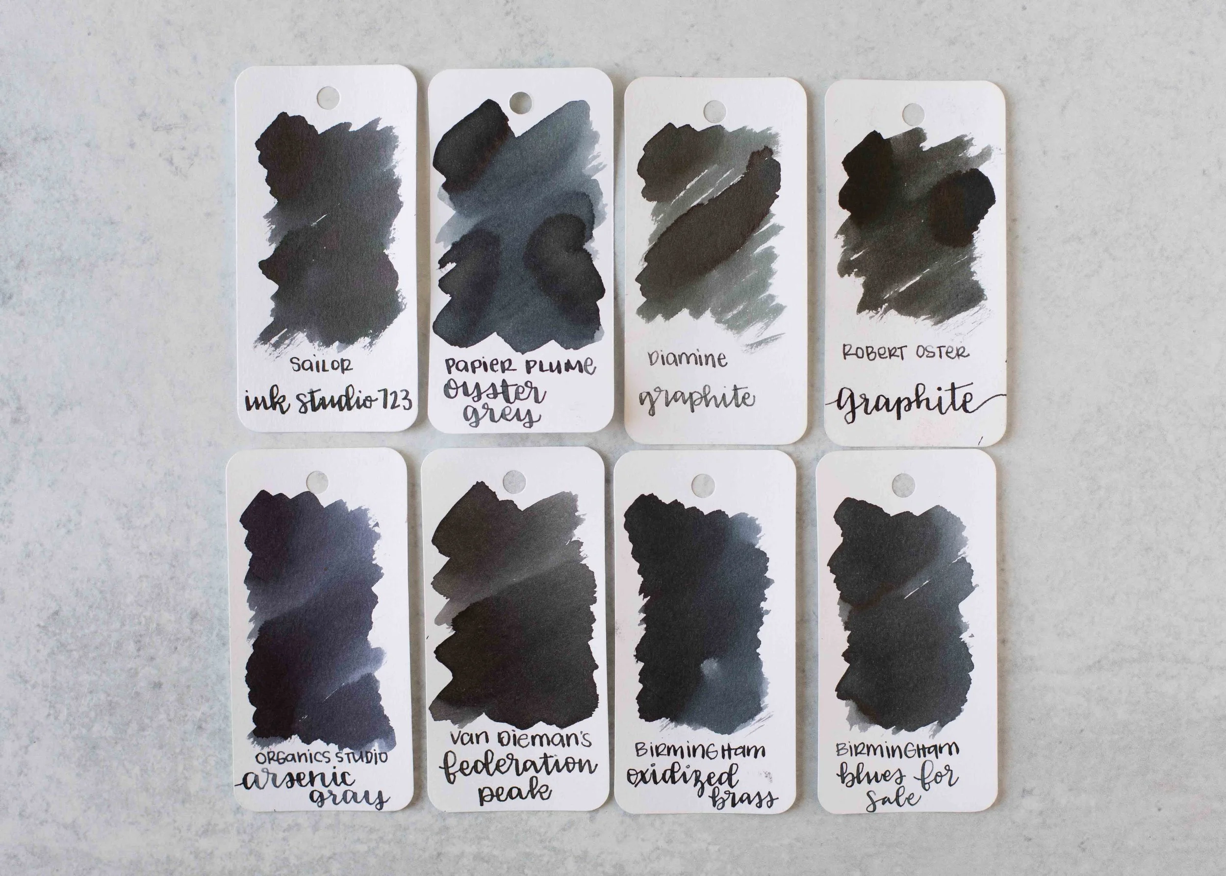
Oyster Grey is closest to Birmingham Oxidized Brass. Click here to see the grey inks together.

Longer Writing:

I used a Pilot Custom 823 Smoke with a broad nib on a Taroko Enigma notebook. The ink has an average flow.

Overall, this is a good solid dark grey ink. It’s dark enough to be easily read and well behaved.

Thanks to all my Patrons! I couldn’t do these reviews without you! You can find my Patreon page here.

Disclaimer: All photos and opinions are my own. This page does not contain affiliate links and this post is not sponsored.

Color Traveler Grey Inks

Today let’s take a look at three grey inks from Color Traveler: Yamato Gray, Oyster Silver and Sardines Griege. You can finds these inks for sale at a Vanness Pens.

Swabs:

Left to right: Yamato Gray, Oyster Silver and Sardines Griege.

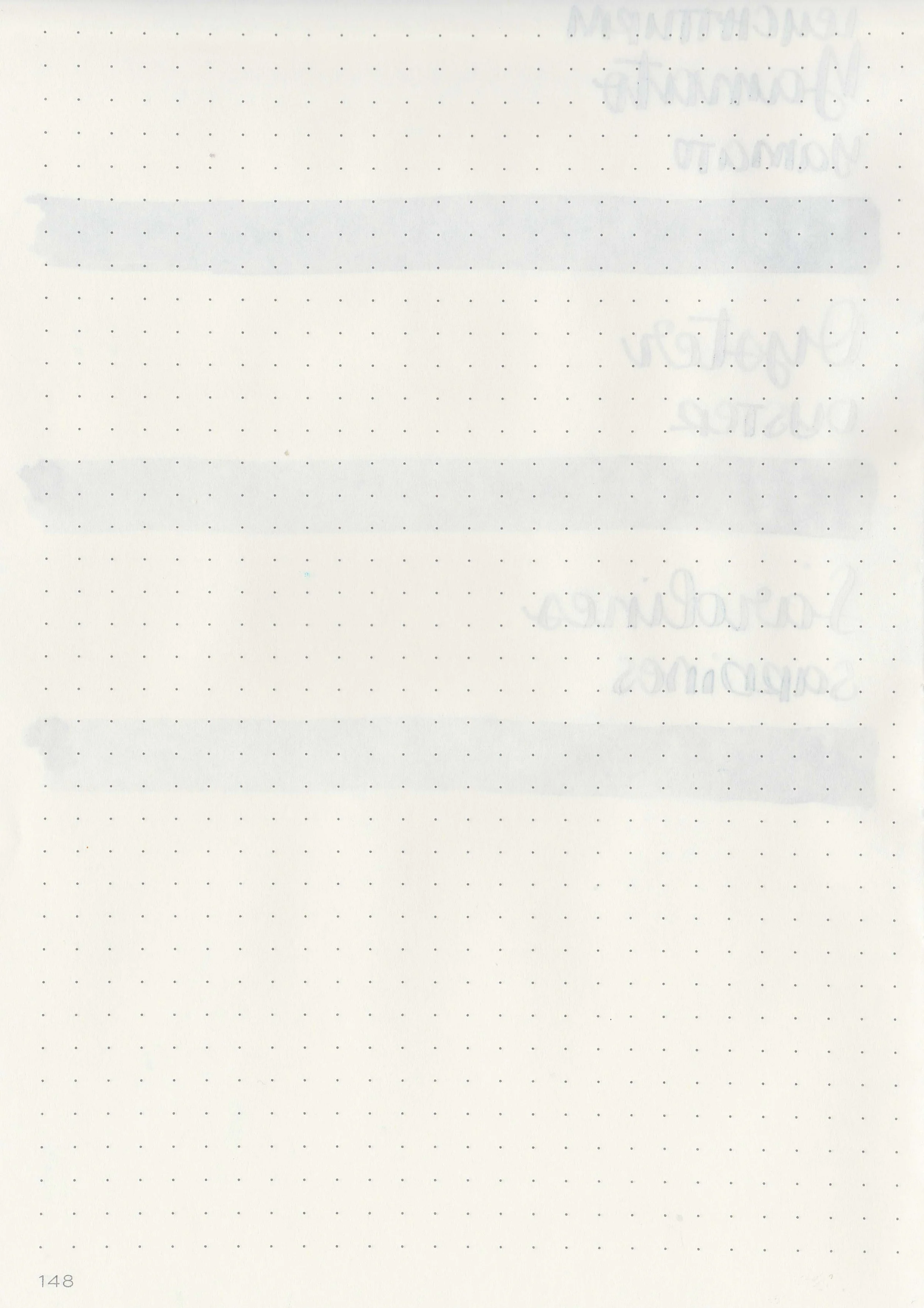
Writing samples:

Let's take a look at how the ink behaves on fountain pen friendly papers: Rhodia, Tomoe River, and Leuchtturm.

Dry Time: 30-50 seconds

Water Resistance: Low

Feathering: None

Show through: Medium

Bleeding: None

Other properties: All have medium shading.

On Walmart Pen + Gear copy paper there was some feathering in every nib size and a few dots of bleeding.

Comparison Swabs:

Yamato Gray is closest to 3 Oysters Cool Gray.

Oyster Silver is closest to Pelikan Edelstein Moonstone, Sardines Greige is close to Octopus Fluids Pebble Stone.

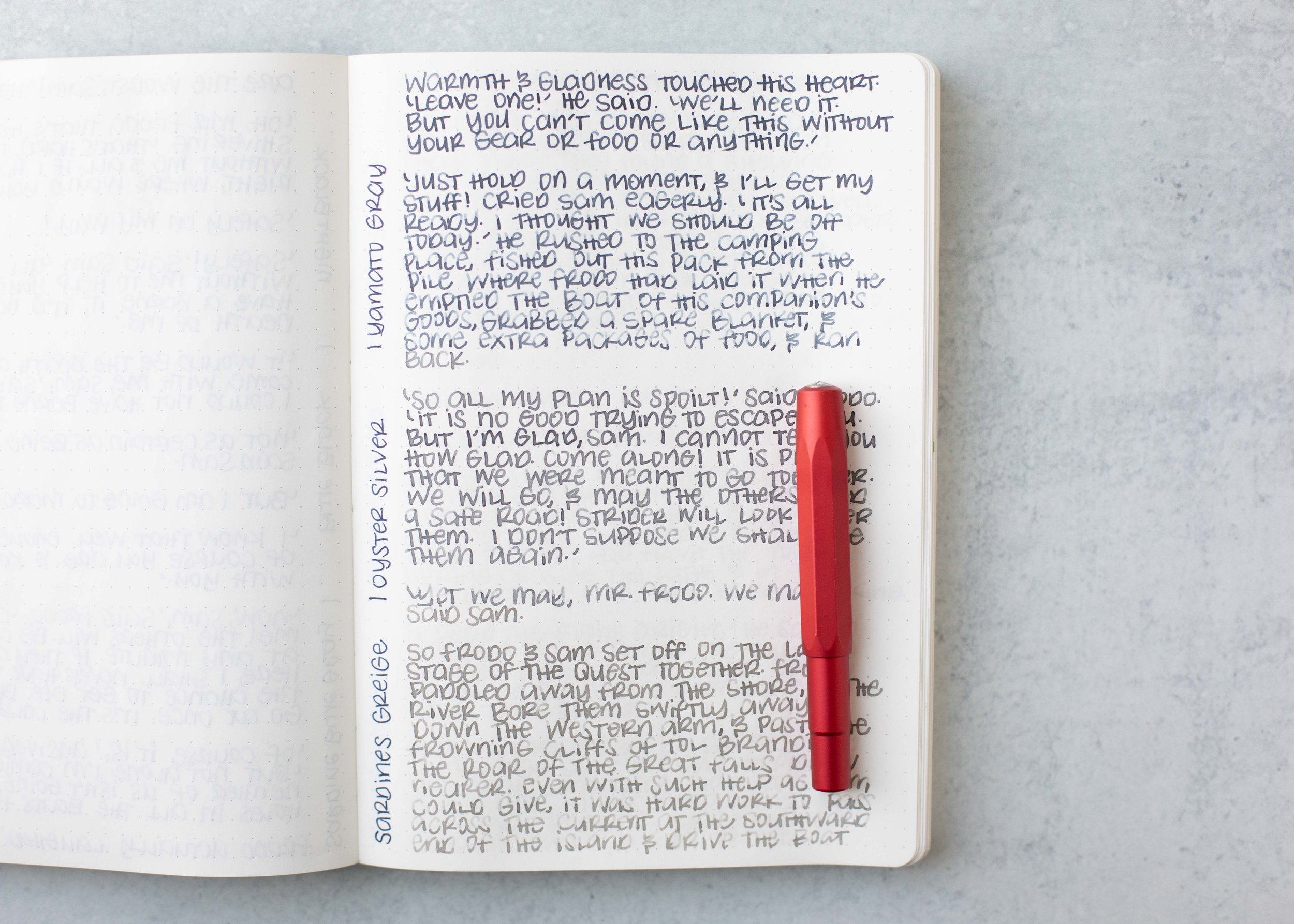
Longer Writing:

I used a Taroko Enigma notebook. All three had average flows.

Overall, these are good inks. Yamato Gray is my favorite out of the three but I like all three.

Disclaimer: All photos and opinions are my own. This page does not contain affiliate links, and is not sponsored in any way.

Ink Review #2576: De Atramentis Slate Grey

Today’s ink is De Atramentis Slate Grey. You can find this ink for sale at most retailers including Vanness Pens.

The color:

Slate Grey is an unsaturated purple grey.

*For my swab cards I use a Col-o-ring by Skylab Letterpress, a medium Pilot Ishime and a Mabie Todd Swan.

Swabs:

In large swabs on Tomoe River paper the ink has just a little bit of shading where the ink pooled.

Writing samples:

Let's take a look at how the ink behaves on fountain pen friendly papers: Rhodia, Tomoe River, and Leuchtturm.

*For my writing samples I use:

Dry time: 20 seconds

Water resistance: Medium

Feathering: None

Show through: Medium

Bleeding: None

Other properties: no shading, no sheen, and no shimmer.

On 20 lb copy paper the ink had some feathering and bleeding in the larger nib sizes.

Comparison Swabs:

Slate Grey isn’t remotely close to any of these other inks, but Krishna Pencil is a similar purple-grey. Click here to see the grey inks together.

Longer Writing:

I used a Kaweco Al-sport Akkerman Navy with a medium nib on a Taroko Enigma notebook. The ink has a wet flow.

Overall, I could take or leave this ink. I like the wet flow and it’s well-behaved, but it’s very purple compared to other grey inks.

Thanks to all my Patrons! I couldn’t do these reviews without you! You can find my Patreon page here.

Disclaimer: All photos and opinions are my own. This page does not contain affiliate links and this post is not sponsored.
Ink Review #2575: De Atramentis Pearlescent Green

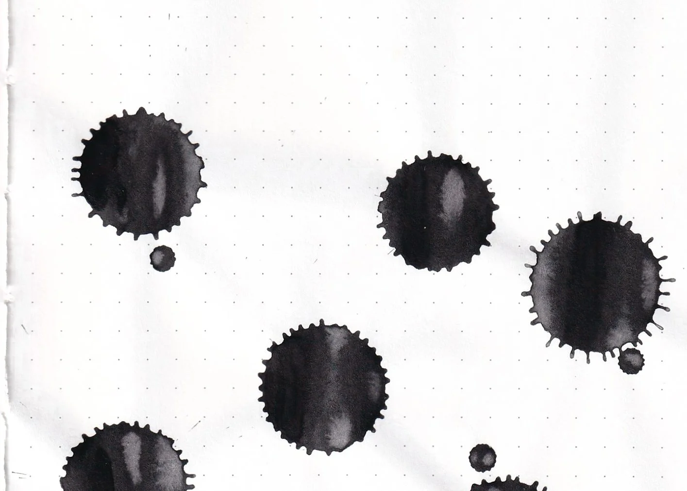
De Atramentis Pearlescent Green, like the Pearlescent Red from yesterday is from De Atramentis’s shimmer collection called the Pearlescents. The name of this one is confusing because usually the De Atramentis Pearlescent inks are named after their base color and then their shimmer color, Velvet Black Copper for example. The base color of Pearlescent Green is grey with red shimmer, so this ink should have been named Grey Green instead of Pearlescent Green. You can find this ink for sale at most retailers including Vanness Pens.

The color:

Pearlescent Green is a neutral grey with green shimmer.

*For my swab cards I use a Col-o-ring by Skylab Letterpress, a medium Pilot Ishime and a Mabie Todd Swan.

Swabs:

In large swabs on Tomoe River paper you can see lots of shimmer-a ridiculous amount really.

Writing samples:

Let's take a look at how the ink behaves on fountain pen friendly papers: Rhodia, Tomoe River, and Leuchtturm.

*For my writing samples I use:

Dry time: 20 seconds

Water resistance: Medium

Feathering: None

Show through: Medium

Bleeding: None

Other properties: medium shading, no sheen, and green shimmer.

On 20 lb copy paper the ink had some feathering and bleeding in the larger nib sizes.

Comparison Swabs:

Pearlescent Green is the same base color as De Atramentis Pearlescent Red. Click here to see the grey inks together.

Longer Writing:

I used a Kaweco Al-sport Red with a medium nib on a Taroko Enigma notebook. The ink has a dry flow.

Overall, just like yesterday’s Pearlescent Red, I did not enjoy this ink. Like the other Pearlescent inks I’ve tried this ink had a lot of hard starts and clogging. The shimmer does not stay put-it flakes off and gets on anything around it. It simply has too much shimmer.

Thanks to all my Patrons! I couldn’t do these reviews without you! You can find my Patreon page here.

Disclaimer: All photos and opinions are my own. This page does not contain affiliate links and this post is not sponsored.

Ink Review #2574: De Atramentis Pearlescent Red

De Atramentis Pearlescent Red is from De Atramentis’s shimmer collection called the Pearlescents. The name of this one is confusing because usually the De Atramentis Pearlescent inks are named after their base color and then their shimmer color, Velvet Black Copper for example. The base color of Pearlescent Red is grey with red shimmer, so this ink should have been named Grey Red instead of Pearlescent Red. You can find this ink for sale at most retailers including Vanness Pens.

The color:

Pearlescent Red is a neutral grey with red shimmer.

*For my swab cards I use a Col-o-ring by Skylab Letterpress, a medium Pilot Ishime and a Mabie Todd Swan.

Swabs:

In large swabs on Tomoe River paper you can see lots of shimmer-a ridiculous amount really.

Writing samples:

Let's take a look at how the ink behaves on fountain pen friendly papers: Rhodia, Tomoe River, and Leuchtturm.

*For my writing samples I use:

Dry time: 40 seconds

Water resistance: Medium

Feathering: None

Show through: Medium

Bleeding: None

Other properties: medium shading, no sheen, and red shimmer.

On 20 lb copy paper the ink had some feathering and bleeding in the larger nib sizes.

Comparison Swabs:

Pearlescent Red is the same base color as De Atramentis Pearlescent Green. Click here to see the grey inks together.

Longer Writing:

I used a Kaweco Al-sport Red with a medium nib on a Taroko Enigma notebook. The ink has a dry flow.

Overall, I did not enjoy this ink. Like the other Pearlescent inks I’ve tried this ink had a lot of hard starts and clogging. The shimmer does not stay put-it flakes off and gets on anything around it. It simply has too much shimmer.

Thanks to all my Patrons! I couldn’t do these reviews without you! You can find my Patreon page here.

Disclaimer: All photos and opinions are my own. This page does not contain affiliate links and this post is not sponsored.

Ink Review #2573: Dominant Industry Early Spring

Today’s ink is Dominant Industry Early Spring. You can find this ink for sale at most retailers including Vanness Pens.

The color:

Early Spring is a light grey that shades to green with pink shimmer.

*For my swab cards I use a Col-o-ring by Skylab Letterpress, a medium Pilot Ishime and a Mabie Todd Swan.

Swabs:

In large swabs on Tomoe River paper you can see both the green shading and the pink shimmer.

Writing samples:

Let's take a look at how the ink behaves on fountain pen friendly papers: Rhodia, Tomoe River, and Leuchtturm.

*For my writing samples I use:

Dry time: 40 seconds

Water resistance: Low

Feathering: None

Show through: Medium

Bleeding: None

Other properties: low shading, no sheen, and pink shimmer.

On 20 lb copy paper the ink had some feathering and bleeding in the larger nib sizes.

Comparison Swabs:

Early Spring is much lighter than these other grey shimmer inks. Click here to see the grey inks together.

Longer Writing:

I used a Leonardo Mother of Pearl with a medium nib on a Taroko Enigma notebook. The ink has a dry flow.

Overall, I love the color in large swabs-it shows the green shading and pink shimmer, but hardly any of that shading shows up in writing. It’s also very pale and hard to read, so this isn’t an ink for me.

Thanks to all my Patrons! I couldn’t do these reviews without you! You can find my Patreon page here.

Disclaimer: All photos and opinions are my own. This page does not contain affiliate links and this post is not sponsored.

Ink Review #2559: Endless Alchemy Wizard's Pencil

Endless Alchemy Ink is a new-to-me ink brand, so let’s take a look at Endless Alchemy Wizard’s Pencil. You can find this ink for sale at most retailers including Vanness Pens.
The color:

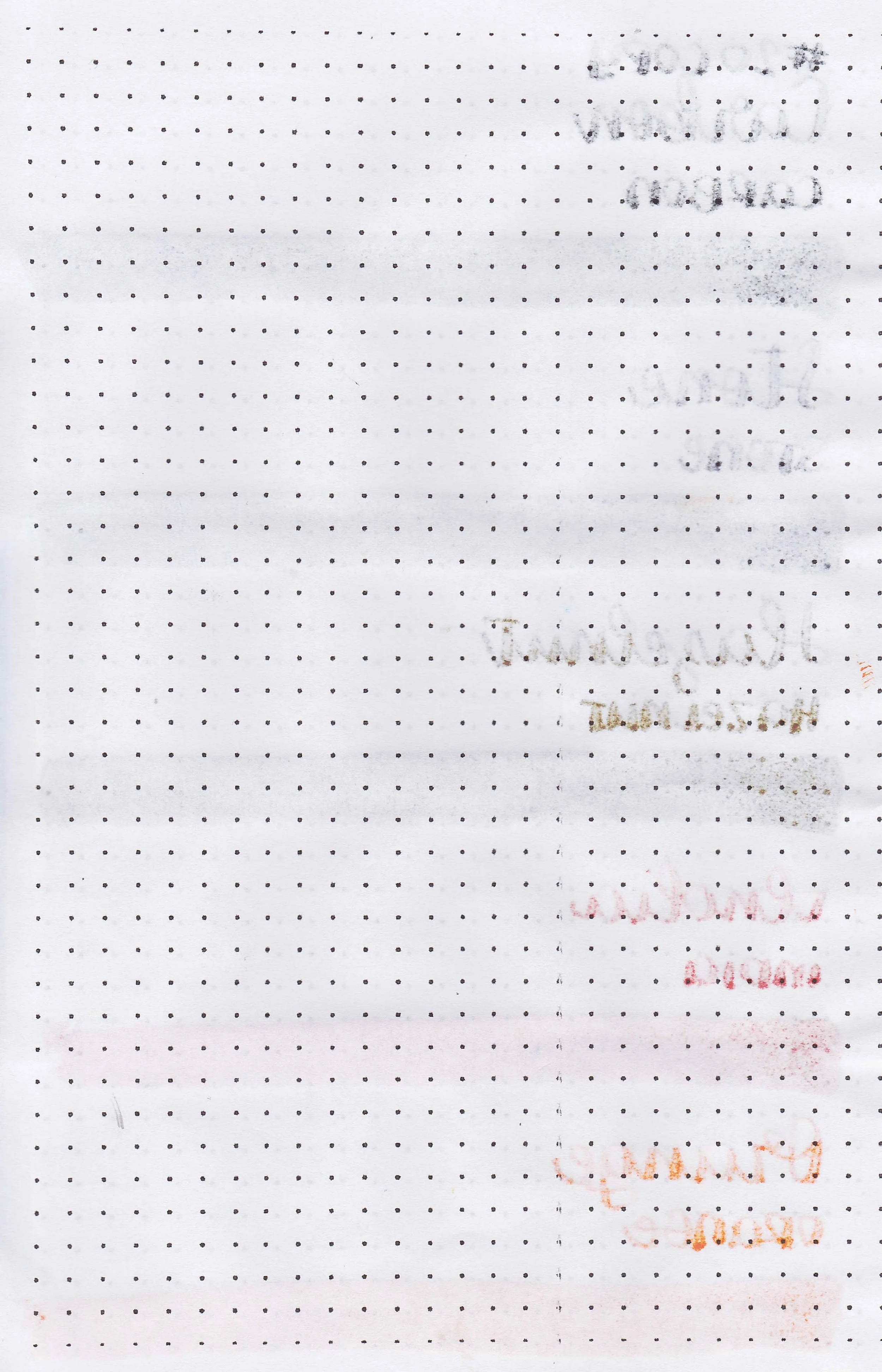
Wizard’s Pencil is a medium grey.

*For my swab cards I use a Col-o-ring by Skylab Letterpress, a medium Pilot Ishime and a Mabie Todd Swan.

Swabs:

In large swabs on Tomoe River paper the ink has some black sheen.

Writing samples:

Let's take a look at how the ink behaves on fountain pen friendly papers: Rhodia, Tomoe River, and Leuchtturm.

*For my writing samples I use:

Dry time: 30 seconds

Water resistance: Medium

Feathering: None

Show through: Medium

Bleeding: None

Other properties: low shading, low black sheen, and no shimmer.

On 20 lb copy paper the ink had some feathering and bleeding in the larger nib sizes.

Comparison Swabs:

Wizard’s Pencil has a little more of a green undertone than these other grey inks. Click here to see the grey inks together.

Longer Writing:

I used a Pelikan M205 Moonstone with a fine nib on a Taroko Enigma notebook. The ink has an average flow.

Overall, this is a lovely grey ink with an average flow. It’s well-behaved and comes in a cool bottle (I only have a sample so unfortunately I can’t show you the bottle but there’s pictures of it on Vanness’s website).

Thanks to all my Patrons! I couldn’t do these reviews without you! You can find my Patreon page here.

Disclaimer: All photos and opinions are my own. This page does not contain affiliate links and this post is not sponsored.