Ink Review #2012: Robert Oster No Fixed Address
/
Robert Oster No Fixed Address is from Robert Oster’s Shake ‘N’ Shimmy collection. You can find this ink for sale at Vanness Pens.
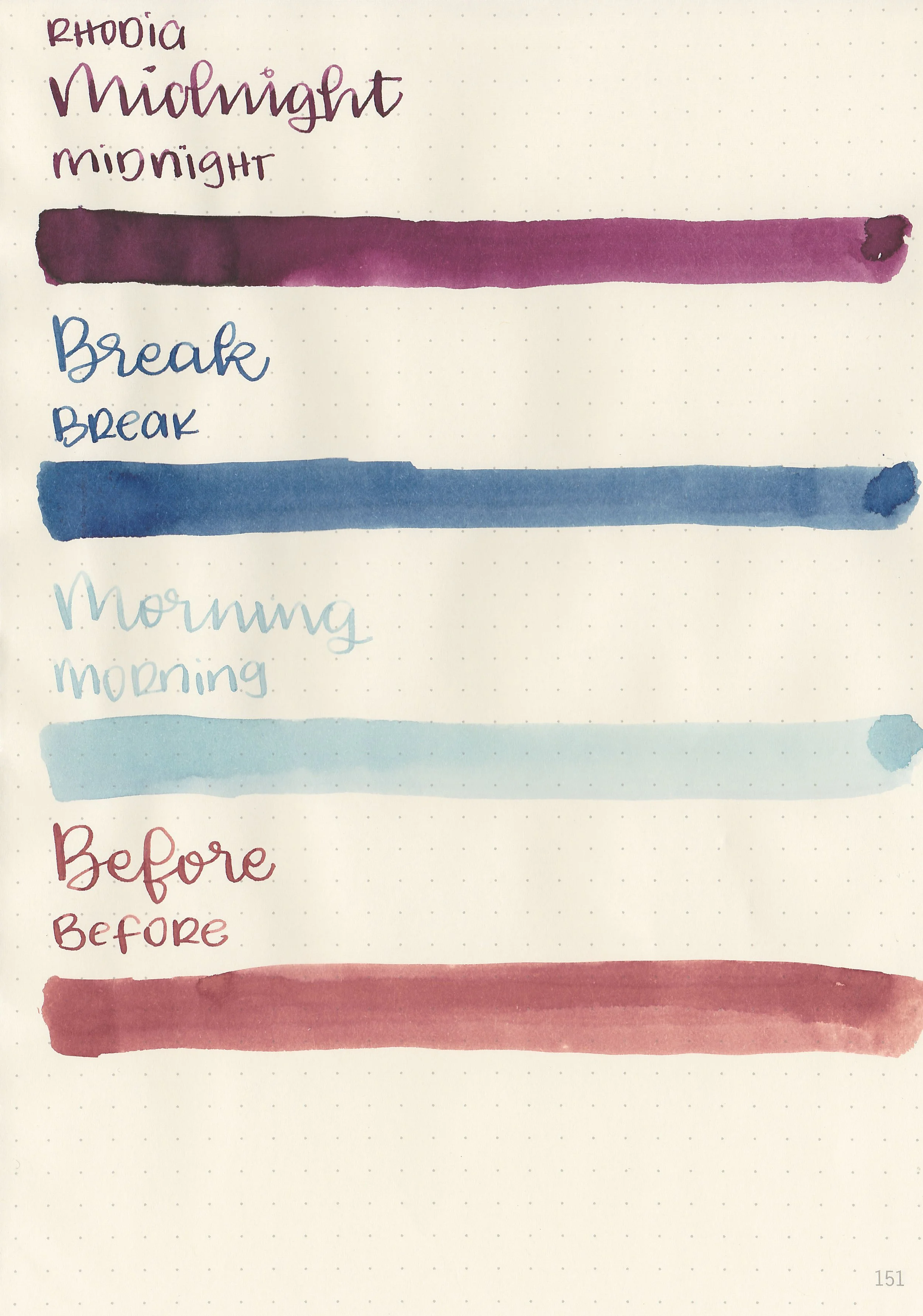
The color:
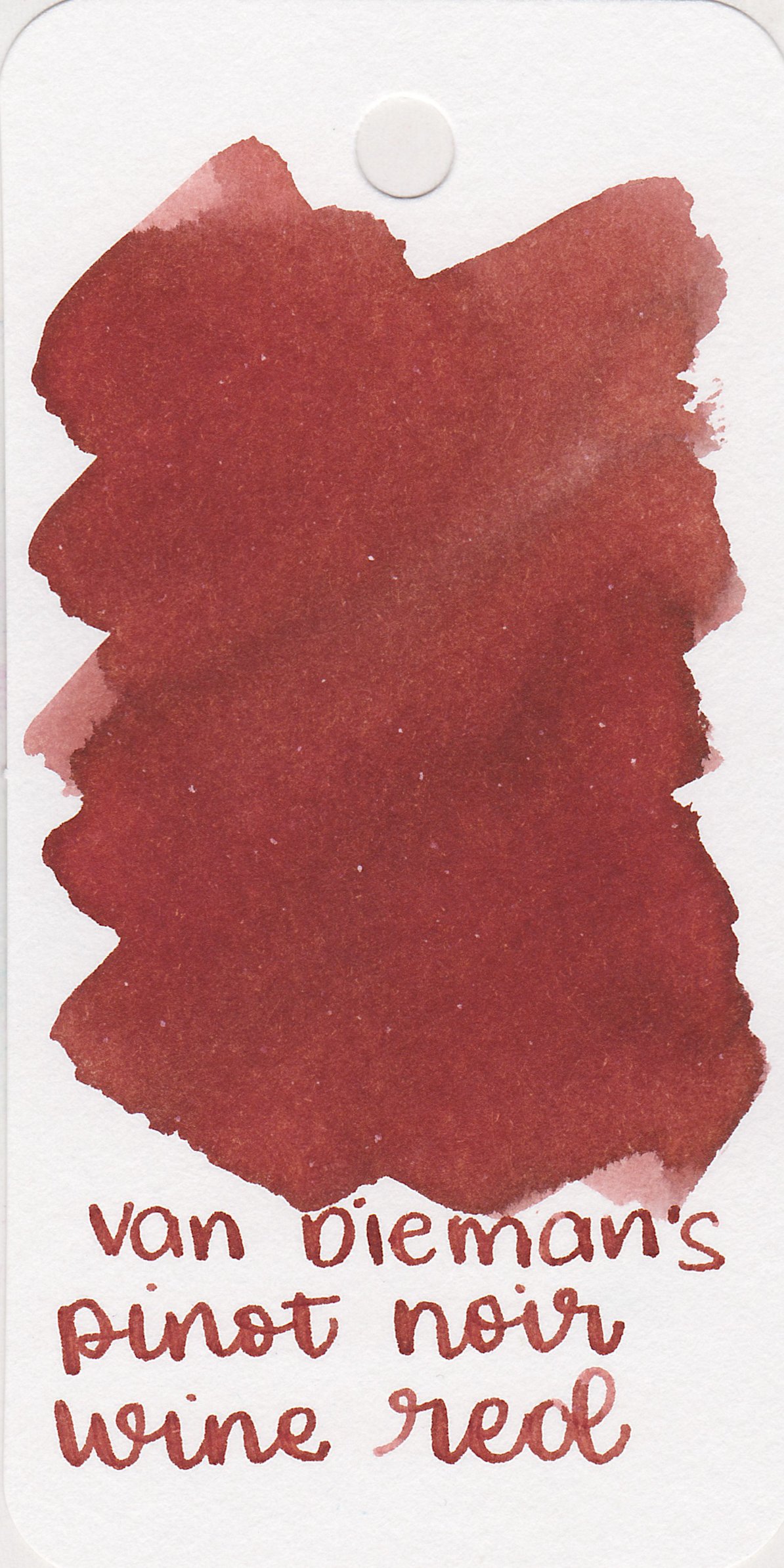
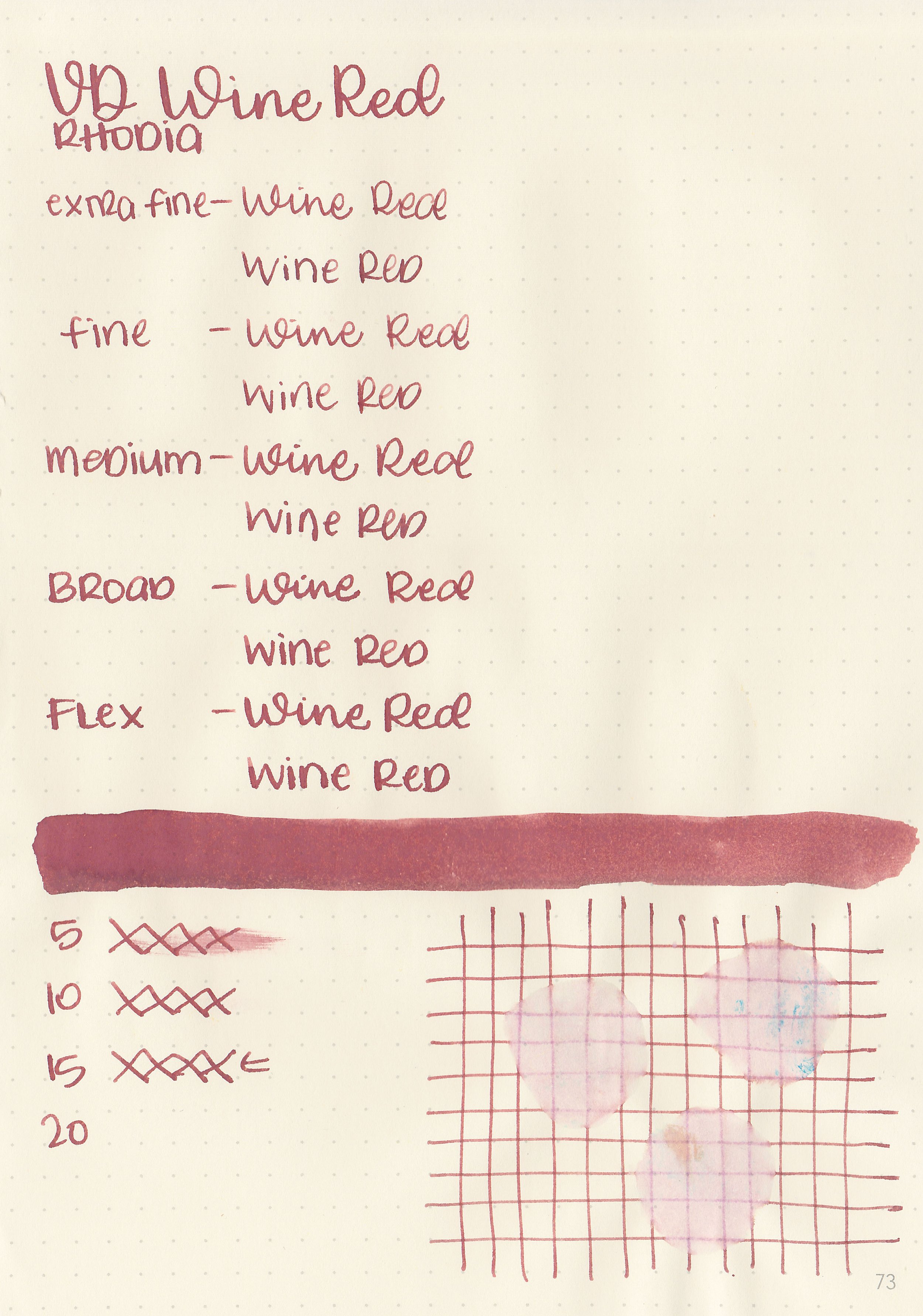
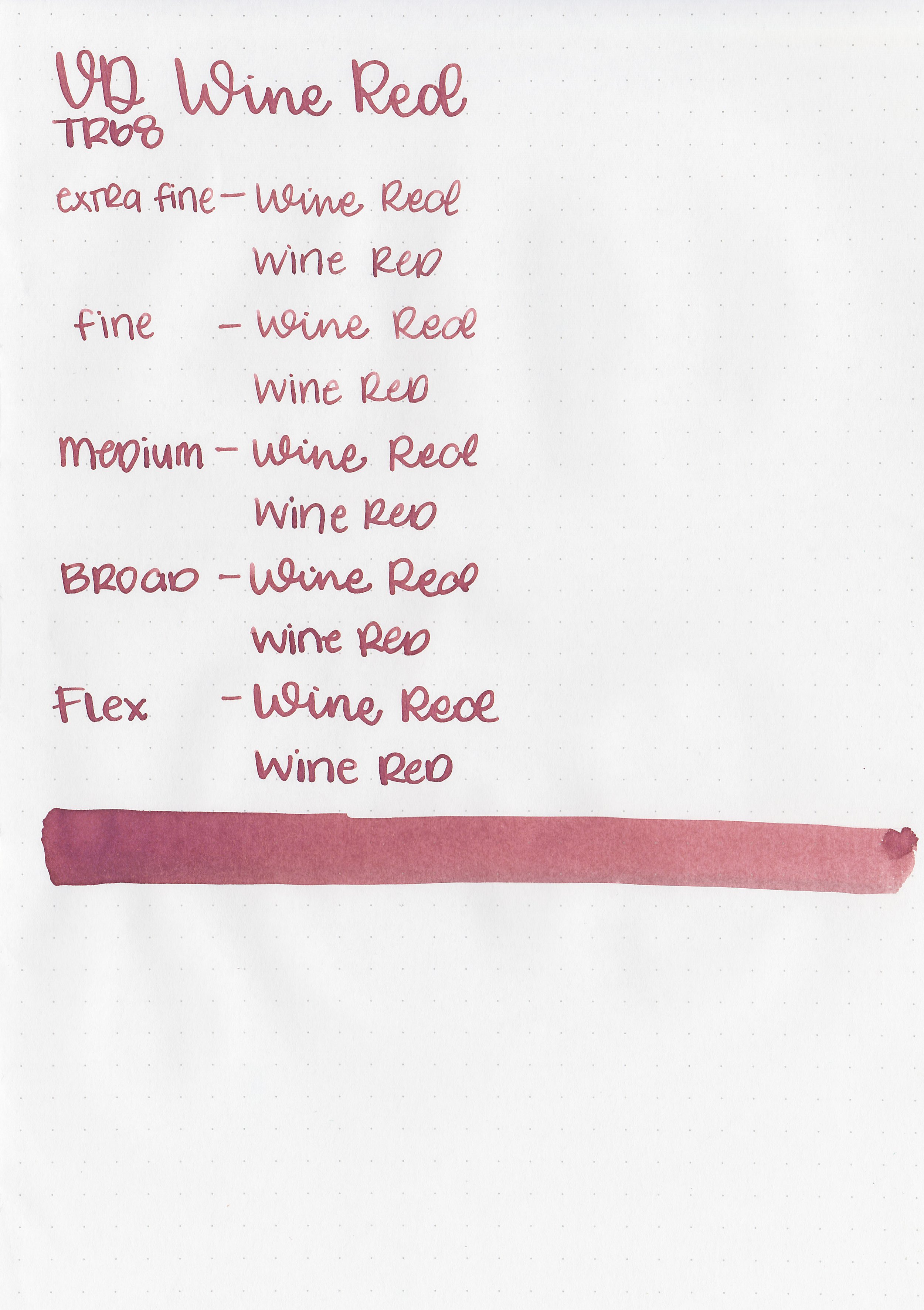
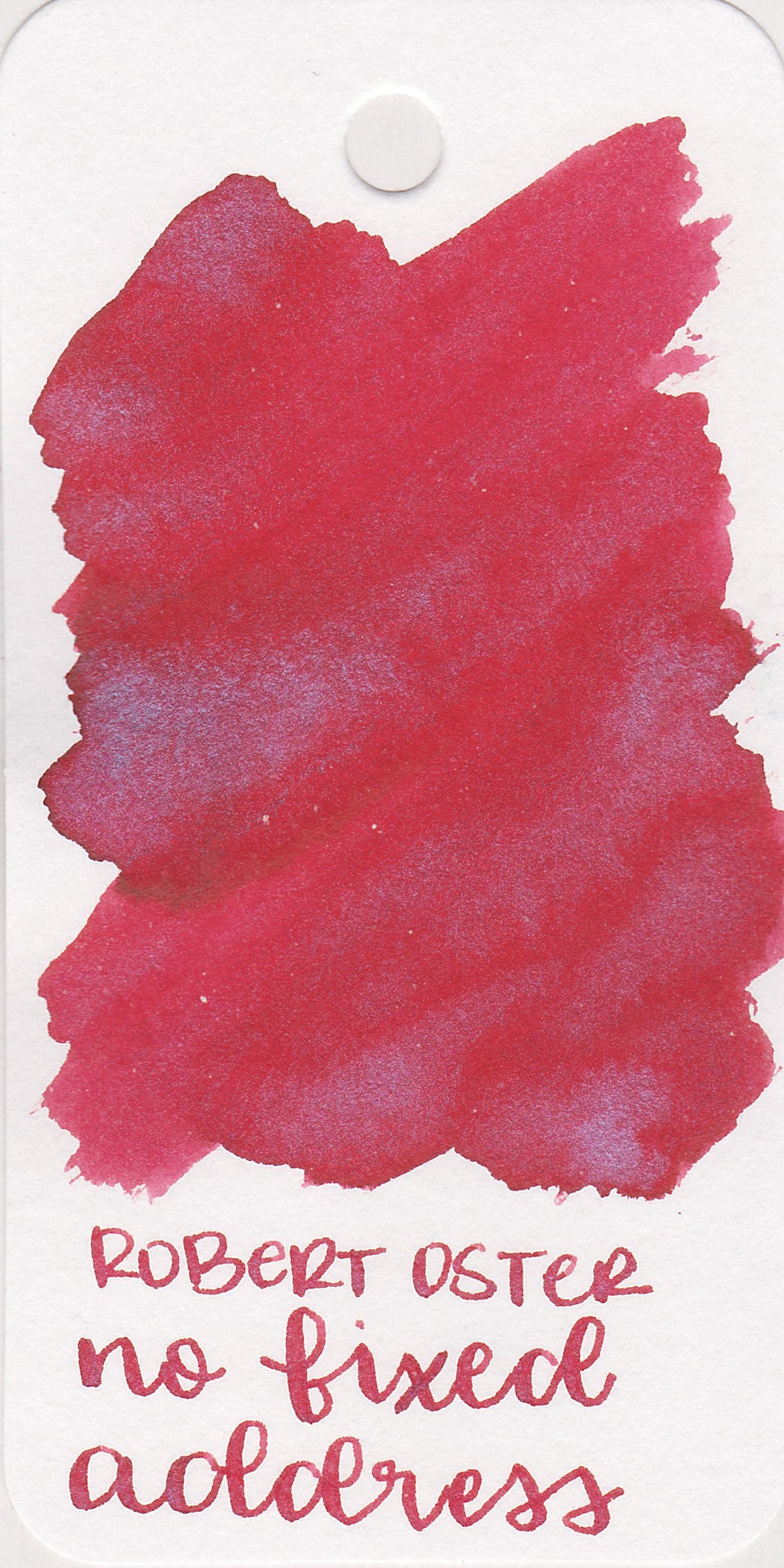
No Fixed Address is a bright cherry red with blue shimmer.
*For my swab cards I use a Col-o-ring by Skylab Letterpress, a medium Pilot Ishime and a Mabie Todd Swan.
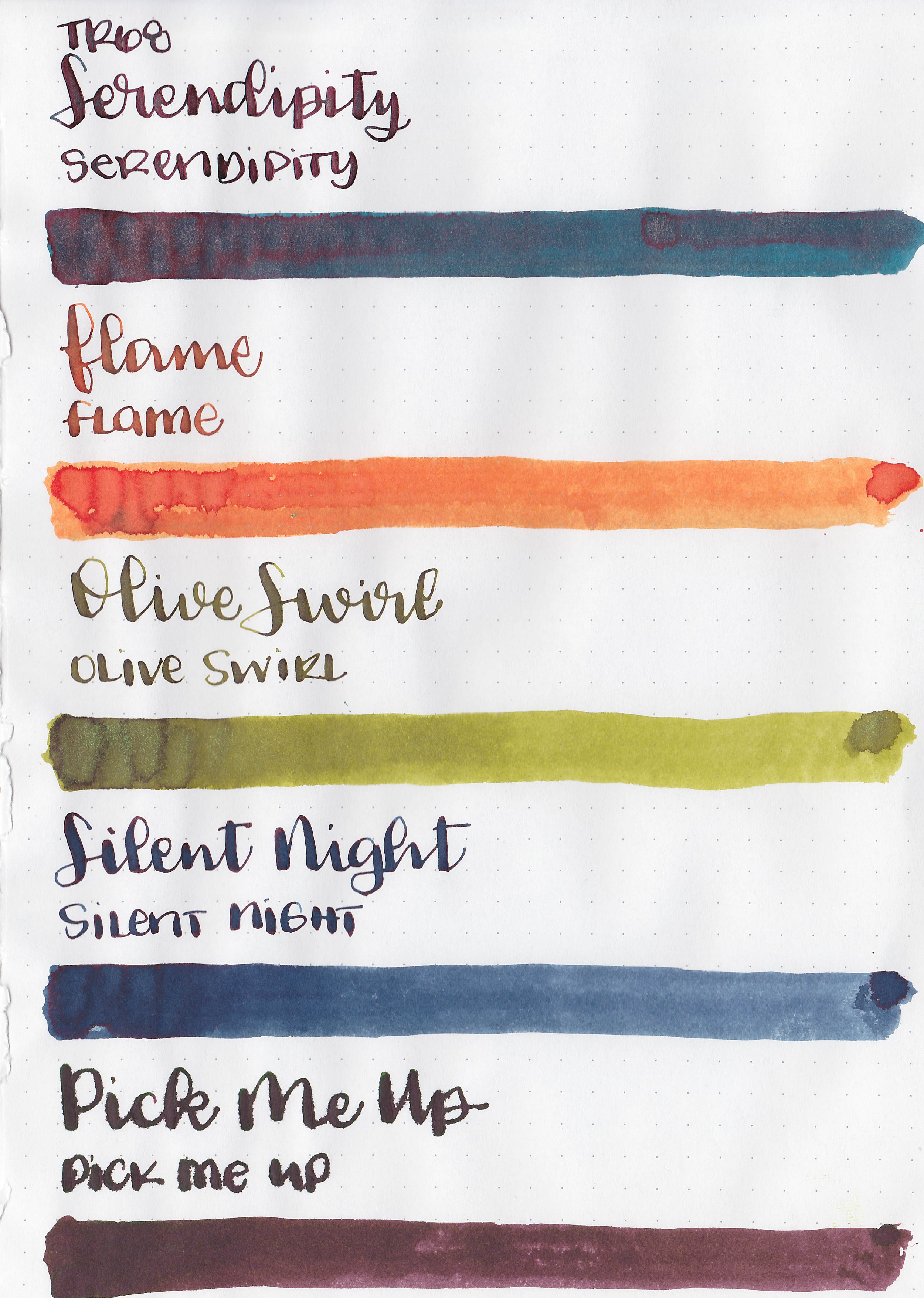
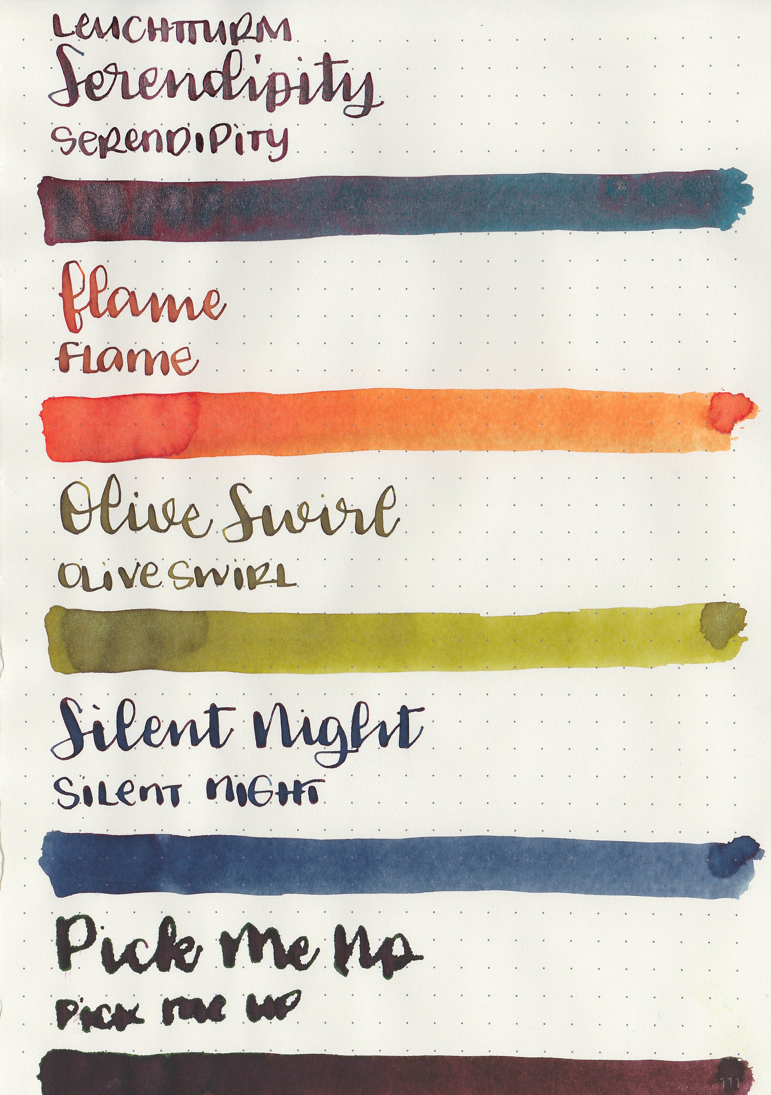
Swabs:

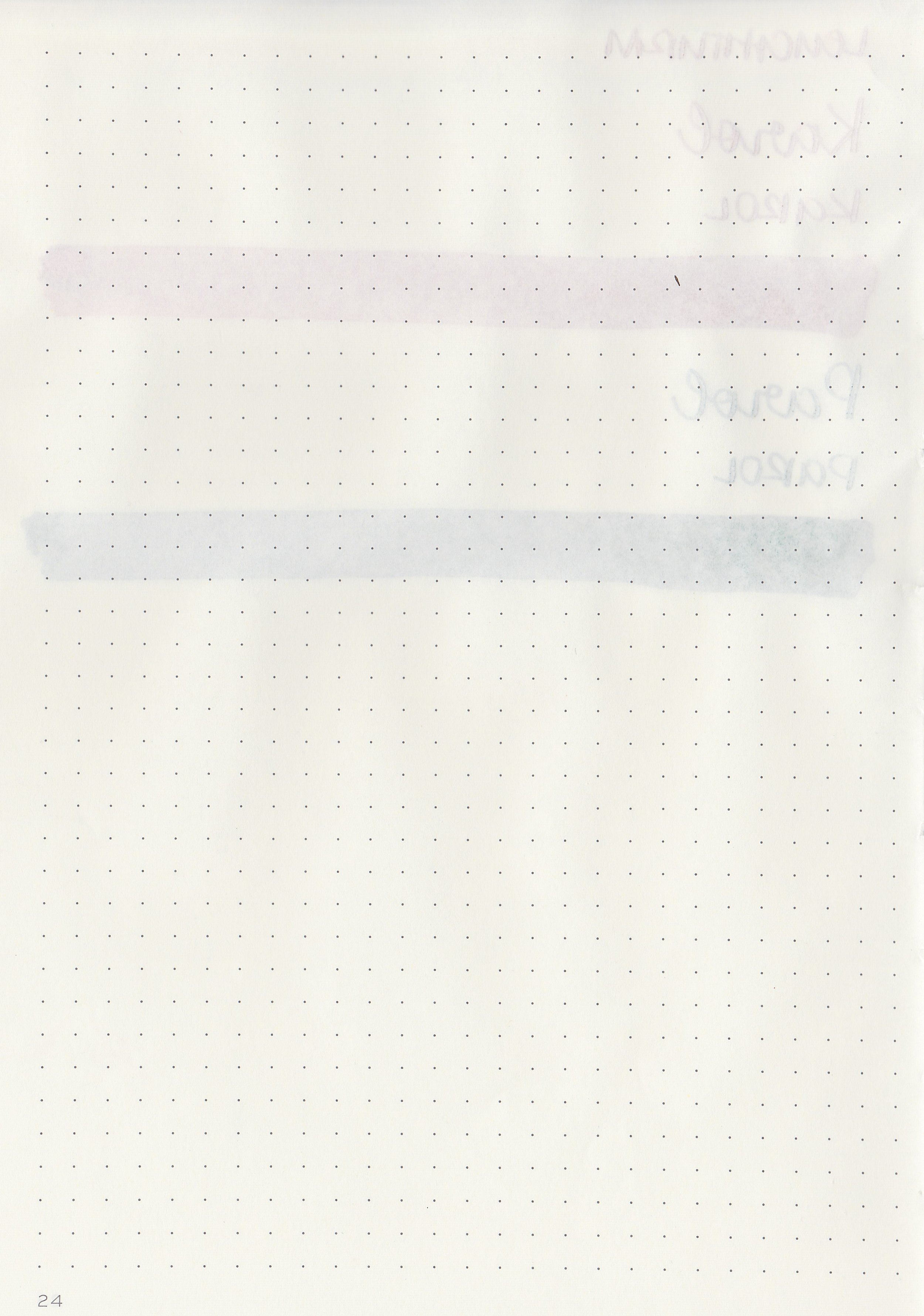
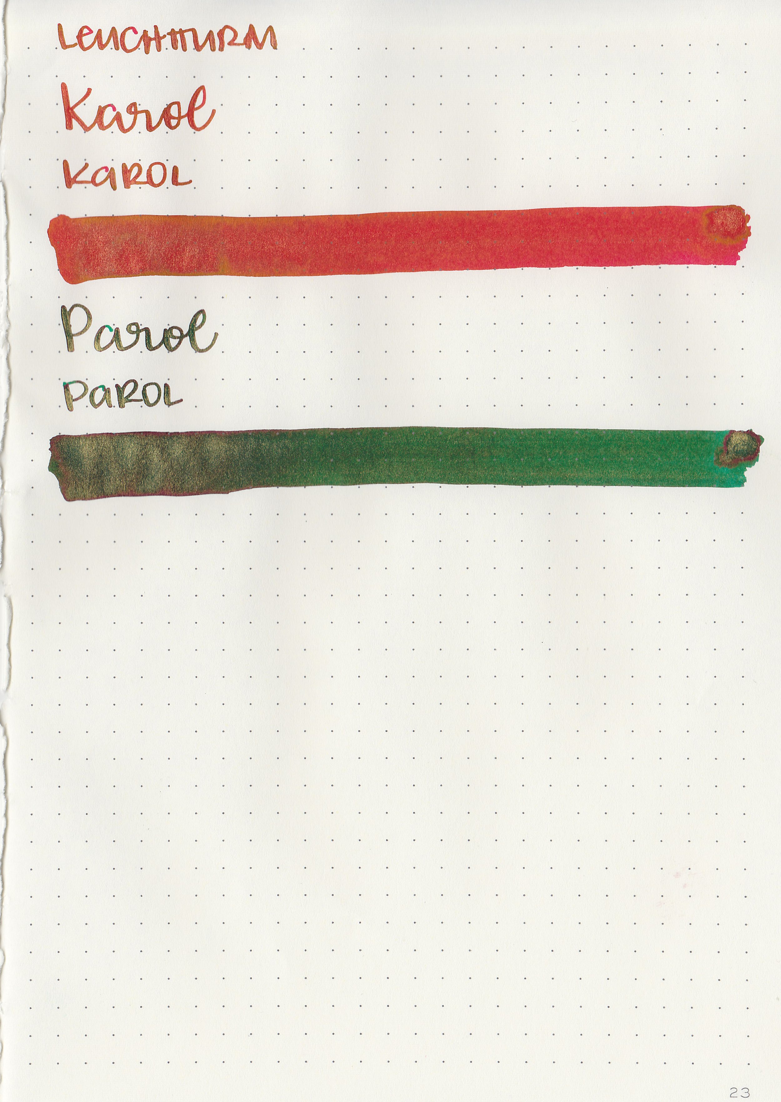
In large swabs on Tomoe River paper the ink has plenty of blue shimmer.

Writing samples:
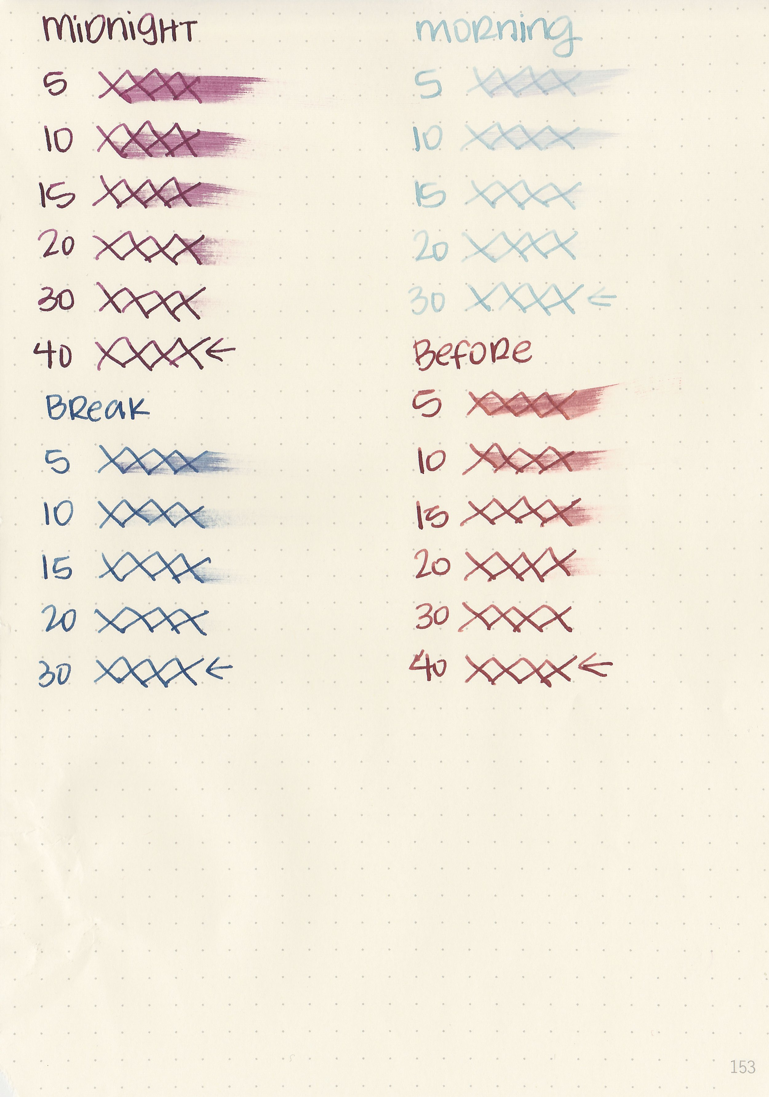
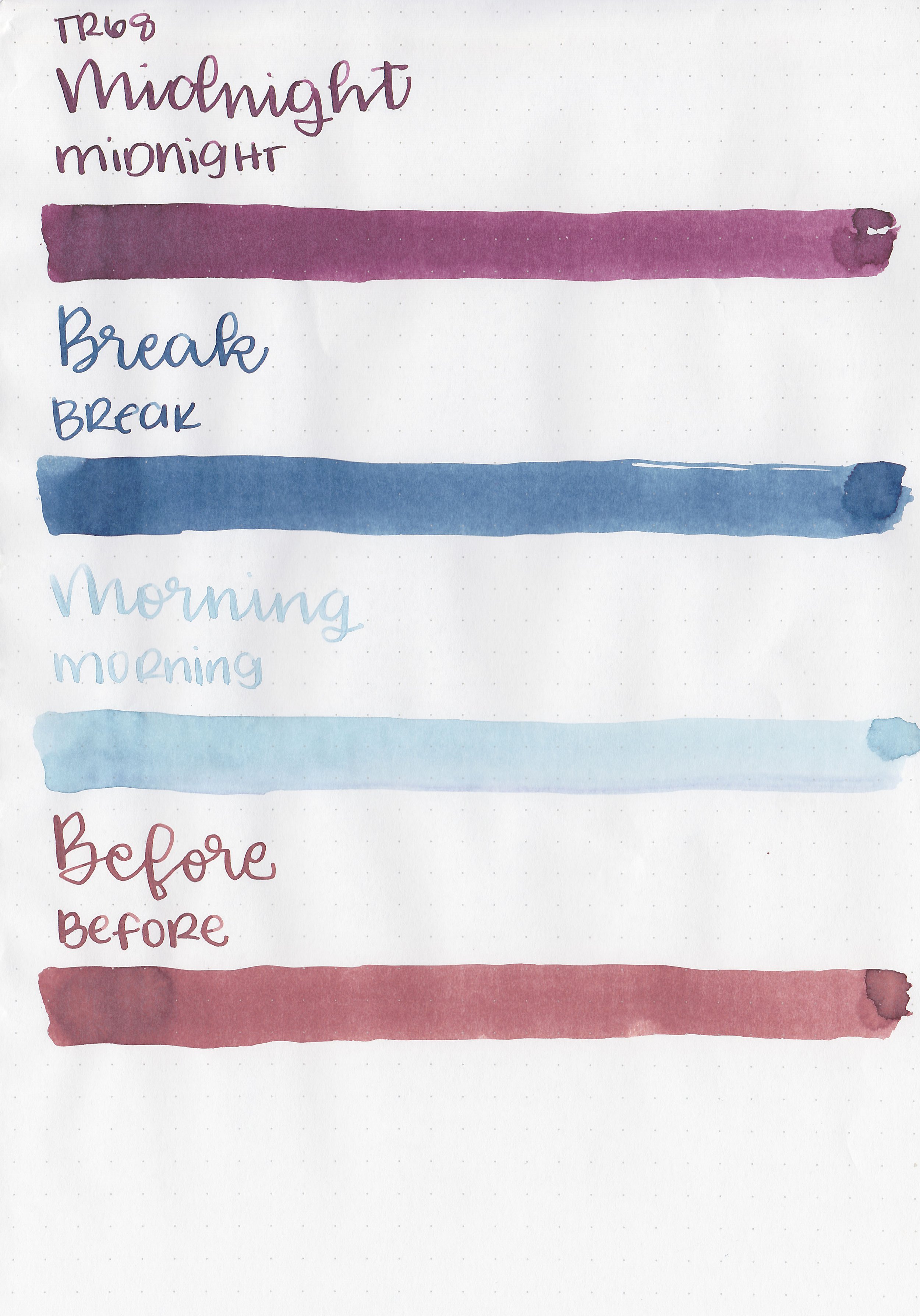
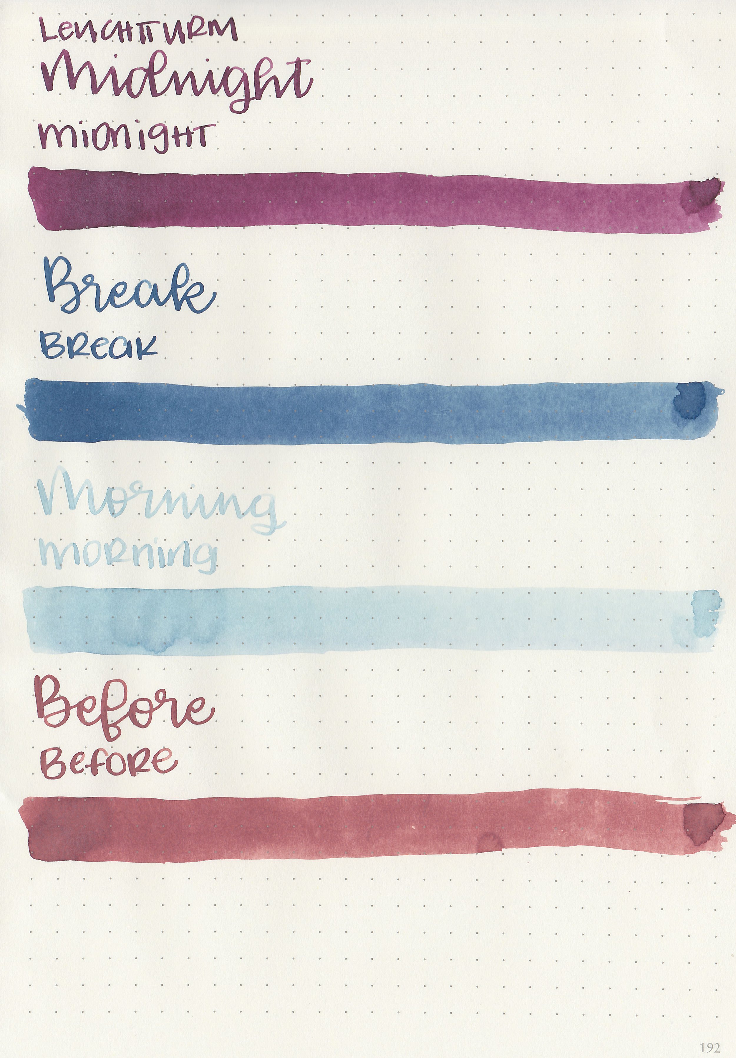
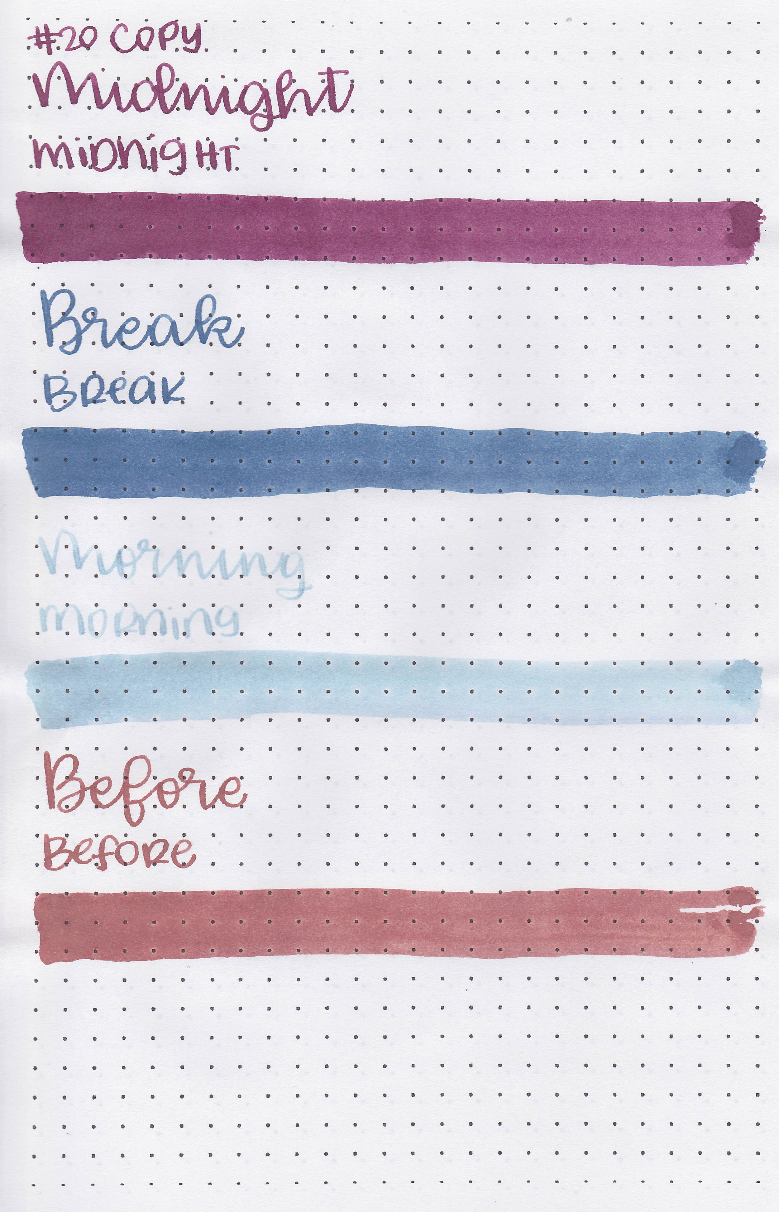
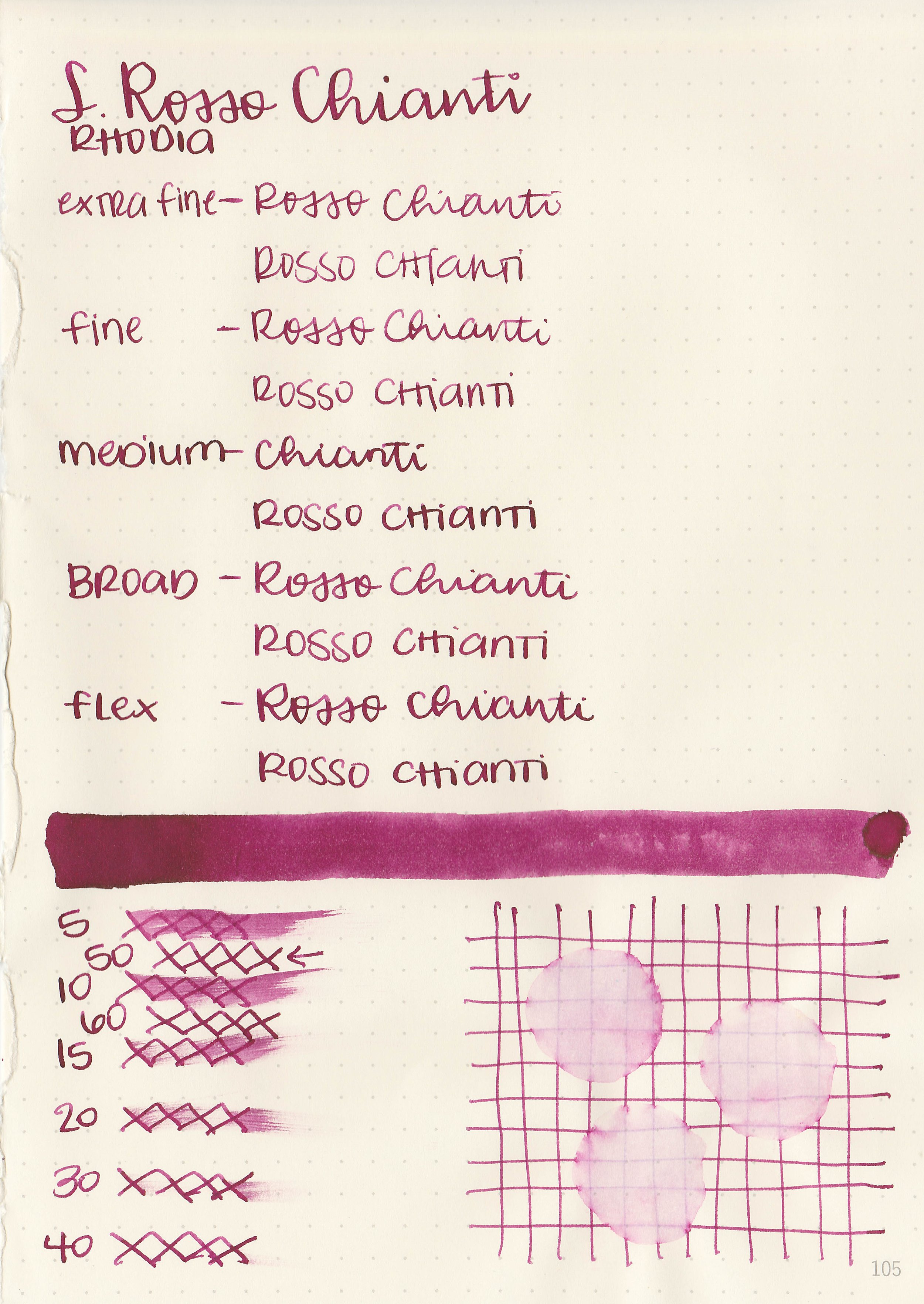
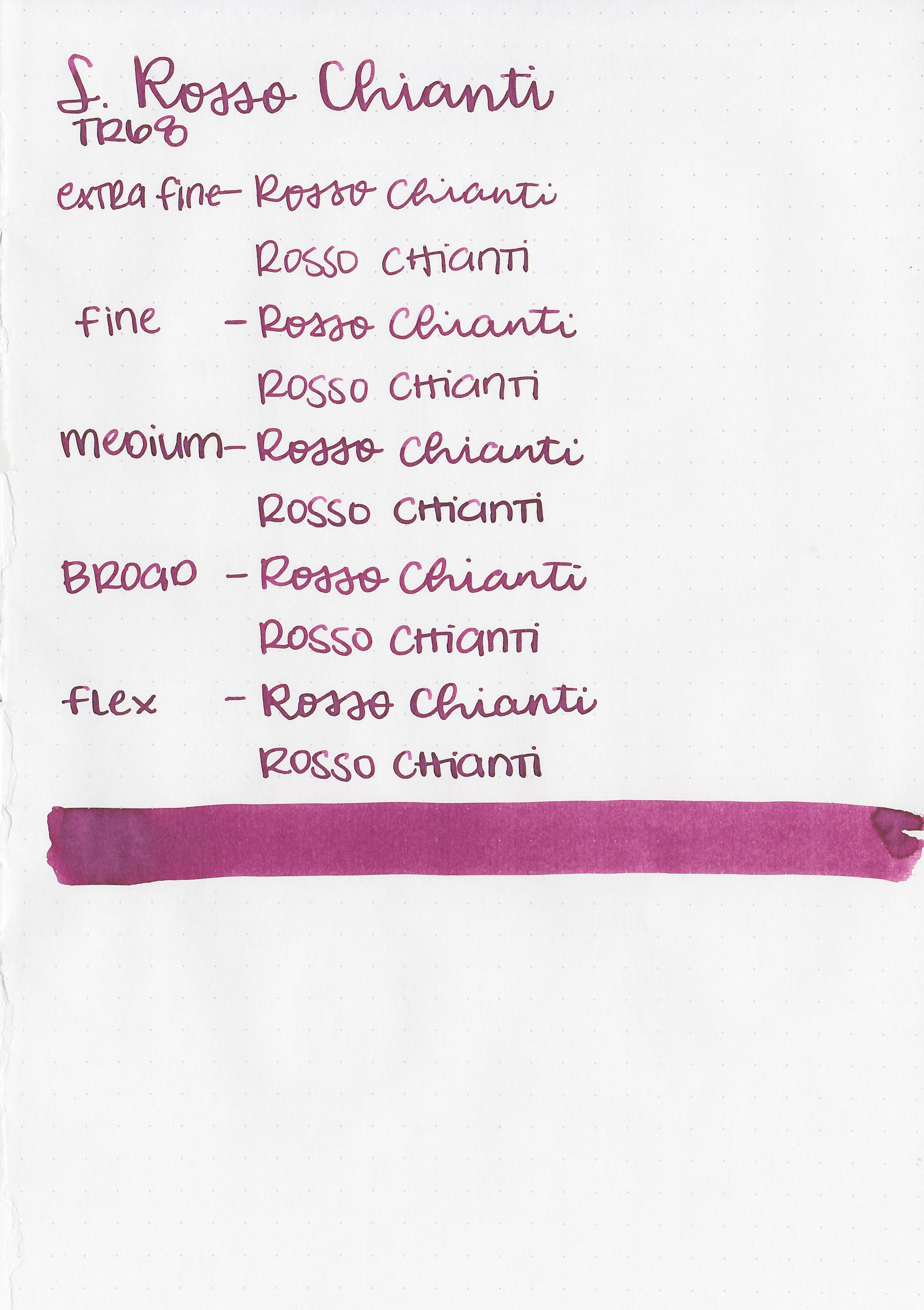
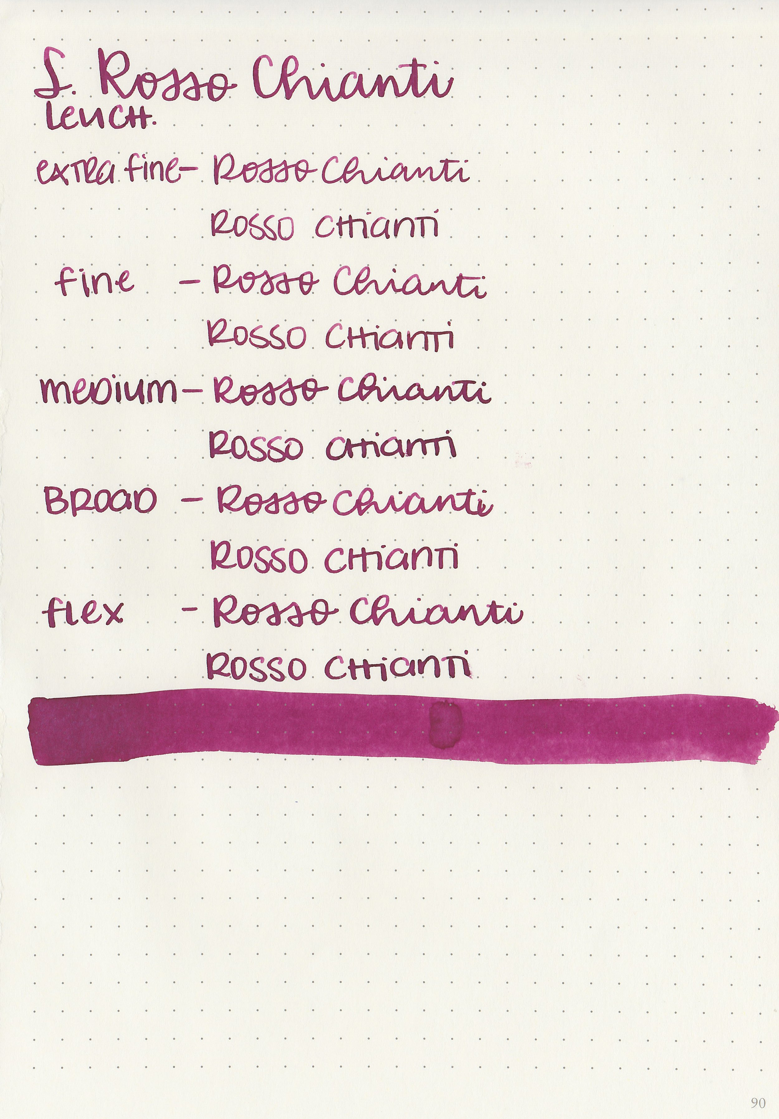
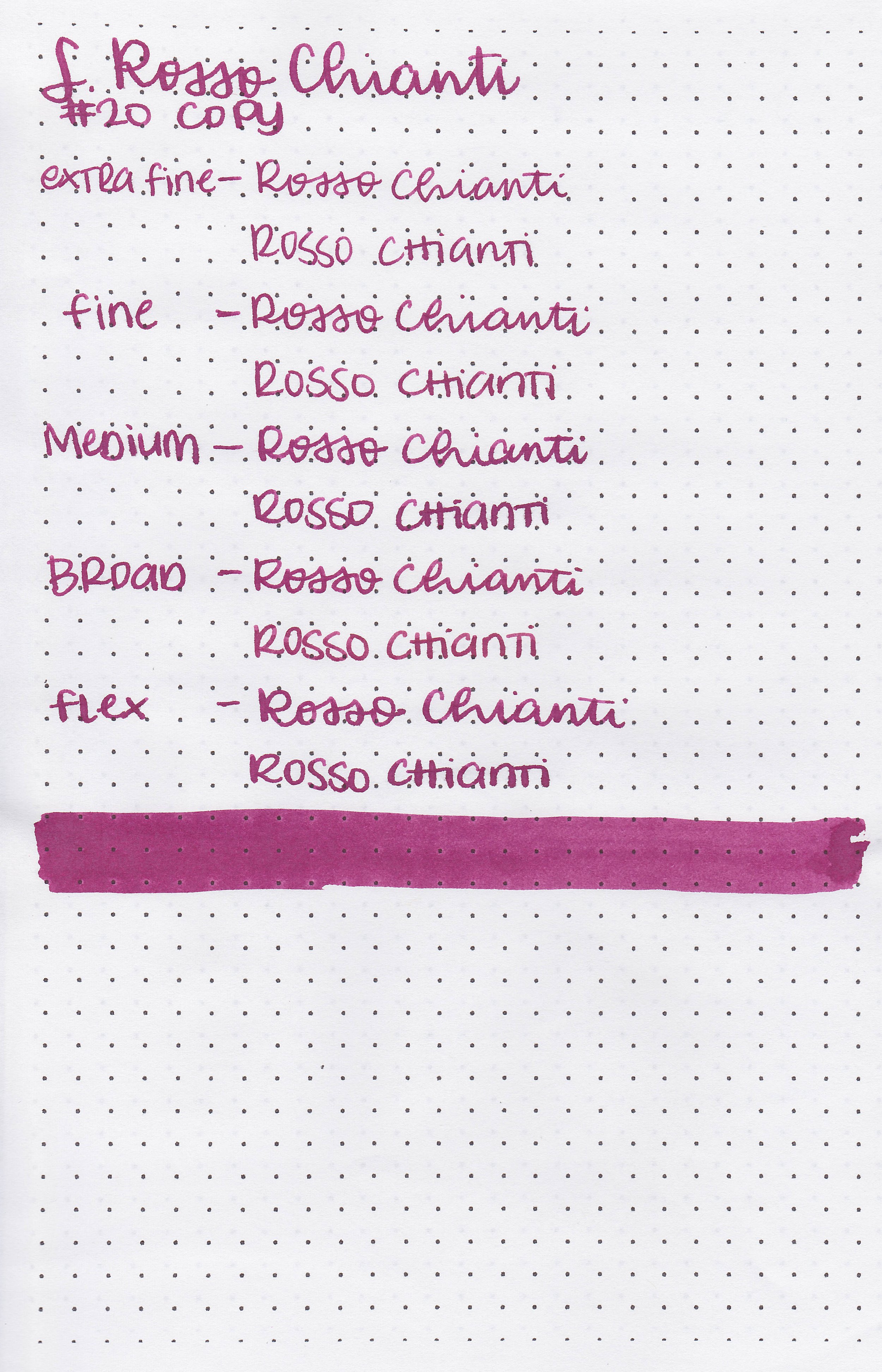
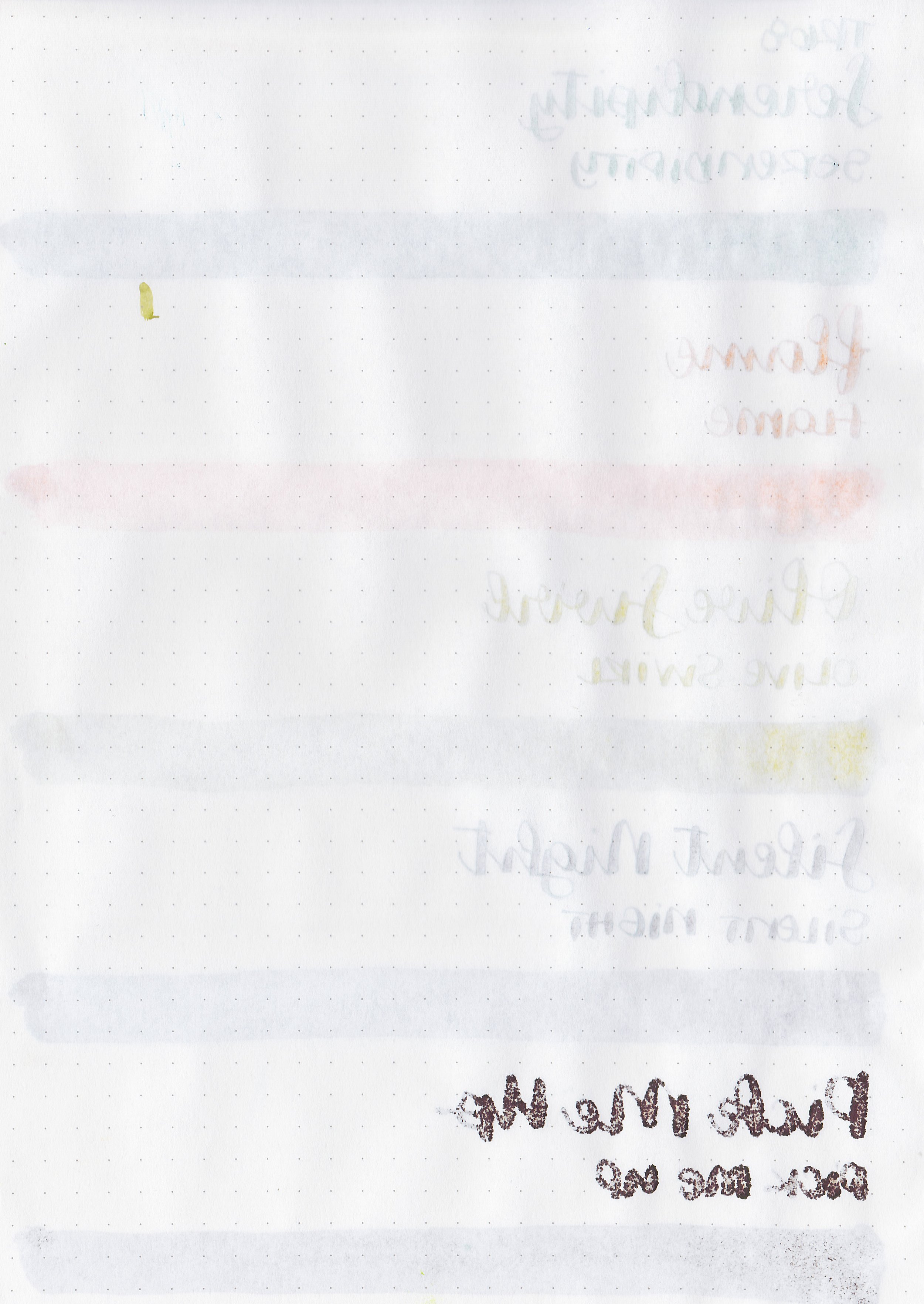
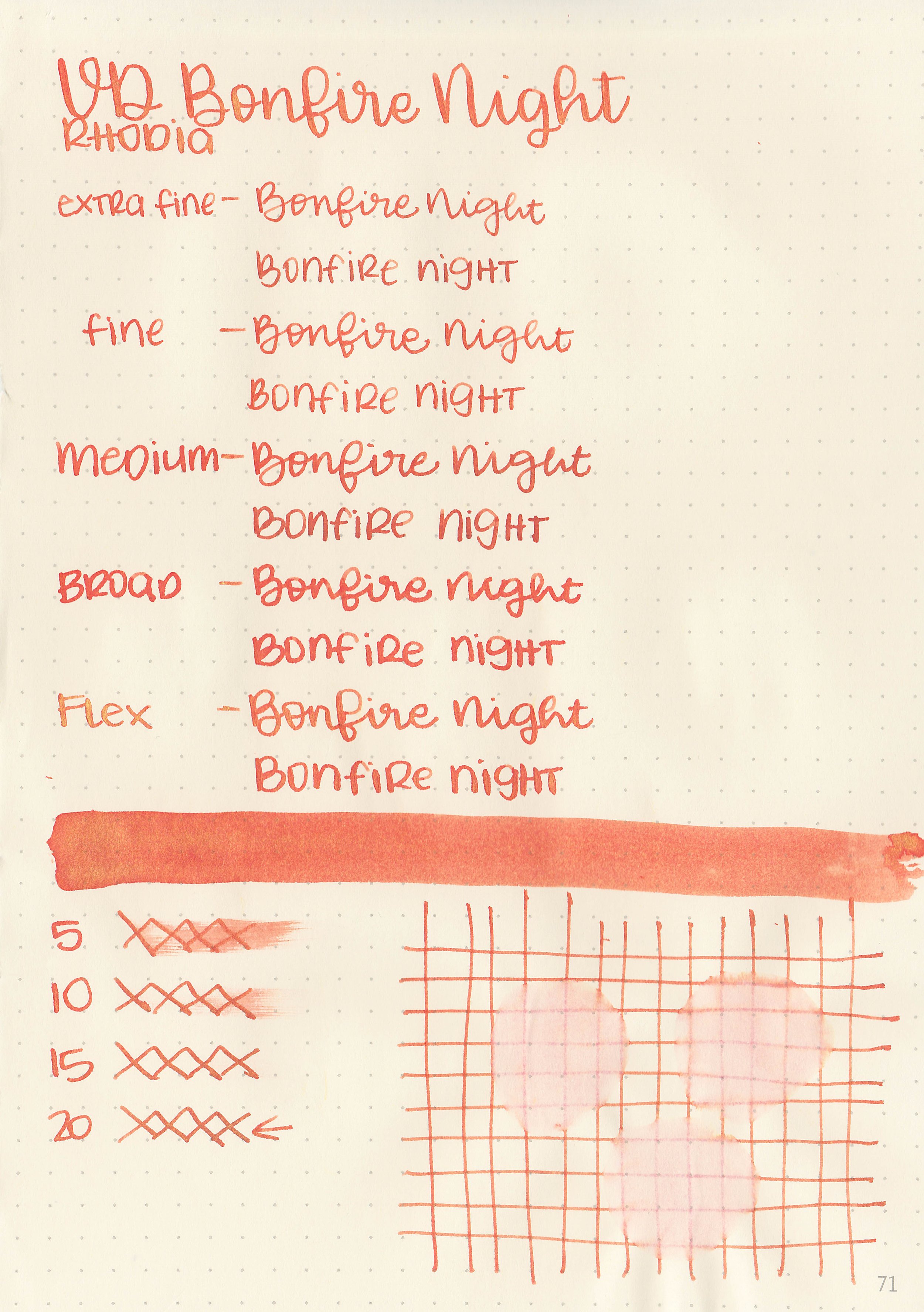
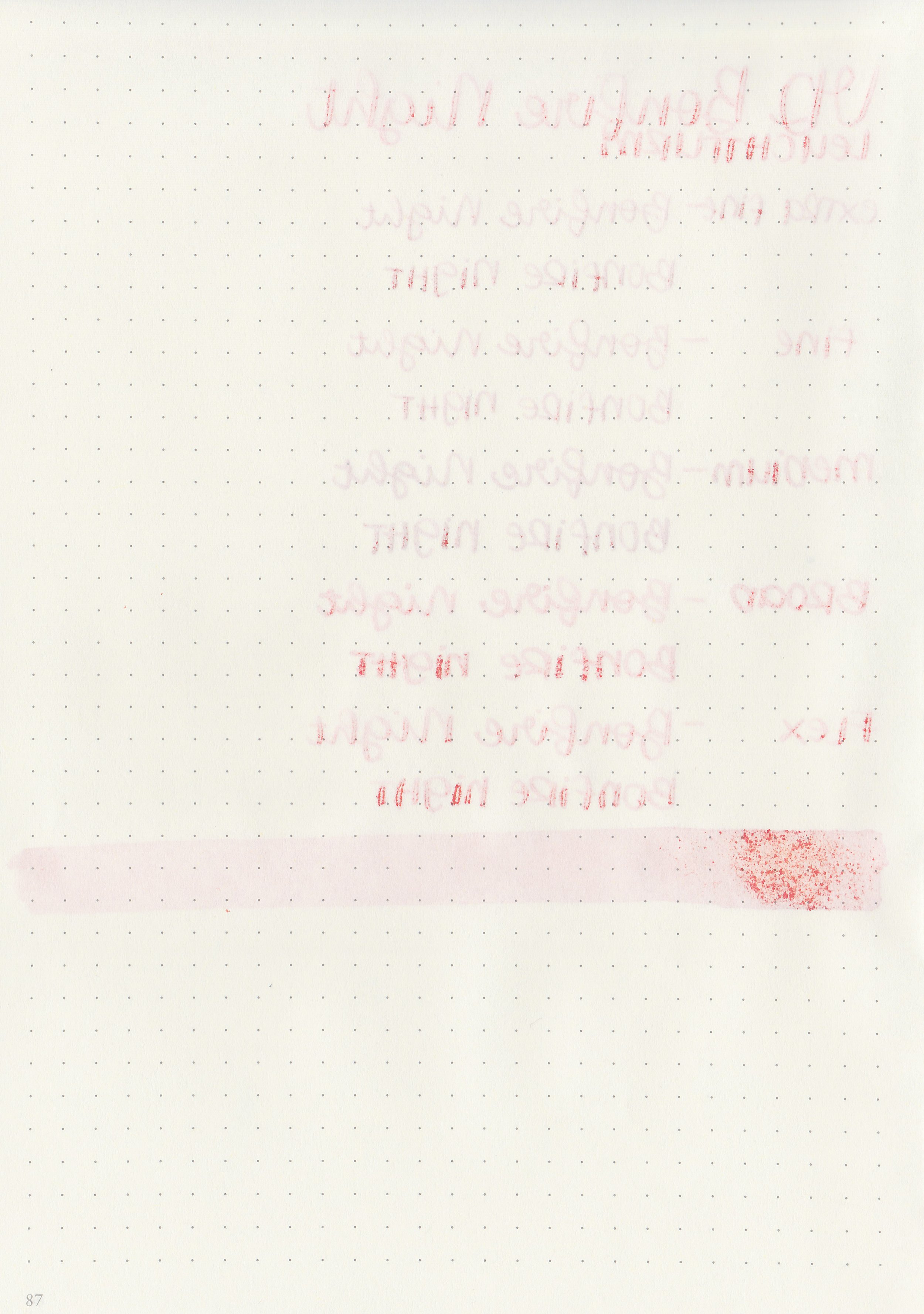
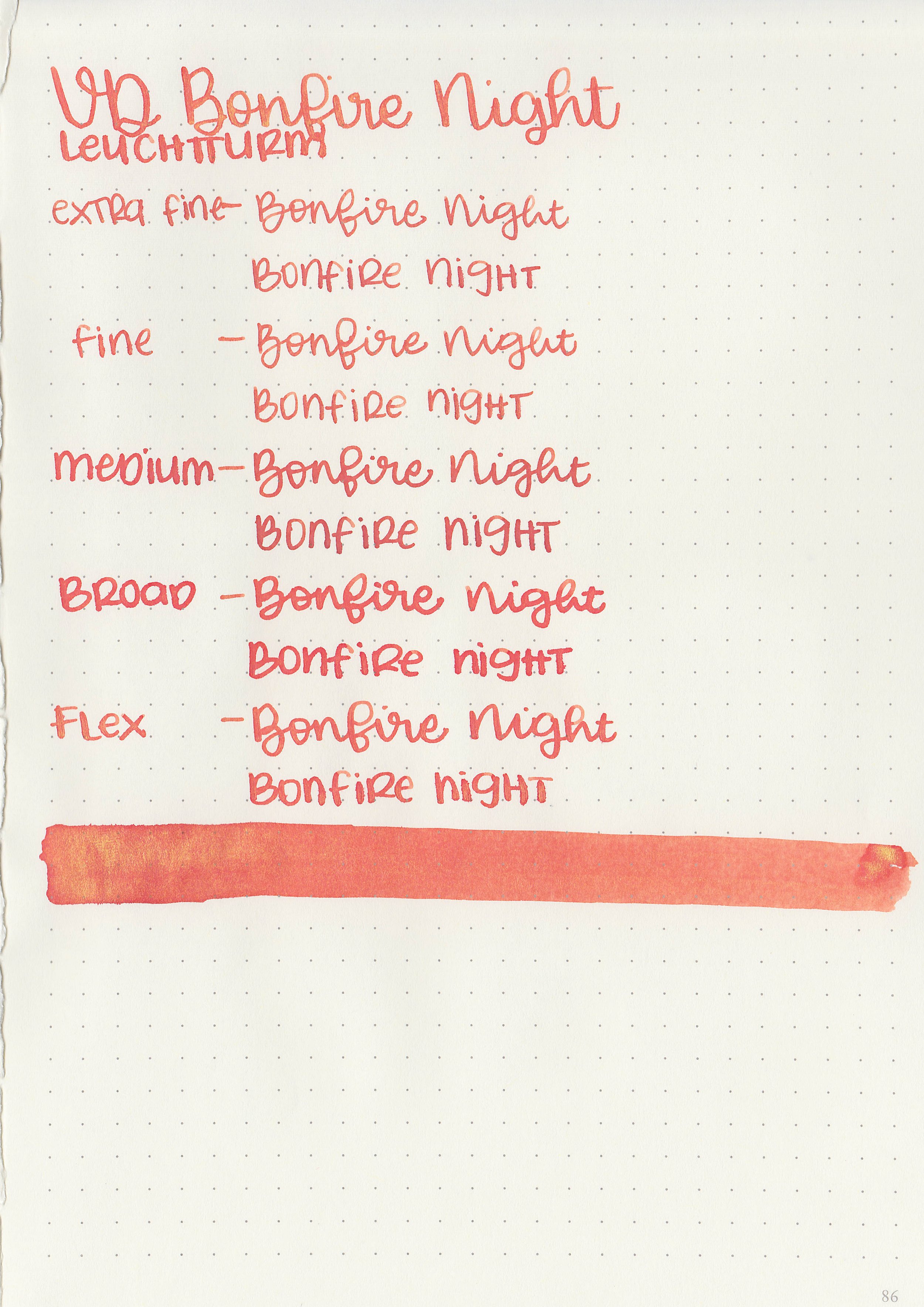
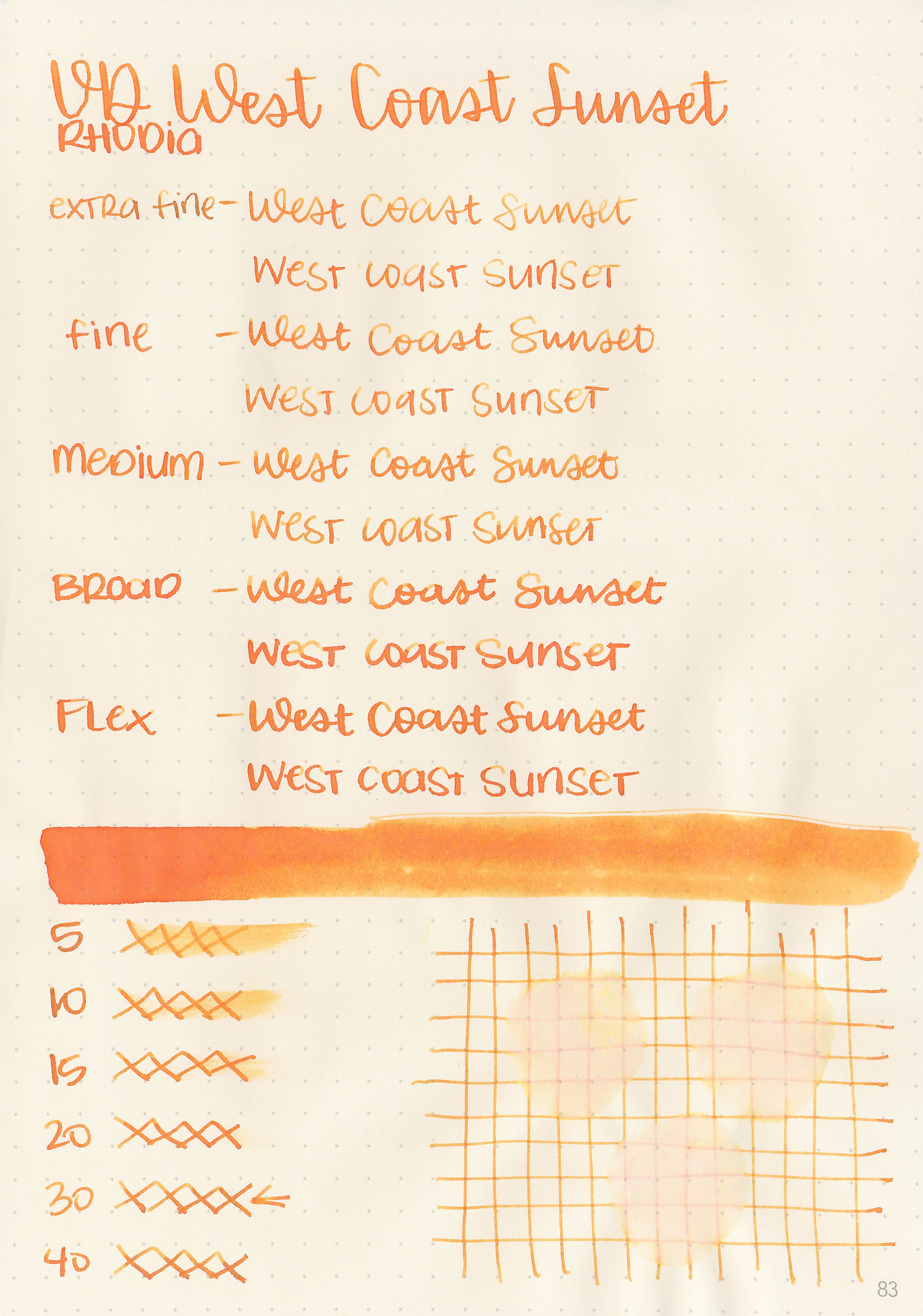
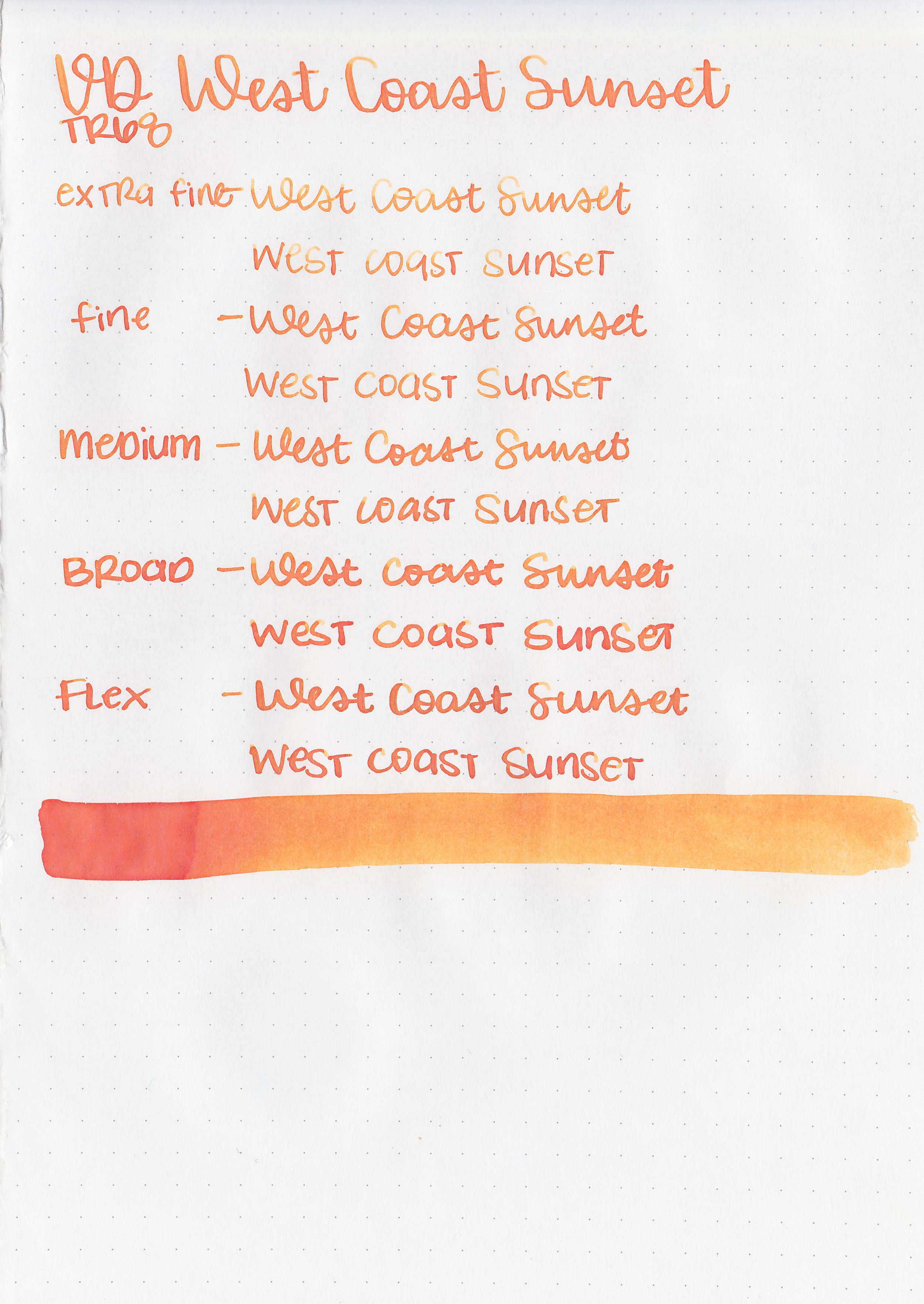
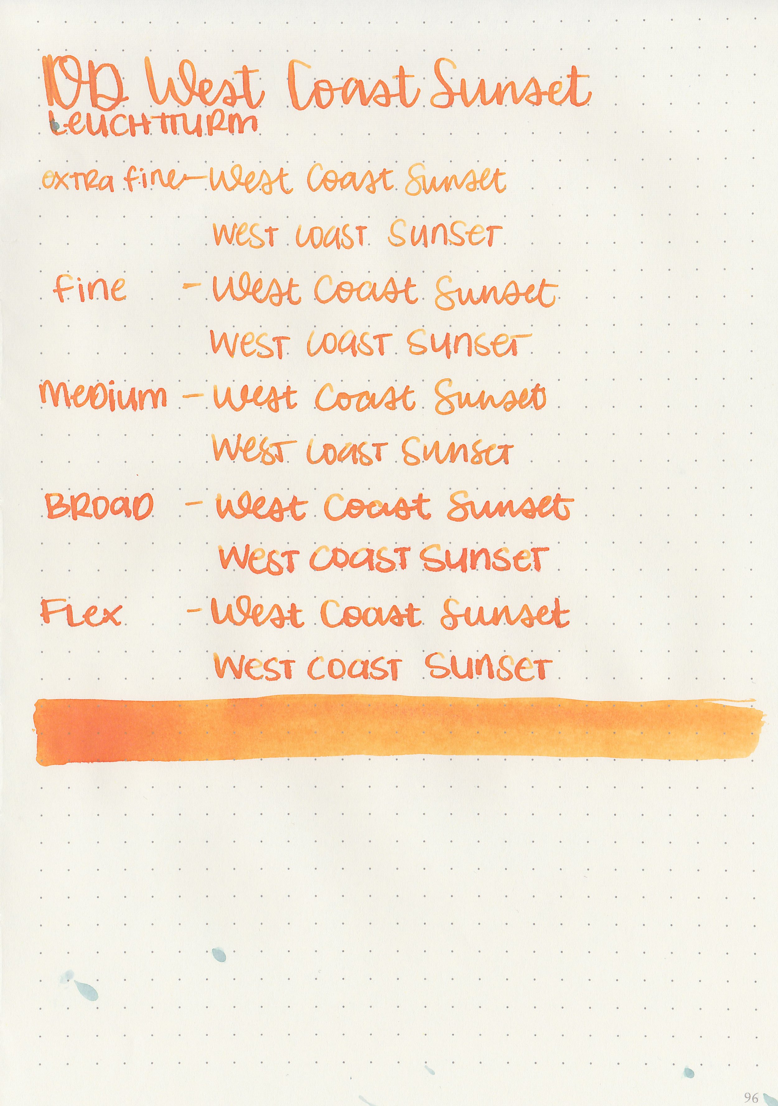
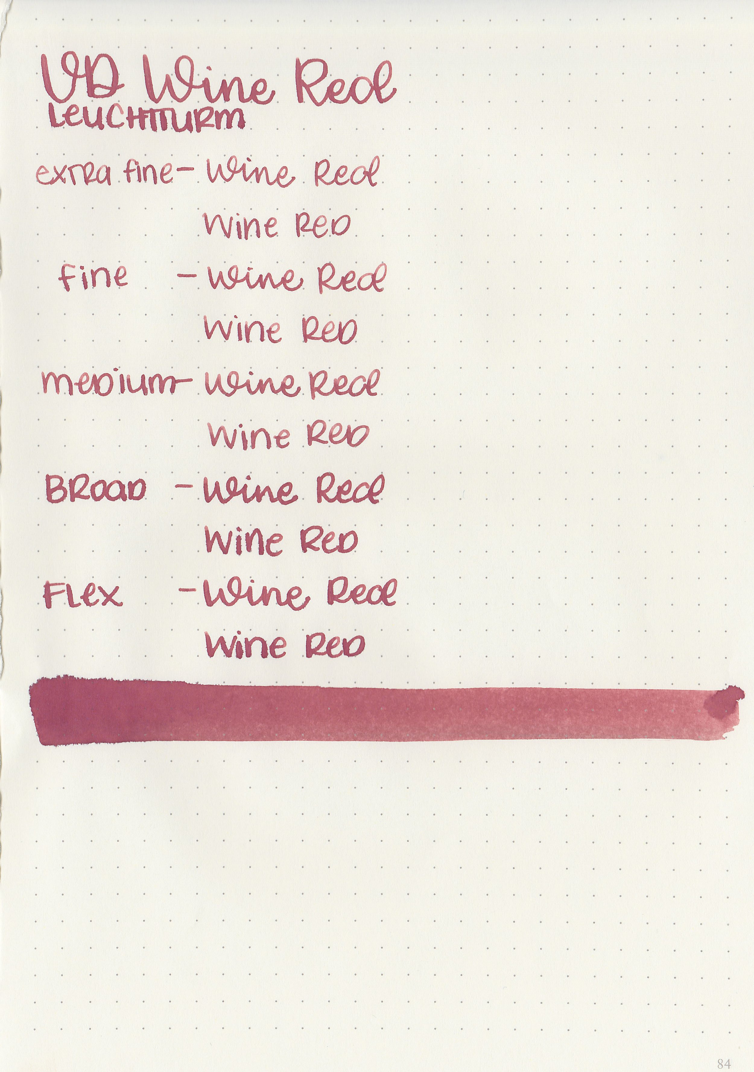
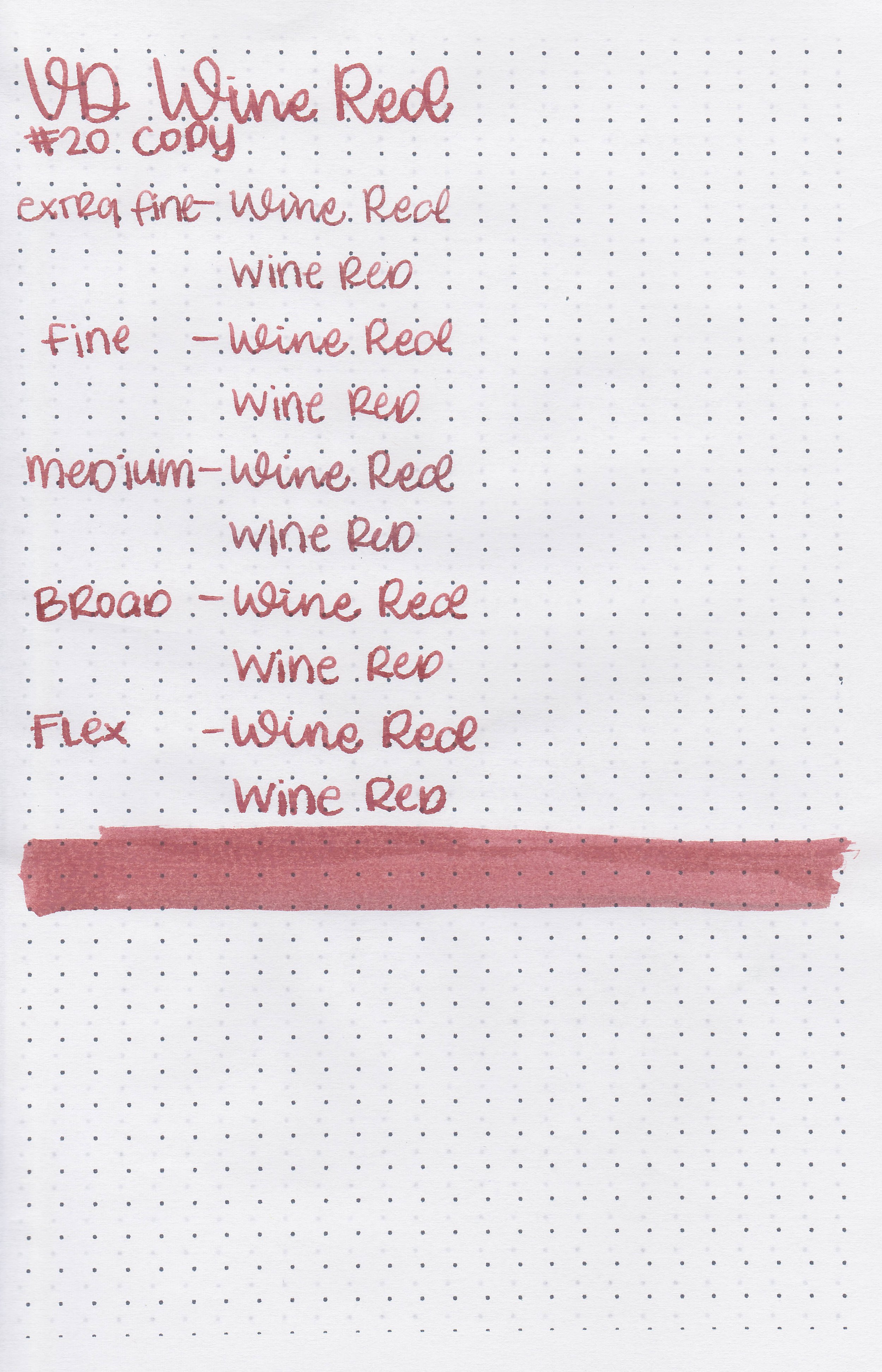
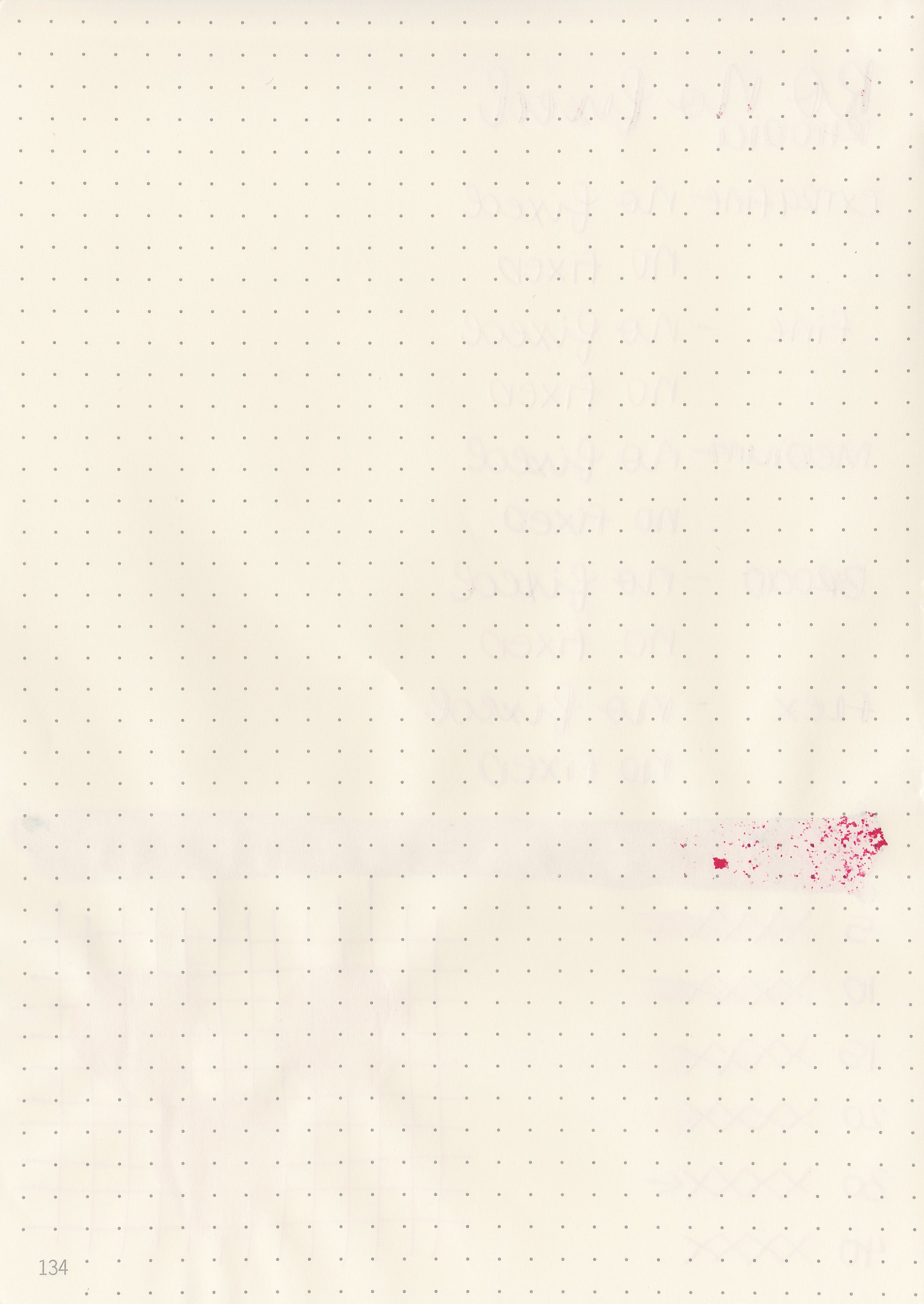
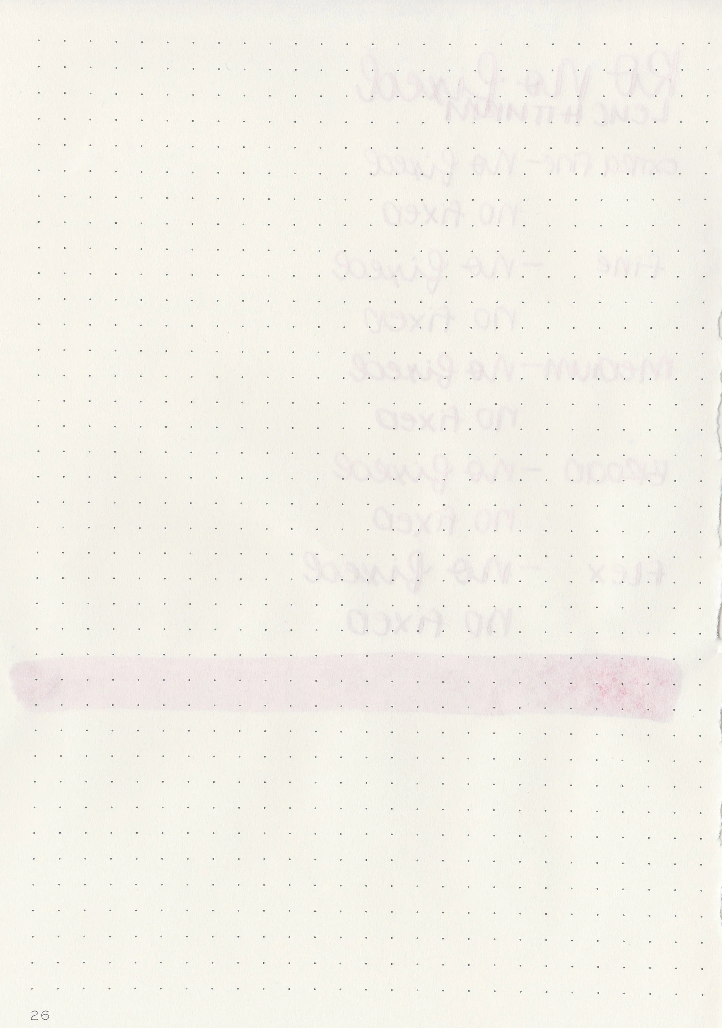
Let's take a look at how the ink behaves on fountain pen friendly papers: Rhodia, Tomoe River, and Leuchtturm.
*For my writing samples I use:
Vintage Mabie Todd Swan (flex nib)
Taroko Enigma notebooks (68gsm TR)
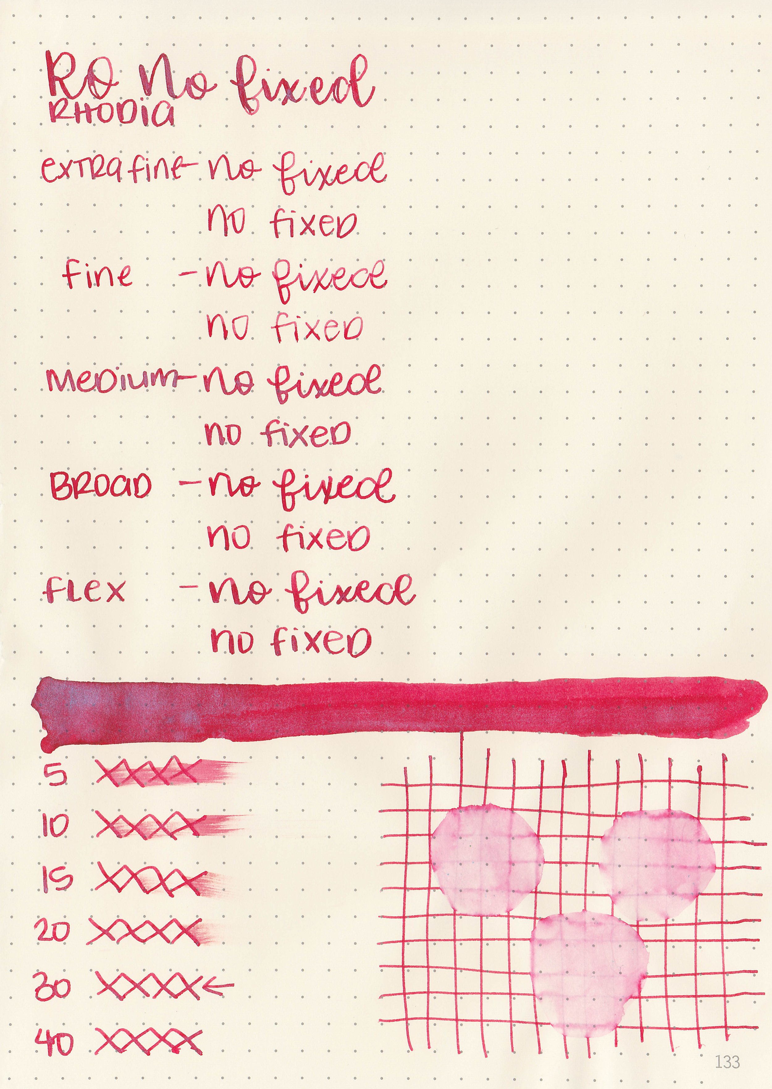
Dry time: 30 seconds
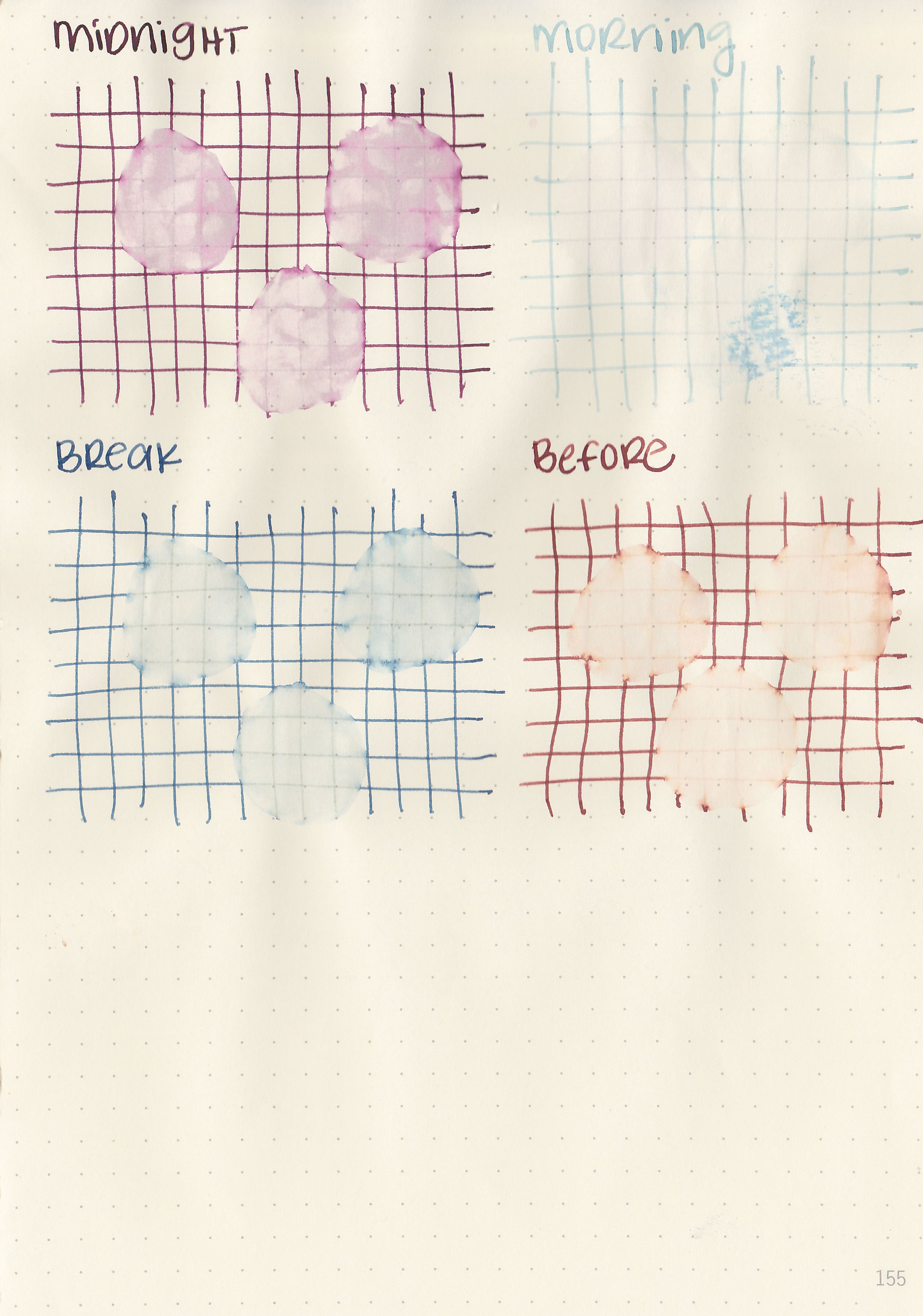
Water resistance: Low
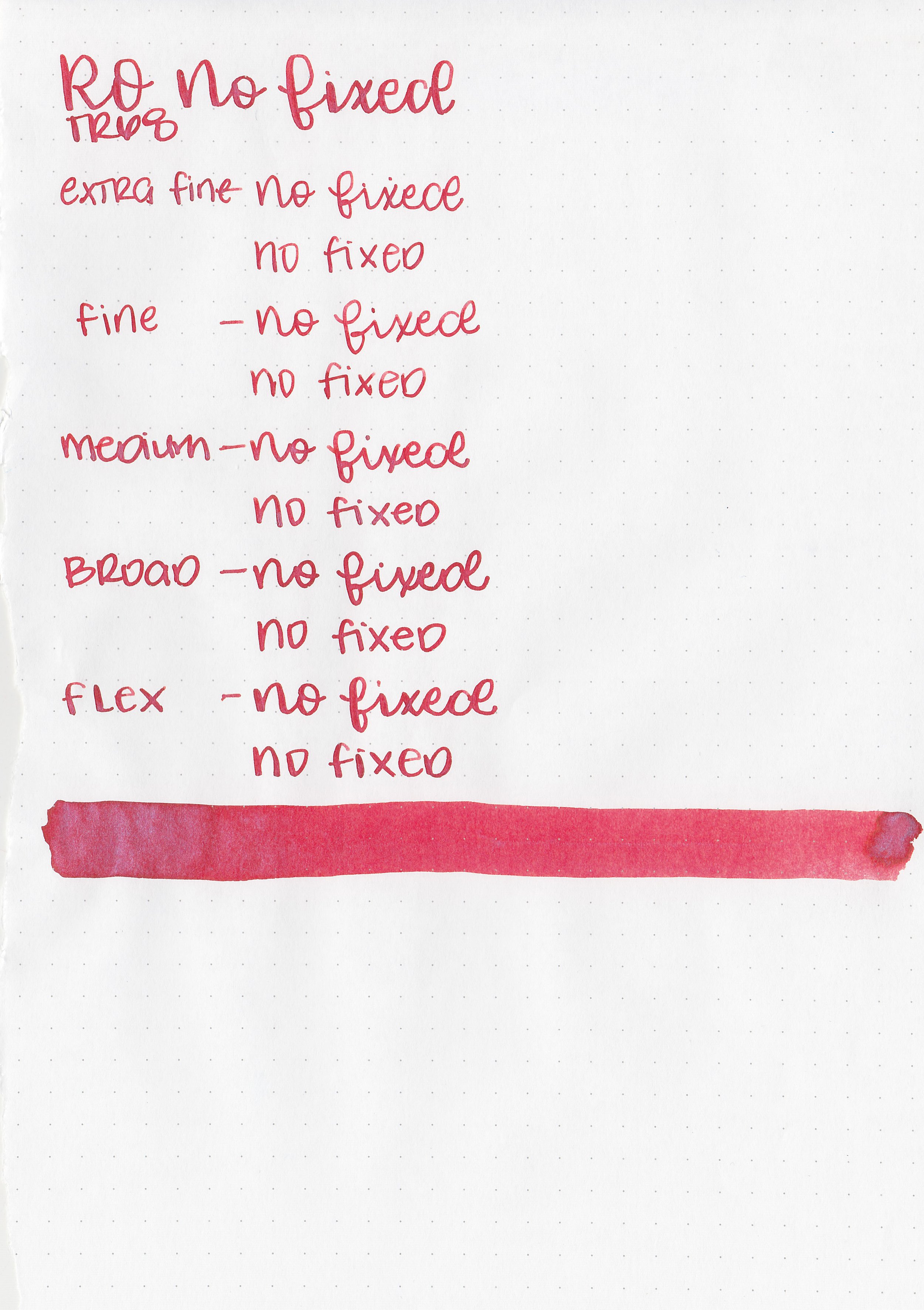
Feathering: None
Show through: Medium
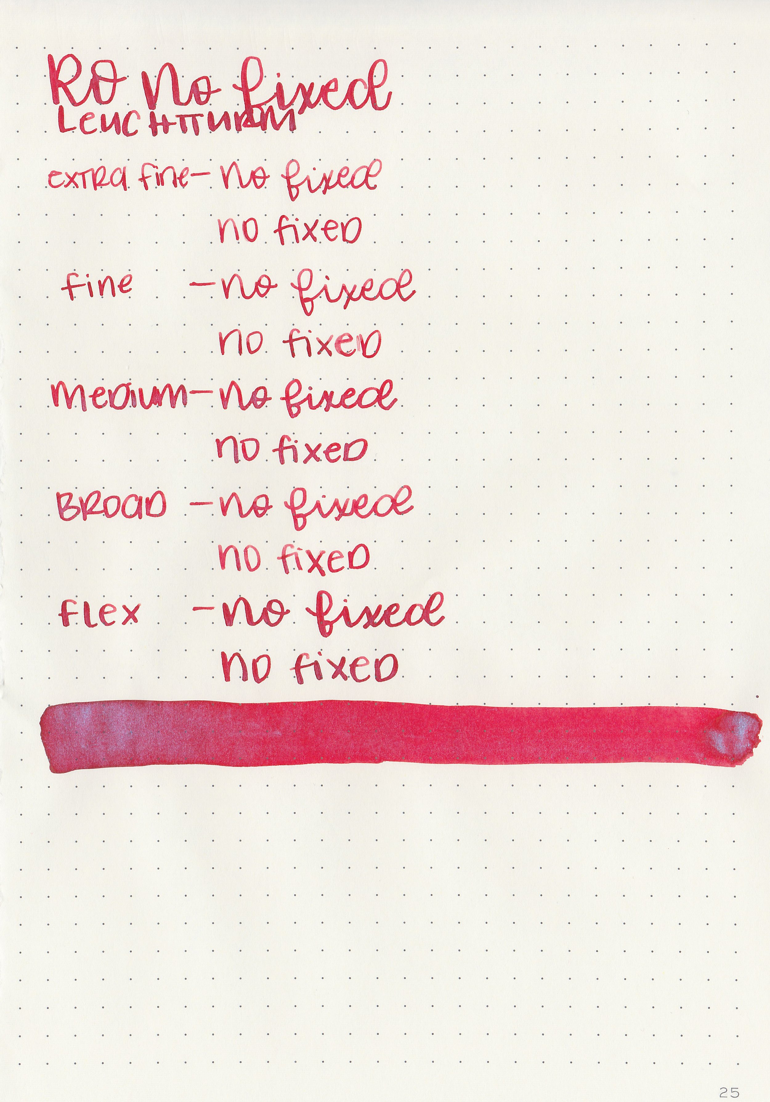
Bleeding: None
Other properties: low shading, no sheen, and blue shimmer.
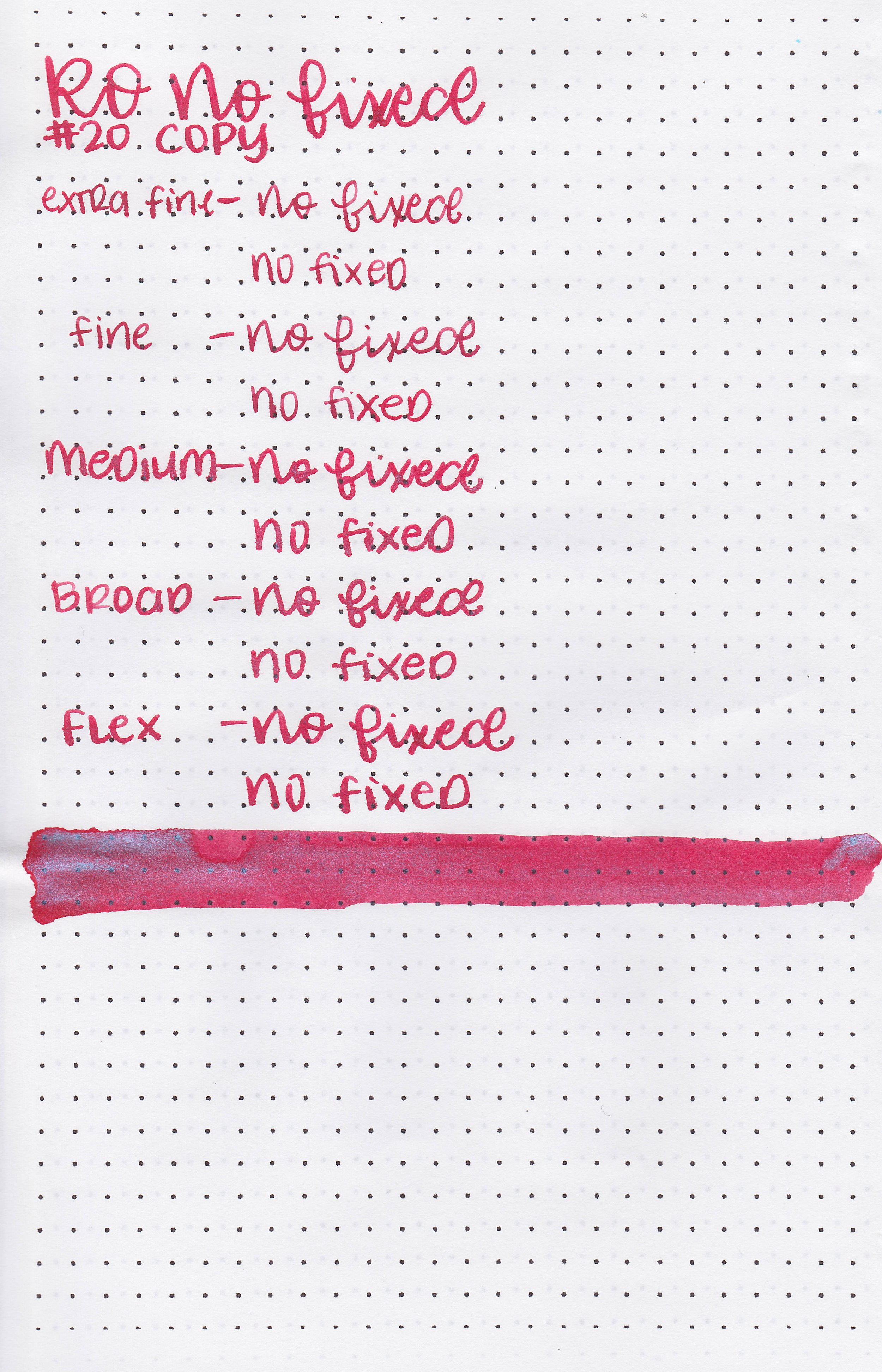
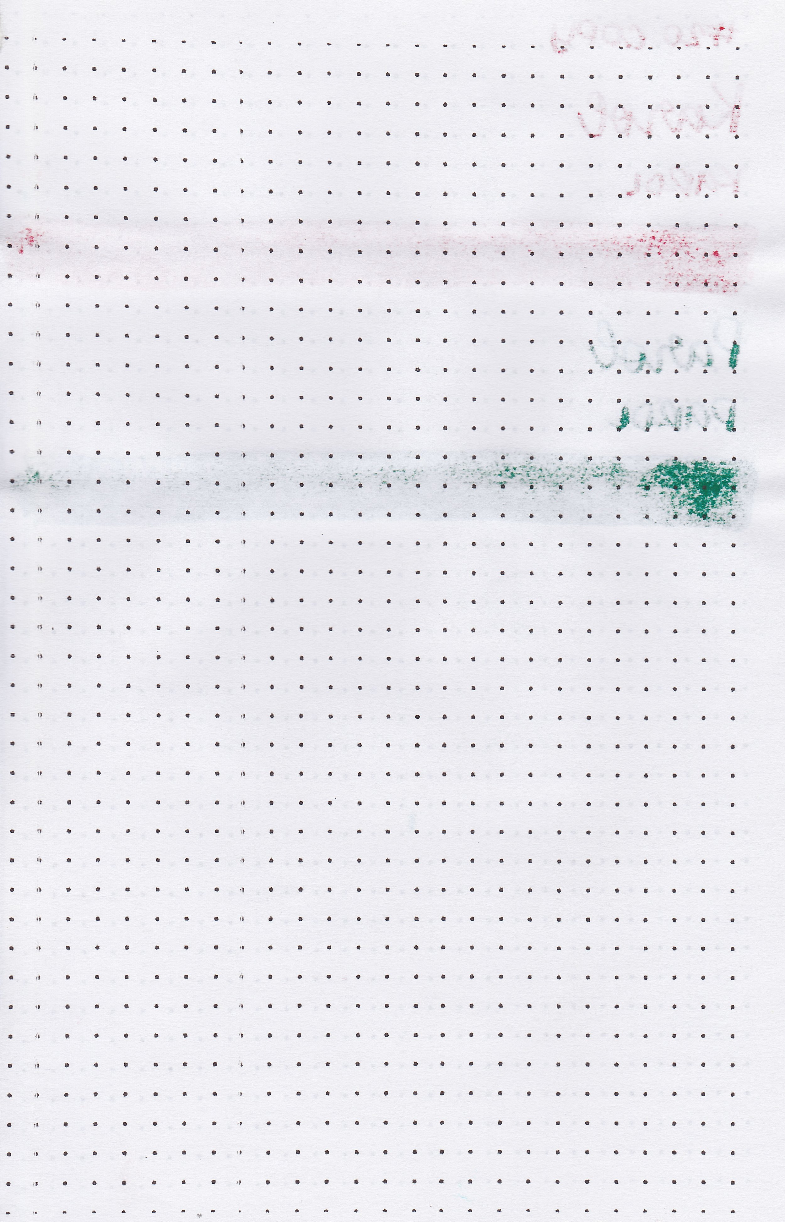
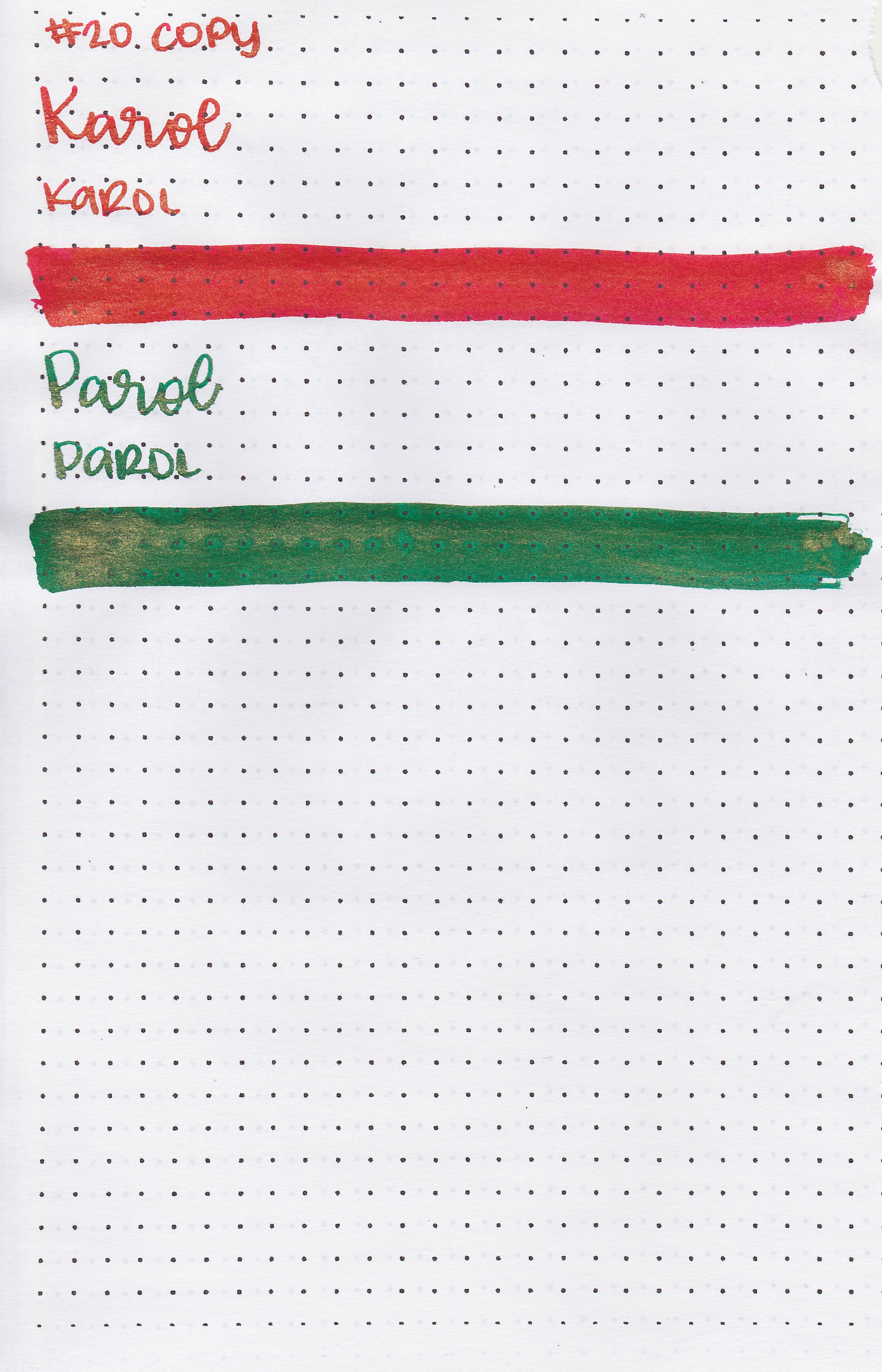
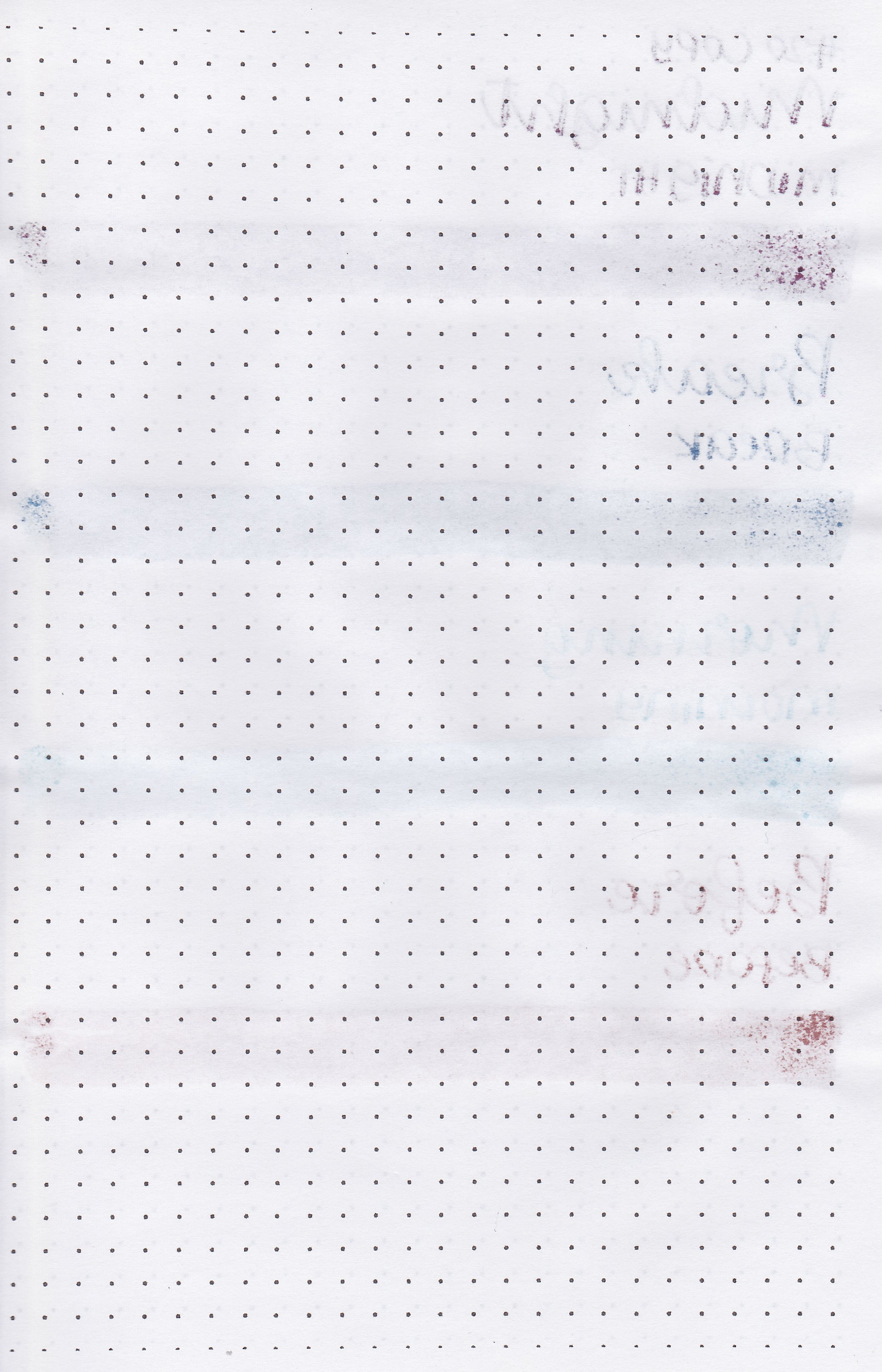
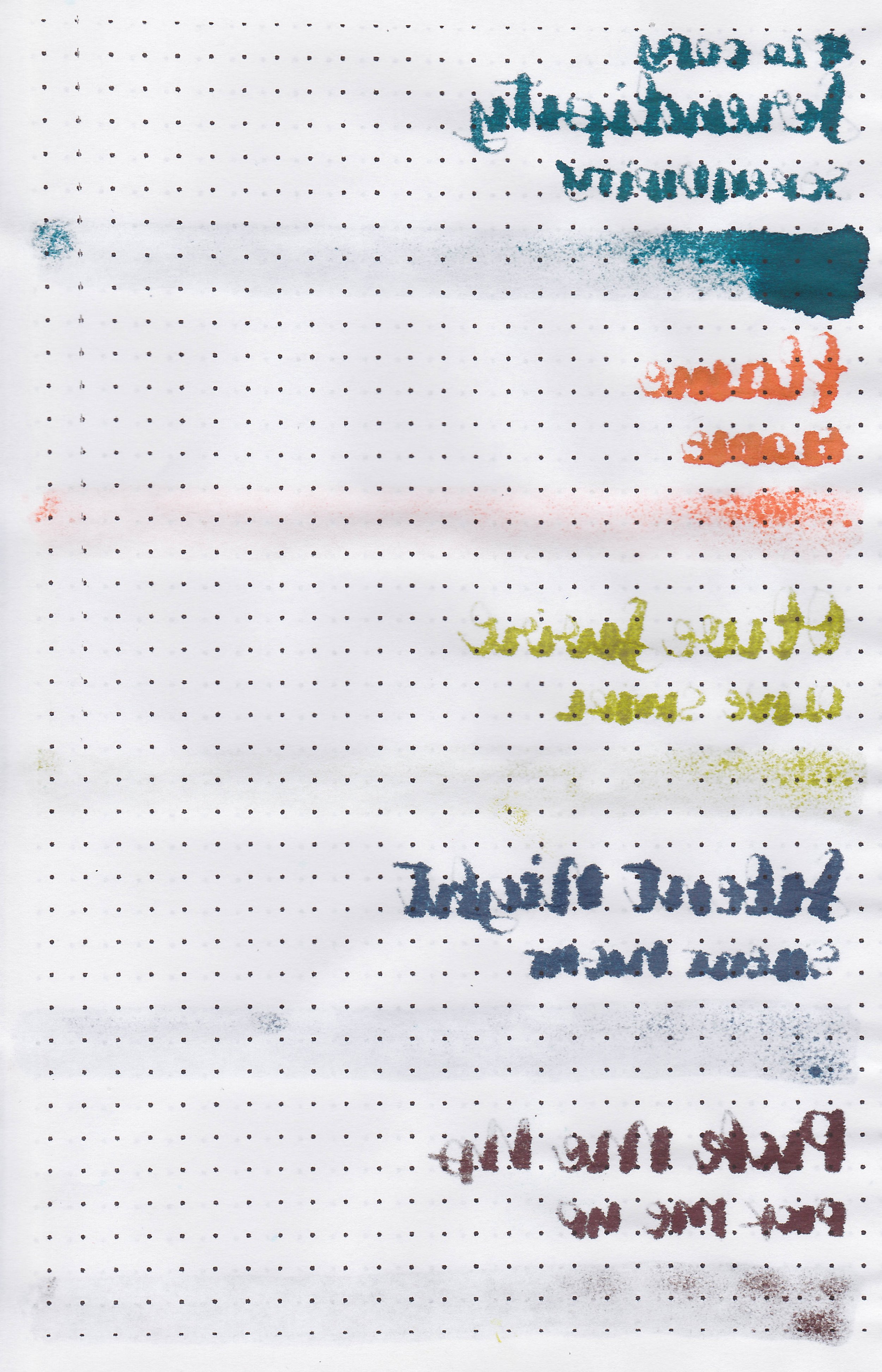
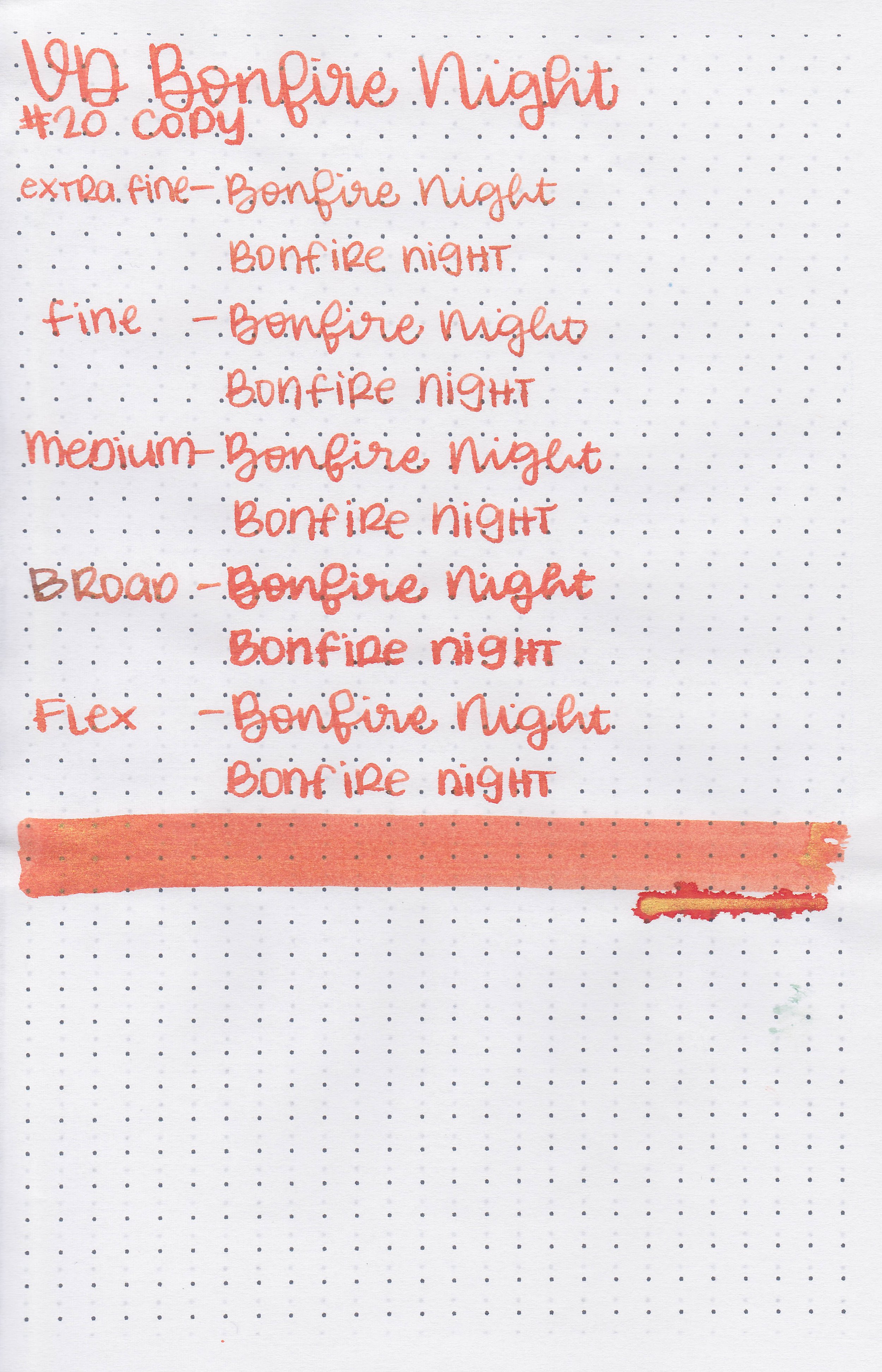
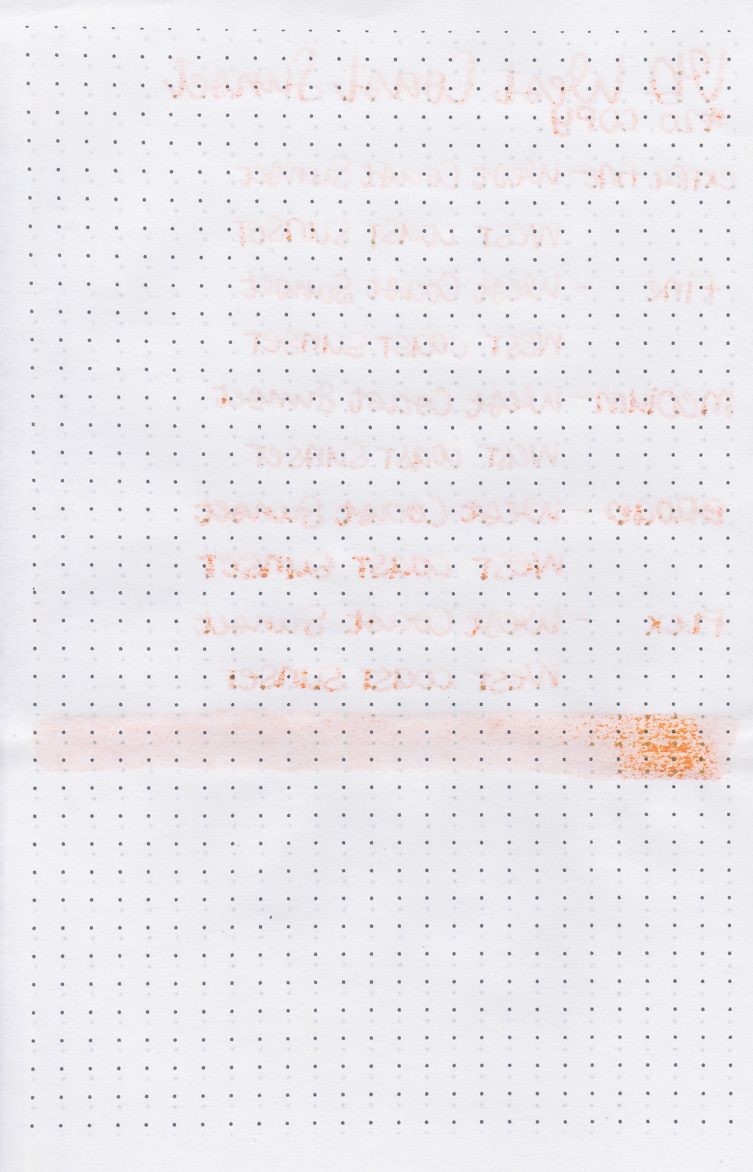
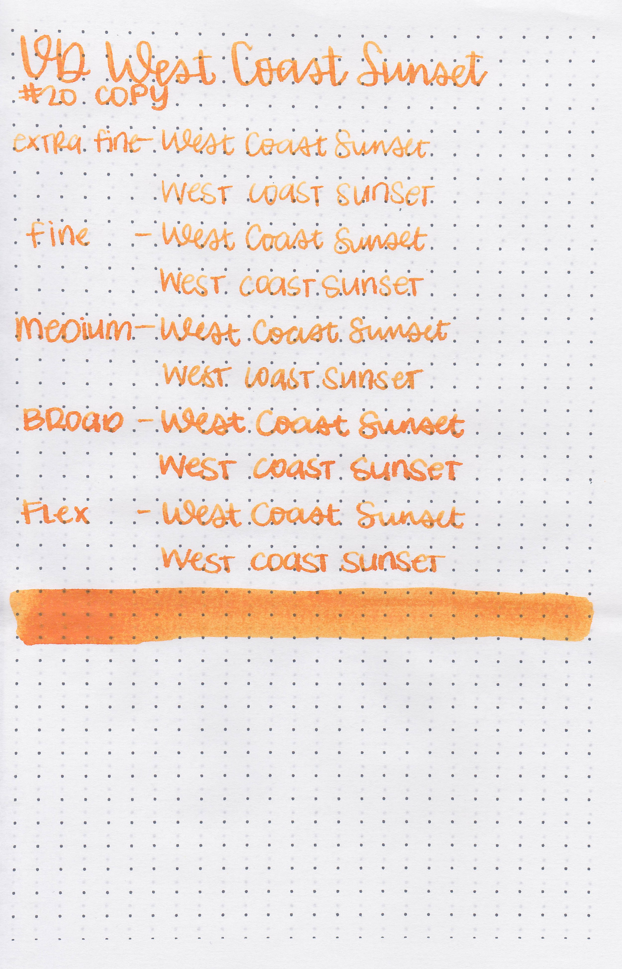
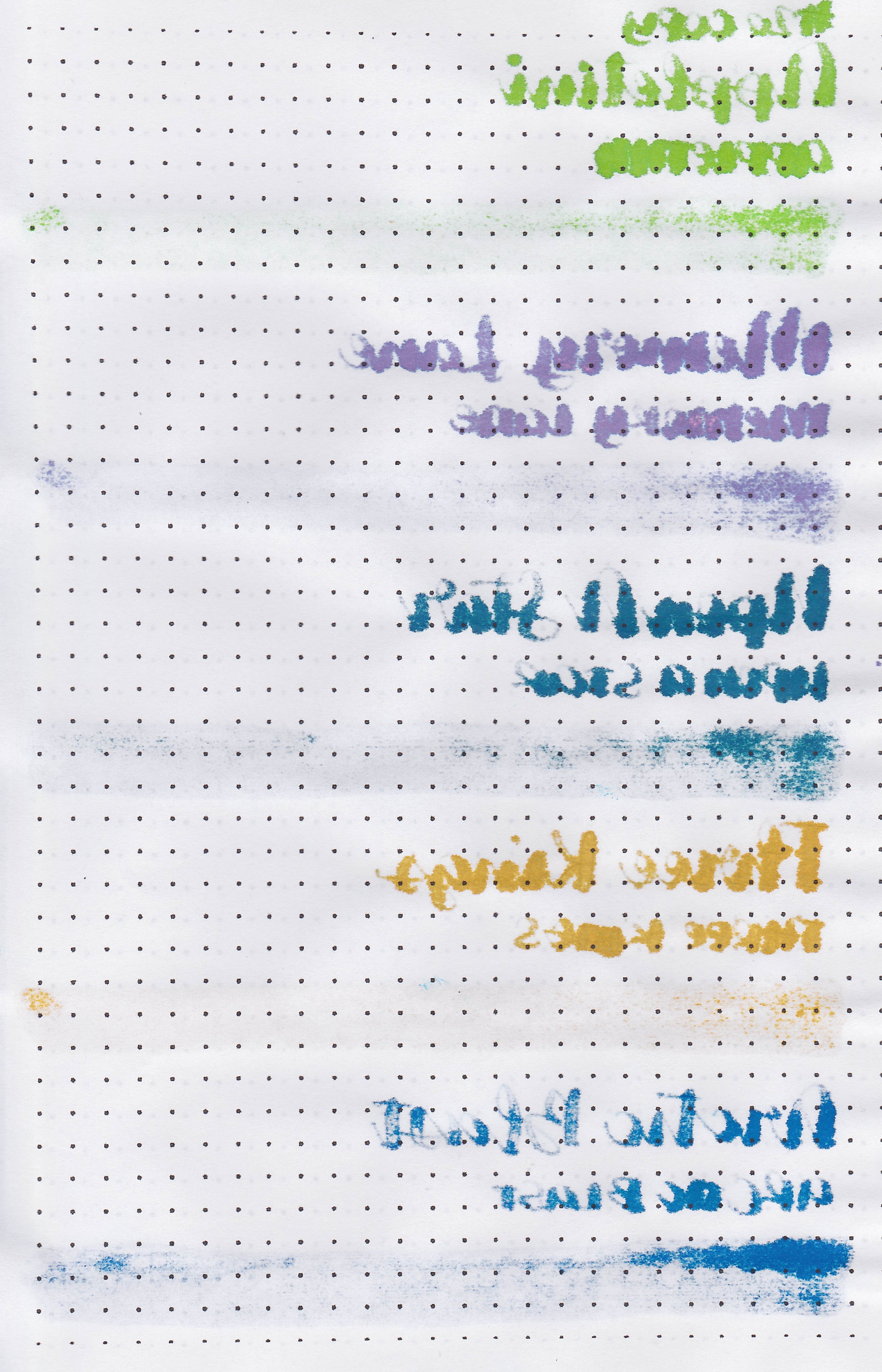
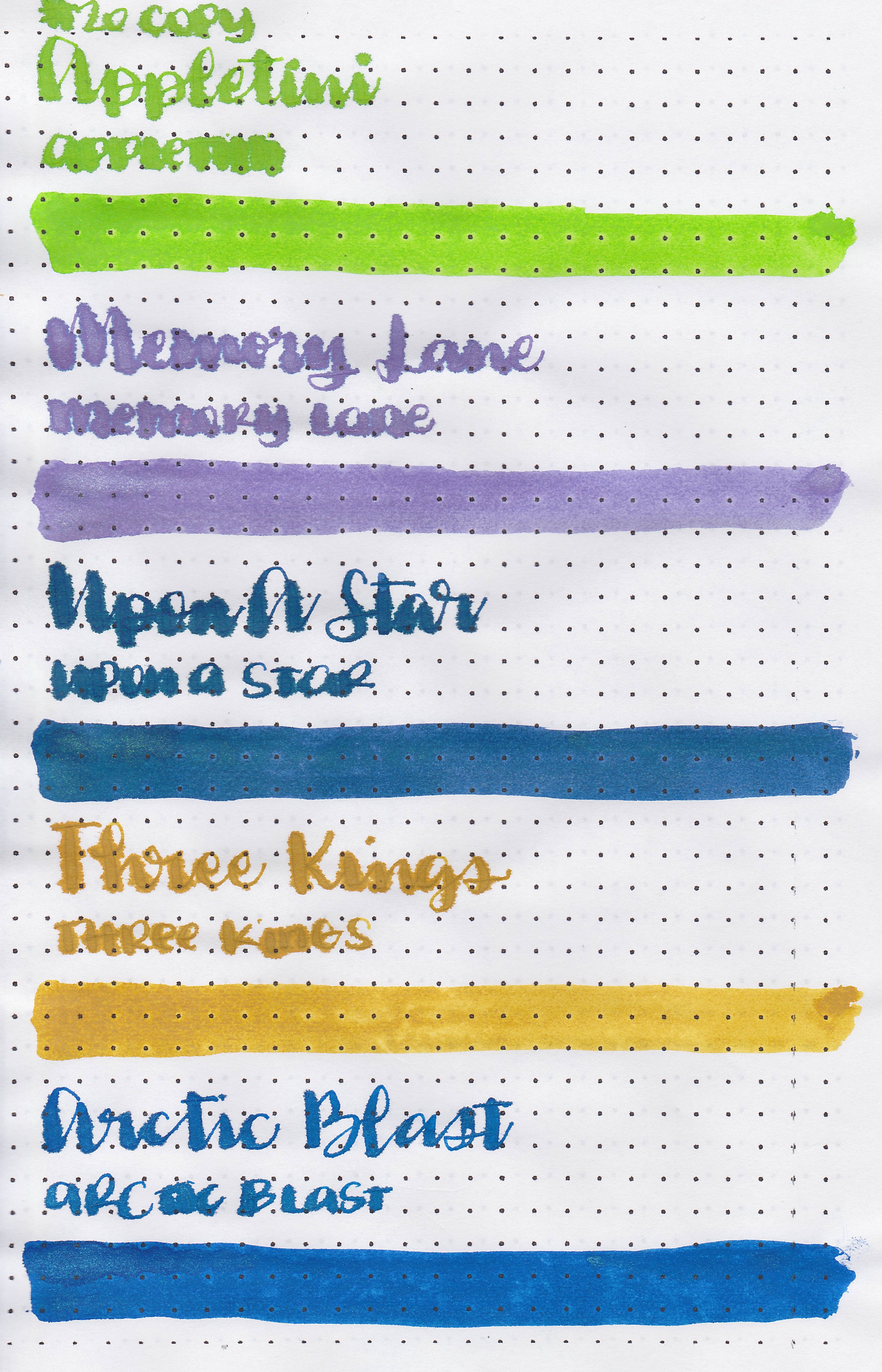
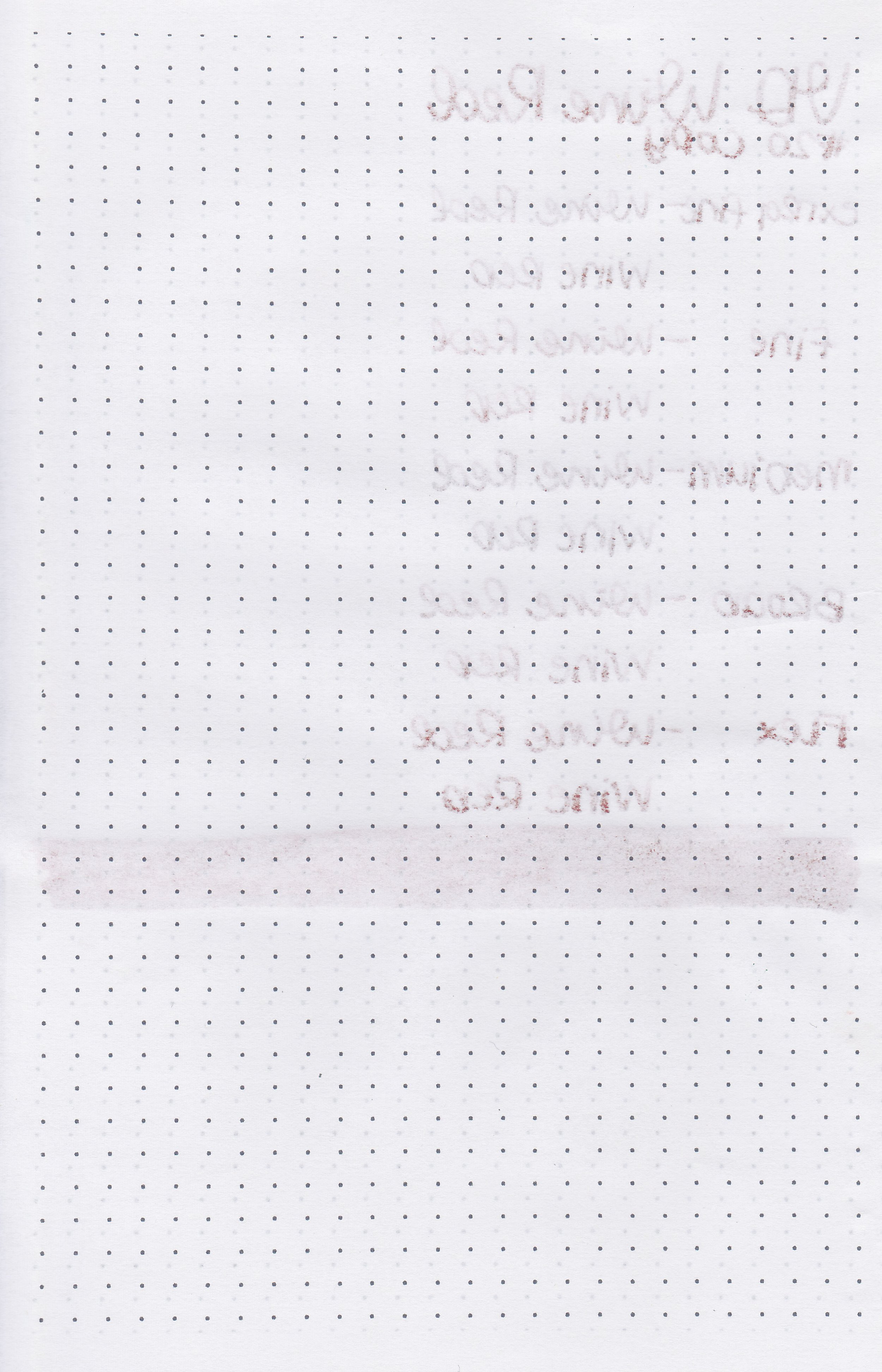
On 20 lb copy paper the ink had some feathering and some bleeding in all nib sizes.
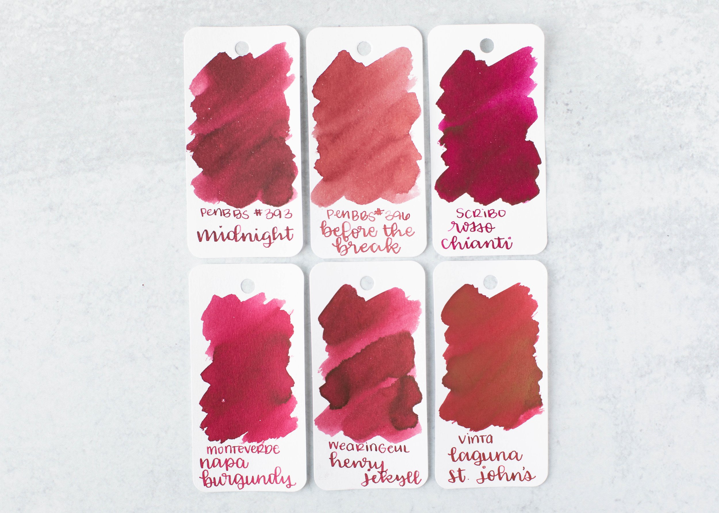
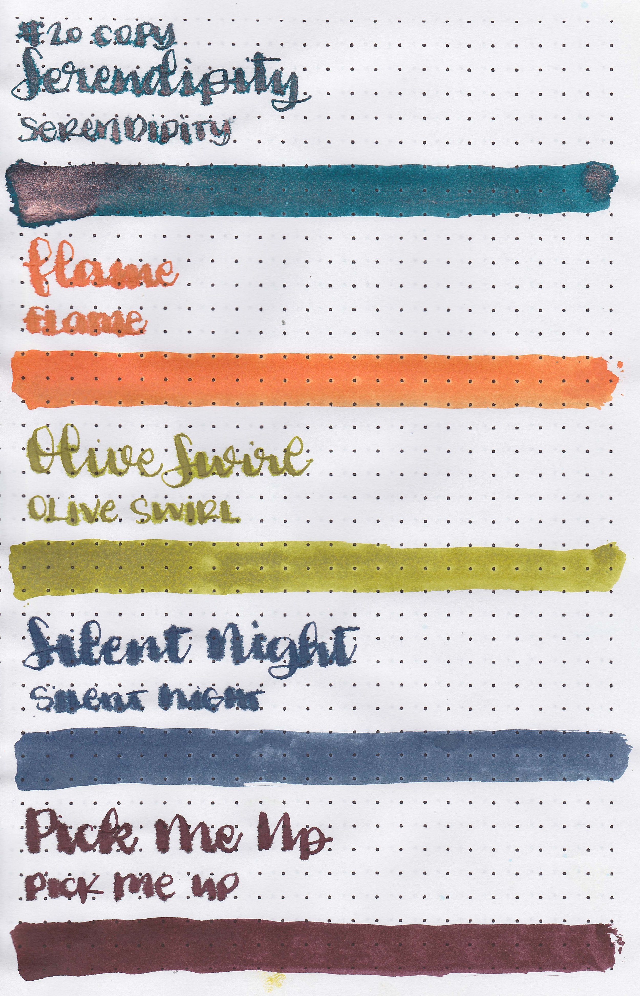
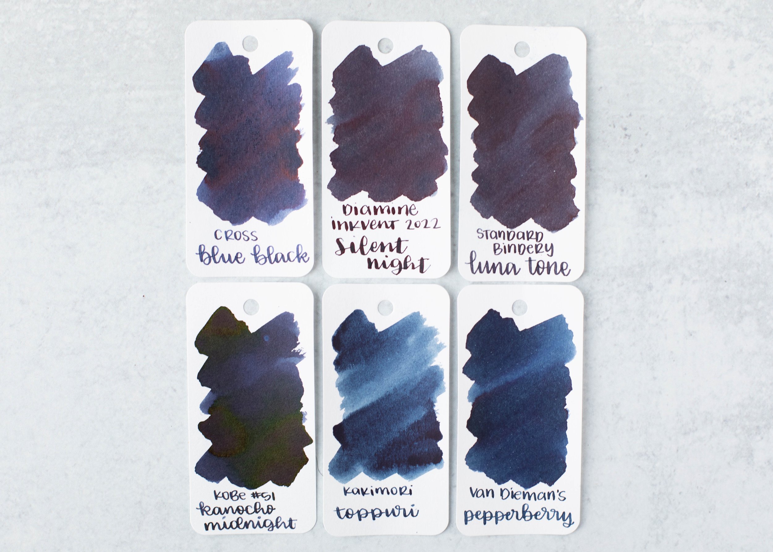
Comparison Swabs:

No Fixed Address is closest to Robert Oster Sparkling Cranberry. Click here to see the red inks together.
Longer writing:

I used a TWSBI Eco Blossom Red with a medium nib on a Taroko Enigma notebook. The ink had a dry flow.
Overall, this is a nice well-behaved red. The flow is a little dry due to the amount of shimmer, but I didn’t have any issues with clogging.
Disclaimer: All photos and opinions are my own. This page does not contain affiliate links and this post is not sponsored.