Ink Review: Diamine Claret
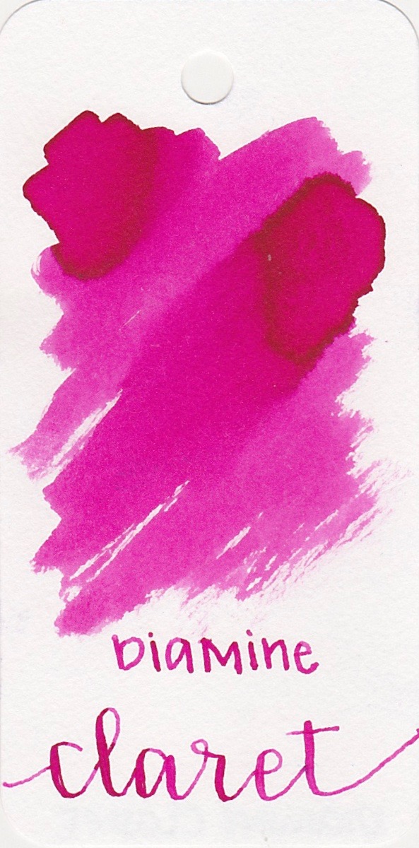
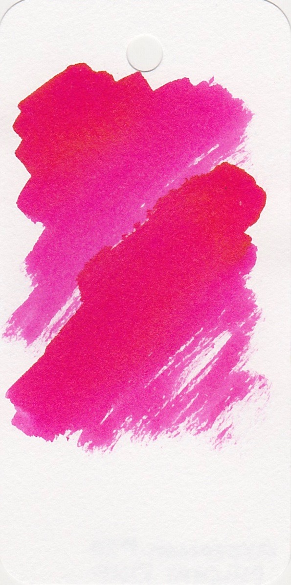
/Diamine has 21 red/pink inks in their classic line, and today's ink is Diamine Claret. Claret is a light-colored red wine, but I found this ink to be more pink than red. I purchased my bottle of Claret from Cult Pens.
The bottle:
I love 30 ml bottles. They are the perfect size for me-small enough that I don't worry about buying a whole bottle, but plenty of ink to do a good ink review and have a little bit left over. I always put a 3-hole punch reinforcer sticker and a quick swipe of ink on the lid to make the correct ink bottle easier to find.
The color...
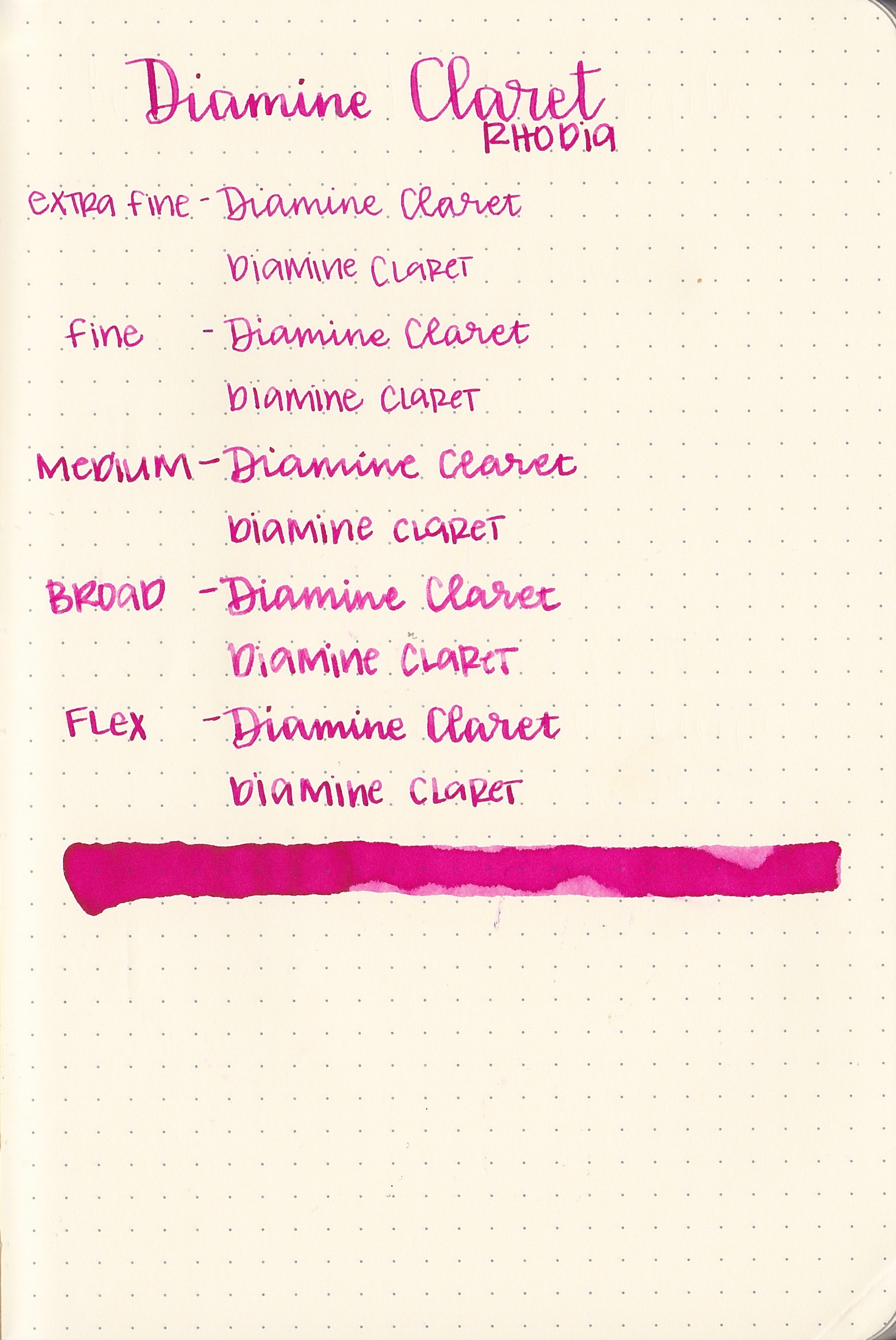
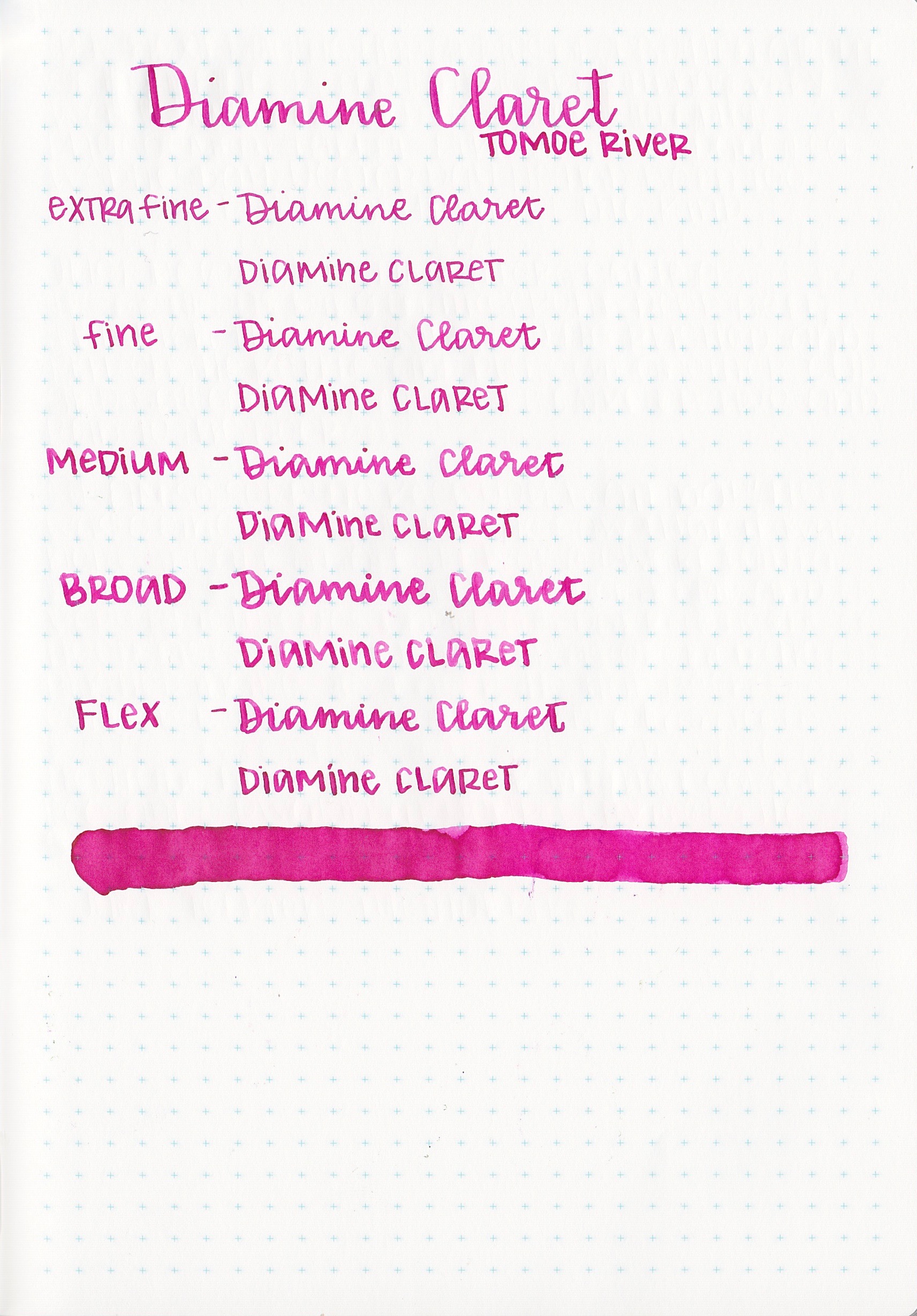
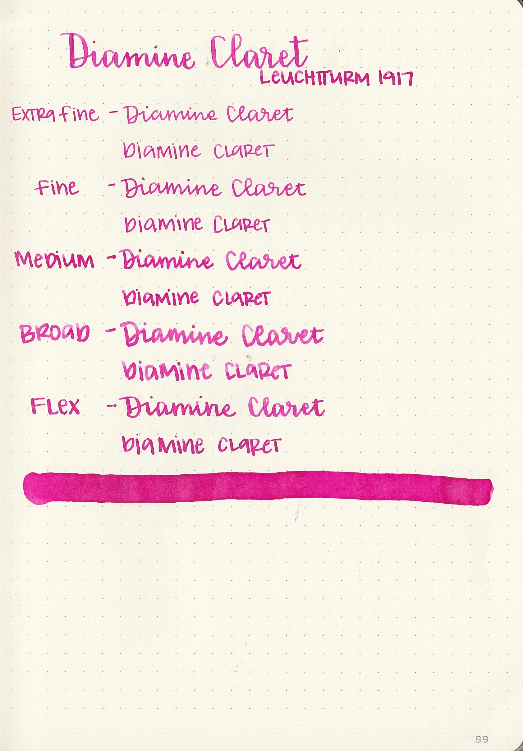
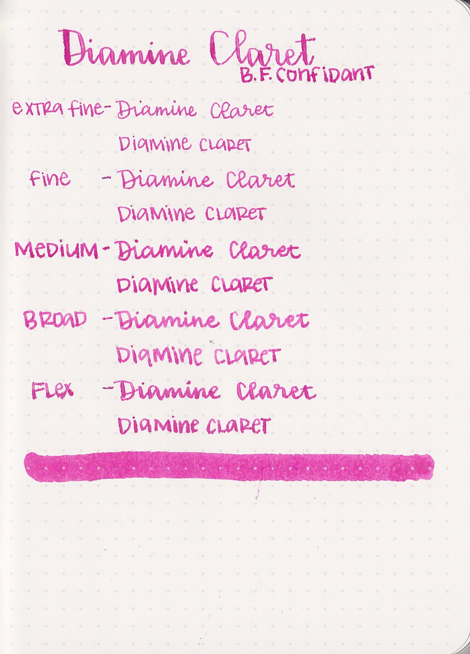
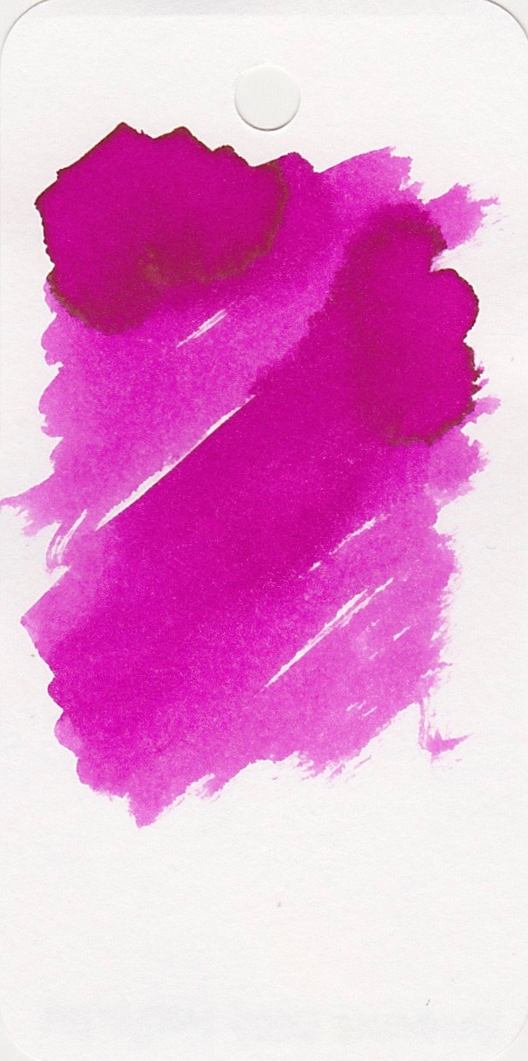
Claret is a bright pink, almost a magenta color, with a tiny bit of shading on certain papers.
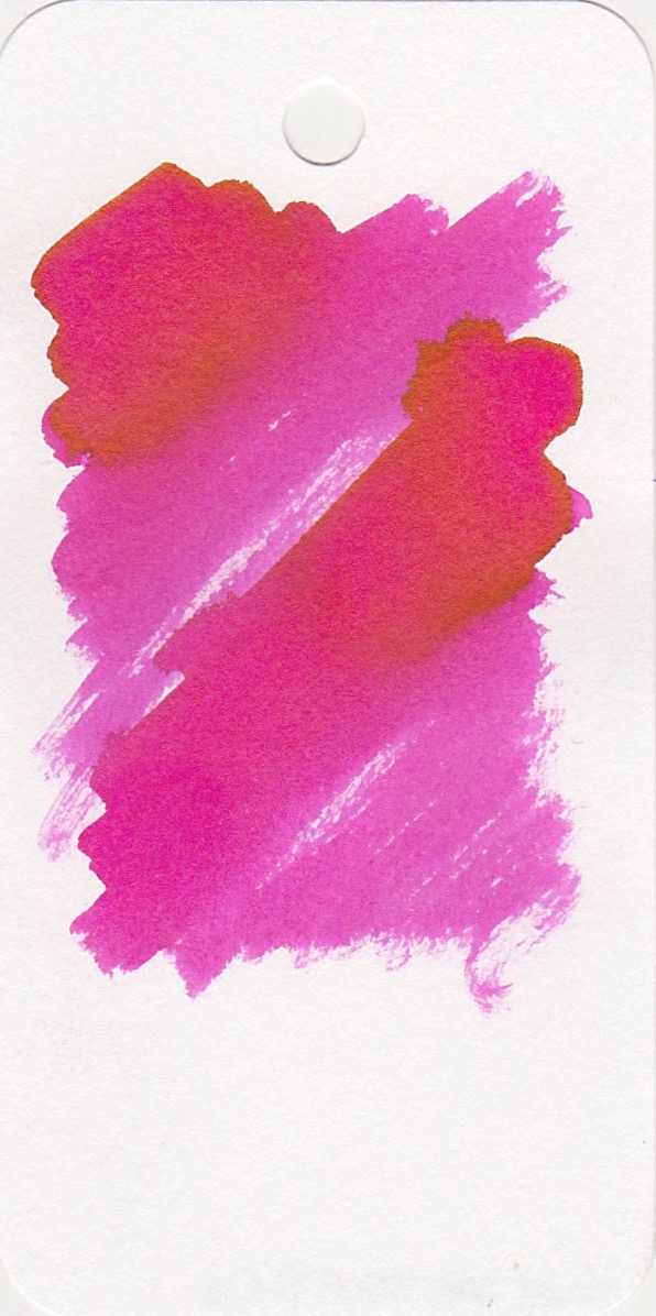
The ink drops show a lot more shading than I saw in the writing. There is just the tiniest gold aura on some of the drops, but not actual sheen.
Feathering: Claret only feathered on Baron Fig paper, but did fine on the other papers.
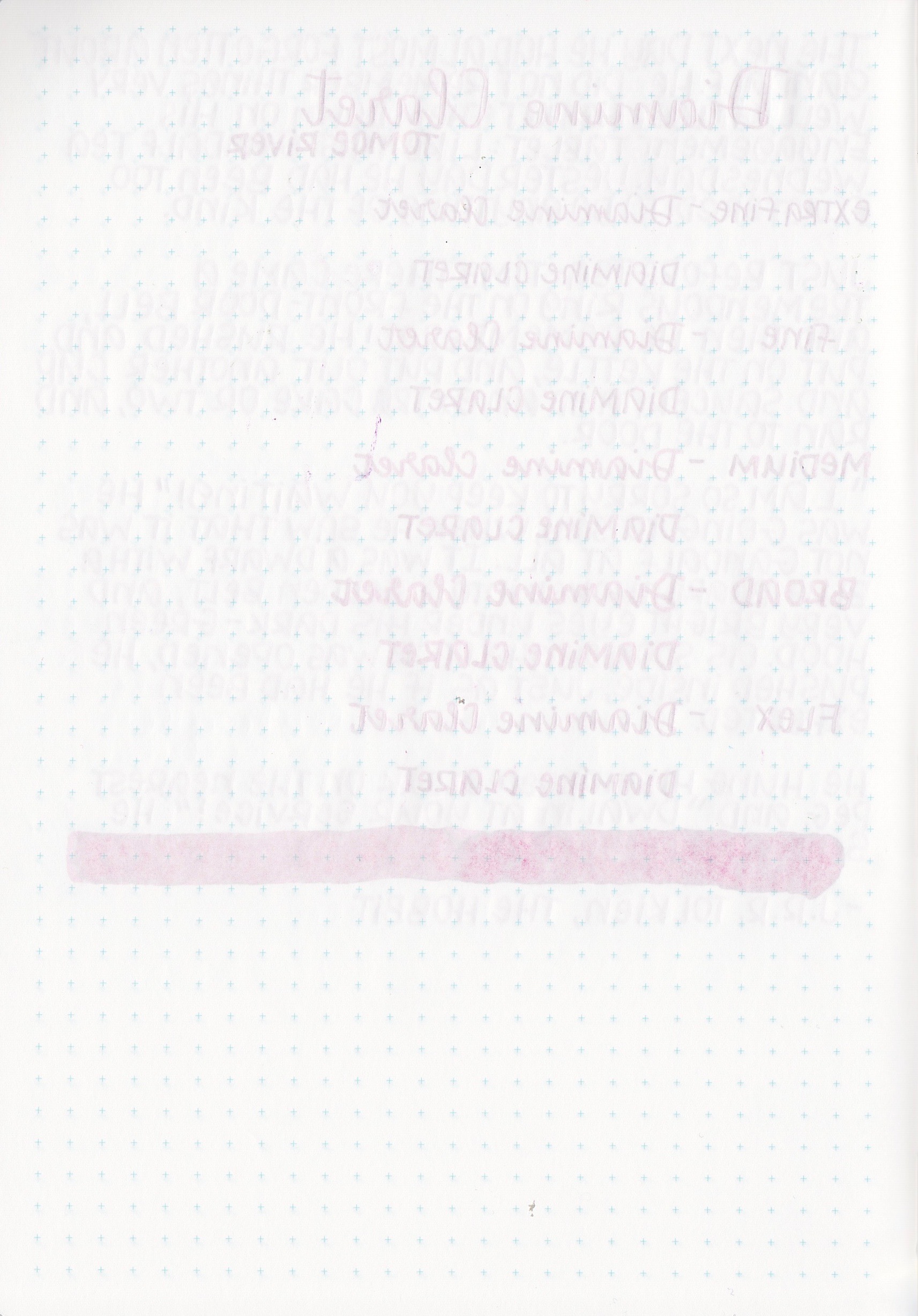
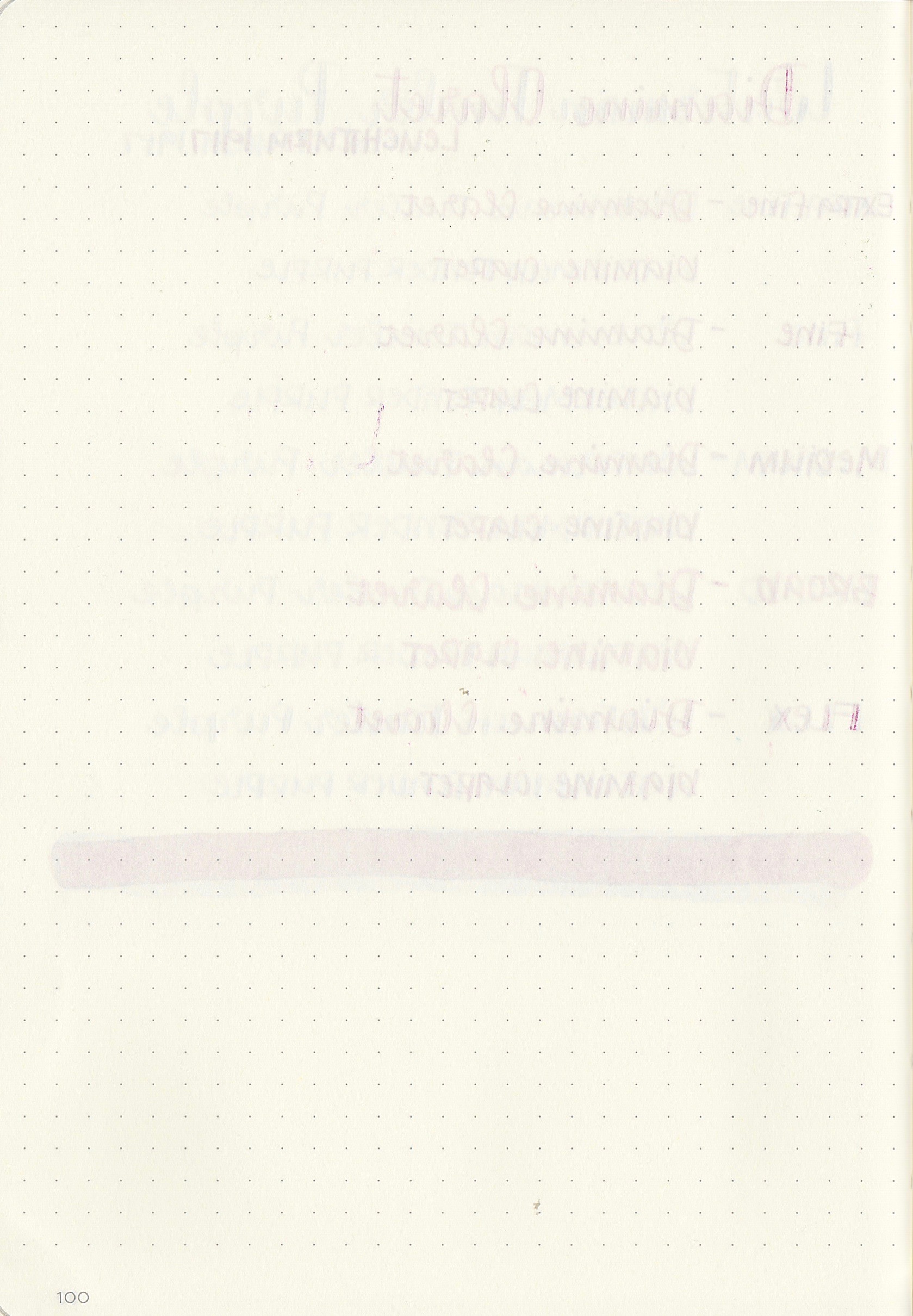
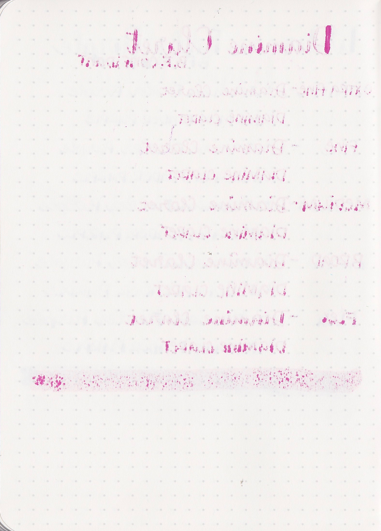
Ghosting (show through): Claret had low to medium ghosting on all of the papers.
Shading: Claret had just a little bit of shading on Tomoe River paper, but I only noticed that when I did a longer writing sample with a medium nib. I didn't notice shading on any of the other papers.
Bleeding: Claret only bled on Baron Fig paper. I did see bleeding from all of the nib sizes, unfortunately, so I would not use this ink on Baron Fig paper. I didn't see any bleeding on the other papers though.
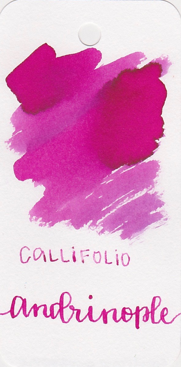
Inks for comparison, left to right: Callifolio Andrinople, Diamine Claret, and Diamine Deep Magenta. I think the closest ink to Claret is Andrinople, though Claret is a bit brighter.
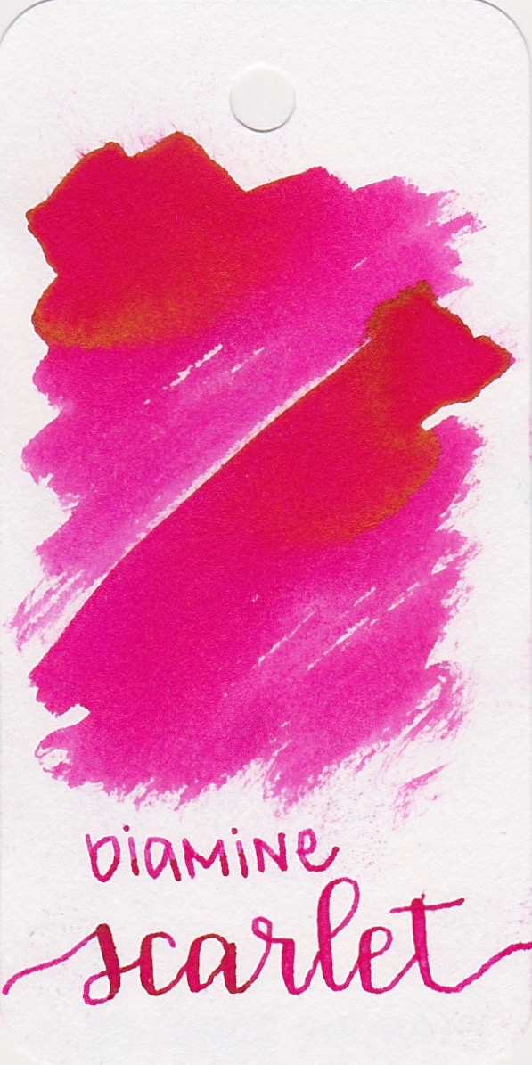
Left to right: Pilot Iroshizuku Tsutsuji, Diamine Scarlet, and Akkerman #20 Pulchri Pink. All three of these are a bit more true pink, while Claret is a bit darker.
Longer writing...
I really enjoyed writing with Claret in a medium nib on Tomoe River paper. It was very smooth and pleasant.
Overall, I really like this ink. It's well behaved, and reminds me of a slightly brighter Callifolio Andrinople, which I loved. I do think Andrinople has more shading than Claret does. It's a great summer pink.
Disclaimer: I purchased this ink myself, and all photos and opinions are my own. There are no affiliate links on this page.


