
Robert Oster Aqua
/
It looks like Robert Oster ink is going to become a habit for me. I reviewed Tranquility yesterday, and I'm covering Aqua today. I'm completely in love with both. I bought my bottle of Aqua at Goulet Pens.
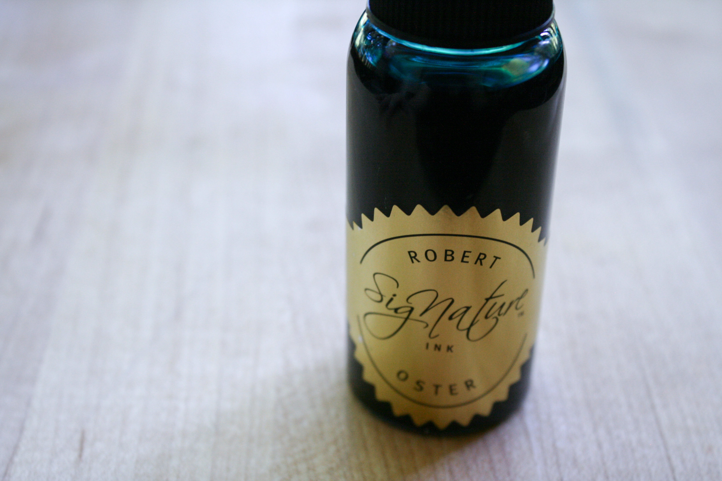
The bottle is very efficient, tall skinny bottles make it easy to fill pens. I like the Gold label-it's very classy.

I love that there is a label on the top-with the color name and a tiny little swab. With some brands I have a really hard time finding the right bottle when they are in a drawer and all look the same from the top.

The color...
Aqua is a beautiful blue, with a pink sheen. Seasonally, I would use this ink in the winter.

I don't know how anyone can resist an ink that sheens like this one does. I'll admit, the sheen doesn't come out a ton in everyday writing, but in ink drops the sheen is gorgeous.

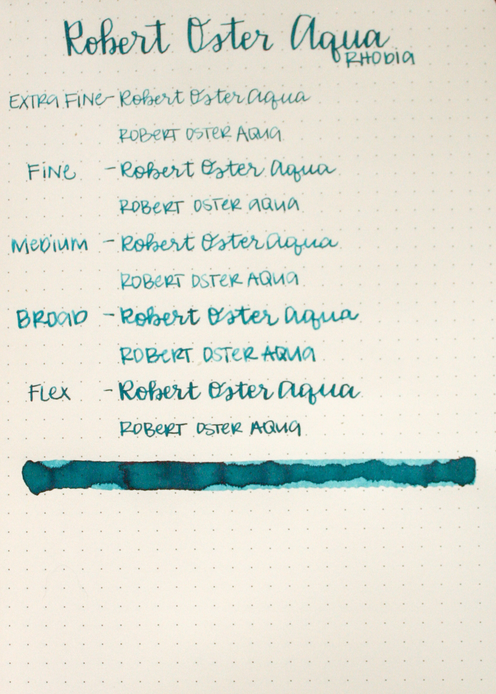
Paper: Rhodia
Feathering: None
Bleeding: None
Show through: Medium
Shading: High
Sheen: Low (only on the swab)
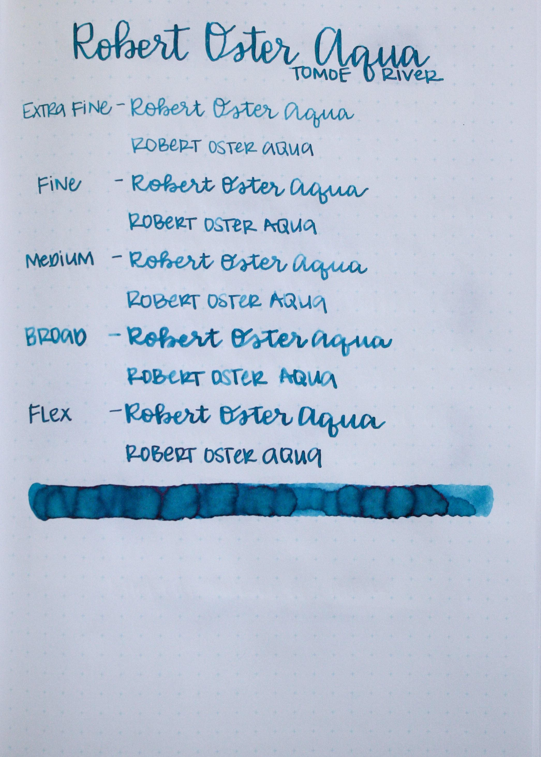
Paper: Tomoe River
Feathering: None
Bleeding: Only on the swab
Show through: Medium
Shading: High
Sheen: Medium (on swab and some of the writing)
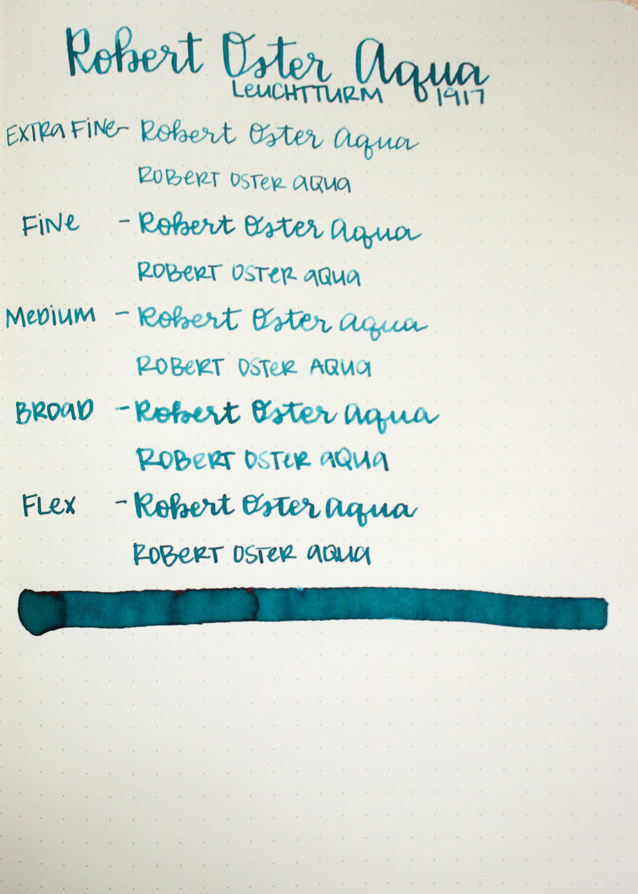
Paper: Leuchtturm 1917
Feathering: None
Bleeding: Only on the swab
Show through: medium
Shading: High
Sheen: Medium
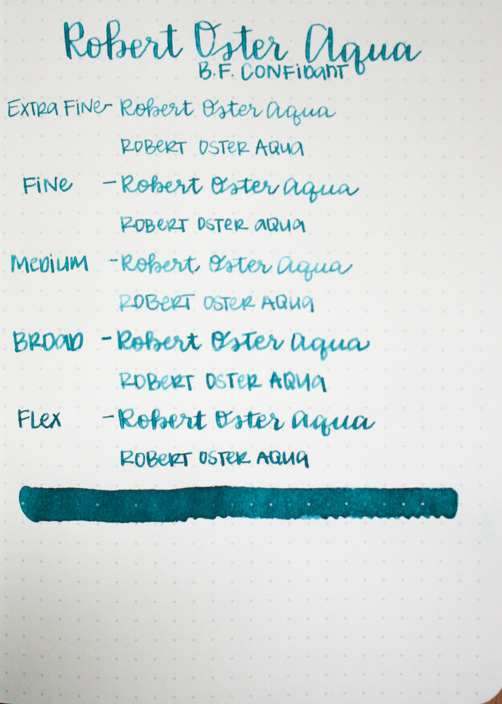
Paper: Baron Fig Confidant
Feathering: Low
Bleeding: None
Show through: Medium
Shading: High
Sheen: Low

Similar inks:
Aqua is actually very similar to J. Herbin Emerald of Chivor, just without the sparkles.

Tranquility is more green and Aqua is more blue, but I love both. Both have a pink sheen and amazing shading. I obviously need more Robert Oster Ink in my life.
Overall, this ink had high shading and at least a little sheen on every paper. This is the second Robert Oster I've fallen in love with. I can't wait to try more of them.