
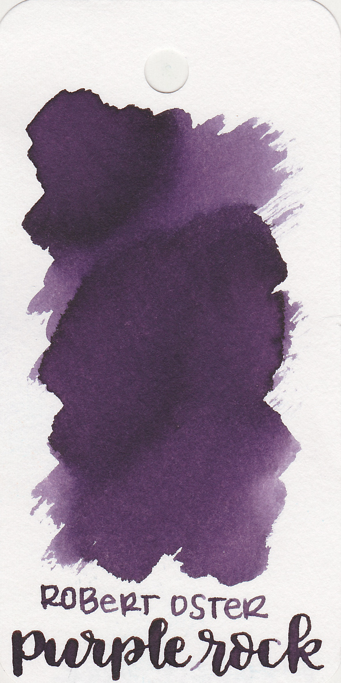
Ink Review #294: Robert Oster Purple Rock
/
It's purple week! We are starting off with Robert Oster Purple Rock. I purchased my sample of ink from Vanness Pens.

The color:
Purple Rock is one of those inks that looks a little bit different on every paper. On the Col-o-ring it looks more medium purple.
Swabs:
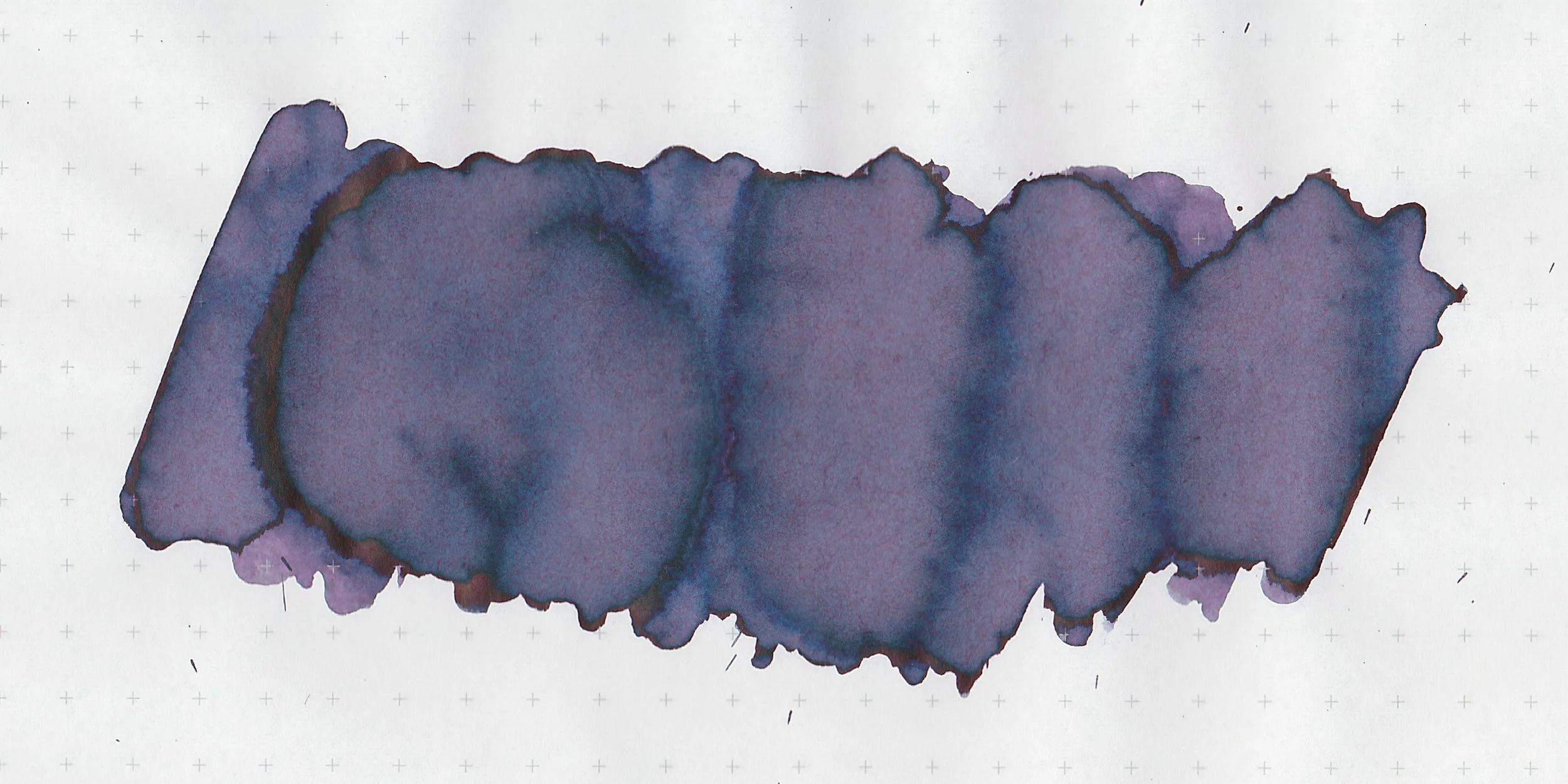
In large swabs the ink turns looks more of a dusky blue purple. There's just a little bit of pinkish red sheen on the edges. The sheen is not visible in writing.

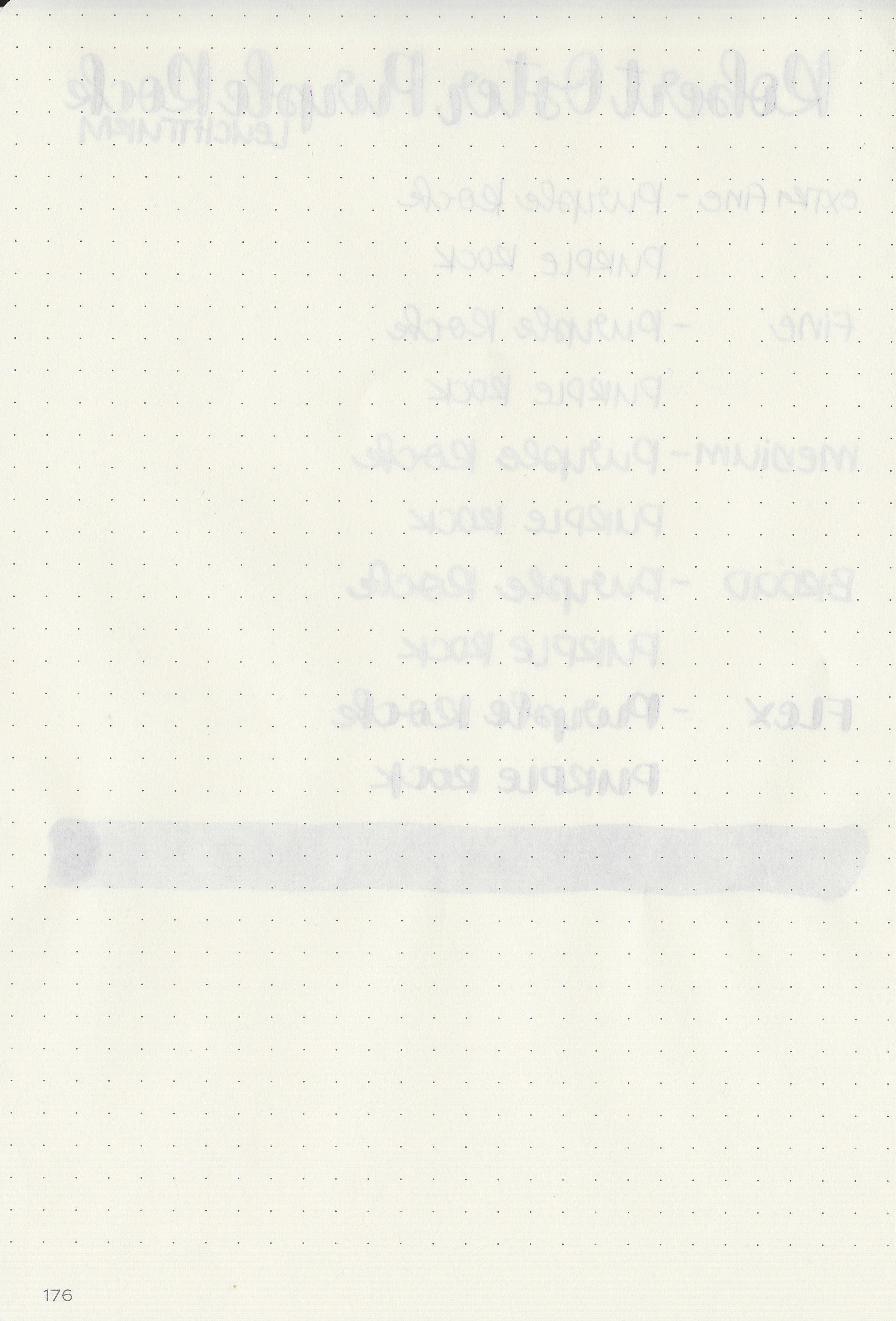
Writing samples:
Let's take a look at how the ink behaves on fountain pen friendly papers: Rhodia, Tomoe River, and Leuchtturm.

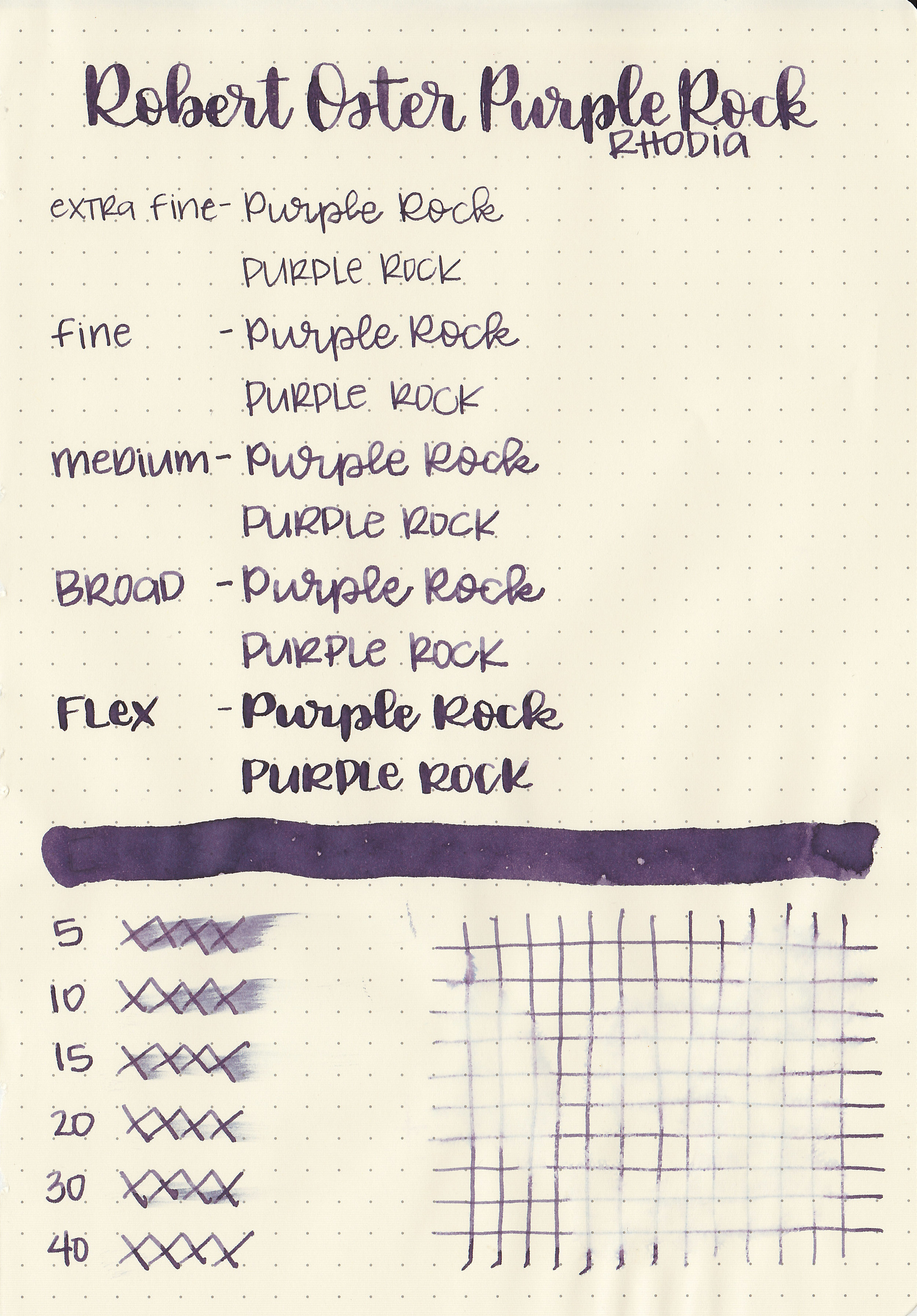
Dry time: 40 seconds
Water resistance: Low
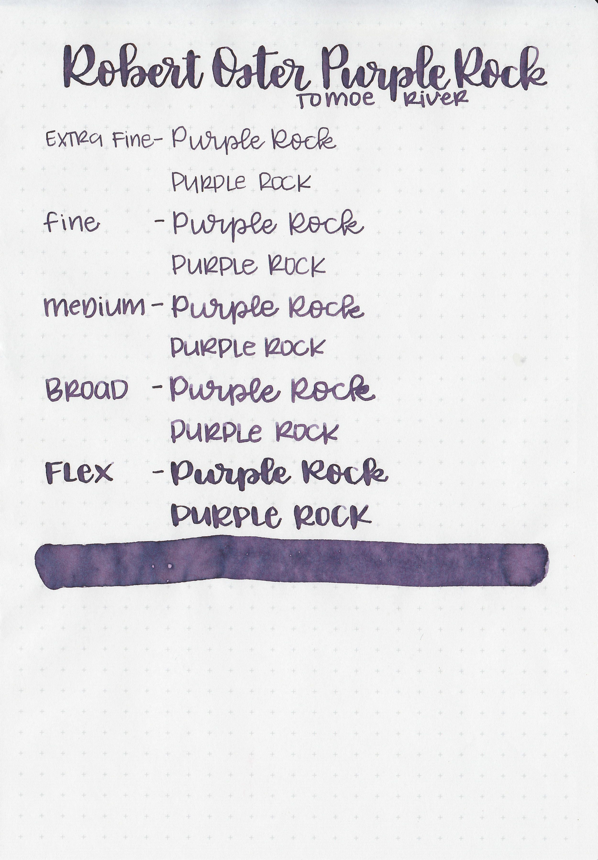
Feathering: None
Show through: Medium
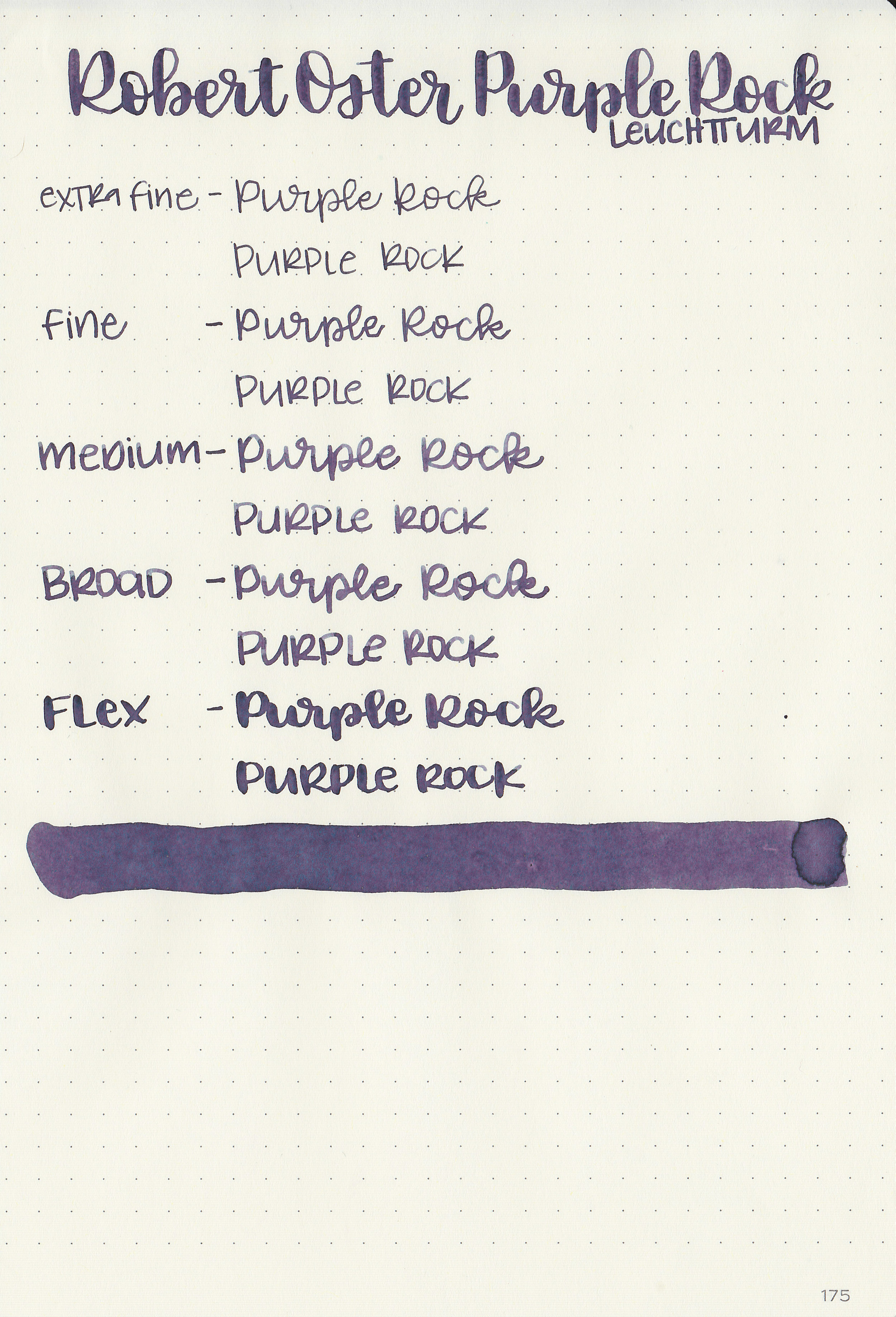
Bleeding: Low, mainly in the flex nib on Tomoe River paper.
Other properties: medium shading, tiny sheen, and no shimmer.

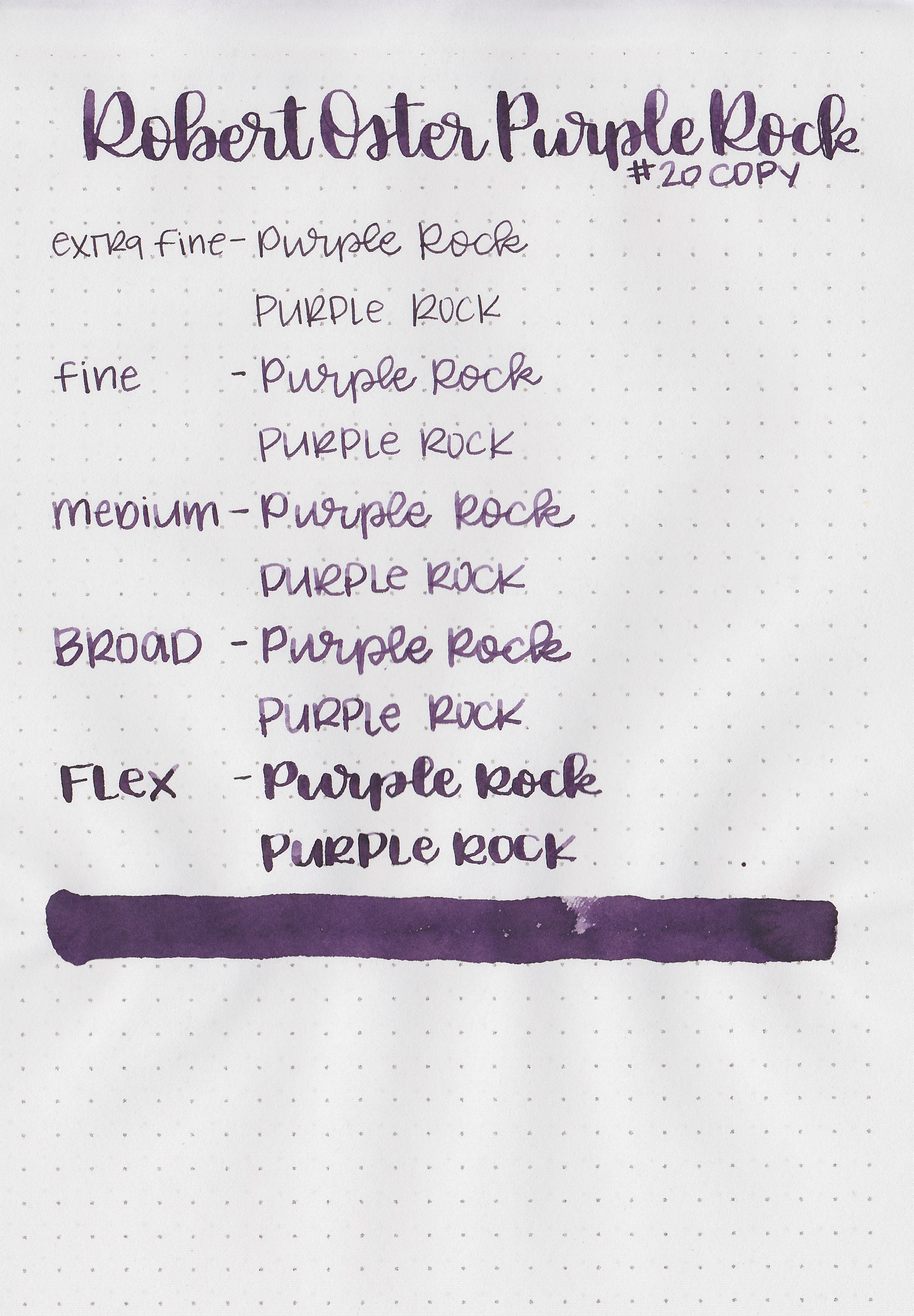
On 20 pound copy paper the ink performed well, no issues that I noticed.
Comparison Swabs:
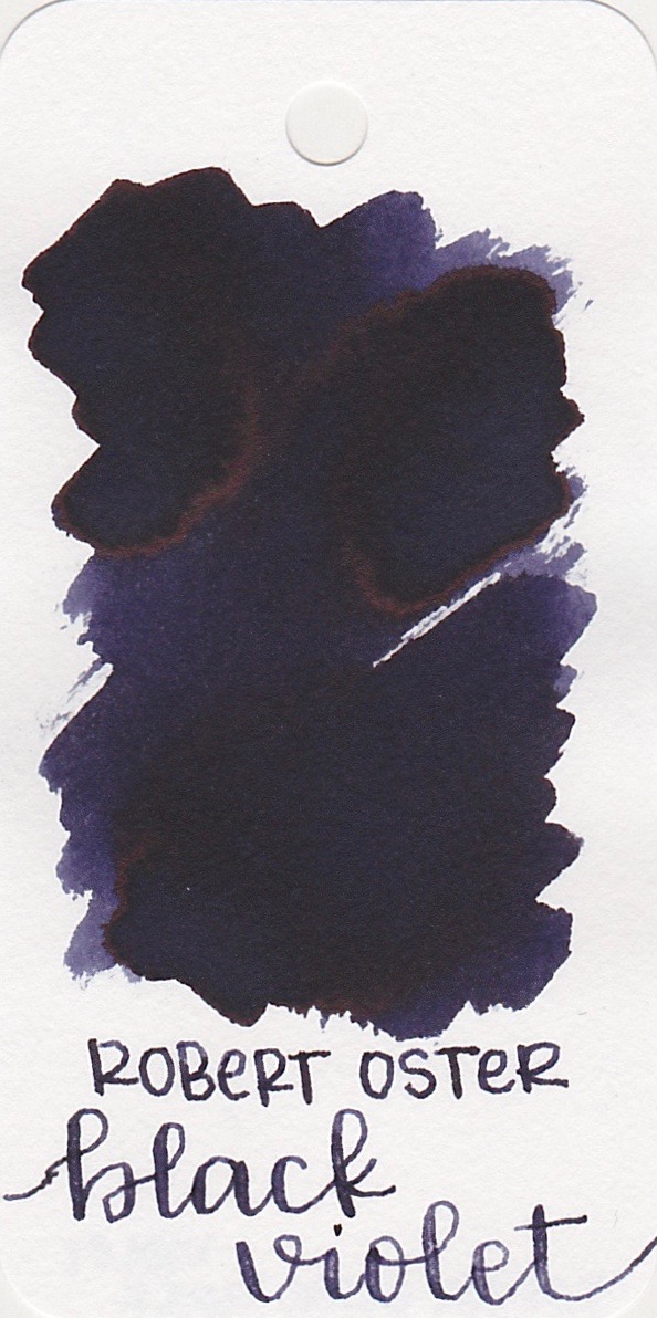
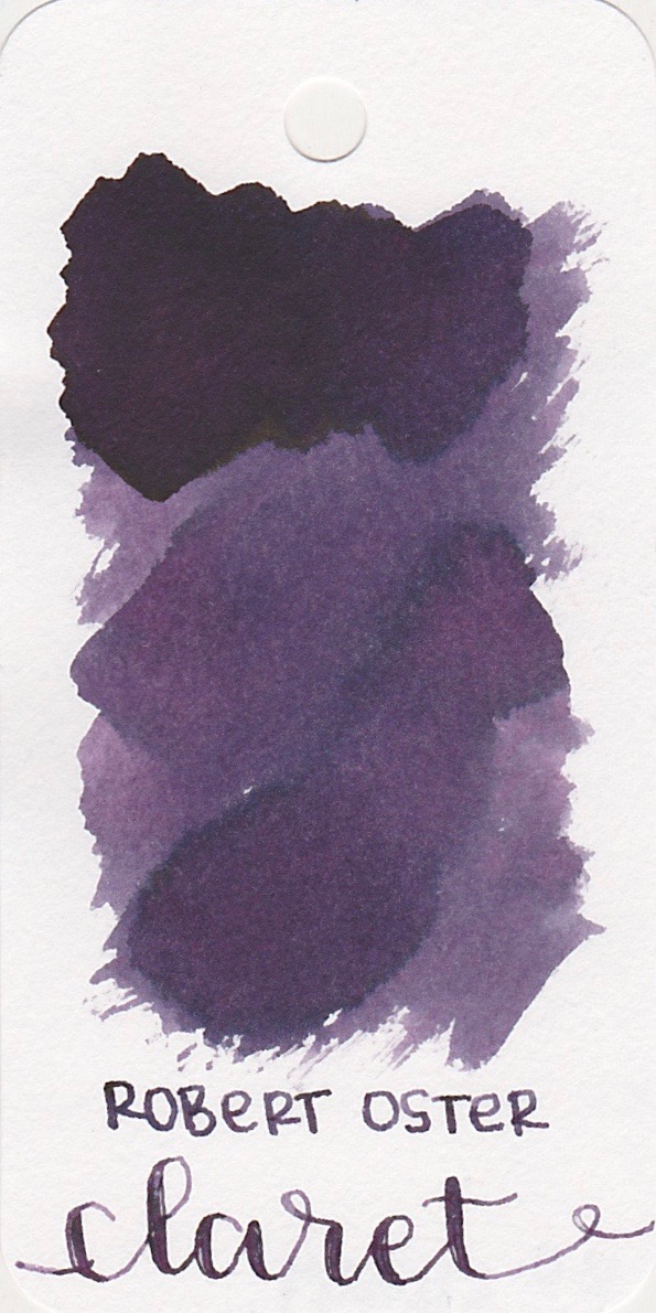
Ink swabs for comparison, left to right (top to bottom for mobile RSS): Robert Oster Black Violet, Robert Oster Purple Rock, and Robert Oster Claret. Click here to see the Robert Oster inks together.
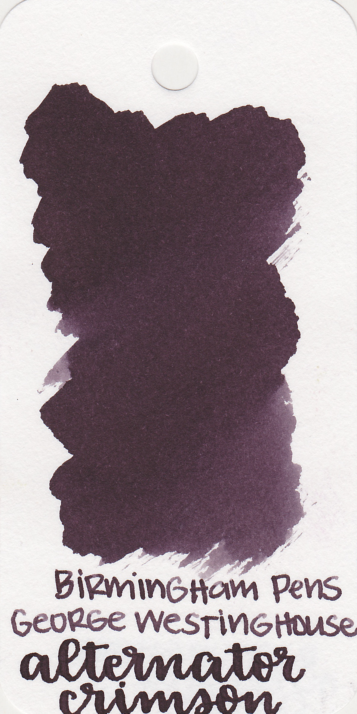
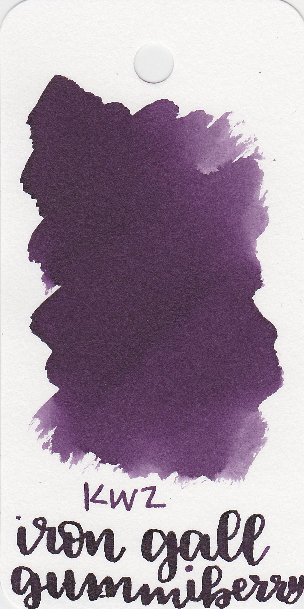
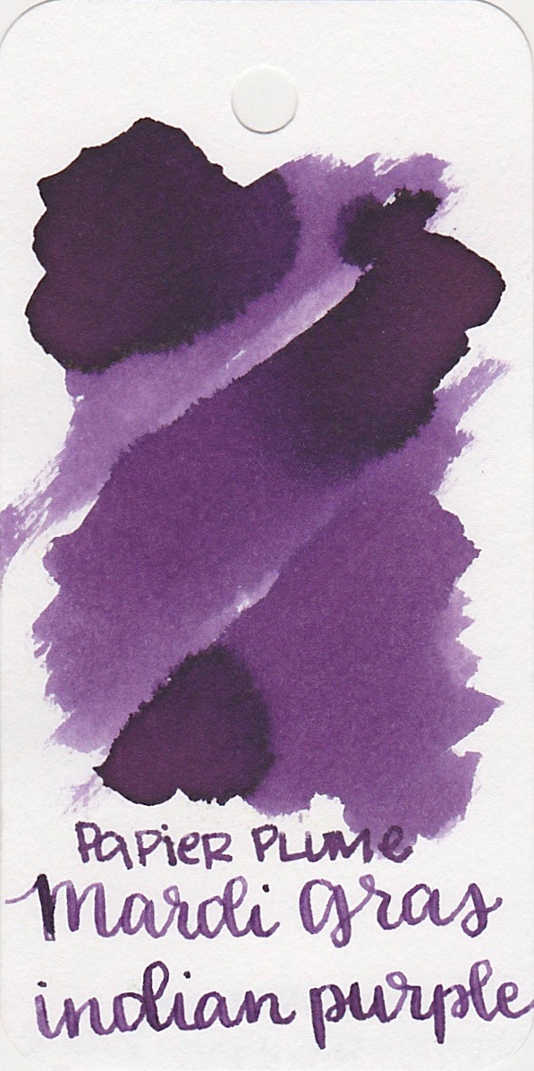
Birmingham Pens Alternator Crimson, KWZ Iron Gall Gummiberry, and Papier Plume Mardi Gras Indian Purple. Click here to see the purple inks together.

Longer writing:
I used a broad Pelikan M805 Ocean Swirl on Tomoe River paper. The ink had an average flow.

Overall, this ink really does look different on every paper. On the Col-o-ring it's more purple, and on most other papers it's more blue-violet. It has some lovely shading and behaves pretty well. Give it a try, you might love it.
Disclaimer: I purchased this ink myself, and all photos and opinions are my own. There are no affiliate links on this page.