
Summer Lavender Ink Palette
/
When I first got into fountain pens, I told myself I would only use black cartridges, just to keep it simple. Then I started looking at all of the different ink colors that were available, and decided I needed just a few different colors to make it interesting, seriously, this is me jumping on a very slippery slope here. Then I realized that per ounce bottled inks are cheaper than cartridges, so of course I told myself that it'll save me money to just buy bottled inks. I though I should just pick a few colors and keep it simple, but what fun is that? After a while I wanted more options-I discovered a whole world of ink out there, and I was keeping myself very limited. Then I asked myself, wouldn't it be great if I picked a few different seasonal inks-this is me slipping a lot farther down this very steep slope. Pastel colors are more suited to spring, brighter colors are more fun in the summer, jewel tones and fall colors look better in the autumn. Greens and reds just say Christmas to me, and icy blues and deep purples look great in the winter. What if I got a few inks per season, that way no matter what pen I used, it would be inked up with a color that looked great with the other pens I have inked up.
If seasonally based ink colors aren't for you-no sweat! Please do what works for you. Matching seasonal inks together is fun for me. I love the different shades of color and how they look together. Those color palettes that match a picture have always appealed to me, and I asked myself, why can't I do that with ink?

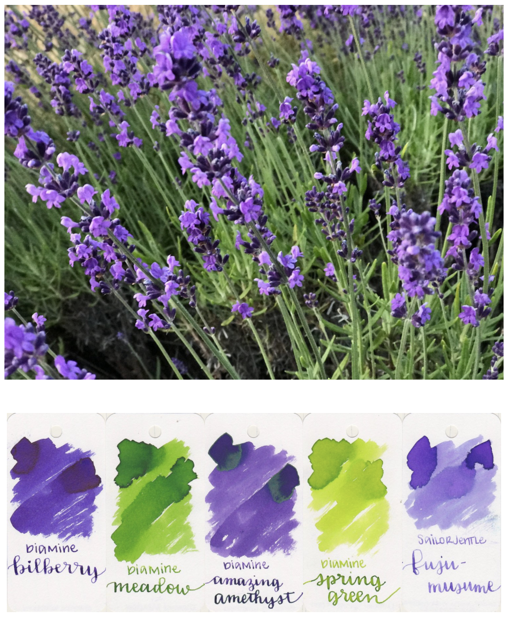
First I needed a picture. When I was at my in-laws house for the fourth of July, I saw this plant in their front yard and snapped a quick picture. I love all of the bright green and purples, and decided to pop it into Illustrator and figure out what the dominant colors were. I opened the picture in Illustrator, applied the pixelate effect, and picked out a few of the colors that appeared the most often. I ended up choosing three purples, and two greens. This plant is lavender, by the way.
I went through my stack of swatches, which don't fit on the ring anymore (I use the Col-o-ring for swatches, you can find the review here), and pulled out all of the swatches that looked similar to the colors I had picked out of the picture. I didn't want to put up a palette of ink colors without reviewing each of the inks individually, so over the past week I have reviewed each of the inks in my palette.
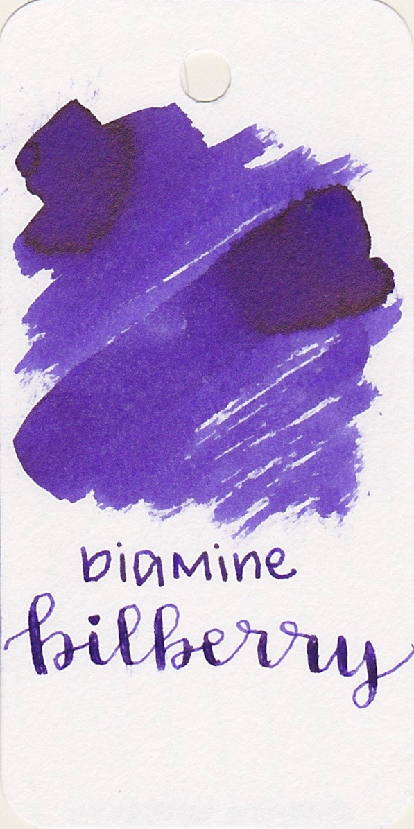
A dark purple with no shading, but some amazing sheen. Bilberry is my favorite ink from this palette.
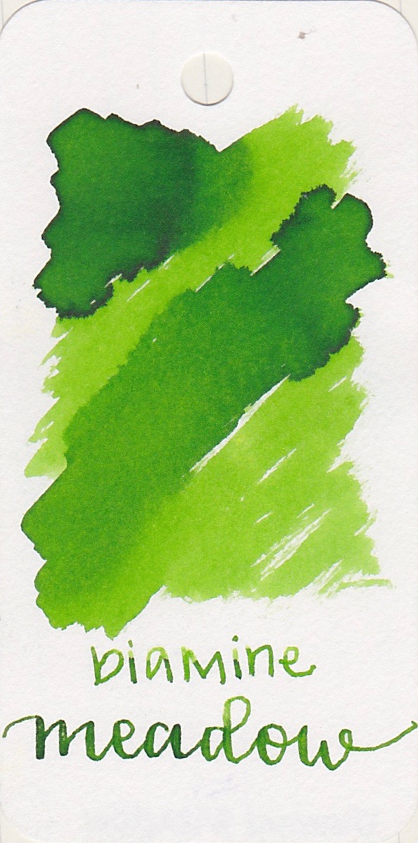
A medium green with plenty of shading.
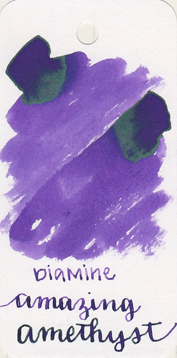
A medium purple, with shading and a hint of sheen.
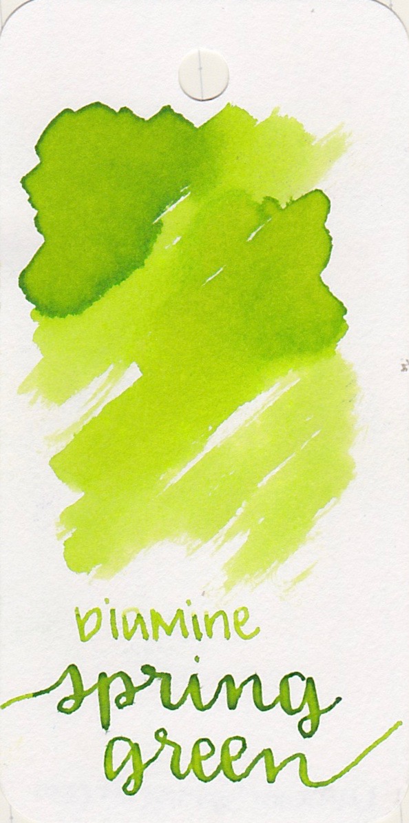
A light green with a little bit of shading. If this ink isn't your cup of tea, Robert Oster Sublime, and Diamine Jade Green are both good alternatives.
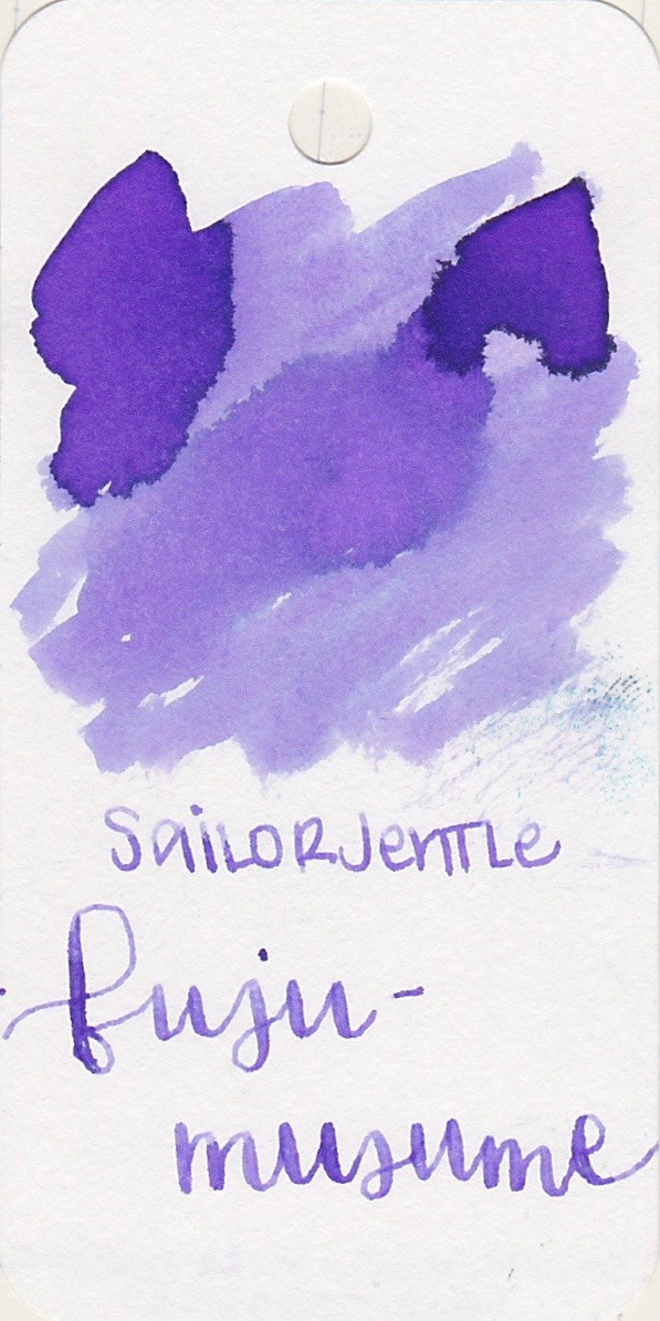
A light purple, with just a hint of shading.


I had a lot of fun coming up with this summery ink palette. I plan to do a few more before the summer is over. Let me know your thoughts on seasonal inks in the comments below!