Sailor Manyo Dual Shaders
/
Today let’s take a look at the four Sailor Manyo Dual Shaders. I purchased my ink from Goulet Pens.
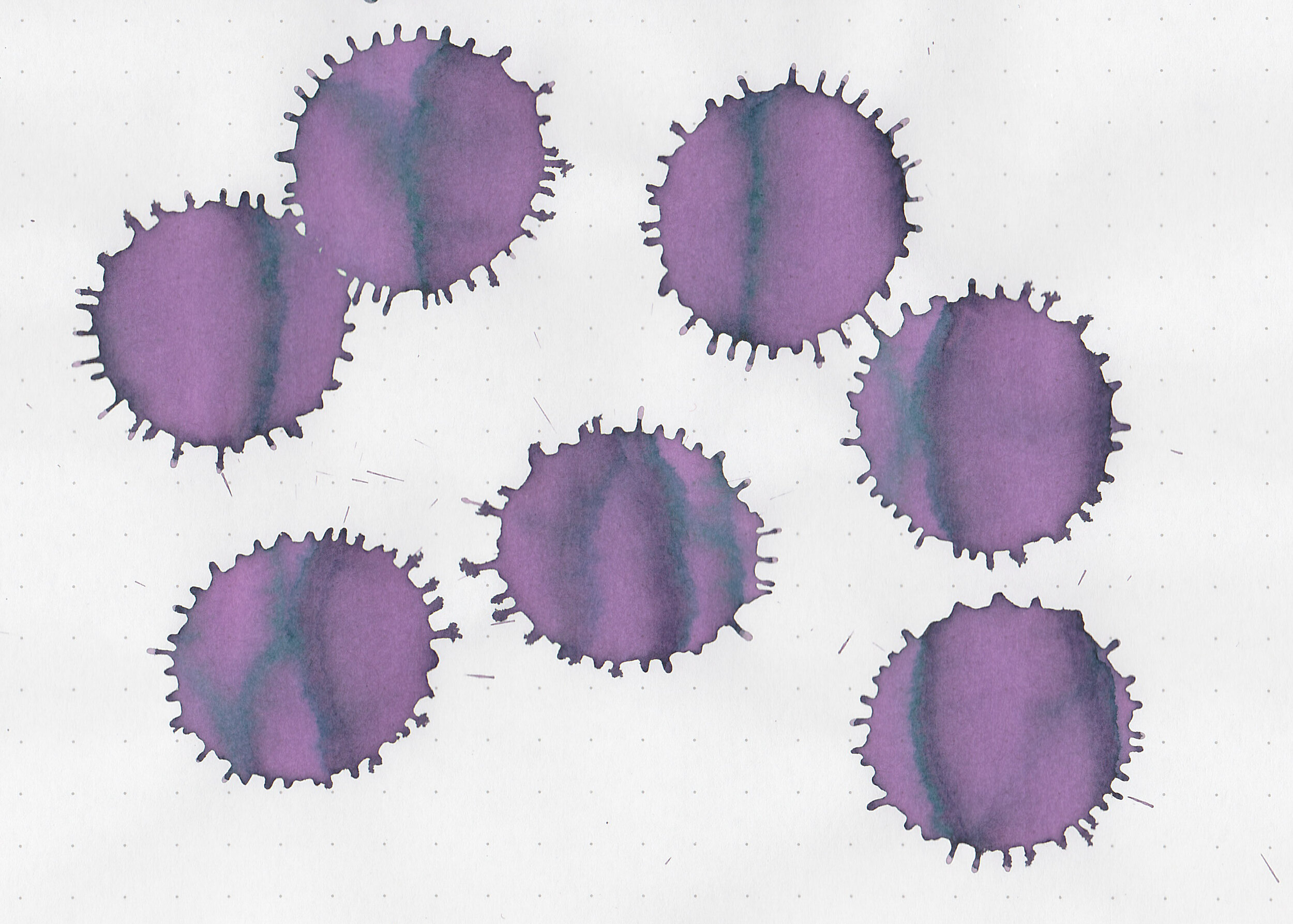
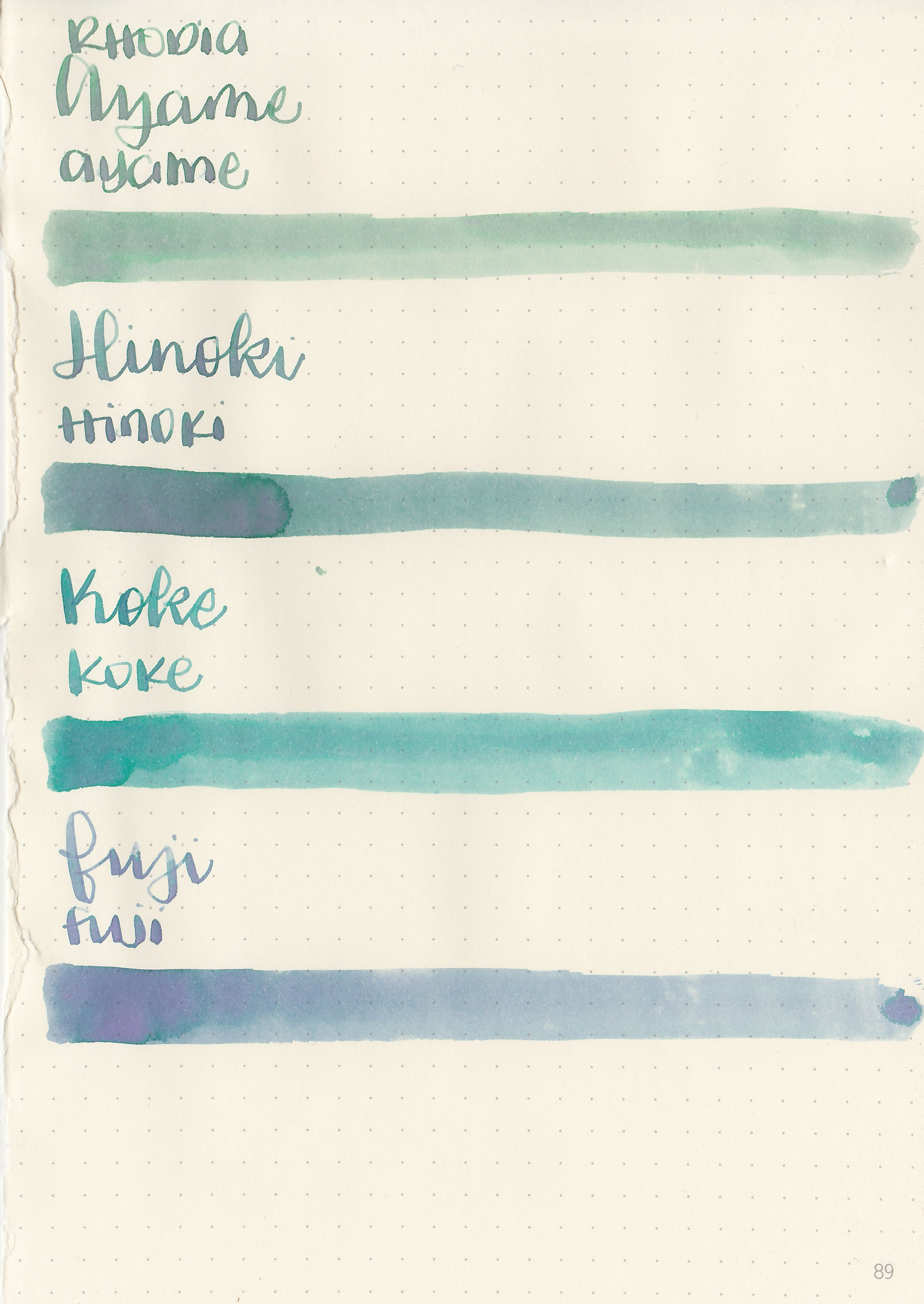
Swabs:
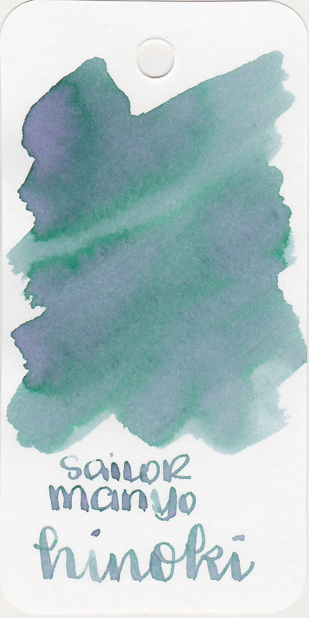
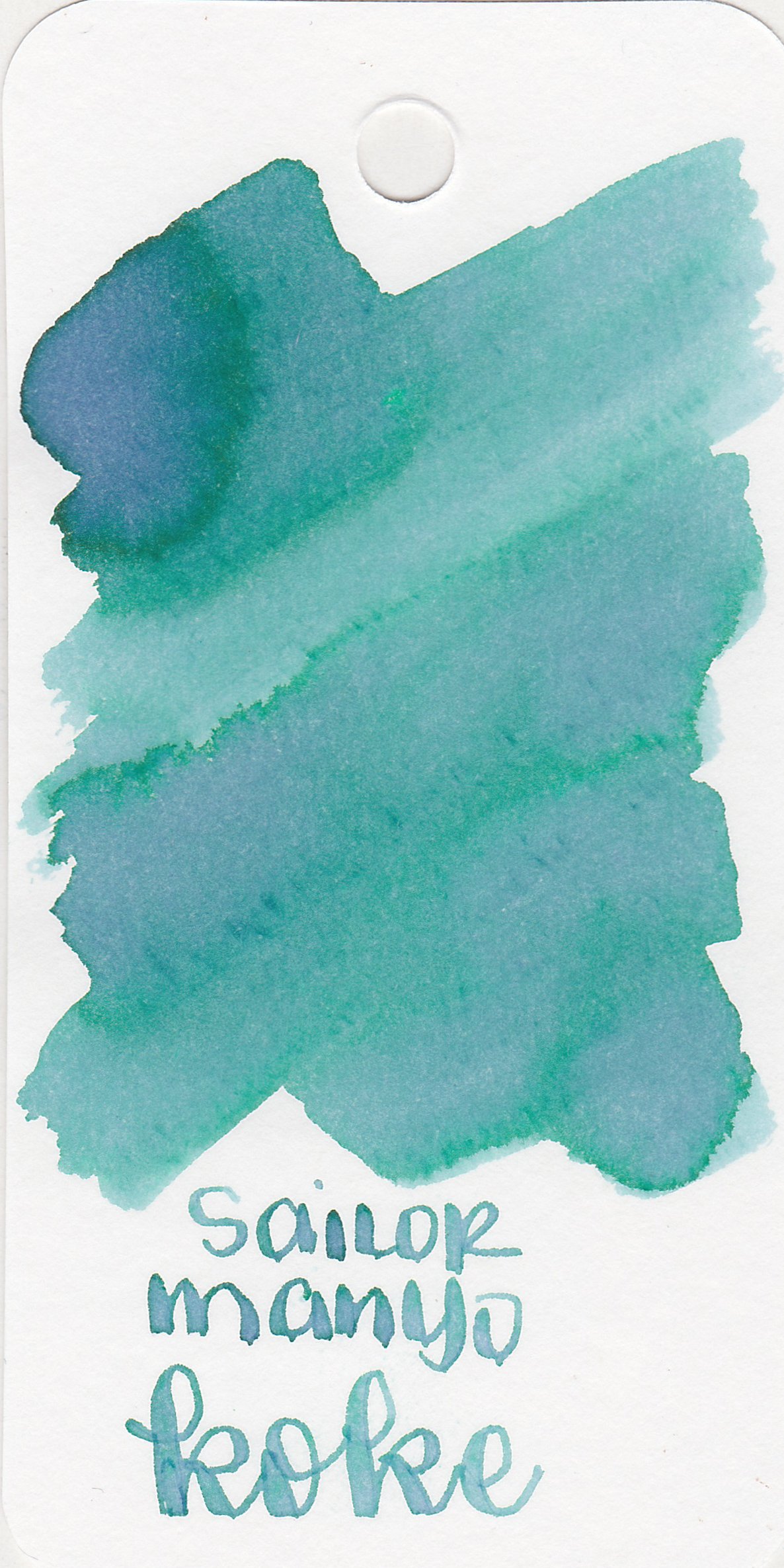
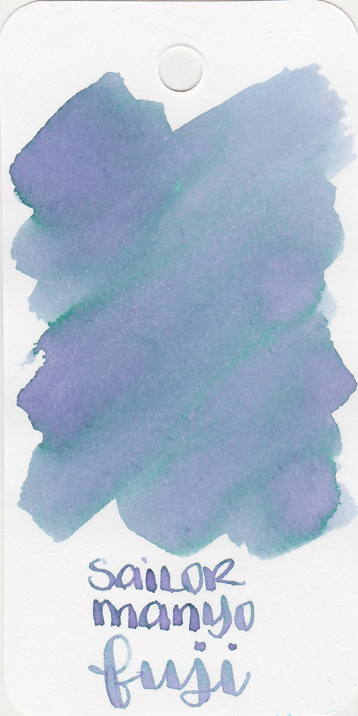
Left to right: Ayame, Hinoki, Koke and Fuji.
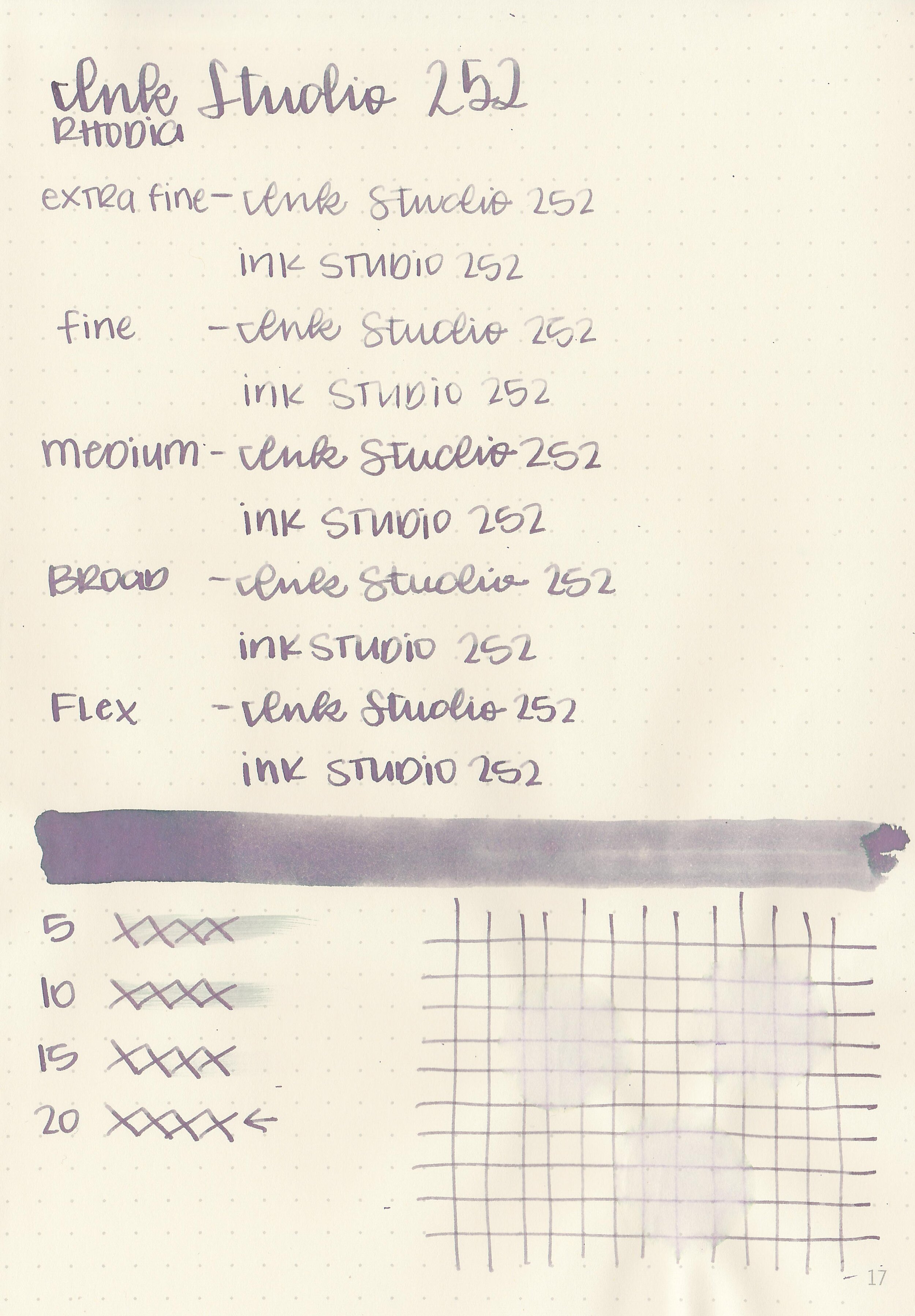
Writing samples:
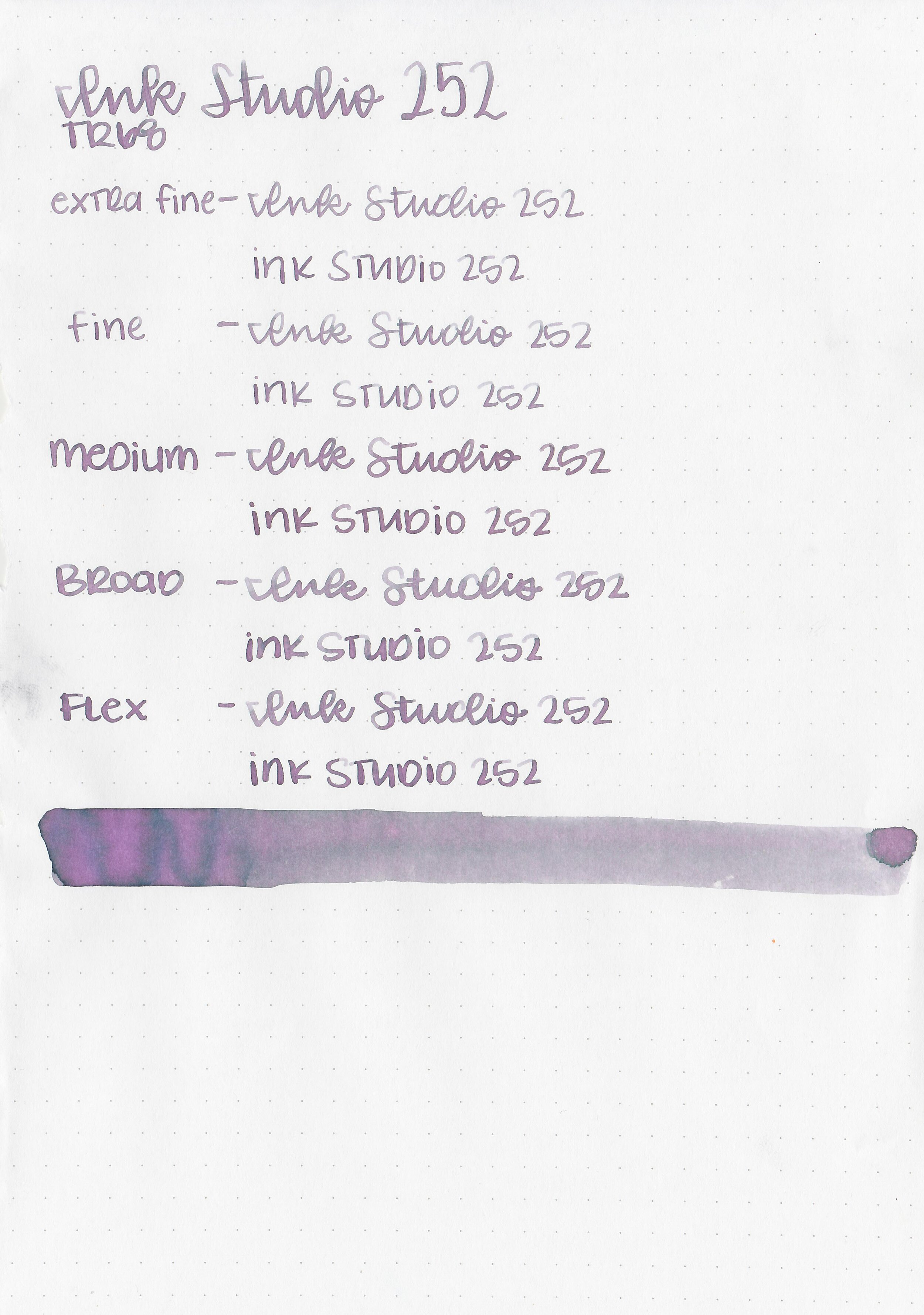
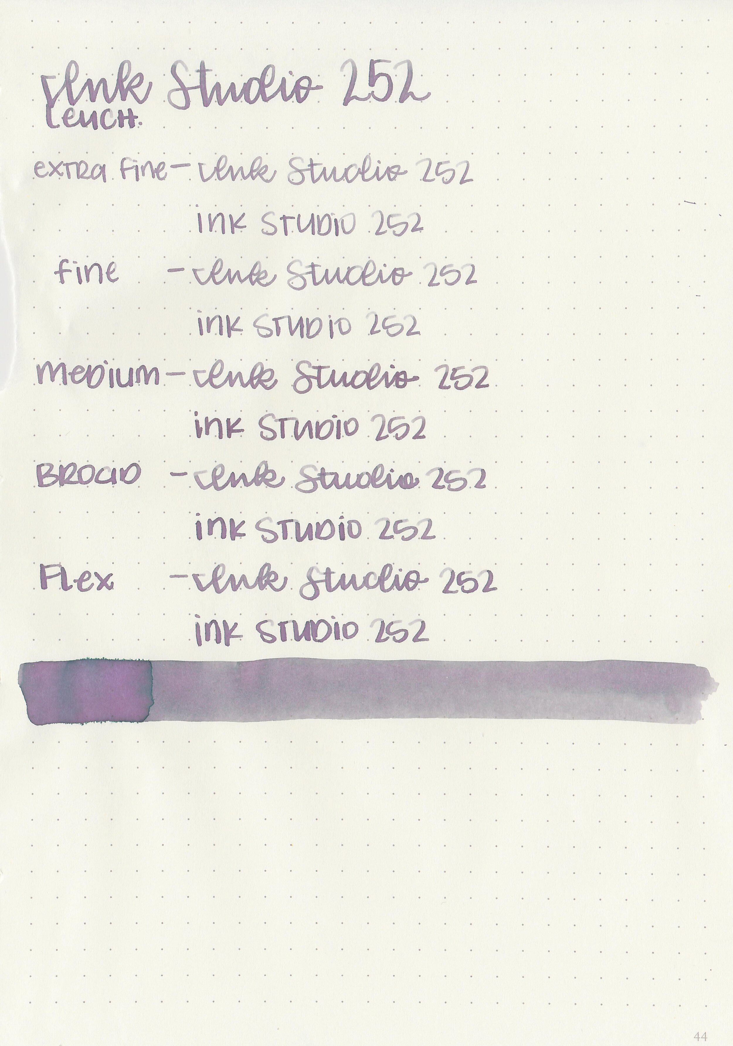
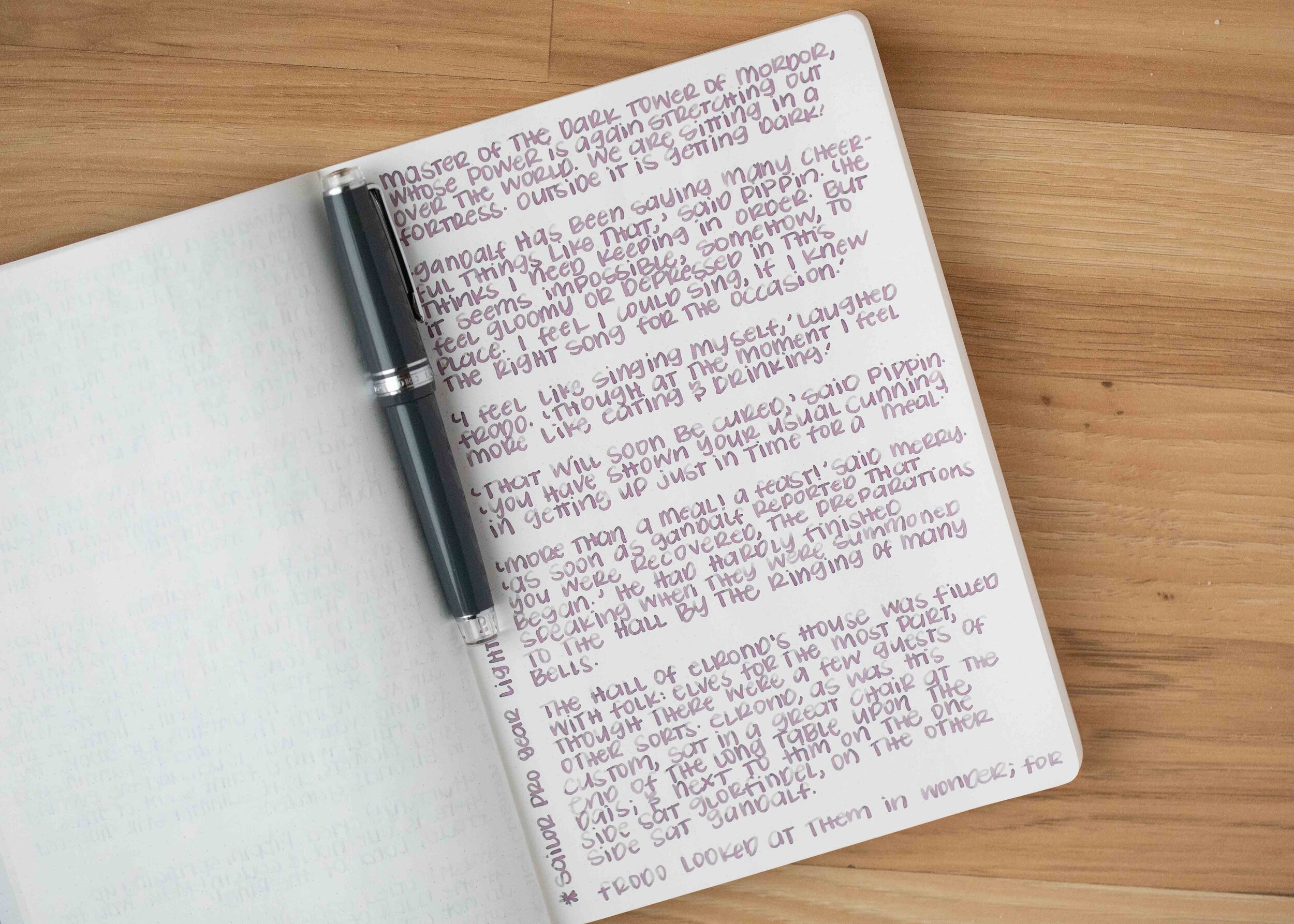
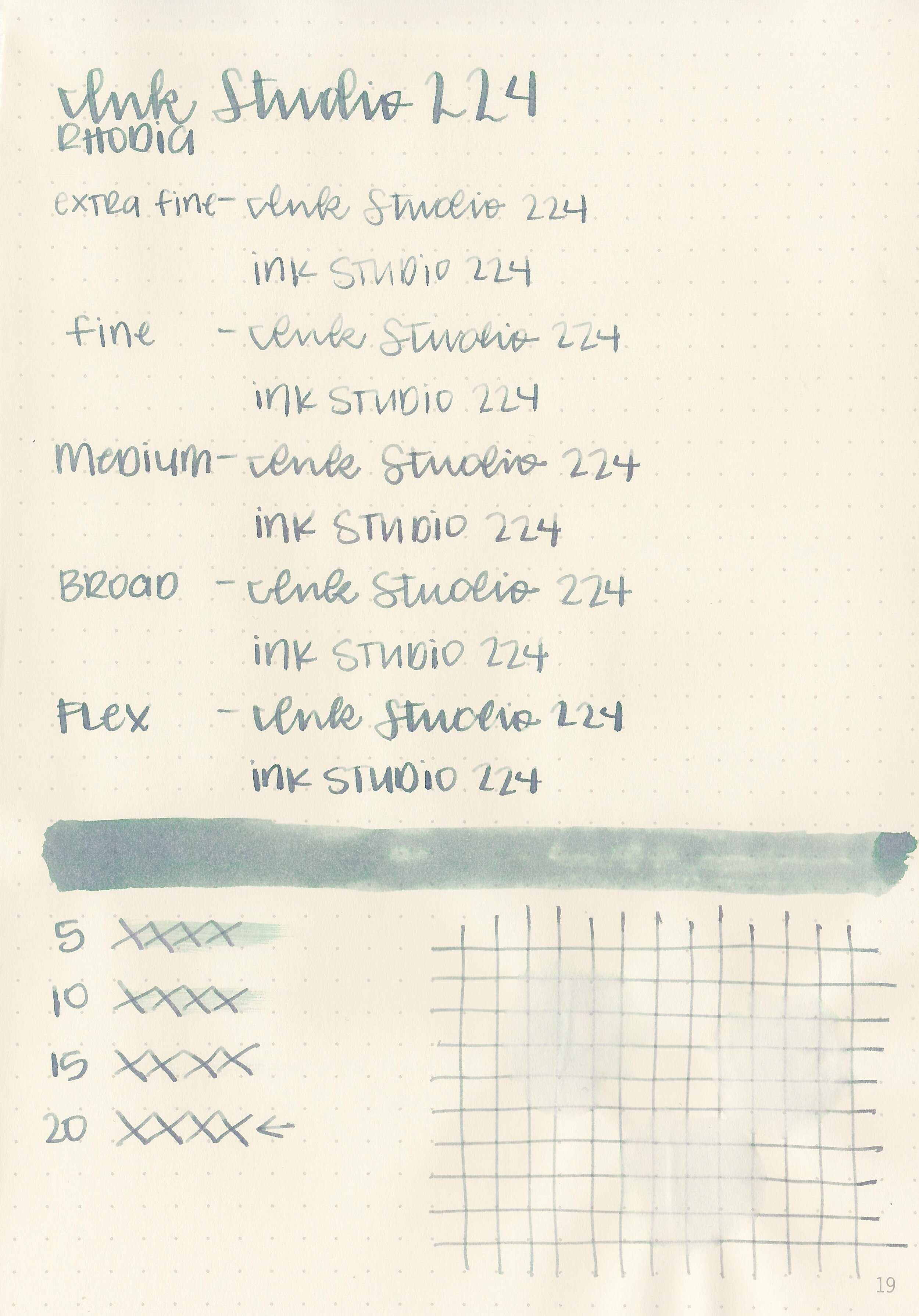
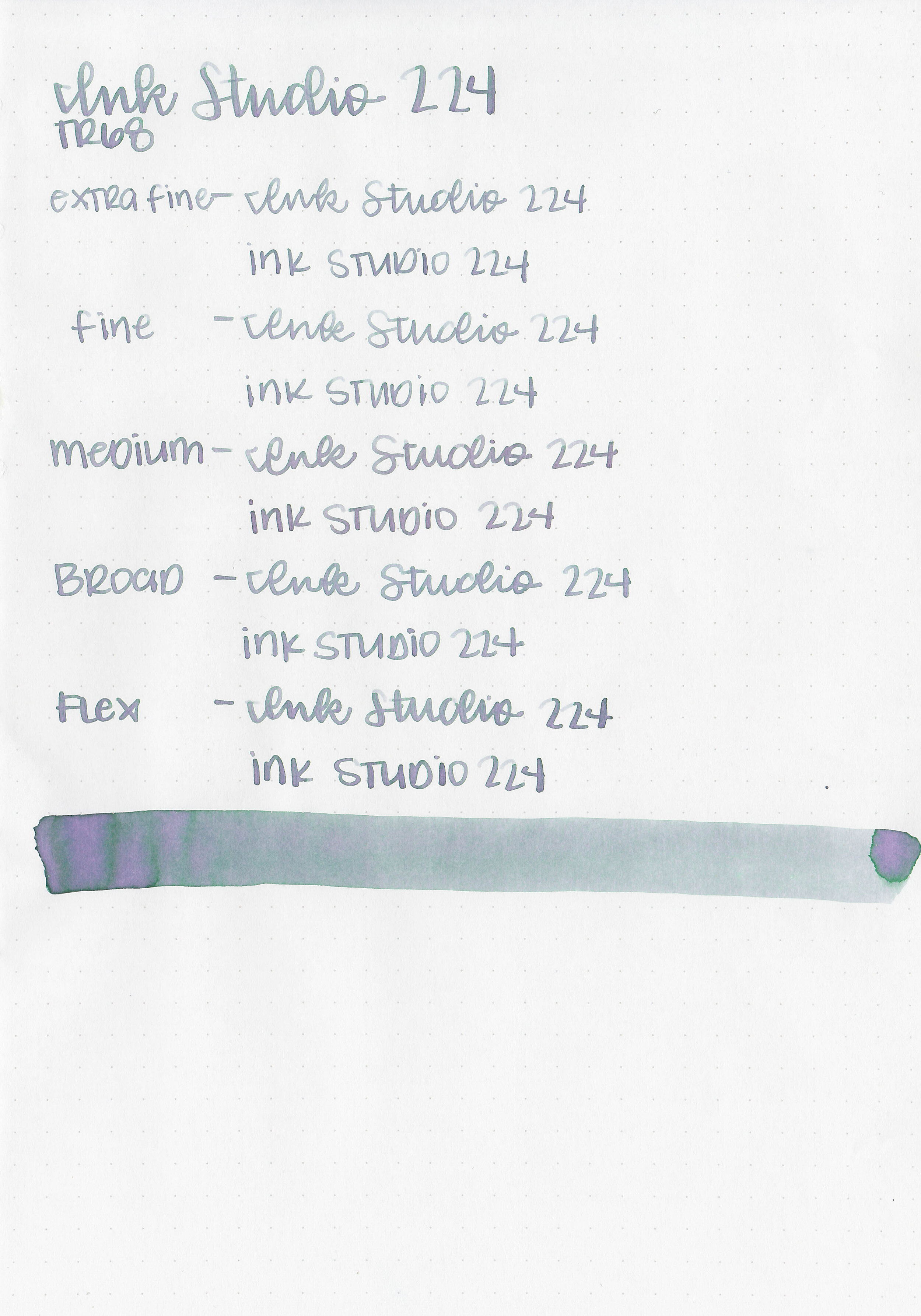
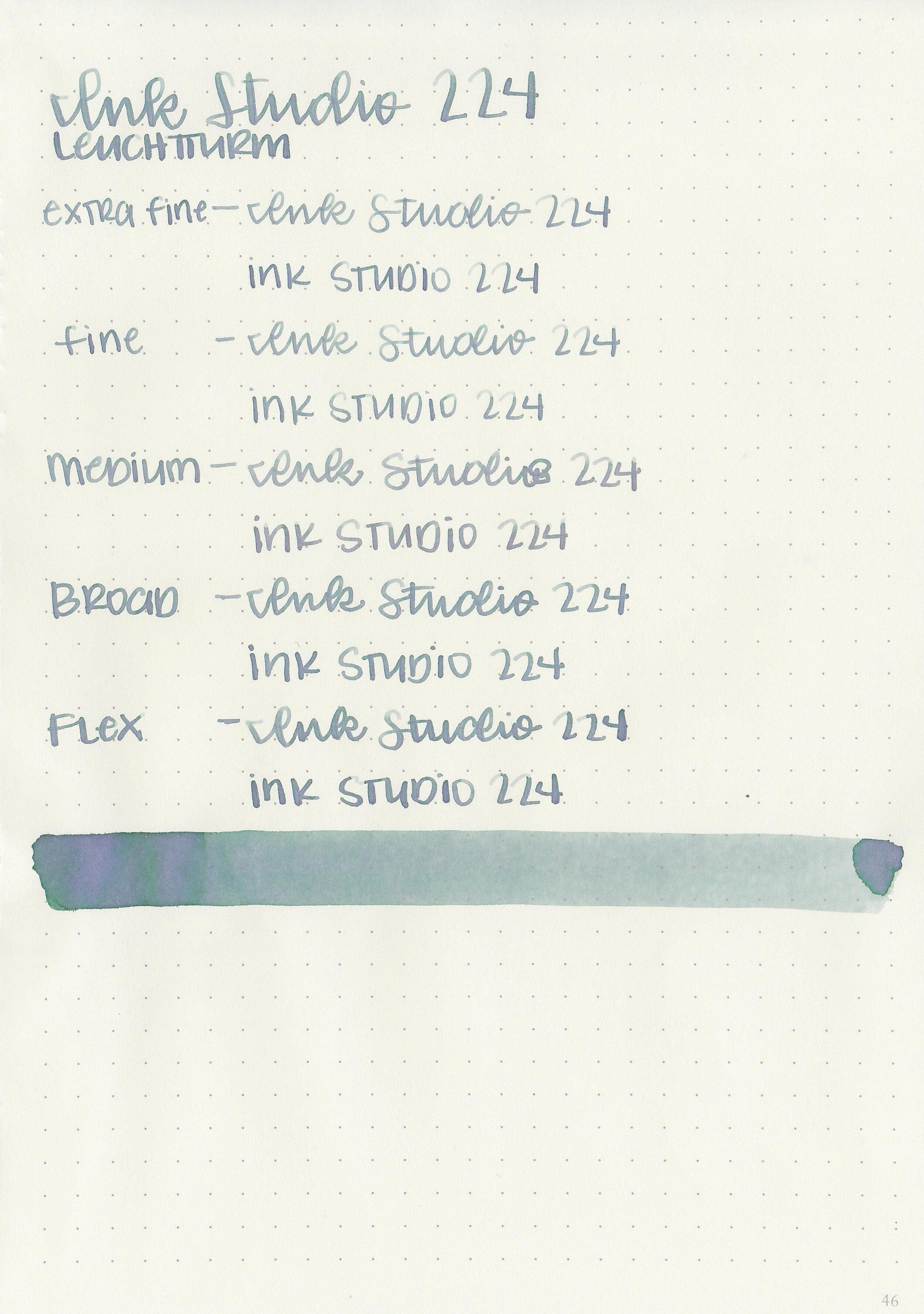
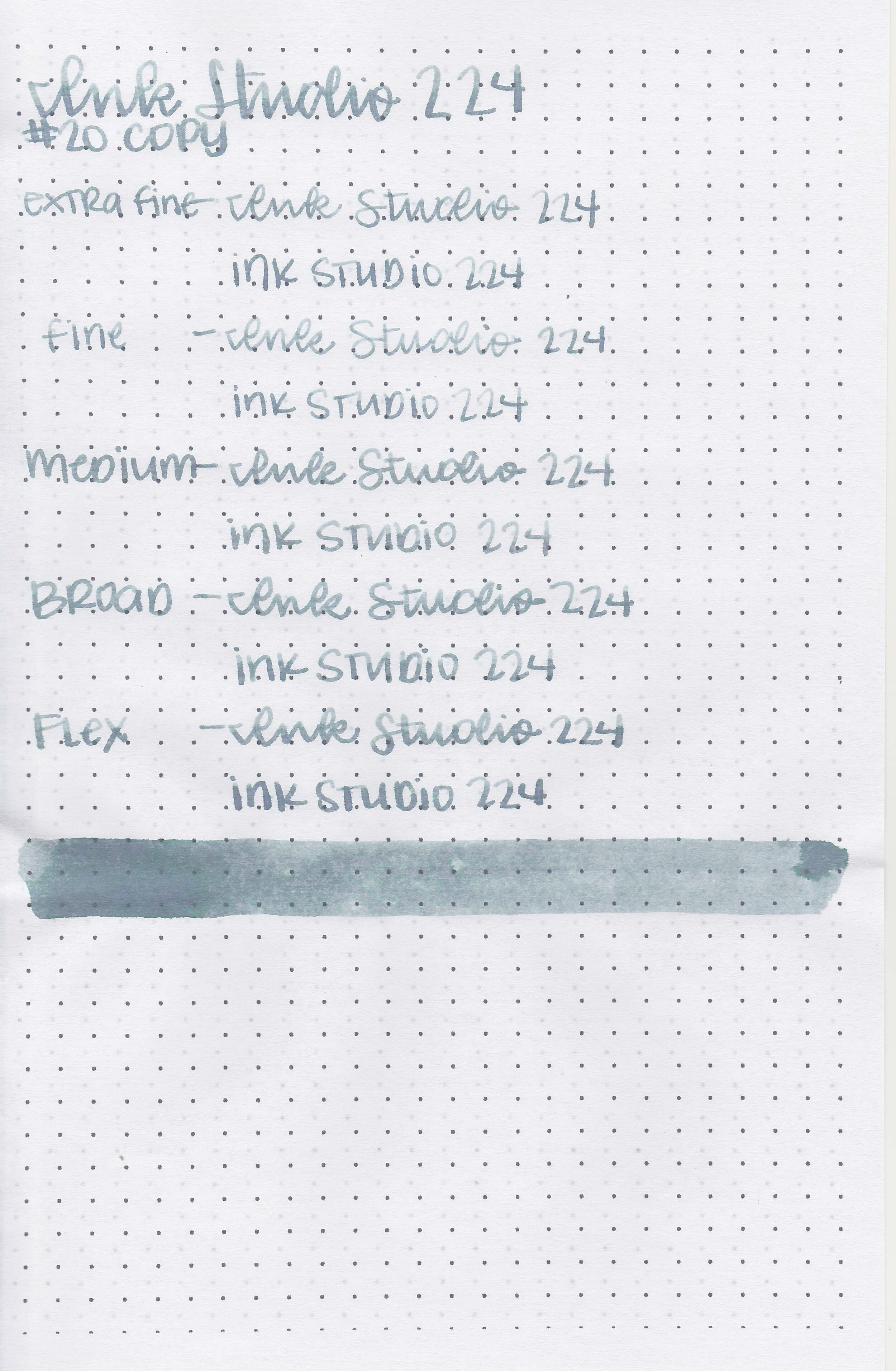
Let's take a look at how the ink behaves on fountain pen friendly papers: Rhodia, Tomoe River, and Leuchtturm.
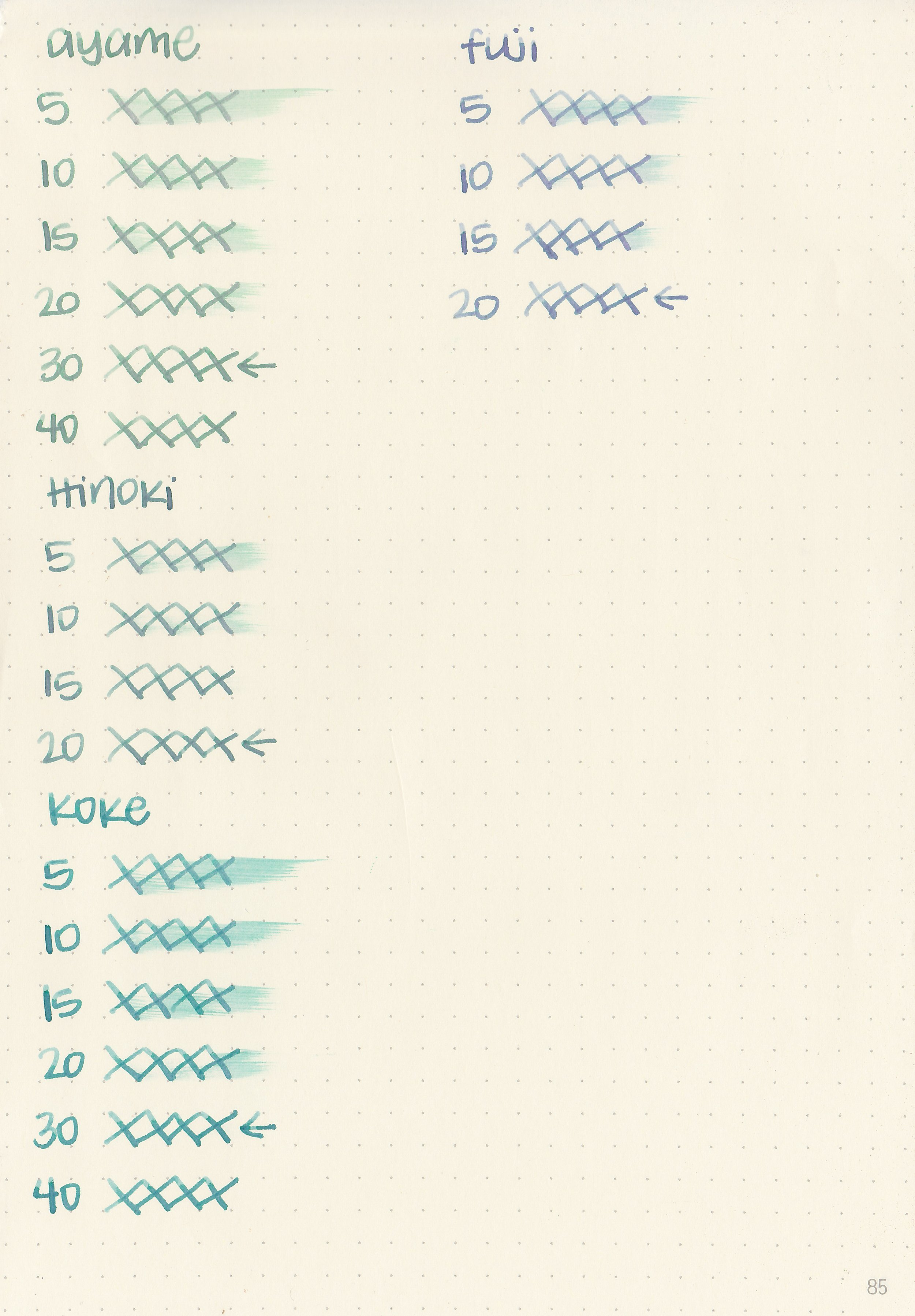
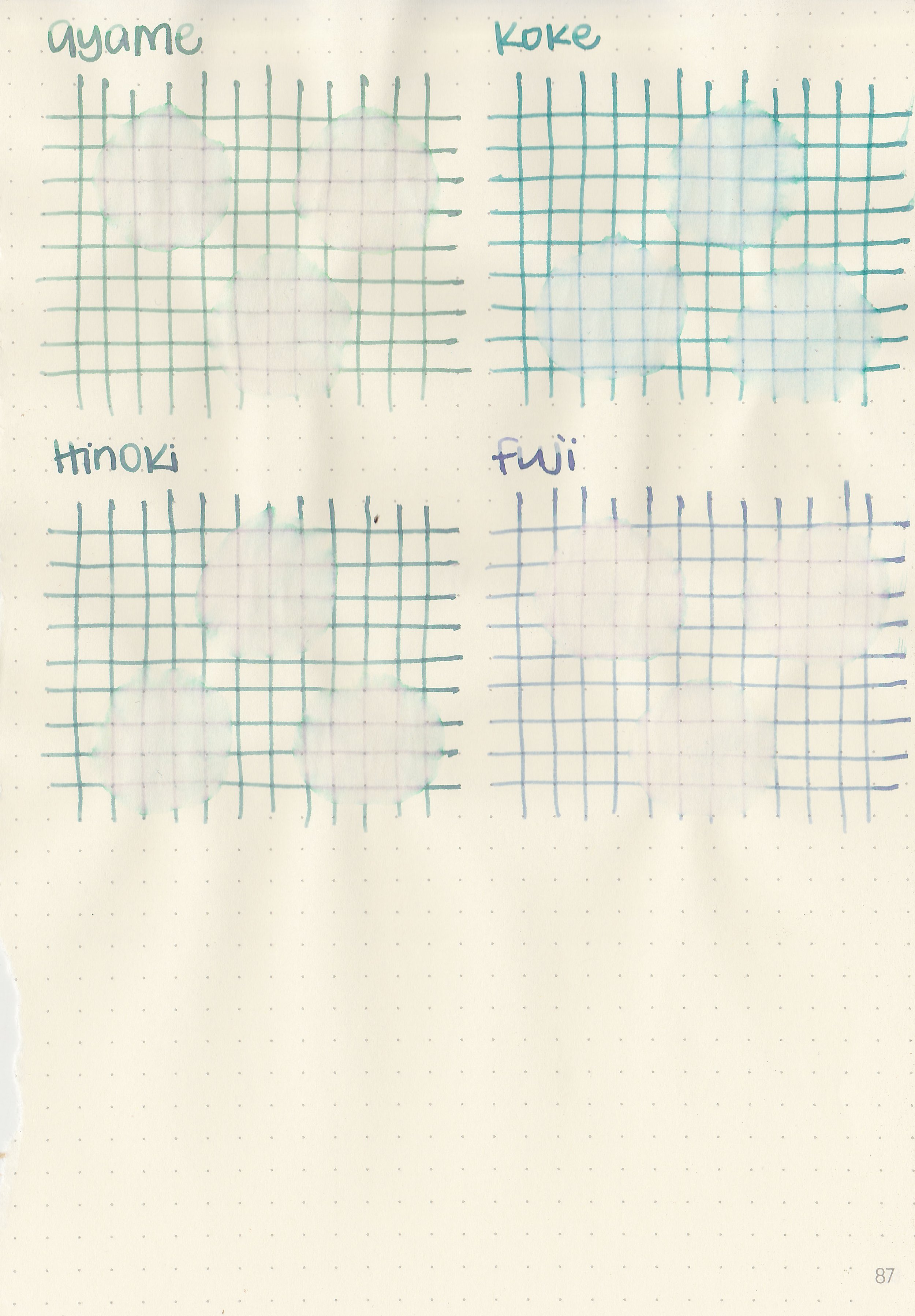
Dry Time: 20-30 seconds
Water Resistance: Low
Feathering: None
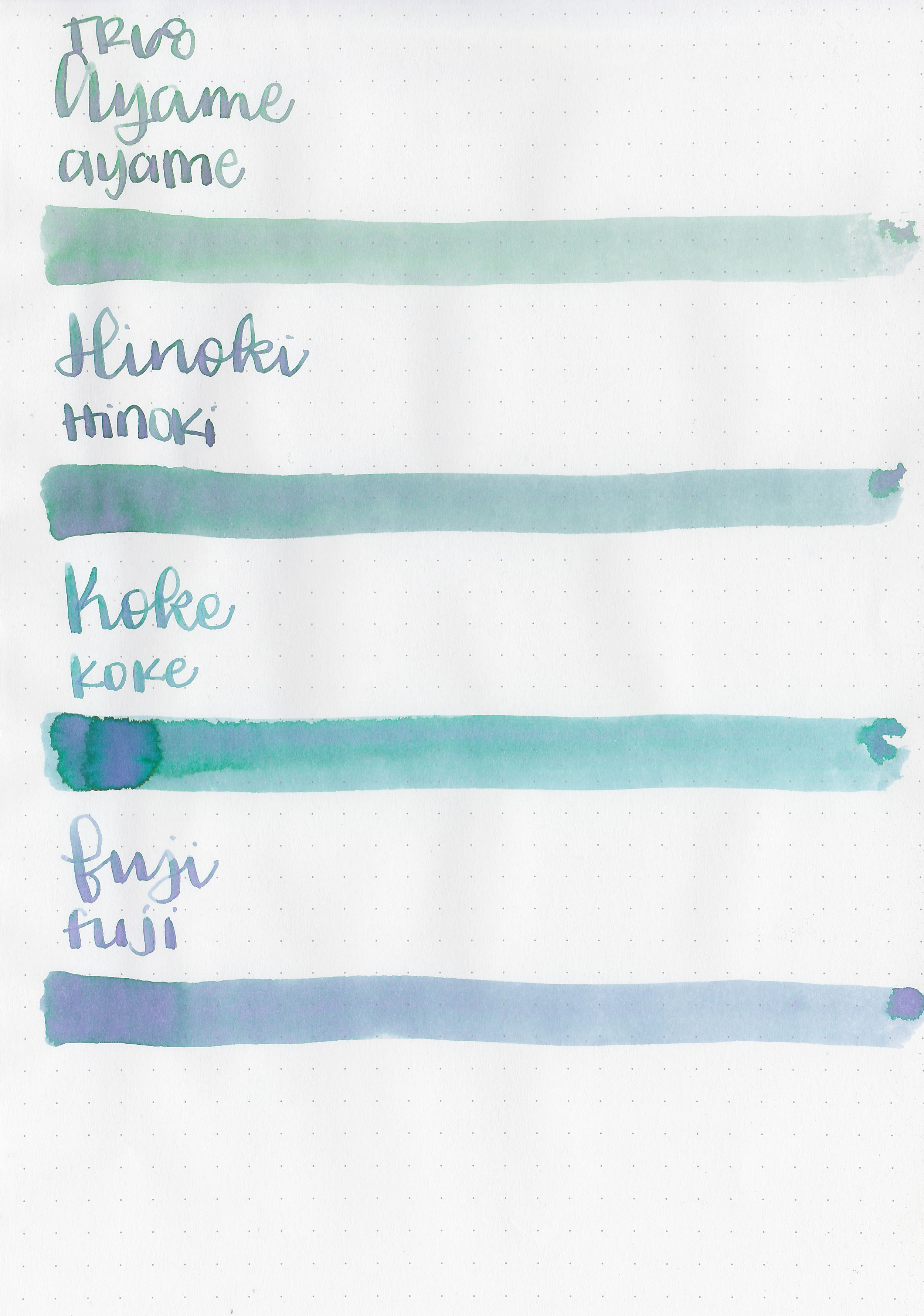
Show through: Medium
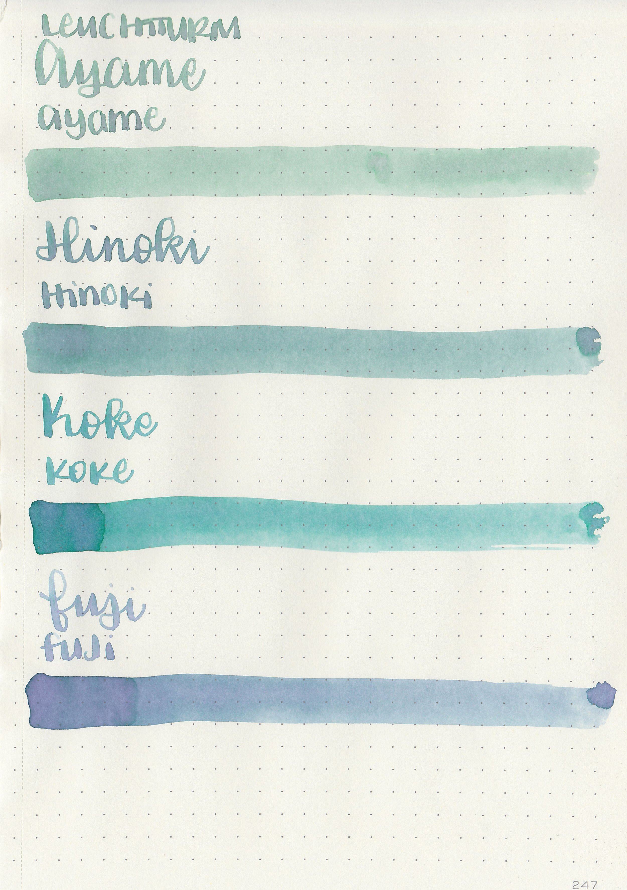
Bleeding: None
Other properties: All four had high shading.
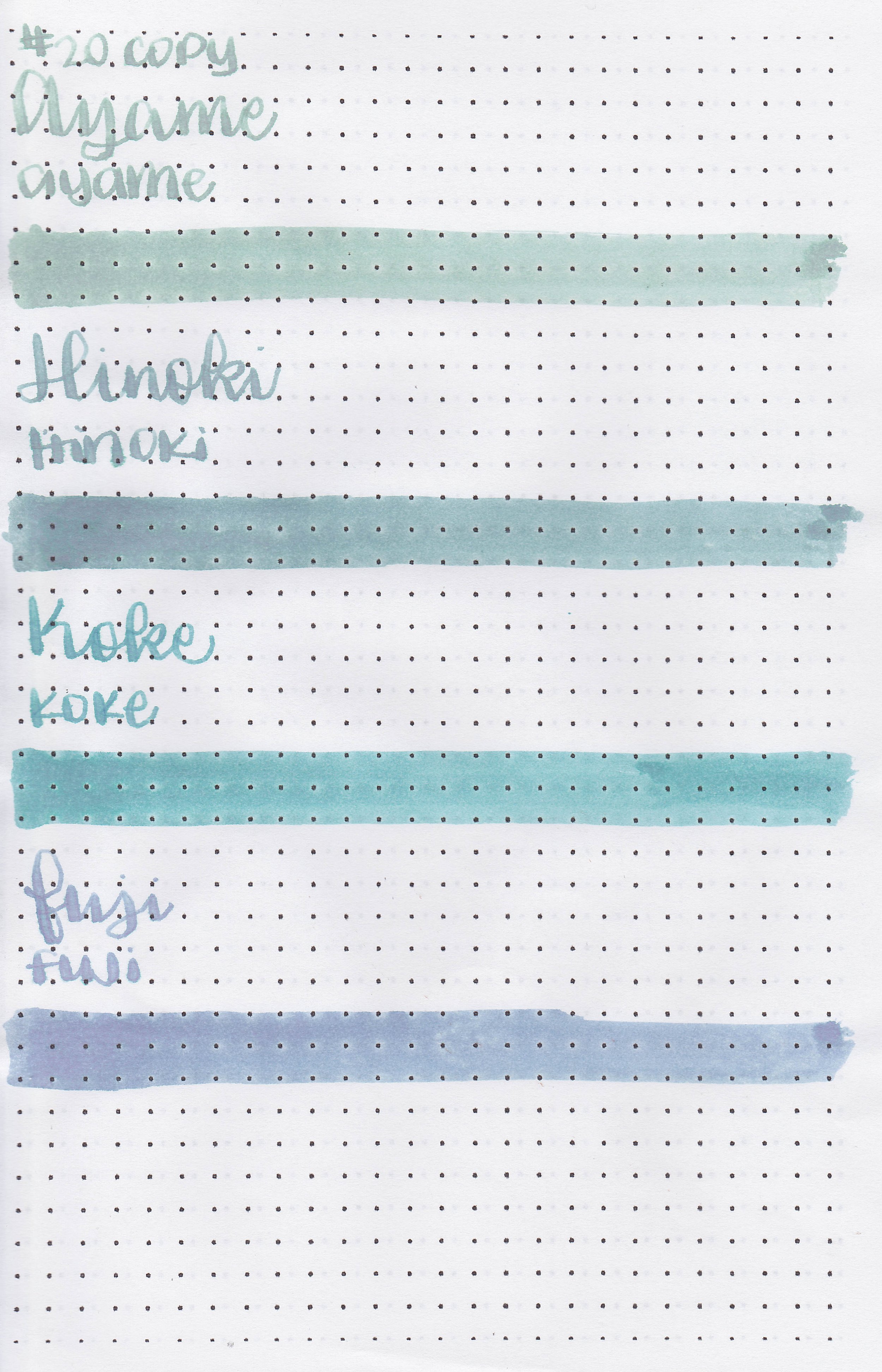
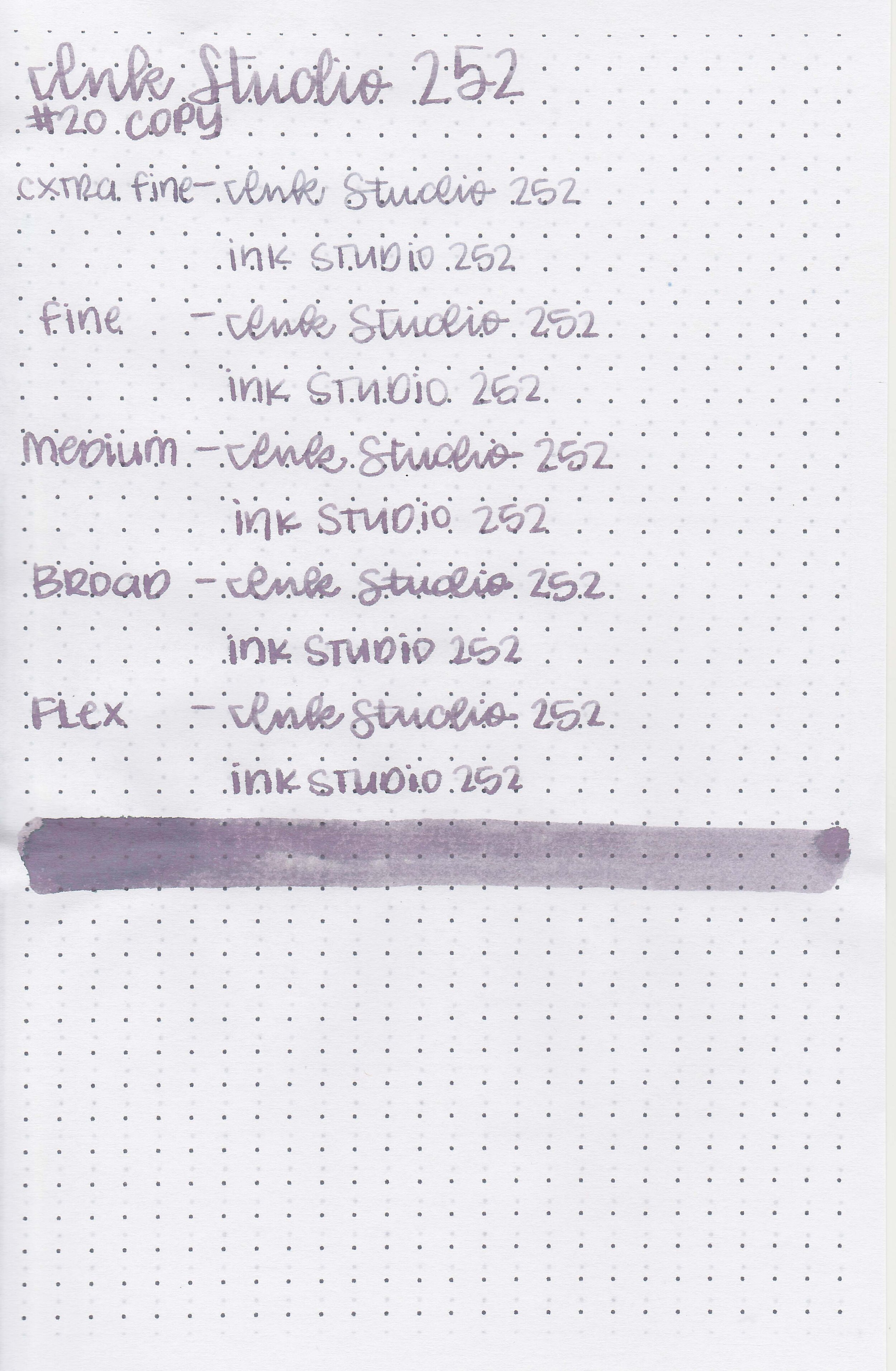
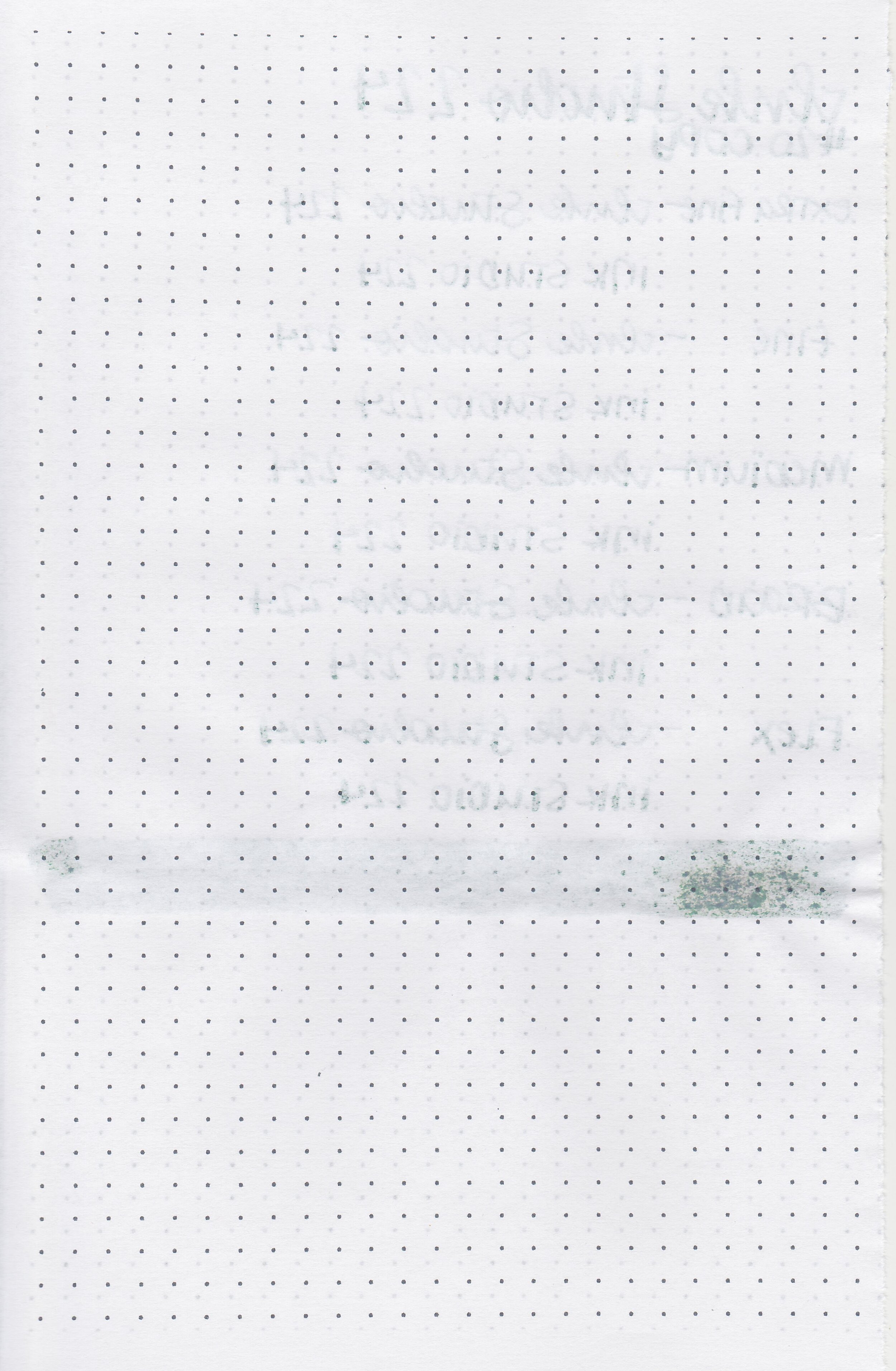
On Staples 24 lb copy paper there was some feathering in every nib size as well as some bleeding.
Comparison Swabs:

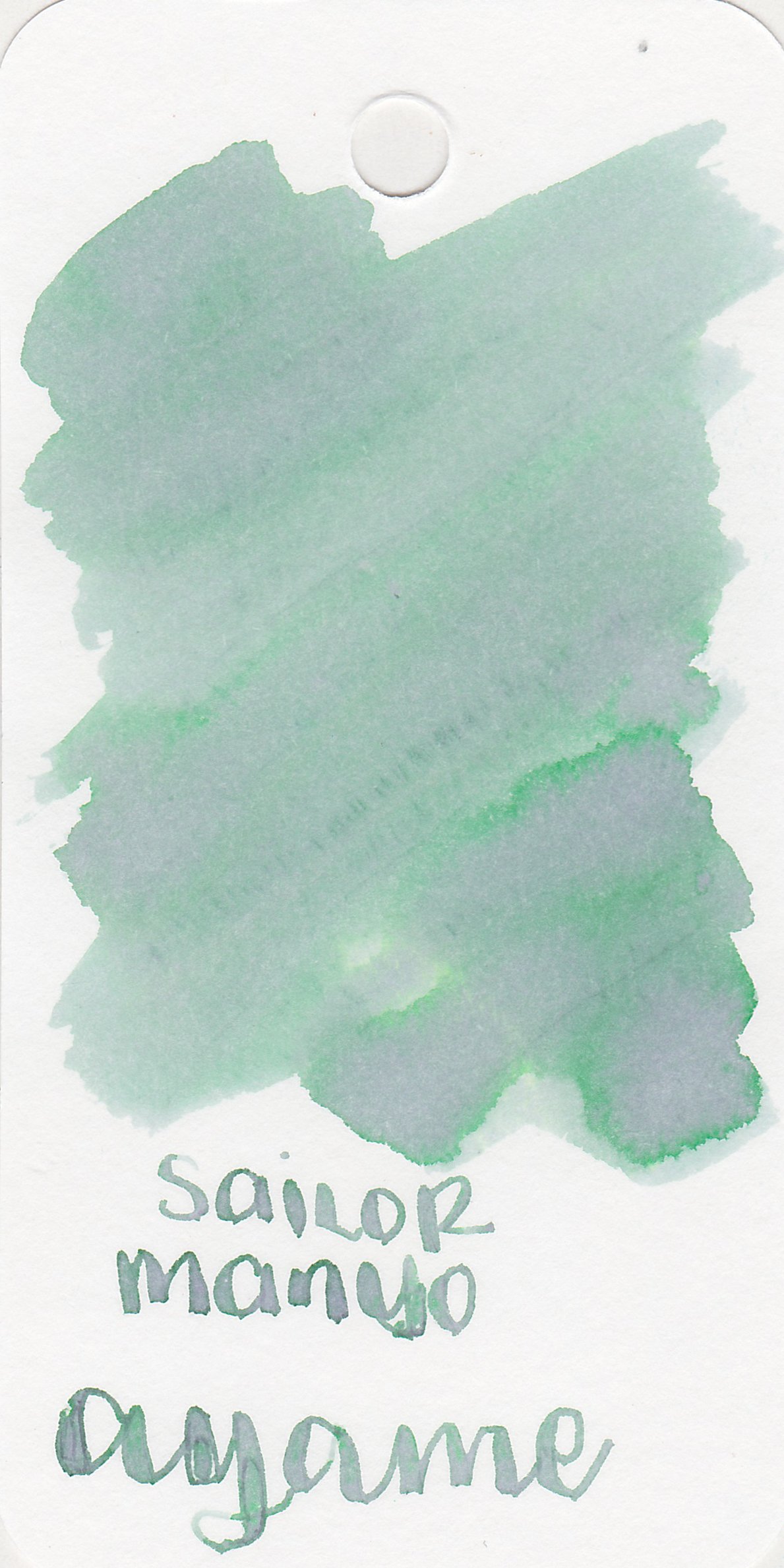
Ayame is closest to Vinta Sirena.
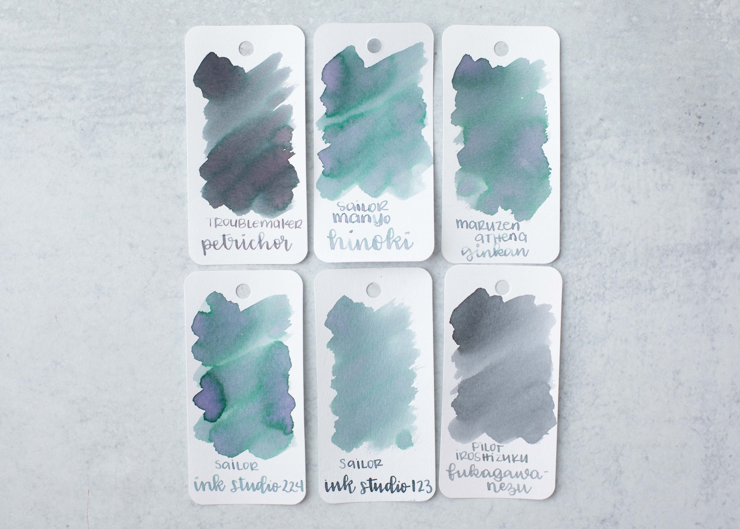
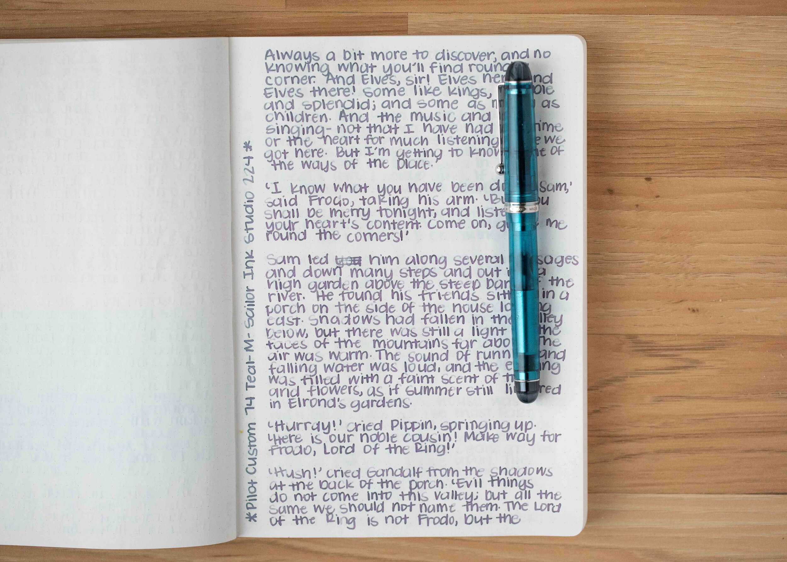
Hinoki is close to Maruzen Athena Ginkan and Sailor Ink Studio 224.

Koke is darker than Sailor Manyo Haha.

Fuji is lighter than Sailor Manyo Nekoyanagi.


All four had dry flows.
Overall, I love all four of them. The shading is fabulous but they are very dry, so I preferred using them in wetter pens. I actually purchased full bottles of these inks because I like them so much. Out of the four Koke is the most readable in everyday writing.
Disclaimer: All photos and opinions are my own. This page does not contain affiliate links, and is not sponsored in any way.