Ink Review #1407: Kyo-iro 03 Fushimi's Flaming Red

kyo-flaming-red-2.jpg

Today’s ink is Kyo-iro 03 Fushimi’s Flaming Red. You can find this ink for sale at Pen Chalet (aff. link) and Vanness Pens.

kyo-flaming-red-1.jpg

The color:

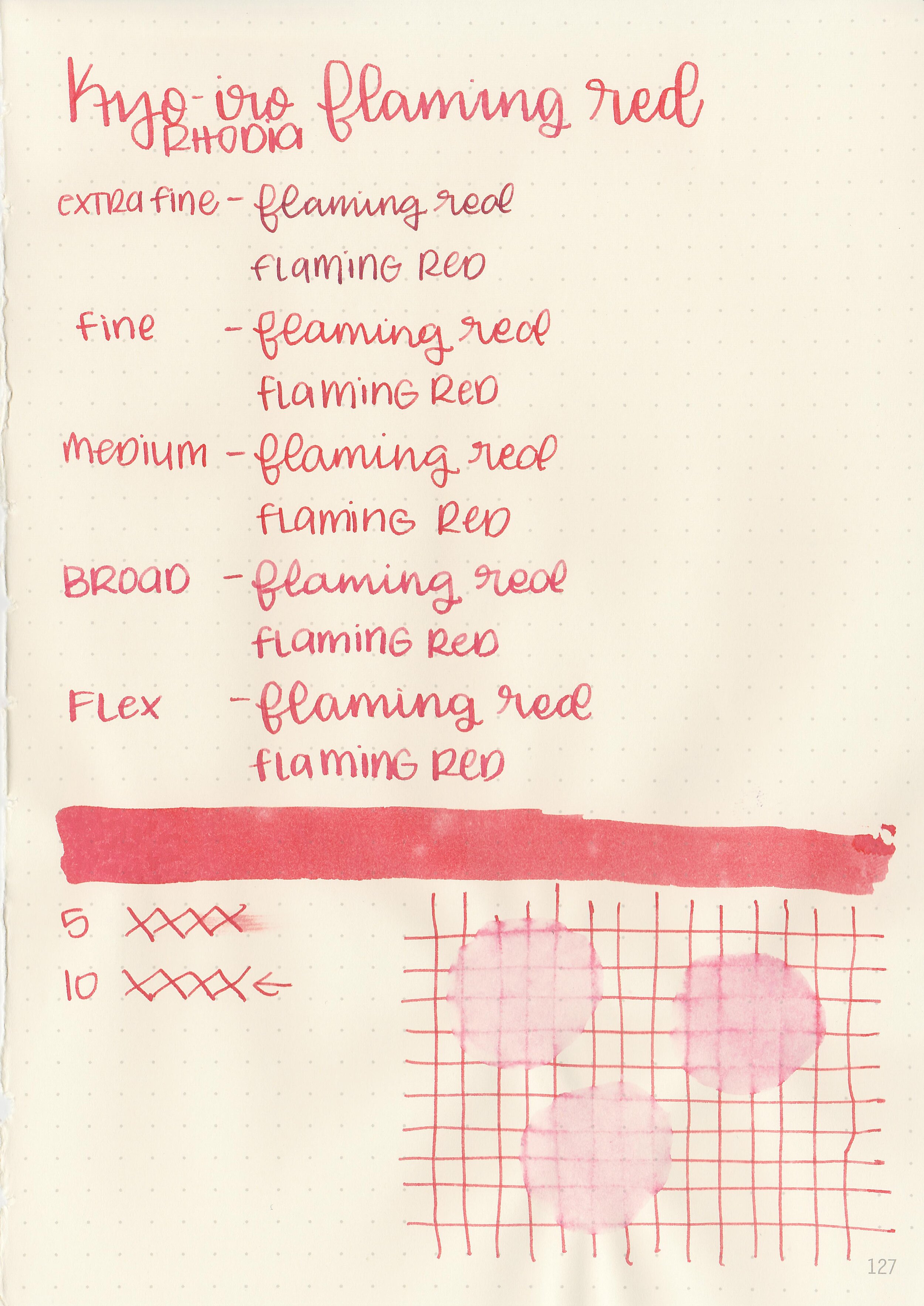
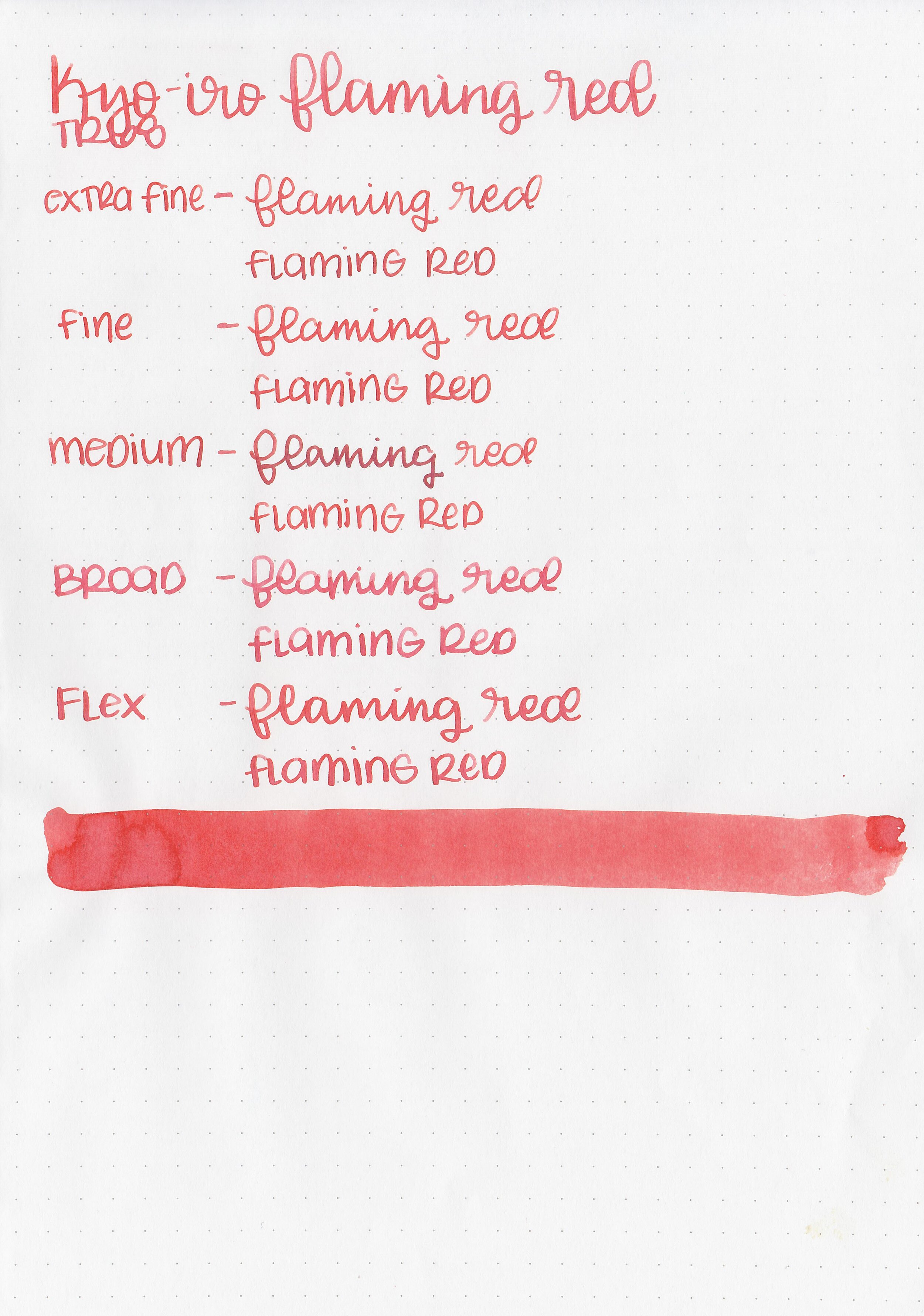
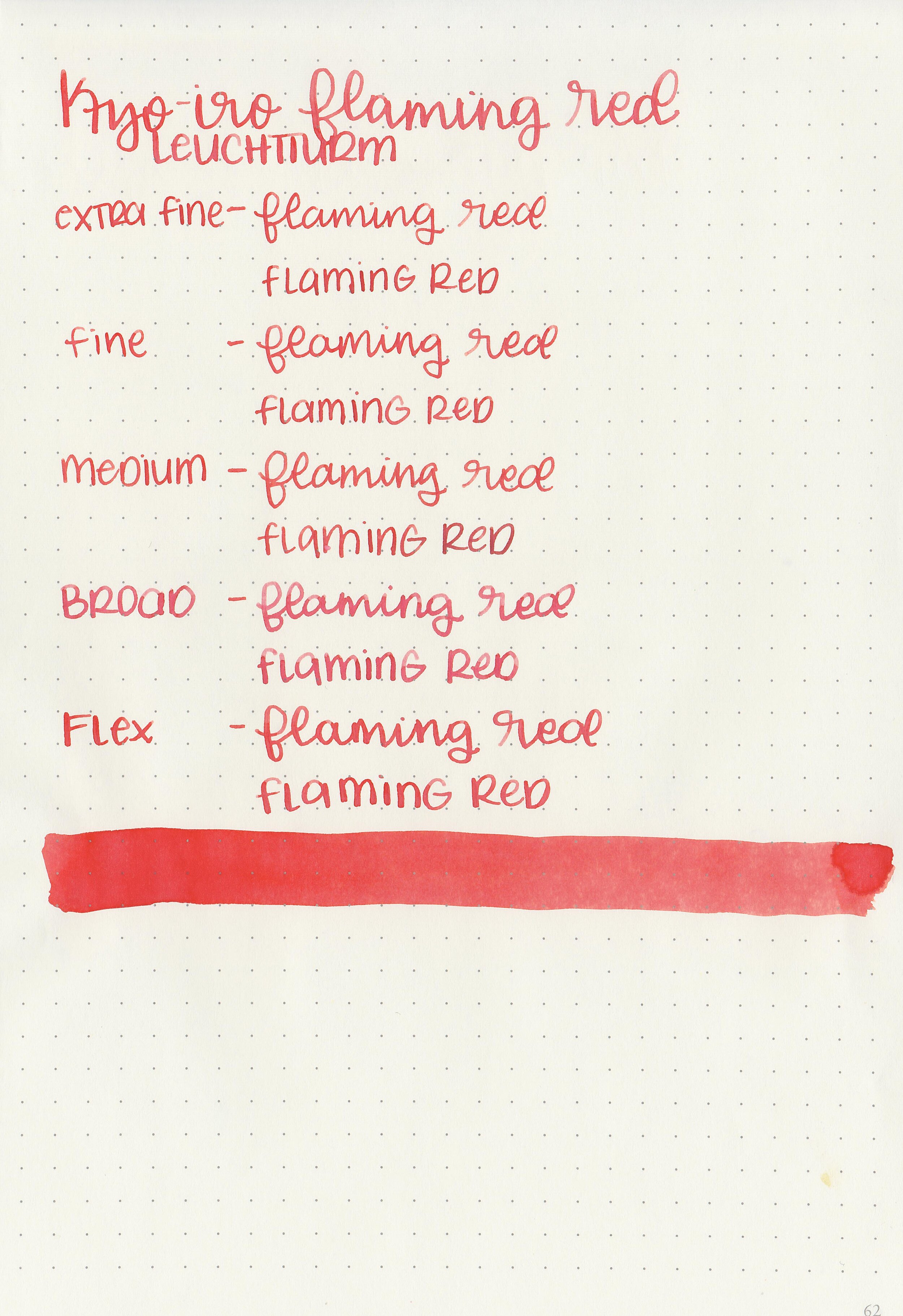
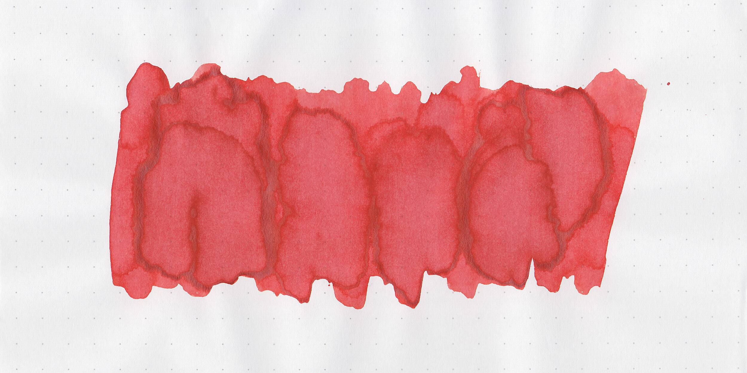
Flaming Red is a bright red that leans just a bit towards orange.

Swabs:

kyo-flaming-red-3.jpg

In large swabs on Tomoe River paper the ink is a little darker than in writing.

kyo-flaming-red-4.jpg

Writing samples:

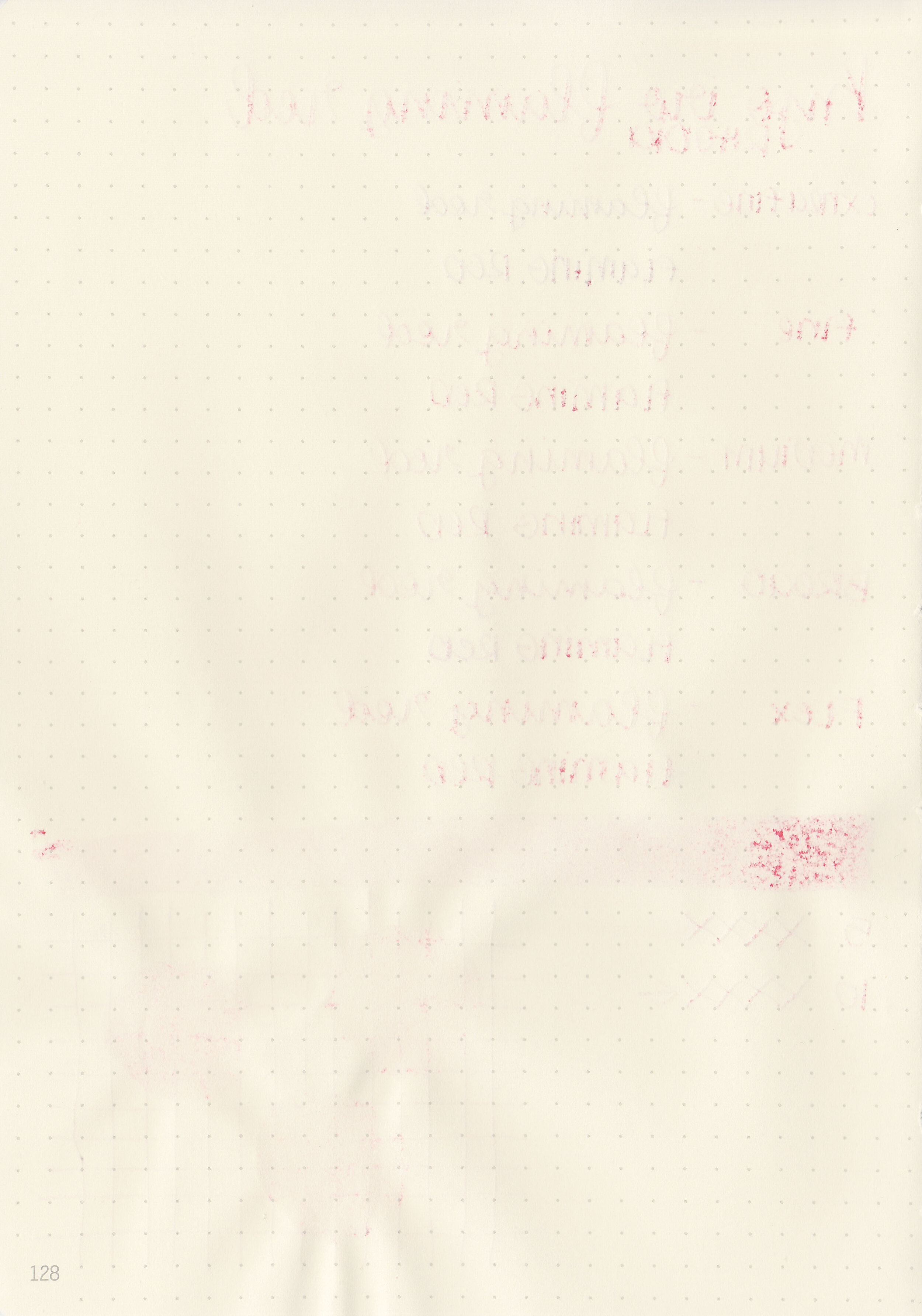
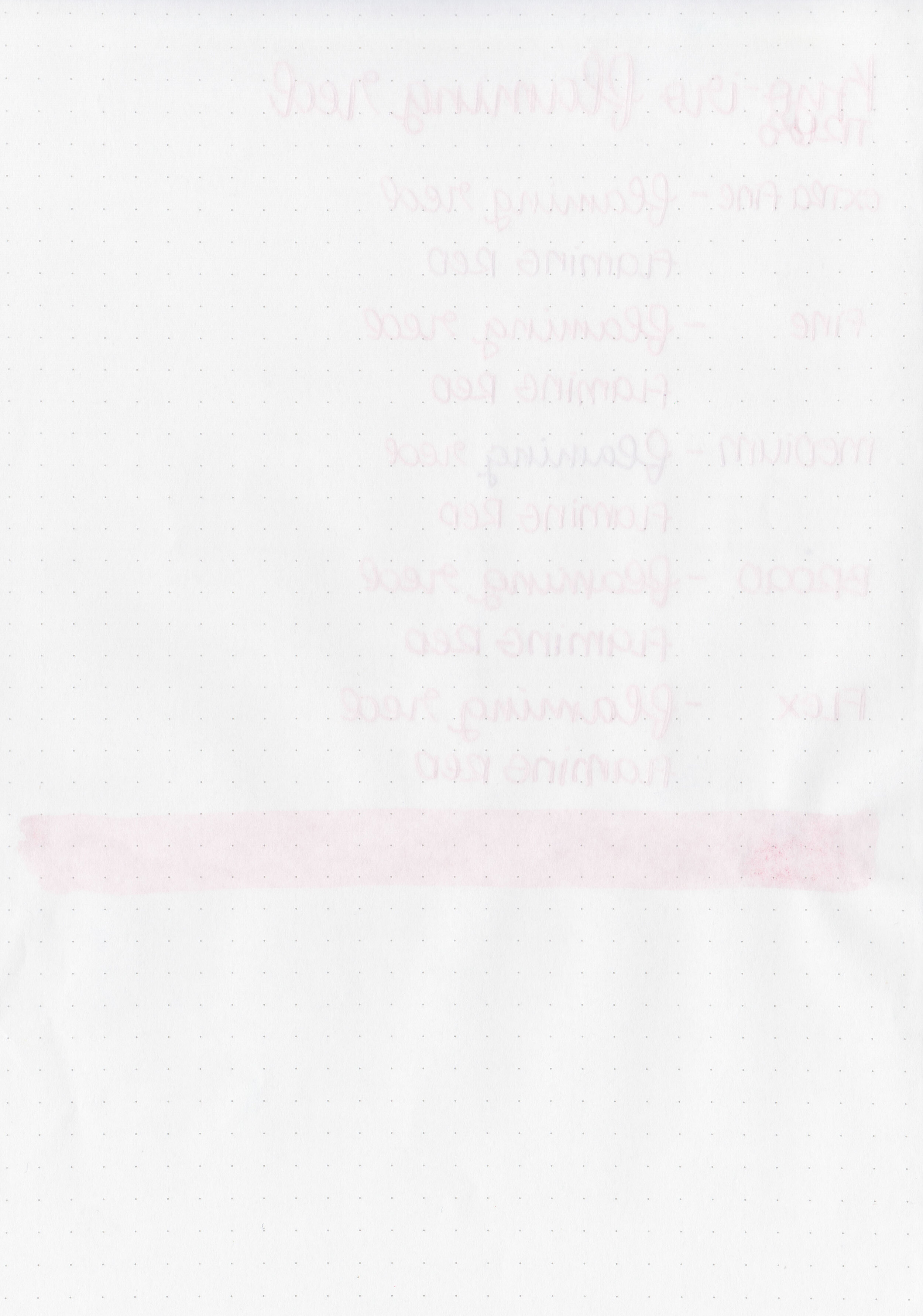
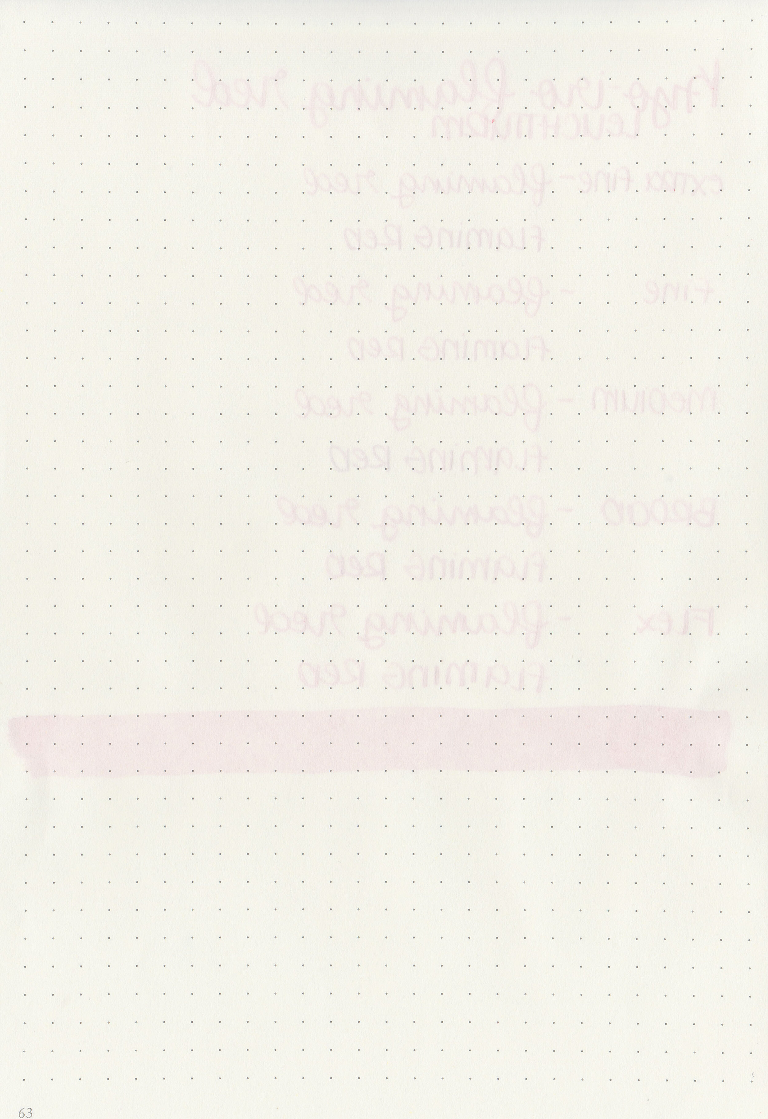
Let's take a look at how the ink behaves on fountain pen friendly papers: Rhodia, Tomoe River, and Leuchtturm.

Dry time: 10 seconds

Water resistance: Medium

Feathering: Low

Show through: Medium

Bleeding: Low

Other properties: low shading, no sheen, and no shimmer.

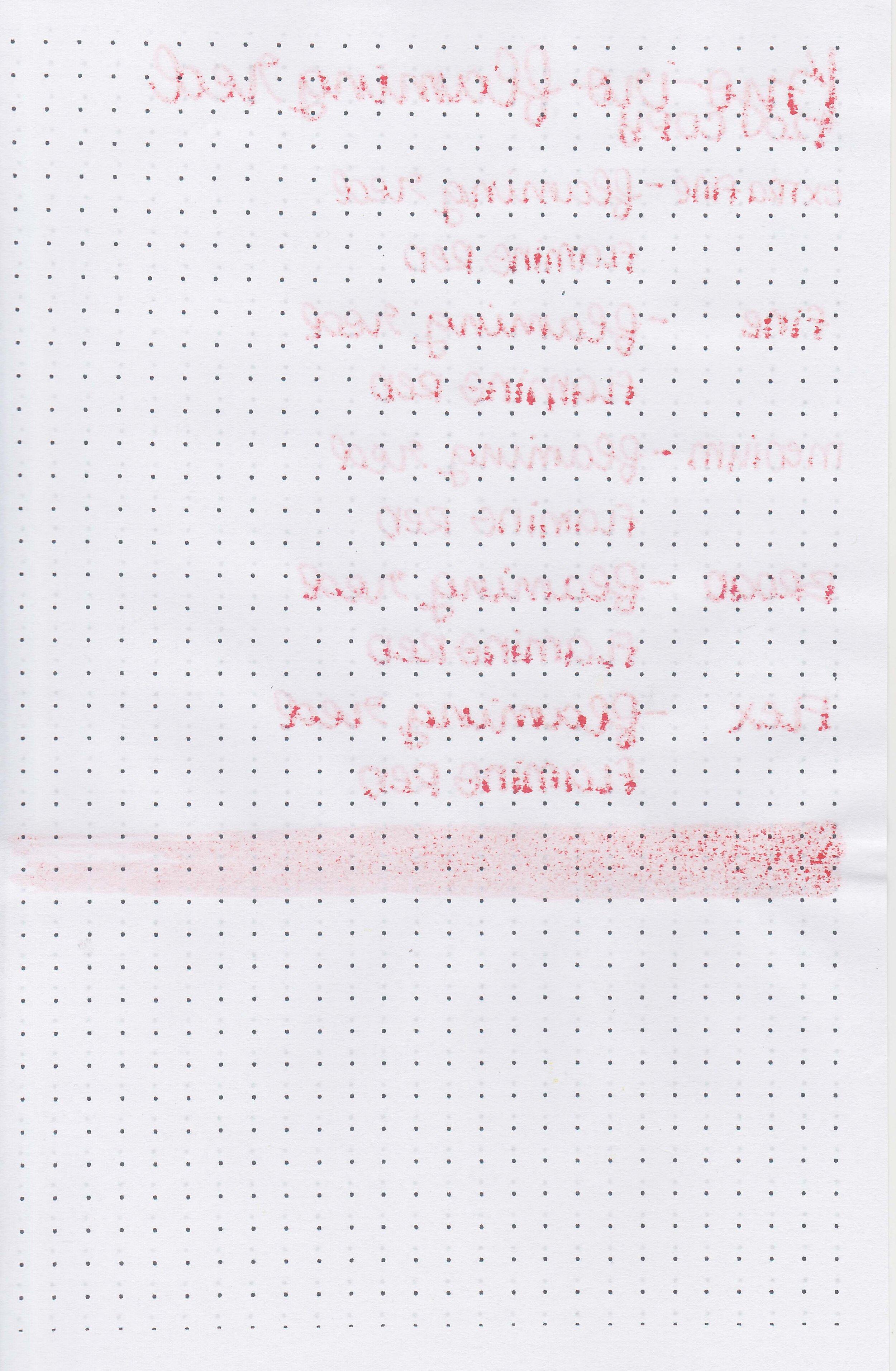
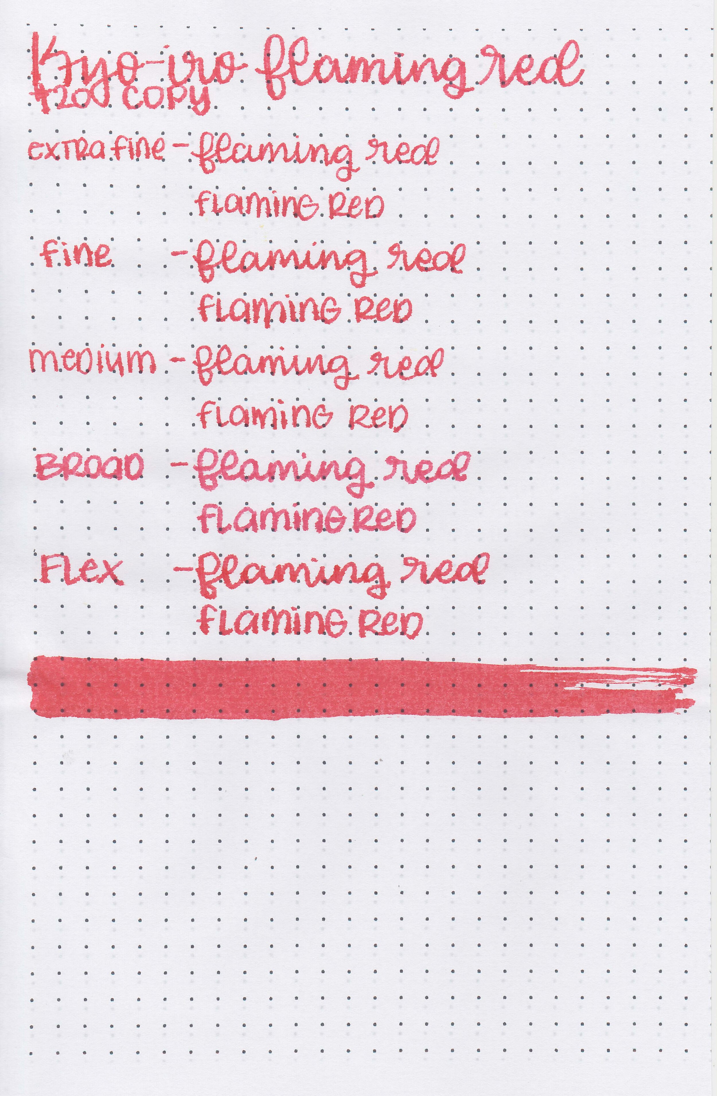
On Staples 24 lb copy paper there was some feathering and bleeding in all nib sizes.

Comparison Swabs:

kyo-flaming-red-s-1.jpg

There are a lot of similar reds out there including Diamine Poppy Red and Robert Oster Direct Sun. Click here to see the Kyoto inks together, and click here to see the red inks together.

Longer writing:

kyo-flaming-red-w-1.jpg

I used a Sailor Pro Gear Slim Supernova Red with a broad nib on a Taroko Enigma notebook. The ink had a super dry flow.

Overall, there are a lot of red inks out there that are very similar to this color. There’s nothing about it that stands out from the crowd.

Disclaimer: All photos and opinions are my own. This page does contain affiliate links but this post is not sponsored in any way.

Ink Review #1074: Kyo-iro 04 Moonlight of Higashiyama

kyo-moonlight-2.jpg

Lately I’ve been trying to make it through more of the Kyoto inks so today’s is Kyo-iro 04 Moonlight of Higashiyama. Thanks to the reader that sent this sample in for review! You can find this ink for sale at most retailers including Pen Chalet.

kyo-moonlight-1.jpg

The color:

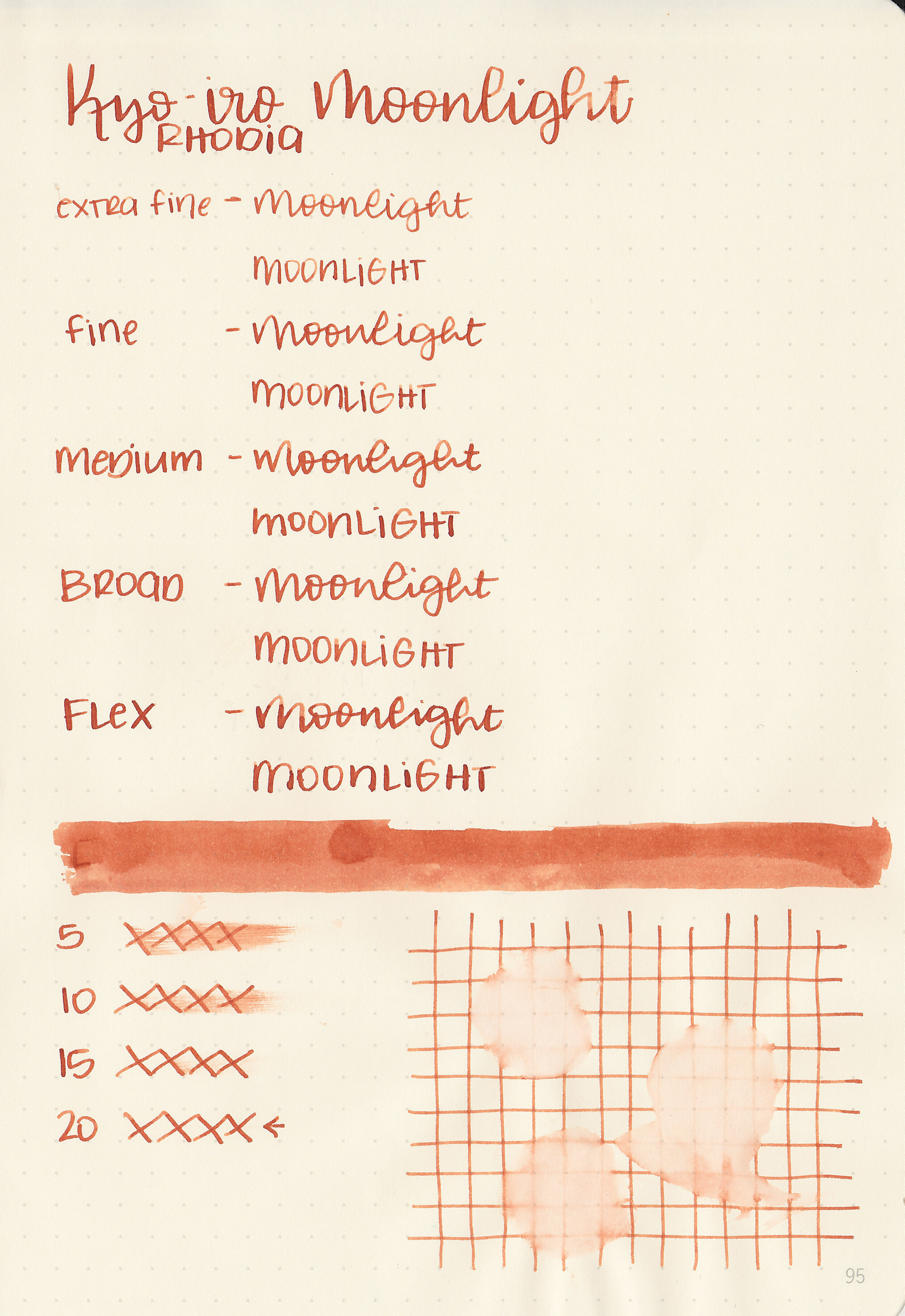
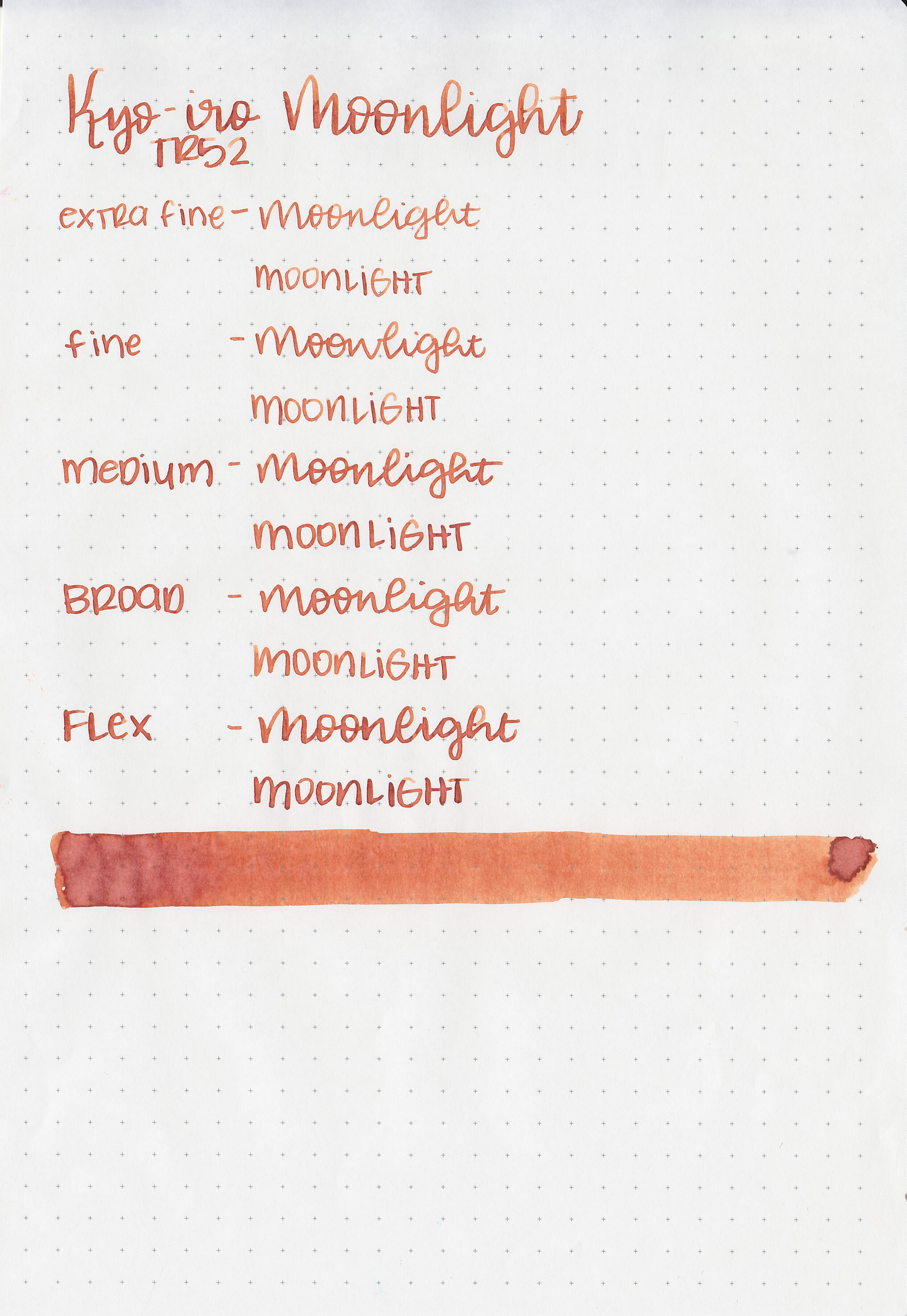
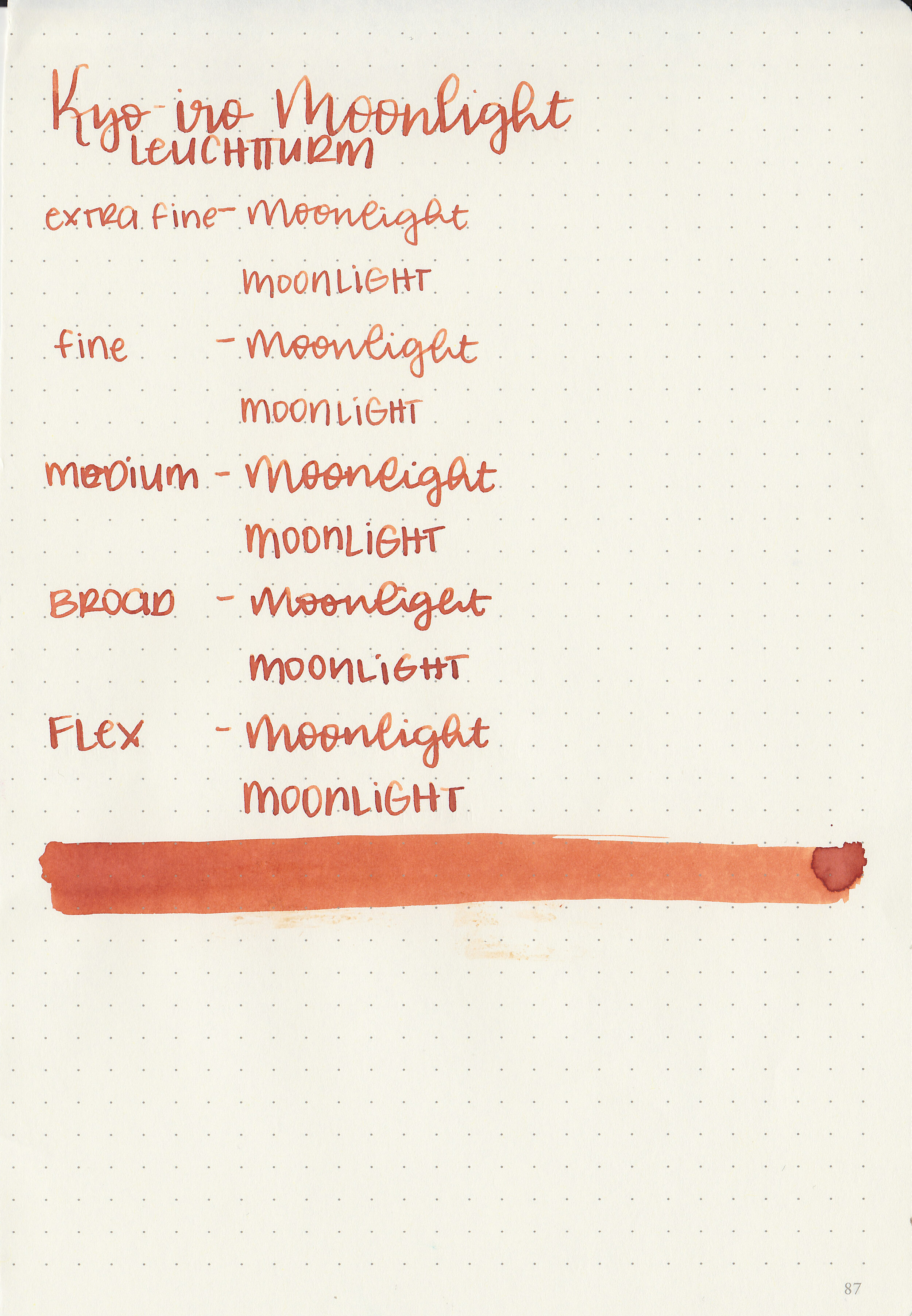
Moonlight is an unsaturated burnt orange.

Swabs:

kyo-moonlight-3.jpg

In large swabs on Tomoe River paper the ink looks less saturated and has just a little bit of brown sheen.

kyo-moonlight-4.jpg

Writing samples:

Let's take a look at how the ink behaves on fountain pen friendly papers: Rhodia, Tomoe River, and Leuchtturm.

Dry time: 20 seconds

Water resistance: Low

Feathering: None

Show through: Medium

Bleeding: None

Other properties: medium shading, tiny sheen, and no shimmer. You can only see the brown sheen in large swabs on Tomoe River paper.

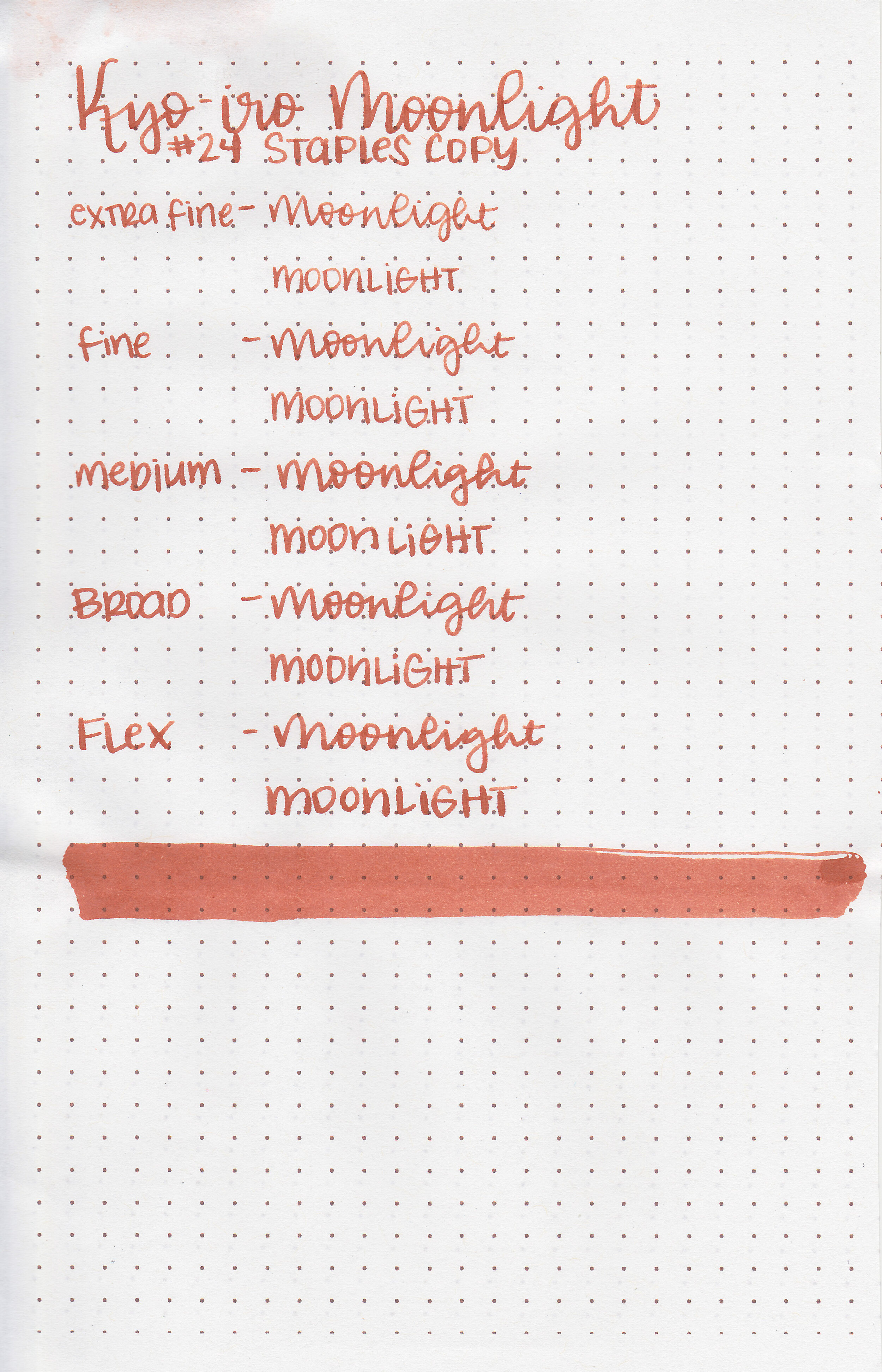
On Staples 24 lb copy paper there was some feathering and just a few dots of bleeding in the larger nib sizes.

Comparison Swabs:

kyo-moonlight-s-1.jpg

Moonlight is just a little bit lighter than Papier Plume 011. Click here to see the Kyoto inks together, and click here to see the orange inks together.

Longer writing:

kyo-moonlight-w-1.jpg

I used a Pelikan M600 Vibrant Orange with a medium nib on a Yoseka A5 notebook. The ink had a dry flow. The ink/pen combo was fine at first, but after the first paragraph it got really dry.

Overall, I love the color and the shading but the flow is a way too dry for me.

Disclaimer: This ink was provided by a reader for the purpose of this review. All photos and opinions are my own. This page does contain affiliate links but this post is not sponsored in any way.

Ink Review #1067: Kyo-iro Soft Snow of Ohara

kyo-soft-snow-of-ohara-2.jpg

Today’s ink is Kyo-iro 02 Soft Snow of Ohara. This ink has been on my radar for a while, I’ve just never tried it before. Thanks to the reader that sent this ink in! You can find this ink for sale at most retailers including Pen Chalet.

kyo-soft-snow-of-ohara-1.jpg

The color:

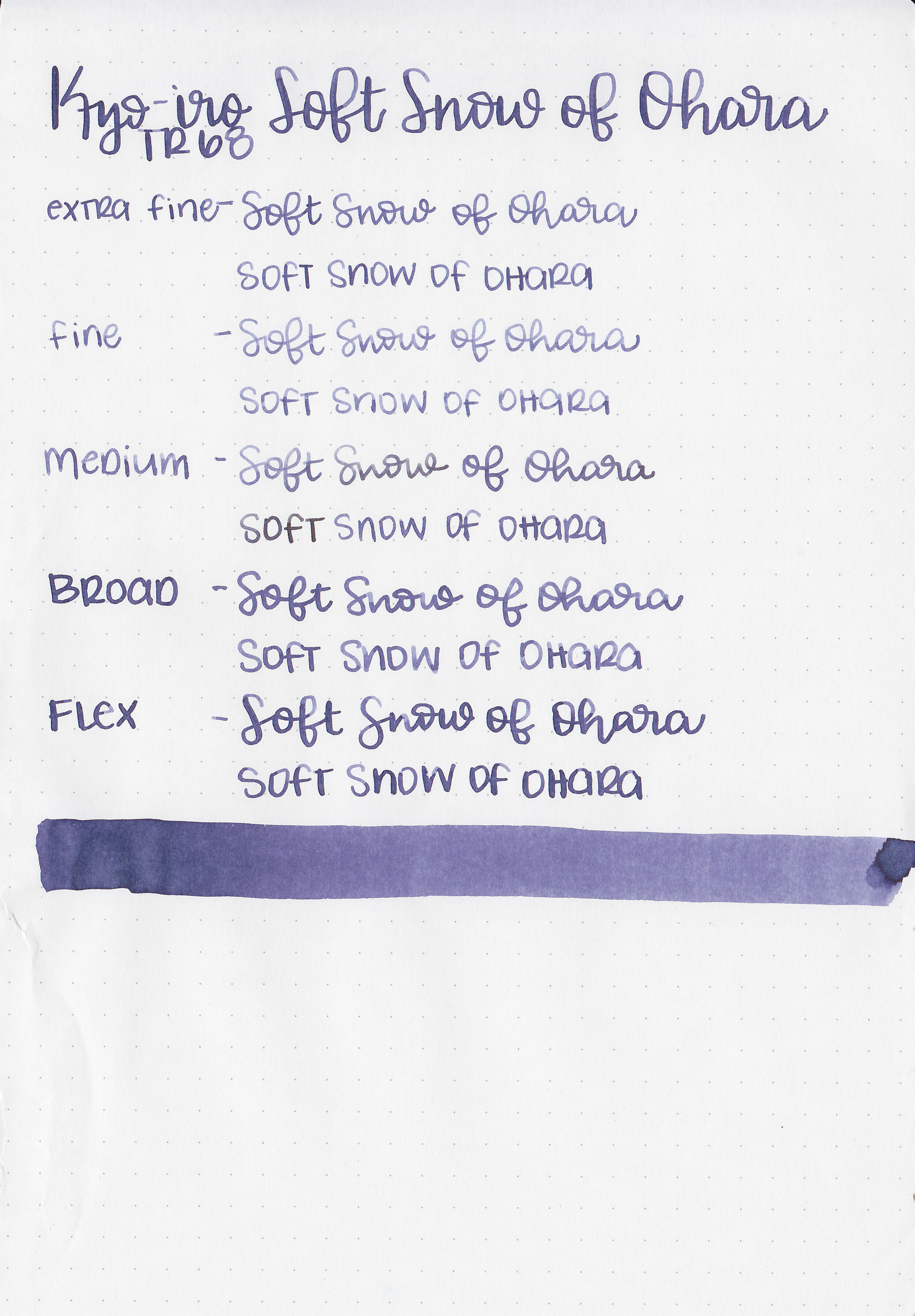
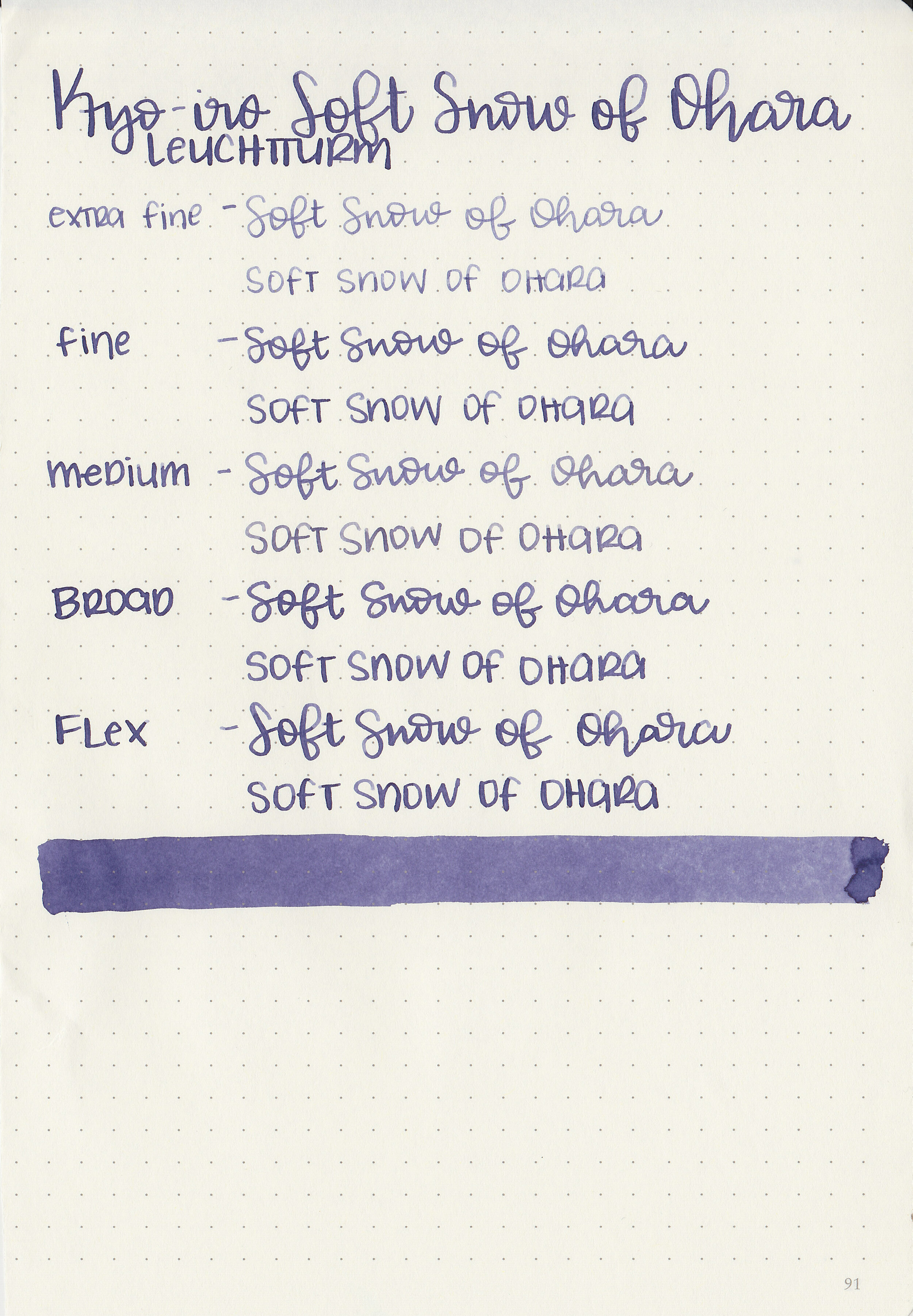
Soft Snow is a dark, moody purple.

Swabs:

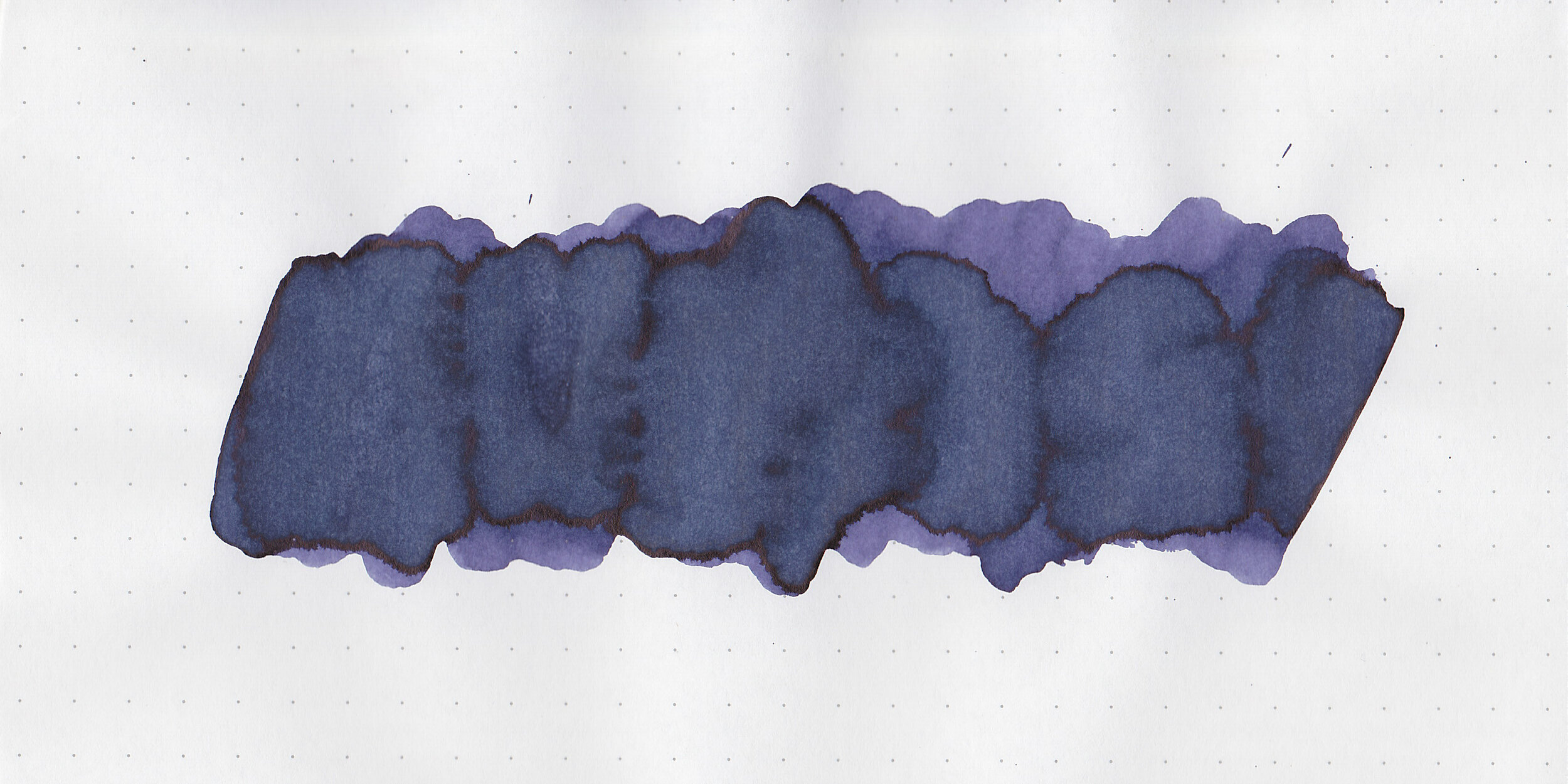
kyo-soft-snow-of-ohara-3.jpg

In large swabs on Tomoe River paper there’s a small bit of black sheen.

kyo-soft-snow-of-ohara-4.jpg

Writing samples:

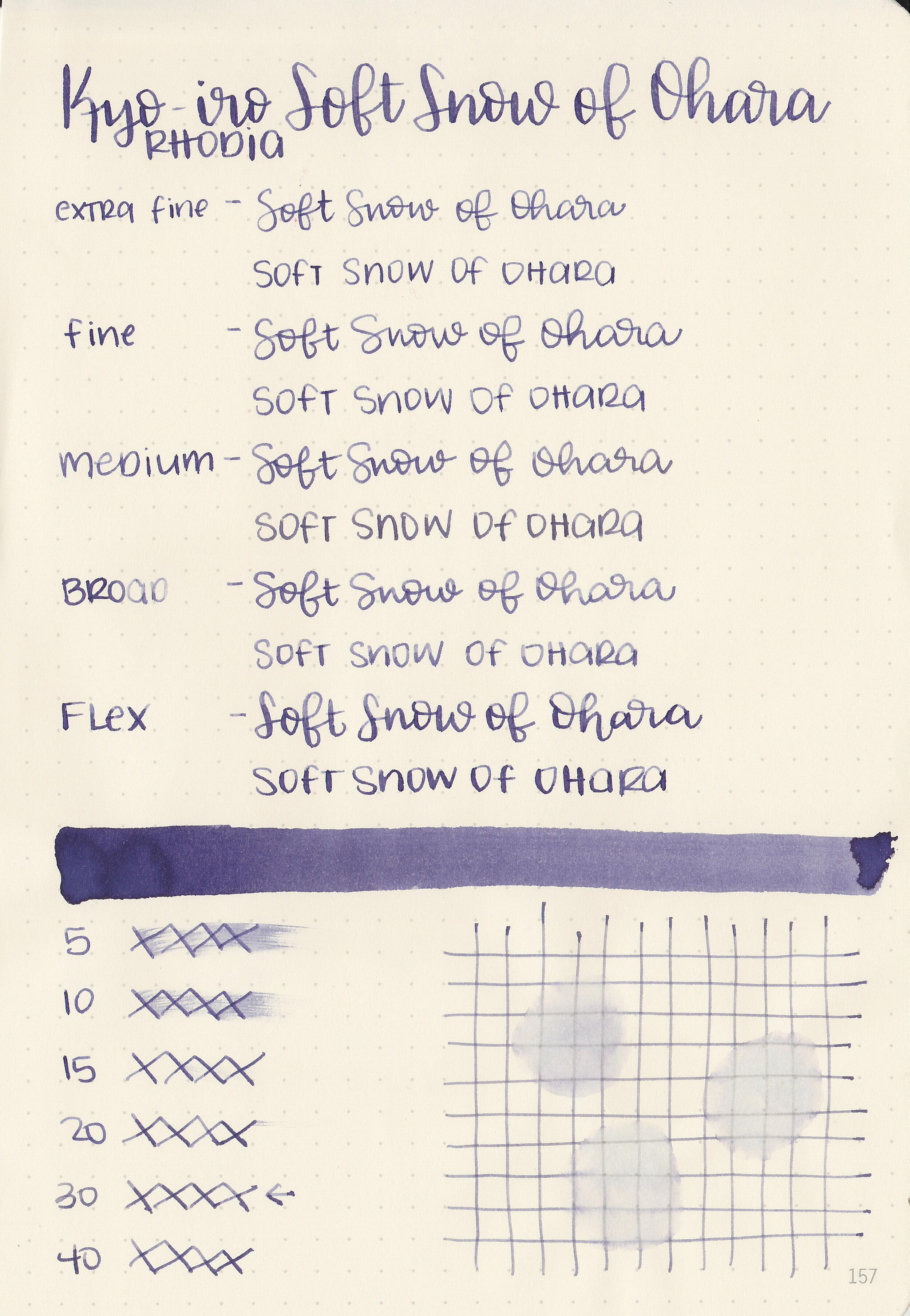
Let's take a look at how the ink behaves on fountain pen friendly papers: Rhodia, Tomoe River, and Leuchtturm.

Dry time: 30 seconds

Water resistance: Low

Feathering: None

Show through: Medium

Bleeding: None

Other properties: medium shading, tiny sheen, and no shimmer.

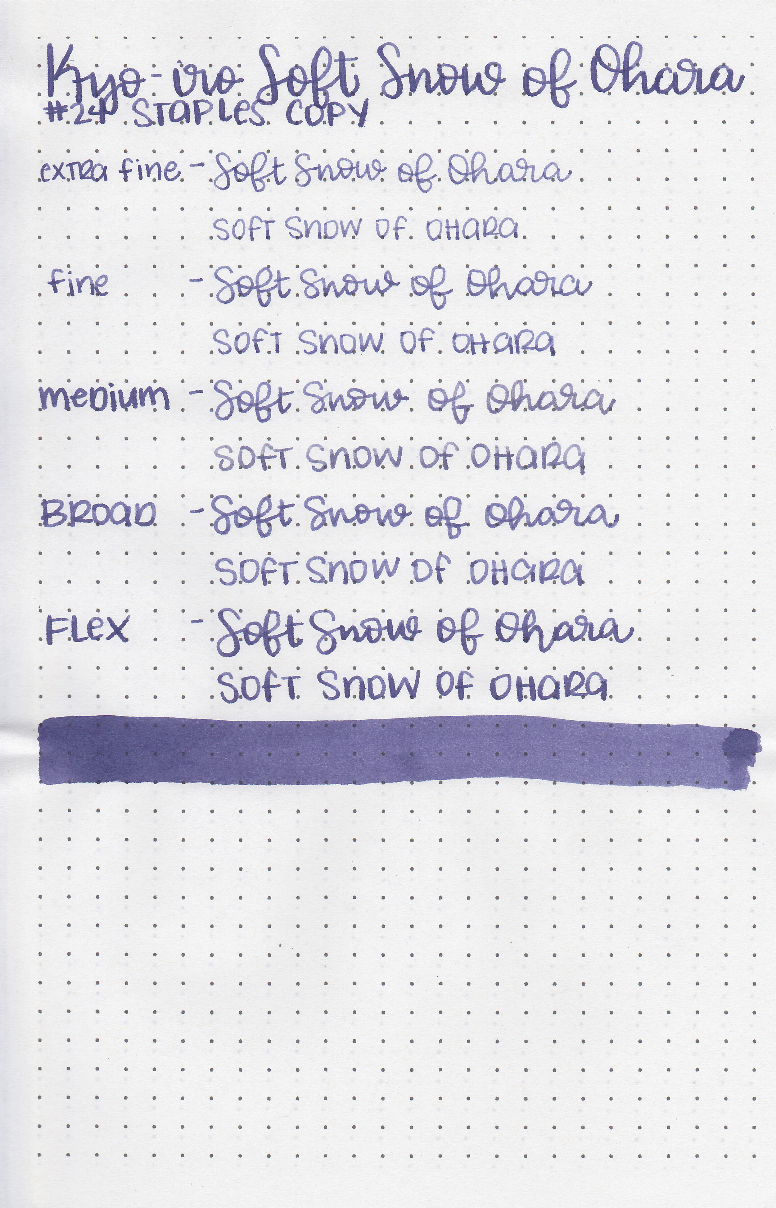
On Staples 24 lb copy paper there was some feathering but no bleeding.

Comparison Swabs:

kyo-soft-snow-of-ohara-s-2.jpg

Soft Snow is less saturated than Sailor Jentle Shigure, and a bit more blue than Diamine Lilac Night. Click here to see the Kyoto inks together, and click here to see the purple inks together.

Longer writing:

kyo-soft-snow-of-ohara-s-1.jpg

I used a Pelikan M805 Stresemann with a medium nib on a Yoseka A5 notebook. The ink had a super dry flow, but with the Pelikan medium nib it did fine.

Overall, I like the color and shading but it is really dry. If I used this ink again I would add a drop of ink additive like White Lightning so it flows a bit better.

Disclaimer: A sample of this ink was provided by a reader. All photos and opinions are my own. This page does contain affiliate links but this post is not sponsored in any way.
Ink Review #965: Kyo-iro #01 Stone Road of Gion

kyo-stone-road-of-gion-2.jpg

I received a sample of Kyo-iro #01 Stone Road of Gion in a sample swab a year ago, but never got around to playing with it, so let’s try it out. You can purchase this ink at Pen Chalet.

kyo-stone-road-of-gion-1.jpg

The color:

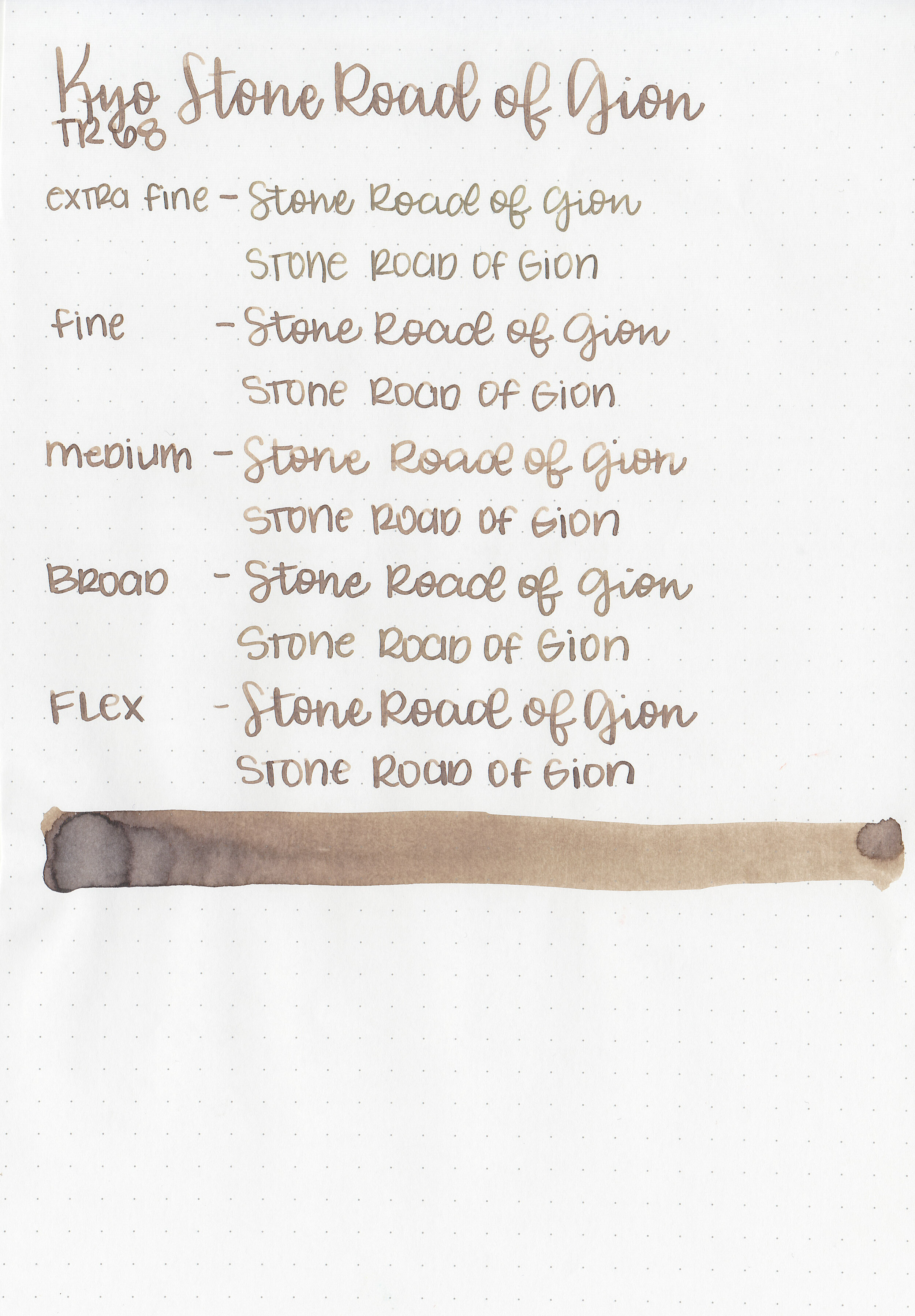
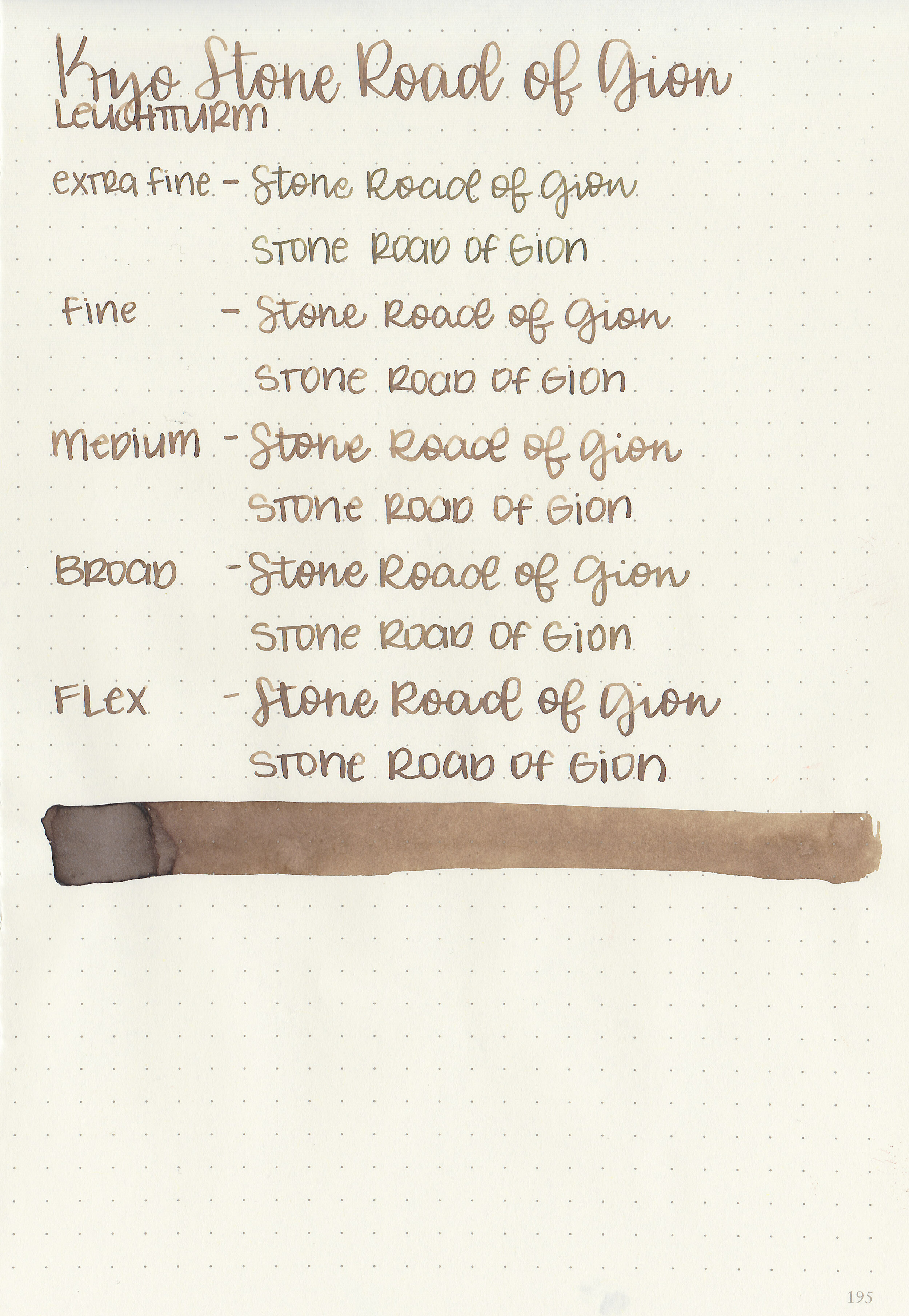
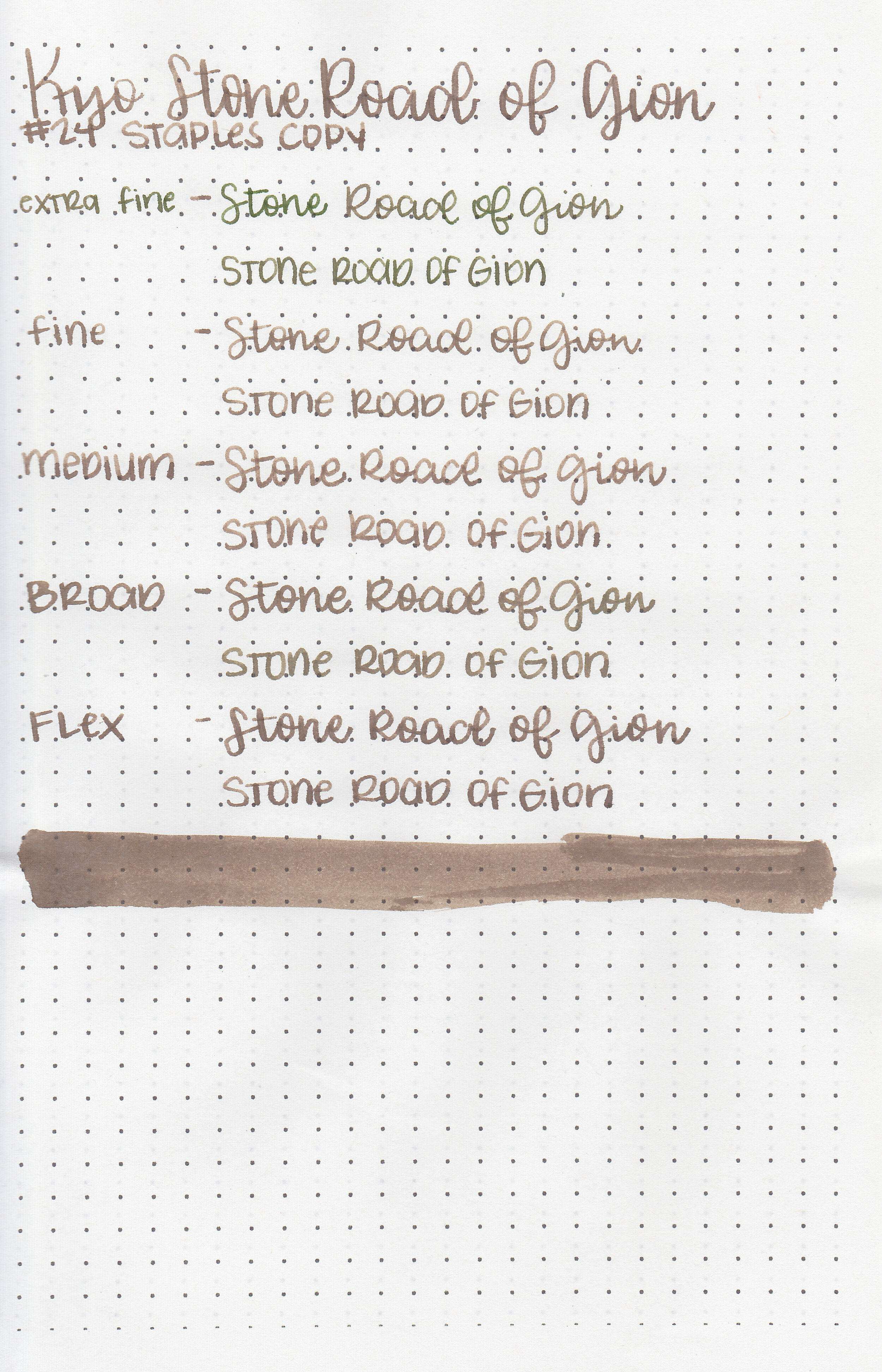
Stone Road is a cool-tone medium brown. I really enjoy this color, I find it a more appropriate color in the winter when I want all the cool tones.

Swabs:

kyo-stone-road-of-gion-3.jpg

In large swabs on Tomoe River paper the ink shows off some of its pretty shading. The more ink there is the cooler in tone it appears.

kyo-stone-road-of-gion-4.jpg

Writing samples:

Let's take a look at how the ink behaves on fountain pen friendly papers: Rhodia, Tomoe River, and Leuchtturm.

Dry time: 15 seconds

Water resistance: Low

Feathering: None

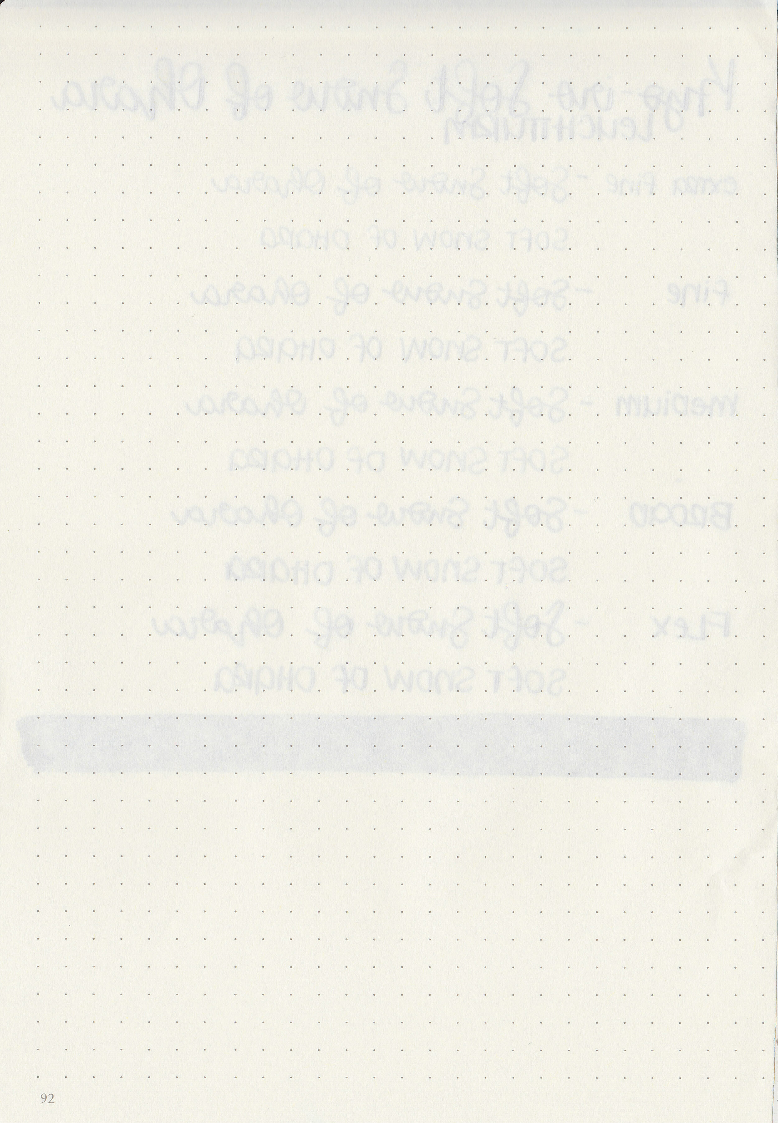
Show through: Medium

Bleeding: None

Other properties: medium shading, no sheen, and no shimmer.

On Staples 24 lb copy paper there was some feathering in all nib sizes but just a tiny bit of bleeding.

Comparison Swabs:

kyo-stone-road-of-gion-s-1.jpg

Stone Road is darker than Montblanc Swan Illusion but lighter than Monteverde Moonstone. All three have a similar cool-tone vibe to them. Click here to see the Kyoto inks together, and click here to see the brown inks together.

Longer writing:

kyo-stone-road-of-gion-s-2.jpg

I used a Lamy Studio Terracotta with a medium nib on a Lochby A5 blank Refill-Tomoe River 68gsm. The ink had a dry flow. This nib and ink together created some beautiful shading.

Overall, I love the color of this ink, but it is very dry. It’s a good ink, but I would add a drop of White Lightning (ink additive) to make it flow better and then I think it would be a great ink.
Disclaimer: I received a sample of this ink from a sample swap. All photos and opinions are my own. This page does contain affiliate links, but this post is not sponsored in any way.