
Ink Review #134: Robert Oster Australian Opal Mauve
/
Let's talk about Robert Oster Australian Opal Mauve. The name is a bit long, but that's ok. I purchased my sample of ink from Vanness Pens.
The color...
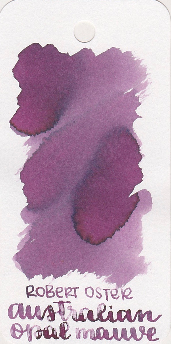
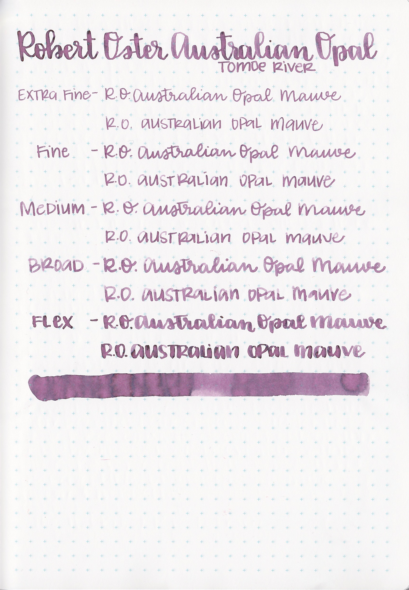
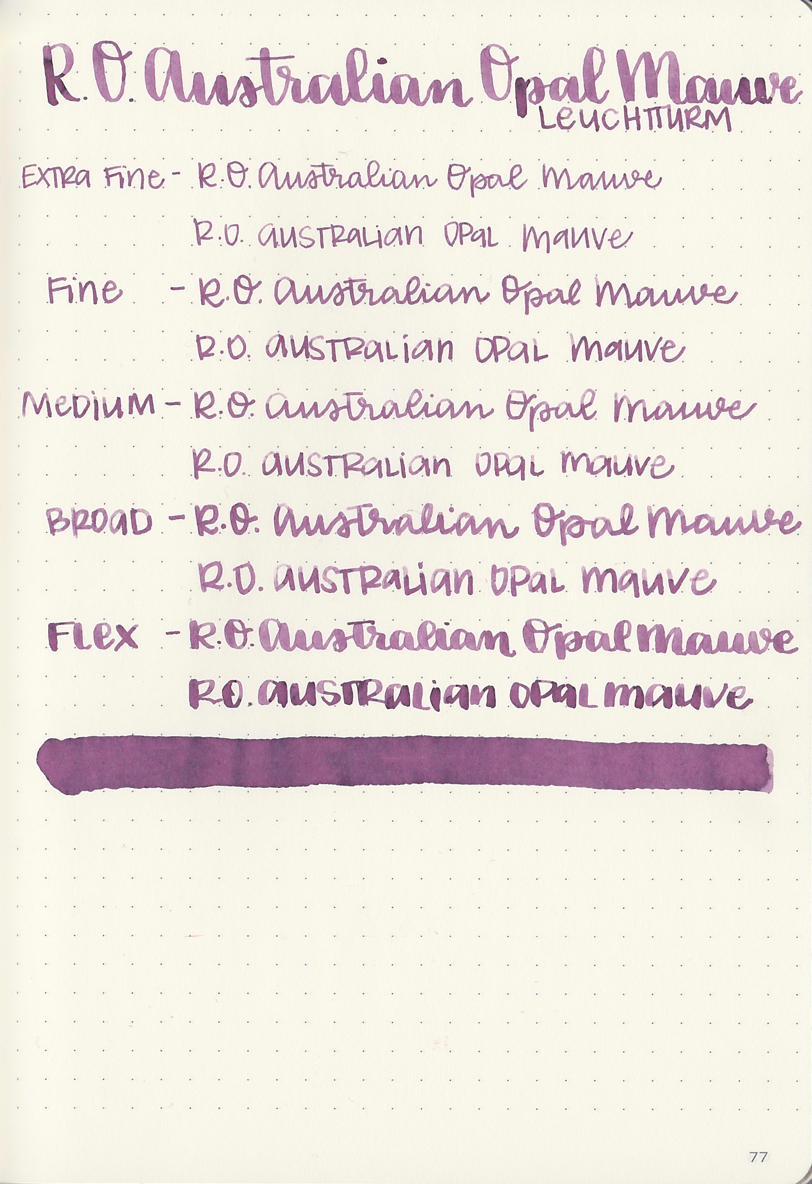
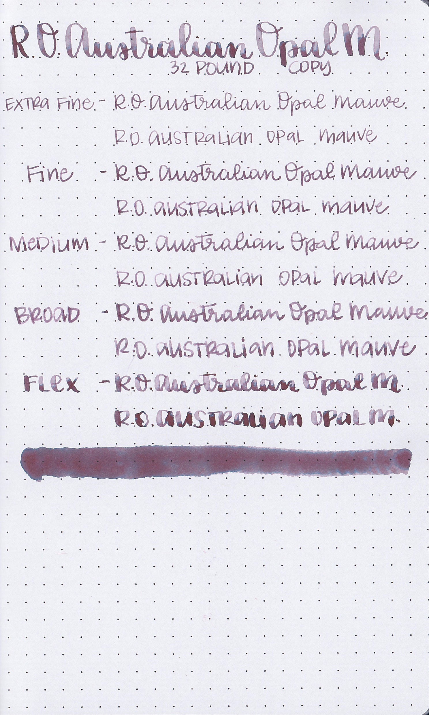
Australian Opal Mauve is a light, dusky purple with a blue undertone.

In large swabs, you can see the bands of blue undertone.
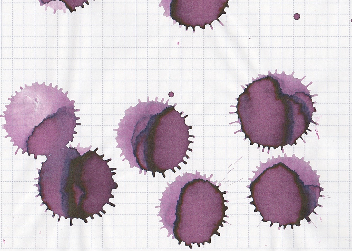

Dry time: 25 seconds
Water resistance: Low
Feathering: None
Show through: Medium
Bleeding: None
Other properties: Medium shading, no sheen
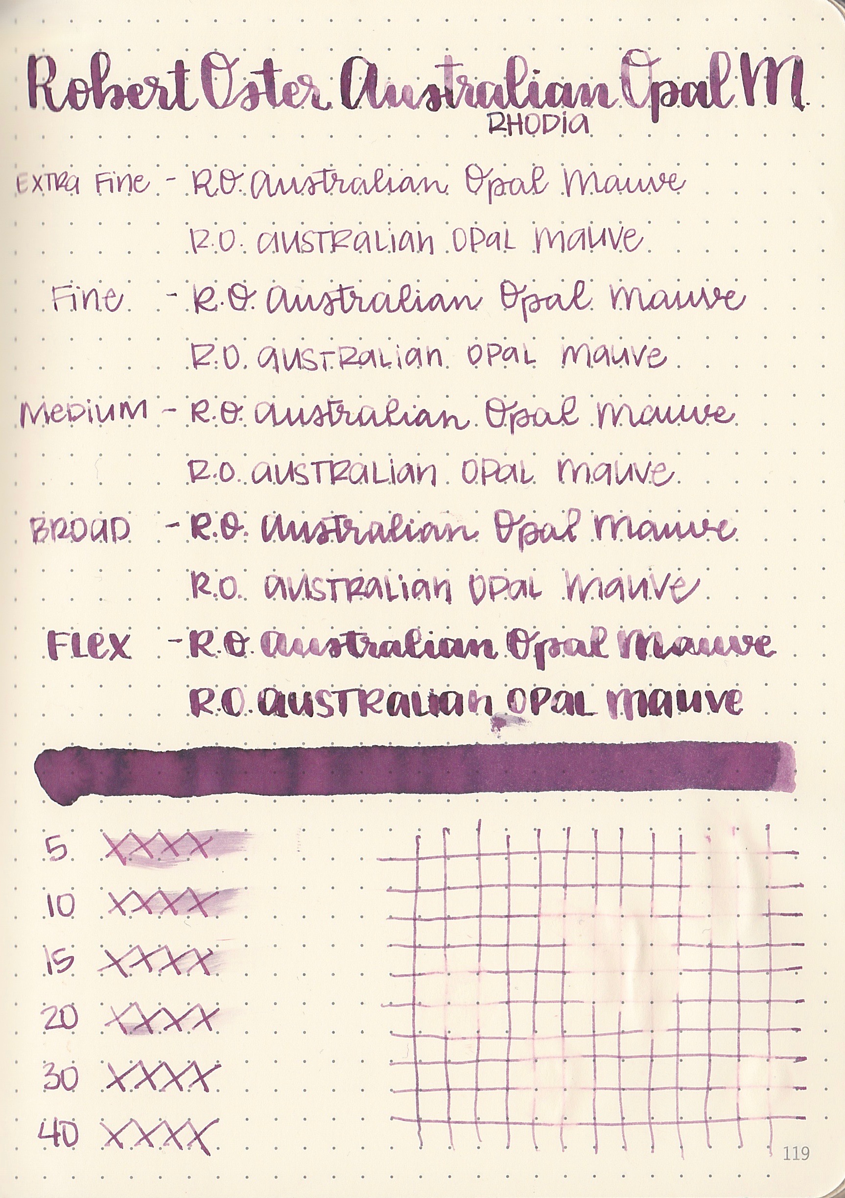
On 32 pound copy paper, the ink behaves a little bit differently: it doesn't bleed or feather, but the color looks a bit darker, and the blue undertone becomes more prominent. In the flex nib, you can see three different bands of color.
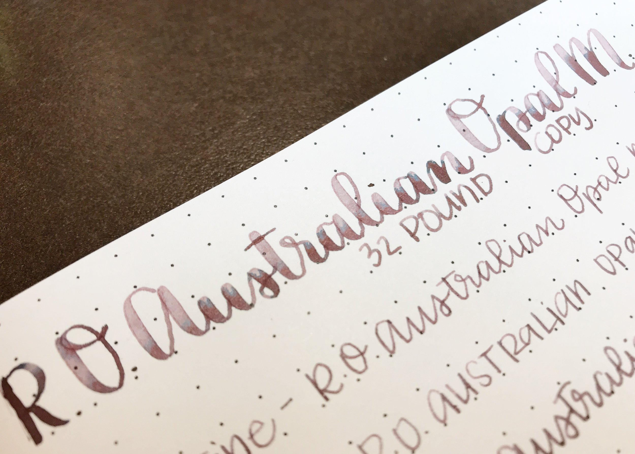
This close-up shows the different shades that show up on copy paper in the flex nib. It starts with a light dusky purple at the top, then the band of blue, then the darker purple.
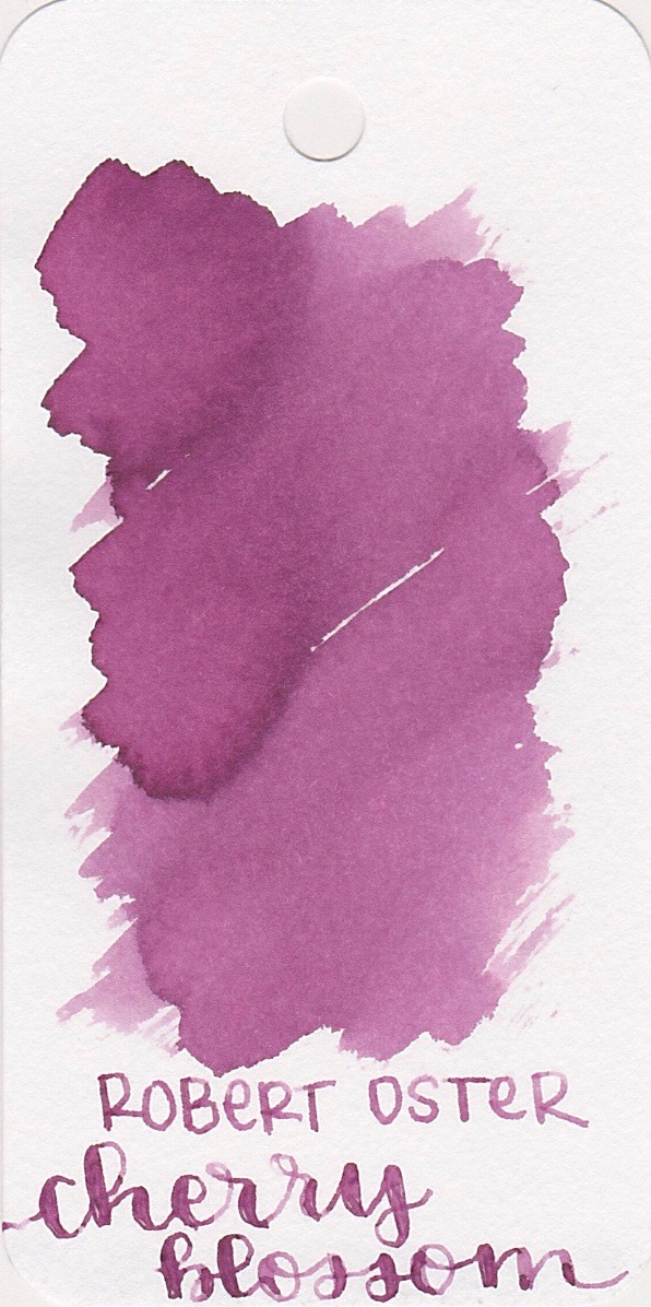

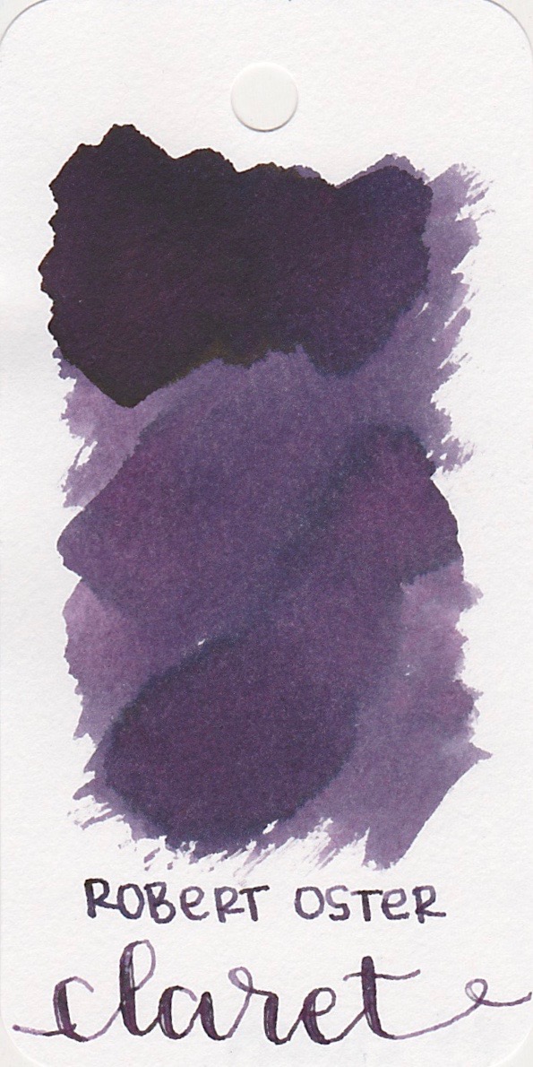
Ink swabs for comparison, left to right (top to bottom for RSS): Robert Oster Cherry Blossom, Robert Oster Australian Opal Mauve, and Robert Oster Claret. Click here to see the Robert Oster inks together. Cherry Blossom is more pink, and Claret is a lot darker than Australian Opal Mauve.
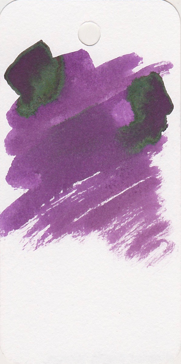
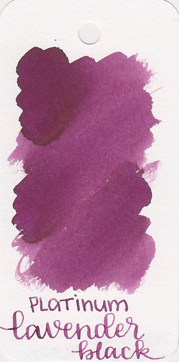
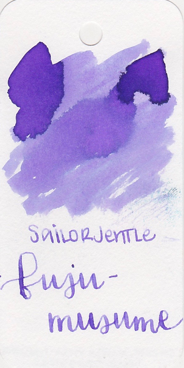
Diamine Music: Handel, Platinum Lavender Black, and Sailor Jentle Fuji-musume. Click here to see the purple inks together.

Longer writing:
I used a Pelikan m800 Renaissance Brown, medium nib, on Tomoe River paper. The ink/pen combo felt just a bit dry to me.
Overall, I like this ink the best on Tomoe River paper, where you get the best shading. I would probably use this ink in the spring.
Disclaimer: I purchased this ink myself, and all photos and opinions are my own. There are no affiliate links on this page.