Ink Review #841: Vinta Sea Kelp Leyte 1944
/
Today’s ink is Vinta Sea Kelp Leyte 1944, from Vinta’s Series 1. According to Vinta’s website, “The Battle of the Leyte Gulf is where the Japanese were ultimately defeated at the end of WWII. Leyte is also one of the biggest producers of Kelp. This gentle green ink evokes the color of kelp as it floats in the bright clear seawaters of Leyte.” Thanks to Vanness Pens for sending a sample over for review.

The color:
Leyte is a medium army green.
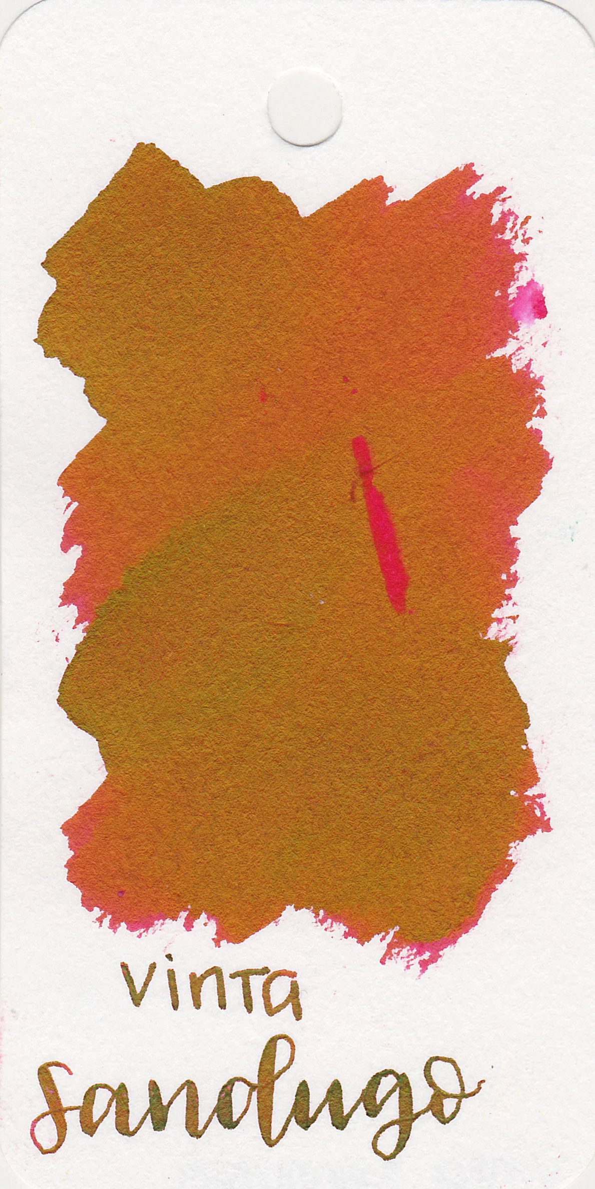
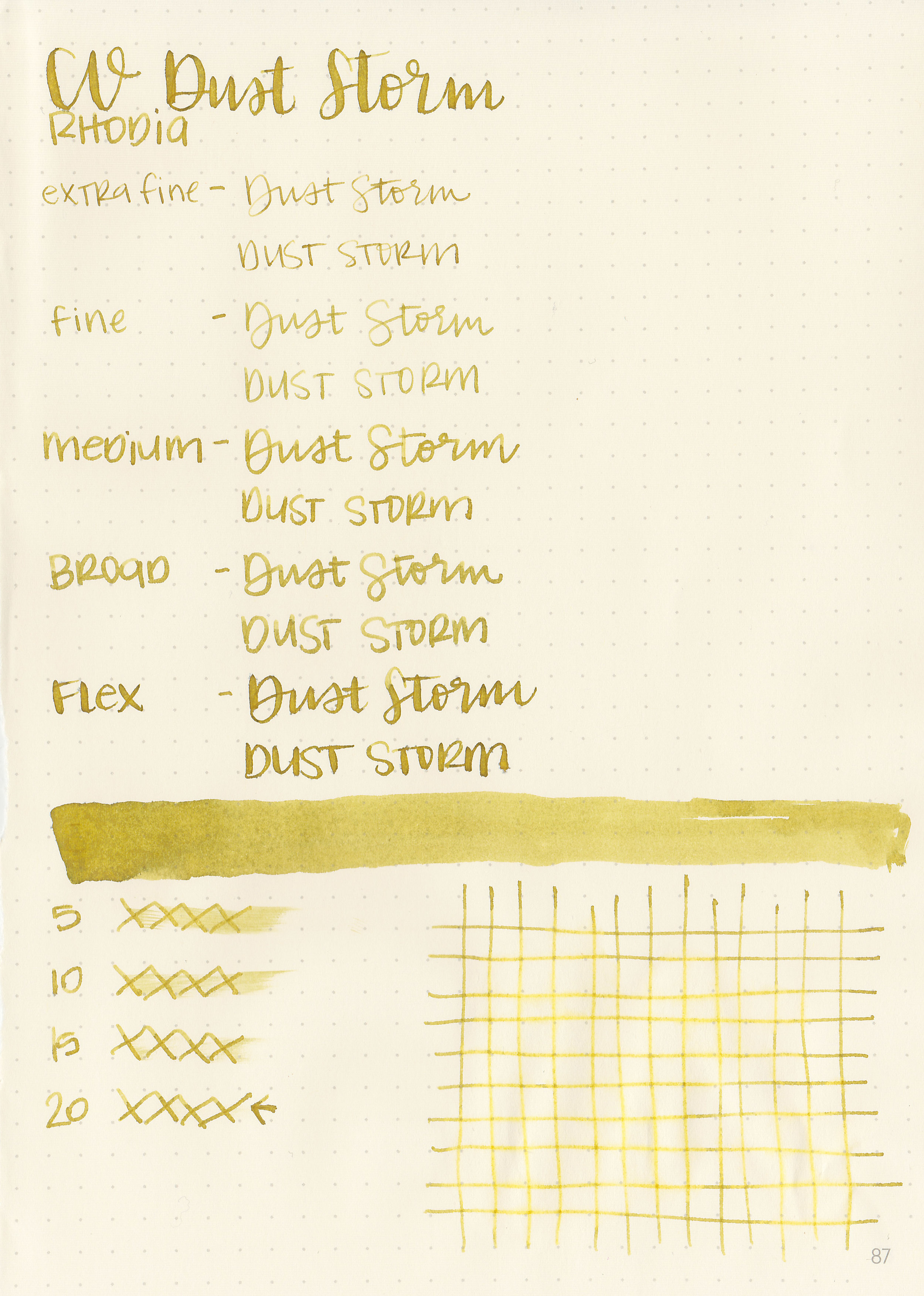
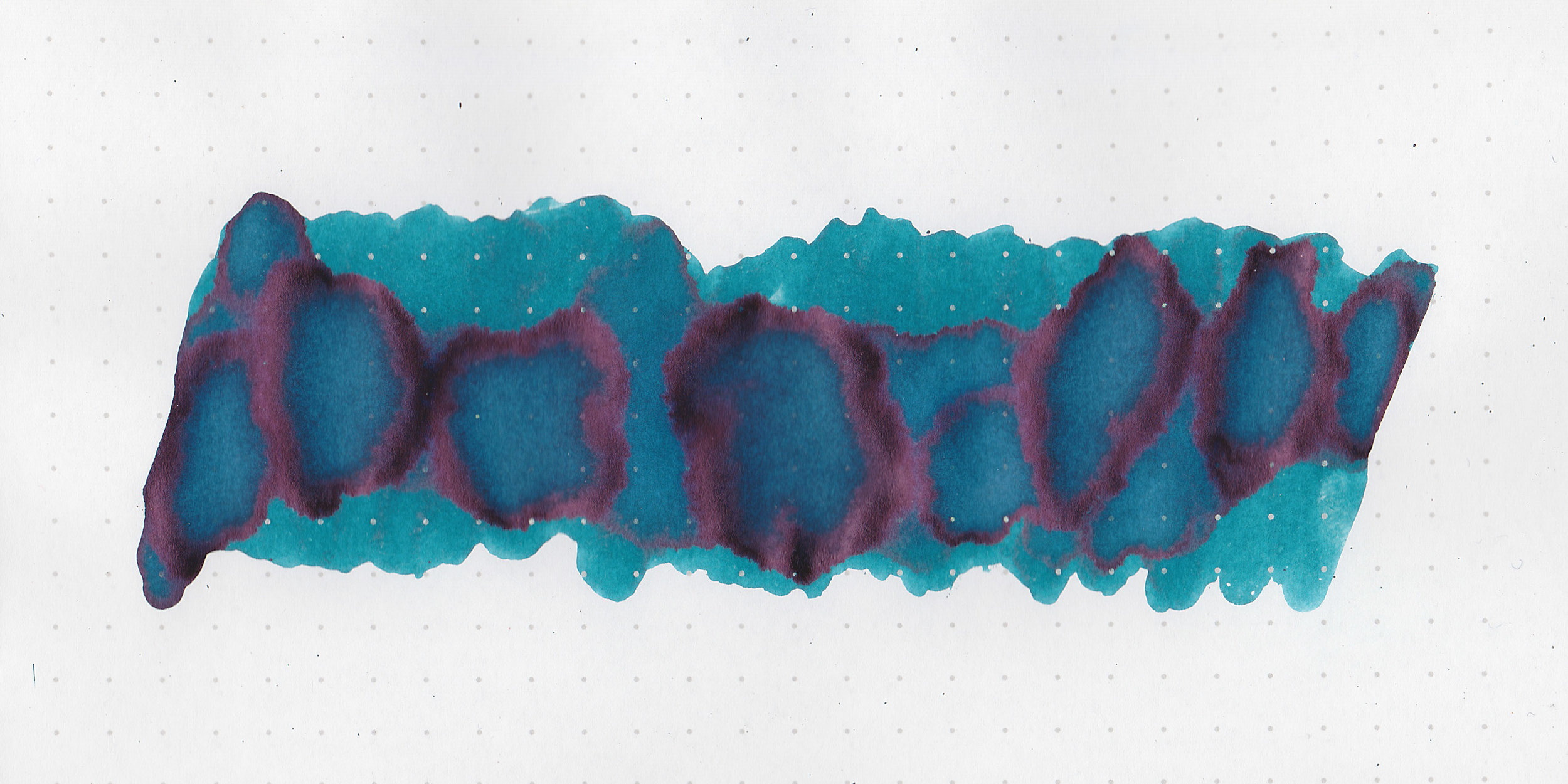
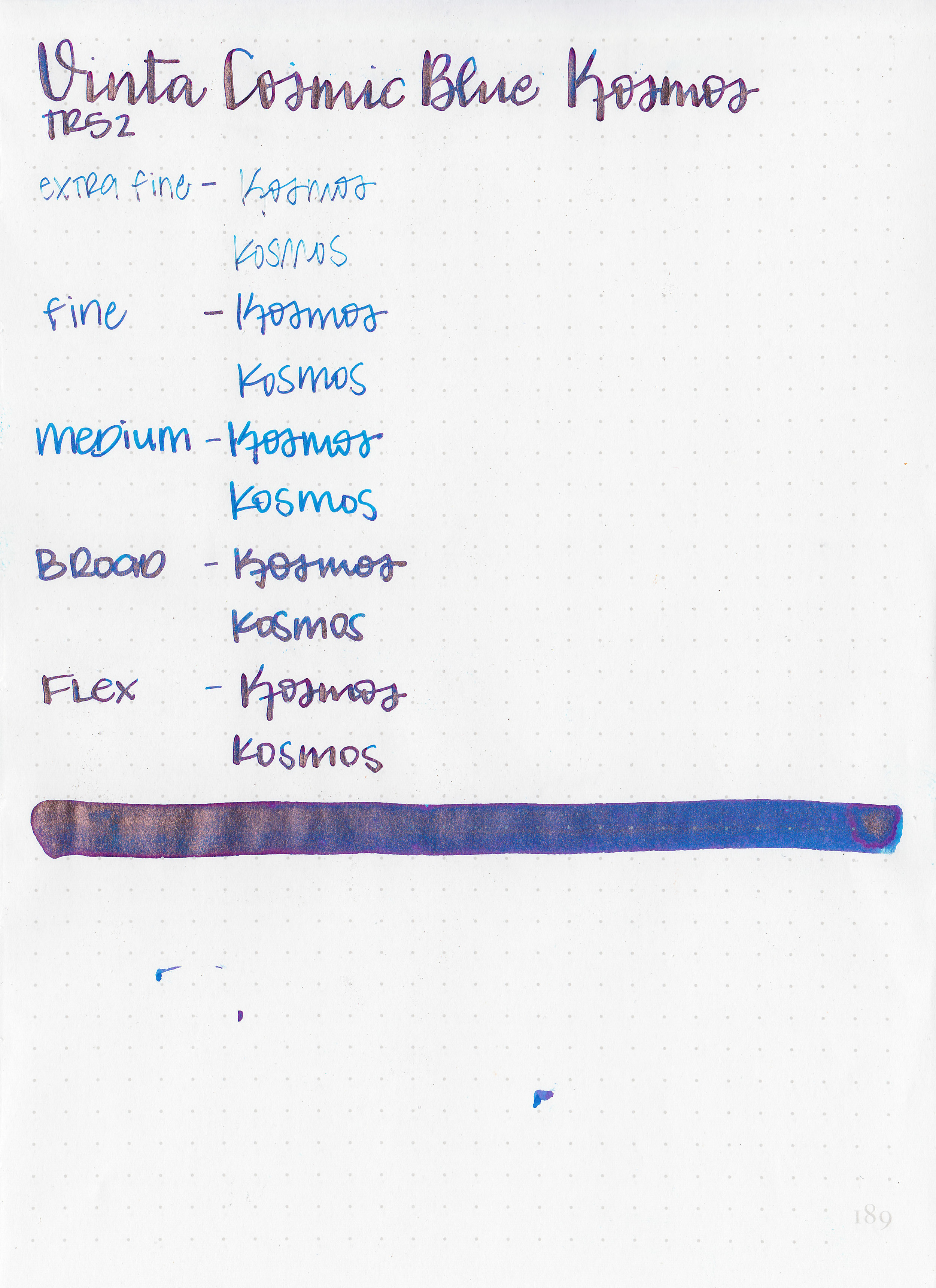
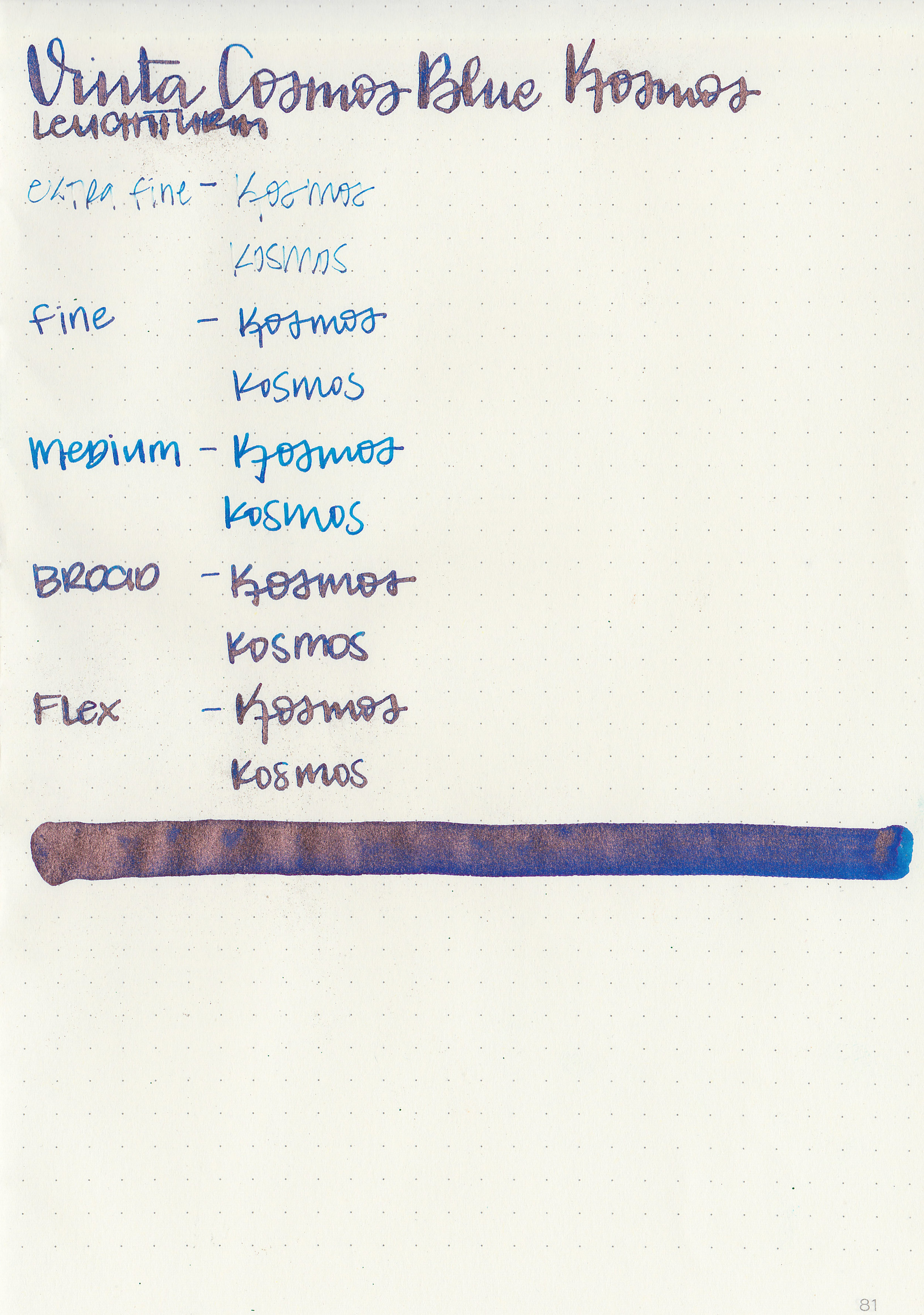
Swabs:

In large swabs on Tomoe River paper the ink shows off some interesting shading.

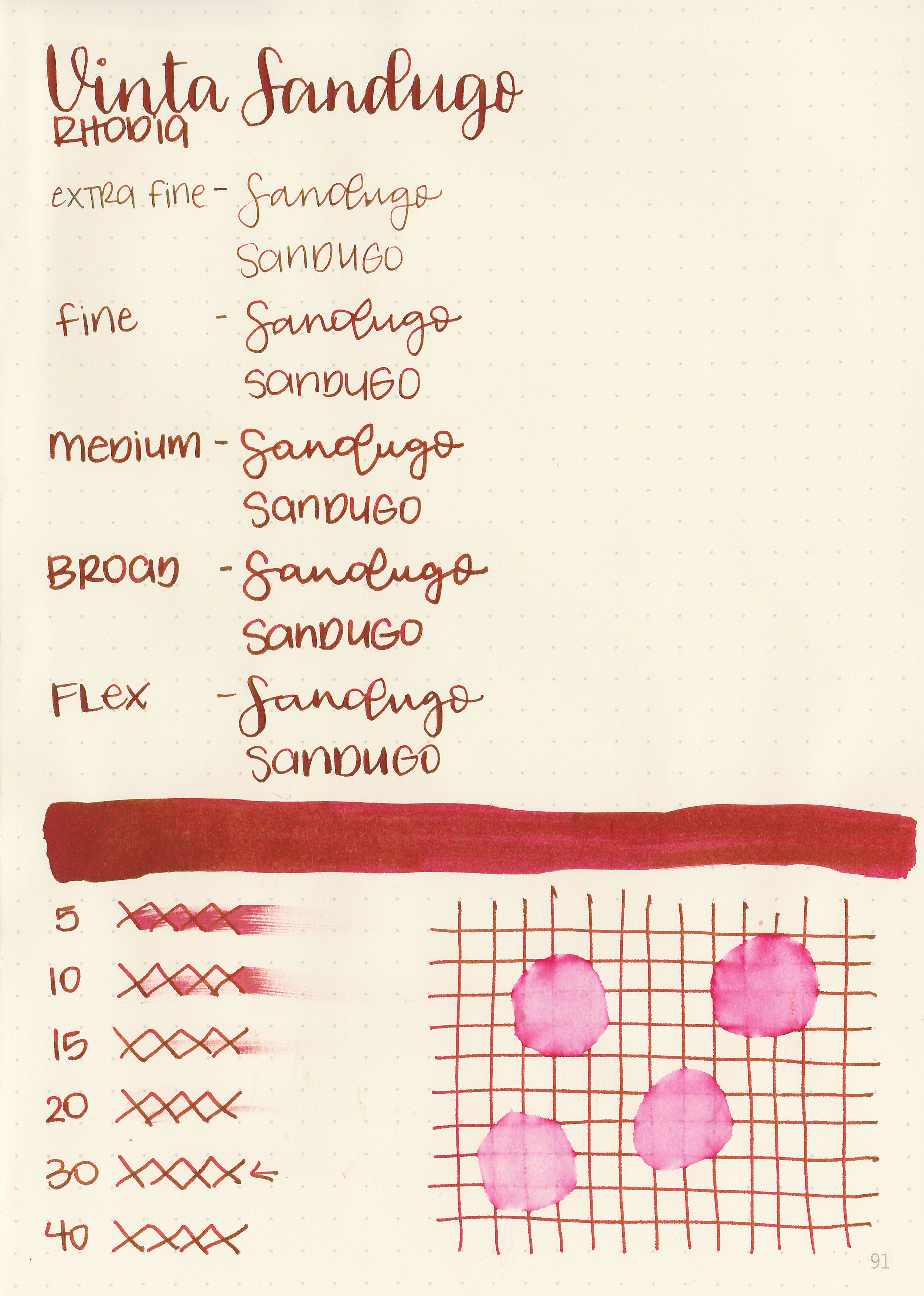
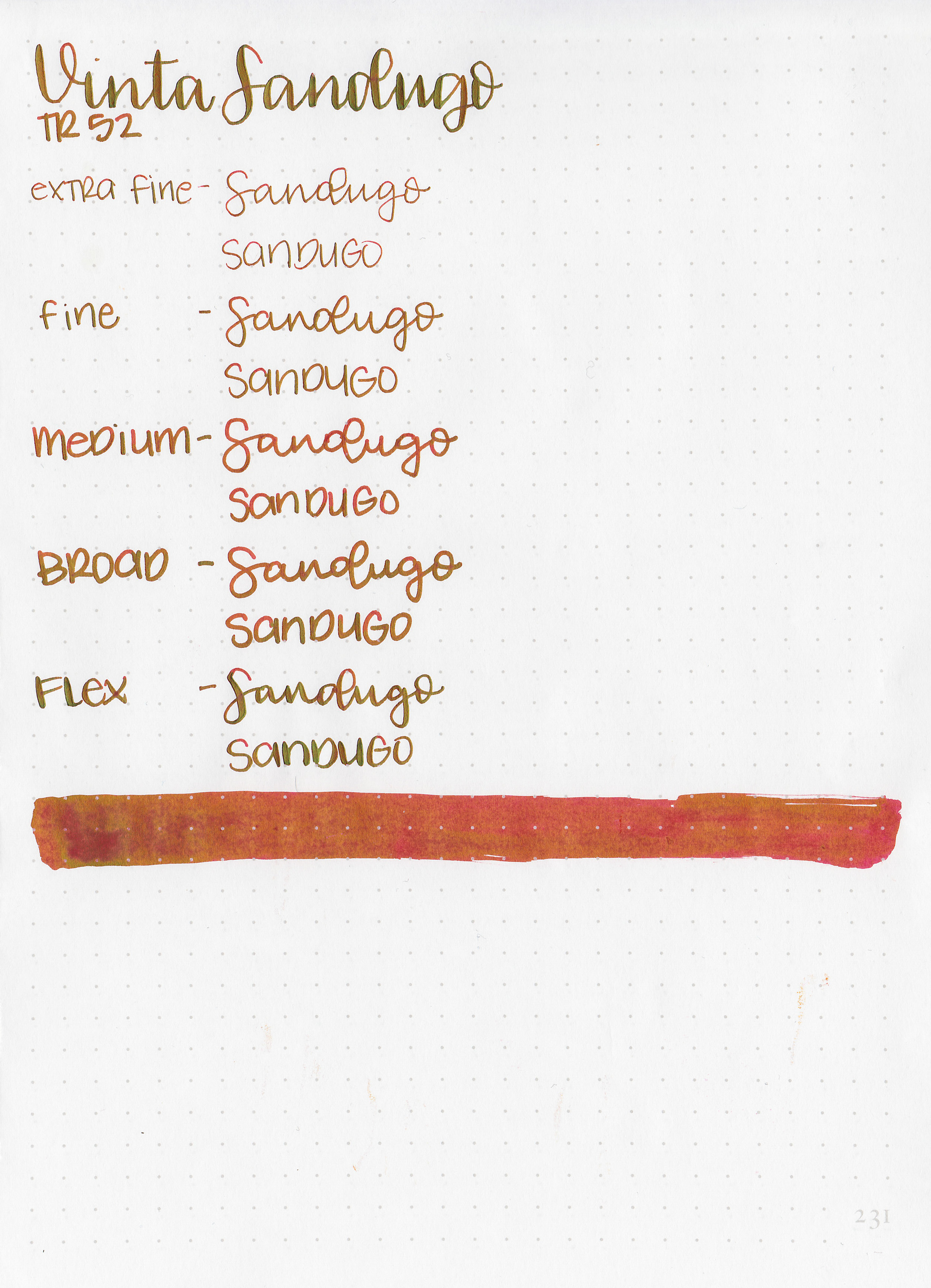
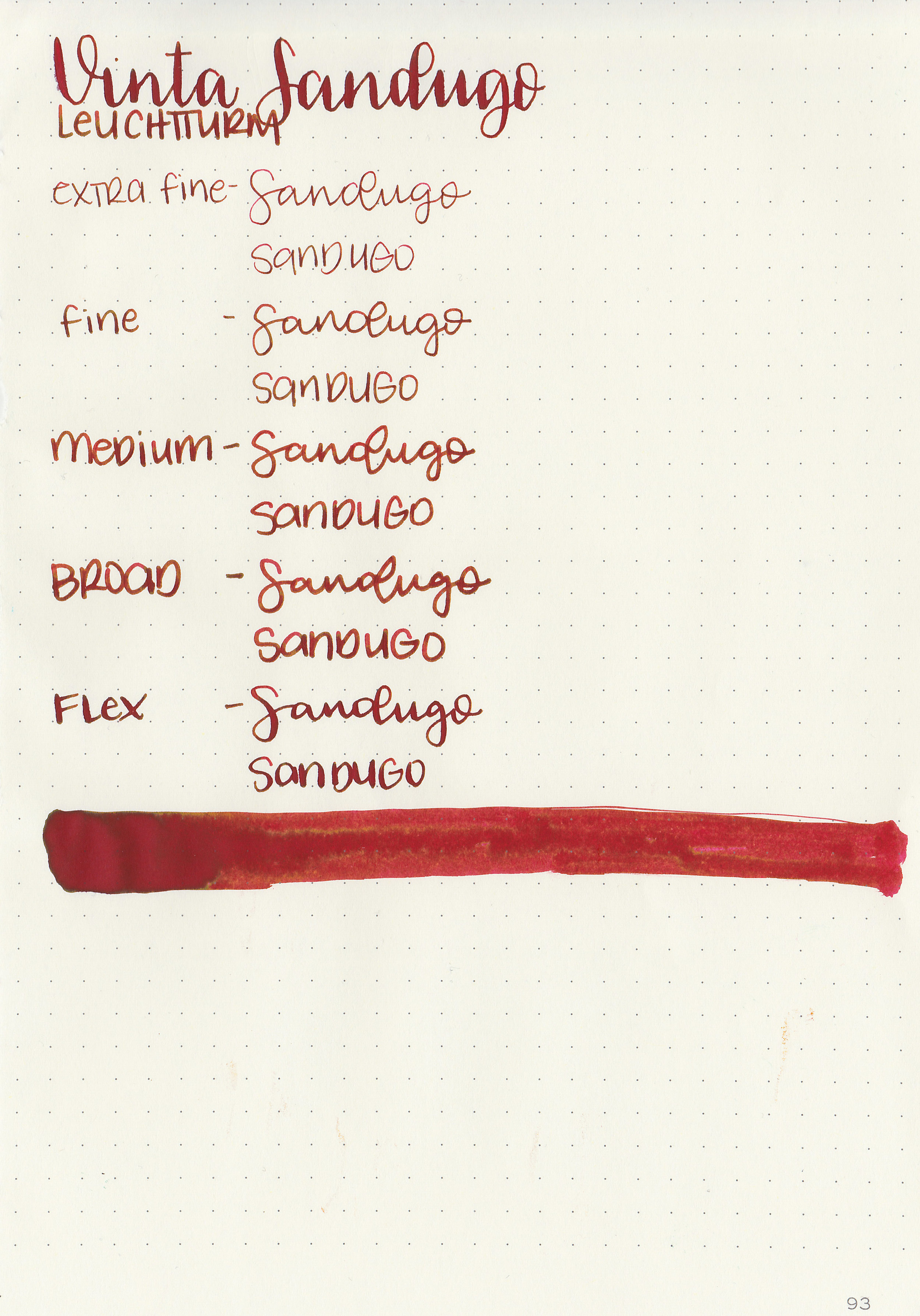
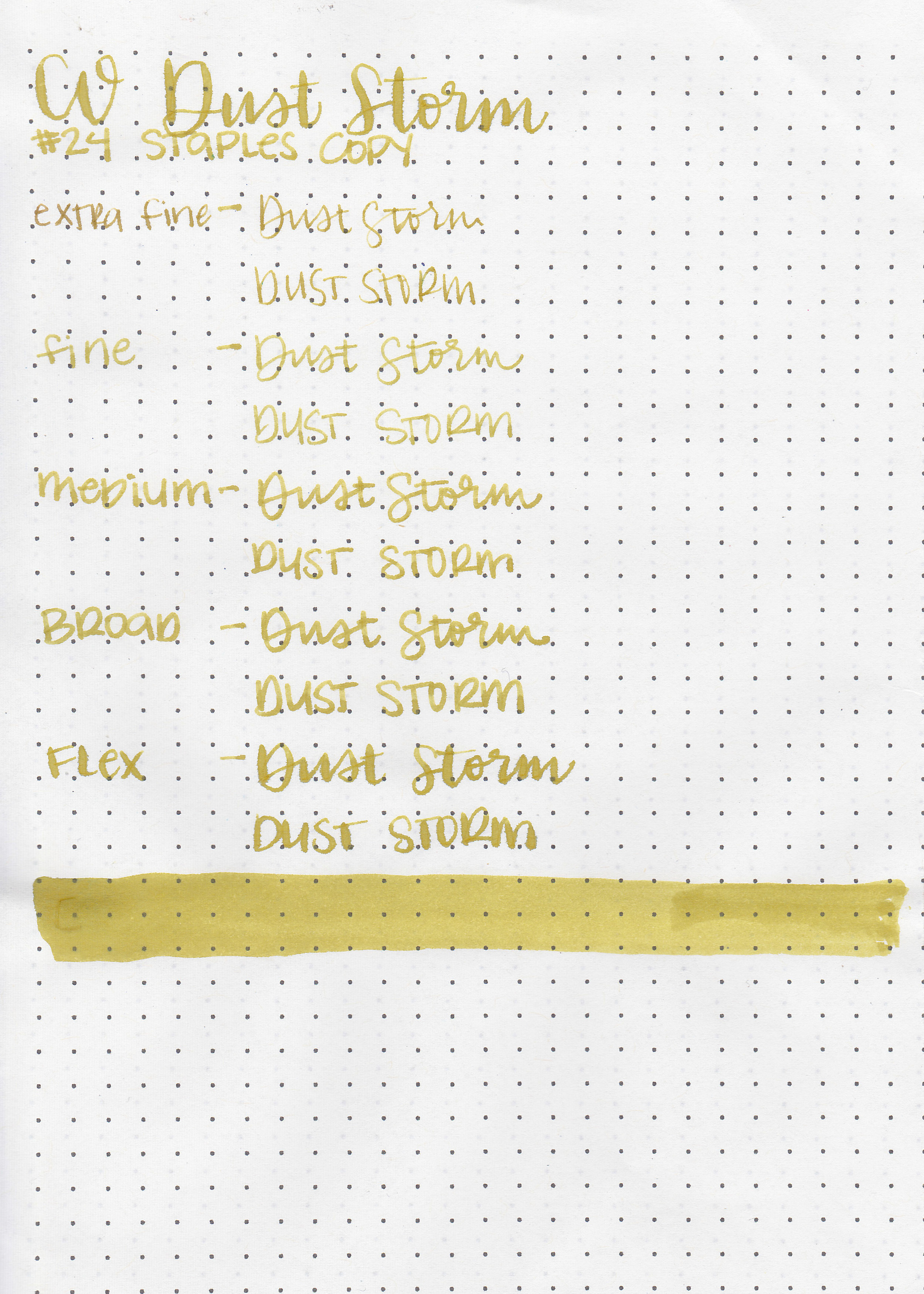
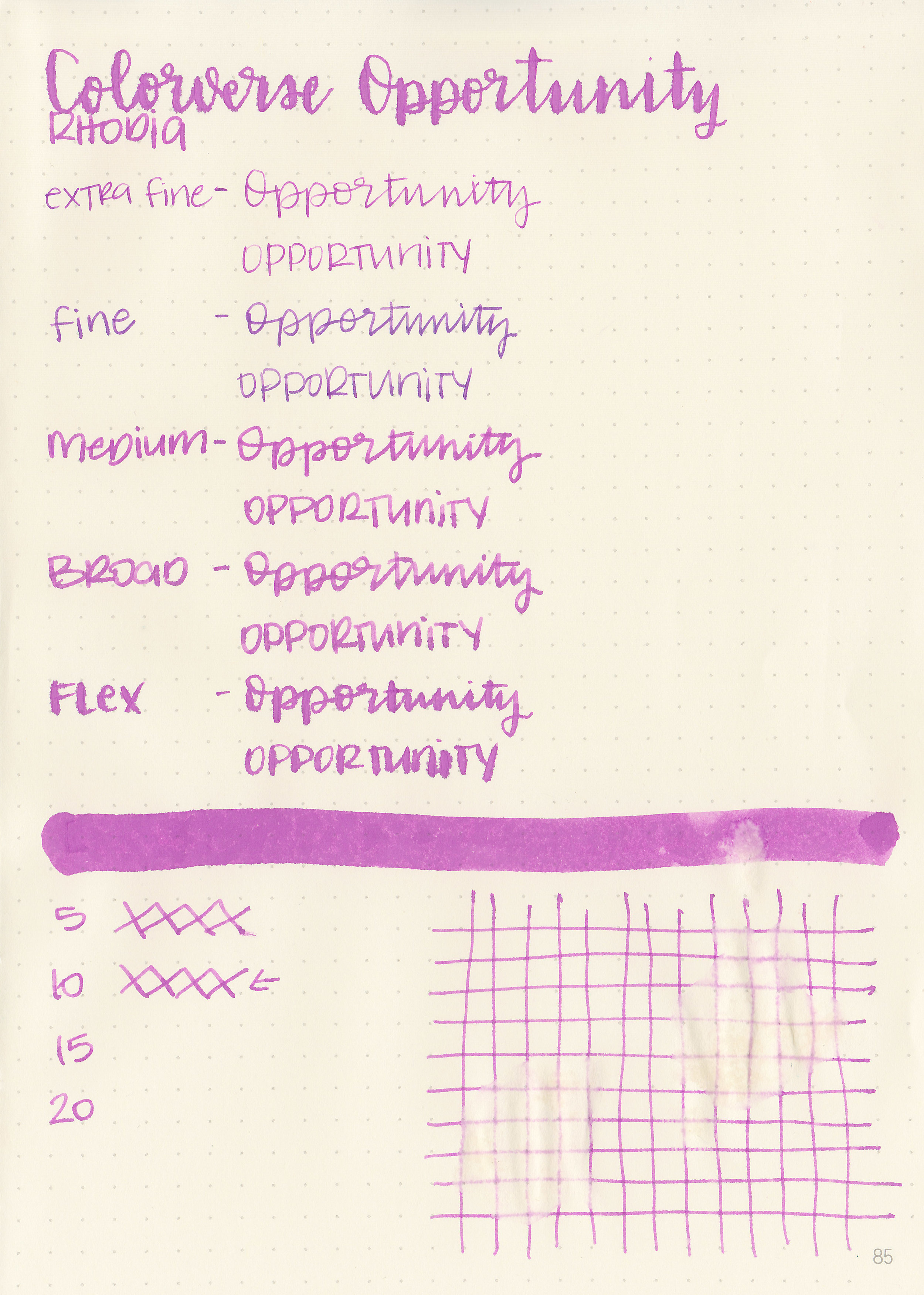
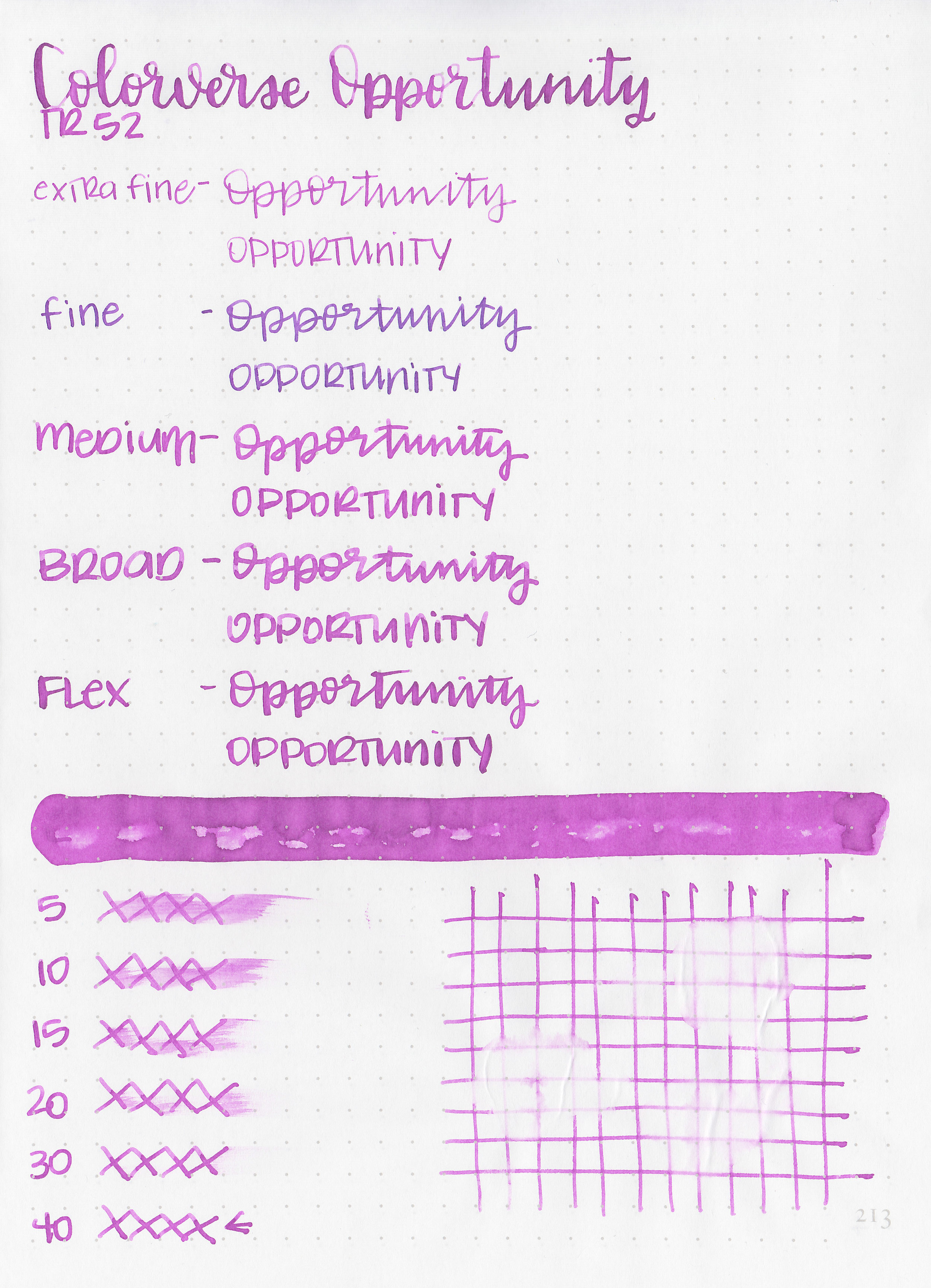
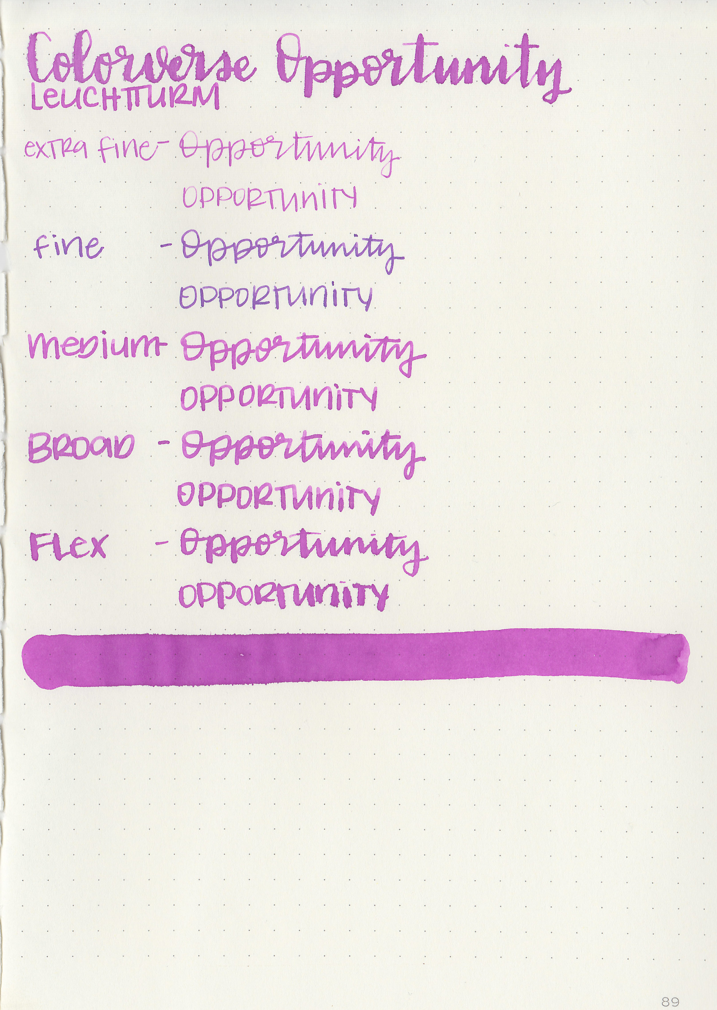
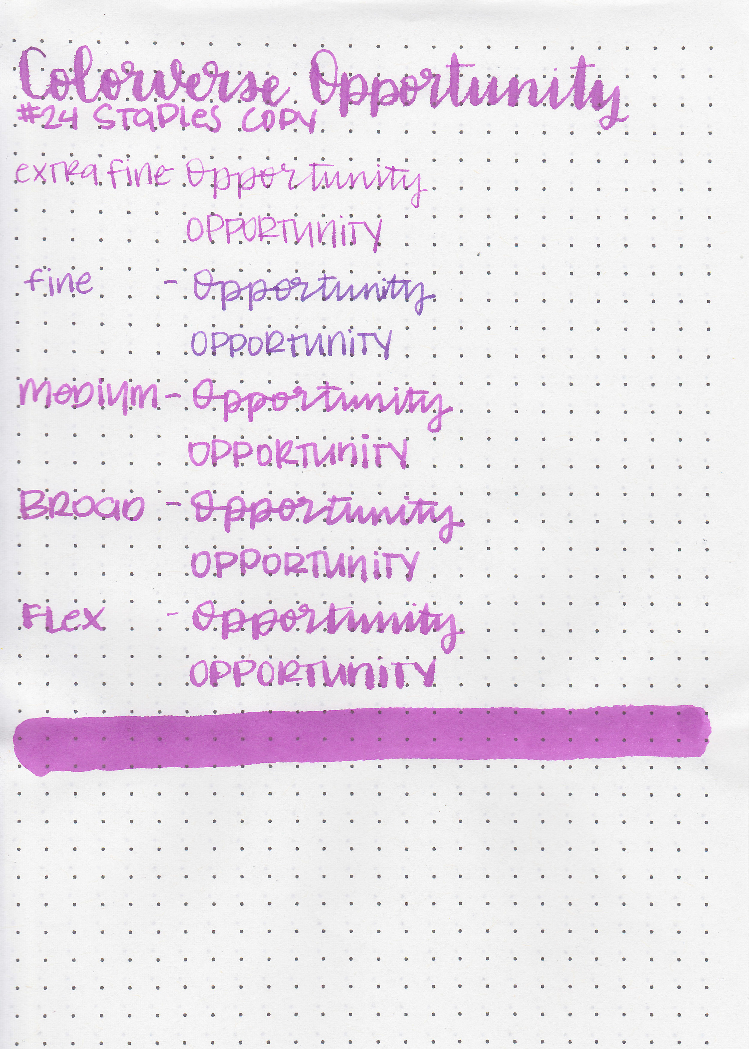
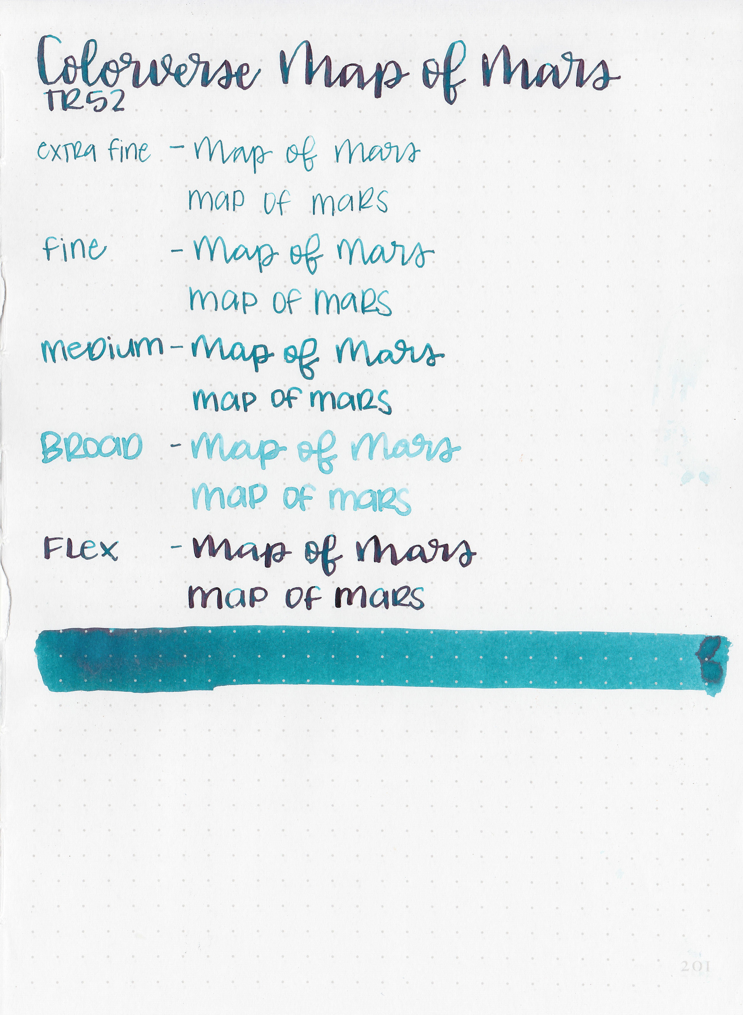
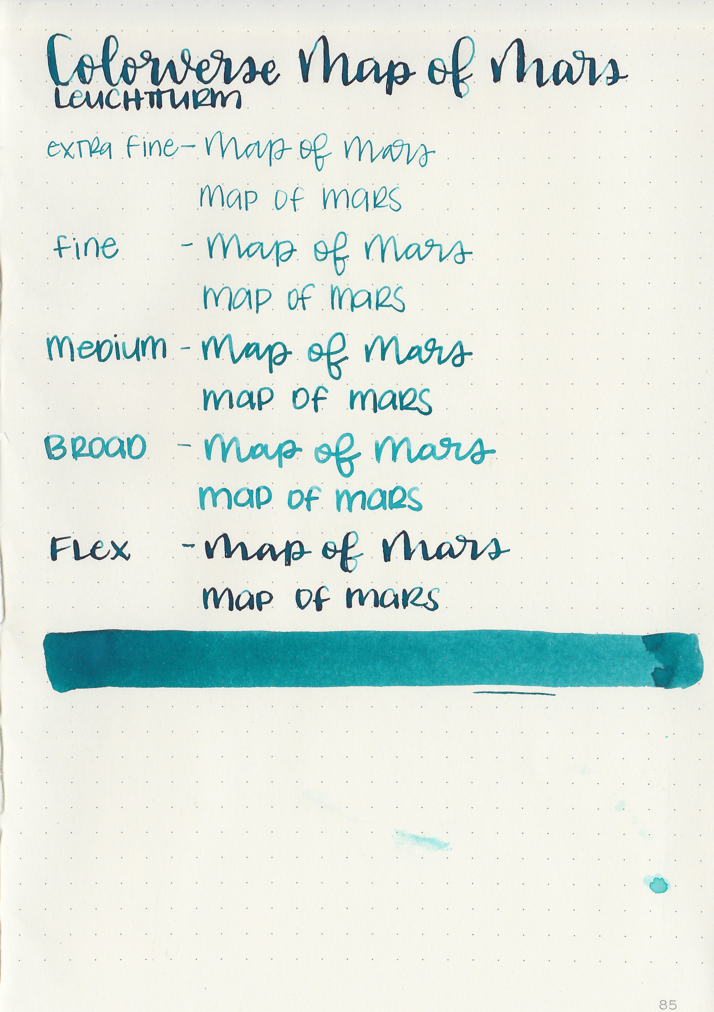
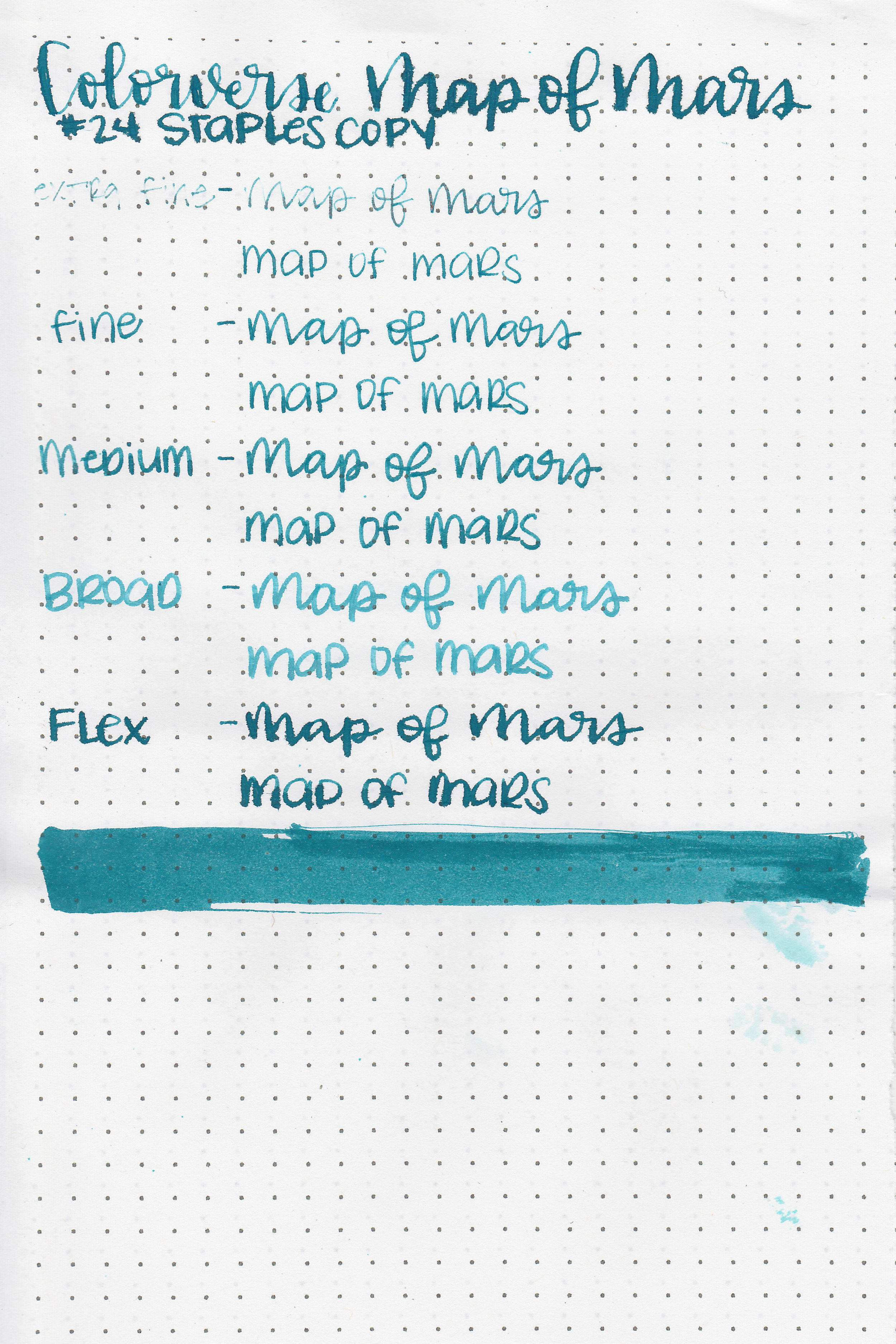
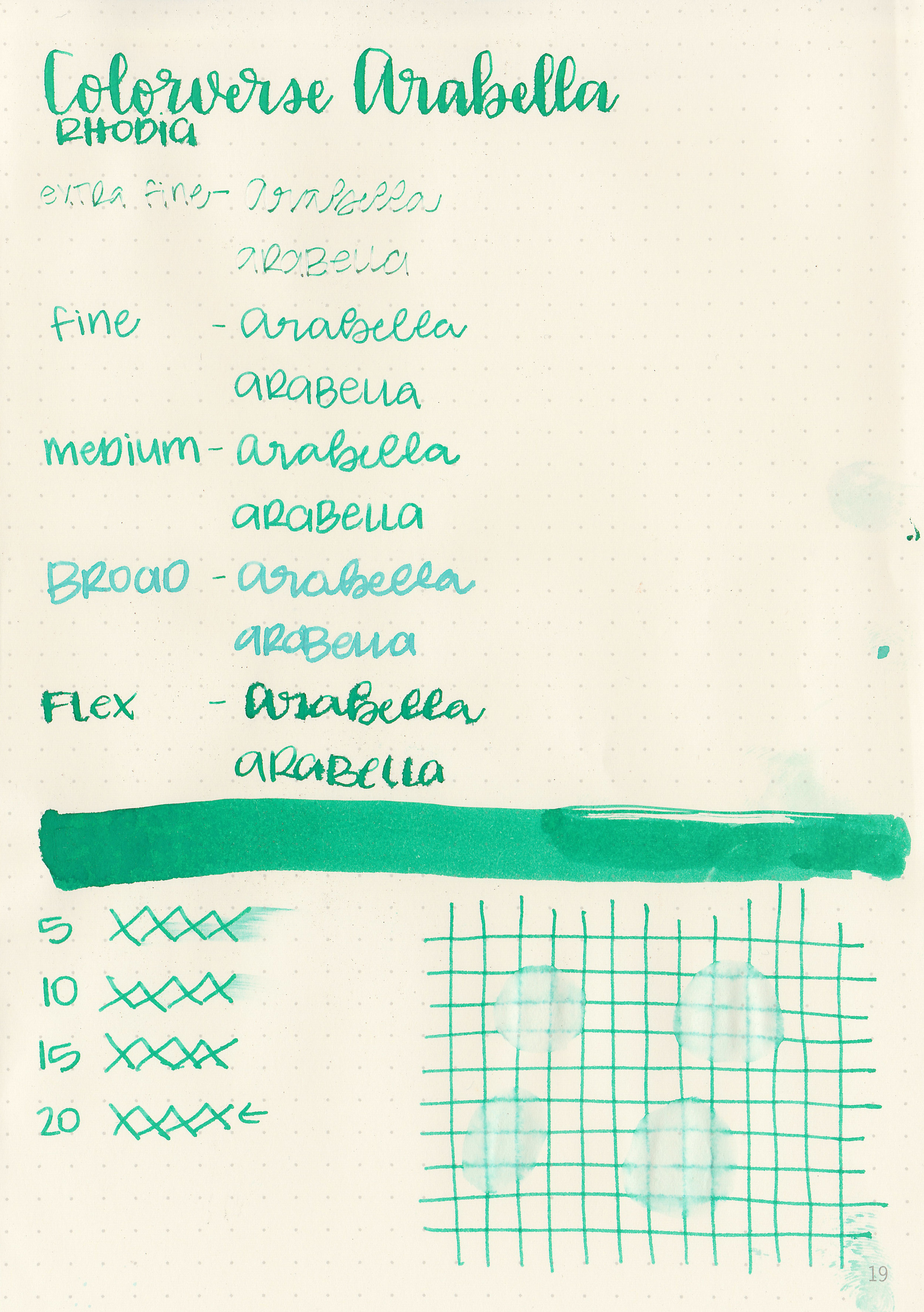
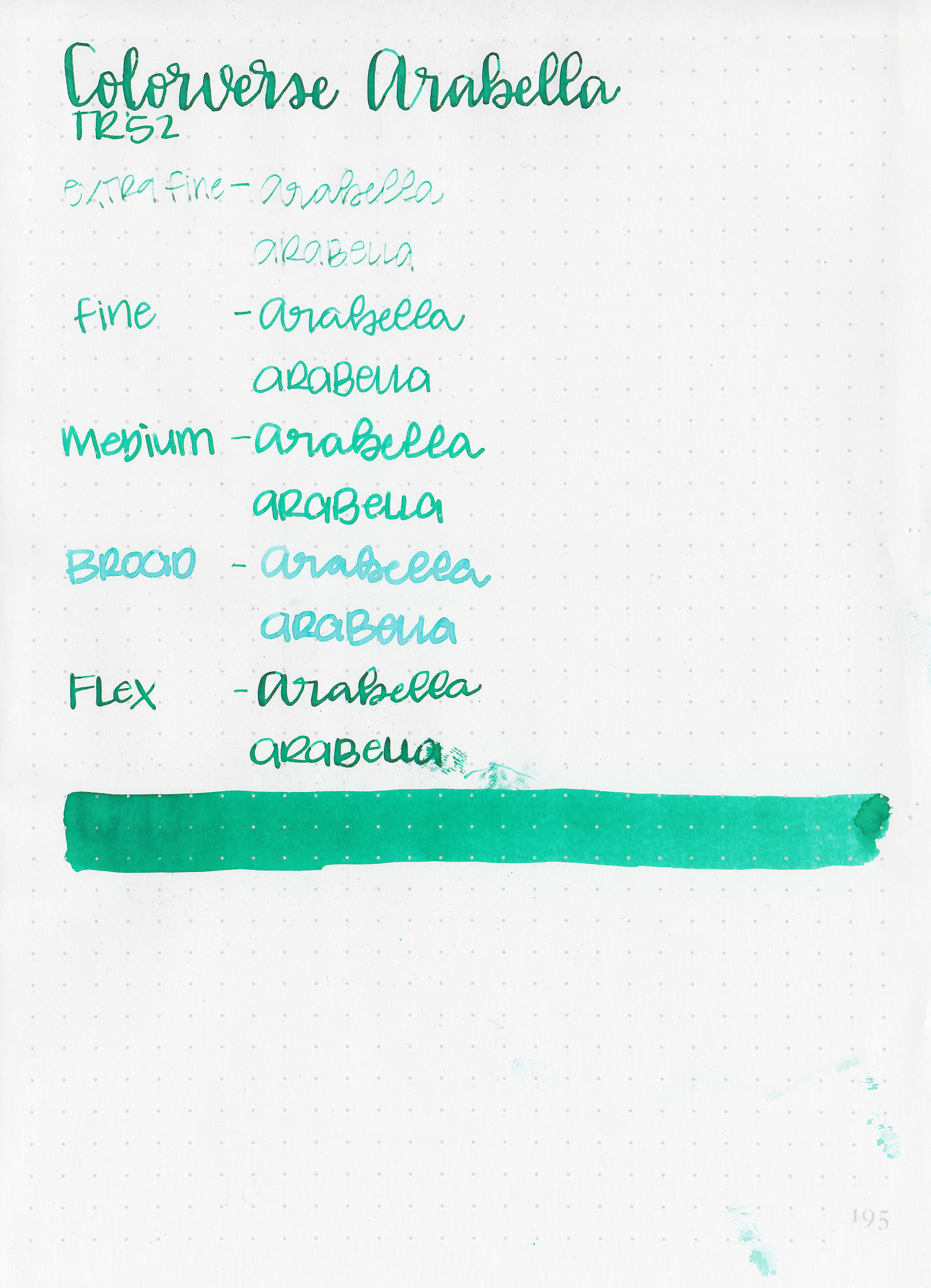
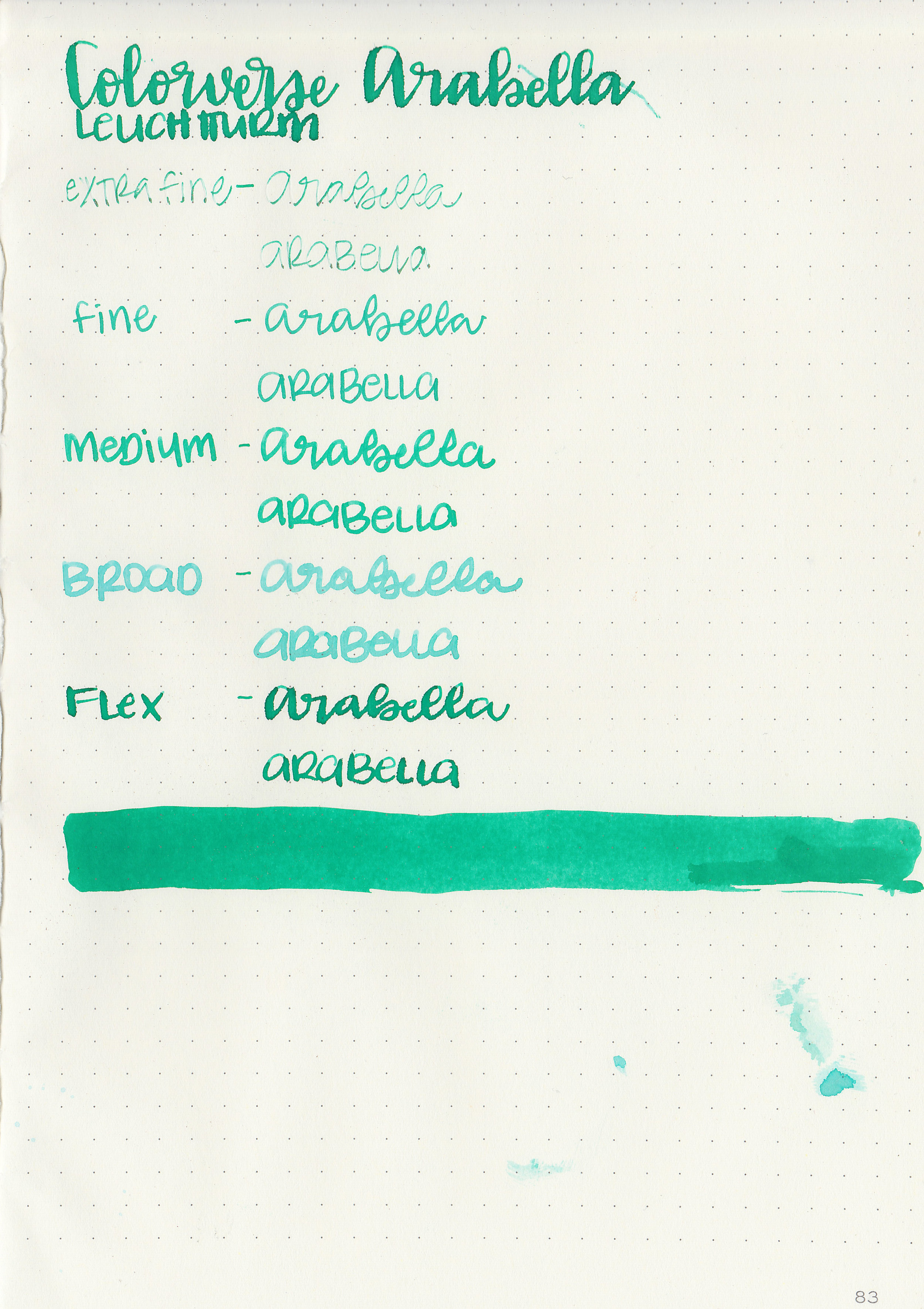
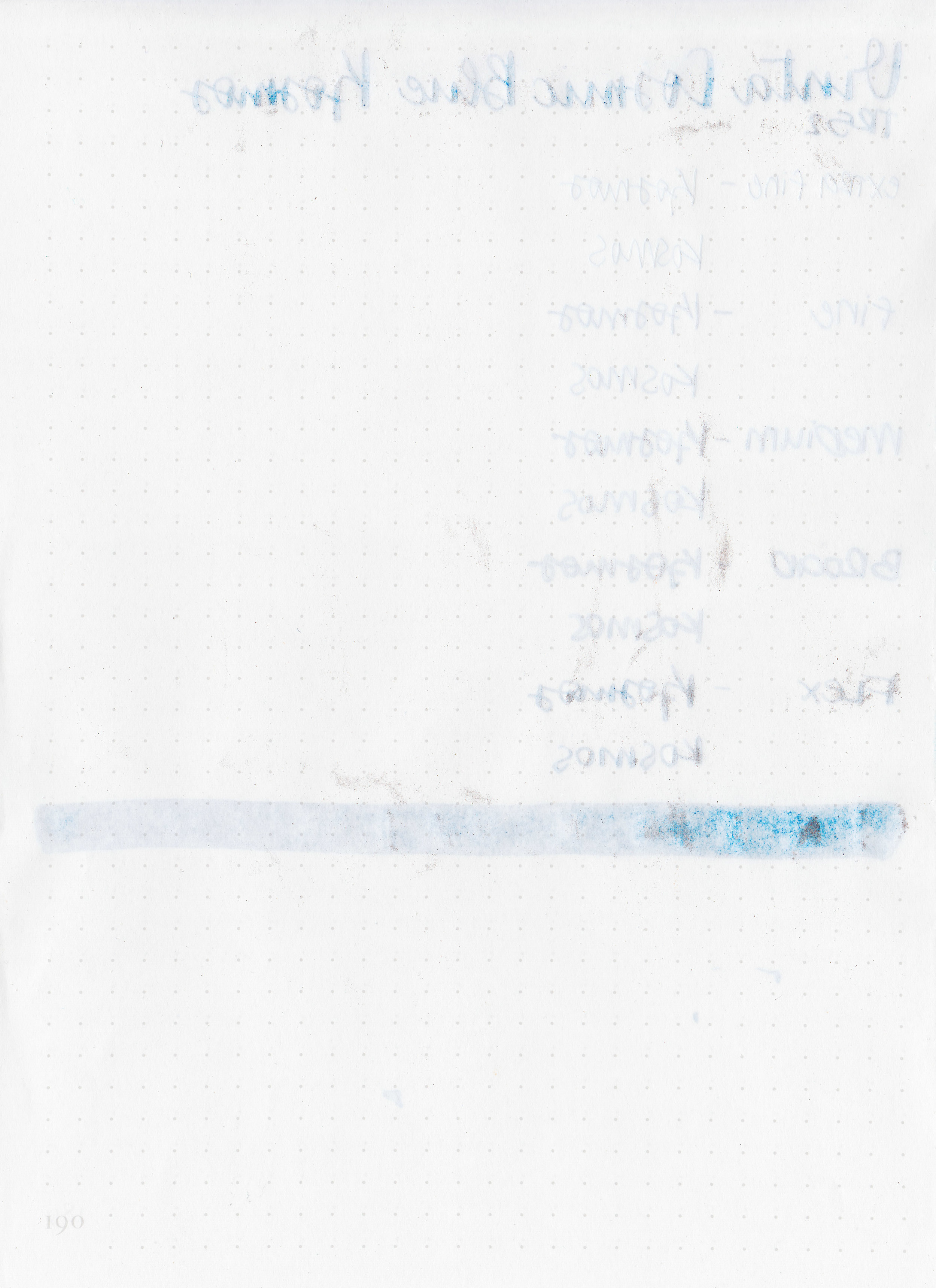
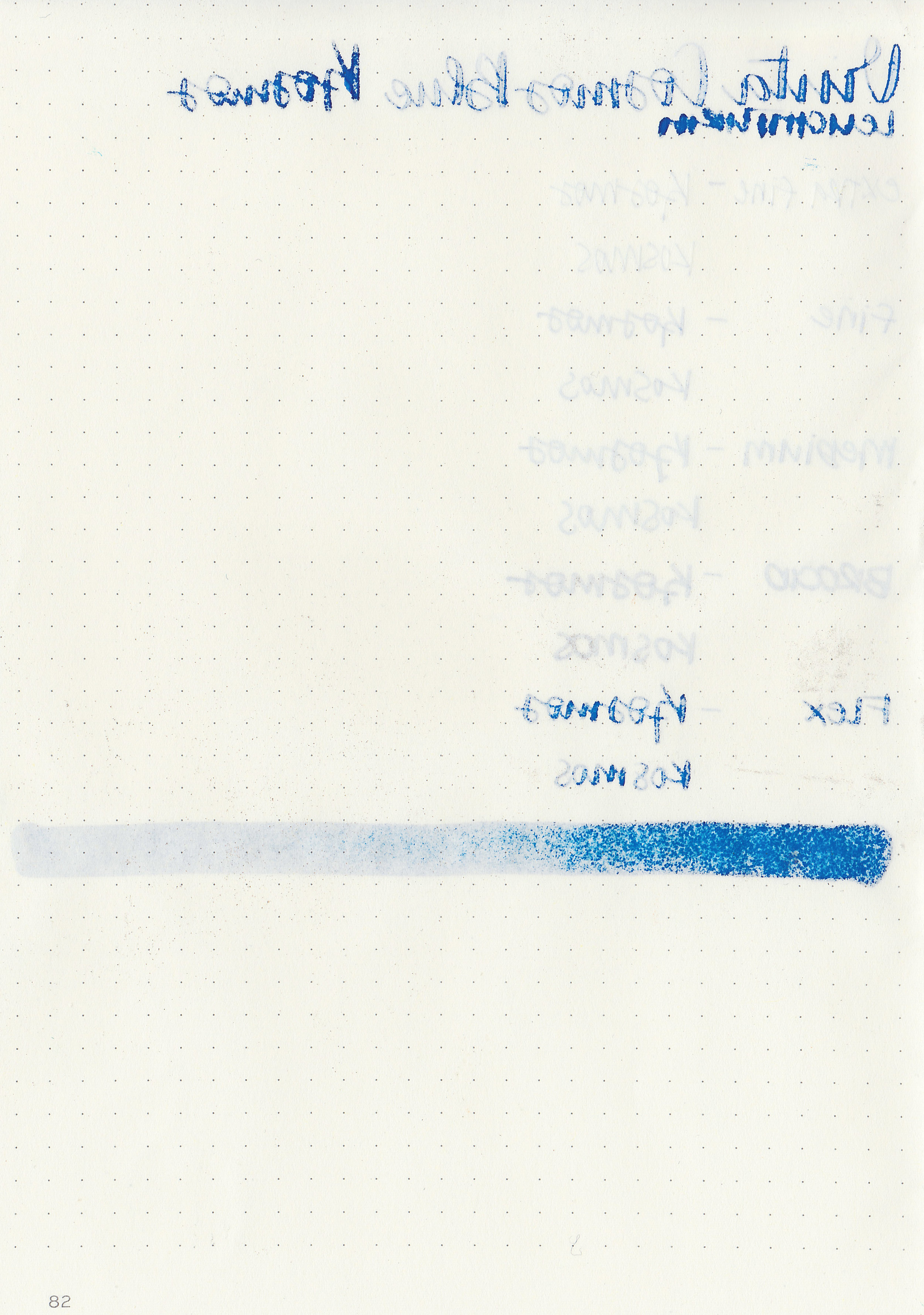
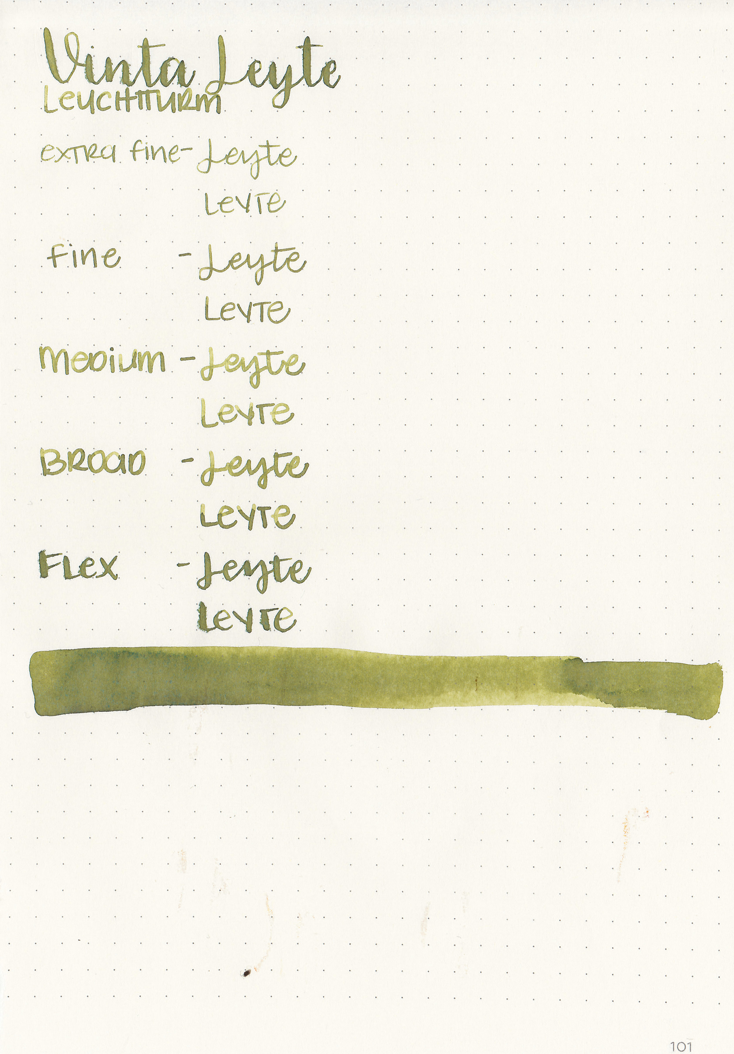
Writing samples:
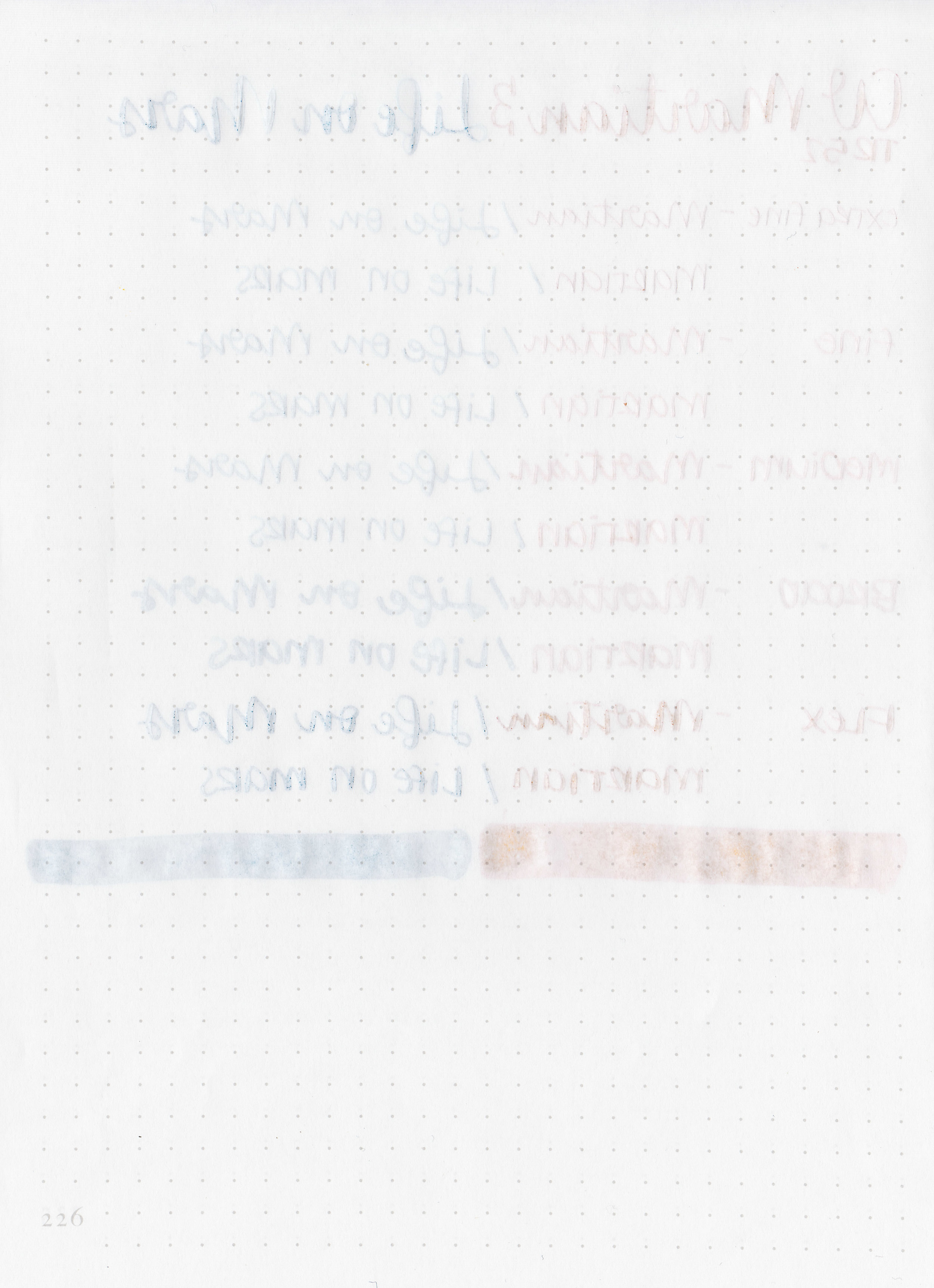
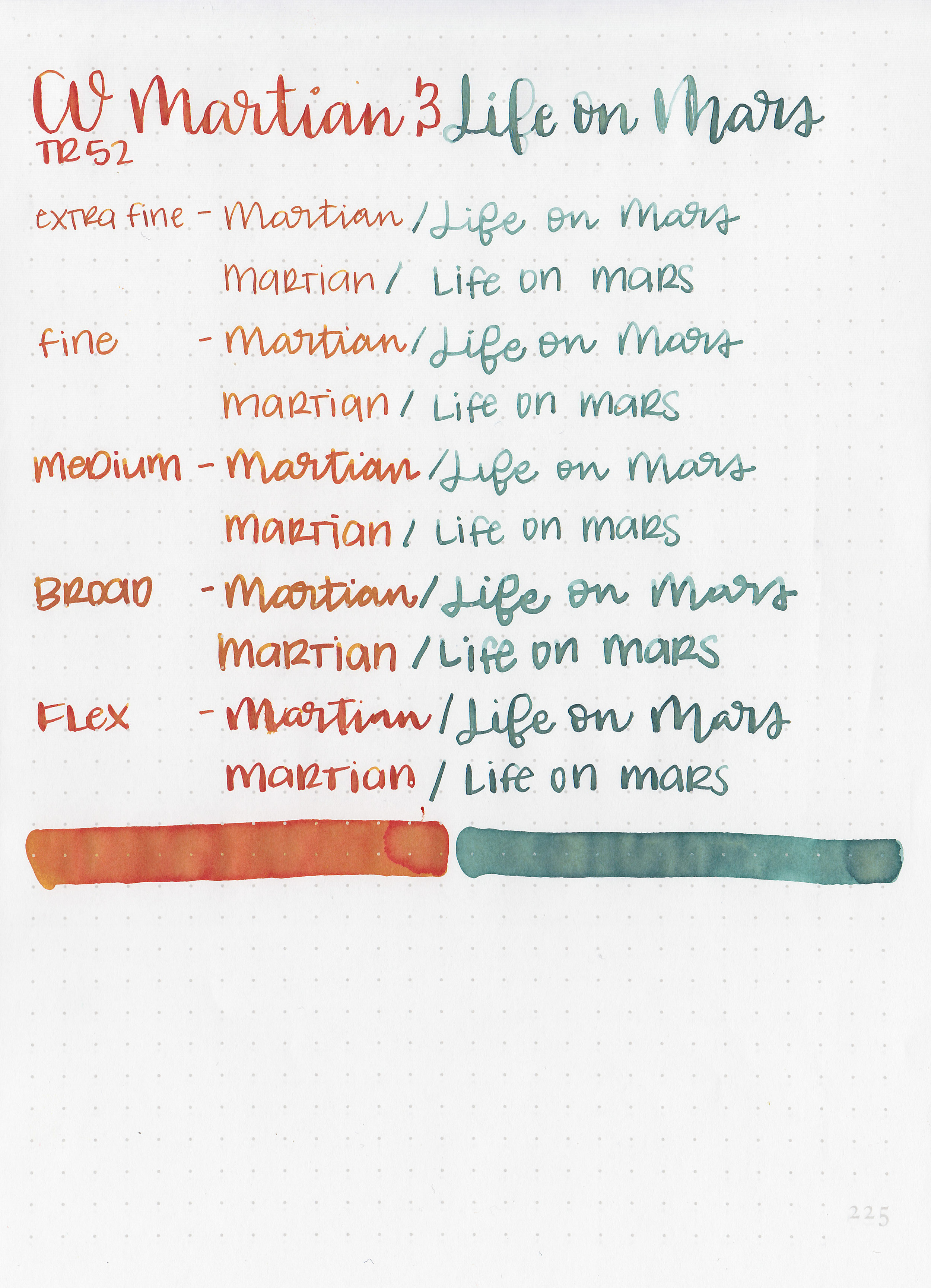
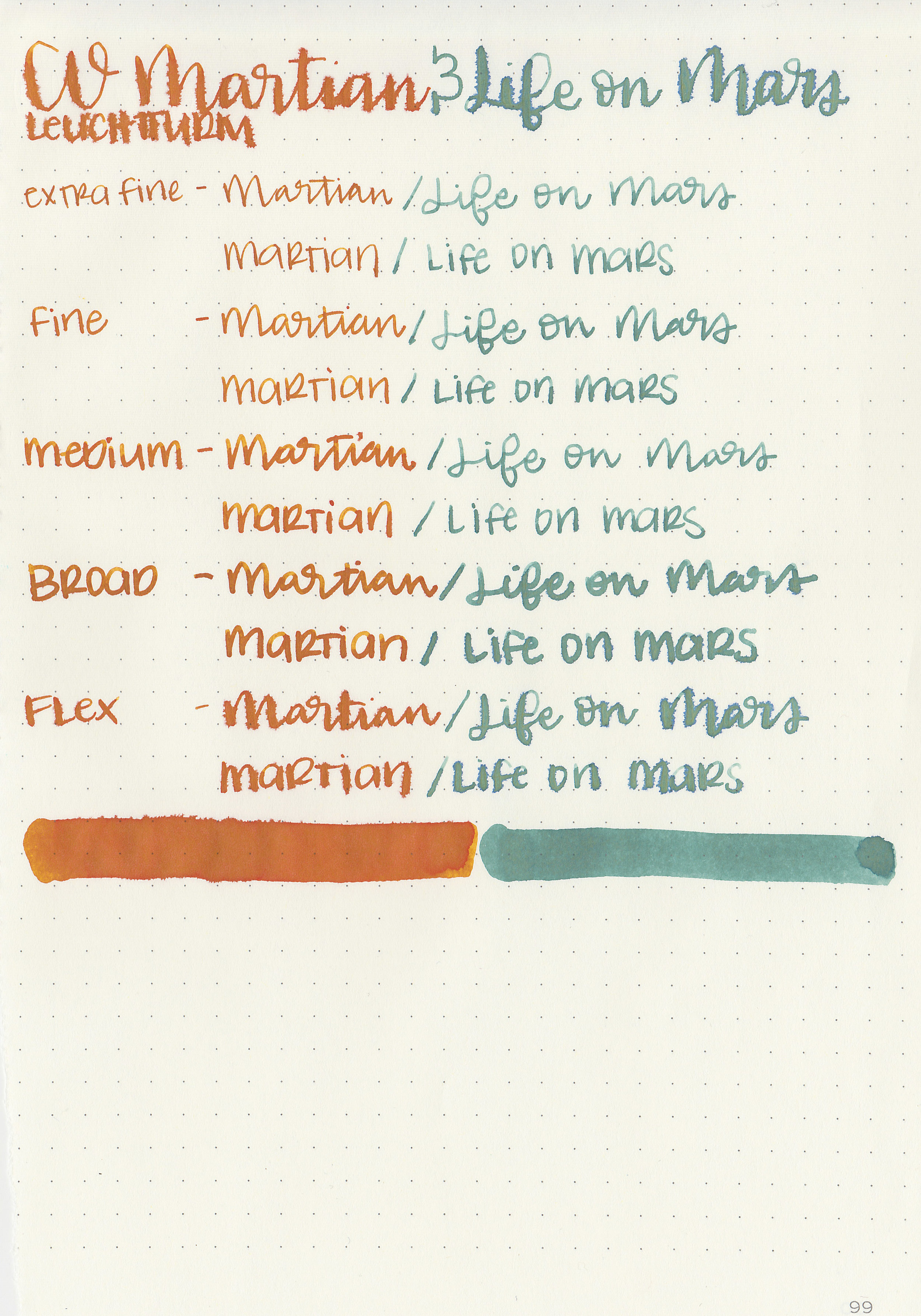
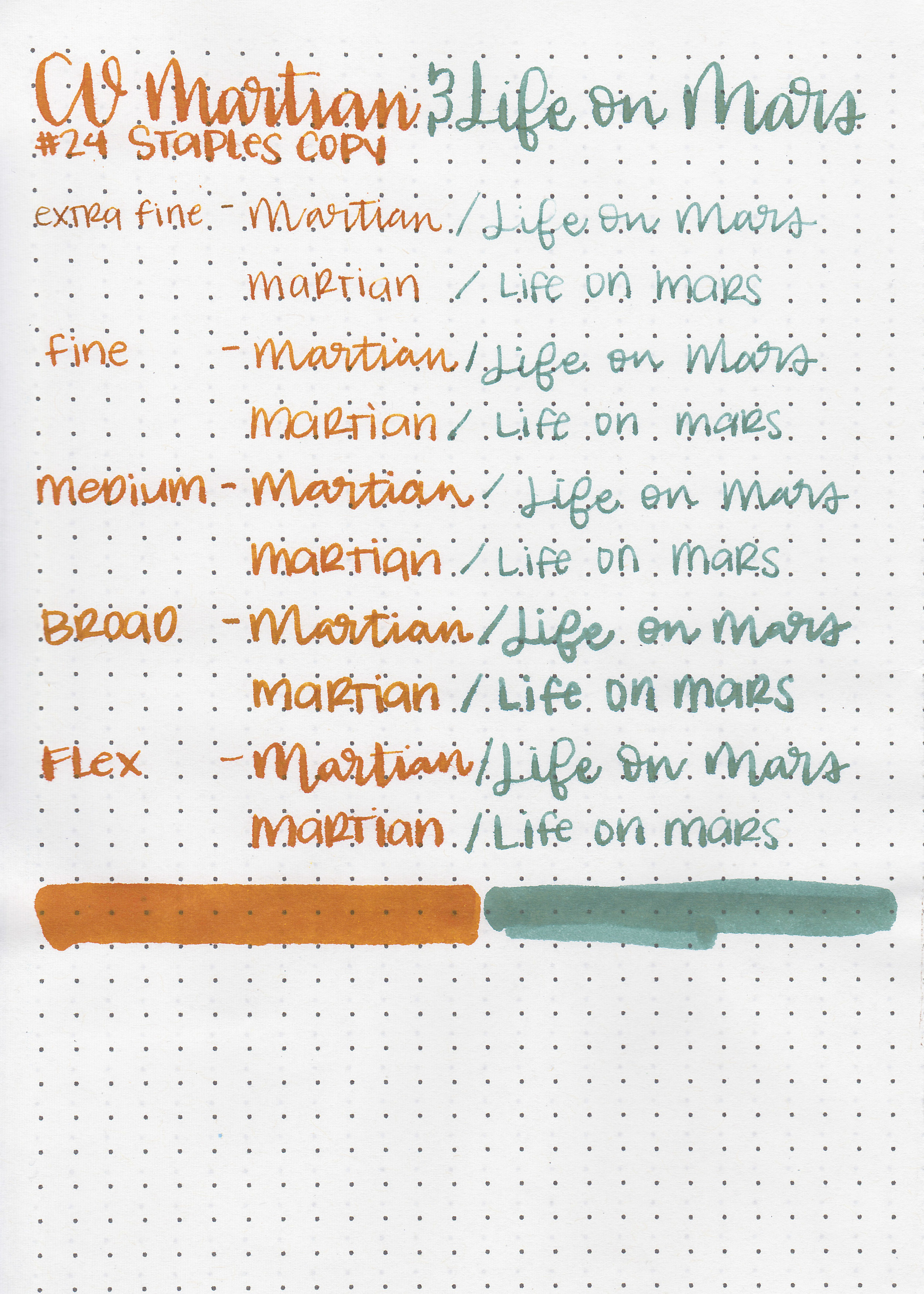
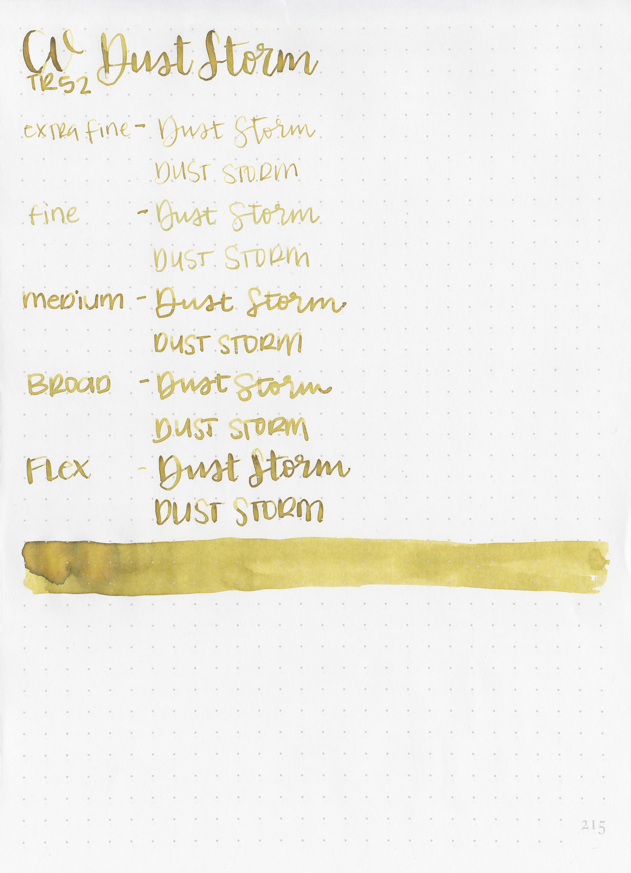
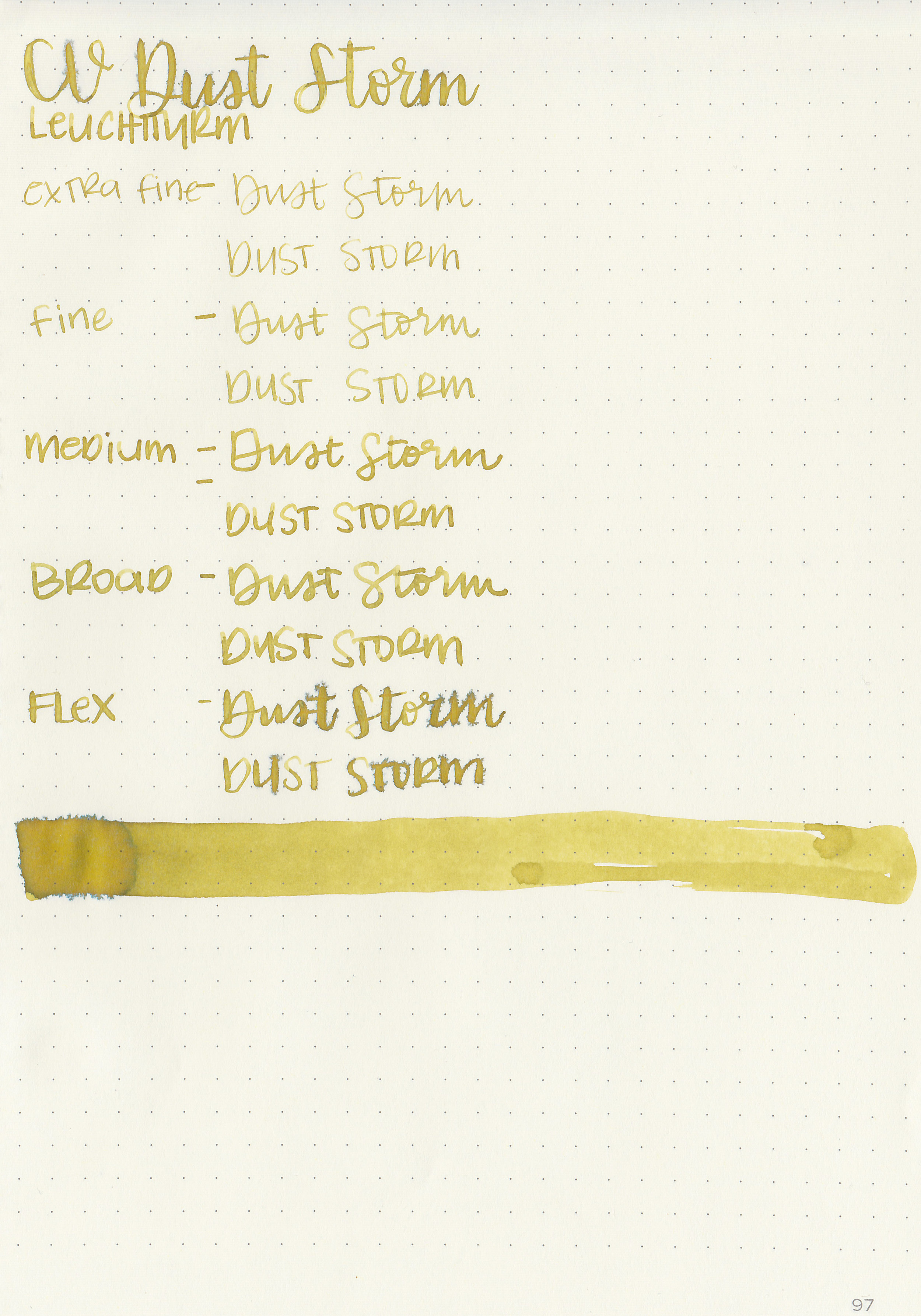
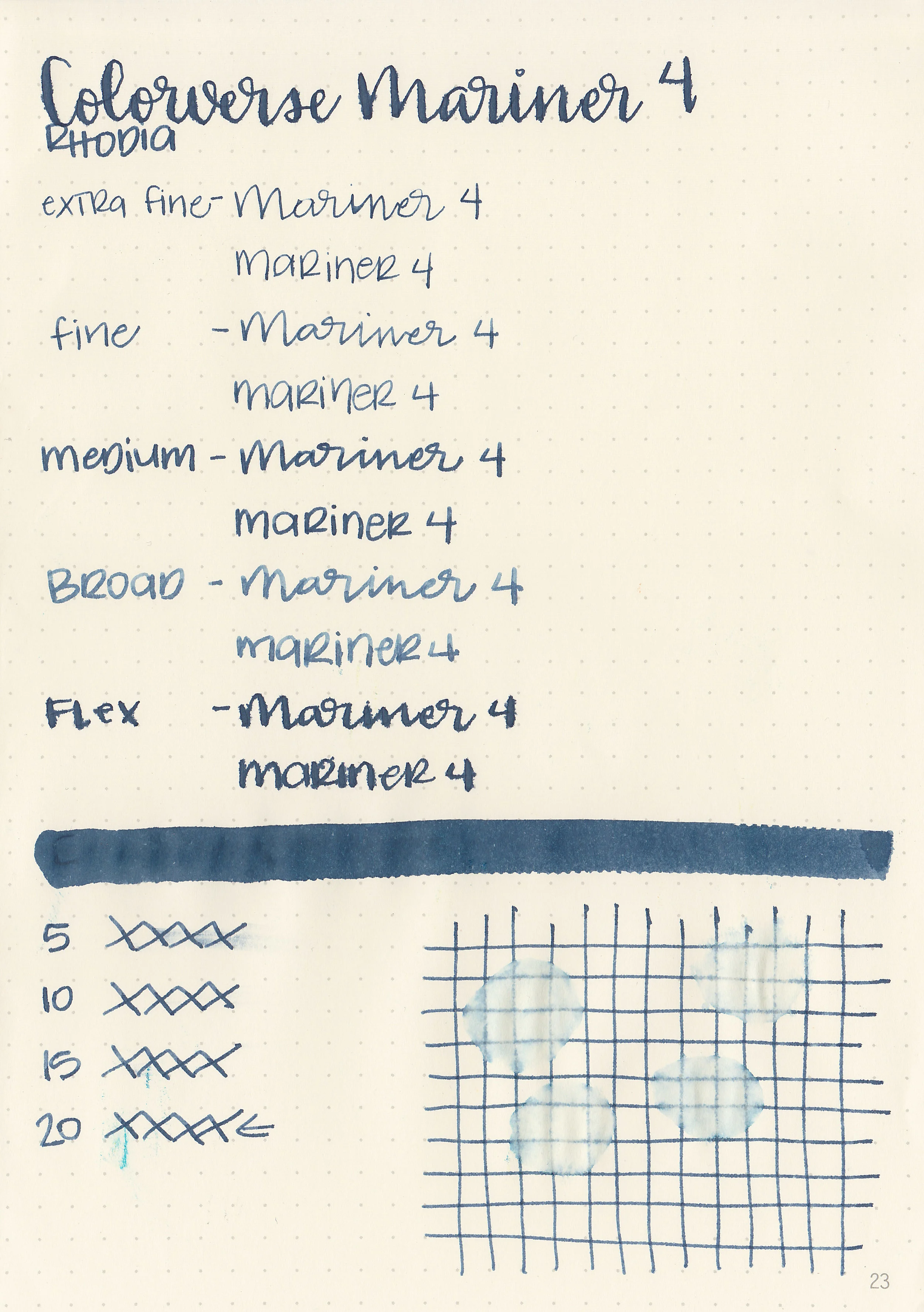
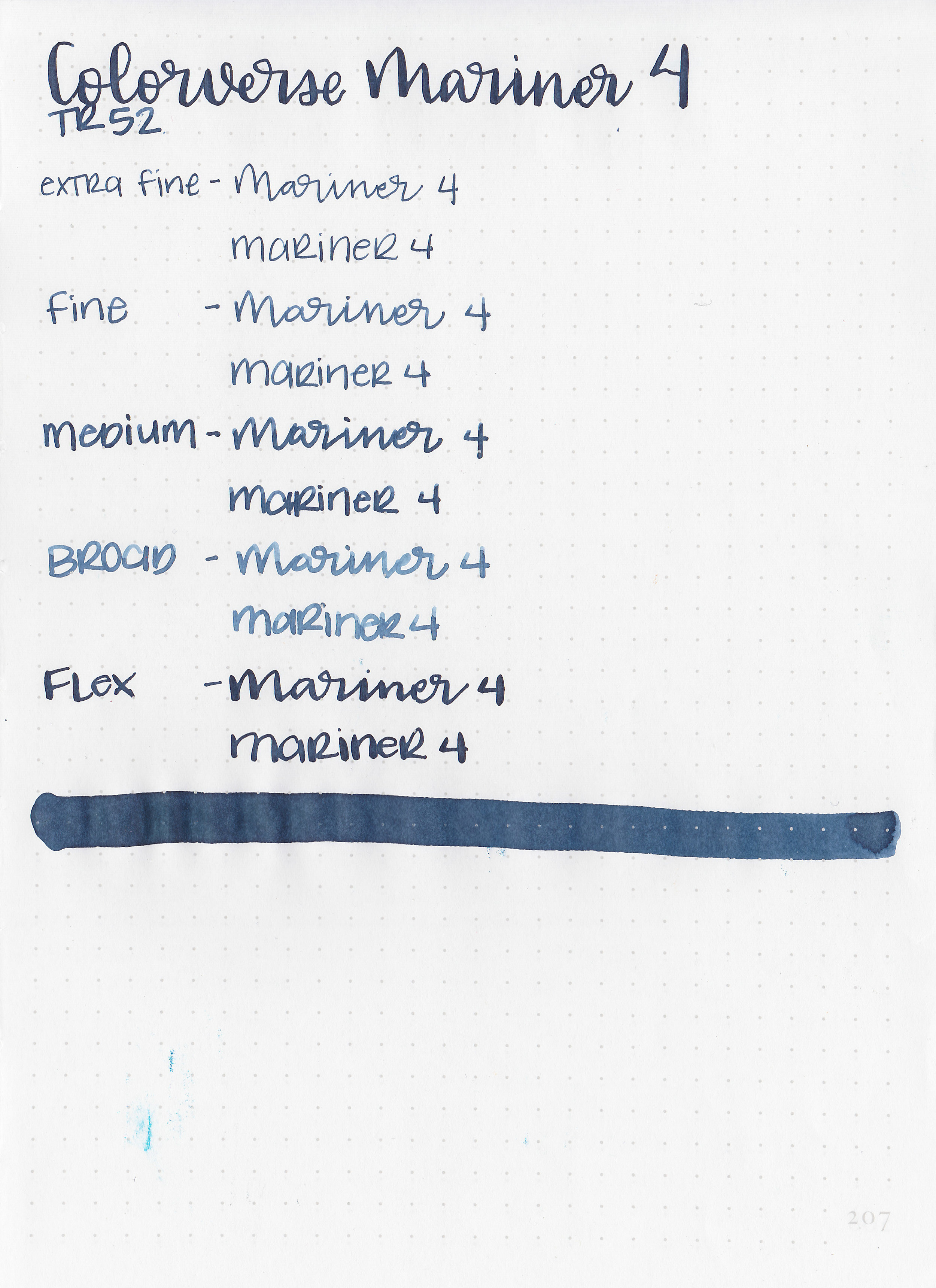
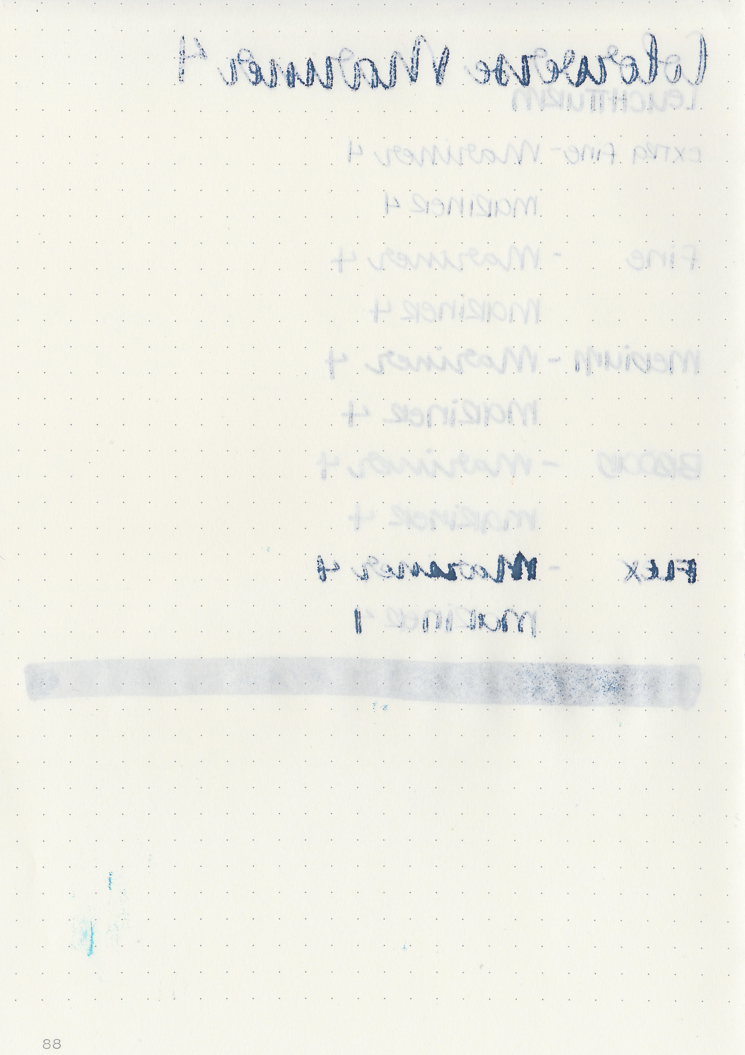
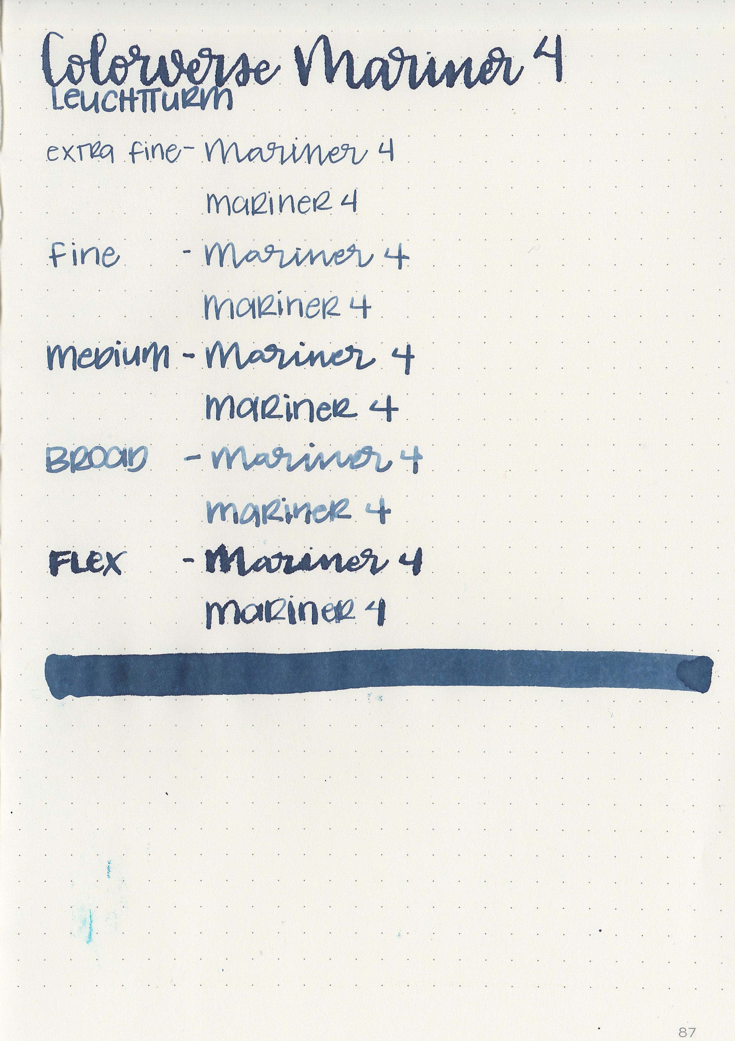
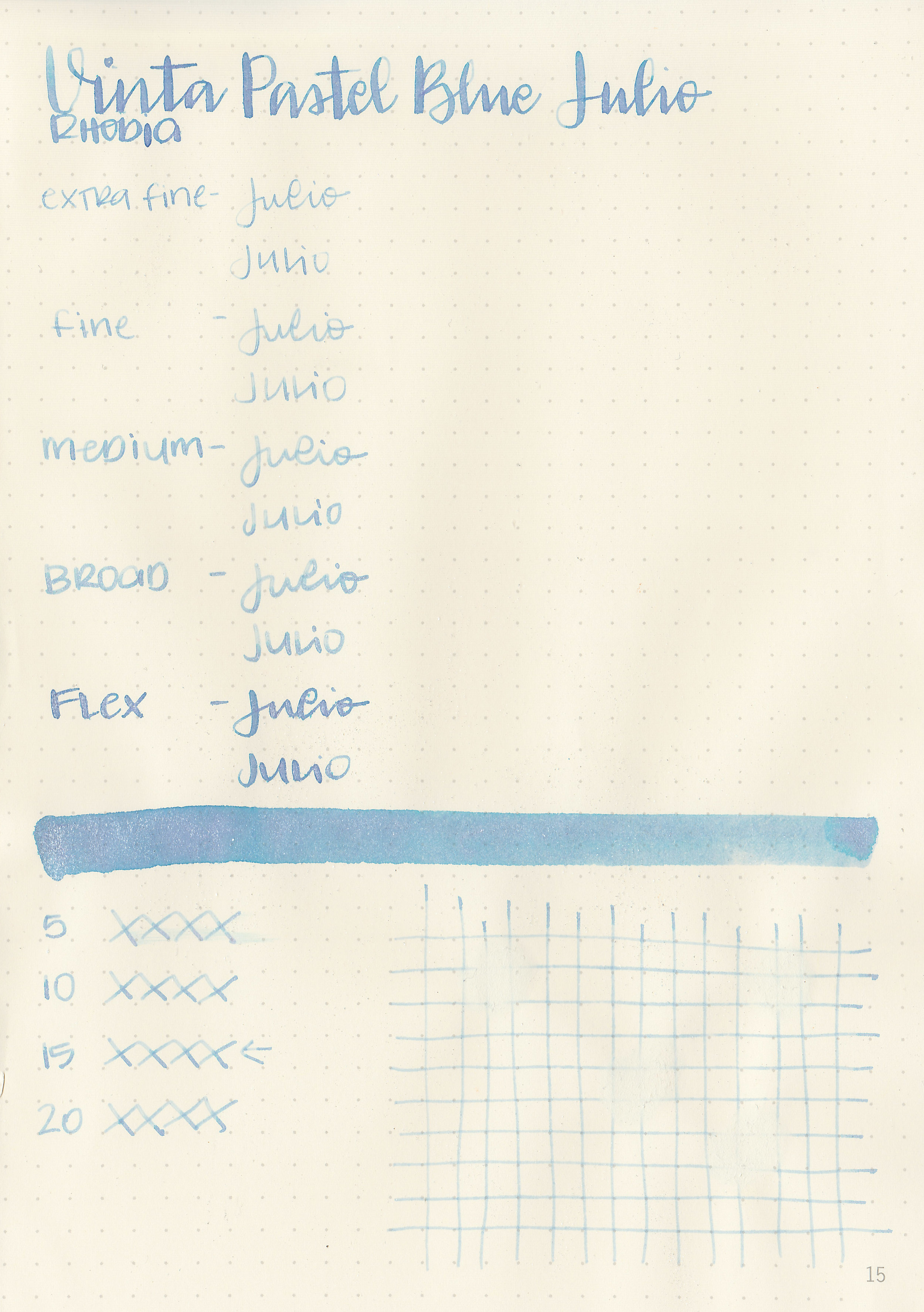
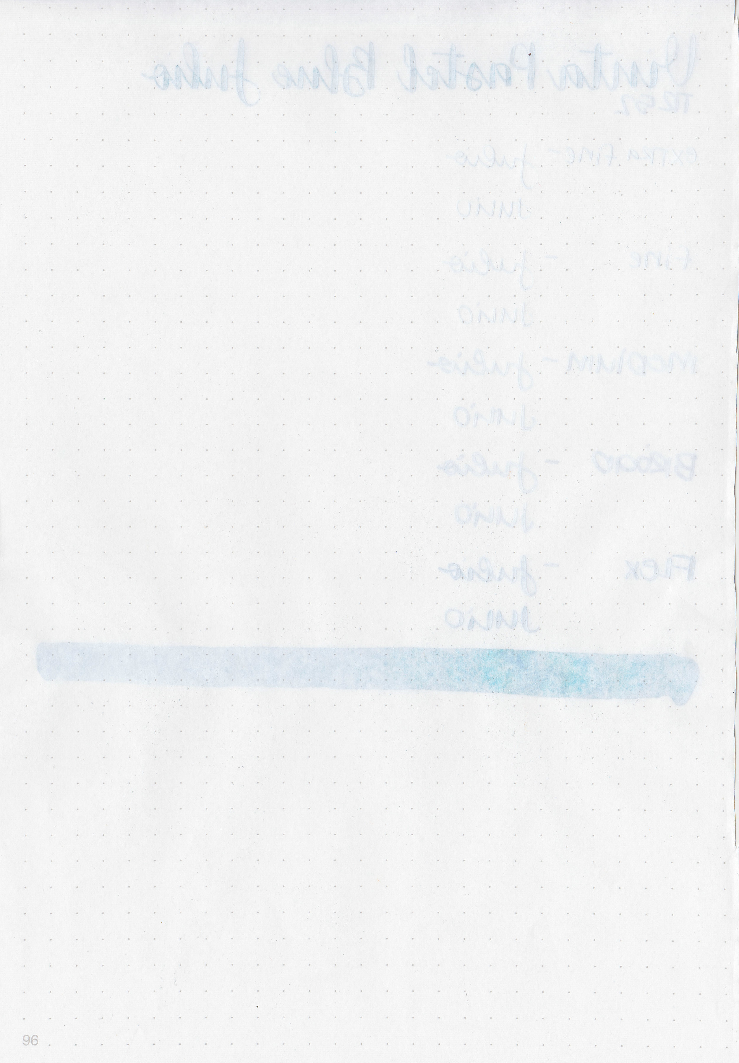
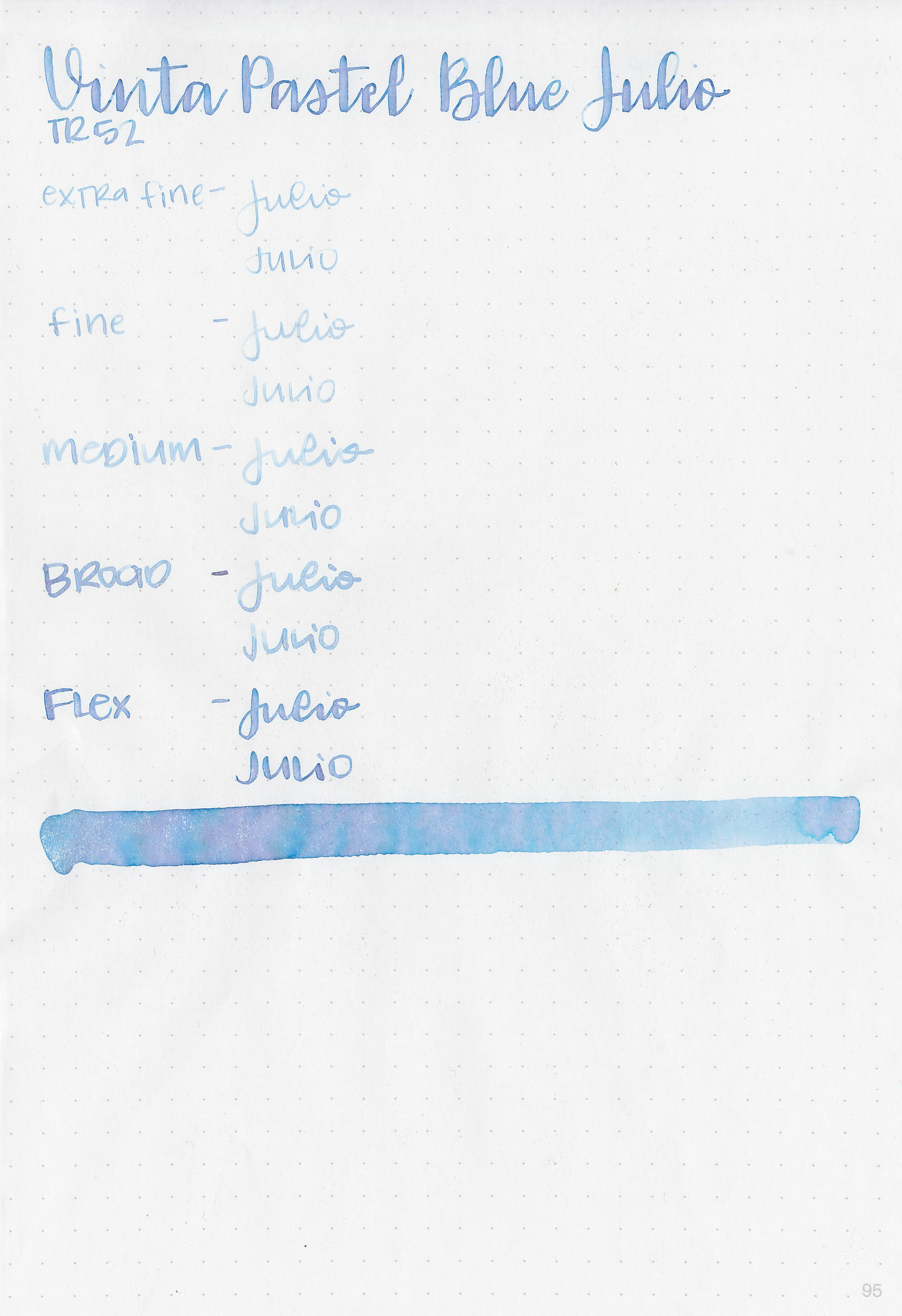
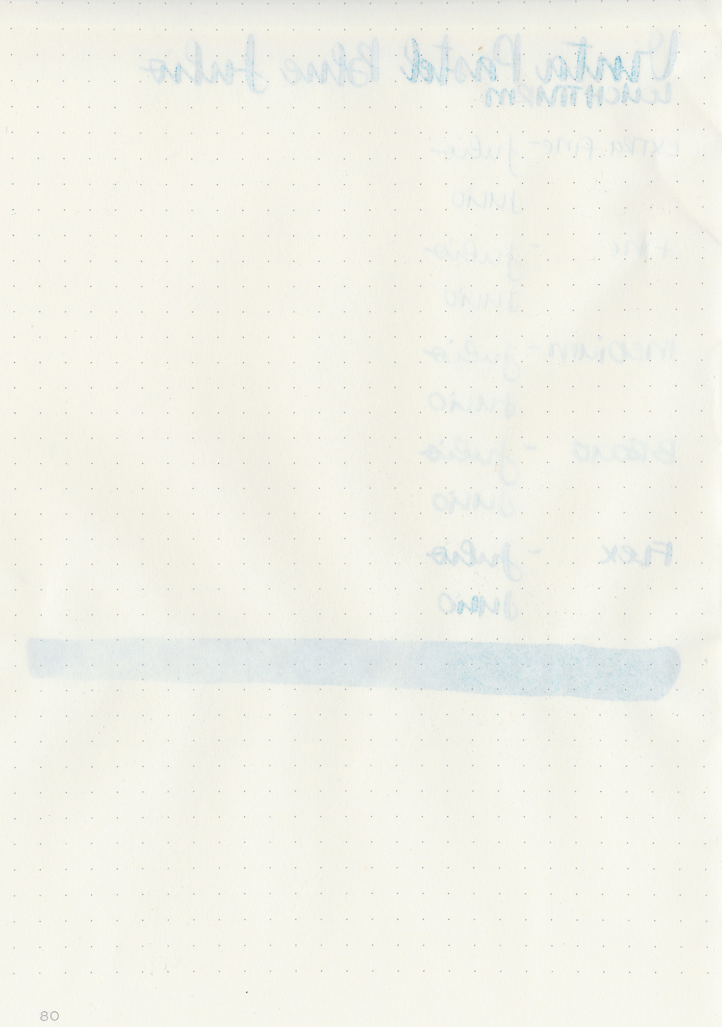
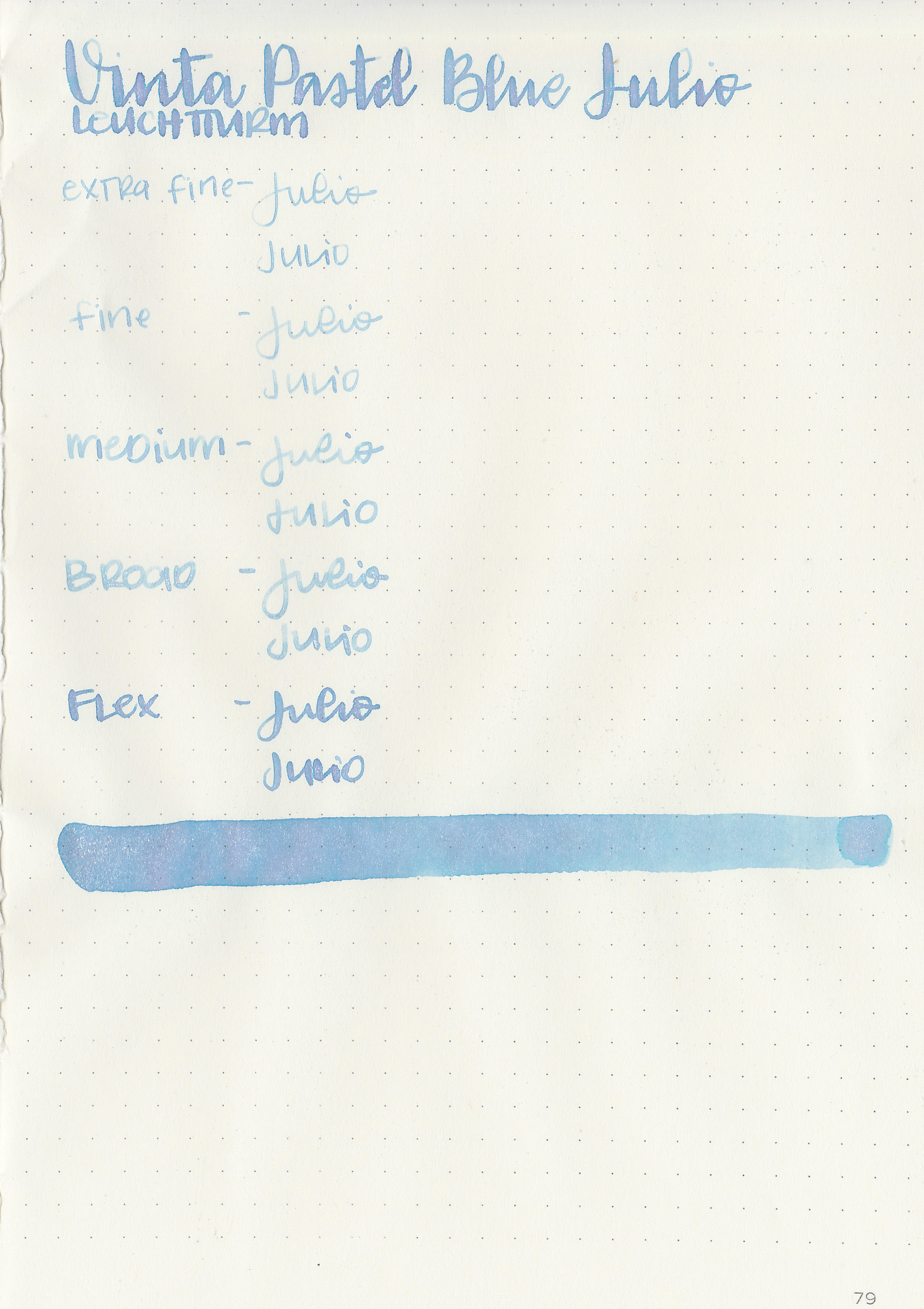
Let's take a look at how the ink behaves on fountain pen friendly papers: Rhodia, Tomoe River, and Leuchtturm.

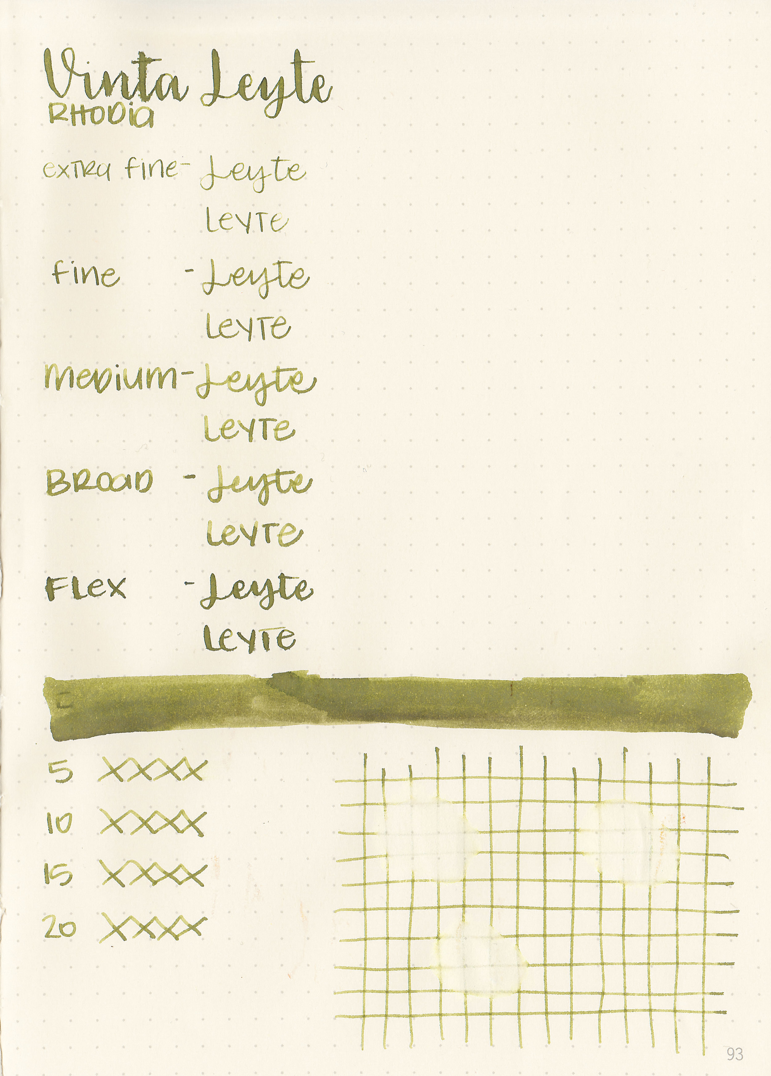
Dry time: 15 seconds
Water resistance: Low
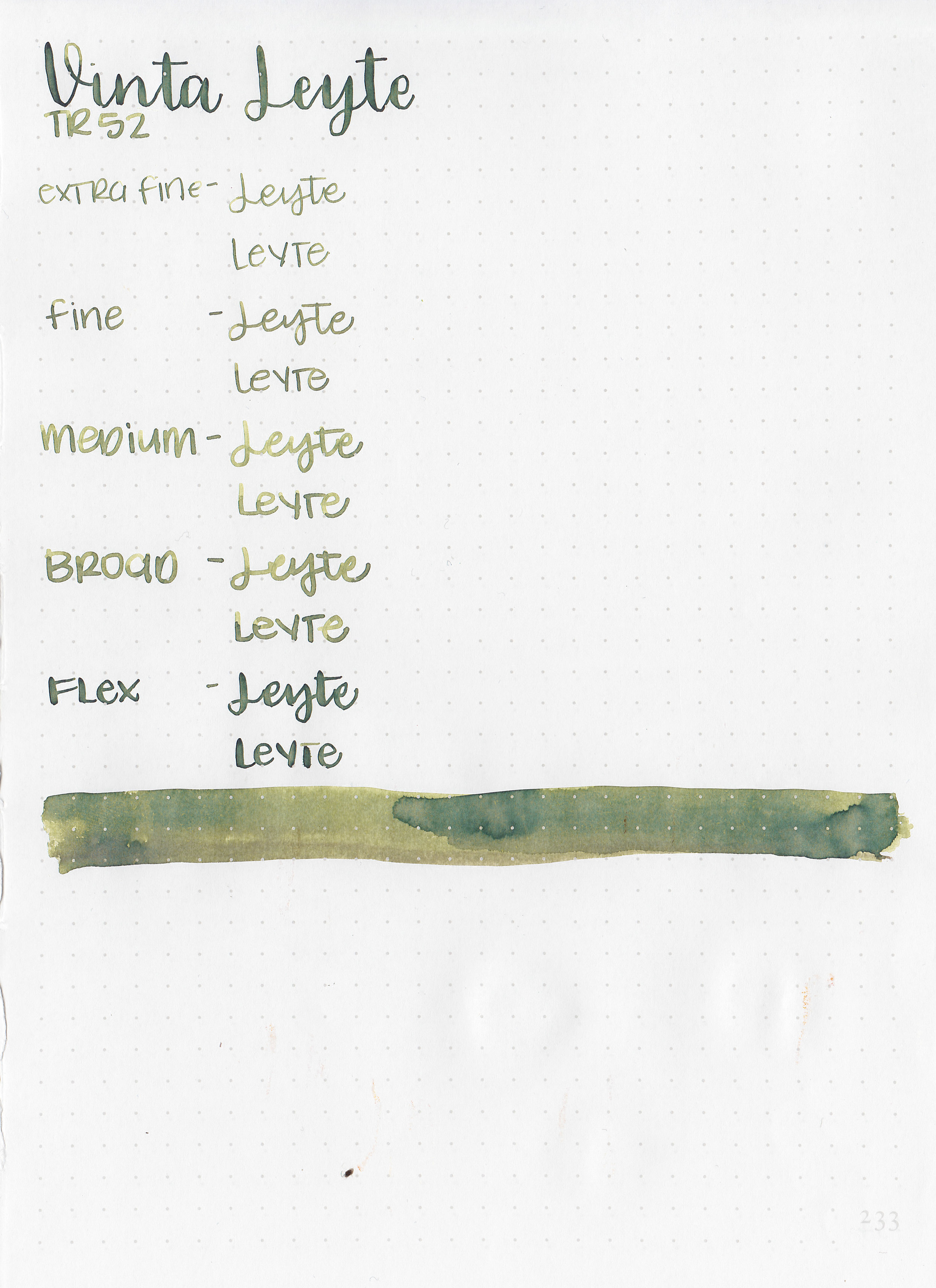
Feathering: Low-there was some feathering in the flex nib on Leuchtturm and Rhodia.
Show through: Medium
Bleeding: Low-there was some bleeding in the flex nib on Leuchtturm and Rhodia.
Other properties: medium shading, no sheen, and no shimmer.

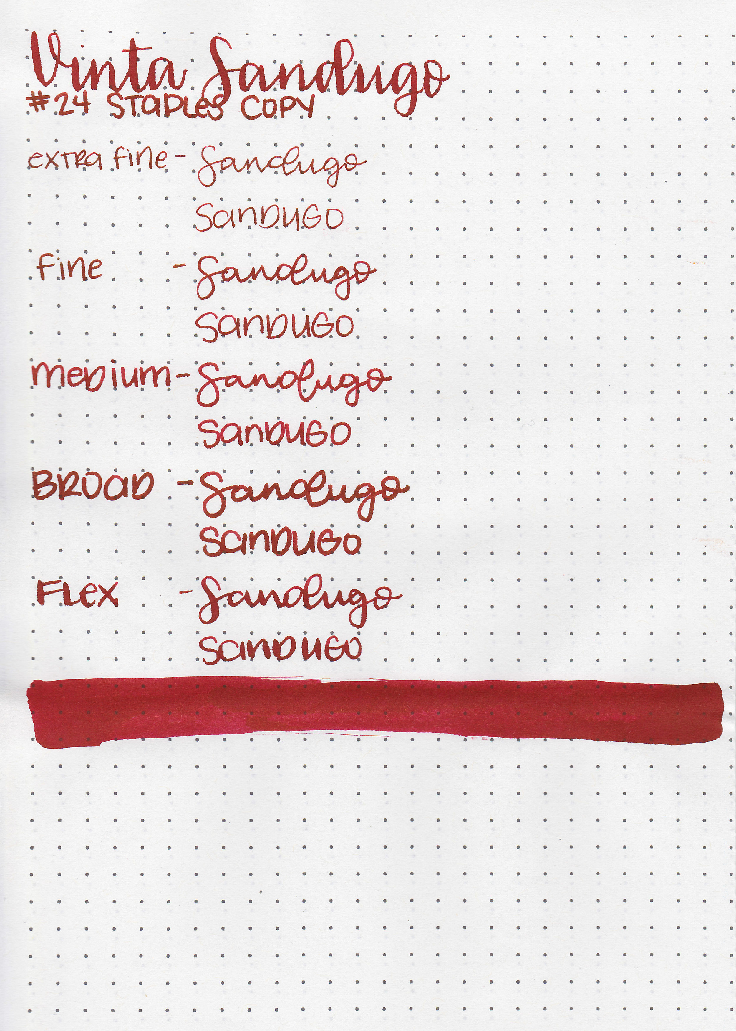
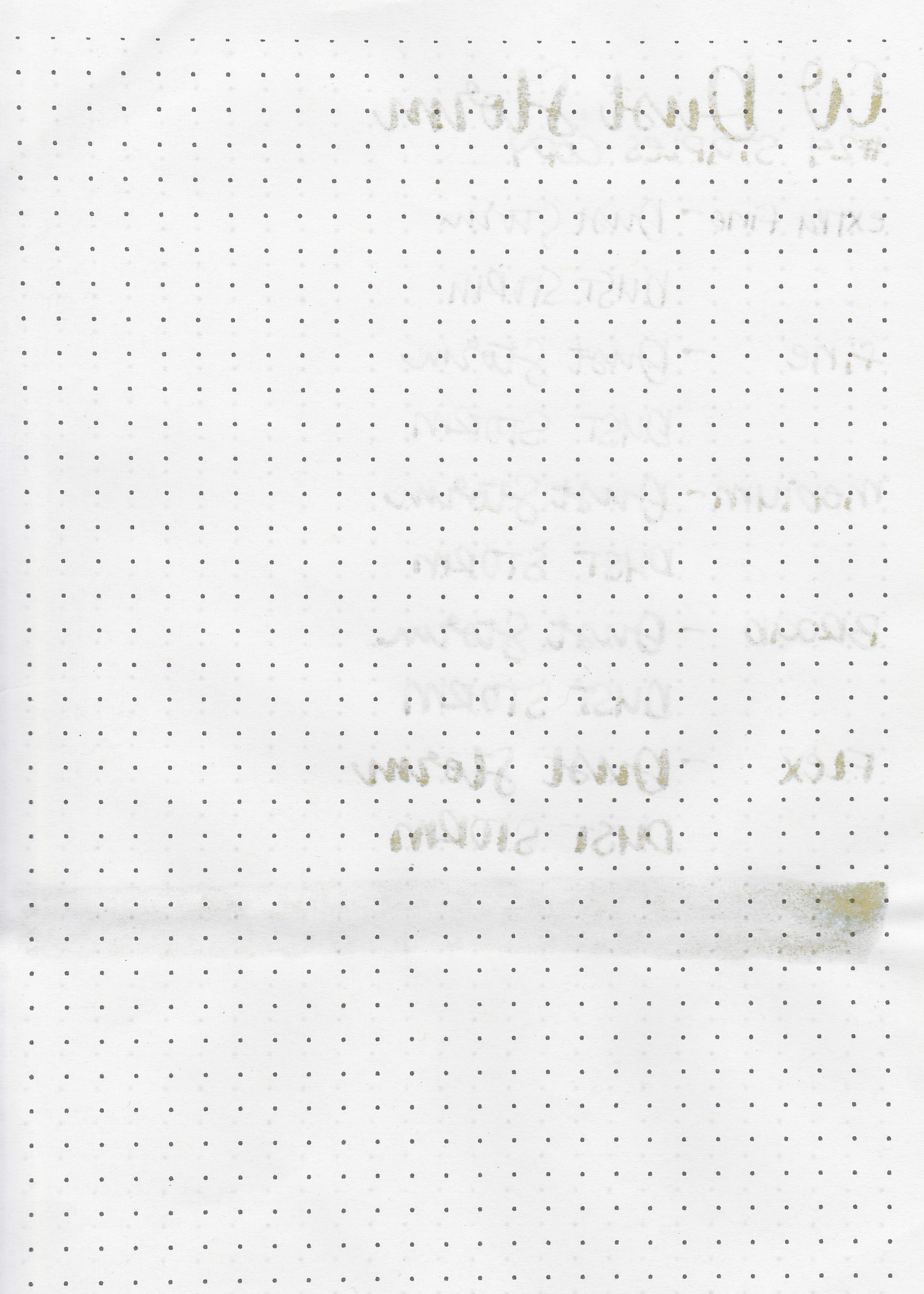
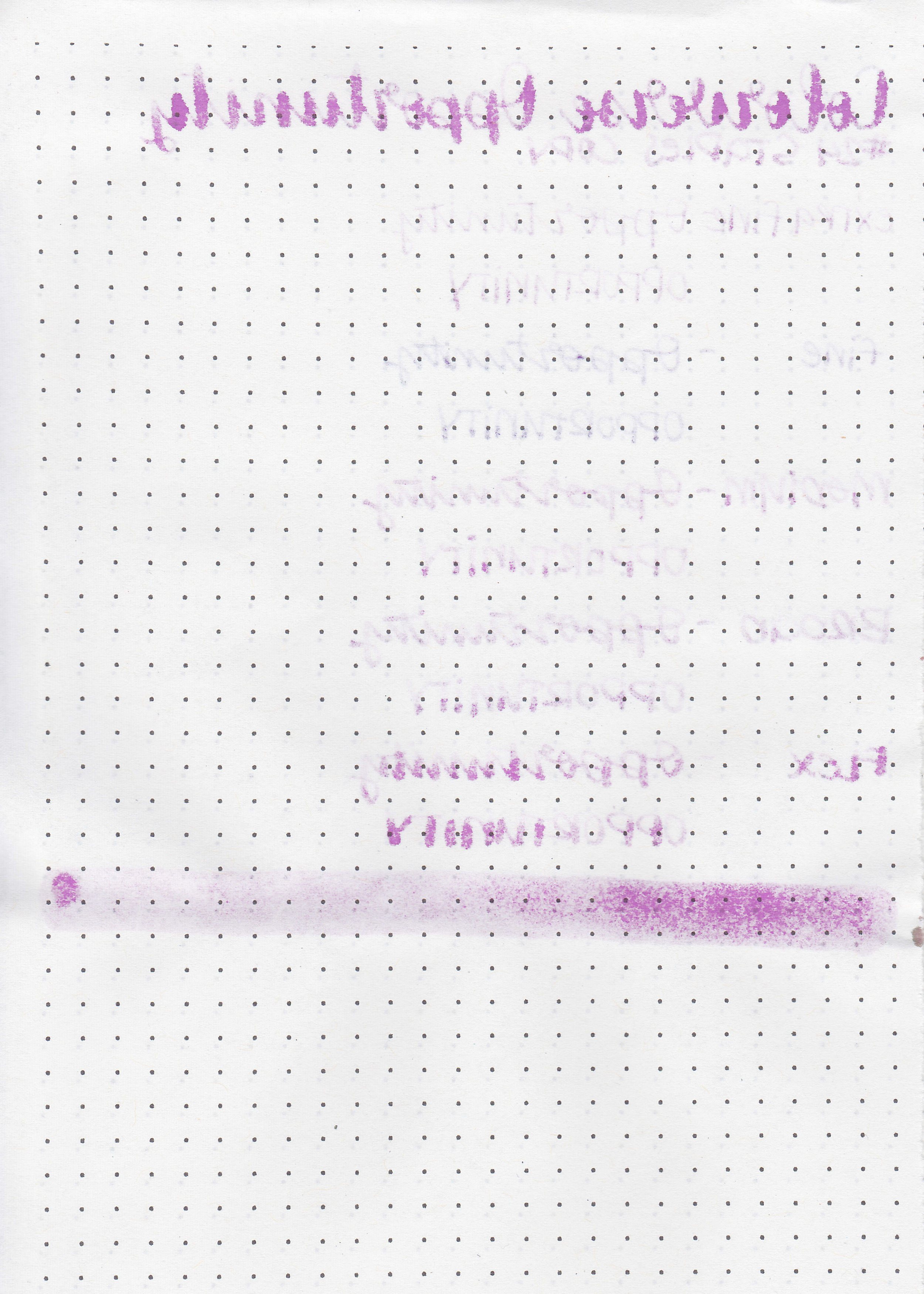
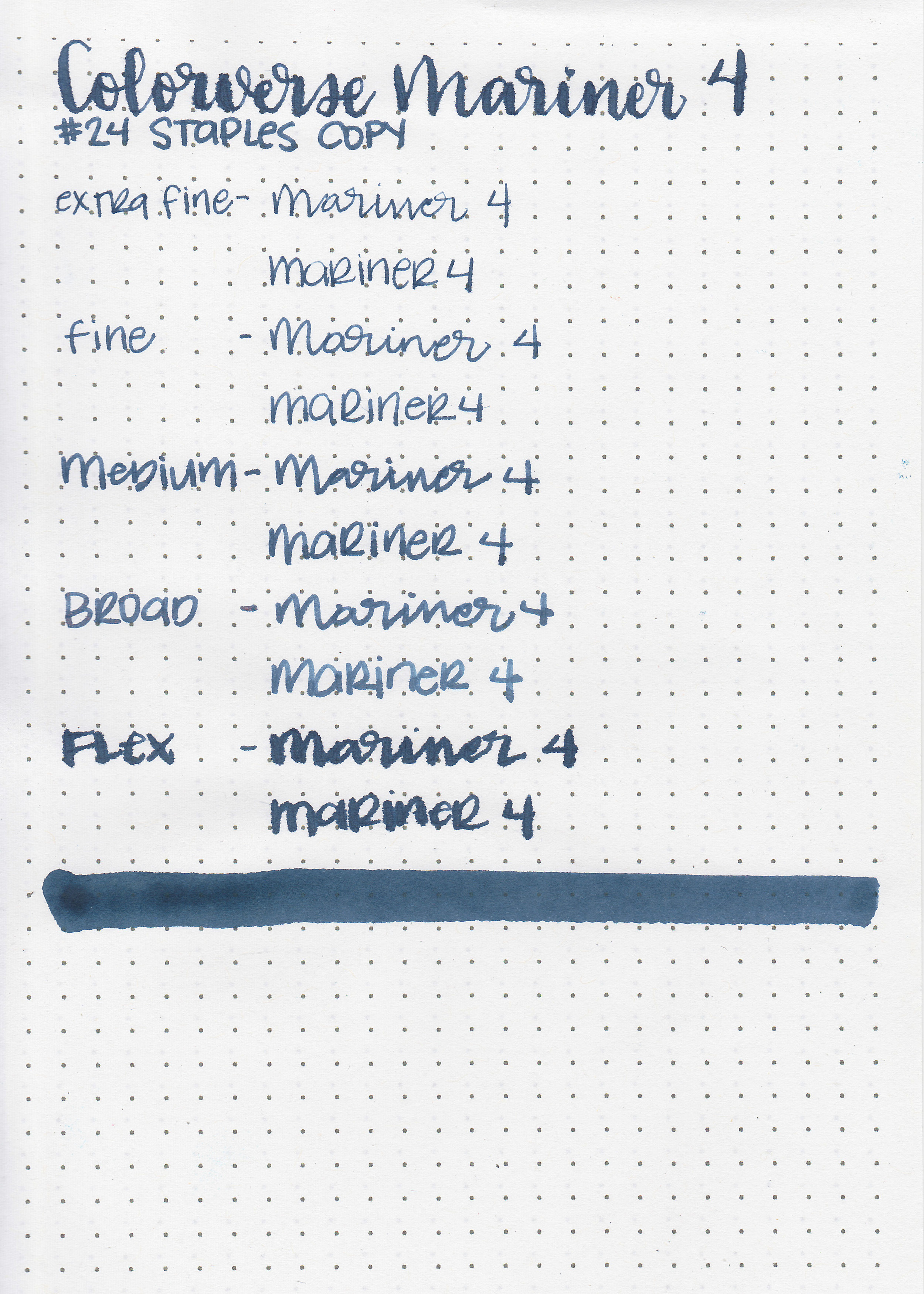
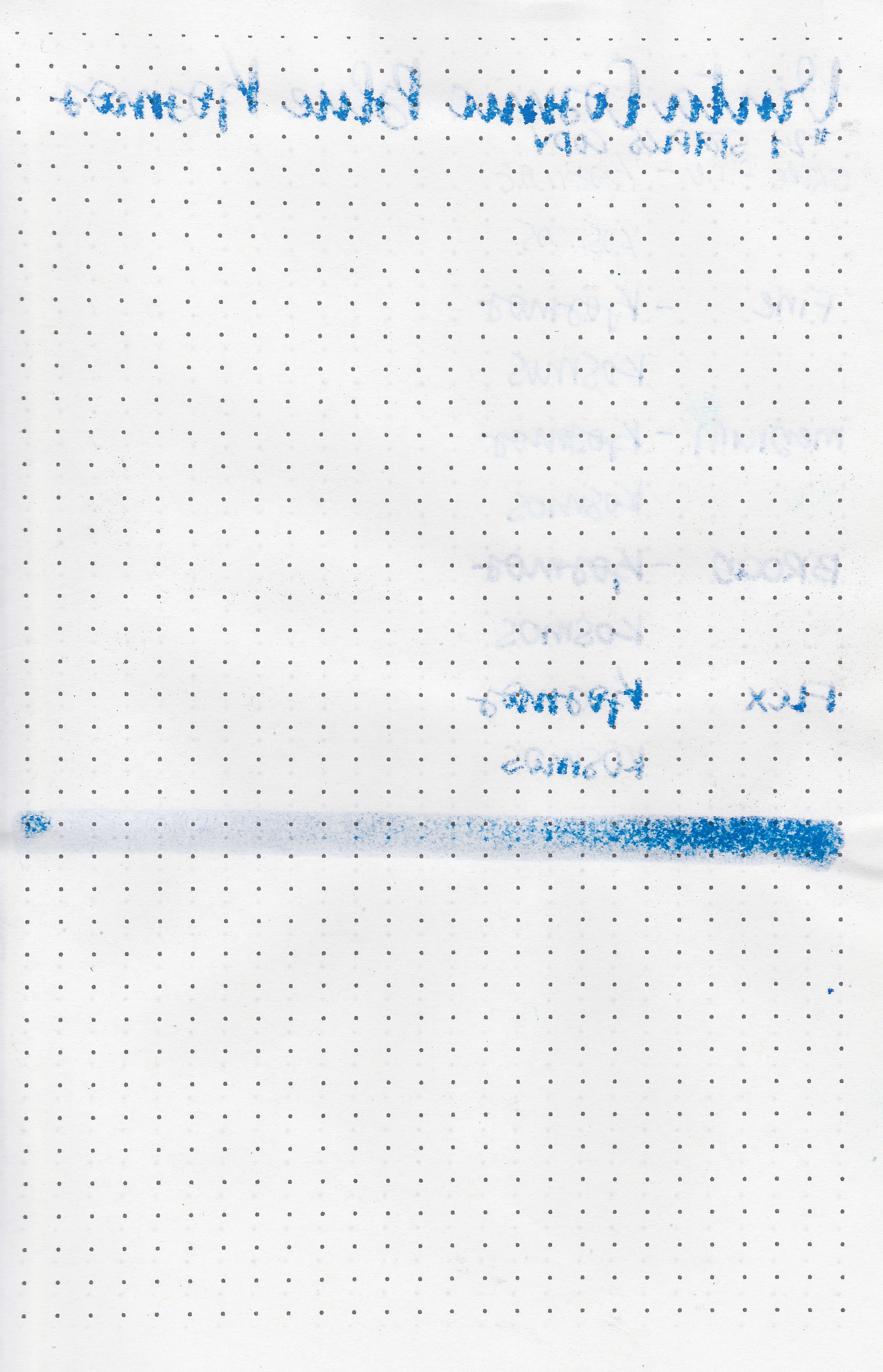
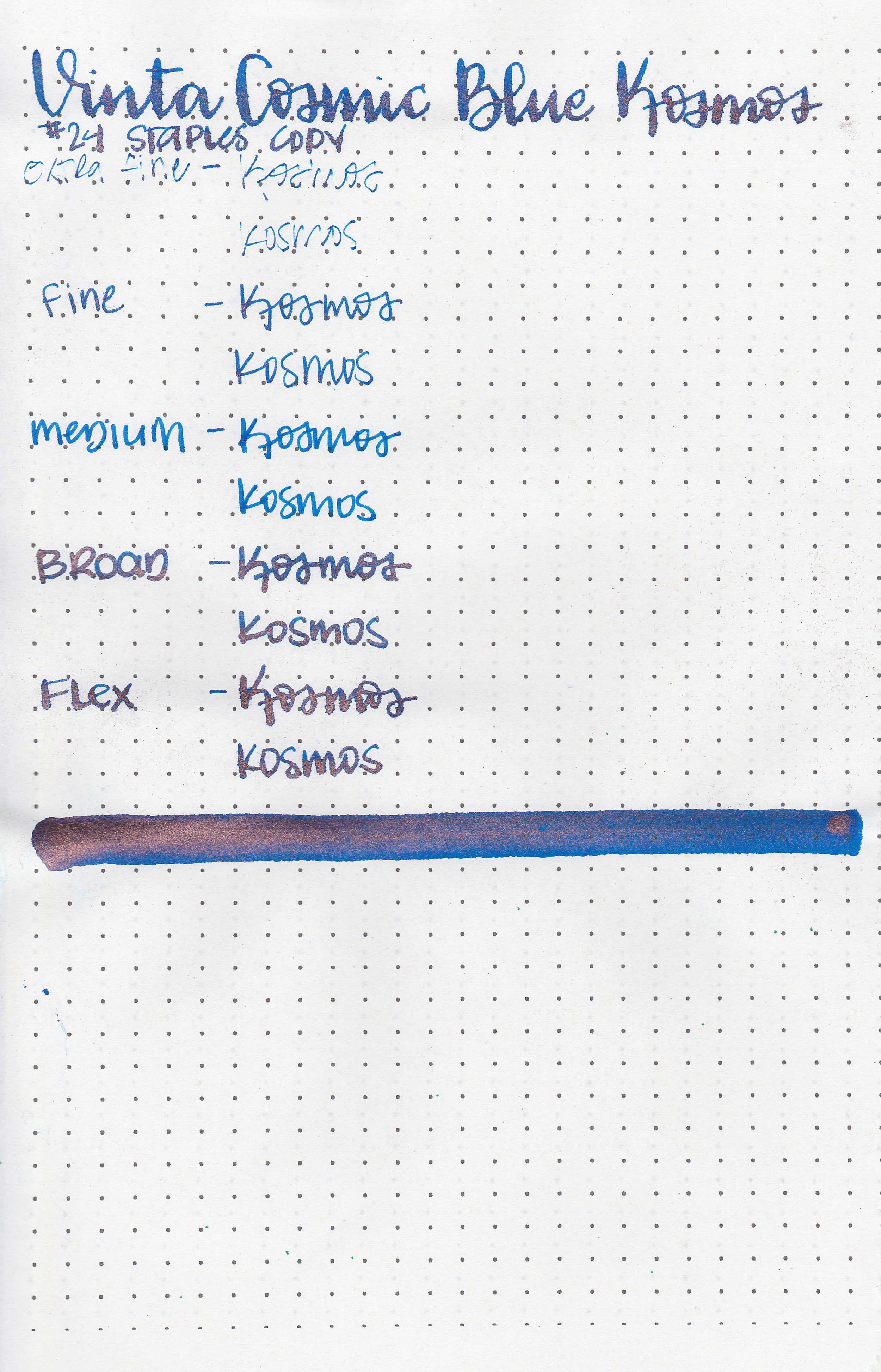
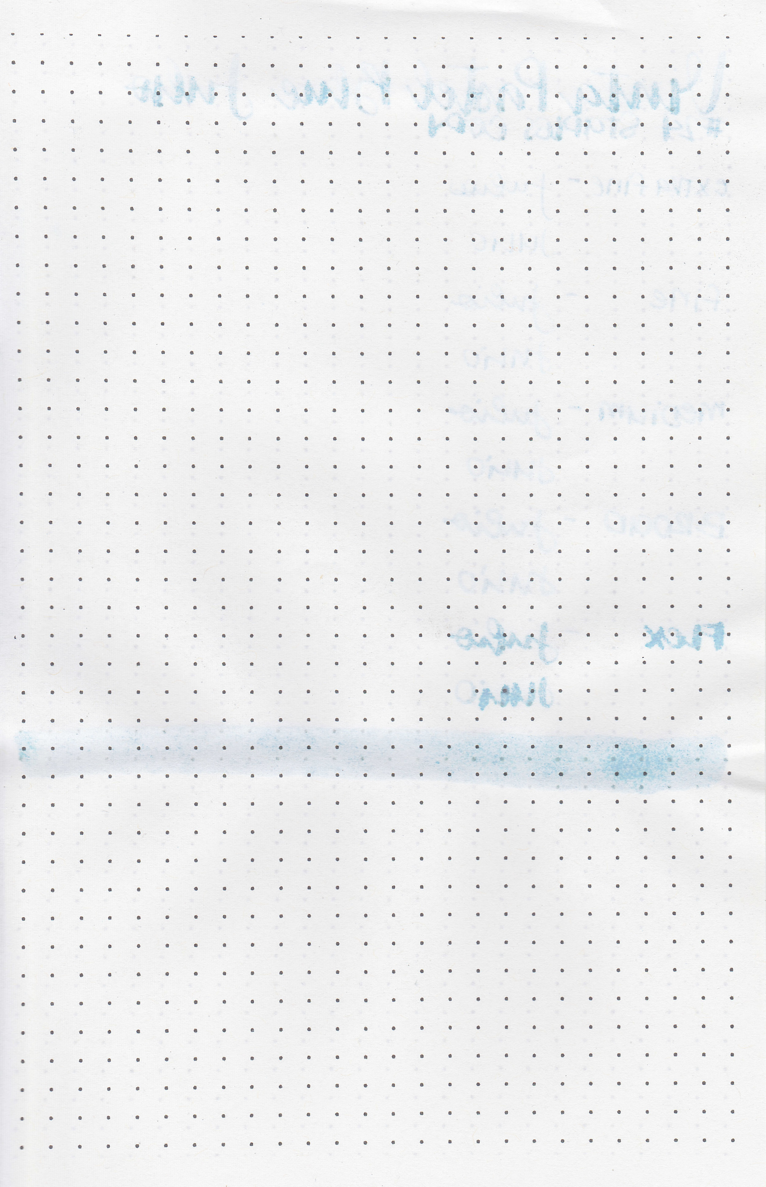
On Staples 24 lb copy paper the ink feathered in all nib sizes and had a little bit of bleeding.
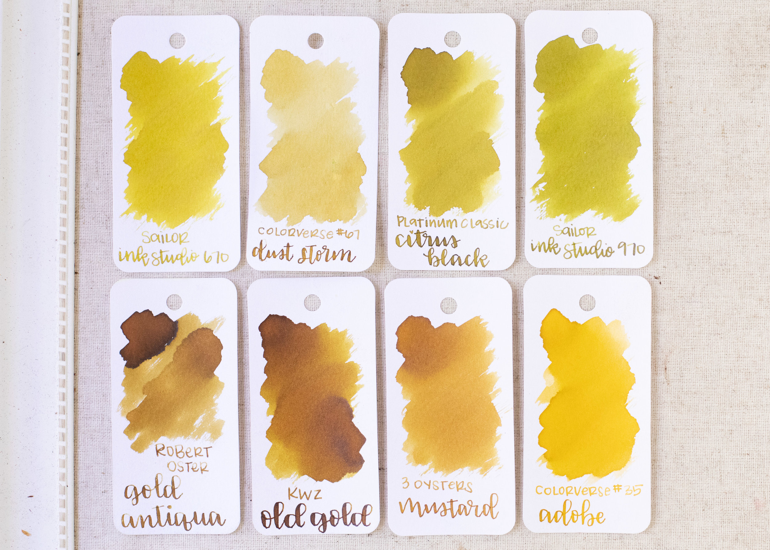
Comparison Swabs:

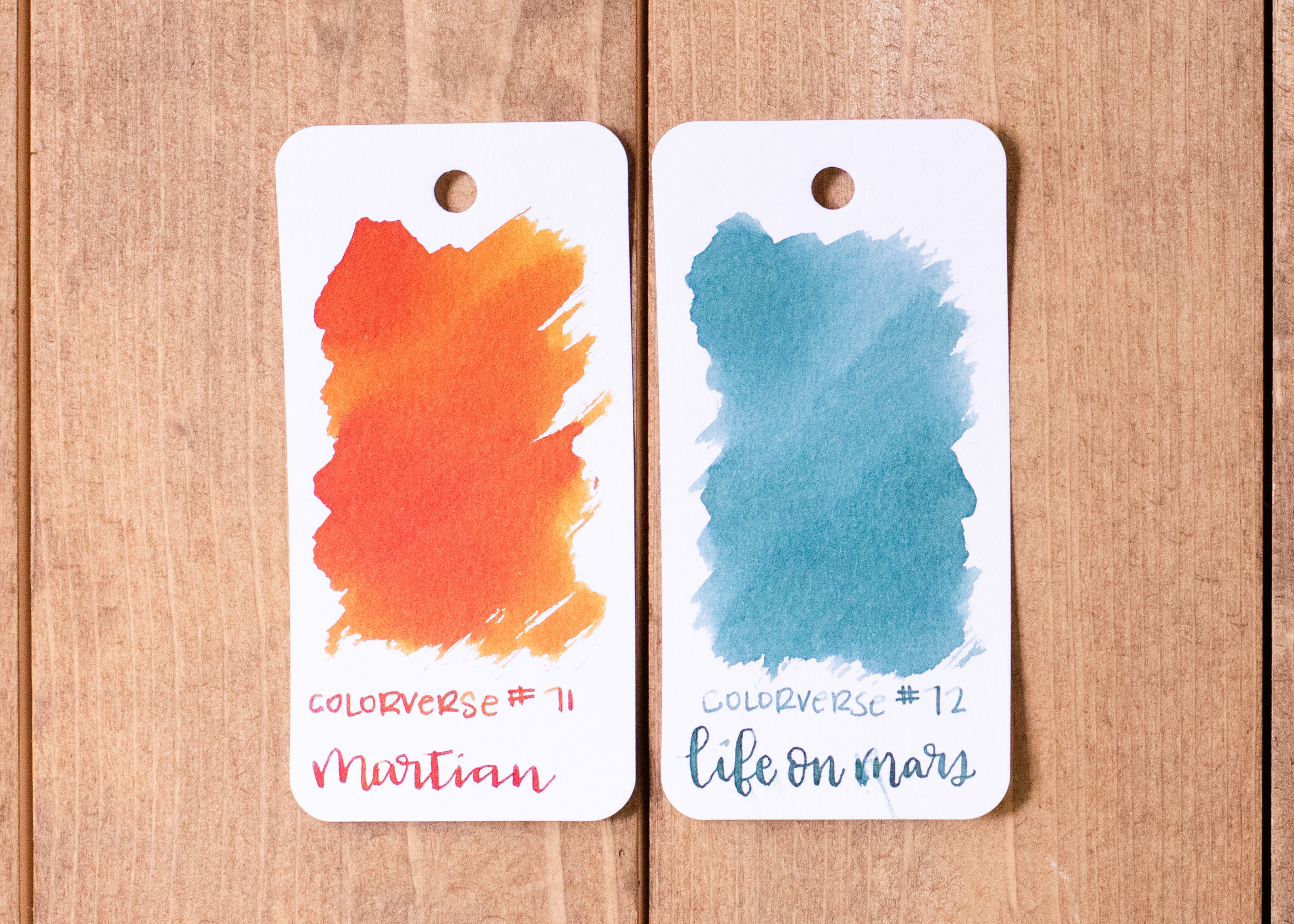
Leyte seems like a darker version of Rohrer and Klingner Alt-Goldgrun. Leyte has a bit more yellow in it than Taccia Uguisu Olive Green but less yellow than Noodler’s Army. Click here to see the Vinta inks together, and click here to see the green inks together.
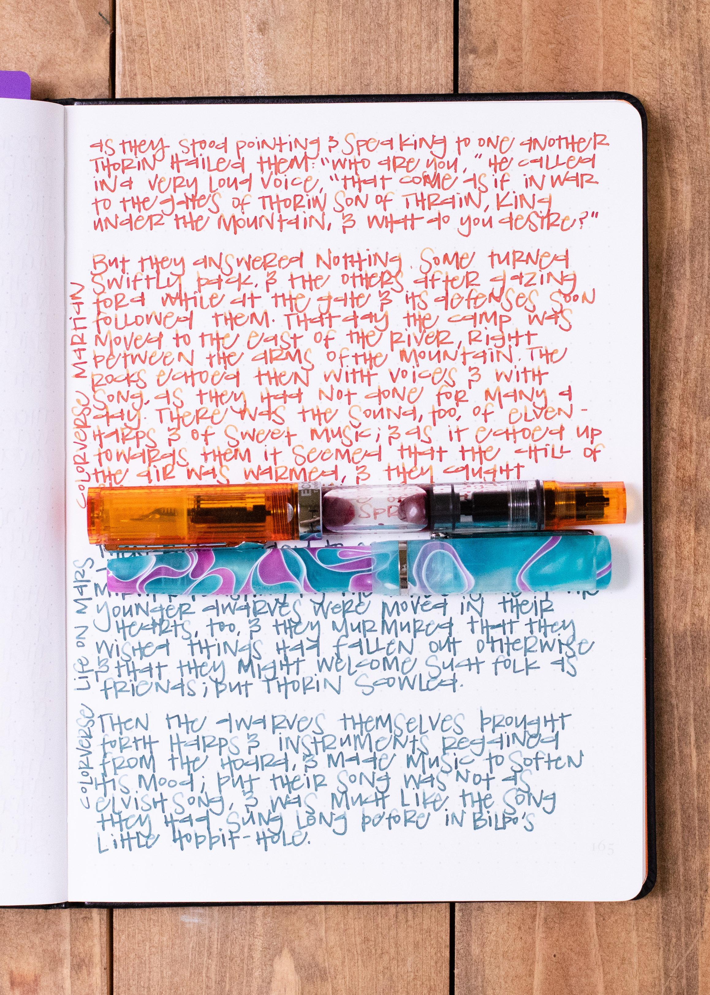
Longer Writing:

I used a Kaweco Sport Sunrise with a broad nib on Tomoe River paper. The ink had an average flow.
Overall, I really enjoy the color of this ink. I love R&K Alt-Goldgrun, and this ink feels similar to that. It performed well for the most part, I just wouldn’t use it in flex nibs.
Disclaimer: A sample of this ink was provided by Vanness Pens for the purpose of this review. All photos and opinions are my own. This page does not contain affiliate links, and this post is not sponsored in any way.