Ink Review #965: Kyo-iro #01 Stone Road of Gion
/
I received a sample of Kyo-iro #01 Stone Road of Gion in a sample swab a year ago, but never got around to playing with it, so let’s try it out. You can purchase this ink at Pen Chalet.

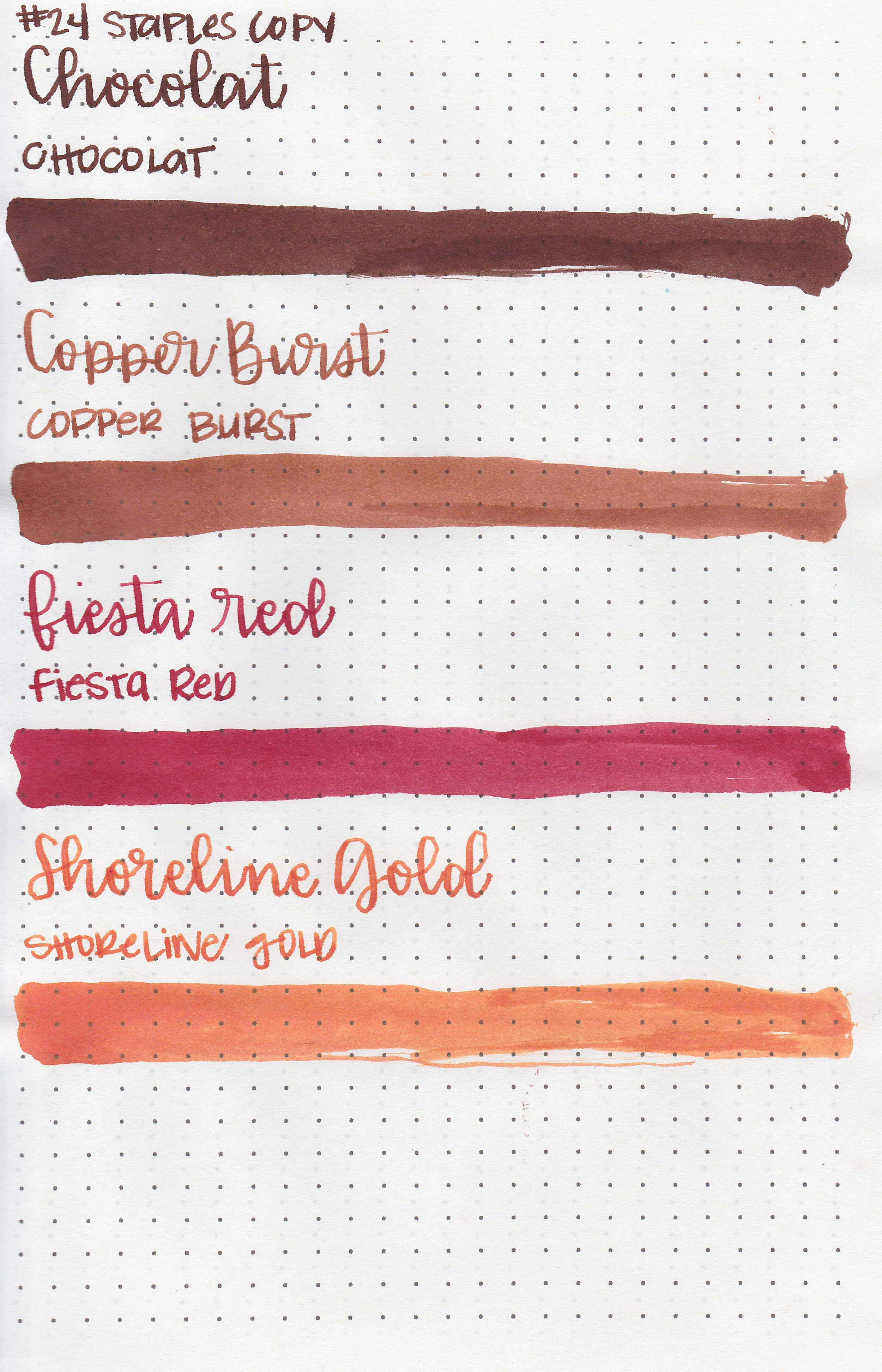
The color:
Stone Road is a cool-tone medium brown. I really enjoy this color, I find it a more appropriate color in the winter when I want all the cool tones.
Swabs:

In large swabs on Tomoe River paper the ink shows off some of its pretty shading. The more ink there is the cooler in tone it appears.

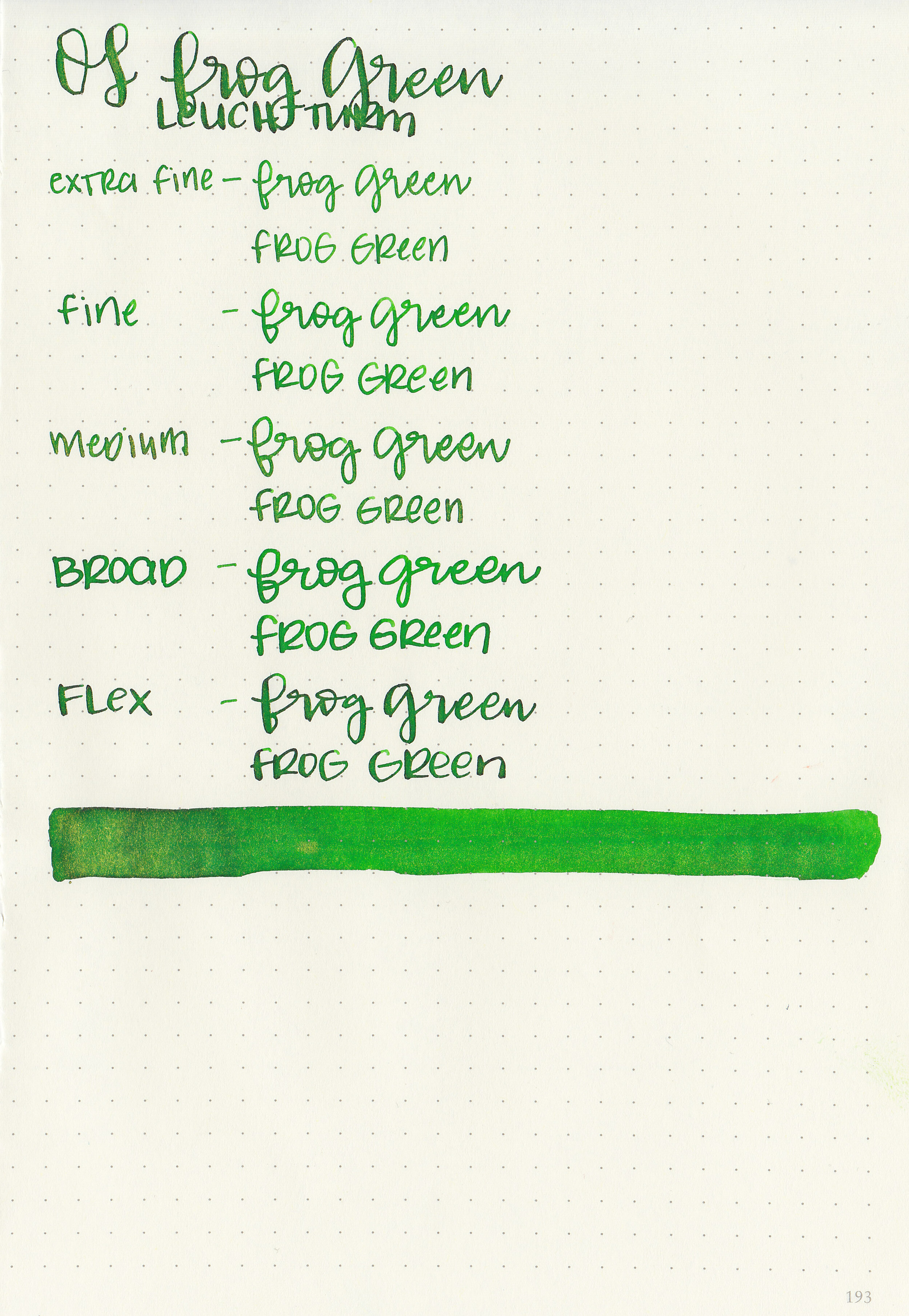
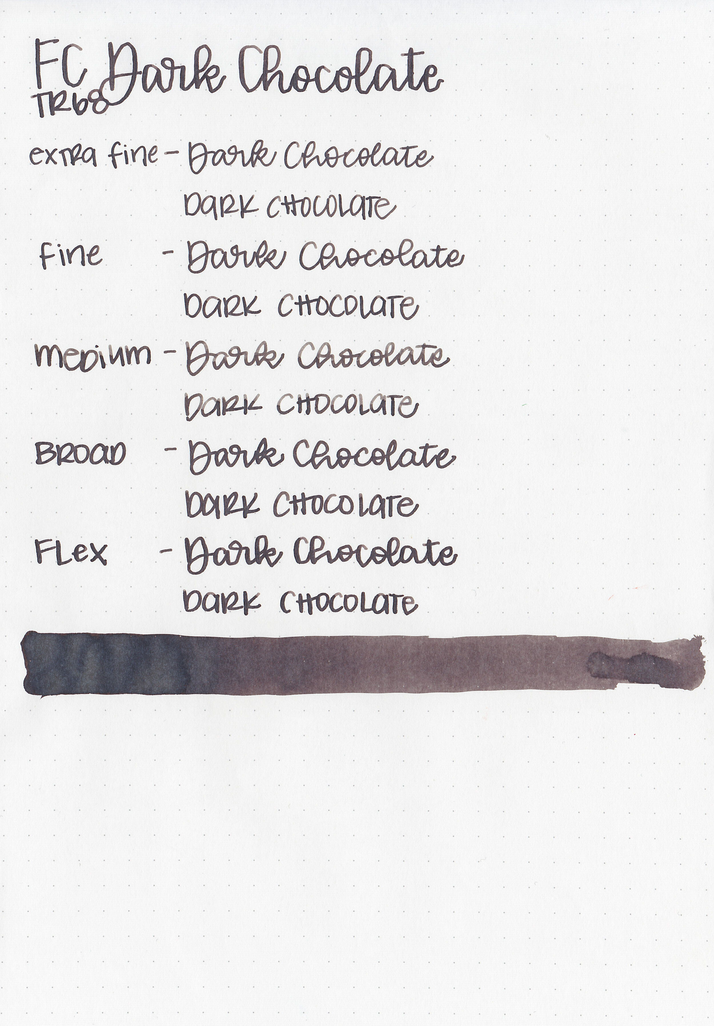
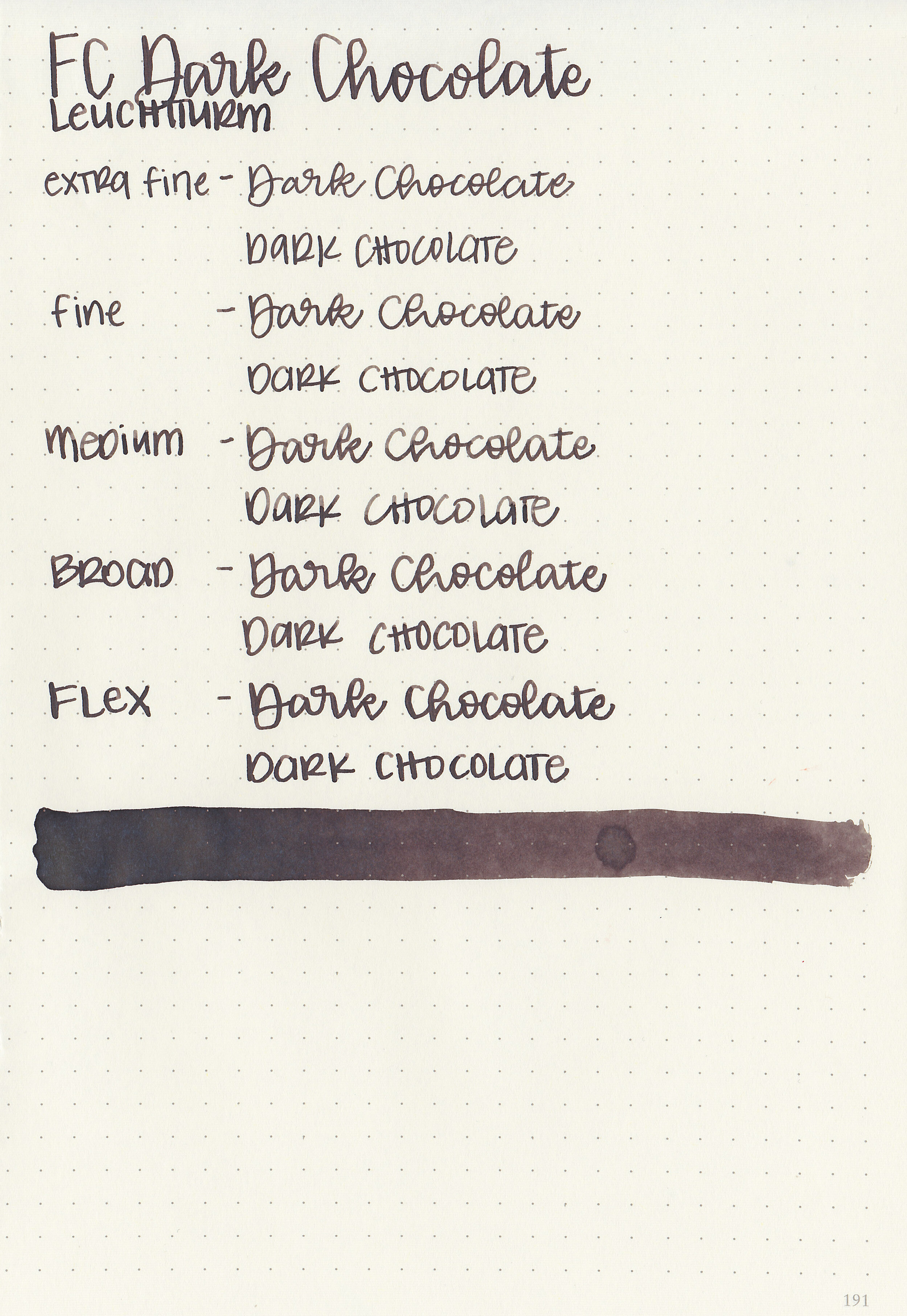
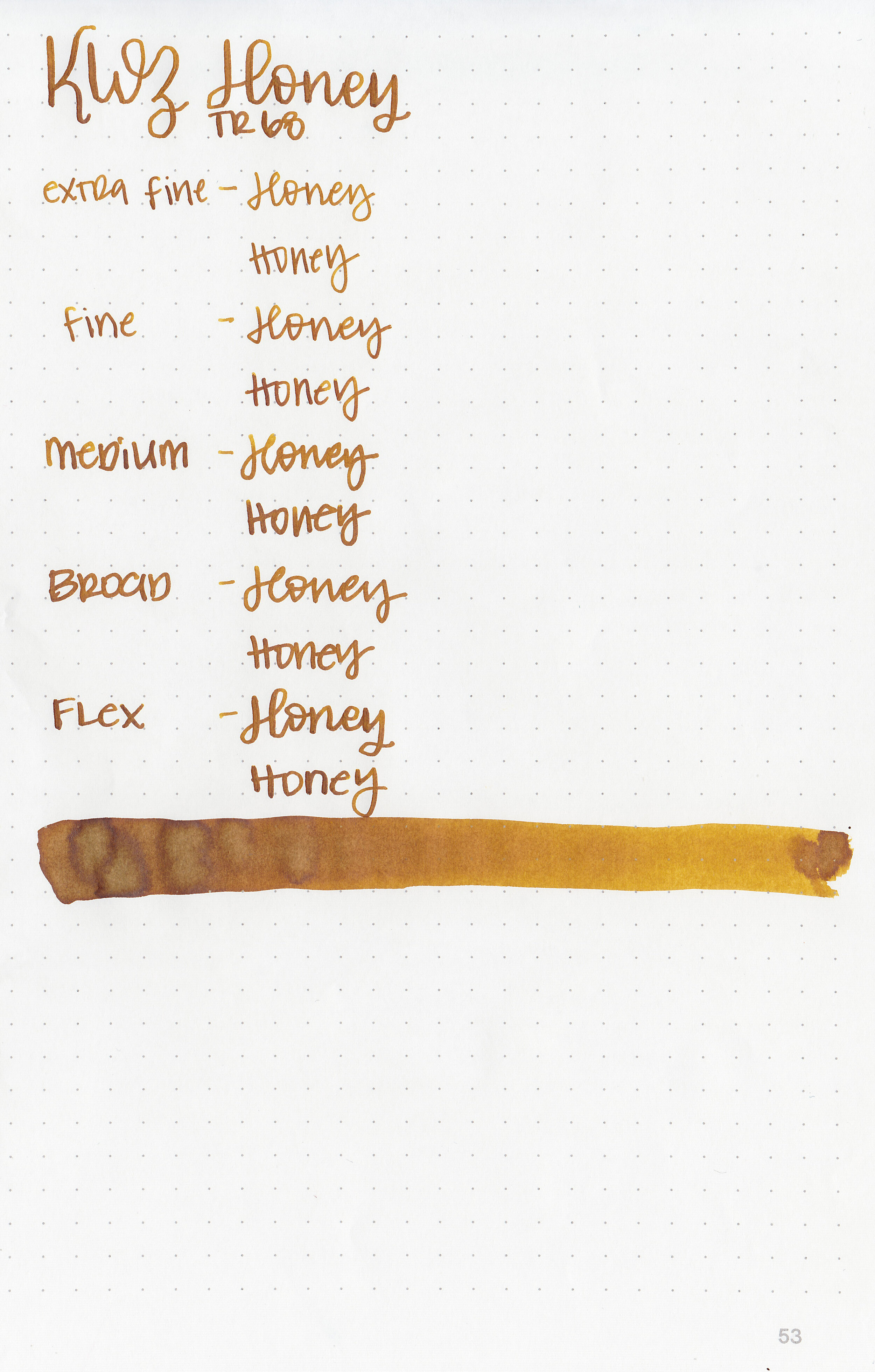
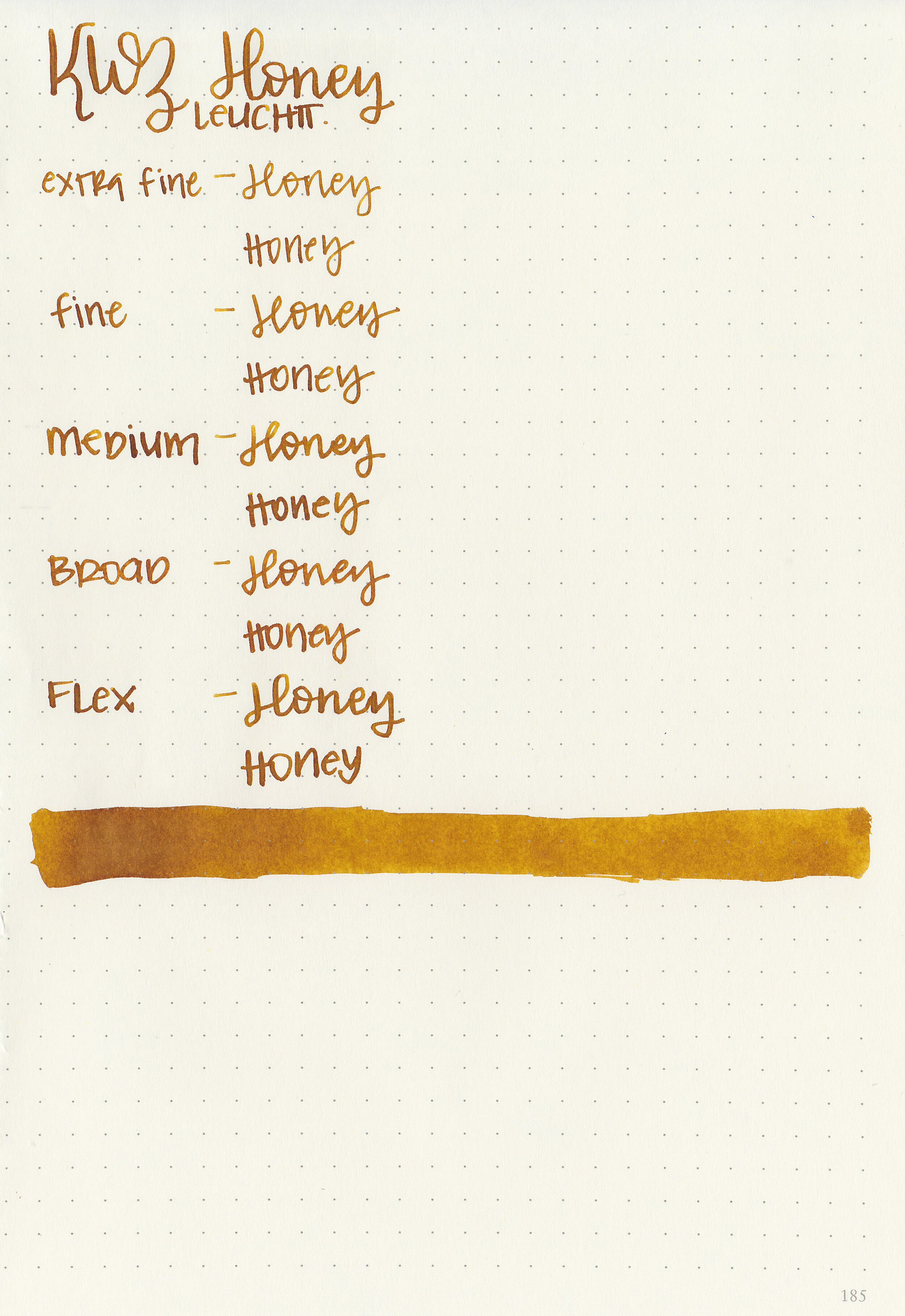
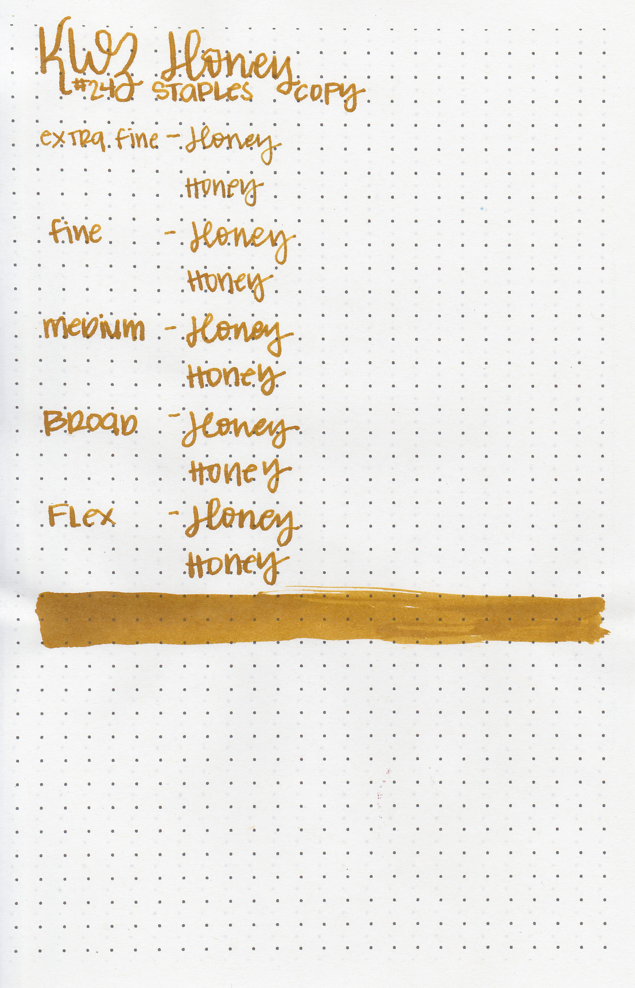
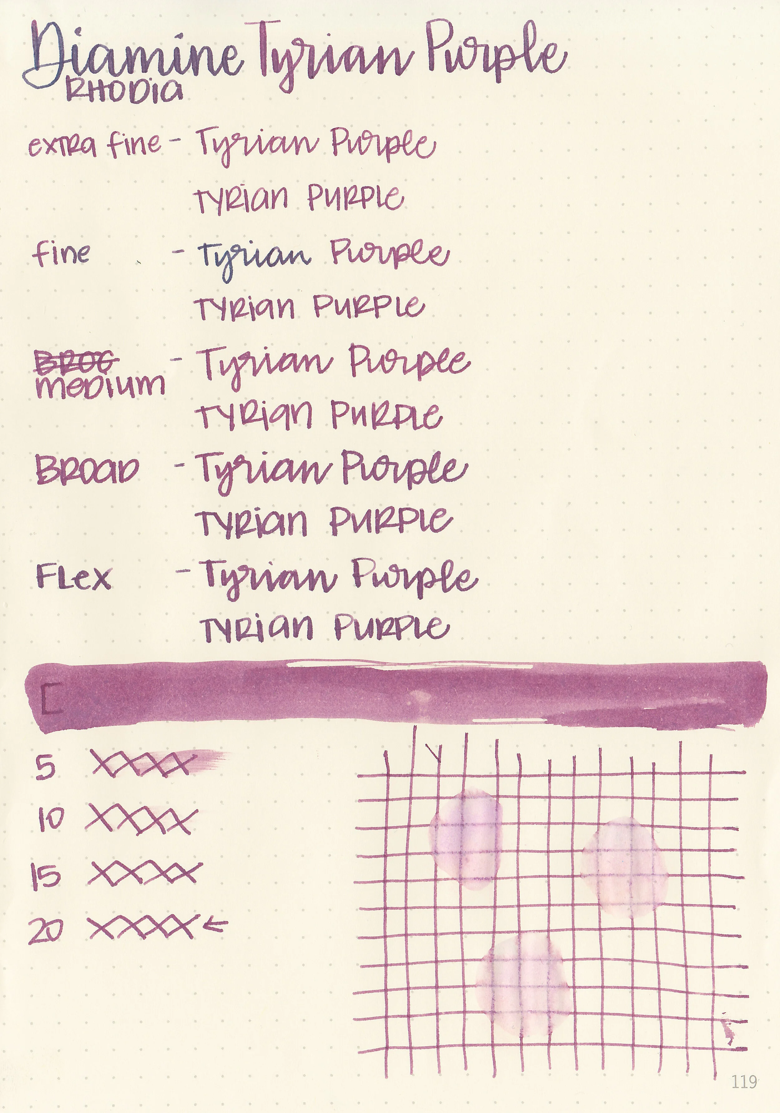
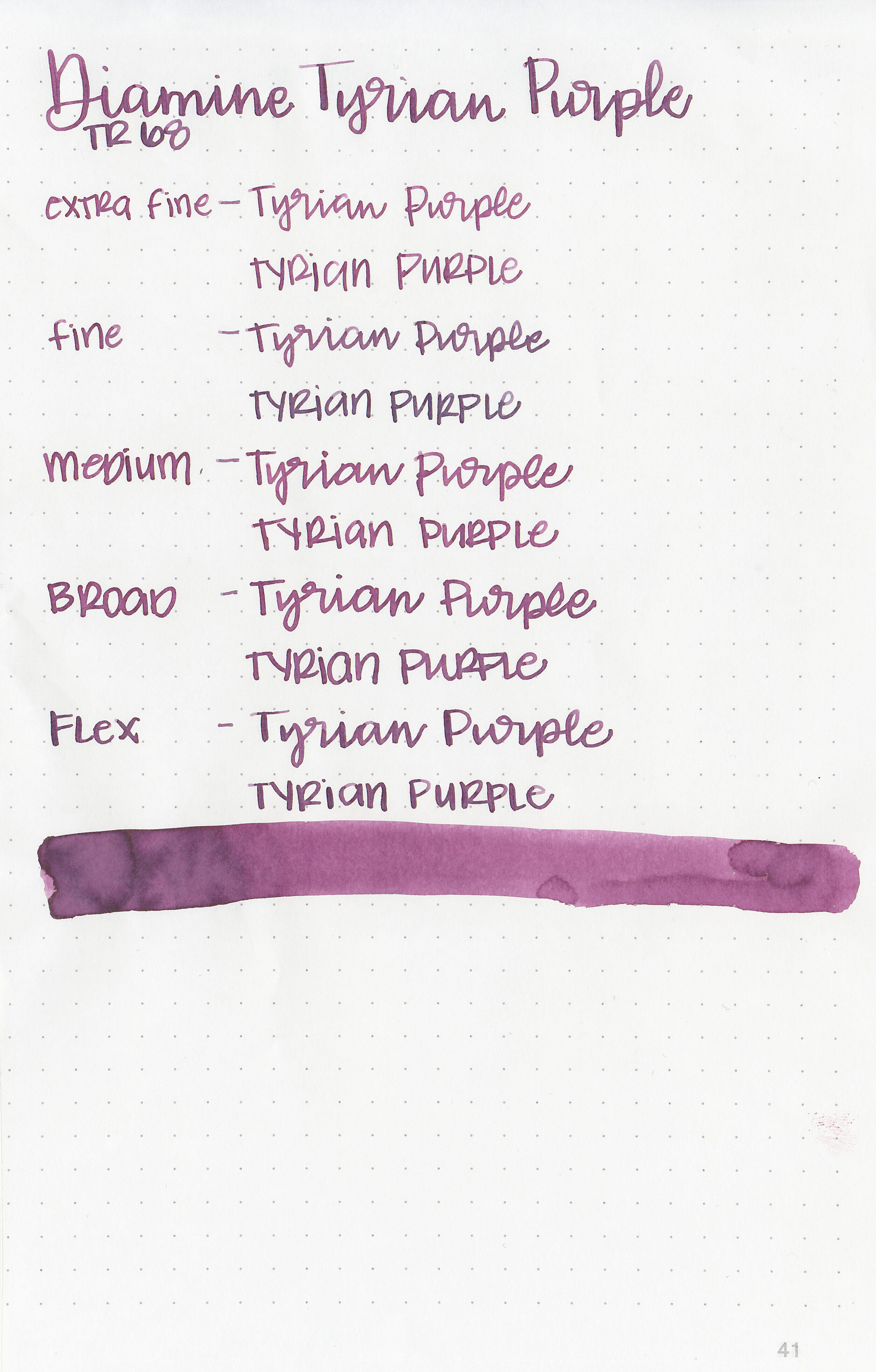
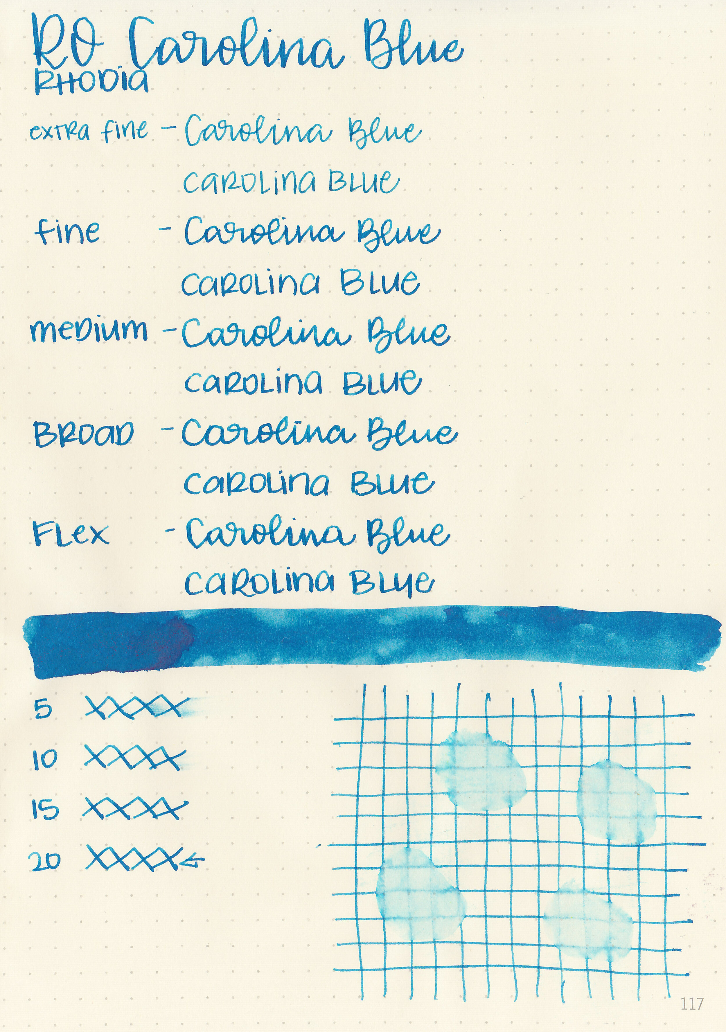
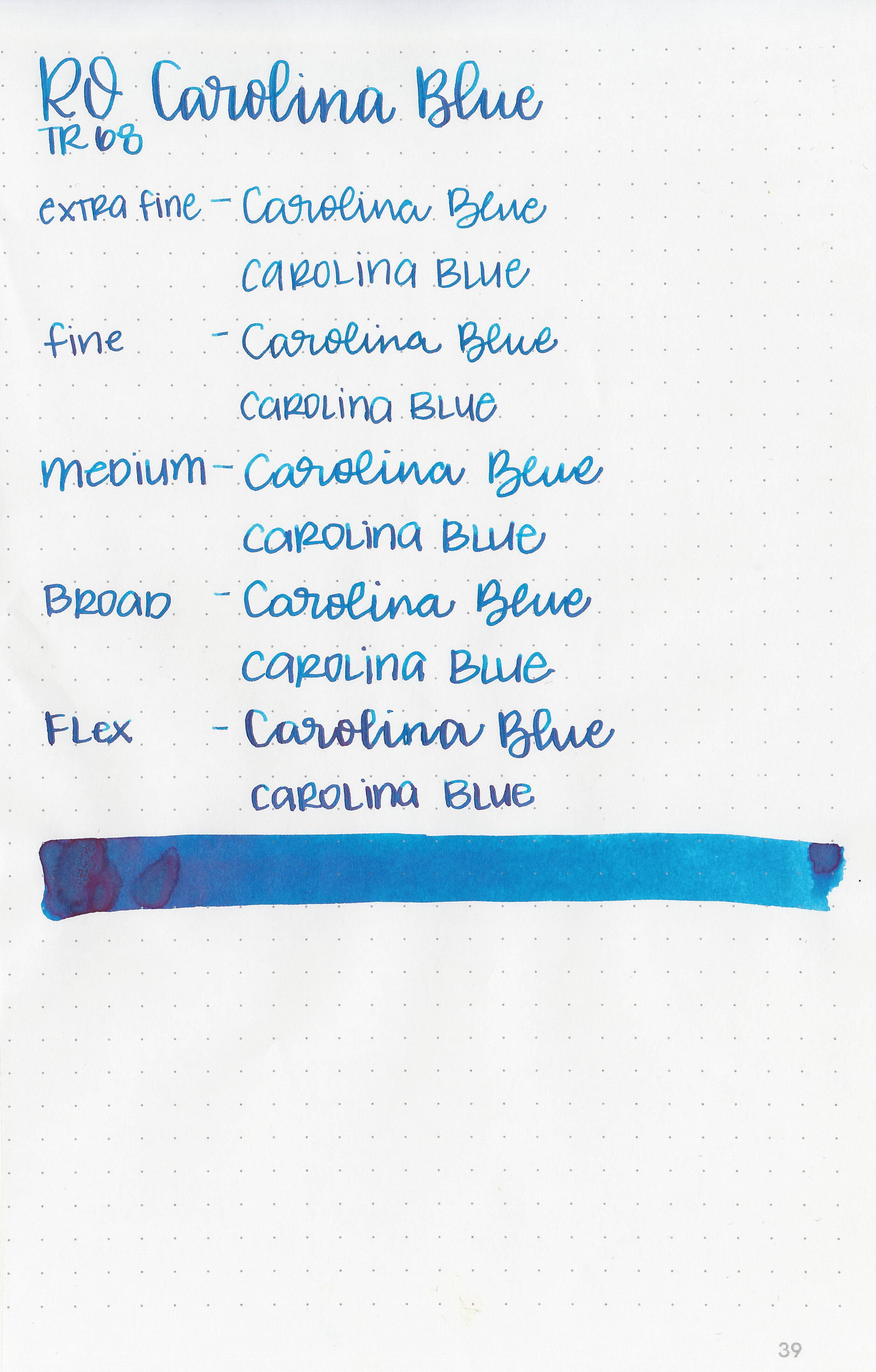
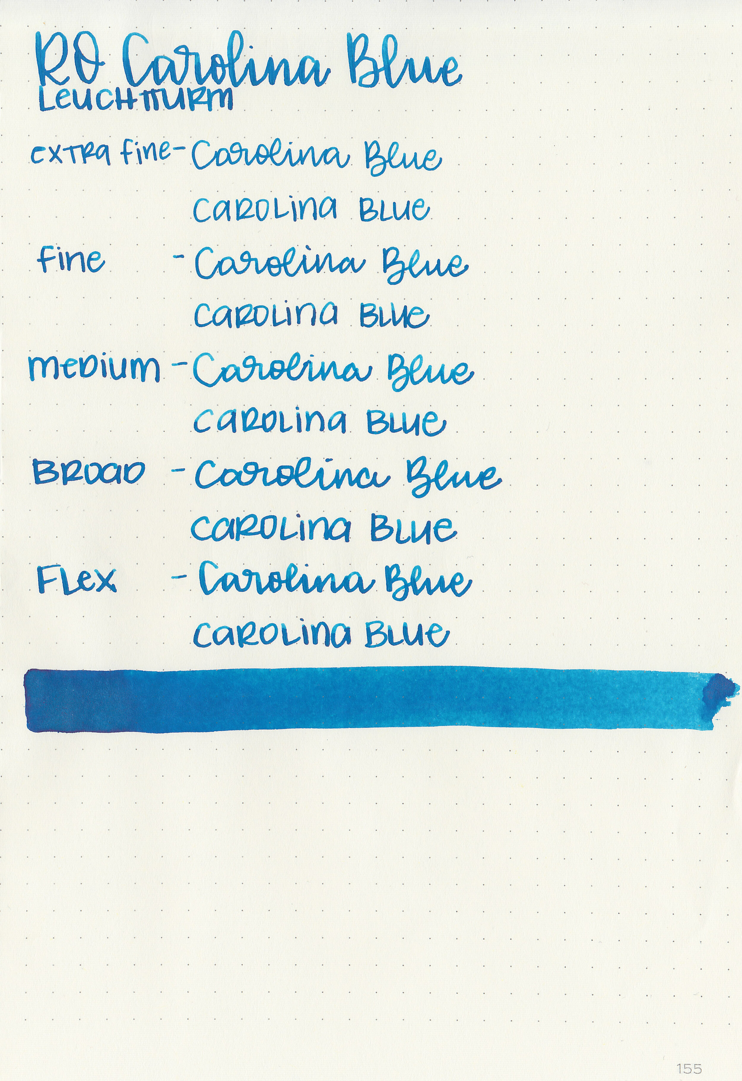
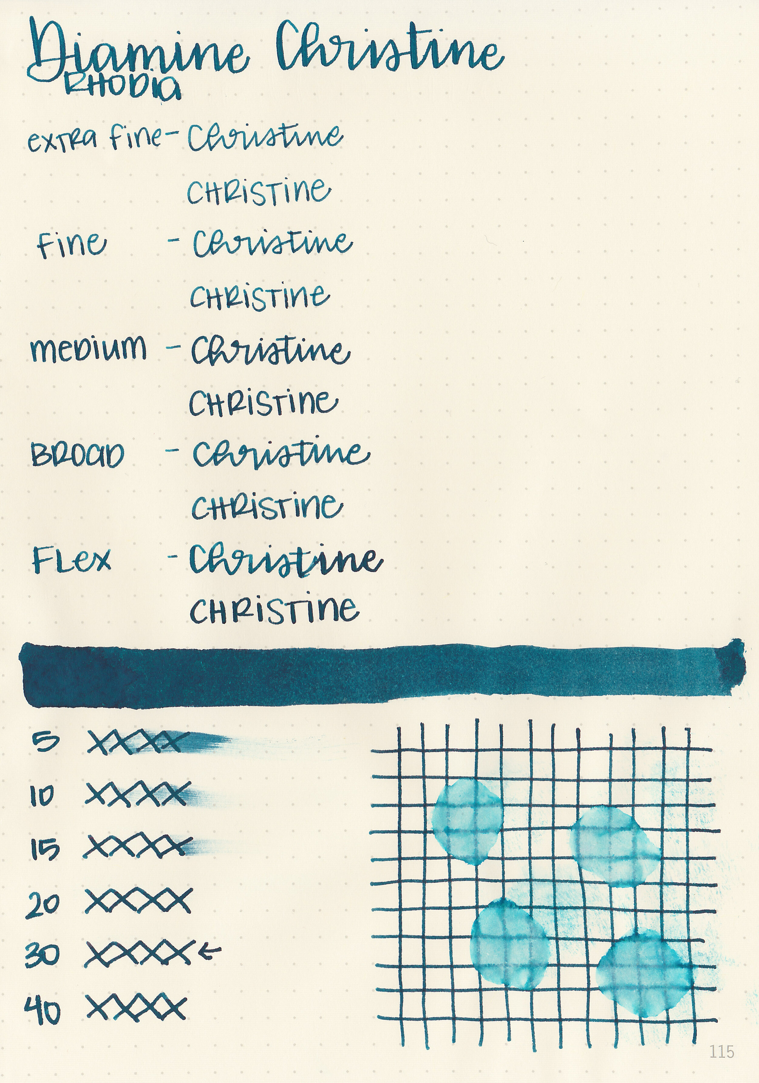
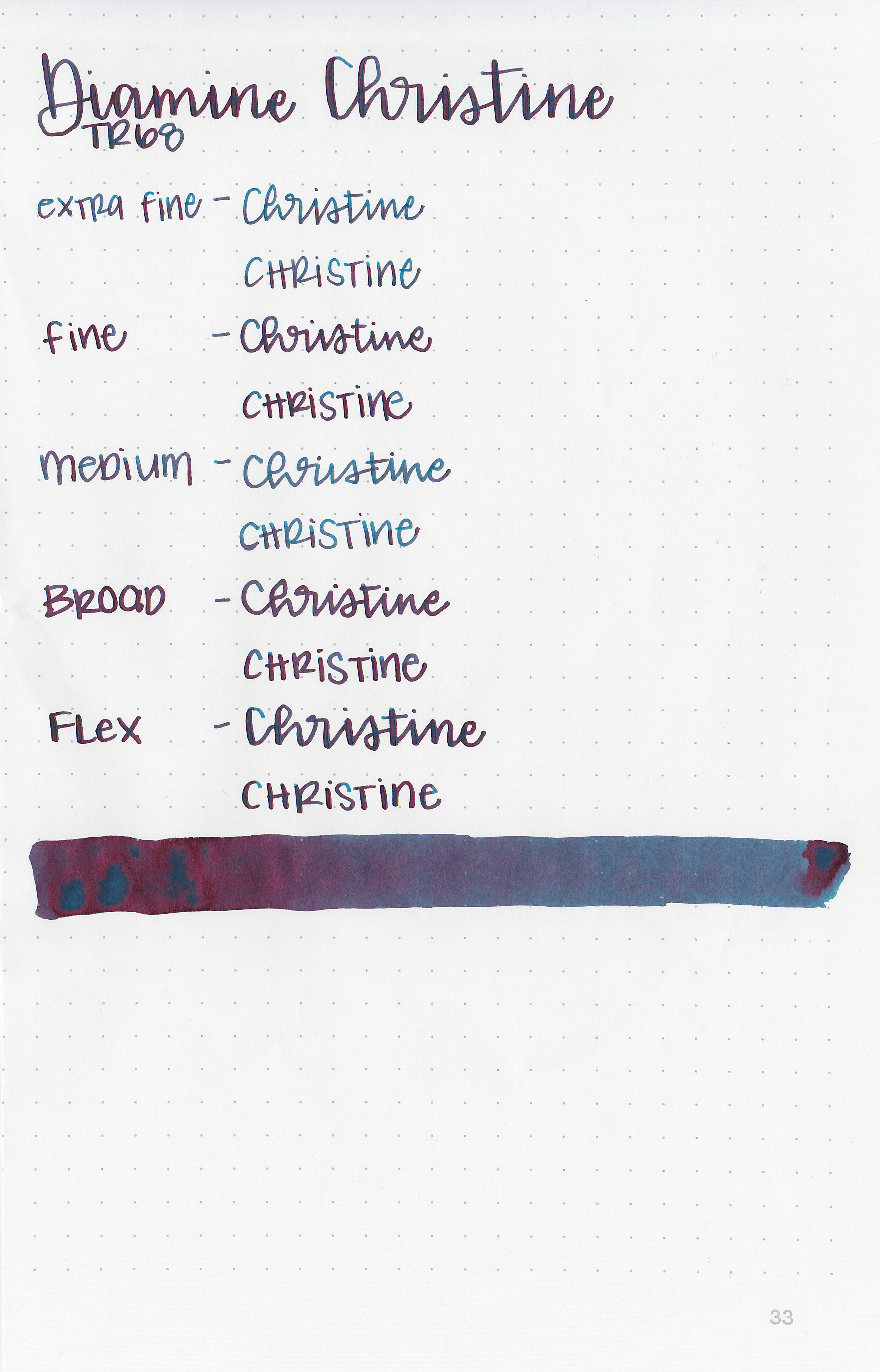
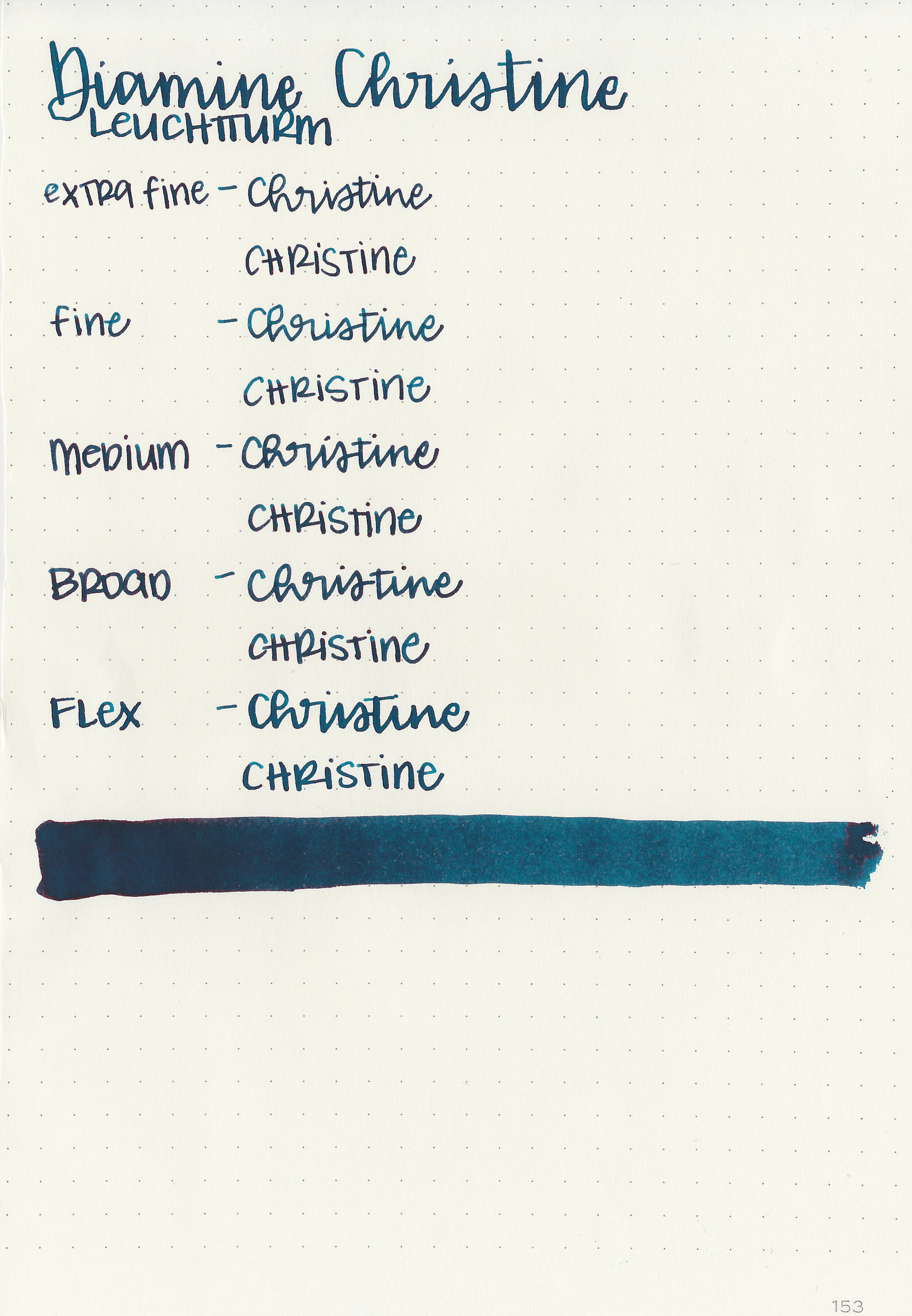
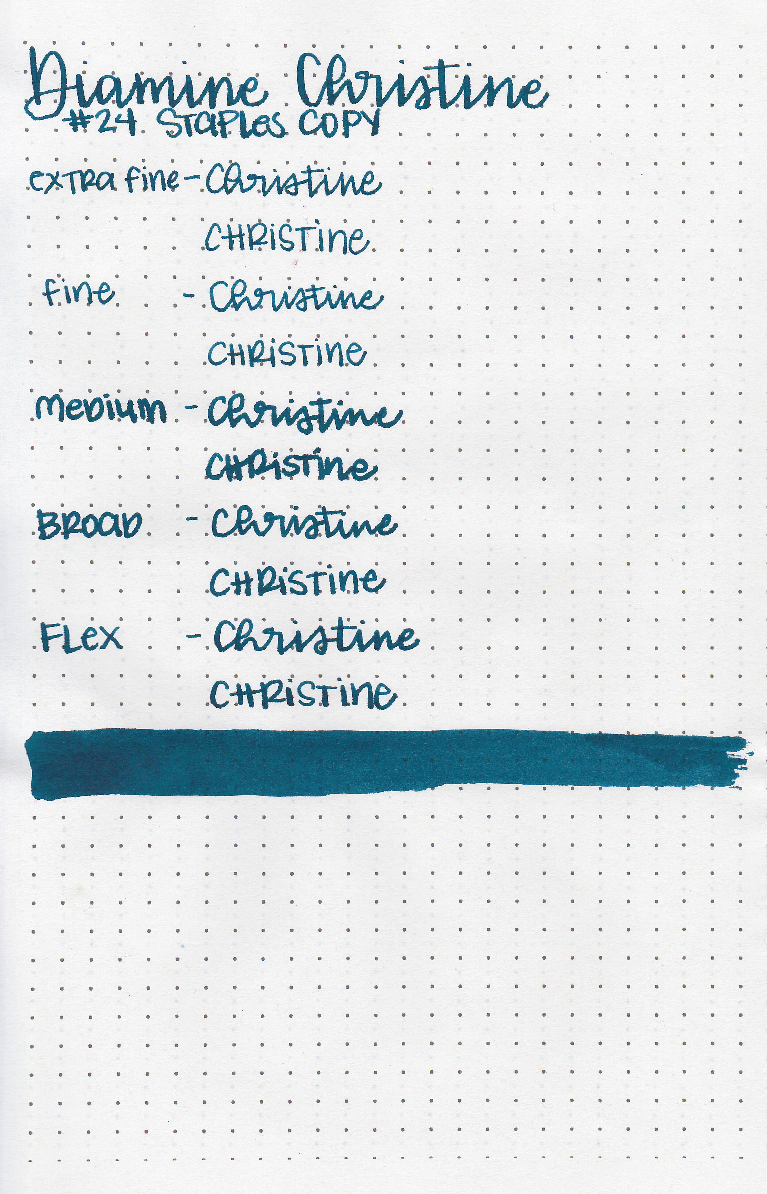
Writing samples:
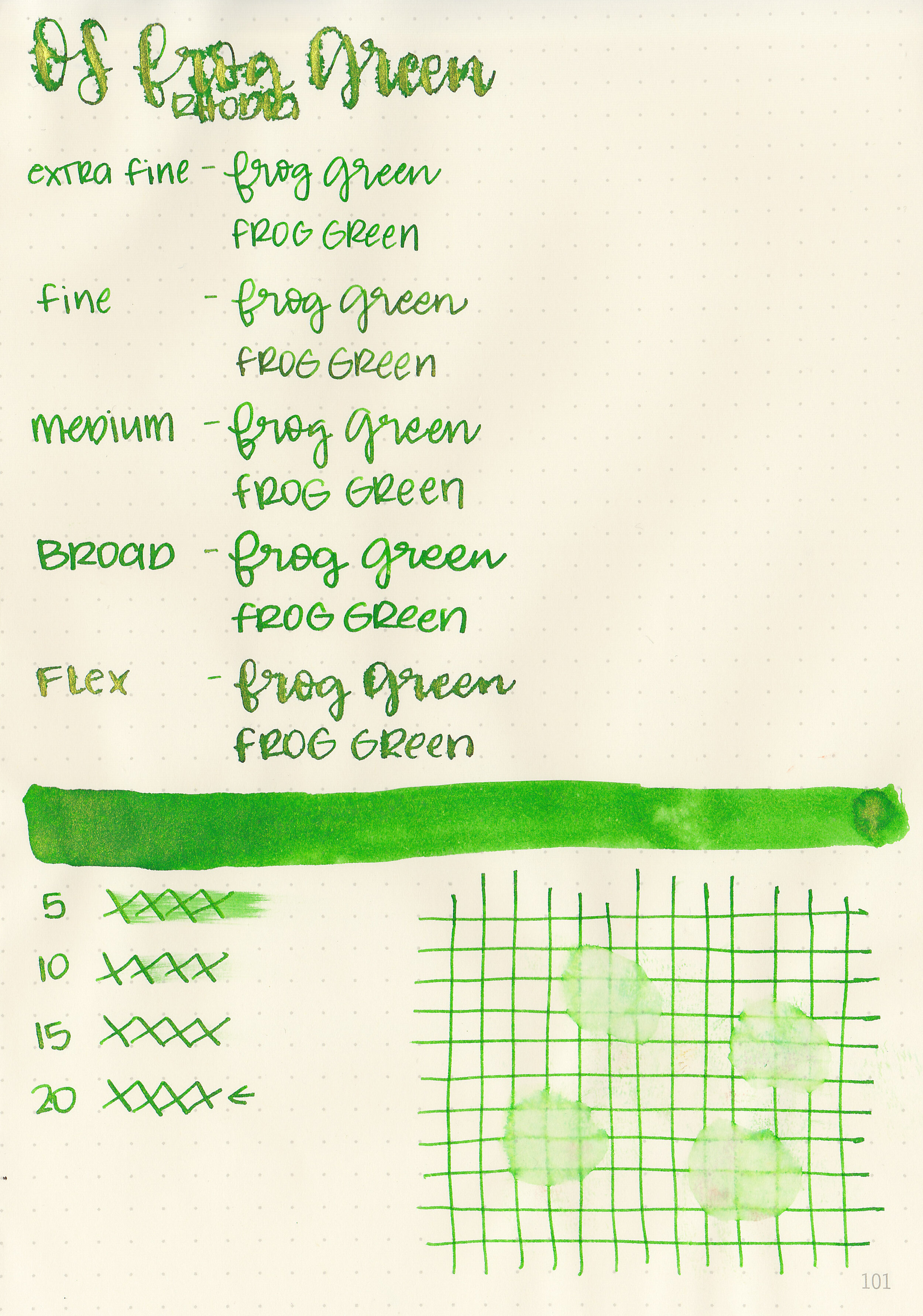
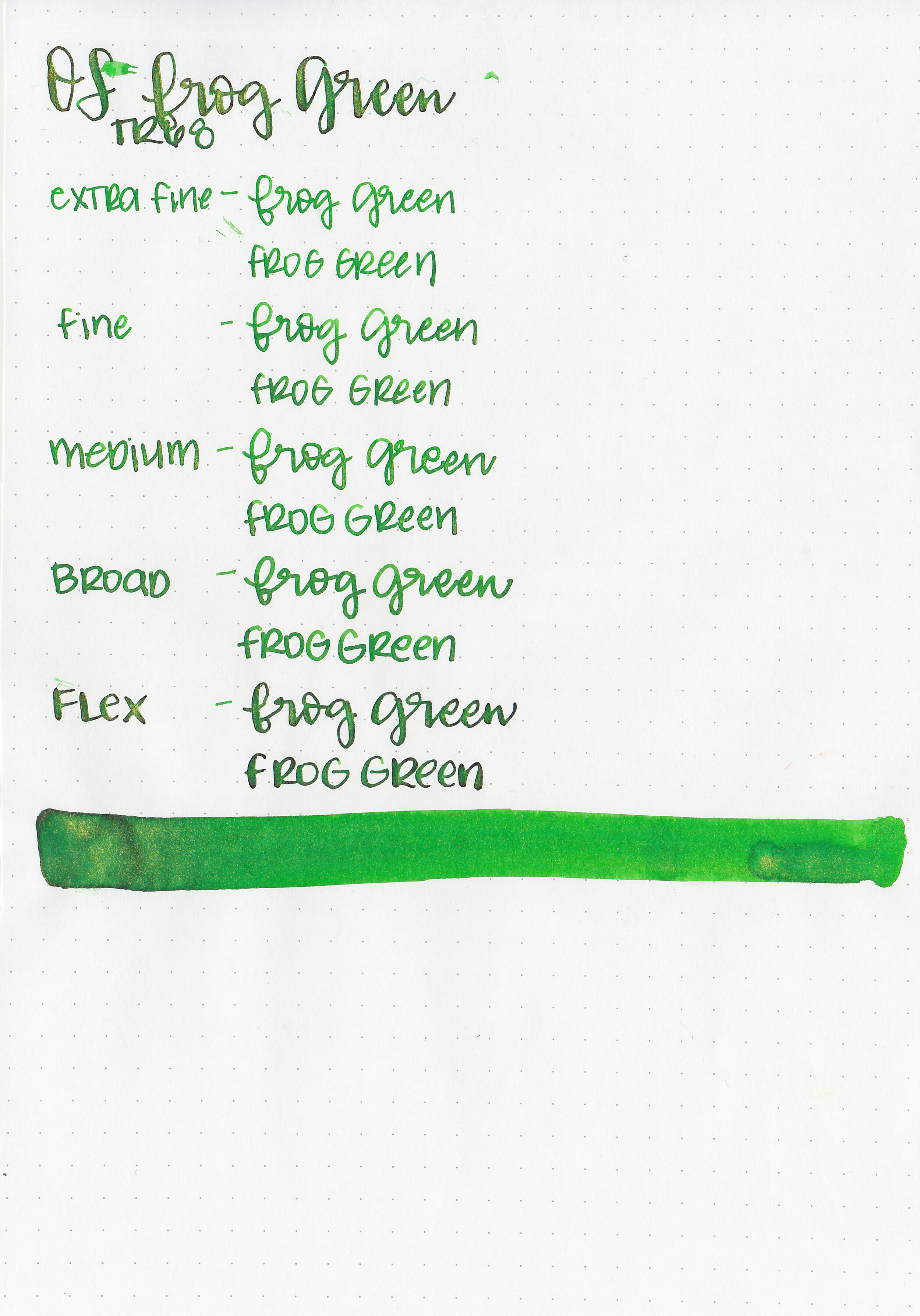
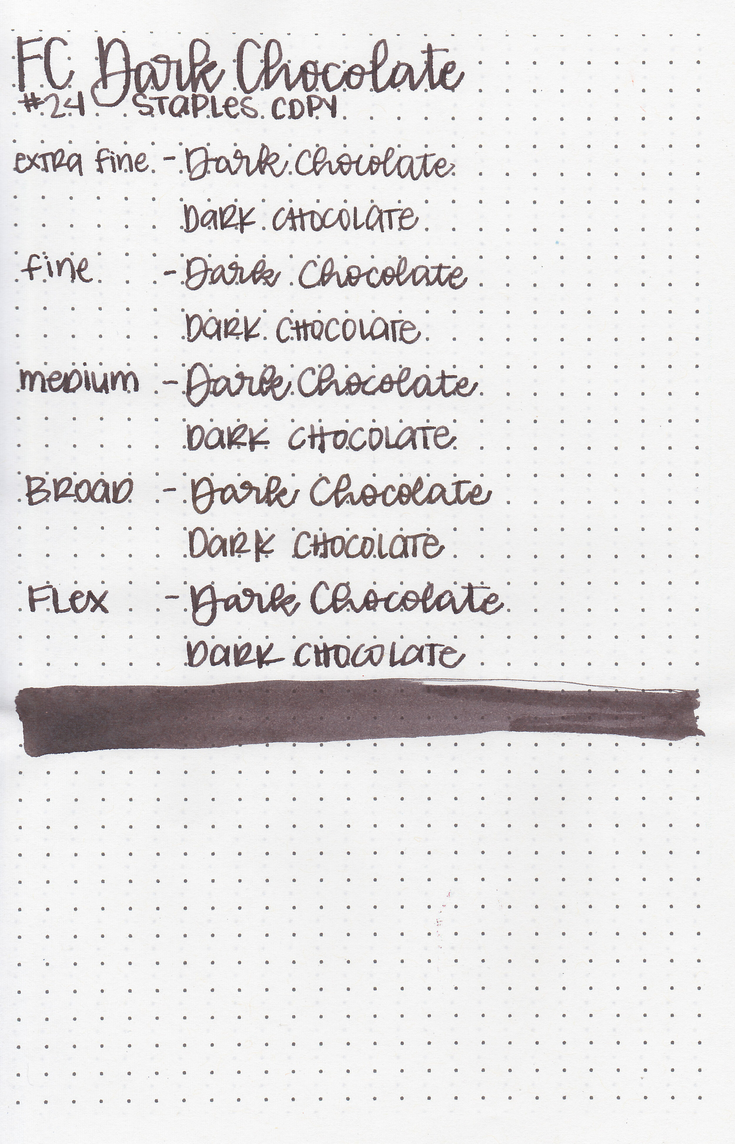
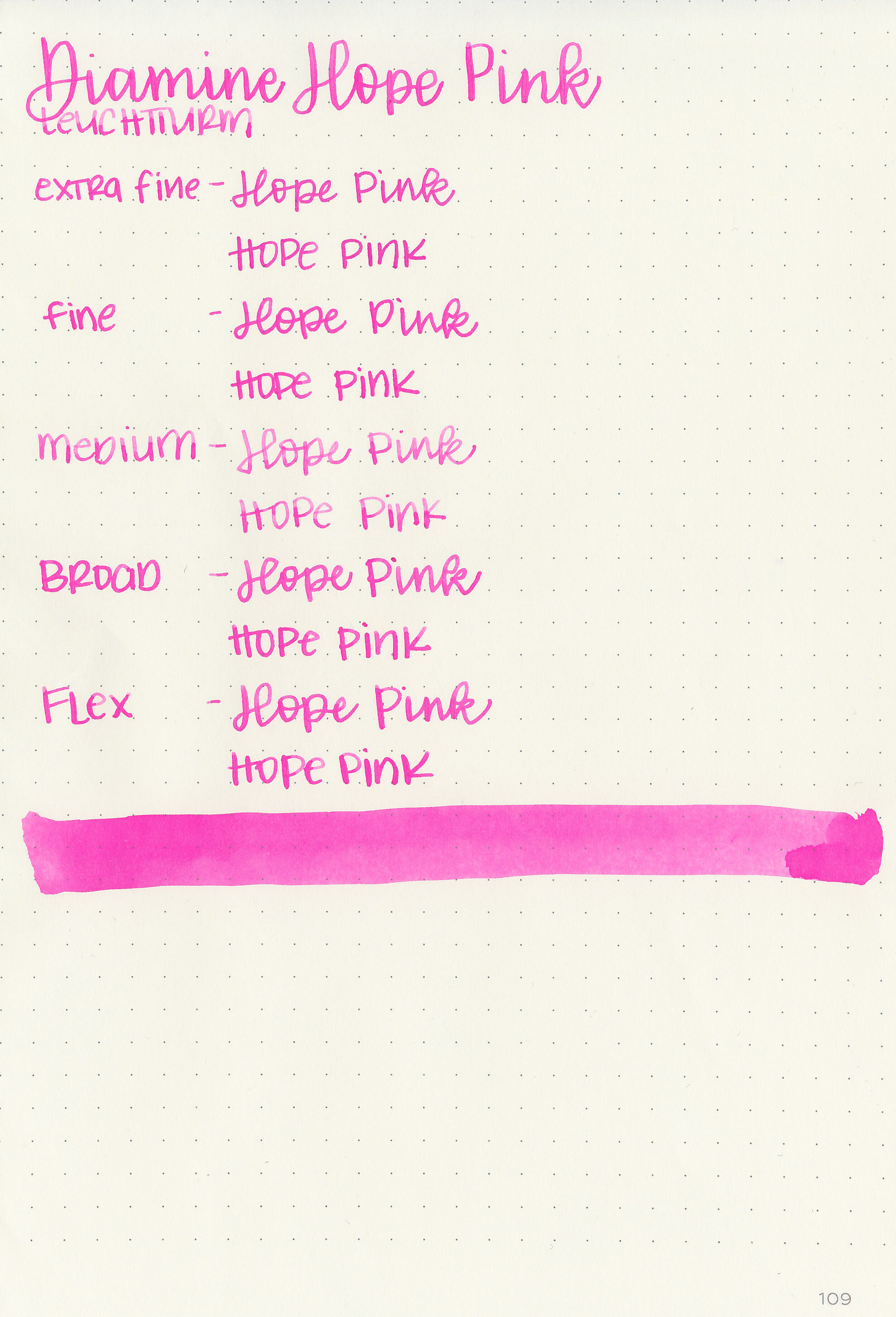
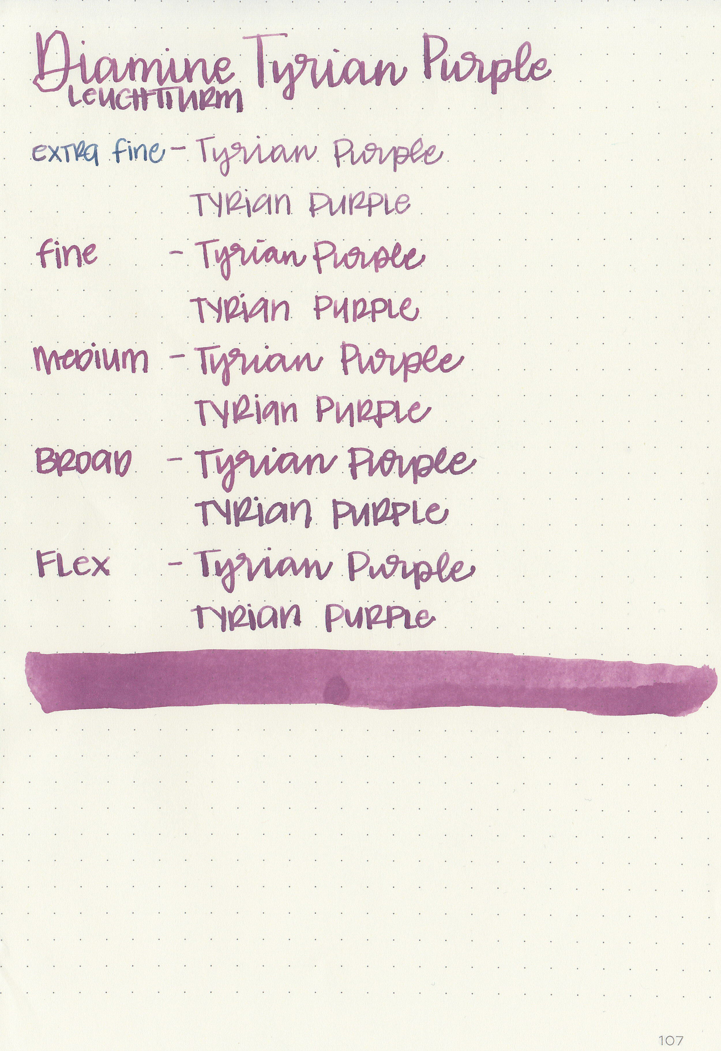
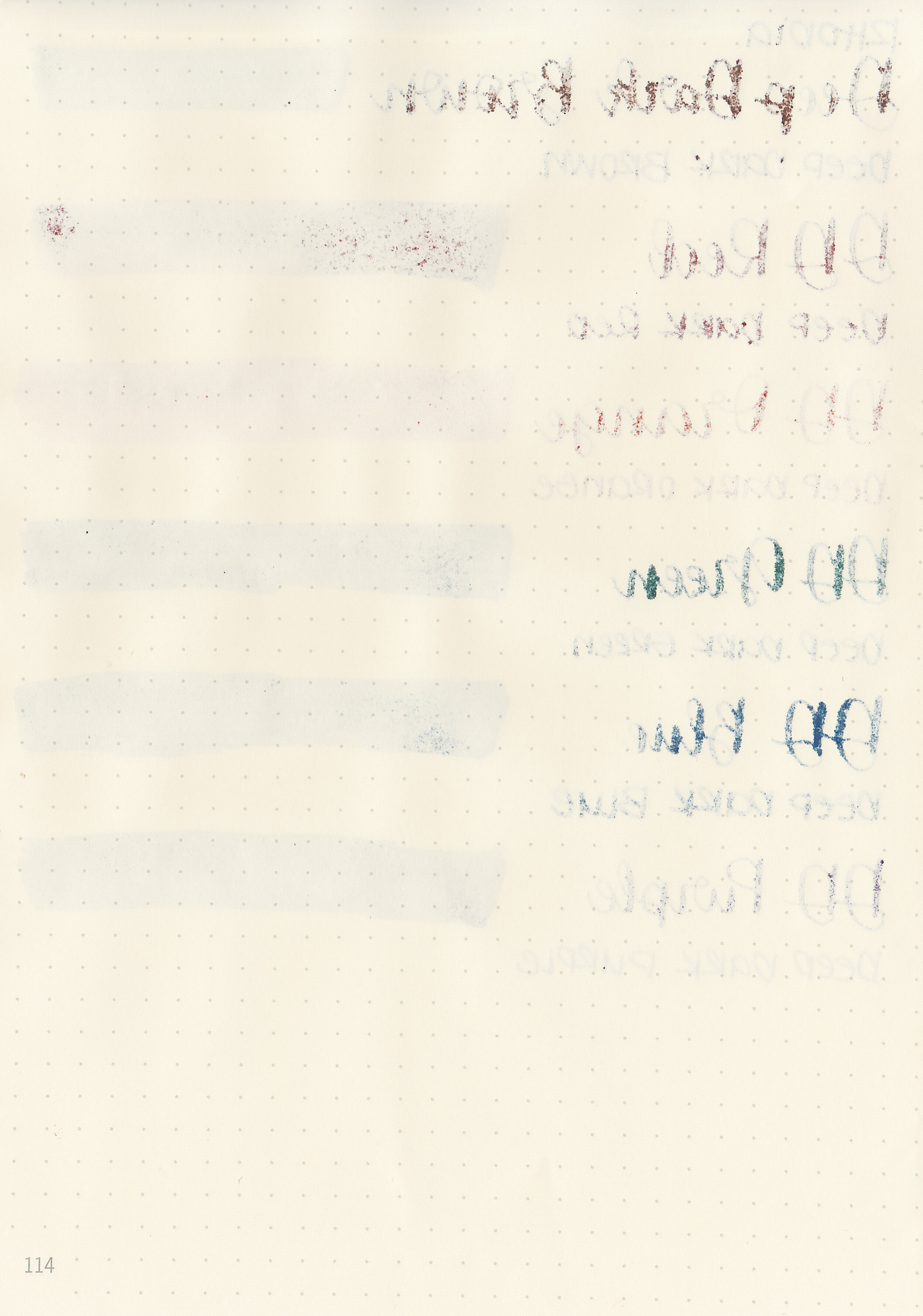
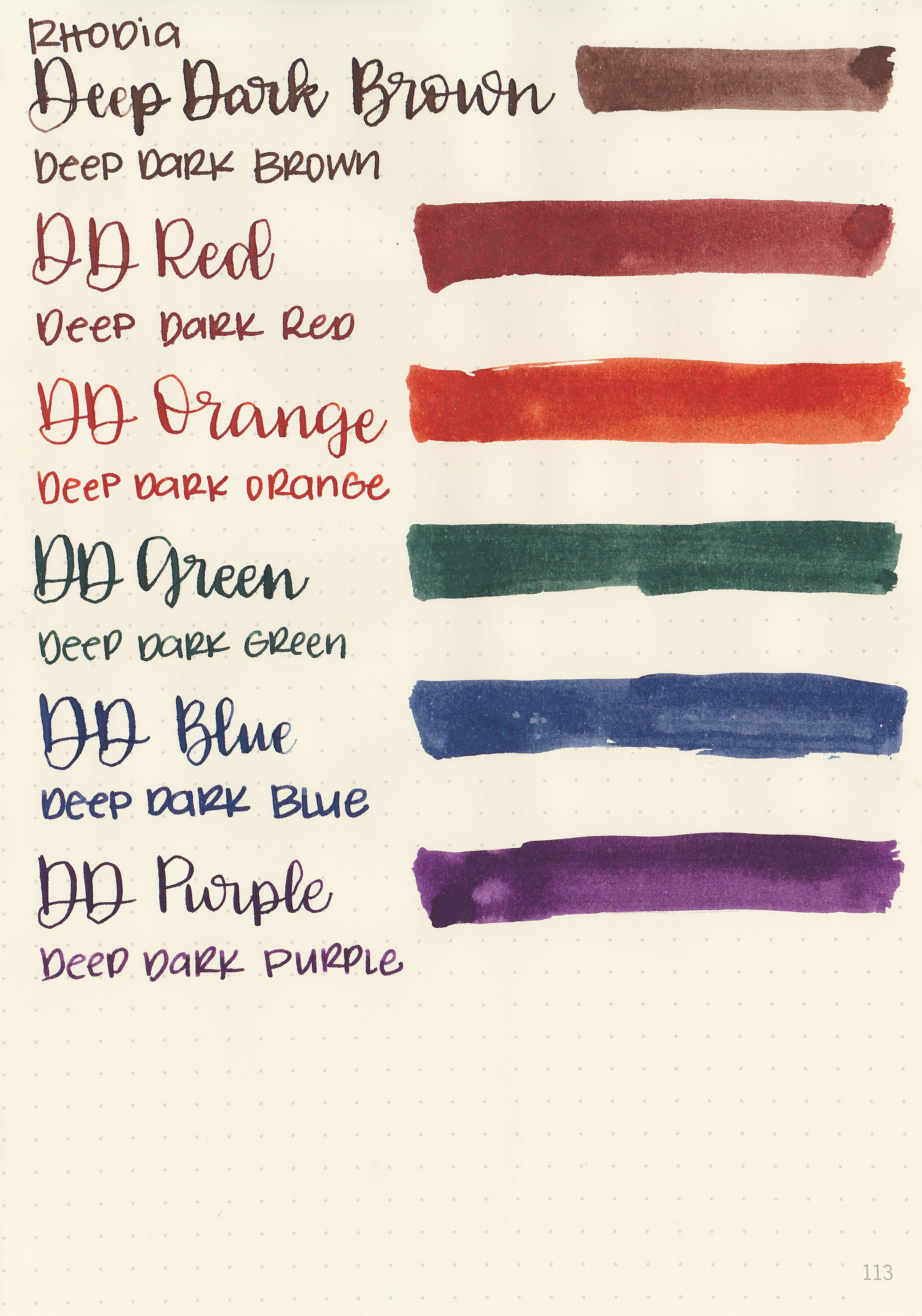
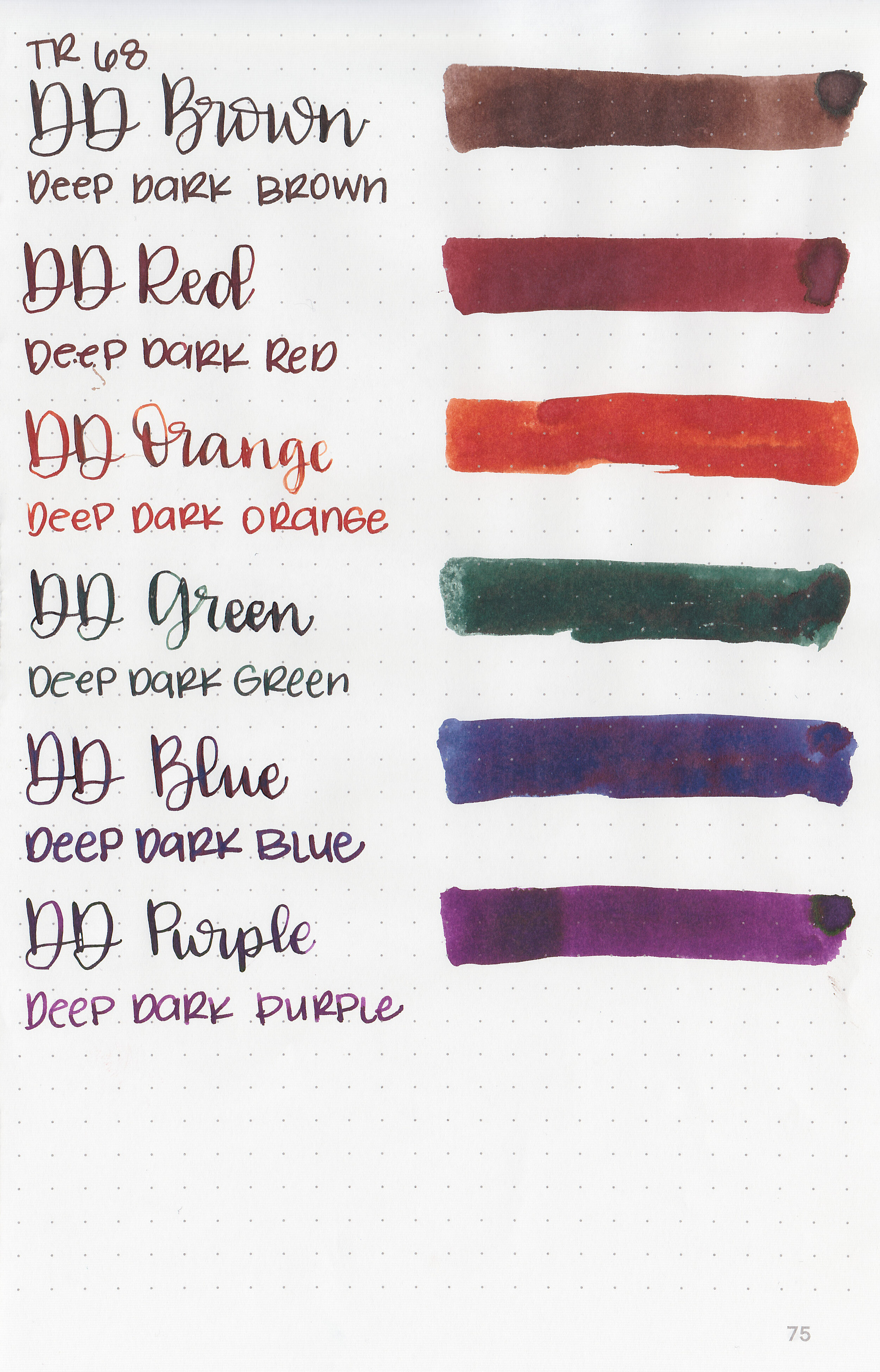
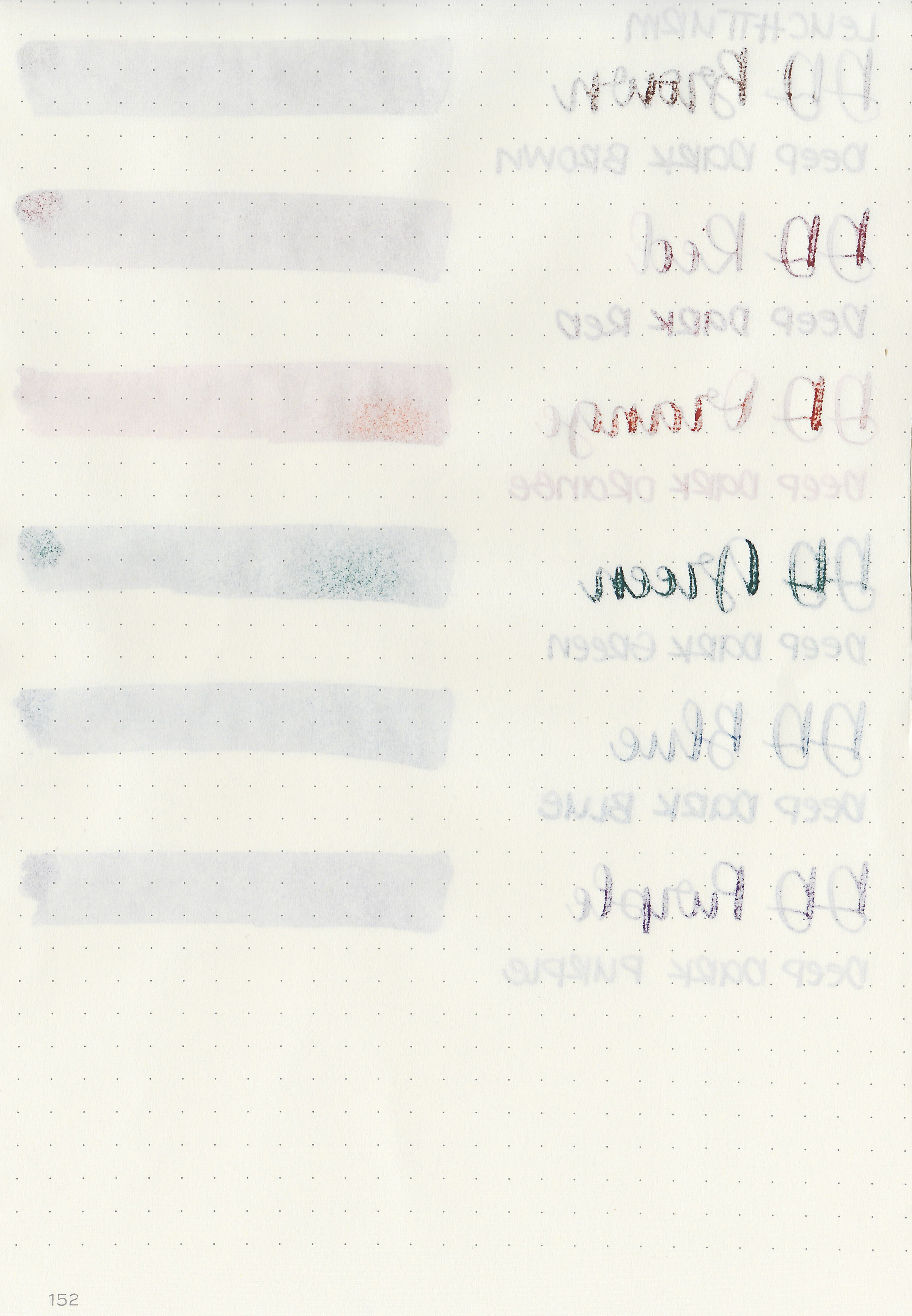
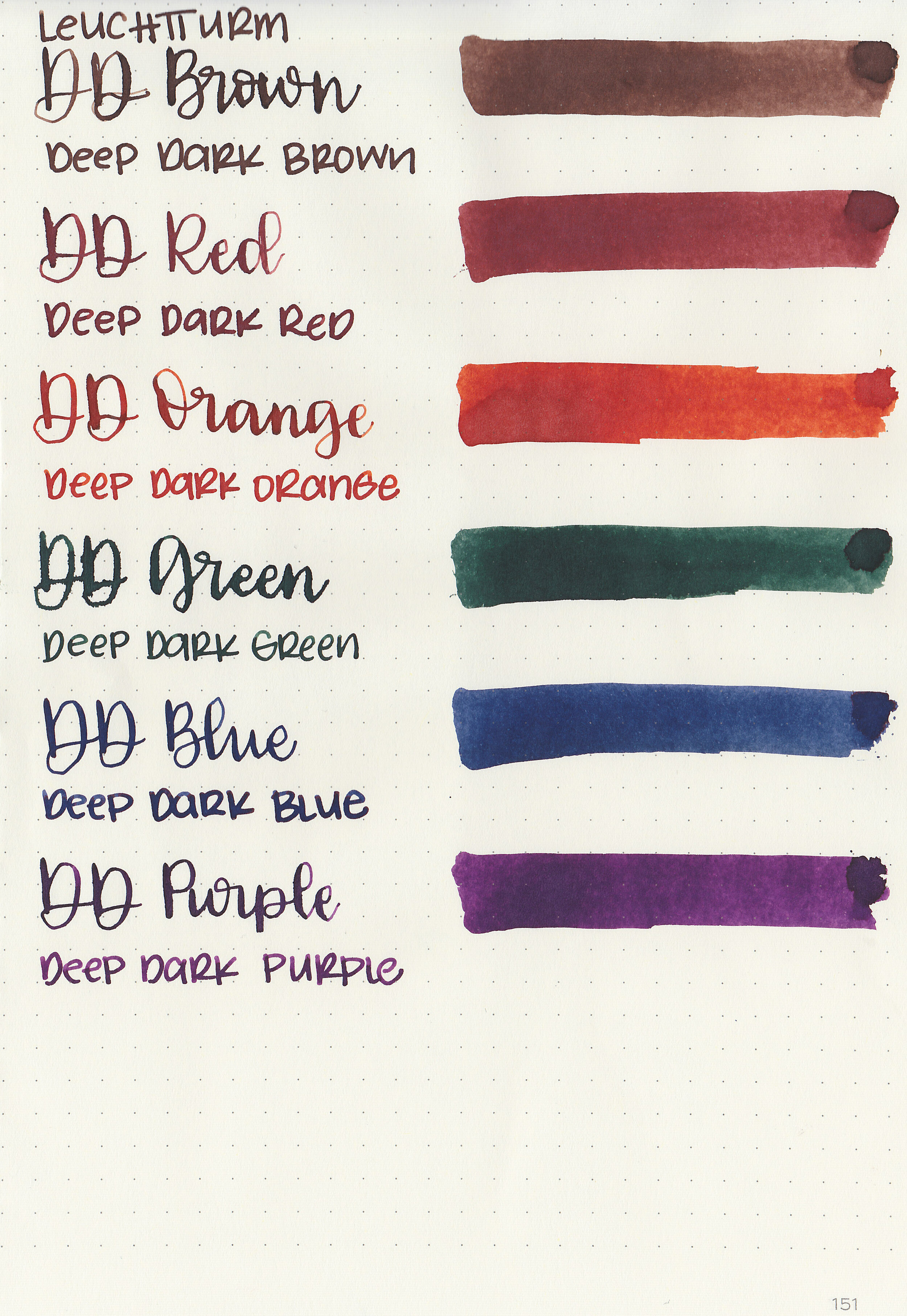
Let's take a look at how the ink behaves on fountain pen friendly papers: Rhodia, Tomoe River, and Leuchtturm.

Dry time: 15 seconds
Water resistance: Low

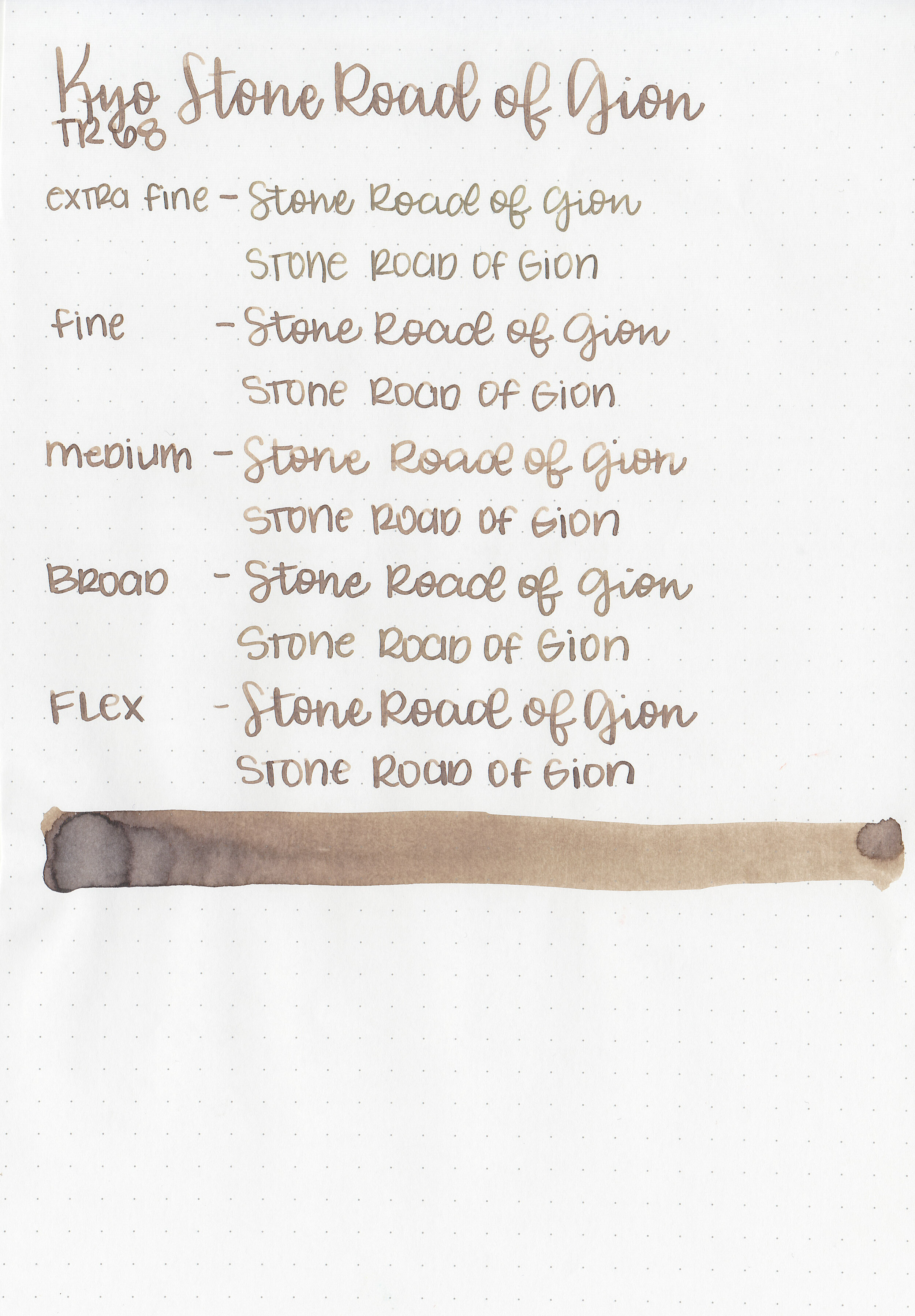
Feathering: None
Show through: Medium

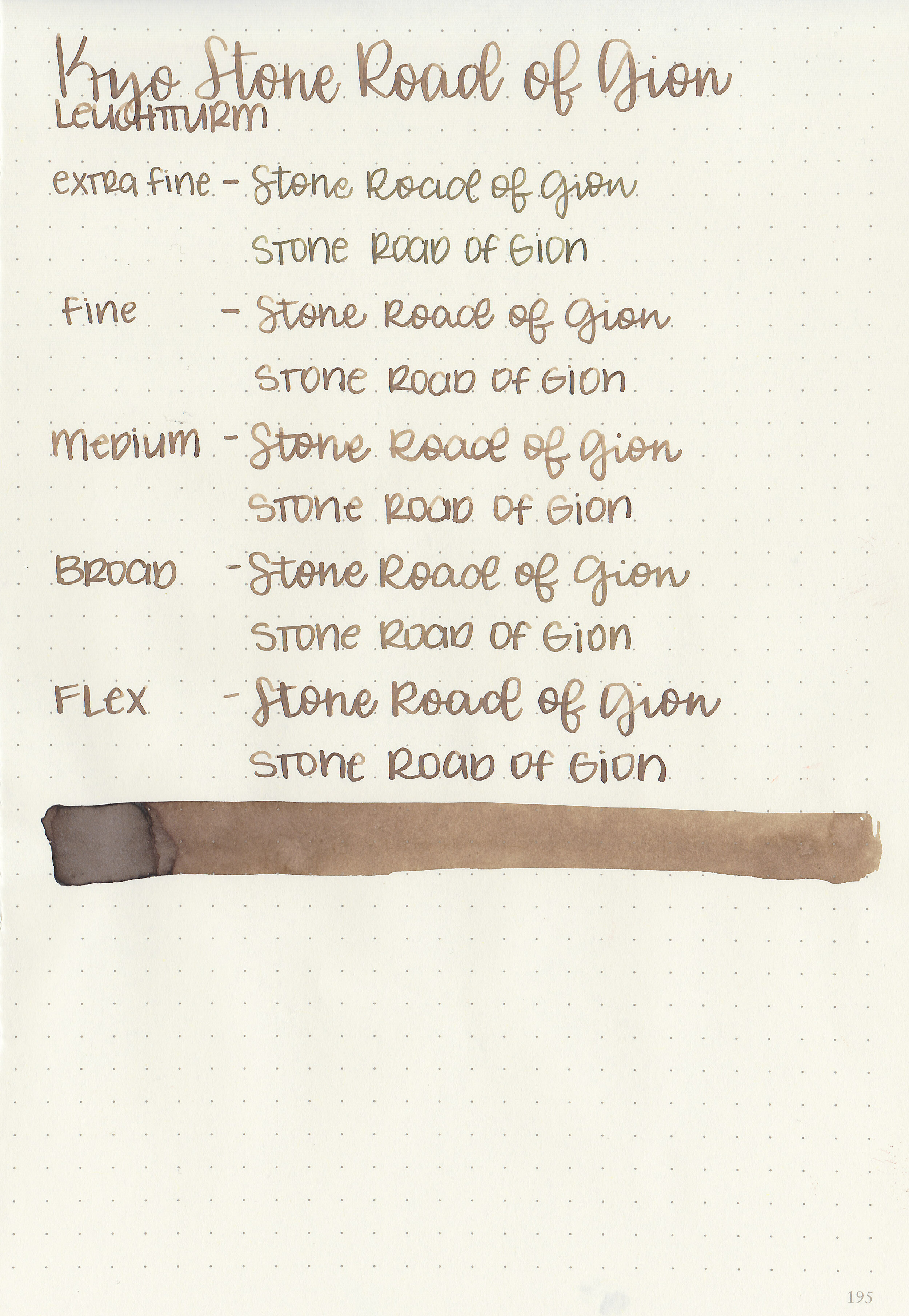
Bleeding: None
Other properties: medium shading, no sheen, and no shimmer.
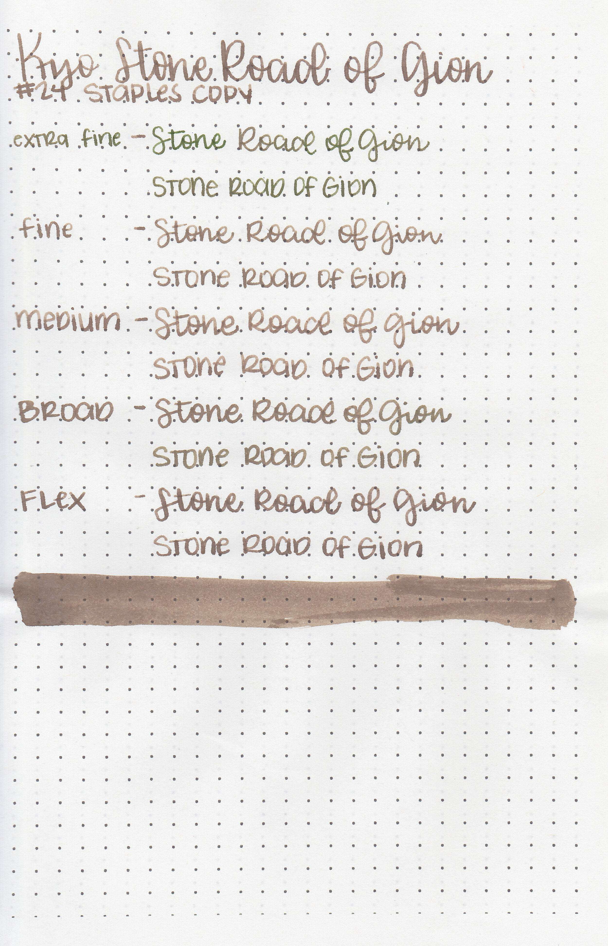
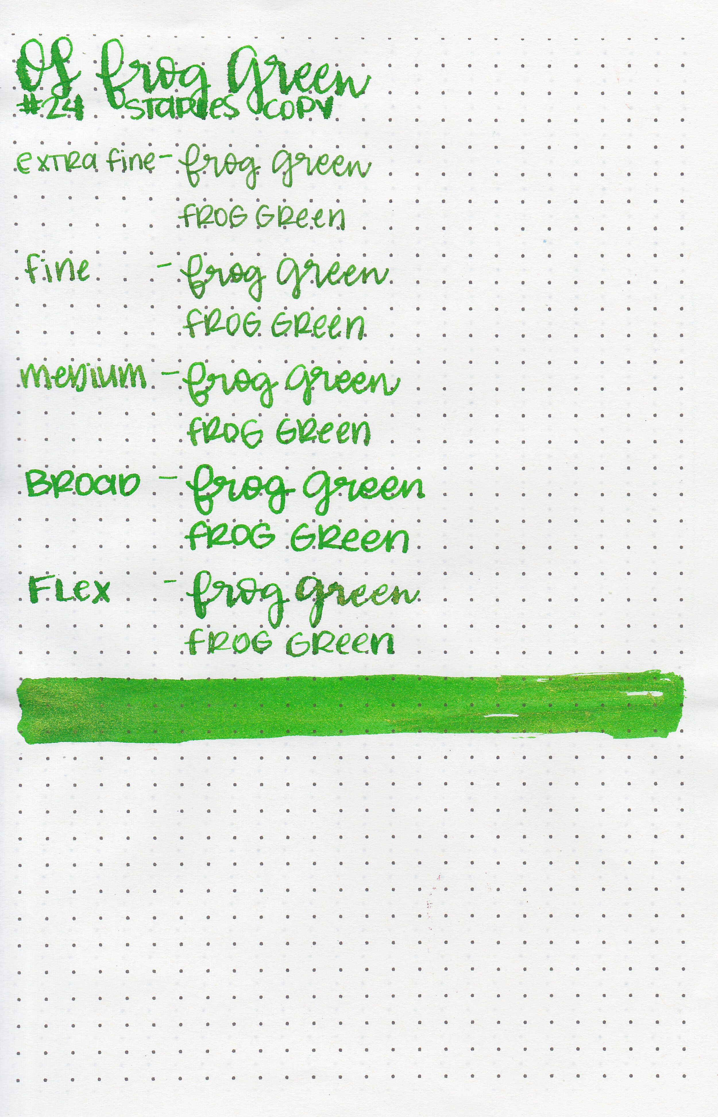
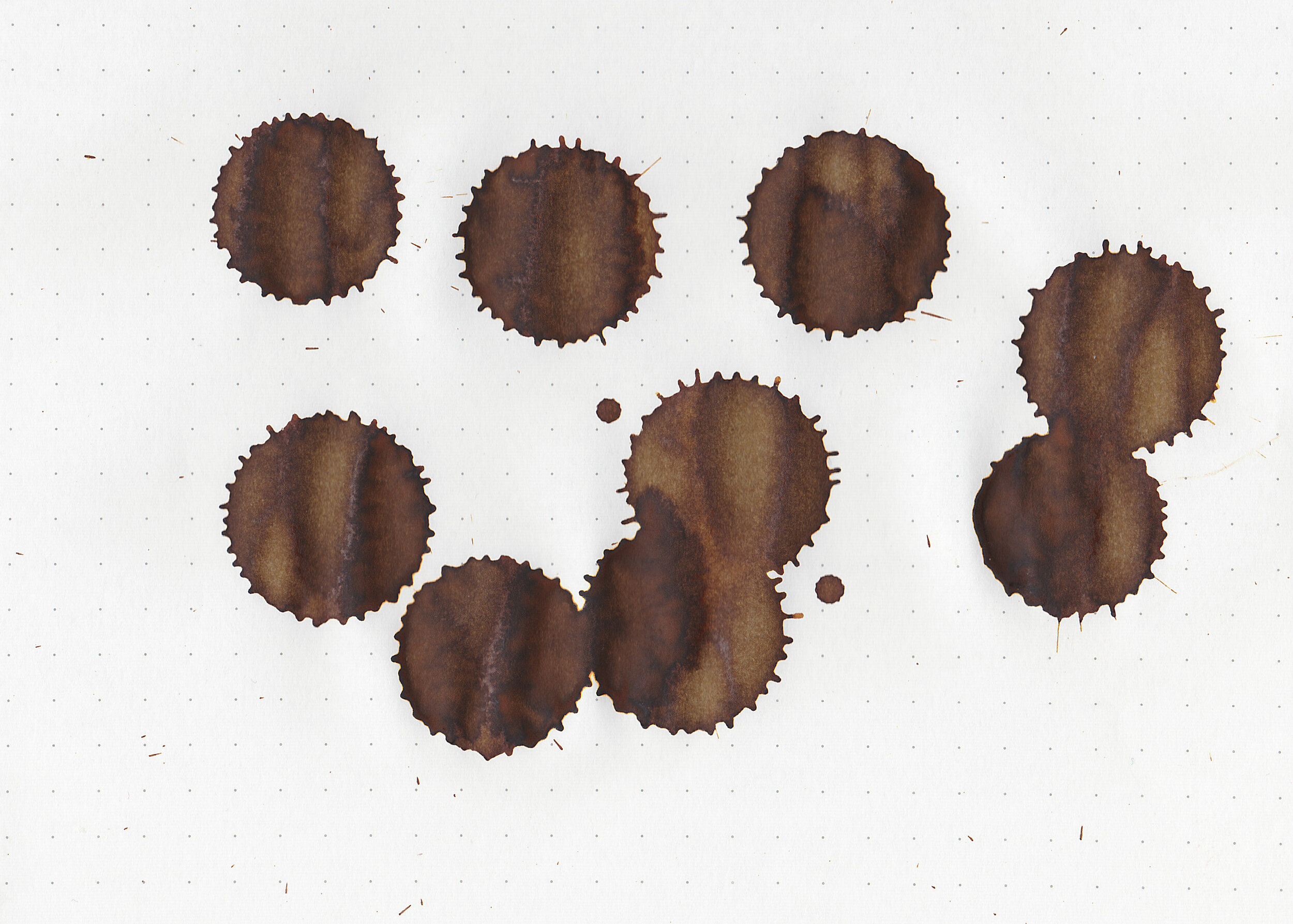
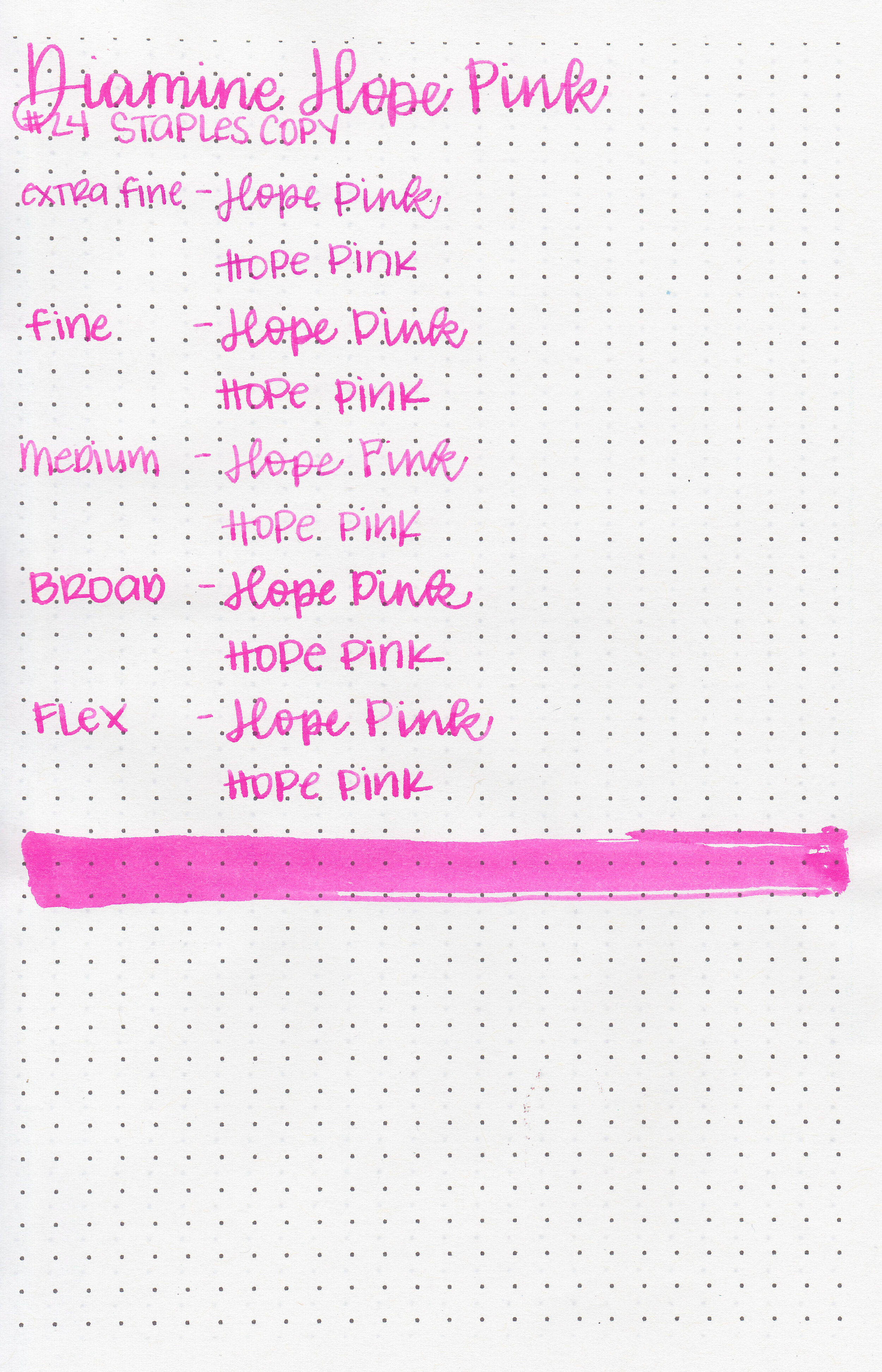
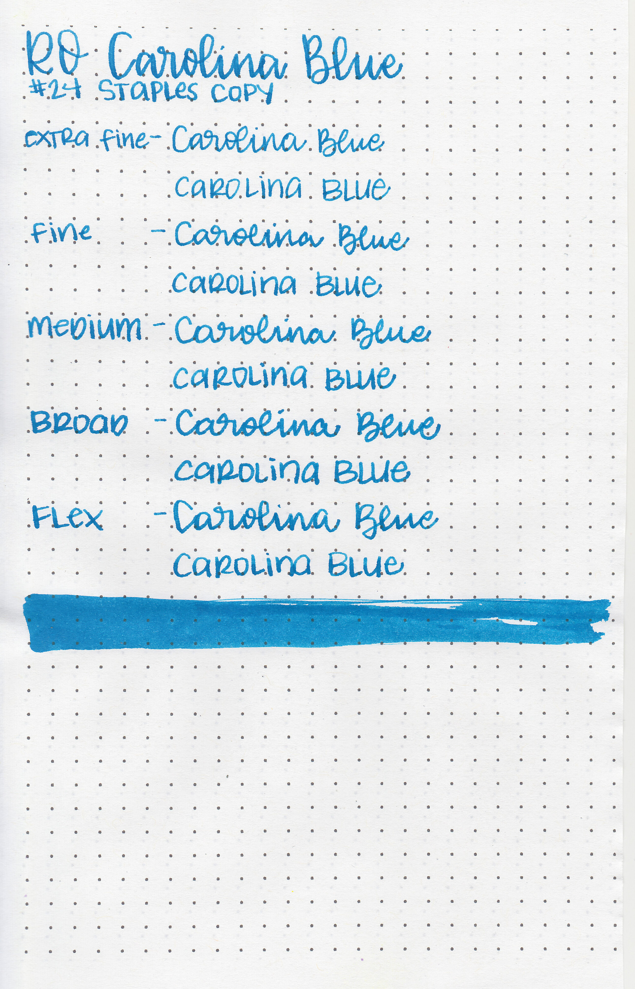
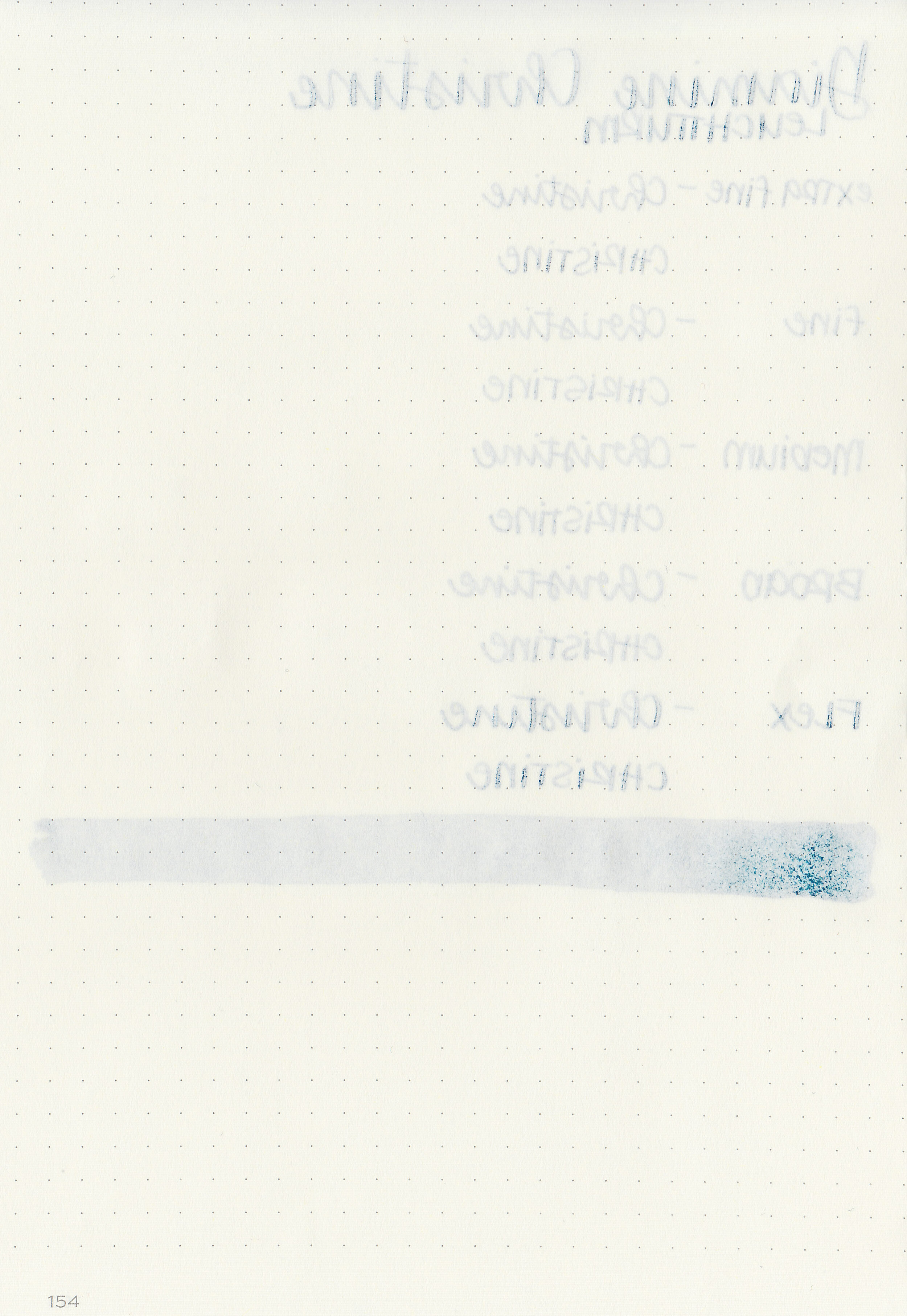
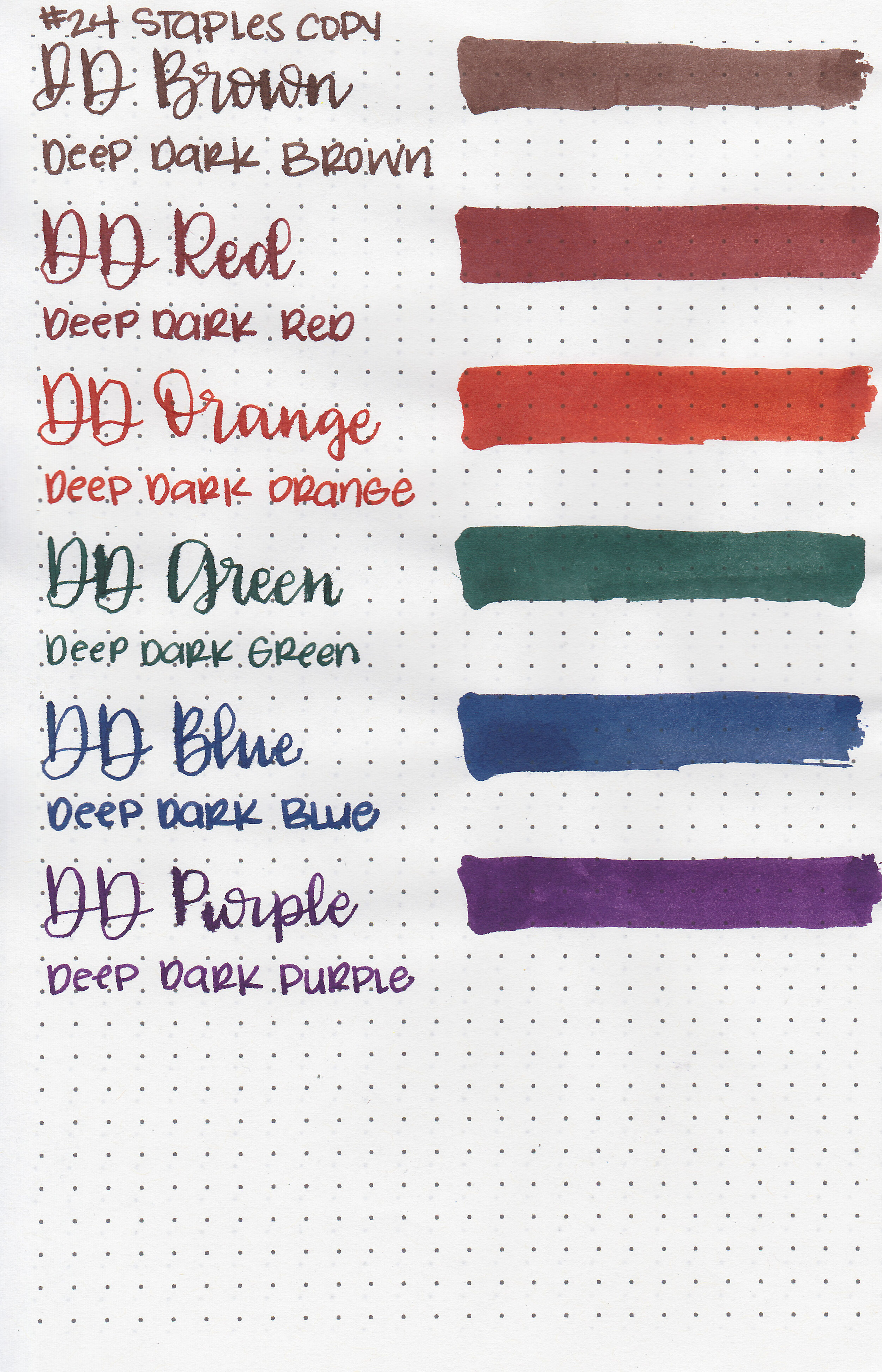
On Staples 24 lb copy paper there was some feathering in all nib sizes but just a tiny bit of bleeding.
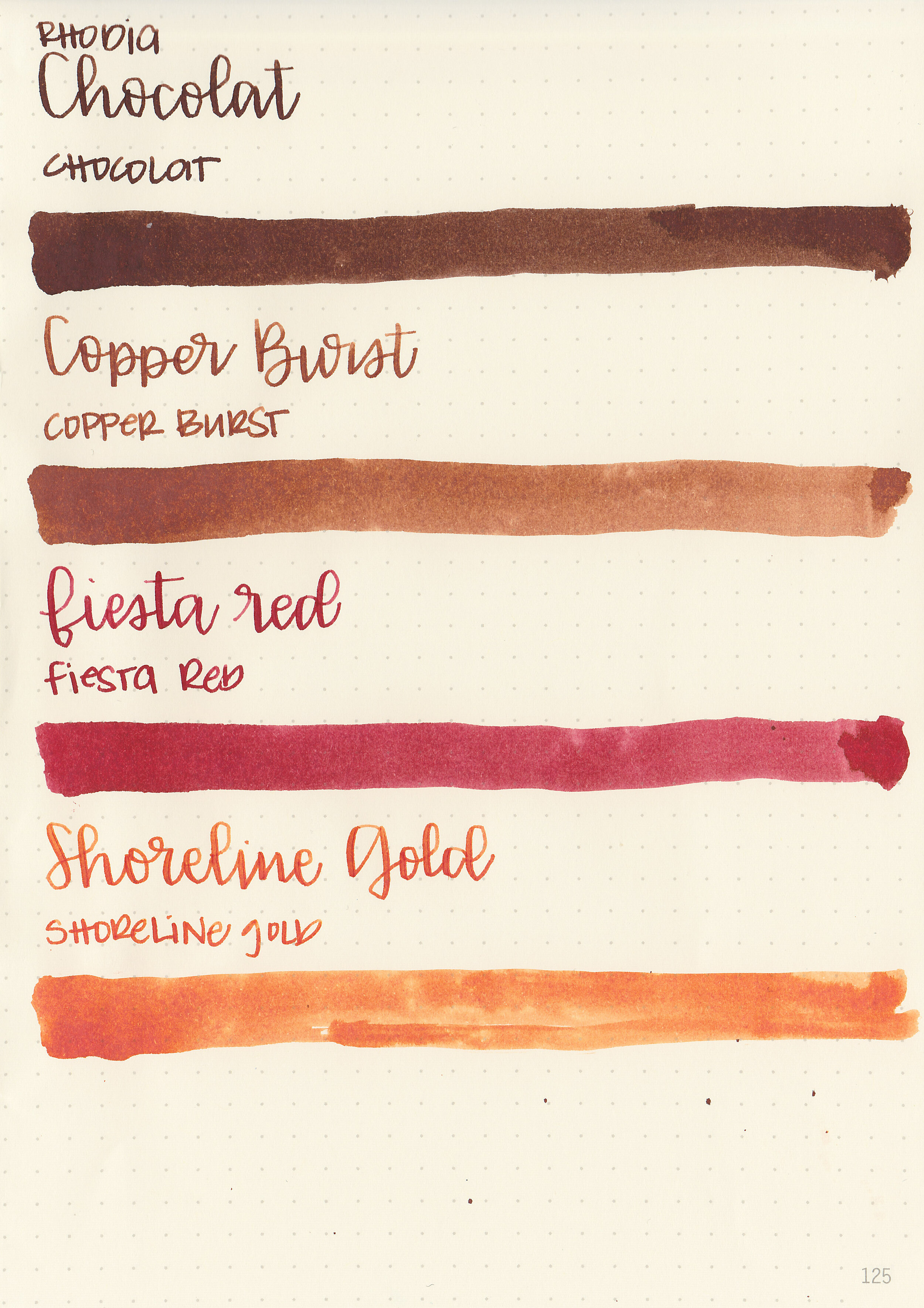
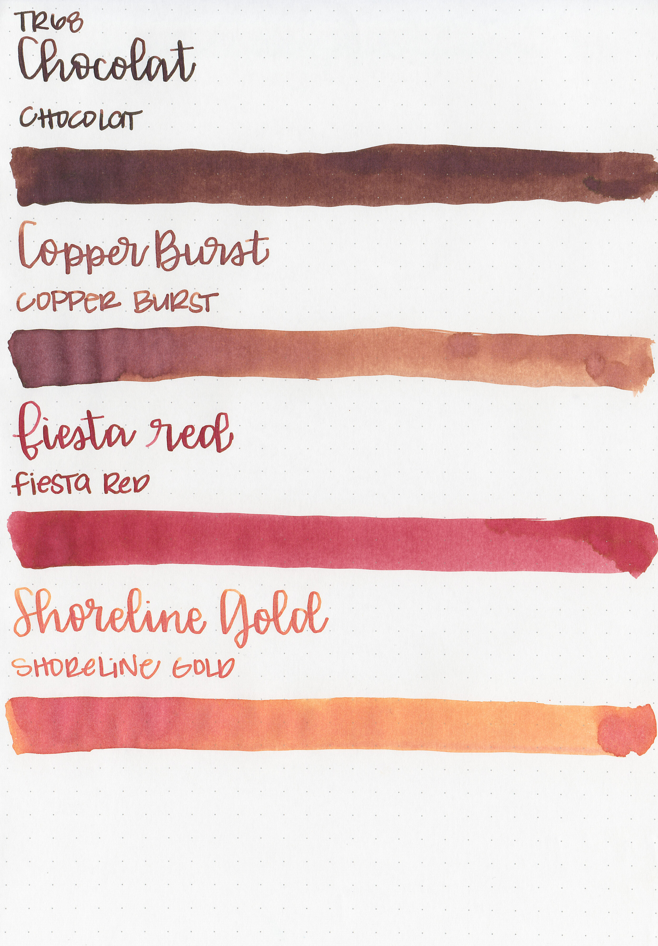
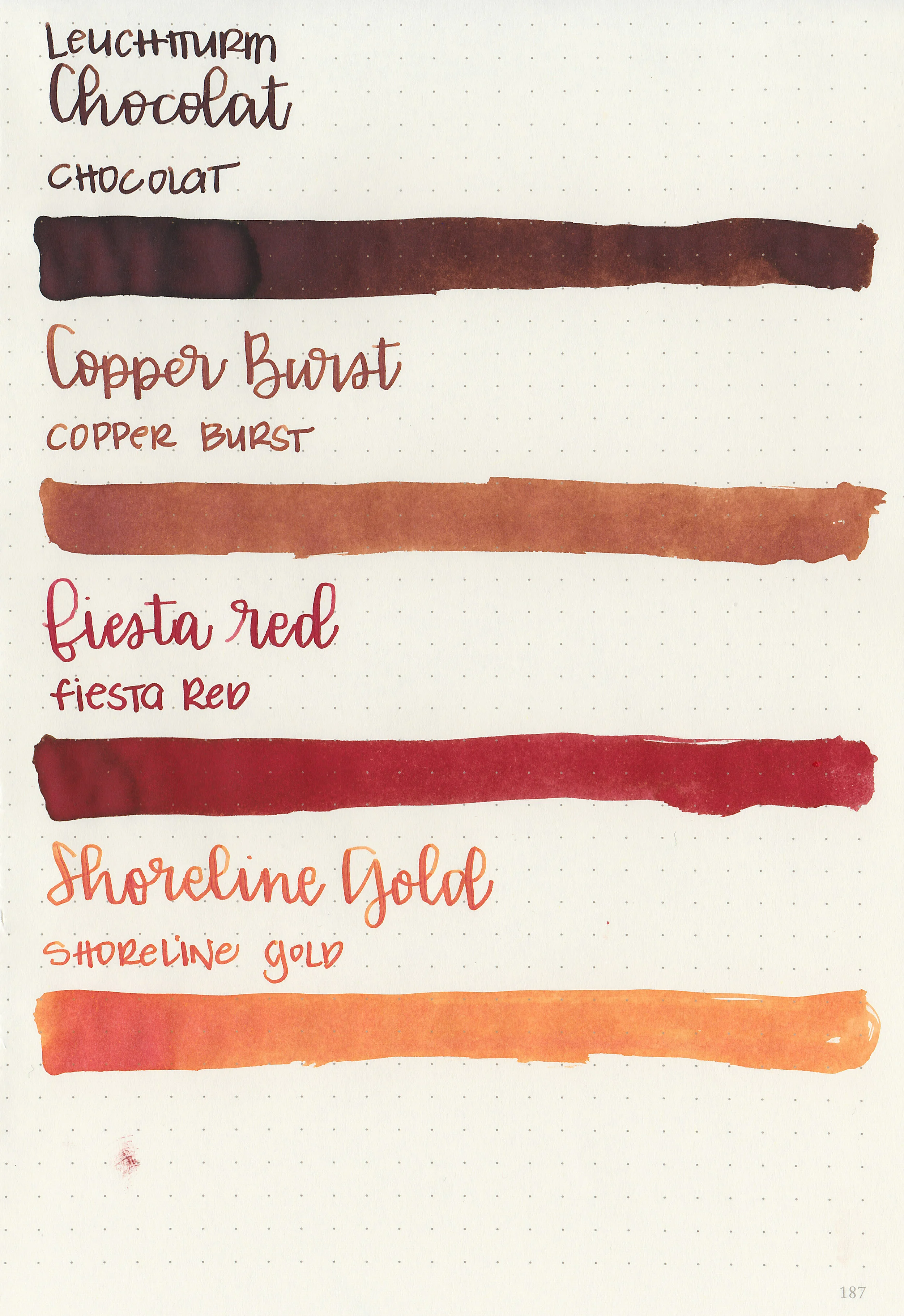
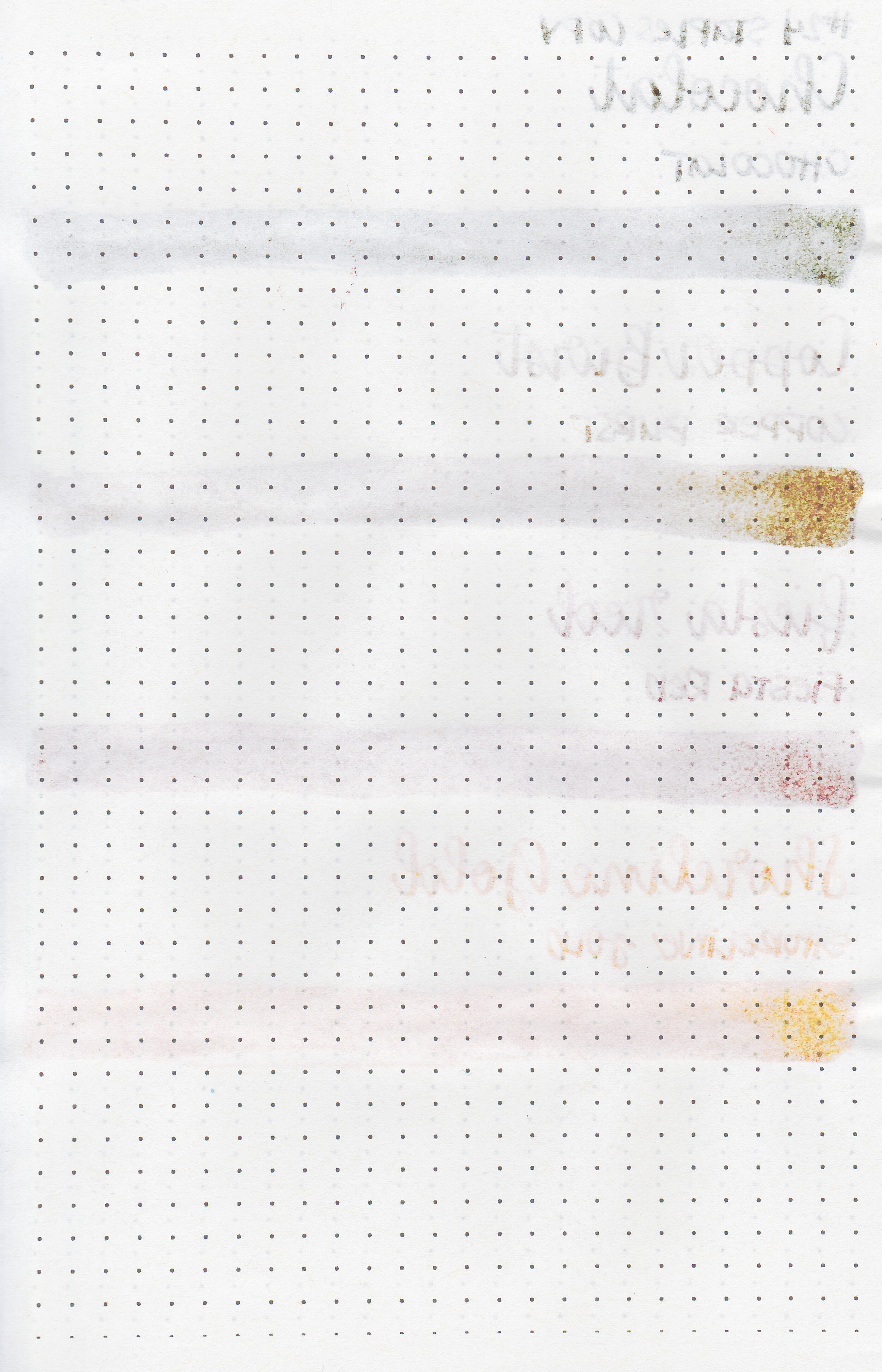
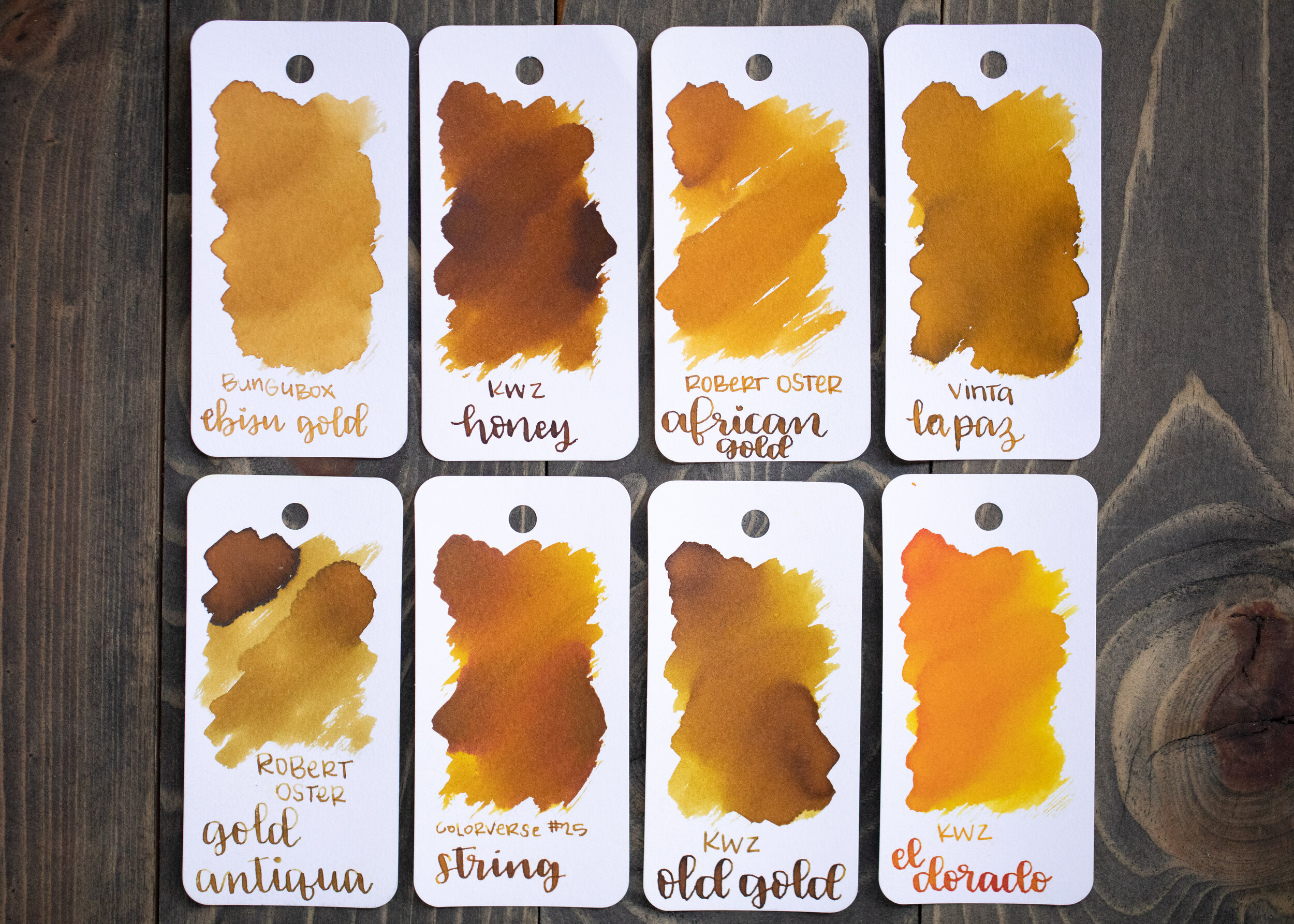
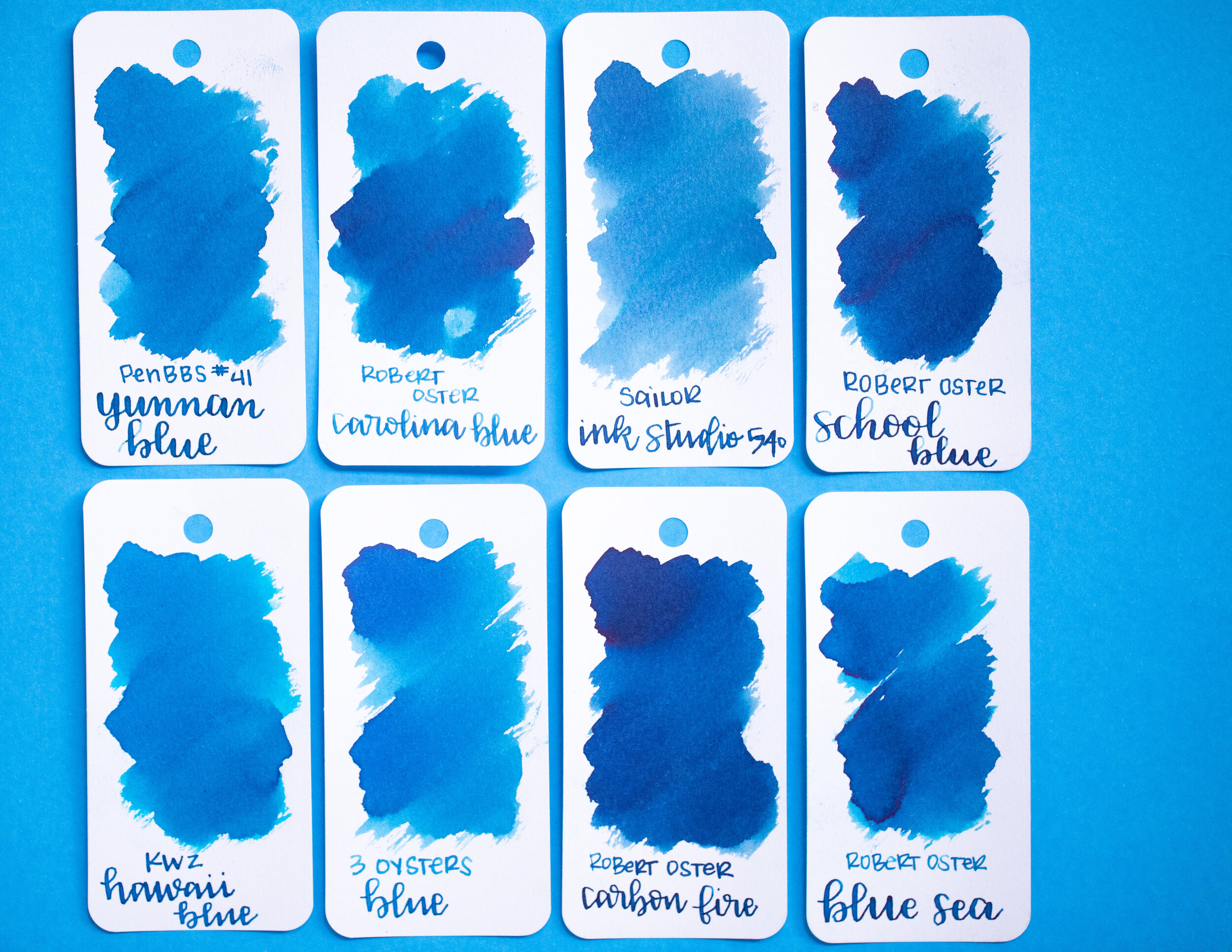
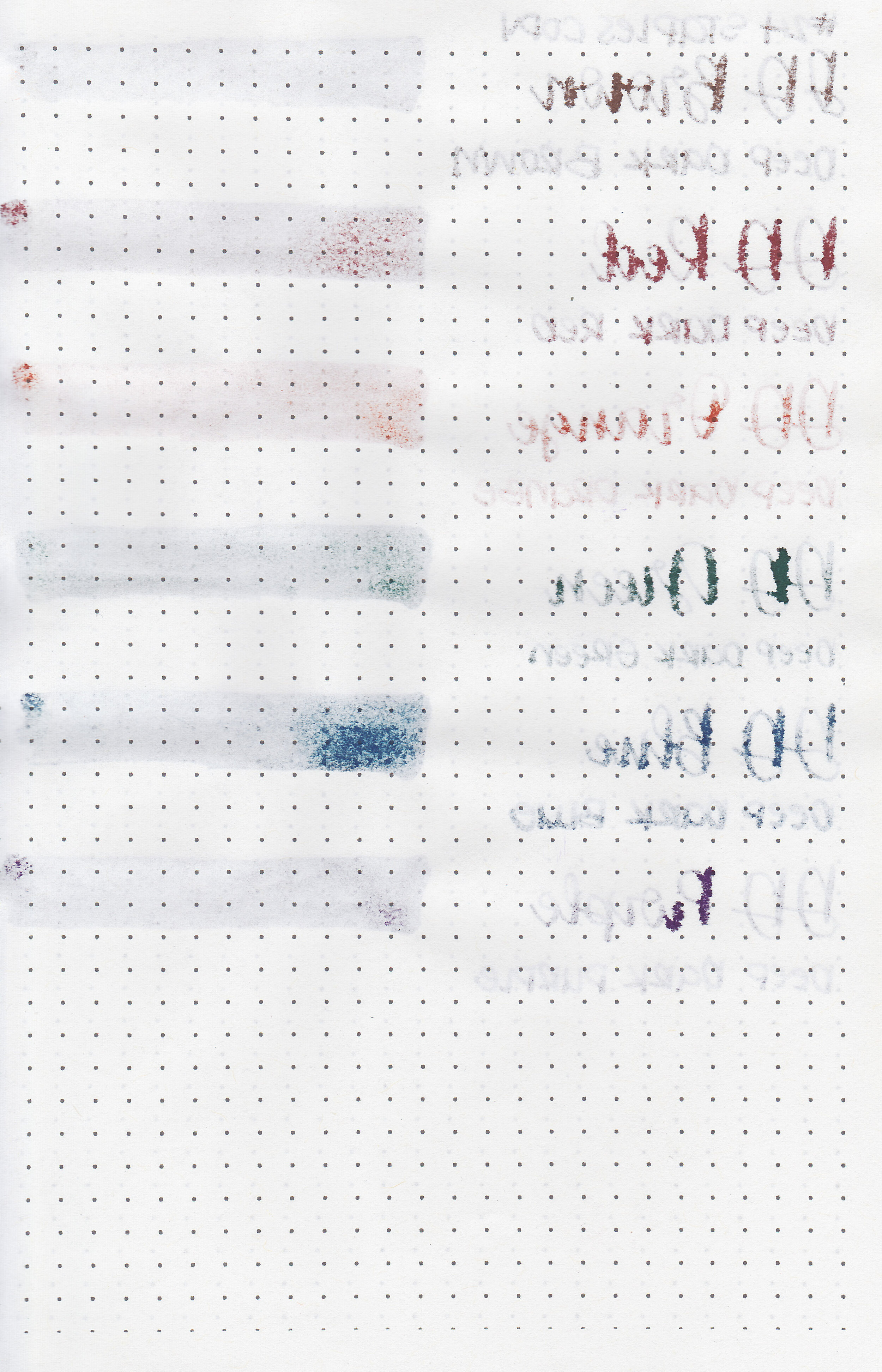
Comparison Swabs:

Stone Road is darker than Montblanc Swan Illusion but lighter than Monteverde Moonstone. All three have a similar cool-tone vibe to them. Click here to see the Kyoto inks together, and click here to see the brown inks together.
Longer writing:

I used a Lamy Studio Terracotta with a medium nib on a Lochby A5 blank Refill-Tomoe River 68gsm. The ink had a dry flow. This nib and ink together created some beautiful shading.
Overall, I love the color of this ink, but it is very dry. It’s a good ink, but I would add a drop of White Lightning (ink additive) to make it flow better and then I think it would be a great ink.
Disclaimer: I received a sample of this ink from a sample swap. All photos and opinions are my own. This page does contain affiliate links, but this post is not sponsored in any way.