Ink Review #1285: Papier Plume Iron Lace
/
I’ve been a big fan of the Papier Plume New Orleans collection for years now, I especially love Garden District Azalea and Sazerac. Recently they added a new ink to the collection called Iron Lace. Thanks to Papier Plume for sending this ink over for review!

The color:
Iron Lace is a dark green-black. It’s not quite black, green or grey but somewhere in the middle.
Swabs:

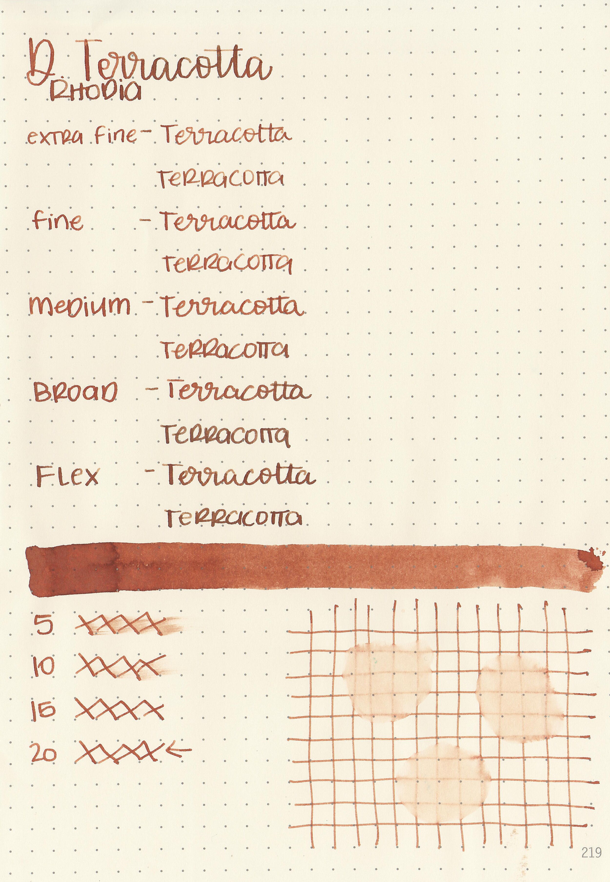
In large swabs on Tomoe River paper the ink looks more grey.

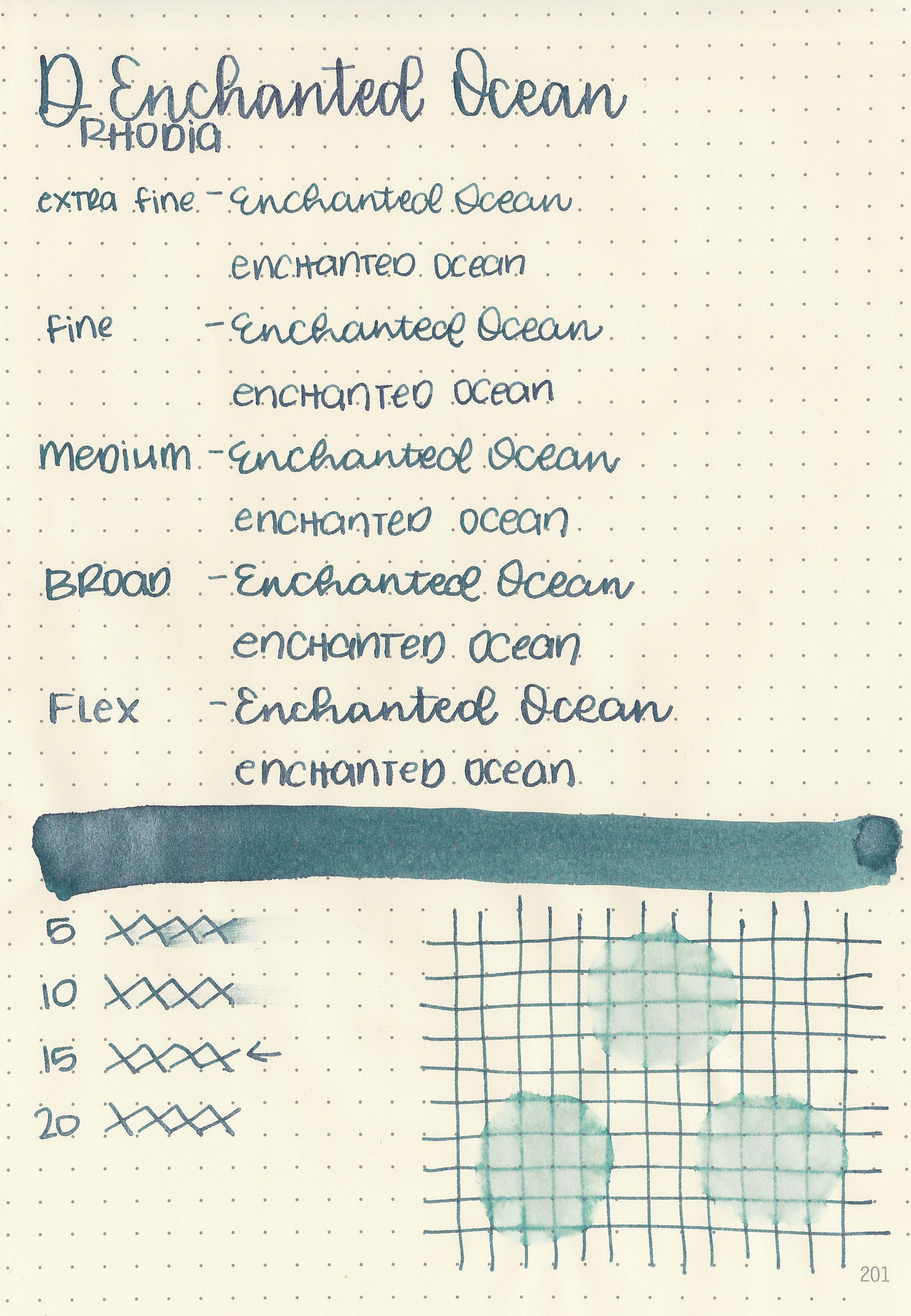
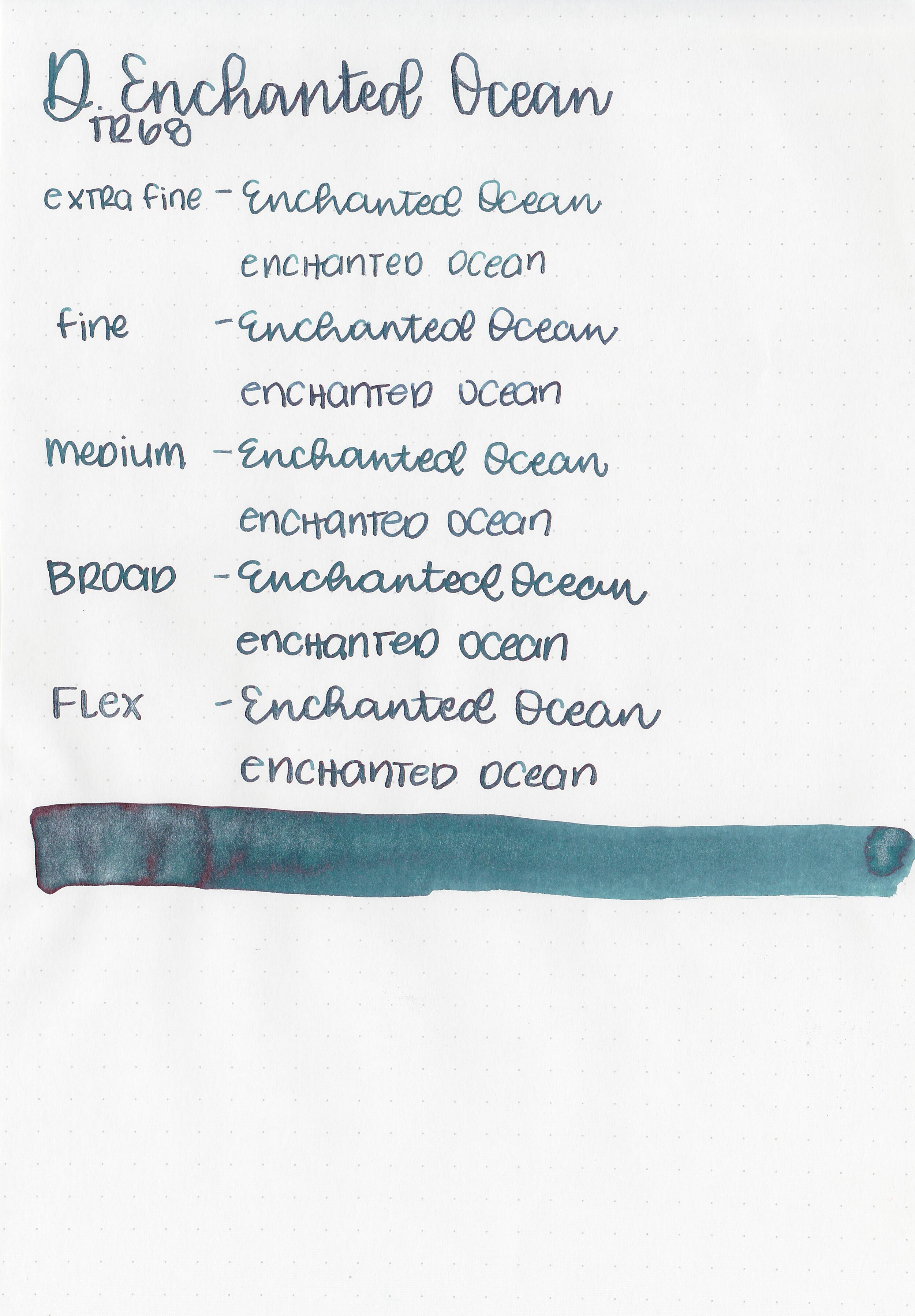
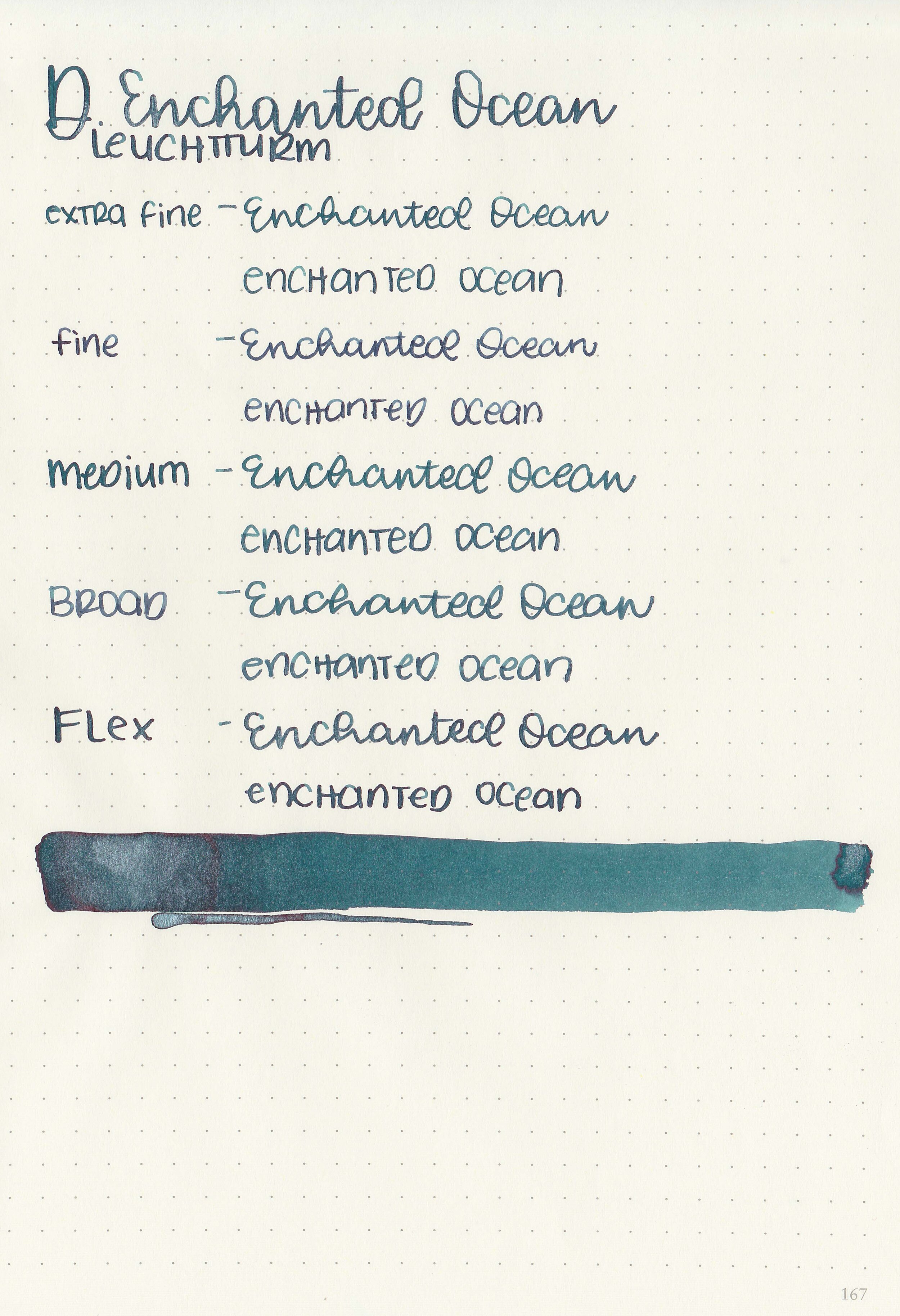
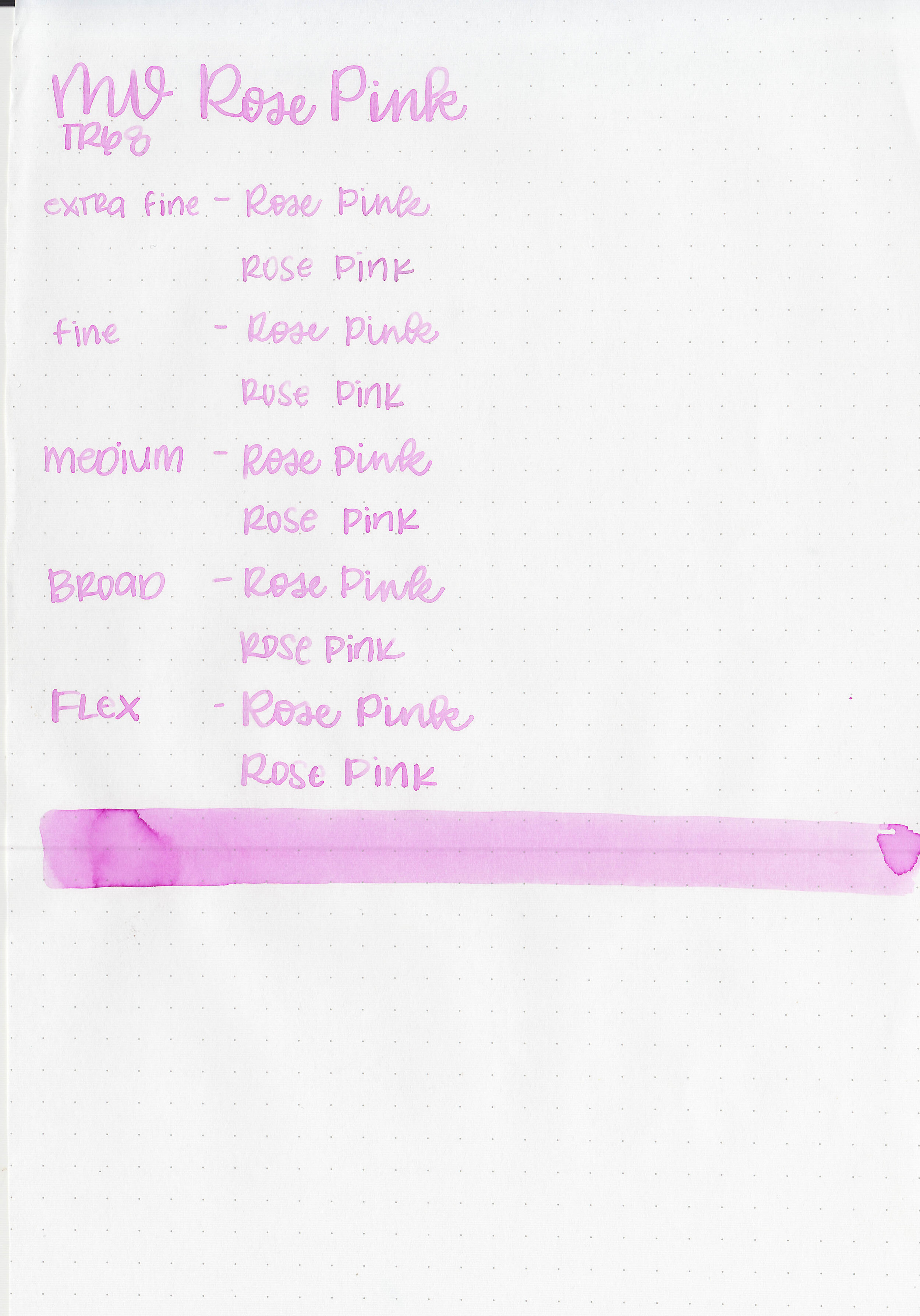
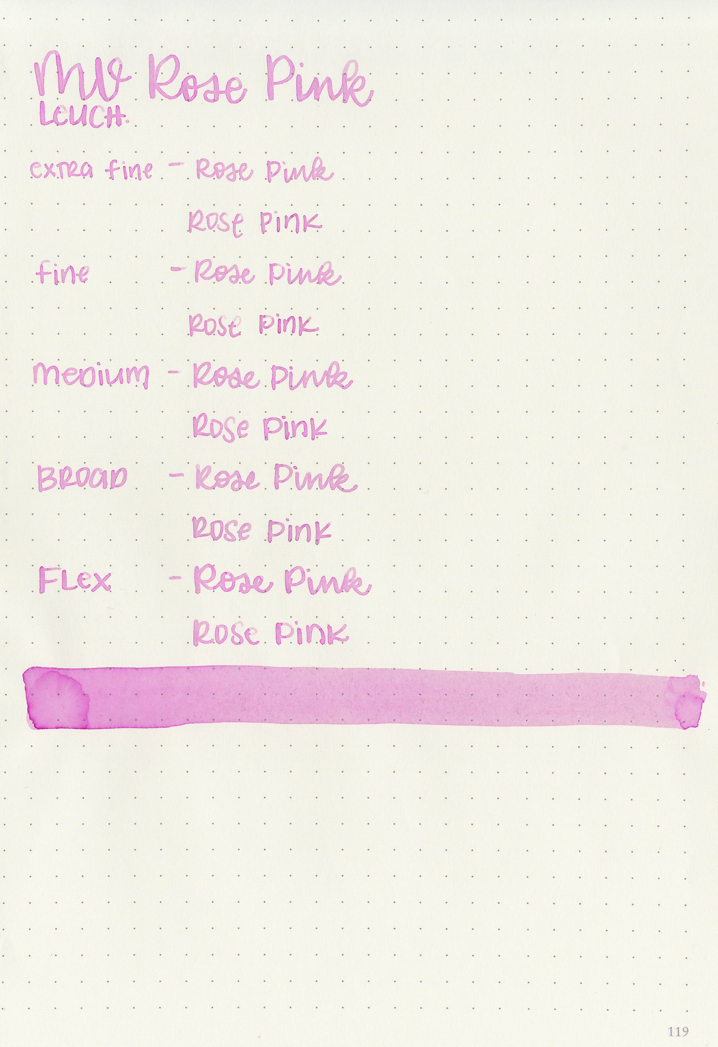
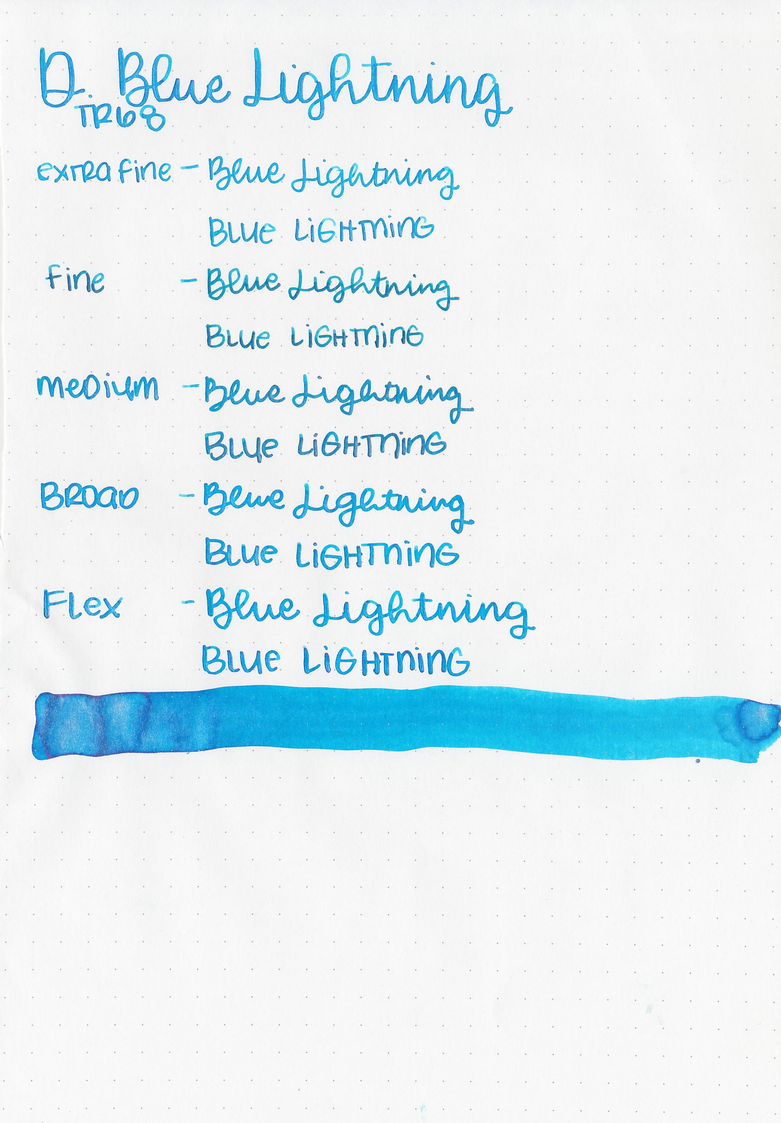
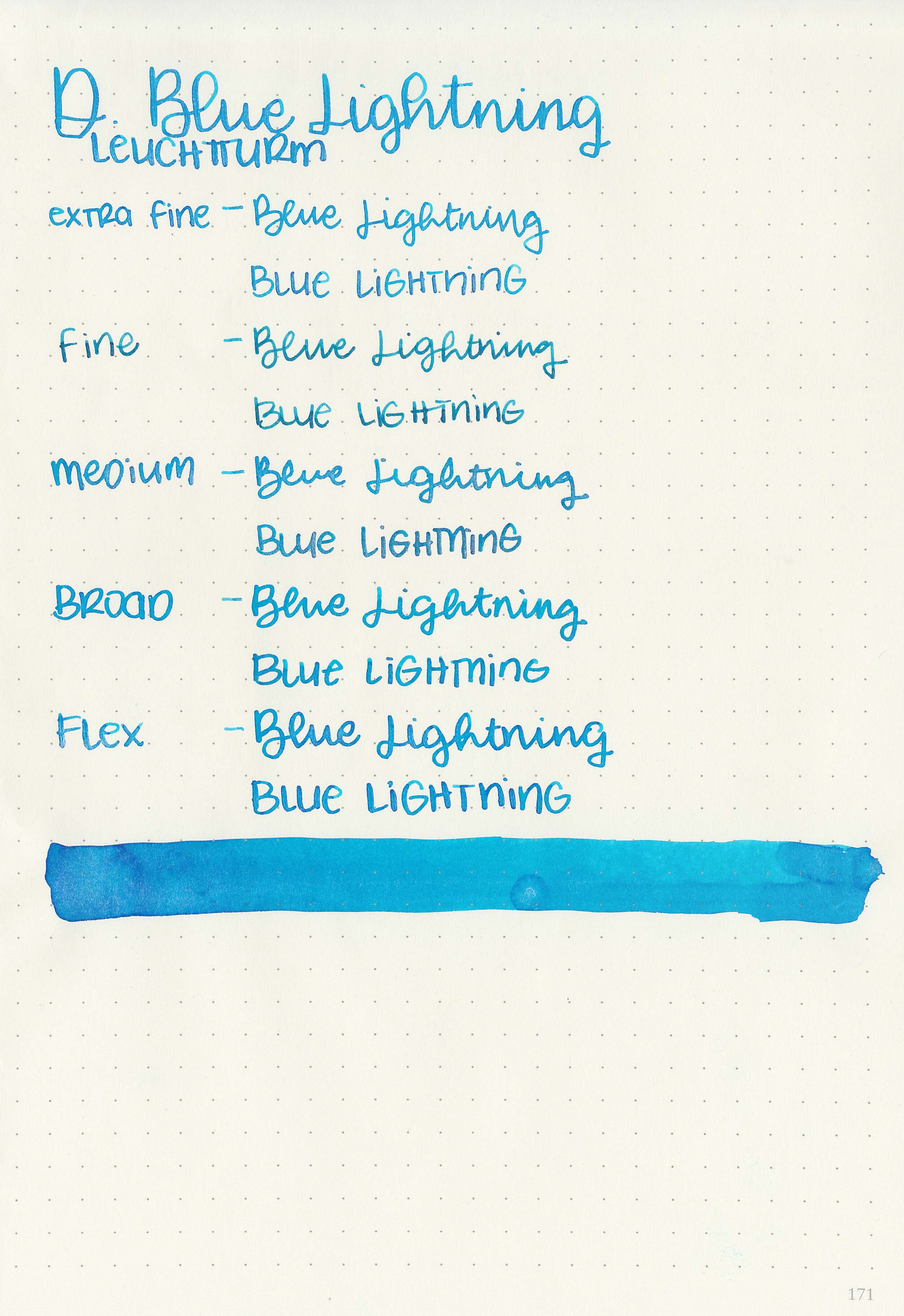
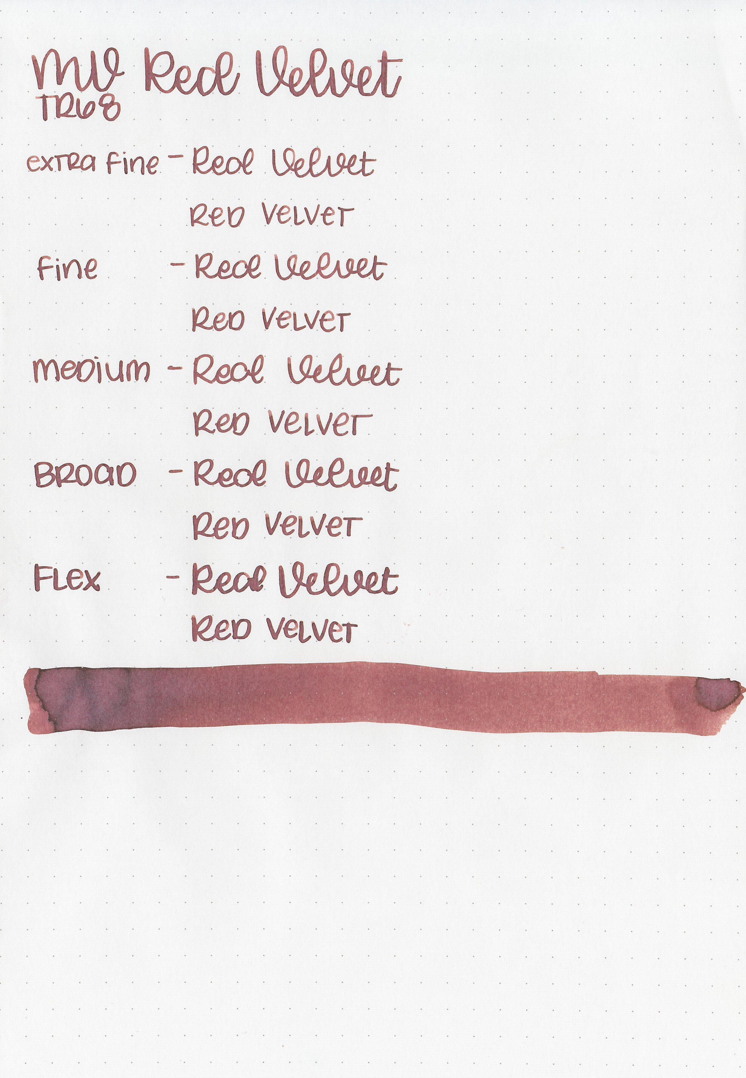
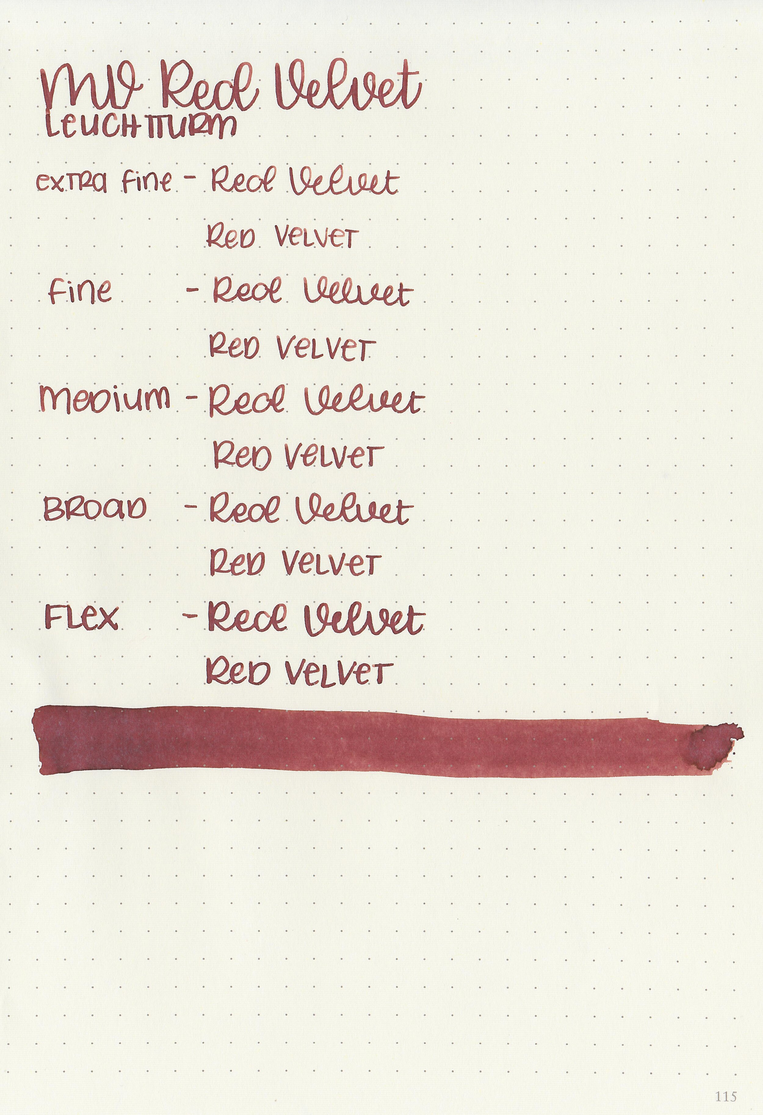
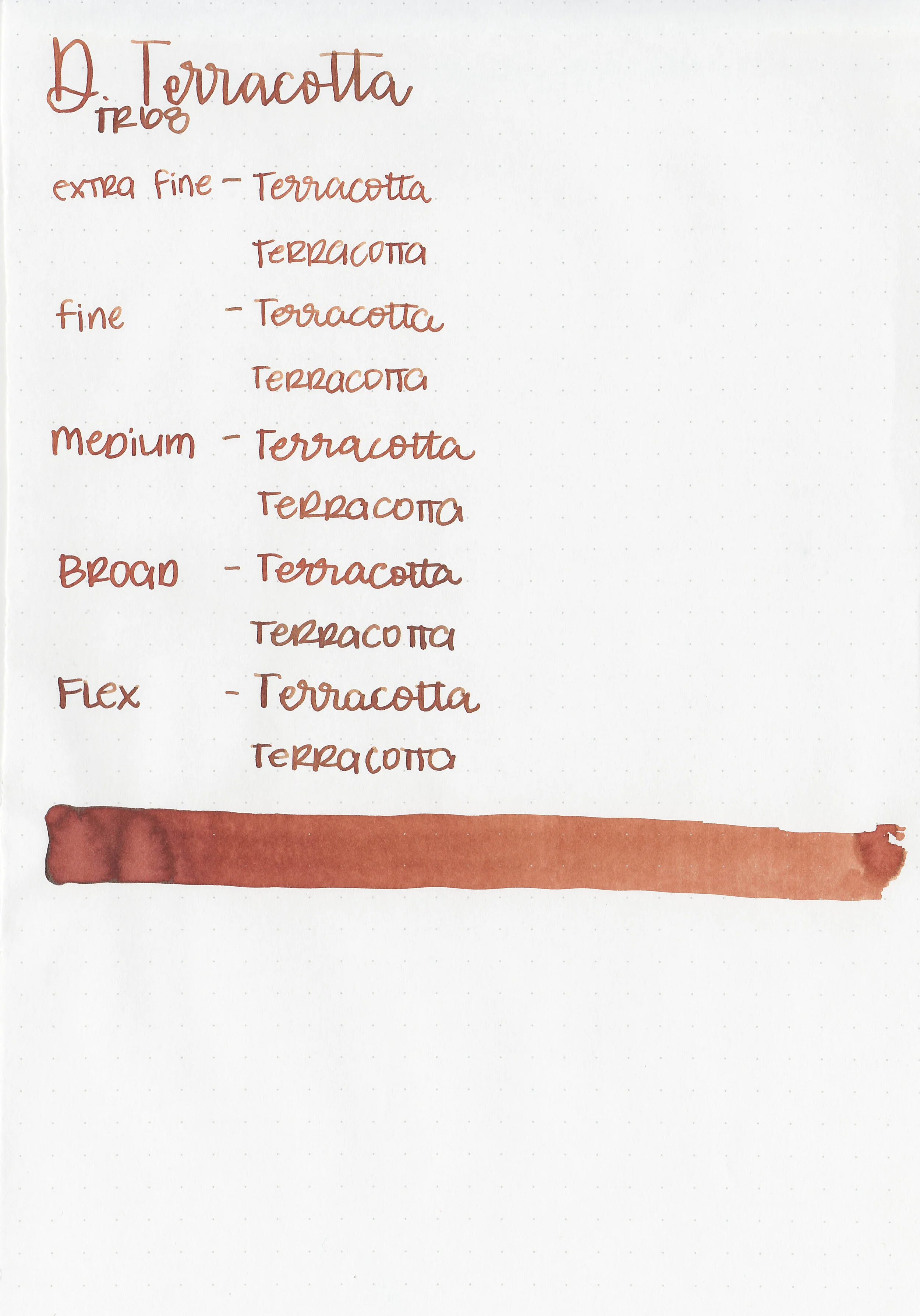
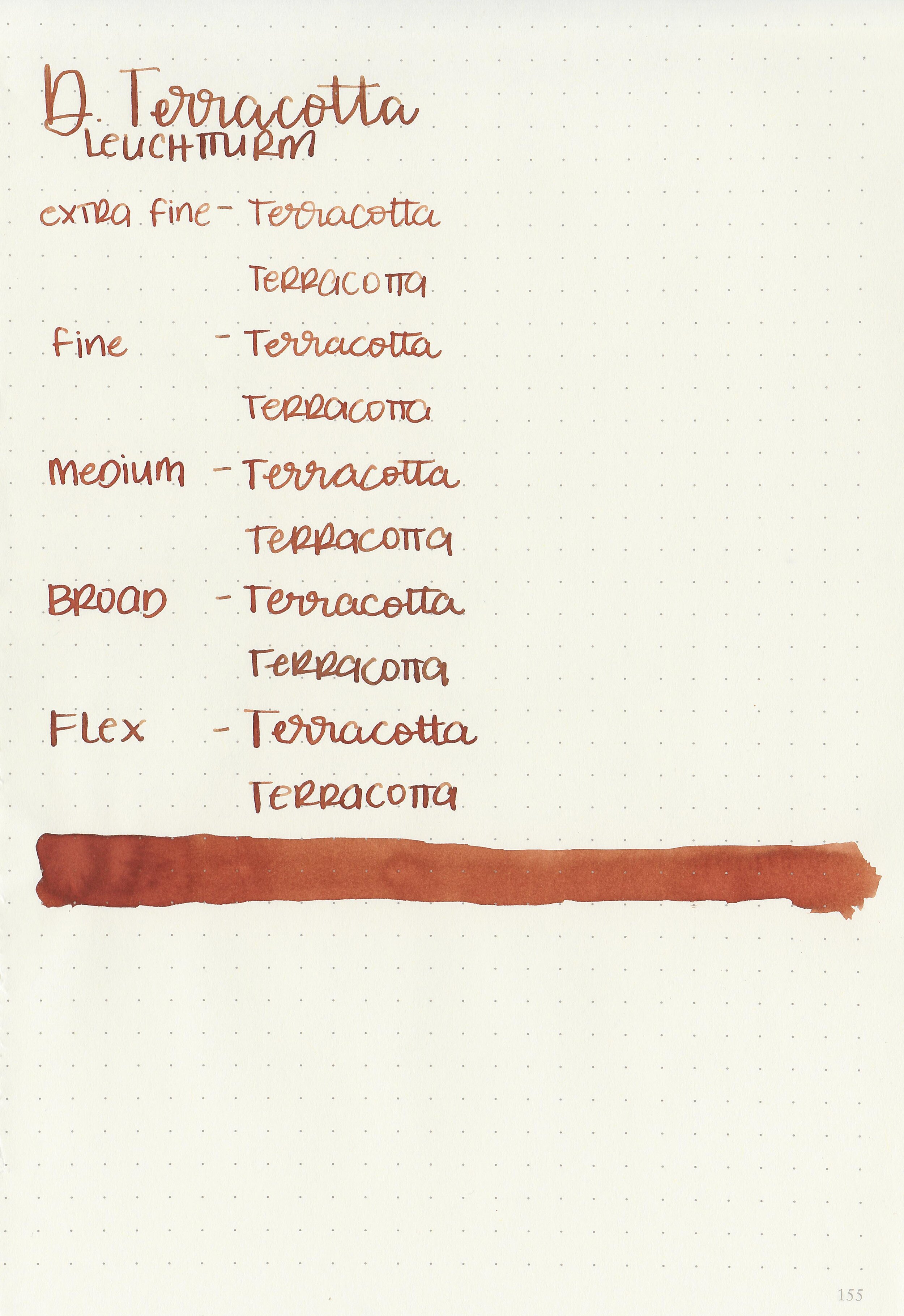
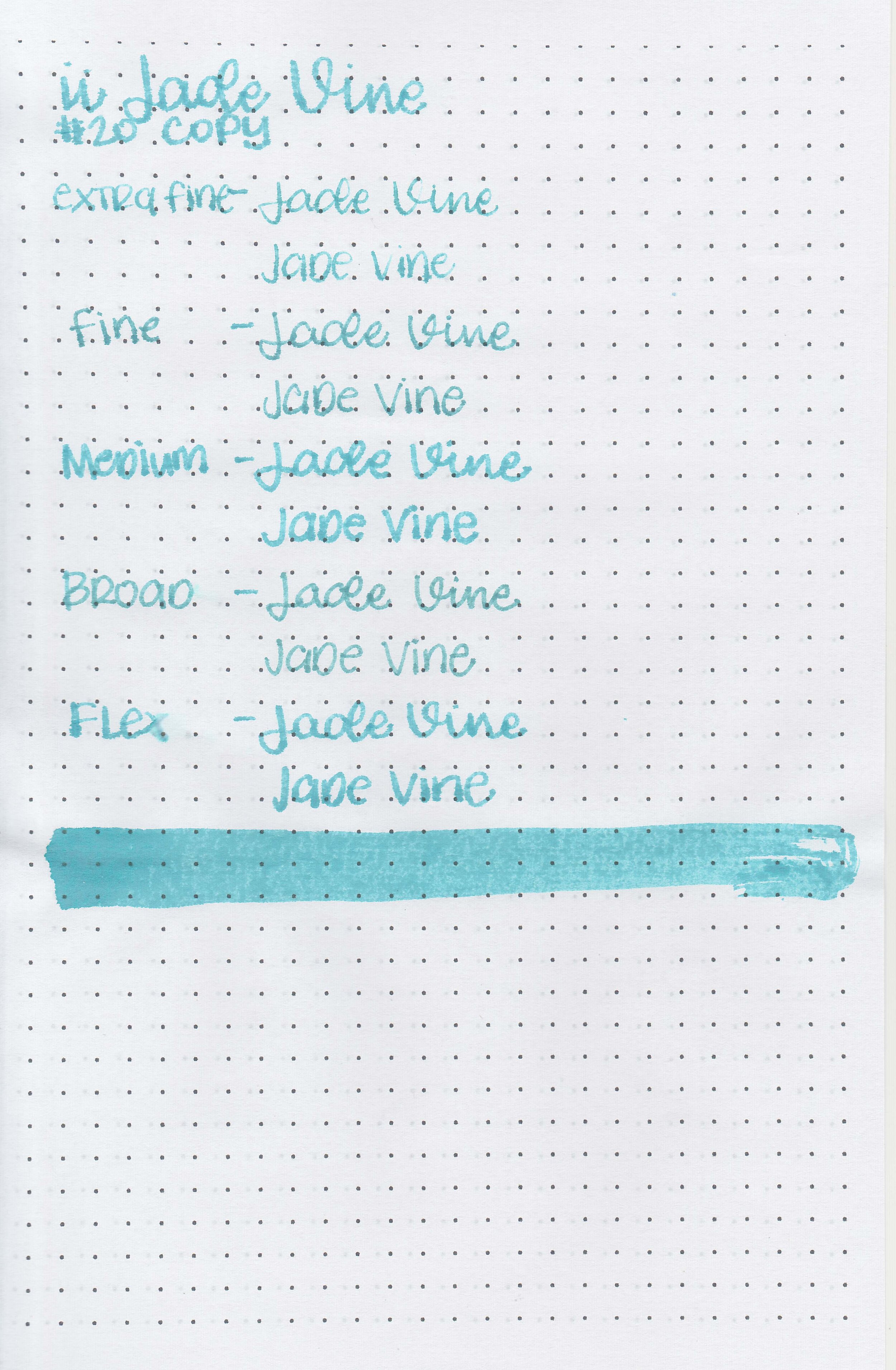
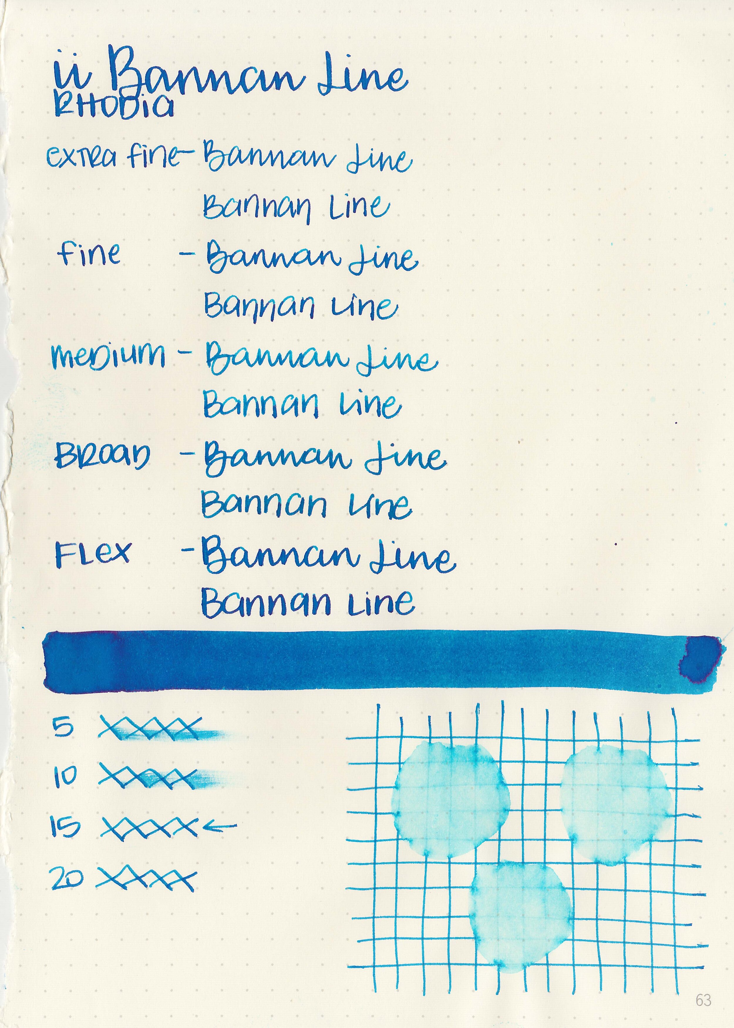
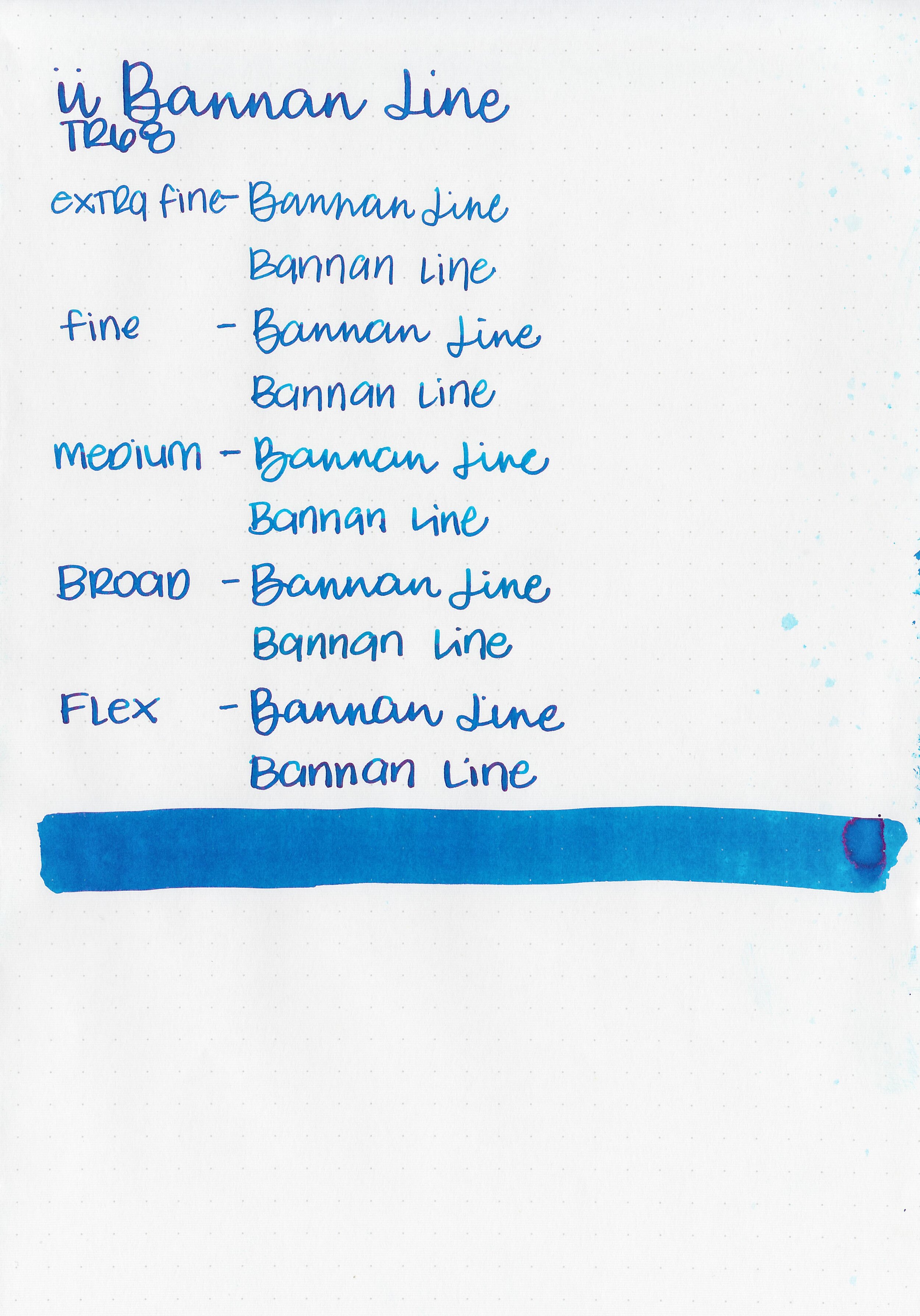
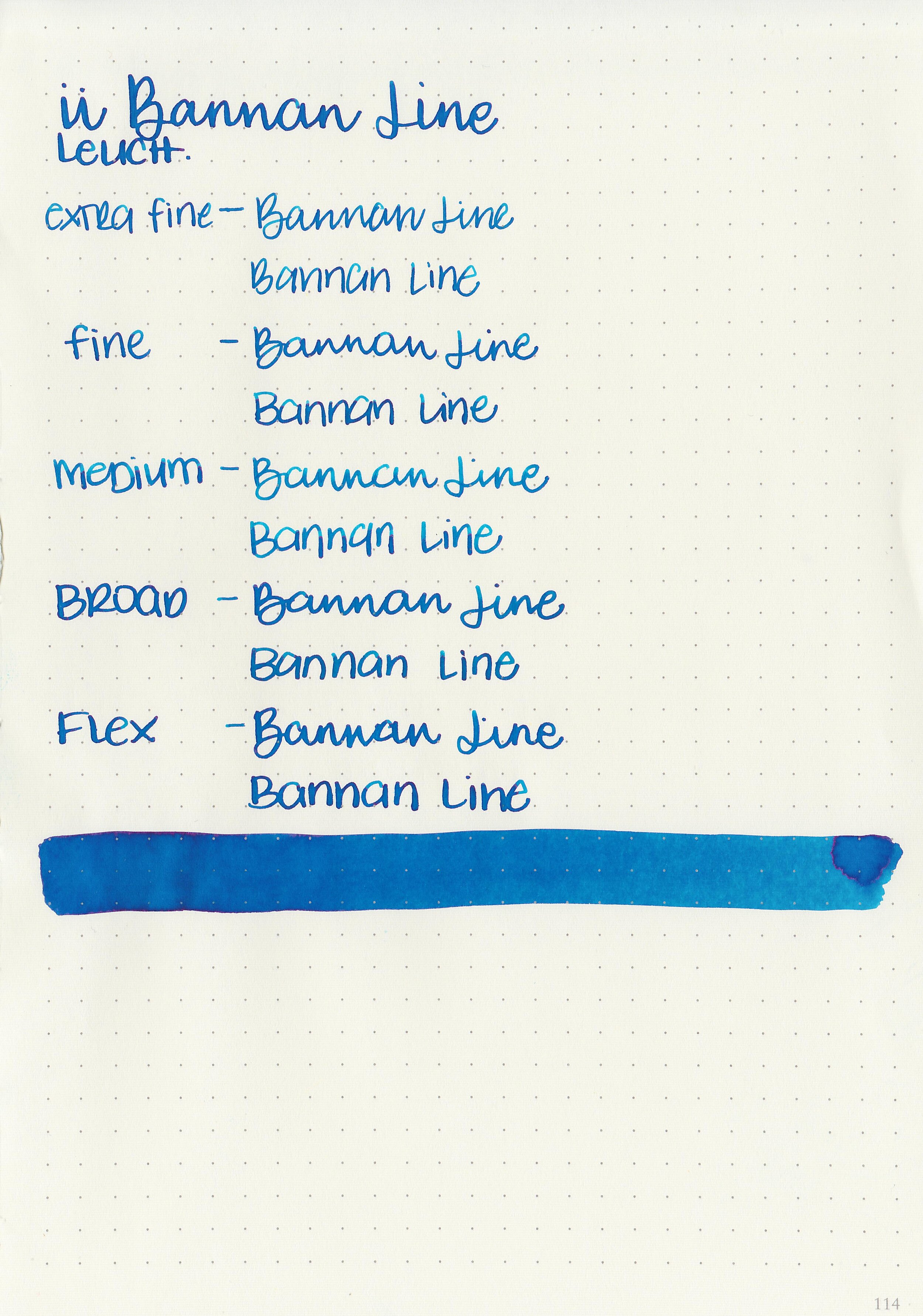
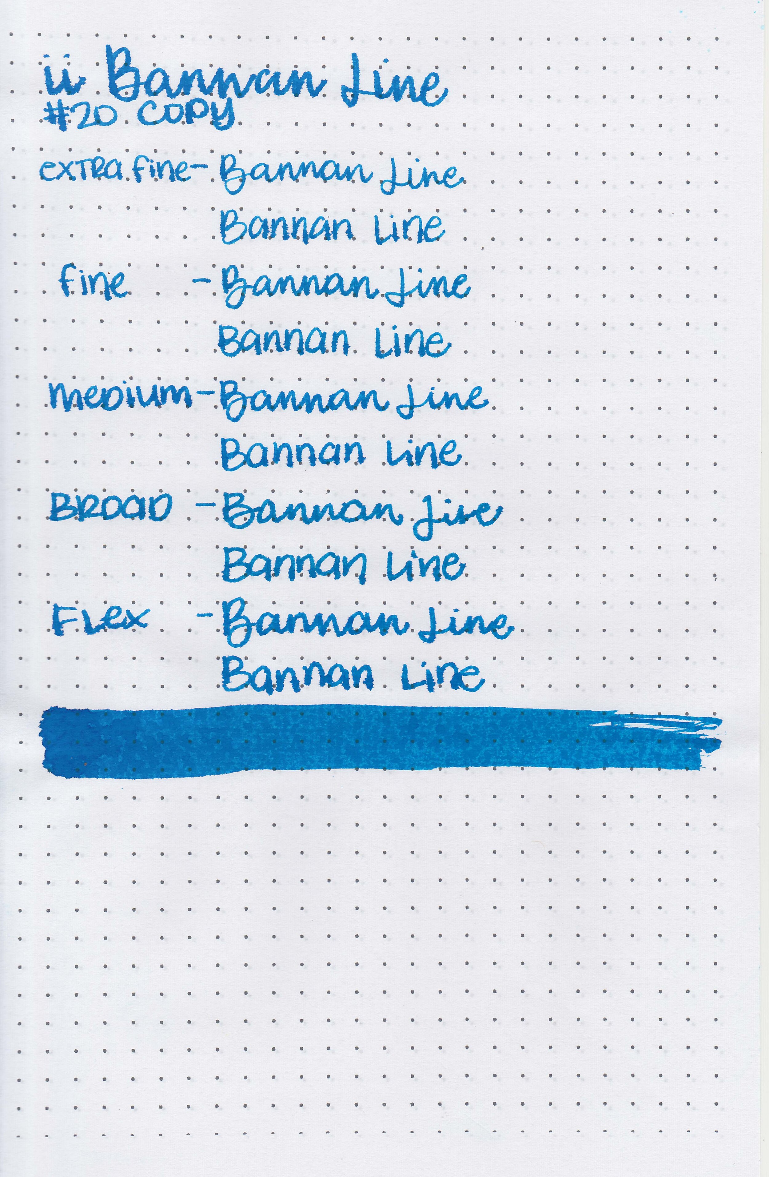
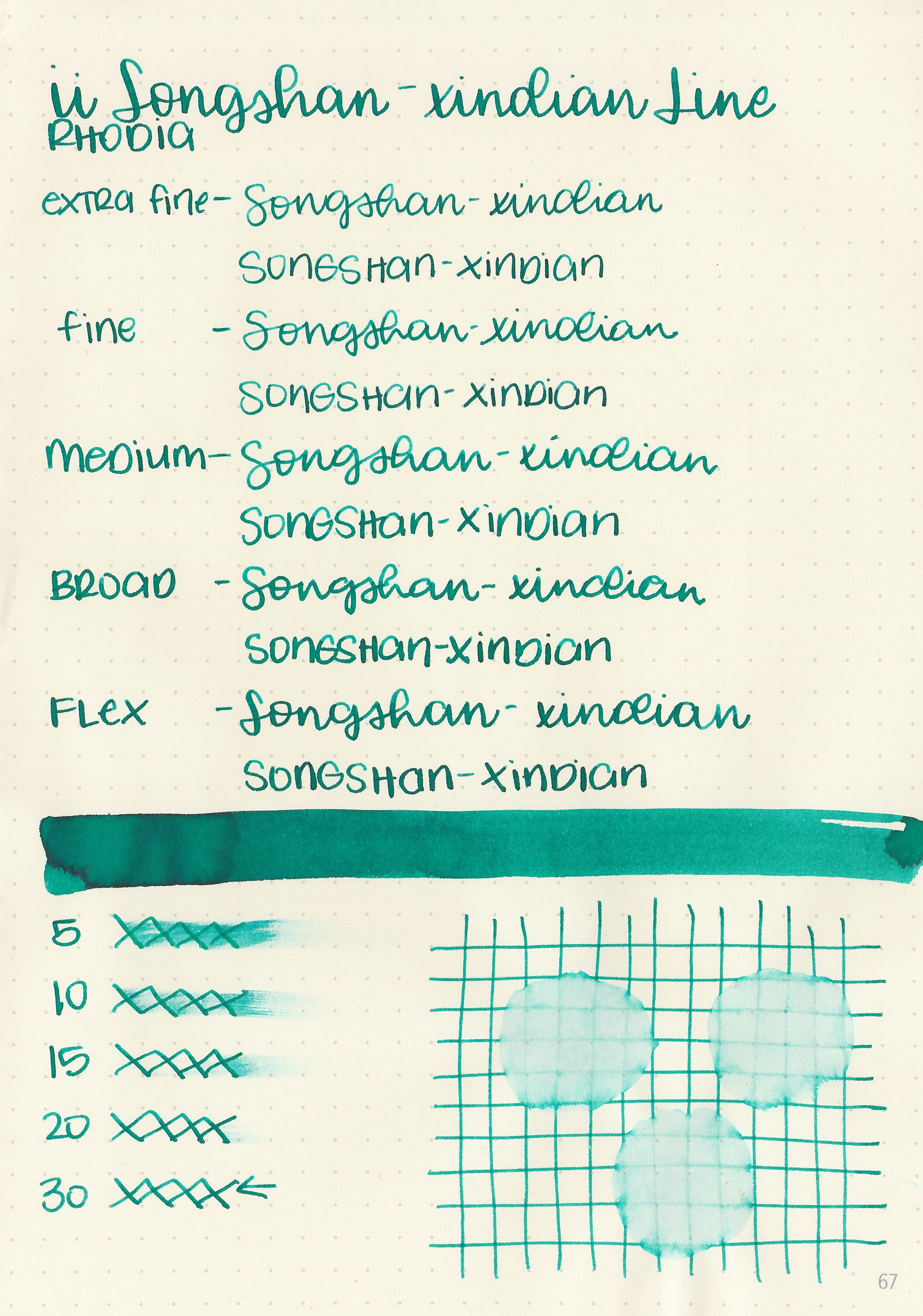
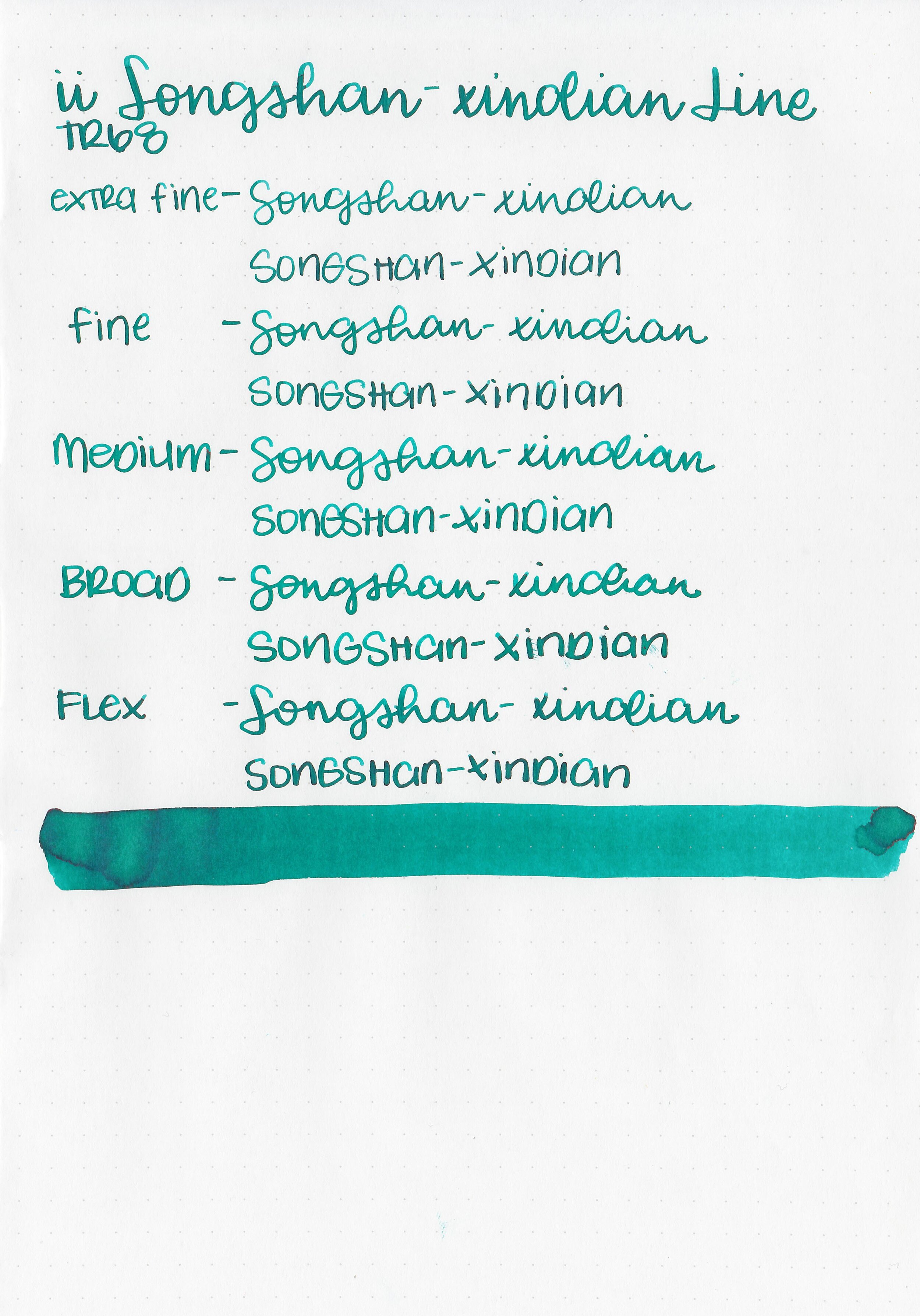
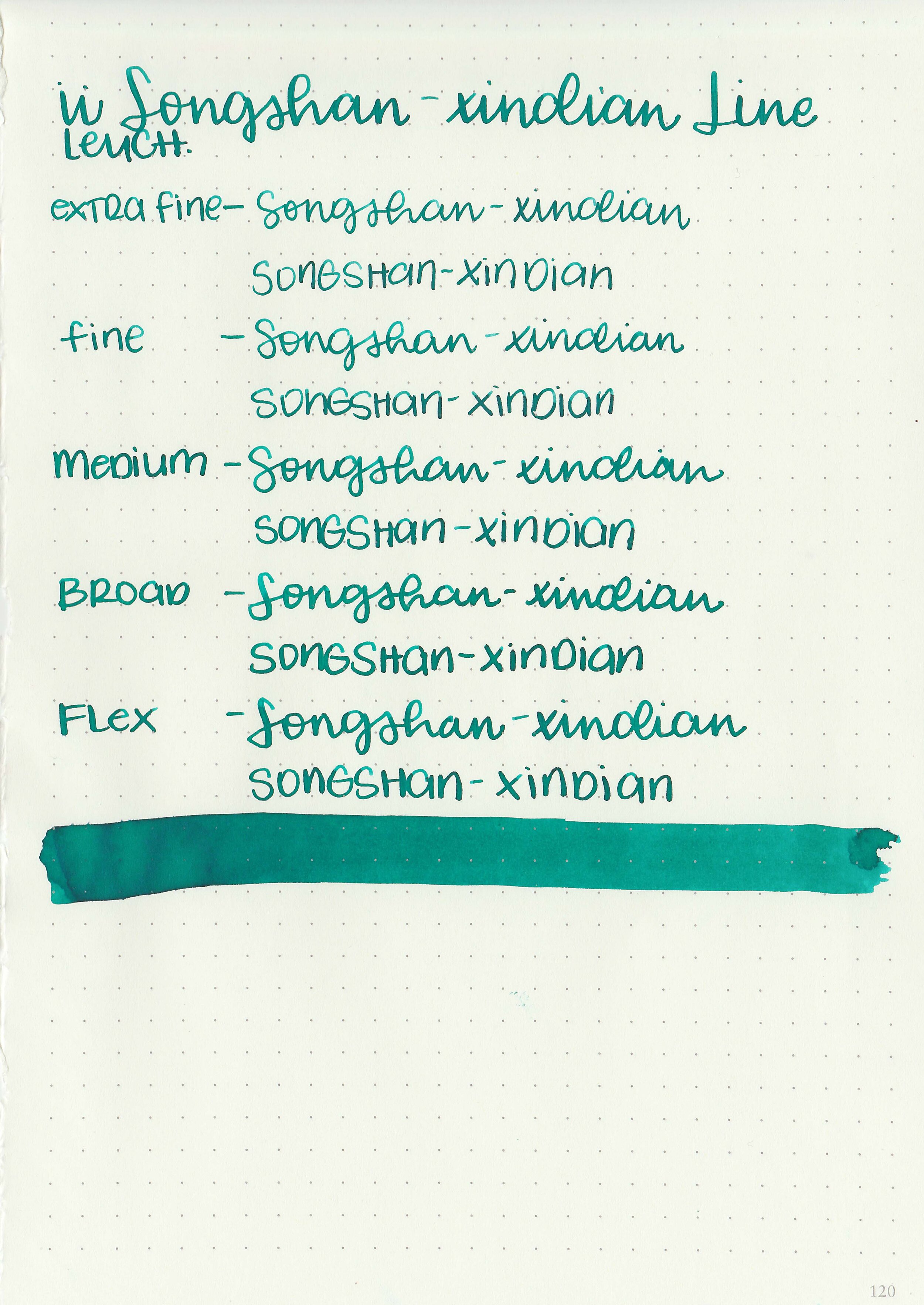
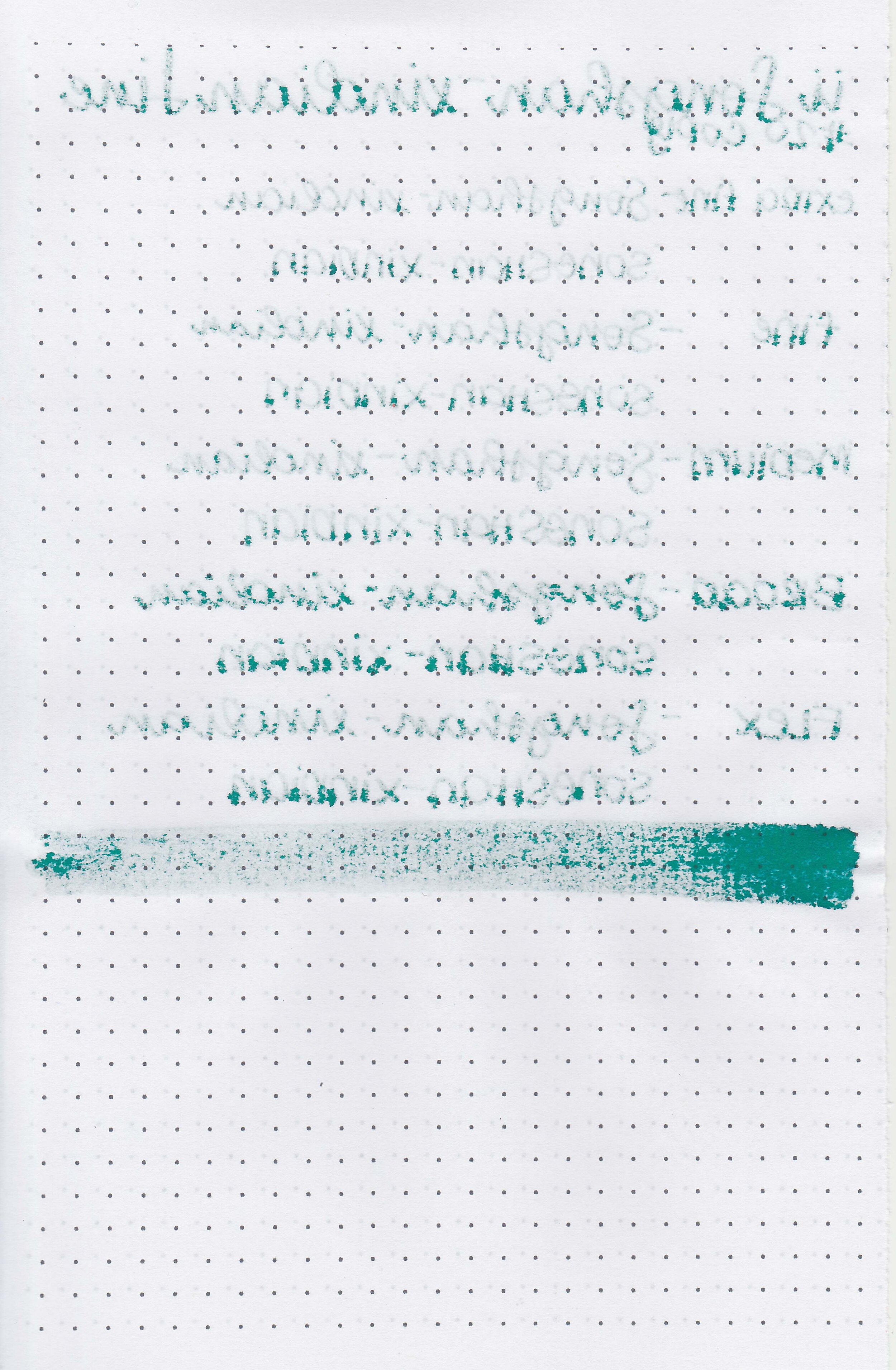
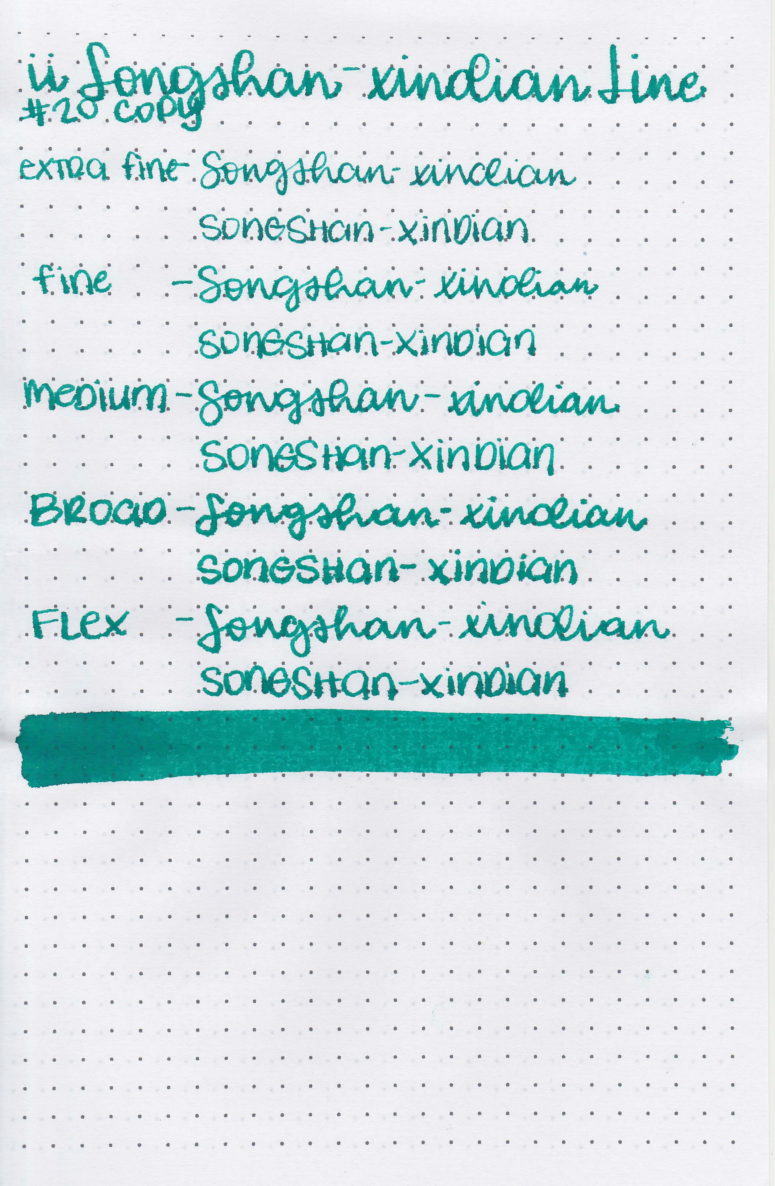
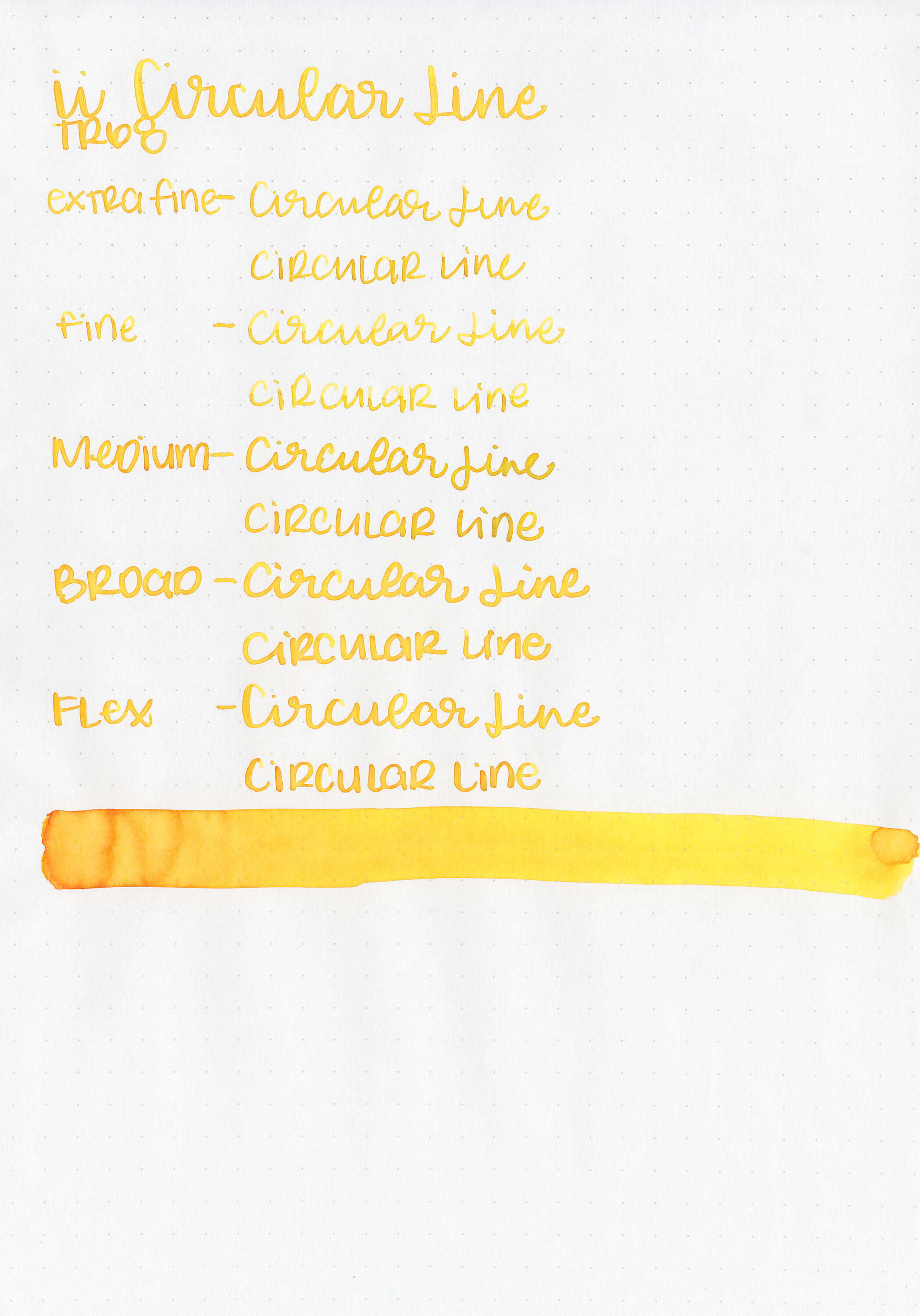
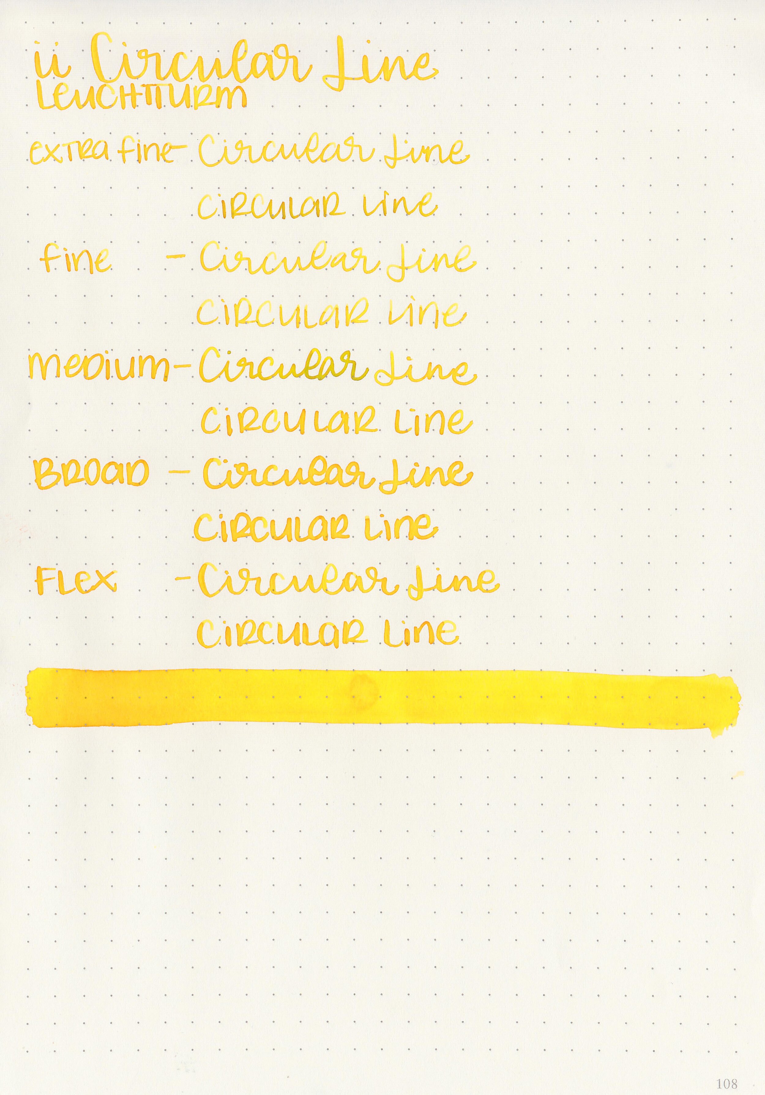
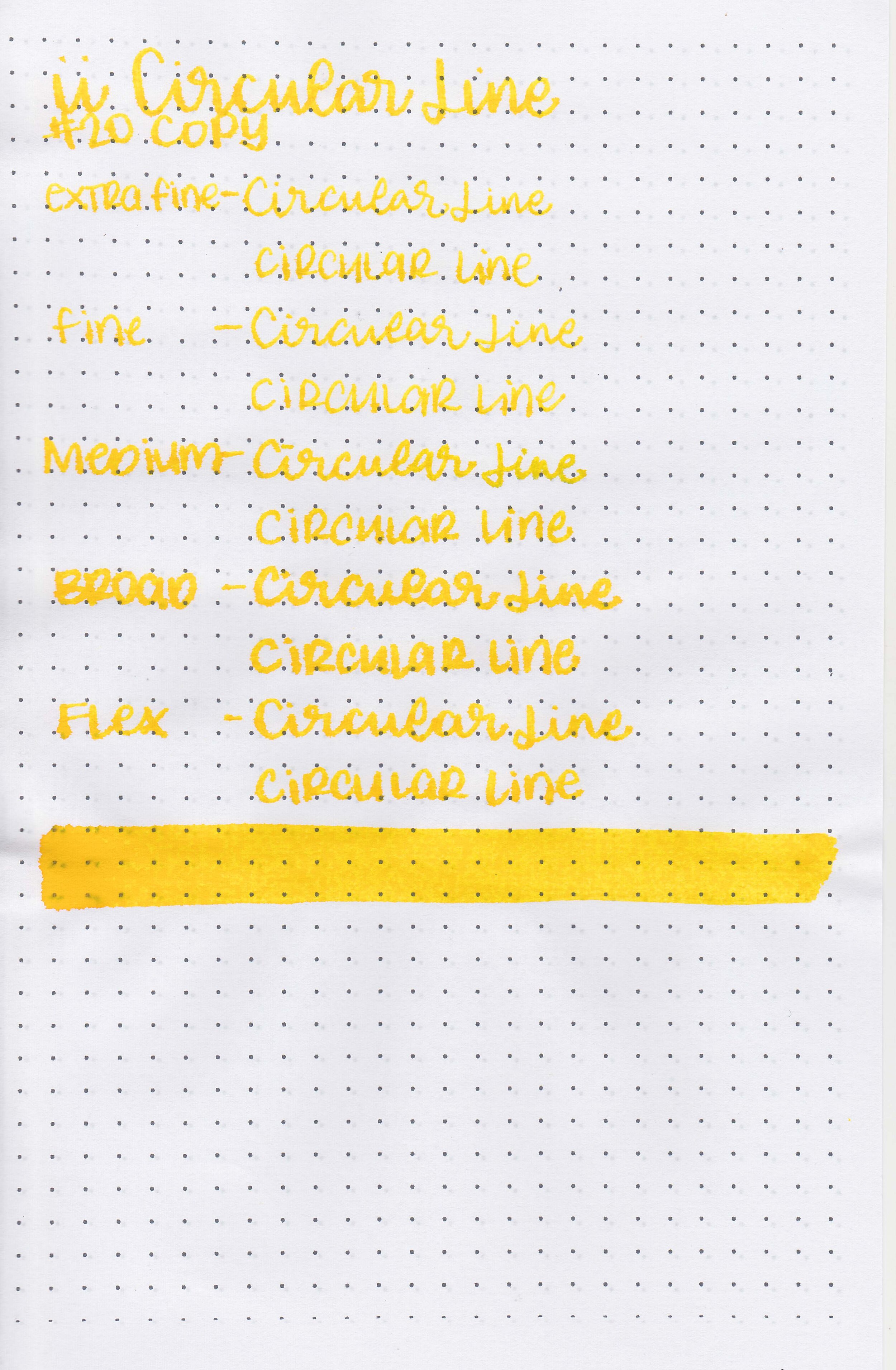
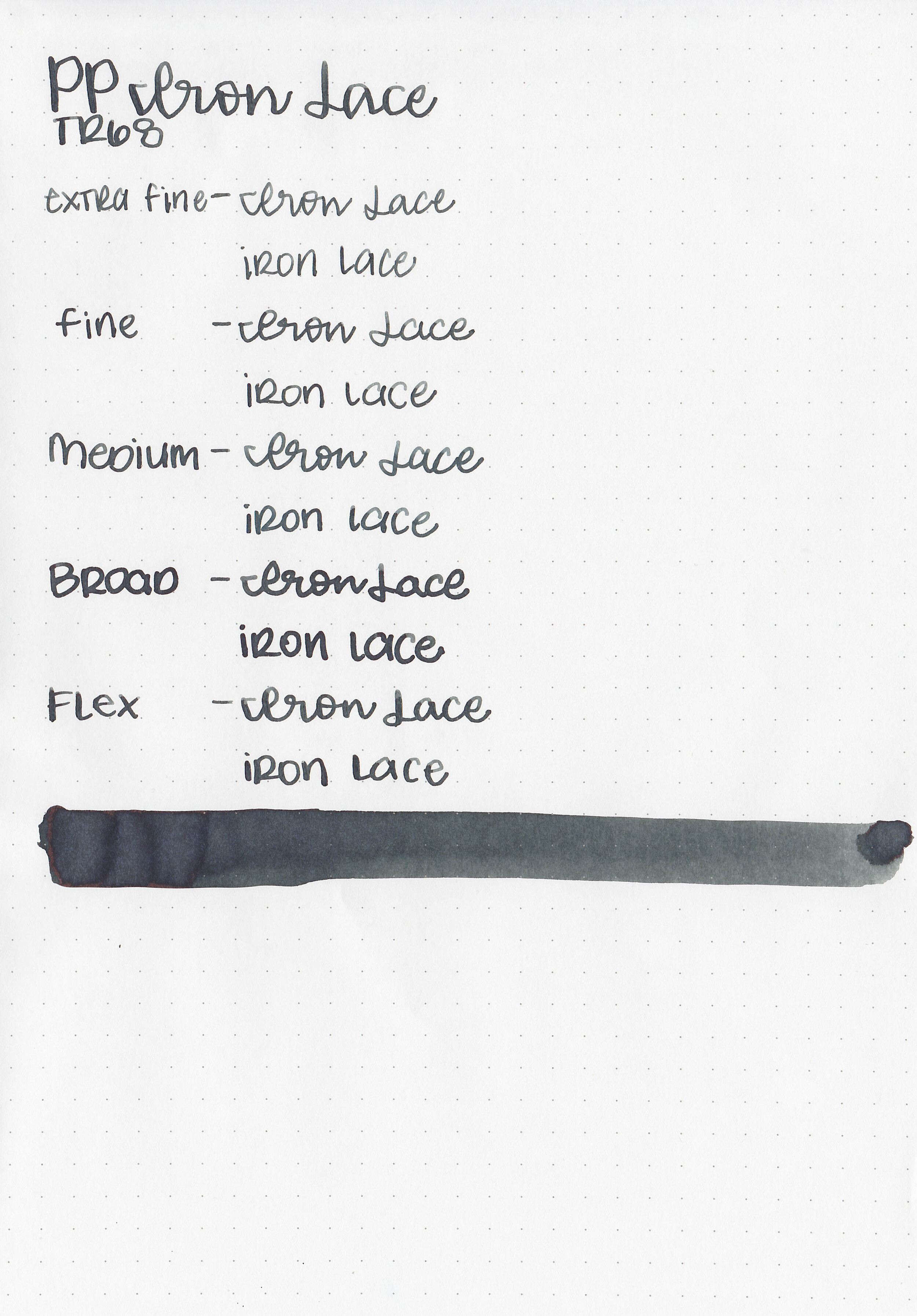
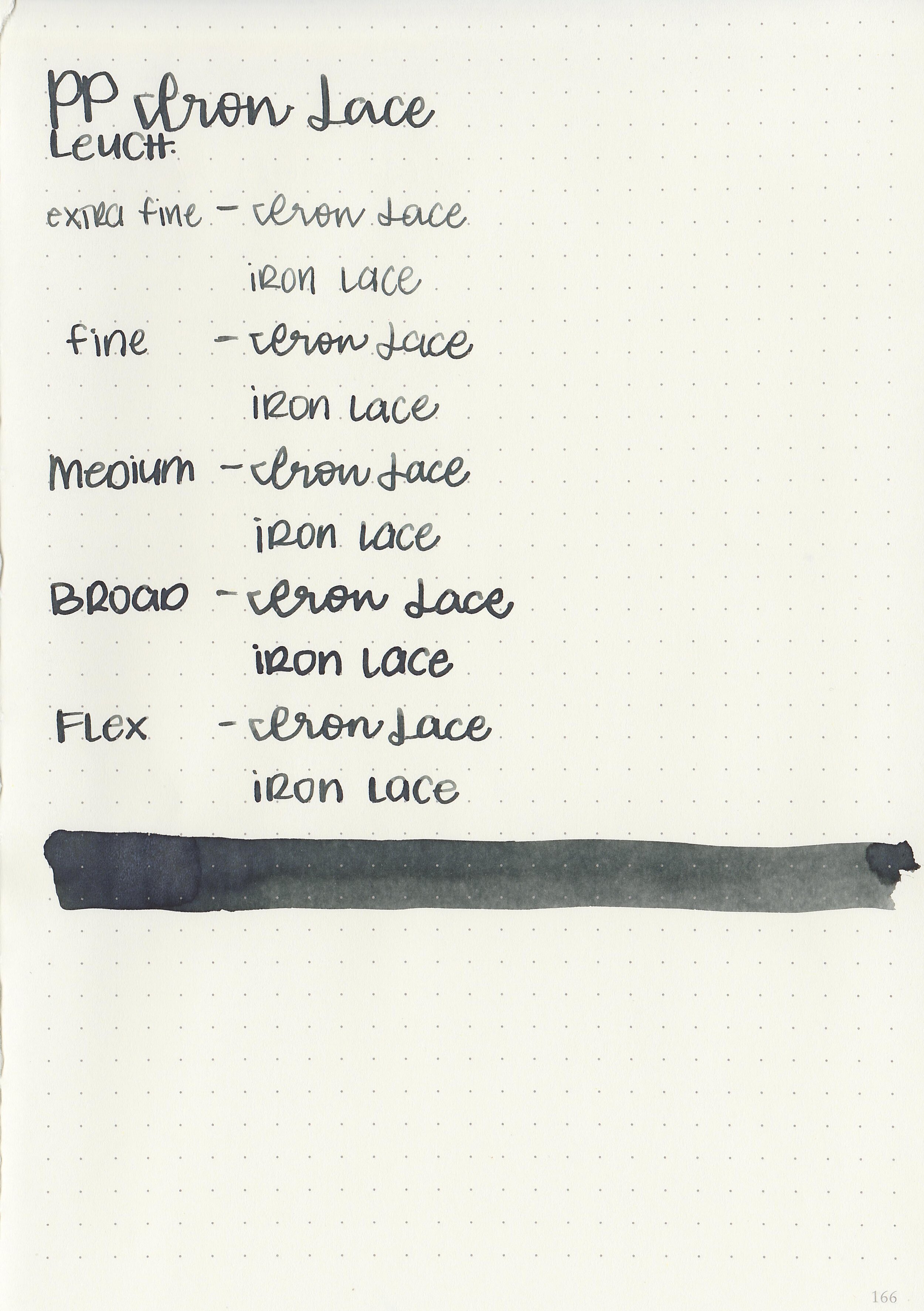
Writing samples:
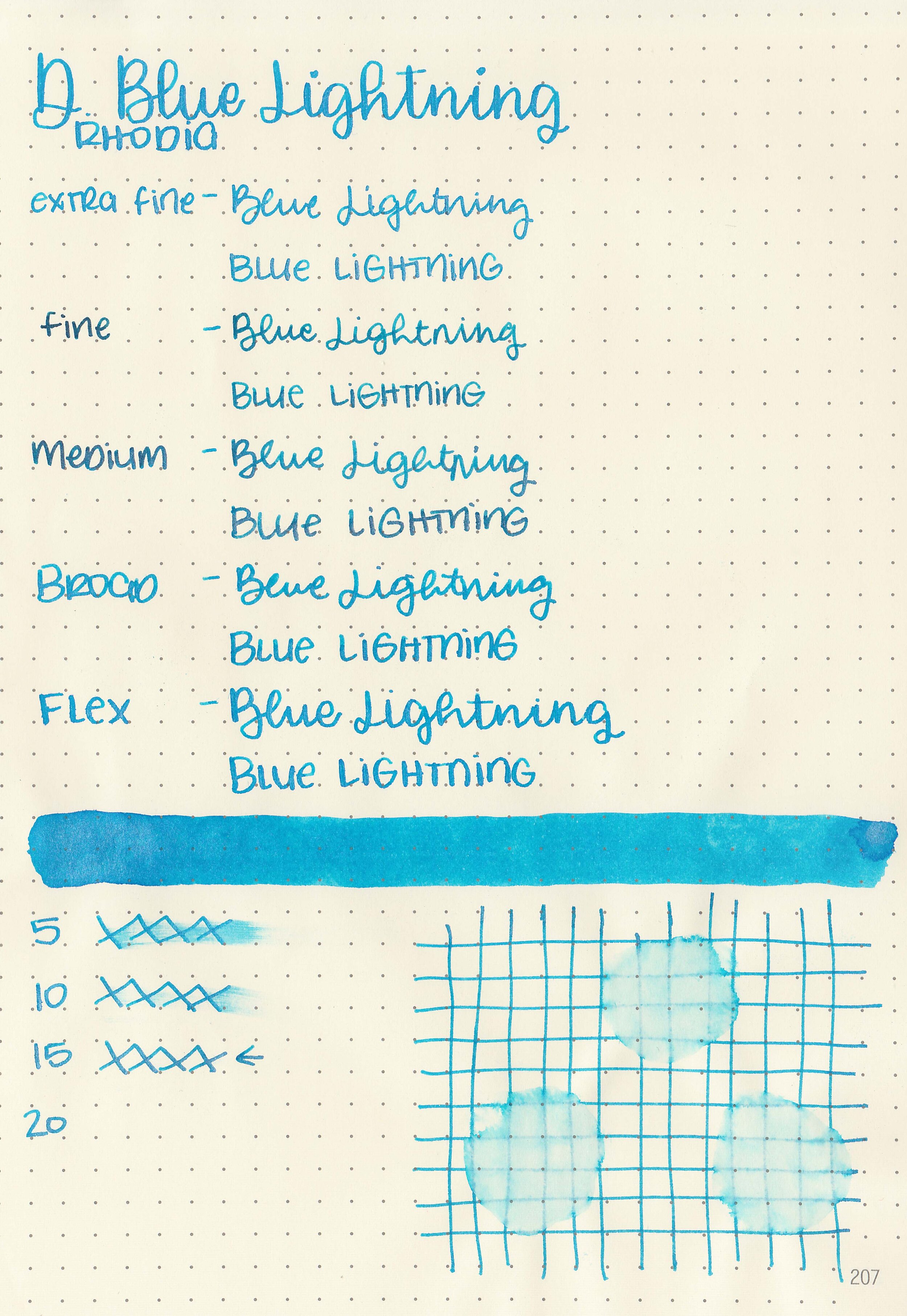
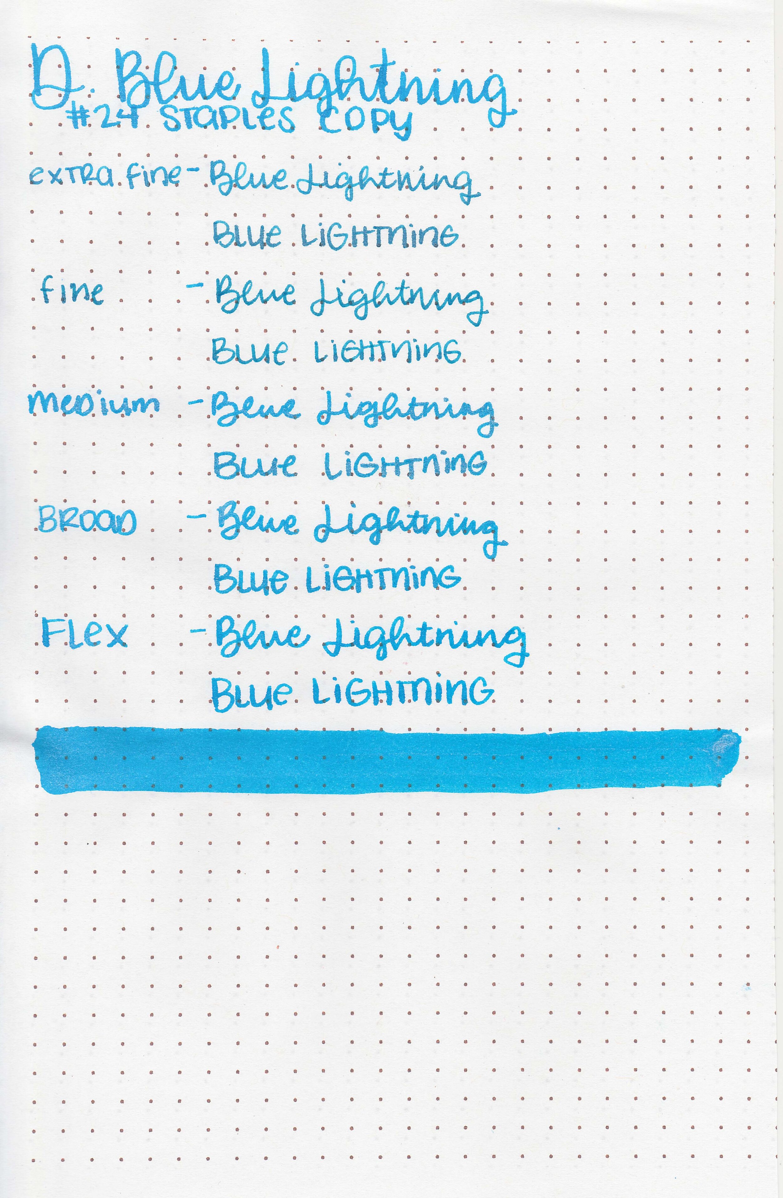
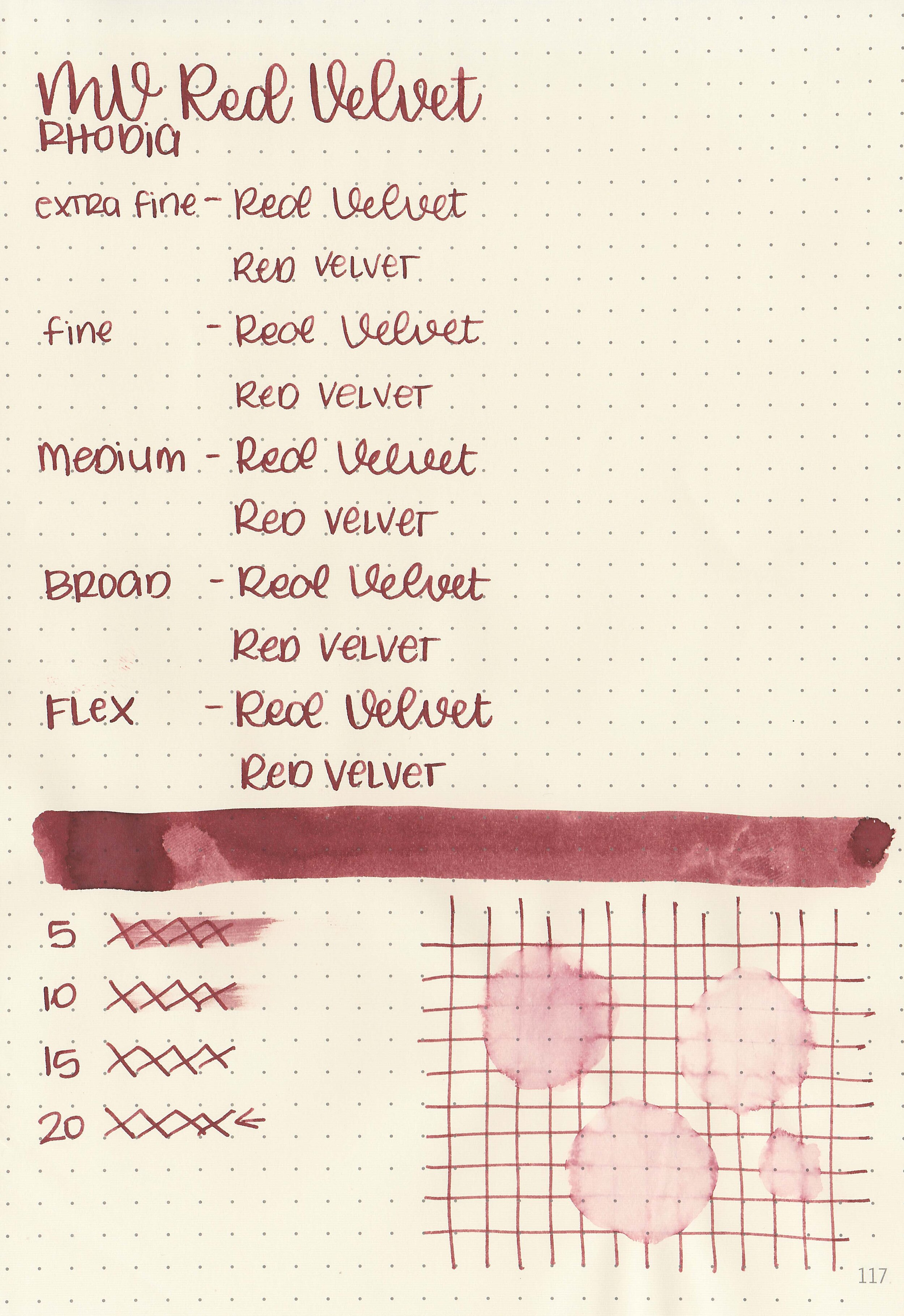
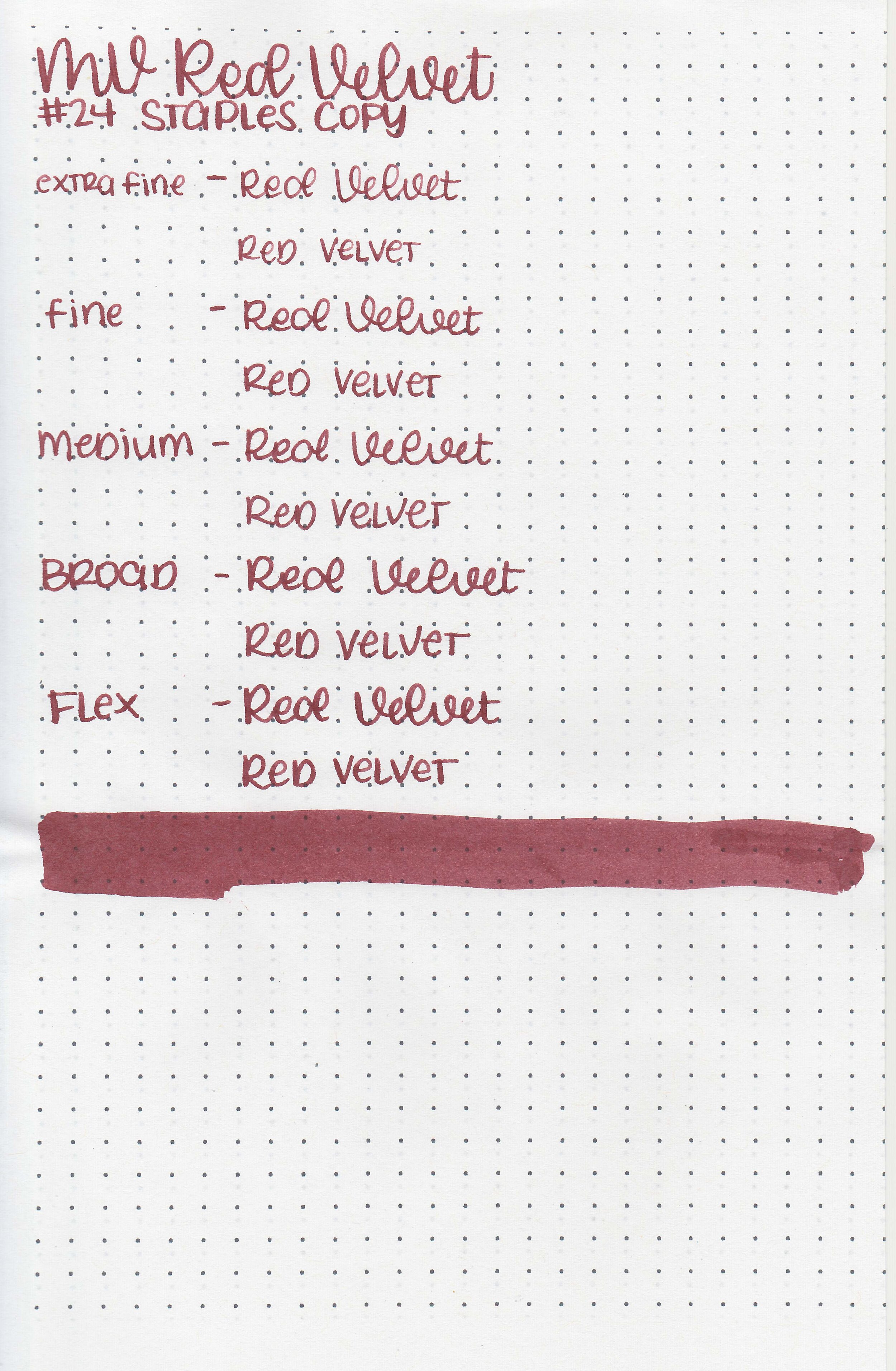
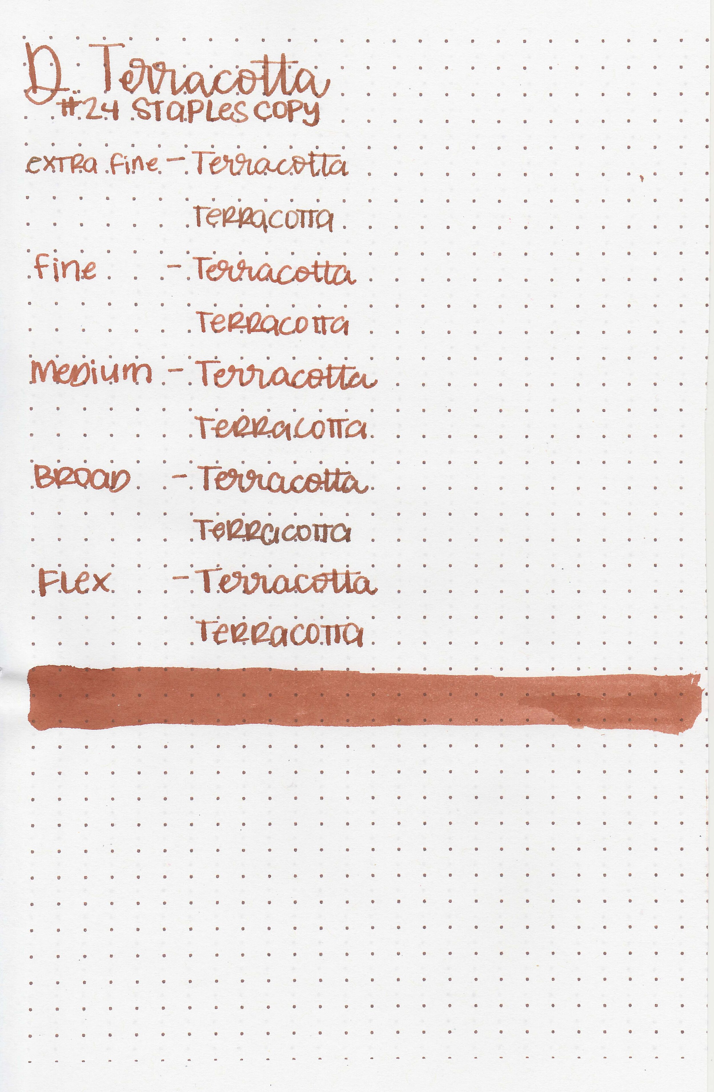
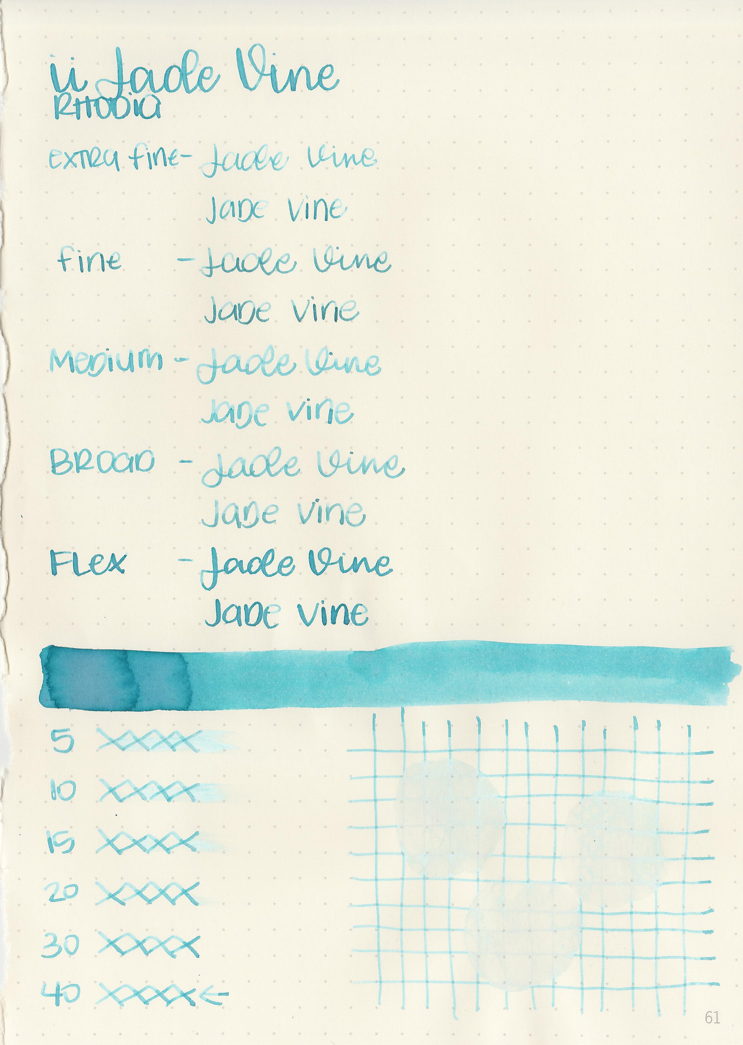
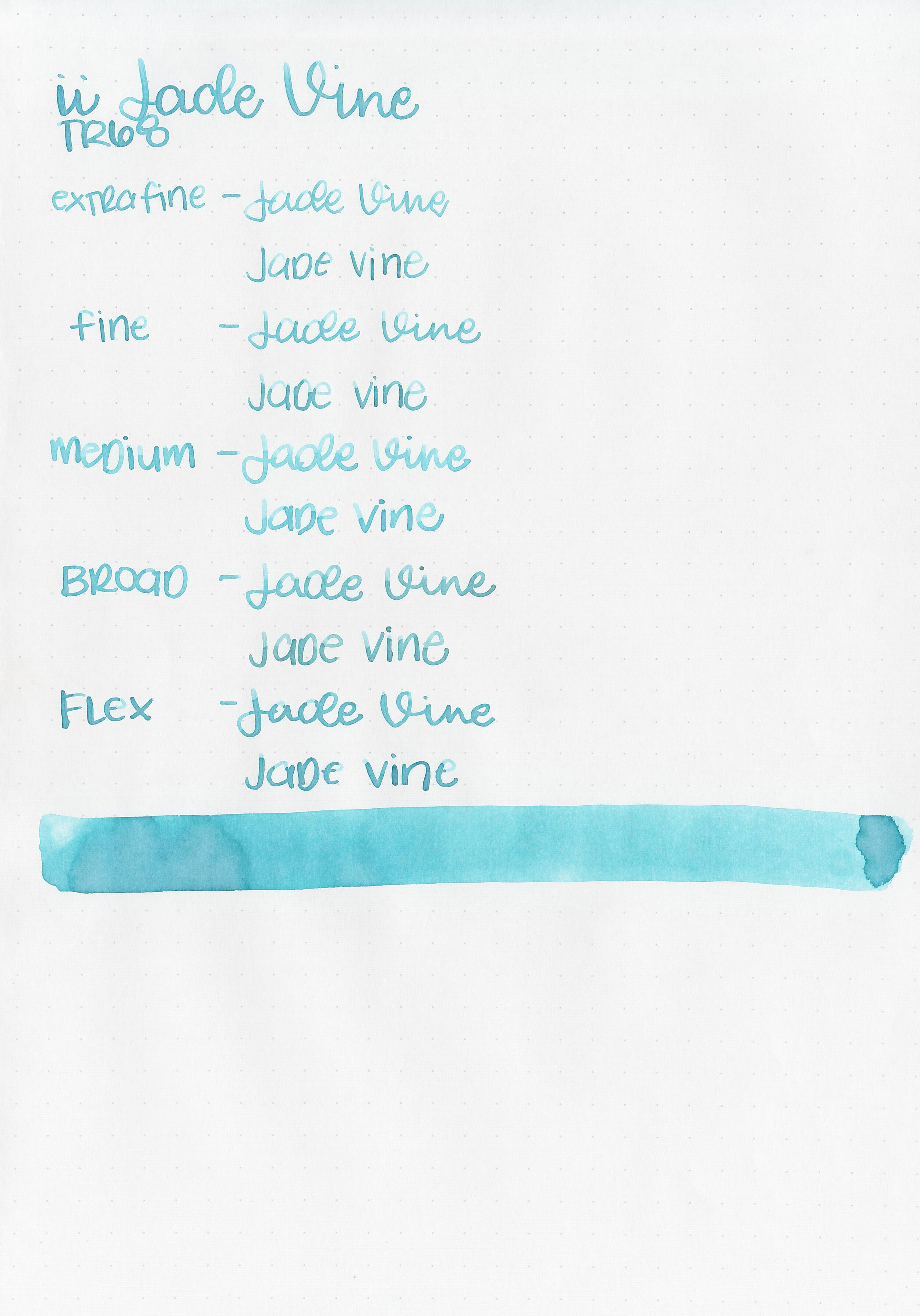
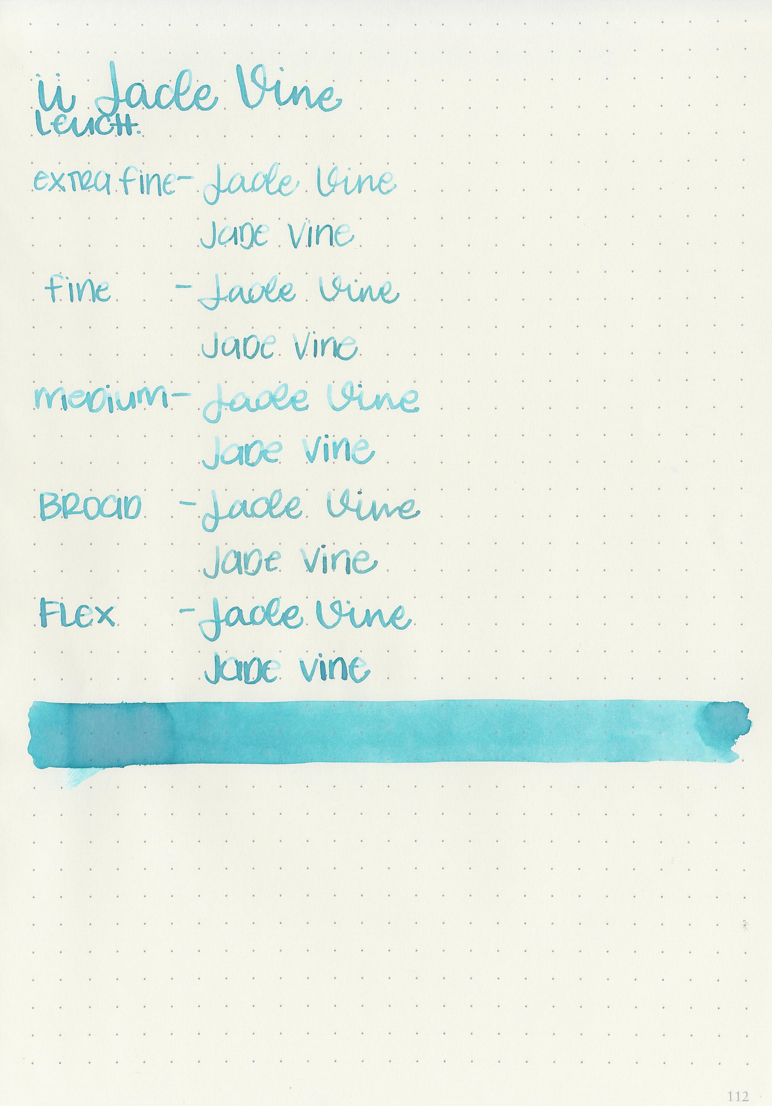
Let's take a look at how the ink behaves on fountain pen friendly papers: Rhodia, Tomoe River, and Leuchtturm.
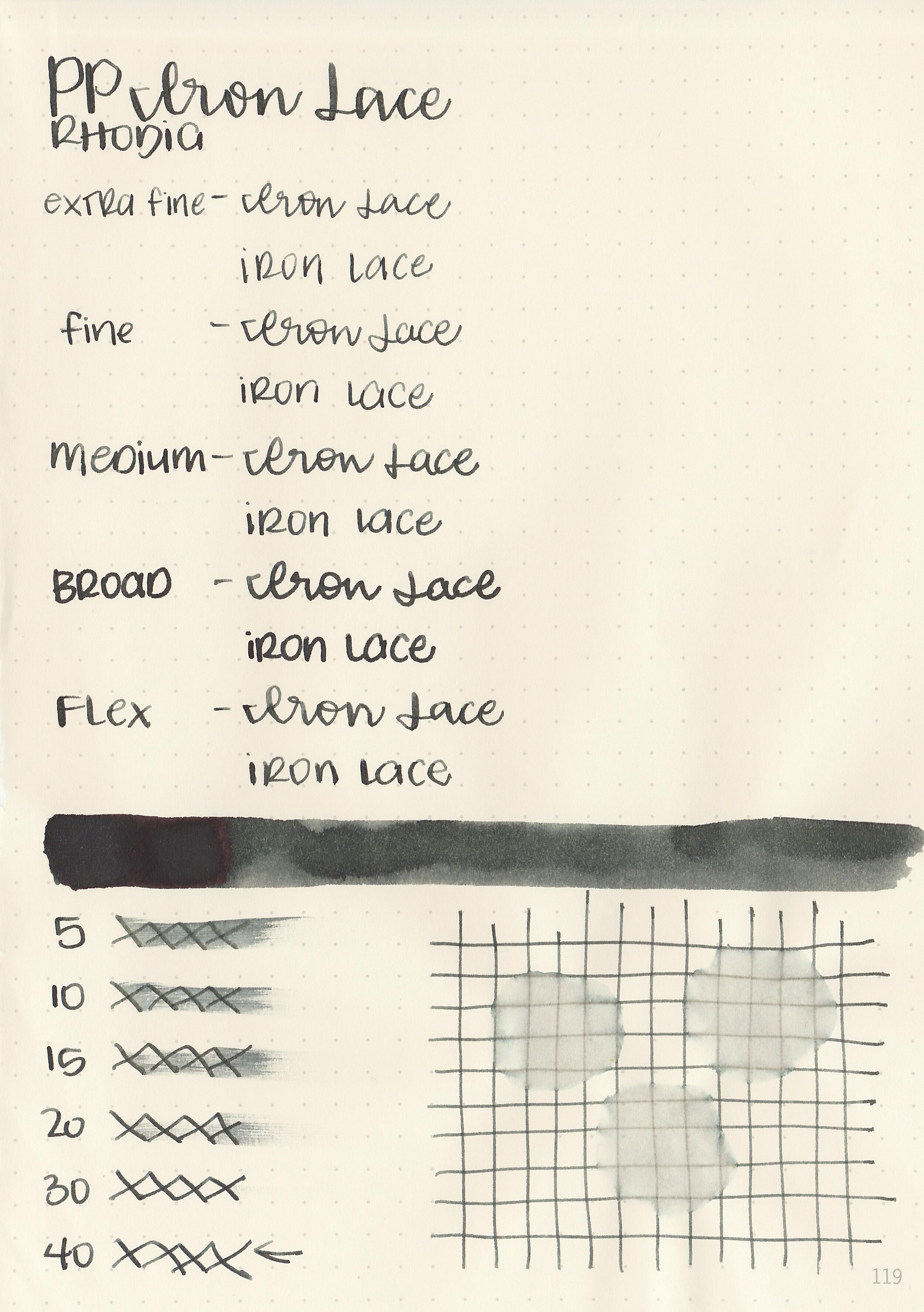
Dry time: 40 seconds
Water resistance: Medium
Feathering: None
Show through: Medium
Bleeding: None
Other properties: low shading, tiny bronze sheen, and no shimmer. The sheen is only visible in large swabs on Tomoe River Paper.
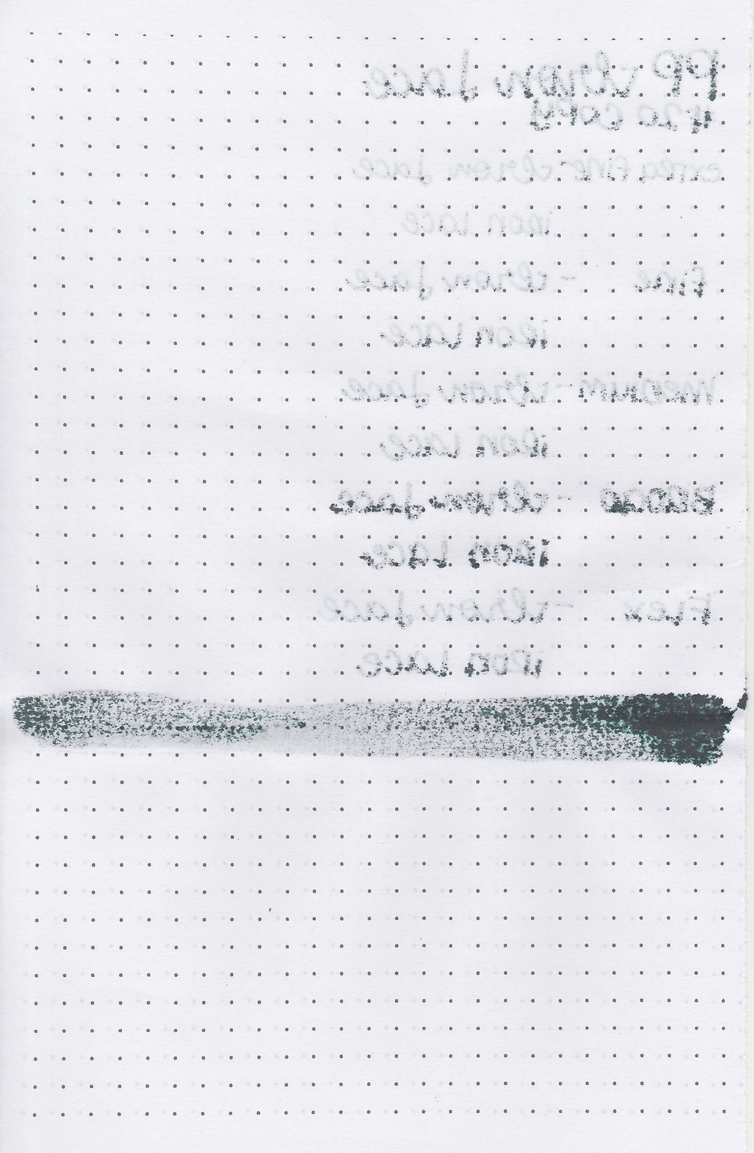
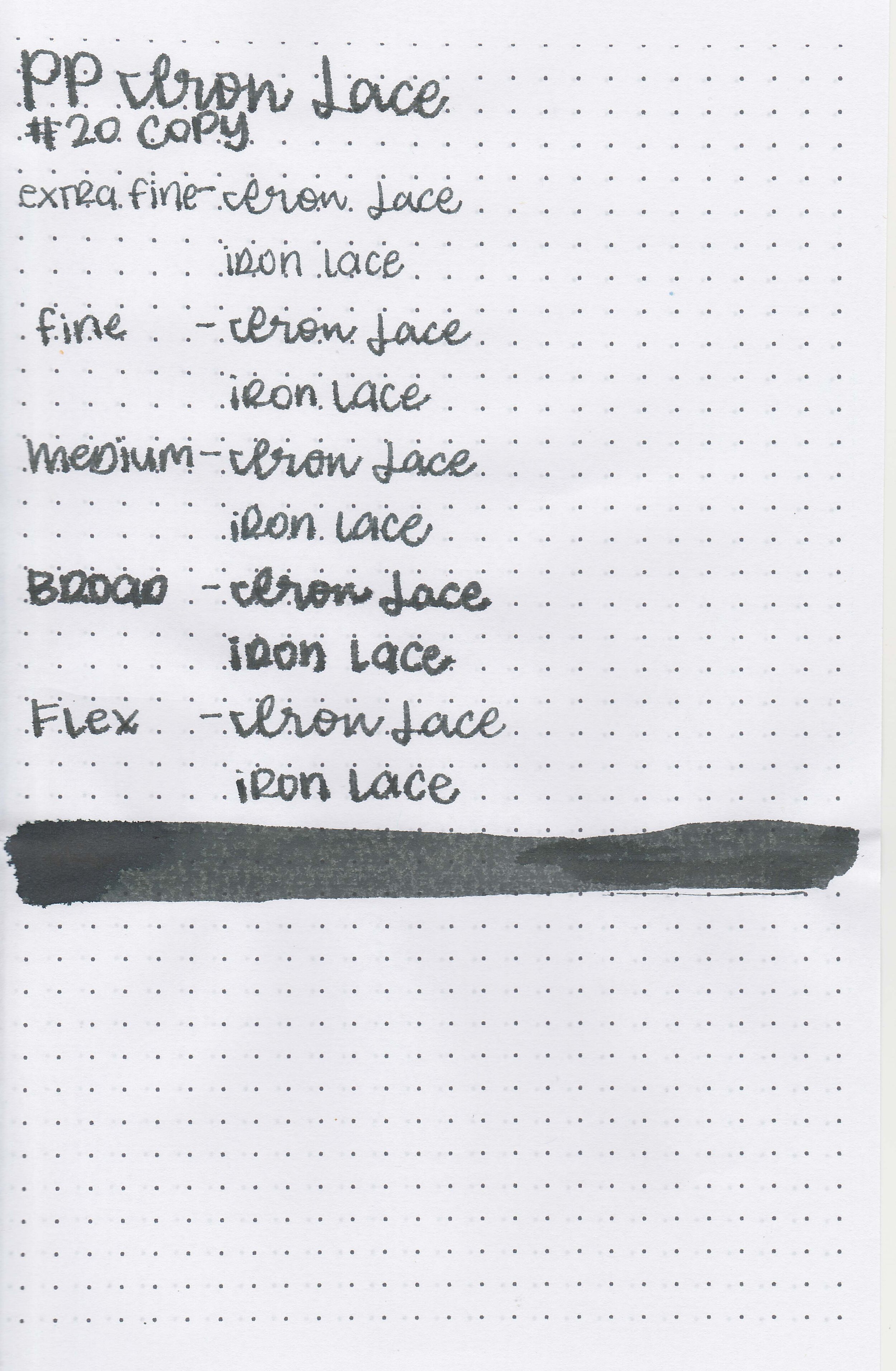
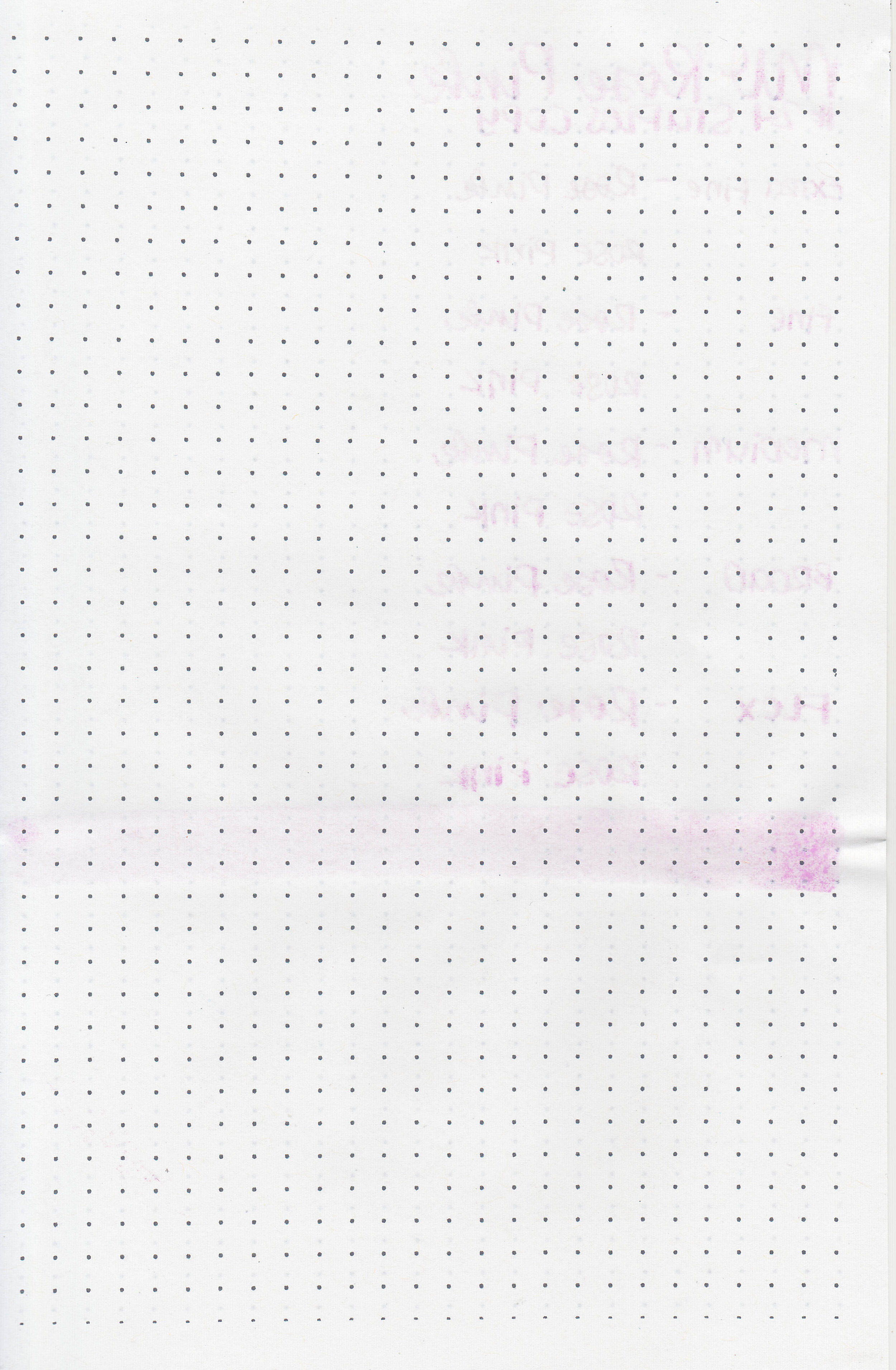
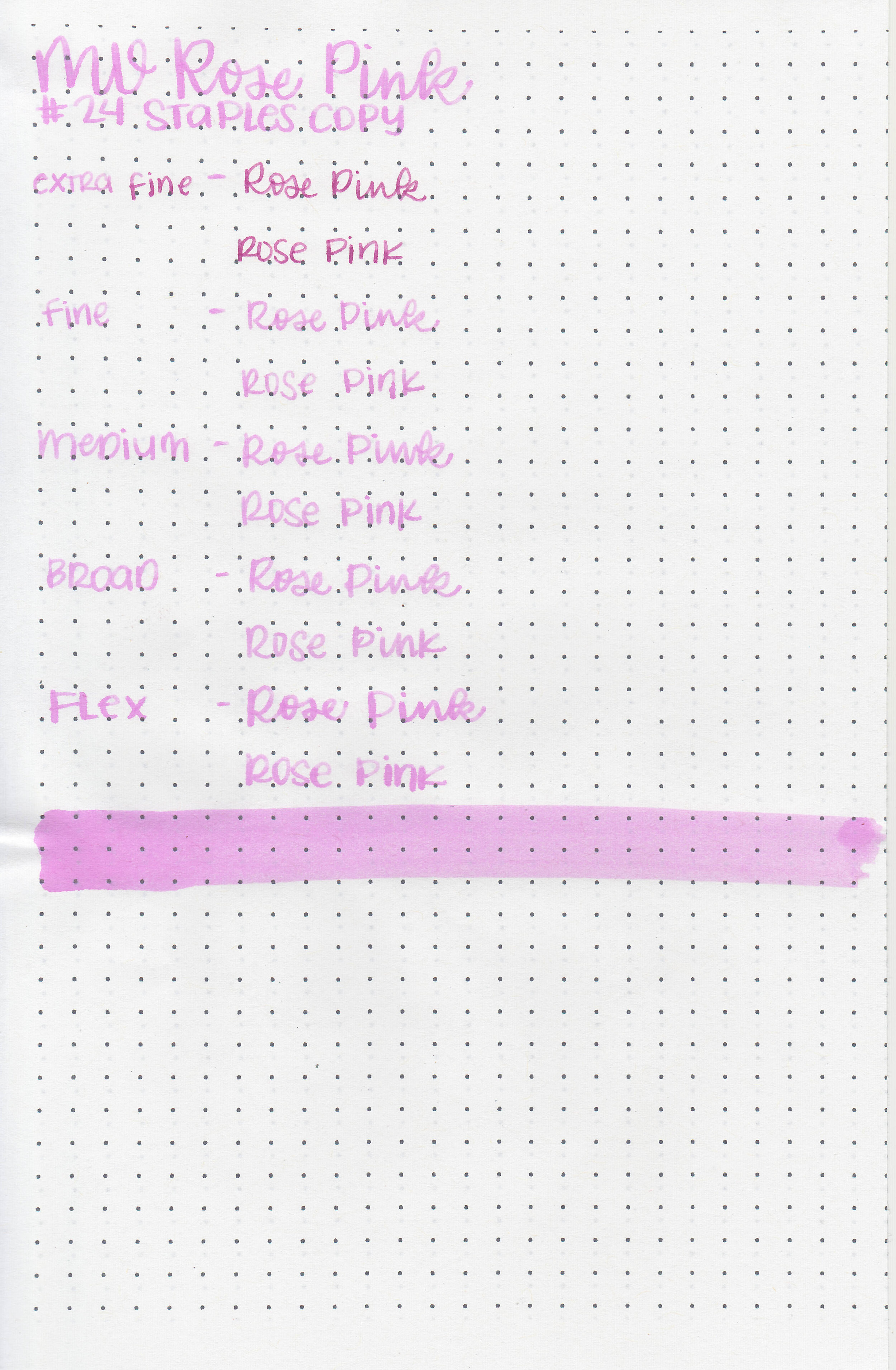
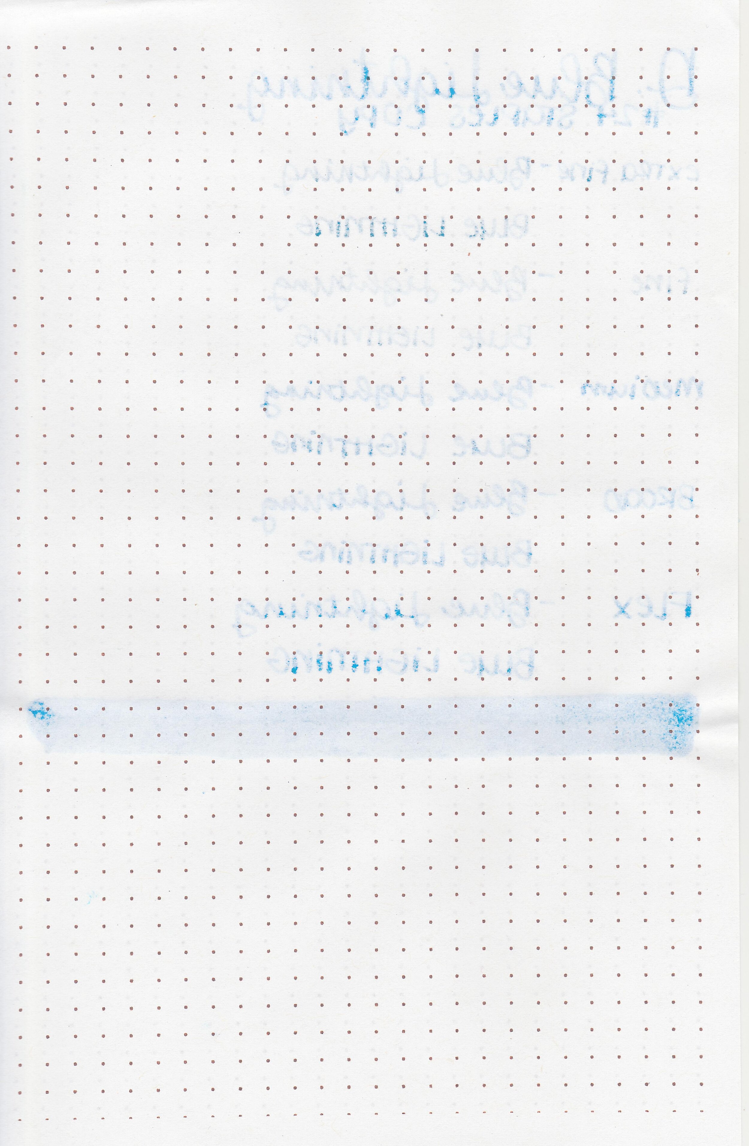
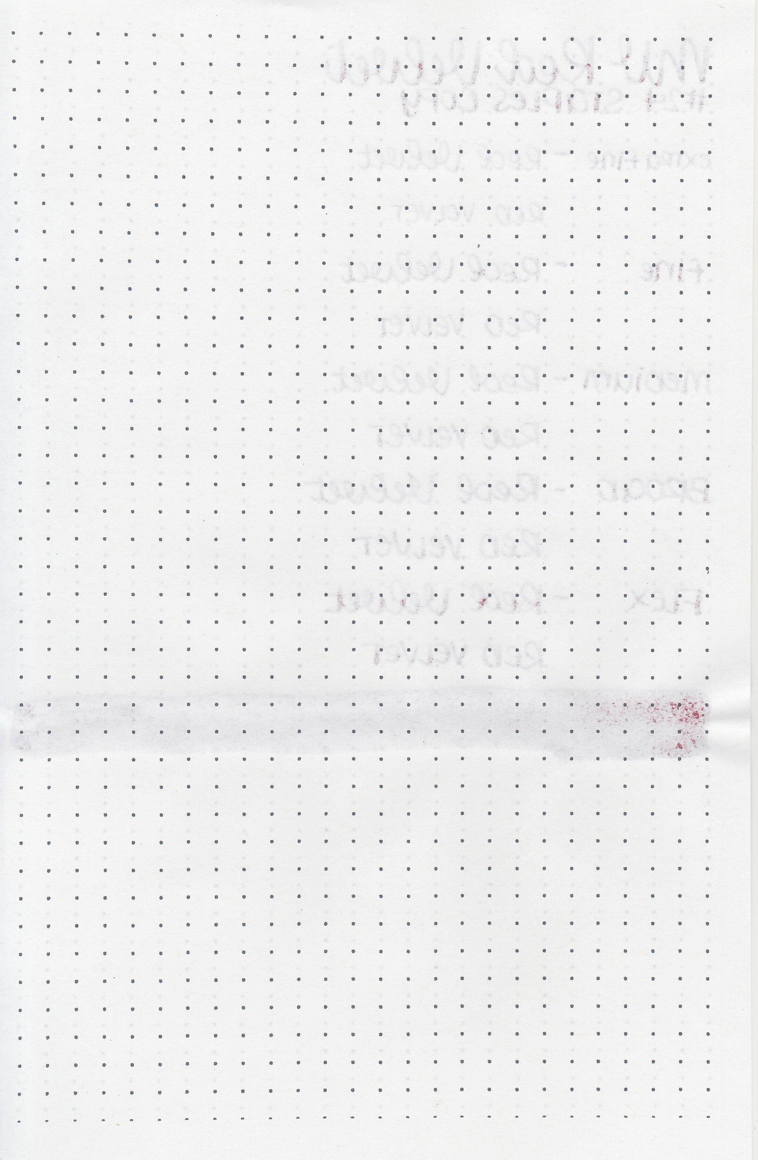
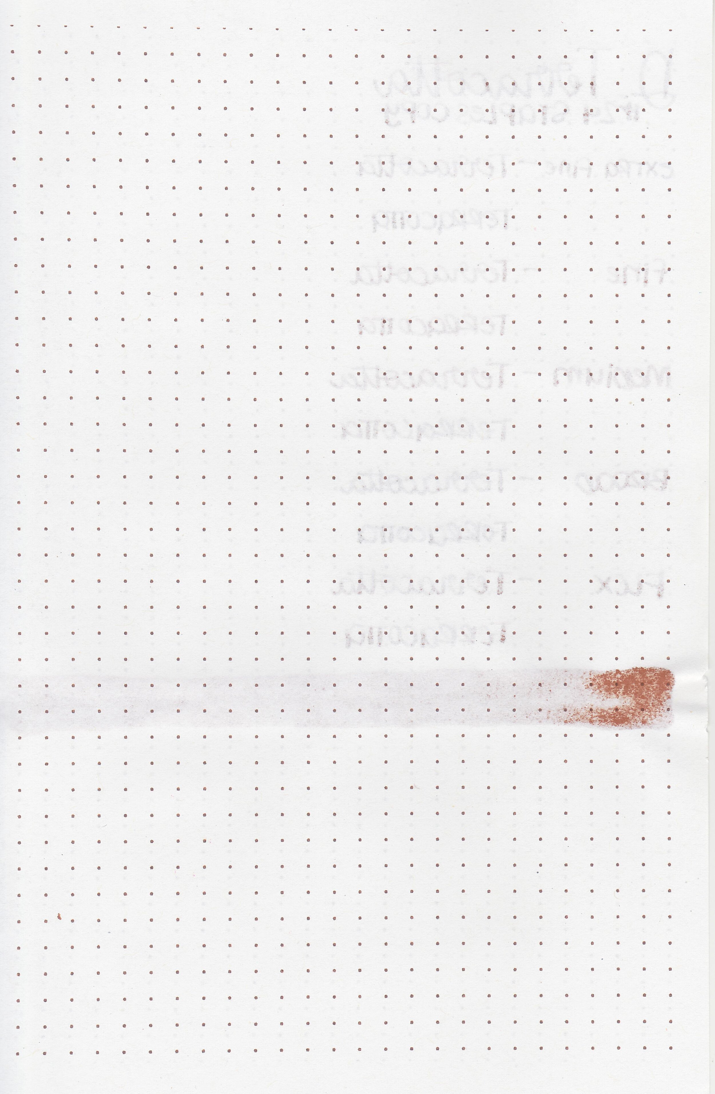
On Staples 24 lb copy paper there was some feathering and bleeding in all nib sizes.
Comparison Swabs:
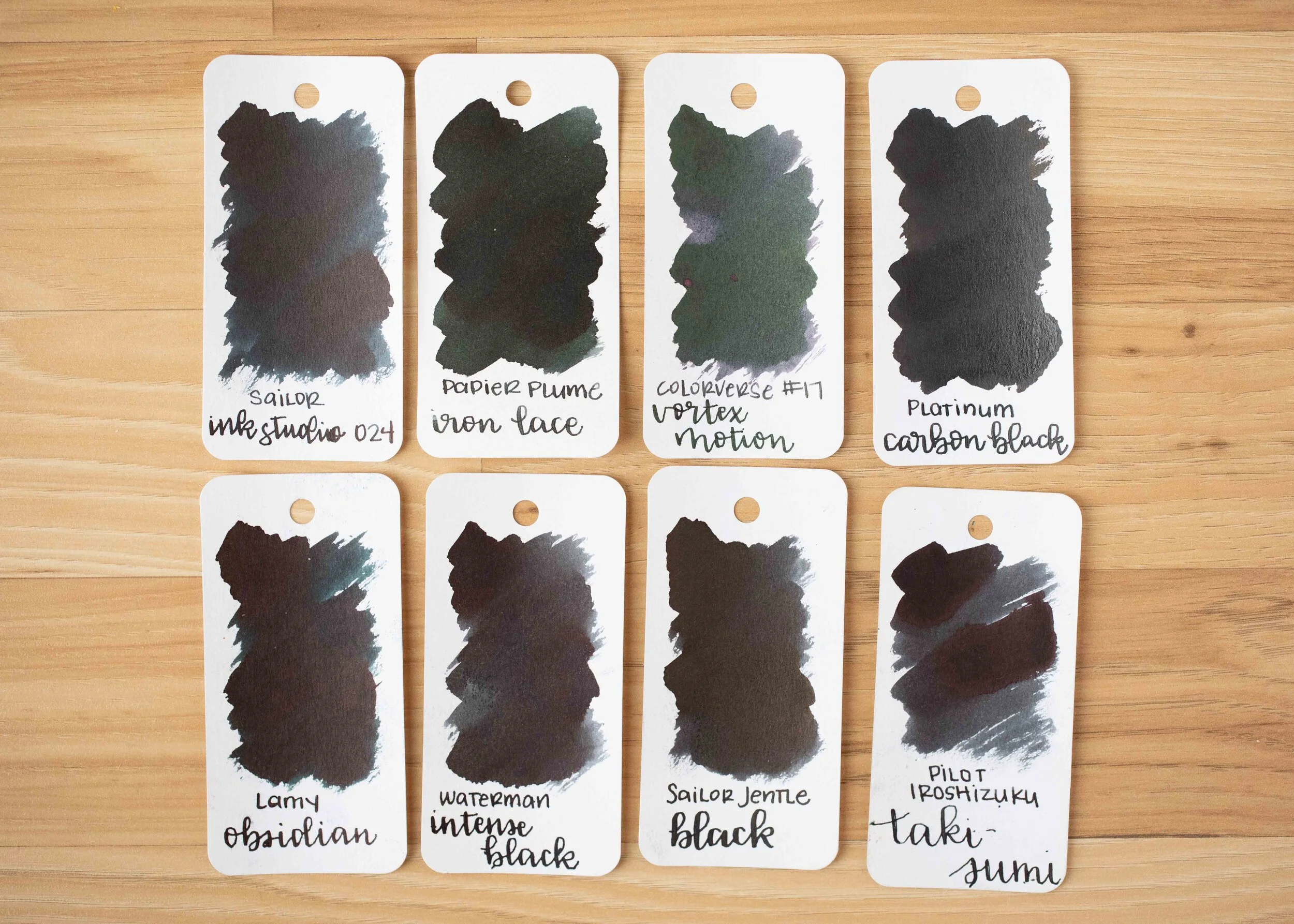
Iron Lace has more green in it than Sailor Jentle Black, but less green than Lamy Obsidian. Click here to see the Papier Plume inks together, and click here to see the black inks together.
Longer writing:

I used a Pelikan M805 Stresemann with a medium nib on a Taroko Enigma notebook. The ink had an average flow.
Overall, I enjoyed this ink; it’s such an interesting color while still being well behaved. It’s a great addition to the New Orleans collection.
Disclaimer: This ink was provided by Papier Plume for the purpose of this review. All photos and opinions are my own. This page does not contain affiliate links and this post is not sponsored in any way.