Exceed Notebooks

exceed-notebooks-s-3.jpg

Recently a friend recommended I try the Exceed notebooks from Walmart, so I went down to the closest one to see what I could find. On the left is the Exceed A5 Bullet Journal in black, and on the right is the Hard Cover Dotted Book in white.

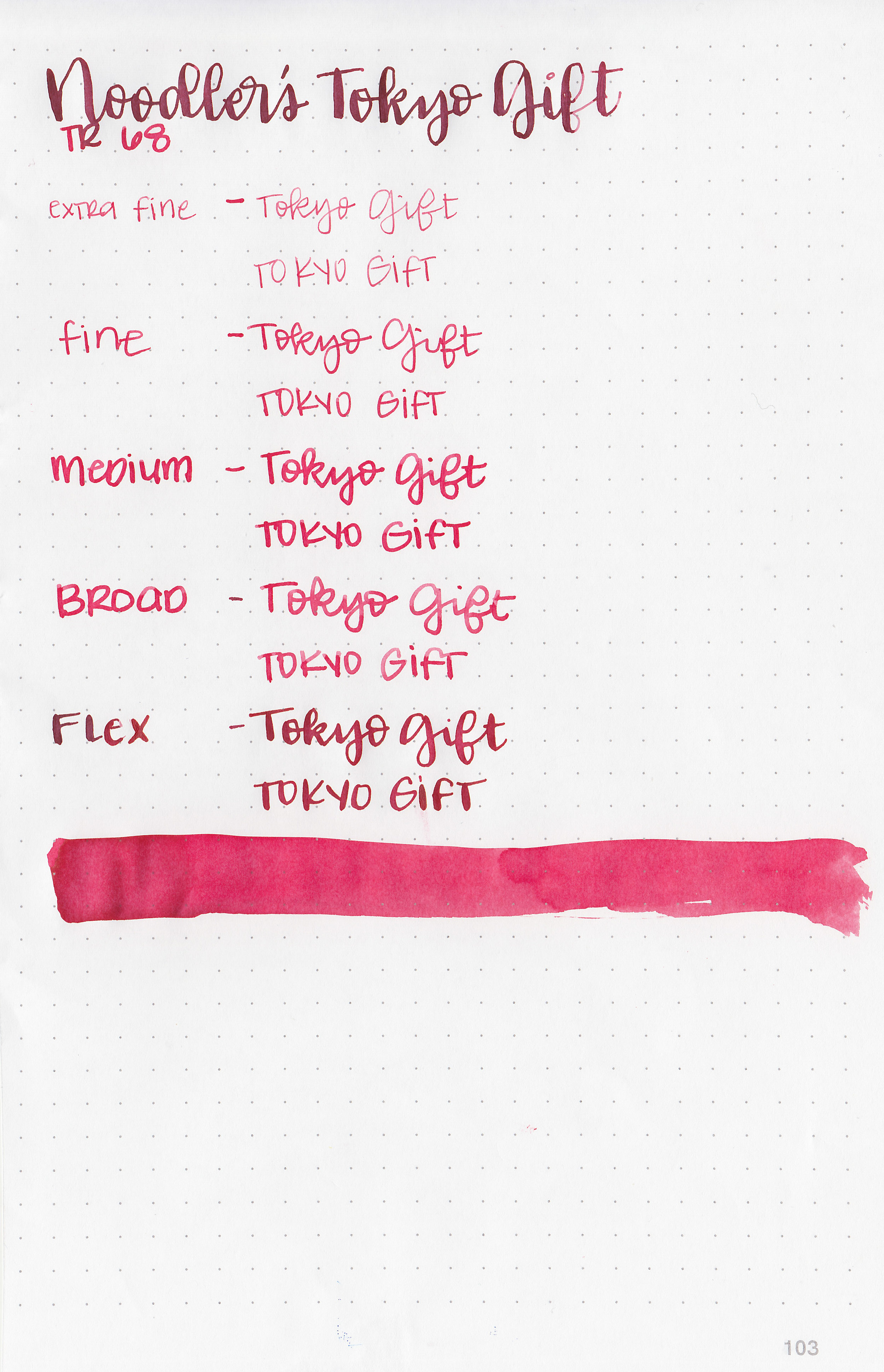
Hard Cover Dotted Book:

The Hard Cover Dotted Book contains 78 gsm cream heavyweight paper, 2 page markers, 120 sheets, an inner pocket, and measures 5 by 8 1/4 inches. It retails for $6.64.

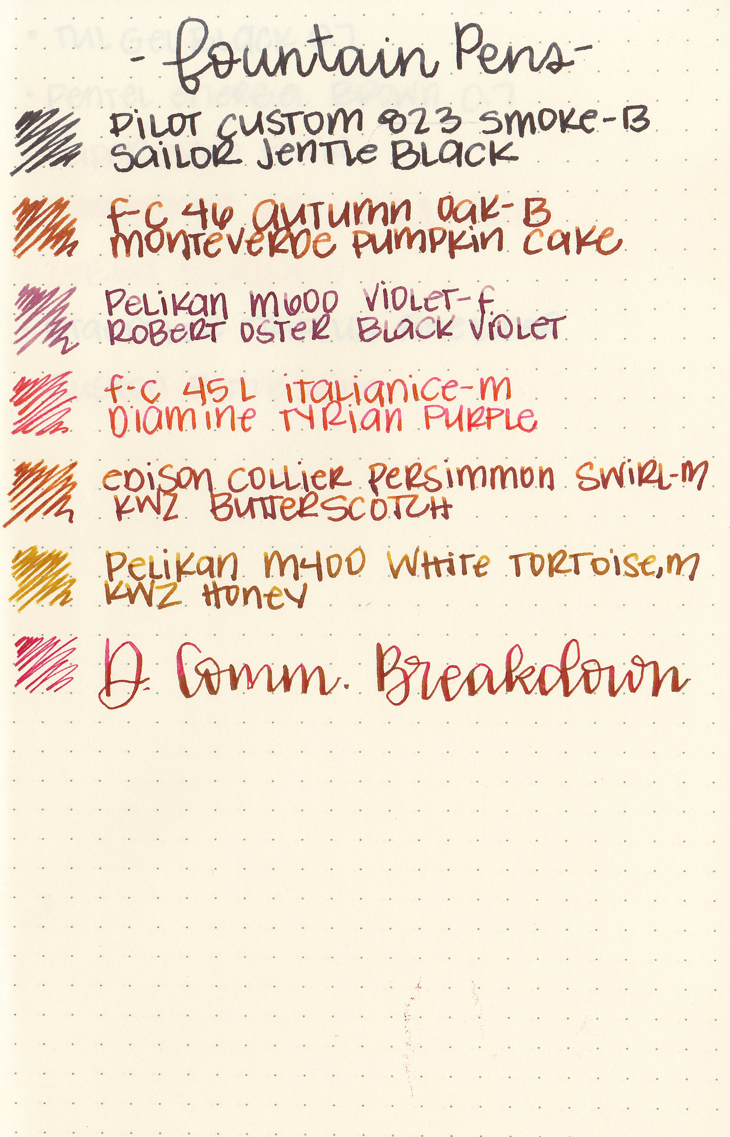
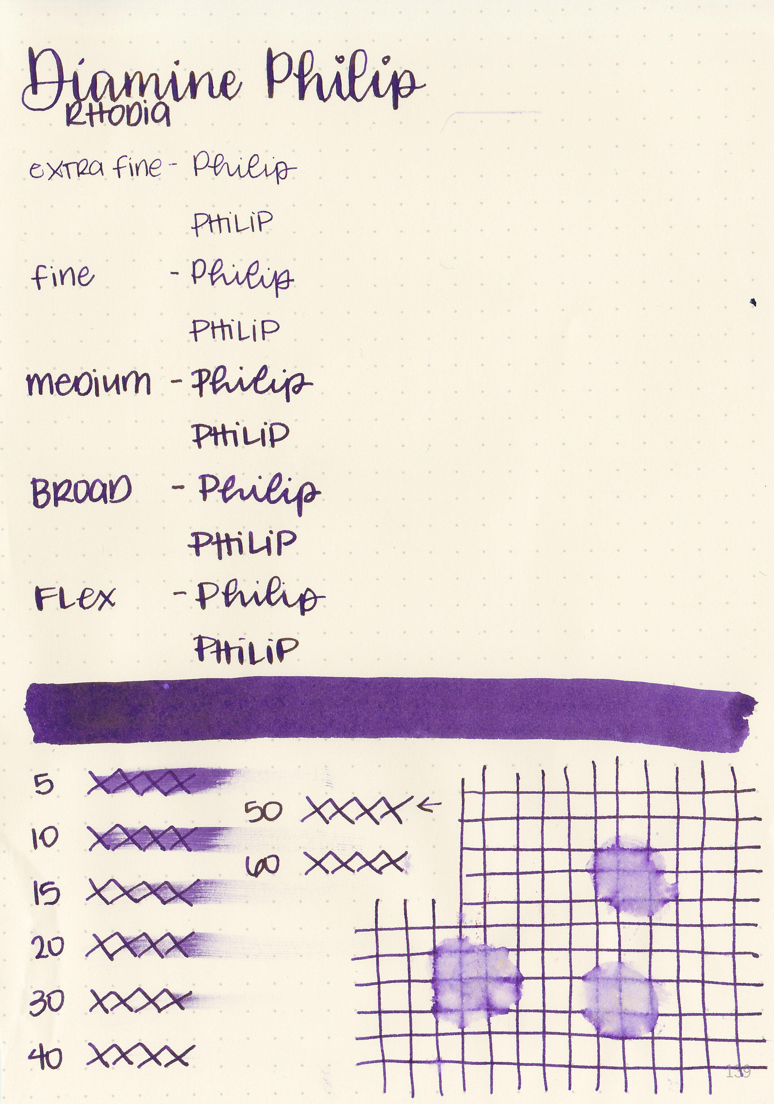
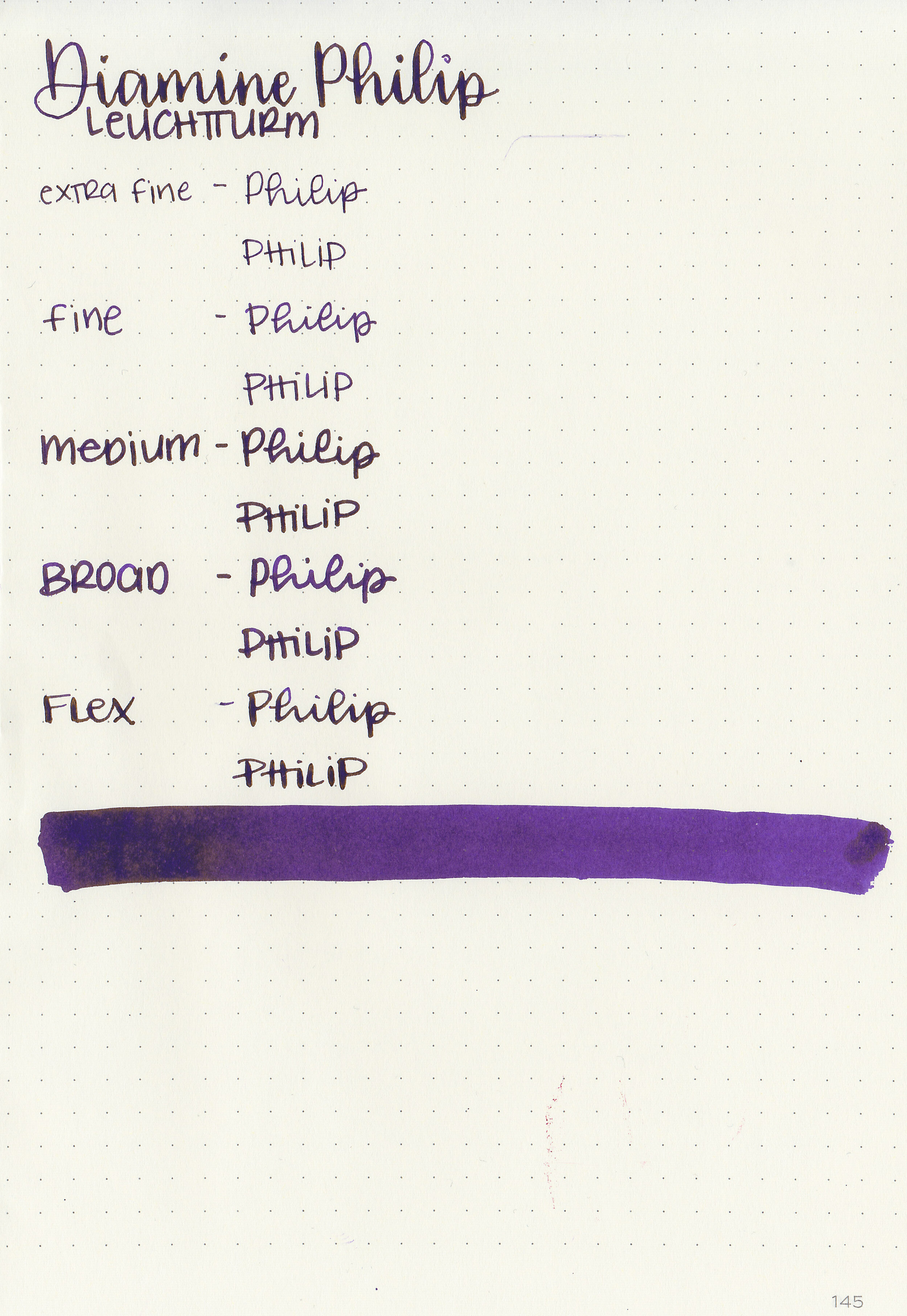
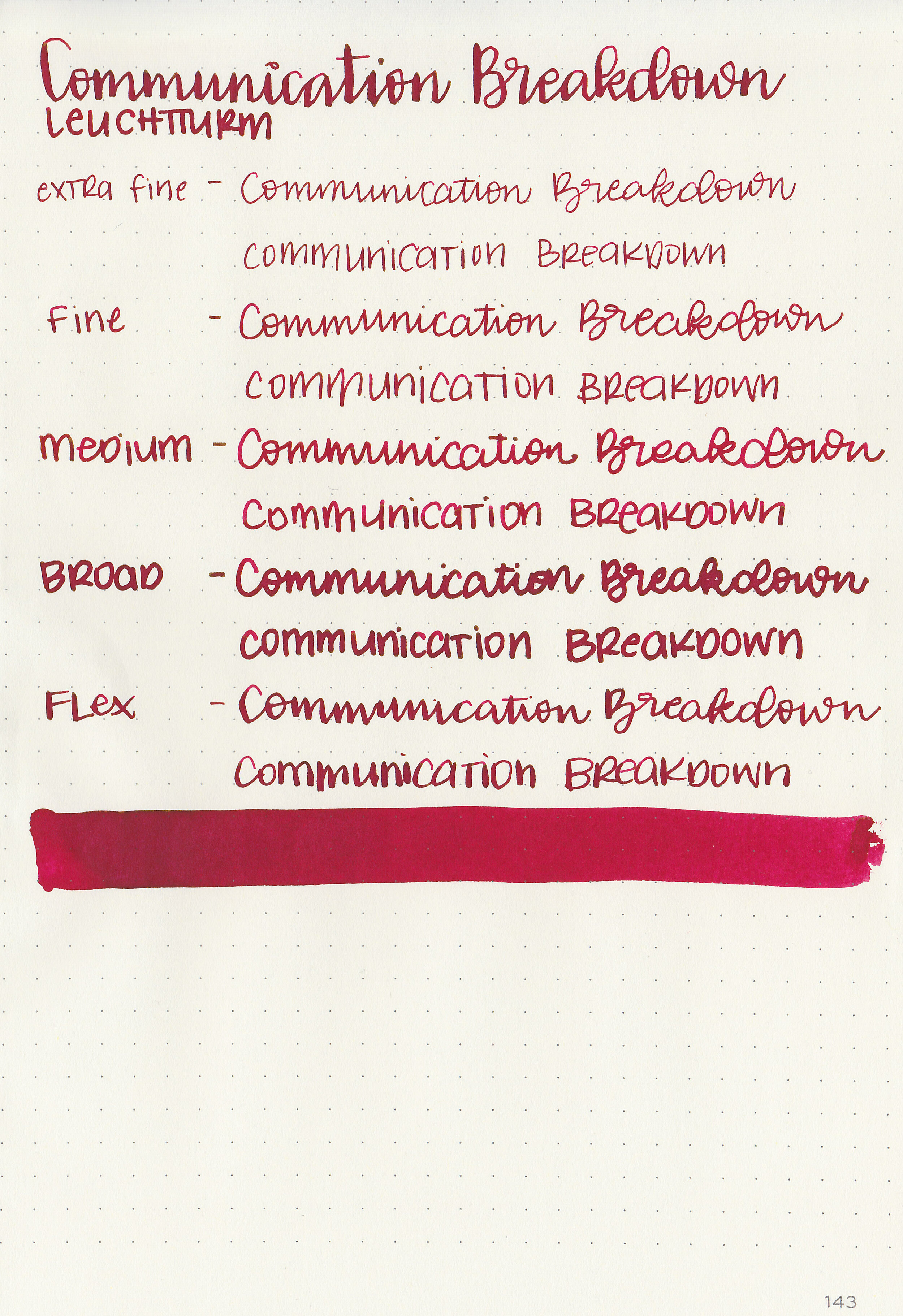
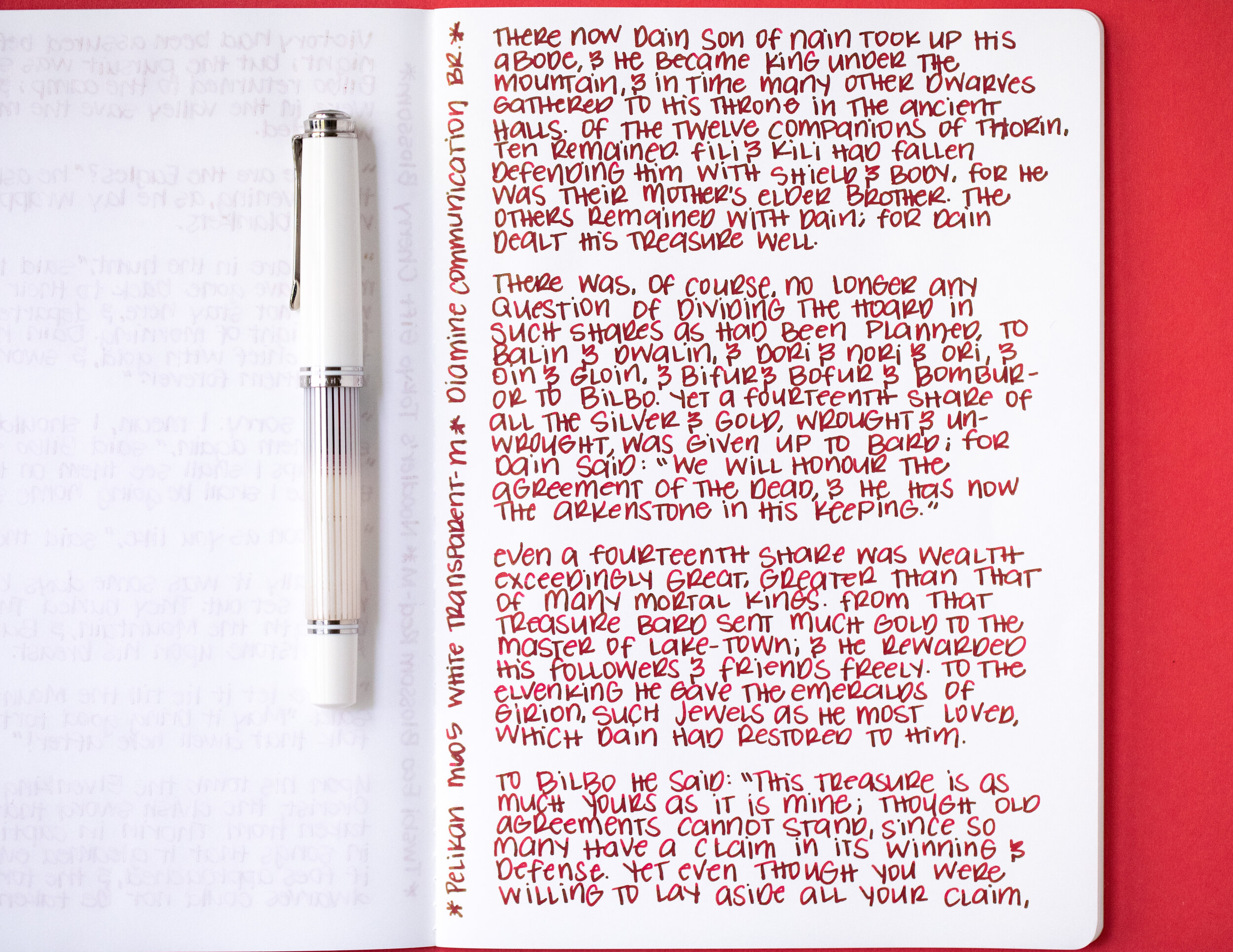
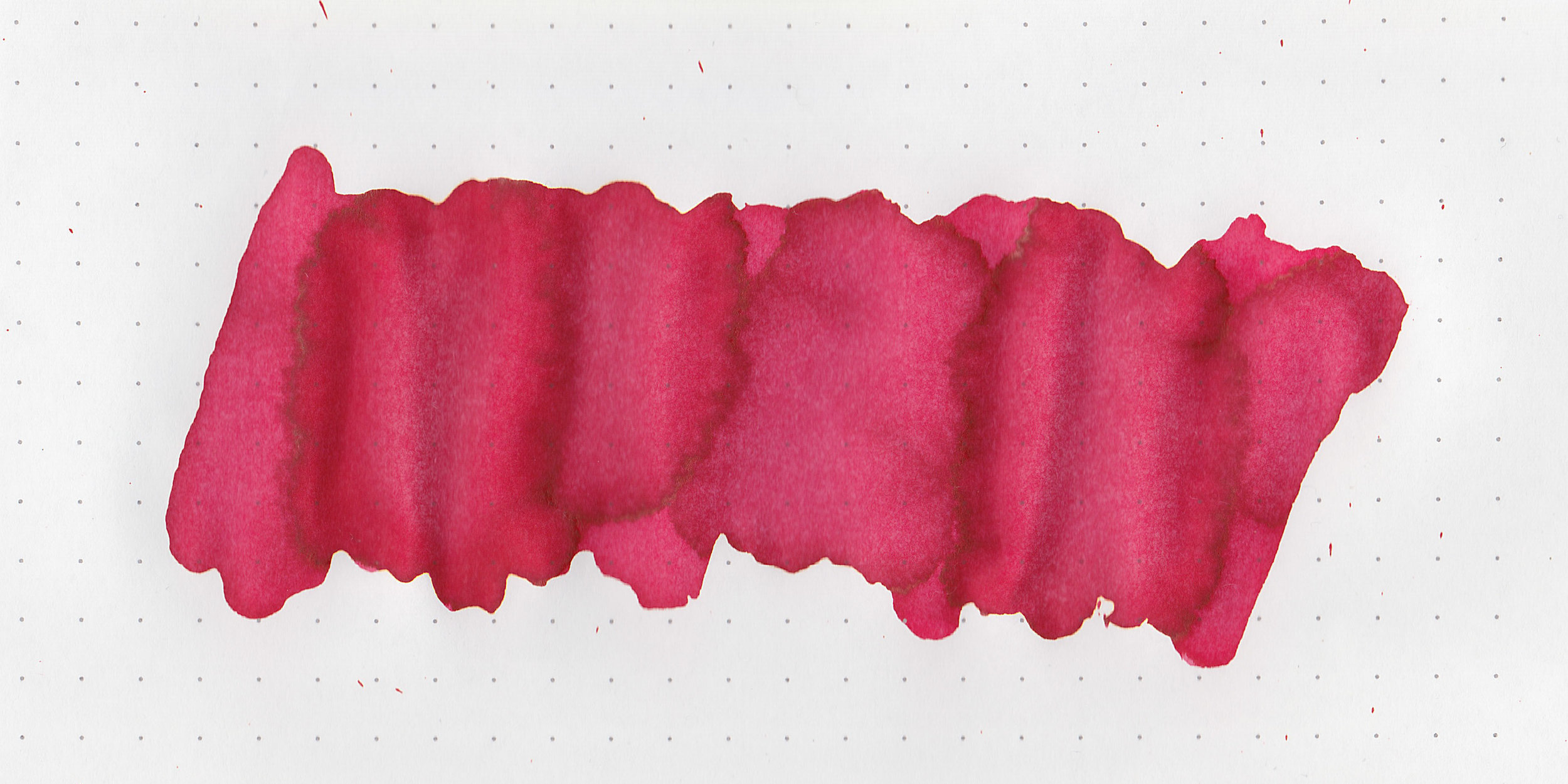
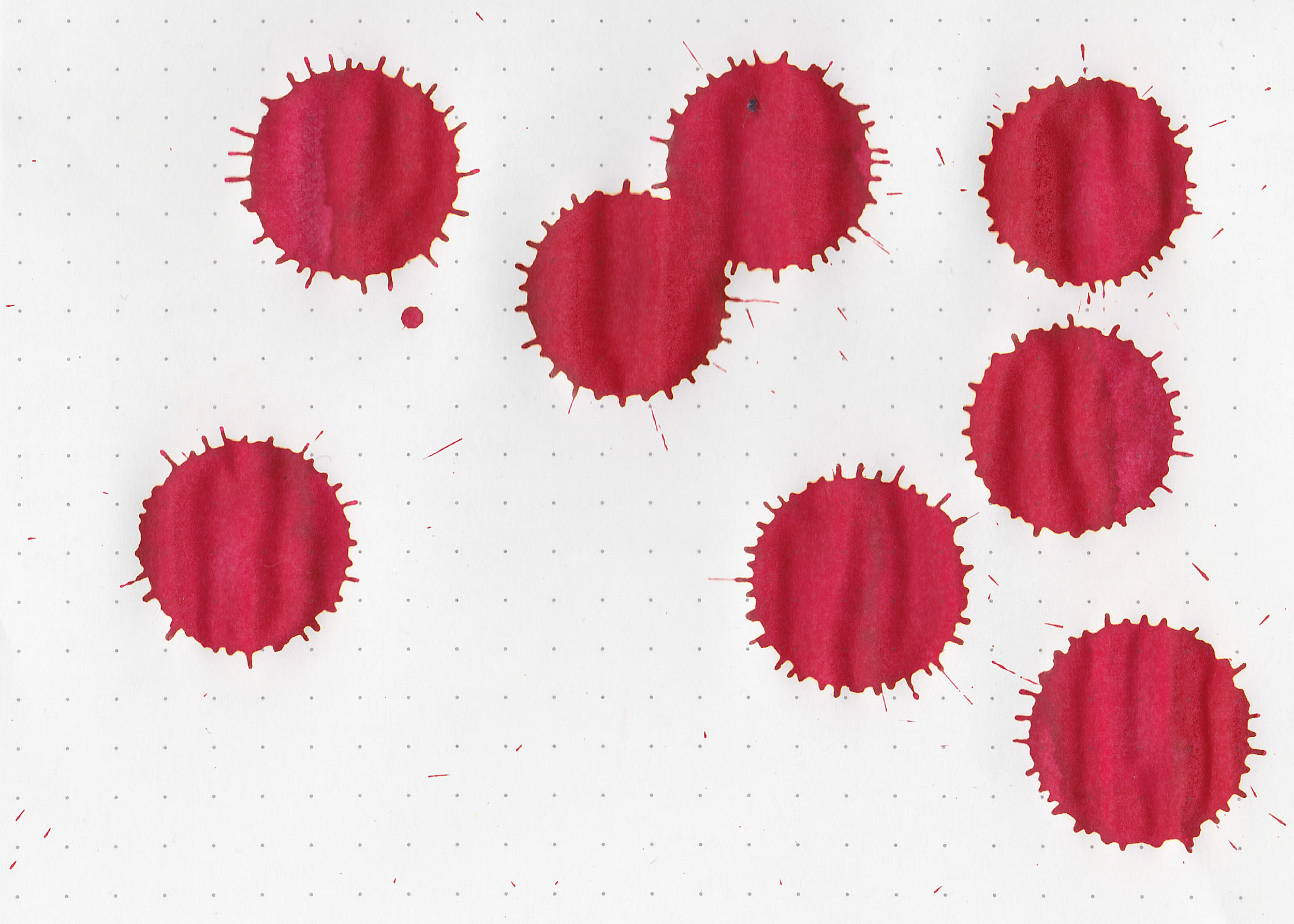
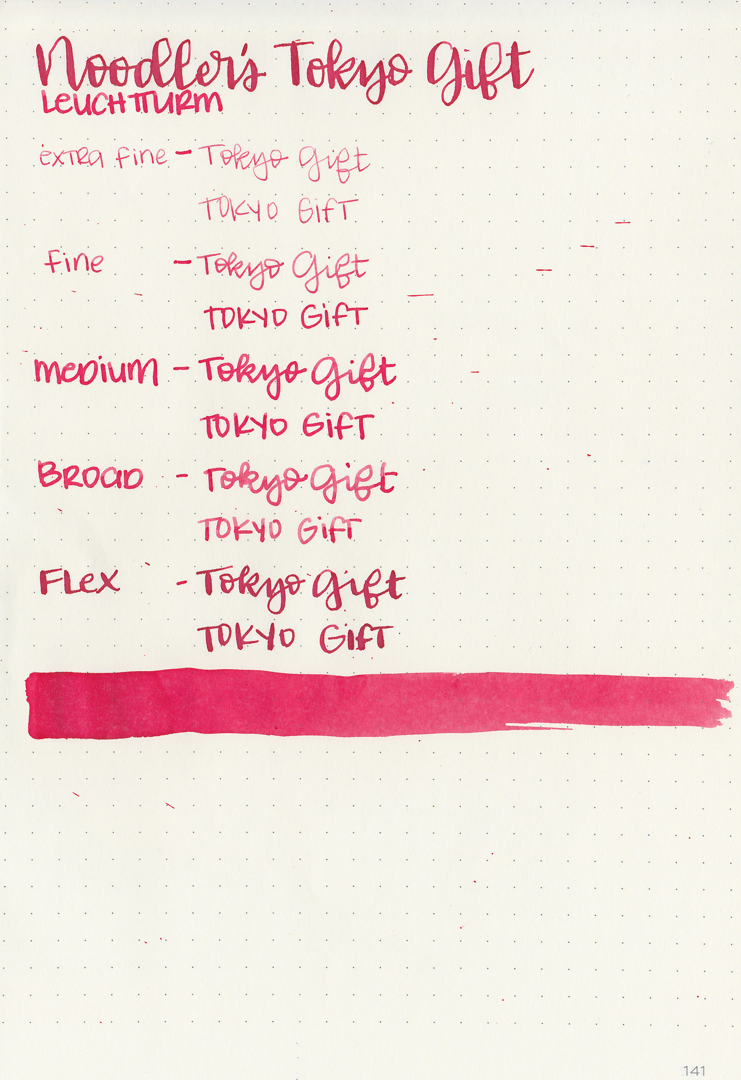
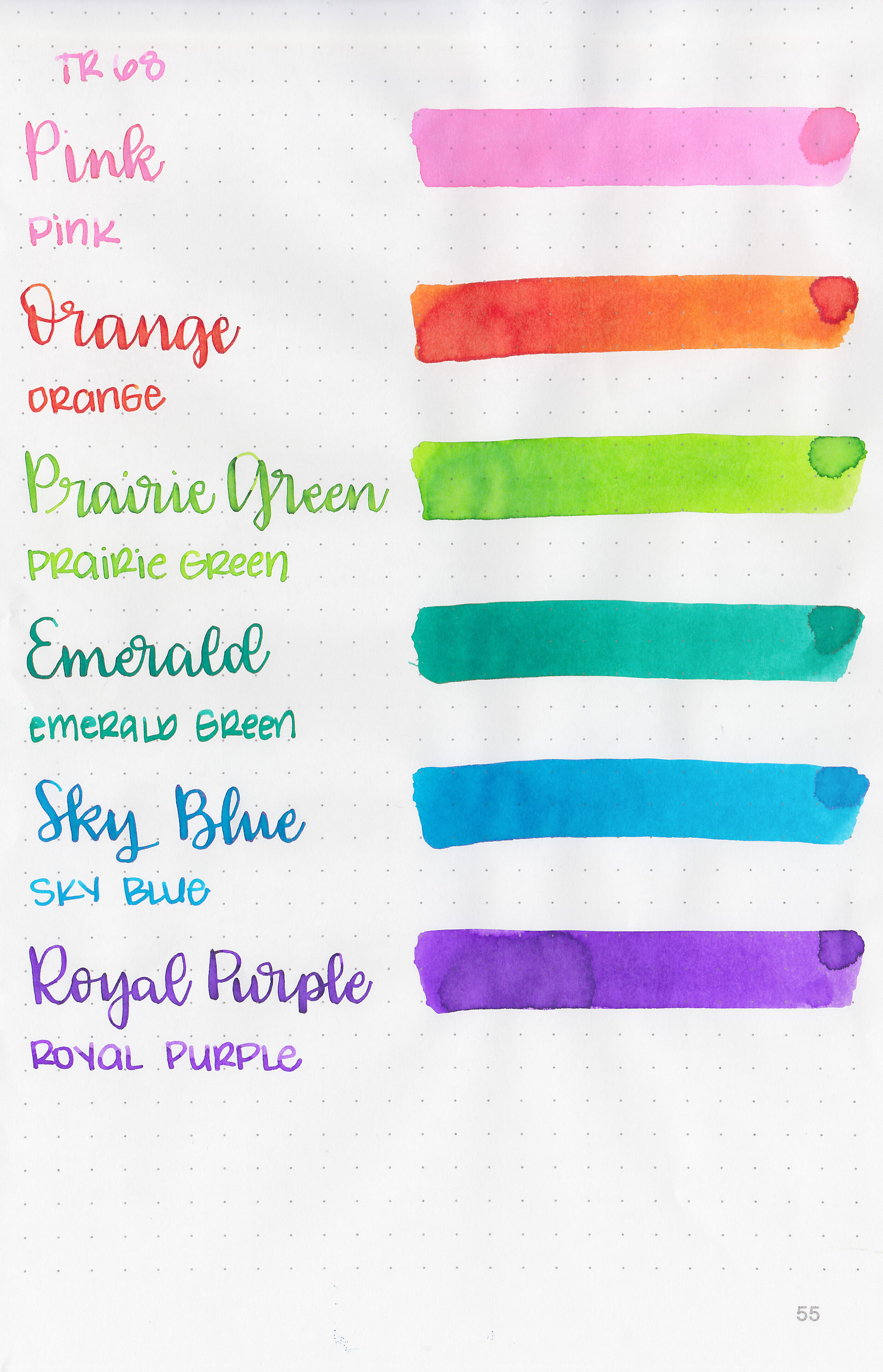
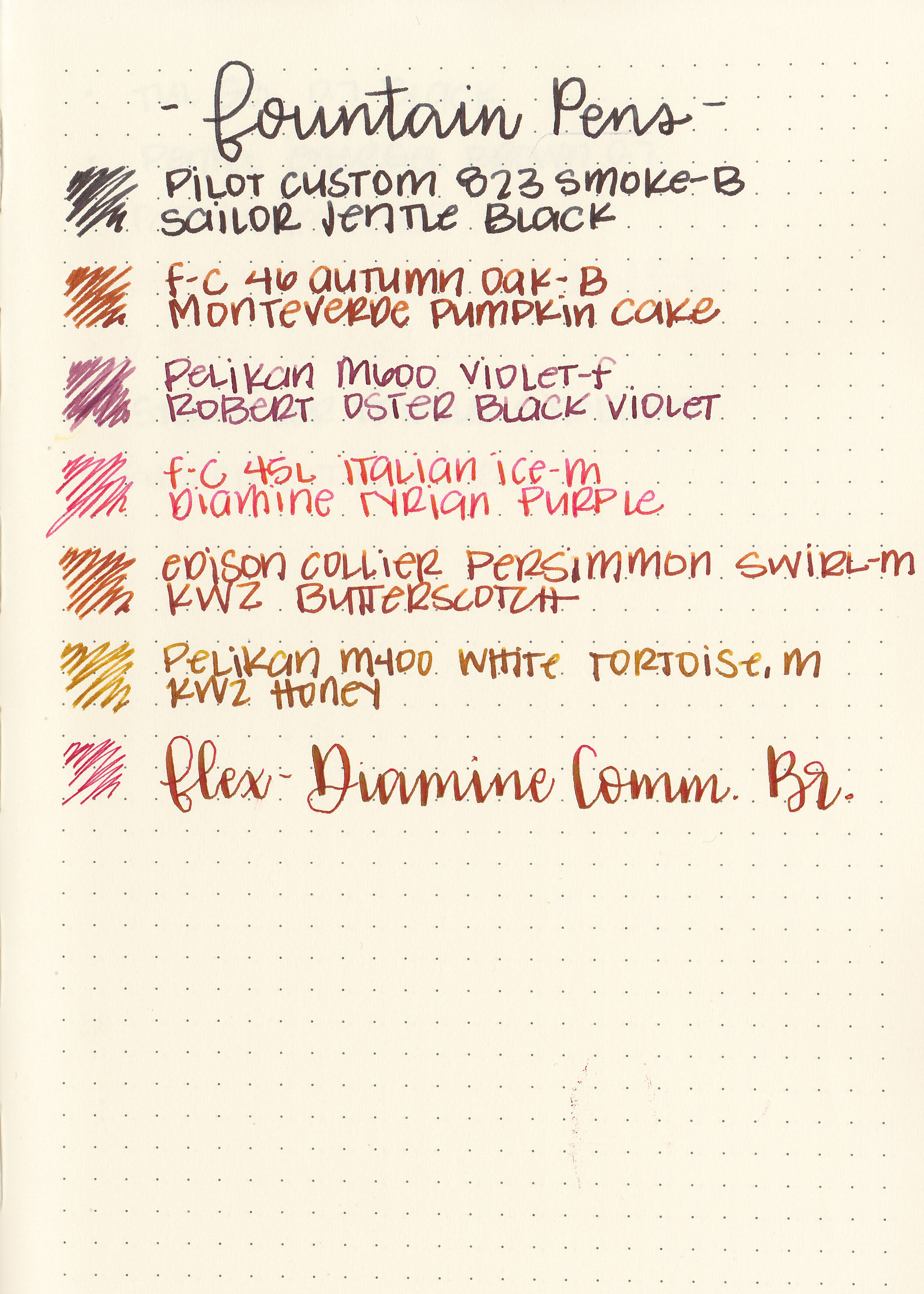
This paper handled all the fountain pens really well, even the flex nib. No bleeding or feathering, and the show through wasn’t bad either.

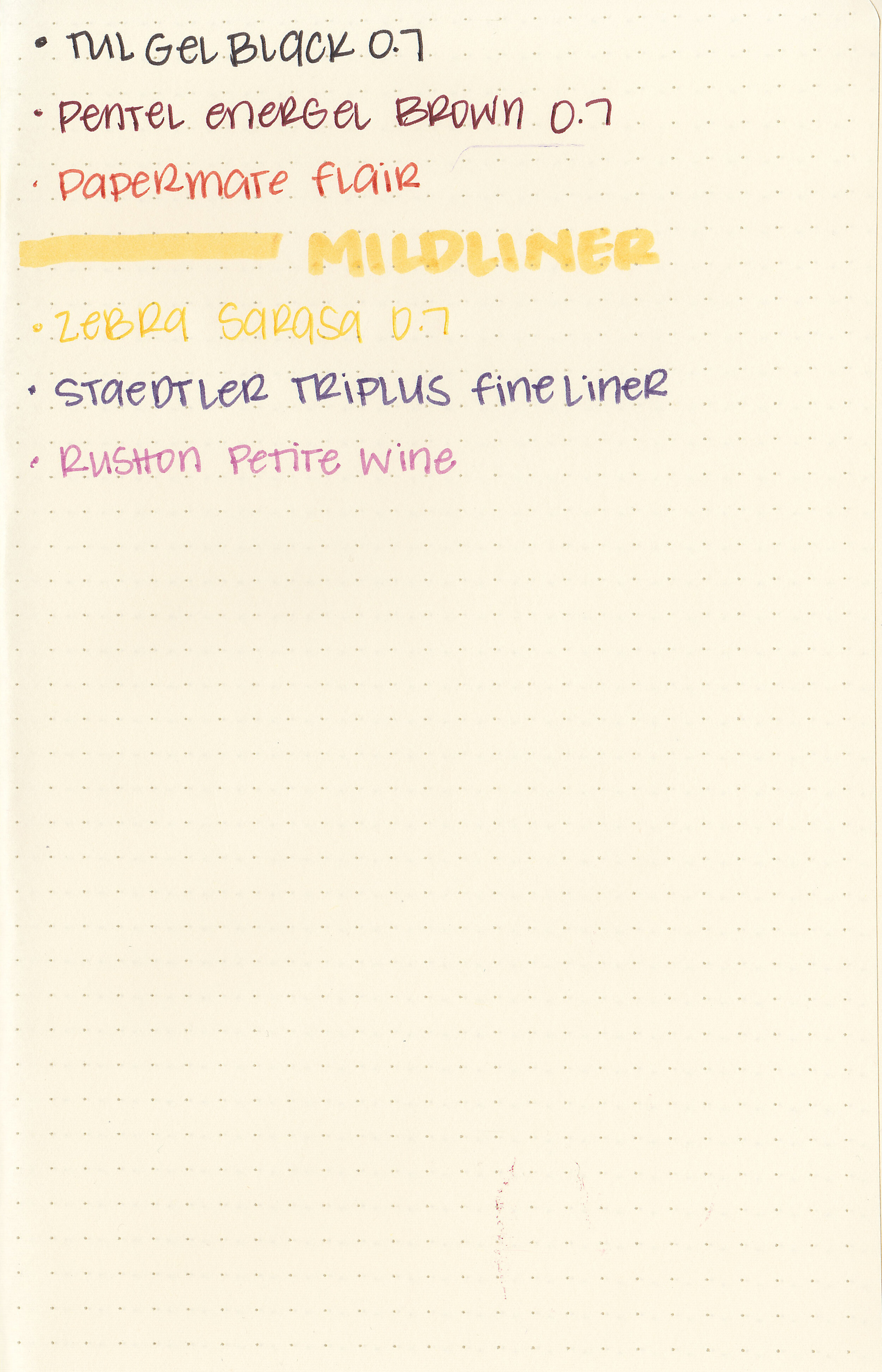
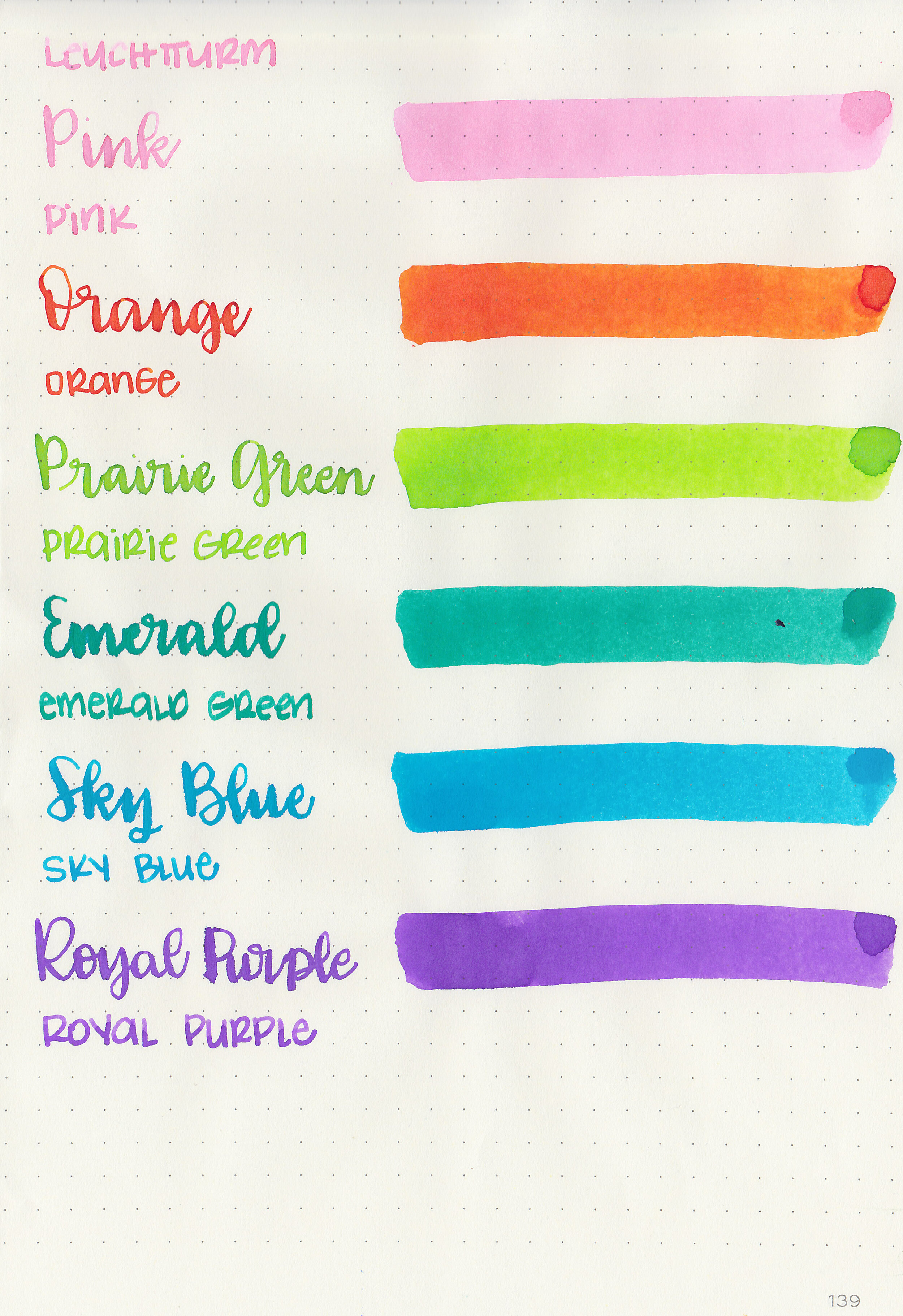
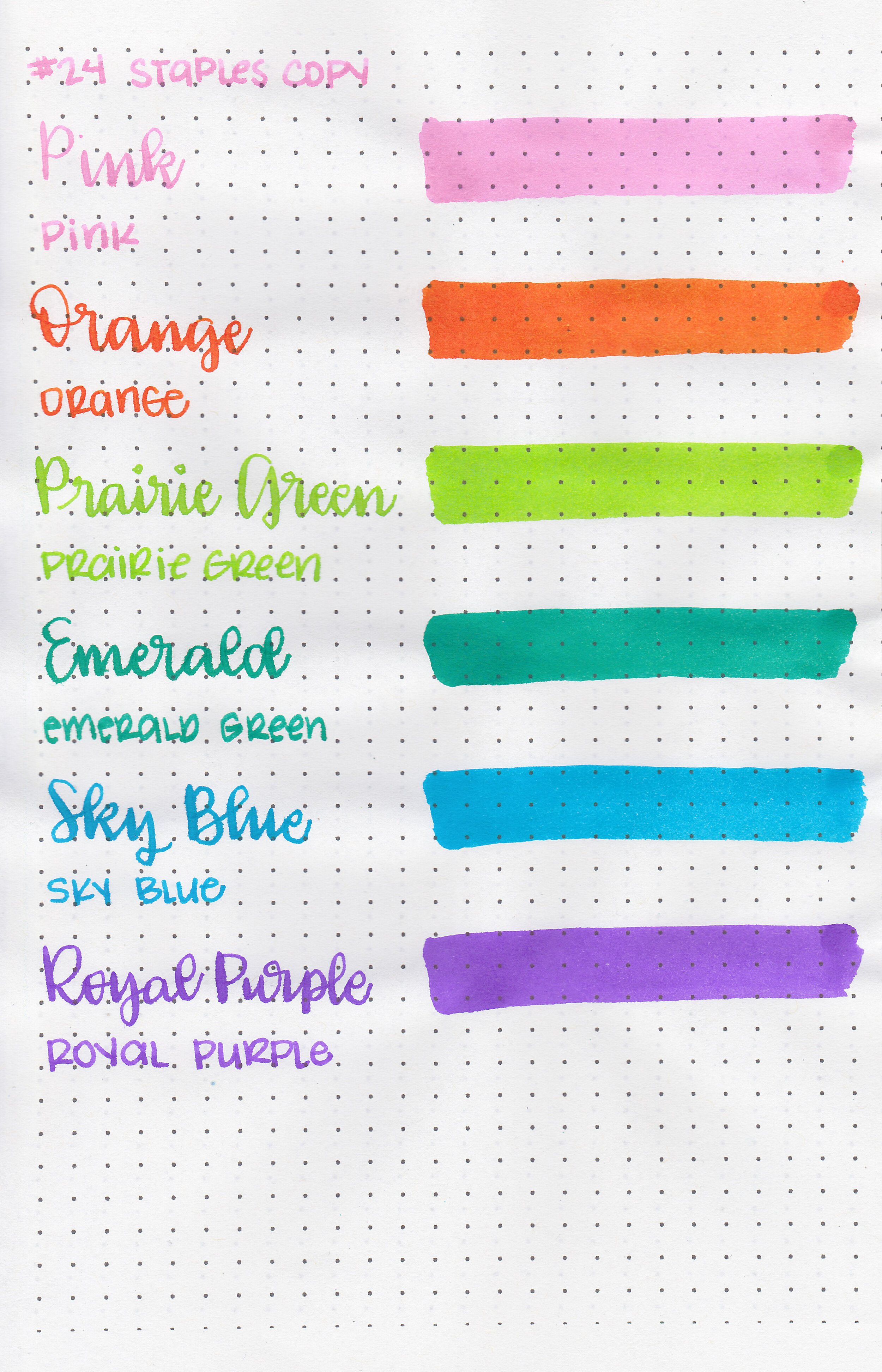
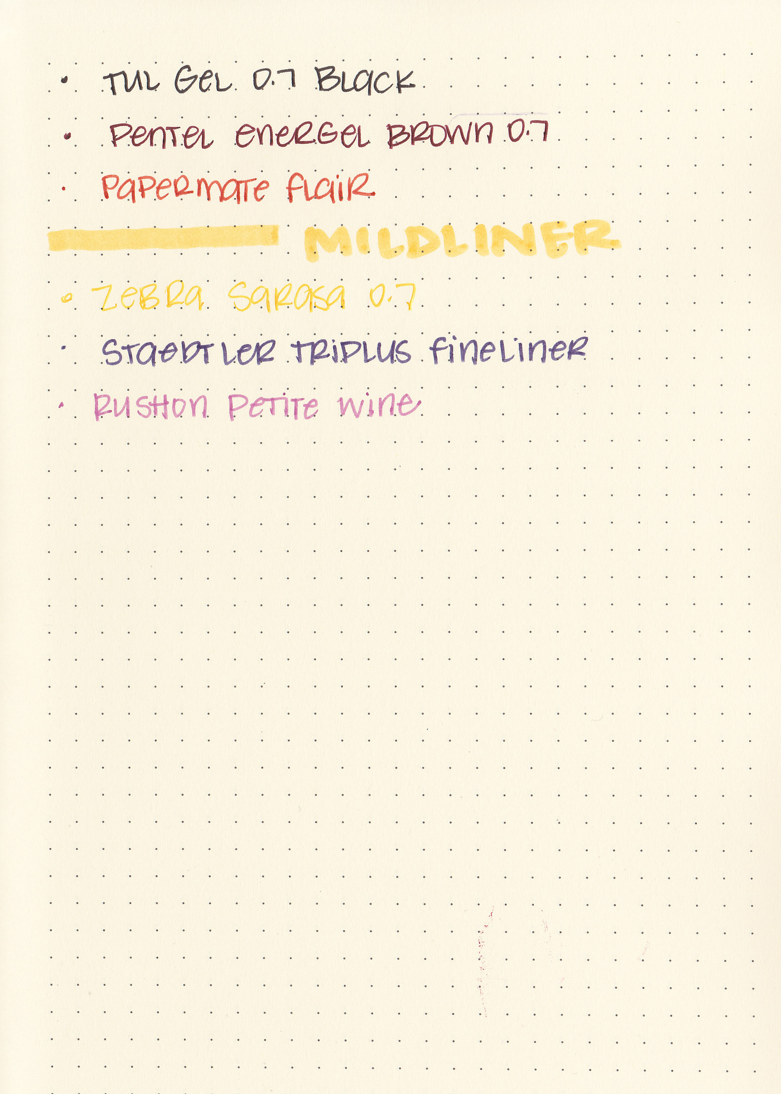
All gel pens and highlighters worked well on this paper, no issues there either.
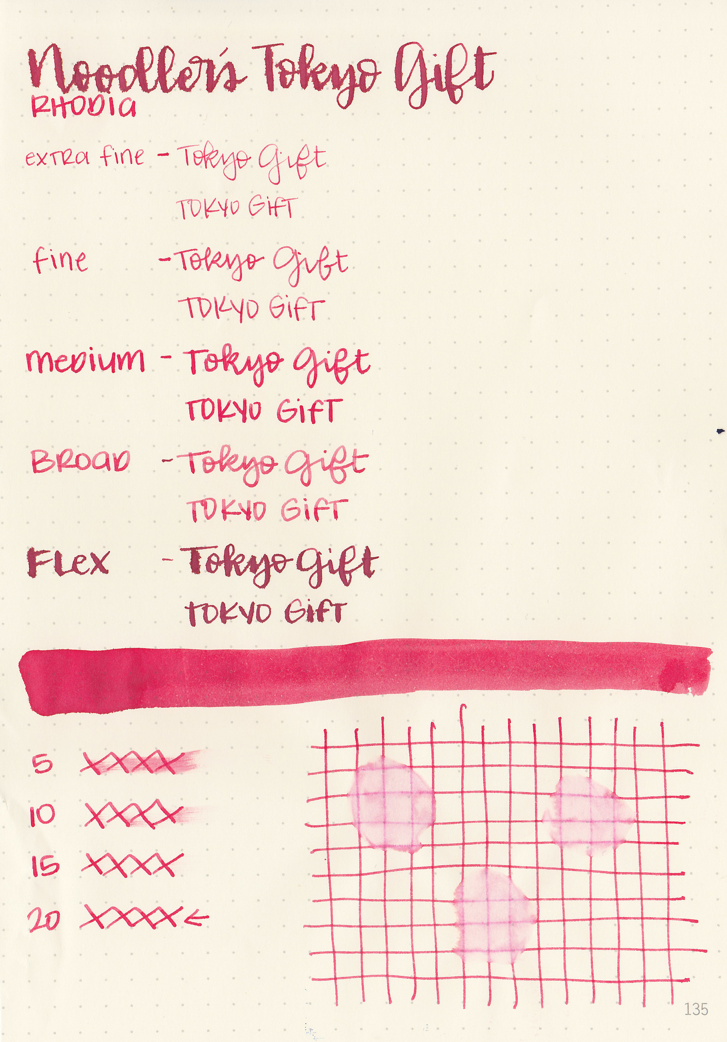
A5 Bullet Journal:

The A5 Bullet Journal contains 100 gsm cream heavyweight paper, 2 page markers, 120 sheets, an inner pocket, and measures 5 3/4 by 8 1/4 inches. This notebook is 3/4 of an inch wider than the dotted journal and has heavier paper but my favorite difference is that the Bullet Journal has an index and page numbers! It retails for $8.64.

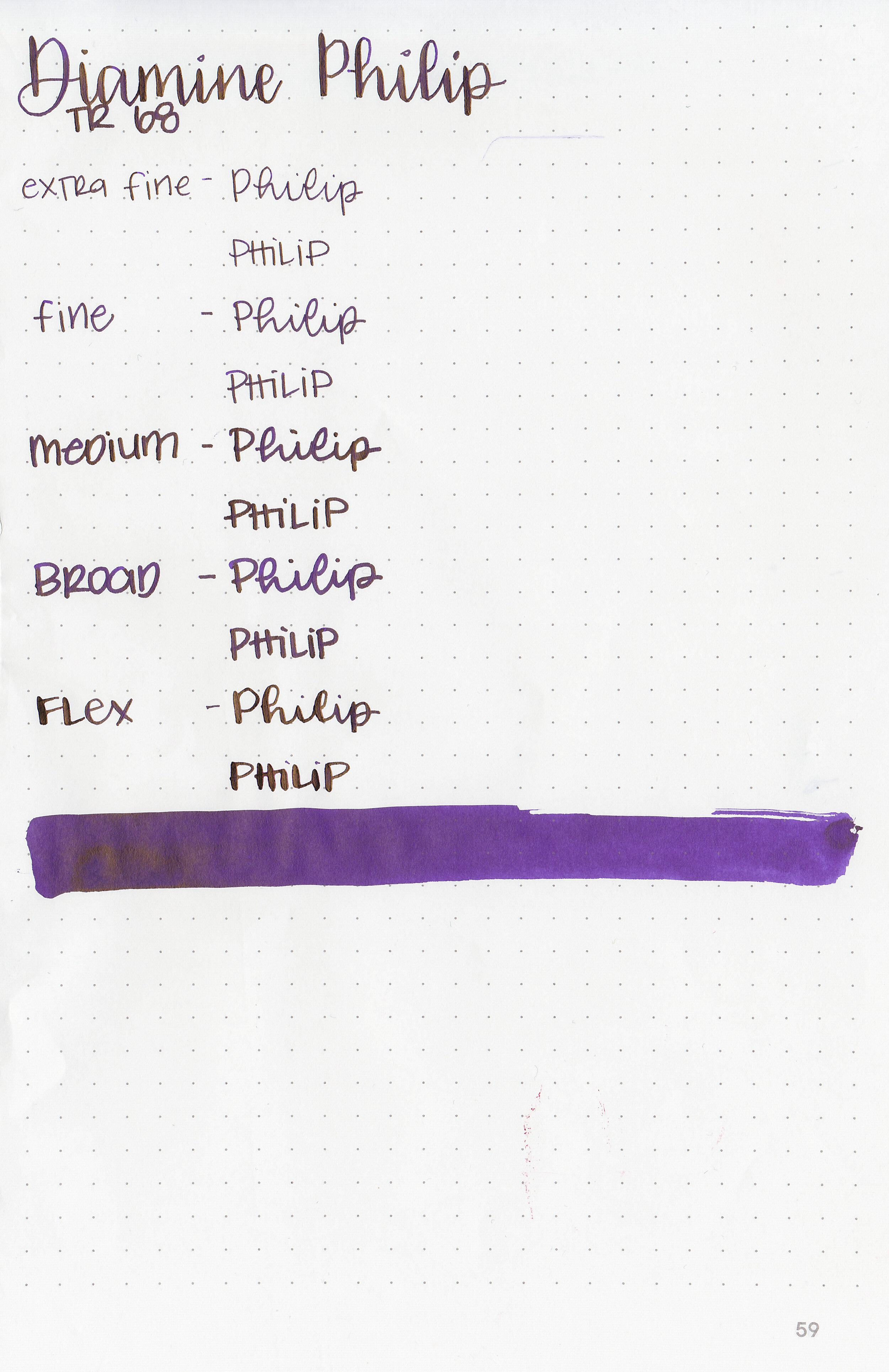
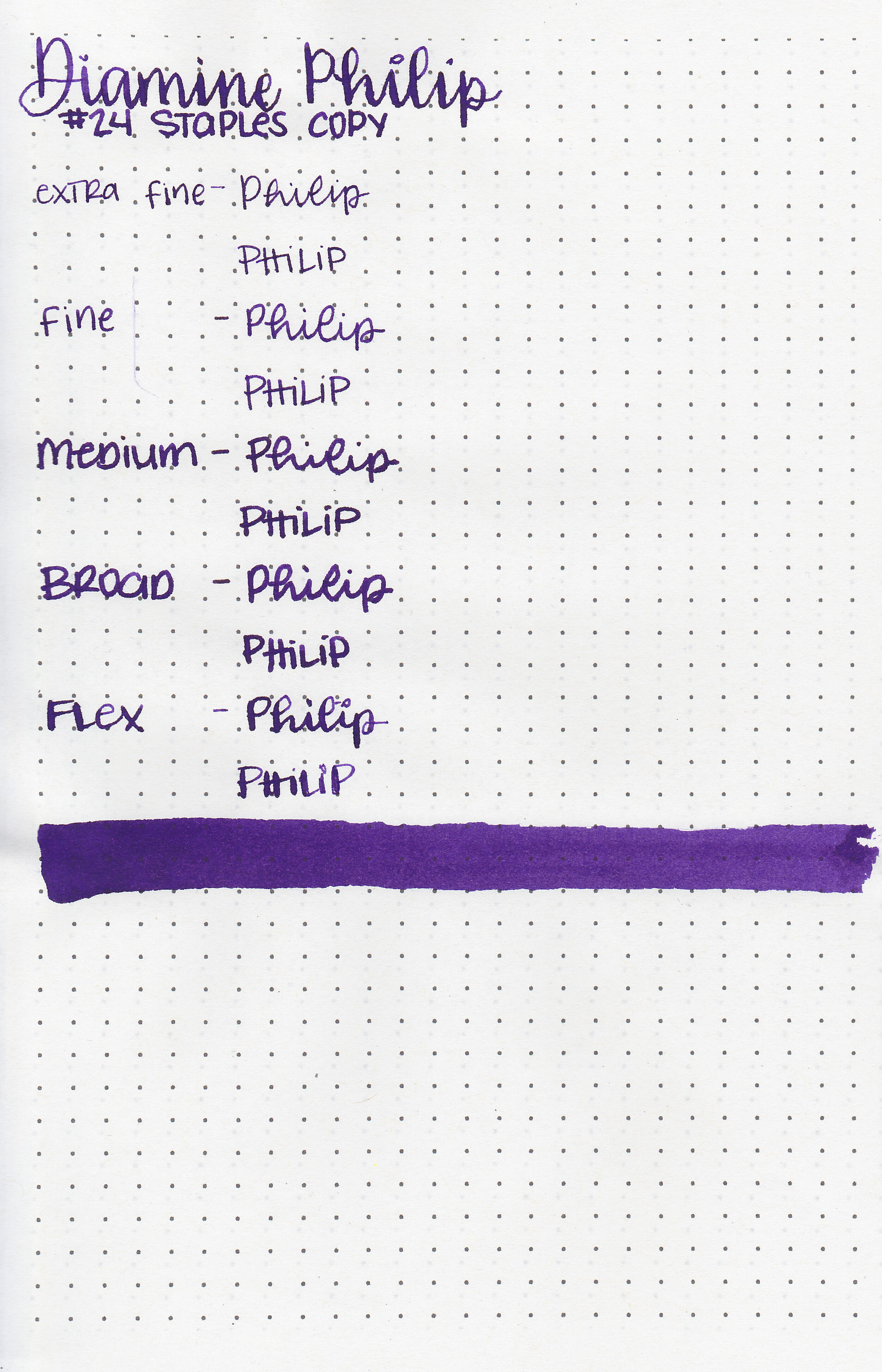
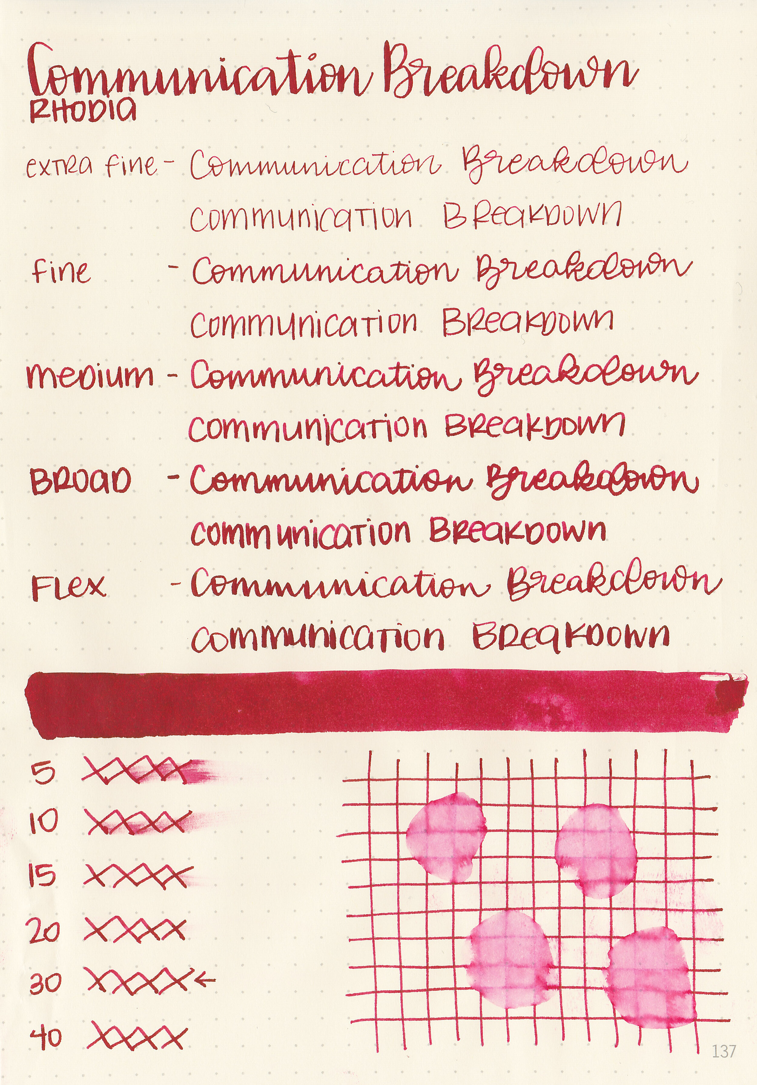
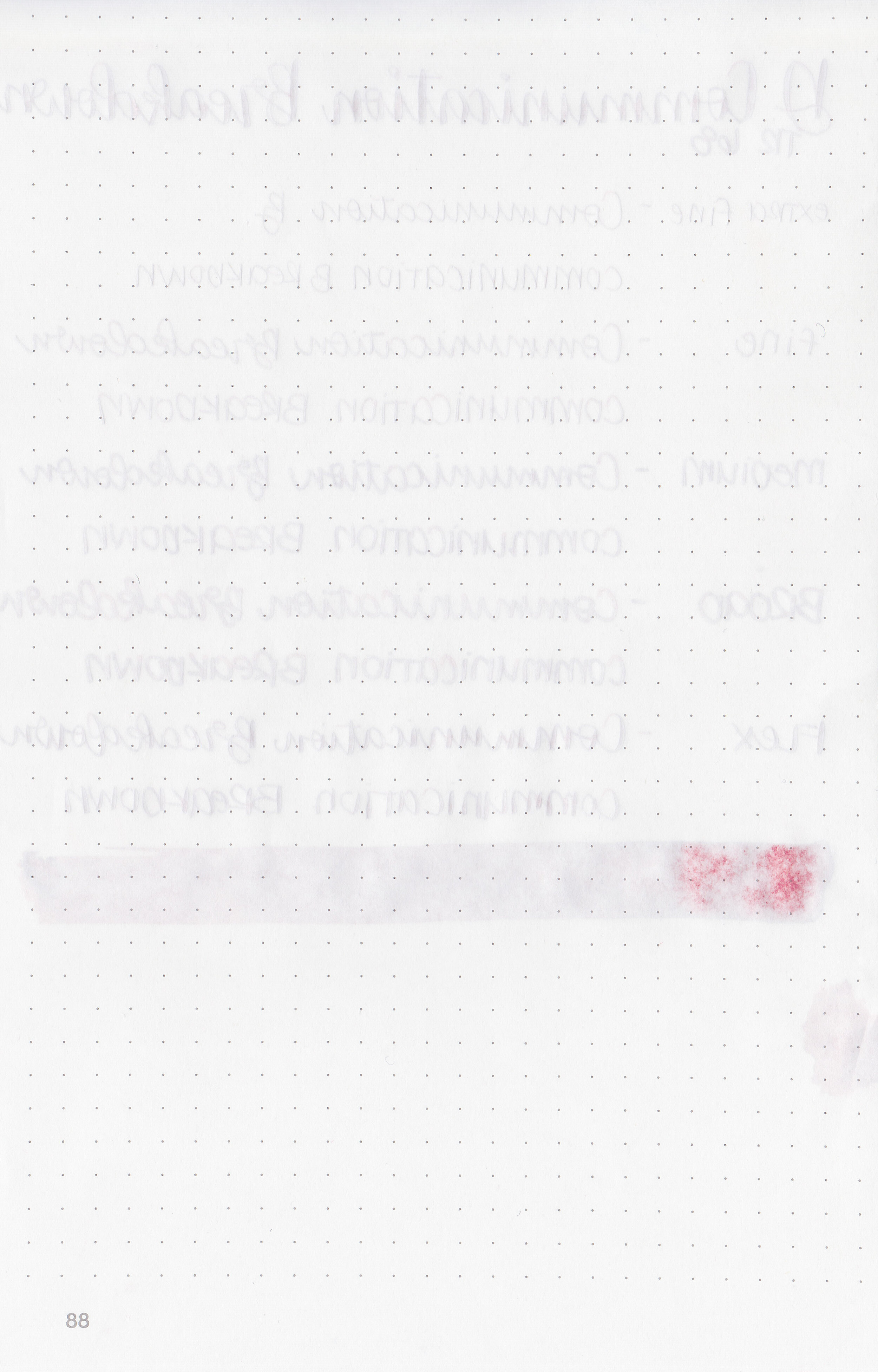
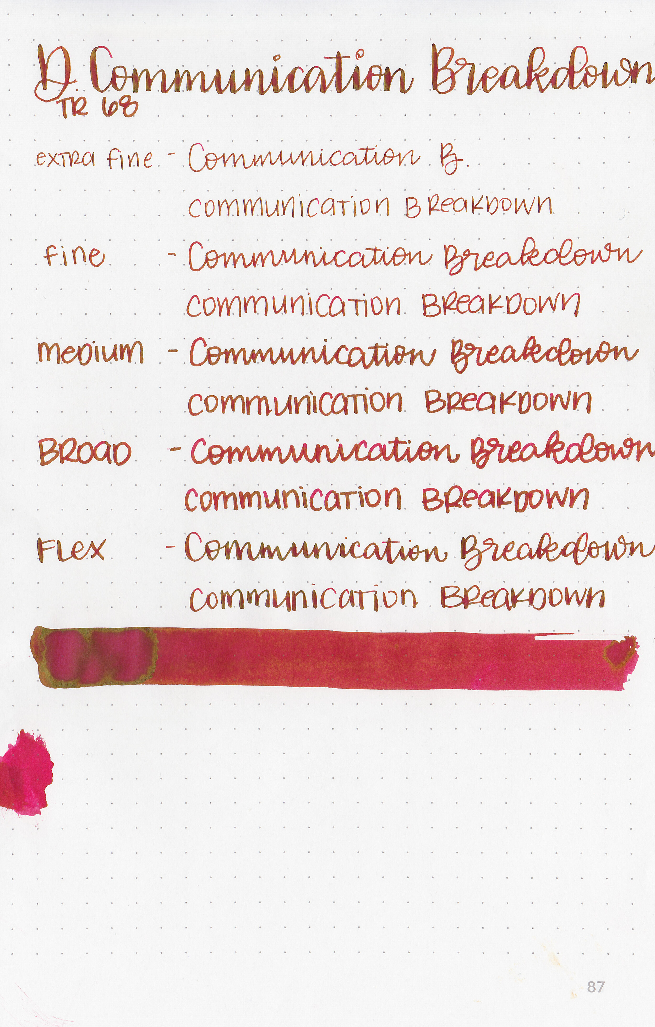
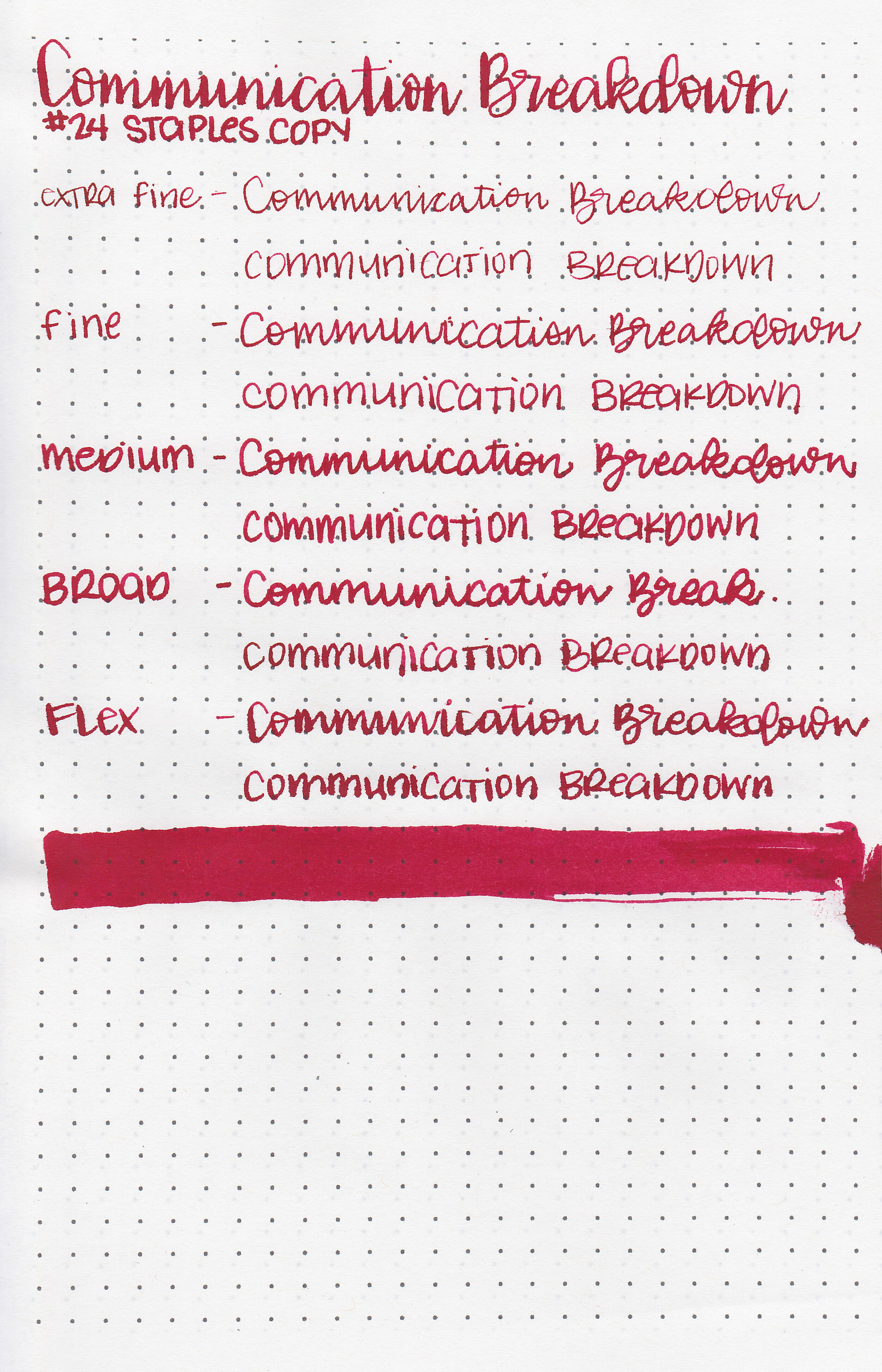
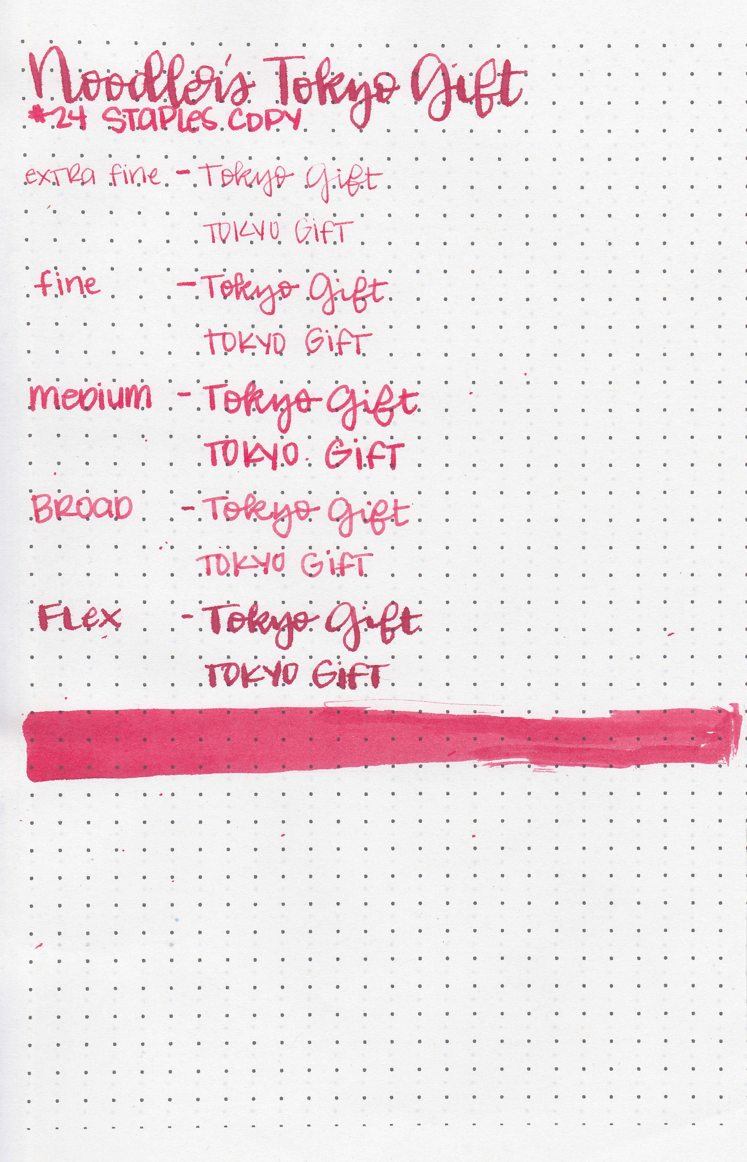
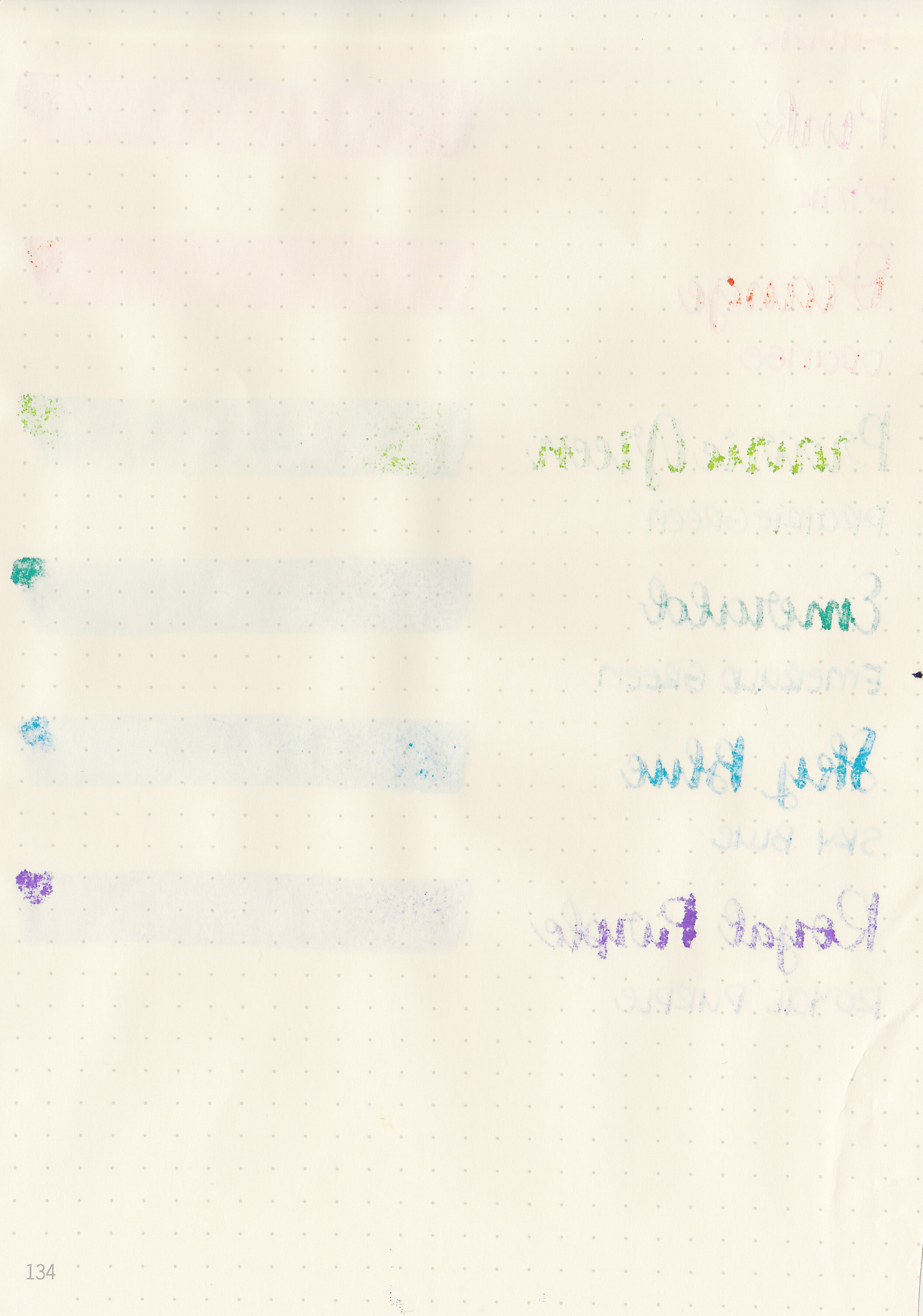
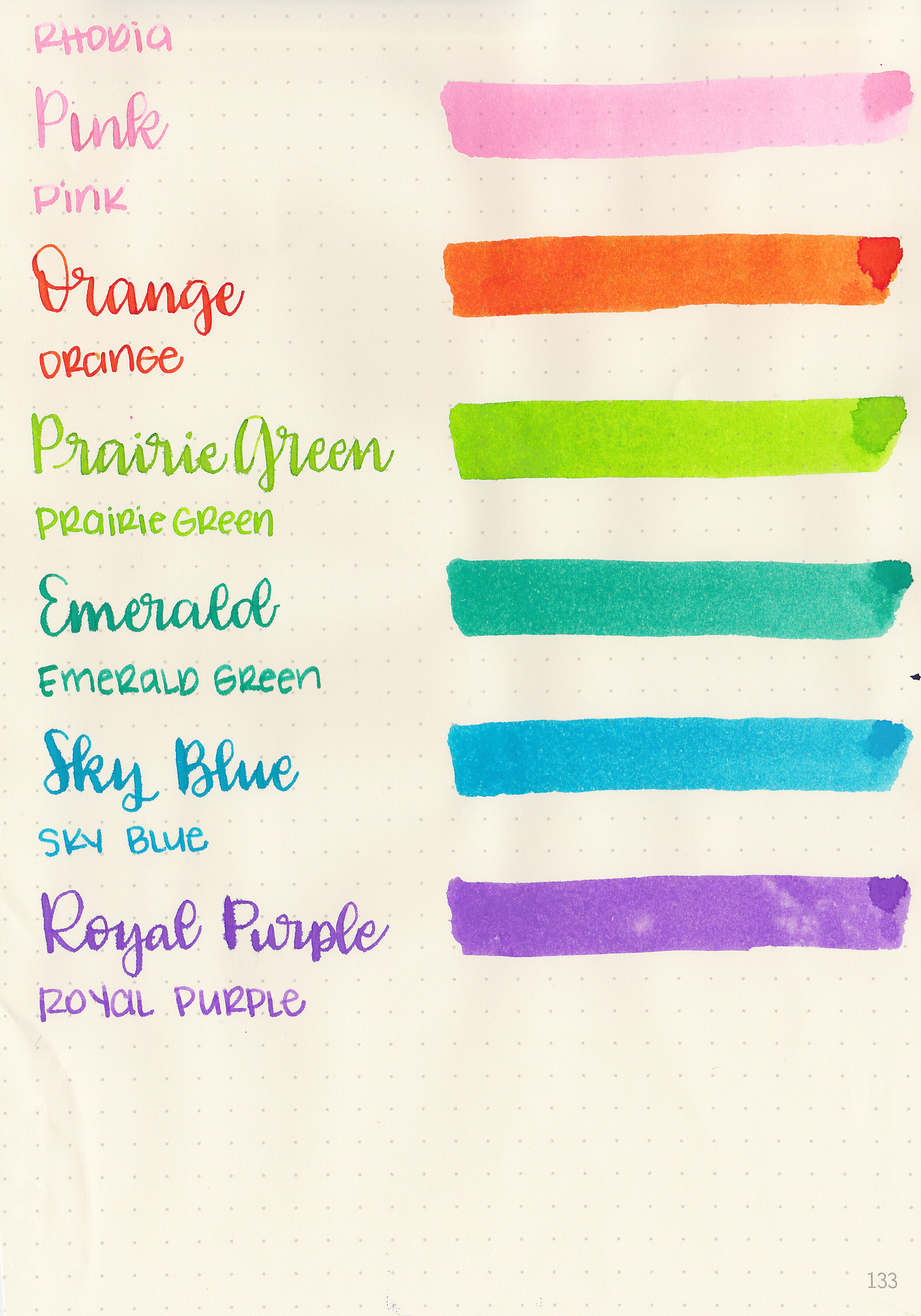
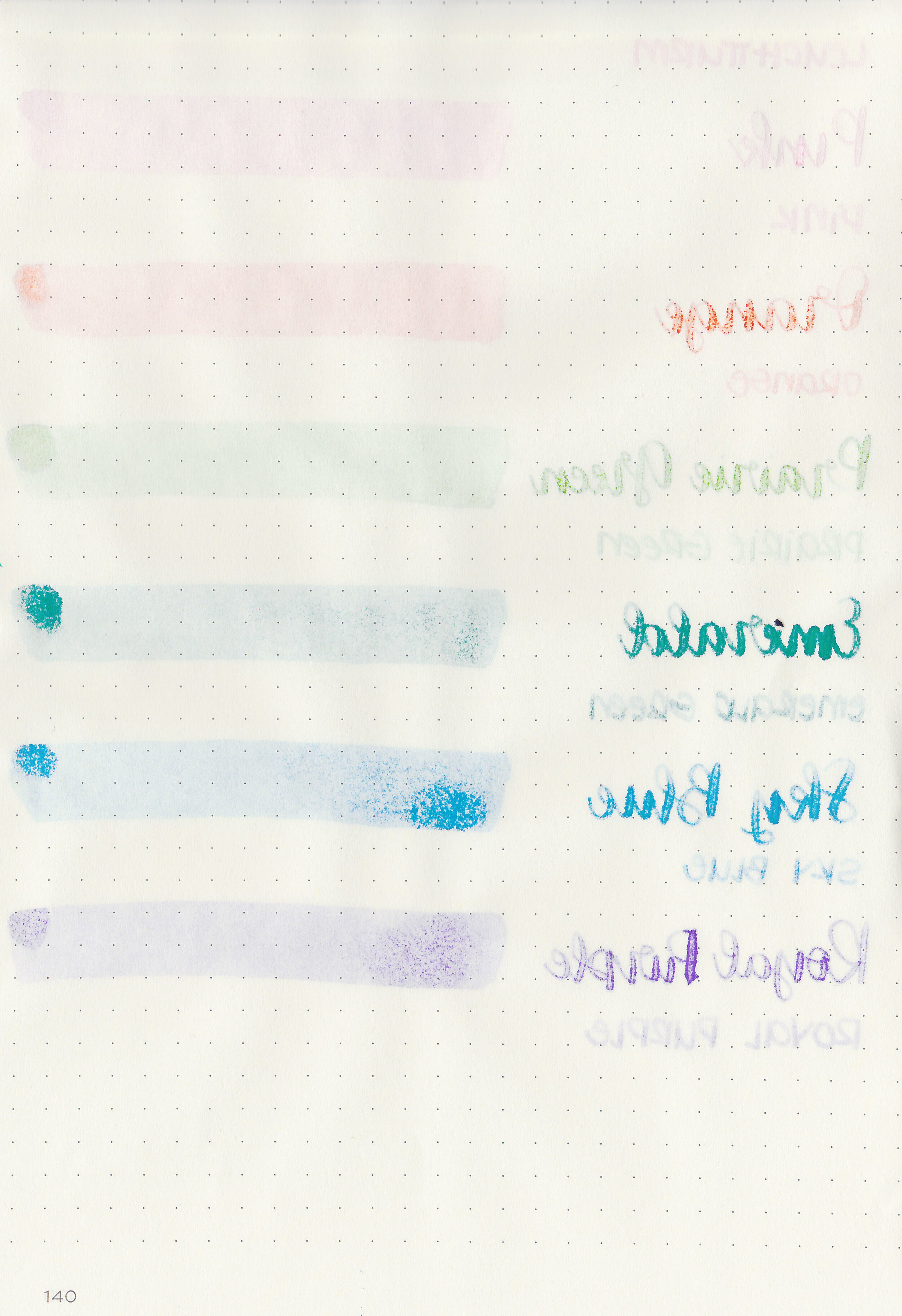
Just like the Dotted Notebook the paper handled all fountain pens really well, but because the Bullet Journal has a bit heavier paper, there’s even less show through.

For gel pens and highlighters there was virtually no show through, and zero bleeding and feathering.

exceed-notebooks-s-1.jpg

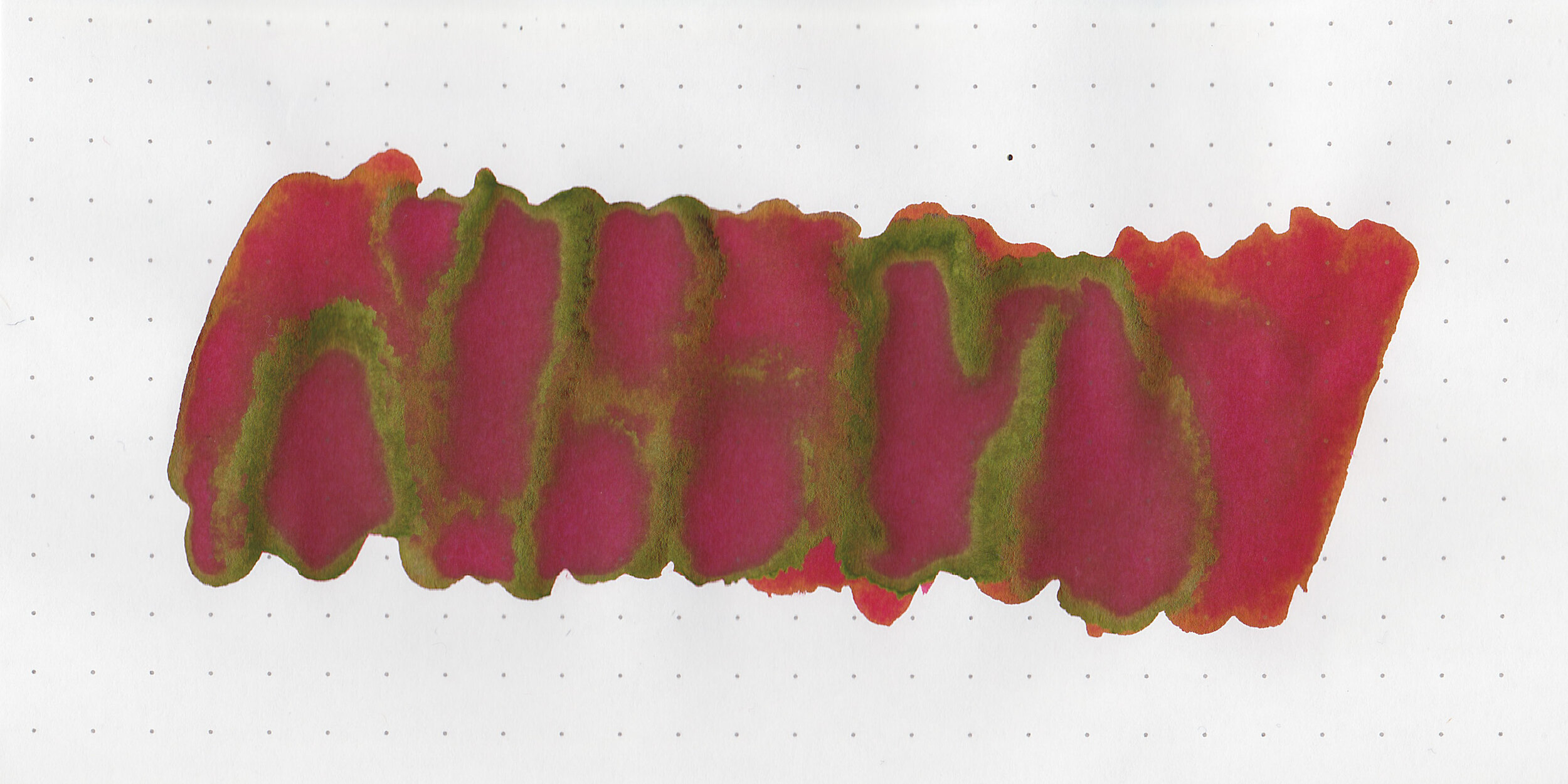
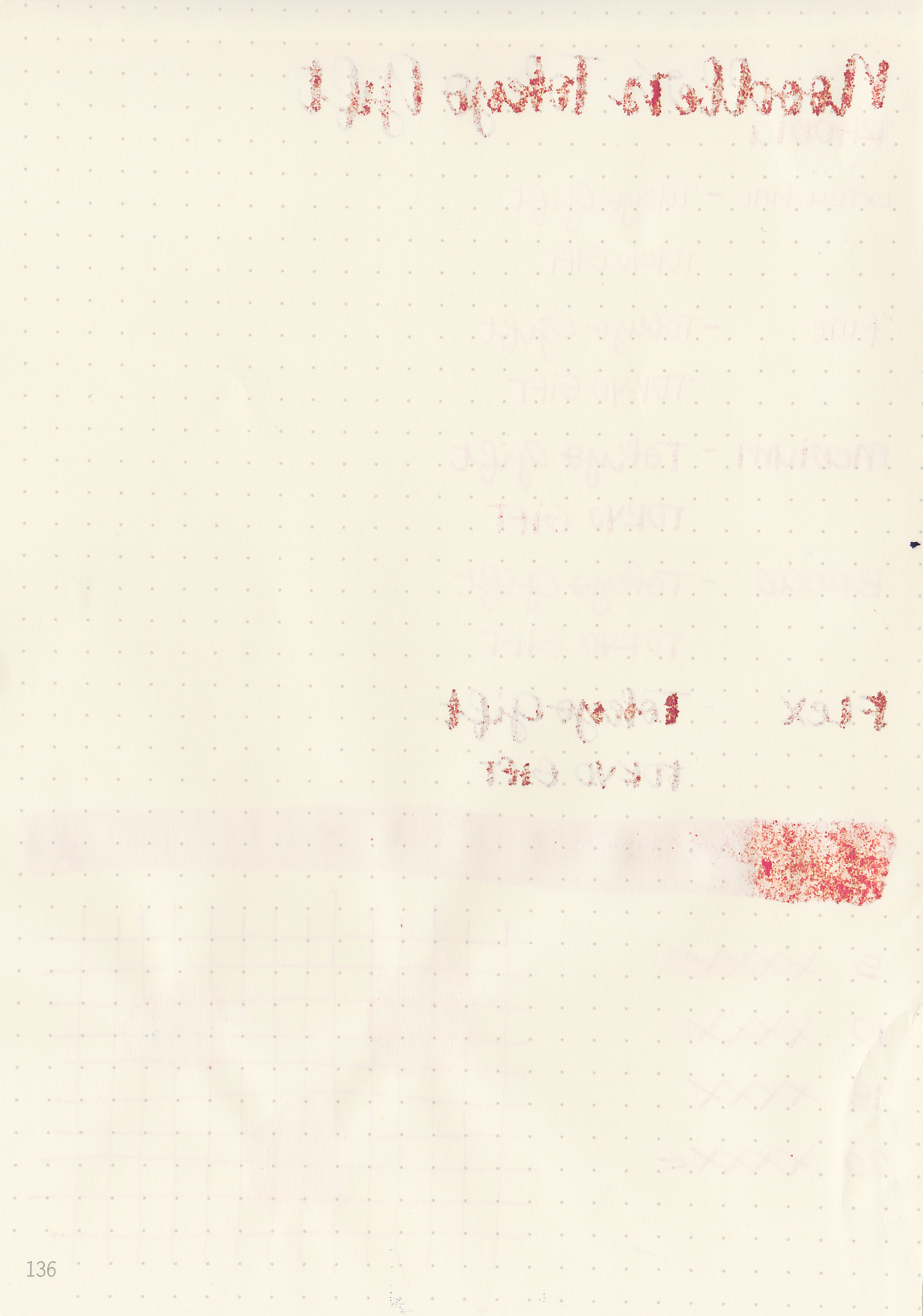
I ended up taking the Bullet Journal to my local pen club last weekend, and tested a bunch of my friends’ pen and ink combinations on it. The paper handled everything perfectly until it came to the Noodler’s inks. Apache Sunset had dried completely but when I closed it it made an impression on the opposite page. X-Feather took a solid 5 minutes to dry and like Apache Sunset, bled a bit onto the opposite page. The Duke Fude nib full of Burma Road did feather and bleed just a little bit, but let’s face it that nib is like writing with a paint brush. I was impressed with how well it handled everything else.

Overall, I prefer the Bullet Journal over the Dotted Hardcover just because the pages are a bit wider, has less show through, and page numbers (which I’m obsessed with). It seems very similar to a Leuchtturm 1917 notebook, but is at a much cheaper price point. The only think I don’t like is the cream paper-I wish it was a bit less yellow. If you are in the market for affordable, fountain-pen friendly notebooks this ones are definitely worth a try!

Disclaimer: I purchased these products myself, and all photos and opinions are my own. There are no affiliate links on this page, and this post is not sponsored in any way.

Ink Review #937: Diamine Philip

d-philip-2.jpg

We are continuing on with our Diamine theme this week, looking at Diamine Philip today. Philip belongs to Cult Pens’ exclusive Iridescink line. I love that Cult Pens has made this ink available in the standard 80ml bottles as well was the smaller “Little Pip” 30ml bottle. Thanks to a local pen friend for donating a sample for review!

d-philip-1.jpg

The color:

Philip is a dark, rich purple with lots of sheen.

Swabs:

d-philip-3.jpg

In large swabs on Tomoe River paper the sheen is a bronzy gold. Not quite gold, but not quite bronze either, somewhere in the middle of the two.

d-philip-4.jpg

Writing samples:

Let's take a look at how the ink behaves on fountain pen friendly papers: Rhodia, Tomoe River, and Leuchtturm.

Dry time: 50 seconds

Water resistance: Low

Feathering: None

Show through: Medium

Bleeding: None

Other properties: no shading, high sheen, and no shimmer. I didn’t notice any smearing issues from the sheen.

On Staples 24 lb copy paper there was feathering in every nib size and just a little bit of bleeding in the larger nib sizes.

Comparison Swabs:

d-philip-s-3.jpg

Philip is lighter than Purple Rain, similar to PenBBS 95 Lin Huiyin. It’s cooler toned than Lamy Dark Lilac. Click here to see the Diamine inks together, and click here to see the purple inks together.

Longer writing:

d-philip-s-1.jpg

I used a Sailor Pro Gear Slim Purple Cosmos with a zoom nib on a Lochby A5 blank Refill-Tomoe River 68gsm. The ink had an average flow.

Overall, besides the long dry time this ink is pretty well behaved. I didn’t have any smearing issues from the sheen, and there is plenty of sheen.

Disclaimer: This ink was provided by a pen friend for the purpose of this review. All photos and opinions are my own. This page does not contain affiliate links, and this post is not sponsored in any way.

Ink Review #936: Diamine Communication Breakdown

d-communication-breakdown-2.jpg

I’ve had a lot of requests for Diamine ink reviews lately, so we are going to dedicate this week to Diamine inks, starting with Communication Breakdown. This ink is a German exclusive, and can be found at Fountainfeder or Papier and Stift. Thanks to a local pen friend for donating a sample for review!

d-communication-breakdown-1.jpg

The color:

Communication Breakdown is a vibrant red ink with green sheen.

Swabs:

d-communication-breakdown-11.jpg

In large swabs on Tomoe River paper the ink shows off some of the green sheen.

d-communication-breakdown-12.jpg

Writing samples:

Let's take a look at how the ink behaves on fountain pen friendly papers: Rhodia, Tomoe River, and Leuchtturm.

Dry time: 30 seconds

Water resistance: Low

Feathering: None

Show through: Medium

Bleeding: Low-there was some bleeding in the flex nib

Other properties: low shading, high sheen, and no shimmer. There could be more shading, but most of it is hidden under the sheen. The sheen is visible in all nib sizes on Tomoe River, as well as flex nibs on Rhodia and Leuchtturm. I wouldn’t quite call it a monster sheener since it doesn’t sheen on multiple nib sizes on paper other than Tomoe River. The sheen does make it a bit smeary on Tomoe River paper.

On Staples 24 lb copy paper there was feathering in every nib size and just a little bit of bleeding in the larger nib sizes.

Comparison Swabs:

d-communication-breakdown-s-3.jpg

Communication Breakdown is similar to KWZ Maple Red, but with sheen added. Click here to see the Diamine inks together, and click here to see the red inks together.

Longer writing:

d-communication-breakdown-s-1.jpg

I used a Pelikan M605 White Transparent with a medium nib on a Lochby A5 blank Refill-Tomoe River 68gsm. The ink had a a slightly dry, sticky flow.

Overall, it’s a nice red sheeny ink, but it is a bit smeary on Tomoe River paper and has a bit of a sticky flow which makes it a no for me. I guess I was a bit disappointed by this ink-everyone kept raving about how sheeny it was and no smearing, and I found it to have a little less sheen than expected, and prone to smearing.

Disclaimer: This ink was provided by a pen friend for the purpose of this review. All photos and opinions are my own. This page does not contain affiliate links, and this post is not sponsored in any way.

Ink Review #935: Noodler's Tokyo Gift

nood-tokyo-gift-4.jpg

Noodler’s Tokyo Gift debuted at the 2019 DC Show. This ink is also known as Cherry Blossom Pink, but I don’t think that quite applies-its more of a red. Thanks to Vanness Pens for providing a sample for review.

nood-tokyo-gift-1.jpg

The color:

Tokyo Gift is a medium red. The ink is described as pink most places, but all I see is red.

Swabs:

nood-tokyo-gift-11.jpg

In large swabs on Tomoe River paper the ink has just a little bit of shading and no sheen.

nood-tokyo-gift-12.jpg

Writing samples:

Let's take a look at how the ink behaves on fountain pen friendly papers: Rhodia, Tomoe River, and Leuchtturm.

Dry time: 20 seconds

Water resistance: Low

Feathering: Low-there was some feathering in the flex nib

Show through: Medium

Bleeding: Low-there was some bleeding in the flex nib

Other properties: low shading, no sheen, and no shimmer.

On Staples 24 lb copy paper there was feathering in every nib size and just a little bit of bleeding in the larger nib sizes.

Comparison Swabs:

nood-tokyo-gift-s-1.jpg

Tokyo Gift is a little bit darker than Robert Oster Rubine, and a little bit lighter than Robert Oster Red Candy. Click here to see the Noodler’s inks together, and click here to see the red inks together.

Longer writing:

nood-tokyo-gift-s-2.jpg

I used a TWSBI Eco Blossom Red with a medium nib on a Lochby A5 blank Refill-Tomoe River 68gsm. The ink had an average flow.

Overall, this ink is pretty average. A little bit of feathering/bleeding in the flex nib, average flow and dry time, a little bit of shading. There’s just nothing about it that makes it stand out-I could take it or leave it.

Disclaimer: This ink was provided by Vanness Pens for the purpose of this review. All photos and opinions are my own. This page does not contain affiliate links, and this post is not sponsored in any way.

TWSBI 1791 Inks

tws-1791-7.jpg

TWSBI has been around for a while as a pen brand, but they recently branched out into inks as well. Their first inks are a set of 6, which can be purchased together or individually. I purchased my set of inks from Lemur Ink.

tws-1791-s-5.jpg

The inks come in a nice box, but it’s made of cardboard and it needs the paper band to keep it closed.

tws-1791-s-3.jpg

The bottles are 18ml glass with red plastic lids.

Swabs:

tws-1791-s-6.jpg

Left to right: Pink, Orange, Prairie Green, Emerald Green, Sky Blue, Royal Purple.

Writing samples:

Let's take a look at how the ink behaves on fountain pen friendly papers: Rhodia, Tomoe River, and Leuchtturm.

Water resistance: Low

Feathering: Low-there was a little bit of feathering in the flex nib.

Show through: Medium

Bleeding: Low-there is some bleeding in the flex nib.

Other properties: low shadingno sheen, and no shimmer.

On Staples 24 lb copy paper there was lots of feathering in every nib size as well as bleeding, so I would not recommend these inks for cheap paper.

Comparison Swabs:

tws-1791-s-8.jpg

Pink is similar to both Sailor Ink Studios 130 and Sailor Jentle Sakura-Mori. Orange is close to Diamine Sunset. Prairie Green is darker than Diamine Jade Green but warmer than Monteverde Key Lime Pie. Emerald Green is cooler than Colorverse Arabella but warmer than Diamine Cool Green. Sky Blue is similar to Taccia Sora Sky Blue. Royal Purple is similar to Taccia Murasaki Purple.

tws-1791-s-1.jpg
tws-1791-s-2.jpg

I used a Lochby Lined Blank A5 notebook (Tomoe River 68gsm). All of the inks had a wetter than average flow, almost a bit thin.

Overall, I enjoyed these inks. The ink is a bit thin, which makes it flow a bit wet, but I prefer wet inks anyway. The colors are nice, but Pink is light, too light in the smaller nibs. I would reserve Pink for broad nibs, but the others are dark enough for all nib sizes.

Disclaimer: I purchased these inks myself, and all photos and opinions are my own. This page does not contain affiliate links, and is not sponsored in any way.