Ink Review #1064: Pilot Iroshizuku Tsuki-yo
/
I’ve almost made it through all of the Pilot Iroshizuku inks, so let’s take a look at Pilot Iroshizuku Tsuki-yo (aka Moonlight) today. A reader was very kind and sent me a sample so I could review it, but you can find this ink for sale at most retailers, including Pen Chalet.
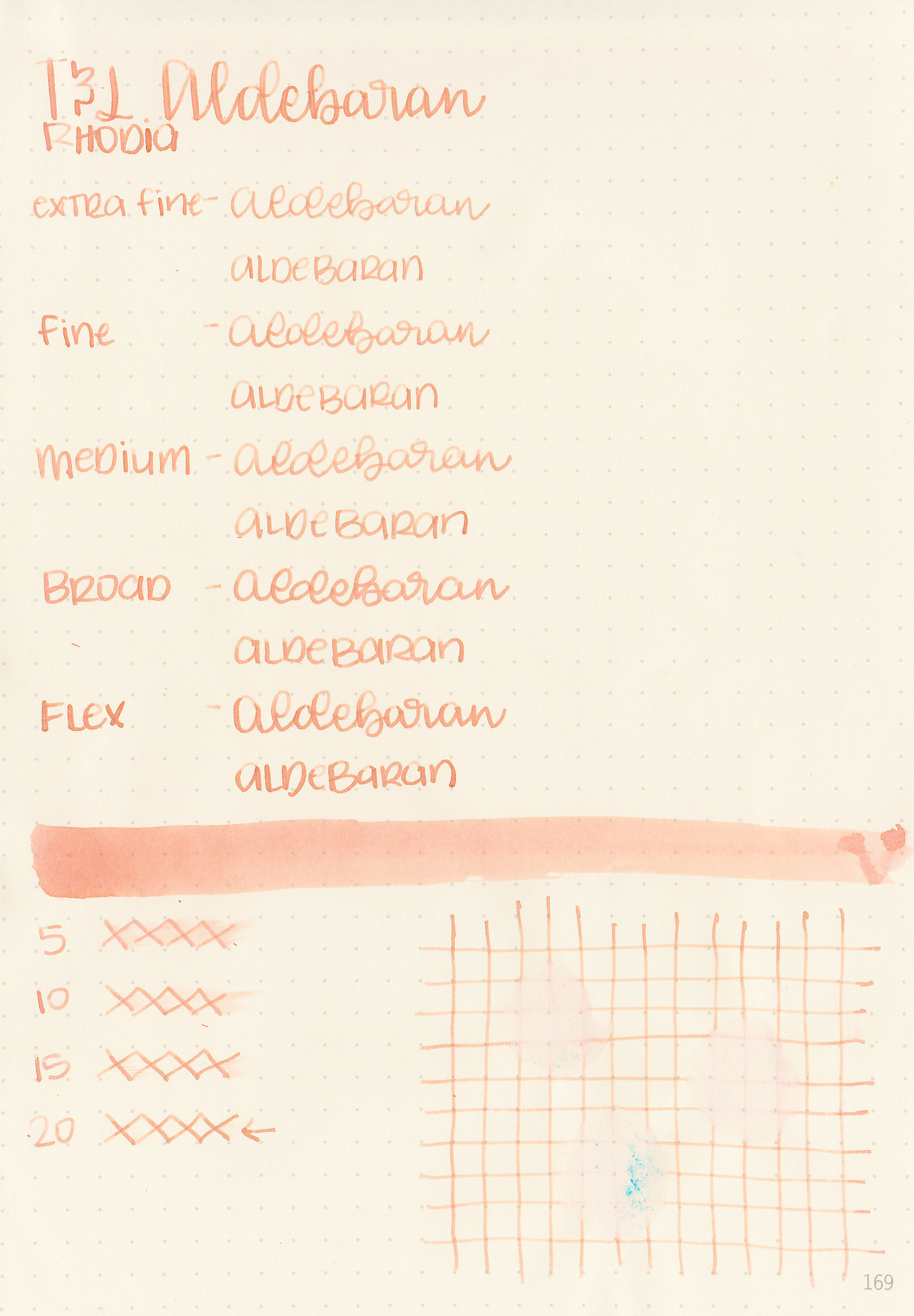
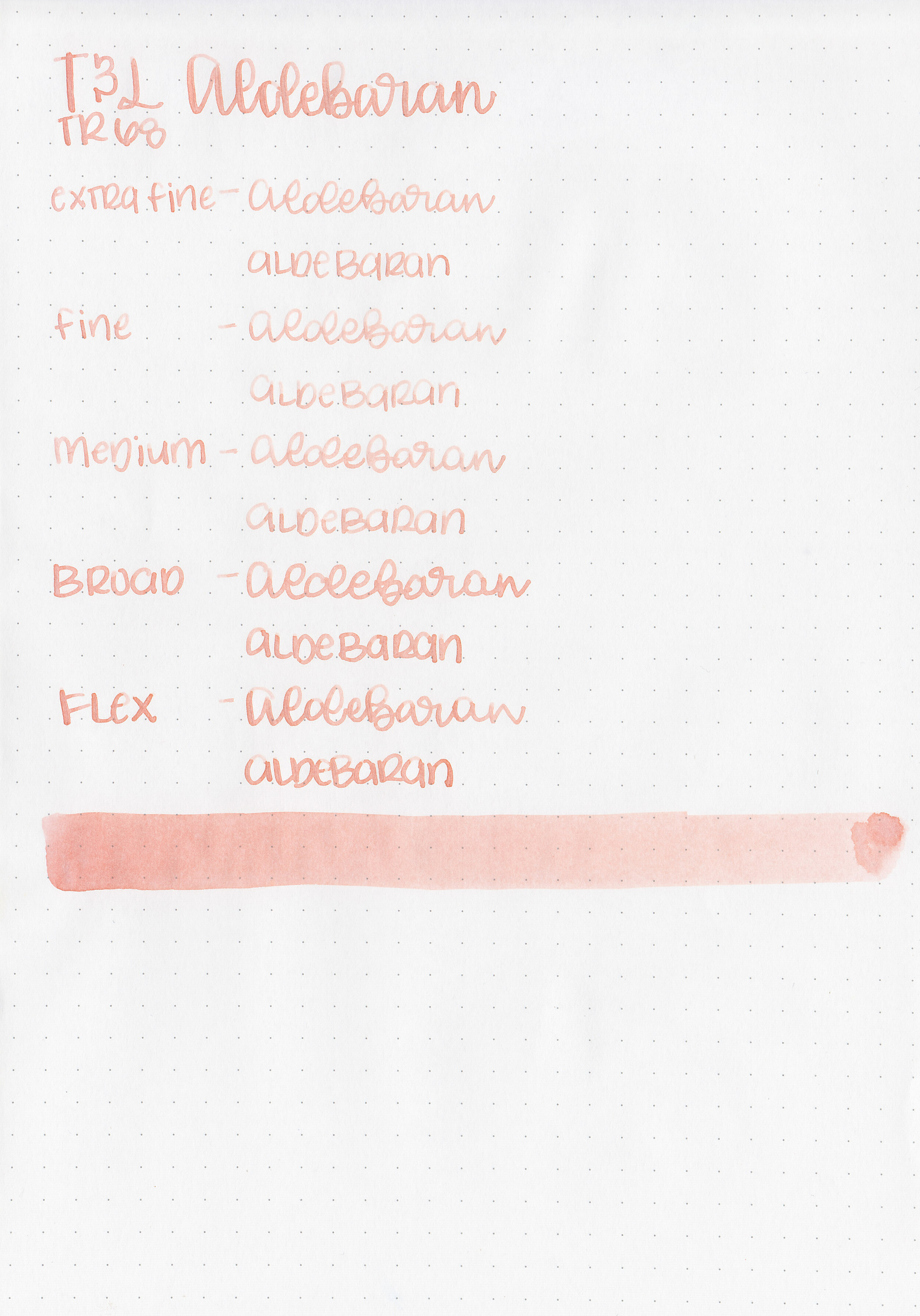
The color:
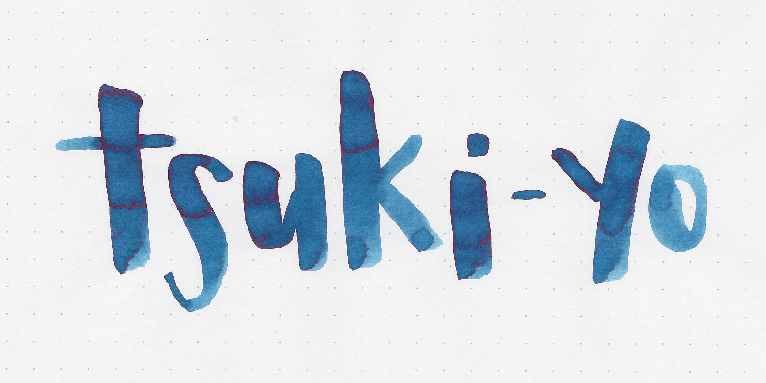
Tsuki-yo is a dark professional blue.
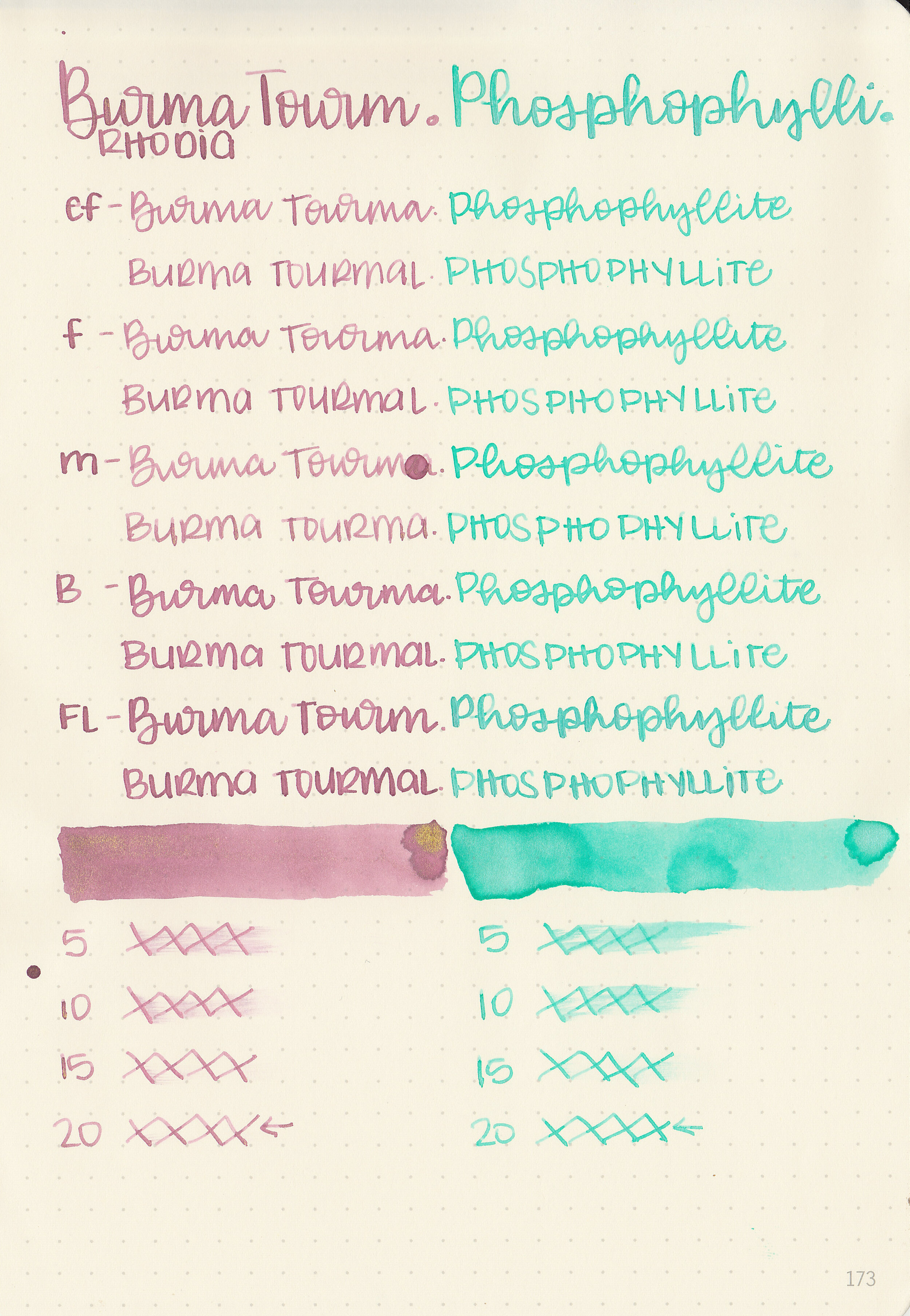
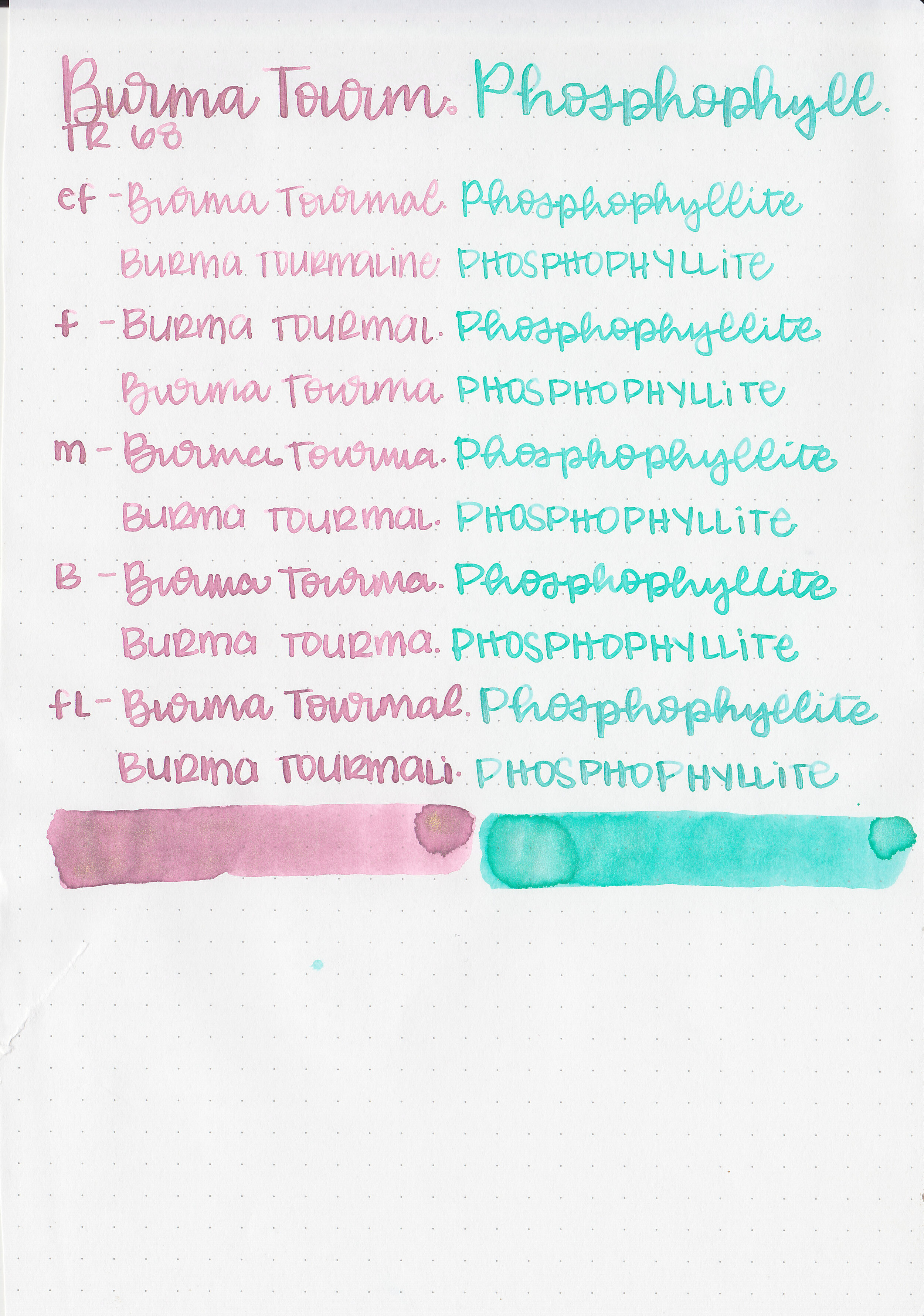
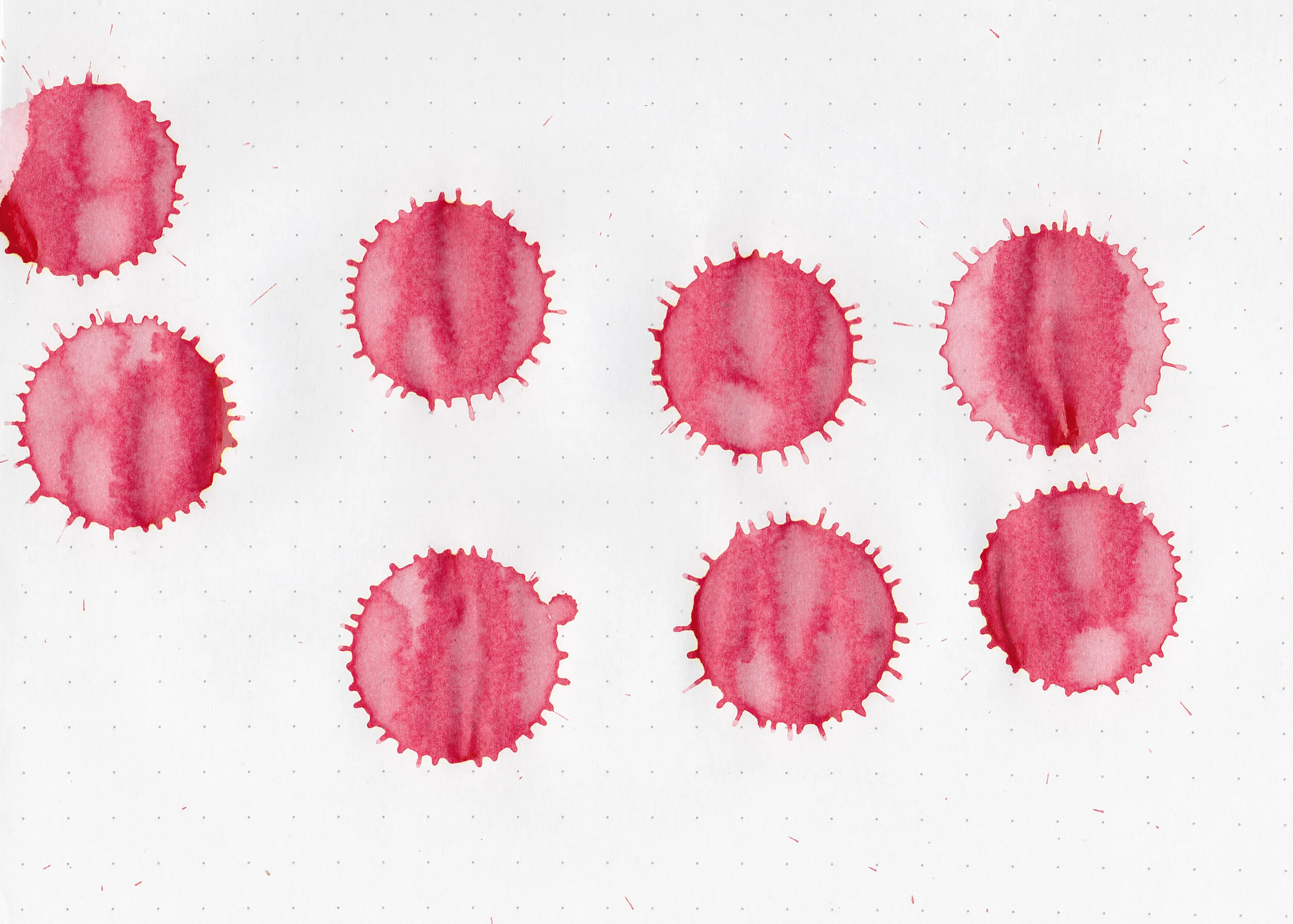
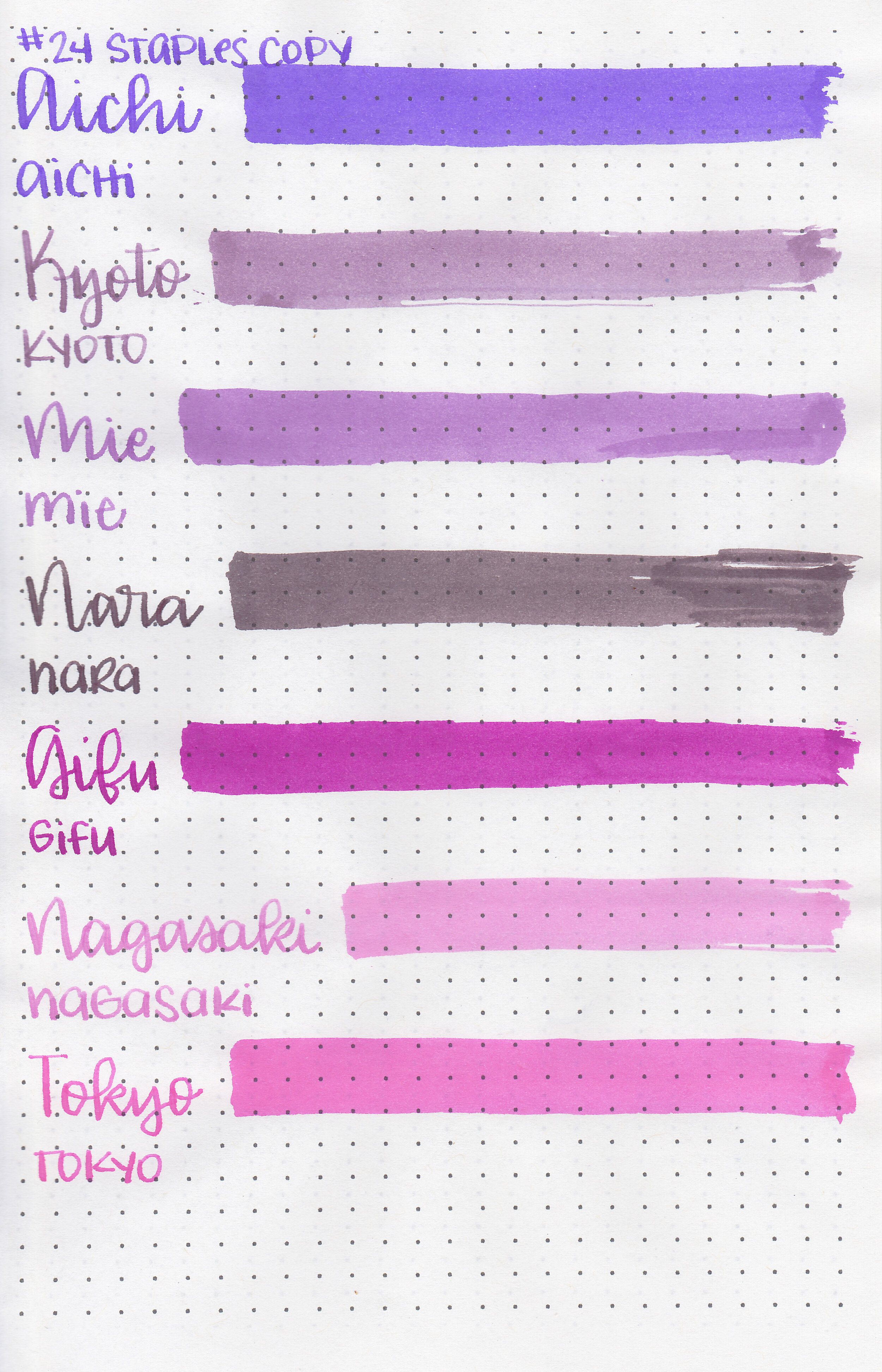
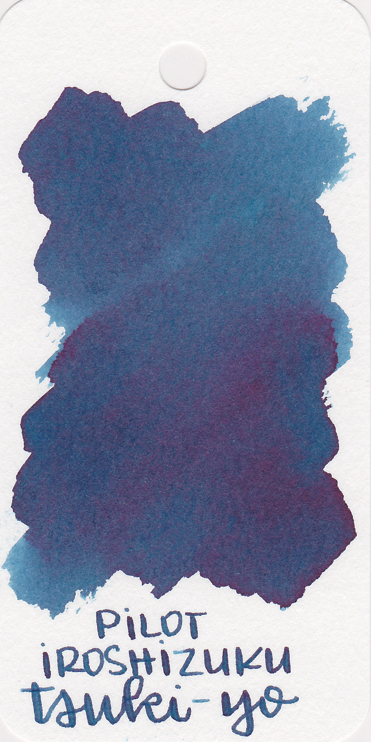
Swabs:
In large swabs on Tomoe River paper the ink has a small pop of red sheen.

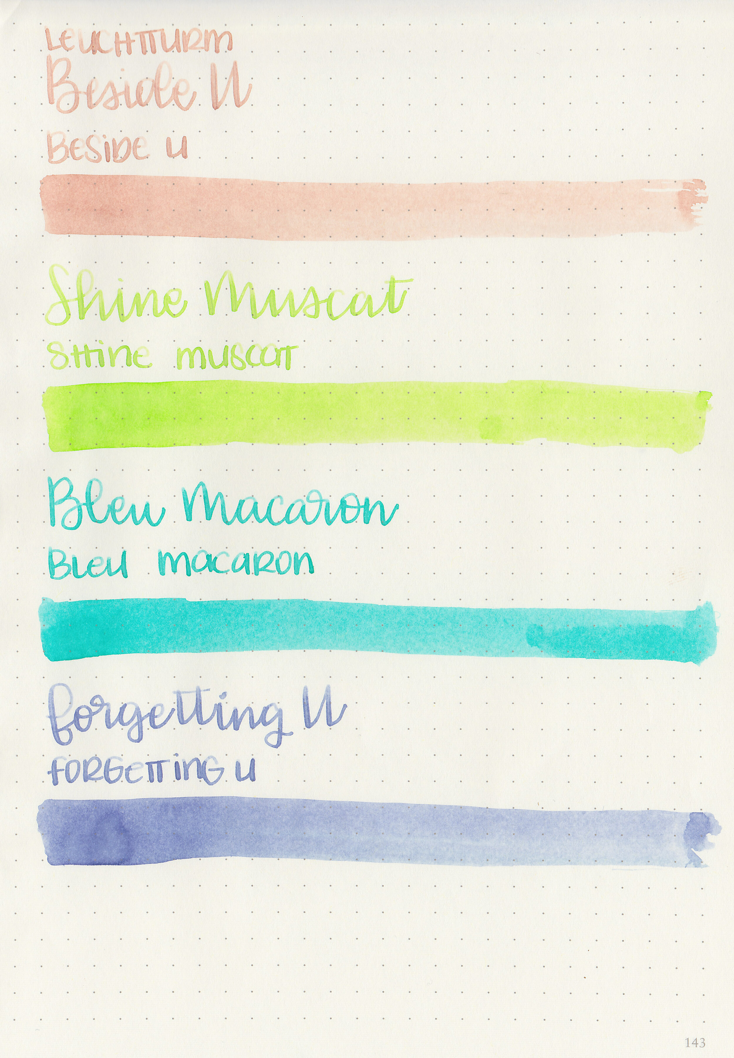
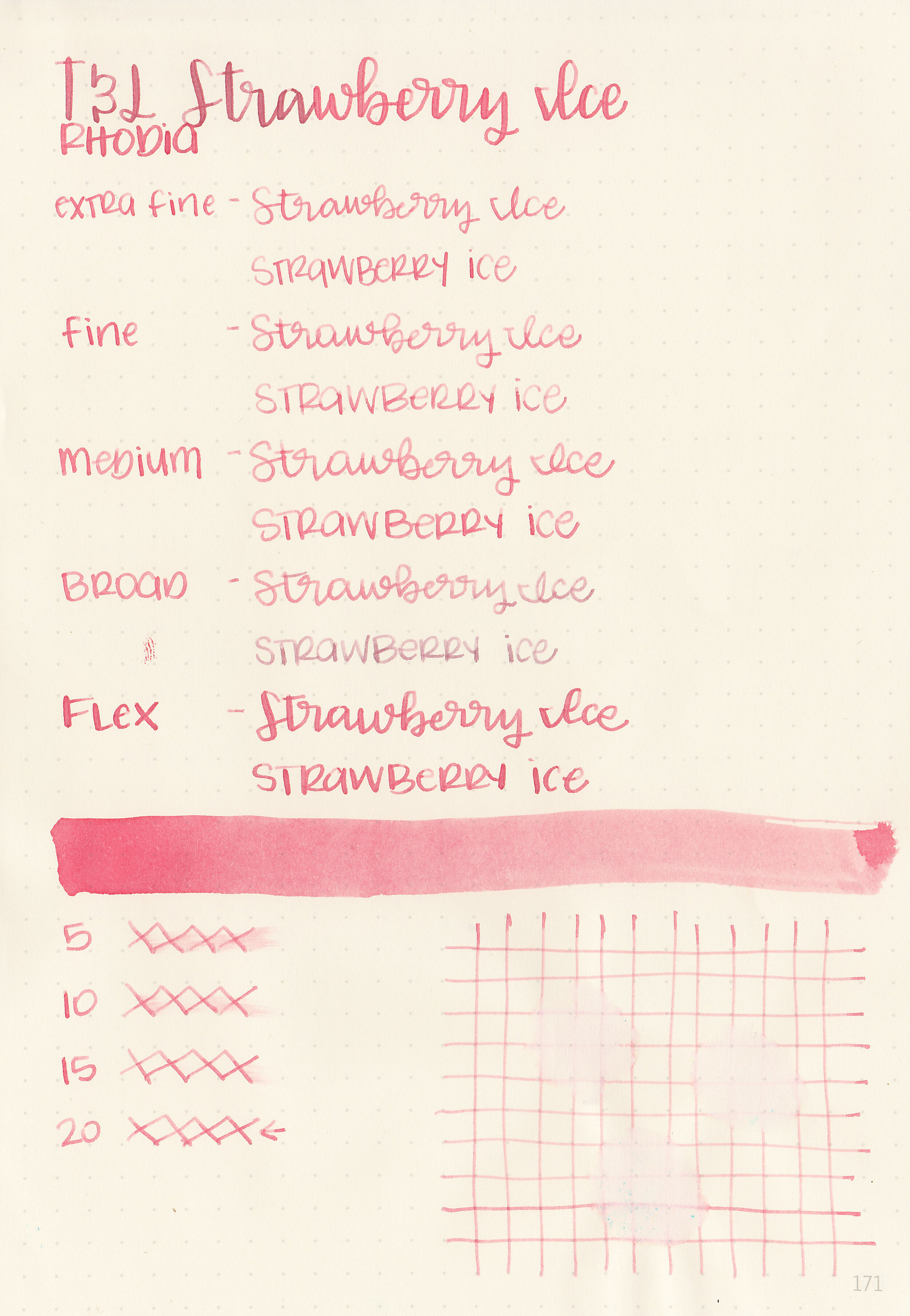
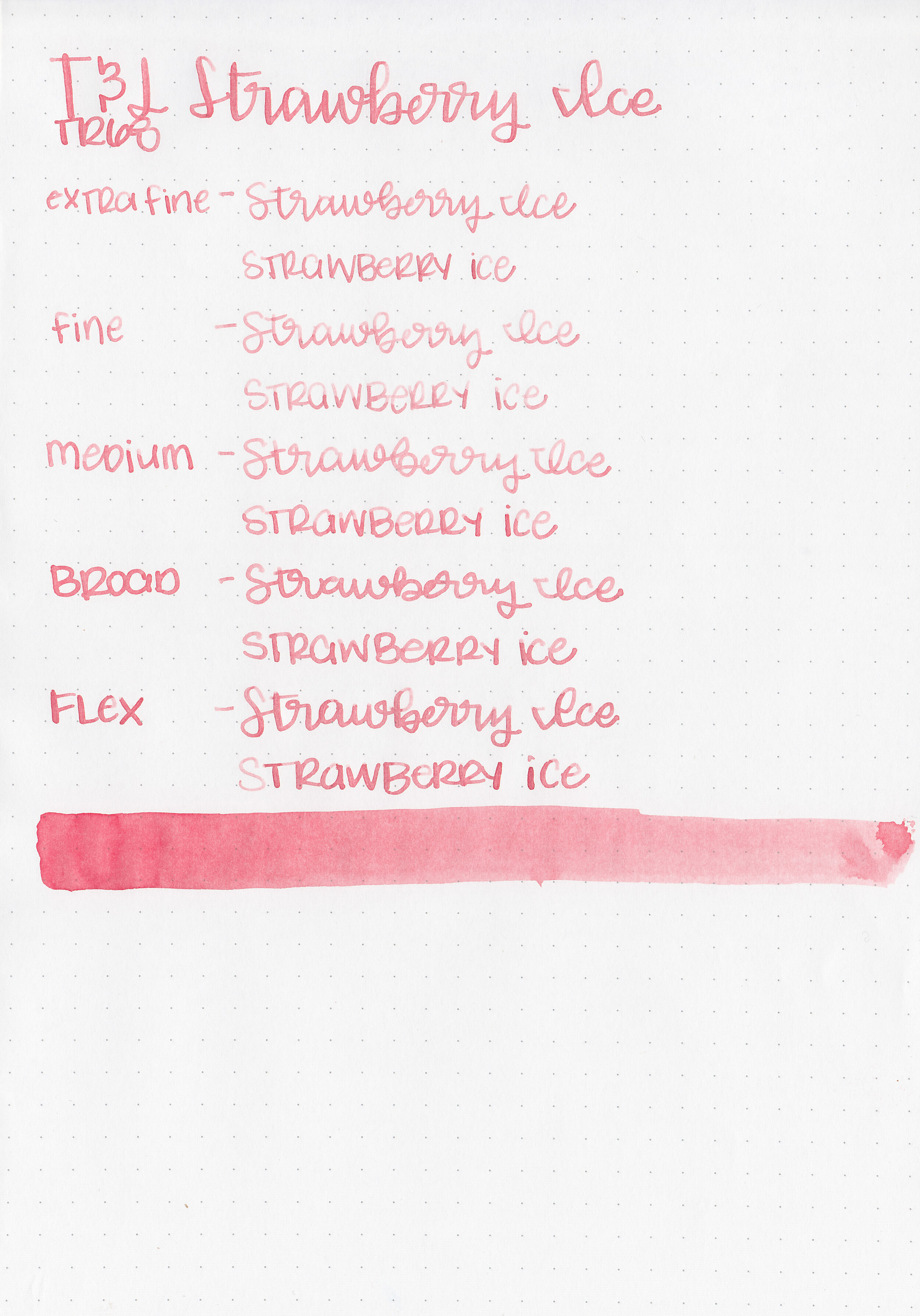
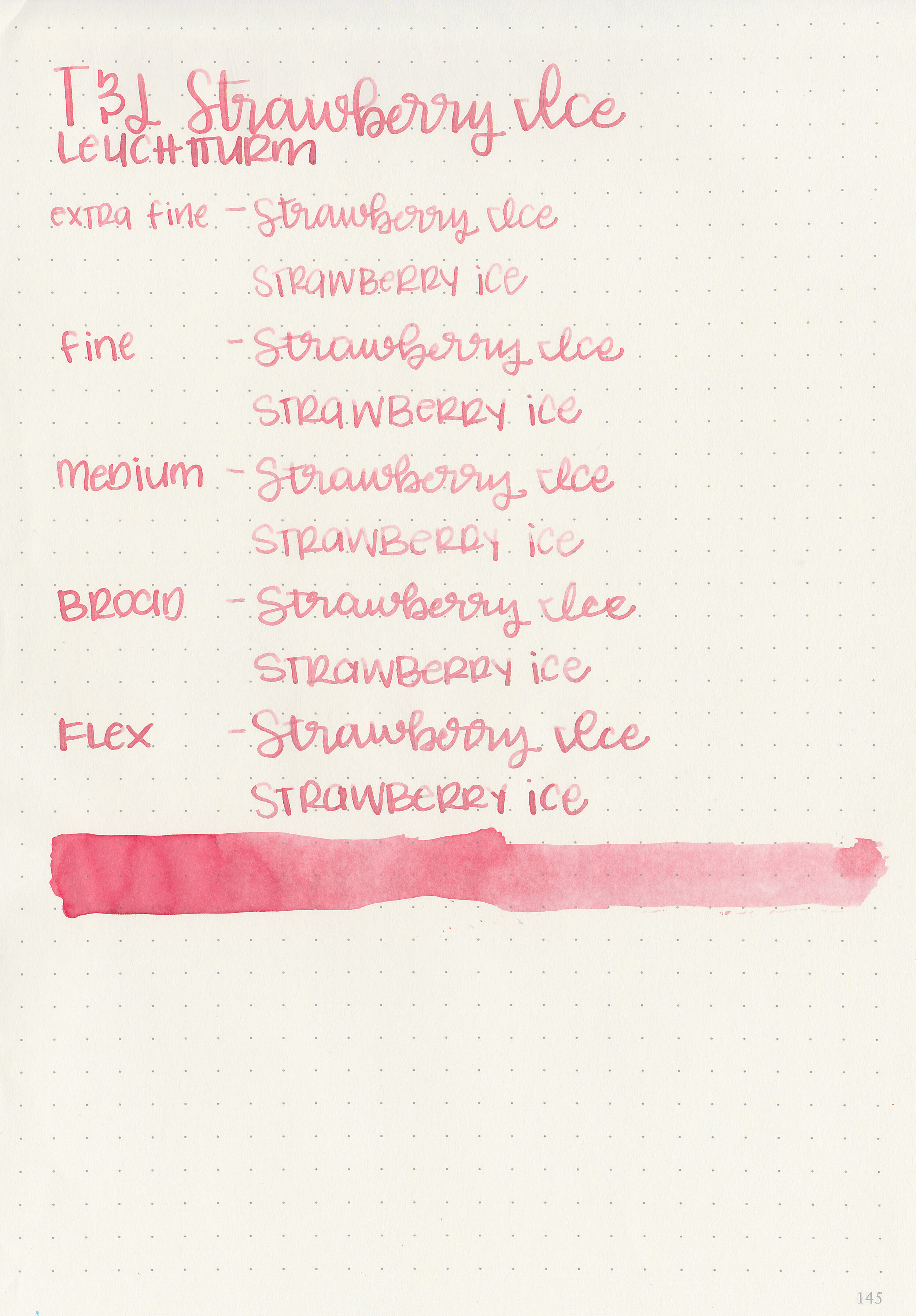
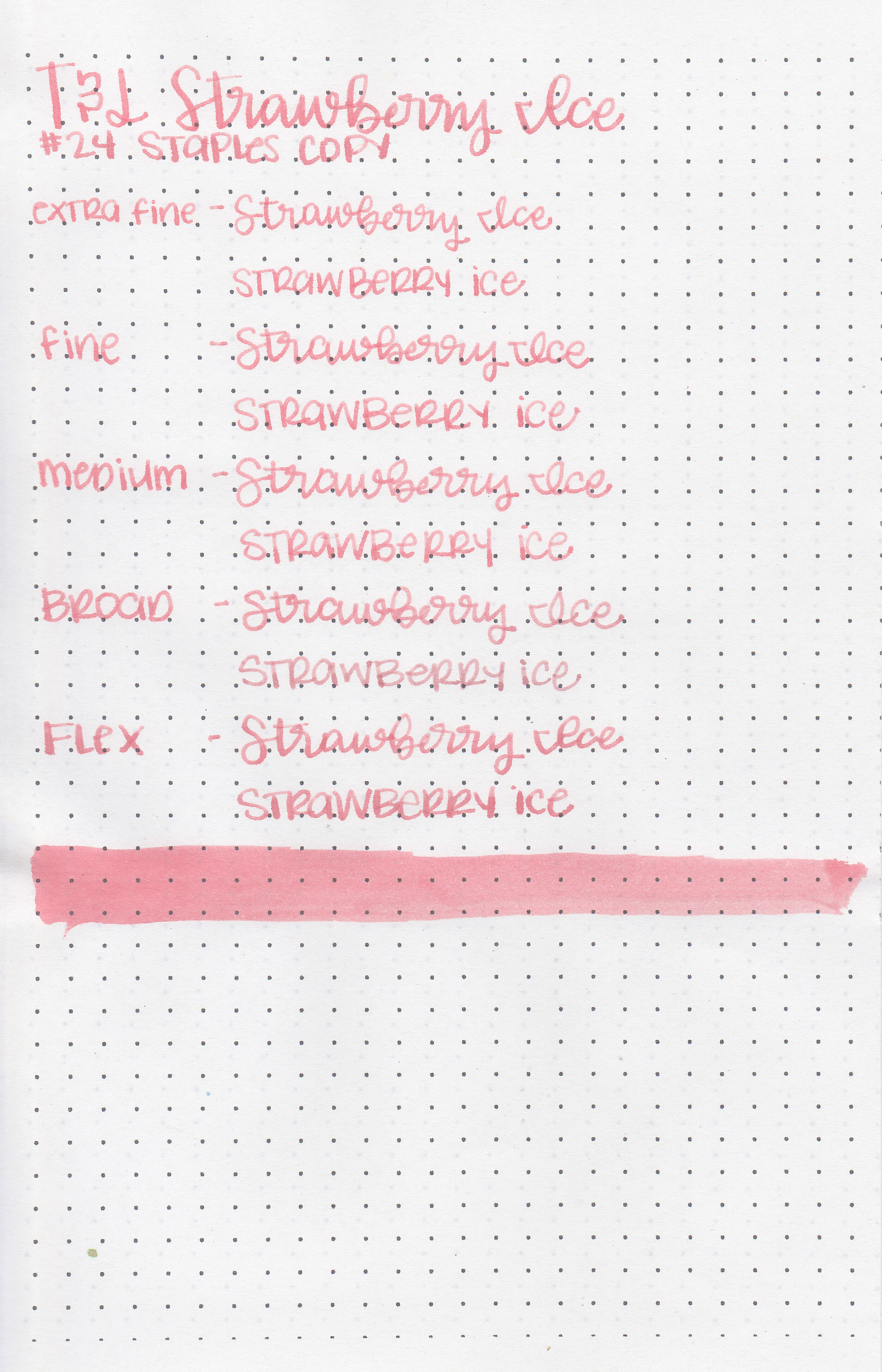
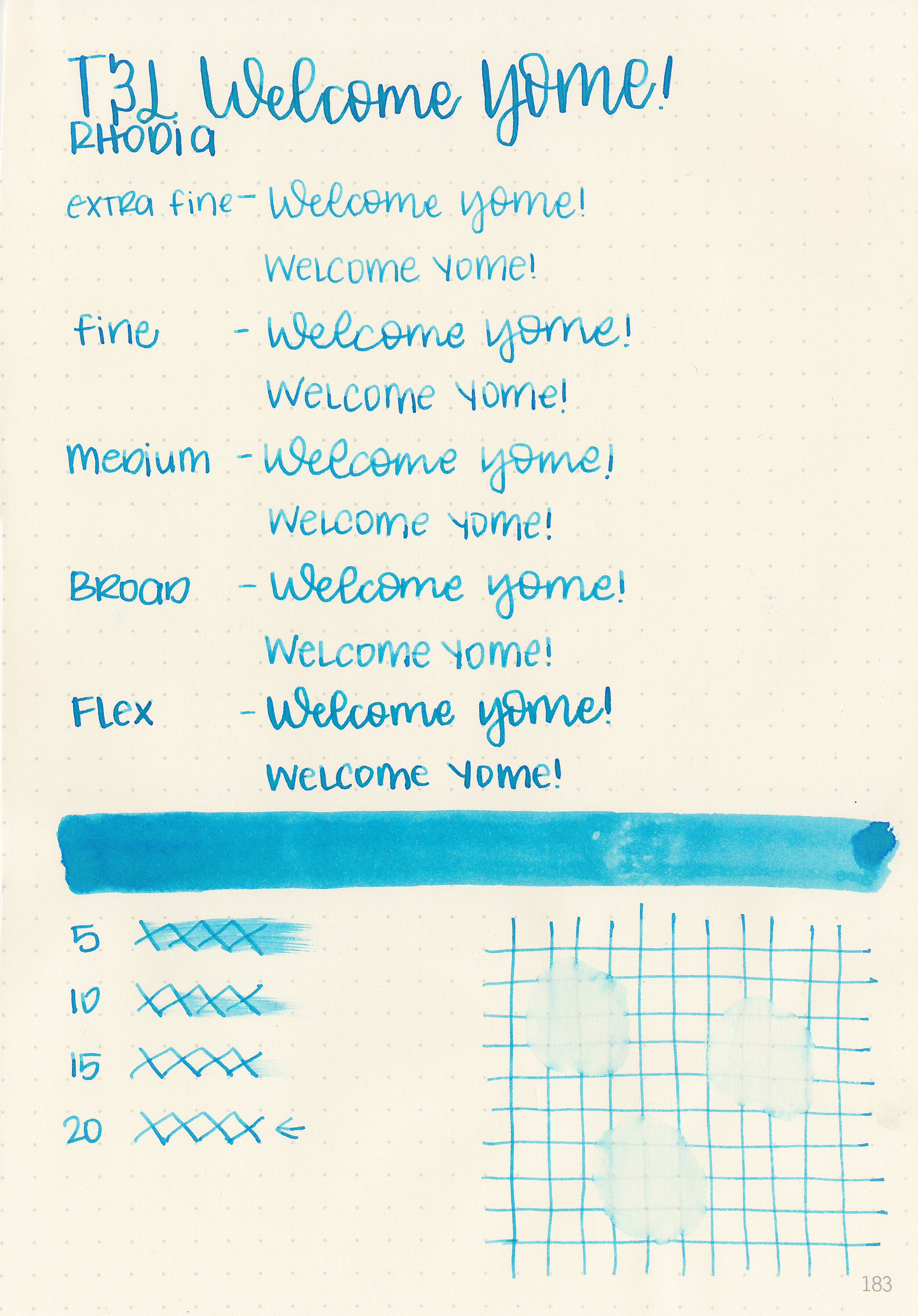
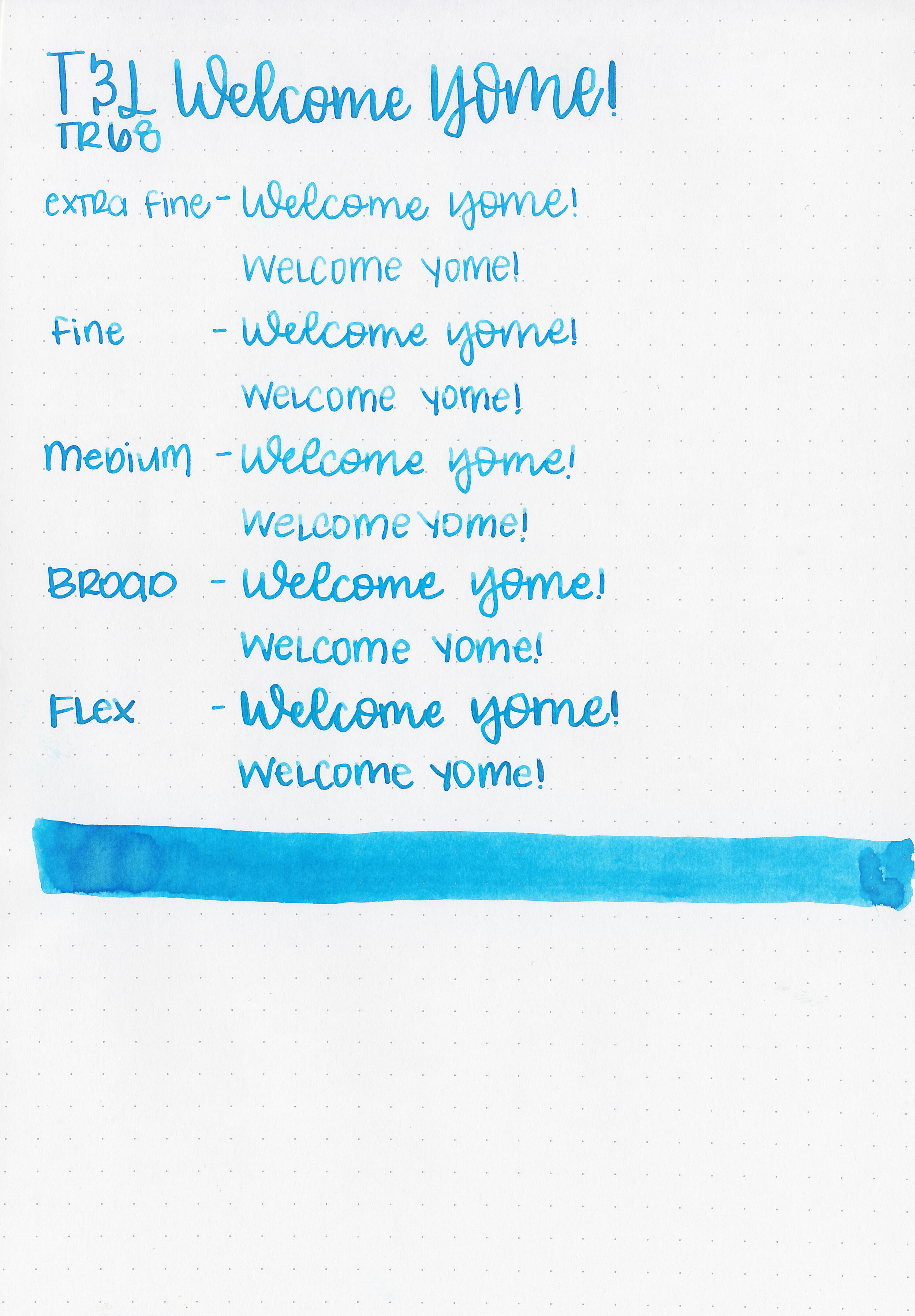
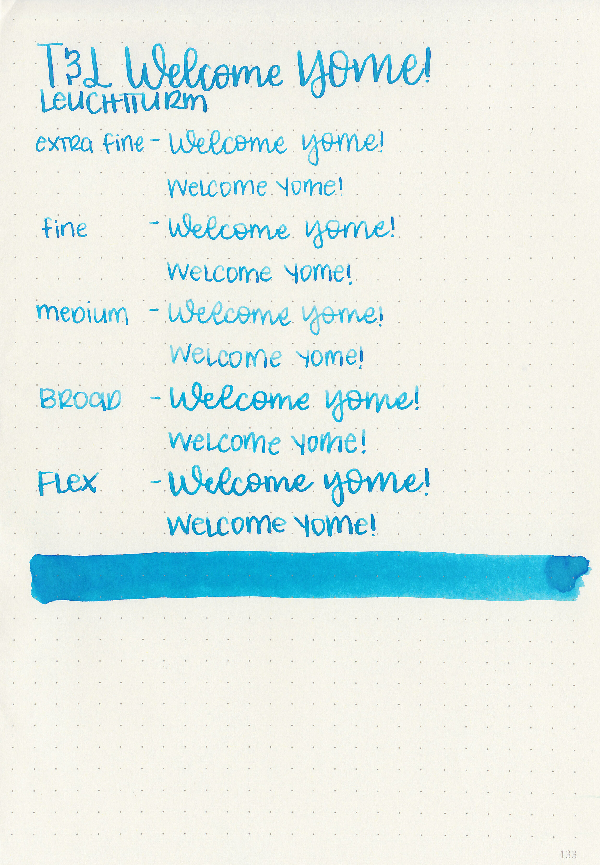
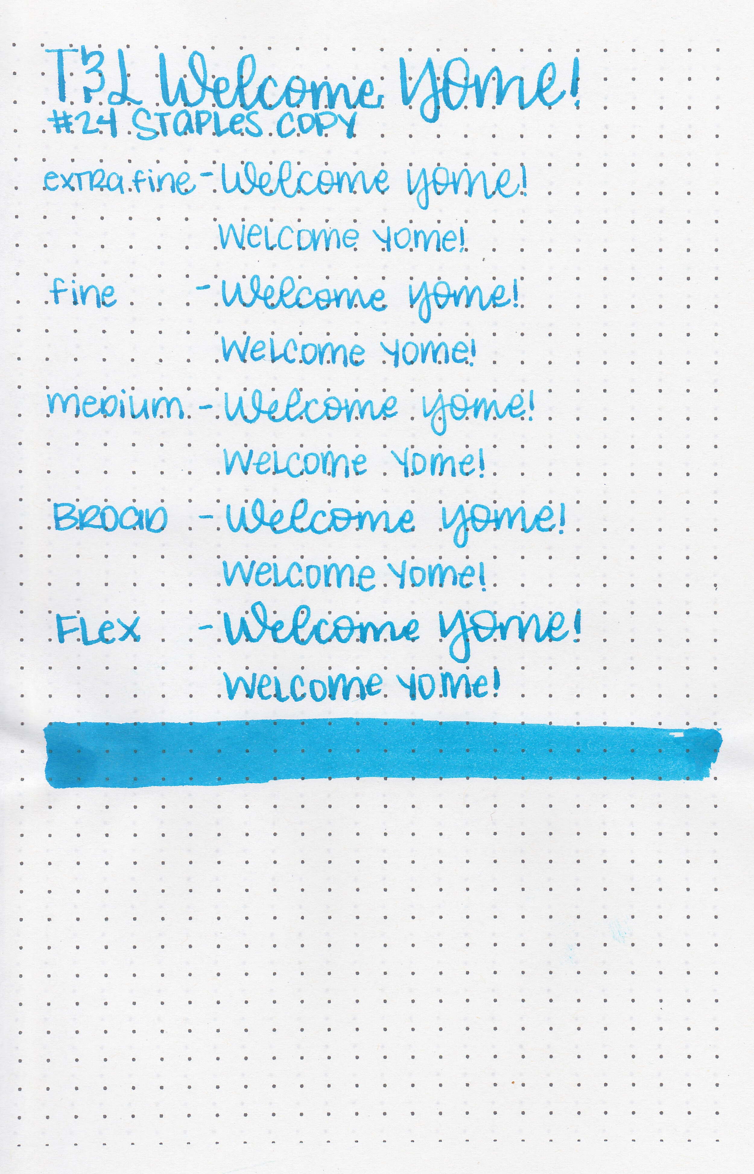
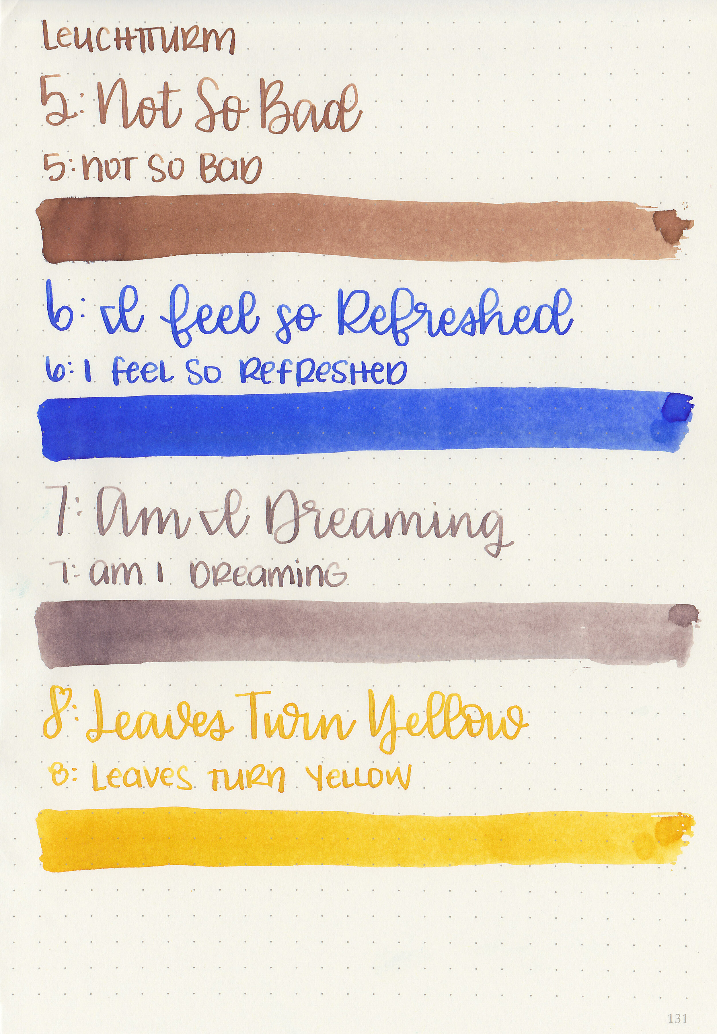
Writing samples:
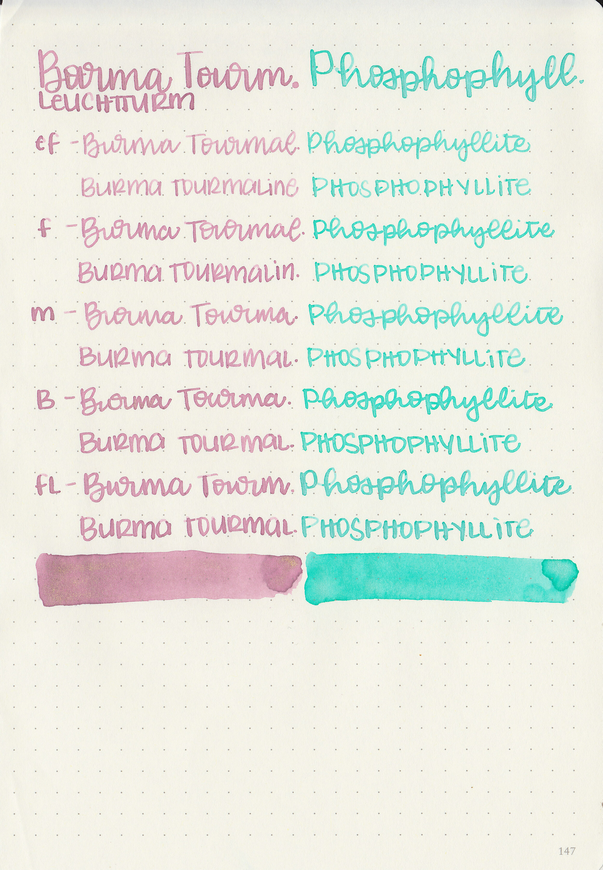
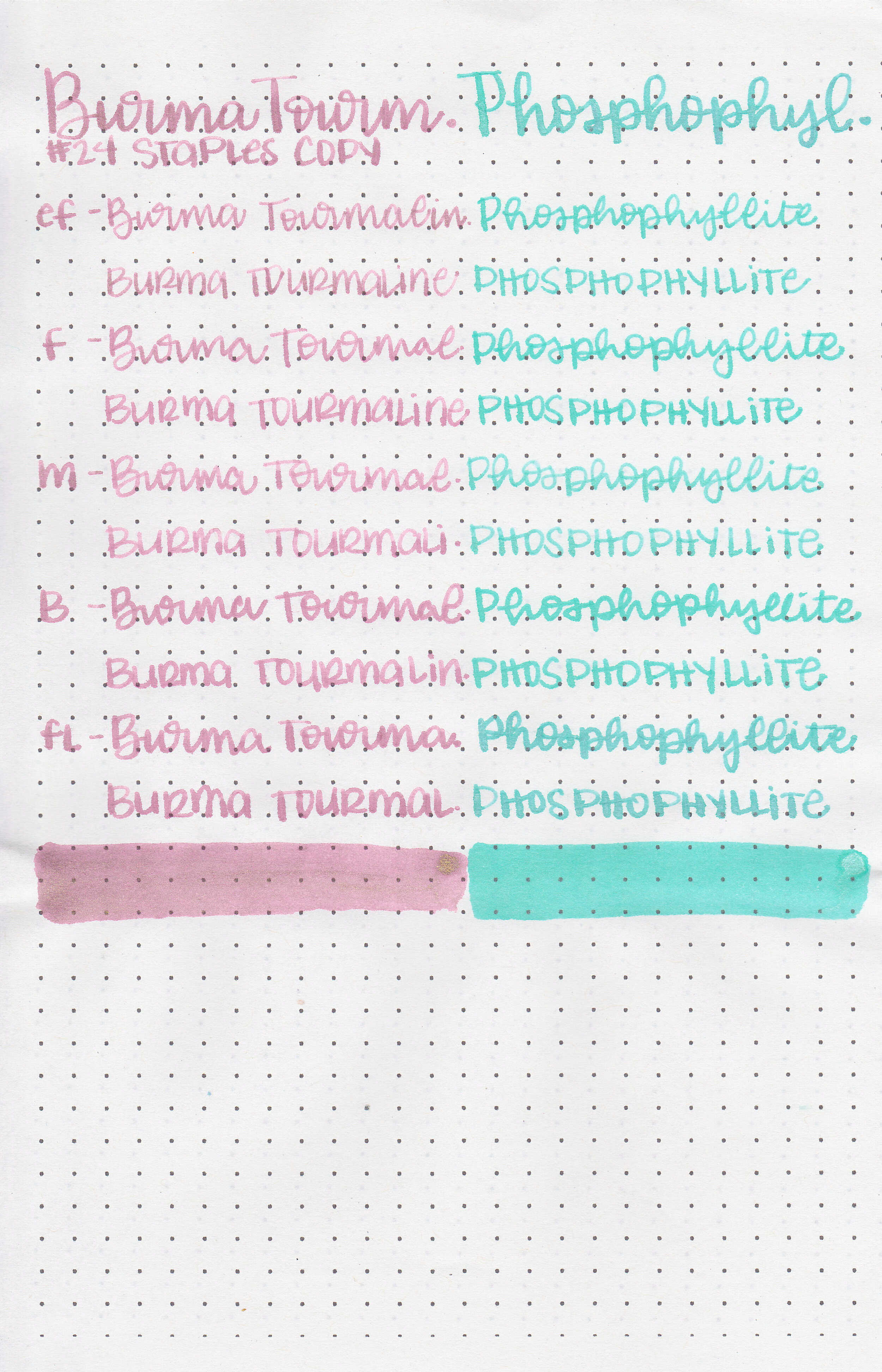
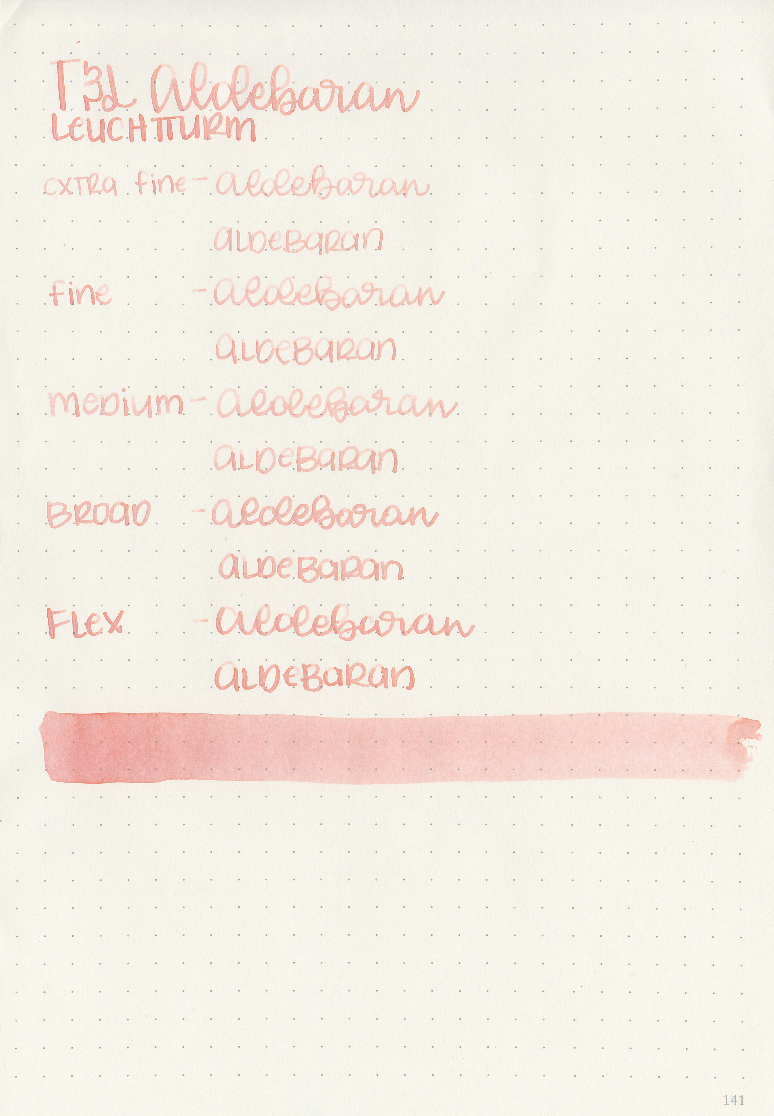
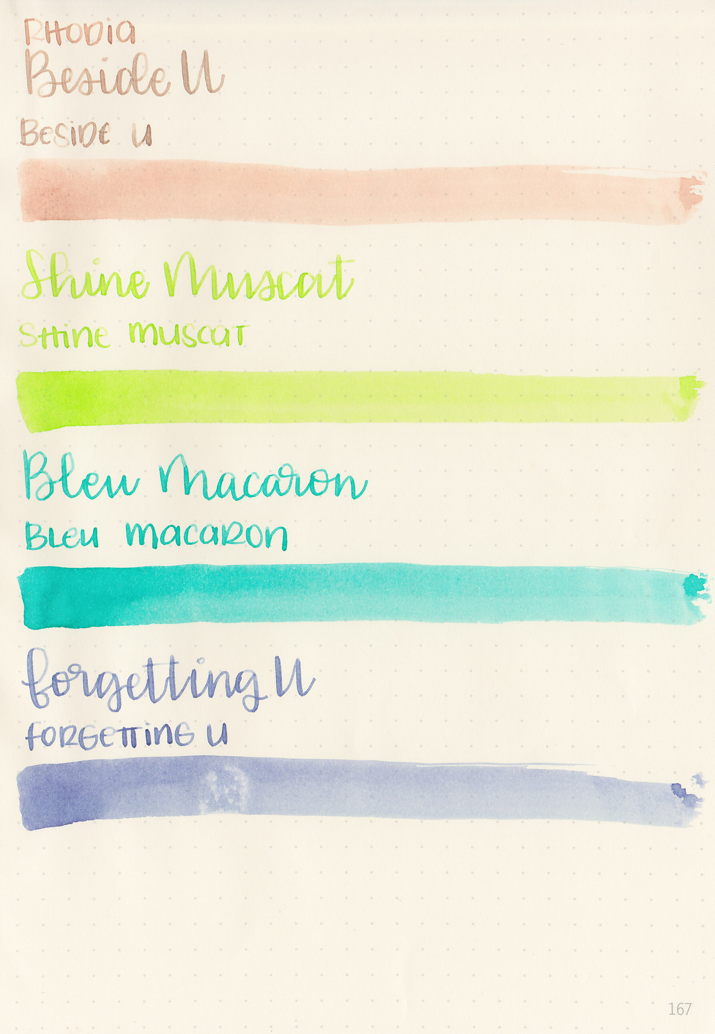
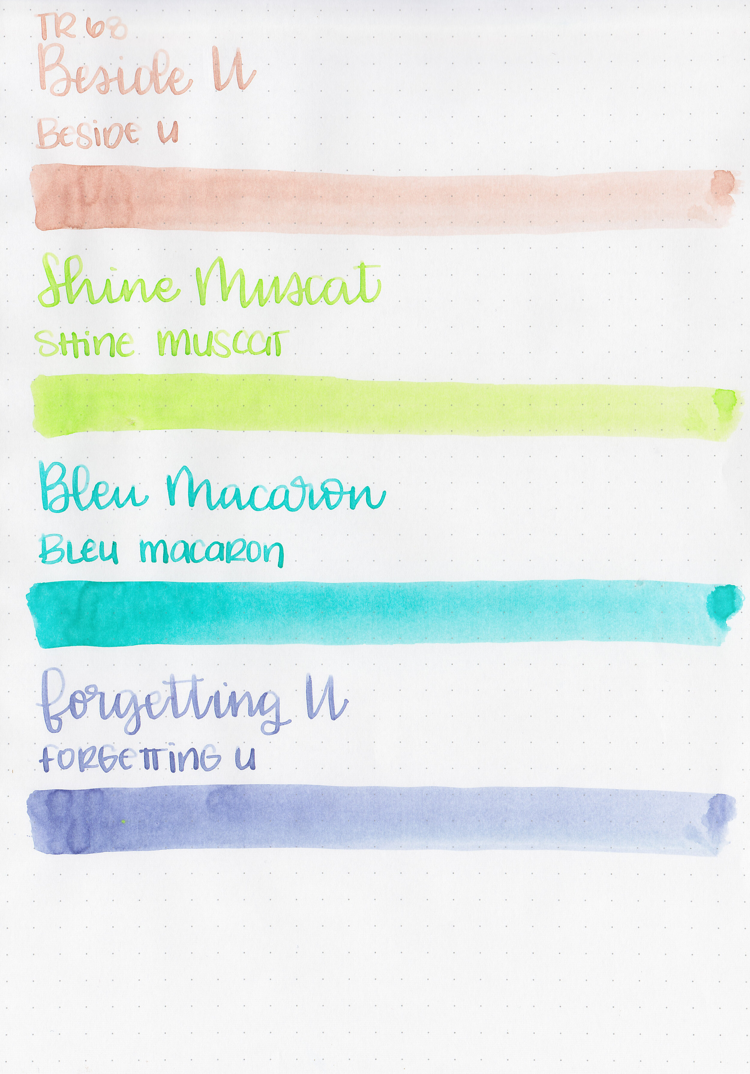
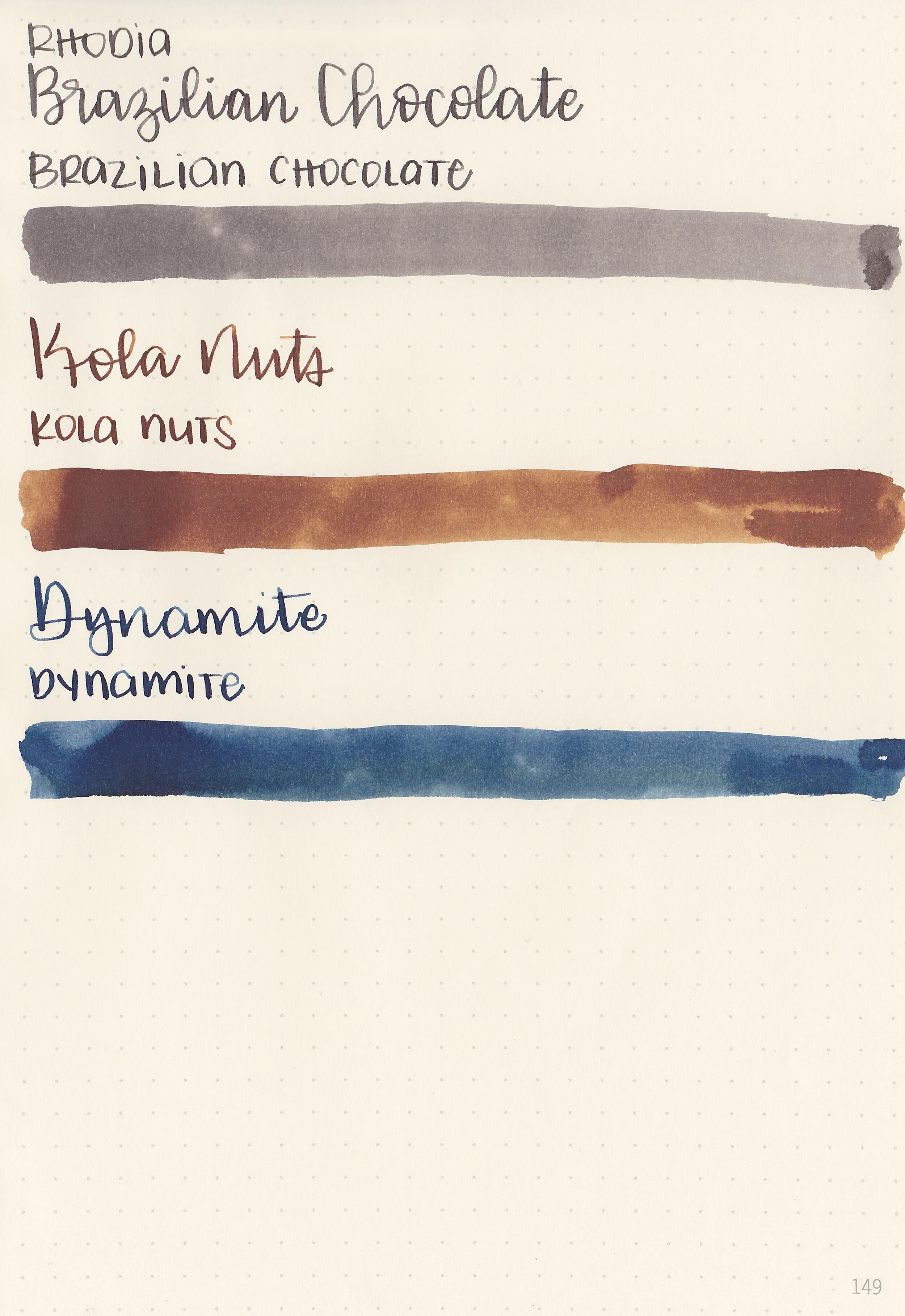
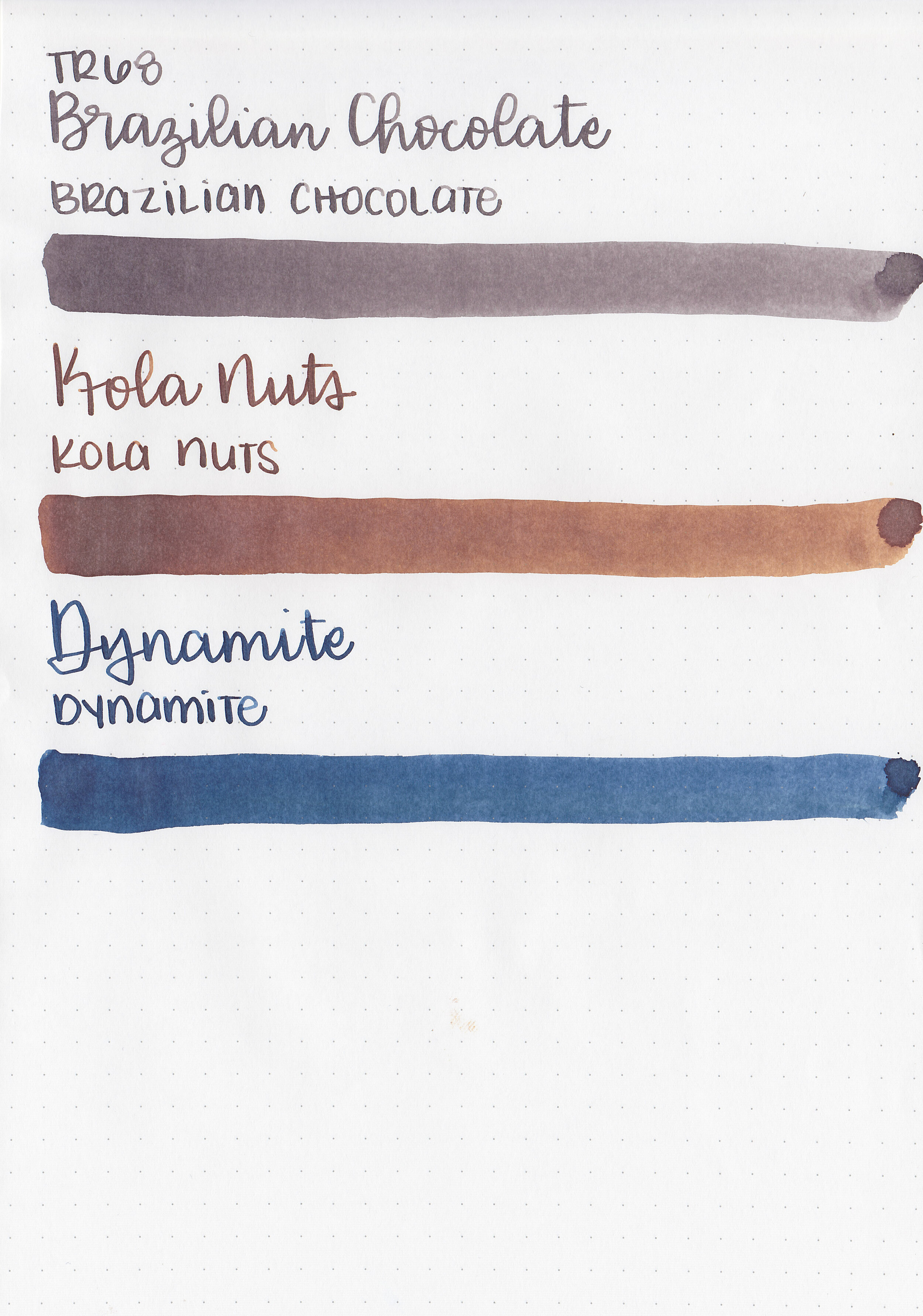
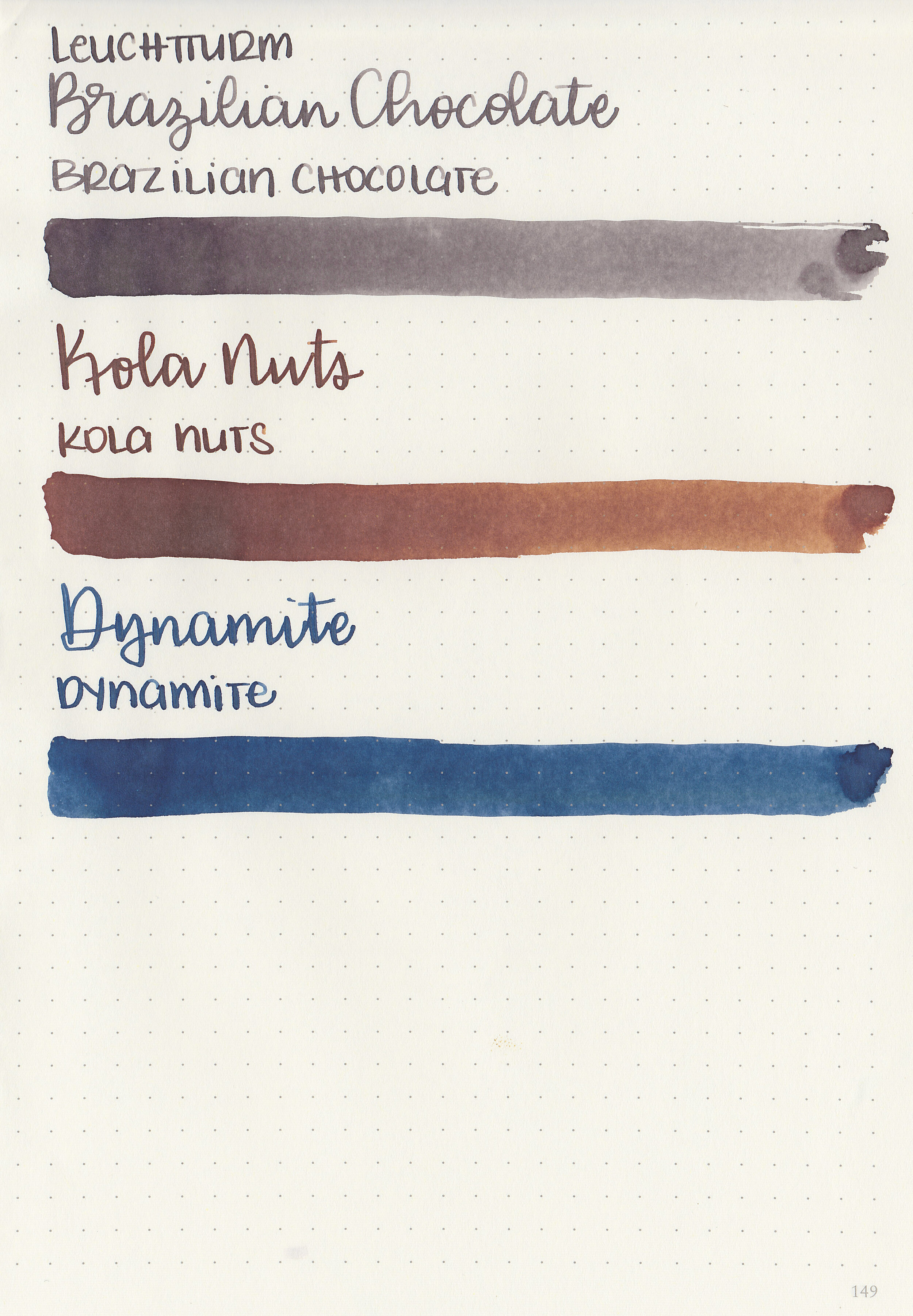
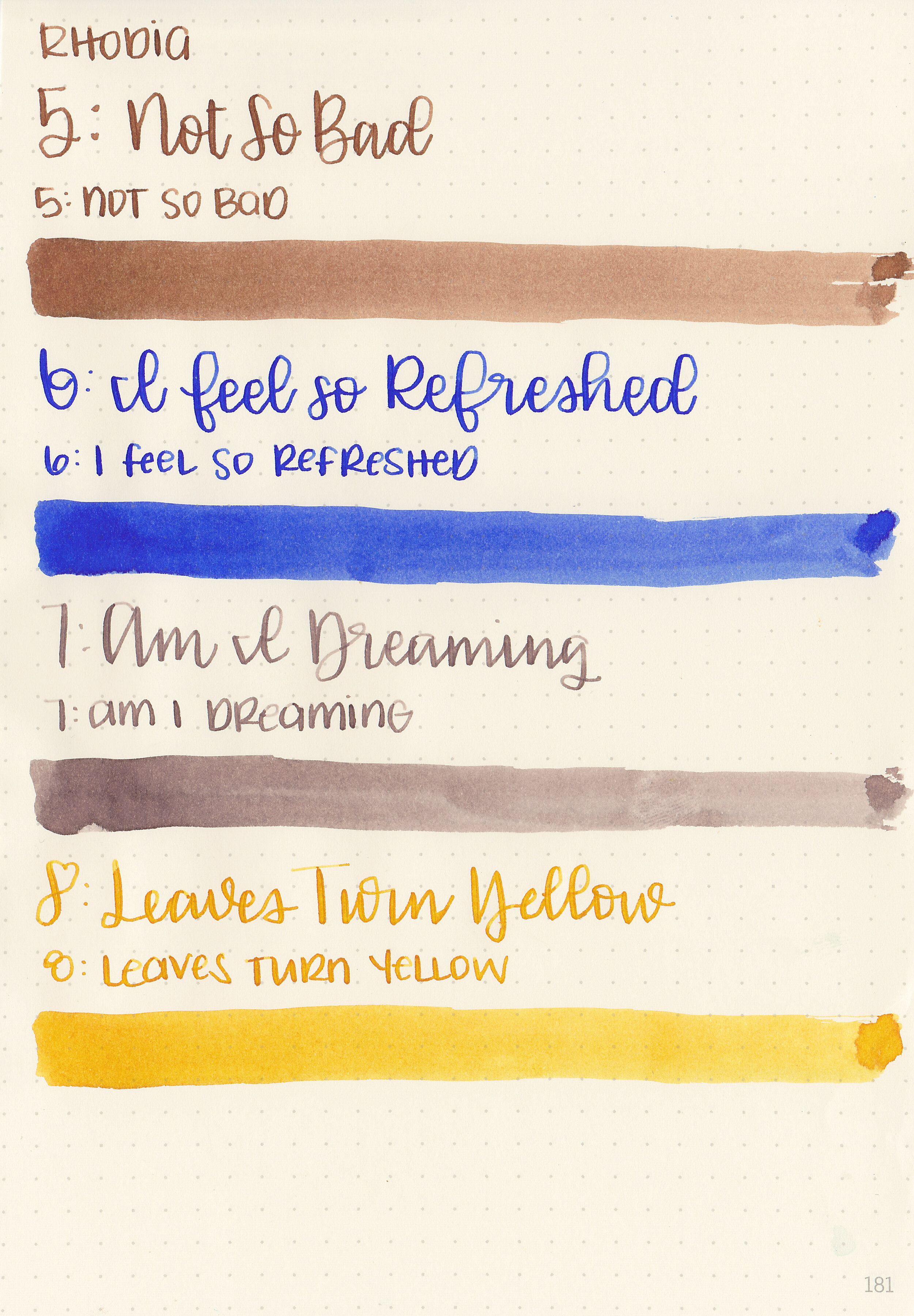
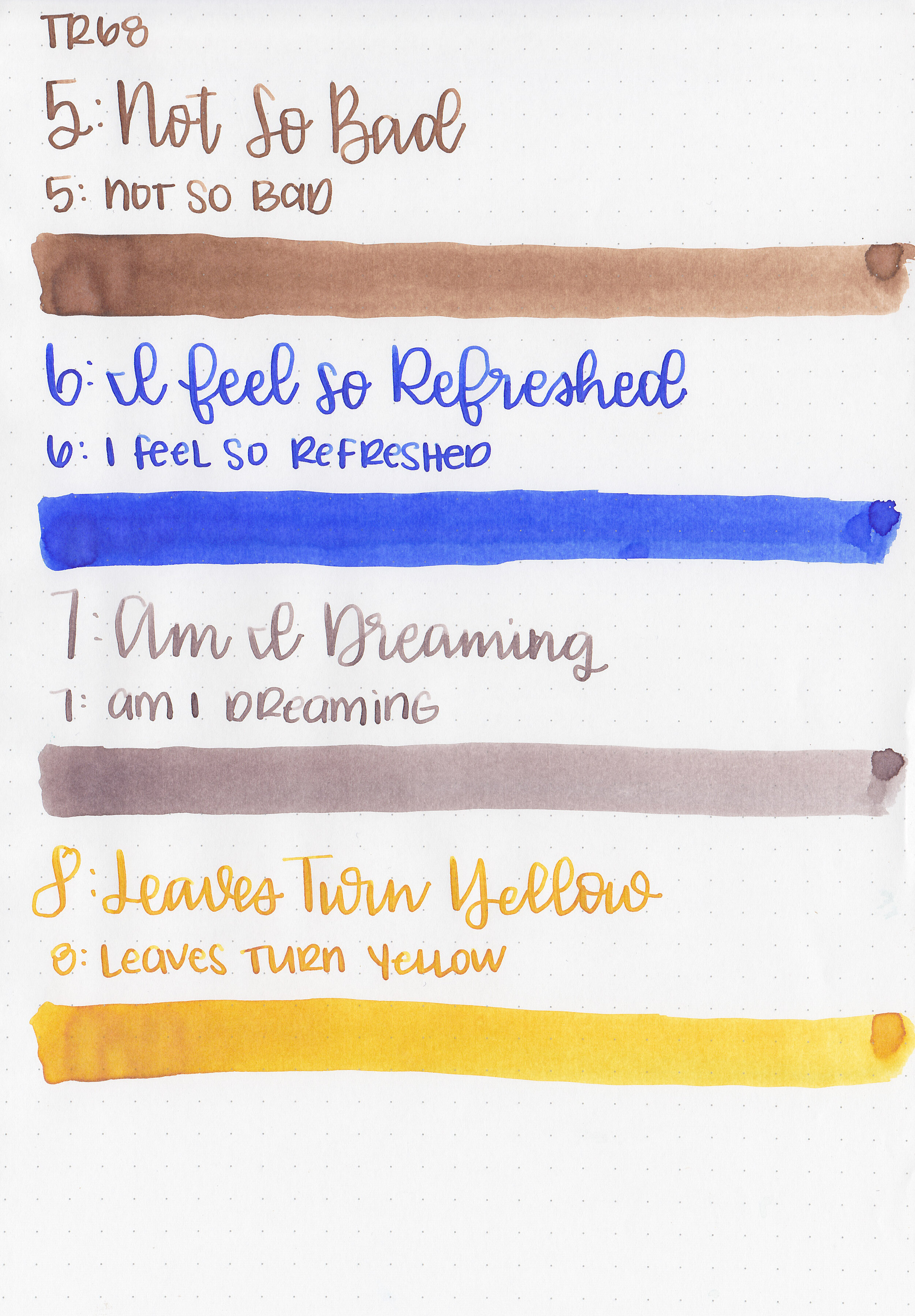
Let's take a look at how the ink behaves on fountain pen friendly papers: Rhodia, Tomoe River, and Leuchtturm.
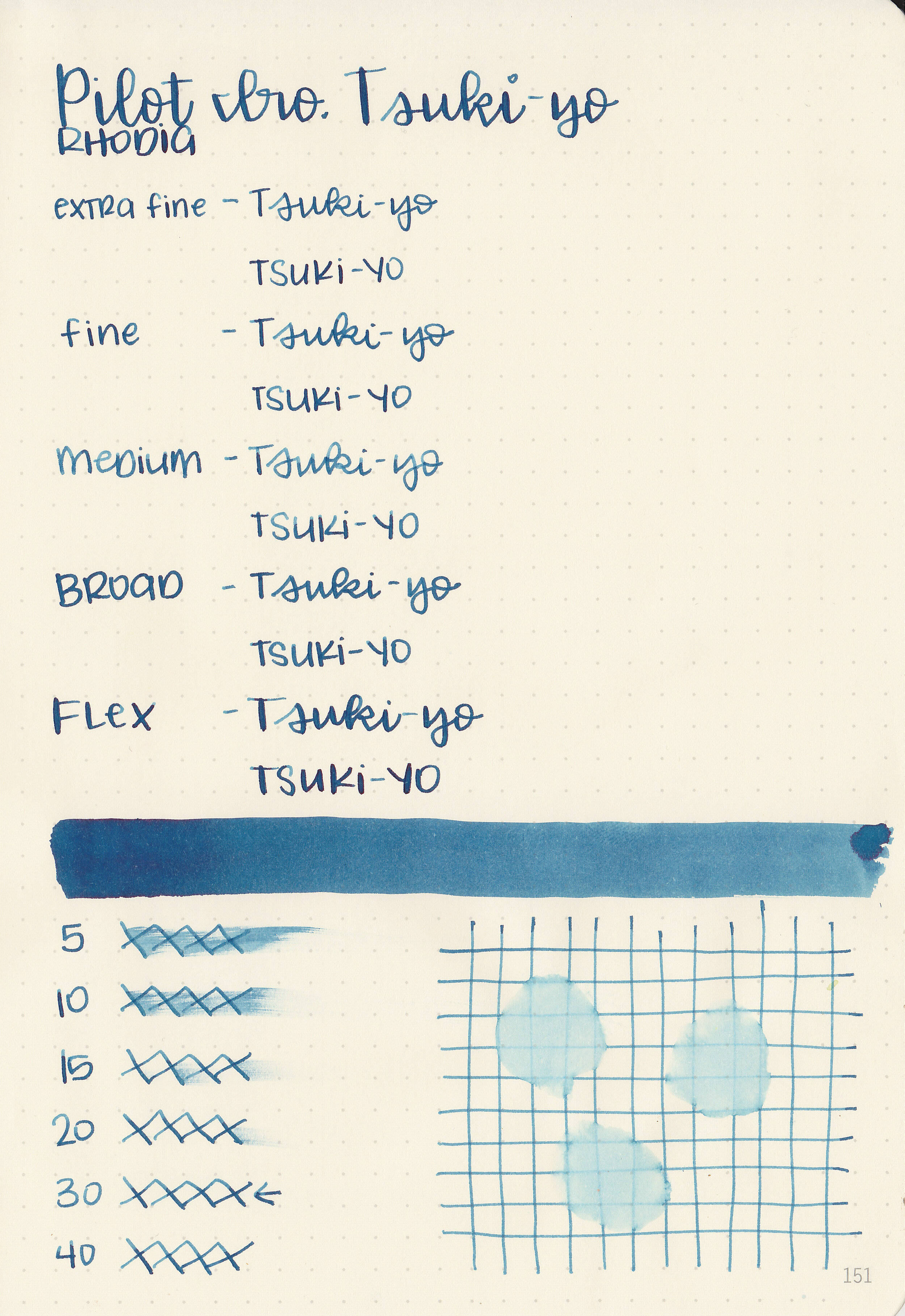
Dry time: 30 seconds
Water resistance: Low
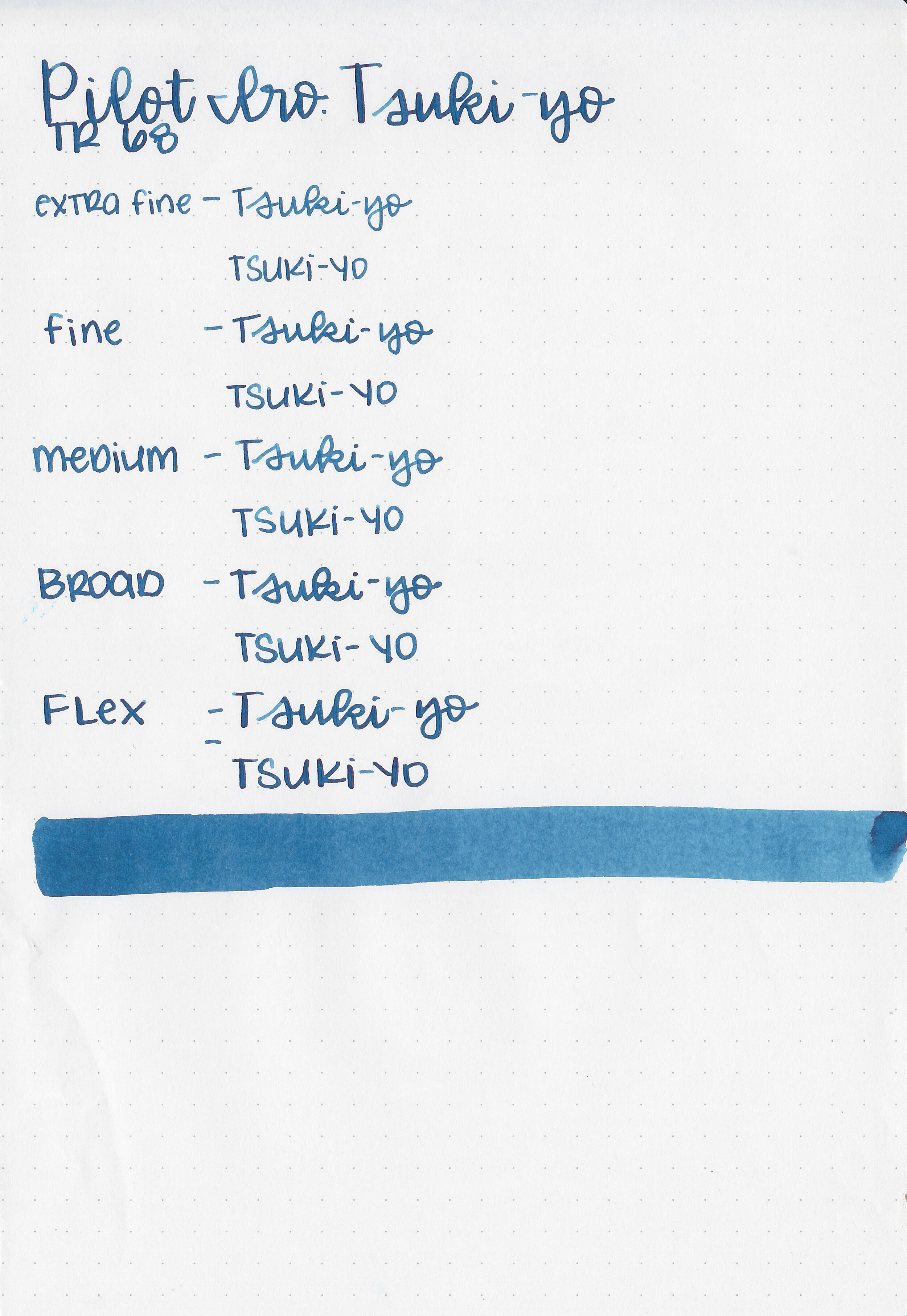
Feathering: None
Show through: Medium
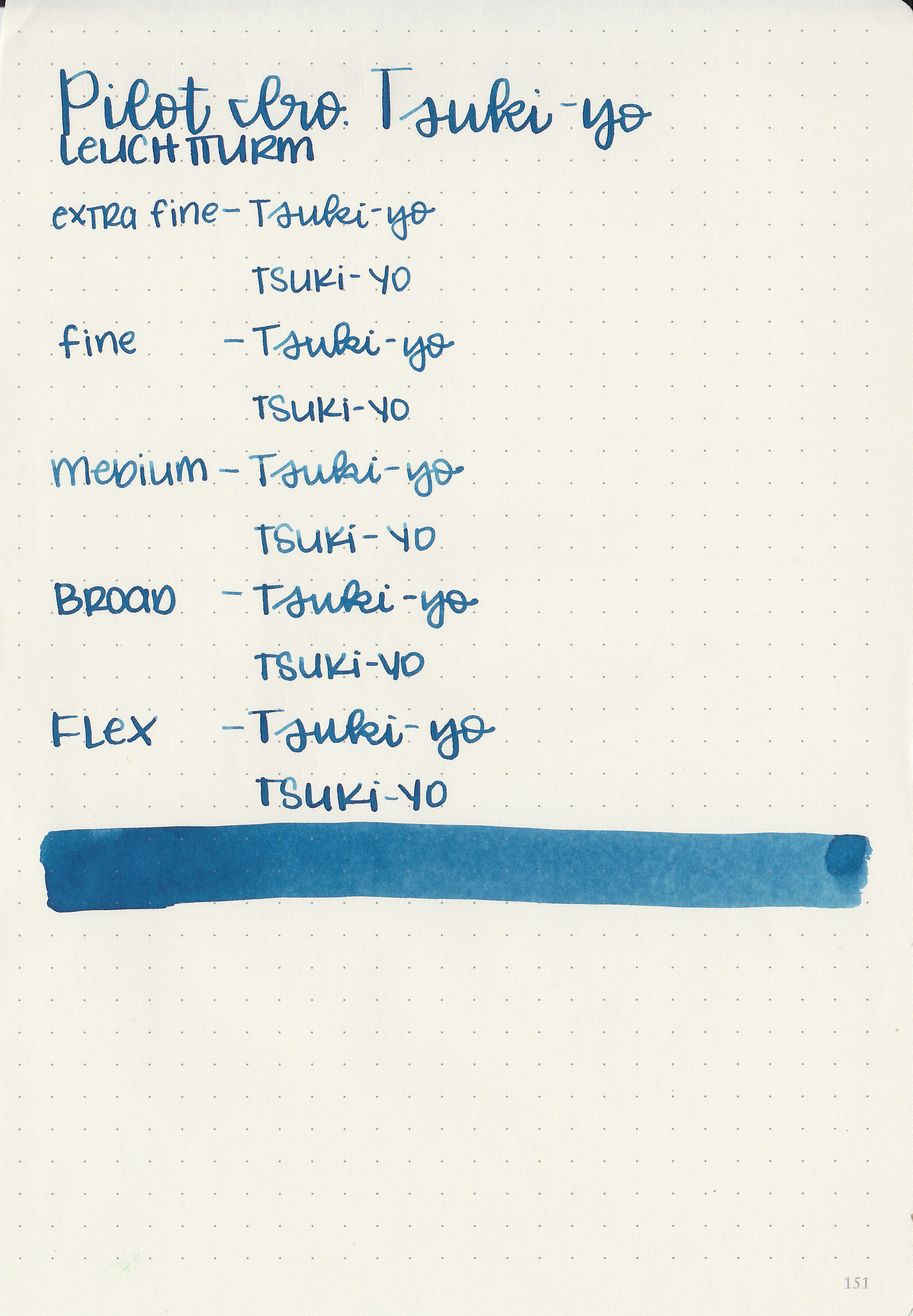
Bleeding: None
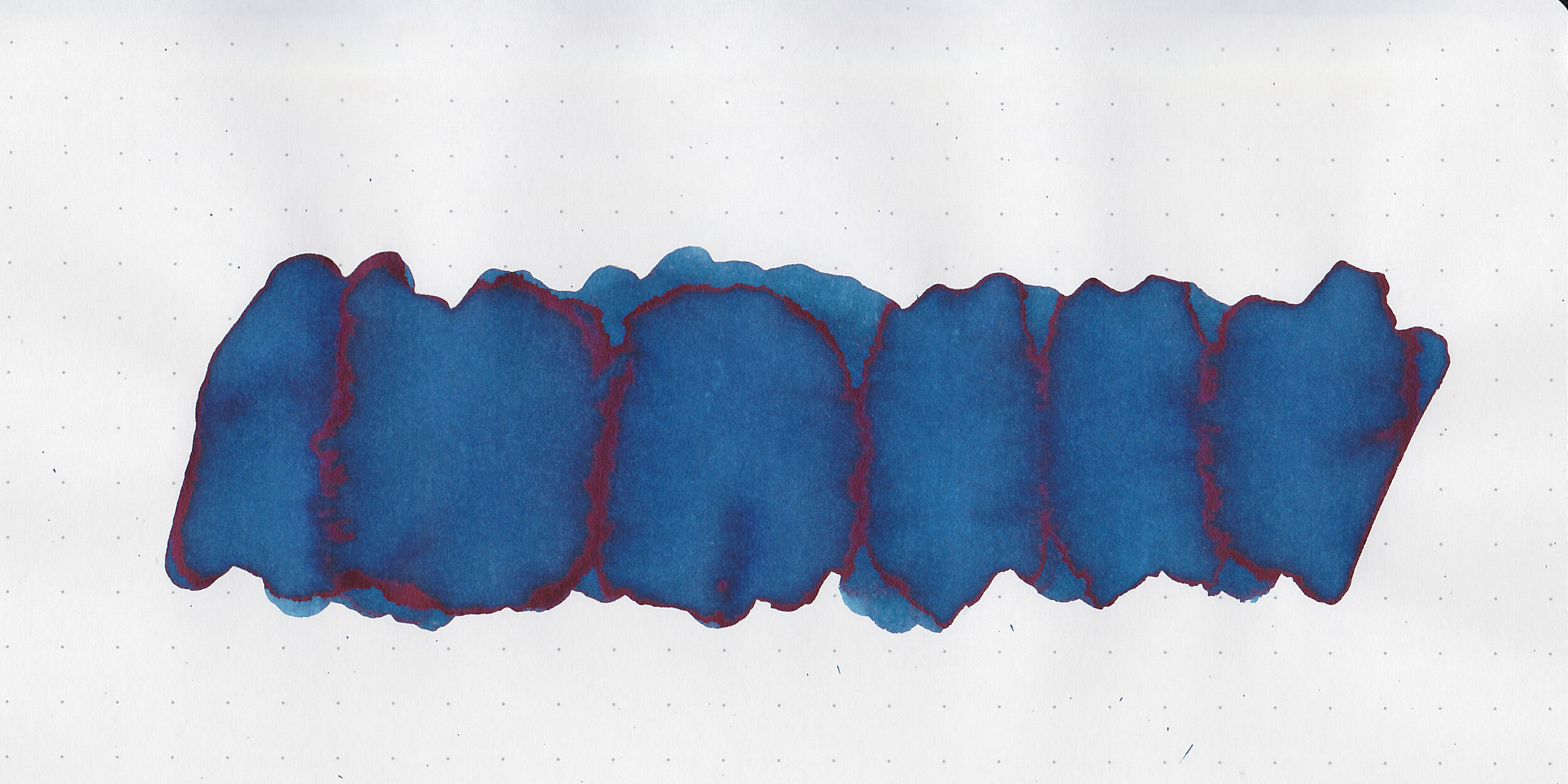
Other properties: medium shading, tiny sheen, and no shimmer. The sheen is only visible in large swabs on Tomoe River paper.
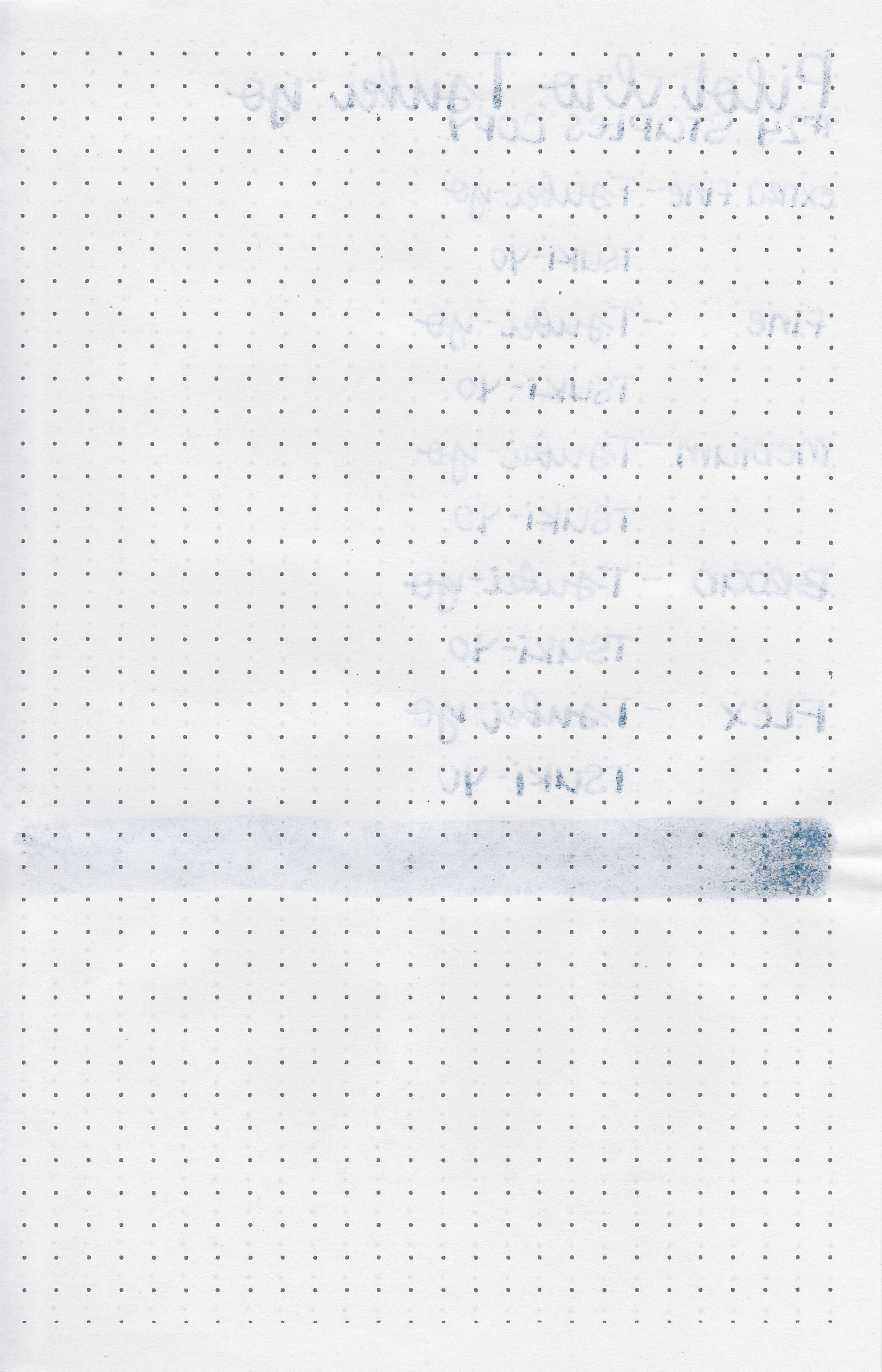
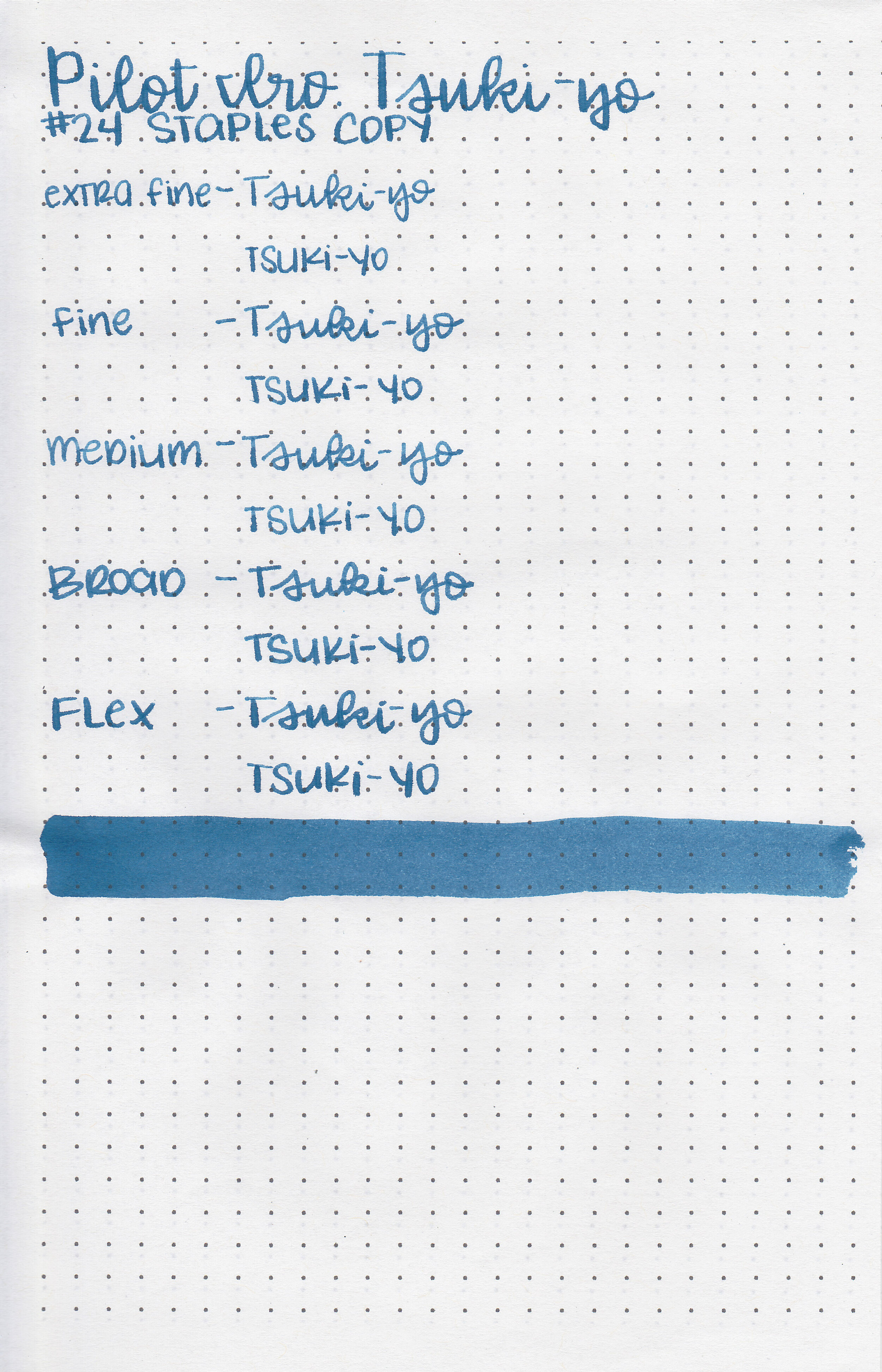
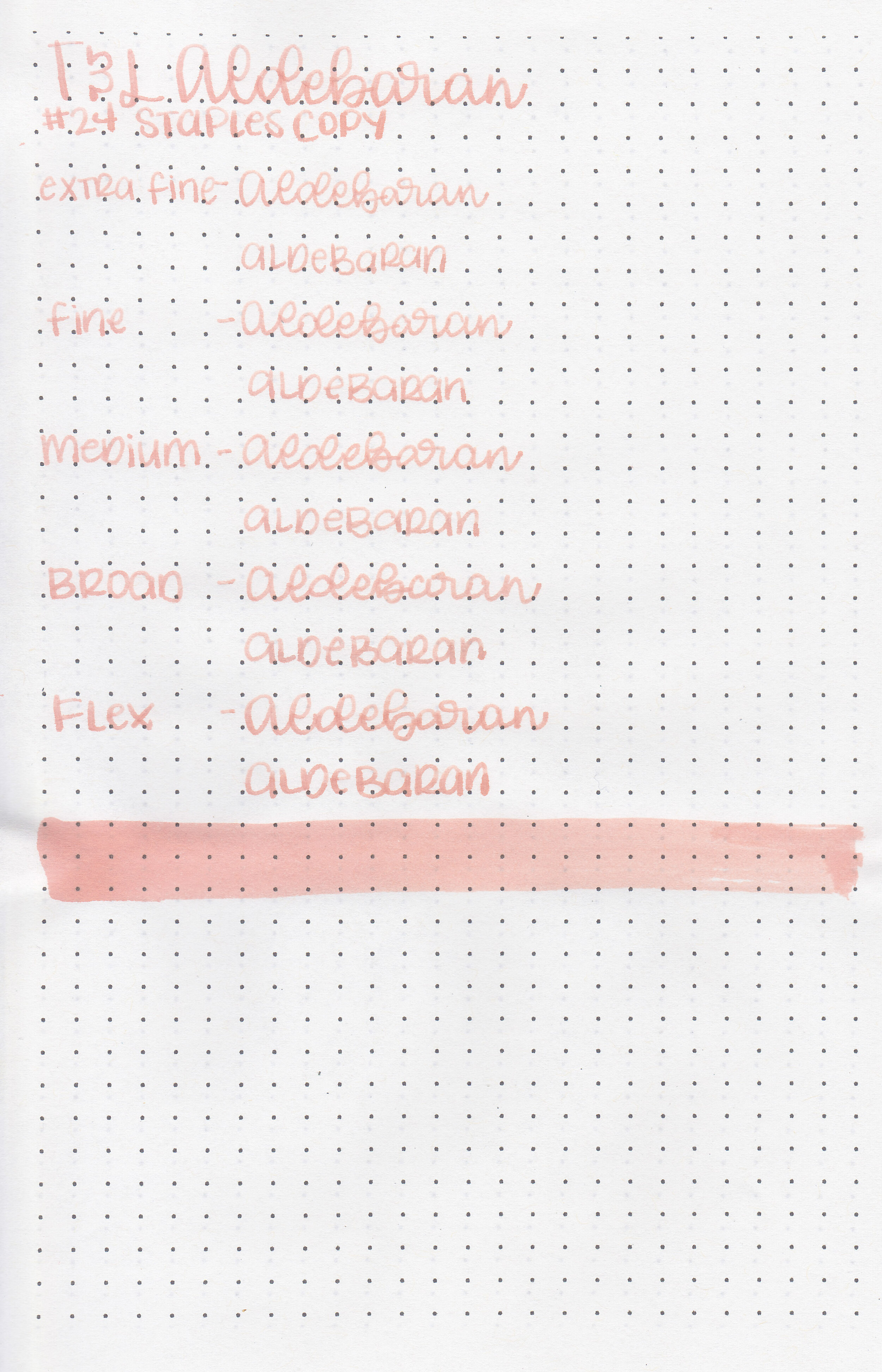
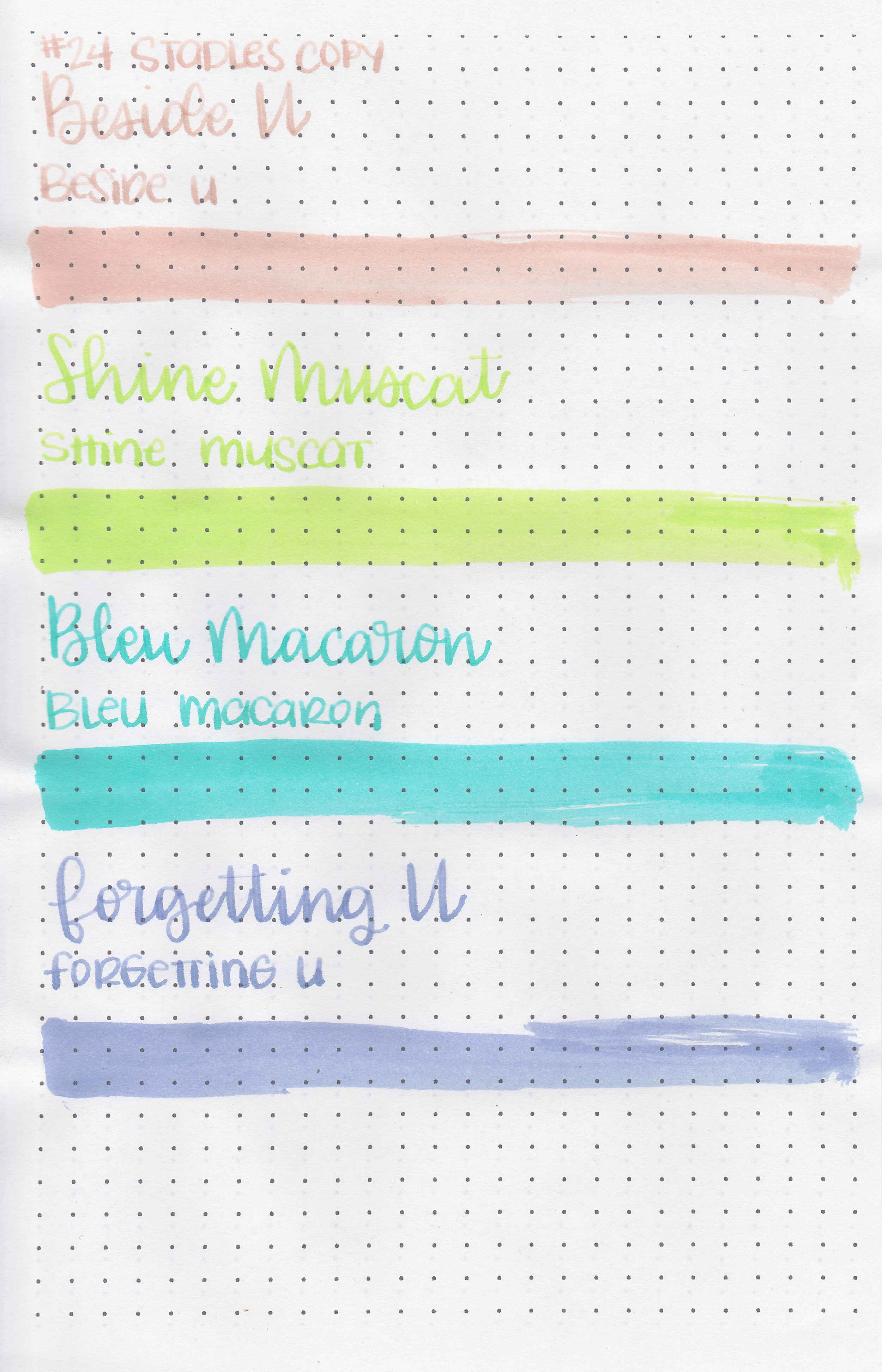
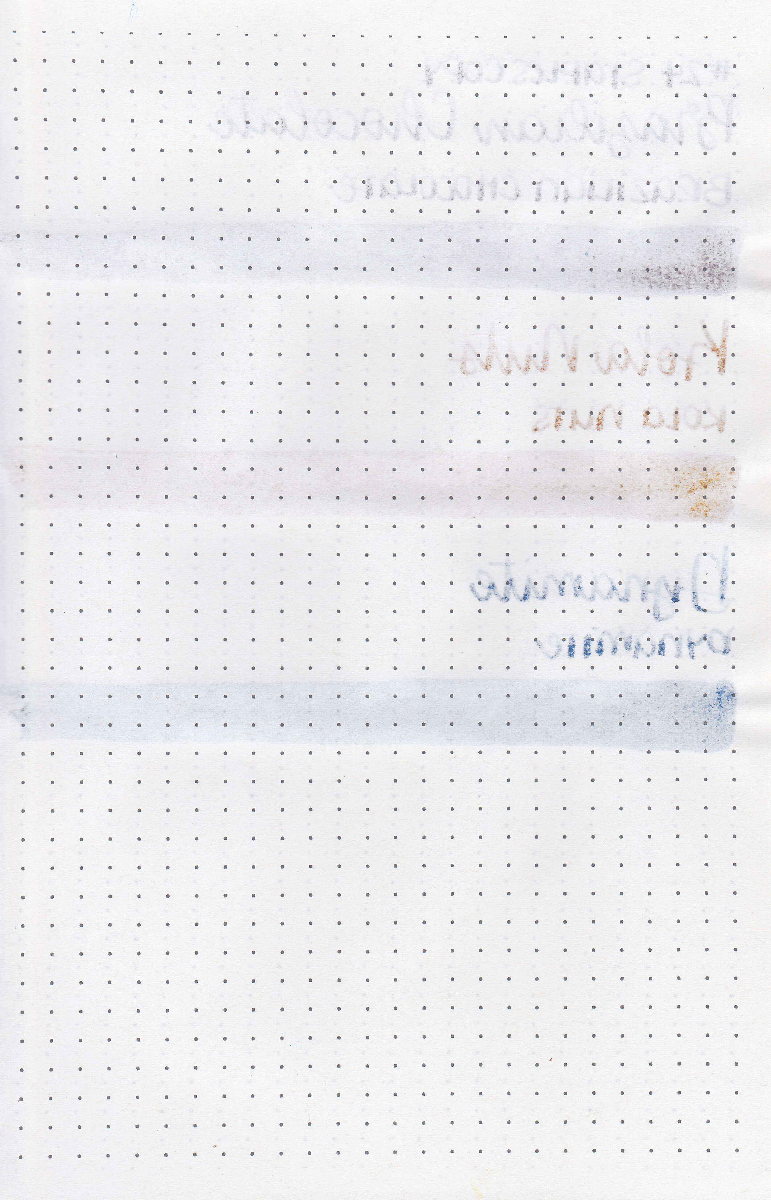
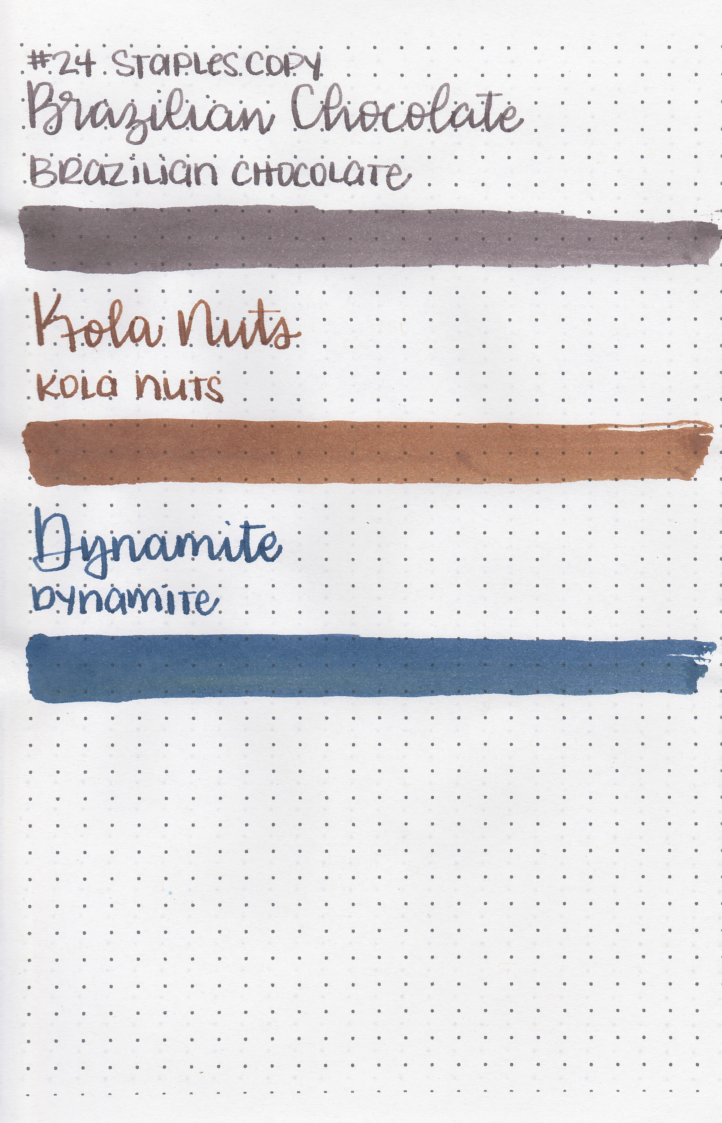
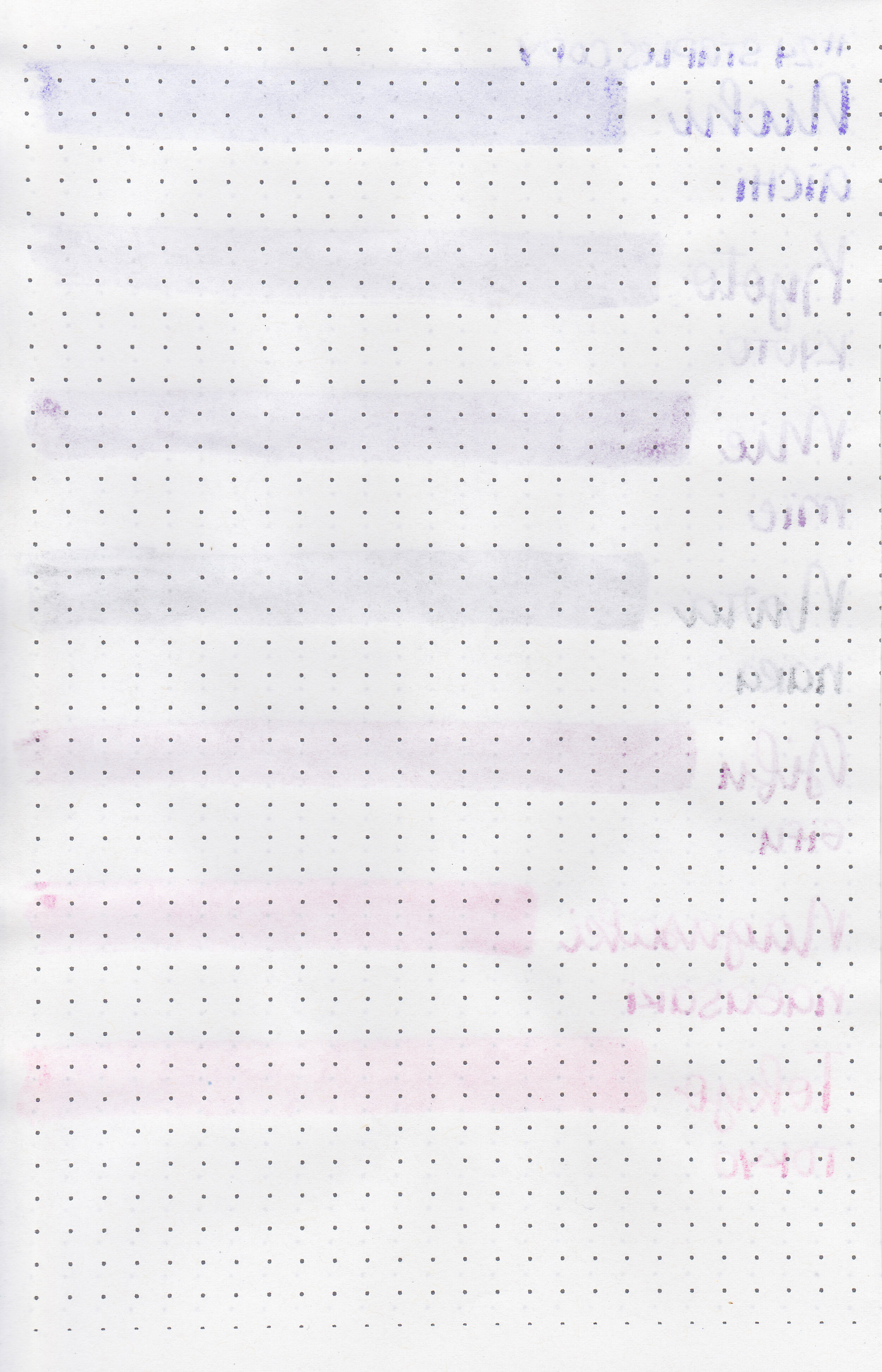
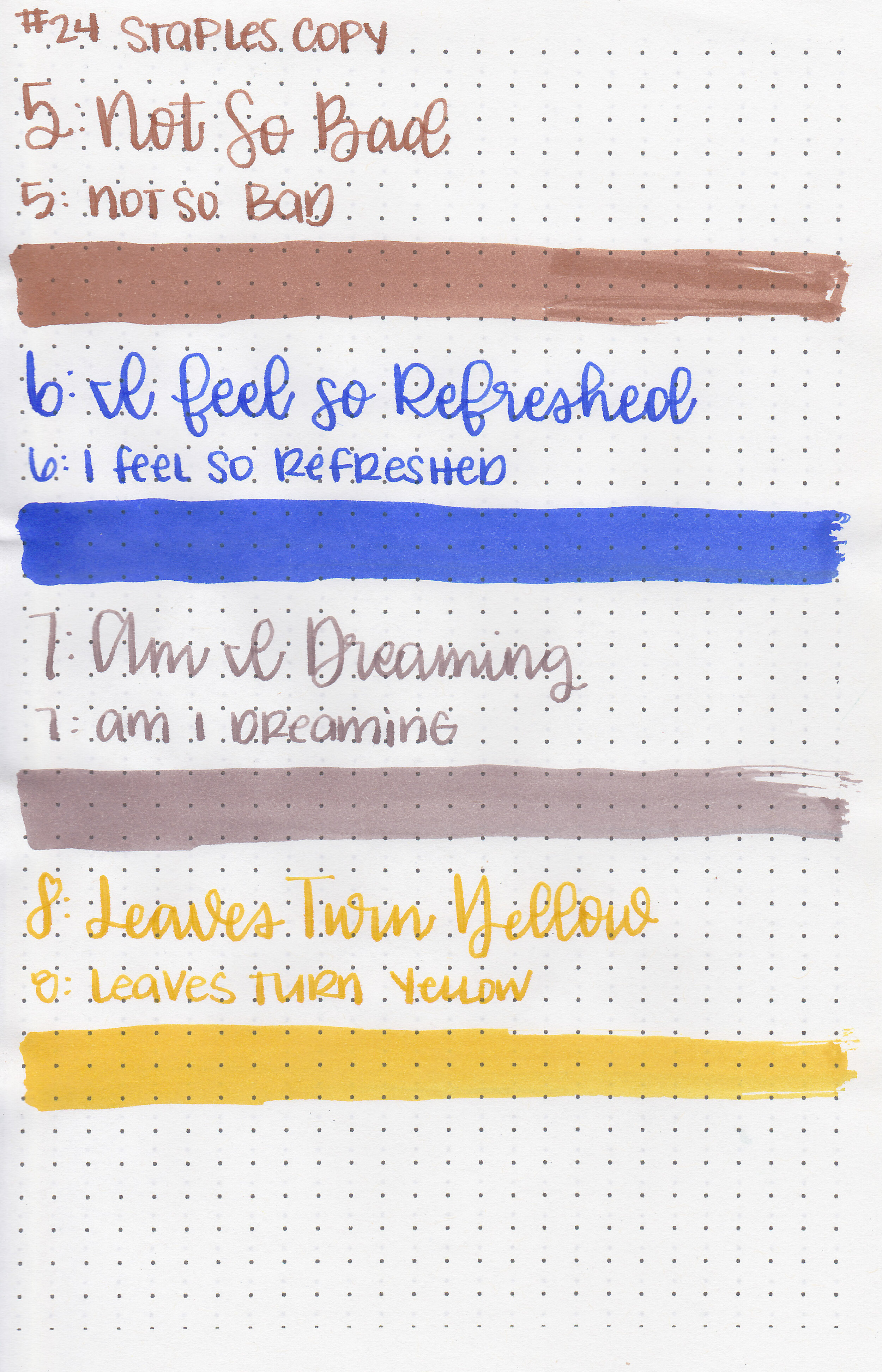
On Staples 24 lb copy paper there was some feathering and a bit of bleeding.
Comparison Swabs:

Tsuki-yo is a little bit darker than Sailor Ink Studio 640. Click here to see the Pilot inks together, and click here to see the blue inks together.
Longer writing:
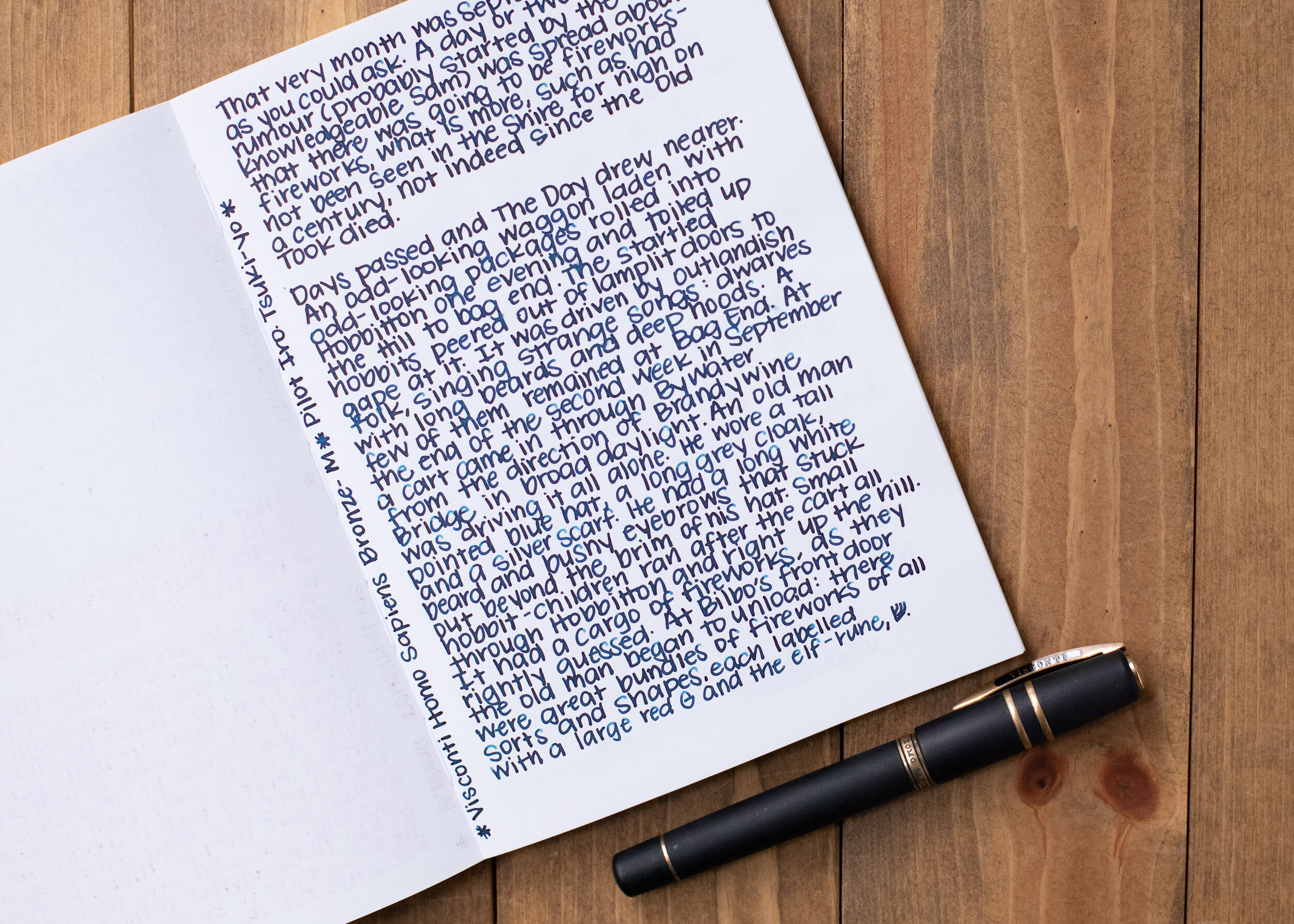
I used a Visconti Homo Sapiens Bronze Age with a medium nib on a Yoseka A5 notebook. The ink had a wet flow, and this nib is very wet on its own, so together they create a river of ink, so there’s less shading with this combo than you would see with a more average nib.
Overall, I like this ink. It has a nice wet flow and a great classic blue color.
Disclaimer: This ink was provided by a reader for the purpose of this review. All photos and opinions are my own. This page does contain affiliate links, but this post is not sponsored in any way.