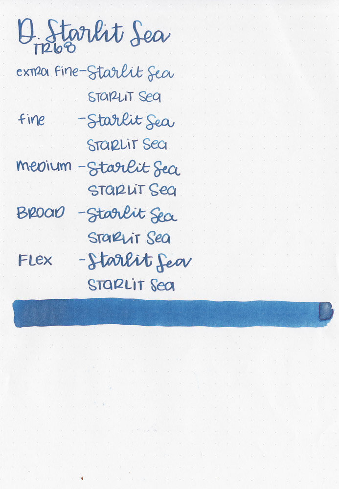
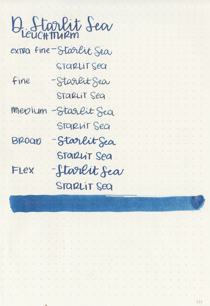
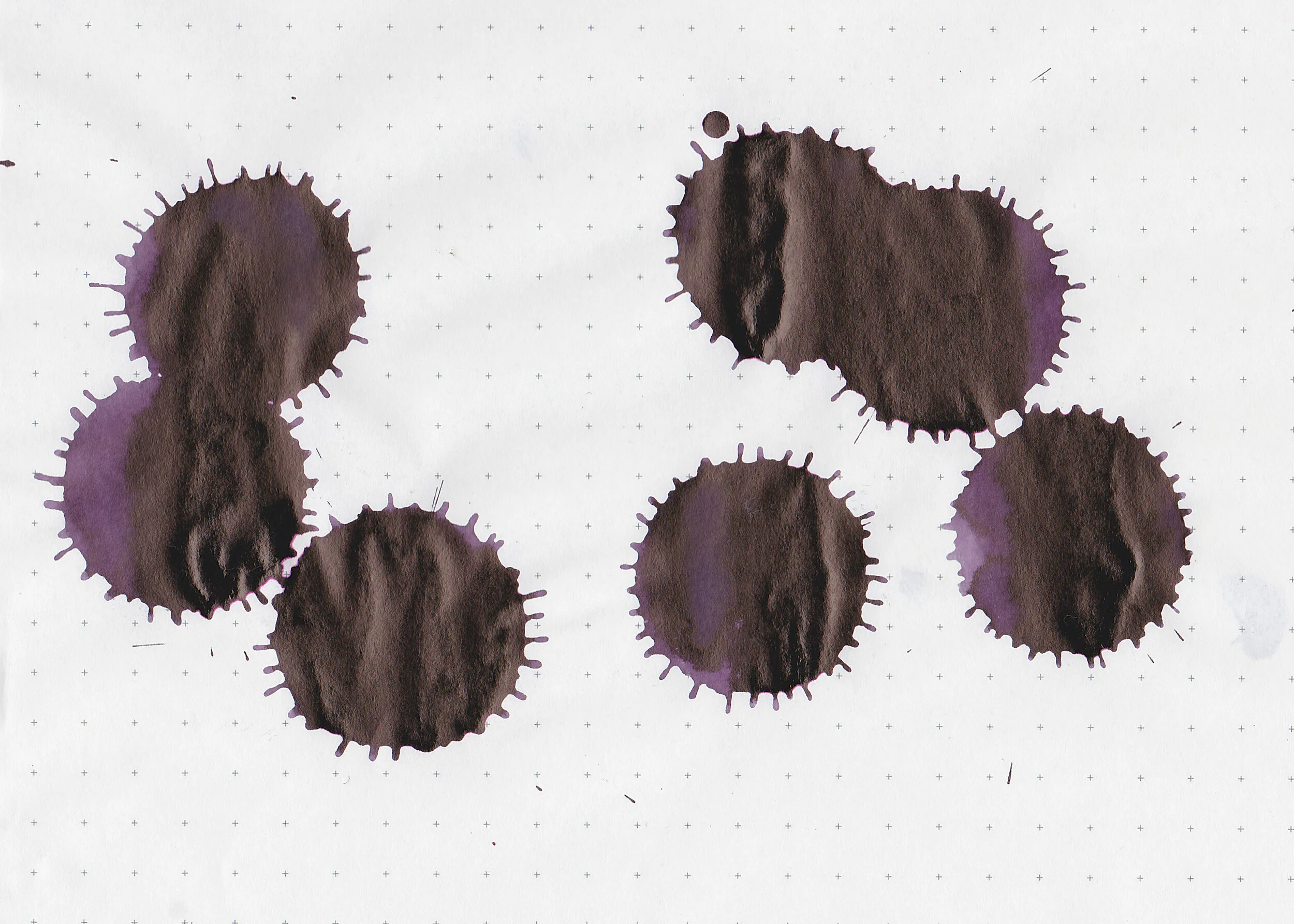
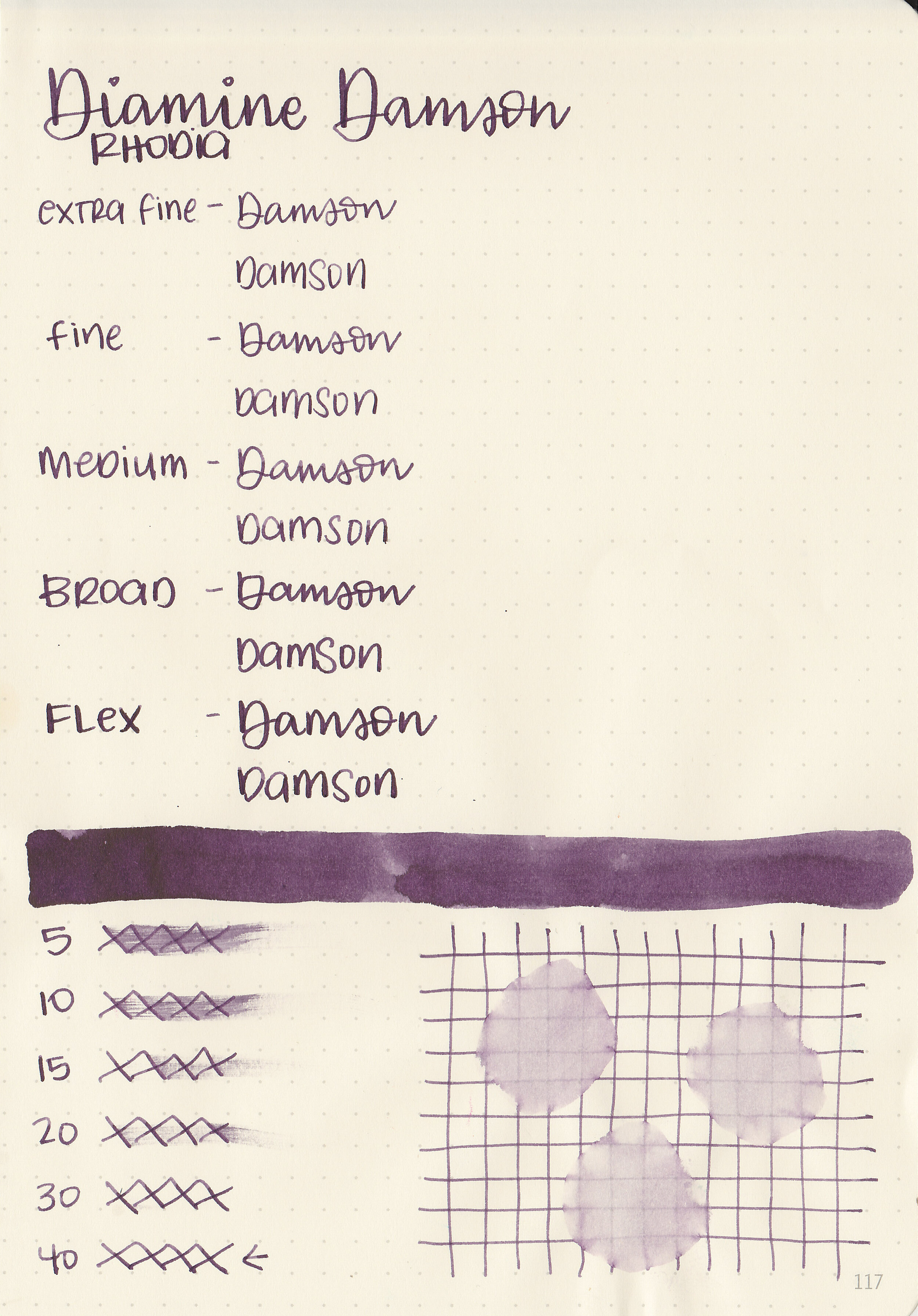
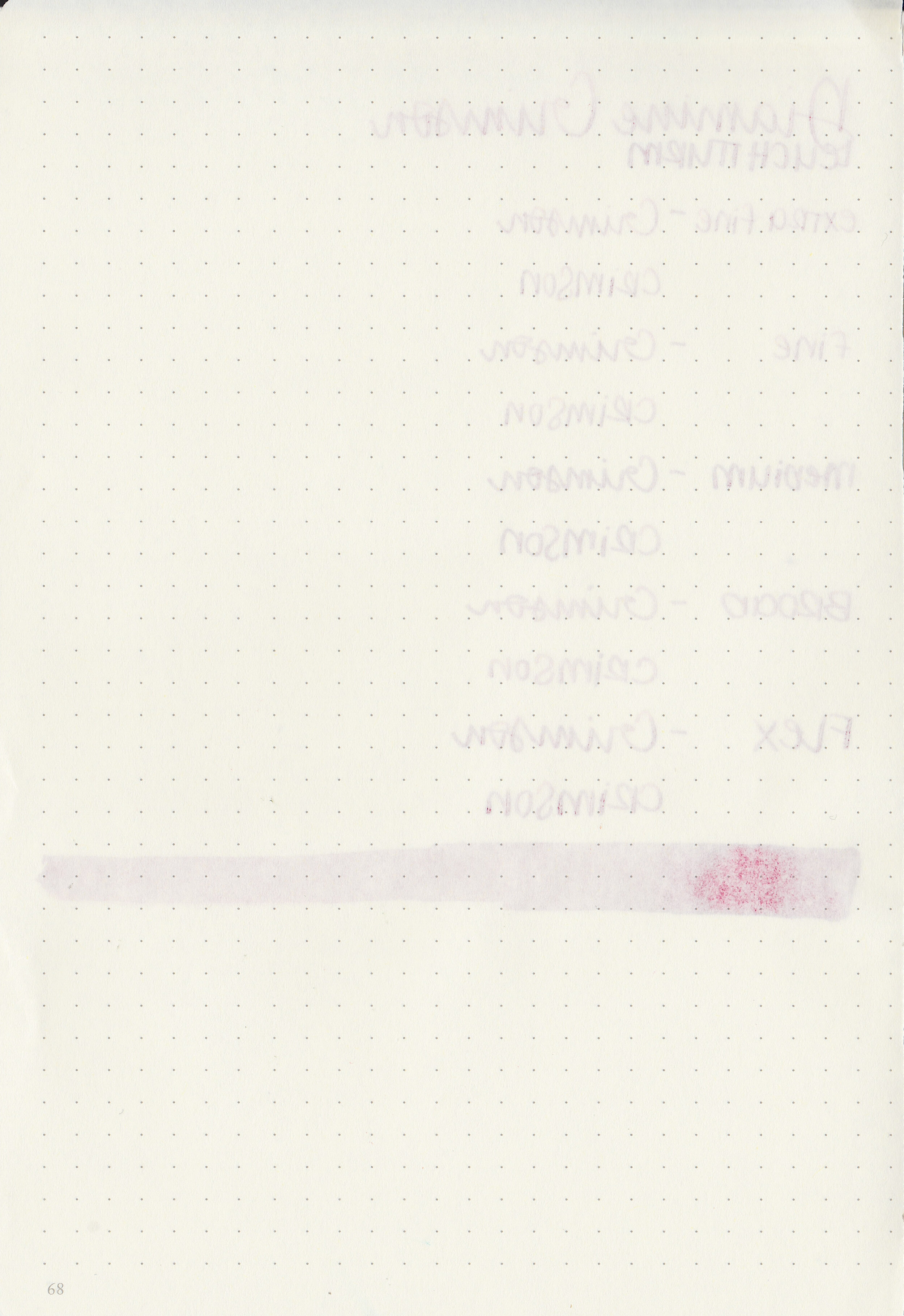
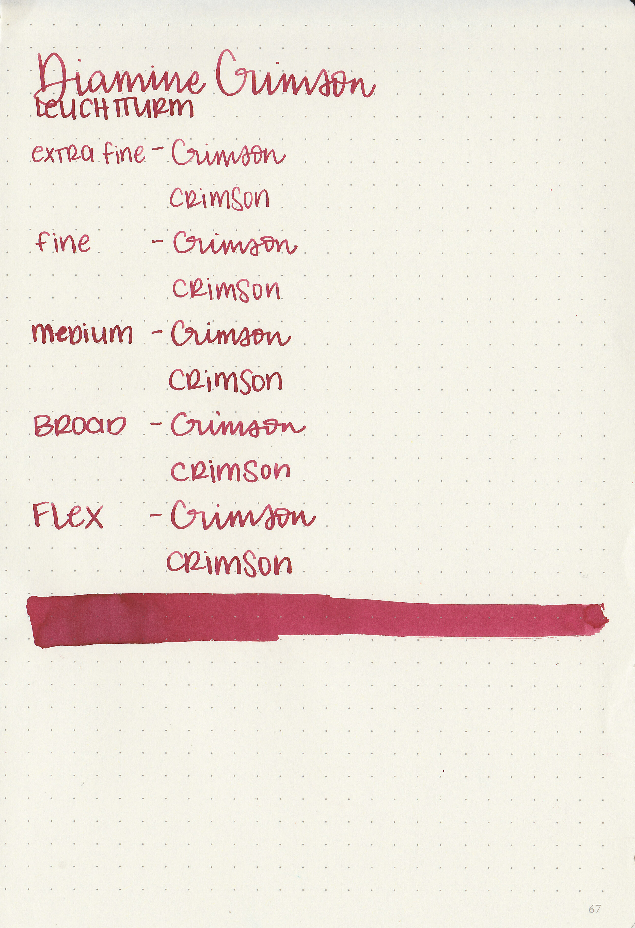
Quarantine 2020 Ink Palettes

chalk-ip.jpg

We are on day 24 of our self-imposed quarantine, something I’ve avoided talking about so far, but this is life right now and it doesn’t seem right to avoid it altogether. We live in Washington State and have three little kids so we decided to stay at home pretty early on and do our best to keep everyone healthy. It’s the first Sunday of the month so I thought I would post this month’s ink palettes based on what we’re doing and missing right now. I know a lot of us are struggling and my heart is with everyone having to deal with this. I’m doing my best to keep our routine as consistent as we can. My day job is on hold for now, but I’ll still be here posting ink content like usual for as long as I can.

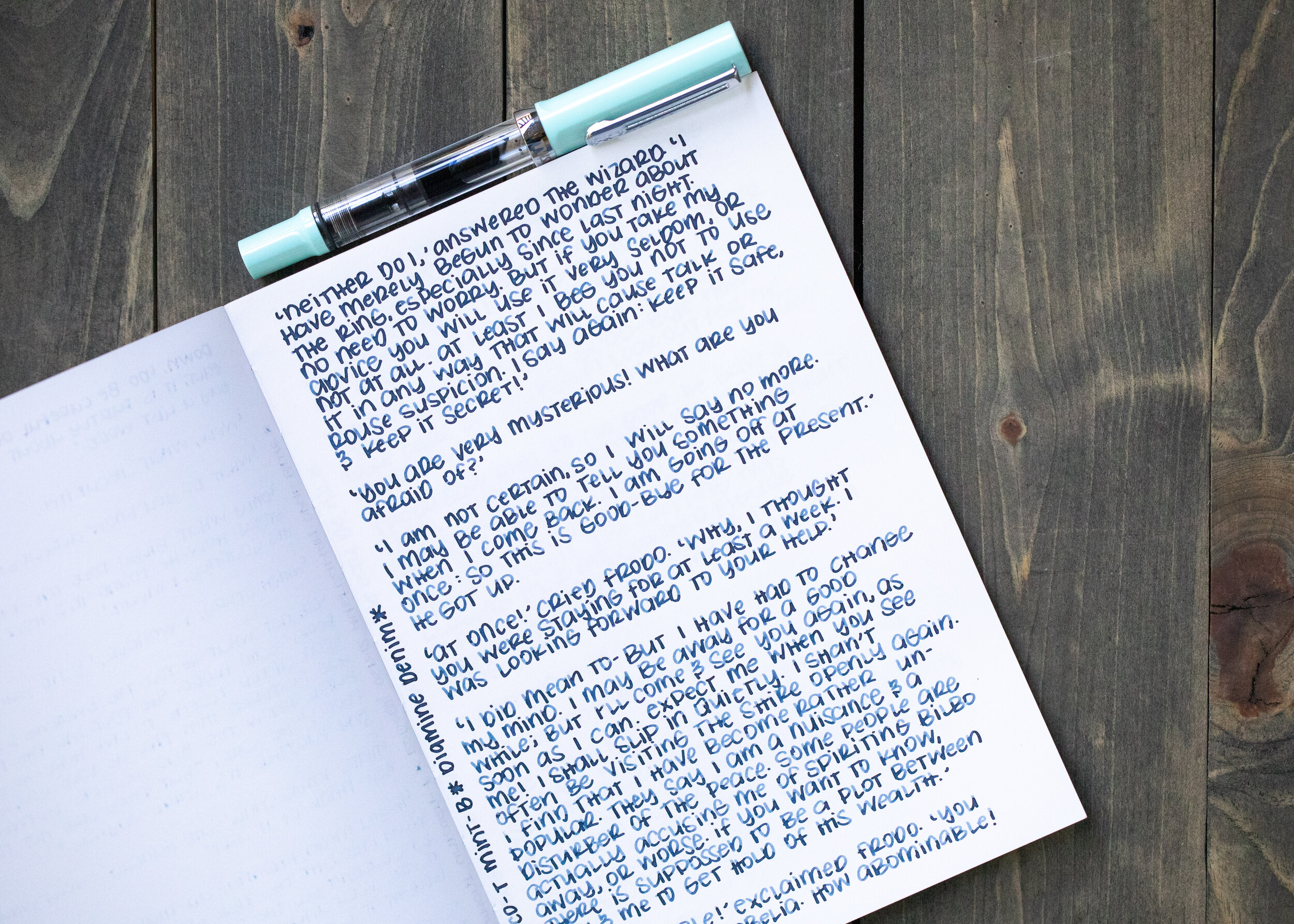
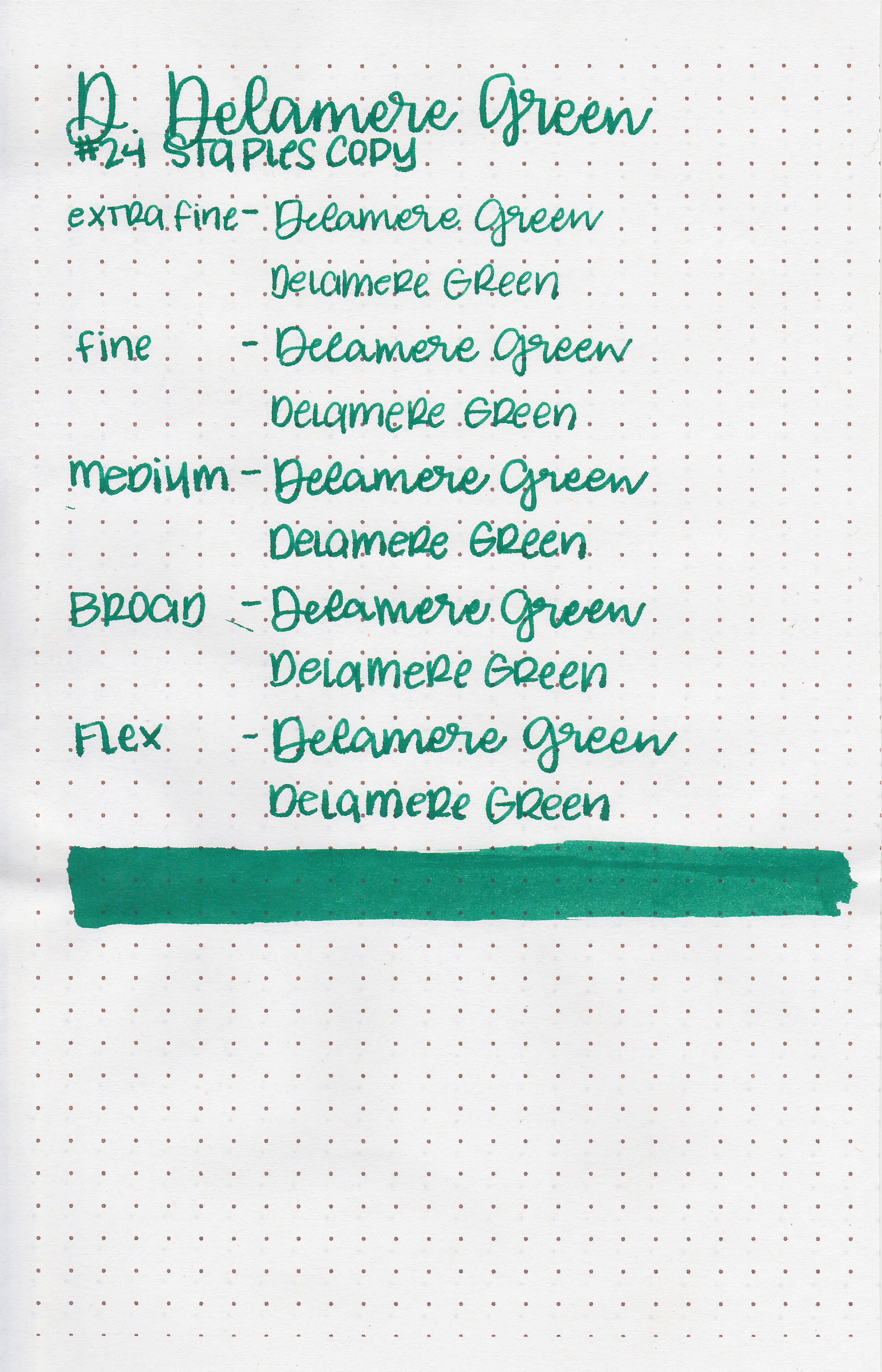
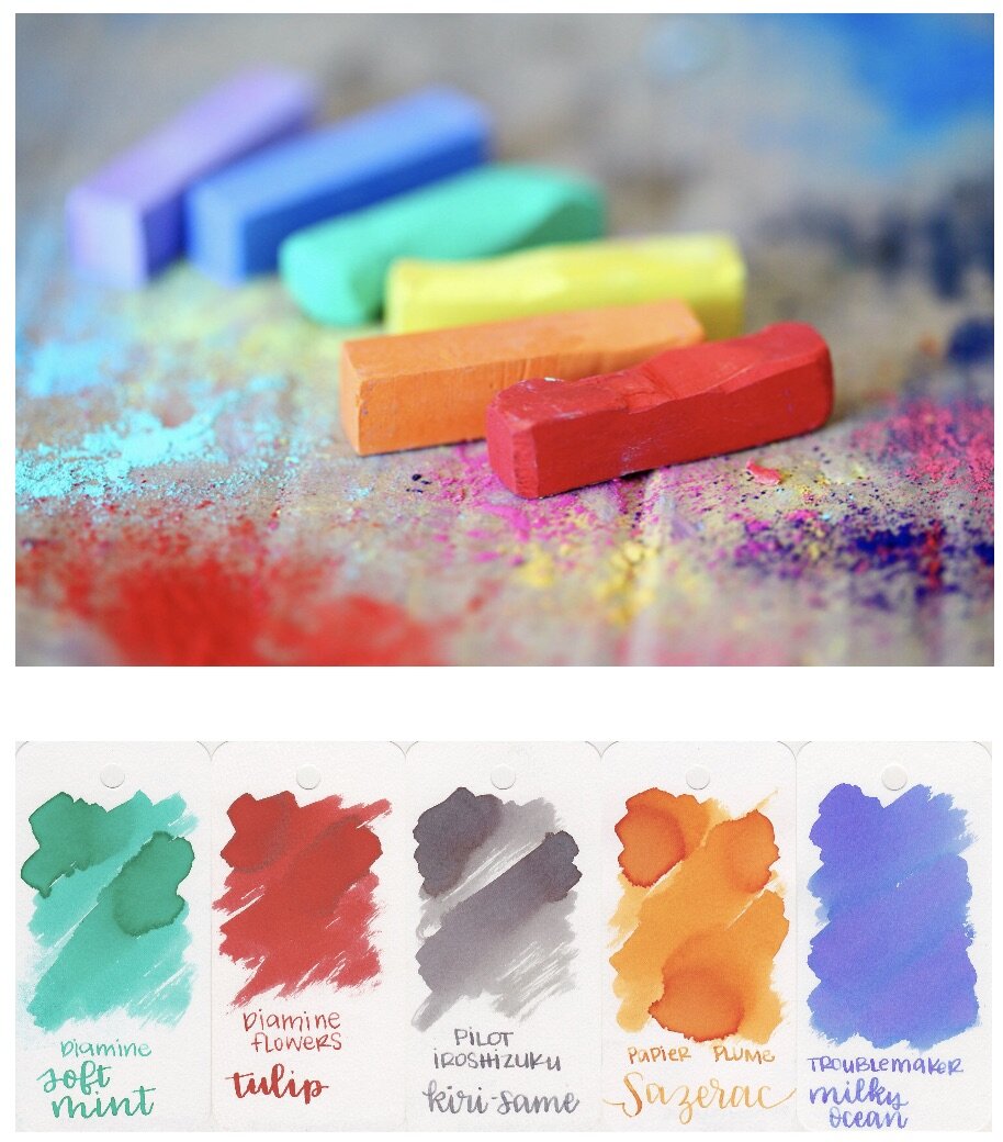
One of the biggest things I miss right now is taking my kids to the park. We usually spend a lot of time outside-we go to a lot of local parks, splash parks and hiking trails. Since this isn’t really an option for us right now, I’m looking forward to days where chalk can be a fun part of our lives again. Diamine Soft Mint is one of my favorite Diamine inks, and has been for years.

jellyfish.jpg

My youngest is super into aquatic life right now and we have spent a lot of time on YouTube watching different sea creatures-have you seen the video of the octopus dreaming and changing colors the whole time?!? Coral and light orange are some of my favorite colors for spring.

easter-eggs.jpg

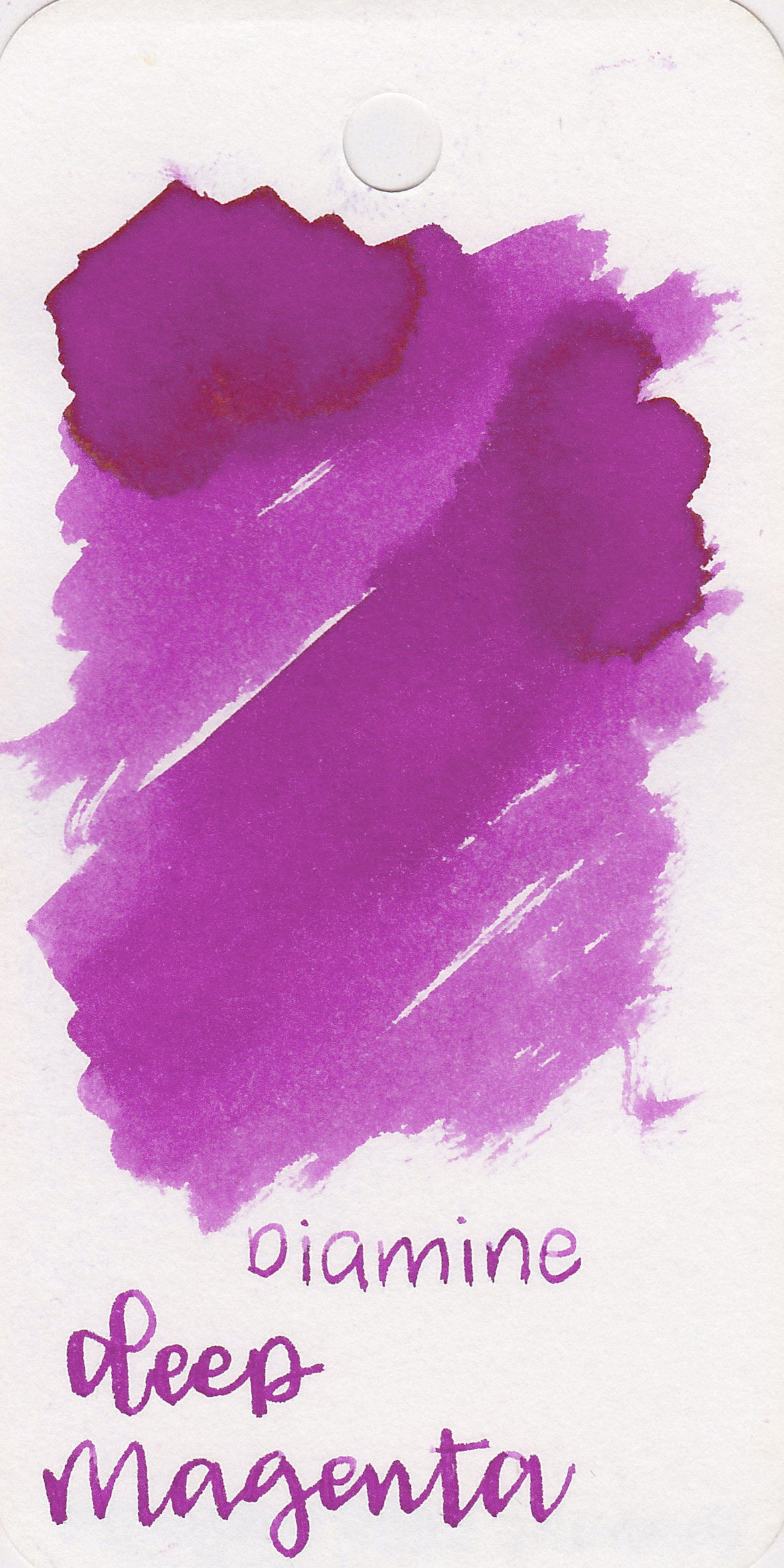
Easter is coming up soon and my kids ask everyday if it’s Easter yet. They love dying eggs-mostly just so they can crack them open later, but it’s a good indoor activity when so many of our Easter activities won’t happen this year. I’m loving these colors together, they definitely have the spring vibe but are still pretty readable.

water.jpg

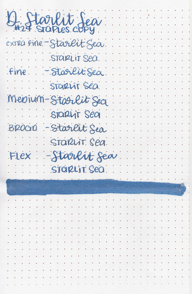
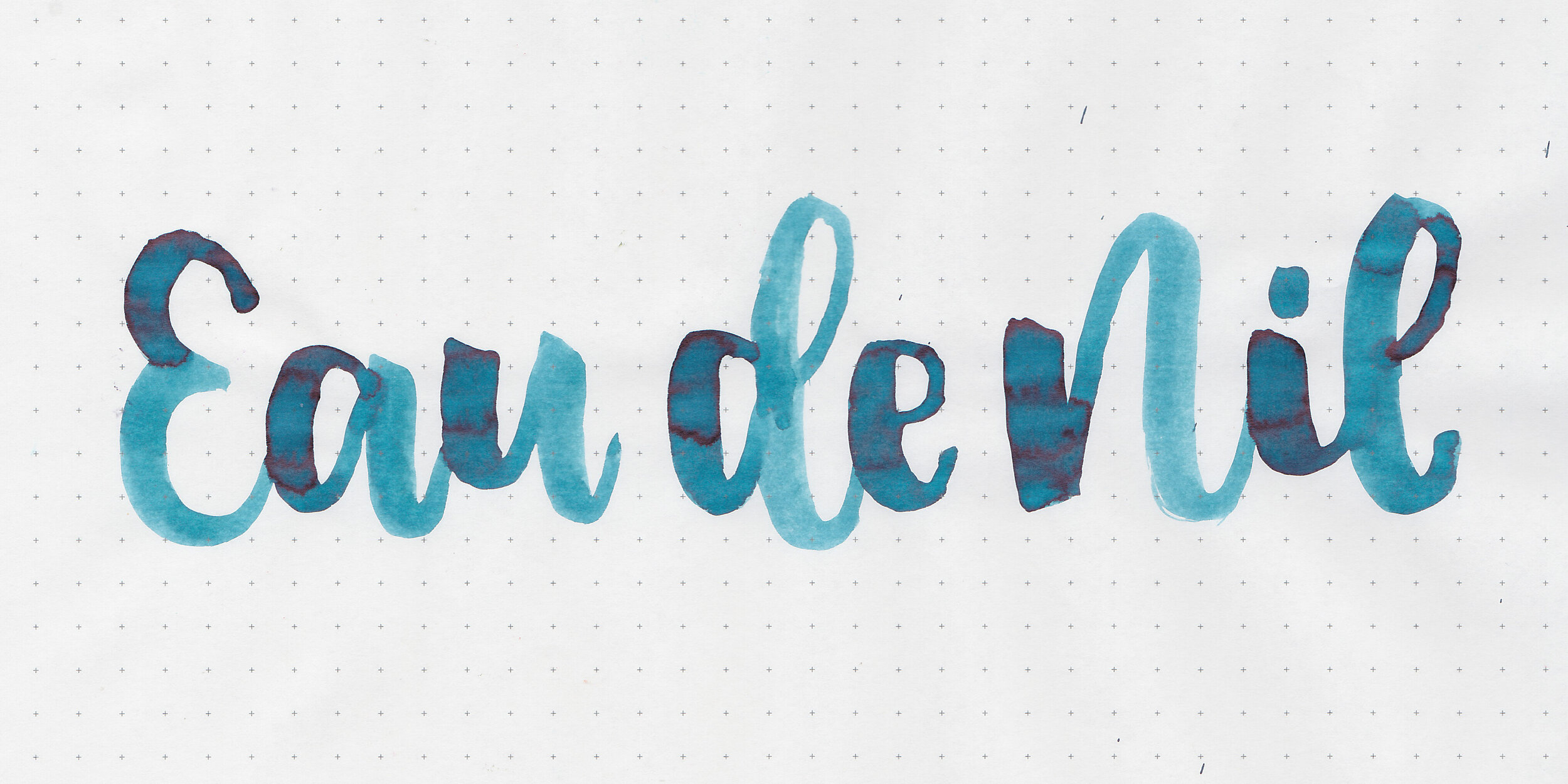
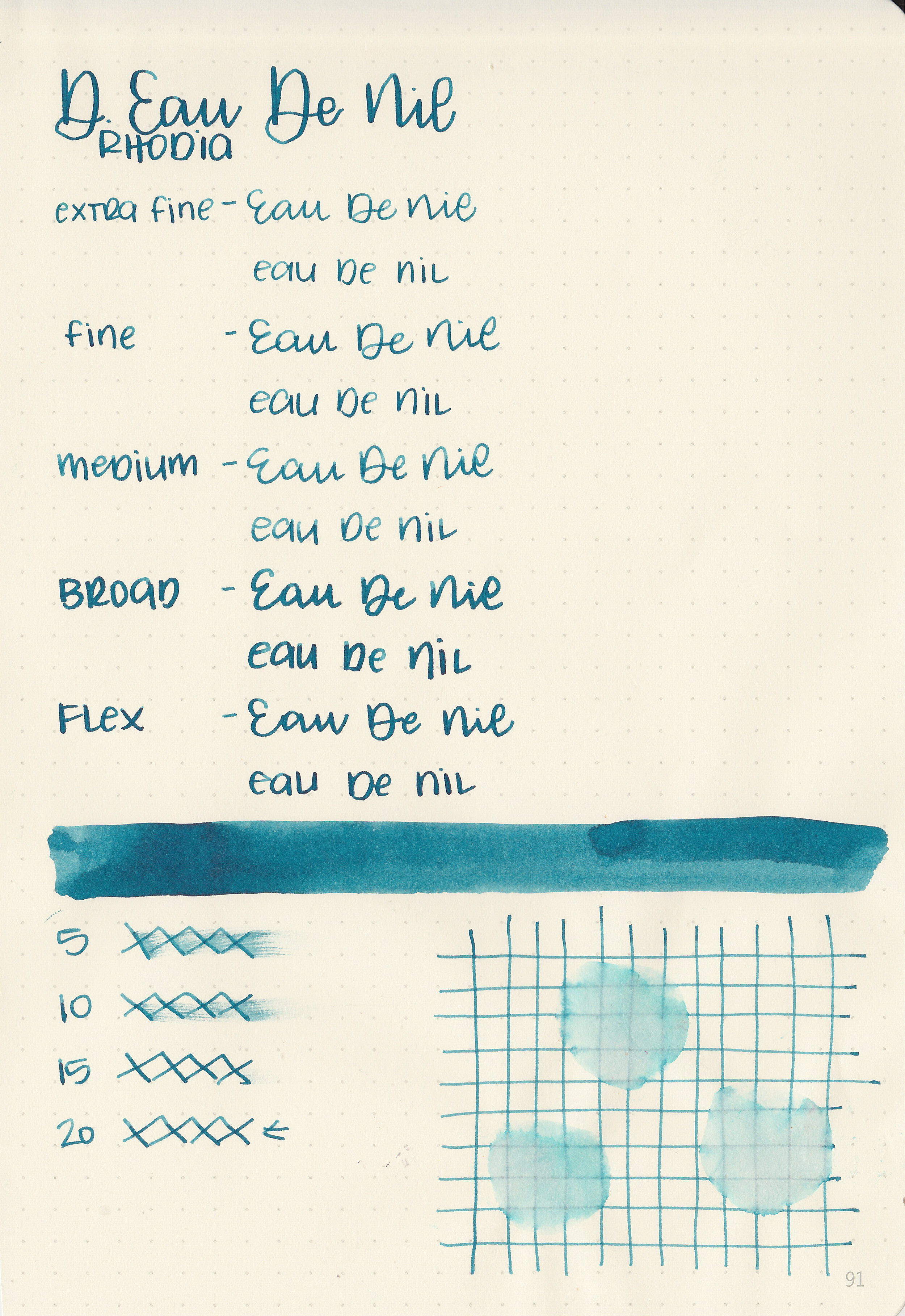
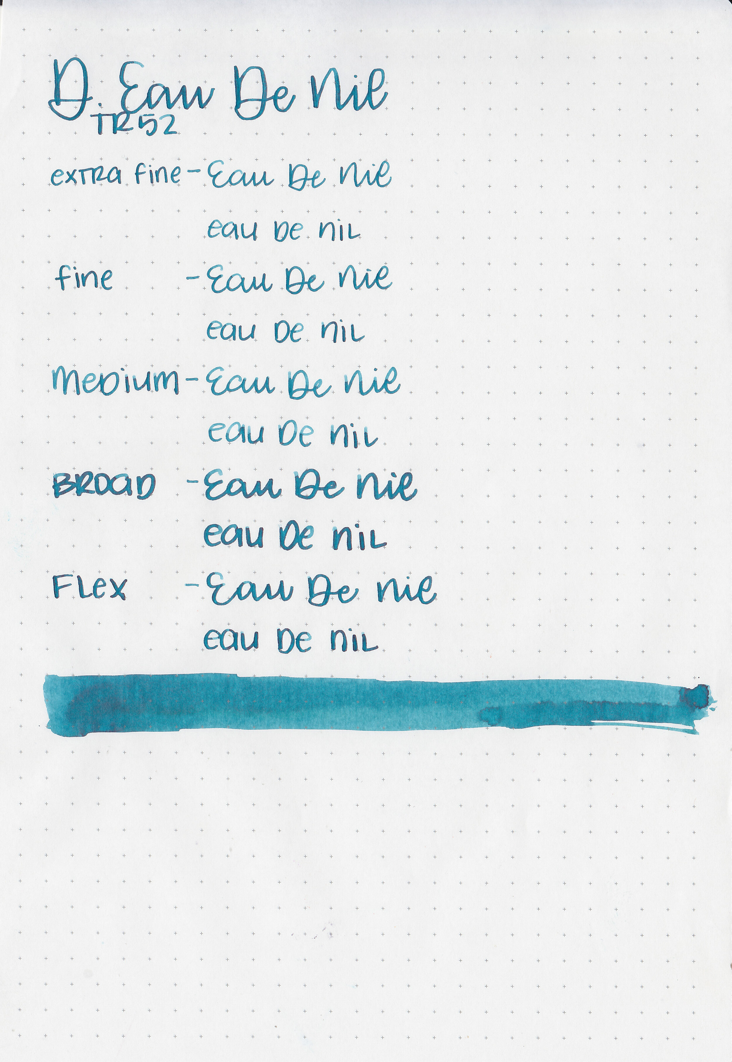
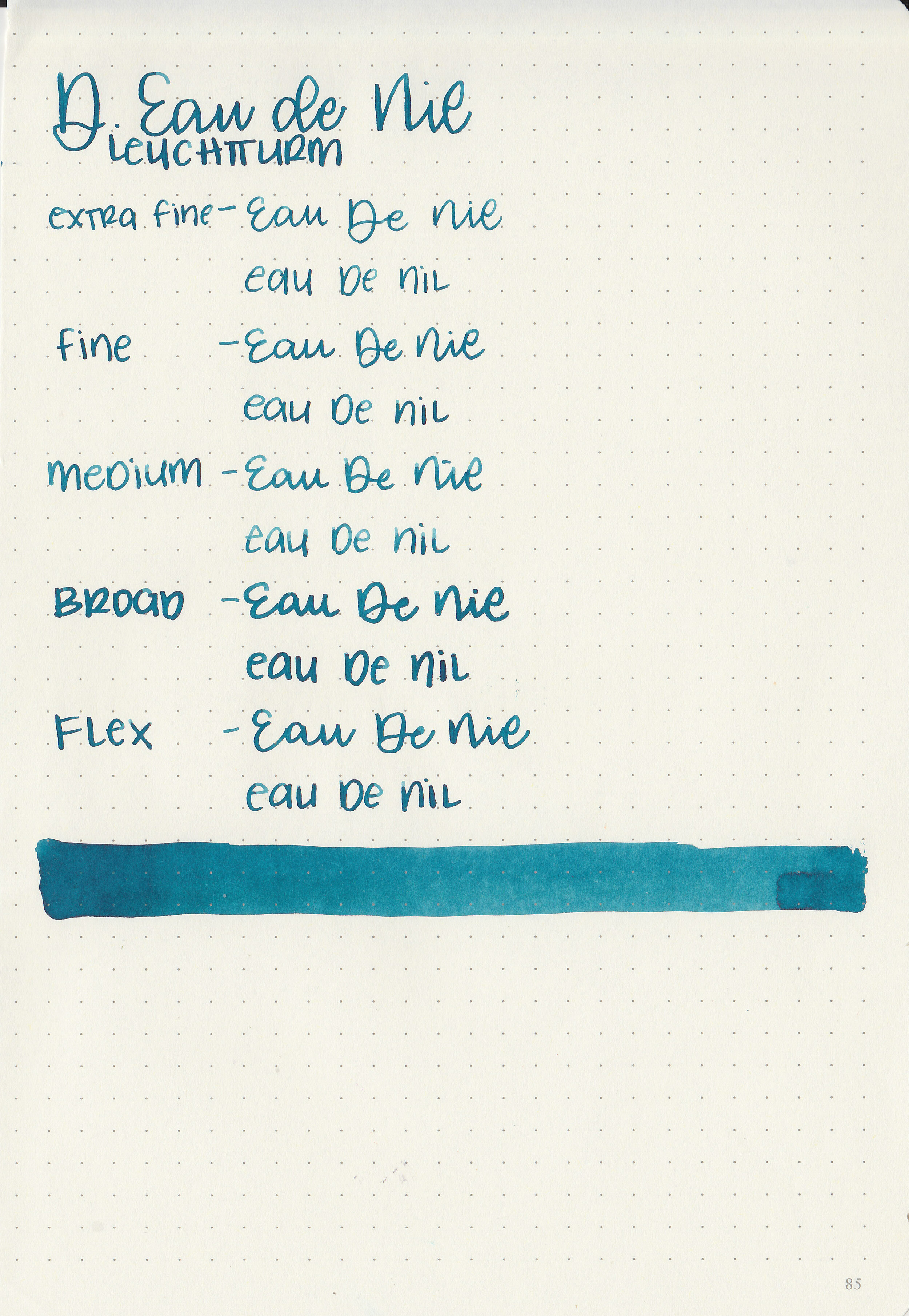
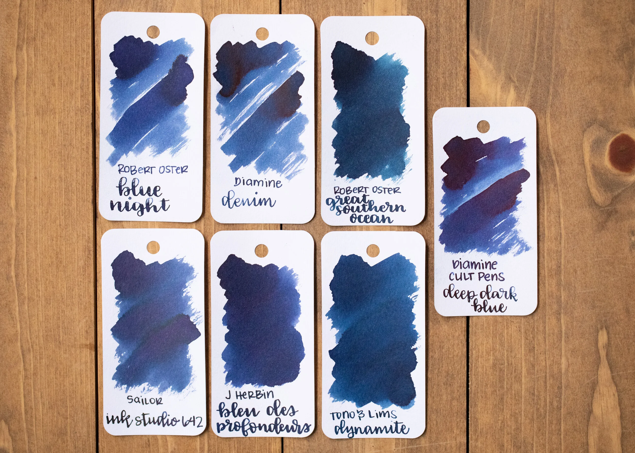
I’m struggling to keep everyone hydrated. It seems like such a silly thing but it’s something we are working on. I love teal inks and all three of these are great ones. Platinum Carbon Black is my new black ink fling, I don’t think we will be breaking up any time soon.

I’m hoping you are all well. I’m going to spend the rest of the evening sewing up some masks, but check back tomorrow for a new ink review. What’s your current ink obsession right now? Let me know in the comments below!

Disclaimer: All opinions are my own. This post does not contain affiliate links and is not sponsored in any way.

Ink Review #1126: Diamine Dragon Blood

d-dragons-blood-2.jpg

Let’s take a look at one more Shimmertastic ink-Diamine Dragon Blood. Thanks to the reader that sent this sample in for review! You can find this ink for sale at most pen retailers including Vanness Pens.

d-dragons-blood-1.jpg

The color:

Dragon Blood is a dark unsaturated red.

Swabs:

d-dragons-blood-3.jpg

In large swabs on Tomoe River paper the ink has lots of gold shimmer.

d-dragons-blood-4.jpg

Writing samples:

Let's take a look at how the ink behaves on fountain pen friendly papers: Rhodia, Tomoe River, and Leuchtturm.

Dry time: 20 seconds

Water resistance: Medium

Feathering: None

Show through: Medium

Bleeding: None

Other properties: low shading, no sheen, and gold shimmer.

On Staples 24 lb copy paper there was some feathering in most nib sizes and a few dots of bleeding.

Comparison Swabs:

d-dragon-blood-w-1.jpg

Dragon Blood is darker than Diamine Red Lustre. Click here to see the Diamine inks together, and click here to see the red inks together.

Longer writing:

d-dragon-blood-w-2.jpg

I used a Kaweco Sport Coral with a medium nib on a Taroko Enigma notebook. The ink had an average flow.

Overall, it’s well behaved but it’s not an ink I think I would use often. I’m not a big on shimmer, and I don’t love the color enough to use it despite the shimmer.

Disclaimer: A sample of this ink was provided by a reader for the purpose of this review. All photos and opinions are my own. This page does not contain affiliate links and this post is not sponsored in any way.

Ink Review #1125: Diamine Razzmatazz

d-razzmatazz-2.jpg

Diamine Razzmatazz is another ink from the most recent set of Shimmertastic inks. Thanks to the reader that sent this sample in for review! You can find this ink for sale at most pen retailers including Vanness Pens.

d-razzmatazz-1.jpg

The color:

Razzmatazz is an unsaturated pea green with gold shimmer.

Swabs:

d-razzmatazz-3.jpg

In large swabs on Tomoe River paper the ink has some nice shading and lots of gold shimmer.

d-razzmatazz-4.jpg

Writing samples:

Let's take a look at how the ink behaves on fountain pen friendly papers: Rhodia, Tomoe River, and Leuchtturm.

Dry time: 20 seconds

Water resistance: Medium

Feathering: None

Show through: Medium

Bleeding: None

Other properties: medium shading, no sheen, and gold shimmer.

On Staples 24 lb copy paper there was some feathering in most nib sizes and a few dots of bleeding.

Comparison Swabs:

d-razzmatazz-w-1.jpg

Razzmatazz is a little bit less saturated than Colorverse Gluon. Click here to see the Diamine inks together, and click here to see the green inks together.

Longer writing:

d-razzmatazz-w-2.jpg

I used a Lamy Al-star Charged Green with a broad nib on a Taroko Enigma notebook. The ink had an average flow.

Overall, it’s well behaved but the color just isn’t my favorite.

Disclaimer: A sample of this ink was provided by a reader for the purpose of this review. All photos and opinions are my own. This page does not contain affiliate links and this post is not sponsored in any way.

Ink Review #1124: Diamine Starlit Sea

d-starlit-sea-2.jpg

Diamine Starlit Sea is from the most recent set of Shimmertastic inks. Thanks to the reader that sent this sample in for review! You can find this ink for sale at most pen retailers including Vanness Pens.

d-starlit-sea-1.jpg

The color:

Starlit Sea is a pretty dark blue with silver shimmer.

Swabs:

d-starlit-sea-3.jpg

In large swabs on Tomoe River paper the ink has a little bit of pink sheen and plenty of silver shimmer.

d-starlit-sea-4.jpg

Writing samples:

Let's take a look at how the ink behaves on fountain pen friendly papers: Rhodia, Tomoe River, and Leuchtturm.

Dry time: 20 seconds

Water resistance: Medium

Feathering: None

Show through: Medium

Bleeding: None

Other properties: low shading, tiny pink sheen, and silver shimmer. The sheen is only visible in large swabs on Tomoe River paper.

On Staples 24 lb copy paper there was some feathering in most nib sizes and a few dots of bleeding.

Comparison Swabs:

d-starlit-sea-w-1.jpg

Starlit Sea is a little bit darker than Diamine Blue Pearl. It’s pretty close to De Atramentis Columbia Blue Silver, but way better behaved. Click here to see the Diamine inks together, and click here to see the blue inks together.

Longer writing:

d-starlit-sea-w-2.jpg

I used an Edison Collier Blue Steel with a broad nib on a Taroko Enigma notebook. The ink had an average flow.

Overall, it’s pretty well behaved for a shimmer ink. It’s a better alternative for those who like the color of De Atramentis Columbia Blue Silver.

Disclaimer: A sample of this ink was provided by a reader for the purpose of this review. All photos and opinions are my own. This page does not contain affiliate links and this post is not sponsored in any way.

Ink Review #1123: Diamine Eau de Nil

d-eau-de-nil-2.jpg

One ink I’ve been meaning to review for a while is Diamine Eau de Nil, so it’s time to test it out! I purchased my bottle of ink from Cult Pens.

d-eau-de-nil-1.jpg

The color:

Eau de Nil is a gorgeous dark teal.

Swabs:

d-eau-de-nil-3.jpg

In large swabs on Tomoe River paper the ink has a little bit of black sheen.

d-eau-de-nil-4.jpg

Writing samples:

Let's take a look at how the ink behaves on fountain pen friendly papers: Rhodia, Tomoe River, and Leuchtturm.

Dry time: 20 seconds

Water resistance: Low

Feathering: None

Show through: Medium

Bleeding: Low

Other properties: medium shading, low black sheen, and no shimmer.

On Staples 24 lb copy paper there was some feathering in most nib sizes and a few dots of bleeding.

Comparison Swabs:

d-eau-de-nil-s-1.jpg

Eau de Nil is lighter than Monteverde Iced Cookie, and more blue than Pelikan Edelstein Aquamarine. Click here to see the Diamine inks together, and click here to see the teal inks together.

Longer writing:

d-eau-de-nil-w-1.jpg

I used a Pelikan M805 Ocean Swirl with a broad nib on a Yoseka A5 notebook. The ink had an average flow.

Overall, it’s a lovely dark teal. It’s well behaved and has some nice shading.

Disclaimer: I purchased this ink myself, and all photos and opinions are my own. This page does not contain affiliate links and this post is not sponsored in any way.

Ink Review #1122: Diamine Denim

d-denim-2.jpg

We are keeping on with another Diamine ink today, Diamine Denim. I purchased my bottle of ink from Cult Pens.

d-denim-1.jpg

The color:

Denim is a pretty dark blue.

Swabs:

d-denim-3.jpg

In large swabs on Tomoe River paper the ink has a little bit of black sheen.

d-denim-4.jpg

Writing samples:

Let's take a look at how the ink behaves on fountain pen friendly papers: Rhodia, Tomoe River, and Leuchtturm.

Dry time: 30 seconds

Water resistance: Low

Feathering: None

Show through: Medium

Bleeding: Low

Other properties: medium shading, low black sheen, and no shimmer.

On Staples 24 lb copy paper there was some feathering in most nib sizes and a few dots of bleeding.

Comparison Swabs:

d-denim-s-1.jpg

Denim is pretty close to Robert Oster Blue Night. Click here to see the Diamine inks together, and click here to see the blue inks together.

Longer writing:

d-denim-w-1.jpg

I used a TWSBI Eco-T Mint with a broad nib on a Yoseka A5 notebook. The ink had an average flow.

Overall, it’s a good standard dark blue. It can be just a touch dry in some pens, but does well in most.

Disclaimer: I purchased this ink myself, and all photos and opinions are my own. This page does not contain affiliate links and this post is not sponsored in any way.

Ink Review #1121: Diamine Delamere Green

d-delamere-green-2.jpg

I hope you are all staying safe! Today we are taking a look at Diamine Delamere Green. I purchased my bottle of ink from Cult Pens a few years ago.

d-delamere-green-1.jpg

The color:

Delamere Green is a classic medium green.

Swabs:

d-delamere-green-3.jpg

In large swabs on Tomoe River paper the ink has a little bit of red sheen.

d-delamere-green-4.jpg

Writing samples:

Let's take a look at how the ink behaves on fountain pen friendly papers: Rhodia, Tomoe River, and Leuchtturm.

Dry time: 30 seconds

Water resistance: Low

Feathering: None

Show through: Medium

Bleeding: Low

Other properties: medium shading, low red sheen, and no shimmer.

On Staples 24 lb copy paper there was some feathering in most nib sizes and a few dots of bleeding.

Comparison Swabs:

d-delamere-green-s-1.jpg

Delamere Green is one shade darker than Pilot Iroshizuku Shin-ryoku. Click here to see the Diamine inks together, and click here to see the green inks together.

Longer writing:

d-delamere-green-w-1.jpg

I used a Lamy Safari Petrol with a medium nib on a Yoseka A5 notebook. The ink had an average flow.

Overall, I really like this ink. It’s well behaved, a good color and even has a little bit of shading and sheen.

Disclaimer: I purchased this ink myself, and all photos and opinions are my own. This page does not contain affiliate links and this post is not sponsored in any way.

Ink Review #1120: Diamine Deep Magenta

d-deep-magenta-2.jpg

Today’s ink is Diamine Deep Magenta. I purchased my bottle of ink from Cult Pens.

d-deep-magenta-1.jpg

The color:

Deep Magenta is a medium magenta; right in-between pink and purple.

Swabs:

d-deep-magenta-3.jpg

In large swabs on Tomoe River paper the ink has a little bit of green sheen.

d-deep-magenta-4.jpg

Writing samples:

Let's take a look at how the ink behaves on fountain pen friendly papers: Rhodia, Tomoe River, and Leuchtturm.

Dry time: 30 seconds

Water resistance: Low

Feathering: Low

Show through: Medium

Bleeding: Low

Other properties: low shading, tiny green sheen, and no shimmer. The sheen is only visible in large swabs on Tomoe River Paper.

On Staples 24 lb copy paper there was some feathering in most nib sizes and a few dots of bleeding.

Comparison Swabs:

d-deep-magenta-s-1.jpg

Deep Magenta is a little bit pinker than Waterman Radiant Pink and Monteverde Gratitude, but more purple than Callifolio Andrinople. Click here to see the Diamine inks together, and click here to see the purple inks together.

Longer writing:

d-deep-magenta-w-1.jpg

I used a TWSBI Eco Transparent Orange with a medium nib on a Yoseka A5 notebook. The ink had an average flow.

Overall, it’s a good ink-affordable, pretty well behaved and a good color.

Disclaimer: I purchased this ink myself, and all photos and opinions are my own. This page does not contain affiliate links and this post is not sponsored in any way.

Ink Review #1119: Diamine Damson

d-damson-2.jpg

In my time stuck at home I’ve been trying to review inks that I’ve had for quite a while but never talked about so today’s ink is Diamine Damson. I purchased my bottle of ink from Cult Pens.

d-damson-1.jpg

The color:

Damson is a dark dusky purple.

Swabs:

d-damson-3.jpg

In large swabs on Tomoe River paper the ink has some pretty black sheen.

d-damson-4.jpg

Writing samples:

Let's take a look at how the ink behaves on fountain pen friendly papers: Rhodia, Tomoe River, and Leuchtturm.

Dry time: 40 seconds

Water resistance: Low

Feathering: None

Show through: Medium

Bleeding: None

Other properties: low shading, high black sheen, and no shimmer.

On Staples 24 lb copy paper there was some feathering in most nib sizes and a few dots of bleeding.

Comparison Swabs:

d-damson-s-1.jpg

Damson is a bit lighter than Sailor Ink Studio 752 but a bit darker than Robert Oster Claret. Click here to see the Diamine inks together, and click here to see the purple inks together.

Longer writing:

d-damson-w-1.jpg

I used a Lamy Al-star Vibrant Pink with a broad nib on a Yoseka A5 notebook. The ink had an average flow.

Overall, I really like this ink. The color’s great, it’s well behaved and has some shading and sheen.

Disclaimer: I purchased this ink myself, and all photos and opinions are my own. This page does not contain affiliate links and this post is not sponsored in any way.

Ink Review #1118: Diamine Crimson

d-crimson-2.jpg

Today’s ink is Diamine Crimson. I purchased my bottle of ink from Cult Pens.

d-crimson-1.jpg

The color:

Crimson is a dark unsaturated red.

Swabs:

d-crimson-3.jpg

In large swabs on Tomoe River paper the ink has some pretty shading.

d-crimson-4.jpg

Writing samples:

Let's take a look at how the ink behaves on fountain pen friendly papers: Rhodia, Tomoe River, and Leuchtturm.

Dry time: 40 seconds

Water resistance: Low

Feathering: None

Show through: Medium

Bleeding: None

Other properties: low shading, no sheen, and no shimmer.

On Staples 24 lb copy paper there was some feathering in most nib sizes and a little bit of bleeding.

Comparison Swabs:

d-crimson-s-1.jpg

Crimson is much darker than the light Diamine reds: Wild Strawberry, Tulip, Brilliant Red and Poppy Red, but not quite as dark as Oxblood. Click here to see the Diamine inks together, and click here to see the red inks together.

Longer writing:

d-crimson-w-1.jpg

I used a Pelikan M200 Gold Marbled with a medium nib on a Yoseka A5 notebook. The ink had an average flow.

Overall, it’s a good standard medium red. There’s nothing about it that stands out, but if you need a classic red this might be the ink for you.

Disclaimer: I purchased this ink myself, and all photos and opinions are my own. This page does not contain affiliate links and this post is not sponsored in any way.