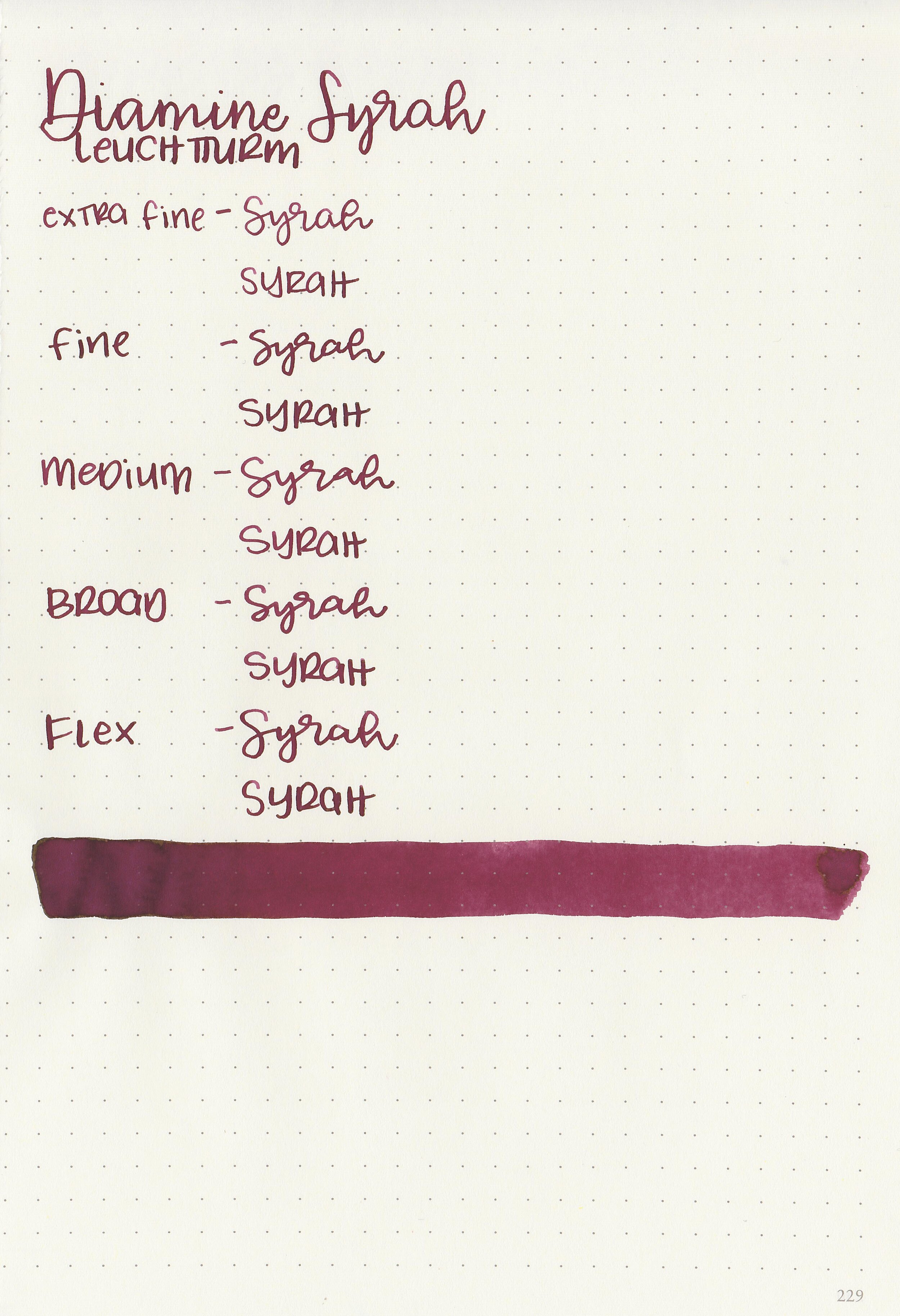
Ink Review #1245: Straits Pen Storm Warning
/
Straits Pen Storm Warning was exclusive to the Ohio Pen Club in 2019. Thanks to the reader that sent a sample in for review!

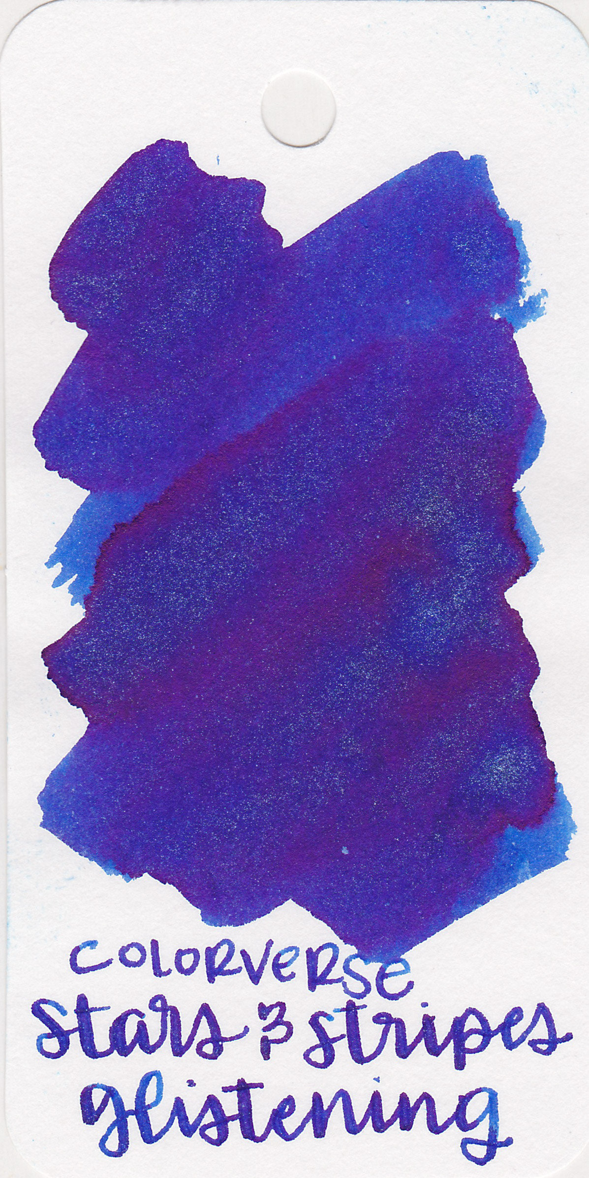
The color:
Storm Warning is a dark but unsaturated olive green.
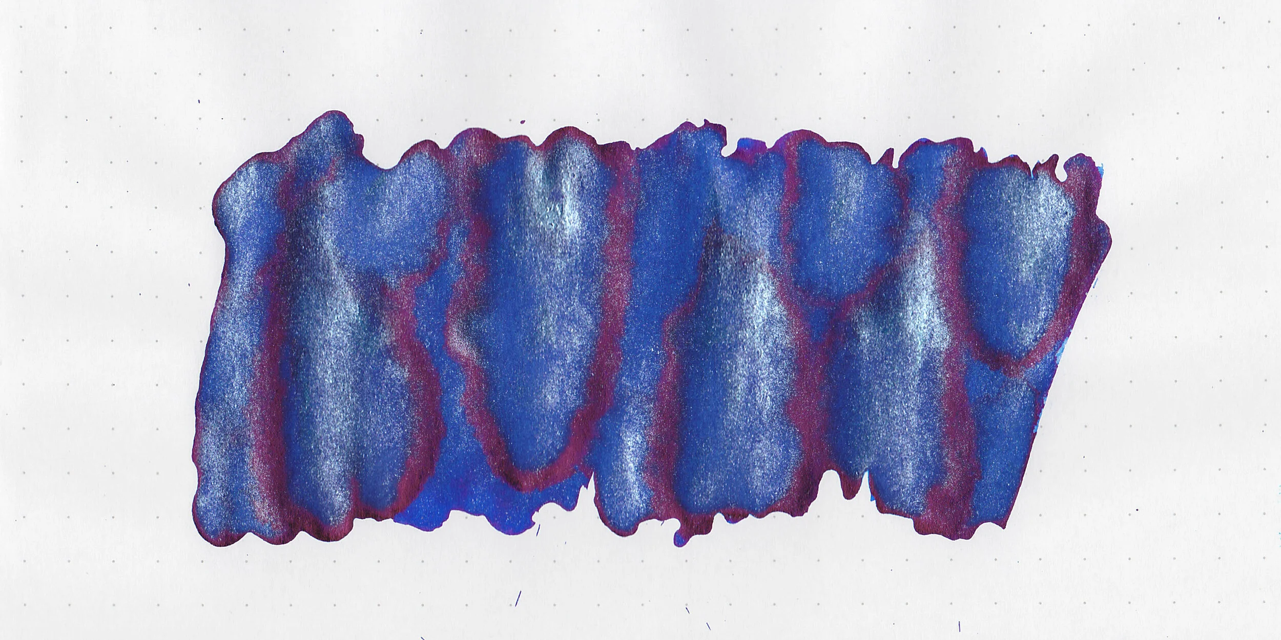
Swabs:

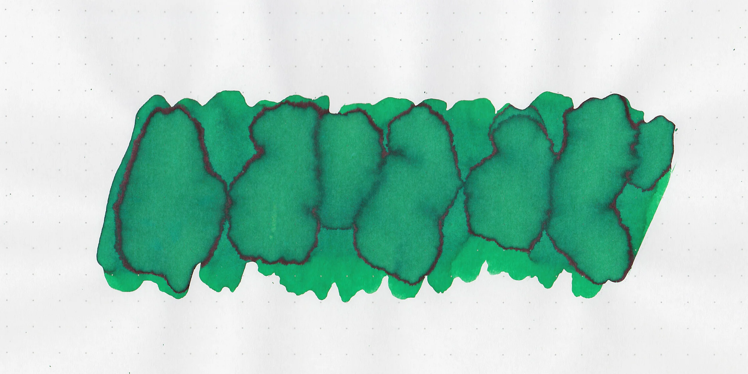
In large swabs on Tomoe River paper the ink looks more grey and has a little bit of brown sheen.

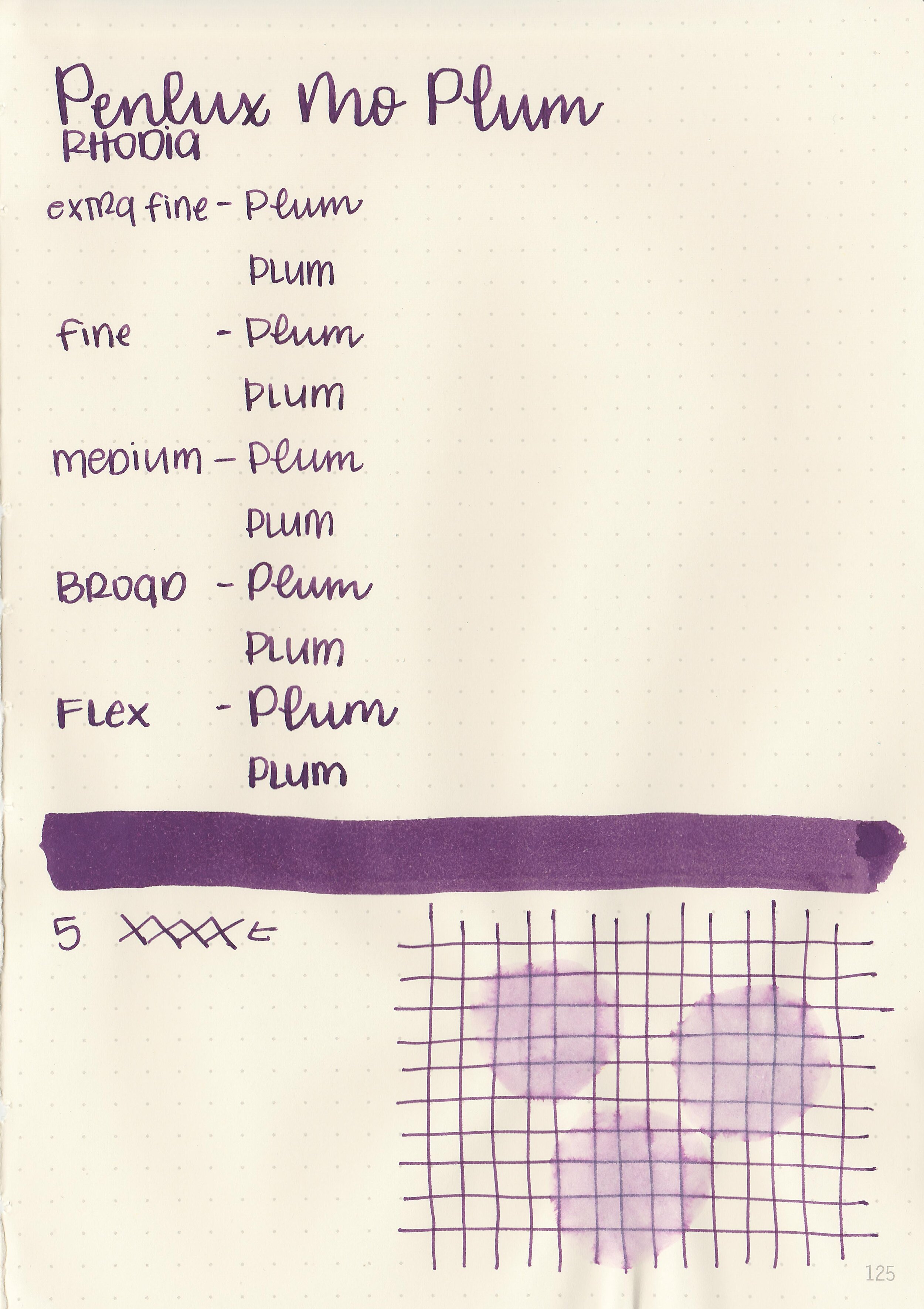
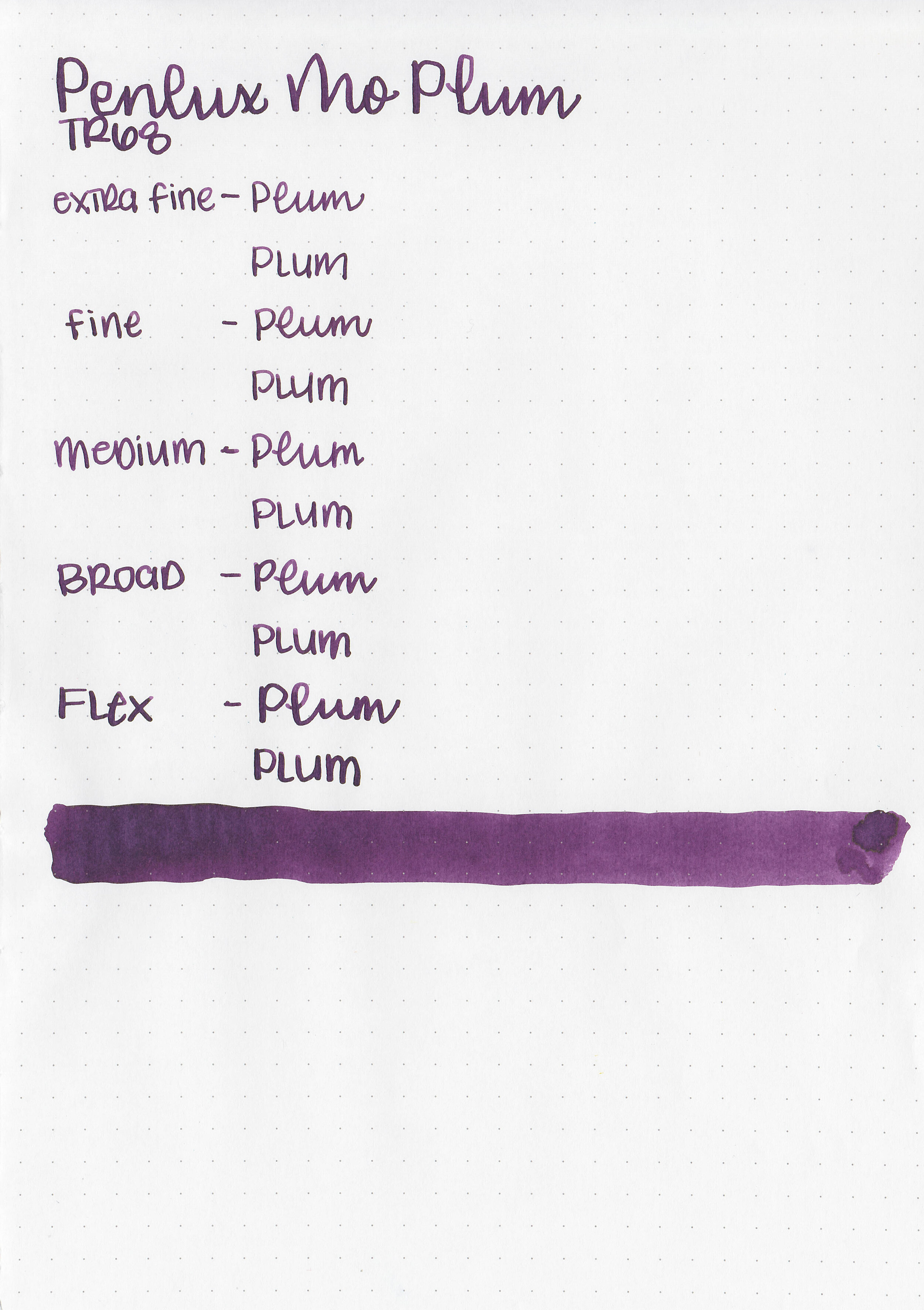
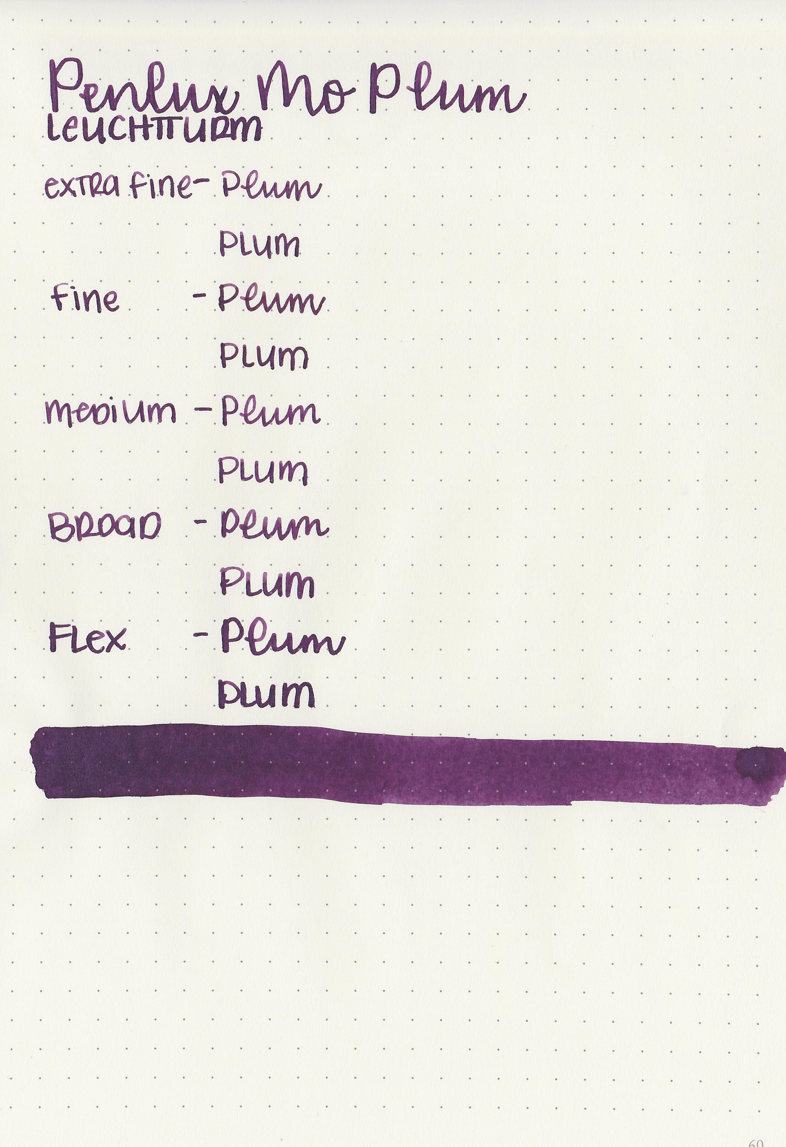
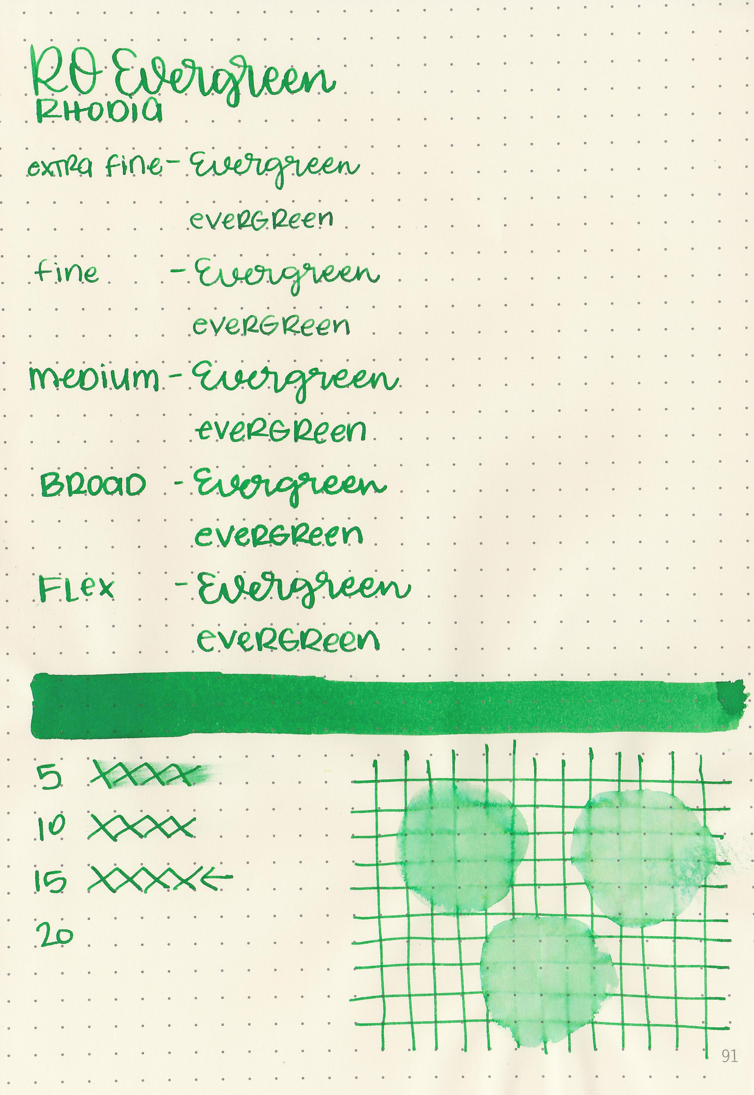
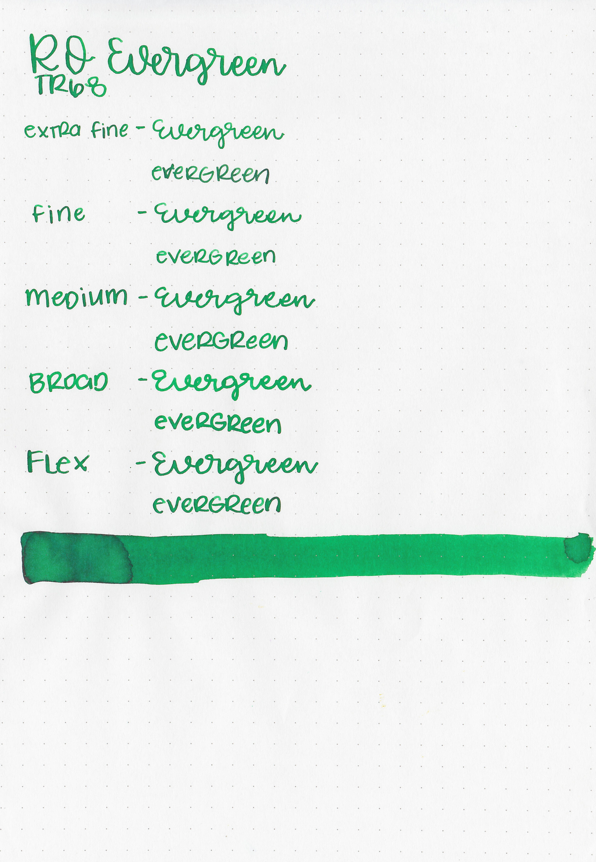
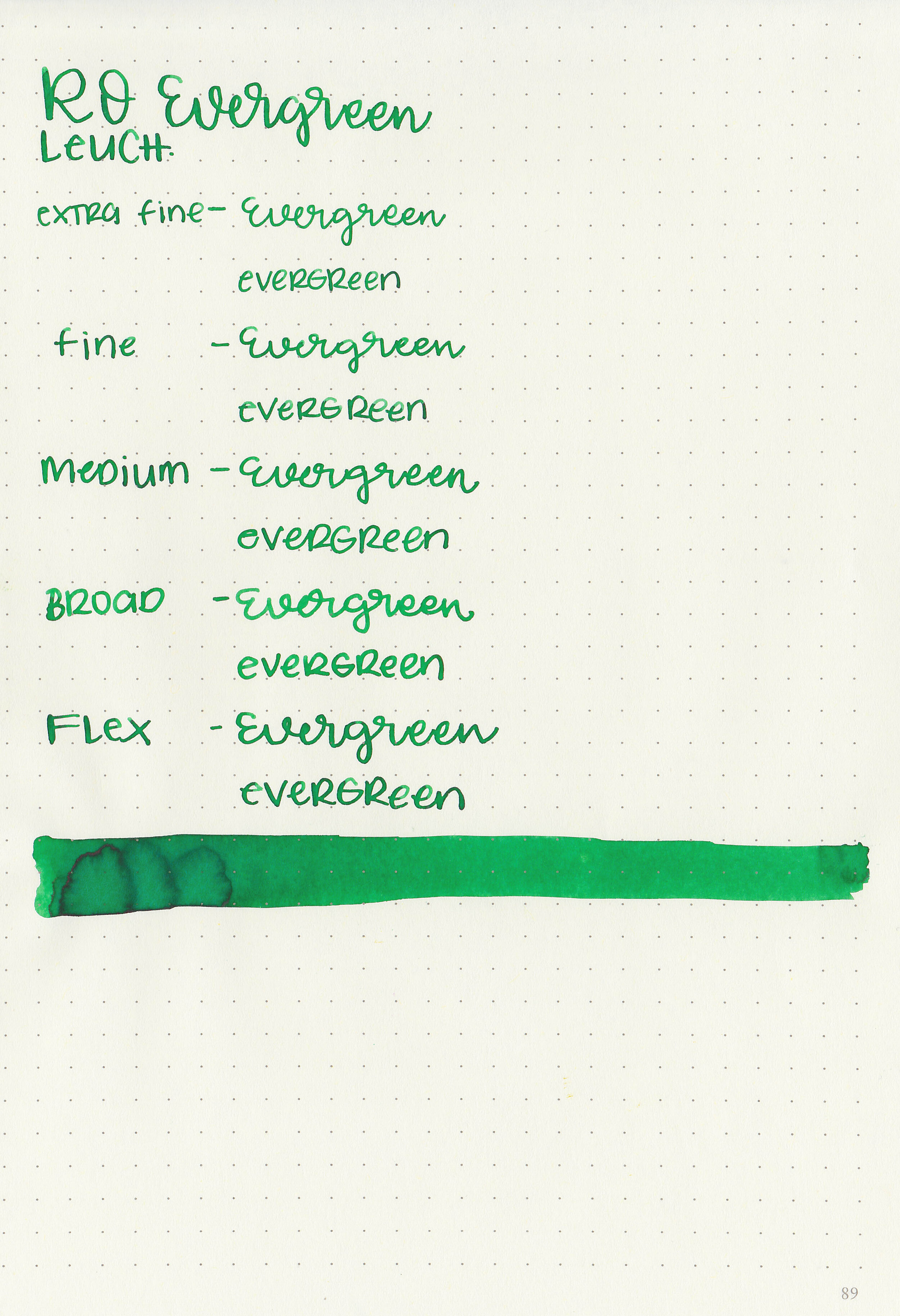
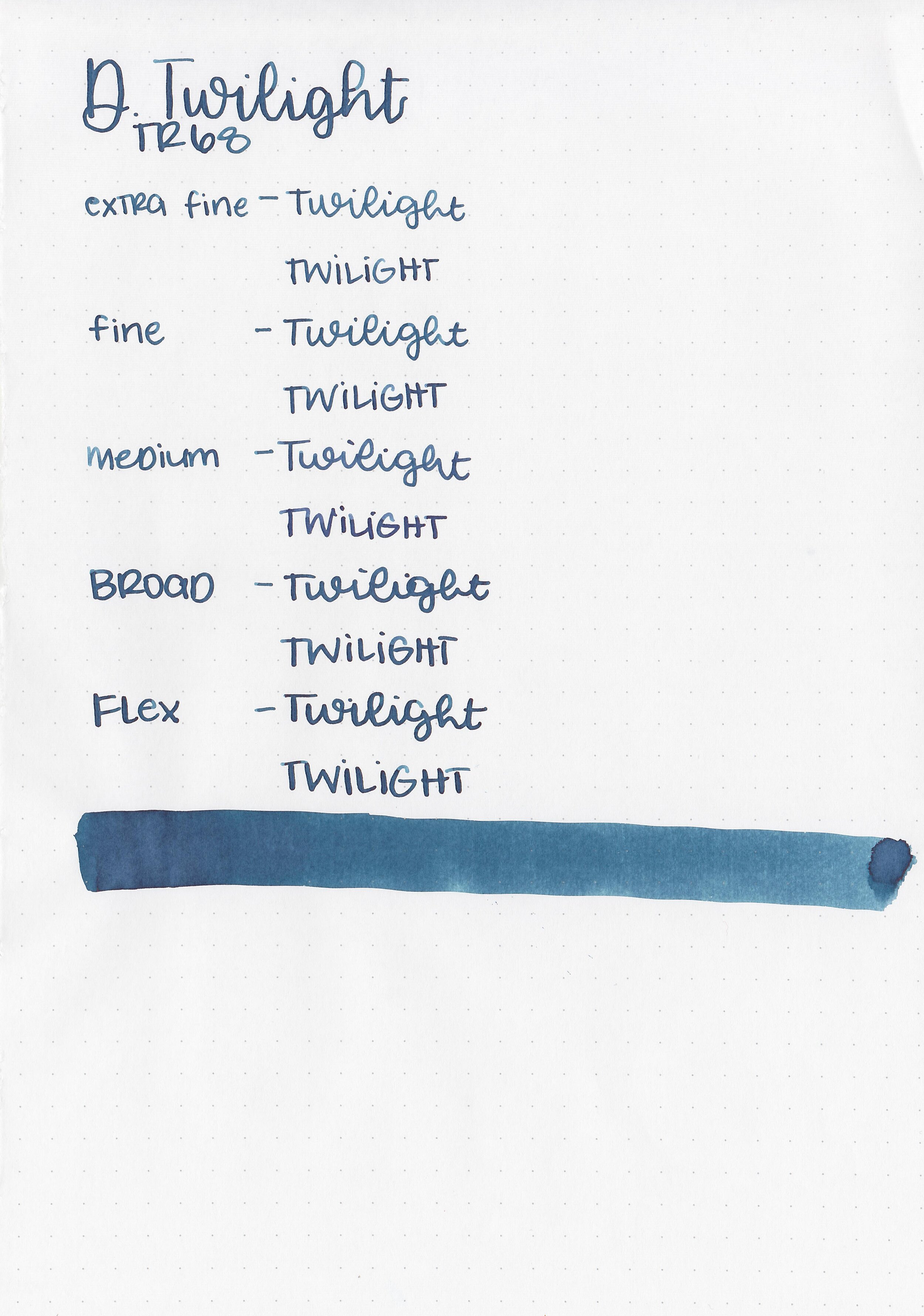
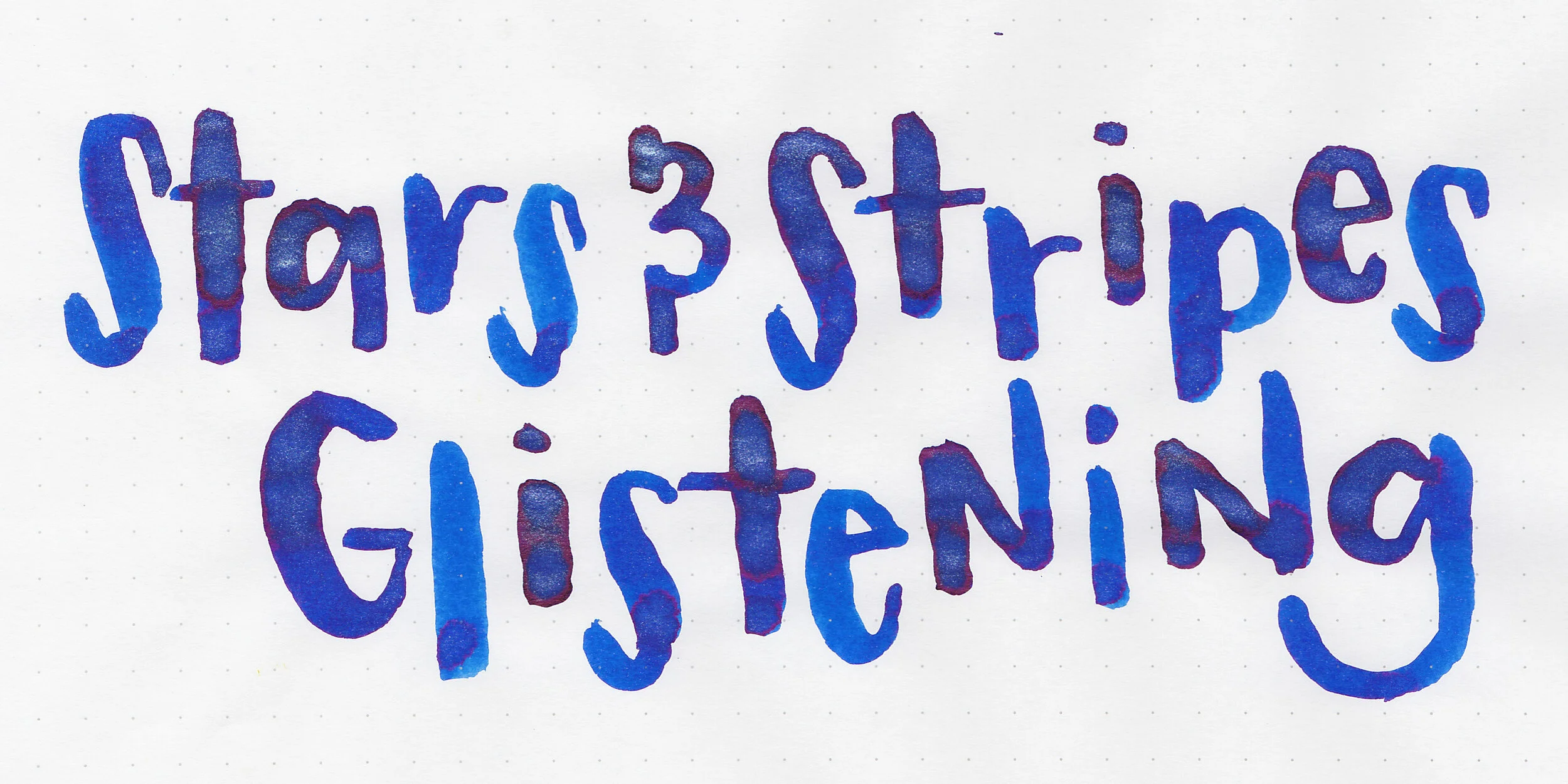
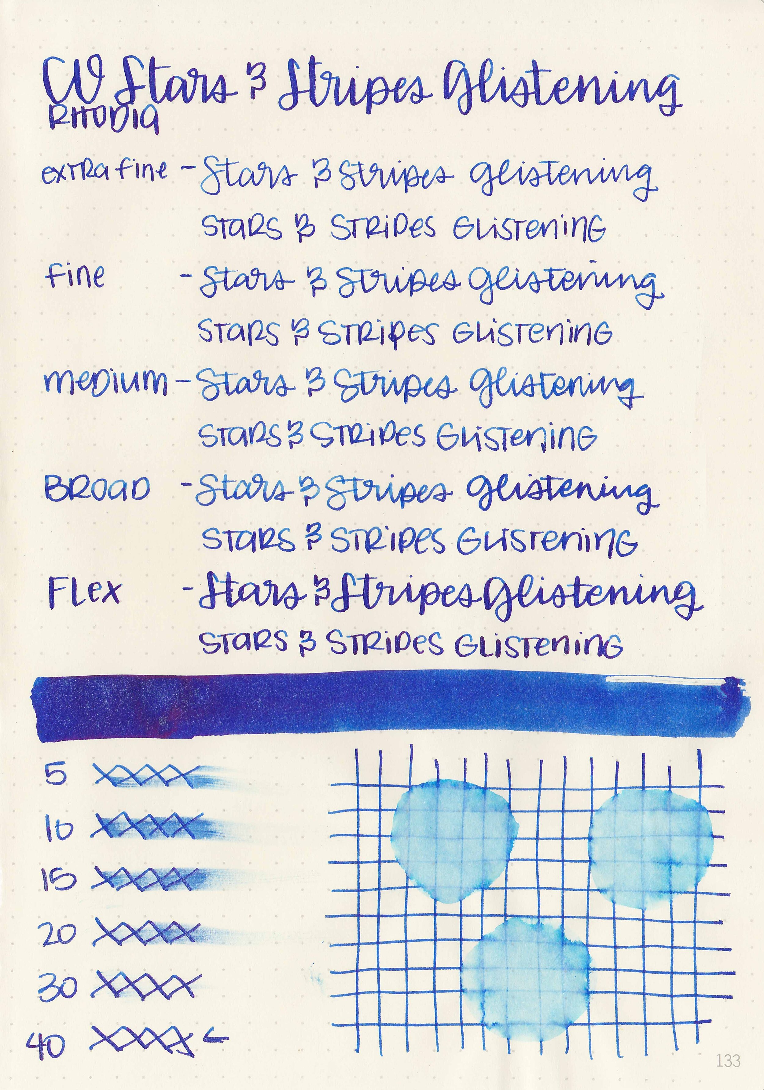
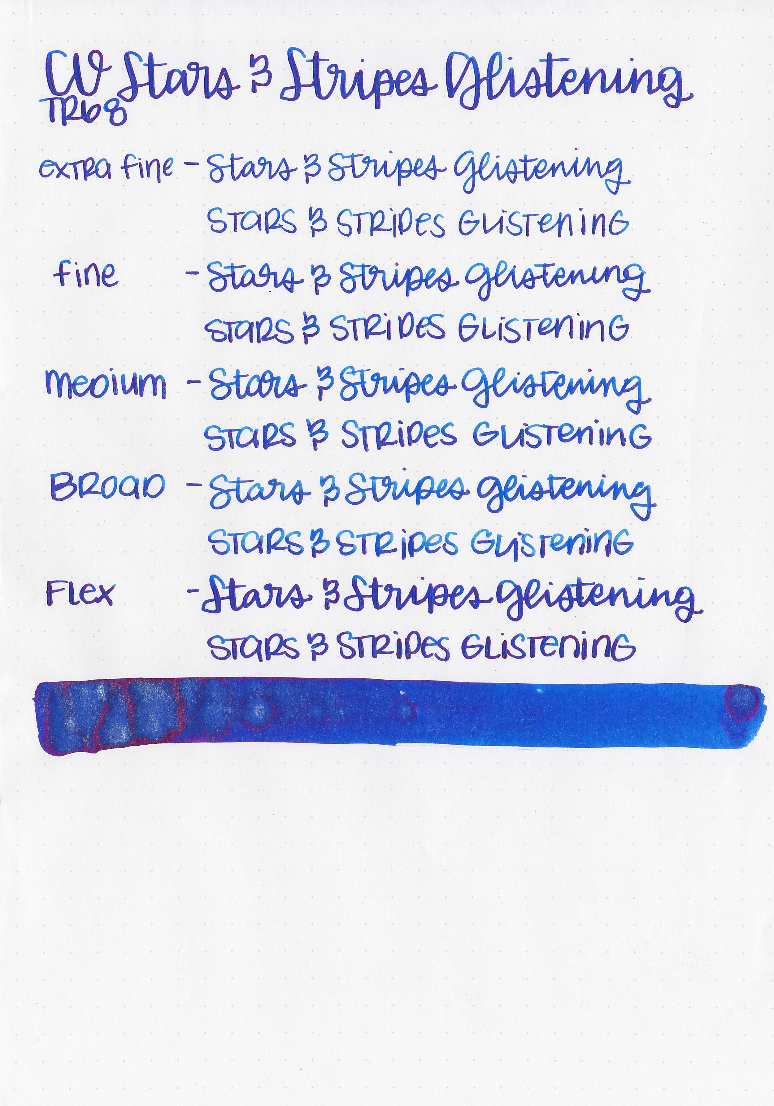
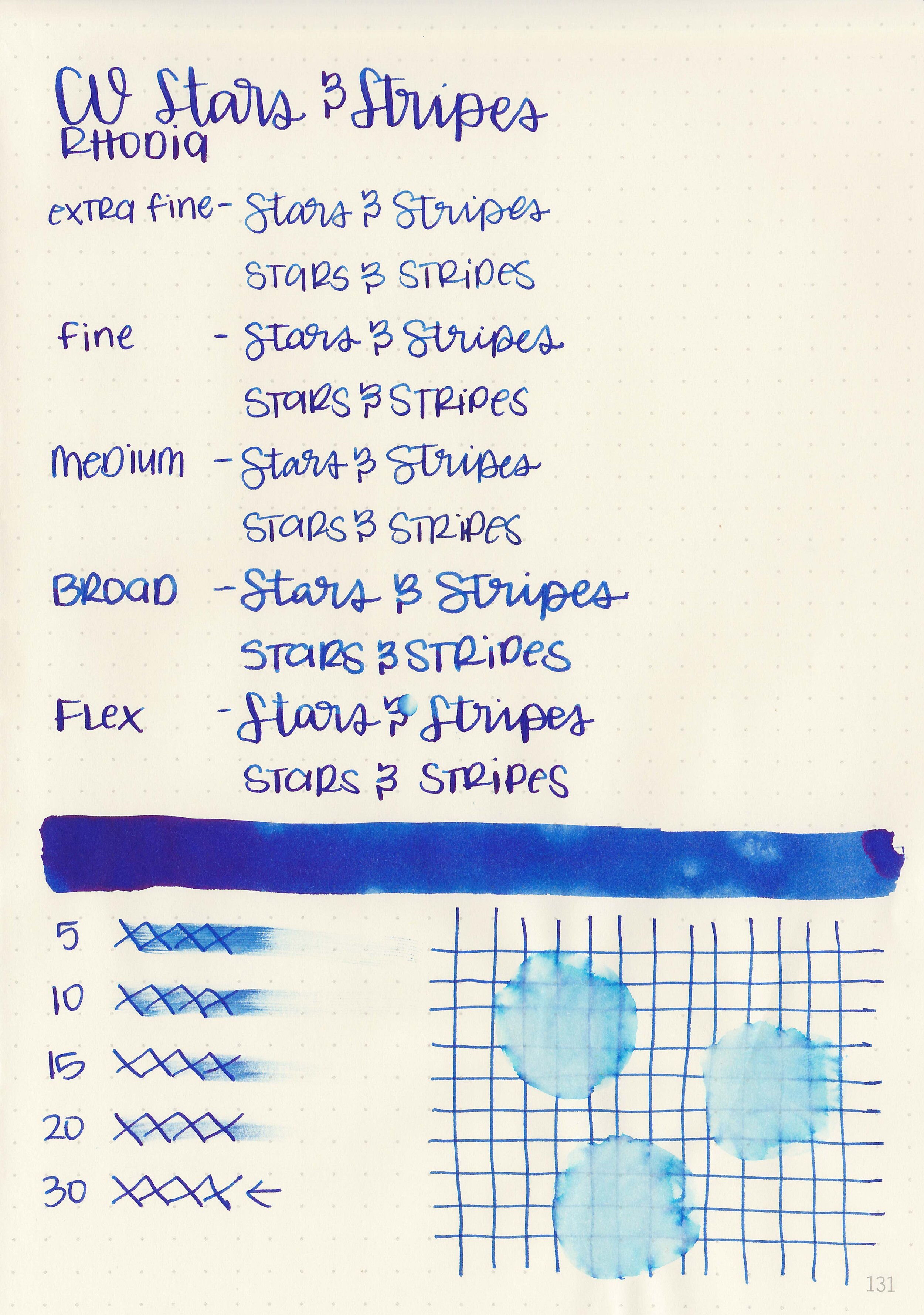
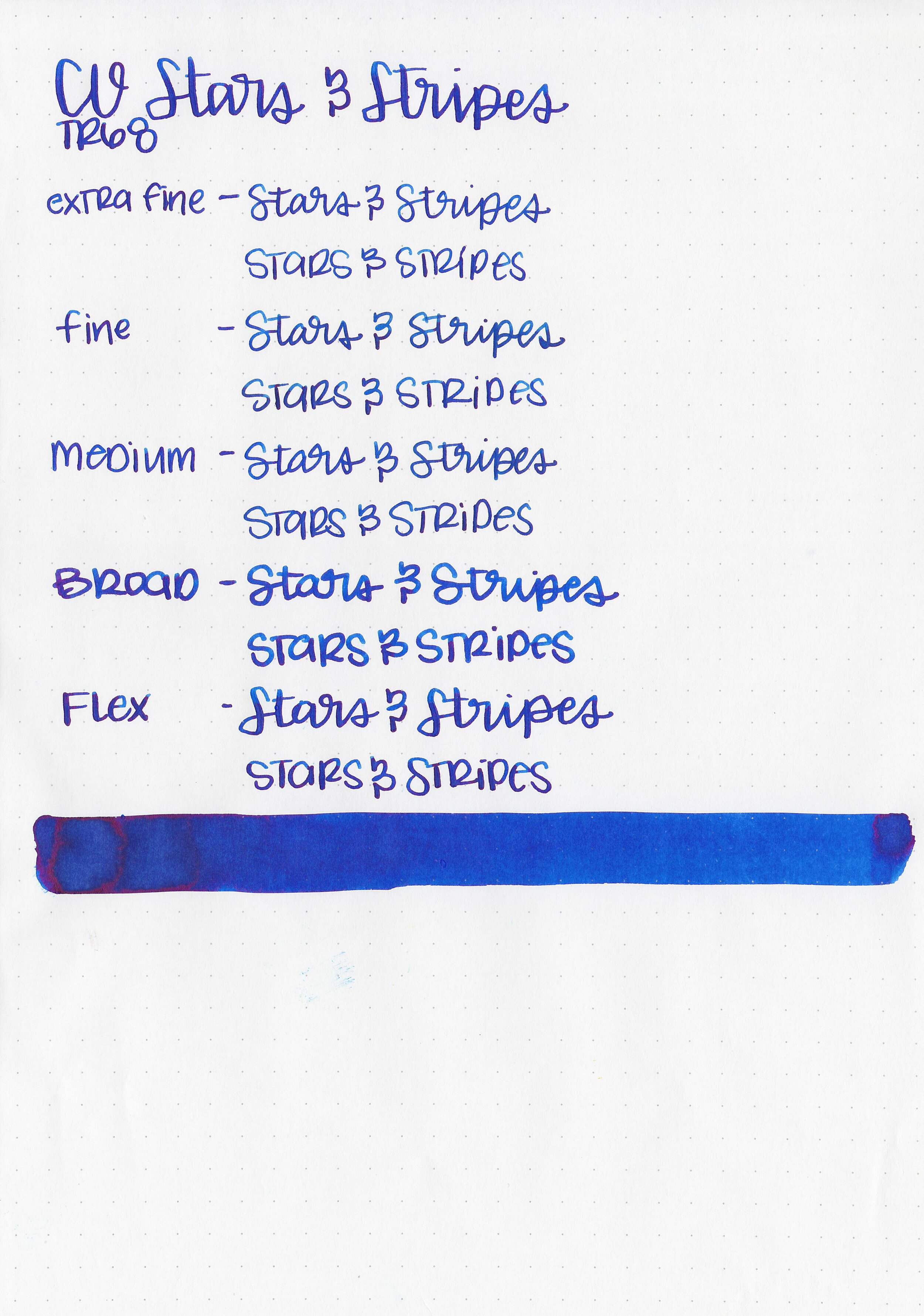
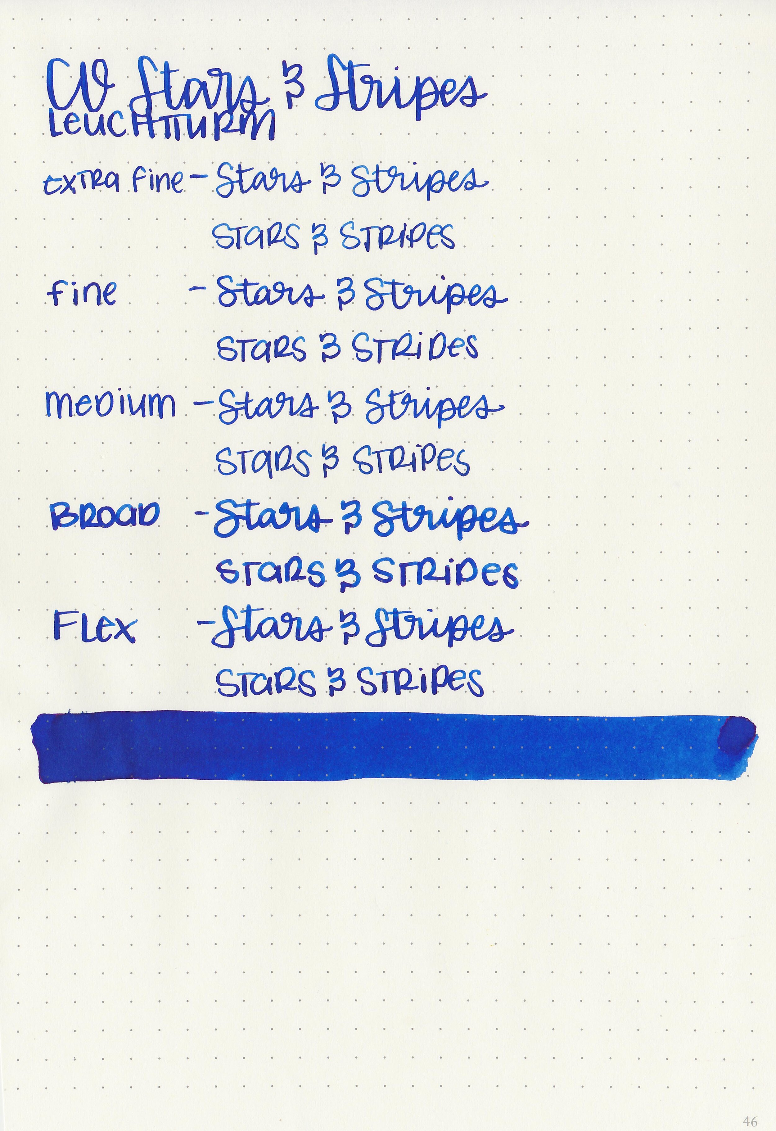
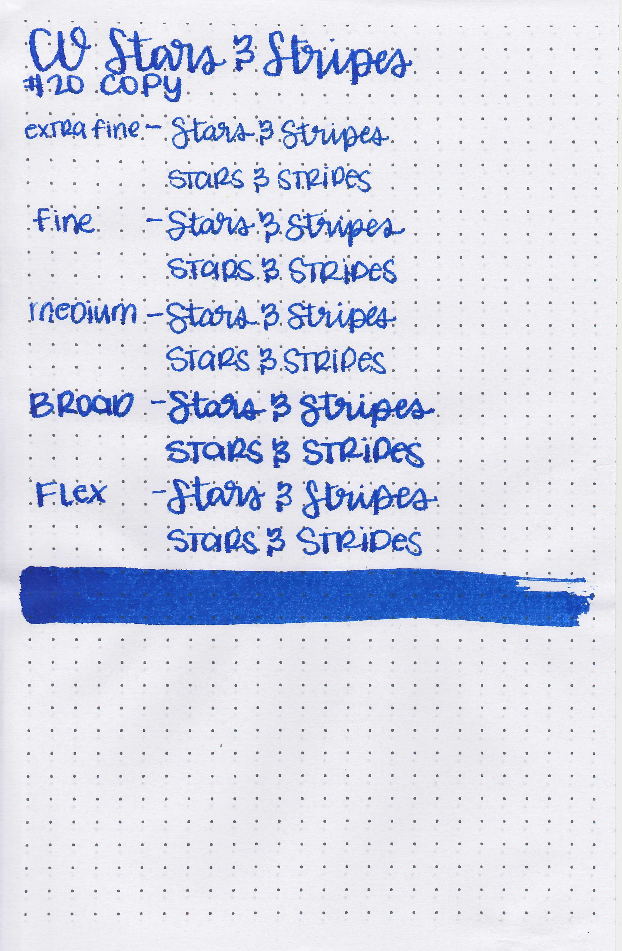
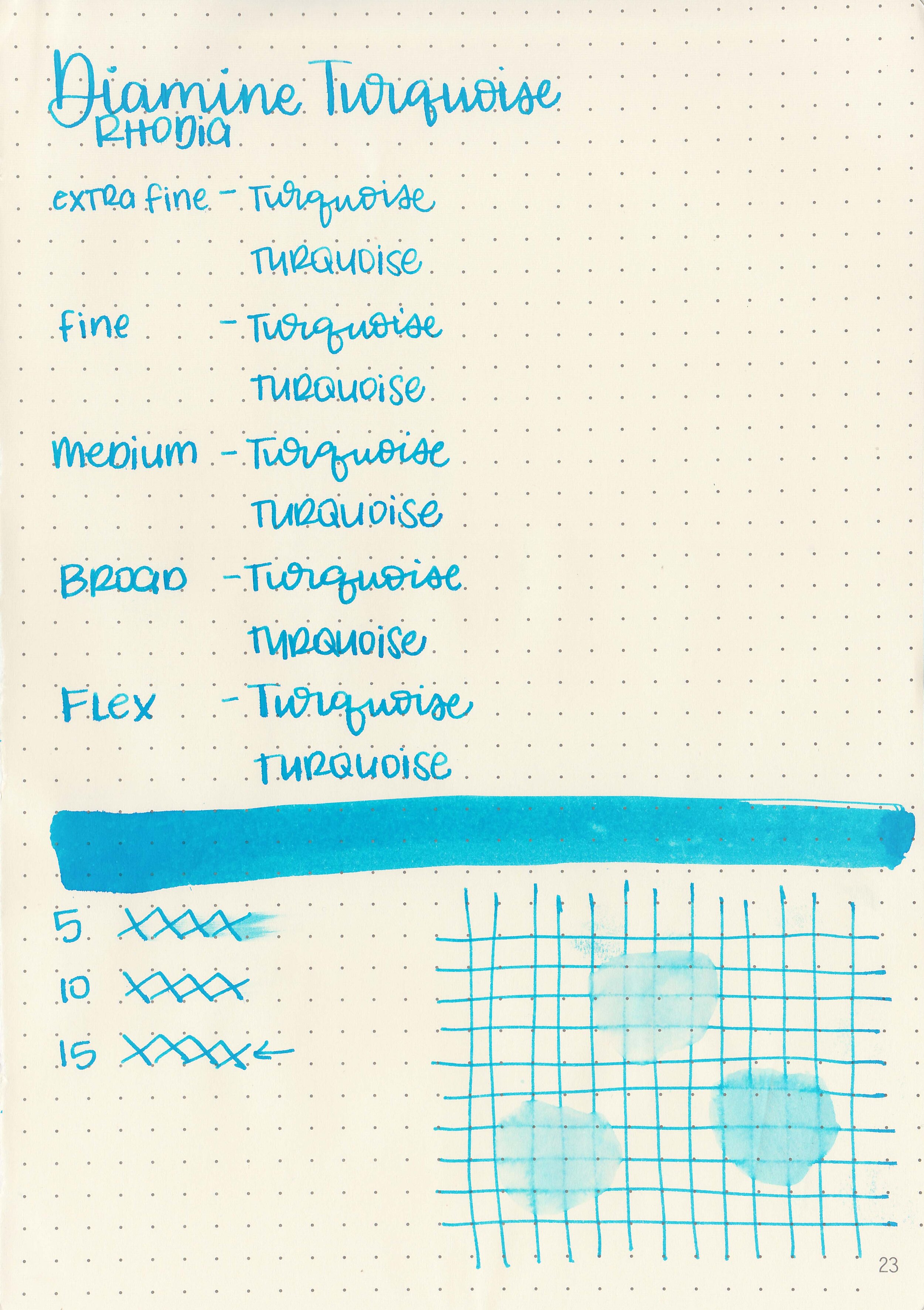
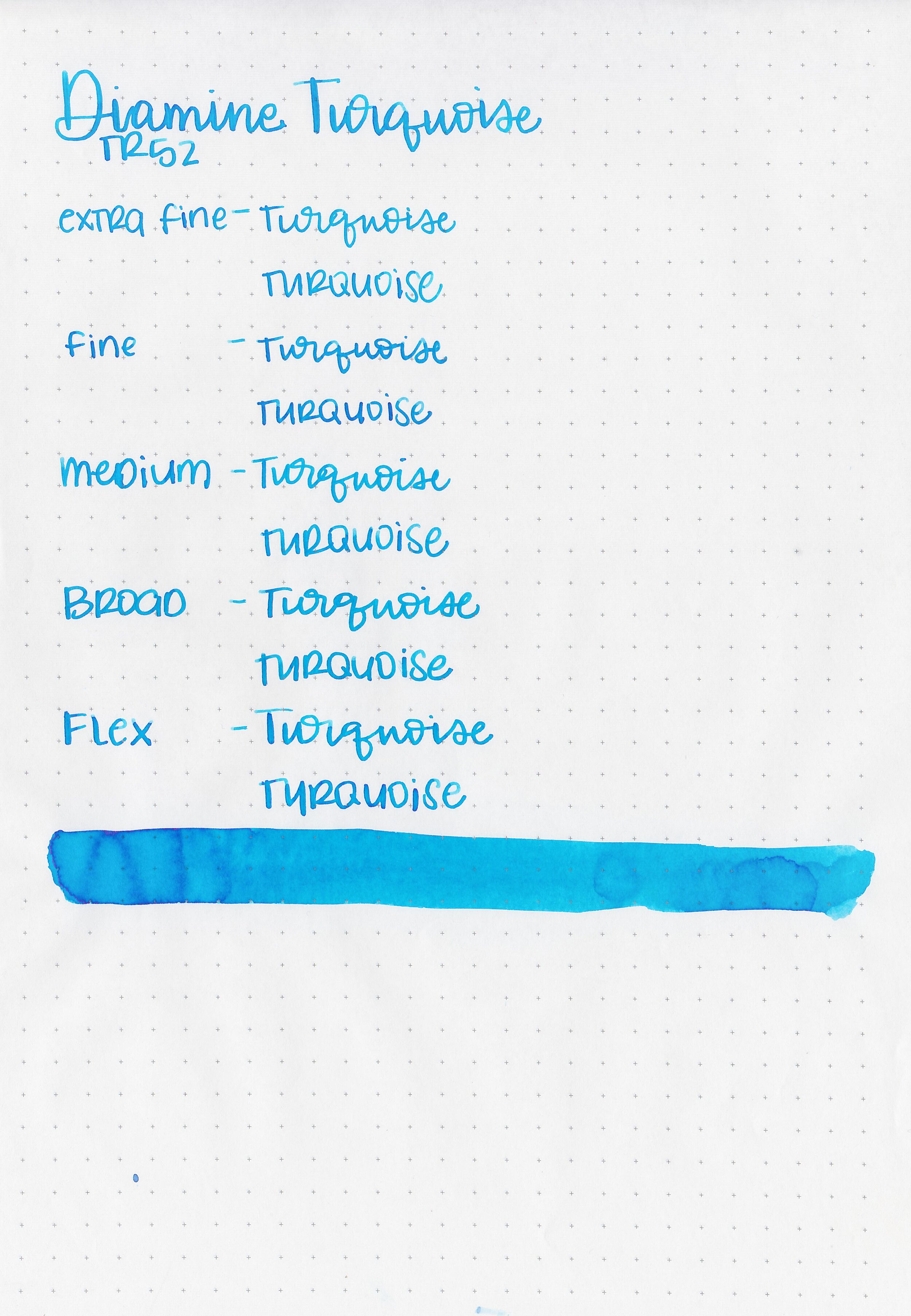
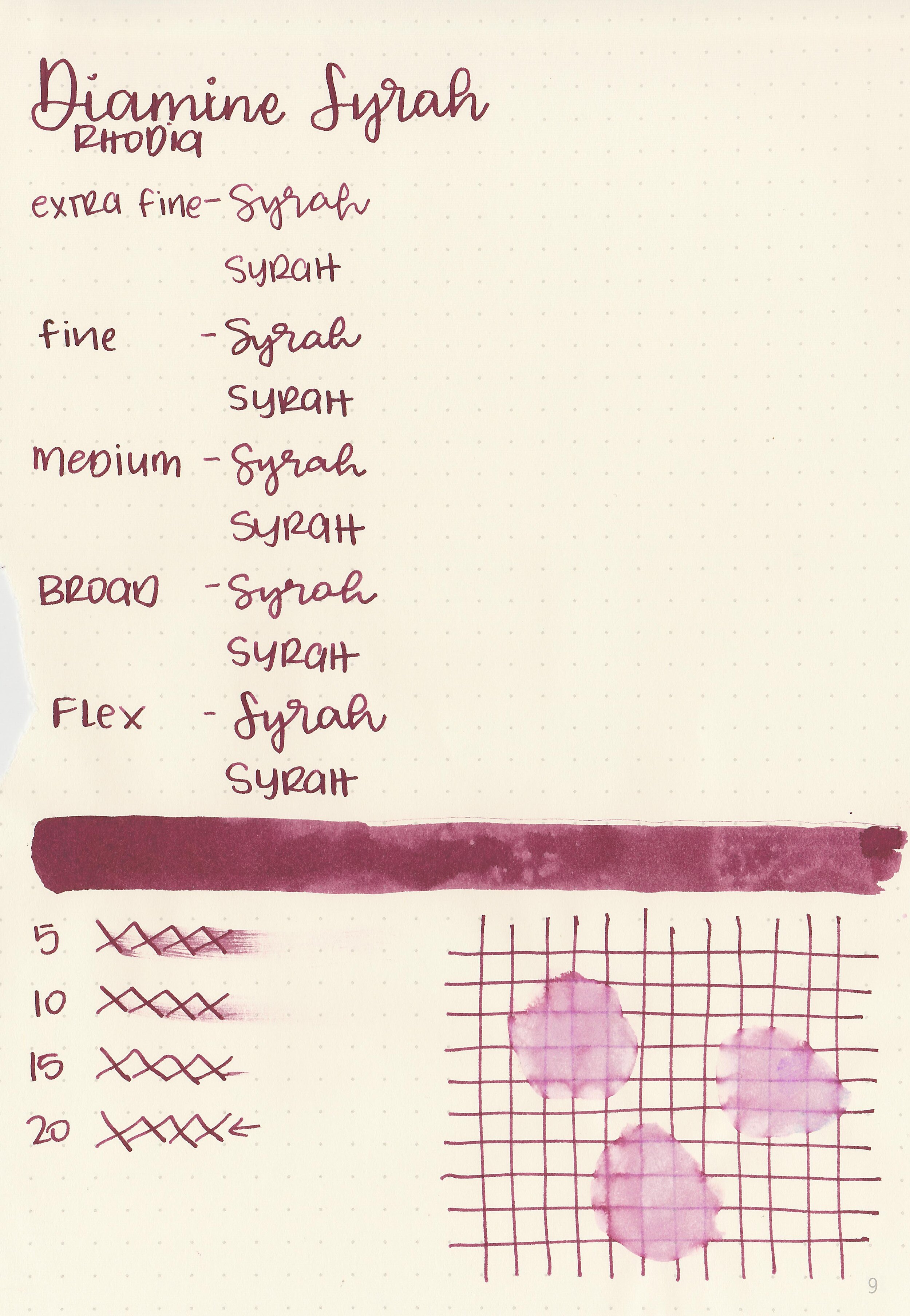
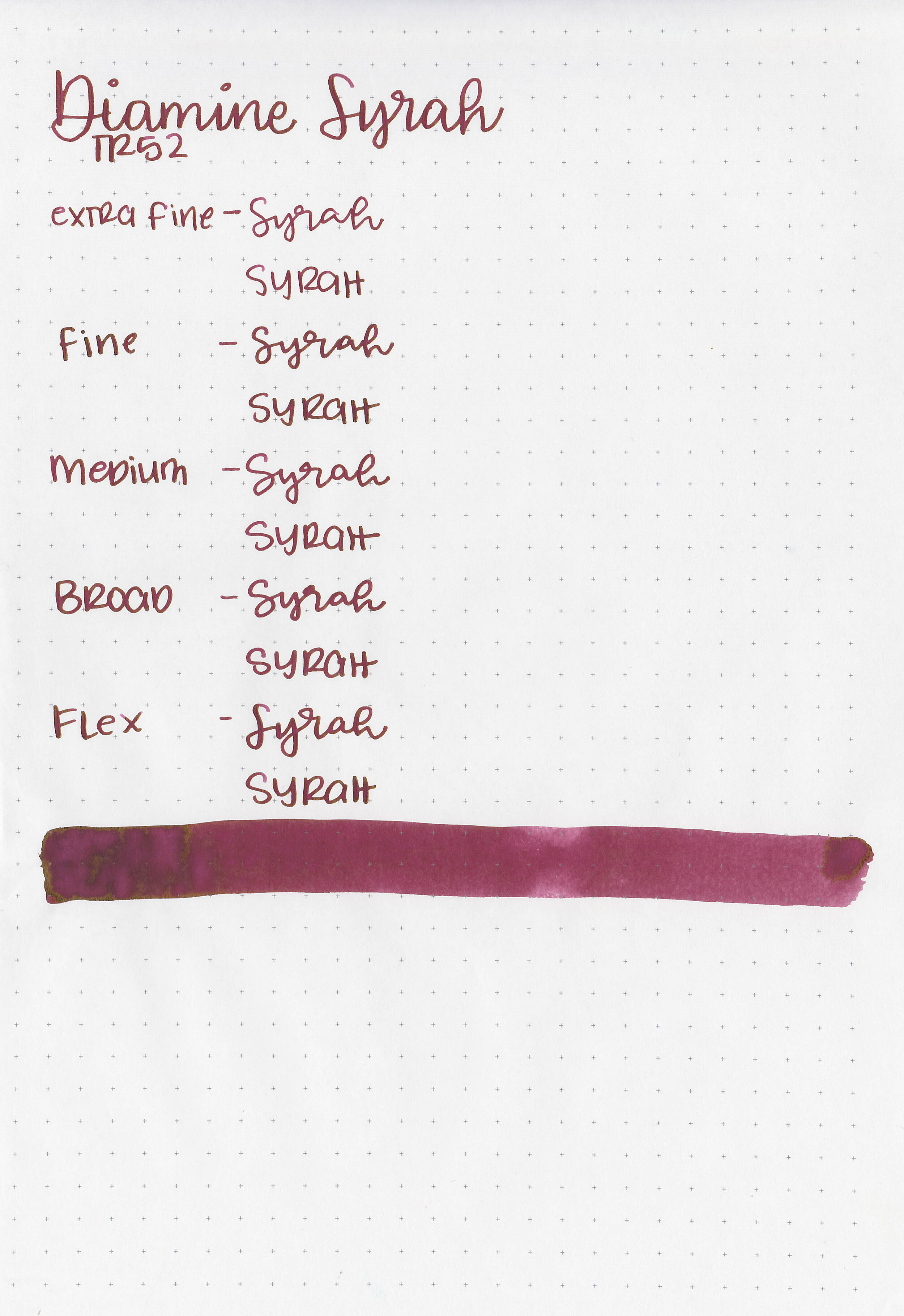
Writing samples:
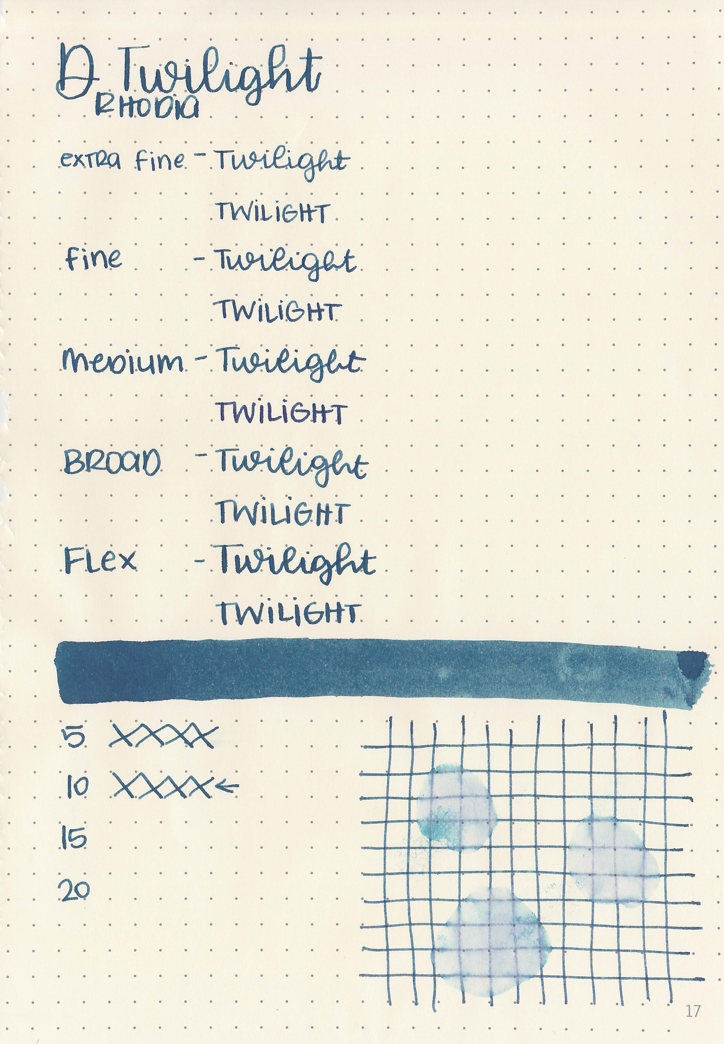
Let's take a look at how the ink behaves on fountain pen friendly papers: Rhodia, Tomoe River, and Leuchtturm.

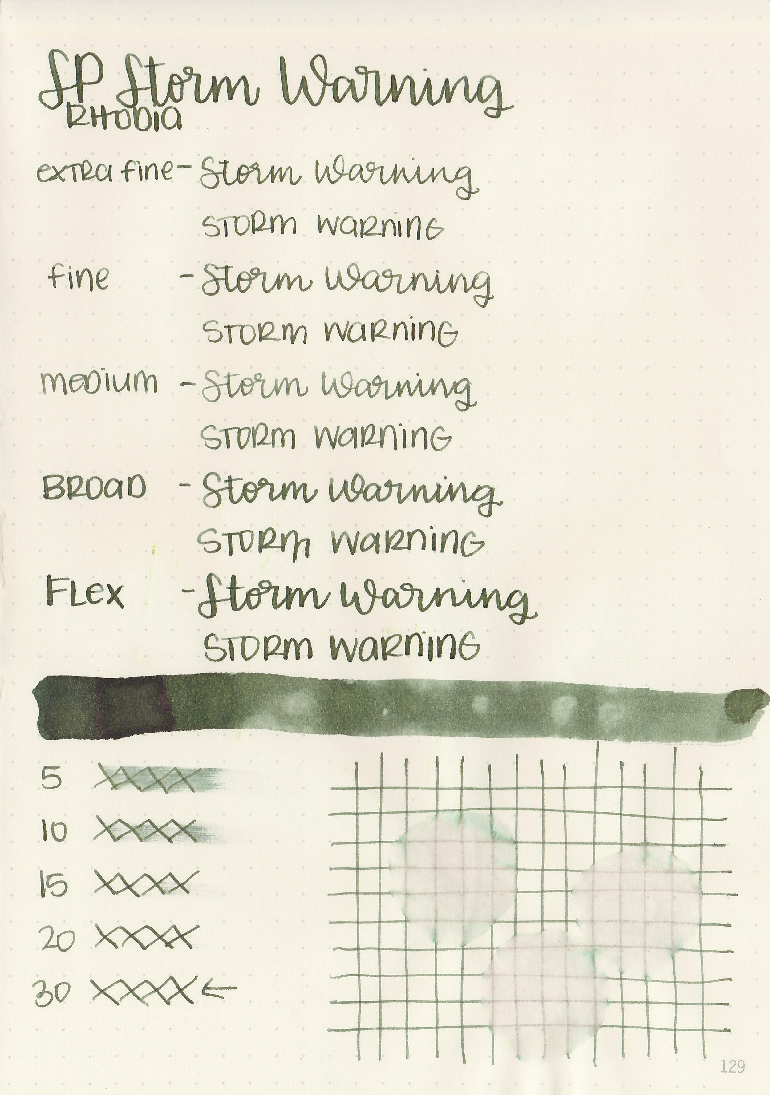
Dry time: 30 seconds
Water resistance: Medium

Feathering: None
Show through: Medium
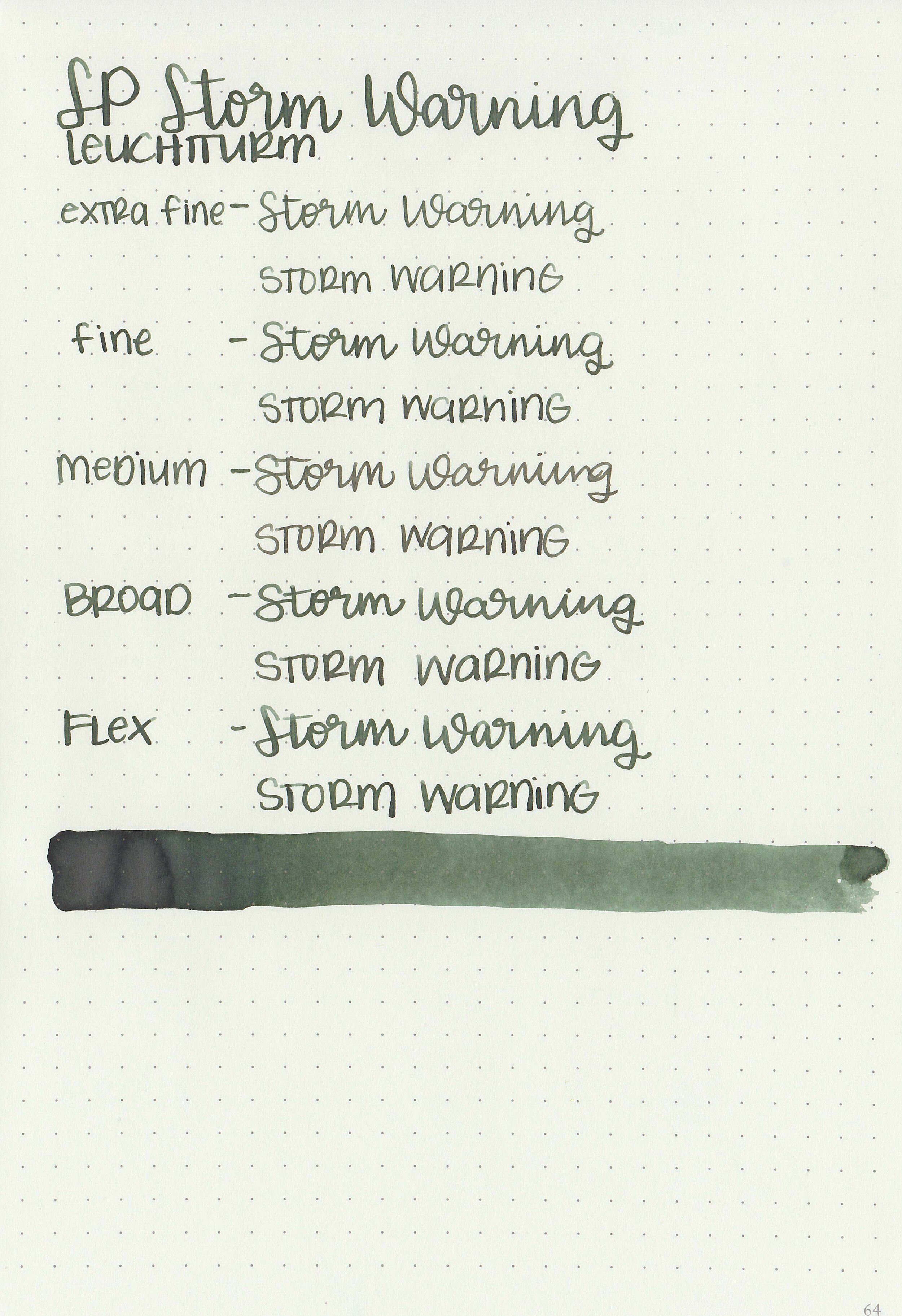
Bleeding: None
Other properties: medium shading, tiny brown sheen, and no shimmer. The sheen is only visible in large swabs on Tomoe River Paper.

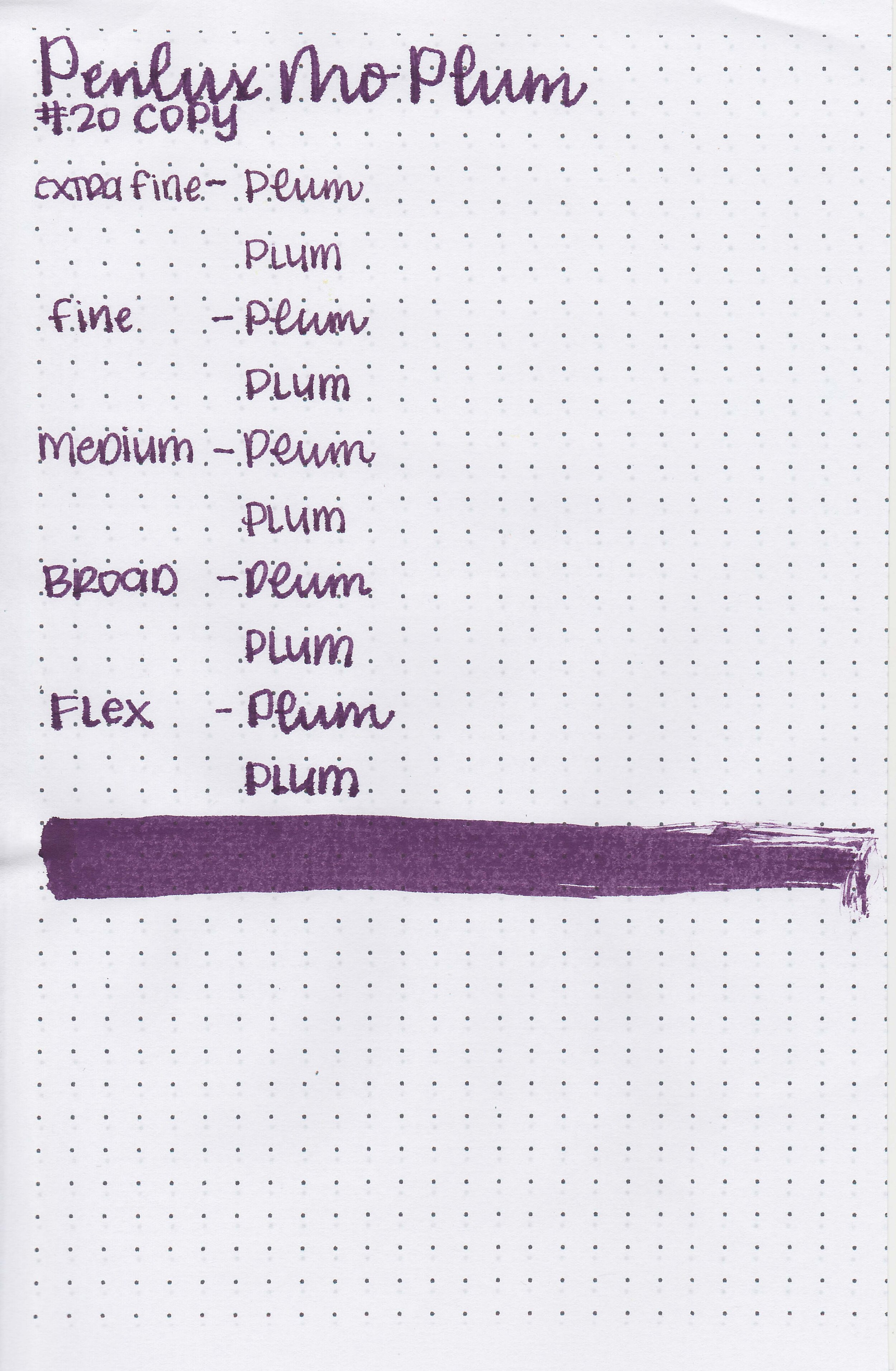
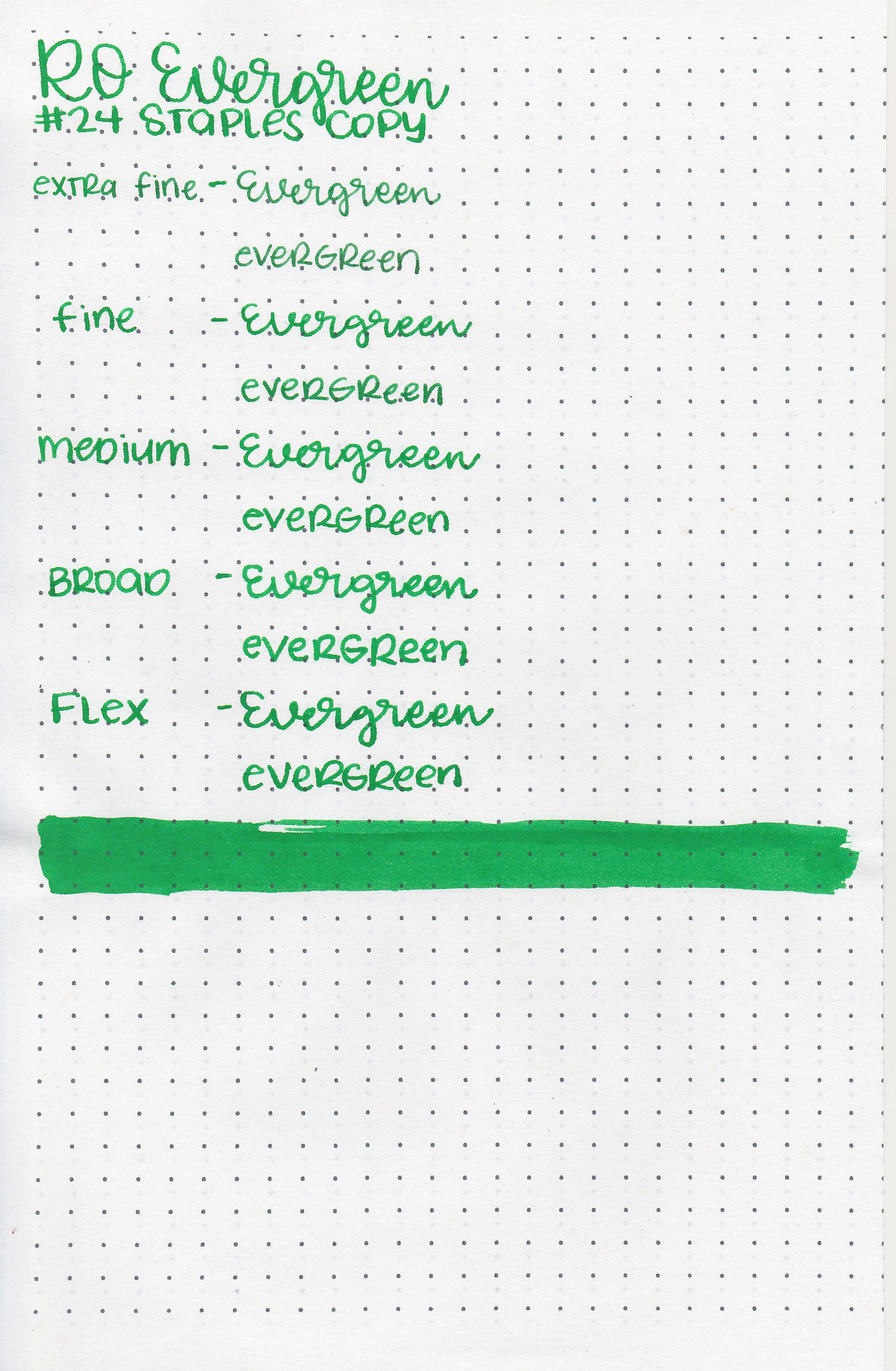
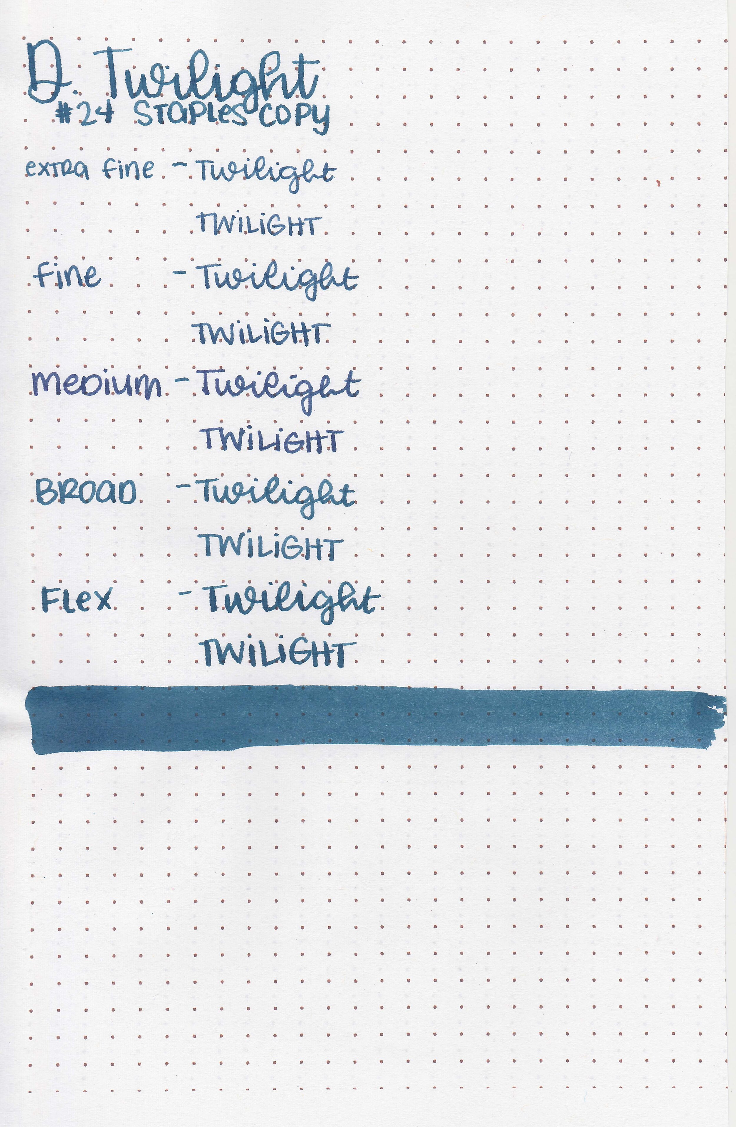
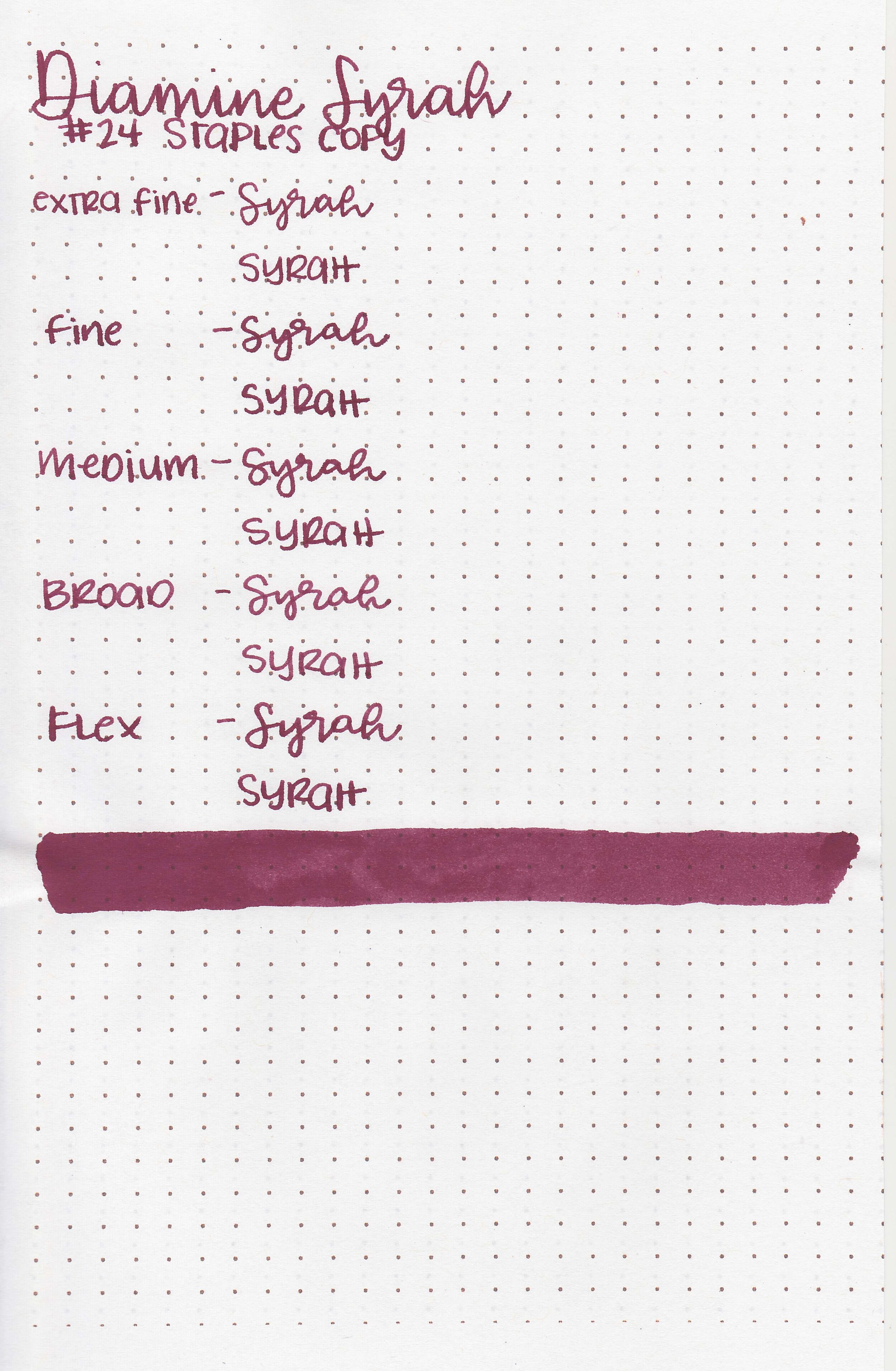
On Staples 24 lb copy paper there was some bleeding and feathering in all nib sizes.
Comparison Swabs:

Storm Warning is closest to Lennon Tool Bar Wenshaan Pouchong Tea. Click here to see the green inks together.
Longer writing:

I used a Pilot Vanishing Point Tropical Turquoise with a medium nib on a Taroko Enigma notebook. The ink had an average flow.
Overall, I found this to be an interesting ink, mainly because the color is rather unusual. If you missed out on this ink, Lennon Tool Bar Wenshaan Pouchong Tea is the closest ink I know of.
Disclaimer: All photos and opinions are my own. This page does not contain affiliate links and this post is not sponsored in any way.