Leonardo Officina Italiana Ink
/
Leonardo ink swabs.
Read More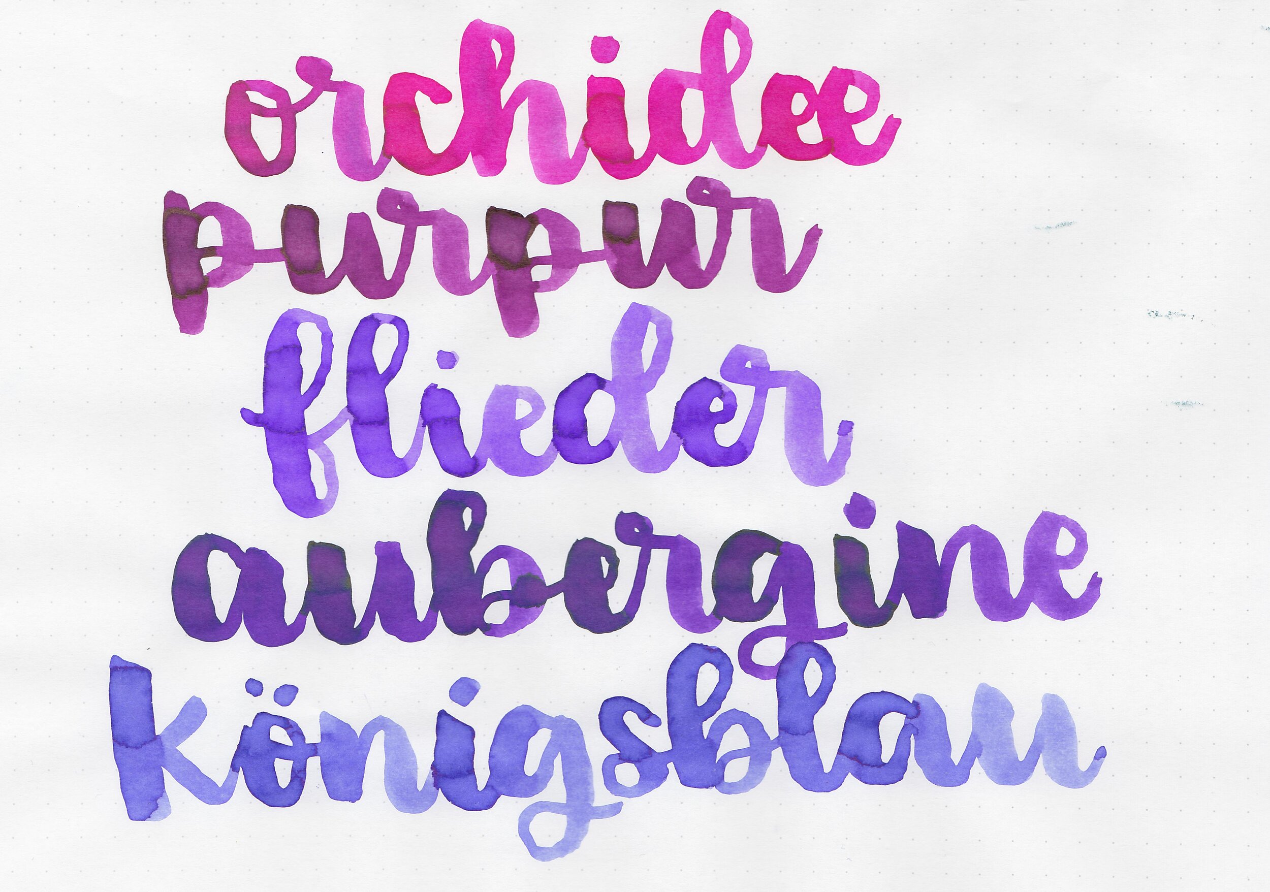
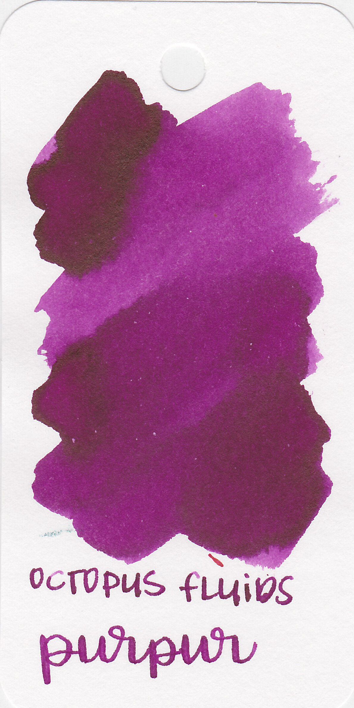
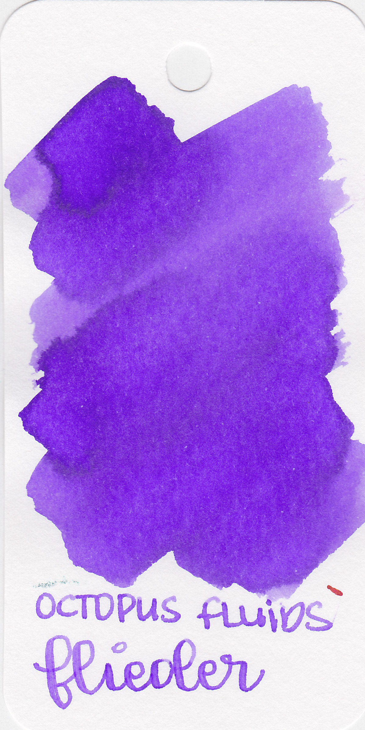
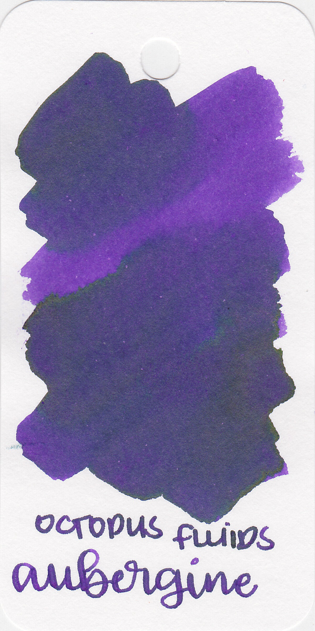
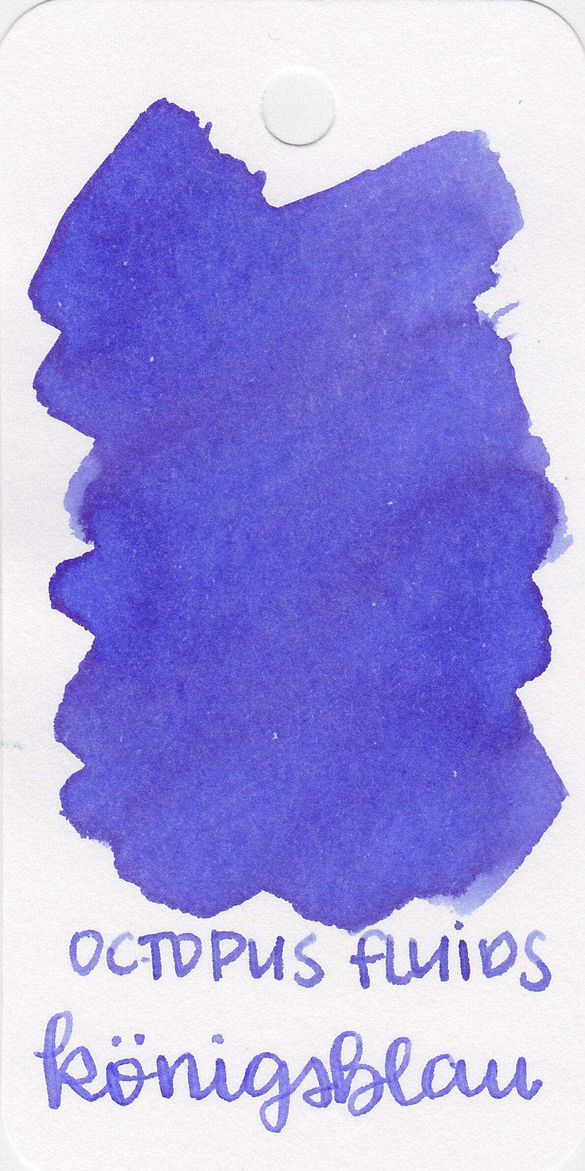
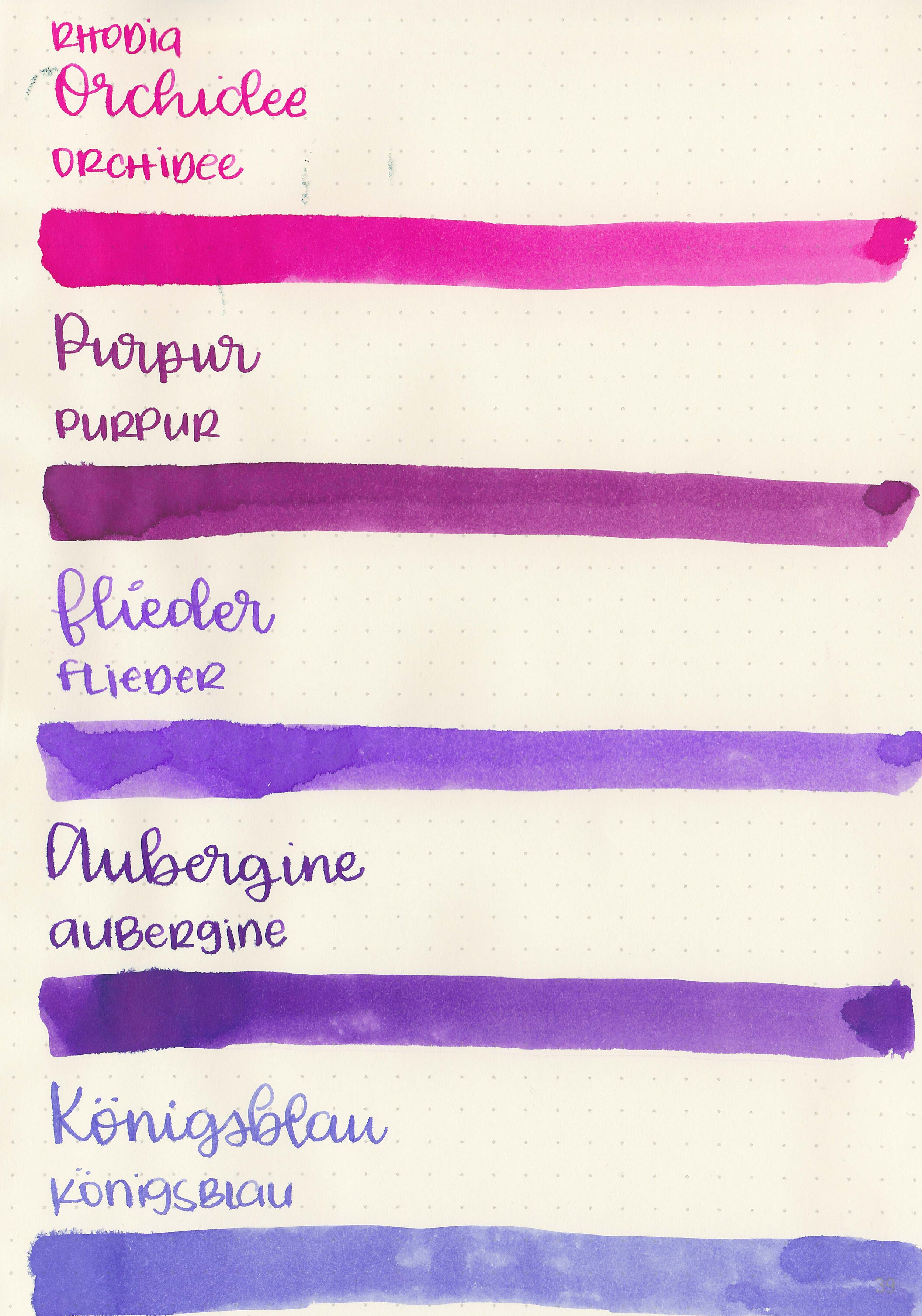
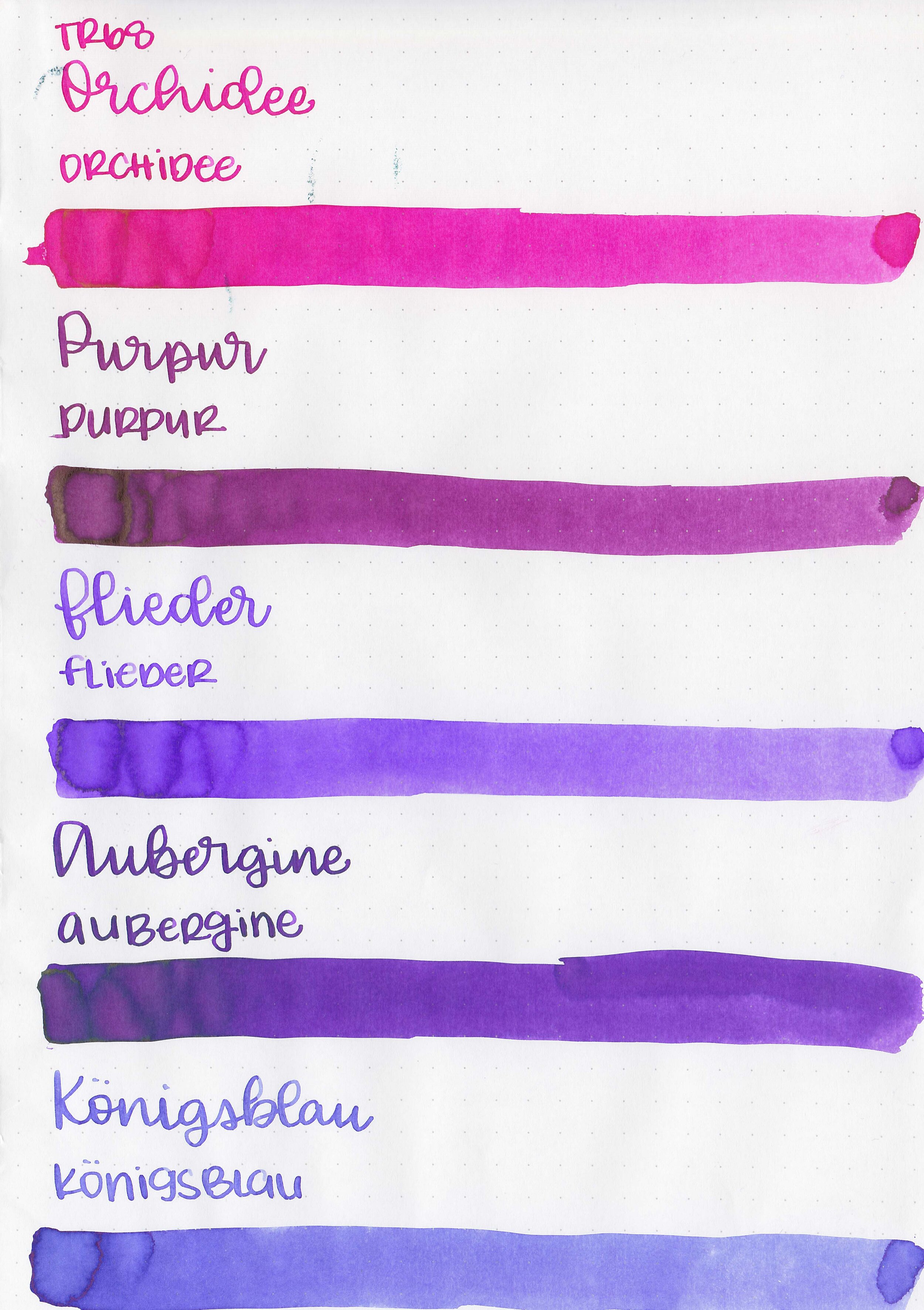
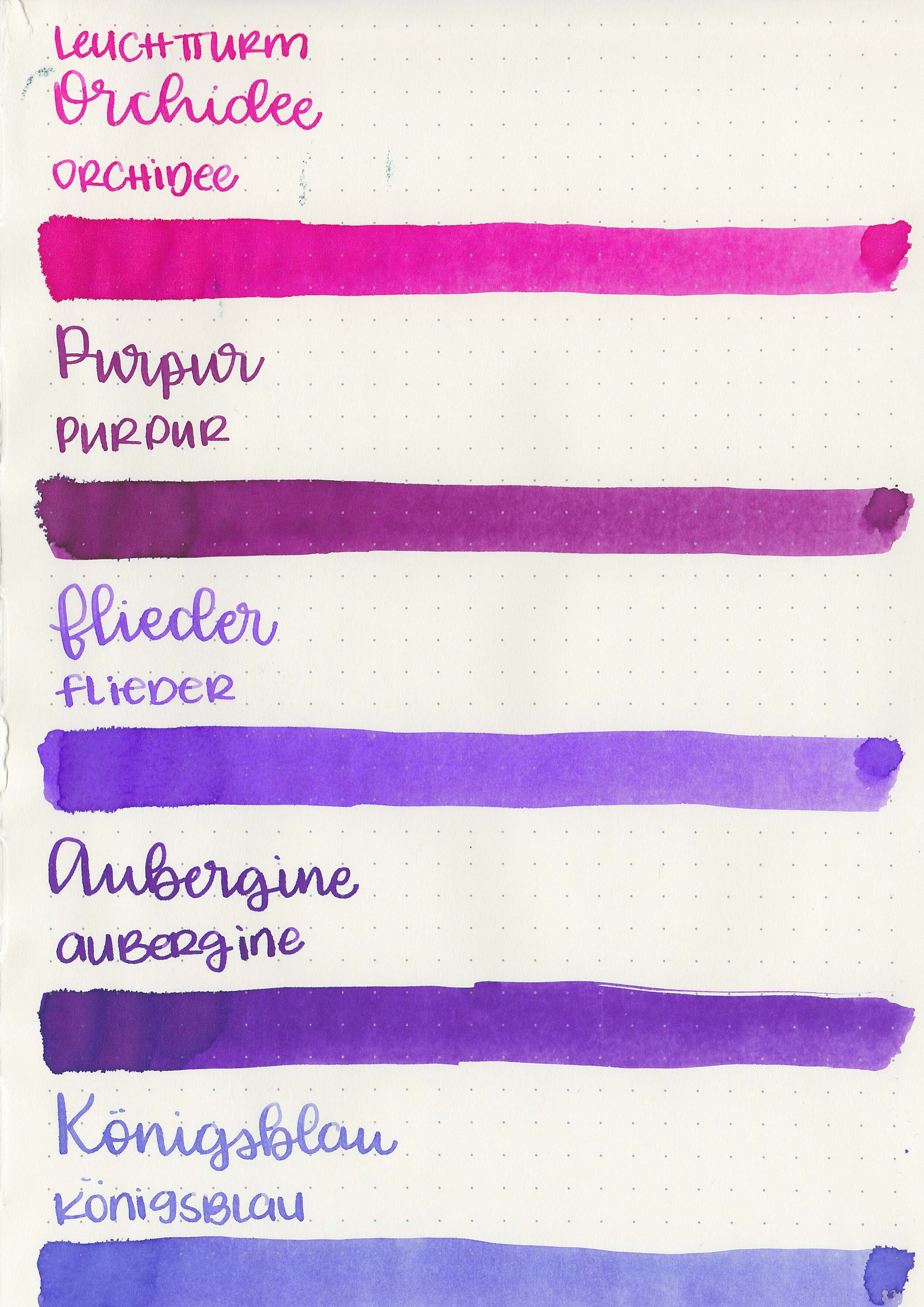
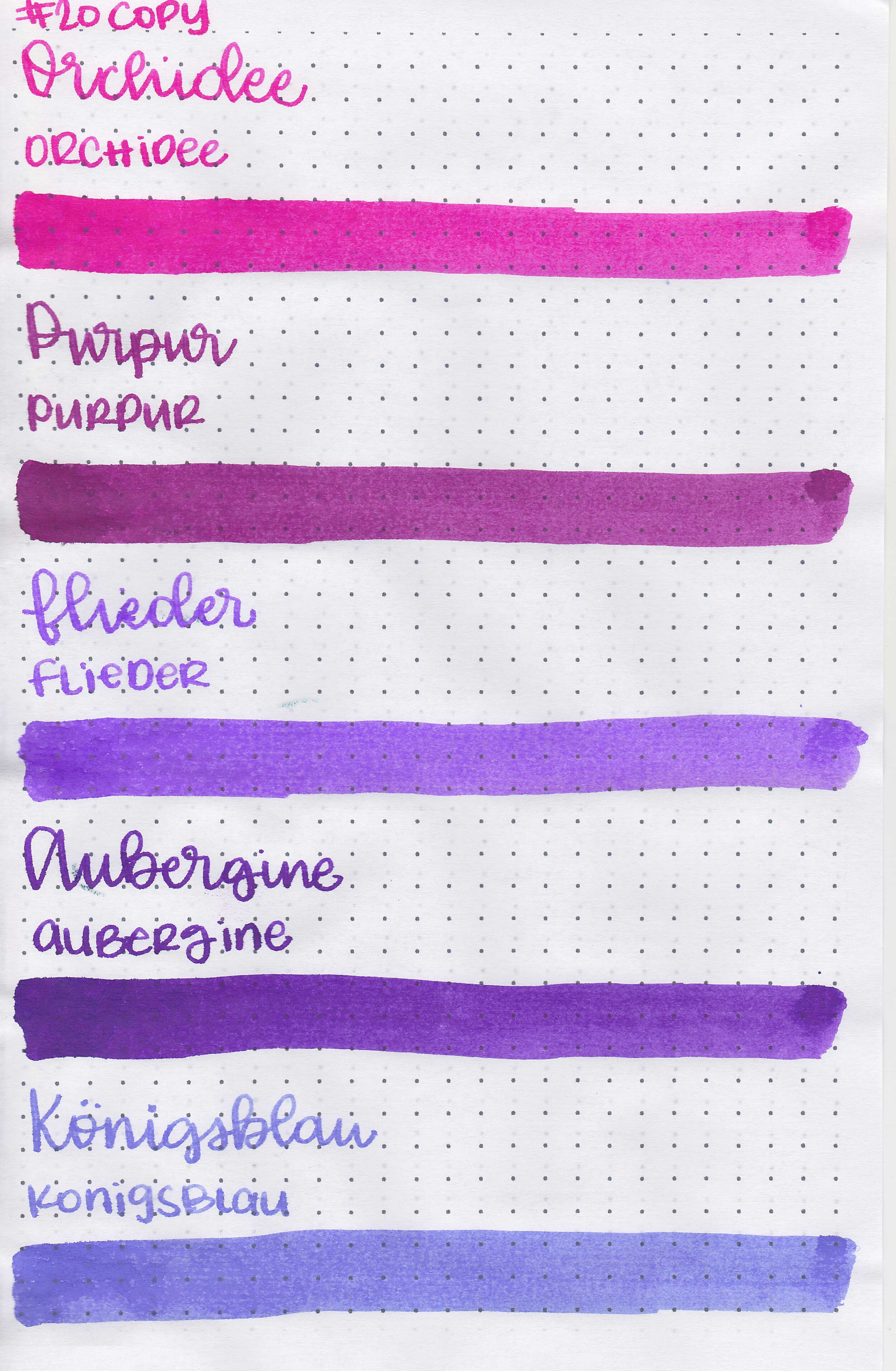
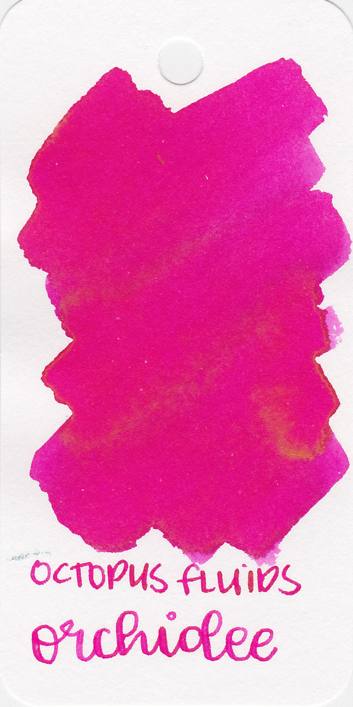
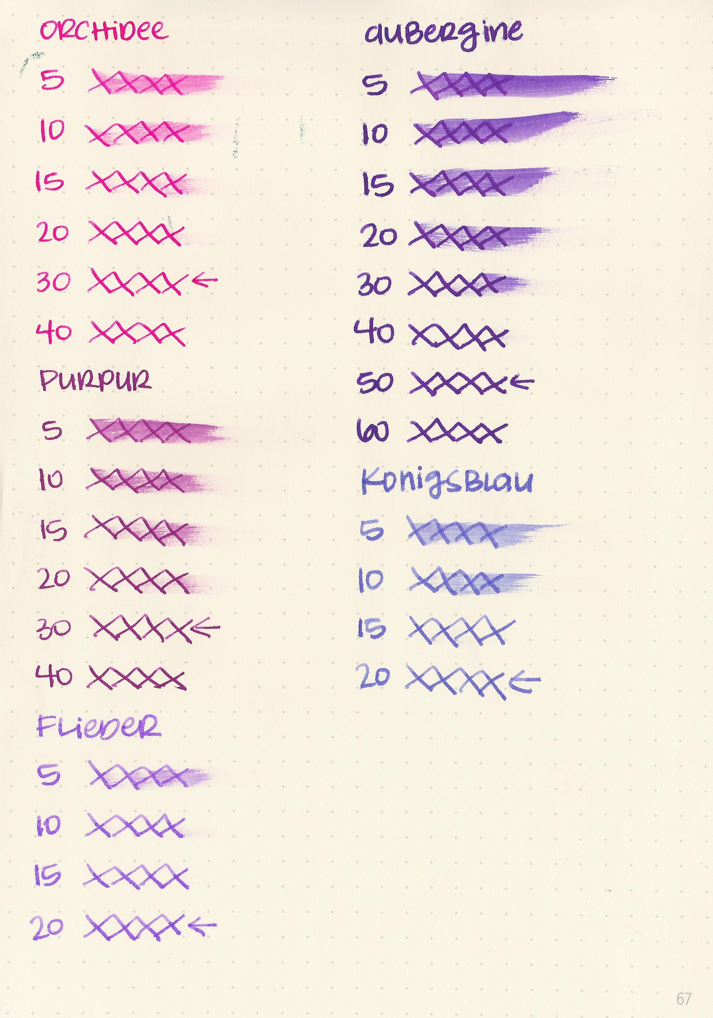
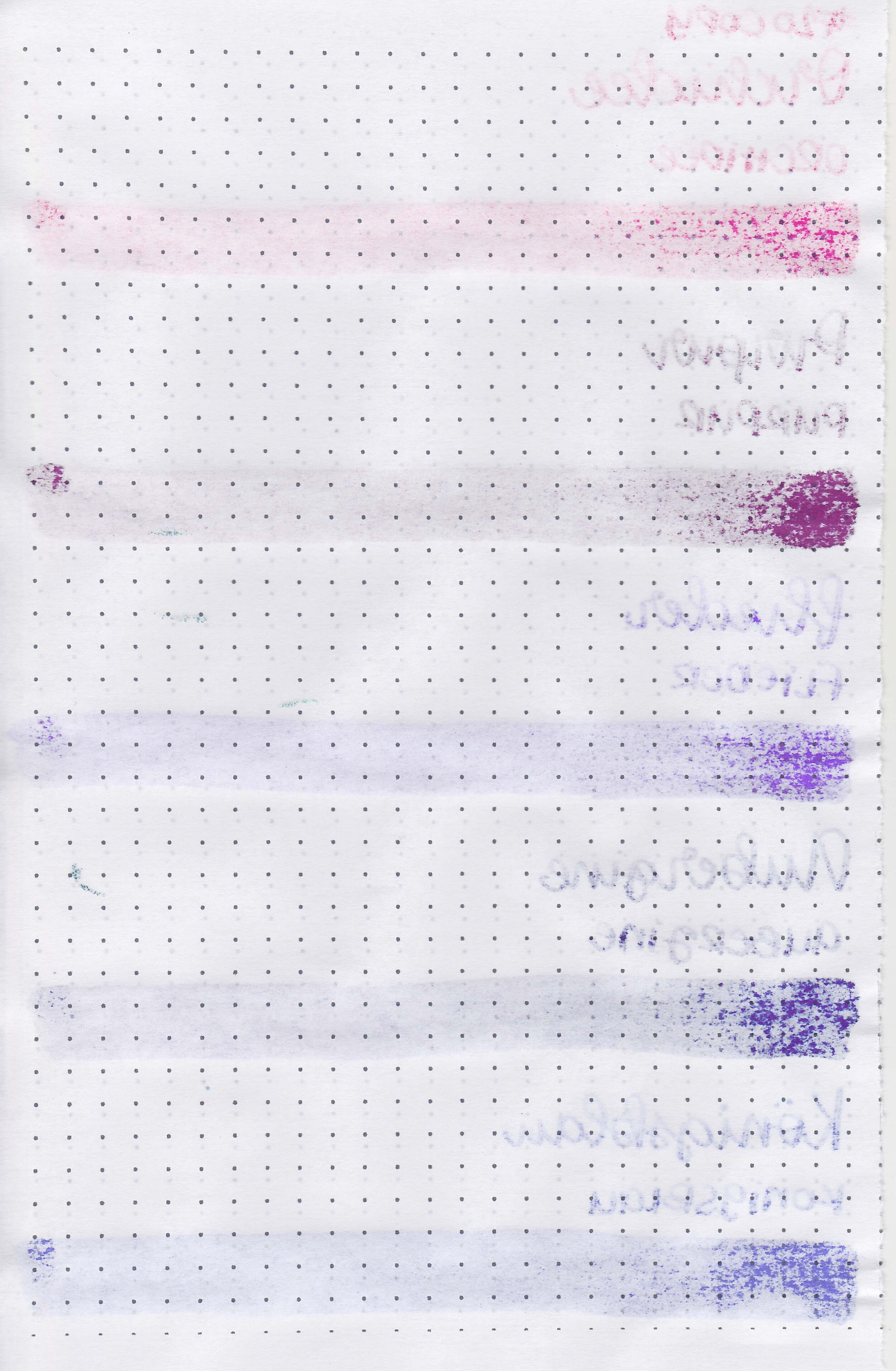
Let’s take a look at the last set of Octopus Fluids inks: Orchidee, Purpur, Flieder, Aubergine, Konigsblau. Thanks to Octopus Fluids for sending these inks over for review!
Left to right: Orchidee, Purpur, Flieder, Aubergine, Königsblau.

Ink drops:
Purpur, Flieder and Aubergine all have a little bit of sheen.
Dry Time:
All five inks dried in 10-50 seconds.

Water Resistance:
All have medium water resistance.
Let's take a look at how the ink behaves on fountain pen friendly papers: Rhodia, Tomoe River, and Leuchtturm.
Feathering: Medium
Show through: Medium
Bleeding: Medium
Other properties: low-medium shading, Purpur and Flieder have tiny sheen and Aubergine has low sheen and no shimmer.
On Staples 24 lb copy paper there was lots of feathering in every nib size as well as some bleeding.

Orchidee is closest to Graf von Faber-castell Electric Pink.

Purpur is closest to Pilot Iroshizuku Yama-budo.

Flieder is closest to Diamine Violet.

Aubergine is closest to Diamine Imperial Purple.

Konigsblau is closest to Cross Blue.


I used a Taroko Enigma notebook. All of the inks had an average flow except Aubergine which had a wet flow.
Overall, out of the five Aubergine is my favorite, but all five colors look great. Unfortunately, like a lot of the other Octopus Fluids inks I’ve tried they all have more feathering and bleeding than I prefer.
Disclaimer: These inks were provided by Octopus Fluids for the purpose of this review. All photos and opinions are my own. This page does not contain affiliate links, and is not sponsored in any way.

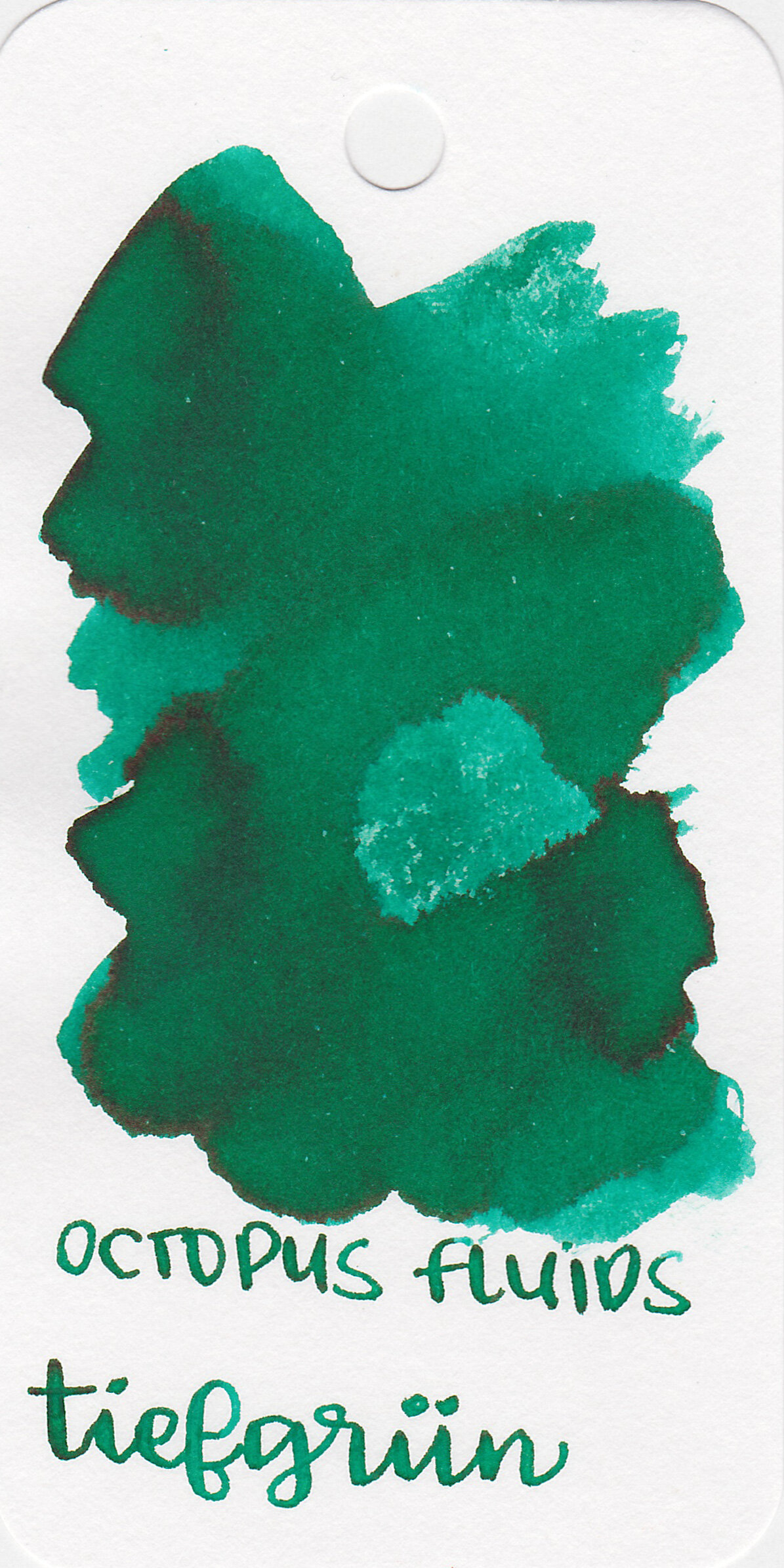
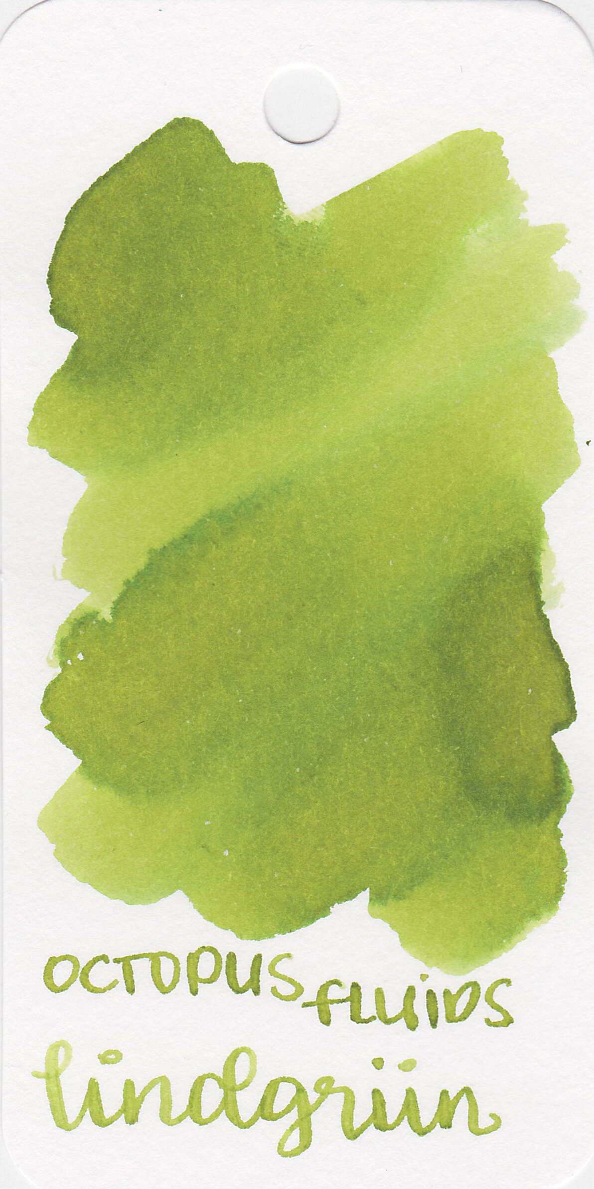
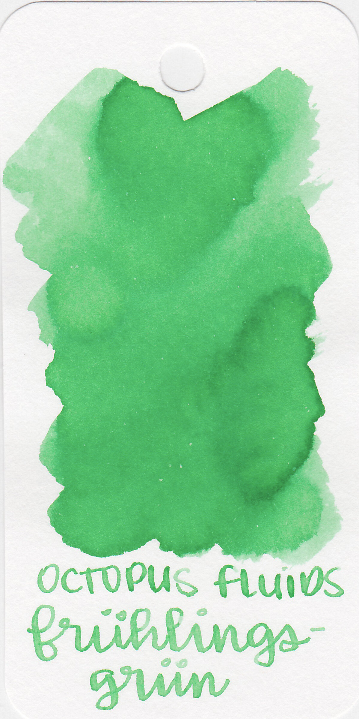
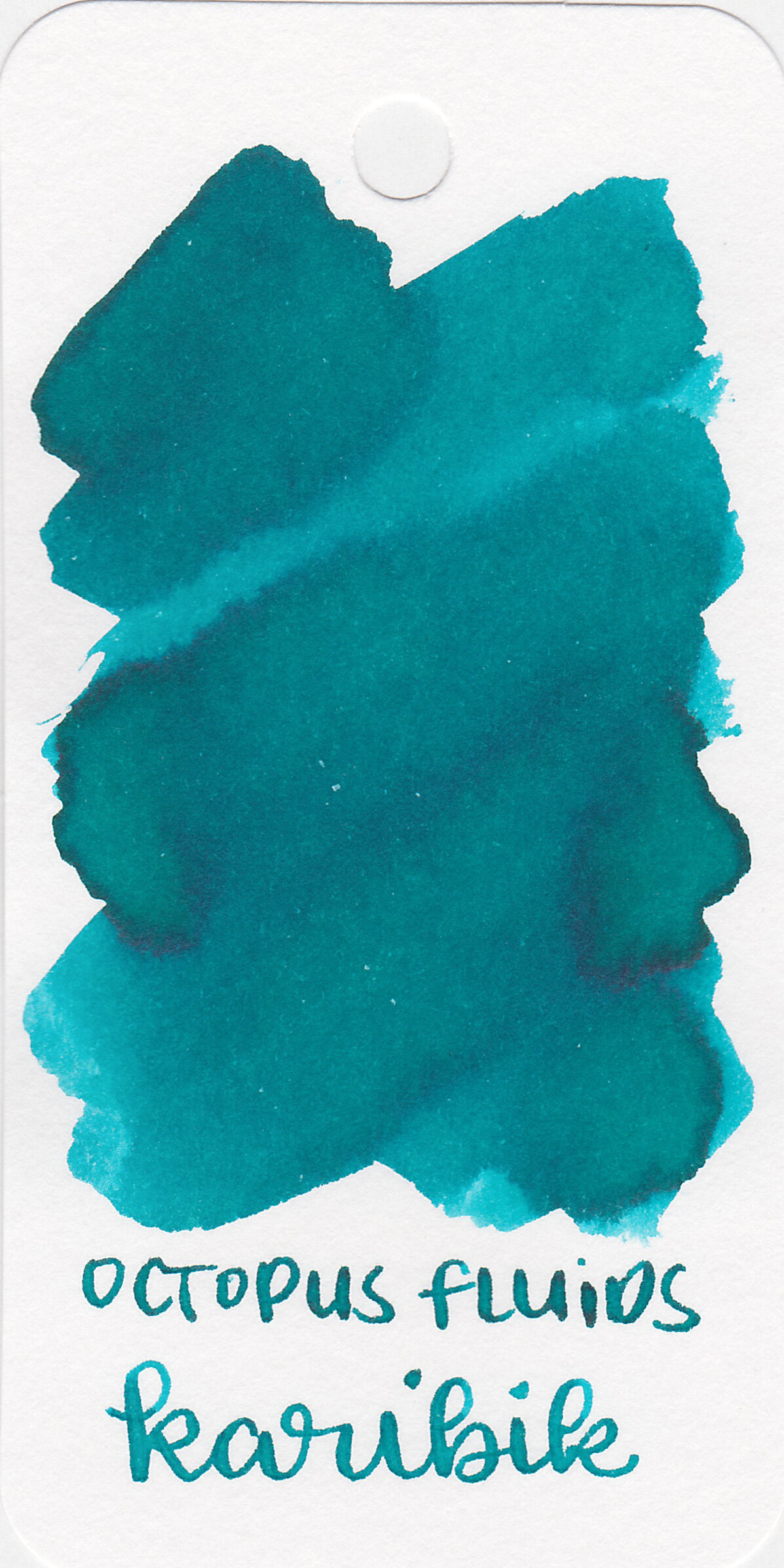
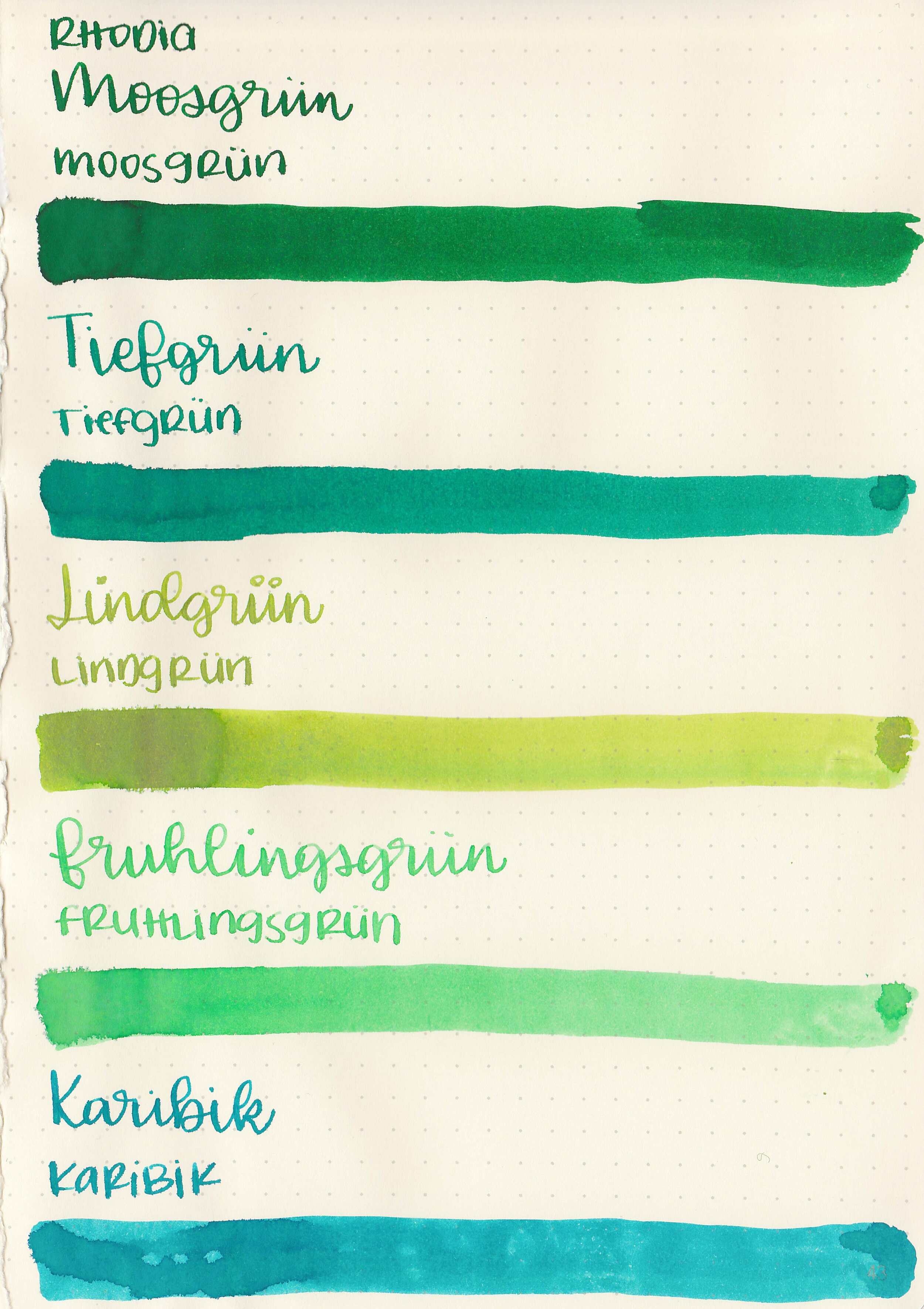
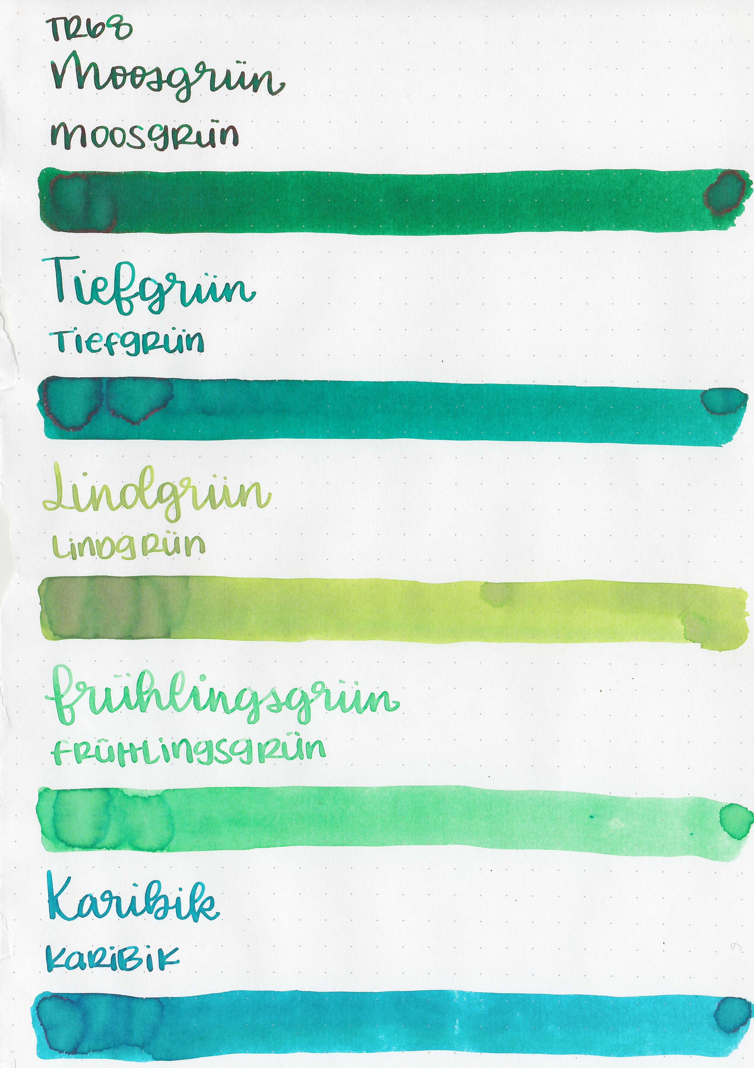
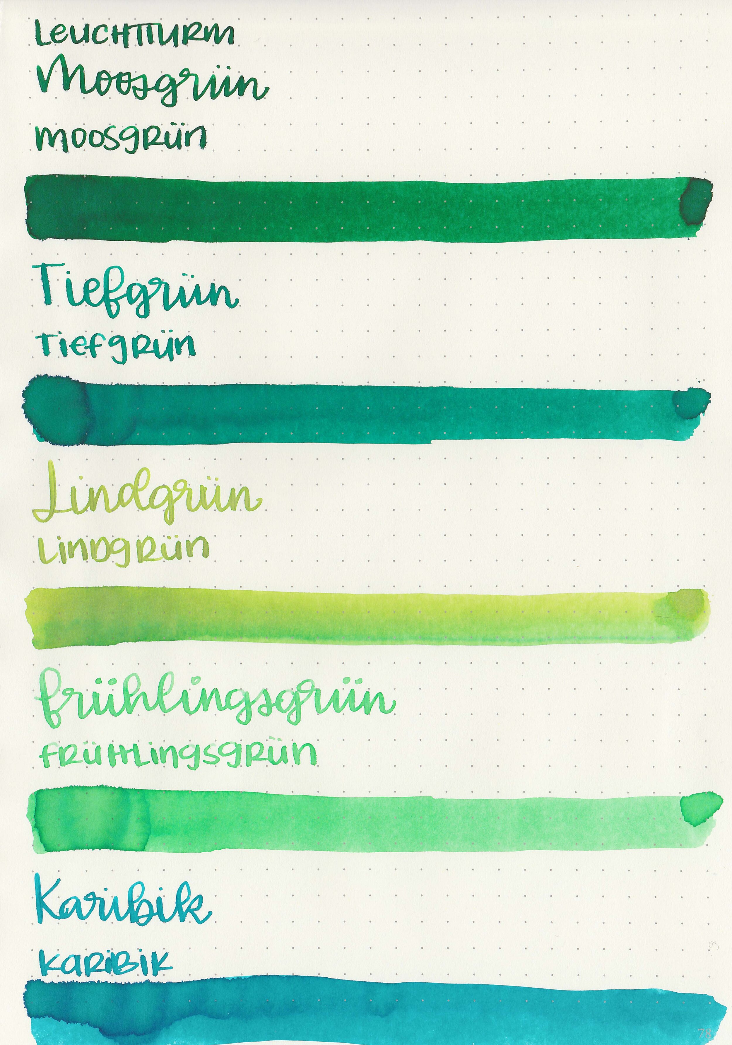
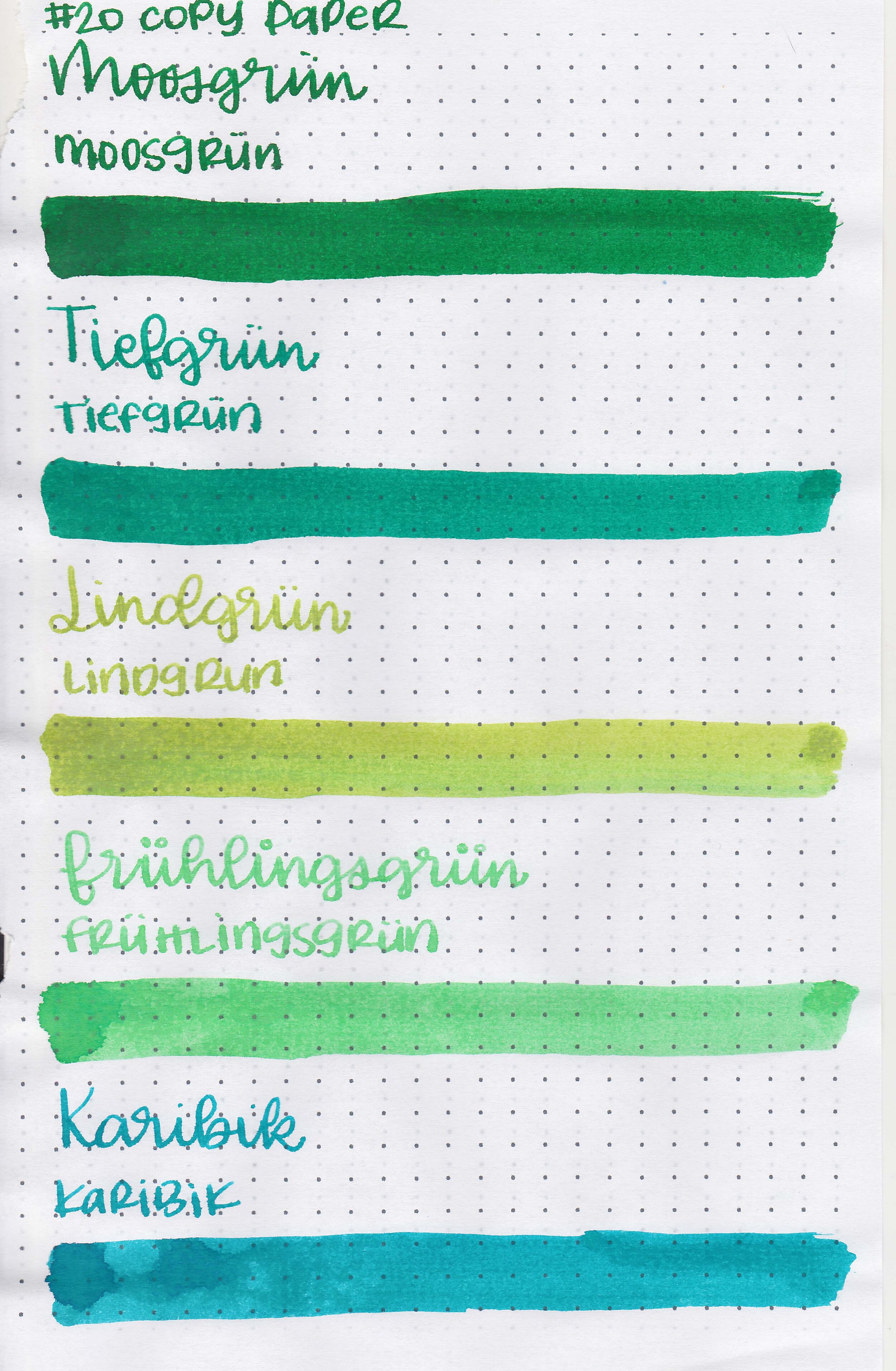
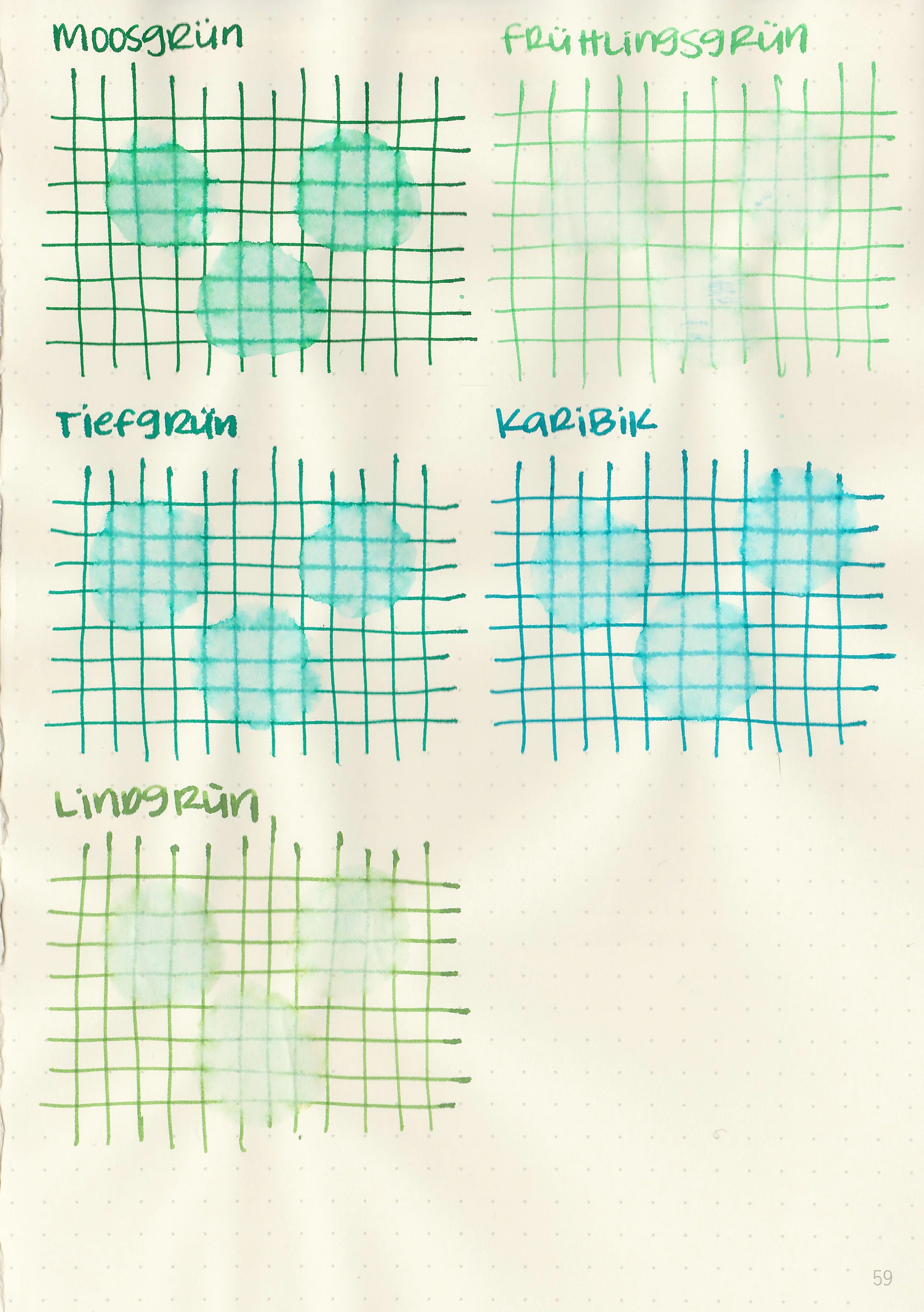
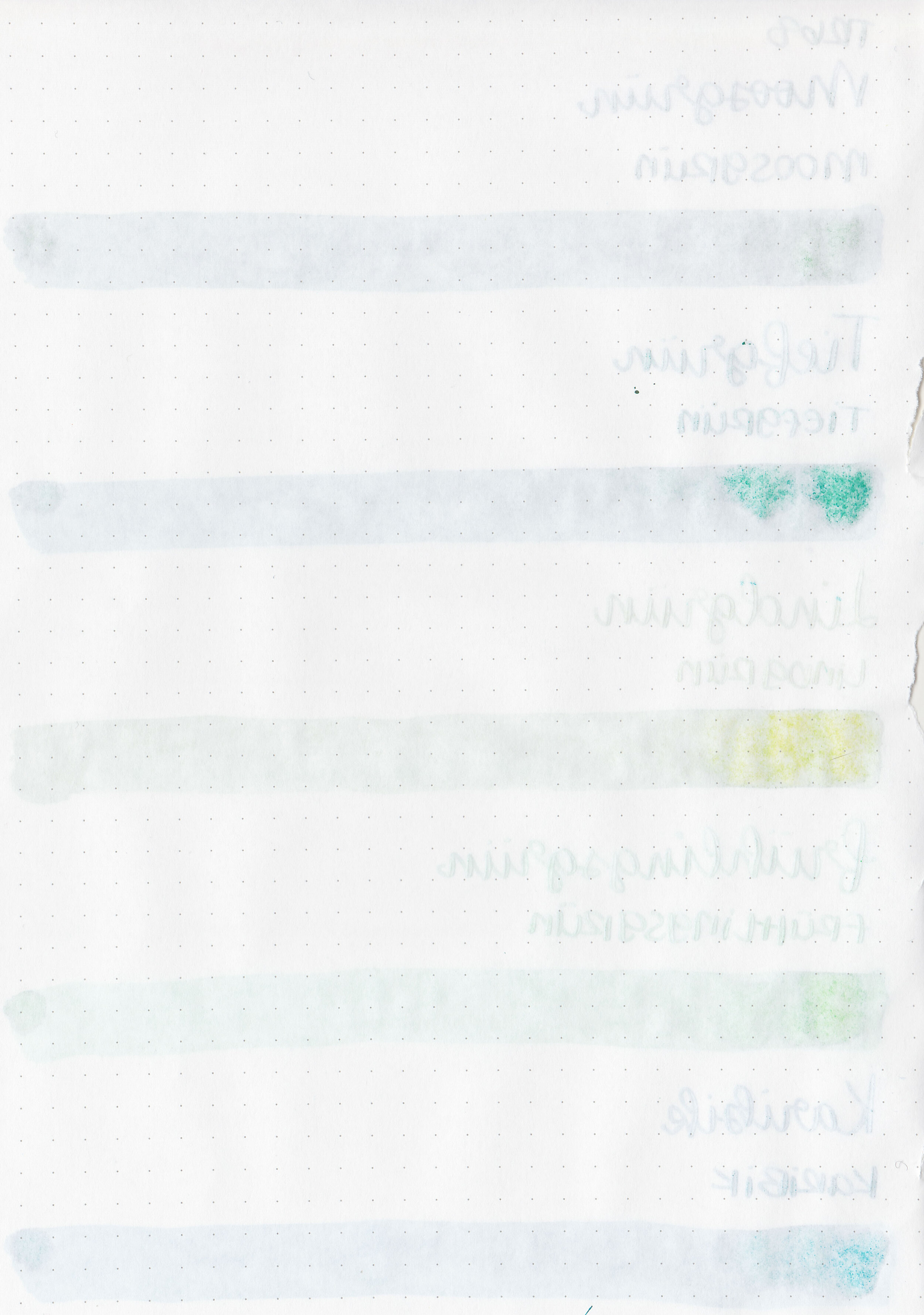
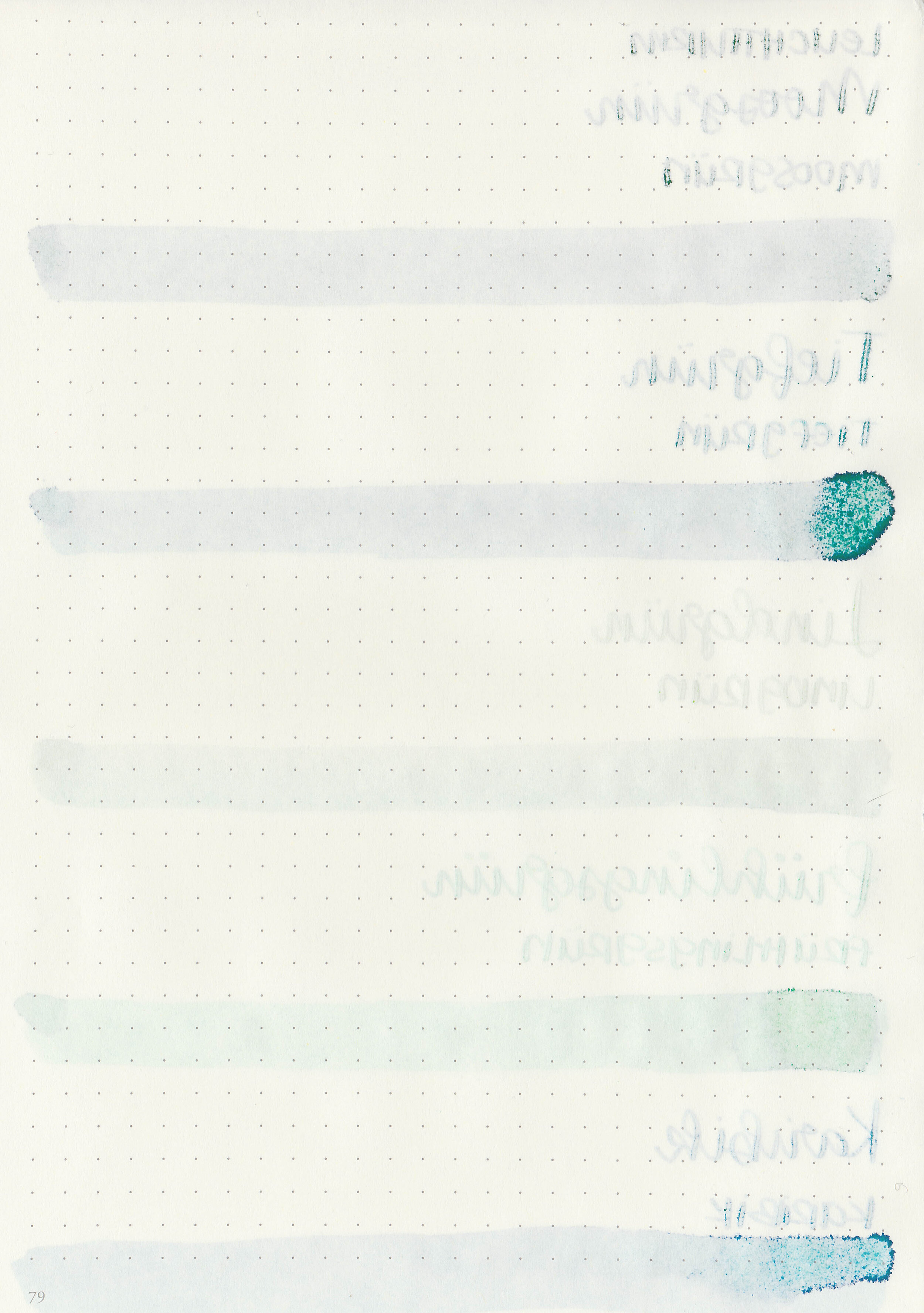
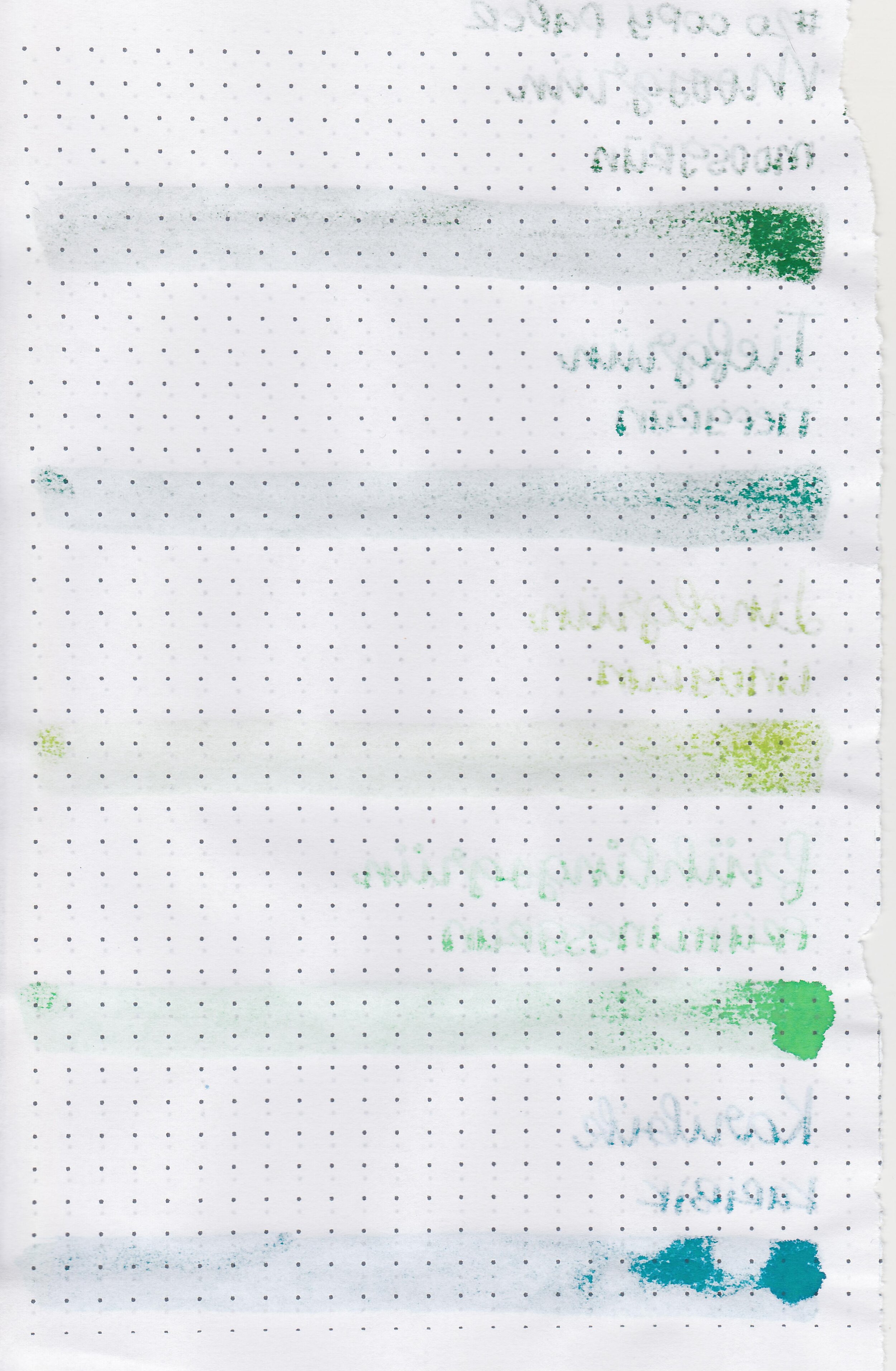
Let’s take a look at the next set of Octopus Fluids inks: Moosgrun, Tiefgrun, Lindgrun, Fruhlingsgrun and Karibik. Thanks to Octopus Fluids for sending these inks over for review!
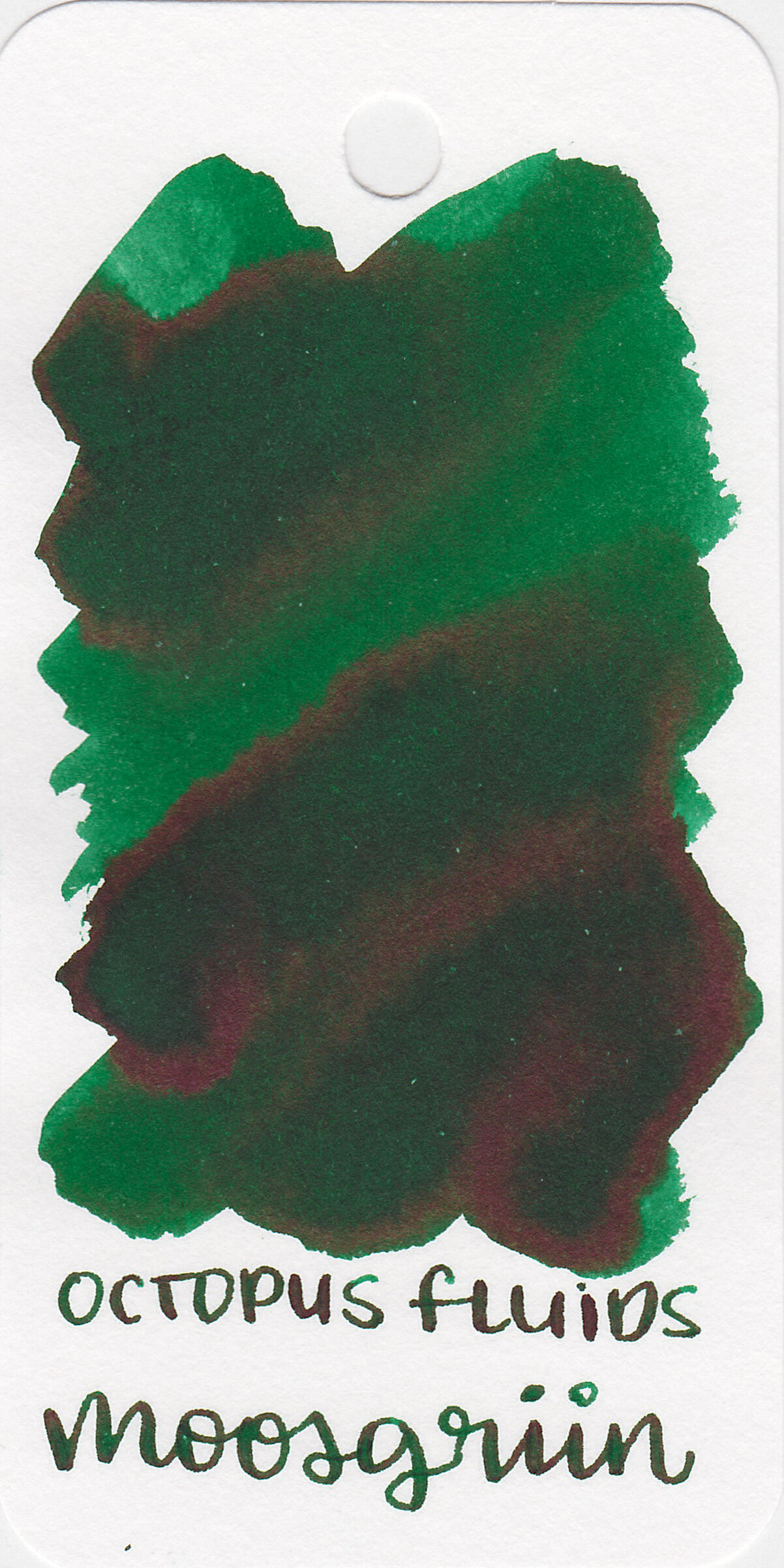
Left to right: Moosgrun, Tiefgrun, Lindgrun, Fruhlingsgrun and Karibik.

Ink drops:
Moosgrun and Tiefgrun both have a little bit of red sheen.

Dry Time:
All five inks dried in 5-10 seconds.
Water Resistance:
All have medium water resistance.
Let's take a look at how the ink behaves on fountain pen friendly papers: Rhodia, Tomoe River, and Leuchtturm.
Feathering: Medium
Show through: Medium
Bleeding: Medium
Other properties: low-medium shading, no sheen except Moosgrun and Tiefgrun and no shimmer.
On Staples 24 lb copy paper there was lots of feathering in every nib size as well as some bleeding.

Moosgrun is closest to Diamine Sherwood Green.

Tiefgrun is closest to Ink Institute Songshan-xindian Line.

Lindgrun is closest to Pilot Iroshizuku Chiku-rin.

Fruhlingsgrun is a little bit lighter than Diamine Apple Glory.

Karibik is closest to Robert Oster Aqua.


I used a Taroko Enigma notebook. The first three inks had an average flow, the last two had a dry flow.
Overall, out of the five Karibik is my favorite color but I do wish the flow was a bit wetter. All five have a bit too much feathering and bleeding for me.
Disclaimer: These inks were provided by Octopus Fluids for the purpose of this review. All photos and opinions are my own. This page does not contain affiliate links, and is not sponsored in any way.

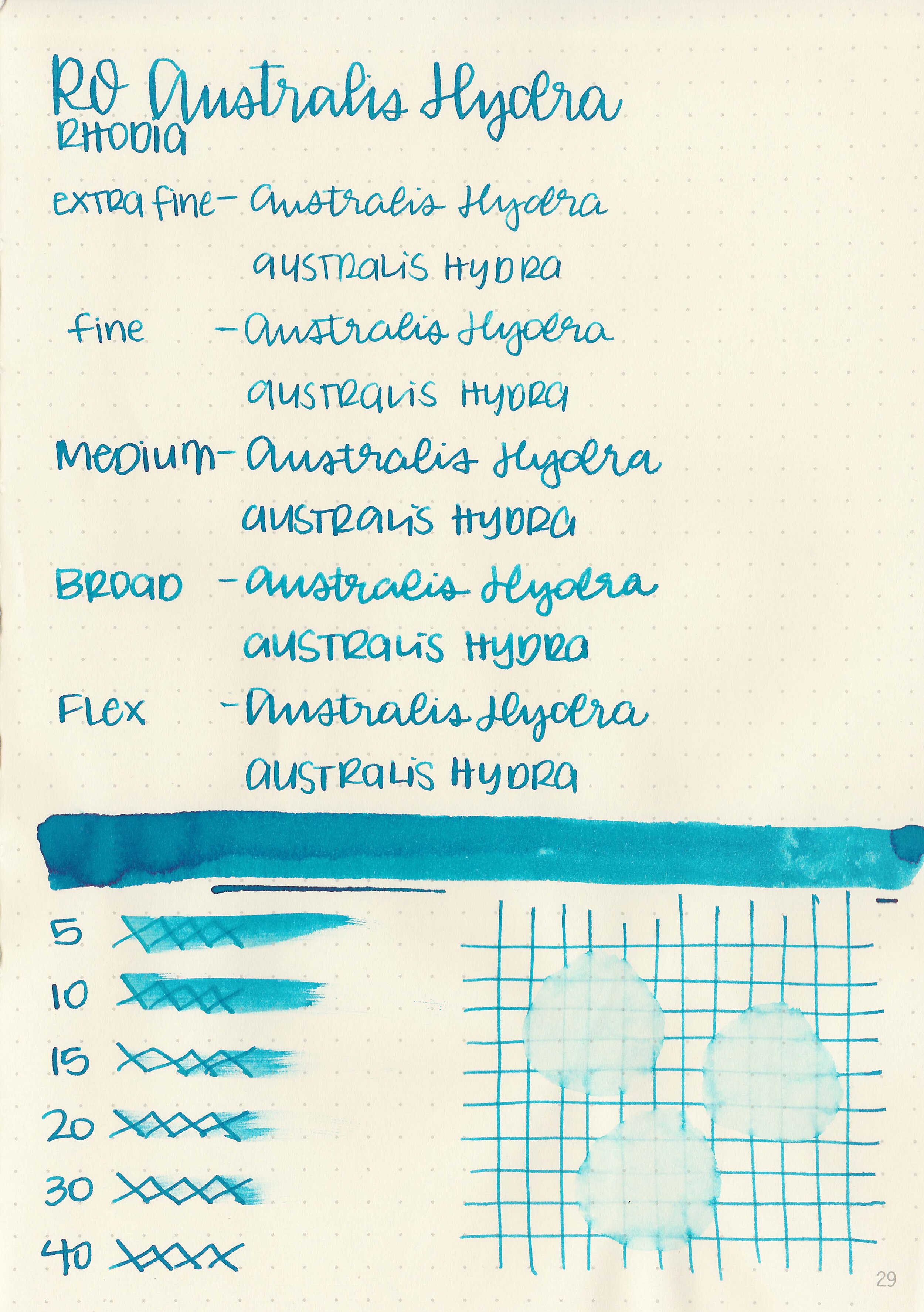
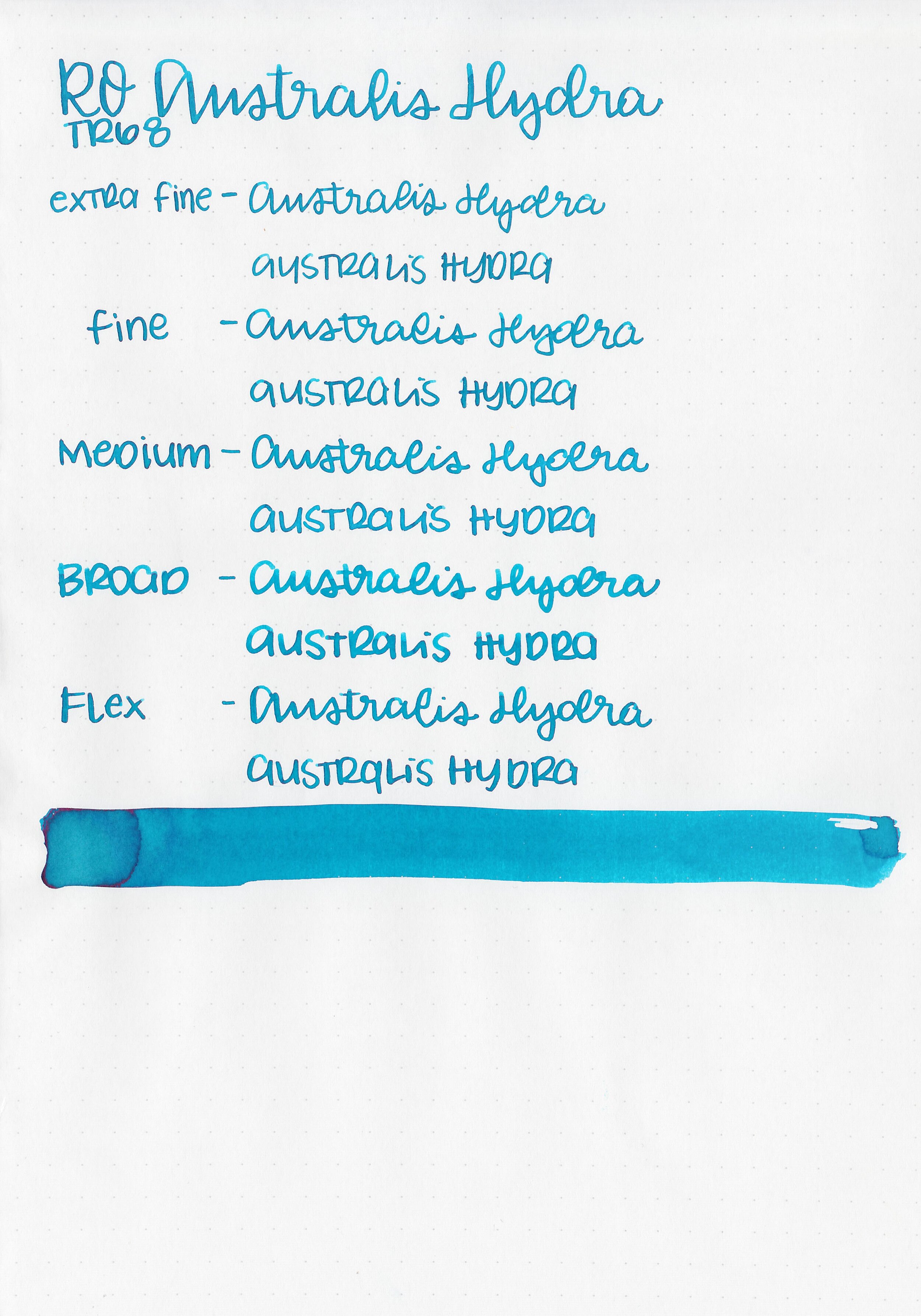
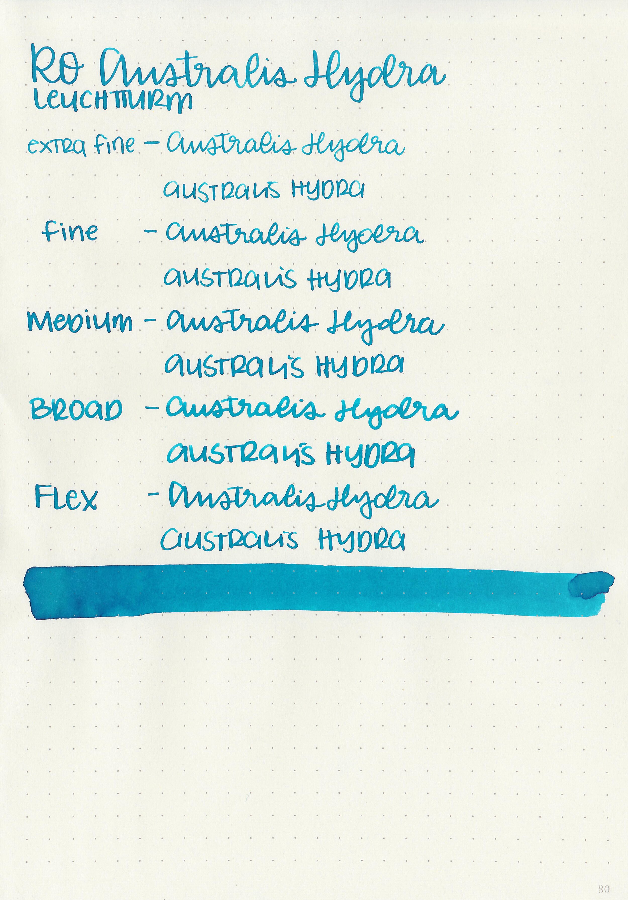
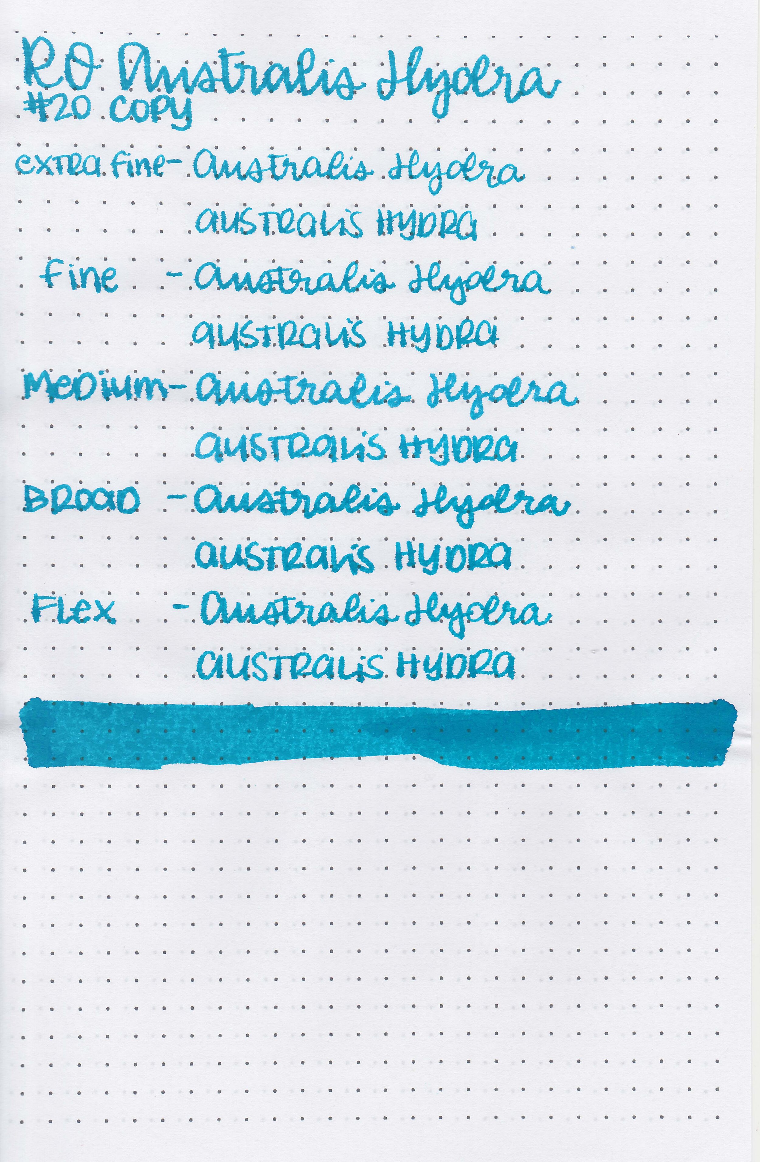
Robert Oster Australis Hydra is the last ink from the recent limited edition Australis collection. You can find this ink for sale at most retailers including Vanness Pens and Pen Chalet (aff. link).

The color:
Australis Hydra is a medium turquoise blue.

In large swabs on Tomoe River paper the ink has a little bit of pink sheen.

Let's take a look at how the ink behaves on fountain pen friendly papers: Rhodia, Tomoe River, and Leuchtturm.
Dry time: 40 seconds
Water resistance: Low
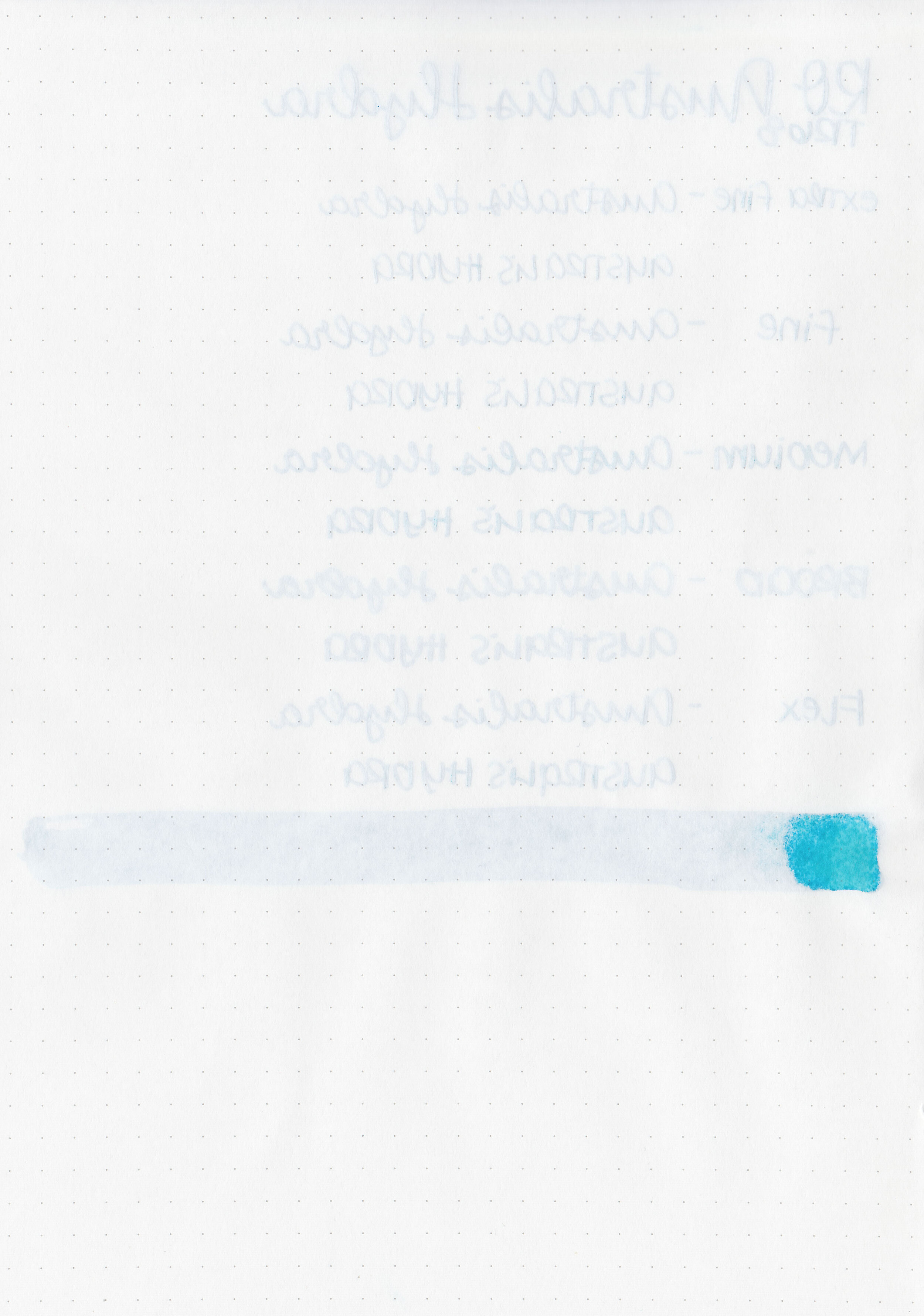
Feathering: None
Show through: Medium
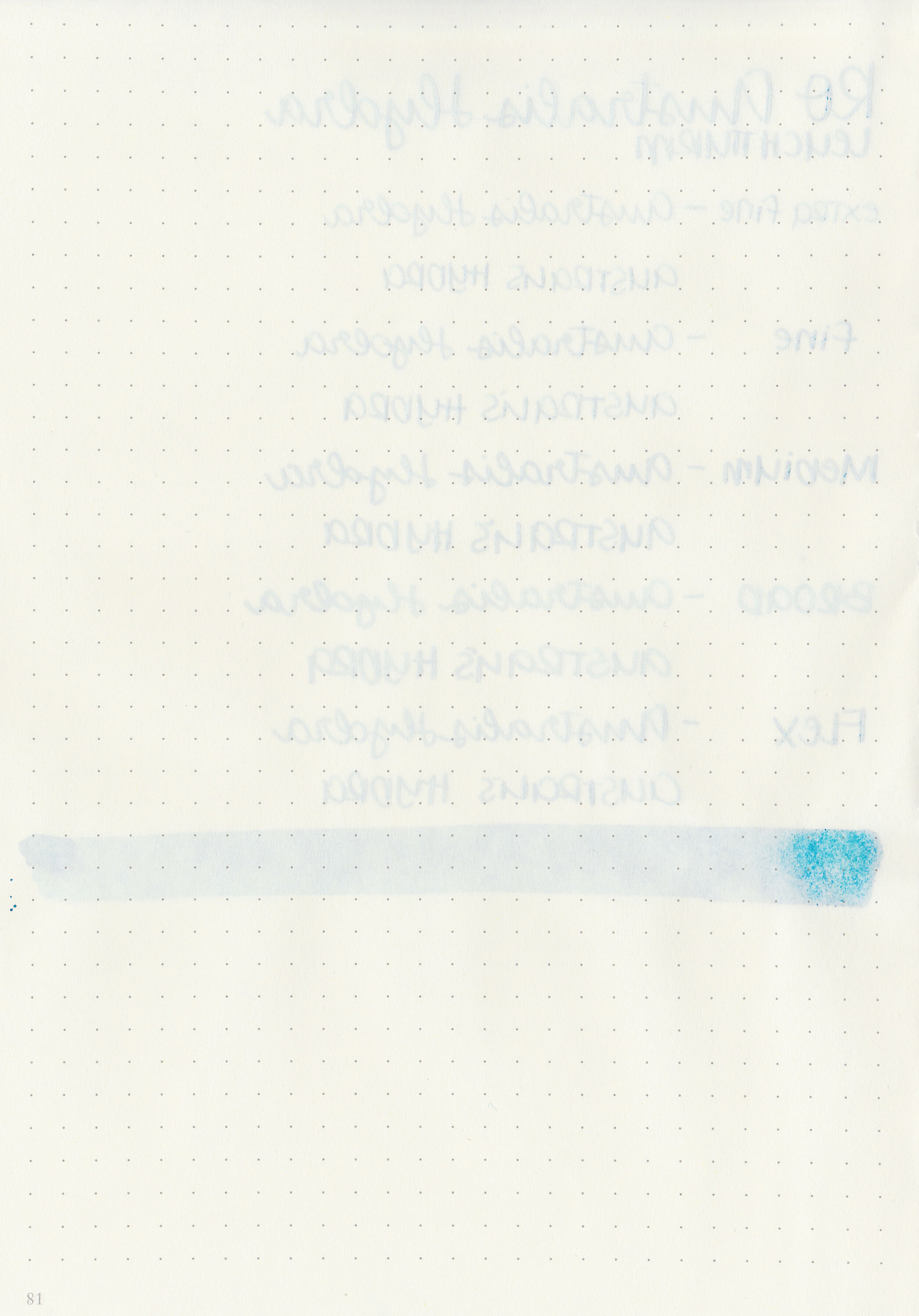
Bleeding: None
Other properties: medium shading, tiny sheen, and no shimmer.
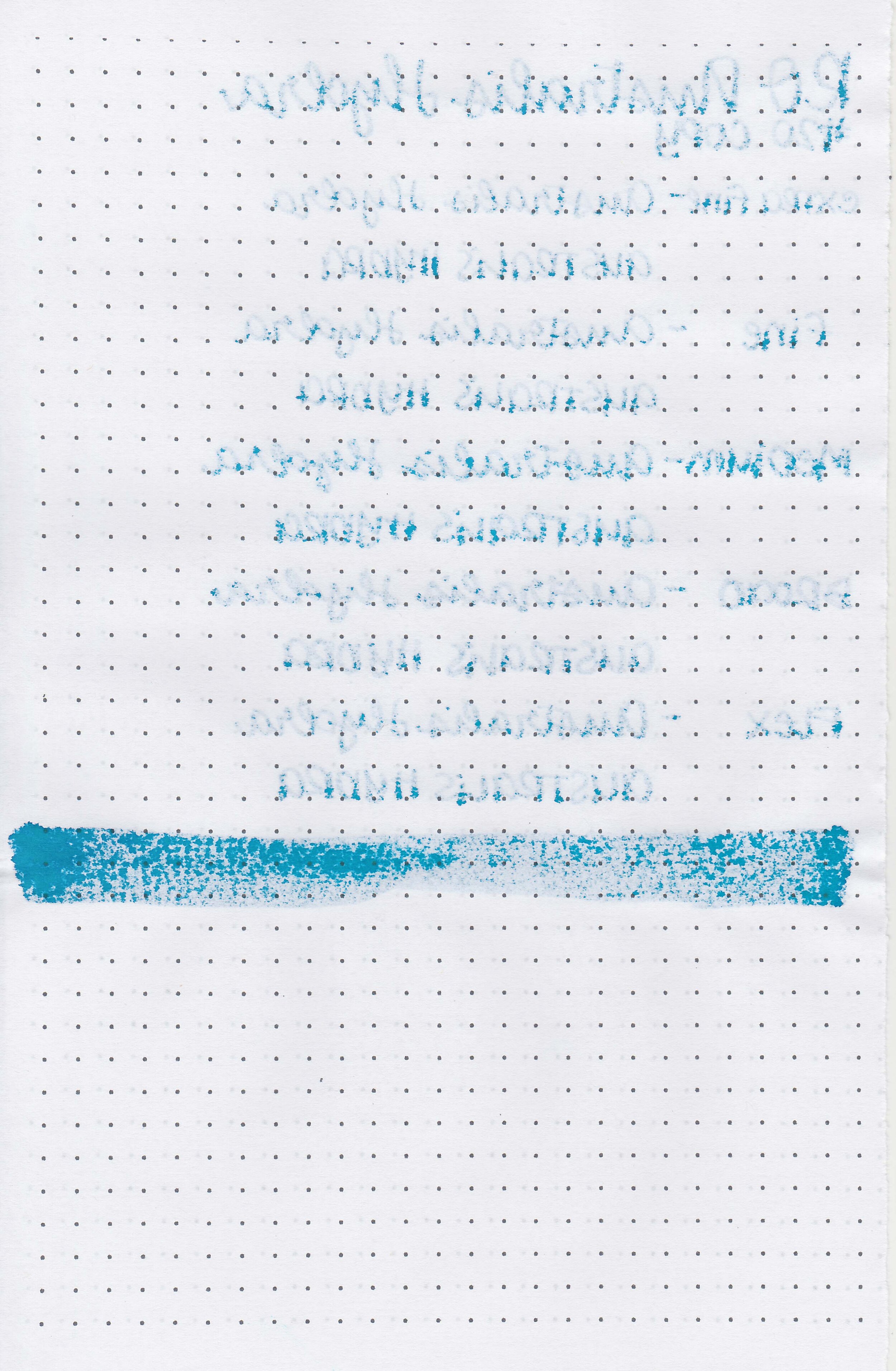
On Staples 24 lb copy paper there was some feathering and bleeding in all nib sizes.

Australis Hydra seems like a lighter version of Robert Oster Fire and Ice. Click here to see the Robert Oster inks together, and click here to see the blue inks together.

I used a Pelikan M805 Vibrant Blue with a broad nib on a Taroko Enigma notebook. The ink had an average flow.
Overall, this is a lovely blue ink. It’s a great option if you’ve been looking for a lighter version of Robert Oster Fire and Ice.
Disclaimer: All photos and opinions are my own. This page does contain affiliate links but this post is not sponsored in any way.

I put a poll up on my Instagram stories a few weeks ago, asking what content you wanted to see in 2021 and I had a few requests for ink mixing. I decided to try a faux Lamy Dark Lilac first. Lamy Dark Lilac (pictured above) seems to be one of those unicorn inks-it was released in 2016 and many of the ink-obsessed have been looking for a dupe ever since.
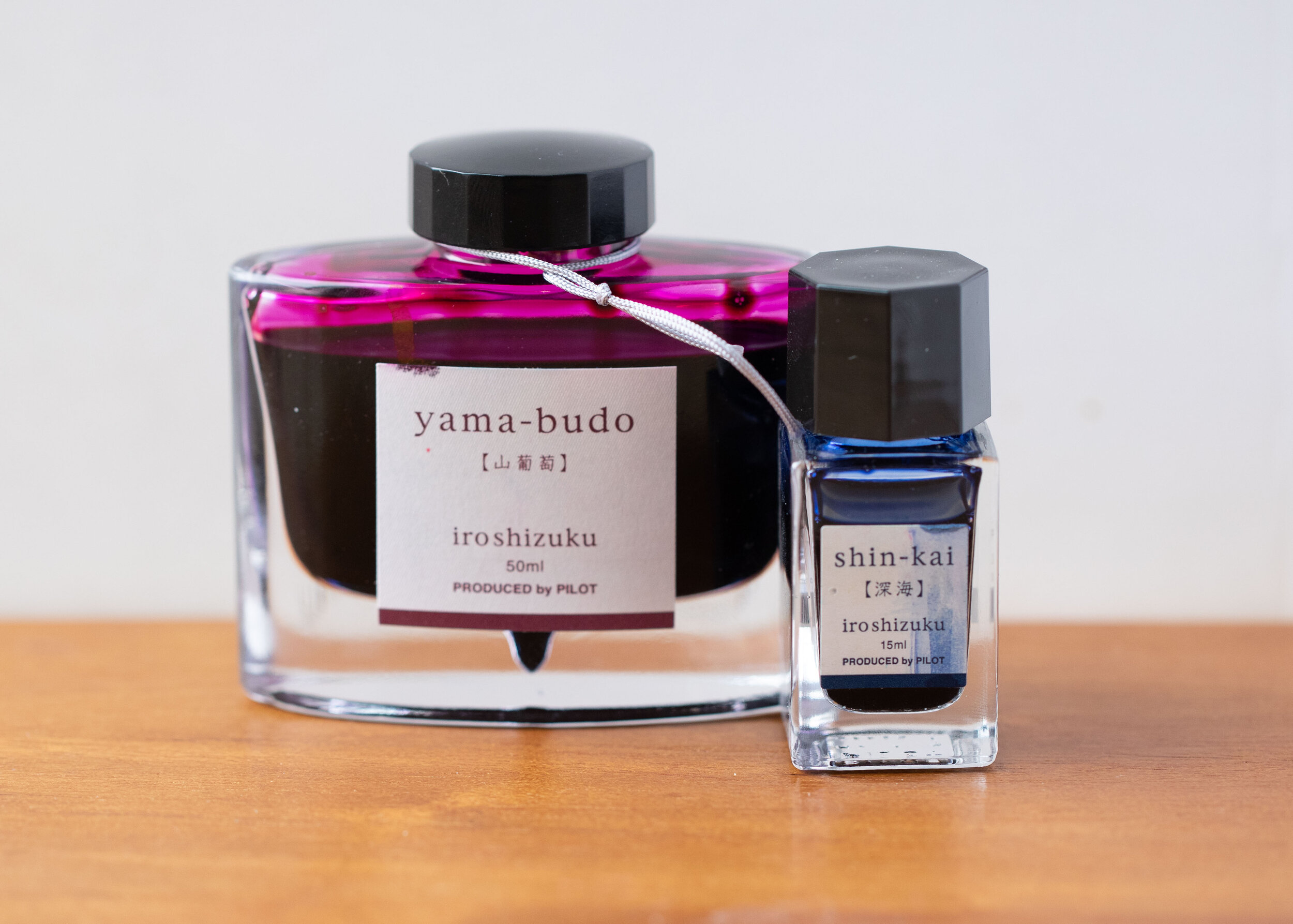
I looked all over the internet for recipes for a Dark Lilac dupe and this one came up the most: Pilot Iroshizuku Yama-budo paired with Pilot Iroshizuku Shin-kai.
I mixed up three different testers:
#1: 3 parts Yama-budo + 1 part Shin-kai
#2 2 parts Yama-budo + 1 part Shin-kai
#3 3 parts Yama-budo + 1 part Shin-kai + 1/2 part Robert Oster Fire & Ice

I tried out all three mixures but none lived up to Lamy Dark Lilac for me. I didn’t have any issues with the inks interacting together though, no funny consistencies or smells.

I still haven’t found the perfect recipe for mixing up a dupe, but there are a few inks out there that are similar already. Which one would you pick?
Disclaimer: All photos and opinions are my own. There are no affiliate links on this page and it is not sponsored in any way.

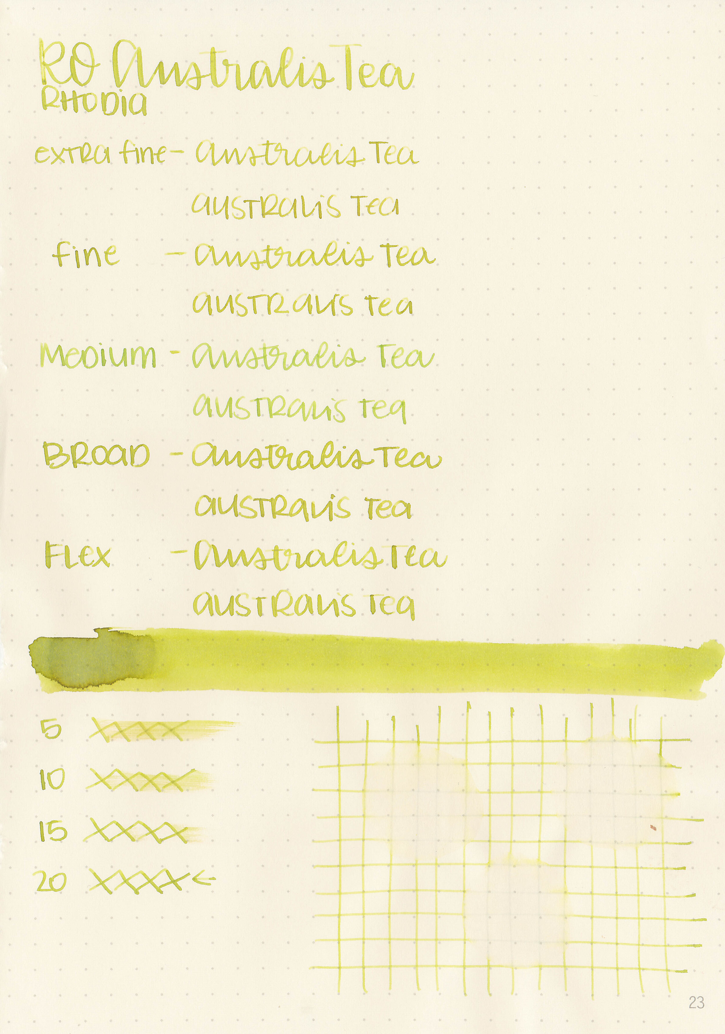
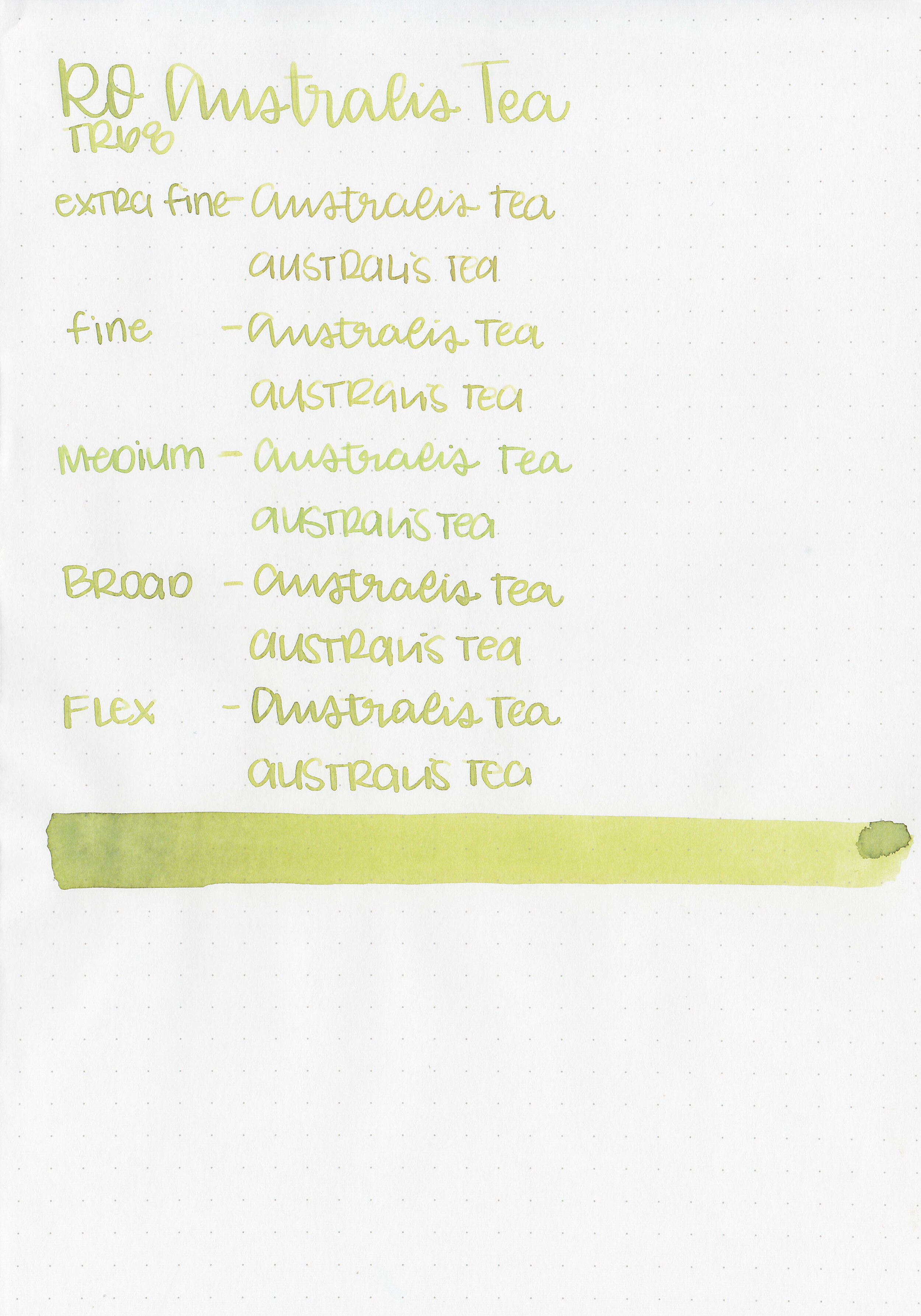
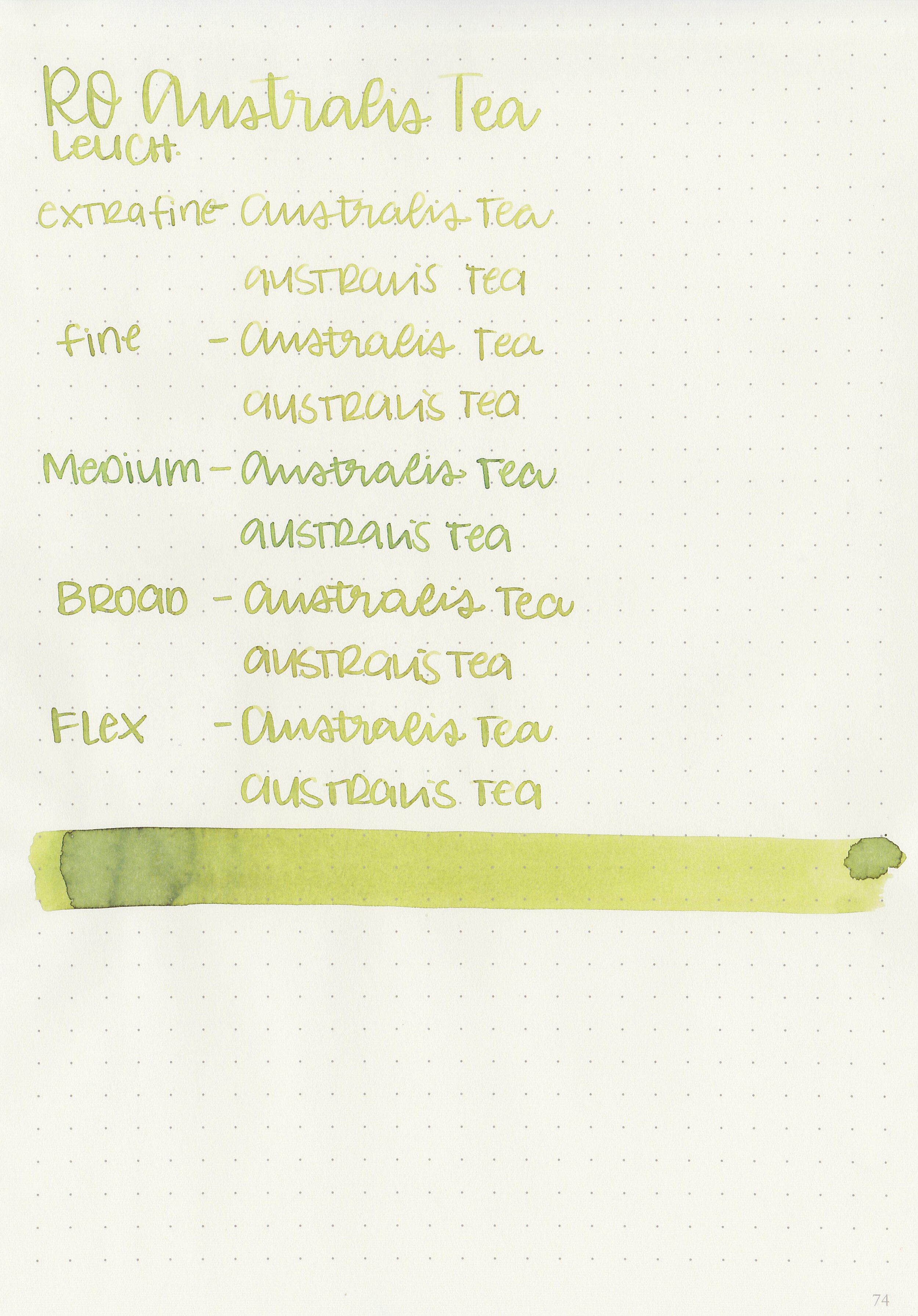
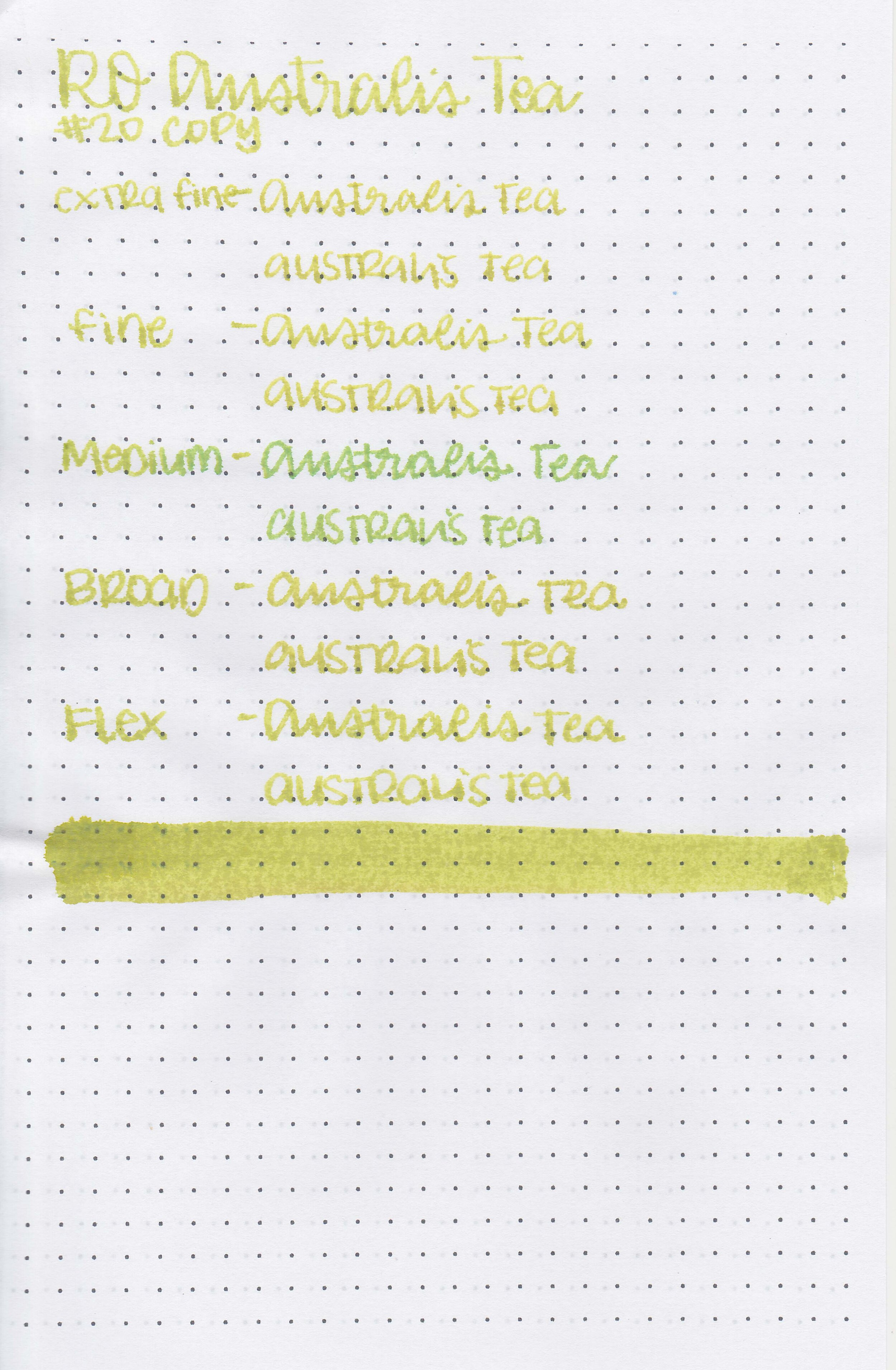
Robert Oster Australis Tea is from the recent limited edition Australis collection. You can find this ink for sale at most retailers including Vanness Pens and Pen Chalet (aff. link).

The color:
Australis Tea is a medium pistachio green.

In large swabs on Tomoe River paper the ink has some shading but no sheen.

Let's take a look at how the ink behaves on fountain pen friendly papers: Rhodia, Tomoe River, and Leuchtturm.

Dry time: 20 seconds
Water resistance: Low
Feathering: None
Show through: Medium
Bleeding: None
Other properties: medium shading, no sheen, and no shimmer.
On Staples 24 lb copy paper there was some feathering in all nib sizes as well as some bleeding.

Australis Tea has less yellow than Robert Oster Chartreuse but more yellow than Pilot Iroshizuku Chiku-rin. It’s also lighter that Rohrer & Klingner Alt-goldgrun. Click here to see the Robert Oster inks together, and click here to see the green inks together.

I used a Kaweco Sport Sage with a medium nib on a Taroko Enigma notebook. The ink had a dry flow.
Overall, I don’t have a good dupe for this one which is great, but it is a bit too dry for me. It’s also a bit pale for me in the smaller nib sizes so this is not a must-have for me.
Disclaimer: All photos and opinions are my own. This page does contain affiliate links but this post is not sponsored in any way.

I had a request recently for a new comparison of Robert Oster blues, so I grabbed every RO blue ink currently in my desk (I don't know what that says about me that I was able to quickly come up with 25...) and started swabbing. I included Monsoon Sky, the newest ink I got and haven't even swabbed yet, but I feel like it's more green than the blue it shows on the bottle lid. Anyway, my top 5 RO blues: Blue Water Ice, Soda Pop Blue, Grey Seas, Evening Sapphire and Fire & Ice. Keep in mind that if you ask me tomorrow my answer will probably be different. What's your #1 favorite RO blue ink?

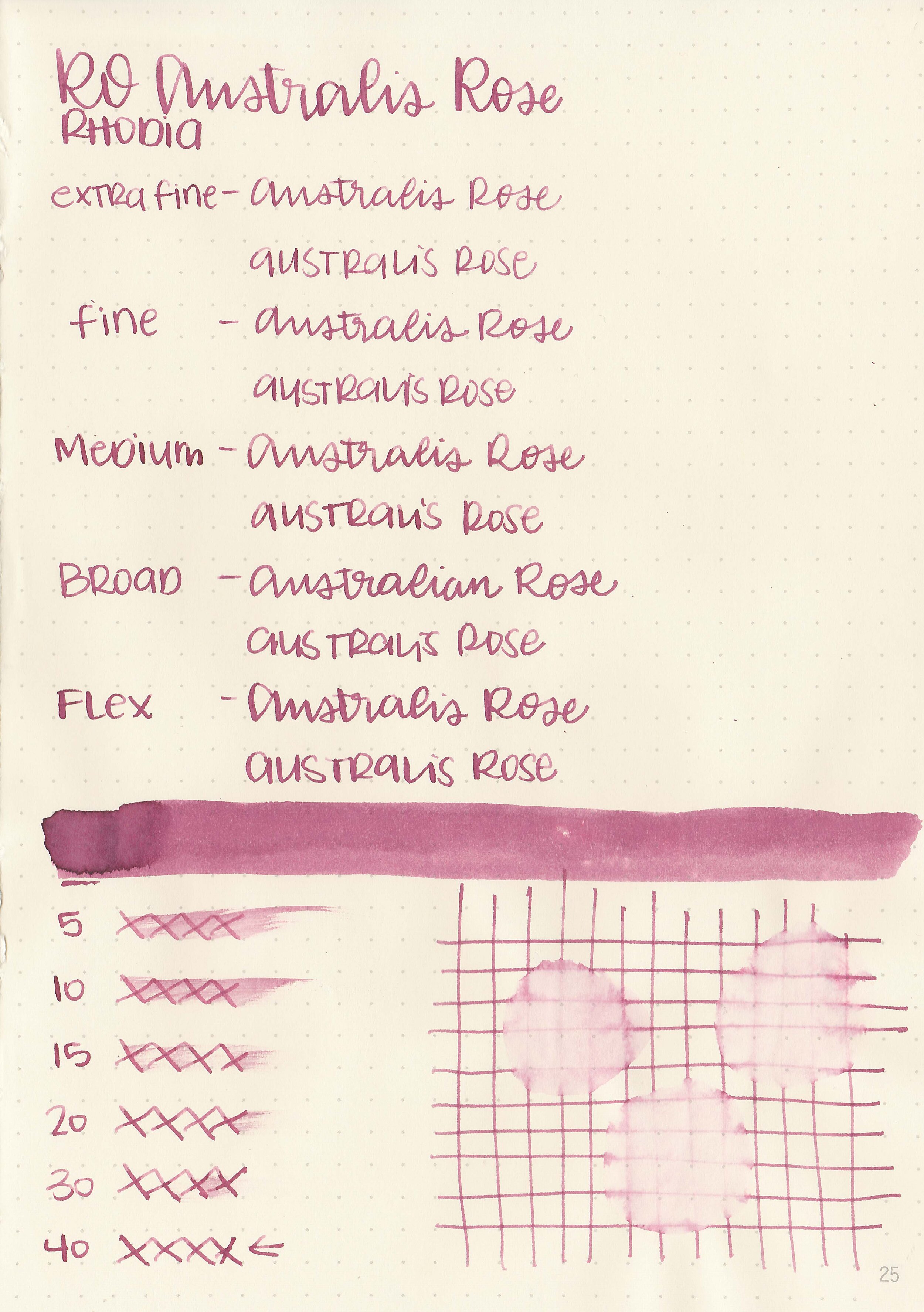
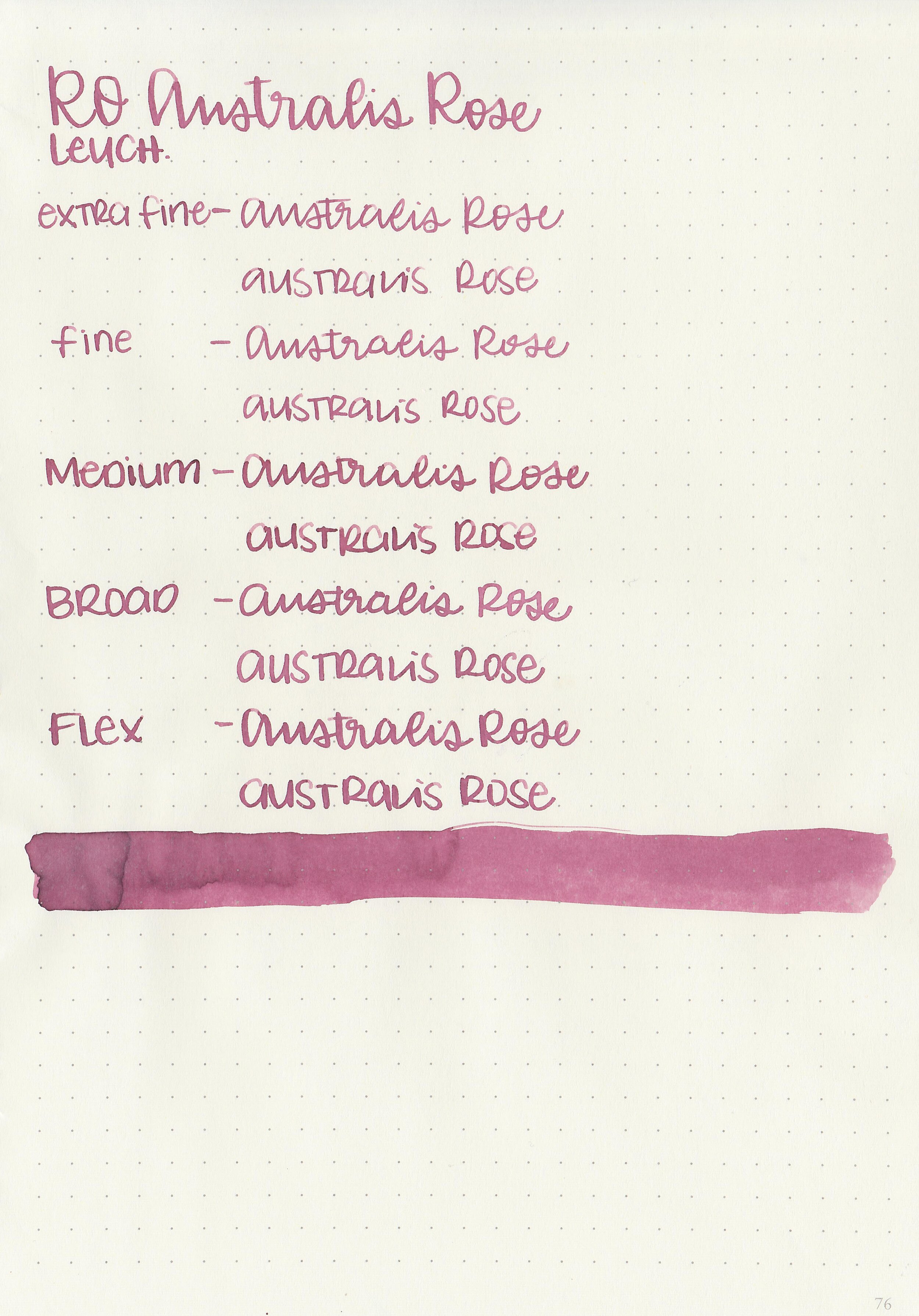
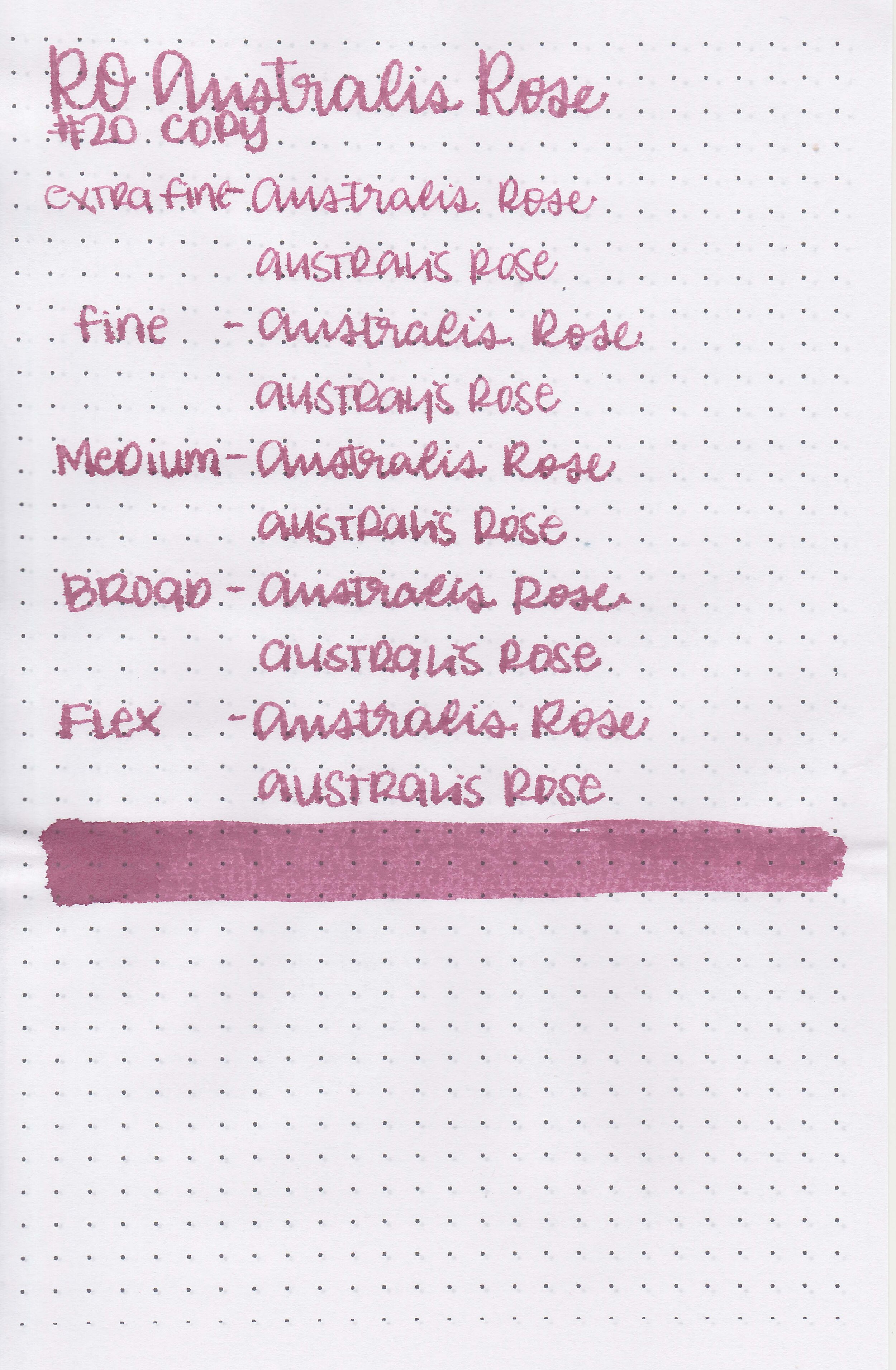
Robert Oster Australis Rose is from the recent limited edition Australis collection. You can find this ink for sale at most retailers including Vanness Pens and Pen Chalet (aff. link).

The color:
Australis Rose is a medium dusky rose pink.
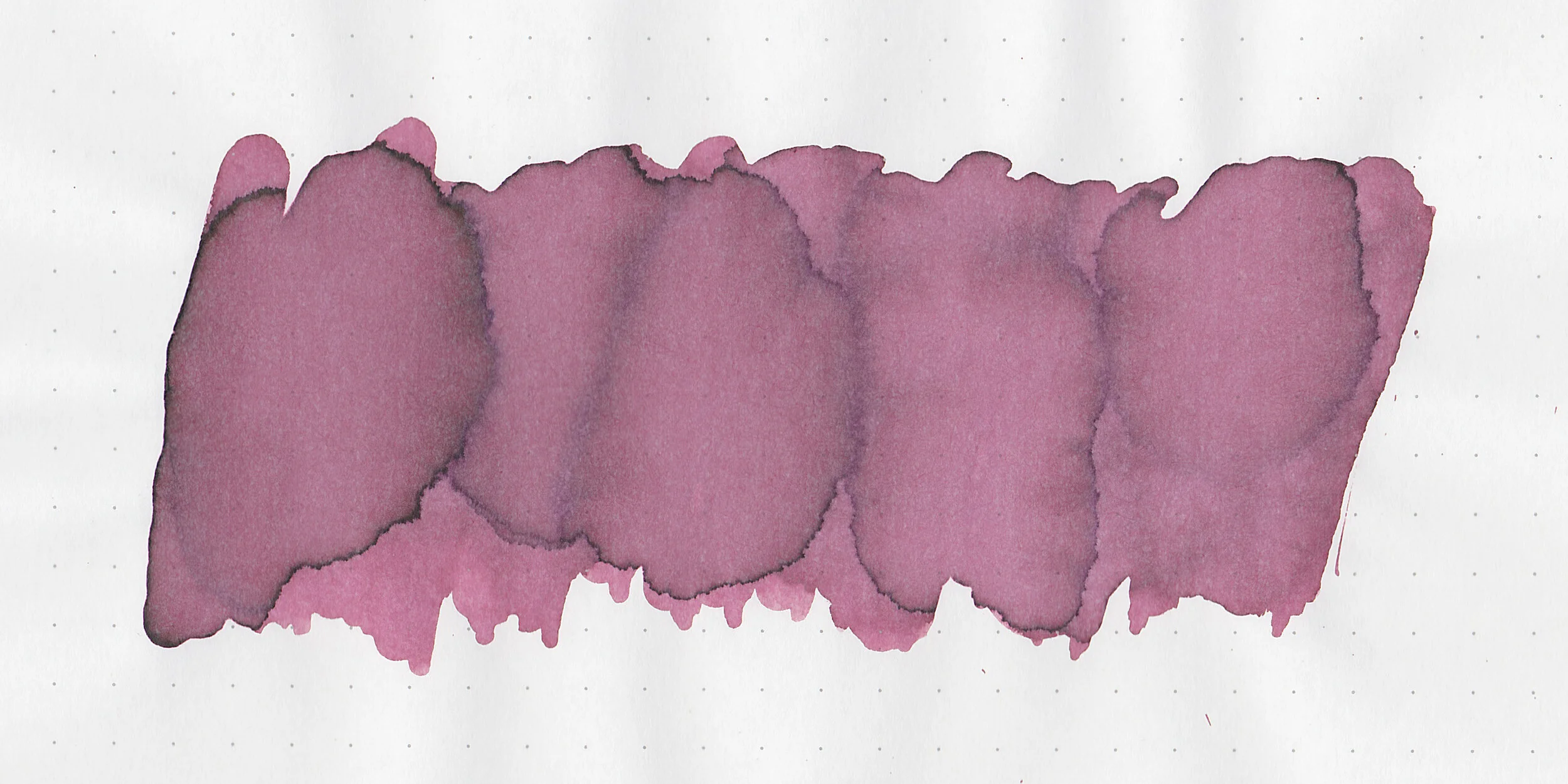
In large swabs on Tomoe River paper the ink has some shading but no sheen.

Let's take a look at how the ink behaves on fountain pen friendly papers: Rhodia, Tomoe River, and Leuchtturm.
Dry time: 40 seconds
Water resistance: Low
Feathering: Low
Show through: Medium
Bleeding: None
Other properties: medium shading, no sheen, and no shimmer.

On Staples 24 lb copy paper there was some feathering in all nib sizes.

Australis Oak is lighter than Robert Oster Plumb Nut. Click here to see the Robert Oster inks together, and click here to see the pink inks together.
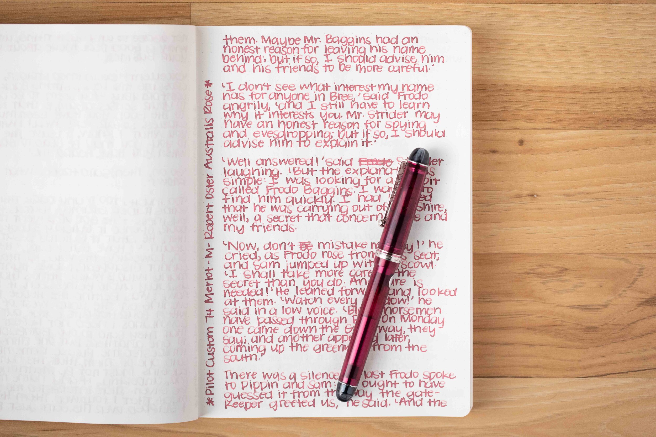
I used a Pilot Custom 74 Merlot with a medium nib on a Taroko Enigma notebook. The ink had a dry flow.
Overall, this ink fits right in-between Robert Oster Plumb Nut and Robert Oster Cherry Blossom. I think I’m partial to this ink just because it’s the color my grandma used to wear on her nails.
Disclaimer: All photos and opinions are my own. This page does contain affiliate links but this post is not sponsored in any way.

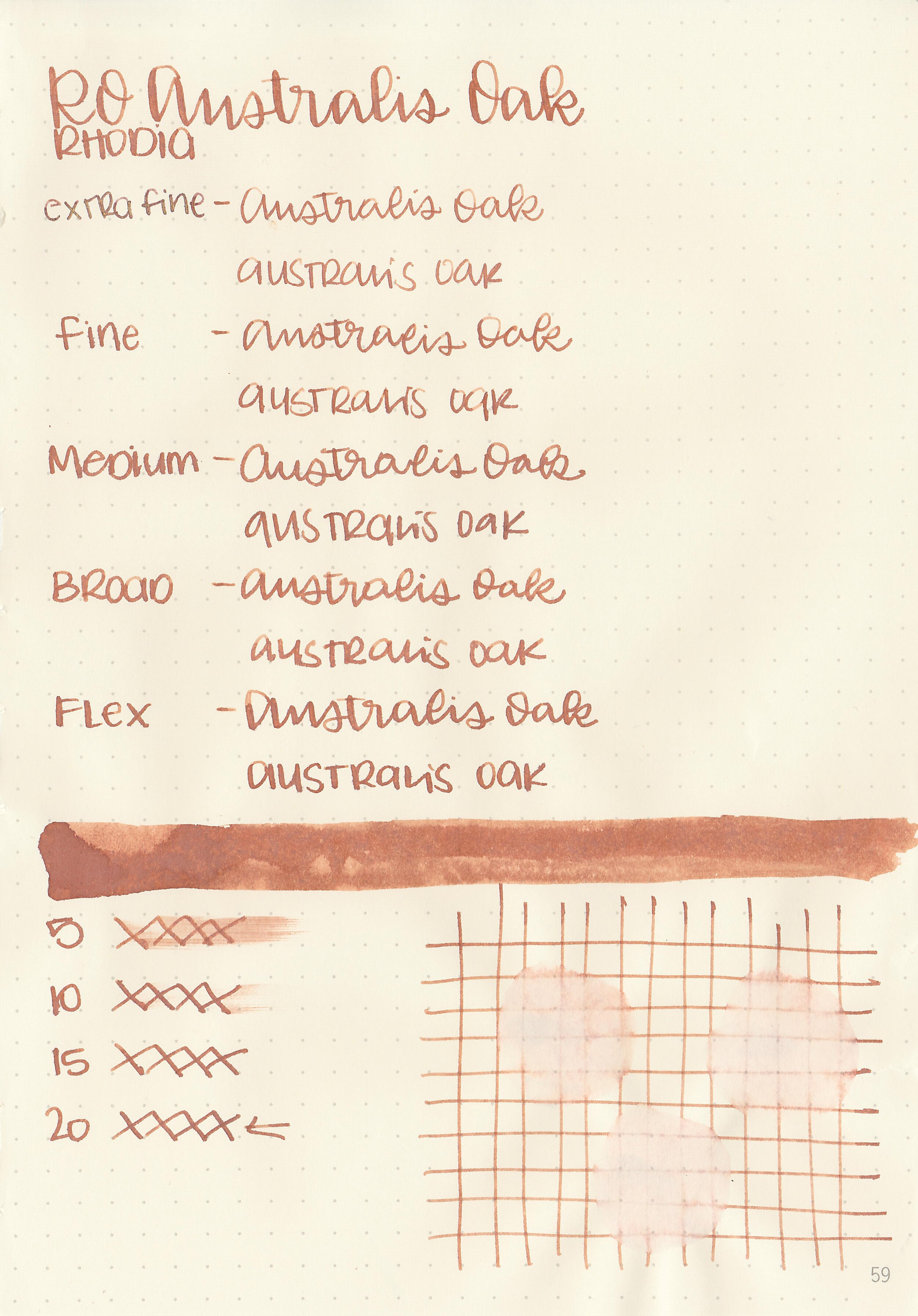
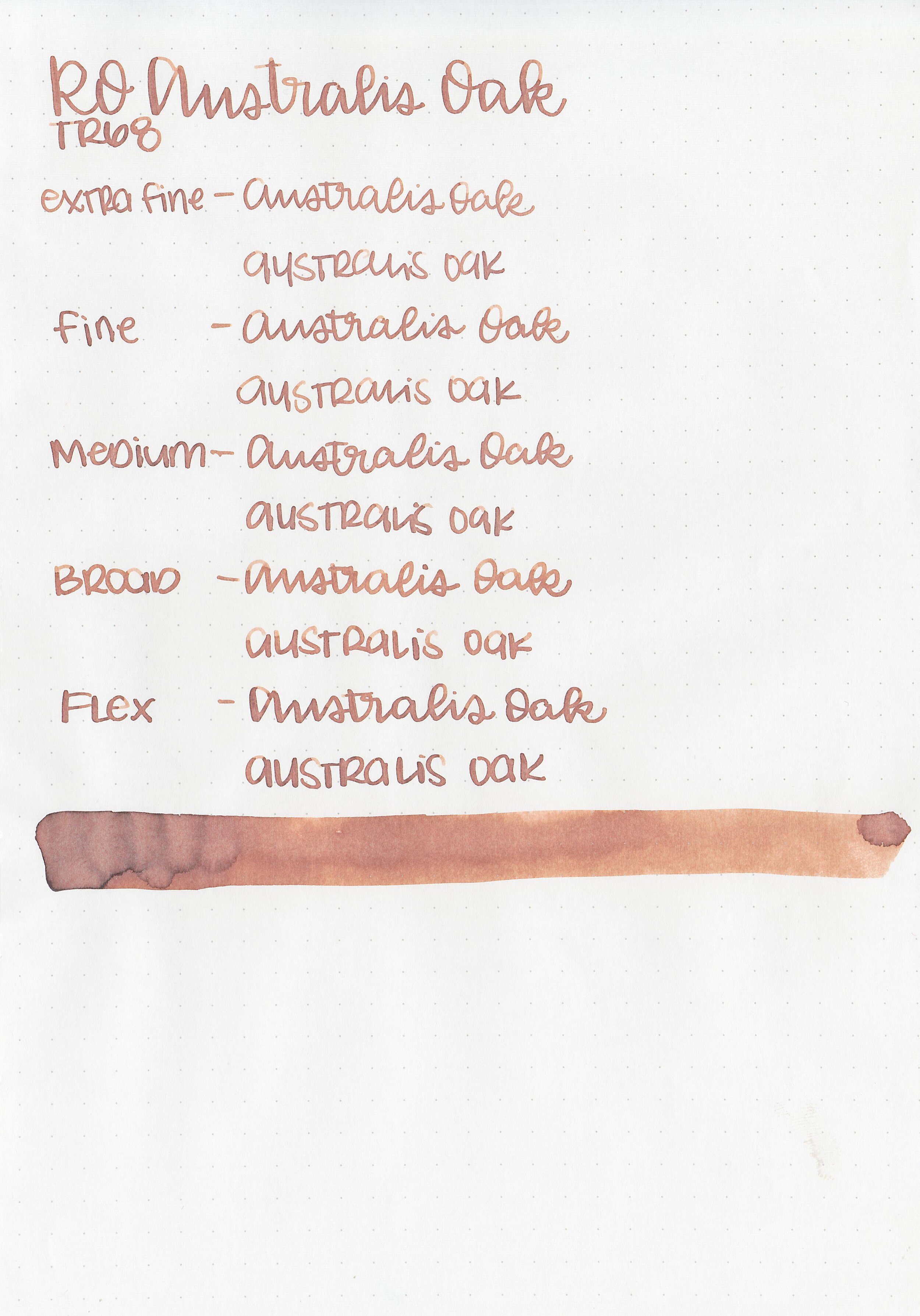
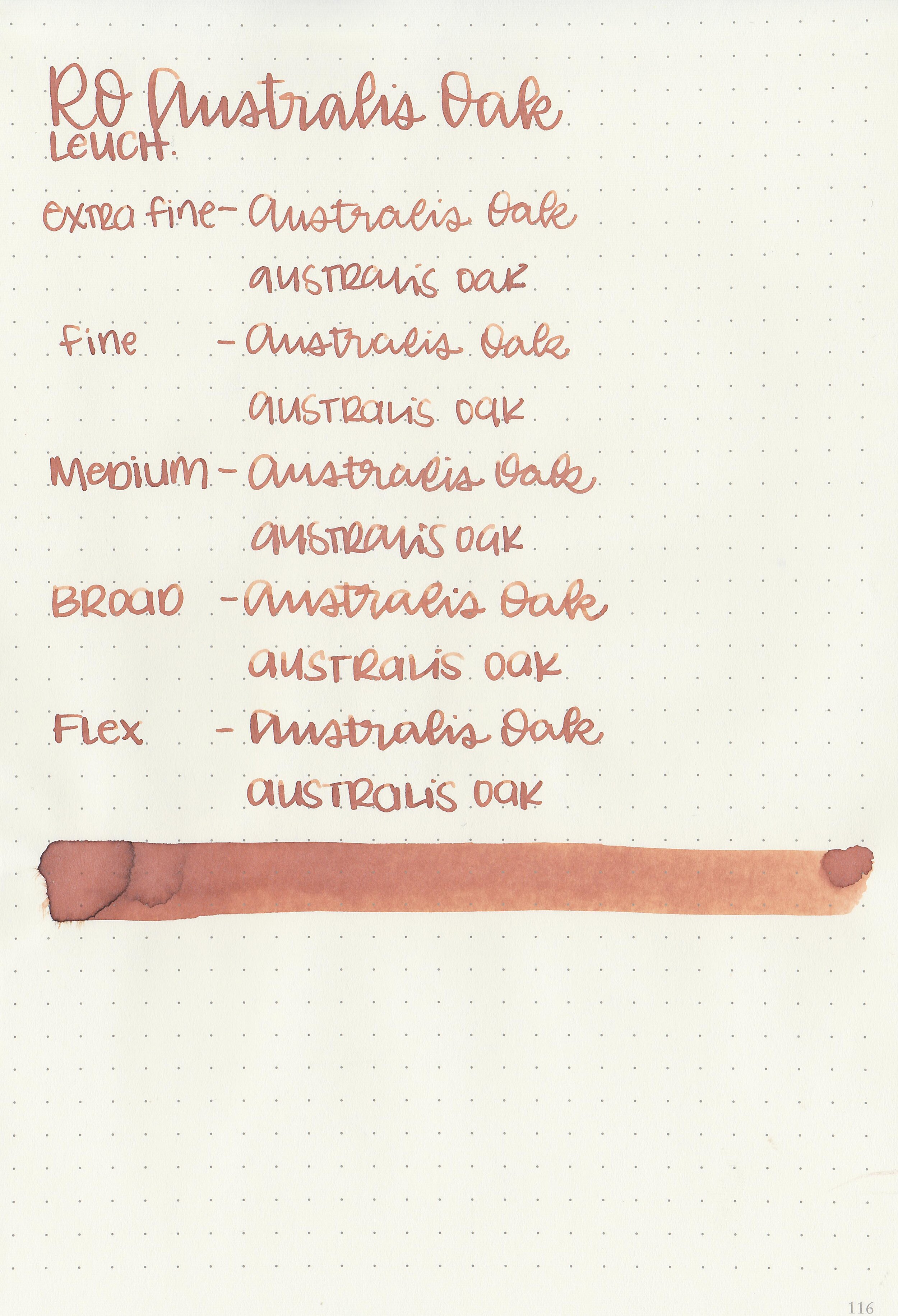
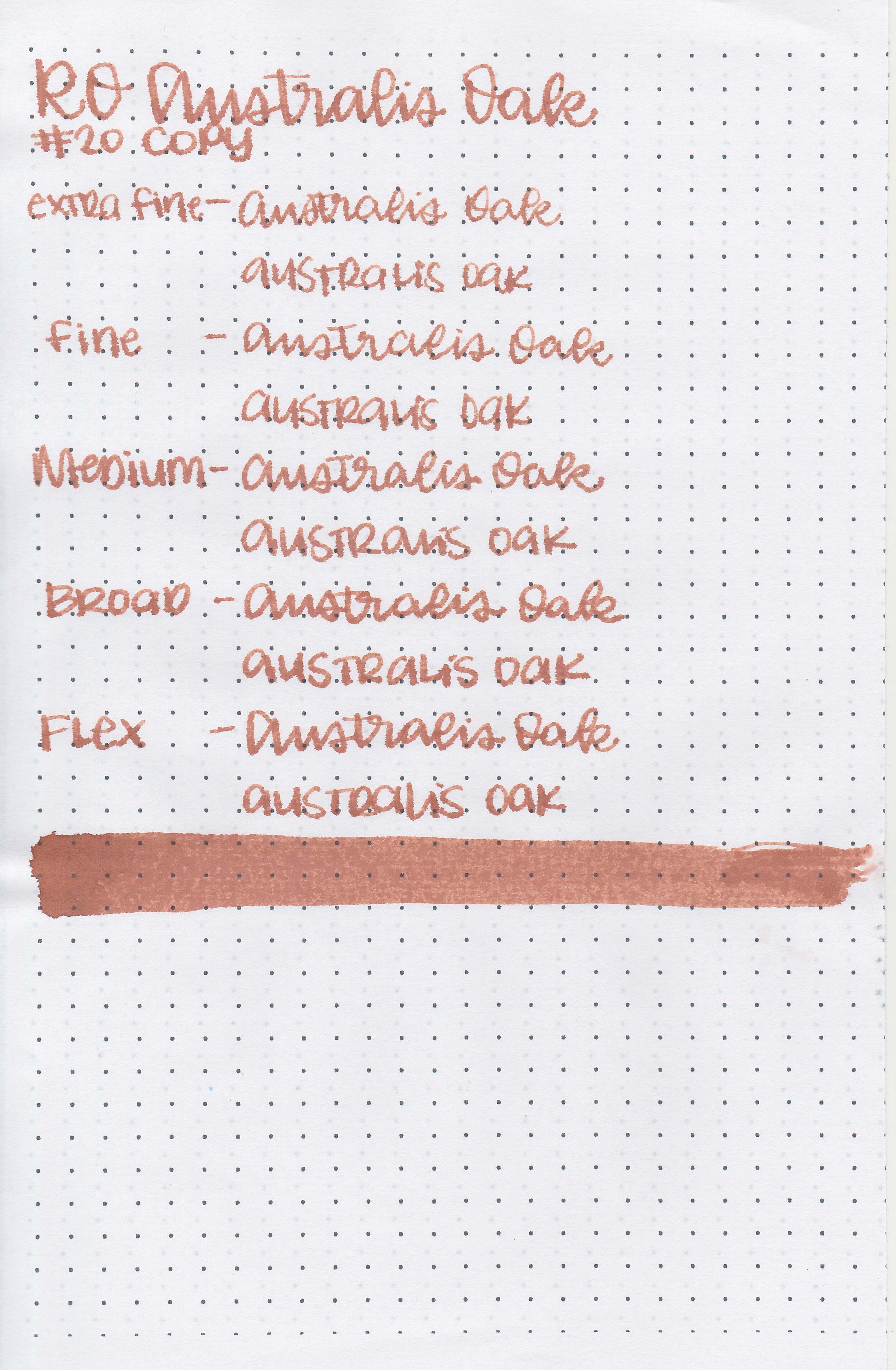
Robert Oster Australis Oak is a recent limited edition ink. You can find this ink for sale at most retailers including Vanness Pens and Pen Chalet (aff. link).

The color:
Australis Oak is a medium toffee brown.

In large swabs on Tomoe River paper the ink has some shading but no sheen.

Let's take a look at how the ink behaves on fountain pen friendly papers: Rhodia, Tomoe River, and Leuchtturm.
Dry time: 20 seconds
Water resistance: Medium
Feathering: Low
Show through: Medium
Bleeding: Low
Other properties: medium shading, no sheen, and no shimmer.
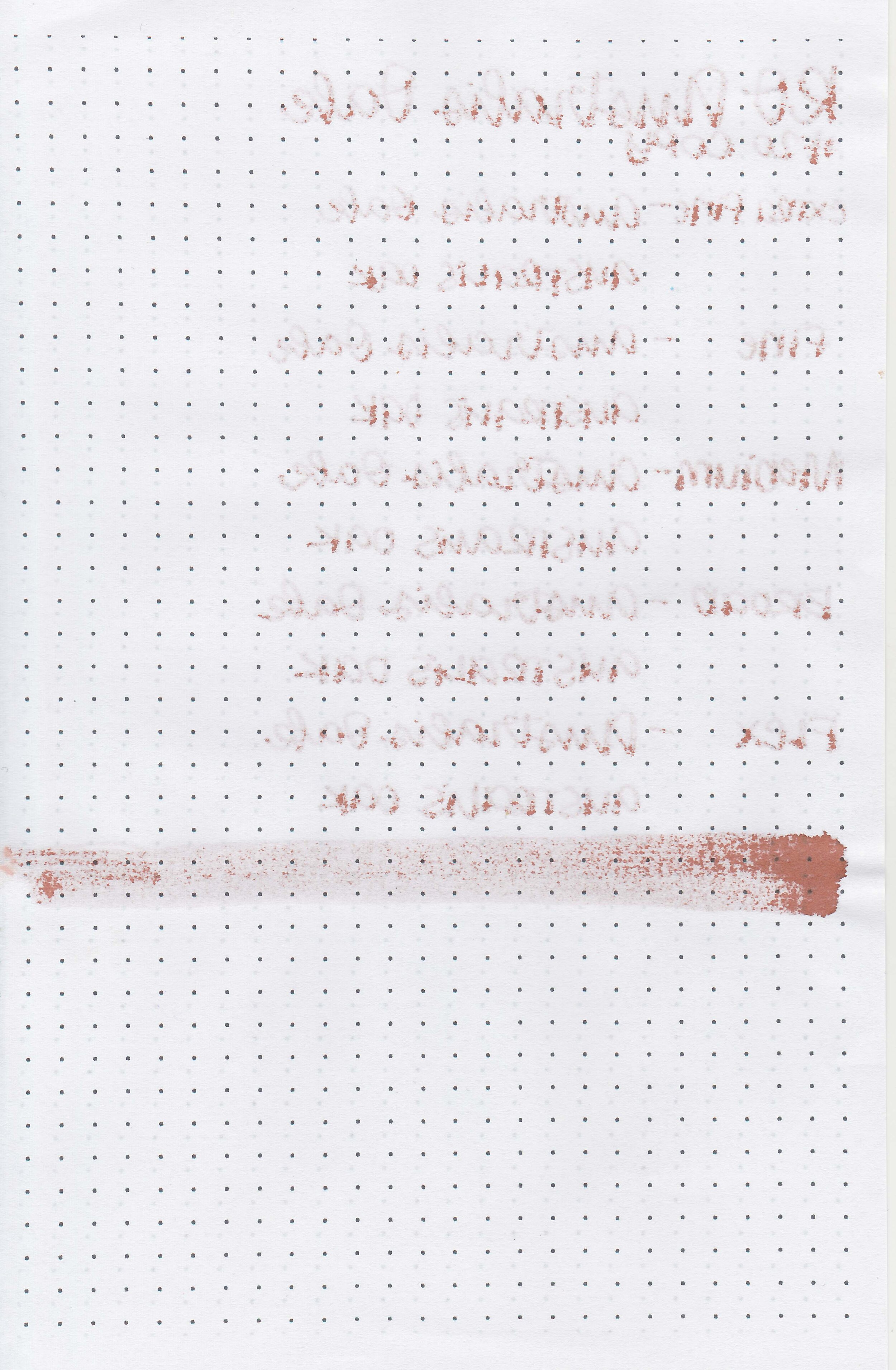
On Staples 24 lb copy paper there was some feathering in all nib sizes.

Australis Oak is darker than SBRE Brown. Click here to see the Robert Oster inks together, and click here to see the brown inks together.
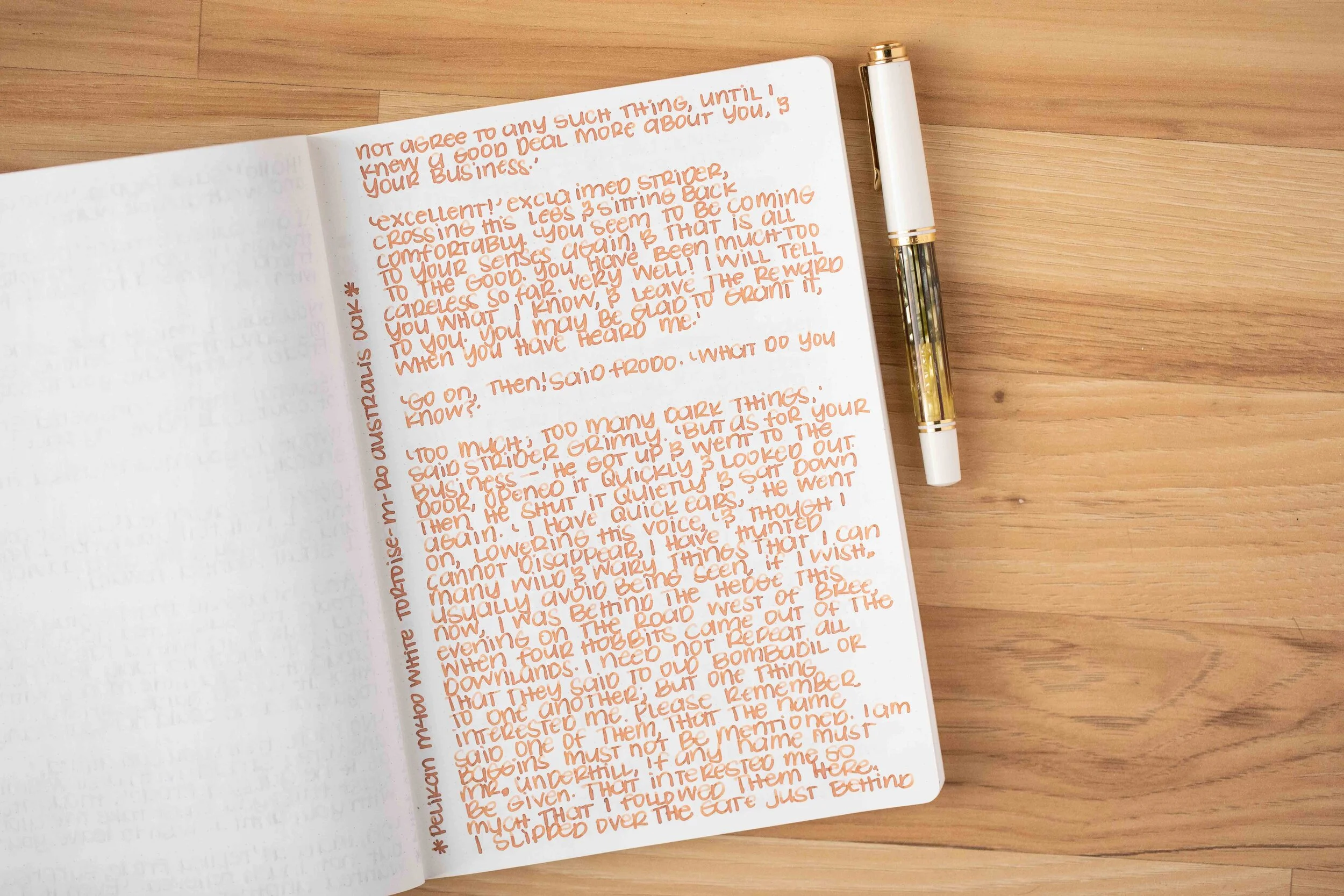
I used a Pelikan M400 White Tortoise with a medium nib on a Taroko Enigma notebook. The ink had a dry flow.
Overall, it’s a nice addition to the Robert Oster lineup, but since it’s a limited edition ink you’ll have to grab it while it’s still available. It’s a little drier than I prefer but performed well in a wet Pelikan nib.
Disclaimer: All photos and opinions are my own. This page does contain affiliate links but this post is not sponsored in any way.

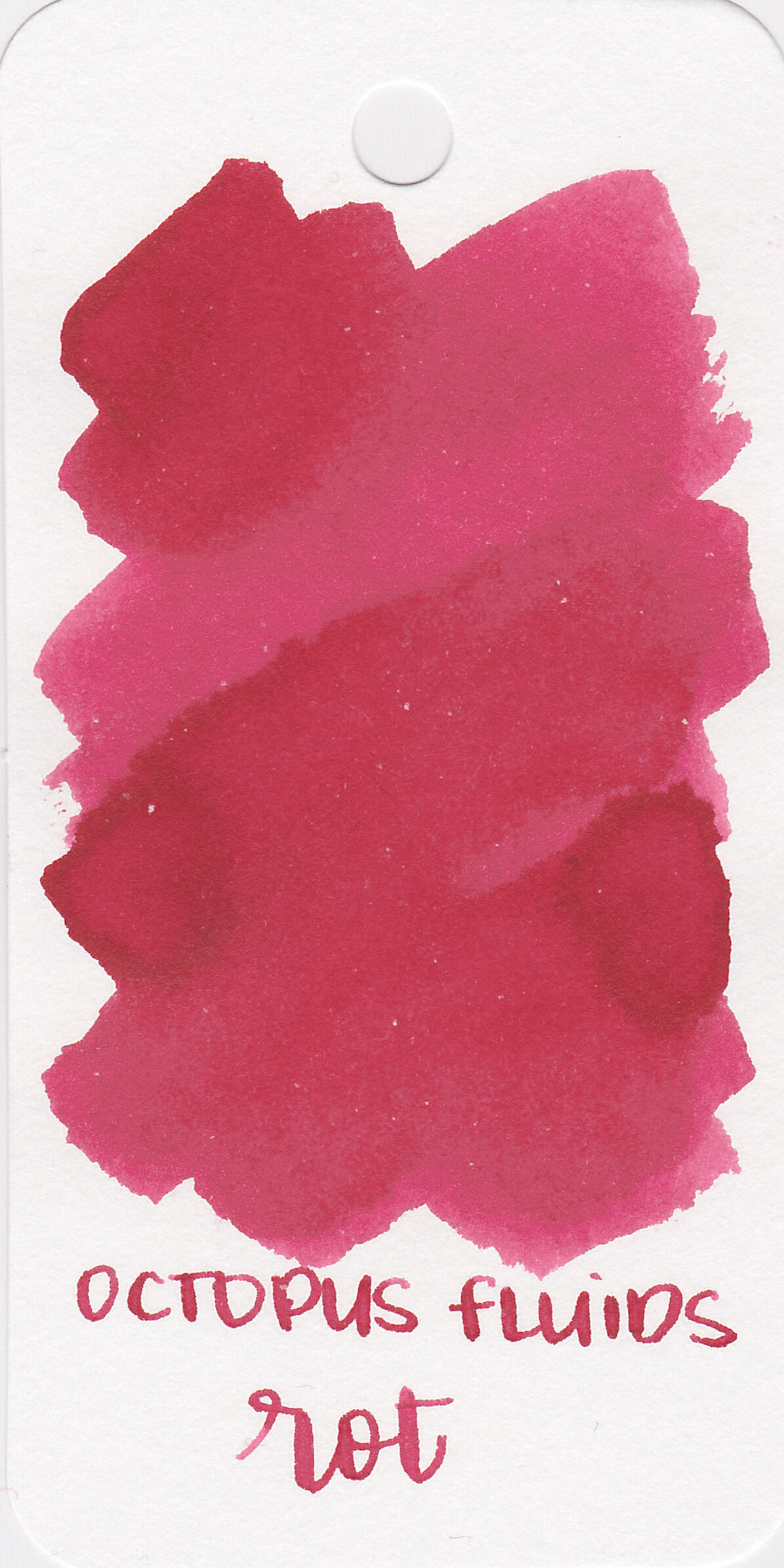
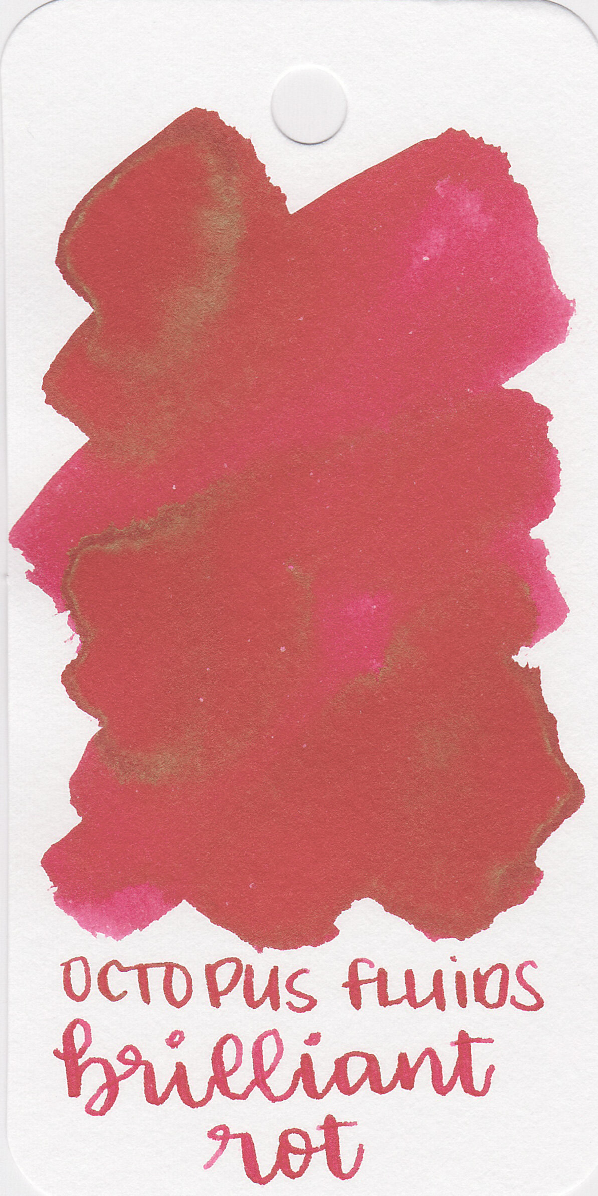
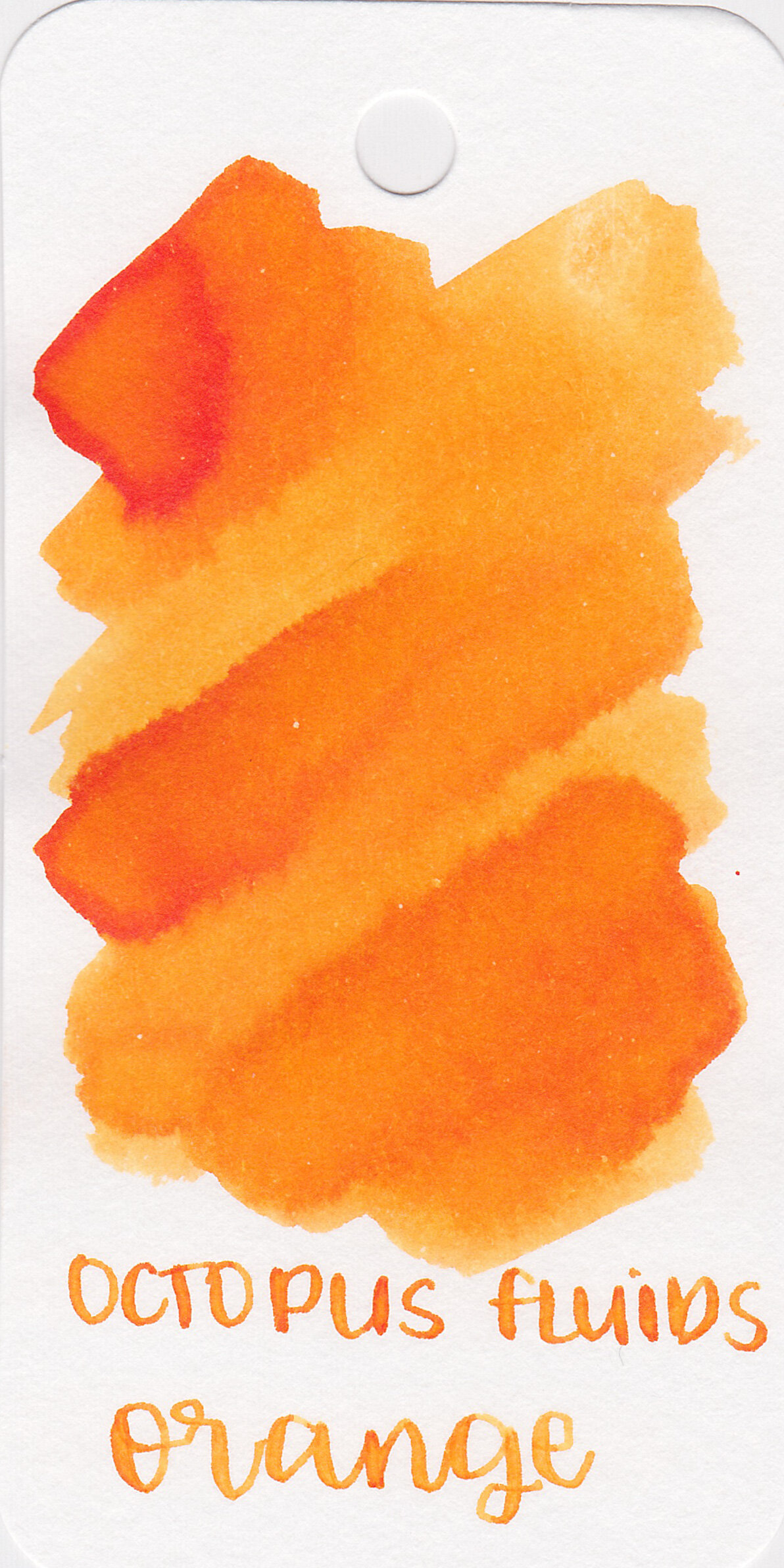
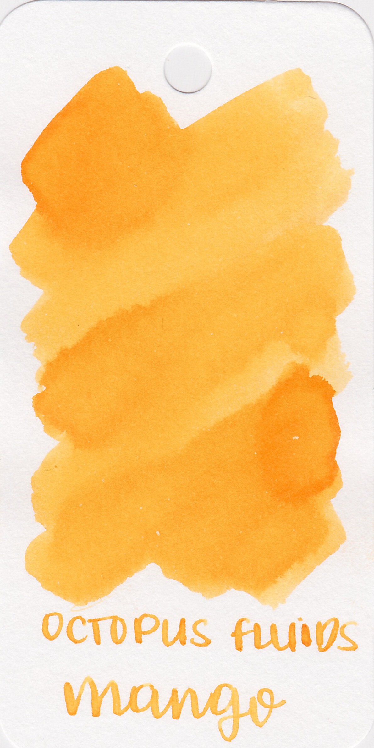
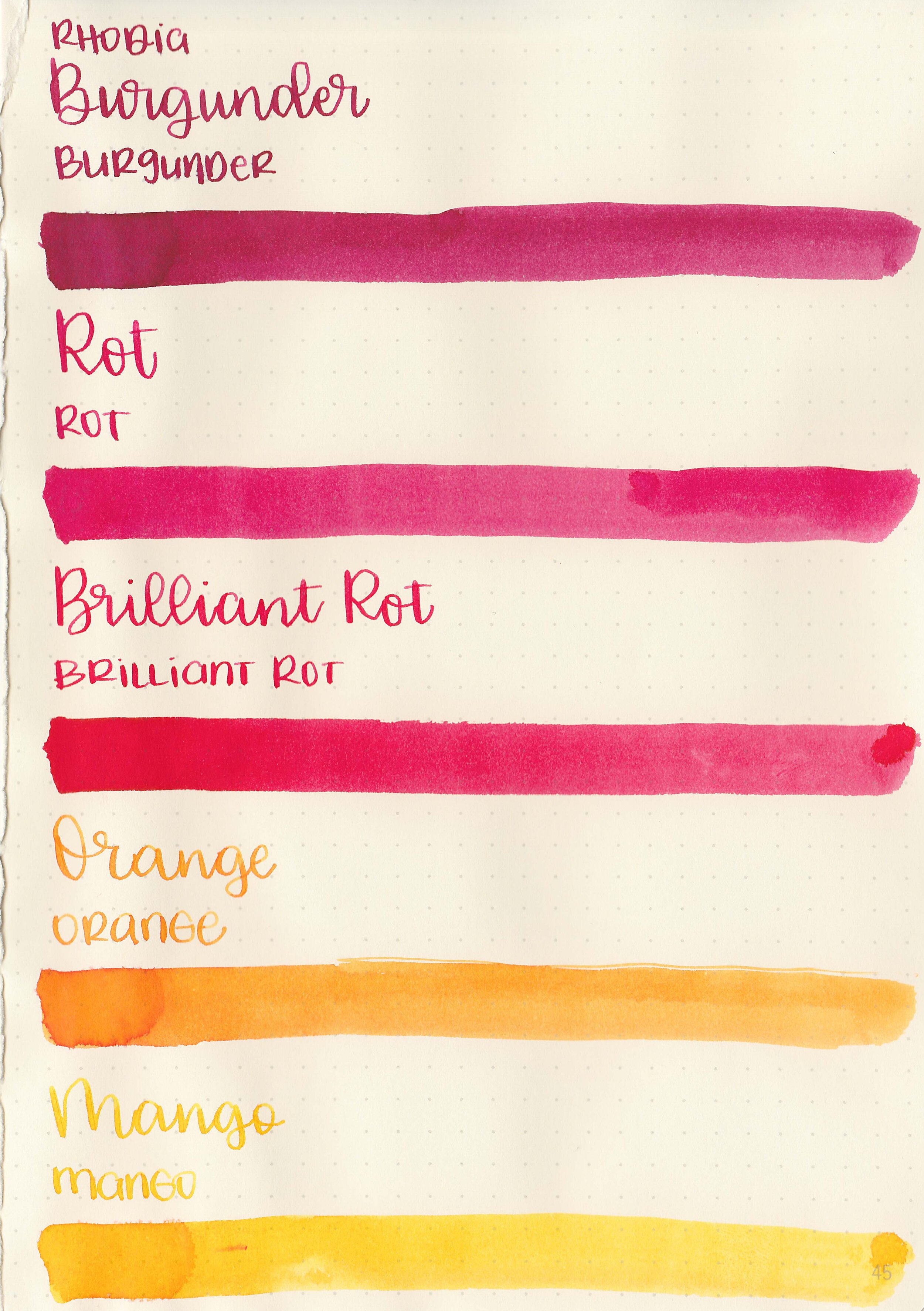
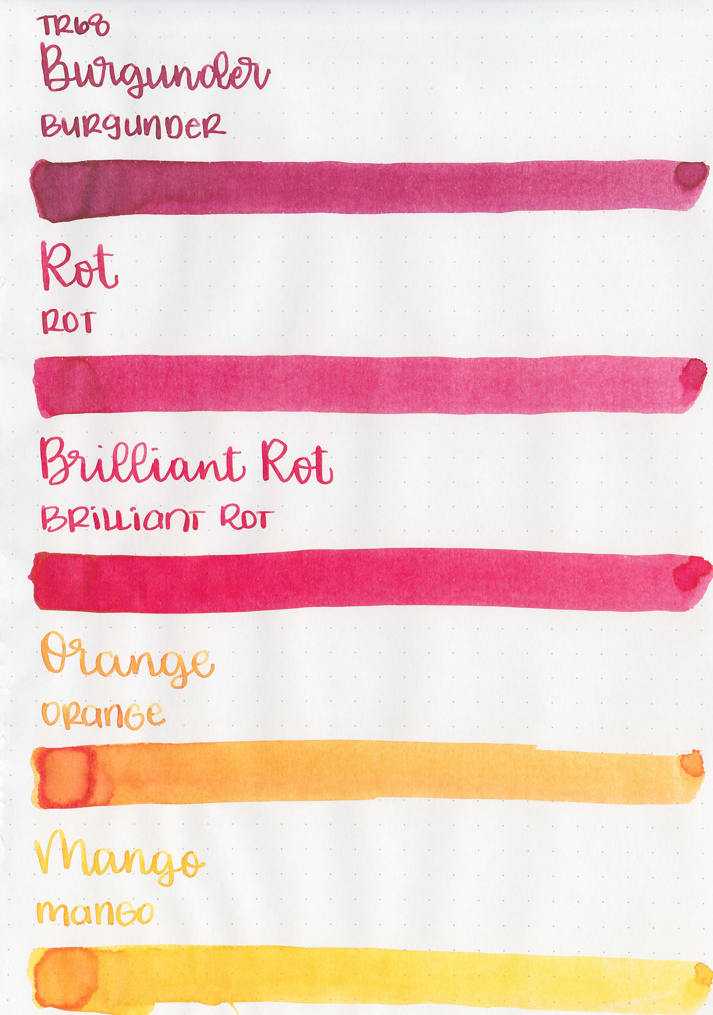
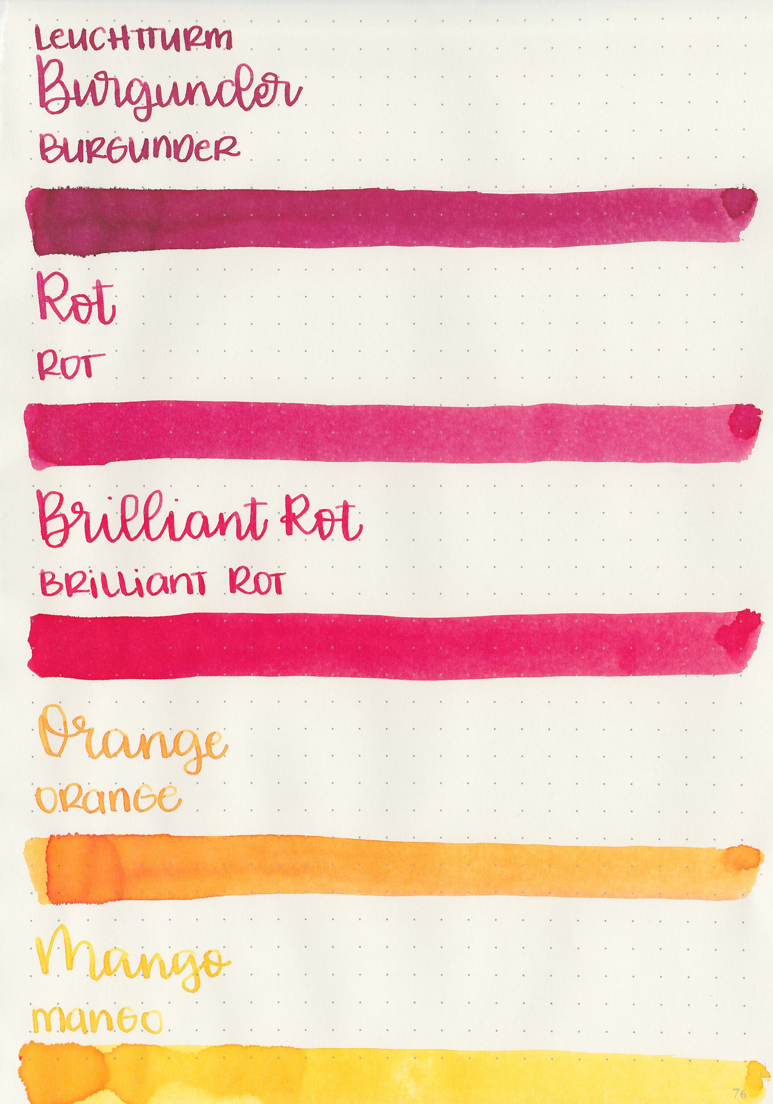
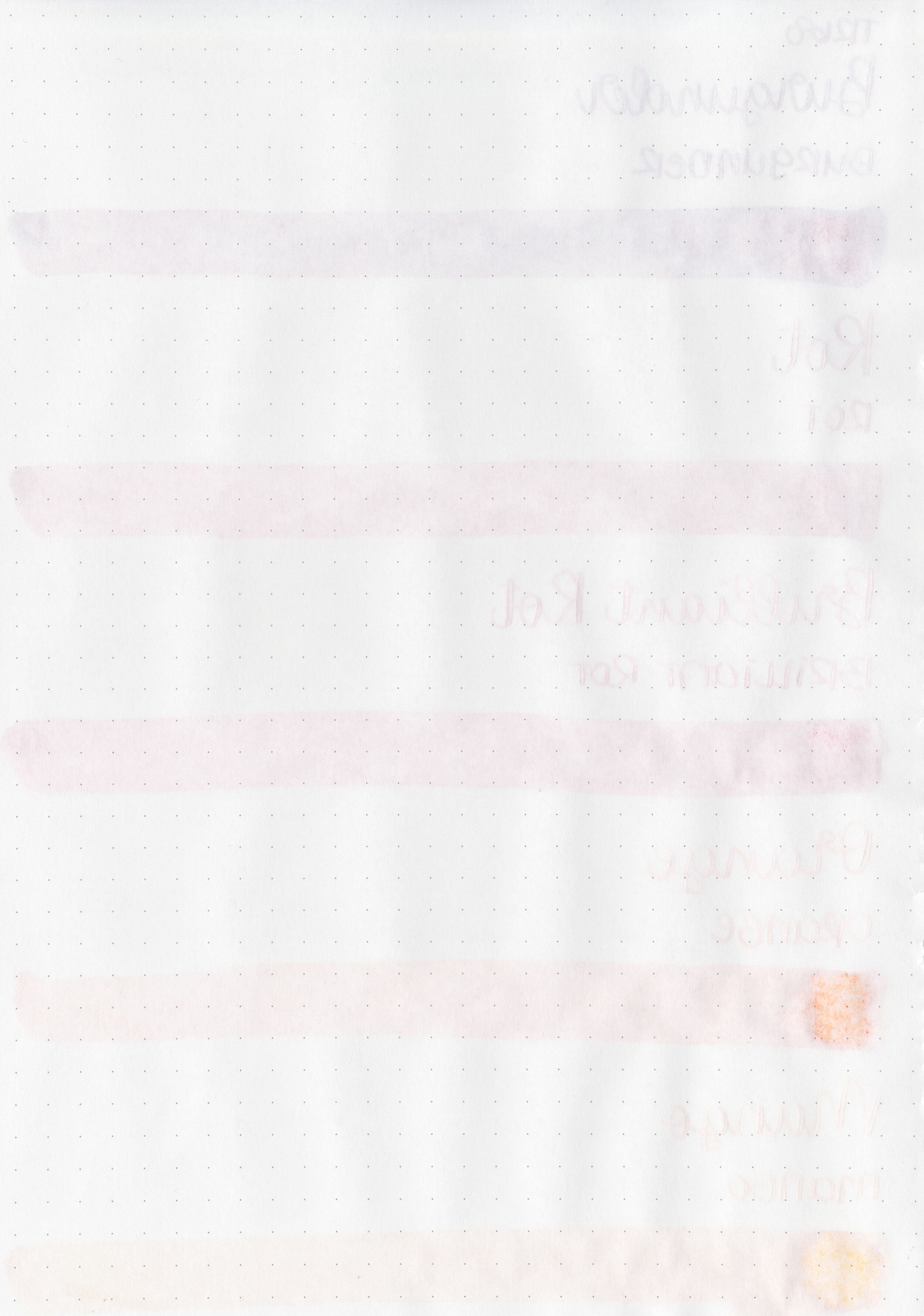
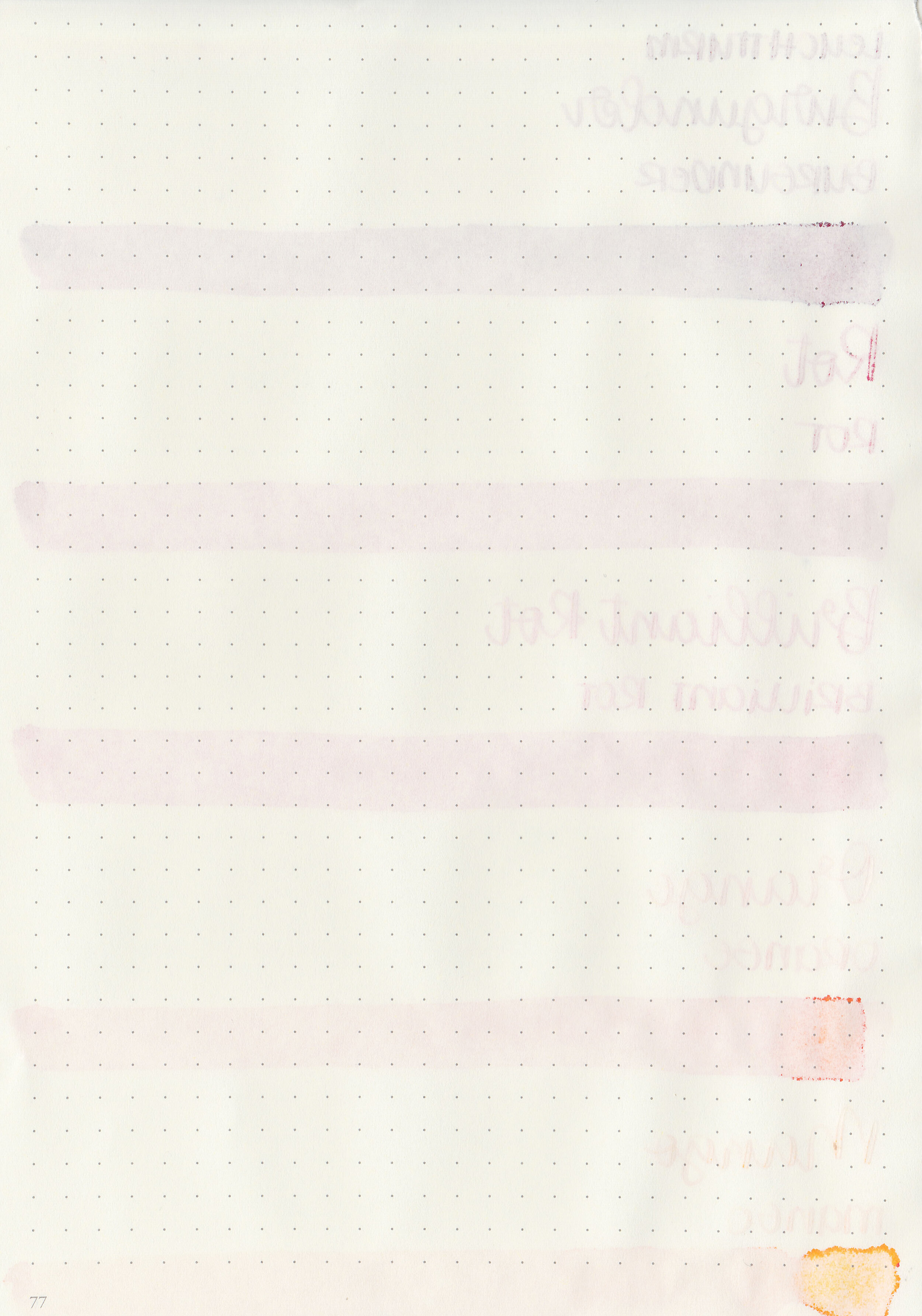
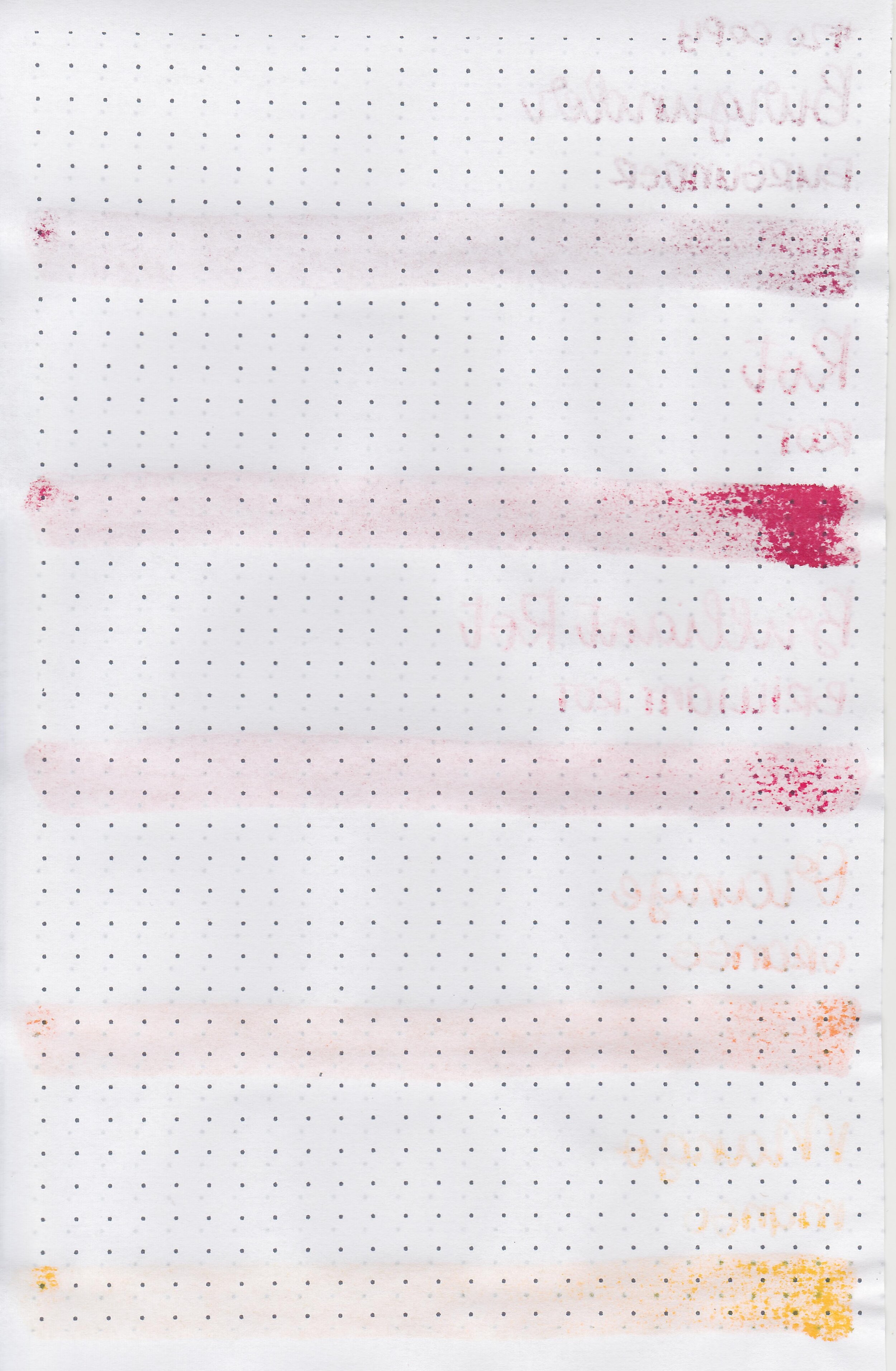
Let’s take a look at the next set of Octopus Fluids inks: Rot, Brilliant Rot, Burgunder, Orange and Mango. Thanks to Octopus Fluids for sending these inks over for review!
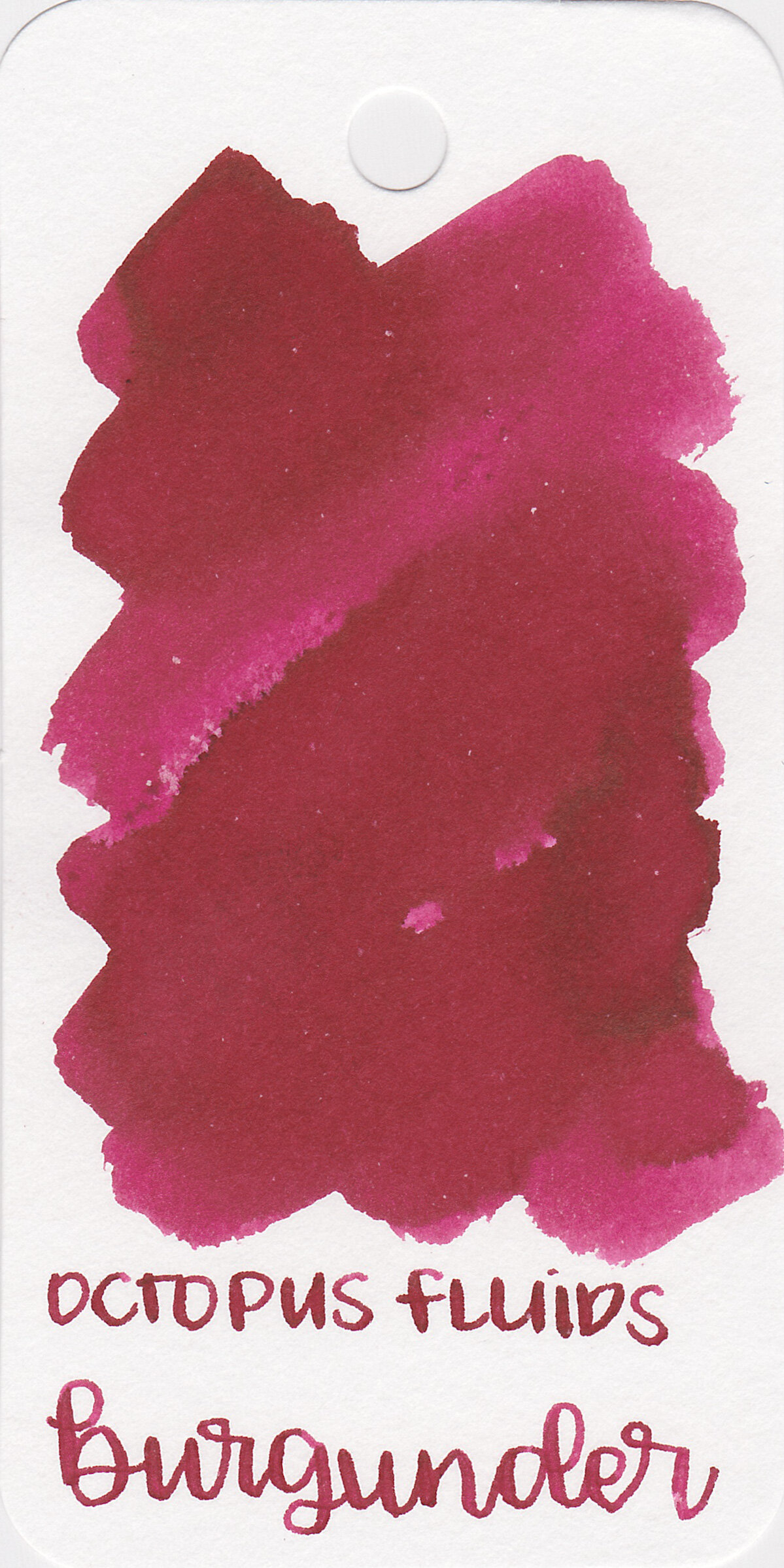
Left to right: Burgunder, Rot, Brilliant Rot, Orange and Mango.

Ink drops:
None of the inks show sheen.

Dry Time:
All five inks dried in 10-20 seconds.

Water Resistance:
All have low to medium water resistance.
Let's take a look at how the ink behaves on fountain pen friendly papers: Rhodia, Tomoe River, and Leuchtturm.
Feathering: Medium
Show through: Medium
Bleeding: Low
Other properties: low shading, no sheen and no shimmer.
On Staples 24 lb copy paper there was lots of feathering in every nib size as well as some bleeding.

Burgunder is closest to Diamine Classic Red. Rot is lighter than Classic Red, Brilliant Rot is closest to Monteverde Valentine Red.

Orange is closest to Diamine Flowers Marigold.

Mango is closest to Tono & Lims Yakiimo.

I used a Taroko Enigma notebook and a Mabie Todd Swan. All five inks had an average flow.
Overall, out of the five Burgunder is my favorite. Mango and Orange can be hard to read in smaller nib sizes. All five inks do have some feathering on Rhodia and Leuchtturm.
Disclaimer: These inks were provided by Octopus Fluids for the purpose of this review. All photos and opinions are my own. This page does not contain affiliate links, and is not sponsored in any way.
Hi, I’m Kelli, and I’m the brain behind Mountain of Ink. I’m a homeschooling mama of three littles, full-time student, aspiring photographer, amateur chef, and lover of all things stationery. I think any day that doesn’t involve learning and playing with ink is a day wasted. On my site you will find fountain pen, ink, and paper reviews, along with stationery bits and bobs along the way. You can find me @mountainofink on Instagram, Facebook, Twitter, and Pinterest.
Powered by Squarespace.