Oblation Ink
/Oblation ink swabs.
Read More
Oblation Olive is made for Oblation Papers & Press by Papier Plume. Thanks to Oblation for sending this ink over for review!
This ink is available in 30ml glass bottles with a wax fleur de lis on the lid.

The Color:
Olive is a bright medium olive green.

In large swabs on Tomoe River paper the ink looks much darker overall, but ranges from a medium chartreuse to a deep olive.

Let's take a look at how the ink behaves on fountain pen friendly papers: Rhodia, Tomoe River, and Leuchtturm.
Dry time: 40 seconds
Water resistance: Medium
Feathering: None
Show through: Medium
Bleeding: None
Other properties: high shading, no sheen, and no shimmer.
On Walmart 20lb copy paper there was quite a bit of feathering and bleeding.

Olive is a little bit brighter than Robert Oster Saguaro Green. Click here to see the green inks together.

I used a Lamy Safari Savannah with a medium nib on a Taroko Odyssey notebook. The ink had a slightly dry flow.
Overall, I love this ink’s shading! It’s a lovely green but it can be a bit hard to read in the lighter shades. I prefer this ink in a broad nib.
Disclaimer: This ink was provided by Oblation for the purpose of this review. All photos and opinions are my own. This page does not contain affiliate links and this post is not sponsored.

The 2021 St. Louis Pen Show starts this weekend and this year it’s virtual! I get excited to see the show exclusive KWZ ink each year. The 2019 show ink Butterscotch is still one of my all-time favorite inks. This year is KWZ Meet Me in St. Louis 2021 “Forest Park Green” and it’s a beauty! You can order this ink at the virtual pen show!

The Color:
Forest Park Green is a bright grass green.

In large swabs on Tomoe River paper the ink has some black sheen where it pooled.

Let's take a look at how the ink behaves on fountain pen friendly papers: Rhodia, Tomoe River, and Leuchtturm.
Dry time: 30 seconds
Water resistance: Low
Feathering: None
Show through: Medium
Bleeding: None
Other properties: medium shading, low black sheen, and no shimmer.
On Walmart 20lb copy paper there was quite a bit of feathering and bleeding.

Forest Park is darker than Robert Oster Ryde Green and lighter than Robert Oster Evergreen. Click here to see the KWZ inks together, and click here to see the green inks together.

I used a Sailor Pro Gear Sparkling Shamrock with a broad nib on a Taroko Odyssey notebook. The ink had an average flow.
Overall, I loved this ink. It’s a great color, flows well and has some lovely shading. I would absolutely recommend picking up a bottle at the pen show!
Disclaimer: This ink was provided by the organizers of the St. Louis Pen Show for the purpose of this review. All photos and opinions are my own. This page does not contain affiliate links and this post is not sponsored.
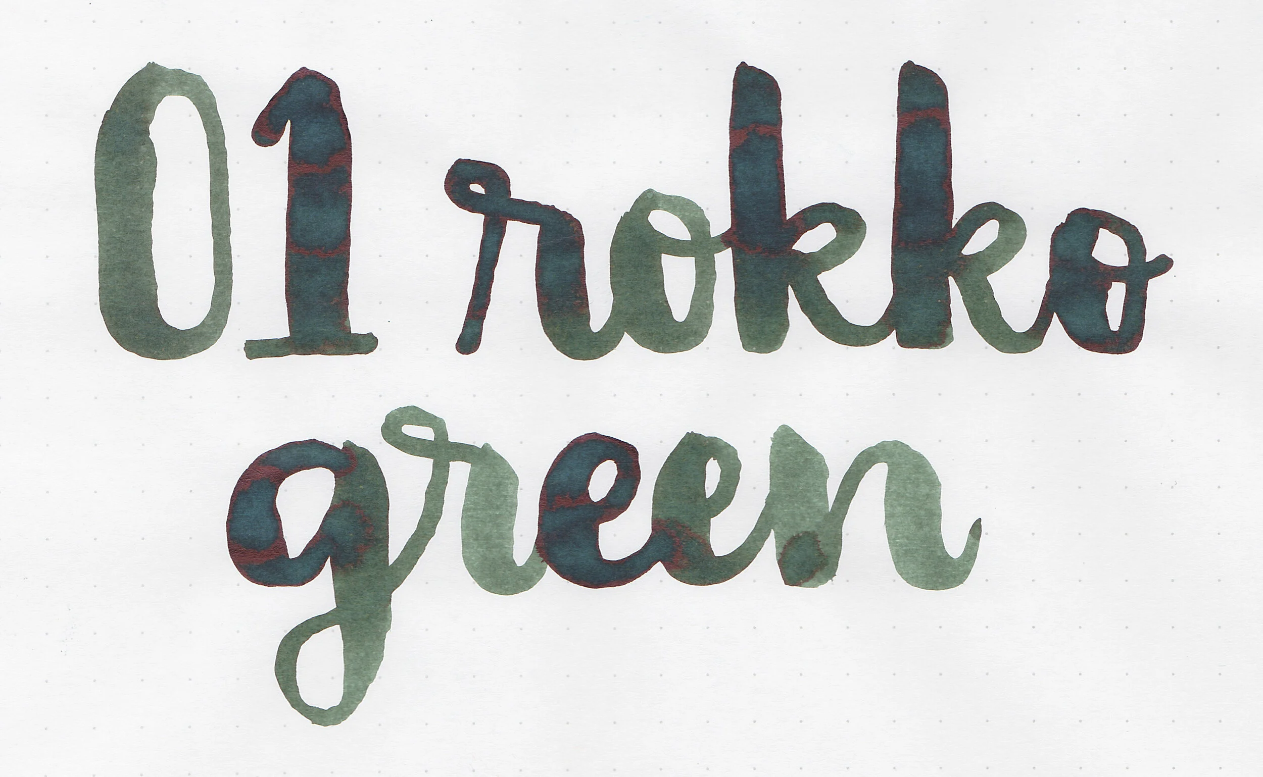
Kobe 01 Rokko Green is from Kobe’s standard lineup. Quite a while ago a pen friend gave me a bottle and I realized I’ve never posted a review. You can find this ink for sale at Vanness Pens.

The Color:
Rokko Green is a deep olive green.

In large swabs on Tomoe River paper the ink looks more like a dark forest green.

Let's take a look at how the ink behaves on fountain pen friendly papers: Rhodia, Tomoe River, and Leuchtturm.
Dry time: 20 seconds
Water resistance: Medium
Feathering: Low
Show through: Medium
Bleeding: Low
Other properties: medium shading, low brown sheen, and no shimmer.
On Staples 24 lb copy paper there was quite a bit of feathering and bleeding.

Rokko Green looks like a darker version of Sailor Jentle Epinard. Click here to see the Kobe inks together, and click here to see the green inks together.
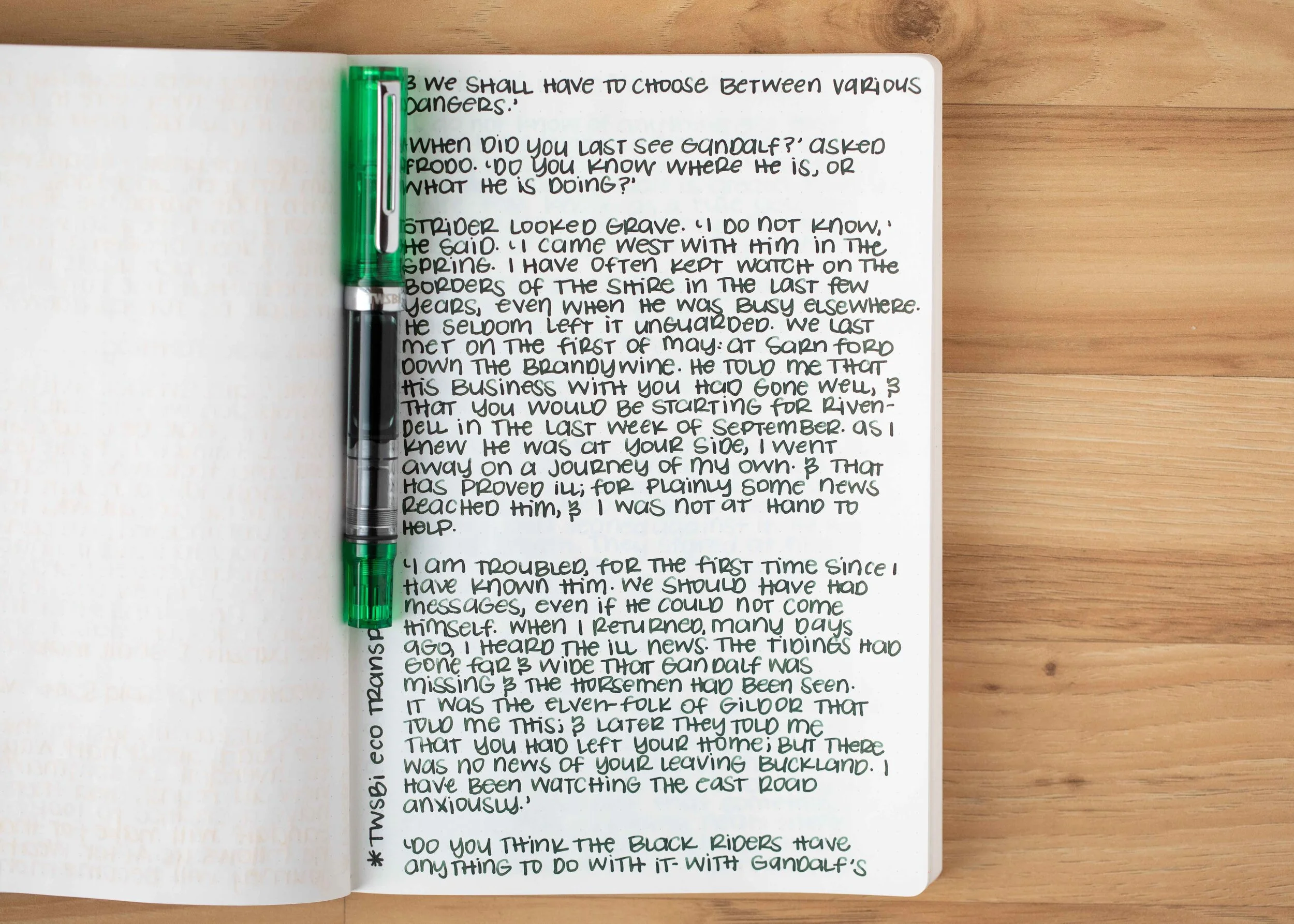
I used a TWSBI Eco Transparent Green with a medium nib on a Taroko Enigma notebook. The ink had a wet flow.
Overall, it’s a nice dark green, pretty well behaved with a nice wet flow.
Disclaimer: All photos and opinions are my own. This page does not contain affiliate links and this post is not sponsored.

Kobe 59 Hirano Gion Romance Gray is from Kobe’s standard lineup. I know all of my writing samples say Kirano but please pretend it says Hirano-I went with the spelling on the sample which turned out to be different than the official name. You can find this ink for sale at Vanness Pens. Thanks to the reader that sent this ink in for review!

The Color:
Hirano Gion Romance Gray is a deep neutral grey.

In large swabs on Tomoe River paper the ink has some black sheen.

Let's take a look at how the ink behaves on fountain pen friendly papers: Rhodia, Tomoe River, and Leuchtturm.
Dry time: 30 seconds
Water resistance: Medium
Feathering: None
Show through: Medium
Bleeding: None
Other properties: low shading, low black sheen, and no shimmer.
On Staples 24 lb copy paper there was a some feathering but not much bleeding.

Hirano Gion is closest to Birmingham Smoked Iron. Click here to see the Kobe inks together, and click here to see the grey inks together.

I used a Sailor Pro Gear Lighthouse with a broad nib on a Taroko Enigma notebook. The ink had a wet flow.
Overall, it’s a lovely neutral grey, great for the office or daily use.
Disclaimer: All photos and opinions are my own. This page does not contain affiliate links and this post is not sponsored.
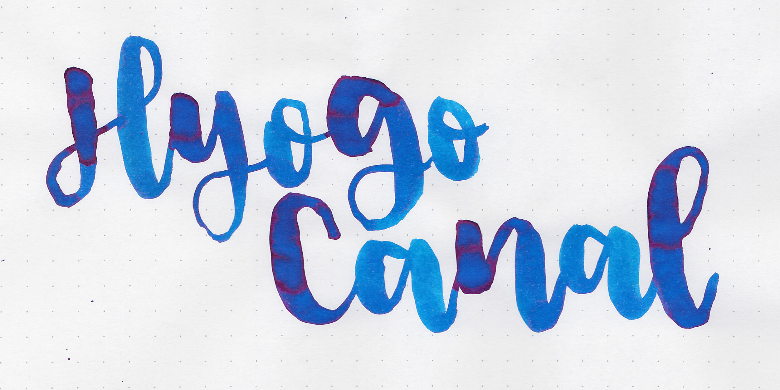
A while back a pen friend gave me a bottle of Kobe 58 Hyogo Canal Blue. I’ve used it many times but realized I’ve never reviewed it so it’s finally time. You can find this ink for sale at Vanness Pens.

The Color:
Hyogo Canal Blue is a beautiful medium blue.

In large swabs on Tomoe River paper the ink is a medium blue with lots of pink sheen.

Let's take a look at how the ink behaves on fountain pen friendly papers: Rhodia, Tomoe River, and Leuchtturm.
Dry time: 30 seconds
Water resistance: Medium
Feathering: None
Show through: Medium
Bleeding: None
Other properties: medium shading, medium pink sheen, and no shimmer.
On Staples 24 lb copy paper there was a lot feathering and bleeding in all nib sizes.

Hyogo Canal Blue is closest to Organics Studio Nitrogen. Click here to see the Kobe inks together, and click here to see the blue inks together.

I used a Pelikan M805 Vibrant Blue with a broad nib on a Taroko Enigma notebook. The ink had a wet flow.
Overall, I really enjoyed this ink. it’s a lovely color with some beautiful shading and sheen.
Disclaimer: All photos and opinions are my own. This page does not contain affiliate links and this post is not sponsored.

Diamine Writer’s Blood was created for the members of r/fountainpens on Reddit. This Reddit group also came up with Earl Grey and Aurora Borealis. I purchased my bottle of ink from Pen Chalet (aff. link).

The color:
Writer’s Blood is a deep Bordeaux red.

In large swabs on Tomoe River paper the ink is very dark, almost purple.

Let's take a look at how the ink behaves on fountain pen friendly papers: Rhodia, Tomoe River, and Leuchtturm.
Dry time: 60 seconds
Water resistance: Medium
Feathering: Low
Show through: Medium
Bleeding: None
Other properties: low shading, low bronze sheen, and no shimmer.
On Staples 24 lb copy paper there was a lot feathering and bleeding in all nib sizes.
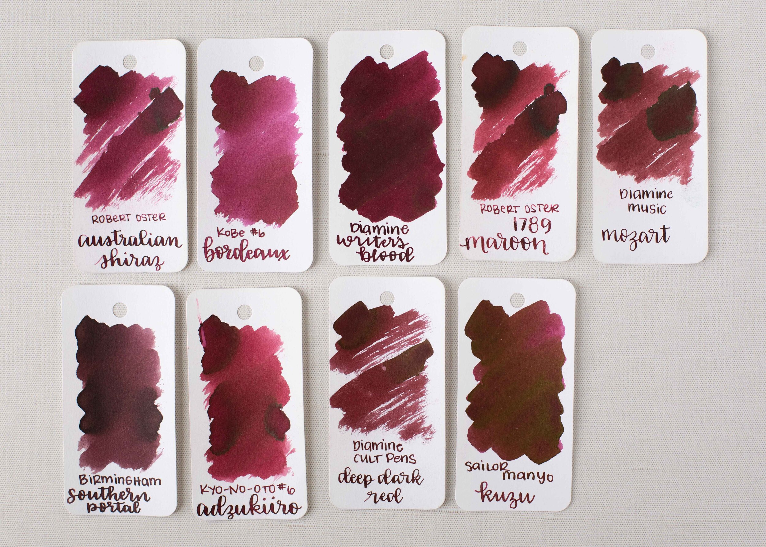
Writer’s Blood is closest to Sailor Manyo Kuzu. Click here to see the Diamine inks together, and click here to see the red inks together.

I used a Pilot Custom 74 Merlot with a medium nib on a Taroko Enigma notebook. The ink had a wet flow.
Overall, I love how wet this ink is but unfortunately it can take a full minute to dry. It’s a nice dark office-appropriate color.
Disclaimer: I purchased this ink myself and all photos and opinions are my own. This page does contain affiliate links but this post is not sponsored.

Colorverse Extra Dimension & Warped Passages are from the new Colorverse Season 3: Multiverse. Extra Dimension comes in a 65ml bottle and Warped Passages in a 15ml bottle. You can find this ink for sale at Pen Chalet. Thanks to the reader that sent these inks in for review!

Left to right: Extra Dimension is a deep blue with some sheen. Warped Passages is a medium blue with some pretty shading.
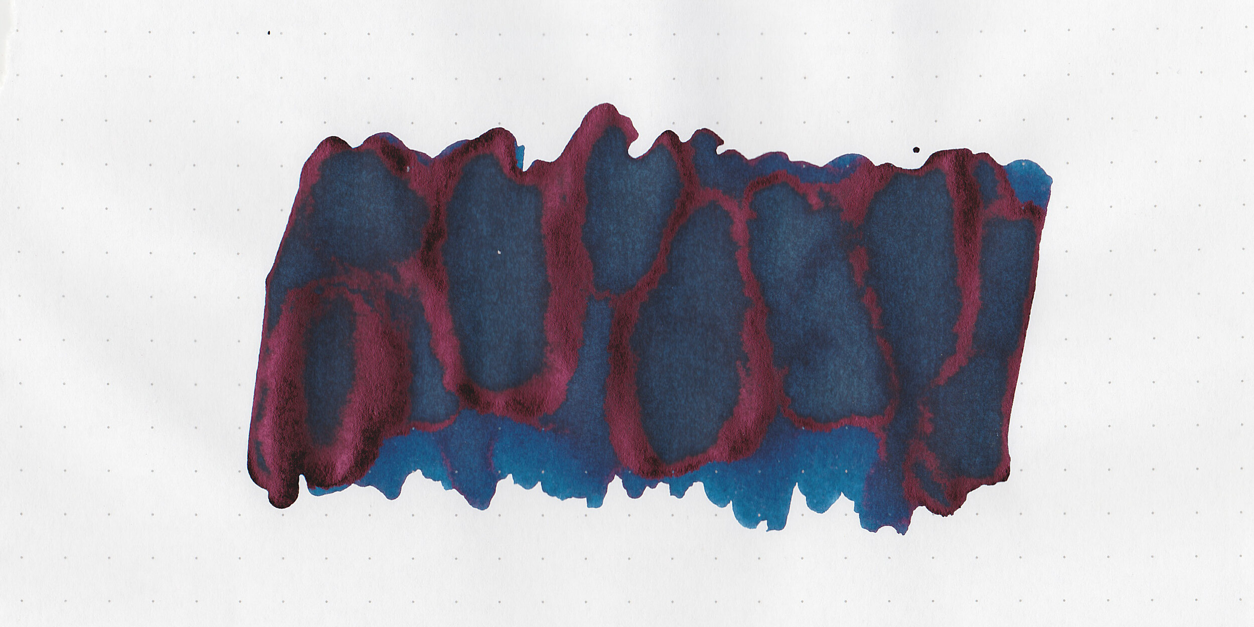
In large swabs on Tomoe River paper, Extra Dimension has some nice red sheen.

Let's take a look at how the ink behaves on fountain pen friendly papers: Rhodia, Tomoe River, and Leuchtturm.
Dry Time: 15 seconds
Water Resistance: Medium
Feathering: Low
Show through: Medium
Bleeding: Low
Other properties: low-medium shading, high red sheen (Warped Passages) and no shimmer.
On Staples 24 lb copy paper there was lots of feathering in every nib size as well as some bleeding.

Extra Dimension is close to Robert Oster Great Southern Ocean, and a little darker than Pilot Iroshizuku Tsuki-yo.

Warped Passages is a little darker than Birmingham Cornflower.

Extra Dimension: I used an Esterbrook Estie Oversize Peacock with a medium nib on a Taroko Enigma Notebook. The ink had a wet flow.
Warped Passages: I used a Pelikan M805 Vibrant Blue with a broad nib on a Taroko Enigma Notebook. The ink had a wet flow.
Overall, I liked both of these inks! I prefer Warped Passages’s shading over Extra Dimension’s sheen but both are worth a try!
Disclaimer: These inks were provided by a reader for the purpose of this review. All photos and opinions are my own. This page does contain affiliate links but this post is not sponsored in any way.

June starts tomorrow! Summer doesn’t officially start until June 20th but I’m already craving the bright summery colors. While we are still in the very end of spring I’m loving dusky colors like Robert Oster Choc Pudding and Dusky Pink.
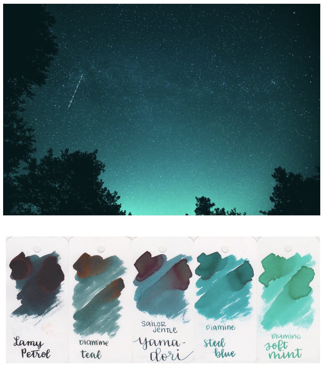
Teal is my favorite color and I’m a sucker for all things teal. This palette is made up of a lot of my favorite teals-Sailor Yama-dori and Diamine Soft Mint being two of my long-time favorites.

Robert Oster Monsoon Sky and Morning Mist are two less popular teals but they are perfect for this palette and wonderful inks too!

Teal and orange go so well together in the summer-Paradise Blue and Manago Mousse are so cheerful together!
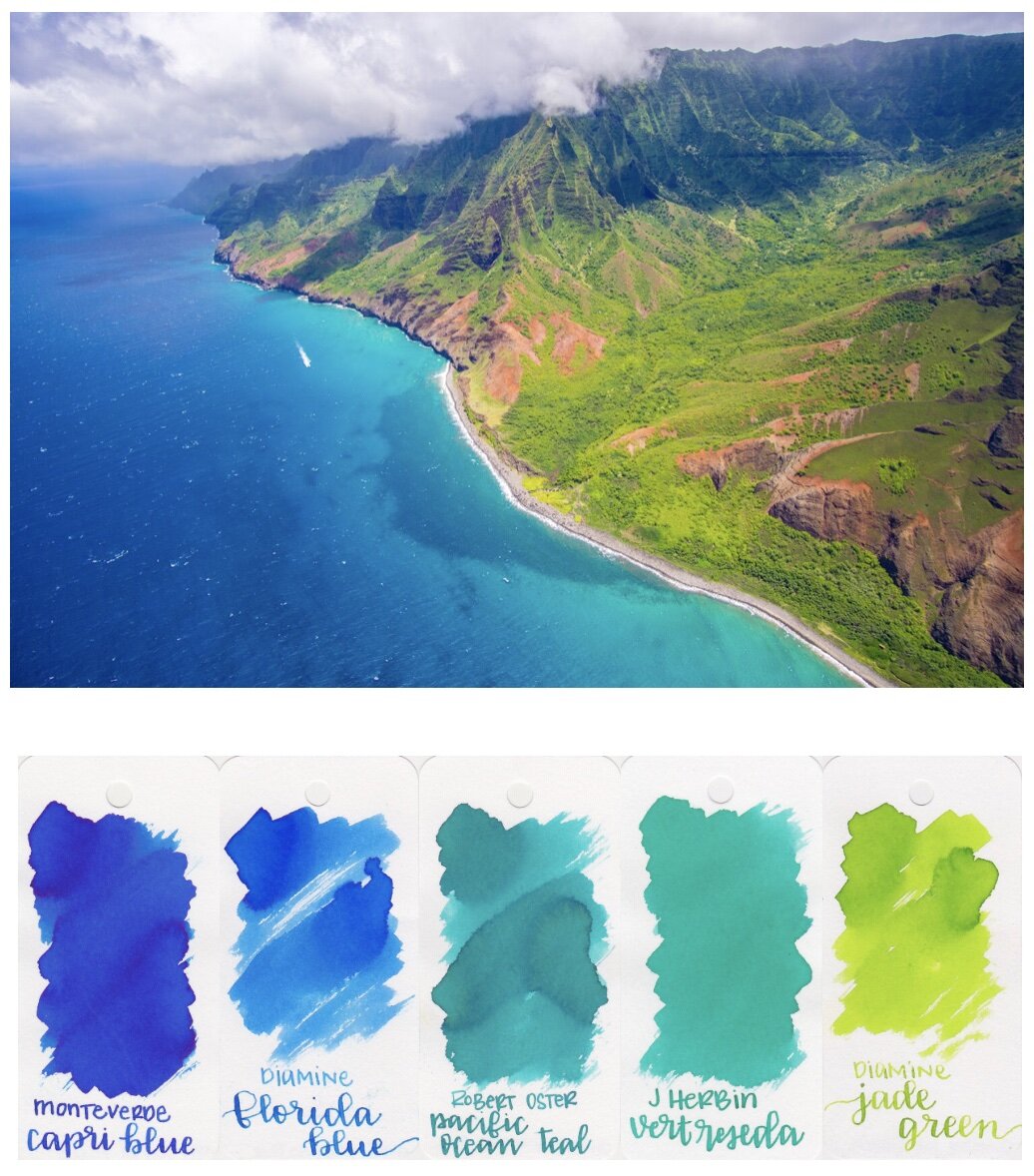
I love everything about this one! I’m pretty sure I will be using these five inks together for the rest of the summer because they look so good together!
I hope everyone is having a great Memorial Day! What’s your favorite ink today? Let me know in the comments below!
Disclaimer: All opinions are my own. This post does not contain affiliate links and is not sponsored in any way.
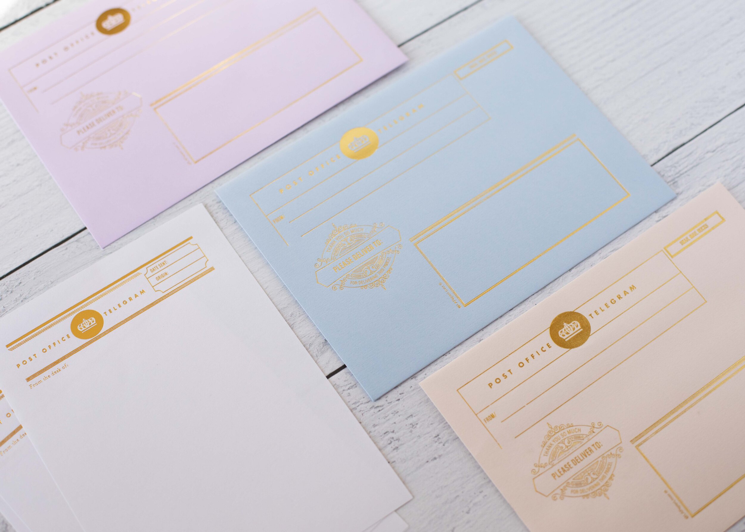
I love good stationery, so when LA Paper Lover sent me some new stationery to try out I was so excited!

Air Mail
One pack she sent was the Air Mail Stationery Kit in pink, white and gold.
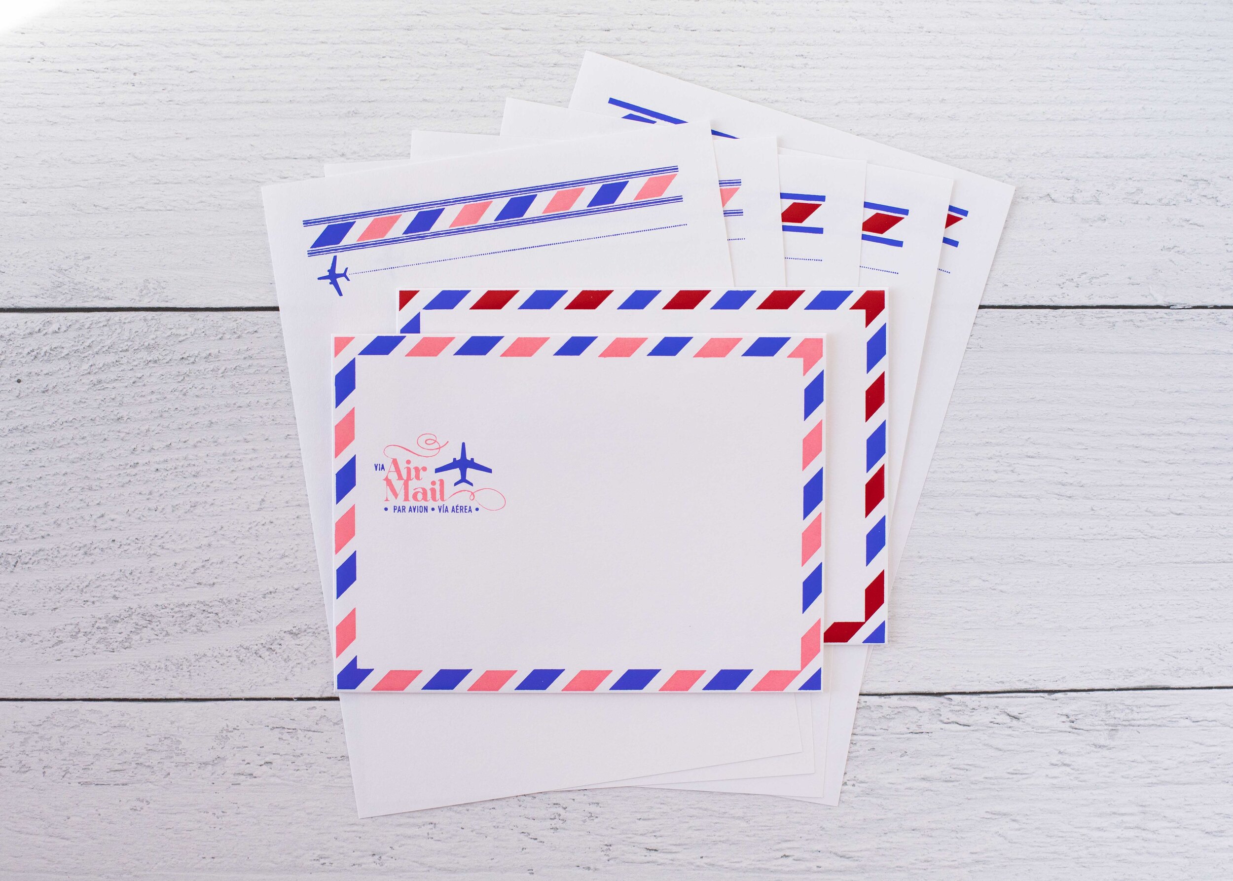
There’s another Air Mail set in white, blue, red and pink. I love how well the papers match the envelopes.

There are matching telegram pages and envelopes.
With fountain pens there was a little feathering and some ghosting but no bleeding. The texture of the paper makes the flow seem a little drier than normal, but I think that’s the case with most papers that have some texture.
Pens and pencils all performed well, like the fountain pens the paper texture makes the gel pens feel a little drier than average.

Pink and yellow Air Mail gives a modern look to an old classic.

I love the pink pansy stationery set. It’s perfect for spring writing.
Overall, I would absolutely recommend this stationery! There are so many fun colors and designs and handle pen and ink really well.
Disclaimer: These products were provided by LA Paper Lover for the purpose of this review. All photos and opinions are my own. This page does not contain affiliate links and this post is not sponsored.
Hi, I’m Kelli, and I’m the brain behind Mountain of Ink. I’m a homeschooling mama of three littles, full-time student, aspiring photographer, amateur chef, and lover of all things stationery. I think any day that doesn’t involve learning and playing with ink is a day wasted. On my site you will find fountain pen, ink, and paper reviews, along with stationery bits and bobs along the way. You can find me @mountainofink on Instagram, Facebook, Twitter, and Pinterest.
Powered by Squarespace.