Ink Review #1999: Van Dieman's Sailor's Delight
/
Van Dieman’s Sailor’s Delight is from the Midnight Collection. My ink sample came from Vanness Pens. (This is the original formula, not the reformulation.)

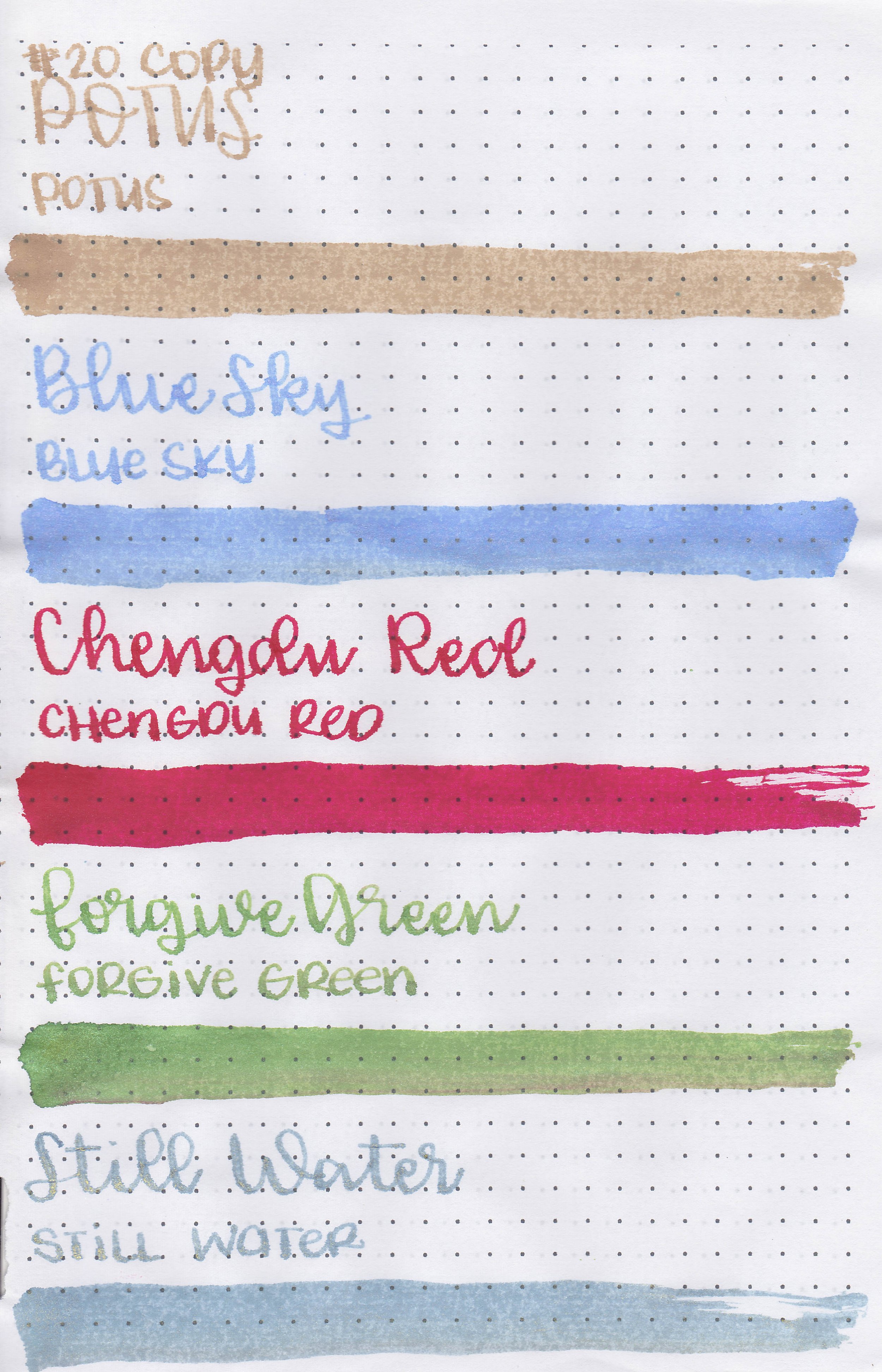
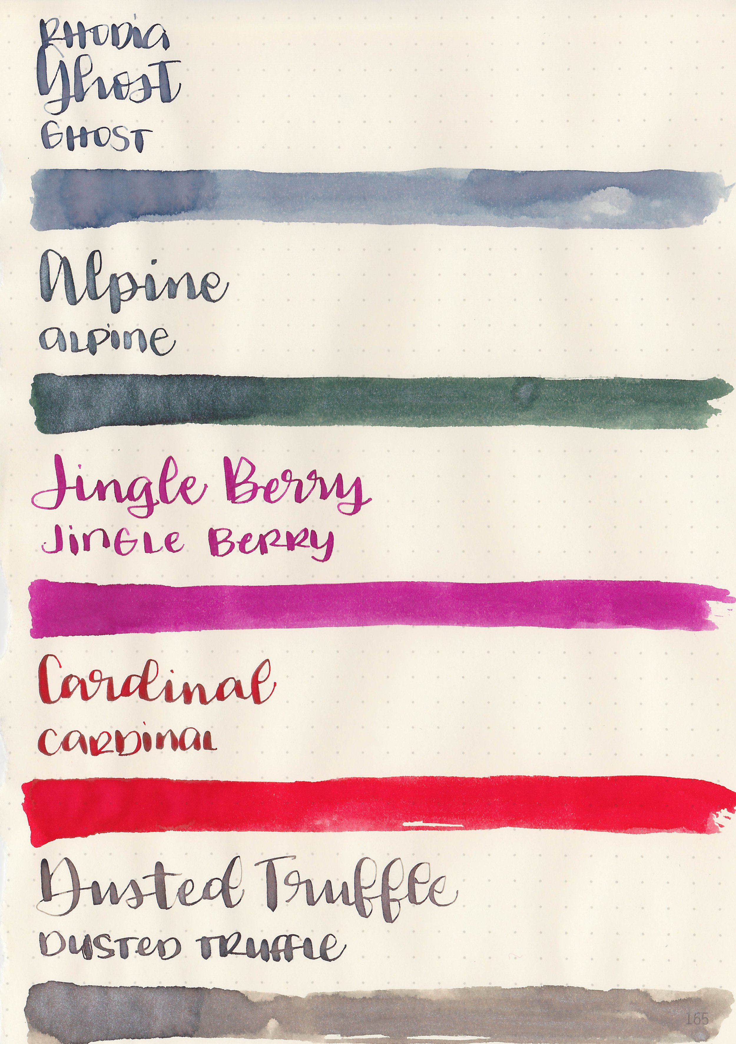
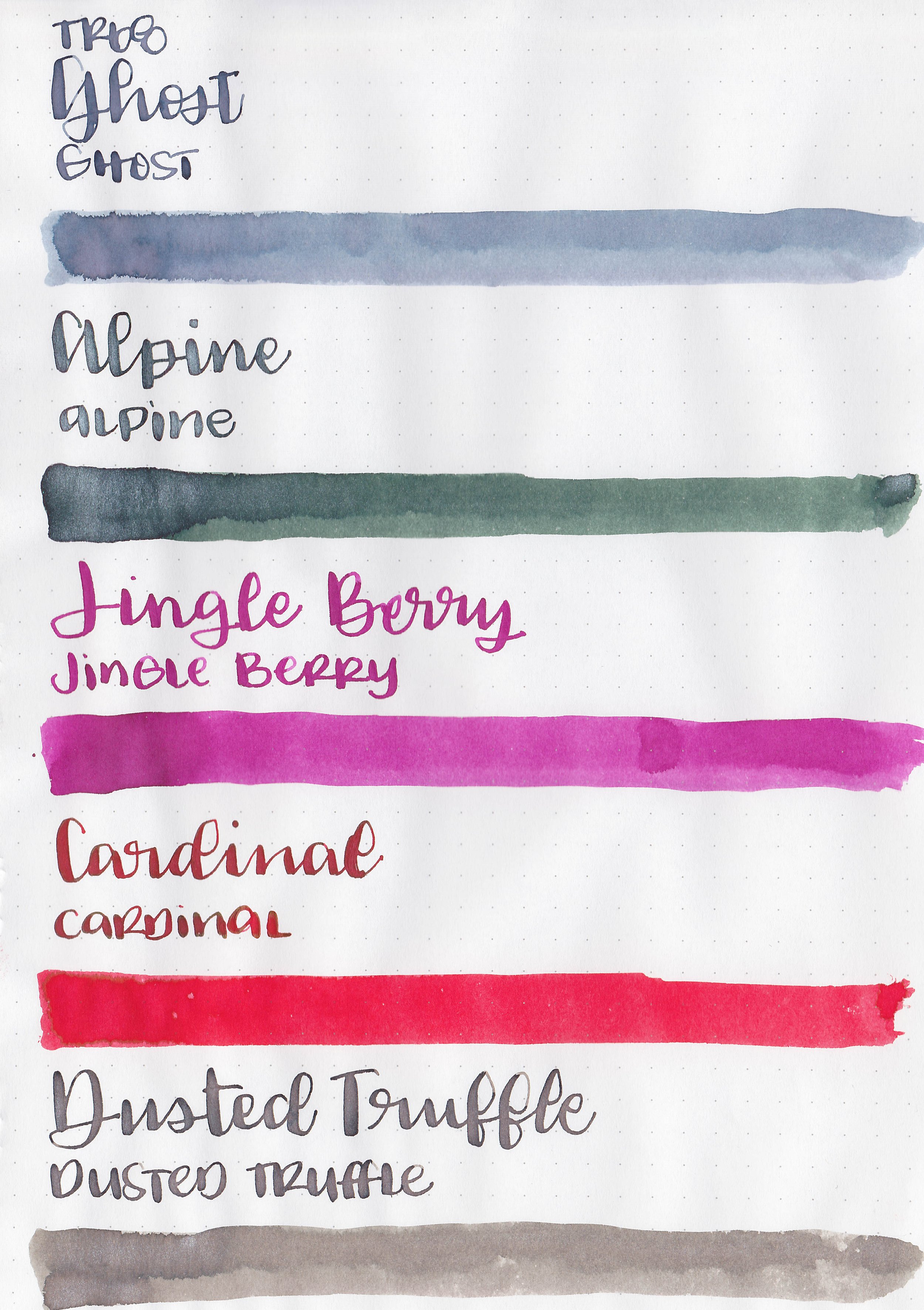
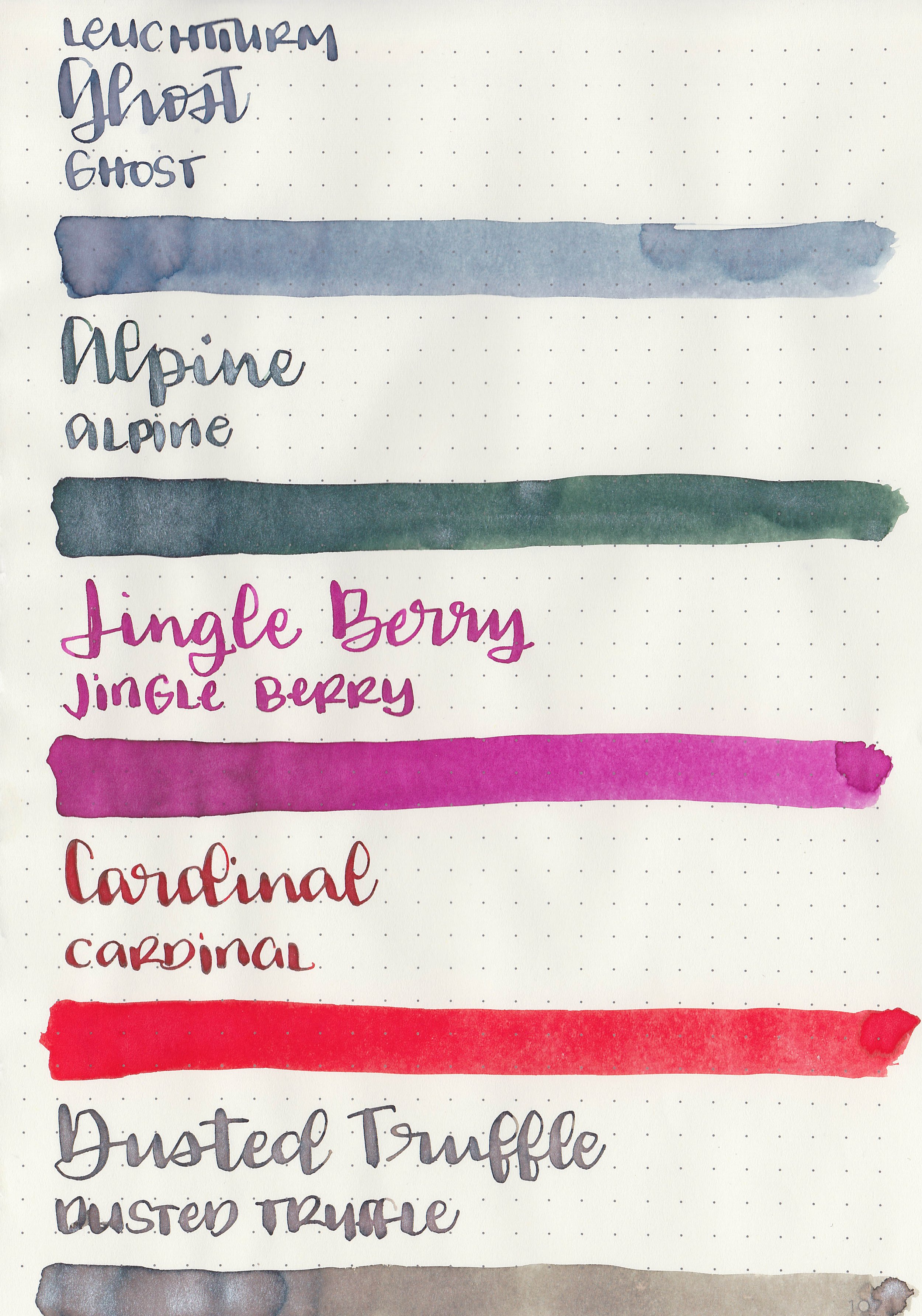
The color:
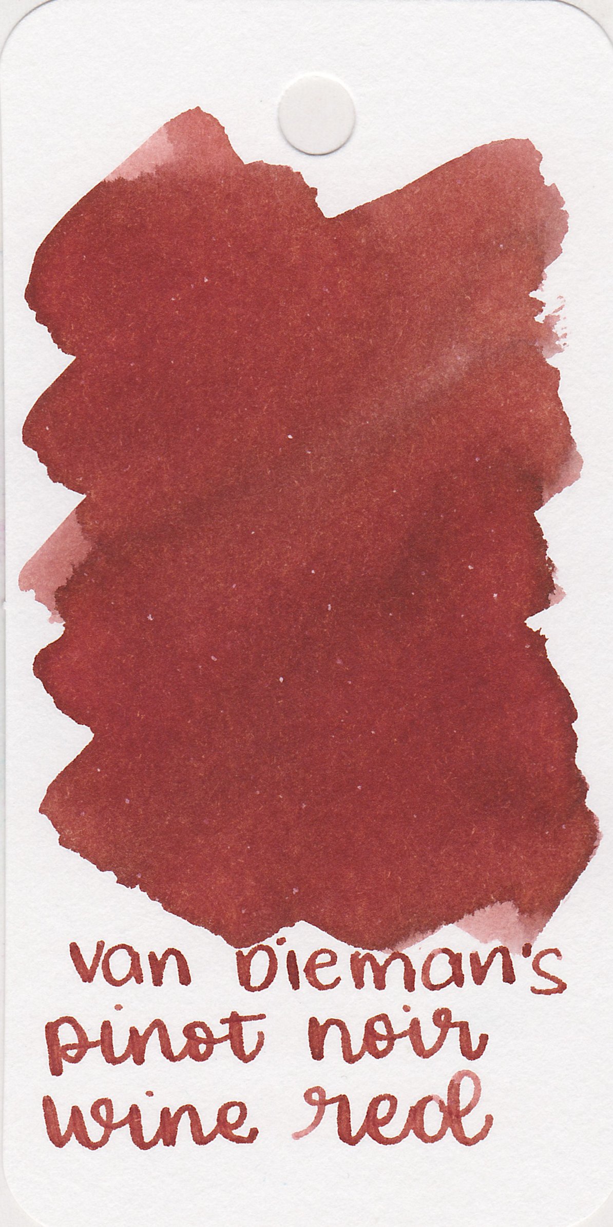
Sailor’s Delight is a deep red-orange. It’s a little bit more red than it is orange.
*For my swab cards I use a Col-o-ring by Skylab Letterpress, a medium Pilot Ishime and a Mabie Todd Swan.
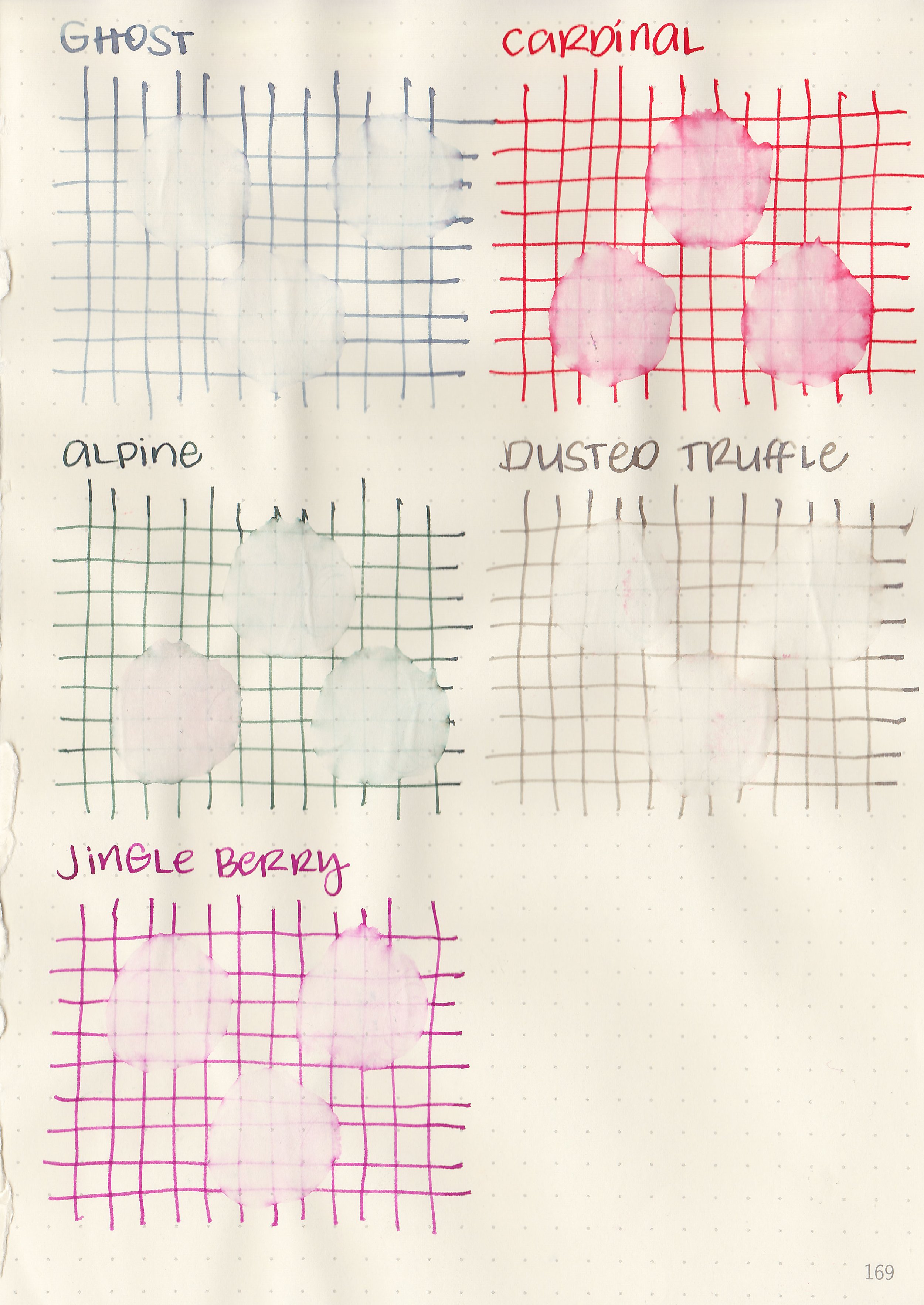
Swabs:

In large swabs on Tomoe River paper the ink is less orange than it is on the Col-o-ring.

Writing samples:
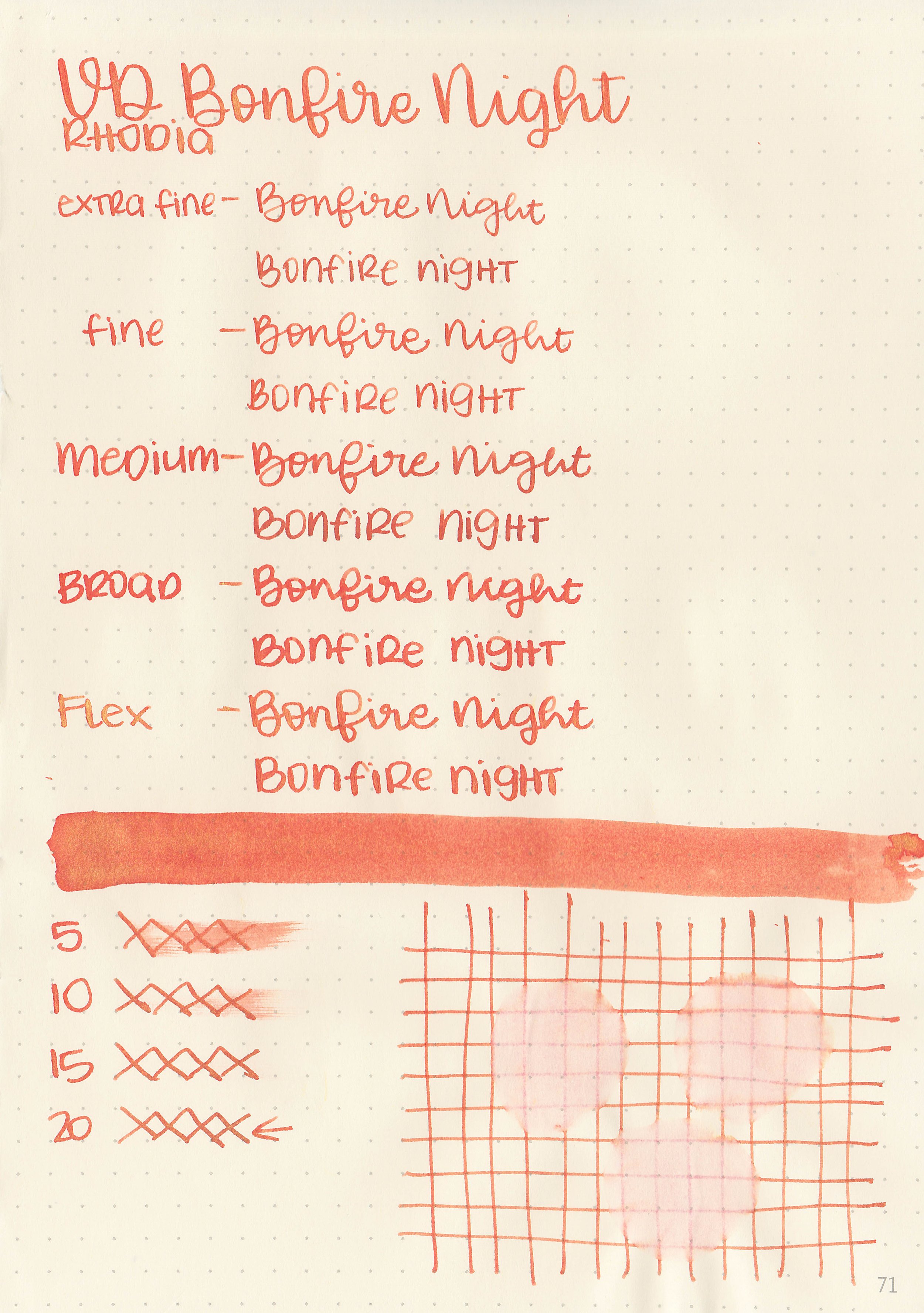
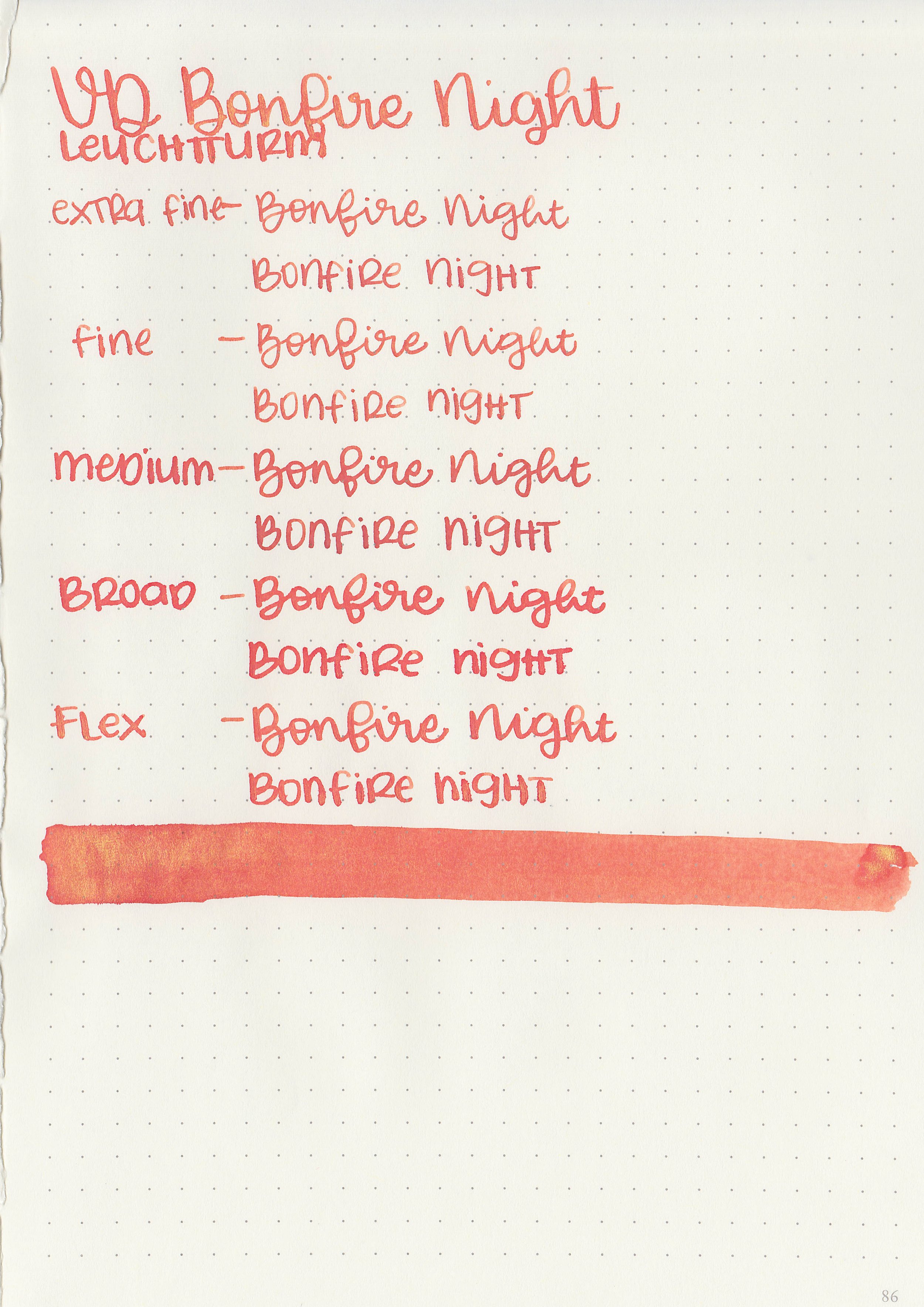
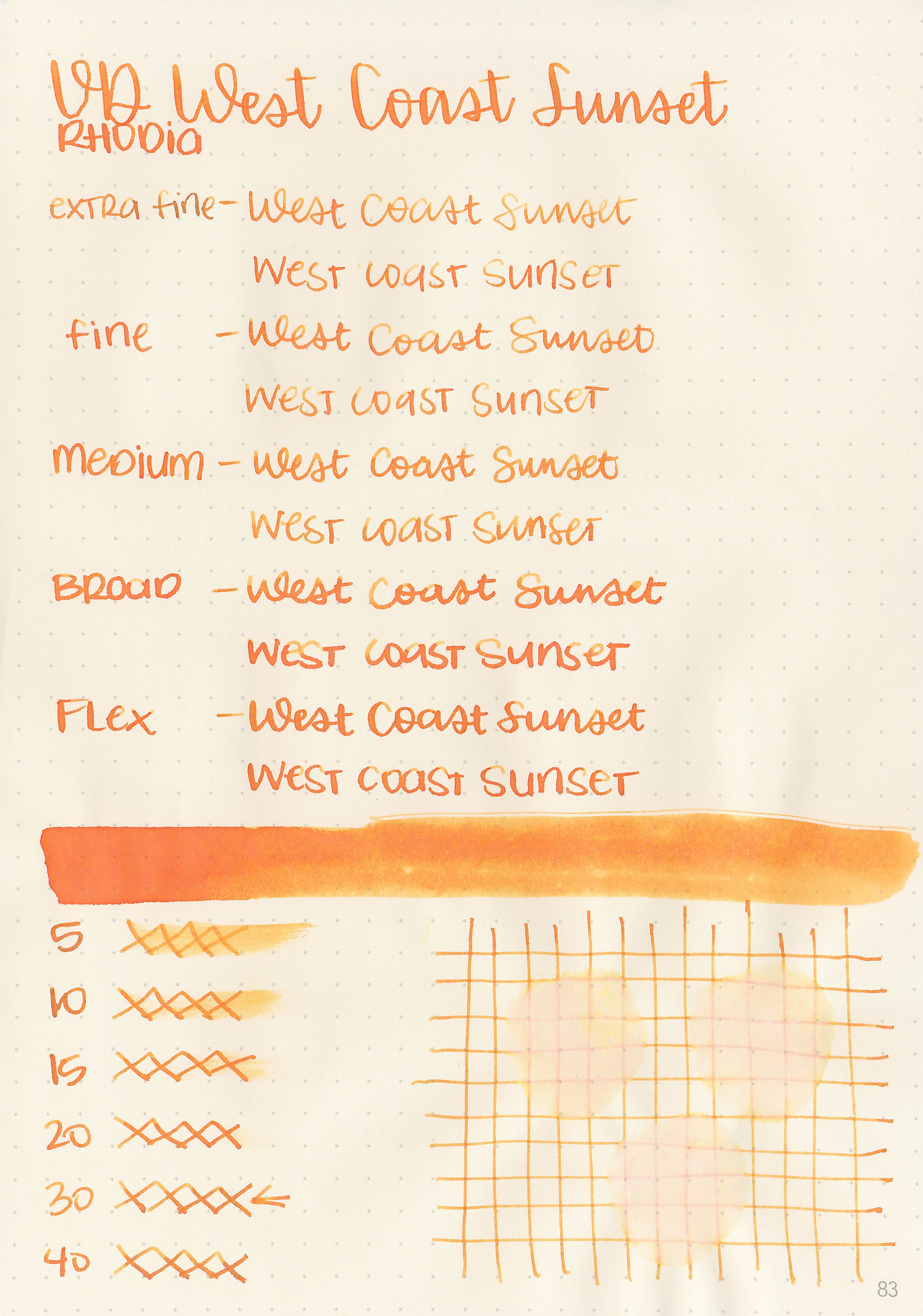
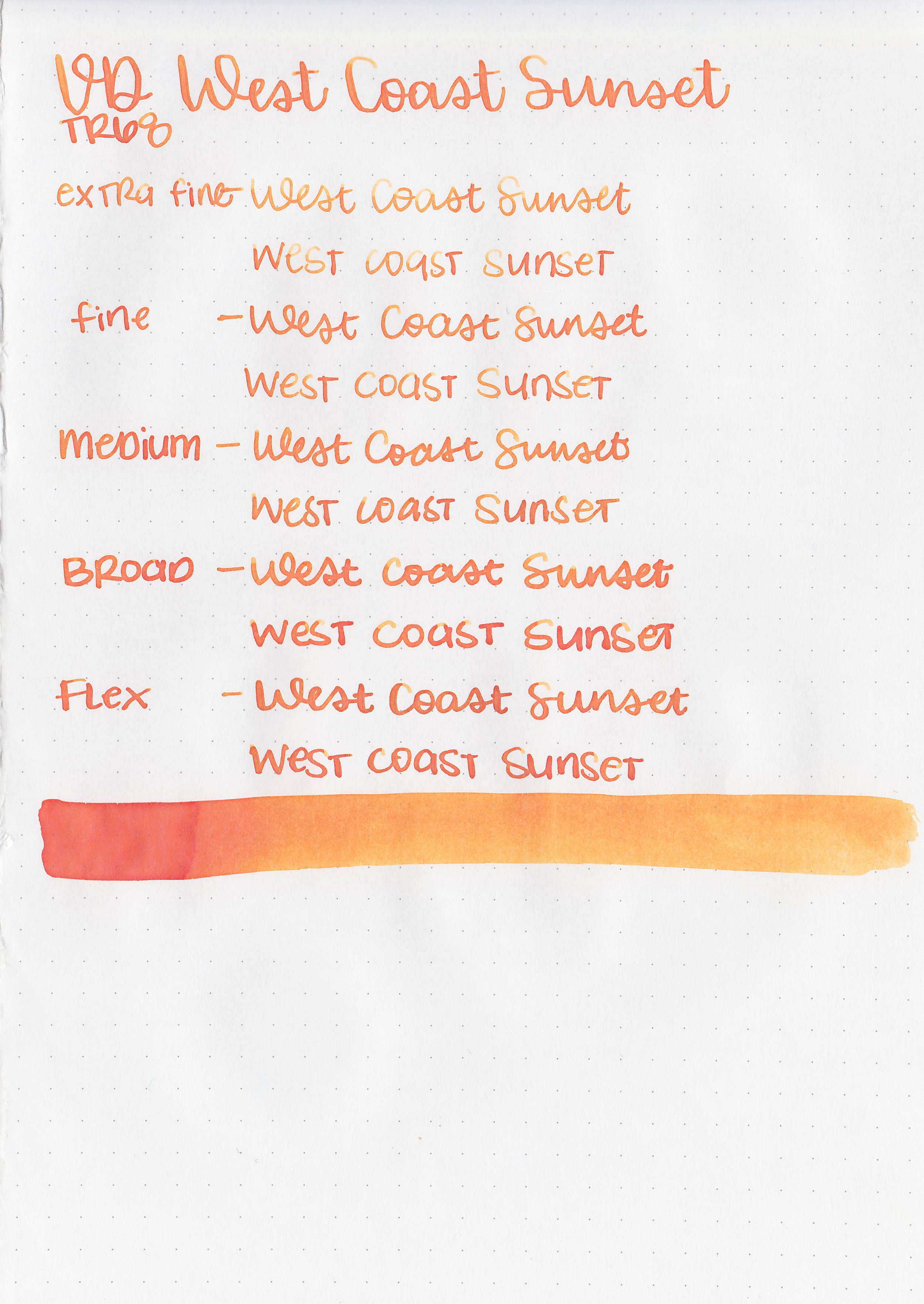
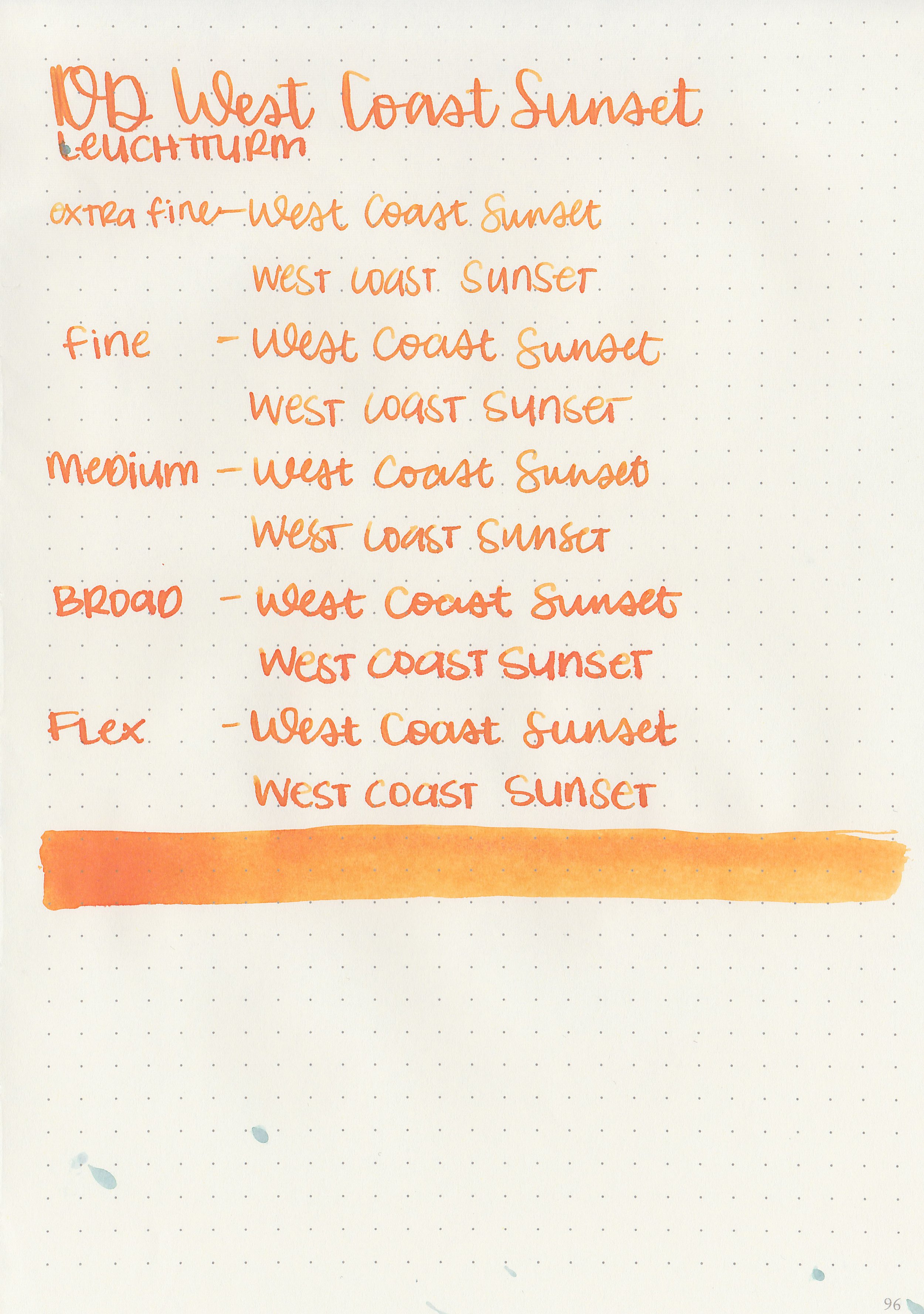
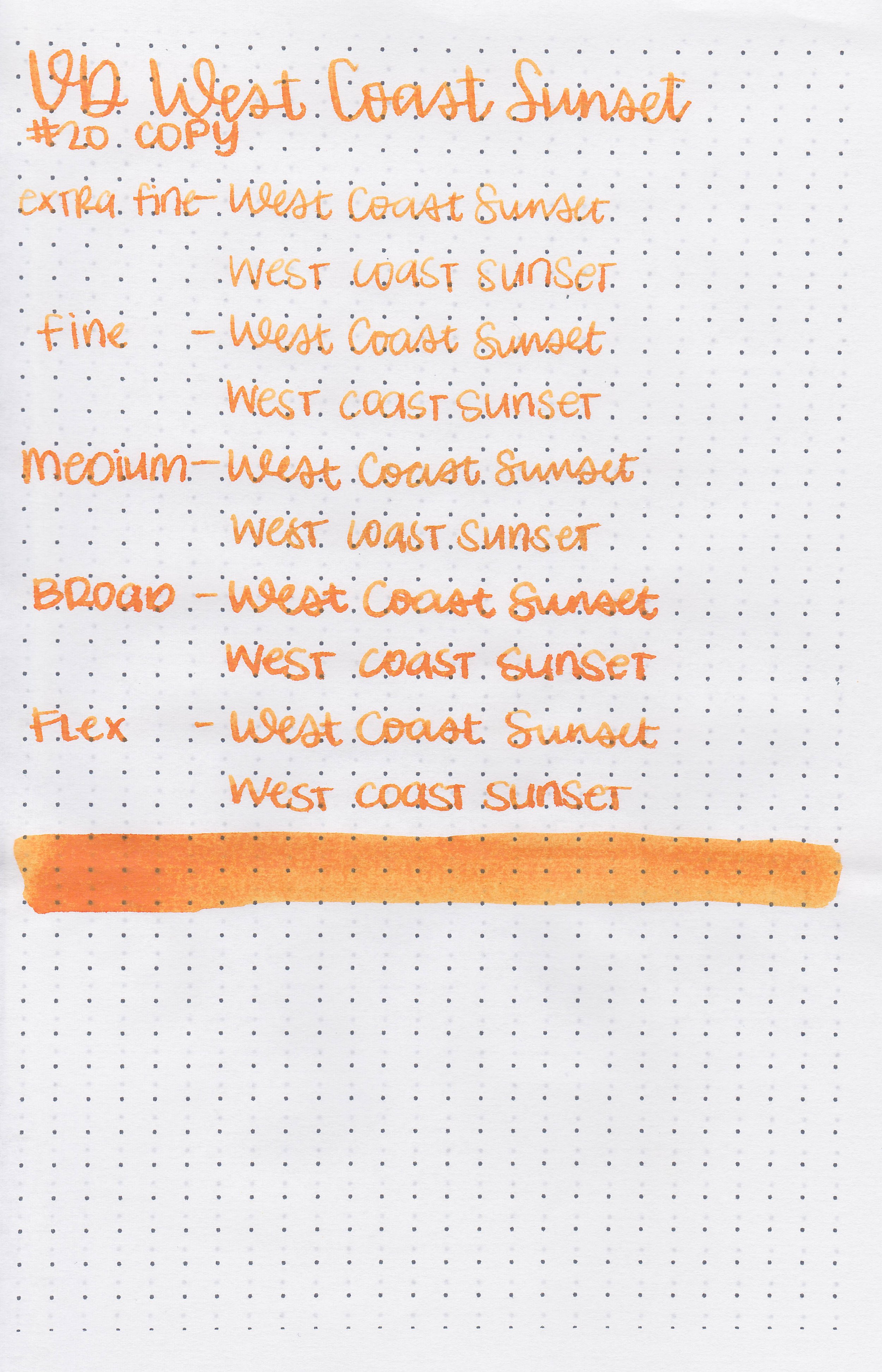
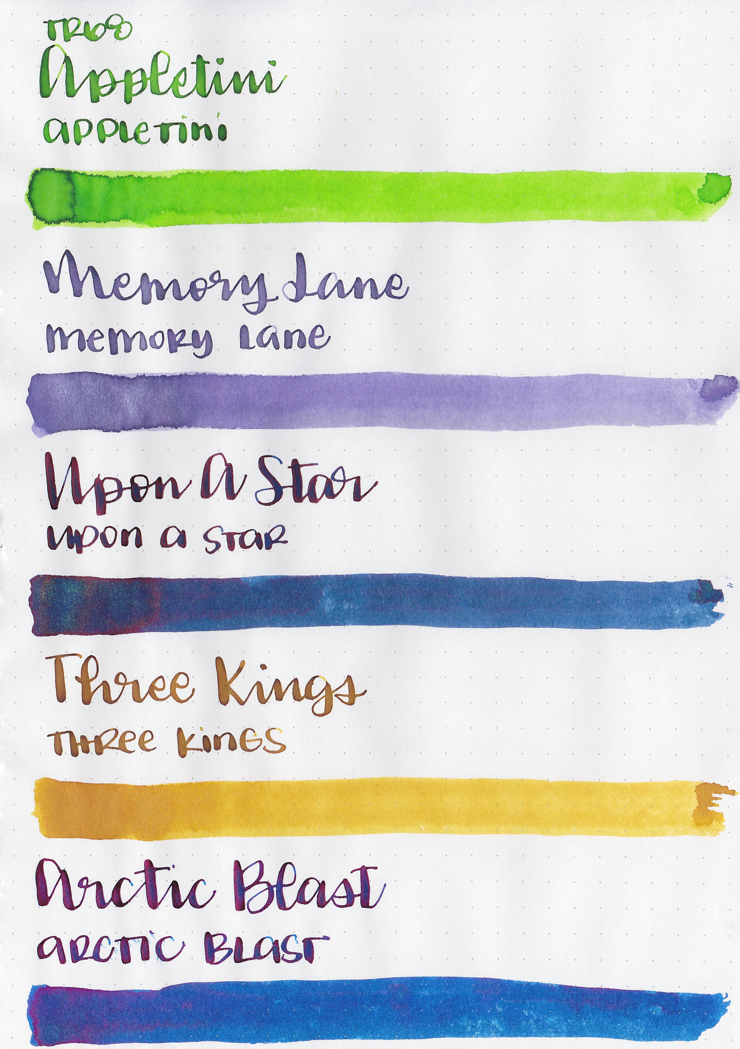
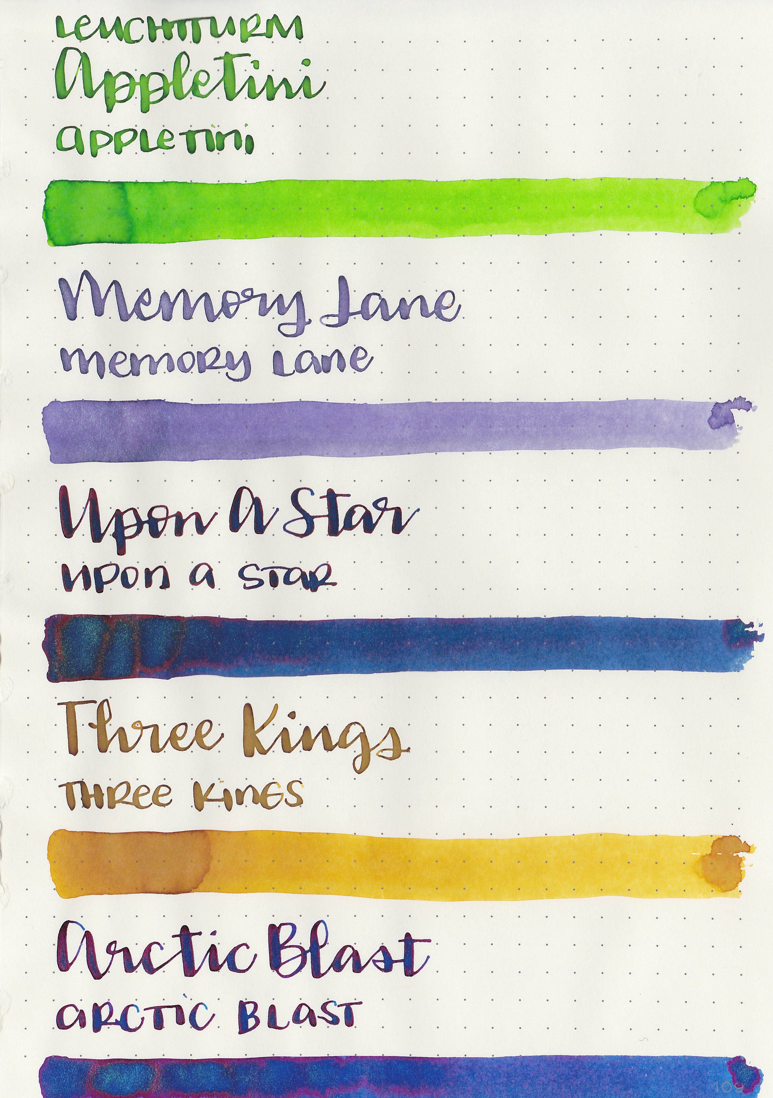
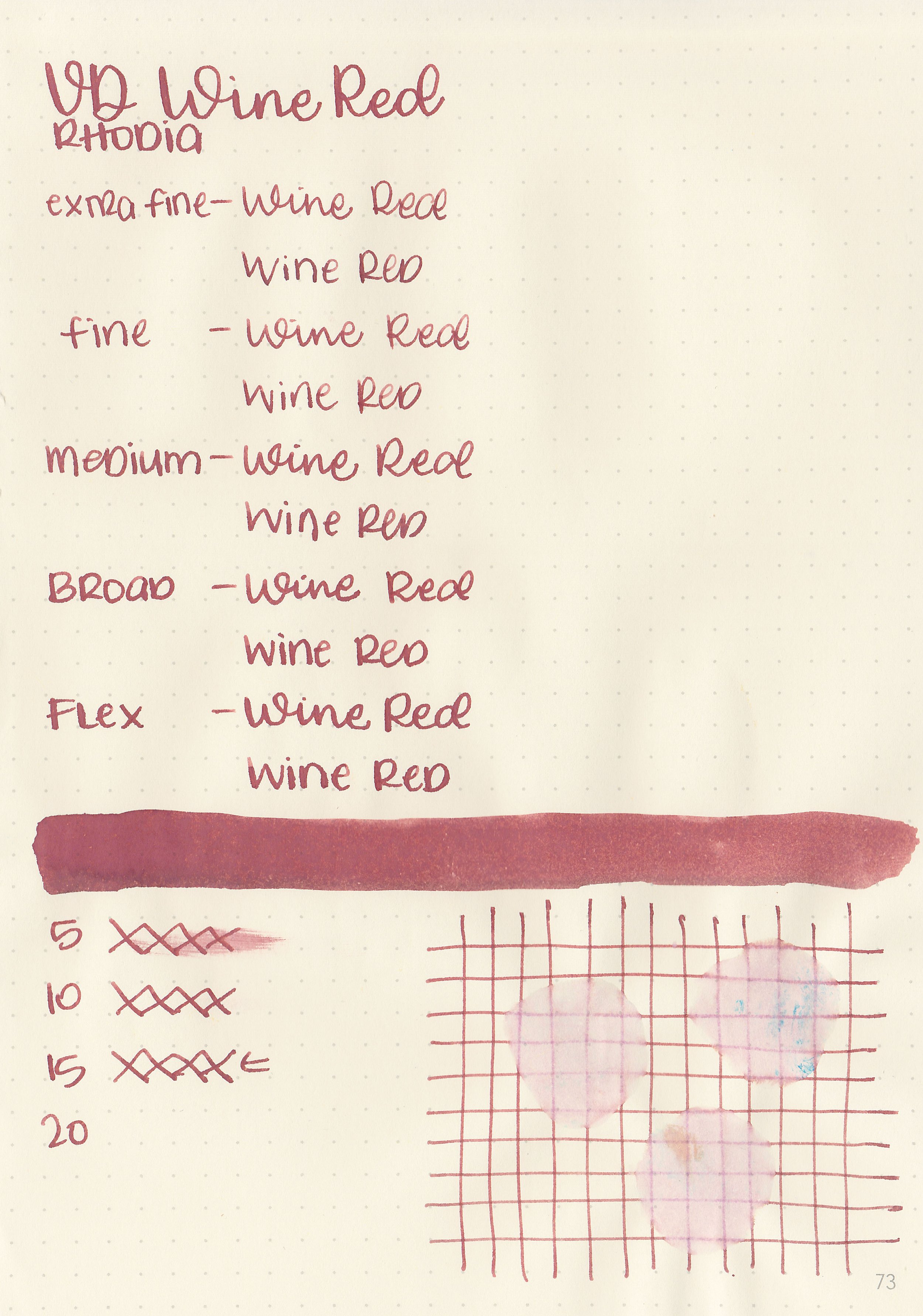
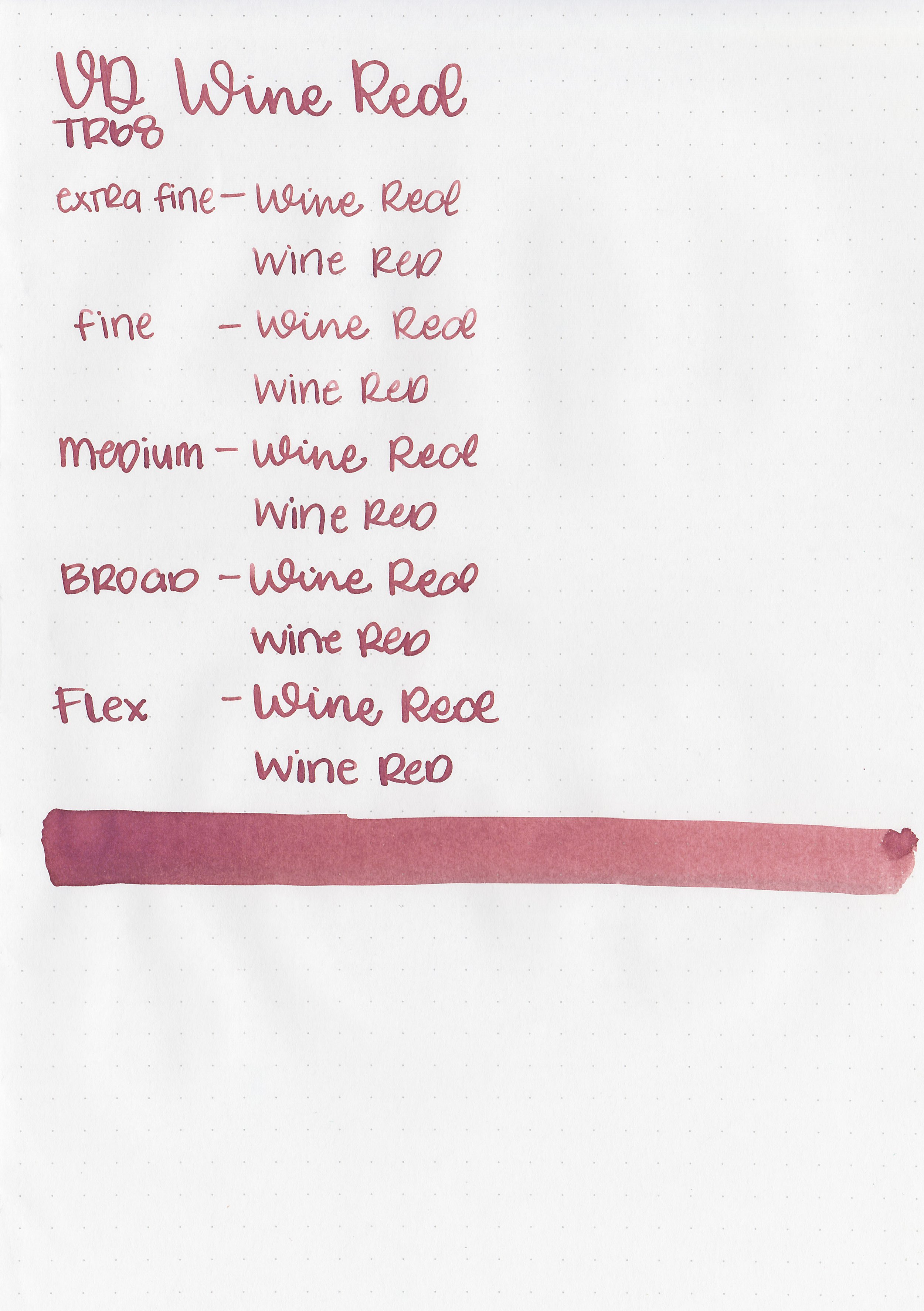
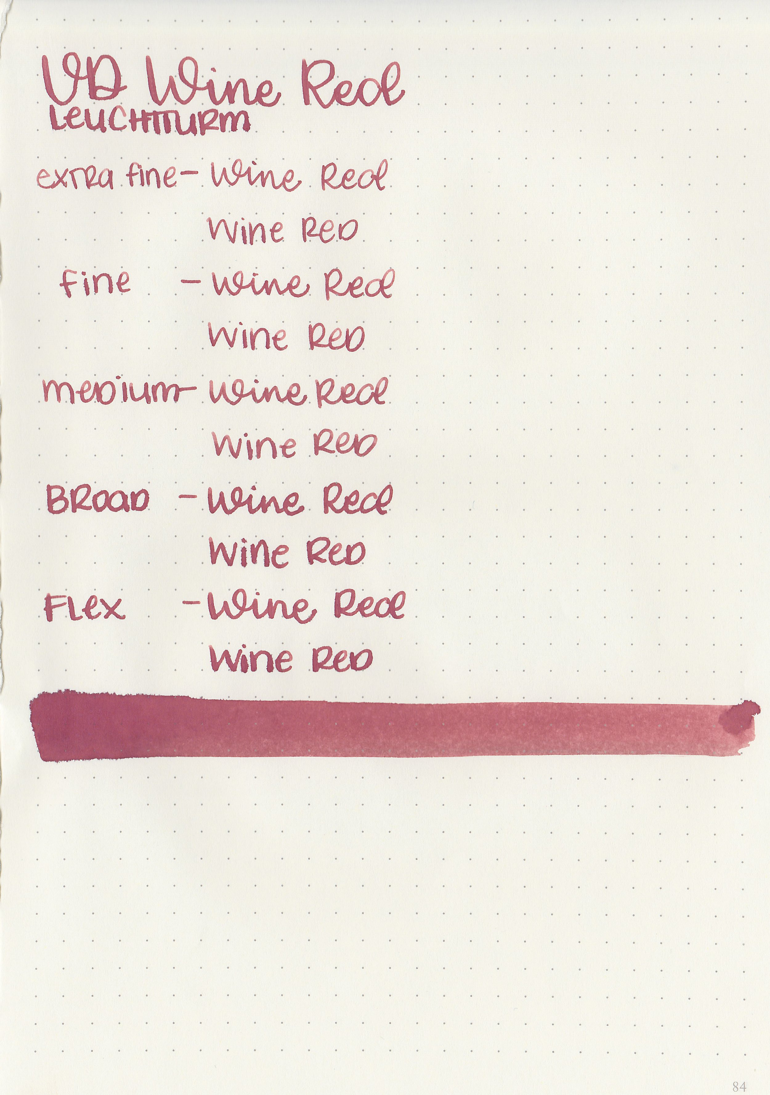
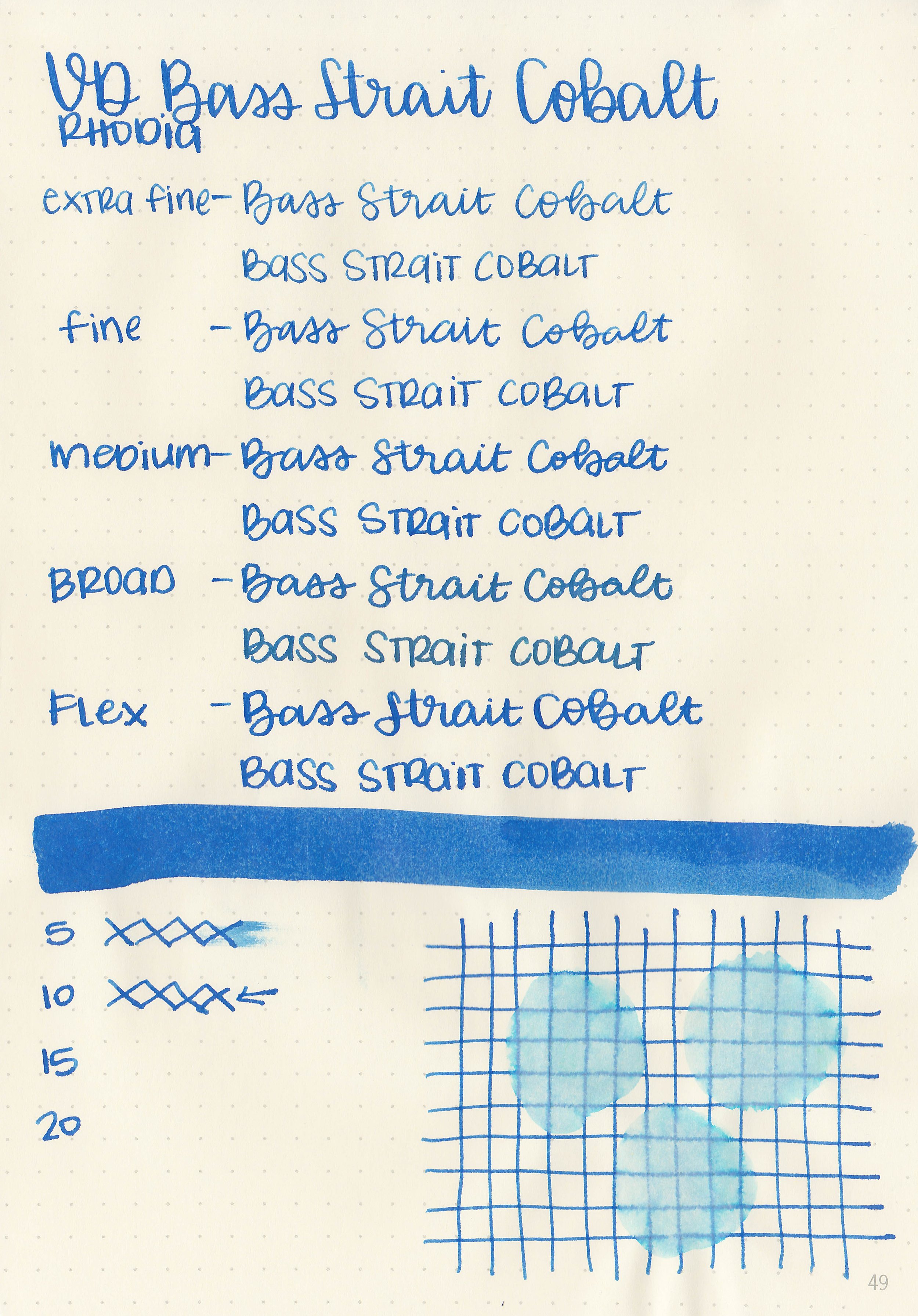
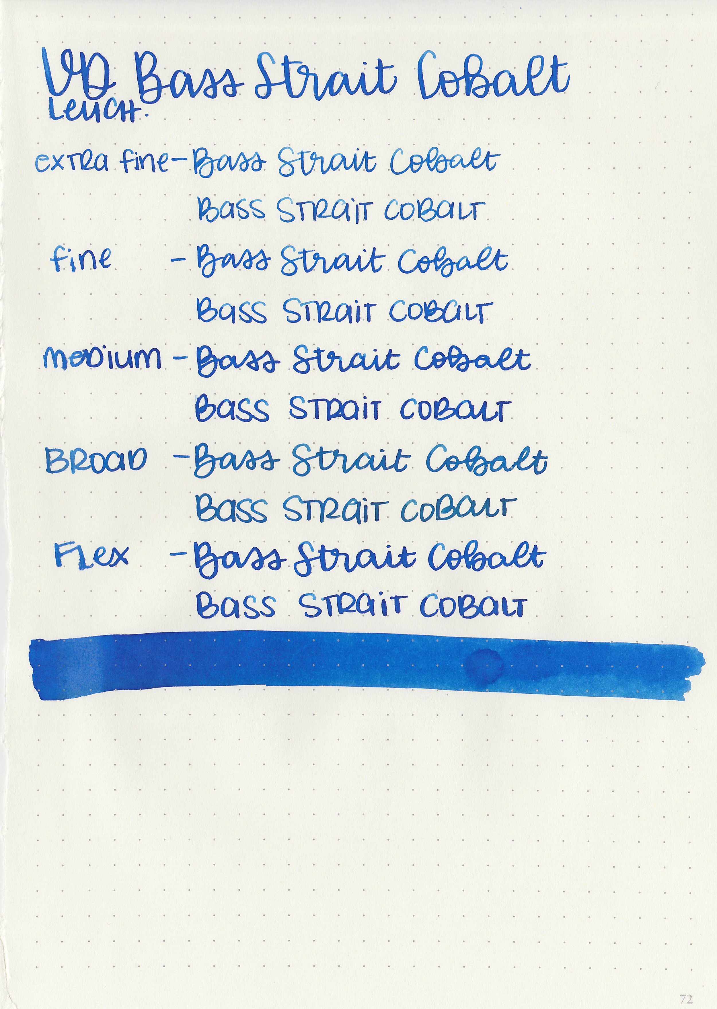
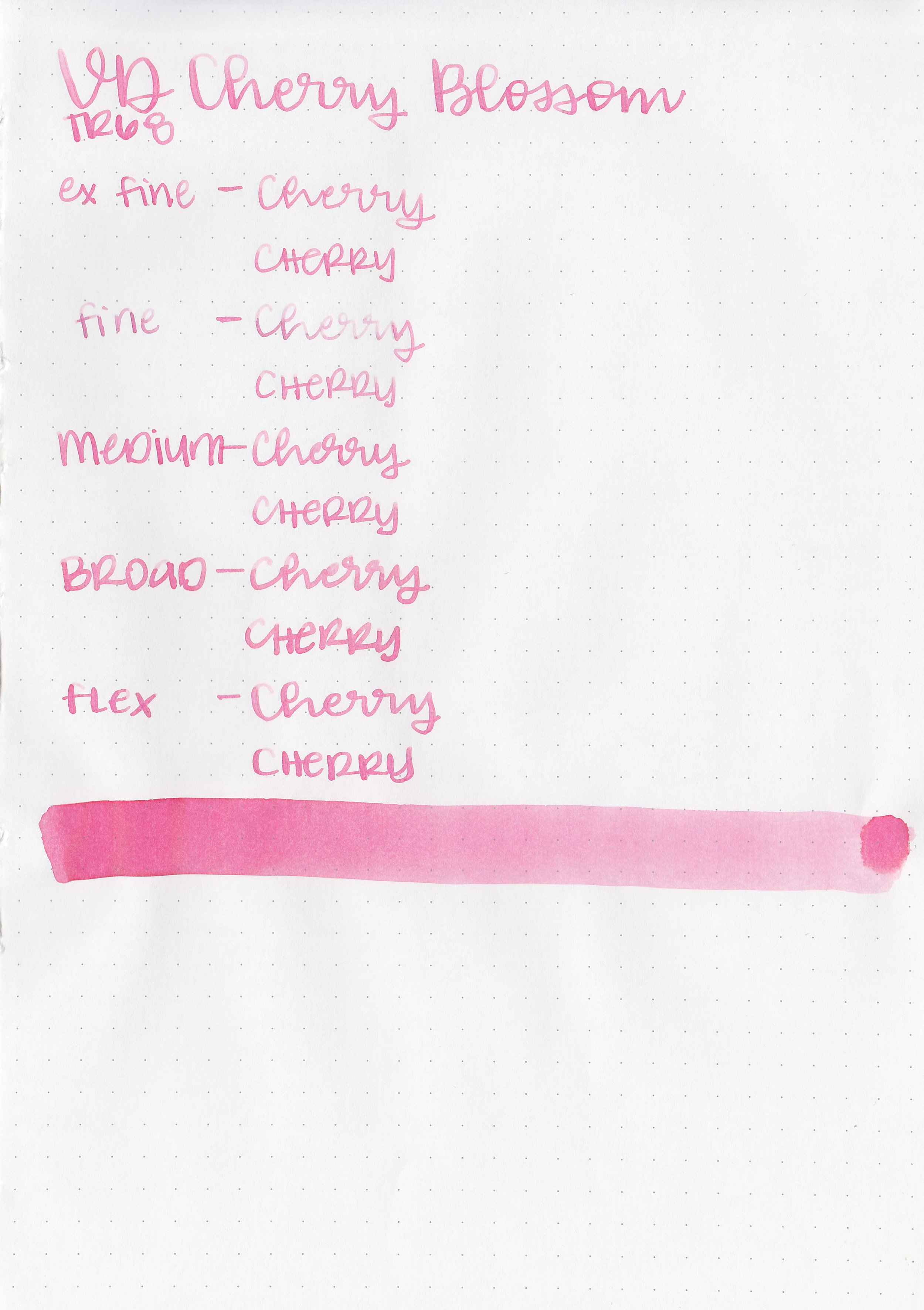
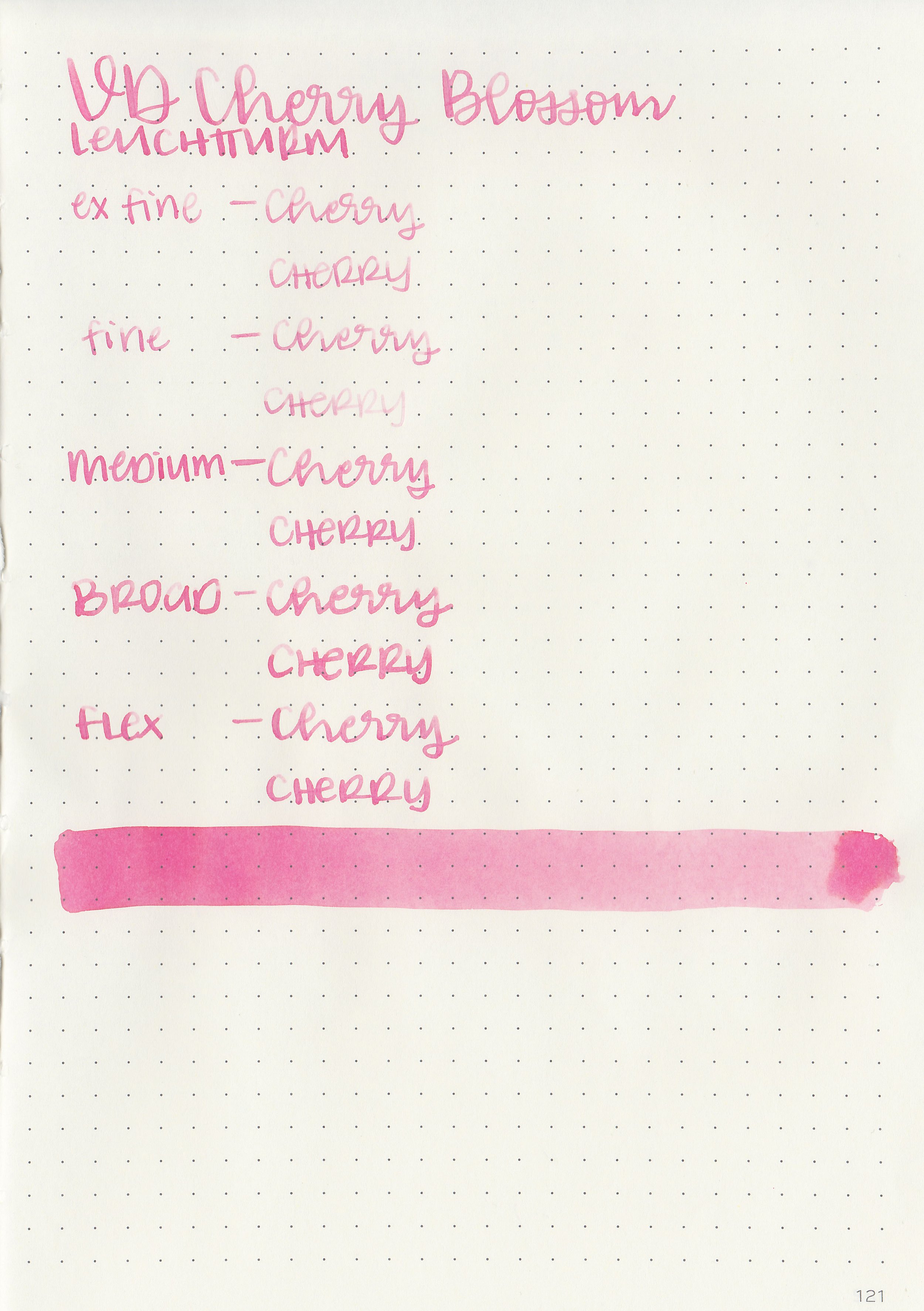
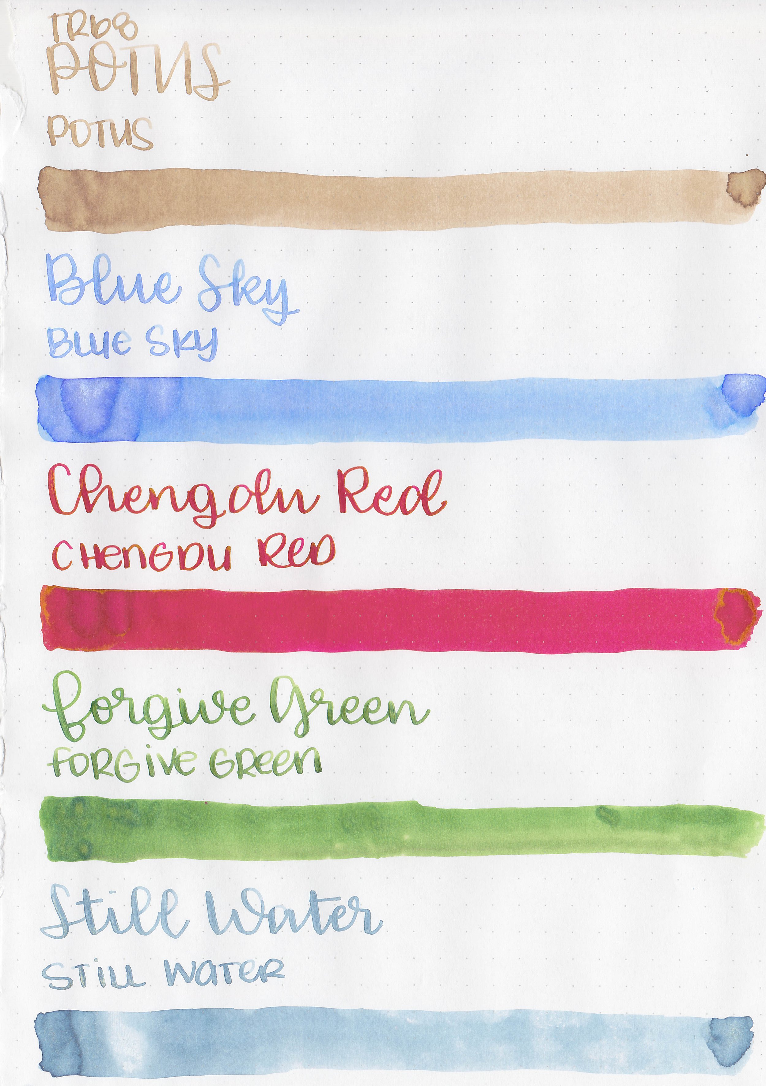
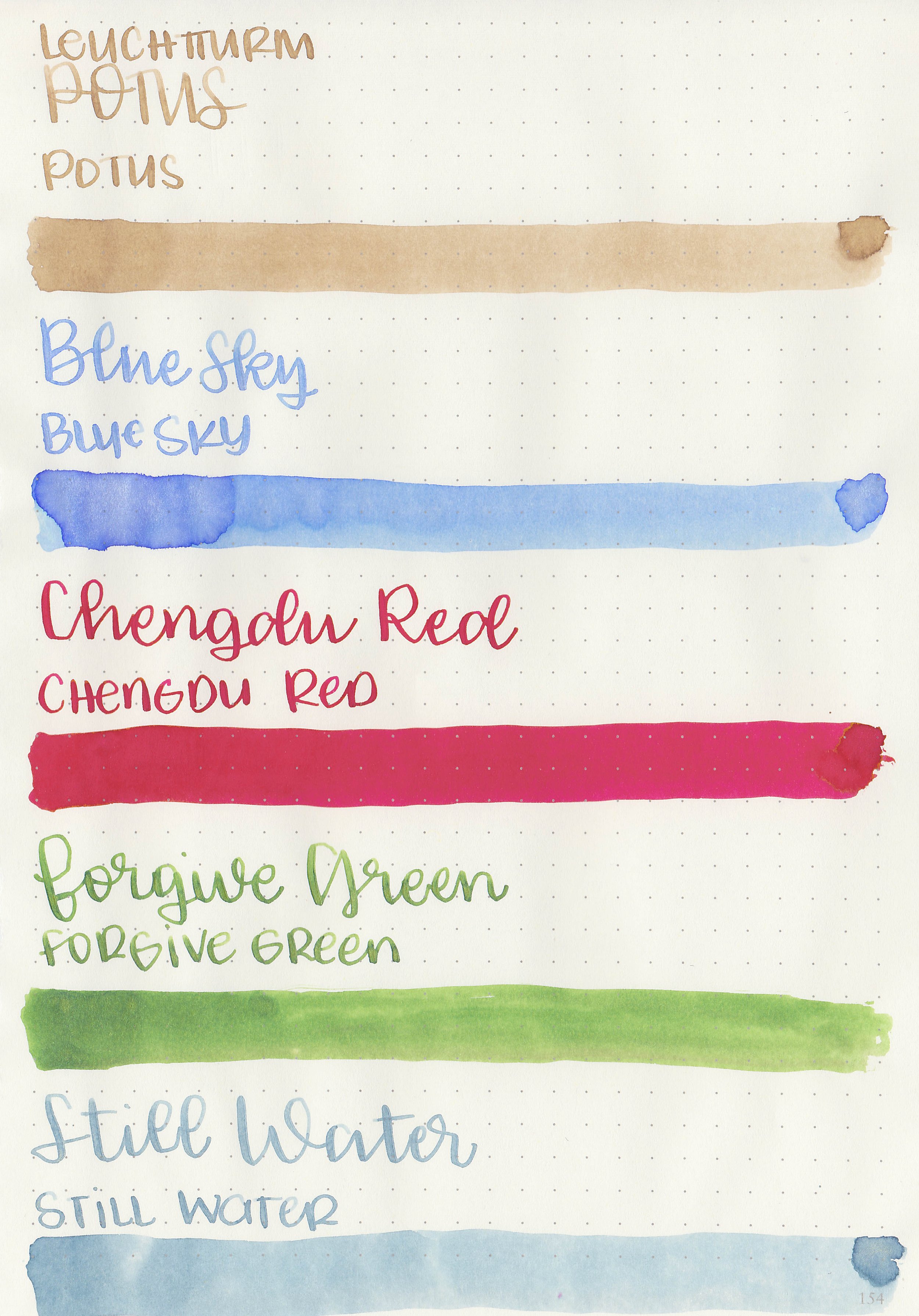
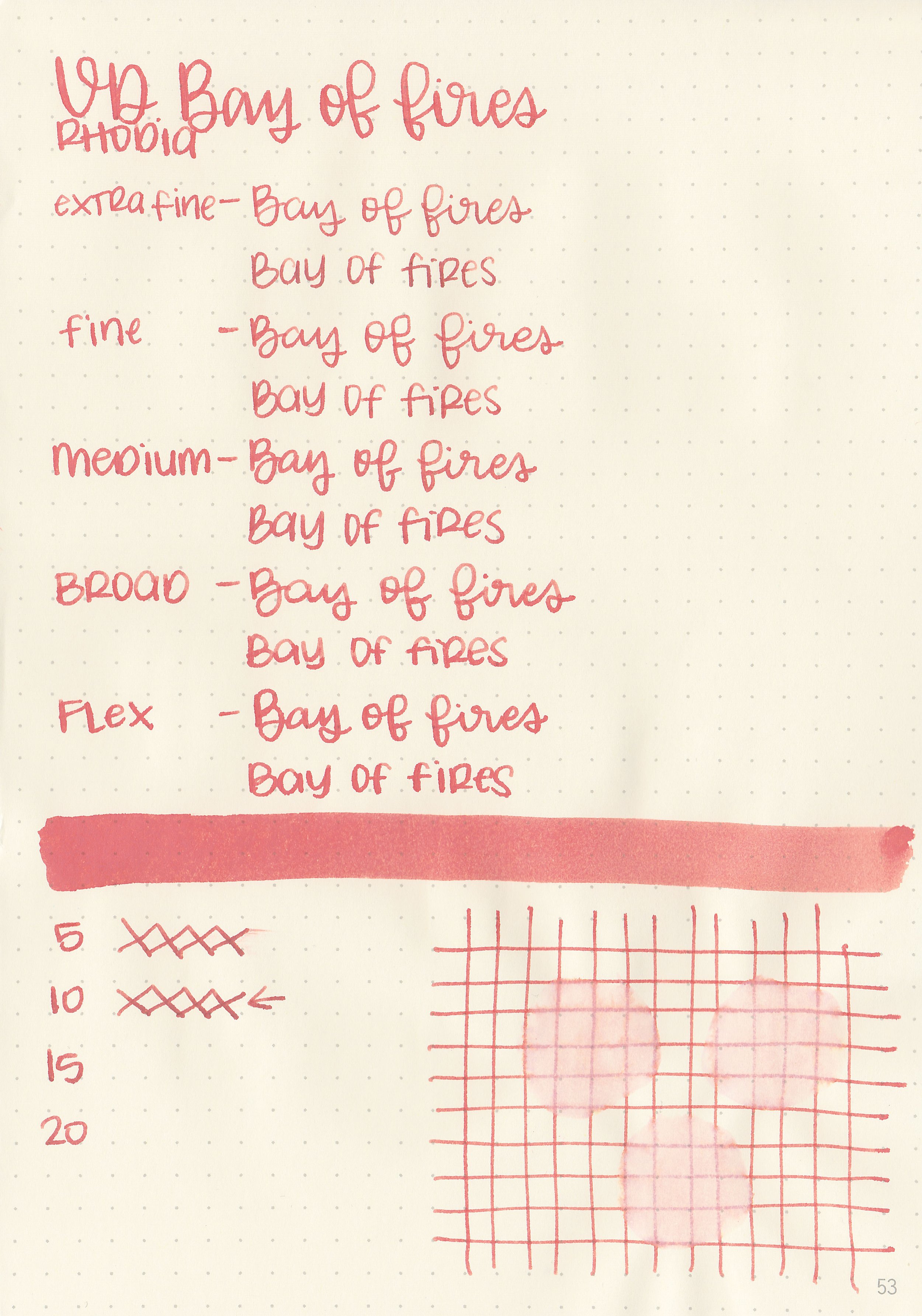
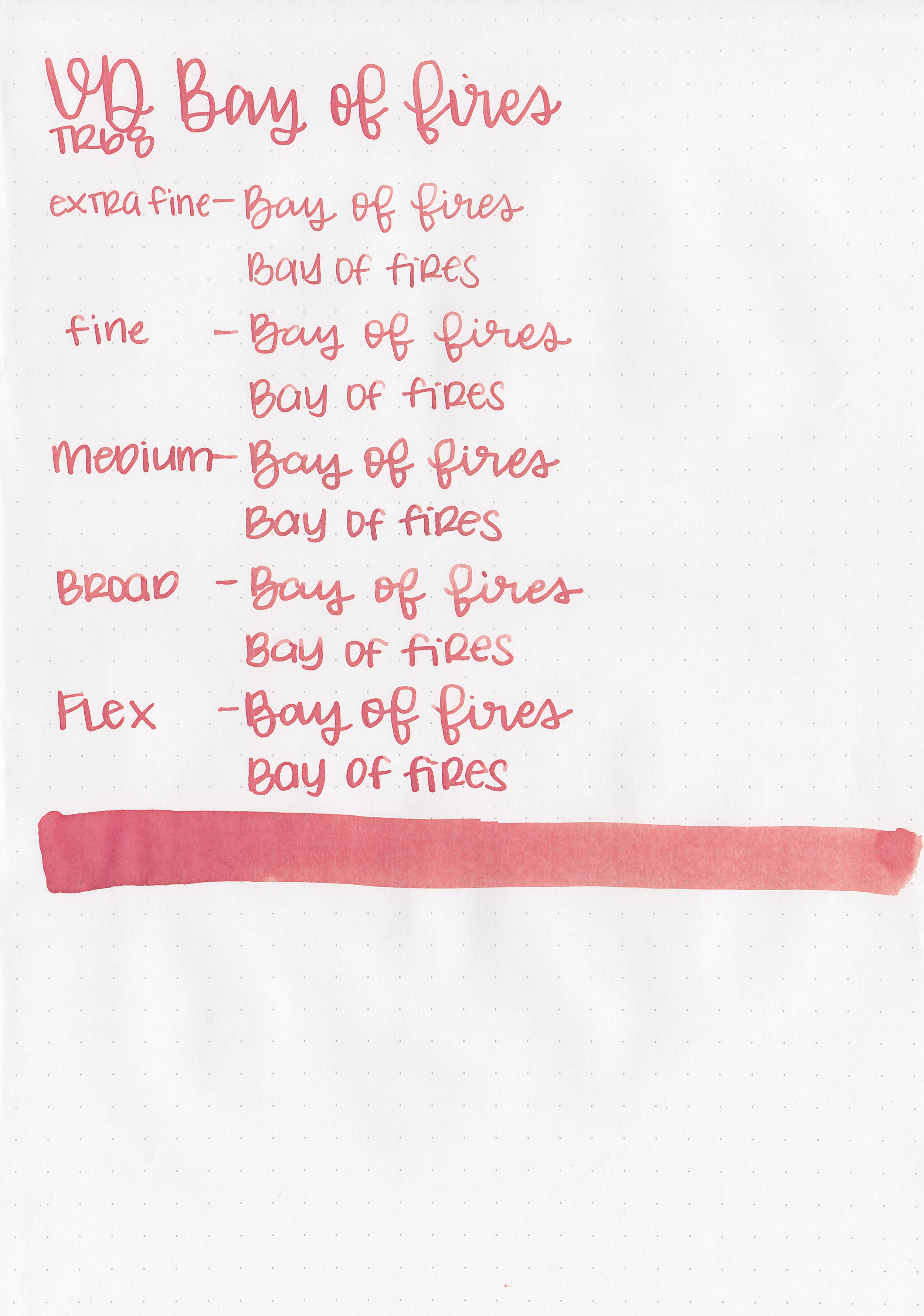
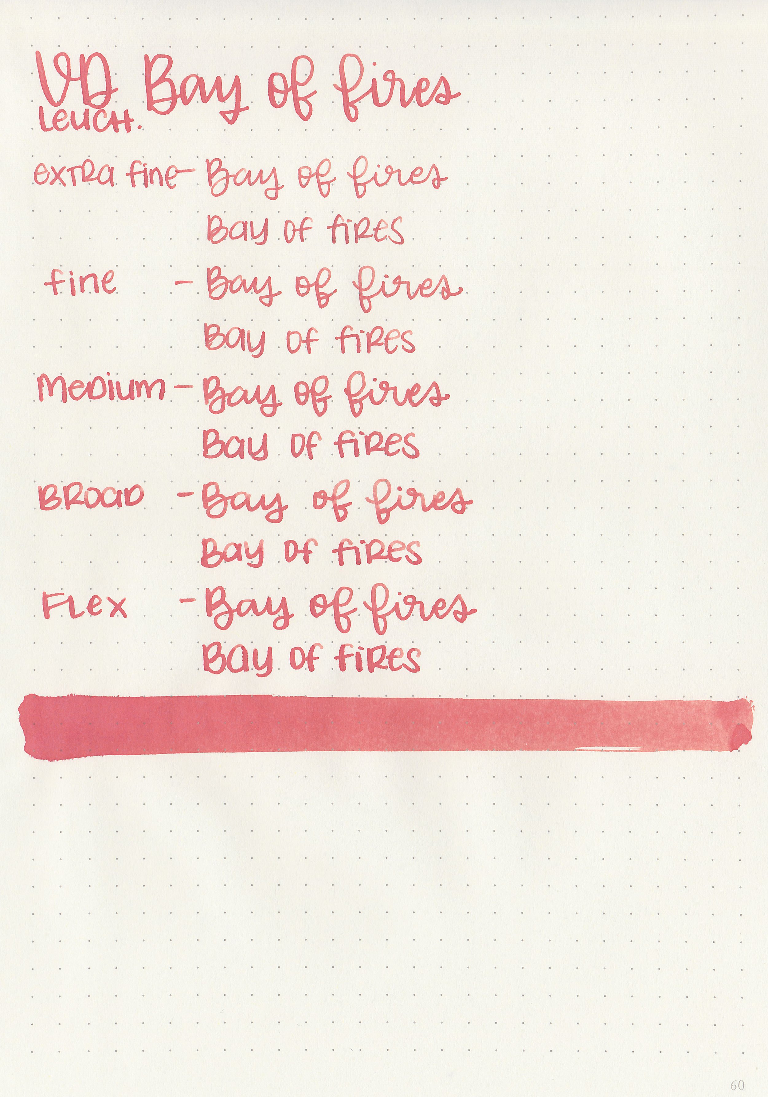
Let's take a look at how the ink behaves on fountain pen friendly papers: Rhodia, Tomoe River, and Leuchtturm.
*For my writing samples I use:
Vintage Mabie Todd Swan (flex nib)
Taroko Enigma notebooks (68gsm TR)


Dry time: 20 seconds
Water resistance: Medium


Feathering: Medium
Show through: Medium


Bleeding: Low
Other properties: no shading, no sheen, and no shimmer.


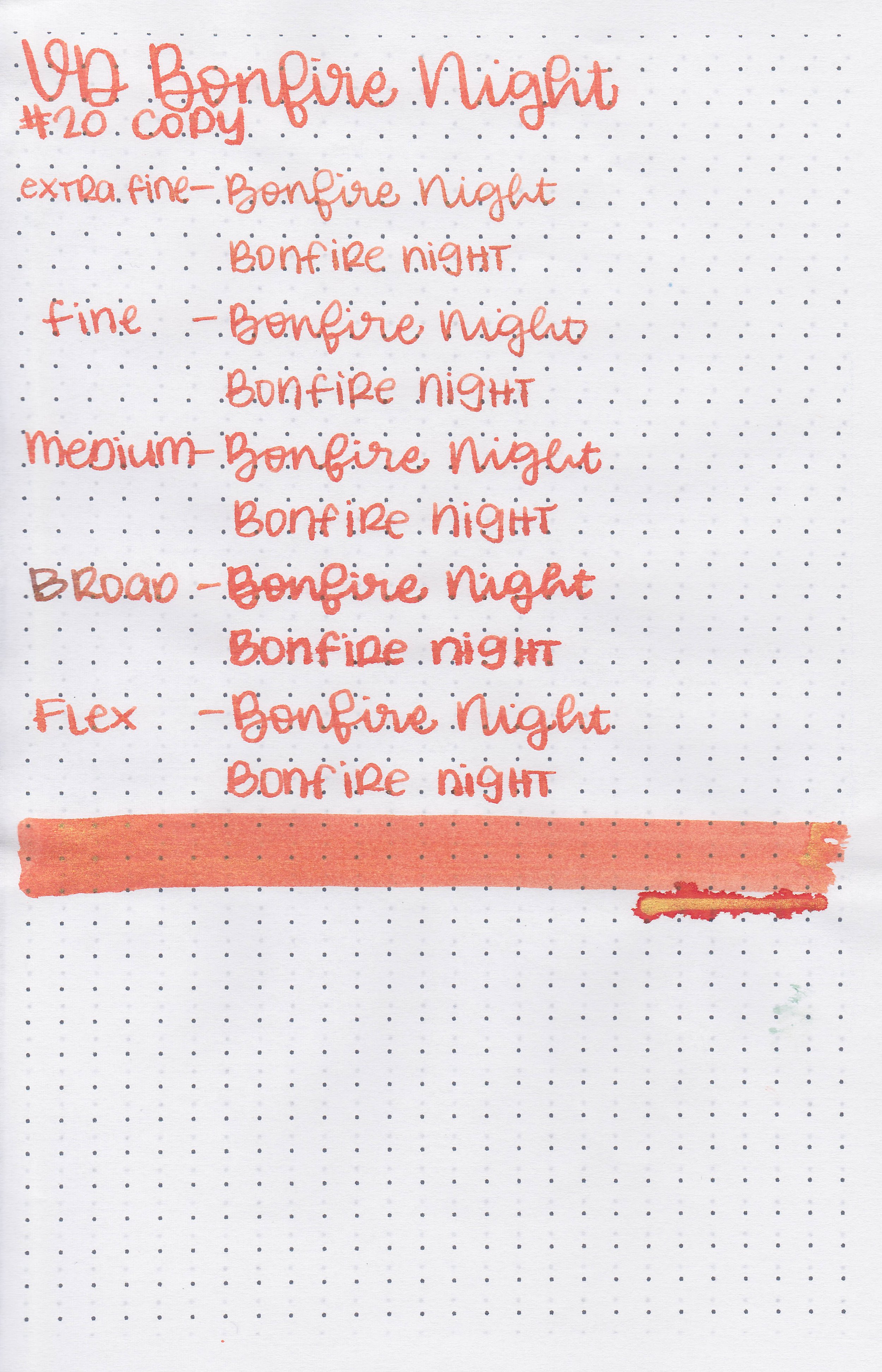
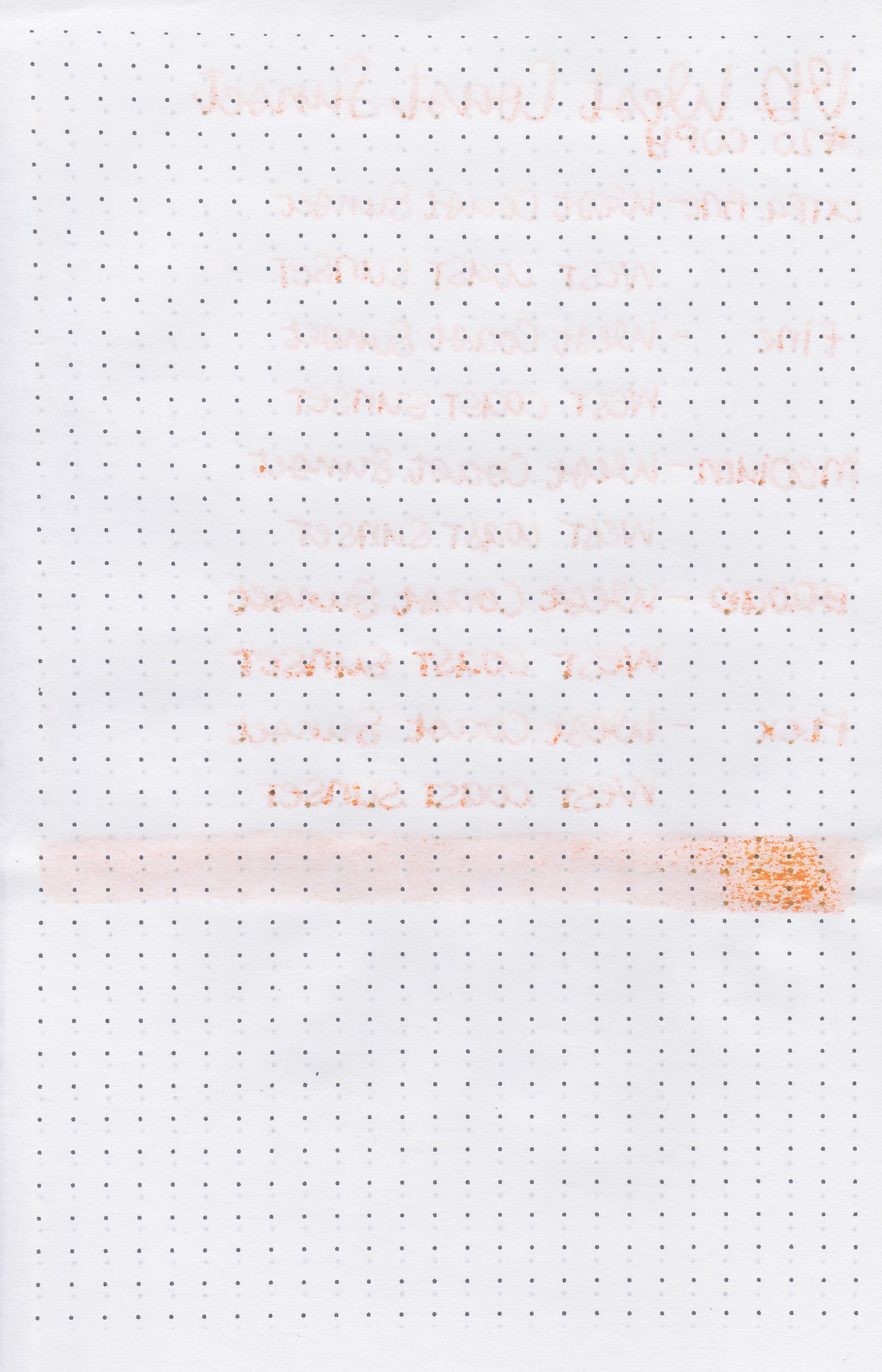
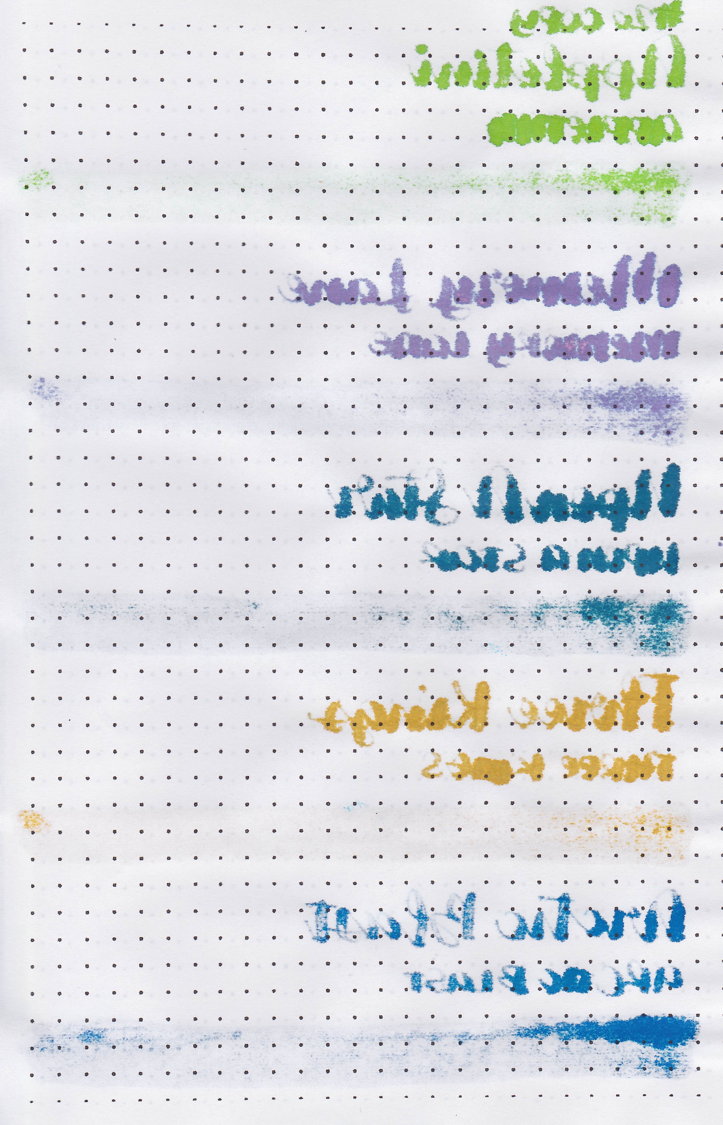
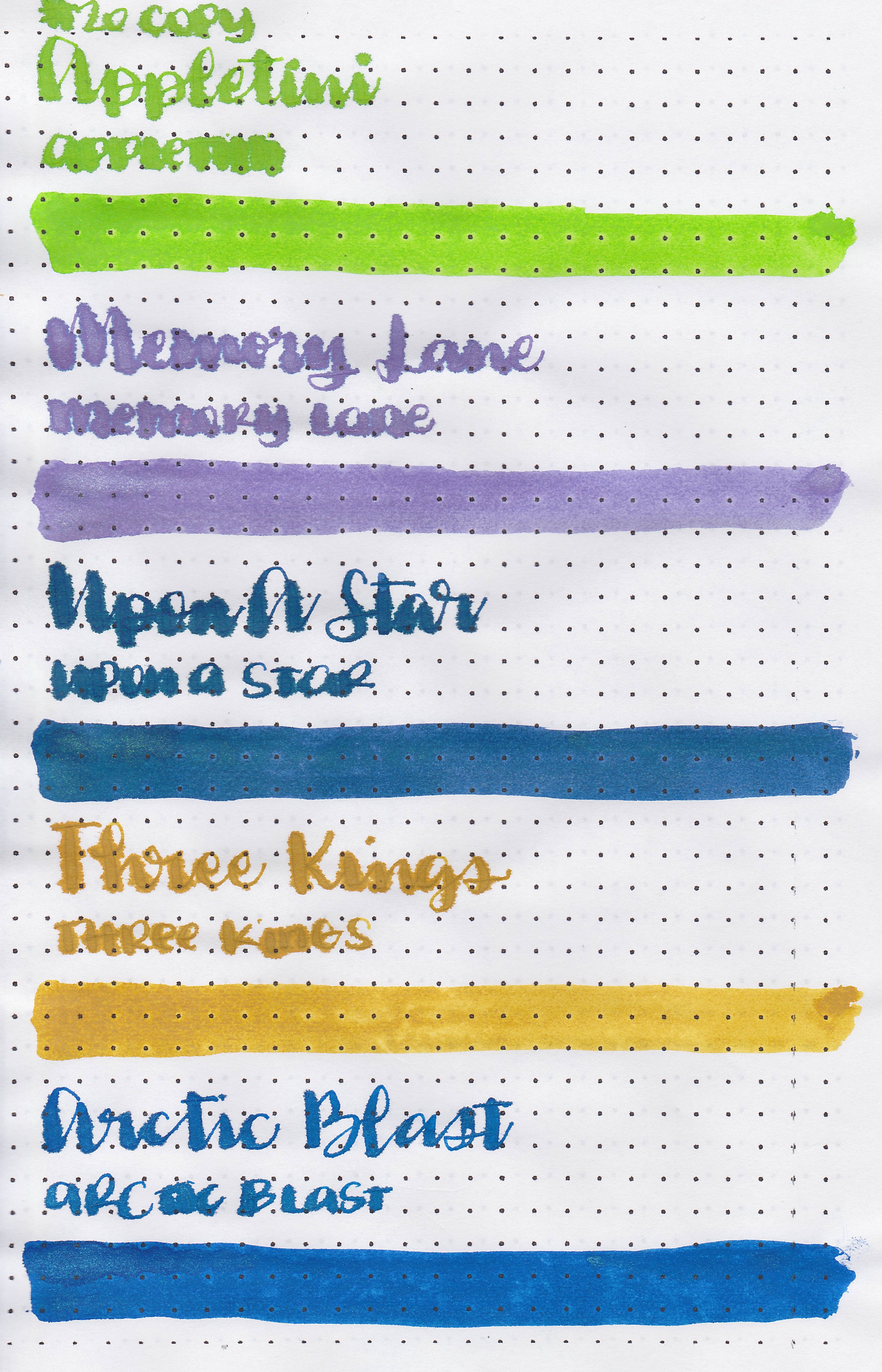
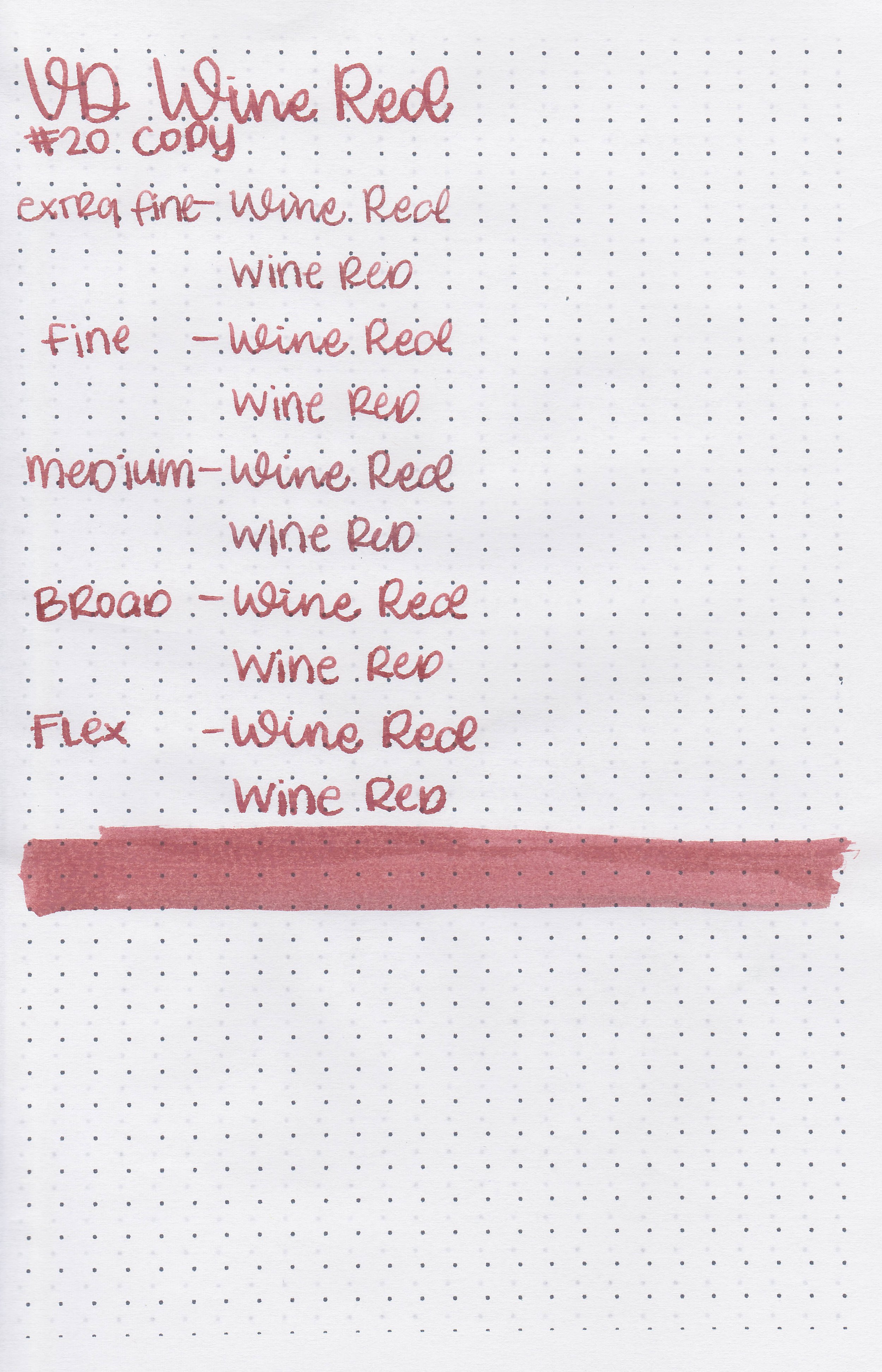
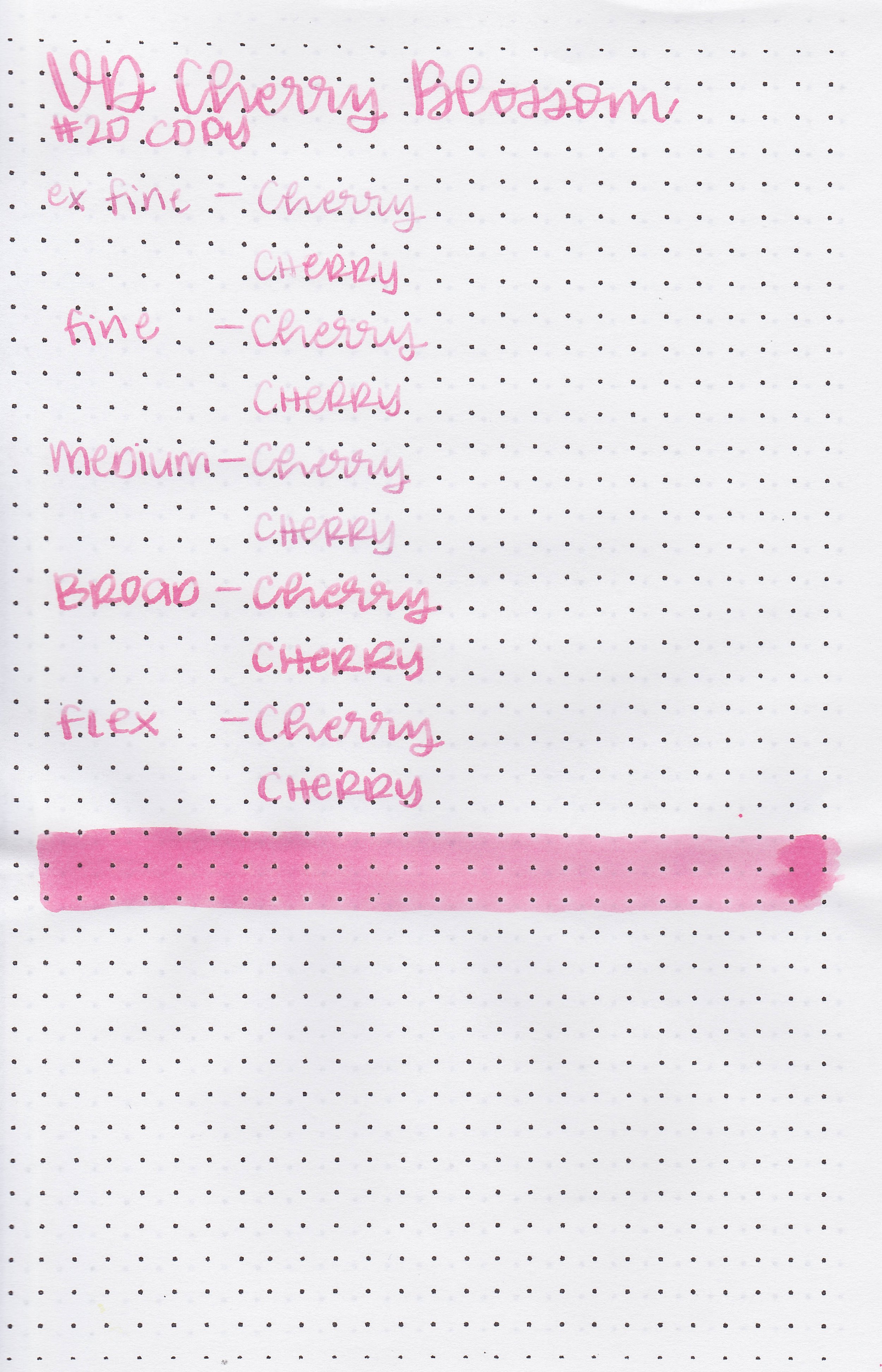
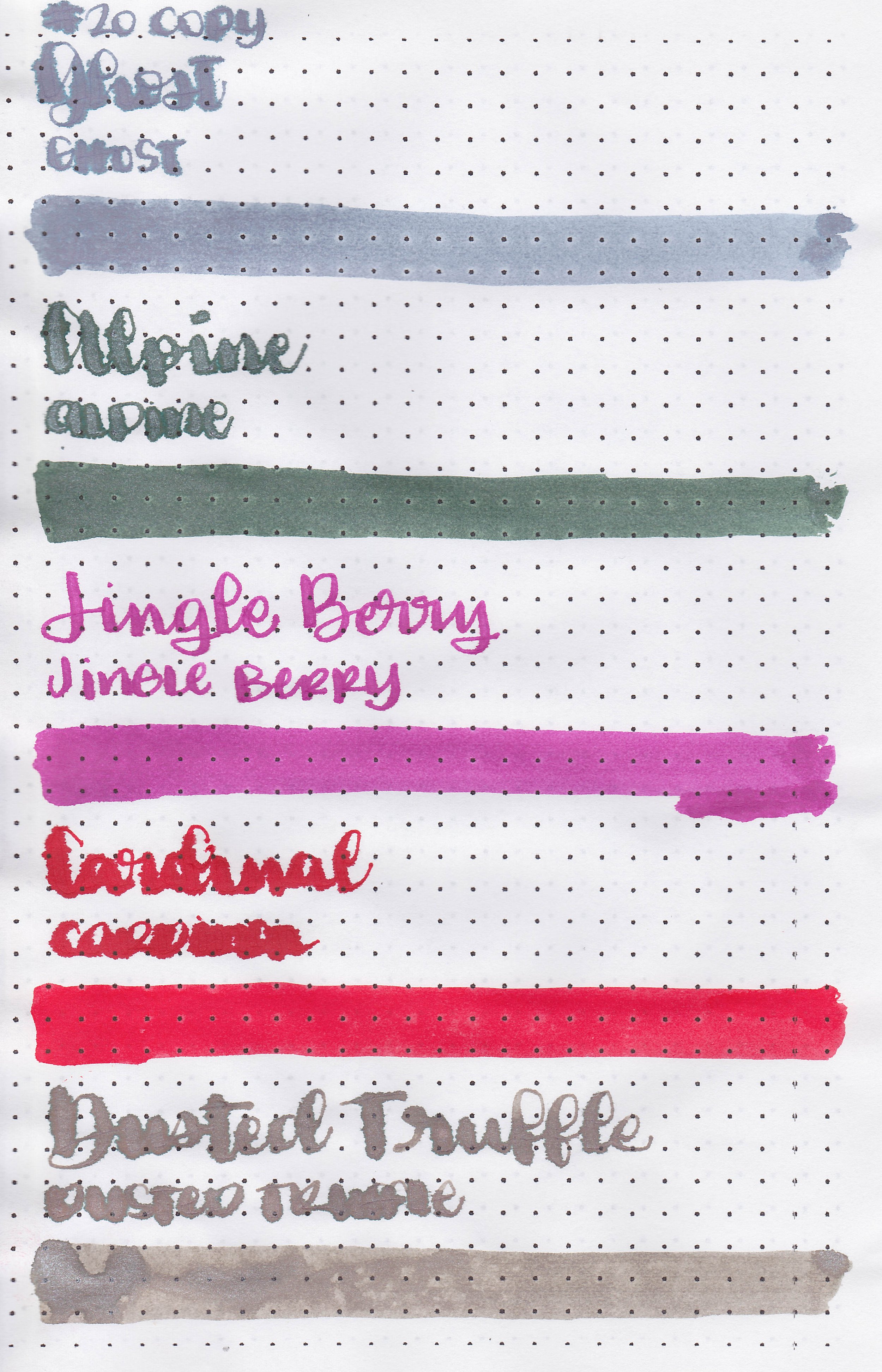
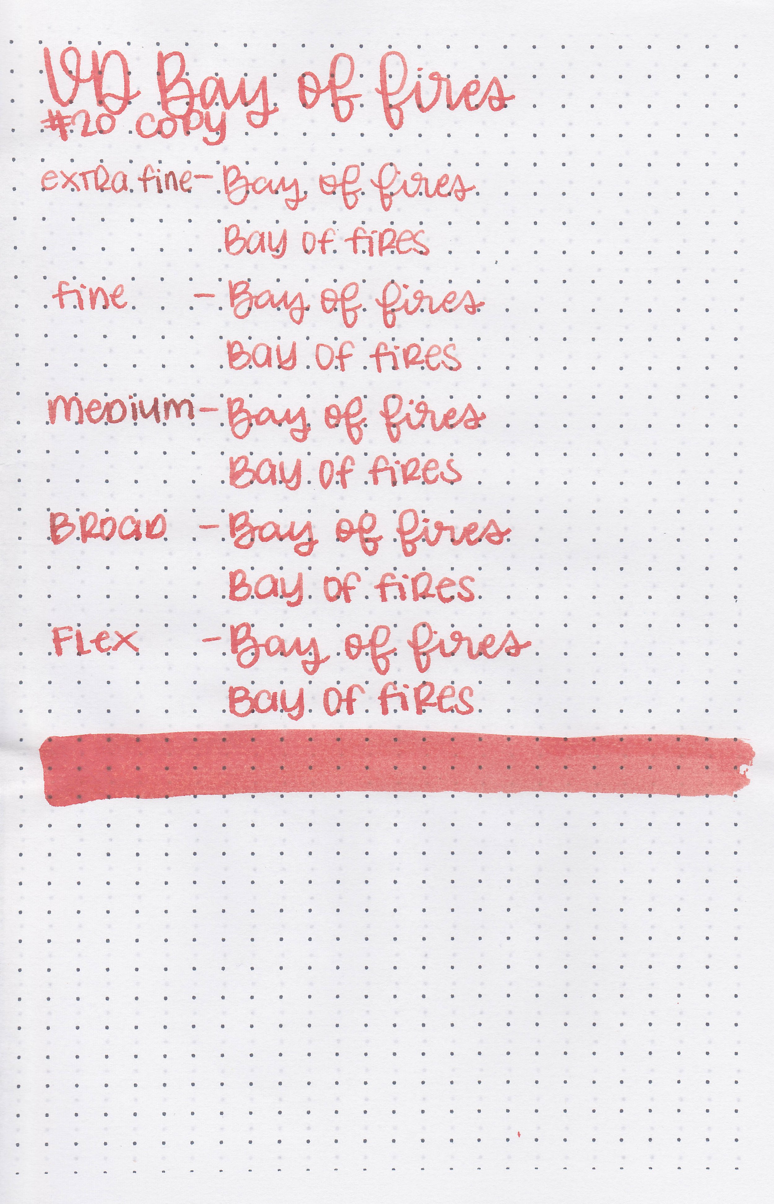
On 20 lb copy paper the ink had some feathering and some bleeding in all nib sizes.
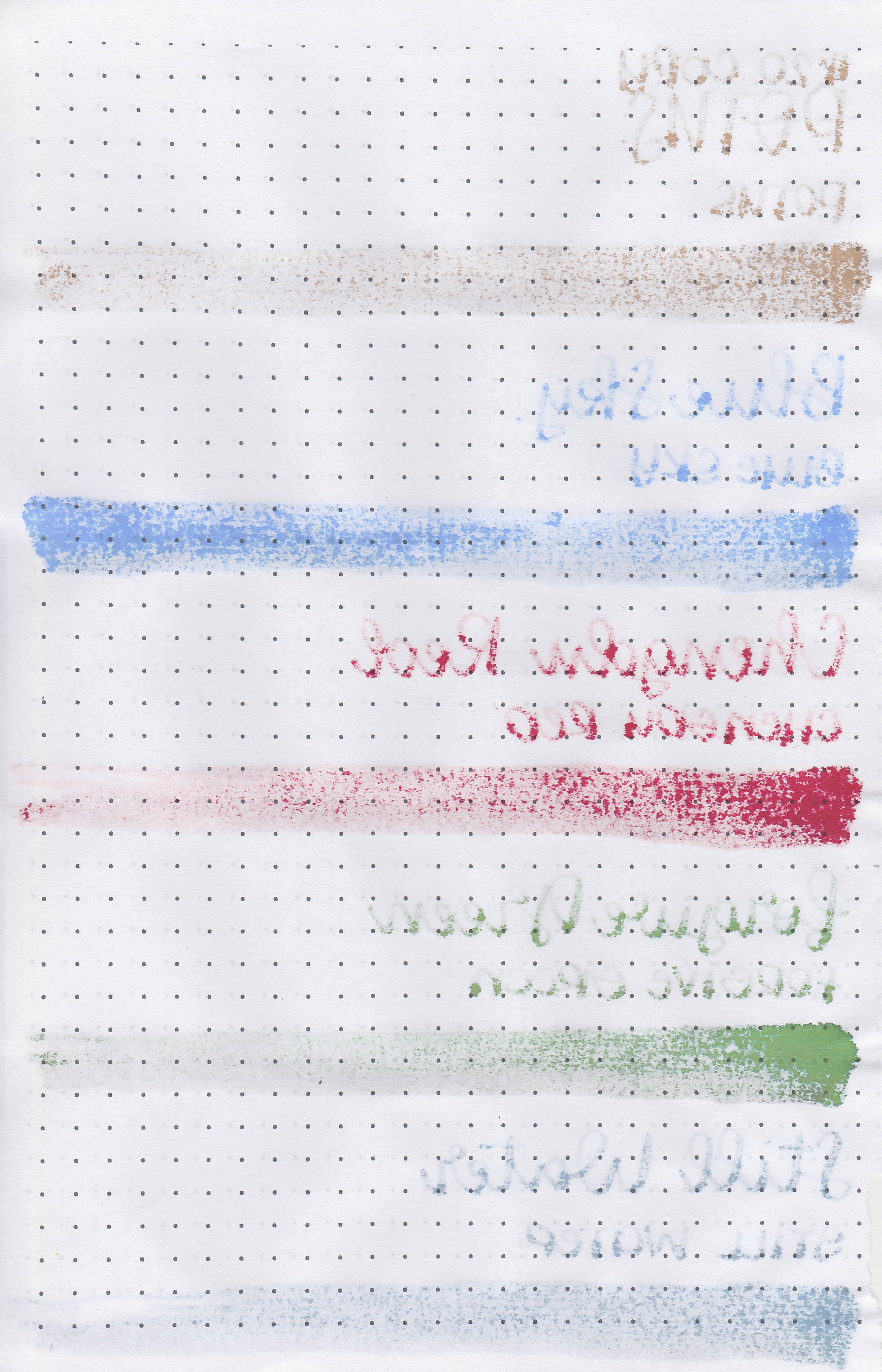
Comparison Swabs:

Sailor’s Delight is similar to Van Deman’s Bay of Fires. Click here to see the red inks together.
Longer writing:

I used a TWSBI Eco Blossom Red with a medium nib on a Taroko Enigma notebook. The ink had a slightly dry flow.
Overall, the color’s too orange for me and there’s too much feathering and bleeding. I don’t like anything about this ink.
Disclaimer: All photos and opinions are my own. This page does not contain affiliate links and this post is not sponsored.